RIBA unveils 2023 Stirling Prize shortlist
The Royal Institute of British Architects has revealed the six-strong shortlist for the 2023 Stirling Prize, which is dominated by projects in London.
Three of the buildings vying for the coveted award, which is given annually to the UK’s best new building, are housing projects in London by studios Apparata, Sergison Bates and Adam Khan Architects.
This is a reflection of what the Royal Institute of British Architects (RIBA) president Muyiwa Oki said is a shortlist of community-focused and “purposeful architecture”.
“The 2023 Stirling Prize shortlist illustrates why architecture matters to all of us,” said Oki.
“These six remarkable buildings offer thoughtful, creative responses to the really complex challenges we’re facing today. Whether it’s tackling loneliness, building communities, or preserving our heritage, these projects lay out bold blueprints for purposeful architecture.”
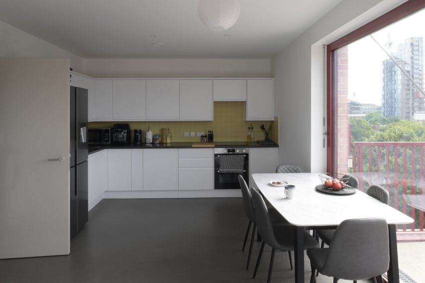
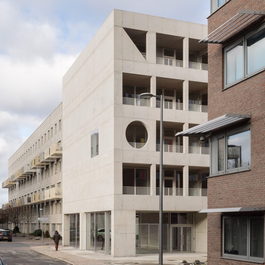
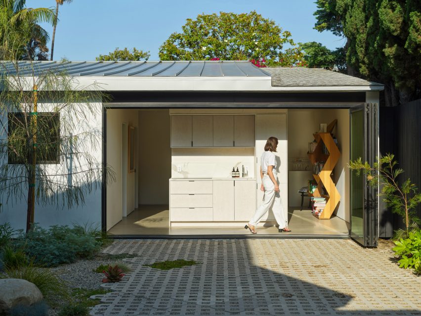
The residential projects on the list include A House for Artists, an affordable housing scheme by Apparata that was aimed specifically at creatives, and Lavender Hill Courtyard Housing, an infill project by Sergison Bates at a former sheet-metal workshop in Clapham.
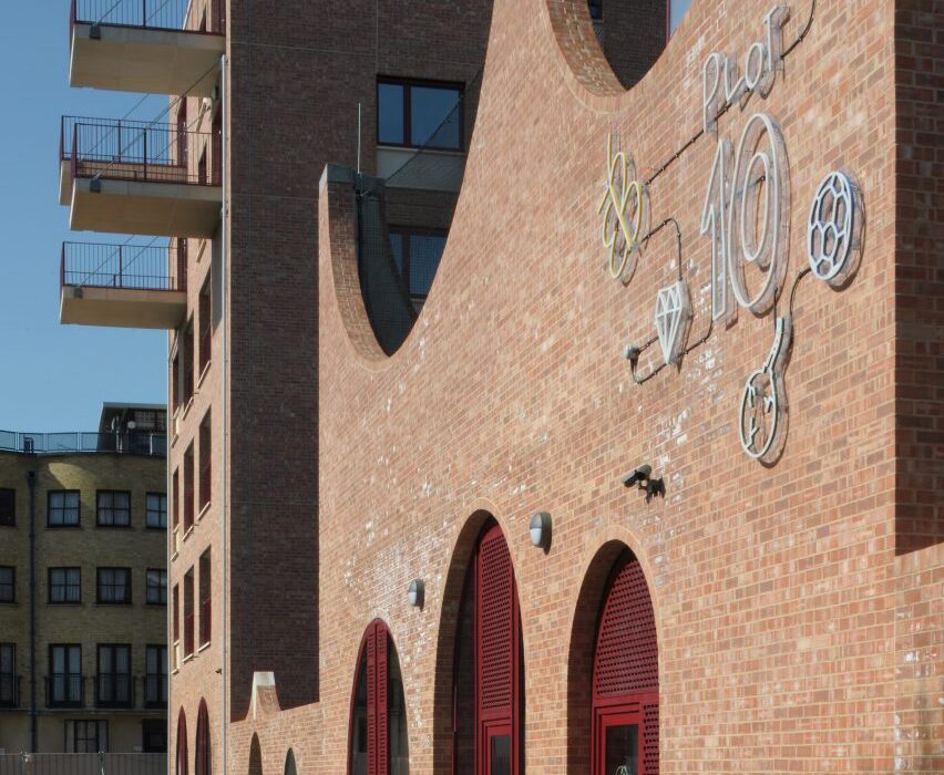
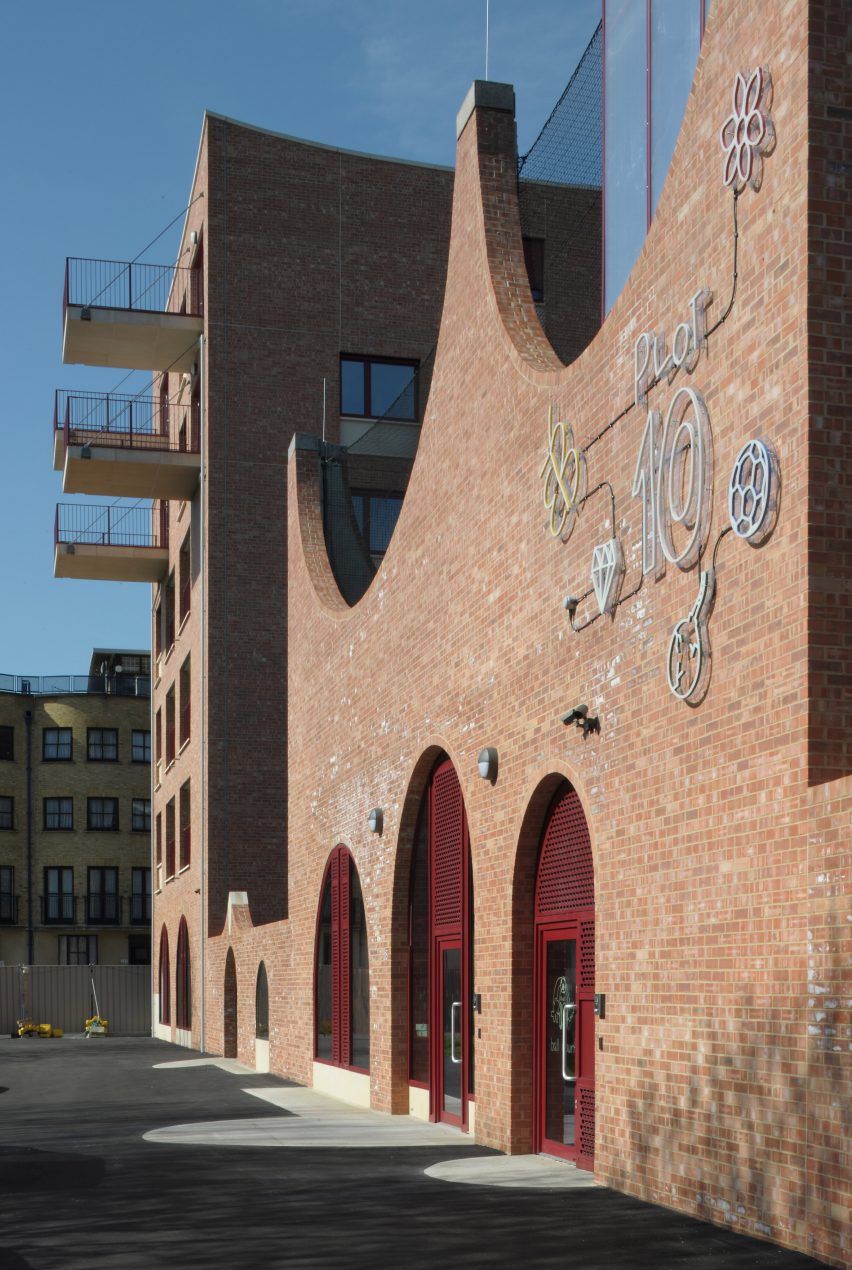
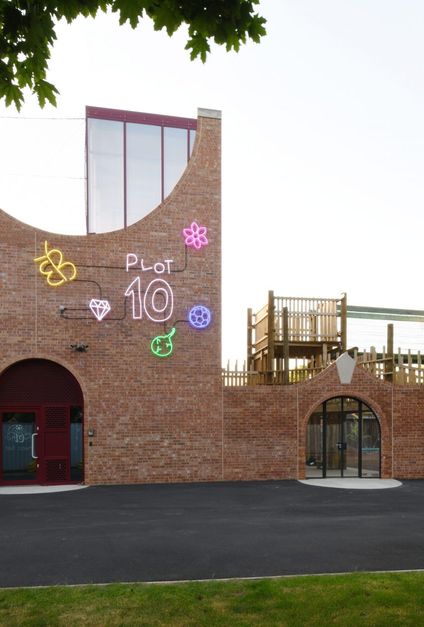
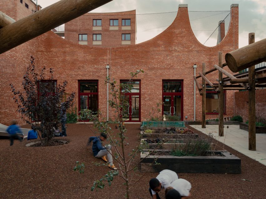
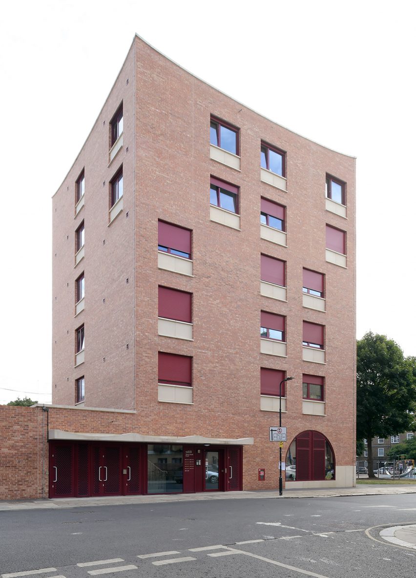
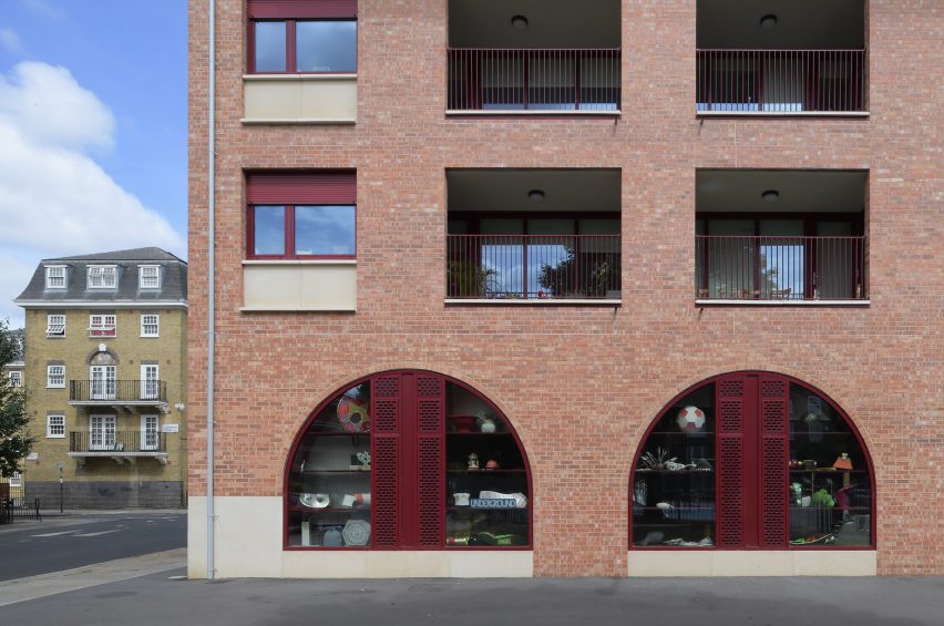
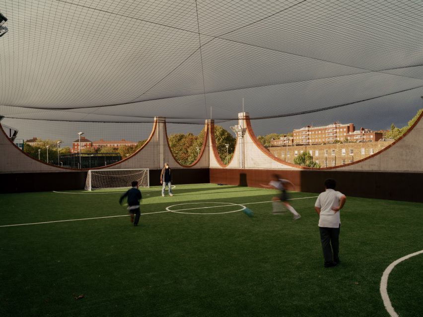
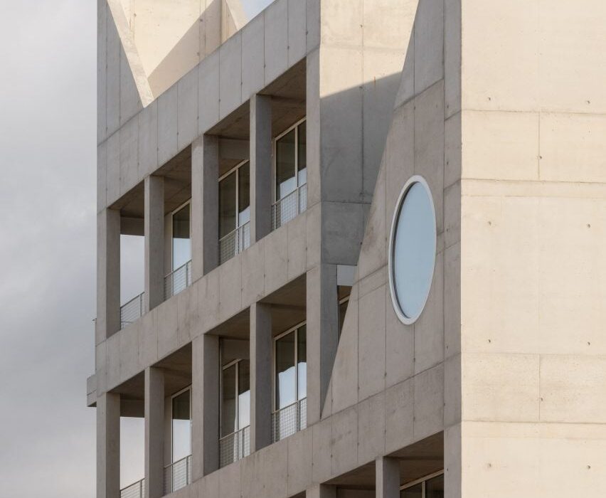
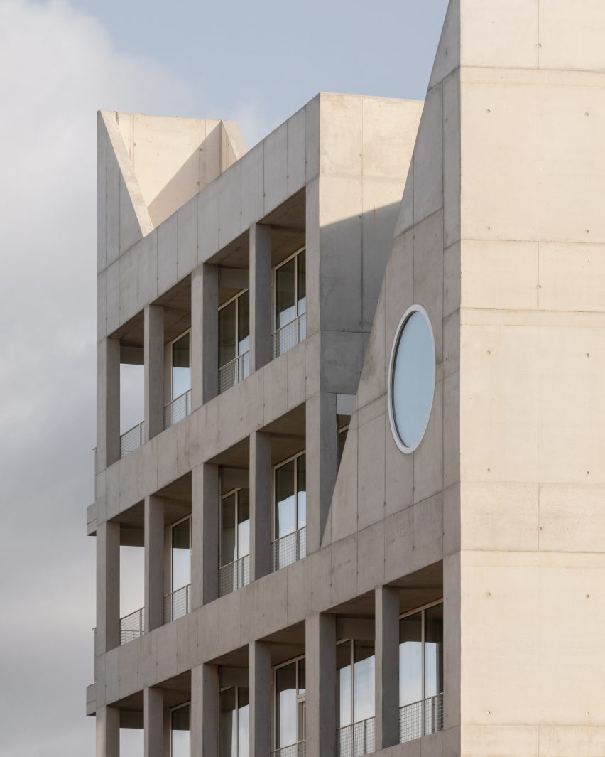
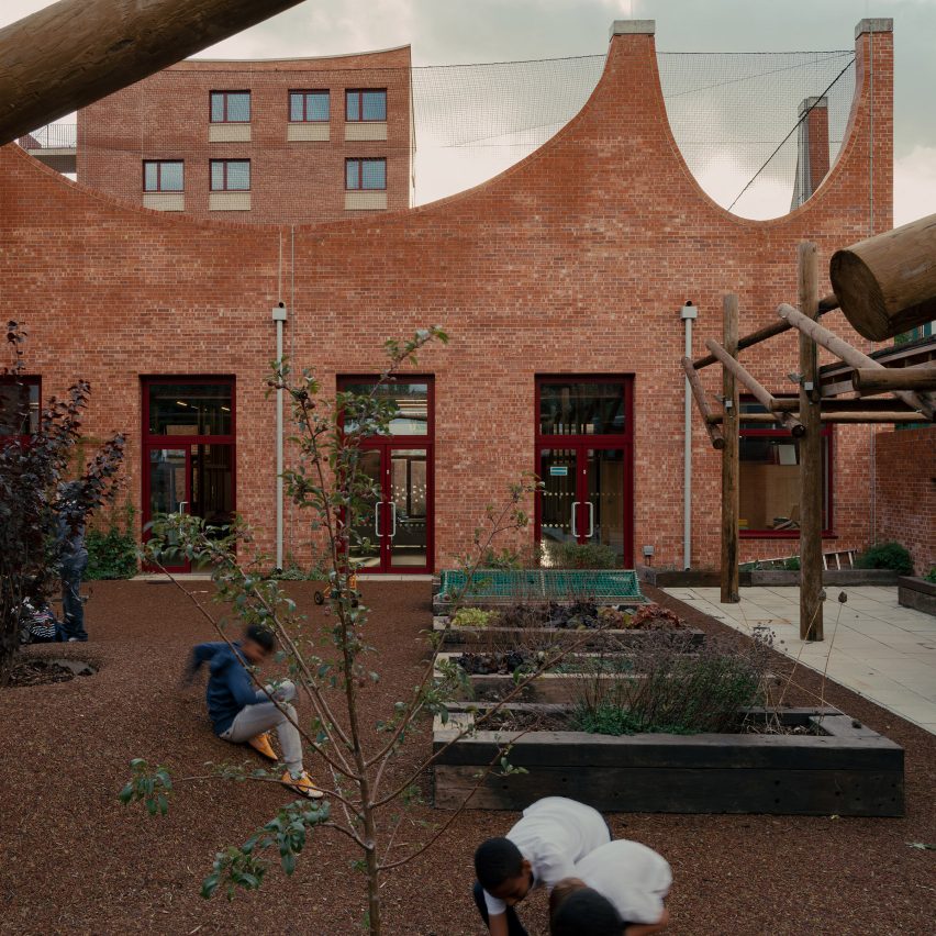
A social housing block designed by Adam Khan Architects as part of the Central Somers Town masterplan in Camden is the third.
This project was animated by matching arch motifs, matching an adjoining children’s community centre that also forms a part of the project.
Two other buildings on the list that are also in London are Courtauld Connects by Witherford Watson Mann Architects and the John Morden Centre by Mae.
Courtauld Connects is a renovated gallery at Somerset House, while the John Morden Centre is a daycare centre for a retirement community in Blackheath.
The only building on the shortlist that is not in London is the Faculty of Arts for Warwick University designed by Feilden Clegg Bradley Studios for a site in Coventry.
This university building brings together its arts departments under one roof and is formed of interconnected pavilions that draw on the surrounding nature.
Feilden Clegg Bradley Studios and Witherford Watson Mann Architects are the only studios on the list to have previously won the Stirling Prize, though Mae also made the shortlist in 2022.
Feilden Clegg Bradley Studios won in 2008 for the Accordia housing in Cambridge, which it created alongside Alison Brooks Architects and Maccreanor Lavington, while Witherford Watson Mann Architects was named winner in 2013 for Astley Castle in Warwickshire.
Last year’s recipient of the award, which is the most significant in UK architecture, was a brick and timber library that Niall McLaughlin Architects created for the University of Cambridge.
The winner of the 2023 RIBA Stirling Prize will be revealed on 19 October at a ceremony in Manchester. It will be selected by a jury headed up by OMA partner Ellen van Loon.
Read on for edited comments from the 2023 Stirling Prize jury:
A House for Artists, Barking, by Apparata
“A House for Artists provides an ambitious model for affordable and sustainable housing.
“Following a six-year effort by arts organisation Create London to provide affordable accommodation for creative people, the result is a flexible live-work space for 12 artists arranged across five floors.
“In exchange for reduced rent, they deliver free creative programmes for the neighbourhood through a street-facing glass-walled community hall and outdoor exhibition space on the ground floor.
“This is a thoughtful and assured piece of architecture that has been delivered with rigour and precision.”
Find out more about A House for Artists ›
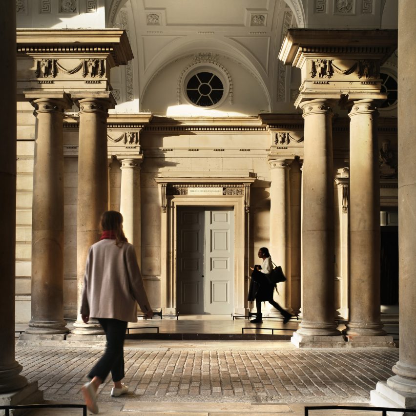
Courtauld Connects, Westminster, by Witherford Watson Mann Architects
“The transformation of the Courtauld Gallery in its home at Somerset House, London is the first part of a multi-phase project that aims to open up the institution both physically and culturally.
“The three main moves that transform the gallery are the insertion of a lift, the reworking of the entrance sequence, including a beautiful new stair down to the basement visitor facilities, and relevelling and opening up the vaults below the entrance to provide a flowing, level space.
“Overall, the jury thought that this was an extremely well-judged project, which lets the spirit of the historic building lead the visitor experience, but with some 21st-century creativity to solve some of its inherent complexities.”
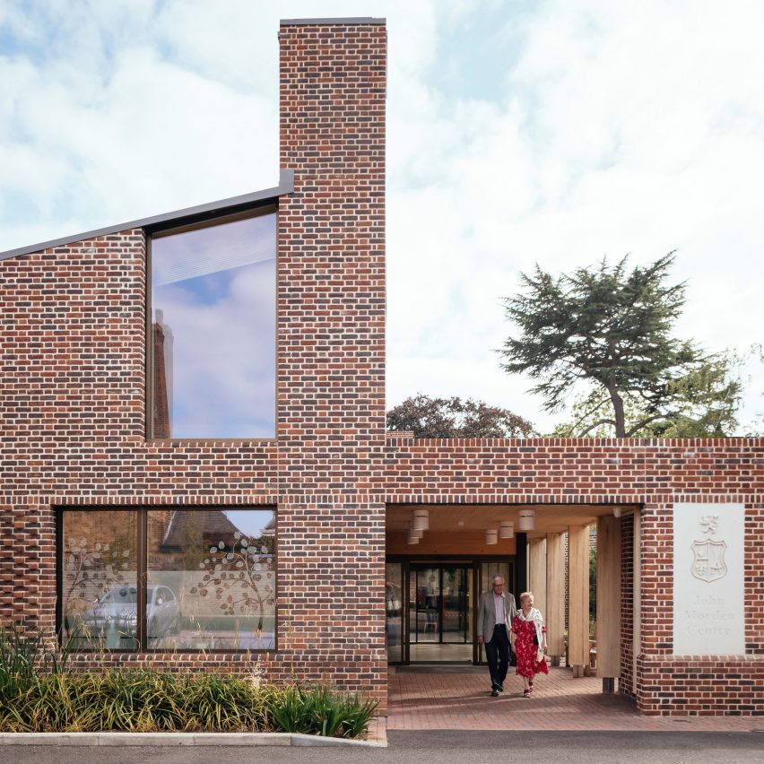
John Morden Centre, Blackheath, by Mae
“Founded in 1695, Morden College is a charity dedicated to providing older people in need with a home for life, including the provision of residential and nursing care. Residents live on the Grade I-listed college site in Blackheath, which is attributed to English architect Sir Christopher Wren.
“The John Morden Centre is a daycare centre housing social and medical facilities for all residents. The brief was to bring functions from across the college, including a medical centre, cafe, lounges and administrative offices, into a single building.
“The project provides a delightful set of meandering spaces, which expertly combines recreational and more tricky medical facilities without feeling institutional.
“Such stimulating spaces are vital to conquer loneliness and isolation. It is beautifully yet robustly detailed and should be a joy to use for years to come.”
Find out more about John Morden Centre ›
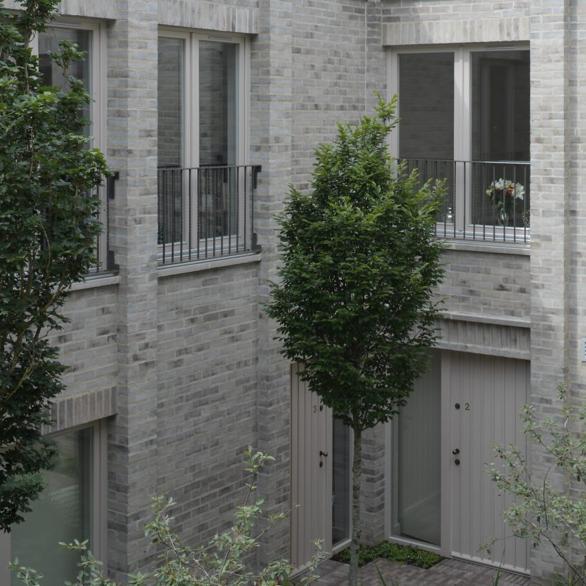
Lavender Hill Courtyard Housing, Clapham, by Sergison Bates
“Tucked away down a timber-lined passageway, barely visible at the end of a Clapham mews, Lavender Hill Courtyard sees the redevelopment of a former sheet-metal workshop into nine apartments of various sizes, arranged around a courtyard space and a timber-decked terrace on the first floor.
“The judges were impressed by the project’s success at inserting a dense development into a very constrained site. The unassuming entrance to the site opens up into the welcoming courtyard that is accessible to all units and creates a sheltered communal space and sense of privacy amongst the busy surroundings.”
Find out more about Lavender Hill Courtyard Housing ›
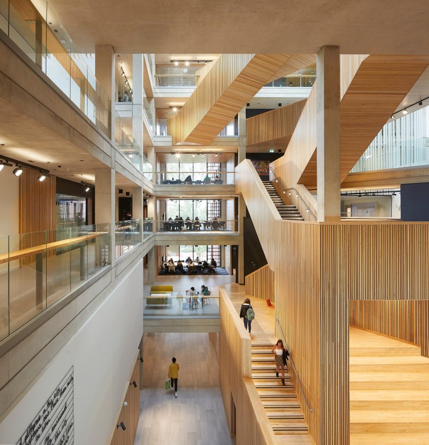
University of Warwick Faculty of Arts, Coventry, by Feilden Clegg Bradley Studios
“The impressive new Faculty of Arts building for the University of Warwick brings together the departments and schools of the faculty under a single roof for the first time.
“The building itself is shaped by the surrounding trees that define the parkland character of the site. This is achieved through four pavilion buildings connected by a lightweight atrium and sculptural timber larch stair.
“The combination of the client’s ambitions to create a new model of working for the faculty, and the architect’s creativity in articulating this ambition through a holistic design approach, has resulted in a building that is both inviting and flexible, enabling collaboration, creativity, and innovation.”
Central Somers Town Community Facilities and Housing, Camden, by Adam Khan Architects
“Central Somers Town Community Facilities and Housing are part of a larger masterplan commissioned by the London Borough of Camden for an extensive area within the very deprived Central London neighbourhood of Somers Town, adjacent to St Pancras station.
“Adam Khan Architects was assigned Plot no.10 and asked to design and supervise the construction of a flexible community children’s facility as well as that of several housing units for social rent.
“The jury commended the Central Somers Town Community Facilities and Housing as a key community asset which is a marked improvement on the previous facility on the site.”
Find out more about Central Somers Town Community Facilities and Housing ›
 The BasilicÔ was made to create an attractive and magnetizing place to explore. The design team wanted to imagine the impact colors can have on the occupant experience, creating an environment that stimulates the senses. As they explained, polychromy and morphology combine to create a maximalist aura. The BasilicÔ project revolves around a floral theme through which several types of apartments emerge: The CoquelicÔt, the MimÔsa, the TournesÔl, the MartagÔn and the TulipÔ.
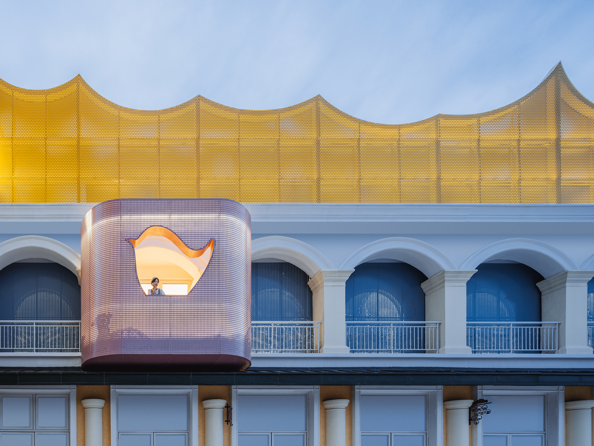
 In Dream La Miro, Wutopia Lab wanted to create a place of joy for the Duoyun Bookstore. The fairytale parent-child bookstore was opened at Dream Town in Yancheng, Jiangsu. When the client showed the team the IP they had introduced, namely the three animated films created by Italian artist Cristina Làstrego: Mirò the Cat, The Circus and The Creation, they were moved by the magnificent scenes and the imagination created by the artist.
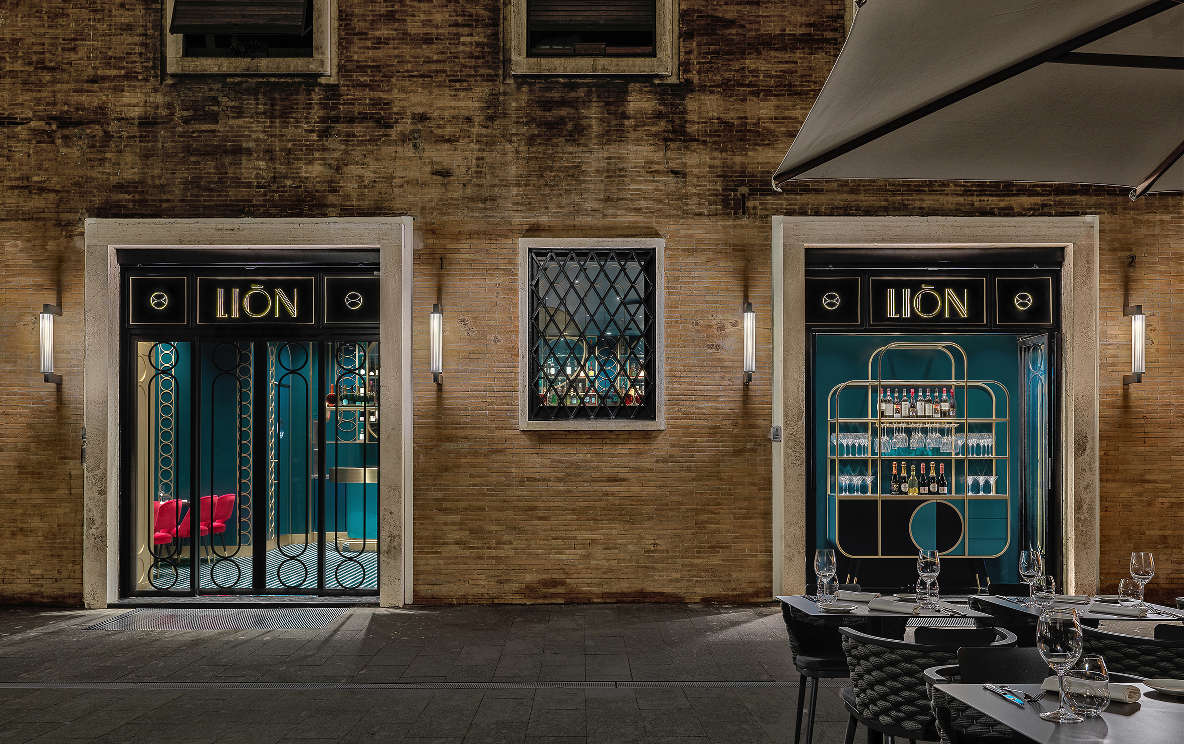
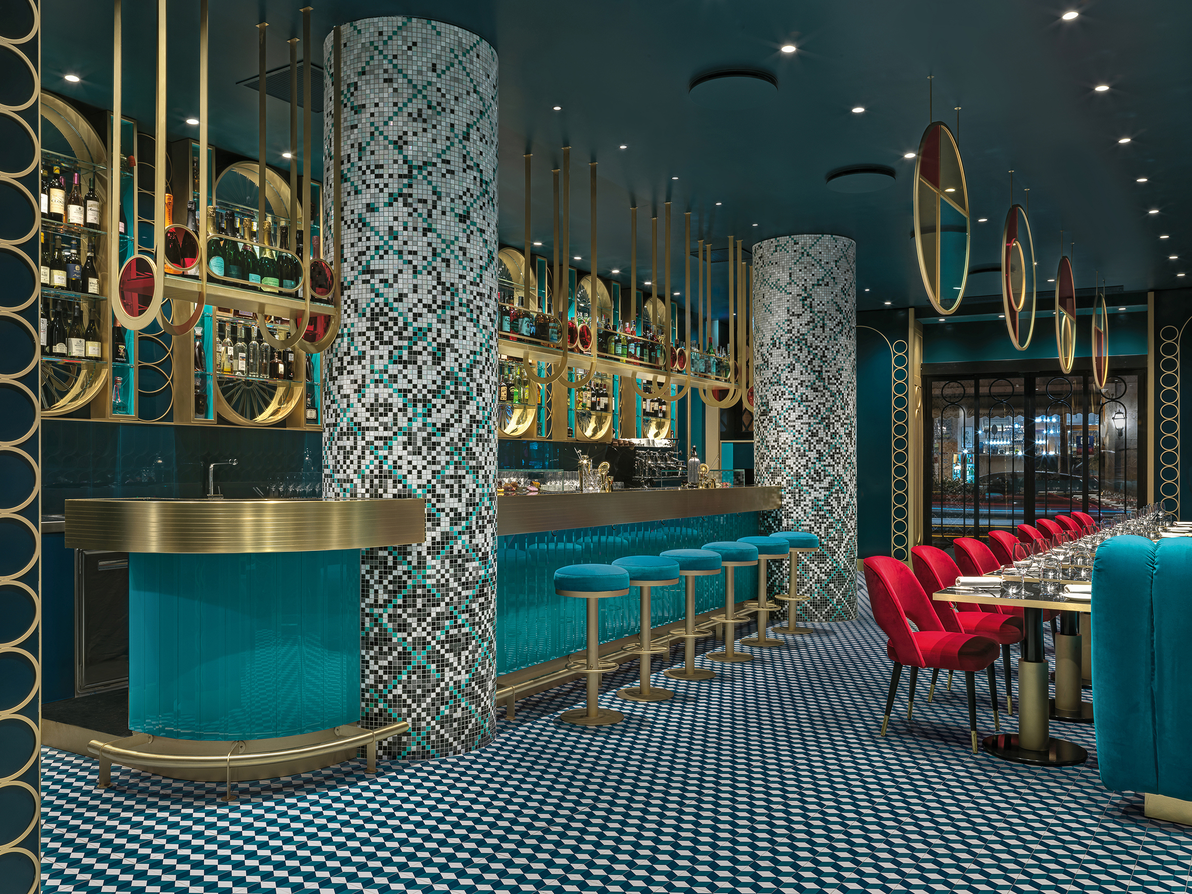 LIÒN is a restaurant and cocktail bar in the heart of Rome — halfway between the Pantheon and Piazza Navon. The project features bold lines and saturated colors in a maximalist style, contrasting with the austerity of the Palazzo that encompassed it. The idea was to give back to the city fragments of the Dolce Vita. Soft lights and mirrored surfaces envelope a sophisticated restaurant, whose terrace overlooks Largo della Sapienza.
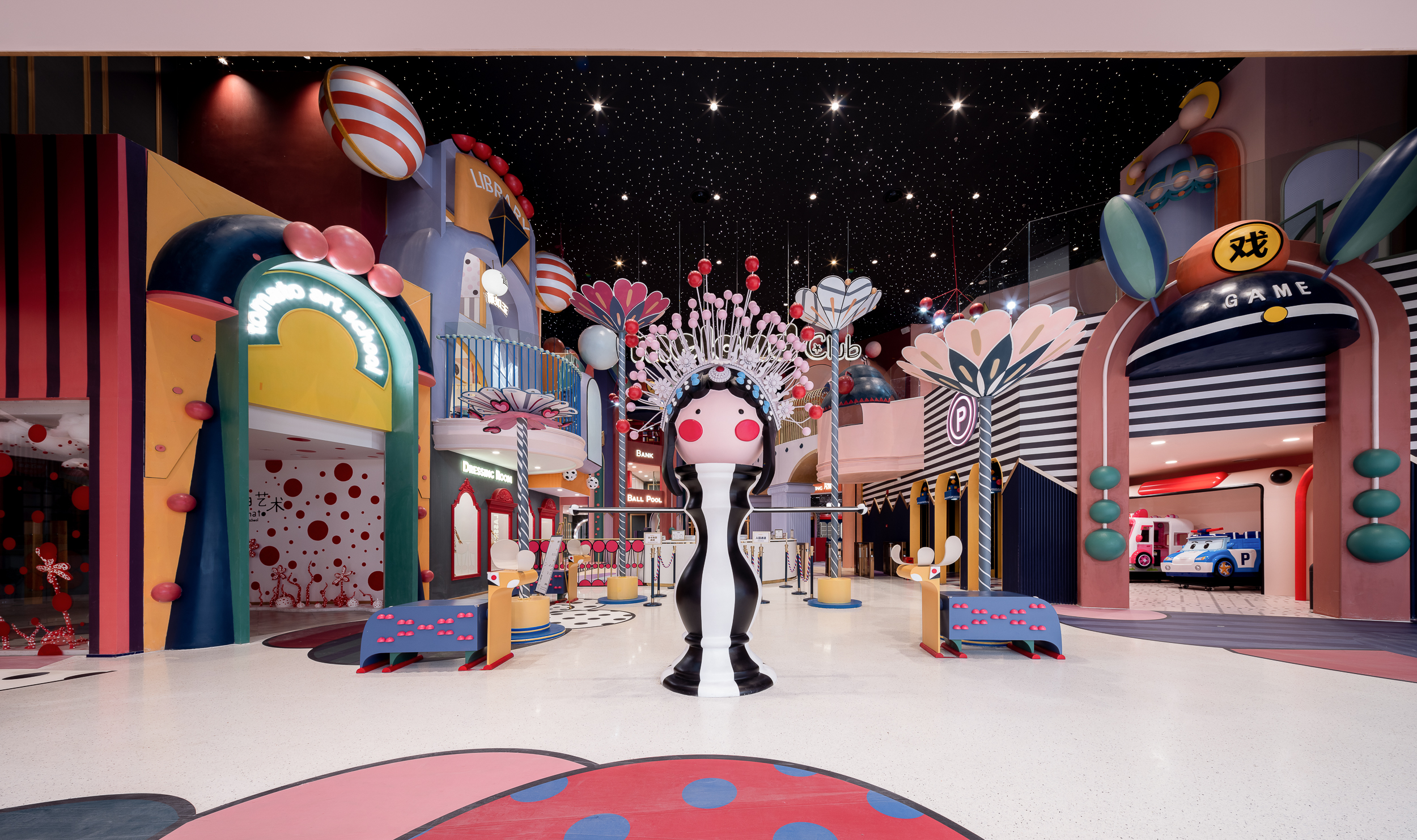
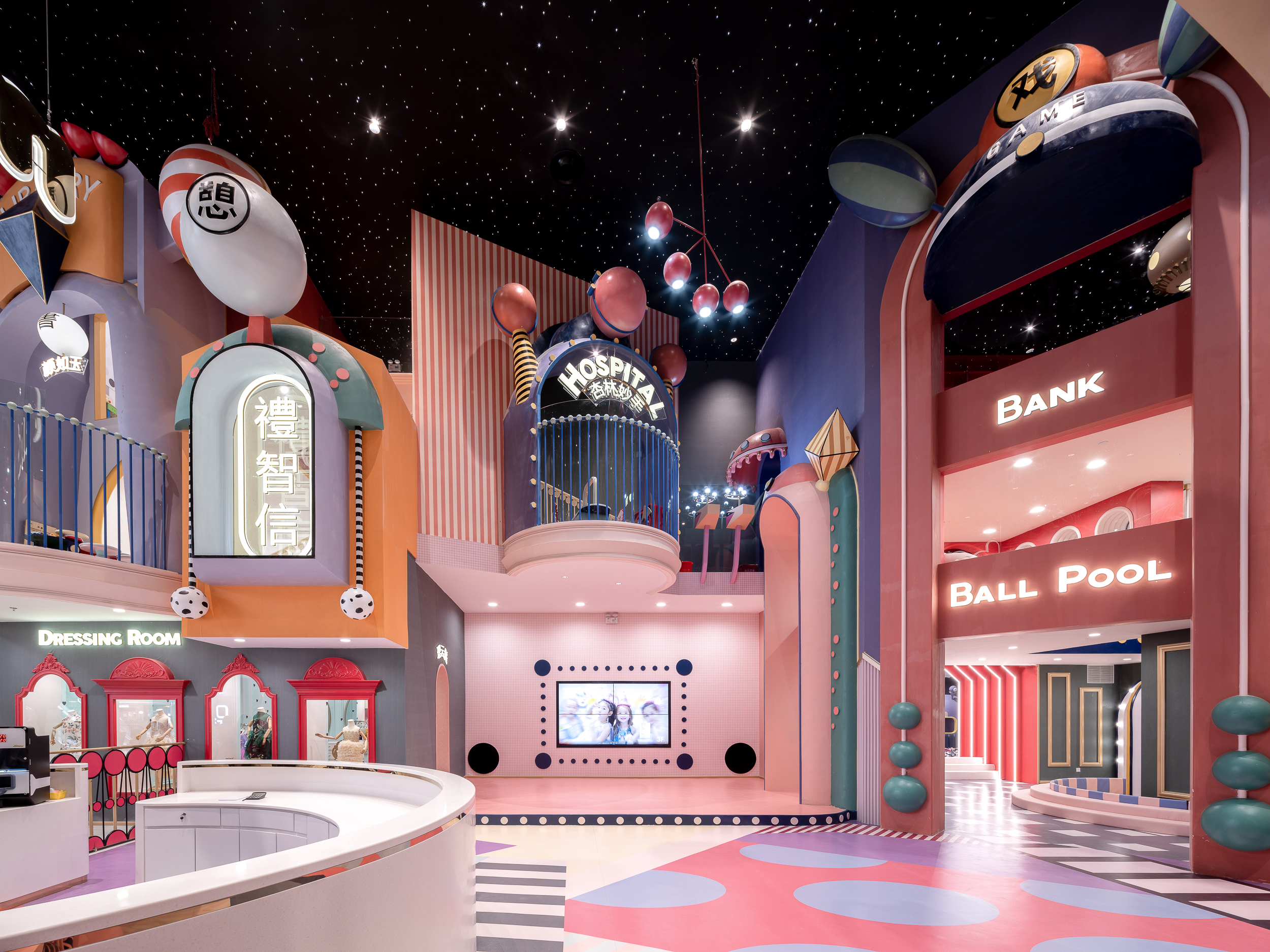 MIXc Kunshan was designed by X+LIVING to create a commercial space with an innovative strategy. The team set out to transform a public space on the third floor of a mall into a children’s section with a unity of aesthetics and theme. The result was a reimagining of public space in shopping malls. The project is located in Kunshan, Jiangsu Province, an important birthplace of Kunqu Opera. It has the nickname of “the mother of Chinese Opera”.
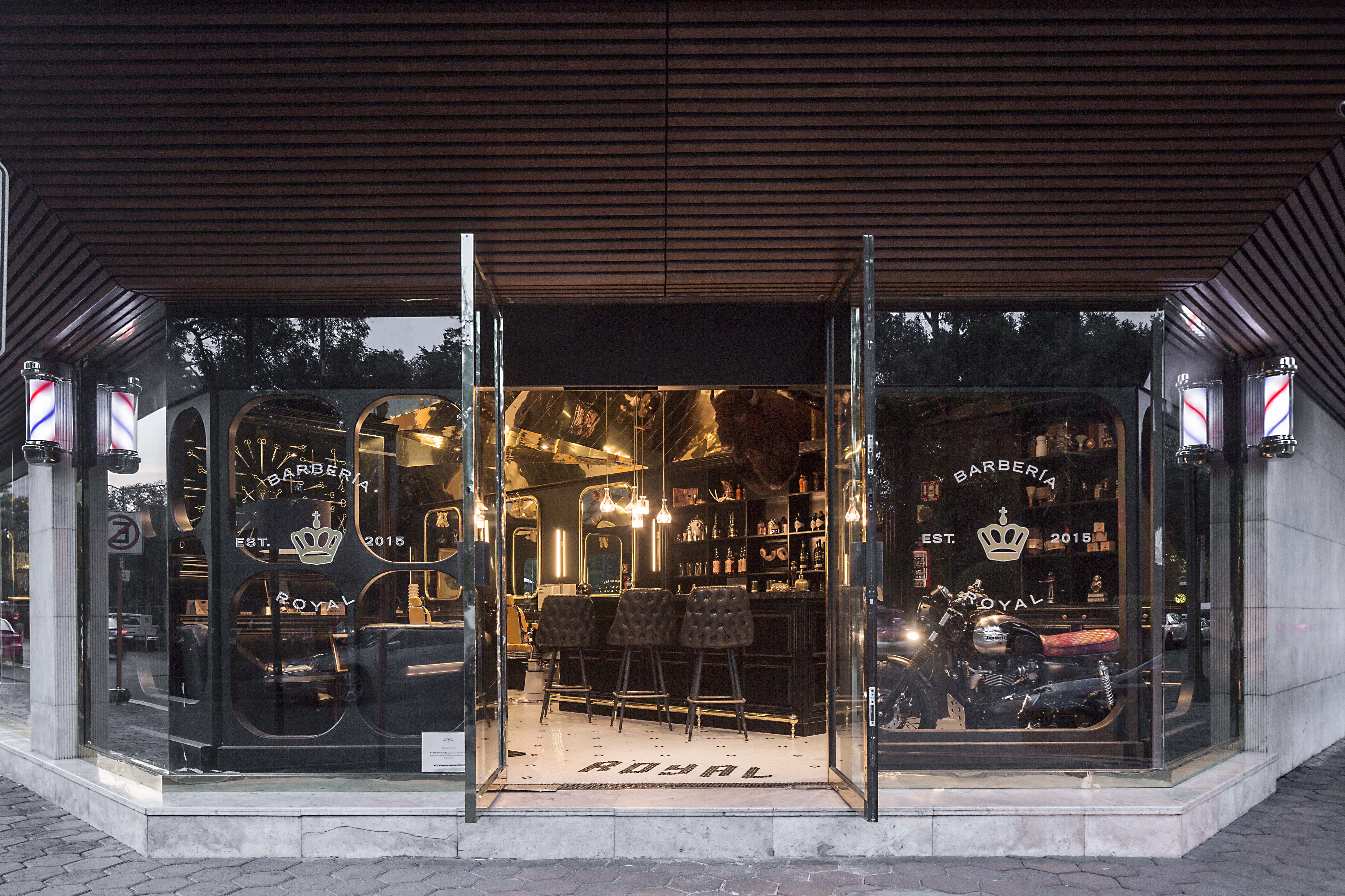
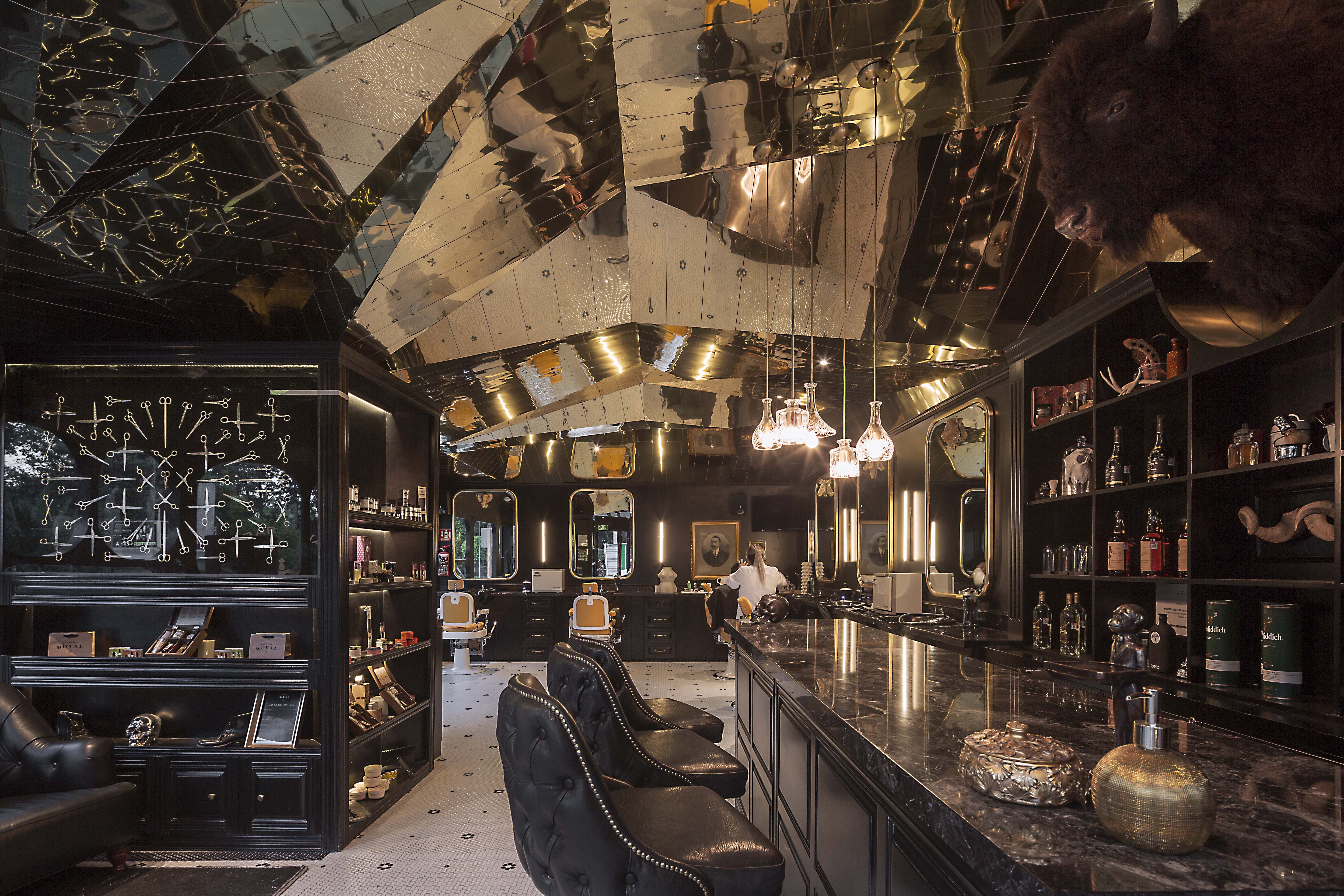 Barberia Royal is a barbershop that offers services in an incredible location of Mexico City. ROW Studio wanted to incorporate the bits and pieces of a previous proposal that was under construction on the site for a different barbershop that was never finished, recycling mismatching moldings and other wooden elements. They put the pieces together almost randomly, fitting them in a contemporary form that still references the traditional symbols of European royalty.
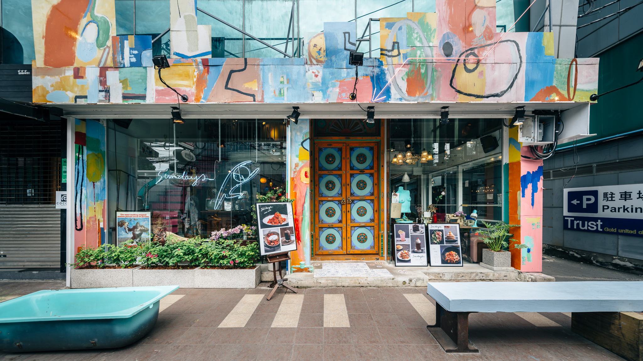
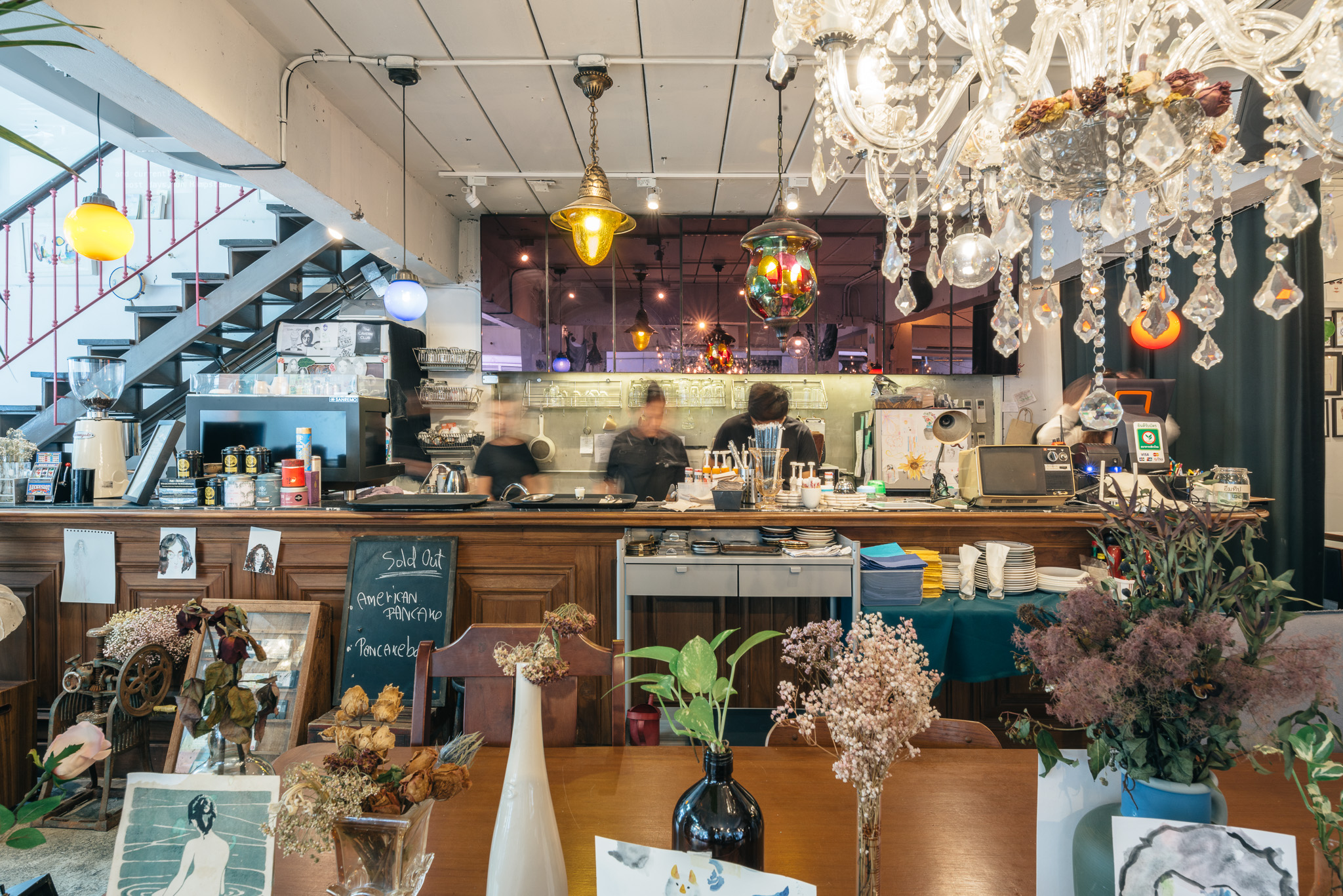 Sundays is the one-off restaurant illustrating design that is hand-crafted and built from the mindset of believing that arts can make things better. The maximalist restaurant was designed to integrate architecture, interior, graphic design and the arts in Bangkok, Thailand. Although surrounded by generic pubs and restaurants, Sundays was made to stand out. The restaurant offers customers striking experiences of what art can do to other things.
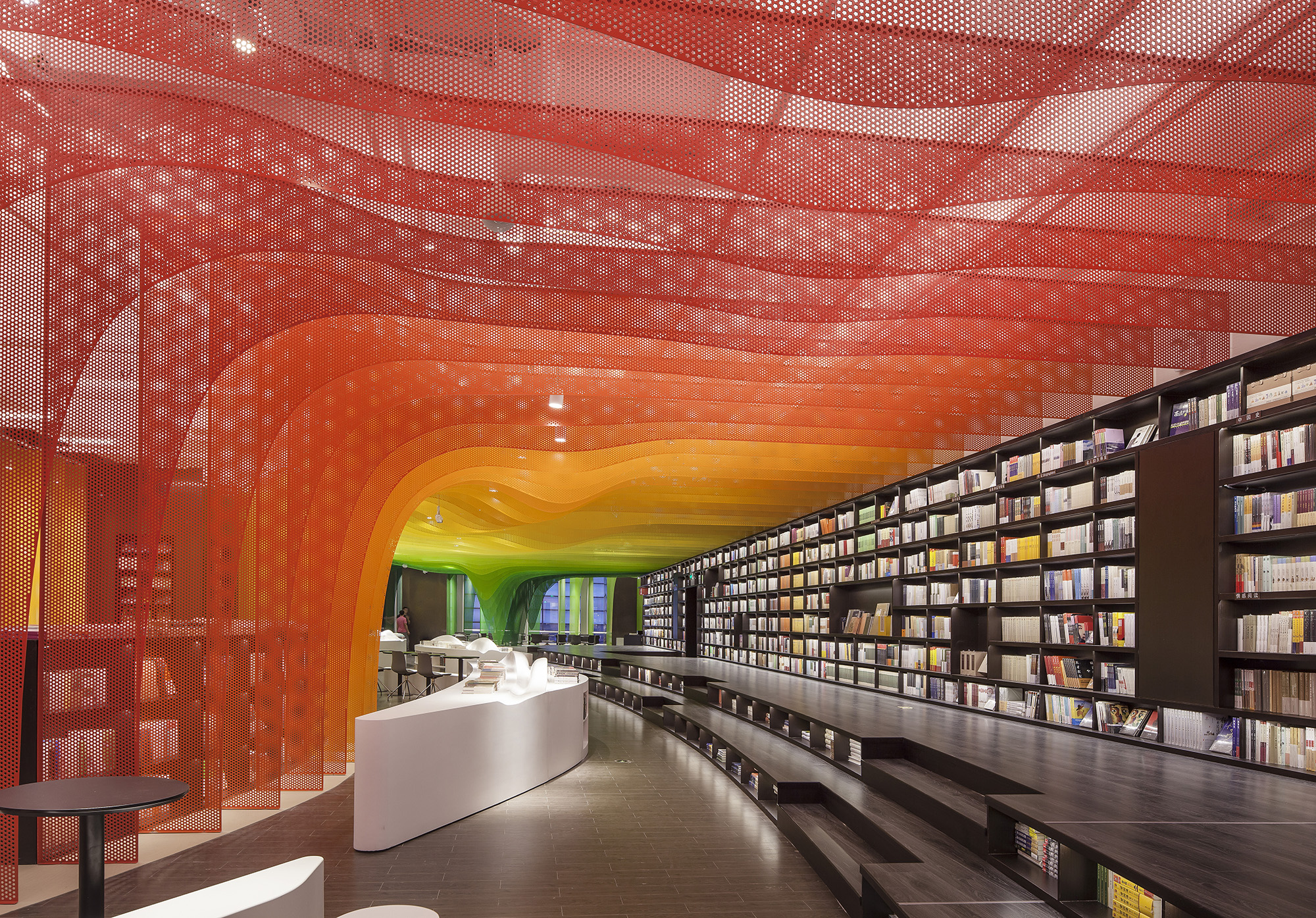
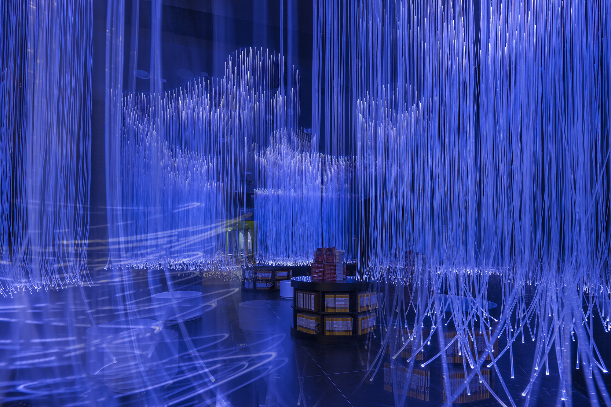
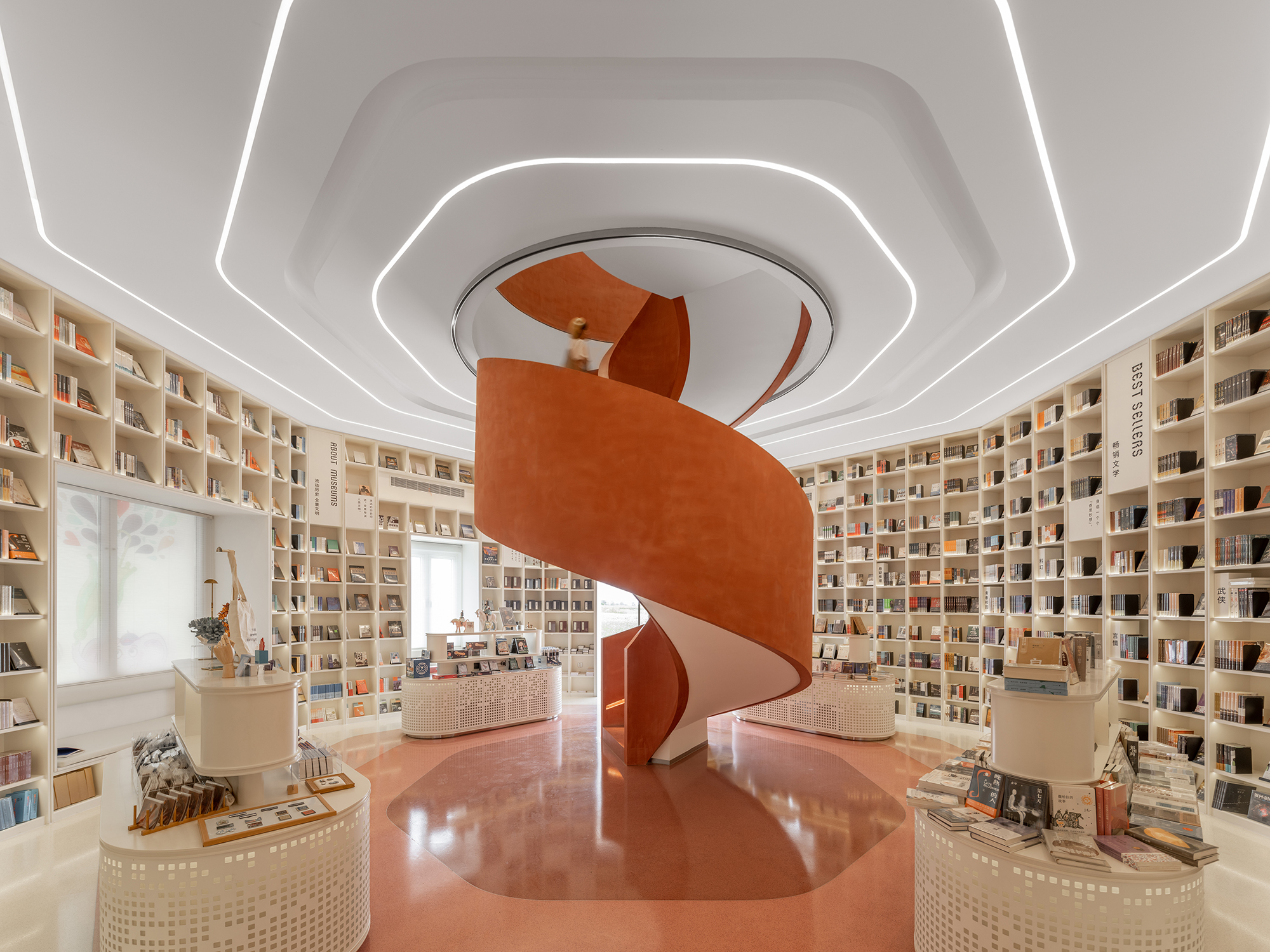
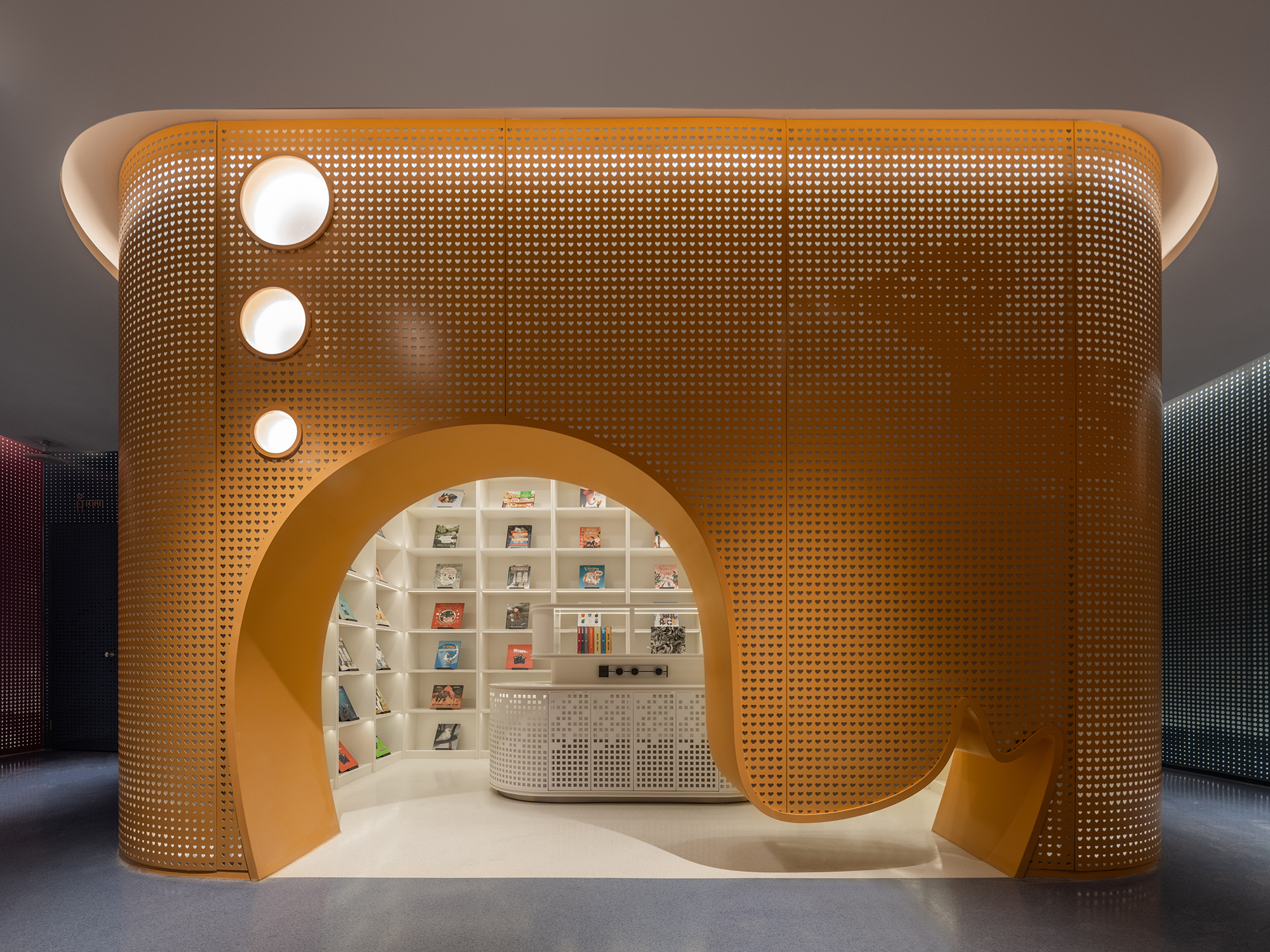
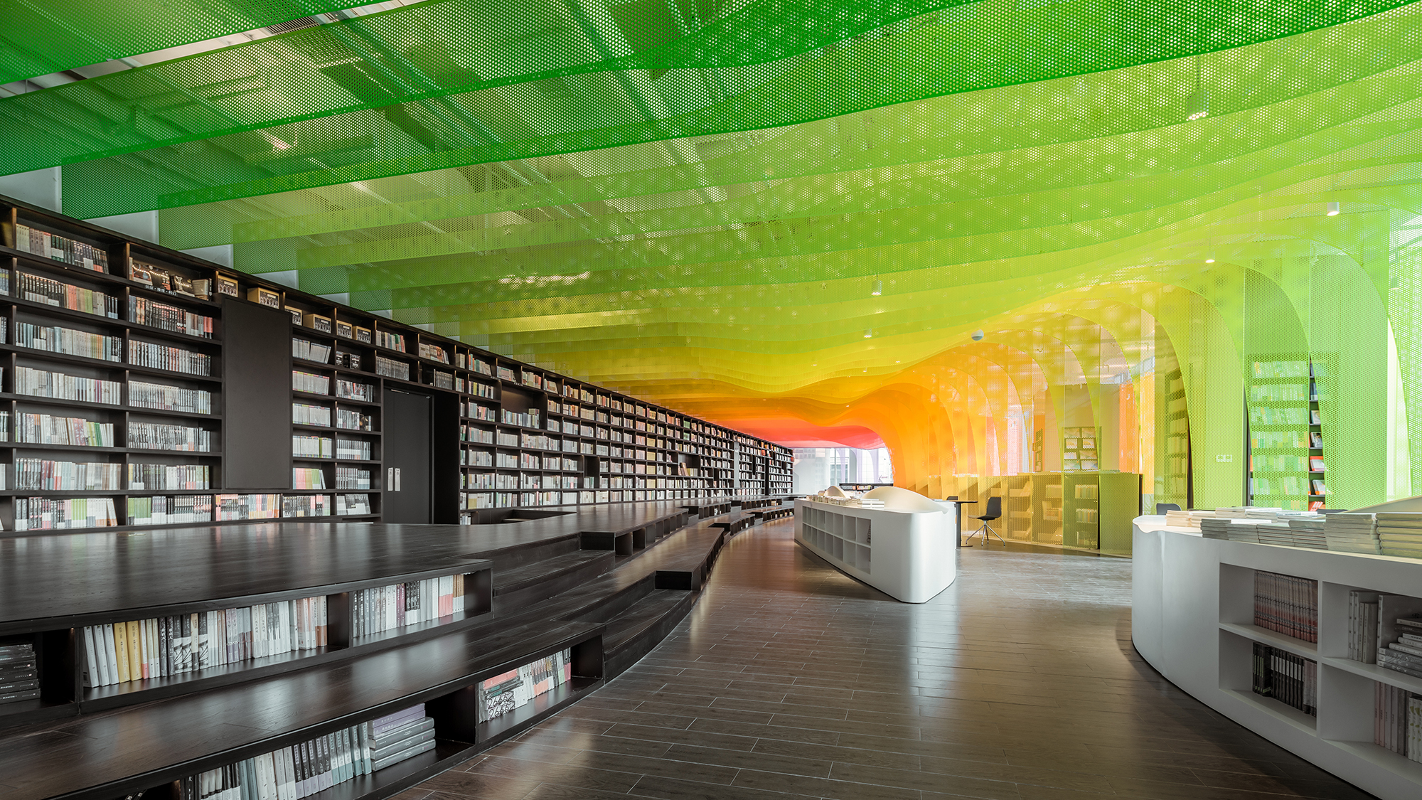 The Zhongshu Bookstore bookstore is divided into four main zones and several subdivided zones. Aiming to create a colorful new world by using symbolism, the architect gave a unique character to each zone: The Sanctuary of Crystal for new arrivals; The Cave of Fireflies for recommendations; The Xanadu of Rainbows for reading room; The Castle of Innocence for children books. As an entrance, ‘The Sanctuary of Crystal’ is a space full of books and nothing else. Using glass bricks, mirrors and acrylic, ‘The Sanctuary of Crystal’ is a shining white space, drawing customers into the heart of the store.


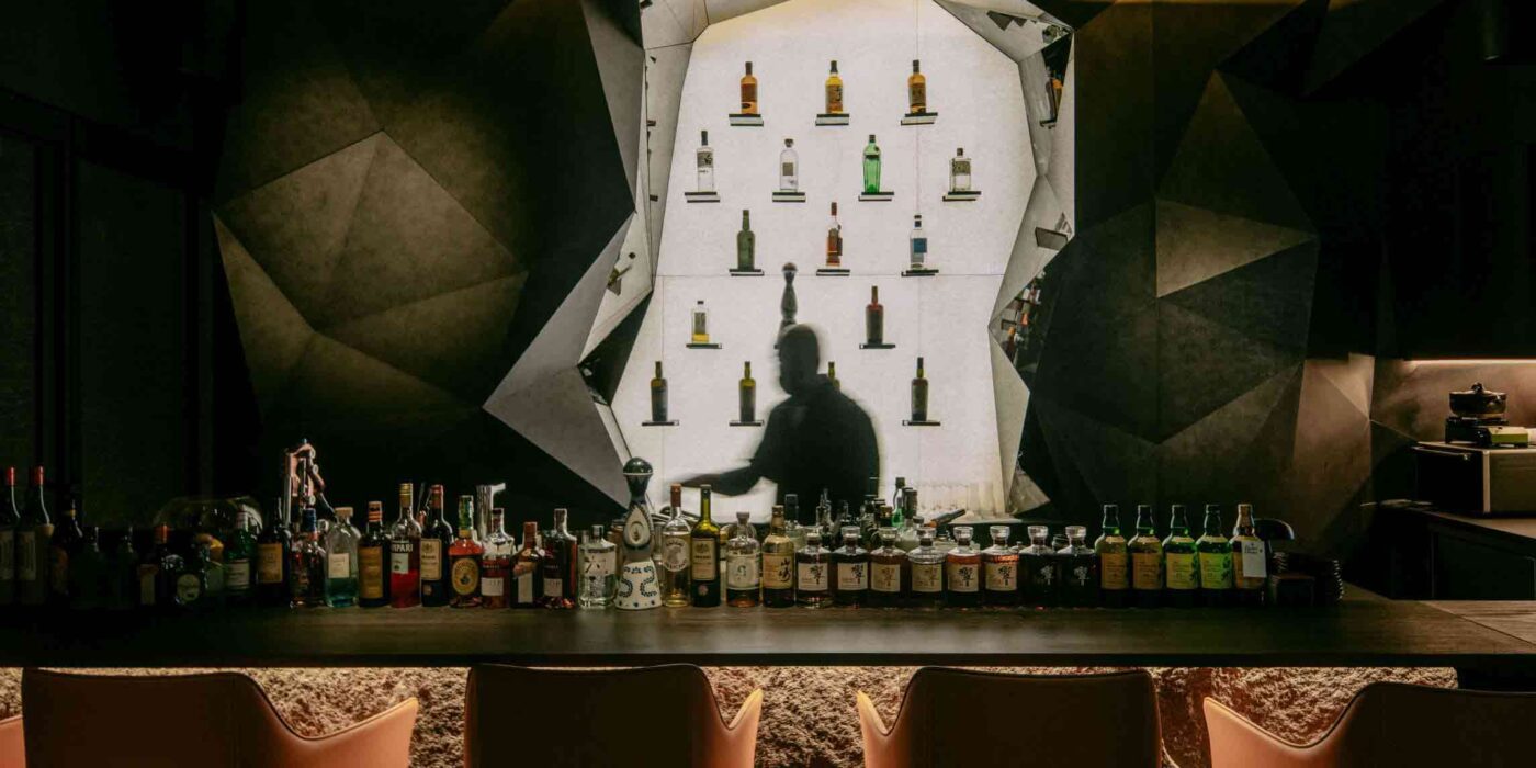
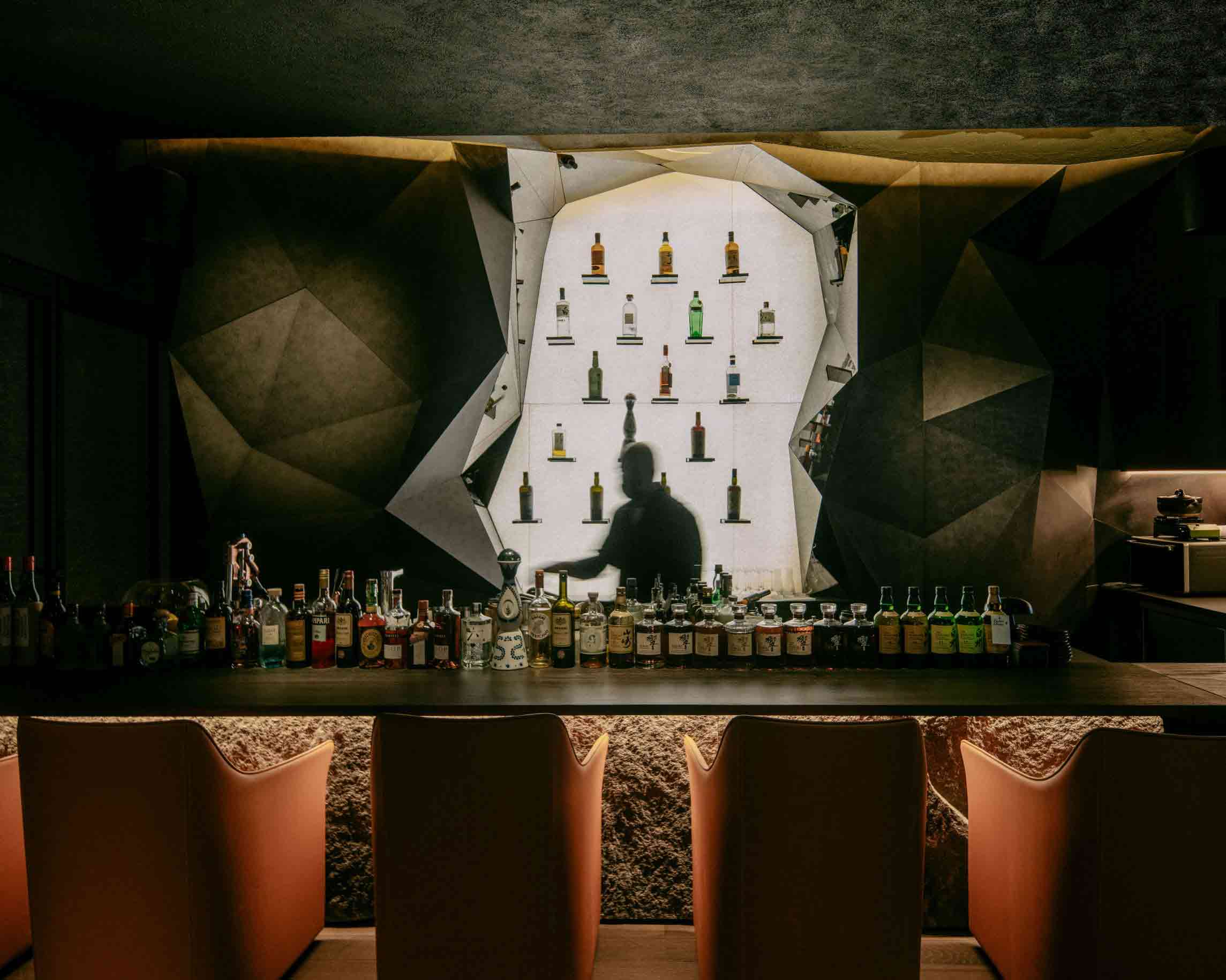
 While it may be nestled amid the bustling cityscape of Singapore, this astonishing Japanese restaurant channels the topography of the chef’s native Kochi Prefecture, over 3,000 miles away. A diptych relief painting of a tumultuous rock formation conceals the eatery’s entrance. Stepping through the parted canvas is like stepping into the mountain itself — diners negotiate twists and turns as they navigate the architectural ‘foothills.’
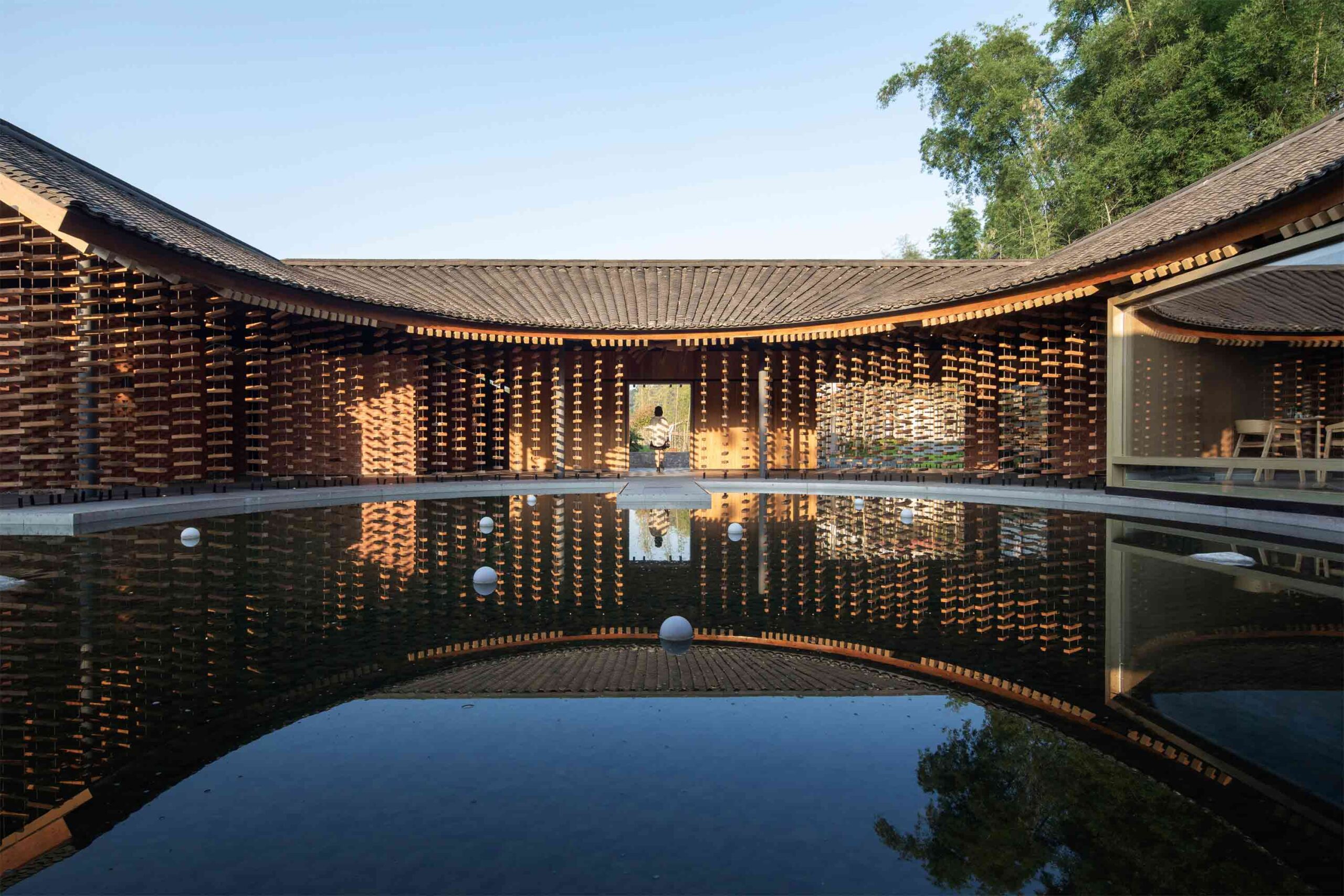
 This extraordinary restaurant in rural Sichuan province takes inspiration from the region’s architectural vernacular. Traditional low, far-reaching eaves offer ventilation and shelter from the elements, while a central courtyard pool blurs the boundary between organic and built landscapes. Curved lines define the interior dining space, which is dissected into more intimate zones, each offering a glimpse of a different rural outlook.
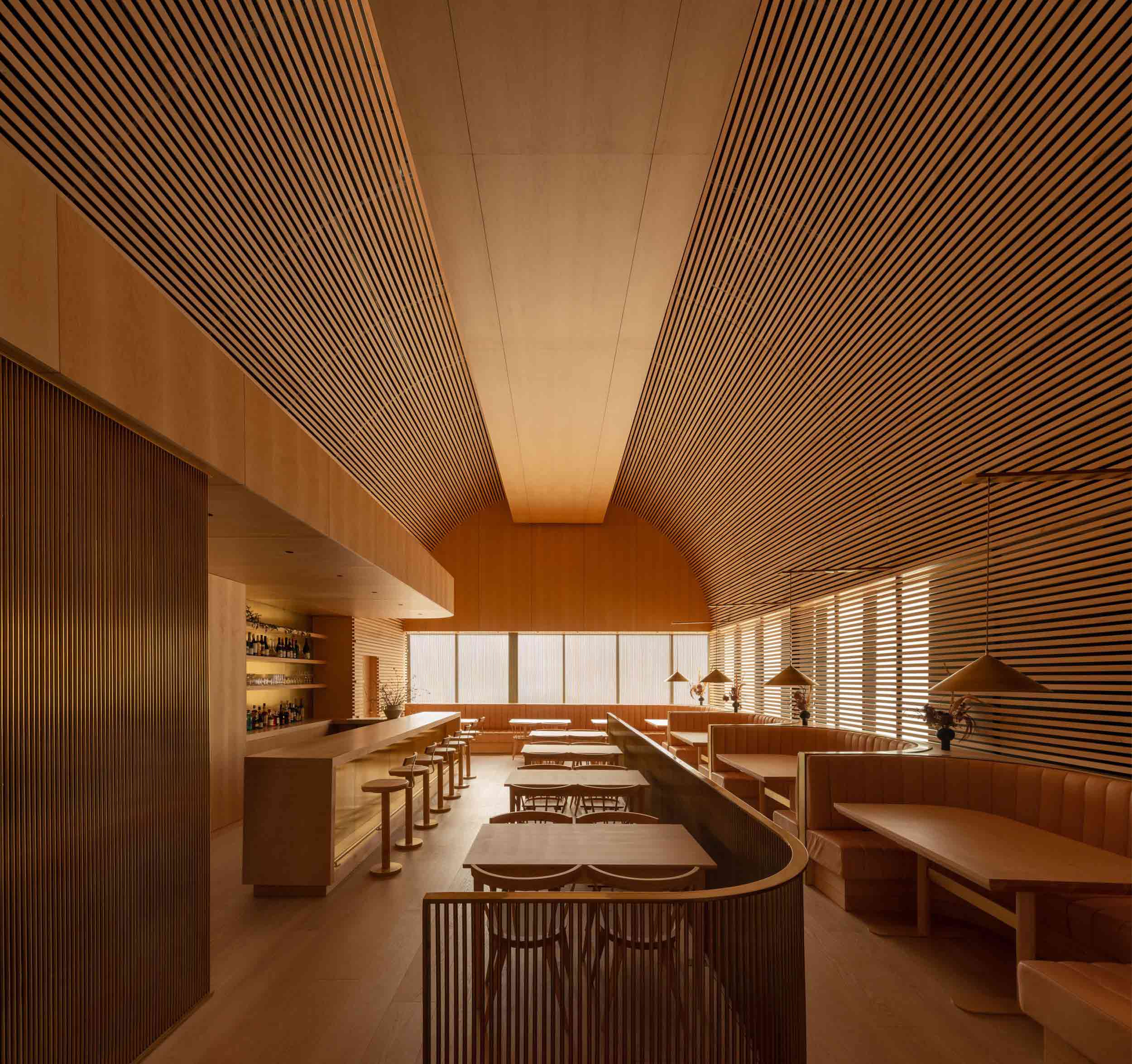
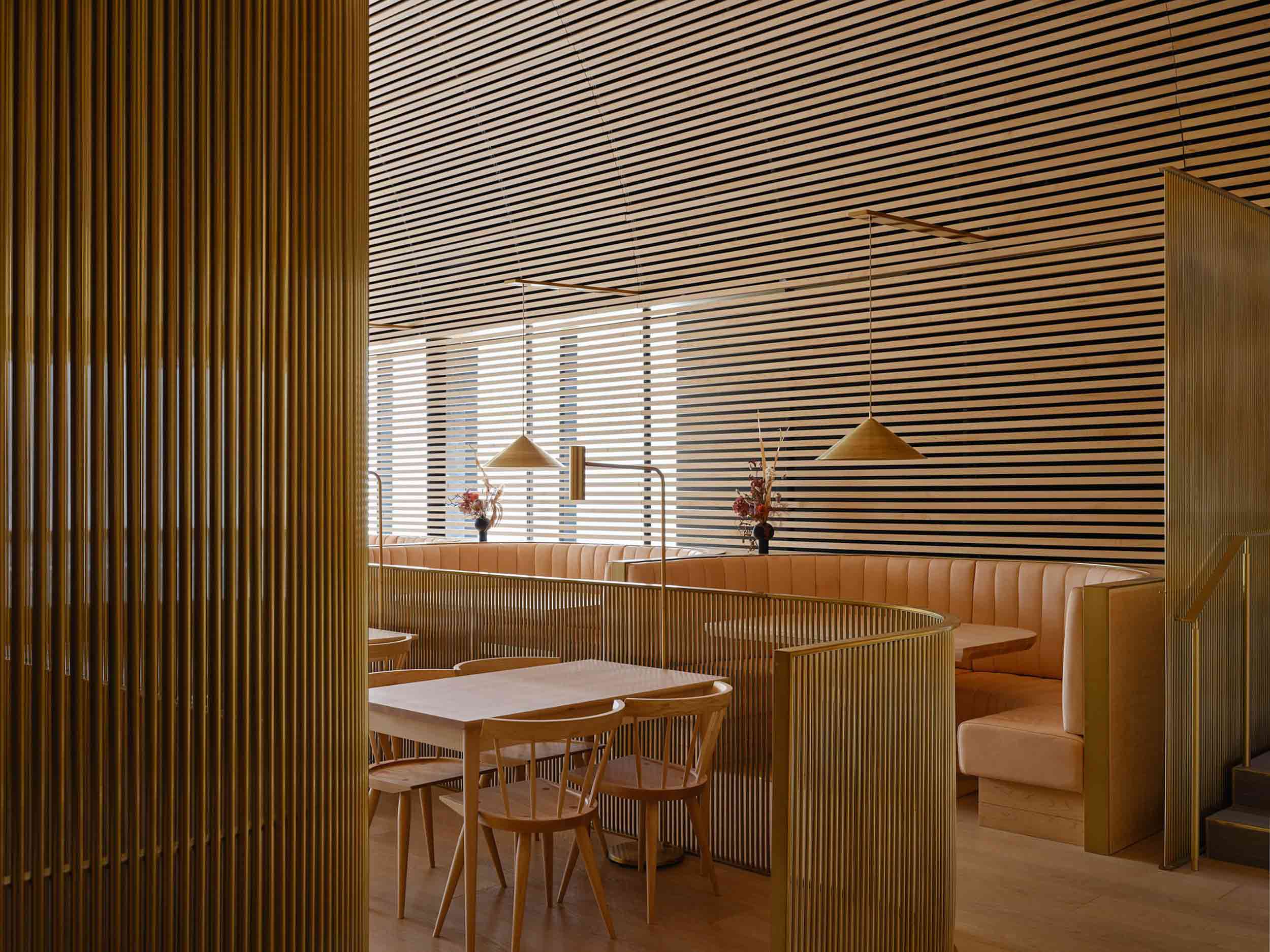 Bold in its monochrome execution, this Toronto restaurant was conceived as a mesmerizing timber cathedral. Rather than being shaped by the transient whims of interior trends, the architects opted for an evolving natural material palette that would patina and shift with the passage of time.
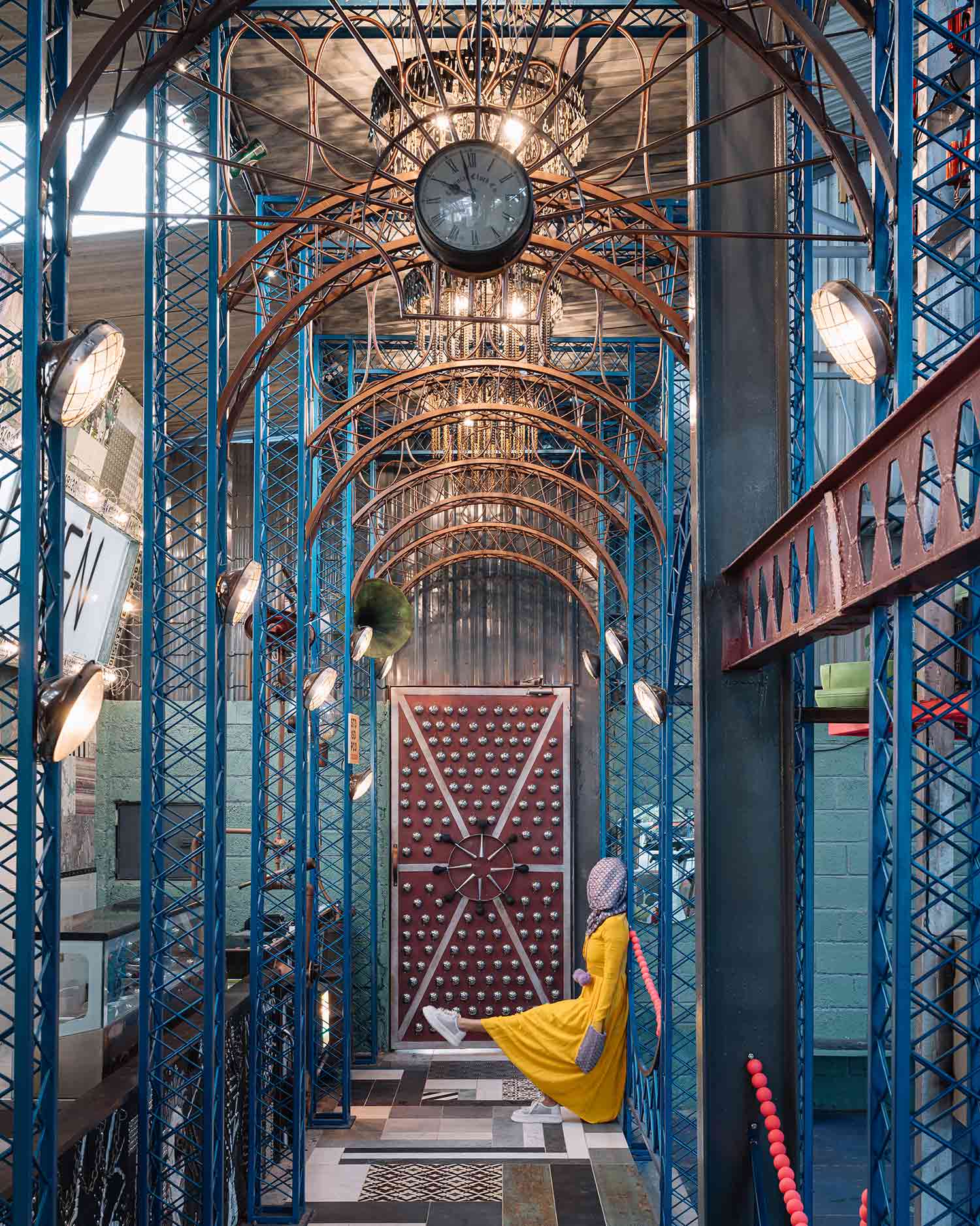
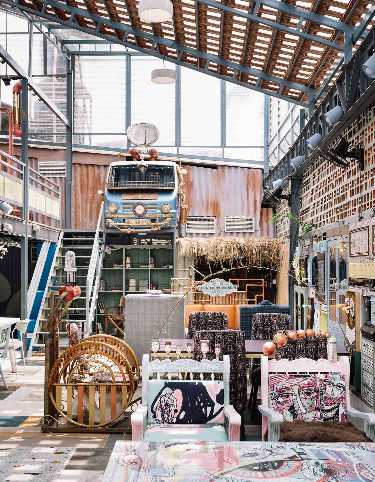 While many in the industry pay lip service to sustainability, this whimsical restaurant in Bangalore is a true celebration of reuse. 90% of its material fabric comprises recycled and salvaged elements, resulting in a playful, architectural patchwork of curios. Inspired by the spectacle of the circus, the entrance is framed by a ripple of teal arches crafted from scrap metal, while chandeliers shaped from bike chains and metal filings hang overhead.
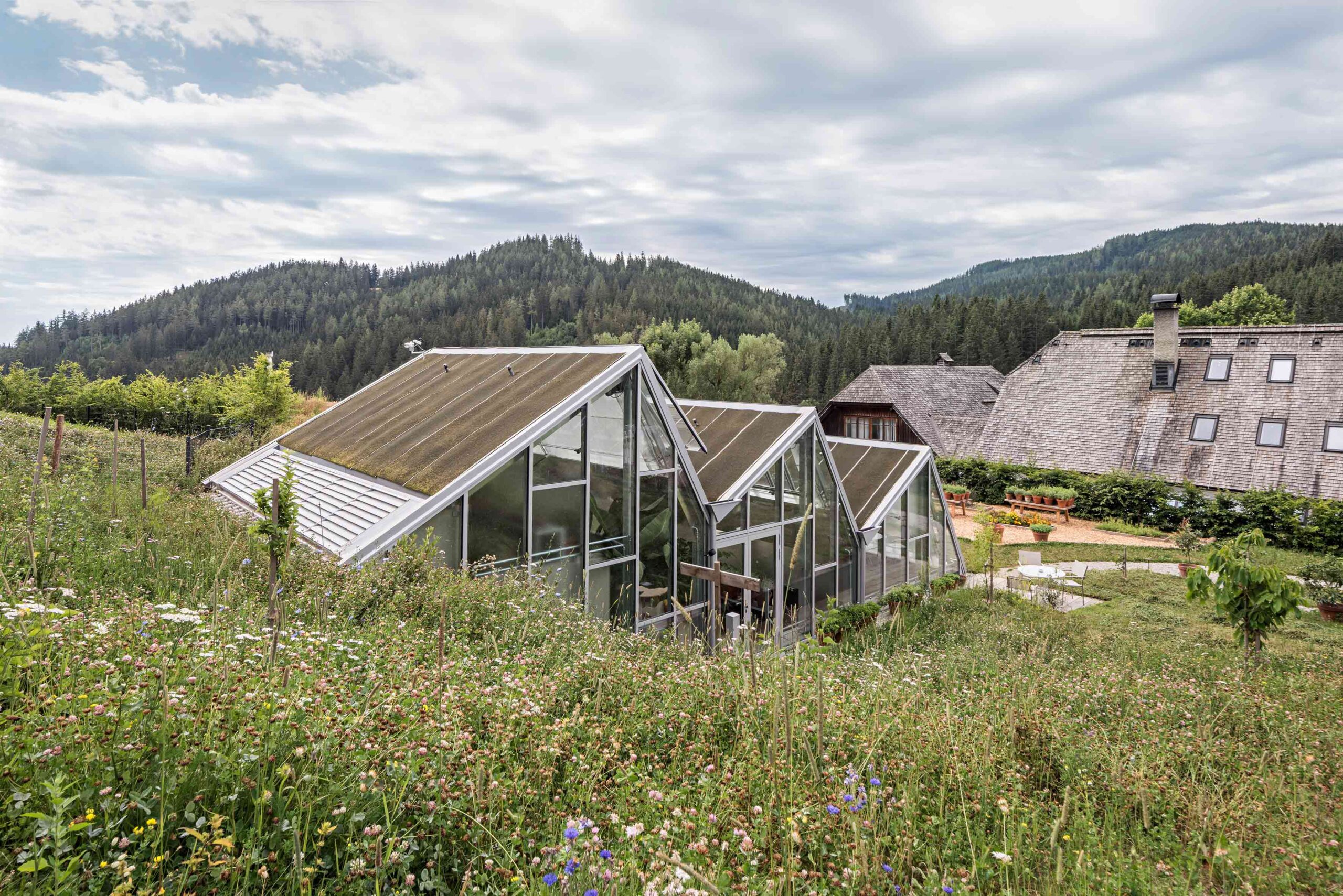
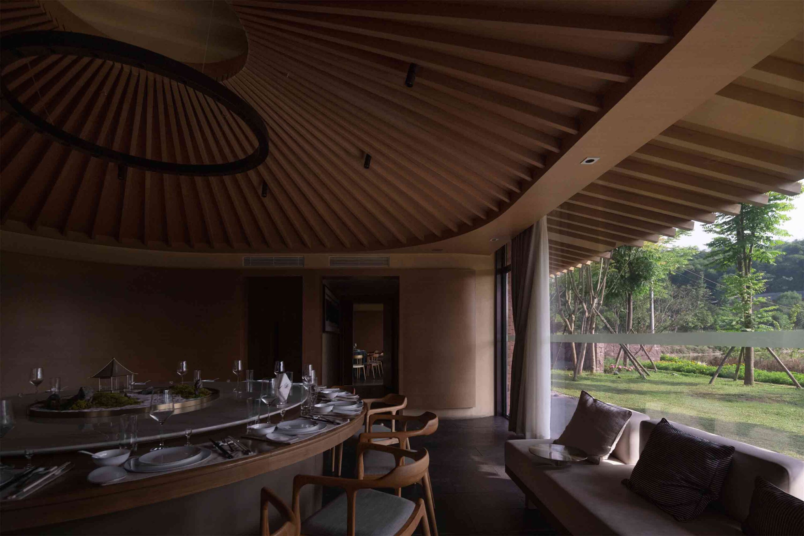
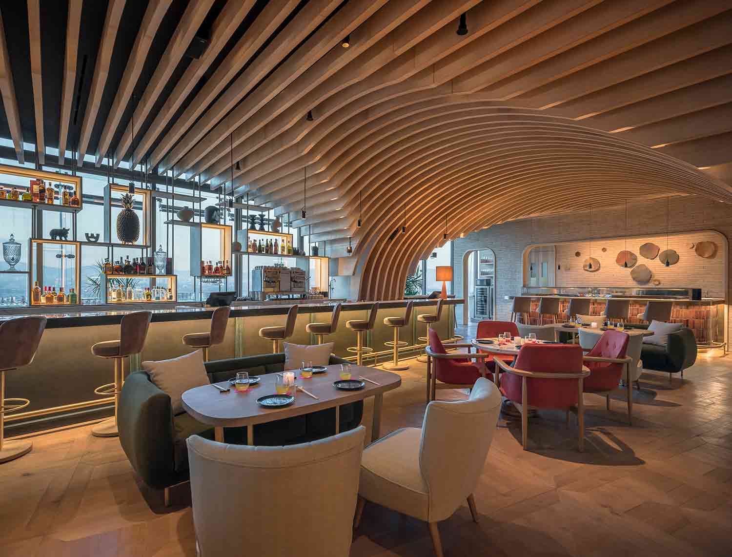
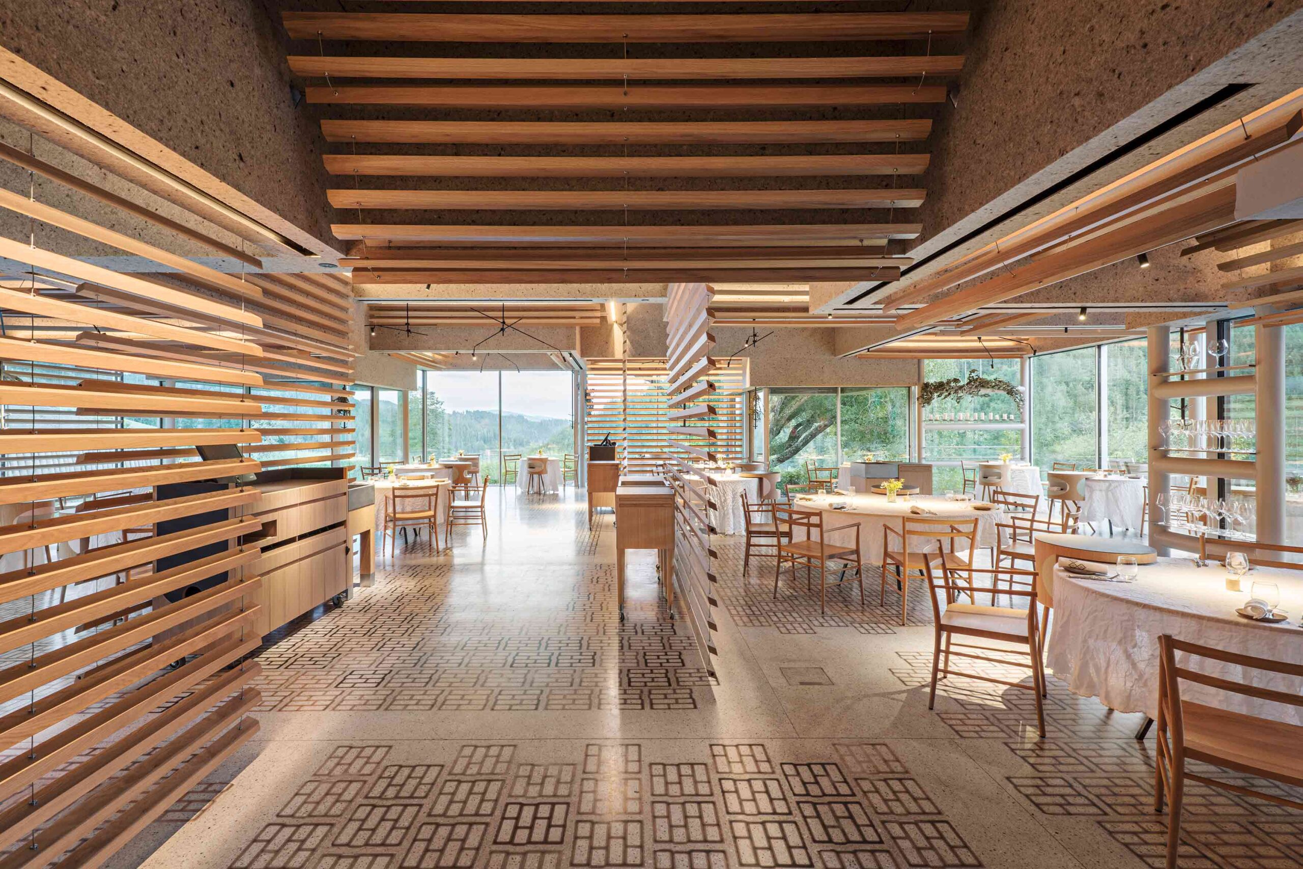 Sequestered in the Austrian Alps, this pioneering restaurant complex is rooted in its rural mountain locale. The various buildings, some old, some new, form a self-sufficient culinary village that encompasses dining areas, prep kitchens, staff zones, guest accommodation and a kitchen garden. Across the estate, the verdant landscape is never far from view. In one of the restaurants, swaths of glazing encircle the space. Slatted timber dividers create permeable divisions between tables, ensuring the breathtaking outlook takes center stage.
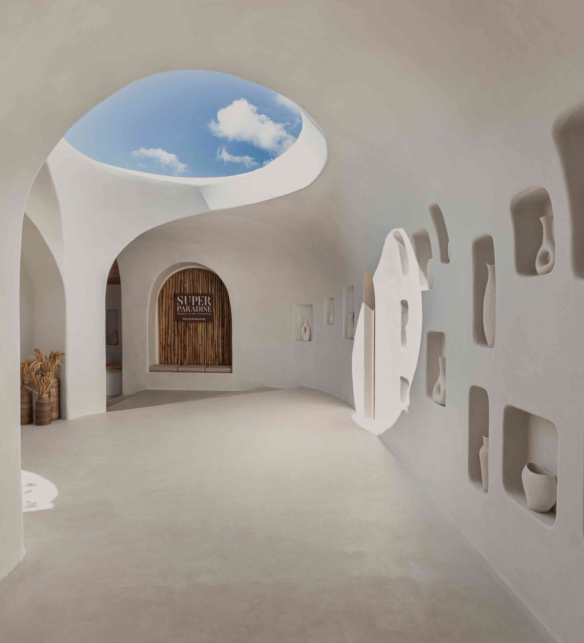
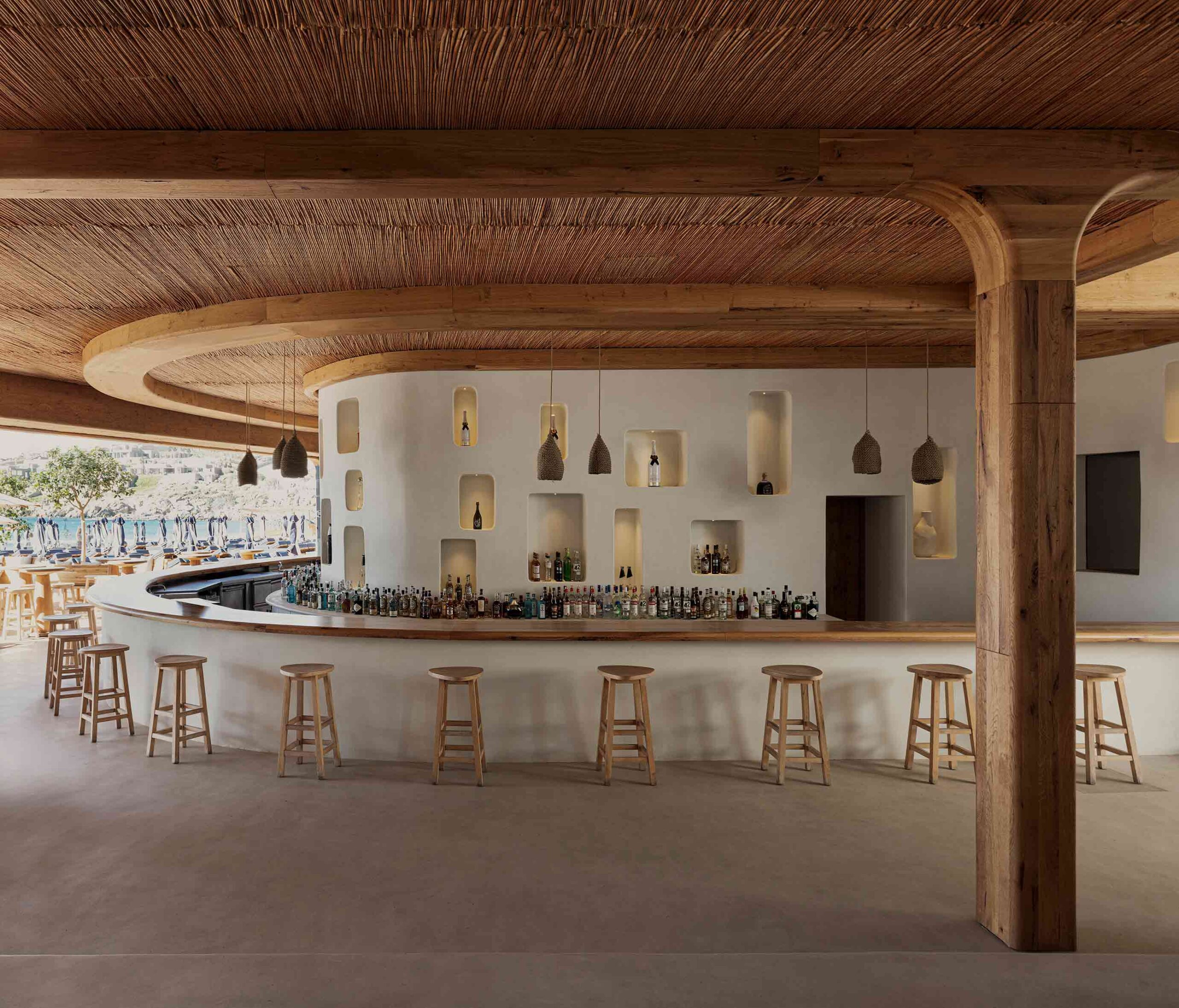 The artful revival of this historic beach bar on the Greek island of Mykonos has resulted in a fascinating collision of architectural languages. The unembellished whitewashed walls and rustic, traditional materials including wood and bamboo hark back to the Cycladic vernacular. Historic emblems play out across the scheme — hollows inset into the walls create display nooks around the bar and entryway.
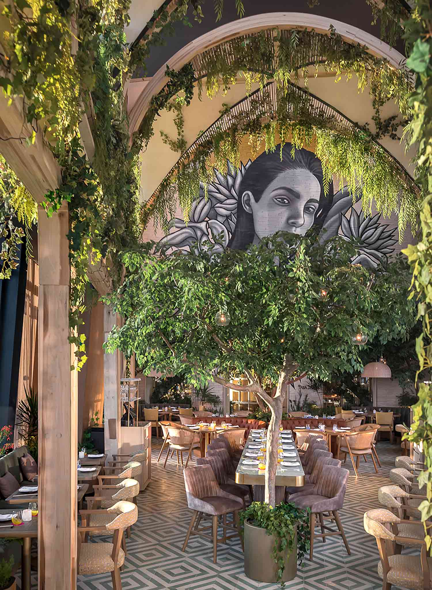
 Poised at the top of one of Mexico City’s highest skyscrapers, this extraordinary restaurant subverts expectations. Floating over the city, a flourishing garden unfurls, taking its design cues from the terraces and courtyards prevalent in Mexican architecture. In the triple-height dining zone, a lofty portico structure intertwined with greenery creates a biophilic cathedral of sorts.


 images ©
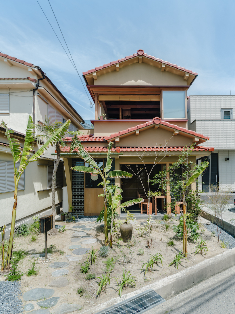
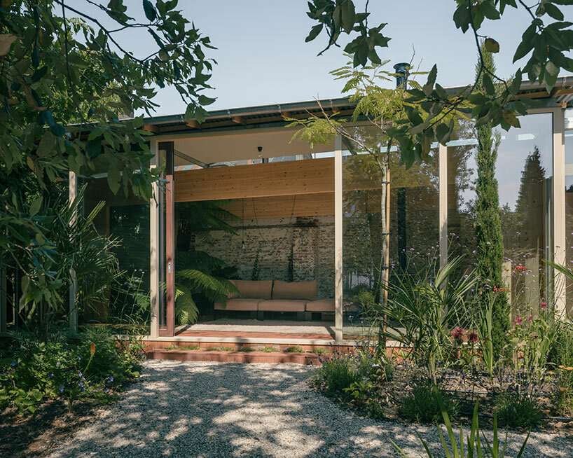
 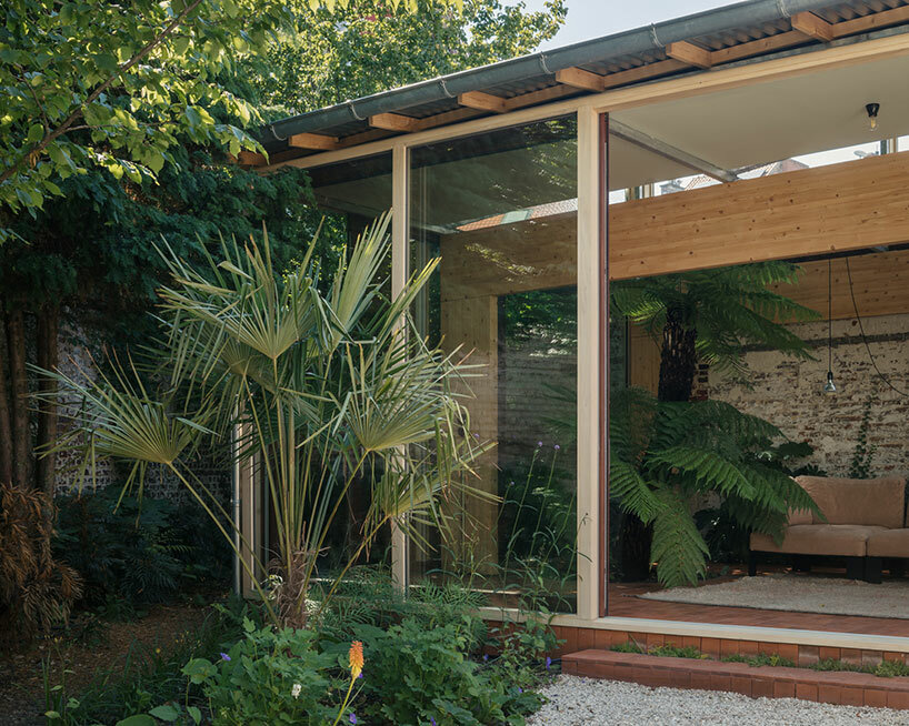 nature grows inside and out the residential renovation
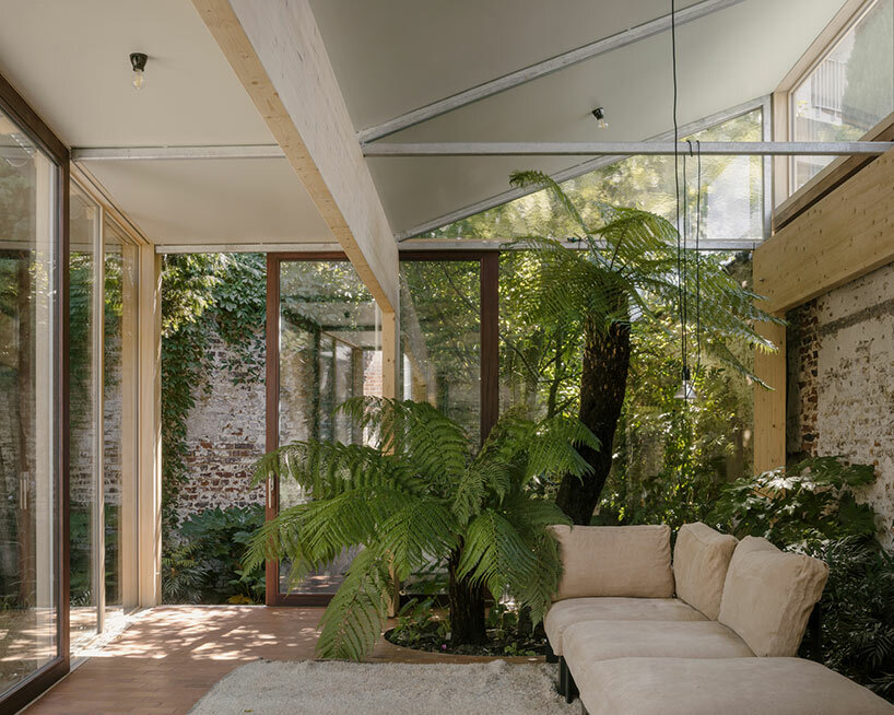
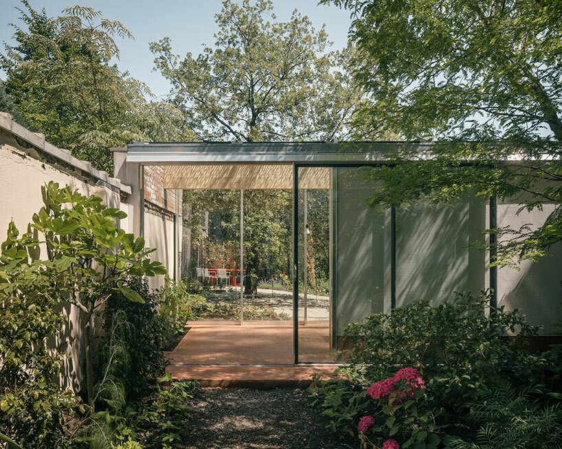
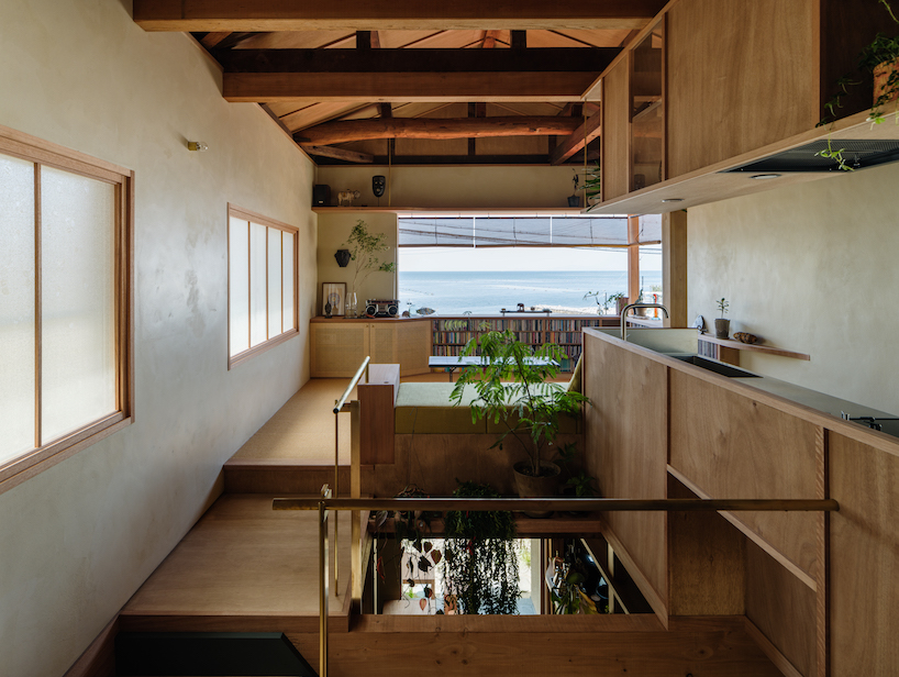
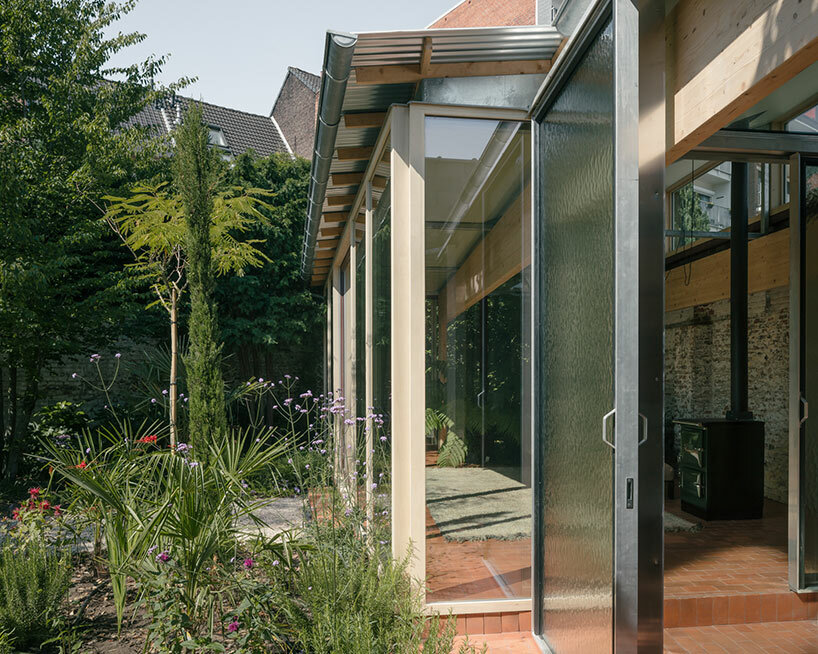 the once-cluttered industrial building is opened up with full-height glass walls