“Architects Are Bad at Business:” Here’s Why and What We Can Do About It
Evelyn Lee is the Head of Workplace Strategy and Innovation at Slack Technologies, founder of Practice of Architecture, and co-host of the podcast, Practice Disrupted. She will serve as the 101st President of the AIA in 2025.
Every architecture and design firm is a business first. It’s easy to forget while celebrating our design awards and the stories of our contributions to the communities where we live, work and play. But to pursue the work that brings us so much joy, it is, first and foremost, essential to have a profitable and agile business that continues to adapt to the changing nature of the economy.
Architects aren’t necessarily known for being good at business or even enjoying having conversations on business operations. We would rather spend our time talking about the projects, the impact of the design, the materials that went into them, and the changes made within the project delivery process to make it so successful.
But the phrase, “Architects are bad at business,” has become a crutch, if not an excuse, to continue to be bad at business and avoid the conversation altogether.
So why are we this way?
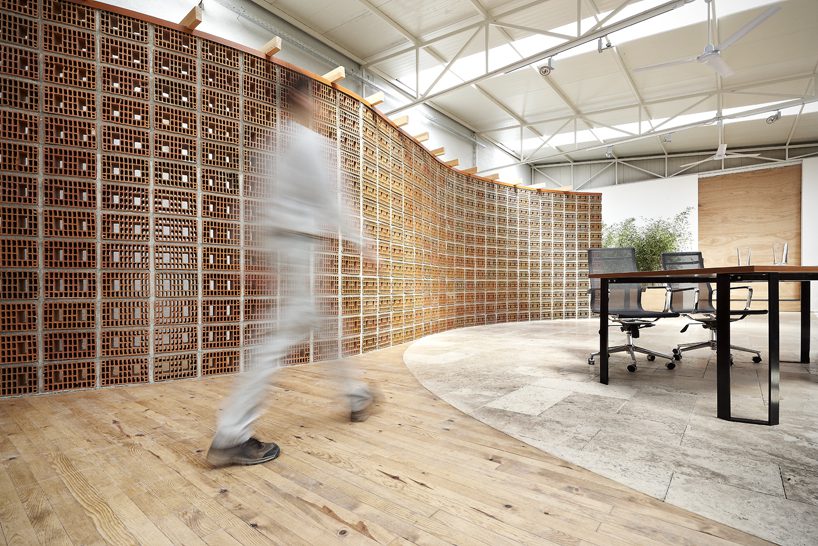
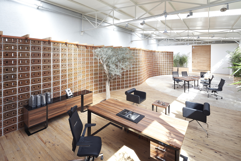
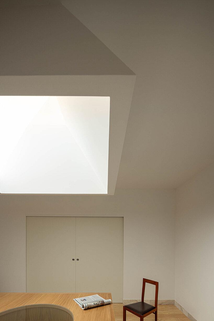
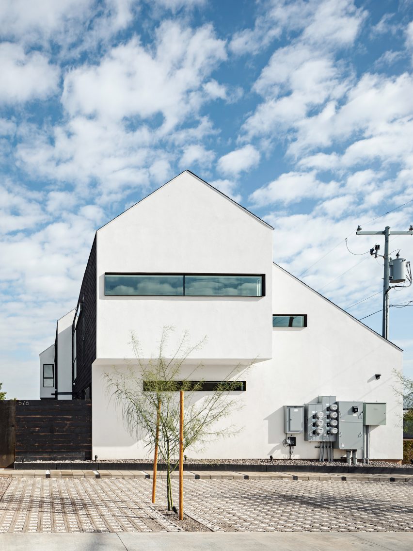
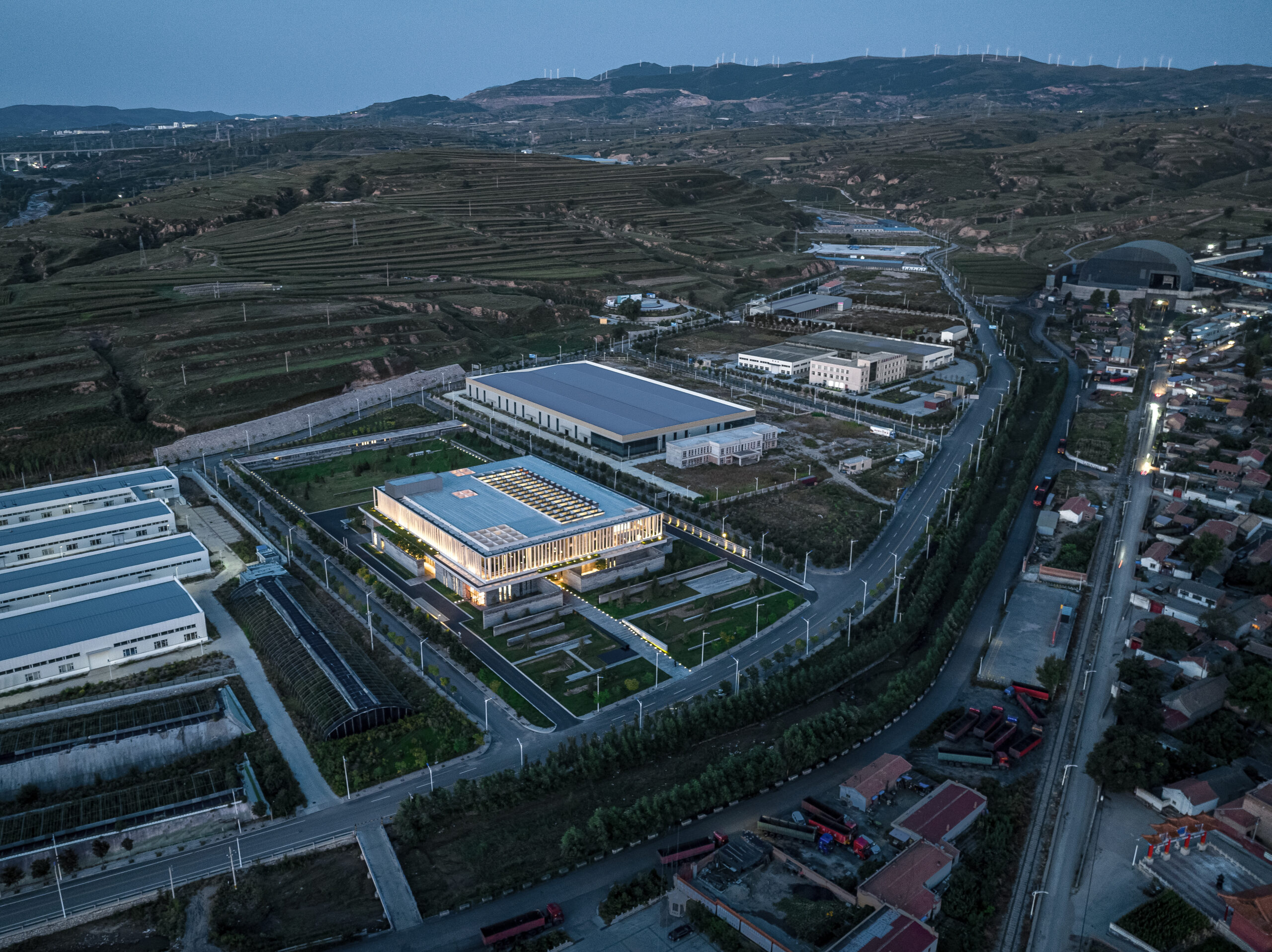
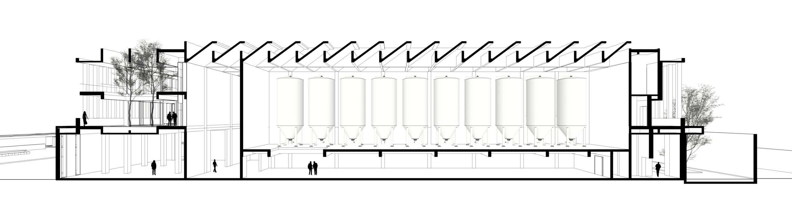
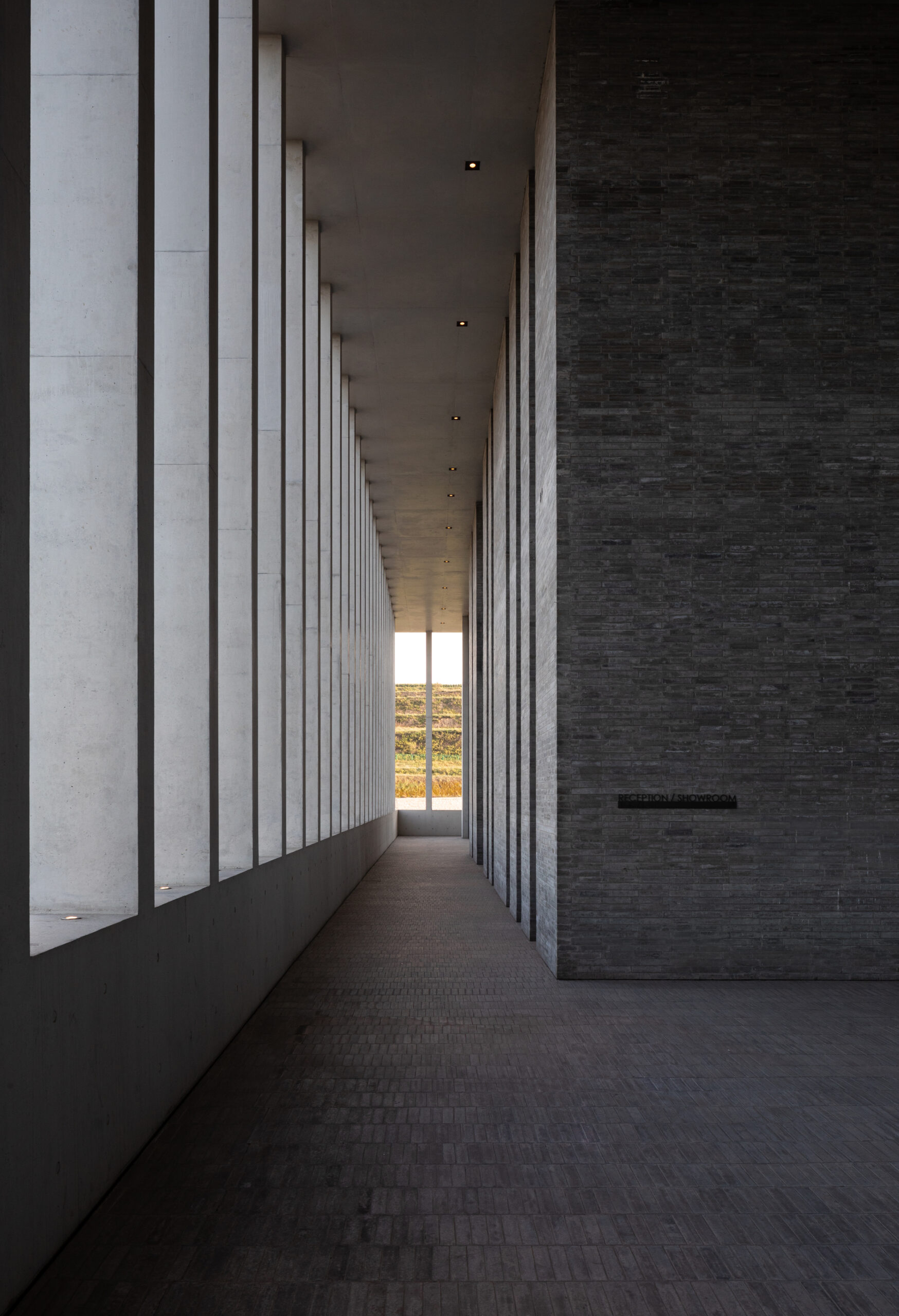
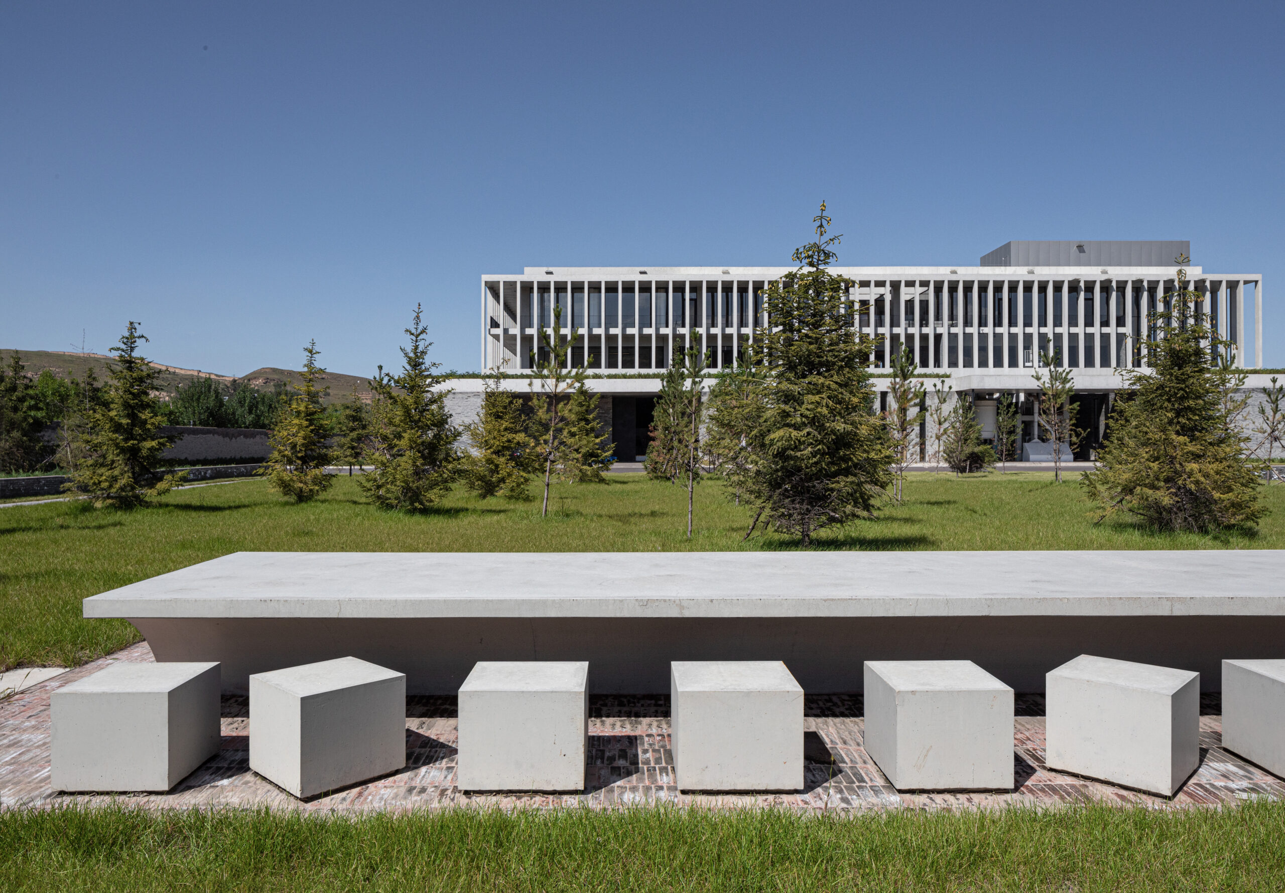
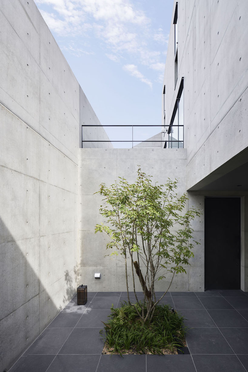
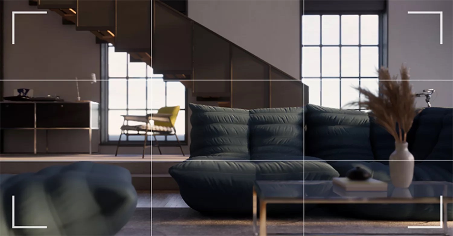
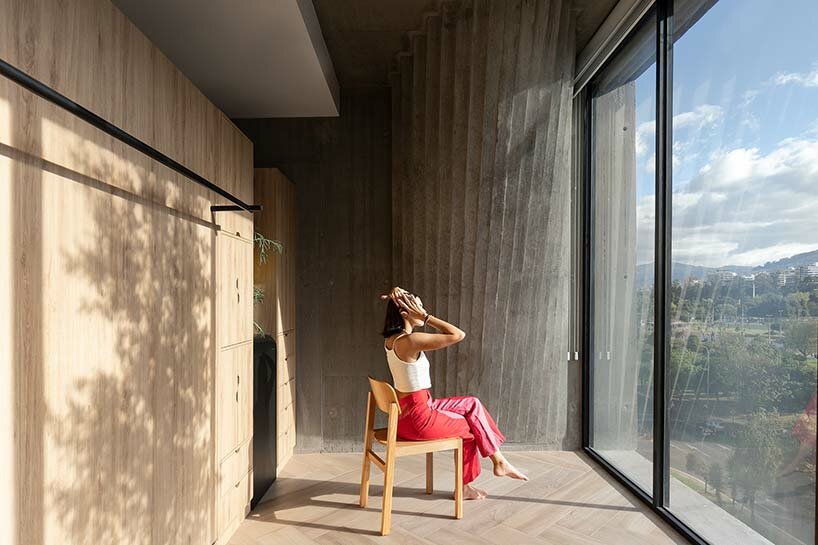
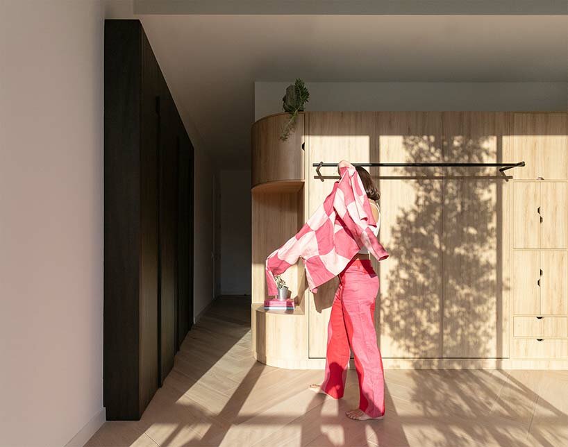
OrfiSera by YERCE ARCHITECTURE
Architects are often more focused on the creative aspects of their work rather than business ones.
The problem with focusing only on creativity often means losing focus on things like project management. This means we spend so much time focused on only one aspect of the business, but businesses are systems, and every aspect of the system needs attention to be successful.
Architects are not trained in business practices.
Anyone who went through an accredited degree program could tell you that the one-hour seminar on professional practice taught students more about avoiding lawsuits while practicing than it did about running a business effectively. And even if it was the class was more broadly focused, there’s too much to learn in a single class to be effective.
What’s more, the ongoing education of individuals, once in practice, is often more focused on project work and does not extend beyond that.
Architects are often reluctant to change.
In today’s rapidly changing business environment, it is more important than ever for businesses to be agile. Agility is the ability to adapt quickly to change, and it is essential for businesses that want to stay ahead of the competition (especially the growing competition coming from outside the profession). However, architects, no matter how innovative we are with our projects, are otherwise stuck in our ways and resistant to change.
Good business operations require continuous improvement, and it not only takes a change mindset but a commitment of resources, both time and money, to examine what is and isn’t working.
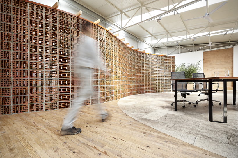
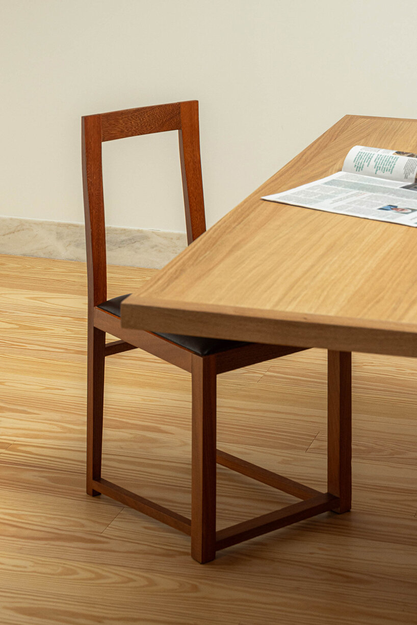
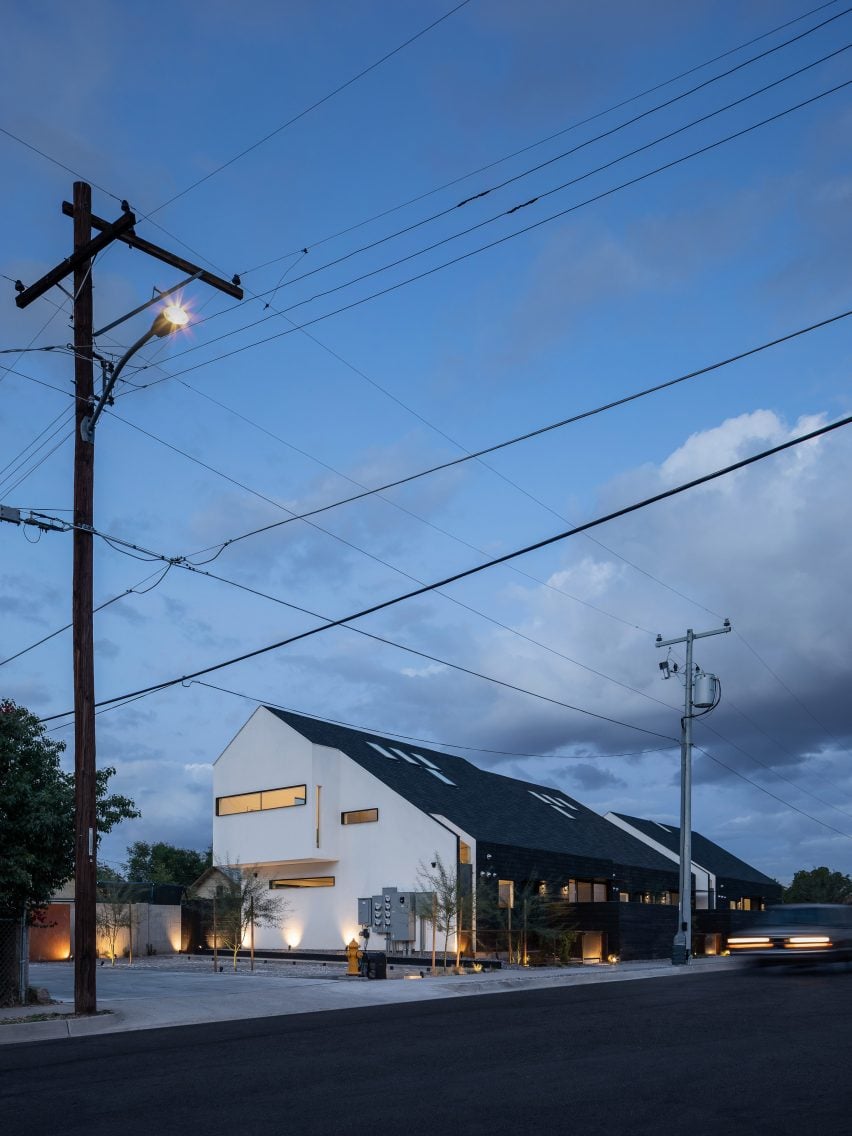
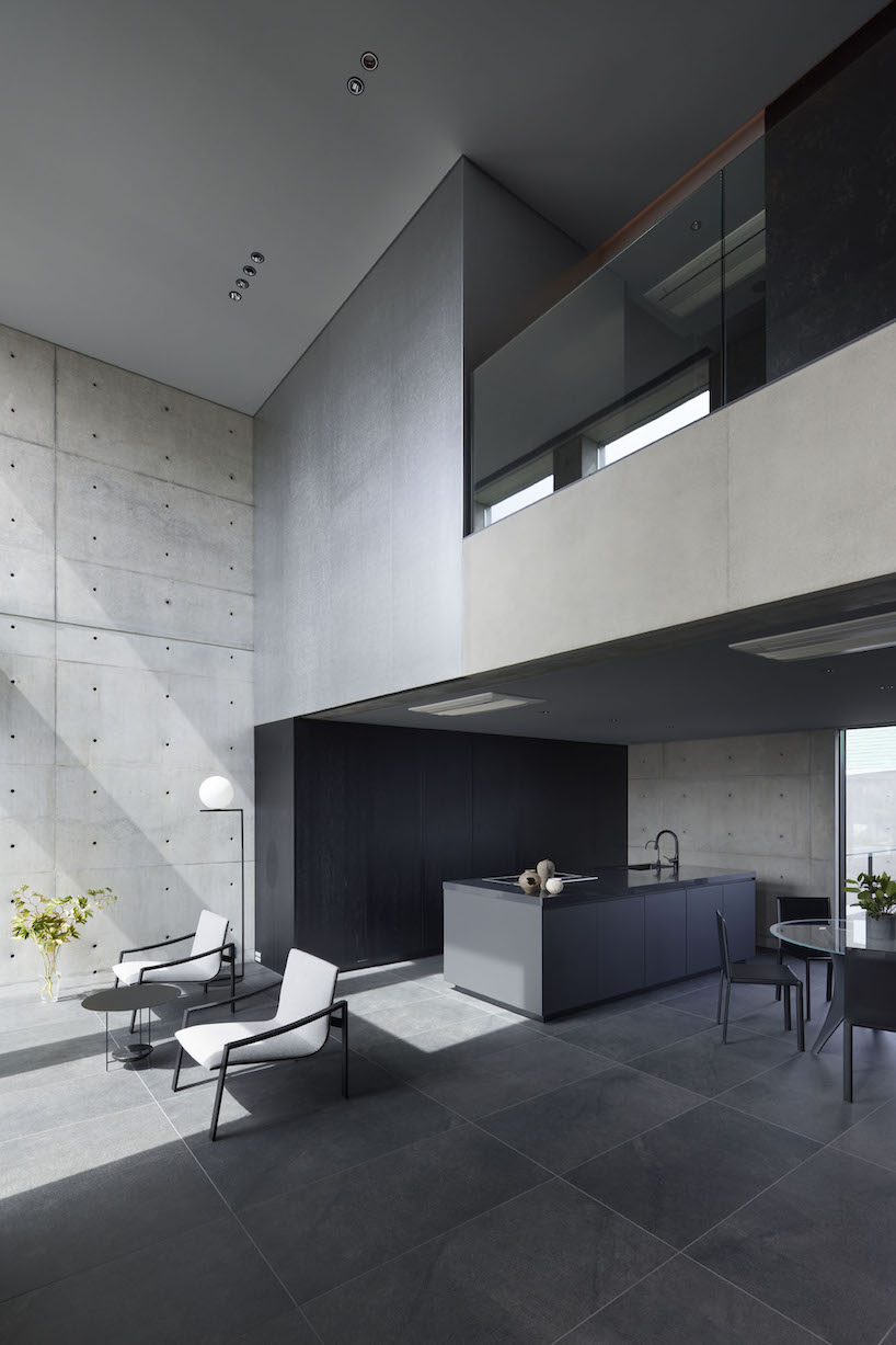
OrfiSera by YERCE ARCHITECTURE
Architects are not good at selling their services.
How often have you heard an architect say, “The work speaks for itself.” Sure, there was a time when architects were discouraged from advertising their services (from the late 1800s to the early 1960s), but even with advertising being off the table, there are many different ways to sell services that most architects are not using.
Architects don’t like to ask for help.
While it’s easy for us to be good at what we are good at, it’s often harder for us to realize what we are not good at and, more importantly, to not stand in the way of letting other experts do their thing. I don’t know how often I’ve heard an architect say about a business operations consultant, “They just don’t understand what we do and how we do it.”
In many ways, we make ourselves out to be so unique that we get it in our heads that no one else can understand what it is we do and how we do it. We then put it on ourselves to do everything, and in essence, nothing more gets accomplished.
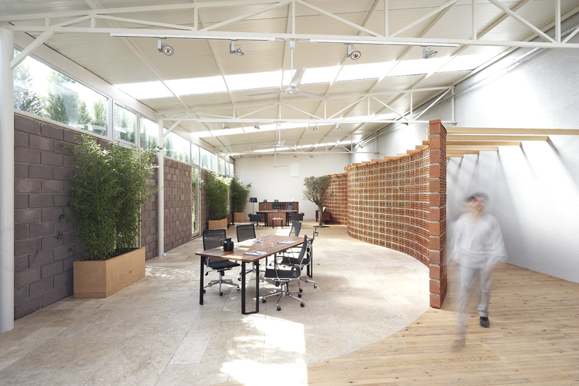
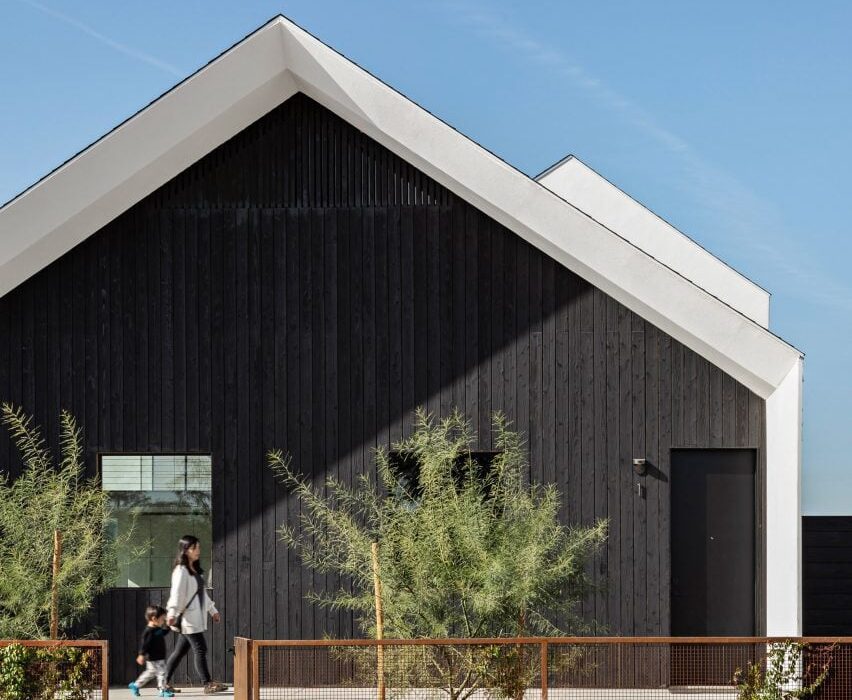
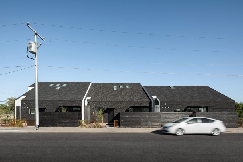
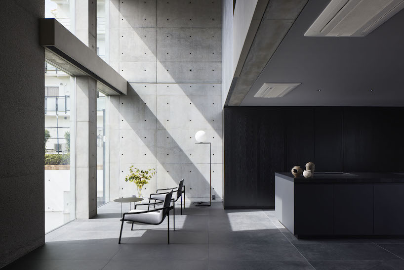
OrfiSera by YERCE ARCHITECTURE
So what can better business operations do for our architecture and design firms? There are many benefits, including:
- Better communication and collaboration: Well-designed business operations can improve communication and collaboration within an architecture or design firm. This can lead to faster decision-making, better problem-solving and more efficient use of resources.
- Streamlined processes: By streamlining processes, firms can reduce the amount of time and effort it takes to complete tasks. This can lead to increased efficiency and productivity.
- Automated tasks: By automating tasks, firms can free up their staff to focus on more strategic and creative work. This can lead to increased efficiency and profitability.
- Better use of technology: By using technology effectively, firms can improve their efficiency and productivity. This can include using project management software, cloud-based collaboration tools, and other technology solutions.
- A focus on continuous improvement: By focusing on continuous improvement, firms can identify and implement changes that will make their business more efficient. This can lead to a sustainable competitive advantage.
In addition to the benefits above, better business operations can also help architecture and design firms to:
- Attract and retain top talent
- Increase customer satisfaction
- Improve profitability
- Expand into new markets
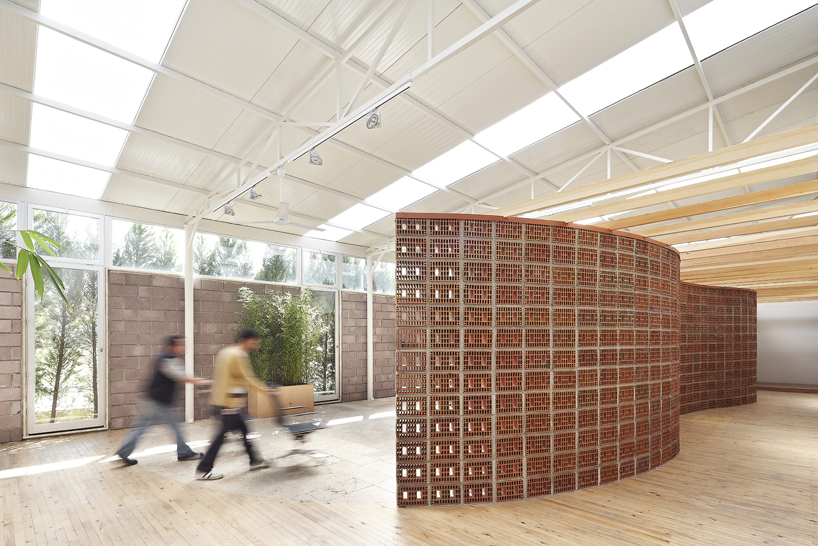
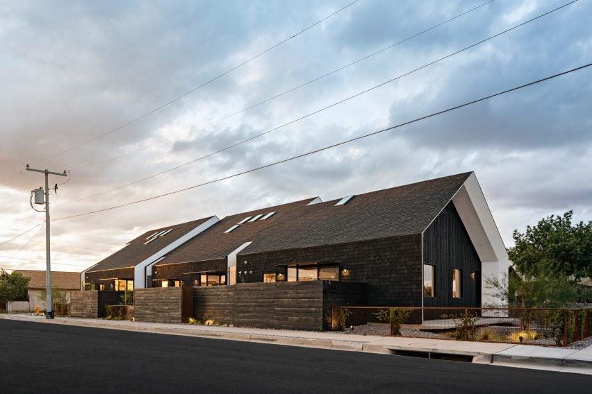
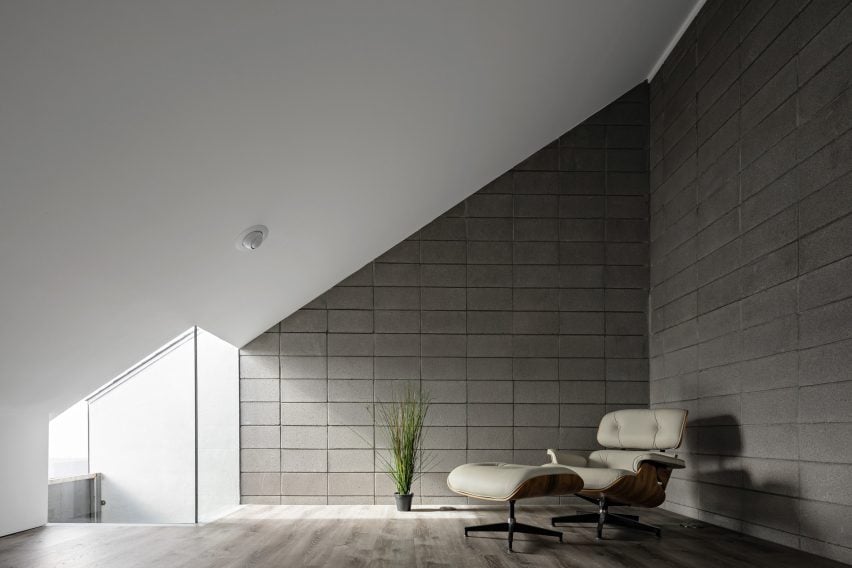
OrfiSera by YERCE ARCHITECTURE
Design thinking has taken hold in many different areas, and architects often share their desire to own the space. I think there’s an opportunity to raise our value there, but to showcase what we can do, we first have to start with what we can do within our firms.
Stay tuned for our upcoming articles offering specific guidance and steps to design and implement better business operations.
In the meantime, we encourage you to download Practice of Architect’s Agile Practice Resource. This free living resource is designed to equip you with the knowledge and tools necessary to bring more agility to your practice.
Architects: Want to have your project featured? Showcase your work through Architizer and sign up for our inspirational newsletters.


 3. Customize your project materials.
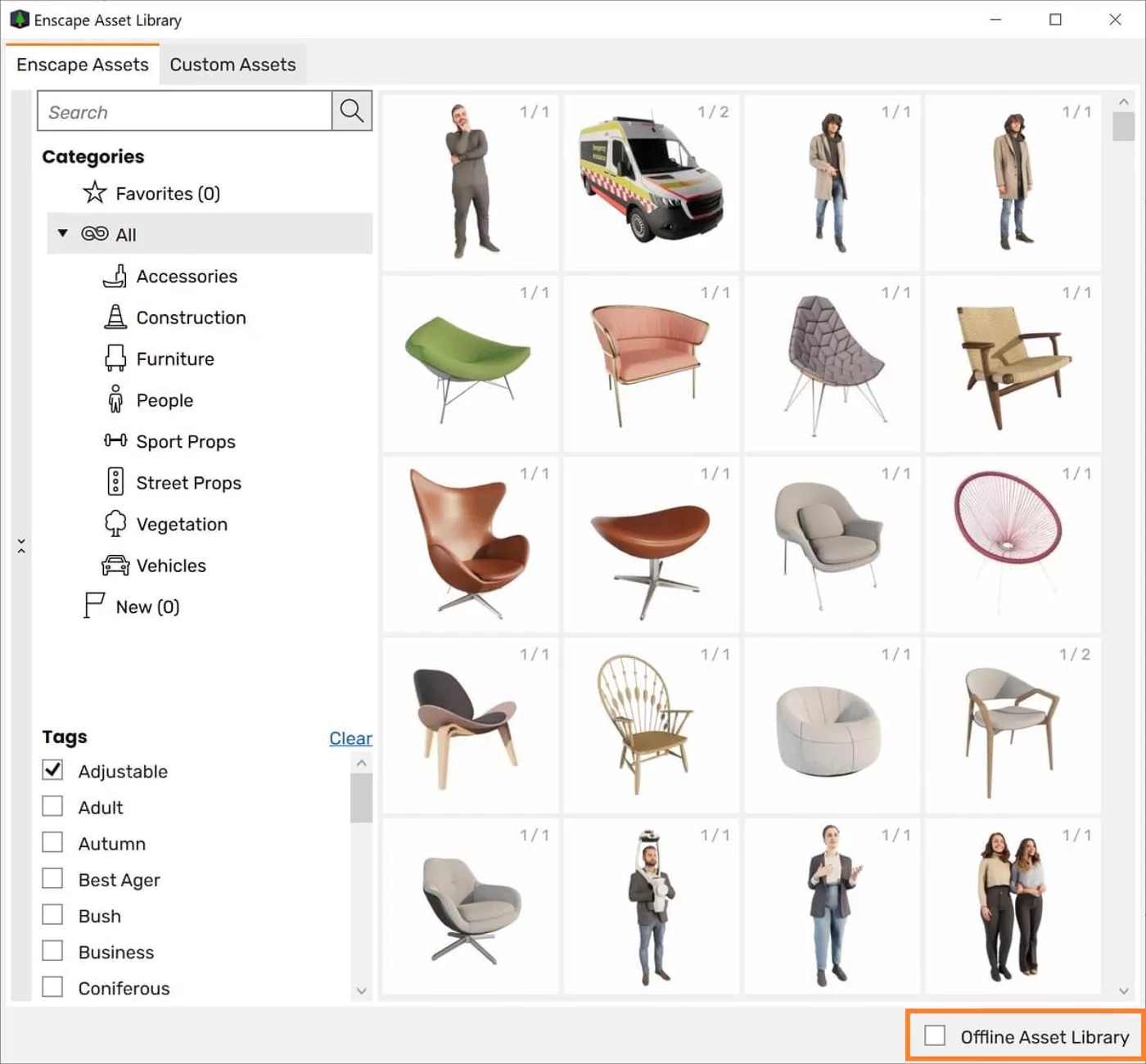 5. Fine-tune in post-production.
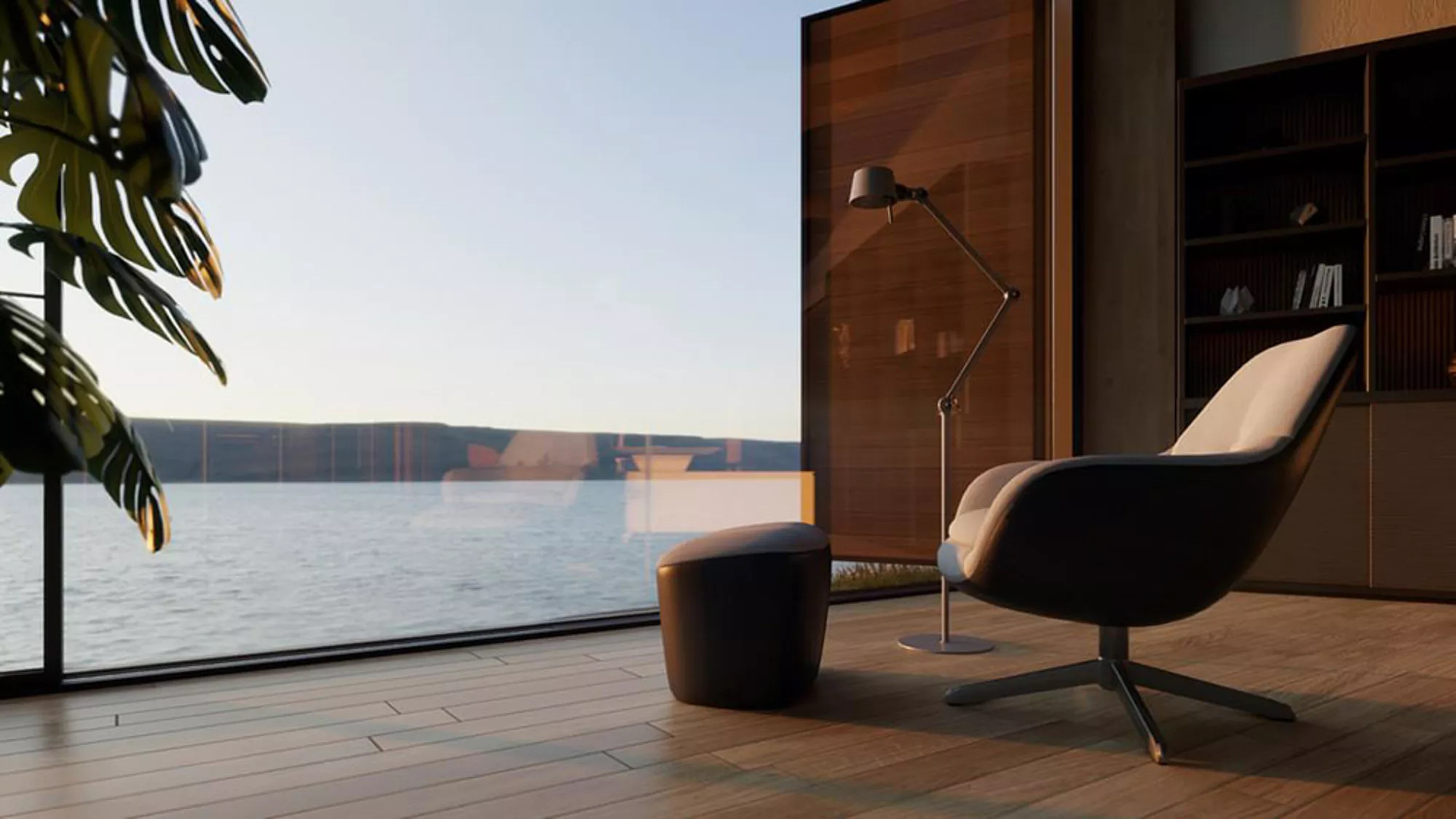
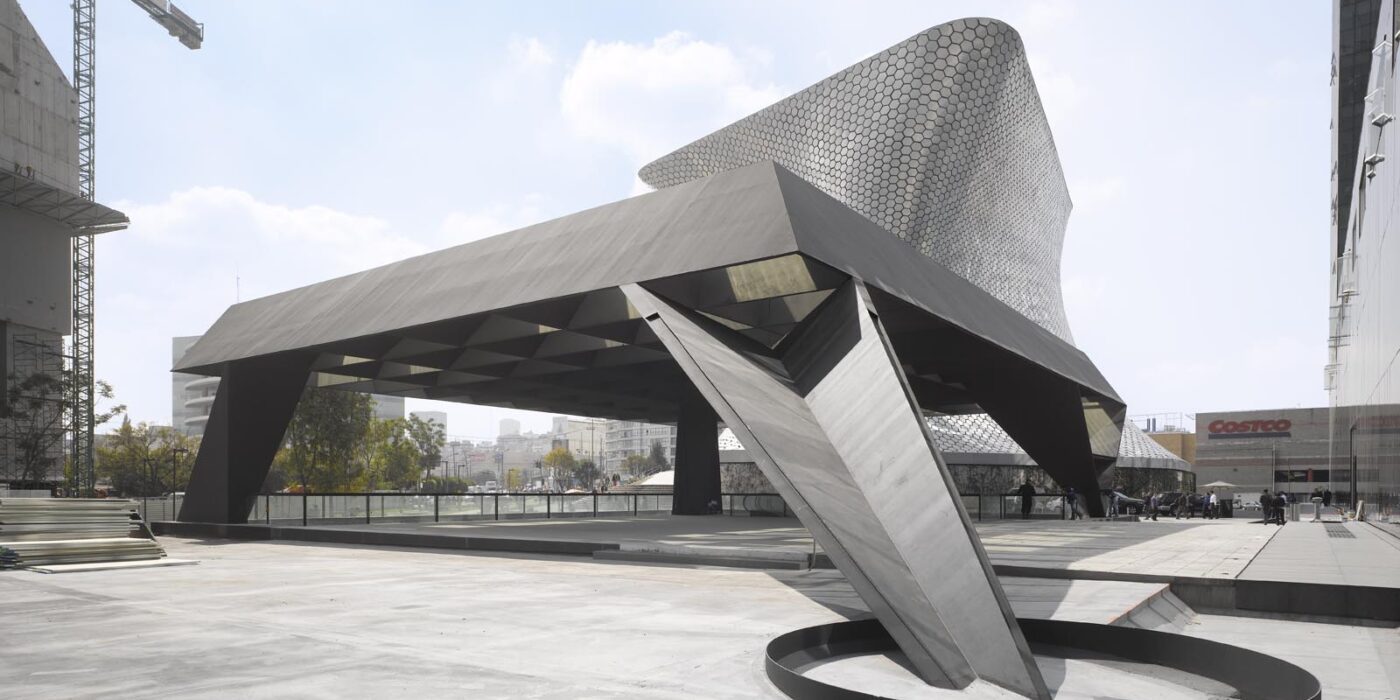
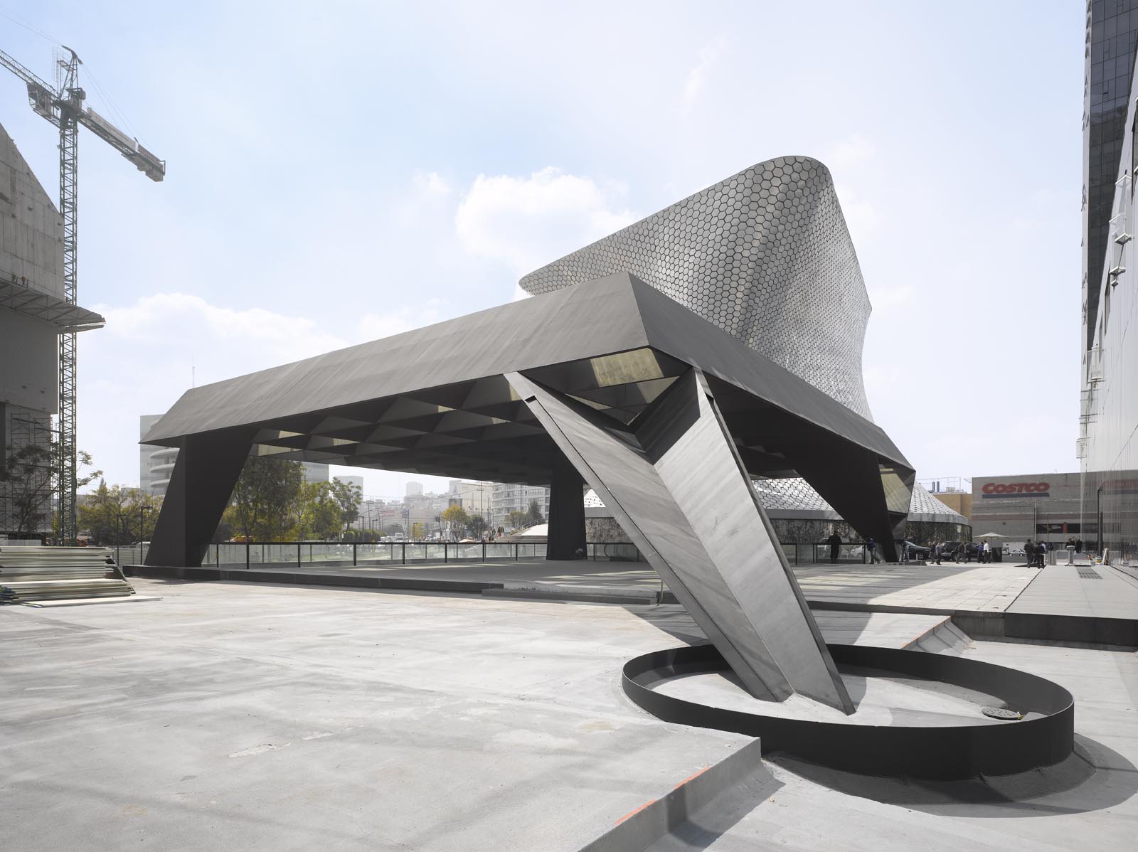
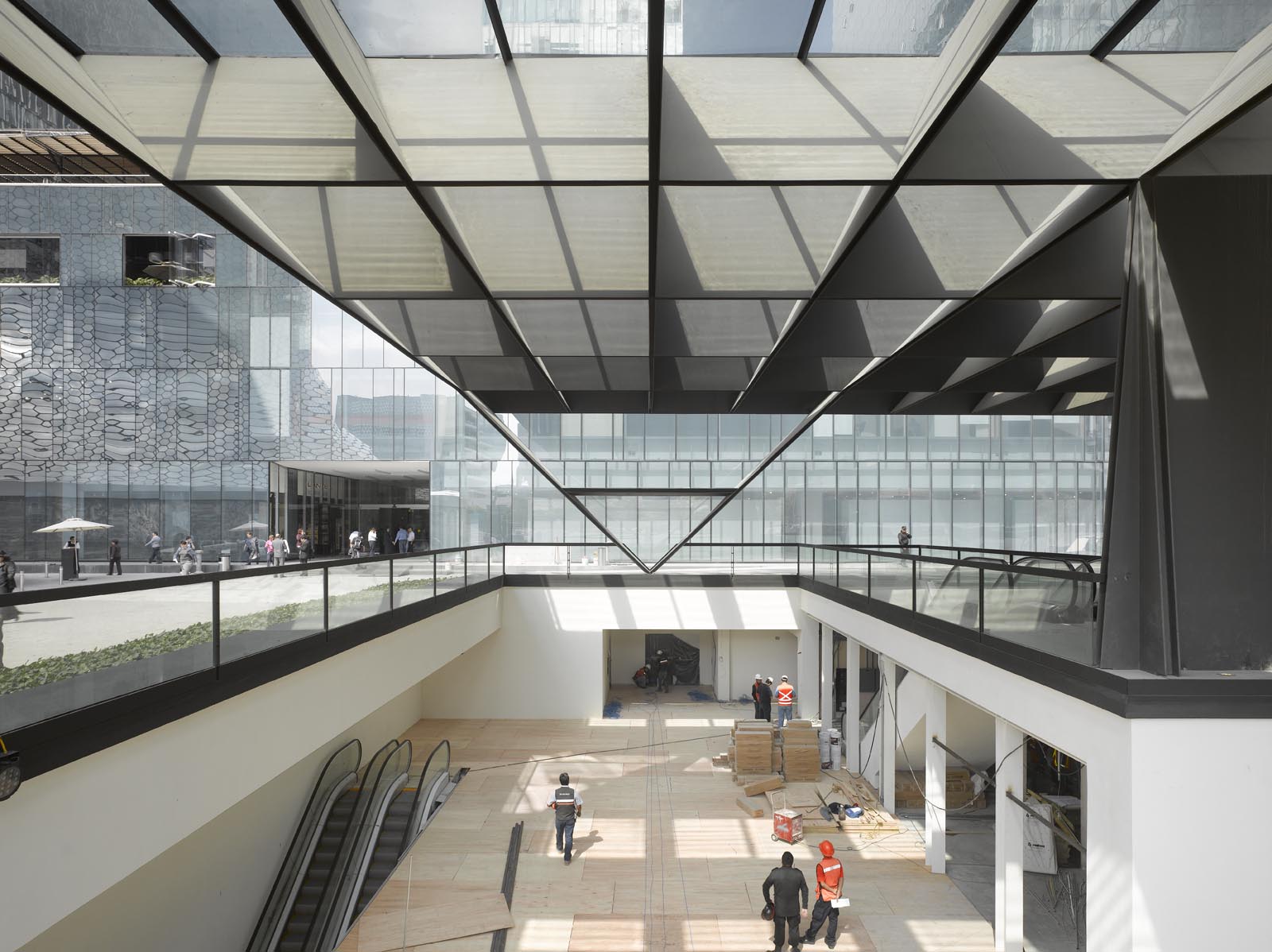
 Ensamble’s design for the Telcel Theater was buried underground with a large metallic structure lifted from ground level. This creates a dramatic open-air volume that rises above and below the ground. The structure above appears as a stone of air, supported by the space that comes from a sequence of excavated terraces. Below, the excavated spaces are given to the public and open to the sky, protected by the symbolic metal structure.
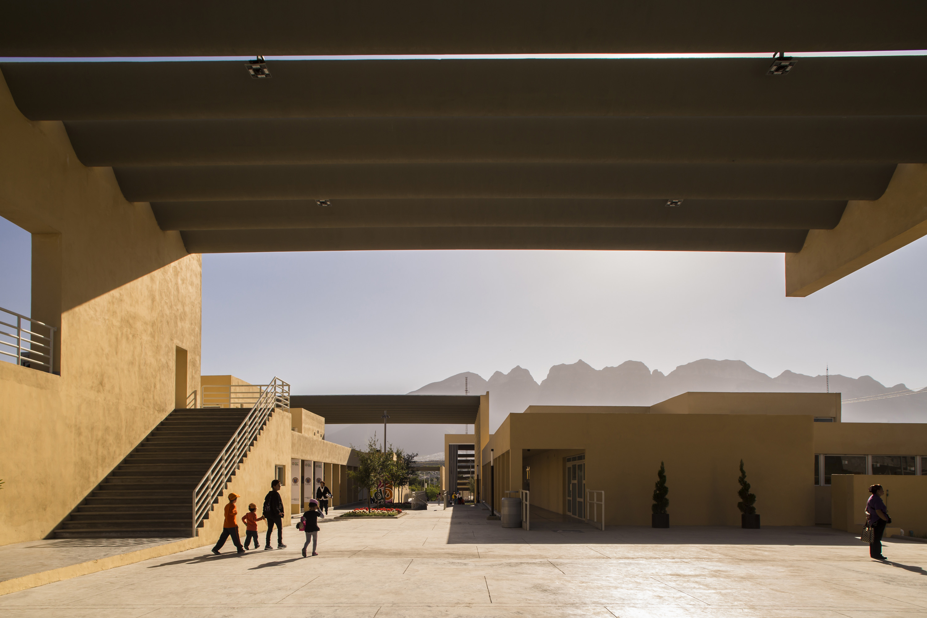
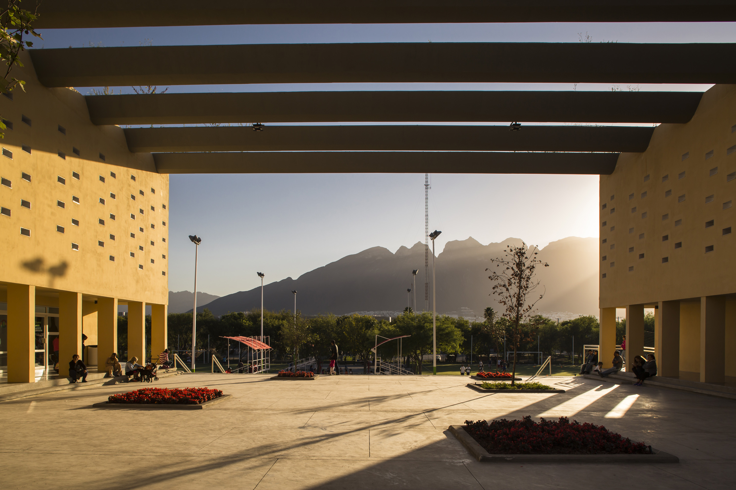
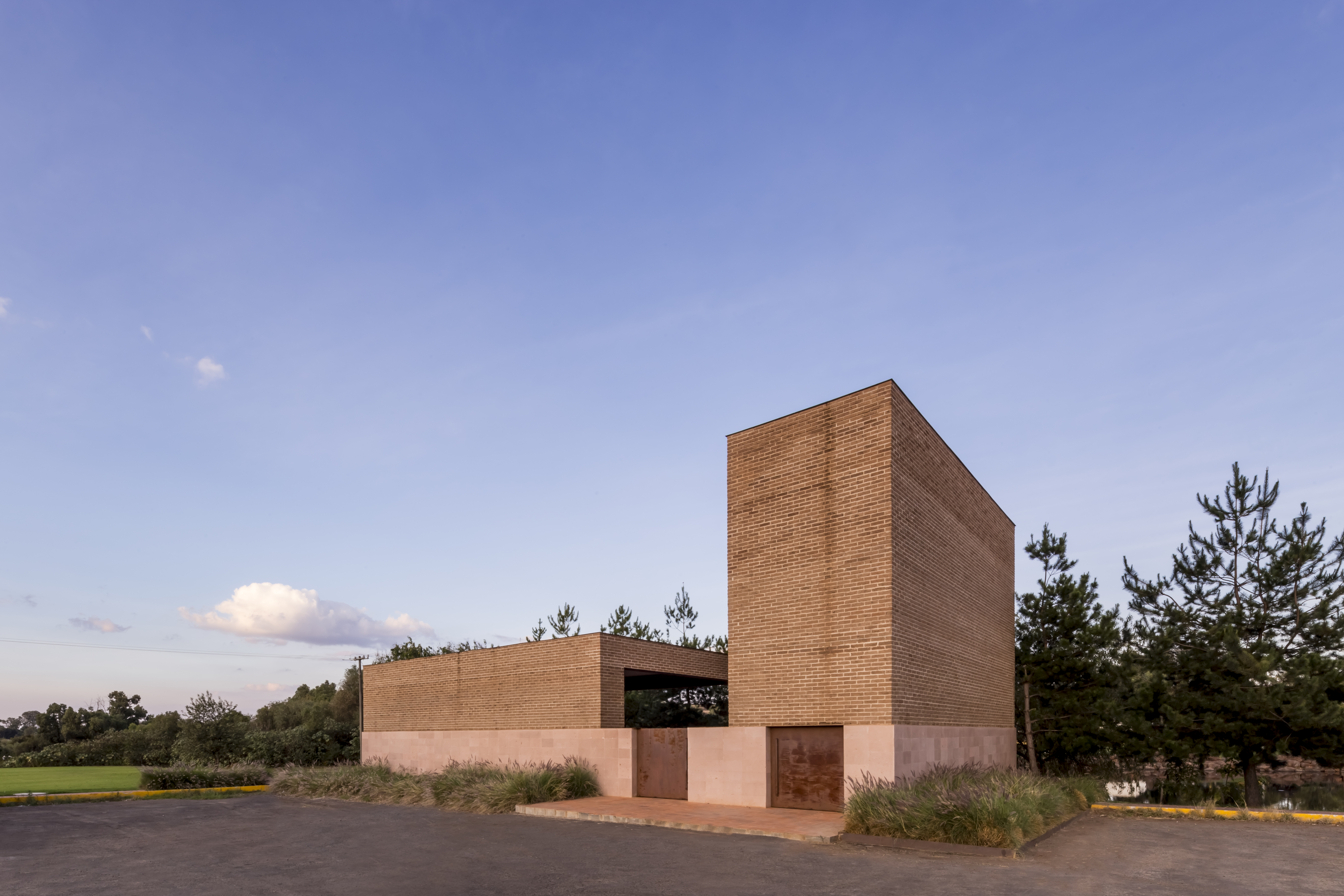
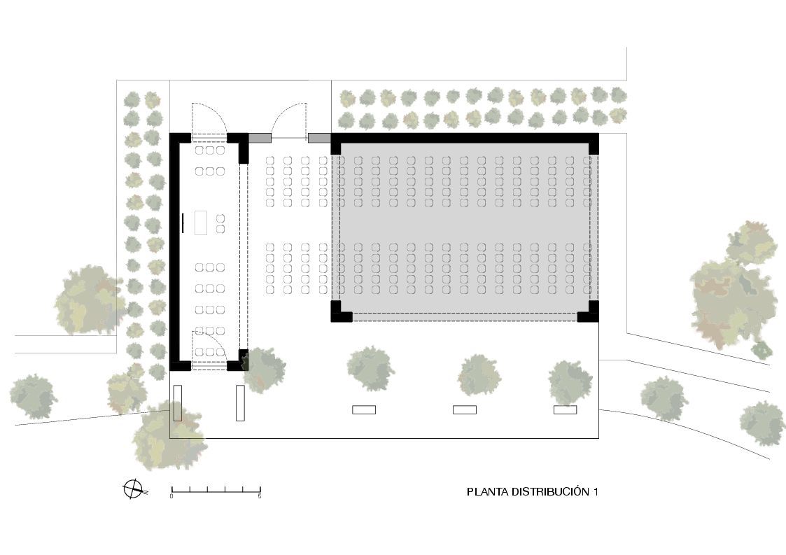
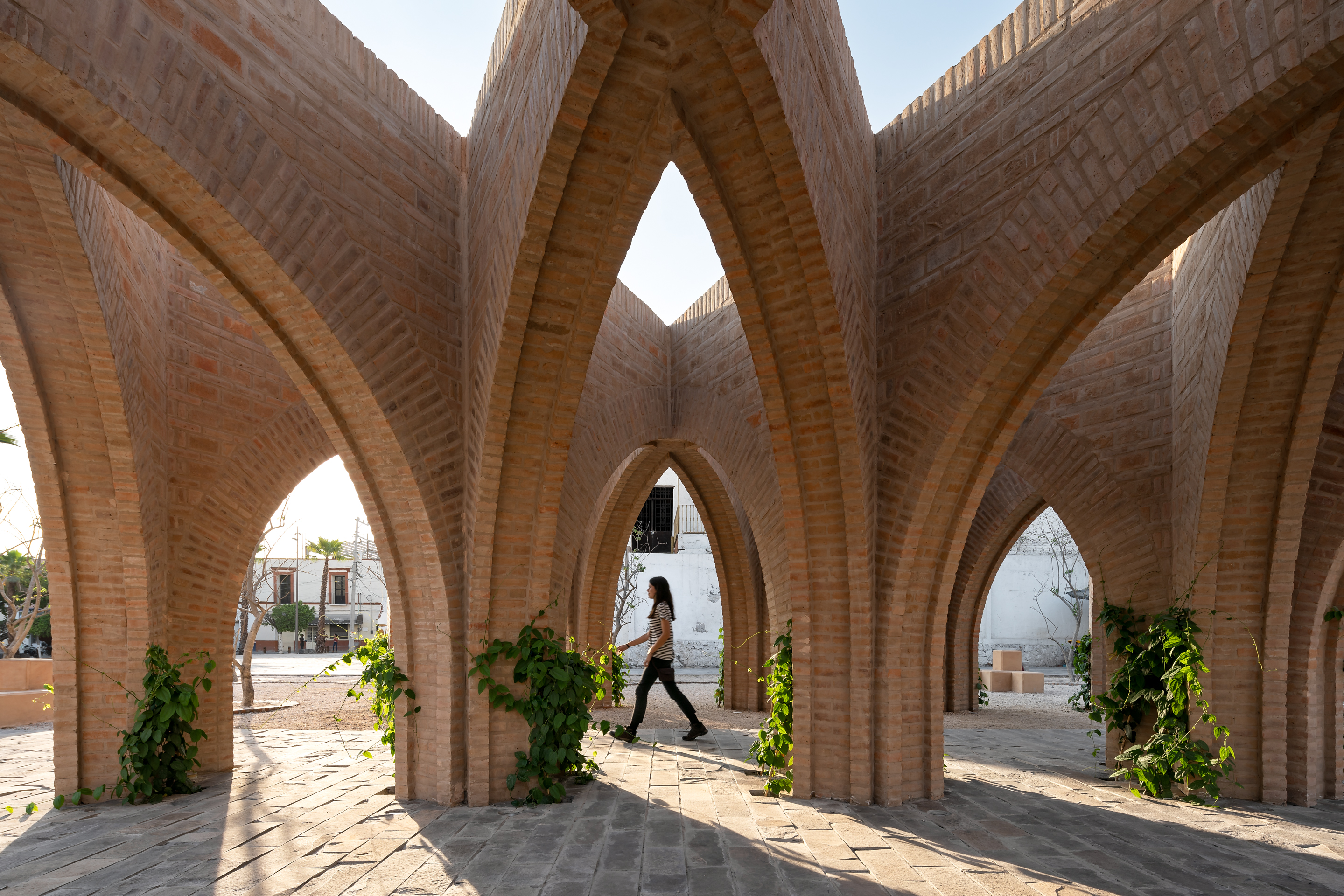
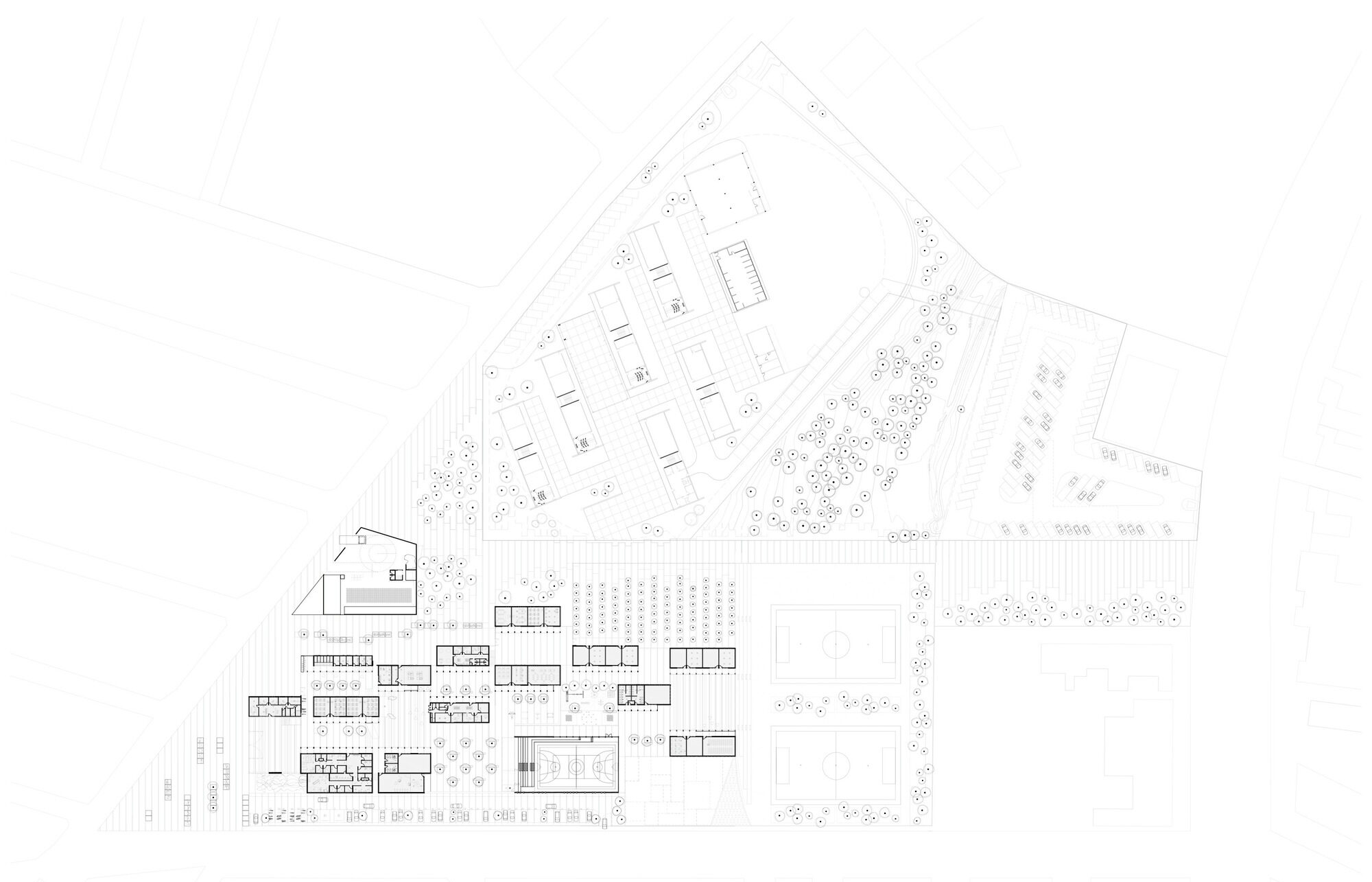 Designed for the community center of San Bernabé, this project offers a building-street which aimed to transmit civic values inherent to the urban structure of the neighborhood. This building-street was conceived as a framework for the relationship and the expression of individuals and the community, so that it will be getting stronger as the citizens start to discover it and living freely in it.
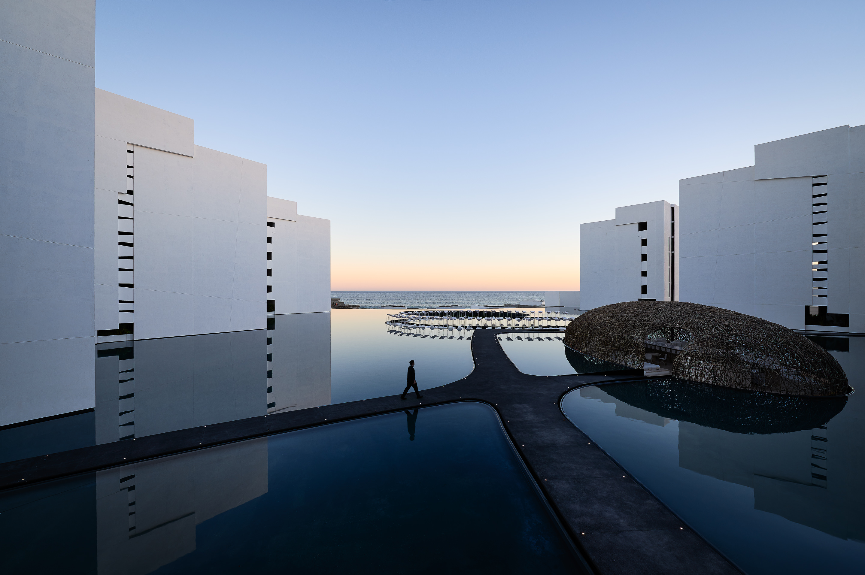
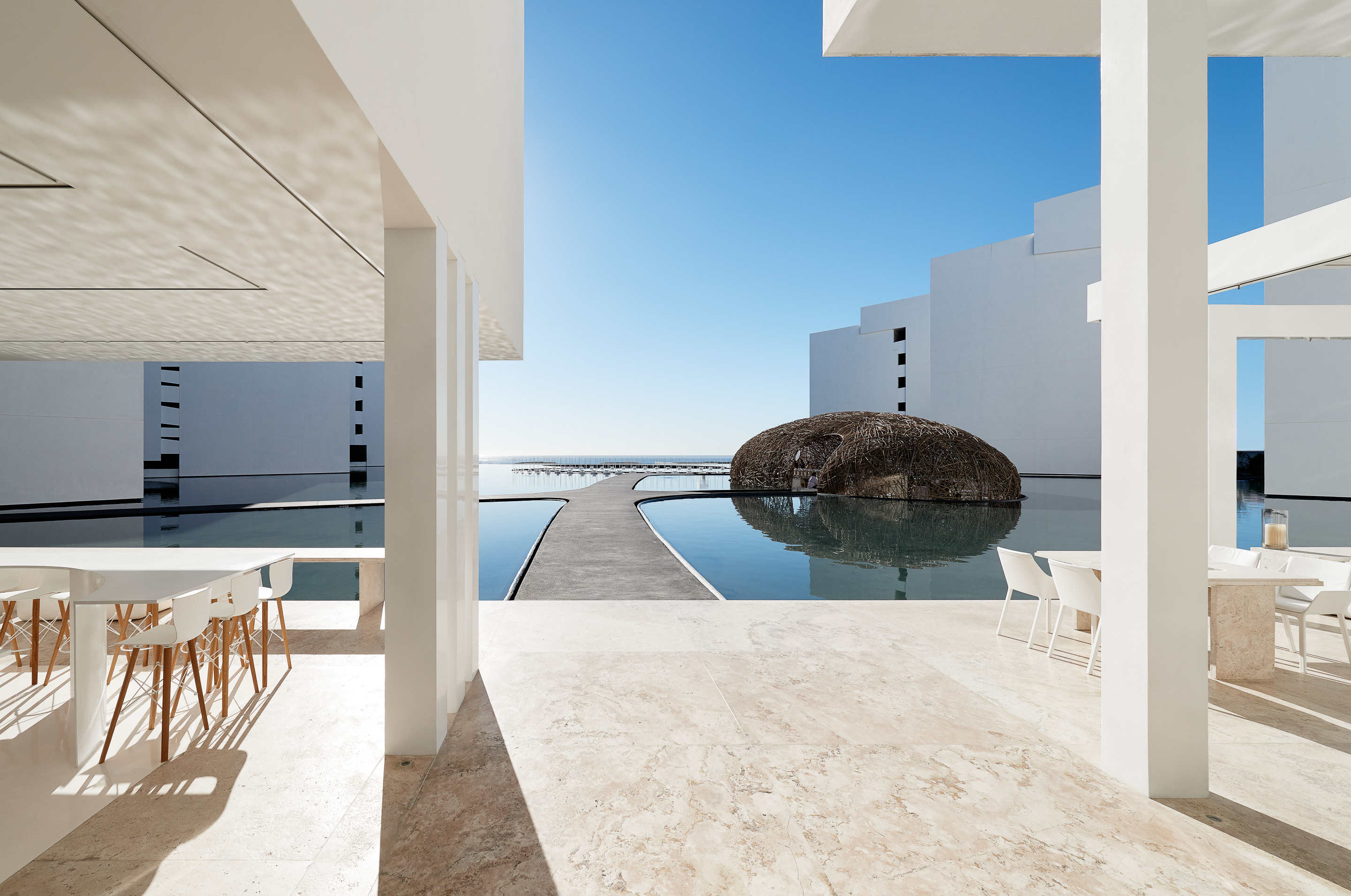
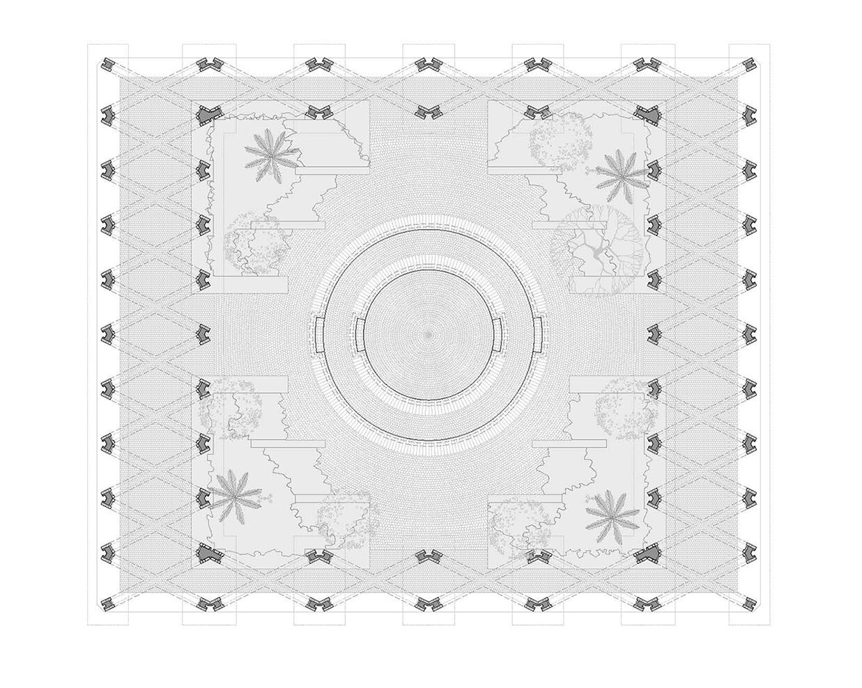
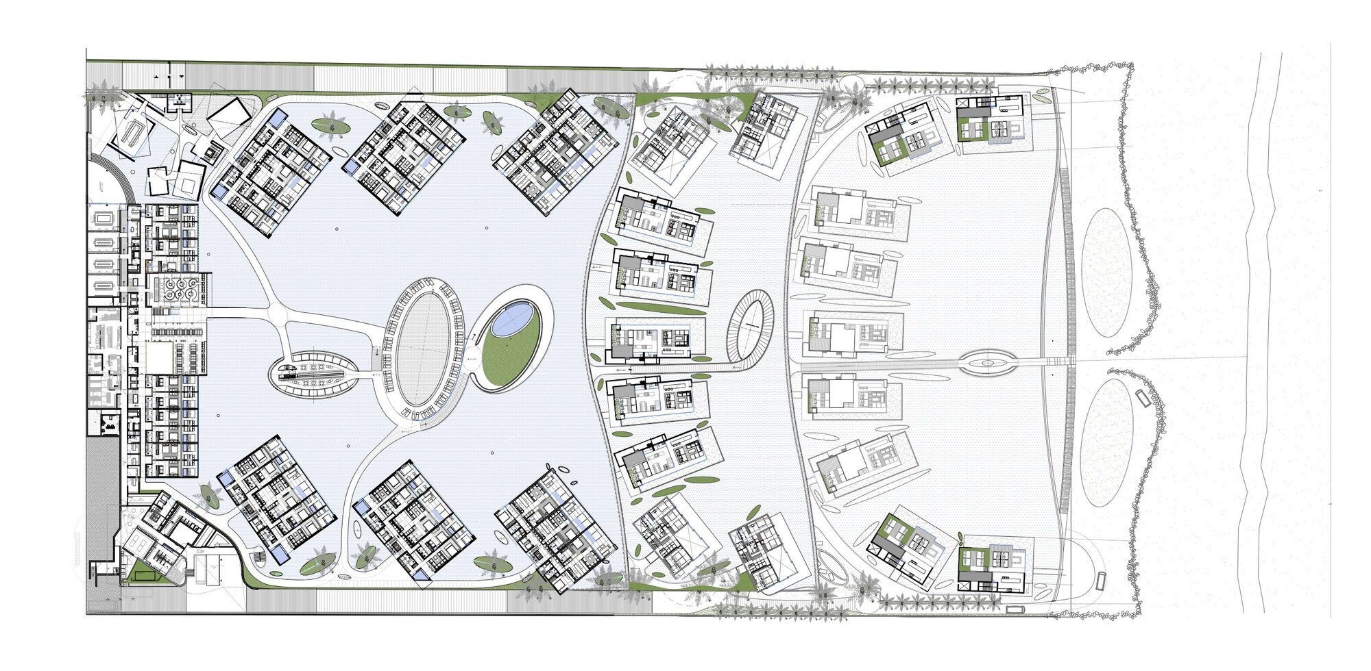 Mar Adentro was inspired by the “enormous drive of water under a scorching sun.” This piece of land, located in the middle of a coastline dotted with “All Inclusives,” and the team wanted to challenge what would have been a box similar to other structures in place. The central idea was to take the horizon and bring it into the foreground. Mar Adentro is a kind of Medina that opens out onto the sea.
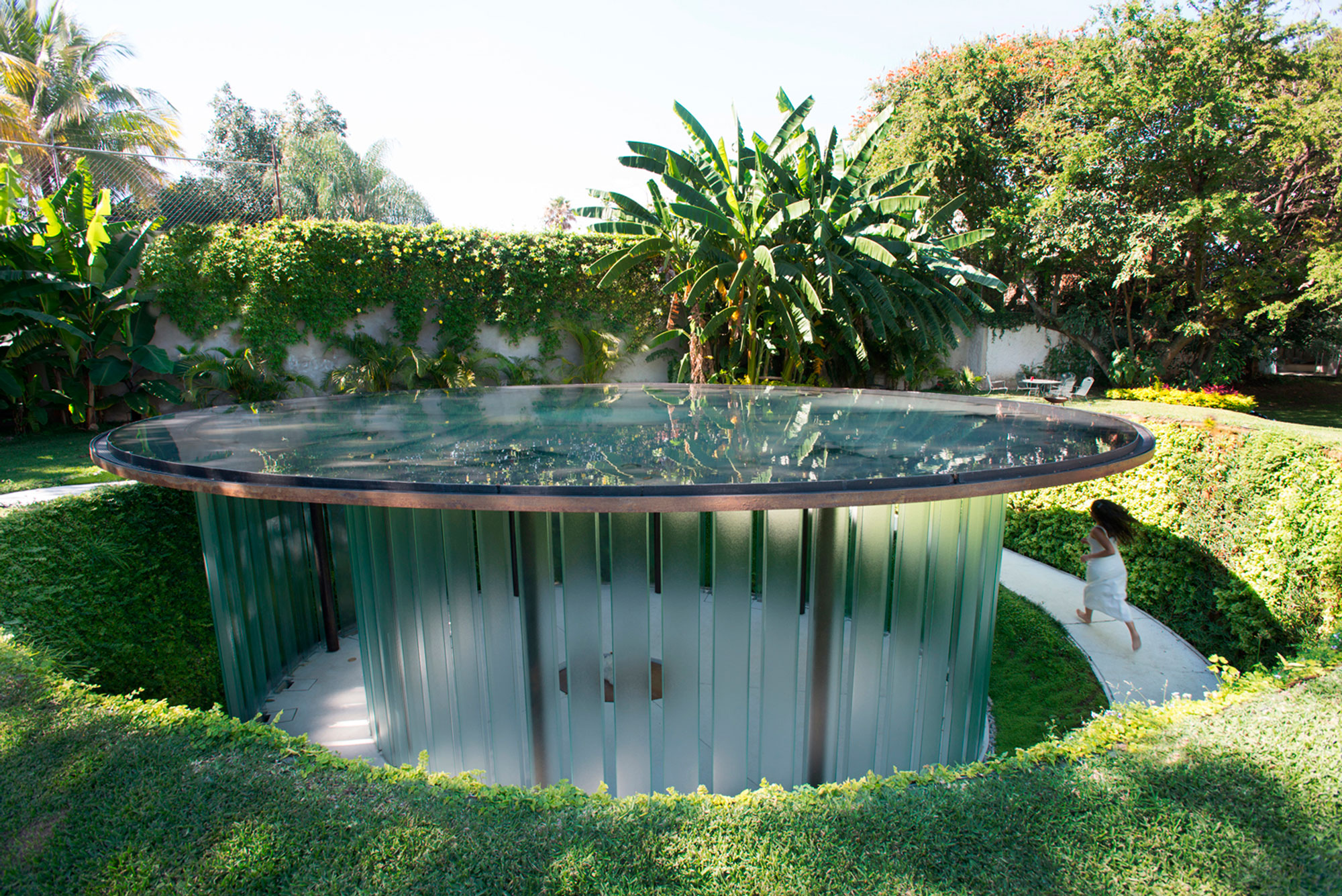
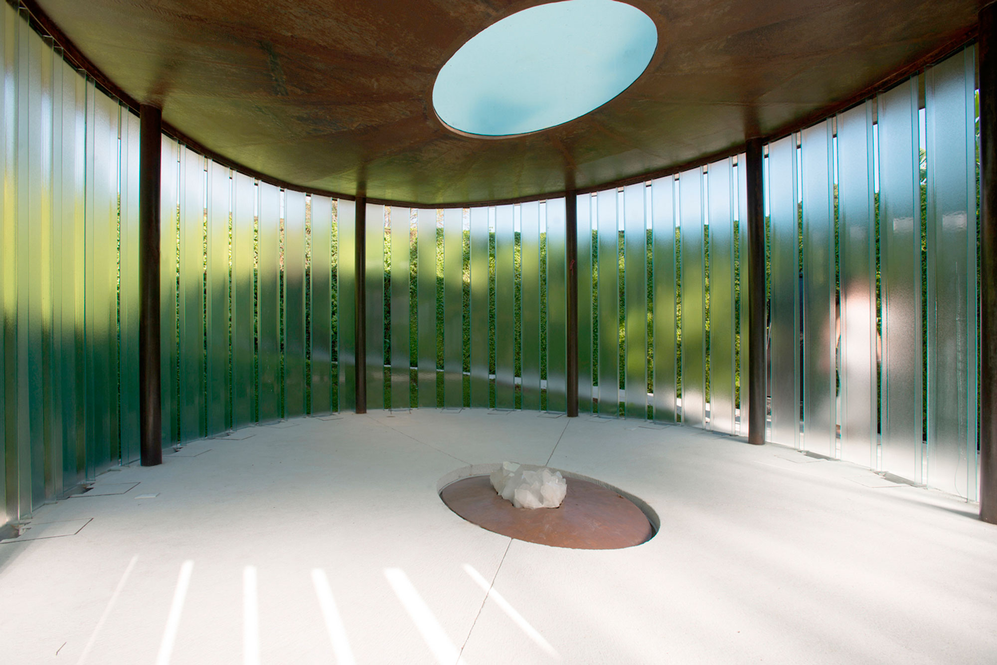
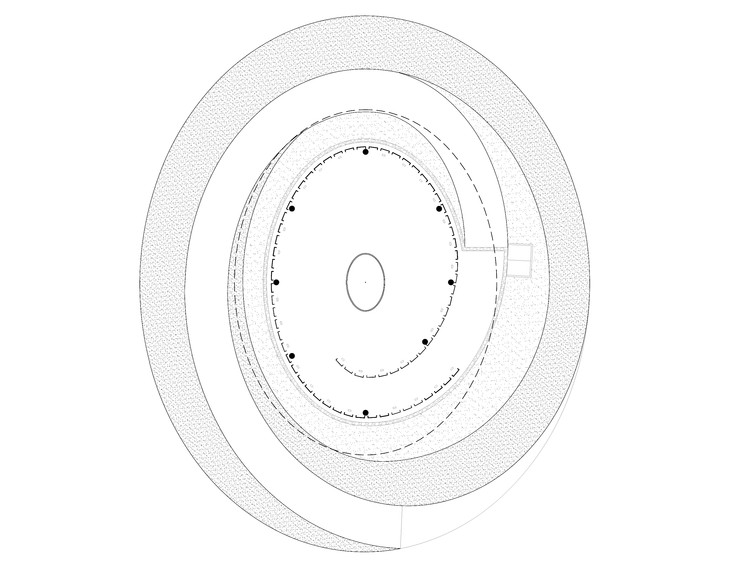

 This chapel project was reimagined inside a tequila factory, located in the northeast of the state of Jalisco. The region is known to be one of the most religious areas in the country. This spiritual and social space is a reinterpretation of the mixed use spaces that exist in older haciendas and houses of the region, where people used to have a chapel or oratory in their own houses, adjacent to the terraces and open covered spaces, where social and family events were commonly held.
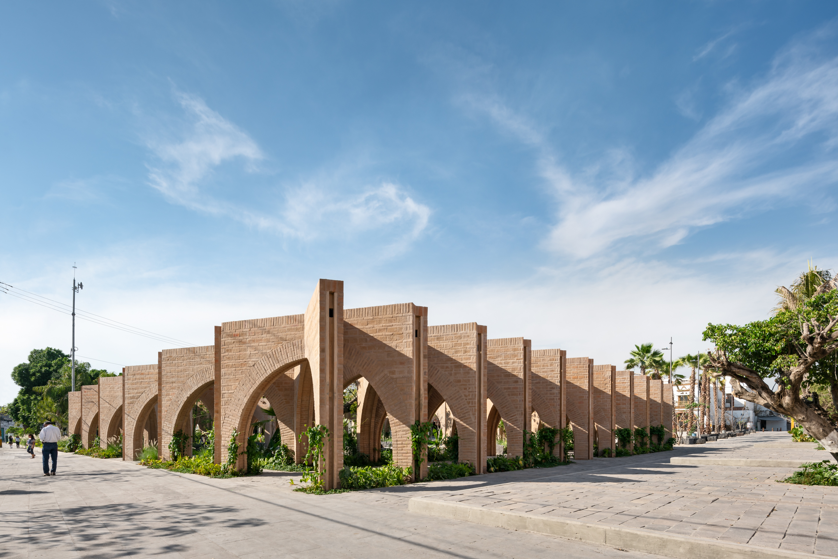
 After devastating earthquakes in Mexico, this project was designed to rebuild an identity that uses public spaces as its media. At the heart of the design was a close interaction with the inhabitants of Jojutla. The core idea came from the trees. These unique elements survived the earthquakes without damage, therefore, the Civic Centre of Jojutla became the “Central Gardens of Jojutla” evoking the concept of resiliency by means of the vegetation.
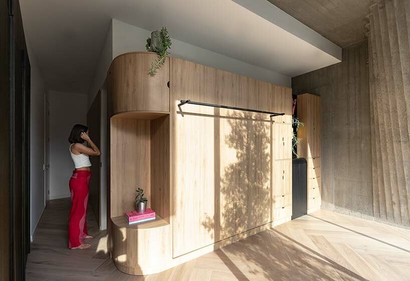

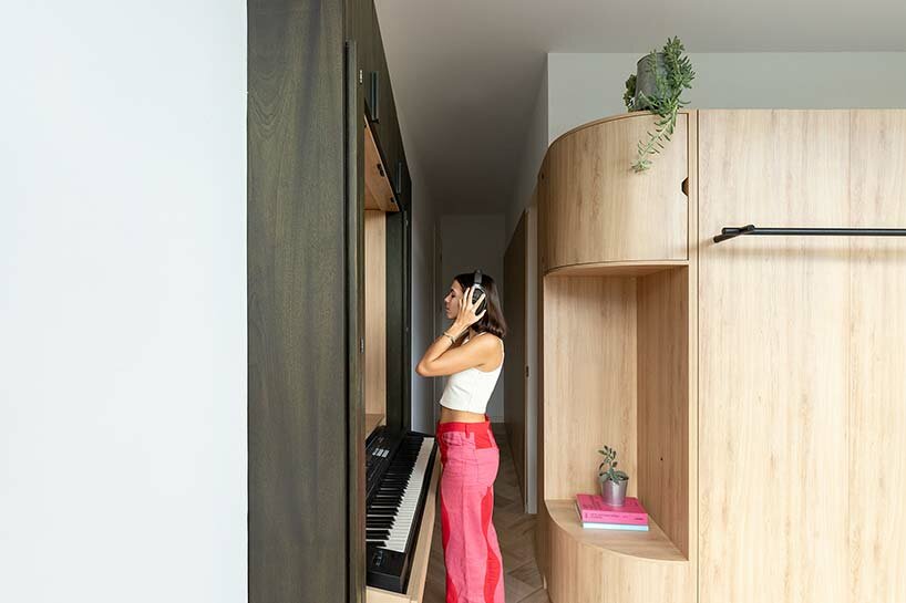
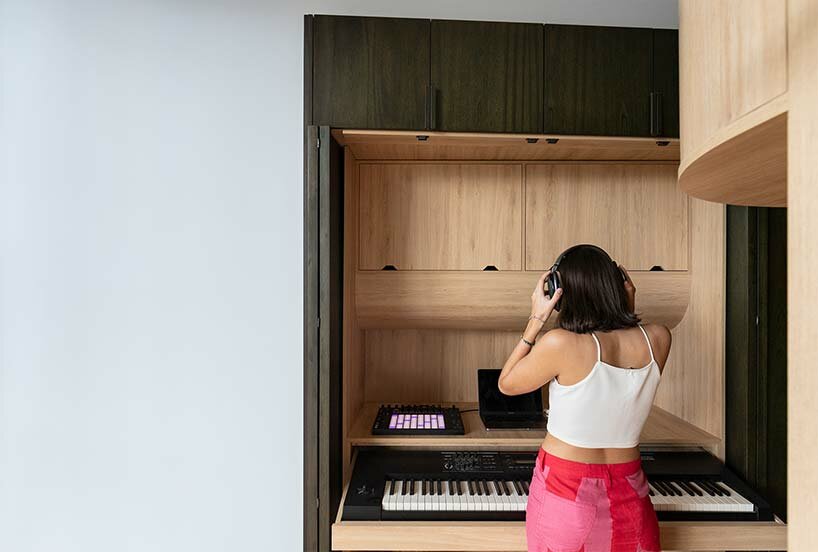 a keyboard is hidden away in the ‘music studio’ station