Twin Cities: New Architecture Taking Root in Minneapolis and St. Paul
CategoriesArchitecture

Twin Cities: New Architecture Taking Root in Minneapolis and St. Paul

Architects: Want to have your project featured? Showcase your work through Architizer and sign up for our inspirational newsletters.

In both Minneapolis and St. Paul, architecture has long been shaped by the Mississippi River. While St. Paul was settled first as it offered a broad river flat for steamboats, Minneapolis grew more organically around St. Anthony Falls. Both cities have a long history dating back to the 1860s, thanks to the growth of agriculture and the lumber industry. Over time,  the Twin Cities gained their moniker from sharing diverse political, cultural and educational institutions.

While styles like the Arts and Crafts movement and Prairie School spread throughout Minneapolis, new structures and streets were built in St. Paul. This included the iconic Summit Avenue, home to the country’s longest avenue of Victorian homes and one of the nation’s best-preserved promenade streets. Over time, well-known architects designed structures in the two cities, including Cass Gilbert, Frank Lloyd Wright and Eero Saarinen. In turn, new architecture continues to be built, highlighting each city’s design culture.

While the architecture of Minneapolis and St. Paul is eclectic across its urban and suburban neighborhoods, new buildings continue to explore what it means to design and build today. The following projects represent a range of these structures built in the Twin Cities over the last ten years.


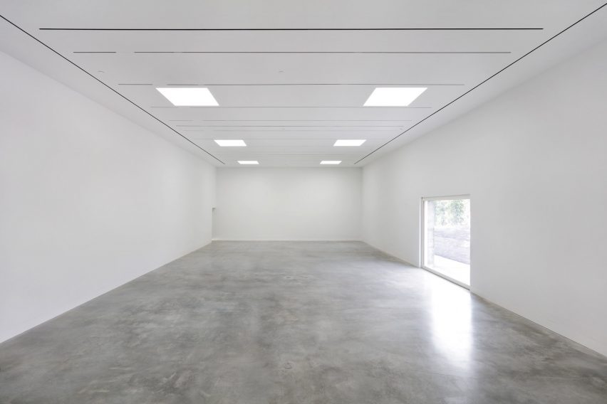
Minneapolis Public Service Building

Designed by Henning Larsen, Minneapolis, MN, United States

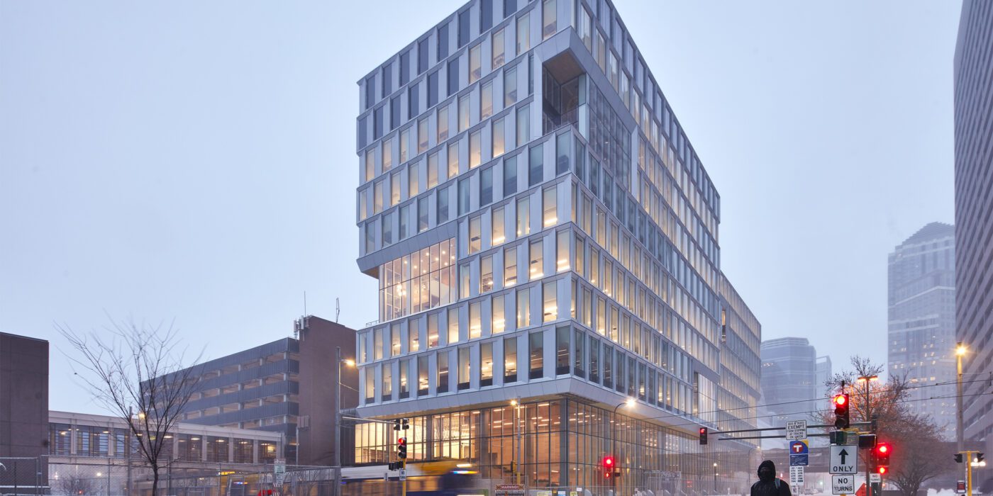
The new Minneapolis Public Service building was designed to better reflect its community. Glass and aluminum facades wrap the building, while double height pockets are carved from the building to break up its massing. Bus and light-rail stations pass by and drop off next to the new building, offering access to from across the city. A large feature stair in the entry foyer provides public space that connects to an extra lobby on the second floor. In turn, the themes of transparency and connection continue inside.

The 370,000-square-foot (34,375-square-meter) building ties into the Minneapolis sprawling network of skyways from the inside out. The office floors contain day-lit workspaces and enclosed offices, as well as a top-floor conference space, café and terrace. Ten city departments and 1,200 employees are brought together in one building. In a government building requiring high security, the design was made to feel open and airy.
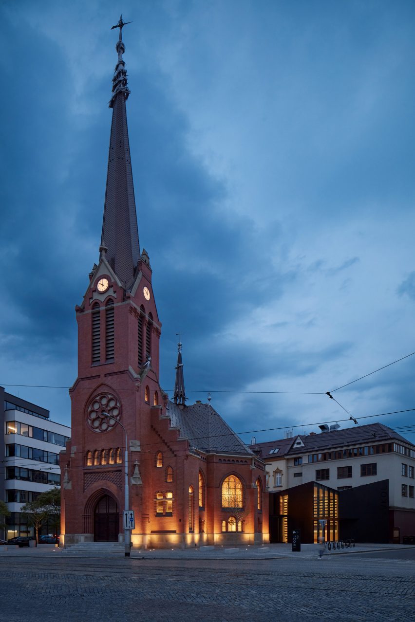
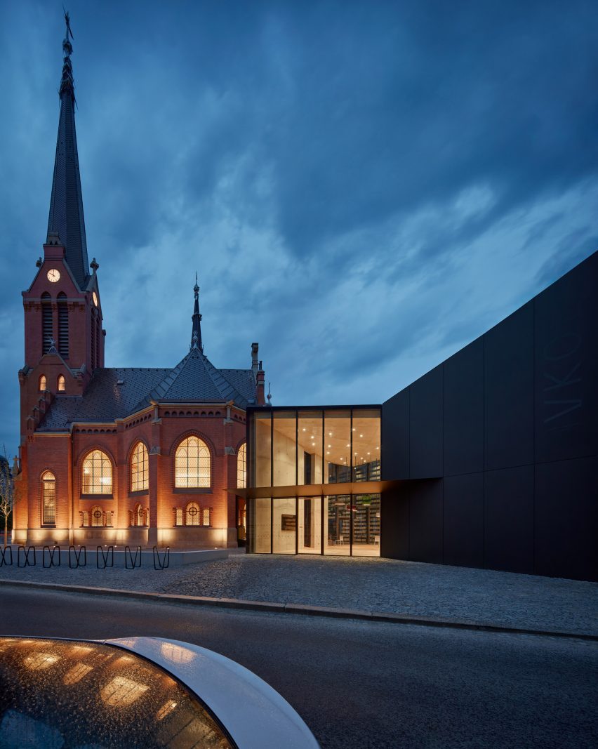
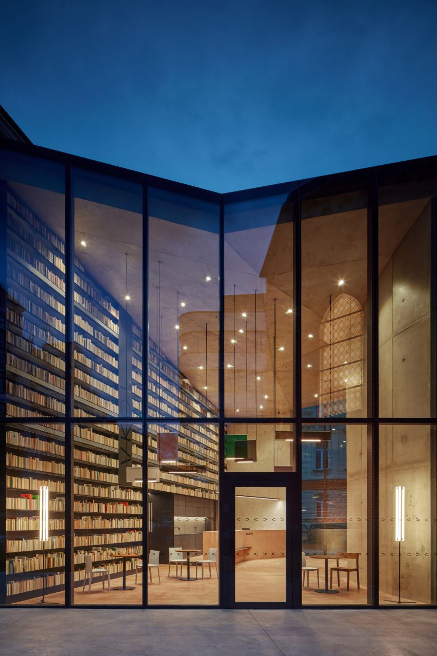
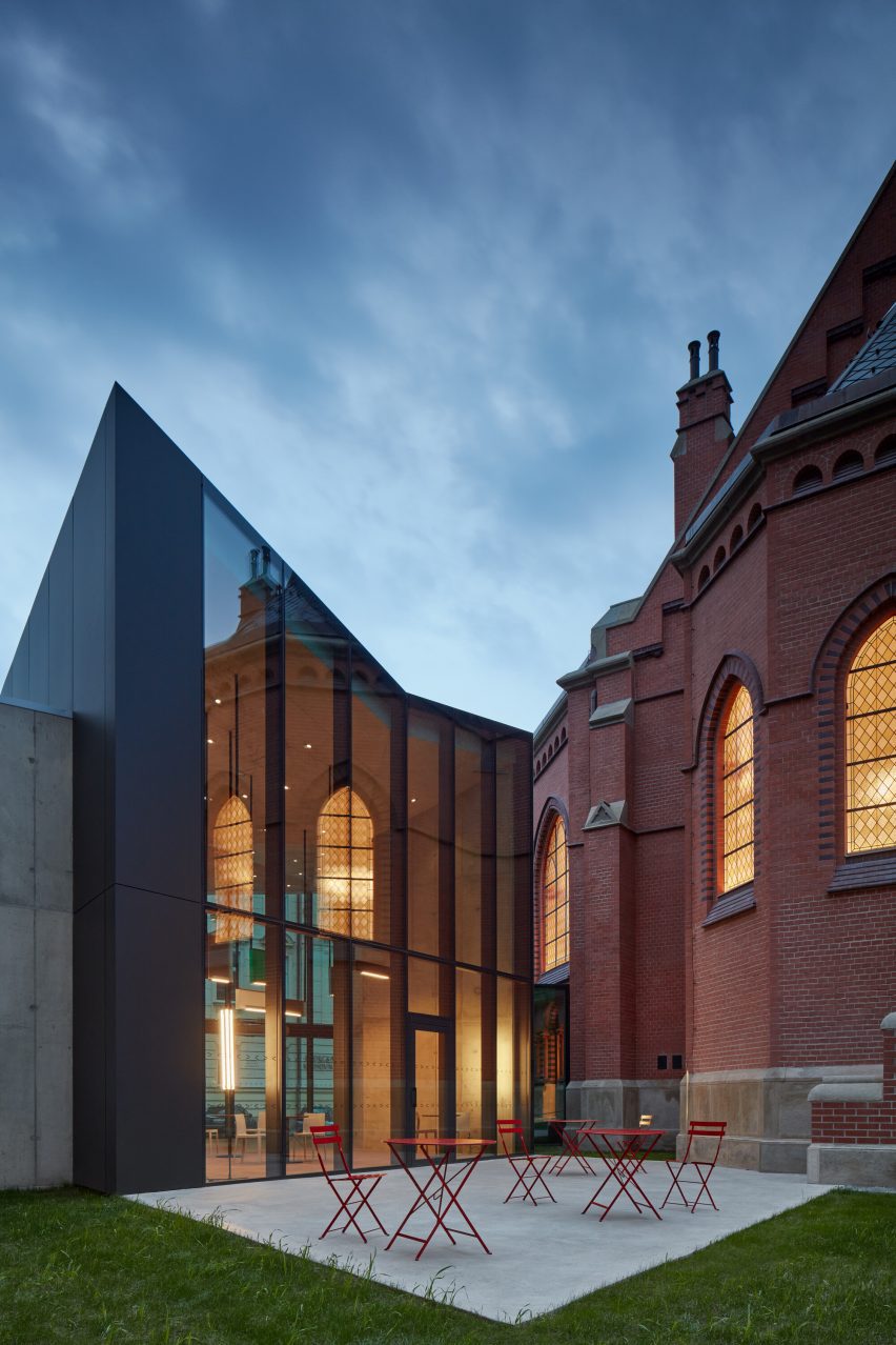

Walker Library

Designed by VJAA Inc., Minneapolis, MN, United States

The Walker library was designed to replace an outmoded subterranean facility, reestablishing the street façade that gives Hennepin Avenue its distinctive character and scale. Located adjacent to the Midtown Greenway bike trail and built on the foundations of the previous structure, the new library is positioned at a nexus of multi-modal transportation networks. As VJAA explains, the new stainless steel and glass clad building was designed as a simple figural mass consistent with the iconography of civic buildings.

The form was made to echo the typical low-rise façades with one or two story masses hovering over extensive street level glass. Since the library nearly fills the site, the façades are sculpted to respond to the surrounding context. The upper portion of the east façade is folded to inflect toward the marquee of the iconic 1930’s Uptown Theater. The glass wall of the library is angled back from the street on the southeast corner to widen the sidewalk and acknowledge the constant flow of pedestrians, bicycles, and automobiles.
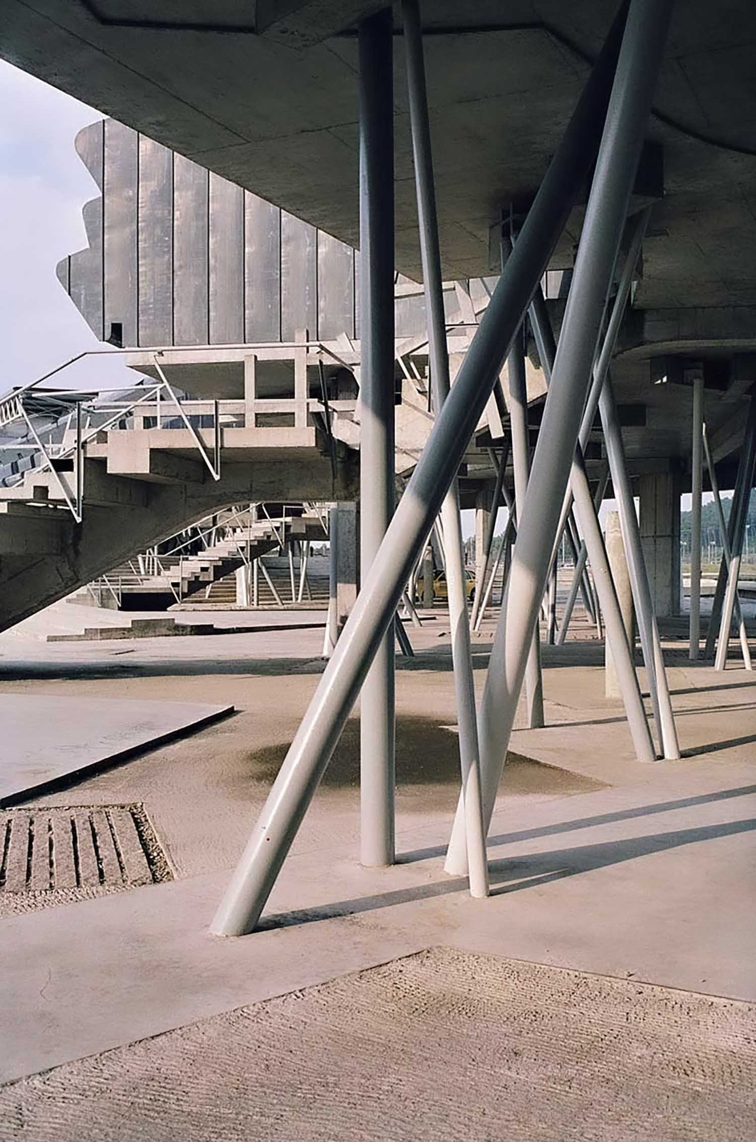
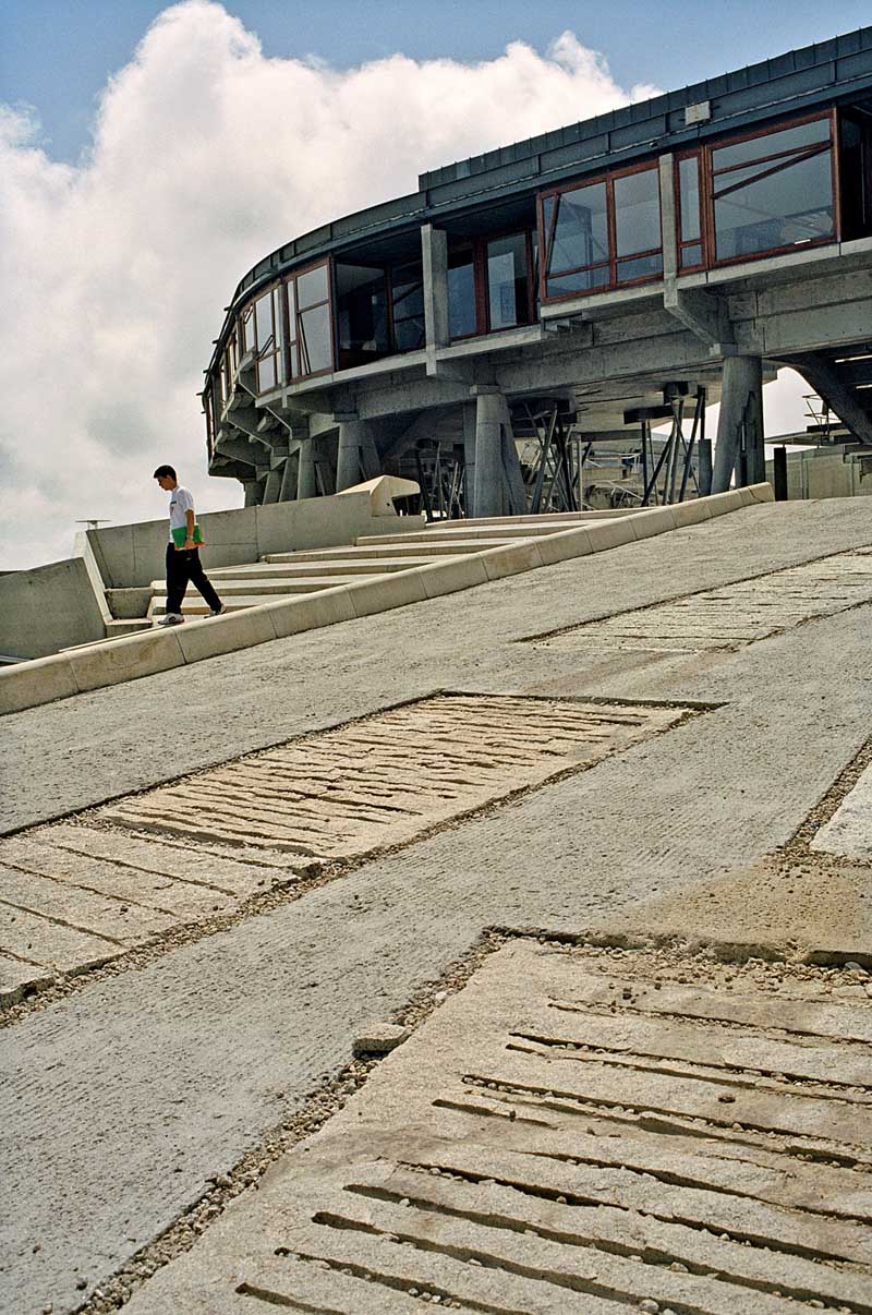
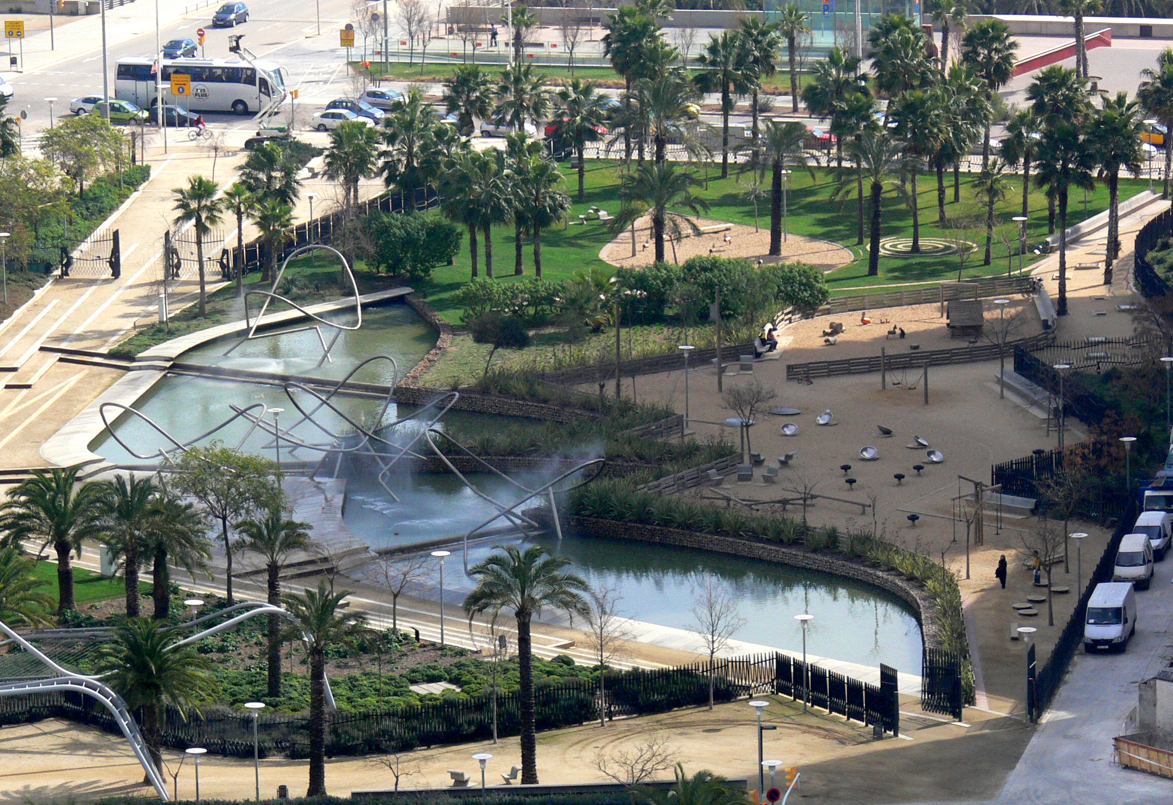
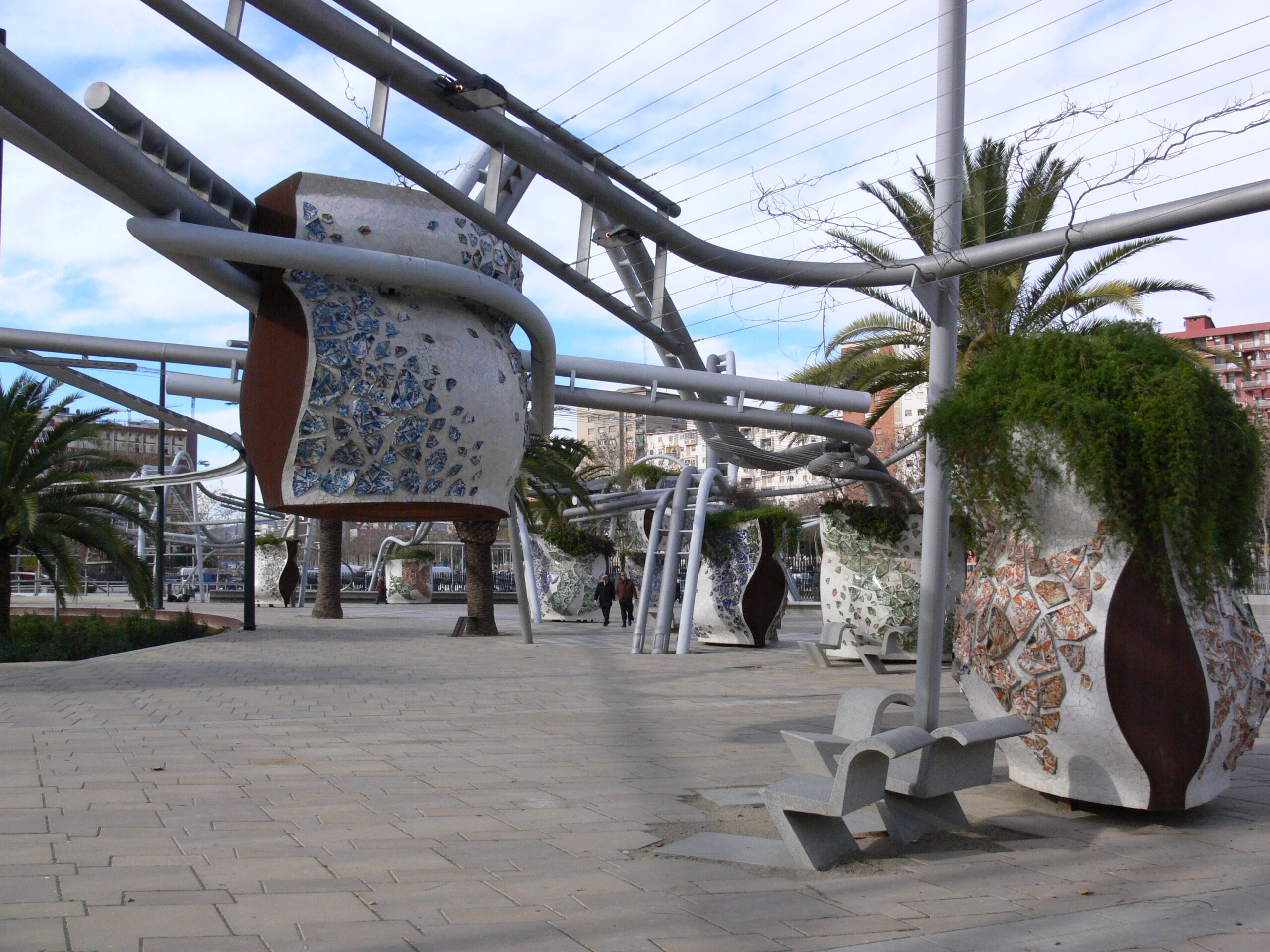

CHS Field

Designed by Snow Kreilich Architects, Saint Paul, MN, United States

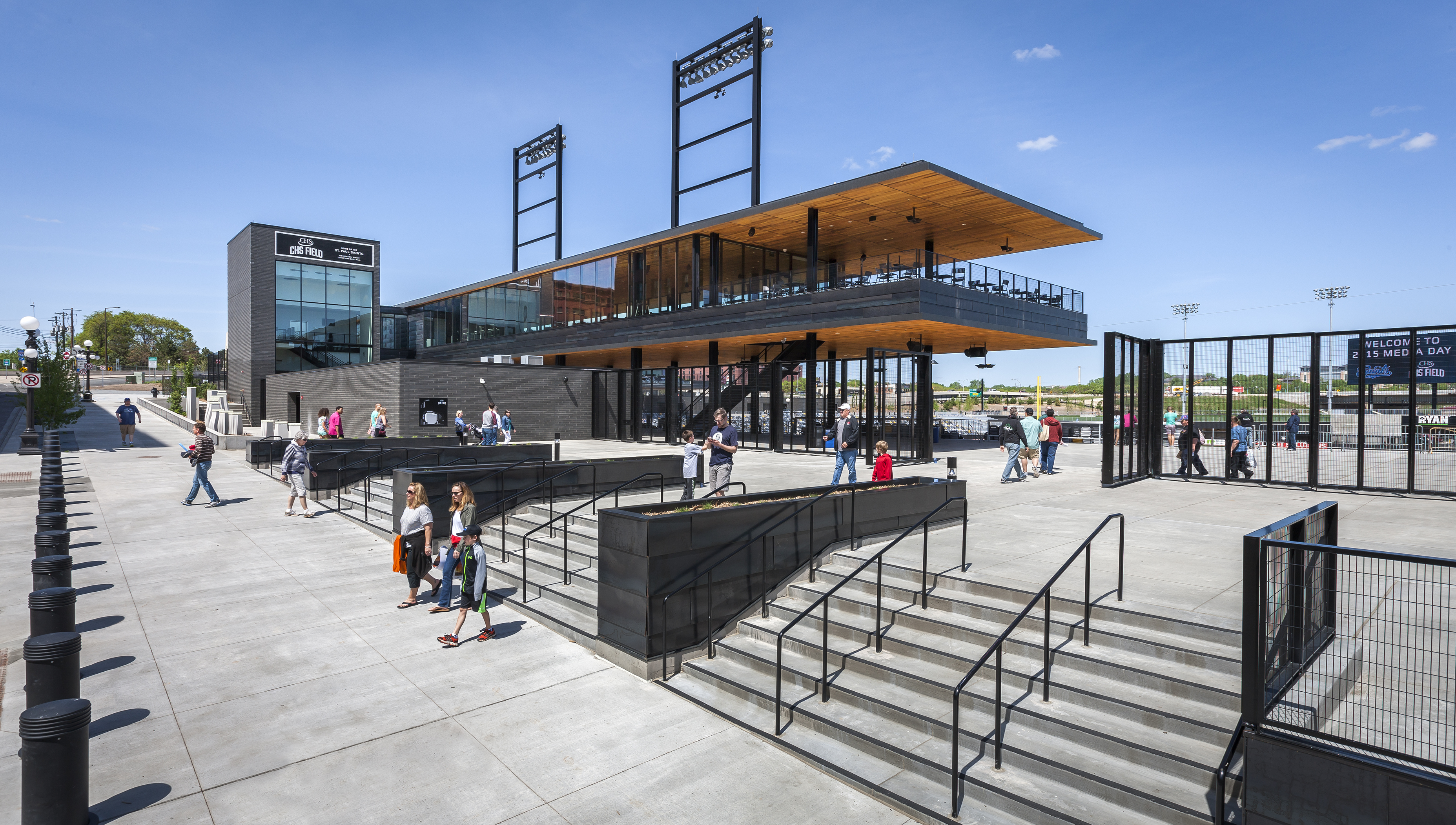
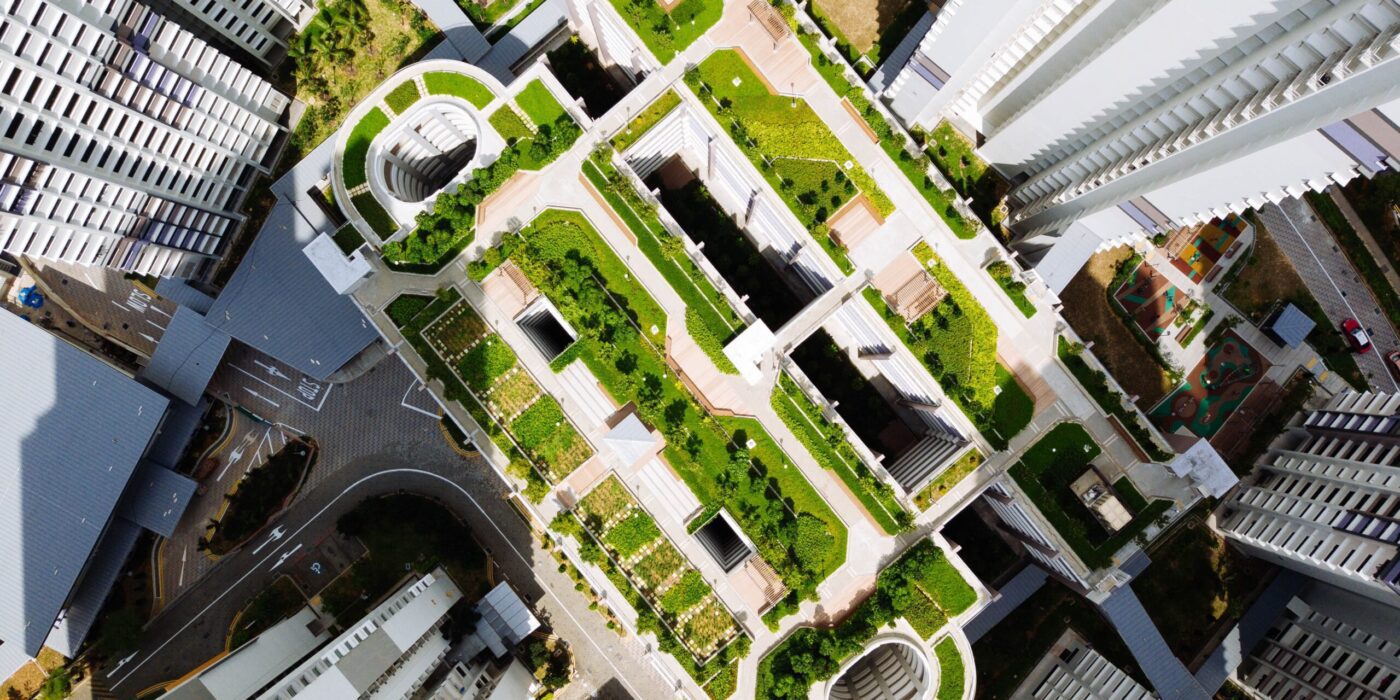
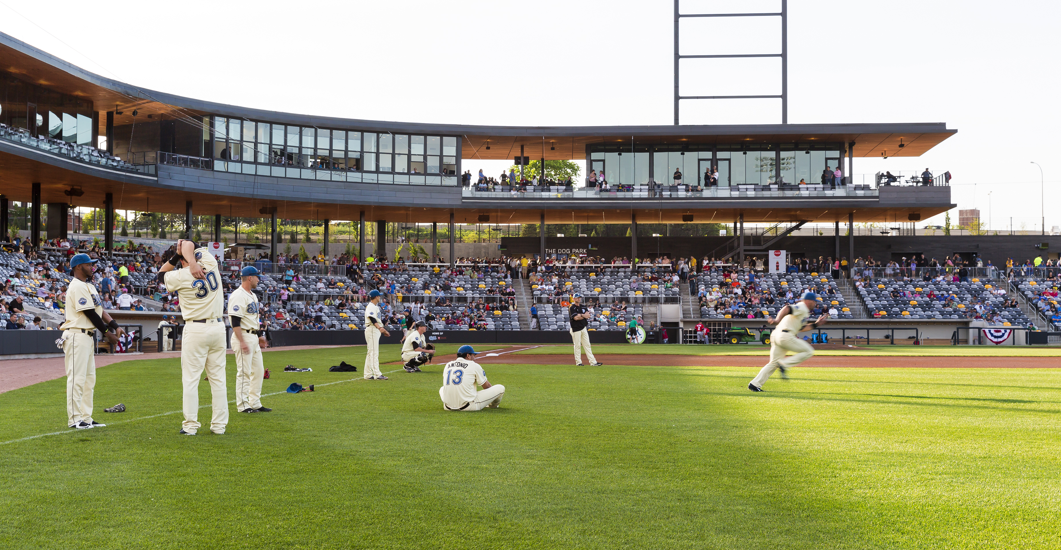
CHS Field creates a culmination to Downtown Saint Paul’s 5th Street to the ballpark. With just 7,000 seats, the ballpark is conceived first as a park, a green space in the city and not a building. Entering off Broadway, at street level, the concourse becomes a 360 degree walkway allowing patrons to navigate around the entire field. Concourse amenities are pushed back into the hillside while the seating bowl and playing field are depressed into the natural topography of the site. It was designed to be the greenest ballpark in America.

As a collaboration between Snow Kreilich Architects, Ryan Architecture + Engineering and AECOM, the ballpark was made to be embedded into the city. The suites, club and press box float above the concourse on a light steel frame. The underside of this structure is clad in a continuous soffit of western red cedar. As the team explained, from brownfield to ball field; what was once one of the ten most contaminated sites in the Twin Cities, is now a park within a park consisting of 135 trees, 138,000 square feet (12, 820 square meters) of natural grass, a dog park, a children’s play area and a rain garden featuring local artwork.


Macalester College Janet Wallace Fine Arts Center

Designed by HGA, Saint Paul, MN, United States

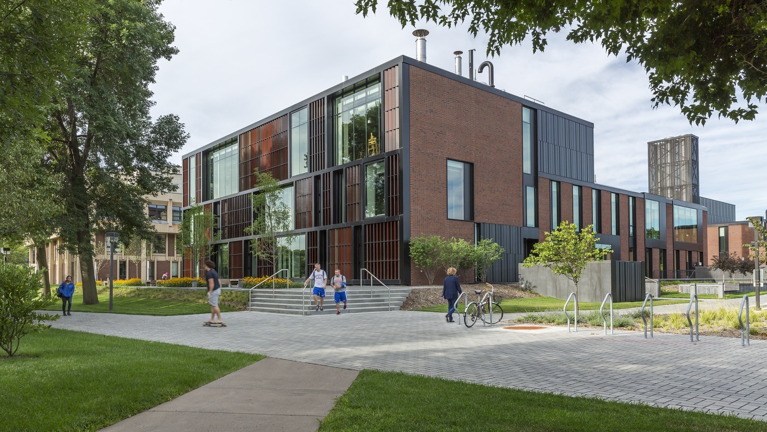
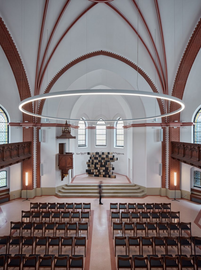
HGA designed the Janet Wallace Fine Arts Center to anchor the western edge of the Macalester College campus in St. Paul, Minnesota. Built in the 1960s, the structure was in need of an update when college officials sought to redesign the complex. Because of the tight urban location of the campus, new campus construction needed to maximize multi-use possibilities to make every space count. The design team responded with a design for a visual and performing arts complex anchored by a light-filled, two-story arts commons.

Explaining the design and massing, HGA notes that, “the exterior of the newly renovated center establishes an identity for the arts on campus: the façade of the music building features a staccato texture of angled panels that reference the rhythm of musical instruments, while the east side of the studio art building features terracotta louvers that pay homage to clay objects and glazing processes.” Throughout the renovated project, large windows connect the activity of the programs within to the campus outside.


Twin Cities Habitat for Humanity

Designed by Gensler, Minneapolis, MN, United States

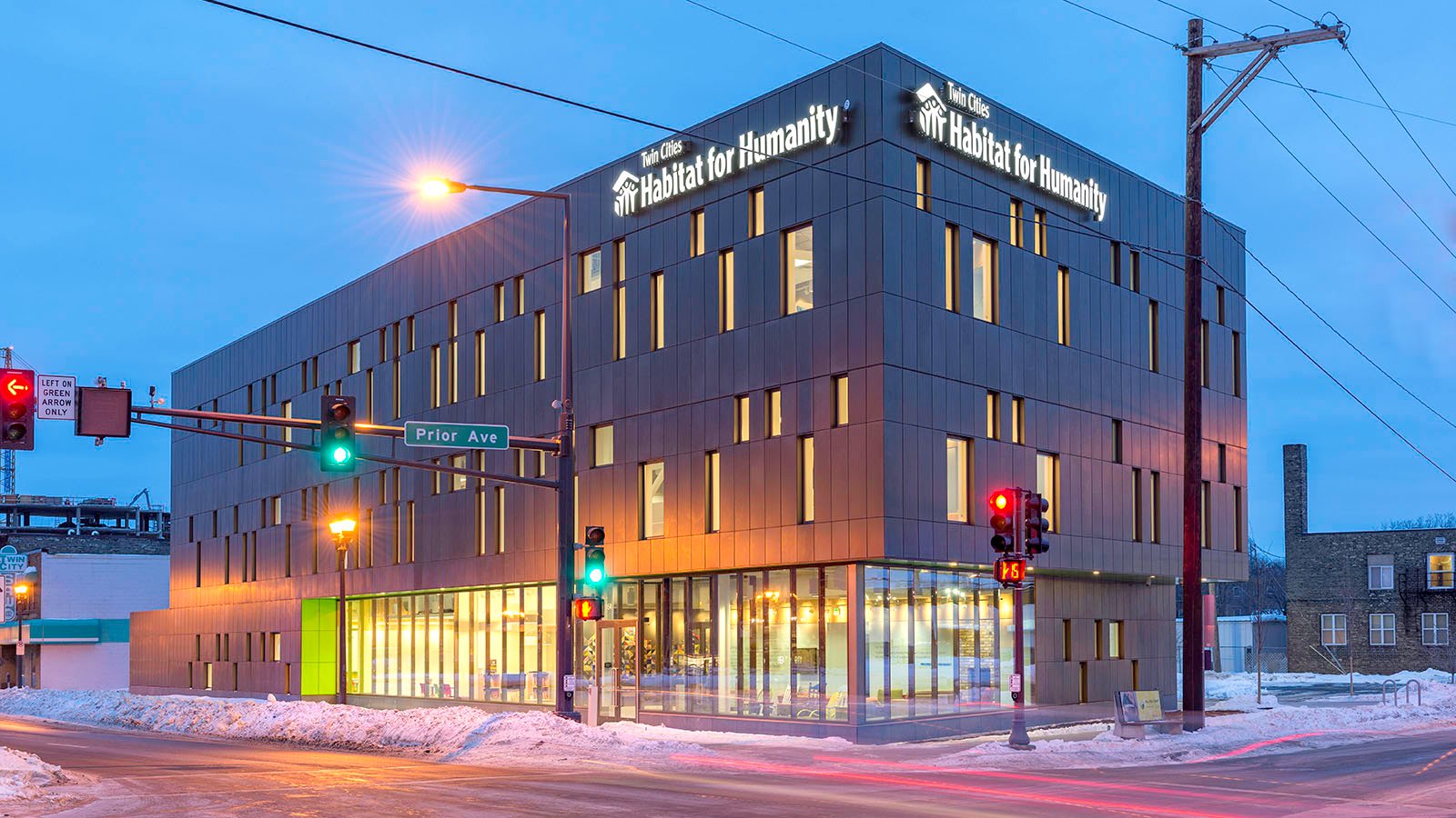
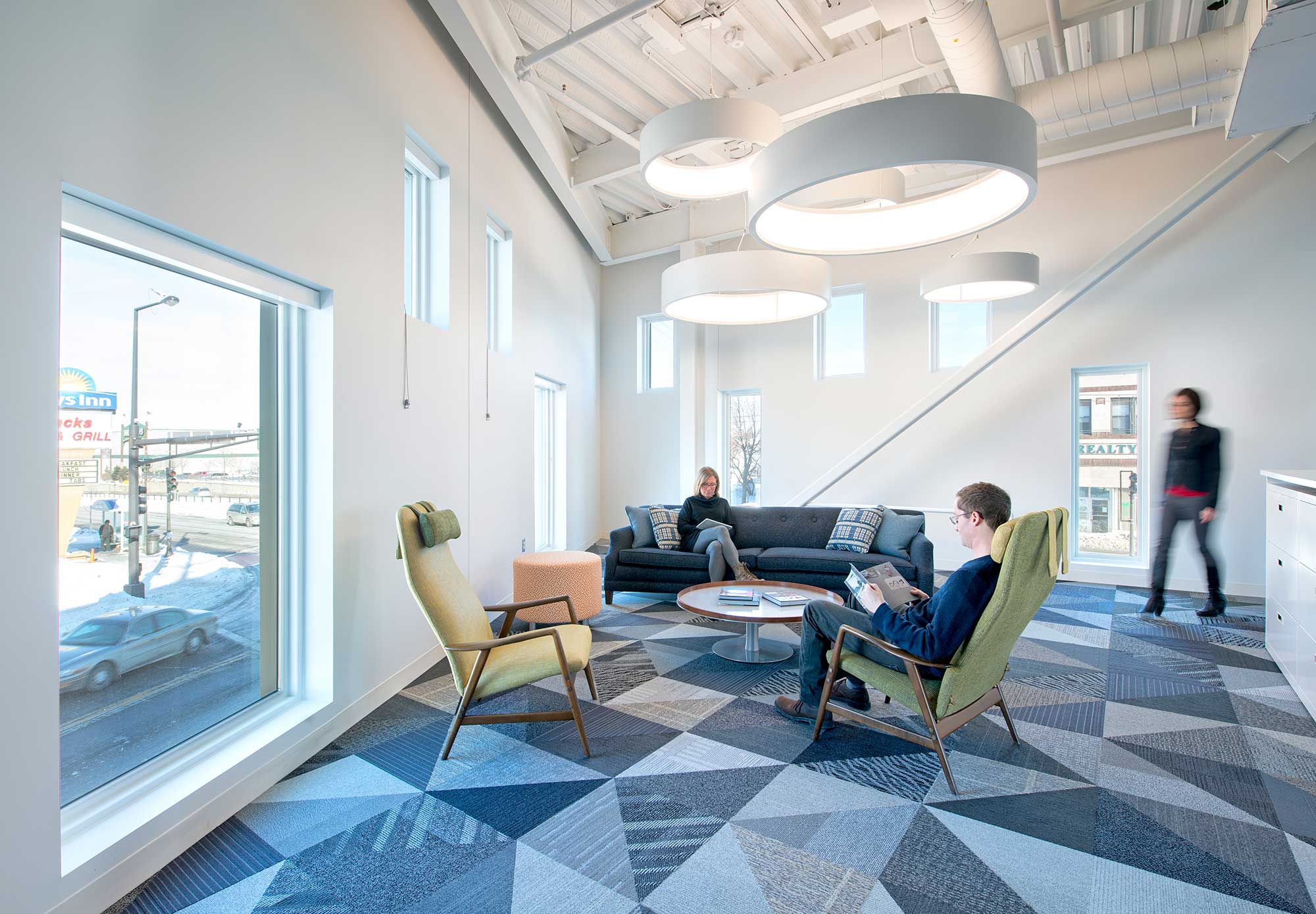
As the new home for Twin Cities Habitat for Humanity, this structure was designed to make physical connections between the community, families and the Habitat staff. As Gensler outlines, the material palette is modest. Residential sized windows are incorporated into the metal panel exterior wall to create both visual and spatial interest throughout. The design team embraced the idea of using the scale and experience of the residential window as part of the project’s overall architectural concept.

Openings were designed to correspond with interior conditions, much like openings in residential homes. A key design element for the building was an urban front porch, connecting the building to the houses designed for families. The strong architectural corner opens up at the base to create a pedestrian friendly experience, revealing the primary entrance, reception and gathering space within the building. This symbol of the front porch connects the exterior and interior experiences.


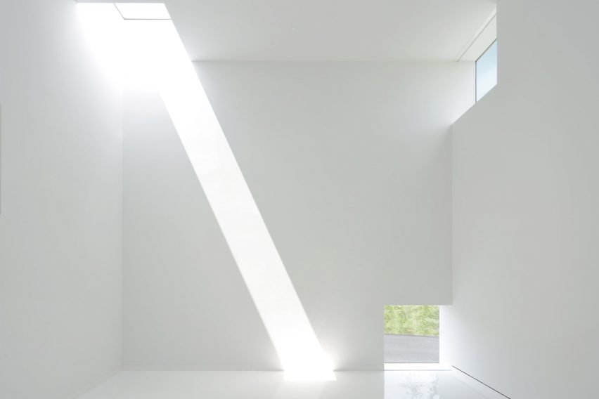
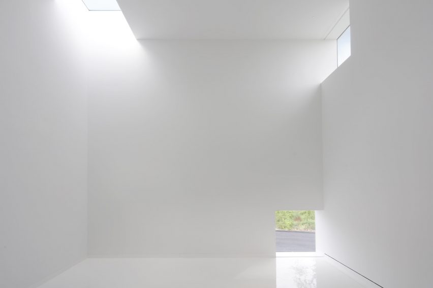
Lilydale Regional Park Pavilion

Designed by VJAA Inc., Saint Paul, MN, United States

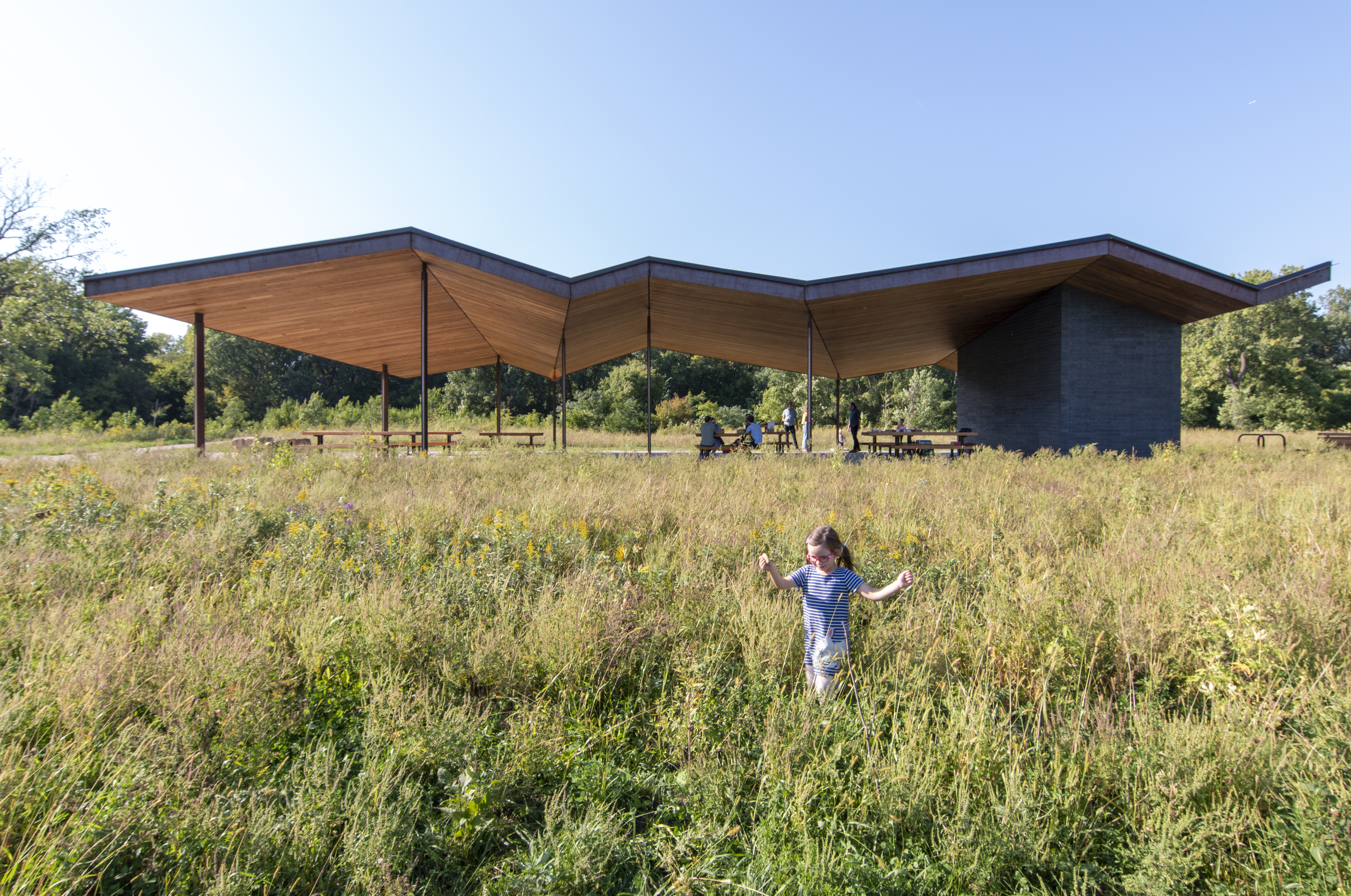
VJJA designed the Lilydale Regional Park shelter as part of the Mississippi National River and Recreation Area. Sited on the floodplains of the east bank of the Mississippi River in St. Paul, it is defined by the Mississippi River to the North and Pickerel Lake below the river bluffs to the South. In turn, Harriet Island Regional Park informs the park to the East and the Interstate, 35‐E, to the west. The park is 384‐acres (155 hectares) which includes the 100‐acre (40-hectare) Pickerel Lake and an additional 100 acres (40 hectares) of wetland/marsh.

This new picnic shelter and park support space creates a gathering place for visitors to Lilydale Regional Park. It helps accommodate groups in the park, provides additional programming space, and helps support recreational trails, fishing and boating, birdwatching, play areas and non‐motorized park access. The gentle, folding roof creates covered gathering space for people and visitors to come together.


Lakewood Cemetery Garden Mausoleum

Designed by HGA, Minneapolis, MN, United States

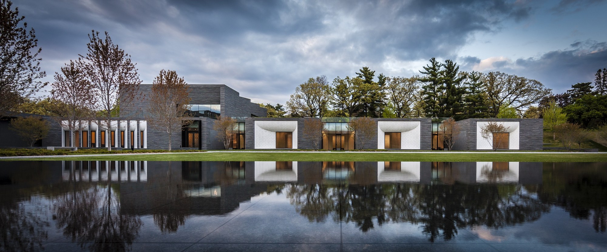
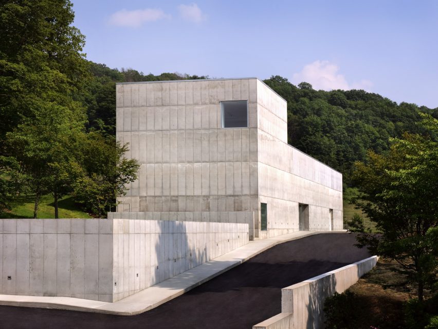
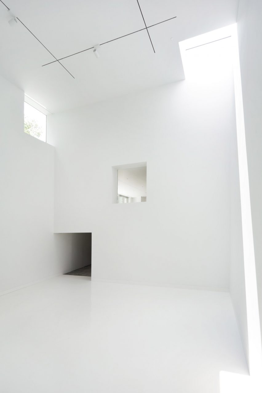
Lakewood follows the distinctly Americanized tradition of the Lawn Plan cemetery — a mix of large family monuments and individual grave markers arranged within open, sweeping lawns framed by trees and softly curving roads. Inspired by the landscape of Pere-Lachaise Cemetery in Paris, a new 24,500 square foot (2, 275 square meter) mausoleum connects to its context and includes burial space for more than 10,000 people, a chapel, reception center, and landscaping on four acres. Rooted in its materials, horizontal bands of split-faced gray granite tie the structure to the earth.

Challenged with adding a large structure to a much-beloved place, the design team developed a strategy that protected and enhanced the cemetery’s historic landscape. Two-thirds of the program is tucked into a hillside to minimize the massing at the street level. A green roof planted over the lower level extends the cemetery’s lawn while angled grass mounds articulate skylights for the building’s subterranean spaces. At the Mausoleum’s entry, a white mosaic pattern rendered in infinite loops across white billowing surfaces reimagines the historic Lakewood Chapel’s colorful mosaic interiors.


Xcel Substation Enclosures

Designed by Alliiance, Minneapolis, MN, United States

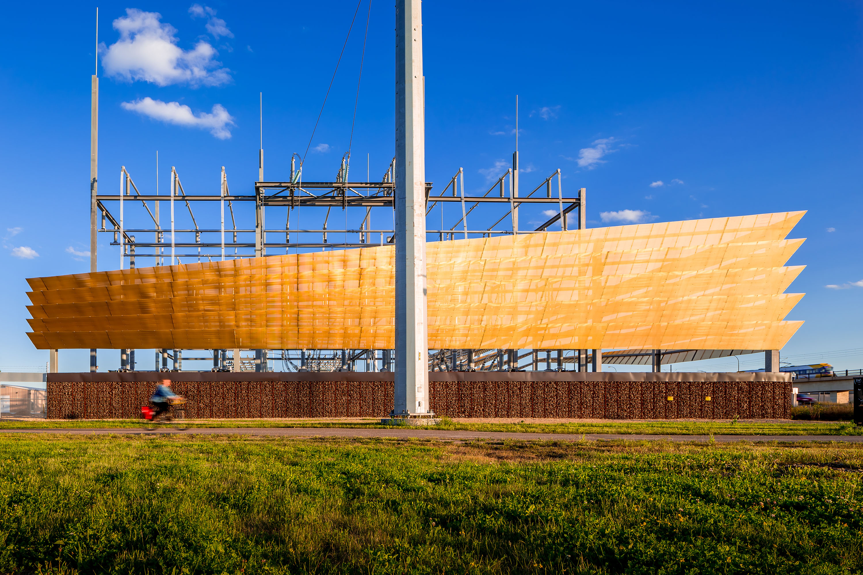
Two Xcel Energy substation enclosures were designed in Minneapolis, called Hiawatha West and Midtown. These were made to respond to multiple requirements and operate at multiple scales: the city, the neighborhood, and the substation-proper. Driven by extensive community feedback and requirements of the Public Utilities Commission, the architecture of these enclosures responds to their community settings as well as to substation functional requirements.

Delving into the design, the team made the upper walls of both enclosures sculptural and iconographic, pushing their material capacities while enhancing the sense of urban connectivity along the city’s Greenway. A galvanized steel framework draws on substation tectonics to support brightly-colored anodized aluminum cladding. This cladding provides surfaces of shifting translucency and reflectiveness that respond to the wall’s visibility at a variety of distances, travel speeds, and vantage points. In contrast, the lower walls operate at a more intimate scale, reflecting their unique neighborhood settings.

Architects: Want to have your project featured? Showcase your work through Architizer and sign up for our inspirational newsletters.

Reference

edition office fenwick
CategoriesArchitecture

edition office’s fenwick homes balance concrete & delicate copper

fenwick st: design-focused homes for hew, australia


Melbourne-based architecture studio Edition Office presents Fenwick St, a newly completed residential development situated on the edge of the Birrarung/Yarra River in Kew, Australia. This location offers unobstructed connections to breathtaking landscapes rarely found in such close proximity to the city. With the site surrounded by well-preserved 1950’s and 1960’s post-war houses, the architects sought to create the concrete complex as a contextually sensitive addition that balances density with visual porosity, while ensuring a connection to the lush natural surroundings.

edition office fenwickimages © Rory Gardiner@arorygardiner


a trio of residential pavilions


To maintain a strong connection to the distant vista while preserving the link between Fenwick St and the public realm, Edition Office emphasized drawing these connections deep into the plan and through the site to the street. In order to achieve this, the architects designed three visually independent pavilions rather than a single large structure. This approach allowed for a balance of similar scaled forms with neighboring houses and enabled the framing of views within the site itself.


The pavilions, connected by a common basement, were strategically positioned to optimize the site’s characteristics. Located at a sharp bend in the street, the split between the pavilions occurs at the fulcrum, creating a dynamic arrangement. As the pavilions extend past the site, they lower in scale at the street level, aligning with the neighboring residences, while gradually increasing in height as they integrate with the terrain leading to the escarpment.

edition office fenwick
nine new dwellings are created on a site that previously accommodated only one


edition office Integrates the lush landscape


The living spaces within Fenwick St were carefully planned to open towards the north, the river, and the valley, allowing the distant landscape to become an integral part of the internal experience. Circulatory paths were strategically designed to draw the surrounding environment deep into the plan, while bedrooms and ancillary spaces opened to the green spaces between pavilions, offering views through a copper mesh privacy veil. This nature inspired the team to blend the architecture into into its surroundings, with landscape designed by Eckersley Garden Architecture.


The need to anchor the building into the site led to a construction that appears rooted to the ground. By slightly shifting and rotating each floor plate, movement was introduced to the shear walls, softening the overall mass and scale. Copper screening was used to bring delicacy to the purposefully heavy pre-cast concrete construction, with the screens expected to age gracefully over time.

edition office fenwick
copper screening delicately balances the heavy pre-cast concrete construction


In addition to connecting with the landscape, creating light-filled private spaces filled with comfort and attention to detail was a key driver for Edition Office in the design of Fenwick St. Flack Studio, responsible for the interiors, imbued the spaces with warmth, calmness, and moments of dramatic nuance. Material tactility and the evolving patina of surfaces, such as the weathering copper screens and the maturation of the surrounding gardens, added depth and character to the interiors. The careful craftsmanship of junctions and thresholds enhanced the joy of navigation throughout the spaces.

edition office fenwick
the complex takes shape as three visually independent pavilions rather than a single large structure


The project brief called for the creation of nine new dwellings on a site that previously accommodated only one. In order to respect the immense environmental and cultural value of the location, Edition Office aimed to minimize the perceived mass of a single large volume. Instead, the design resulted in three distinct forms that conform to the domestic patterns and scale of the existing streetscape. These wedge-shaped pavilions meet at their narrowest points, creating moments of architectural exuberance and unobstructed sight-lines both within the site and towards the horizon.

edition office fenwick
the environment is drawn deep into the plan, while interiors open to the in-between green spaces


Reference

Image of Red Dunes Playtopia
CategoriesArchitecture

Red Dunes Playtopia features “cave-like” play spaces and undulating hills

Sloping red dunes and cavernous spaces feature in this playground, which local studio XISUI Design has created in a residential area in Guangzhou, China.

Built above an underground parking unit, the play area takes cues from natural forms including mountains and caves and comprises a playful arrangement of hills and arches designed for climbing and discovery.

“The design revolves around utilising the undulating red dunes to provide an attractive terrain for children to come and engage in activities such as running, jumping, and playing,” studio design director Hu Yihao told Dezeen.

Image of Red Dunes Playtopia
Red Dunes Playtopia was designed by XISUI Design

The studio used a load-bearing concrete shell for the structure of the playground, arranging the openings so that the loads are transferred to the supporting columns of the building below.

“Through concealed structural supports beneath the main weight-bearing concrete shell, the upper weight is precisely transferred to the supporting columns of the underground garage,” said Hu.

“This reduces the amount of earthwork volume used, reducing the weight of the load, and ensuring safety and stability.”

Photo of Red Dunes Playtopia by XISUI Design
The playground consists of hill-like structures

A variety of areas were hidden beneath the concrete shell, where the undulating topography of the land underneath helps to form organic landscapes designed to evoke the atmosphere of a cave.

Accessed through curved openings between sloping bridges, the covered play space is punctuated by a central white column, where a ladder leads to a white playhouse that sits above the concrete shell and connects to a metal slide.

Photo of the Red Dunes Playtopia by XISUI Design
It has a concrete shell

“The use of undulating concrete shell structures creates cave-like spaces that blend harmoniously with the terrain, offering both climbing opportunities and fantastic sheltered areas,” said Hu.

“This design approach ensures seamless integration with the natural topography while minimising structural elements and maximising space utilisation.”

The landscape was coloured with a range of red and blue tones arranged in a blocky pattern of curving shapes that follows the topography of the playground.

“Our client expressed an interest in incorporating a celestial theme into the children’s play area, specifically referencing the concept of Mars,” said Hu.

“To balance the overall colour scheme and avoid excessive dominance of red tones, we also incorporated complementary blue hues to enhance contrast and visual interest.”

Photo of the playground
Climbing walls, slides and walkways cover the hills

Up the sides of the shell, ropes and climbing walls provide access to the top of the hill, with white railings placed along the edges of the arches to provide additional safety.

Play equipment, including tunnels, stepping stones, slides, and tactile climbing frames, has been arranged across the rest of the site into zones suited towards different age groups, ranging from toddlers to teenagers.

“We aimed to provide a balanced range of activities that cater to different stages of child development, including exercises that enhance upper and lower body strength, balance, social interaction, and parent-child bonding,” added Hu.

Photo of the playground
The playground has an undulating topography

Flattening out towards the edges of the site to simplify access, the topography was designed around these zones, with a smaller hill to one side of the site catering to toddlers and the larger shell on the other end providing more challenging terrain for older children.

While trees are dotted around the play area, the main green spaces were placed around the edges of the site where the ground dips to absorb draining rainfall.

Photo of Red Dunes Playtopia by XISUI Design
Trees surround the playground

“Meticulous calculations and simulations have ensured a comprehensive natural drainage system, effectively managing rainwater flow despite the undulating terrain,” said the studio.

“This innovative approach eliminates the need for surface drainage outlets, allowing rainwater to naturally disperse into green spaces and designated peak drainage outlets.”

Other playgrounds recently featured on Dezeen include a tree-inspired office playground in Tel Aviv and a series of giant rocks on wheels designed to encourage adventurous play.

The photography is by Hu Yihao.

Reference

Barcelona's Best: Enric Miralles and Benedetta Tagliabue's Poetics of Place
CategoriesArchitecture

Barcelona’s Best: Enric Miralles and Benedetta Tagliabue’s Poetics of Place

Architizer’s new image-heavy daily newsletter, The Plug, is easy on the eyes, giving readers a quick jolt of inspiration to supercharge their days. Plug in to the latest design discussions by subscribing. 

Miralles Tagliabue EMBT is one of the most renowned Spanish architectural firms in the world. It was founded in 1994 in Barcelona by the late Enric Miralles and Benedetta Tagliabue. The studio’s primary philosophy is carefully responding to each project’s context and site conditions. It employs sensitive integration practices and creates a dialogue between design and its surroundings. Mainly undertaking public projects, the office emphasizes the urban, cultural and material values of its design, resulting in unorthodox, subtle organic forms that echo the context’s history, landscape and material presence.

By faithfully addressing their surrounding environment, Miralles Tagliabue EMBT create not just space but the architecture of place — that is, space filled with strong narratives and culturally relevant symbolic gestures. For instance, by simply observing the Scottish Parliament window openings or the stair balustrades of the Palafolls Public Library, one cannot help but acknowledge the originality in their inception and form. The studio treats each brief not as a tabula rasa project but as a field of relational conditions, ready to become gestures, walls and accents to create a one-of-a-kind architectural project.


The Scottish Parliament

By Miralles Tagliabue EMBT, Edinburgh, United Kingdom

Located at the bottom of the Royal Mile, the Scottish Parliament acts as an extension of the Scottish hillside terrain. Its radical design sets it apart from the neighboring iconic, albeit classical, Palace of Holyrood. Greatly inspired by Scottish heritage elements such as the Scottish cross, Scottish paintings and the country’s natural landscape, the Parliament is comprised of a series of multifunctional, sensory spaces, each one custom-designed and exceptionally detailed. The building has seamlessly integrated within Scotland’s natural and cultural setting, while celebrating its quirky and influential design, becoming a true pioneer in the architectural field.


Palafolls Pubic Library

By Miralles Tagliabue EMBT, Palafolls, Spain

This next project is an interplay between the playfulness of the existing landscape and the functions hosted within the public library. Using the presence of agricultural land and Tordera river as gestures, the Palafolls Public Library is designed as a fluid, labyrinthine form. Its spaces are interchanging between gardens and walls, leading to interior spatial clusters, such as newspaper conferences, reading rooms and storage spaces. Finally, its low, curved walls allow for unobstructed views throughout the library visually tying all the spaces together.


Plaza Ricard Viñes

By Miralles Tagliabue EMBT, Lleida, Spain

Plaza Ricard Viñes brings together the iconic landscape of La Seu Vella — Lleida’s most prominent cultural landmark — the Spanish musician Ricard Viñes and the symbolism of the labyrinth. With the intent to design an interactive Plaza, Miralles Tagliabue EMBT used the original etymology of the word ‘labyrinth’ to create irregular, “dancing” pathways, extending in multiple levels, made out of locally sourced stone. The location of the Plaza also serves as the official entrance into the city. Its labyrinthine form regulates the different functions spreading around it and creates spontaneous interactions within the public fabric of Lleida, becoming a true architecture of place.


Utrecht Town Hall Rehabilitation

By Miralles Tagliabue EMBT, Utrecht, Netherlands

The original Utrecht Town Hall was a building with great historical value. Miralles Tagliabue EMBT used its neoclassical form as an inspiration for its extension, with spaces such as the ‘medieval room’ becoming rediscovered through its renovation. The new addition treated the municipality offices as an accumulation of different city structures, reflecting this in its inconsistent design forms and materials. In fact, to further integrate its diverse nature into the Dutch urban fabric, the building’s ground floor became a communal space fully accessible by the public.


Vigo University Campus

By Miralles Tagliabue EMBT, Vigo, Spain

The Vigo University Campus project operates in two different timescales: a short-term transformation of the university’s campus in order to establish a denser sense of community — an architecture of place — and a longer-term task to redefine the surrounding landscape. Miralles Tagliabue EMBT’s primary aim was to exaggerate the natural conditions that encompassed the campus by utilising the existing inland valleys and sloping topography. The newly constructed landscape serves as fresh ground for fostering university activities and communal gatherings.


Diagonal Mar Park

By Miralles Tagliabue EMBT, Barcelona, Spain

This next project is all about making intentional urban connections. Located next to the Barcelona waterfront as well as adjacent to some of the most vibrant areas of the city, Diagonal Mar Park is designed to bring those places together. Its design forms a series of paths for walking, biking, skating as well as for enclosing artificial ponds. The curved structure expands and thickens, sometimes becoming a surface to walk on and others a carefully curated piece of metallic and ceramic structure.


Santa Caterina Market

By Miralles Tagliabue EMBT, Barcelona, Spain

Located in Ciutat Vella, one of the oldest quarters of Barcelona, the historic Santa Caterina Market was restored by Miralles Tagliabue EMBT, who won the competition in 2005. Oddly, the market’s neighborhood appears almost as a standalone city by itself — a city within a city — and any effort for substantial intervention has been challenged by the complex, local planning regulations.

Eventually, Miralles Tagliabue EMBT restored Santa Caterina Market by designing a commercial food market, combined with a distinct residential zone and adjacent public spaces that integrated all the neighborhood activities. The market’s most prominent feature is a gleaming, colourful roof supported by old and new infrastructure and creating a hybrid design that reorganises the flows of public and private space. Santa Caterina Market operates as a true architecture of place in the heart of Barcelona.

Architizer’s new image-heavy daily newsletter, The Plug, is easy on the eyes, giving readers a quick jolt of inspiration to supercharge their days. Plug in to the latest design discussions by subscribing. 

Reference

tubular membrane roof casts a soft glow over this two-story house in tokyo
CategoriesArchitecture

membrane roof casts a soft glow over two-story house in tokyo

house with a membrane roof in tokyo, japan 


House with a Membrane Roof is a private dwelling located in a dense residential area of Tokyo. Designed for an owner with a nomadic lifestyle, the project takes on a camping-like aesthetic with adaptive functions and spaces. Yuko Nagayama & Associates teamed up with Shohei Yoshida + Associates and architect Asuka Fujita to complete the 60 sqm residence enclosed by surrounding buildings on all sides except for the narrow frontage facing the street. These site conditions restrict from having large openings in the exterior walls, pushing the trio to introduce natural light from above through a tubular membrane roof. As a result, a diffused glow engulfs the roof volume before pouring into the second floor and atrium, reaching as far down as the ground floor.


Bathed in ample daylight, the second floor serves as a lively public area, whereas the ground floor shelters private quarters like the bedroom and bathroom, which, although basking in subduded lighting, provide a serene sanctuary akin to a tranquil cave, ideal for unwinding and slumbering peacefully. To optimize the site’s limited space, an indoor garden, complete with a flourishing tree, graces the skylit atrium, replacing the conventional outdoor garden. ‘By incorporating it  indoors, the owner enjoys an immersive experience, directly engaging with nature rather than merely observing it through a window,’ notes the team. 

tubular membrane roof casts a soft glow over this two-story house in tokyo
all images © Satoshi Takae


changing lights inform about outdoor conditions


The Yuko Nagayama Associates team collaborated with Fujita and Shohei Yoshida + Associates (more here) to incorporate a flexible membrane material onto the roof, allowing it to take on a visually striking contorted shape. It consists of a dual-layer structure, with an upper and lower membrane enclosing the structural components and thermal insulation. The lower membrane follows a graceful catenary curve, attaching to T-shaped structural beams, resulting in a ceiling adorned with semi-circular light tubes. Meanwhile, the airspace within the roof serves as an insulating layer and facilitates natural ventilation. This allows air to circulate from bottom to top, ensuring a comfortable indoor environment.


While the sky is not directly visible through the membrane roof, the changing light conditions give cues about the surrounding environment. At sunrise, the space gradually brightens, and warm light tinges the area with a reddish hue during the evening. The brightness also varies depending on whether it is sunny or cloudy. ‘In this way, the roof acts as a skin-like layer, transmitting the exterior changes to the interior and transforming one’s sensory experience,’ reflects Yugo Nagayama. The House with a Membrane Roof took two years to complete. 

tubular membrane roof casts a soft glow over this two-story house in tokyo
a skylight at the entrance of House with a Membrane Roof

tubular membrane roof casts a soft glow over this two-story house in tokyo
the membrane material introduces a soft glow to the interiors

tubular membrane roof casts a soft glow over this two-story house in tokyo
attaching semi-circular light tubes to the lower membrane

Reference

Concrete building with vertical protrusion and square windows
CategoriesArchitecture

Monolithic New York museum pavilion features “perfect cube” gallery

Spanish architects Alberto Campo Baeza and Miguel Quismondo have collaborated to create the Robert Olnick Pavilion for the Magazzino Italian Art museum in Cold Spring, New York.

The concrete-clad pavilion is the second structure on the campus of the museum, which is dedicated to promoting Italian art and design in the United States.

Quismondo, who designed the first building on the site, worked with Baeza to expand the gallery capabilities of the institution.

Concrete building with vertical protrusion and square windows
Alberto Campo Baeza and Miguel Quismondo designed the Robert Olnick Pavilion in New York

The pavilion is partially submerged into a sloping green hill, with entrances on either side of the building at the top and bottom of the grade.

It has a monolithic concrete facade with little detail, punctuated at points by simple square windows. At the top of the hill, the structure has a vertical element that gives the whole building an L shape.

Within this space a double-height gallery was conceived of as an isotropic room that is a “perfect cube”, according to the architects. Windows were placed at each corner to create a sundial effect when light from outside enters.

White interior room with light streaming through square windows
The architects included a perfectly cubic room that functions like a sundial with strategically placed windows

“We built the Robert Olnick Pavilion like a poem: a white cube traversed by light,” said Baeza.

“The main space will embody the beauty of the artwork it exhibits, and with an isotropic design that carves an opening into every corner, each detail will be touched by magnificent sunlight.”

“Not unlike the excitement of birth, it is with great anticipation that we deliver this second building to the museum.”

Polished concrete floors and white ceilings
The interior features polished concrete floors and white ceilings

The building has two floors and a mezzanine, with a long first floor that stretches the length of the structure and holds a variety of programming spaces, terminating at a glass end wall that overlooks a sunken courtyard.

The primary floor holds the two main galleries, one in the long end of the building and another housed in the double-space element created by the vertical element at the top of the grade.

“The pavilion has a humble layout that highlights industrial materials such as concrete to facilitate a conceptually strong and aesthetically neutral environment to compliment the postwar and contemporary Italian art and design it will exhibit,” said the museum.

White room with beams of sunlight
The galleries will hold art by Italian creatives

Between the two gallery spaces is a mezzanine level that is accessed from the door at the top of the slope. This space holds a cafe with a seating area that extends outdoors.

All the interiors are stark white, in line with the minimalism of the facade. Polished concrete flooring and seamless overhead lights were designed to add to the smoothness of the interior.

White light in white gallery space
The structure has two floors and a mezzanine

The museum plans to launch its first exhibitions in the fall, featuring the work of Italian designers and artists such as painter Mario Schifano and architect Carlo Scarpa.

Baeza and Quasimondo has been working with museum founders Nancy Olnick and Giorgio Spanu for more than twenty years, and designed the pair’s home, which was Baeza’s first US project, in 2003.

Other projects by Baeza include a sports complex in Madrid designed to be a “box of light” and a white-walled minimalist house in Monterrey, Mexico.

The photography is by Marco Anelli

Reference

Aerial views of roof terraces. Photo by CHUTTERSNAP via Unsplash
CategoriesArchitecture

Is Demand Set to Grow for Architects Specialized in Green Roof Design and Renovation?

Architizer is thrilled to announce the winners of the 11th Annual A+Awards! Interested in participating next season? Sign up for key information about the 12th Annual A+Awards, set to launch this fall.

Rooftops have traditionally been the domain of mechanical equipment, line-drying laundry and the occasional playground for kids. Panoramic views and good weather make the perfect setting for sunset drinks (bars, restaurants and hotels got it right!), but expansive areas of residential building rooftops remain underused around the world. These spaces are waiting to be transformed into pleasant outdoor environments — and not necessarily for lucrative purposes. The benefits of transforming rooftops extend not only to residents but to entire cities at large.

Aerial views of roof terraces. Photo by CHUTTERSNAP via Unsplash

Roof terraces aerial view. Photo by CHUTTERSNAP via Unsplash.

In densely populated areas where scant land is available, underused roofs offer the opportunity to expand green urban areas, promoting urban biodiversity, improving the well-being of city dwellers and reducing negative environmental impact. With green roof technology, rooftops no longer accumulate heat during the day, creating the so-dreaded heat island effect. Instead, they retain rainwater and capture CO2 and pollutants. Turning rooftops into pleasant outdoor spaces accessible to building residents is an effective use of otherwise wasted built space and offers the opportunity to replace lost habitats.

Improving the Quality of Life for City Dwellers

Architects, developers, builders, landscape architects/designers and product manufacturers are the ideal team to create cohesive, functional and sustainable buildings that improve city dwellers’ quality of life. Architectural examples worldwide demonstrate that the effort to counter the overpopulation of urban areas and the scant green spaces is global. They differ, however, in the architectural vocabulary, which, in each case, facilitates the integration of buildings into their specific context, taking into account cultural, climatic and economic factors.

90-unit housing development in Saint-Ouen, France by Atelier du Pont

90-unit housing development in Saint-Ouen, France, by Atelier du Pont. Photo by Takuji Shimmura. 

Take, for example, Atelier du Pont  90-unit mixed-use building in Saint-Ouen, near Paris, France, which draws inspiration from the city’s industrial heritage. The project offers private open spaces at various levels and a shared community garden, a gathering spot for the building’s residents.

The building’s overall massing of staggered concrete “boxes” maximizes natural daylight, while brightly colored metal balconies provide private outdoor spaces. On the sixth floor, a community garden offers open space for residents to grow their own organic vegetables and socialize. As open spaces in cities dwindle, rooftops and terraces open a world of opportunities.

Avalon Bay Urban Housing Landscape by Todd Rader + Amy Crews Architecture Landscape Architecture LLC

Avalon Bay Urban Housing Landscape by Todd Rader + Amy Crews Architecture Landscape Architecture LLC, New York City, NY

Meanwhile, our next case study brings us to the New York City, where Todd Rader + Amy Crews designed the landscapes at Avalon Bowery Place in the heart of the concrete jungle, where scant land is available. The new landscapes root the project in the urban context and provide open space for the building’s residents and the neighborhood.

The project includes three landscapes at the ground level and two on building rooftops. While the ground-level landscapes unify the complex through visual connection and material selection, the roof terraces are physically isolated landscapes in the sky, where they enjoy sunny exposure and participate in the aerial archipelago formed by the landscape of city rooftops.

Nieuw Bergen development in Eindhoven, The Netherlands

Nieuw Bergen by MVRDV, Eindhoven, The Netherlands

Finally, let’s take a look at The Nieuw Bergen — a multi-unit housing development in Eindhoven, the Netherlands. Its design responds to an urban strategy tool that the architects, MVRDV, have been developing and implementing in cities on the way to sustainable densification. This strategy establishes environmentally friendly and dynamic living conditions for residents. The sloped roofs maximize sunlight for the buildings and the public spaces at street level, resulting in significant energy savings. The diverse roofscape of solar panels and greenery complement the area’s architectural character of new and existing buildings.

So, given all of the clear urban benefits demonstrated by the private initiatives explored in these examples, what would it look like to implement green roof design at an urban scale? Well, one European city has already recognized the broader benefits of mandating this architectural upgrade and is exploring ways to provide impetus for designers to incorporate green roofs in their plans.

Barcelona Living Terrace Roofs and Green Roofs Initiative

Following the example of other European cities, Barcelona has been promoting environmentally conscious initiatives, offering sustainable solutions to reduce pollution and increase access to green areas (internationally, Barcelona’s popular superblock concept has received a lot of coverage). Now, the Living Roofs and Green Covers initiative highlights the social and environmental benefits of green roofs and, since 2017, has been the platform to launch the Green Roof Competitions to promote the creation of green rooftops in privately owned residential buildings.

Initiatives like this one are paramount to raising environmental awareness. According to the Guide to Living Terrace Roofs and Green Roofs published by the City of Barcelona in 2014, it is estimated that 67% of the surface area of roofs in Barcelona (1,764.4 hectares) could be landscaped. If this could ever be achieved, the temperature in the city would drop by approximately two degrees, the green area per resident would more than double and the levels of air pollution would be considerably lower.

The Expansion of the Green Roof Market

The surface area that city building roofs cover is vast, and the social and environmental benefits of greening these surfaces are considerable. Building owners invest in green roofs, designers dream up the plans, and city authorities play a major role in spreading the practice. Choosing between living in the suburbs close to nature and living in the city near work is no longer necessary. Building residents are looking for homes with outdoor access, especially since the pandemic.

Aware of the increasingly popular demand, the real estate industry sees multi-unit residential buildings with partially or entirely planted rooftops as an architectural trend that adapts to a contemporary lifestyle. But how fast is the green roof market expanding? Studies indicate that the global green roof market has been steadily growing at a rate of 17% since 2020 and is expected to grow at this same rate through 2027. Limitations for this growth? Unfavorable climate conditions and maintenance requirements.

Architizer is thrilled to announce the winners of the 11th Annual A+Awards! Interested in participating next season? Sign up for key information about the 12th Annual A+Awards, set to launch this fall.

Reference

SLAS architekci's public park in poland is a collage of playful, green-filled shapes
CategoriesArchitecture

SLAS architekci’s public park is a collage of playful shapes

activity zone brings regenerative play to post-military Chorzów


Located on the site of a demolished military building in Chorzów, Poland, Activity Zone takes shape as a multifunctional public park infused with whimsical designs, vegetation, and a vibrant color palette. Polish studio SLAS Architekci completed the playful space as the first phase of the regeneration and integration of the University of Silesia with Chorzów’s urban tissue. The studio’s project was nominated for the 2022 European Union Prize for Contemporary Architecture – Mies Van der Rohe Award (EUMiesAward).


Activity Zone is designed as a concrete platform perforated throughout to create different flora-filled shapes to accompany the site’s existing trees, which were all preserved for this public park. Programs include a students leisure zone, children’s play devices, a fitness area, and individually designed street furniture. ‘The platform connects the diverse program, intensifies the use of the place and becomes itself an element of play,’ writes the Awards platform. 

SLAS architekci's public park in poland is a collage of playful, green-filled shapes
all images © Michał Kopaniszyn


slas architekci turns concrete into versatile public park


While initially catering to young students, the multifunctional public park is open to users of all age groups, inviting a proper integration of the University of Silesia‘s academic community with local inhabitants and the surrounding nature. Being part of a post-military, wooded, and neglected neighborhood area, Activity Zone brings back life to Chorzów by attracting frequent visits, gradually transforming an abandoned place into a safe park.


The concrete platform is an accessible feature for disabled people and opens up room for activities like biking, rollerblading, and skateboarding. In addition, the perforation allows SLAS architekci (see more here) to accommodate all these different programs while preserving each existing tree to provide shade and prevent overheating. Enhancing the sensory experience, the platform is enriched with a rich palette of colors, textures, and scents, creating a vivid garden amid the neglected area. All proposed materials ( concrete, steel, wood, tree bark, and sports rubber surface) are durable, easy to maintain, and affordable. You can see the complete list of 2022 nominees by visiting the EUMiesAward website

SLAS architekci's public park in poland is a collage of playful, green-filled shapes
a collage of playful shapes, textures, and colors

SLAS architekci's public park in poland is a collage of playful, green-filled shapes
turning a post-military, neglected area into an active, green space for all age groups

SLAS architekci's public park in poland is a collage of playful, green-filled shapes
Activity Zone park by SLAS architekci is part of a regeneration program for the University of Silesia

SLAS architekci's public park in poland is a collage of playful, green-filled shapes
carving shapes from the concrete platform and filling them with vegetation

SLAS architekci's public park in poland is a collage of playful, green-filled shapes
materials include concrete, steel, wood, tree bark and sports rubber surface

SLAS architekci's public park in poland is a collage of playful, green-filled shapes
SLAS architekci looks to gradually turn the difficult neighborhood into a safe public park

Reference

Photo of Cerveny Kostel
CategoriesArchitecture

Atelier-r refreshes neo-gothic church with angular black extension

Czech studio Atelier-r has refreshed the Red Church in Olomouc, the Czech Republic, adding an angular matte-black extension and public spaces informed by neo-gothic design.

The renovated church, along with the added black volume, holds an information centre and cafe as well as an events venue designed to host small concerts and exhibitions.

Photo of Cerveny Kostel
The church was extended by Atelier-r

Built in 1902, the original church was closed to the public and has been used as a private storage space for the library next to the site for the past sixty years.

Despite its poor condition, Atelier-r aimed to open up the listed building for public use, opting to partially reconstruct the church and add an extension that reflects the existing structure’s neo-gothic style.

Exterior photo of Cerveny Kostel
The extension is an angular structure

“The building itself was preserved as a whole but in a very poor condition,” studio founder Miroslav Pospíšil told Dezeen. “We had to do a complete makeover with maximum effort to retain the original elements.”

“We designed the renovation with deep respect to the neo-gothic atmosphere of the place,” he added. “First, it was necessary to strengthen the foundations, mend the damp and salty masonry, repair the stucco and plaster, and tidy up and fill the gaps in the facade cladding,

“The floors were a complete redo, including the layers all the way down to the terrain base.”

Photo of the library at Cerveny Kostel
The extension contains a library

Due to damaged trusses, the studio entirely reconstructed the roof of the church, cladding it in copper squares that resemble the concrete tiles of the original roof.

Modern decorative elements created by local sculptor Jan Dostal were added to the roof to replace the original damaged features.

Photo of the church
The extension connects directly to the 20th-century church

“The original roof was clad in asbestos cement tiles, but it is a very fragile material and most of them were damaged by falling ice from the church tower,” said Pospíšil.

“So we decided to use copper tiles of the same size as the original ones,” he continued. “Copper’s colour changes gradually to a dark grey colour, which will be very similar to asbestos cement tiles in a couple of years.”

Inside the church, exposed brick structural elements stand out against white walls, while a large ring-shaped lighting fixture is suspended over rows of chairs. A raised platform at the end of the building holds a sculptural arrangement of staggered bookshelves.

To hold additional spaces, including a reception and a cafe, Atelier-r added a new structure between the church and library, connecting it to both existing buildings with glazed walkways.

Photo of the interior
The shape of the extension was informed by the form of the church

Surrounded by a patio area with outdoor seating, the building features a roof and walls made from black aluminium and has an angular form informed by the geometry of the church.

“The crystal-like mass of the annex responds to the neo-Gothic form of the church; it derives from its geometric shape, volume, and layout, ” said Pospíšil. “The floor plan is a cut-out of the part of the church floor plan, only moved outside of the original platform.”

Interior image of the library
The interior has a pink concrete floor

Entering through a glass door set within walls of full-height glazing, guests are met by a double-height cafe and reception space finished with a pastel pink concrete floor.

To one side of the room, a tall accent wall featuring shelves filled with old books acts as the centrepiece of the space, while a glass lighting fixture by Lambert & Fils hangs over the dining tables.

Photo of a reception desk
A reception desk was constructed from pink concrete

“The elegant and minimalist glass elements float in the air, suspended on the nylon ropes high above the visitors’ heads,” said the studio. “If you look at them from specific angles, they reflect the houses in the street or the church.”

At the back of the space, a pink concrete reception desk reflects the angular form of the building and sits beneath a bespoke lighting feature that follows the shape of the desk.

Photo of Cerveny Kostel
The interior was designed in collaboration with Denisa Strmiskova Studio

Designed in collaboration with local interior design practice Denisa Strmiskova Studio, the interior spaces across the new and existing building feature chairs made from walnut wood, as well as coffee tables that draw upon the traditional design of the church.

A storage space branches from the main hall, featuring a wall of black lockers and a cloakroom set behind a blocky pink counter.

An additional accent wall of shelves is arranged around the large opening to the space, providing further storage for the old books from the library.

Photo of the church
The original rooms of the church were renovated

Other renovated churches recently featured on Dezeen include a cathedral in Manhattan that Ennead Architects has refreshed with a copper dome and a community hub added to a 19th-century church.

The photography is by BoysPlayNice.

Reference

Zaha Hadid Architects' New AI Tool Takes You From Sketch to Rendering With a Click
CategoriesArchitecture

Zaha Hadid Architects’ New AI Tool Takes You From Sketch to Rendering With a Click

The latest edition of “Architizer: The World’s Best Architecture” — a stunning, hardbound book celebrating the most inspiring contemporary architecture from around the globe — is now available. Order your copy today.  

2022 was the year AI broke through to mainstream attention. But 2023 might be the year deep learning technology begins to really change how architects work.

It should come as no surprise to anyone that Zaha Hadid Architects is behind LookX, a digital tool that allows architects to put AI to work in a meaningful way. Dubbed “the Midjourney for Architecture” by Dezeen, LookX is a software program that can take a wide variety of inputs — anything from a detailed sketch to a group of squiggly lines — and instantly transform them into high-end architectural renderings. Zaha Hadid designer Tim Fu made headlines with a Gehry-esque rendering created from a crumpled piece of paper.

Unlike Midjourney — or any other AI tool for that many — LookX was specifically trained on an architecture dataset called ArchiNet. The fact that LookX has been trained on this data sets it apart from other tools and allows its outputs to be of real use to architects.

“Because it’s trained specifically on architecture models, it has a lot more capabilities in producing finished results and resolved geometry, as opposed to what you would typically get from Midjourney or DALL-E or Stable Diffusion,” Fu told Dezeen.

In short, the program is able to quickly grasp different architectural typologies, distinguishing residential structures from commercial or public buildings. It can also fill in details that really make sense and could be useful in later phases of the design process. These outputs, in other words, are not simply impressionistic digital sketches of buildings. Their utility extends beyond the initial “wow” factor.

The LookX platform includes three sections: Generator, Model Training and Sharing Community. This last section, the social dimension, allows different models to cross-pollinate, enabling sparks of innovation to fly in unexpected directions.

In addition, the image generation is split into Render Mode, where the machine re-interprets sketches into architectural form, and Explore Mode, which allows for flexible customization. Even Render mode is more flexible than one might think; users can upload reference images to give the program visual guidelines. Something is reassuring about these features; they make it clear that using LookX does not mean handing over creative control to the machine!

As LookX is a deep learning program, its generating capabilities are constantly improving the more that it is used. That might sound eerie but it is true; the power of these kinds of programs lies in their ability to learn.

There is a certain significance to the fact that Zaha Hadid Architects is the firm to release this tool. The late Dame Zaha Hadid was well-known for her loose and impressionistic sketches. She had the remarkable ability to think in terms of large shapes and curves and then translate these general ideas into real-life buildings.

LookX will allow more architects to work like Hadid, beginning with the big picture. As a brainstorming tool, this is very exciting. We can’t wait to see what buildings result from this technology!

The latest edition of “Architizer: The World’s Best Architecture” — a stunning, hardbound book celebrating the most inspiring contemporary architecture from around the globe — is now available. Order your copy today.  


Reference