adjaye associates’ first skyscraper evokes fortress ruin in new york
now complete: new york’s modern ruin by adjaye associates
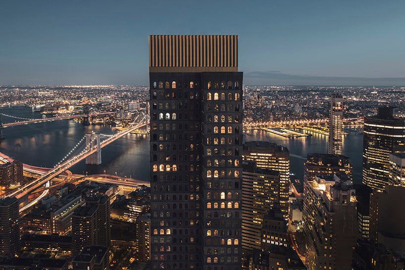
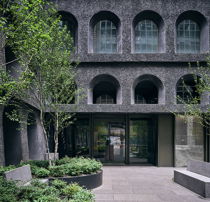
130 William stands completed in New York City‘s financial district, marking Adjaye Associates‘ first skyscraper. Designed as a rejection of the common glass tower, the architecture takes its inspiration from the industrial heritage of the city with its facade of rhythmic, arched windows and its hand-cast concrete skin — this way, the project evokes a ‘ruin’ in the city, proposing an alternative history of New York architecture. The building rises 800 feet and 66 stories above the city, and introduces 242 residences along with a luxurious collection of amenities and a welcoming public plaza at street-level. See designboom’s previous coverage here.
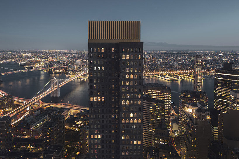 image © Ivane Katamashvili
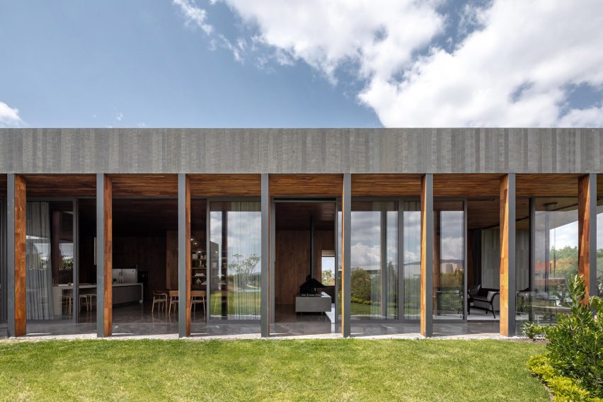
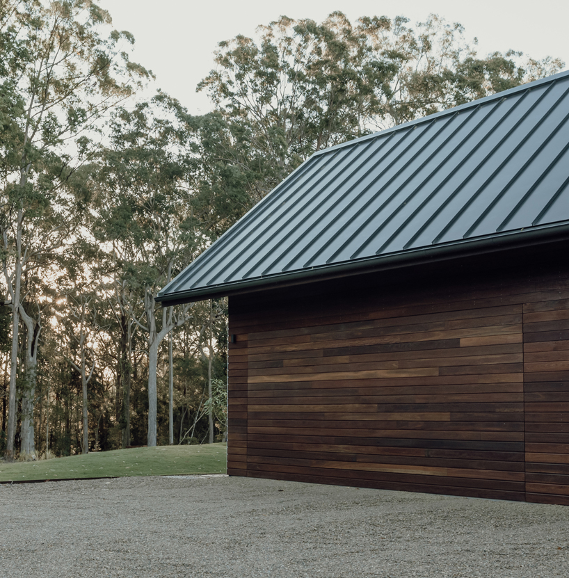
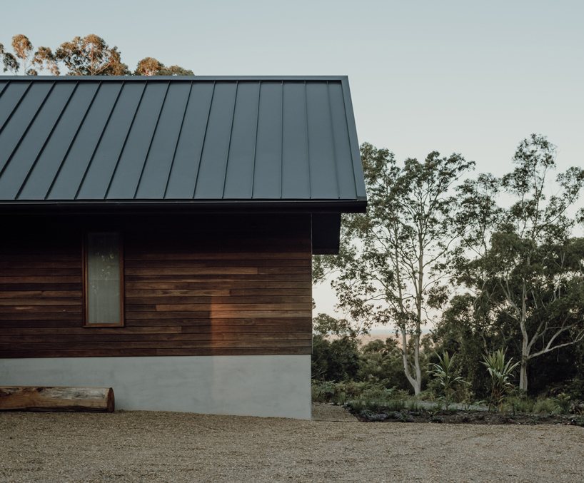
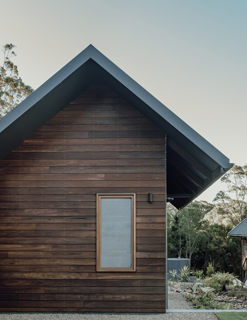
a hand-cast concrete facade evokes the texture of lava rock
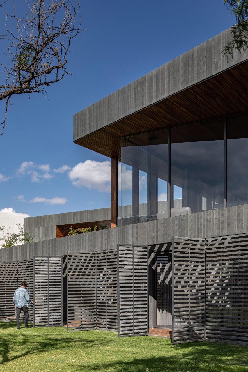
From the street, 130 William’s entrance plaza opens up as a lush public ‘pocket park,’ which Adjaye Associates designed as a quiet retreat from the density of the Financial District. This park is wrapped on three sides by the building’s custom hand-cast facade with its stack of arched windows. From here, visitors can observe the rich texture of the blackened concrete skin, cast to evoke the porous surface of lava rock, which is highlighted by refined bronze accents. The distinctive silhouette of large-scale arched windows are a reminder of the historic lofts that once defined the fabric of lower Manhattan.
‘This idea of making a ‘pocket park’ as an outdoor room for the city was the compelling part of the project for me,’ architect David Adjaye said during an opening celebration at 130 William. ‘Making not just a condo but a piece of public infrastructure, a piece of the city, was really important.’
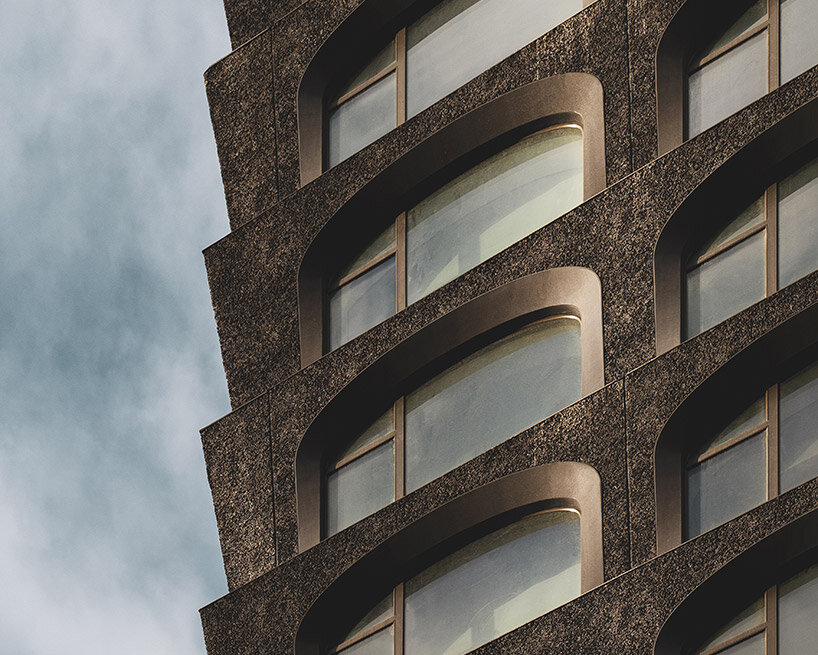
image © Ivane Katamashvili
inside the airy residences
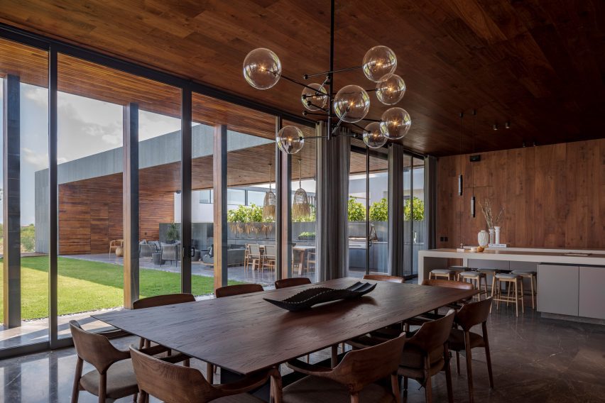
While Adjaye Associates designs its 130 William tower with a dark, fortress-like exterior, the team curated its interiors with a light and airy ambience. The 242 residences range from studios to four-bedroom units, and take shape with materials gathered from across the globe. With wide-plank white oak flooring and large, bronze-framed arched windows, the each residence is designed with open and spacious interiors and a meticulous attention to detail. The team at Adjaye Associates custom-designed all the residences’ burnished bronze fixtures and hardware — including all faucets, showerheads, accessories, and door handles — along with textiles and textural wallpaper.
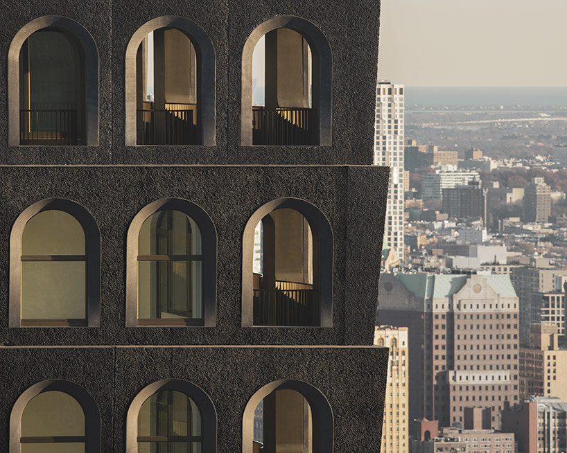
image © Ivane Katamashvili
sheltered loggias bring private outdoor space
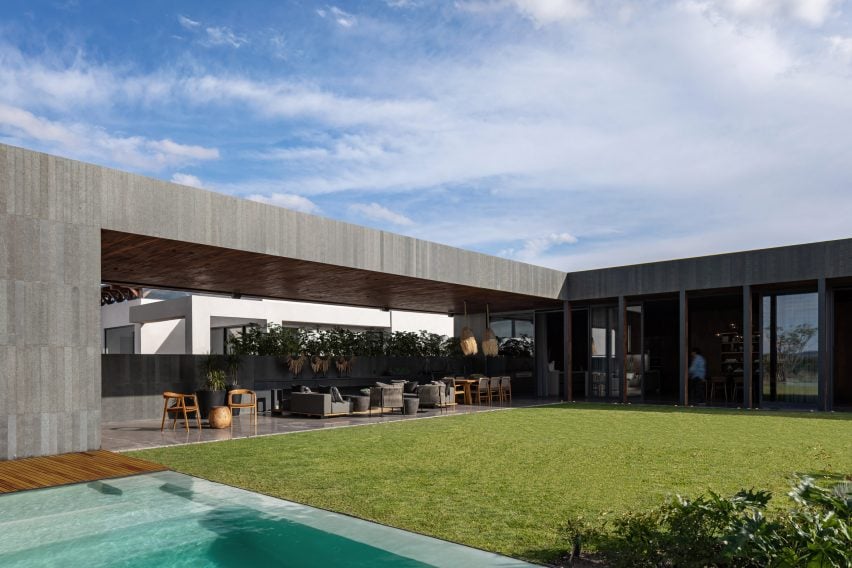
Within the top ten floors of 130 William, Adjaye Associates fits the Penthouse and Loggia Residences, which feature spacious rooms and high ceilings ranging from 11 to 14 feet. These interiors seamlessly connect to expansive outdoor areas with breathtaking views. The Loggia terraces envelop these residences from one end to the other, offering substantial outdoor space starting at a height of over 600 feet. These distinctive residences are further enriched with exclusive touches, such as sink countertops and soaking tubs crafted from exquisite marble.
a ‘pocket park’ is open for residents and the public alike | image © Dror Baldinger
the luxury amenities of 130 william
130 William presents an extensive range of lifestyle and wellness amenities spanning over 20,000 square feet. These offerings encompass a comprehensive health and wellness club featuring a luxurious infinity-edge spa pool, invigorating cold and hot plunge pools, a rejuvenating dry sauna, and tranquil massage rooms. Additionally, there is a cutting-edge fitness center with a terrace, a serene yoga studio, and a versatile basketball court. Residents can indulge in various entertainment facilities, including a private IMAX theater, one of just two in all of New York City. Indoor and outdoor lounges offer a chef’s catering kitchen, a club room, a golf simulator, and a children’s play space.
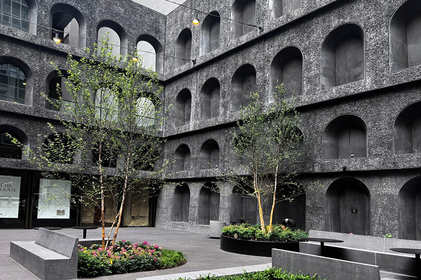 the blackened, textural facade wraps the public park on three sides | image © designboom
For panoramic views across the city and beyond, a private rooftop observation deck crowns 130 William, situated almost 800 feet above ground level. Convenient services include a 24-hour attended lobby, a concierge service catering to personal needs such as reservations and theater tickets, as well as a pet spa. Additional amenities comprise bicycle storage, private storage options, and exclusive rooftop cabanas.

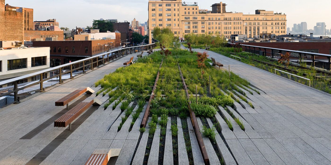
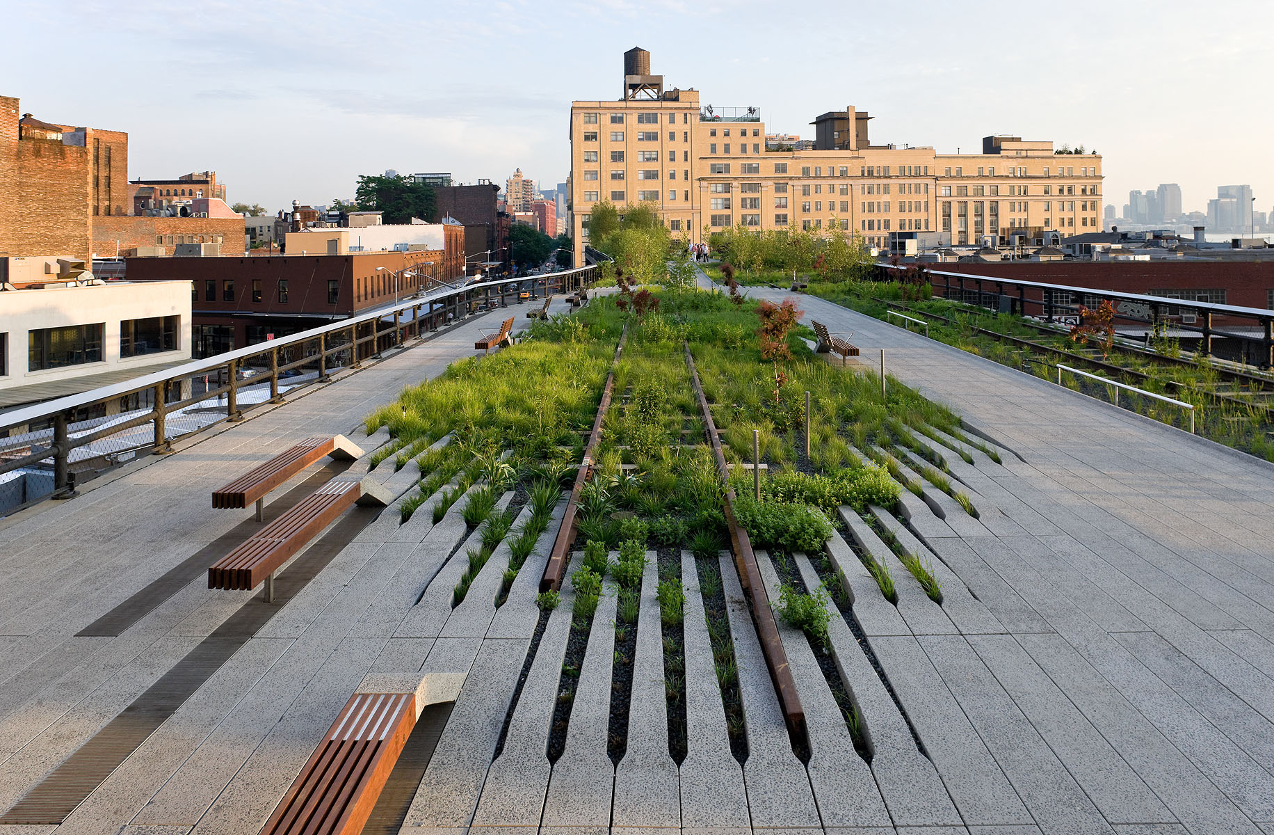
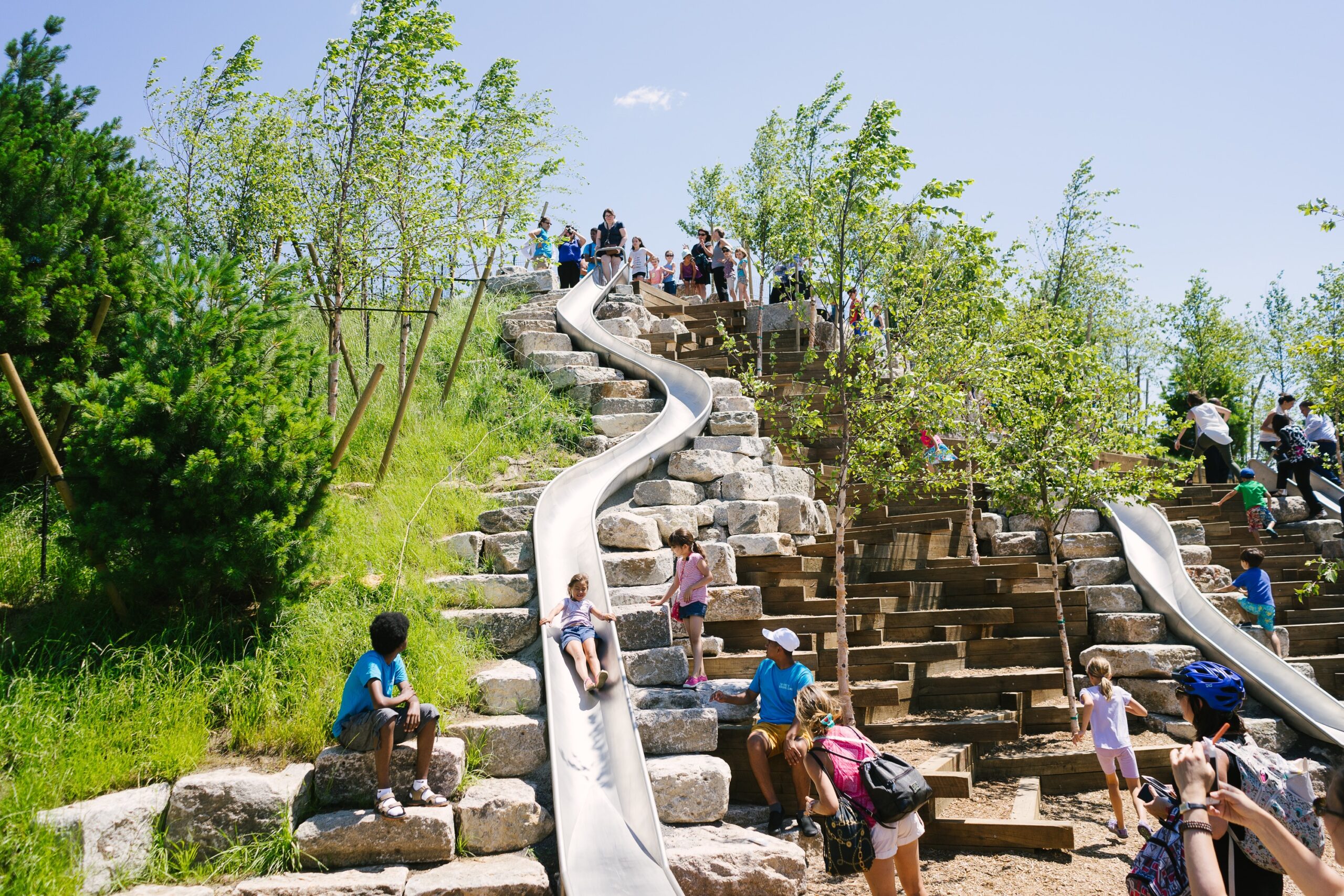
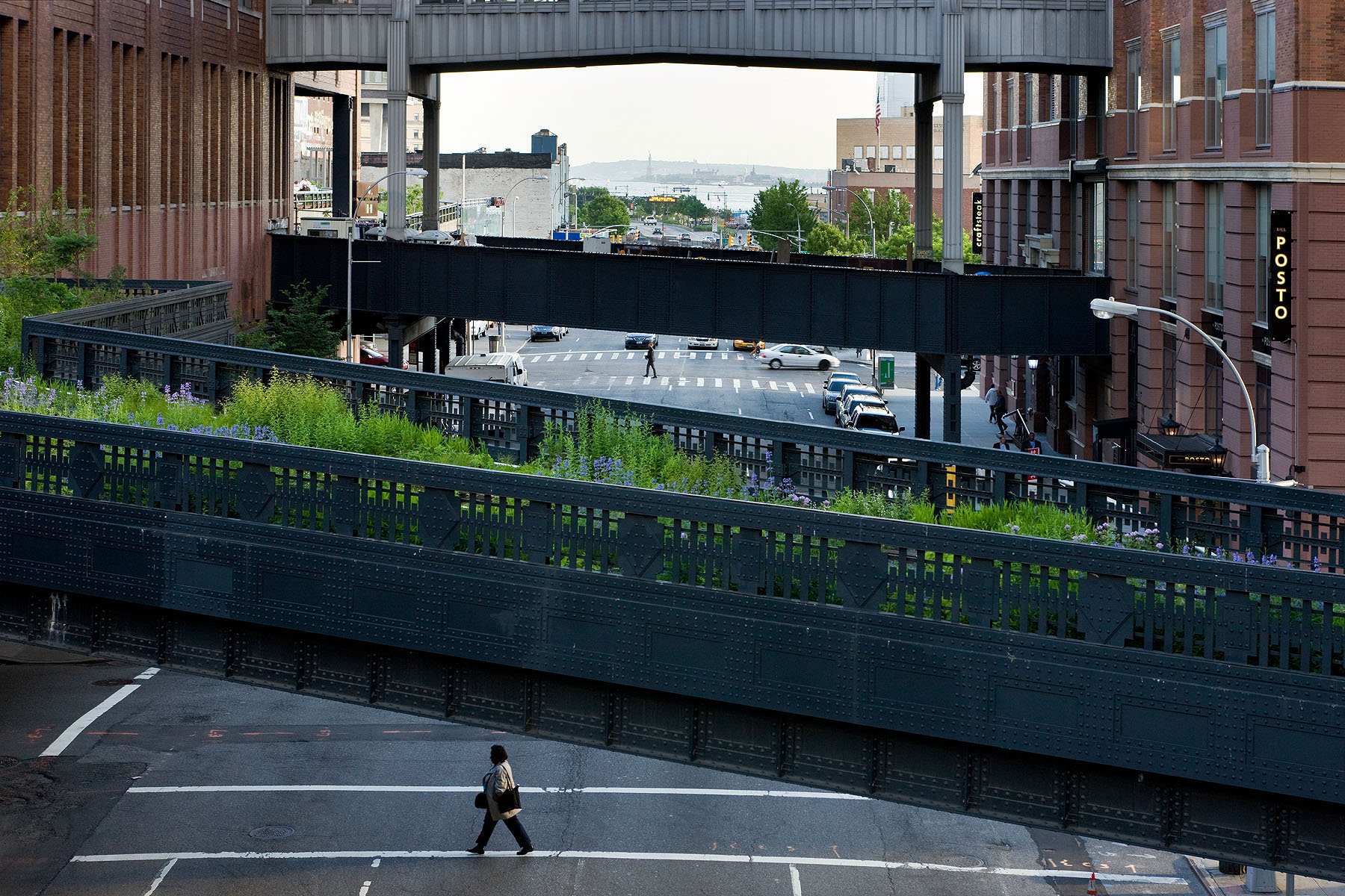 How can an abandoned railroad be reused by the citizens of New York City? Connecting the Meatpacking District with the Hudson Railyards, 1.5 miles (2.5 kilometers) of elevated rail tracks have been transformed into the High Line project: a public park that stands as an agricultural oasis amidst the franticness of the big city. Prior to the project’s realisation, the deserted railroad had already been “reclaimed” by nature. Consequently, when James Corner Field Operations and Diller Scofidio + Renfro designed the High Line they celebrated these natural diversities, by employing the strategy of “agri-tecture”. Irregular paving patterns and planting beds form a series of asymmetrical pathways, allowing the people of New York to experience the city through a different, more impromptu, type of lens.
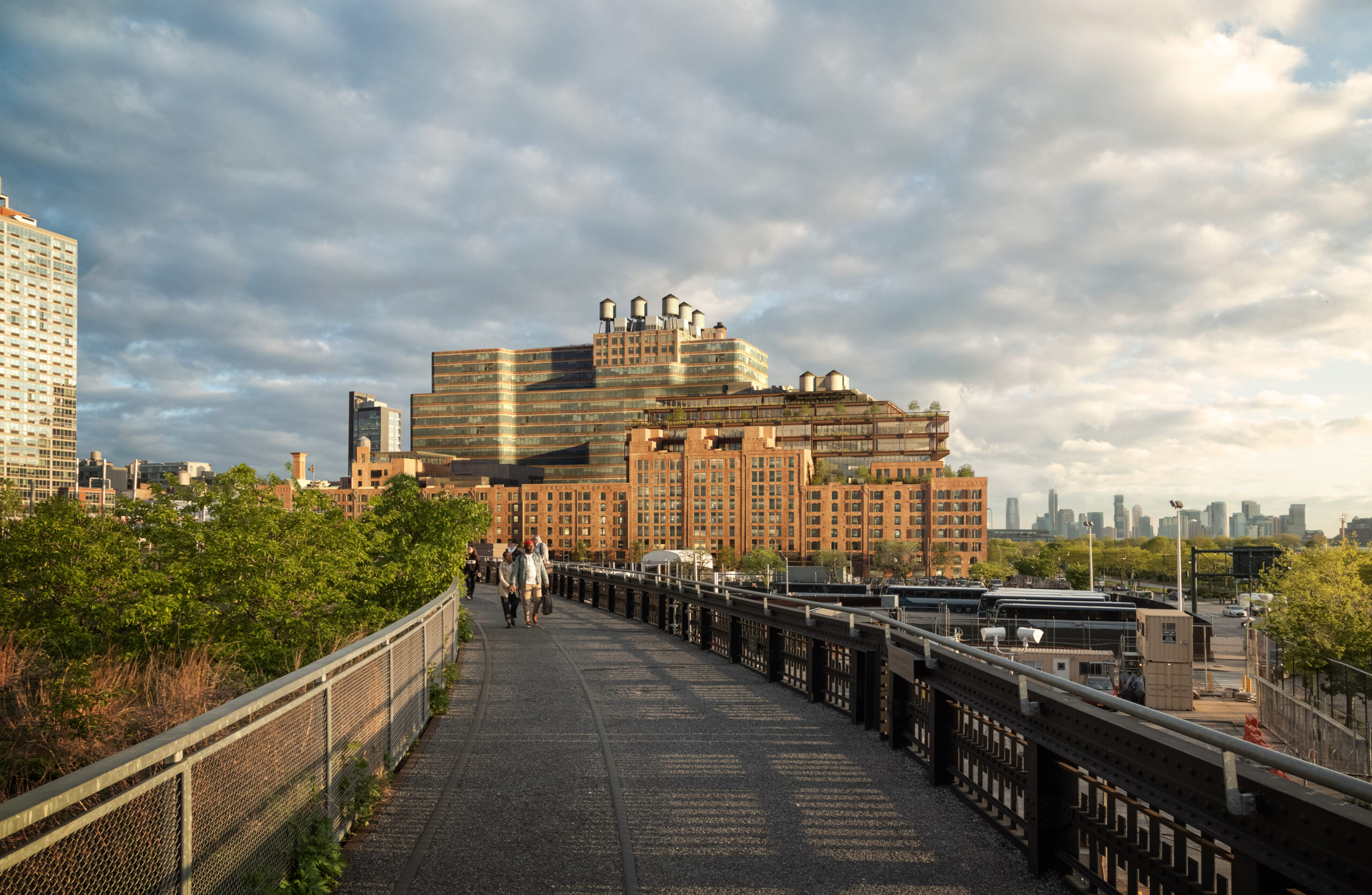
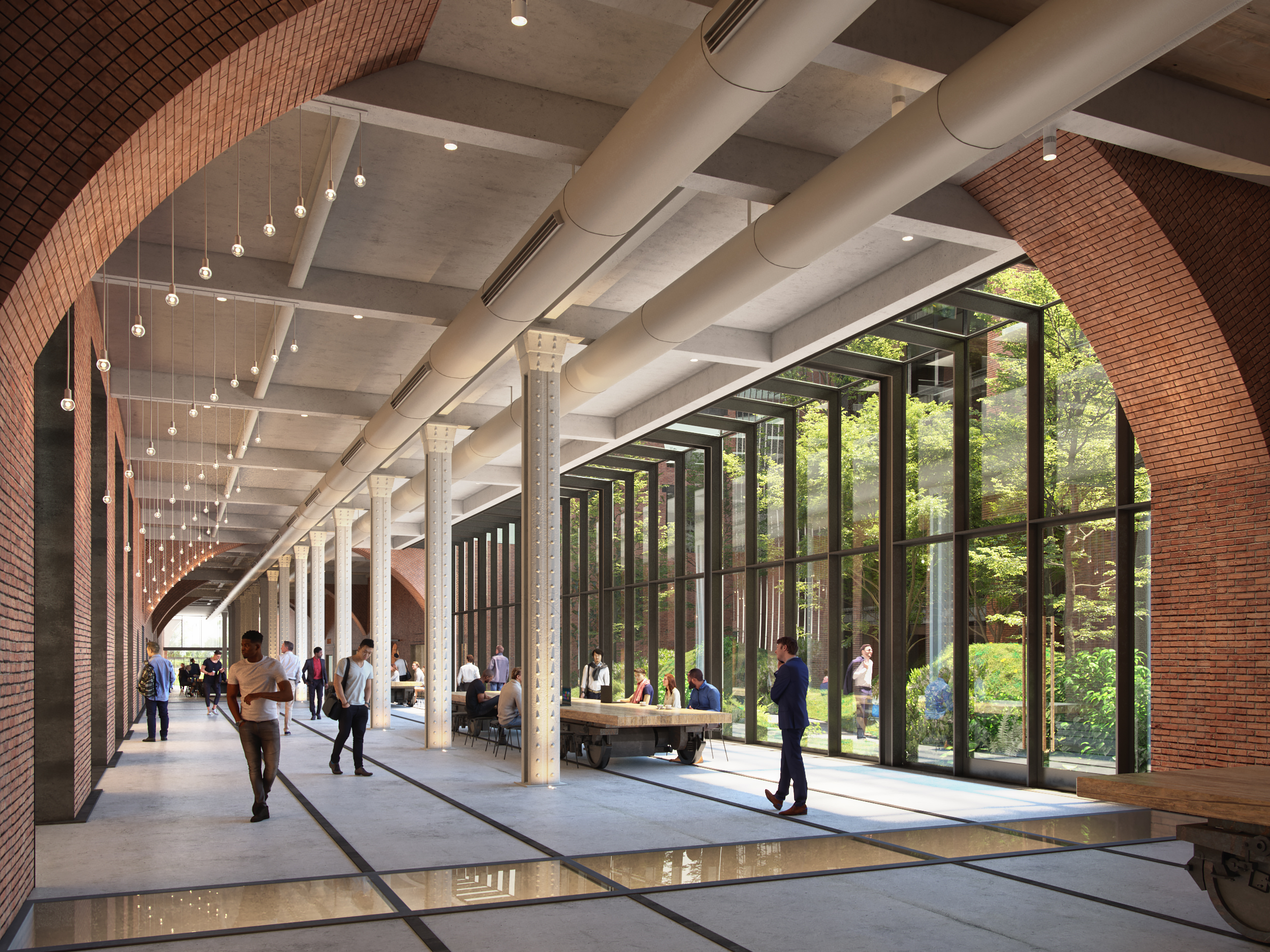 Built in 1891, the Terminal Warehouse is an iconic post-industrial ruin of New York. No longer needing the traditional warehouse in West Chelsea district, the Terminal Warehouse is gradually being transformed into a collection of biophilic office spaces. As part of their design strategy, COOKFOX Architects have preserved the building’s historic architectural typology and used its masonry structure as an infrastructure for supporting a series of gardens and green terraces. Additionally, through a set of rail tracks, the Terminal Warehouse is directly linked with Hudson river. The disregarded railroad becomes an opportunity for reuse and is transformed into a pedestrian route that reestablishes the link between city and water.
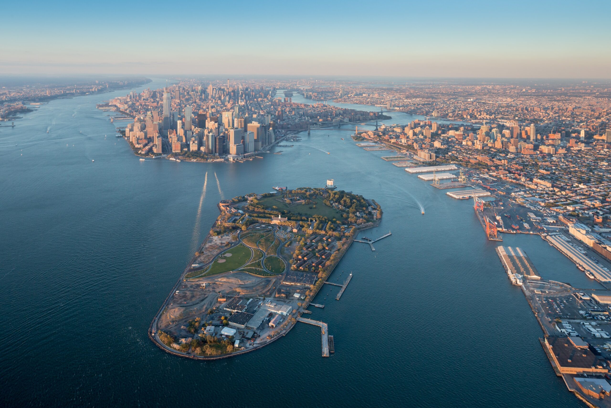
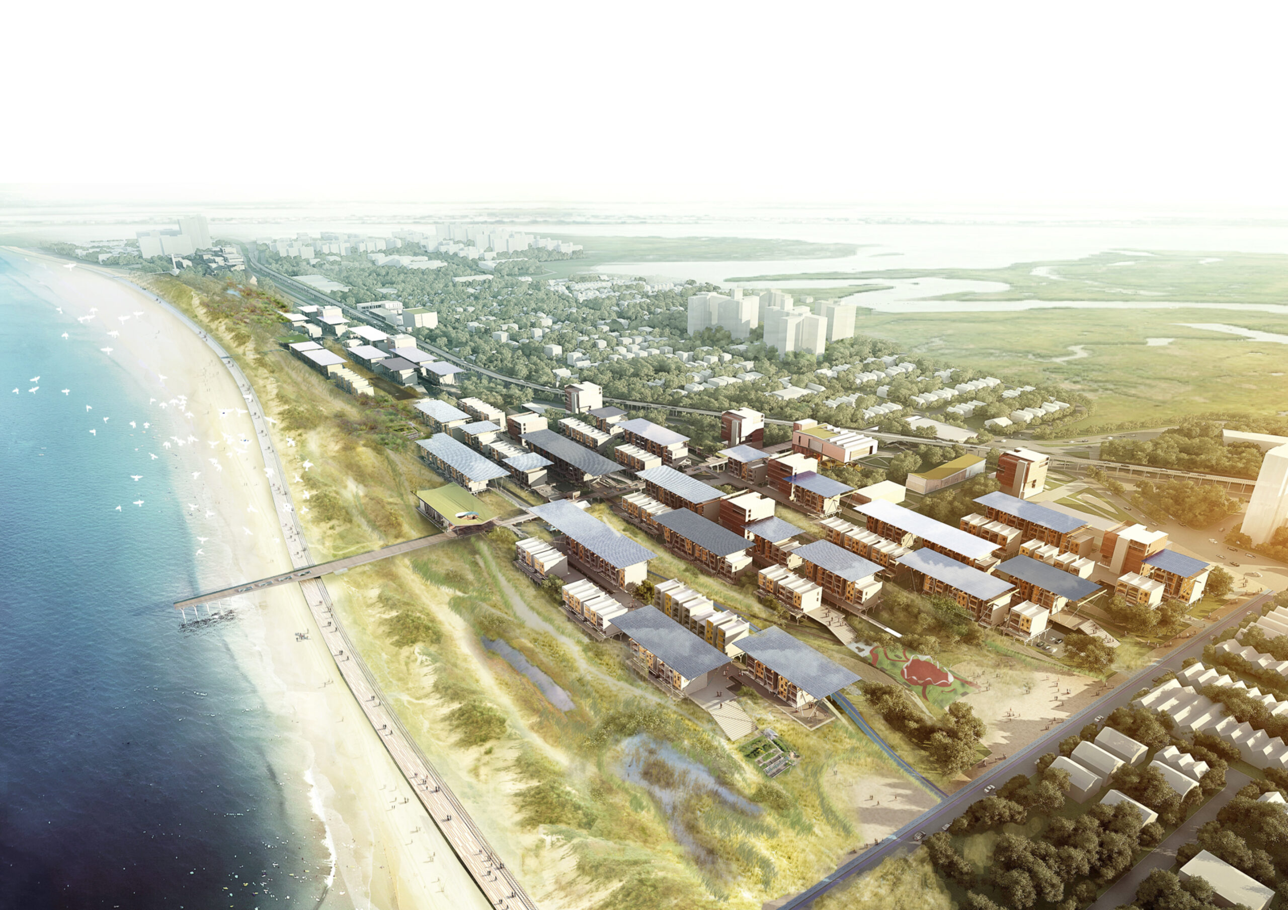 Located in a beach-front site in the Rockaways, the F.R.E.D. proposal introduces a new type of pairing between nature and infrastructure. Ennead Architects used the iconic Row House typology and the local sand dunes as the two components for designing a resilient infrastructure system. Their aim was to create a flexible strategy, which could be easily repurposed for other waterfront sites with the same characteristics and expand upon the research on “infrastructuring nature”.
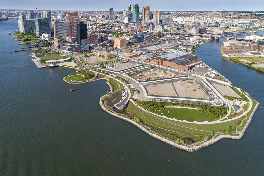
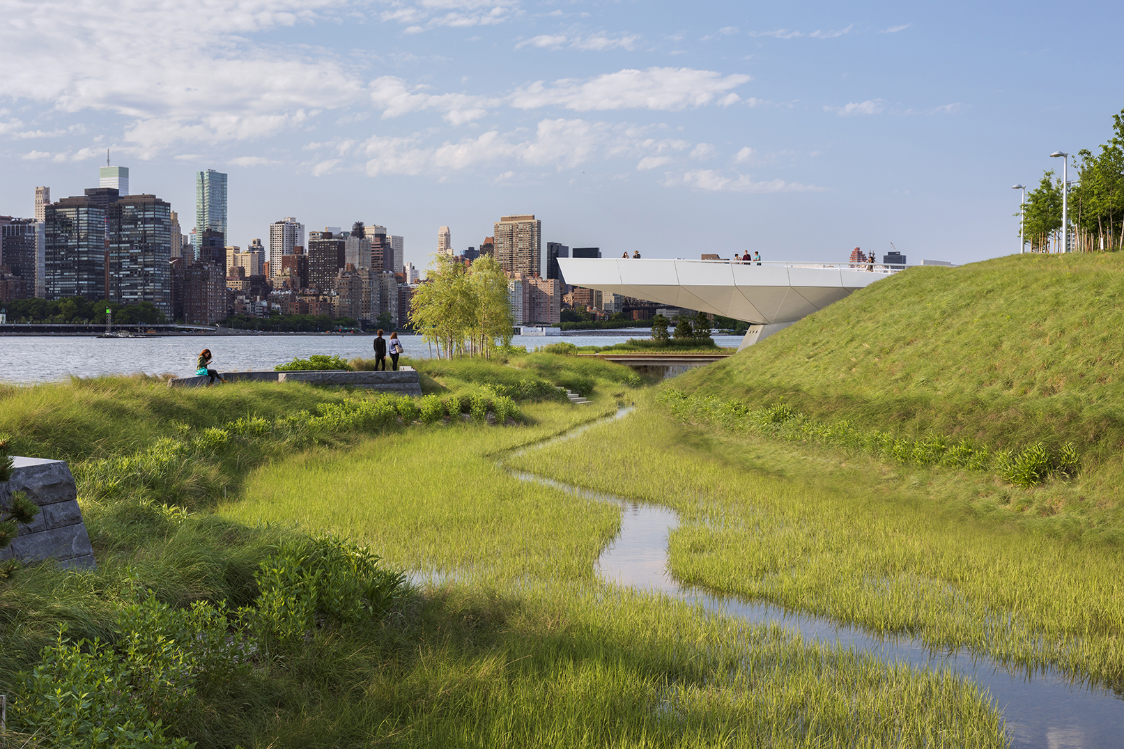 For two hundred years, Hunter’s Point was a series of wetlands on the East river. Later on, the site was turned into an industrial hub and rail station. Eventually, it was diminished to a post-industrial ruin filled with decaying piers and steep landfills, inaccessible to the wider public. Finally, in 2018 it became one of the most transformative and ecologically driven projects in the city. A coastal park, a footbridge, a cantilevered overlook and even a landfill peninsula transformed what used to be an empty industrial site into an adaptable infrastructural system that reinvented the once iconic water edge.
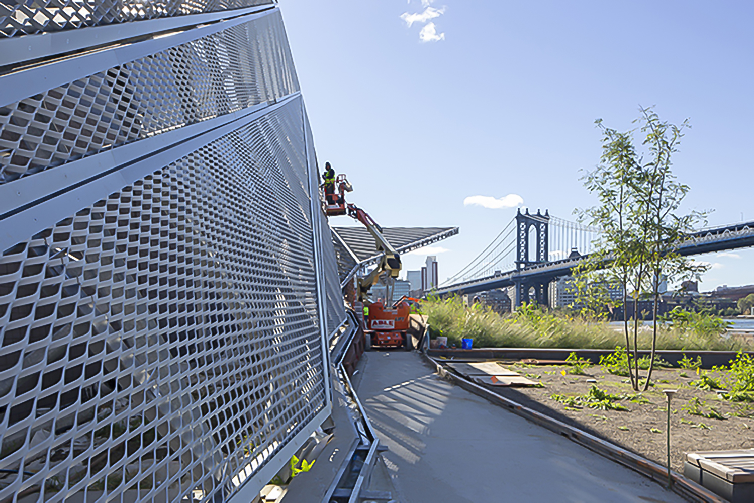
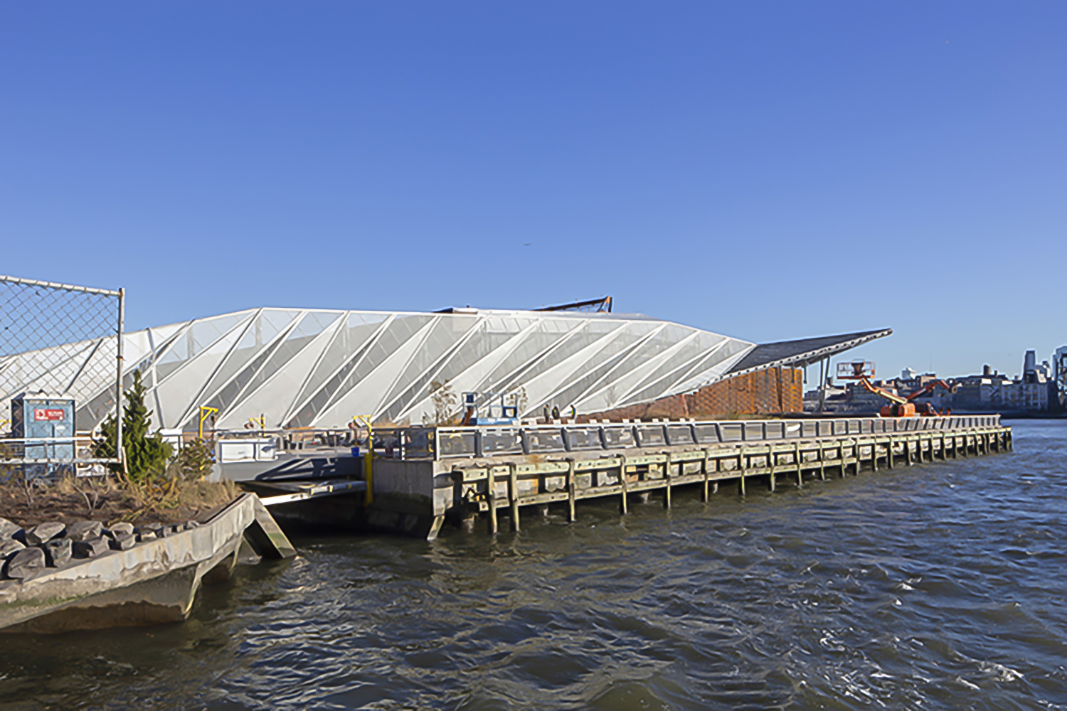 Enclosed by the Hudson and East rivers, the island of Manhattan is naturally surrounded by many raw, uninviting concrete piers. Fortunately, the Pier 35 proposal transformed one of these flat blocks of artificial land into a much needed esplanade project. Pier 35 is literary “infrastructuring nature”. It consists of a folded landscape that gradually slopes down to the surface of the water. Its crinkled form interacts with the varying tidal currents, while replicating the physical characteristics of the East river shoreline. Above the water, a series of landscape lawns, dunes and inclined plant-covered screens form pedestrian walkways filled with vantage points towards Brooklyn and Manhattan bridge.
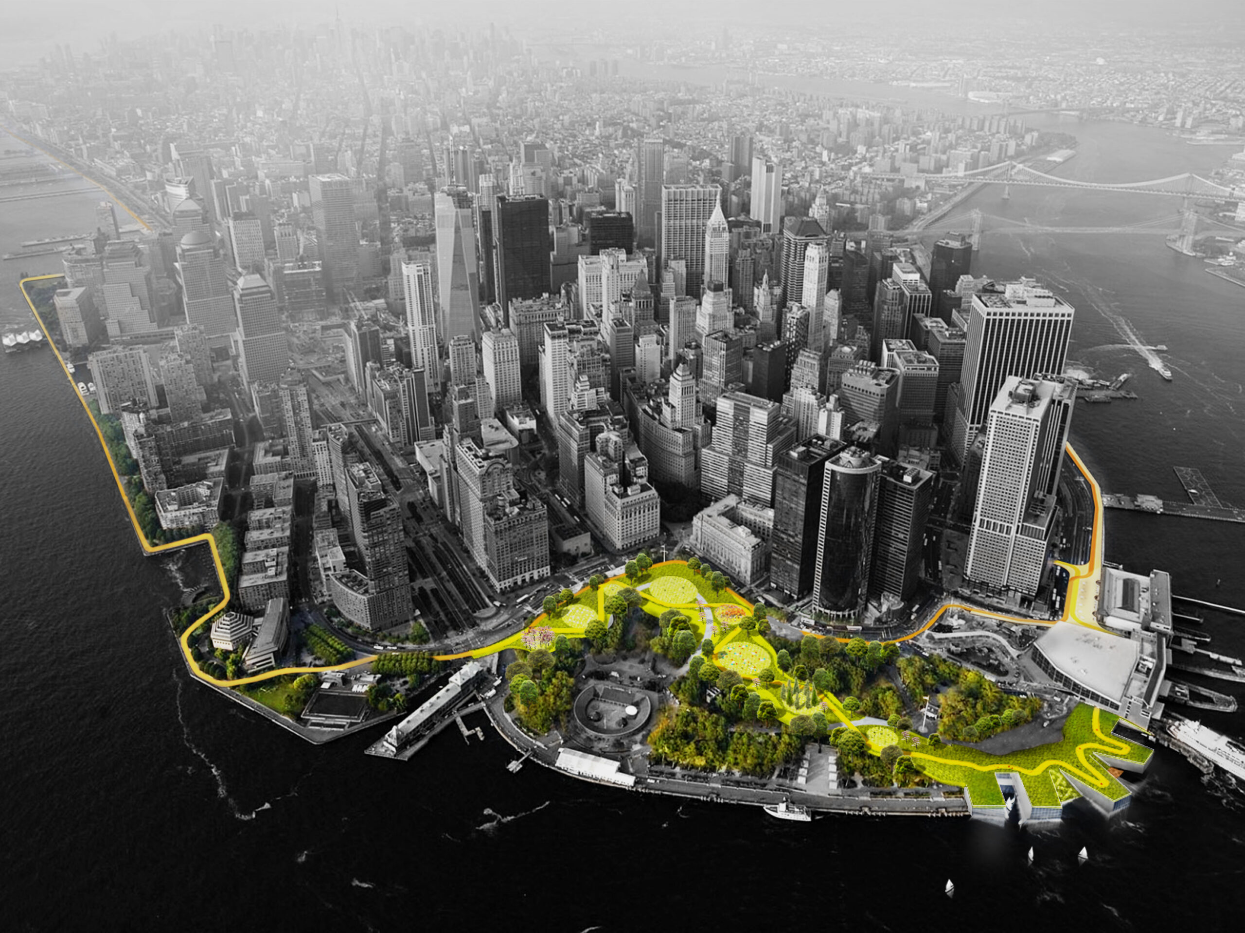
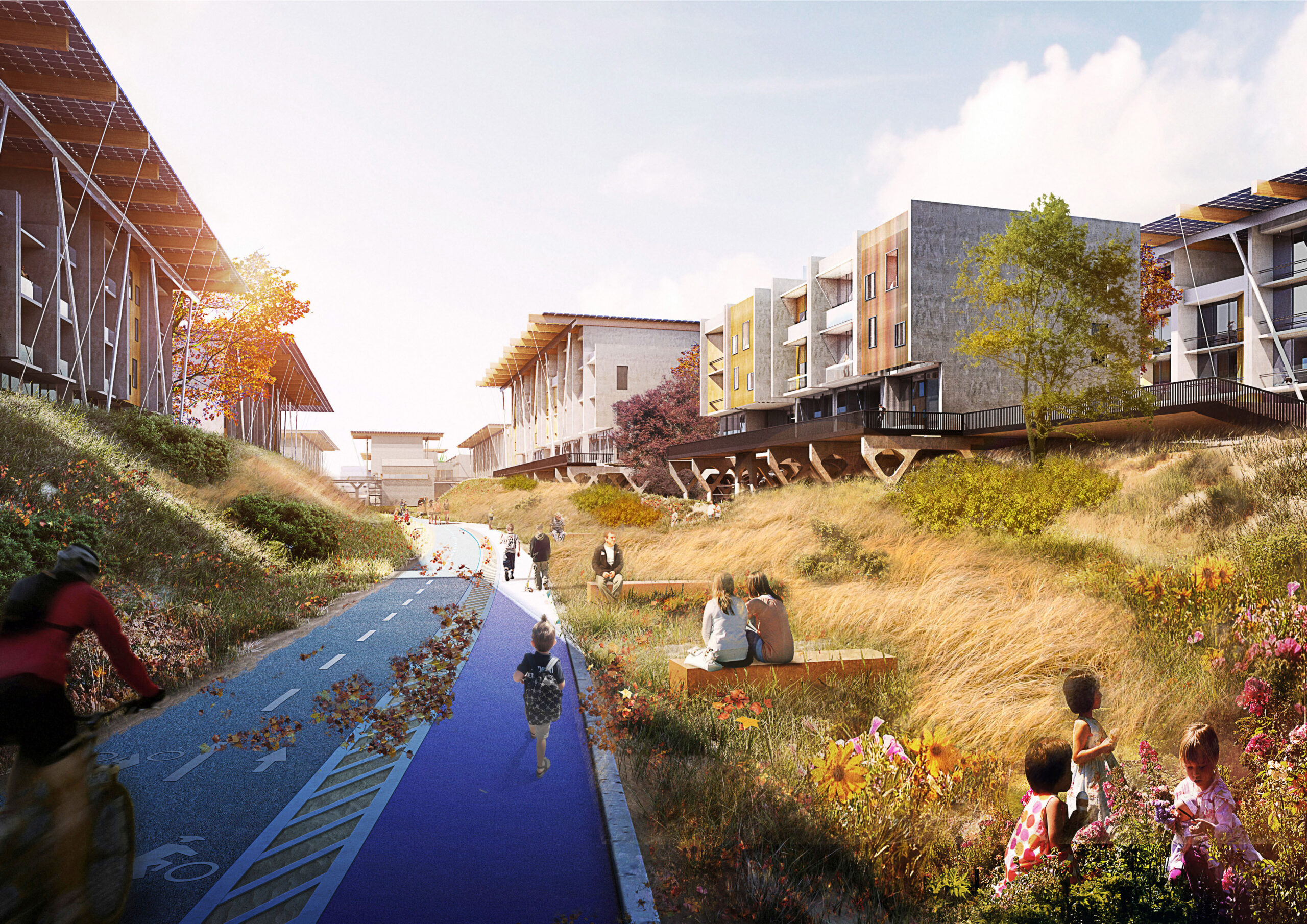
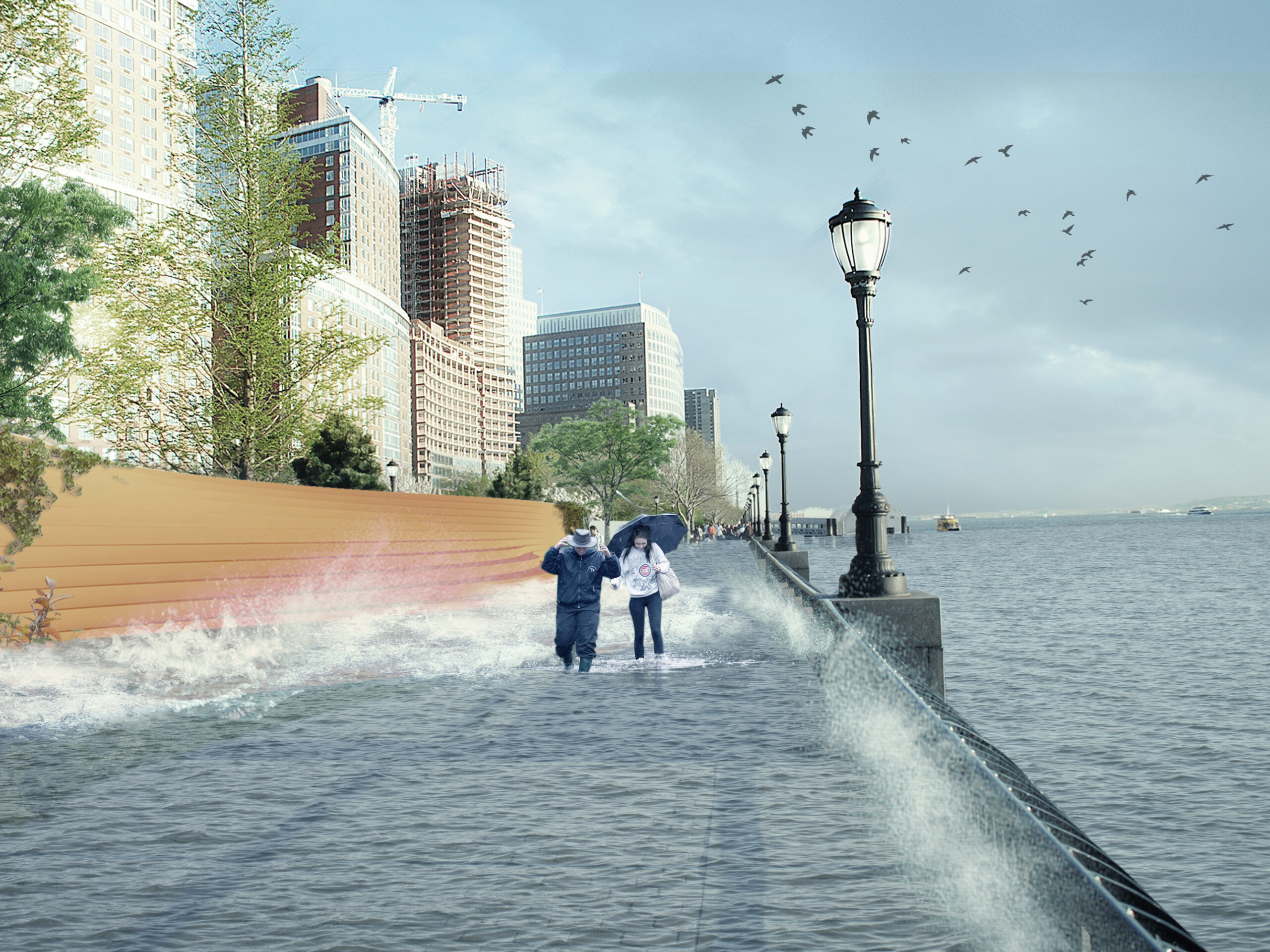 Also known as “The Big U,” this conceptual 10-mile-long (16 kilometer) protective ribbon around Manhattan was imagined in the wake of Superstorm Sandy. Ultimately, it was deemed unfit to respond to the challenging weather conditions that increasingly threaten the city. Subsequently, the Dryline is a project that redesigns lower Manhattan’s water edge, proposing a series of components that will aid to both the physical and social infrastructure requirements of the neighboring districts. More specifically, the project consist of a continuous protective element that also operates as playful street furniture, an elevated pathway and finally, a series of overarching greenways. In short, the Dryline project has essentially become the blueprint for effectively designing social as well as physical infrastructure strategies for coastal cities, providing new insights for “infra structuring nature” practices.

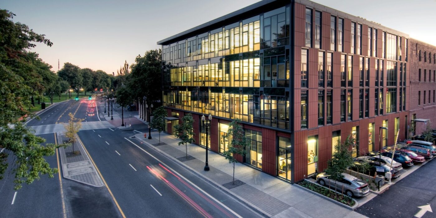
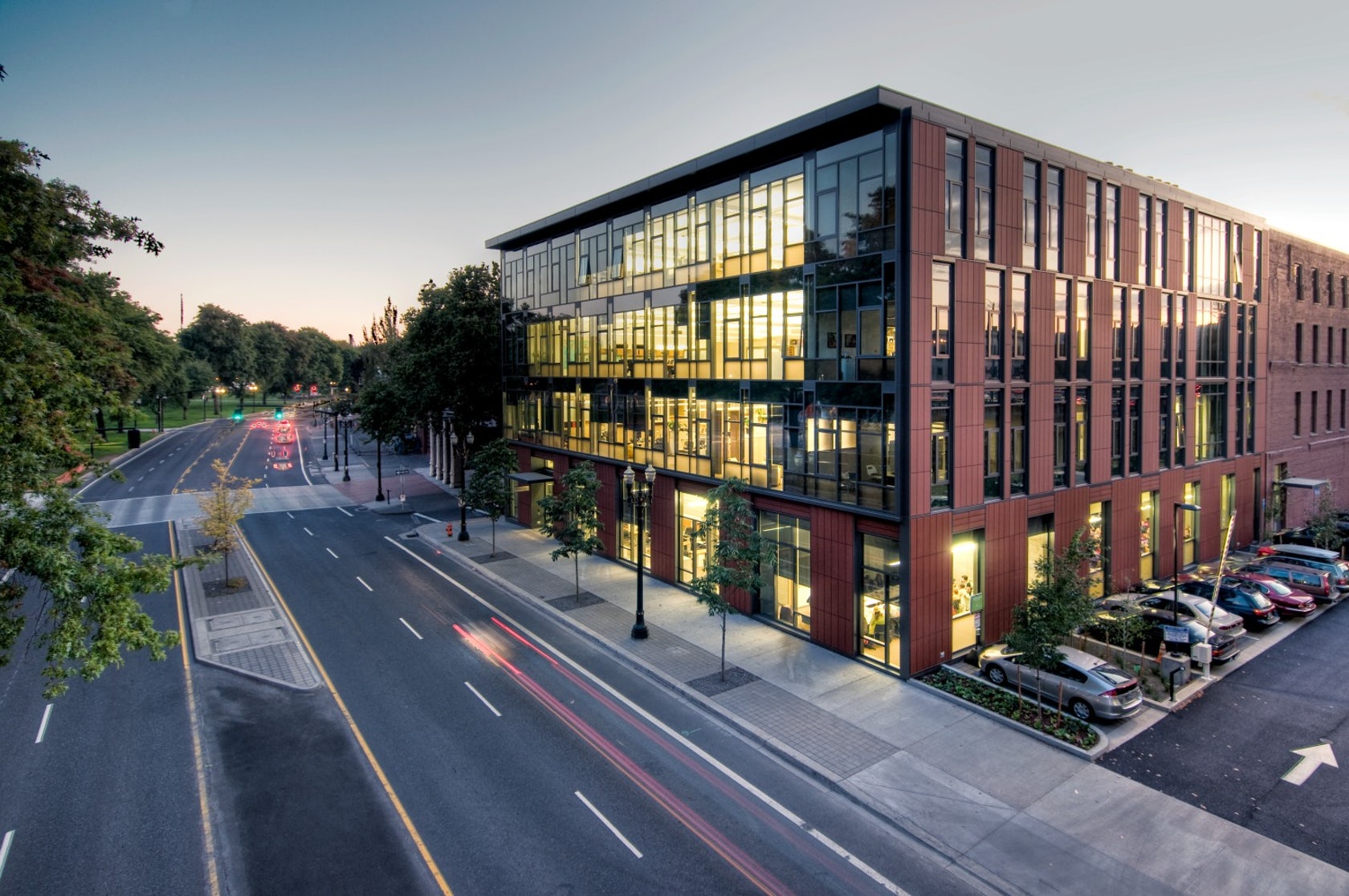
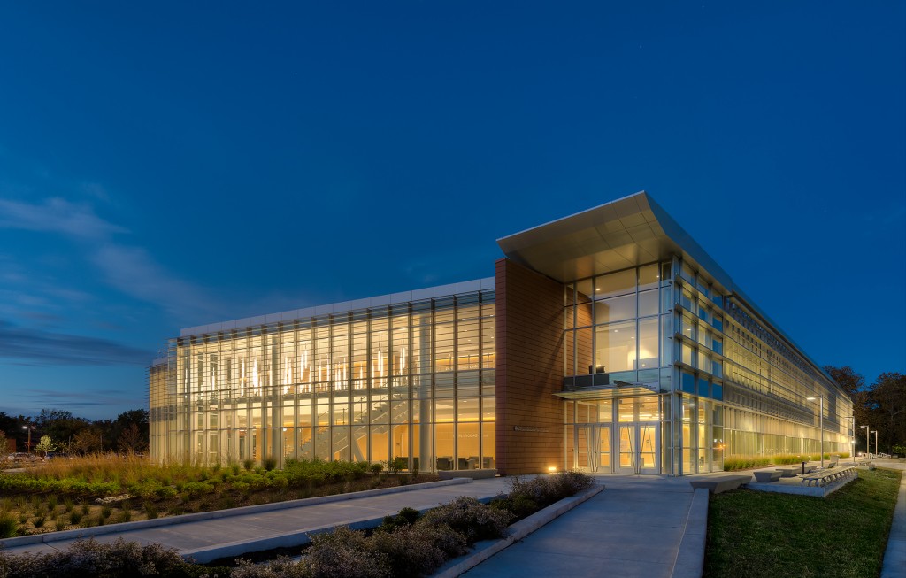
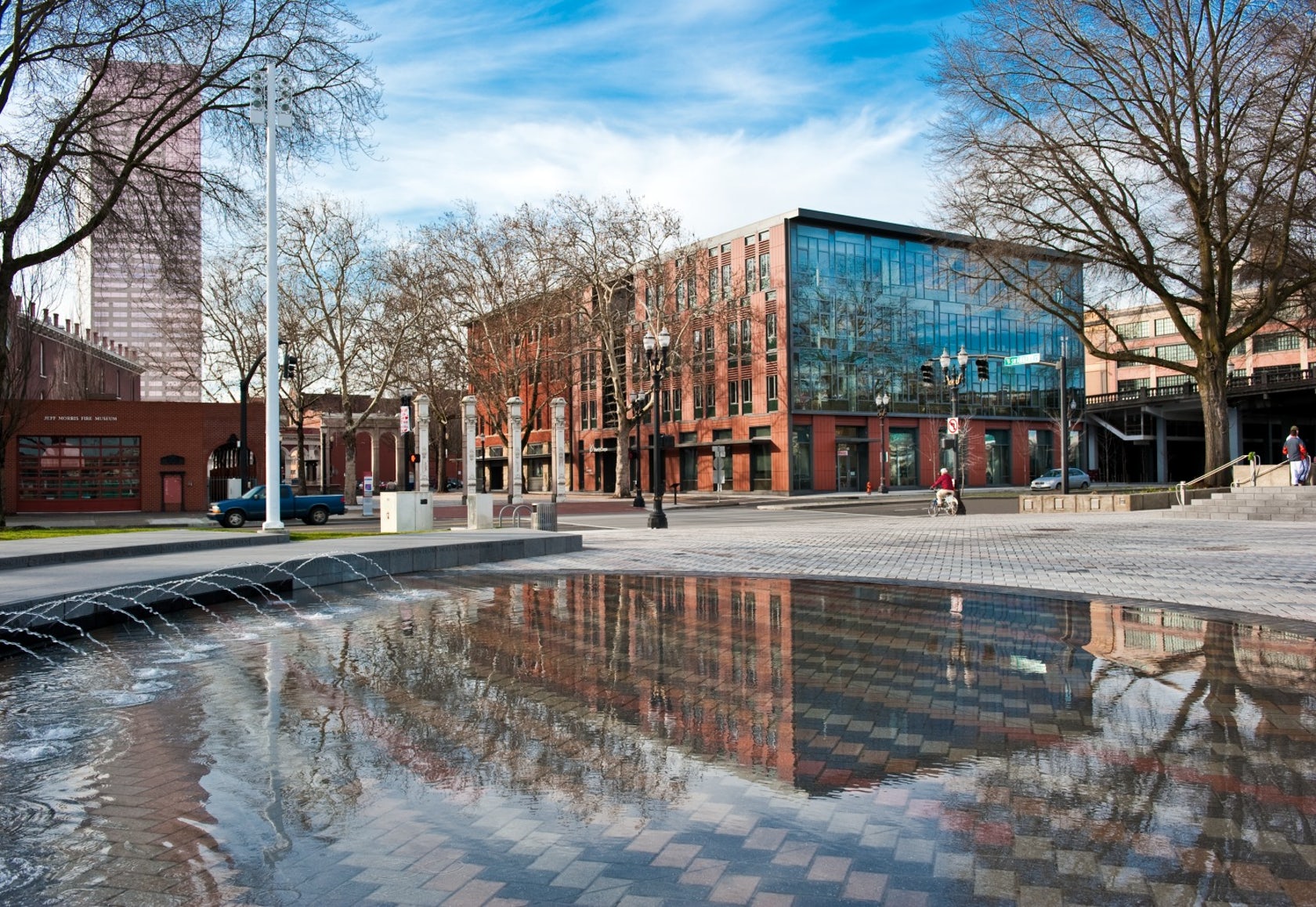 Designed to teach and encourage visitors to engage with contemporary issues, the Mercy Corps building was built to exemplify a sustainable, community-focused approach. Doubling the size of the historic Portland Packer-Scott Building, the landmark project combined a green roof, with resource-friendly landscaping and a glass and terracotta envelope.
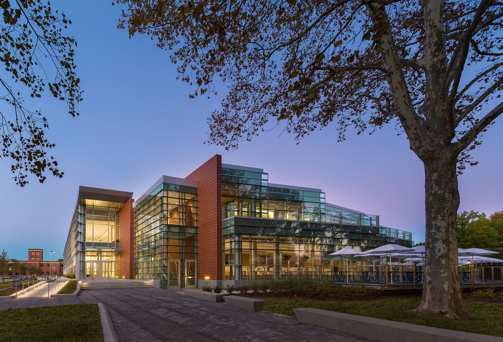
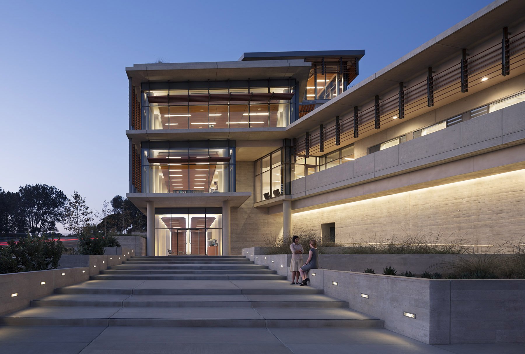
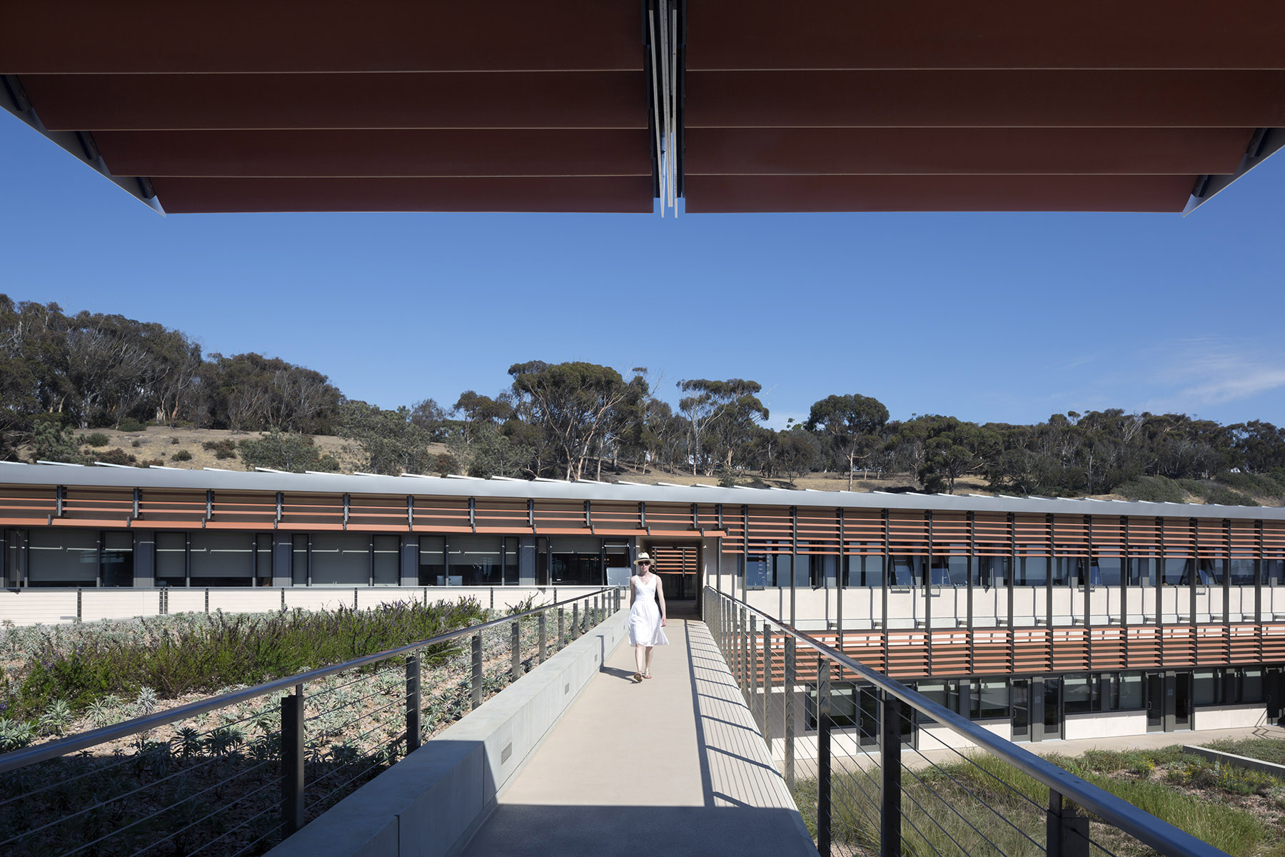 For the design of the National Oceanic and Atmospheric Administration (NOAA)’s Southwest Fisheries building, the team partnered with the University of California San Diego to design a facility that would pay homage to a world-class site and create a sustainable building for environmental stewards of the ocean.
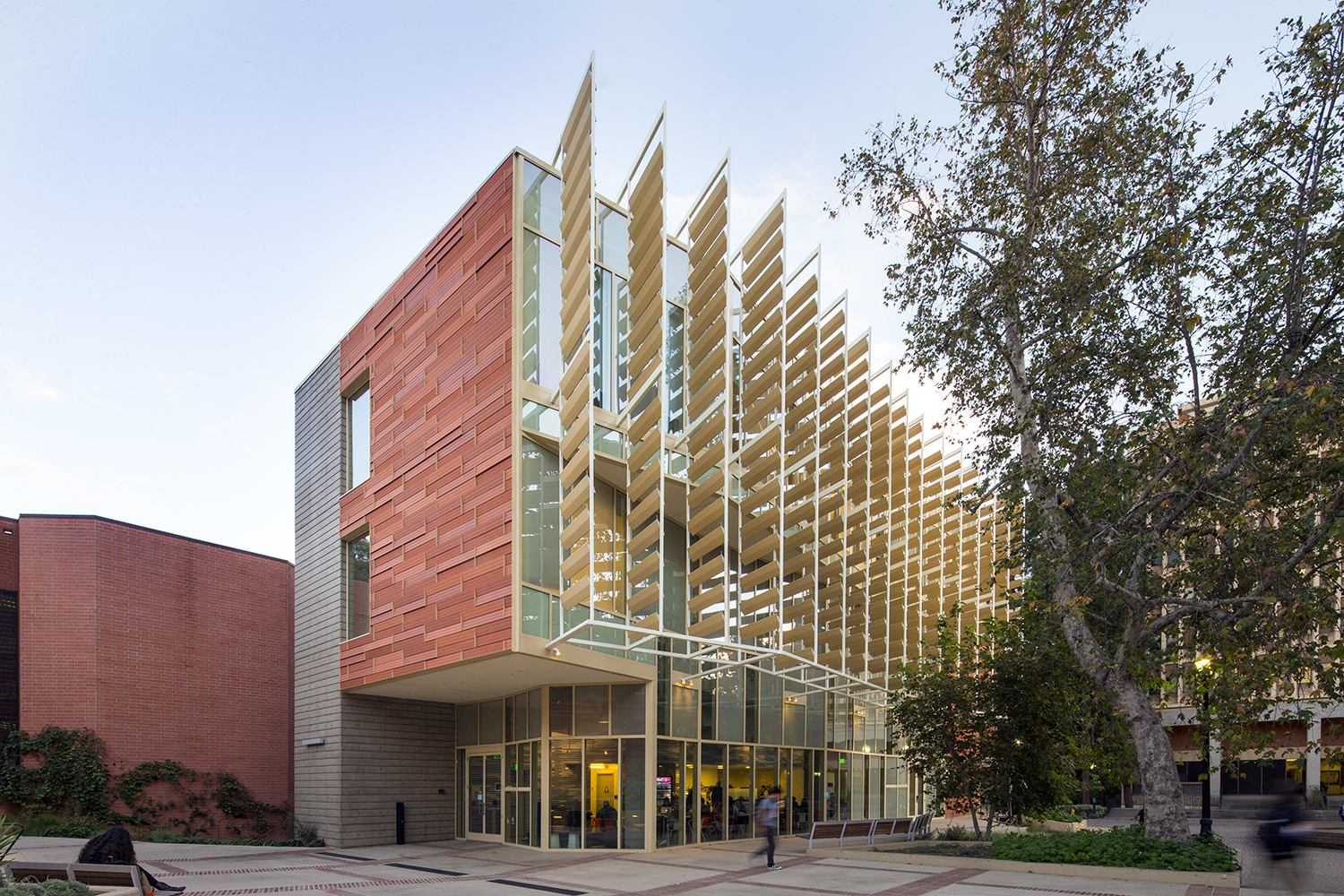
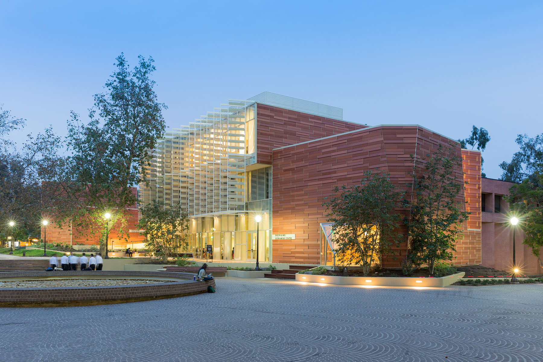 For this music center in Los Angeles ,the project includes a high-tech recording studio, spaces for rehearsal and teaching, a café and social space for students, and an Internet-based music production center. Music industry executive and philanthropist Morris “Mo” Ostin donated $10 million to UCLA for the music facility, now known as the Evelyn and Mo Ostin Music Center. Adjacent to the Schoenberg Music Building and the Inverted Fountain, the new structures provide faculty and students access to the latest advances in music technology, research and technology.
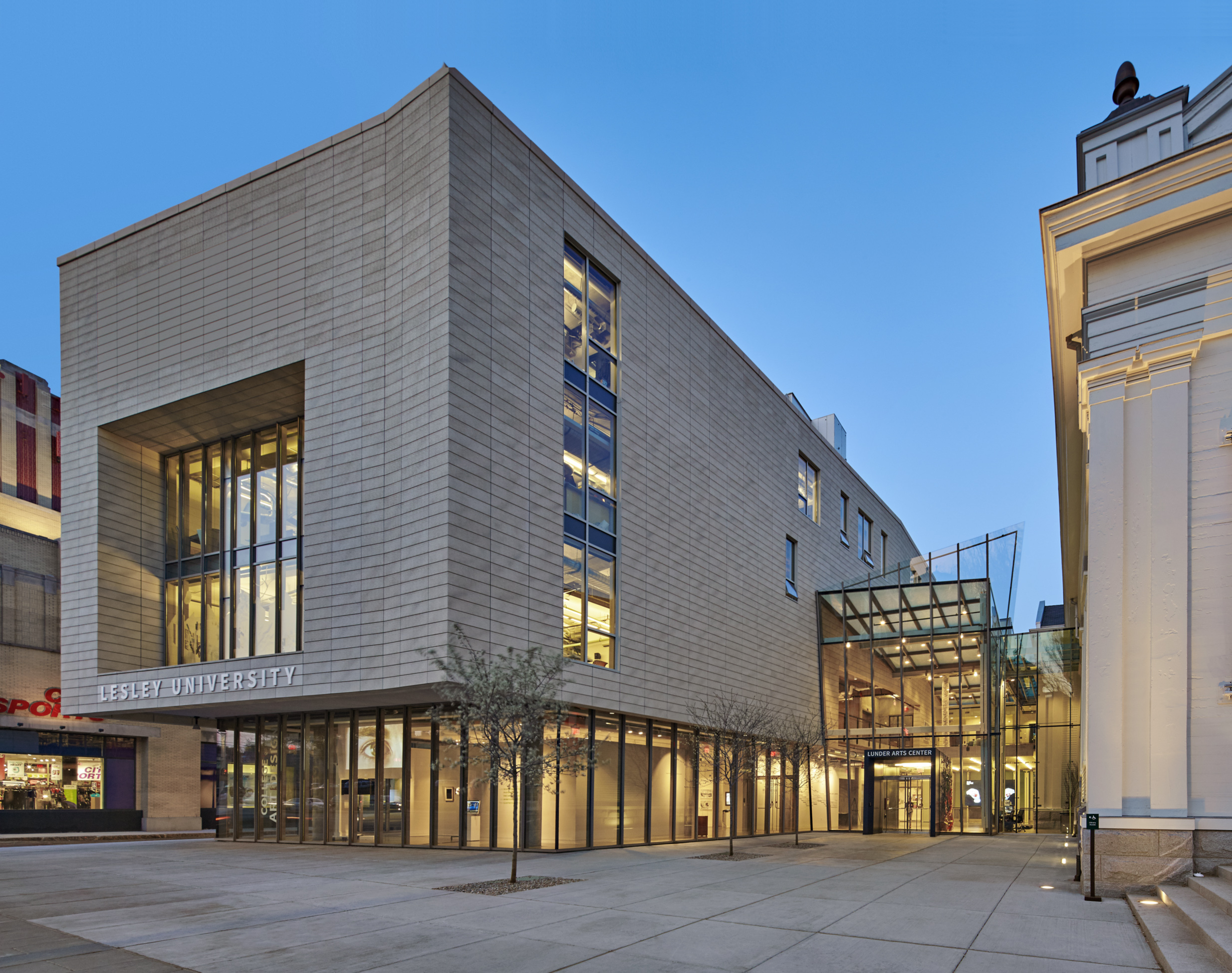
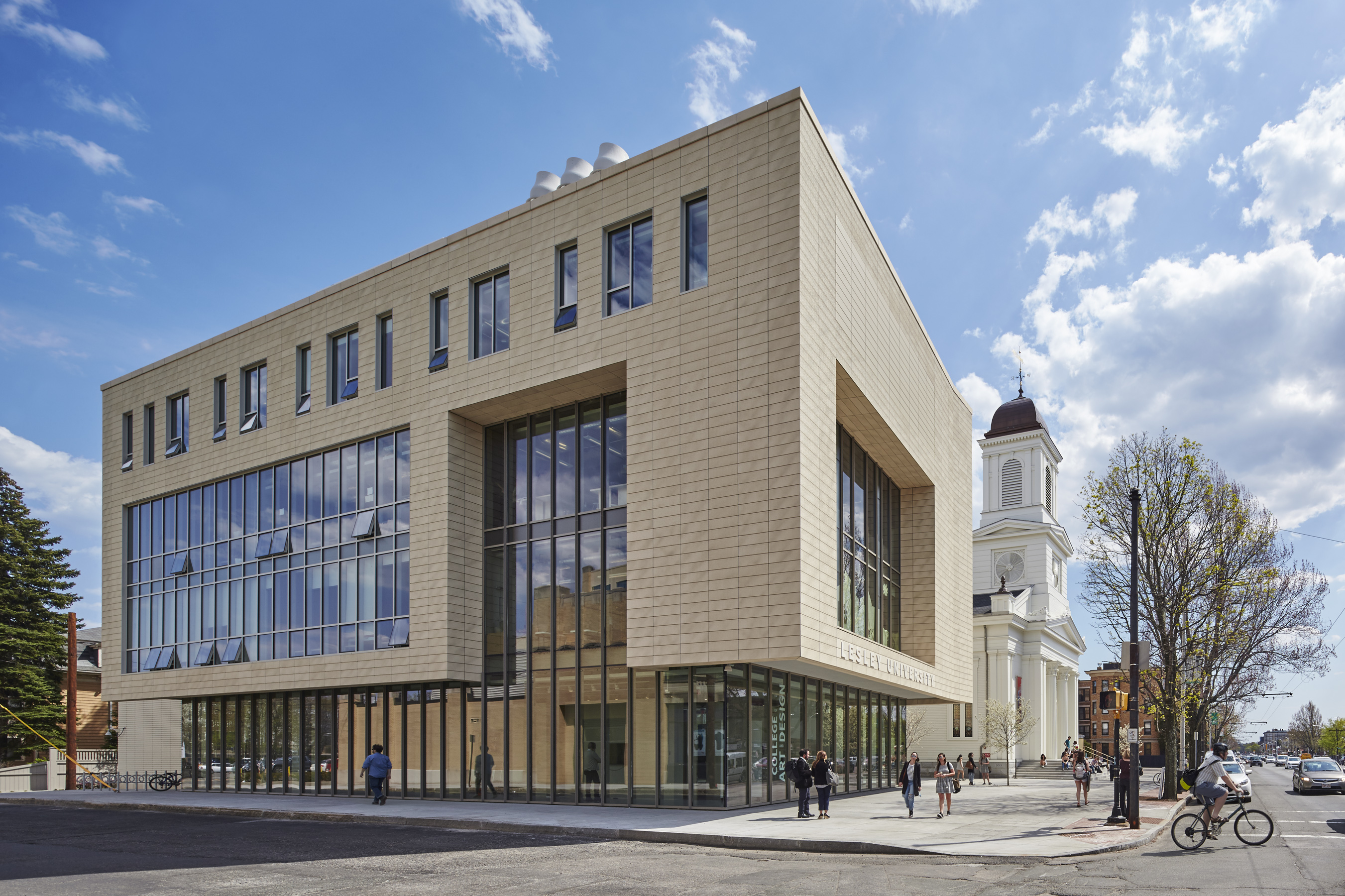 The Lunder Arts Center at Lesley was designed to be the new heart of the College of Art and Design. A center for art teaching and making, the campus is a crossroads for academic, artistic, and neighborhood communities. The terra-cotta and glass design foregrounds the site’s important historic church, initiating a dialog between 19th century religious and 21st century educational icons. An art gallery in the new glass building and a library in the historic church anchor the building at both ends; both are open to the public.
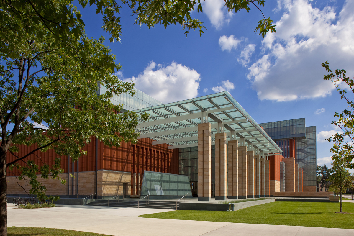
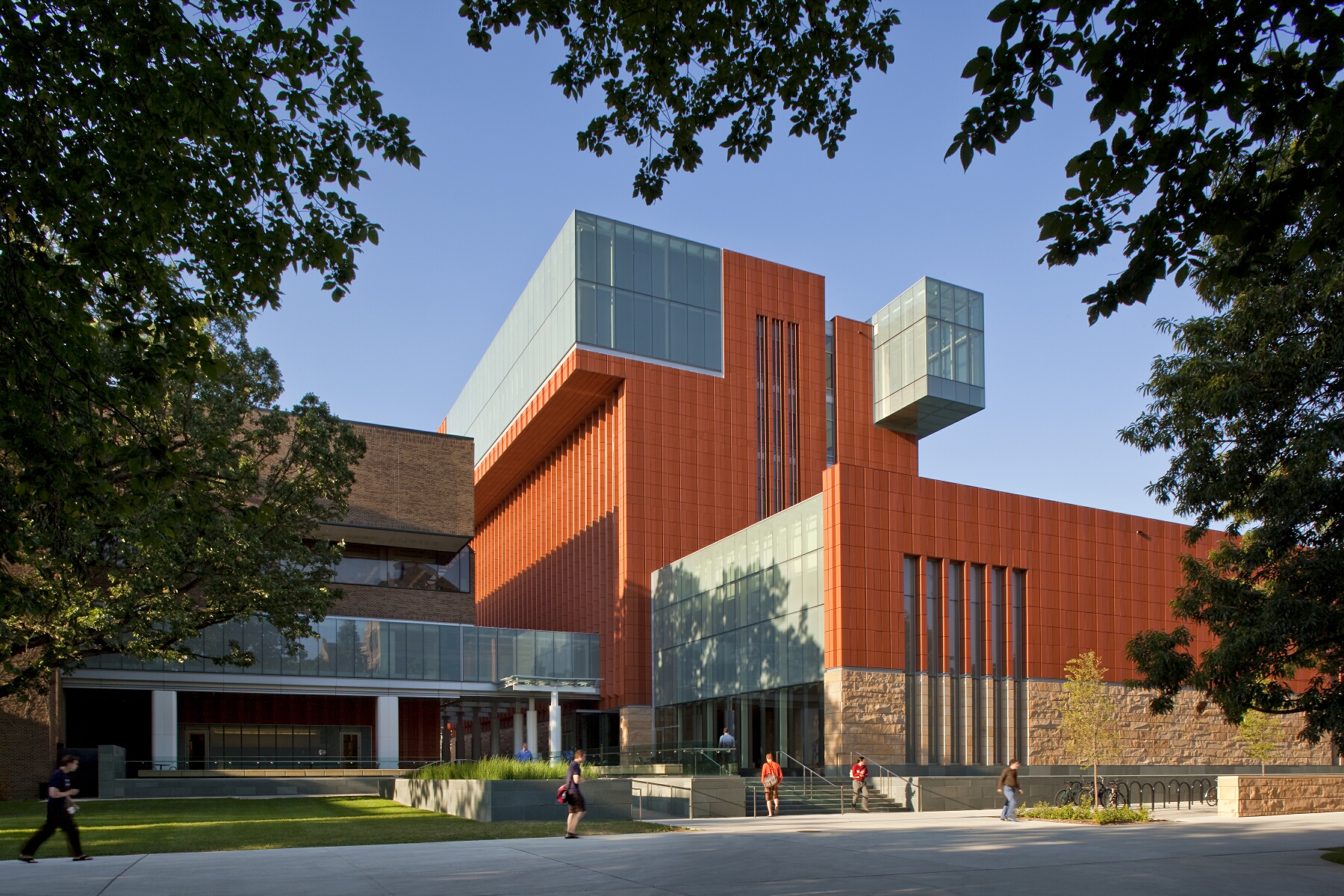 Key to the success of the design of the new Stephen M. Ross School building was relating the typical tiered classroom to group study spaces. To do so, the design team developed a model for early site planning studies to address the pedagogical needs of the school, which focused on assessing the capacity of existing buildings to accommodate new teaching spaces. Equally important was a sense of local identity, both for the building on the university campus and for distinct groups within the school.
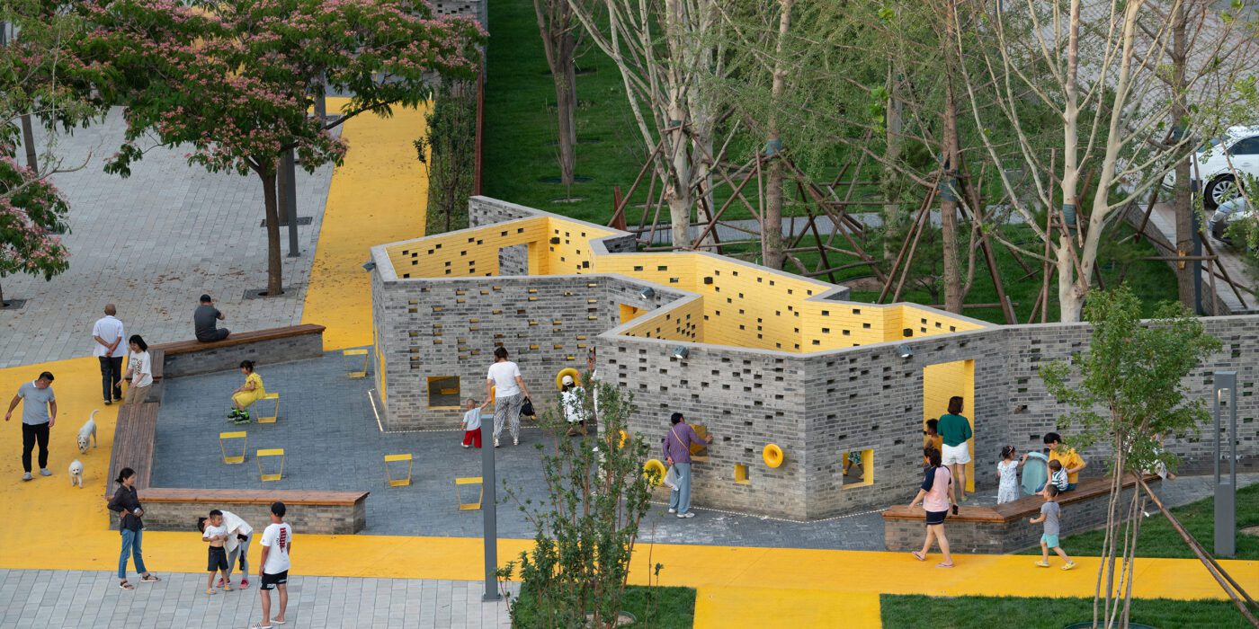
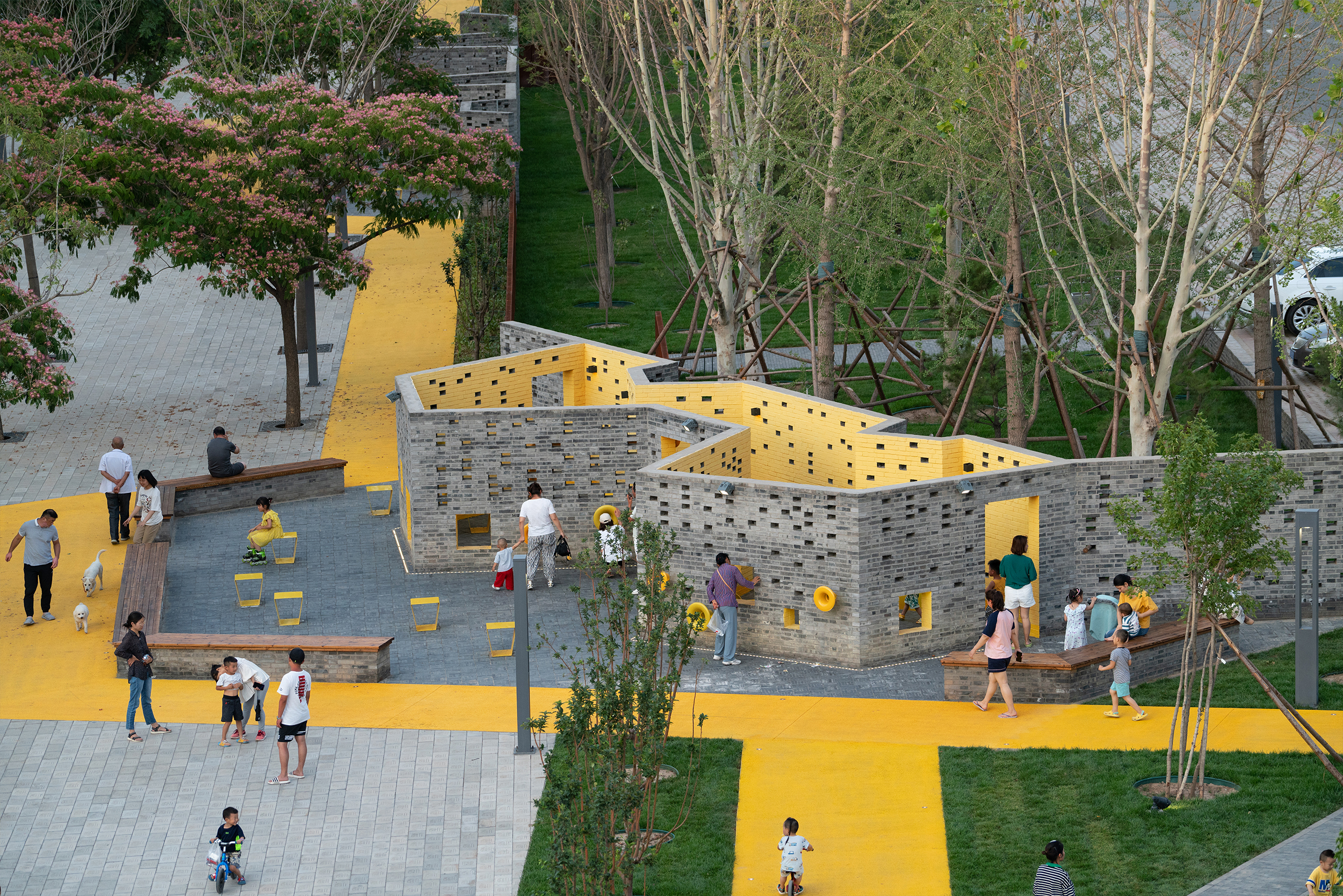
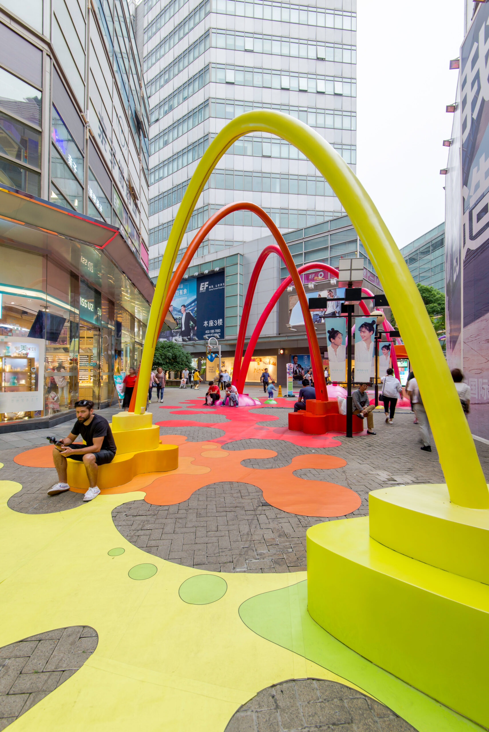
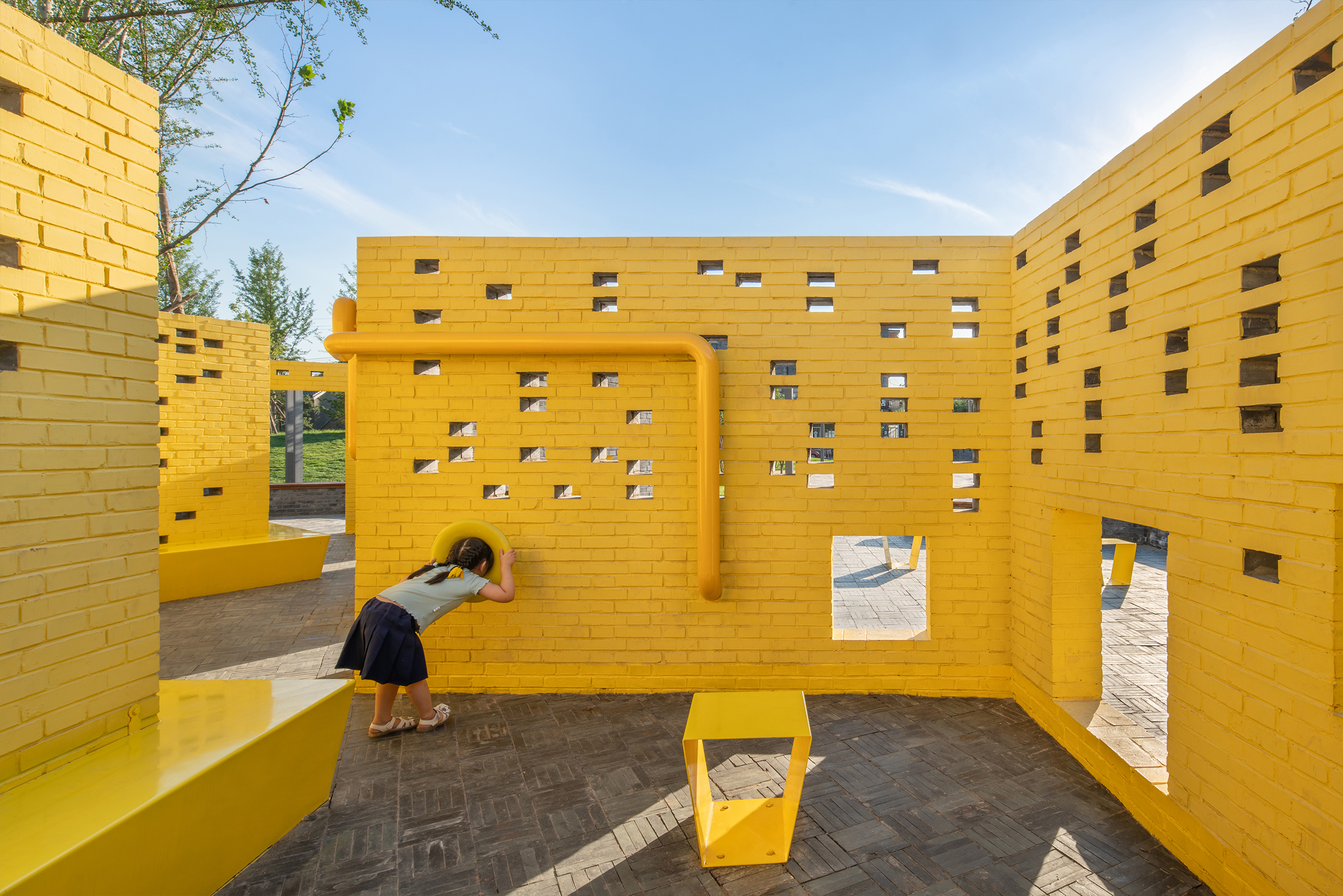 Situated in the vibrant art village of Songzhuang, this park was specifically designed to cater to the diverse needs of both artists and the local population. Color plays a pivotal role in capturing attention and creating an inviting atmosphere within the park.
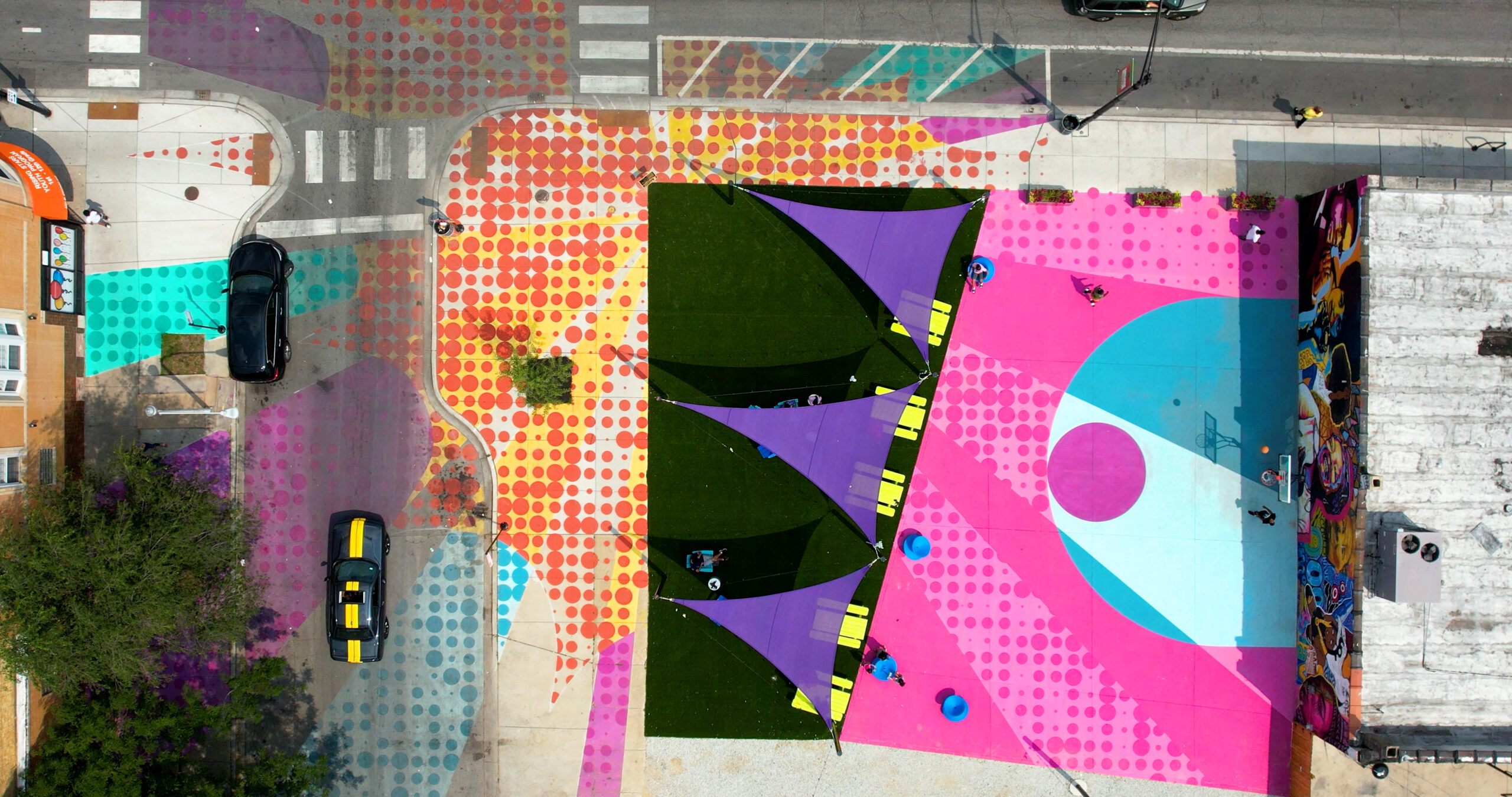
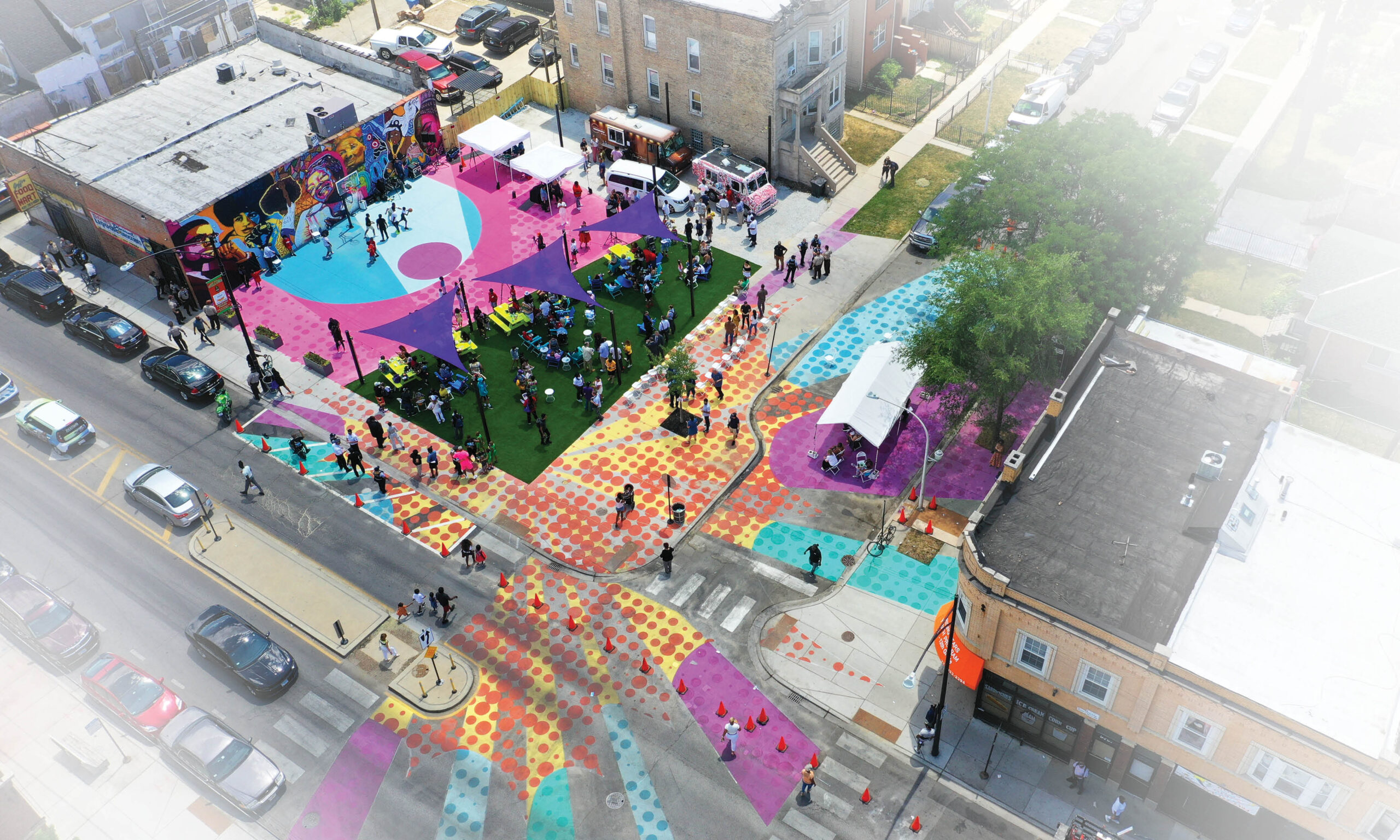 PopCourts is a vibrant pop-up park in Chicago’s Austin neighborhood that served as an outdoor haven during the pandemic. It exemplifies the transformative power of community, collaboration and innovative design in revitalizing underutilized spaces. Color plays a central role in PopCourts, reflecting the neighborhood’s energy and cultural identity. The bold color palette creates an engaging backdrop for community events. Divided into three zones, the park offers versatile spaces. The basketball court doubles as a community plaza, while the gravel drive hosts food trucks and vendors. The shaded lawn becomes a food court with seating. Artwork, including murals of influential figures and a Pop Art theme, unifies the space and celebrates the community’s history.
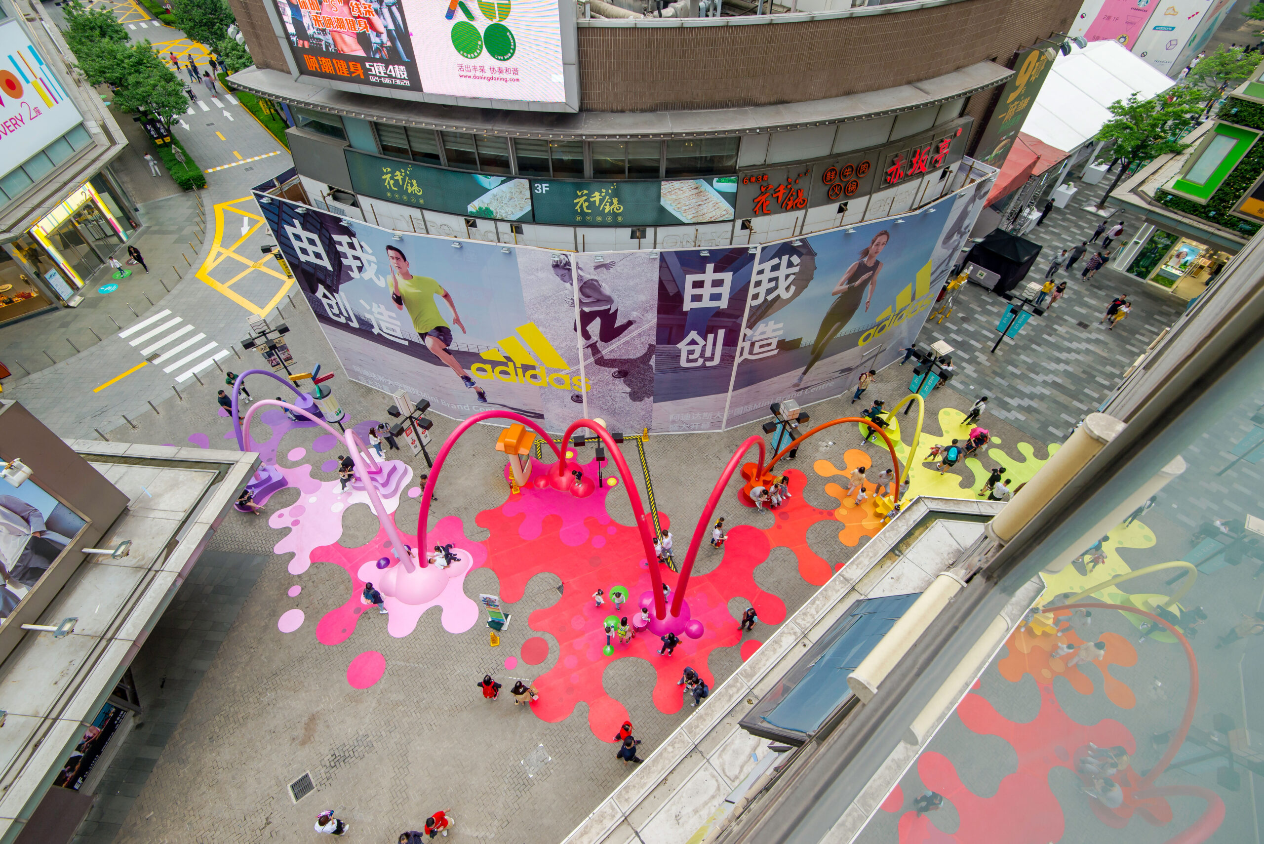
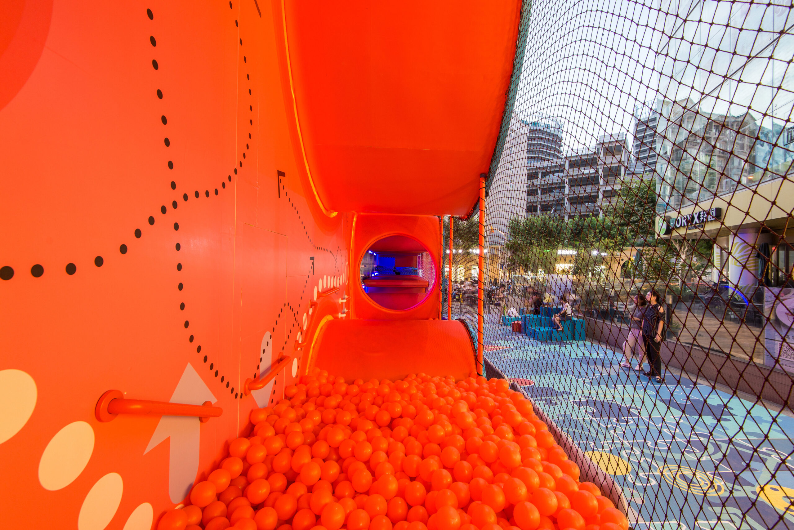
 The Paint Drop project is a visually captivating public space intervention that effectively utilizes color to create a noticeable, attractive and vibrant environment. The primary goal of the installation was to draw attention to a newly opened retail space and entice pedestrians to explore it. To achieve this, a tunnel of splashing color paint was designed as the central theme.
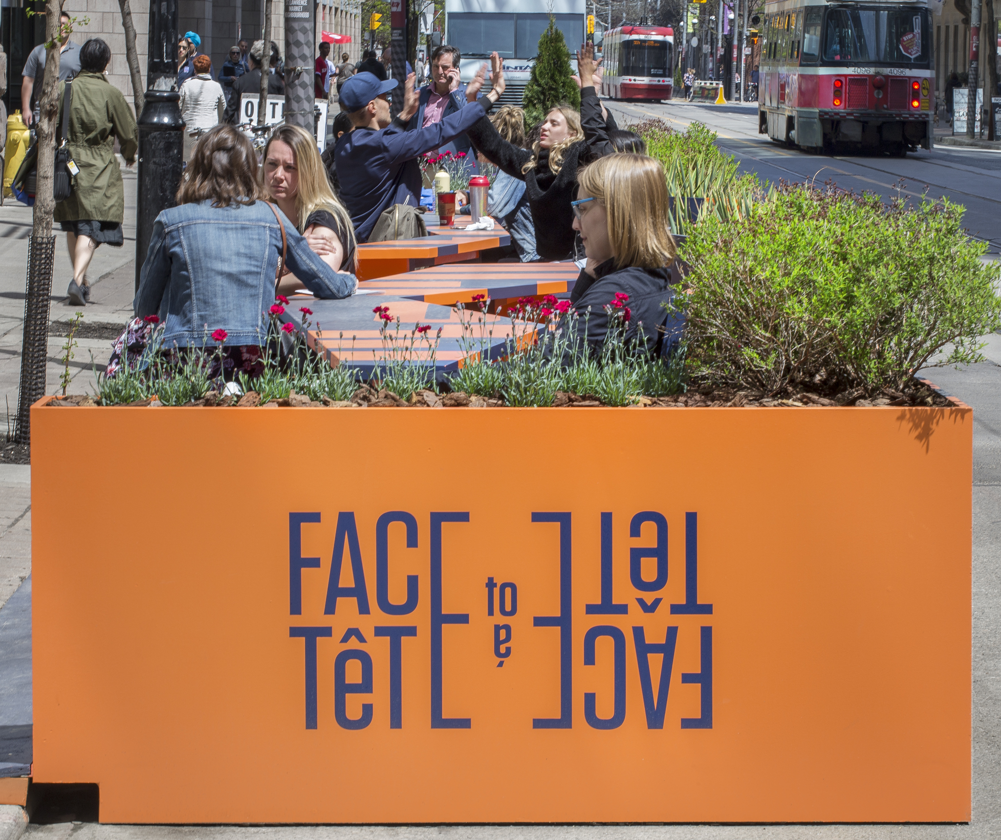
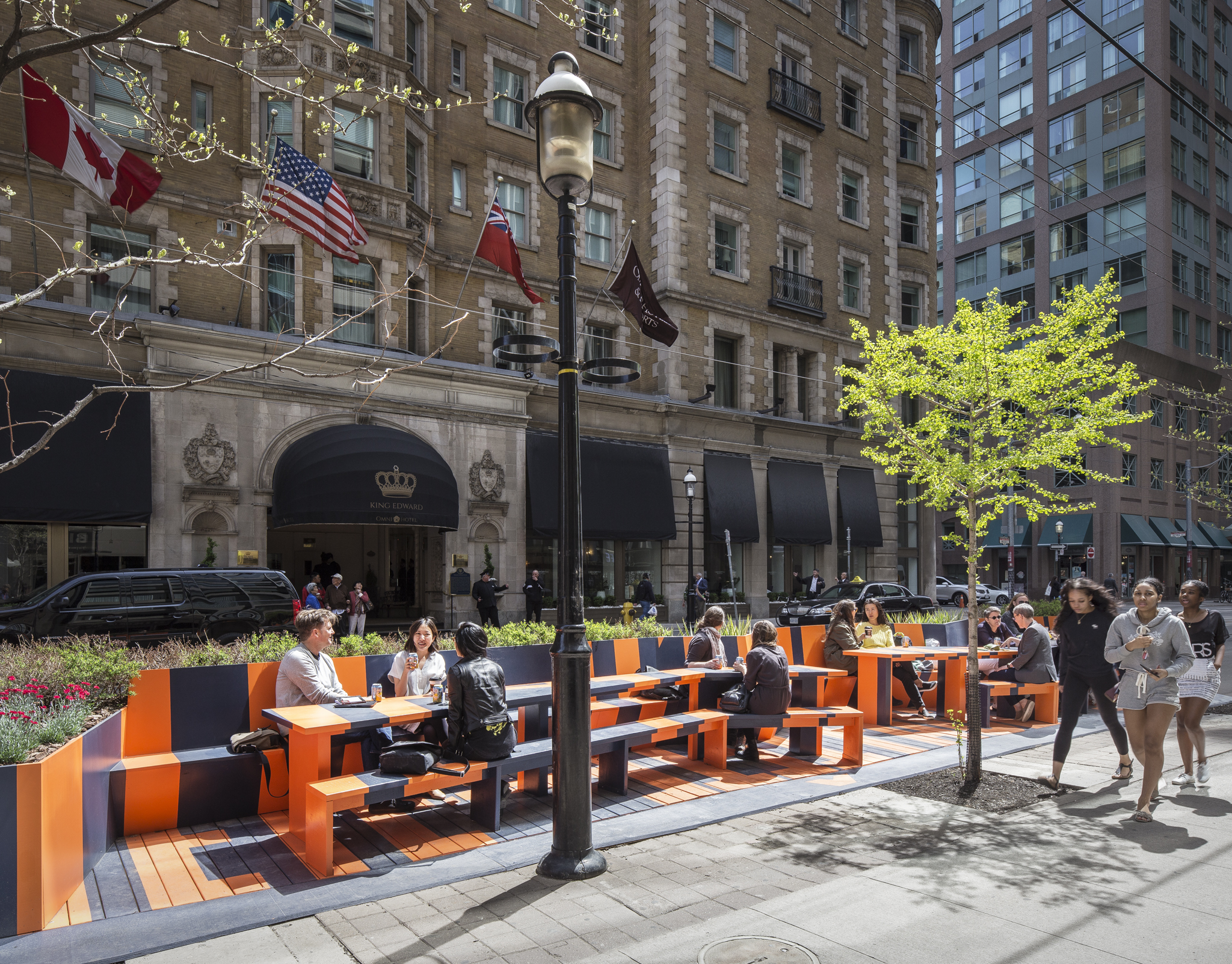 The Face to Face/Tête à Tête project is a charming installation that creates a space for shared conversation along a 44-foot (13-meter) roadway. Featuring two remarkably long tables accompanied by continuous benches and surrounded by lush greenery, its design stands out. Yet, what truly distinguishes this project is its brilliant utilization of color.
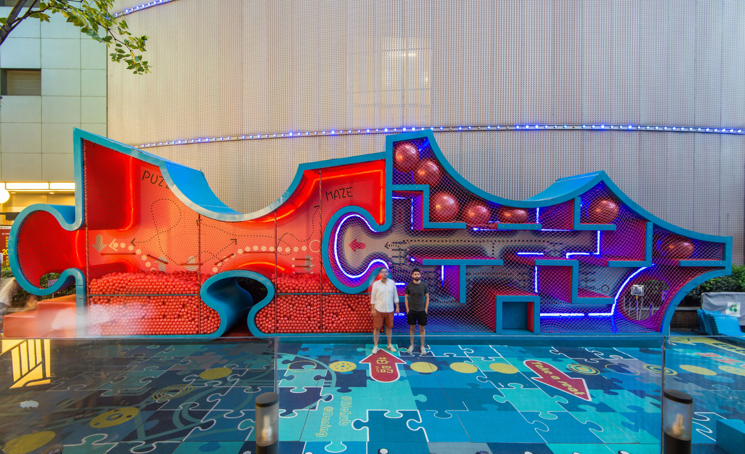
 As an urban intervention within an open-air Retail Street, the Puzzle Maze project aims to transform a privately-owned public space into an engaging and lively area. To create an innovative kids’ playground that surpasses traditional expectations, the marketing team of Life Hub @ Daning sought to turn a stagnant pedestrian street into an attractive and bustling space.
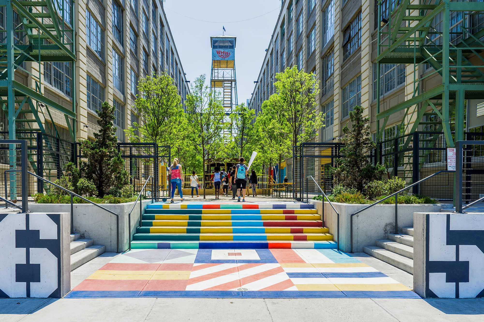
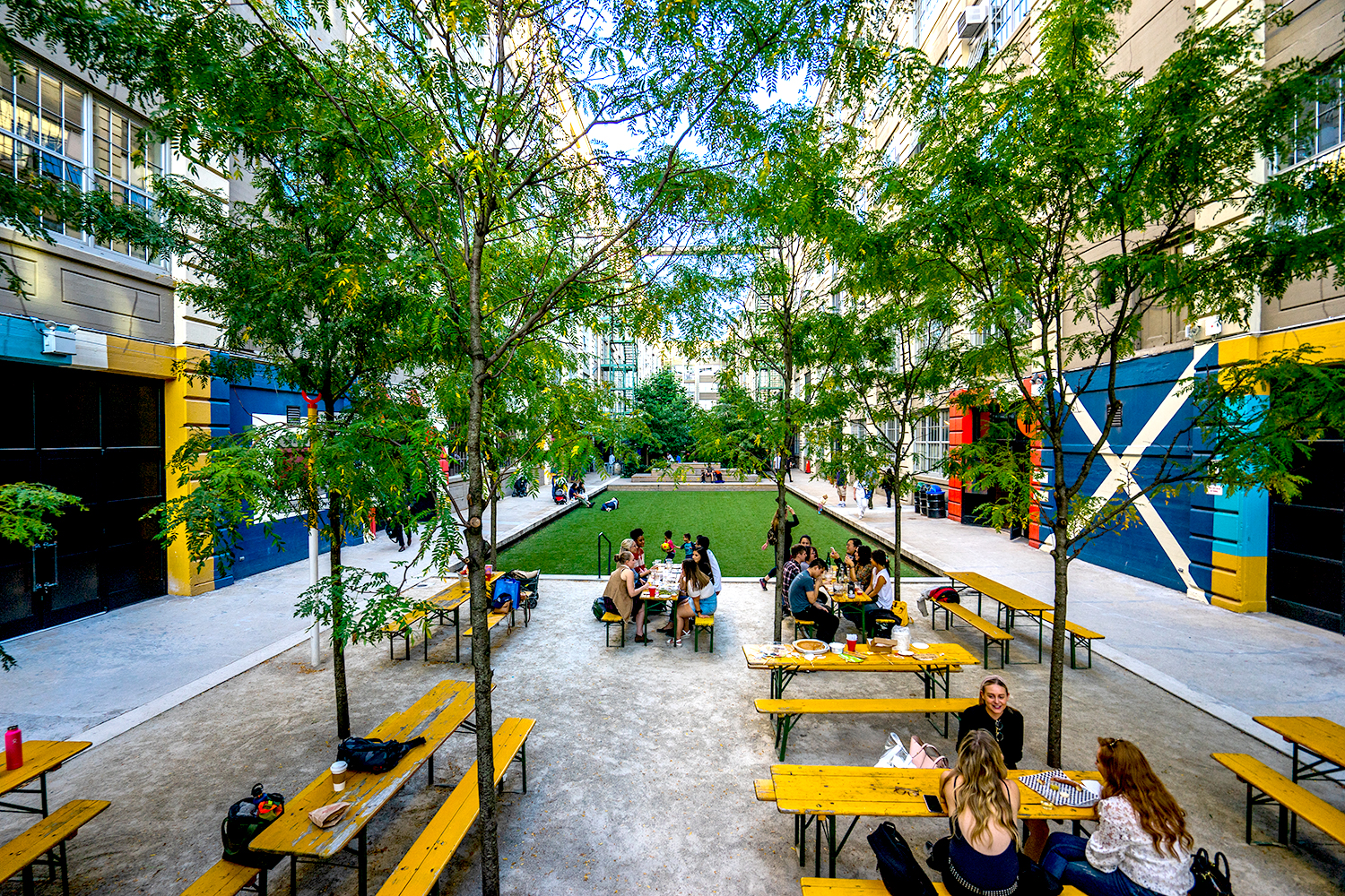 Once a cargo loading dock, this space within the historic manufacturing complex has been reborn as a vibrant and diverse landscape, breathing new life into the old factory. Serving as a vital public green space for over 600 creative businesses and the local community, Courtyard 5-6 stands apart from the surrounding buildings with its captivating colors and an array of design elements.

 As the centerpiece of the Des Moines Western Gateway Park urban renewal project, this public library was sited between the center of the city and a newly designed public park. As well as library facilities, the building contains a flexible activity space, education facilities, children’s play areas, a conference wing and a cafeteria. In plan, it responds to the orthogonal nature of the city blocks to the east while stretching out into the park to the west. This plan is extruded vertically with a glass-metal skin, which gives the building its distinctive appearance.
 Harkening back to the beginning of insulated glazing itself, the Halley VI Antarctic Research Station was designed for polar research. As the world’s first re-locatable research facility, it was constructed by Galliford Try for the British Antarctic Survey (BAS). The project aimed to demonstrate ground-breaking architecture characterized by a compelling concept, but also a structure that’s executed with careful attention to detail and coordination.
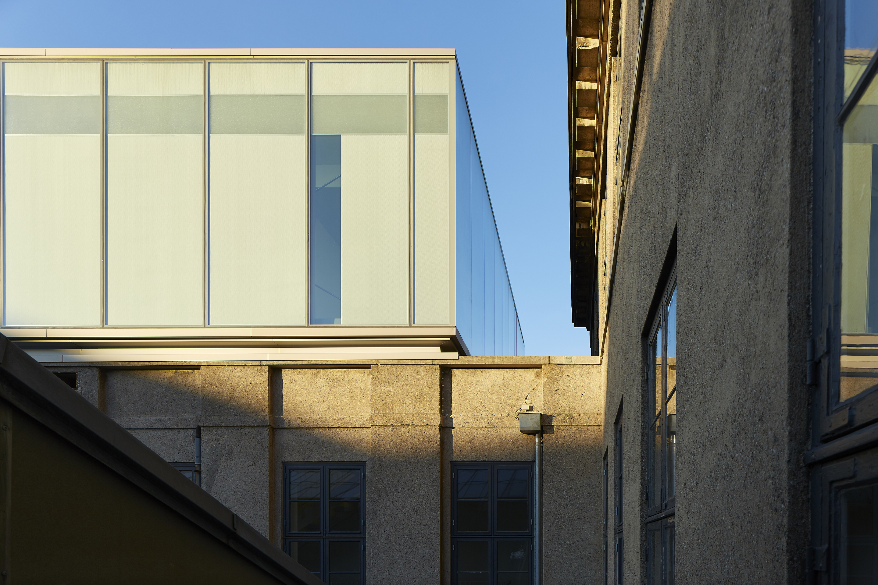
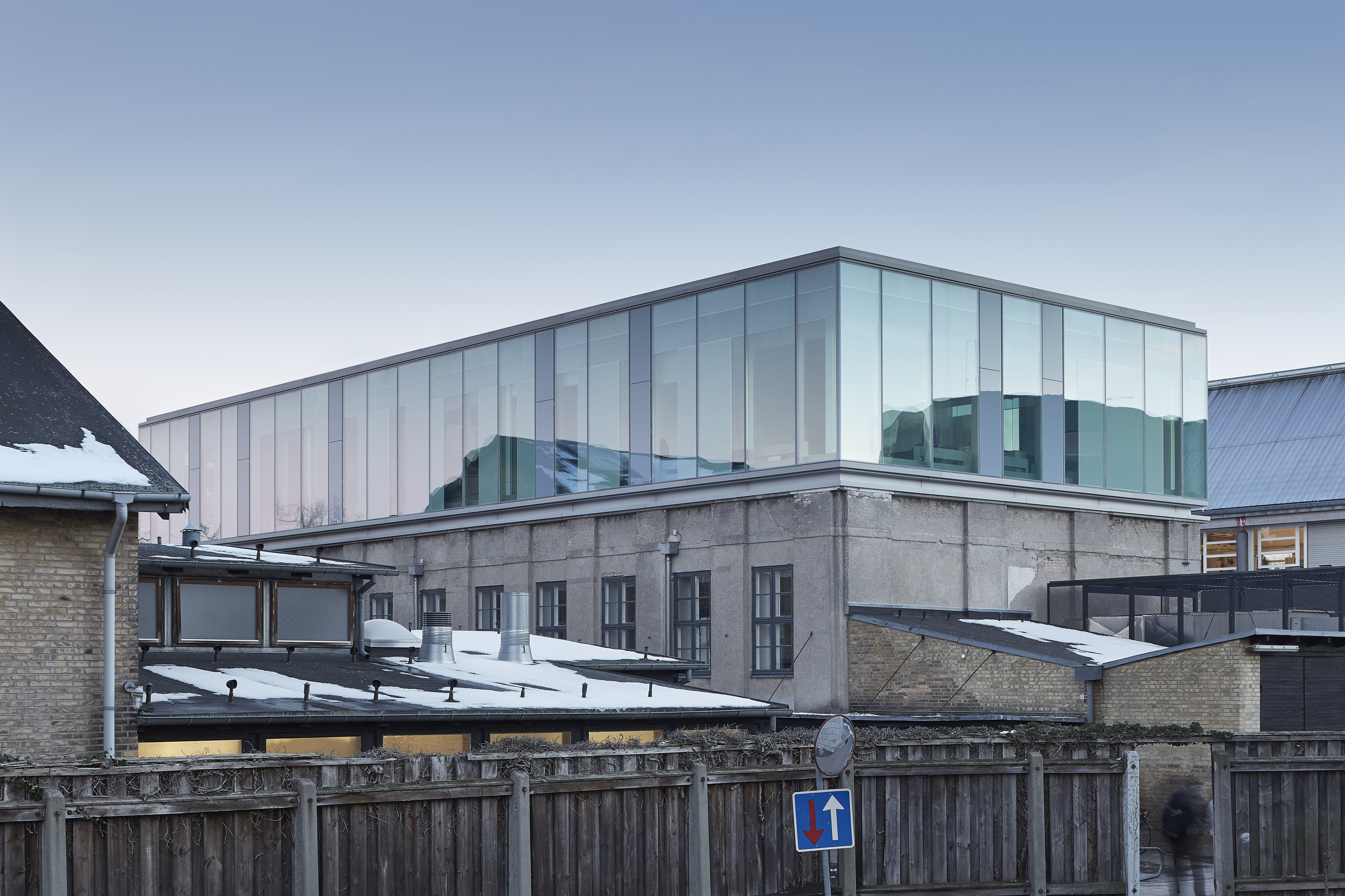 Extending an existing university gymnastic hall with a testing laboratory, the Damesal project was designed with a new building on top. The project offered an opportunity to explore an architectural concept where the geometry of the additional floor is designed with a simple box shape in glass. The architectural and functional variation happens as the glass façade responds to the program and functions within the building. The building’s envelope embodies design and performance as a collaboration between the architect and the supplier of the customized glass solution.
 The Greenpoint Emergency Medical Service (EMS) Station was designed as a two-story facility that supports FDNY ambulance crews and vehicles. The project was made with a strong, distinctive form occupying a prominent site in the rapidly developing neighborhood. The station’s requirements led to a four-part division of the facility. Because the space for housing vehicles called for a higher ceiling height than the rest of station, one side is taller than the other. This change organizes the building’s functions.
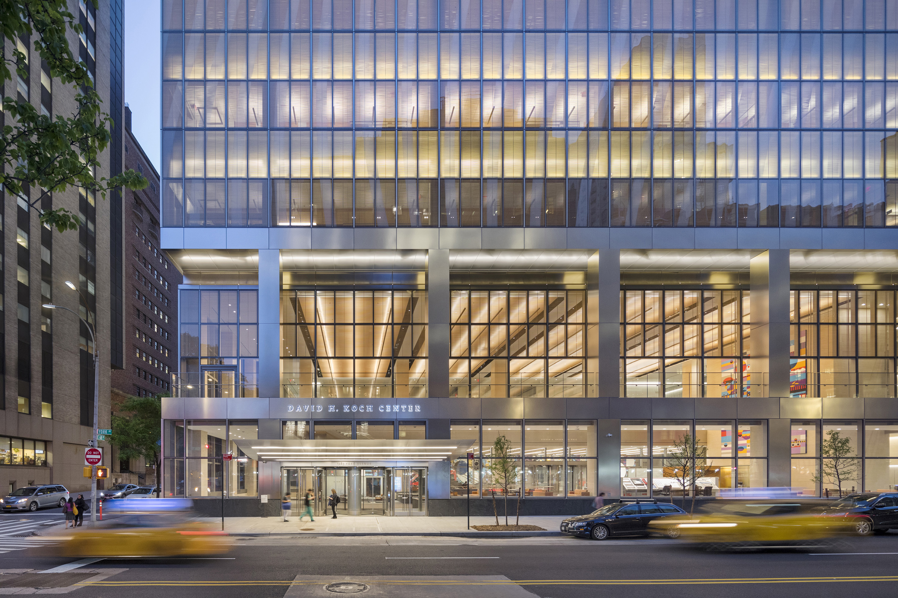
 The Koch Center was designed to provide advanced integrative healthcare and complex outpatient services. Patient-centered and family-centered care is at the forefront of the building’s medical program, announced by a triple-height lobby that offers respite from the surrounding streets. Infusion and radiation oncology areas, as well as diagnostic imaging, typically found in basement areas, are located on upper floors. This gives patients and staff the benefit of natural light.
 SHA designed the Cité de l’Océan et du Surf museum to raise awareness of oceanic issues and explore educational and scientific aspects of the surf and sea. Centered around leisure, science, and ecology, the project was made in collaboration with Solange Fabião. The design includes the museum, exhibition areas, and a plaza, within a larger master plan. The building form derives from the spatial concept “under the sky”/“under the sea”.