lina ghotmeh brings sweeping arches to brick-clad hermès workshop in normandy
CategoriesArchitecture

lina ghotmeh brings sweeping arches to new hermès workshop

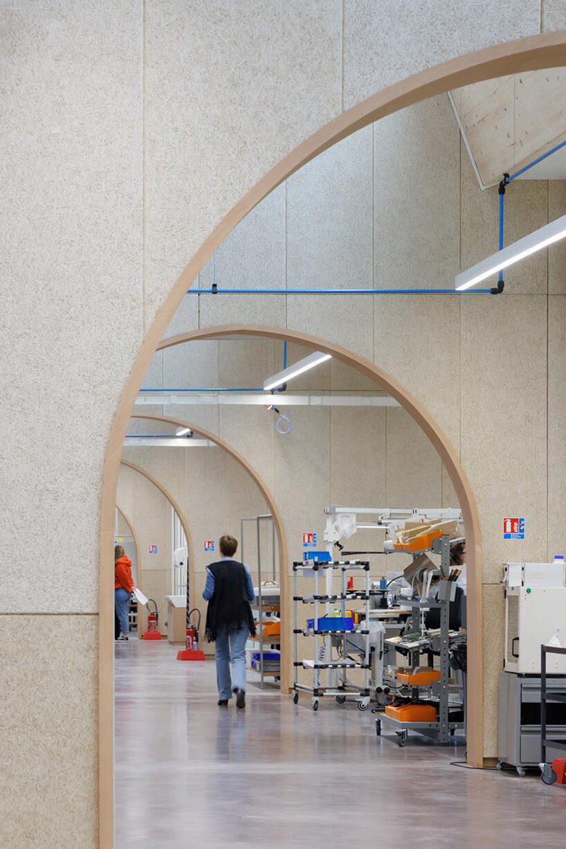
hermès maroquinerie de louvriers by lina ghotmeh 


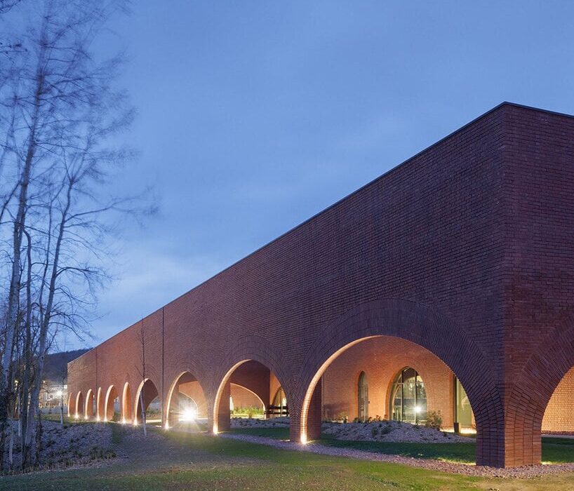
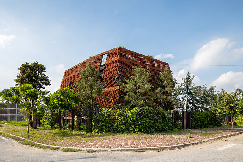
On April 7, 2023, Hermès inaugurated a new Maroquinerie, a high-performance, and low-carbonbrick-clad building in Louviers, France. Completed by French-Lebanese architect Lina Ghotmeh, the 6,200 sqm leather workshop occupies a second site in Hermès’ Normandy hub, perpetuating the house’s artisanal and human culture, as well as its ecological ambitions. The workshop will welcome 260 artisans trained at the Louviers École Hermès des savoir-faire, its apprenticeship training center (CFA) accredited by the French Education Department, which delivers the CAP vocational diploma in leatherworking. This manufacture also includes a saddlery workshop to support the dynamic equestrian métier, historically at 24 rue du Faubourg-Saint-Honoré, Paris.

lina ghotmeh brings sweeping arches to brick-clad hermès workshop in normandy
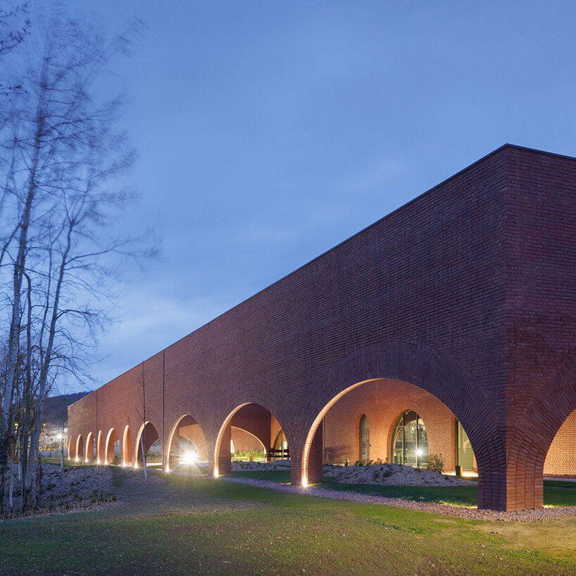
image © Iwan Baan | all courtesy Hermès and Lina Ghotmeh — Architecture


the first industrial building to earn the french e4c2 label 


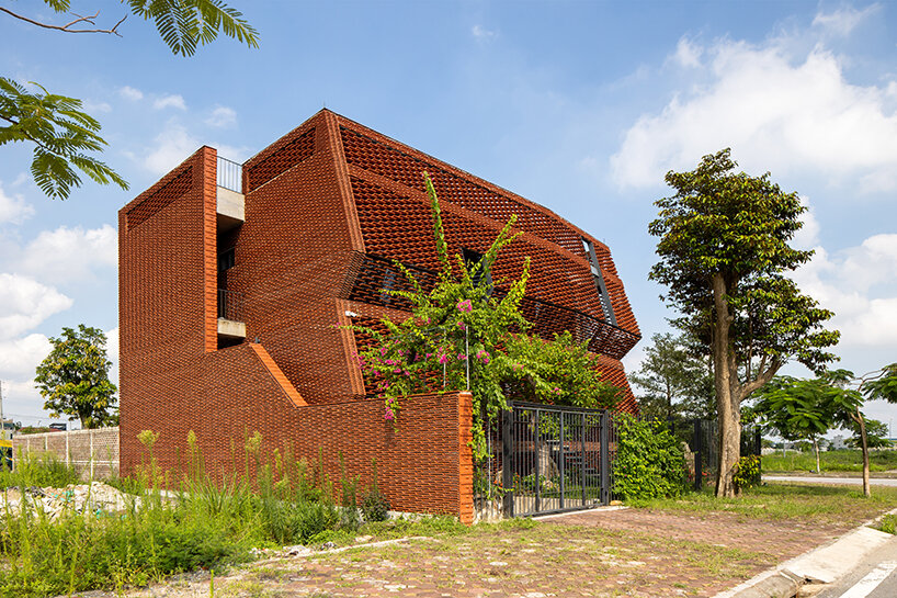
Drawing on her unique approach, rooted in what she calls ‘the archaeology of the future,’ Lina Ghotmeh (see more here) focused her quest on the architecture of the space and how it enhances and preserves its site, in line with the house’s values. The Hermès workshop is thus a true technical achievement serving the brand’s environmental goals: it is, to date, the first industrial building to have earned the French E4C2 label. This label assesses the performance of a new facility according to two criteria: energy (E) and carbon (C). Level E4, the highest level, means that the Louviers leather goods workshop is a positive energy building. Level C2, also the highest, denotes the most efficient operation for carbon footprint reduction.
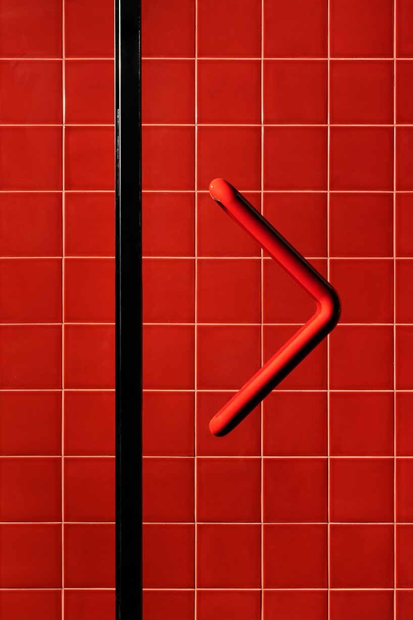
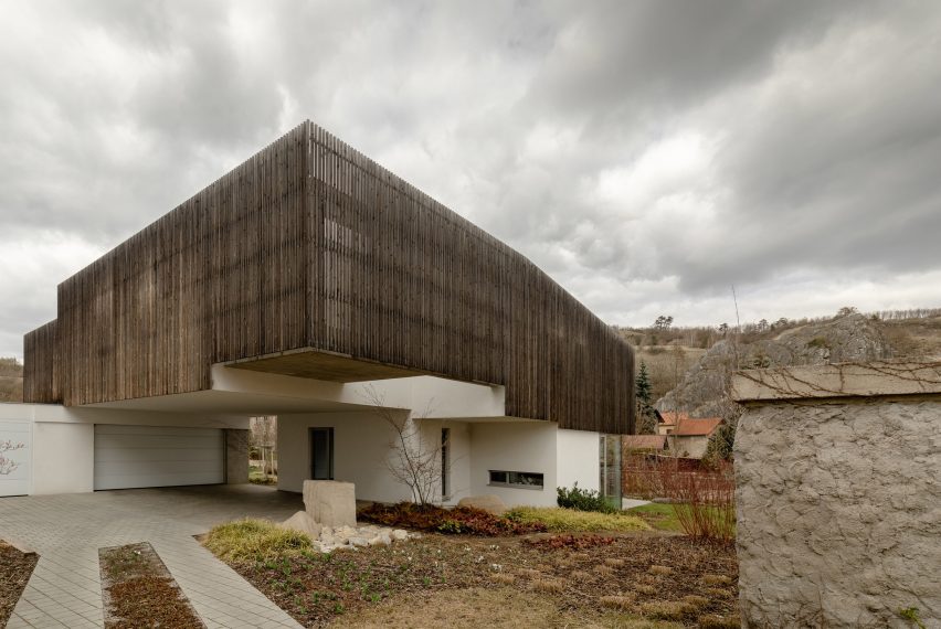
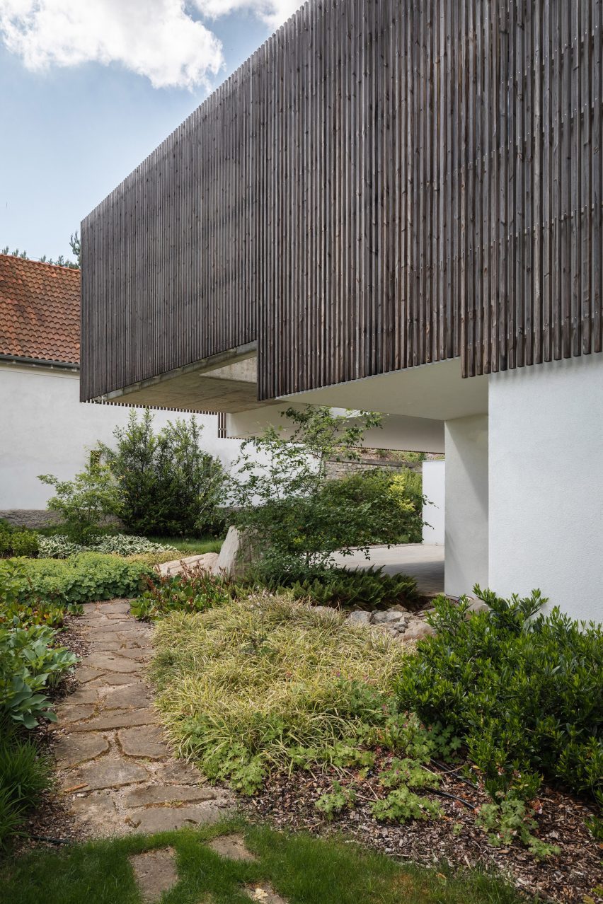
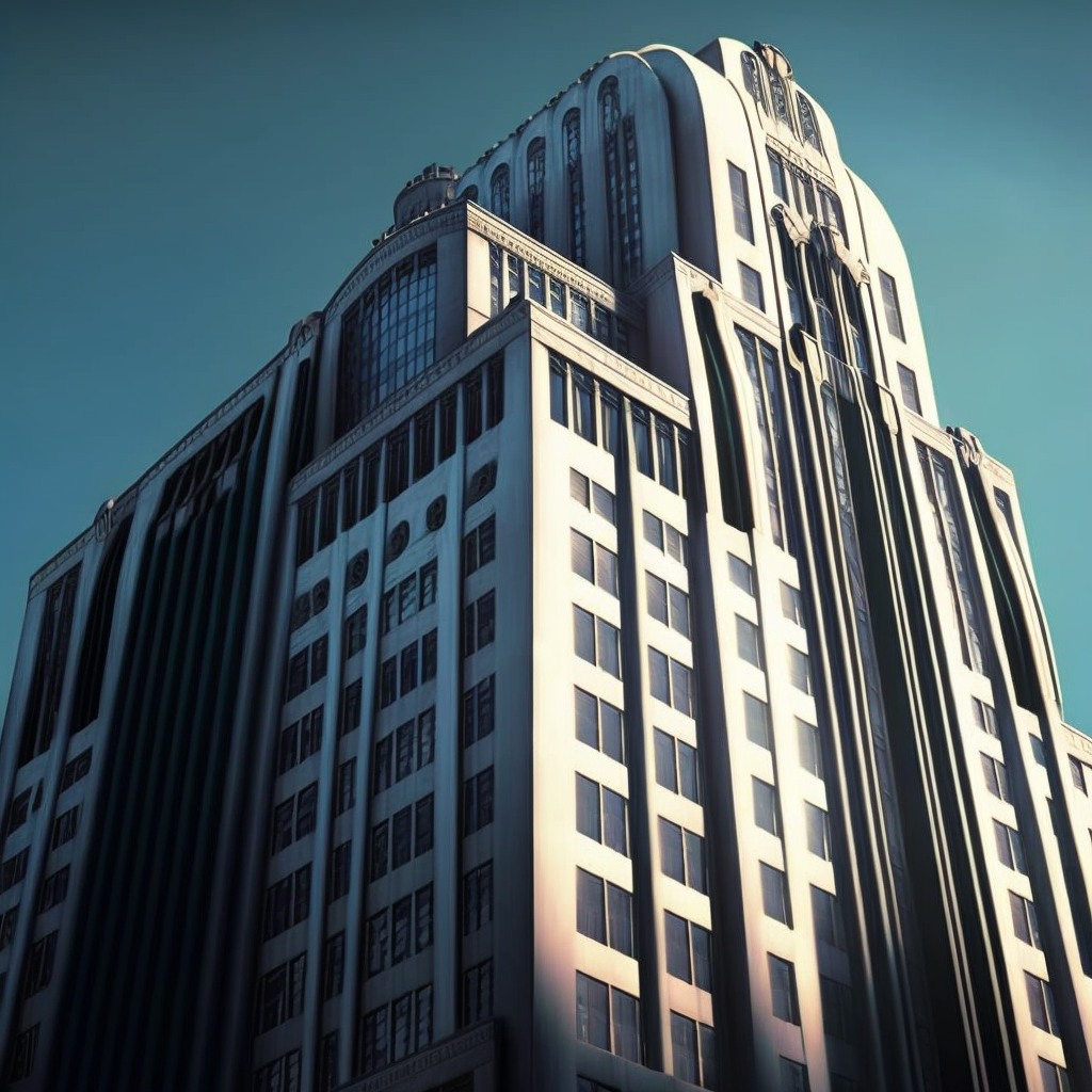
 

The wooden-framed building was constructed on an industrial brownfield site using more than 500,000 bricks, produced 70 kilometers from Louviers to minimize the impact of construction while showcasing the know-how of Normandy’s brick-makers. As the main material used, the brick attests to the local embedding of the project in its environment and offers a palette of red and violet tones that vary according to daylight and the time of the year,’ writes the architectural practice. 

lina ghotmeh brings sweeping arches to brick-clad hermès workshop in normandy
a brick-clad, low-carbon, environmental workshop | image © Iwan Baan


preserving and celebrating the local site 


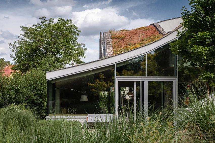
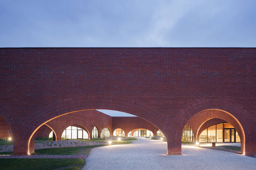
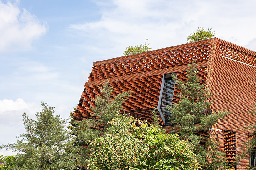
Indeed, the building’s location takes full advantage of natural light and ventilation to limit the need for artificial lighting, heating, and air conditioning. These needs are met by geothermal energy (with 13 probes at a depth of 150 meters) and more than 2,300 sqm of solar panels, which combine to ensure energy autonomy. Using the soil excavated from the site and the expertise of the Belgian landscape architect Erik Dhont, three hectares of undulating gardens have been created, retaining most of the site’s original trees. Designed to preserve local biodiversity, these gardens are equipped with a system for recovering and directing rainwater into the water table.


From its construction to its day-to-day operation, everything has been designed to ensure that the building embraces, extends, and complements its natural environment. This ‘archaeology of the future’ approach also permeates its appearance: echoing the motifs dear to Hermès, the square shape of the workshop is reminiscent of the house’s silk carré, while its graceful arches evoke the trajectory of a jumping horse. This innovative and timeless form, thought of from the smallest scale of the brick and as a new layer in the landscape, also recalls the gestures of artisans, the precision of the hand, and the constant pursuit of excellence and beauty in their leather work. The gardens’ gentle undulations recall the arches of a building that blends into its landscape, down to the materials used to construct it,’ concludes Ghotmeh. 
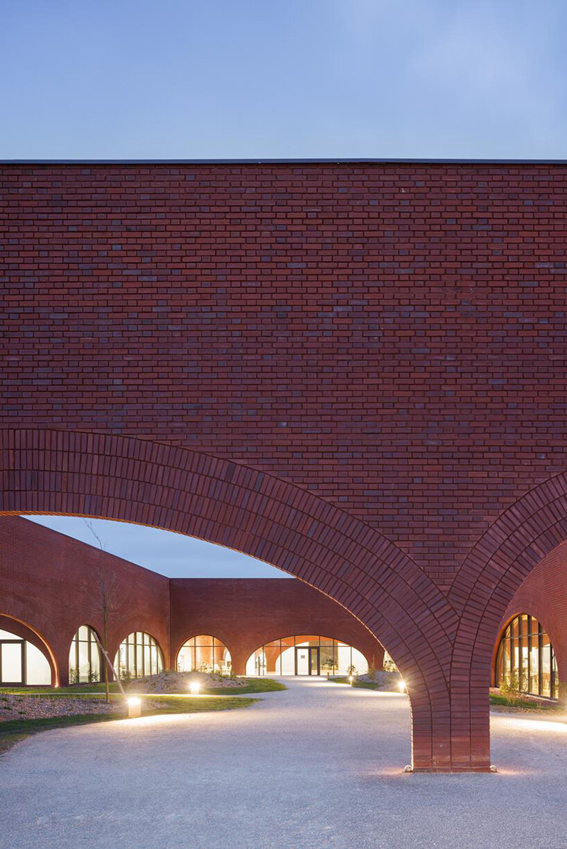
lina ghotmeh brings sweeping arches to brick-clad hermès workshop in normandy
image © Iwan Baan


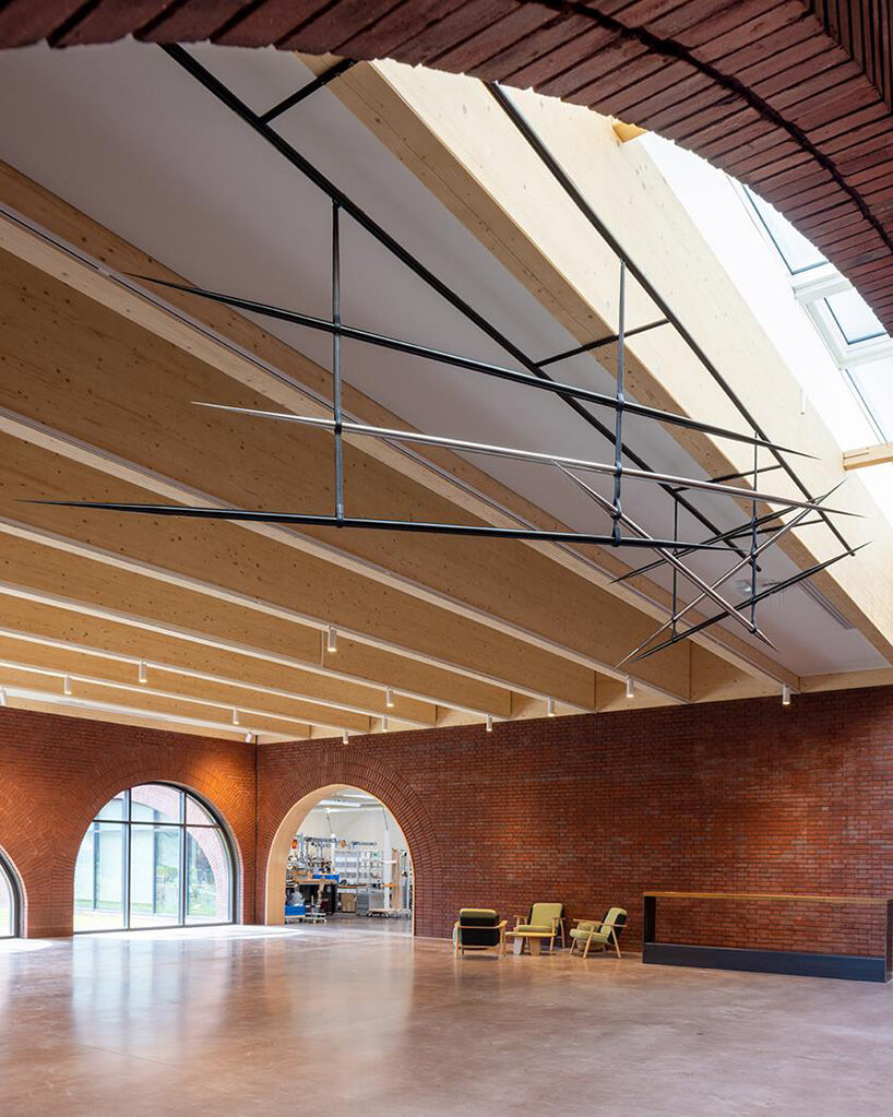
Last but not least, in this precise and harmonious setting, the artist Emmanuel Saulnier was invited to design a piece of art for the ‘village square’, the workshop’s courtyard and meeting place. Inspired by ‘The Epsom Derby’, a painting by Théodore Géricault from 1821, the work consists of seven stainless steel needles suspended by leather stirrup straps custom-made by the house’s bridle-makers. These horizontal lines evoke the movement of horses beneath a light-filled stormy sky and connect it to the artisanal gesture of the expert hand.
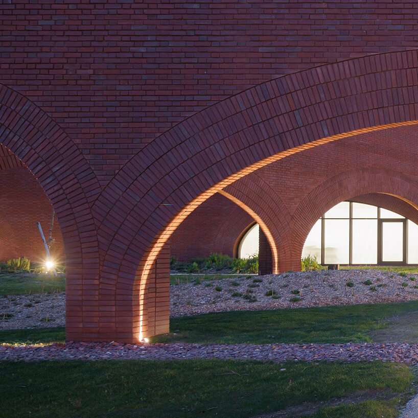
lina ghotmeh brings sweeping arches to brick-clad hermès workshop in normandy
image © Iwan Baan

lina ghotmeh brings sweeping arches to brick-clad hermès workshop in normandy
art installation by Emmanuel Saulnier | image © Iwan Baan
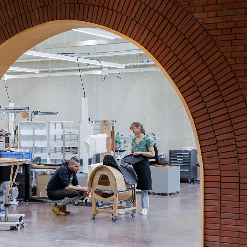
lina ghotmeh brings sweeping arches to brick-clad hermès workshop in normandy
image © Iwan Baan

lina ghotmeh brings sweeping arches to brick-clad hermès workshop in normandy
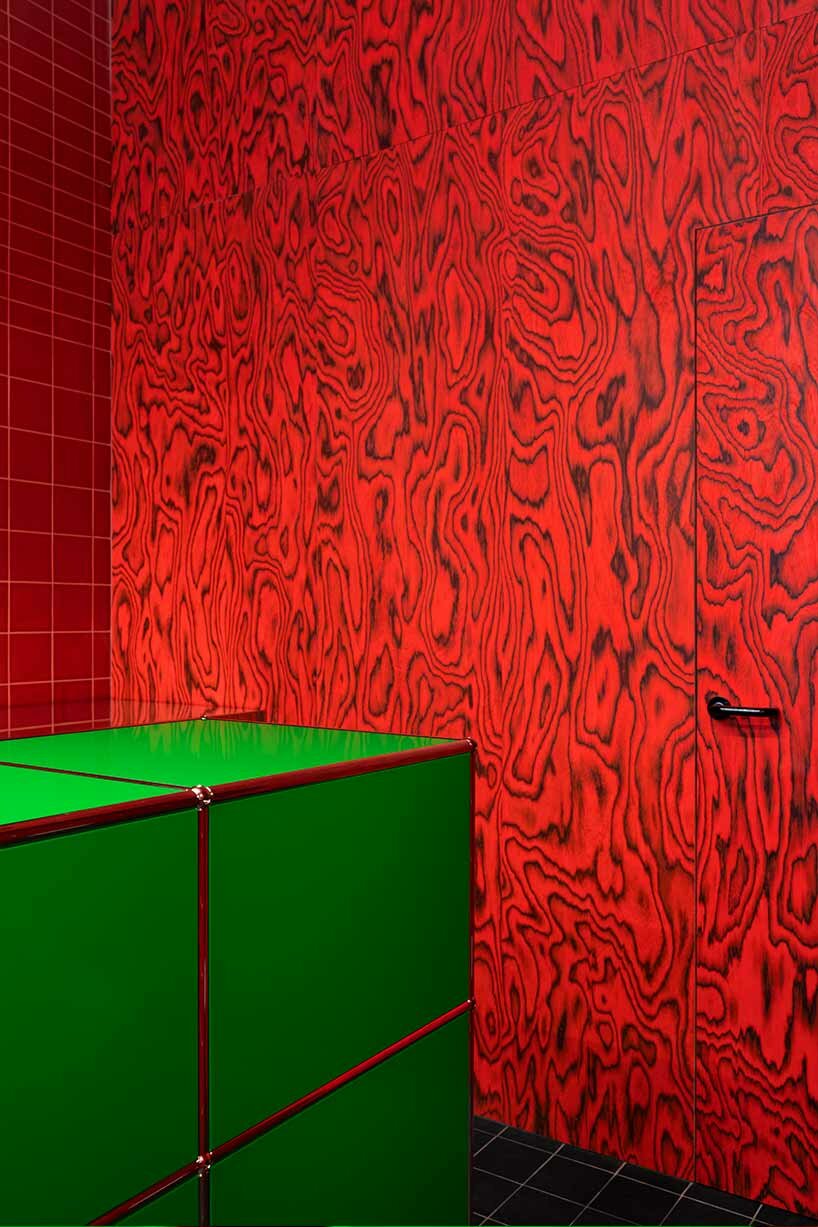
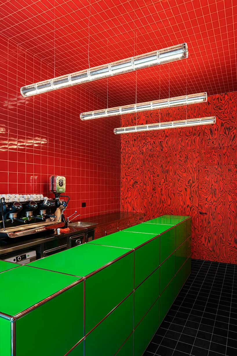
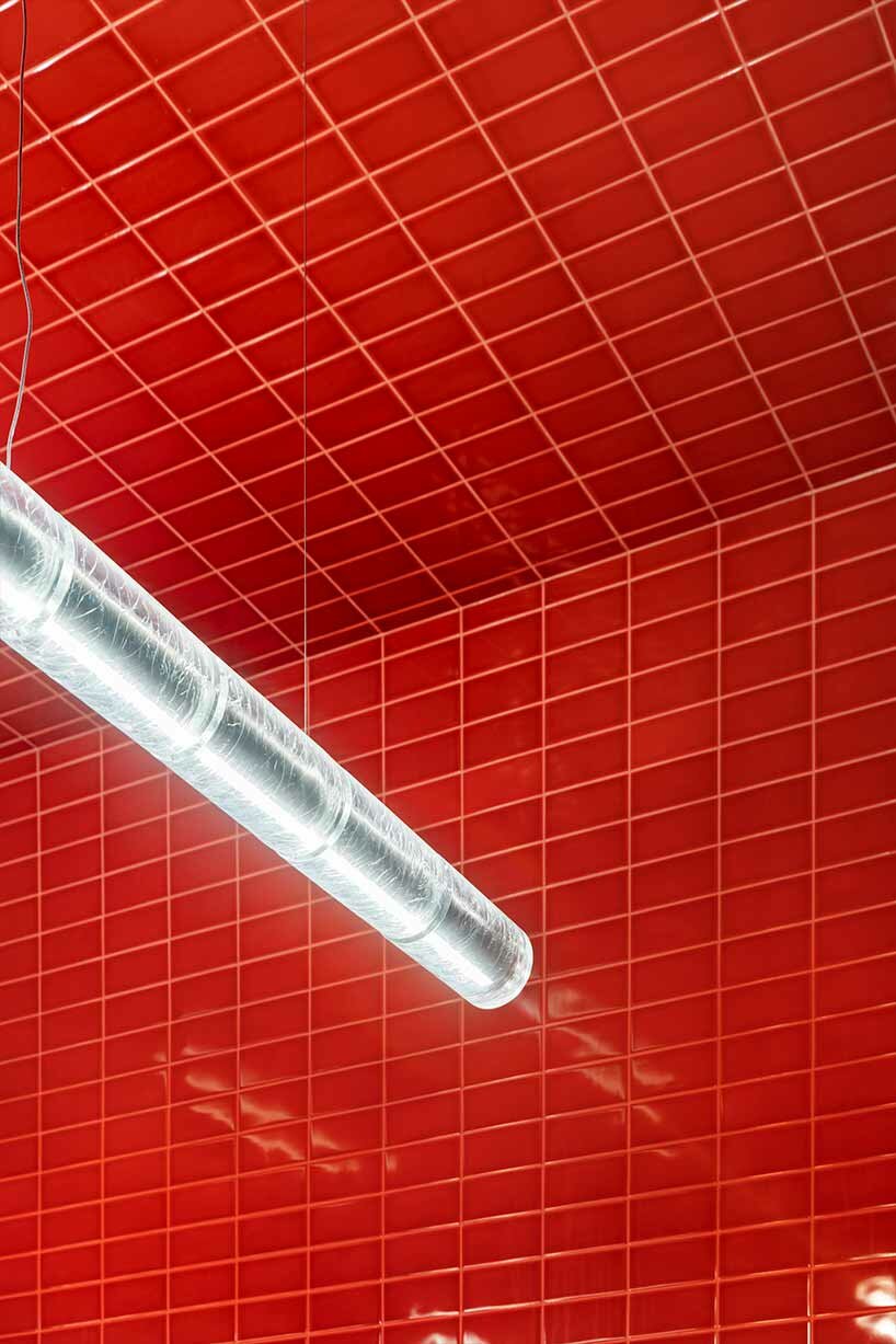
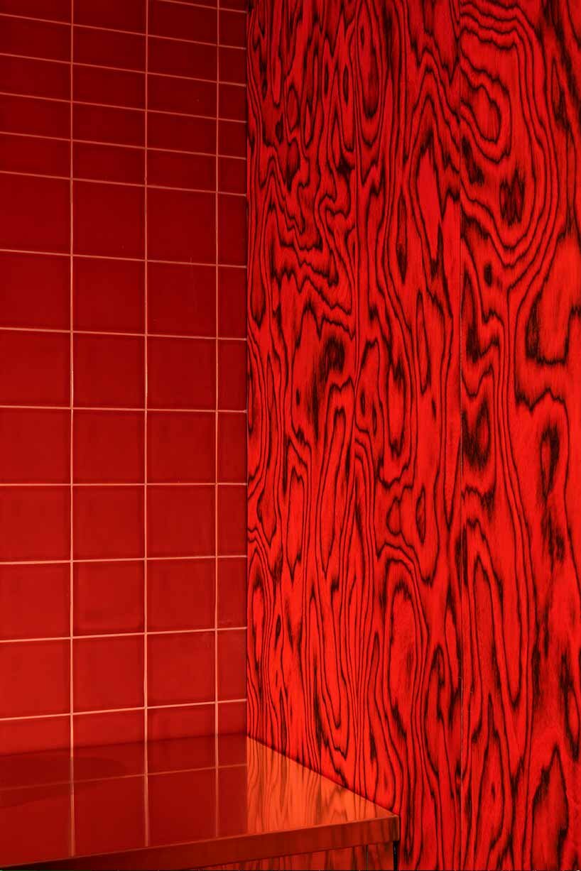
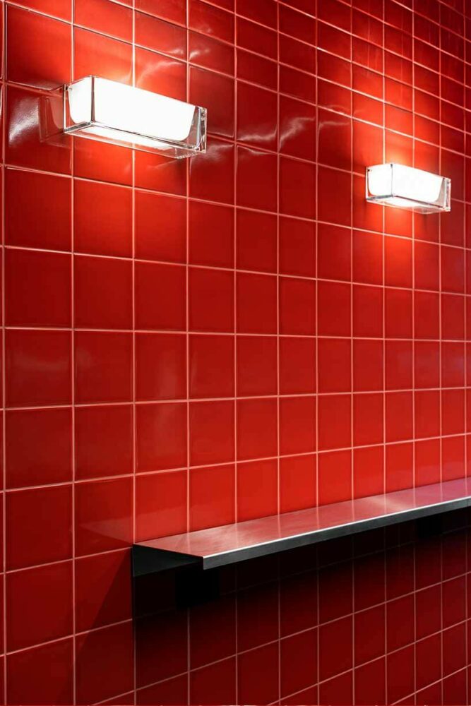
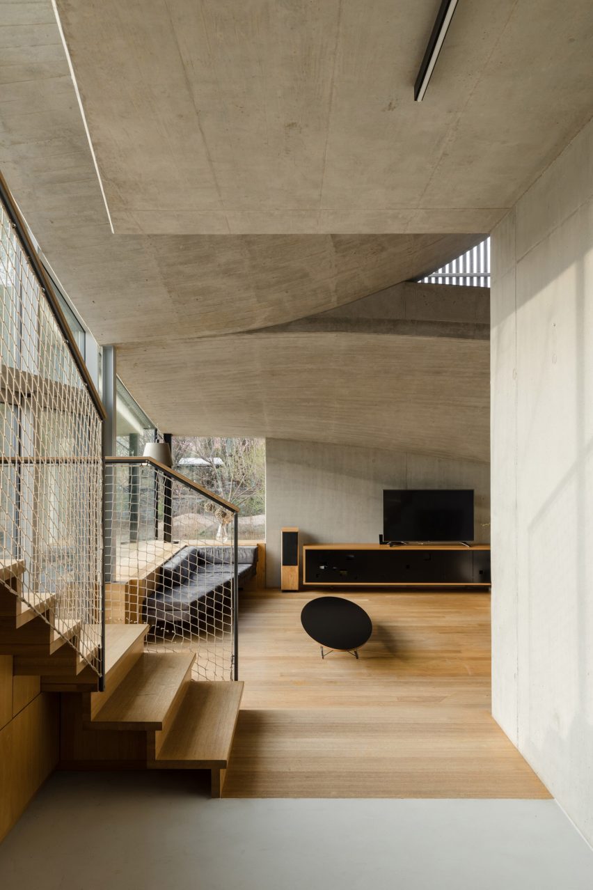
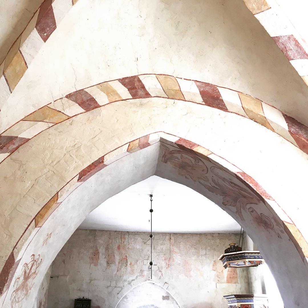
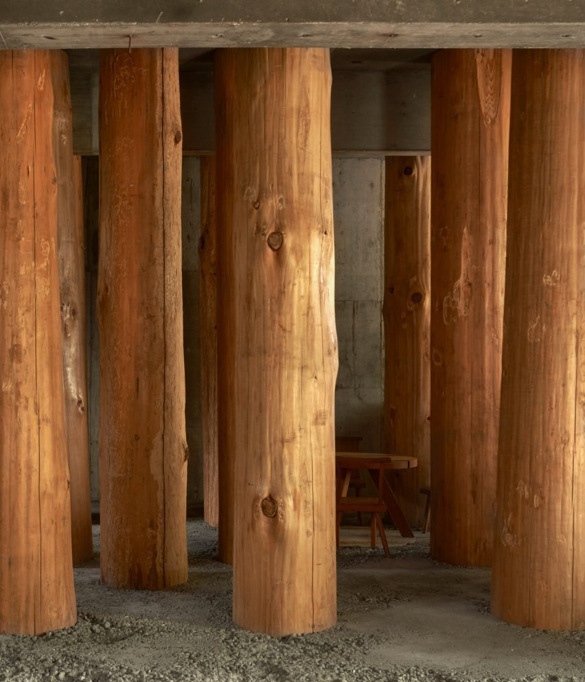
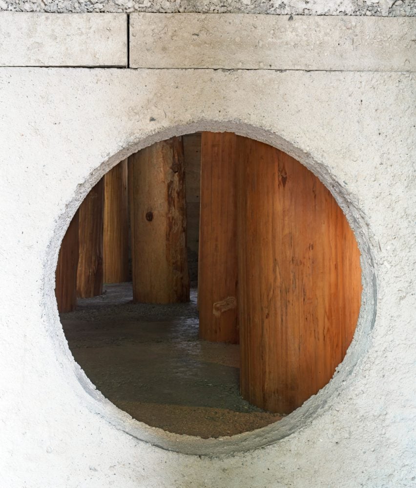
inside the leather workshop | image © Iwan Baan

Reference

Tomoaki Uno Architects-designed workspace in Japan
CategoriesArchitecture

Wooden logs frame Forest Office in Japan by Tomoaki Uno Architects

Columns made from thick wooden logs fill this office in Nagoya City, Japan, created by local studio Tomoaki Uno Architects at the base of a former apartment block.

Named Forest Office, the small workspace was commissioned by a client who simply requested that “something interesting” be created within half of his office space.

It was Tomoaki Uno Architects‘ second commission by the client, with the first being a sky-lit dwelling nearby named Ogimachi House.

Tomoaki Uno Architects-designed workspace in Japan
Tomoaki Uno Architects has created Forest Office in Japan

“There were no specific requirements for [the project],” studio founder Tomoaki Uno told Dezeen.

“As someone who usually works within functional constraints, this was an exciting opportunity for me,” he continued.

Drawing on the site’s natural surroundings and a nearby shrine, Tomoaki Uno Architects prioritised natural materials and rough finishes to create an atmospheric, multipurpose space.

Tree-trunk columns inside Forest Office in Japan
The workspace is filled with columns made from thick wooden logs

“I had long been inspired by the unique atmosphere I felt every time I walked along the approach to Ise Shrine,” said Uno.

“I knew that the irregular rows of large trees had a strong influence on this feeling. Therefore, I thought about using thick logs as a metaphor and seeing if I could recreate something similar,” he continued.

Interior of Forest Office by Tomoaki Uno Architects
A table is nestled at the centre

Inside, the concrete of the existing structure has been left exposed. It is teamed with a new floor and wall with a circular opening, both made of concrete with a rough aggregate.

Large wooden logs, stripped of their bark and spaced equally in a grid, are set into the concrete floor to create the feeling of being in a forest.

Due to their size, the trunks had to be brought into Forest Office horizontally, before being hoisted into position and cast into the concrete floor.

One of these trunks could not fit in the planned location, and all of them ended up being slightly tilted and displaced during construction, which Uno embraced as “serendipity”.

Japanese workspace filled with tree trunks
The columns are set into the rough concrete floor

“In a nutshell, this is a question of how to deal with nature,” said Uno. “Whether consciously or not, architects are constantly being questioned in every aspect of how they approach nature and their thoughts,” he continued.

“I explored unbuilt boundaries with this project, and I wanted to confirm that the presence of the spirit felt in nature is the origin of architecture.”

Concrete wall inside Forest Office by Tomoaki Uno Architects
A wall with a circular opening has been added

A kitchenette and bathroom occupy one corner of Forest Office, while a small table and chairs nestle between the large trunks at the centre.

Tomoaki Uno Architects was founded by Uno in Nagoya in 1990. Its previous projects include a concrete home with an Aztec-informed pyramid and a minimal concrete home illuminated by dramatic light wells, both of which are also located in Nagoya.

The photography is by Edmund Sumner.

Reference

<alt=
CategoriesArchitecture

“Yposkafo”: Have You Heard of Greece’s Underrated and Undercut Residential Typology?

Architects: Want to have your project featured? Showcase your work through Architizer and sign up for our inspirational newsletter. 

For the past decade, Greek architects have had to tap into the tourist industry, Greece’s most prosperous sector, in order to deal with the country’s financial crisis. Suddenly, the bare landscapes in rural Greece went “under construction,” and a new typology of residential architecture emerged.

The term “yposkafo” stands for a building that exists partially into the ground and is also known as undercut architecture. These seven residential projects explore the different techniques, processes and morphologies of houses that blend in with a site’s topography. Spanning through multiple levels, these residences include both extraordinary underground spaces as well as limitless country and seaside views.


Xerolithi

By Sinas Architects, Serifos, Greece

Jury Winner 2021, A+Awards, Architecture + Stone
<alt=

Photos by Yiorgos Kordakis

<alt=

Topography and landscape are the two essential ingredients of Xerolithi. Breaking the preconceptions of a typical Cycladic house, Sinas Architects have exaggerated the island’s topographical contours, designing a house that seamlessly integrates with its surroundings. With walls built from the island’s stone and a roof that is covered with local plants and vegetation, the house is gradually emerging from the Mediterranean hill. Finally, a long, singular façade arranges the house’s functions in a linear order, successfully orienting it towards the sea.


Aloni

By Deca Architecture, Antiparos, Greece

<alt=
<alt=

Photos by Erieta Attali

<alt=
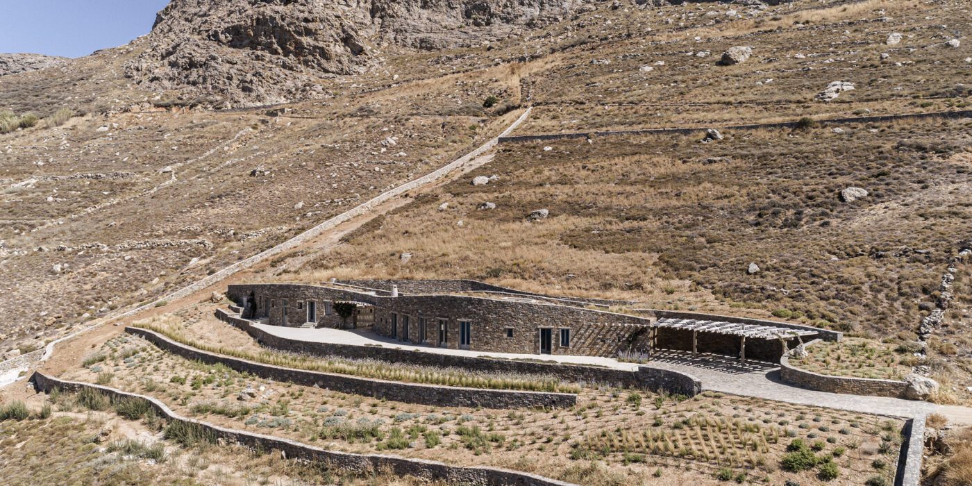
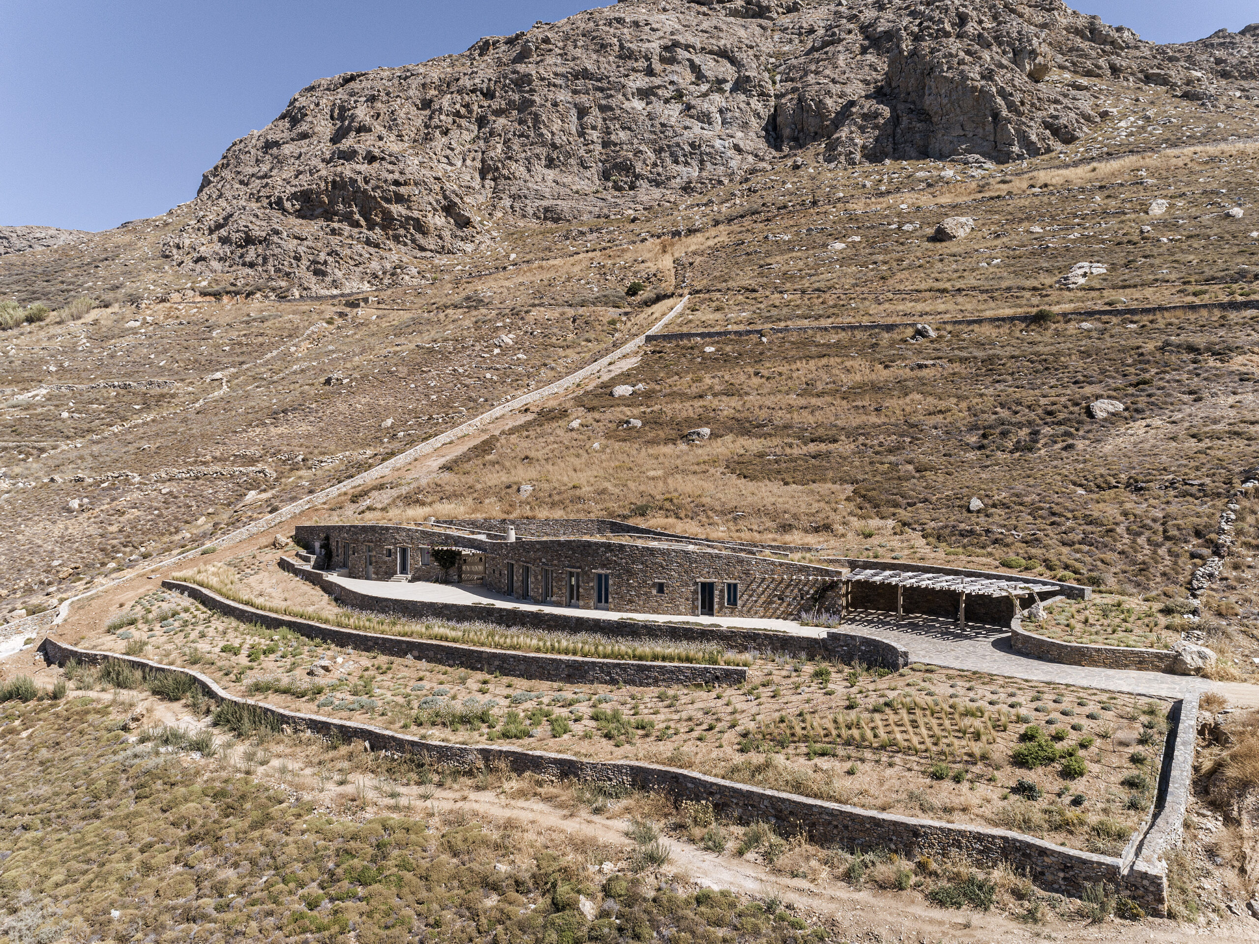
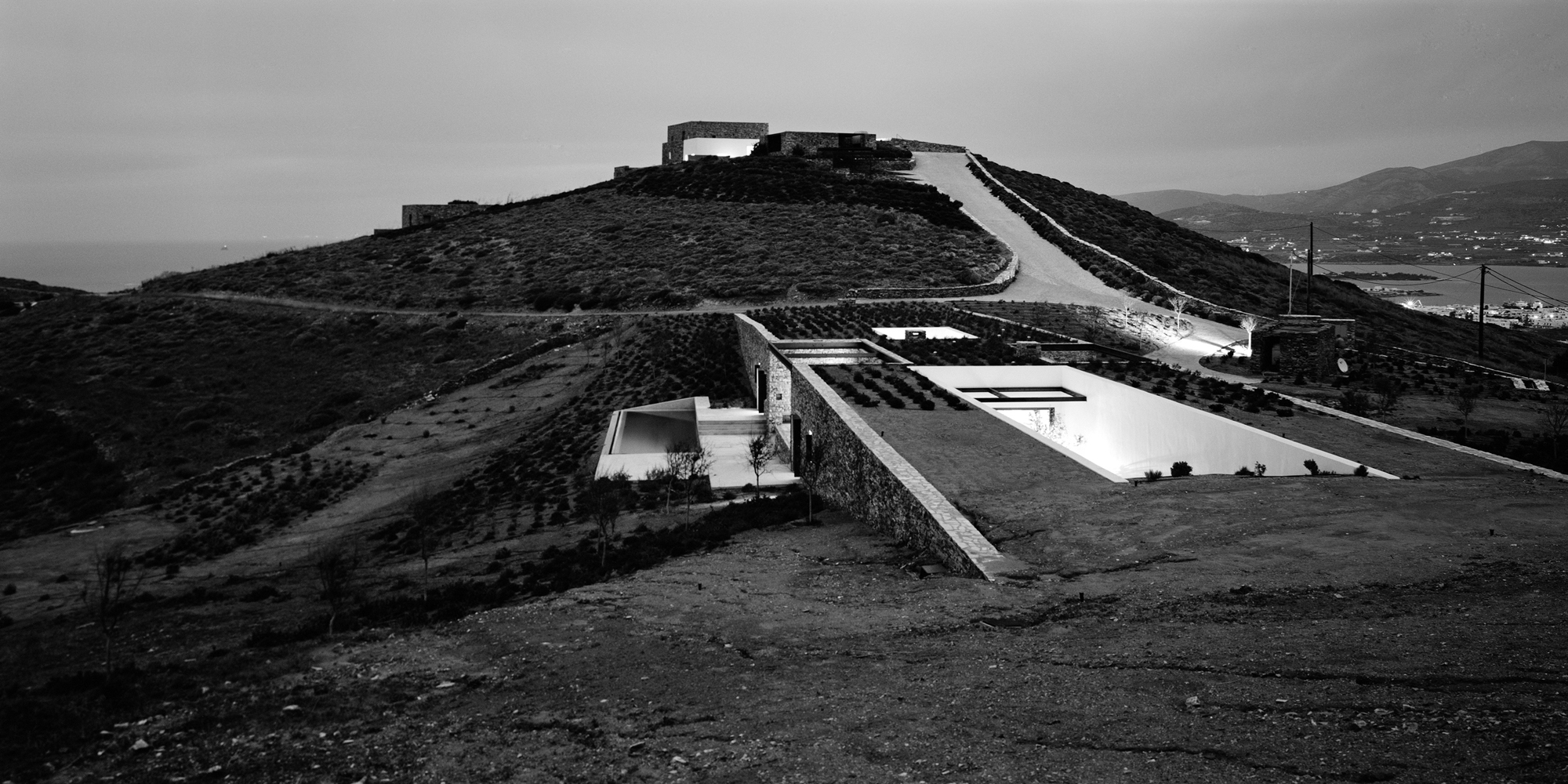
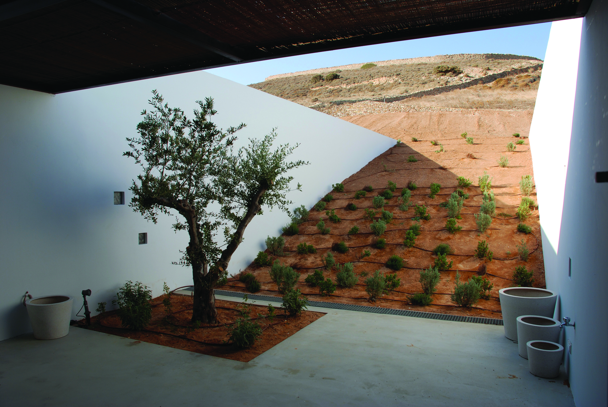
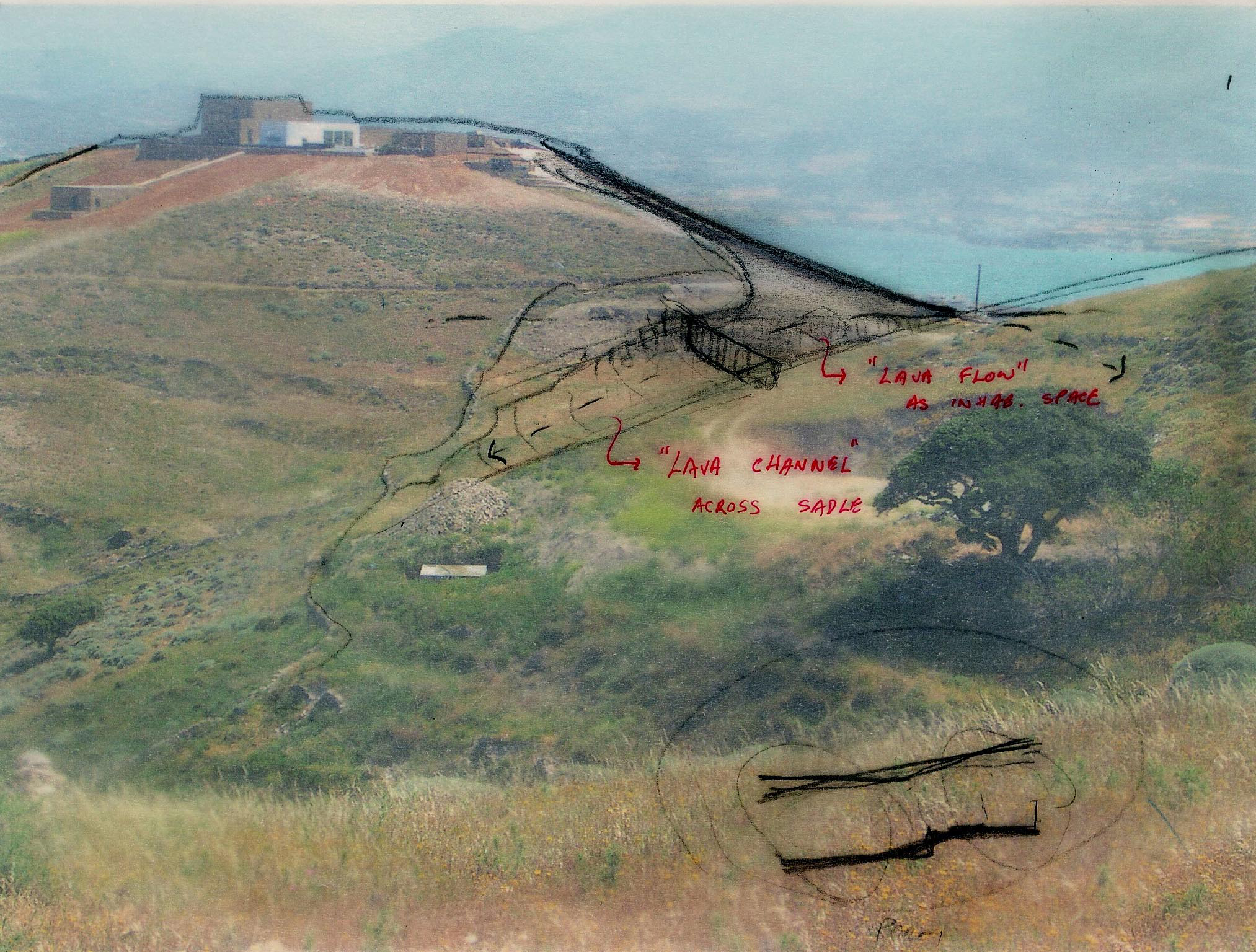
Aloni is also a house that trails the landscape. Still, in this case, the land is not raw or uninhabited, but rather a product of rural conversion practices. Following the agricultural motifs of the past, Deca Architecture employs a series of techniques such as carving, sinking and the use of existing retaining walls. They create a semi-artificial landscape that blurrs the edges between the natural and artificial ground morphology.


Ring House

By Deca Architecture, Crete, Greece

Jury Winner 2018, A+Awards, Private House (L 3000-5000 sq ft)
<alt=

<alt=

Photos by George Messaritakis

In addition to being a refined addition to Crete’s natural setting, the Ring House fulfills a wider agenda. After countless random interventions to the hill’s topography, Deca Architecture approached the house’s design as an opportunity to regenerate the surrounding landscape. Pursuing a reduce-waste approach, they used the excavated material to reconstruct the hill’s original morphology. At the same time, the Ring House itself acts as an exemplar for sustainable design. Its careful insertion into the landscape, results in the formation of a temperate microclimate fit for Crete’s desert-like environment.


Sheltered Villas

By A&M Architects, Karpathos, Greece

<alt= <alt=

Sheltered but not concealed, A&M Architects designed three distinct villas in the island of Karpathos. However, instead of employing the classic “yposkafo” typology, they added a bit of a twist, treating the opposing facades of each house in the most contradictory way. On the one hand, a series of white retaining walls cut through the ground, clearly marking the back wall of each villa. On the front end of the house however, a single transparent façade creates a threshold between the inside spaces and the outside scenery.


KHI House & Art Space

By LASSA Architects, Methoni, Greece

<alt= <alt= <alt=
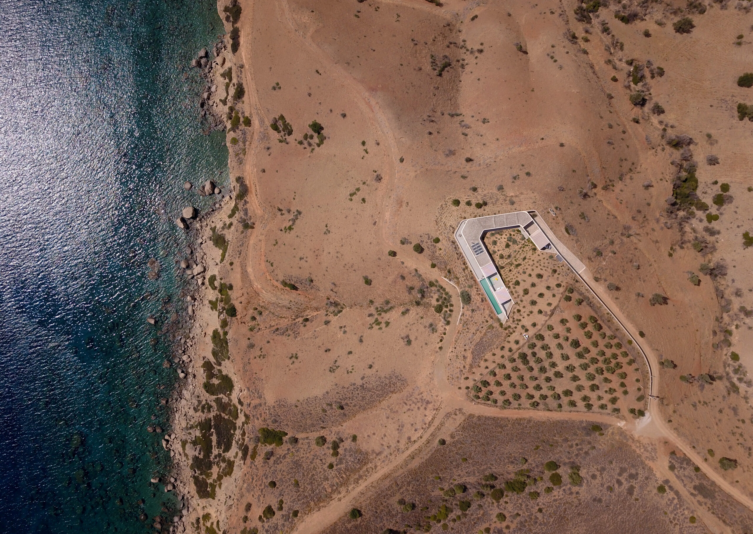
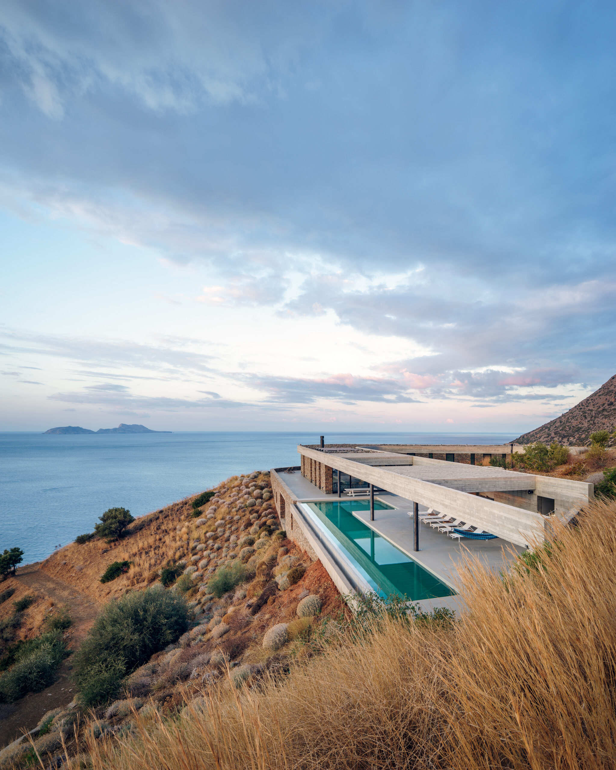
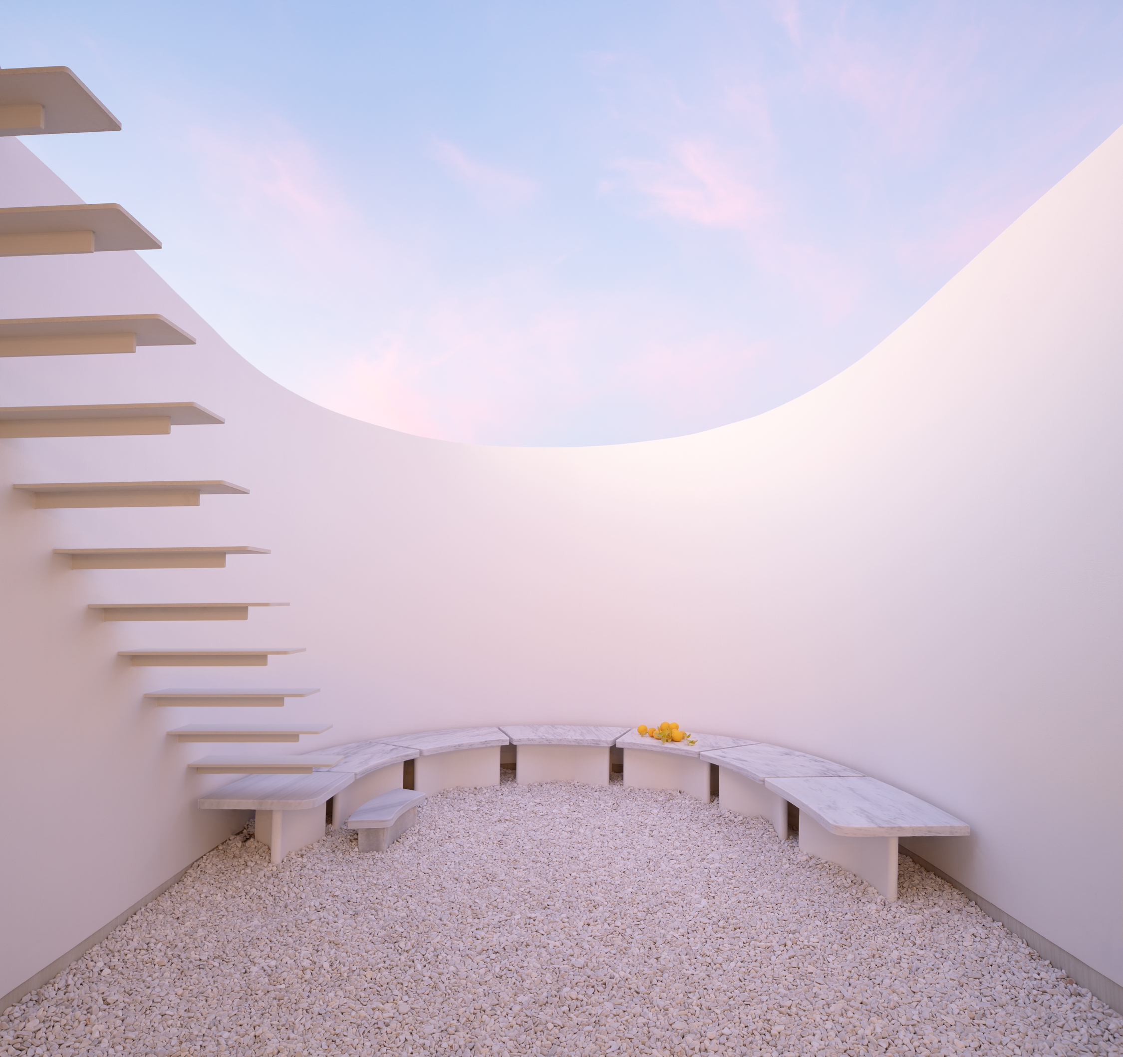
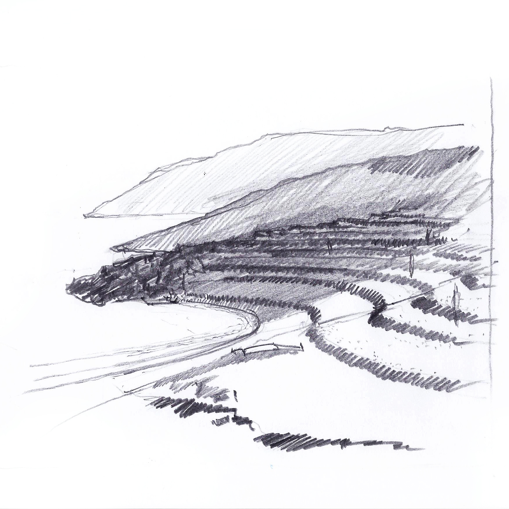
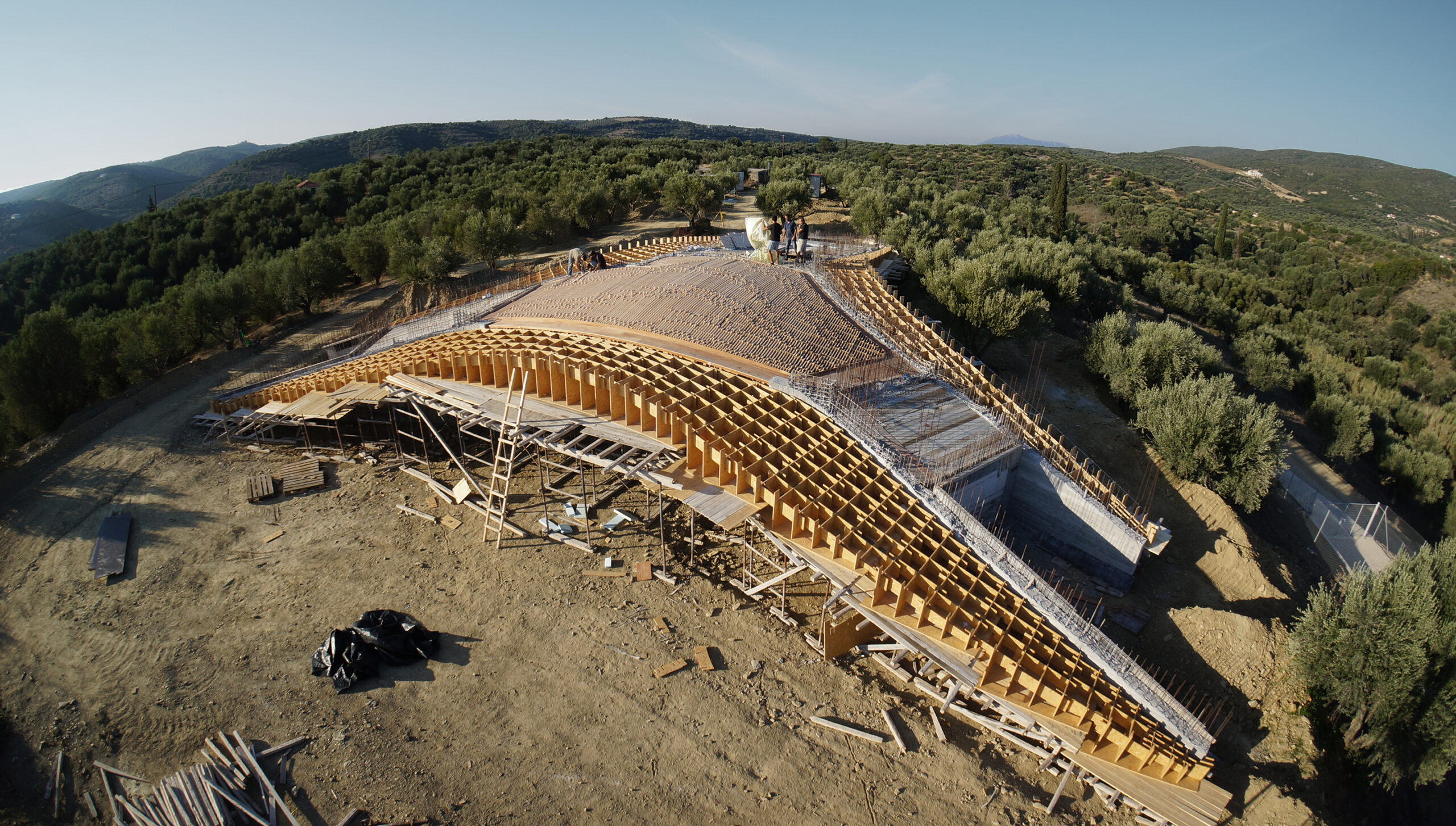
Located in a shallow Peloponnesian slope, KHI is a house full of contradictions. Playing with height as well as enclosure, LASSA Architects have merged courtyards, unrestricted roofs, underground gallery spaces, and sunbathed rooms all within a single rippling wall. The wall gradually sinks into the ground, continuously reframing the two functions of the house: the residence and the art space. It becomes an animating apparatus that shifts the landscape conditions around KHI House, gently integrating it with the immediate terrain.


House 6 °

By Mado Samiou Architecture, Lagonisi, Greece

<alt= <alt=
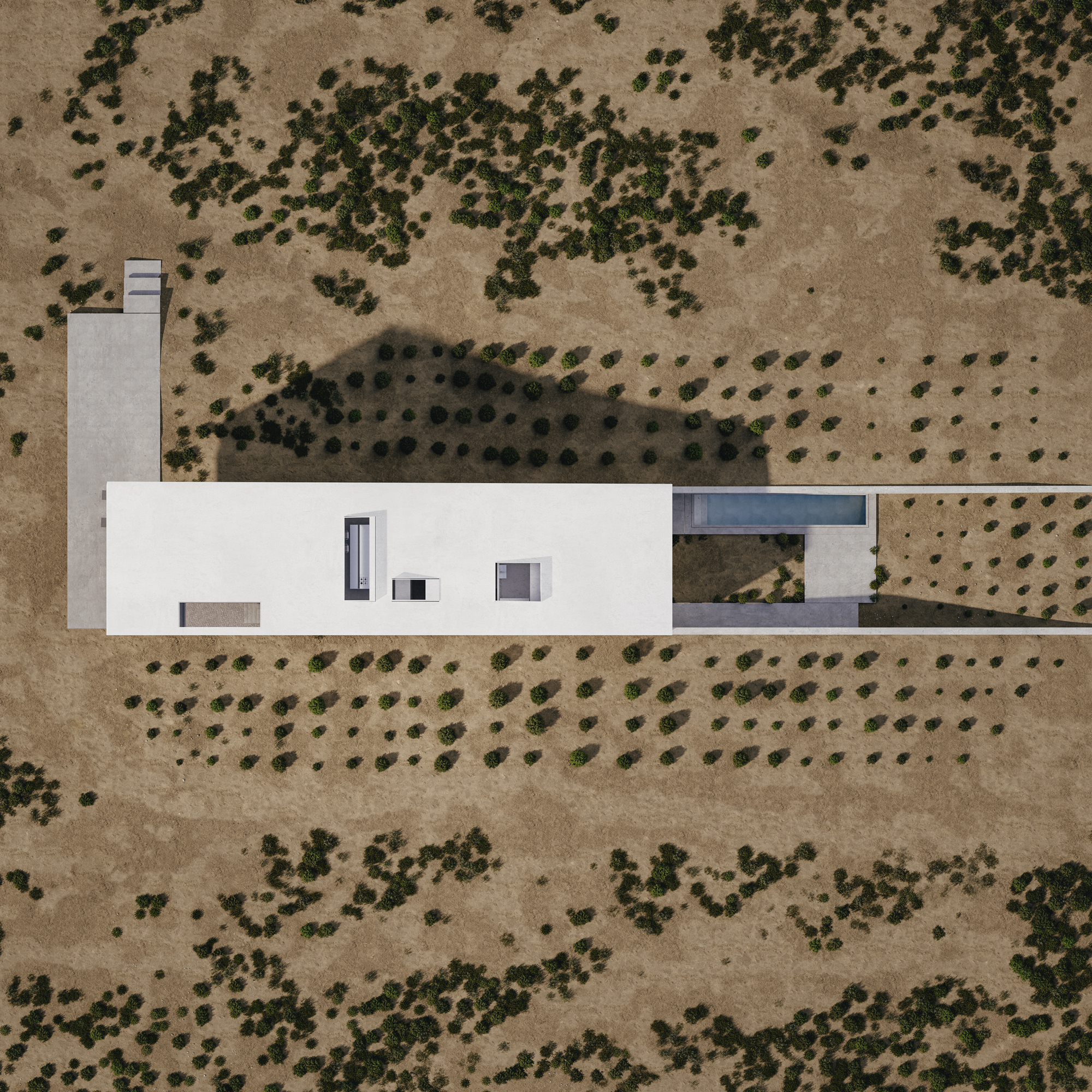
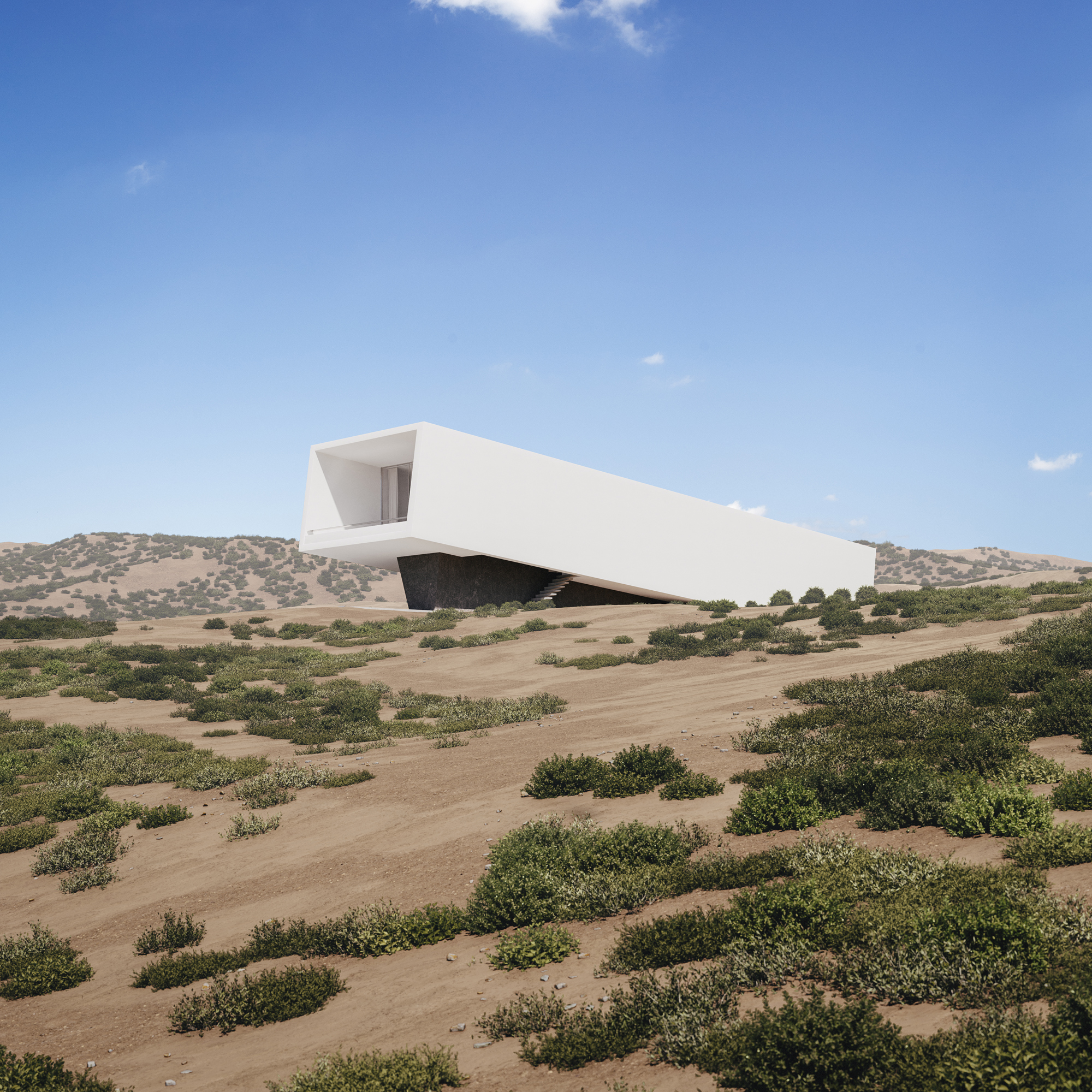
Built only a couple of miles away from Athens’s dense urban setting, House 6 ° celebrates the unspoiled nature of its setting. Emerging from the ground, the white solid structure compliments the incline of the adjacent hill. House 6 °separates its functional spaces into underground private areas, illuminated by a series of skylights, and common areas above the ground, strategically positioned towards the surrounding countryside views.


Villa Ypsilon

By LASSA Architects, Foinikounta, Greece

<alt= <alt=
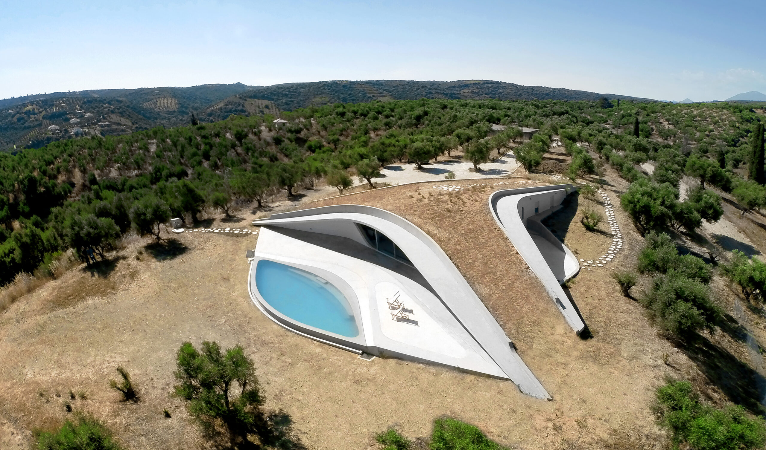
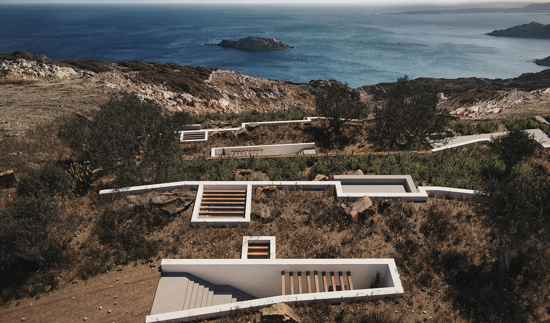
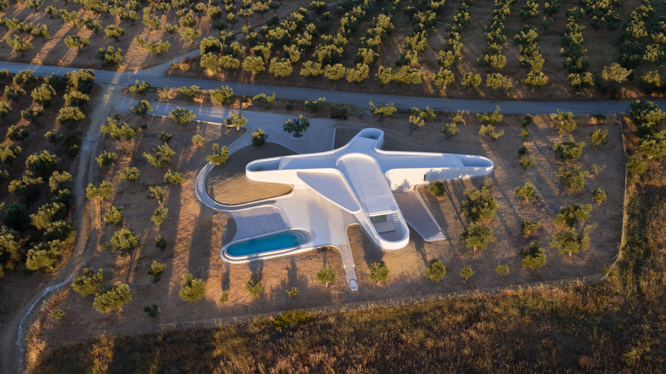
Villa Ypsilon is one of the most radical “yposkafo” residences, found inside a Peloponnesian olive grove. Instead of digging into the landscape, its design manipulates the ground’s surface, shifting it to a higher level. The roof of the villa becomes an integral part of the hill as well as a natural cooling mechanism for the entire space.

“Yposkafo” typology is predominantly established in rural areas in order to sustain Greece’s natural landscape. Greatly encouraged by Greek building regulations, it has become an intermediary solution for promoting international tourism without sacrificing its physical beauty.

Architects: Want to have your project featured? Showcase your work through Architizer and sign up for our inspirational newsletter. 

Reference

H&P architects' latest clay tile structure unfolds as a nature-infused dwelling in vietnam
CategoriesArchitecture

’tile nest’ unveiled as a nature-infused porous dwelling in vietnam

’tile nest’ house by H&P architects 


Following its eye-grabbing ‘Ngói Space’ building outside Hanoi, H&P Architects returns with another exploration into using clay tiles as a porous architectural skin. Dubbed ‘Tile Nest’, the studio’s latest project takes shape as a private residence cocooned in a newly developing urban area of Phu Ly in Vienam’s Ha Nam province. ‘The house communicates the idea of creating a space, a blend of the Nest with many nooks and crannies finding all their way up to the ground and the Ancient Pit House partially hidden underground. This combination gives the house’s architecture a distinct corrugated appearance, with the shell felt like porous/ perforated on the outside and large space on the inside,’ shares the team. 

H&P architects' latest clay tile structure unfolds as a nature-infused dwelling in vietnam
all images © Le Minh Hoang


nooks and crannies of sunshine, porosity, wind, and foliage 


The outer shell of ‘Tile Nest’ features endless clay tiles suspended and arranged in various patterns to evoke a stacked roof and brise-soleils as found in traditional dwellings. Complementing the porous skin is a middle layer characterized by transitional green balconies at different heights, framing captivating views and helping regulate the indoor microclimate. ‘For a long time, tile has become a familiar and popular material with Vietnamese people. Yet, it is applied to this house in an unusual way to make its presence felt by seeing through, touching, and sensing properties, thereby creating different but close experiences in the space of flower-like patterns from sunshine reflection, wind, and the scent of plants – an architecture immersed in nature,’ writes H&P Architects (see more here). 

H&P architects' latest clay tile structure unfolds as a nature-infused dwelling in vietnam
‘Tile Nest’ house in the Ha Nam province


Concluding its approach, the studio reflects on the dwelling’s unique construction process: ‘Lastly, since this area is supposed to have graves deep underground, due to its proximity to a former cemetery, it is, therefore, necessary to excavate the old soil layer before construction so as to clear the assumption mentioned above. This perspective then helps develop the concept of using the excavated site as part of the house (after the old soil layer is removed) so that not only distinguishable spatial features are created but also the possibility to harness geothermal energy is made.’

H&P architects' latest clay tile structure unfolds as a nature-infused dwelling in vietnam
using clay tiles as architectural façades

H&P architects' latest clay tile structure unfolds as a nature-infused dwelling in vietnam
stacking and organizing the tiles in different patterns to create sunshades and a stacked roof

Reference

Purple two-storey cuboid house with sun lounges and palm trees
CategoriesArchitecture

Workshop Architects renovates and expands purple Mérida home

Local architecture studio Workshop Architects has renovated a Spanish colonial house in Mérida, Mexico, and added two concrete buildings in its garden.

Named Casa Pulpo, the 235-square-metre residential project is characterised by lilac-hued exterior walls and traditional pasta floor mosaic tiling in the interiors.

Purple two-storey cuboid house with sun lounges and palm trees
Casa Pulpo has three purple-coloured buildings

“The traditional architecture of Mérida uses pasta tile for the floors, and usually, each room has a different pattern,” said Workshop Architects co-founder Francisco Bernés.

“That is why in this project, every room has a unique design on the floors and a similar tone colour for the base of the walls.”

Front exterior of the existing house at Casa Pulpo by Workshop Architects
The studio renovated the existing Spanish colonial house

The studio renovated the existing house, preserving the high ceilings and exposed white metal beams with wooden joists in the bedroom and living room at the front of the property.

An archway in the living room leads to the kitchen, which features a wood and white quartz island and a corner breakfast area to add a sense of cosiness.

A one-storey purple building with glass sliding doors revealing a dining room and swimming pool beyond
Glass sliding doors in the central building connect the living space and swimming pool

Each space in the house features a different colour applied to the pasta floor tiles and painted on the lower sections of the walls.

Workshop Architects united the rooms by using a neutral colour on the upper part of the walls and adding white border tiles on the perimeter of the floors.

Interior of a living room with mosaic floor tiles, exposed ceiling joists and a blue sofa
Traditional Mexican pasta tiles decorate the floors

Large sliding glass doors connect the kitchen and outdoor space, letting natural light and ventilation into the interior.

A breakfast nook was also added to generate a “warm and cosy feeling”.

The studio added two separate concrete buildings to the site, using door proportions and wall heights and thickness that reference the original house.

One of the buildings is a one-storey structure in the middle of the site, accommodating a bedroom and dining and TV room with glass sliding doors open out to a swimming pool.

“This area, being independent of the rest of the house, allows, through the use of two sliding glass doors, to have visuals that flow towards the gardens and towards the pool area, giving the sensation of spaciousness and freshness,” said Workshop Architects.

Exterior of a purple two-storey building with an arch entryway and swimming pool
Workshop Architects added an arched entryway to the building at the rear of the property

At the end of the garden is a two-storey structure containing a bedroom and ensuite on the ground floor, accessed by an arched entryway. An outdoor staircase leads to an additional bedroom and ensuite above.

“The third and last nucleus of the house has a more modern and purposeful volumetry with respect to the previous two, which are presented in a more conservative way,” said Workshop Architects.

Purple rectangular one-storey building with a swimming pool and palm trees
Chukum was used for the swimming pool walls

Adjacent to the two-storey structure is a small terrace with a bajareque wooden roof that filters natural light and “projects an extraordinary play of light and shadow on the walls and floors”.

The swimming pool walls were made from the material chukum, which is created by boiling chukum tree bark and mixing it with concrete.

Interior of a kitchen with mosaic floor tiles, a corner breakfast area and archway leading to a living room
Different colours were used on the lower parts of the walls in each room

“Casa Pulpo seeks to create perfect atmospheres for the full enjoyment of each of its spaces through the use of different materials and textures throughout the property,” said Workshop Architects.

In 2020, the studio transformed a colonial house in Mérida into an art centre and workshop for the city’s annual festival of lights.

The photography is by Tamara Uribe.

Reference

Architects' Guide To Midjourney: An Adventure in AI-Generated Imagery for Concept Development
CategoriesArchitecture

Architects’ Guide To Midjourney: An Adventure in AI-Generated Imagery for Concept Development

Architizer’s Vision Awards is celebrating the innovative minds propelling architectural visualization forward with a special AI-Generated Visualization Category. Learn more and start your submission before the Early Entry Deadline on May 5th.  

You’ve probably heard by now: the AI revolution is well and truly upon us. And while it doesn’t quite resemble Spielberg and Haley Joel Osment’s 2001 vision, it’s clear that AI is moving in, and its moving in faster than your first love into that studio apartment you used to have.

While some industries rush to bolster their roles and justify their positions as AI proves that, in many instances, it can comfortably complete tasks to the same and often higher standards than its human counterparts, architects and the design industry as a whole are pondering with enthusiasm, how we can most effectively adopt this groundbreaking technology to explore, enhance, and streamline our practice.

Prompt: /imagine Architecture, concept sketch and plan, residential, modern, contemporary, handdrawn, in the style of Alvar Aalto

Change is daunting, and it’s safe to say we’re on the cusp of one of the most significant workflow conversions many of us have ever experienced, perhaps since the transition from drafting to CAD. So, in case you feel like you’re out of your depth or just haven’t yet had the time to explore the wonders of Midjourney, we thought it was important to show you why and how AI can be used to support your creative vision.

Let us start at the beginning. Midjourney is the brainchild of David Holz, the visionary mind behind Leap Motion. The company is a pioneering research lab that specializes in text-to-image AI technology. It offers a refreshingly simple and user-friendly interface through a platform named Discord. Users can seamlessly communicate with the AI “bot” using elementary commands without any coding experience whatsoever (phew!). The mission is to “expand the imaginative powers of the human species.” To say this tool has been popular is an understatement: The new company is making an indelible mark in the AI realm and proudly announced its profitability within a month of its open beta release in 2022.

Prompt: /Imagine Contemporary architecture, treehouse hotel, luxury, tropical jungle, hyperrealism, hyperrealistic, photorealistic, daylight, 8K Ultra HD

Now, where does architecture come into all this? Well, as we all know, as architects and designers, we regularly use imagery to express our vision, harnessing photographs, sketches and all sorts of visual aids to interpret and represent our ambitions. Yet, it can be tricky when the thing in your head doesn’t exist yet; how can you show what you mean using vague and abstract similarities, especially if your vision is unique? It’s the skill that has separated the good designers from the great designers, and Midjourney is here to make you even better.

Prompt: /imagine Hotel lobby, Moroccan, luxury, serene, wellness, airy, bright, hyperrealism, hyperrealistic, photorealistic, cinematic lighting, 8K Ultra HD

Midjourney offers a groundbreaking solution to some of these challenges by incorporating AI-generated images into our design process, we can dictate our thoughts using descriptive language to generate images that can loosely interpret our ideas. I say loosely because, understandably and thankfully, in my opinion — AI can’t read your mind. Your images are only as good as your descriptions, and even then, often, the results are far from what you imagined. However, we’re still in the early stages and with time, practice and further technological development, these things will surely improve rapidly.

So down to the fun part, how do we actually use it? Honestly, it’s pretty simple once you’ve gone over it a couple of times. Midjourney has been designed to be user-friendly, and it takes only a few steps to create your first image.

To begin your adventure with Midjourney, simply follow these steps:

1. Install Discord and create a free account.

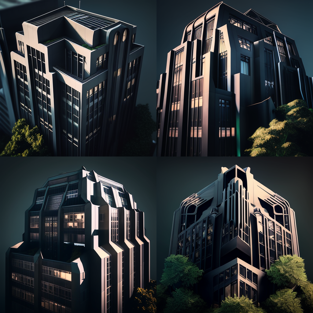
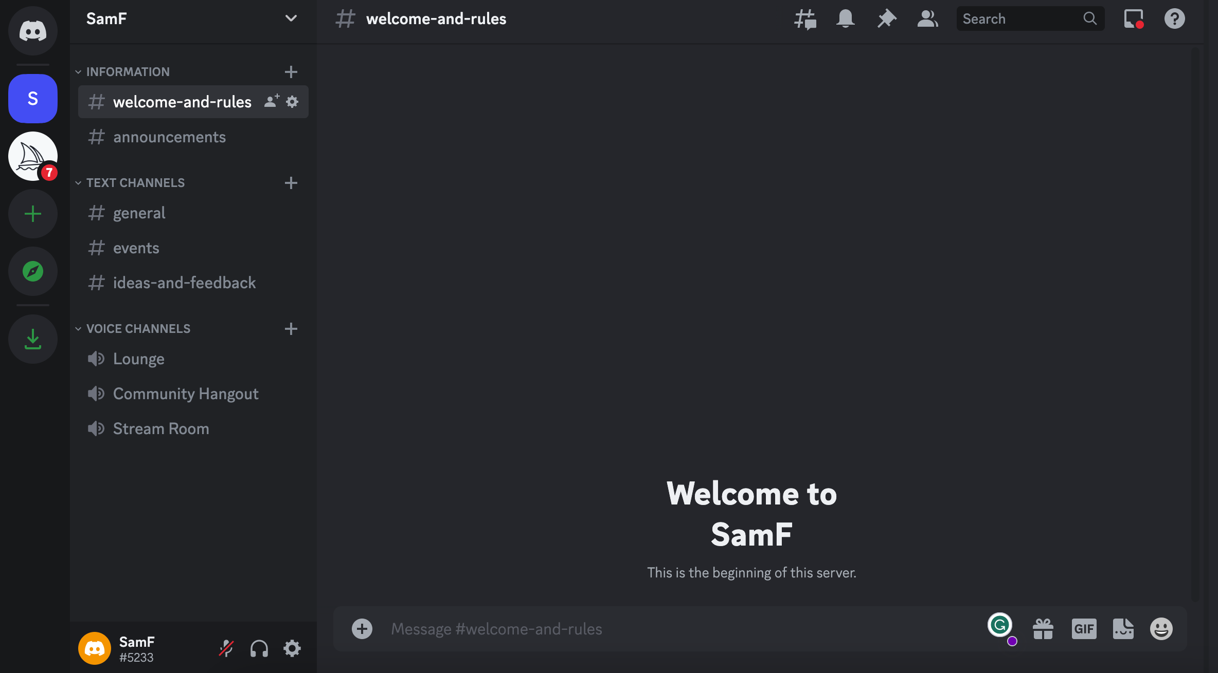
You can use a desktop or a mobile device. I’ve found the mobile interface a little more comprehensive for novices, but both work equally as well.


2. Visit Midjourney’s website and click on the “Join the Beta” to be given access to their Discord channel.


Once you’re all set up, head back to Discord and from the list on the left-hand side, locate the Midjourney Channel (a white icon with a sailboat) and select a Room in the Newcomer Rooms section within the channel.

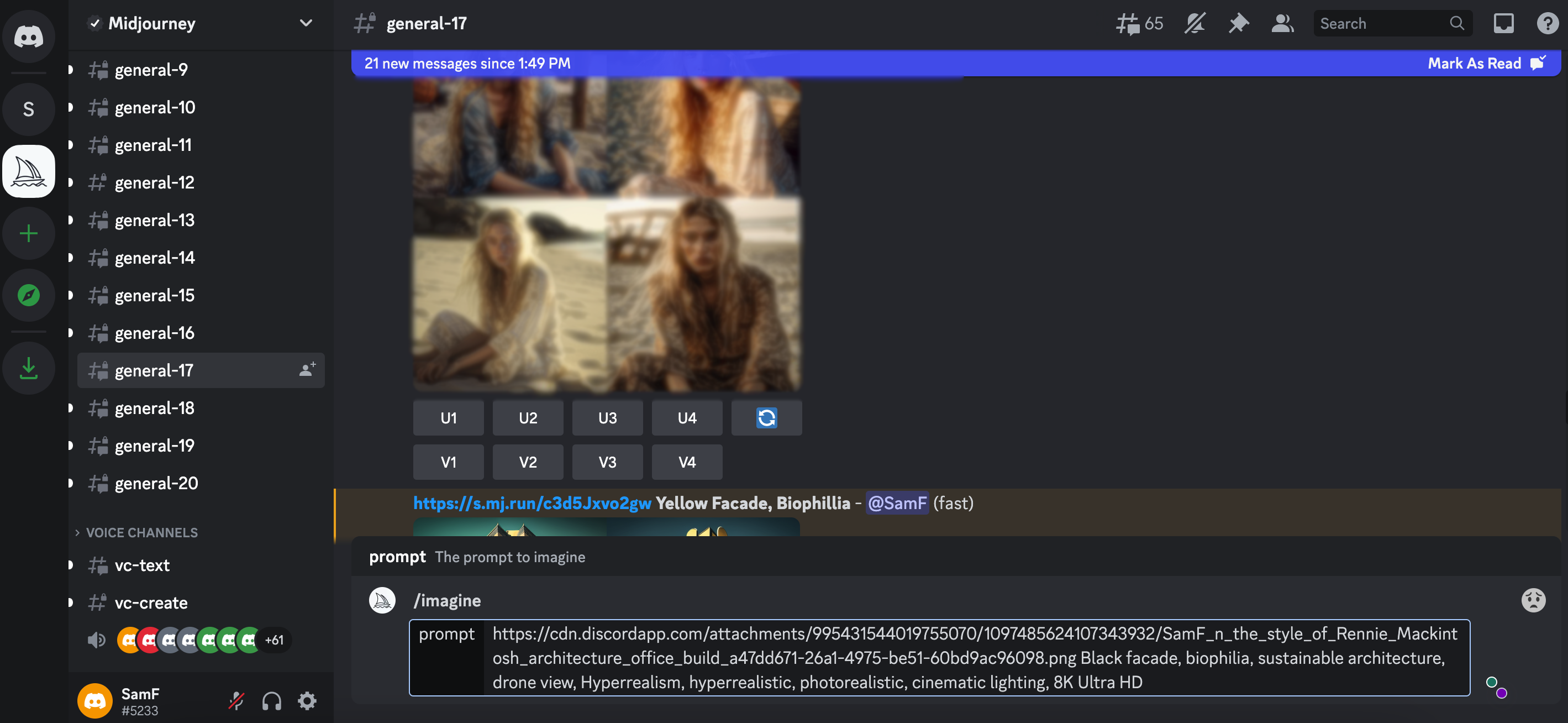
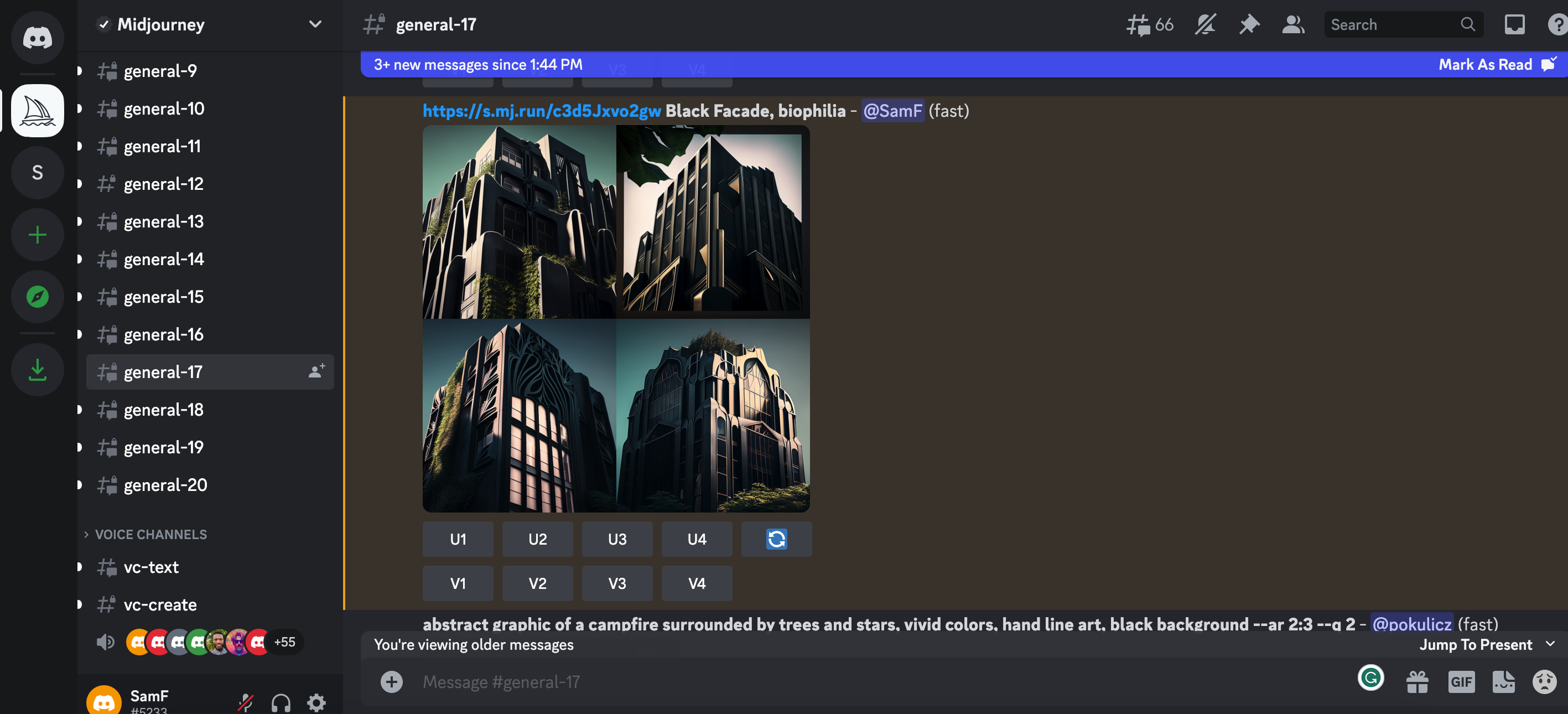
These channels are available to use without any sort of subscription while your first getting started. Your free trial gives you about 25 image creations to start out. Subscriptions start at $10 a month, depending on your requirements.

Be aware that these rooms are public, so everyone else in the room can see your creations.


3. Activate the AI bot

Prompt: /imagine In the style of Rennie Mackintosh, architecture, office building, skyscraper, New York City, summers day, Hyperrealism, hyperrealistic, photorealistic, cinematic lighting, 8K Ultra HD

Once you’re all set up and settled in, you can get started by typing “/imagine” into the messaging bar at the bottom of the conversation window, followed by a spacebar. This starts your “prompt” and you can let your imagination go wild from here. Enter any descriptive words that come to mind, and let the magic unfold as the program renders an image based on your input.


4. Select your preferred image

Image 3 – Upscaled

Midjourney will give you a grid of four images with several commands beneath it. U means “upscale,” and V means “Variation.” Upscale will provide you with a better quality and larger image. Variation will give you an additional four images similar to your chosen one. The numbers correspond from left to right. The top left is U1, and the bottom right is U4.


5. Keep track of your image in the constantly evolving message

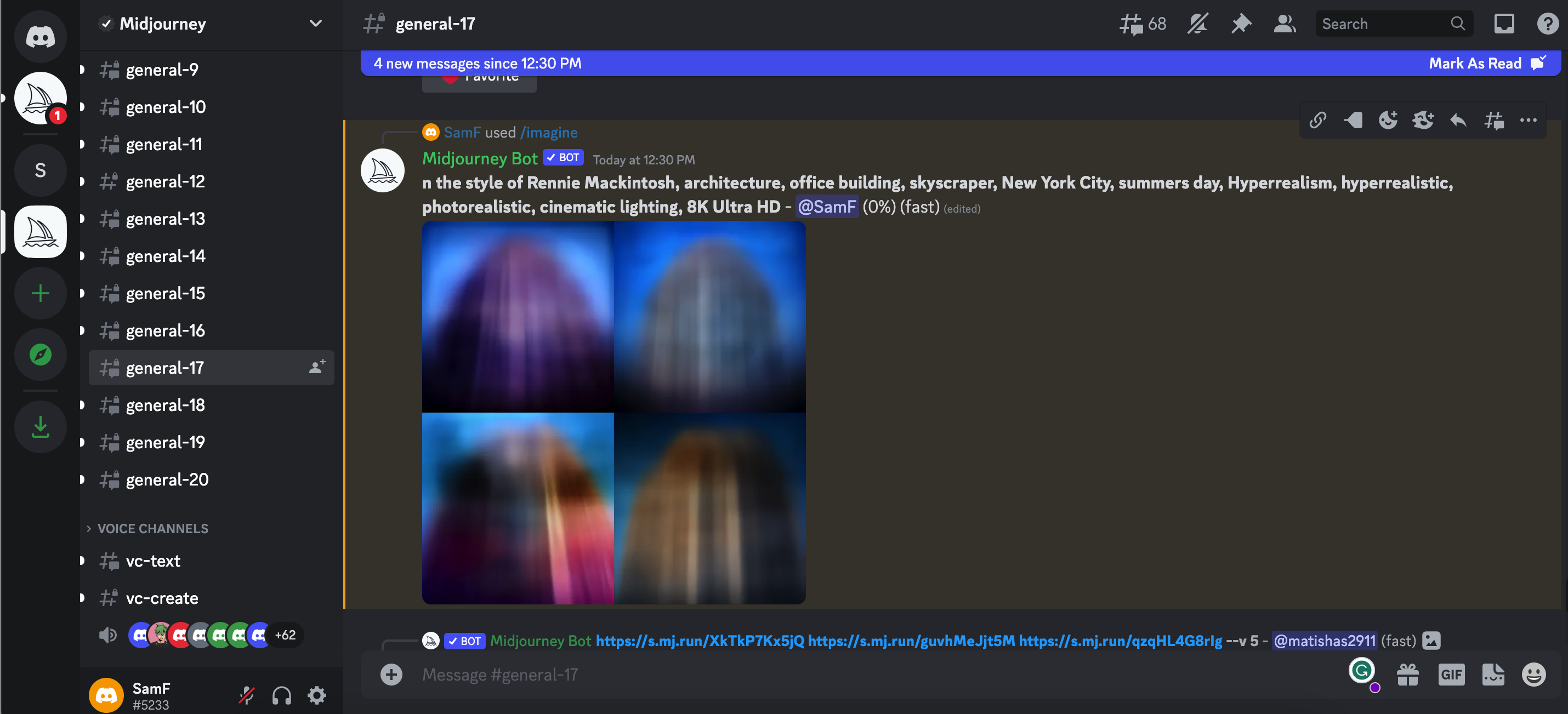
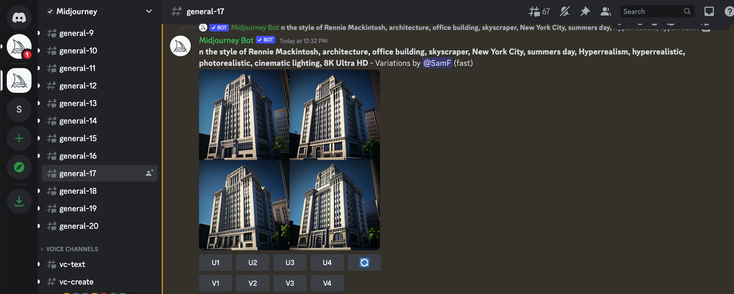
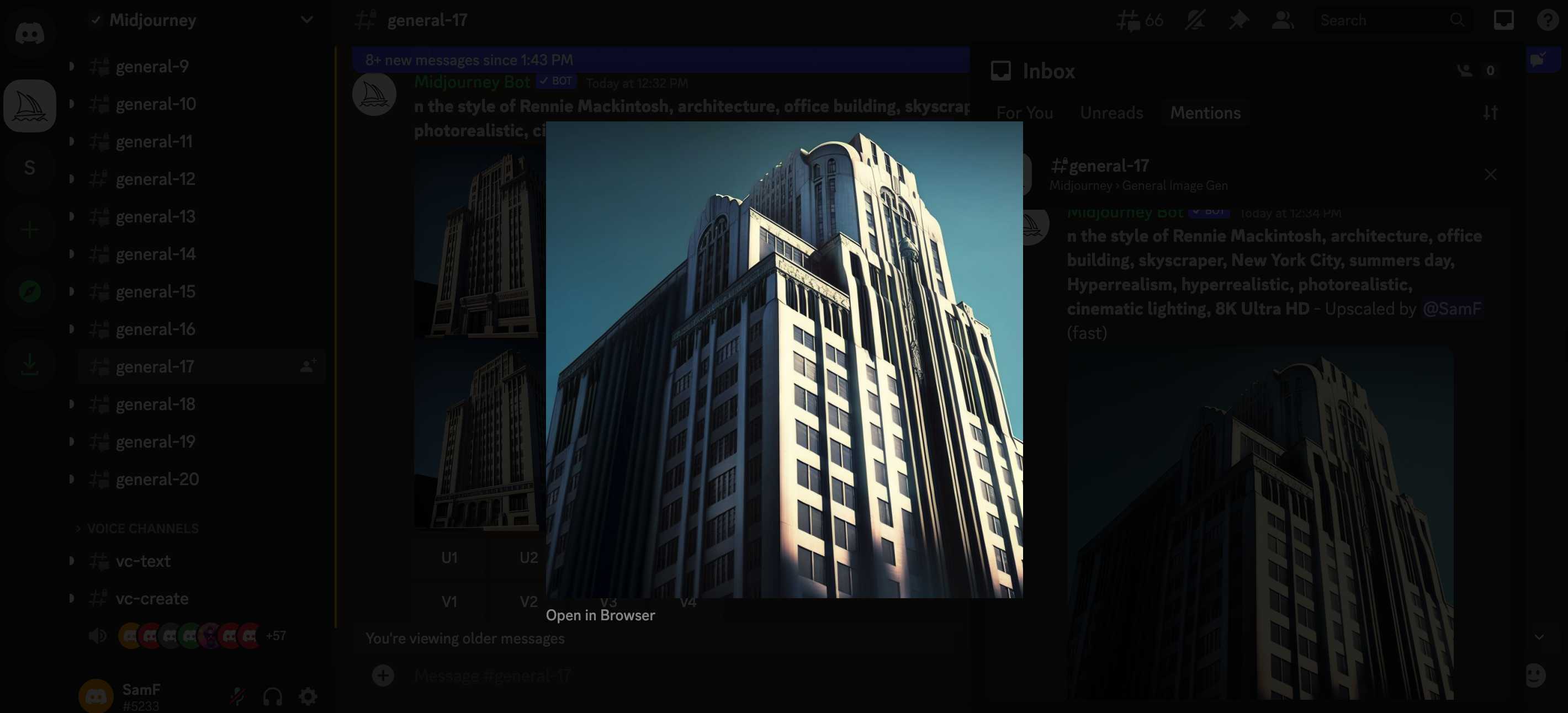
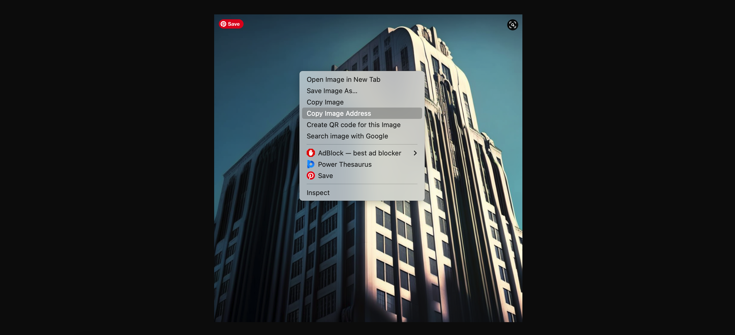
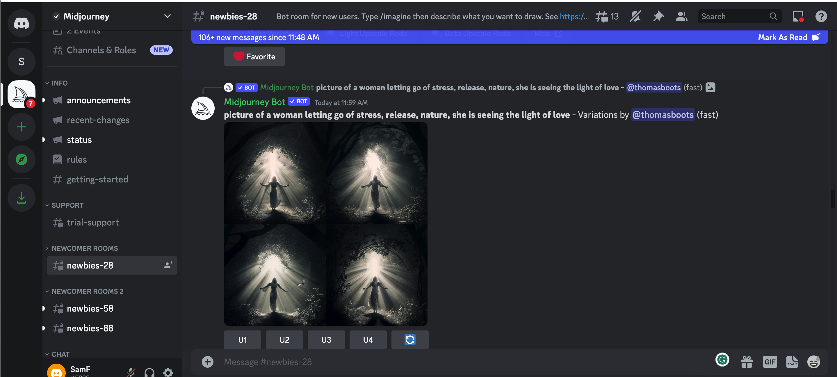
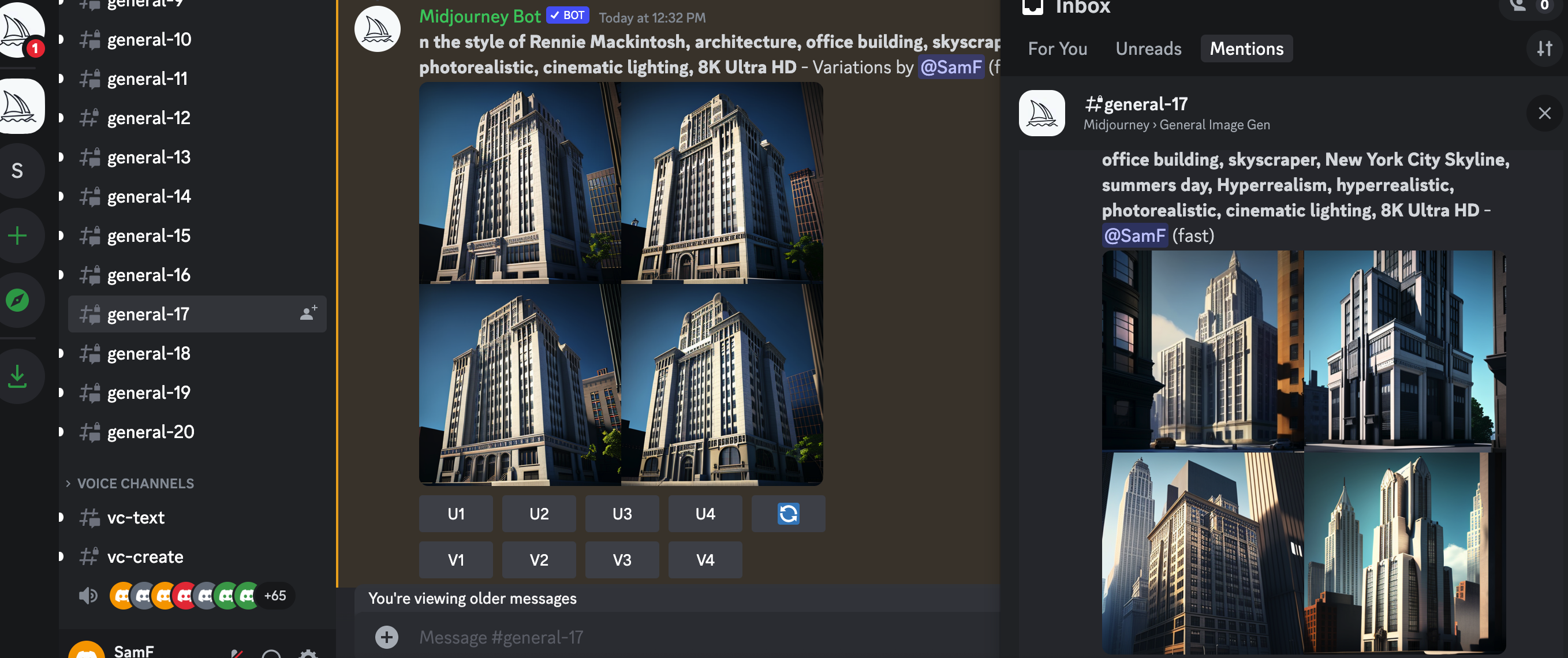
With all the users on Midjourney it’s really easy to lose track of your message. If this happens, just head to the top right corner of your window, look for your inbox and hit mentions. Here you’ll see all the messages you have been tagged in, including your images, variations and upscales.


6. Integrate Midjourney into your creative process

From this point on, you’re free to develop and adjust to your heart’s content. Simply open up you upscaled image into a browser window, copy the URL, start a new /imagine prompt and post the URL followed by any adjustments.

Prompt: /imagine (ORIGINAL IMAGE URL) Black facade, biophilia, sustainable architecture, drone view, Hyperrealism, hyperrealistic, photorealistic, cinematic lighting, 8K Ultra HD


It’s that simple. As you hone your prompts, you can develop your technique to get the desired image style you are looking for. A single change of word can create an entirely new set of images.

As the AI-generated images from Midjourney continue to inspire architects worldwide, real-world applications are becoming more common. From initial mood boards to fully realized designs, architects have found new ways to incorporate AI-generated visuals into their creative processes. The innovative approach pushes the boundaries of conventional architectural design, allowing architects to explore ideas faster and more effectively, bypassing the need for exhaustive online image searches.

As we become more familiar with the software, daring architects are venturing even further by crafting AI-encouraged designs, generating photorealistic renderings of architectural structures using Midjourney, and creating 3D models based on the AI-generated concepts. With the development of these models in familiar architectural software, AI generated concepts can quickly become reality. Watch this space!

Architizer’s Vision Awards is celebrating the innovative minds propelling architectural visualization forward with a special AI-Generated Visualization Category. Learn more and start your submission before the Early Entry Deadline on May 5th.  

The images used are all author’s own.

Reference

4 Novels About Architecture That Are Better Than "The Fountainhead"
CategoriesArchitecture

4 Novels About Architecture That Are Better Than “The Fountainhead”

Sooner or later, every architect is gifted The Fountainhead. Usually, this is done with good intentions: someone reads Ayn Rand’s 1943 novel about an idealistic architect at war with a cynical society and is reminded of the architect in their own lives, their friend or nephew or whomever. They buy the architect a copy, thinking they will appreciate seeing their profession represented in literature. 

Sometimes though, Fountainhead pushers have another agenda. Rand’s 753 page doorstop was not just a work of imaginative literature; it was a vehicle for Ayn Rand to push her political ideology, an extreme form of capitalist individualism called Objectivism. Rand hoped readers of The Fountainhead would be convinced of the evils of collectivism, especially any kind of socialism, which in her view suppresses the entrepreneurial spirit of geniuses like her architect hero Howard Roark. She wanted to change the way people voted, not just how they thought about architecture. 

As it is a work of political propaganda, The Fountainhead falls short of John Keats’s standard for authentic literature. In an 1817 letter to his brothers George and Thomas, the poet coined the term “negative capability” to describe the ability of great authors to put their own opinions to the side when they set out to write. The role of the author, in Keats’s view, is not to push an agenda but to give life to whatever ideas emerge organically within the imaginative space of the poem or novel. 

A lofty standard? Maybe. But the novels listed here come closer to the mark than The Fountainhead. They run where Rand’s book only walks — that is, they give authentic literary expression to architectural ideas.


Daniel Burnham’s “White City,” constructed in 1893 for the Chicago World’s Fair. Unidentified Photographer, Public Domain via Wikimedia Commons.

The reader might here exclaim that I am cheating. “The Devil in the White City is not a novel at all,” they’ll say, “it is a work of non-fiction!”

True as that may be, The Devil in the White City is by Keats’s standard a clear example of imaginative literature. In re-telling the events surrounding the 1893 Chicago World’s Fair and its architect, Daniel Burnham, author Erik Larson set out, above all else, to tell a story and to do so as powerfully as he could. As New York Times critic Janet Maslin gushed, Larson “relentlessly fuses history and entertainment to give this nonfiction book the dramatic effect of a novel, complete with abundant cross-cutting and foreshadowing.” 

Larson’s approach is well suited to his dramatic subject matter. The story alternates between two narratives: the planning and development of the World’s Fair under architect Daniel Burnham, who used the fair as an opportunity to showcase the grandeur of the Beaux Arts Style, and the exploits of serial killer H.H. Holmes, who used the fair as an opportunity to prey on naive out-of-towners.

In a grim ironic twist, Holmes was something of an architect himself, transforming a Chicago rooming house into a “Murder Castle” complete with trapdoors, greased chutes and soundproof rooms. Indeed, the parallels between Burnham and Holmes are the thematic heart of the book, lending this true story literary gravitas. 


Italo Calvino riding a bike in 1970. Unknown Photographer, Public Domain via Wikimedia Commons.

Like a great building, Invisible Cities is a book that was designed to be inhabited rather than simply experienced once. The allegorical novel is structured as a series of conversations between Marco Polo, the 13th century Italian explorer, and Kublai Khan, the Mongol emperor of China. 

Polo and Khan did meet in history, but this book is not drawn from any historical sources. The conversations are merely a framing device, allowing Polo to describe 55 fictitious cities to the emperor, places he claims to have visited. Each city is a parable for a different aspect of human nature, and as the novel progresses, it becomes clear that the subject Polo has learned the most about in his travels is himself. Places, it seems, are illuminated by the preconceptions we bring to them.

While the story has a free-floating and dreamlike structure, there is a plot twist that occurs halfway through the novel. Pressed by Kubla Khan to describe his home city of Venice, Polo explains that he has been doing that all along. Fedora, Zoe, Zenobia, and all the other fictional cities he recounts are all just Venice seen from different vantage points. 


House of Leaves by Mark Z. Danielewski (2000) 

Leaves are much more intricate than they appear to be at first. Photo by Jon Sullivan, 2003, Public Domain via Wikimedia Commons.

House of Leaves is sort of like the reading equivalent of being trapped within H.H. Holmes labyrinthine Murder Castle. The text is laid out in a fashion that is anything but linear, with copious footnotes leading to their own footnotes which themselves have footnotes, all making copious references to books and films that are sometimes real, sometimes not. At times, the text is arranged unusually on the page and the book must be rotated to be read. At other times, multiple narrators interrupt one another in a disorienting fashion. Even the genre is hard to determine. While most readers consider House of Leaves a horror story, the author himself has described it — bafflingly perhaps — as a love story. 

But House of Leaves offers the reader much more than mere confusion. By traversing this experimental book, the reader is able to share in the protagonists’ disorientation, offering a unique, sometimes claustrophobic experience of imaginative identification. The book follows a family whose house contains an endless series of hidden rooms — an allegory, perhaps, for the psyche, family dynamics, academic criticism, history  and more. (Perhaps the list is also endless). For architects, the mysteries of this novel are a potent reminder that clarity, rationality, and openness are not always preferable. Sometimes people are drawn to the darkness.


Am Gestade, one of many Viennese streets Austerlitz traverses as he searches for his hidden past. Photo by Jorge Franganillo, CC BY 2.0 <https://creativecommons.org/licenses/by/2.0>, via Wikimedia Commons

Can a work of art speak to both the heart and head at the same time? Or do the intellect and the emotions respond to different kinds of artistic experience, one craving critical distance and the other empathic closeness? These are not just questions that Austerlitz poses to the reader, they are the questions faced by the novel’s eponymous protagonist. 

Jacques Austerlitz is an architectural historian who lives a solitary, itinerant life. He is fascinated with the way buildings and street layouts can reveal the buried histories of places, leaving behind an objective record of how people lived — ordinary people, that is, not just the type of people whose names end up in history books. One day, Austerlitz stumbles across a startling fact about himself. He learns that the couple who raised him in England were not his biological parents. His actual parents were a Jewish couple from Vienna who perished in the Holocaust. They had sent their young son, then aged three, to safety in England using an underground program known as the kindertransport

Austerlitz applies his skills as an architectural historian to research the buried history of his own parents, who seem to have left few traces behind. He is then faced with the possibility that he had unknowingly been looking for them all along. Could his interest in architectural history have been, unconsciously, a way of trying to uncover his own roots? This question, which would intrigue Calvino’s Marco Polo, is just one of the many tantalizing mysteries of this masterful novel about memory and loss. 

Cover Image: Freepik, Attribution via Wikimedia Commons

Reference

glossy red tiles contrast with lime green counter within spazio maiocchi's new bar in milan
CategoriesArchitecture

glossy red tiles dynamically contrast with lime green counter within spazio maiocchi’s new bar

Spazio Maiocchi’s bar extension in milan 


Spazio Maiocchi, a contemporary art space and cultural hub in the heart of Milan, has recently unveiled its new extension, a vibrant and modern bar. Its striking design, conceptualized by Capsule magazine and architect Paul Cournet, features a bold use of color and clear forms, creating a dynamic contrast between the intense shades of red and green. The eye-catching aesthetic is the result of collaborations with renowned designers, including Konstantin Grcic, and Ettore Sottsass among others. This new extension adds to the already rich cultural scene offered by Spazio Maiocchi, providing a stylish and welcoming environment where visitors can enjoy the Milanese energy.

glossy red tiles contrast with lime green counter within spazio maiocchi's new bar in milan
all images by Capsule


One year after the launch of Capsule magazine (see more here), Capsule Plaza was created as a hybrid between a fair and a collective exhibition. This initiative brought together designers and companies from various creative fields, injecting fresh energy into Milan Design Week. The inaugural edition of Capsule Plaza coincided with milan design week 2023, celebrating the city’s lively design scene. On this occasion, Capsule Plaza unveiled the new extension of Spazio Maiocchi — a striking former garage across the street, renovated by architect Paolo Caracini and Laboratorio Permanente, reaching a footprint of over 1600 sqm and reasserting its presence as a new cultural hub.

glossy red tiles contrast with lime green counter within spazio maiocchi's new bar in milan

wooden wall tiles by Ettore Sottsass incorporate natural warmth and texture into the space


a Symphony of Materials


The new bar is a natural extension of Spazio Maiocchi’s mission to bring together artists, creatives, and the community to foster cultural exchange. The space boasts a stunning design, featuring a striking combination of materials, such as Mutina DIN tiles in glossy red and matte black, created by Konstantin Grcic, and wooden wall tiles by the renowned designer Ettore Sottsass. The resulting aesthetic is bold and contemporary, while also incorporating natural warmth and texture into the space.


Adding to the design’s glossy are the horizontal suspended lamps by Ronan & Erwan Bouroullec and a USM bar counter in lime green. This diverse material choice imparts a sophisticated and timeless aesthetic to the overall composition, with the patterns and forms lending an illusion of space extension. Other details from aluminum shelves and wall sconces to a pedestal sink in rust-colored reinforced concrete contribute their own unique flair to the imposing design.

glossy red tiles contrast with lime green counter within spazio maiocchi's new bar in milan
the lime green USM bar counter creates a dynamic contrast against the red background.

glossy red tiles contrast with lime green counter within spazio maiocchi's new bar in milan
horizontal suspended lamps by Ronan & Erwan Bouroullec generate intricate reflections on the glossy walls

glossy red tiles contrast with lime green counter within spazio maiocchi's new bar in milan
a unique combination of materials, textures, and colors

glossy red tiles contrast with lime green counter within spazio maiocchi's new bar in milan glossy red tiles contrast with lime green counter within spazio maiocchi's new bar in milan


1/2

glossy red tiles contrast with lime green counter within spazio maiocchi’s new bar in milan


glossy red tiles contrast with lime green counter within spazio maiocchi’s new bar in milan


project info:


name: Spazio Maiocchi‘s new Bar | @spaziomaiocchi

designed by: Capsule and architect Paul Cournet

location: Milan

christina petridou I designboom

may 01, 2023


Reference

Exterior of house in the Czech Republic by RO_AR
CategoriesArchitecture

Grass-topped home by RO_AR bridges “the urban and the natural”

An undulating concrete roof topped with grass covers this house in the Czech Republic, designed by local architecture studio RO_AR.

Located alongside a wildlife corridor at the edge of the Hlubocepy district in Prague, the family home is designed to be a “bridge between the urban and the natural”.

To achieve this, RO_AR designed the house as a “clash of two geometries”: a rectilinear form facing the city that is clad in thin oak slats and a hill-like, grass-topped form facing the garden and natural landscape beyond.

Exterior of house in the Czech Republic by RO_AR
Czech studio RO_AR has created a house in the Hlubocepy district

“Urban space surrounds the site on the south and east sides,” explained studio founder Szymon Rozwałka. “It is a chaotic and random development, often adversely affecting the value of the terrain.”

“We designed a building that was created by the method of land deformation. The terrain was to transition smoothly from the north-west side into an artificial ‘hill’ into which the house was to be placed,” he continued.

On approach, the ground floor has been carved out to create a garage and entrance sheltered by the overhanging first floor. Here, a paved path leads around the side of the home into the garden.

Home with glazed facade and green roof
It has an undulating concrete roof topped with grass

While the front of the dwelling is more austere, finished in white render and clad with oak battens for privacy, the rear opens onto the garden through fully-glazed facades beneath the curving roof.

“The home seeks to extend the natural context into the interior of the site and into the interiors,” said Rozwałka. “It becomes an abstract body that, through its form and scale, corresponds to the surrounding rocks in the background.”

A paved patio outside the living area overlooks a small pond, and on the first floor, one of the bedrooms opens onto a small terrace that is concealed from the adjacent properties by a section of concrete wall.

Internally, the home’s undulating roof is expressed as an exposed, board-marked concrete ceiling, with large skylights created in the areas where its curves intersect.

Entrance to family house in the Czech Republic by RO_AR
An overhanging first floor creates a sheltered entrance

The concrete structure has also been left exposed for the internal walls, contrasted by wooden ceilings and staircases and black-metal frames, fittings and furniture.

Concrete interior of Czech house by RO_AR
The concrete structure has been left exposed

Based in Brno, RO_AR was founded in 2011 by Rozwałka and operates in both the Czech Republic and Poland.

Elsewhere in the Czech Republic, local studio Architektura recently completed a brightly coloured kindergarten that is intended to echo childhood playfulness.

Reference

What do Plastic and Paint have in Common? Everything.
CategoriesArchitecture

What do Plastic and Paint have in Common? Everything.

This article was written by Burgess Brown. Healthy Materials Lab is a design research lab at Parsons School of Design with a mission to place health at the center of every design decision. HML is changing the future of the built environment by creating resources for designers, architects, teachers, and students to make healthier places for all people to live. Check out their podcast, Trace Material.

We’ve got good news and bad news. Let’s start with the bad. We are dealing with a well-documented plastics problem that is choking our planet and infecting our bodies. This is not news. But, there is new evidence of an under-reported key player in our plastics crisis: paint.

Thanks to tireless advocacy work over the last decade, many of us are familiar with the concept of volatile organic compounds (VOCs) in paints and the threat they pose to our bodies and the planet. We are now spoilt for choice when it comes to low and no-VOC paint options, even at big box stores. This is progress, no doubt, but VOCs are only one of the dangers of paint, and it’s vital that we once again reconsider how we make and use paint.

Environmentalists filter the microplastic waste contaminated with the seaside sand.

The vast majority of paints currently used in our homes, offices, and schools across the country (where we spend 90% of our time) are acrylic based —sometimes called “acrylic latex.” These paints are popular for a good reason. They are affordable, they dry quickly, and once dry, are water resistant. These characteristics are achieved because, at its core, acrylic latex paint is pigment suspended in liquid plastic. The plastic binders and additives found in acrylic latex paint are often toxic to humans and our environment. Some concerning additives are alkylphenol ethoxylates (APEs)— a group of chemicals combined in acrylic paint for viscosity that are suspected endocrine disruptors, leading to hormonal dysfunction in humans and animals, and the disruption of marine life. Our widespread use of acrylic latex paint has created interior environments wrapped in toxic plastic bubbles.

Remember, good news is coming (spoiler: there are alternatives to plastic paint)… but first a bit more of the bad. Beyond the immediate threats to the health of building occupants, plastic paints, which never biodegrade, pose a host of dangers to humans, animals, sealife and the environment once their useful life is over. A recent study released by Environmental Action, a Swiss-based scientific research firm of world-renowned experts on plastic pollution, has revealed that our understanding of paint’s role in plastic pollution was dramatically underestimated.

The study finds that paint is the leading source of microplastics in our oceans and waterways.

12th Century Lime Paint Detail, Church in Store Heddinge, Denmark, 2018. Photo by J.Ruth

According to Environmental Action, an astounding 58% of microplastics in oceans and waterways began their life as paint. While some of this paint comes from sectors like the automotive industry or road markings, the largest single contribution comes from the architecture sector, which makes up 48% of pollution. Plastic particles have contaminated the entire planet and are wreaking havoc on ecosystems. New research has revealed a plastic-induced illness in seabirds dubbed ‘plasticosis,’ and microplastics were detected in the blood of 80% of participants in a recent study. The issue is acute, the need to replace petroleum-based paints is urgent, and the architecture industry must take action.

We promised some good news and here it is: healthier paint alternatives exist, and have for centuries! Mineral, clay, and plant-based paints are now readily available. Although transitioning to these paints sometimes requires slightly different installation and practices, it’s an easy learning curve. These paints can be used in interior and exterior applications and can be a superior option to minimize mold, without the addition of problematic additives. Unlike acrylic paints that lightly coat a wall surface, mineral paints penetrate into porous surfaces, which means they will be significantly more durable. Mineral paints, like lime paints for example, have a long history that weave through diverse cultures. Minerals are abundant — limestone makes up 10% of the earth’s crust — and modern technology has made mineral paints more durable than ever.

Lime Paint Color Swatches at KALK in Denmark, 2018. Photo by J.Ruth

In our research at Healthy Materials Lab, we have rigorously investigated and installed some of these plastic paint alternatives that are part of our meticulously vetted materials collection. These products not only avoid VOCs and other hazardous additives, they help to make healthier interiors by absorbing impurities from the air, actively improving indoor air quality.

Romabio employs an ancient recipe based on lime and offers both interior and exterior paints. The exterior paint is known for its superior coverage on brick, stucco and other porous surfaces. Some water is added to the lime pigment in the bucket before painting, reducing the weight of the paint during transportation. We painted our offices over five years ago and even after scrubbing scuff marks, it still looks fantastic.

Keim Paints, made from potassium silicate minerals, another abundant mineral class, offer a low-embodied carbon option that is free of plasticizers or preservatives. Just one coat of primer and one coat of paint provides enough coverage and is high-performing on a range of surfaces. Reducing the number of paint coats reduces the upfront costs, making it an affordable option. Beyond their health benefits, mineral paints are beautiful! They interact with light in a totally different way than synthetics, refracting it across spaces and creating warmth and brightness.

Lime-Painted Ceiling by Salty Labs, Pedagogy ike Shop NYC, 2022. Photo by Annie Schlecter

Real Milk Paint Co. offers a paint made from, you guessed it, milk (protein) along with lime, clay and earth pigments. It comes as a powder to be mixed with water in desired quantity. Less water creates an opaque coating and more water creates a transparent coating.

It’s important to note that, when it comes to healthier materials, labels can be deceiving. Some acrylic paints may contain trace amounts of minerals and be marketed as “mineral paints.” By the same token, some “mineral paints” can contain trace amounts of plastic polymers. Full ingredient transparency is a cornerstone of material health, as is practical patience when it comes to the transition away from petroleum based products. It may not always be possible to avoid acrylic paint altogether, but we have the option to dramatically reduce our consumption. In our materials collection, you’ll find some ‘less harmful’ plastic paint—although we strongly recommend avoiding them. Acrylic latex paint is often the first choice in many projects and low or zero VOC options are available. We acknowledge that this is a good first step to take.

Whenever possible, we encourage a consideration of the entire lifecycle of paint. According to the Environmental Action study, 33% of the total paint used in the Architectural sector will eventually end up in the environment. If that paint is made of plastic, it will end up clogging our waterways, infecting animals, and appearing in our bodies. If we opt for healthier alternatives, the paint will return to the earth as it came. That is better for all of us.


Judging for the 11th A+Awards is now underway! While awaiting the Winners, learn more about Architizer’s Vision Awards. The Early Entry Deadline on May 5th is fast approaching. Start your entry today >

Reference