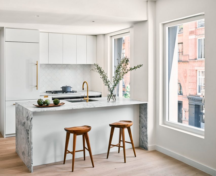
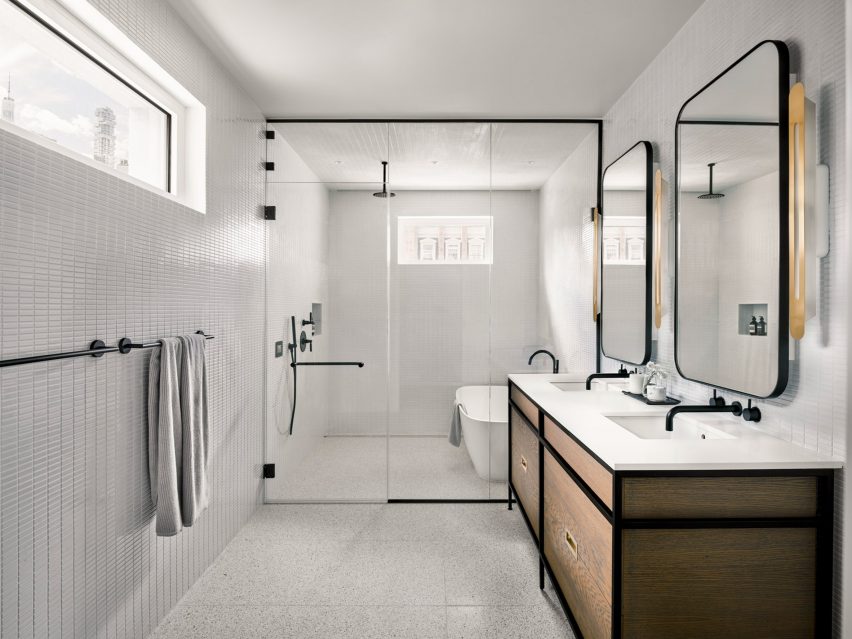
The winners of this year’s A+Product Awards have been announced. Stay tuned for the year’s edition of the A+Product Awards ebook in the coming months.
Boundaries are intended to be pushed in the realm of design, and the incomparable creative synergy between fashion and architecture has proven to be an irresistible force. Over the years, this fusion of disciplines has given rise to many breathtaking collaborations that challenge the status quo as designers and architects join forces to create spaces that are as inspiring as they are functional.
Delving into the art of this creative alchemy, this article explores some of the most iconic partnerships in the world of design, each of which has birthed a masterpiece that is both an ode to their respective fields and a testament to the power of collaboration.
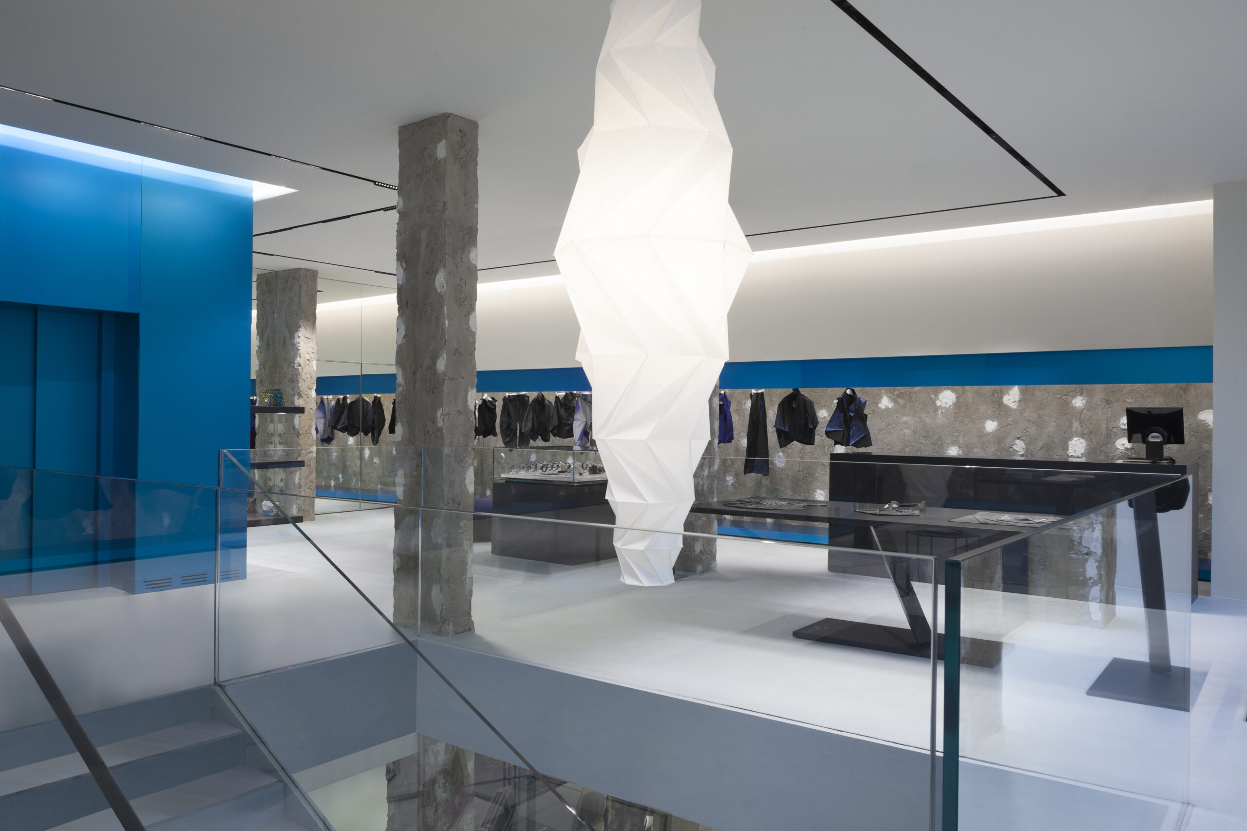
REM Koolhaus, OMA x Prada
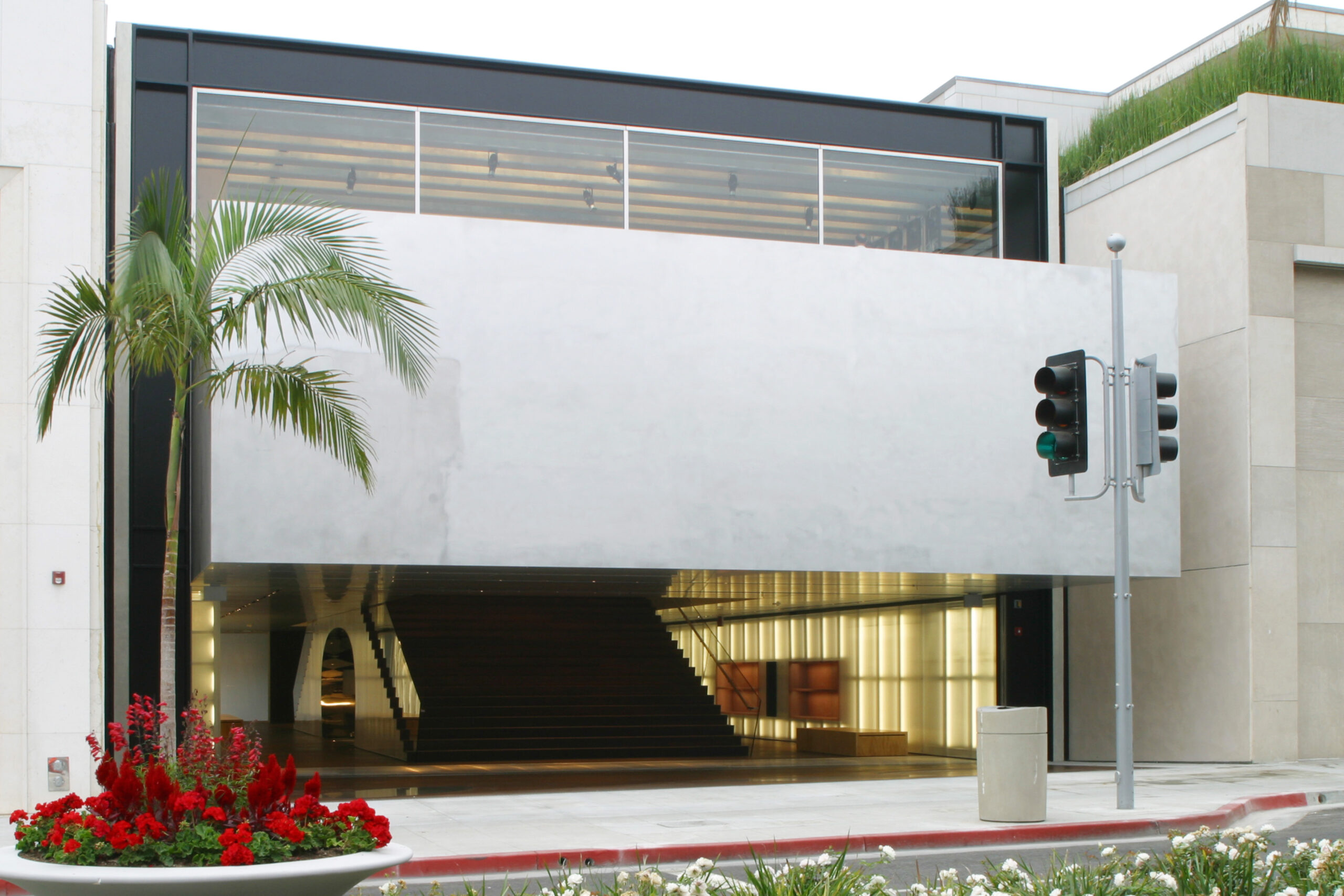
Prada Los Angeles Epicenter by Rem Koolhaas and Ole Scheeren, Los Angeles, CA Photograph provided by OMA
While some collaborations are one-offs, undoubtedly adding to their allure, others become long-term relationships. Many deeper partnerships between fashion designers and architects are born of a mutually explored aesthetic or shared understanding of values and goals. In the case of Prada and OMA, their ongoing saga is indeed one for the ages.
Rem Koolhaas, the Pritzker Prize-winning architect and founder of the multi-disciplinary firm the Office for Metropolitan Architecture (OMA), has long been known for his innovation and daring vision. When he joined forces with Miuccia Prada, the matriarch of the eponymous Italian fashion house, the result was a series of architectural marvels, such as Seoul’s Transformer project and the Prada Epicenter in New York.
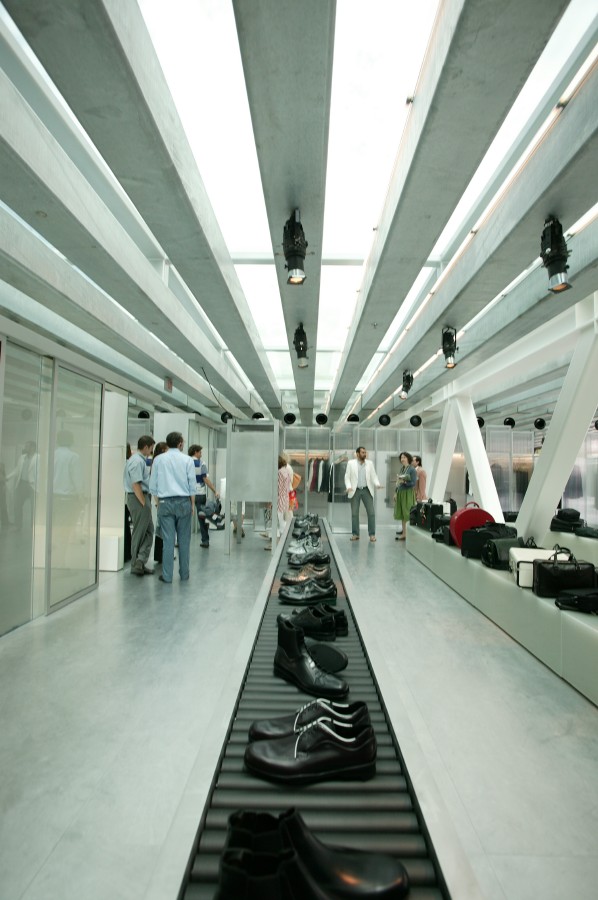
Prada Los Angeles Epicenter, by Rem Koolhaas and Ole Scheeren, Los Angeles, CA Photograph by OMA
This collaboration extended beyond bricks and mortar, as OMA and the AMO think tank began to redefine the very nature of the catwalk at Prada’s shows. The convergence of Koolhaas’s avant-garde design sensibilities and Prada’s penchant for bold self-expression has given rise to spaces and experiences that are as breathtaking as they are groundbreaking.
Lina Ghotmeh x Hermès
Like the early days of Prada and Koolhaas, the collaboration between French luxury goods manufacturer Hermès and Franco-Lebanese architect Lina Ghotmeh appears to be the beginning of a harmonious and hopefully long-established relationship. Having worked together previously to create stunning window displays for the brand, Ghotmeh has now been appointed for Hermès’ latest and largest architectural project to date.
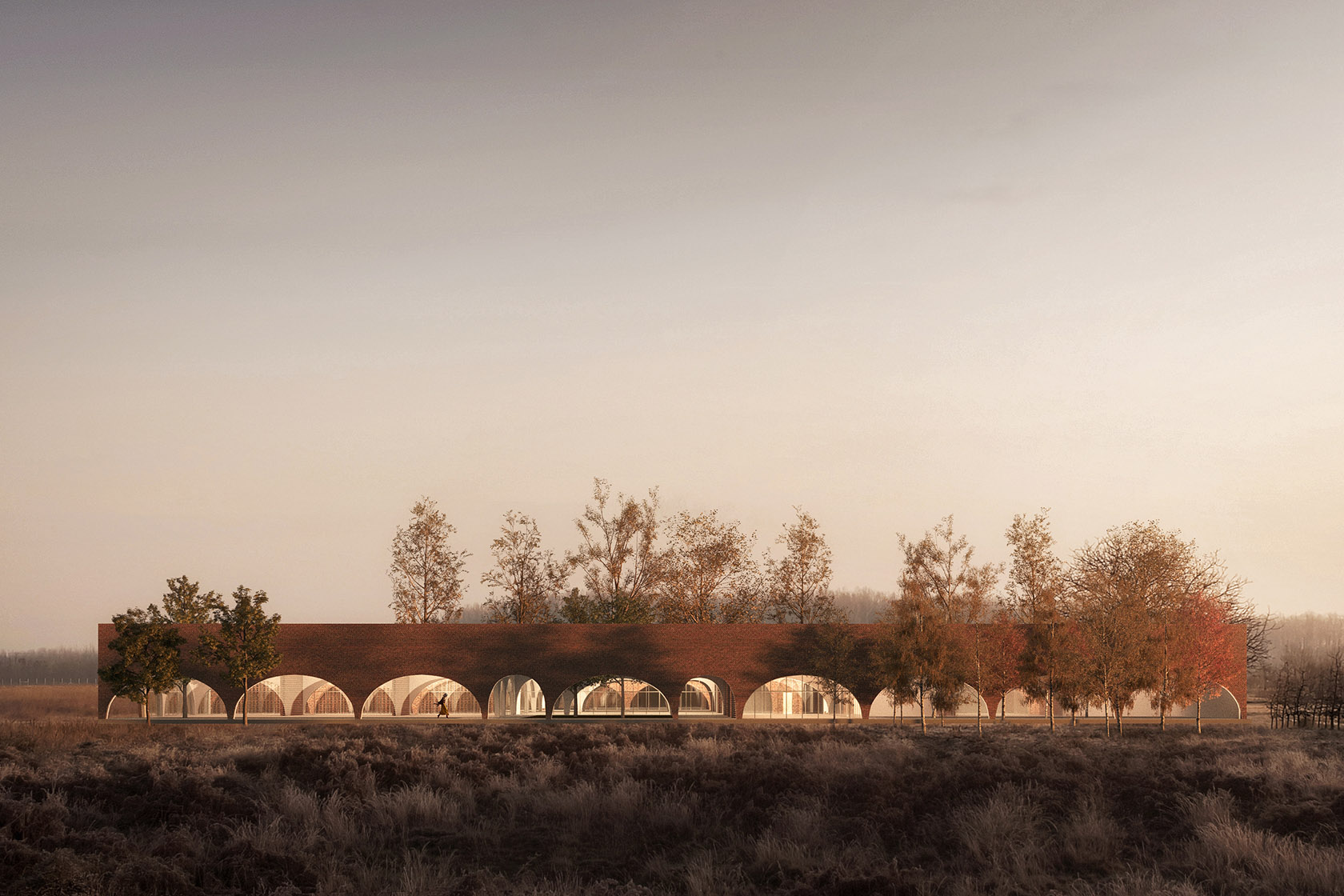
Precise Acts – Hermès Workshops, France by Lina Ghotmeh Architecture. Render courtesy of Lina Ghotmeh Architecture.
Exemplifying the poetic marriage of craftsmanship and design that exists between the two design companies, Ghotmeh’s studio, Lina Ghotmeh Architecture, was chosen to design the new Hermès Leather Workshops, resulting in what looks to be a stunning space that seamlessly blends with the surrounding landscape while respecting the surrounding environment.
The all-brick construction, punctuated by large bay windows, bathes the space in natural light and evokes the precision and craftsmanship that have become synonymous with the Hermès brand. This poetic merging of form, function and broader ecological impact demonstrates the overlapping priorities across both industries.
Samuel Ross, SR_A x Acqua di Parma
Many collaborations between fashion designers and architects are grounded in retail design. Samuel Ross, founder of the streetwear label A-Cold-Wall* and design studio SR_A, has harnessed alternative skills to create new designs for the instantly recognizable Acqua di Parma bottles. While not technically an architect, Samuel is a creative polymath whose portfolio of work is deeply rooted in the semiotics and aesthetics of architecture.
His collaboration with the century-old Italian perfume house resulted in a reimagining of their iconic Colonia bottle. Drawing inspiration from the architecture of Milan and London, Ross’s designs featured a scaffolding-like window frame, a nod to the two cities’ post-WWII architectural dialogue. The result is a captivating reinterpretation that has bridged history and modernity in a way that celebrates both equally.
Marco Costanzi Architects x Fendi
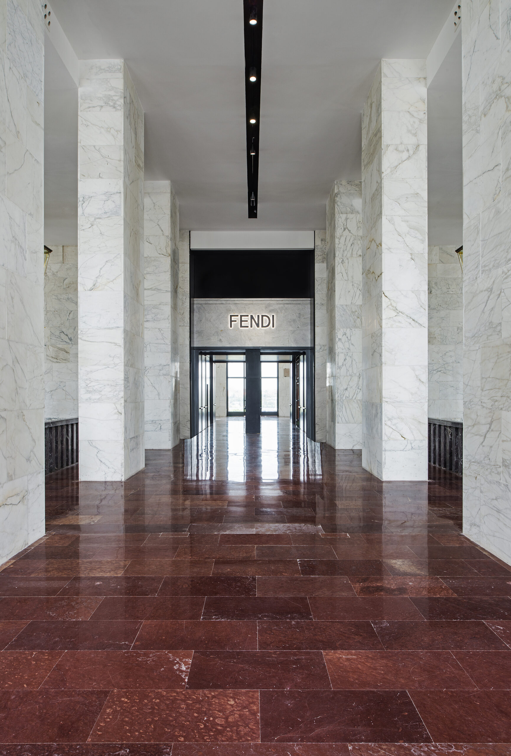
Fendi HQ by Marco Costanzi Architects, Rome, Italy Photograph by Andrea Jemolo
While retail design is often the catalyst for cross-discipline collaboration in recent years, there has been a marked increase in fashion brands entering the realm of hospitality design — notably Fendi. The Italian luxury fashion house found an architectural soulmate in Marco Costanzi Architects when they embarked on a journey to reimagine their flagship store in Rome.
Fendi HQ by Marco Costanzi Architects, Rome, Italy Photograph by Andrea Jemolo
Located in the historic Palazzo della Civiltà Italiana, the store’s interior design is an ode to Fendi’s rich heritage while showcasing the forward-thinking ethos of Marco Costanzi Architects. The result is a sumptuous blend of materials, textures, and colors that pay tribute to both the brand’s history and the building’s architectural significance.
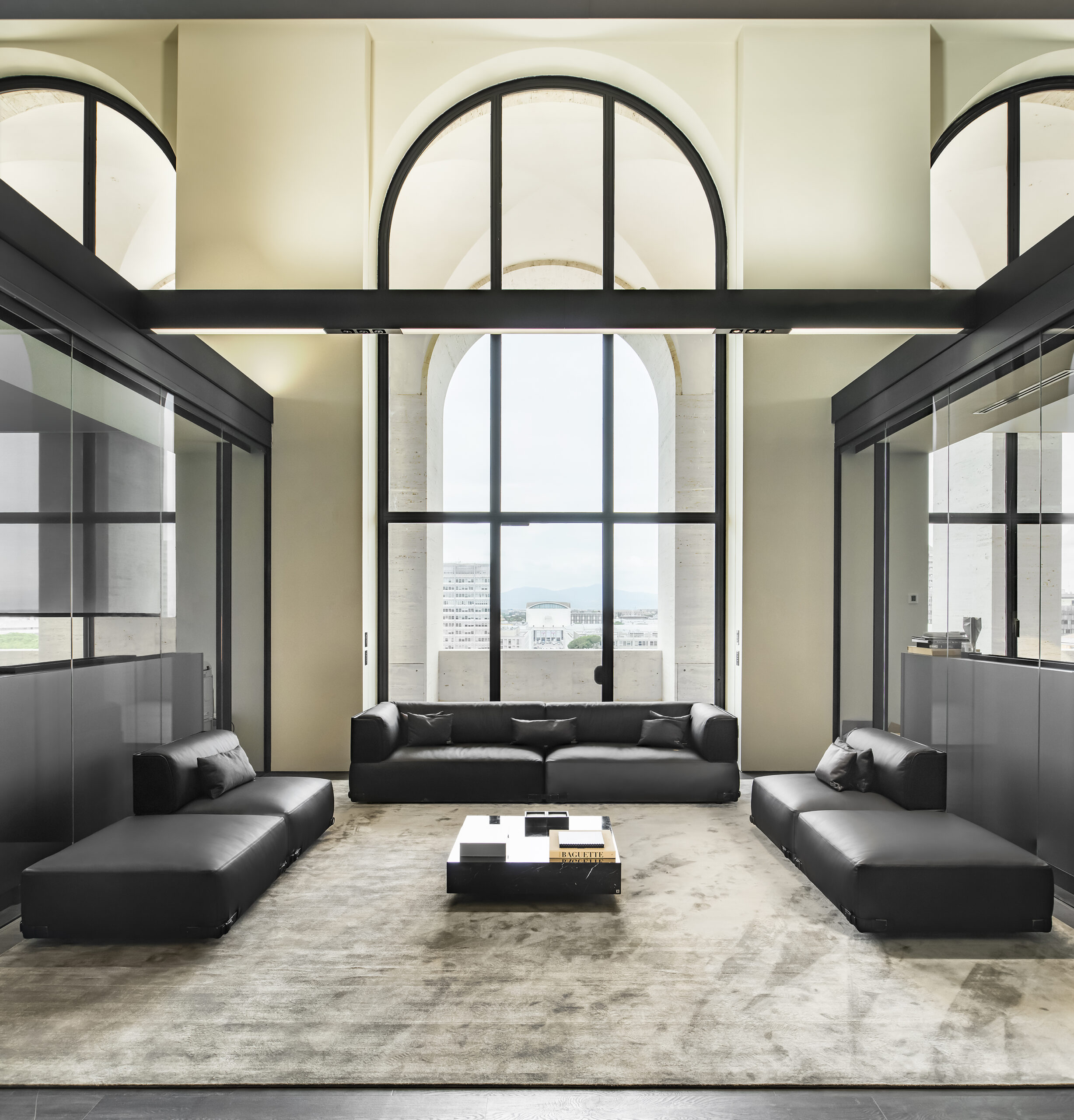
Above the store sits the Fendi Private Suites. Each suite is a celebration of the classic Fendi aesthetic – rich, neutral colors, crisp lines and hardwood floors. Walls are paneled in grey, polished wood and inset with Karl Lagerfeld’s black and white photos of Rome’s fountains, an ideal backdrop that brings out the subtle playfulness of custom Fendi Casa furniture. The building, store and suites are a haven for design and architecture enthusiasts.
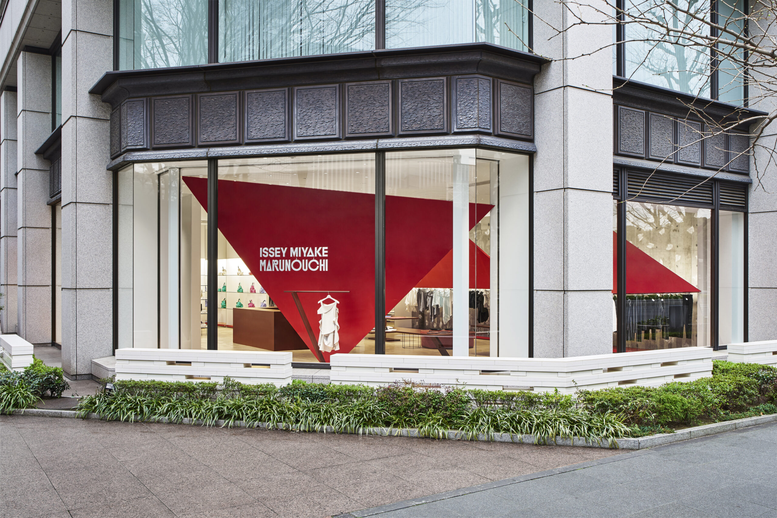
Issey Miyake x David Chipperfield x Toshiko Mori x Frank Gehry and more
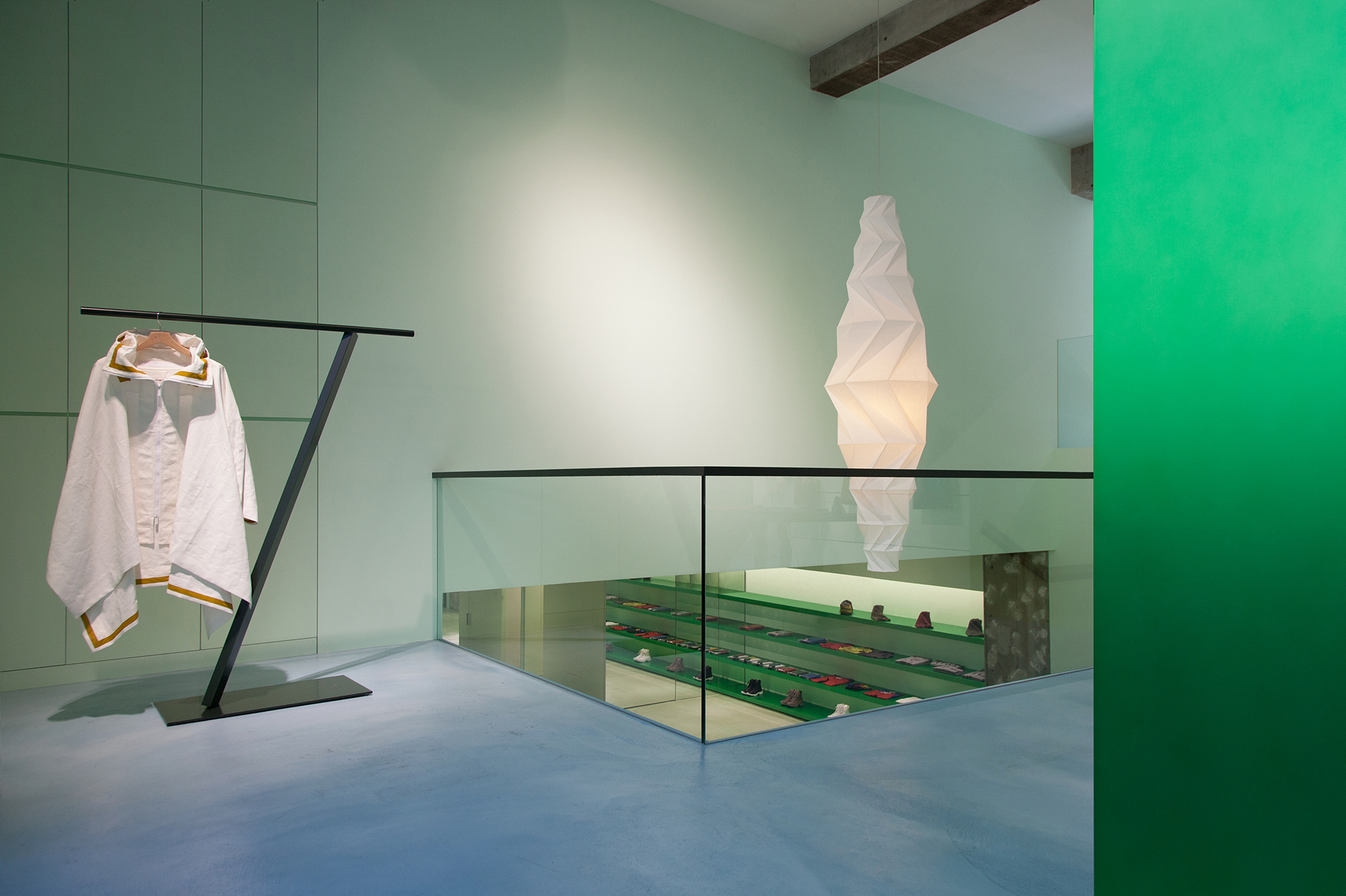
Reality Lab. Issey Miyake by TOKUJIN YOSHIOKA DESIGN, Tokyo, Japan Photograph by Masaya Yoshimura
Of the many fashion designers who have impacted architecture and interior design, the late Issey Miyake was the pinnacle. He was often referred to as a center of contemporary design culture and found a way to combine space and showcase into one unified experience by using his showrooms to further present his design thinking to the world. The iconic mastermind worked with a broad cross-section of architects to create unique, captivating environments. Over the years, their showrooms became a textbook example of retail design becoming an extension of a fashion brand’s vision and identity.
Issey Miyake Marunouchi by TOKUJIN YOSHIOKA DESIGN, Tokyo, Japan Photograph by Masaya Yoshimura
From as early as 1976 and his collaboration with a young Shiro Kuramata on the From First building in Aoyama, Japan, Miyake worked with many notable architects, providing younger or less experienced architects a global platform on which to showcase their talents.
David Chipperfield and Kenneth Armstrong designed his London showroom in 1985 with the architects using natural materials to evoke the spirit of Japanese architecture. Miyake then worked with Toshiko Mori on his first freestanding showroom at 77th Street and Madison Avenue in New York. Mori also designed a New York location for Pleats Please in 1998; another New York showroom for Miyake on 79th Street was finished in 2005.
Issey Miyake London by TOKUJIN YOSHIOKA DESIGN, London, UK Photograph by Masaya Yoshimura
Later, Miyake would enlist the skills of people like Ronan and Erwan Bouroullec, Ito Masaru Design Project and, of course, long-time friends Frank Gehry and Gordon Kipping. Together, they brought the iconic Issey Miyake Tribeca store to life. The store’s interior is a harmonious blend of Kipping’s urban sensibilities and Miyake’s signature folds, creating a space that is both a tribute to New York City’s architectural heritage and a glimpse into the future of design. With its dynamic, origami-inspired aesthetic, the store serves as a reminder of the potential unleashed when fashion and architecture intertwine.
With each collaboration, the importance of creative exploration and pushing boundaries is evident. By merging their respective disciplines, designers and architects can break new ground, challenge conventions, and redefine our understanding of design and style. The results of these partnerships are spaces that are not only functional but equally inspiring and transformative, demonstrating the limitless possibilities that arise from interdisciplinary collaboration.
The winners of this year’s A+Product Awards have been announced. Stay tuned for the year’s edition of the A+Product Awards ebook in the coming months.


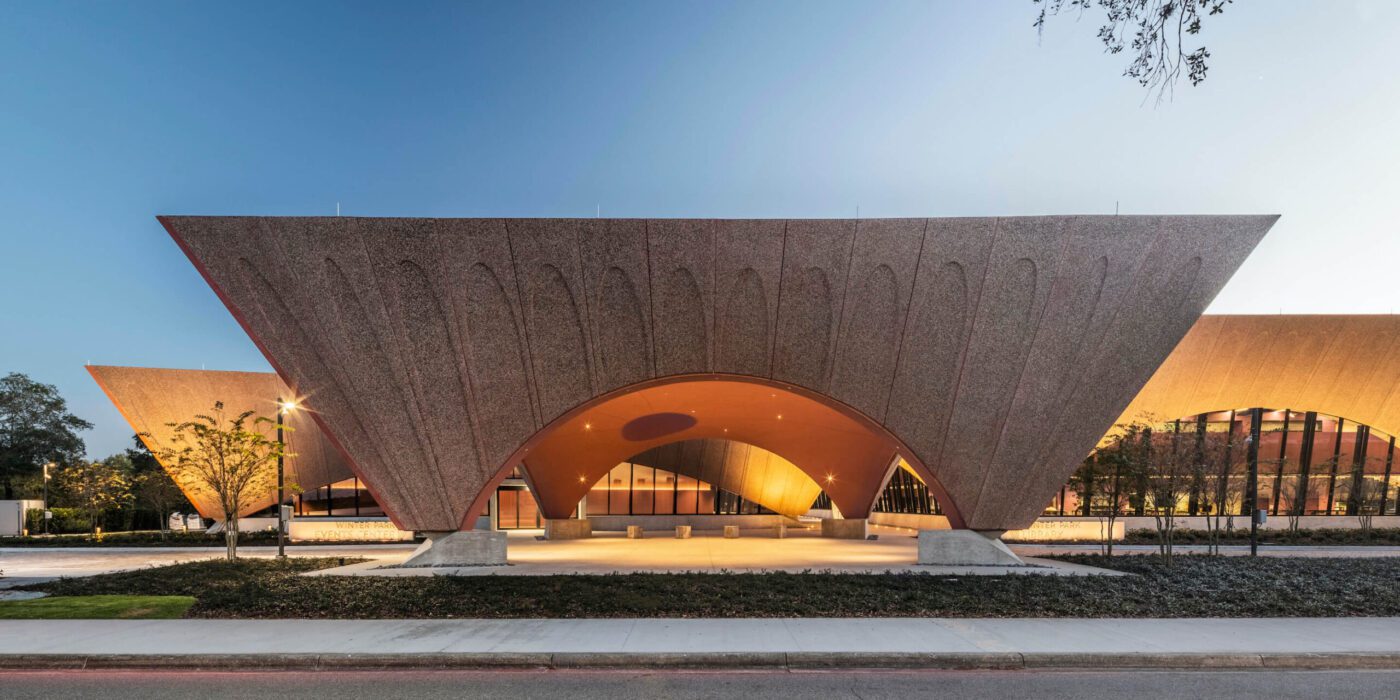
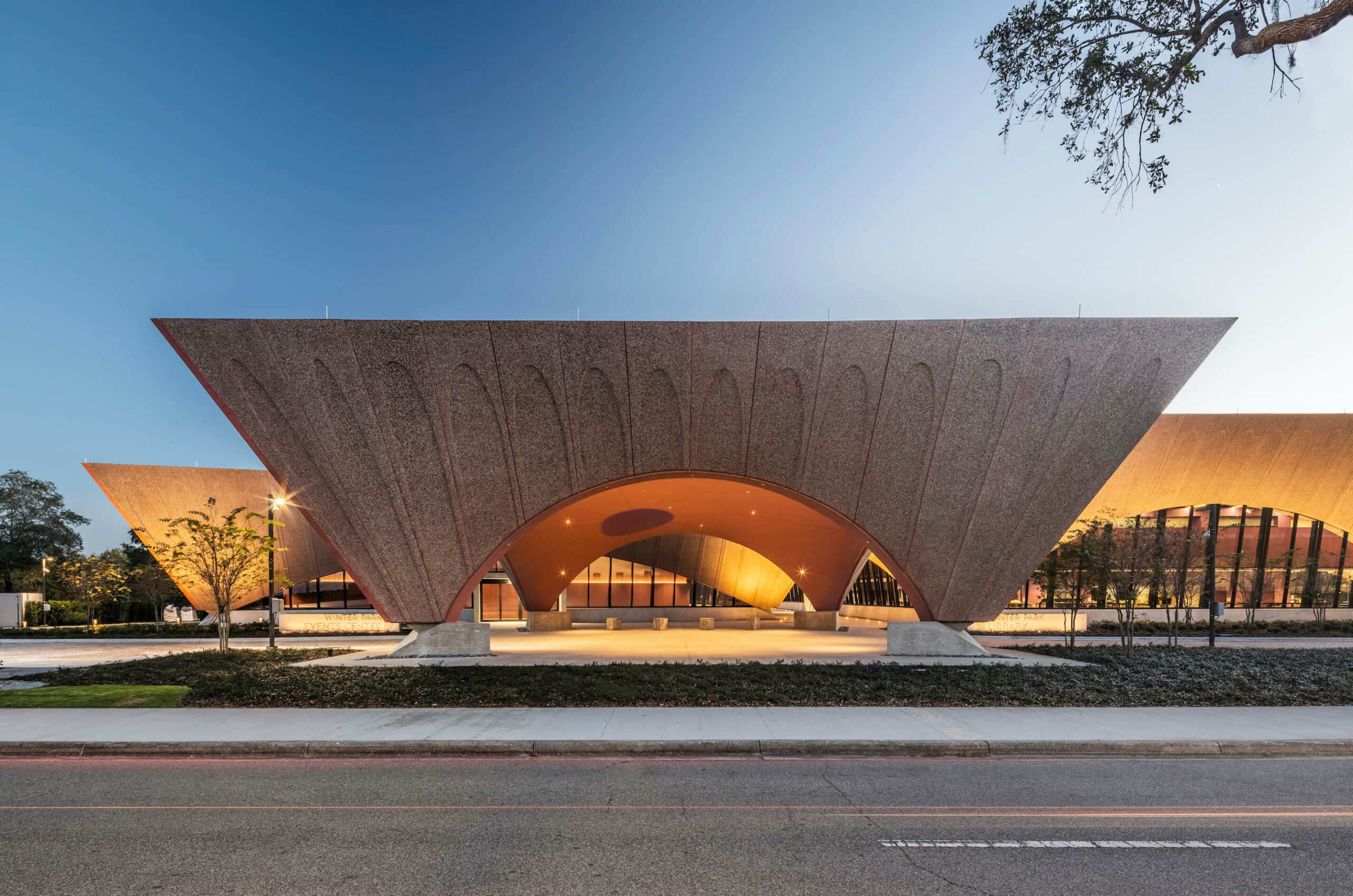
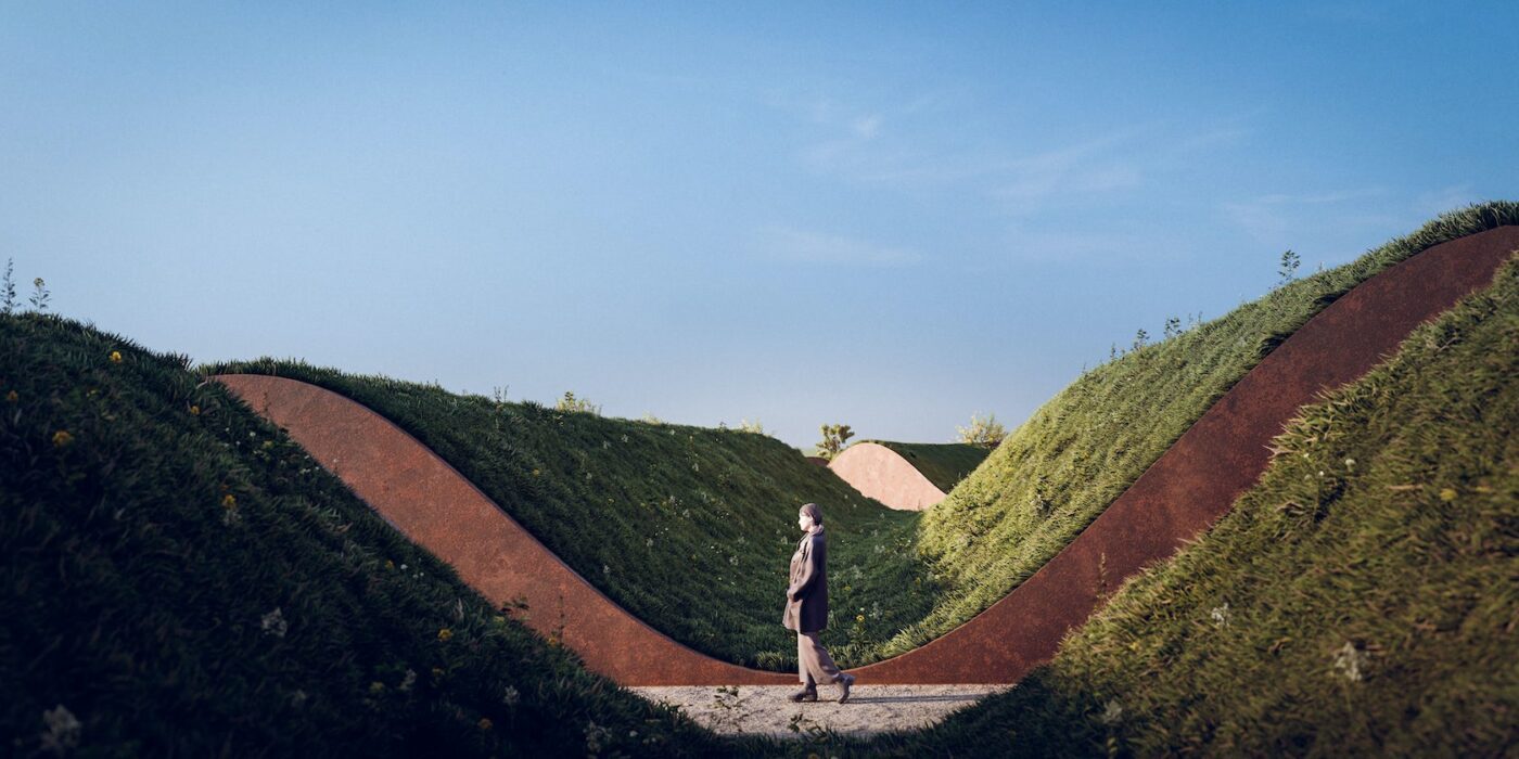
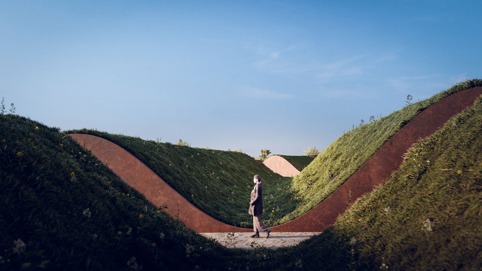
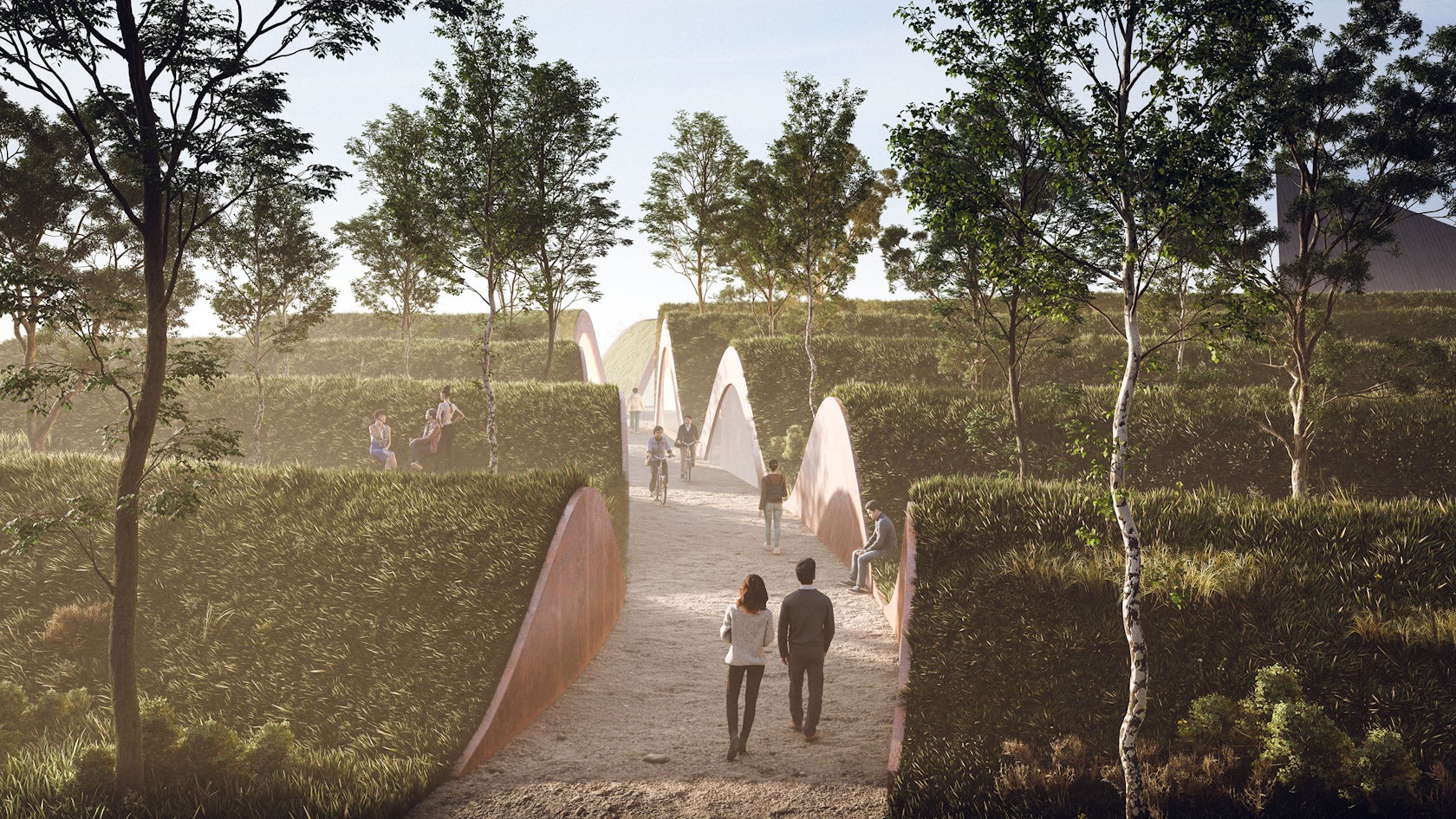
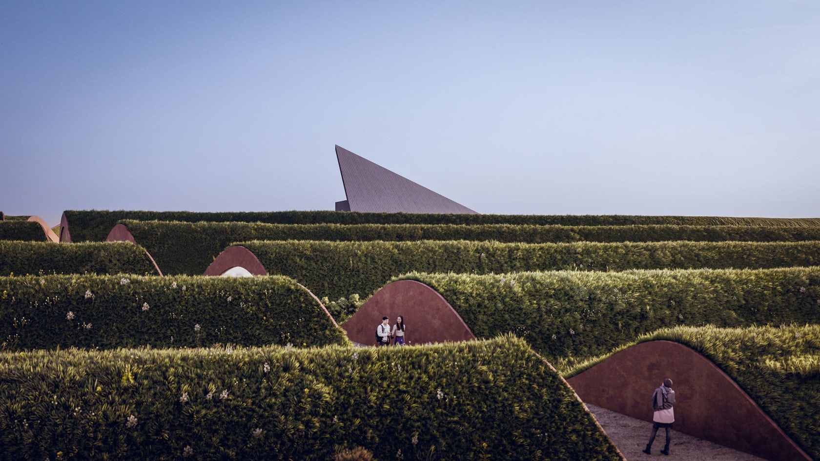
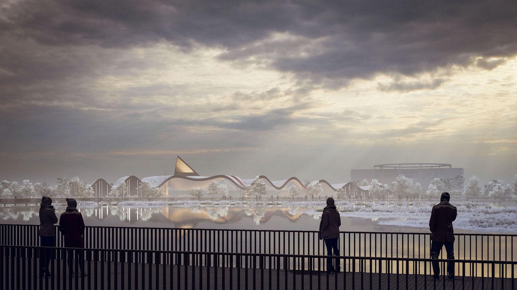
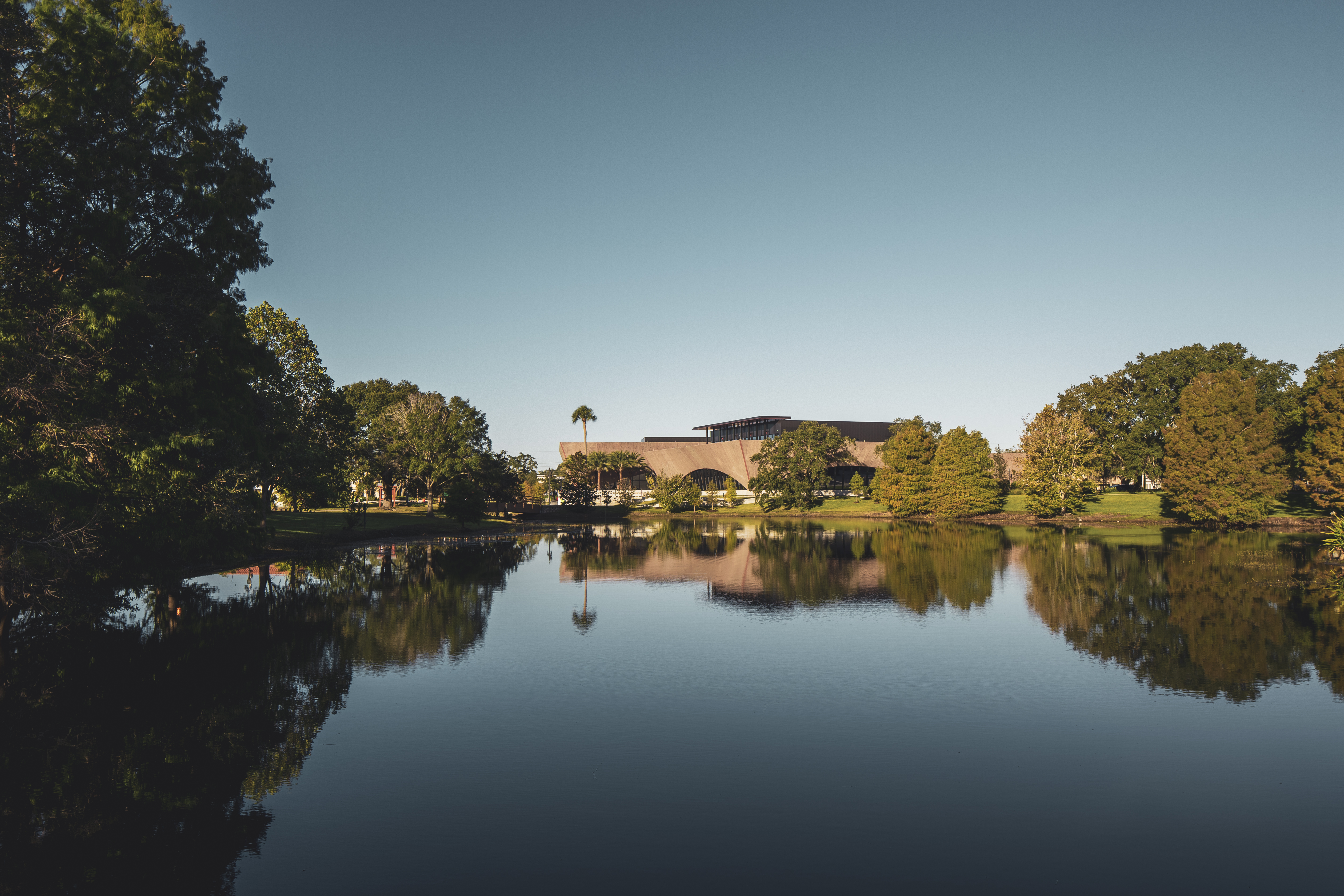
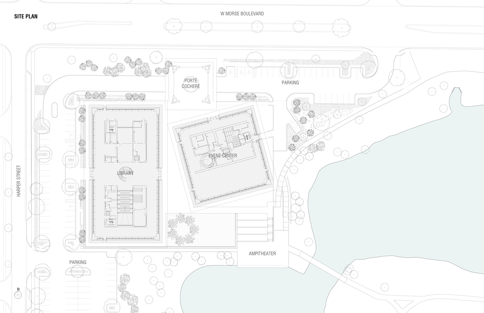 The library’s design team aspired to establish a new civic and cultural hub on the northwest corner of Martin Luther King, Jr. Park in Winter Park, Florida. The library was made to embody the values of the park’s namesake as a space for community empowerment. Seven years in the making, the project spans 50,000 square feet across a trio of canted pavilions.
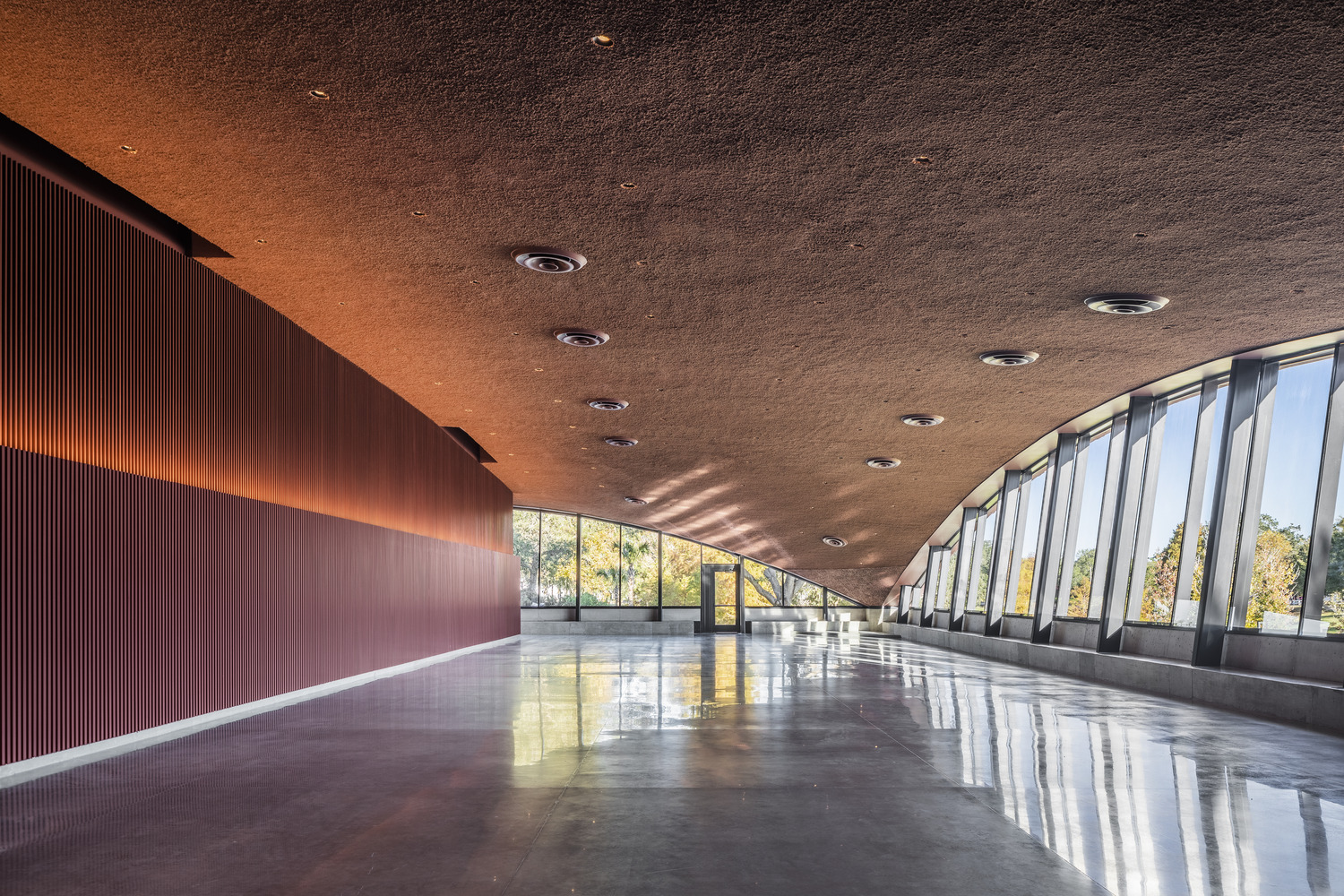
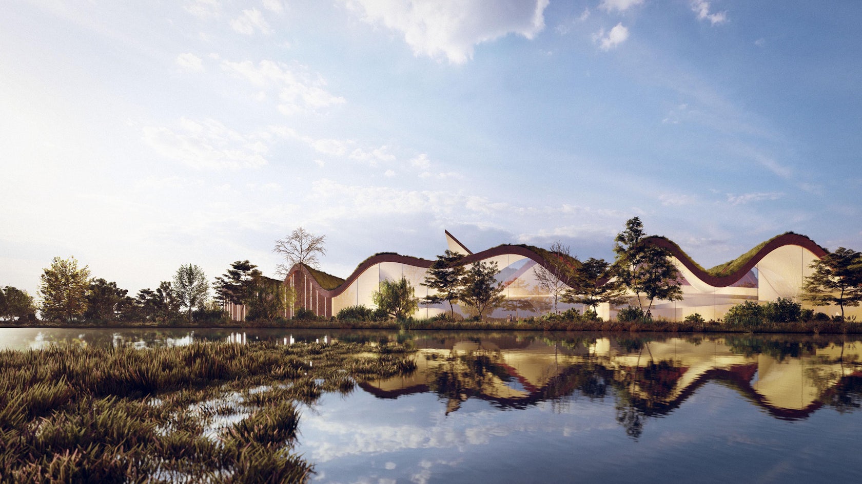
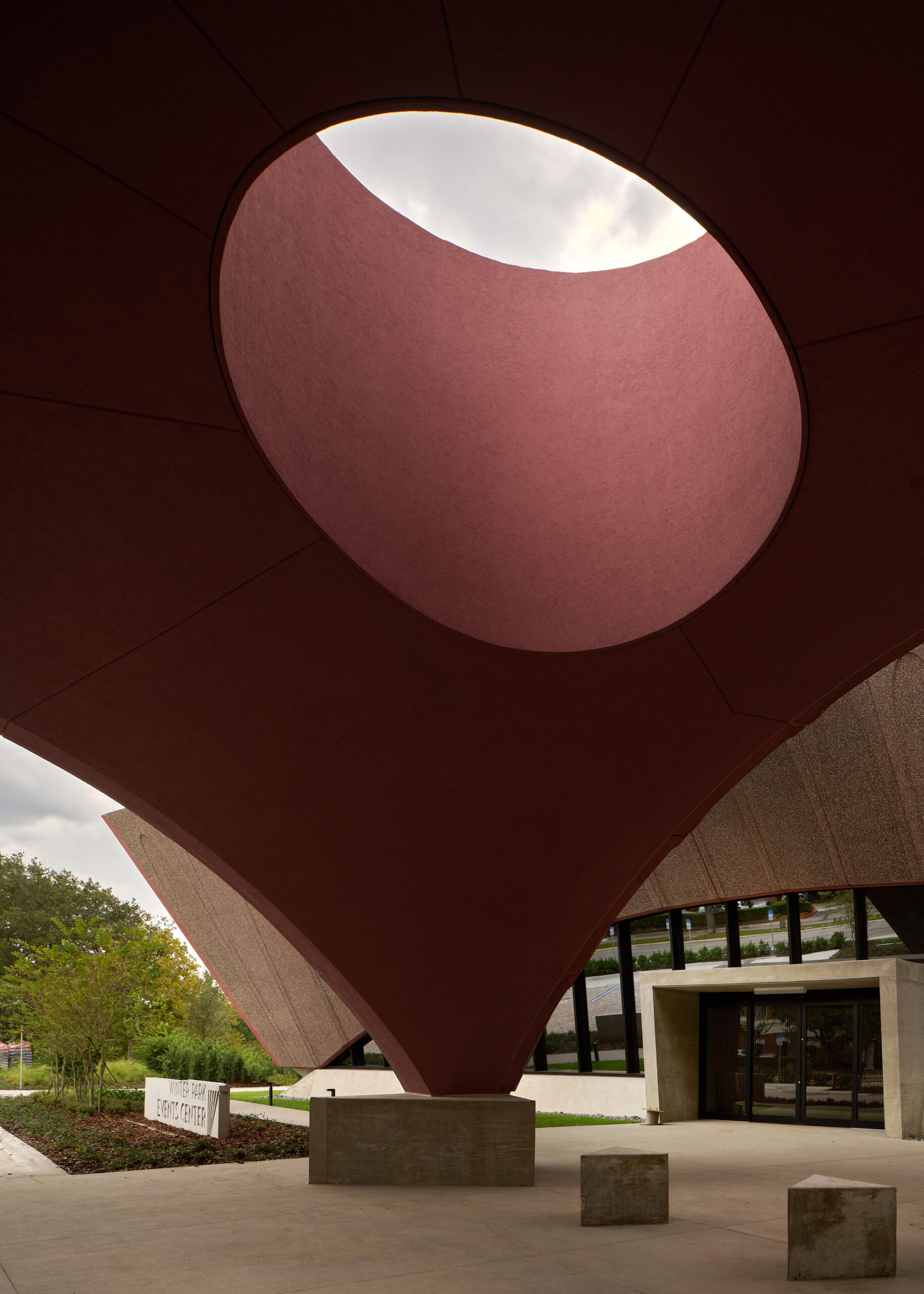
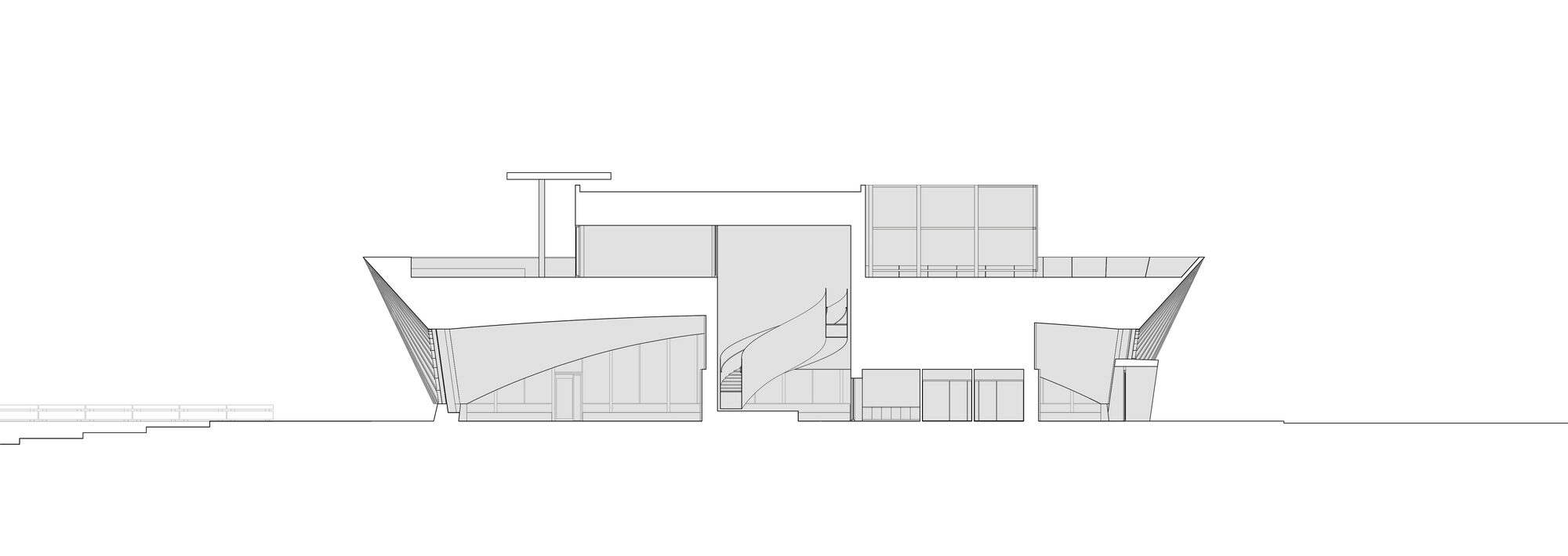 Arches establish the form of the pavilions, where compound, convex exterior walls are made with a series of scalloping, frond-like patterns. The volumes of the library, events center, and porte cochère come very close to touching. Hoping to draw light deep into the new library, the team created the angled exterior walls that lean outward as they rise from the base.
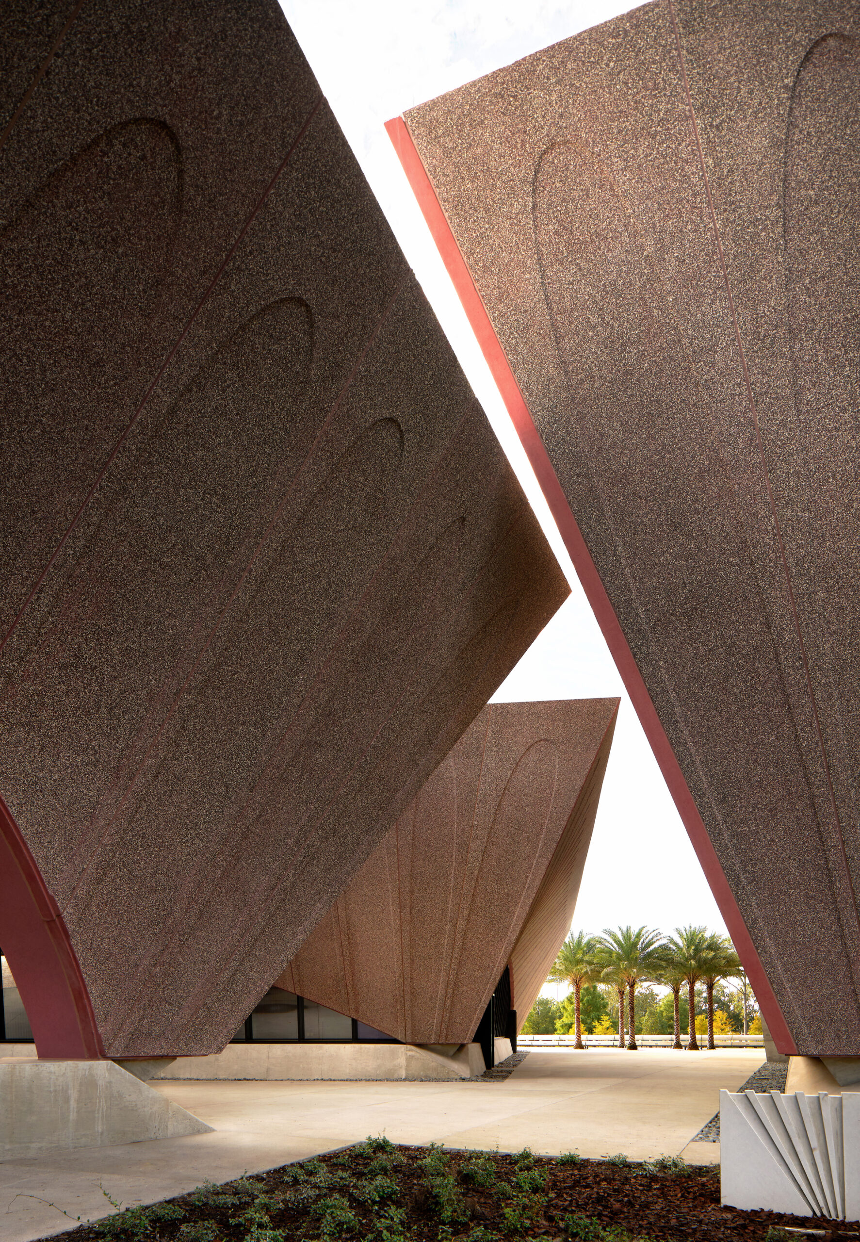 For the precast façade, it was determined that concrete was the only cladding material that could achieve the quality and durability needed for the exterior walls. The texture, color, aggregates and concrete matrix were carefully selected for aesthetics, durability and low maintenance. The curved walls are realized with back-up framing made up of structural steel.
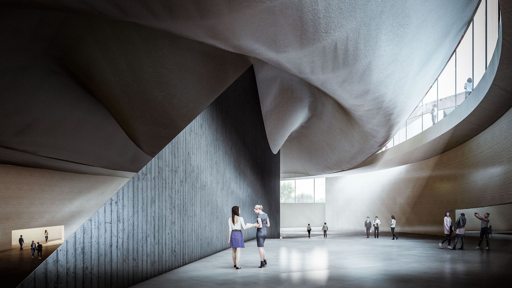
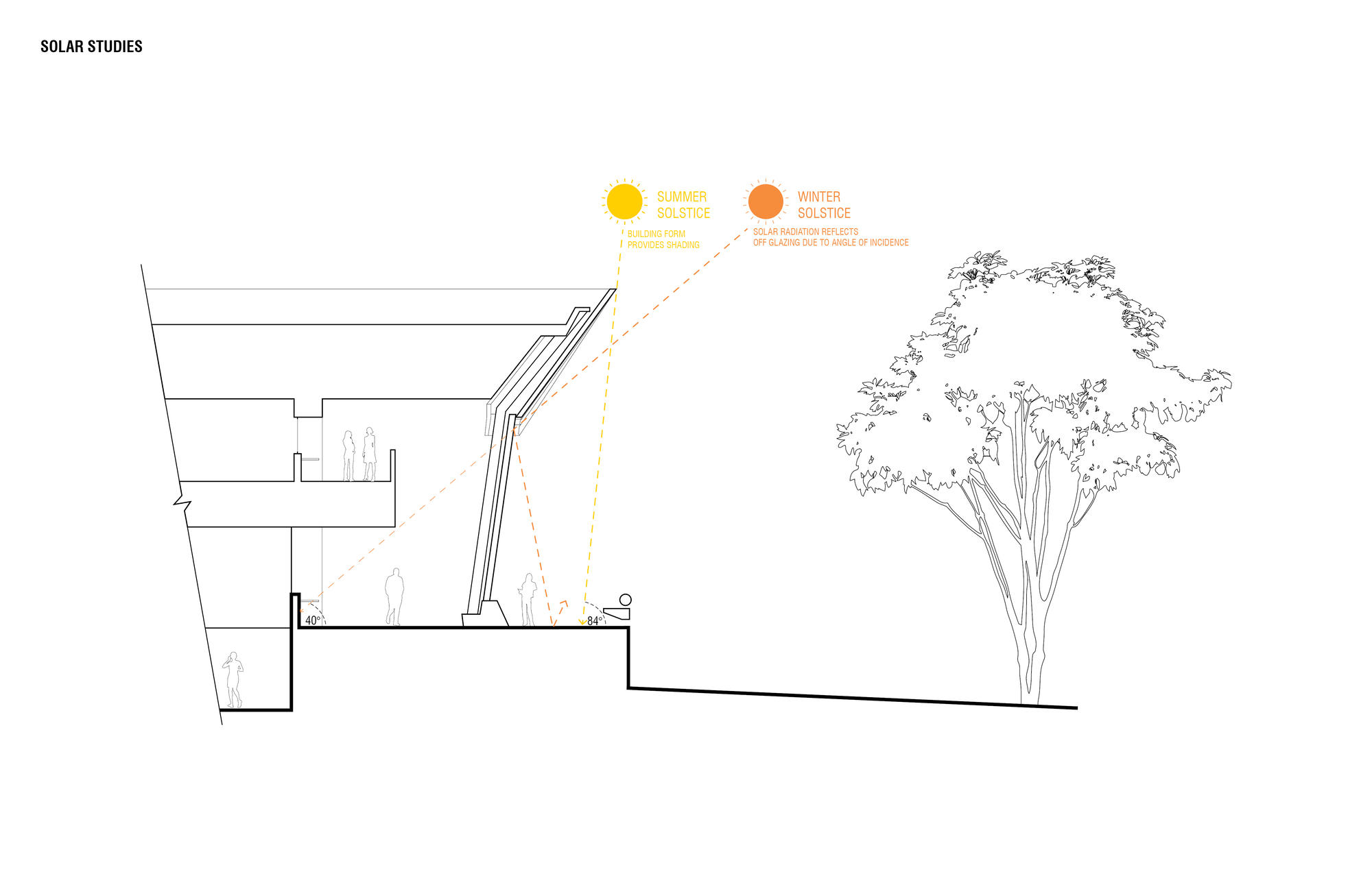 In turn, a series of sloping, arched curtainwalls in the enclosed buildings meet the curved, solid surfaces. The architects mirrored the concrete edge to create continuous seating along the curtain wall. Shallow foundations are used to support the building loads, while the elevated floor and roof are framed using structural steel beams and girders.
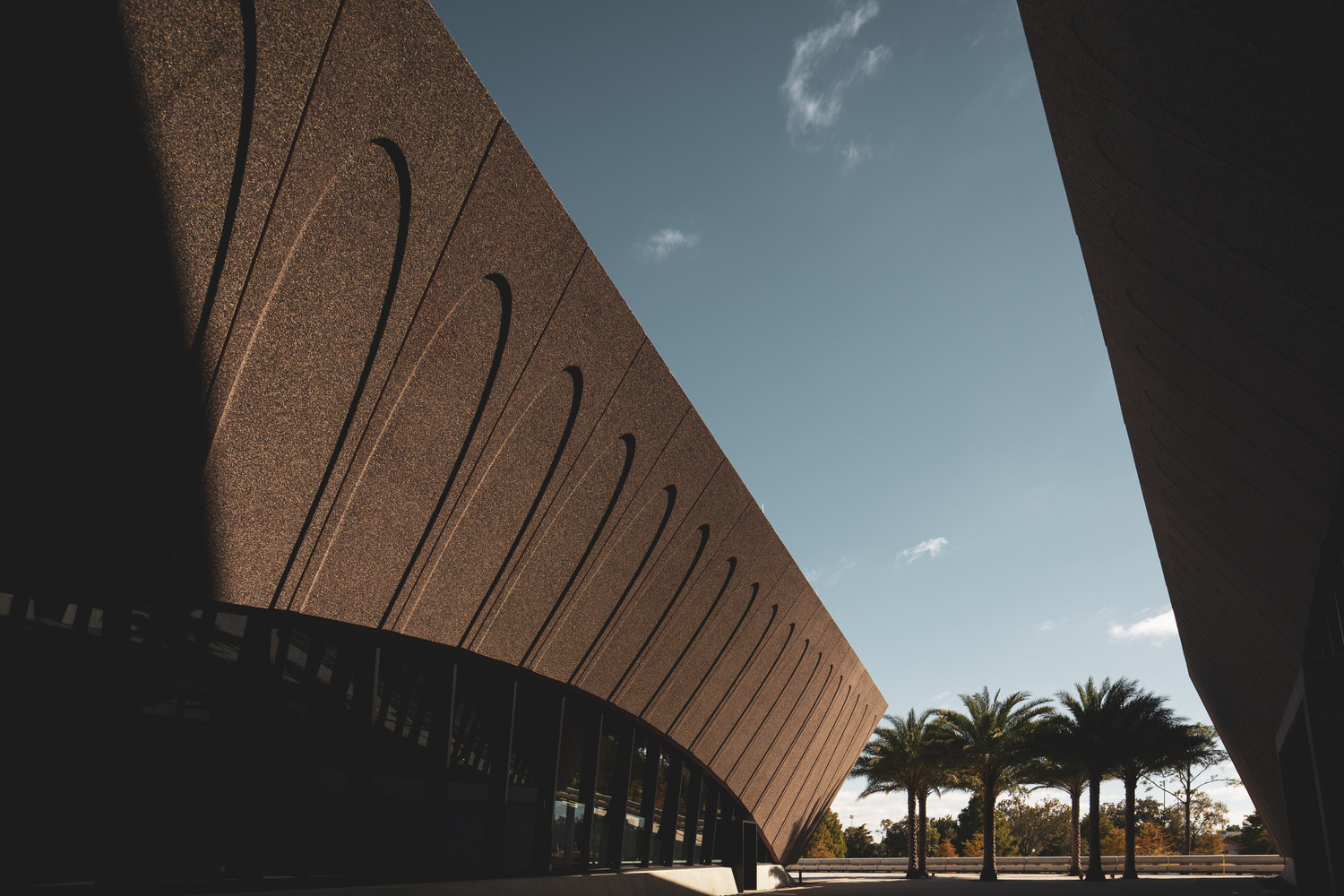
 The site’s physical constraints required efficient use of space for the buildings, the belvedere and parking. The team worked with
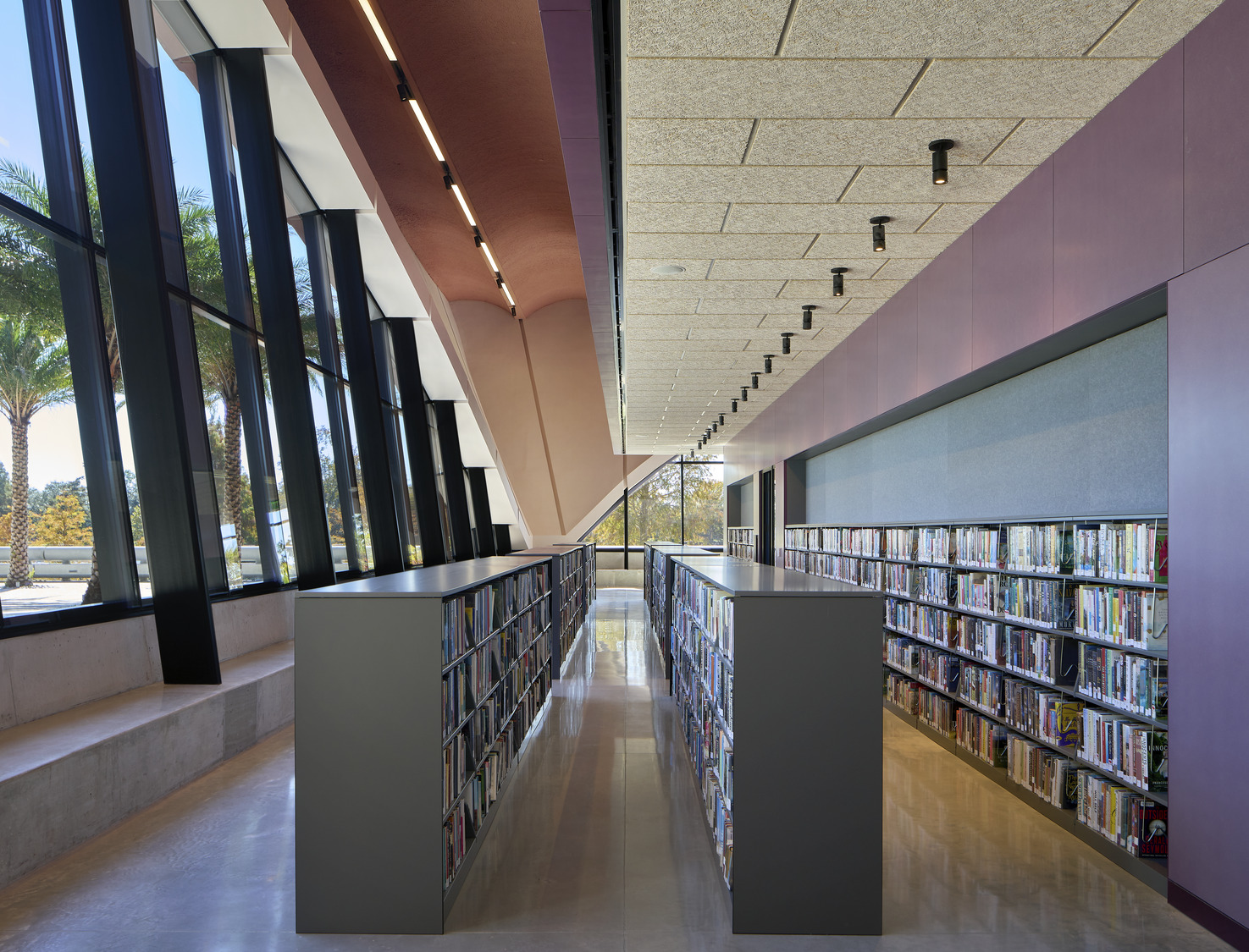
 The library has become a place where the entire community can interact, learn and gather. Inside, open spaces are framed by four timber-lined cores that contain Winter Park’s historical and archival collection spaces, support zones, and private reading rooms. Designing with the community in mind, the event center was made with a flexible auditorium space and a rooftop terrace that offers views of the lakeside park setting.