The results are in for one of Architizer’s most inspiring competitions of the year: We are excited to announce the Winners for the 4th Annual One Drawing Challenge! Featuring extraordinary details and produced using a wide range of artistic mediums, the two top winners and 10 commended entries showcase the powerful potential architectural representation to tell stories about our built environment and the wider world in 2022.
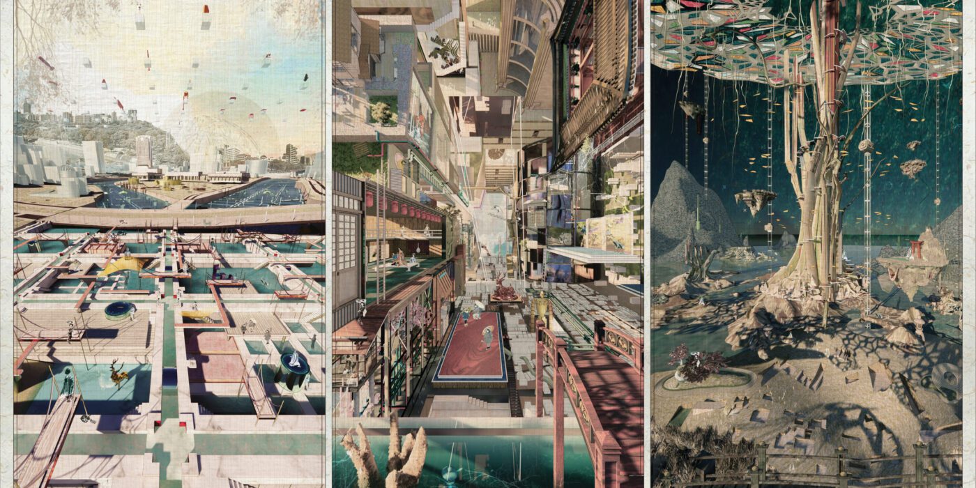
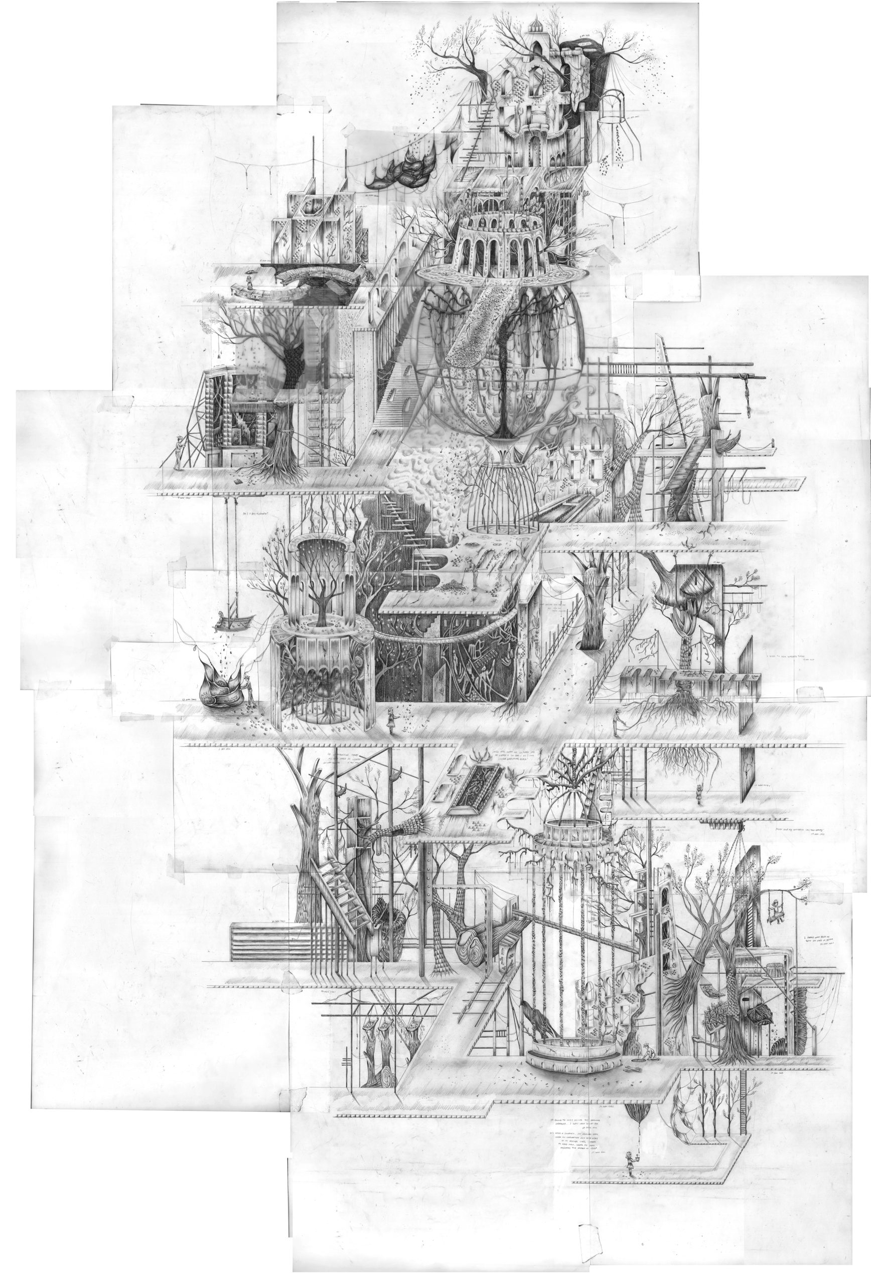
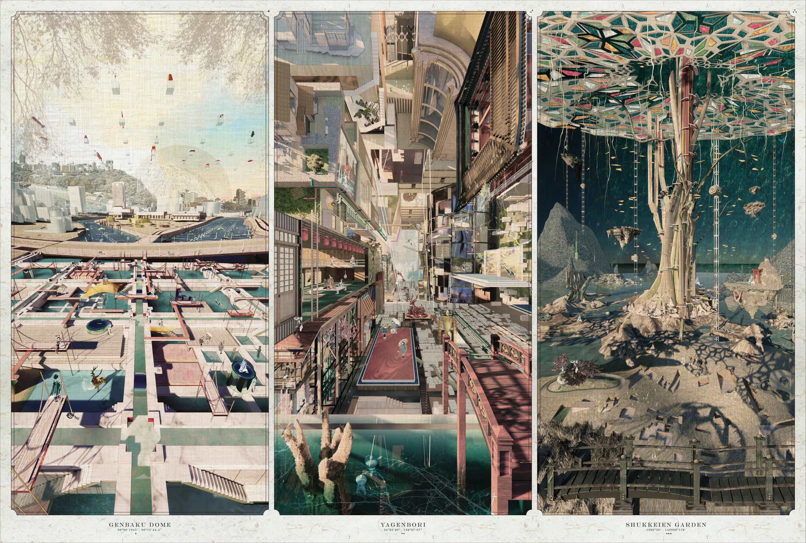
This year’s Top Student Prize goes to Victoria Wong from the University of Michigan, whose intricate triptych, entitled “Into the Void”, captured the imagination of the jurors. The incredibly detailed panels depict the “the new collisions of regrowth and reshaping our relationship with different agencies” in Hiroshima, Japan. Meanwhile, artist and architect Thomas Schaller scooped the Top Non-Student Prize for his atmospheric depiction of “Octavia – Suspended City”, a fantastical image of a mysterious metropolis inspired by Italo Calvino’s book Invisible Cities.
Reflecting on this year’s competition, juror Wandile Mthiyane commented: “This year’s finalists stretched my notion of what it means to be a designer: they used the medium of architectural drawing to express their political views, show their support for equity, and stress the importance of climate change. Architecture and design are the frames, but people are the big picture. This year’s best drawings were truly thought-provoking, challenging, and creative.”
The two top winners receive $3,000 each, an exclusive editorial feature on their work, and a seat on an Architizer jury panel next year. Without further ado, view the Top Winners and the 10 Commended Entries from this year’s One Drawing Competition, together with descriptions by their creators. Be sure to share your favorites with the hashtag #OneDrawingChallenge on Instagram and Twitter!
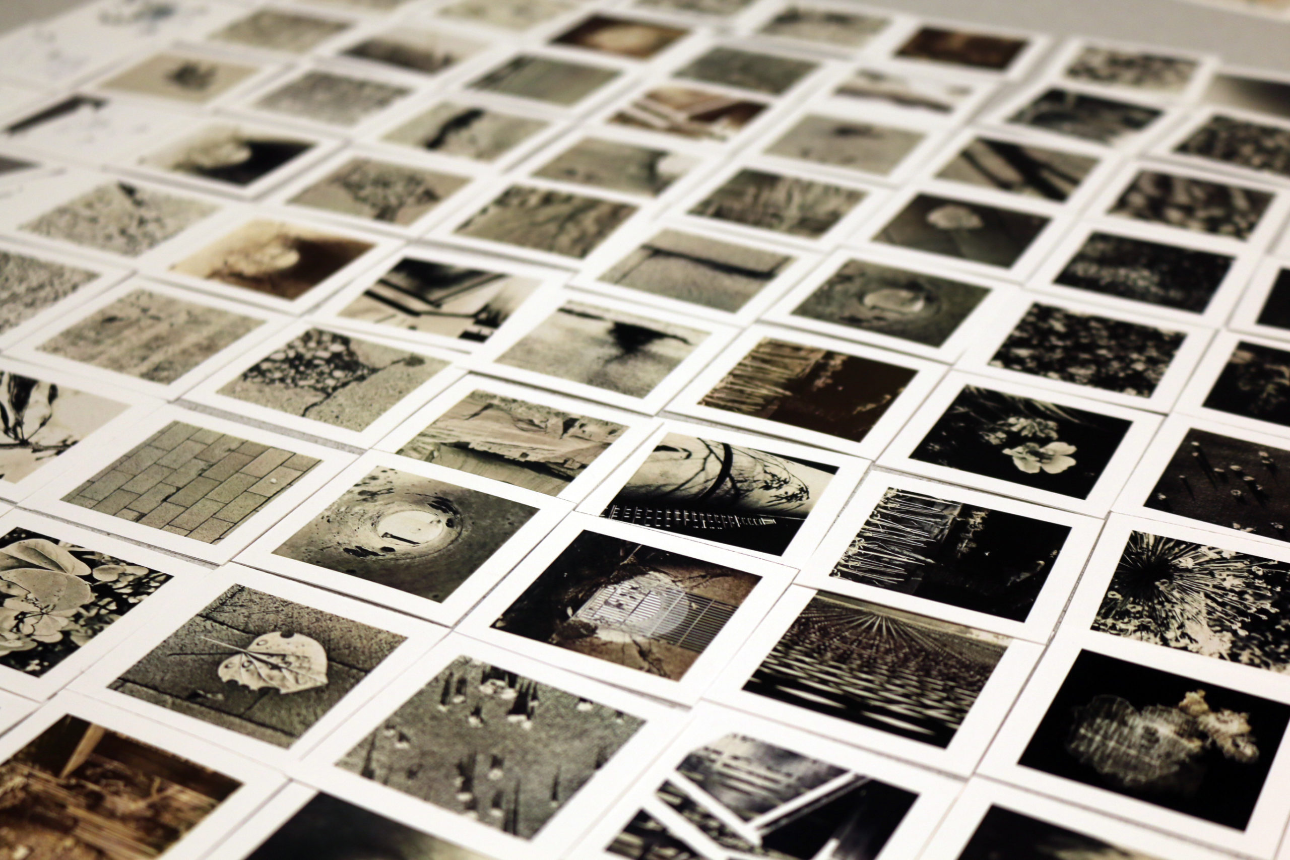
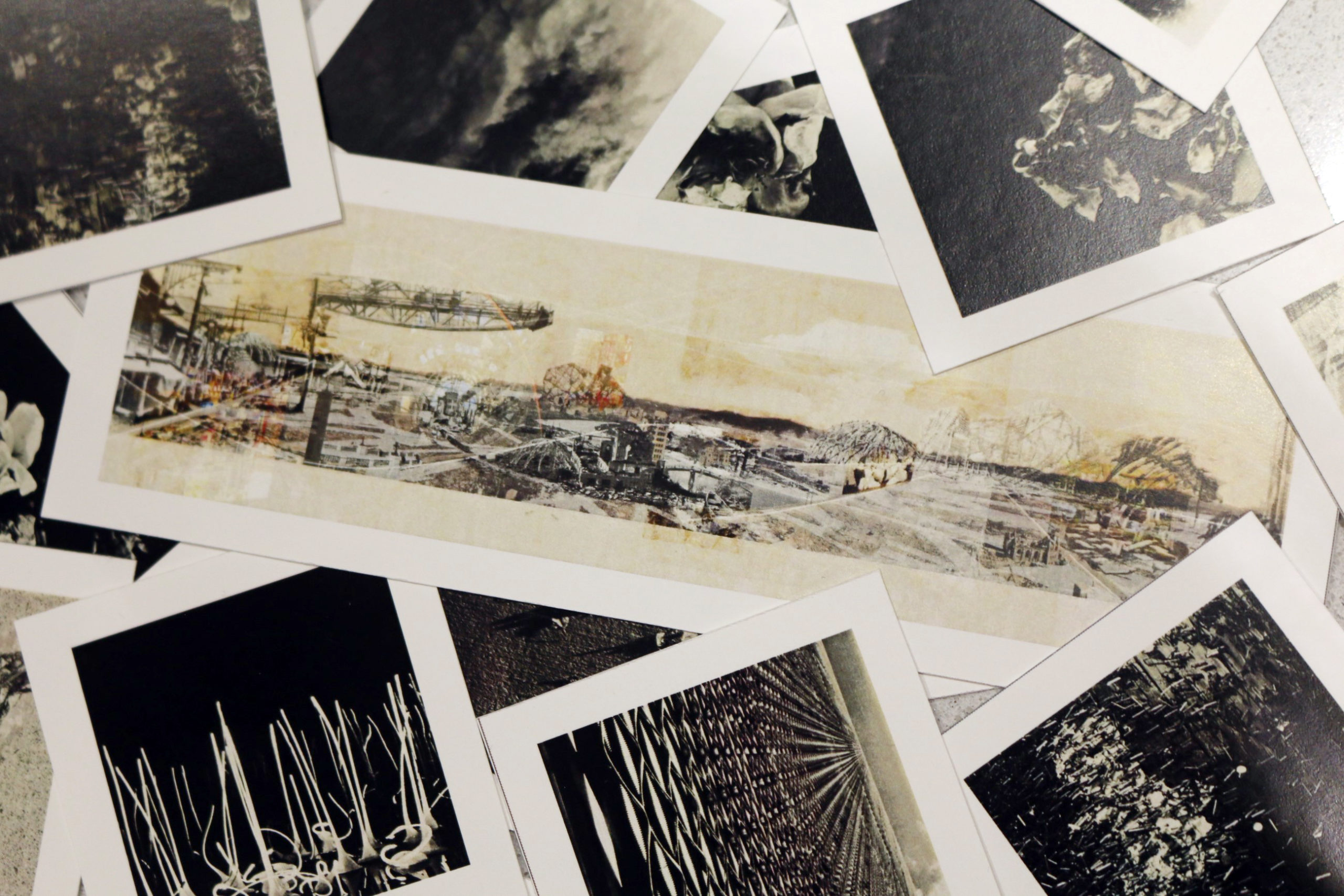
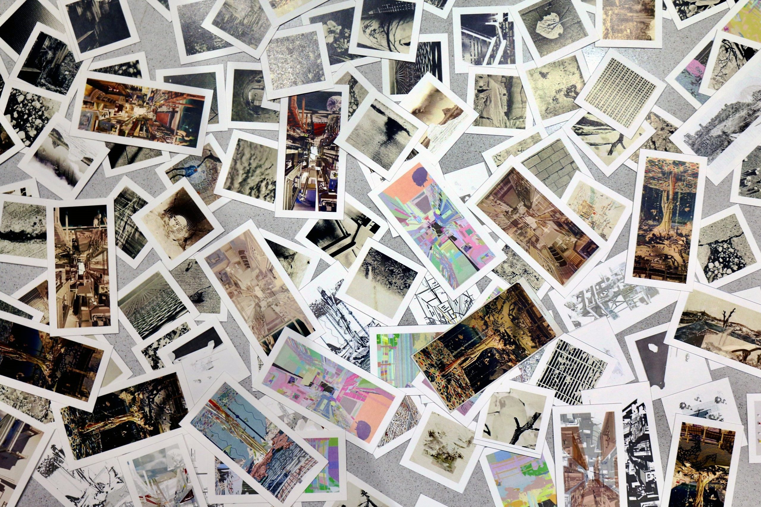
Student Winner: “Into the Void: Fragmented Time, Space, Memory, and Decay in Hiroshima” by Victoria Wong
University of Michigan

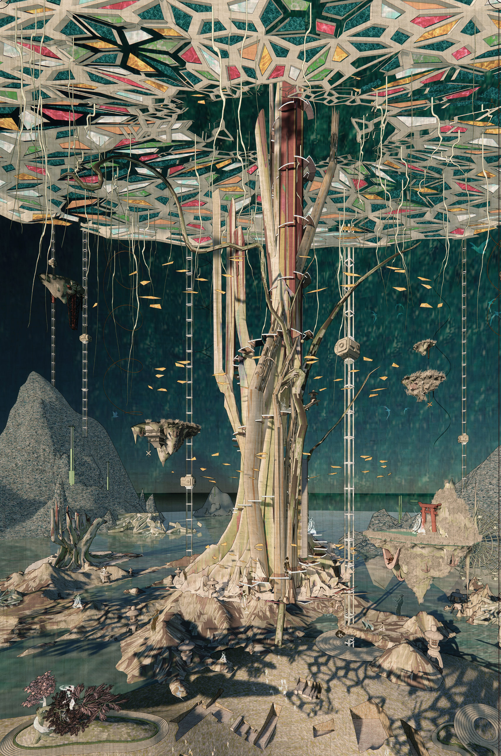
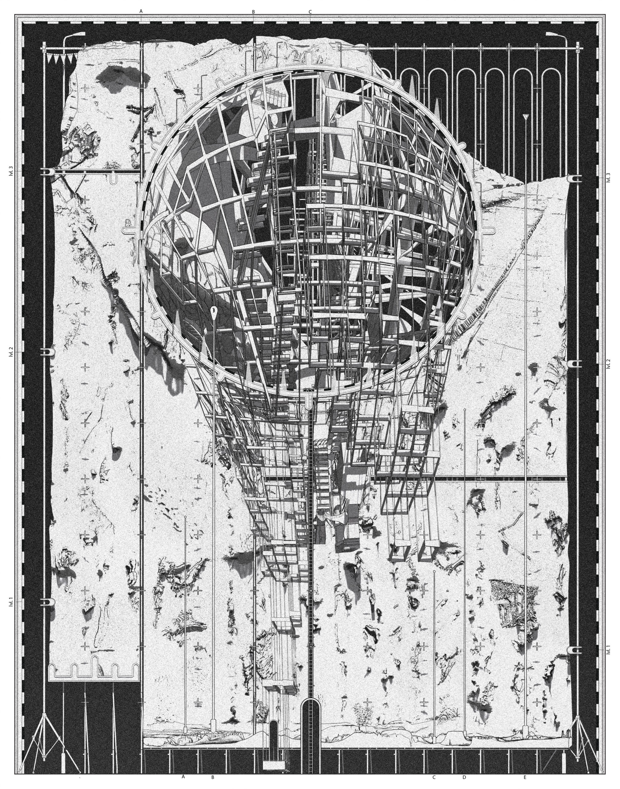
“Into the Void” Detail
“Suggested by Lebbeus Woods, architecture is essentially an internalization of society yet an externalization of ourselves. This triptych adapts Japanese aesthetic theories of transience & imperfection, and applies them to the city of Hiroshima. Through investigating the decay & death of artifacts and events, Into the Void illustrates the new collisions of regrowth and reshaping our relationship with different agencies.
The three selected locations are experimental adaptations to the spatial and environmental challenges that facilitate ‘changes’ according to our mental statuses and behaviors. Through displaying site-specific elements, Into the Void captures the heterotopia voids in time, culture, and nature. The over-saturated sites are witnesses and flaneurs through time that capture the architectural scars in the parallel universe where the past, present, and future coexist simultaneously.”
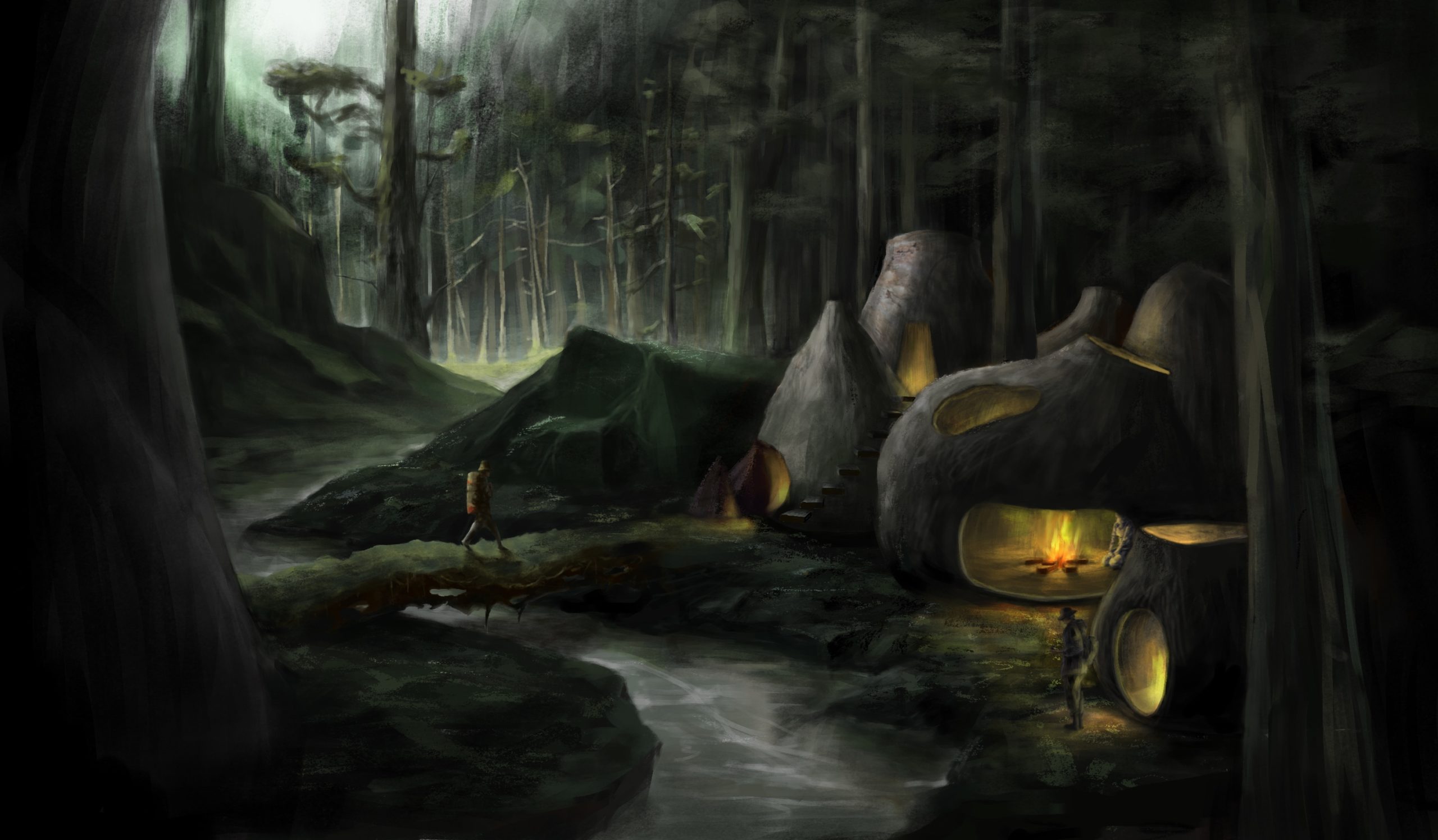
Non-Student Winner: “Octavia – Suspended City” by Thomas Schaller
Schaller Architectural Fine Arts
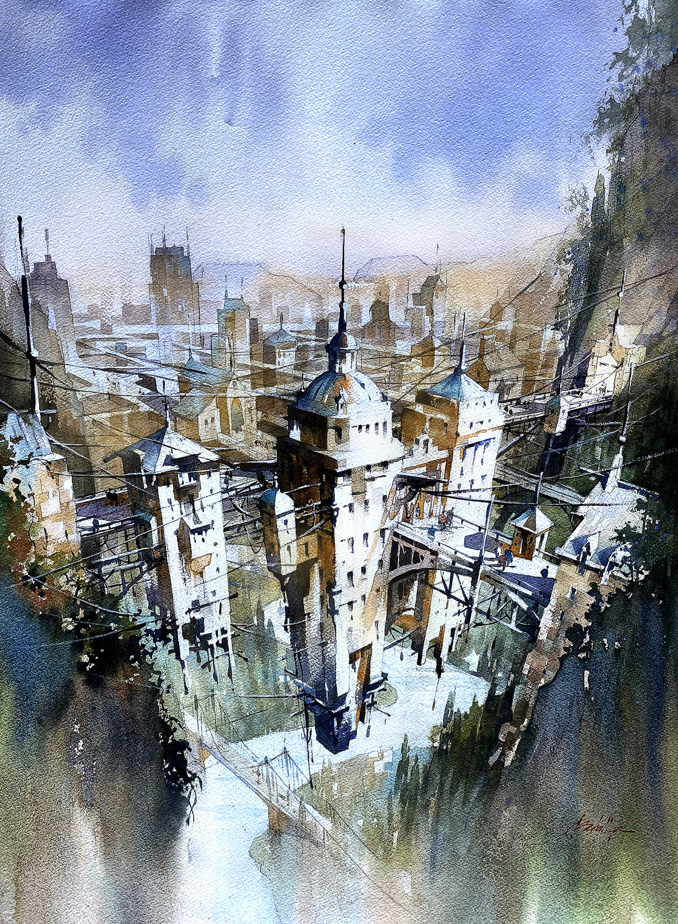
“Inspired by the iconic book Invisible Cities. by Italo Calvino, this drawing tells the story of Octavia, a city suspended above the Earth by a spider’s web of cables and wires. Interpretations are limitless, but in my interpretation, the inhabitants of Octavia depict the central truth about humanity – connections are profound – but tenuous; just as is our grasp on life itself. Isolation is not sustainable and connectivity – for all its impermanence – remains a more beautiful response.”
Commended Entry: “The city drowned by coffee” by Pengcheng Yang and Zirui Wang
The Melbourne University
“This is a painting about the concept of architecture expressed through images in a dream world. The theme of the painting revolves around the culture of coffee and the society that is triggered by coffee as a sober dependency of people.
1. A distant coffee factory produced an explosion, and the excess coffee caused great pressure inside the building.
2. The origin of coffee often comes from relatively poor countries, such as Brazil, Ethiopia or Colombia.
3. The shepherds mingling in the line represent the story of how coffee was first discovered by the shepherds of Ethiopia.
4. The fragile console tries as much as possible to hold the balance of people’s coffee intake.
5. There are ads and signs like iLLY and Nespresso for capsule coffee everywhere.
6. The mountains of waste formed by coffee consumption.”
Commended Entry: “Remembering Hanami” by Seah XinZe
WilkinsonEyre Architects
“Every spring, cherry trees in Japan bloom with a fleeting magnificence, captivating the nation for two weeks before wilting. During this time, parks are shrouded in pink and the ephemerality of cherry blossoms is appreciated as they are a reminder of the transitory yet overwhelming beauty of life.
Located in Yoyogi park, Tokyo, the project aims to immortalize the spirit of the cherry blossom. The building is a hand-woven landscape of experiences that engage the senses through the extraction of the different aspects of cherry blossom. The distillery boils flowers from the adjacent cherry grove, distributing scented steam through a network of pipes into the various spaces of the building. Visitors enjoy cherry blossom tea under a canopy crafted from sakiori weaving dyed pink from cherry trees and are invited to picnic by the scented water pools.”
Commended Entry: “Synopolis” by Lohren Deeg
Ball State University
“Content with the limitations of their small apartments and quaint terraces, warmly greeting their neighbors, and strolling among the stepped streets, the citizens of Synopolis greet the sunset each evening with decanters of bubbly concoctions, slowness in their constitutionals, diving into delectable sweets, and chatting away the day’s trials and travails over stacks of plates of tapas.”
Commended Entry: “Mycelium Modularity” by Dustin Wang
Young Guns Studio
“This drawing illustrates a forest that has been populated with housing pods made out of mycelium, conceptualizing the utilization of this material in modular architecture.
Mycelium, a natural fungi found in forests, can form rigid, water-resistant structures when molded and grown. Possessing a flexible form, this allows for the creation of these pods around trees and hills – existing in harmony with nature, rather than replacing it. The resulting effect are teardrop-like structures, differing in shape as each is hand-built.
In this scene, pollution is the origin of the hazy, grey sky. With plastic and waste reduction having become an everlasting consequence, mycelium is used in this small community of hopeful outliers, being a last ditch effort to slow down the deep-rooted repercussions of the changing climate.
In an inevitable future where the natural lives in the artificial, the increased awareness of the benefits of mycelium, will aid in revitalization.”
Commended Entry: “(Your) My Bedroom” by Daniel Ho
University of Auckland
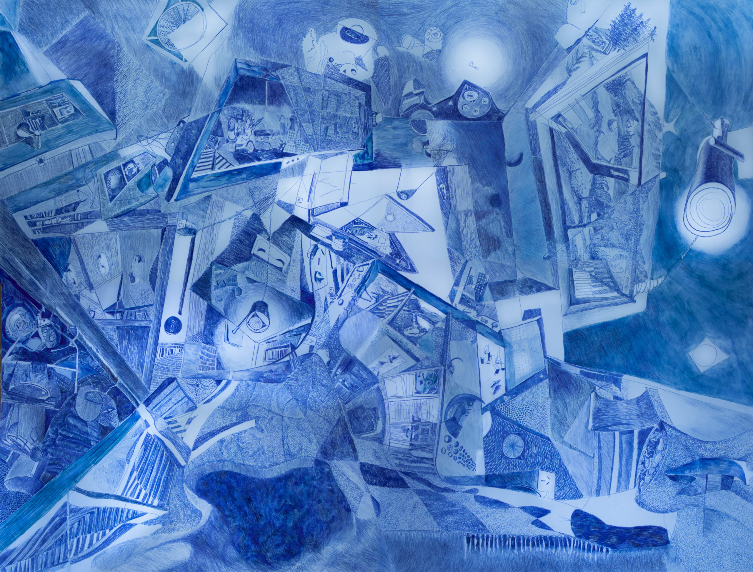
“Many see in architecture the plan, section, elevation, axonometric, and BIM model; mathematical conventions communicating the means of construction. However, drawing by measurement to prescribe beyond the floor, walls, and roof is a perverse overstep; measurements cannot make singular the continuous performance of everyday living.
‘(Your) My Bedroom’ departs from such Cartesian description. It draws a transient domestic, where violence and protection coalesce. A place to laugh, cry, hate, love, reflect, and regret; to feel ambition, faith, passion, cynicism, pleasure, and pain. To draw the bedroom should reflect these experiences with all the egotism of the eye, lest the drawing repels the character it endeavors to express.
Singular compositionally, yet multiplicative in evoking identities of the viewer’s own ‘Bedroom.’ Recalling these identities with blue pencil on 2000 x 1500mm paper means democratizing these everyday experiences. Identities range from bodily to microscopic scales; zoom up, explore, and analyze the character, ‘Bedroom.’”
Juror Sabina Blasiotti said of (Your) My Bedroom: “The drawing that excited me the most is (Your) My Bedroom. It immediately spoke to me, and straight away I saw the bedroom in a way that I’d never seen before. The bedroom is often the subject of architectural illustrations, but Daniel is giving us a completely fresh view of the bedroom which can speak to a wider audience. Daniel talks about a coalescence of violence and protection, passion and pain. The bed is the place where we seek refuge when we are sick and suffering, where we stare at the ceiling when we are anxious, but also a place to relax, think and so on. How to depict one single space that encapsulates such a wide spectrum of contrasting feelings and emotions? I believe Daniel successfully did this.”
Commended Entry: “The Stamper Battery” by William du Toit
Te Herenga Waka — Victoria University of Wellington
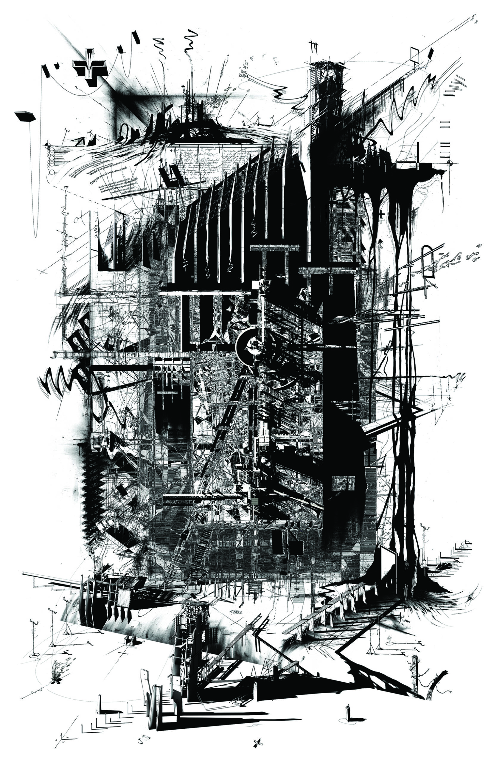
“Drawing from EM Forster’s 1909 short story “The Machine Stops”, this allegorical architectural drawing re-presents a seminal tale of environmental devastation caused by the 1860 New Zealand goldrush. Propelling the Otago region into economic prosperity, the mining operations were abandoned once the gold dried up—the forgotten industrial artefacts, environmental scarring, and their historic narratives slowly decaying over time, destined to be lost forever.
The Stamper Battery is the final drawing in a series of 7, each preserving the narrative of a different artefact of the historic goldmining process. It combines orthographic, notation and layering techniques to compose a drawing that shifts restlessly on its page—depicting fragments of architecture as they transform and decay over time. The drawing is intended to be exhibited in sequence, avoiding direct intervention on the site while preserving a national heritage story of place identity—acting as a lesson for future generations to learn from past mistakes.”
Commended Entry: “Up” by Thomas Schaller
Schaller Architectural Fine Arts
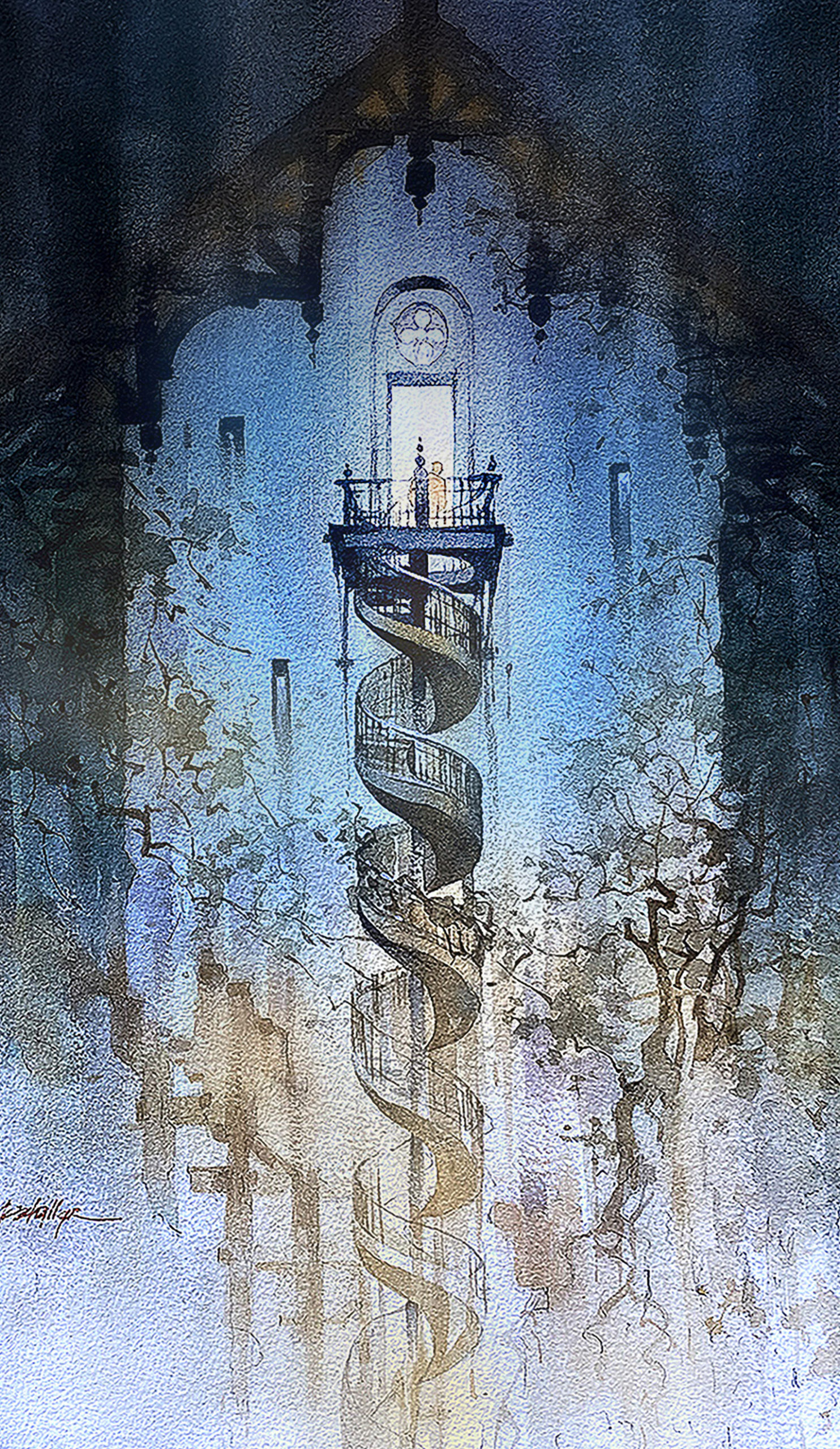
“Examples of architecture can too often be seen as solid objects, but of course, they are not. They contain spaces, voids in which humans interact, work and play, love and live. In this sense, the volumes contained by architecture are the collective kinetic stories of all who have gone before and will yet arrive. This drawing – “Up” – explores the energies of that process, the ideas of entrance and exit, of doors and stairways that we all employ to knit our internal lives to the external world and in some silent way, to one another and to time itself.”
Commended Entry: “The Gardener’s Diary” by Glory Kuk
KPF
“Dear Diary,
I recently rummaged through my old diaries and found melancholic entries.
Located in Renwick Ruins of Welfare Island, an island that housed the undesirables of the city, much like our rejection of mental health problems.
The drawing diary is informed by small details in life and on site, which is spatially translated. It grows as more details are noticed, the drawing itself as a growing diary where it is reconditioned daily by me, tending, caring and maintaining the space. There is a visitor within me who might create chaos within the garden based on their emotions, the other side of my psyche. We shall leave traces for each other as we will never meet.
The drawing is where the garden is architecturised, and the architecture is gardenised.
It is a safe haven to defuse my worries, through this drawing I shall find my peace…
Yours Truly, The Gardener”
Commended Entry: “Pocket Size City: The Atlas” by Stefan Maier
University of Applied Arts Vienna
“The Atlas – a loose assemblage of maps. It constitutes a multitude of scales within itself. It links between the content and its representations, creates relationships, and references – a hyperlink into the digital space. The atlas holds the weight of the digital mesh.”
Commended Entry: “Ronin’s Lair” by Eduardo Perez
California State University Long Beach
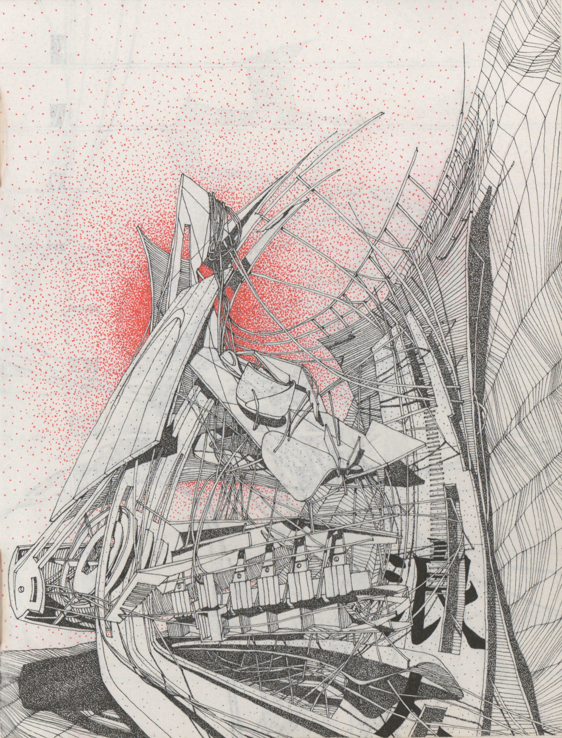
“‘Ronin’s Lair’… an environment that lies between two parallel universes. These series of spaces are a continually morphing and warping training grounds for the ‘wayward samurai’. They are part Japanese Edo Period and part digital future, they are neither today nor tomorrow… they are in a continually shifting threshold space; a warped interim and an evolutionary and non-chronological series of physicality’s and landscapes. My explorations also lie within 2 worlds of the analogue and the digital, my submission is one of the analogue (ink on parchment paper) and it is one of a series of many such explorations in digital, analogue, and hybrid mediums.”
We have been blown away once again by the response from our community for this popular ideas competition. “This year’s entries raised the bar for creative storytelling through visual means, demonstrating again that technology need not kill off drawing as architecture’s medium of choice,” remarked Architizer’s Editor in Chief, Paul Keskeys. “In fact, with advancements in digital sketching and even AI as an additional creative tool, our fundamental approach to ideation is evolving, and I am excited to see what the future holds for architectural drawing in the next decade and beyond.”
As the art of architectural representation continues to evolve, so will our competitions and awards programs, in order to accurately reflect the incredible ability of architects, designers and creative people to communicate complex ideas about the built environment. Sign up for our newsletter in order to be notified when our next evolution is announced, with bigger, bolder opportunities set to emerge in 2023:
Register for the Architizer Newsletter

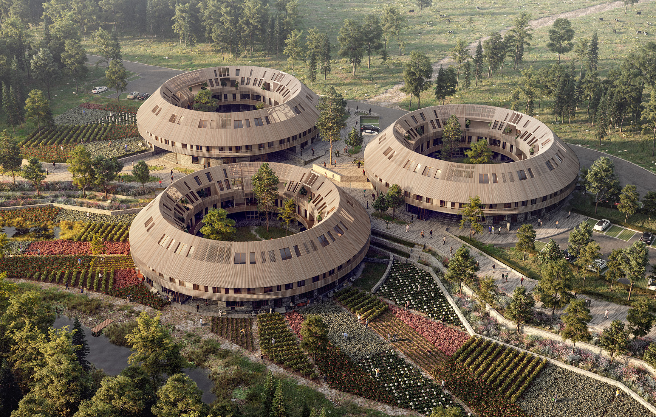


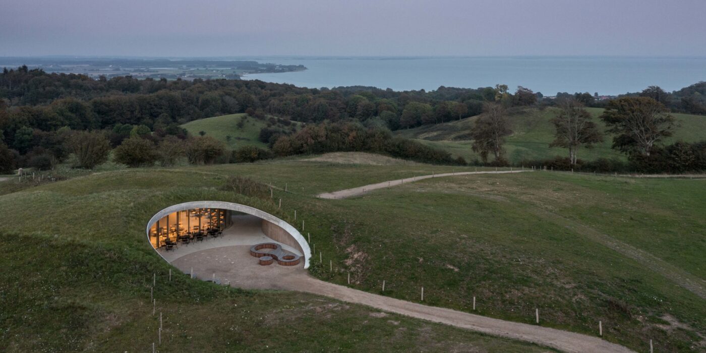
 Skamlingsbanken has long been a point for gather: the protective shelter of the rolling hills seemingly invited gatherings. Now, this natural landscape’s remarkable history as a civic landscape — one that hosted debates about women’s suffrage, democracy and more — is home to an architectural landmark that will continue this legacy, with little impact on the natural landscape. Indeed, The visitor centre is an architectural interpretation of the local topography and a representation of the local history; it is seeded with native species, selected in collaboration with biologies Mette Keseler, which shows optimal conditions for the local herbs and biodiversity.
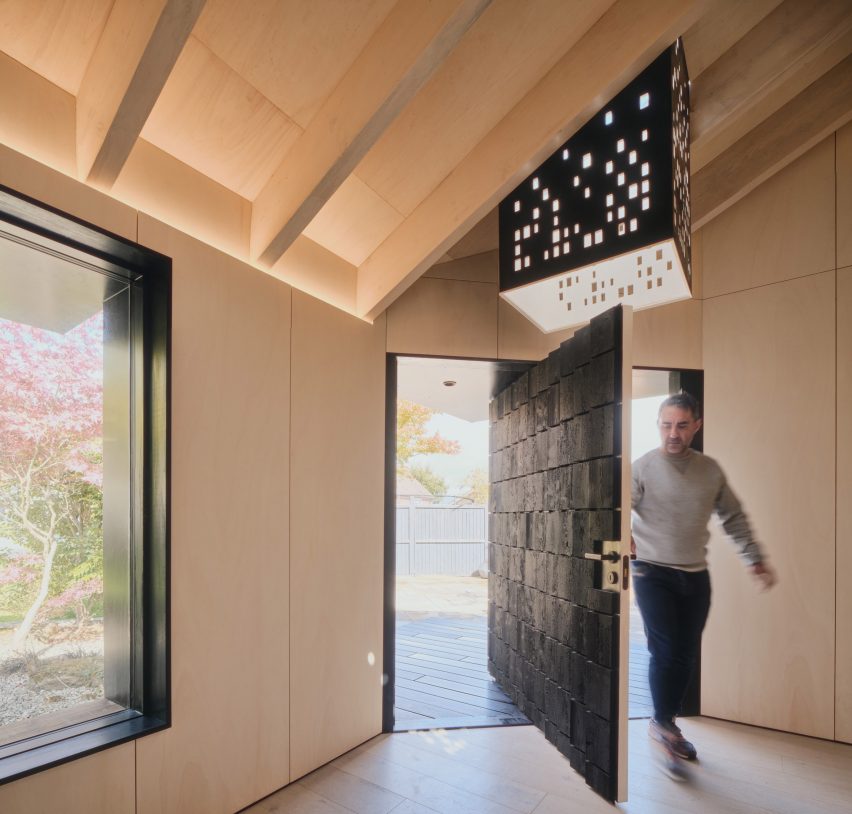
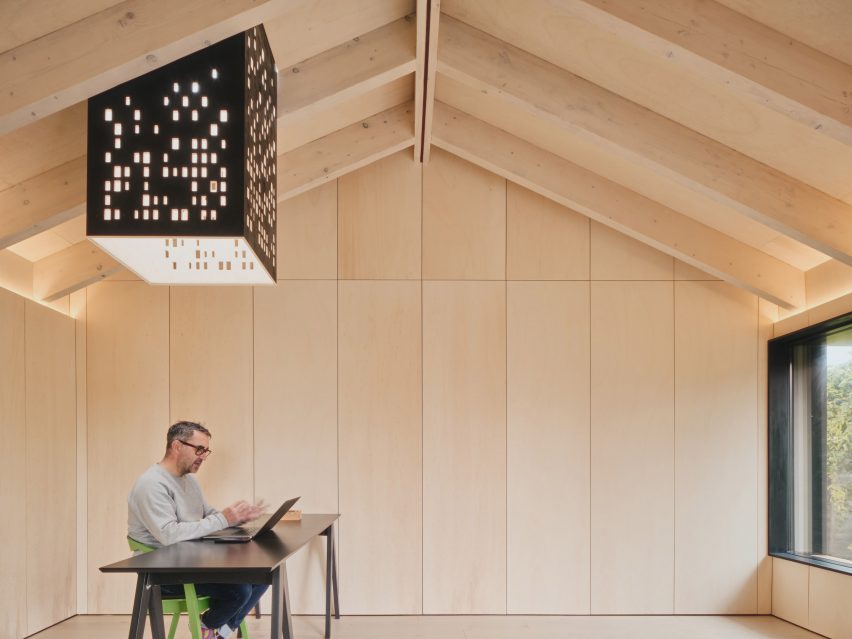
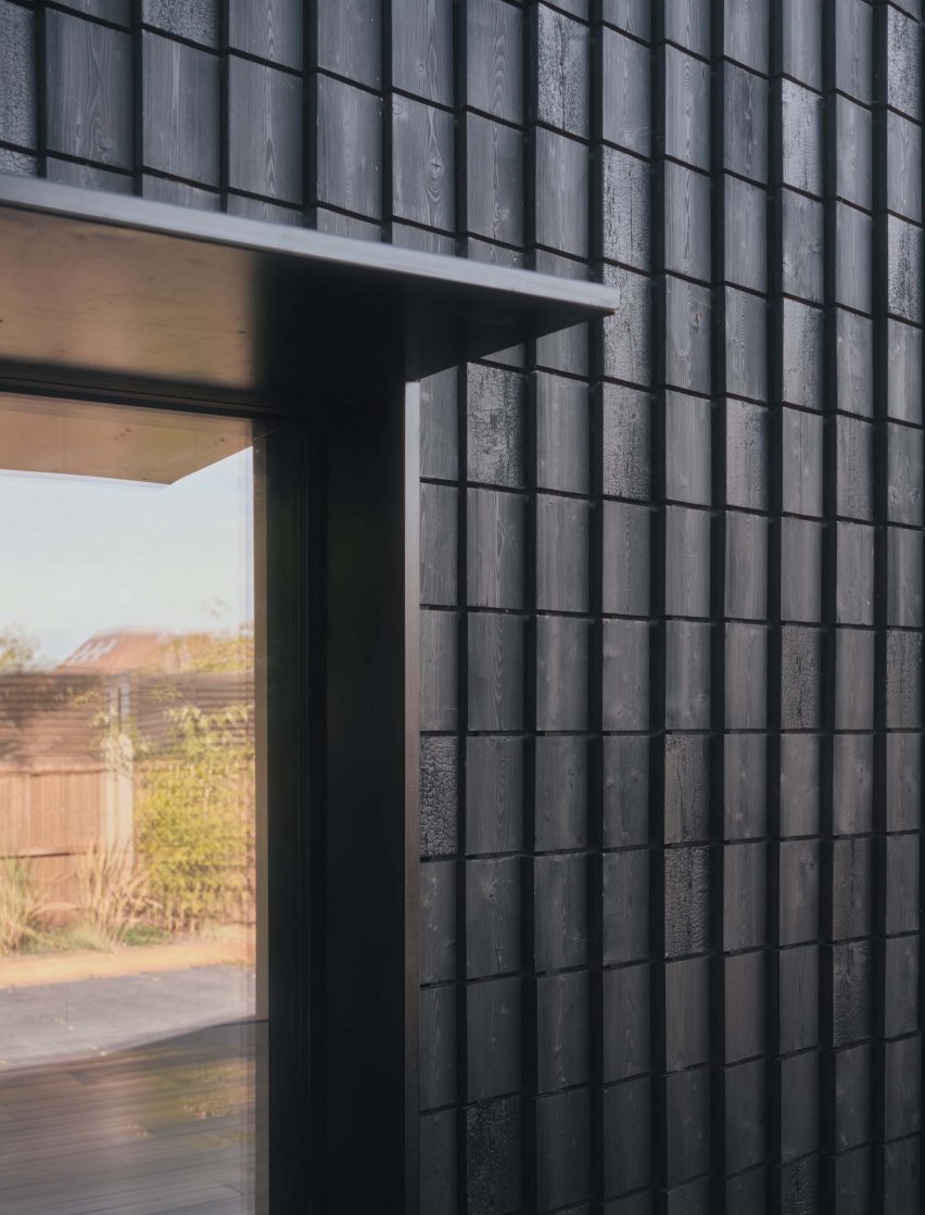
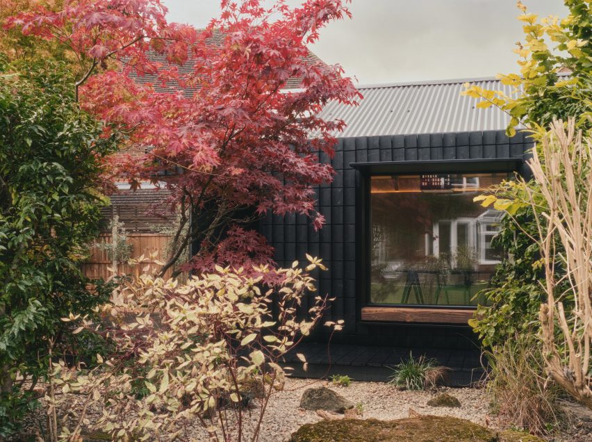
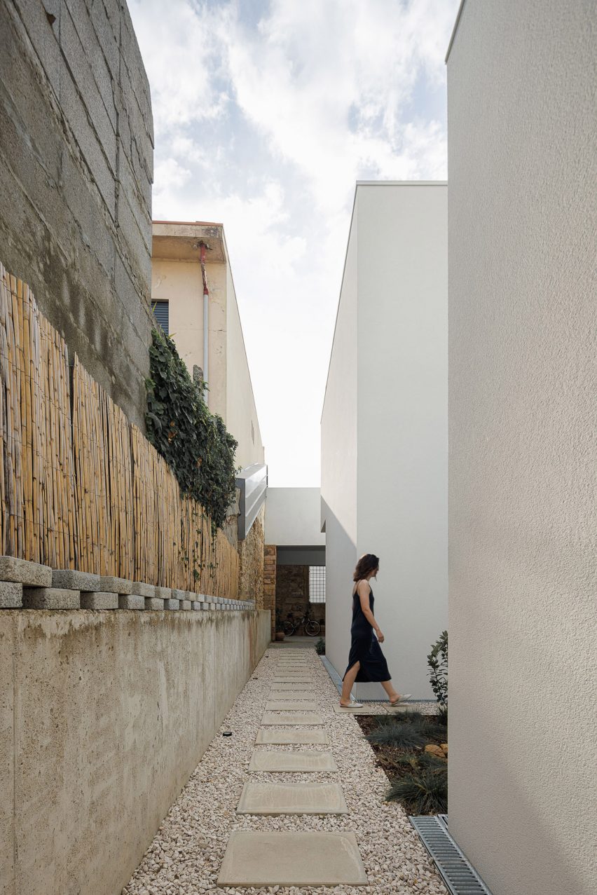
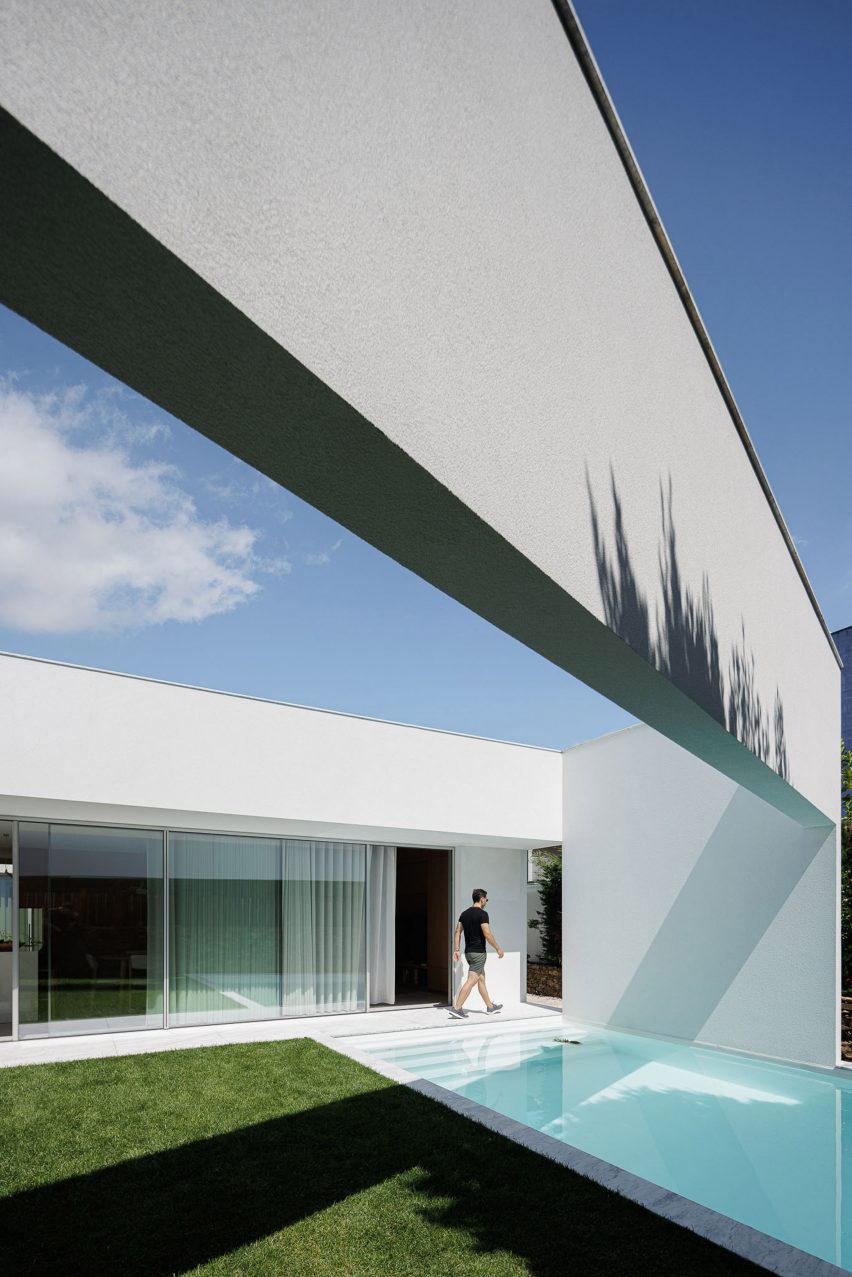
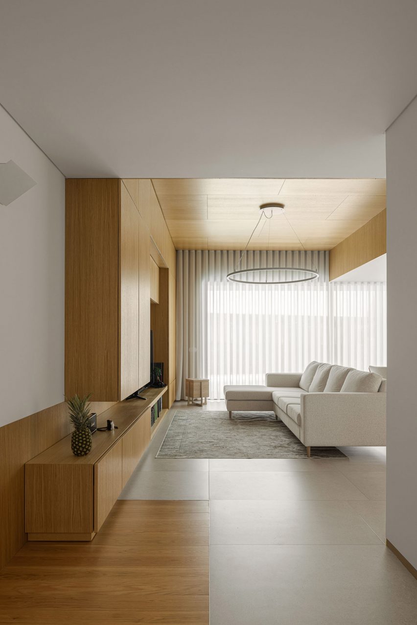
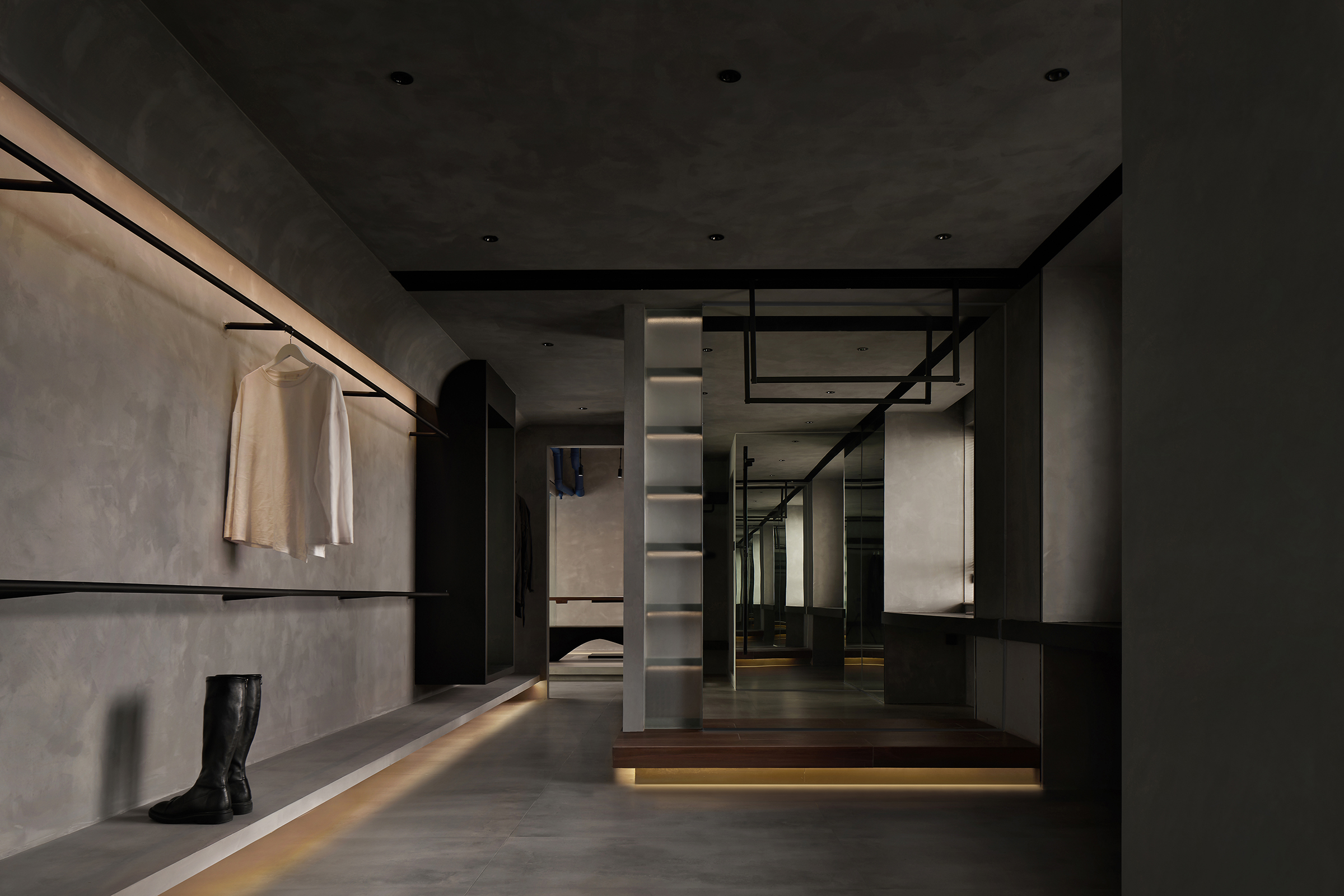 Moody lighting, textured walls and interlocking linear elements all come together to create a dynamically flowing space. Four principal moving lines are used to connect the apartment’s various zones, ensuring that the open space feels connected while its functions are differentiated. This tension between who and parts, static volumes and dynamic movement, amount a significant challenge to more traditional private homes. Based on the “unconventional” living space needs of the two owners, designers want to create a sense of privacy and closure that can break the traditional private house space for the owners.
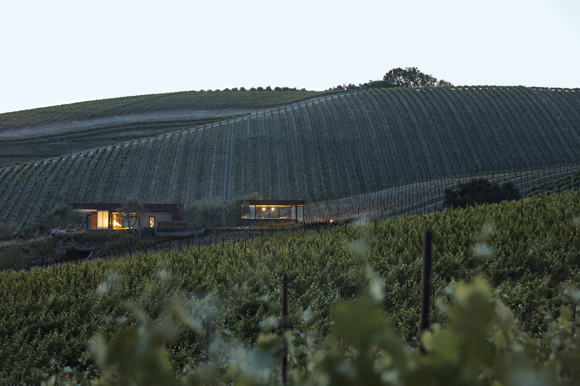
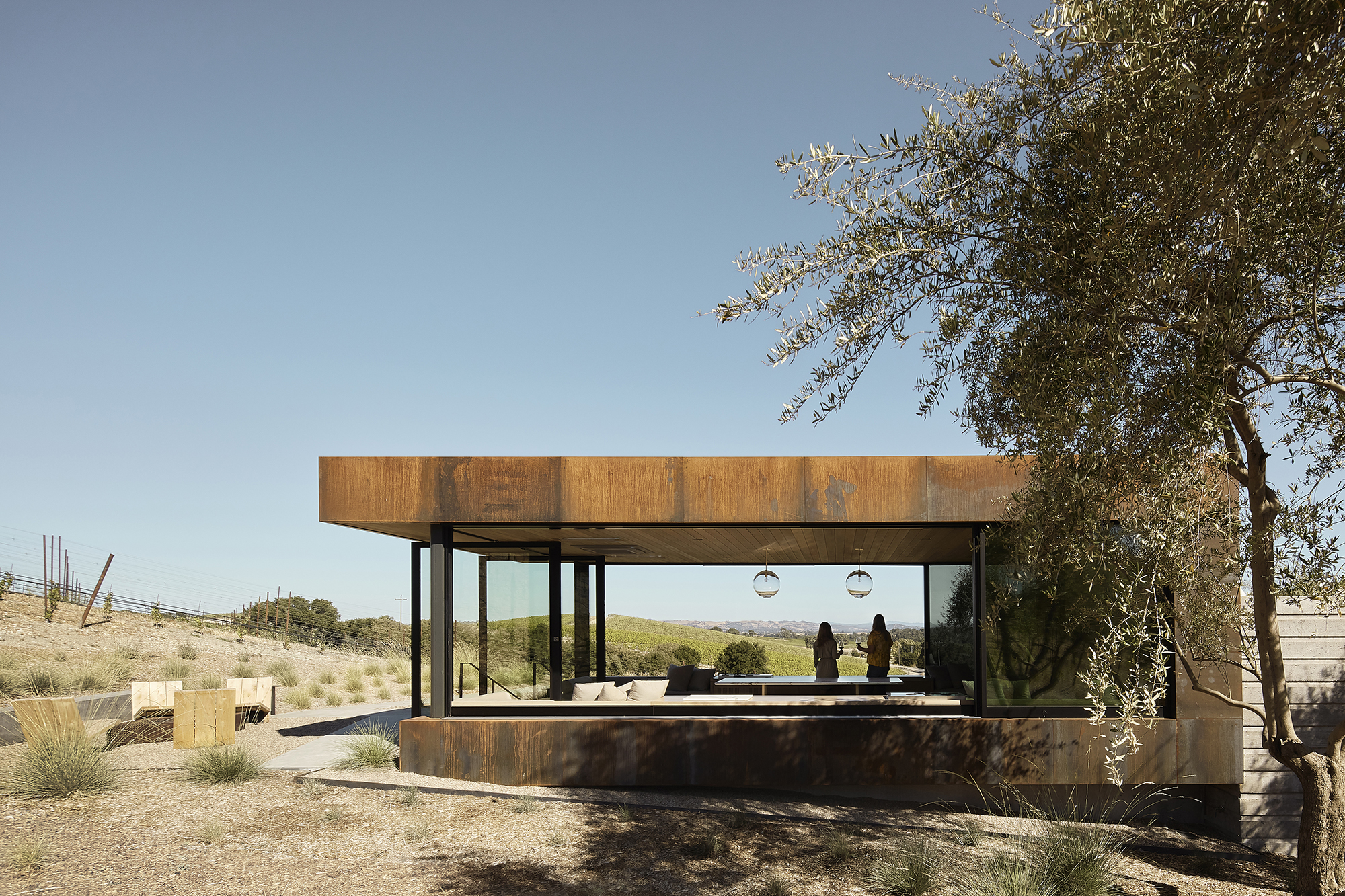
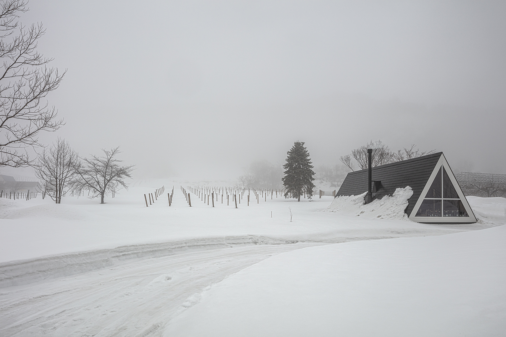
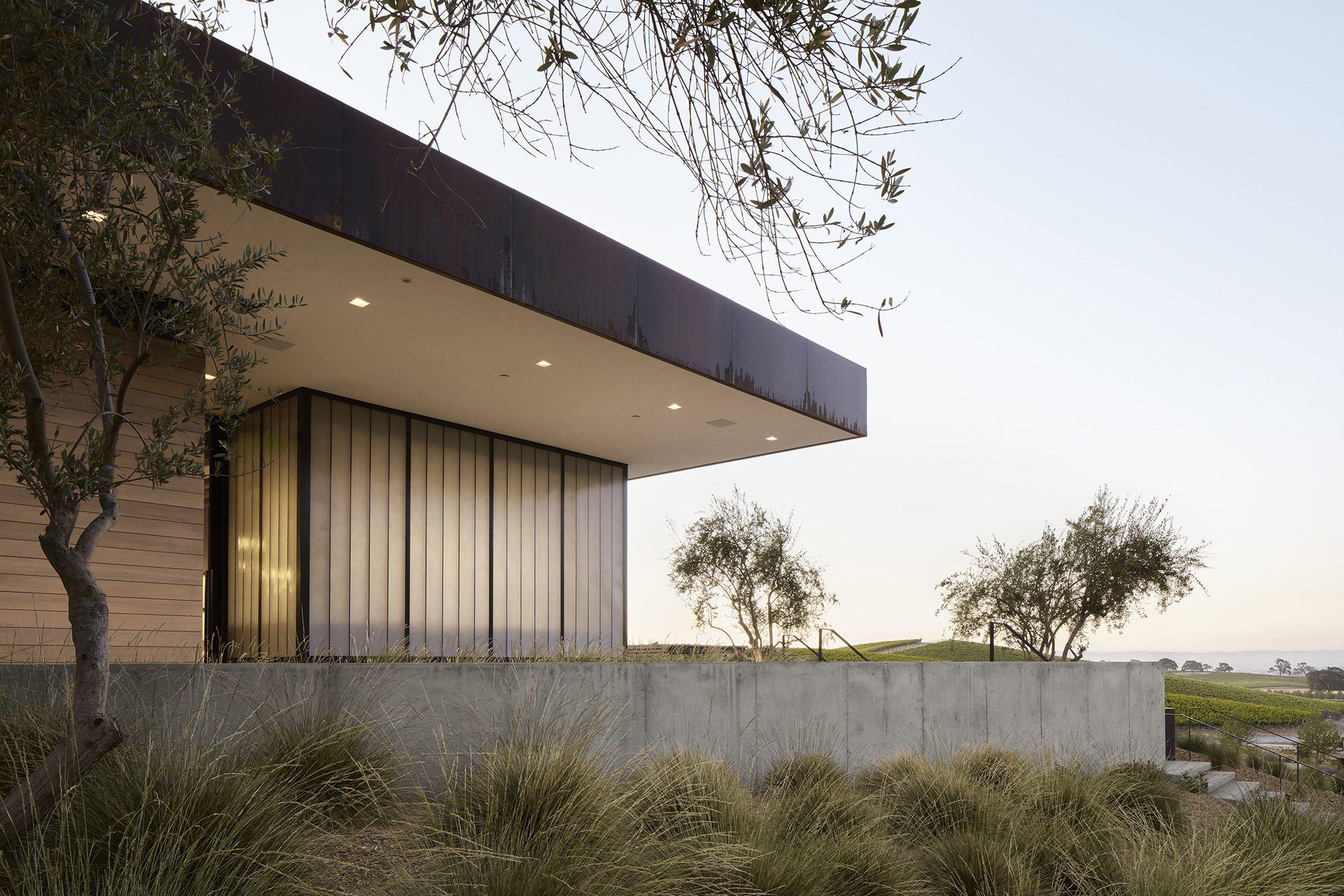 Set on a 100 acre site in Paso Robles, this the architects of this project were faced with a complex task: to design a building with a unique identity that would invite visitors without detracting from the picturesque landscape — a contention at the heart of winemaker Eric Jensen’s minimalist philosophy of interfering with the land as little as possible. Thius the architects began with a typology familiar to the place: a trellis and terrace. Next, the visible fractures in the area’s chalky limestone soil helped to make out the buildings’ walls, in direct relation to the land and views.
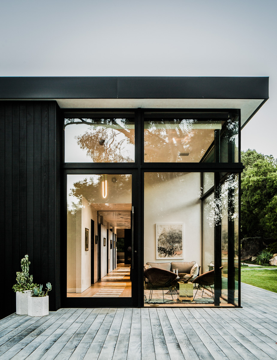
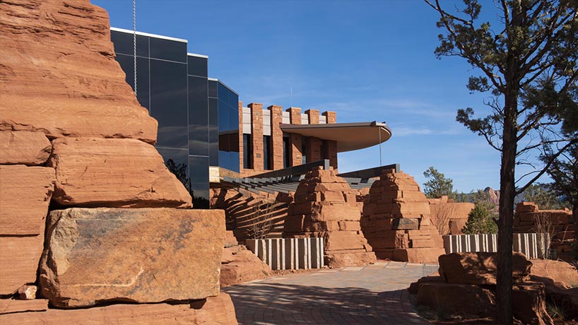
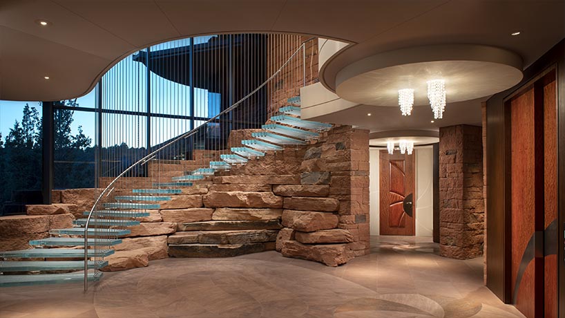
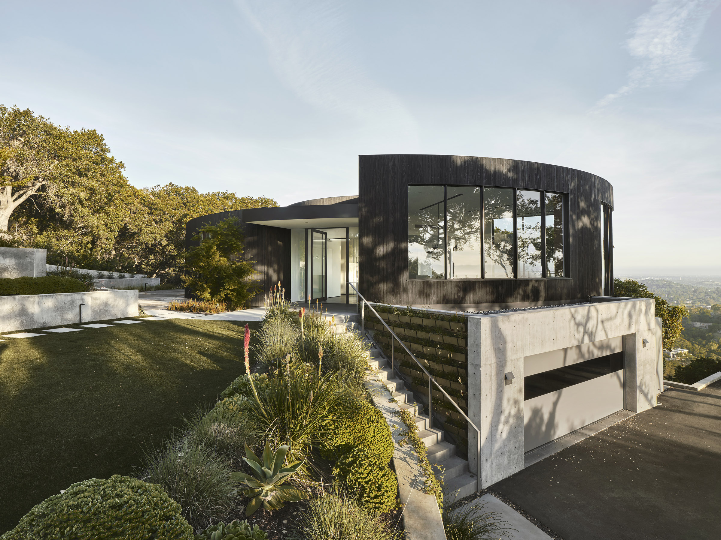
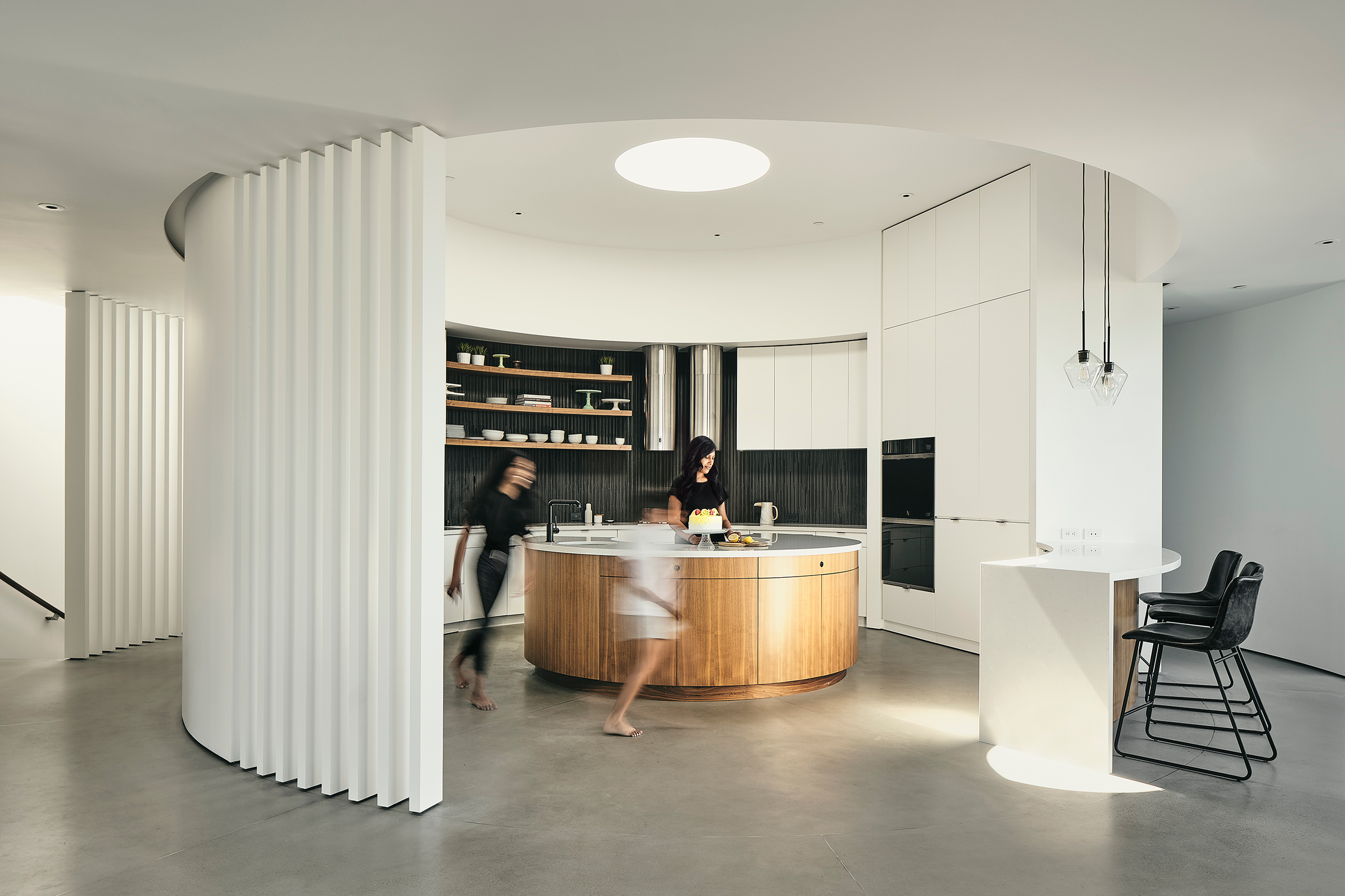
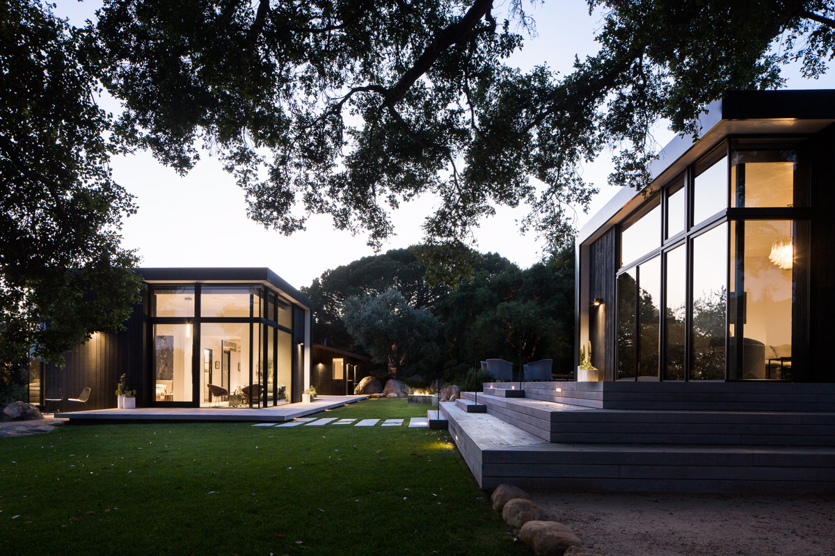 Mies van der Rohe seems a likely inspiration for this modernization project in the foothills of Santa Barbara; however, this modernize project is deeply rooted in its source material — a simple 1950s wood cabin set in a rock quarry. The single-story residence takes into account the surrounding boulders and oak forest; the design sought to maintain original elements and to reuse stone found onsite.
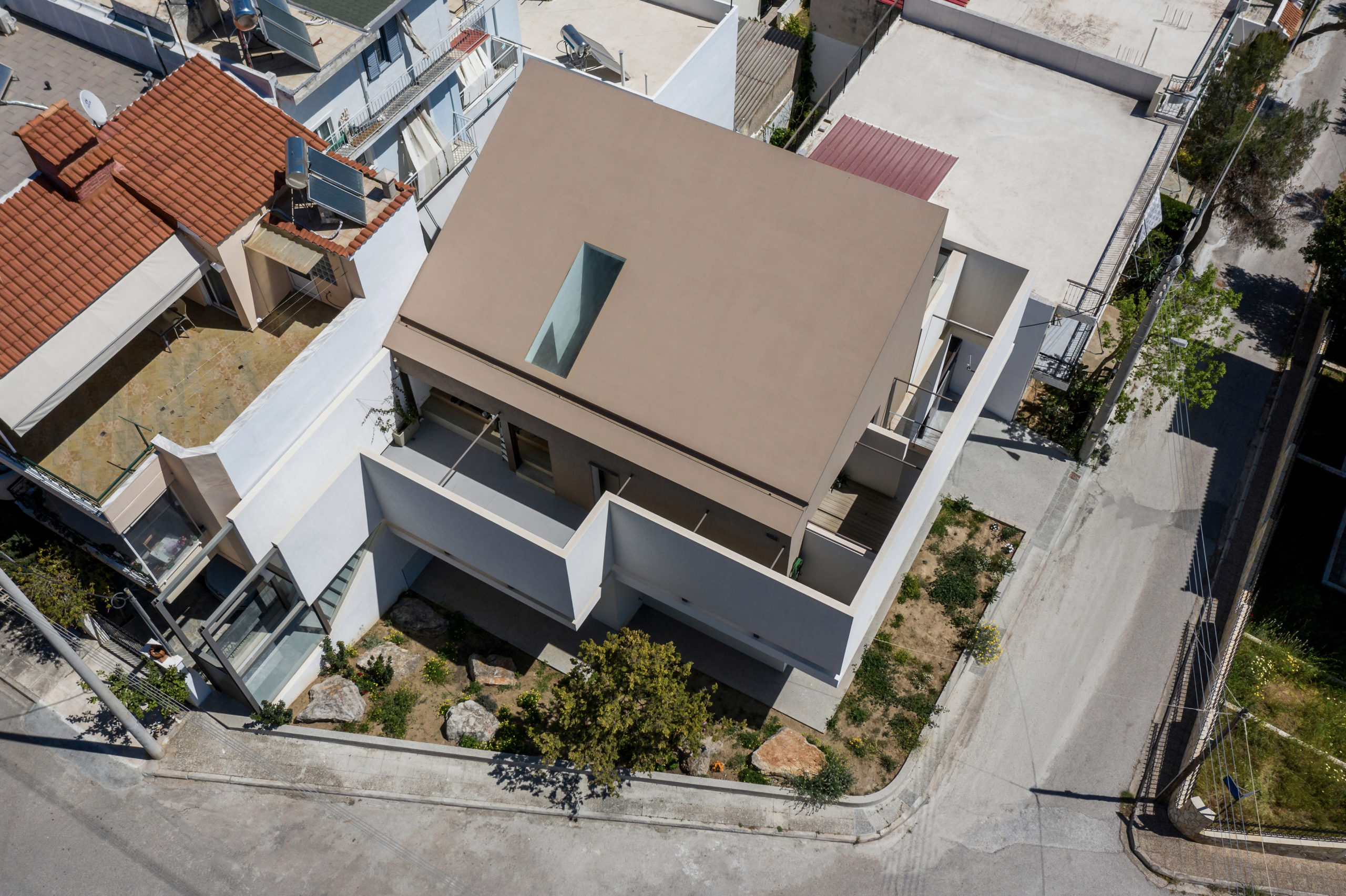
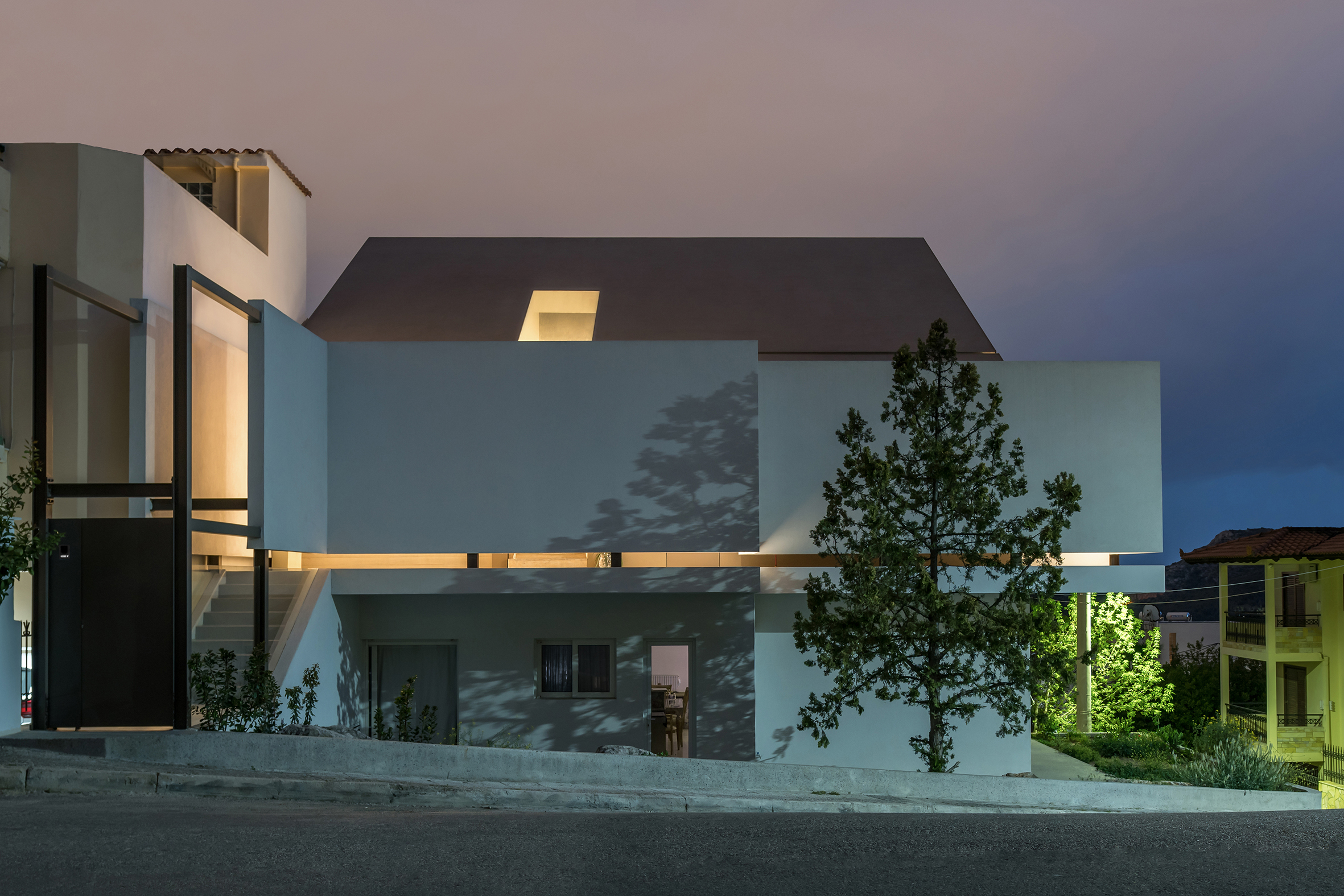 Many cities can claim hybrid identities as contemporary metropolises with ancient, historic pasts; however, Athens is one of those cities where this duality is ever-present, and the city’s legacy continues to inform designs of the present. Epitomizing this relationship to the past are those homes that Greek families literally build on top of their older residences. Known as “panosikoma,” these “upper-level extensions” are rooted in a traditional building practice that implicitly negotiates these identities. The Flying Box exemplifies this approach.
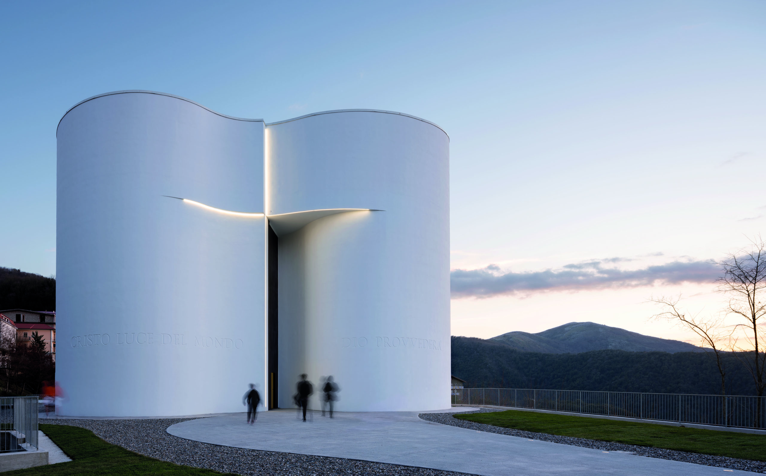
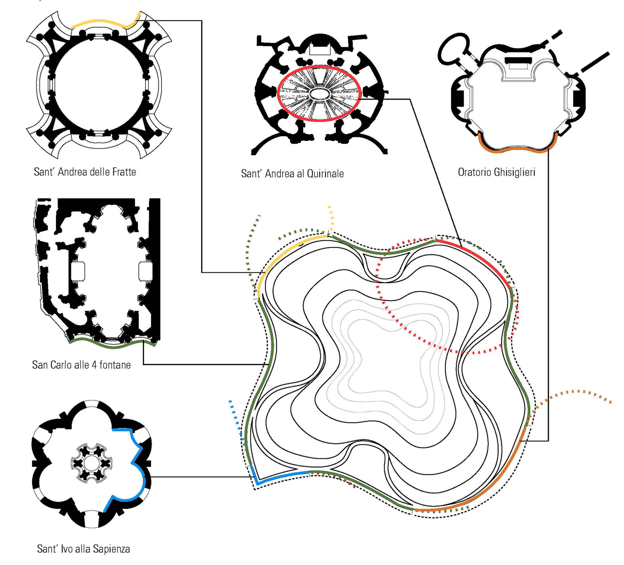
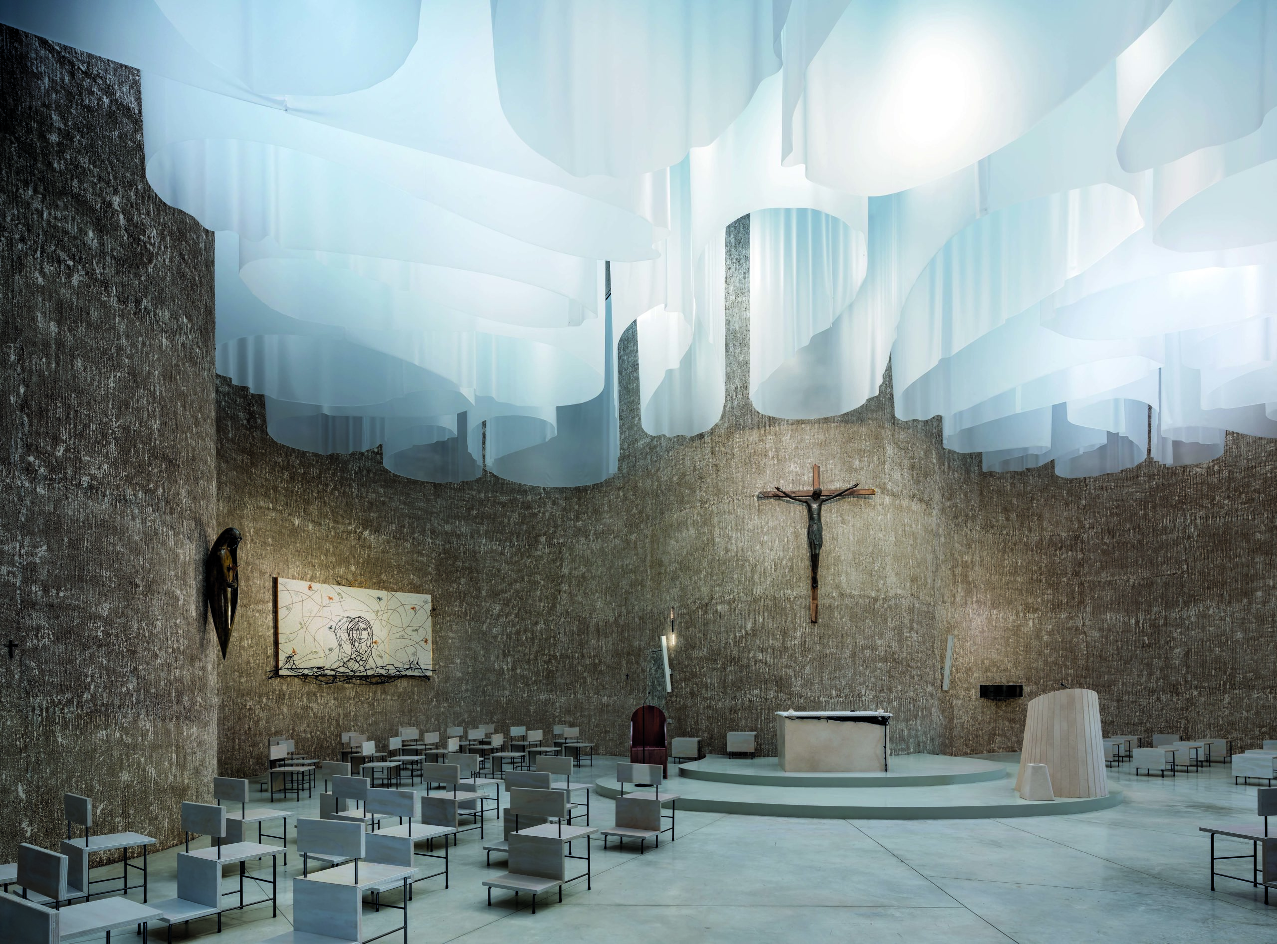 One first glance, the flowing lines of this iconic floor plan is unlike any other ecclesiastical structure (actually, it’s safe to say they’re quite distinct from any other structure, period). Yet, the organic footprint of this monumental building was inspired by the curvilinear geometries of Baroque churches in Rome. Natural light — long an important element and symbol of Christian places of worship — floods the interior space, and is filtered through a memorable canopy of translucent veils.
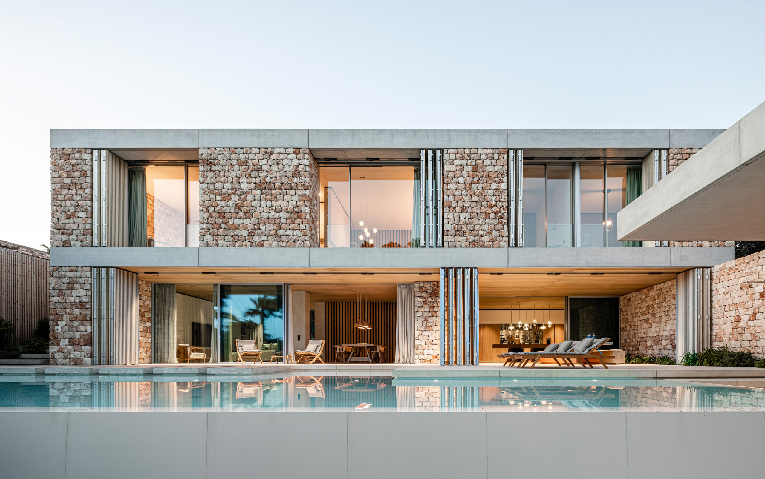
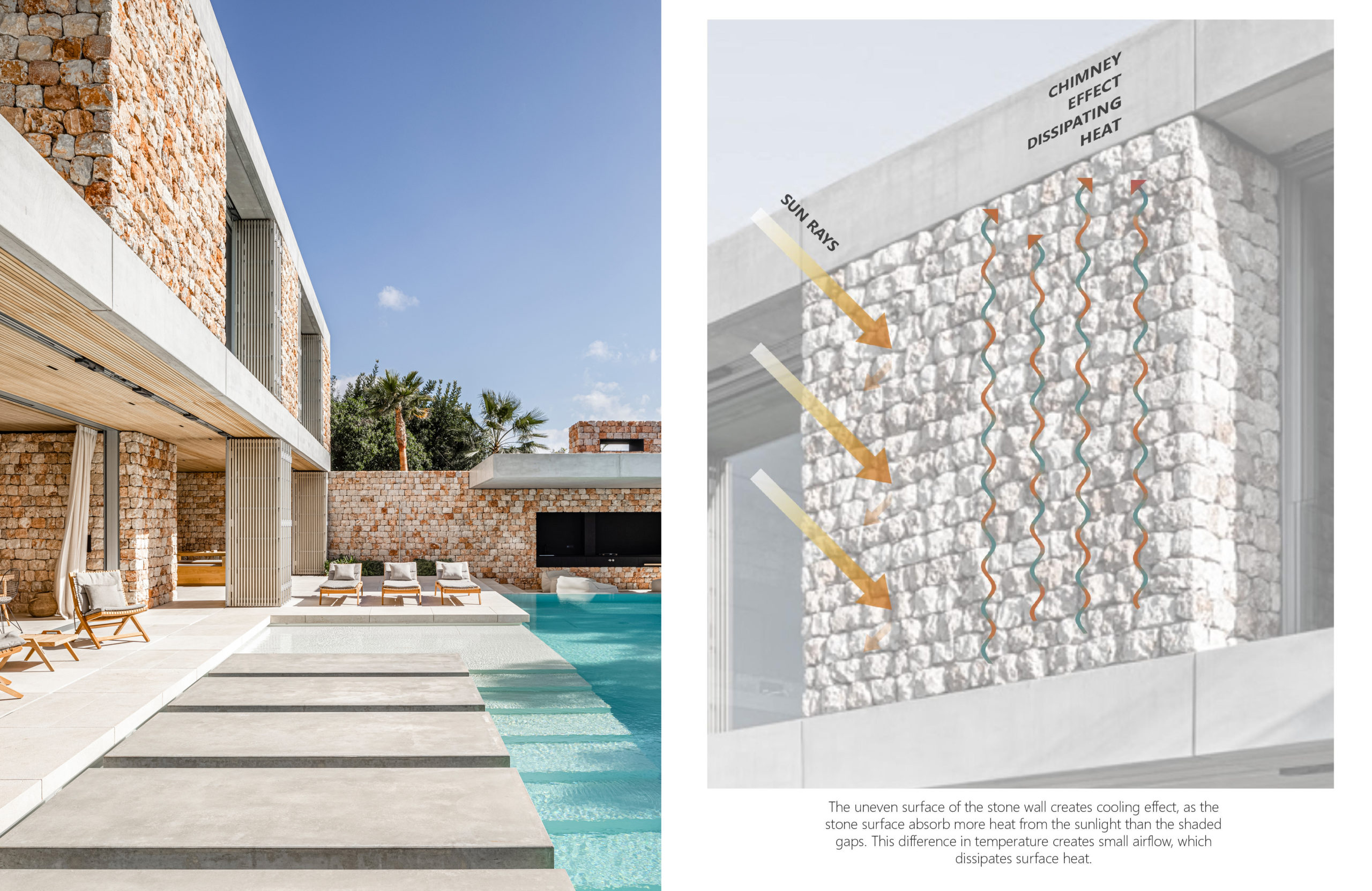
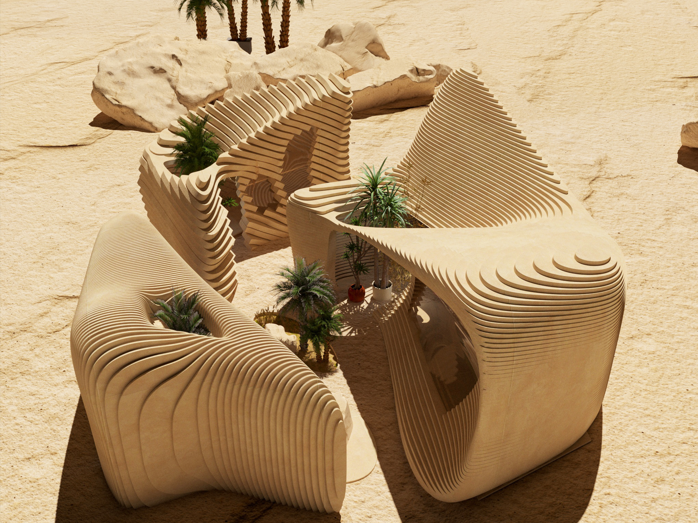
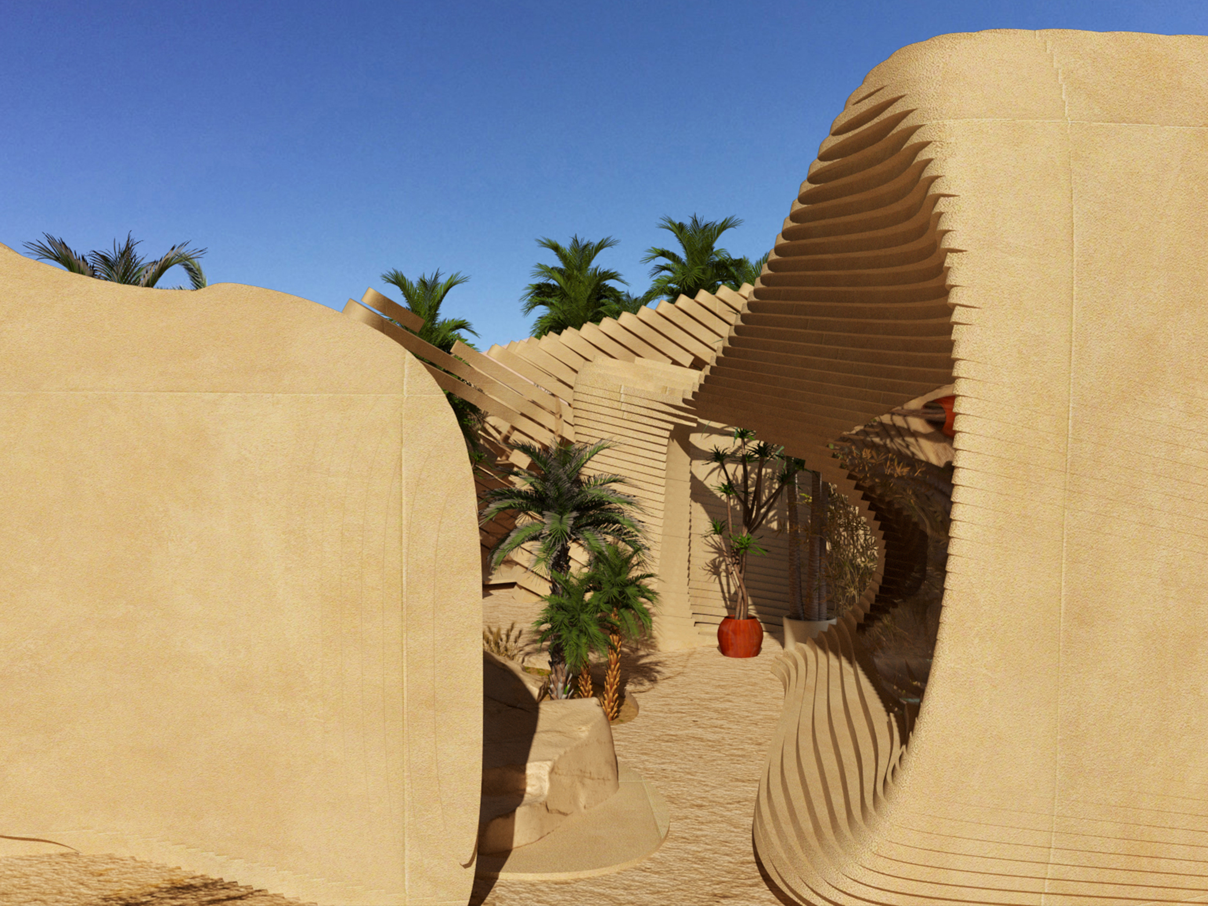
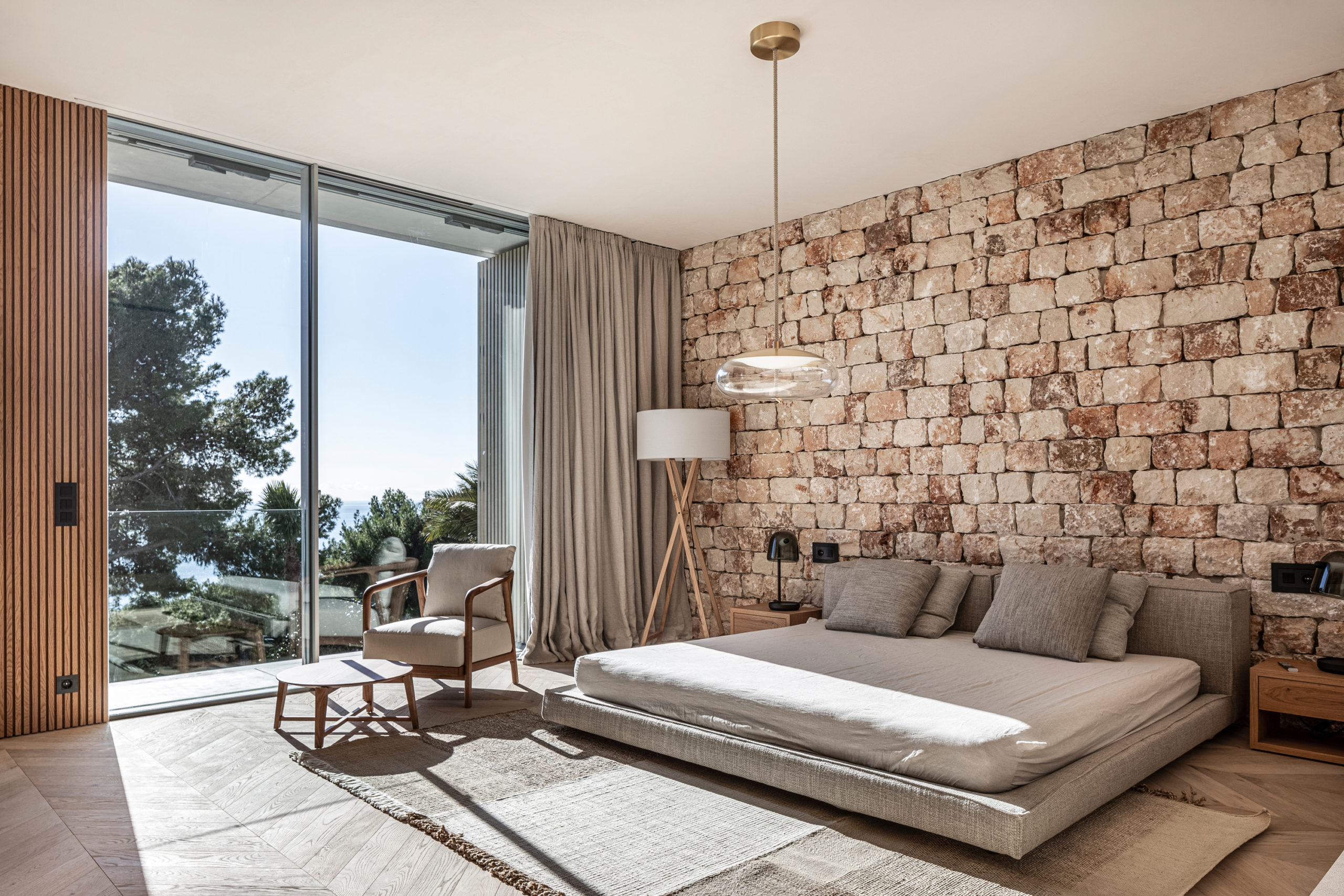 Mallorca is famous for its sapphire blue beaches and picturesque craggy cliffs; however, architects would be interested to learn more about the vernacular techniques long used in local construction on this mediterranean island. Using stones sourced from a nearby quarry, Beef Architekti pay homage to the traditional dry construction technique known as ‘pedra en sec’ used to express a typical design that can be found all over the island — one that was named an intangible Cultural Heritage of Humanity by UNESCO in 2018.
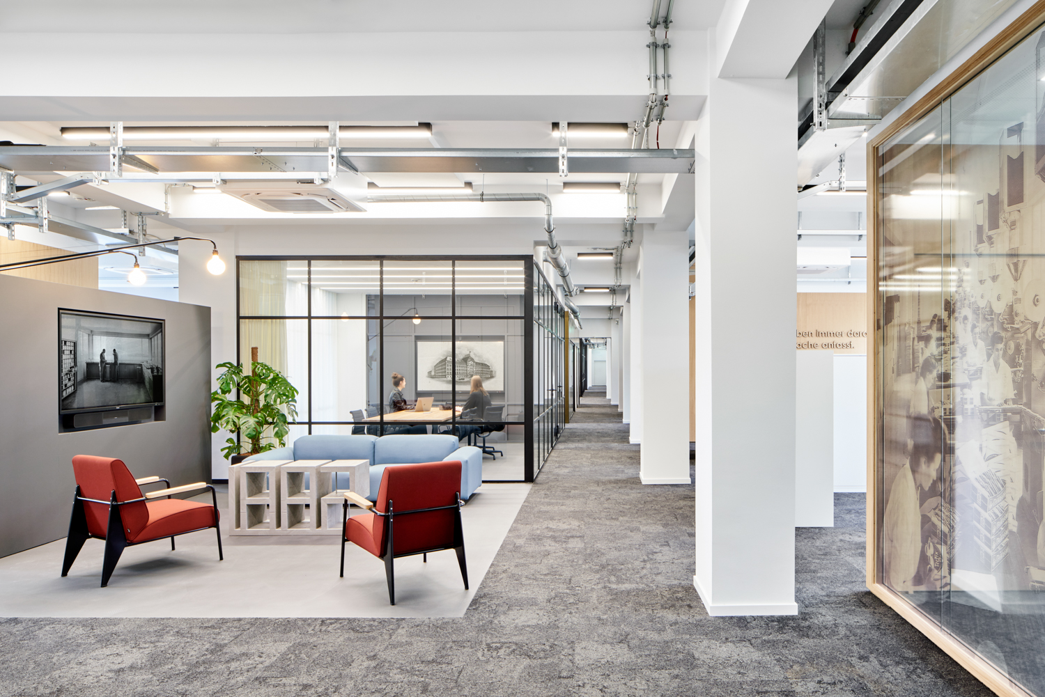
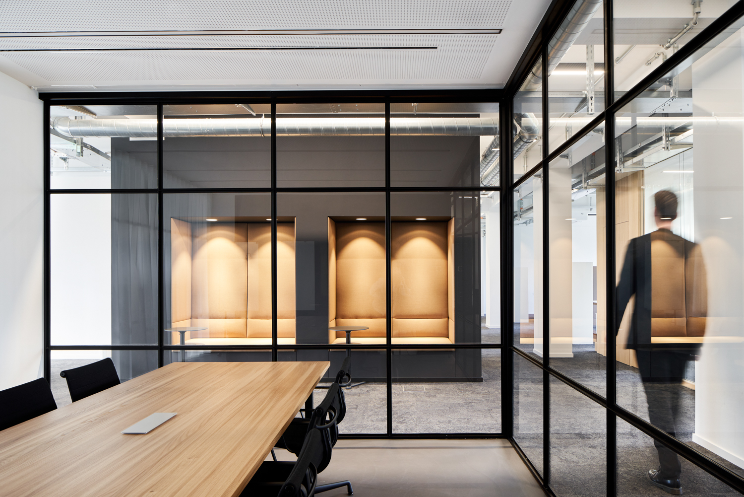 The future of office culture hangs by a thread, and architects are increasingly seen as the heroes capable of coaxing a reluctant workforce out of their homes. Charged with strengthening employee’s identification with their employer, this multispace strives to integrate their patron’s long company history and state-of-the-art production techniques with the comforts of home offices, which allow employees to retreat when needed, and therefore to be fully present when needed in the work community.
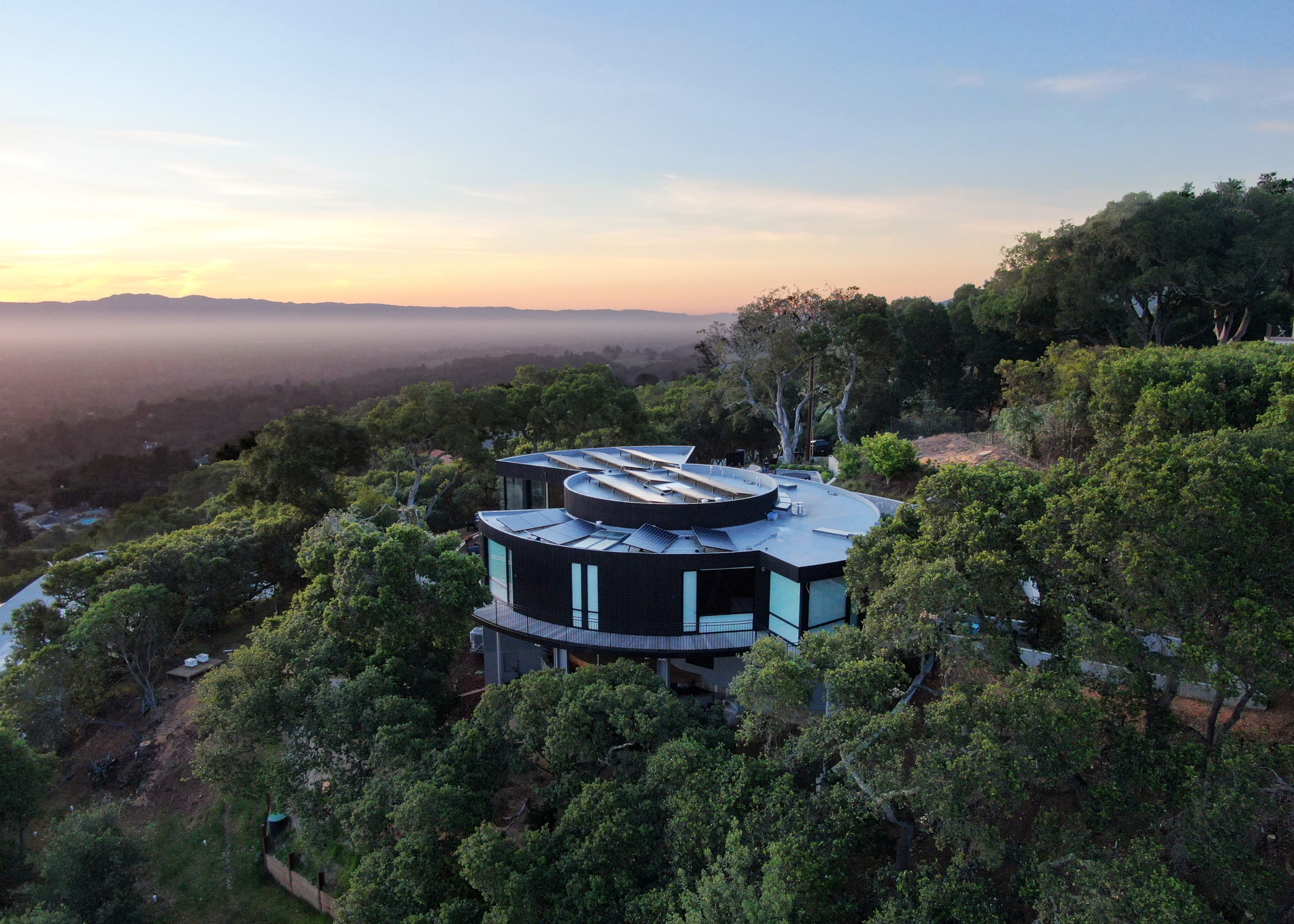
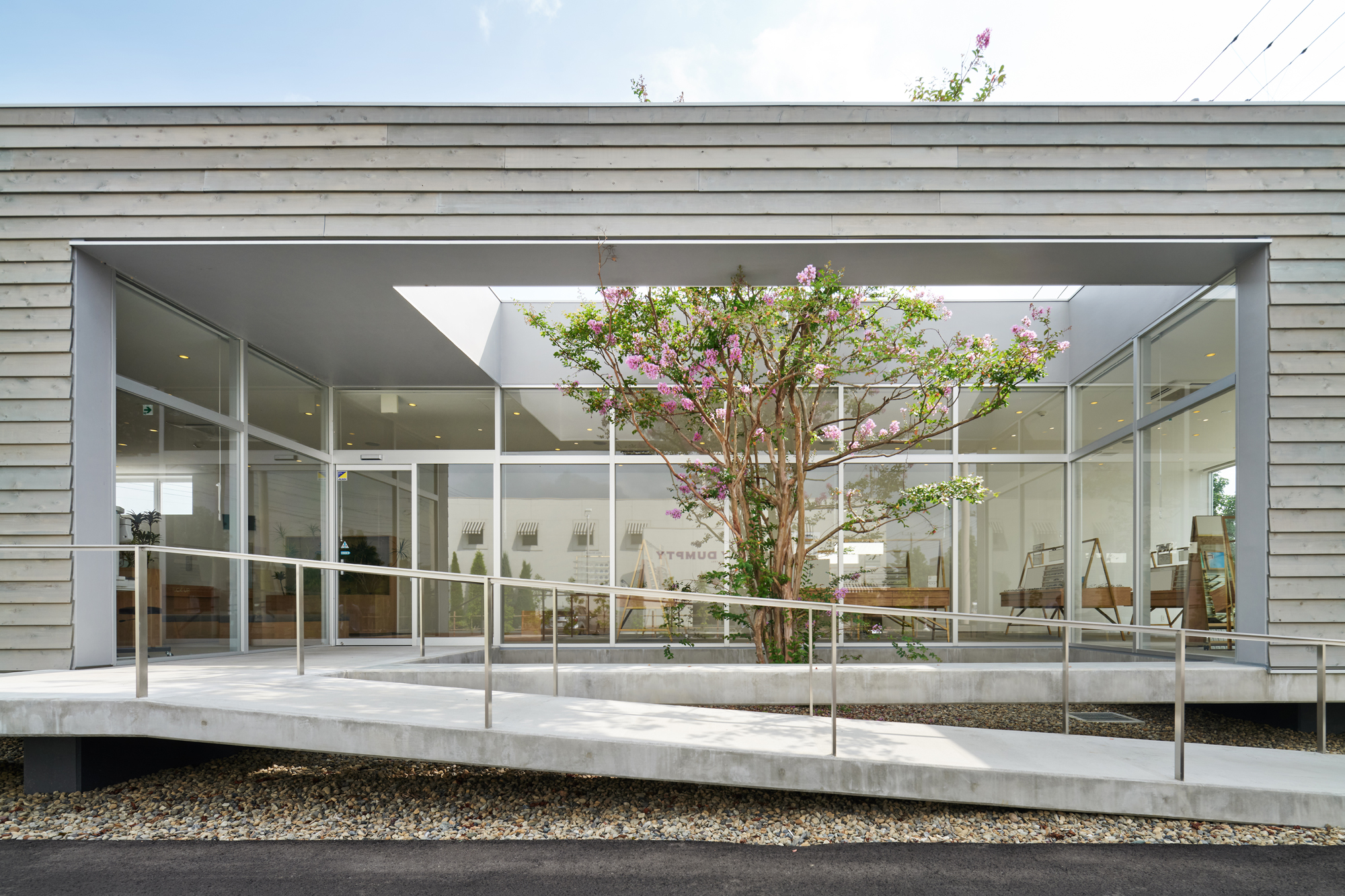
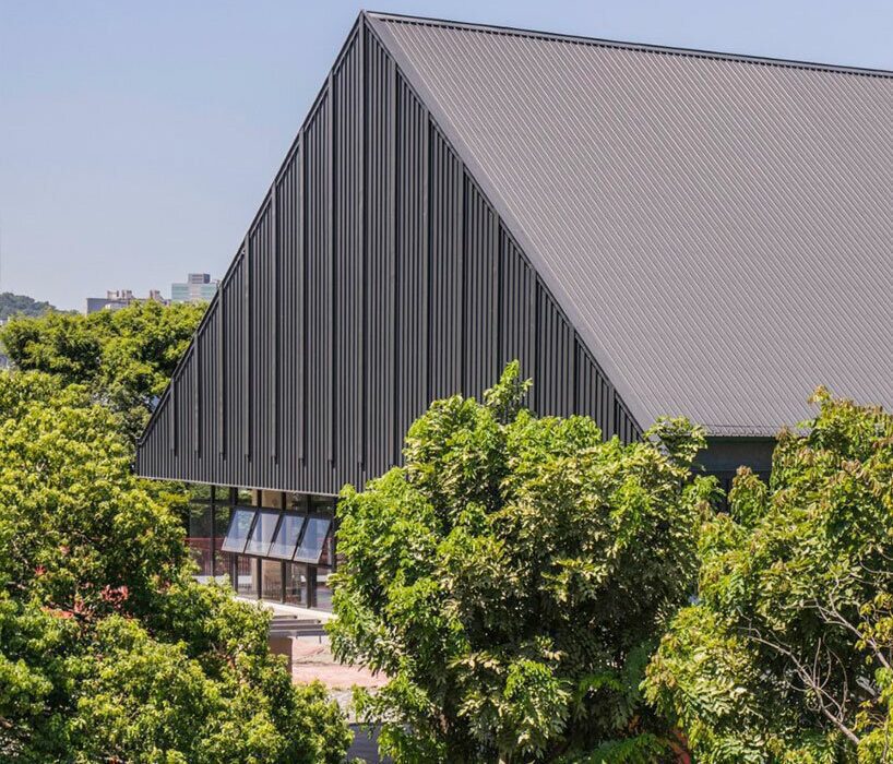
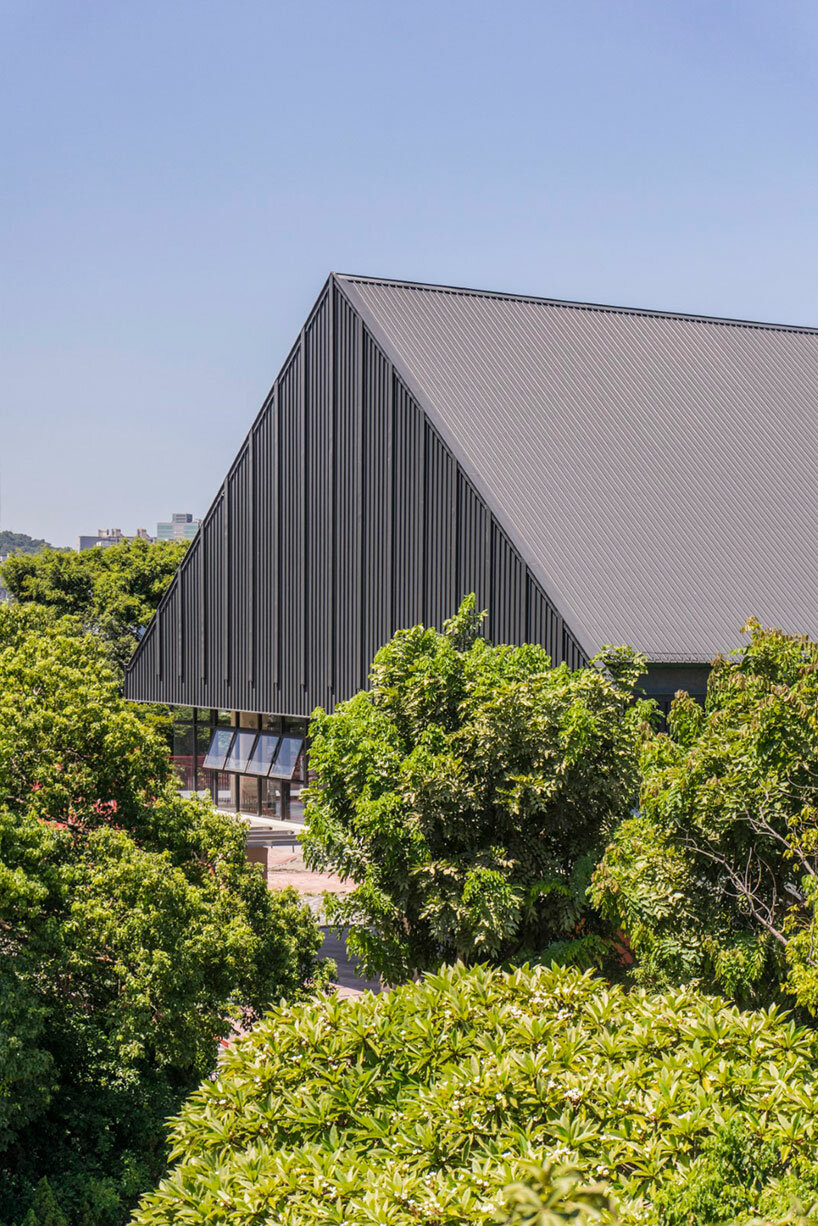
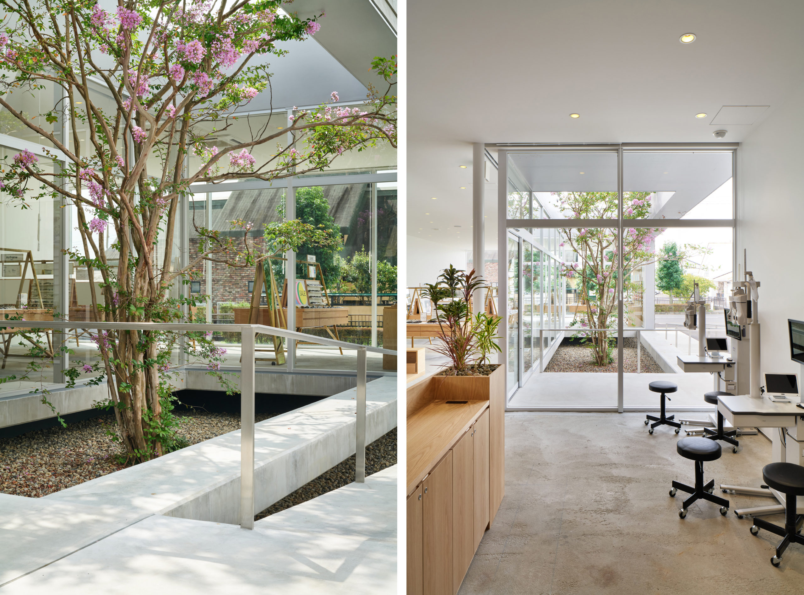 How to elevate a suburban box store into an intriguing and enjoyable space? This Japanese firm complicates the typical elongated rectangular in plan in several key way. First, the building appears to float thanks to a level difference, which helps it to stand out. Next, a small patio is carved into the front center of the building, not only enhancing the appearance from the outside, but also providing greenery on the interior, since the planted tree is visible from all sides of the commercial space. In this way a simple architectural design provides a rich presence for visitors.