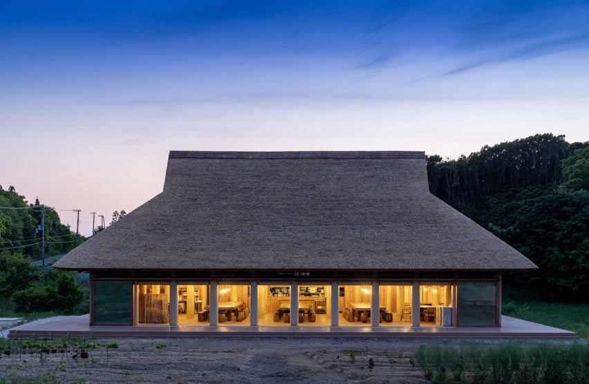
The Winners and Commended Entries of this year’s One Drawing Challenge, Architizer’s hugely popular architectural drawing competition, have been announced, showcasing the power of drawings to communicate complex ideas about the built environment.
Among 100 exceptional finalists, there were some standout examples of how drawings can be a medium for telling stories — not only about our built environment but also about our wider world. As illustrated by our entrants, an architectural drawing has the power to reveal new perspectives about the impact of architecture on society, communities and individual people.
In honor of this power, we’ve introduced a series of new, narrative-driven awards for this season’s One Drawing Challenge, called the “Storied Drawing Awards”. As selected by Architizer’s Editorial team, the authors of the following drawings each merit special attention for their creative approach to crafting images in response to a series of narrative prompts:
- Utopian Vision
- Dystopian Warning
- Fantasy Island
- Sci Fi Streetscape
- Sustainable City
- Political Narrative
- Climate Change Future
- Awe-Inspiring Atmosphere
And a further two, as defined by our entrants:
- Architectural Assemblage
- Impossible Space
Without further ado, explore the detailed and imaginative Winners of the 2022 Storied Drawing Awards, and get inspired for your own architectural sketches, paintings, models and beyond:
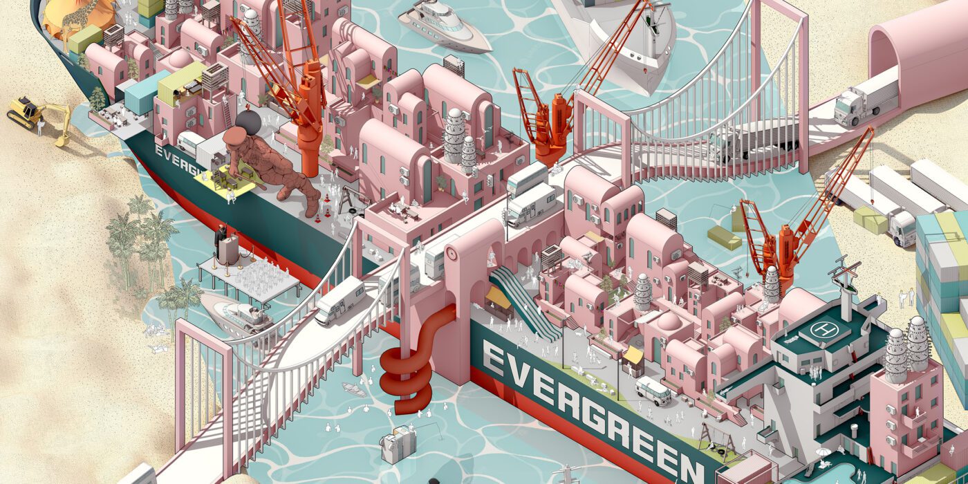
“Ever Given Ever After: Suez Canal Obstruction Rethought“
By Manuel Ragheb, ppp Architekten
Storied Drawing Theme: Political Narrative
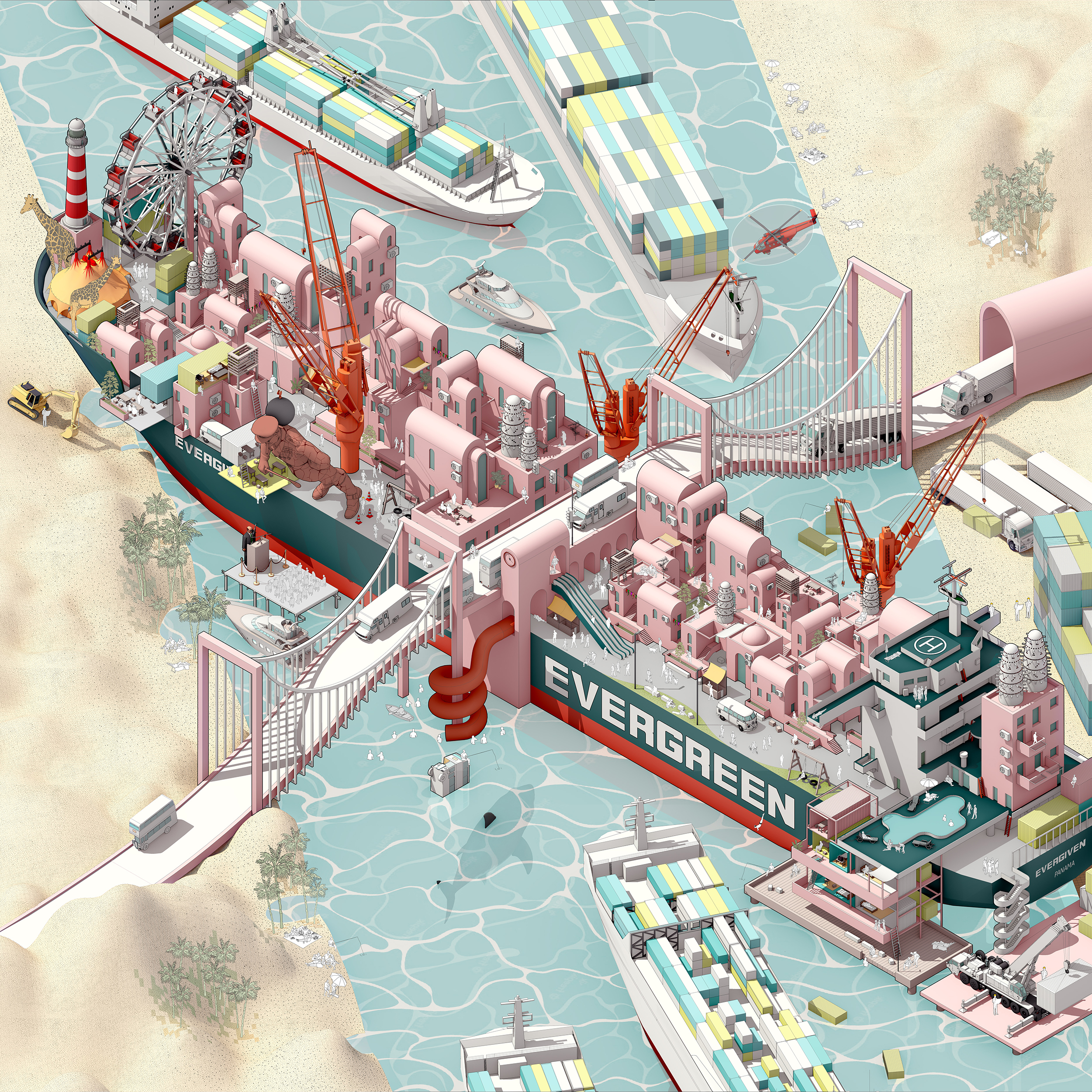 “In March 2021, an Evergreen container ship blocked the Suez Canal waterway for six days. In a scenario in which the ship had never managed to leave the canal, people in need of homes would have brought their lives aboard. While the Egyptian government has been dragging people out of their homes in Warraq and Sinai as development plans move forward, people are forced into poorly planned habitats that pay no real attention to people’s needs or their economic activities.
Not only are people entitled to the right to shelter, but also to one that guarantees a high life standard with consideration to the way people earn their livings. Urban development plans should target local inhabitants rather than investments that disregard the human factor. Only then, people can be part of a better urban future. The mural portrays people building their own homes on board the container ship.”
“Towards a New Venetian Landscape – An Inhabited Linear Infrastructure“
By Nicolas Coppieters and Gabin Sepulchre, Université Catholique de Louvain-la-Neuve
Storied Drawing Theme: Sustainable City
Detail
“Venice being one of the most famous city in the world, we are all aware of its biggest problems: the perpetual flooding and its exposure to mass tourism. But there is another considerable problem in Venice and its lagoon: an ecological crisis. During a year, we tried to find a solution to solve all its problems by creating an inhabited linear infrastructure.
Its foundations were created like a dam to control the “acqua alta” phenomenon, its first floor used for the new seaweed production, and the upper floors to welcome workers and Venetians fleeing their overcrowded city. We reviewed a lot of ancient linear cities to create a new ecological one (in its conception and purpose). We tried to find the right balance between industrialization and human happiness. Our handmade drawing, summarizing a full year of work, was made with the Pointillism technique and was 1788mm x 841mm.”
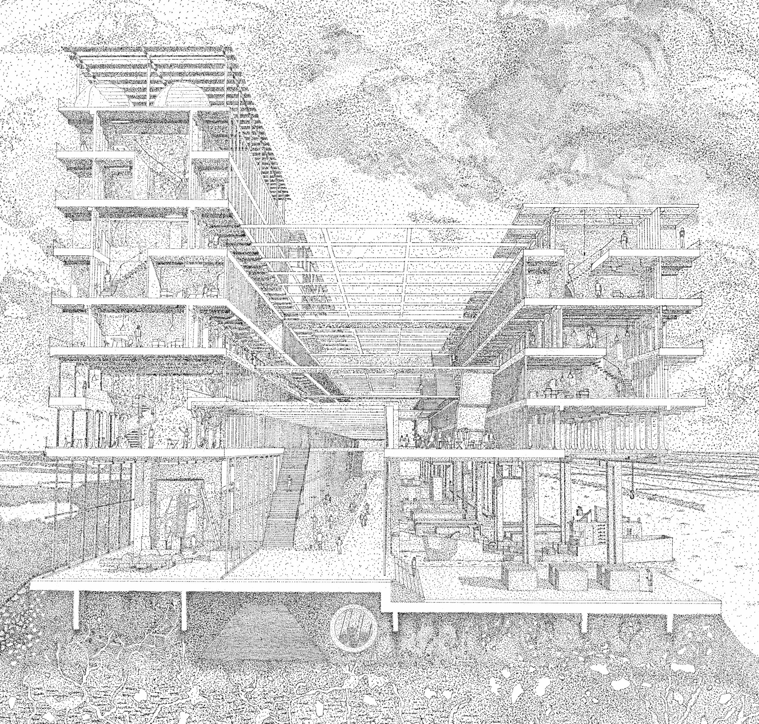
“Labyrinth”
By Eric Pham, University of Texas at Arlington
Storied Drawing Theme: Fantasy Island
Detail
“This piece recounts a childhood memory of playing video games without being able to understand English. It recalls not being able to read directions, being locked from progressing, and yet never feeling frustrated. Instead, simply playing games deprived of narrative context, viewing them purely as representations of spatial conditions. In the same way, this piece was made entirely in the video game Minecraft, a game that defined a generation by acting as virtual legos. Any child with a copy of this world can explore in an intuitive first-person experience. It is architecture without language.”
“Mycelium Modularity”
By Dustin Wang, Young Guns Studio
Storied Drawing Theme: Climate Change Future
 “This drawing illustrates a forest that has been populated with housing pods made out of mycelium, conceptualizing the utilization of this material in modular architecture.
Mycelium, a natural fungi found in forests, can form rigid, water-resistant structures when molded and grown. Possessing a flexible form, this allows for the creation of these pods around trees and hills – existing in harmony with nature, rather than replacing it. The resulting effect are teardrop-like structures, differing in shape as each is hand-built.
In this scene, pollution is the origin of the hazy, grey sky. With plastic and waste reduction having become an everlasting consequence, mycelium is used in this small community of hopeful outliers, being a last ditch effort to slow down the deep-rooted repercussions of the changing climate.
In an inevitable future where the natural lives in the artificial, the increased awareness of the benefits of mycelium, will aid in revitalization.”
“URBAN NET”
By Alena Dolzhikova, A4 Studio
Storied Drawing Theme: Sci Fi Streetscape
 “The drawing is a vision of a future city based on the building project design of the A4 Studio.
What if the Architecture we build today would be able to proceed developing into entwined bodies, uniting buildings of the past with future forms? What if buildings could be inhabited with a living organism that flourishes into new forms while adapting to the shape of available structure? What if the livable organism constructing future environment turns the building into so-called a neuron cell?
It would contain all the valuable information, DNA of a particular building. The city organism consisting of cells would create connections — bridges between each other, for a mutual exchange of information. Some their bridges will be thicker, some thinner — depends on the amount of information transporting trough it. The overall connections create an URBAN NET — final but never ending evolving version of the future city.”
“Threshold”
By Kenan Pence and Deniz Calisir Pence, Kenan Pence / Design Office
Storied Drawing Theme: Dystopian Warning
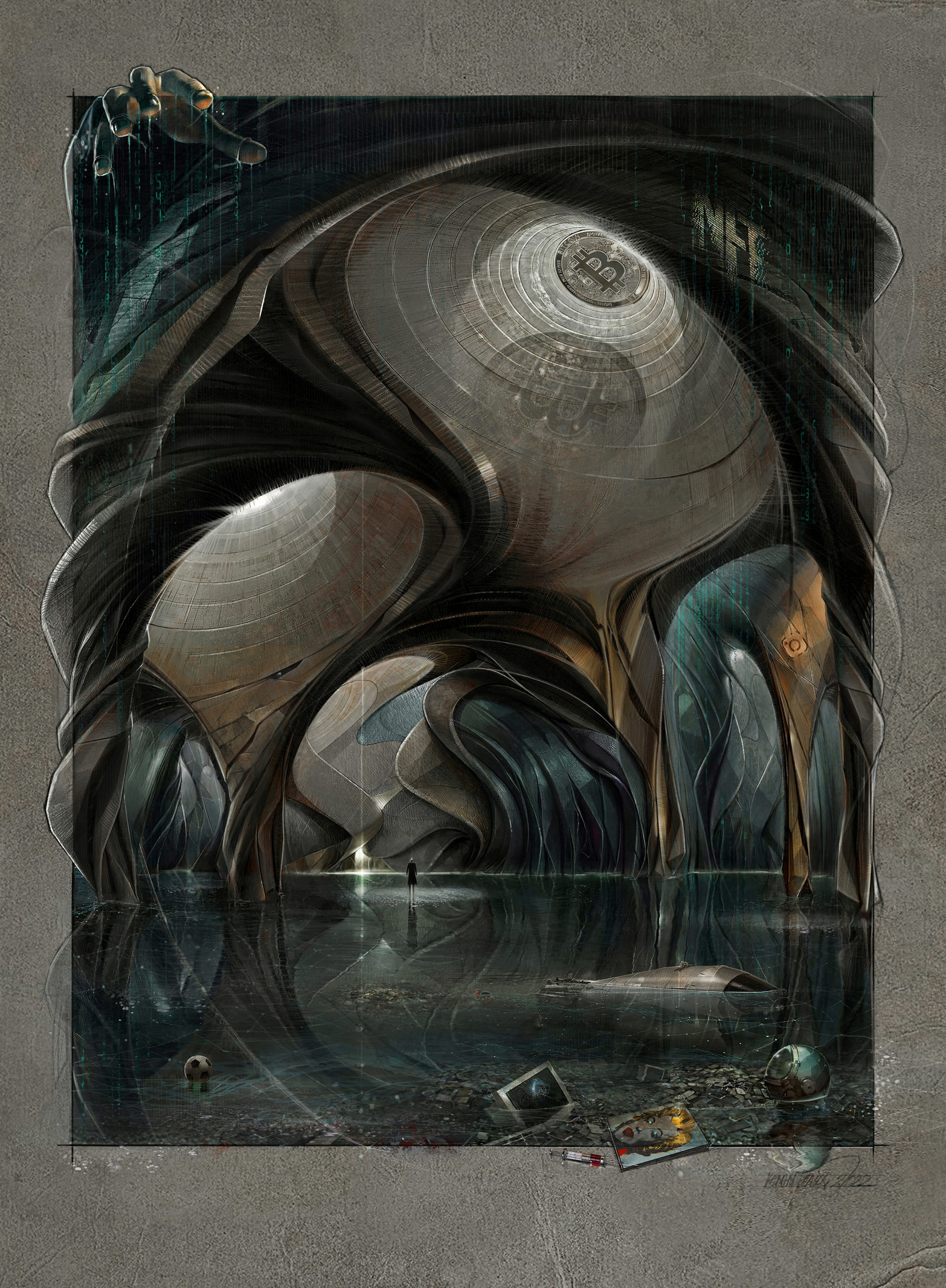 “Threshold: The focal point of the picture is a human standing on the water’s surface, facing the light (referring to the Truth) diffusing from a cracked wall in an uncanny cave. The philosophy of art and visual arts questioning the “reality” and “illusion” frequently refers to Platon’s “the allegory of Cave”. The picture uses a cave metaphor as well as a “the allegory of uterus” referring to the human’s first home which is conceptualized by the curvilinear forms.
In this context, space means “existence”. The picture merges both metaphors to create a conceptual architectural space representing a contemporary critical interpretation. The cave symbolized by the architectural space of the picture has metaphoric shadows that represent illusions built by power. The human at the threshold is left systematically created chaos behind in need of finding new hope.”
“Architecture of Insecurity”
By Seungho Park
Storied Drawing Theme: Architectural Assemblage
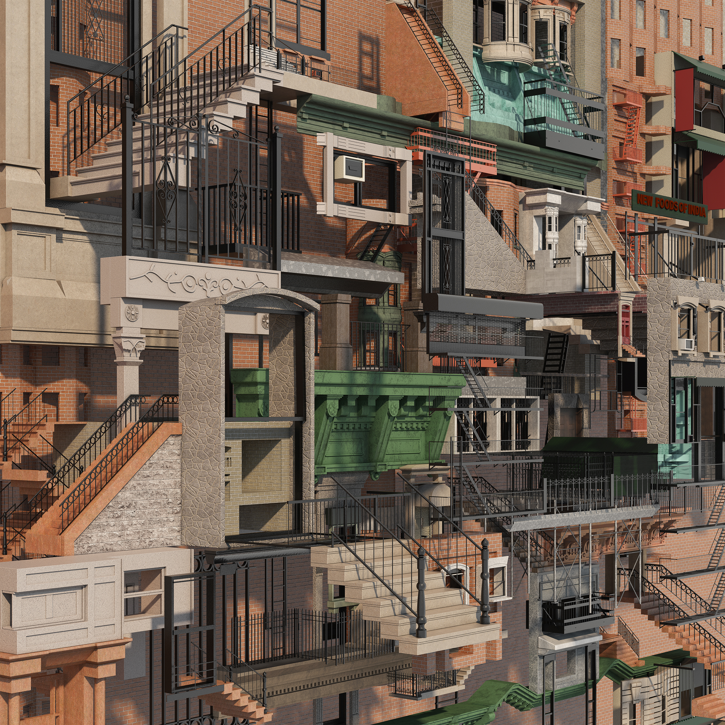 “During its rapid growth in the late 1800s, New York City formed most of its current modern city fabric. As a city of immigrants with its own cultural insecurity, New York borrowed the architectural style of its diverse ancestral European roots in an attempt to create a historic urban context. This European influence, combined with the advancing construction technology and socioeconomic factors of the time, forged a unique architectural environment. Architectural elements of different origin, whether ornamental or functional, were melded into New York’s building facades; architectural manifestation of “insecurity”.
The drawing mimics and exaggerates the architectural evolution of the city by displacing and fragmenting the buildings and architectural elements from their origin and context. Does the reassembly of the architectural fragments give us an extreme New York City? Through assemblage and abstraction, what can architects learn from it?”
“More Was More”
By Gregory Klosowski, Pappageorge Haymes Partners
Storied Drawing Theme: Utopian Vision
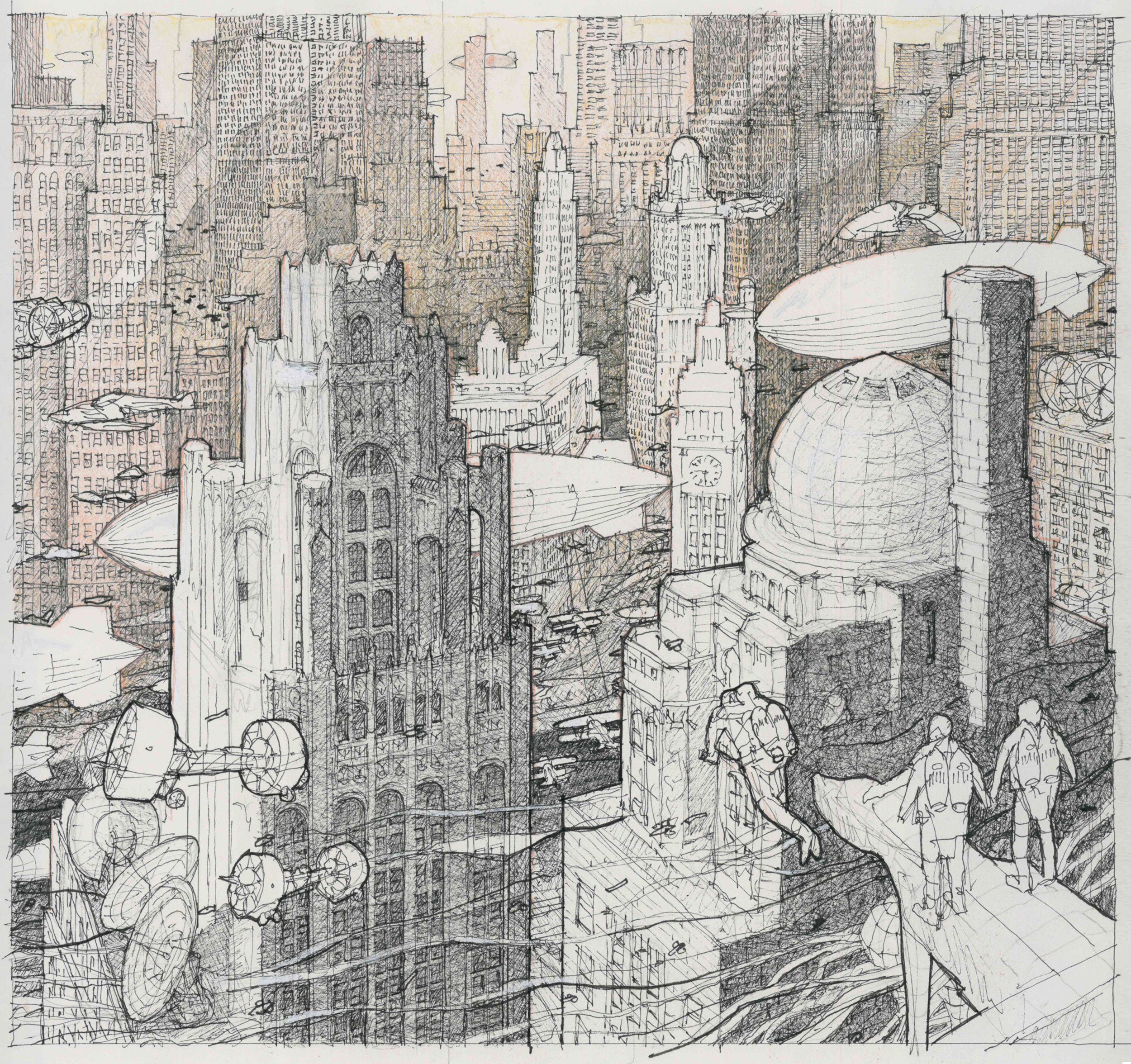 “This drawing imagines an alternate reality and economic reverie where the Great Depression never happened, a need for stripped to the basics skyscrapers averted, and the stylistic impressions of the era continued to roar for decades onward. This depicts a parallel Chicago, devoid of modernist glassy structures. A staggered stone skyline is a hazy backdrop to airships hovering at startlingly low altitudes.
Flight mechanisms with robotic precision, advanced echolocation, exact three dimensional positioning, and miniaturized drones allow for all manners of ability to defy gravity…affording anyone the ability to gracefully, and accurately, fly within the glowing limestone canyons. The drawing is rendered in ink pen and colored pencil with a warmth and technique characteristic of, and inspired by, period watercolor renderings.”
“Lost to the City”
By Alex Hoagland, Boston Architectural College
Storied Drawing Theme: Awe-Inspiring Atmosphere
 “Depicted is a city that has yet to exist, one where passion, freedom and love fill the towers that rise above, an example of the pleasures art can bring, the idea that like people buildings represent individualism. What is depicted in drawing is a world where art, math and science become the forefront of the built environment and humans are able to liberate themselves from the natural world.
In this city scape the understanding of raw emotion and how that correlates too the work we as humans produce and environment we surround ourselves with is the key to understanding the longevity of our own mentality and livelihood. This cityscape represents the separation between ones self and the greater good of the others around, it signifies a liberation of the human conscious.”
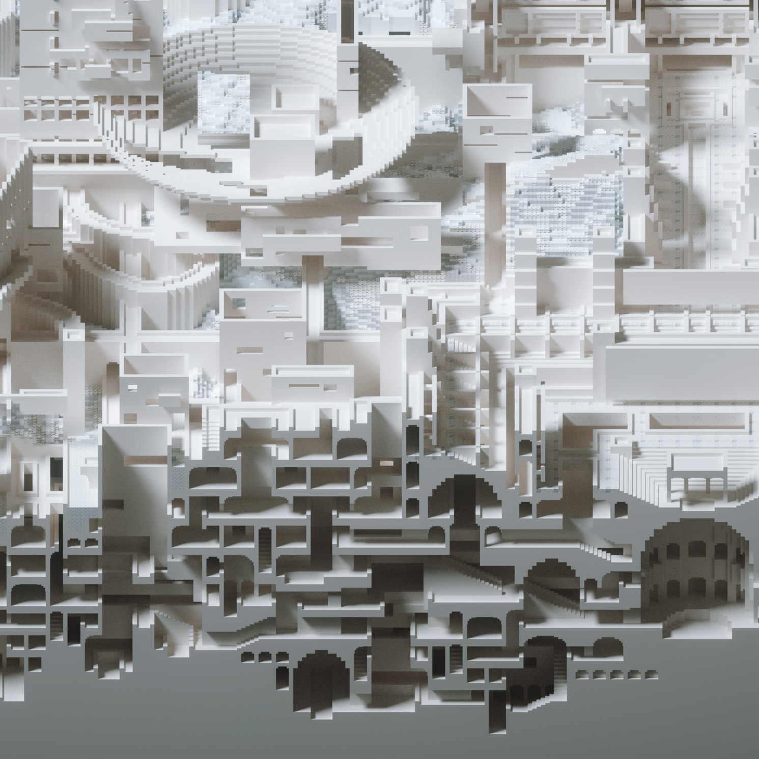
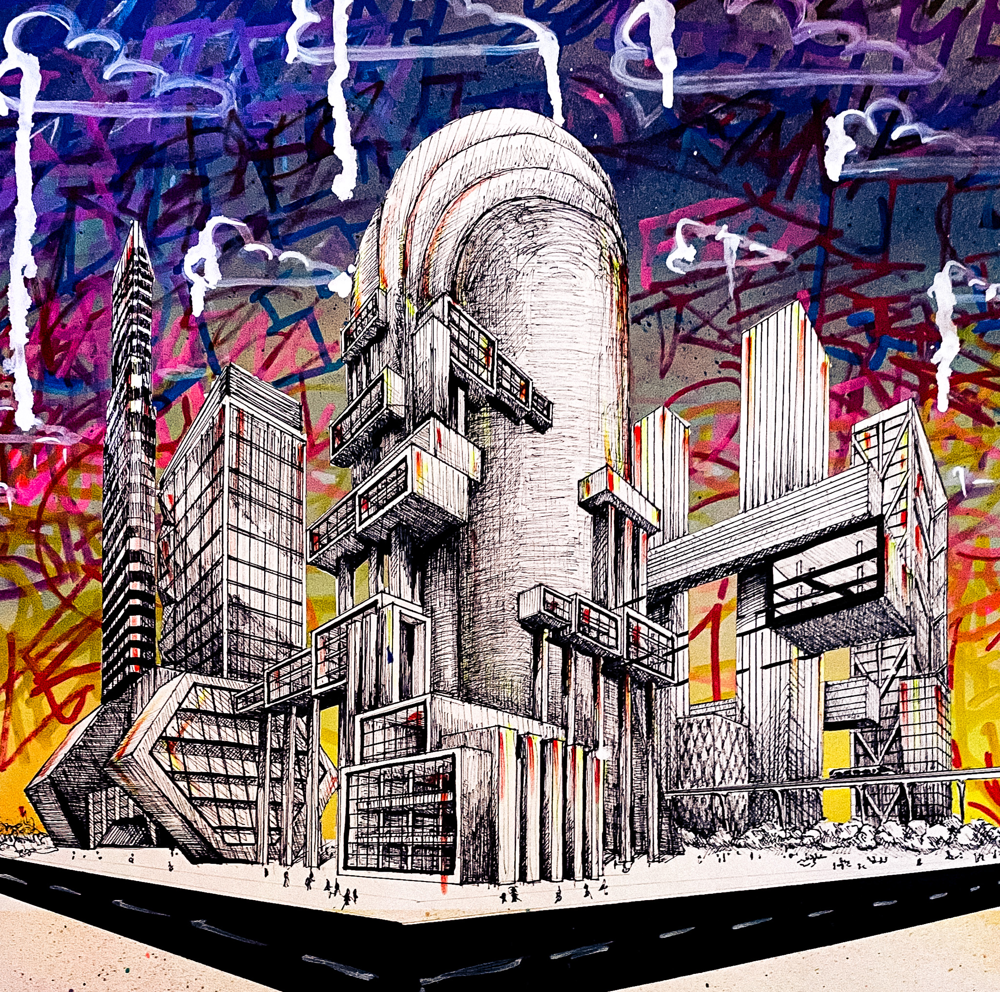
“The Red-Wall Maze”
By Dong Fu, Zephyr(US) Architects P.C.
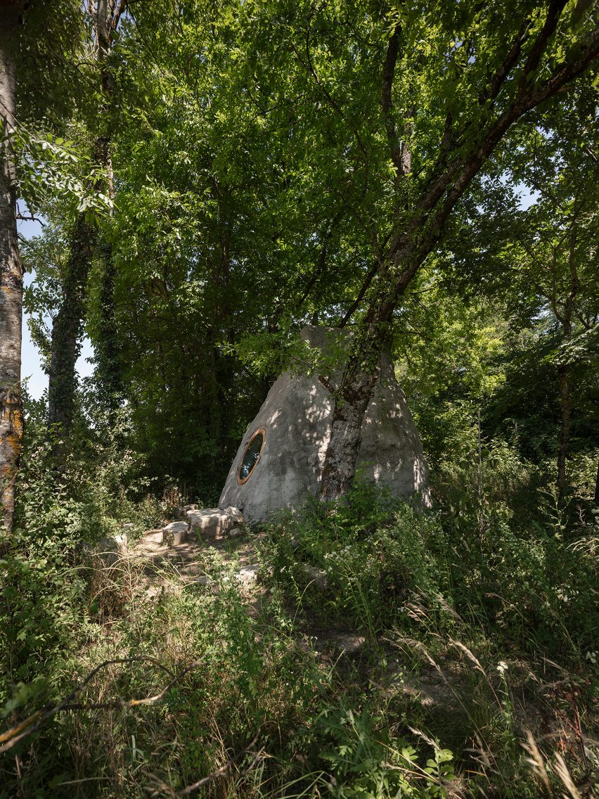
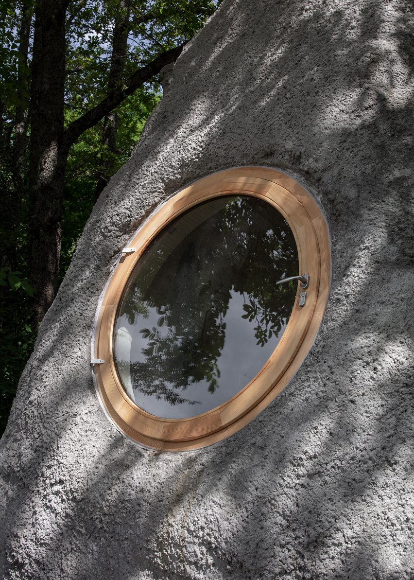
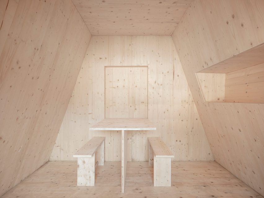
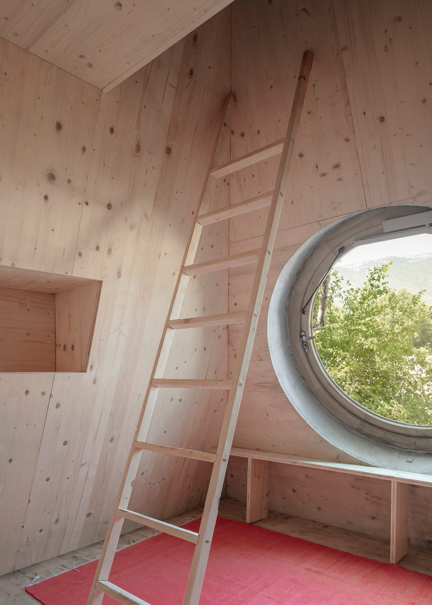
Storied Drawing Theme: Impossible Space
 “Stair mazes will always be dynamic structures for the human spatial experience. Humans have the instinct to create infinite space through limited materials so that a certain relationship can be formed between limited life and the infinite universe. Stairs are important elements of a maze — connecting different heights and circulating up and down. The winding pink staircases, the main subject of this drawing, give the building a very large number of possible paths, forming a complex labyrinth.
At the same time, I utilized Escher’s impossible space in such a way that the upper part of the drawing is a space facing up, and the lower part faces down. In this way, at the shared edge of the two spaces, a person needs to make a 90-degree rotation of the body to complete the crossing between the two parts, similar to scenes of the movie “Inception.””
Congratulations to our 2022 Storied Drawing Award Winners! As the art of architectural representation continues to evolve, so will our competitions and awards programs, in order to accurately reflect the incredible ability of architects, designers and creative people to communicate complex ideas about the built environment. Sign up for our newsletter in order to be notified when our next evolution is announced, with bigger, bolder opportunities set to emerge in 2023:
Register for the Architizer Newsletter
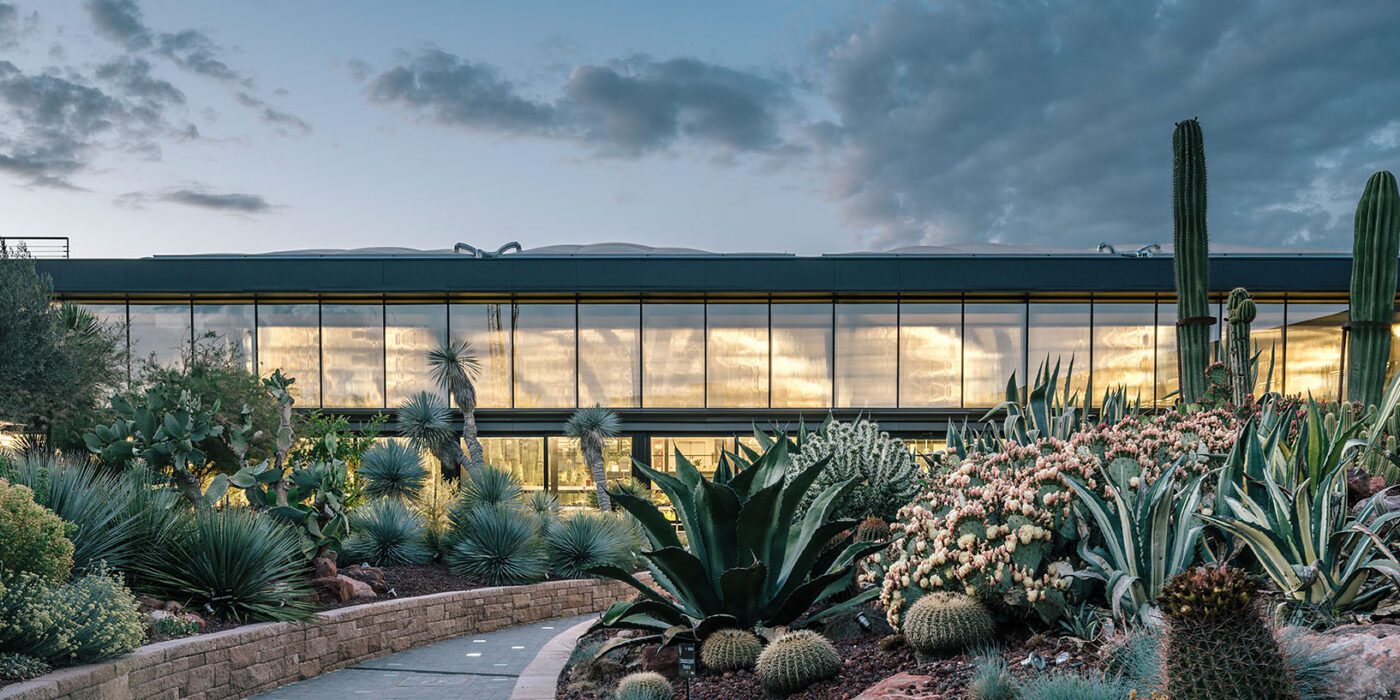
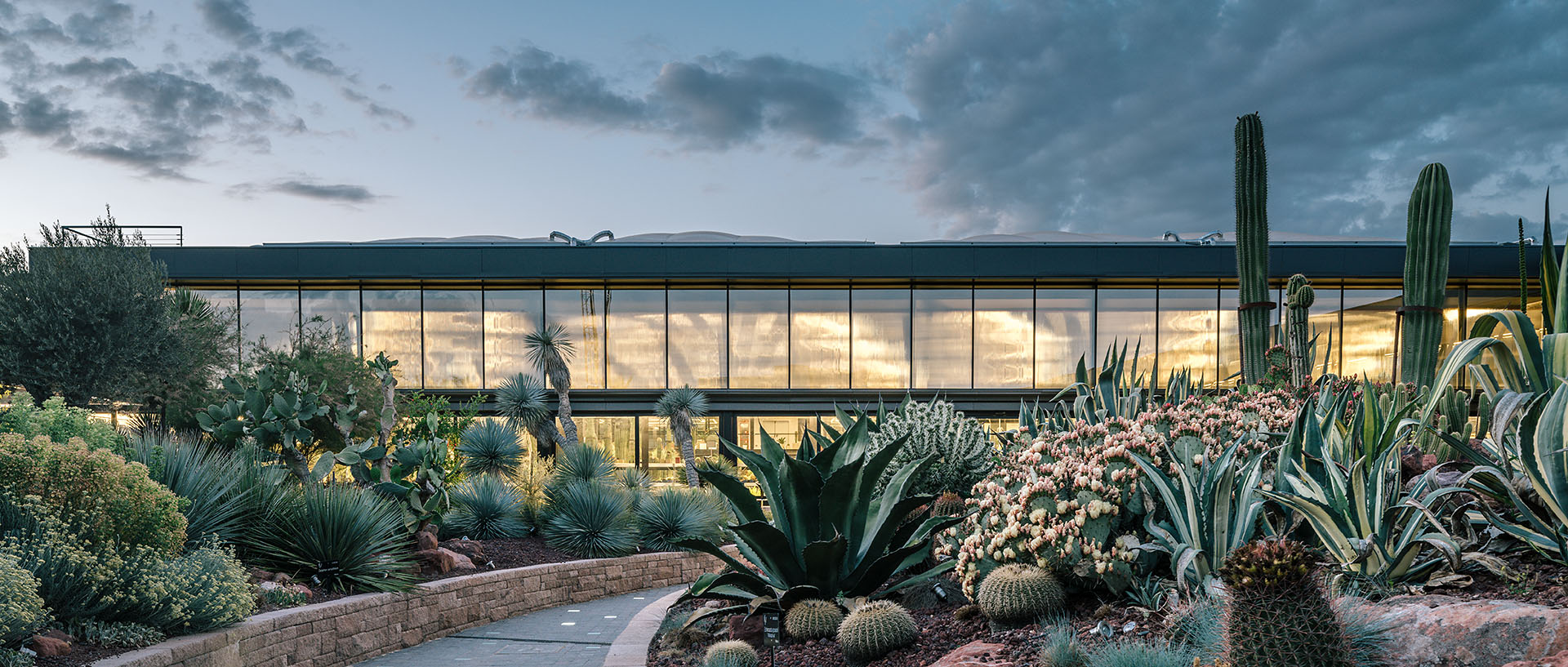
 Sited in San Sebastián de los Reyes, GGA’s soaring cactus complex is an infrastructural design between highway and forest, harboring a “twin oasis for cactus exhibiting and growth” with a mixed eco-cultural program. The project showcases sustainable and ecological approaches alongside educational spaces. At Desert City‘s heart is a large garden and greenhouse that house a range of leisure activities and presentations to small conventions, workshops and exhibitions.
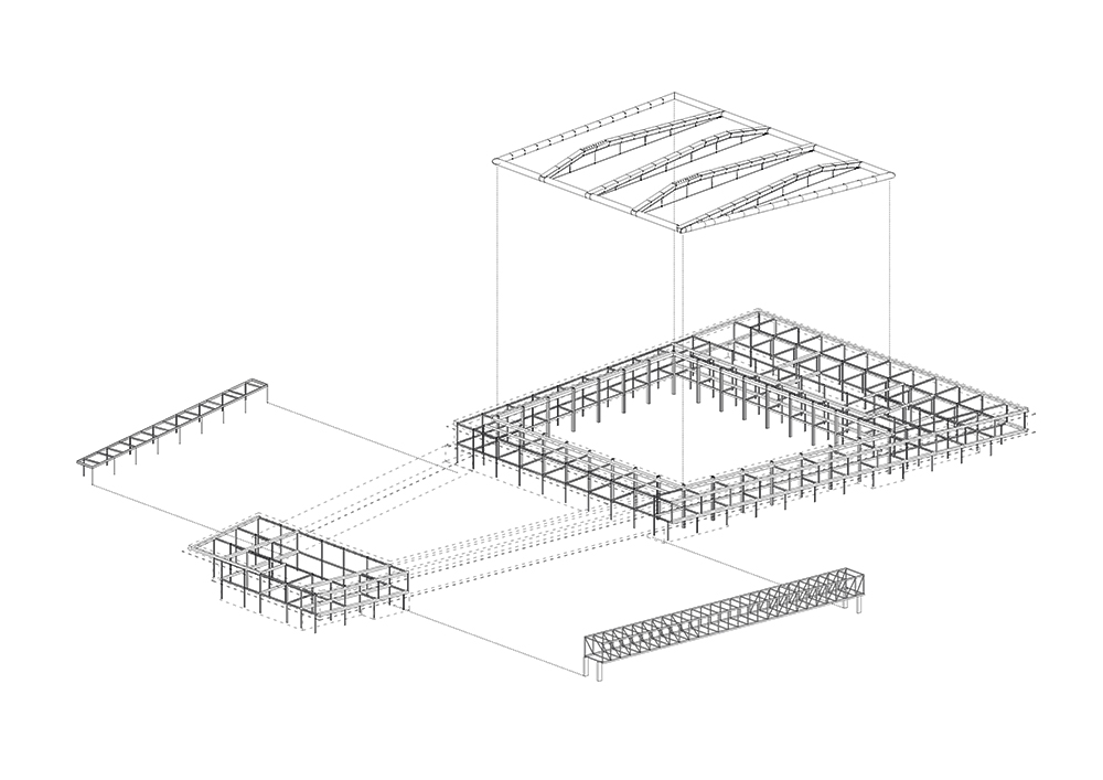 GGA designed the project alongside builder Isolux Corsán, as well as structural engineer Felipe F. Sanz and the greenhouse roof engineer Arenas Ingenieros. Together, they created a cloister-like cactus garden and a cable roof inspired by tensegrity structures for a “billboard-building” alongside the highway. As architect Eduardo Prieto noted, the design features a “powerful steel bridge that extends 40 meters above the cacti, its span constituting the most spectacular moment of the building. The bridge synthesizes the building’s main argument: the image of a machine hovering over the garden to produce a picturesque, if not Surrealist, contrast between opposing geometries.”
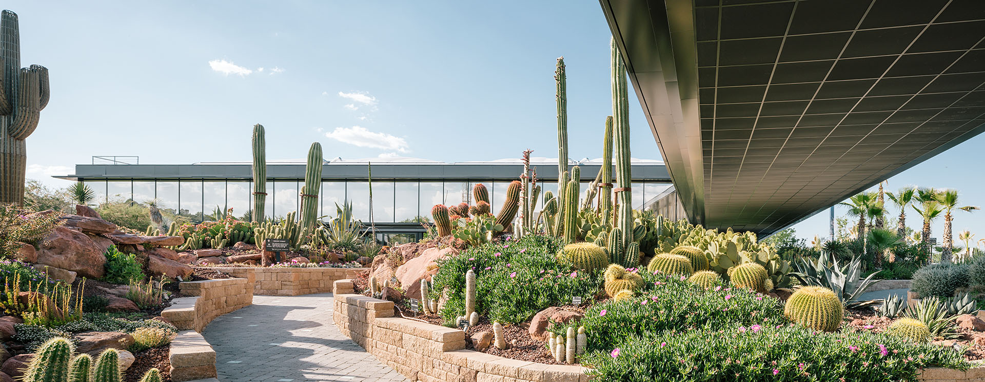
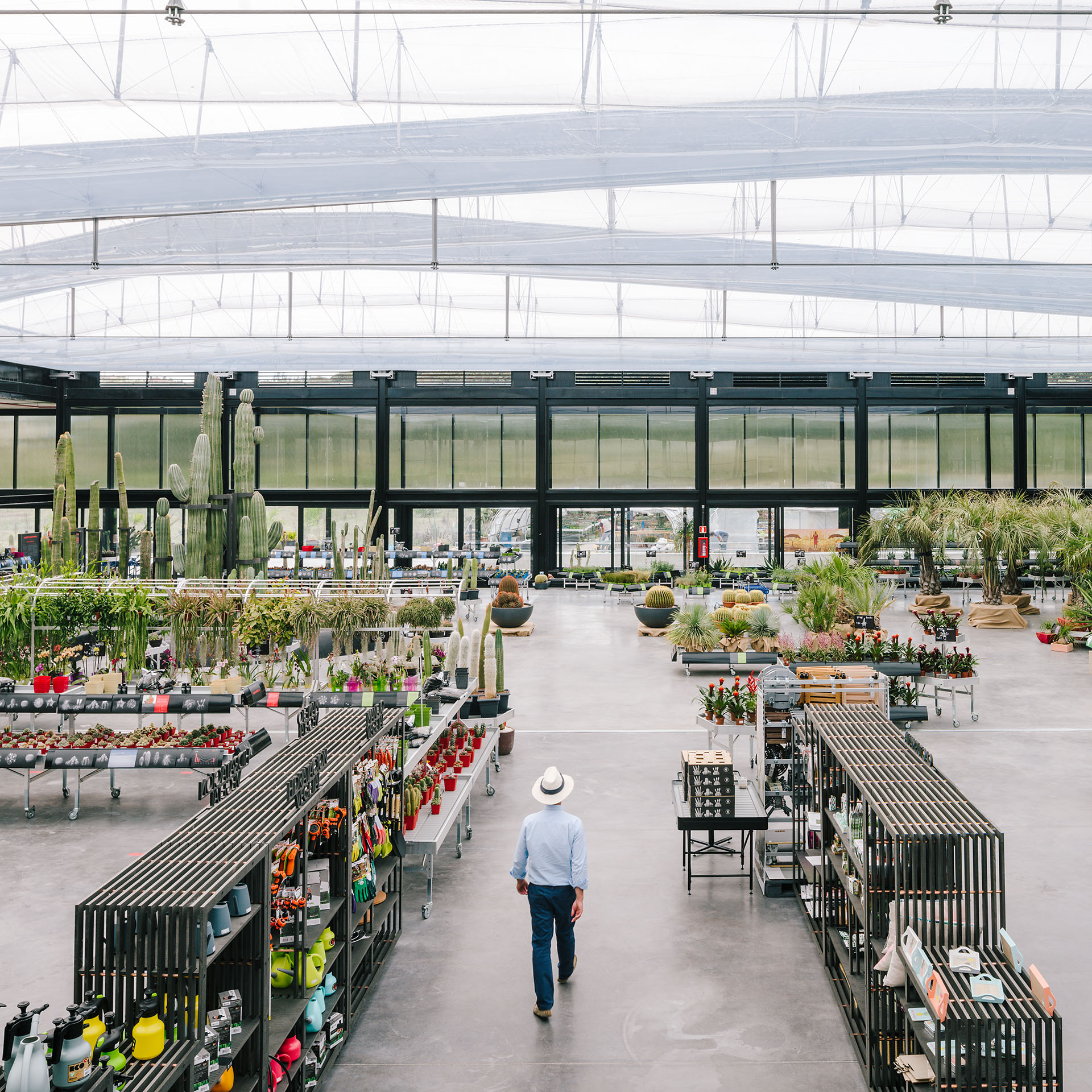
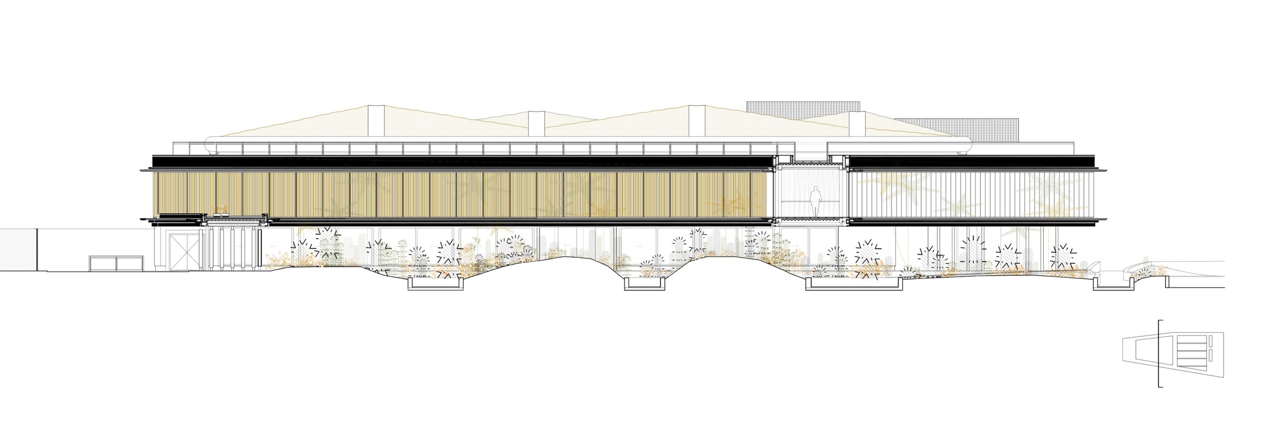 Desert City is a large complex that includes an exhibition and sales space, as well as a restaurant, shop, storage, and office areas. It is organized internally by a sequence of symmetries around the cactus garden, which receives newcomers, and the greenhouse space. As the team notes, despite its hybrid program, the complex’s construction is systematized through repetition, modulation and prefabrication of elements.
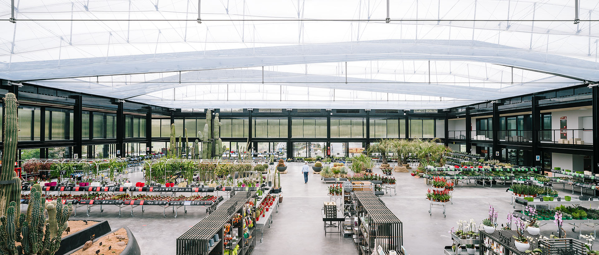
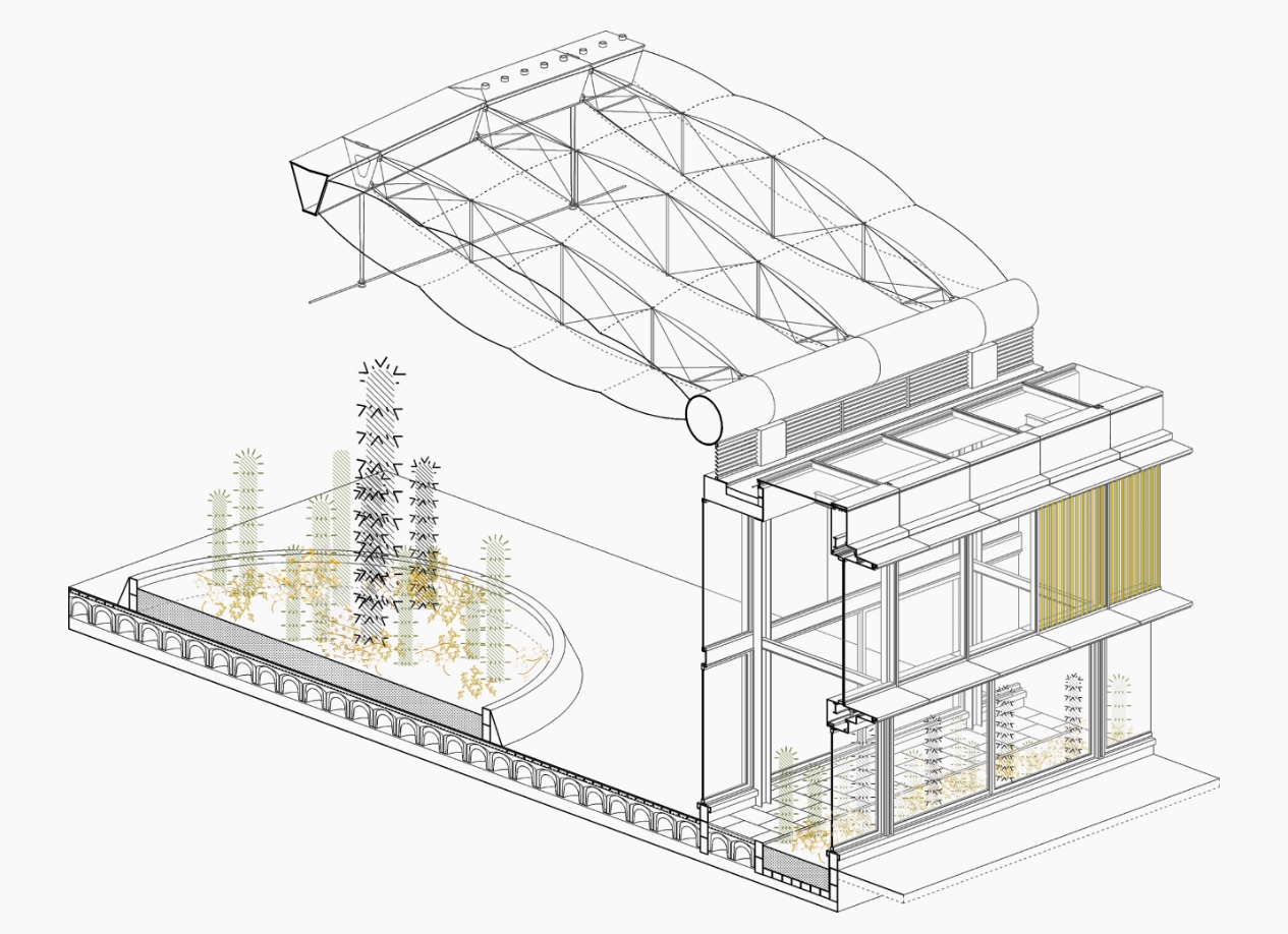 The structure takes on the form of a huge, abstract and stretched out skeleton. The idea was for the building to communicate its inner workings and the veiled presence of greenery as seen from the passing car through a tinted, watery glass façade. As the team explains, the architecture incorporates sustainable solutions such as transparent photovoltaic glass, geothermal power, water recovery systems, solar controls, and extensive plantings in the site, which was originally a wasteland.
 Overall, the project was designed to overlap activities that range from the exhibiting, growing and breeding of cactus from around the globe. As GGA stated, the overlapping of apparently excluding situations, such as “commercial exploitation of leisure events vs. exemplary “green” business; building as sole infrastructure vs. atmospheric and “soft” finishes; size vs. fragility; and oasis by the highway” created a new opportunity. It also includes a significant commitment to R&D, undertaken in collaboration with international universities.
 An interplay between light, structure and cacti, Desert City embodies a highly refined and well-executed approach. The building has become a filter between the harsh infrastructural condition of the highway and the limit of the huge green pocket formed by the Parque Regional de la Cuenca Alta del Manzanares on the other side. In turn, it showcases how architecture can be inspired by nature while being created for and with it.
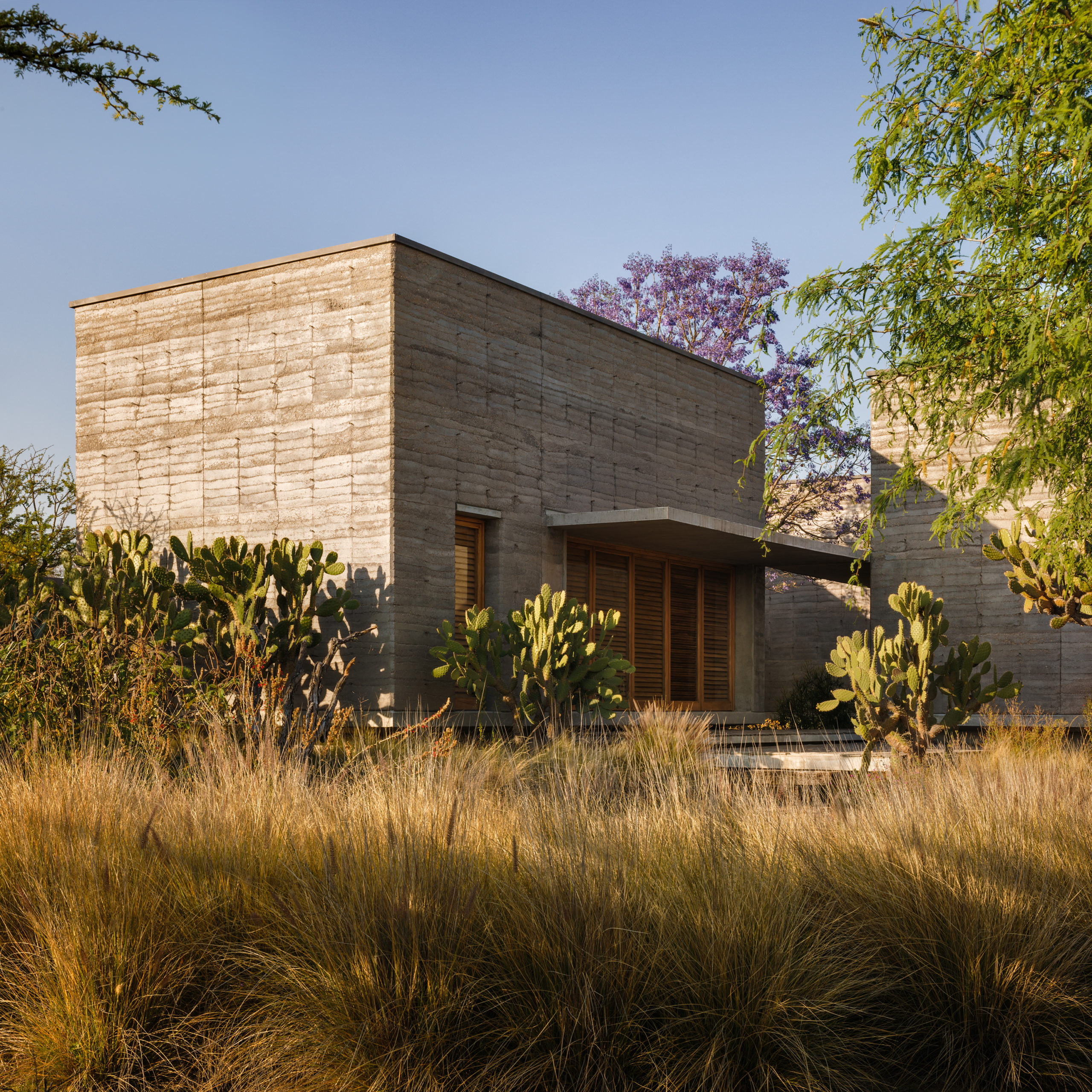
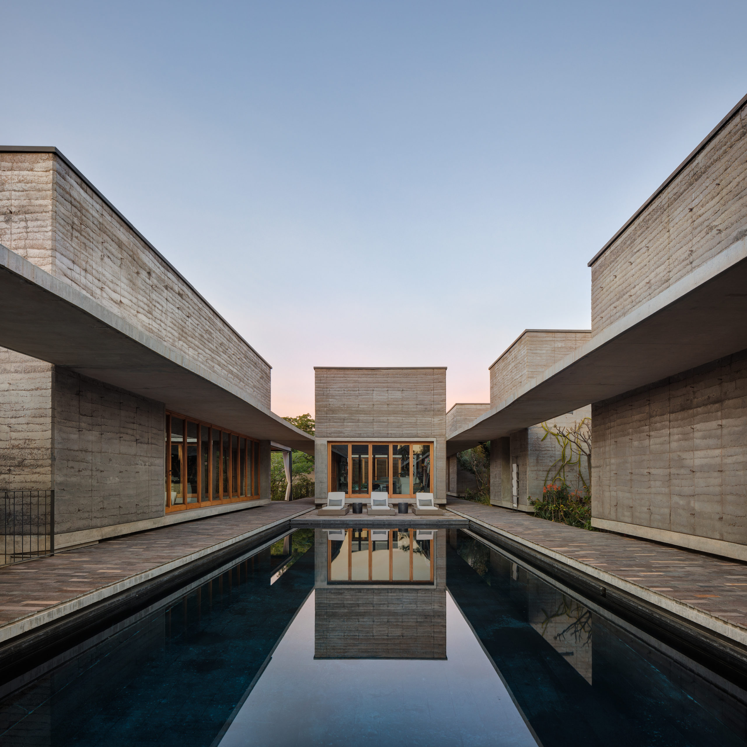
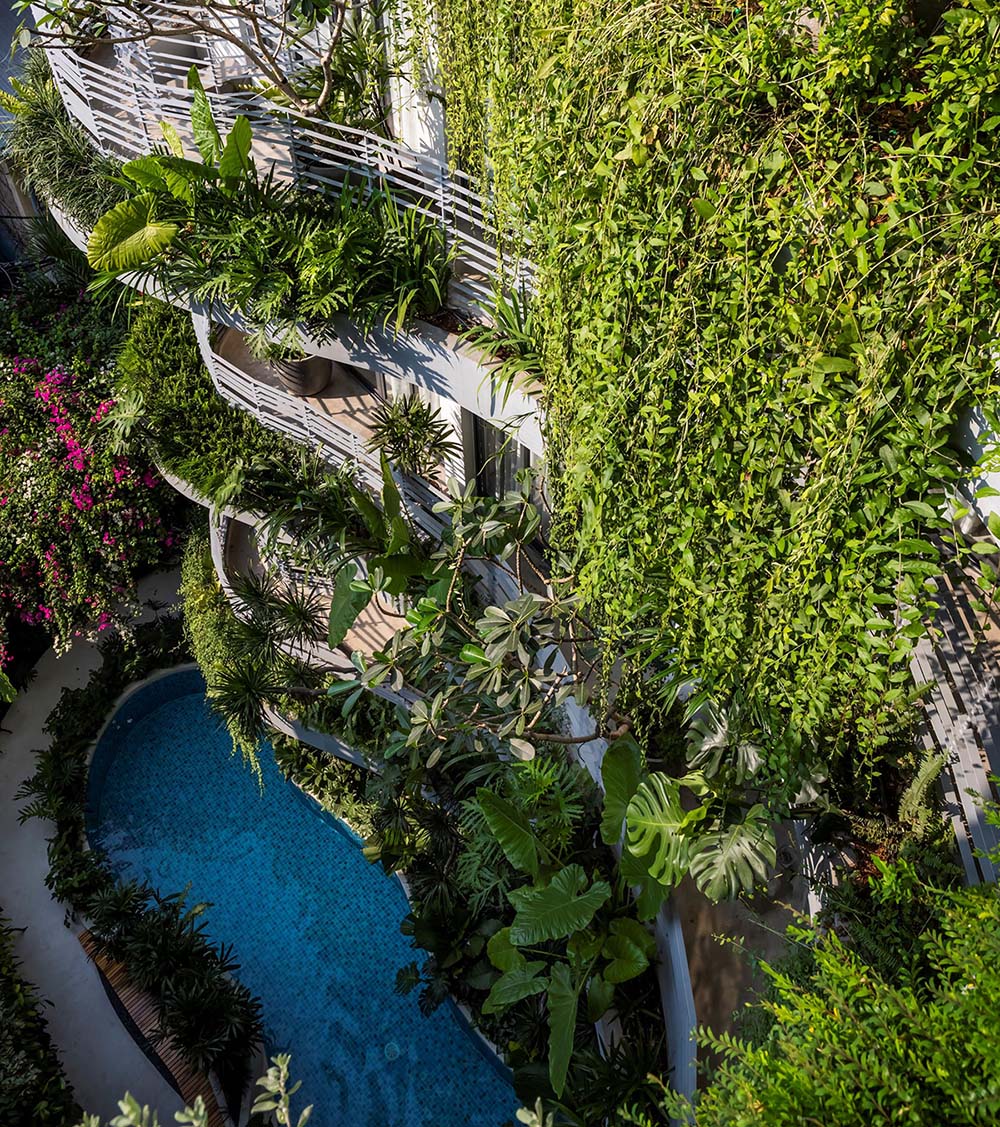
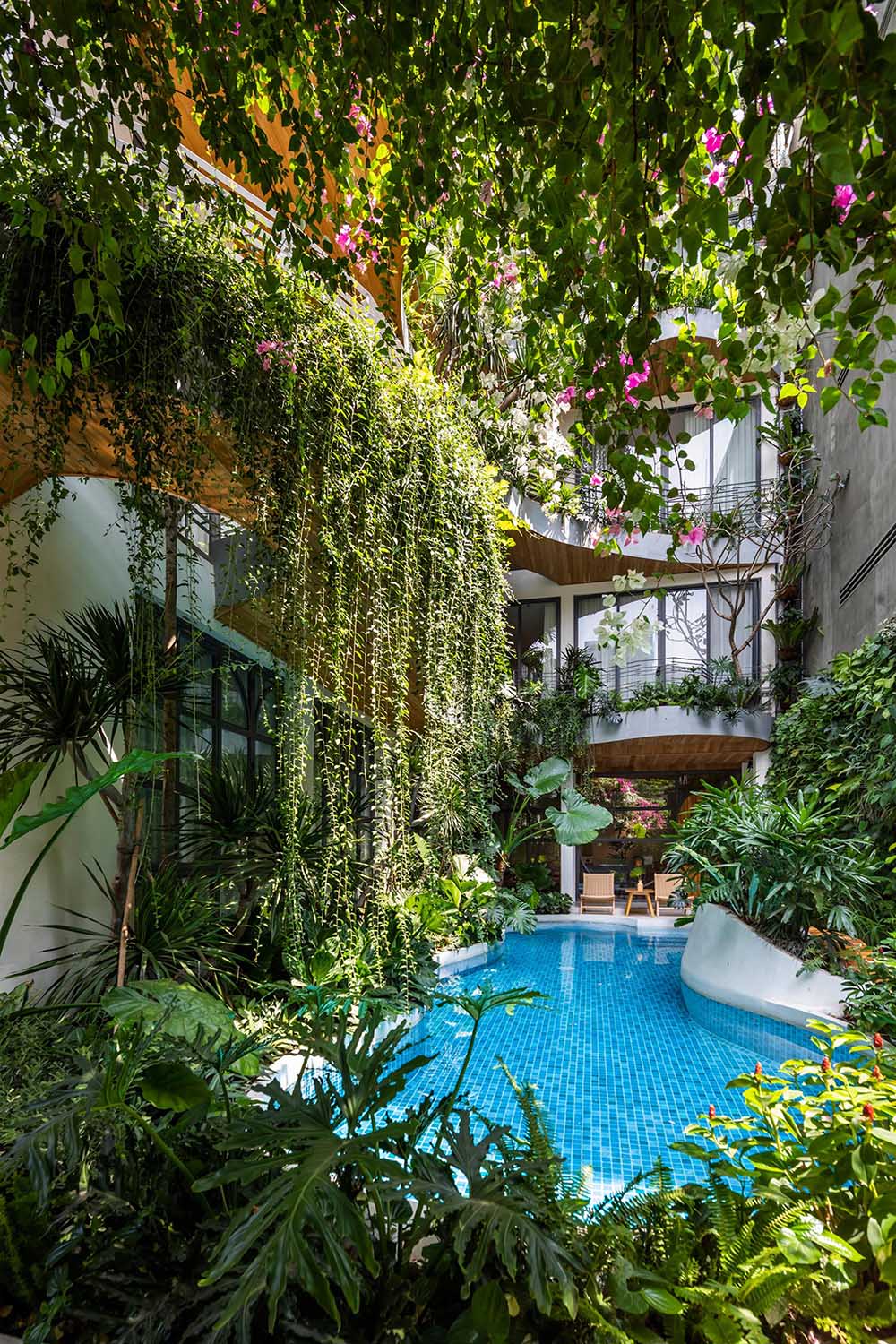
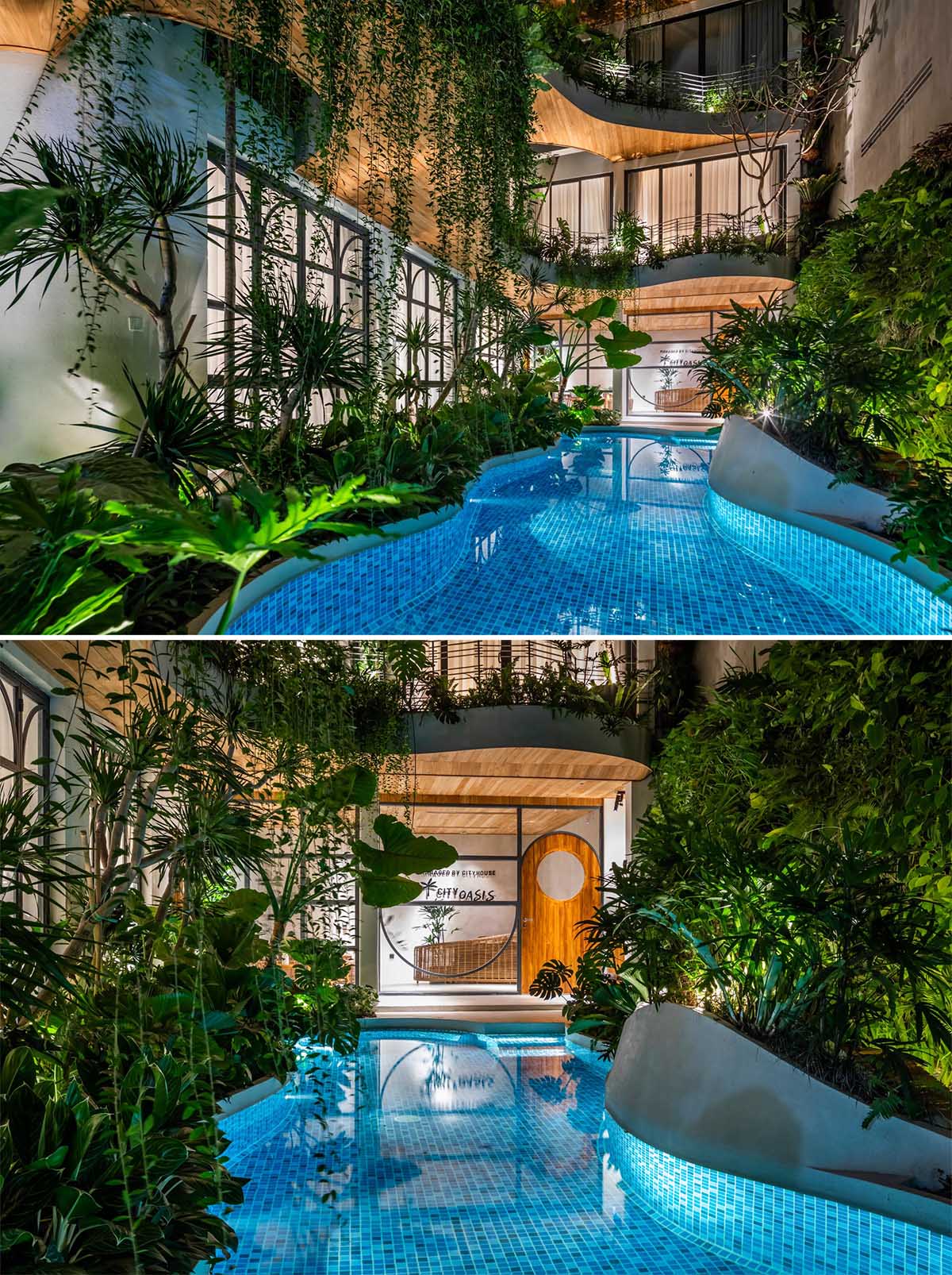
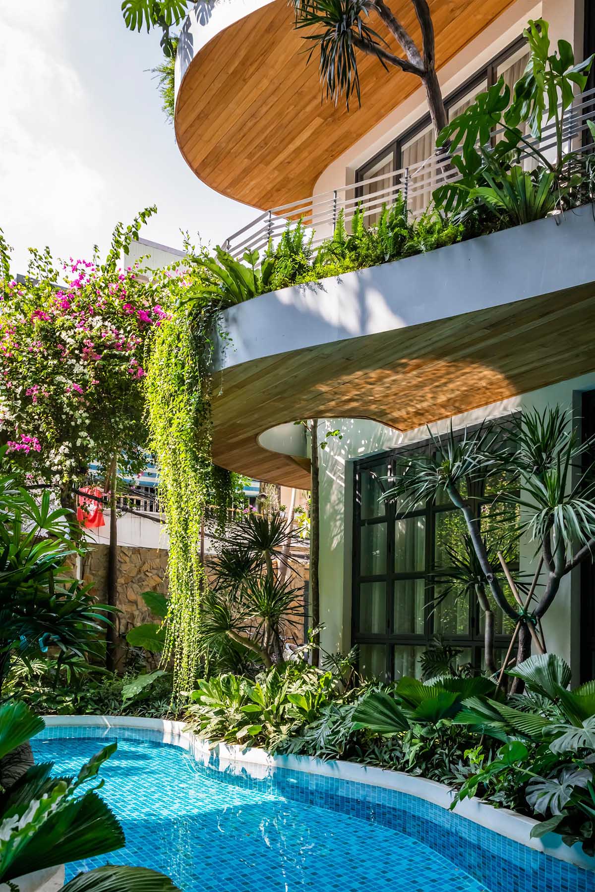
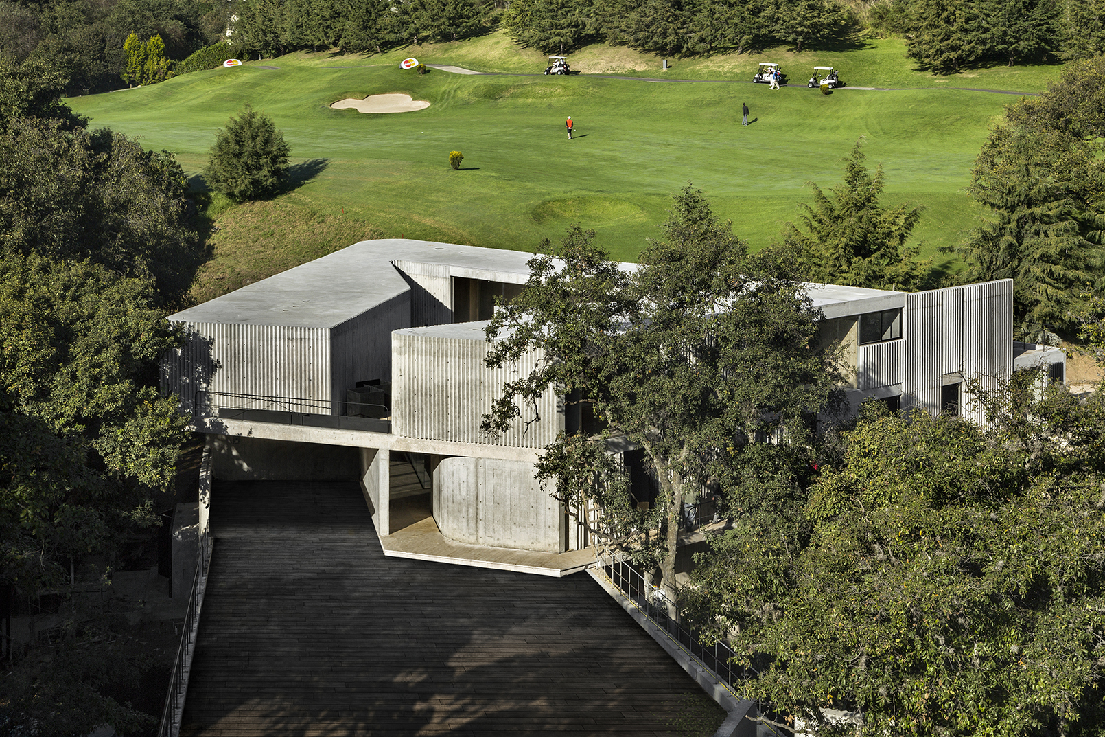
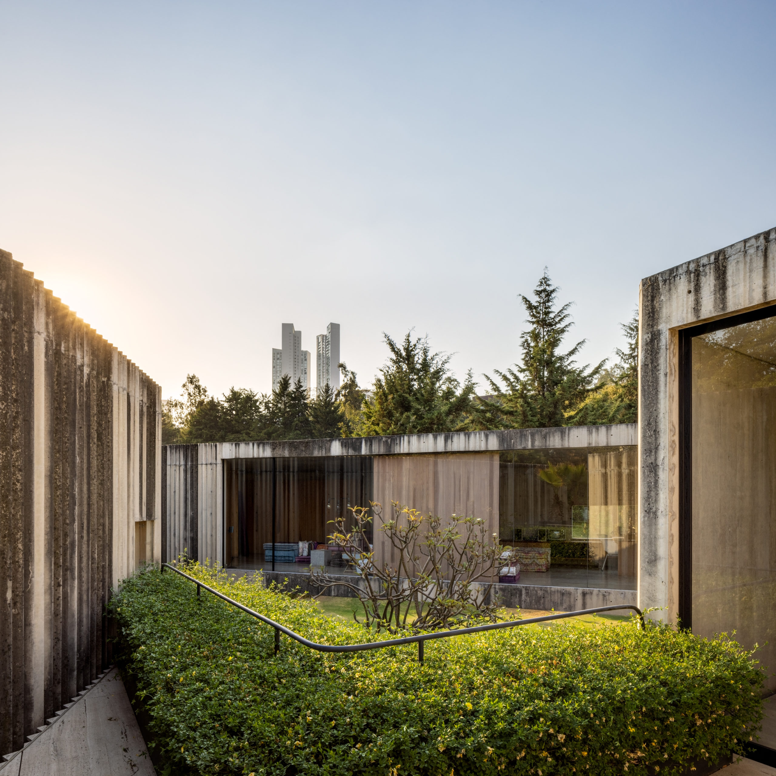
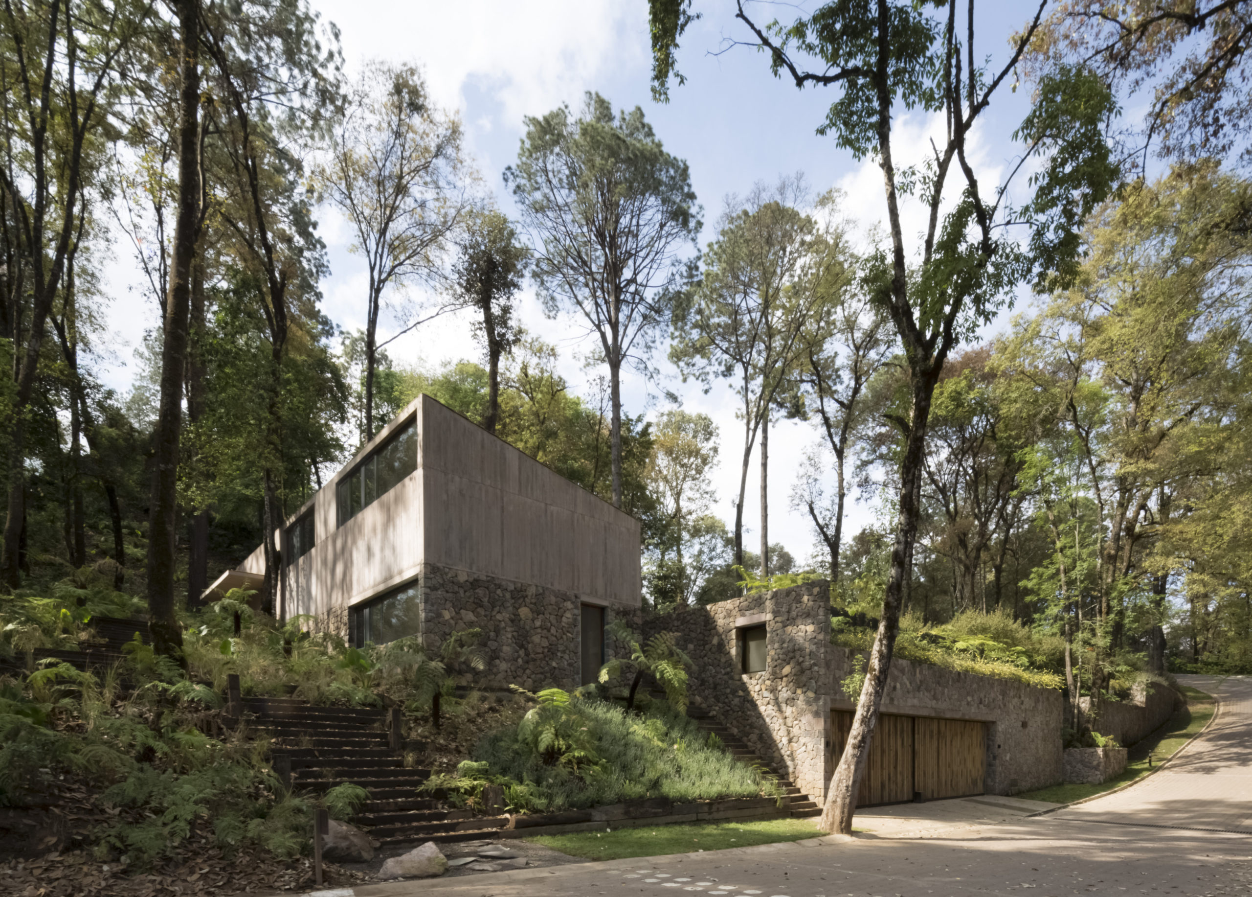
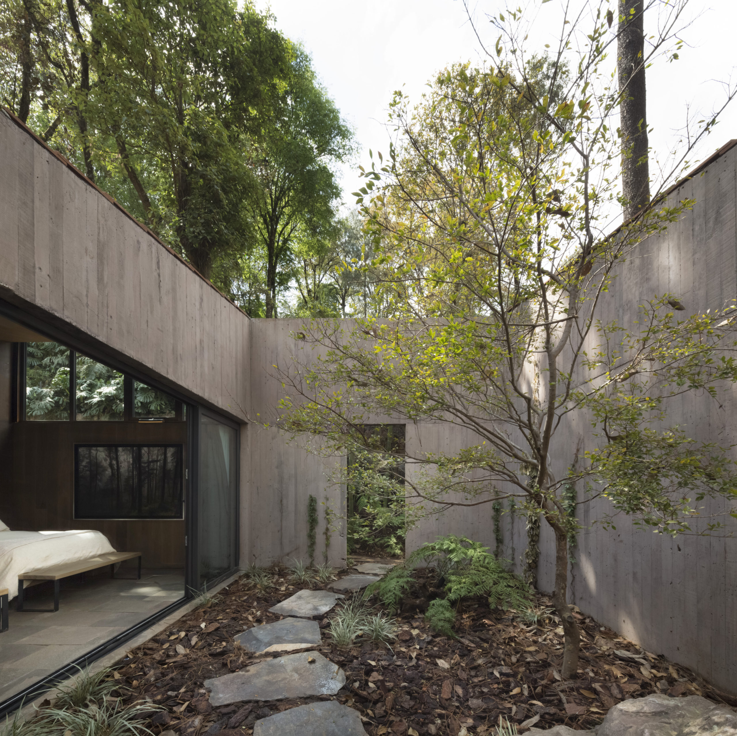
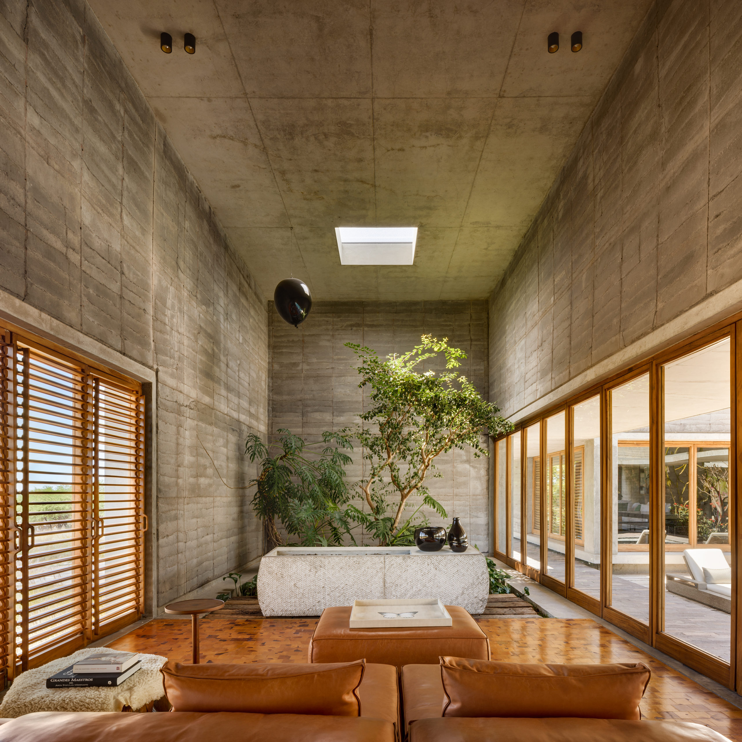 This multi-residential project by Cherem Arquitectos on the outskirts of Mexico City is the contemporary equivalent of the traditional Mexican Hacienda. The project consists of a dozen flat roofed buildings interspersed by three main courtyards and large, lush gardens. Inside, the firm aimed to create a strong contrast between the large paneled concrete walls and the natural light entering from skylights. This is accentuated by the rich display of plants and native artwork throughout, suggesting an artisanal quality to the houses’ rough concrete finishes.
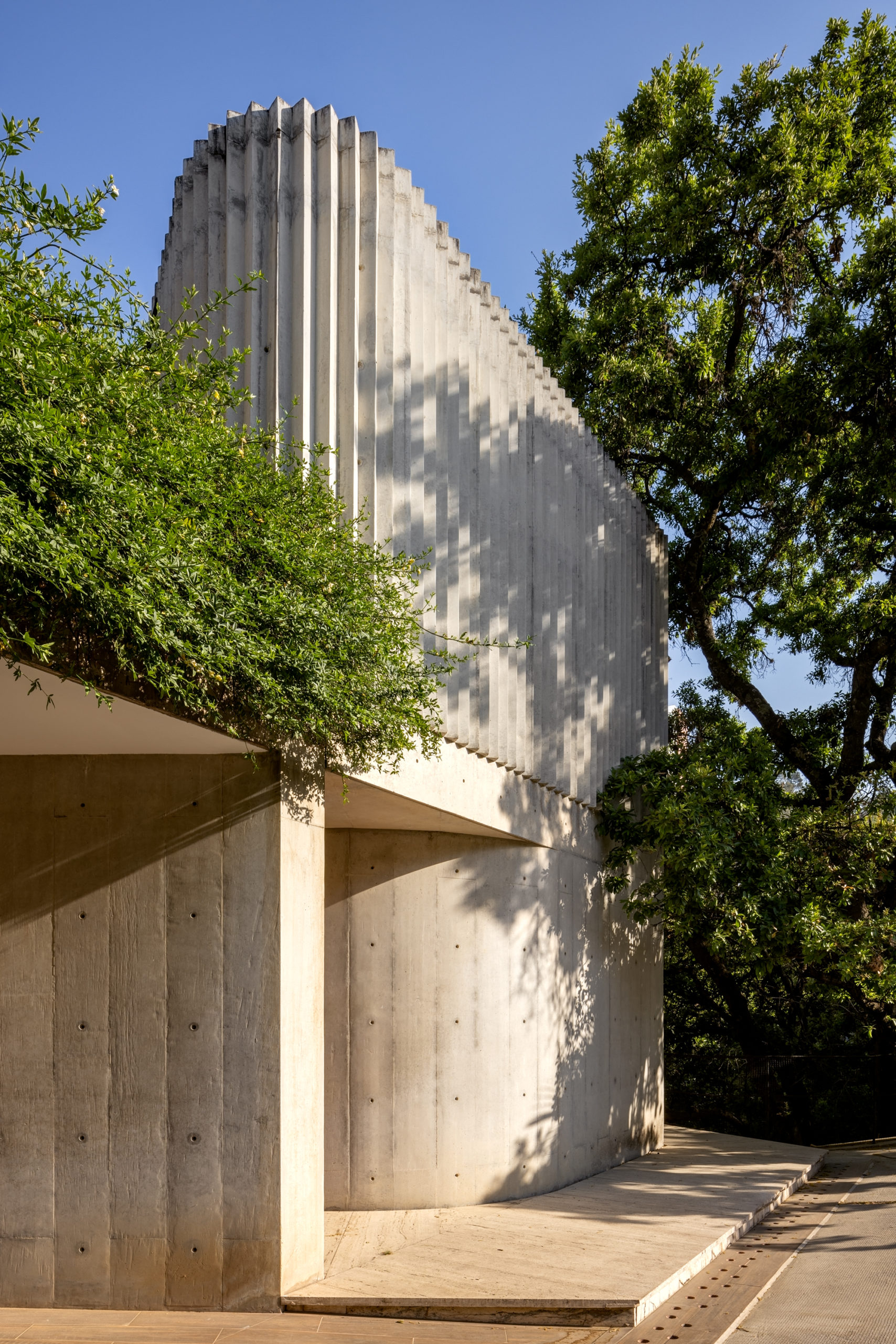
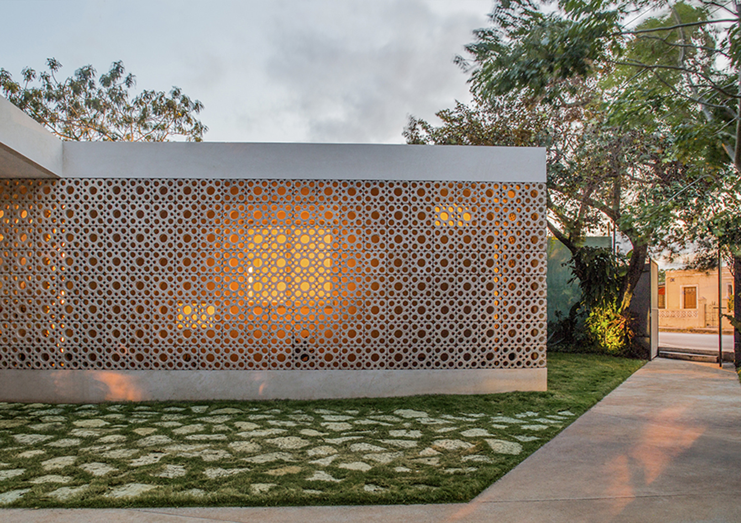
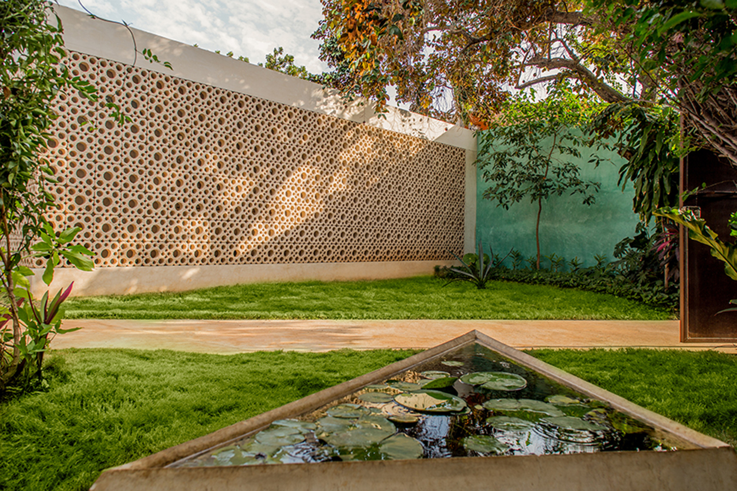 This 1960s suburban house in Mérida, Yucatán was recently renovated by TACO Taller de Arquitectura Contextual to accommodate the accessibility needs of the aging property owners. As part of the renovation, the firm gave a nod to the original era of the house with a new second skin: a lattice of compressed white cement made with discontinued molds from the sixties. The semi-permeable walls provide a new textured intermediary between interior and exterior, where both sunlight and interior light play in unique ways with the circular patterns.
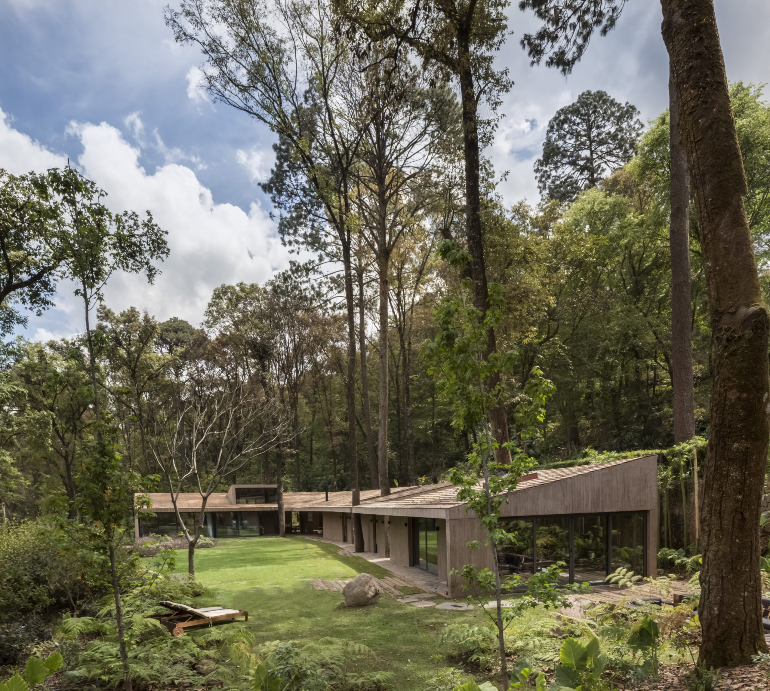
 This new home designed for a retired couple on the outskirts of Oaxaca is what the firm Espacio 18 Arquitectura has described as “an oasis at the city limits”. The house is modeled like an old colonial house from downtown Oaxaca with a floorplan centered around the kitchen and the central patio, where the couple hopes to host numerous social events. Likewise, the architectural combination of smooth concrete, timber and bright red clay brick creates a warm, hospitable atmosphere in the house’s congregation spaces. No doubt the homeowners will be recurring dinner party hosts.
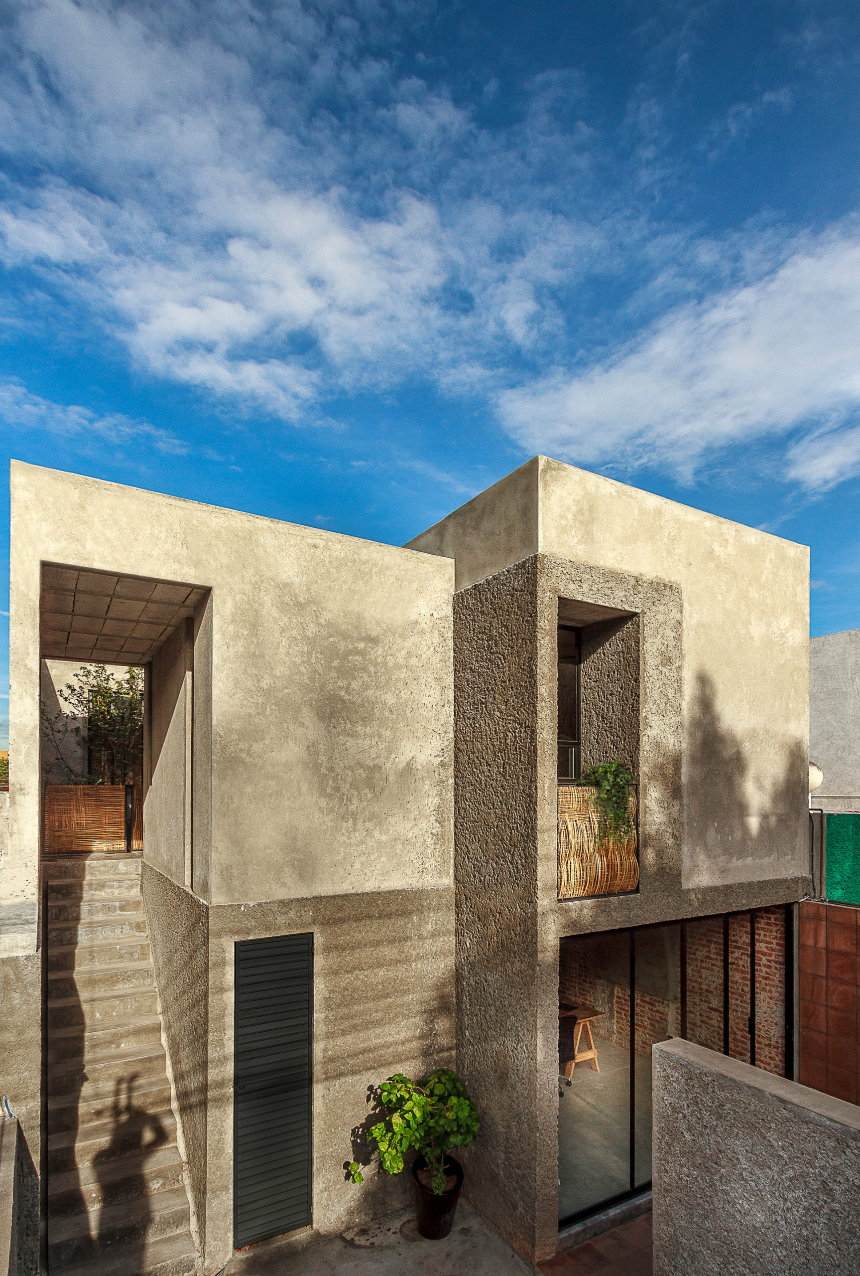
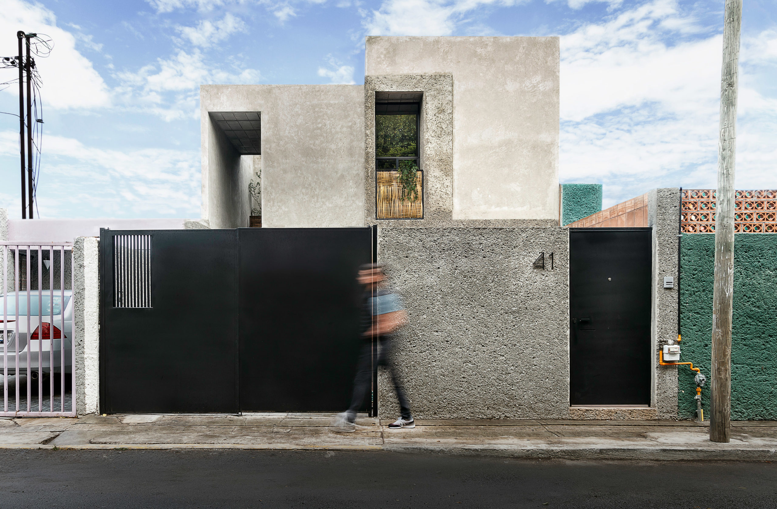
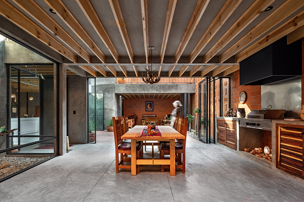
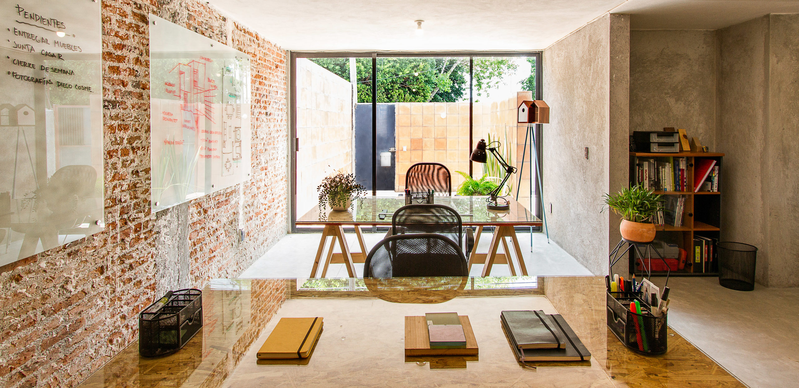 This modestly sized house located in an industrial neighborhood of Santiago de Querétaro manages to look rugged and hospitable at the same time. Intersticial Arquitectura undertook major renovations to this once deteriorating one-story concrete house, decluttering the space with the addition of a luminous and well-ventilated second floor. The renovation also combines rugged and smooth concrete sections for the new walls – a play of textures that pays homage to the local industrial heritage without losing the warm touch of the former building.
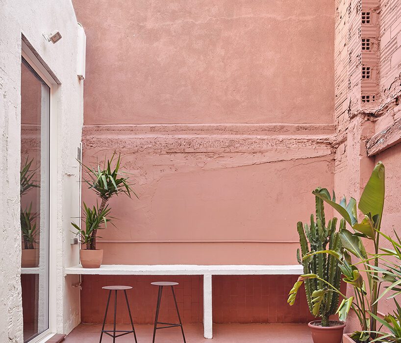


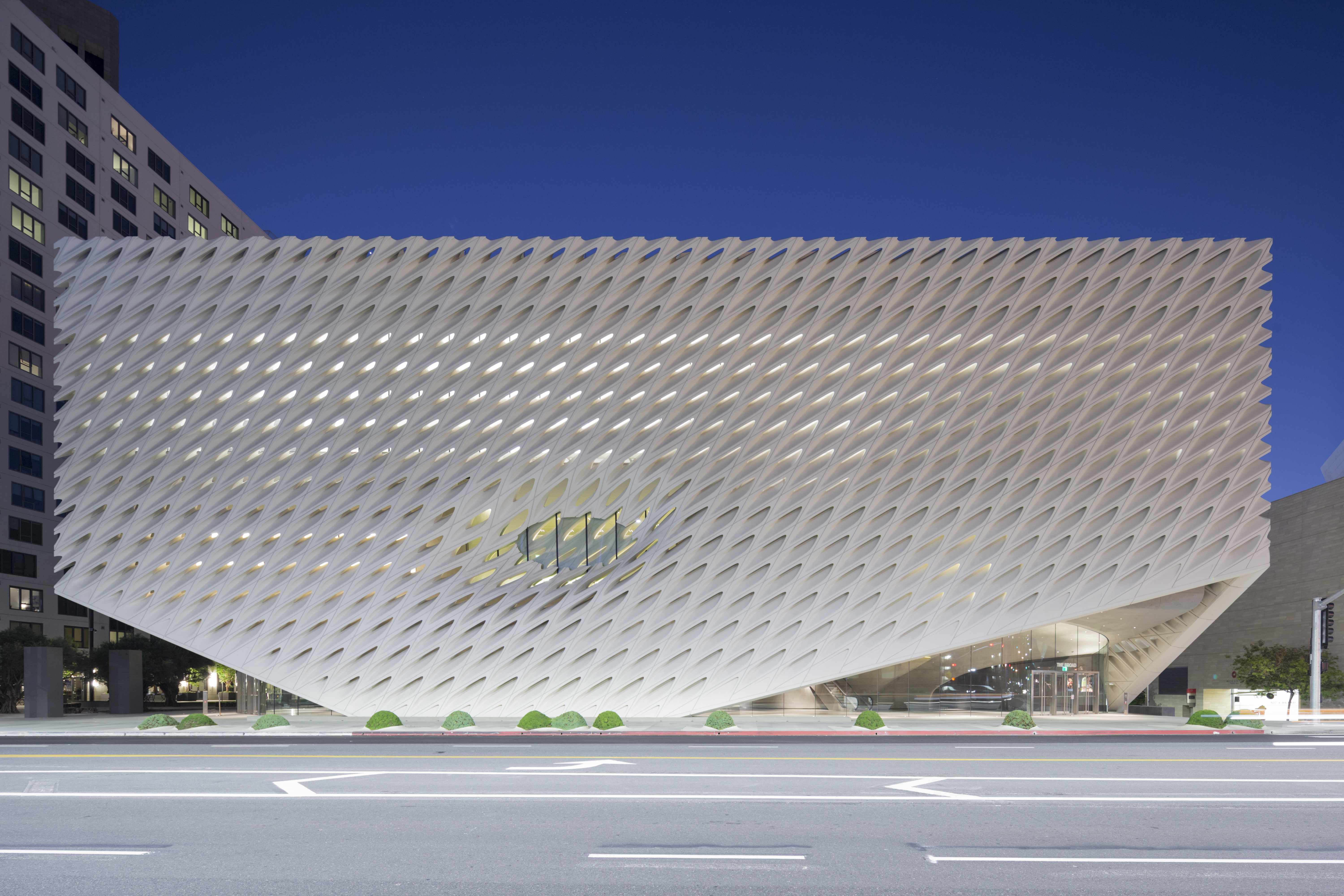 The split between the “veil” and the “vault” reflected the museum’s two key spaces: the public exhibition space and the archive/storage space. The vault storage area is enveloped on all sides by a cellular exoskeleton structure made up of 2500 glass-fiber-reinforced concrete (GFRC) panels. This airy building envelope became the heart of the project, defining both the circulation and spatial experience, as well as the light quality throughout the design.
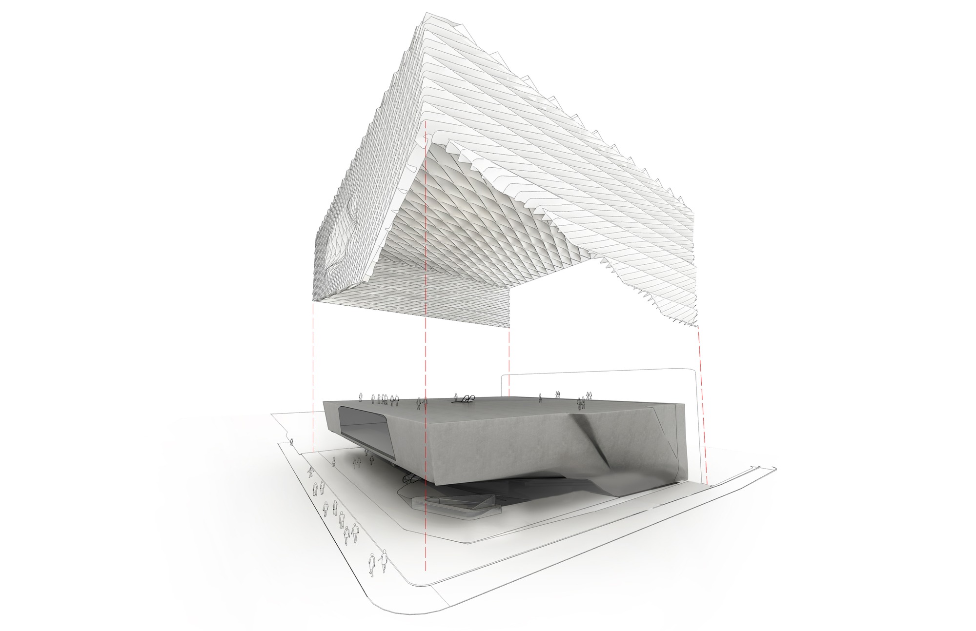 The 120,000-square-foot building features two floors of gallery space and is the headquarters of The Broad Art Foundation’s worldwide lending library, which has actively loaned collection works to museums around the world. In its inaugural year, The Broad attracted triple the number of its projected visitors. Eli and Edythe Broad also built a 24,000-square-foot public plaza, added streetscape improvements and enhanced pedestrian access along Grand Avenue.
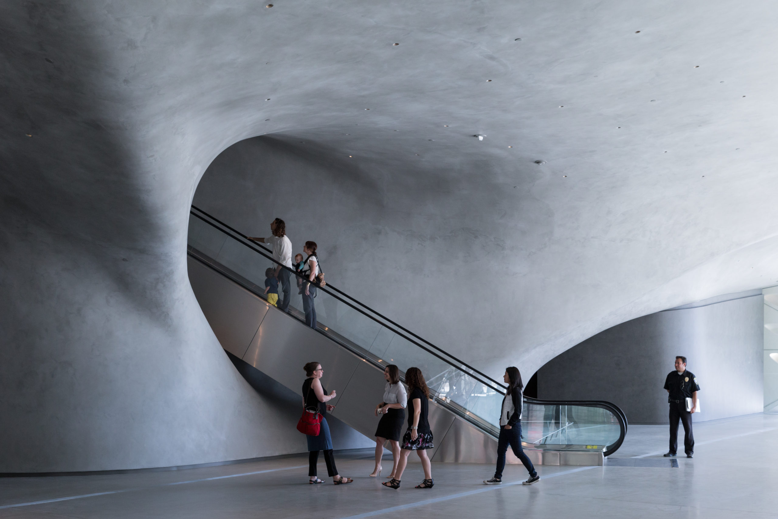
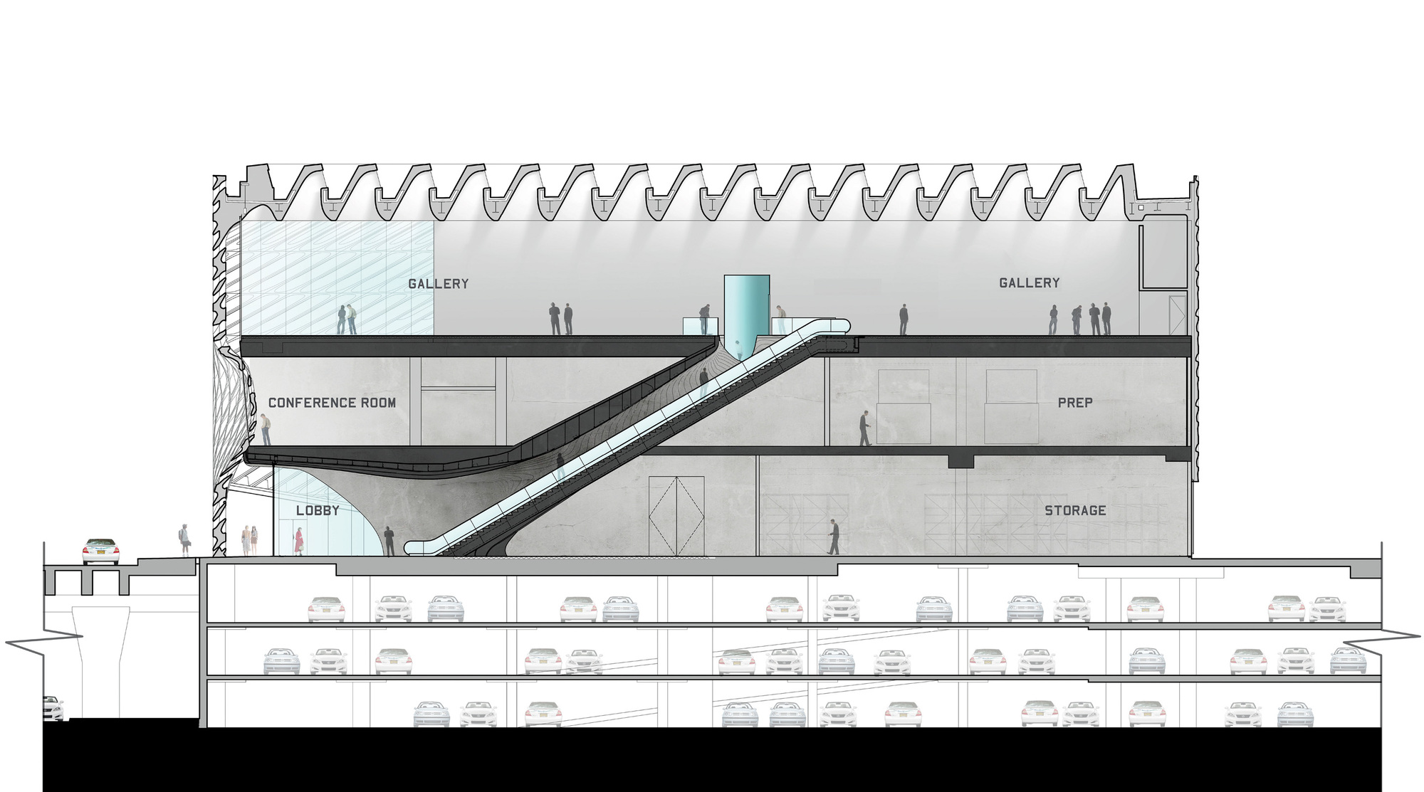 The museum’s iconic veil is held up by 650 tons of steel lifts that span across the block-long gallery. The final building envelope was simplified from its original design, with its panels rationalized to aid the manufacturing process. During the day, shadows cast by the perforations articulate the façade, and at night, it glows like a lantern in downtown. The museum’s “veil” lifts at the corners, welcoming visitors into an active lobby and shop. On the top floor, visitors experience nearly an acre of column-free gallery space bathed in filtered light. The gallery has 23-foot-high ceilings, and the roof is supported by 7-foot-deep steel girders.
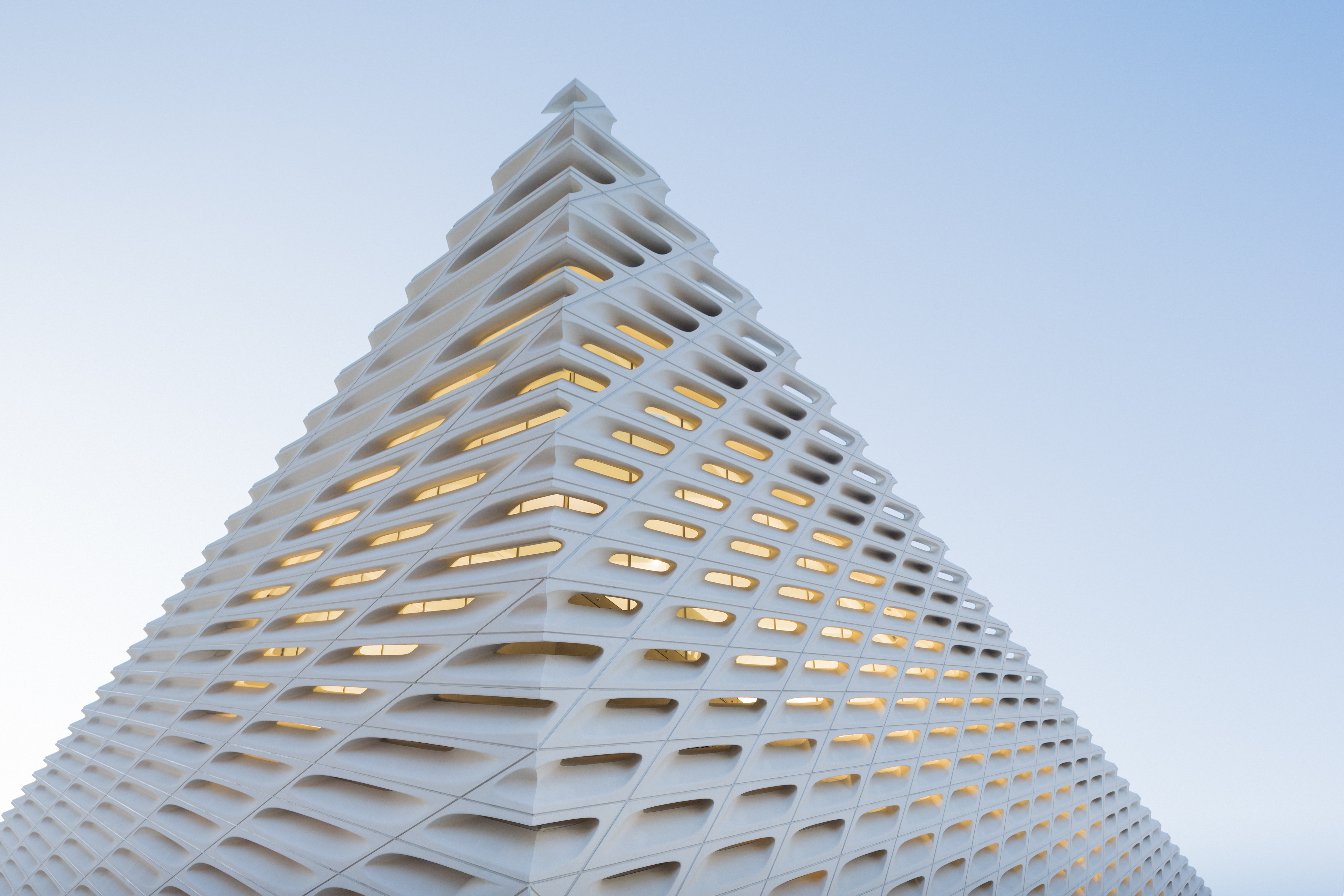
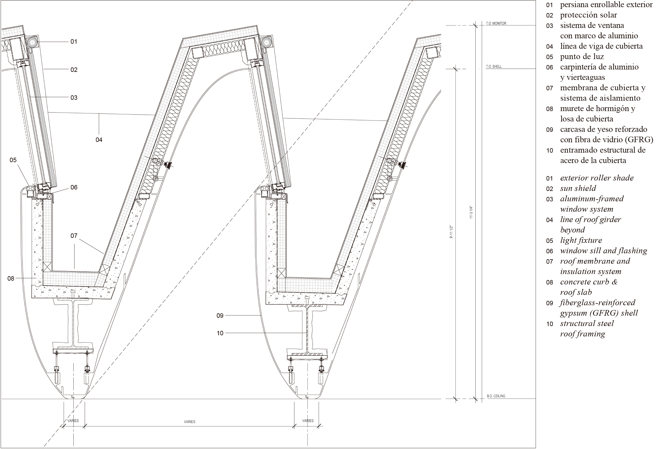 A key component of the veil is that it provides filtered natural daylight. The design team was able to realize hundreds of conical light openings for the building and create the front oculus from a parabolic curve. As the precast concrete manufacturer Willis explained, the design was made possible by using a five-axis, computerized-numerical control machine to carve molds out of high-density foam. Before skinning in fiberglass, the foam molds were sanded and sealed to create the negative formwork for the GFRC panels.
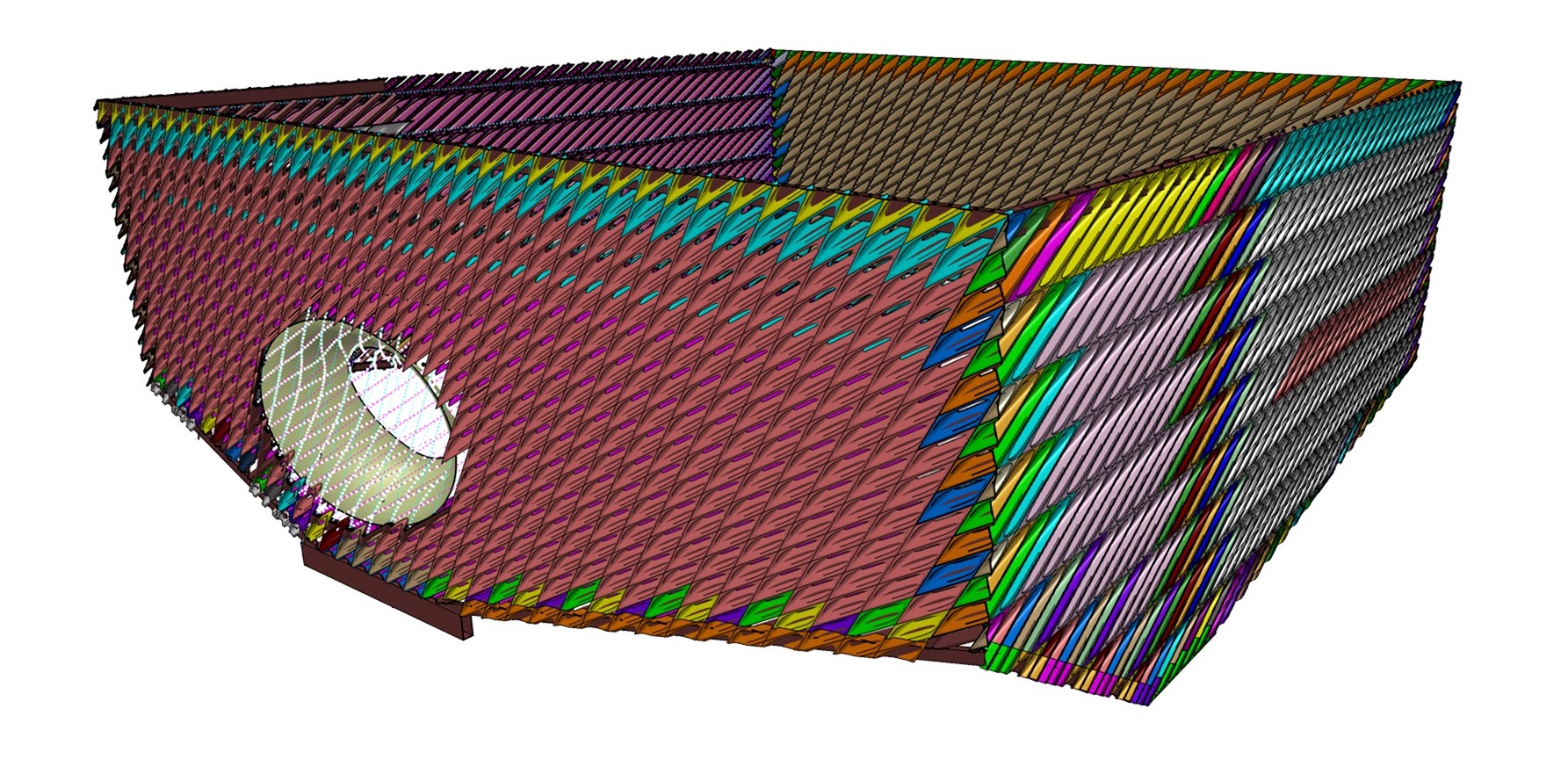 In turn, “the vault” plays a key role in shaping the museum experience from entry to exit. As the DS+R team explains, the heavy opaque mass is always in view, hovering midway in the building. Its carved underside shapes the lobby below and public circulation routes. Its top surface is the floor of the third-floor galleries, where ribbed ceilings and integrated lights echo the latticework of the external façade.
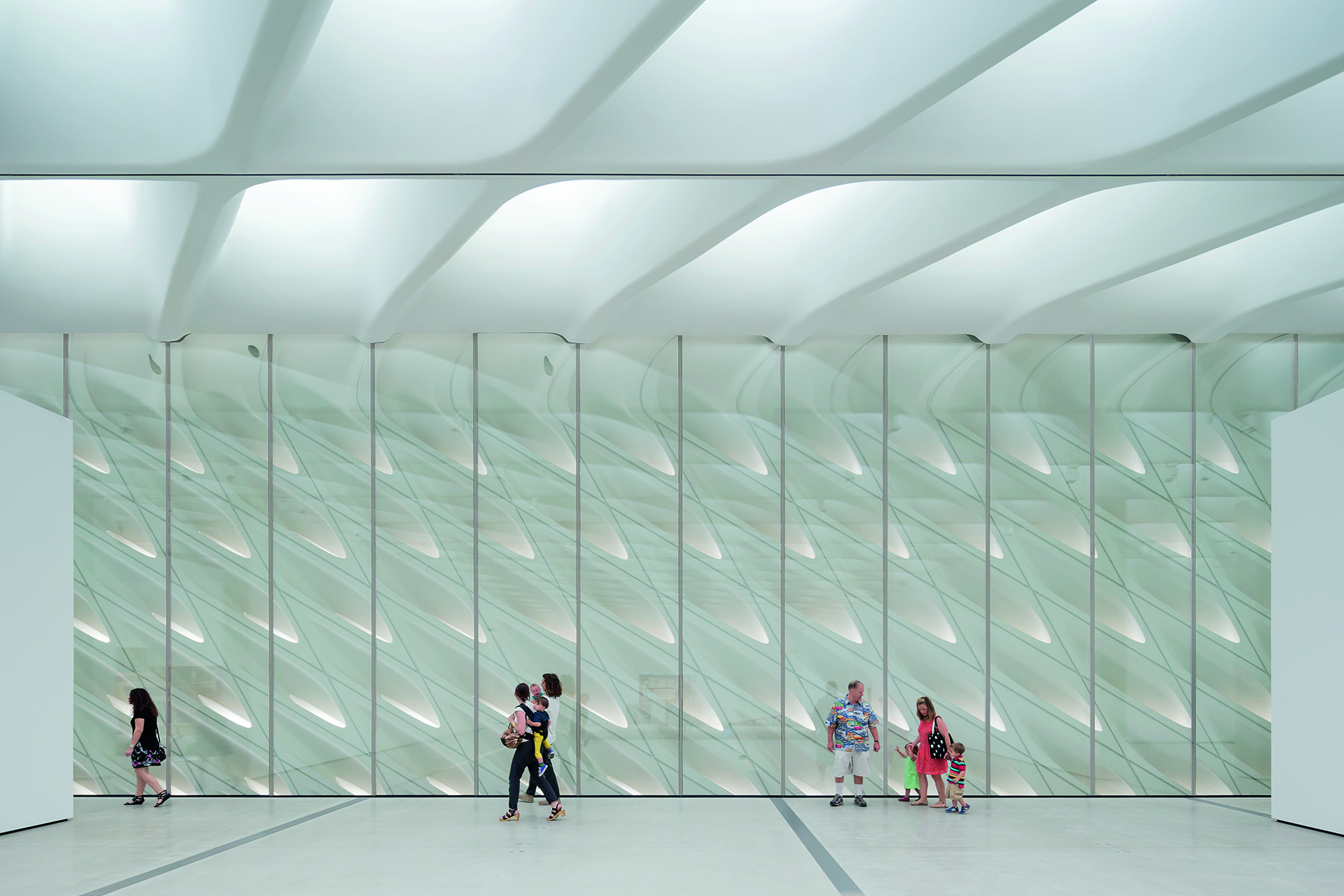 The museum is home to the 2,000 works of art in the Broad collection, which is among the most prominent holdings of postwar and contemporary art worldwide, and has launched an active program of rotating temporary exhibitions and innovative audience engagement. Highlights of the Broad collection include 1960s works by Andy Warhol, paintings and sculptures by Cy Twombly, and Yayoi Kusama’s immersive Infinity Mirrored Room – The Souls of Millions of Light Years Away.
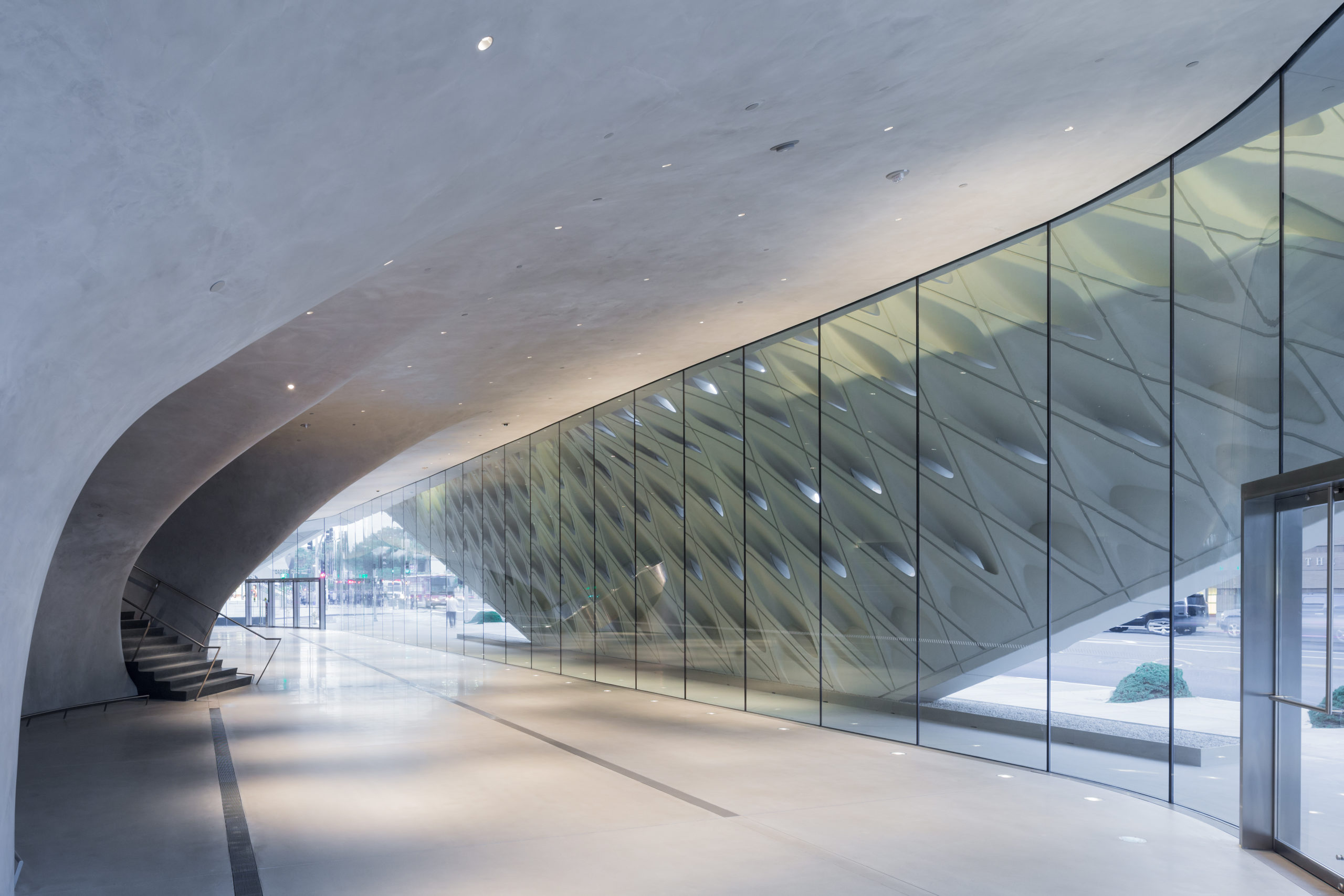
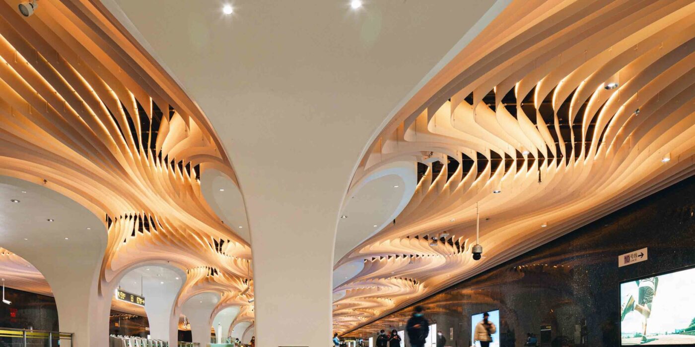
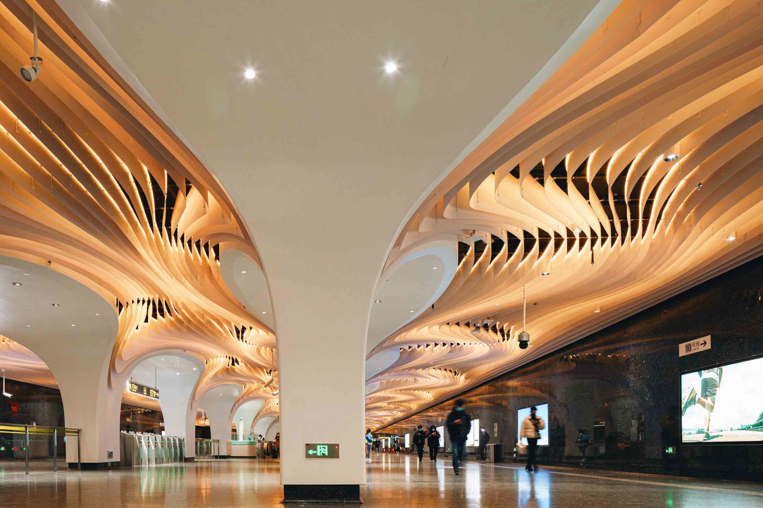
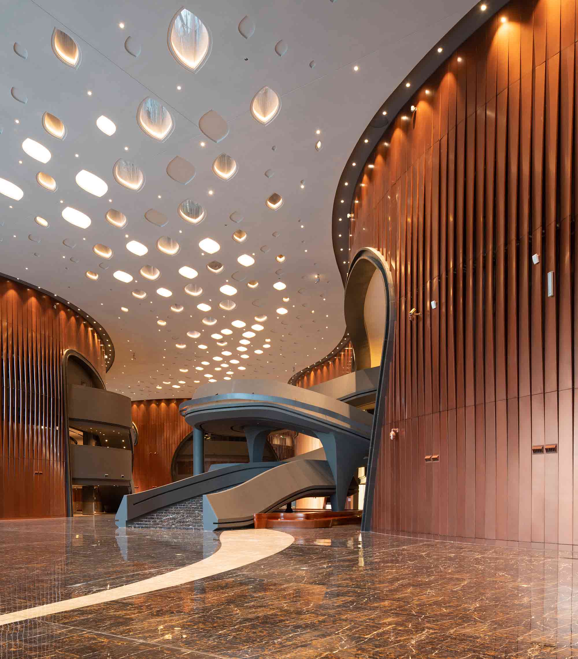
 Concealed underground, Yuyuan Station is Shanghai’s deepest transport hub. Elevating the experience of this subterranean space came with its challenges. Essential elements of the site, including the walls, columns and flooring, could not be altered. Nevertheless, the architects delivered an immersive scheme that consumes the senses of its users.
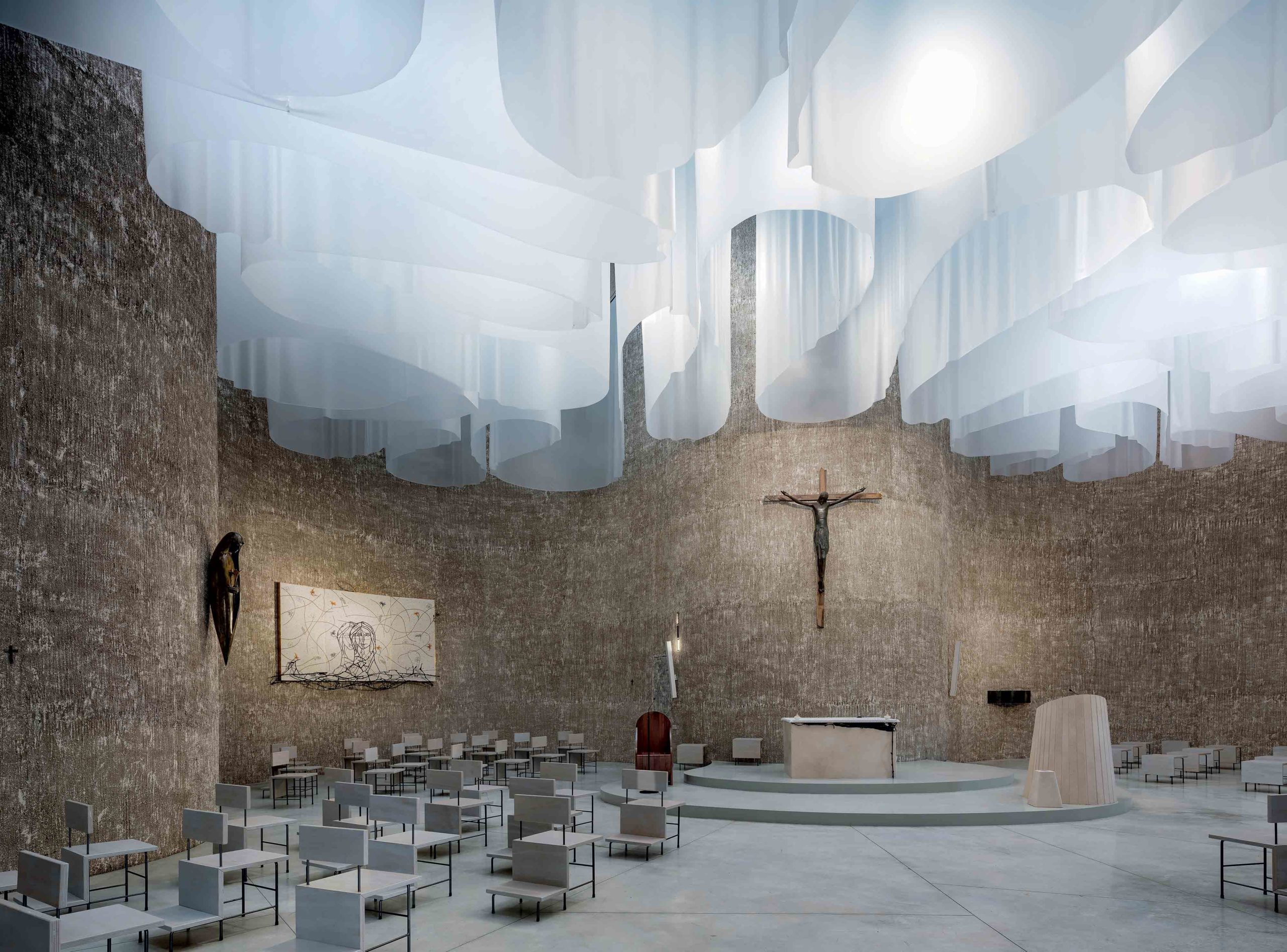
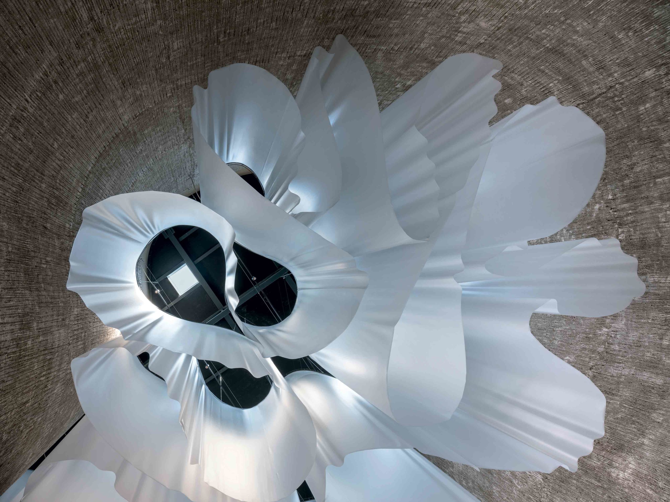 Revising religious architecture can be an imposing task, one that calls for reverence in the same breath as reinvention. This contemporary church in the Calabrian region of southern Italy negotiates that careful dance between tradition and innovation. While its organic, cross-shaped plan is inspired by some of the country’s most impressive Baroque churches, the interior is something of an inversion of the ornate domed designs of its predecessors.
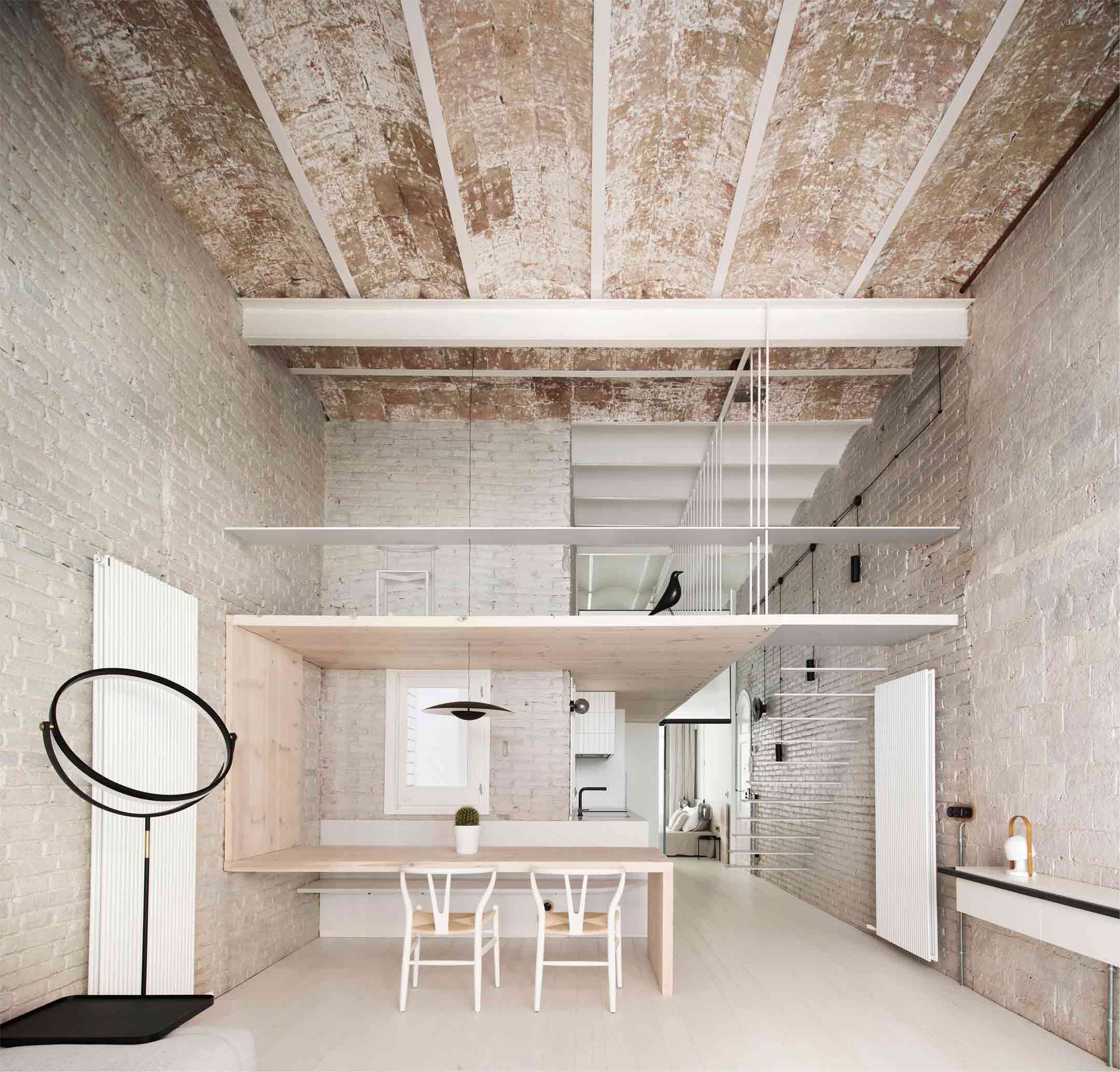
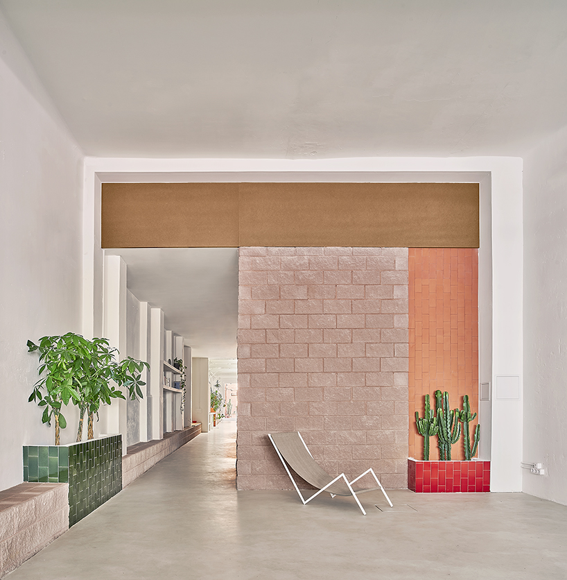
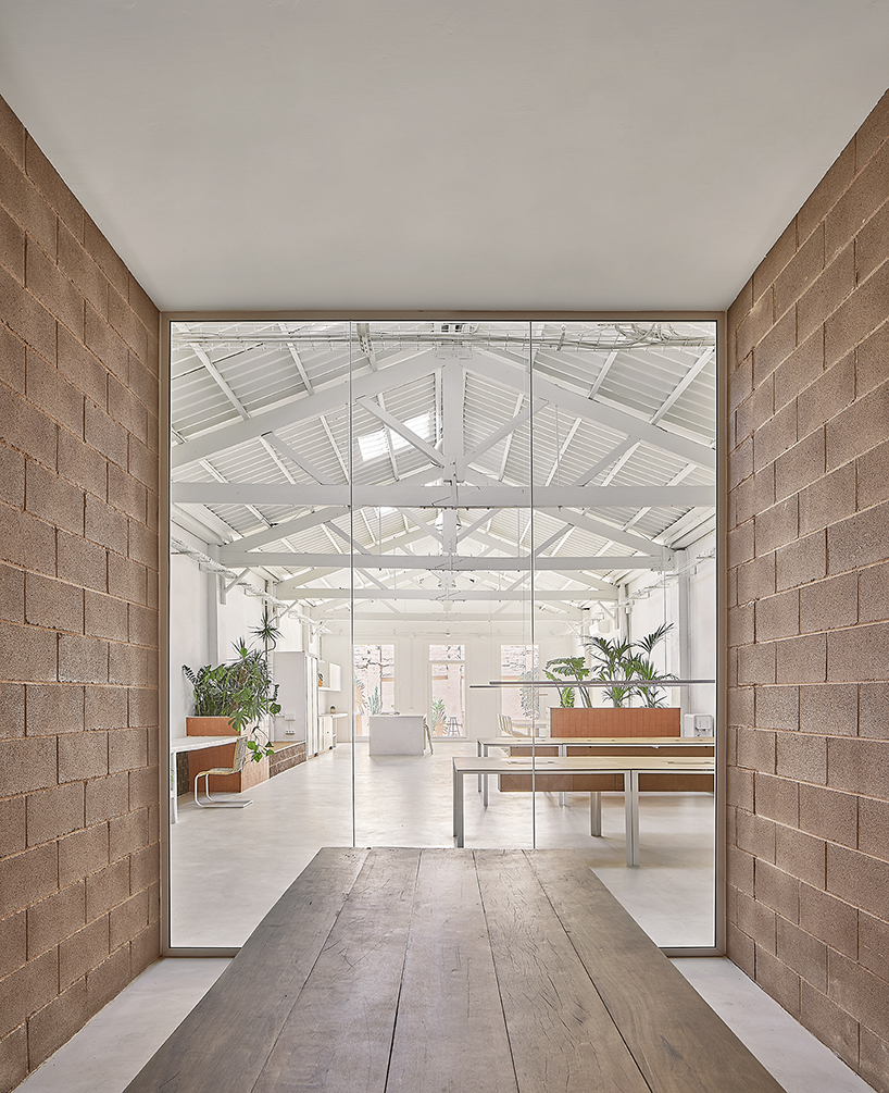
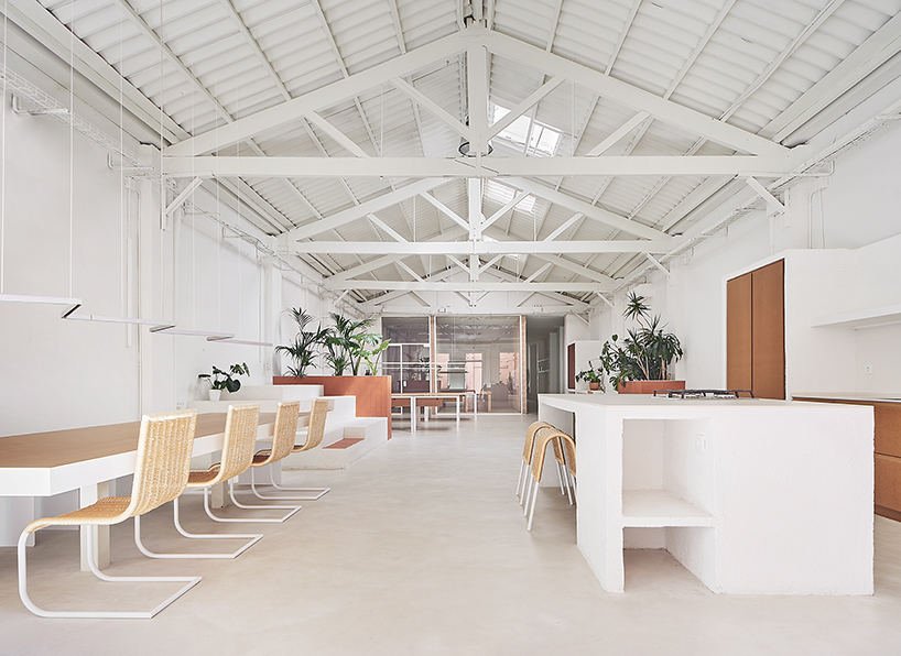
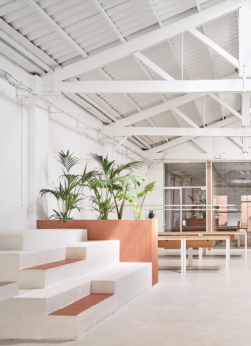
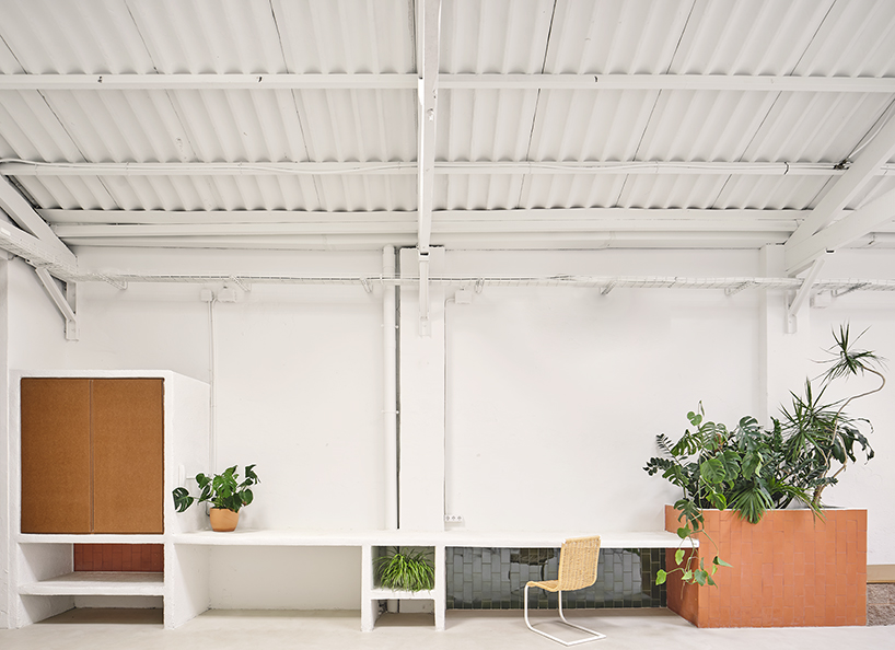
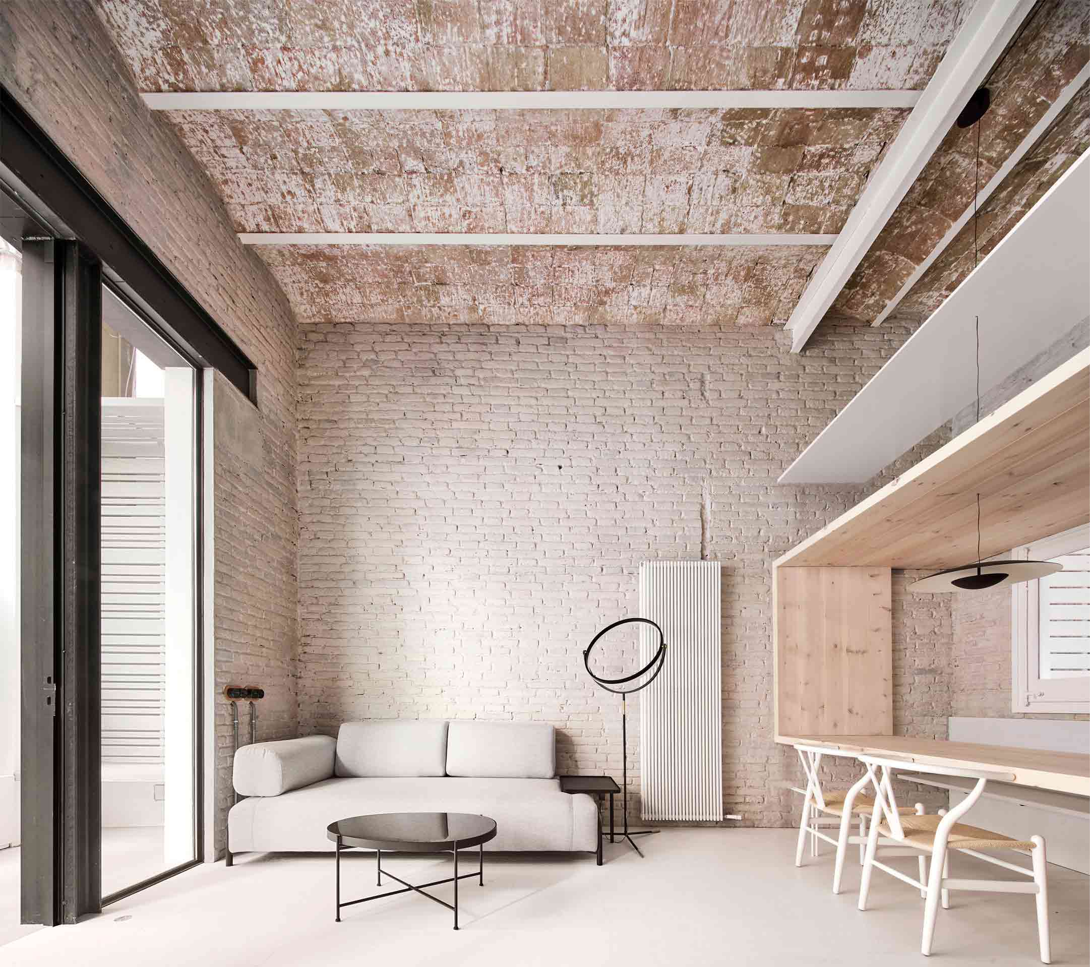 In another life, this building in Spain’s Catalan region was a warehouse. Once a dark space of industry, it’s now been sensitively transformed into a modern light-filled residence. However, traces of the structure’s history still take center stage thanks to considerate spatial organization.
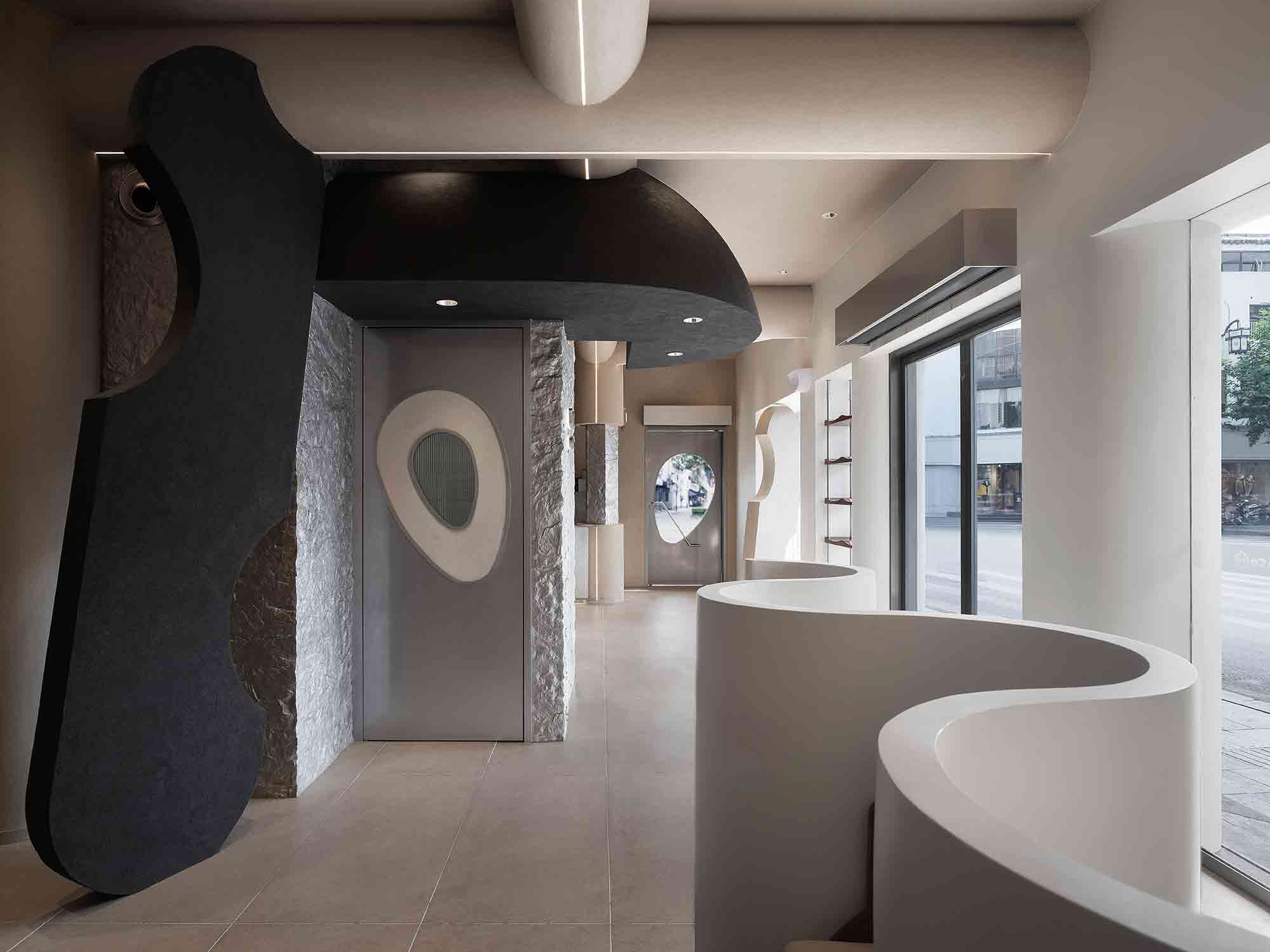
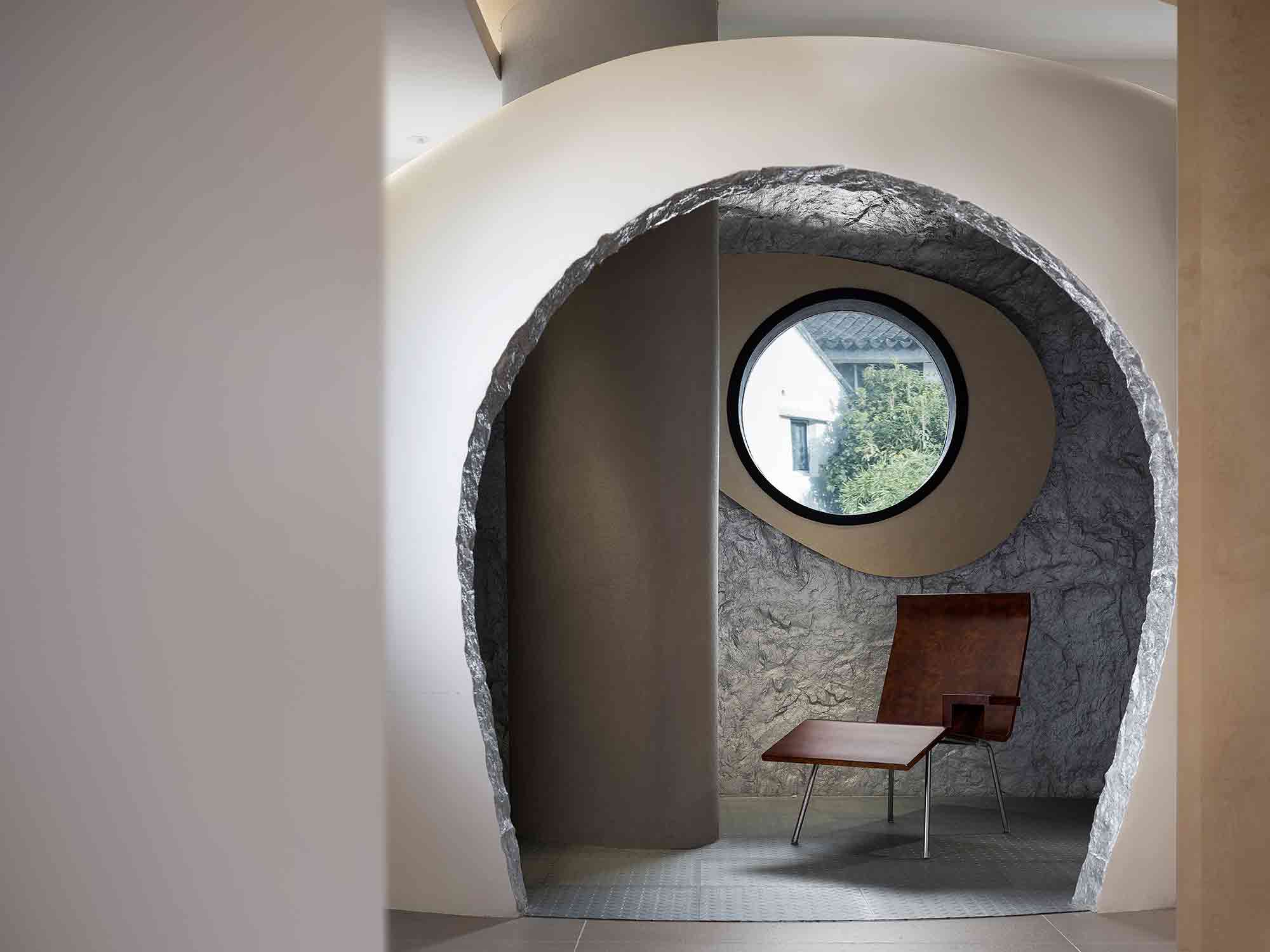 Situated in the Chinese city of Suzhou, this pioneering café was inspired by the concept of returning to the origin of life. The interior is an unexpected convergence of old and new, responding to the historic street outside while reimagining commercial typologies through a futuristic lens.
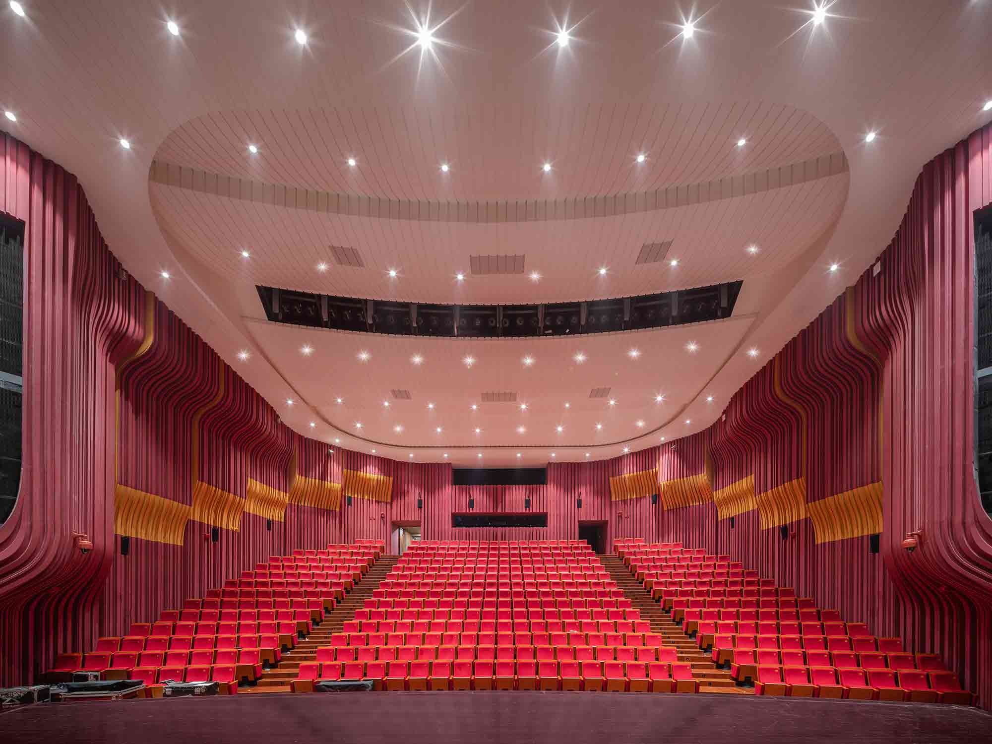
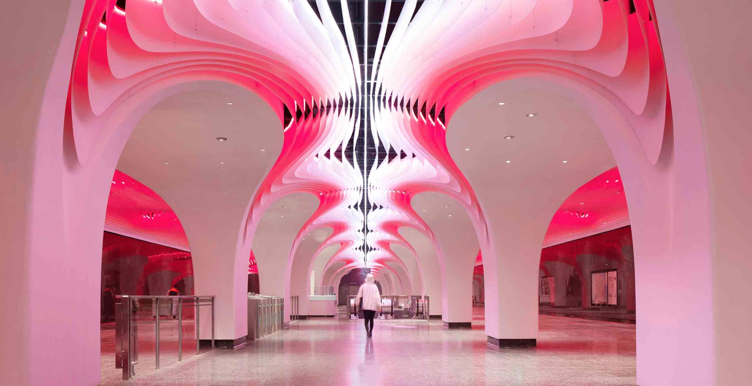
 A performance complex of impressive proportions, the Zhengzhou Grand Theater encompasses four large venues with distinct architectural characters. In one hall, the walls ripple with a daring solid surface design in pink and orange hues. Narrow, repetitive channels envelop the room, resembling the interior architecture of a living, breathing organism, while the carefully considered contours were crafted to meet high acoustic standards.
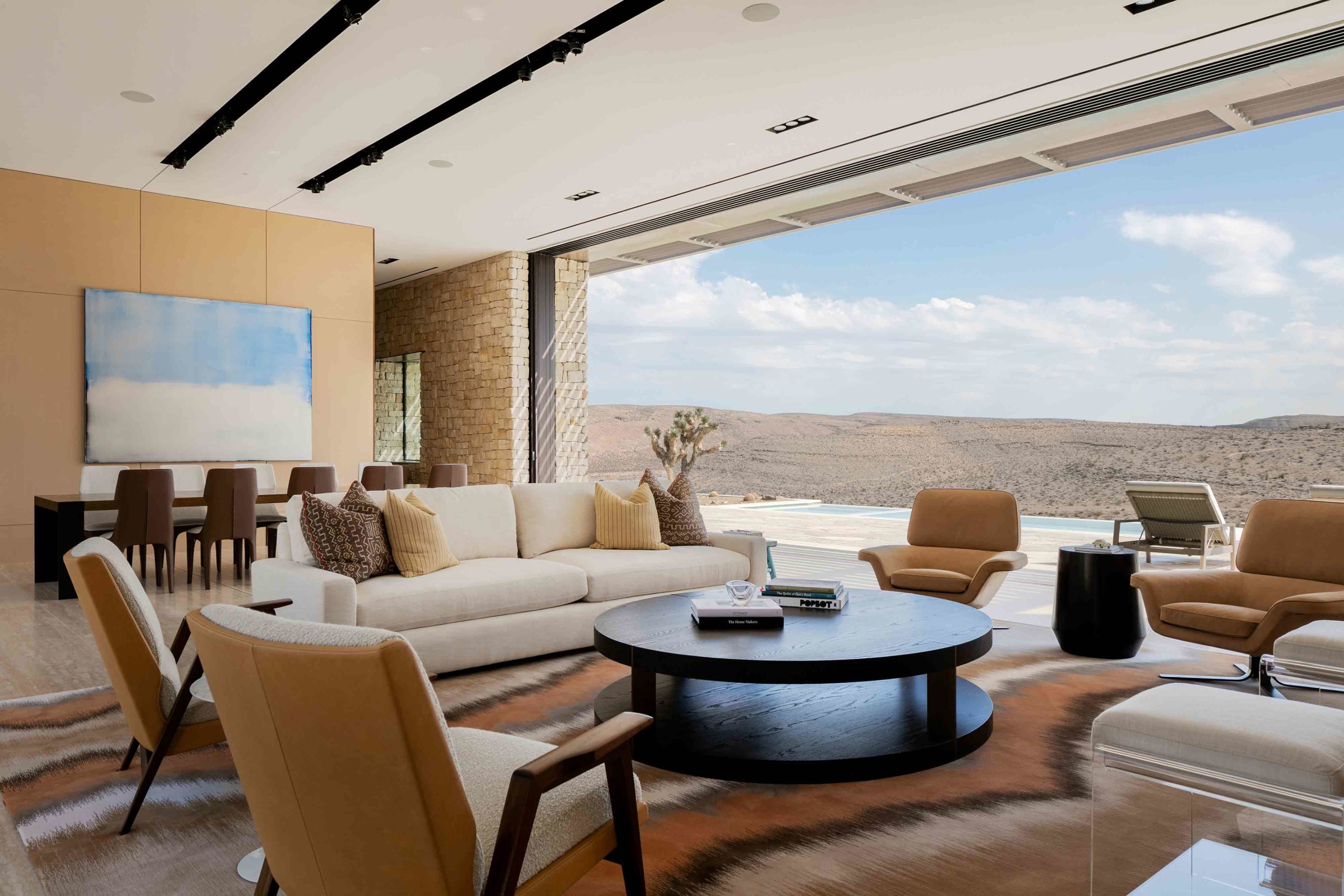
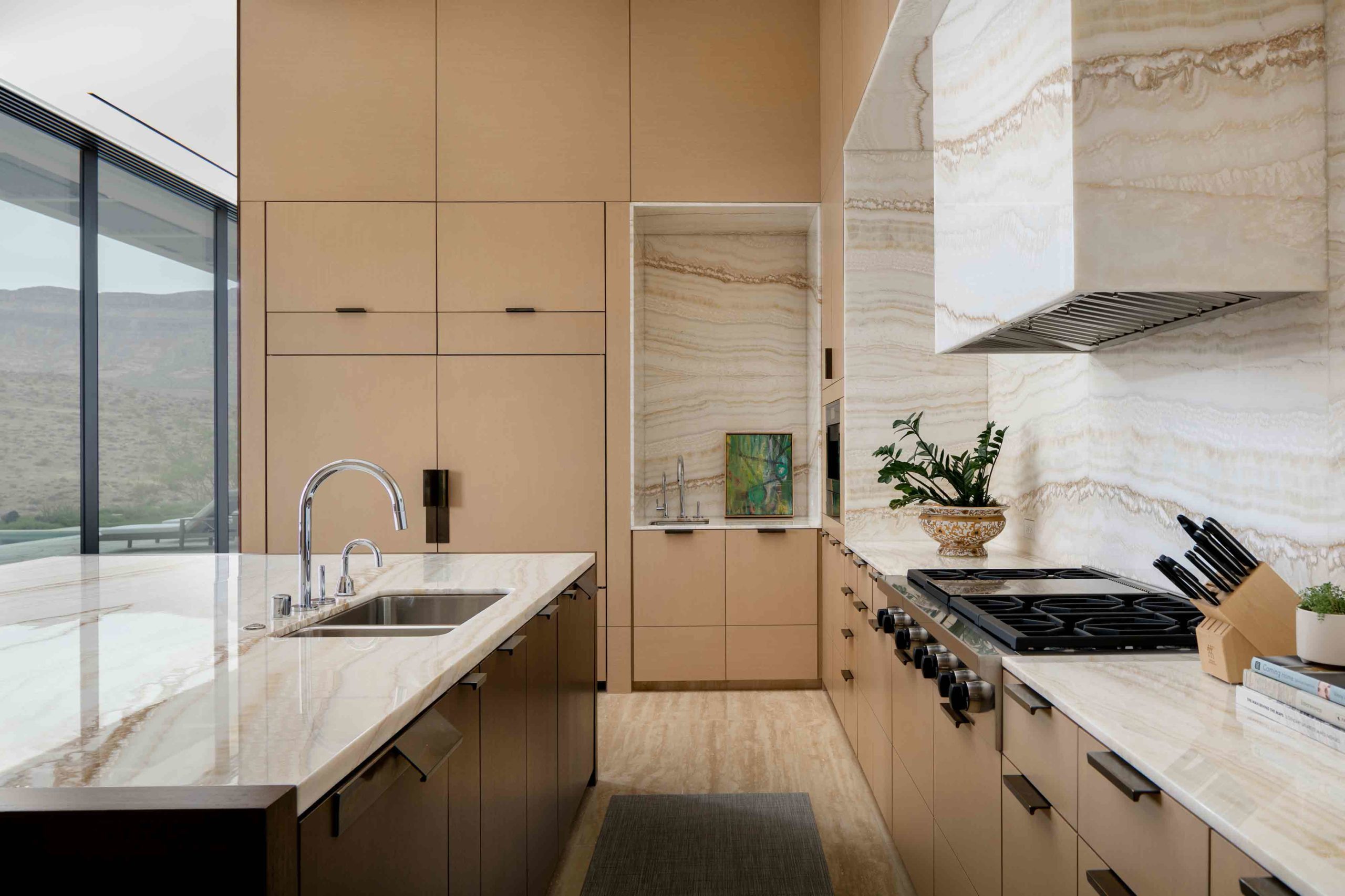 Nestled in the arid Nevada desert, this residence reads as an extension of the topography, both externally and internally. Retractable walls of glass, which span across two different aspects, peel away in the main living and dining zone, erasing the boundary between natural and built environments. Exposed rock excavated from the site lines the walls of the living spaces and orients the home within the same tactile language as the rugged terrain.
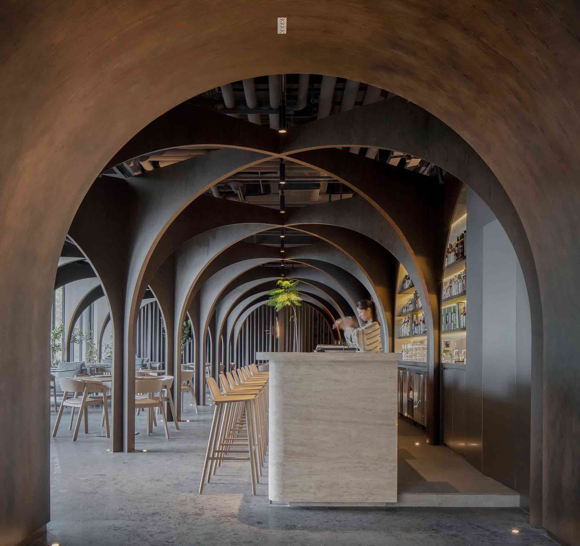
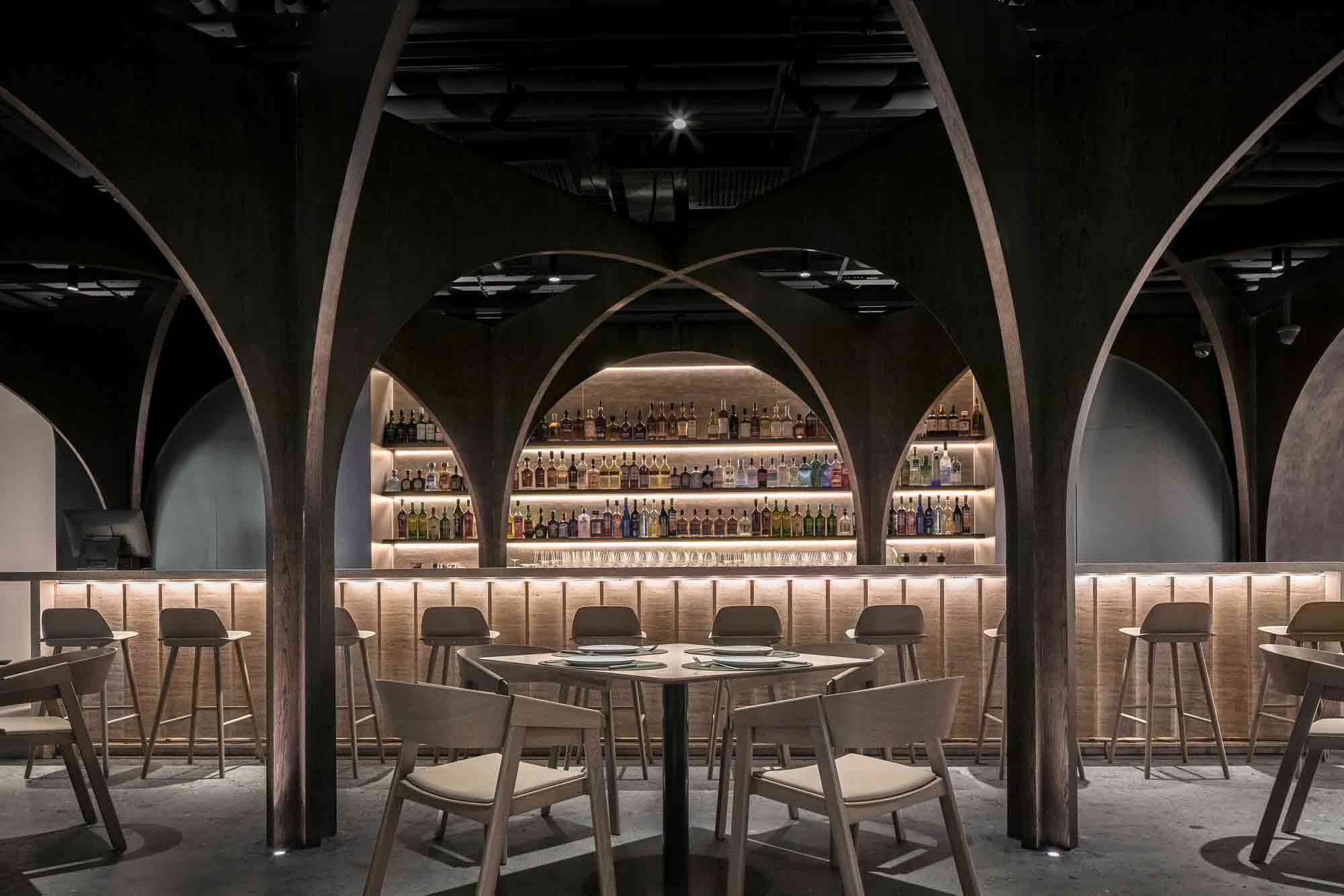 This visually striking bar and restaurant in Beijing eschews right angles and straight lines. Approaching the curved threshold to this daring space is like delving into a warren. The arched entrance draws the eye down through a cocoon-like portal defined by dark, earthy colors.
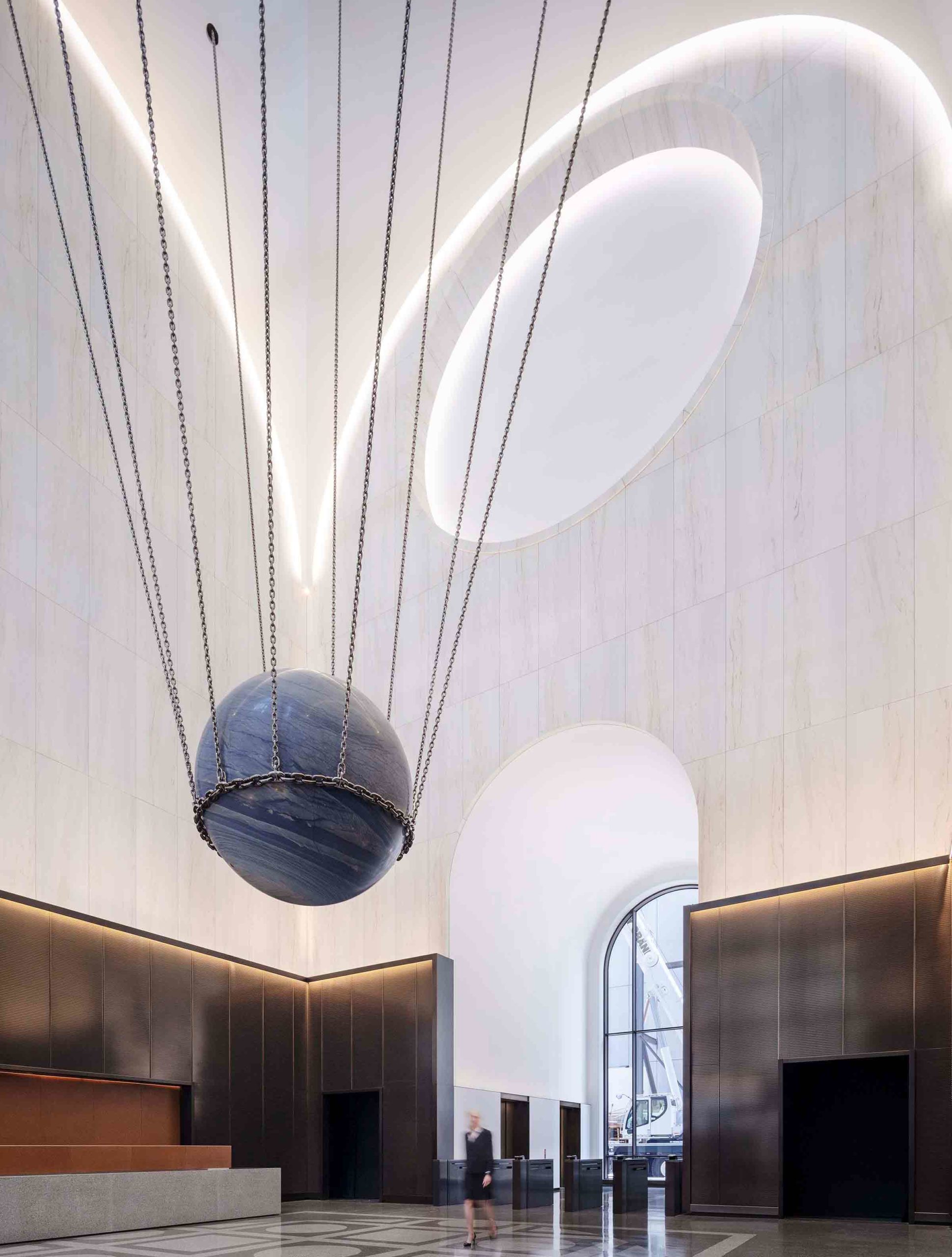
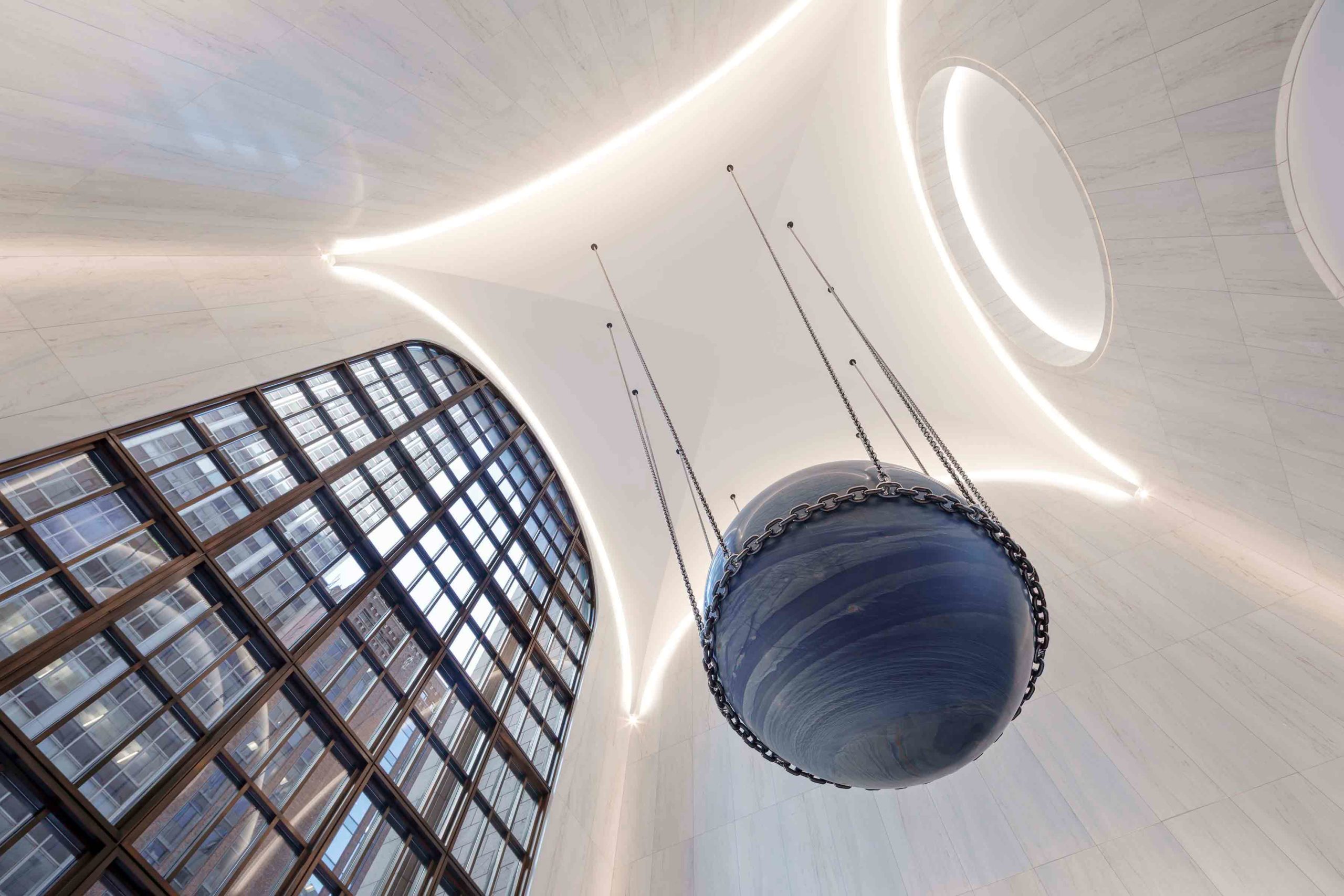 Dating back to 1984, the lobby of this postmodern building in New York City underwent a contemporary update by architectural firm Gensler. While remaining respectful of the scheme’s heritage materials and capacious proportions, the towering, triple-height ceiling now arches softly around the space. The convex lines of the engraved oculus emphasize the vaulted barrel design, accentuated by the illuminated perimeter, which imparts a celestial, almost weightless effect.