One Drawing Challenge 2022: Send Us an Architectural Drawing. Tell Us a Story. Win $3,000!
Architizer is thrilled to announce that the Fourth Annual One Drawing Challenge is officially open for entries! Architecture’s most popular drawing competition is back and bigger than ever, including larger prizes (including an increased cash prize for our 2 Top Winners), more publicity and some amazing new jurors to boot. Without further ado, get started on your submission today, and don’t forget to share the competition with colleagues, students and friends who you know have the talent to succeed in this year’s program!
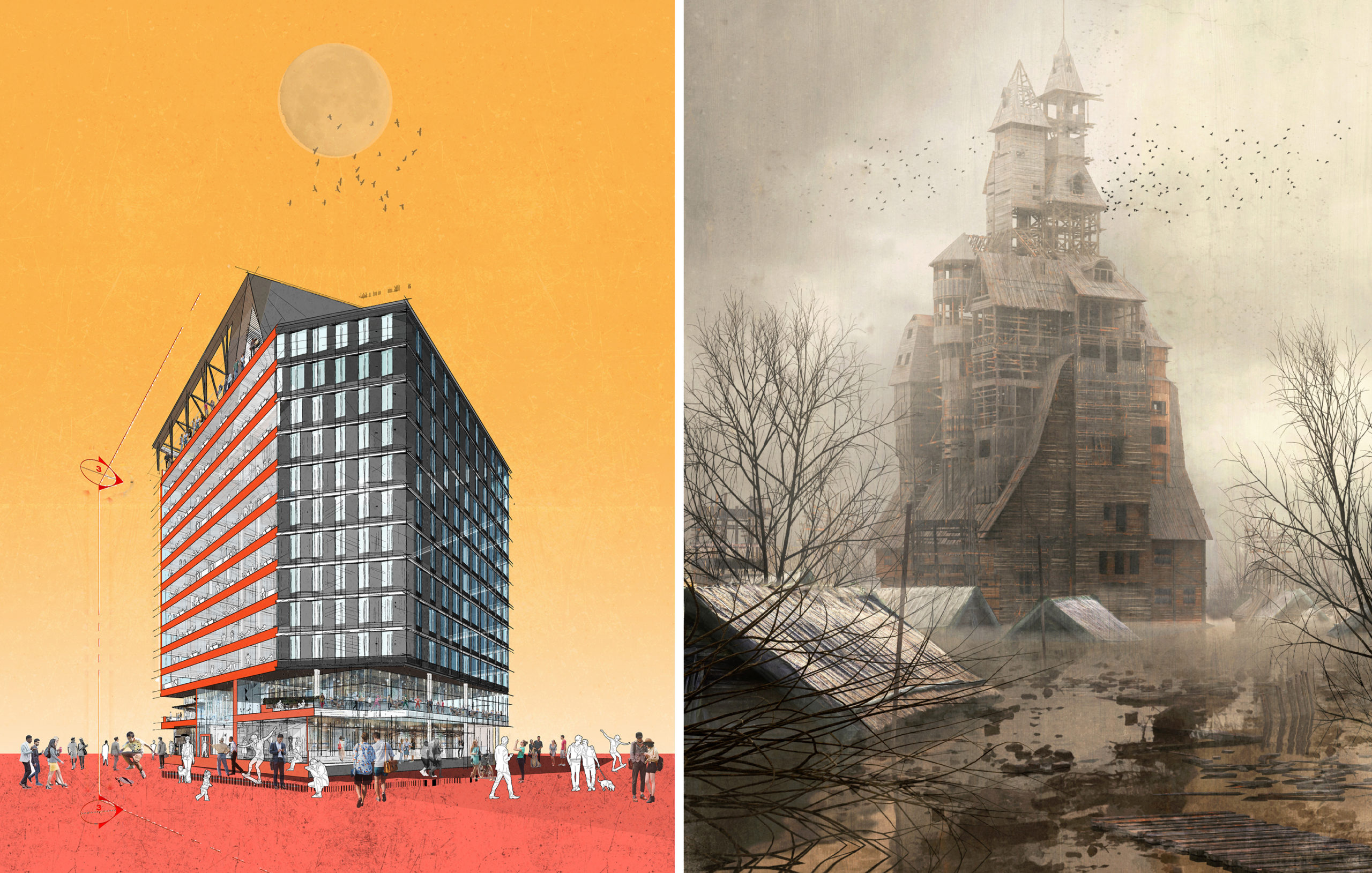
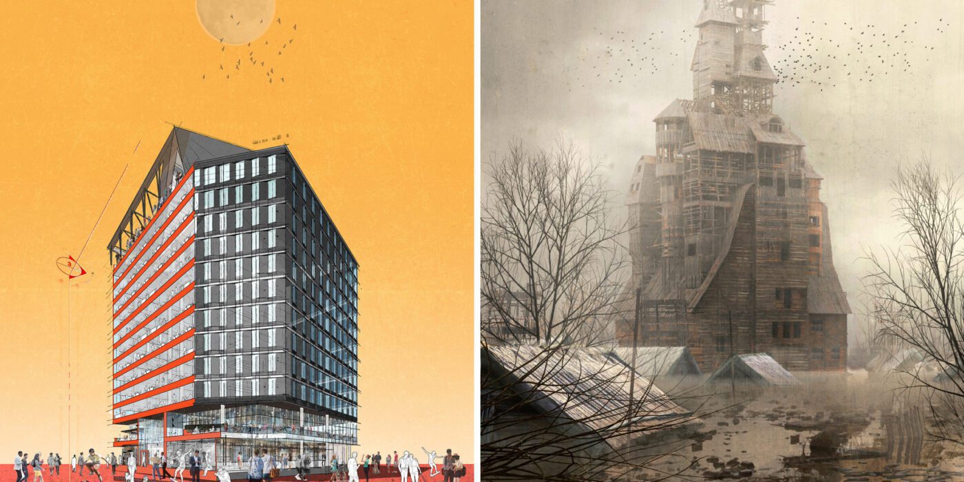
Left: “See You at Work” by Dorian Sosa; Right: “Sutyagin’s House” by Pavel Dikov; Finalists in the 2021 One Drawing Challenge
Competition Brief
For the One Drawing Challenge, your task is simple and complex in equal measure — tell a powerful visual story about architecture and the people that inhabit it through a single architectural drawing.
All drawing formats, both hand-drawn or digital, are permitted. It could be a cityscape, an individual building, or even an architectural detail. It could be a plan, section, elevation, perspective, axonometric projection, sketch or abstract. As long as it includes architecture in some ways, it is eligible.
You are welcome to submit an older drawing or create something brand new. For some examples of the types of images that you could submit, we encourage you to explore the best 100 architectural drawings from last year’s competition.
Your drawing should be accompanied by a written passage (up to 150 words), which explains what your drawing depicts. Focus points could include but are not limited to: The type of architecture portrayed, where it might be located, who might inhabit it, what atmosphere it conjures, the essence it captures, and what makes it special.
Enter the One Drawing Challenge
Prizes
This year, we are excited to be able to offer our largest prize fund to date for our One X Challenge competition series: A total of $6,000 will be split evenly between 2 Top Winners (1 student and 1 non-student).
As well as their cash prize, our Top Winners will have top billing in the Official Winners Announcement (see last year’s announcement here), as well as an exclusive interview about their work. A further 100 Finalists will also see their work published globally, in one of our most viewed editorial features of the year: 100 Stories That Tell Powerful Stories About Architecture.
Both Top Winners will also secure themselves a seat on next season’s competition jury, giving them the opportunity to review entries alongside the likes of James Wines on SITE, Amanda Ferber of Architecture Hunter, Bob Borson of Life of an Architect and more!
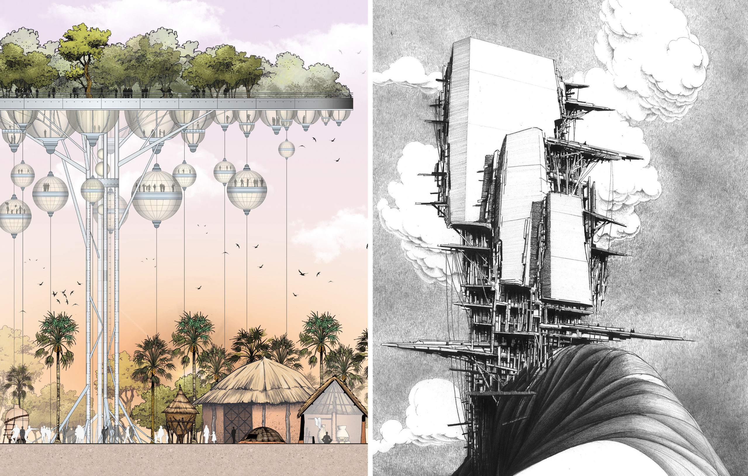
Left: “Chicago : Drifted” by Gregory Klosowski; Right: “The Shipwright’s Anthology – A New Story of Fantastic ‘Knots’” by Jay Jordan; Finalists in the 2021 One Drawing Challenge
New for 2022: The Storied Drawing Awards
This year, we want to take the One Drawing Challenge back to its roots, celebrating architectural drawings as a medium for telling stories — not only about our built environmental, but also about our wider world. When done well, an architectural drawing has the power to reveal new perspectives about the impact of architecture on society, communities and individual people.
In honor of this power, we are introducing a series of new, narrative-driven awards called the “Storied Drawing Awards”. Participants can apply for any one of these special awards at no extra cost when submitting an entry, and Architizer’s Editorial Team may also nominate entries as they see fit. You can apply for a “Storied Drawing Award” for the following themes:
- Utopian Vision
- Dystopian Warning
- Fantasy Island
- Sci Fi Streetscape
- Sustainable City
- Political Narrative
- Climate Change Future
- Awe-Inspiring Atmosphere
The Storied Drawing Award winners are eligible for the overall prizes as well, so it’s possible for your drawing to win multiple accolades! Storied Drawing winners will feature in their own dedicated editorial, similar to last season’s Special Mention Award recipients. We’ll be revealing more about the Storied Drawing Awards in the coming weeks, so stay tuned!
Left: “The Palaver Tree” by Jonathan Nkunku; Right: “ELLITANIUM city(in praise of naught)” by Hosein Mosavi; Finalists in the 2021 One Drawing Challenge
Meet the Jury
New to this year’s jury, we welcome one of the most popular experts in architectural drawing: Eric Reinholdt of 30×40 Design Workshop! As well as his architectural practice, Eric is widely known for creating the 30X40 Design Workshop YouTube channel, where he makes videos about architecture, designs simple modern homes, and openly shares his process online. The videos are used as curriculum in architecture schools, and by students and professionals worldwide. Learn more and join 980K+ subscribers on 30X40’s YouTube channel.
Eric is joined by Sabina Blasiotti, the talented designer behind last year’s One Drawing Challenge Winner, “Outlines of Nuclear Geography”. Sabina is an architectural designer based in London and a guest critic at UCL, where she graduated with distinction. Her work focuses on aesthetics and challenging stories and was awarded and exhibited internationally by Architizer, Azure Magazine, Royal Academy, Soane Museum, RIBA and others. Prior to working independently, Sabina gained experience in acclaimed offices such as BIG and Kengo Kuma.
See the rest of the amazing One Drawing Challenge jury here.
Follow in the Footsteps of Last Year’s Winners
In her exclusive interview with Architizer, Sabina Blasiotti reflected on the value of her accolade for herself and the wider architectural community.
“The prime reason that led me to enter the competition was the desire to share my work,” she explained. “I believe that for architects and architecture students, sharing one’s own work can be of great significance, both to further value the time spent in creating a project but mainly to collect feedback from colleagues and the public for personal improvement.
“This accolade boosts the faith in myself and cheers me on to keep working and experimenting in my own style. On top of that, it further asserts that the international architecture community is supporting and encouraging youngsters to speak up against controversial prominent climate and societal challenges, such support is of great importance for our generation.”
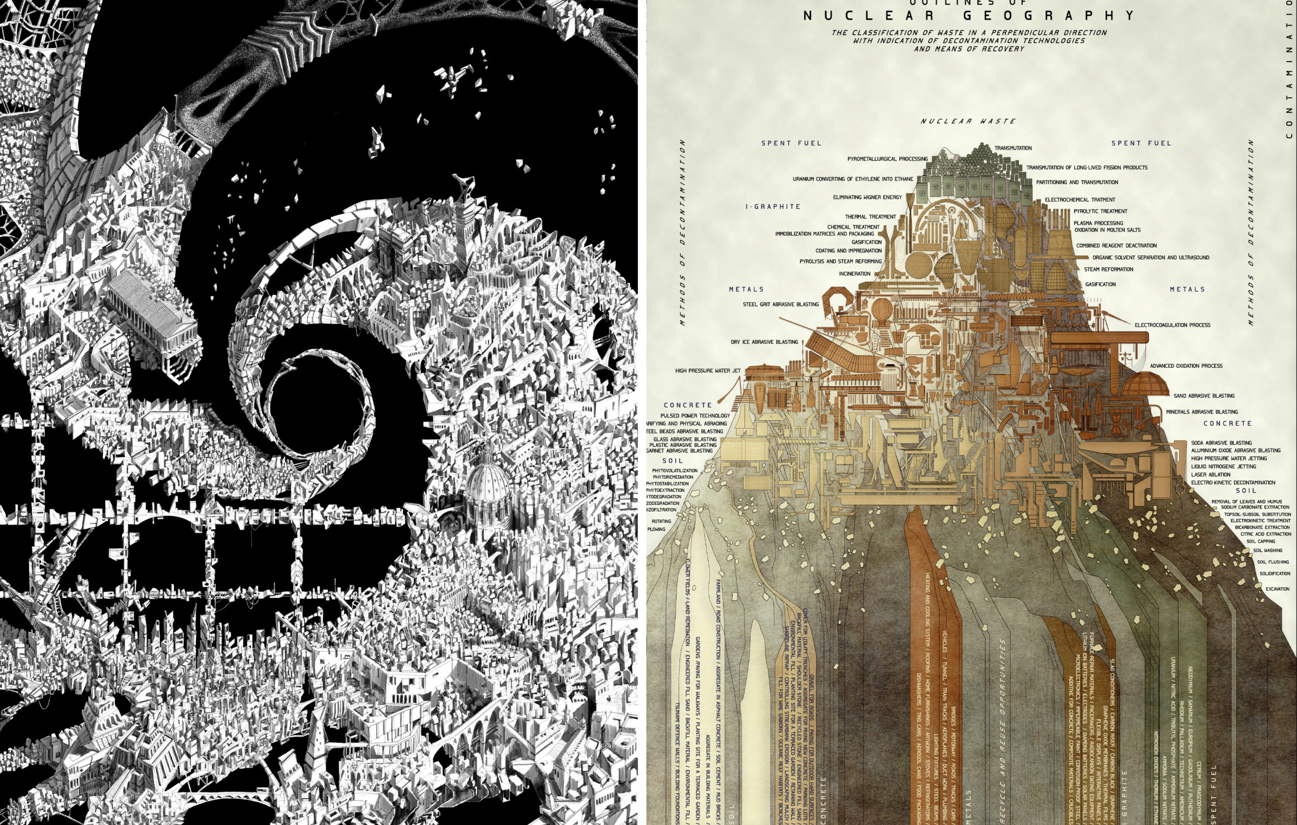
Left: “Vortex” by Endri Marku; Right: “Outlines of Nuclear Geography” by Sabina Blasiotti; Winners of the 2021 One Drawing Challenge
Similarly, architect Endrit Marku, last year’s Non-Student Winner for the extraordinary “Vortex”, used his interview to speak about the rewarding nature of the competition: “As an architect who loves drawing, it came naturally to search for a competition rather than, let’s say, finding an art gallery to exhibit my work. In this search, it is impossible to miss Architizer’s event. Winning was beautiful and unexpected. It is highly motivational having your work acknowledged internationally by reputable experts.”
Now, it’s your turn: Hit the button below to begin your entry, and tell YOUR story about architecture with a single drawing:
Enter the One Drawing Challenge
You can find out everything you need to know about this year’s competition here, including entry guidelines, deadlines, entry fees, FAQs and more. If you need assistance with your submission, don’t hesitate to reach out to us at competitions@architizer.com and we’ll be glad to help. Best of luck from the whole team at Architizer!

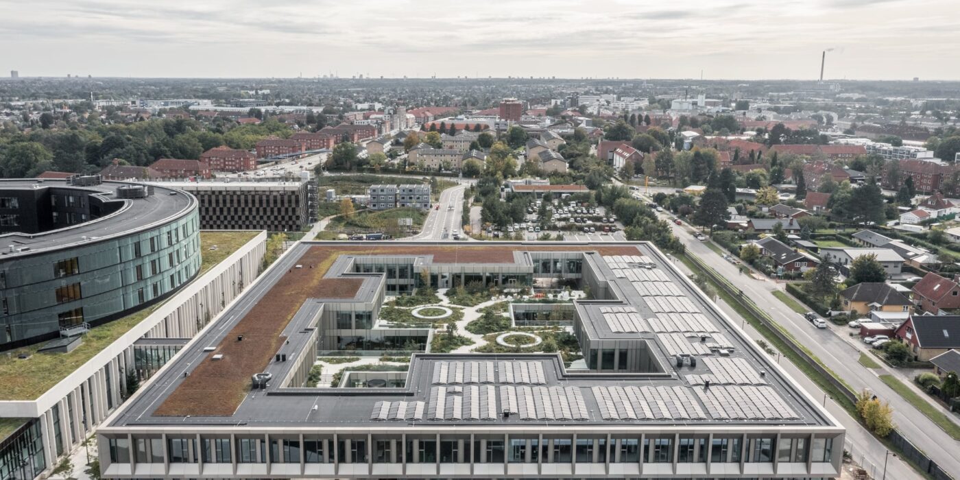
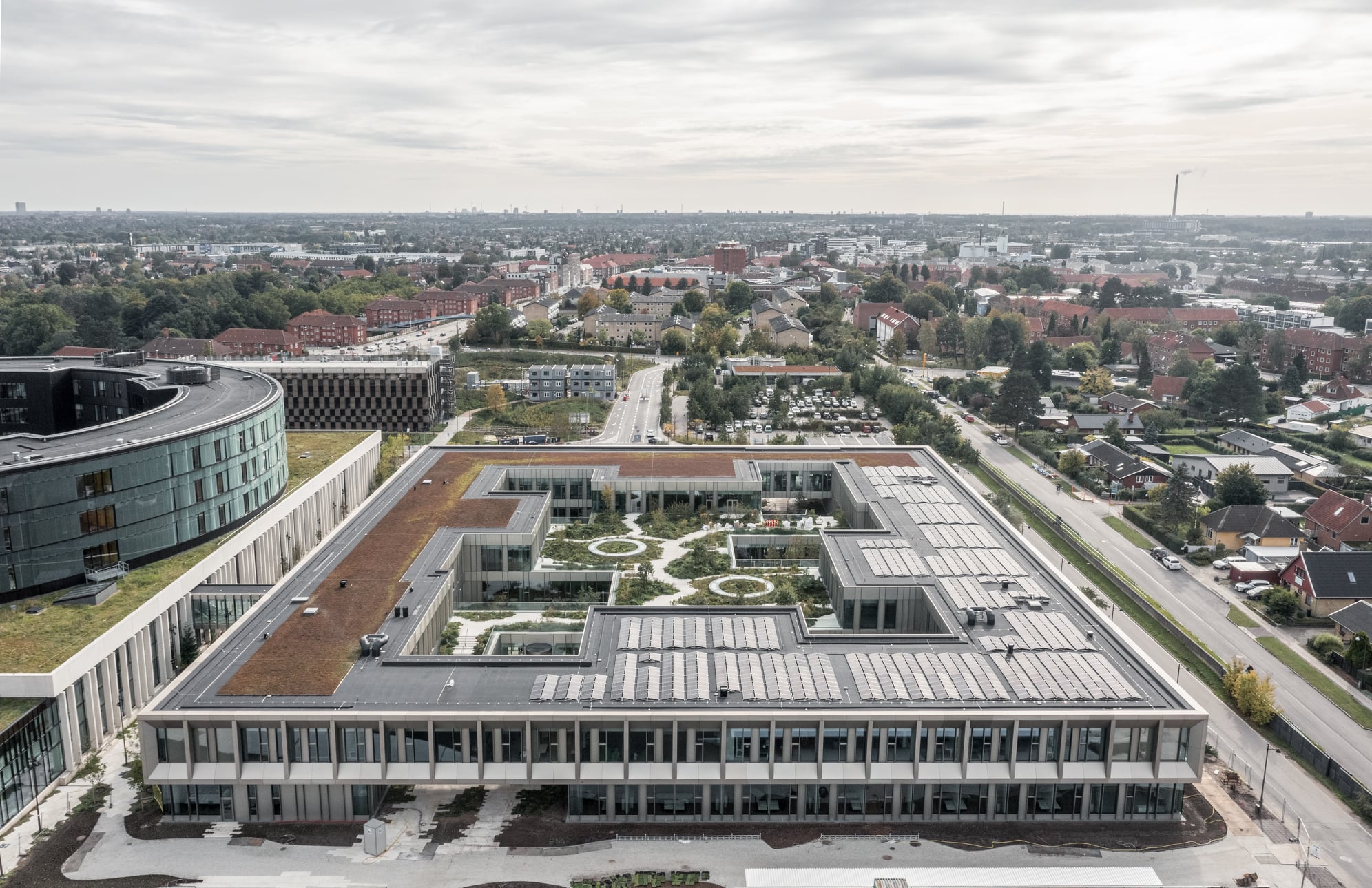
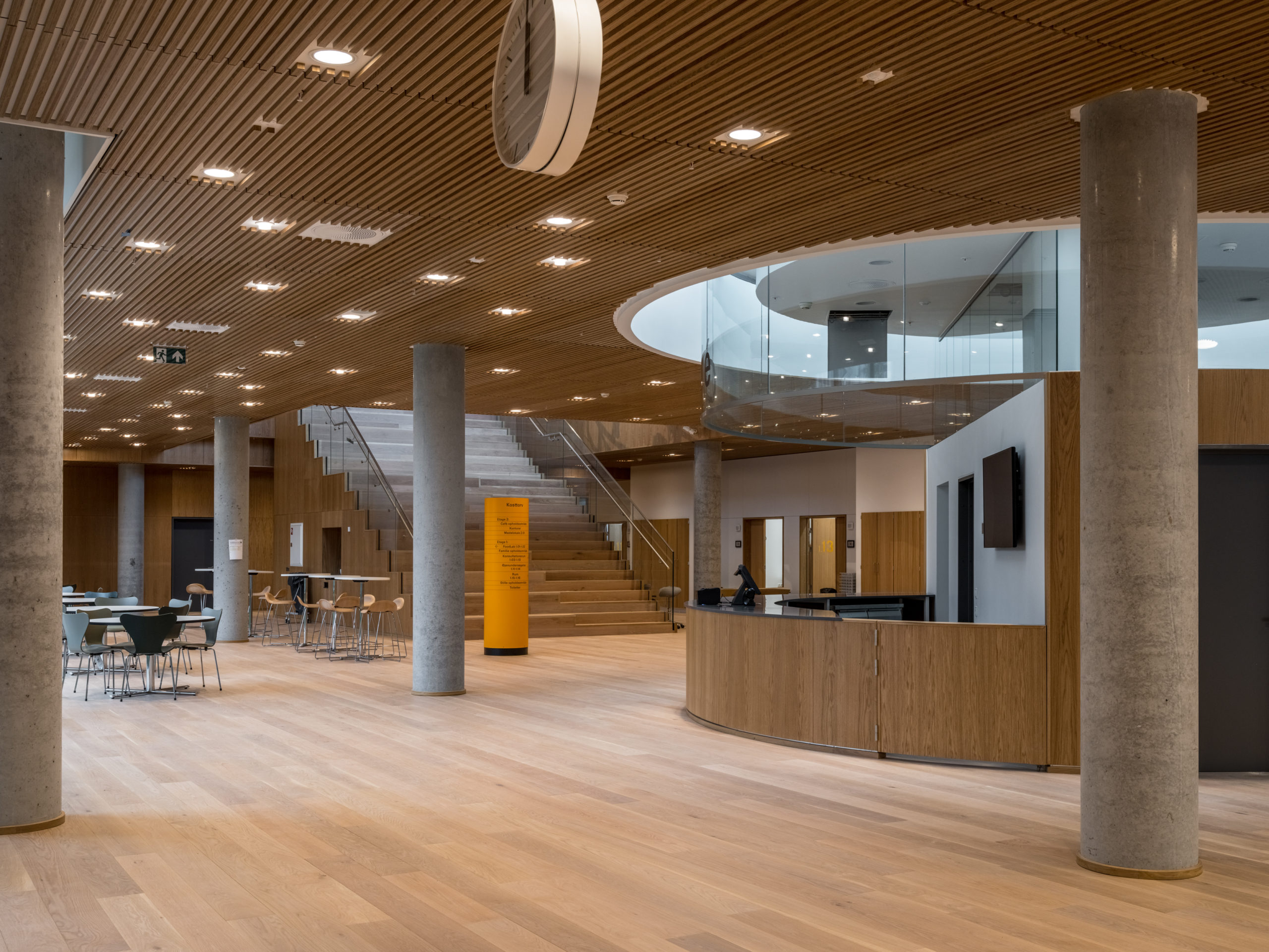 Steno Diabetes Center Copenhagen is a hospital for preventing and treating diabetes. The hospital occupies a rectangular site with two entrances open on two opposite sides. There are four inner gardens on the first floor and two of them greet the visitors immediately upon their entry. Common areas such as circulation spaces and reception sit in the middle of the floor plan, while most individual rooms are lined on the outer ring.
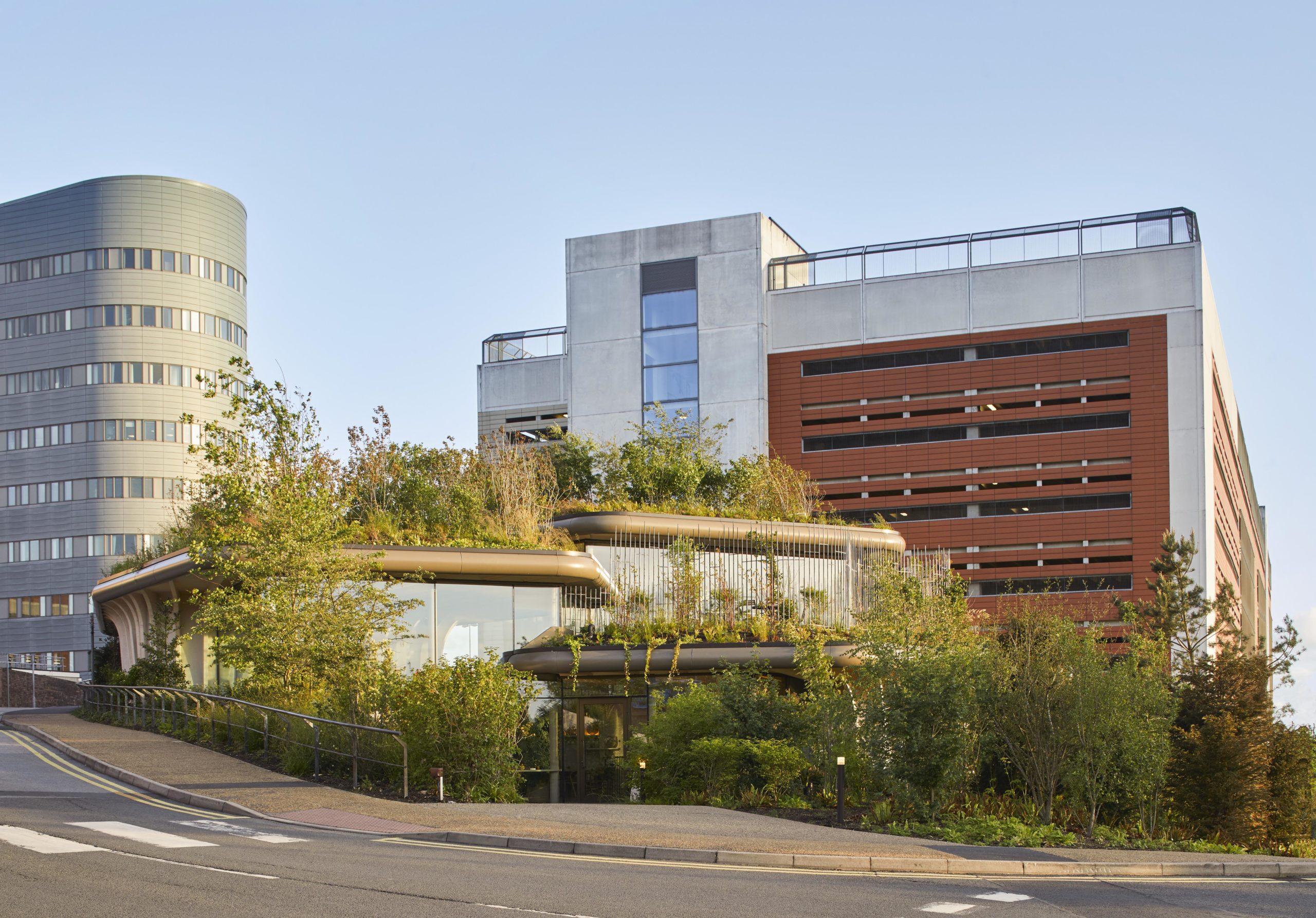
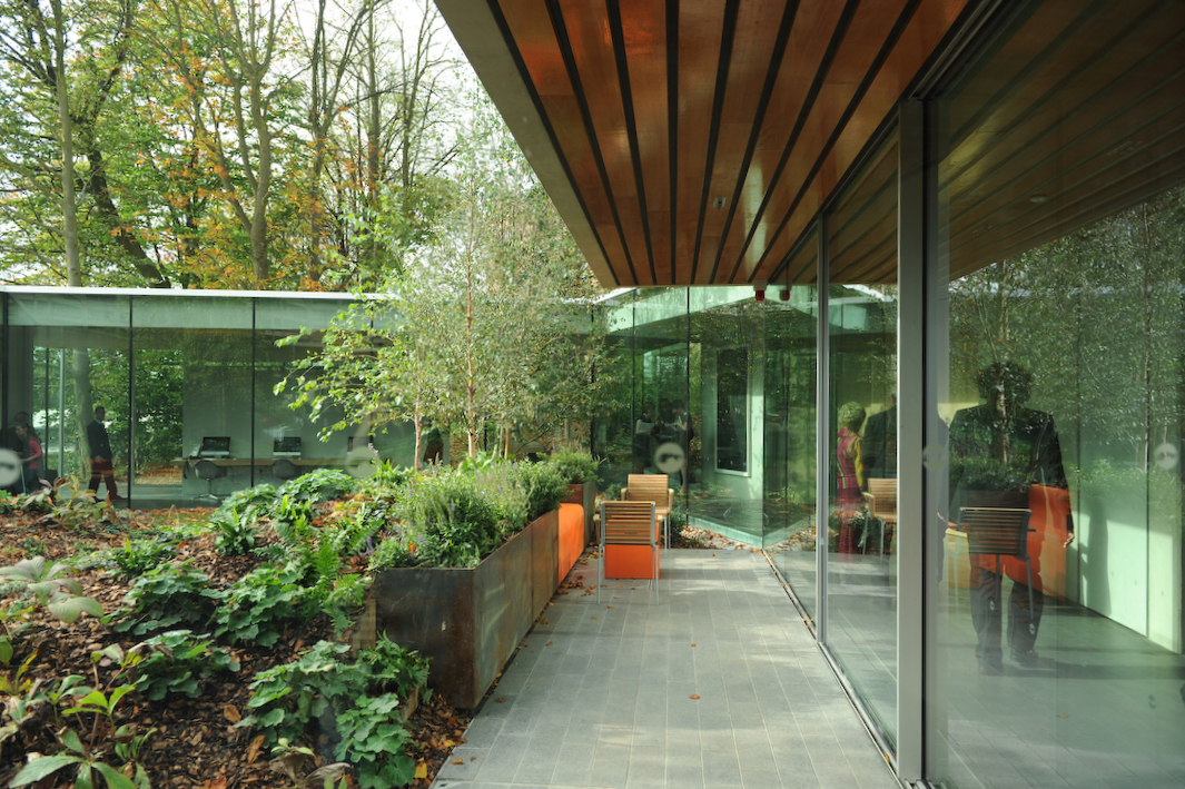
 Maggie’s centers provide free cancer support and information to patients and their friends and families. The centers are located across the UK, each in a unique style while all of them embrace nature as a way of healing. Maggie’s Leeds stands on the last patch of greenery at St James’s University Hospital. The sloping site is bounded by roads and a multi-story car park. Instead of flattening the landscape, the spaces descend along the landscape, creating views that vary from open to secluded.
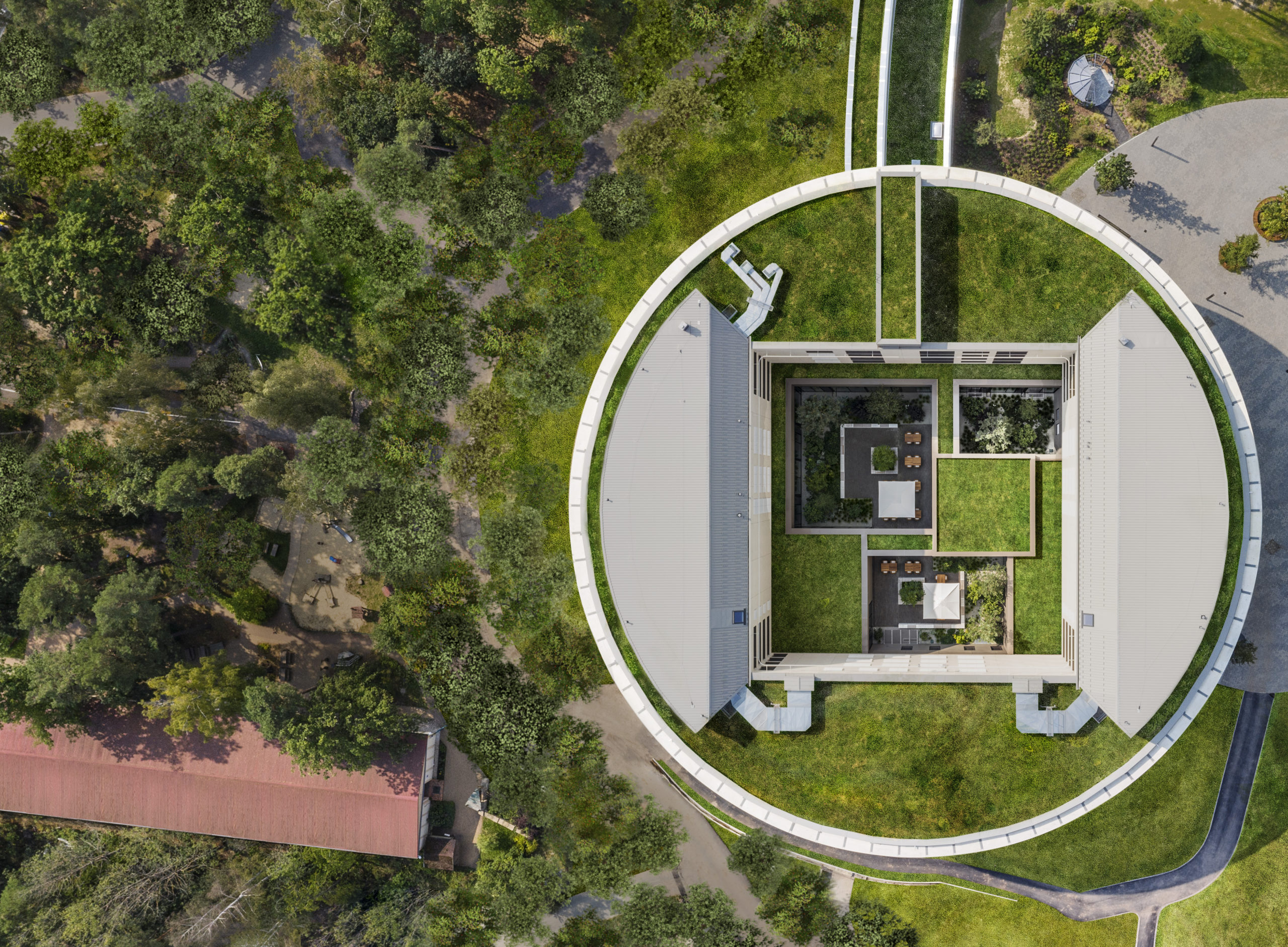
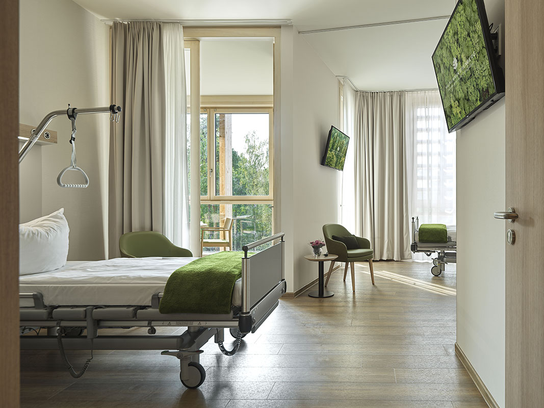 This new hospital wing of the orthopedic center Waldkliniken Eisenberg enjoys an immersive view of the Thuringian Forest. The six-story building has 128 patient rooms, all located on the outer ring of the circular floor plans. Floor-to-ceiling windows invite unblocked views of the natural landscape into the rooms while providing natural light and fresh air to the rooms.
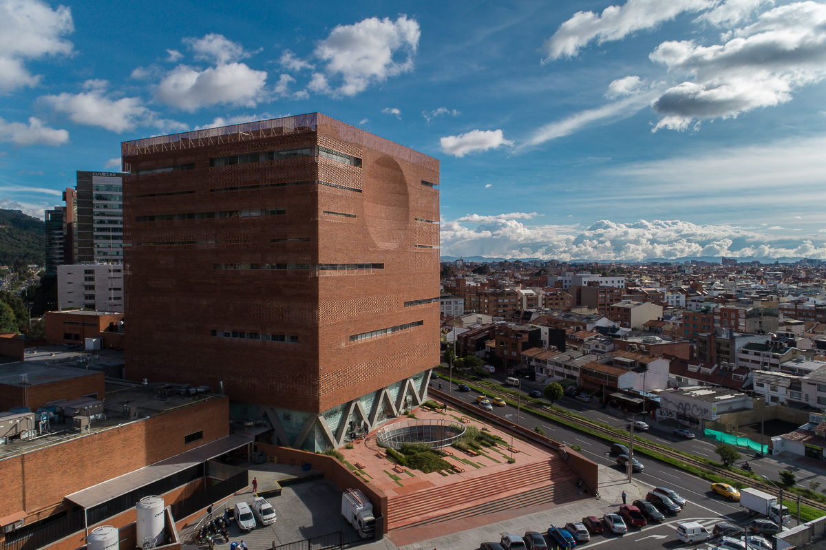
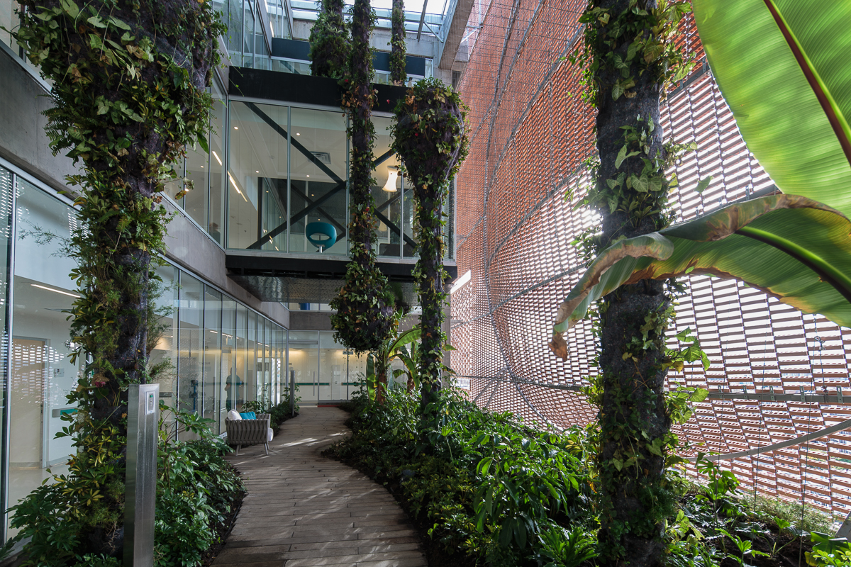 The expansion of Santa Fe de Bogotá Foundation is sited in the compact urban context of the city of Bogotá. It comprises an eleven-story block and a single-story base. The roof of the base becomes a plaza opening to the roads, with staircases inviting people onto it. Red bricks cover the expansion as a response to the existing buildings around. Strips of pavement on the plaza are replaced by plants. Different types of plants vary in height, breaking the flatness and solidity of the brick plaza.
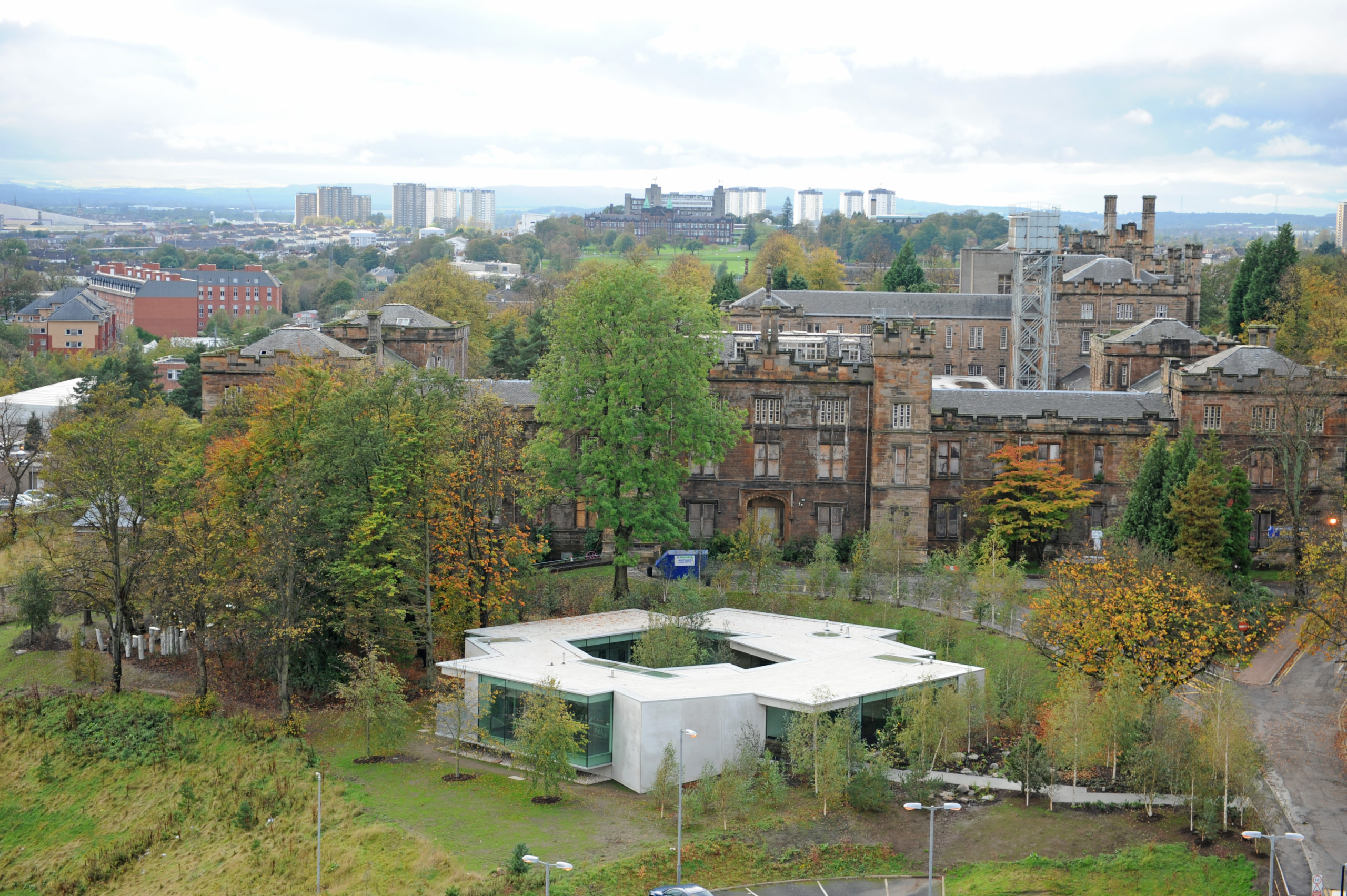
 Maggie’s Gartnavel sits humbly on the land of the Gartnavel hospital in Glasgow, close to the Beatson West of Scotland Cancer Centre. The single-level volume comprises a series of interlocking rooms, with an inner garden in the middle of the ring of rooms. With a flat roof and floor levels that respond to the natural topography, the rooms vary in height. Common areas including the dining room, kitchen, library and a large activity room are on the side with taller ceilings and the counseling rooms are more intimate.
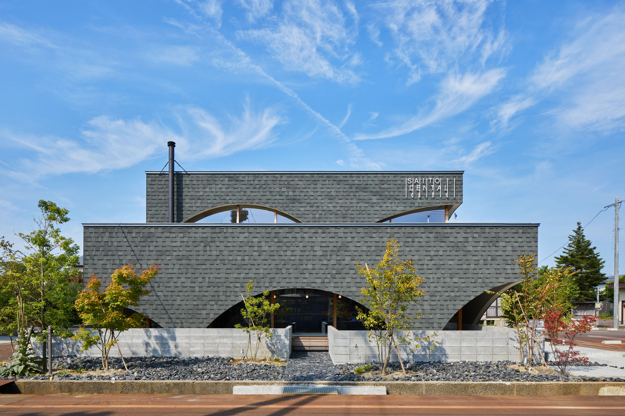
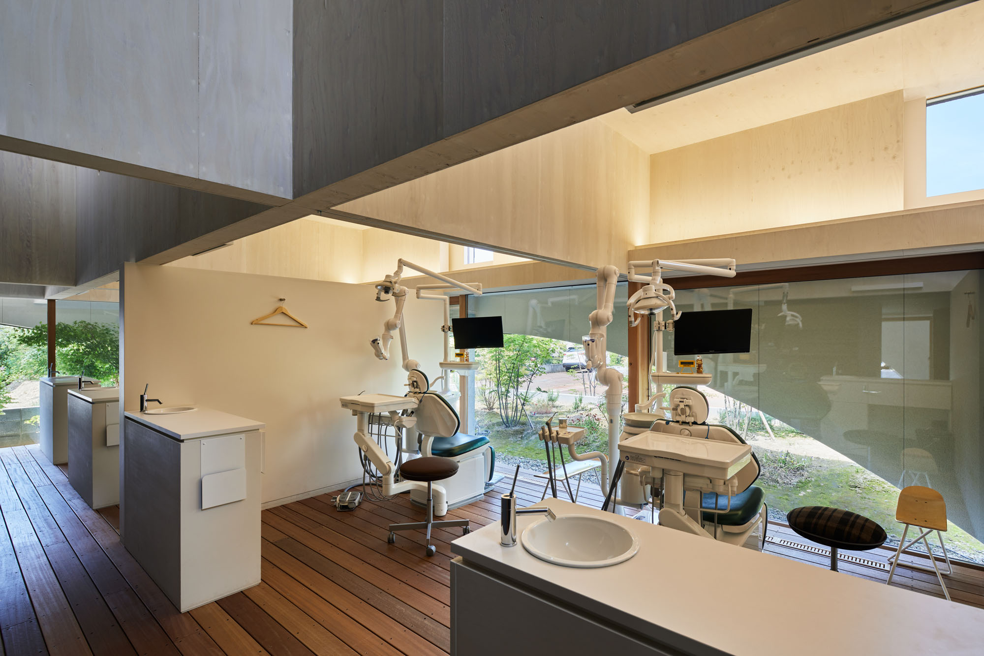 Neighboring a nursery, elementary school and junior high school, this dental clinic is designed as an enjoyable place for both children and parents. This two-story timber building accommodates not only a clinic but also a bookstore and daycare center. By combining programs, the design team wishes to encourage people to come not just for their appointment.
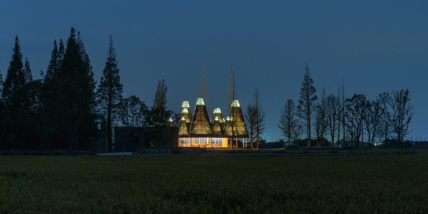
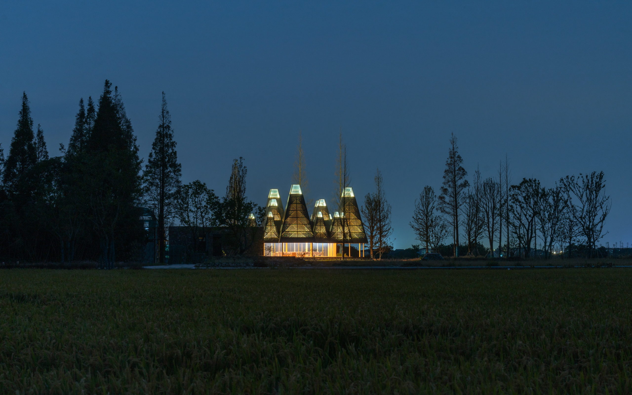
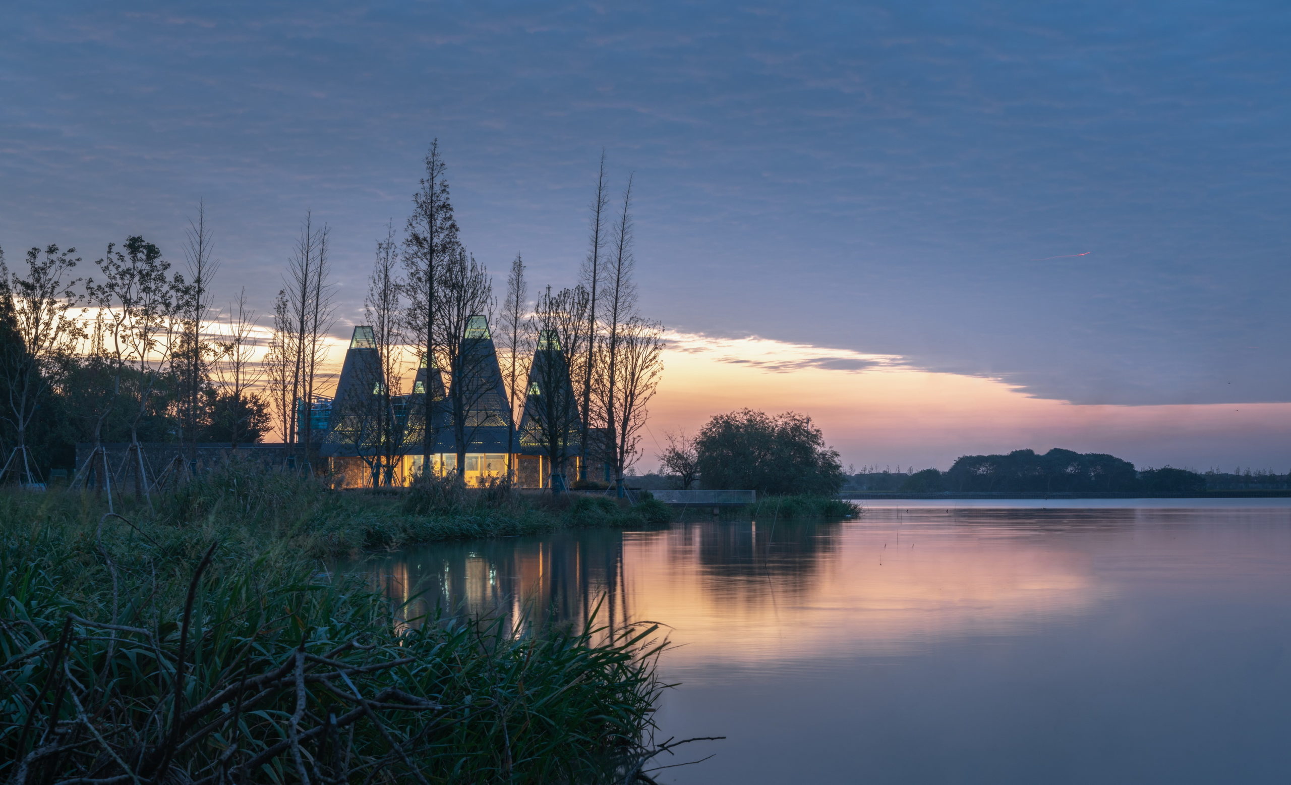
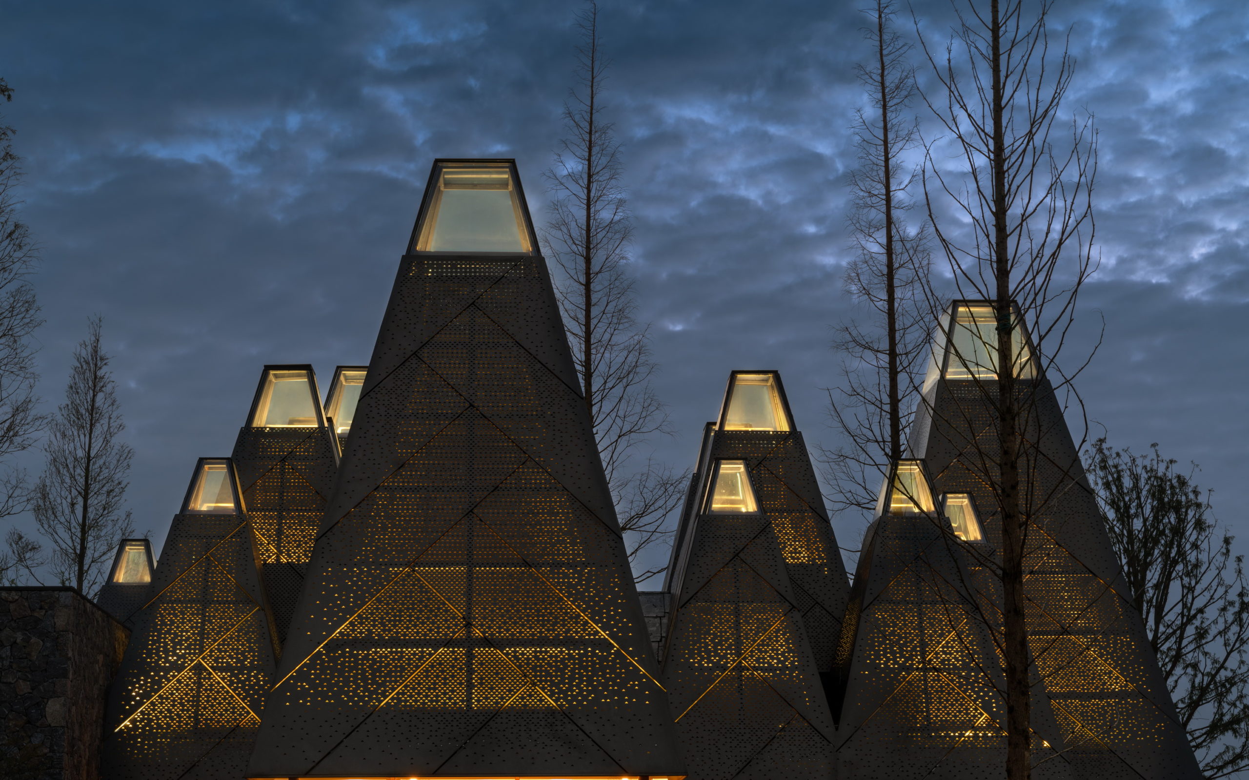
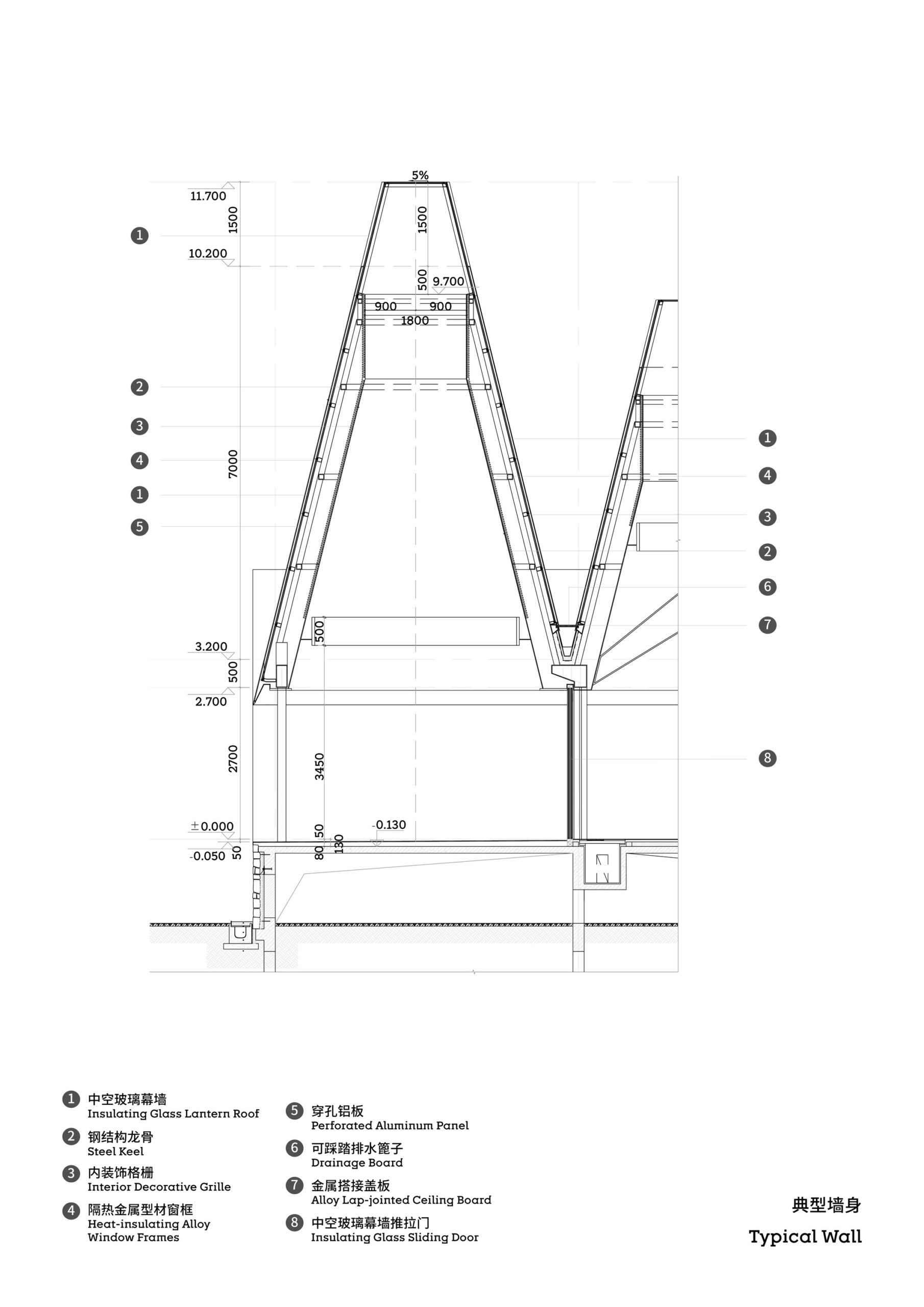
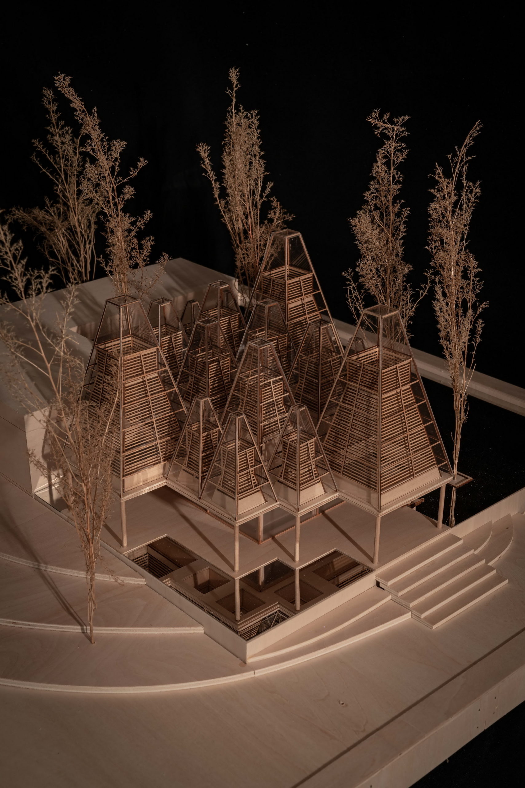
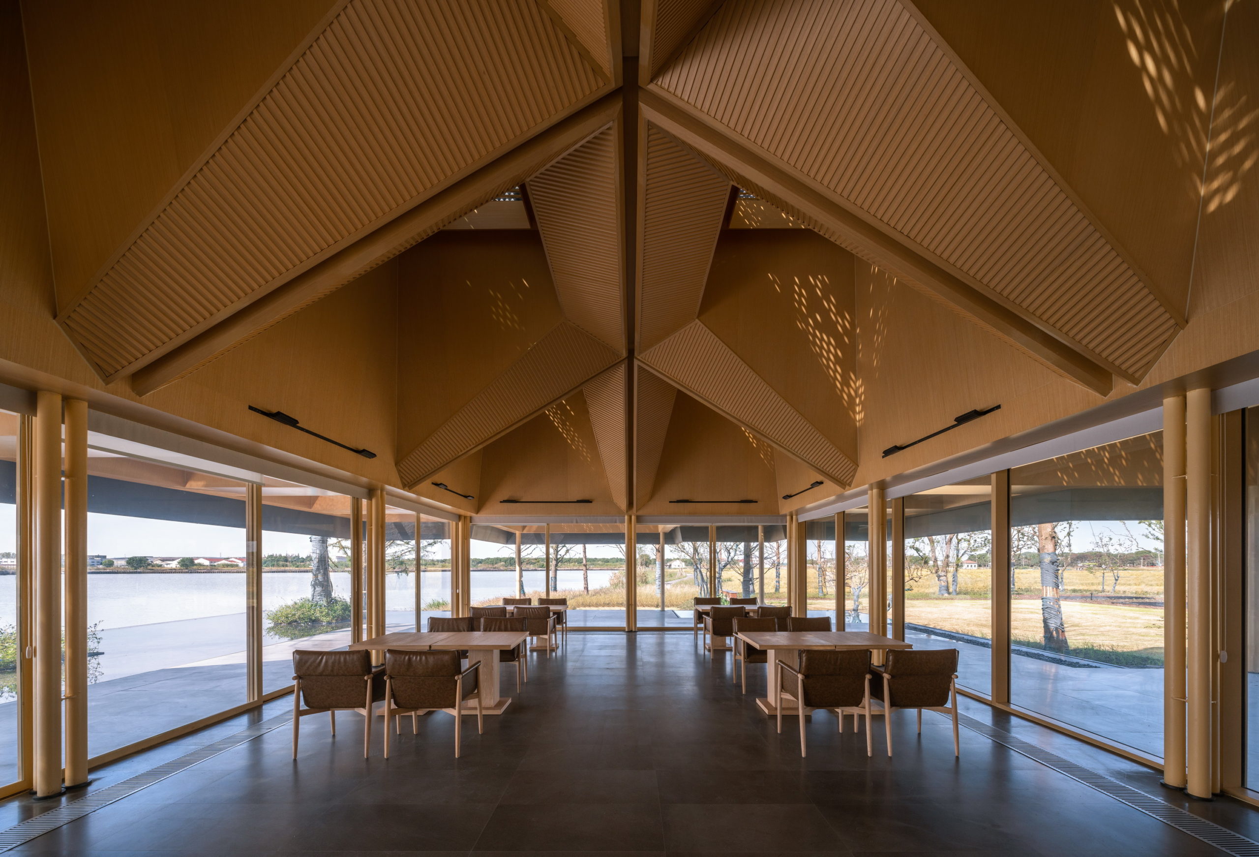
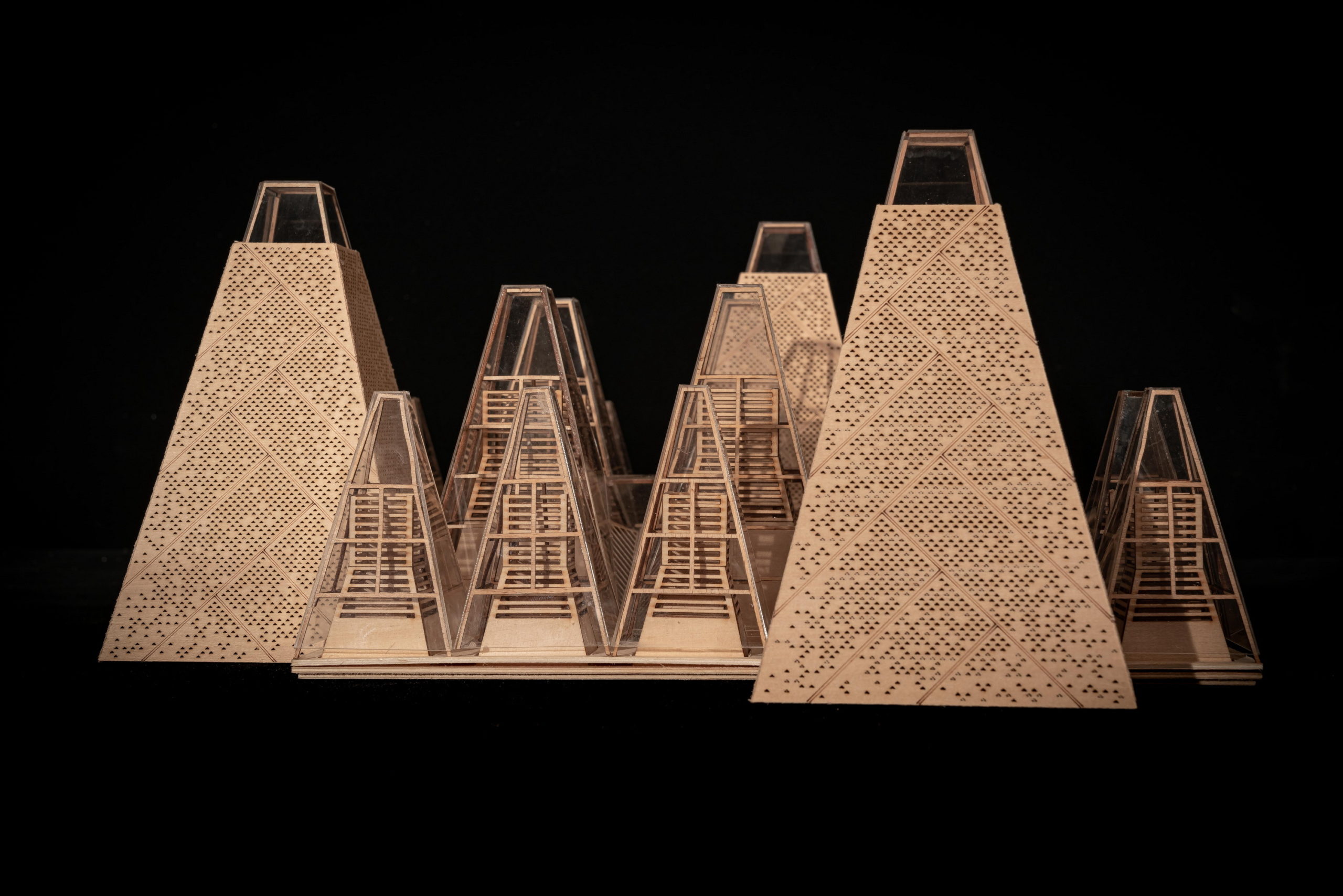 Despite the different heights on top, the lower end of the roof is evenly lowered by about nine feet to create a crisp frame of the view around. “Standing under the eaves and looking out, the vastness and tranquility of the plain wetlands seem to be included in the picture scroll,” GOA explained. The underside of the roof is also free of vents, which are in turn placed at the ground level along the glass windows, to create a disruption-free experience.
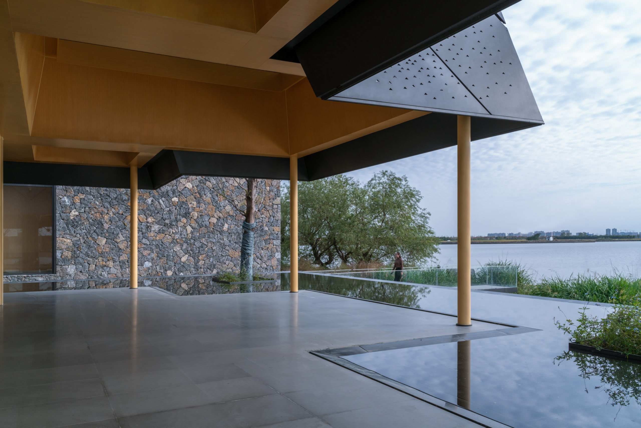
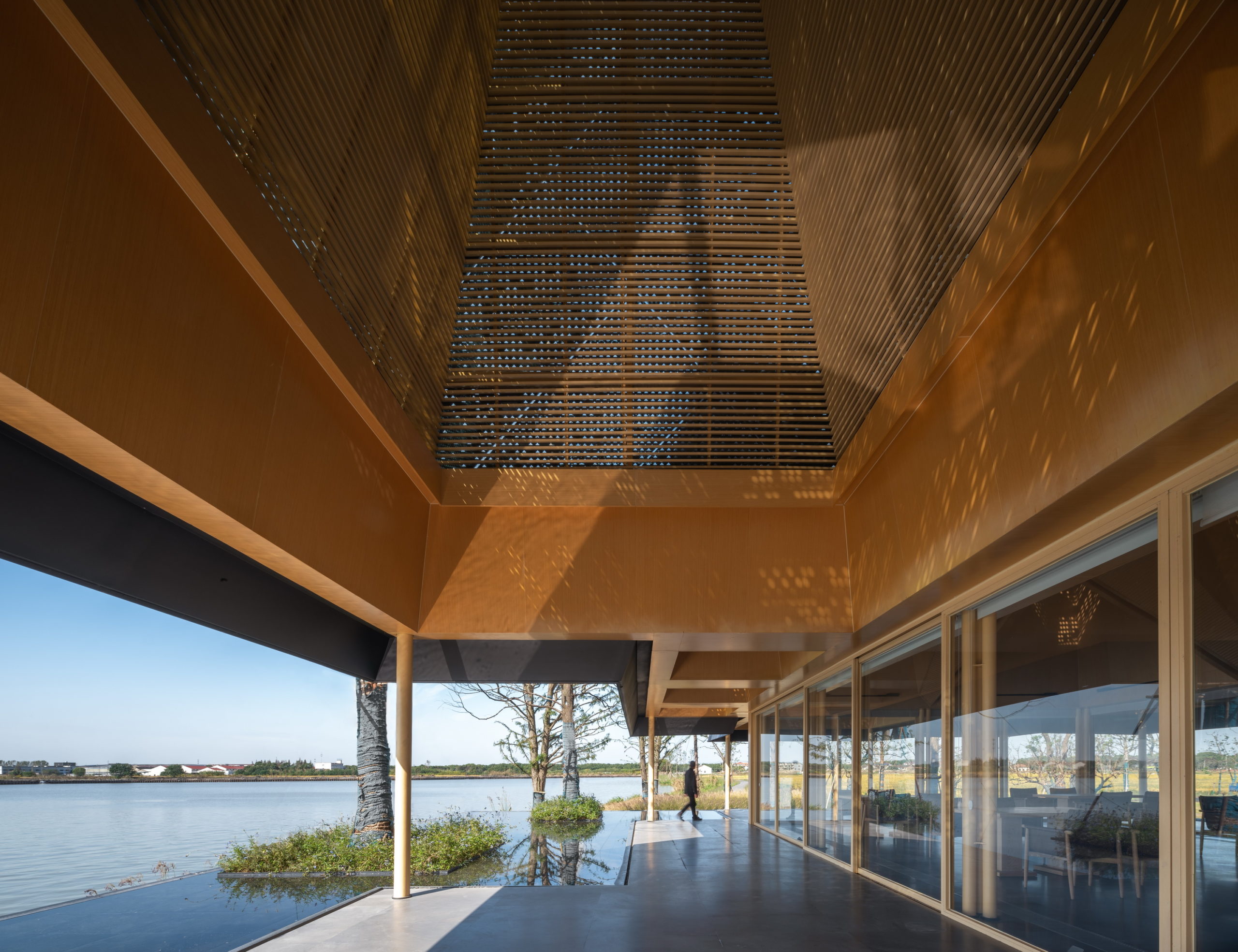
 In addition to eliminating partition devices, the team has further blurred the boundaries between the structure and site around by using the same paving materials within the restaurant and the terrace that extends outwards. The terrace also includes a planned water body, closer to the natural water body, which creates a continuous line of vision when sitting inside.
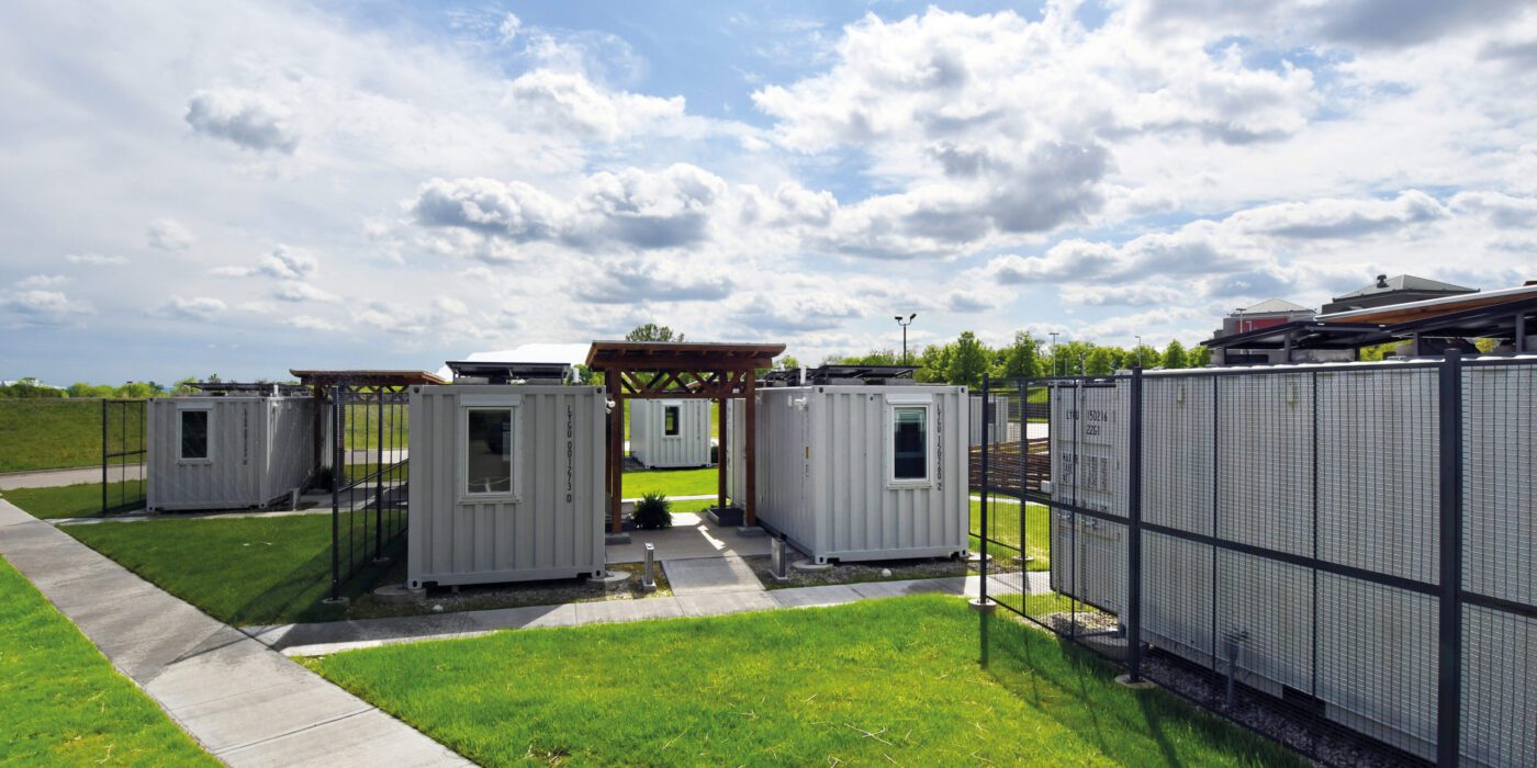
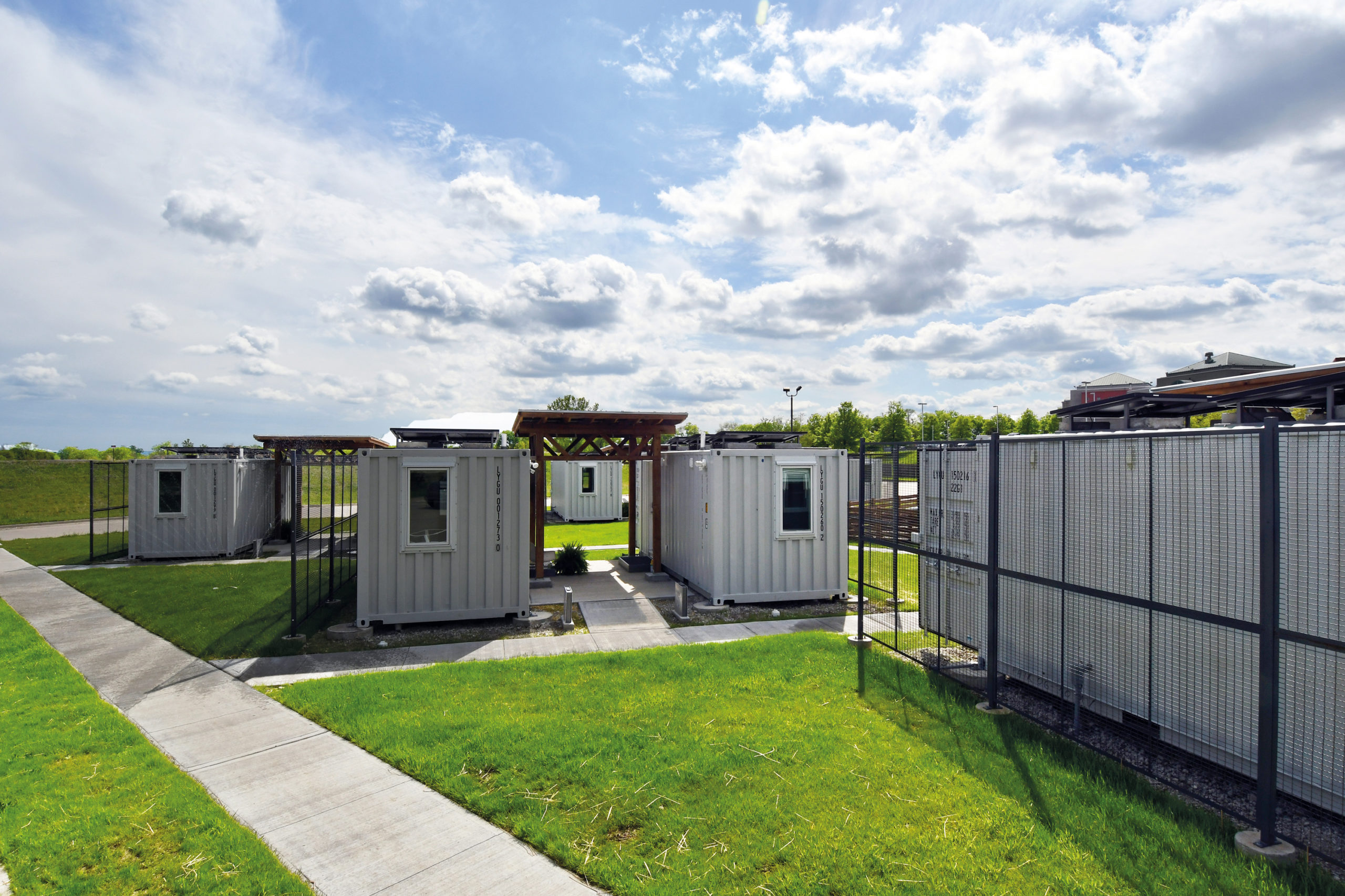
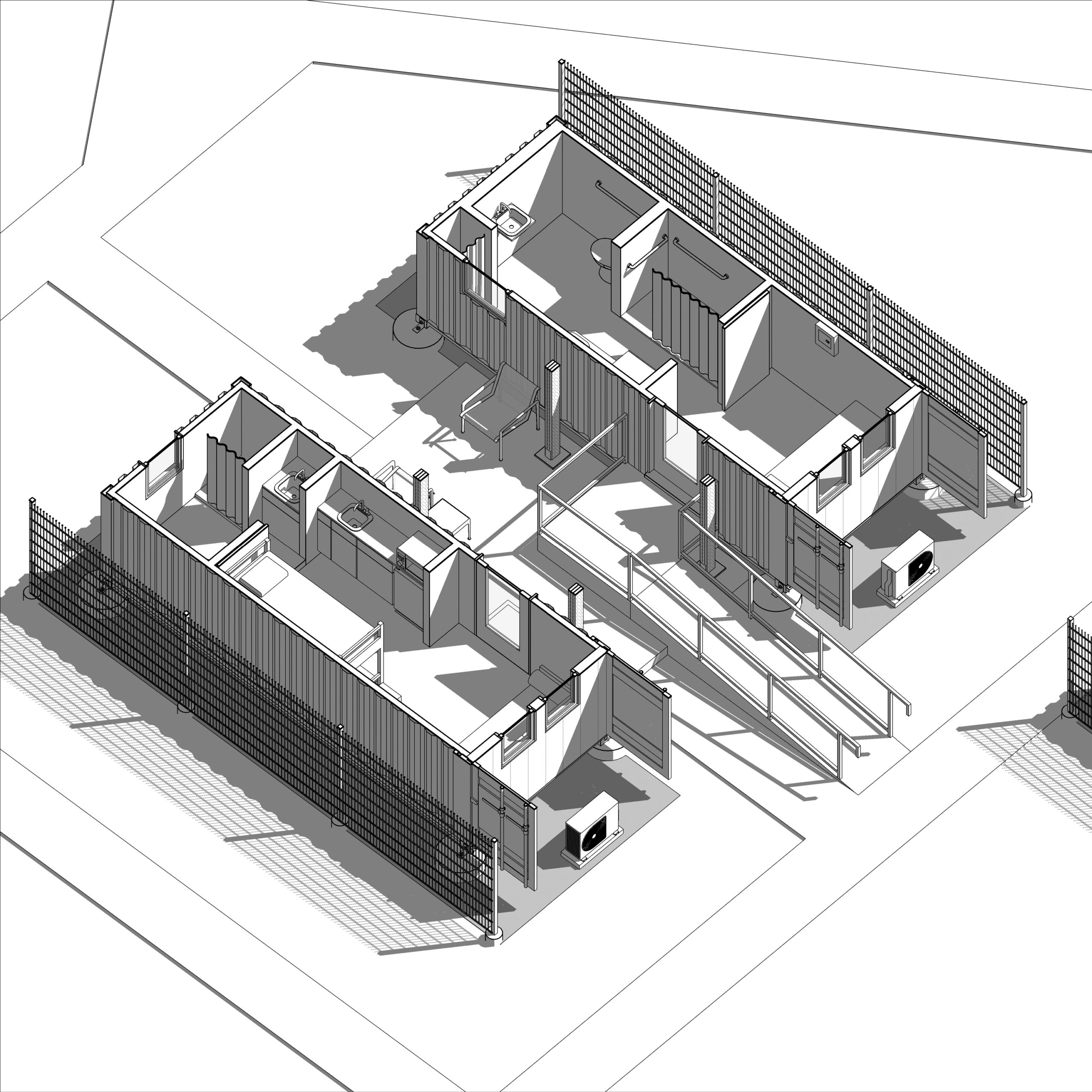
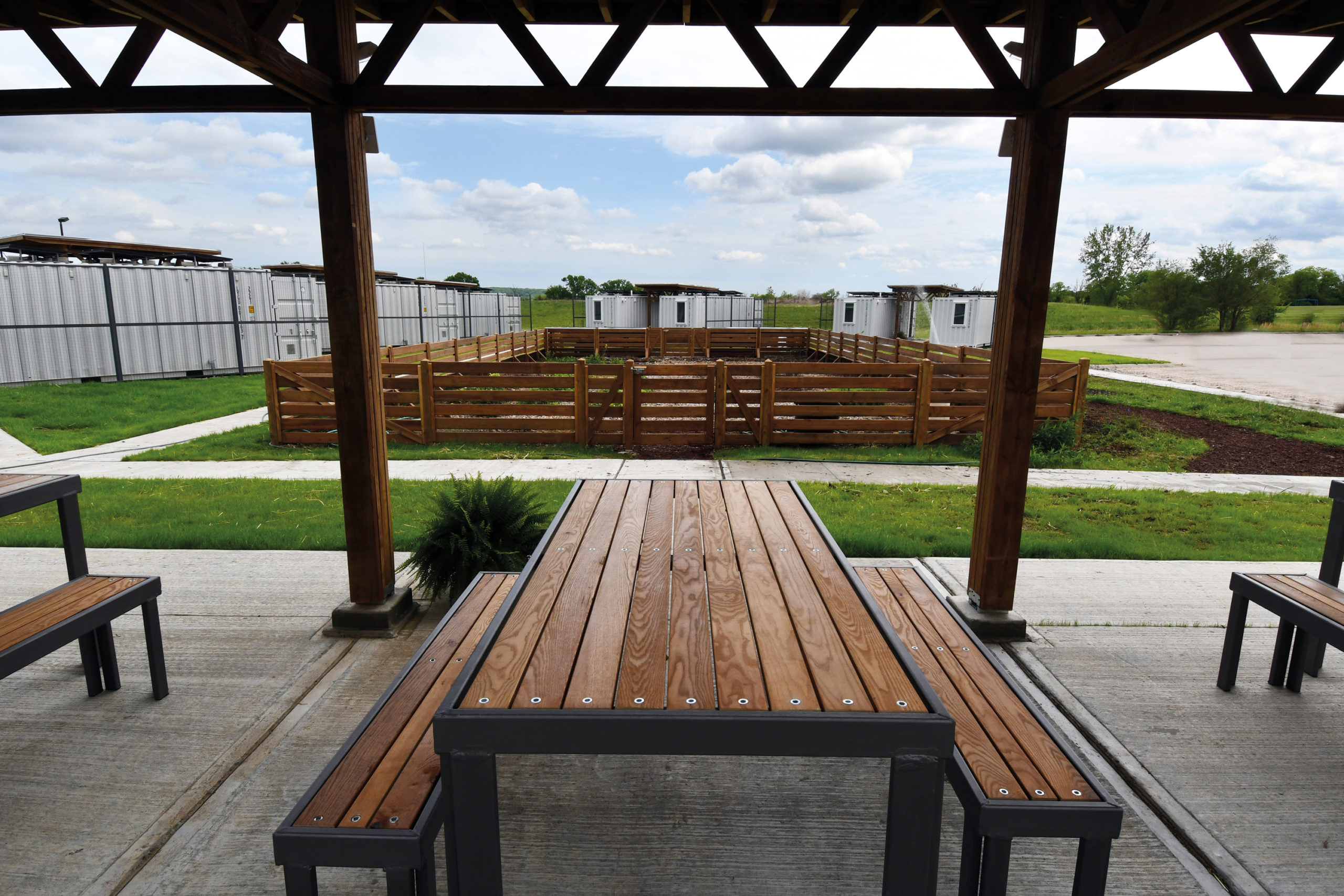 At the University of Kansas School of Architecture, graduate students have the option to enroll in Studio 804, which recently received a donation of a dozen shipping containers. The students worked to convert this gift into tiny homes for families who needed isolate during the pandemic. (The alternative was congregate housing.) Three solar collectors were placed on top of each unit to provide some electricity for inhabitants on the four beds inside.
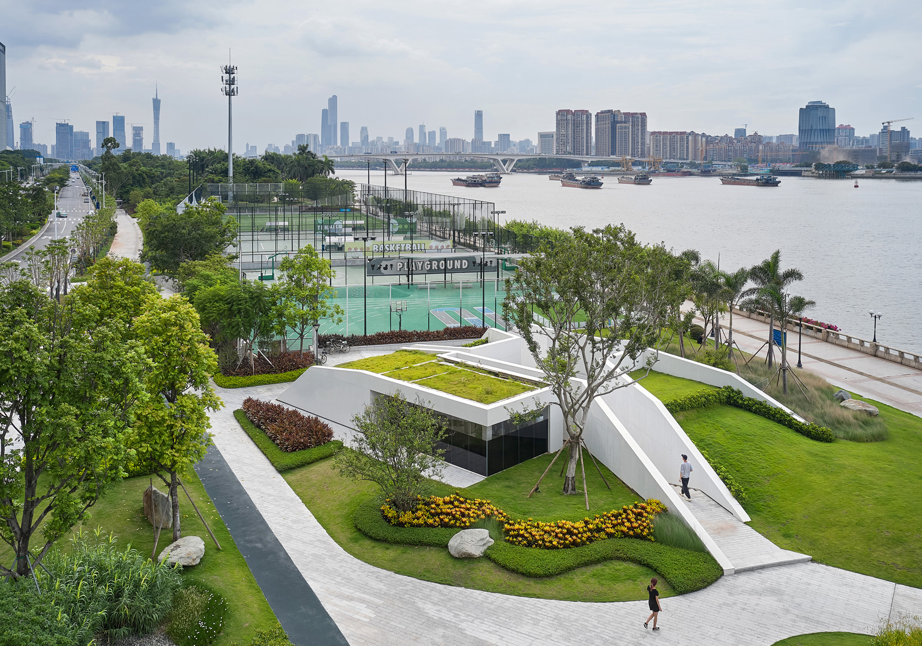 This project joins a growing movement towards architecture that blends in rather than standing out by acting as an extension of the existing landscape. Following the natural movement of the site, this design responds to crowds moving by through and around the building by raising up the green space of the original landscape and incising it with terrazzo paths.
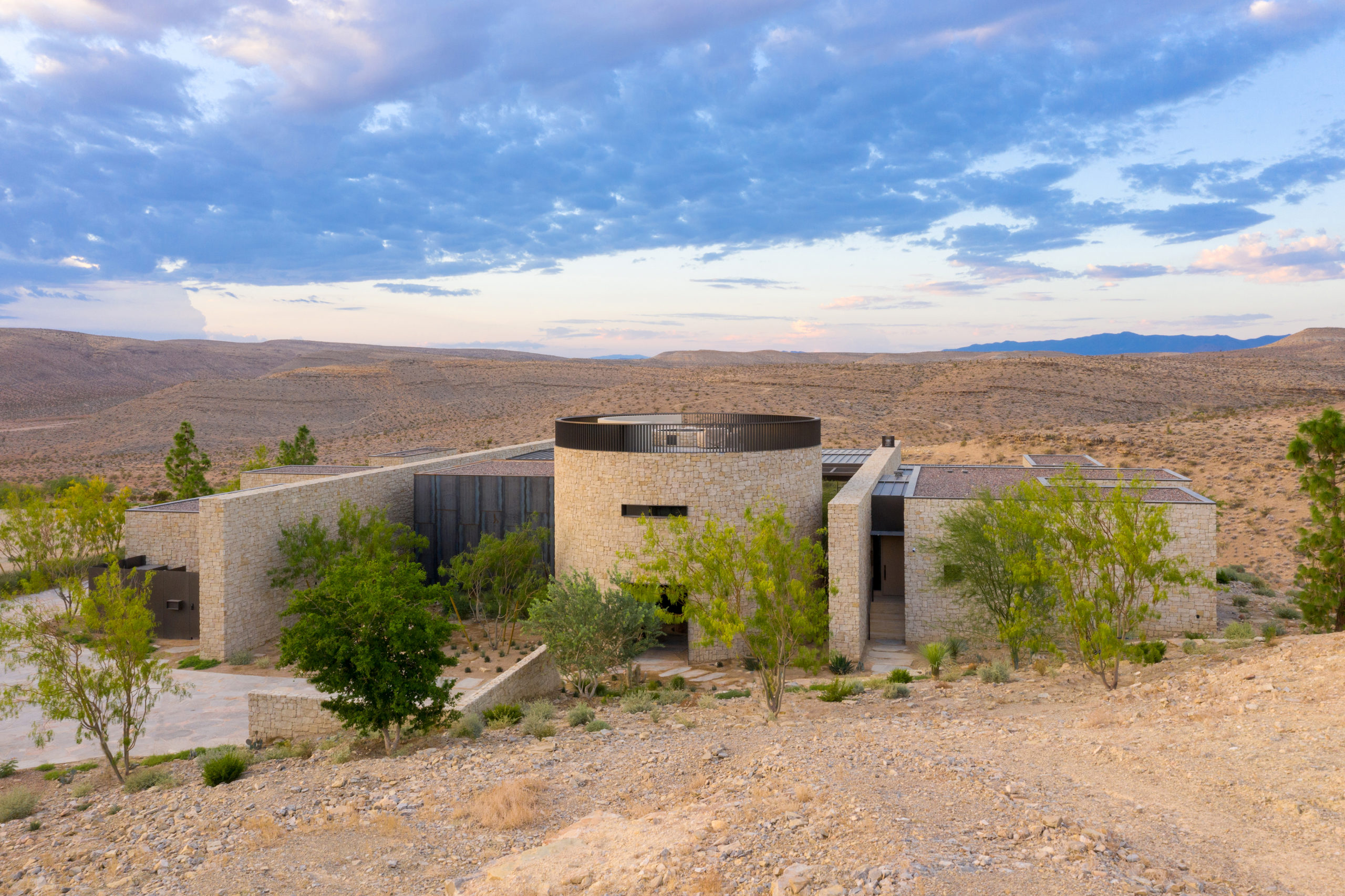
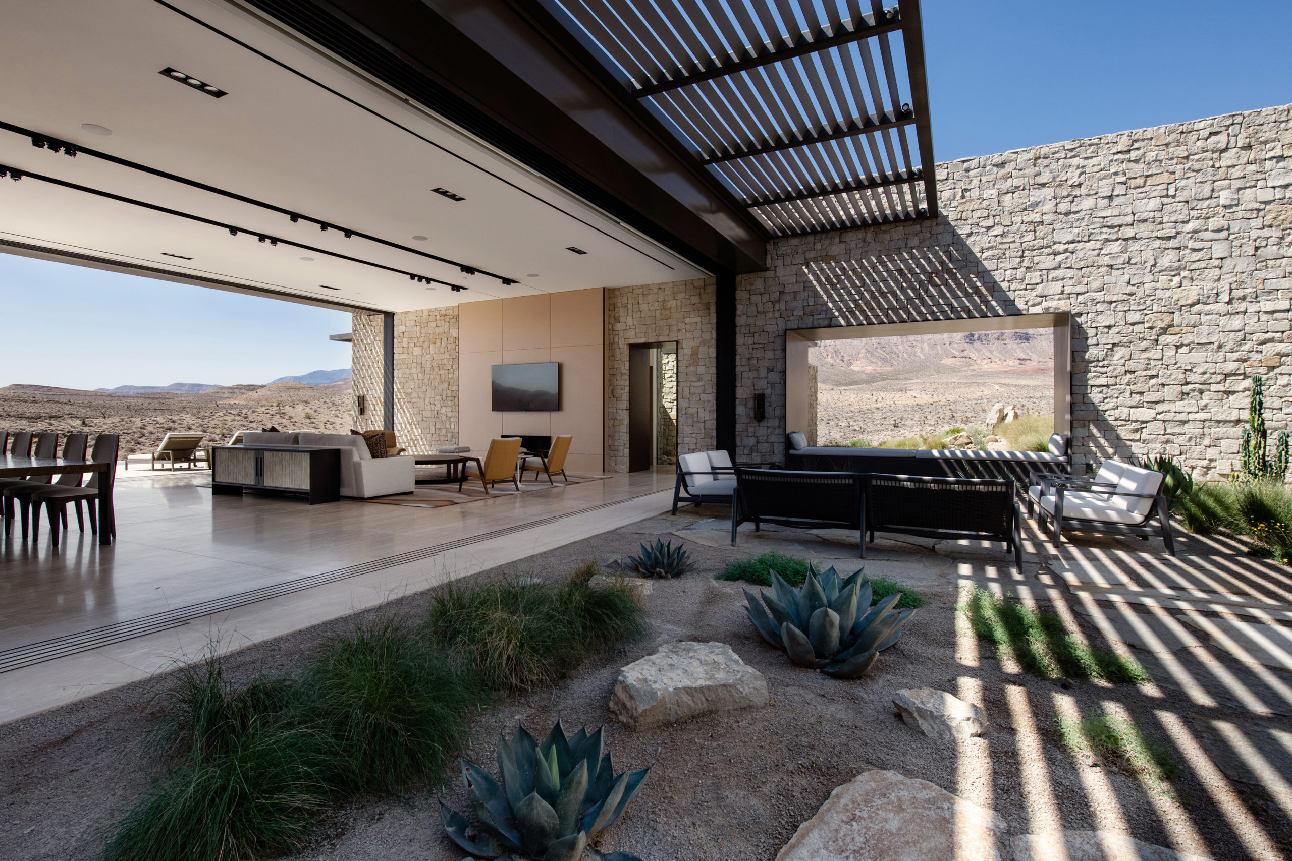 Perched on the most remote edge of the Las Vegas Valley, this scheme aims to immerse the client in the isolated landscape while maximizing unobstructed views of the surrounding desert and canyons. Like a stronghold in the desert, the site also inspired the design and materiality, which pays homage to the historic forts, hand forged from site-sourced materials, that dotted the fringes of the Southwest frontier.
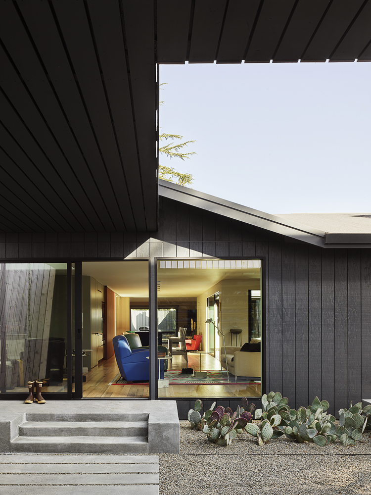
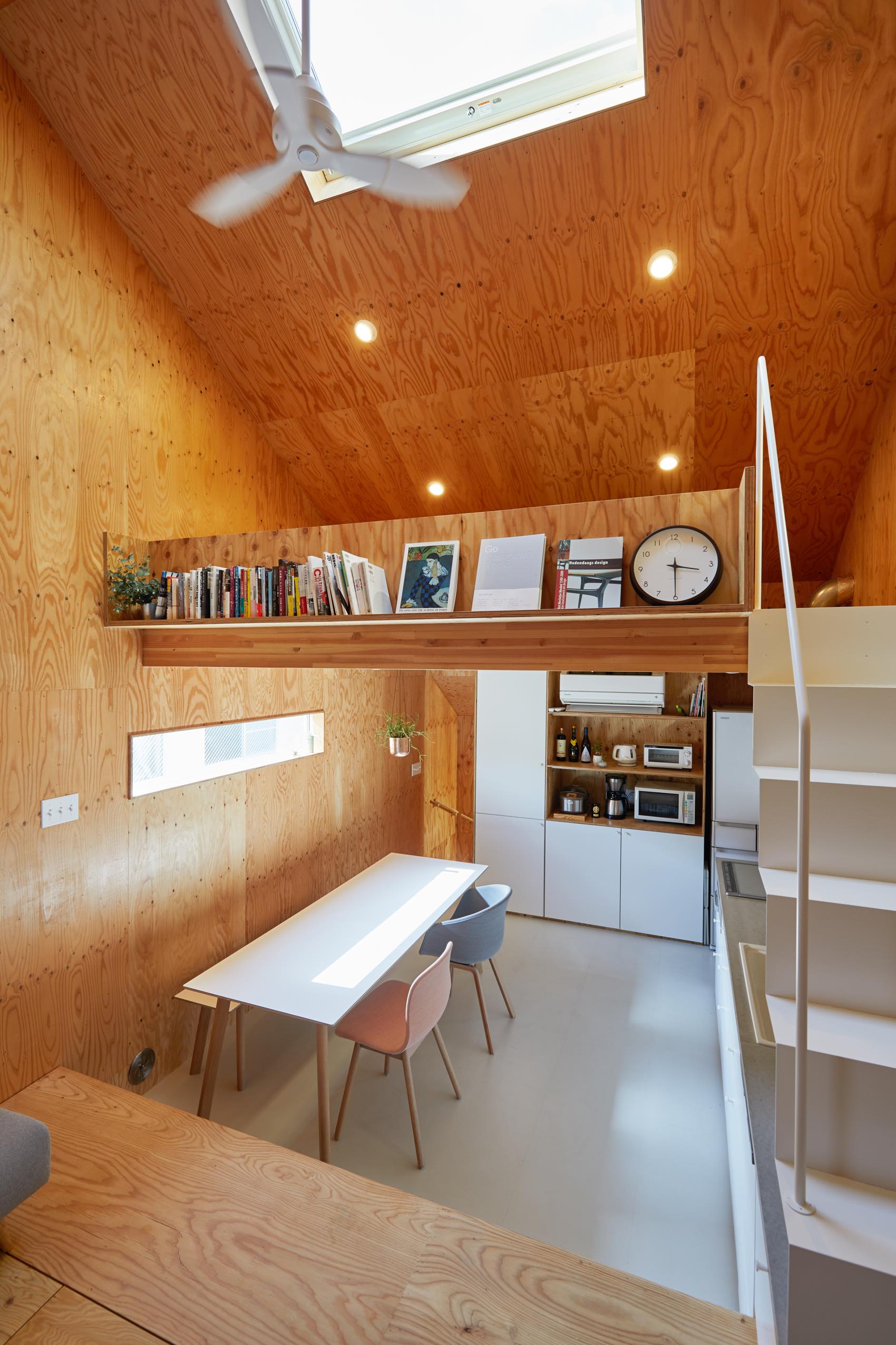
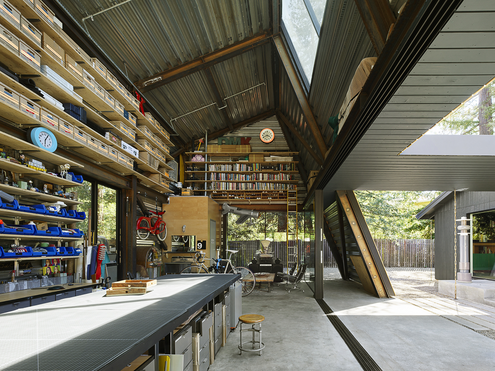 Reworking and remodeling this 1960’s house also involved integrating a new and unconventional workshop for the owner, a university professor. Yet, as the architects explain, “inherent in [the] work was a questioning of the suburban vernacular,” which manifested as a raw and tough space that is ready for anything. While an angled industrial frame, wrapped in wood and glass, offers a clever reply to local pitched-roof mandates, the connecting breezeway emphasizes a parti about flow, both creative and spatial.
 On one aspect the house seeks to express the laid-back nature of the seaside town; yet, because the surroundings are quite cramped, the architect had to carefully study the massing placement. This resulted in a sort of inside-out house, with an arrival courtyard penetrating to the central living deck that creates an in-between area that is convertible to be either indoor or outdoor living area.
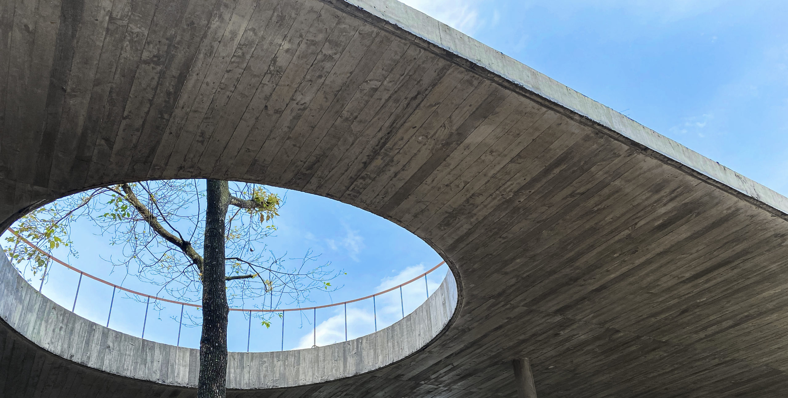
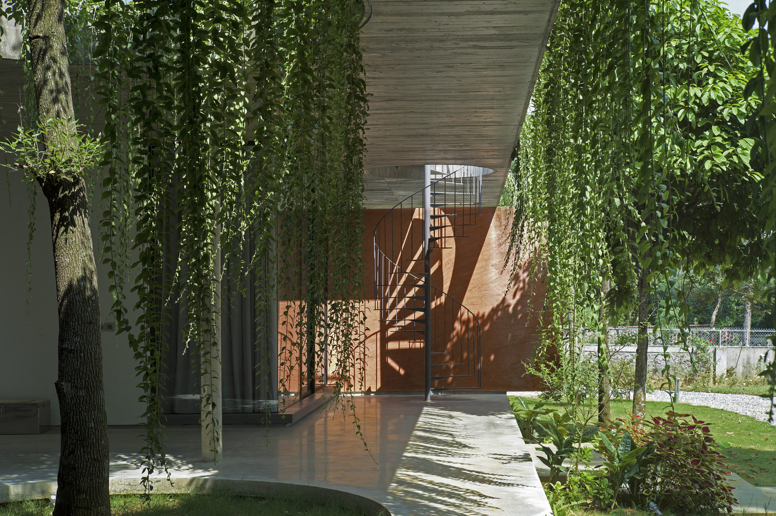
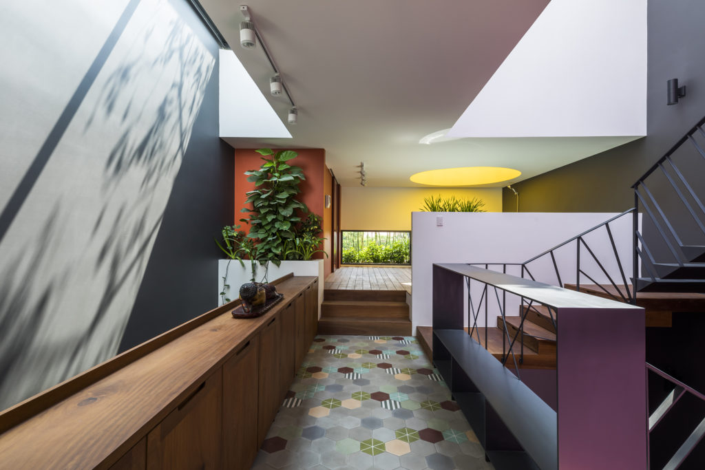
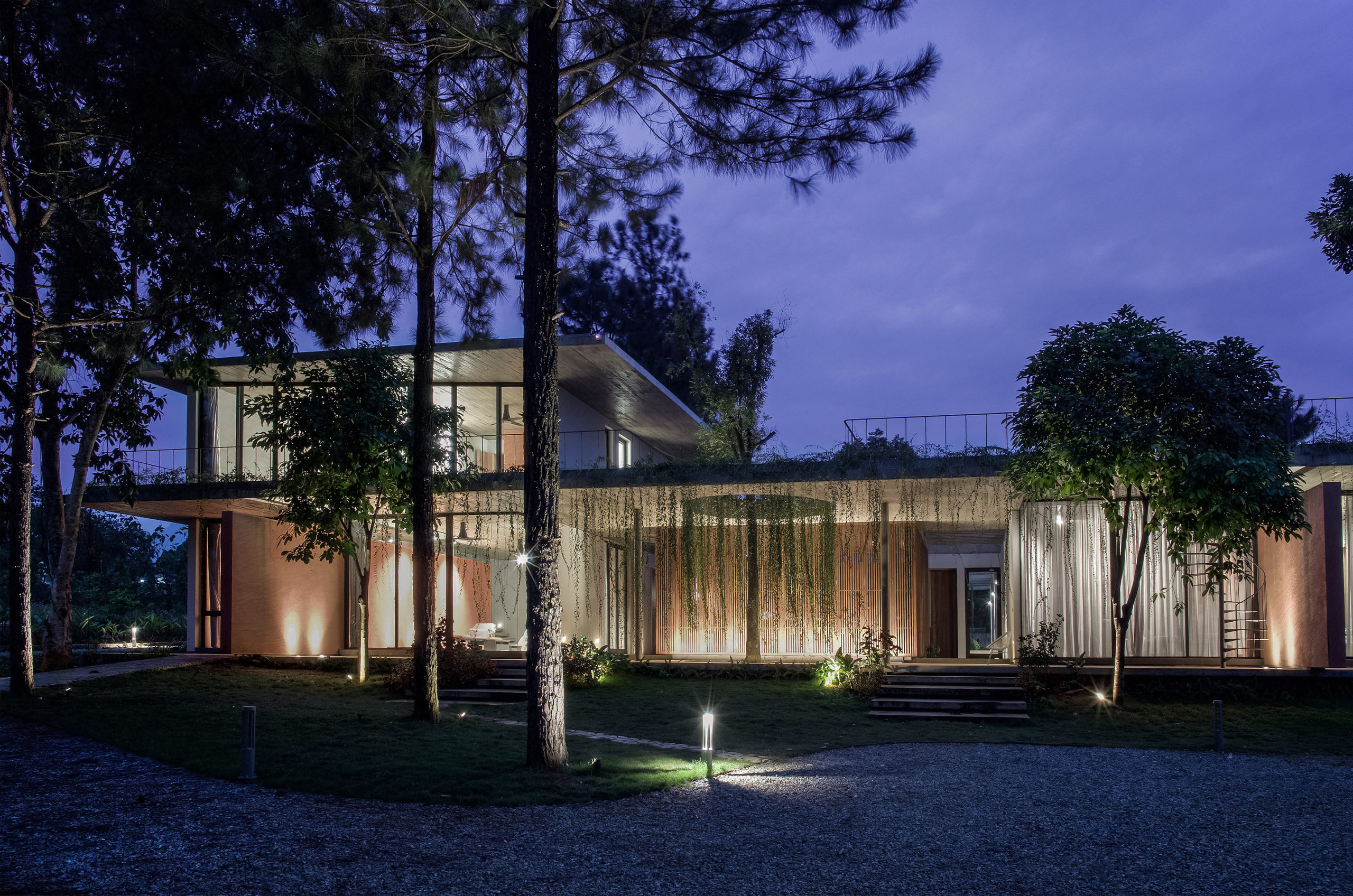 This house is home to family members across generations, meaning that it requires spaces that accomodate differences in family members’ lifestyles, ages and personal needs. While the grandparents are used to the traditional Vietnamese lifestyle, the married couple and their children are familiar with the modern way of living in foreign countries. Faced with designing a massive structure, the architects needed to find a way to ensure that it blended in well with its surroundings.
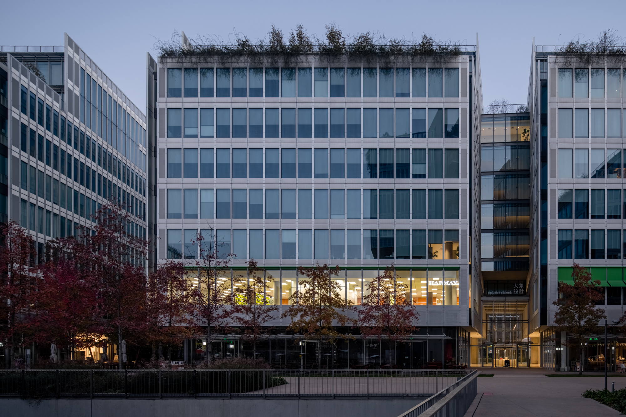
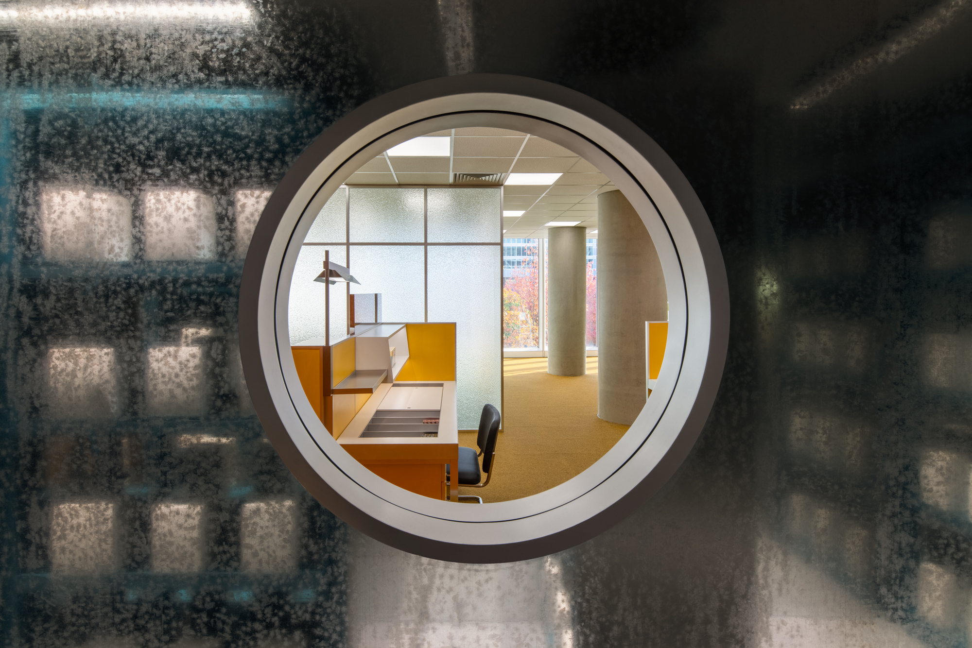
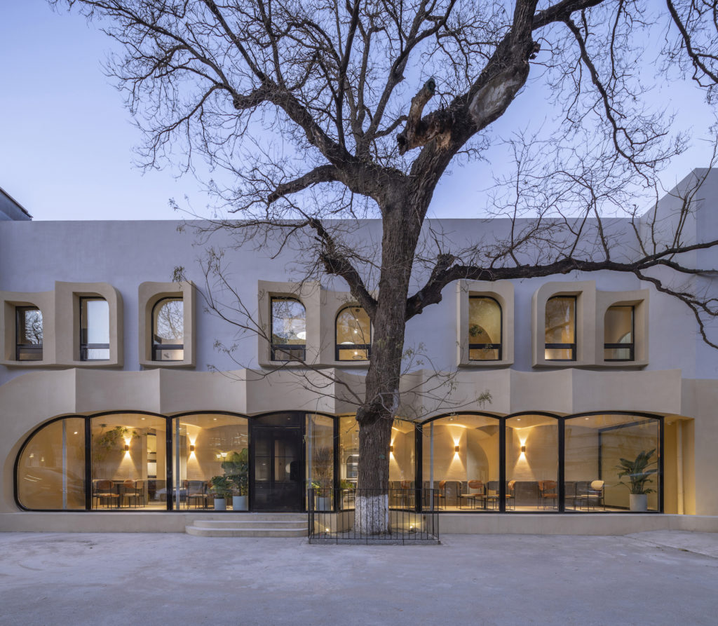
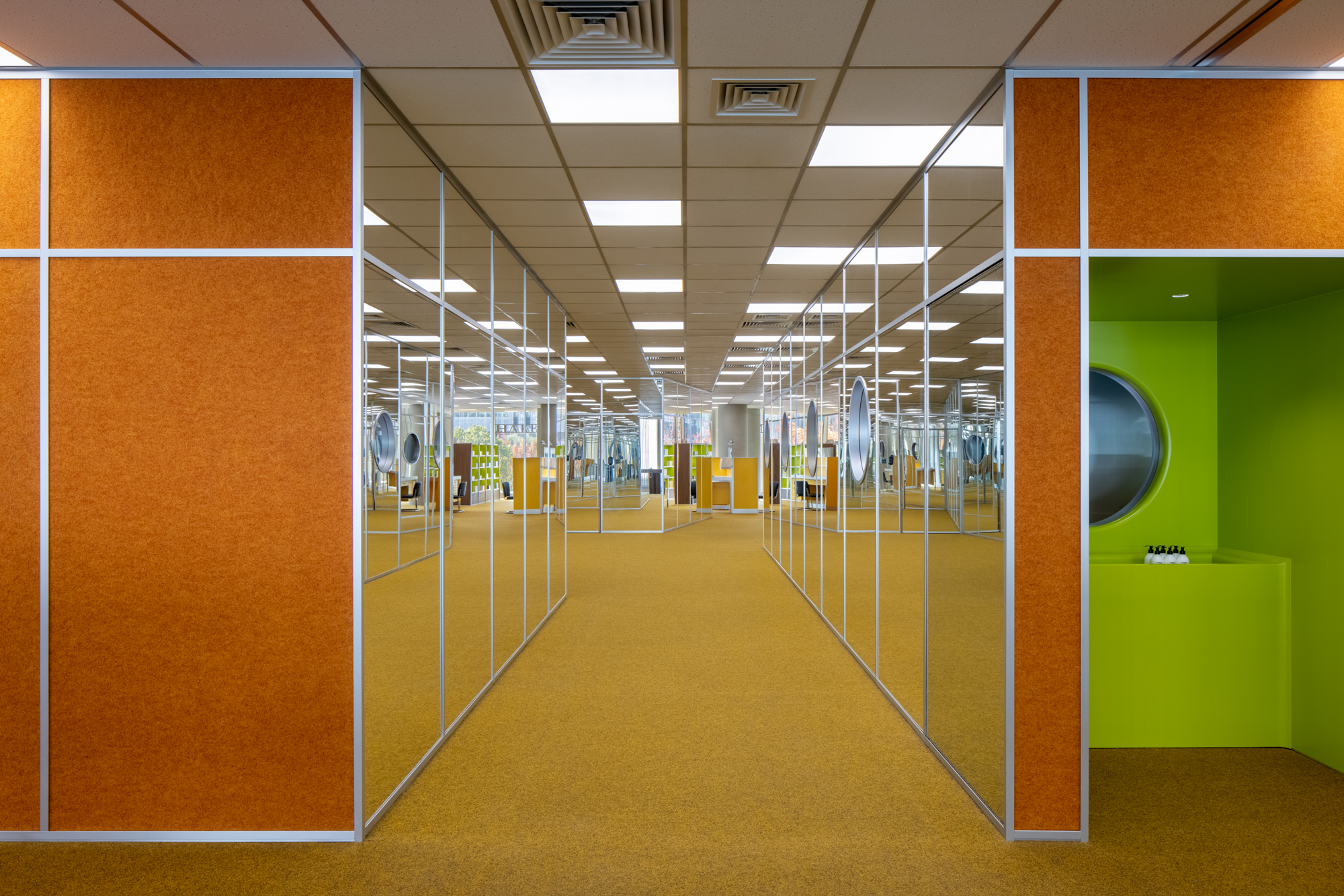 Set on the second floor of a building in a mixed-use office park designed by Renzo Piano Building Workshop in 2020, this store is inspired by its immediate surroundings. The space with floor to ceiling high curtain wall windows and an enclosed center core is the perfect platform to explore a place closely related to our day-to-day environment, the office. Representing a 70’s romanticized image of what an office life looks like, consumers experience this illusion of time wandering between the past and present. Working with bright color tones, soft carpets, and different textures creates a mood of future positivism.
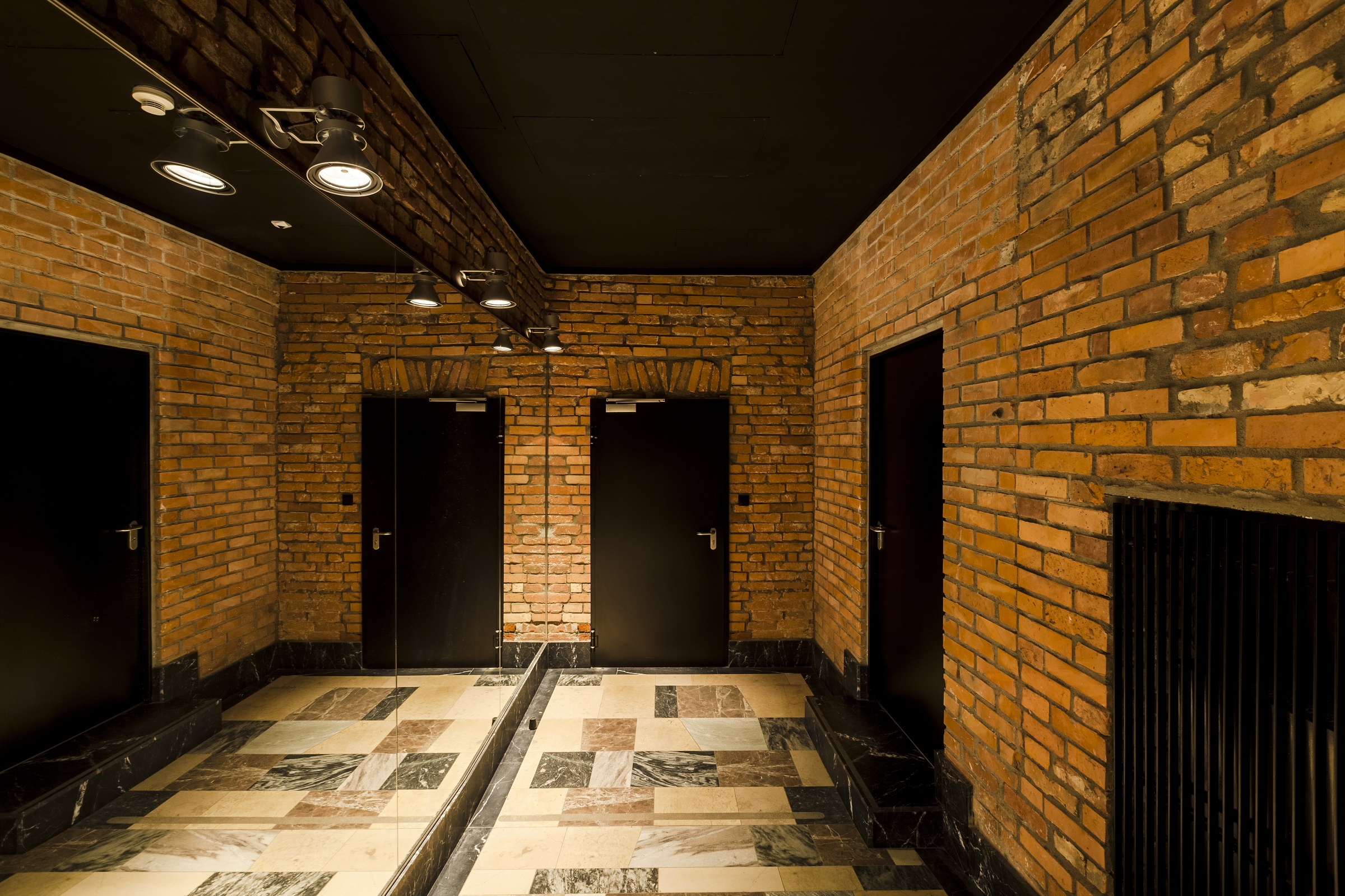
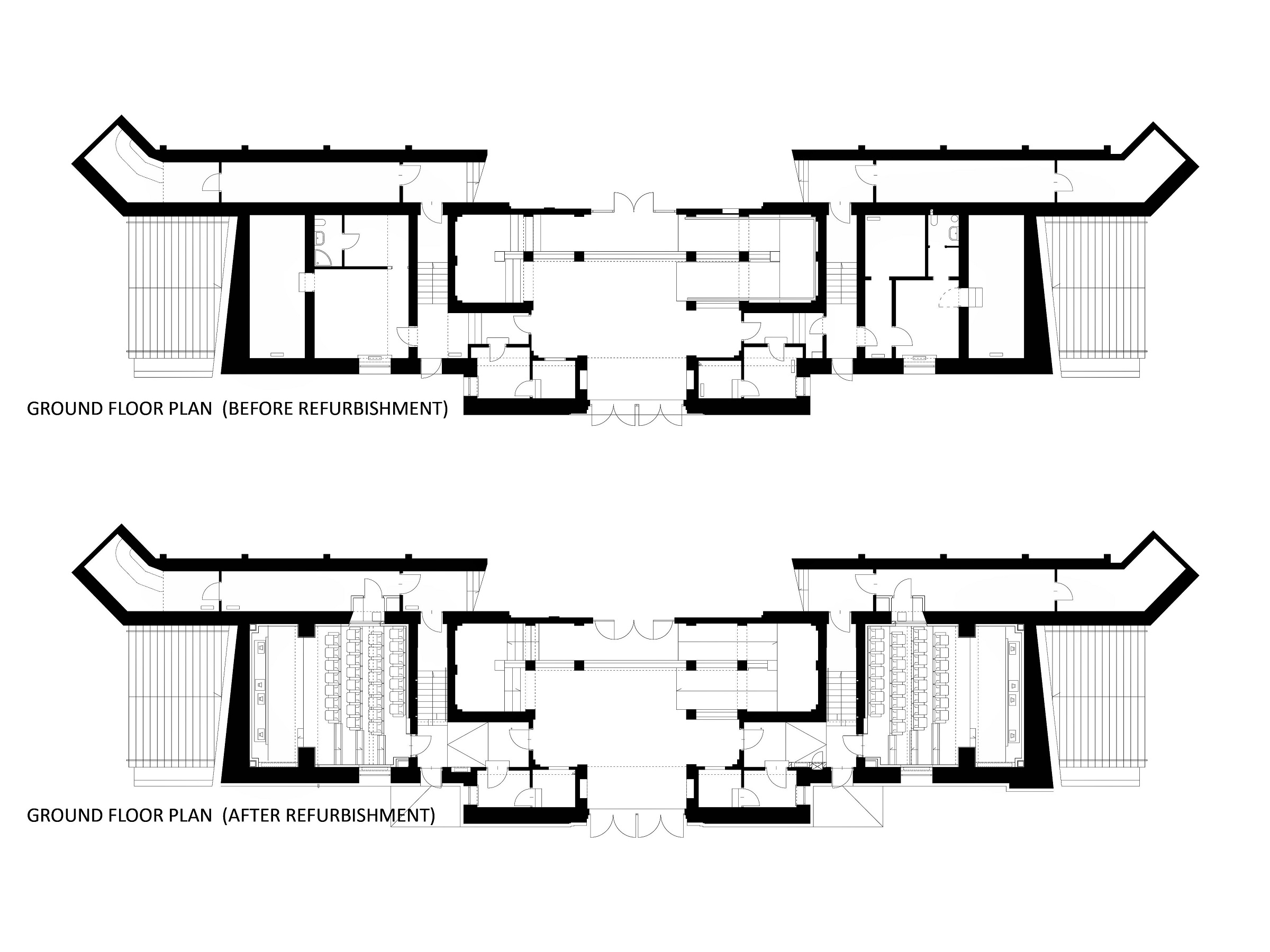
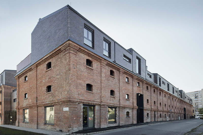
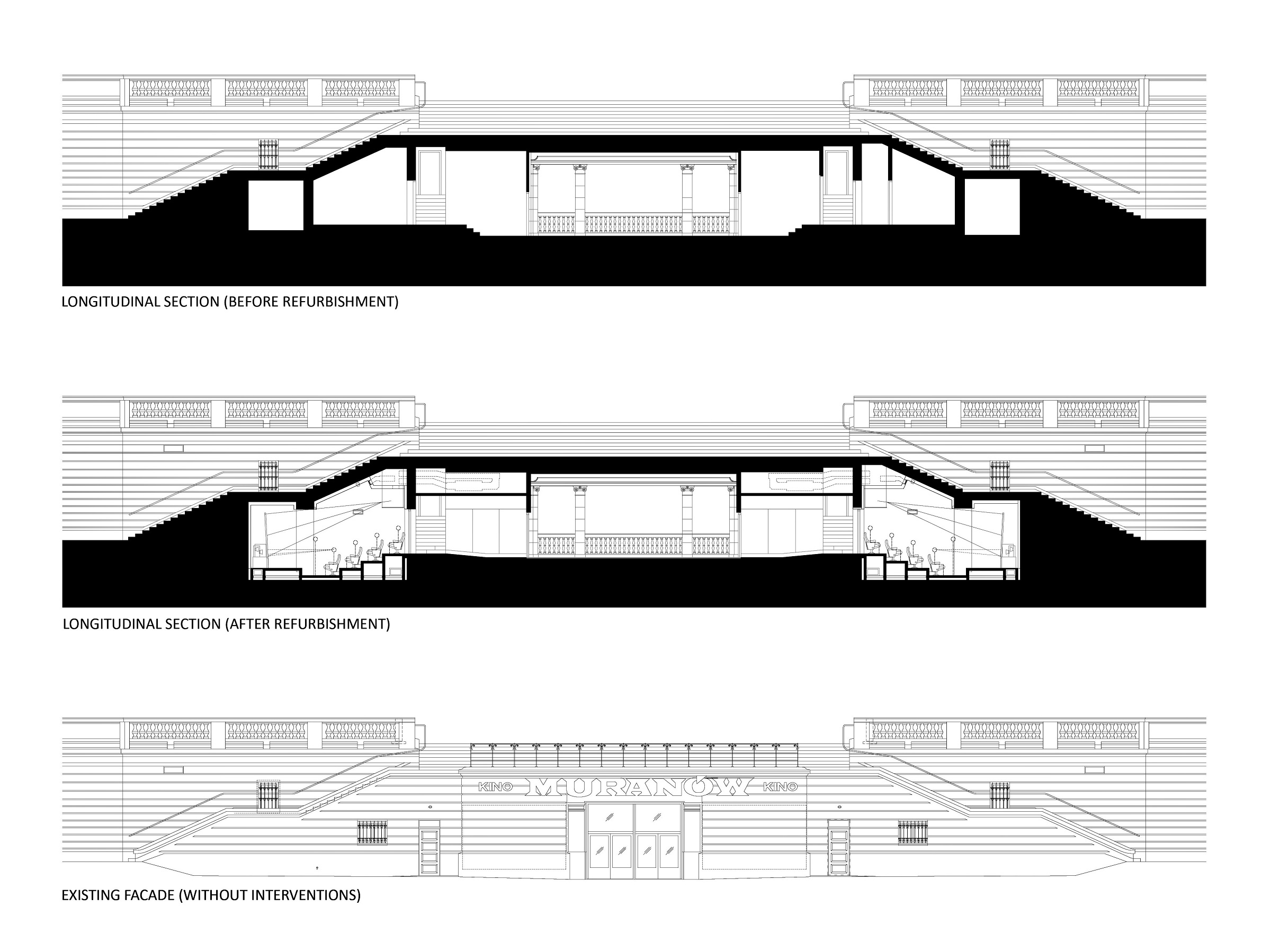 The cinema is located in the area of a former Jewish quarter destroyed by the Nazis during the WWII. In the aftermath, the area was rebuilt using rubble from the former buildings. The designer of the cinema, the excellent pre-war architect Bohdan Lachert, faced a choice: either to design in the socialist realist style or not to design at all. It was only decades later that his ideas were appreciated. Seventy years later, these stories from the past had a strong influence on Piotr Hardecki Architekt’s refurbishment project.
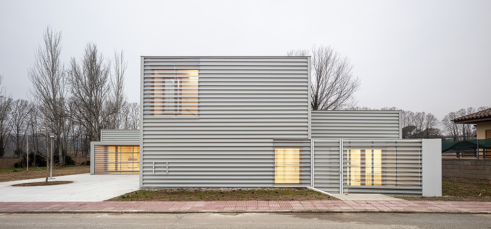
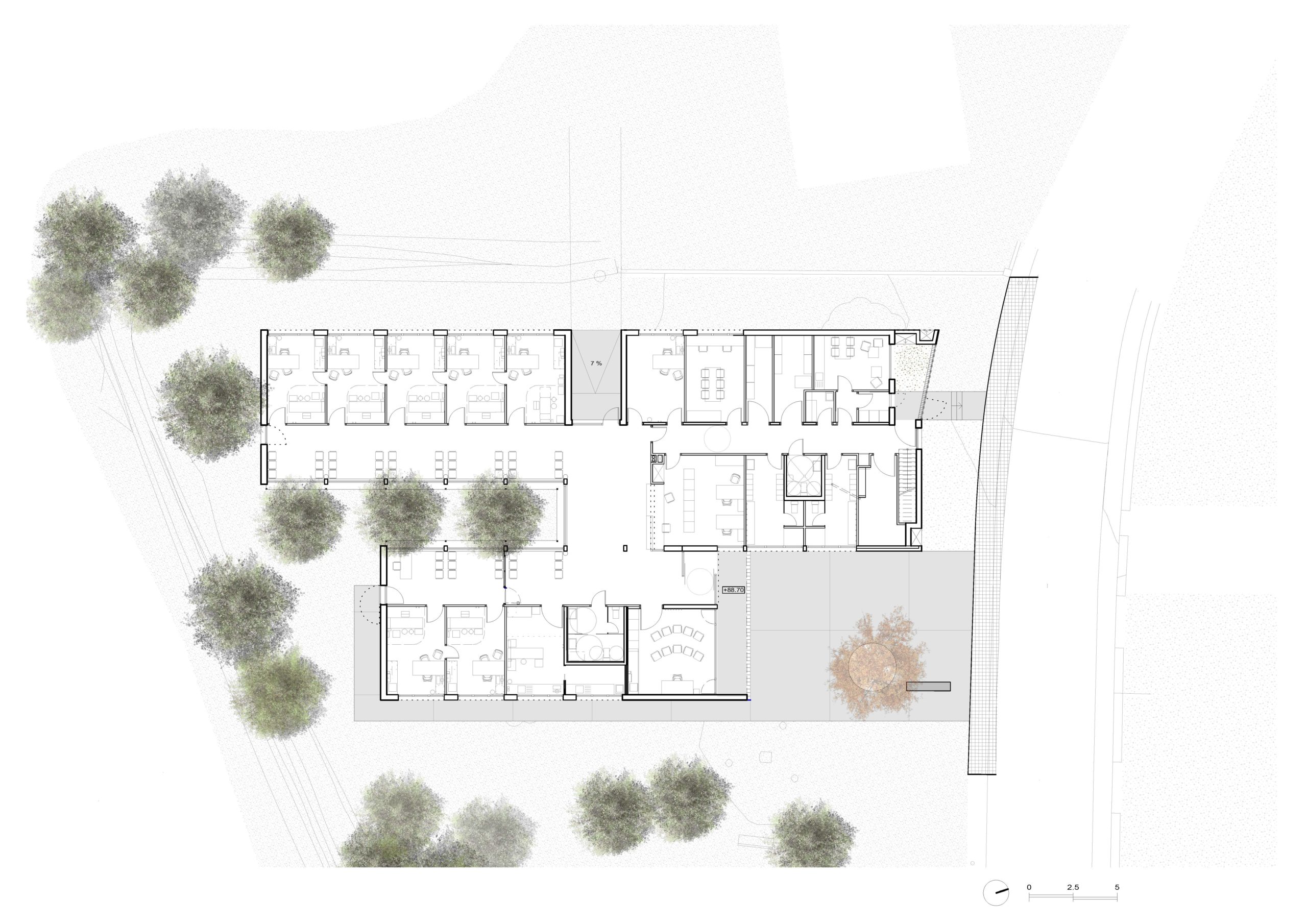 A Primary Care Center (CAP) is an ideal public facility to consider the health of people from the construction itself, minimizing the generation of CO2 in the life cycle of materials and ensuring a healthy environment in the interior. This project introduces the surrounding landscape inside the building through a linear courtyard related to the waiting rooms. The use of the structure with microlaminated wood (CLT) for the first time in a CAP in Catalonia, generates a conceptual dialogue with the forests of Montseny (biosphere reserve) visible from the building, reduces the execution deadlines and waste and allows to achieve the highest energy rating A.
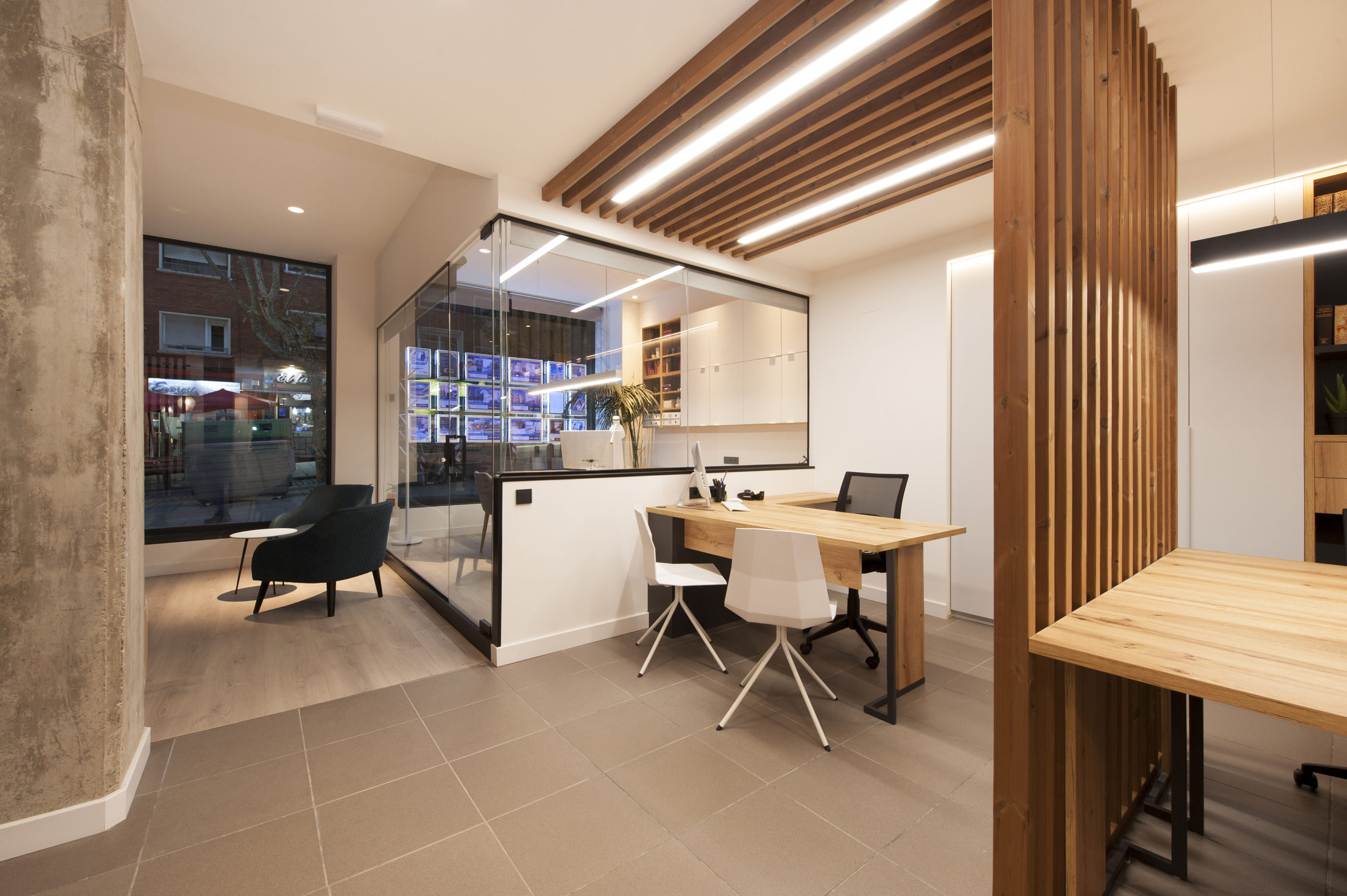
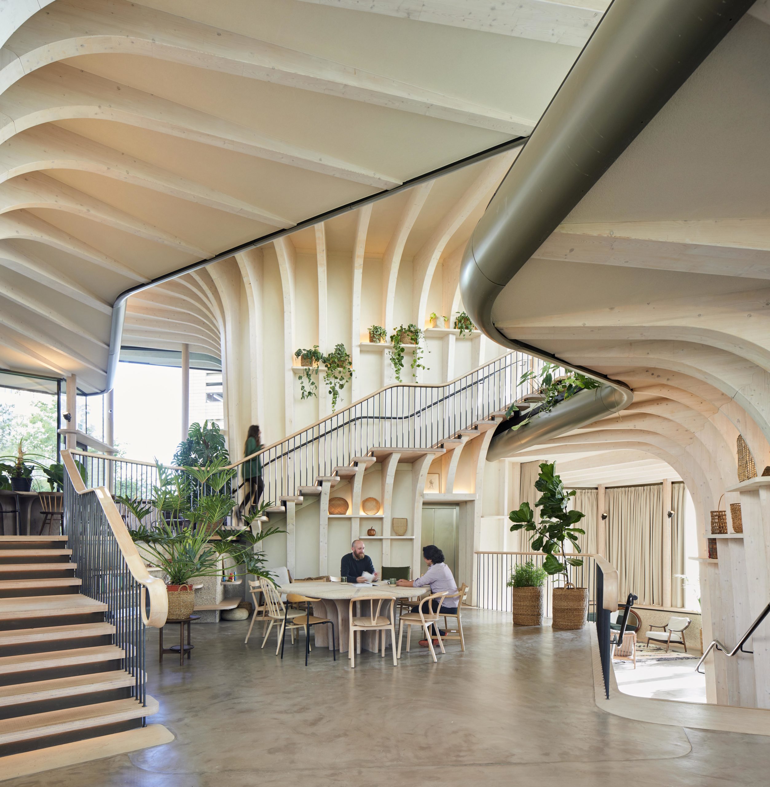
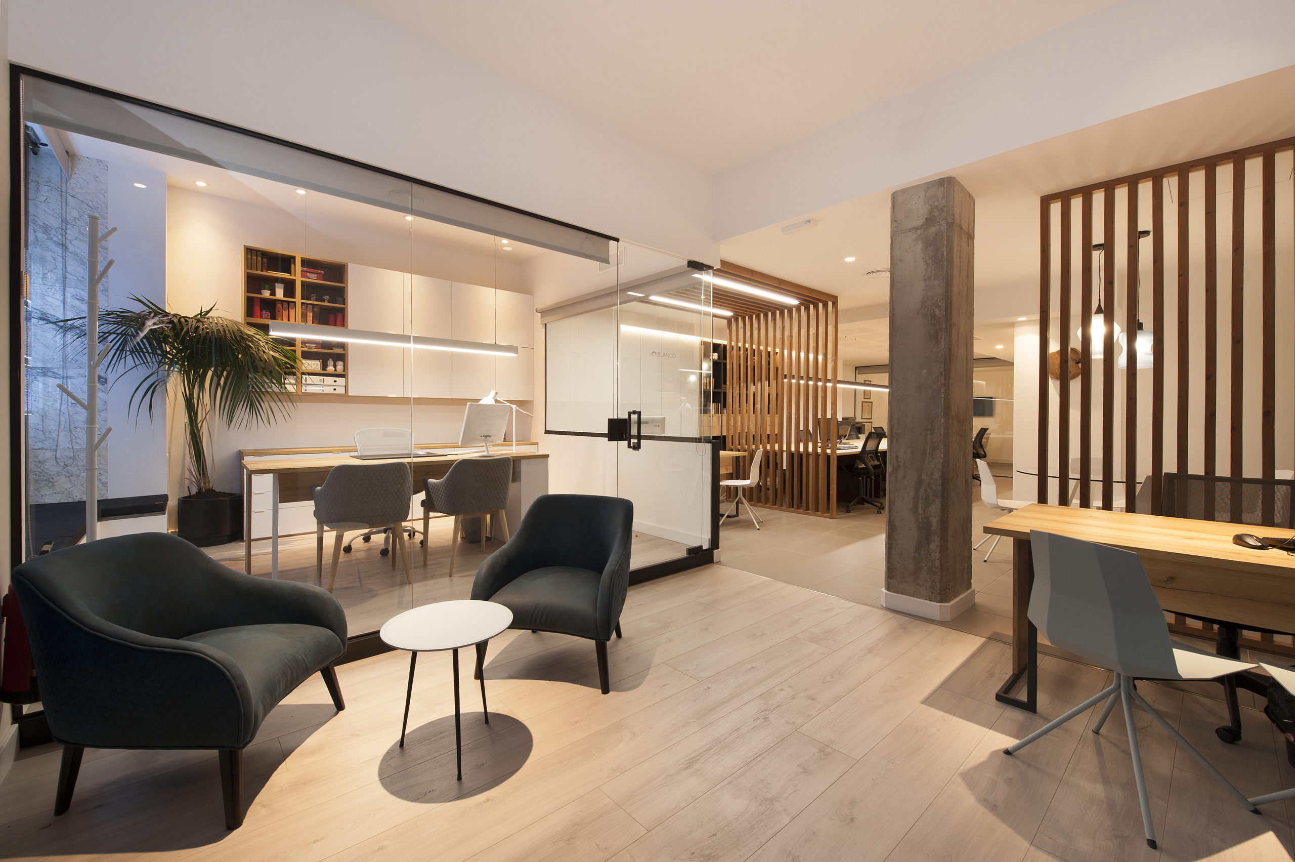 The complete redesign of the corporate image of the 15-year-old offices of a real estate company in Barcelona. The interior has been designed in a Nordic style, expressed through the use of wood that brings warmth, along with the minimalism of white. The structures made with wooden slats also function as spatial divides that simultaneously imbue the space with character and personality.
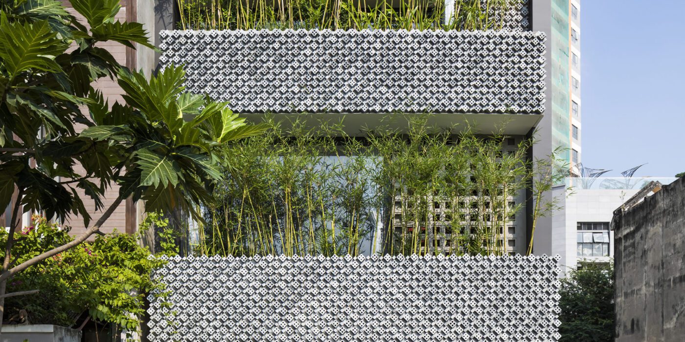
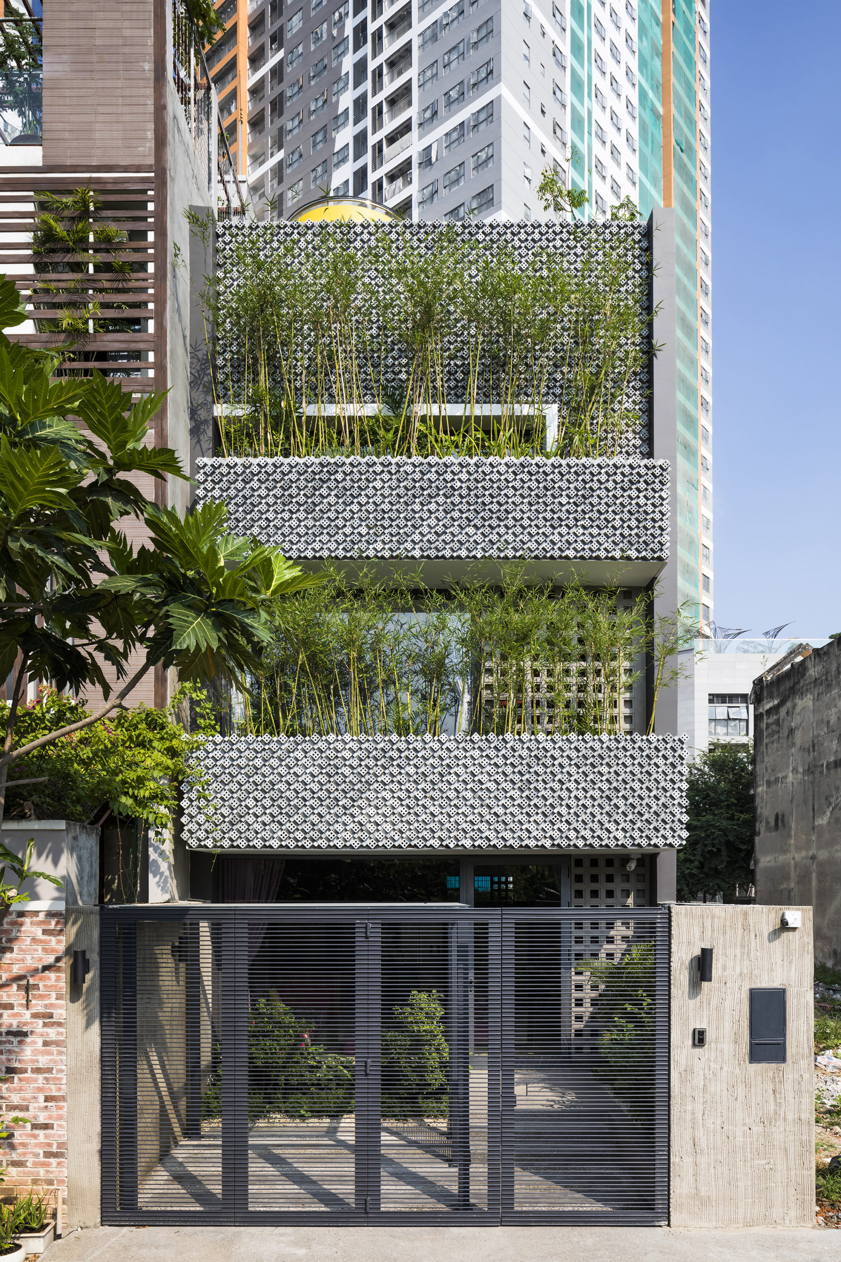
 This modernist construction in Ho Chi Minh combats the perception that shophouse-style buildings suffer from a lack of natural light because of the inherent narrowness of their lot. The designers do so with a textured combination of cement breeze blocks and brick patterned walls, letting sunlight gently diffuse inside. Bamboo trees, meanwhile, create their own natural screen to filter the direct sunlight coming through the street-facing windows.
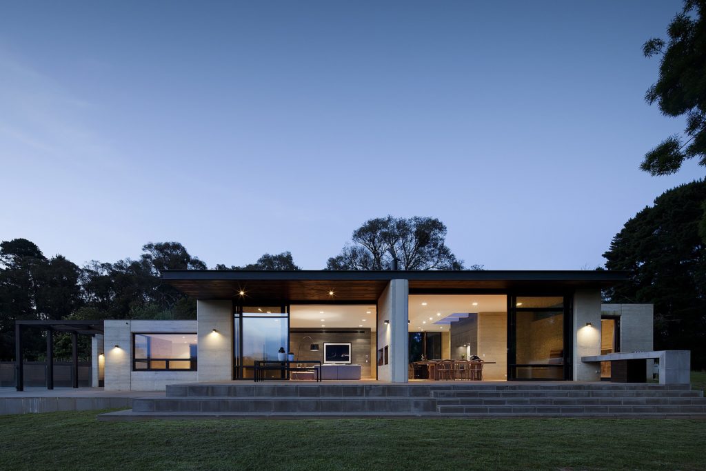
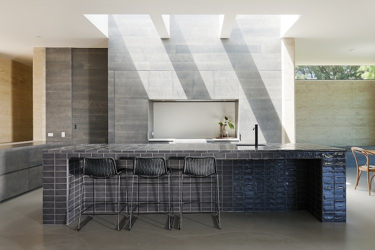
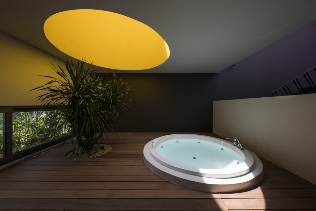
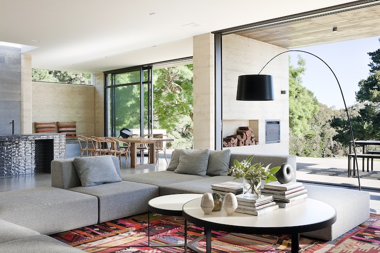 The family commissioning this rural home near Melbourne wanted to ensure plenty of natural light within the living space, but without the harsh direct northern and western sun. To resolve this issue, Robson Rak Architects designed large eaves to shade thin long high-level windows around the house, creating an evenly glowing living room and dining room. In similar fashion, the architects added two wall-like beams underneath the kitchen’s skylight, parsing out the strong sunlight into milder segments.
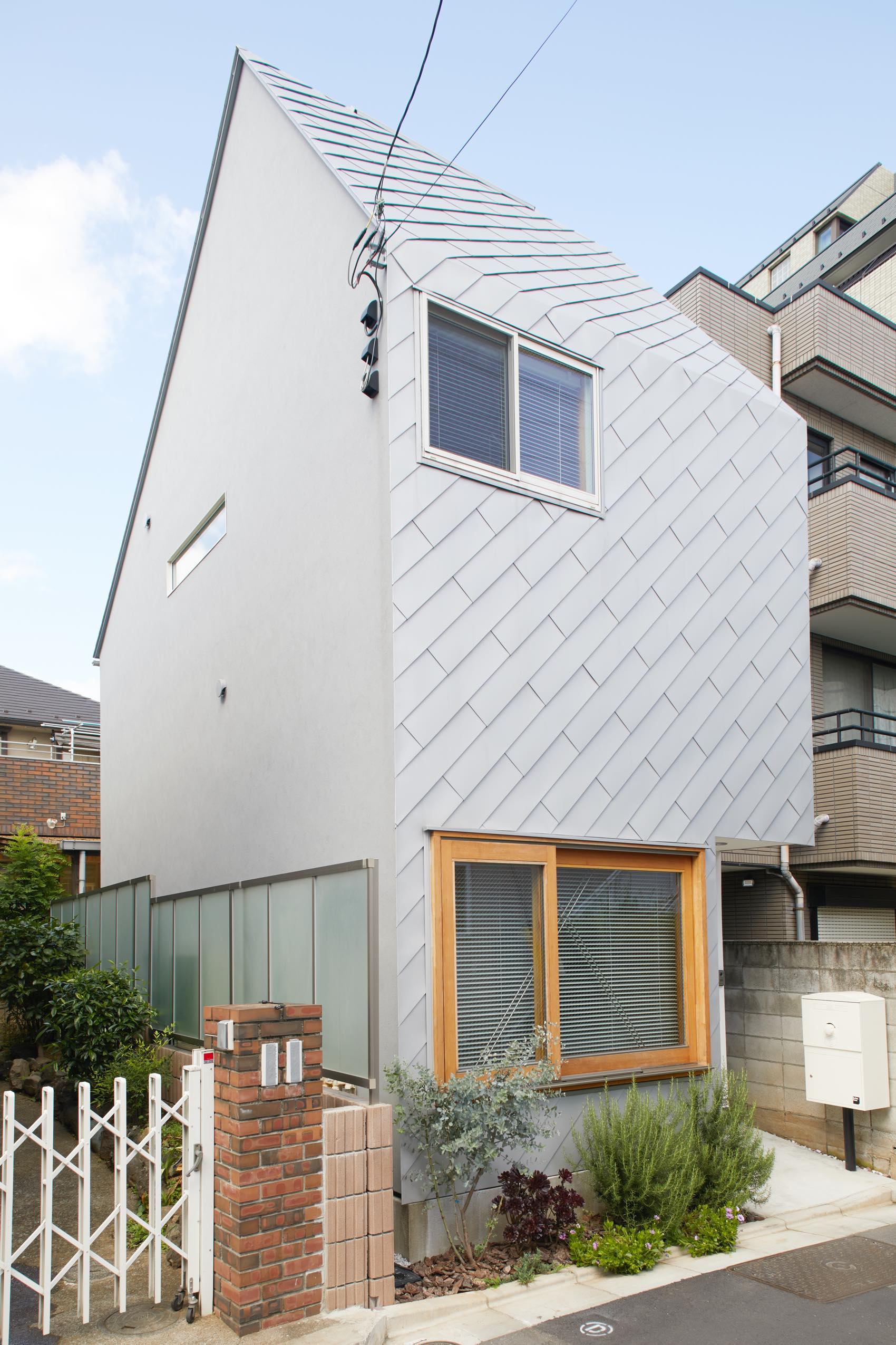
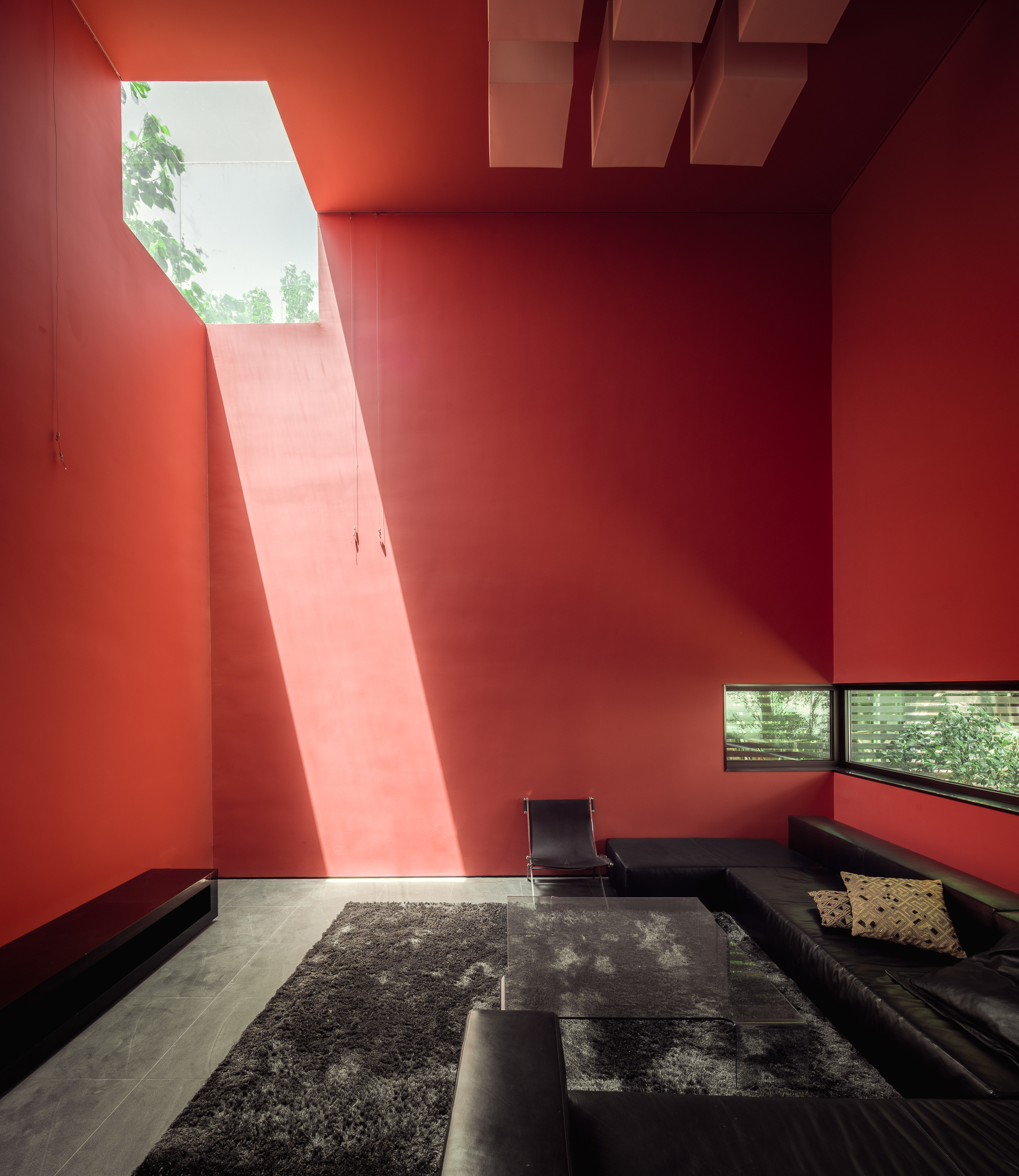
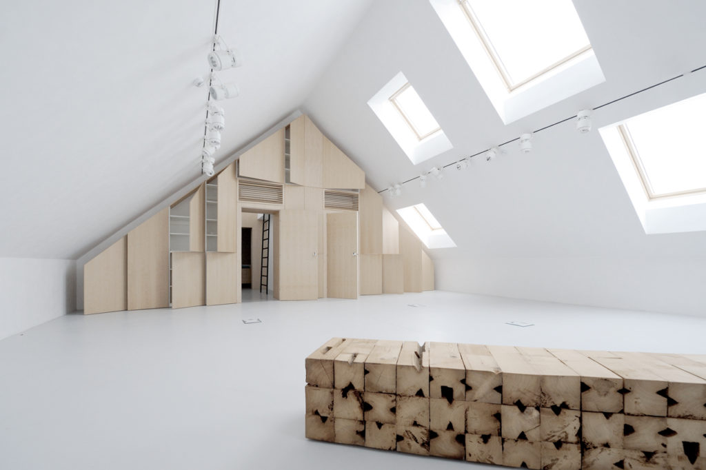
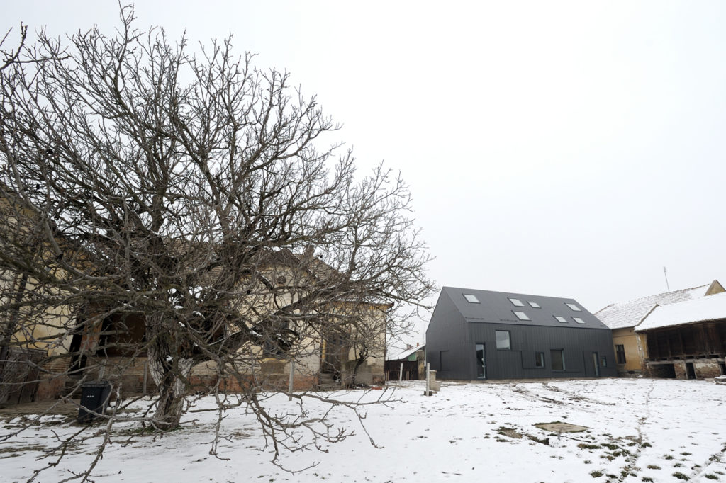 Rejecting the idea of the theatrical space as a necessarily dark and solemn place, this new estate espouses a more open (and bright) setting for its cultural projects thanks to a series of large skylights. From the outside, the playfully random assortment of skylights and windows healthily counterbalances the more serious dark-grey exterior.
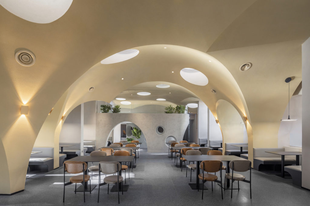


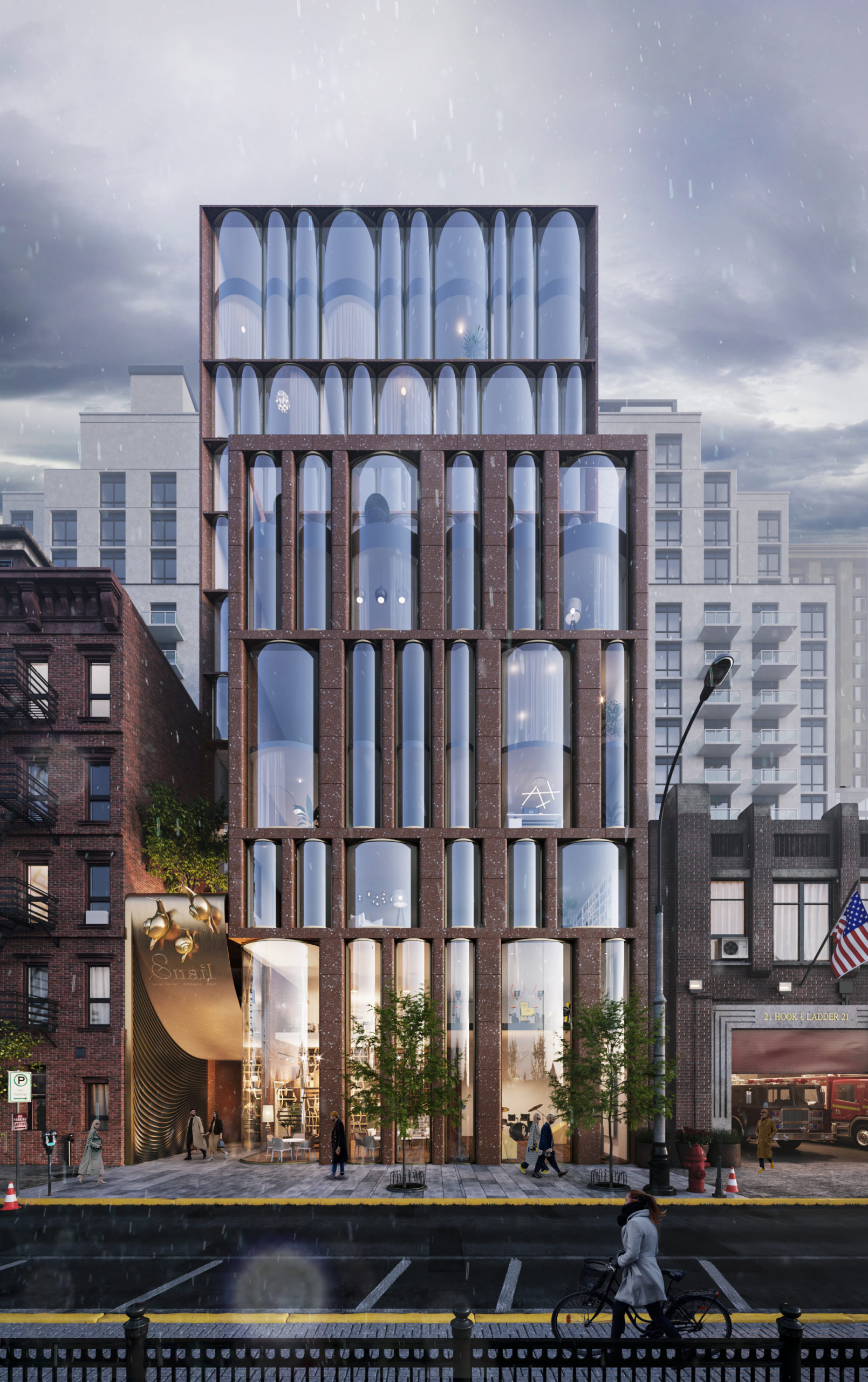
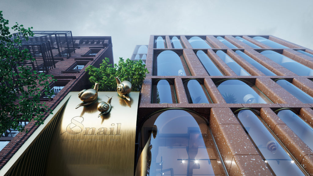 The design concept for this residential project in Chelsea, New York combines features from two different eras of the city’s architectural history: 19th and 20th century brick housing and contemporary glass skyscrapers. Yet, neither inspiration can account for the arrangement of floor to ceiling cylindrical-shaped windows which give the façade a lively character. It’s ironic that the project’s emblem is a snail because the design leaps towards an exciting vision of the future.
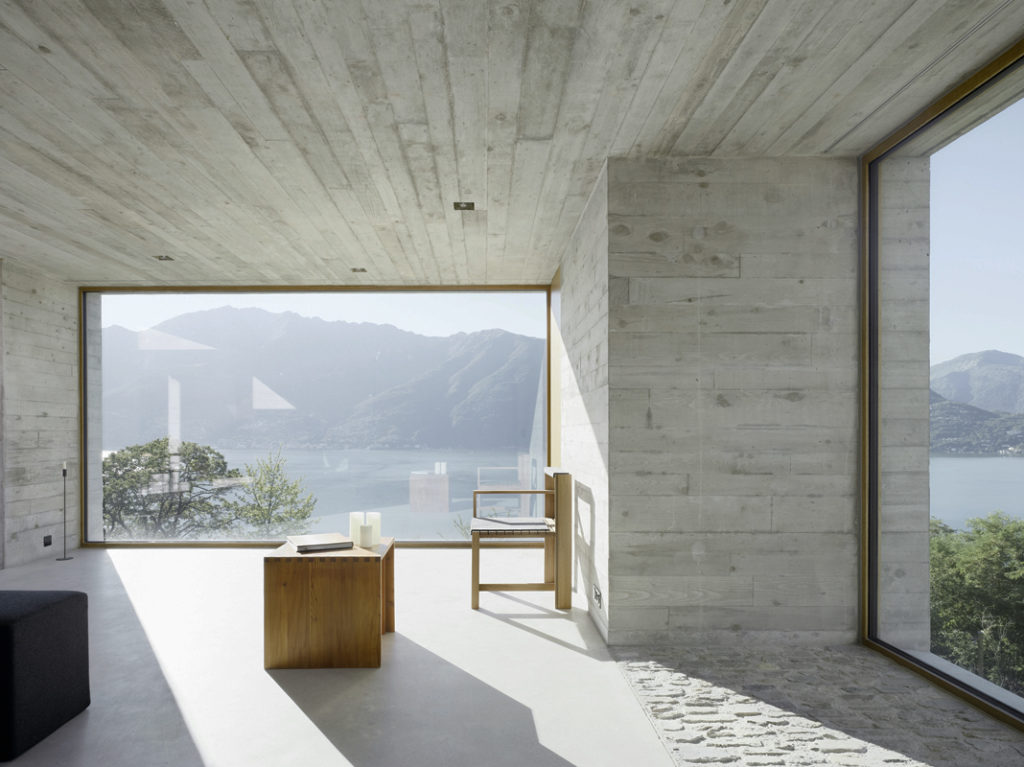
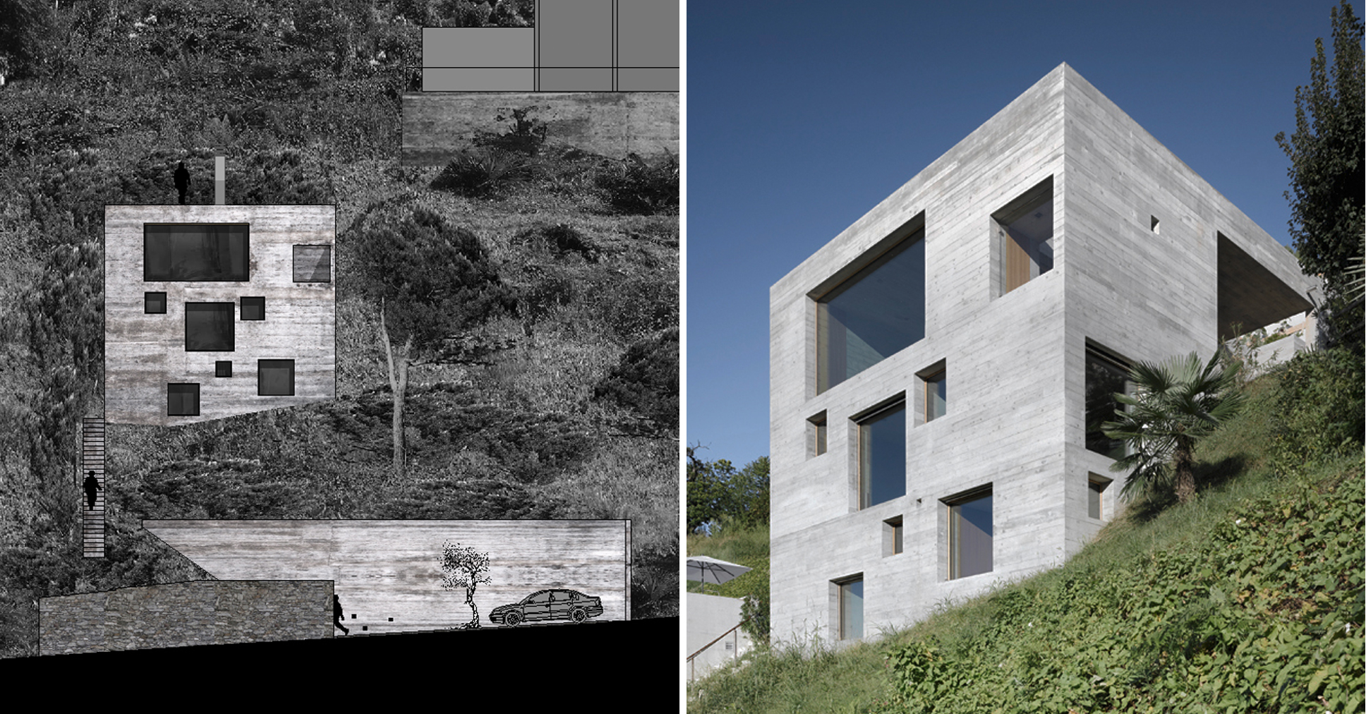 Standing on a steep slope near Lake Maggiore in the Swiss Alps, this new house keeps things simple with a cubic shaped structure and wood panel cast concrete walls. The irregularly placed large square and rectangular windows breaks with the monolithic façades and ensures no view of the stunning lake goes unseen.
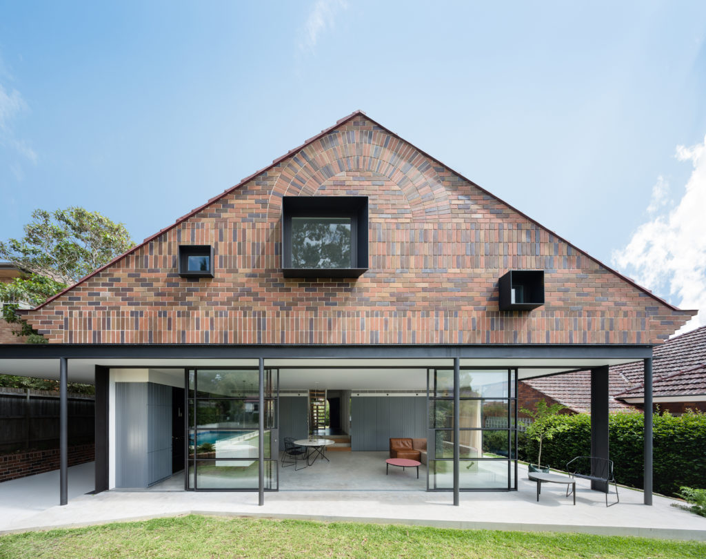 The rear extension to this modest 1930s bungalow in a leafy Sydney suburb reproduces many of the sensible design choices of the original house: herringbone brick gables, a brick sunburst and some Tudor detailing among other details. However, three deep-set square windows bring a pop of modernity to the rear façade, matching the design ethos of the new living room on the floor below.
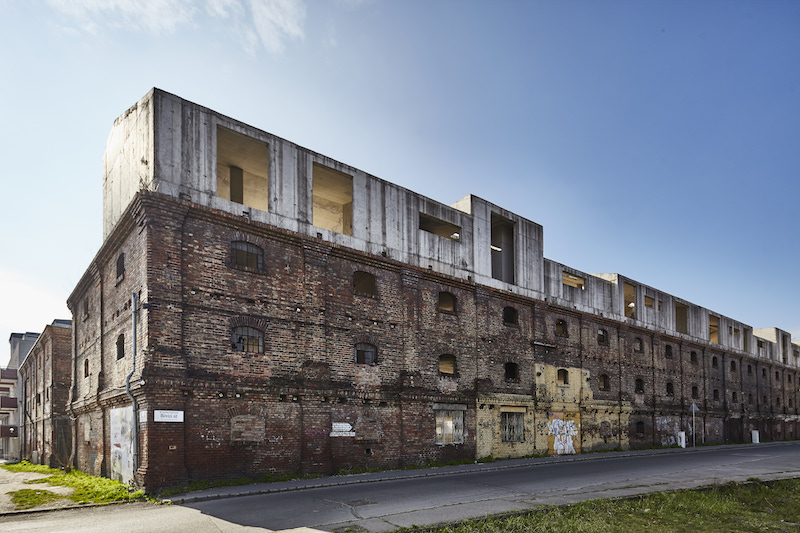
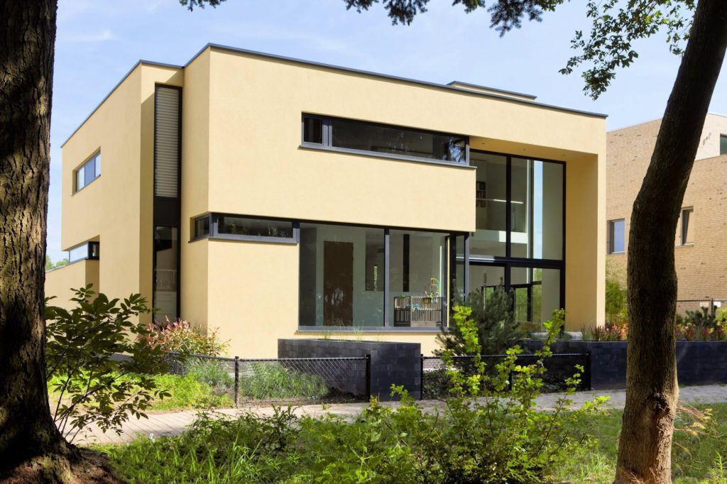
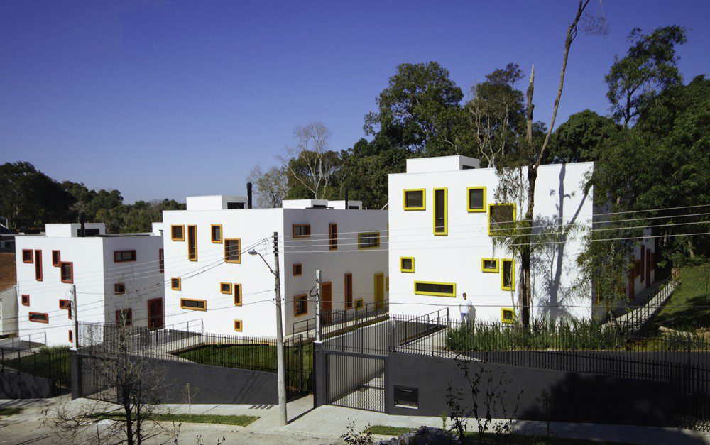
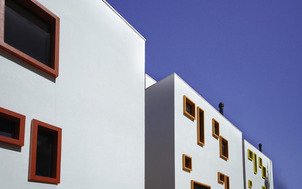
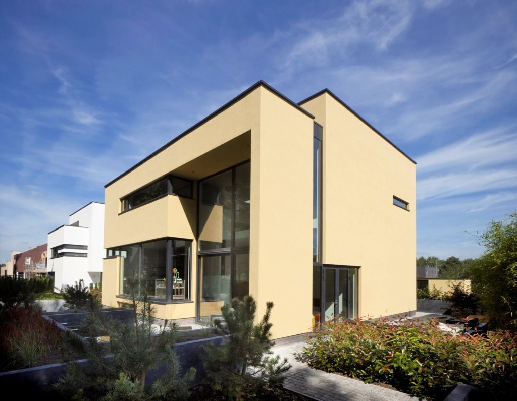 This new residence in Eindhoven is a playful remix on Le Corbusier’s ribbon window. The architects add a vertical dimension to the horizontal windows, ensuring one continuous flow of glass over two floors carved within the yellow cubic volumes. These offer generous vertical views of the nearby forestry while maintaining enough privacy for the second-floor bedrooms.