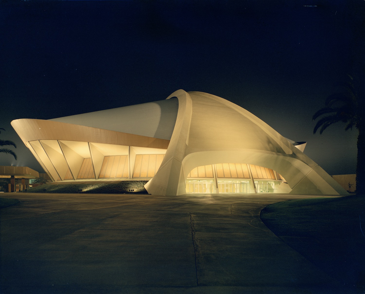
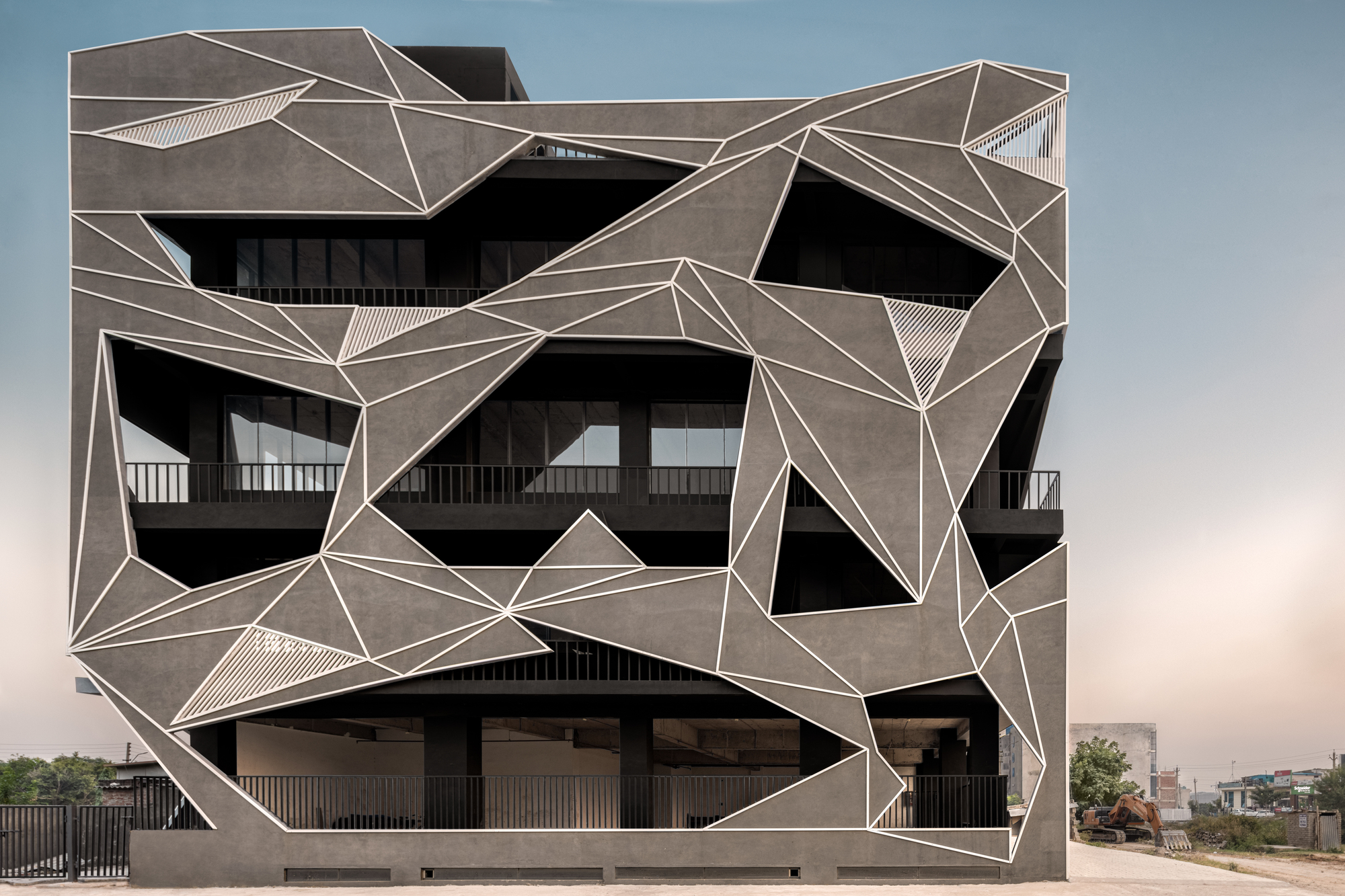
Atomic Architecture: Nanotechnology and Building Sciences
CategoriesArchitecture

Atomic Architecture: Nanotechnology and Building Sciences

Send us a photo. Tell us a story. Win $2,500! Architizer’s 3rd Annual One Photo Challenge is underway with a Main Entry Deadline on June 24, 2022! Start your entry for architecture’s biggest photography competition here.

Architecture is designed across scales and mirrors developments in science and research. Investigating matter on atomic, molecular and supramolecular scales, the field of nanotechnology has now started informing architectural design. In turn, structures for building sciences and research have rapidly expanded. As architects and designers are taking on this typology in public and private sectors alike, the study and evolution of nanotechnology mirror broader developments in how sciences are flourishing.

Combining science, engineering, and technology conducted at the nanoscale, the field focuses on a scale of 1 to 100 nanometers. At such a small scale, nanomaterials, begin to exhibit unique properties that affect physical, chemical and biological behavior. By manipulating matter, nanotechnology can create new structures, materials, and devices. Taking a closer survey into the design of structures and buildings for nanotechnology and research, the following collection of projects explores what atomic architecture looks like today.
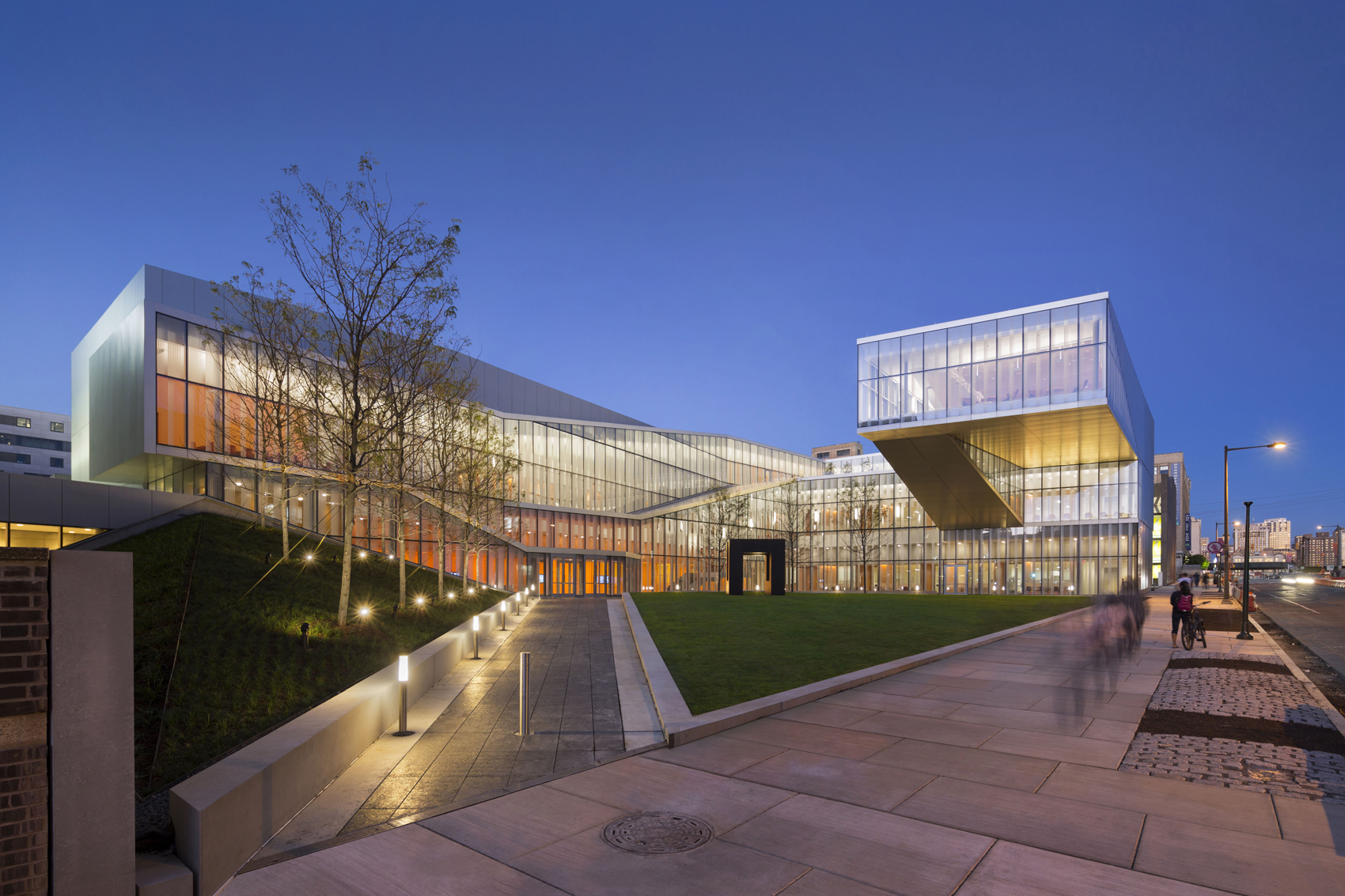
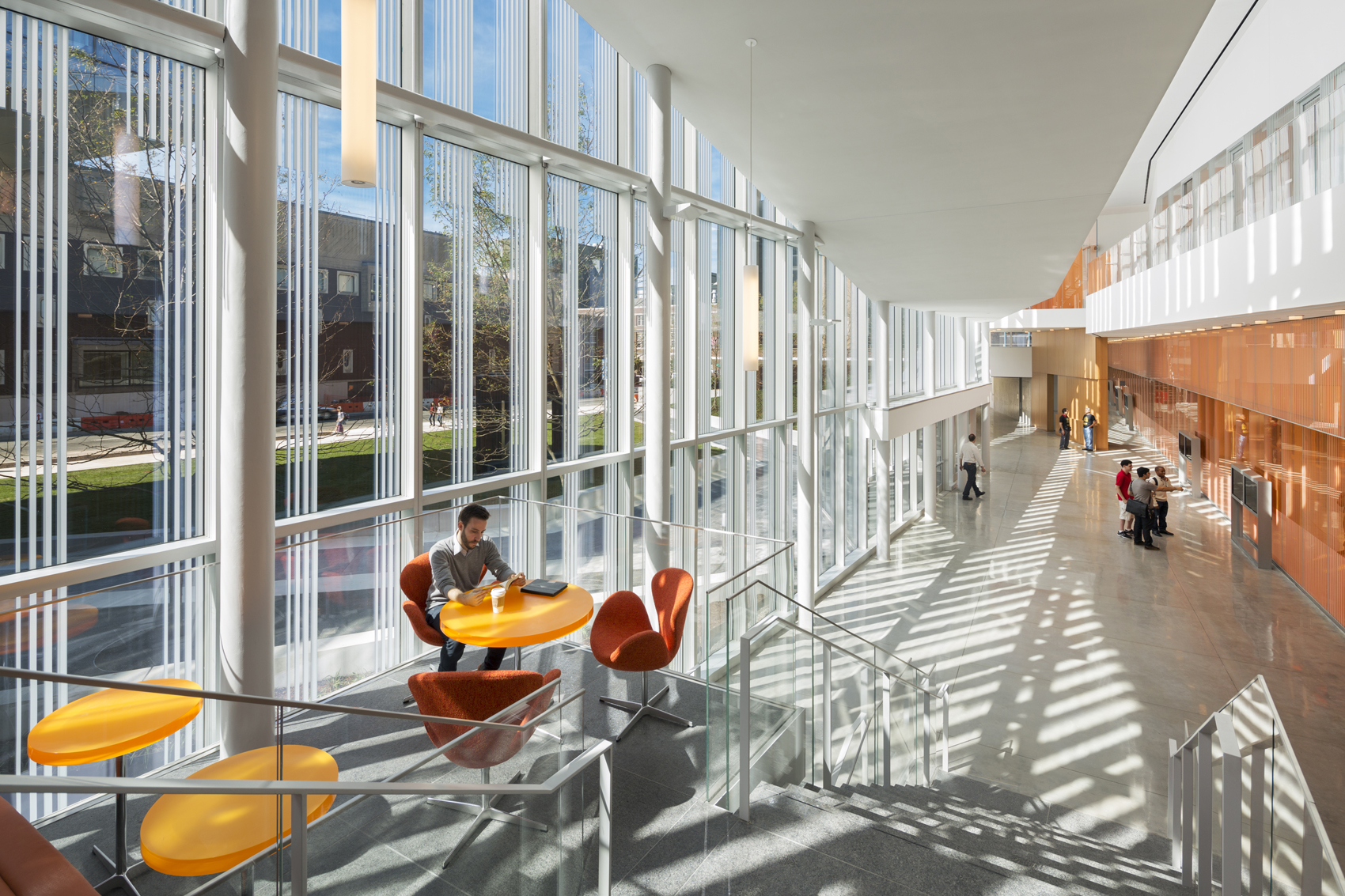
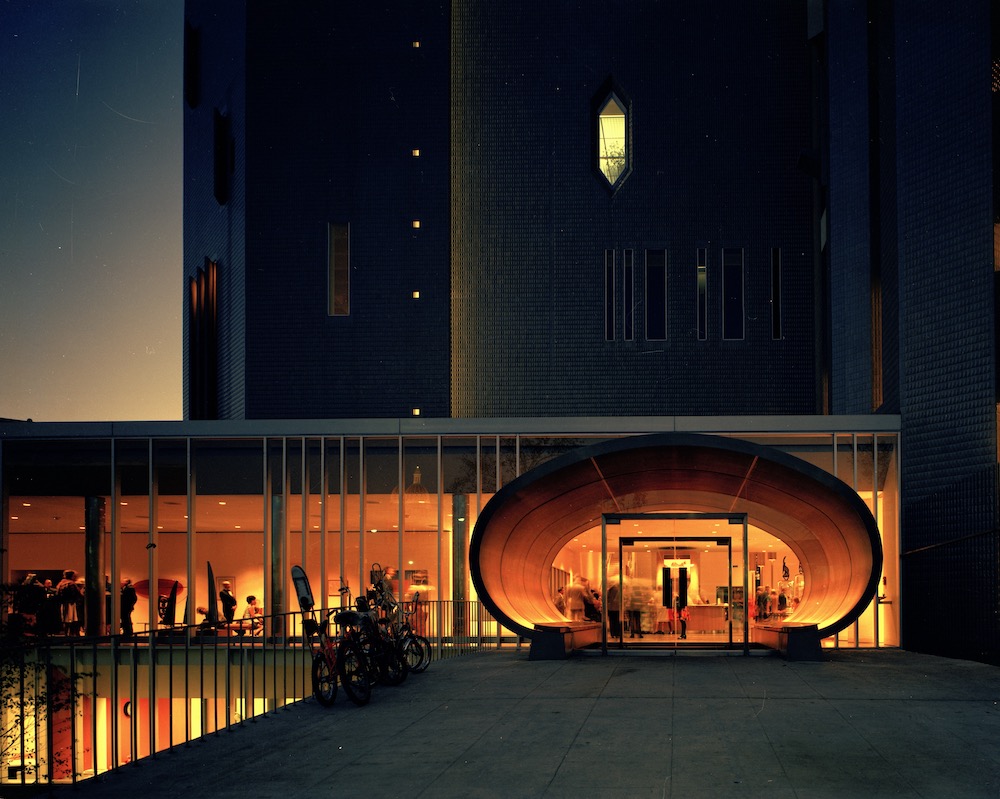
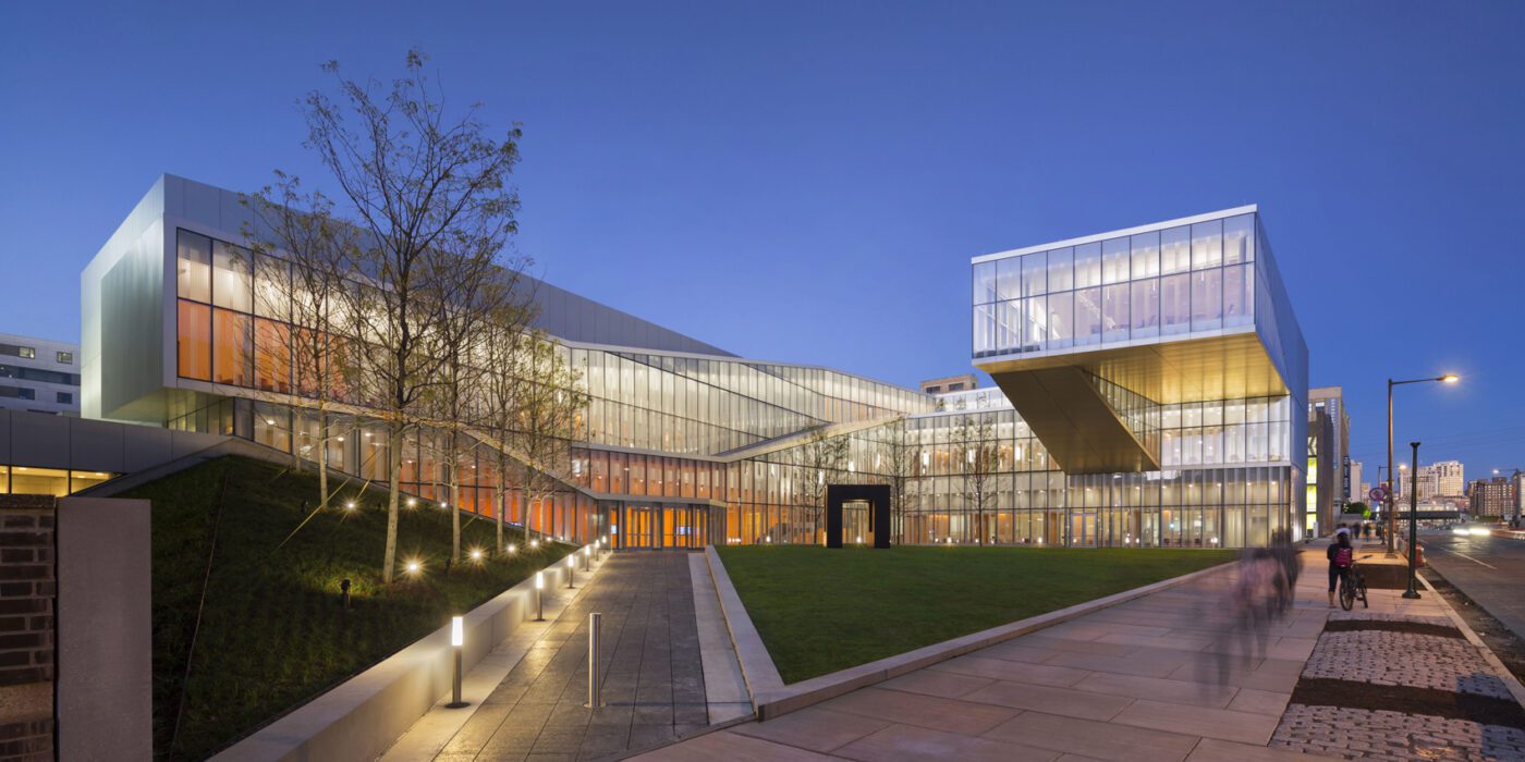
Krishna P. Singh Center for Nanotechnology by WEISS/MANFREDI, Philadelphia, PA, United States

As the university’s first cross disciplinary building, this nanotech research facility was designed to encourage the collaboration, exchange and integration of knowledge that is the core of this emerging field. The facilities will combine the resources of both the School of Engineering and Applied Sciences and the School of Arts and Sciences.

Defined by a new central campus green, the building ascends as a spiral of research, reaching its highest elevation at the forum, a meeting space that cantilevers over the quad and opens to views of both the city and campus. A new multi-level crossroads, the center is a significant step toward signaling the University’s leadership in the emerging field of nanotechnology.
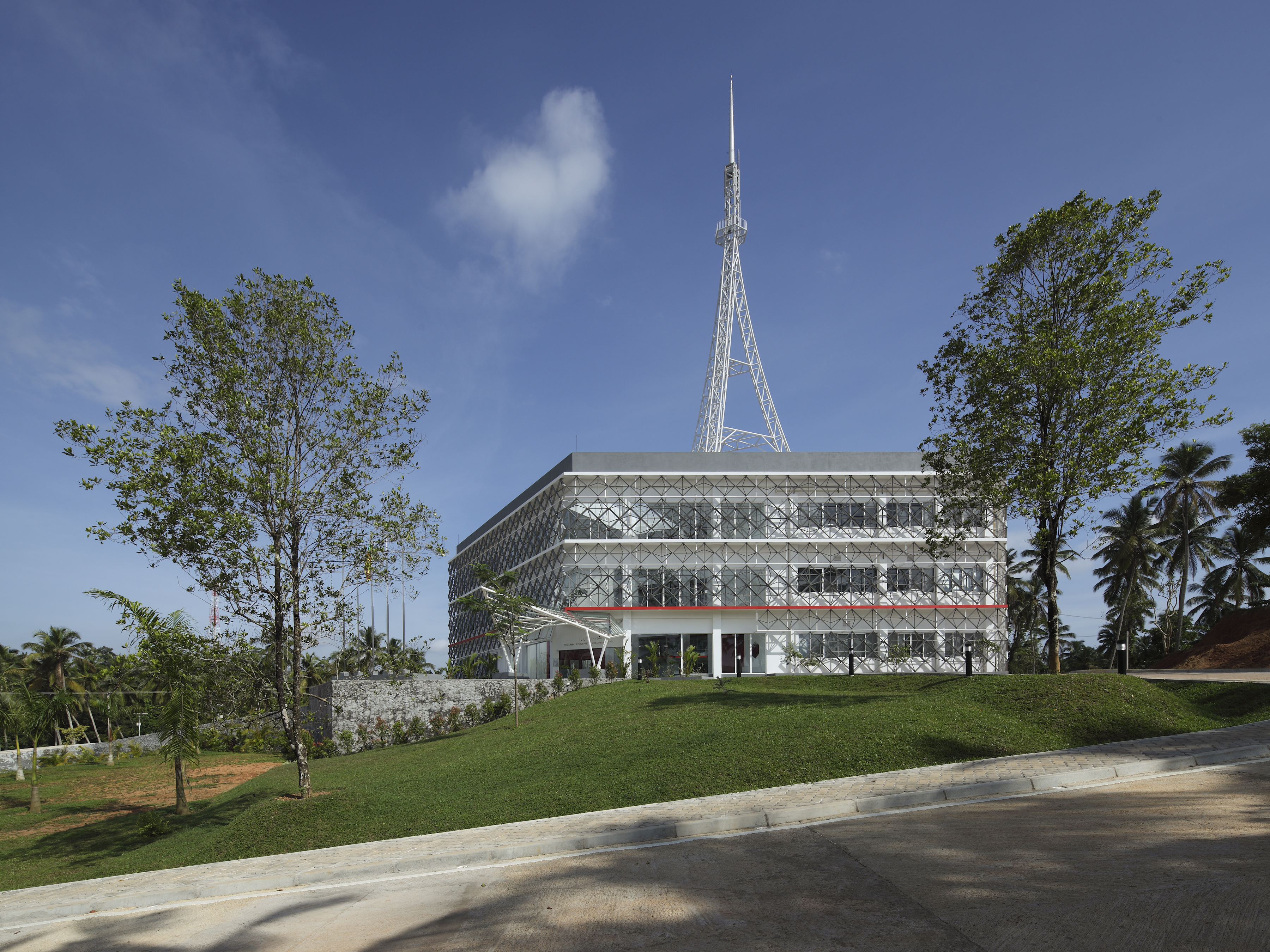
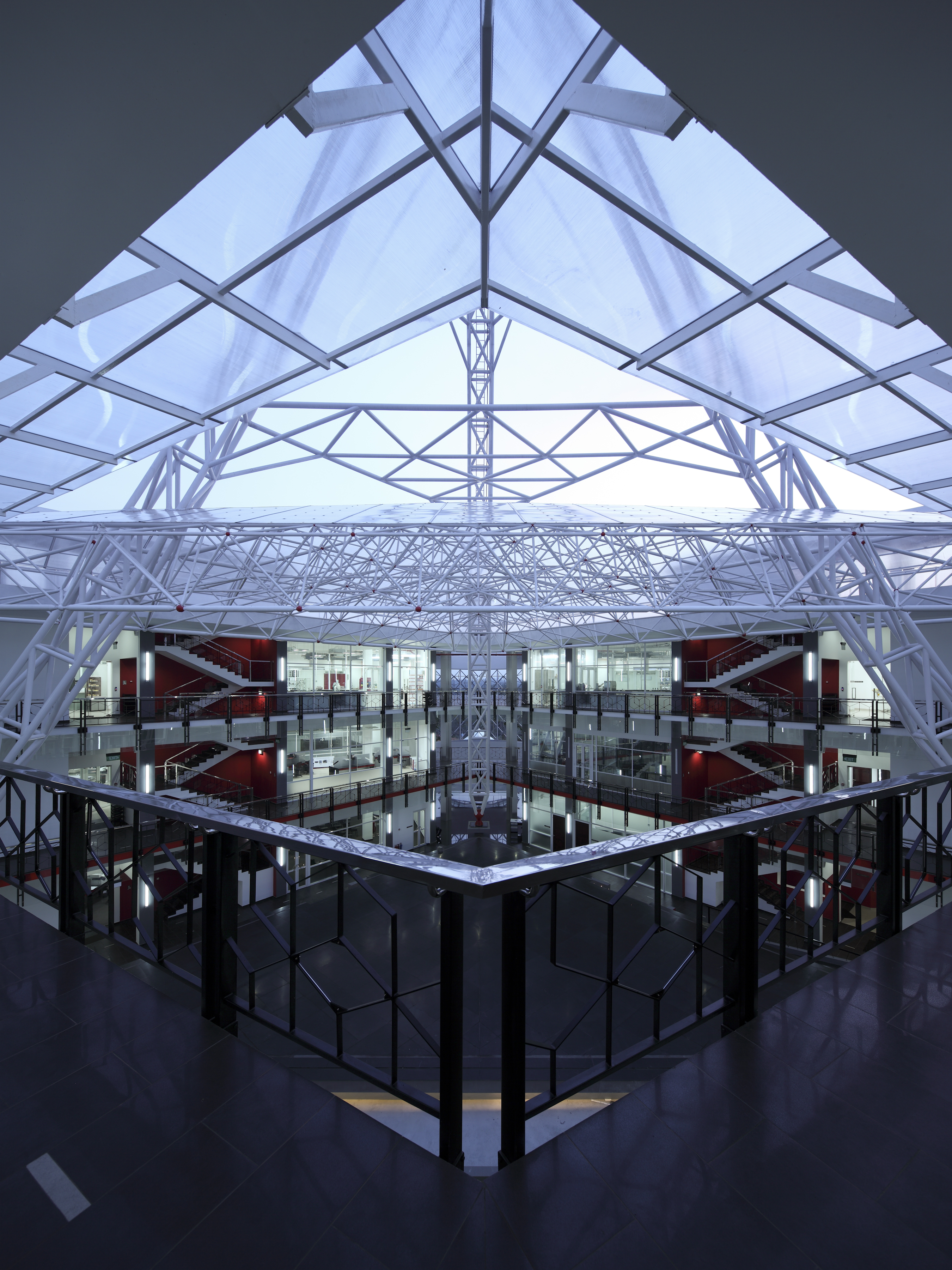
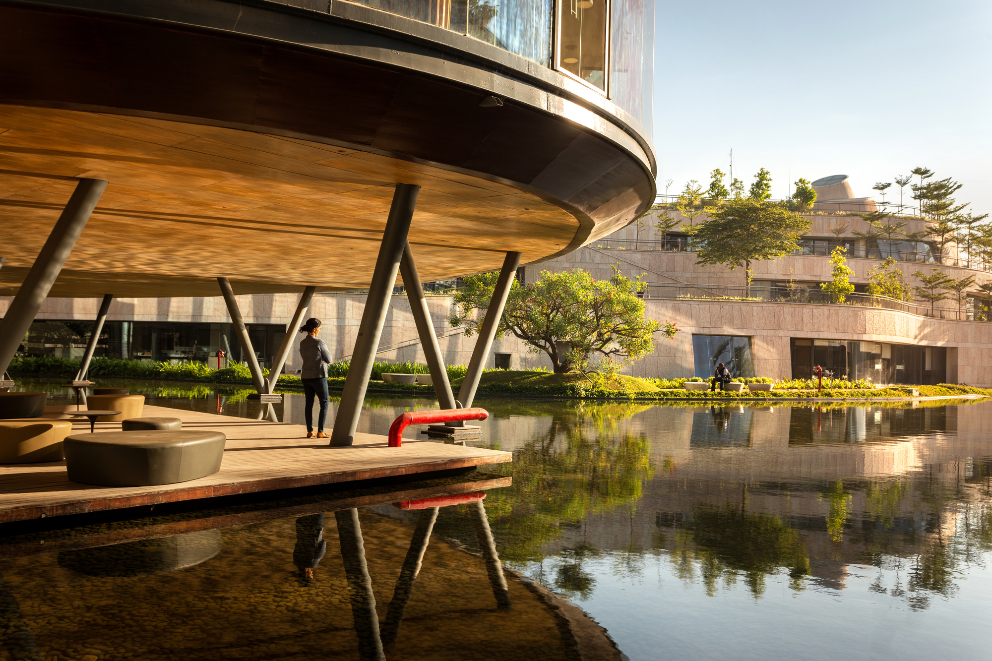
National Nanotechnology Park by Arch International Pvt Ltd., Homagama, Sri Lanka

The Nanotechnology Center of Excellence forms the epicenter of a National Nanotechnology Park that is a result of SLINTEC’s aims to create an ideal space for ‘thinking’. The campus will be a key feature within the ‘knowledge hub’ development plan in Homagama, creating a unique opportunity to house research, incubation and technology commercialization in an area that aims to draw both the public and private sectors.

Elements of all scales and sizes within the architectural language have been used in order to depict the relationship with nanotechnology as well as geometries that are closely involved in the sciences.
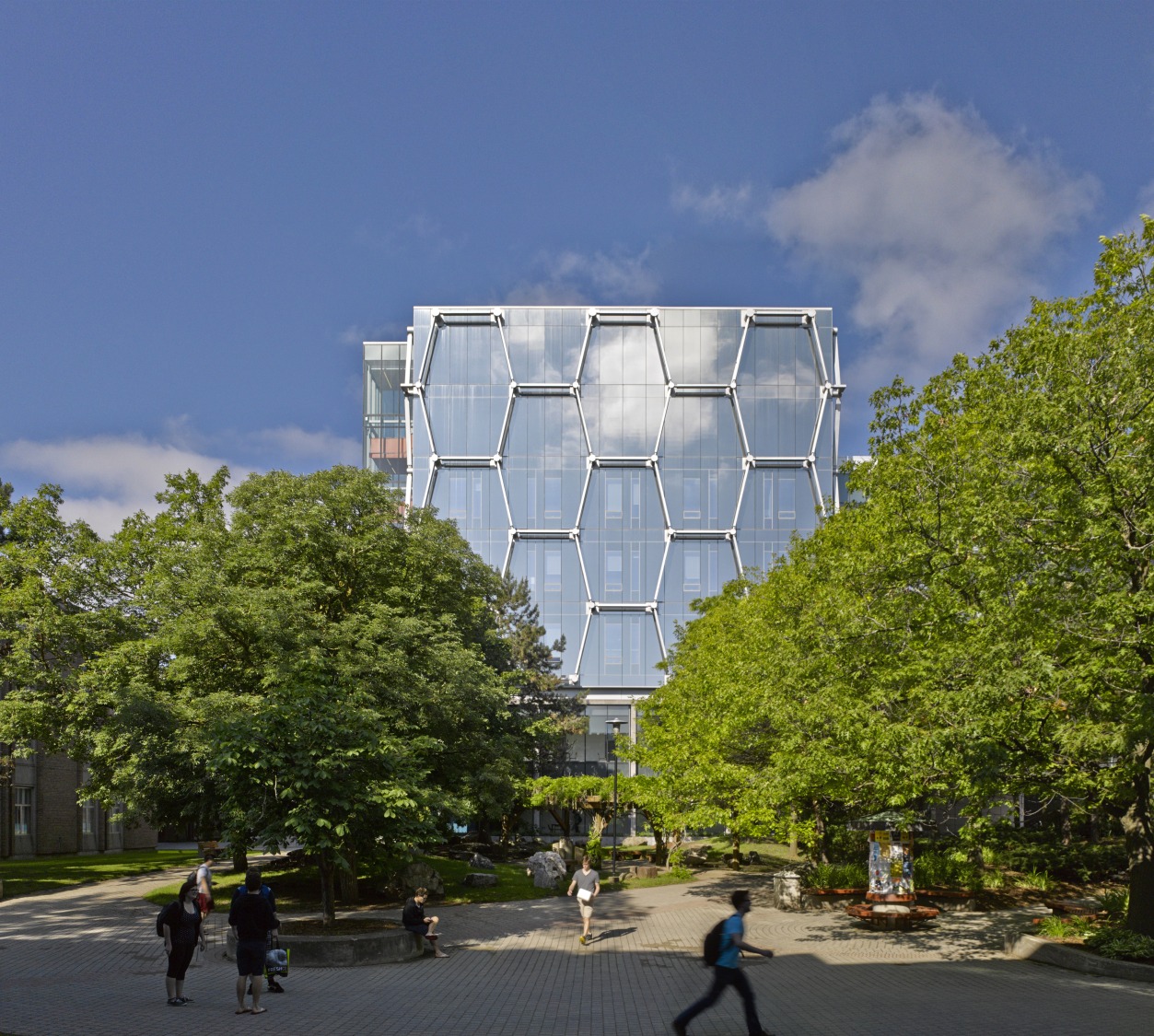
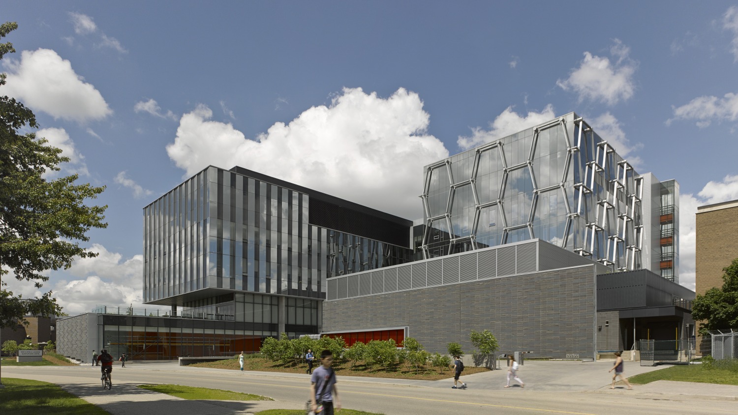
Mike & Ophelia Lazaridis Quantum-Nano Centre by KPMB Architects, Waterloo, Canada

The Mike & Ophelia Lazaridis Quantum-Nano is a showcase for Canadian innovation and industry in the fields of quantum computing and nanotechnology. The social components of the facility in the form of atria, mind spaces and collaborative areas manifest the original goals to attract and inspire the brightest minds in the world. At the official opening, Stephen Hawking, world-renowned physicist and partner with the University of Waterloo since 1999, described the design as a work of “architectural genius”.
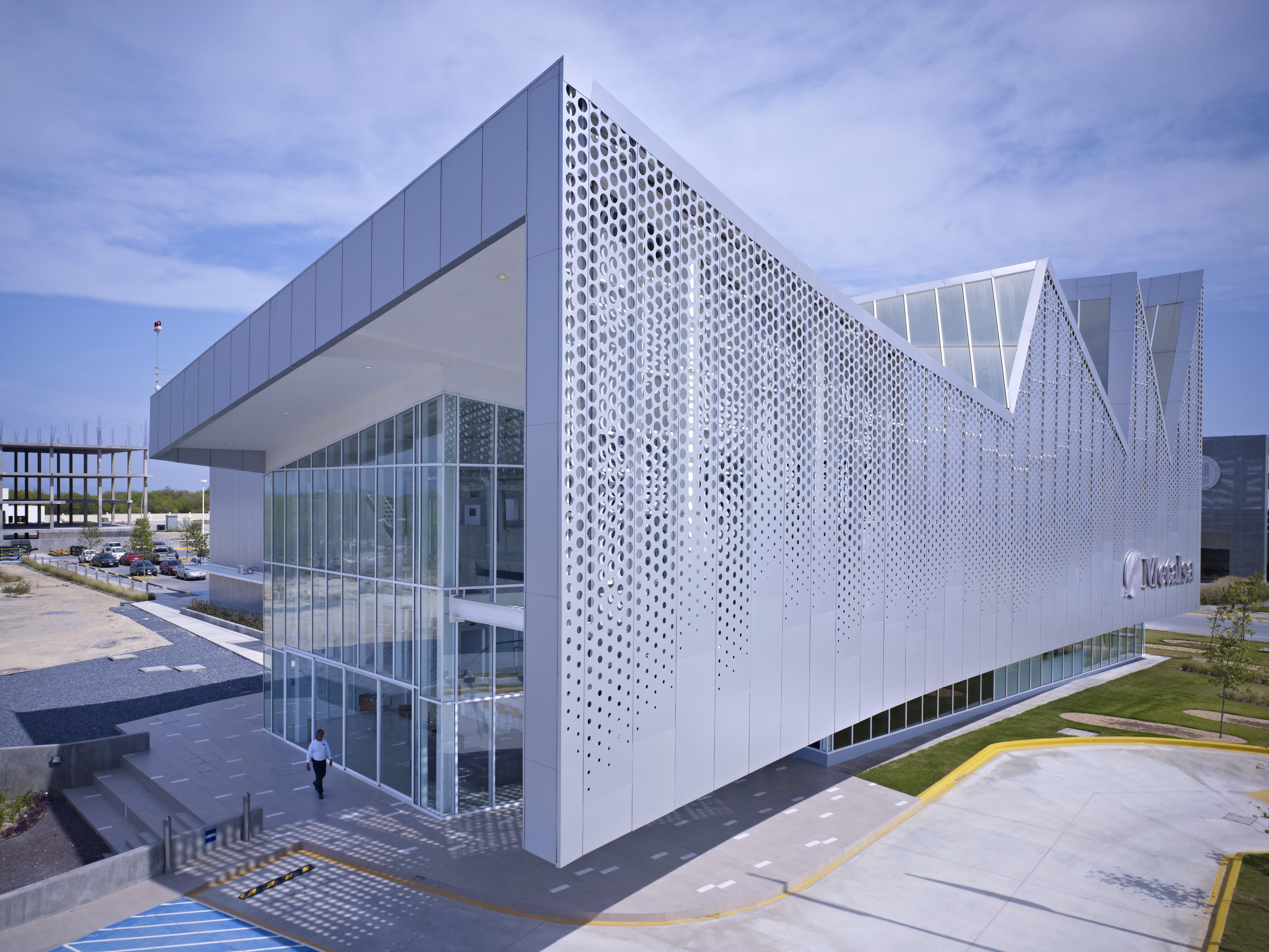
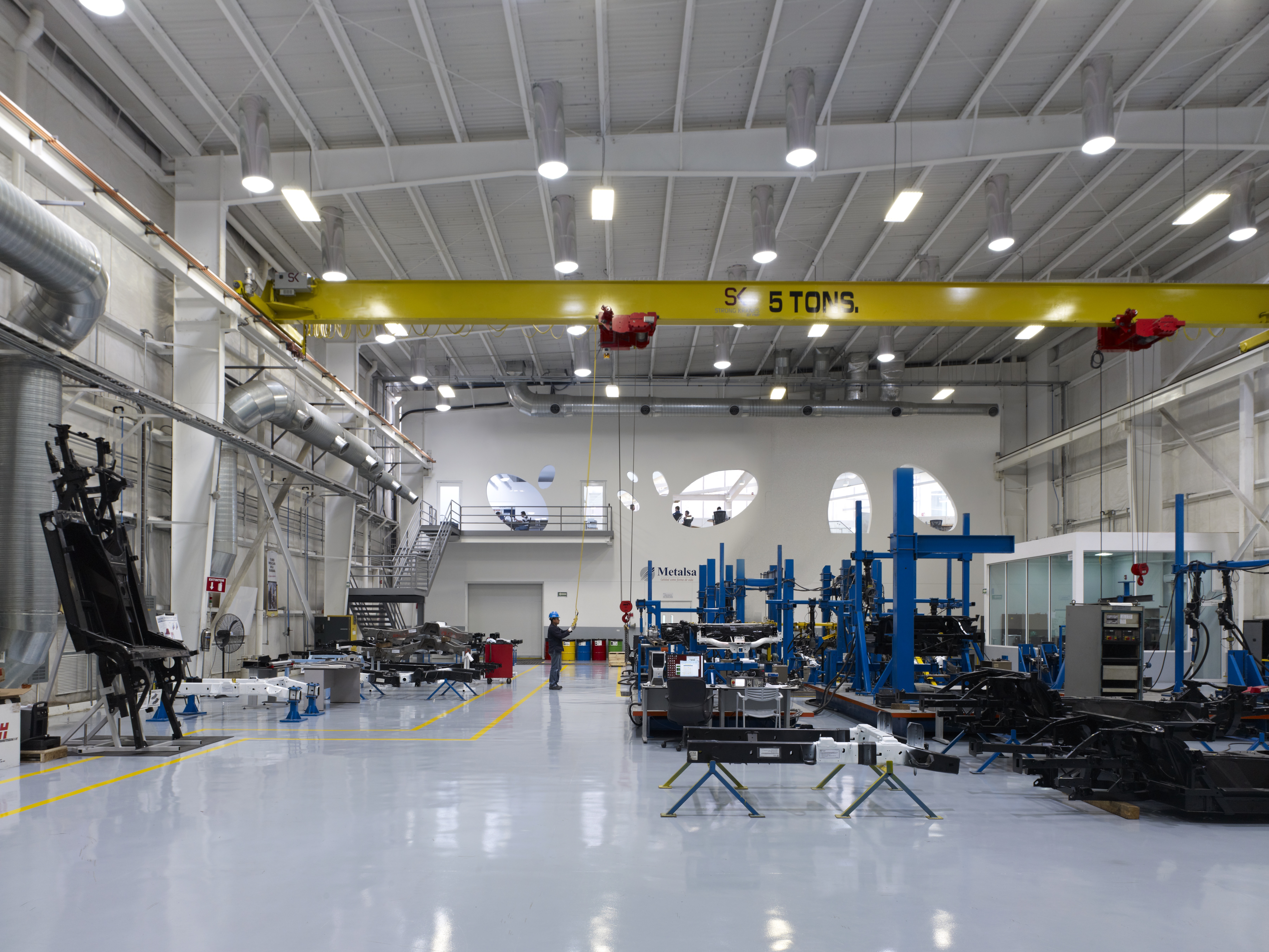
New Center for Manufacturing Innovation by Brooks + Scarpa Architects, Monterrey, Mexico

Located in Mexico’s Research Park for Technical Innovation (PIIT), a science and technology park, which is a partnership between government, universities and the private sector to seek economic growth through technical innovation. The sprawling campus is host to more than 50 research centers devoted to R&D as well as the development of technology innovation in nanotechnology, biotechnology, mechatronics and advanced manufacturing, information technology, clean energy and advanced materials development. The iconic saw-toothed roof is inspired by the geometry of old factories and the surrounding Monterrey Mountains.
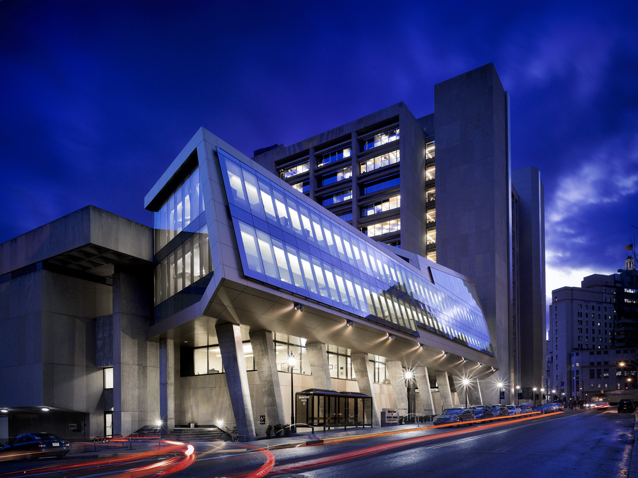
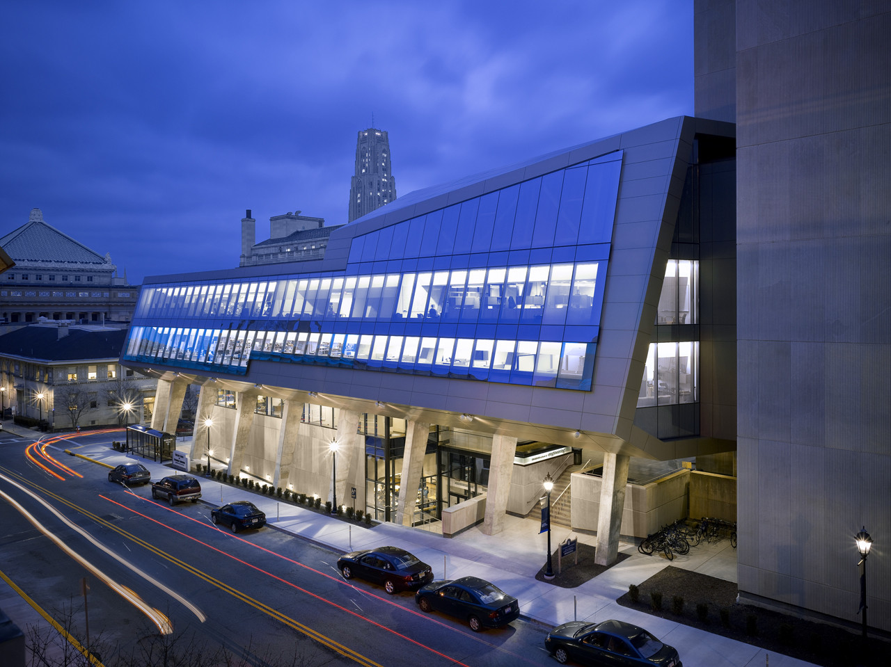
Mascaro Center for Sustainable Innovation by EDGE Studio, Pittsburgh, PA, United States

The University of Pittsburgh decided to expand and renovate Benedum Hall, the circa 1968 home for the Swanson School of Engineering on their main Oakland campus. The original limestone clad modernist tower and separate auditorium buildings, with their inflexible and non-daylit concrete block labs and offices and out of date classrooms, had become obsolete as the school’s focus shifted to the 21st century collaborative disciplines of nanotechnology, bioengineering and materials research. The University desired a more flexible facility that was conducive to inter-departmental collaboration, and that could help attract the best and brightest research faculty and students from around the world.
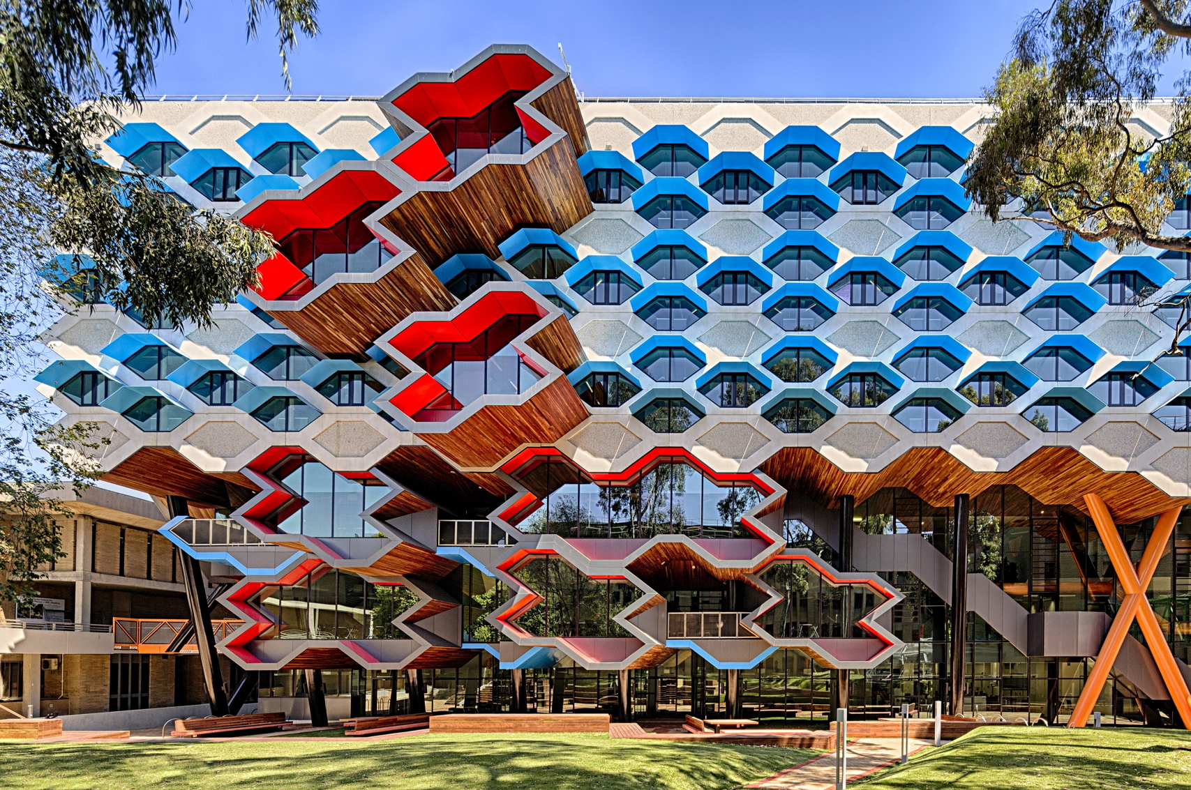
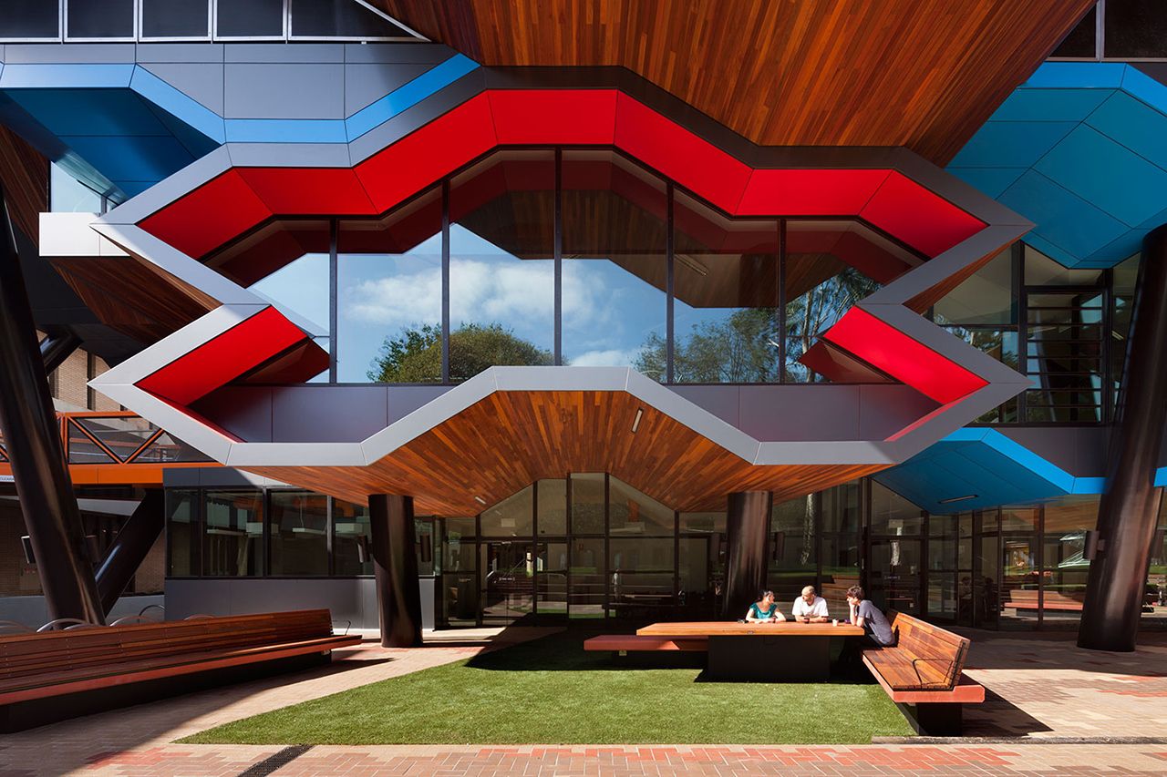
La Trobe Institute for Molecular Science by Lyons, Melbourne, Australia

This new research centre is a world-class facility for molecular science, biotechnology and nanotechnology research, teaching and learning. The 6 story facility provides approximately 11000m² of learning space – both wet and dry labs – on the lower 3 levels, and 18 research labs on the upper floors. It contains research groups in life sciences (biochemistry and genetics), physical sciences (chemistry and physics), and applied sciences (pharmacy) and teaches undergraduate and graduate courses in these areas through the School of Molecular Sciences.

Send us a photo. Tell us a story. Win $2,500! Architizer’s 3rd Annual One Photo Challenge is underway with a Main Entry Deadline on June 24, 2022! Start your entry for architecture’s biggest photography competition here.

Reference

7 Tips for Snapping a Killer Architectural Photograph
CategoriesArchitecture

7 Tips for Snapping a Killer Architectural Photograph

Send us a photo. Tell us a story. Win $2,500! Architizer’s 3rd Annual One Photo Challenge is underway with a Main Entry Deadline on June 24, 2022! Start your entry for architecture’s biggest photography competition here.
The art of architectural photography is a passion not just for architects, but everyone with a desire to capture the environment around them in all its glory. This desire extends far beyond simply archiving a building’s physical features: we yearn to capture the mood, atmosphere and emotion of places and the people that inhabit them. This is what Architizer’s One Photo Challenge — our global annual competition dedicated to architectural photography — is all about.

With 2 top prizes of $2,500 and global recognition for your work, this is a competition you will want to get involved with. Head this way to learn more and upload your submission:

Enter the One Photo Challenge

Architizer’s popular architectural ideas competition poses a simple question: Can you capture a single photograph that tells a powerful story about architecture? The best architectural photographs can tell you more about a building or cityscape than any essay or lecture, informing and inspiring in equal measure.

But what does it take to achieve such lofty goals with your phone, a compact or even an SLR? I am no technical expert when it comes to the genre, but I have taken a few snaps in my time: 10,000 photographs over 9 months of traveling in 2012 drew me so deeply into this niche, I suspect I’ll never view the built environment the same way ever again!

Here’s what I learnt over the course of that extraordinary year, primarily relating to composition and shot selection. Hopefully, one or two of these tips will aid you in your own quest for photographic immortality…

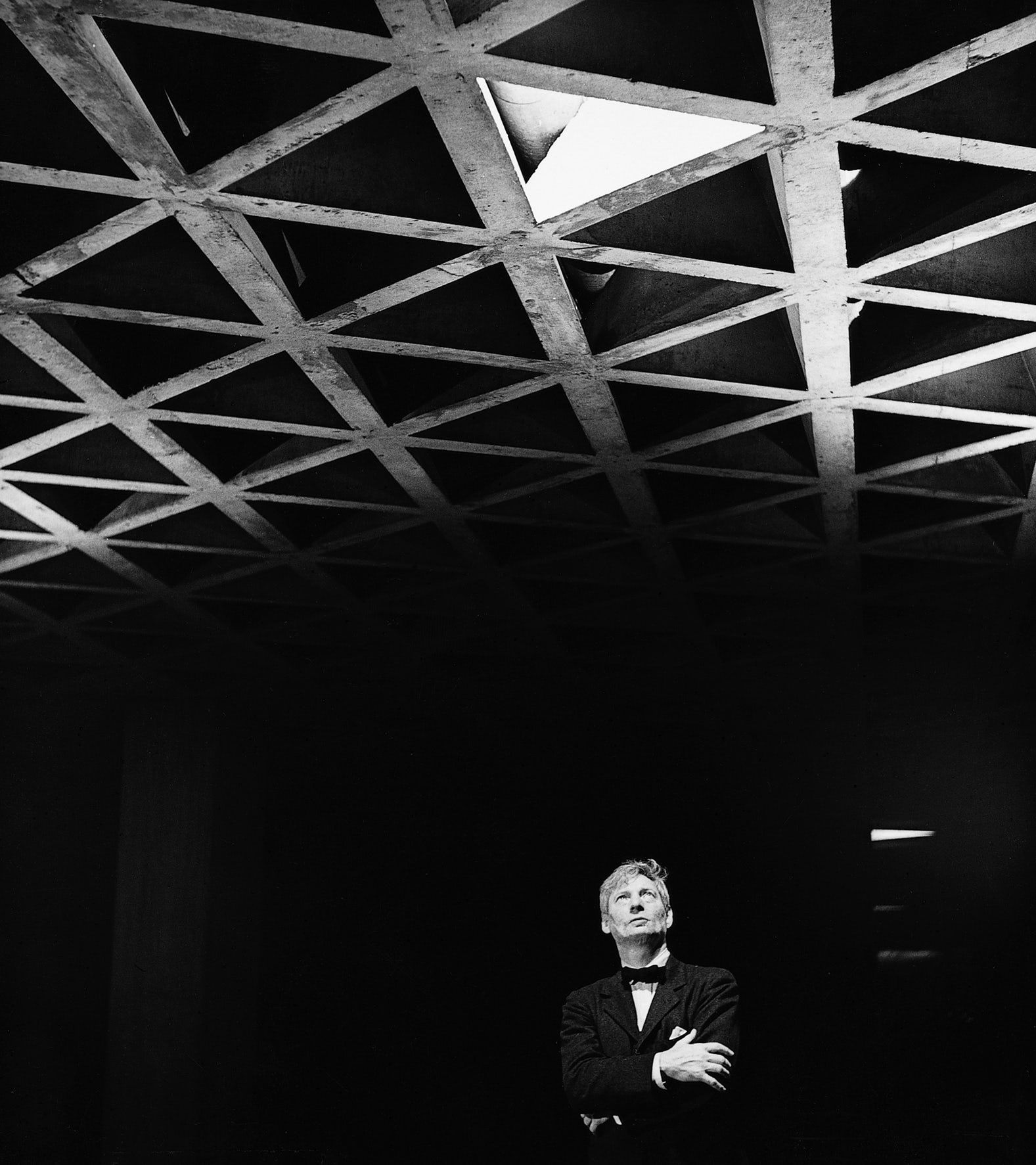
Louis Kahn Looking at His Tetrahedral Ceiling in the Yale University Art Gallery, 1953. © Lionel Freedman. Via Archdaily

1. Let There Be Light

Khan, Ando and Zumthor will tell you as much — light is the most crucial tool in an architect’s box, and the same can be said for photographers in the field. For exteriors, visit your subject in the early morning or late afternoon when the sun is low in the sky to capture images with a greater degree of contrast — assuming, of course, the weather is kind to you. I have been known to sit for an hour or more, waiting for the clouds to break so I can catch my favorite buildings at their glorious best. It pays to be patient!

Look for concentrated natural light sources within buildings too, for dramatic, high contrast shots full of atmosphere.

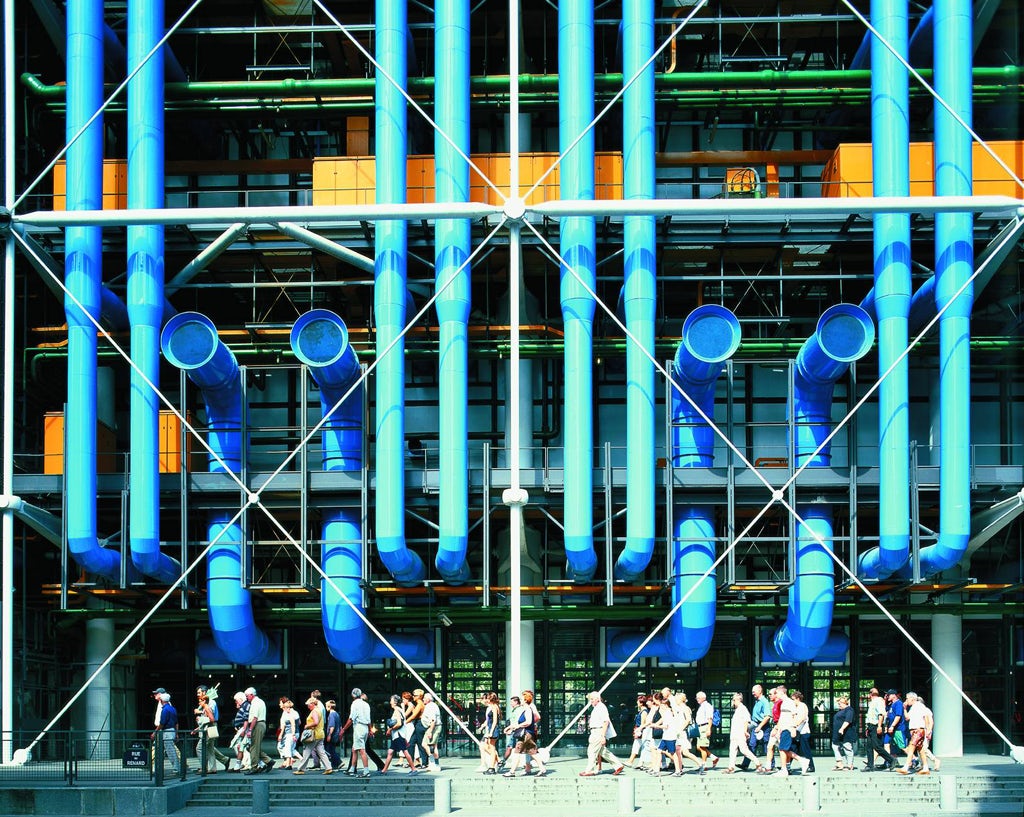
Centre Pompidou by Piano + Rogers.© Royal Academy of Arts. Via Metalocus

2. Color Me Stunning

Black turtleneck clichés abound, many architects would consider themselves somewhat allergic to color — there is nothing like a high-contrast monochromatic image to accentuate the striking forms and uncompromising lines of a modernist icon by Niemeyer or Corbusier.

However, it is possible — bear with me here — for a flash of color could provide a distinctive, eye-catching moment within your image, communicating architectural language by accentuating a window reveal, a soffit, or a key structural element. Try photographing the work of Richard Rogers, with his vibrant Pompidou ductwork, to kick-start your newfound love affair with color.

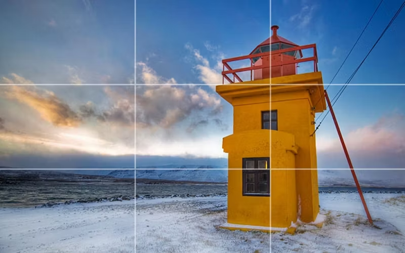
© Trey Ratcliff. Via PhotographyMad

3. The Rule Of Thirds

The Rule of Thirds is typically recognized as a safe bet when considering composition in photography: keep your primary subject or focal point off centre, a third of the way across the view, to creating additional tension, energy and interest within the image. For more distant shots, a composition should have balance and weight if the horizon sits a third of the way up the image.

Having said all this, if your subject lends itself to a centred composition, or a zoomed-in detail, go right ahead – rules are made to be broken!

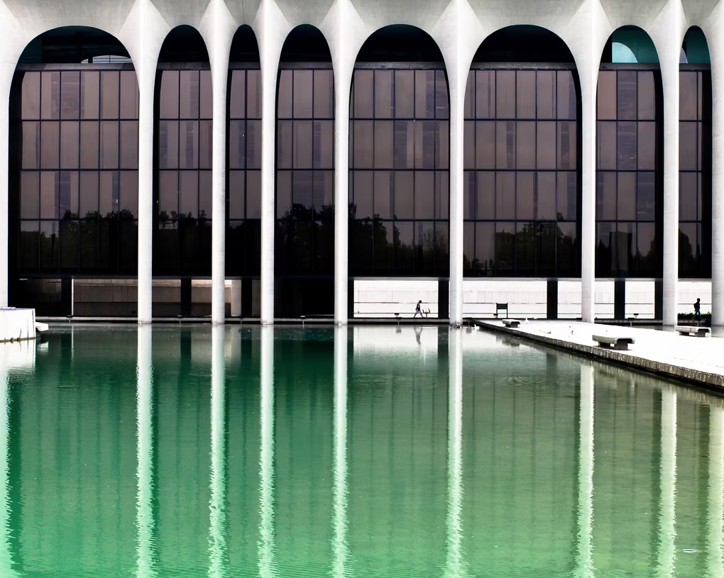
© Ezio Beschi. Via Flickr

4. Rhyme and Rhythm

A certain Johann Wolfgang once compared architecture to frozen music, and you can see his point: Some of the greatest works in our time have some wonderful rhythmic qualities. If you can find the right angle from which to take your photograph, these rhythms can be emphasized, revealing the logic behind the designer’s thinking and the structural qualities of the building in a single, stunning image.

Once you have those repeated elements within your viewfinder, align diagonal lines of perspective with the corners of the photograph to add depth and balance in equal measure.

Hong Kong High Rise. © Michael Wolf. Via Daily Mail

5. Clean vs. Chaotic

A classic architectural cliché is illustrated in that most infamous of Tumblrs, ‘Unhappy Hipsters’: Clean-cut minimalism, free from even the slightest speck of dust, a children’s toy, or — heaven forbid — a smiling face. However, consider shooting buildings in all their ugly glory: Anarchic apartment blocks, traffic-filled streetscapes and rusting industrial monoliths can tell a story that your slick, set-piece image may never manage.

The same can be said for weather: Capturing your favorite architectural icon on a crisp, clear day is just fine, but what about shooting it during the chaos of a thunderstorm, or even a blizzard? Brave the elements and find out, hardy souls.

‘Break Point’. © Darell Godliman. ViaBD Online

‘The Urban Lantern’. Via BD Online

6. The Human Touch

Speaking of smiling faces, who needs ’em? I have spent many a long day waiting with growing frustration as people walk in front of the church or museum elevation I’m trying to catch a perfect, person-free image of. We are all about the architecture, not the portraiture… right?

Ok, I must grudgingly admit that sometimes people can add an awful lot to your photograph. From a practical point of view, they provide comparable scale — tiny people in front of gargantuan skyscrapers really throw the urban environment into sharp perspective. On top of this, they can also provide that vital injection of cultural and social context — after all, without their inhabitants, buildings are merely objects upon the plains.

© Scott Fillmer

© Scott Fillmer

Via Craft Hubs

7. All the Gear, No Idea

If you search around the internet for architectural photography guides, you will be swamped with a plethora of recommendations regarding equipment and specifications: wide-angle lenses, tripods, tilt-shift lenses, polarising filters, bellows for detail shots, long exposures for night scenes, varied apertures… the list goes on.

If you are just starting out, reading about all of this can be bewildering – but ultimately, the best way to learn is to get out there and experiment. You will soon learn how the gear works and which settings will give you the result you are looking for.

Right, I’m off to the dark room, excuse me…


Submit your best architectural photo in the inaugural One Photo Challenge for shot at $2,500 and global recognition:

Enter the One Photo Challenge

Top Image: 56 Leonard Street by Herzog & de Meuron, photographed by One Photo Challenge juror Paul Clemence.

Reference

8 Stunning Structures Shaped By Their Sloping Sites
CategoriesArchitecture

8 Stunning Structures Shaped By Their Sloping Sites

 Architects: Want to have your project featured? Showcase your work through Architizer and sign up for our inspirational newsletter.    

Despite technical complications involved in construction, inclined sites can invoke inspiring new architectural possibilities that just aren’t possible on flat sites. Better views, unique spatial design, creation of privacy using a variety of levels, and much more. Floating buildings can be constructed on slopes either by using a taller foundation or supports. On the other hand, architects have also created buildings that follow the incline or are even partially or fully buried into the slope. Below are a few ways in which architects have made the most of sloped sites to create unique homes and public buildings.

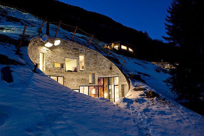
Villa Vals by SeARCH, Vals, Switzerland

SeARCH took the idea of a mountain house one step further by building a home that is concealed within the slope rather than on top of it. Given its proximity to the bath of Vals, the team wanted to create a home without disrupting the snowy inclines. A circular cavity into the mountain becomes the entrance as well as a patio. The rooms are placed around this central opening, ensuring that all the windows reach the surface. And while it may look small, appearances can be deceiving, and the inside of the home feels spacious, bright and airy. Meanwhile, the use of materials like stone, wood and concrete helps unify the design with the terrain around.

Khyber Ridge by Studio NMinusOne, Whistler, Canada

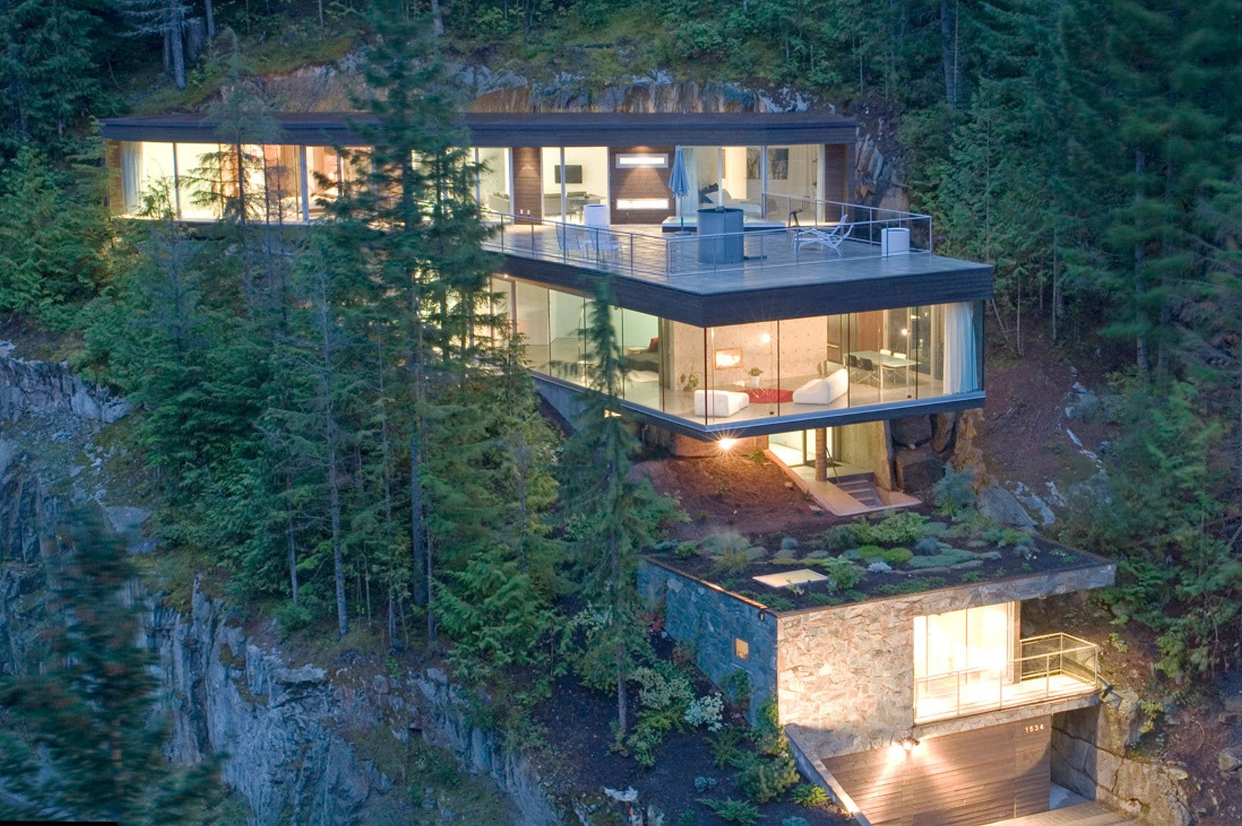
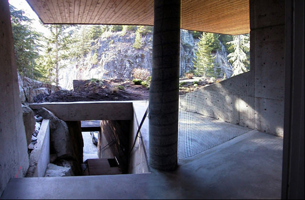
This home is broken up into five levels that adapt to the changing slope. The arrangement of the volumes is based on the unique function and views that each space requires. The topmost level contains the bedrooms as well as a large balcony for residents to take in the nature around. Part of it is embedded into the rock to create a sense of intimacy and privacy. The level below cantilevers out of the rock and houses the common areas, making it seem like it is floating within the trees. Below the mid-level entrance lies the guest room, which is completely sunken into the mountain slope for privacy. Some of the natural rock surfaces were in the interior spaces remains exposed, amplifying the alpine atmosphere.

Images by Benedikt Markel

Krkonose Mountains Centre for Environmental Education by Petr Hajek Architekti, Vrchlabí, Czech Republic

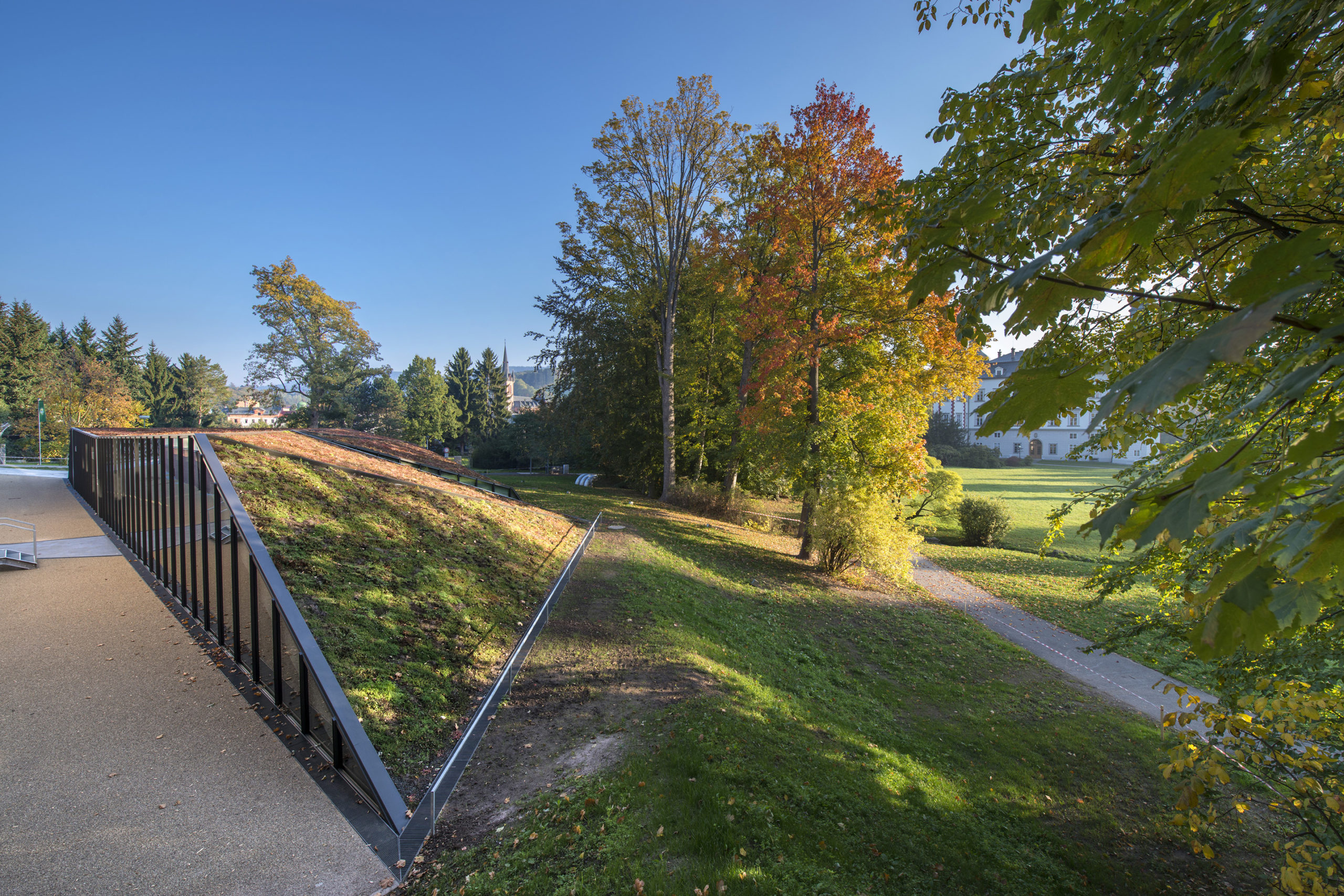
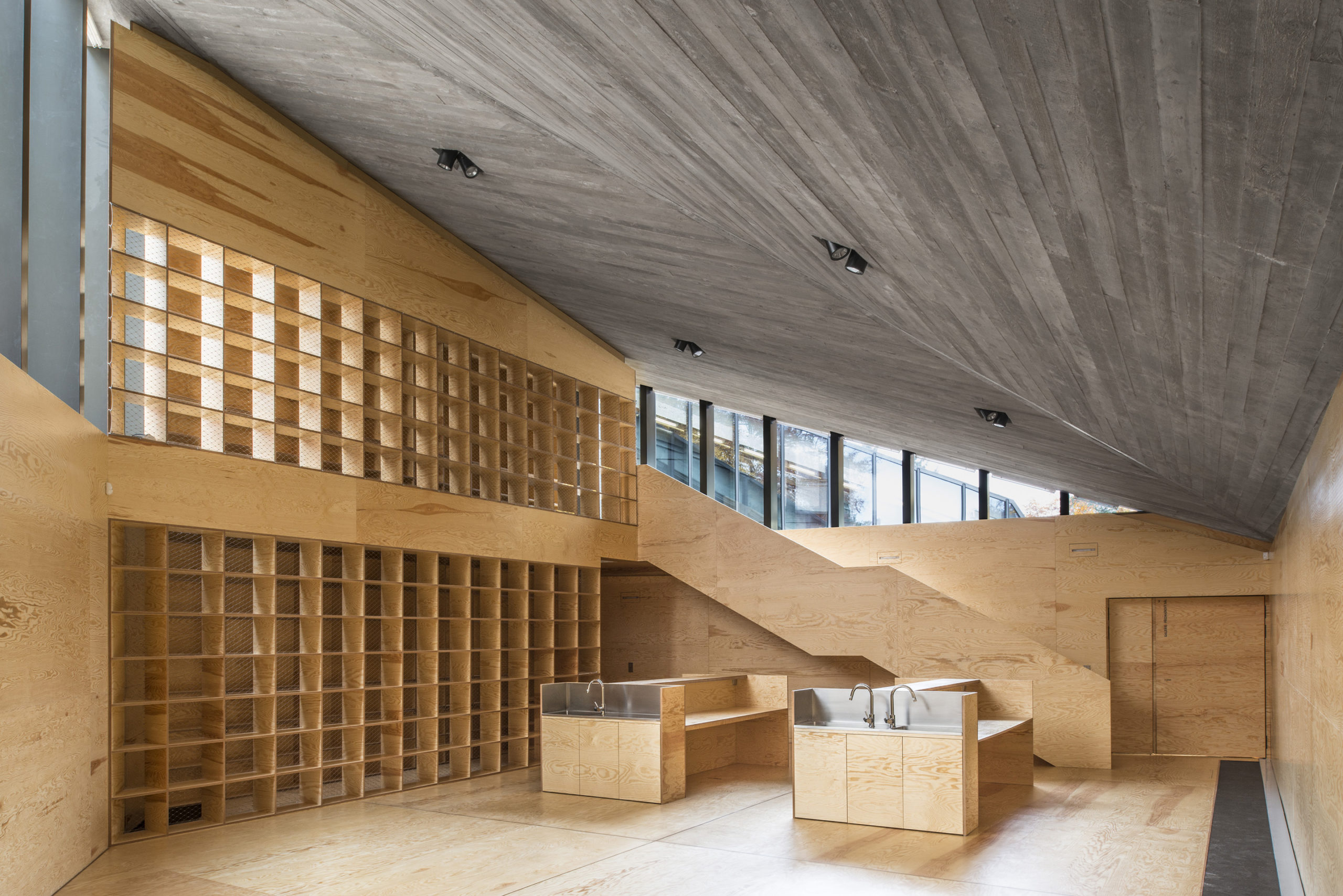
Inspired by the geometry of the Krkonose Mountains, this new building blends into the landscape (almost completely!) when seen from certain angles. The roof is covered with vegetation to reinforce this illusion. While mostly underground, a part of the structure rises above the terrain and features a glass wall that invites passersby to peek into the building and observe the activity taking place inside. Concrete is used to create the interior volumes that are then divided using plywood partitions. The furniture within is made using the leftover plywood from the bigger partitions to reduce waste.

House D by PAUHOF Architekten, Austria

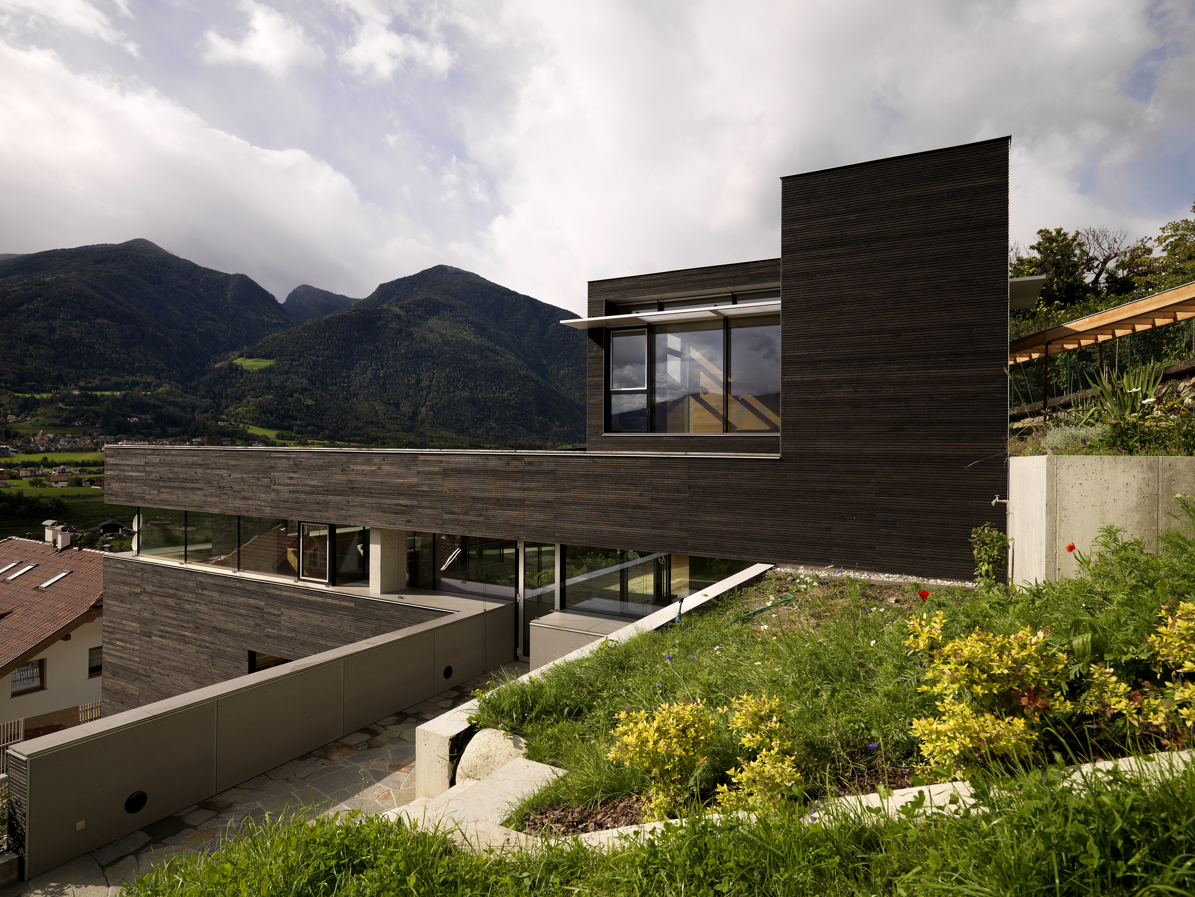
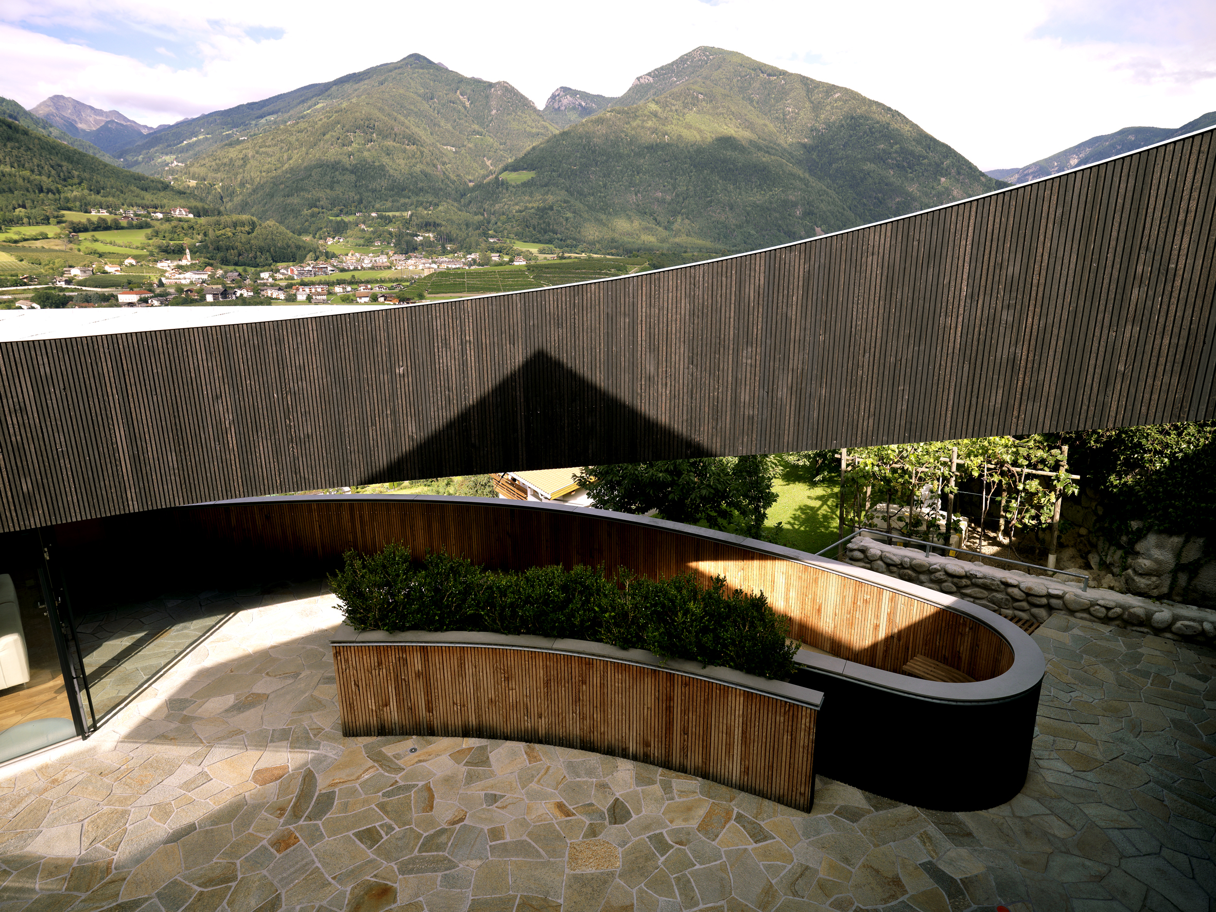
Connected volumes, natural finishes, spacious interiors and stunning views make up this home. One the one hand, this is a four-story structure with stacked volumes that follow the contours of the site. On the other hand, the structure’s rounded corners are governed by the property line. The windows are placed in a way that the residents can overlook the mountains while also preventing their neighbors from being able to peek in. It follows a spiral circulation with a floating roof on the upper level. The home comprises a studio gallery, library, multiple bedrooms, baths, a family room as well as other utilities.

Sheltered Villas by A&M Architects, Karpathos, Greece

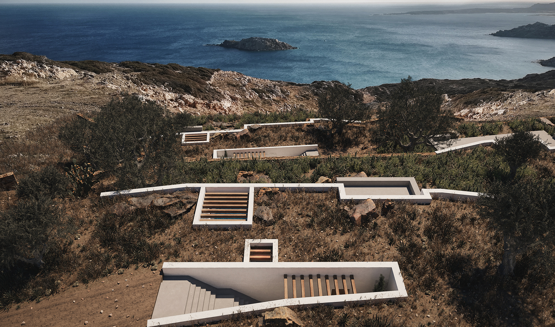
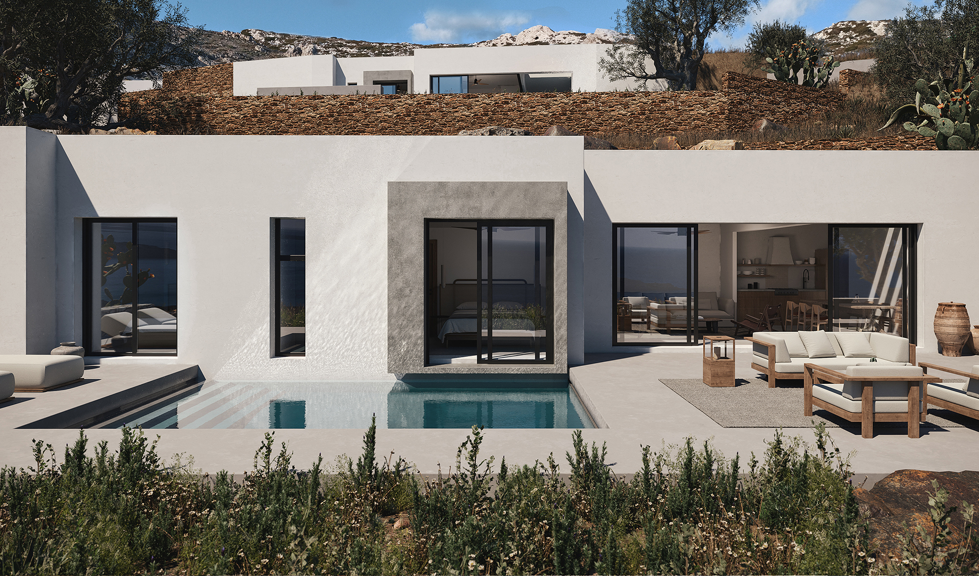
This multi-level structure creates a strong relationship between the exterior and the interior. The different volumes that make up the three villas are partially nestled into the slope of the site. The retaining walls holding up the structure extrude from the ground and are painted in white to help them stand out in the landscape. The inner volumes feature clean lines, simple geometry and black accents for the minimal aesthetic and help the view of the Aegean Sea become the hero of the experience.

Ebenezer Chapel by Vilalta Studio, Raleigh, North Carolina

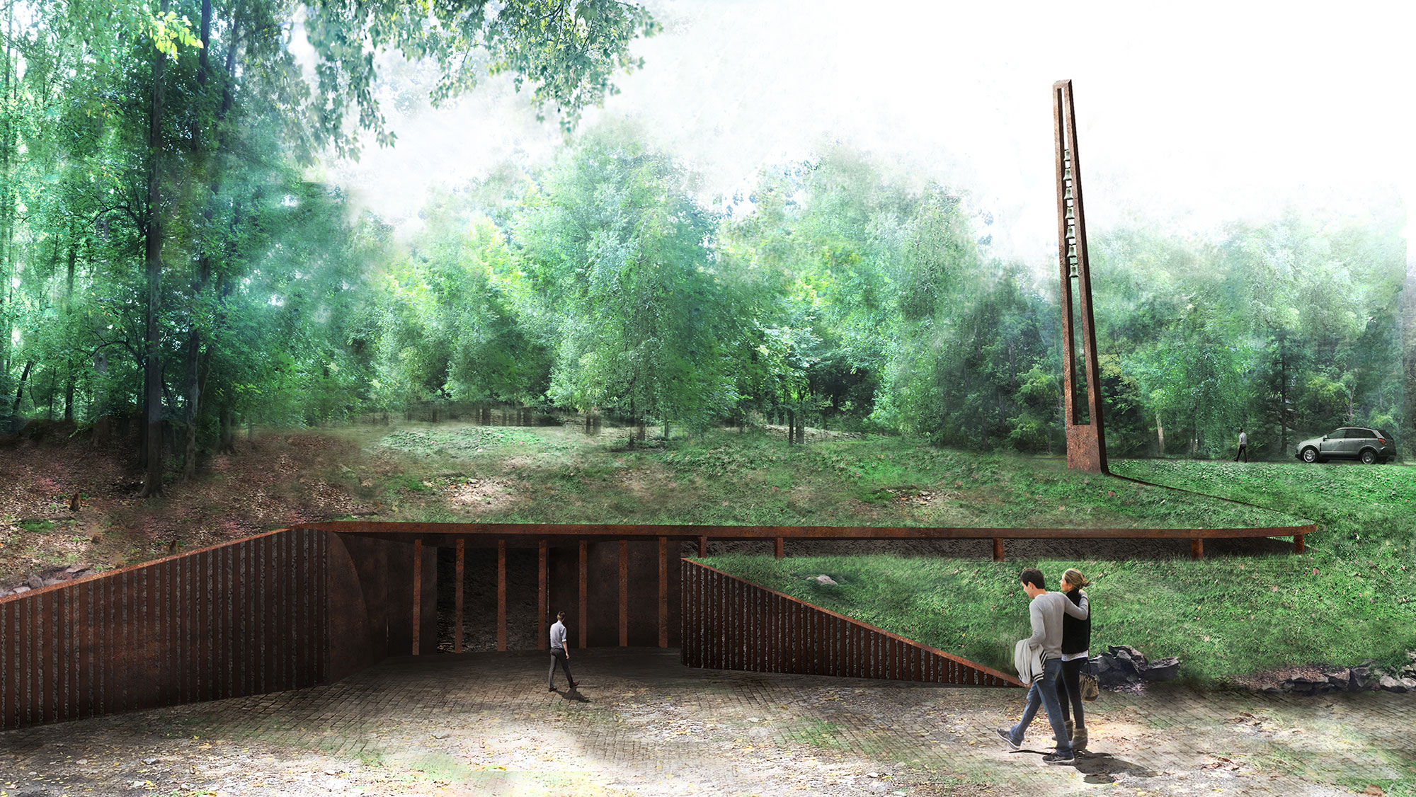
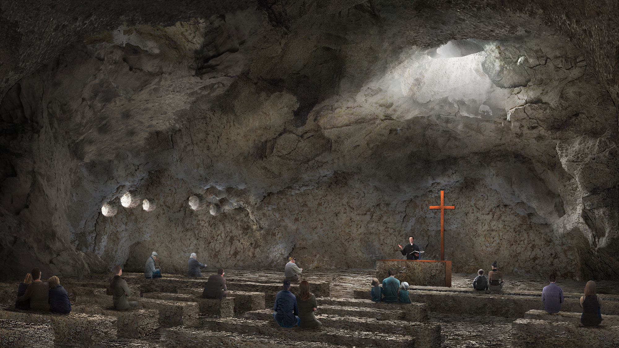
Building on the increase of architecture that challenges the perception of what religious buildings should look like, Vilalta Studio presents a conceptual underground chapel. Dug into the sloped terrain near Richland Creek, the granite structure is imagined to stretch about 50 feet deep into the ground. Visitors would enter the chapel through a downward ramp that leads to an underground chamber and creates a contemplative space before entering the main gathering area. A large tower, the only element that visibly extends out of the site, brings light and air into the building. The chapel, which can accommodate 250 people, also has a skylight above for light and ventilation.

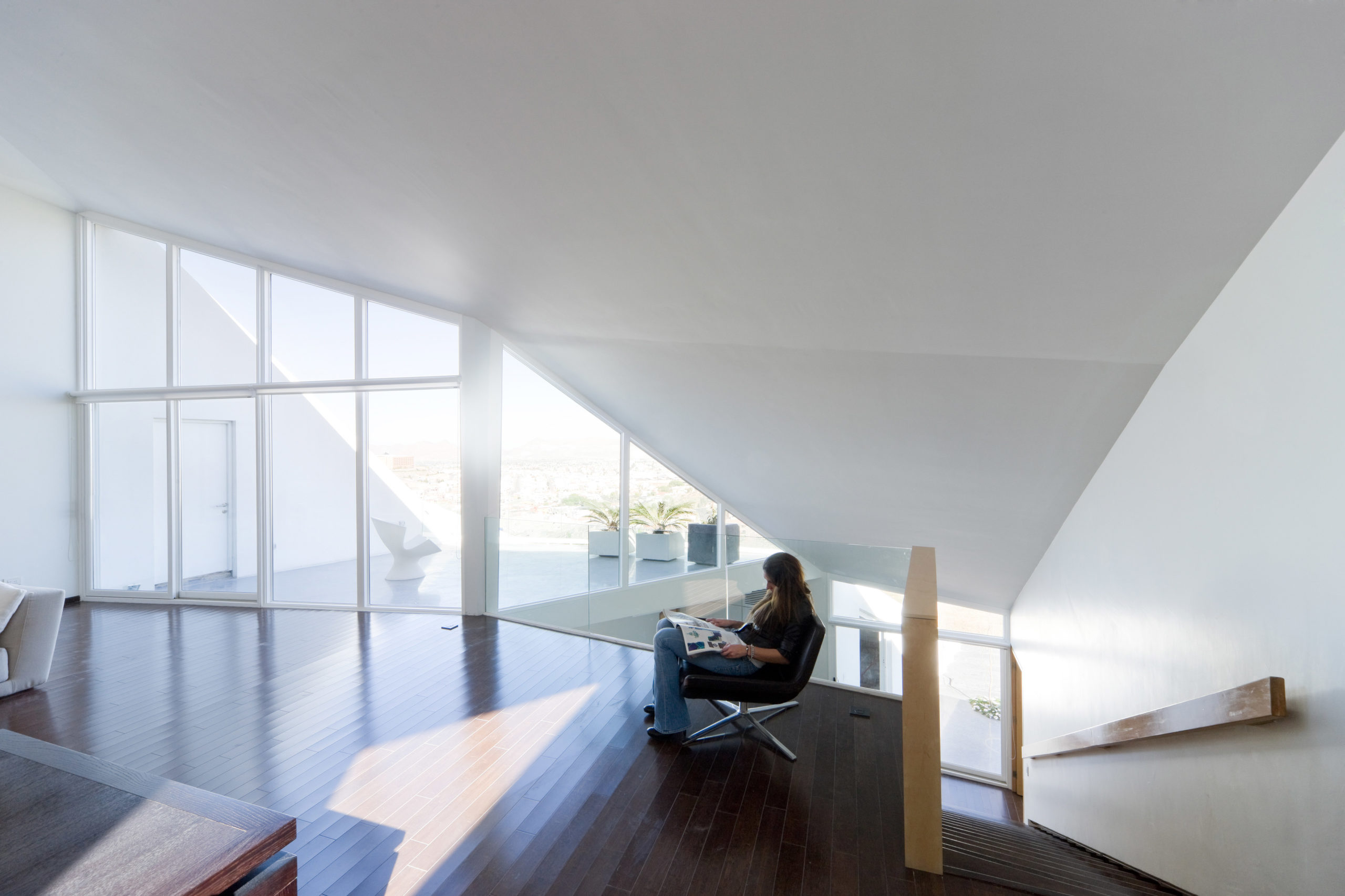
House in Chihuahua by Productora, Chihuahua, Mexico

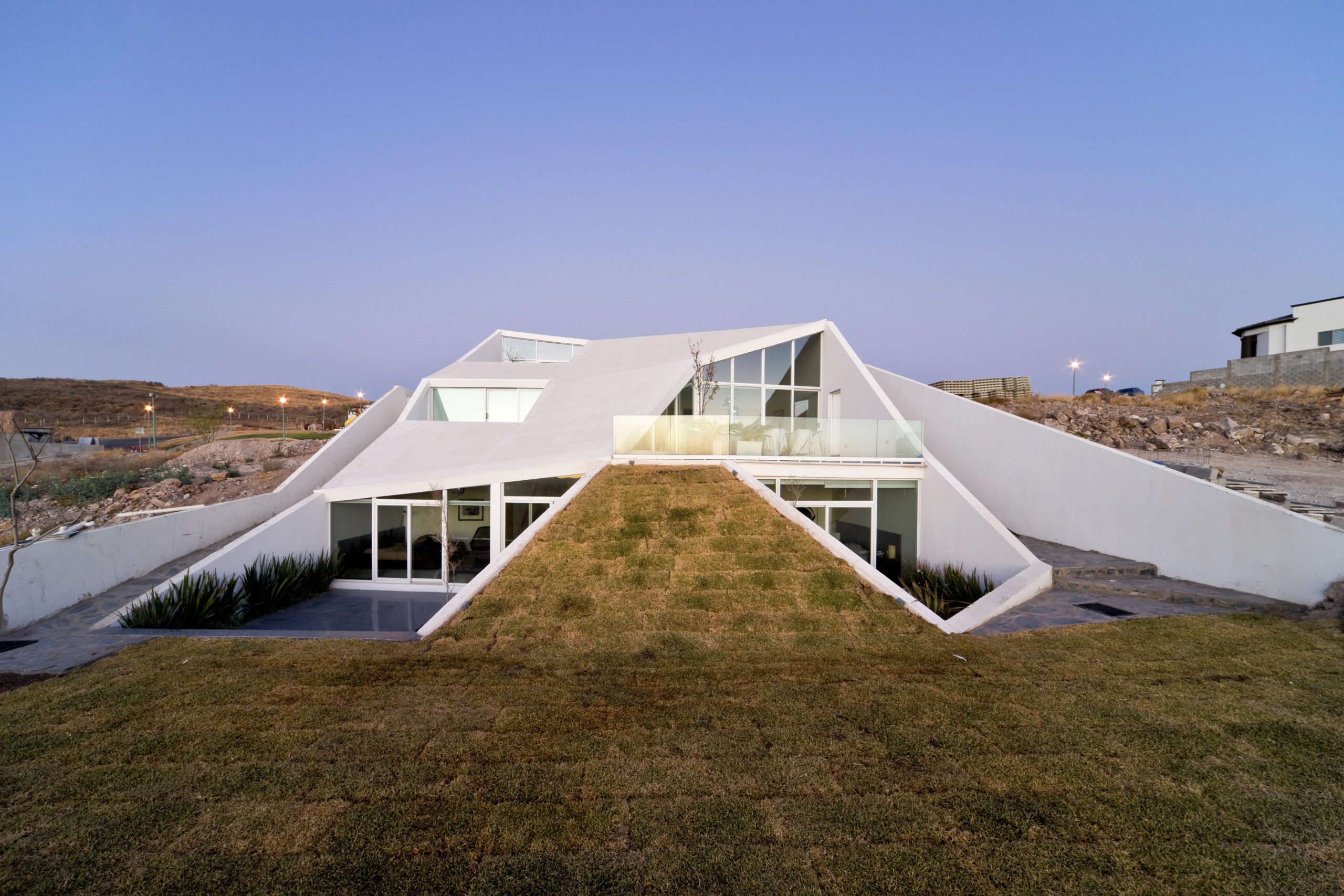
In addition to adapting to the site, this home’s form is designed with the area’s extreme climatic conditions in mind. The temperature in the northern region of Mexico can go below freezing point in the winter and turn to scorching heat in the summer. And there are drastic temperature differences between day and night as well. Having part of the house underground helps regulate the temperature within by using the soil’s thermal mass. There are multiple roof openings and patios that not only bring in light but also create breakout spaces for the residents.

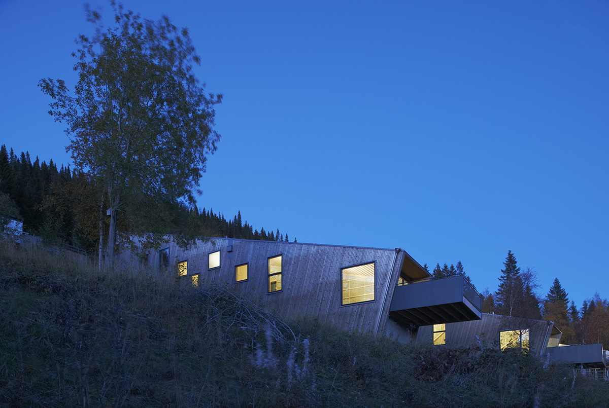
Åre Solbringen by Waldemarson Berglund, Åre, Sweden

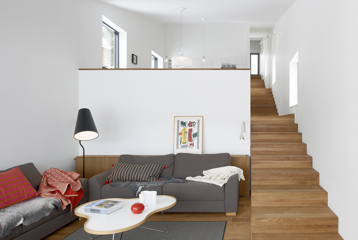
The project includes three inclined homes on the Åreskutan mountain in Sweden. Most houses in this region are built in a way that results in one habitable floor. The architects cultivated a diagonal typology that allows them to create five usable levels that all get abundant light. The unit lies entirely along the slope. The different levels within are connected by a long flight of stairs on one side. Starting with the living room and the kitchen at the bottom, the stairs lead to the bedrooms, hall, bathroom and sauna on the upper floors. It is constructed using brick slabs, timber structural elements, a metal sheet roof and white plasterboard. Unlike the bright interiors, the wooden panels used on the exterior surfaces will age with and time and turn grey.

 Architects: Want to have your project featured? Showcase your work through Architizer and sign up for our inspirational newsletter.    

Reference

Why Capturing Movement Will Elevate Your Architectural Photographs
CategoriesArchitecture

Why Capturing Movement Will Elevate Your Architectural Photographs

Architizer’s annual One Photo Challenge offers professionals and blossoming design students the chance to showcase a photograph that they think best captures the essence of an architectural design or specific surrounding. The 2021 One Photo Challenge brought a wonderful selection of images, all of which demonstrated the potentiality of capturing architecture through a camera lens.

Enter One Photo Challenge

While each entry was remarkably singular and distinctive, a notable overarching theme emerged across a handful of photographs. One will notice that in last year’s One Photo Challenge, many photographs capture a strong sense of movement. Listed below are four photographs from the 2021 One Photo Challenge, all of which explore the human form coupled with interesting architecture to produce movement-heavy imagery. 

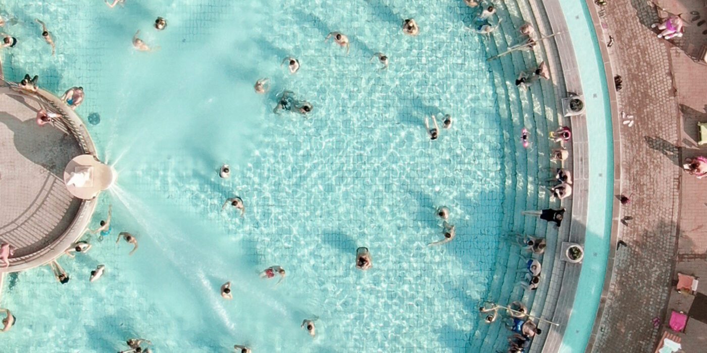
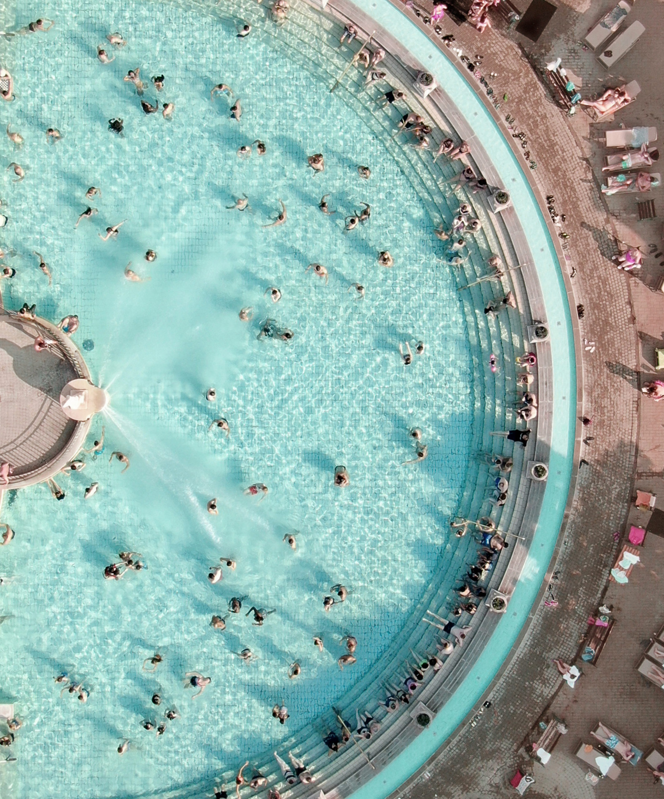
“Social Bathing” by Derek Wasylyshen

This image captures a bird’s-eye shot of the hugely popular and highly recognizable Széchenyi Medicinal Bath. Located in Budapest, Hungary, this large-scale bath is a popular tourist attraction where visitors can experience social bathing as well as marvel over the site’s ancient Roman history.

At first glance, the eye is caught by the vibrant aqua blue water, which greatly contrasts the surrounding cement floor. Following this, the gaze moves to the abundance of dark spots (human bodies) that span the entire photograph. The moving bodies are small in scale but their abundance creates a strong feeling of sociality and community. Moreover, the gently-sloping staircase that covers the bath’s perimeter is filled with lounging bodies, which equally enforces a strong social atmosphere.

The large presence of water and abundant human form work together to create a movement-heavy photograph. Whether the movement is caused by the natural rhythm of the water or the frolicking bodies, lively energy is produced and the same social ideology of the ancient Romans is presently felt. 

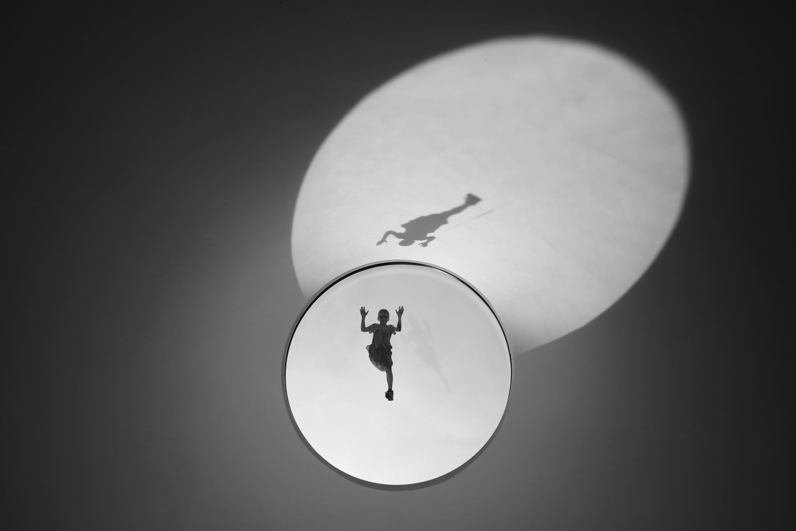
“The roofscape of the obscure” by Venla Rautajoki 

Non-Student Winner, 2021 One Photo Challenge

This photograph has an extra-terrestrial feel, which makes it immediately enthralling and equally challenging to pinpoint. The image was shot at Amos Rex, the famous art museum in Helsinki, Finland designed by JKMM Architects.

Amos Rex is known for its windowed domes that span the urban environment like a series of hills. Each dome has a peephole large enough for visitors inside the museum to see out of. The photographer was immediately captured by a young boy who continuously climbed atop the domes to peep into the interior museum space. The image is captured in monochrome which strengthens the viewer’s gaze on the young boy. The boy is captured in a highly active pose — his two hands perched like a cactus and his leg bent as if he’s climbing.

The image at first appears static and isolated as the background is dark and unembellished. However, the focus on the young boy positioned in such an active stance lends a feeling of lively existence and movement. 

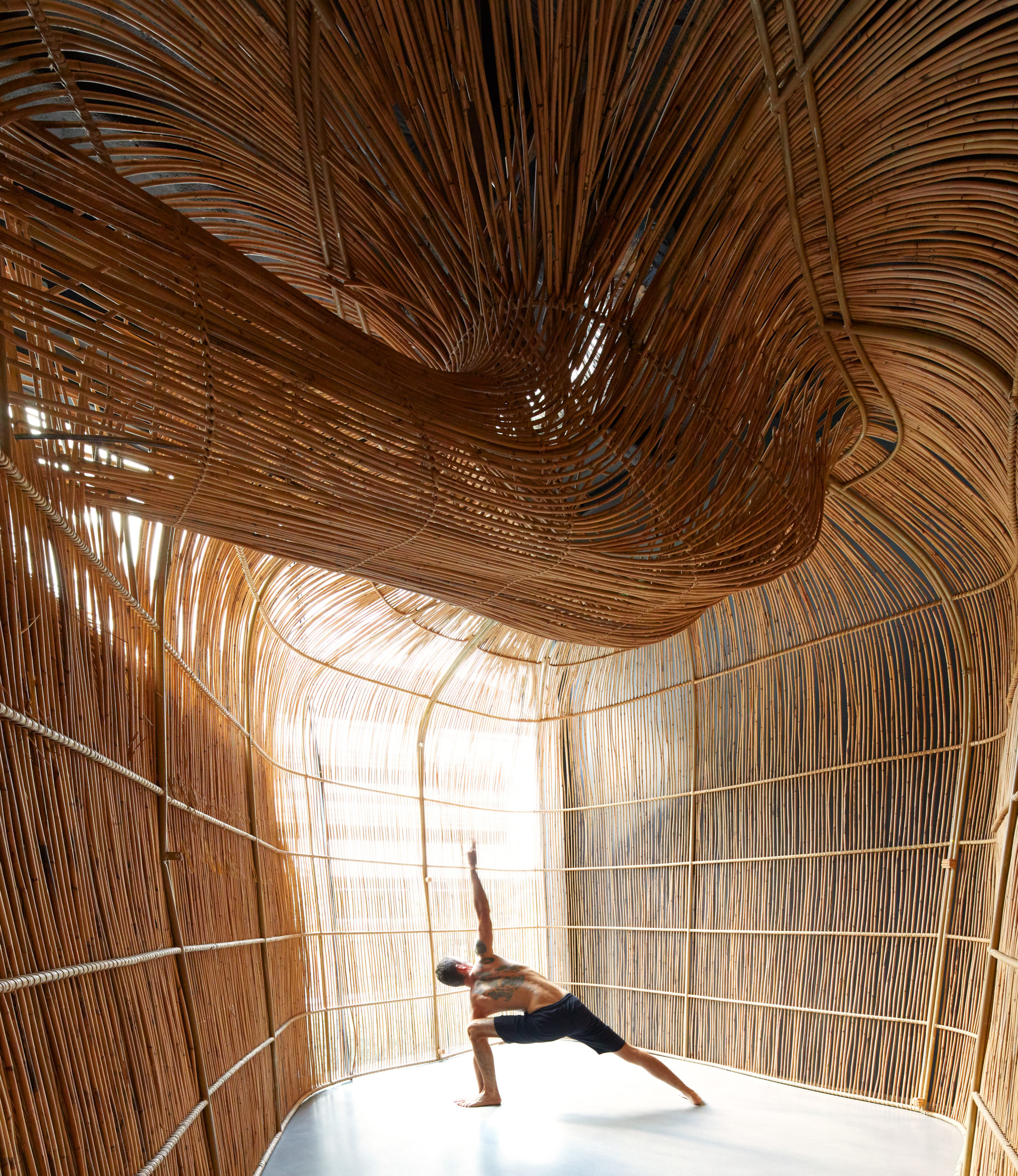
“Yoga” by Edmund Sumner 

This photograph was shot in Bangkok, Thailand in January 2020. The image depicts a yoga master and owner of the studio, Yogi Konstantin Miachin, holding an extended side-angle pose. Immediately what captures the eye is the incredible structure in which the yoga master is practicing.

The space feels intimate and warm and appears to be enclosed by a bamboo-esque material that wraps the walls in a curved manner. The wall material extends upwards to create an unconventional curved ceiling. Moreover, the cavities in the wall allow light to fill the interior, warming the environment and spotlighting the practicing yogi. The light-filled room feels like an incredibly zen and comforting space to practice yoga and meditation.

In this photograph, the human form balances and compliments the pronounced structure in a harmonious manner. The practicing yogi may feel small in scale, but his strong pose and reaching arm fills the photograph with energy. An equal vitality is felt in the structure’s curved and pronounced ceiling. The site was designed by architecture firm Enter Projects and the photograph was realized using low-tech materials such as rattan, with newer high-tech computer modeling such as Rhino. 

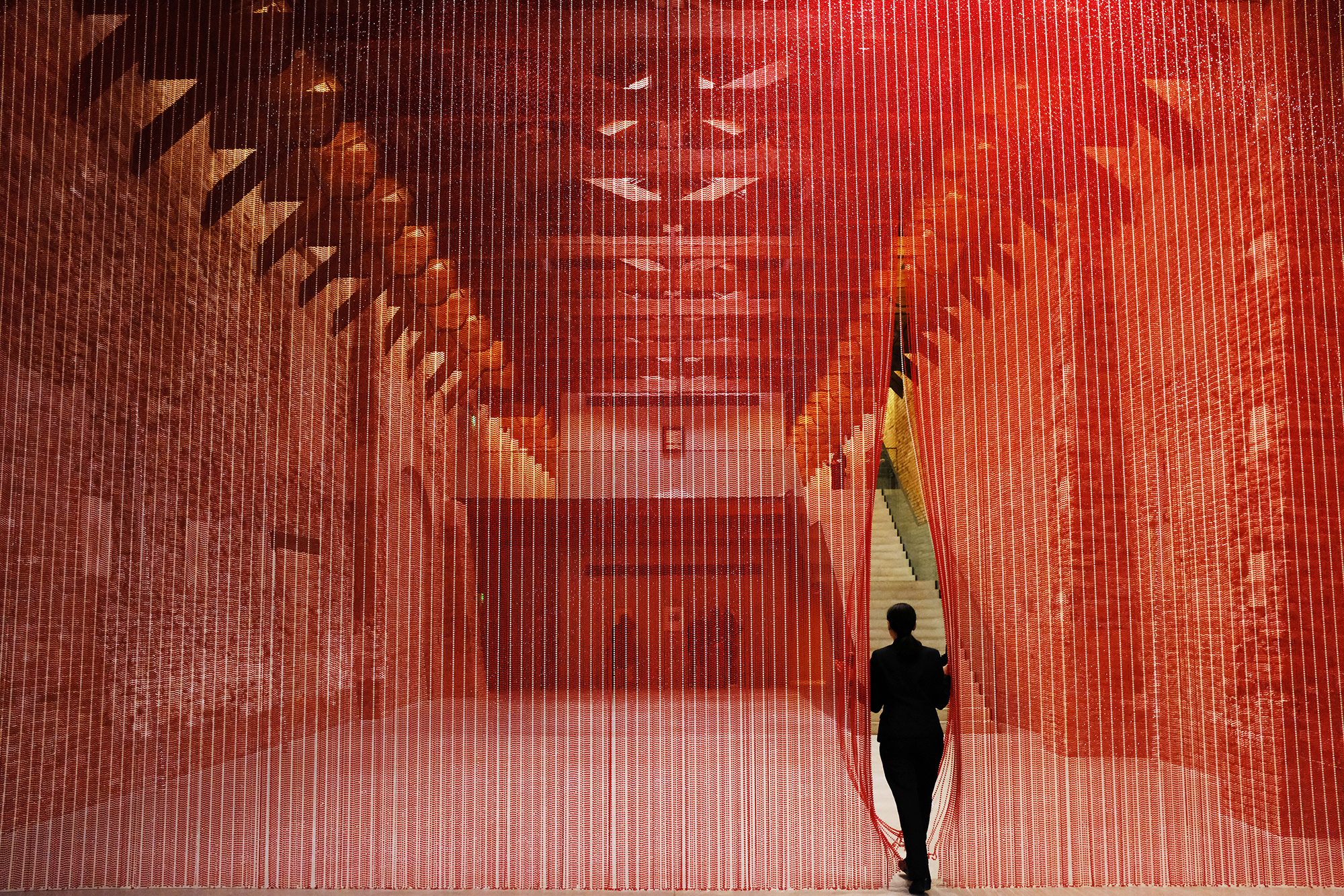
“Echo” by Philippe Sarfati 

This photograph feels mysterious, dramatic and incredibly intriguing. “Echo” is located in Tadao Ando’s gallery and features an autobiographic installation by the famed Cuban-American artist, Félix González-Torres. The photograph depicts an individual walking through the installation, which consists of a large-scale curtain made of red and white beads.

The installation underscores the difficulties and reality of living with HIV. The curtain of beads represents the progression of the virus within the bloodstream in a confronting and honest manner. As the person pushes past the curtain, one can sense the dramatic sway of beads that is to follow.

This photograph feels like the calm before the storm – before the intense movement following a disrupted installation. The interaction between human form and object in this photograph demonstrates a dramatic transition from still to moving. 

All four photographs highlight that when human forms are perfectly captured amongst static surroundings, there is the potential to create lively and active images that celebrate movement! Click here to learn more about this year’s upcoming 2022 One Photo Challenge and to start your entry:

Enter One Photo Challenge

Reference

5 Powerful Ways Lighting Can Transform Simple Architectural Spaces
CategoriesArchitecture

5 Powerful Ways Lighting Can Transform Simple Architectural Spaces

The A+Product Awards is open for entries, with a Main Entry Deadline of June 24th. Get started on your submission today! 

Good lighting can make or break a well-designed interior project. In addition to optimizing the availability of natural light in a space, selecting the right light fixtures can augment the furniture inside and cement a tone for the entire space. Bright white lights can make writing or chopping easier whereas warm yellow lights can make dinners an elevated experience. Similarly, colored lights can liven up parties and candle-lit wall sconces can be perfect for cozy nights.

Layering a variety of lights can add depth to any space and make it more comfortable. This technique also helps utilize different parts of a space in different ways. The scale and size of light fittings can also help fill up spaces or make them look more spacious.


Natural Light

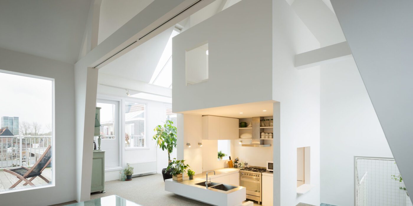
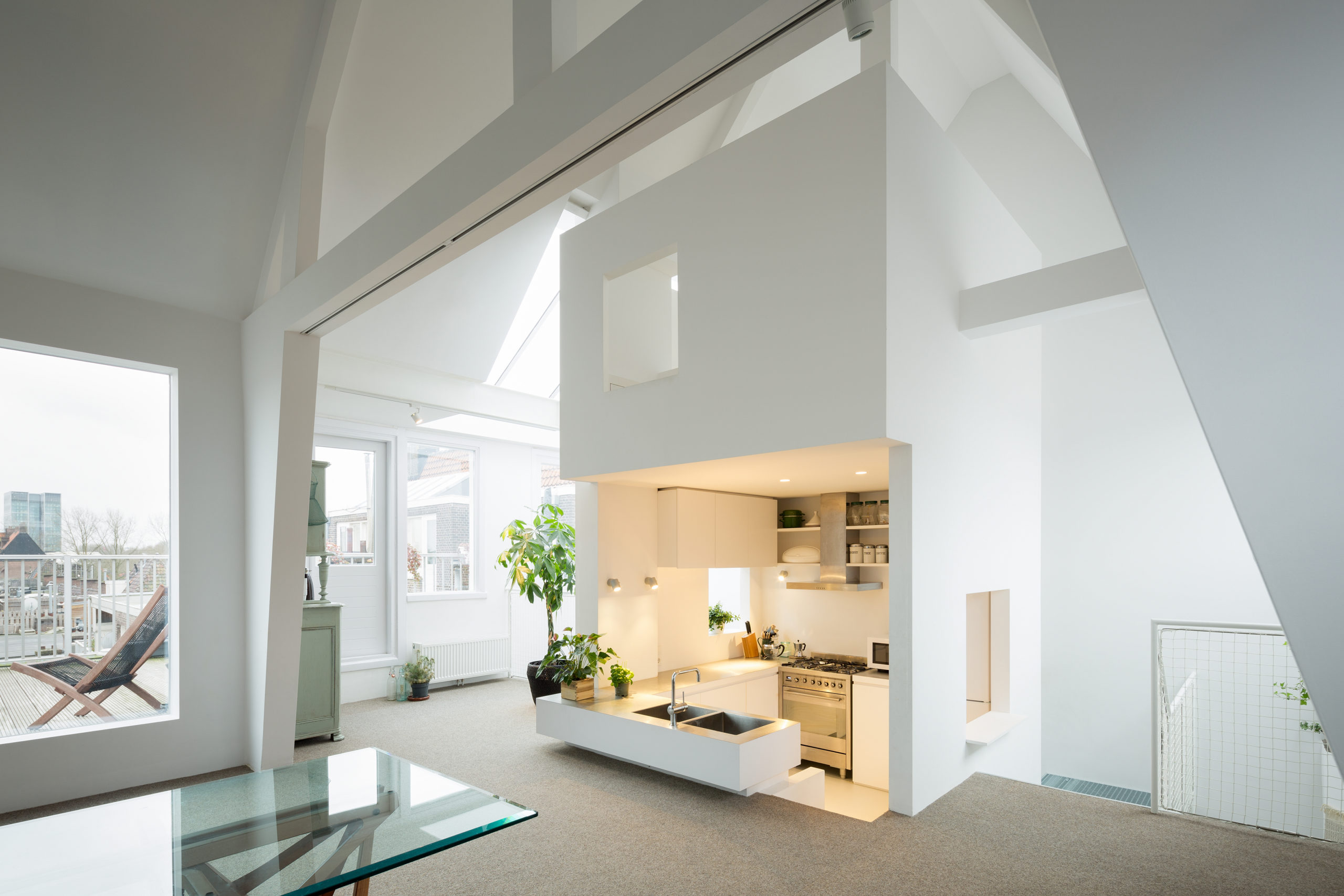
Apartment in Amsterdam by MAMM DESIGN, Amsterdam, The Netherlands | Image by Takumi Ota Photography

For years, designers have been trying to maximize the amount of natural light within a space. Having an abundance of sunlight pouring into a space can help make it feel bright, airy and comfortable (this is especially due to its soothing tone and physical warmth). Another check in favor of designing for natural light: it cuts down on power use.

Exposure to the sun’s rays also helps regulate the body’s sleep cycles as well as overall health. In addition to windows, skylights have become increasingly popular to draw in light in interior spaces. Some interior designers also use cleverly arranged reflective surfaces throughout the space to help the light bounce off of surfaces and make the space feel brighter. Translucent partitions or latticed screens in homes can also help draw light to interior spaces that might otherwise be blocked by solid walls.


Ambient Light

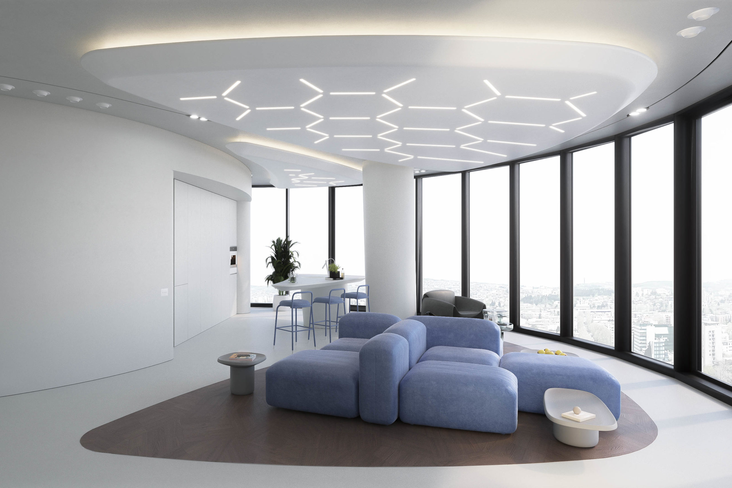
Lenvix by STIPFOLD

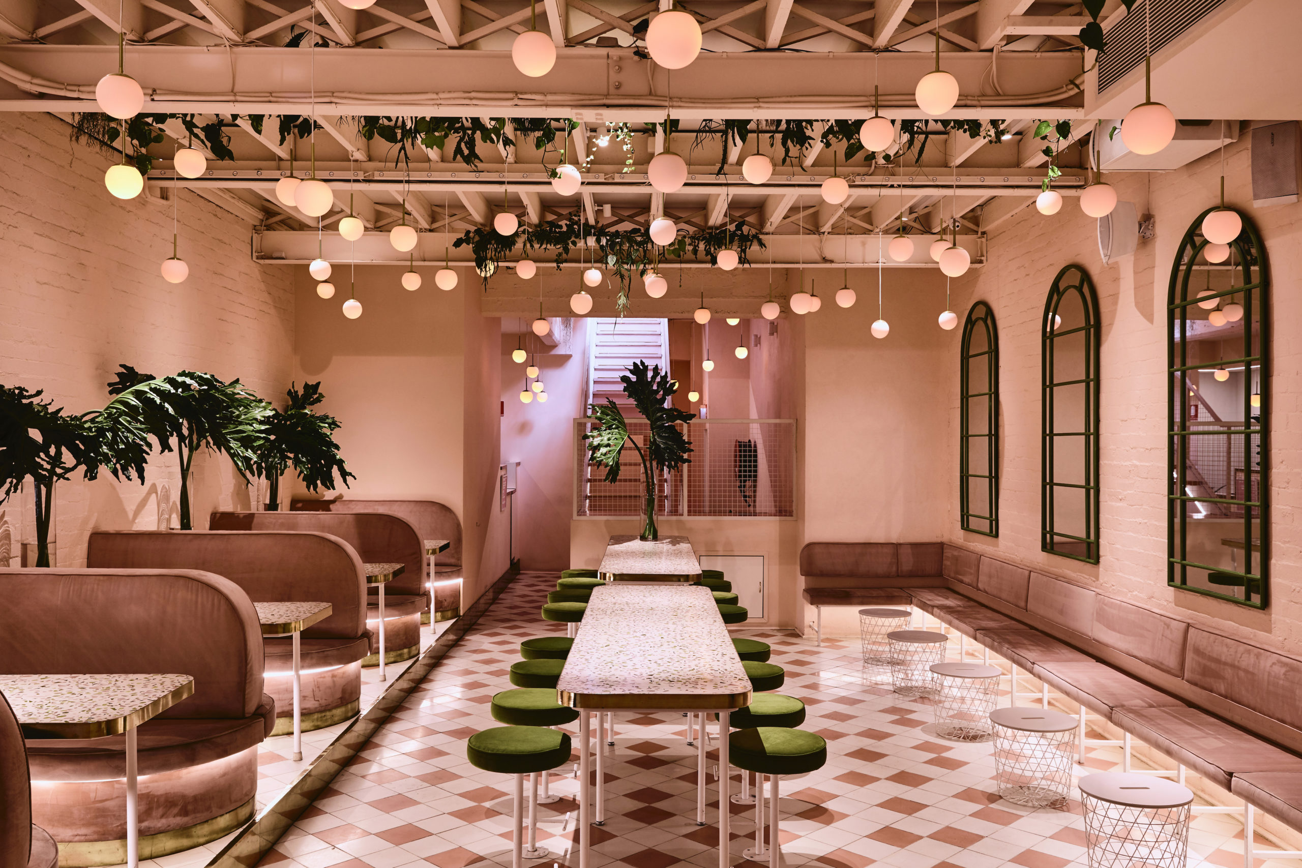
Peaches Rooftop Cocktail Bar by Pierce Widera, Melbourne, Australia

This is perhaps the most important selection of lights for a space. Ambient light refers to the fixtures that are used to brighten the entire space, more often than not in a uniform manner. The tone used for ambient light can also determine the overall mood of the space. Offices tend to use white light to help carry out tasks efficiently under the brightness. On the other hand, warmer lighting schemes are gaining popularity in restaurants and homes for the warm and cozy atmosphere they can create.

Ambient lighting can be designed in a variety of ways. It can range from ceiling lights, track lights, wall lights and chandeliers to recessed circular and strip lights. Using dimmable fittings for ambient light can also help adjust brightness levels for different activities. Now, there are a variety of options and illumination systems that are not only functional but also quirky and trendy.

In Lenvix, STIPFOLD composed a hexagonal pattern on the ceiling using slimmer light fixtures. This not only brightens the space but also adds an additional pattern to the space and helps demarcate the seating area. Alternatively, the Peaches Rooftop Cocktail Bar features a canopy of pink-toned spherical pendant lights hanging from the ceiling to mimic peaches.


Task Lighting

Coil Collection Naturals by LightArt

Casa Cosmos by S-AR, Oaxaca, Mexico

This could be considered a secondary source of lighting. Task lighting is referred to lighting fixtures with a very specific function. Desk lamps, bedside lights, wardrobe lights, strip lights under kitchen cabinets and even staircase guiders can come under this category. Task lighting can help carve out secluded nooks and can also help easy navigation during the night. It is ideal to isolate the switches for task lights from the overall ambient light connection so that they can be used only when needed.

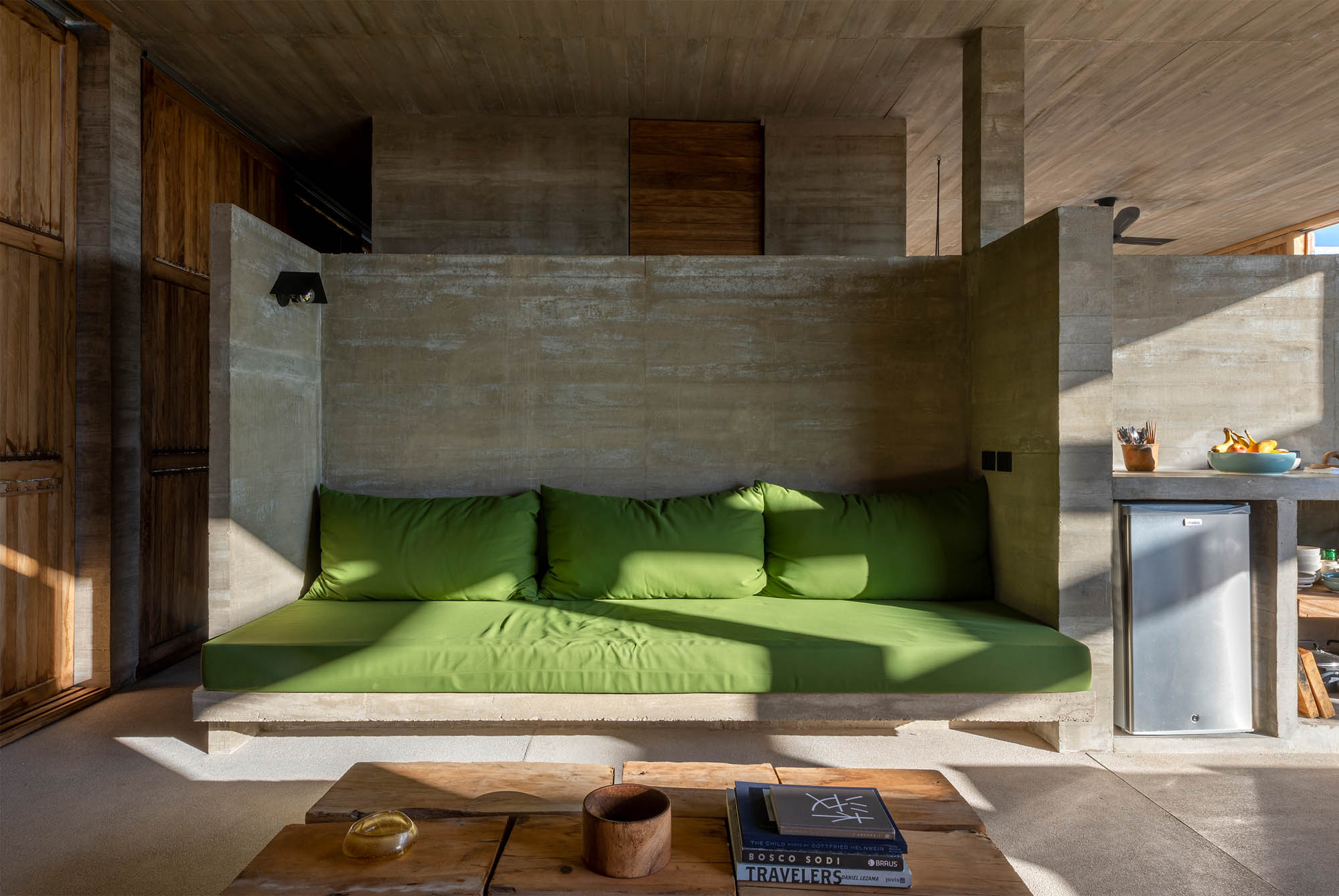
Decorative additions like the A+Award-winning Coil Collection Naturals can make a great bedside companion for late-night reading and can also be used as an additional light source near desks or in hallways. In Casa Cosmos, S-AR used a focused light fixture to brighten the concrete-backed seating area. Unlike the above example, these lights can also help separate the multiple functions within a space without the use of partitions.


Accent Lights

Sticks by Vibia

Hong Kong Garden / Theatre House by Bean Buro, Hong Kong Island, Hong Kong

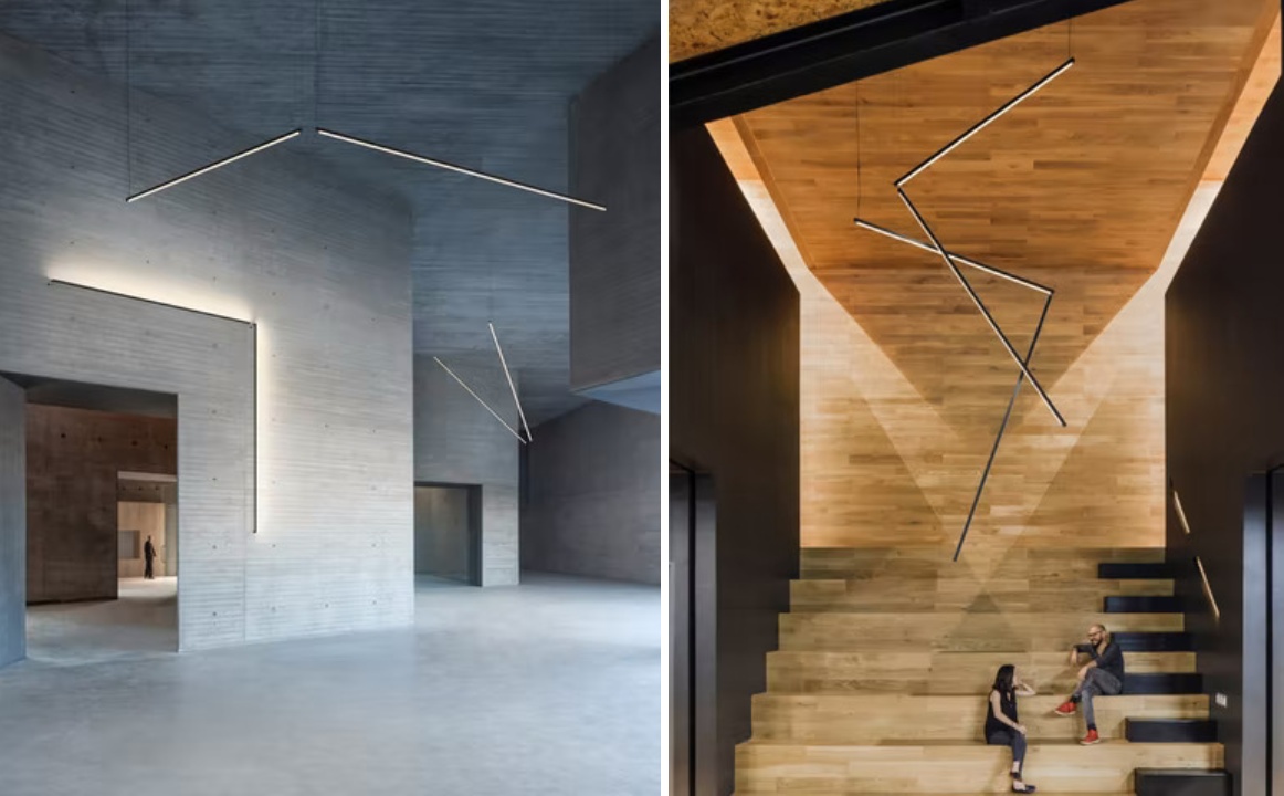
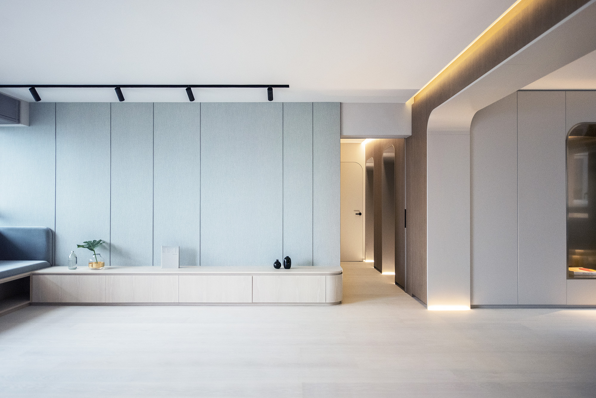
The aim of accent lights is to draw attention to a specific object or an element, even when the general lights are on. These can be direct or indirect sources of light that highlight artwork, wall textures, level differences, recesses, false ceilings or other architectural elements in a space. This also adds more dimension and drama to the space. Types of accent lights range from small spotlights to wall-grazing linear lights.

The A+Award Winning Sticks is a modular design that can be used in a variety of ways to either focus on specific objects or illuminate specific areas in spaces. In the image above, the light is used to mimic the space of the doorway to accent not only the passage but also the wall texture. It also becomes an additional spotlight for the sides of a small stepped seating area. Accent lights also help highlight doors and partitions in Hong Kong Garden / Theatre House.


Decorative and Mood Lighting

Lo-Fi by SYNECDOCHE, Ann Arbor, Michigan

Media Plaza by Liong Lie Architects | Image by Christiaan de Bruijne

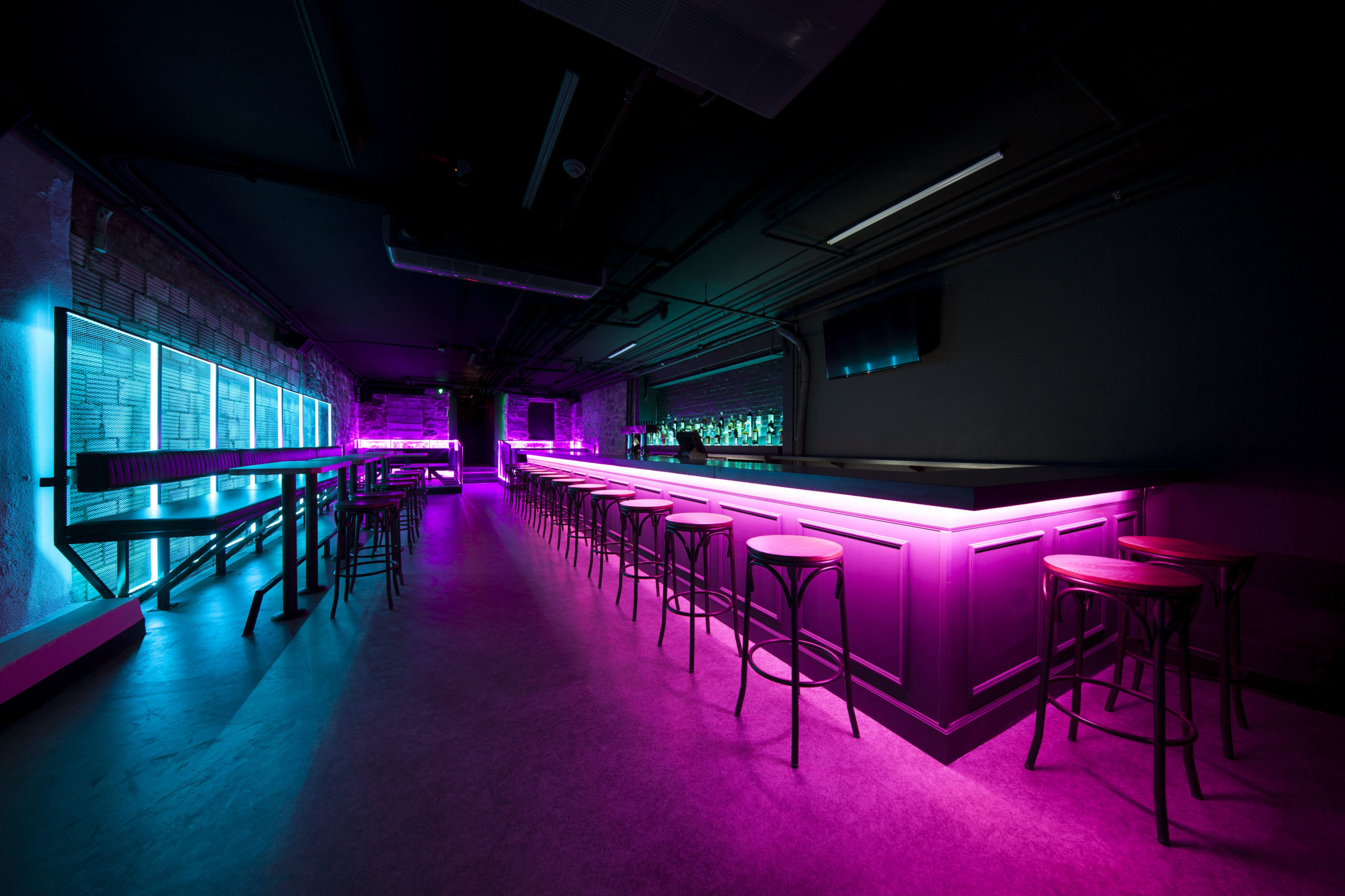
This category is often more to set a mood as opposed to being functional; it includes candle-based décor, string lights, lanterns, wall sconces and colored lights. These different techniques of illumination act as secondary light sources as they are not bright enough to help carry out everyday tasks without straining your eyes. There are extremely popular in restaurants and nightclubs as they help create an air of mystery and build tension without compromising the functionality of the furniture.

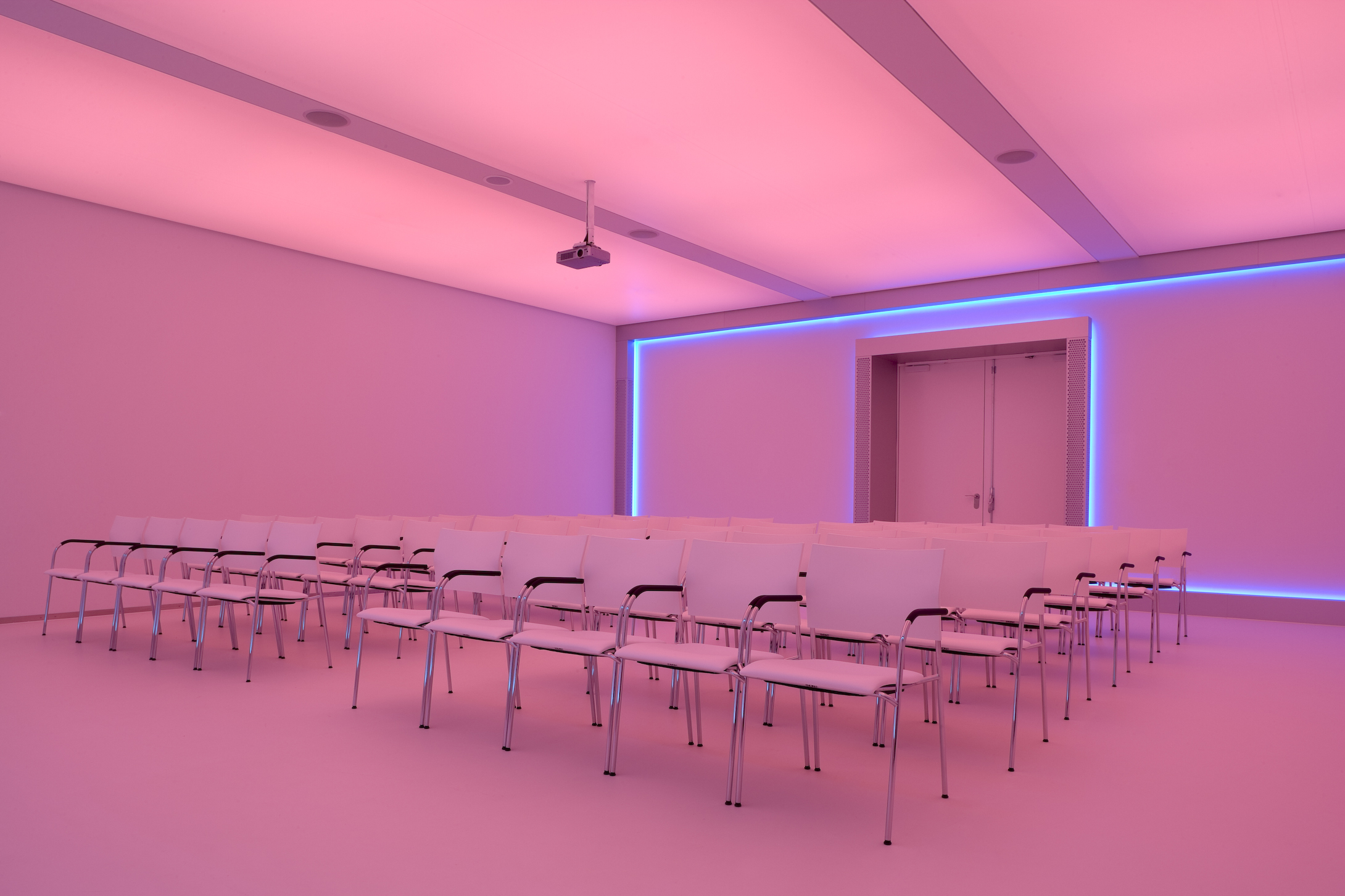
Neon blue and pink lights make up the interior of Lo-Fi in Michigan. The vibrancy of the lights energizes the otherwise dim space and also provides a great backdrop for photos, creating additional interest. In Media Plaza, a strip of blue wraps around the back wall of a projection room that is covered in foils that can change color when needed.

The A+Product Awards is open for entries, with a Main Entry Deadline of June 24th. Get started on your submission today! 

Reference

Daring Design at Dizzying Heights on Norway’s Scenic Routes
CategoriesArchitecture

Daring Design at Dizzying Heights on Norway’s Scenic Routes

Browse the Architizer Jobs Board and apply for architecture and design positions at some of the world’s best firms. Click here to sign up for our Jobs Newsletter. 

Good trails guide you through different landscapes while minimizing the impact of tourism on the environment. Trails also build connections between humans and nature. It is about view framing/directing, and infrastructure designs that cope with people’s needs and environmental factors. Providing the right amount of information for visitors to learn about the cultural and natural history of the site is part of the infrastructure as well.

This story takes you through a trail of great scenery and beautiful architecture, introducing Ryfylke, one of the 18 Norwegian Scenic Routes developed by the Norwegian Public Roads Administration. Along the route of 260km, there are 8 structures by different architects. Including installation, viewing platform, footbridge and museum, these structures become part of the scenery with their clean forms that are not disrupting the natural landscape.


Høllesli by Lie Øyen Arkitekter (2020)

Høllesli

Viewpoint at Høllesli ©Frid-Jorunn Stabell.

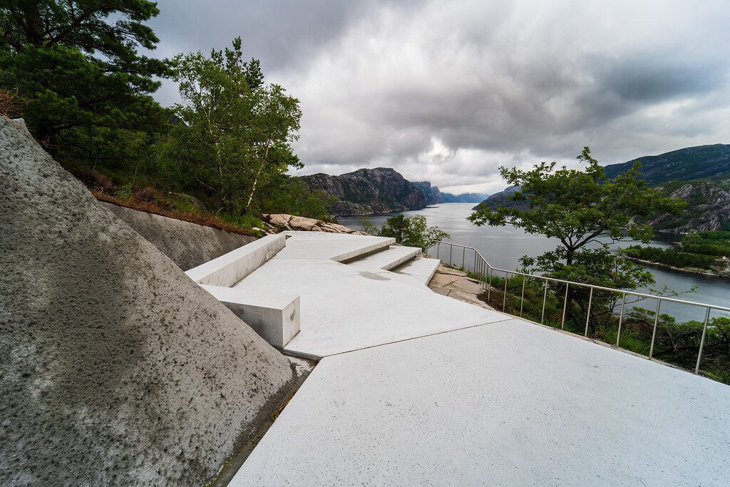
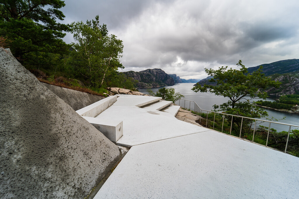
Starting from the south end of the route, the Høllesli viewpoint is a continuous concrete platform that cuts through the rock. The cuts are shaped into neat slopes and are sprayed with concrete to improve their stability. The concrete spray also gives the slopes a color similar to that of the platform, making them transition between the artificial and natural.

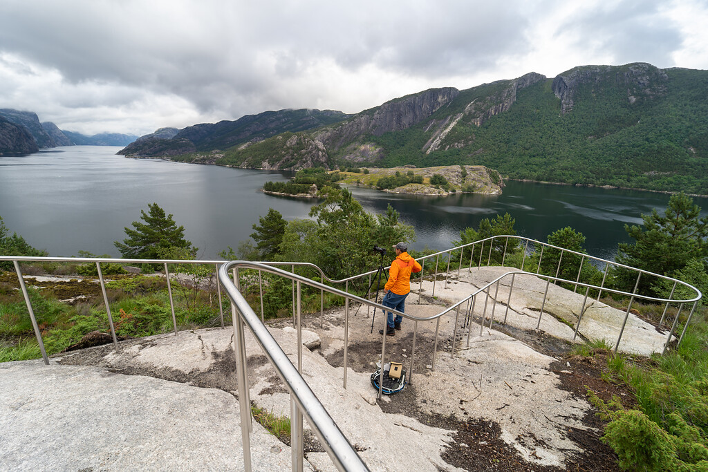
The platform provides safe access to an open view of Lysefjorden. Zig-zagging along the steep terrain, the sharp-edge platform extends two steps further down. It forms an artificial terrain that leads visitors towards the great fjord.


Lovra

Viewpoint at Lovra ©Foto Per Kollstad / Statens vegvesen.

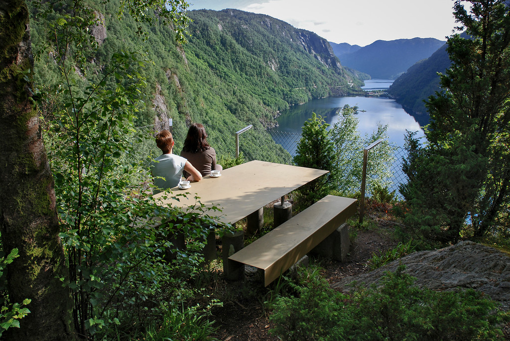
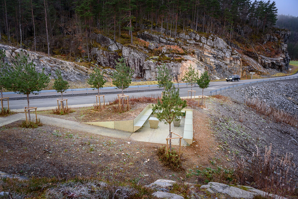
The viewpoint of Lovra was always missed until a simple architectural intervention called attention to the overlooked and under-appreciated site. The simple addition of metal benches and tables on top of the old concrete blocks on the site called attention to the rest area/viewpoint, which is a little off the road, making it more visible.


Ropeid by Jensen & Skodvin Arkitektkontor and KAP – Kontor for Arkitektur og Plan (2004 and 2021)

Ropeid

Inside the ferry waiting room ©Foto Helge Stikbakke / Statens vegvesen.

Ropeid

Furniture made of recycled plastic ©Frid-Jorunn Stabell.

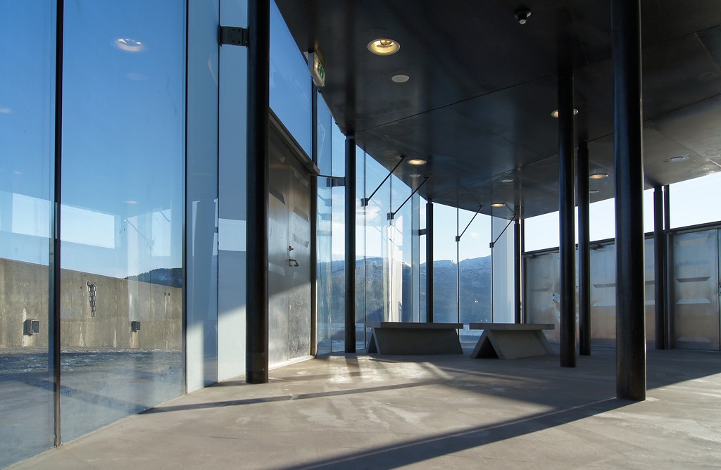
In 2004, Jensen & Skodvin Arkitektkontor designed a fully glazed ferry waiting room on the peninsula Ropeid. The building has floor-to-ceiling fenestration, inviting the view of fjords and mountains into the waiting room while sheltering waiting passengers from the elements.

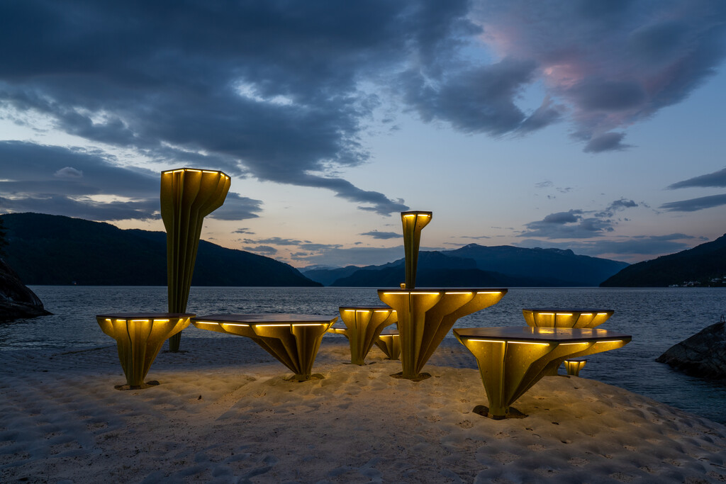
A second intervention in 2021 saw the addition of several mushroom-like structures to the shore. These yellow “mushrooms” of varying height and proportion form three clusters where some can function as tables and others as seats. Those structures that are neither table nor seat become street lamps when they are lit from under the cap.


Ostasteidn by KAP – Kontor for Arkitektur og Plan, 2018

Ostasteidn

Resting area at Ostasteidn ©Foto Frid-Jorunn Stabell / Statens vegvesen.

Ostasteidn

The viewpoint at Ostasteidn ©Foto Lars Grimsby / Statens vegvesen.

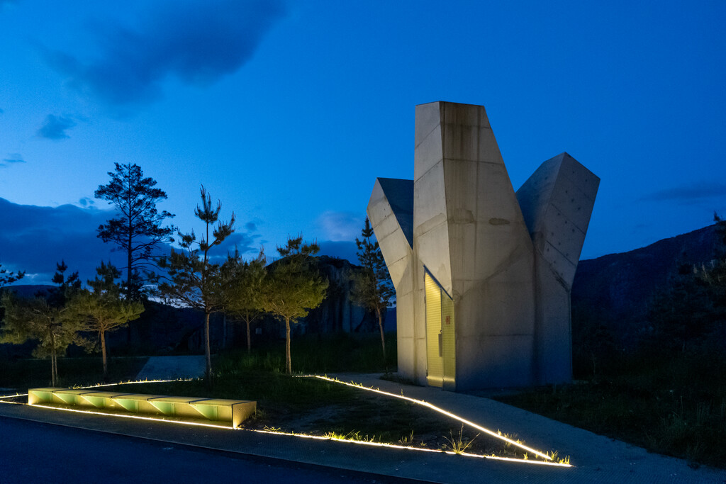
This resting point extends from the road towards another fjord. A staggeringly tall concrete structure houses the washrooms. The top of the structure splits into three branches, each has a skylight.

The walkway connects the service building with the viewpoint on the other side of the site. Visitors can enjoy the attractive view of Sandsfjorden from the designated area. The walkway is made of fiberglass grating that allows grass to breathe and grow from underneath.


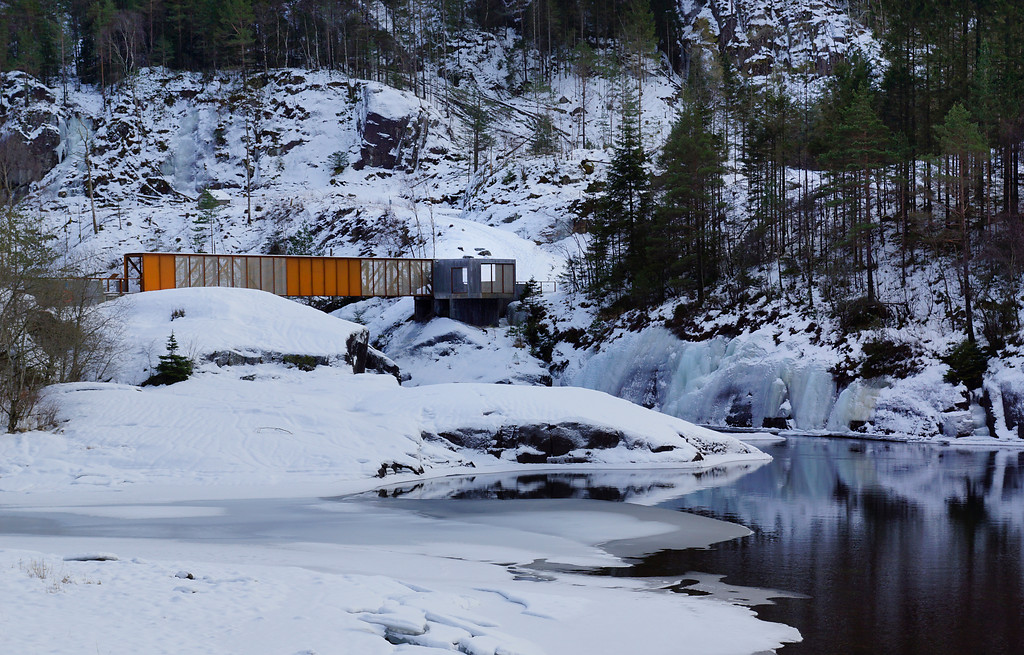
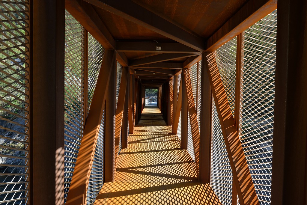
Høse bridge connects the town of Sand to a vast woodland on the other side of the Suldalslågen river. The straight bridge stands on steel beams and is textured with weathering steel, giving it a brownish-orange looking. It offers a view over the river that differs from the scenery received on the banks.

Both solid steel panels and mesh, as well as vertical and diagonal steel members, create patterns both on the outside and inside of the bridge. Sunlight penetrates the perforations on the mesh panels, leaving rhythmic shadows inside the crossing area. The bridge is lit from the inside during the night, giving the structure a glowing appearance from the exterior. The bridge culminates with a concrete pavilion that can shelter small groups of visitors on the woodland side.


Svandalsfossen by Haga & Grov AS Sivilarkitekter MNAL and Helge Schjelderup Arkitektkontoret Schjelderup & Gram (2006)

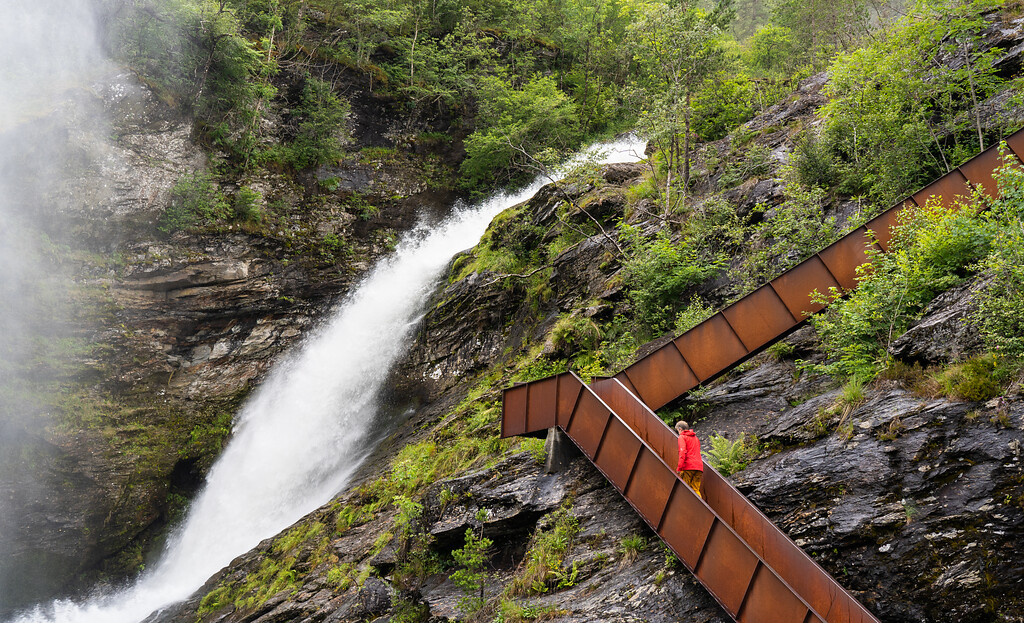
Svandalsfossen stairs ©Foto Per Kollstad / Statens vegvesen.

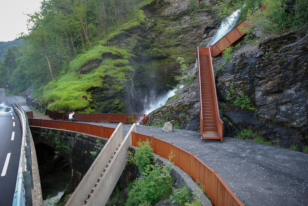
Both Svandalsfossen stairs and Høse bru echo the industrial history of their site with weathering steel. The rough surface and earthy color make the stairs a nice band of decoration up the terrain. With 540 steps in total, the stairs vertically link the low/riverside level, the middle/road level, and the top-level, where the Svandalsfossen waterfall is close at hand.


Allmannajuvet by Atelier Peter Zumthor & Partner (2016)

zinc mine

Allmannajuvet Zinc Mine Museum ©Foto Fredrik Fløgstad / Statens vegvesen.

Inside the museum ©Foto Fredrik Fløgstad /Statens vegvesen.

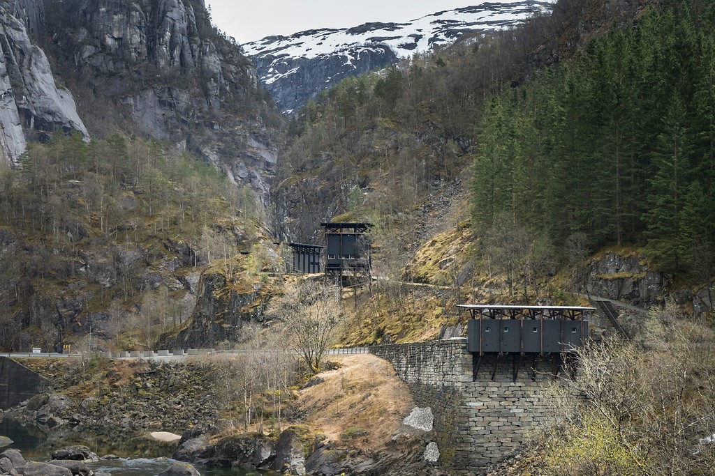
The project by Peter Zumthor consists of a carpark, walkways and three buildings along the route walked by the miners between 1881 and 1899. The buildings — a café, a museum and a service building — are of similar languages; they all rely on a timber frame supporting system to stand on the steep, rocky terrain. A dark grey box stays within each supporting system and a tile roof floats on top.

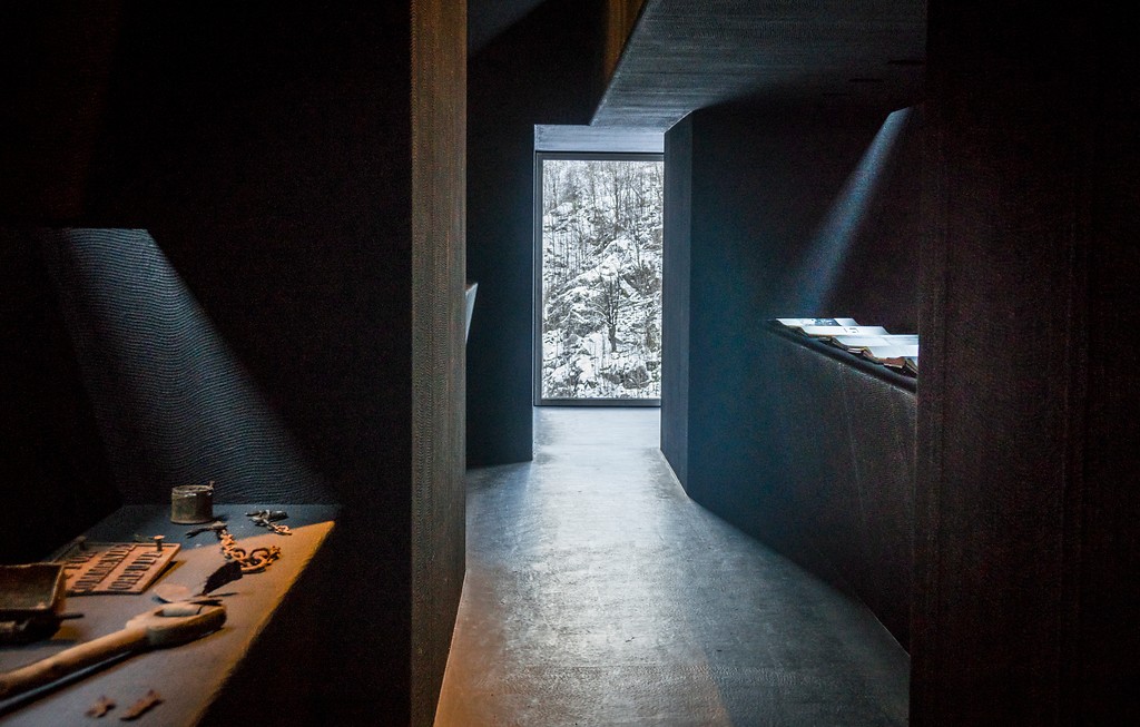
The buildings are painted dark on the inside as well. Views of the Allmannajuvet enter the interior space through limited openings, creating a serene atmosphere that is slightly isolated from the outside.

Both café and museum are open to tourists every summer. The museum documents the hard life and work of the zinc miners, while the café offers visitors local foods and a place to rest. The café functions as a community space for the locals when not in service time.

Browse the Architizer Jobs Board and apply for architecture and design positions at some of the world’s best firms. Click here to sign up for our Jobs Newsletter. 

Reference

Sleek New Products Designed for the Modern Kitchen
CategoriesArchitecture

Sleek New Products Designed for the Modern Kitchen

The A+Product Awards is open for entries, with a Main Entry Deadline of June 24th. Get started on your submission today! 

Fast-paced lives and busy schedules call for homes and spaces that are low maintenance and yet very stylish. Homeowners now want highly functional solutions that can simplify the processes in their daily routines. In addition to ease of handling, growing urban density and skyrocketing real estate prices have also increased the need for multi-tasking and space-saving fixtures that can uplift small spaces. This is not to say that it only has to be about functionality. This is about finding the right permanent additions that are durable and also versatile enough to be translated into a variety of different aesthetics as trends change.

This is most important when designing a kitchen. Using high-quality materials and fixtures that are durable, easy to clean and simplistic can help maintain the hygiene of cooking areas and also save time when cooking or serving. It can be hard to find spend hours every weekend trying to get spice stains off of stone counters or scrub off the burned residue on metal stovetops.

Start A+Product Awards Application

Product designers have recognized these needs and are now focusing on efficient designs that display both quality and elegance. Simple designs also offer the flexibility of going from a sleeker look to a maximalist kitchen with the addition of small décor objects and furnishings without requiring a complete kitchen overhaul. Below are just a few winning entries from last year’s A+Awards that can offer some inspiration when planning the perfect kitchen.

2021 A+Awards Product Winner in Cabinetry & Millwork

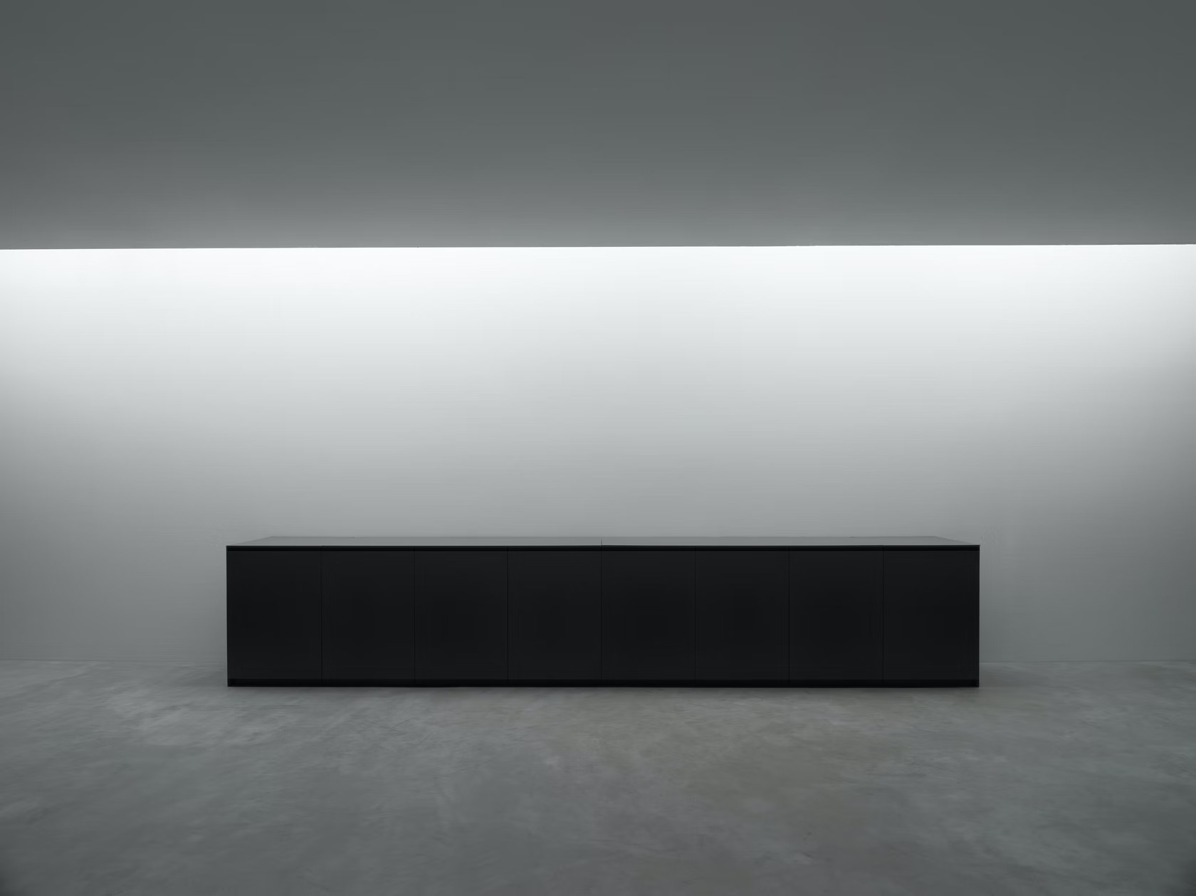
The core of a kitchen setup is always the counter or island. Today’s homeowners are looking for surfaces that are utilitarian without compromising the overall aesthetic. Plain surfaces with flushed drawers, concealed joints and even hidden electric stoves or sinks are making rounds on social media and in homes.

Along those lines, Nero Cucine is redefining kitchen interiors with futuristic kitchen essentials that are durable and sustainable. Users can raise the flat Corian or marble cover of the N037 counter to reveal a sink and cooktop. The opening is lined with steel for easy maintenance. Similarly, all the drawers are precisely made to ensure that the cabinet appears seamless when not in use. Taking the design even further is an option to avail the same setup with recyclable materials.

2021 A+Awards Product Winner in Appliances

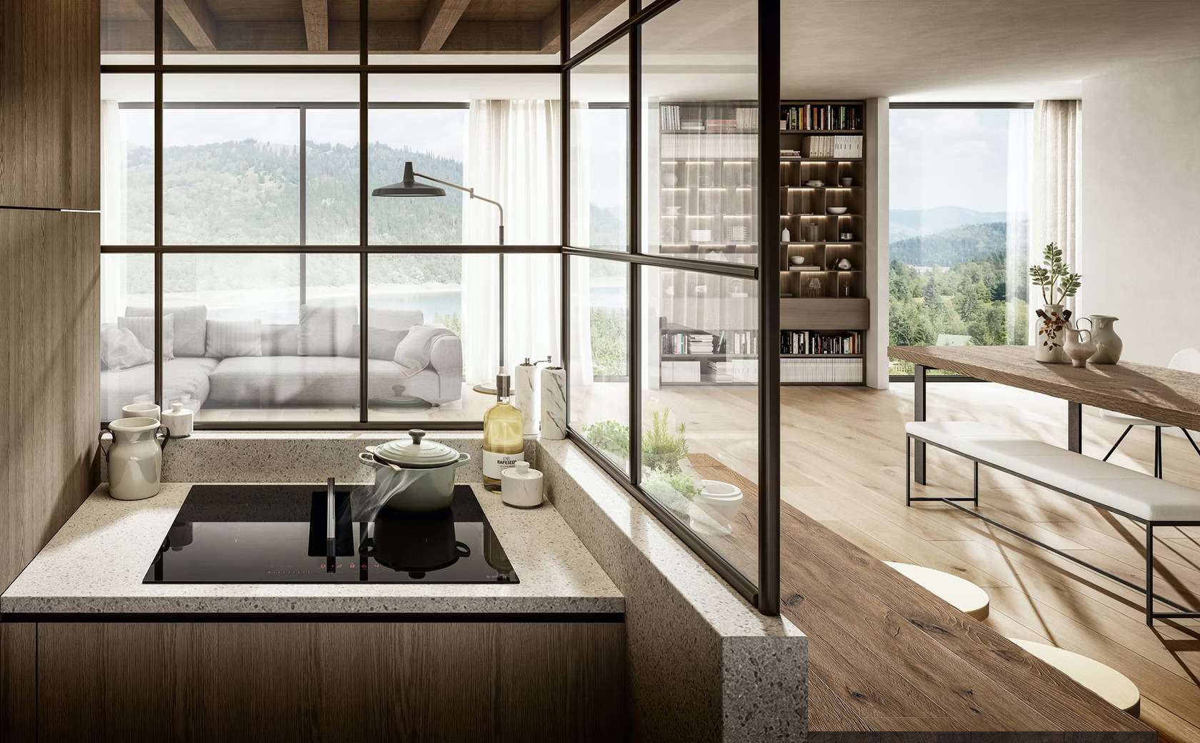
No perfect counter is complete without the right stove. A recessed stovetop not only makes the kitchen seem more spacious but also makes movement and cleaning easier. Traditional burners can come with the headache of cleaning out grime and spillovers and using burner covers can mar the clean look of a kitchen.

Elica’s NikolaTesla Fit is an induction hob with an in-built air extraction mechanism, helping make the most of compact spaces. This extraction mechanism is located in the center of the hob and can be operated with just a little bit of pressure. It is also covered with a glass top to help in cases of spills. The system also comes with a drain valve underneath to facilitate easy cleaning of excess liquids.

2021 A+Awards Product Winner in Fixtures & Fittings – Kitchen

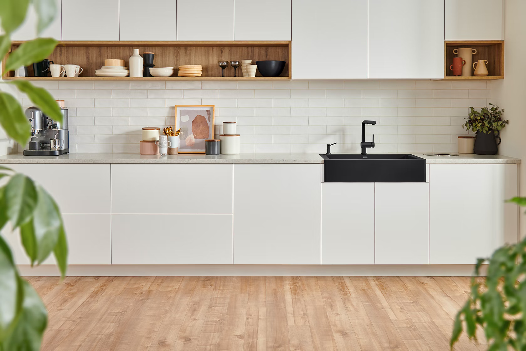
The next step in assembling a minimal kitchen is finding the perfect sink — one that stands out but also blends in. Fewer seams and streamlined fittings can help prevent excess soap and grime buildup and also create the appearance of more room. In line with these needs, designers are now moving away from traditional metal sinks and opting for stone or ceramic options that are more geometric and modern.

While kitchens can’t have a minimal slit-drain sink like the one in Kim Kardashian’s bathroom, there are still sleeker alternatives like the VINTERA from BLANCO. The flushmount fixture has an option to show part of its border in the front to break up the counter design. The sizing also enables the product to fit into standard cabinet dimensions so that it can be used both in custom and modular setups. Its durable granite body also has a protective shield to reduce dirt and bacteria growth.

2021 A+Awards Product Winner in Accessories and New Materials

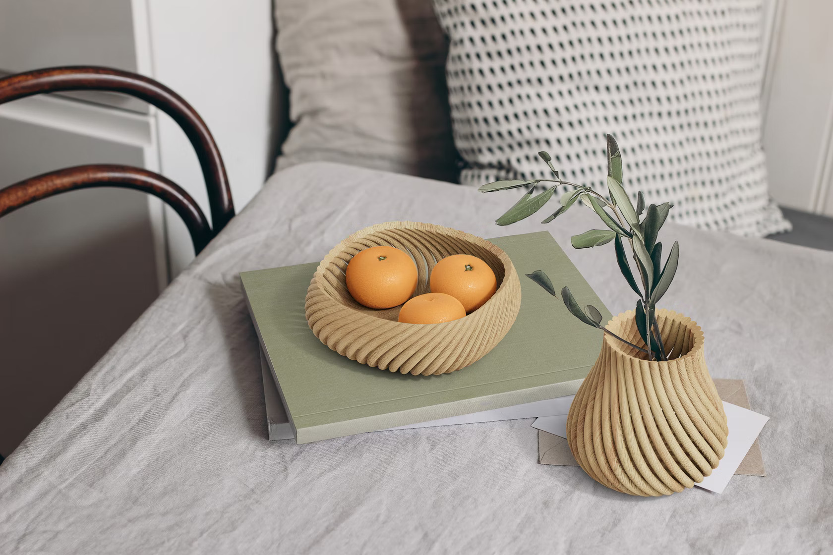
In addition to pots, pans and utensils, displayware is also becoming increasingly popular in kitchen décor. From ornate flower vases to decorative signs and stands, there are options for every kitchen aesthetic. Forust recently developed a 3D printing system that uses wood waste to craft home goods. The sustainable Vine range, designed by fuseproject, includes a vessel, bowl, basket and tray — all of which can be used for a variety of schemes ranging from whimsical cottagecore to minimal monochrome. These pieces are made up of 3D-printed rods that twist and come together to create curved forms without any adhesives. Their simple and versatile design language makes them an easy option to add some warmth to simple spaces.

The A+Product Awards is open for entries, with a Main Entry Deadline of June 24th. Get started on your submission today! 

Reference

Designing Domestic Interiors for the Microbiome
CategoriesArchitecture

Designing Domestic Interiors for the Microbiome

Judging is now underway for the 10th Annual A+Awards Program! Want to earn global recognition for your projects? Sign up to be notified when the 11th Annual A+Awards program launches. 

One of the clearest byproducts of the pandemic has been a renewed focus on the domestic interior. As stewards of our own homes, we have found ourselves examining them under a new microscope, both for their aesthetic ability to bring comfort during a difficult period and for imagined traces of the virus, which we may have reluctantly brought indoors from the outside world at any time. Early on, bags of groceries often spent a day or more outside of our homes; they were punished as alleged viral transmitters and forced to enter a period of quarantine before being allowed in to provide much-needed sustenance. Countertops, doorknobs, and other surfaces that regularly made corporeal contact were scrubbed with a renewed vigor in an effort to sterilize our home from any living presence but our own.

Over the course of the last century, much of modernist architecture can be understood as a consequence of the fear of disease; the construction of physical space to facilitate an ability to cleanse rooms where bacteria lurk. Clean, empty white walls, open floor plans and industrial, highly polished surfaces became synonymous with functional space that allowed the occupant to feel comfortable, safe and germ-free — at least to the naked eye. Architects such as Le Corbusier famously thought that a house should function as a “machine à habiter” or machine for living in his 1923 manifesto for future habitation, Towards a New Architecture. But the lines immediately following this iconic phrase are equally revealing:

“Baths, sun, hot water, cold water, warmth at will, conservation of food, hygiene, beauty in the sense of good proportion… We must clear up a misunderstanding: we are in a diseased state because we mix up art with a respectful attitude to mere decoration.”

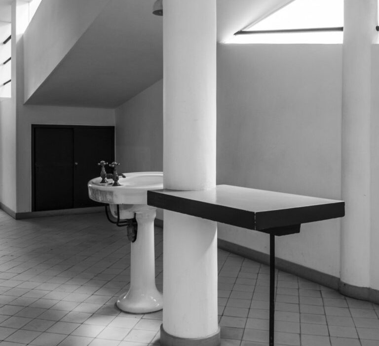
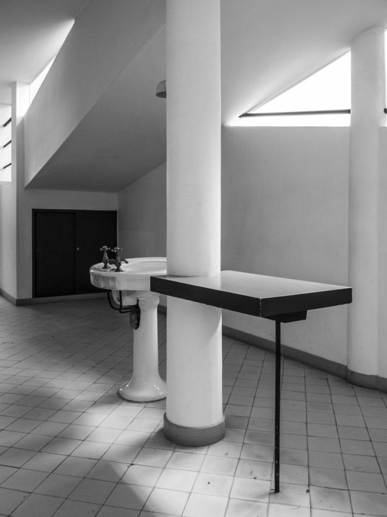
The entrance hall in Le Corbusier’s Villa Savoye. © Thomas Nemesker

On the surface, Corbusier’s aesthetic focused on the qualities of unornamented, rectilinear spaces. Yet, a deeper reading reveals an agenda of moral and physical cleanliness. While diseases like tuberculosis and the resulting technologies developed to diagnose them helped to shape modernism and the work of architects like Corbusier throughout the 20th Century; similarly, Covid-19 and our cultural propensity to spend time indoors (up to 90% of our days) will influence architecture in the near future.

Today, our culture is saturated with products focused on sanitizing and architectural surfaces that help to facilitate this ritual cleansing. We commonly hold that sterility is the ideal state of existence, even though it is impossible to achieve for more than even a brief moment. We regularly consume antibiotic treatments for even the most minor illnesses, hoping to eradicate all germs or bacteria on contact. In reaction to the pandemic, architectural publications widely circulated articles detailing products and surfaces with natural anti-microbial properties, including copper and cardboard (to name a few). While there are certainly architectural contexts including the healthcare industry that require starkly hygienic environments, this strategy exists at the expense of the “good” bacteria we need to foster healthy immune systems.

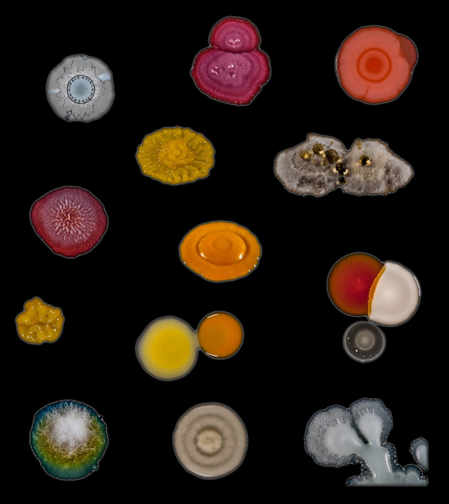
Colonies formed by a variety of bacterial and fungal species. © Scott Chimileski and Roberto Kolter

Conversely, we are composed of 100 trillion microbes, and over half of the cells in our body belong to foreign microbes that inhabit us. On an architectural scale, according to Emily Anthes’ book The Great Indoors, our homes are filled with up to 2000 different microbial “squatters” at any given time. Different areas of the home tend to reveal distinct differences; bacteria found in kitchens is most commonly associated with food, while doors and door knobs are covered in species most typically found in leaves and soil.

Domestic elements like toilet seats and pillowcases look more similar than you’d like to believe under a microscope — both harbor bacteria that typically lives on our skin and in our mouths. More recent research on hygiene espouses a modern microbial perspective that is complex and intertwined with both outdoor and indoor environments; a combination of strategies to expose the body to certain bacteria while targeting certain hygiene to create the framework for healthy protection from pathogens while restoring and reinforcing our microbiomes.

With this in mind, how should our interior domestic environments intervene to foster the restoration, growth or even flourishing of microbial cultures? Revisiting the kitchen with a renewed focus would not be a bad start. In order to re-frame our relationship with microorganisms, we should reference symbiotic examples from the world’s culinary traditions. Bread-baking, kombucha and other fermentation processes that revolve around the kitchen, all produce healthy bacteria that humans benefit from, both during the processes of production and following consumption. In some cases, as with sourdough bread, the microbes found on bakers’ hands even mirror the microbes within their starters, the bubbly mix of yeast, bacteria and flour that’s the basis of every loaf.

Kombucha is fermented by a floating biofilm made up of a symbiotic community of bacteria and yeast, or SCOBY. © Scott Chimileski and Roberto Kolter

In “Micro-ecologies of the Built Environment,” a chapter in The Routledge Companion to Biology in Art and Architecture, Ted Krueger argues that architecture’s conventional focus on the human scale should be brought down in scale to the microbial and that architects should operate more like “creative chefs than forensic doctors”, manipulating conditions to encourage the cultivation of healthy microbiota. In turn, as the architectural discipline evolves into a more microscopic realm, we should promote the design of micro-ecologies within our domestic spaces through the careful selection of materials and spatial conditions, that do not only destroy bacteria but work to nurture what may be beneficial to us.

How can we reframe the notion of cleanliness through the lens of architecture in an age where filth and germs might actually help us survive? It’s clear that our interior environments and the products we use within them need to evolve from a purely adversarial position towards microorganisms, to a far more symbiotic relationship with “good” bacteria. There is an urgent need to develop “architectural probiotics”; environments and surfaces that support the complex conditions needed to partner with microorganisms for mutual benefit. What would this architecture look like?

Judging is now underway for the 10th Annual A+Awards Program! Want to earn global recognition for your projects? Sign up to be notified when the 11th Annual A+Awards program launches. 

Reference

What Can North Americans Learn About Design From European Cities?
CategoriesArchitecture

What Can North Americans Learn About Design From European Cities?

Judging is now underway for the 10th Annual A+Awards Program! Want to earn global recognition for your projects? Sign up to be notified when the 11th Annual A+Awards program launches. 

As a Canadian ex-pat currently living in France, I was excited for and whole-heartedly welcomed a change of pace from North American life. Canadians and Americans often idolize Europe and its accompanying lifestyle, and after nine months in France, I can confirm the charm of European living has yet to wear off.

Europe covers a relatively small landmass, especially when comparing it to the rich array of countries that make up the continent. Each country offers its own distinctive culture and way of life, and because of this, it is difficult to categorically define ‘European living.’ Nonetheless, there are certain cultural similarities that can be strongly felt amongst countries (especially those in Western Europe). I will use my time residing in France as a case study to help make sense of North America’s infatuation with the European lifestyle. An infatuation that I continue to feel here in France.

I’ve been residing in Orléans, a small French city located one hour southwest of Paris. The city dates back to antiquity and has a charming mix of half-timbered medieval homes, Haussman-style buildings and Gothic architecture. Those living in the city center typically reside in the town’s older infrastructure, while those in the surrounding suburbs occupy newer, more contemporary buildings.

One of the most apparent reasons why North Americans are so charmed by Europe is its history. European cities are filled with an incredible history that is recognizable through architecture. As a North American, it’s hard not to be taken by such ornate and historic surroundings. When living in Orléans, I can confirm that walking past the striking gothic cathedral and rows of half-timbered homes never got old to my North American eyes.

Despite such apparent beauty, history and charm, there were certain aspects of French living that took some time to get used to. While in France, I said goodbye to the many North-American luxuries I had grown accustomed to: high-end heating, accessible infrastructure, dryers and large living spaces. At first, I missed such luxuries but I quickly discovered just how easy it is to live without them. All it took was a bit of adjusting to eventually realize that many North-American amenities are superfluous. In the winter months, I learned to layer my clothes and in the summer months, I made sure to keep my shutters closed during the day. Quickly enough, giving up modern amenities was easy to do when, in return, you get to live in a historic city.

Even as we enter the hot summer months, I do not long for North American amenities. One of the most pronounced differences between Europe and North America in the summer is the absence of air conditioning. Most old European apartments do not come equipped with air conditioning. European homes are often built with brick and stone, unlike North American homes, which are built with wood. Building with stone and brick provides much better insulation and thus a more temperature-regulated living space. Therefore in Europe, it is possible to keep a dwelling cool in the summer. Moreover, the use of exterior window shutters is common in Europe and helps keep out the heat during the days and ventilate the home at night. Perhaps it is less convenient not having air conditioning, but the traditional building infrastructure makes it possible to endure hot summers.

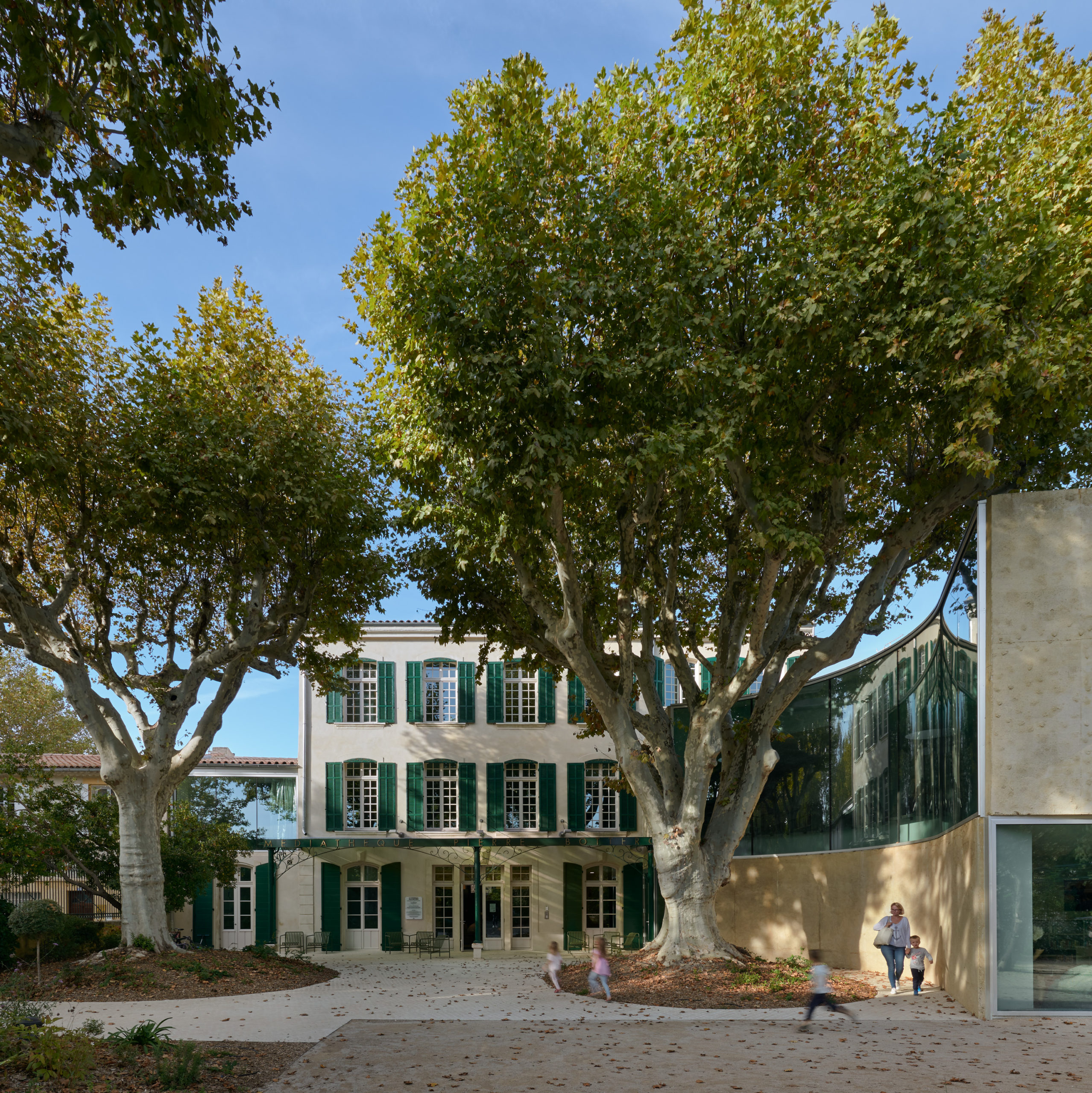
Window Shutters – ‘Pierre Bottero’ media library and park in Pélissanne by Dominique Coulon & Associés, Pélissanne, France, 2020

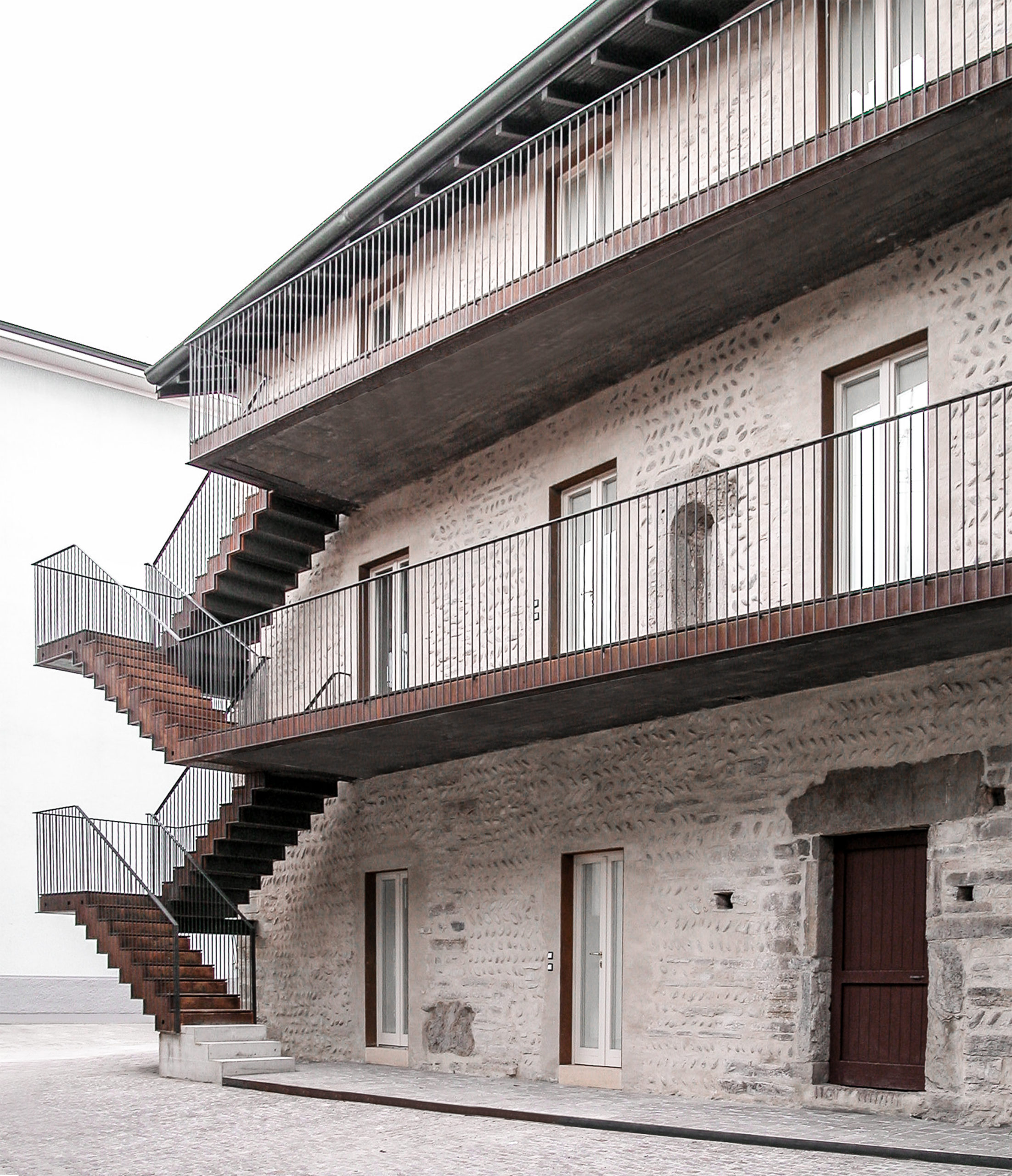
Stone Buildings – Former Monastery of San Giuliano by CN10 Architetti, Bonate Sotto, Italy, 2016

Moreover, I realized that Orléans’ architecture contributed to my ability to find community in a foreign country. For example, the tight living spaces and communal courtyards helped foster strong connections with my roommates and neighbors. Equally, the abundance of mixed-use buildings furthered this strong sense of community living. In North America, we are often used to separate residential and commercial districts. Whereas in Europe, everything is much more densely organized. We often perceive density as a negative urban characteristic, but in this case, it helped me find my place and personal rhythm in Orléans. Whether it was visiting my local boulangerie or pharmacie, the intertwined nature between commercial stores and residential dwellings fueled a strong connection between all Orléanais people. In addition, the numerous public squares sprawled throughout the city would hold weekly farmer’s markets and social events. These public squares further contributed to my ability to comfortably integrate into the local way of life.

Public Spaces – Leyteire Courtyard by Martin Duplantier Architectes, Bordeaux, France, 2012. Yohan Zerdoun Photography

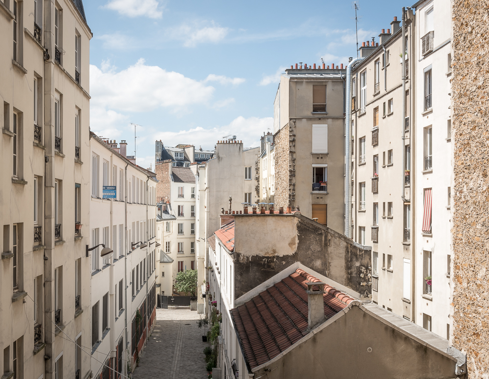
Dense ArchitectureVoltaire by SABO project, Paris, France, 2017

Before I knew it, the very things I at first disliked about France became the very aspects I now appreciate. Today I see claustrophobic close quarters as intimate spaces, narrow sidewalks as endearing and the bike-unfriendly cobblestone roads as a welcomed challenge to my daily commute to work. All in all, what I’ve taken away from my time in France is that European living is often more laidback. It’s at times less convenient and less polished but equally, if not more, enjoyable to North American life. The homes may not be equipped with the standard appliances found in North America, however, one will quickly find great satisfaction and purpose in navigating the quirks of European life.

Judging is now underway for the 10th Annual A+Awards Program! Want to earn global recognition for your projects? Sign up to be notified when the 11th Annual A+Awards program launches. 


Reference

10 Architectural Photographers Who Dominate the Field
CategoriesArchitecture

10 Architectural Photographers Who Dominate the Field

Send us a photo. Tell us a story. Win $2,500! Architizer’s 3rd Annual One Photo Challenge is underway with an Early Entry Deadline on May 27, 2022! Start your entry for architecture’s biggest photography competition here.
Architectural photography has forever changed the way we understand design. As images have become ubiquitous, their influence on culture and society can be felt throughout the world. Over the last thirty years, we’ve transitioned from discovering architecture primarily through individual experience and print to seeing buildings through renderings and photography. This has created an opportunity for architectural photographers to help designers see their work in a new light and utilize a photographer’s eye for structure, light and form.

Enter One Photo Challenge

Taking three-dimensional space and making it two-dimensional, architectural photographers build off their understanding of both their subject and the mediums by which their work will be shared. Focusing on composition and narrative, their images use buildings to tell a story. At the same time, photographers balance the need for the accurate representation of a structure and how it connects to a larger place. Showcasing the individuals shaping the image of architecture, the following photographers capture design from a range of perspectives. Together, they give a glimpse into how we discover architecture.


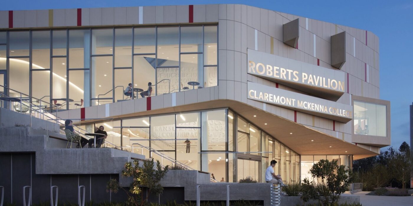
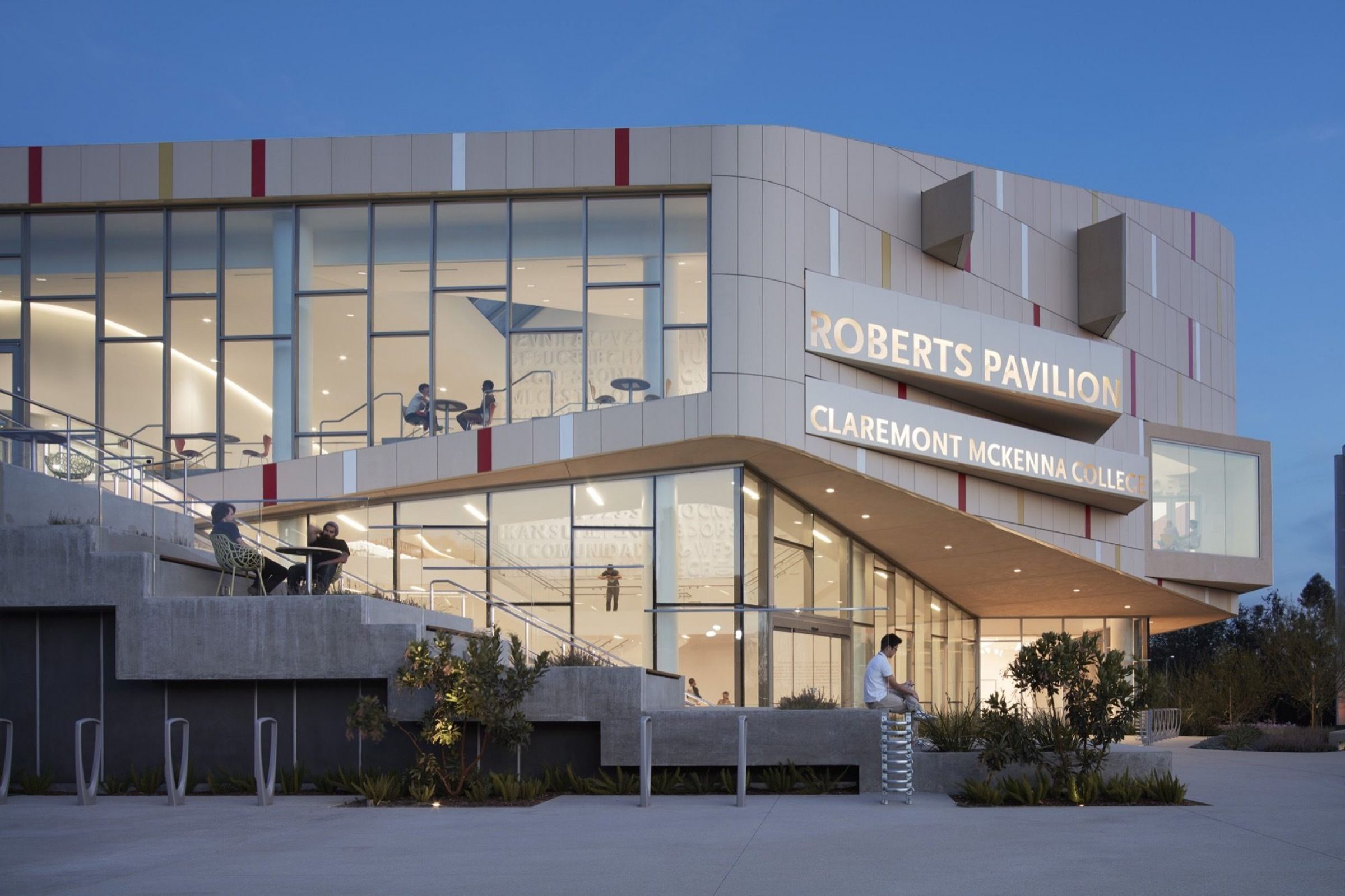
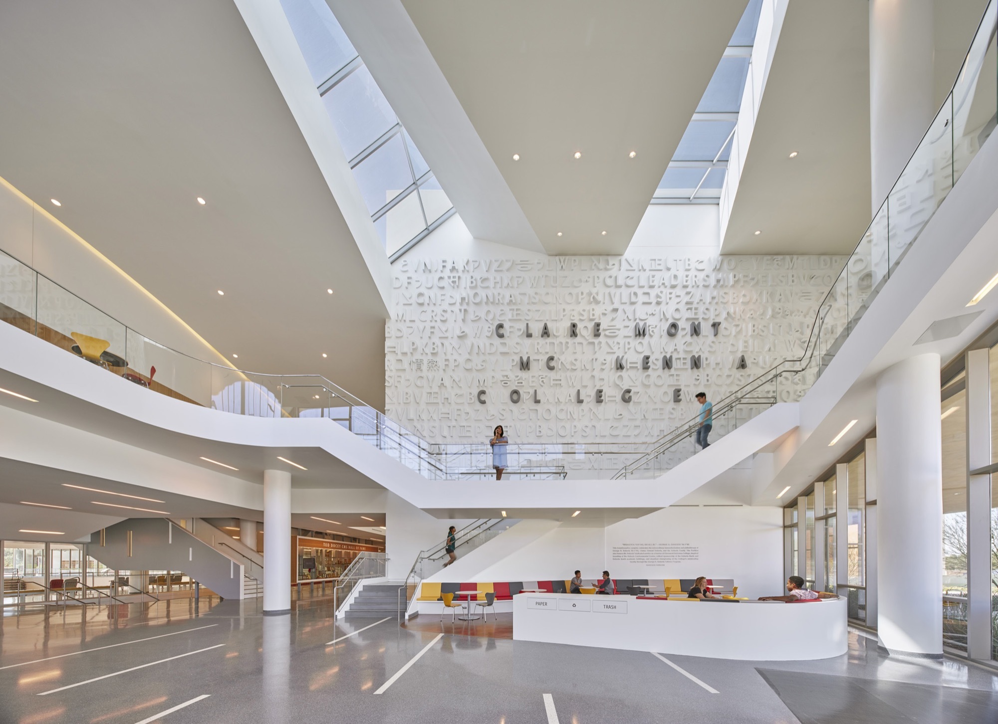
Roberts Pavilion, Claremont McKenna College by JFAK Architects, Images by Fotoworks/Benny Chan

Benny Chan lives in Los Angeles and works as both an art and commercial photographer. Through architecture and photography, Benny Chan makes sense of the world; he is fascinated by how things go together. His photographs may collectively be read as an assembly manual for Los Angeles. They show the city from top-down perspective, as plan-views of its infrastructures and everyday monuments. They get inside the machines that run the metropolis, from the port of Los Angeles, to utility stations, transportation terminals, warehouses, and laundromats. They all have powerful stories.

Chan’s efforts to make sense, to figure out, shapes his work. He hangs from helicopters to get the right angle. He builds his own cameras to surpass focal length limitations of off-the-shelf models. And, he finds his way behind the scenes and into highly restricted sites.


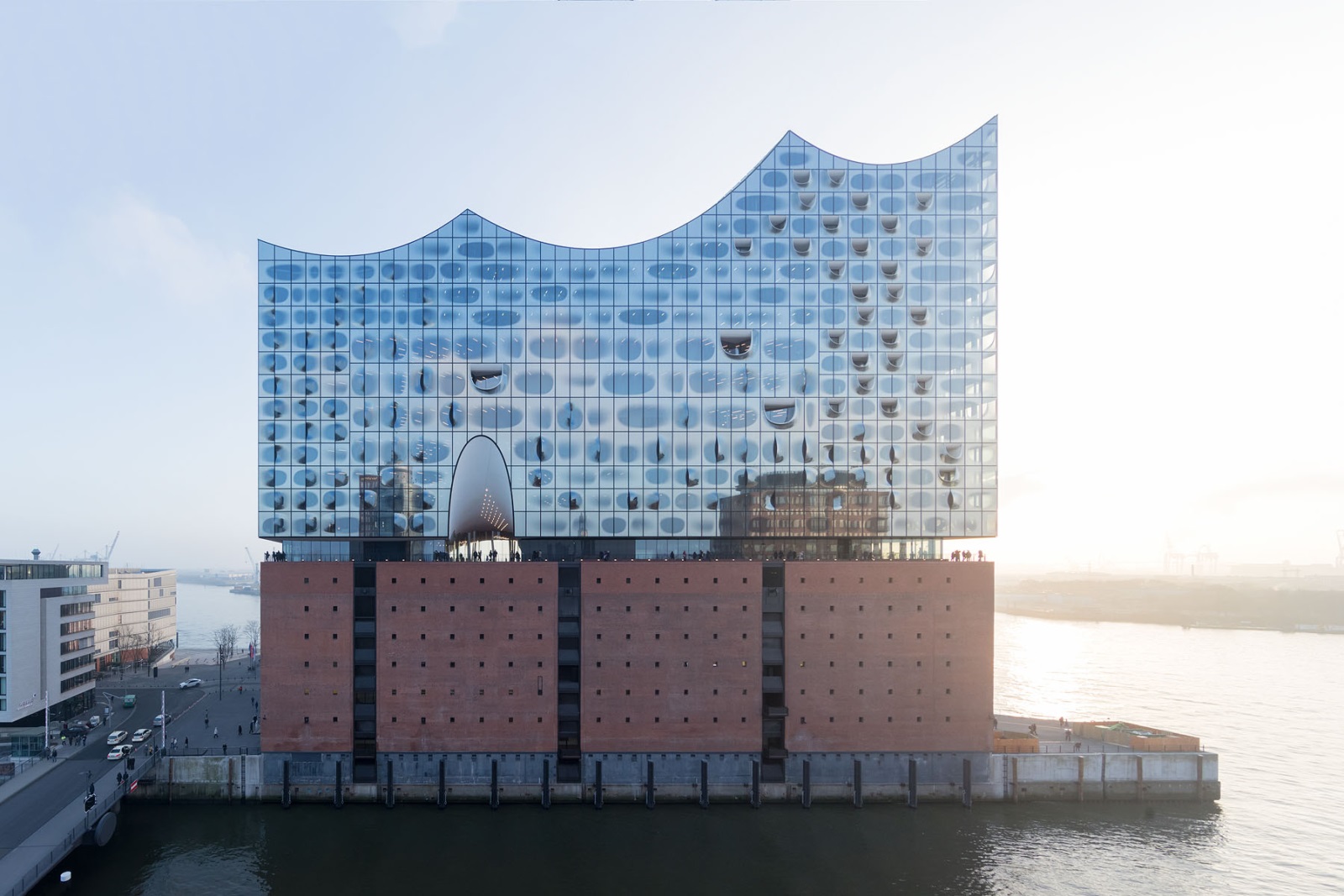
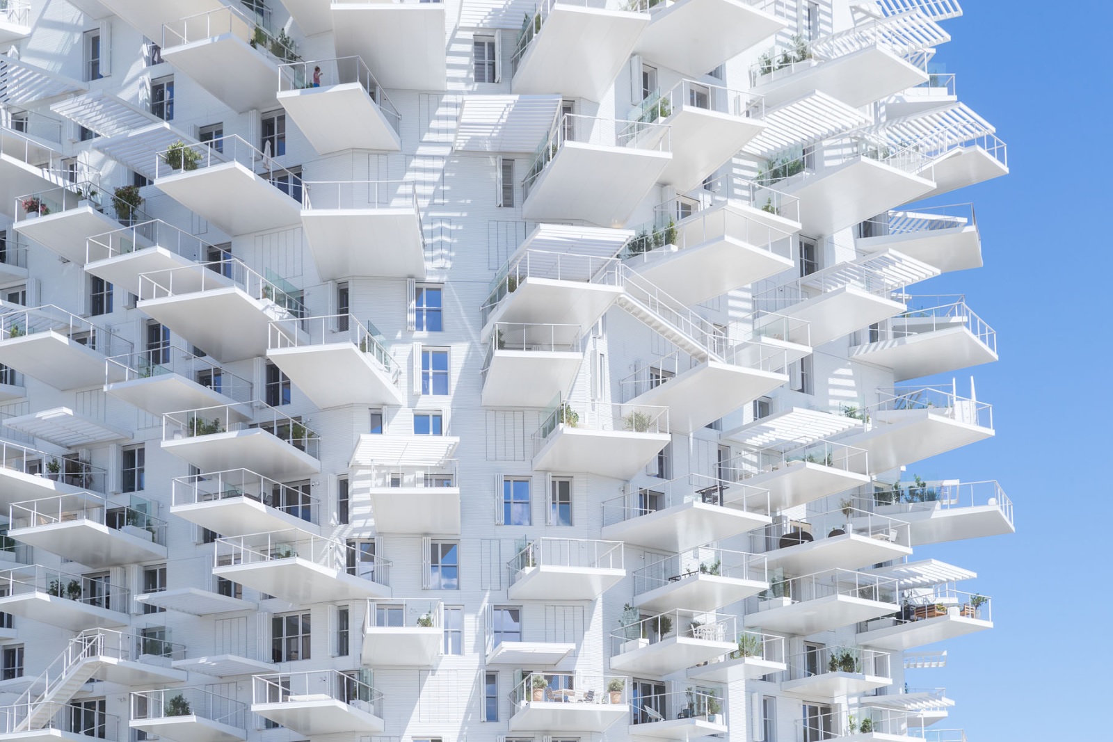
Elbphilharmonie Hamburg by Herzog & de Meuron & L’Arbre Blanc Residential Tower by Sou Fujimoto, Photographs © Iwan Baan

Iwan Baan is a Dutch photographer known primarily for his images that narrate the life and interactions within architecture. Born in 1975, Iwan grew up outside Amsterdam, studied at the Royal Academy of Art in The Hague and worked in publishing and documentary photography in New York and Europe. Iwan fell unexpectedly into the subject of architecture in 2005 when he proposed to document a project by OMA to Rem Koolhaas, leading to his first major project, the documentation of the construction of OMA’s China Central Television (CCTV) building.

Today, Iwan collaborates with some of the world’s most well-known architects, photographing institutional, public and private projects. His work is characterized by the portrayal of the context, society and environment around architecture.


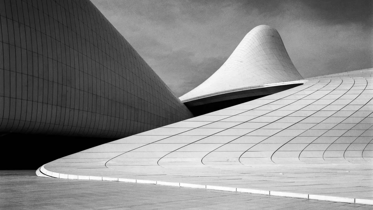
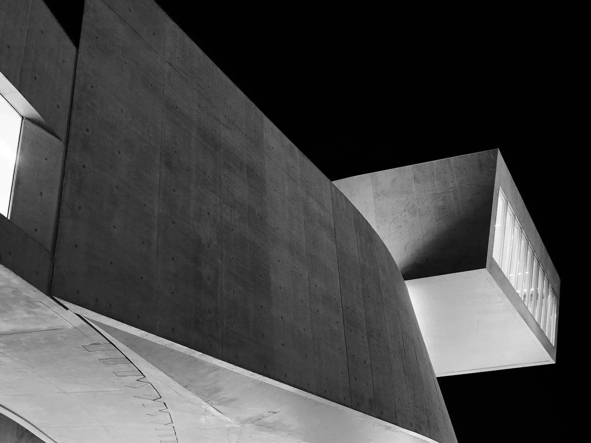
Heydar Aliyev Centre and MAXXI Museum by Zaha Hadid Architects, Courtesy of ammann // projects. Photographs © Hélène Binet

Over a period of twenty-five years, Hélène Binet has photographed both contemporary and historical architecture. While following the work of contemporary architects — often from construction through completion — Hélène Binet has also photographed the works of past architects as Alvar Aalto, Geoffrey Bawa, Le Corbusier, Sverre Fehn, John Hejduk, Sigurd Lewerentz, Nicholas Hawksmoor and Dimitris Pikionis.

More recently, Hélène Binet has started to direct her attention to landscape photography, wherein she transposes key concerns of her architectural photography. Hélène Binet’s work has been published in a wide range of books and is shown in both national and international exhibitions. Hélène Binet is an advocate of analogue photography and exclusively works with film.


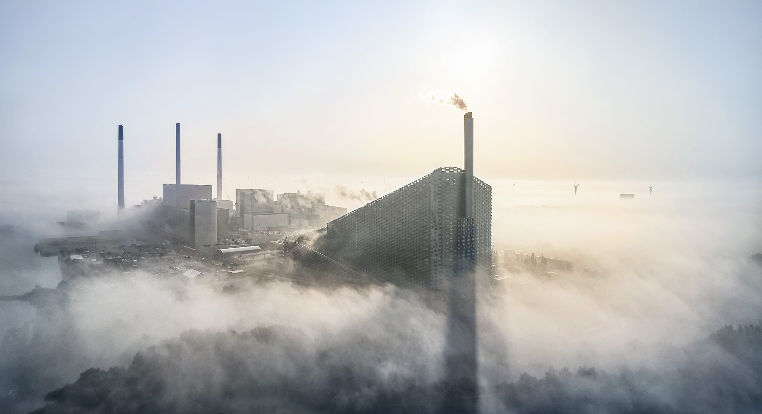
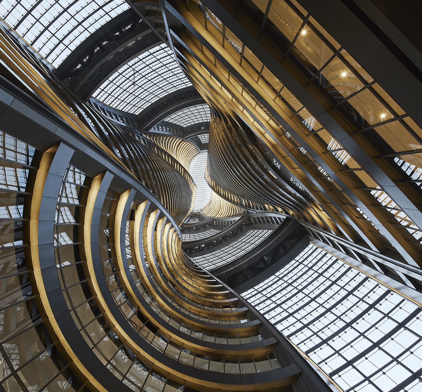
CopenHill by BIG & Leeza SOHO by Zaha Hadid Architects, Photography Courtesy Hufton + Crow

Hufton + Crow is a UK-based photography studio that was founded by Nick Hufton and Allan Crow. The duo work as a team and have captured contemporary interior and exterior architecture for renowned practices. Nick and Allan grew up together in Macclesfield, northern England, before moving to London. Both trained in analogue using a large format camera favored by many architectural photographers, but switched to digital as soon as the opportunity arose. The technical possibilities of digital photography mean it is now possible to stitch together several images to show wider views or to combine a series of moments into one. Harnessing these strategies has led the team to earn further commissions.


Denver Art Museum by Gio Ponti and James Sudler Associates & Anaheim Convention Center by Adrian Wilson and Associates, Photographs Courtesy Wayne Thom

Raised in Hong Kong, Thom moved to California in the mid-1960s and trained in the technical craftsmanship of photography. He is adept at harnessing natural light for both interior and exterior compositions. For more than thirty years Thom has captured the surfaces and depths, the shapes and textures, the contrasts and reflections of the objects of the built environment.

A patient reveler in the natural staging of the atmosphere, he creates compositions of materials around color and glow. Thom’s still life depictions unveil an idealized portrait of the inhabitable world, exposing the ultimate ambition of the architectural work as that which renders existence as art.


Tessalace Commercial Office Space by Studio Ardete and Titan Integrity Campus by Mindspace, Photography Courtesy Purnesh Dev Nikhanj

Purnesh Dev Nikhanj is an architectural photographer based in Chandigarh, India. His strengths are in experimenting with illusions, patterns, and abstract perspectives for storytelling. He worked with many renowned international design practices, and his main interest lies in the area of architectural and landscape photography, and video making. He is the only photographer to have won the Trends Excellence Award for Architectural photography twice and a silver spot at PX3, Paris.

Dev draws from deep psychological interests to represent space in various contexts. In all his signature series, such as Lost in Paradox, Beyond, Child’s play, etc. he explores psychological, philosophical, and existential ideas.


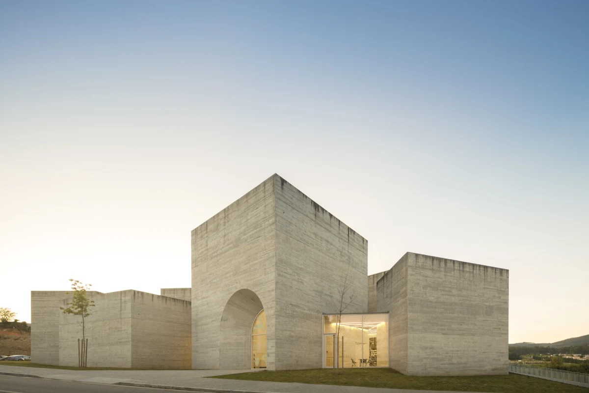
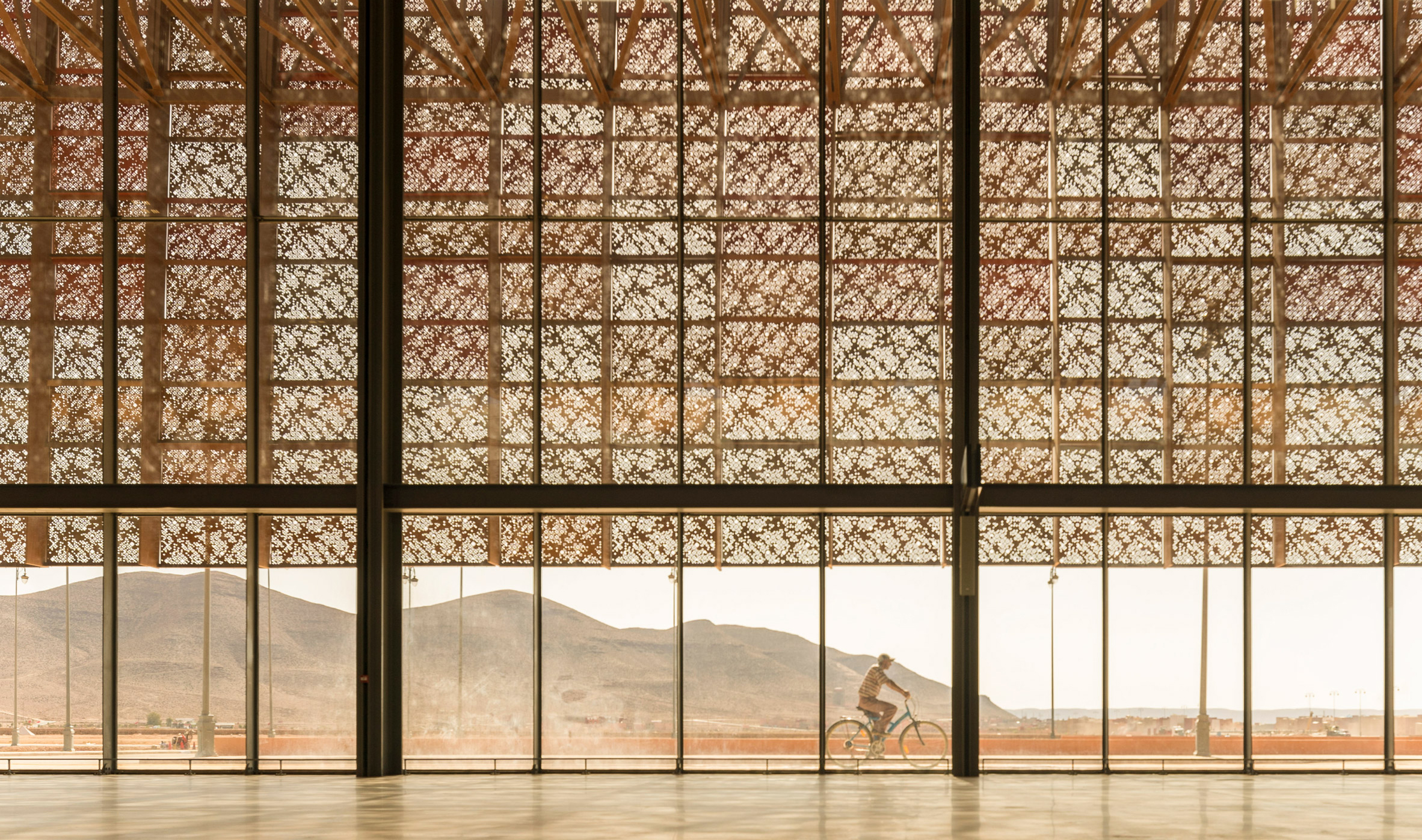
Centro de Interpretação do Românico Museum by Spaceworkers & Guelmim Airport by Groupe3Architectes, Images Courtesy Fernando Guerra, FG+SG

Fernando Guerra is a photographer of architecture based in Lisbon, Portugal. He obtained a degree in Architecture from Lusíada University (Lisbon), before working as an architect in Macau for five years. Fernando has been taking photographs since he was 16 years old and, in 1999, with his brother Sérgio Guerra, founded the studio ‘FG+SG – Fotografia de Arquitectura’. Five years later, they established the publishing house ‘FG+SG – Livros de Imagem’ to publicize the various architectural works they photograph. In 2012, he assumed the role of Canon Ambassador of Europe for architectural photography.


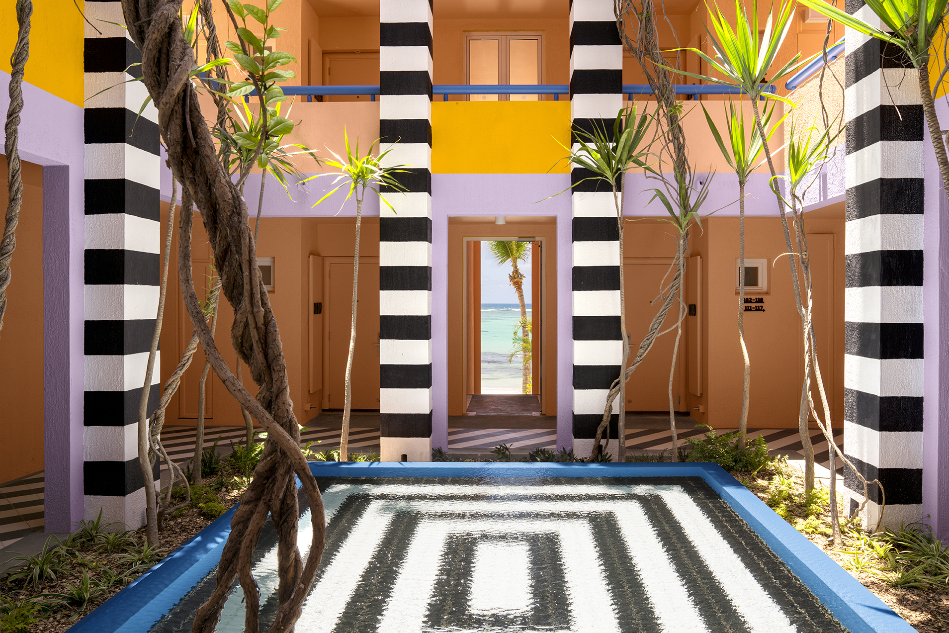
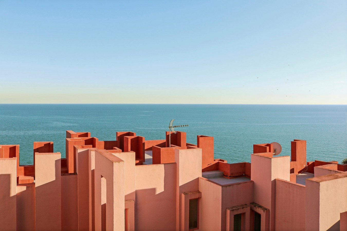
Salt Boutique Hotel by Camille Walala & La Muralla Roja by Ricardo Bofill, Photography Courtesy Tekla Evelina Severin

Using social media to explore color and composition, Tekla is a photographer that started her journey by turning her lens to interiors. She is both a colorist and interior architect who has become famous for her strong colors and graphically playful expressions.

Tekla started her journey to find colors, lines, and shapes in every object and surroundings. She is a freelancer in Stockholm as well as an art director and set designer. Whether it’s to design a product for a collaboration, or to photograph architecture for a commission, Tekla’s work highlights the importance of color in design, not merely as decoration, but as an important element in a project.


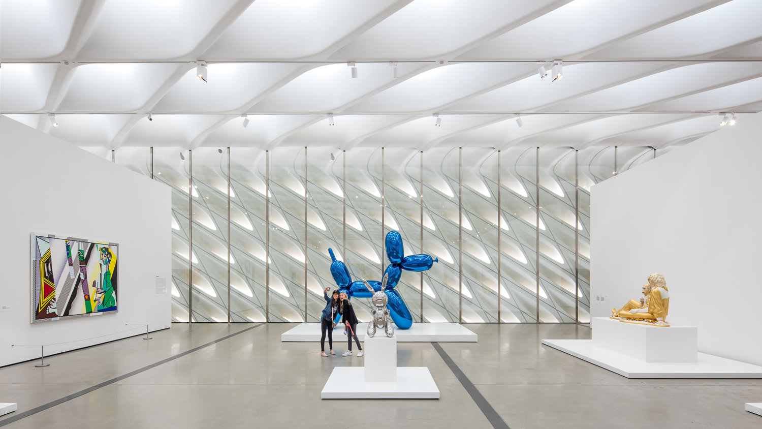
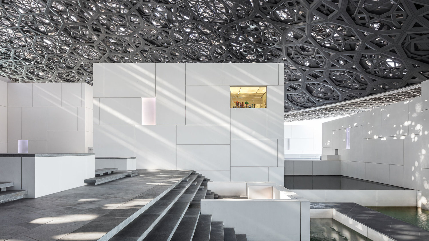
The Broad Museum by Diller Scofidio + Renfro & Louvre Abu Dhabi by Jean Nouvel, Photography Courtesy Mike Kelley

Mike Kelley is an architectural photographer from Los Angeles, California. He grew up in Ipswich, Massachusetts, and after studying studio art and environmental science at the University of Vermont, he eventually found himself taking up an offer to photograph a few homes for a client.

What started by chance turned out to be a mix of technical challenge and creative outlet. In 2018, he founded the Architectural Photography Almanac, a resource for architecture photographers and those in the architecture industry seeking to learn about the craft and theory of architectural photography.


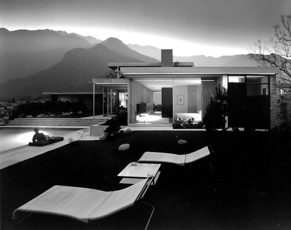
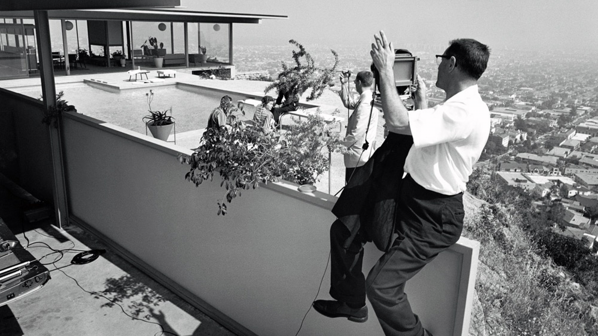
Kaufmann House by Richard Neutra & Stahl House by Pierre Koenig, Photography Courtesy Julius Shulman Photography Archive

No discussion of architectural photographer can be had without mentioning Julius Shulman. His career as an architectural photographer began in 1936 when he showed Richard Neutra some photographs he had made of the architect’s Kun Residence in Los Angeles. Neutra liked the images and asked Shulman to photograph more of his houses for him.

Ultimately, Shulman photographed most of Richard Neutra’s work and was introduced to other modernist architects working in Southern California. His extraordinary client list eventually included: Charles and Ray Eames, Raphael Soriano, John Lautner, Pierre Koenig, Rudolf Schindler, Frank Lloyd Wright and hundreds of others. Shulman did not merely document significant architecture, but interpreted it, becoming one of the most important and influential architectural photographers in history.

Send us a photo. Tell us a story. Win $2,500! Architizer’s 3rd Annual One Photo Challenge is underway with an Early Entry Deadline on May 27, 2022! Start your entry for architecture’s biggest photography competition here.
Reference