Ome Dezin restores 1960s California residence by A Quincy Jones
CategoriesInterior Design

Ome Dezin restores 1960s California residence by A Quincy Jones

US studio Ome Dezin has renovated a large mid-century home in Brentwood, California, using a tonal colour palette and maximising the lush hillside views.

The six-bedroom 12221 Benmore residence was designed and constructed in 1960 by notable local architects A Quincy Jones and Frederick Emmon.
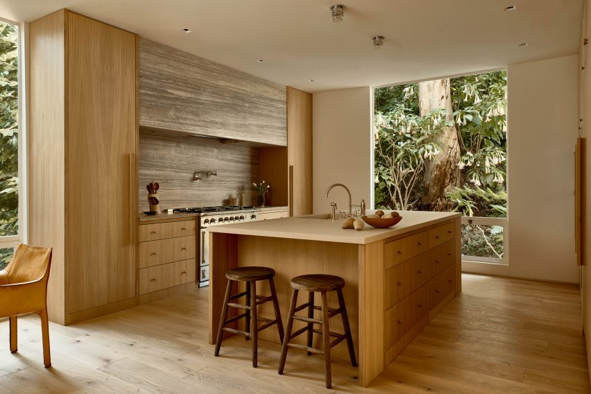
Kitchen with white oak island and cabinetry, and travertine backsplashKitchen with white oak island and cabinetry, and travertine backsplash
Natural materials and neutral colours were chosen throughout the home to highlight the lush views

When Jesse Rudolph and Joelle Kutner of Ome Dezin came to the project, it had undergone a 1990s remodel that had stripped away its character and style.

The team made it their mission to revive the home’s original charm and connection to the outdoors, bringing in natural tones and materials.
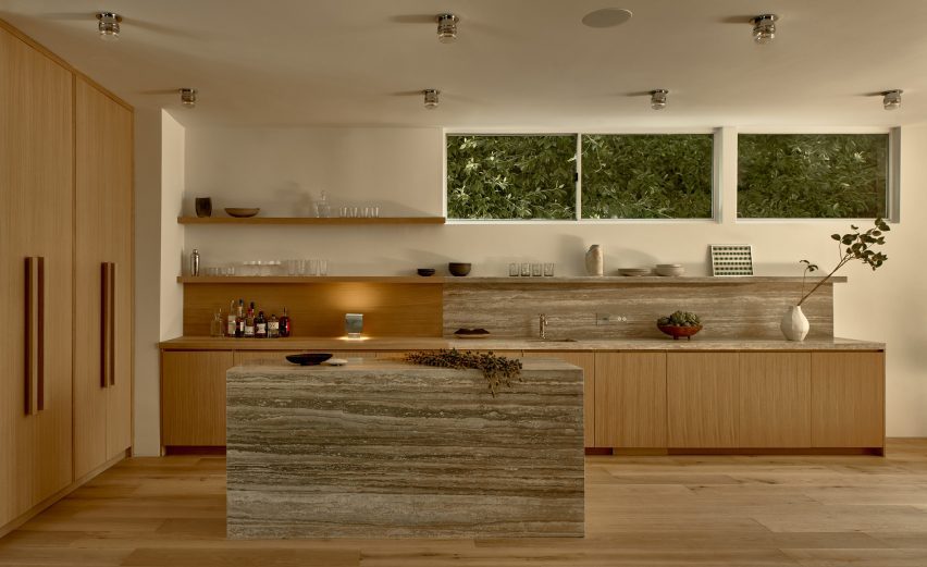
White oak and travertine bar areaWhite oak and travertine bar area
White oak and travertine are recurring materials, as seen in the bar area

“We have always been fans of A Quincy Jones and familiar with his work, which is what prompted us to see the home initially,” the duo told Dezeen.

“This one did not disappoint — it had the typical Quincy atrium-like living space centered across from the exterior which includes a 40-foot (12-metre) waterfall.”
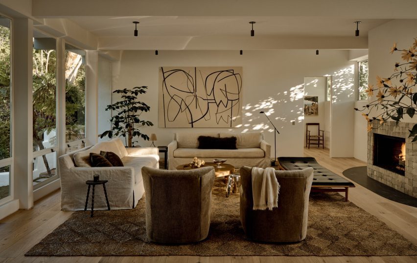
Living room with neutral decorLiving room with neutral decor
The main living spaces all flow together and have expansive views onto the garden

Many of the existing fixtures were retained, including the fixed windows and doors, wherever possible.

To keep the focus on the views from the large windows, the interior was designed with “a more muted, streamlined aesthetic”.
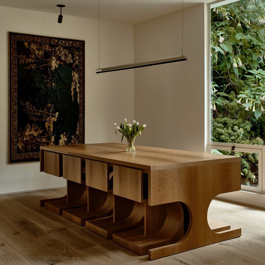
Wood dining table with chairs that tuck neatly underneathWood dining table with chairs that tuck neatly underneath
Custom pieces designed for the home include a dining table and chairs created in collaboration with Ben Willett

“We wanted to ensure the intention of Quincy was intact, so we aimed for a bit of brutalism and connection with nature,” said Rudolph and Kutner. “We opted for a limited material and color palette in favour of natural tones.”

The new white oak staircase designed for the three-storey atrium features rectangular forms and has an architectural presence, echoing the shape and style of the building.
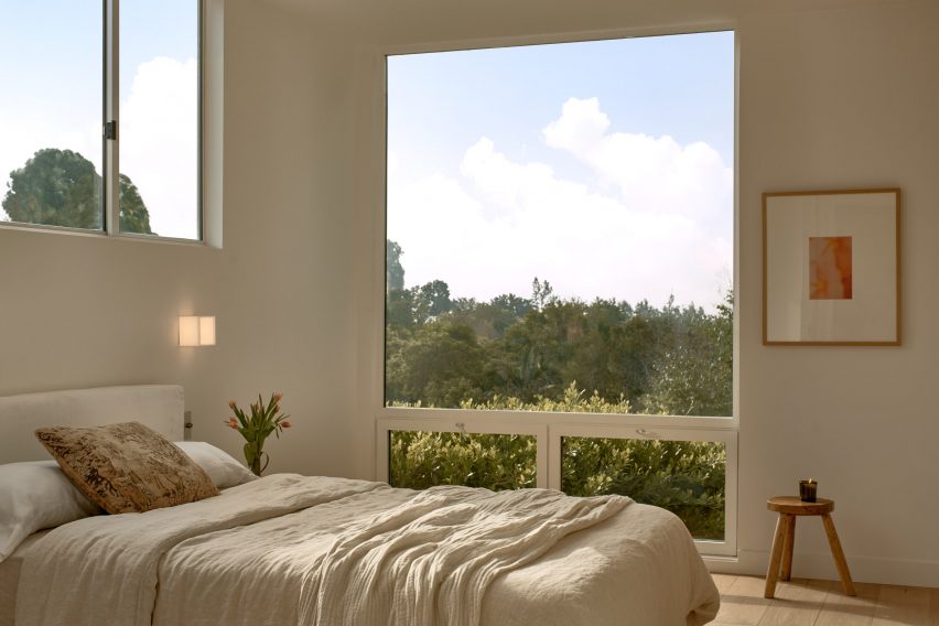
Bedroom with a large window overlooking treetopsBedroom with a large window overlooking treetops
Large windows are found in almost every room, so the decor is kept minimal and sparse so as not to draw focus

It sits at the nexus of the living room, dining area, kitchen and bar, which all flow together and enjoy expansive views out the back of the house.

A den adjacent to these open spaces is furnished with a variety of midcentury pieces, in keeping with the building’s history.
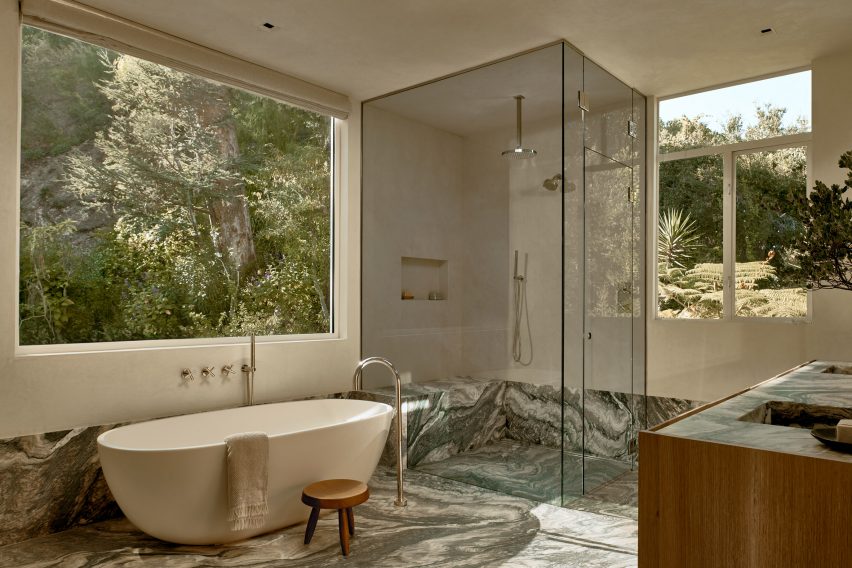
Bathroom with stone floor, freestanding tub and corner showerBathroom with stone floor, freestanding tub and corner shower
Dramatically patterned Cipollino stone in the bathroom echoes the grey tones of the rocks outside

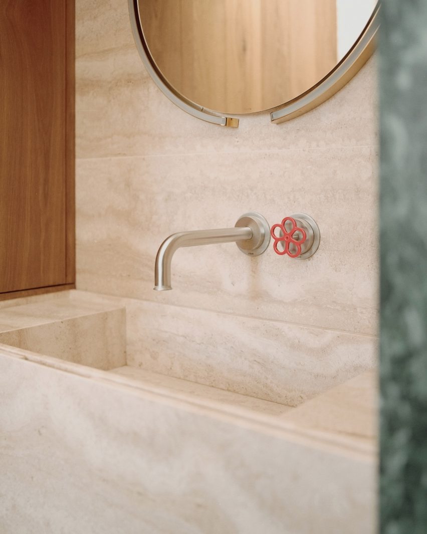
Two types of stone were used throughout the home: travertine, which appears in the kitchen, bar area and powder room, and richly patterned Cipollino in the primary bathroom chosen to pick out the colours of the mountains visible through the windows.

In the lower-floor bedrooms and around the fireplace, flagstones and cobblestones were laid to create a grounding quality and to connect the spaces to the rocky landscape outside and pavers around the swimming pool.

Custom pieces designed for the project include the dining table created with furniture designer Ben Willett, which allows all of the chairs to be tucked away neatly underneath.

Two 10-foot-high (three-metre) doors were custom-built for the living space and feature Jean Prouvé-influenced circular window cutouts that allow light to shine through.
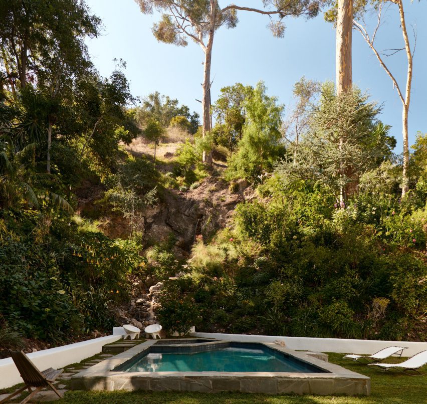
Garden featuring a swimming pool and a 40-foot (12-metre) waterfallGarden featuring a swimming pool and a 40-foot (12-metre) waterfall
The garden features a swimming pool and a 40-foot (12-metre) waterfall

“We paid special attention to the lighting in the home, mostly sourcing vintage lights to add charm and character,” the design team said.

“With such a large home, and lots of windows and tall ceilings, warm mood lighting really made the spaces feel intimate and magical, particularly in the evenings.”
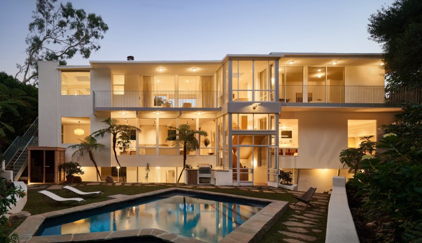
Three-storey modernist house seen at duskThree-storey modernist house seen at dusk
The home was designed and constructed in 1960 by A Quincy Jones and Frederick Emmon

Rudolph and Kutner founded Ome Dezin as a design and development studio focused on residential restoration in and around Los Angeles.

California has no shortage of mid-century properties in need of revamping. Other recently completed examples include Studio Schicketanz’s renovation of modernist architect Henry Hill’s former seaside home, and Woods + Dangaran’s overhaul of a residence that once belonged to singer Bing Crosby’s manager.

The photography is by Nils Timm.


Reference

Halleroed references Swedish Grace for Toteme flagship store
CategoriesInterior Design

Halleroed references Swedish Grace for Toteme flagship store

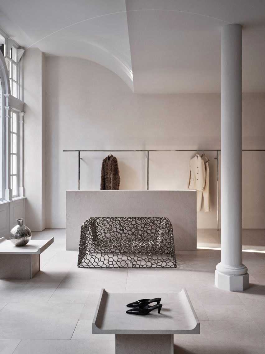
Stockholm studio Halleroed has designed fashion brand Toteme’s flagship store in London, which features a sculpture by artist Carl Milles and a steel sofa by designer Marc Newson.

Halleroed designed the store, located on Mount Street in the upmarket Mayfair area, together with Toteme founders Elin Kling and Karl Lindman. The duo wanted its third flagship to feature nods to the brand’s heritage.

“We like the idea of keeping certain elements that we find in our Swedish heritage,” Lindman told Dezeen at the store’s launch event.

“It can be by using certain vintage pieces, or like in [the brand’s Mercer Street store] in New York, we had a collaboration with Svenskt Tenn,” he added. “It’s about lifting this notion of Scandinavian design or Swedish design.”

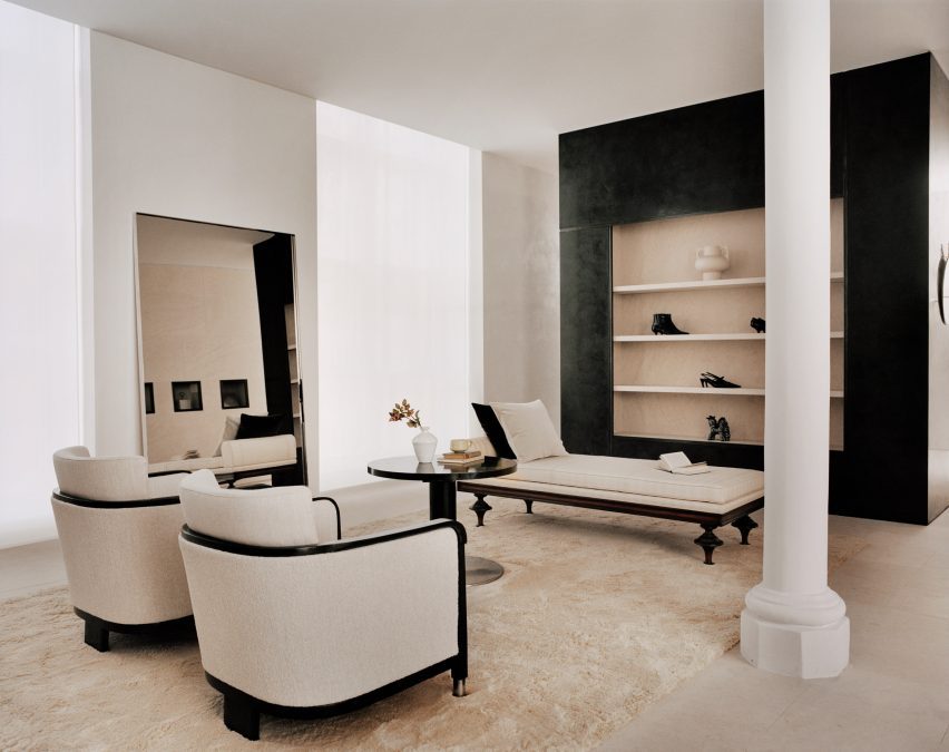
Interior of Totême store in LondonInterior of Totême store in London
A metal sofa by Marc Newson is among the sculptural details in the store

Halleroed drew on the space itself when designing the interior, focussing on how the light falls.

“We were inspired by the space itself with beautiful original windows letting the daylight in,” Halleored co-founder Ruxandra Halleroed told Dezeen.

“The upper part of the windows was partly hidden, which was a shame, so we redesigned the ceiling with a half vault towards the front to show the full height of the windows.”

Totême London storeTotême London store
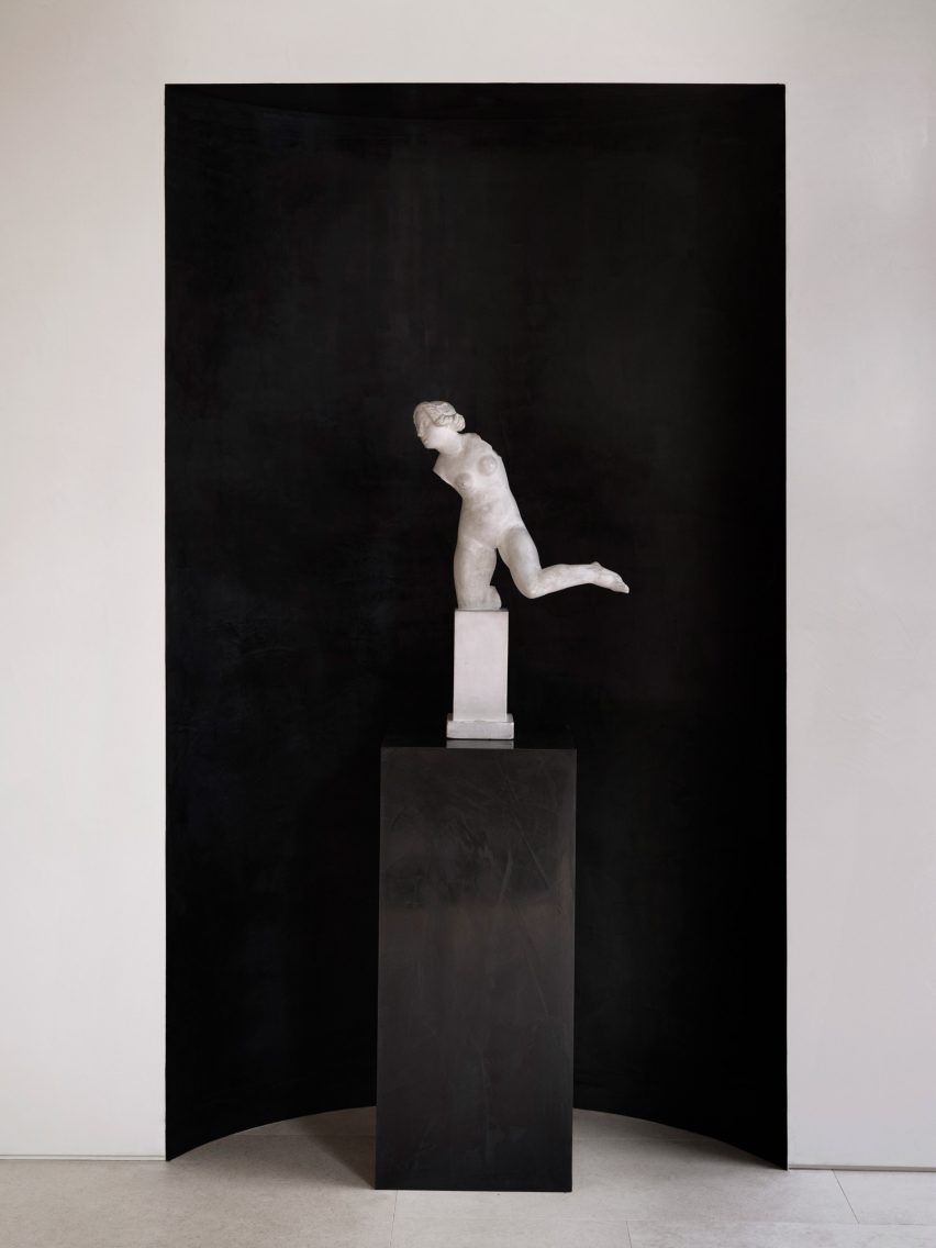
A piece by sculptor Carl Milles sits by the entrance

The design also references the work of Italian architect Carlo Scarpa as well as the Swedish Grace movement.

“We were also inspired by the Swedish Grace period – around 1920-30s – that has an elegant and pure design, something we think works well for Toteme as a brand,” Halleroed co-founder Christian Halleroed told Dezeen.

“Also the work of Carlo Scarpa we find interesting, more as a mindset on how to work with details and textures to create a subtle elegance and luxury.”

Cube inside fashion store in MayfairCube inside fashion store in Mayfair
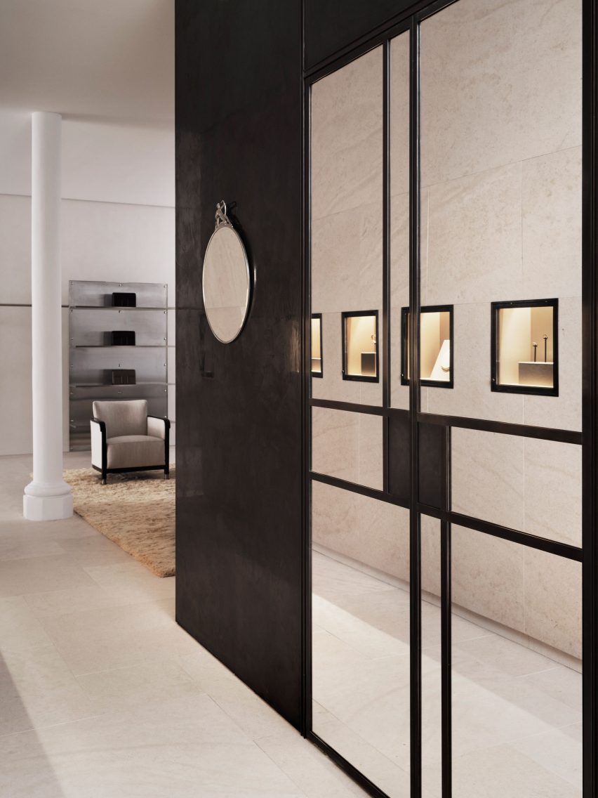
A black mirrored cube features at the rear of the store

Kling and Lindman wanted to keep the feel of “very posh” Mount Street where the store is located, while also underlining the space’s minimalist feel.

To do so, a lot of effort was put into the colour palette and different textured materials used for the flagship store.

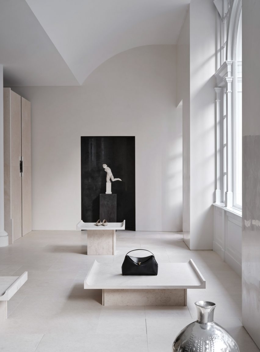
“We worked with an off-white palette in different tones and different textures,” Ruxandra Halleroed said.

“The textures are as important as colour and materials. For walls, we have a glossy, off-white stucco, ceiling in same colour but matte. The floor is in a beige, honed limestone with a so-called Opus pattern.”

Milles sculpture inside Totême storeMilles sculpture inside Totême store
Halleroed chose to redesign the store’s ceiling to reveal its windows

In the middle of the Toteme shop, Halleroed created a stone-clad cube that holds shelves, vitrines and niches filled with artworks.

“The volume in the middle is clad with the same limestone, but in three different textures: honed, bush hammered and spiked texture, combined with oxidised dark brass,” Christian Halleroed said.

The store also features a square black volume in the back made from high-gloss stucco and dark brass.

Beige and white interior of London fashion storeBeige and white interior of London fashion store
The minimalist interior has a beige, white and black colour palette

To contrast the minimalist interior, the store is decorated with multiple artworks, including a sculpture by Milles and Newson’s intricately woven steel Random Pak Twin sofa, which Lindman found online.

“He’s a slave to auction houses,” Kling told Dezeen.

“So he found it and sent it to me and I loved it, and we also have a Marc Newsom piece in every store,” she added. “So we thought, ‘this one’s for the Mount Street store’. At that time we only had the signed contract, nothing else.”

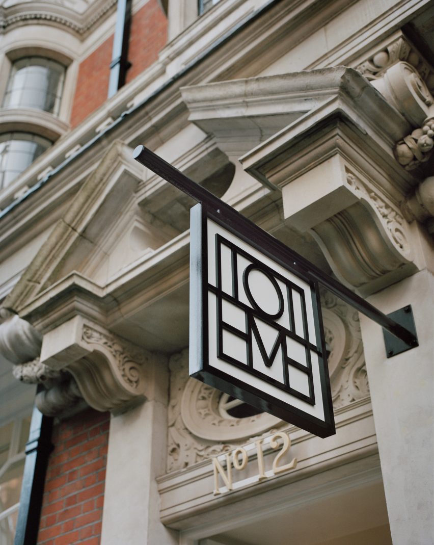
Sign outside Mount Street storeSign outside Mount Street store
The store is located on Mount Street in central London

The two founders and Halleroed decided on the gypsum Milles sculpture for the Toteme store together, with Halleroed designing a custom niche to place it in that is made from black high-gloss stucco to contrast the pale artwork.

Halleroed also added vintage Swedish Grace furniture to the store, including armchairs and a coffee table by furniture designer Otto Schulz, a daybed and a mirror in pewter made for the Stockholm Exhibition 1930.

The studio has designed a number of other store interiors, including a Paris boutique for French brand L/Uniform and an Acne Studios store in Chengdu that aimed to combine the futuristic and primitive.

Reference

This week we looked forward to the architecture and design trends of 2024
CategoriesInterior Design

This week we looked forward to the architecture and design trends of 2024

This week on Dezeen, we looked forward to the buildings set to be completed in 2024 and the architecture, design and interiors trends that will impact the upcoming year.

We rounded up 12 key buildings that will be completing over the next year – these include projects by Kéré Architecture, Sou Fujimoto, Zaha Hadid Architects and Foster + Partners.

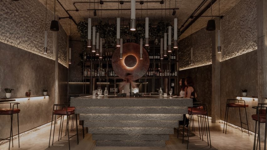
Interior by Mexican studio RA!Interior by Mexican studio RA!
We looked at the trends of 2024

We also looked at the architecture, design and interiors trends of 2024. Interior design will have a focus on individualism and see a backlash to the rise in AI design, while we will see less experimentation and more “safe spaces” this year in architecture.

Dezeen’s editorial director Max Fraser predicted that in design, we will see the rise of material intelligence and a rush for sustainable accreditation.

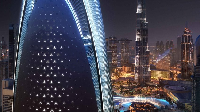
Mercedes-Benz skyscraperMercedes-Benz skyscraper
Mercedes-Benz is designing a skyscraper in Dubai

In architecture news, car brand Mercedes-Benz and developer Binghatti have revealed plans for a supertall skyscraper in central Dubai.

The car company’s first branded residential tower will reportedly be 341 meters high and located close to the Burj Khalifa.

“Our aim with our first branded real estate residential tower is to create new, desirable grounds that inherit our brand’s DNA and give our customers a place to arrive, unwind and come home to,” said Britta Seeger, a member of the management board for Mercedes-Benz Group AG.

The latest Neom region was revealedThe latest Neom region was revealed
The latest Neom region was revealed

In Saudi Arabia, the latest region of the Neom mega-development was revealed.

Named Norlana, the development designed by architecture studio 10 Design will be a town wrapped around a marina on the Gulf of Aqaba.

Venice Architecture Biennale 2022Venice Architecture Biennale 2022
Catherine Slessor wrote an opinion on Carlo Ratti’s Venice appointment

Following Carlo Ratti’s appointment as the curator of the next Venice Architecture Biennale, critic Catherine Slessor wrote an opinion piece that raises questions about how the event will be impacted by Italy’s far-right government.

“Viewed as a supposedly safe pair of Italian hands, Ratti’s appointment marks a screeching U-turn from [previous curator] Lesley Lokko, whose tenure was structured around narratives of decarbonisation and decolonisation,” she wrote.

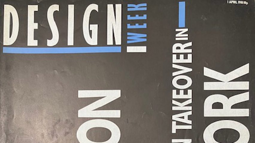
Design Week magazine coverDesign Week magazine cover
Design Week announced it was closing

In the UK, online design magazine Design Week announced that it had ceased publication and that its website will be taken offline later this month.

“Design Week is ceasing publication with immediate effect,” said a statement.

“Design Week’s parent company, Centaur, has made the decision to close the publication as its strategy shifts towards its ‘core audience of marketers, and focuses on training, information, and intelligence’.”

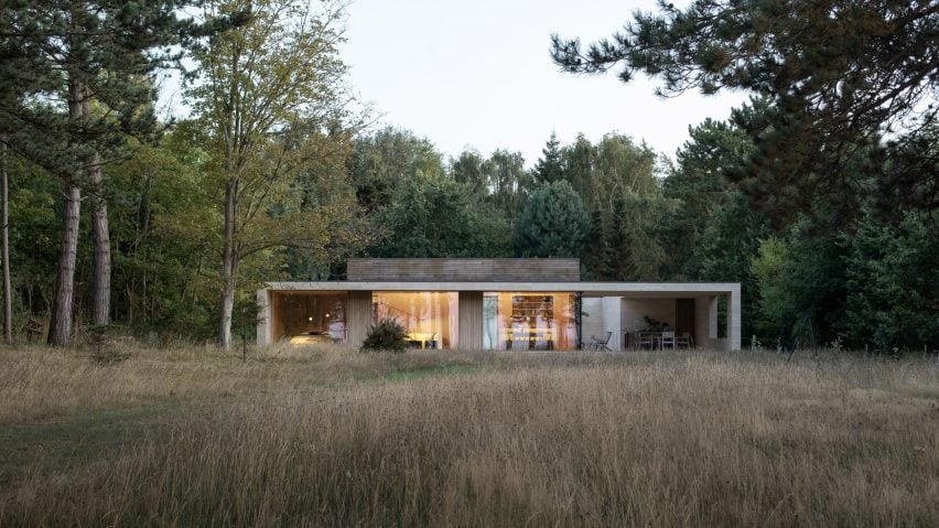
Danish holiday homeDanish holiday home
A Danish summerhouse was one of this week’s most-read projects

Popular projects this week included a monolithic summerhouse on the Danish coast, a pitched-roof house in Massachusetts and a store arranged around a conversation pit.

This week on Dezeen

This week on Dezeen is our regular roundup of the week’s top news stories. Subscribe to our newsletters to be sure you don’t miss anything.

Reference

Eight homes where mid-century modern furniture adds a stylish touch
CategoriesInterior Design

Eight homes where mid-century modern furniture adds a stylish touch

Pieces by designers Charles and Ray Eames and Isamu Noguchi are on show in this lookbook, which features homes with eye-catching mid-century modern furniture.

Mid-century furniture, which often has simple lines and a sculptural feel, adds a modernist touch to these homes, which range from period properties to newly built and renovated houses.

Among the interiors showcased in this lookbook are iconic architect Le Corbusier’s own home and a residence in London’s upmarket Mayfair area that has been filled with mid-century modern and art deco details.

This is the latest in our lookbooks series, which provides visual inspiration from Dezeen’s archive. For more inspiration see previous lookbooks featuring perforated brick-walls, budget home interiors and immersive saunas in peaceful settings.


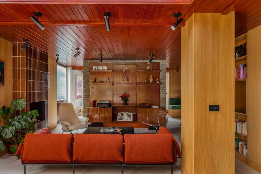
Mid-century modern home Mid-century modern home
Photo by Mariell Lind Hansen

Zero House, UK, by Ben Garrett and Rae Morris

Owners Ben Garrett and Rae Morris updated Zero House, which was informed by Californian Case Study Houses, themselves in a way that would honour its mid-century roots.

The living room features a striking floor-to-ceiling fireplace clad in tiles, as well as a number of furniture pieces in warm colours. Among them is a classic Eames office chair in a dark-brown leather colour that matches the wooden panelling that decorates the room.
Find out more about Zero House ›


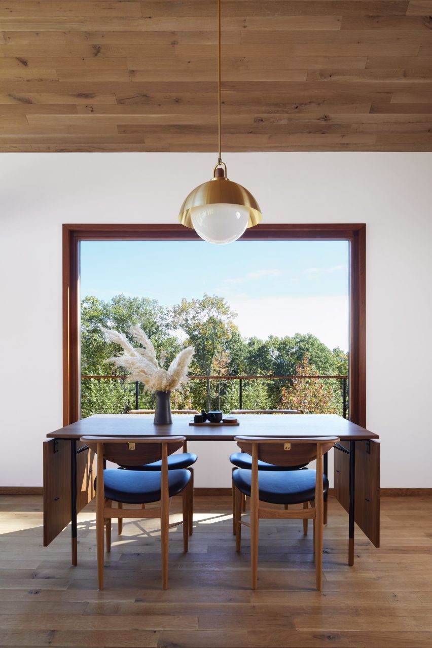
Hudson Woods house by Magdalena KeckHudson Woods house by Magdalena Keck
Photo by Jeff Cate

Hudson Woods home, US, by Magdalena Keck

Located in upstate New York, this holiday home has an interior that fuses Danish and Japanese design. A dinner table and chairs by designer Finn Juhl are among the Danish pieces used in the house, where they look both functional and elegant.
A simple lamp with a gold-coloured shade above the table adds a decorative touch and matches the brass fastenings at the backs of the chairs.

Find out more about the Hudson Woods home ›


Interior of Madrid apartmentInterior of Madrid apartment
Photo by Polina Parcevskya and Julie Smorodkina

Radikal Klassisk, Spain, by Puntofilipino 

The interior of this Spanish apartment in a former bank building has a moody, interesting colour palette and features richly textured materials including terrazzo, clay-rendered walls and marble tiles.

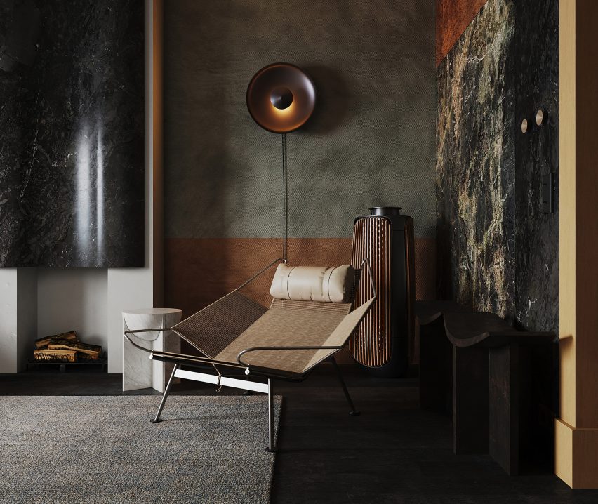
In contrast, the furniture is streamlined and unfussy, including a sculptural lounge chair by Danish designer Hans J Wegner in the living room.

Find out more about the Radikal Klassisk ›


City Beach residence in Perth by Design TheoryCity Beach residence in Perth by Design Theory
Photo by Jack Lovel

City Beach House, Australia, by Design Theory

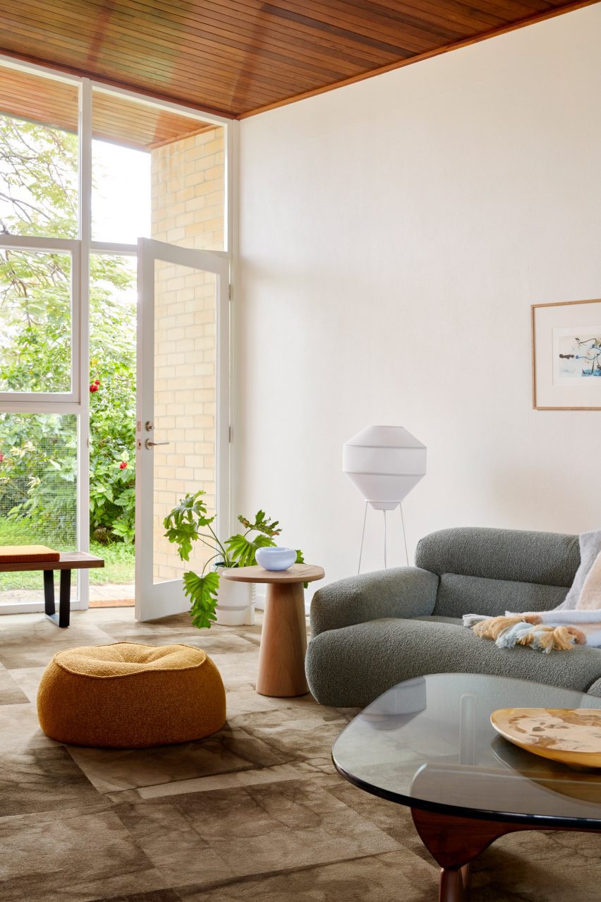
American artist and designer Noguchi’s iconic coffee table, made from a heavy glass tabletop that rests on two undulating wooden legs, has pride of place in the living room of City Beach House.

The interior, created by Australian studio Design Theory, responds to the design and natural material palette of the house itself, which is from the 1960s.

Find out more about City Beach House ›


White home in Sweden by Asa Hjort ArchitectsWhite home in Sweden by Asa Hjort Architects
Photo by Jim Stephenson

Hallen, Sweden, by Åsa Hjort Architects

This newly built home in the southern Swedish region of Österlen has a blocky geometric design and large windows that provide views out across the Baltic Sea.

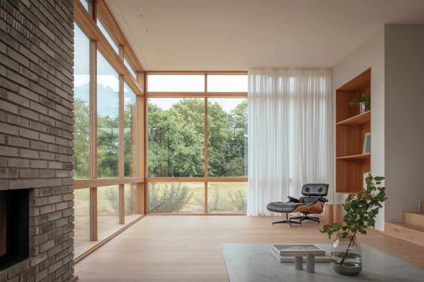
An Eames lounge chair adds a comfortable resting space in one of the rooms, where its dark hues contrast against sheer white curtains and pale wood flooring.

Find out more about Hallen ›


Moore HouseMoore House
Photo is by Joe Fletcher

Moore House, US, by Woods + Dangaran

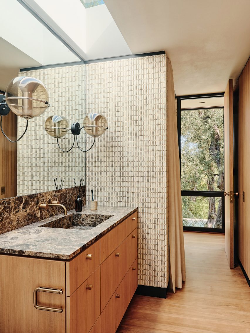
A pair of vintage globe-shaped pendants by Dutch designer Frank Ligtelijn light up the bathroom in this 1960s California home designed by architect Craig Ellwood.

The bathroom also features a dark Emperador marble countertop and a wall clad in Japanese porcelain tiles.

Find out more about Moore House ›


Mid-century modern interior by Child StudioMid-century modern interior by Child Studio
Photo by Felix Speller and Child Studio

Mayfair residence, UK, by Child Studio

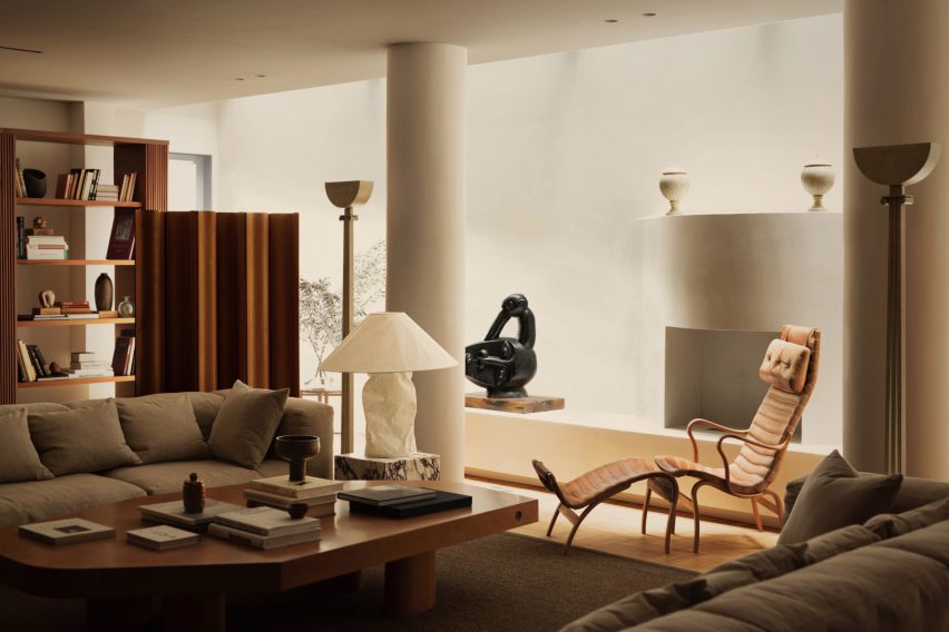
The “Pernilla” lounge chair by Swedish designer Bruno Mathsson is among the many mid-century modern furniture pieces on show in this London apartment.

Local practice Child Studio told Dezeen that the spacious lounge that houses the chair was informed by the grand salon in fashion designer Yves Saint Laurent’s Paris home.

Find out more about the Mayfair residence ›


Le Corbusier's studio apartmentLe Corbusier's studio apartment

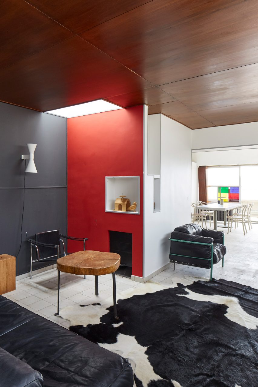
Studio apartment, France, by Le Corbusier

Le Corbusier’s apartment in his Immeuble Molitor apartment building in Paris, where he lived for more than three decades, reopened to the public in 2018.

Visitors to the modernist flat can admire mid-century modern furniture pieces including a black leather edition of the designer’s signature LC2 lounge chair, which sits next to a cowhide rug at the entrance of the apartment.

Find out more about Le Corbusier’s apartment ›

This is the latest in our lookbooks series, which provides visual inspiration from Dezeen’s archive. For more inspiration see previous lookbooks featuring perforated brick-walls, budget home interiors and immersive saunas in peaceful settings.

Reference

Ibiza Interiors turns dry-stone stables into flexible guesthouse
CategoriesInterior Design

Ibiza Interiors turns dry-stone stables into flexible guesthouse

A 200-year-old stable building in the mountains of Ibiza has been converted into a vacation home by local studio Ibiza Interiors.

The Atelier is one of four dwellings that make up Campo – a group of rentable guesthouses set in a finca, or farmstead, in the island’s Morna Valley.

View through large opening into a neutral-toned interiorView through large opening into a neutral-toned interior
Campo Atelier is located in a renovated dry-stone stable building

Ibiza Interiors founder Jurjen Van Hulzen has renovated these buildings one by one to enhance their original features and create a series of tranquil getaway spots.

“Nestled between carob and orange trees, the Atelier […] appears at the end of the path as a haven of peace,” said the Dutch architect, who founded the studio in 2014.

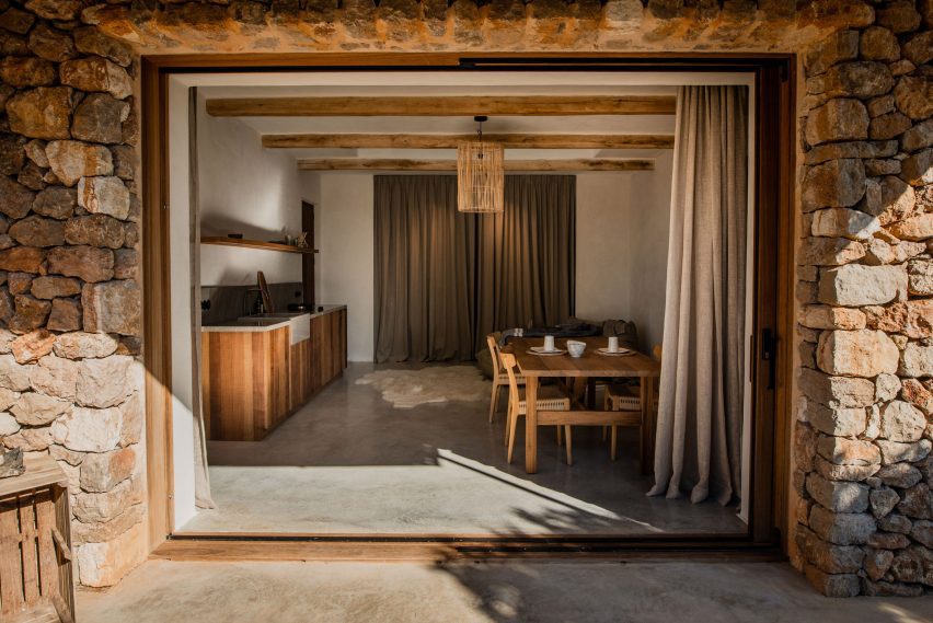
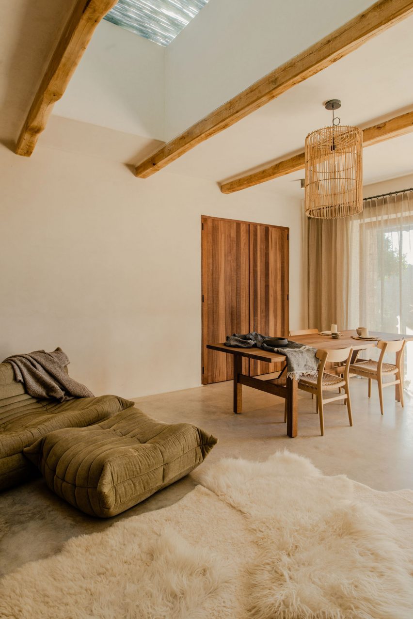
Room with wooden ceiling beams, polished concrete floor and a dining tableRoom with wooden ceiling beams, polished concrete floor and a dining table
The main space is designed for flexible use

The single-storey dry-stone structure is typical of the local vernacular but now features a large retractable glass wall across its front.

A polished concrete patio continues inside, where exposed timber ceiling beams and wooden doors complement the neutral colour palette.

“Textures and styles are not afraid to cohabit and the emphasis is on the interplay between old and contemporary, elegant and rustic,” said Van Hulzen.

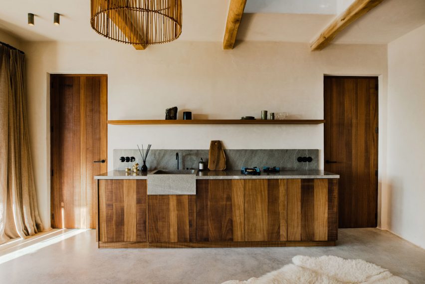
A small kitchenette with wood-panelled cupboards and doors either sideA small kitchenette with wood-panelled cupboards and doors either side
A small kitchenette with wood-panelled cupboards matches the doors on either side

The main space contains a small kitchenette on one side and a dining table that doubles as a workspace on the other.

A seating area comprising low, comfy sofas is positioned towards the back.

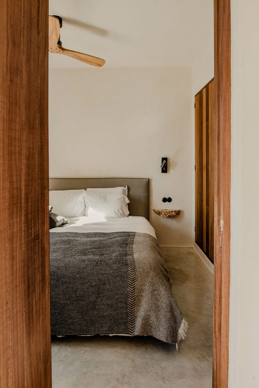
A minimally furnished bedroom with built-in storageA minimally furnished bedroom with built-in storage
The minimally furnished bedroom includes built-in storage

The interior is designed to be as flexible as possible, with all of the furniture except the kitchen counters moveable to provide space for exercise or meditation.

Equally, the linen curtains can be drawn and the sofas reoriented for watching movies on a projected screen.

The bedroom is minimally furnished but guests can store their belongings within built-in closets while another glass door opens to the exterior.

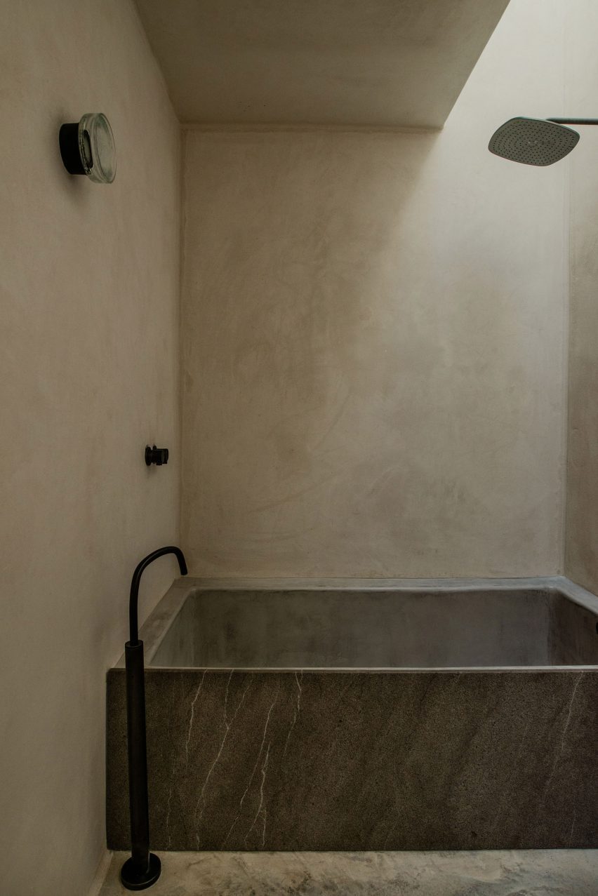
In the bathroom, lit from above by a skylight, a large tub made of dark stone is accented with matte black hardware.

A grey stone bathtub illuminated by a skylightA grey stone bathtub illuminated by a skylight
In the bathroom, a grey stone tub is illuminated by a skylight

The landscaping around the Atelier was designed by Ibiza Exteriors, a new offshoot of Ibiza Interiors created by Van Hulzen and Alicia Uldall.

The pair chose local flora attuned to the island’s climate that requires minimal maintenance such as stipa grasses, aloe, rosemary and mastic trees.

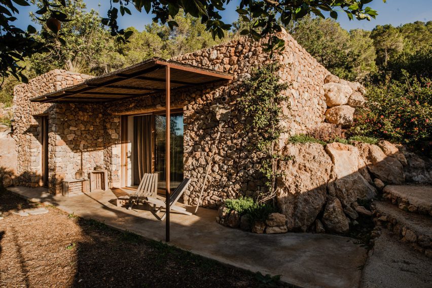
A 200-year-old building sat into the hillsideA 200-year-old building sat into the hillside
The 200-year-old building sits on a hillside, with its flat roof accessible via stairs

Deep steps lead up to the flat roof that serves as a picnic or sunbathing spot overlooking the valley. The dining table and chairs can also be brought outside for al fresco dining among the vegetation.

“Like the Atelier, the garden preserves the wild essence of this land and its genuine beauty,” Van Hulzen said.

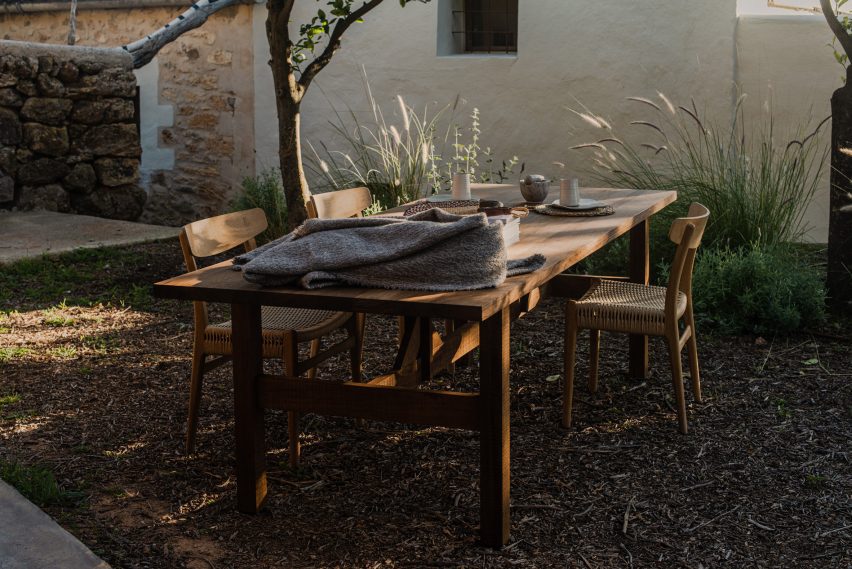
Wooden dining table outdoorsWooden dining table outdoors
The dining table can be brought outdoors for al fresco meals

Better known for its party scene, Ibiza is becoming ever more popular as a wellness and relaxation destination – particularly away from its coast.

Many of the island’s historic fincas have been converted into secluded accommodations including the remote Aguamadera resort and the members-only retreat La Granja.

The photography is by Ariadna Puigdomenech.

Reference

Ten homes with net floors for relaxation and play
CategoriesInterior Design

Ten homes with net floors for relaxation and play

In this lookbook, we collect 10 residential interiors where net floors provide an unusual place to sit, recline or jump about.

Nets can be a fun way to link two storeys in the home. Featured below are examples from a New York apartment, a skinny house in Rotterdam and a small family residence in rural Vietnam, among others.

This is the latest in our lookbooks series, which provides visual inspiration from Dezeen’s archive. For more inspiration see previous lookbooks featuring homes with dividing lattice screens, split-level living areas and stylish children’s bedrooms.


Haus L in Austria by DunkelschwarzHaus L in Austria by Dunkelschwarz
Photo by Marcus Rohrbacher

Haus L, Austria, by Dunkelschwarz

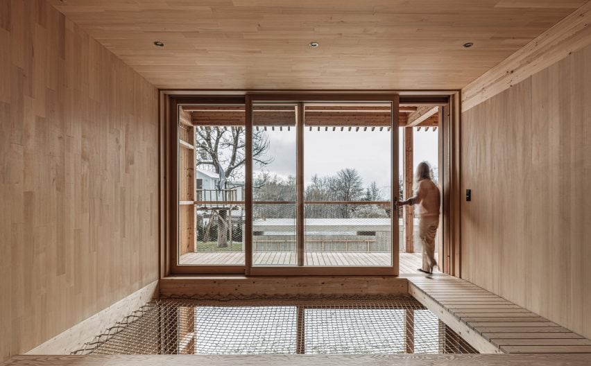
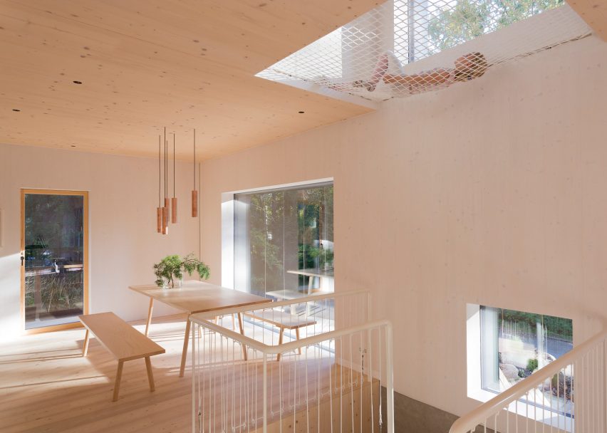
Timber-lined living spaces create a soothing atmosphere inside this house in the Austrian Alps, designed by local architecture studio Dunkelschwarz.

To encourage relaxation, a void above the dining area was covered with netting that can be used for lounging, while an adjacent walkway leads directly to a large balcony.

Find out more about Haus L ›


Net floor in Pimeriza HouseNet floor in Pimeriza House
Photo by Marcos Zegers (also top)

Primeriza House, Chile, by Stanaćev Granados

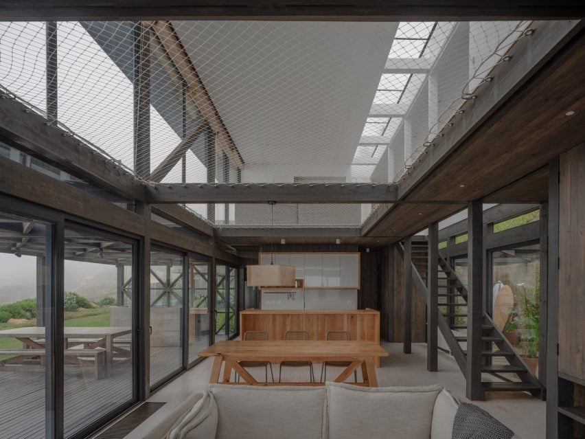
Chilean architecture studio Stanaćev Granados put two large cargo nets at the centre of this seaside house in Chorrillos overlooking the Pacific.

As well as providing an easily visible children’s play space above the open-plan living area, the net allows for a subtle transition between the darker wood cladding of the ground floor and the white-painted timber of the upper level.

Find out more about Primeriza House ›


Net hammocks suspended above seating areasNet hammocks suspended above seating areas
Photo courtesy of No Architecture

Urban Tree House, USA, by No Architecture

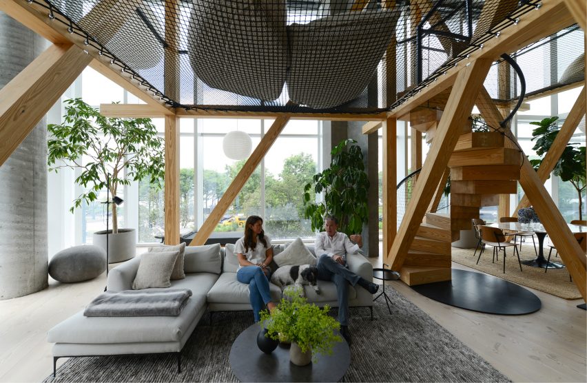
To make the vast living space of this apartment in New York’s West Village feel less chasmic, No Architecture constructed two “treehouses” from a series of timber beams.

Black netting strung between the beams creates an elevated chill-out space, accessed by a spiral staircase whose balustrade is made of the same mesh material.

Find out more about Urban Tree House ›


Nets inside the HOUSE by H&P ArchitectsNets inside the HOUSE by H&P Architects
Photo by Le Minh Hoang

HOUSE, Vietnam, by H&P Architects

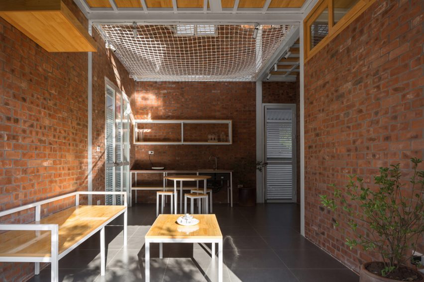
In this house in Vietnam designed by H&P Architects, a net floor contributes to the humble aesthetic created by its compact, open-plan layout and rough-and-ready materials like exposed brick and corrugated metal.

The net allows air to move freely through the home, helps to instil a sense of spaciousness and creates additional usable floor space.

Find out more about HOUSE ›


Atrium Townhome by Robitalle CurtisAtrium Townhome by Robitalle Curtis
Photo by Adrien Williams

Atrium Townhome, Canada, by Robitaille Curtis

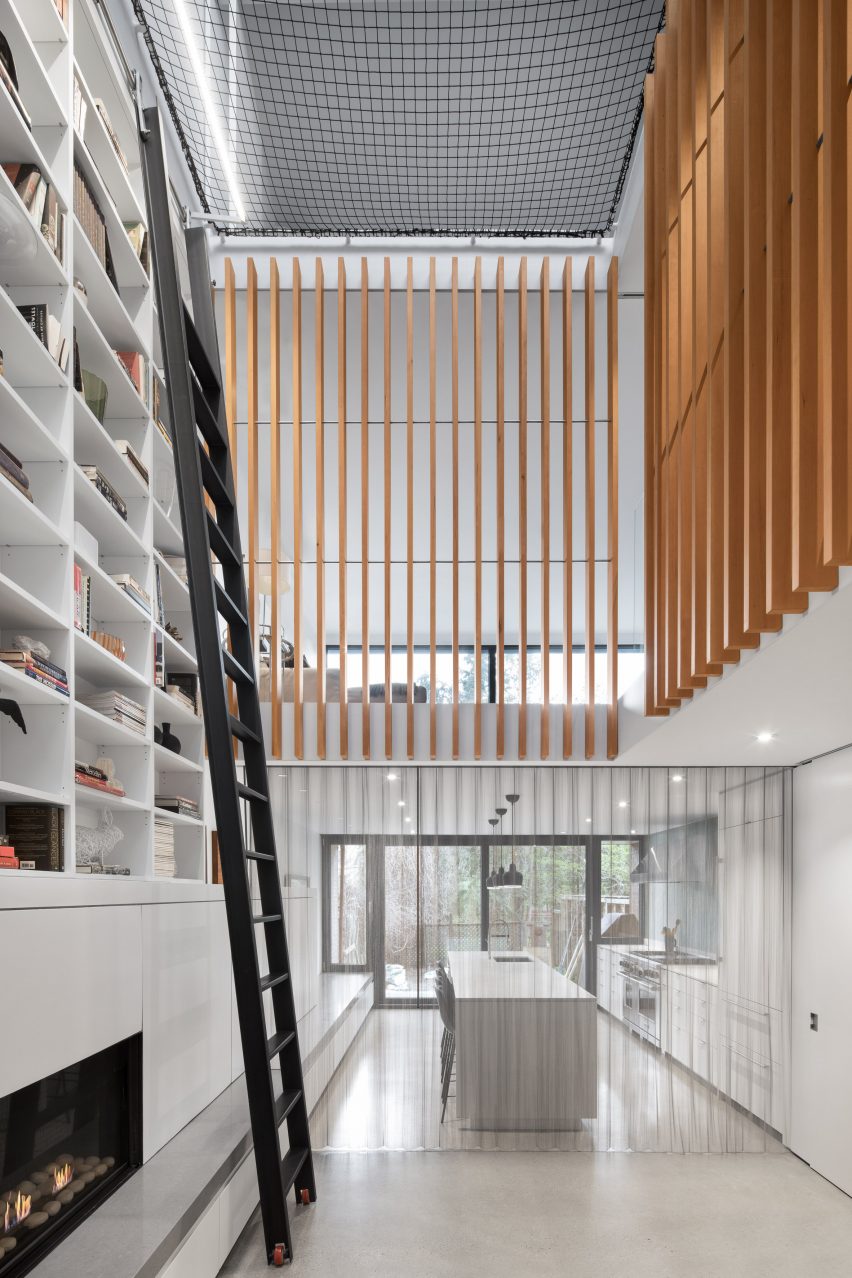
Canadian studio Robitaille Curtis procured the expertise of famous circus company Cirque du Soleil to rig a trapeze-style net atop the high atrium inside this Montreal home.

The aim was to emphasise the drama of the space, with a tall bookcase accessed by a 5.5-metre ladder and vertical wooden slats also helping to direct the gaze upwards.

Find out more about Atrium Townhome ›


Net floor in Casa Bosque SerenoNet floor in Casa Bosque Sereno
Photo by FRAM Fotografía

Casa Bosque Sereno, Mexico, by Fábrica de Espacios

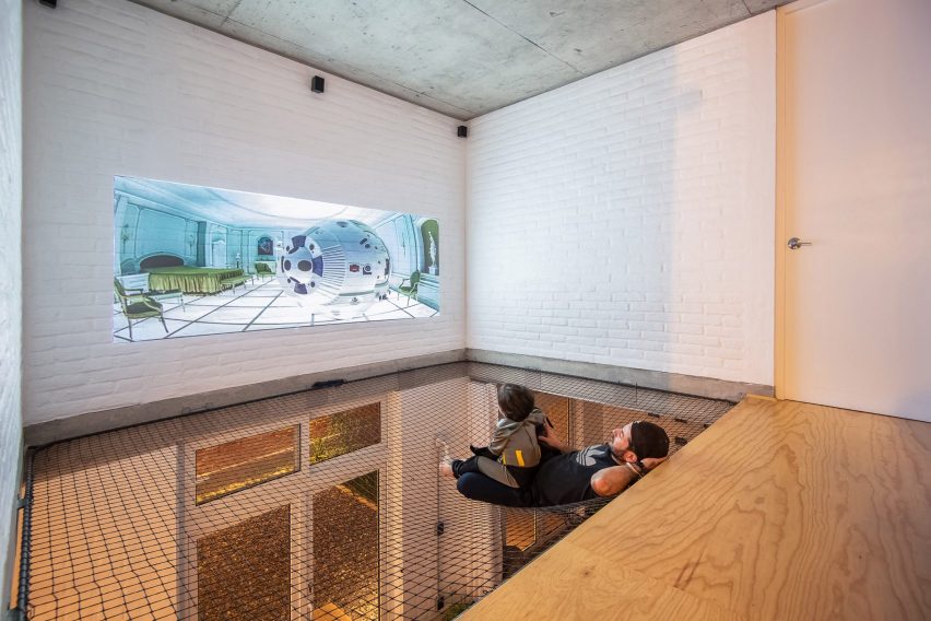
At Casa Bosque Sereno, residents can use the net floor as a place to watch movies thanks to a projector mounted opposite a white-painted brick wall.

The net also contributes to the pared-back, open-plan design chosen for the house by architecture office Fábrica de Espacios.

Find out more about Casa Bosque Sereno ›


SkinnyScar, Rotterdam, the Netherlands by Gwendolyn Huisman and Marijn BotermanSkinnyScar, Rotterdam, the Netherlands by Gwendolyn Huisman and Marijn Boterman
Photo courtesy of Gwendolyn Huisman and Marijn Boterman

SkinnyScar, Netherlands, by Gwendolyn Huisman and Marijn Boterman

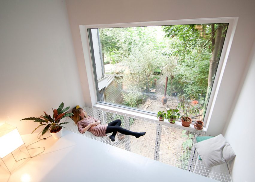
Dutch architects Gwendolyn Huisman and Marijn Boterman wanted to avoid “harsh boundaries” between living spaces in this skinny house in Rotterdam that they designed for themselves to live in.

To that end, they strung a modestly sized net next to a large window overlooking the garden, to act as a kind of static hammock next to the first-floor living room and above the dining room.

Find out more about SkinnyScar ›


Net floor above living area in house designed by Ortraum ArchitectsNet floor above living area in house designed by Ortraum Architects
Photo by Marc Goodwin

MK5, Finland, by Ortraum Architects

This family house in a forest near Helsinki features a number of child-friendly elements including a climbing wall, gymnastic apparatus and, of course, a net floor.

Local studio Ortraum Architects placed the net in a cut-out next to the first-floor landing, allowing light to filter down into the basement stairwell.

Find out more about MK5 ›


King Bill house by Austin Maynard ArchitectsKing Bill house by Austin Maynard Architects
Photo by Derek Swalwell

King Bill, Australia, by Austin Maynard Architects

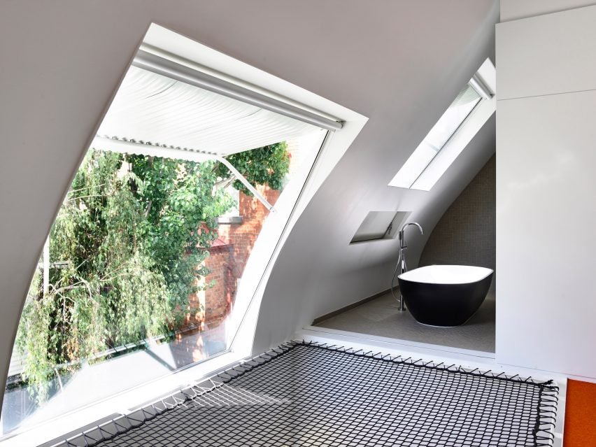
Austin Maynard Architects installed a netted platform with a view out of a large window and into the bathroom as part of its renovation of this formerly dilapidated stable in Melbourne.

The black mesh contrasts with the white corrugated metal of the window awning, the grey tiles of the bathroom and the orange carpet on the adjacent floor.

Find out more about King Bill ›


Saigon house by a21 StudioSaigon house by a21 Studio
Photo by Quang Tran

Saigon House, Vietnam, by a21studio

The large net in this Ho Chi Minh City house, designed by Vietnamese architecture office A21studio, is visible from almost everywhere in the four-storey building.

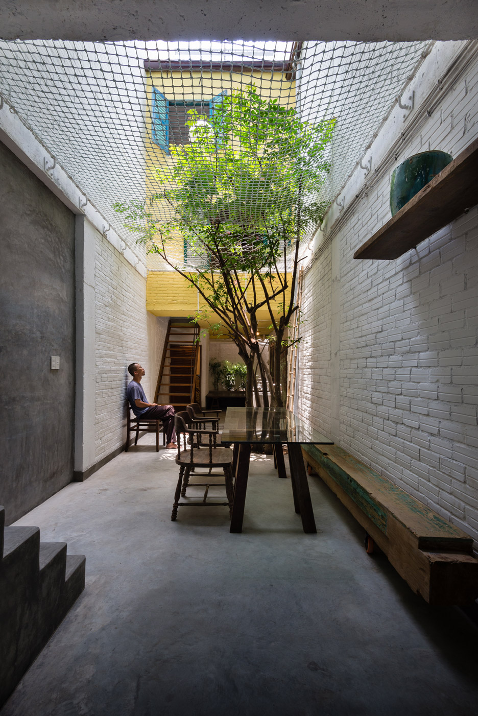
In addition to serving as a children’s play area, it helps create an impression of the ground floor as an outdoor courtyard – particularly as a tree bursts through the textile.

Find out more about Saigon House ›

This is the latest in our lookbooks series, which provides visual inspiration from Dezeen’s archive. For more inspiration see previous lookbooks featuring homes with dividing lattice screens, split-level living areas and stylish children’s bedrooms.

Reference

Yellow lighting illuminates Le Père store in New York by BoND
CategoriesInterior Design

Yellow lighting illuminates Le Père store in New York by BoND

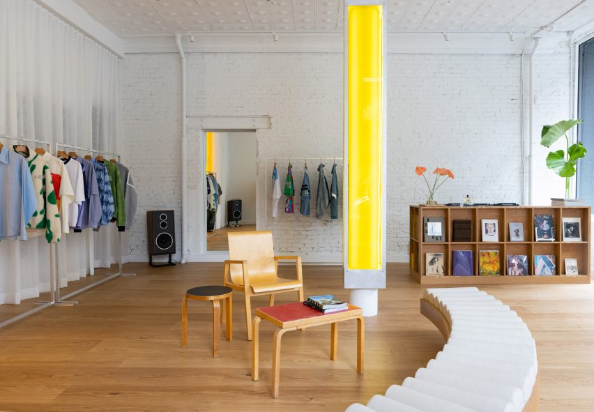
New York architecture studio BoND has used tubular lighting to create a bright yellow glow inside this men’s apparel store on Manhattan’s Lower East Side.

The first flagship for cult fashion label Le Père occupies a 1,000-square-foot (93-square-metre) corner unit on Orchard Street.

Store interior with white walls, wooden floors and a central yellow columnStore interior with white walls, wooden floors and a central yellow column
The flagship store for Le Père is largely painted white to allow the bright clothing to stand out

Utilising the store’s large exposure to the street, BoND opted to create an interior that would be just as impactful from the exterior as it is once inside.

“BoND designed the store to feel like a canvas, highlighting the design elements of the clothes while ensuring the space is a place that creators feel encouraged to spend time in,” the team said.

A central column encased in a translucent yellow boxA central column encased in a translucent yellow box
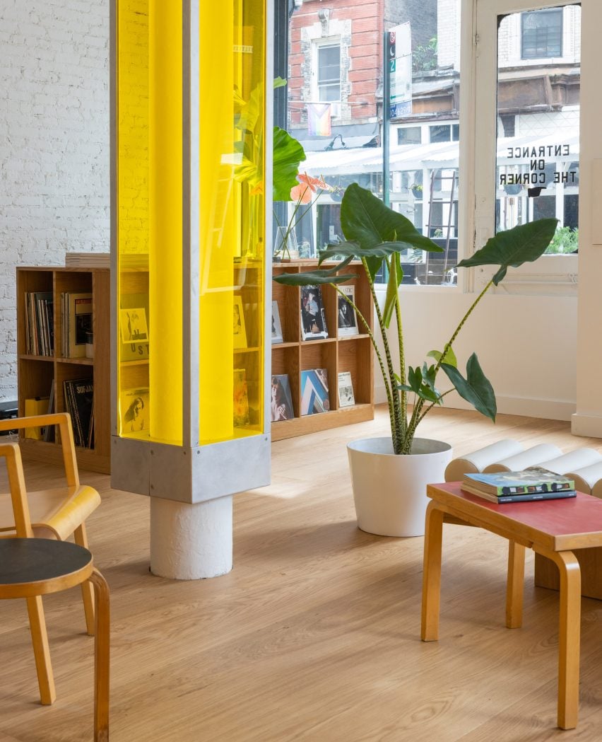
A central column is encased in a translucent yellow box

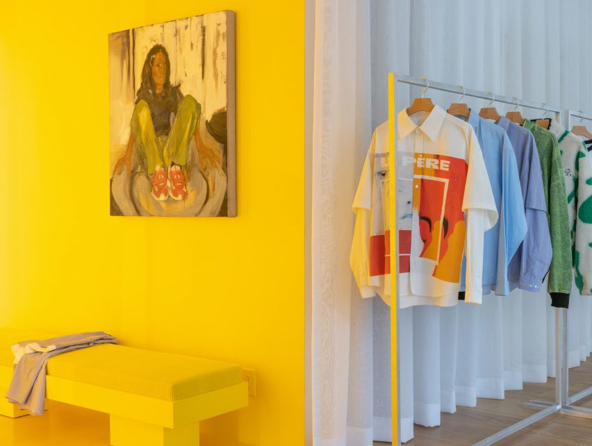
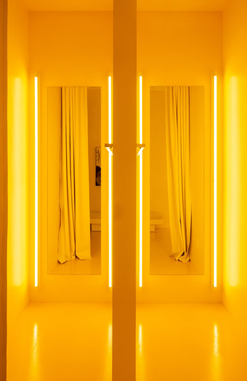
The firm’s approach was to leave the majority of the space white, allowing the boldly patterned clothing to stand out, then highlighting the fitting rooms using bright yellow lighting and surfaces.

A structural column in the centre of the store encased in a translucent box is also fitted with lights to give off a sunny glow.

Yellow fitting room with a rail of clothing to the rightYellow fitting room with a rail of clothing to the right
Yellow lighting installed in the fitting rooms emits an inviting glow

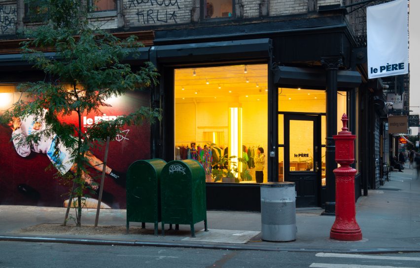
This yellow aura is immediately apparent from the street and is meant to entice passersby to step inside.

Neon lighting has seen a resurgence in retail and other commercial interiors of the past year, appearing everywhere from a Brooklyn cafe to a Calgary chicken shop.

Pair of yellow fitting rooms with tube lights either side of the mirrorsPair of yellow fitting rooms with tube lights either side of the mirrors
The tube lights were installed on either side of mirrors in the fitting rooms, which are also yellow

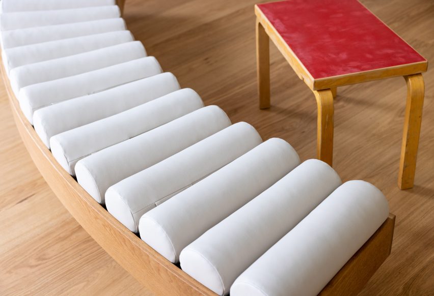
At Le Père, other elements like the tops of vintage Artek furniture are coloured red and black, to borrow from the street signs across the neighbourhood.

Floor-to-ceiling curtains along the back wall create a soft and neutral backdrop for the apparel, which is displayed on industrial metal racks.

Close-up on a curved bench with a row of cylindrical seat pillowsClose-up on a curved bench with a row of cylindrical seat pillows
Custom furniture pieces were designed by BoND and fabricated by Lesser Miracle

Wide-plank wood floors are laid across the main shop floor, which doubles as a space for gatherings, conversations, exhibitions and events.

Custom furniture pieces including a curved bench were designed by BoND and fabricated by Brooklyn design and art studio Lesser Miracle.

“The design scheme blurs the lines between a store, a home and an art studio – a space that is both aspirational and livable, combining contemporary and historic elements as a playful strategy,” said the studio.

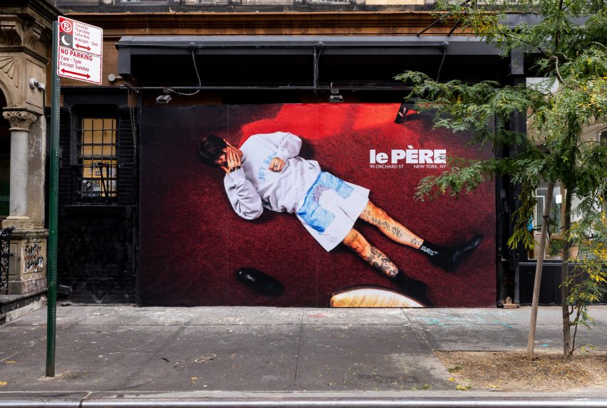
On the exterior, a generous portion of the facade is given over to a giant billboard that Le Père will use to present its seasonal visual campaigns and artwork by the brand’s collaborators.

Billboard across a storefrontBillboard across a storefront
A large portion of the facade is given over to a billboard to display the brand’s campaigns

The debut placement for Fall/Winter 2023 was titled And Sometimes Boys and influenced by the work of Korean visual artist Nam June Paik.

BoND was founded by Noam Dvir and Daniel Rauchwerger, who previously designed the global headquarters and showroom for the Brazilian brand PatBo in New York.

Le Père store exterior on Orchard StreetLe Père store exterior on Orchard Street
The glow from the yellow lighting is designed to entice in shoppers on the Lower East Side. Photo by BoND

The duo earlier overhauled an apartment in Chelsea for themselves, turning the dark, divided space into a light-filled home.

The photography is by Stefan Kohli, unless stated otherwise.


Reference

Commoncraft draws on “beauty in imperfection” for New York cafe
CategoriesInterior Design

Commoncraft draws on “beauty in imperfection” for New York cafe

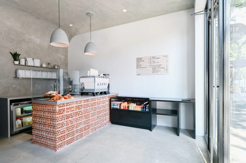
Distressed concrete, rowlock bricks and worn plasterwork create an intentionally unfinished appearance at this cafe in New York City’s East Village neighbourhood, designed by Brooklyn studio Commoncraft.

For its expansion into Manhattan, New Jersey-based Kuppi Coffee Company secured a 350-square-foot space on bustling St Marks Place – its second location.

Cafe with concrete walls, ceiling and floorCafe with concrete walls, ceiling and floor
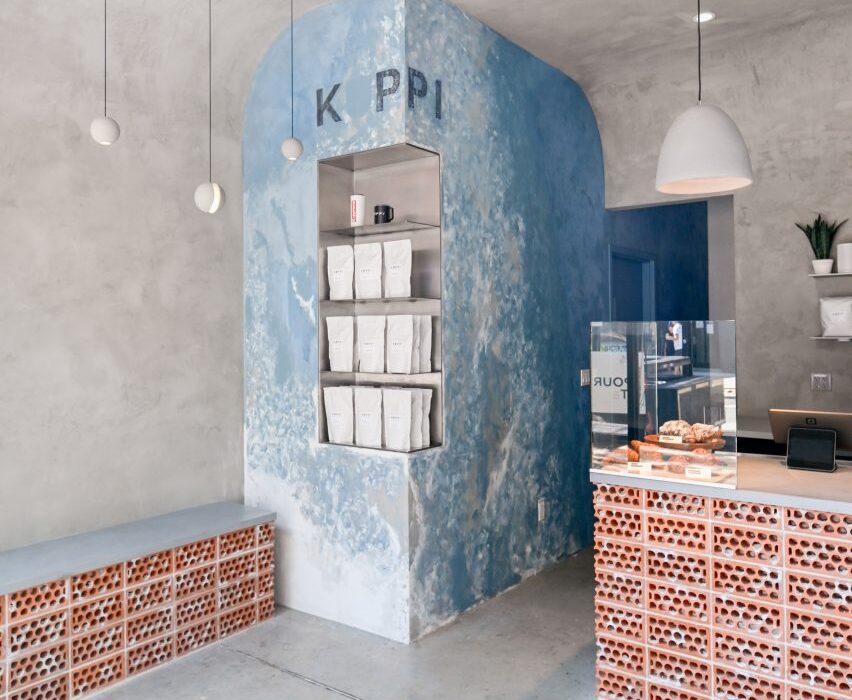
Textured concrete plaster envelops the interior of Kuppi Cafe in the East Village

The compact interior has just enough space for a customer area and the cafe counter, plus a prep area and a WC for staff at the back.

Commoncraft approached the front-of-house space with an ethos akin to wabi-sabi, the Japanese art of “flawed beauty”.

Cafe counter faced with rowlock-course bricksCafe counter faced with rowlock-course bricks
Commoncraft chose materials for the space that appear purposefully rough and unfinished

“Employing a range of rough and raw materials, Commoncraft’s design of Kuppi Cafe seeks out the beauty in imperfection,” said the studio, which was founded by Zach Cohen and Tony-Saba Shiber.

Textured concrete plaster curves up from two perpendicular walls and over the ceiling, enveloping the room together with the concrete floor.

Concrete interior with small brick bench against a wallConcrete interior with small brick bench against a wall
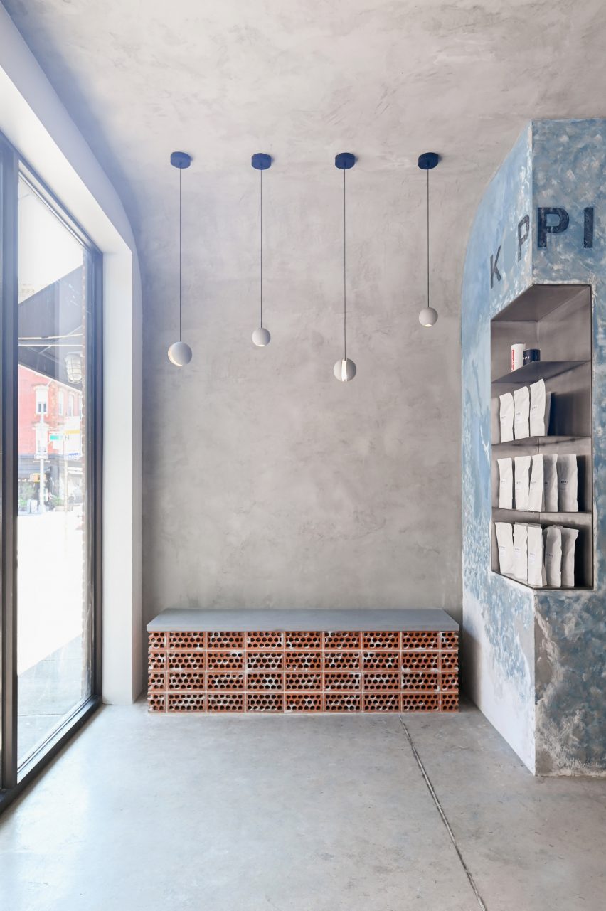
The compact space features a small bench for customers awaiting their orders

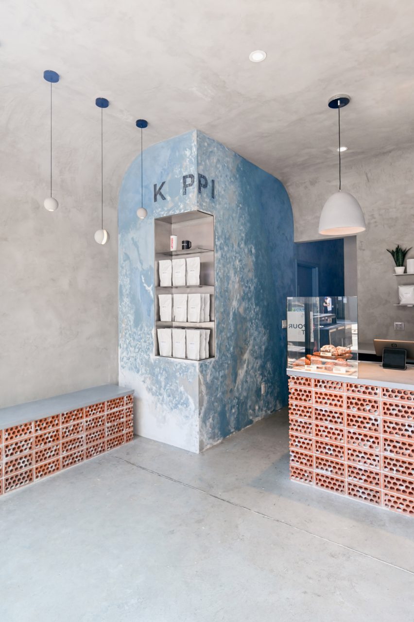
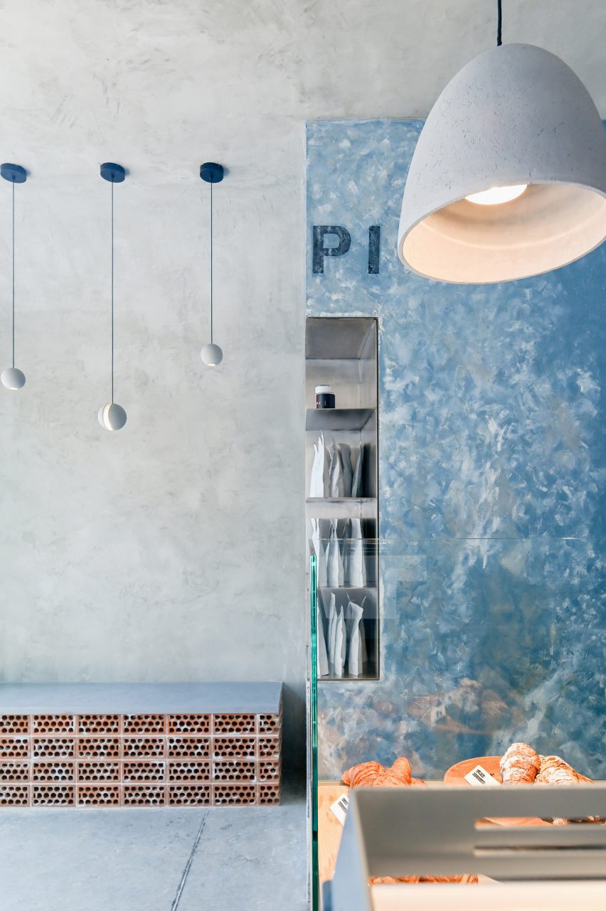
Where these walls meet, a vertical element is wrapped in bluish plaster that’s peeling away to reveal a whitewash beneath.

The Kuppi logo is applied faintly at the top, and stainless-steel shelves for displaying merchandise are cut into part of the pillar’s corner.

Brick cafe counter facing a glass facadeBrick cafe counter facing a glass facade
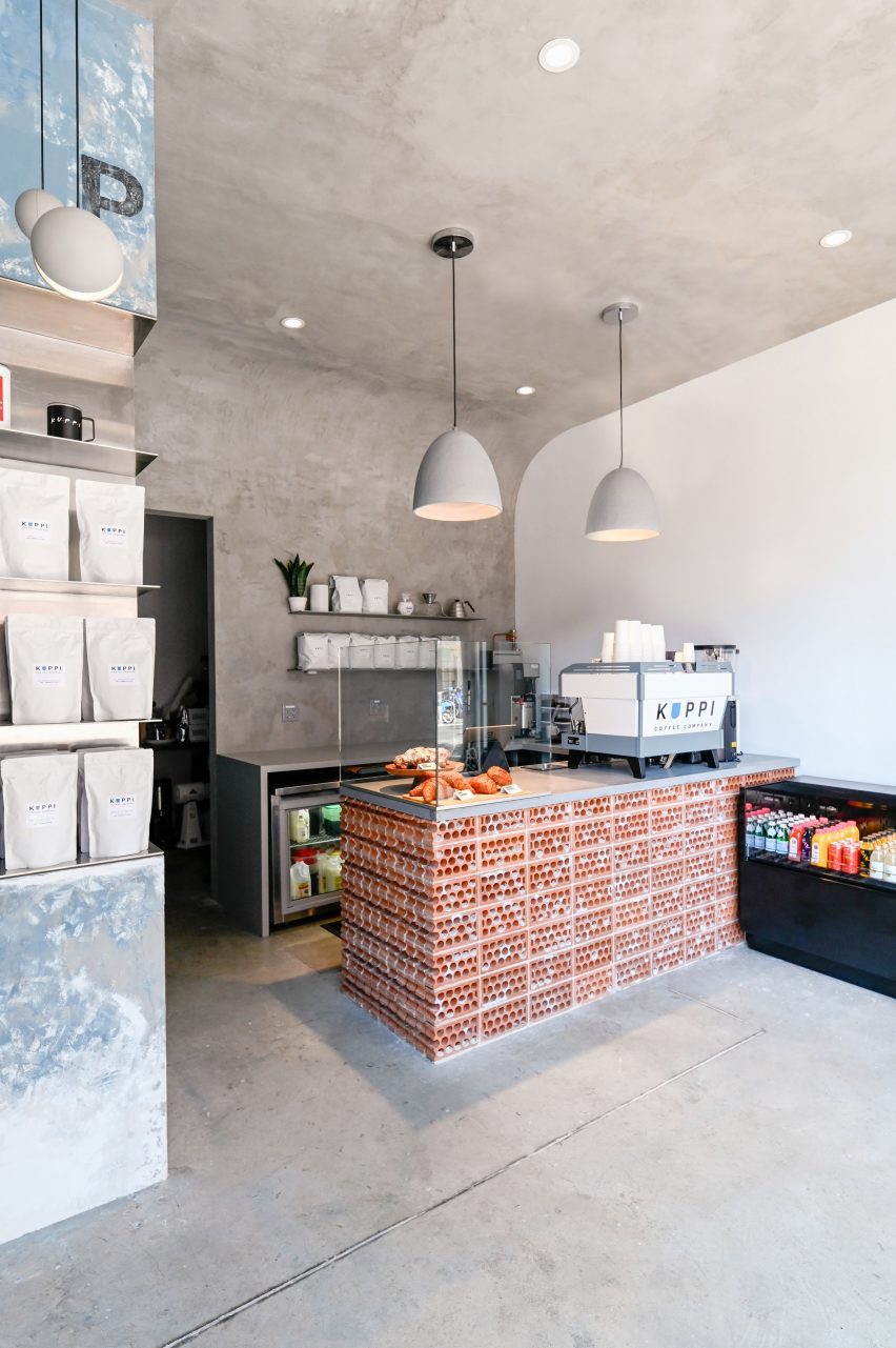
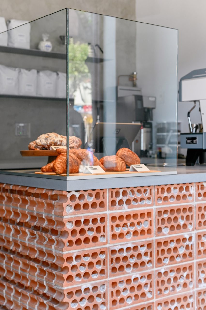
The cafe counter is faced in bricks stacked on their sides to expose their “guts”

Zones for customer interaction – including the service counter and a small bench – are defined by terracotta bricks, which are stacked on their sides in rowlock courses “to expose their core and mortar ‘guts’.”

“Each terracotta volume is terminated by a course of cut bricks, further revealing the rough, imperfect cores,” Commoncraft said.

In such a compact space, the designers have ensured that their concept carries through each of the cafe’s elements.

“The material honesty of the space is further reinforced by a number of small details,” said Commoncraft.

A corner element is wrapped in bluish plasterA corner element is wrapped in bluish plaster
A corner element is wrapped in bluish plaster that’s distressed to reveal a whitewash underneath

These include floating stainless steel shelves behind the counter, a freestanding glass splash guard for baked goods and spherical concrete pendant lights suspended at different heights above the bench.

The cafe is highly visible from the high-traffic street through its fully glazed facade.

A counter terminated by a course of cut bricks, with a glass enclosure for pastries on topA counter terminated by a course of cut bricks, with a glass enclosure for pastries on top
The counter is terminated by a course of cut bricks

New York City is home to thousands of cafes and coffee shops, including many independent establishments with unique interiors intended to entice customers inside.

Among them is another Commoncraft project: a Williamsburg eatery named Gertie designed as a playful tribute to the owner’s grandmother.

The photography is by Andrew Fu.


Project credits:

Client: Kuppi Coffee Company (Kevin and Vivian Kim)
Architecture and interior design: Commoncraft
Plumbing engineer: Alan R Schwartz
General contractor: LTI Construction Corp

Reference

Monolithic green marble carves apartment interior in Milan by AIM Studio
CategoriesInterior Design

Monolithic green marble carves apartment interior in Milan by AIM Studio

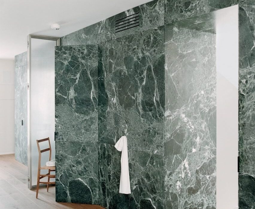
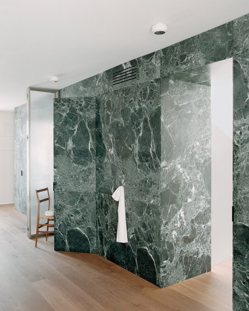
Italian studio AIM has designed a compact, multi-level apartment interior in Milan organised around a floor-to-ceiling Verde Alpi marble partition.

Created in collaboration with local marble artisans Bianco67, AIM Studio used the wall to divide the various functions of Green Nest, aiming to create an elegant backdrop for a dynamic domestic experience.

View of marble partition in Green Nest Apartment by AIM Studio in MilanView of marble partition in Green Nest Apartment by AIM Studio in Milan
Monolithic green marble carves apartment interior by AIM Studio in Milan

“The design challenge [for] Green Nest was to combine the compact size of the dwelling with the desire to create inviting, functional and representative spaces pleasant to live in at all times of the day,” AIM Studio told Dezeen.

“We were looking for a single gesture to characterise the apartment [and were] inspired by the idea of a majestic wall [running] through the heart of the house,” the studio continued. “This massive element, both because of its solid presence and its intrinsic beauty, is the focal point on which the entire design revolves.”

Full height glass divider in Green Nest Apartment by AIM Studio in MilanFull height glass divider in Green Nest Apartment by AIM Studio in Milan
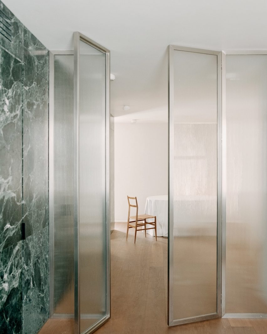
The fluid living spaces can be divided by an operable ribbed glass door

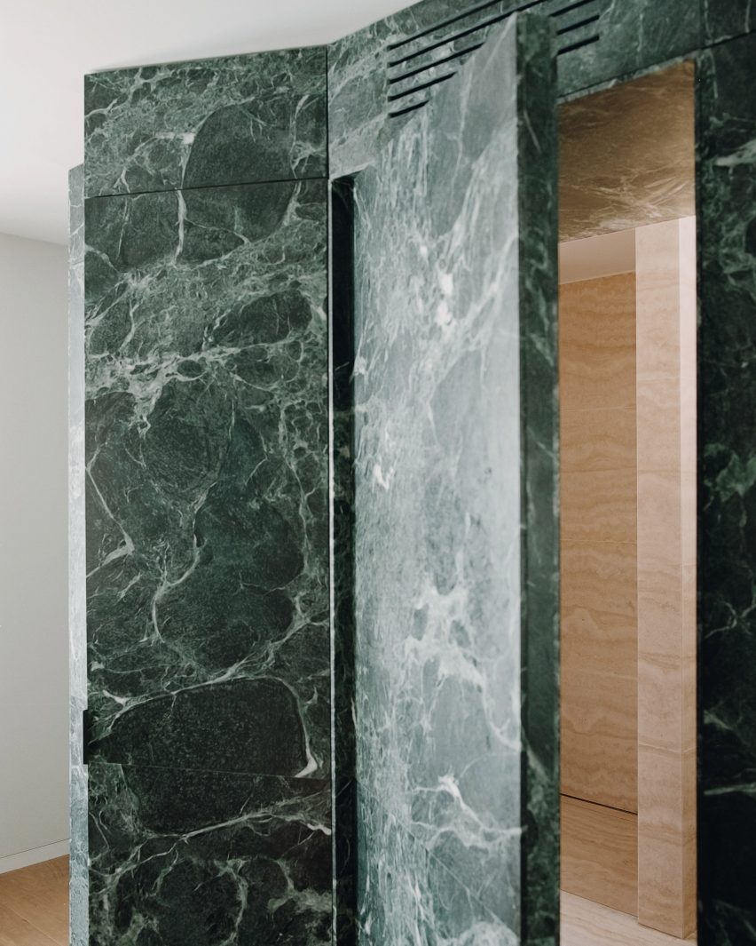
The marble partition was constructed as a permeable threshold between the apartment’s lower level living spaces and a staircase leading to the habitable roof terrace above.

Designed as a single, fluid area, the main living room and bedroom can be separated by full-height ribbed glass doors. 

Green Nest Apartment by AIM Studio in MilanGreen Nest Apartment by AIM Studio in Milan
The studio used the marble wall system to host functional storage and compartment spaces

AIM Studio sought to meet the practical requirements of small-footprint living by using the Alpi marble to conceal a series of deep storage compartments.

“More than a monolith, the volume is an inhabited wall whose thickness is continuously perforated, crossed and interrupted to host the different functions of living,” AIM Studio said.

“[It] was designed as a precious shell but [leaves] nothing to chance in terms of containment and management of the space. Every compartment, every opening, has been designed [for utility].”

Behind the marble partition, the staircase to the rooftop terrace was completed with a central lightwell to draw natural light into the space below.

The studio also integrated large windows into the main living area to encourage an interplay of light on the reflective marble surface and to evoke a chiaroscuro-like effect.

Suspended kitchen system inside Green Nest Apartment by AIM Studio in MilanSuspended kitchen system inside Green Nest Apartment by AIM Studio in Milan
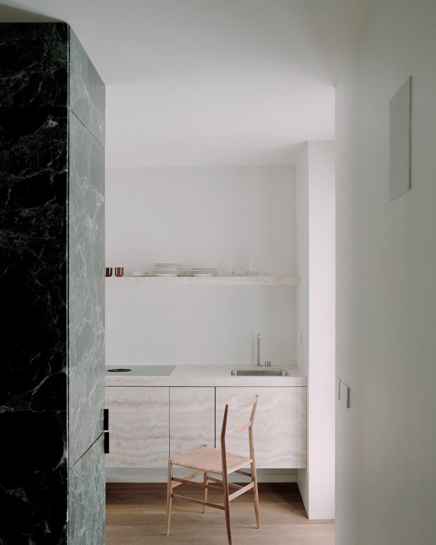
The compact kitchen was formed by suspended travertine joinery

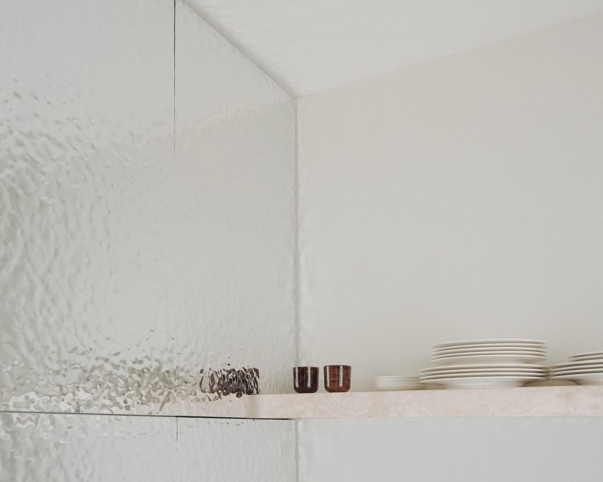
Tucked into a corner of the living room, the kitchen was demarcated by suspended travertine joinery and an embossed mirror feature wall.

Neutral-toned fixtures and restrained furniture pieces were selected to balance the apartment’s modern aesthetic and emphasise the drama of the green marble.

Green Nest Apartment by AIM Studio in MilanGreen Nest Apartment by AIM Studio in Milan
An embossed mirror feature wall was connected to the kitchen nook

“We conceived this project as a search for authenticity; a minimal but at the same time welcoming and functional design created through natural, precious [and] timeless materials.”

“We hope that this search for authenticity will be perceived by those who will inhabit these spaces and that it will translate into family atmospheres and elegant, but convivial, environments.”

Green Nest Apartment by AIM Studio in MilanGreen Nest Apartment by AIM Studio in Milan
The studio selected a neutral material palette to emphasise the green marble gesture

Founded in 2012 by Claudio Tognacca in Milan, AIM Studio has projects spanning across architecture, interior design and product development both in Italy and internationally.

Other recently completed projects in Italy include Antonino Cardillo’s design for “a miniature palazzo” residence near Lake Garda and Humbert & Poyet’s interior conversion of a 16th-century Milanese chapel into a Beefbar restaurant.

The photography is by Simone Bossi

Reference

Method Architecture outfits own Houston studio with vibrant mural
CategoriesInterior Design

Method Architecture outfits own Houston studio with vibrant mural

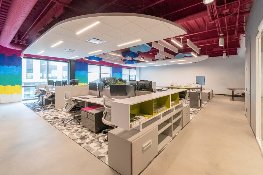
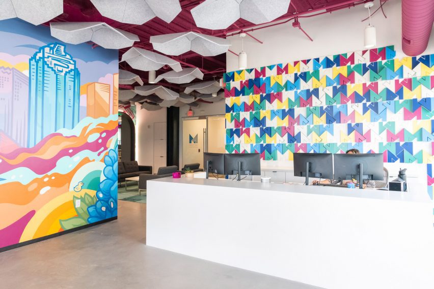
Texas studio Method Architecture has completed an office for itself in Houston with maximalist design, vibrant colours and a mural at its centre.

The 8,612-square foot (800-square metre) studio was completed in 2023 with a reception area, open office plan, private and collaborative meeting spaces and staff lounges.

Colourful interior of studio for Method ArchitectureColourful interior of studio for Method Architecture
Method Architecture has completed its self-designed studio

Located in the mixed-use East River development, designed by architecture studio Page, the office was designed to serve as an inspiration source for the studio’s clients.

“Our approach was to pursue maximalism with the goal of creating an environment where our clients would feel safe expressing their bold and innovative ideas with us,” Ashley Bettcher, Research and Design Specialist with Method Architecture told Dezeen.

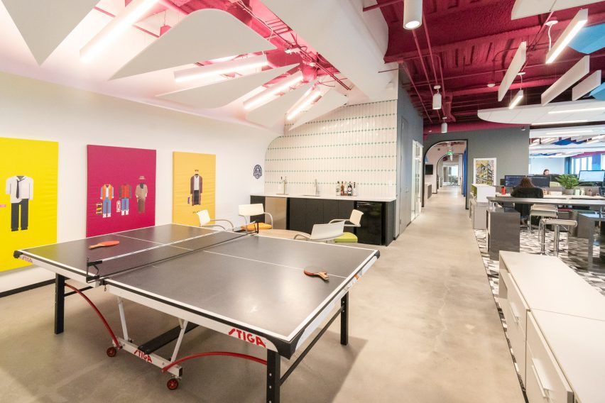
Table tennis table in Method Architecture's studioTable tennis table in Method Architecture's studio
The office was designed to serve as an inspiration source

“Creativity has no limits and great design doesn’t necessarily need to cost more. Method’s new Houston office perfectly encapsulates that mantra.”

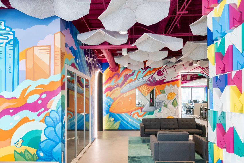
The “ego-free” focus of the design is a nearly 50-foot multi-wall mural by local artist David Maldonado, known for creating nearly 20 pieces of public artwork throughout Houston.

Multi-wall mural by David MaldonadoMulti-wall mural by David Maldonado
David Maldonado created a multi-wall mural for the studio

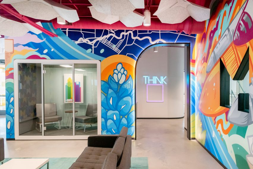
With pops of magenta, cobalt, and yellow, the mural features icons from the city and state like the skyline, a rocket for Johnson Space Center, a bluebonnet as the Texas state flower, and the neighbouring Buffalo Bayou.

The artwork also slips in custom motifs representing the studio, such as Method’s rubber duck mascot.

Acoustic baffles suspended from the ceilingAcoustic baffles suspended from the ceiling
Light grey flower-like acoustic baffles hang from the ceiling

“This feature piece of artwork helps set the tone for the remainder of the office including bold colors, geometric patterns and shapes and a secondary mural designed and installed by Maldanado featuring drip paint in mirroring colorways located at the back of the office,” the team said.

The mural is complemented by a 3D-printed wall installation behind the reception desk composed of the studio’s signature “M” logo and the raw ceiling with exposed mechanical lines all painted a vibrant shade of fuchsia.

Half-arched portal at Method Architecture officeHalf-arched portal at Method Architecture office
Clients pass through a half-arched portal

Light grey flower-like acoustic baffles hang from the ceiling adding to the maximalist design. Light blue bicycles are mounted on one wall as another unique installation.

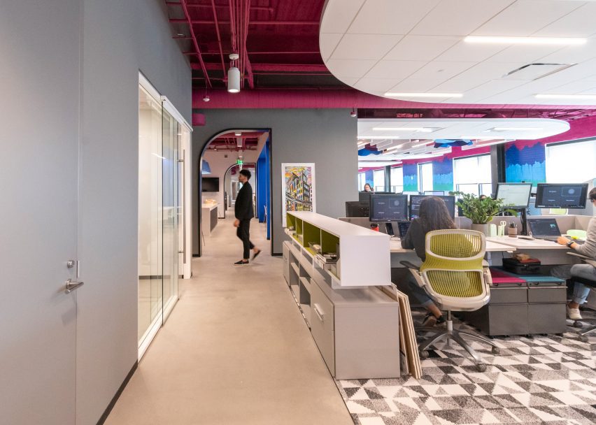
From the reception area lounge, clients pass through a half-arched portal – created with custom millwork and embedded lights – into the main office space which includes rows of desks over custom greyscale carpet.

Desks and geometric carpet in self-designed studioDesks and geometric carpet in self-designed studio
Hotel desk stations accommodate hybrid work styles

Hotel desk stations accommodate hybrid work styles for both in-office and at-home work.

“Cozy architectural work booths are nestled amid the bustling breakroom and office areas, offering a quiet refuge for more private work, private conversations or meals with coworkers,” the team said.

The workspace is flanked by six meeting rooms: a large creative conference space, three medium-sized conference rooms and two smaller huddle spaces.

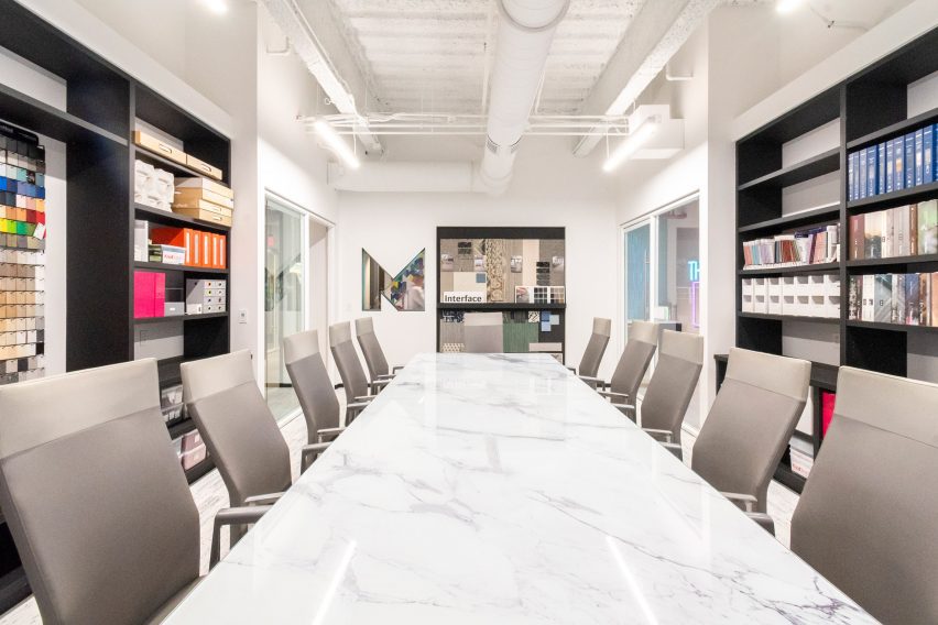
The all-white conference room was left intentionally blank to showcase the client’s material selections with tunable white lights to adjust the light temperature for each project.

M-shaped window cutoutM-shaped window cutout
An M-shaped window cutout opens the conference room to the rest of the office

An M-shaped window cutout opens the conference room to the rest of the office.

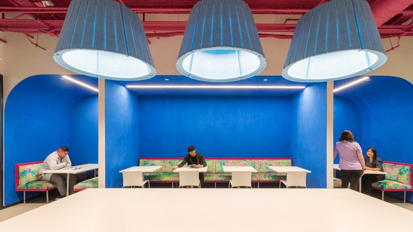
In the break room, bright blue suede fabric adorns the walls to provide an unexpected texture and pale blue lamp shades – reminiscent of the shape of inverted cupcake liners – serve as a geometric juxtaposition to the rounded banquette boxes.

Bright blue-walled break roomBright blue-walled break room
Bright blue suede fabric adorns the walls in the break room

“Plush, psychedelic-inspired fabrics in meeting booths and distinctive light fixtures keep the space feeling light and fun to inspire creative design,” the studio said.

In addition to being designed for flexible workflows and teams, the space features multiple sustainable and WELL features like ample daylighting, repurposed materials and ergonomic furniture.

Other recently completed projects in Houston include Nelson Byrd Woltz’s grassed park that bridges a six-lane highway and Modu’s design for a wellness building with a self-cooling exterior.

The photography is by Ana Larranaga, Method Architecture.


Project credits:

Architecture: Method Architecture
MEP: Telios Engineering
General contractor: Burton Construction
Furniture: AGILE Interiors, MDI, OP,
Flooring: Interface, Shaw Contract
Tile: Trinity Surfaces, La Nova
Textiles: Knoll Textiles
Masonry: Upchurch Kimbrough
Demountable partitions: DIRTT
Countertops: CAMBRIA
Mural: David Maldonado
Lighting: Lighting Associates Inc.
Signage: ARIA Signs


Reference