Promotion: in 2023 Bentley Motors launched an architecture and design-centred travel experience around Scandinavia, with highlights that included a stay at Wingårdhs’ forest hotel in Sweden and a tour of BIG’s studio in Copenhagen.
The Extraordinary Journey Scandinavia tour was one of a series of curated travel experiences presented by Bentley in 2023, offering the opportunity to explore attractive destinations from behind the wheel of its luxury cars.
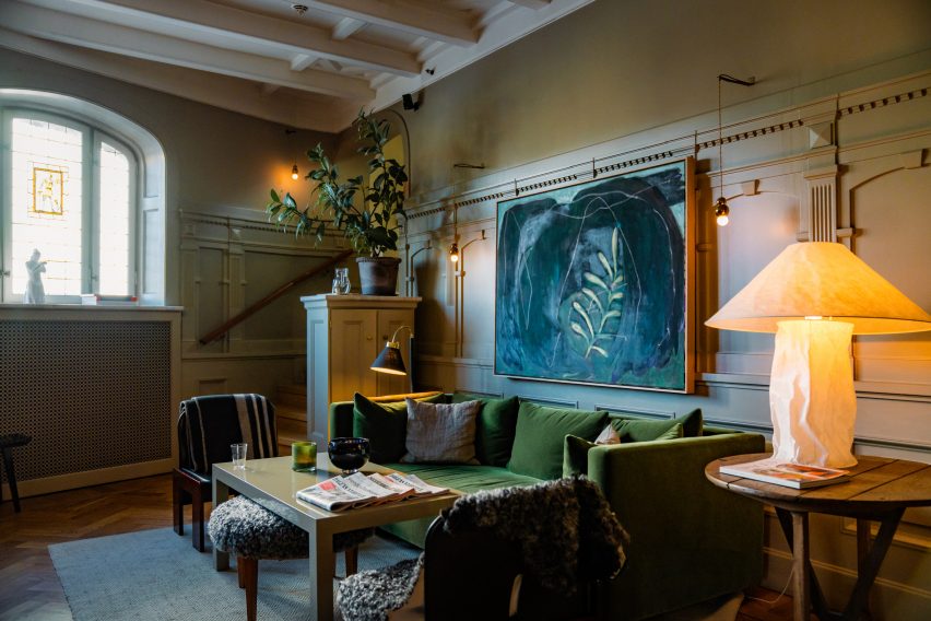
The five-day, four-night tour started in Stockholm, where guests were collected from the airport in a chauffeured Bentley and taken to their first night’s stay in the world-renowned Ett Hem hotel.
The first night’s stay was at Stockholm’s Ett Hem hotel
With interiors created by designer Ilse Crawford, the hotel is known for merging luxury with a feeling of home, with spaces that encourage guests to relax and mingle as if at a manor house.
The hotel hosted a welcome reception, dinner in the library and a nightcap for the small party of guests on day one to get to know each other.
On day two, attendees took the wheel of one of several Bentley models on offer and began the journey south through Sweden’s forests, with Scandinavia’s finest architecture and design destinations guiding the way forward.
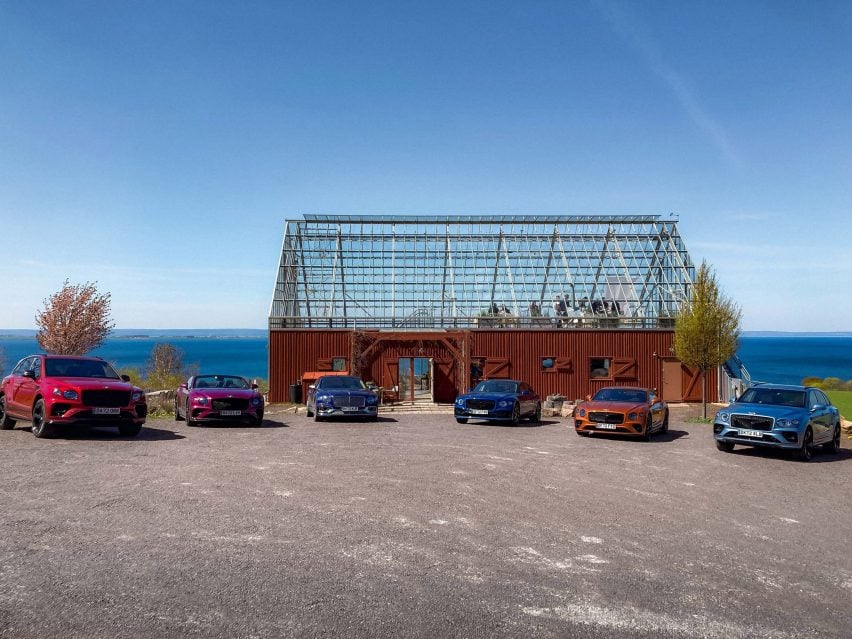
For lunch on day two, attendees stopped at Naturehouse
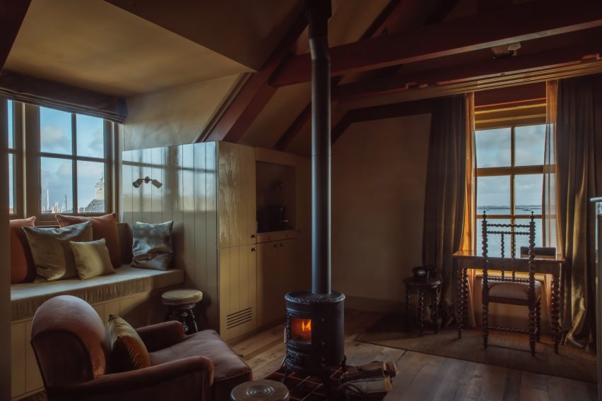
For lunch, the tour stopped at Naturehouse, a sustainability-focused lakeside spa by Tailor Made Arkitekter that merges the forms of a barn and a greenhouse, before continuing to reach the Trakt Forest Hotel in Småland in the afternoon.
Designed by Wingårdh architecture studio, the hotel features just five suites that are raised high into the treetops on stilts, giving guests the chance to feel immersed in nature.
The suites are “a true representation of Bentley’s design values of sustainability, materiality, and innovation” said the brand, and guests had the opportunity to relax in the sauna or hot tub before joining the hotel owners Sandra and Mattias Sälleteg at a drinks reception.
The evening also included dinner in a forest near the hotel, which was made by Michelin star chef Niklas Ekstedt and celebrated natural ingredients coming together “to create something greater than the sum of its parts”.
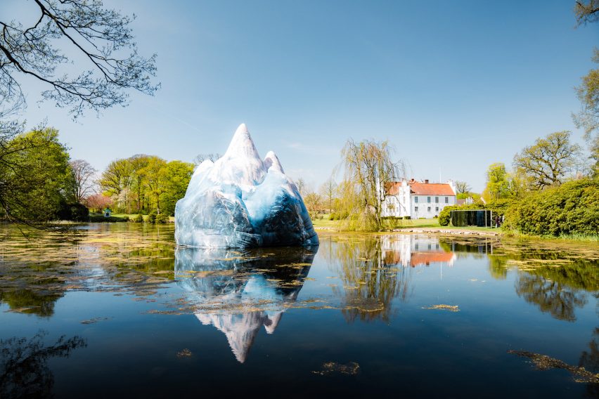
Lunch on day three took place at Wanås Hotel and Sculpture Park
Day three saw the group continue the drive south through Sweden’s forests and stop for lunch at Wanås Hotel and Sculpture Park, built around two converted stone barns with interiors by Kristina Wachtmeister.
They then drove on through Malmö and across the Öresund Bridge, the longest bridge in Europe, connecting Sweden and Denmark, before switching to chauffeured transport once again for the final stretch of the journey to Copenhagen.
With accommodation at the Nimb Hotel in Tivoli Gardens, guests had ample opportunity to explore Copenhagen, including dinner at a world-renowned Nordic restaurant and then a city tour hosted by the Danish Architecture Centre.
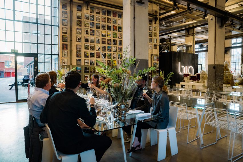
Day four included a tour and lunch at Bjarke Ingels Group’s studio
There was also a tour of Bjarke Ingels Group’s studio, hosted by a member of the team who gave insights into their creative practice. Lunch was also held within “the beating heart” of the office.
Bentley‘s Extraordinary Journey continues in the UK in 2024 with a programme where attendees will experience a scenic route starting at Crewe, the home of Bentley Motors, to The Macallan Estate in Speyside, Scotland. The UK programme runs from 19 to 22 August and 2 to 5 September.
For more information and to register interest, visit the Bentley website.
Partnership content
This article was written by Dezeen for Bentley as part of a partnership. Find out more about Dezeen partnership content here.
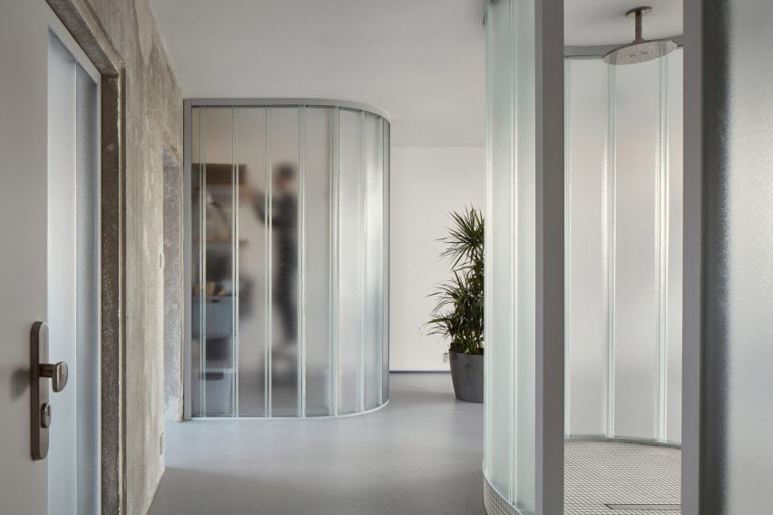
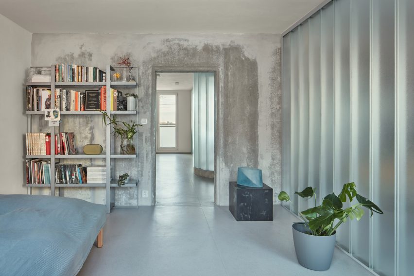
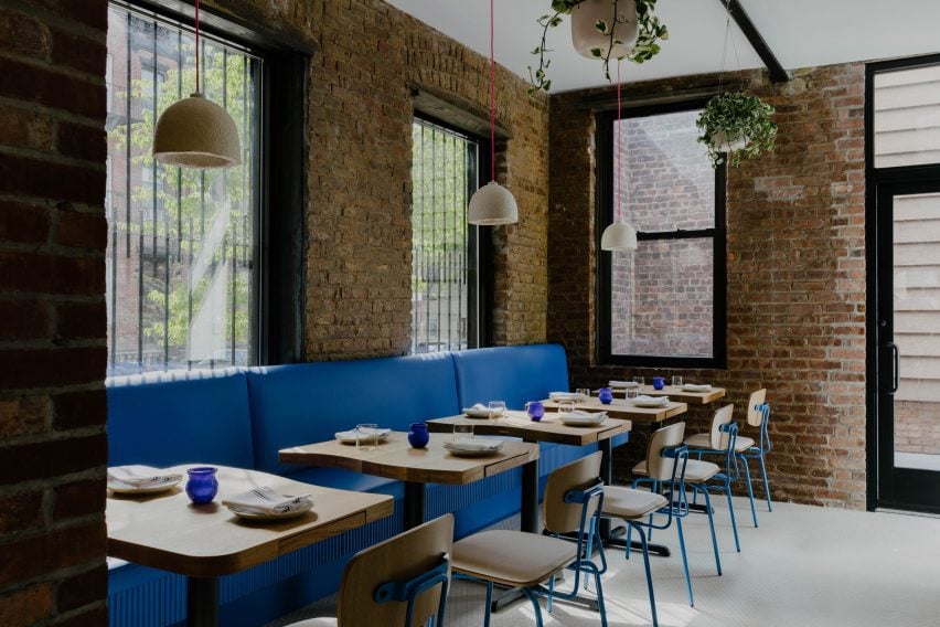
Czech architecture studio Neuhäusl Hunal has renovated a prefabricated apartment in Prague, turning it into an open-plan home and workspace for sculptor and glassworker Vladimír Bachorík.
Neuhäusl Hunal opted for curved translucent glass partitions in place of doors to divide the interior spaces and create a sense of openness and fluidity.
U-profiled glass partitions divide the interior spaces
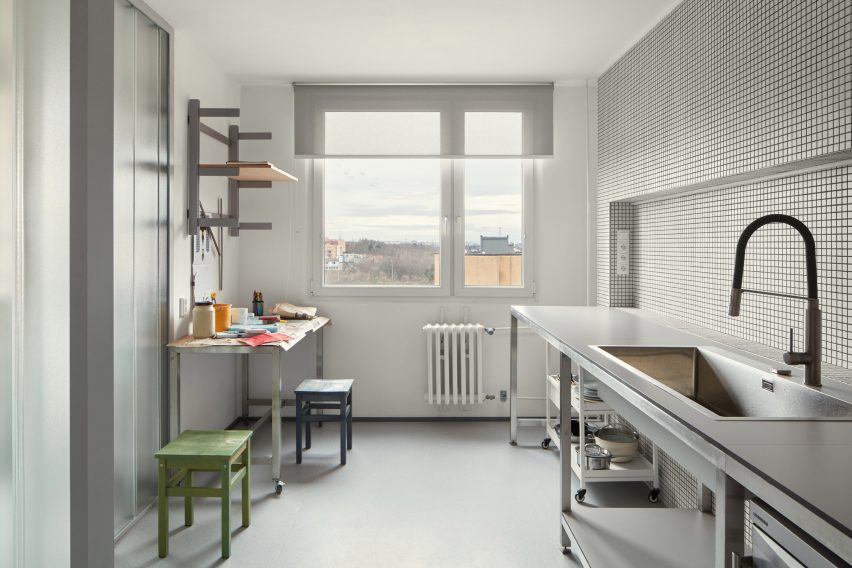
In order to maximise floor space, the studio removed all non-load-bearing elements, leaving just a single load-bearing concrete wall that cuts through the living and workspaces.
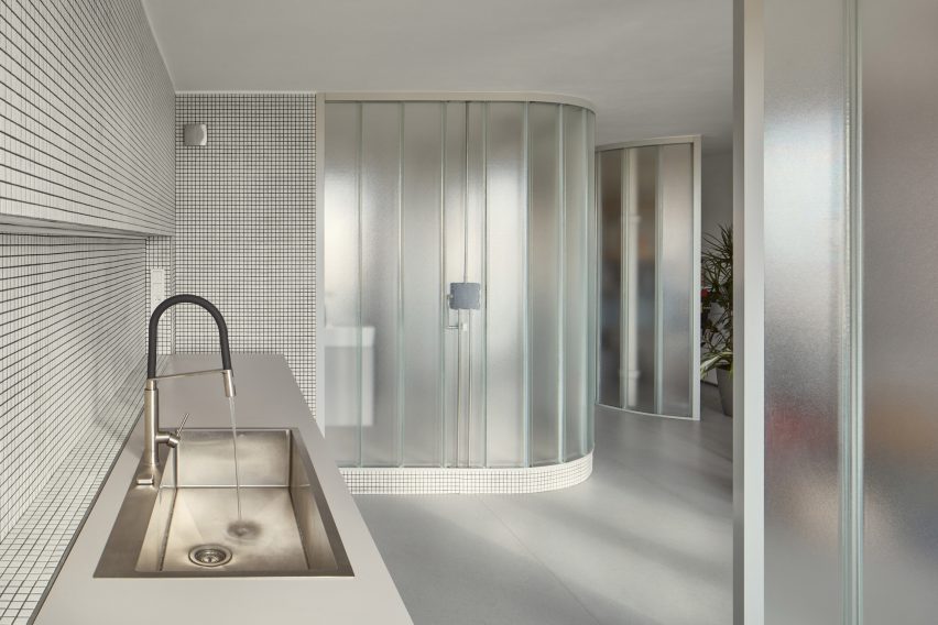
Three U-profiled glass partitions were then used to enclose a cloakroom, storage space and kitchen, while the remaining floor space can be used flexibly.
An existing load-bearing concrete wall separates the living and work spaces
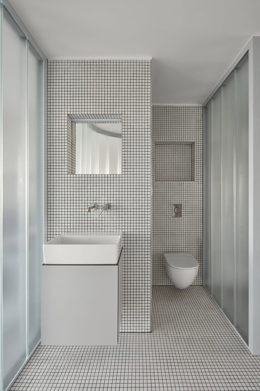
A centralised, curved bathroom, raised by a small platform for waste management, is similarly enclosed by translucent glass panels and protrudes into the main space.
The bathroom interior was lined extensively with white ceramic tiles and features a walk-in shower.
Meanwhile, matching ceramic tiles were also used in the kitchen, which doubles as a work area for the artist.
White mosaic tiles line the kitchen and bathroom
“To design the maximally open and flowing space without doors, infrastructure, besides statics, was a key constraint, which defines the location of the single-almost-enclosed space: the bathroom,” studio architect and founder David Neuhäusl told Dezeen.
“Therefore we emphasized [the bathroom] as the most prominent element in the apartment to create a strong spatial experience,” Neuhäusl continued.
The interior material palette was defined by the stripped concrete wall as well as the translucent panels and ceramic tiles, set on a background of white plaster walls and grey-toned rubber flooring.
Metal furniture and shelving was used throughout the minimalist interior, with cubic plinths used to display Bachorík’s glasswork around the space.
Existing windows draw daylight into the interior spaces
Daylight shines through the existing windows at either end of the apartment and penetrates the glass partitions to create a brightly lit interior, while carefully positioned strip lights and spotlights provide artificial lighting.
“These translucent glass blocks of high order ensure the penetration of light and create identity of the apartment,” Neuhäusl explained.
“Their materiality and character naturally refer to the client’s lifelong work. They can be naturally composed in curves to formulate the softly shaped partitions.”
Metal furniture is used throughout the space
Neuhäusl Hunal is an architecture studio founded by David Neuhäusl and Matěj Hunal in the Czech Republic.
Other projects recently completed in the Czech Republic include a winery topped with a sweeping concrete roof and an angular black extension to a neo-gothic church.
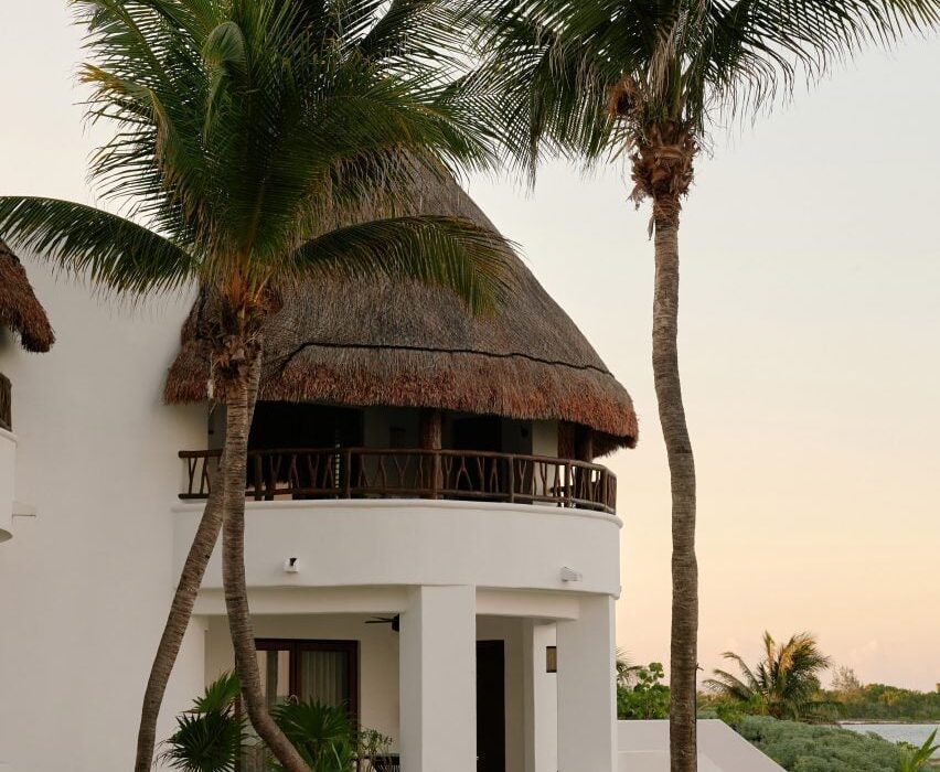
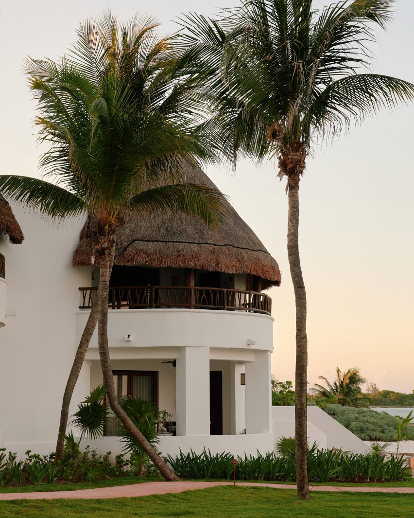
Interior designer Tara Bernerd worked with local artisans when dressing the cavernous rooms at the Maroma hotel in Riviera Maya, Mexico, which were renovated to reflect hacienda-style living.
Housed within white stucco volumes arranged on a coastal plot between lush jungle and the Caribbean sea, the longstanding Maroma, A Belmond Hotel was renovated earlier this year but retained much of its traditional-style architecture.
The Maroma hotel is housed within rounded stucco, palapa-topped volumes
Bernerd and a team of local artisans conceived the eclectic interiors to reflect the palapa-topped structures, creating a range of bespoke curved furniture and ornaments.
“The buildings themselves are organic in shape and form and were originally positioned in response to the sacred Mayan geometry,” she told Dezeen.
“We sought to retain and enhance the beauty of the hotel’s original character.”
Tara Bernerd sought to reflect this “Mayan geometry” in the interior design
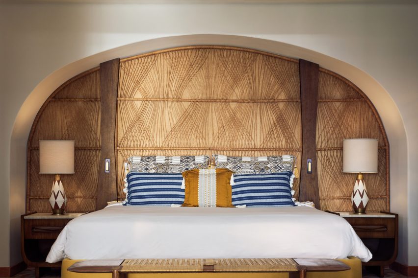
Among the custom pieces are over 700,000 tiles hand-painted and crafted by ceramicist José Noé Suro using clay from Mexico’s Jalisco region.
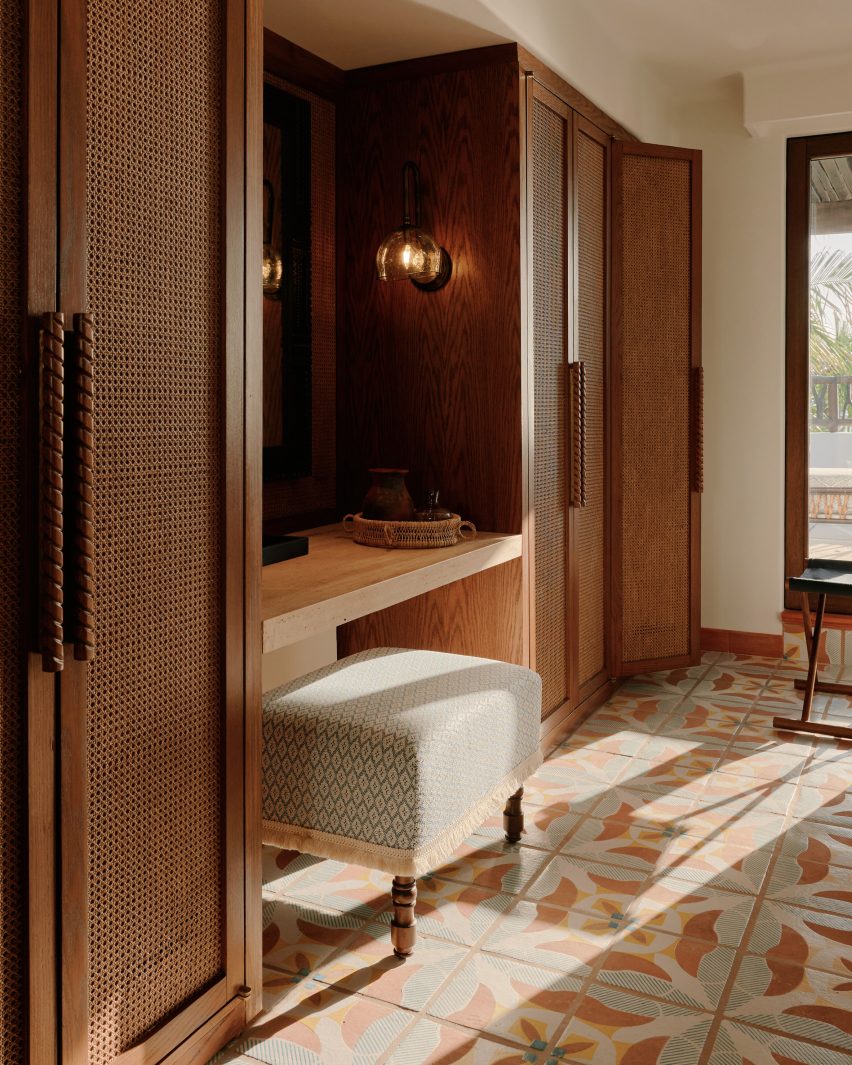
The tiles cover the floors in all of the 72 guest rooms, which are characterised by rattan wardrobes and amorphous timber furniture pieces – 80 per cent of which were hand-carved.
The guest rooms are characterised by rattan accents and blown glass
Artisan Max Kublailan blew bulbous glass sconce lights, which feature throughout the rooms and are reminiscent of glowing gemstones.
“It was a joy working with the local artisans who brought our designs to life and the process was more like a conversation between artisan and designer, with each inspiring and on occasion challenging the other,” reflected Bernerd.
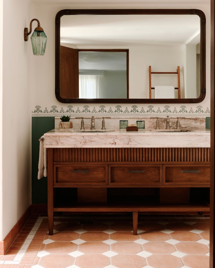
Eclectic design choices were also made for the guest bathrooms
The entrance to each guest room also features individual ceramic, painted signs informed by traditional Lotería cards, which are used to play a similar game to bingo in Mexico.
“We built up the layers of design within the spaces, with rich pops of colour being brought in through the tiled or mosaic floors, the use of decorative tiles in the walls and dado rail as well as cushions and fabrics,” explained Bernerd.
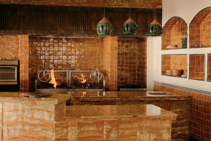
An open kitchen clad in glazed ceramic tiles features in one restaurant
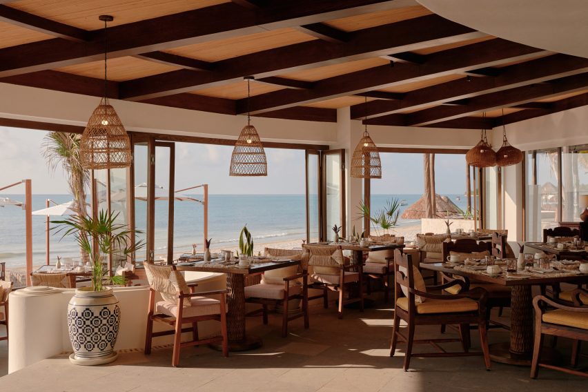
Maroma’s two restaurants follow a similar design, with accents such as rattan pendant lights and tables featuring textured legs that give the appearance of tree trunks.
An open kitchen clad entirely in caramel-hued glazed ceramic tiles was tucked into a corner of the Woodend eatery while Casa Mayor includes clusters of hand-painted plant pots.
The other restaurant includes painted potted plants and oversized rattan lampshades
Throughout the hotel, cavernous alcoves were also dressed with custom interiors made up of stone, clay, wood and natural fibres.
“Location and layout were key and I am especially proud of how we have managed to reimagine previously under-utilised areas and have created a balance between unique, dramatic spaces and cosier, slightly hidden areas,” said Bernerd.
Traditional Yucatán doors with dense timber frames and chandeliers made from clusters of seashells were chosen to respond to Maroma’s setting.
The hotel’s central swimming pool was renovated with Sukabumi turquoise tiles handmade from volcanic stone to emulate the cenotes – water-filled sinkholes formed by the collapse of limestone – found in the Yucatán Peninsula.
Cavernous corridors reflect the hotel’s architecture
“In essence, we wanted to create something that was effortlessly serene and had the feeling of a chic home,” said the designer.
“So we also drew inspiration from traditional hacienda-style living to create a relaxed, almost residential vibe throughout the resort and evoke a sense of connection, unity and flow between all of the public area buildings,” she concluded.
The central swimming pool was informed by cenotes
The British designer is the founder of the London-based architecture and interiors office Tara Bernerd & Partners.
Elsewhere in Mexico, local firms Productora and Esrawe Studio designed a San Miguel de Allende hotel with planes of green tile. Architect Alberto Kalach added a series of vaulted, brick arches to a resort in Oaxaca.
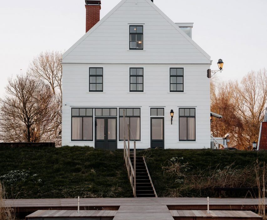
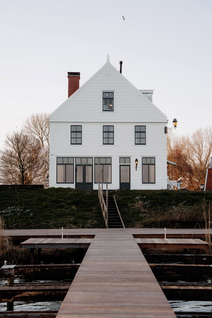
Dutch hospitality company Aedes has pushed Amsterdam’s building restrictions to their limit to convert a heritage-listed tavern into an all-electric hotel.
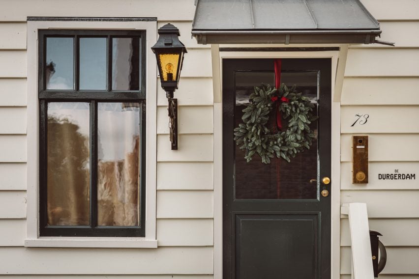
De Durgerdam hotel occupies one in a row of almost identical gabled buildings perched on a seawall on lake IJmeer, which together make up the small village of Durgerdam near Amsterdam.
Constructed in 1664, the building originally served as an inn for sailors and fishermen, its white-painted clapboard facade acting as a beacon for boats that could pull right up to its deck in the Zuiderzee bay of the North Sea.
De Durgerdam hotel is set on a seawall outside Amsterdam
Due to recurring flooding, the village was cut off from the sea with the construction of a dam in 1932, turning the bay into a freshwater lake while the inn became a ferry terminal and later a cafe and restaurant.
Following a five-year restoration led by Aedes, the building reopened this year as a boutique hotel with 14 rooms and interiors designed by material research studio Buro Belén.
De Durgerdam, the first hotel to be owned and operated by the Aedes, provided an opportunity to see how far heritage restrictions could be stretched to make the building as sustainable as possible.
The hotel occupies a former inn with a white-painted clapboard facade
“What we have done in terms of sustainability is fairly innovative for a historic building of this kind,” said founder Paul Geertman. “We have pushed the boundaries as far as we could to reduce its environmental impact.”
The 17th-century building now runs on renewable energy – provided by 32 rooftop solar panels and a green energy supplier – and its operations are entirely gas-free.
This was made possible via meticulous insulation and four separate heat pumps, which cover all of the building’s heating and cooling needs in lieu of a traditional boiler.
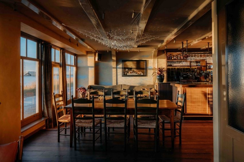
The ground-floor restaurant integrates a small lounge area
With limited space in the old inn, the heat pumps are dotted across the garden where they are hidden in tiny outbuildings complete with gables and clapboards, which Aedes constructed especially to work around local building codes.
“A heat pump in Amsterdam normally has to be inside of your building, otherwise you just don’t get the licence,” Aedes head of sustainability Esther Mouwen told Dezeen. “So we had to build a house around them.”
The windows posed a similar struggle, as the municipality rarely allows the distinctive hand-blown glazing of heritage buildings to be changed.
But Aedes was able to source an energy-efficient triple-glazed model with a pattern of tiny dots across its surface, which creates the optical illusion of looking at rippled glass.
An Ingo Maurer chandelier hangs above a vintage sharing table in the restaurant
The renovation itself was a balancing act between changing as little as possible about the building while ensuring that it could survive for another 500 years.
Although from the outside, the three-storey building looks almost exactly like it did when it was first constructed, large parts of its structure had to be carefully dismantled and reconstructed.
“The building had deteriorated over time and the structural integrity had been compromised in some areas,” said Aedes marketing manager Monica Hanlo.
“The interiors had to be carefully renovated and restructured, with beams and stones disassembled, inspected and either reused or replaced.”
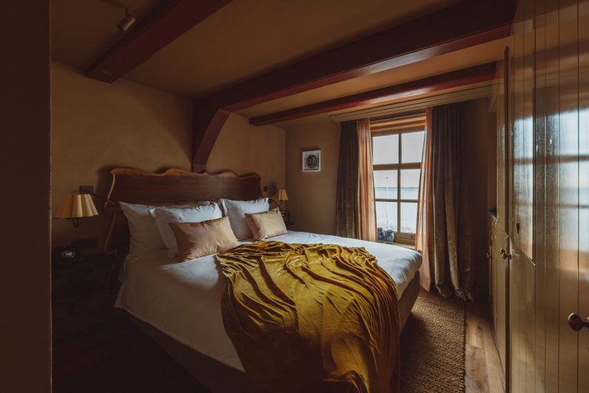
The bedrooms are finished in a moody colour palette
Where timber could no longer serve a structural function, it was converted into floorboards alongside reclaimed wood sourced from old church pews and demolished timber houses from Austria.
This wood was smoked for 18 hours to create a rich colour that permeates the timber rather than sitting on top like a stain, which would wear down over time and need re-upping.
“Normally, they do not smoke it that long,” explained Buro Belén co-founder Lenneke Langenhuijsen. “Now it will patina super beautifully because all throughout, it became this really dark wood.”
“It was important to us to make well-based decisions, maybe invest a bit more but it’s a long-lasting product that ages with the hotel and makes it even nicer over time.”
De Durgerdam marks the first time that Buro Belén has applied its material research approach to an entire hotel interior.
“We did a lot of research so that the hotel also feels very grounded in what it once was, in its place,” Langenhuijsen said. “And if you look at the Zuiderzee, it was a very important part of the Netherlands, all the villages around made their living from it.”
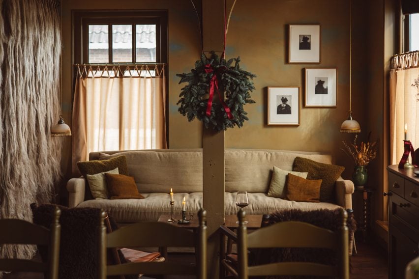
Layered throughout the hotel’s interior are references to this seafaring history, delivered via an eclectic mix of new, vintage and bespoke elements created by Buro Belén.
A rusty red colour was used to highlight the building’s beams
In the ground-floor restaurant De Mark, framed photos provide a glimpse of the inn’s evolution over the years.
A shaggy curtain frames the lounge area near the entrance, made from traditional flax rope and raw flax fibres that were once used by local fishermen to make their nets.
Weather permitting, patrons can dine outside on the jetty atop lake IJmeer or sit at a long sharing table that forms the centrepiece of the restaurant.
The same colour dominates the guest bathrooms
Overhead, Buro Belén suspended Ingo Maurer’s chandelier Lacrime del Pescatore – or “fisherman’s tears” – made of sparkling crystals that droop from a nylon net.
Its name, according to Langenhuijsen, acts as a subtle reference to the plight of the local fishers, who lost their livelihoods as the village was cut off from the sea.
Upstairs, the inn accommodates three suites and one room, accessed via the building’s untouched original staircase, which still shows the deep grooves that were worn into the wood by thousands of shoes over the centuries.
Ten of the hotel’s 14 rooms are housed in a garden annexe added in 2006
De Durgerdam’s remaining 10 rooms are housed in a garden annexe that was added to the building in 2006. All share a moody colour palette that was drawn from the craft and building traditions of the Zuiderzee.
A rusty red colour – reminiscent of sails treated with tree-bark tannins to prevent rot – was used to highlight key architectural features like the building’s timber beams and the monochrome bathrooms.
Similarly, the inside of the bedrooms’ Shaker-style built-in wardrobes was painted in a sky blue colour that nods to a traditional paint made from buttermilk, chalk and a particular blue pigment, historically used by locals across cupboards and box beds to repel insects.
The hotel’s heat pumps are hidden in tiny gabled outbuildings
Even though construction is complete, Aedes is still working on reducing the hotel’s operational footprint, with the aim of getting 80 per cent of the way towards being zero waste by the end of next year.
The company is also looking into a reliable way of offsetting the building’s whole-life carbon emissions via a reforestation scheme but has so far struggled to find a reliable company that can guarantee measurable, traceable carbon removals.
“We’re not fans of offsetting, because we think we have to make sure we don’t create emissions,” Mouwensaid. “But it’s not possible yet.”
Aedes has previously converted Amsterdam’s art deco Bungehuis building into a Soho House members’ club.
The photography is by Chantal Arnts and Studio Unfolded.
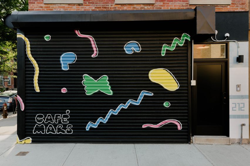
Bright colours, neon lighting and expressive furniture create a playful mood inside this Brooklyn restaurant, designed by local studio Format Architecture Office.
Cafe Mars is an Italian eatery located in Gowanus, founded by co-chefs Jorge Olarte, and Paul D’Avino – whose grandfather lived across the street when he first emigrated from Campania in 1901.
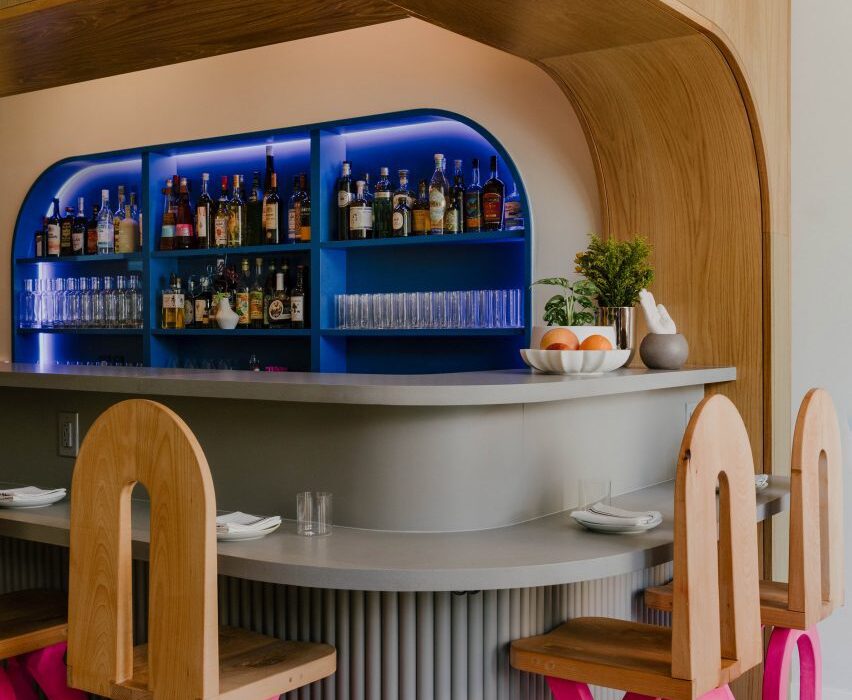
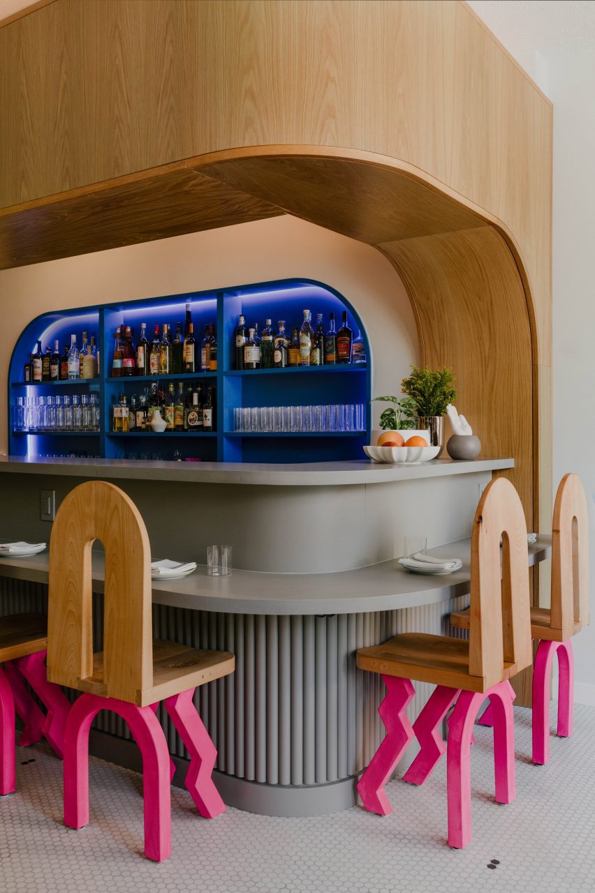
Playful furniture throughout Cafe Mars includes chairs with hot-pink arched and zigzag legs
Honouring these roots, the restaurant is designed as a celebration of all things Italy: from the Memphis design movement of the 1980s to the glamorous Amalfi Coast.
“It was important to connect the intent of the culinary experience with the intent of the spatial experience,” said Format principal and co-founder Andrew McGee.
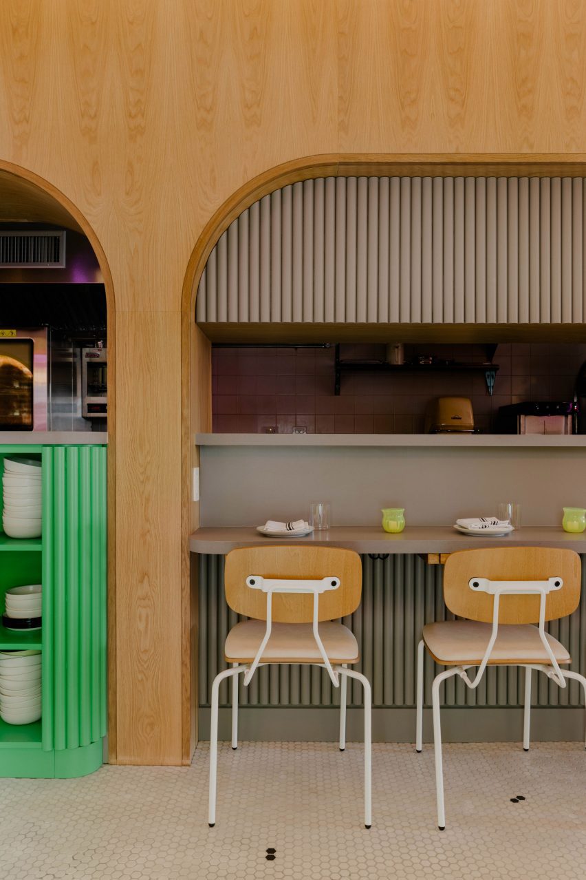
The bar and open kitchen are framed by white oak panels
“If the driving force of the menu was to showcase knowledge and love of traditional Italian cuisine, twisted and subverted at just the right moments to create something playfully rebellious and unusual, it seemed only natural to reference the character and movement in [Ettore] Sottsass and the Memphis style with a similar vintage in the architecture and design realm,” he continued.
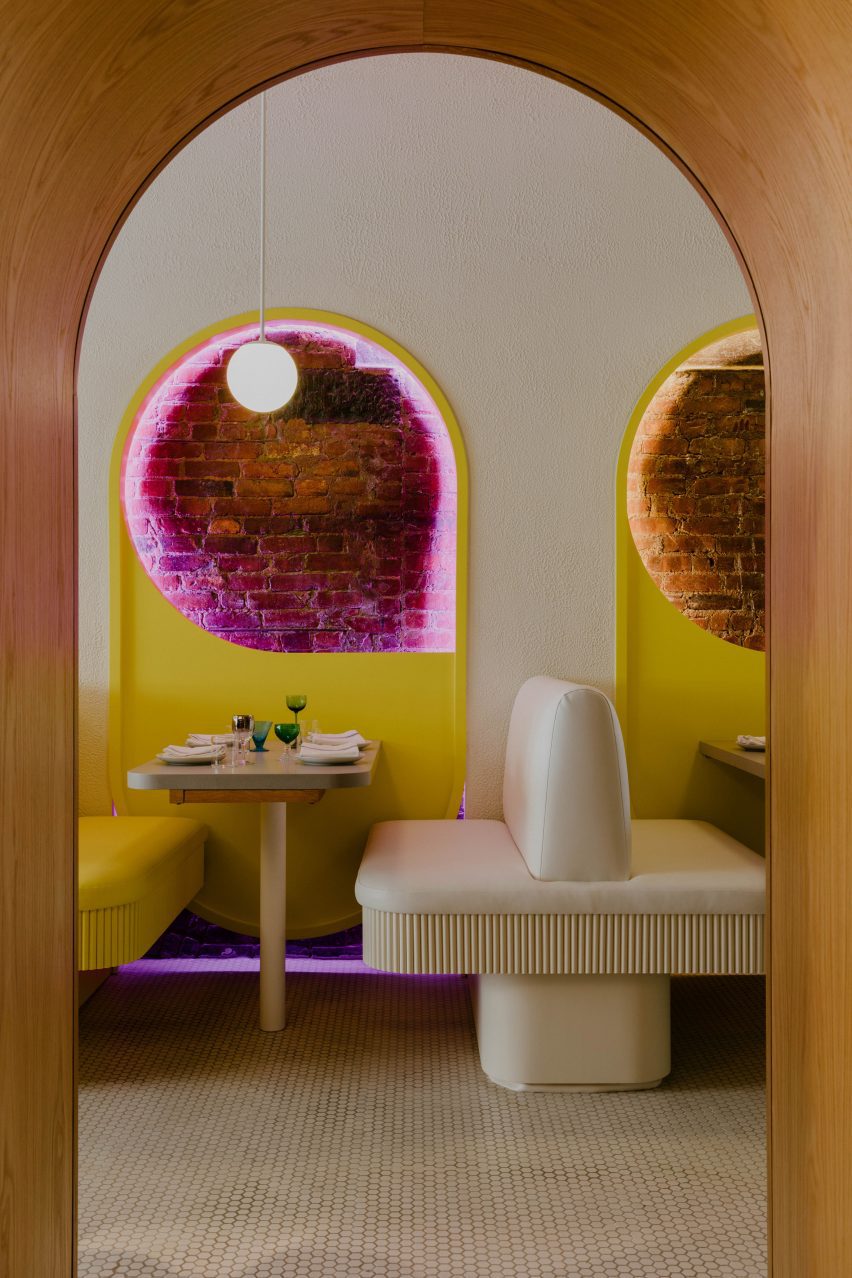
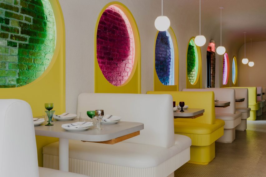
Above each table in the main dining space is a yellow panel with a hole cut-out, exposing the building’s original brick
To enter the 1,100-square-foot (100-square-metre) restaurant, visitors must turn a pasta die door handle sourced from local third-generation manufacturer D Malardi & Sons.
“The detail is a charming nod to the building’s pasta factory and Italian grocery history whilst ushering in its restaurant future,” the studio said.
The custom banquettes are coloured one yellow for every two white
Once inside the long narrow front space, the bar area can be found on the right and a row of back-to-back banquettes runs along the left.
The bar and the open kitchen further down are framed by white oak panelled arches, revealing a bright blue back bar that echoes the same shape.
The “blue room” in the back features cobalt-coloured seating that contrasts the exposed brickwork
A tall, light grey counter forms an L-shape within the first arch, with a lower surface for diners seated in custom chairs by Studio Apotroes with hot pink zig-zag legs.
More seats – this time with white details – face the kitchen area, beside a bright green shelving unit for tableware tucked under the bar counter.
Hot pink reappears in the cords of pendant lights, which have shades made from mushroom mycelium
Opposite, the custom double-sided banquettes have ribbed edges and are coloured one yellow for every two white.
In between are arched yellow panels with circular holes that expose the original brick walls behind, and Stuff by Andrew Neyer globe pendants that hang above each table.
Pasta illustrations by artist Massimo Mongiardo are found throughout the interior, including in the bathroom
The “blue room” in the back features cobalt-coloured seating that contrasts the exposed brick walls, black window frames and white hexagonal floor tiles.
Hot pink reappears in the cords of pendant lights with MushLume shades made from mushroom mycelium, while bespoke wooden tables have puzzle-piece tops that slot together in various configurations.
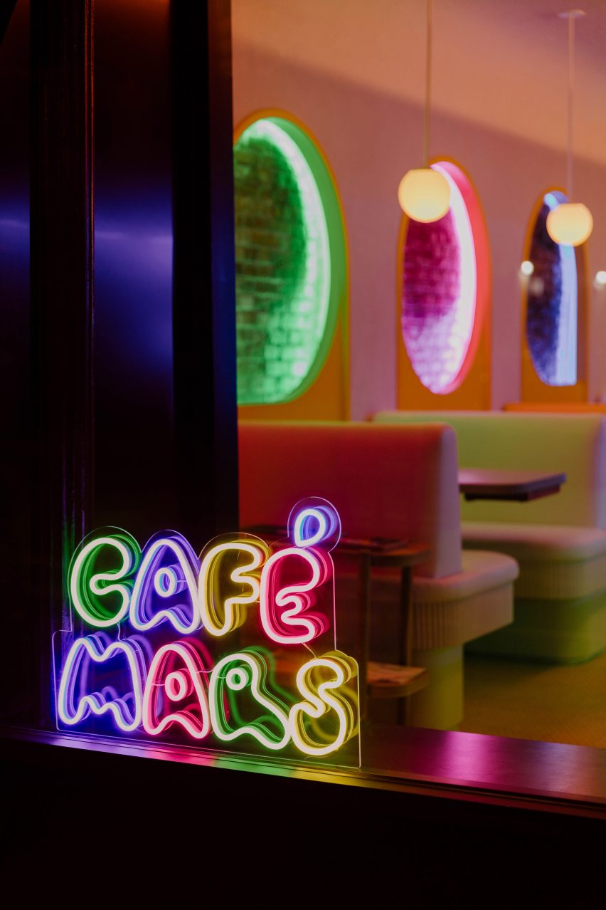
At night, colourful LED lights within the circular wall elements, under the bar counter and above the back bar all match a neon sign in the window, which traces the Cafe Mars logo designed by artist Massimo Mongiardo.
His illustrations of pasta shapes can be found throughout the interiors, including in the bathrooms, and across the black-painted roller shutters pulled down when the restaurant is closed.
Mongiardo’s illustrations also cover the black roller shutter on the exterior
“The goal was to strike a delicate balance between fanciful and comforting, transformative and familiar,” said Format co-founder and principal Matthew Hettler.
“The design, however loud, becomes a backdrop for a quality experience, and that is something we are excited about.”
A neon version of the Cafe Mars logo sits in the window, matching the colorful LED lighting inside
Other relative newcomers to Brooklyn’s ever-evolving culinary scene include Nabila’s, a Lebanese spot designed by Frederick Tang Architecture, and Usonian-inspired eatery Sereneco featuring interiors by Carpenter + Mason.
Over in Manhattan, the number of Italian restaurants continues to balloon, with Bad Roman and Cucina Alba among the many to have opened in the past year.
Architecture and interior design: Format Architecture Office Project team: Clare Hačko, David Hettler, Matt Hettler, Andrew McGee Construction: Rusk Structural engineer: Blue Sky Design MEP engineer: Department of Approvals
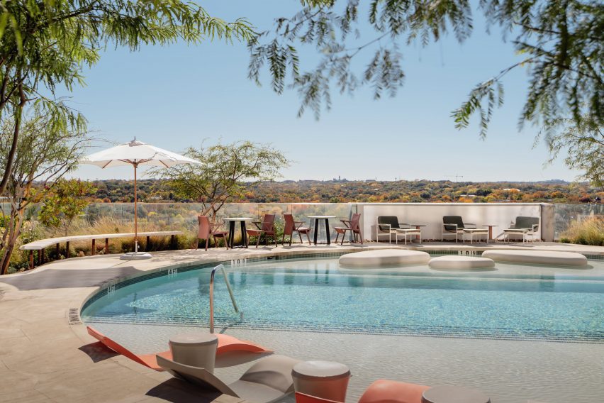
Texas studio Michael Hsu Office of Architecture has designed the common areas for a 50-storey residential high-rise building in Austin, as shown in this exclusive video captured by Dezeen.
Called 44 East, the building is located east of downtown Austin in the Rainey Street Historic district. The firm designed the interiors of the building’s common areas, which take cues from its natural surroundings, particularly the neighbouring Colorado River.
Michael Hsu Office of Architecture has designed the interiors of 44 East
The practice enhanced the space using colour and texture, layering vintage and custom furnishings to create a relaxed and inviting ambience.
Curved surfaces and light colours are incorporated throughout the space, with poured concrete terrazzo floors incorporated to pay homage to the gravel of the nearby riverside trail.
Curved surfaces and light colours are incorporated into the lobby area of 44 East
The interior is characterised by the use of soft shapes and natural materials throughout the various spaces, including on the eleventh floor, where pastel hues complement subtle architectural details.
The outdoor swimming pool features a series of pebble-shaped islands, with a partially-covered patio inviting guests to relax outside and enjoy the views of the river.
The eleventh floor features a circular outdoor swimming pool
On the thirty-seventh floor, a large moon-like pendant light is suspended above a plush circular sofa.
The higher vantage point offers scenic views of downtown Austin, and features jewel tones and darker materials intended to complement the Texas skyline at dusk.
The thirty-seventh floor features darker tones to complement views of the Texas skyline
44 East was developed by Intracorp, while the tower and unit interiors were designed by Page and landscapes designed by DWG.
The interior design of the common spaces is one of the latest projects by Michael Hsu Office of Architecture, which is based in Austin and Houston.
The company recently completed its self-designed Austin studio, which is adorned in wood-and-fabric lined walls and industrial details, to accommodate its growing team.
This video was produced by Dezeen for Michael Hsu Office of Architecture as part of a partnership. Find out more about Dezeen partnership content here.
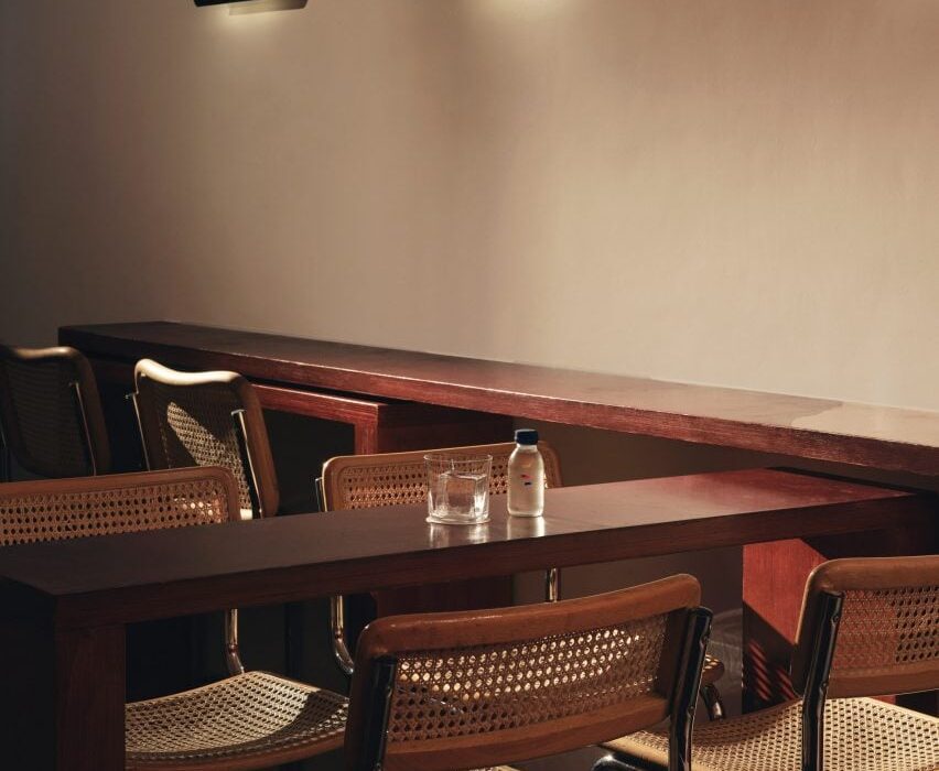
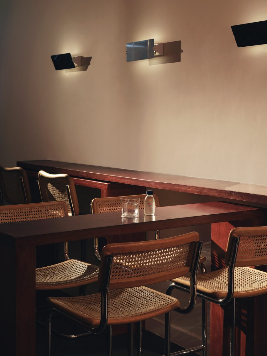
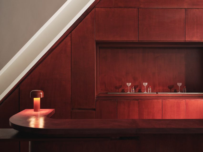
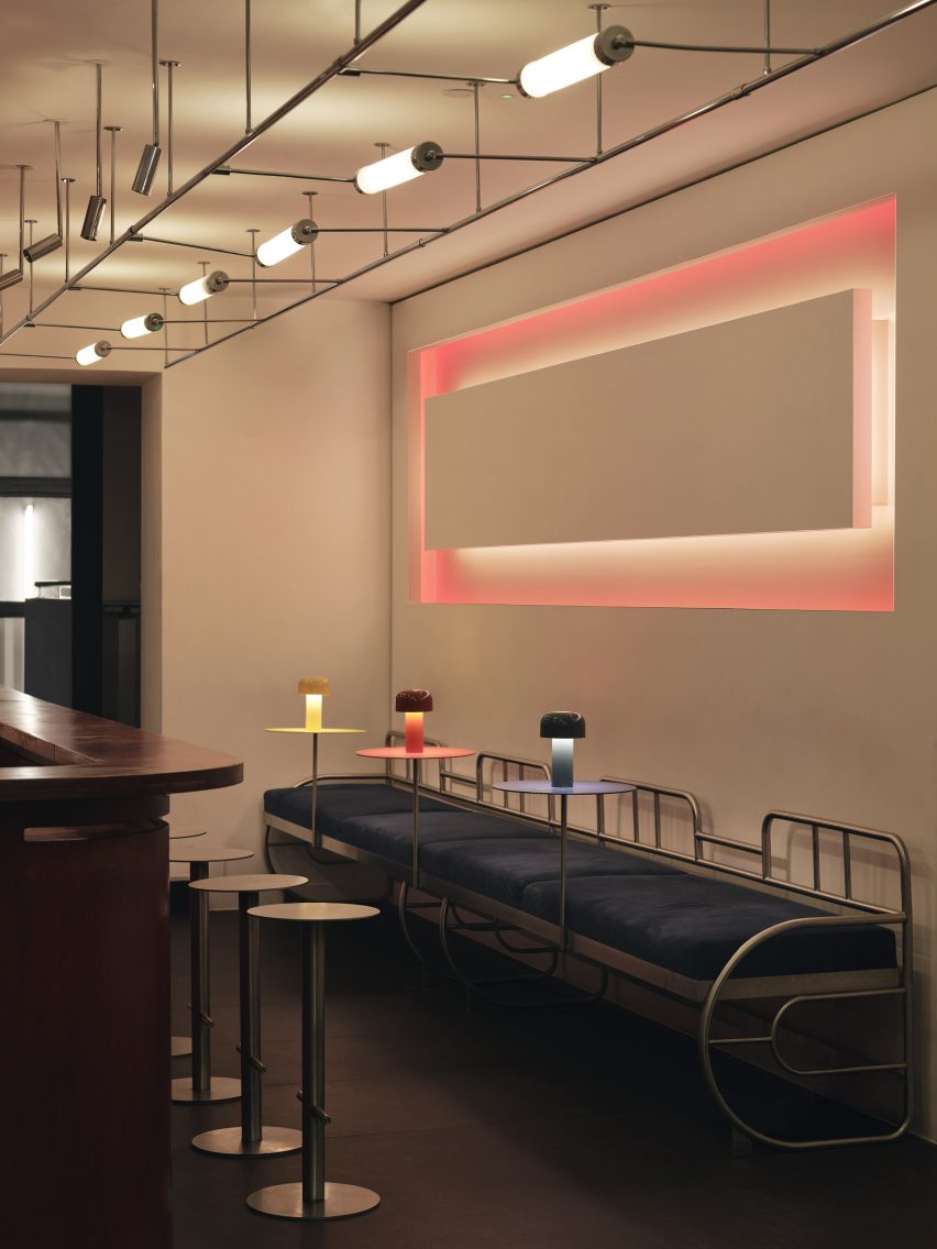
Cake Architecture has renovated A Bar with Shapes for a Name, an east London cocktail bar featuring “utilitarian” interiors.
A Bar with Shapes for a Name owes its title to the yellow triangle, red square and blue circle that are emblazoned on its facade in a nod to the primary colours and understated geometry commonly associated with the Bauhaus.
Tall tubular chairs feature on the ground floor
When creating the bar’s minimalist interiors, Dalston-based Cake Architecture took cues from the influential German art and design school that was established in 1919 and advocated for an emphasis on functionality, among other similar principles.
Located at 232 Kingsland Road in Hoxton, the cocktail bar was renovated by the studio to serve as a multipurpose venue.
Cake Architecture created a smooth ground-floor bar from reddish plywood
Cake Architecture doubled the bar’s capacity by adding a basement, which acts as a “kitchen-bar” room, and refurbished the ground floor’s existing seating area as well as a classroom-style space that offers a location for rotating events or workshops.
“These spaces have specific functional requirements and we selected colours and materials to suit,” studio director Hugh Scott Moncrieff told Dezeen.
It was positioned opposite a rectilinear light installation
Upon entering the bar, visitors are greeted by the main seating area or “showroom”, which was designed to be warm and inviting.
Tall tubular chairs finished with neutral rattan were positioned around chunky geometric tables made from birch ply stained to a rich, reddish-brown hue.
The renovation included the addition of a new basement
The team also used the same timber to create the space’s curving bar, which is illuminated by a squat, cordless table lamp by lighting brand Flos.
Opposite the bar, a glowing rectilinear light installation by photographer Steve Braiden was fitted to the wall underneath bench-style seating reminiscent of early Bauhaus furniture designs.
A steel, glass-topped table sets an industrial tone
“We looked in particular at projects by the Bauhaus founder Walter Gropius,” reflected Scott Moncrieff.
“Gropius is a master of this elegant zoning through the application of colour and form,” he added.
The “classroom” includes steel-framed tables
Downstairs, the low-lit basement was created to house additional seating as well as “all of the crazy machinery they use to prepare the drinks,” the designer said.
The basement is characterised by a bespoke central table by Cake Architecture and furniture designer Eddie Olin.
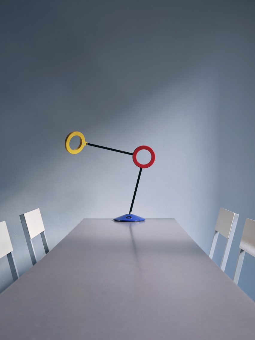
Red, yellow and blue accents define a sculptural lamp
Consisting of a steel frame that “floats” over a central leg, the table was topped with a glass surface and its base was clad in phenolic-coated plywood to match the floor and walls.
“This new basement is predominantly a production space – so the palette reflects this with hardwearing, utilitarian and industrial materials,” said Scott Moncrieff.
A thick, felt curtain in ultramarine adds a pop of colour to the otherwise pared-back space.
With its pale blue walls and Valchromat-topped, steel-framed tables, the ground-floor “classroom” pays homage to the Bauhaus as an educational institution.
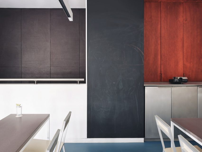
A tall blackboard provides space to learn in the classroom
Brighter blue vinyl covers the floors while a sculptural lamp featuring red, yellow and blue circles echoes the bar’s logo.
A tall blackboard and overhead strip lighting add to the classroom feel of the space, which is used for various group events.
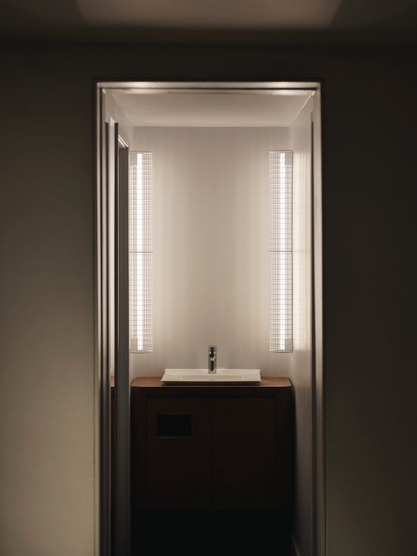
Thin vertical lights frame the bathroom sink
Cake Architecture worked closely with the bar’s founders Remy Savage and Paul Lougrat when creating the interiors, which were primarily informed by the duo’s way of working.
“The team has a conceptually driven ethos drawn from the theory and practice of Bauhaus embedded in everything they are doing. We found that incredibly exciting,” explained Scott Moncrieff.
A Bar with Shapes for a Name is located on London’s Kingsland Road
“The Bauhaus phrase ‘party, work, play’ was pertinent to some early ideas and this carried through all our design discussions,” noted the designer.
“The space enables these three things. Separately as individual functions and simultaneously as a representation of the overall atmosphere of a bar!”
Cake Architecture previously worked with interior designer Max Radford to create a curtain-wrapped speakeasy in London’s Soho. The studio also designed a workspace for London agency Ask Us For Ideas in the same part of the city.
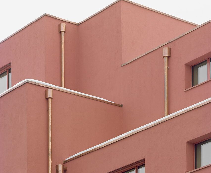
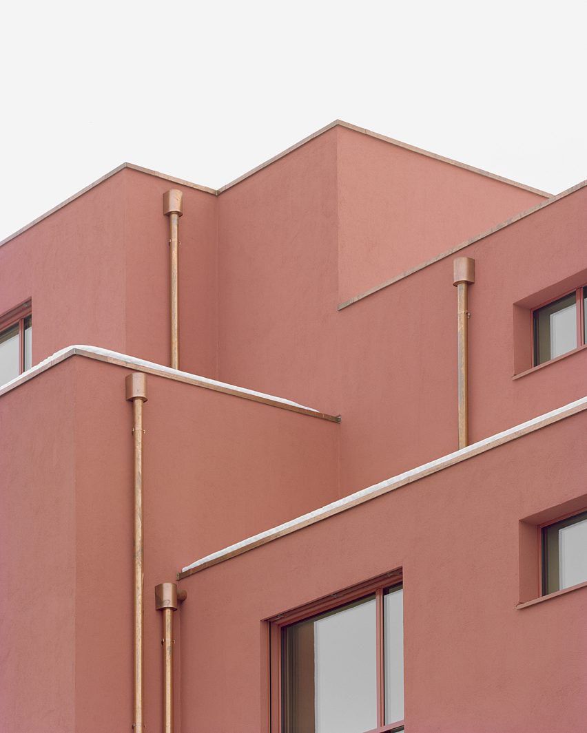
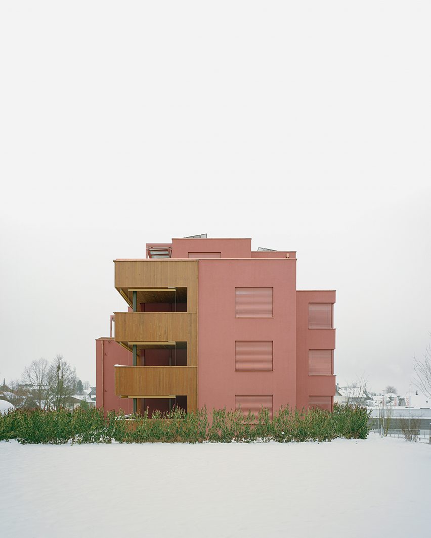
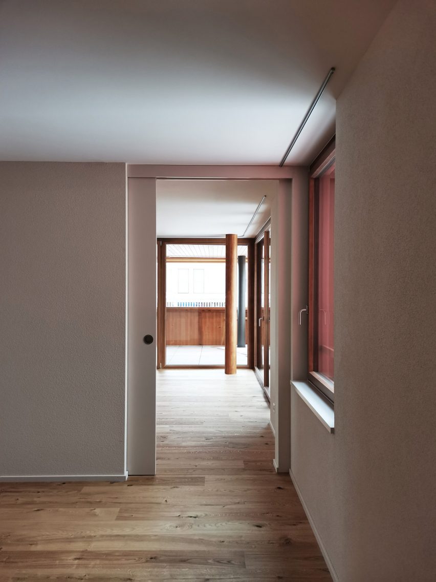
Architecture studio Ductus has designed an apartment complex coated with a monochrome red plaster facade into a sloping site in Schwarzenburg, Switzerland.
Located on the outskirts of the village of Schwarzenburg in eastern Switzerland, the complex was designed by Ductus to have the appearance of a series of intersecting blocks of various heights that protrude and recede throughout the design.
The red plaster-covered block was has a blocky appearance
Accommodating 16 apartments, the complex comprises two buildings sat perpendicular to one another that are connected by a shared garden.
Balconies constructed from pressure-impregnated white fir and green columns contrast with the red plaster facade and overlook the garden and neighbouring buildings.
Adjoining balconies are constructed from pressure-impregnated white fir, which contrast with the red facade
Flat roofs lined with untreated copper top the apartment complex, which distinguishing it from the surrounding more traditional pitched-roof buildings.
On the exterior, untreated copper was also used for downpipes, while red-toned window frames and mechanical shutters match the plaster’s colour.
Within the apartments, textured white walls were set off by wooden flooring, while stylish bathrooms were characterised by red-toned fittings and decorative tiles to match the facade.
Bright living spaces are lit by floor-to-ceiling doors that also provide access to the adjacent balconies.
The complex contains 16 apartments split across two buildings
“All 17 apartments were designed as condominiums,” Ductus partner Marcel Hauert told Dezeen.
“The client’s desire was for all buyers to determine the interior finishes themselves. We provided a basic concept that could be adapted virtually without restrictions.”
Red-toned fittings and tiles feature in the bathroom
Ductus is an architecture studio operating between Sweden and Switzerland.
Elsewhere in Switzerland, BE Architektur recently used intersecting sculptural blocks to form a barn-like house and Enrico Sassi has transformed a wood store into a micro home.
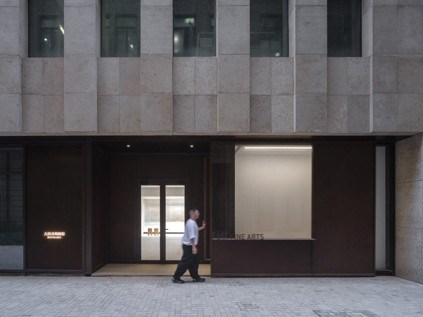
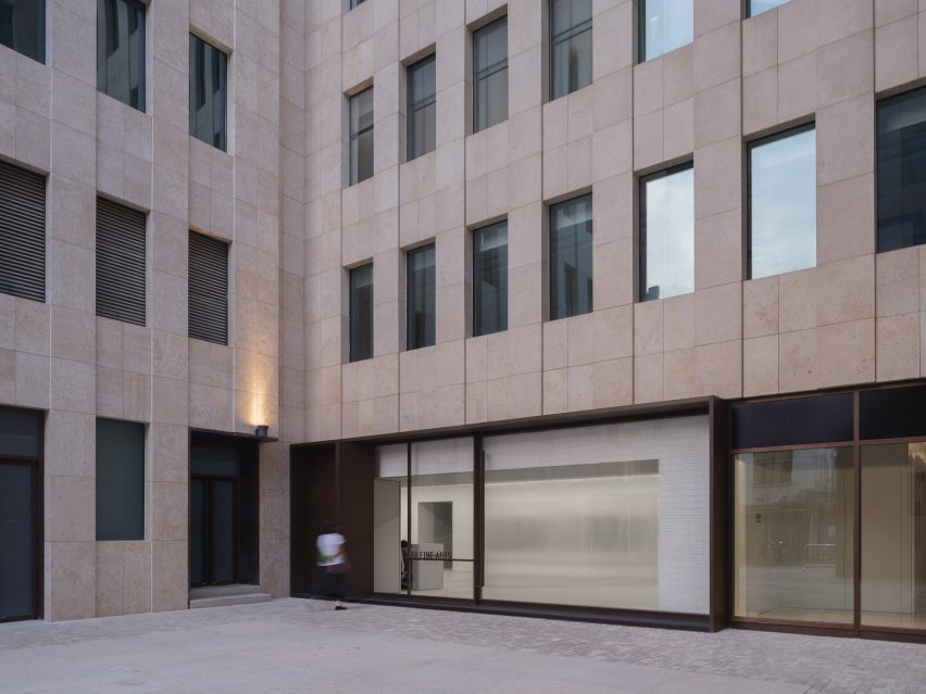
Chinese studio Neri&Hu has designed a contemporary art gallery for Ota Fine Arts in Shanghai with a focus on the “sublime beauty of the banal”.
The gallery sits on the ground floor of a mixed-use tower at Rockbund, a development amidst the historical Bund in Shanghai along the Huangpu River, where a series of restored colonial art deco buildings are located.
The entrance of the gallery features an oversized sliding door
“The primary design challenge was to utilise the areas along the facade for both storage and display, blurring the distinction between functional and experiential space,” explained Neri&Hu.
“This deepened threshold condition found on both facades defines the visitor’s arrival sequence and journey within.”
The facade of the gallery is framed in aged steel to contrast the contemporary gallery
The facade of the gallery was framed in aged steel, with portions of solid metal and large glass panels arranged to form a window display for the artworks.
Handmade ivory tiles line the inner side of the window in a subtle woven pattern, serving as a neutral backdrop for the art pieces.
A warehouse-sized door can be fully open on the west facade for easy transport of large art pieces
An oversized sliding door marks the entry to the gallery on the eastern facade. When opened, the entrance of the gallery is revealed, with the outer sliding door framing the window display next to it.
When closed, the door slides back to its original position and allows the full-height glazed window to be exposed.
The western facade features a warehouse-sized door that can be fully opened using a custom-designed handle. This allows large artworks to be delivered directly from a designated parking area into the gallery.
Neri&Hu also added fluted glass to the exterior, which glows in the evening to illuminate the adjacent Rockbund courtyard and add elegance to the functional facade.
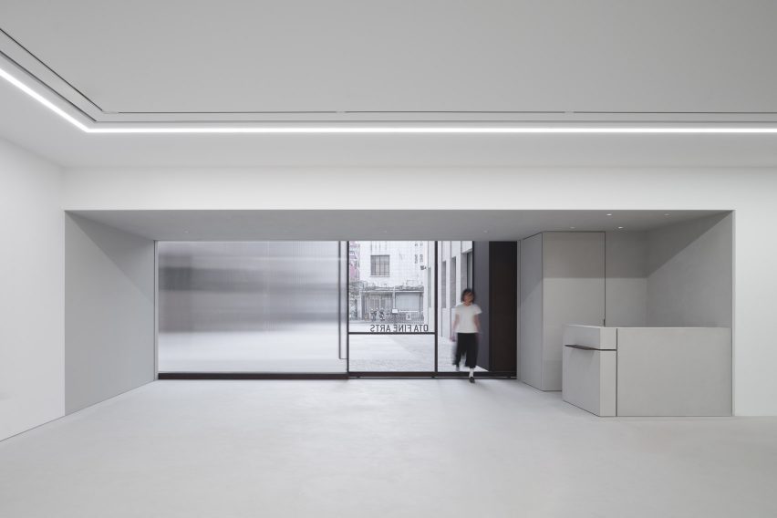
Inside the gallery, the 350 square-metre space is divided into two zones – a 150-square-metre main public viewing gallery and a private zone that houses VIP rooms and office space.
The pared-back, white VIP rooms feature contemporary furniture pieces with custom-made white tiles and a stained oak floor and were designed to create a relaxing environment, in which the attention can be focused on the art itself.
The interior of the gallery has a neutral and simplistic tone
“The project’s understated material palette and overall conceptual underpinning lies in the juxtaposition of old and new, raw and refined, ordinary and spectacular,” said Neri&Hu.
“We hope one can appreciate the sublime beauty of the banal, as much as the brilliance of contemporary art,” it added.
Clean white rooms are intended to highlight the art piece
Neri&Hu was founded by architects Lyndon Neri and Rosanna Hu in 2004 in Shanghai.
Other recent projects completed by the studio include the Sanya Wellness Retreat hotel on the Chinese island of Hainan and a fashion boutique with fabrics and marble screens.
The photography is by Zhu Runzi.
Project credits:
Partners-in-charge: Lyndon Neri, Rossana Hu Associate-in-charge: Jacqueline Min Senior interior designer-in-charge: Phil Wang Design team: Rovi Qu FF&E procurement: Design Republic Contractors: ETQ Project (Shanghai) Limited
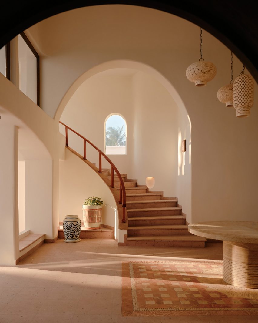
Continuing our 2023 review, we have selected 10 striking staircases published on Dezeen this year, from prefabricated plywood steps at a Cornish home to a colourful set for an opera in a Swiss theatre.
Architects and designers have continued to find clever solutions to travelling on foot from one storey to another in 2023 by creating staircases that are both beautiful and functional.
Ranging from the spectacular to the space-saving, here are Dezeen’s top 10 staircases of 2023:
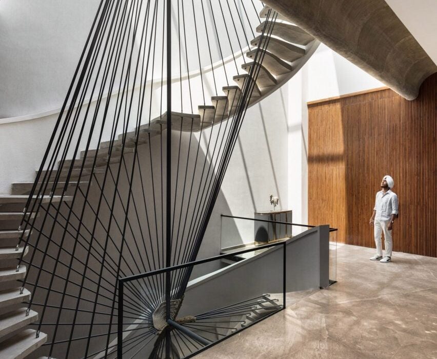
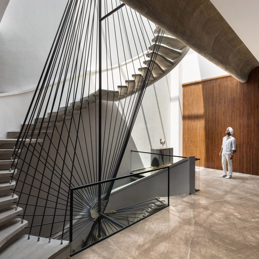
Photo by Purnesh Dev Nikhanj
Ribbon House, India, by Studio Ardete
An angular balustrade with tilting black rails twists around sweeping concrete steps to form the staircase at Ribbon House, a home in Punjab with an equally sculptural exterior.
Architecture office Studio Ardete placed open living spaces next to the staircase on each floor to create lobby-like communal areas on the house’s different levels.
Find out more about Ribbon House ›
Photo by Lorenzo Zandri
House by the Sea, UK, by Of Architecture
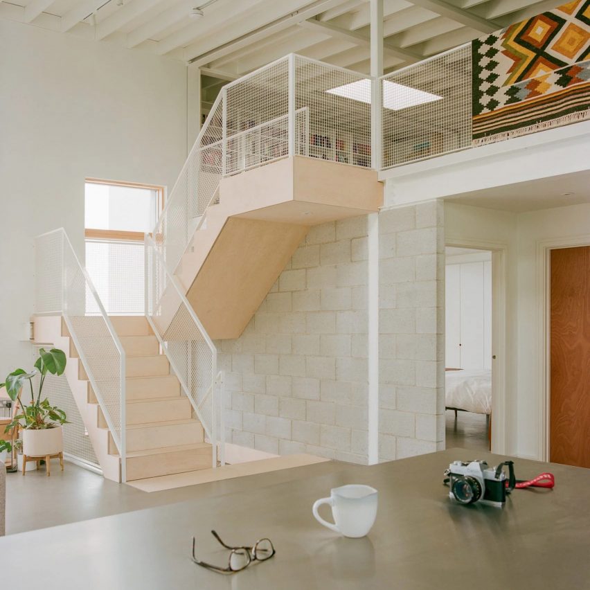
House by the Sea is the home of a surfer-and-artist couple in Newquay, Cornwall, that was designed to be “simple, robust and utilitarian”.
For the interior, London studio Of Architecture inserted prefabricated plywood steps leading to a cosy mezzanine level tucked beneath the dwelling’s sloping roof.
Find out more about House by the Sea ›
Photo by Schnepp Renou
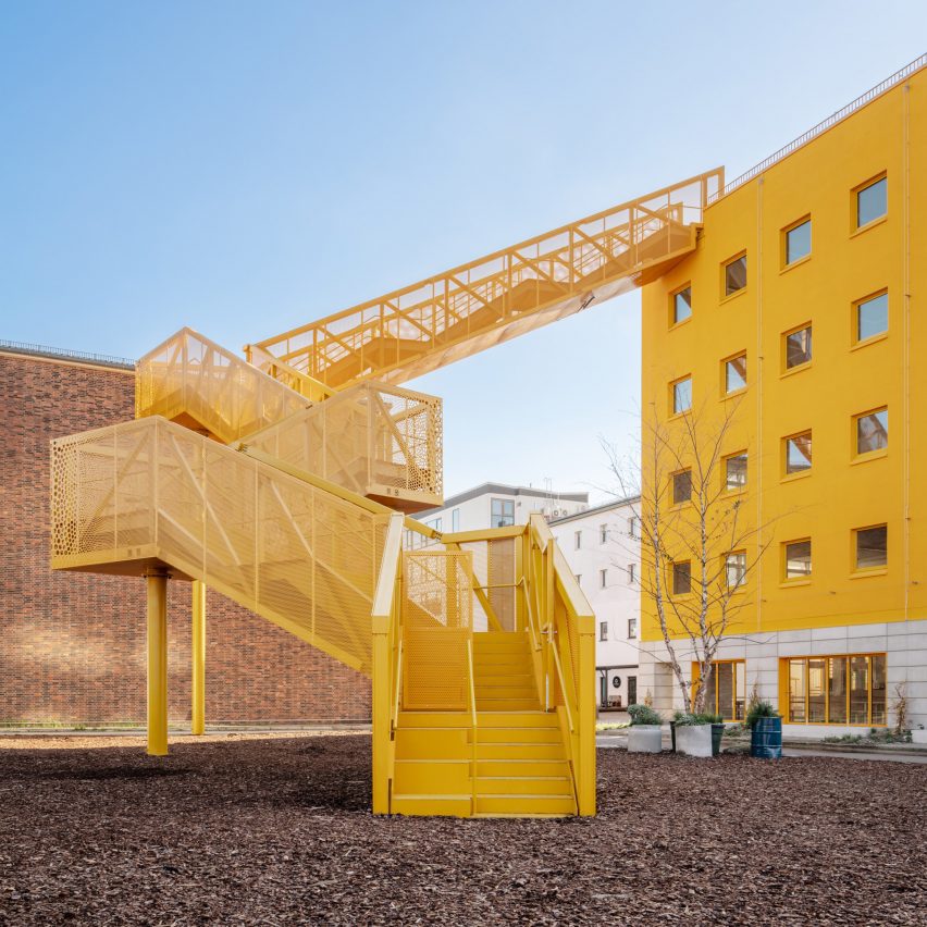
Haus 1, Germany, by MVRDV and Hirschmüller Schindele Architekten
A bright yellow, zigzagging staircase juts out from the facade of the Haus 1 building in Berlin, creating the appearance of a striking crane and providing a beacon for approaching visitors.
Dutch studio MVRDV worked with local studio Hirschmüller Schindele Architekten to design Haus 1, which forms part of the city’s Atelier Gardens redevelopment.
Find out more about Haus 1 ›
Photo by Pezo von Ellrichshausen
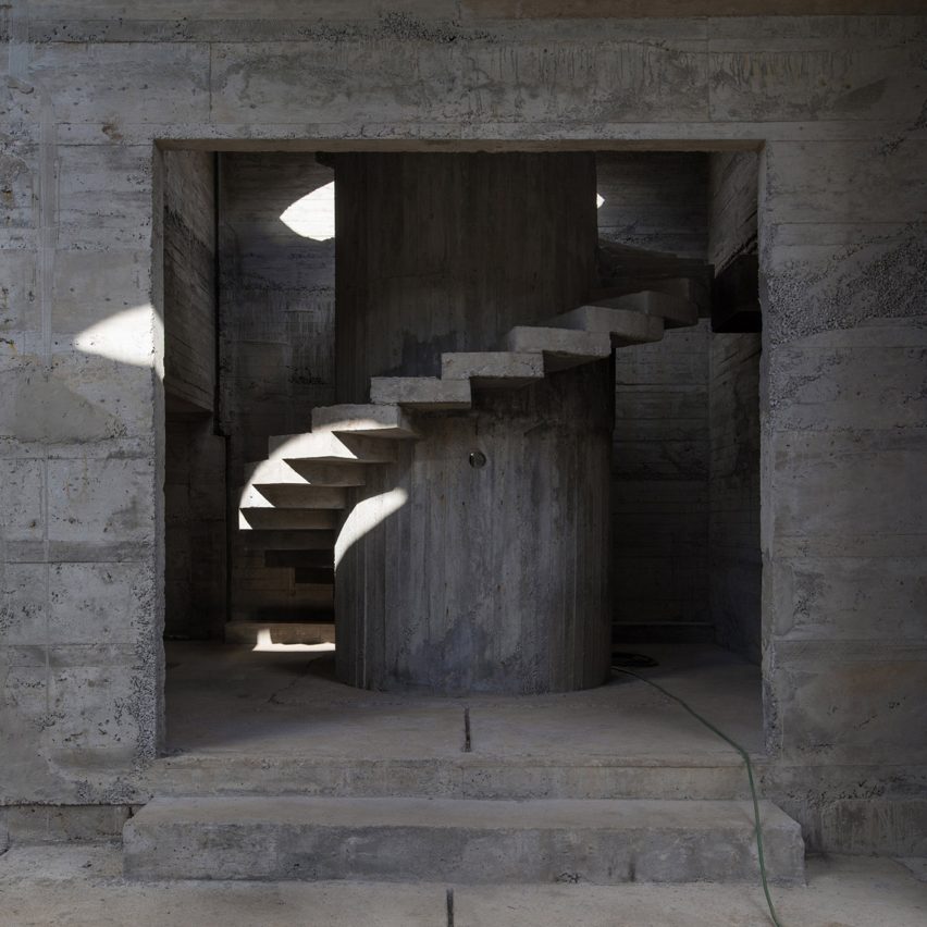
Luna House, Chile, by Mauricio Pezo and Sofia von Ellrichshausen
Brutalist-style spiral staircases connect the storeys of Luna House, an expansive geometric complex in Chile comprised of 12 individual buildings.
Chilean studio Pezo von Ellrichshausen designed the stairs and the majority of the structure in reinforced concrete, which is highly textured thanks to imprints left behind by wooden formwork.
Find out more about Luna House ›
Photo by Paolo Abate.
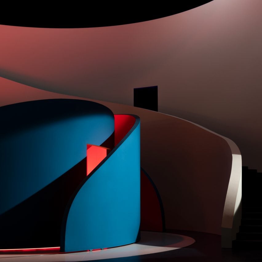
Rigoletto set design, Switzerland, by Pierre Yovanovitch
French interior designer Pierre Yovanovitch embedded moving, curved walls within an undulating staircase that stretched the full width of the stage for a production of Giuseppe Verdi’s opera Rigoletto at Theatre Basel.
Bathed in coloured light, the flexible walls created a neutral set for the performers to balance the play’s complex plot, according to the designer.
Find out more about this staircase ›
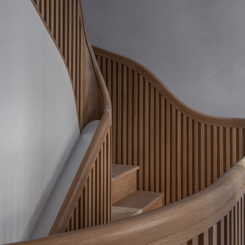
Photo by James Leng (also top)
Hairpin House, USA, by Studio J Jih and Figure
This Boston house was renovated to revolve around a sculptural “hairpin” staircase informed by the twists and turns of mountain roads.
Designed by American firms Studio J Jih and Figure, the white oak stairs were created to increase the home’s useable floor area by 20 per cent.
Find out more about Hairpin House ›
Photo by Alex Shoots Buildings
House in Pernek, Slovakia, by Ksa Studený
This home in the village of Pernek, Slovakia, was designed in the shape of an isosceles trapezoid, mirroring its longitudinal profile.
Architecture studio Ksa Studený positioned a chunky white staircase over a slanted slab of concrete to divide the interior space.
Find out more about this house ›
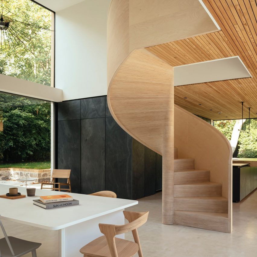
Photo by Jim Stephenson
The Arbor House, Scotland, by Brown & Brown
A spiral staircase made from birch plywood winds into the dining area at The Arbor House by Brown & Brown, located in a conservation area in Aberdeen.
The studio assembled the stairs over three weeks, with timber treads individually cut and hand-layered to form a smooth curve.
Find out more about The Arbor House ›
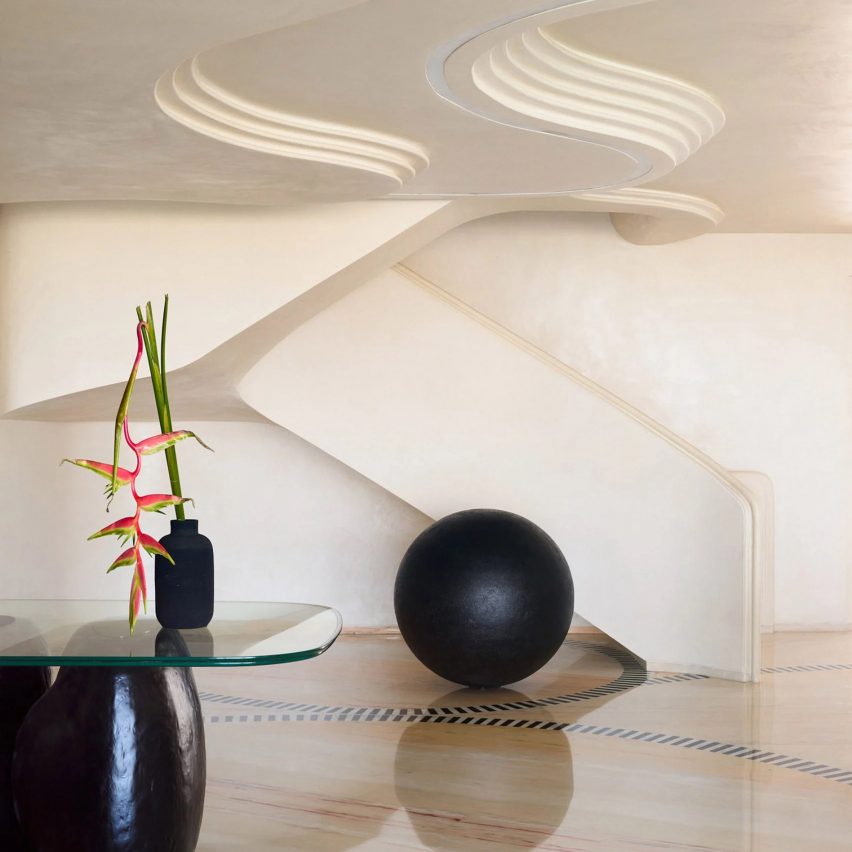
Photo by Gokul Rao Kadam
SNN Clermont residential tower, India, by FADD Studio
Indian practice FADD Studio renovated two apartments within the SNN Clermont residential tower in Bangalore to create a fused multi-generational home.
The studio took cues from the curves of caterpillars when creating a swooping staircase, which connects the two flats and features deep red marble risers.
Find out more about these apartments ›
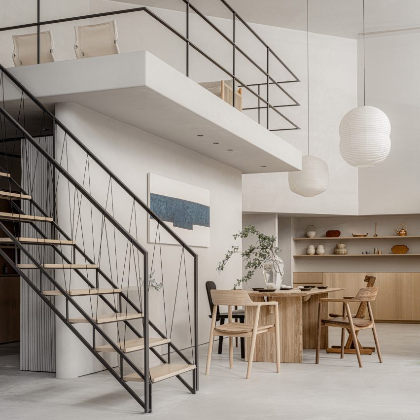
Photo courtesy of The Conran Shop
The Conran Shop, Japan, by Keiji Ashizawa
Japanese designer Keiji Ashizawa created interiors for The Conran Shop in Tokyo to reflect the inside of someone’s home.
The store’s mezzanine floor is accessible by a minimalist geometric staircase featuring a handrail made from black paper cords.