Photo of a woman sitting within a forest green-coloured single-person office pod working at a laptop. The pod sits within a modern office space surrounded by open workstations
CategoriesInterior Design

Framery predicts focus spaces to be key office design trend of 2024

Promotion: the need for well-considered focus spaces will come to the fore in workplace design in 2024, driven by the uptake of artificial intelligence, according to office pod brand Framery.

Framery says that the increase in AI in the workplace will result in it taking more responsibility for mundane, repetitive tasks, resulting in the need for additional focus spaces in open-plan offices to help support employees’ deep and focused tasks.

“If it happens how it’s expected and AI takes more responsibility for repetitive tasks, the office design should reflect this development and support deep, focused work,” said Tomi Nokelainen, head of Framery Labs, the company’s research and innovation unit.

Photo of a woman sitting within a forest green-coloured single-person office pod working at a laptop. The pod sits within a modern office space surrounded by open workstations
Framery predicts focus areas will be the key office design trend of 2024

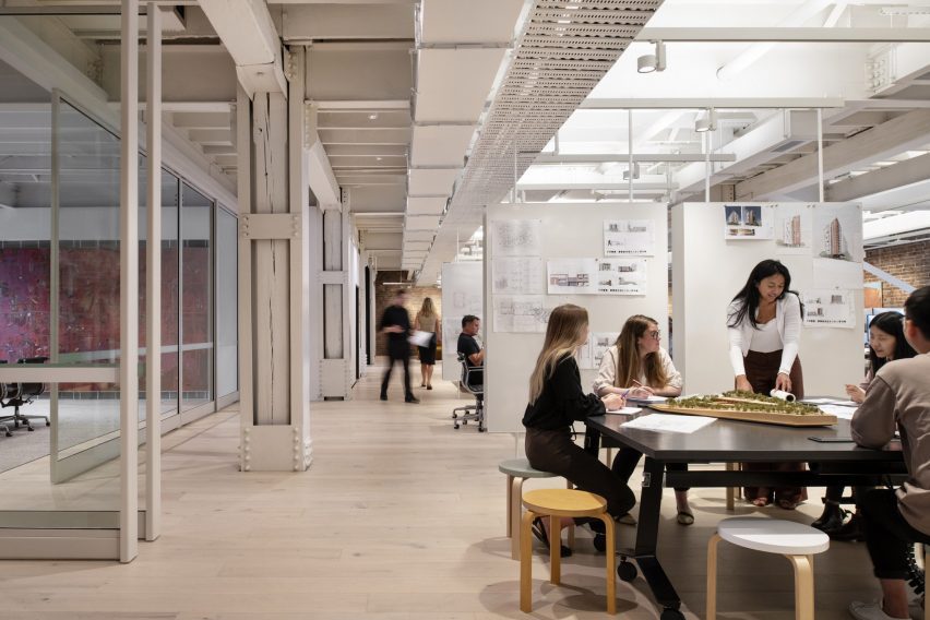
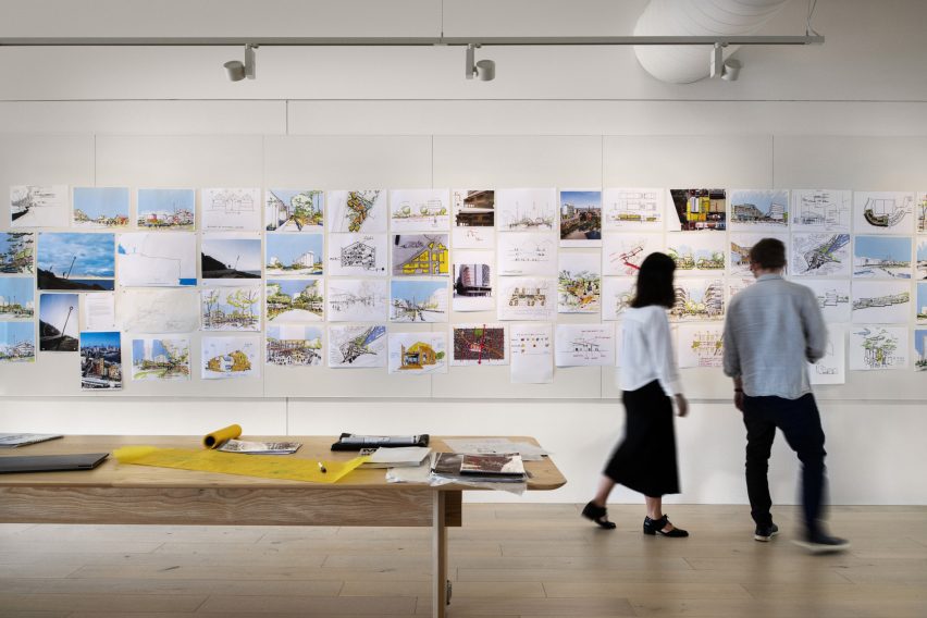
According to Framery, while post-pandemic hybrid office design placed an emphasis on the creation of collaborative spaces and “flashy common areas embodying organisational culture”, the next phase of this evolution will centre on creating areas that minimise distraction and allow for focused work.

“It’s noteworthy that employees value focused working spaces beyond collaborative spaces,” said Nokelainen. “With work complexity on the rise, there is a heightened demand for both acoustic and visual privacy.”

The company points to the findings of research company Leesman, which has reported that workers are still choosing to stay at home for solitary work. Leeman’s research suggested that some working activities were “better supported at home” including individual-focused work and planned meetings.

However, Framery says that when employees have the option to work from home, that may not be sufficient to fulfil their productivity needs.

“It can’t be assumed that all employees have the luxury of a dedicated home office room, or are willing to invest in expensive desks or ergonomic chairs,” said Nokelainen.

Photo of a woman working at a laptop within a closed office pod that has two transparent and two solid walls. The pod is located within a breakout space with more casual, open table seating
Office workers value focus areas more than collaborative spaces, Framery research finds

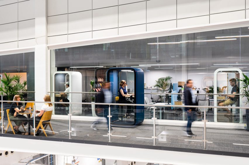
Framery, a Finnish brand, was one of the first to enter the office pods space in 2010, creating soundproof booths that drown out external distractions so that employees can undertake focused work or conduct video conferencing calls.

According to Framery Labs’ research, focus spaces are the number one desired perk for employees that would draw them into working in the office rather than at home and they address distractions to focused work, for example, noise.

Only 33 per cent of employees report finding noise levels satisfactory in their workplace and dissatisfaction with noise has the strongest correlation to an employee saying that the design of their workplace does not support their personal productivity.

Photo or rendering of a modern, busy office incorporating several single-person work pods where people are working on their laptops in peace
The pods are soundproof so external noise is not a distraction

This can be especially consequential for neurodiverse people, who constitute around 15 to 20 per cent of the global population and who can have a greater sensitivity to sensory stimuli, according to the brand.

With workplaces becoming more inclusive, the next step will be to design them to function as “a catalyst not a barrier to productivity”, said Nokelainen, with a recognition that different people have different needs.

“There are no one-size-fits-all focus spaces – they can be everything from silent open areas, library-like spaces, private offices or pods,” said Nokelainen. “Each role and industry has their own special needs that must be taken into account.”

Photo or rendering of a forest green Framery One office pod within a contemporary office, placed within an otherwise open breakout space with cafe-style tables and chairs
The Framery One pod is Framery’s bestselling product

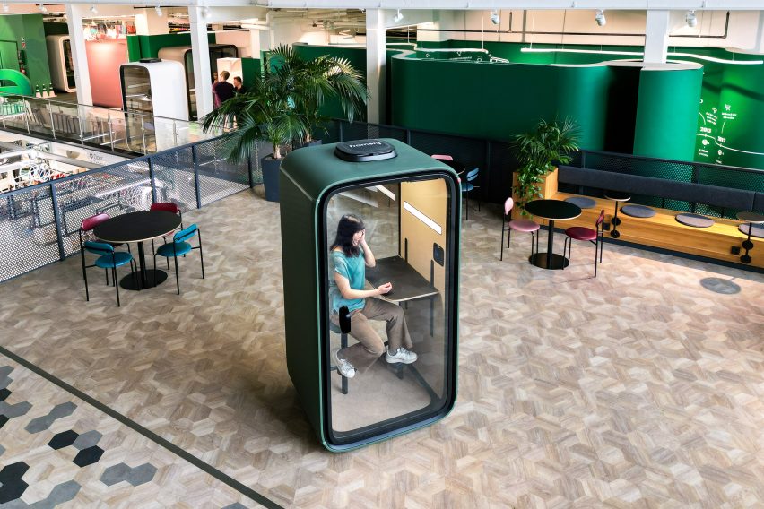
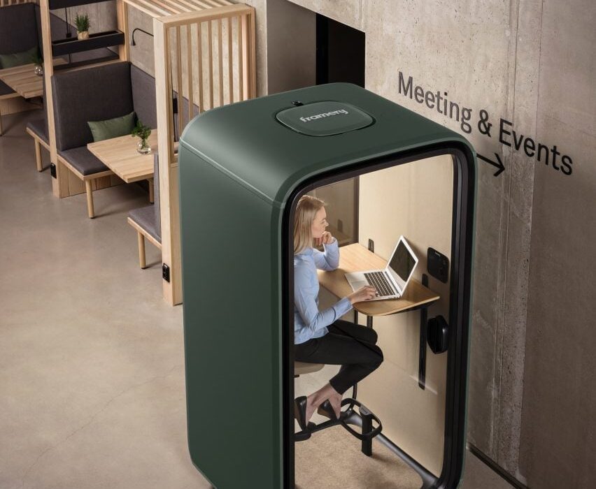
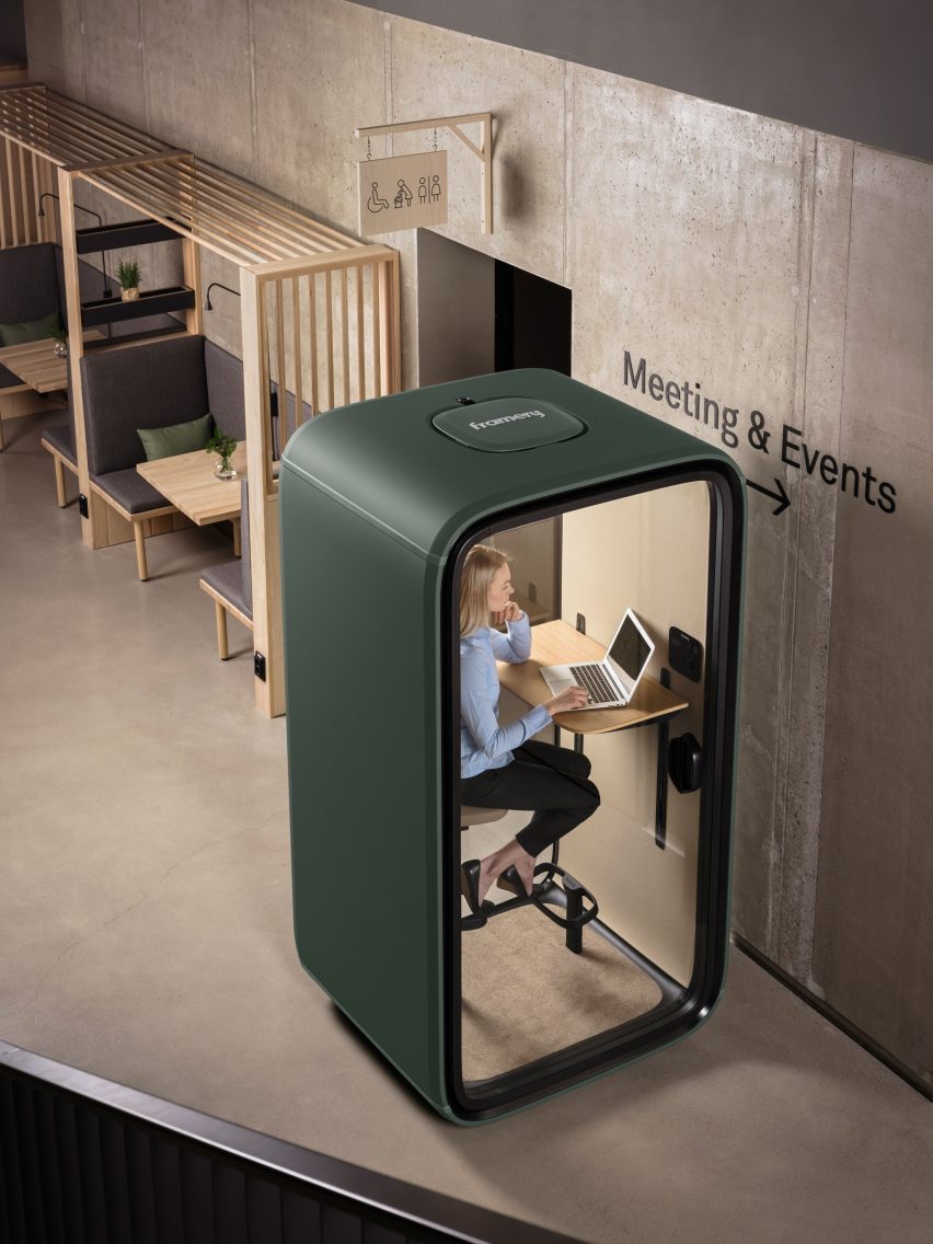
These considerations can be addressed with products like the Framery One, Framery’s bestselling office pod. A single-person workstation for focused work that is also optimised for virtual meetings, it includes soft lighting and adjustable ventilation to help create a personalised environment.

In a closed pod like this, neurodiverse people can apply “sensory integration techniques”, said Nokelainen which means incorporating the sensory tools or approaches that promote calm and focus for them.

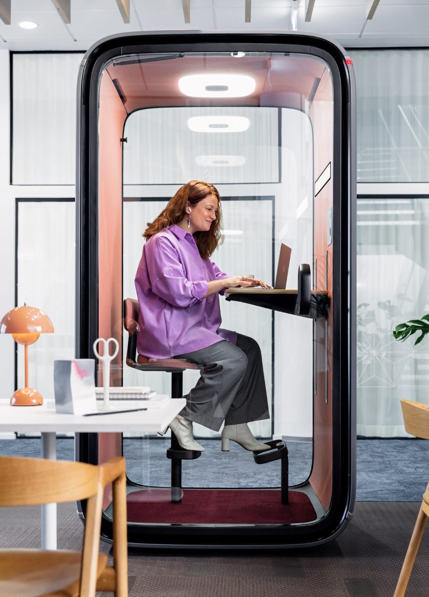
There are also multi-person pods like the Framery Q Flow, one of the newest models. It is designed to help enable workers to achieve the “flow” state of mind, where work feels effortless and time switches off, and includes a height-adjustable electric table so that users can shift positions without interrupting their thought process.

The office pods come with Framery Connect, an integrated workplace management tool that supplies detailed data and analysis around how often and when they’re being used.

Photo of a man using the Framery One pod in an office while two women collaborate on a table outside
The pods include the Framery Connect workplace management system

Framery says it prides itself on the quality of its soundproof office pods, as well as having been among the first to bring the product category to the market. The company launched 13 years ago after its founder – Samu Hällfors – devised a solution to address the distraction caused by his boss’s loud phone calls.

“Our founder and CEO Samu Hällfors invented the office pod category in 2010,” said Framery. “Now we have over 200 competitors globally. To ensure we stay the market leader we are relentlessly innovating to engineer the most advanced pod in the world.”

Framery also has a sustainable and responsible ethos and has made a commitment to converting to a circular business model.

To find out more about Framery and its products, visit the brand’s website.

Partnership content

This article was written by Dezeen for Framery as part of a partnership. Find out more about Dezeen partnership content here.

Reference

Cox Architecture design studio office in Sydney
CategoriesInterior Design

Cox Architecture celebrates heritage features of its own Sydney studio

A brick, steel and timber structure is left exposed in this office interior in Sydney, which local firm Cox Architecture has revamped to house its own studio.

Cox Architecture removed previous alterations to the structure, which occupies five floors of the heritage-listed Metcalfe Bond Stores warehouse in Tallawoladah, to highlight its original features and complement them with pared-back, flexible workspaces.

Cox Architecture design studio office in Sydney
Cox Architecture has designed its own studio in a Sydney warehouse

“Our objective was to do more with less, balancing the poetic with the pragmatic,” explained the studio.

“Restrained interventions allow the heritage to be the hero and minimise the project’s embodied energy,” it continued. “Our starting point was a process of reduction, removing non-heritage elements to create clarity.”

Interior view of office space by Cox Architecture
The studio exposed its existing structure

The interior is defined by the original steel and timber structure’s columns and beams that have been painted white, and the brickwork of the outer walls that are left exposed.

New elements such as glass doors and walls, room dividers, curtains and furniture were chosen to touch the existing structure “as lightly as possible”, and feature alongside dark-wood carpentry and gallery-style lighting tracks.

View of office interior featuring a steel and timber structure
Dark-wood carpentry features throughout

The workspaces themselves are designed to be flexible and “hackable”, allowing areas to be reconfigured and subdivided easily by staff.

This includes a forum space on the fifth level of the building, which has a wall lined with magnetic whiteboards and can be used as anything from a collaborative workshop space to a presentation area for 200 people.

Alongside it is a kitchen with a backdrop of exposed brickwork and two long counters topped with unsealed brass that will patinate over time.

A black-steel stair leads up to a mezzanine level above containing further desk spaces. This sits at the top of the building, lit by skylights in the apex of the pitched roof.

View of workspace by Cox Architecture in Sydney
The workspaces are designed to be flexible

“Anchored by a generous kitchen, a flexible forum space is a magnet for serendipitous exchange between Cox’s own people and the wider design community,” said the studio.

“The majority of elements within the space are movable, creating an experimental, nimble workspace allowing teams the autonomy to control their space and future-proofing the studio as the workplace evolves,” it continued.

Cox Architecture design workspace interior in Sydney
The presentation space is lined with magnetic whiteboards

Facing the street, Cox Architecture created a “shopfront window”, giving staff the opportunity to populate vitrines with the studio’s work.

Cox Sydney Studio has recently been shortlisted in the large workplace interior category of Dezeen Awards 2023. Another office interior completed by the studio is the Midtown Workplace in Brisbane, which features a large, plant-filled atrium with by a weathered-steel staircase.

The photography is by Nicole England and Cameron Hallam.

Reference

Exterior of Lai Zhou Bar by RooMoo features offcuts from wooden whiskey barrels
CategoriesInterior Design

RooMoo resuses old whiskey barrels inside Shanghai’s Laizhou Bar

Chinese interiors studio RooMoo has used nearly 6,000 pieces of oak from discarded distillery barrels to adorn this whiskey bar in Shanghai.

Laizhou Bar is located in the city’s buzzy Xuhui District and is an offshoot of Laizhou Distillery, a Chinese whiskey producer based out of Sichuan province.

Exterior of Lai Zhou Bar by RooMoo features offcuts from wooden whiskey barrels
Wood offcuts from Laizhou Distillery’s whiskey barrels feature across the bar’s facade

The distillery prides itself on reducing its environmental impact by using low-temperature saccharification machinery and collecting wastewater so it can be converted into biogas energy.

So Shanghai-based studio RooMoo placed a similar emphasis on sustainability when designing the bar, where almost 6,000 pieces of wood from the distillery’s discarded oak barrels were reused as decoration.

Interior of Lai Zhou Bar by RooMoo features offcuts from wooden whiskey barrels
The offcuts were then used to construct a ringed structure on the bar’s ceiling

“The bar imports the materials used in the distillery’s production process, creating a symbiosis between the two spaces,” said the studio.

“Each dismantled barrel piece was different in terms of width, length and grain, so we classified them and applied them to different positions.”

Interior of Lai Zhou Bar by RooMoo features offcuts from wooden whiskey barrels
RooMoo assessed and classified all of the offcuts before use

Barrel pieces are first seen on the bar’s facade, where they have been placed horizontally to create a lattice-like effect.

The facade is otherwise only punctuated by a wide-set door and an expansive window, where barrels printed with the distillery’s logo are displayed.

Interior of Lai Zhou Bar by RooMoo features offcuts from wooden whiskey barrels
The bar’s slatted partition walls are also made from barrel offcuts

Once inside, guests step into a whiskey sampling area with a green marble tasting counter. Suspended directly above the space is a dramatic double-ringed sculpture crafted from barrel offcuts.

More wooden barrel pieces were used to construct a curving, slatted partition in front of the main bar.

A long seating banquette bends around the back of the room, accompanied by a series of black tables and leather chairs. There is also a huge light-up wall where liquor bottles are put on display.

Interior of Lai Zhou Bar by RooMoo features offcuts from wooden whiskey barrels
Black leather furnishings were incorporated throughout the main bar area

On the ceiling here are the beginnings of another ringed sculpture, which will be completed as soon as the distillery has used up more barrels for the studio to use.

“We made the ceiling structure beautiful enough to open the bar first,” explained the studio. “We are not hurrying to finish it, but following the production process and waiting for the wasted materials to be produced.”

Off to the side of the main bar is a more private VIP tasting room. At its centre hangs a bespoke light crafted from the circular metal bands, which once held together the distillery barrels.

Interior of Lai Zhou Bar by RooMoo features offcuts from wooden whiskey barrels
The ceiling sculpture will be completed once the studio receives more offcuts

Lai Zhou Bar has made it to the shortlist in the sustainable interior category of the 2023 Dezeen Awards.

The project is up against Edit restaurant by Elly Ward and Joe Morris, which is clad with salvaged terracotta tiles, and the Big Beauty store by Nina + Co, which is decked out in biomaterials like mycelium.

Reference

Plant-filled office space by Workers of Art (WOA)
CategoriesInterior Design

Workers of Art designs studio space using materials “relegated to landfill”

Indian architecture studio Workers of Art has converted a former storage space into its own plant-filled office, using recycled and repurposed waste materials in almost every aspect of its design.

Called WOA Second Home, the office is located in Kochi, Kerala, and occupies a 1,450-square-foot (135-square-metre) concrete structure that was previously used for storing tiles.

Aiming to “underscore the necessity of the curtailment of waste output in architecture,” Workers of Art (WOA) made use of materials that had been “relegated to landfill” including concrete board, PVC pipes and acrylic sheets, to create a workspace that would reflect the studio’s ethos.

Plant-filled office space by Workers of Art (WOA)
WOA has converted a former storage space into an office in Kerala

“The design celebrates the value of materials that might have otherwise been discarded, creatively forming patterns and combining different elements to breathe new life into the space,” said the studio.

“For instance, odd-shaped waste tiles are harmoniously mixed and matched, finding their new home in the powder room. A strikingly repurposed tile piece also elevates the entry steps, underscoring the studio’s attention to detail and innovative flair,” it added.

Organised across one floor, the entrance to the office leads into a large space lined with a zig-zag of ferrocement desks along the eastern wall, next to a meeting table and sample board at the centre of the room and a more private workspace to the west.

Office interior of 'WOA Second Home'
The design uses recycled and repurposed waste materials

A new partition with a large arched opening and blackout curtain leads through to a breakout area and facilities space containing a locker area, kitchen and bathroom.

“The design of the workstations, which meander through the shared workspace, was strategically planned to encourage teamwork while also allowing for individual space,” WOA co-founder Priya Rose told Dezeen.

“The philosophy was to create a workspace that feels like a ‘second home’ – evident in the thoughtful design elements that prioritise comfort, aesthetic pleasure, and a sense of belonging,” she added.

Custom black light fittings on the ceiling were created by repurposing lengths of PVC pipe, while bespoke planters were made using ferrocement lined with blue plastic barrels.

The existing tile floor in the building was retained, with areas that had become cracked removed and infilled with microcement to create contrasting dark grey geometric areas.

Throughout the studio, discarded antiques and over 100 species of local plants were introduced to bring a “homely” quality to the space.

Office interior of Workers of Art studio office
A large arched opening forms a new partition within the office

WOA Second Home has been shortlisted in the workplace interior (small) category of Dezeen Awards 2023.

In Madrid, designer Lucas Muñoz used upcycled junk and construction waste to create nearly every interior element of the Mo de Movimiento restaurant.

The photography is by Ishita Sitwala. 

Reference

10K House by Takk
CategoriesInterior Design

Eight imaginative home interiors created on a budget

In this lookbook, we collect eight residential interiors that were put together with limited funds but still have a certain richness.

Featuring exposed structures, simple materials and sparing use of finishes, these budget interiors prove that adventurous design doesn’t have to be reserved for the very wealthy.

This is the latest in our lookbooks series, which provides visual inspiration from Dezeen’s archive. For more inspiration see previous lookbooks featuring interiors made with reclaimed materials, inviting entrance halls and industrial-but-cosy living rooms.


10K House by Takk
Photo by José Hevia

10K House, Spain, by Takk

Renovated on a material budget of only 10,000 euros, this Barcelona apartment takes raw, pared-back aesthetics to extremes.

Leaving traces of dismantled fixtures visible, Spanish studio Takk chose not to apply coatings to the floors and walls, while utilitarian medium-density fibreboard features throughout.

Find out more about 10K House ›


Mono-pitched steel kitchen with green marble table and overhead shelving
Photo by Trieu Chien

Binh Thuan House, Vietnam, by MIA Design Studio

Simple white curtains divide spaces inside the Binh Thuan House, designed by MIA Design Studio for a family of four using limited resources.

An exposed steel frame lends a distinctly industrial feel and is also an easily adaptable means of fitting windows, curtains, furniture and pictures.

Find out more about Binh Thuan House ›


Segal House by Fraher & Findlay
Photo by Taran Wilkhu

Segal House, UK, by Fraher & Findlay

UK architecture studio Fraher & Findlay avoided using specialist trades and bespoke products to keep costs down in the renovation of this house in south London that was originally designed according to Walter Segal’s self-build methods.

Extensive use of plywood meant there was no need to hire a plasterer, for example, while other materials and products were chosen for being widely available off the shelf.

Find out more about Segal House ›


Casa Nakasone by Escobedo Soliz
Photo by Ariadna Polo/Sandra Perez Nieto

Casa Nakasone, Mexico, by Escobedo Soliz

This small, simple house on the outskirts of Mexico City was designed by Escobedo Soliz for a retired teacher.

Cheap structural materials were left exposed in the interiors, such as brickwork walls, tiled floors and pale wooden beams on the ceilings.

Find out more about Casa Nakasone ›


Minimum House is a home in Japan that was designed by Nori Architects
Photo by Jumpei Suzuki

Minimum House, Tokyo, by Nori Architects

Minimum House, in Tokyo, was designed by Nori Architects as a prototype for a low-cost, low-waste, adaptable model of urban housing.

Ductwork and wiring was left exposed with only simple light fittings, while the timber structure is left uncovered on the walls and used for kitchen and storage units.

Find out more about Minimum House ›


White-tiled bathroom at 105JON
Photo by José Hevia

105JON, Spain, by Vallribera Arquitectes

Simple materials feature throughout this house in Vallès, Spain, modernised by Barcelona studio Vallribera Arquitectes.

Chunky chipboard is a recurring motif, contrasting with blue linoleum flooring in the bathroom and with exposed brick party walls in the living spaces.

Find out more about 105JON ›


Living room of Maison Pour Dodo by Studio Merlin
Photo by Richard Chivers

Maison Pour Dodo, UK, by Studio Merlin

Studio Merlin incorporated an abundance of storage in its revamp of this Stoke Newington flat to ensure that the available space could be kept luxuriously serene and clutter-free.

Touches include a large floor-to-ceiling shelving unit in the living and dining area, and a wall of deep-set IKEA cabinets with smokey blue door fronts from Danish brand Reform in the kitchen.

Find out more about Maison Pour Dodo ›


New level in Madrid flat
Photo by Javier de Paz García

UpHouse, Madrid, by CumuloLimbo Studio

Completed on a shoestring budget of $39,000, this extensive renovation of an apartment in Madrid by CumuloLimbo Studio prioritised using inexpensive materials such as salvaged plywood.

The kitchen area features a simple open shelving system with a black-tile backsplash, while the counter forms part of an unusual staircase leading up into a newly inserted mezzanine.

Find out more about UpHouse ›

This is the latest in our lookbooks series, which provides visual inspiration from Dezeen’s archive. For more inspiration see previous lookbooks featuring interiors made with reclaimed materials, inviting entrance halls and industrial-but-cosy living rooms.

Reference

Sauna in Sweden
CategoriesInterior Design

Eight immersive saunas in peaceful settings from Sweden to Canada

A floating sauna and a cavernous coastal grotto feature in our latest lookbook, which collects eight sauna interiors that provide a warming antidote to colder months.

Usually contained within a single room, a sauna is a sealed place where visitors experience dry or wet heat produced through a variety of mechanisms that are designed to clean and refresh the body – a ritual that is reported to date back to as early as 4000 BC.

Saunas are typically made of wood due to the material’s ability to absorb heat but remain cool to the touch. The following projects demonstrate how architects and designers have interpreted this longstanding practice in contemporary settings.

This is the latest in our lookbooks series, which provides visual inspiration from Dezeen’s archive. For more inspiration see previous lookbooks featuring cosy living rooms, retro eateries and dining rooms with built-in seating.


Sauna in Sweden
Photo is by Filip Gränström

Big Branzino, Sweden, by Sandellsandberg 

The Big Branzino is a floating sauna by Swedish studio Sandellsandberg that was topped with a distinctive bow-shaped roof.

Designed to drift against the shifting backdrop of the Stockholm archipelago, the sauna features a red cedar-clad interior including a bespoke stove flanked by two-tiered seating.

Find out more about Big Branzino ›


Grotto sauna by Partisanas
Photo is courtesy of Partisans

Grotto, Canada, by Partisans

Canadian studio Partisans designed a cavernous cedar interior for a private burnt-timber sauna that was created to emulate a seaside grotto.

Situated on a craggy spot on the shore of Lake Huron, north of Toronto, the structure features skewed porthole windows and a curvy alternative to traditional geometric stepped sauna seating.

Find out more about Grotto ›


The Bands sauna
Photo is by Jonas Aarre Sommarset

The Bands, Norway, by Oslo School of Architecture and Design students

A trio of staggered timber bands forms this student-designed sauna, which also functions as a picnic terrace and has a sunken hot tub on its exterior.

The building has three different gabled roof profiles, as well as glass and translucent polycarbonate plastic windows that illuminate the larch-clad interior.

Find out more about The Bands ›


Haeckels-designed sauna in Margate
Photo is courtesy of Haeckels

Sauna, UK, by Haeckels

Skincare brand Haeckels took cues from traditional Victorian bathing machines – wooden carts that provided privacy for people to change clothes at the seaside – when creating this sauna on the beach of southeast England’s Margate.

The brand used materials that were as close as possible to those that would have been used to design original bathing machines. A wood-burning stove features inside, while timber benches provide seating with a sea view framed by an external wax-cloth awning.

Find out more about this sauna ›


Tullin Sauna by Studio Puisto
Photo is Riikka Kantinkoski

Tullin, Finland, by Studio Puisto

Finnish practice Studio Puisto paid tribute to the concept of the late nineteenth-century korttelisauna, or neighbourhood sauna, when designing this communal complex in the city of Tampere.

Throughout the complex, the interior is characterised by rough concrete finishes layered with warm local pine – a material used in saunas all over Finland.

Find out more about Tullin ›


Löyly sauna
Photo is by Noé Cotter

Löyly, Switzerland, by Trolle Rudebeck Haar

Designer Trolle Rudebeck Haar built a prefabricated floating sauna on Lake Geneva while studying at the Lausanne University of Art and Design.

Created to explore the concept of micro-architecture, Löyly spans 2.2 square metres and features a Japanese sliding door – known as a shōji – made from ribbed translucent glass.

Find out more about Löyly ›


Timber-lined sauna interior in Gothenburg, Sweden
Photo is by Raumlabor

Gothenburg Public Sauna, Sweden, by Raumlabor

German studio Raumlabor worked with local residents in Gothenburg to design this public sauna, which is raised over the water in the Swedish city’s Frihamnen port and accessed via a wooden bridge.

Thin larch strips line the interior and create texture across the curved and angular surfaces of the ceiling and walls.

Find out more about Gothenburg Public Sauna ›


A black timber sauna
Photo is by Riikka Kantinkoski

Saunaravintola Kiulu, Findland, by Studio Puisto

Studio Puisto designed the Saunaravintola Kiulu wellness centre to combine a duo of saunas and a restaurant.

Characterised by dark wood cladding and red epoxy flooring, the smaller of the two saunas is contained within its own independent timber cabin.

Find out more about Saunaravintola Kiulu ›

This is the latest in our lookbooks series, which provides visual inspiration from Dezeen’s archive. For more inspiration see previous lookbooks featuring cosy living rooms, retro eateries and dining rooms with built-in seating.

Reference

The raw concrete facade of Trunk Hotel Yoyogi Park
CategoriesInterior Design

Keiji Ashizawa Design and Norm Architects create Trunk Hotel in Tokyo

An exposed raw concrete facade fronts the Trunk Hotel Yoyogi Park, which Japanese studio Keiji Ashizawa Design and Danish firm Norm Architects conceived as a minimalist retreat in the heart of the city.

Marking the third location in a trio of Trunk hotels in Tokyo, the design of the boutique hotel was rooted in the concept of “urban recharge”, according to Trunk chief creative officer Masayuki Kinoshita.

The raw concrete facade of Trunk Hotel Yoyogi Park
Trunk Hotel Yoyogi Park features a raw concrete facade

The hotel group said the idea was to balance the opposing elements of tradition and modernity as well as nature and the city and the melding of both Japanese and European craft.

Keiji Ashizawa Design created a textured concrete aggregate facade for the seven-storey building, which is punctuated with steel-lined balconies and overlooks Yoyogi Park’s lush treetops.

Neutral bathroom within Tokyo's Trunk Hotel
Guest rooms feature a muted colour and material palette

The studio worked with Norm Architects to design the minimalist interior, accessed via a copper-clad entrance.

A total of 20 guest rooms and five suites were dressed in a muted colour and material palette featuring hardwood flooring and plush Hotta Carpet-designed rugs informed by traditional Japanese architecture.

Paper-cord chairs and washi pendant lights at Trunk Hotel in Tokyo
Paper-cord chairs and tapered washi pendant lights contribute to the minimalist design

Delicate rattan partition walls delineate spaces within the rooms, which open out onto the building’s balconies that were fitted with slanted ceilings in order to encourage sunlight into each room “as if mimicking the gentle transitions of a day”.

“It’s been an interesting journey for us to find the right balance between a space that is relaxed and vibrant at the same time,” said Norm Architects co-founder Jonas Bjerre-Poulsen.

Minimalist neutral double bed within the Trunk Hotel in Tokyo
The interiors were designed to be both “relaxed and vibrant”

The rooms are also characterised by paper-cord chairs and tapered washi pendant lights as well as abstract artworks, amorphous vases and grainy floor-to-ceiling bathroom tiles.

On the ground floor, oak seating designed by Norm Architects for Karimoku features in the hotel restaurant, which includes a striking copper-clad pizza oven and the same rattan accents that can be found in the guest rooms.

Rattan room dividers in the restaurant of Trunk Hotel
Rattan accents can also be found in the hotel restaurant

“It is a very unique and gratifying experience in the sense that the architecture, interior and furniture, as well as the attention to detail, have created a space with such a strong sense of unity,” said Keiji Ashizawa Design.

An open-air pool club is located on the sixth floor of the hotel.

Sand-blasted concrete flooring was paired with thin bluey-green tiles that make up the infinity swimming pool, which overlooks the park below.

A “glowing” firepit can also be set alight after dark, intended to create a soothing contrast with the bright Tokyo skyline.

Rooftop infinity pool overlooking Yoyogi Park
The Trunk Hotel features a rooftop infinity pool

The city’s first Trunk Hotel opened in Shibuya in 2017, while the second location is an offbeat one-room hotel in the metropolis’s Kagurazaka neighbourhood featuring its own miniature nightclub.

The photography is by Jonas Bjerre-Poulsen.

Reference

A series of steel chairs on podiums within a railway arch
CategoriesInterior Design

Daisuke Yamamoto presents recycled steel chairs under Milan railway arch

Japanese designer Daisuke Yamamoto presented recycled steel chairs on podiums of the same material as part of an exhibition in Milan, which has been shortlisted for a 2023 Dezeen Award.

Yamamoto‘s Flow project explores ways to minimise industrial waste by focusing on a single material – light-gauge steel (LGS).

A series of steel chairs on podiums within a railway arch
Daisuke Yamamoto presented his Flow chairs as part of the Dropcity showcase

Commonly used in construction as a strong, lightweight framing option, LGS is also one of the industry’s largest waste products, Yamamoto claims, as it is rarely recycled after demolition.

The designer therefore chose to create a second life for the steel sheets and components as a series of sculptural chairs.

Light-gauge steel chairs on podiums made from the same material
The chairs were placed on podiums made from the same light-gauge steel

He also used LGS to form platforms for showcasing the seating designs as part of an exhibition at Milan design week 2023 that has been shortlisted in the exhibition design category of this year’s Dezeen Awards.

“This project began with the awareness that everyday recycled construction materials are disposed of, then new construction begins – a so-called ‘scrap and build’,” Yamamoto said.

Recycled steel chairs with different forms
Each of the recycled steel chairs had a different form

“Using the iconic LGS material – one of the most popular materials normally used in framing systems throughout the interior wall structure – we transformed it into beautifully redesigned furniture, giving the materials a second chance,” he added.

The exhibition formed part of the Dropcity showcase, which took place inside the Magazzini Raccordati spaces at Milan Central Station during the design week in April.

A workshop bench with a partially built chair on top
A workshop bench was also placed at the centre of the space

These empty railway arches have a dilapidated, industrial aesthetic with peeling floors, stained tilework and exposed utilities.

Yamamoto chose to leave the vaulted room largely as he found it but placed a series of platforms in two rows, upon which he presented the series of chairs.

Track lighting was installed overhead to spotlight the elevated designs, each of which has a slightly different shape.

In the centre of the exhibition, a workshop bench also built from lightweight gauge steel was used to fabricate more chairs during live demonstrations between Yamamoto and craft artist Takeo Masui.

Daisuke Yamamoto and Takeo Masui building a recycled steel chair
Yamamoto and Takeo Masui built more recycled steel chairs during live demonstrations

“This is a landfill, a place where a volume of used LGS is collected,” Yamamoto said. “A place where the designer and craftsmen work hand in hand to recreate what was bound to be disposed into something new, a process of disassembling to re-assemble.”

The intention was to not only showcase the material’s capabilities for reuse but also to allow visitors to engage with the process and ask wider questions about how society deals with waste.

Daisuke Yamamoto and Takeo Masui assembling a chair
The demonstrations allowed visitors to engage with the process

Using waste materials produced by other industries was a key trend that Dezeen spotted during this year’s Milan Design Week, with designers and studios including Formafantasma, Prowl Studio, Atelier Luma and Subin Seol all looking to reduce the environmental impact of their products.

The photography is by Takumi Ota.

Future Landfill took place at Magazzini Raccordati from 15 to 23 April 2023 as part of Milan Design Week. See Dezeen Events Guide for an up-to-date list of architecture and design events taking place around the world.

Reference

Monroe Street House by TBo
CategoriesInterior Design

Eight homes with light-filled kitchens from Australia to Slovenia

For our latest lookbook, we’ve chosen eight kitchens in contemporary homes where strategically placed windows and glazing create well-lit spaces for cooking and spending quality time with family and friends.

These light-filled kitchens feature different finishes, including marble, concrete, wood and glass, but are joined together by the sunlight that streams through their large windows, glazed doors or skylights.

This is the latest in our lookbooks series, which provides visual inspiration from Dezeen’s archive. For more inspiration see previous lookbooks featuring interiors with furry walls, sculptural wooden staircases and rustic Italian interiors.


Monroe Street House by TBo
Photo is by Matthew Williams

Monroe Street House, USA, by TBo

New York studio TBo updated a 124-year-old townhouse in Brooklyn to meet the demands of a modern, multi-generational family’s lifestyle.

Featuring a window that stretches from the worktop to the ceiling and glass doors that lead to an outdoor deck, the kitchen has maximised access to daylight and to the outdoors.

Find out more about Monroe Street House ›


Kitchen with concrete flooring, wood ceiling and a large kitchen island with seating
Photo is by Rohan Venn

Sydney bungalow extension, Australia, by Emily Sandstrom

Australian architect Emily Sandstorm restored this out-of-use 1930s bungalow in Sydney with reclaimed materials from the demolition of its small rear kitchen.

She sees the new kitchen, which features a kitchen island with a worktop of recycled Australian hardwood, as the centre of the home. A window wall creates views of an outdoor dining area and fills the room with light.

Find out more about the bungalow ›


Photo is by Nick Dearden

Glazed house extension, UK, by DHaus

As part of the rear extension to a house in Hertfordshire, UK, London studio DHaus opened up the original dark and cramped kitchen with a material palette of concrete, glass and Douglas fir timber.

The studio lowered the kitchen floor by one metre and connected the interior to the garden, with glazing lining the entire end of the extension to create a bright, welcoming space.

Find out more about the glass extension ›


AB design california renovation
Photo is by Jason Rick

Quarry House, USA, by AB Design Studio and House of Honey

West Coast-based architecture practice AB Design Studio renovated the Quarry House in California, a 1954 house that had fallen into disrepair, in collaboration with House of Honey, which was responsible for the interior design.

The kitchen was renewed with textured marble surfaces and a kitchen island, as well as Crittall-style windows and doors.

Find out more about Quarry House ›


House MM by a202 Arhitekti is a home in Slovenia
Photo is by Ana Skobe

House MM, Slovenia, by A202 Arhitekti

A202 Arhitekti transformed the traditional gabled house in Slovenia by removing all non-structural interior elements and adding a timber extension inside while preserving the shell of the property.

The studio built the kitchen with light-coloured materials in a minimalist style, adding a large window with a comfortable window seat for reading or contemplation.

Find out more about House MM ›


The kitchen is covered with marble clads
Photo is by Lorenzo Zandri

House extension, UK, by ConForm

Designed by ConForm, the light-filled kitchen in this Hampstead home is covered with white marble panels.

The patterns of light grey veins on adjoining surfaces were unmatched to “encourage a natural and textural language”, the studio said. Sliding doors open the room up to the garden.

Find out more about the Hampstead extension ›


Photo is by Peter Bennetts

10 Fold House, Australia, by Timmins + Whyte

Australian studio Timmins + Whyte added an extension with a folded roof that brings in extra natural light to this Melbourne home.

The kitchen included in the extended space was combined with the living room through a shared material palette of ribbed wood, marble and grey terrazzo.

Find out more about 10 Fold House ›


Photo is by Jeroen Verrecht

House C-DF, Belgium, by Graux & Baeyens Architecten

Belgian studio Graux & Baeyens Architecten was tasked to maximise the space in a narrow townhouse in Ghent that already had a rear kitchen extension.

The studio changed the gap between the old extension and the original house into a skylight and replaced the wall between the garden and the kitchen with a glass sliding door, which introduced additional light to the ground-floor kitchen.

Find out more about House C-DF ›

This is the latest in our lookbooks series, which provides visual inspiration from Dezeen’s archive. For more inspiration see previous lookbooks featuring interiors with furry walls, sculptural wooden staircases and rustic Italian interiors.

Reference

Fireplace with yellow tiles by Familien Kvistad
CategoriesInterior Design

Familien Kvistad designs colourful Yellow House in the Apple Garden

Vibrantly coloured tiles and textiles feature in this house renovation in Oslo, Norway, designed by locally based duo Familien Kvistad.

The Yellow House in the Apple Garden is a 1950s house in Oslo’s Voldsløkka area, home to a family of four and their cat, “the rambunctious Caspian”.

Fireplace with yellow tiles by Familien Kvistad
Familien Kvistad has renovated a Oslo home

Familien Kvistad founders, married couple Astrid and Ziemowit Kvistad, have completely remodelled the interior using a palette that also includes solid ash joinery and lightly speckled terrazzo surfaces.

“When they bought the house, the family envisioned painting some walls, moving the kitchen and building two new bathrooms,” the pair told Dezeen. “Over time, things naturally escalated, resulting in a complete change of layout, roof windows, new insulation, siding… absolutely everything was replaced.”

Kitchen with ask cabinets and yellow tile splashback and cat
The kitchen features solid ash cabinets

The three-storey house has an enviable setting in a large garden filled with fruit trees. It was this that primarily attracted the owners, rather than the building itself.

“The house was relatively old, not architecturally distinctive and outdated inside on all levels,” said the designers.

Yellow House in the Apple Garden by Familien Kvistad
The house was originally built in the 1950s

However, shortly after they bought the property, the council enforced new conservation zone restrictions that made it impossible to alter the building’s exterior in any way.

The task for Astrid and Ziemowit was to modernise the house without changing or extending its structure.

“This is obviously a costly project; it would have been cheaper to build a new house,” they explained.

“However, the outer structure had to remain.”

Conservatory in Yellow House in the Apple Garden
A terrazzo floor and ochre sofa are installed in the conservatory

The renovation removed many of the old internal partitions, creating a more open layout. This gives the ground floor a broken-plan feel, made up of various separate but connected living and dining spaces.

The old loft was also removed and replaced with small mezzanines, revealing the sloping roof beams and increasing the ceiling height in the first-floor bedrooms and bathroom to up to four metres.

Entrance lobby by Familien Kvistad
Wooden ceiling joists are exposed throughout

The colour scheme was based on “earthy shades” of the owners’ favourite colours.

On the ground floor, this resulted in a feature fireplace clad in mustard-yellow Kaufmann tiles, a lounge sofa upholstered in a plum-coloured Kvadrat textile and a storage bench topped by forest-green cushions.

Lounge in Yellow House in the Apple Garden
A storage bench topped with green cushions lines the main living space

An abundance of wood brings balance to this bold palette, with Douglas fir flooring from Dinesen and solid ash kitchen cabinets matching the exposed ceiling joists.

This level also includes a sunken conservatory featuring large plants, a terrazzo floor, an ochre-toned sofa and electric-blue cushions. On the wall, an expressive painting displays similar colours.

Bedroom with wall carpets by Familien Kvistad
Custom-designed wall carpets adorn the primary bedroom

“During the renovation, the family sold most of what they already owned,” said Astrid and Ziemowit. “This meant that all the furniture was purchased new.”

“However, they did have some art from before,” they added. “Much to our delight, they fit perfectly into both the colour palette and the style.”

Staircase doubles as a shelving unit
In one of the children’s rooms, a staircase doubles as a shelving unit

Upstairs, the primary bedroom features a pair of tufted wall carpets designed and made by Familien Kvistad, depicting abstract landscapes.

One of the two children’s bedrooms features a playful storage unit that doubles as a staircase, while the other has a ladder to provide access to the mezzanine loft above.

Bathroom with green tiles and terrazzo bath and basin
The family bathroom combines green tones with terrazzo

The bathroom has a more mellow character, combining terrazzo sanitaryware with calming green tones. The basement floor mainly serves as a utility area, although it does include an extra bathroom and a living room that doubles as a guest bedroom.

Other recently completed homes in Norway include a “house of offcuts” by Kolman Boye Architects and a villa on piloti by Saunders Architecture.

The photography is by Magnus Berger Nordstrand.

Reference