Het Nieuwe Instituut's New Store 1.0 pop-up at Dutch Design Week
CategoriesInterior Design

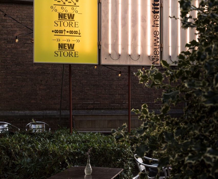
Customers exchange pee for soap at Nieuwe Instituut’s New Store pop-up

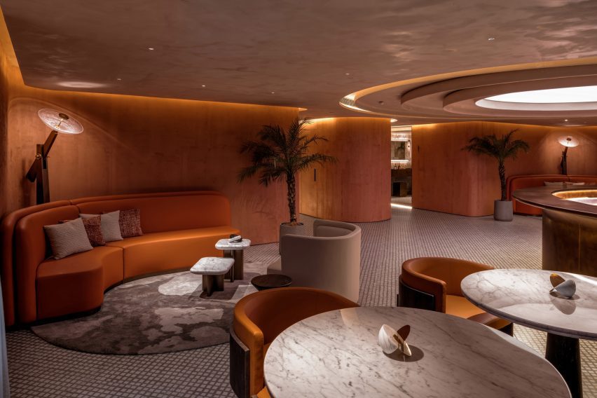
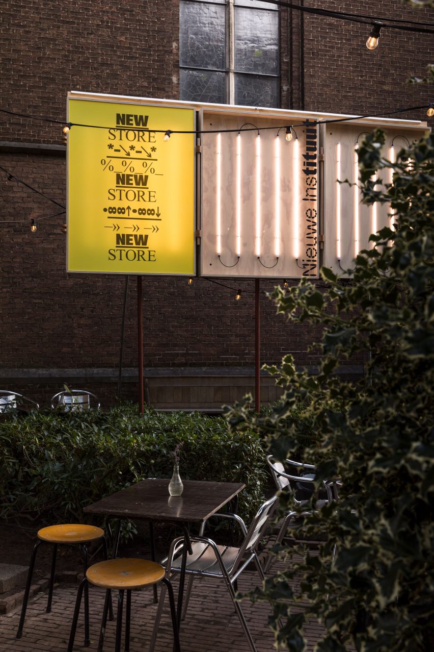
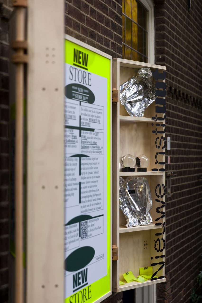
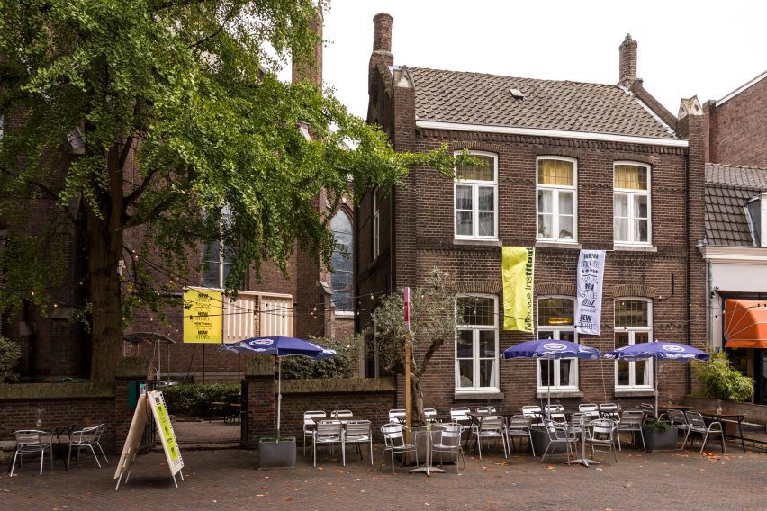
Cultural centre Het Nieuwe Instituut is rethinking the archetypal museum shop with a pop-up at Dutch Design Week, designed to encourage more ethical, resource-conscious consumption.

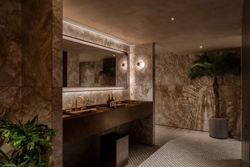
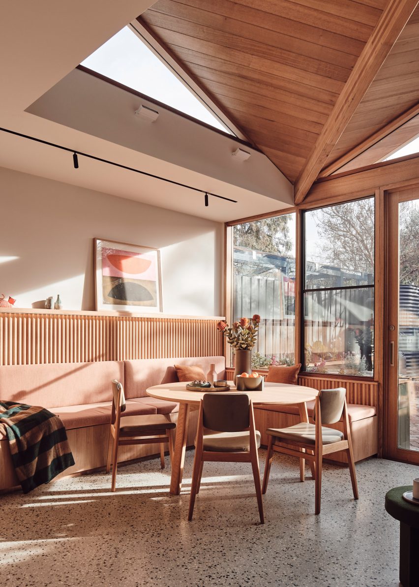
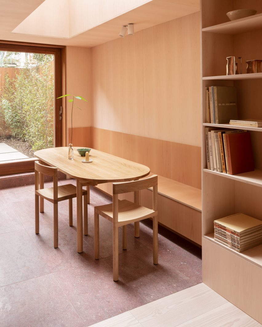
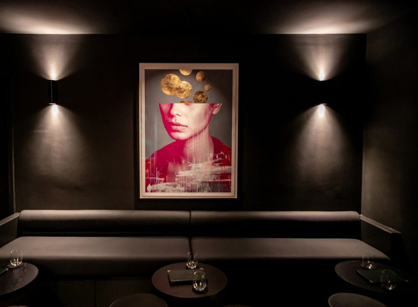
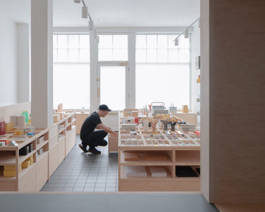
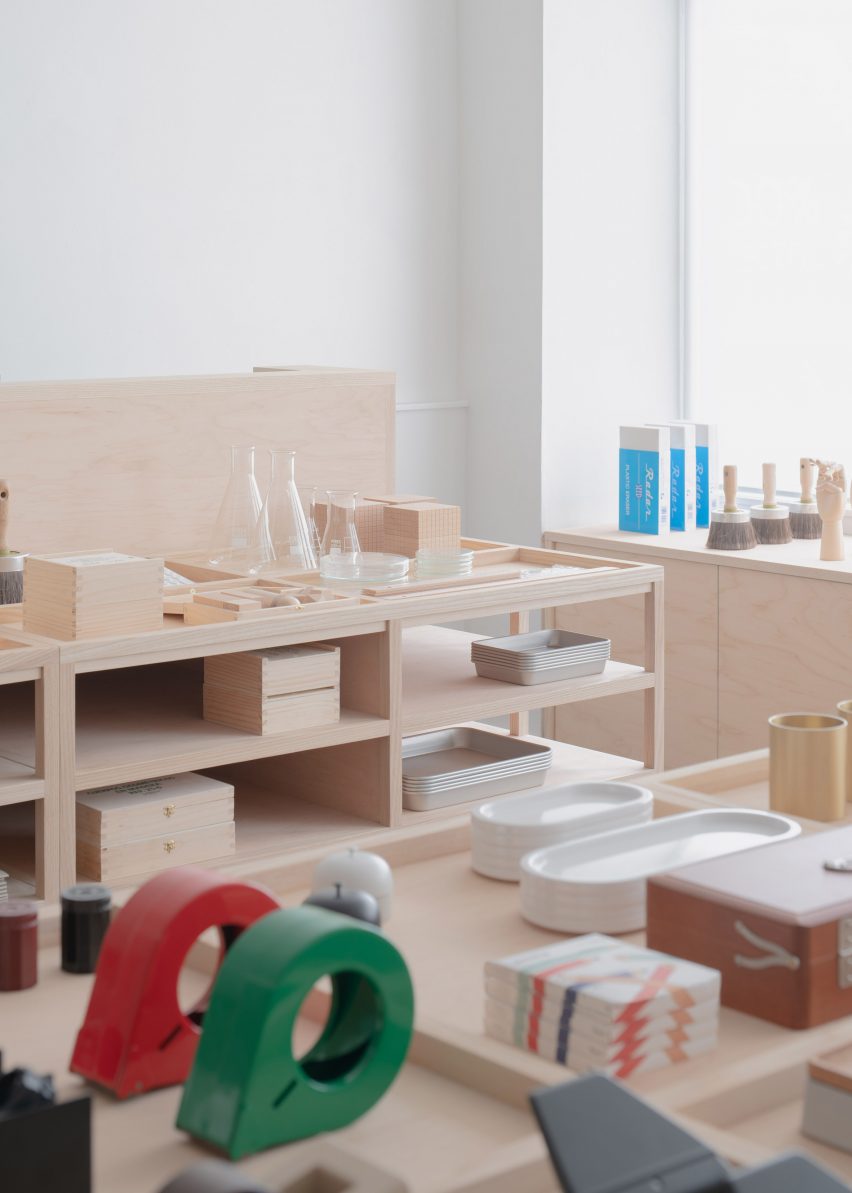
Instead of offering a straightforward exchange of wares for money, New Store 1.0 gives patrons the opportunity to trade their urine for a piece of Piss Soap and encourages them to place their phones on specially designed fixtures to provide lighting for the venue once the sun goes down.

Het Nieuwe Instituut's New Store 1.0 pop-up at Dutch Design Week
Het Nieuwe Instituut has launched its debut pop-up shop at Dutch Design Week

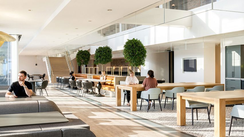
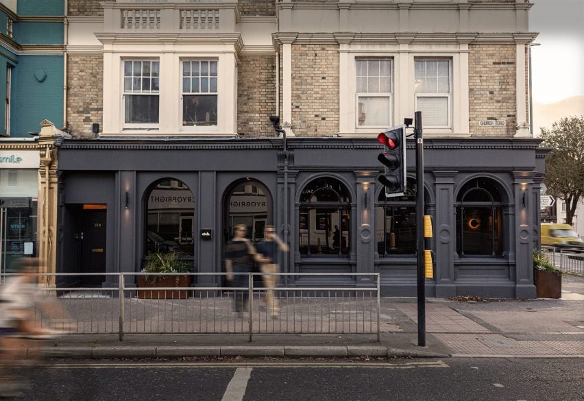
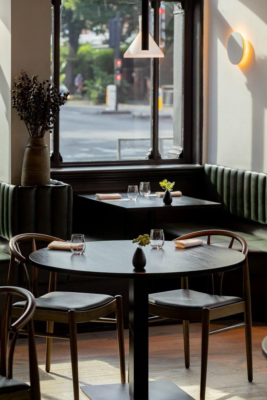
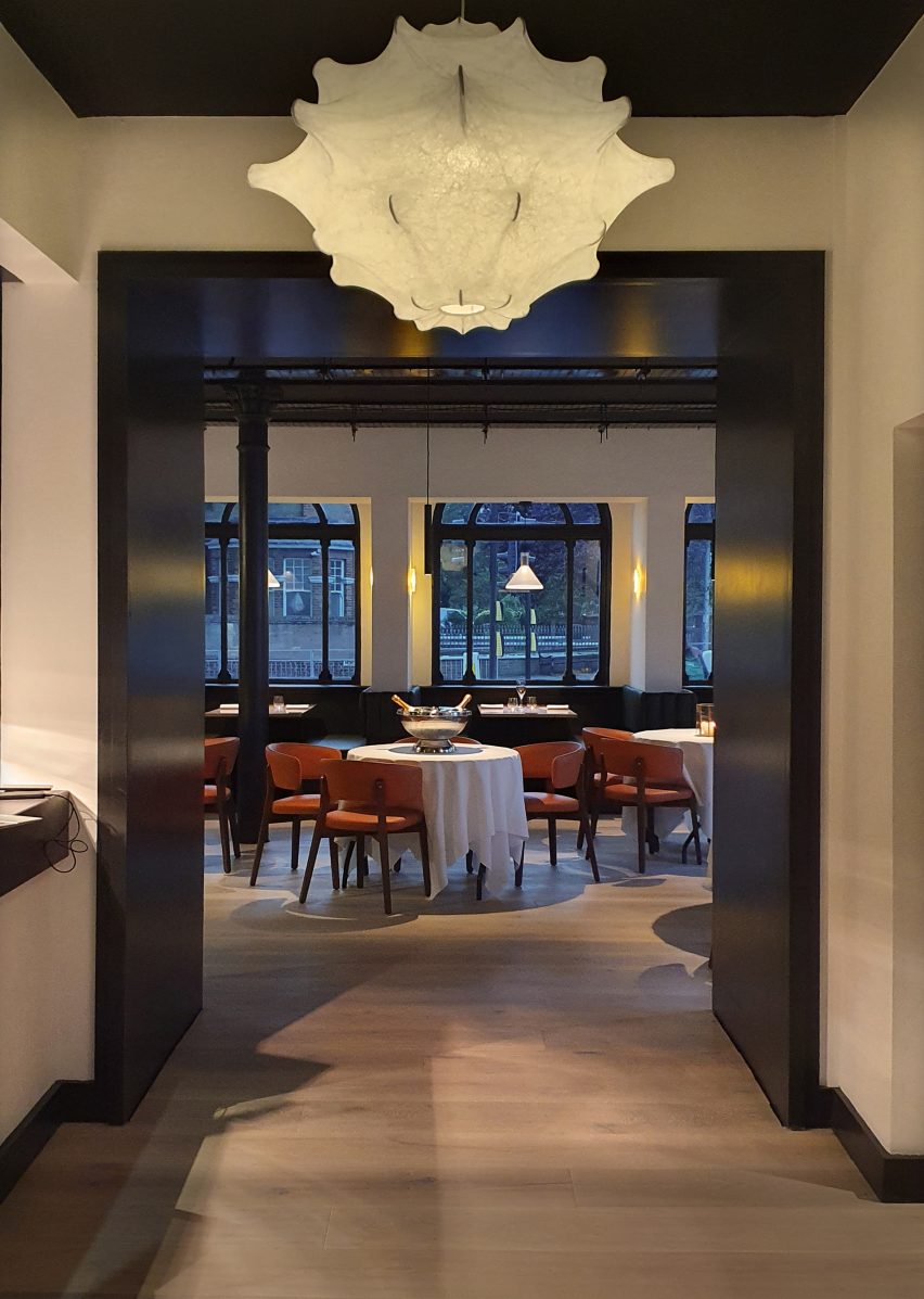
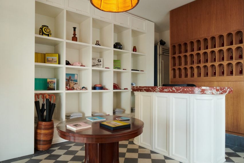
Taking over Residency for the People – a hybrid restaurant and artist residency in Eindhoven – the pop-up also serves up two different versions of the same seabass dish, one made using wild locally caught fish and the other using fish that was industrially farmed and imported.

The pop-up is the first of two trial runs for the New Store, aimed at helping Rotterdam’s Nieuwe Instituut work out how to design its own museum shop to prioritise positive social and environmental impact over mere financial gain.

Bar of Piss Soap by Arthur Guilleminot at New Store pop-up
Arthur Guilleminot’s Piss Soap is among the projects on offer

In collaboration with the International Architecture Biennale Rotterdam (IABR) and research consultancy The Seeking State, the second trial will take place at next year’s Milan design week, with the aim to open the first dedicated shop in the museum’s Rotterdam location in 2025.

“It all started out with the idea that we don’t have a museum shop per se,” Nieuwe Instituut’s programme manager Nadia Troeman told Dezeen. “A museum shop, as we know, has books and trinkets and gadgets. And it’s not really doing well for the planet or the environment.”

“So we were like, how can we make the act of consuming better? How can we consume differently to help not just ourselves but the environment as well?”

Poster calling for people to donate their pee
Visitors are invited to donate their urine via a poster in the toilet. Photo by Jennifer Hahn

For the Dutch Design Week (DDW) pop-up, Nieuwe Instituut found the three featured projects by Dutch designers Arthur Guilleminot, Brogen Berwick and Arnout Meijer via an open call.

The aim was to help the designers trial their ideas for how the exchange of goods could be less extractive and transactional in a real-world scenario.

Jar of pee on a ledge at New Store pop-up
This can then be placed on a shelf outside the bathroom. Photo by Tracy Metz

“The project is part of a broader institutional agenda of ours to become more of a testing ground,” explained the museum’s director Aric Chen. “It’s part of rethinking the role of cultural institutions as being places that can do more than host debates, discussions and presentations.”

“So our aim is to take some of these projects that try to think about how we can do less damage, take them out of the graduation shows, take them out of the museum galleries, take them out of the biennales and put them into the real world, with real consumers, audiences and real people to see what we can learn from it,” he continued.

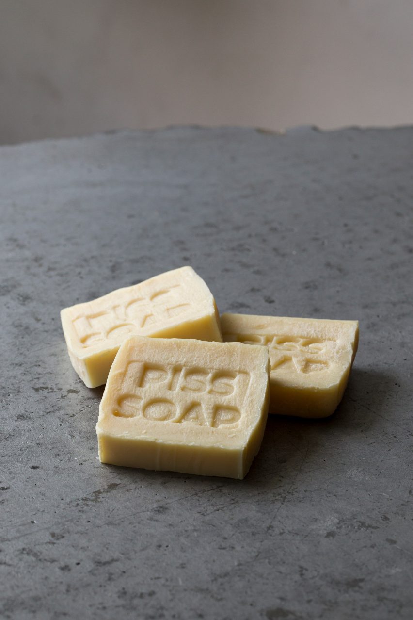
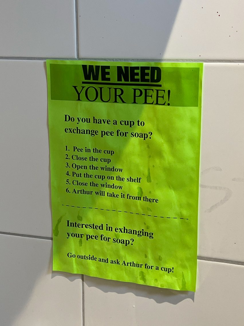
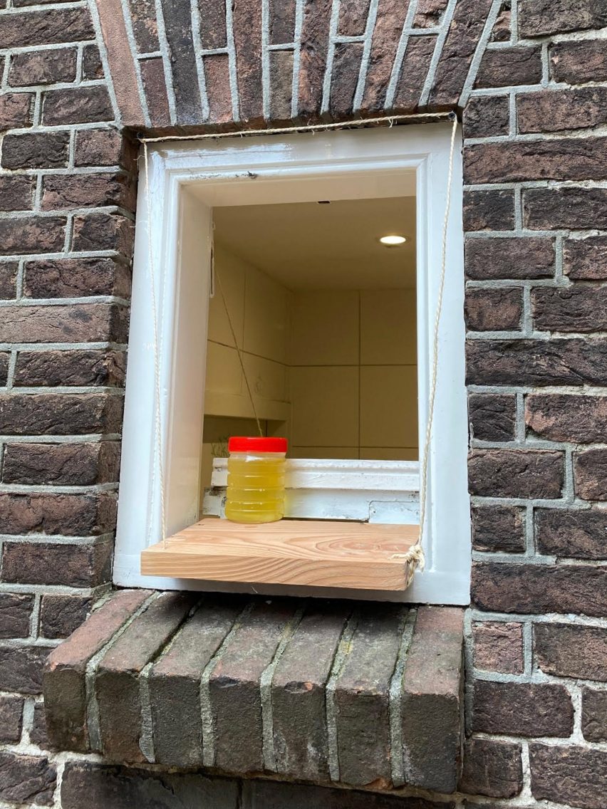
Guilleminot used the opportunity to expand his ongoing Piss Soap project, with a poster in the venue’s toilet inviting visitors to donate their pee by relieving themselves into designated cups and discreetly placing them on a newly added shelf outside the bathroom window.

This can then be exchanged for a piece of soap, made using urine donated by previous participants and other waste materials from human activities such as used cooking oil.

The soap takes three months to cure and is entirely odourless, helping to break up dirt and grease thanks to the urine’s high ammonia content.

Vacuum sealed fish
Those who are eating at the New Store can choose between two kinds of fish

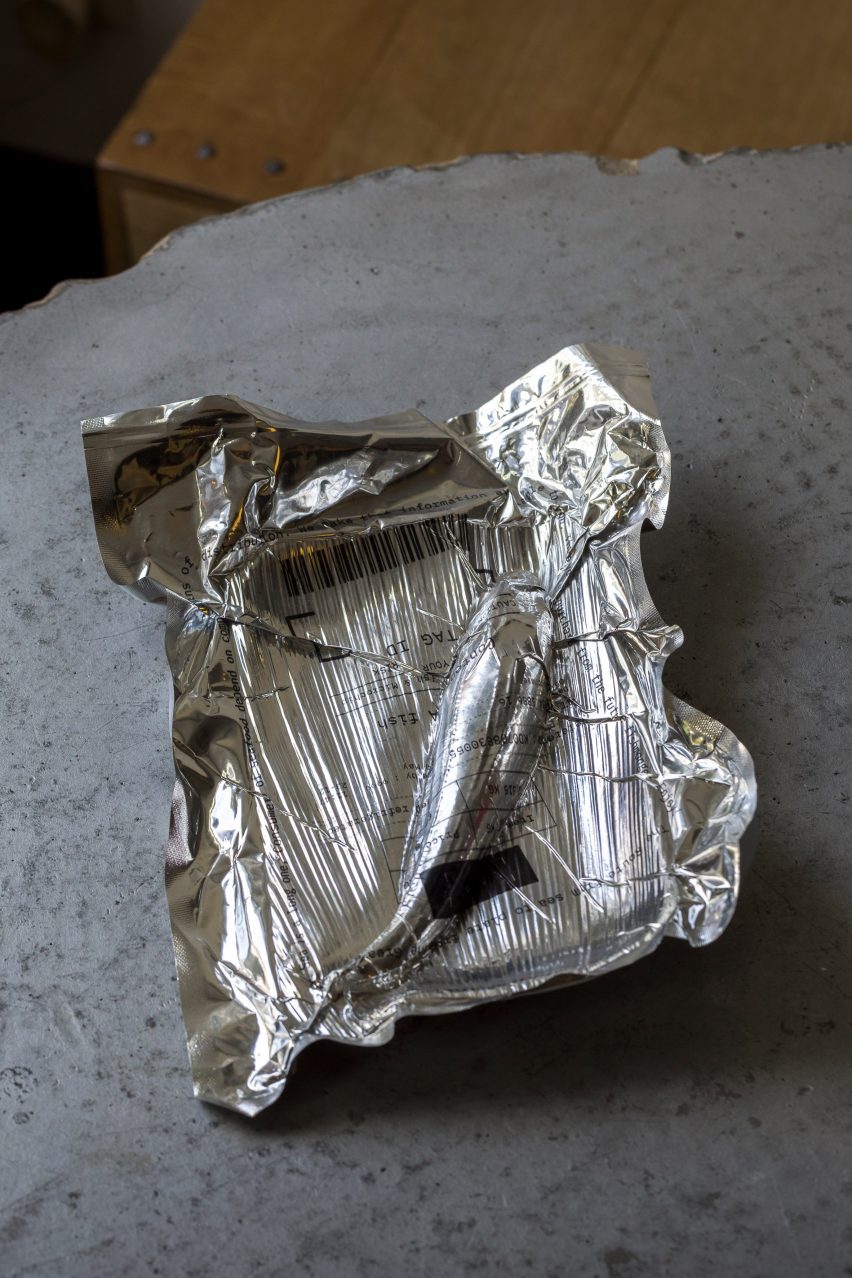
The aim of the project is to find a new application for an underutilised waste material and engage people in a kind of circular urine economy.

“The idea was to revive the ancient tradition of using pee to make soap, which was done for many centuries, including in ancient Rome,” said Guilleminot.

“Could I make a modern product using this ingredient and, in the meantime, also change our feelings of disgust about our golden organic liquid?”

Black marble light by Arnout Meijer at New Store pop-up
The shop’s interactive lighting fixtures were designed by Arnout Meijer

Those having dinner at the New Store can choose between two iterations of the same fish dish.

The first uses wild seabass that was caught locally by fishers Jan and Barbara Geertsema-Rodenburg in Lauwersoog while the other was farmed in Turkey and imported by seafood market G&B Yerseke.

Devised by Berwick, who is a design researcher and “occasional fisherwoman”, the project challenges diners to ask themselves whether they are willing to pay the higher price associated with locally caught fish in exchange for its environmental benefits.

“With the fish, they get a receipt of transparency,” Troeman added. “And one is obviously longer than the other.”

Display at Het Nieuwe Instituut's New Store 1.0 pop-up at Dutch Design Week
The shop is open until 29 October

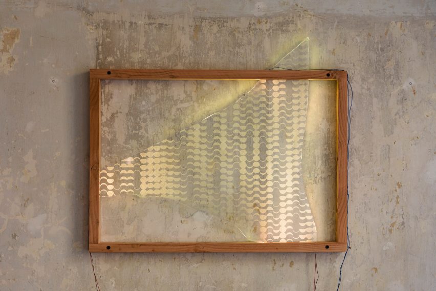
Diners were also asked to provide their own illumination as the sun goes down, in a bid to make them aware of our overconsumption of energy and the adverse effects our light pollution has on the natural rhythms of other animals.

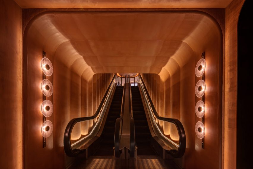
For this purpose, Meijer designed two wall-mounted fixtures inside the New Store that have no internal light source and are simply composed of discarded glass shards topped with wooden shelves made from old beams.

If they require more light, guests have to place their phone on this ledge with the flashlight on, funnelling light onto the glass shard through a narrow slit in the wood.

Exterior of Residency for the people In Eindhoven
It takes over Eindhoven’s artists’ residency and restaurant Residency for the People

This reflects and refracts light around the space while revealing various crescent moon shapes engraved into the glass in a nod to the circadian rhythm.

“It’s really about our dependence on the constant supply of energy,” Troeman said. “Can we embrace the dark and hence be more environmentally friendly? It has benefits for everyone and everything.”

Exploring more circular forms of exchange was also on the agenda at last year’s Dutch Design Week, when designer Fides Lapidaire encouraged visitors to trade their own poo for “shit sandwiches” topped with vegetables that were fertilised with human waste.

The photography is by Jeph Francissen unless otherwise stated.

Dutch Design Week 2023 is taking over Eindhoven from 21 to 29 October. See Dezeen Events Guide for information about the many other exhibitions, installations and talks taking place throughout the week.


Reference

Entrance escalator of Gym Town in Hong Kong by MR Studio
CategoriesInterior Design

MR Studio designs Hong Kong gym to “transport visitors to another world”

In Hong Kong’s fast-paced Central District, local practice MR Studio has modelled this fitness studio on a futuristic Martian dwelling to offer members an escape from their busy lives.

Gym Town‘s entryway and reception are finished entirely in an an earthy shade of orange, chosen to reflect the colours of Mars, while moody black workout areas were designed to allow visitors to focus on their individual health goals.

Entrance escalator of Gym Town in Hong Kong by MR Studio
Gym Town is entered via a dramatic escalator

“We wanted to create a unique and immersive experience for gym-goers,” MR Studio founder Myron Kwan told Dezeen. “The concept of Mars was chosen to represent escapism and a sense of adventure.”

“Inspired by Elon Musk’s vision of colonising Mars, we wanted to create a space that felt futuristic and cutting-edge.”

Lobby and reception of Gym Town
The gym’s reception doubles as a lounge

The studio created a bespoke sculptural lighting piece that can be seen from the street to create a sense of intrigue about the gym.

From the entrance, members are taken up to the lobby by an escalator. In a bid to make this ascent feel like an event, MR Studio turned the space into a tunnel-like “portal” that provides a sense of voyage.

Seating area in Hong Kong gym by MR Studio
Bespoke lights were modelled on satellite dishes

Around the escalator, the walls undulate to create a series of vertical ridges, designed to add depth and visual interest while suggesting walls that have buckled under the heat of the red planet.

“By using the tunnel-like form, we wanted to create a visually striking feature that would set the tone for the entire space,” Kwan said.

“The tunnel creates a sense of anticipation and excitement as guests enter,” he added. “The design itself aims to transport visitors to another world.

Skylight in Gym Town lobby
Decorative rocks are fixed to the ceiling

The escalator delivers members into a large reception area, arranged as a lounge with various seating areas.

One of the challenges of the project was the absence of natural light, which MR Studio addressed with a feature ceiling light.

Composed of concentric circles with an illuminated core, it suggests both a natural skylight and the crater-studded terrain of Mars.

Curves and circles feature heavily throughout Gym Town, from wavy walls and rounded furniture to lights inspired by the form of a satellite dish.

“Custom-made table lamps adorned with sleek metal finishes and cracked glass details capture the silhouette of high-gain antennas used in space exploration,” the studio explained.

The room is centred on a semi-circular brass-wrapped reception desk, which doubles as a bar during events or after-hours gatherings.

Bathroom inside Hong Kong gym by MR Studio
Rooms get progressively darker

The walls here feature the same dusty red-orange finish as the entrance tunnel, while decorative rocks are fixed to the ceiling.

“Envisioned as a modern Martian house, the space is painted in a textured monochromatic palette of tangerine, referencing the iconic red planet’s signature colour and rough terrain,” said Kwan.

“It adds vibrancy and warmth to the space, creating a visually intriguing element that complements the overall design theme.”

Workout area inside Hong Kong gym by MR Studio
The workout areas are finished in muted black and grey tones

Progressing into the changing rooms, workout areas and studios, the colour palette shiftsto more sober greys and blacks.

“To encourage members to fully devote to their fitness routines, the workout area is grounded in an organic and unpretentious style,” the studio said.

Overview of workout areas inside Gym Town
Orange accents delineate different areas

Gym Town has been shortlisted in the health and wellbeing interior category at this year’s Dezeen Awards.

Also in the running is the dusty-pink welfare centre of a boys’ school in Melbourne and a pediatric clinic in Seattle with “no blank walls”.

The photography is by Steven Ko.


Reference

Built-in seating around the dining table in 10 Fold House, Australia, by Timmins + Whyte
CategoriesInterior Design

Ten dining rooms with built-in seating including benches and banquettes

Our latest lookbook explores homes where built-in benches or banquettes offer an inviting place to sit around the dining table, while also helping to save space.

Built-in seating is a popular solution in kitchens and dining rooms where the optimal position for a table is along a wall rather than in the centre of the space.

For homes where space is limited, a fixed bench can provide more seats than would otherwise be possible. It can also be a clever way of integrating extra storage, with concealed compartments under the seat.

The most straightforward approach is to build a fixed seat along one side of the table and then add dining chairs on the opposite side, although L-shaped or curved seating installations can also be possible, depending on the layout.

Whatever the design, the key to getting it right is ensuring that the table legs don’t clash with the base of the bench, so that it’s easy for people to get in and out.

Read on for 10 examples, ranging from a minimalist terrace in London to a warm and tactile family home in Melbourne.

This is the latest in our lookbook series, which provides visual inspiration from Dezeen’s archive. For more inspiration, other recent lookbooks feature colourful shower rooms and kitchens with tiled worktops.


Built-in seating around the dining table in 10 Fold House, Australia, by Timmins + Whyte
Photo is by Peter Bennetts

10 Fold House, Australia, by Timmins + Whyte

This extension to a family home in Melbourne, designed by architecture and design studio Timmins + Whyte, includes a casual dining space that slots into a corner between the kitchen counter and the end wall.

The L-shaped bench is topped with peach-toned cushions, which match the warm tone of the mid-century-style oak table. As well as providing comfort, they conceal storage areas underneath.

Find out more about 10 Fold House ›


Spruce House by Ao-ft
Photo is by Rory Gardiner

Spruce House, UK, by Ao-ft

A bench seat forms an extension of the polished concrete floor in this cross-laminated timber-framed house in east London, designed by Ao-ft founders Liz Tatarintseva and Zach Fluker as their own home.

This is possible because the living space is slightly sunken. This means the concrete plinth, which actually sits at ground level, is the perfect height for sitting at the table.

Find out more about Spruce House ›


Project Karper by He!
Photo is by Tim Van de Velde

Karper, Belgium, by Hé!

This converted warehouse in Brussels was designed to serve as either a family home or a co-living building, so it features a range of different live and work spaces. One of these is a casual dining space located next to the kitchen on the second floor.

A custom-made bench anchors this space to the side wall. A matching table has a squashed circle shape, creating the feel of a round table while also aligning with the seating fixture.

Find out more about Karper ›


Dining space in Frame House by Bureau de Change
Photo is by Gilbert McCarragher

Frame House, UK, by Bureau de Change

When remodelling this south London terrace, architecture studio Bureau de Change added a three-tiered extension at the property’s rear.

The stepped terrazzo floor was designed to incorporate casual seating areas, with one of them serving as a seating area for the adjacent dining table.

Find out more about Frame House ›


Interior of Steele's Road House by Neiheiser Argyros
Photo is by Lorenzo Zandri

Steele’s Road House, UK, by Neiheiser Argyros

If a kitchen has a window bay, this can be a good place to create a seating area. This is what London studio Neiheiser Argyros did in its renovation of a Victorian terrace in the west of the city.

A curved banquette wraps the base of the window, framing a fixed cafe-style round table.

Find out more about Steele’s Road House ›


Dining room interior of Girona Street apartment in Barcelona, designed by Raúl Sanchez Architects
Photo is by José Hevia

Girona Street Apartment, Spain, by Raúl Sanchez Architects

Barcelona studio Raúl Sanchez Architects employed colour-blocking to create the dining space for this renovated apartment in the city’s Dreta de l’Eixample neighbourhood.

A seating bench and the wall behind it are both painted deep blue, in contrast with the white tones elsewhere, which gives the dining space an increased emphasis.

Find out more about Girona Street Apartment ›


Kitchen with perforated breeze black walls and a timber ceiling
Photo is by Tom Ross

Sunday, Australia, by Architecture Architecture

A kitchen island provides the backdrop to the dining table in this house in Melbourne designed by local studio Architecture Architecture.

Upholstered in a muted colour textile, the banquette has a cantilevered seat that slots neatly under a long, slender table, while traditional dining chairs are positioned on the opposite side.

Find out more about Sunday ›


Kitchen island with built-in bench seat at Scalloped Concrete House

Scalloped Concrete House, USA, by Laney LA

California-based studio Laney LA found another way to position a dining space beside a kitchen island for this home in Manhattan Beach, Los Angeles.

Instead of extending out, the bench seat is built into a recess within the wooden volume.

Find out more about Scalloped Concrete House ›


Dining table and bench seat in London terrace by O’Sullivan Skoufoglou Architects
Photo is by Ståle Eriksen

Kensington Place, UK, by O’Sullivan Skoufoglou Architects

In this extension of a mid-terrace property in London’s Kensington, a built-in bench allowed O’Sullivan Skoufoglou Architects to fit a dining table into a narrow space.

Built from plywood, the bench incorporates storage. It is slightly recessed at the base, while a backboard makes it feel more integrated with the wall behind.

Find out more about Kensington Place ›


Dining table with built-in banquette in Nido House by Angelucci Architects

Nido House, Australia, by Angelucci Architects

The ground floor spaces of this family home in Melbourne wrap around a glazed courtyard, so an L-shaped seat was the best solution for fitting in a dining table.

Designed by Angelucci Architects, the space incorporates a green leather banquette and a dining table featuring a marble surface and a base wrapped in ceramic tiles.

Find out more about Nido House ›

Reference

Dezeen Awards 2023 party tickets on sale!
CategoriesInterior Design

Dezeen Awards 2023 party tickets on sale!

Tickets for the Dezeen Awards 2023 party to celebrate this year’s winners are now on sale. Book now to secure your place at our reduced early-bird rate!

Taking place at Shoreditch Electric Light Station in London on 28 November, we will celebrate the winners of Dezeen Awards 2023 with food, drink, live entertainment and music throughout the night.

The winners of all 39 Dezeen Awards project categories will be revealed, as well the overall architecture, interiors, design and sustainability projects of the year.

We will also be announcing the six Designers of the Year and revealing the winner of the inaugural Bentley Lighthouse Award.

The party will be a chance for everyone to come together to celebrate their achievements with fellow nominees and winners, as well as our illustrious Dezeen Awards 2023 judges.

Judges this year include Guilio Cappellini, Patrizia Moroso, Sabine Marcelis, Yves Béhar and Thom Mayne. See who they crowned as winners when they collect their trophies, and join in the celebrations.

Tickets for the event cost £175 + VAT. However, you can save 20 per cent and book your ticket for the special early-bird price of £145 + VAT if you order before 31 October 2023. You can also save a further 10 per cent if you book a package of 10 tickets or more.

Book your ticket now via Eventbrite: dezeenawards2023.eventbrite.co.uk

Email [email protected] if you have any questions. Sign up to our Dezeen Awards newsletter to get updates on the winners party and future editions of Dezeen Awards.

Reference

Shaw Contract reveals Naelofar Office by Swot Design Group as one of the winners of its 2023 Design Awards.
CategoriesInterior Design

Shaw Contract reveals the winners of its 2023 Design Awards

A hotel overlooking a Japanese castle and a neurodiversity-friendly office building are among the winners of Shaw Contract’s 2023 Design Awards, revealed in this video produced for the brand by Dezeen.

Global flooring company Shaw Contract recognised five winners in the 18th edition of its Design Awards, which celebrate impactful living, working, learning and healing interior spaces around the world.

In total, five Best of Globe winners were chosen by a panel of design professionals from 39 regional winners, which had been narrowed down from over 650 project submissions from 40 countries.

The winners include architecture studio Tatsuro Sasaki, which won an award for its OMO5 Kumamoto by Hoshino Resorts hotel built on Mount Chausu in Kumamoto City, Japan.

The hotel is located in the city centre overlooking Kumamoto Castle and is nestled in amongst the landscape to blend in with its surroundings.

Shaw Contract reveals Naelofar Office by Swot Design Group as one of the winners of its 2023 Design Awards.

Four workplace designs were also recognised, including Boston Consulting Group’s headquarters in Toronto designed by HOK.

The office features ample open spaces to flood it with natural light and is equipped with circadian lighting to follow people’s natural rhythms and improve productivity.

Another winner was the 345 North Morgan office design by Eckenhoff Saunders, which is located adjacent to Chicago’s metro tracks. The design of the office was informed by classic railway stations and draws from the neighbourhood’s rich industrial history.

Boston Consulting Group's headquarters in Toronto designed by HOK
Shaw Contract reveals Boston Consulting Group Canadian Headquarter by HOK as one of the winners of its 2023 Design Awards.

Other winners include Swot Design Group’s Naelofar Office in Petaling Jaya, Malaysia, which was designed to foster relationships and collaboration in the workplace.

It features meeting rooms with operable glass panels that can be rearranged to open up spaces for functions such as training sessions or events.

Rezen Studio’s Newmont office in Subiaco, Australia also received an award, which Shaw Contract described as an example of “the rapidly evolving office typology which responds to the changes in which businesses are operating”.

Rezen Studio's Newmont office interior in Subiaco, Australia
Shaw Contract reveals Newmont by Rezen Studio as one of the winners of its 2023 Design Awards.

“We believe that design has the power to shape the world around us and create a better future for both people and the planet,” said Shaw Contract.

“That’s why the Shaw Contract Design Awards programme is so important to us. It allows celebration of the designers who share our commitment to creating a positive impact in all interior spaces.”

Each winner was awarded a £2,000 USD charitable donation in the name of their studio to an organisation of their choice. They also received a trophy designed by Singapore-based artist Kelly Limerick using recyclable Shaw Contract’s recycled yarn.

Find out more about all of the winners on the Shaw Contract Design Awards website.

Partnership content

This video was produced by Dezeen for Shaw Contract as part of a partnership. Find out more about Dezeen partnership content here.


Reference

Etch by Steven Edwards in Hove
CategoriesInterior Design

Akram Fahmi’s monochrome revamp of Etch reflects two-ingredient dishes

Interior designer Akram Fahmi has revamped the Etch restaurant in Hove, East Sussex, creating black and white interiors to reflect its minimalist menu.

Located in a space that was originally a bank, Etch was first renovated and opened as a restaurant in 2017.

It has been reimagined by Fahmi, the founder of interiors studio London Design House, with an open kitchen and subterranean speakeasy bar.

Etch by Steven Edwards in Hove
Two modern arches were added to complement the three period arches of the existing building

Fahmi chose the simple colour palette to echo the approach of the restaurant’s menu, where most of the dishes are comprised of just two ingredients.

Wide-plank chalk-washed timber floors and white walls contrast black banquette seating and timber framing.

“We identified, and tried to achieve, three key principles in the design; refinement, texture, and locality,” Fahmi told Dezeen.

monochrome dining room at etch hove by steven edwards
Black-framed windows stand in stark contrast to the white interior walls

Rough quarry tiles, matte-finished stone and sinuous stretched-fabric lighting were chosen to reflect the textures of the nearby South Downs, the coastline and the urban landscape.

“The balance in texture and tone is key to the guests’ journey through every space in the restaurant and bar,” Fahmi explained.

The renovation involved merging two ground-floor units together and uniting a single space that is flooded by natural light from five arched windows.

Looking out arched window at Etch
The lighting fixtures continue the monochrome theme

The studio kept three original Victorian arched windows on the corner and added two further full-height arches with modernised detailing to create a uniform facade.

This was further united by painting the whole ground-floor facade charcoal grey.

all black speakeasy bar
The subterranean speakeasy is decorated all in black with dramatic lighting

“You want to feel as though the architecture and interiors that you journey through are as curated and elegant as the food in front of you,” Fahmi said.

Internally, cast iron columns from the old bank were retained and suspended ceilings in the main spaces were stripped out to expose the original high ceilings.

Black and white interior design by London Design house
Stretched lampshades recall the nearby coastal landscape

Fahmi worked with the local council to find solutions for extract routes and plans that would “retain and respect the fabric of the historic building as much as possible”.

The studio used passive devices, such as tinting the glazing to reduce solar glare, to help control the internal temperature more efficiently.

New external planting troughs soften the austere facade and hard pavement. The studio chose plants, herbs and grasses that would be suitable for the local coastal environment.

London Design House also worked with local craftspeople and suppliers on the project to reflect Etch’s ethos of sourcing its produce locally and seasonally.

Speakeasy bar at Etch
A speakeasy bar is underneath the restaurant

“I wanted the restaurant to feel like an extension of the food and service we offer, which I would describe as British contemporary, but also minimalist  – mainly using two quality ingredients,” Etch’s chef and owner Steven Edwards told Dezeen.

The monochrome palette “gives a slightly nordic minimalist feel that works completely with my food style,” he added.

“I think the relationship between the food you eat and the setting you eat it in is really important. It’s not just about the food – although it’s hard for me to say that being a chef!”

Other restaurant interiors recently featured on Dezeen include Studio Becky Carter’s “distinctly New York” interiors for Cecchi’s and Otherworlds’ transformation of a Goan villa into restaurant.

The photography is by Justin de Souza and David Charbit.

Reference

A spiraling ramp replaces the need for stairs in this modern office and adds a sculptural element.
CategoriesInterior Design

Instead Of Stairs, A Spiraling Ramp Was Designed For This Office Building

A spiraling ramp replaces the need for stairs in this modern office and adds a sculptural element.

PAULO MERLINI architects has designed the offices of E-GOI & CLAVEL´S KITCHEN in Portugal, and one of the main design features central to the interior is a spiraling ramp.

A spiraling ramp replaces the need for stairs in this modern office and adds a sculptural element.

The former warehouse, which has now been transformed into offices that span multiple floors, includes a ramp that replaces the need for a staircase.

A spiraling ramp replaces the need for stairs in this modern office and adds a sculptural element.

The elegantly curves of the concrete form is accentuated by the use of white bars and edges.

A spiraling ramp replaces the need for stairs in this modern office and adds a sculptural element.

The circling ramp connects the floors of the office and adds a sculptural element that doesn’t block the light from traveling throughout the interior.

A spiraling ramp replaces the need for stairs in this modern office and adds a sculptural element.
A white frame and supports connect the top of a spiraling ramp with the ceiling.

Here’s a glimpse of the ramp looking down from the top floor, and up from the ground.

A spiraling ramp replaces the need for stairs in this modern office.

Let’s take a look at the rest of the office…

The exterior of the office has walls of glass providing a glimpse of the interior for the pedestrians on the street.

The exterior of this modern office has walls of glass providing a glimpse of the interior for the pedestrians on the street.

There’s a variety of different seating areas in the office interior, including spaces for casual meetings in house-shaped alcoves.

There's a variety of different seating areas in this modern office interior, including spaces for casual meetings in house-shaped alcoves.

More private work rooms with glass walls that keep the sound in or out.

A modern office interior with a variety of work areas.

A larger meeting room with a blue curtain that’s filled with beanbags and has LED lighting in the ceiling.

A large meeting room with a blue curtain that's filled with beanbags and has LED lighting in the ceiling.

Other more traditional work spaces exist too, with desks that include multiple work stations.

A modern office with floor-to-ceiling windows.

There’s also a photo studio with a minimalist white kitchen with floating wood shelves. Adjacent to the kitchen are tall wood shelves filled with photography props and kitchen equipment.

A modern office has a photo studio with a minimalist white kitchen with floating wood shelves. Adjacent to the kitchen are tall wood shelves filled with photography props and kitchen equipment.
Wood shelves frame a spiraling ramp in the center of this modern office.

When it’s time to take a break from working, there’s a communal area with long wood tables, a kitchenette, seating by the windows, and an outdoor space.

A modern office with a communal break room.
A modern office with seating by the windows that take advantage of the natural light.
A modern office with plants that hang from a metal detail.
Photography by Ivo Tavares Studio | Architecture Office: PAULO MERLINI architects | Main Architects: Paulo Merlini/ André Santos Silva

Madera bespoke cabinetry
CategoriesInterior Design

Madera displays custom wood products in Los Angeles showroom

Design and fabrication firm Madera has unveiled its latest showroom in Los Angeles, which was designed to showcase wood flooring and millwork products and has been captured in this exclusive video produced by Dezeen.

The West Coast hub, which is Madera‘s second showroom, is located in the Arts District of Los Angeles while its flagship showroom is in New York City.

The showroom features a selection of wood products ranging from the brand’s signature wide-plank Thrasher flooring to custom cabinetry and benches.

The space, which was converted from a former metal foundry into a showroom, aims to encourage clients to embrace wood and view it as an essential and natural element in design.

Madera bespoke cabinetry
Madera’s made-to-order Thrasher cabinetry is displayed in a living room space

The entryway features bespoke Douglas fir tables and benches, while the living room space has made-to-order Thrasher cabinetry showcasing the various finishes the brand offers.

The kitchen displays a large custom island combining Madera’s Dogwood Ash and Travertine finishes, while a nearby conference room houses the brand’s Abechi Façade cladding in black.

Madera showroom in Los Angeles California
The showroom kitchen features a custom island that combines Madera’s Dogwood Ash and Travertine finishes

Madera’s mission is to bring the natural beauty of wood into the spaces their clients inhabit to “redefine its place in the modern home”, according to the brand.

Its Los Angeles wood shop, where custom stair parts and millwork elements are produced, is located only a short distance from its showroom.

outside of Madera showroom in Los Angeles
Madera’s showroom is located in the Arts District of Los Angeles

The brand recently launched its Seamless Wood Design system, which aims to ensure wooden products in an interior all complement each other.

The system was created to offer designers and homeowners a customisable option that enables them to retain the character of wood throughout an interior.

Partnership content

This video was produced by Dezeen for Madera as part of a partnership. Find out more about Dezeen partnership content here.


Reference

Present & Correct by Architecture for London
CategoriesInterior Design

Architecture for London creates demountable interior for stationery store

Local studio Architecture for London has designed an interior for stationery store Present & Correct in London,  which features gridded joinery and draws on “wunderkammer” cabinets of curiosities.

The studio designed bespoke joinery and storage for the Present & Correct shop in Bloomsbury, central London, which sells vintage and new stationery from across the globe.

Present & Correct by Architecture for London
The store interior was made from white-oiled wood

Architecture for London constructed a fully demountable interior for the store, which could be moved in the future if needed.

“Rather than building the joinery around the existing building, we treated each unit as a freestanding cabinet,” Architecture for London director Ben Ridley told Dezeen.

Stationery store in Bloomsbury
Trays showcase old and new stationery

“Aside from the kiosk, most of the joinery was constructed offsite, so we had to consider whether the cabinets fit through a standard door width and could it easily be carried,” he continued.

“In the long term the interior needs to adapt to multiple environments; the current shop has uneven floors, to accommodate this the cabinets have adjustable feet concealed within a recessed plinth, while slender legs appear to be bearing the weight.”

Grid-shaped interior of Present & Correct
Architecture for London developed a grid design for the interior

Present & Correct’s aesthetic is often built around an organised grid that holds different-shaped pieces of stationery, and the studio aimed to replicate this in the interior of the store.

“The shop joinery provides order through a grid which becomes progressively smaller as you enter the shop, providing scale to the eclectic collection of objects,” Ridley said.

Plywood shelves in Present & Correct
The store design references the nearby British Museum

It also drew on the idea of a wunderkammer, informed by the store’s location close to the British Museum, to display the goods as “objects of desire”.

“The wunderkammer is an environment which provides order to a collection of objects through compartmentalisation which could otherwise be observed as a chaotic mess,” Ridley explained.

“So it’s about how we display hundreds of tiny objects like pens, pencils and rubbers alongside toolboxes and trays in a considered and legible way.”

The aim was for the cabinets to be durable and as long-lasting as old museum vitrines. However, budgetary constraints meant that Architecture for London couldn’t use hardwood for the joinery.

Instead, it chose to work with maple plywood and ash.

“We created the appearance and durability of solid timber by applying a rule that all edges of the maple plywood are finished with 25-millimetre British ash, which can take the knocks from a busy shop floor,” Ridley said.

Wooden shelving in London stationery store
The furnishings are fully demountable

“The maple plywood grain is free from imperfections and has a calm grain, so we didn’t feel the need to use additional veneers,” he added.

“Although the joinery is built with an off-the-shelf material, by concealing the raw plywood edges the interior avoids the DIY aesthetic that can come with working with plywood.”

Close-up of plywood shelves
A neutral colour palette was used throughout

It was important to Present & Correct that the interior would allow the products to shine, rather than compete with them.

This led Architecture for London to use a neutral colour palette and a grid layout that lets the materials speak for themselves, rather than more eye-catching designs.

“At the concept stage, we produced designs which incorporated more playful elements such as large columns shaped like pencils,” Ridley said.

“The shopkeeper understood their product well enough to know that there was enough humour in the stationery, so it didn’t need to be represented in the architecture.”

Other recent projects by Architecture for London include a light-filled extension to a Hackney home and an energy-saving home in north London designed for Ridley.

The photography is by Building Narratives.


Project credits:

Architect: Architecture for London
Interior designer: Architecture for London
Main contractor: AFL Build

Reference

Chequered yellow floor with chequerboard flooring
CategoriesInterior Design

Eight interiors where chequerboard flooring adds a sense of nostalgia

A cannabis dispensary, a hotel gym and an office in a converted 1930s military warehouse feature in this lookbook, proving that chequered floors aren’t just for kitchens.

Alternating squares of colour, a style hearkening back to the nostalgia of 1950s American diners and Victorian entryways, can provide a graphic backdrop to any room.

The examples below were realised using a range of materials, from tiles and stone slabs to wood parquet and paint, providing a clever way of bringing colour, pattern and texture into interiors.

This is the latest in our lookbooks series, which provides visual inspiration from Dezeen’s archive. For more inspiration see previous lookbooks featuring autumnal bedrooms, loft conversions and kitchen islands with sleek waterfall edges.


Chequered yellow floor with chequerboard flooring
Photo by Mikael Lundblad

Cafe Banacado, Sweden, by ASKA

The sun-drenched bars of Cuba and the symmetry of Wes Anderson films informed the design of this all-day breakfast cafe in Stockholm.

This is reflected in its butter-yellow colour palette and the tonal squares painted onto the concrete floor, complemented by vintage touches including a vinyl player and a wall of Polaroid pictures.

Find out more about Cafe Banacado ›


Il Capri Hotel, Italy, by Graziella Buontempo and Arnaud Lacombe
Photo by Marine Billet

Il Capri Hotel, Italy, by Graziella Buontempo and Arnaud Lacombe

When renovating this hotel in a 19th-century Venetian-style palazzo, husband-and-wife duo Graziella Buontempo and Arnaud Lacombe aimed to balance the building’s old-school grandeur with a more pared-back contemporary elegance.

A classic black-and-white checked floor runs through all of the hotel’s communal spaces and was paired with a mix of new and antique furniture pieces to create a homely, lived-in feel.

Find out more about Il Capri Hotel ›


Bonne Vie patisserie with chequerboard flooring
Photo by Brian W Ferry

Bonne Vie patisserie, USA, by Home Studios

Alternating slabs of red and white marble pave the Bonne Vie patisseries at The Grand America Hotel, which was designed to bring European cafe culture to Salt Lake City.

Matching crushed velvet chairs create a small seating area and are offset against duck-egg blue millwork and art deco-style opal globe lights mounted on brass fixtures.

Find out more about Laurel Brasserie and Bar ›


022 Rodrigo da Fonseca by Aboim Inglez Arquitectos residential interiors
Photo by Ricardo Gonçalves

Rua Rodrigo da Fonseca apartment, Portugal, by Aboim Inglez Arquitectos

Portuguese studio Aboim Inglez Arquitectos stripped back the interior of this 1930s apartment in Lisbon to reveal its original parquet floors during a renovation.

Fulfilling much the same function as area rugs, the carefully restored patterns feature timber in different shades, laid into a subtle chequerboard pattern bordered by strips of light wood.

“We believe it was used to stress the independence of the rooms and circulation areas and at the same time acting as the element that unifies the whole house,” architects Maria Ana and Ricardo Aboim Inglez told Dezeen.

Find out more about Rua Rodrigo da Fonseca apartment ›


Clay Warsaw offices designed by Mateusz Baumiller with chequerboard flooring
Photo by Ernest Wińczyk

Clay.Warsaw office, Poland, by Mateusz Baumiller

Tiled chequerboard floors are original to this former 1930s military warehouse in Warsaw, which now houses the joint offices of production companies Menu, Analog/Digital and Photoby.

To soften the building’s industrial shell, architect Mateusz Baumiller furnished the office much like a residential interior, bringing in modern Polish art and a mix of contemporary and vintage design pieces from local brands and artisans.

Find out more about the Clay.Warsaw office ›


A greent store with cannabis products
Photo by Alex Lysakowski

The Annex, Canada, by Superette

This cannabis dispensary in Toronto was modelled on an Italian delicatessen, complete with a deli counter that contains an array of pre-rolled joints and different strains and strengths of marijuana.

The kitschy nostalgic atmosphere was rounded off with green-and-white chequered flooring, while contrasting splashes of tomato red was used across stools and pendant lights.

Find out more about The Annex ›


Casa Cabanyal in Valencia by Viruta Lab with chequerboard flooring
Photo by David Zarzoso

Casa Cabanyal, Spain, by Viruta Lab

A mosaic of small navy blue and white tiles brings a subtle nautical feel to this home in Valencia’s traditional fishing neighbourhood El Cabanyal.

Featured throughout all the rooms, from the bathroom to the sleeping quarters, they nod to the traditional azulejo tiled facades found across the city, which has been a prolific exporter of ceramics since the 15th century.

Find out more about Casa Cabanyal ›


Gym inside Hotel Les Deux Gares in Paris
Photo by Benoit Linero

Hotel Les Deux Gares, France, by Luke Edward Hall

Colours and patterns clash merrily inside this renovated hotel, designed by British designer Luke Edward Hall to have an “anti-modern” feel that hearkens back to the Paris of the past.

Even its gym has been reimagined with wooden equipment, graphic red-and-white flooring and mismatched floral wallpaper designed by Austrian architect Josef Frank.

“I really wanted this space to feel above all joyful and welcoming and alive, classic but a little bonkers at the same time,” Hall told Dezeen.

Find out more about Hotel Les Deux Gares ›

This is the latest in our lookbooks series, which provides visual inspiration from Dezeen’s archive. For more inspiration see previous lookbooks featuring autumnal bedrooms, loft conversions and kitchen islands with sleek waterfall edges.

Reference