Harry Nuriev and Tyler Billinger Residence
CategoriesInterior Design

Eight bold showers that add a pop of colour to the bathroom

Showers enclosed in dichroic glass and wrapped in speckled terrazzo are featured in our latest lookbook, which showcases eight unique showers that bring a touch of colour to the bathroom.

Bathtubs often hold the spotlight in a bathroom, but this round-up proves showers can be just as showstopping – and luxurious.

From an all-pink shower in Taiwan to a minty-green shower in an Antwerp apartment, these colourful showers add a bold touch to brighten up the surrounding space.

This is the latest in our lookbooks series, which provides visual inspiration from Dezeen’s archive. For more inspiration see previous lookbooks featuring pared-back loft conversions, lattice screens and outdoor showers.


Harry Nuriev and Tyler Billinger Residence
Photo is by Dylan Chandler

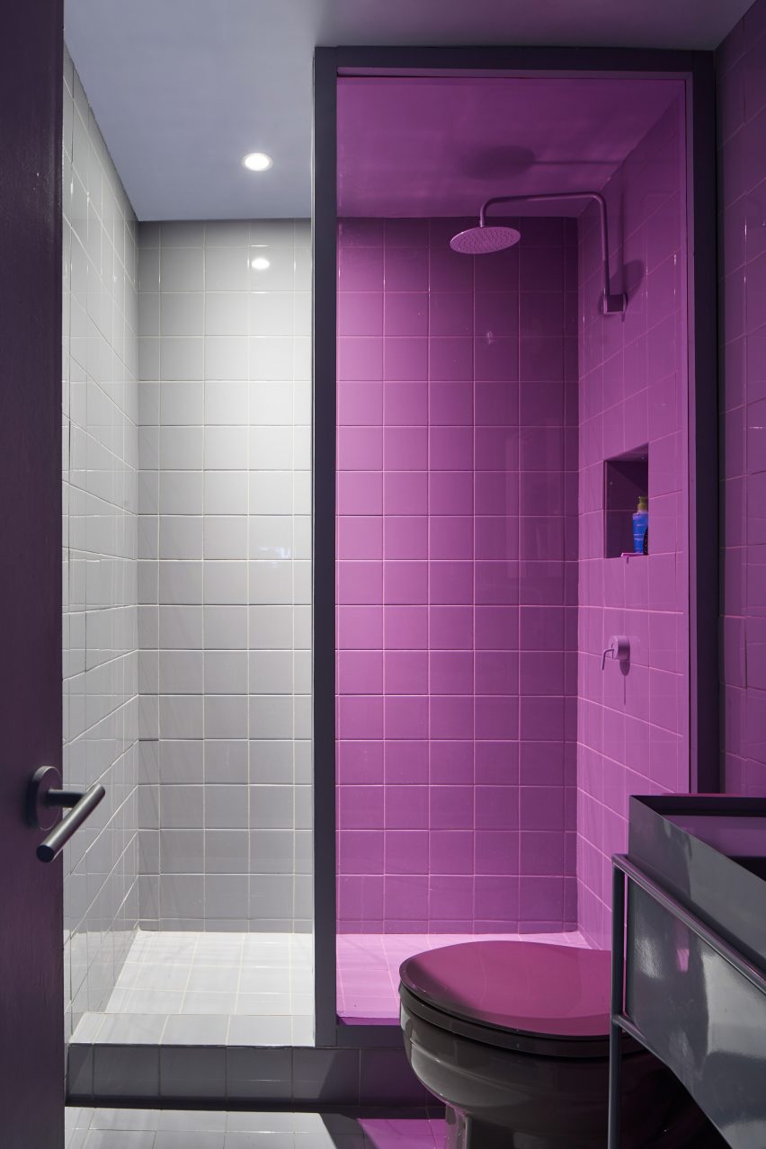
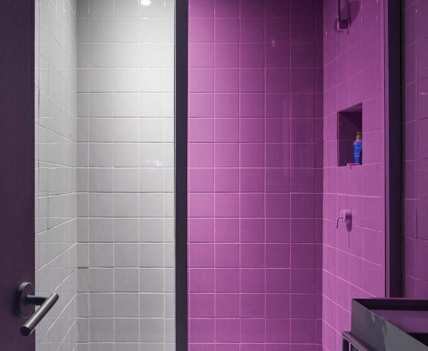
Crosby Studios apartment, USA, Crosby Studios

Crosby Studios founder Harry Nuriev and partner Tyler Billinger outfitted their New York City apartment in a palette of purple and grey.

The bold colour scheme was carried into the bathroom, where the shower was clad in grey tile and enclosed with a purple shower screen.

Find out more about the Crosby Studios apartment ›


The Siren Hotel by ASH NYC
Photo is by Christian Harder

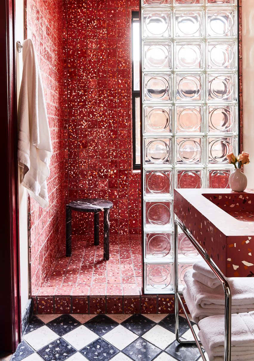
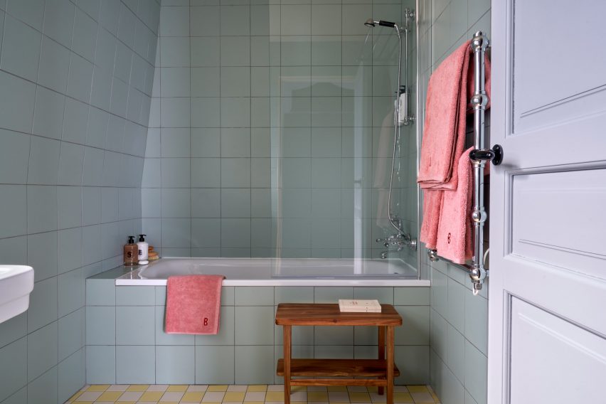
The Siren Hotel, USA, Quinn Evans Architects

The Siren Hotel in Detroit was originally built in 1926 by architect Robert Finn before being refreshed by design development firm ASH NYC with the help of Quinn Evans Architects in 2018.

The renovation included the addition of pastel hues and an assortment of rich textiles, while the hotel’s showers were updated with red-speckled terrazzo and a glass-brick divider.

Find out more about The Siren Hotel ›


Concrete bathroom in Habitat 67 building
Photo is by Maxime Brouillet

Unit 622, Canada, Rainville Sangaré 

Unit 622 by Rainville Sangaré is located inside architect Moshe Safdie’s famous brutalist Habitat 67 in Montreal, Canada.

Sangaré updated the apartment to include walk-in showers enclosed in dichroic glass that appears to change colour when viewed from different angles.

Find out more about Unit 622 ›


A bathroom with pink tile
Photo is by Hey! Cheese

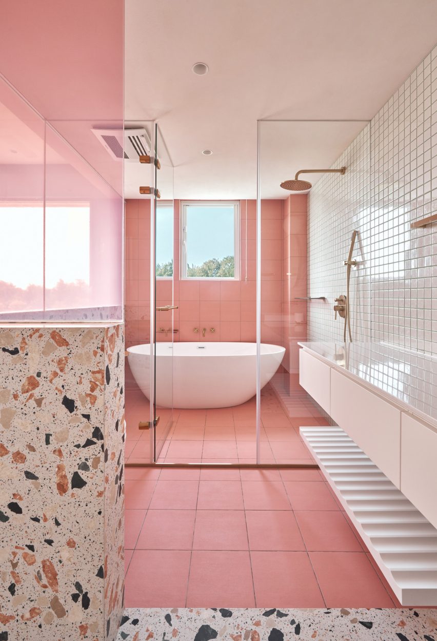
Cats’ Pink House, Taiwan, KC Design Studio

Not only does the Cats Pink House by KC Design Studio include an entire room dedicated to the owner’s cats, but it also contains a spacious pink bathroom.

Large pink tiles cover the walls and floor of a walk-in shower, which is also outfitted with a stand-alone tub.

Find out more about Cat’s Pink House ›


Spinmolenplein apartment by Jürgen Vandewalle
Photo is by Karen Van der Biest

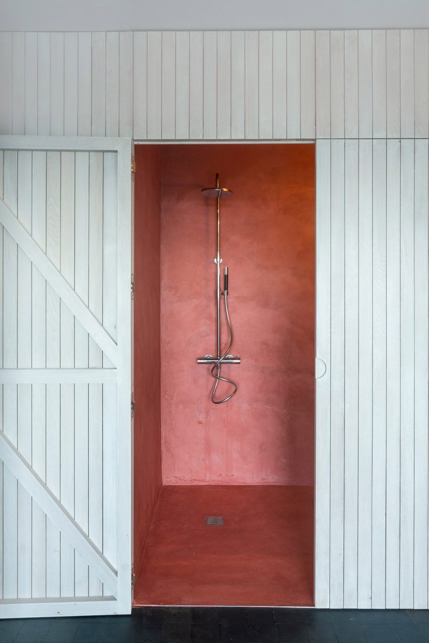
Spinmolenplein penthouse, Belgium, Jürgen Vandewalle

Located on the top floor of the tallest residential building in Ghent, Belgium, the 60-square-metre Spinmolenplein penthouse updated by Jürgen Vandewalle was designed to maximize space.

A bathroom unit clad in white wood panels opens to reveal a colourful shower stall finished with a micro-cement in a muted red.

Find out more about Spinmolenplein penthouse ›


A bathroom with shower and bathtub clad in blue tile
Photo is by Luis Díaz Díaz

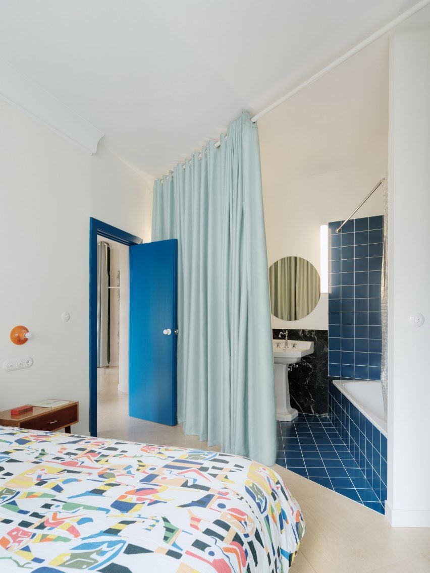
Ready-made Home, Spain, Azab

Located in an apartment building in Spain built in the 1960s, the Ready-made Home by Azab features a colourful palette of soft pinks, blues and yellows.

A corner bathroom in the main bedroom is partitioned by a light blue curtain, while a deeper shade of blue was carried into the tiles that cover the floor and walls of the bathtub and shower.

Find out more about Ready-made Home ›


Apartment A by Atelier Dialect
Photo is by Piet-Albert Goethals

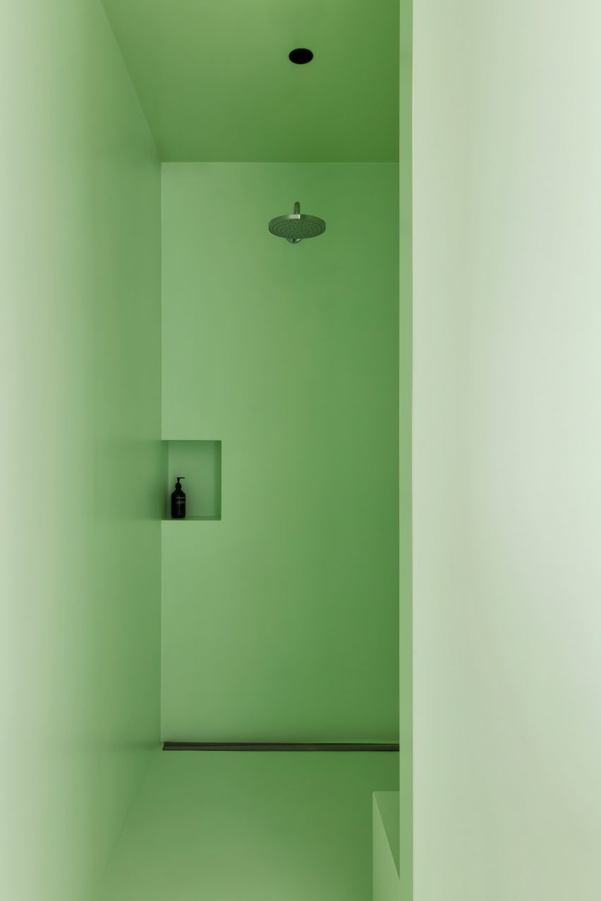
Apartment A, Belgium, Atelier Dialect 

While an en-suite shiny steel tub makes quite the statement in this Antwerp apartment updated by Belgian design studio Atelier Dialect, the shower is equally intriguing.

Contrasted by the stark white and black palette of the surrounding bedroom, the shower was wrapped in minty green, with a single shelf cut into the wall for toiletries and a bench installed opposite.

Find out more about Apartment A ›


Louisville Road house designed by 2LG
Photo is by Megan Taylor

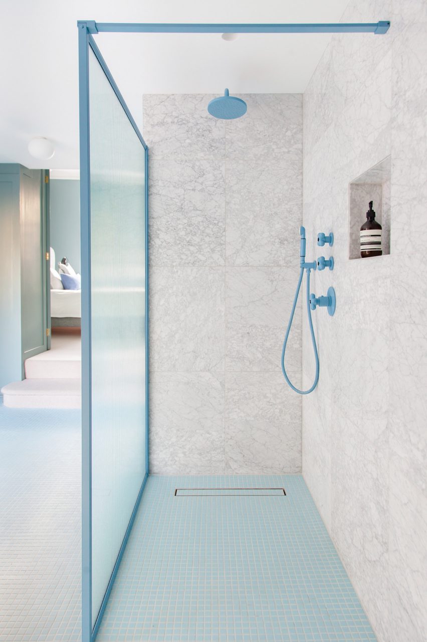
Louisville Road house, England, 2LG Studio

Located in Tooting, south London, interior design studio 2LG overhauled a period home with blue tilework and coral-orange cabinetry.

The walk-in shower features baby blue floor tiles and matching hardware, as well as sky-blue bordering that surrounds the fluted-glass shower screen.

Find out more about Louisville Road house ›

This is the latest in our lookbooks series, which provides visual inspiration from Dezeen’s archive. For more inspiration see previous lookbooks featuring basement apartments, mid-century homes and textural kitchens.

Reference

Lounge at Hôtel de la Boétie
CategoriesInterior Design

Beata Heuman designs colour-drenched Hôtel de la Boétie in Paris

Saturated greens and blues contrast pale pink sheets and playful flower details at Hôtel de la Boétie in Paris, which Swedish designer Beata Heuman created to be “a bit like a stage set”.

Set in a 19th-century building, the 40-room hotel in Paris’ 8th arrondissement was designed with Heuman‘s signature colourful interior style.

Lounge at Hôtel de la Boétie
Beata Heuman’s Dodo Egg Light hangs in a lounge area at Hôtel de la Boétie

While it was a renovation of an existing hotel, the designer was able to make large changes to the interior as the building had been altered numerous times since it was completed.

“The building didn’t have any original features left and has been re-configured over the years,” Heuman told Dezeen. “We spun off the simplicity of the bones that were there, working with strong, simple ideas.”

Reception area at Hôtel de la Boétie
The hotel’s reception area has a warm red colour

Guests are met by a reception room with a vibrant, bright-red nook for the front-of-house staff and two lamps designed like winding red-and-yellow flowers. A dark-blue leather seat complements the room.

Next to the reception area, Heuman created an all-silver lounge that was designed to have a theatrical feel and is brightened by an orange velvet sofa and a forest-green coffee table.

Silver lounge space at Hôtel de la Boétie
Guests can relax in a silver lounge area

The colour palette was very deliberately chosen by Heuman, who thought about the wider impact it would have on the space.

“It’s about contrast and balance,” the designer said. “When you work with rich colours my instinct is to off-set that using simpler materials around it to complement and enhance.”

Bedroom with patterned headboard
Woven headboards create striking centrepieces in the bedrooms

The bedrooms have a saturated colour scheme, with lower-level floors that feature dark blue walls, which change to shades of brown on the ascending floors.

The two top levels have pale, airy blue hues, with classic French cast-iron balconies providing views of central Paris from the top floor.

A grassy green carpet was used throughout the hotel to create a vibrant contrast to the blue and brown hues.

Bathroom at Parisian hotel
The bathrooms feature pale pastel colours

Some bedrooms have been decorated with oversized headboards that were woven as rugs and then upholstered, creating an unusual and eye-catching centrepiece.

These were informed by the inlaid marble floor of the Medici Chapel in Florence and sit above the solid-ash beds, which have been made with pale-pink satin sheets that add to the vibrant feel of the room.

In the bathrooms, Heuman used pale blue and green pastel hues juxtaposed with pink towels to give the rooms a luxurious retro feel, while checkerboard-patterned tiles in yellow and green add a fun touch.

Pink satin sheets on bed in Paris hotel
bedrooms on the lower levels have dark-blue walls

The designer also used her own products to decorate the hotel, including her Dodo Egg Light – an egg-shaped light with green fittings designed to resemble planet leaves.

This decorates one of the ground floor lounge areas, which also features posters for art exhibitions by artists Pablo Picasso and Paul Klee.

The designer used mainly natural materials for the hotel, including wood and brass.

“The solid ash furniture used in all the rooms have a humble quality which anchors the more theatrical elements of the schemes such as the headboards, ensuring the expression stays true to the nature of the building,” she said.

Interior of Hôtel de la Boétie
Heuman aimed to use natural materials throughout the space

Heuman also created the branding for the hotel, which was made for French hotel group Touriste.

“A hotel is about having an experience for a day or two, which means that we have been able to explore a concept and a mood to a greater extent,” Heuman said.

“We can treat it a bit like a stage set, which is not the approach I would take when it comes to someone’s home.”

Reception at Parisian hotel
Flower lamps decorate the reception area

The project fulfilled a long-time dream for the designer, who had previously never designed a hotel and works more on private home interiors.

“I’ve been wanting to do a hotel for ages and it has been a fantastic experience,” Heuman said.  “I am drawn to the theatrical, although that is often not appropriate for a residential setting.”

“A hotel is an experience for a few nights, therefore you can exaggerate and do more of a ‘look’,” she added. “In a residential project the design is centred around the personal preferences of an individual client.”

Previous hotels by Touriste include Hotel Les Deux Gares in Paris, which has an interior that was created by British designer Luke Edward Hall. Also in Paris, local studio Uchronia created a colourful Haussmann-era apartment as a “chromatic jewellery box”.

The photography is by Simon Brown.

Reference

Midnight blue vestibule with neon strips across the walls and ceiling
CategoriesInterior Design

Neon lighting illuminates Strip Joint Chicken by Amanda Hamilton

Canadian studio Amanda Hamilton Interior Design has used bold colour-blocking and neon lighting to give this Calgary chicken shop a “1990s meets Memphis” feel.

Strip Joint Chicken in the city’s East Village neighbourhood is a fast-casual restaurant that serves “chicken fingers with a twist”.

Midnight blue vestibule with neon strips across the walls and ceiling
A dark entrance vestibule sets the tone for Strip Joint Chicken’s dining space beyond

The brand is fun, playful and cheeky, so the interiors of its 2,200-square-foot (204-square-metre) space needed to reflect this.

Working with a return client, Amanda Hamilton Interior Design leant fully into the “offbeat” concept, creating an elevated interpretation of a seedy bar or nightclub that founder Amanda Hamilton described as “1990s meets Memphis”.

The words "Strip Joint" written on a wall in a striped typeface
A trio of colourful stripes is used to guide customers to the ordering area, and also spells out the brand’s name on the wall

“At times subtle (and sometimes not so subtle) design elements take a nod (or a big ol’ bow) playing to the restaurant’s name,” said the designer. “In a market saturated with options for fast casual, standing out was key.”

The main entrance vestibule is painted midnight blue and illuminated by vertical bands of neon lighting that connect wall-to-wall across the ceiling. This immersive passageway sets the tone for the main dining area, which is similarly lit with neon.

Fluorescent-blue neon tubes suspended above a service counter
Tangles of fluorescent-blue neon tubes are suspended above the service counter

Tangled fluorescent-blue tubes are positioned above the bar and service counter, while pink and yellow glow from LED strips within large colour-blocked arches that accommodate built-in seating for a row of dining tables.

“Coloured lighting is used extensively to feature architectural details, enhance volumetric space, ground the bar and highlight seating areas,” Hamilton said.

Pink arched niche with built-in seating and dining tables
LED strips illuminate colour-blocked arched niches, which accommodate bench seating

Part of a larger retail space that was divided into four units, the chicken shop is accessible from both sides of the building.

Therefore, close attention was paid to the flow of people through the space, and wayfinding tools were implemented to assist both dine-in and take-out customers.

A trio of arched niches lit up in pink and yellow
The arched niches provide space for dine-in guests to enjoy their chicken out the way of take-out customers

A trio of thin, coloured stripes are inlaid across floors to guide hungry patrons to the ordering area.

The same triple-line motif spells out the brand’s name in large letters across a wall, above a pink scallop-topped bench accompanied by small tables and terrazzo stools.

Custom-designed feathery wallpaper adorns the back of the central arch and inside the “tender neutral” bathrooms, which are tucked behind bright pink doors.

For guests wishing to stay longer, a private dining area named the Hens Den is obscured from view by gauzy drapery.

Bathroom interior with feathery wallpaper
Custom feathery wallpaper adorns the bathroom interiors

This monochromatic room features a brass pole in the centre of its dining table, around which a lazy susan for sharing food rotates.

“As an extension of the space, the predominately custom furniture is equal parts playful and sculptural, creating a conversation-worthy addition to the space,” Hamilton said.

Bathroom with feathery wallpaper and a bright pink door
Located behind bright pink doors, the bathrooms are designated as “tender neutral”

The designer founded her eponymous studio in Calgary, where she’s based, and also operates a second location out of Vancouver.

A trend for bright psychedelia in hospitality and entertainment spaces has been gaining pace recently, with other examples found in Seattle’s Supernova nightclub and the Resonant Head music venue in Oklahoma City.

The photography is by Joel Klassen.

Reference

Two buildings clad in recycled bricks and thatched roofs
CategoriesInterior Design

RooMoo integrates local materials into Som Land Hostel near Shanghai

Thatched roofs, recycled bricks and bundles of sticks were used to construct this hostel on Shanghai’s Chongming Island, which Chinese studio RooMoo has organised around two existing buildings.

The site is surrounded by water and forests, creating a secluded rural environment on the island that’s located across the Yangtze River estuary from the vast metropolitan area.

Two buildings clad in recycled bricks and thatched roofs
RooMoo completely transformed two existing buildings using materials found on-site

The Som Land hostel was designed to integrate with this natural landscape and respect the local customs and traditions.

“The resort’s name Som Land comes from the traditional Chinese colour, the warm green between the mottled gaps in the tree shadows, representing a state of relaxation and slow-paced life,” said Shanghai-based RooMoo.

“In terms of overall space arrangement and planning, Som Land focuses on nature and humanistic traditions.”

Walls covered in recycled bricks in an unusual pattern
The buildings are clad using recycled bricks in a pattern based on a local cloth

The architects revived two old houses on the site, manipulating their existing forms and layouts to meet the new requirements while adhering to planning restrictions.

The larger two-storey structure that acts as the accommodation block was overhauled and extended to include an additional floor – now totalling 552 square metres.

Staircase with glass top
In the larger of the two buildings, the staircase was moved to the north side

“Because the original building has problems, it is necessary to adjust the old and inappropriate space layout and add new design strategies to provide reconstruction to match the new requirements,” said RooMoo.

While its perimeter footprint remained the same, the building was transformed both internally and externally.

Guest room with neutral tones and sticks on the ceiling
The rooms are decorated with neutral tones and natural materials

Planning codes limited the height of the eaves. So to provide extra space, RooMoo steepened the pitch of the roof so that the extra storey could tuck inside.

Large dormer windows create even more space on this upper floor, while balconies were added to the lower levels to extend these, too.

View from guest room into a tiled bathroom
Wood furniture and woven textiles connect the interiors to the rural setting

The staircase was also relocated to the north of the building, allowing three guest rooms per floor to fan around the glass-topped circulation core.

Each room has its own bathroom facilities, and some suites include a bathtub that overlooks the balcony and the forest beyond.

Neutral tones and natural materials decorate the interiors, which feature wooden bed frames, tables and chairs, plus woven textiles and lighting.

Tree branches gathered from the site are framed into panels that cover parts of the ceilings in both the rooms and corridors, while bamboo poles partition the staircase flights.

Thatched building with a glass extension
The second building was extended on the west side with a glazed addition

“The guests staying can feel the space environment of non-machine standardised production, so most of our material selection is from nature and the local site,” said RooMoo.

The second single-storey building that was originally a tool shed was also completely rethought, becoming a reception and communal space where crumbling walls and a tiled roof once stood.

Dining area inside wood-framed glass structure
This building is used as the reception and a communal space for guests

As with the larger structure, the roof pitch was increased to its maximum allowed height and its boundary was also pushed outward.

The top of its gabled form was cut off and the flat plane turned into a window to allow plenty of natural light into the interior.

Strips of wood curve from the ceiling, while a central brick fireplace divides the open space
A central brick fireplace divides the open space

On the west side, a wood-framed glass addition is extruded from the building’s profile to face the water.

Inside, thin strips of wood swoop down and curve outward from the skylight, helping to distribute the light.

A variety of local products displayed on wooden shelves
A variety of local products are displayed in the reception building

A curvaceous brick fireplace and chimney stack are positioned in the centre of the open room to separate the reception area from a lounge and dining space.

Both buildings were re-clad in bricks recycled from the original structures, in a pattern based on local cloth that casts shadows across the facades.

Dining room of a hostel in China
Strips of wood curve from the ceiling to funnel in sun from the skylight

Thatched roofs were also added as a nod to the region’s historic building traditions. “In our practice, we tried to recall the traditional way of manual binding to build a roof of reed poles,” said RooMoo.

“Therefore, we hope to bring out the first impression of the sustainable concept and practice of earth materials returning to nature,” the studio added.

“The design treatment is to provide hotel guests with a warm and relaxing vacation with a deeper understanding of the local style of the environment.”

Gabled structure with glass walls glowing at night
The top of the gabled roof is cut off and covered in glass

Som Land is longlisted in the hotel and short-stay interior category for the 2023 Dezeen Awards, becoming the latest hostel in China to receive recognition from the program.

Previously, the Capsule hostel and bookstore by Atelier Tao+C in a small rural village was named interiors project of the year at the 2020 Dezeen Awards.

The photography is by Wen Studio.


Project credits:

Design team: RooMoo
Construction: Shanghai Guixiang Decoration Engineering
Lighting consultant: Shanghai Yiqu Laite Lighting Industry

Reference

Two-storey whitewashed building with terracotta tiles terrace
CategoriesInterior Design

Renovated Ibizan finca retains rustic charm as Aguamadera hotel

A 19th-century farmhouse hidden away in the mountains of Ibiza has been converted into a hotel, where guests stay inside earthy, minimalist suites with interiors conceived by creative director Carlota Sarda Caralps.

The remote Aguamadera resort opened earlier this year and was designed as “a secluded hideaway home” with a focus on nature, wellness and food.

Two-storey whitewashed building with terracotta tiles terrace
A 19th-century farmhouse has been converted into a boutique hotel

The brainchild of Pacha Group co-founder Iria Urgell and hospitality entrepreneur Pablo Fernández-Valdés, the hotel was designed under the creative direction of Sarda Caralps.

Positioned atop a hill near the beach resort of Cala Llonga, the finca – or farmhouse – and its outbuildings constructed in 1888 were converted to accommodate seven guest rooms and four suites.

Renovated farmhouse with large bougainvillea tree in front, now the Aguamadera hotel in Ibiza
The pink flowers of a large bougainvillea tree contrast the whitewashed building

The renovated whitewashed structures sit among 27 acres of pine forests, olive groves and terraced agricultural land, from which much of the produce used in the hotel’s restaurant is sourced.

The name Aguamadera is derived from the Spanish words for water and wood, in a nod to the fact that the hotel hopes to promote healing through nature in its rural setting.

Covered porch with built-in seating and old wooden door
A covered porch features built-in seating for lounging

This translates into the design through the use of natural materials like clay plaster walls, wooden furniture, linen textiles and jute carpets.

Simplicity reigns throughout the resort. The textured plasterwork forms organically shaped surfaces and the cement floors complement the neutral palette.

Dining area with wooden furniture and small pendant lights in Aguamadera hotel in Ibiza
Small pendant lights hang from the exposed ceiling beams in the casual dining area

The main building is minimally decorated with locally crafted furniture, objects and a rotating series of works by Ibizan artists.

“Our venue serves as a vessel between artists and guests,” said the operators.

“Aguamadera presents pieces of art for a limited time only where paintings, sculptures, environmental art and rare objects are integrated within the hotel experience.”

Built-in wall niches
Furniture, objects and works by local artists and artisans are displayed throughout

Towards the back is the restaurant, where the kitchen and its wood-fired oven are completely open to the casual dining area.

Small pendant lights suspended from the exposed wooden ceiling beams softly illuminate the tables, which are set with tableware by British artisan and artist Sarah Jerath.

Guest room with plaster walls and earth-toned upholstery in Aguamadera hotel in Ibiza
The old farmhouse accommodates seven guest rooms

“Cosy, easy-going and fresh, the space allows you to explore the valley from within with sunset views,” the team said.

“In the essence of the winter season, a colossal fireplace evokes nostalgic charm.”

Close-up of rustic bedside table next to simple bed
The rooms have a monastic quality and are furnished with only the essentials

Spread over two floors, the guest rooms in the farmhouse have a monastic quality, with the earth-toned furnishings and decor elements reduced to only what’s necessary.

Larger multi-room suites are located in corrals – the outbuildings that formerly housed livestock – and have the same visual language as the other spaces.

View through open doors of a swimming pool in Aguamadera hotel in Ibiza
Cushioned loungers surround the swimming pool, which overlooks the valley beyond

“Rustic wood finishes, built-in furniture, quality materials and soft textures are highlighted through sculptural silhouettes, the cornerstone of our design,” said the team.

Across the site, several terraces facing the surrounding valleys offer outdoor spaces for guests to eat, drink and relax.

A covered porch is lined with built-in seats for lounging and is further shaded by a bougainvillaea tree, whose pink flowers starkly contrast the building’s white walls.

The pool terrace below features chunky cushioned loungers placed on terracotta tiles and is wrapped by a low dry-stone wall.

Whitewashed building with a tiled roof and palm tree behind
The hotel’s larger suites are housed in the outbuildings formerly used for livestock

Sunset is best enjoyed from cushions and mats placed under a huge tree on the opposite side of the building to the pool, where a large al fresco dining area is also located.

Details include hollow bricks with patterned faces embedded into the walls, which glow softly at night to help guests navigate around the site.

Outdoor courtyards with chairs and a potted tree in Aguamadera hotel in Ibiza
The suites have their own outdoor areas

Aguamadera hosts a variety of activities for guests and the local community, from exhibitions and workshops to wellness offerings such as sound meditations, rituals and ceremonies.

Ibiza is renowned the world over as a party destination but visitors are beginning to appreciate its natural beauty and rural charm, too.

Covered outdoor terrace with wooden dining tables and chairs
Multiple terraces wrapped by dry-stone walls can be used by guests

Several of the island’s old farmhouses have been converted into hotels or private villas, including a 200-year-old stone building that was turned into the members-only retreat La Granja.

The historic port city of Eivissa has also seen a recent renaissance, with locations from international groups The Standard and Experimental both opening within the past couple of years.

The photography is by Lekuona Studio. The main image is by Mateo Sánchez Garcia De La Cruz.

Reference

Bentley Motors' residential tower in Miami
CategoriesInterior Design

Bentley’s branded residences in Miami will include a patented car elevator

Promotion: Bentley Motors’ first Bentley-branded residential tower will include a vehicle lift that allows residents to seamlessly travel from the road up to their homes without exiting their cars.

Located in Sunny Isles Beach, Miami, the Bentley Residences tower will contain 216 luxury homes designed in collaboration with Bentley, architectural firm Sieger Suarez Architects and US property developer Dezer Development.

Bentley Motors' residential tower in Miami
Bentley Motors’ first Bentley-branded residential tower in Miami will include a vehicle lift

Standing 61 stories high, the 749-foot building will be completed in 2027 and aims to be an iconic figure on Miami’s Sunny Isles Beach coastline.

The brand says that the building will have a focus on indoor-outdoor living spaces exemplified by its cylindrical form and floor-to-ceiling windows, which are designed to ensure each of the residences enjoys uninterrupted views of the Atlantic Ocean and the intracoastal waterways.

Inside the Bentley residences
The vehicle lift will allow residents to travel from the road up to their homes inside their cars

Bentley’s design language is integrated throughout the design. For instance, Bentley’s signature diamond motif – a shape used across all of the brand’s products and cars – is echoed in everything from the meticulous diamond-shaped glass facade panels that are carefully angled to create the natural light refraction, to the elegant diamond-shaped tiles adorning the floor of the lobby.

Built to suit the needs of luxury car owners, each residence boasts an in-unit multi-car garage with storage for up to four cars per home, with convenient access to a state-of-the-art patented car elevator nestled in the core of the building.

Inside the Bentley Residences
Bentley’s signature diamond motif is echoed in the design

Named the “Dezervator” after Bentley’s partner Dezer Development, this innovative lift will allow residents to travel directly up to their residences inside their cars.

An RFID sticker placed in residents’ cars will be automatically scanned on arrival into the building. This triggers a sophisticated lighting system to guide the driver to the correct Dezervator to reach their own floor.

The technology recognises this ID and takes them directly to their residence, without the driver having to step out of their vehicle or press a button.

Outside of Bentley Residences
The building will have a focus on indoor-outdoor living spaces

Each lift features a hydraulic system that gently secures a car by its tyres to smoothly bring it on top of a robotic shuttle system, which in turn transports a car up or down to the correct story. The lower floors of the elevator shaft are enclosed by glass, granting passengers a full panoramic view of the shared spaces of the building.

Each of the Bentley Residences will additionally feature an oversized private balcony, a swimming pool, sauna and an outdoor shower. The building’s amenities will include a gym, spa, pet spa, whisky bar, a resident-only restaurant, wellness centre and cinema.

Swimming pool looking out towards the sea
All homes will include a private swimming pool

Designed in accordance with the Florida Green Building Coalition (FGBC) certification to ensure maximum protection of the local environment and its wildlife, the tower’s architectural design incorporates environmentally safe building materials and reduced coastal lighting, safeguarding the habitat of endangered sea turtles.

The interiors of Bentley Residences will be made from sustainably sourced, natural materials and finishes such as wood, leather and glass, thoughtfully curated to create a calming colour palette that reflects the residence’s coastal surroundings.

Inside the Bentley Residences tower
The building is scheduled to be completed in 2027

In the lobby space, structural pillars are veined with wood that has been ingrained with copper dust to add a subtle, metallic finish. This technique was used in Bentley’s concept car, the EXP 100 GT.

In order to appeal to a luxury consumer, the design team, led by Chris Cooke, head of design collaborations at Bentley, ensured that the residences were designed with the same unwavering dedication to detail found in every Bentley car.

Bedroom featured in the Bentley Residences Tower
Prospective buyers have the opportunity to explore a full-size 6,000-square-foot replica unit luxuriously appointed by Bentley Home within the on-site beachfront sales gallery

“One of the biggest achievements when we design a car, is to have a whole group of designers working together, but to make it look like it came from one person’s hand,” said head of design collaborations at Bentley, Chris Cooke

“We have the same exciting challenge with Bentley Residences Miami but on a 61-storey scale.”

Inside the Bentley Residences tower
The tower has been designed by Bentley in collaboration with Sieger Suarez Architects and Dezer Development

“In reality, each element has been considered, understood and designed by the Bentley Design Team, by our partners at Dezer Development and by Sieger Suarez Architects, but the overall effect is seamless,” Cooke added.

“We have applied the same attention to detail that goes into our cars into this very building.”

Bentley Residences's oceanfront gym
Bentley Residences also includes an oceanfront gym as one of its distinguished features

For example, Bentley’s design DNA is subtly woven into communal amenities, epitomised in such as the cinema, which is designed to mimic the concept of a Bentley car interior.

“A cosseting sofa wraps around the back of the rear three walls, embracing residents in the space,” said Cooke.

The whisky bar will reference the matrix grille of Bentley’s cars and feature a bar suspended from the ceiling to appear weightless and floating.

Inside the Bentley Residences tower
The tower contains 216 luxury homes

While the building completion is slated for 2027, potential buyers can view a full-size 6,000-square-foot replica residence, lavishly appointed by Bentley Home, within the on-site beachfront sales gallery.

The sales gallery can be found at 18325 Collins Ave, Sunny Isles Beach, FL 33160.

To learn more about the development visit Bentley Residencies Miami’s website.

Partnership content

This article was written by Dezeen as part of a partnership with Bentley. Find out more about Dezeen partnership content here.

Reference

La Casa de los Olivos in Valencia by Balzar Arquitectos
CategoriesInterior Design

Eight restful bedrooms decorated in the colours of autumn leaves

In this lookbook, Dezeen has selected eight bedrooms that feature shades of green, yellow, orange, red and brown to create cosy environments with an autumnal feel.

As the northern hemisphere settles into the autumn season and the days get colder, this roundup showcases examples of how to create serene and restful bedrooms by using colours similar to the changing hues of leaves.

This is the latest in our lookbooks series, which provides visual inspiration from Dezeen’s archive. For more inspiration see previous lookbooks featuring airy loft conversions, kitchen islands with waterfall countertops and art-filled living rooms.


La Casa de los Olivos in Valencia by Balzar Arquitectos
Photo by David Zarzoso

La Casa de los Olivos, Spain, by Balzar Arquitectos

Spanish studio Balzar Arquitectos designed a copper-toned home in rural Valencia with an interior colour palette informed by the colours of the surrounding landscape.

Taking cues from the leaves of the surrounding olive trees, green cupboard doors feature in the bedrooms and kitchen, while terracotta-toned flooring throughout the home mimics the colour of the reddish soil.

Find out more about La Casa de los Olivos ›


Bedroom in Zero House with wood-panelled walls and an orange carpet
Photo by Mariell Lind Hansen

Zero House, UK, by Ben Garrett and Rae Morris

Informed by the mid-century period this London home was built in, recording artists Ben Garrett and Rae Morris renovated Zero House with a warm-toned material palette.

Timber ceilings were stained a dark red hue, while the walls were stained a lighter yellow tone.

A rusty red carpet covers the floor in the main bedroom, complementing the orange velvet upholstery on the dark wood bed frame.

Find out more about Zero House ›


Bedroom with brown curtains covering a glass door leading outside
Photo by Derek Swalwell

Somers House, Australia, by Kennedy Nolan

Australian studio Kennedy Nolan finished the interior of Somer House in Victoria with shades of dark down and pops of red, mirroring the dark timber cladding and red-hued render used on the exterior.

A range of textures in the tactile flooring, curtains and wood-lined walls create variation in this deep-brown bedroom, which is accented by red bedding.

Find out more about Somers House ›


Canal Saint-Martin apartment by Rodolphe Parente
Photo by Giulio Ghirardi

Canal Saint-Martin apartment, France, by Rodolphe Parente

A palette of warm neutrals was chosen to enhance the classical heritage of this 19th-century Parisian apartment, which French interior designer Rodolphe Parente renovated in a contemporary style.

Caramel-coloured walls and a leafy green throw in the bedroom create a warm and inviting environment, which is juxtaposed by a vivid purple rug and lavender-hued bed sheets.

Find out more about the Canal Saint-Martin apartment ›


Brown bedroom with custom leather headboard
Photo by Fabian Martinez

Colonia Condesa house, Mexico, by Chloé Mason Gray

Local interiors studio Chloé Mason Gray renovated a mid-20th century house in Mexico City, embracing the lack of natural light in the home by flooding the walls with deep shades of brown and green.

The bedroom has a moody atmosphere, with brown textured plasterwork walls accompanied by a leather headboard and green linen bedding and curtains.

Find out more about the Colonia Condesa house ›


Hygge Studio by Melina Romano
Photo by MCA Estúdio

Hygge Studio, Brazil, by Melina Romano

Named after the Danish word describing a sense of cosiness and contentment, Hygge Studio is a São Paulo apartment designed by Brazilian designer Melina Romano.

Creamy brick walls, terracotta flooring and warm-toned accents feature throughout the home, including in the oversized upholstered headboard in the bedroom.

Romano also added nature-inspired elements to the bedroom in keeping with the cosy, bucolic feel of the home, including branches speckled with lichen and insect-shaped wall art.

Find out more about Hygge Studio ›


Bedroom with lime plaster walls in Hybrid House by Sketch Design Studio
Photo by Purnesh Dev

Hybrid House, India, by Sketch Design Studio

Architecture firm Sketch Design Studio used vernacular building techniques from both north and south India to create the three-bedroom Hybrid House.

The house was made from pink-toned rammed-earth walls, which were partly covered with lime plaster in the interior, and terracotta floors feature a kolam inlay created using rice flour.

Find out more about Hybrid House ›


Bedroom, Casa Tres Árboles in Valle de Bravo by Direccion
Photo by Fabian Martinez

Casa Tres Árboles, Mexico, by Direccion

Varying shades of brown define the interior of Casa Tres Árboles, a holiday home in Valle de Bravo designed by Mexican studio Direccion to be a “monastic sanctuary”.

Darker, cool-toned shades were used for the bedrooms to create a tranquil atmosphere and counterpoint to the warmer tones in the exposed timber ceiling beams.

Find out more about Casa Tres Árboles ›

This is the latest in our lookbooks series, which provides visual inspiration from Dezeen’s archive. For more inspiration see previous lookbooks featuring airy loft conversions, kitchen islands with waterfall countertops and art-filled living rooms.

Reference

Lounge windows in St John Street warehouse apartment by Emil Eve Architects
CategoriesInterior Design

Eight living rooms featuring low-slung furniture and seating

Low-back sofas and armchairs play a key role in our latest lookbook, which explores how low-slung furniture can make living rooms feel more relaxed and less formal.

When lounge furniture sits low to the ground, it can make a big difference to the mood of the room.

Low-back seats are typically more generous in width, so the sitting position doesn’t have to be as upright. This means sofas can sometimes feel more like beds.

This type of furniture works well in open-plan interiors, as it can divide up the space without making different areas feel too separate. But it can also be used to soften rooms that are heavily decorative.

Read on for eight examples, including a London loft renovation and a California home.

This is the latest in our lookbook series, which provides visual inspiration from Dezeen’s archive. For more inspiration, other recent lookbooks feature colourful bedrooms and kitchens with tiled worktops.


Lounge windows in St John Street warehouse apartment by Emil Eve Architects
Photo is by Mariell Lind Hansen

St John Street, UK, by Emil Eve Architects

The aim behind this renovation of a former warehouse space in London’s Clerkenwell neighbourhood was to make it feel more comfortable without losing its industrial character.

A low-slung, L-shaped sofa helps to create that mood in the living space. Other furniture elements are also set low, allowing the exposed brickwork walls to be the key focal point.

Find out more about St John Street ›


Vasto gallery by Mesura apartment interior
Photo is by Salva López

Casa Vasto, Spain, by Mesura

This converted factory apartment in Barcelona’s El Poblenou neighbourhood doubles as a gallery, so it plays host to an ever-changing roster of collectable art and design pieces.

Low-lying furnishings help to enhance the apartment’s high, vaulted ceilings, creating an optimal setting for display.

They include a modular sofa system that can be arranged in different ways and an equally low coffee table made out of construction waste.

Find out more about Casa Vasto ›


Minimalist living room inside House by the Sea by Of Architecture
Photo is by Lorenzo Zandri

House by the Sea, UK, by Of Architecture

The open-plan ground floor of this seaside house in Cornwall includes two lounge spaces. One is designed as a snug, with a high-back sofa and a hearth, while the other has a more casual feel.

The sofa in this second space is a modular L-shaped piece, upholstered in beige marl fabric.

Its low back helps the space feel connected with the adjacent kitchen and allows views across to the expansive sliding windows, which offer a view of Newquay’s picturesque Pentire Steps beach.

Find out more about House by the Sea ›


Sausalito Outlook by Feldman Architecture
Photo is by Joe Fletcher

Sausalito Outlook, USA, by Feldman Architecture

The living room of this renovated 1970s house on San Francisco Bay features an iconic low-slung seating design that was launched around the same time.

Designed by Michel Ducaroy in 1973 and produced by Ligne Roset, the Togo chairs and sofas look like slouchy, oversized cushions, but their foam filling is surprisingly supportive.

Here, they create two seating areas that can be used for reading, watching television or looking out at the sea view.

Find out more about Sausalito Outlook ›


Family lounge in Twentieth house by Woods and Dangaran
Photo is by Joe Fletcher

Twentieth, USA, by Woods + Dangaran

Generous, low furniture pieces are a recurring theme in this three-storey house in Santa Monica, which was designed to be practical for day-to-day life and able to host parties and gatherings.

The most striking example is a set of four club chairs with swivel bases, organised around a polished stone coffee table in one of two ground-floor living rooms.

Find out more about Twentieth ›


Exterior of NZ10 Apartment in Spain by Auba Studio
Photo is by José Hevia

NZ10 Apartment, Spain, by Auba Studio

Low-back furniture can work well in rooms that connect indoors with outdoors, where the atmosphere is typically less formal. This apartment in Palma de Mallorca is a prime example.

Located in a converted bakery, the home features full-height sliding doors that connect a rear lounge space with patio terrace. The room is furnished with a casual, low sofa that extends all the way along one side.

Find out more about NZ10 Apartment ›


Canal Saint-Martin apartment by Rodolphe Parente
Photo is by Giulio Ghirardi

Apartment Canal Saint-Martin, France, by Rodolphe Parente

The living room of this renovated Haussmann-era apartment in Paris centres around a sculptural vintage sofa, upholstered in mustard-yellow velvet.

The piece has a formal, geometric shape that complements the building’s period details, while its low shape offers a contemporary feel that is echoed by other playful artworks and furnishings in the room.

Find out more about Apartment Canal Saint-Martin ›


Low-slung sofa in Sag Harbor 2
Photo is by Read McKendree

Sag Harbor 2, USA, by KOS+A

Sunset views were a priority for the owners of this waterfront house in the Hamptons, the popular retreat destination for New Yorkers.

The waterfront facade is largely glazed to maximise views, so it made sense to choose unobtrusive furniture. For the family lounge, this meant a low-slung L-shaped sofa and a curved club chair.

Find out more about Sag Harbor 2 ›

This is the latest in our lookbook series, which provides visual inspiration from Dezeen’s archive. For more inspiration, other recent lookbooks feature colourful bedrooms and kitchens with tiled worktops.

Reference

Fireplace at Il Gattopardo by Dion & Arles
CategoriesInterior Design

Dion & Arles creates “salon in which you can dine” for Il Gattopardo

French design and interiors studio Dion & Arles drew on the work of 20th-century Italian designers Carlo Mollino and Gio Ponti for the interior of Mayfair restaurant Il Gattopardo in London.

“We envisioned Il Gattopardo to be a salon in which you can dine – not just a restaurant,” the designers told Dezeen.

The studio looked to Mollino’s apartment in Turin for its balance between modernity and heritage.

Fireplace at Il Gattopardo by Dion & Arles
The inner dining room has curved crushed-velvet seating and a large fireplace

“Modernity, heritage and sophistication are the three elements we think together define the Italian sensibility, which we tried to translate into the interiors,” Dion & Arles said.

Il Gattopardo – which is Italian for leopard – is located in Mayfair in central London and aims to “celebrate the golden era of mid-century Italian design in an intimate setting” across five dining spaces, the studio said.

The main dining room and crudo bar lead through to an inner dining area and second bar, which in turn reveals the intimate “salon”, or living room, which seats 10 people in soft-upholstered armchairs.

Banquette seating looks out onto the courtyard lattice
Banquette seating is complemented by groupings of tables and chairs

There is a separate private dining room on the lower ground level.

The salon room is characterised by crushed-velvet curved seating and a substantial fireplace featuring a bas-relief on its canopy.

Tables are topped with sepia drawings after artist Piero Fornasetti, which complement the muted amber seating.

Blue panthers on the walls that lead to the dining room
Blue panthers feature on the walls in the entrance space

In the main dining room, banquette seating has been kept to a minimum, with tables and chairs otherwise arranged in close groupings.

A signature leopard print motif appears on rugs, cushions and artworks in various tones ranging from amber to blue.

“Each project should belong to its specific location,” the studio said.

“We do not believe in cloning, as it gives the feeling of being everywhere, anywhere. We are trying to make people feel they are in a unique space that cannot be found anywhere else; ‘somewhere’ that belongs to ‘someone.”

Italian stone tops the crudo bar in the corner of the dining room
An Italian stone crudo bar sits in the corner of the dining room

The spaces are decorated with an eclectic mix of free-form sculptures, objets, lamps, picture frames and carpets in vibrant colours.

These “speak to the influence of the master of Italian flair, the interior designer and architect Gio Ponti,” the studio said.

A striped fabric informed by the linings of Italian tailoring covers the ceiling. Panelled walls are intended to mimic the dashboard of a vintage Fiat coupé and, in the corner, Italian stone tops the crudo bar.

Informed by the eclectic, mix’n’match style of Mollino’s apartment, the private dining room – which features a leopard-print carpet from French interior designer Madeleine Castaing – was designed to feel like a secret refuge.

“We see patterns as a variation of colour which add density to the palette,” the designers said. “We generally prefer to work with a small-scale pattern, which is less intrusive.”

Dining room at Il Gattopardo Mayfair
The private dining room has soft lighting diffused through fabric

Classical sepia frescoes run around the wall of the private dining room above rich navy blue, textured fabric panels.

Soft lighting is diffused through fabric resting between the ceiling beams, which was designed to mimic a sunset. An illuminated onyx bar adds to the warm lighting scheme.

The bar
The crudo bar has a polished wood-panelled ceiling

Designing the interiors of Il Gattopardo was “a dream commission” the studio said, as it gave it the opportunity to work in a style the designers love.

“We are always referring to earlier periods when every house and family inherited antique furniture and juxtaposed it with futuristic pieces,” the studio said.

Reference points for the space also included project by interior designer David Hicks and movies by director Stanley Kubrick.

“We don’t have rules and we like to take inspiration from great painters, as in most recent compositions by Peter Doig, or the way [Pedro] Almodóvar approaches colour in his films,” the studio added.

“Everything can go together; bad or good taste is merely a place of refuge for under-confidence. Walking along the borders of taste is more exciting to us.”

Other restaurant interiors recently featured on Dezeen include GRT Architects’ “vacation Italian” restaurant in New York and Lorenzo Botero and Martín Mendoza’s conversion of a Bogotá residence into a brick-lined restaurant.

The photography is by James McDonald.

Reference

Open living room with a variety of midcentury and contemporary furniture
CategoriesInterior Design

Pascali Semerdjian creates Aurora Apartment to hold “two universes”

Gut-renovating this São Paulo apartment has allowed Brazilian studio Pascali Semerdjian Arquitetos to incorporate the personalities of it occupants, particularly in the bedrooms of the family’s two children.

The Aurora Apartment is home to a family of four, and sits on a private street in the Alto de Pinheiros neighbourhood to the west of the city.

Open living room with a variety of midcentury and contemporary furniture
Renovating the Aurora Apartment involved opening up the living spaces

A total overhaul of the residence was needed to open up its spaces, bring in more light, and incorporate new materials and decor that reflect the owners’ tastes.

Without complete structural plans of the apartment or building, the demolition process revealed multiple hidden elements.

Dining room with oval table, Jean Prouvé chairs and dark wood panelling
The dining room is sometimes used for business meetings and dinners

Only when the apartment had been fully stripped back to its bare bones was Pascali Semerdjian Arquitetos able to design the floor plan to work around the structure.

“When we saw the remaining columns and slabs, we were able to continue sketching the client’s necessities as well as our ideas onto paper,” said the studio.

Wood door opened to reveal a hidden bar
A wall panel opens to reveal a hidden home bar

Once the layout was “settled”, the architects began to examine the walls and space volumetrically to discover ways to add interesting design moments that would reveal more about the family.

“One of the most important things about this project is how every single space, both social and private, has the family personality, with a unique design that results in harmony with the whole,” said Pascali Semerdjian Architects.

Floor-to-ceiling wood panelling and a gridded cabinet
Close to the entrance, a gridded cabinet houses a coat closet

The apartment is divided into a large, open social space that’s occasionally used for hosting business meeting and dinners, and a private area that contains the bedrooms and bathrooms.

“We wanted to create two universes in the same apartment: an intimate and cozy one, and another minimalist and social,” the studio said.

Room wrapped with thin fibrous curtains
Pascali Semerdjian Arquitetos has played with volumes and materials throughout the apartment

Dark wood panelling lines the entryway, concealing a storage area for keys and shoes, and the same floor-to-ceiling wood panels are used in the corner of the dining room. Here, a hidden door swings open to reveal a bar, and a brass container built into a plastered counter serves as a cooler for bottles.

Stone flooring in the living area is laid in thin planks to match the pattern of the wooden boards that run through the private spaces.

Home office with wood panelling and matching desk
Designed during the pandemic, the apartment contains several multifunctional spaces

Several classic midcentury designs were chosen for the living space, including Jean Prouvé dining chairs and a pair of salmon-coloured Ondine armchairs by Jorge Zalszupin.

These are mixed in with contemporary furnishings like the Thin Black side tables by Nendo and a leather chaise by Studiopepe.

A variety of furniture and lighting pieces custom-designed by Pascali Semerdjian also feature in the apartment, such as the main sofa, the office chairs, and the bar sconces.

There’s also a coat closet housed within a gridded cabinet, which is affixed to a mirror and features a cluster of square lights in its top right corner.

Minimal bedroom with wood and white surfaces
In the home’s private section, the primary bedroom is minimally decorated

In the private quarters, the primary suite is minimally finished in white and wood surfaces, while the children’s rooms are much more expressive.

For example, the younger son’s room is designed to resemble a small house, formed from wood panelling that covers the walls and is pitched on the ceiling.

View from bedroom through sliding doors to a planted area
Natural light floods the primary bedroom when its sliding wooden doors are opened

His bed and a sofa are raised to create space for a “hide-and-seek” tunnel underneath, while the older daughter’s room includes arched white closets.

“We seek to bring originality to all rooms, with special attention to the children’s room, where we’ve pursued solutions that are close to playful, without exaggeration,” Pascali Semerdjian said.

Bedroom shaped like a house using wood panelling
The bedroom of the family’s younger son is designed like a house

The renovation work began during the height of the Covid-19 pandemic in 2020, so special attention was paid to creating multifunctional spaces.

“The project seeks to balance and bring fluidity between the different possible uses of a house, allowing residents to experience moments together as well as the possibility of having privacy, including the couple,” said the architects.

House-shaped wood volume with bed and sofa inside
The son’s bed and a sofa are raised to accommodate a hide-and-seek tunnel underneath

Pascali Semerdjian Arquitetos was founded by Domingos Pascali and Sarkis Semerdjian in 2010, and the studio has renovated many apartments across São Paulo.

They include a residence imbued with a “deeply Brazilian and vividly cosmopolitan” flavour and a home organised around a semi-circular wooden library.

The photography is by Fran Parente.


Project credits:

Project and interiors: Pascali Semerdjian Architects
Team: Sarkis Semerdjian, Domingos Pascali, Ana Luisa Cunha, Fernando Spnola
Production: VC Artwork
Execution: S Macedo Engenharia

Reference