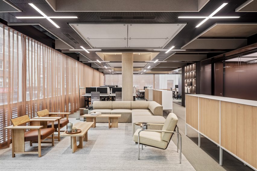
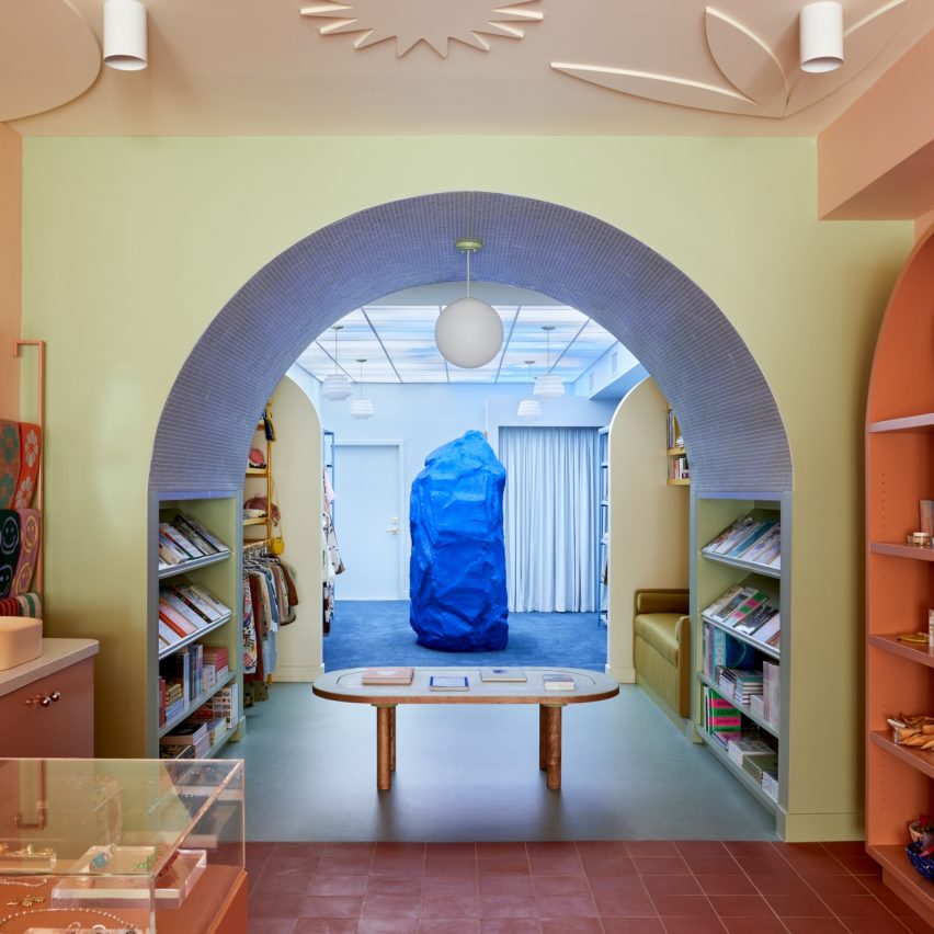
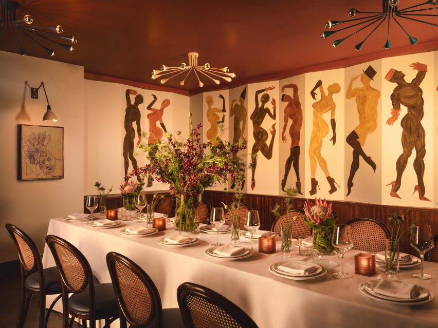
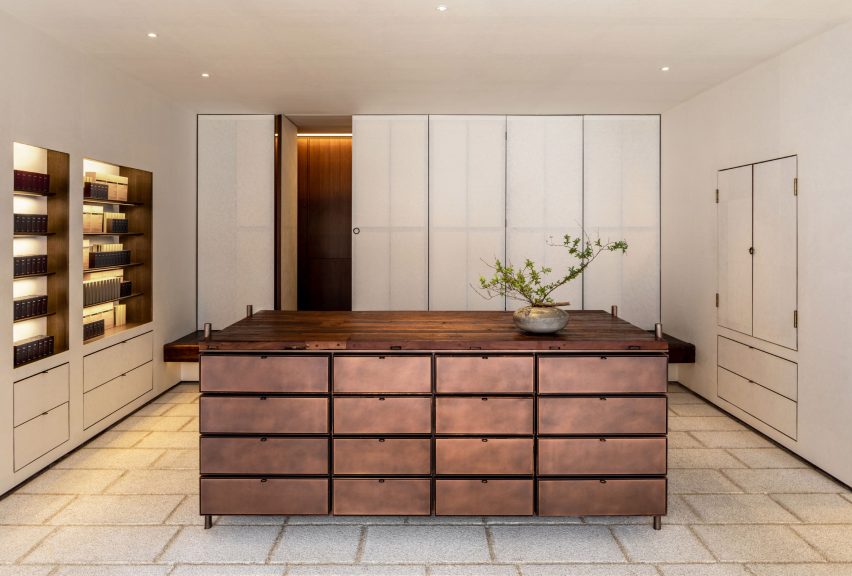
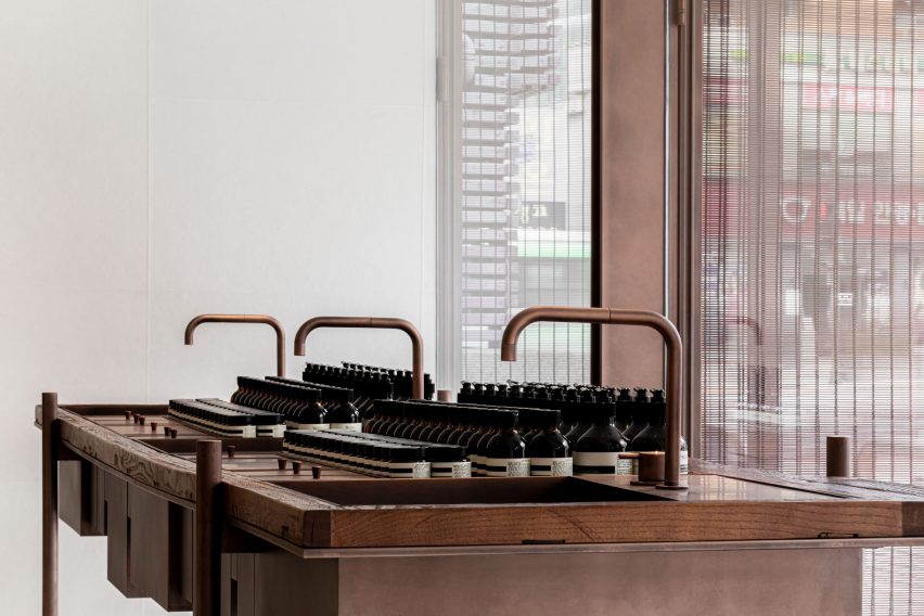
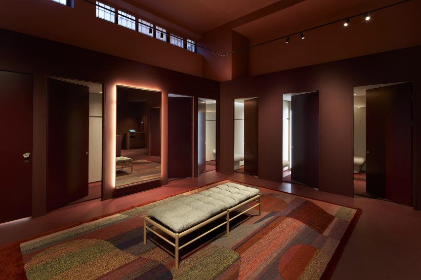
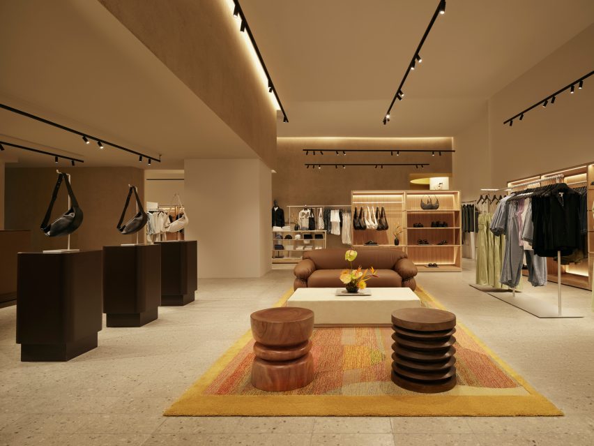
Universal Design Studio put a modern spin on the design conventions of bank buildings when creating the headquarters for cryptocurrency firm Copper inside a Richard Rogers-designed office in London.
Copper – a fintech company that helps financial institutions to securely store and trade cryptocurrencies – wanted to break away from London’s financial districts and instead set up its office inside Soho’s Broadwick House.
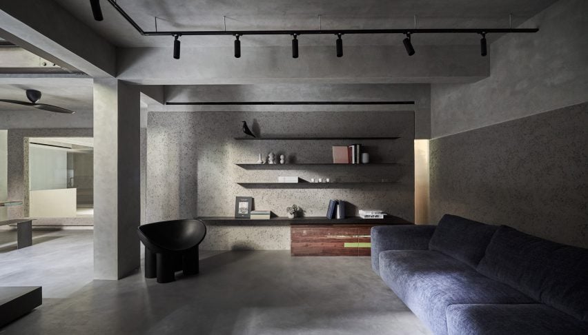
Copper’s headquarters are located in the Richard Rogers-designed Broadwick House
The building was originally completed by the Richard Rogers Partnership in 2000 and was renovated last year before Copper brought in Universal Design Studio to devise the interiors.
The local practice introduced familiar materials such as marble and walnut into Copper’s HQ to “provide a sense of assurance”.
Copper-toned curtains provide a sense of privacy
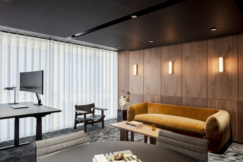
These are contrasted with more contemporary elements including stainless steel, kinetic screens and dynamic light boxes that help to create “an uncanny and cinematic environment”.
“The design approach draws in part upon historic icons of banking architecture through a contemporary lens, to create a familiar space that feels safe, whilst also pushing the boundaries on expectations,” the practice said.
“Being able to contain that within an architectural landmark is very special.”
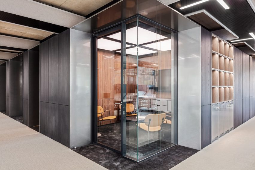
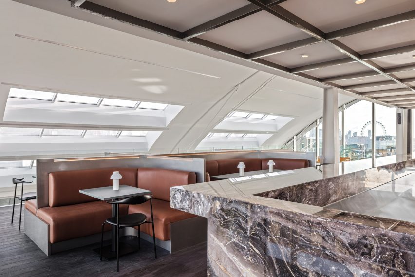
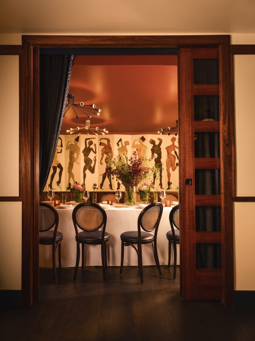
Private meeting rooms are set back from the facade at the core of the building
The lobby features Jesmonite wall panels, referencing the marble-wrapped entrances found in more traditional banks.
By contrast, a gold desk, alcove and gridded lightbox ceiling give a cinematic feel to the lobby and “allude to some of the more unexpected design elements further up the building”, according to Universal Design Studio.
“This idea of bringing together two distinctive finishes that are different recurs throughout the building, to echo the safe and trusted nature of finance with a new digital future,” the practice said.
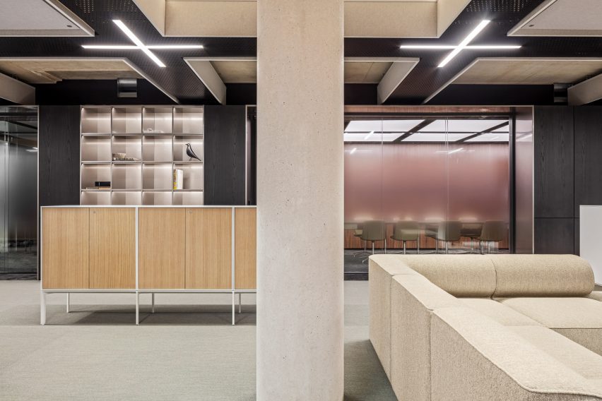
The building’s new “Copper Core” is clad in dark timber
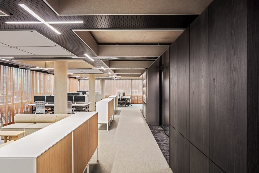
Rogers’s original architectural concept for the building focussed on transparency, with glazed facades providing high levels of light penetration.
Universal Design Studio sought to work with this vision, creating light-infused workspaces with a focus on natural materials.
Lightbox ceilings provide dramatic illumination
“The main workspaces for the Copper team are light, with a connection to the street level around the perimeter, playing to the strengths of the original facade design,” the studio said.
“But given the nature of what Copper do, an element of privacy was also essential.”
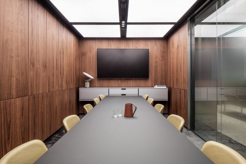
To achieve this, the studio designed a more opaque “Copper Core” that runs through the entire building, punctuating each floor and containing private spaces such as meeting rooms and quiet rooms.
Set away from the exterior facade, the meeting rooms in the core of the building are inevitably less light-filled than the main work areas.
Meeting rooms are panelled with walnut wood
To create spaces that still felt inviting, Universal chose to panel the walls with walnut, harnessing the tactility of this natural material to add a feeling of safety and familiarity.
Stainless steel thresholds were added to create a sense of arrival, as team members move away from general working areas into the Copper Core.
The interiors were designed to inspire a sense of trust and security
In another nod to the concept of privacy, Universal designed a copper-toned curtain that is found on each floor level, running the full perimeter of the facade.
“Operated digitally, each floor’s curtain closes in unison,” the studio said. “The curtain was also conceived as a type of visual security, locking down the building at night.”
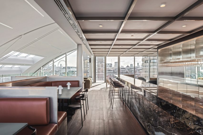
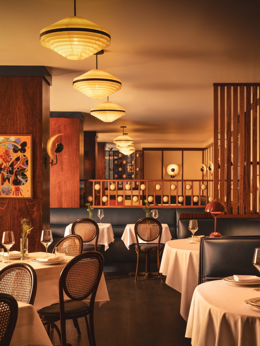
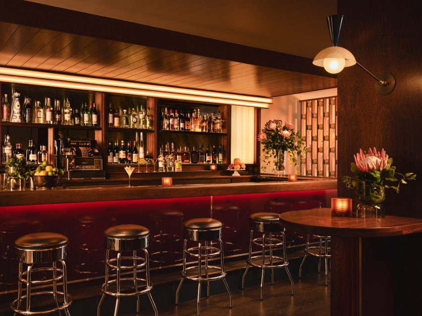
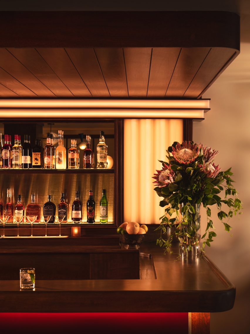
The top floors were designed for hosting clients
Visiting clients are received on the sixth and seventh floors of the building where the meeting rooms take on a hospitality focus, with bar and banquette-style seating capitalising on Broadwick House’s views across the city.
“These areas are styled on a members’ club to serve the Copper team and its clients,” Universal Design Studio said.
“The sixth floor has a focus on gathering both physically and digitally. Cinematic experiences are again utilised in this space with dramatic sliding digital screens for large events and presentations.”
Guests can take in the views from banquette-style seating booths
Other unconventional interiors belonging to financial institutions include Hana Bank in Seoul with its “floating” meeting room and Citibank Singapore, which was designed to resemble a giant conservatory.
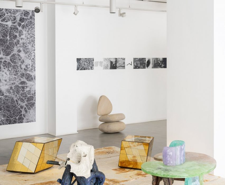
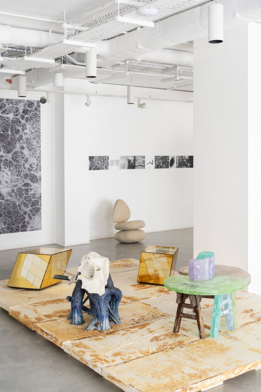
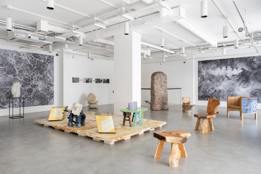
To celebrate 15 years of Gallery Fumi, the London gallery is hosting the Growth + Form exhibition of “functional art”, featuring sculptural furniture and lighting with organic forms.
The Growth + Form exhibition includes new works by 16 of the 28 past Gallery Fumi exhibitors, responding to themes of transformation, regeneration and biological growth patterns.
The Growth + Form exhibition celebrates Gallery Fumi’s 15th anniversary
It was designed by architectural designer Leendert De Vos and curated by design historian Libby Sellers, who invited former exhibitors back to showcase new pieces in a group display.
The exhibition title and theme were informed by the On Form and Growth book by Scottish biologist D’Arcy Wentworth Thompson, which analyses the mathematical harmony of growing shapes in biology.
Pieces in the exhibition were informed by biology
Responding to this biological starting point, furniture and lighting with organic shapes and natural materials can be seen throughout the exhibition.
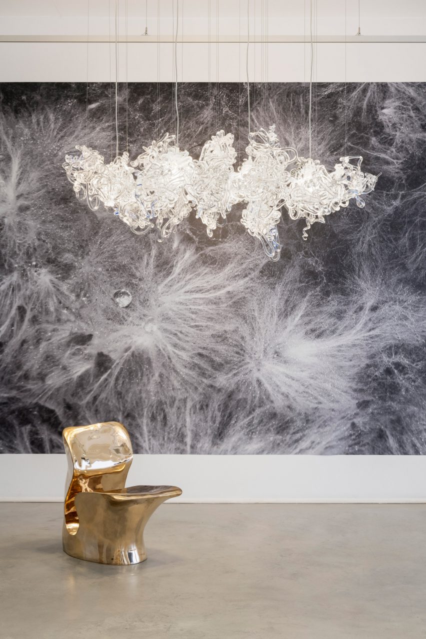
Danish artist Stine Bidstrup created a sculptural chandelier titled Light Entanglements, made up of twisting clusters of hand-blown glass.
Light Entanglements is a chandelier made from hand-blown glass
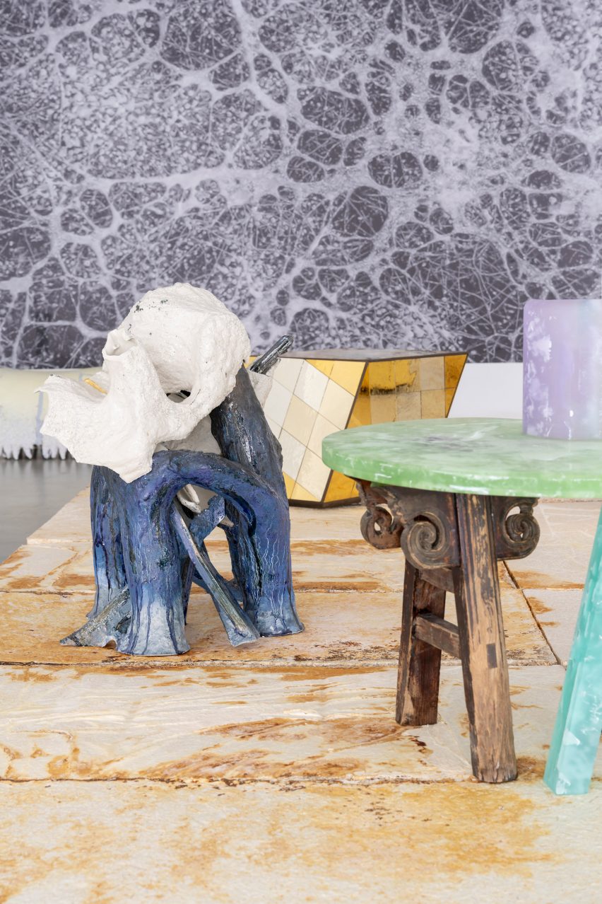
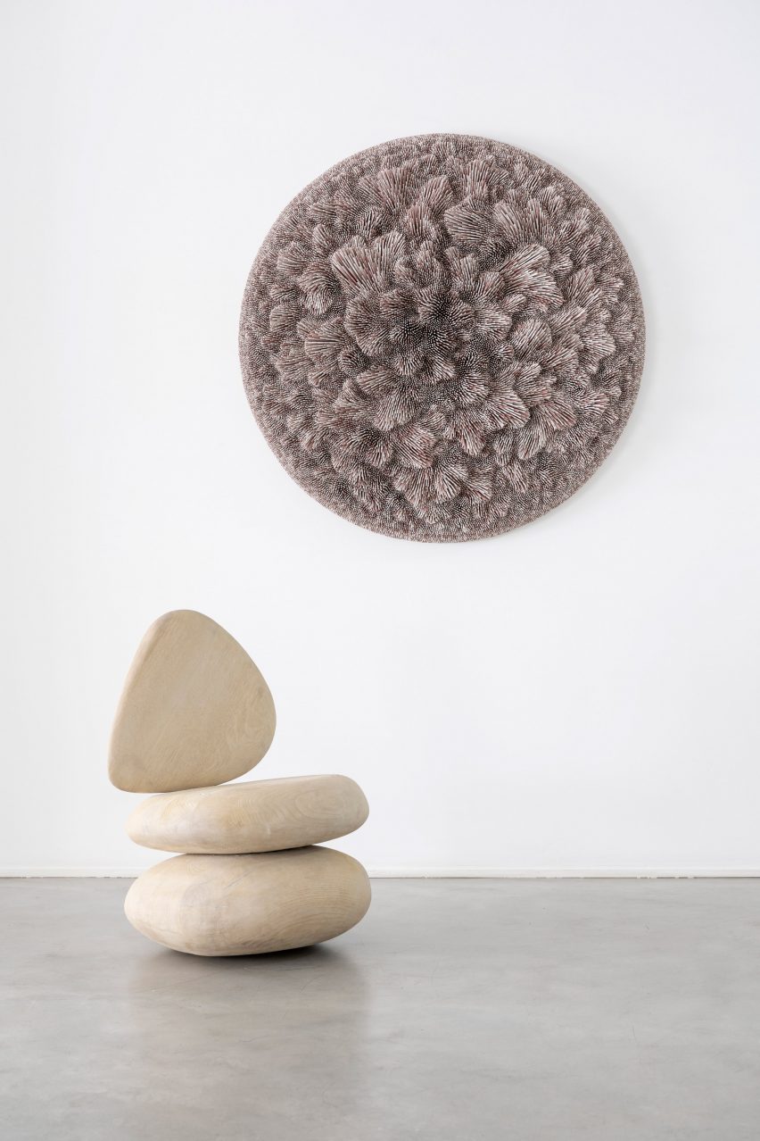
Different lengths of painted sticks were combined to create Marmaros Metamorphosis II, a circular decorative wall piece with a textured, tufted-like surface by sculptor Rowan Mersh.
“Revisiting the very beginning of his career when Mersh used cheap materials to experiment with techniques, in this work using lacquered coloured sticks, he creates forms with the details and skill level he currently attains when using precious materials,” said Gallery Fumi.
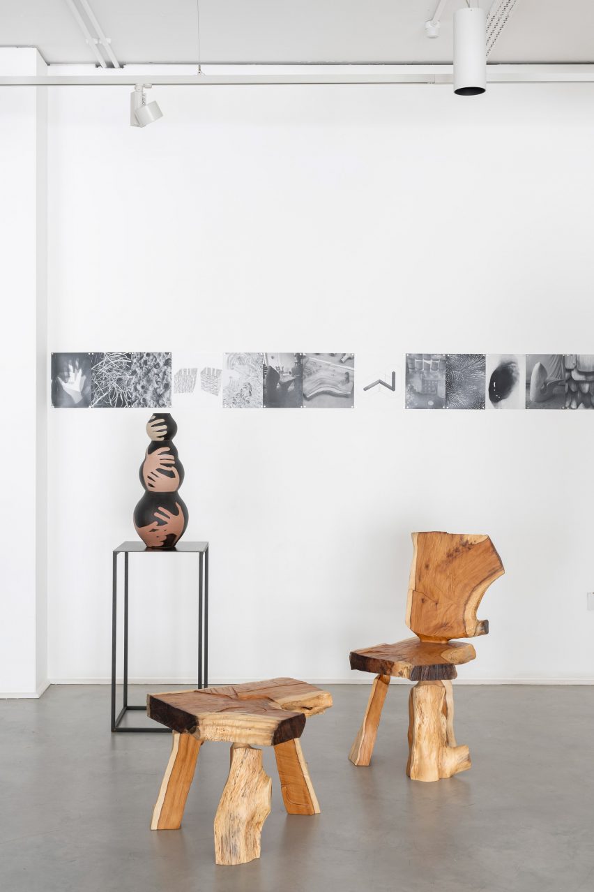
Seating crafted from a single yew log is featured in the exhibition
As the gallery celebrates its 15th anniversary, Sellers likened its growth to the formation of crystals – the material traditionally associated with 15-year anniversaries.
“Grown from small particles into a solid form of geometric beauty, crystal is both a poetic metaphor for Gallery Fumi’s own development over the last 15 years and an opportunity to explore the creative affinity between science, art, and the intricate nature of constructions,” said Sellers.
“After all, is this not a definition of design? The meeting of knowledge, form-making, material exploration and beauty?” Sellers added.
“The works are vibrant and active – sprouting, swirling, twisting, turning – transferring material and form into objects of beauty.”
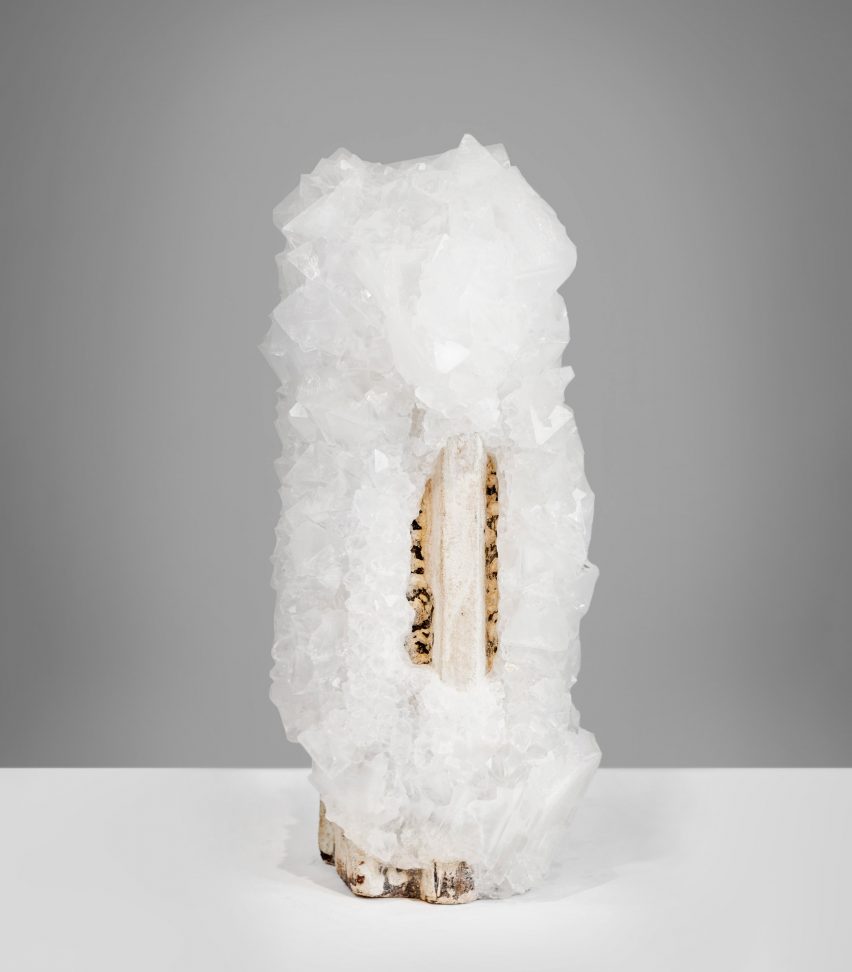
Wegworth created a crystal salt vase for the exhibition
Also on show was a wooden cabinet covered in hand-painted shingles by Berlin-based designer Lukas Wegwerth, who also created a crystal salt vase titled Crystallization 183.
“Crystallization 183 was identified by Sellers as most significant for the exhibition, as not only is the 15-year anniversary traditionally celebrated with crystal, but the process of growing the crystals is a poetic metaphor for Fumi’s growth as a gallery,” Gallery Fumi said.
The wall sculpture Marmaros Metamorphosis II has a tufted texture
Other pieces on display include a sculptural copper floor lamp with a stone base by London design studio JamesPlumb and a chair by British designer Max Lamb crafted from a single yew log.
“Tapping into the creative affinity between science and art, the pieces created for the show will display fluid organic forms, natural materials and geometric structures,” said Gallery Fumi.
The exhibition is on display from 7 to 30 September
Gallery Fumi was founded in 2008 by Valerio Capo and Sam Pratt. It has previously showcased work including a Jesmonite lighting collection by British designer Lara Bohinc and a limited-edition bench by JamesPlumb made using medieval dying techniques.
The photography is courtesy of Gallery Fumi.
The Growth + Form exhibition is on display at the Gallery Fumi in London, UK, from 7 to 30 September 2023. See Dezeen Events Guide for an up-to-date list of architecture and design events taking place around the world.
Dezeen has announced the 150 projects longlisted for this year’s Dezeen Awards in the interior categories, including interiors by studios Olson Kundig, Neri&Hu, Patricia Urquiola and Morris+Company.
The 150 longlisted projects, which are in the running for awards in nine different interior project categories, are by studios located across 32 different countries including India, Slovakia, Belgium, Canada, Denmark and Latvia.
The top three represented studio countries are the UK, with 27 longlisted entries, followed by the US with 23 and Australia with 15.
The top project city locations are London, with 18 longlisted entries, followed by Shanghai with seven and Sydney and Paris tied with four each.
Amongst the longlisted interiors this year are a refurbished 280-year-old courtyard house in Beijing, a textured beige ceramic home interior in Kyiv and a playful red brick-clad rooftop cafe in South Korea’s Gyeonggi-do province.
Other longlisted projects include a monochromatic office in Barcelona, a restaurant with a curved metal-mesh ceiling in London and a retail space featuring salvaged and biomaterials.
All Dezeen Awards 2023 longlists revealed this week
Dezeen Awards 2023, in partnership with Bentley Motors, will reveal all longlisted projects this week. The architecture longlist was published yesterday and the design longlist will be announced tomorrow, followed by the sustainability longlist on Thursday.
Longlisted projects have been selected from over 4,800 entries from 94 countries for the sixth edition of our awards programme, which celebrates the world’s best architecture, interiors and design, as well as the studios and individuals producing the most outstanding work.
Above: Sun Dial Apartment by Manuelle Gautrand Architecture. Photo by Gaelle Le Boulicaut. Top: Shiny Gold by Nelly Ben Hayoun Studios. Photo by Vinciane Lebrun
The next stage of Dezeen Awards 2023 will see all longlisted projects assessed by our international jury of leading professionals including interior designers Eny Lee Parker, Nick Jones and Tola Ojuolape.
The judges will determine the projects that feature on the shortlists, which will be announced in October. A further round of judging by our master jury will determine the winners, which will be announced in November.
One of the nine winners of the interior project categories will then be crowned the overall interior project of the year.
Read on for the full interiors longlist:
Union Street House by Prior Barraclough. Photo by Ben Hosking
Home Interior
› WKA Penthouse, Antwerp, Belgium, by Bruno Spaas Architectuur › Leaside Avenue, London, UK, by Emil Eve Architects › Another Seedbed: From Domesticity to Hospitality, New York, USA, by Future Projects › House FC, Taipei City, Taiwan, by Fws_work › Atelier Chabot, Montreal, Canada, by Indee Design › Hiroo Residence, Tokyo, Japan, by Keiji Ashizawa Design › Cape Drive Residence, Hong Kong, China, by Linehouse › Mureli House, Kozyn, Ukraine, by Makhno Studio › Sun Dial Apartment, Paris, France, by Manuelle Gautrand Architecture › Kamoi House, Barcelona, Spain, by Mas-aqui › Hargrave Cottage Paddington, London, UK, by Michiru Higginbotham › Adventures in Space, London UK, by Owl › Union Street House, London, UK, by Prior Barraclough › North London Family Home, London, UK, by Retrouvius › Mexican and Galician influences in Madrid, Spain, by Sierra + Delahiguera › Belgravia Townhouse, London, UK, by State of Craft Limited › Tembo Tembo Lodge, South Africa, by Studio Asaï › Light House, Singapore, by Studio iF › Villa San Francisco, California, USA, by Studio Mortazavi › A Resolutely Maximalist Mini Loft, Bagnolet, France, by Zyva Studio
Browse all projects on the home interior longlist page.
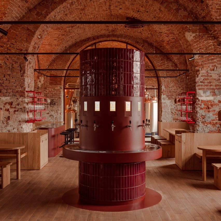
Taproom in the Brewery Tenczynek by Projekt Praga. Photo by ONI Studio
Restaurant and bar interior
› Kiln at Ace Hotel, Sydney, Australia, by Atelier Ace › Frescohallen, Bergen, Norway, by Claesson Koivisto Rune Architects › Nebula, London, UK, by Common Ground Workshop › Dolly, Unley, Australia, by Genesin Studio › Mala Sichuan Bistro, Houston, USA, by Gin Design Group › Beefbar Milan, Italy, by Humbert & Poyet › Chleo, New York, USA, by Islyn Studio › Gaga Coast, Shanghai, by Linehouse › Blue Bottle Zhang Yuan Cafe, Shanghai, by Neri&Hu Design and Research Office › Noma Kyoto, Kyoto, Japan, by OEO Studio › Prime Seafood Palace, Toronto, Canada, by Omar Gandhi Architects › Taproom in the Brewery Tenczynek, Poland, by Projekt Praga › Xokol, Guadalajara, Mexico, by ODAmx and Ruben Valdez Practice › Colemans Deli, Hathersage, UK, by SJW Architects › Cozinha das Flores and Flôr, Porto, Portugal, by Space Copenhagen › AOC Restaurant, Copenhagen, Denmark, by Spacon & X › Ikoyi, London, UK, by David Thulstrup › Light Years Asian Diner, Byron Bay, Australia, by Studio Plenty › Parconido Bakery Cafe, Gyeonggi-do, South Korea, by SukChulMok › Saint Hotel, Melbourne, Australia, by Telha Clarke
Browse all projects on the restaurant and bar longlist page.
SABI by Grounded Living. Photo by Lean Timms
Hotel and short-stay interior
› Birch (Selsdon), London, UK, by A-nrd studio › Drift Hotel, California, USA, by Anacapa Architecture › Ace Hotel Toronto, Canada, by Atelier Ace › Ember Locke, London, UK, by Atelier Ochre & House of Dré › Capella, Sydney, Australia, by BAR Studio › Bos-Cos Sevilla, Seville, Spain, by Febrero Studio › SABI, Tasmania, Australia, by Grounded Living › Albor Hotel, Tapestry Collection by Hilton, Guanajuato, Mexico, by Héctor Esrawe › Ying’nFlo, Hong Kong, China, by Linehouse › Monasty Hotel, Thessaloniki, Greece, by Not a Number Architects › The Standard, Ibiza, Spain, by Oskar Kohnen Studio › Our Habitas San Miguel de Allende, Mexico, by Our Habitas › Six Senses Rome, Italy, by Patricia Urquiola › Som Land Hostel, Shanghai, by RooMoo › Heymo 1, Espoo, Finland, by Rune & Berg Design Oy › The Standard, Bangkok, Thailand, by Standard International › Hay Boutique Hotel, Polyanytsya, Ukraine, by YOD Group
Browse all projects on the hotel and short stay longlist page.
Folk Kombucha by Spacon & X. Photo by Hedda Rysstad
Workplace interior (small)
› The Joint Works, Birmingham, UK, by 2G Design and Build › Lincoln St Workplace, Boston, USA, by Atelier Cho Thompson › Carnaby Club, London, UK, by Buckley Gray Yeoman › Mitsui & Co, Minato-ku, Japan, by Flooat › Studio Reisinger, Barcelona, Spain, by Isern Serra › LAJ Office and Shop, Vancouver, Canada, by Marcela Trejo › Workplace for the preparation of medicine in Riga, Latvia, by MUUD Architects › ScienceIO Headquarters, New York, USA, by Office of Tangible Space › Folk Kombucha, Copenhagen, Denmark, by Spacon & X › The Forest of Knowledge – CCI Library, Mumbai, India, by Studio Hinge › Artis Ventures, San Francisco, USA, by Studio O+A › Alera, Vancouver, Canada, by Studio Roslyn › Terroir Hobart Office, Hobart, Australia, by Terroir › Chief London, London, UK, by Thirdway › WOA Second Home, Ernakulam, India, by Workers of Art
Browse all projects on the workplace interior (small) longlist page.
Carlsen Publisher Campus by de Winder Architekten. Photo by Mark Seelen
Workplace interior (large)
› Government Office, Abu Dhabi, UAE, by Agata Kurzela studio › COX Sydney Studio, Australia, by Cox Architecture › Carlsen Publisher Campus, Hamburg, Germany, by de Winder Architekten › NeueHouse Venice Beach, California, USA, by DesignAgency › Here+Now, Reading, UK, by Hawkins\Brown › Sony Music UK HQ, London, UK, by MoreySmith › 215 Mare Street, London, UK, by Morris+Company › 800 Fifth Avenue, Seattle, USA, by Olson Kundig › Dice, London, UK, by Sella Concept › Bay Area Research Company by SkB Architects › Canopy Menlo Park, California, USA, by Studio Mortazavi › Adidas (GOLD, Performance Zone, and RED) campus, Portland, USA, by Studio O+A › World of Klarna, Stockholm, Sweden, by Studio Stockholm › 210 Euston Road, London, UK, by Universal Design Studio › Convene at 22 Bishopsgate, London, UK, by Woods Bagot
Browse all projects on the workplace interior (large) longlist page.
Dreams by Adi Goodrich of Sing-Sing. Photo by Adi Goodrich and Ye Rin Mok
Retail interior (small)
› Aesop Palisades Village, Los Angeles, USA, by Odami › Big, London, UK, by Nina+Co › Bisque Golf Amsterdam, The Netherlands, by Barde vanVoltt › Buff, Edinburgh, Scotland, by GRAS › Camper Pop-Up Galeries Lafayette, Paris, France, by Penadés office › Chimi Store at NK, Stockholm, Sweden, by Campus › Coachtopia, London, UK, by Studio XAG › Cover Story Paint Studio, Amsterdam, The Netherlands, by Cover Story Paint › Dreams, Los Angeles, USA, by Adi Goodrich of Sing-Sing › Finesse, Melbourne, Australia, by Studio Edwards › Garrett Leight New York, USA, by West of West › Glossier, New York, USA, by Glossier › Mimco Flagship Store, Chadstone, Australia, by Studio Doherty › Net Zero Ecoalf Store, Madrid, Spain, by Medina Varela MVN Arquitectos › SOM Store, Bratislava, Slovakia, by D415 › The Art Gallery of NSW, Sydney, Australia, by Akin Atelier
Browse all projects on the retail interior (small) longlist page.
Superseed Concept Store by FOG Architecture. Photo by SFAP
Retail interior (large)
› Harmay Chongqing, China, by Aim Architecture › Maison Special/Prank Project Fukuoka, Japan, by AtMa › Calico Club Cottage, Nistelrode, The Netherlands, by Barde vanVoltt › ToSummer Beijing Guozijian, China, by FOG Architecture › Xiaozhuo Shanghai Boutique, China, by FOG Architecture › Super Seed Concept Store, Hangzhou, China, by FOG Architecture › Freitag Store Shanghai, China, by Freitag Lab › GANT Flagship Store, Stockholm, Sweden, by GANT › Jasmin Black Lounge, Seoul, South Korea, by Hyundai Department Store Group › The Forum, Daegu, South Korea, by Hyundai Department Store Group › GrubStreet Arts Center, Boston, USA, by Merge Architects › XiaoZhuo Flagship Store, Shanghai, by Offhand Practise › Salvatori Showroom, New York, USA, by Salvatori › Cake 0 Emissions US Headquarters, Los Angeles, USA, by Shin Shin › BSTN Store, London, UK, by Sunst Studio › SVRN, Chicago, USA, by WGNB
Browse all projects on the retail interior (large) longlist page.
Leisure Area of Pediatric Ward of Hospital São João by ARG studio. Photo by Ivo Tavares Studio
Health and wellbeing interior
› Eterno Health Hamburg, Germany, by Ahochdrei – Labor für Gestaltung › Leisure Area of Pediatric Ward of Hospital São João, Porto, Portugal, by ARG studio › Insight Body and Mind, Aberfeldie, Australia, by Biasol Studio › Placidus Student Welfare Spaces for Marcellin College, Melbourne, Australia, by Branch Studio Architects › Chi Chi Club, Hamburg, Germany, by Deglan Studios › Hooke London, UK, by Holland Harvey › Gym Town, Hong Kong, China, by MR Studio › Practice Dr. Sell + Dr. Stocker, Nuremberg, Germany, by Markmus Design › Seattle Children’s Odessa Brown Children’s Clinic, USA, by NBBJ › Ocean Cosmetics Clinic, Cottesloe, Australia, by Nickolas Gurtler Office › Paw, Beijing, China, by Office AIO › Symphony Orthodontics, Bristow, Australia, by OLI Architecture › La Maison de Beauté Carita, L’Oréal-Luxe, Paris, France, by Rev/Studio › Paste, Toronto, Canada, by Studio Author › Flow Space, Shanghai, by Super Rice Architects
Browse all projects on the health and wellbeing longlist page.
Søylerommet – The Pillars by 2050+. Photo by 2050+
Exhibition design (interior)
› Søylerommet – The Pillars, Oslo, Norway, by 2050+ › Objects Of Desire: Surrealism and Design 1924, London, UK, by Alexander Boxill › Plastics: Remaking Our World, Dundee, Scotland, by Asif Khan › Scandinavian Design and the United States, 1890-1980 at LACMA, Los Angeles, USA, by Bestor Architecture › Flow, Milan, Italy, by Daisuke Yamamoto Design Studio › The Golden Age of Grotesque, Hannover, Germany, by Didier Fiuza Faustino / Mesarchitecture › Fashioning Masculinities: The Art of Menswear, London, UK, by JA Projects › Nature. And us?, Lenzburg, Switzerland, by Kossmanndejong & Stapferhaus › BIO27 Super Vernaculars Exhibition Design, Ljubljana, Slovenia, by Medprostor › Batman x Spyscape: Immersive Interactive Experience, New York, USA, by Mona Kim Projects › Shiny Gold, Paris, France, by Nelly Ben Hayoun Studios › Refik Anadol: Unsupervised, New York, USA, by Refik Anadol Studio › Illustration corner, Ljubljana, Slovenia, by Sara&Sara › The Welcome Center, Washington, USA, by Studio Joseph › Flugt Refugee Museum of Denmark, Oksbøl, by Tinker imagineers › Our Time on Earth, London, UK, by Universal Design Studio
Browse all projects on the exhibition design (interior) longlist page.
Dezeen Awards 2023
Dezeen Awards celebrates the world’s best architecture, interiors and design. Now in its sixth year, it has become the ultimate accolade for architects and designers across the globe. The annual awards are in partnership with Bentley Motors, as part of a wider collaboration that will see the brand work with Dezeen to support and inspire the next generation of design talent.
Brooklyn-based Studio Becky Carter has pulled varied references, from Bauhaus luncheonettes to comedic characters, for the interiors of a bistro in Manhattan’s West Village.
Art deco dining rooms, 1960s Milanese architecture and “a distinctly New York feel” are all evoked at Cecchi’s, the first establishment from veteran restaurant maitre d’ Michael Cecchi-Azzolina.
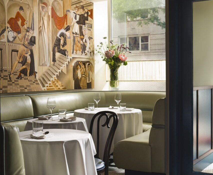
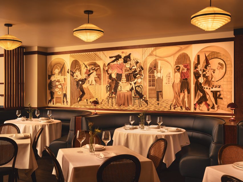
At the entrance to Cecchi’s, pistachio leather banquettes sit below a mural by Jean-Pierre Villafañe
Studio Becky Carter was given creative control to produce an environment that felt distinctively New York, but also presented a departure from the typical bistros.
“My style is retro-futurist, so I take strong cues from historic design narratives and process them through the lens of an imagined future society,” Carter told Dezeen. “When people enter Cecchi’s, I want them to feel like they’ve stepped into old-school, underground, NYC exclusivity, only this time everyone is invited.”
Elements retained from the space’s previous iteration as Café Loup include a marble lectern used as a host stand
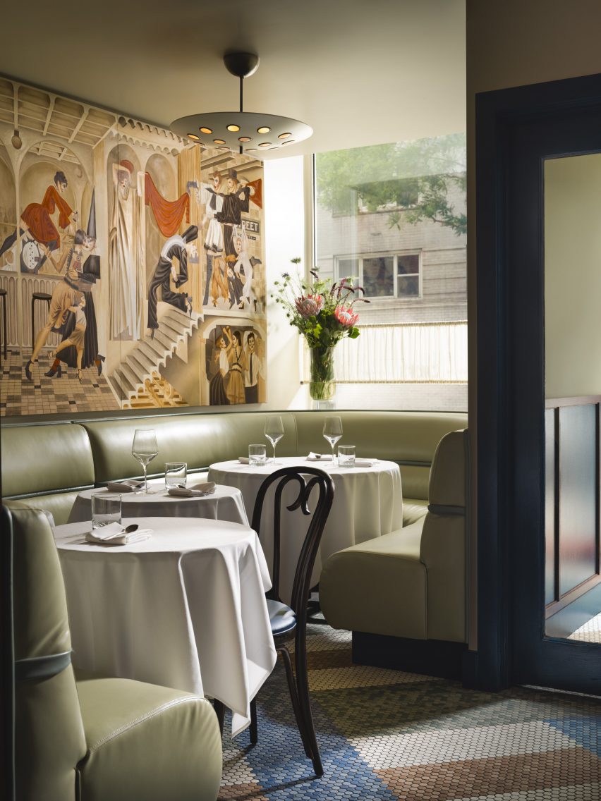
A starting point for the design was the whimsical murals of artist Jean-Pierre Villafañe, who was brought on early in the process to create scapes for the restaurant’s walls.
His “transportational” depictions of lively party scenes helped to inform the colour palette for the rest of the space, a mix of reds, blues and tonal browns.
Villafañe’s murals informed the colour palette for the restaurant’s interiors
Some of the dancing figures appear as historic European comedic characters, so Carter also looked to these for influences.
The spheres placed within dividing screens, for example, are reminiscent of those found on a Pierrot costume, a figure in French pantomime theatre, while mosaic floor tiling at the entrance is adapted from Harlequin patterns.
Large columns and louvred dividers break up the space into different yet visually connected areas
“The beautifully finished spheres are just so tactile,” said Carter.”I can’t not touch them every time I’m in the restaurant.”
The long, narrow space posed several challenges, such as the lack of natural light towards the rear and large structural columns that interrupted the flow.
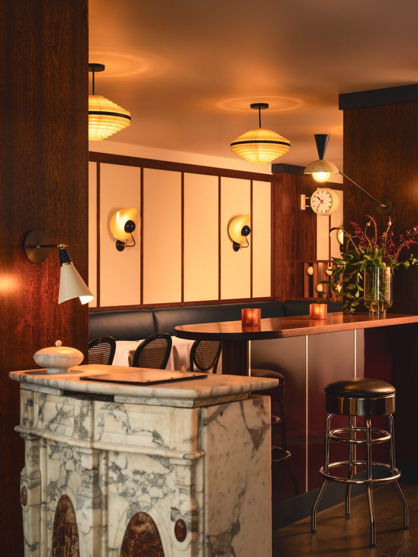
The mahogany bar top was also retained, while high-gloss burgundy lacquer was added to the front
Carter’s approach involved dividing up the restaurant into multiple areas, demarcated by the wood-wrapped columns, louvred dividers and built-in seating – all at different heights to allow visual connections across them.
At the entrance, pistachio green leather banquettes occupy the bright window niches, then the mood shifts to darker and cosier as guests venture further inside.
Soft lighting around the bar adds to the mood in the space
Several elements from the space’s previous iteration as Café Loup were retained or refinished as part of the new design, including the mahogany bartop and the restored caned bistro chairs.
The marble lectern that serves as the host stand and a chrome cash register were also saved, while 1970s Czech lighting was introduced overhead.
White tablecloths lend to the classic, old-school atmosphere, while contemporary details like custom wall sconces and the burgundy lacquered bar front add a more casual twist.
“Michael envisioned the servers being able to pull up a chair and have a conversation about the menu in a convivial manner, and the style was to reflect this,” Carter said.
A private dining room for parties is located at the back of the restaurant
A private room for parties at the back features another Villafañe mural, as well as a rust-coloured ceiling and sci-fi lighting.
Overall, Cecchi’s offers a fine-dining experience that still feels approachable, warm and not too serious.
The private room features another Villafañe mural, as well as a rust-coloured ceiling and sci-fi lighting
Carter founded her eponymous studio in 2016 and has completed a mix of residential and hospitality spaces on both coasts.
Other recently completed restaurants in the US that feature retro-futurist interiors include 19 Town, a Chinese eatery in Los Angeles by Jialun Xiong, while new openings in the West Village include the worker-owned Donna designed by Michael Groth.
In this lookbook, we select eight apartments that prove basements are the new penthouses, from an art deco flat in Paris to a sci-fi-style hideaway in Madrid.
Often associated with limited space and poor natural light, basement homes have not always been particularly coveted.
But as the world’s cities get more expensive, busier and hotter, below-ground living can be a relatively affordable, private and temperate option.
Below are eight of the best basement apartments previously featured on Dezeen.
This is the latest in our lookbooks series, which provides visual inspiration from Dezeen’s archive. For more inspiration see previous lookbooks featuring cave-like interiors, residential entrance halls and pocket doors.
Photo by Jim Stephenson
Unearthed Vault, UK, by Daab Design
Architecture studio Daab Design turned a former art storage vault in London into a two-bedroom basement flat.
Georgian period features were meticulously restored as part of the renovation and paired with a soothing colour palette of creams, greens and blues, turning what was previously a dark and cramped interior into a modern living space.
Find out more about Unearthed Vault ›
Photo by Simone Bossi
The Whale, France, by Clément Lesnoff-Rocard
The Whale takes its name from the huge structural elements that punctuate this home in the basement of a Parisian apartment building, which reminded architect Clément Lesnoff-Rocard of being inside an enormous animal.
Lesnoff-Rocard stripped back the apartment to reveal the chunky concrete beams, while extensive mirrored glass, brass and geometric shapes inject an understated sense of art deco.
Find out more about The Whale ›
Photo by José Hevia
Yurikago House, Spain, by Mas-aqui
Architecture studio Mas-aqui used half-levels in its renovation of this semi-basement apartment in Barcelona to maximise space.
The previously unused bottom level was excavated to create a staircase down to a new guest bedroom featuring a structural arch above the bed and an exposed-concrete retaining wall.
Find out more about Yurikago House ›
Photo by by Yiannis Hadjiaslanis (also top)
Ilioupoli Apartment, Greece, by Point Supreme
Sunken into the ground at the bottom of an apartment building in Athens, this small, one-bedroom flat was previously a storage space.
Point Supreme sought to retain the interior’s “magical-cave-like” feeling by leaving raw concrete surfaces exposed and using floor finishes, curtains and sliding partitions rather than walls to separate the space.
Find out more about Ilioupoli Apartment ›
Photo by Hey! Cheese
House H, Taiwan, by KC Design Studio
The basement of House H in Taipei leans into its underground setting with a dark and moody colour palette provided by concrete flooring, loosely rendered grey plaster walls and black or grey fixtures and fittings.
To filter more natural light and fresh air into the basement, KC Design Studio carved several openings into the ceiling, accommodating a staircase and an indoor courtyard.
Find out more about House H ›
Photo by José Hevia
Apartment Tibbaut, Spain, by Raúl Sánchez
Architect Raúl Sánchez converted a vaulted basement beneath a house in Barcelona into a subterranean apartment using curving panels of laminated pine.
The partition curls around a central living area, separating each of the rooms but stopping short of the ceiling to ensure the building’s original architecture remains visible, as well as allowing natural light to spread throughout the space.
Find out more about Apartment Tibbaut ›
Photo by José Hevia
Casa A12, Spain, by Lucas y Hernández-Gil
This semi-basement Madrid apartment features fun, Stanley Kubrick-esque features such as shiny silver curtains, cobalt-blue accent walls and an indoor courtyard with orange grass.
Lucas y Hernández-Gil designed the space to be a “world of work and leisure” where the homeowners can escape from the street above.
Find out more about Casa A12 ›
Photo by Jérôme Fleurier
Studio LI, France, by Anne Rolland Architecte
A secret room sits beneath this sunken studio apartment created by Anne Rolland Architecte in a long-abandoned space in a 17th-century Parisian townhouse.
Accessed via a mechanical trapdoor and granted natural light by a window in the kitchen floor, the former slurry pit was restored to create a music room and home cinema.
Find out more about Studio LI ›
This is the latest in our lookbooks series, which provides visual inspiration from Dezeen’s archive. For more inspiration see previous lookbooks featuring cave-like interiors, residential entrance halls and pocket doors.
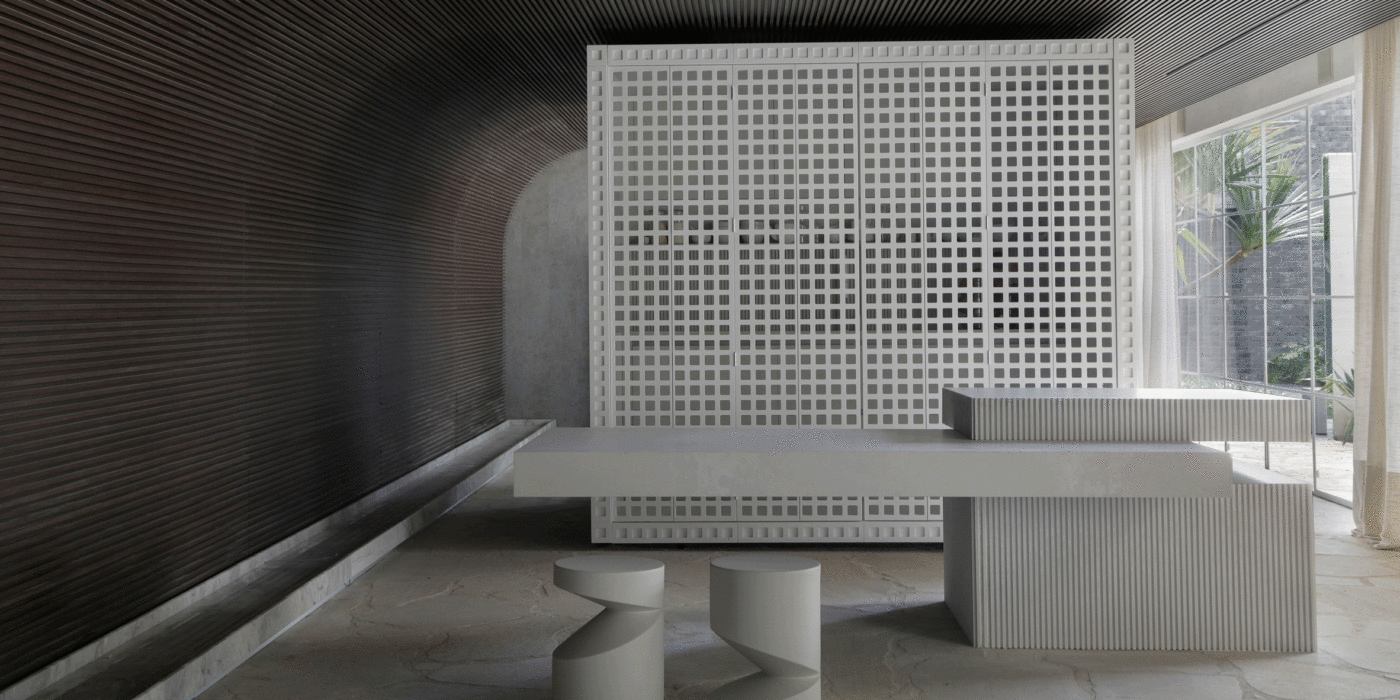
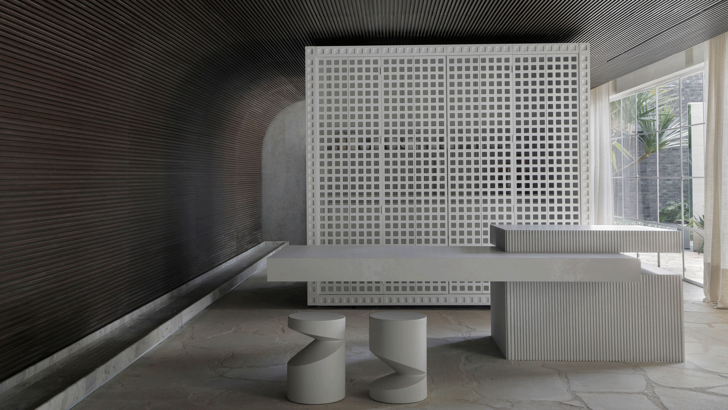
For our latest lookbook, we have selected eight interiors that use lattice screens to conceal and divide spaces without blocking sightlines.
Lattice screens can come in a variety of materials and provide a versatile alternative to solid walls and room dividers, offering a way to create privacy between two spaces while still maintaining a connection between them.
From concealing bathrooms to establishing connections between interior and exterior spaces, this lookbook presents eight different ways in which lattice screens have been used in residential, hotel and restaurant interiors.
This is the latest in our lookbooks series, which provides visual inspiration from Dezeen’s archive. For more inspiration see previous lookbooks featuring period home renovations, open-plan interiors characterised by bold dining tables and interiors with reclaimed materials.
Photo by Denilson Machado
Dendê Duratex House, Brazil, by NJ+
Brazilian architecture studio NJ+ took cues from Bahia, the Brazilian state that studio founder Nildo José grew up in, to create the interior of Dendê Duratex House. Here, it integrated a white latticework structure that separates the living space from the bedroom.
The volume encompasses the one-bedroom apartment’s bathroom and kitchen amenities while introducing texture to the monochrome minimalist home.
Find out more about Dendê Duratex House ›
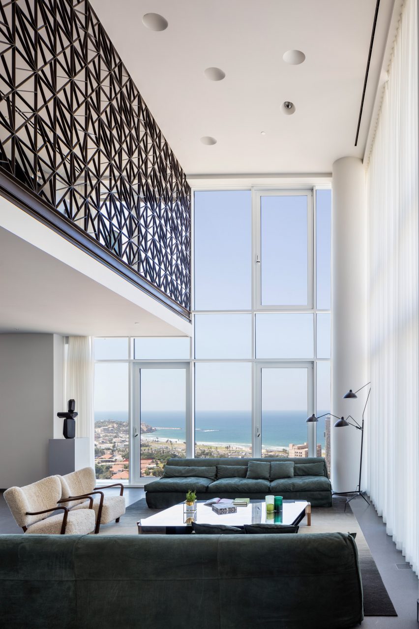
Photo by Amit Geron
P Duplex apartment, Israel, by Pitsou Kedem Architects
The second floor of this apartment in Tel Aviv was transformed into a mezzanine that overlooks a double-height living and dining room by local practice Pitsou Kedem.
A black metal guardrail wraps the upper level, tracing the route from the staircase to the upper floor and offering security while allowing views of the floor below. The see-through lattice design features triangular shapes compiled into rectangular modules.
Find out more about P Duplex apartment ›
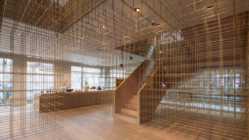
Photo by Pedro Pegenaute
Sulwhasoo Flagship Store, South Korea, by Neri&Hu
This five-storey flagship store, designed for Korean skincare brand Sulwhasoo, is characterised by large expanses of brass rods that form a lattice network. Used throughout the store, the latticed walls form see-through room dividers as well as shelving.
The framework continues from the exterior into the interior of the store, guiding visitors through the five floors. Architecture studio Neri&Hu’s concept was informed by lanterns and their role in illuminating journeys in Asian culture.
Find out more about Sulwhasoo Flagship Store ›
Photo by Andrii Shurpenkov
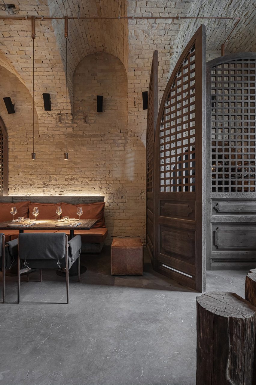
Virgin Izakaya Bar, Ukraine, by YODEZEEN
Timber screens and red metal webbed structures conceal and divide spaces within this Japanese restaurant in Kyiv, designed by Ukrainian architecture and design studio YODEZEEN.
The wooden lattice screens were introduced to soften the restaurant’s cold material palette, consisting of raw concrete and brick surfaces.
Find out more about Virgin Izakaya Bar ›
Photo by Luis Garvan, Luis Young and Maureen Evans
Casa Octavia, Mexico, by PPAA
Thin latticed timber screens shield this hotel’s interiors from harsh sunlight and cast intricate shadows throughout the day.
The screens aim to serve as a mediator between hotel guests and passerbys, fostering interaction between residents of the La Condesa neighbourhood in which its is located and the hotel itself, while maintaining a level of privacy.
Find out more about Casa Octavia ›
Photo by Tom Ferguson
Manly Pacific, Australia, by Luchetti Krelle
Sliding lattice screensseparate the reception from the bar in this hotel in Sydney, which was renovated by Australian studio Luchetti Krelle.
The partitions allow the two distinct spaces to blend together without losing their individual character, which is defined by contrasting material and colour palettes.
Find out more about Manly Pacific ›
Photo by Maha Nasra Eddé
Mimi Kakushi, Dubai, by Pirajean Lees
London studio Pirajean Lees was informed by Japan’s jazz age, combining a variety of materials and textures such as beaded curtains, stained-glass windows and sliding gridded screens in this restaurant in Dubai.
The flexibility of the moveable lattice screens allows the restaurant to host events of varying crowd sizes, partitioning the open-plan layout into a variety of smaller spaces.
Find out more about Mimi Kakushi ›
Photo by Amit Geron
Hiba, Israel, by Pitsou Kedem Architects
A combination of solid and hollow oakwood components forms a gridded screen that allows visitors to glimpse between the dining area and the entrance of this restaurant in Tel Aviv.
Alongside oakwood, the restaurant’s interior features granite slabs and concrete. Designers Pitsou Kedem Architects aimed for the raw material palette to reflect the restaurant’s use of fresh ingredients.
Find out more about Hiba ›
This is the latest in our lookbooks series, which provides visual inspiration from Dezeen’s archive. For more inspiration see previous lookbooks featuring period home renovations, open-plan interiors characterised by bold dining tables and interiors with reclaimed materials.
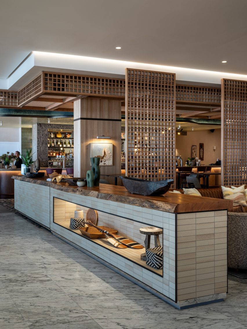
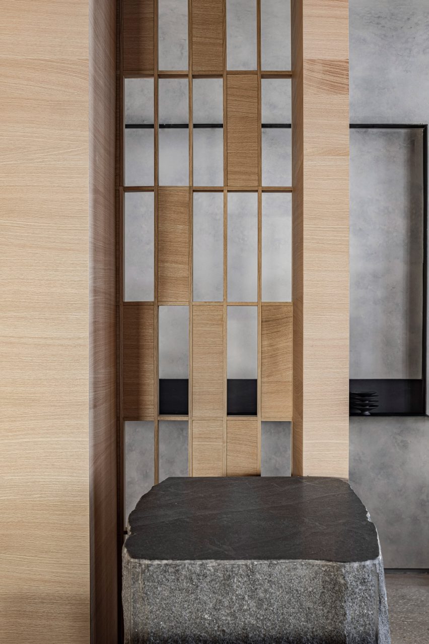
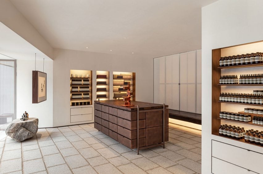
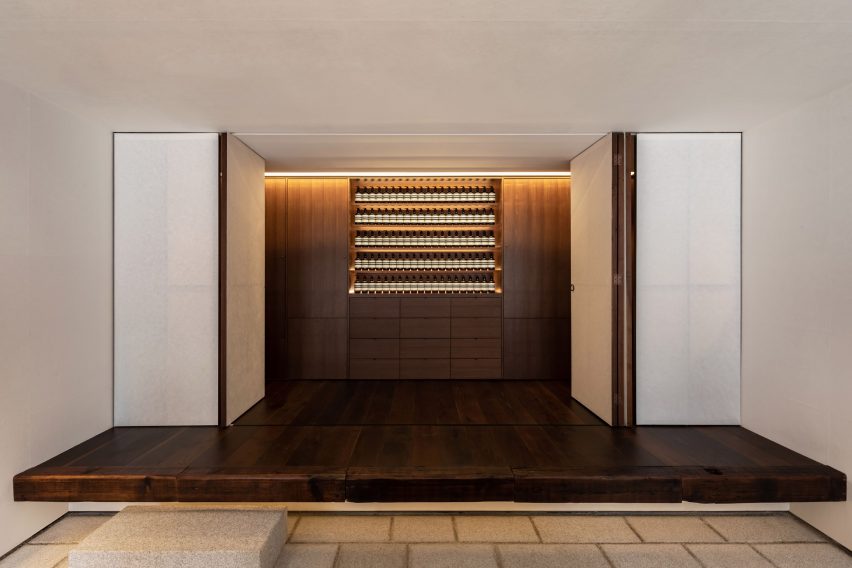
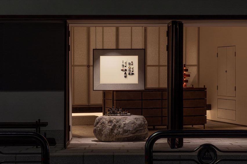
Skincare brand Aesop has collaborated with designer Samuso Hyojadong to create a store in Seochon, Seoul, that features an open facade and an oversized stone plinth.
Positioned in one of the oldest neighbourhoods of Seoul’s Jongno-gu district, the Seochon outlet was created to “fit harmoniously within its local context”, according to Aesop’s design team.
Aesop designed the Seochon store with Samuso Hyojadong
When designing the store, Aesop and Hyojadong took cues from the architecture of jeongjas – traditional Korean pavilions with no walls, which serve as spaces for resting and taking in the surrounding views.
The street-facing facade was created with mesh metal screens that can open out entirely to create a storefront with no walls. Once closed, the woven metal backing creates translucent windows through which passersby observe the softly lit silhouettes of uniform rows of bottles.
Reclaimed timber features on the interior
“Samuso extended the floorplate outwards to create a threshold that conveys a generous sense of hospitality,” the Aesop design team told Dezeen.
“One [jeongja] in particular that inspired us was the Soswaewon in the Damyang region, which was built in the sixteenth century and is surrounded by a verdant garden.”
An oversized stone plinth displays Aesop products
For the store’s material palette, the designers referenced the timber and stone that are typically used to build traditional Korean houses known as hanoks.
A large, rough-edged stone plinth displaying clusters of products was positioned at the entrance while various wooden accents were created with timber reclaimed from salvage yards and an abandoned house.
Copper was used to create geometric cabinets
The store was also built on a raised stone platform, which nods to the traditional architecture.
Hanji paper created from mulberry tree bark sourced from South Korea’s Gyeongnam province features on the store’s walls, which frame central geometric cabinetry and sleek taps made of locally produced aged copper.
The designers were restrained in their use of sanding, sealants and coatings when treating the materials, opting to embrace their “natural imperfections”.
“Sensitivity to texture in this store is superlative,” reflected the design team. “Samuso wanted each material to express itself directly, without too much human intervention,” it continued, referencing the roughness of the stone and the reclaimed timber’s undulating texture.
The metal was also used to design sleek taps
Rosewood was used to create the store’s signature fragrance armoire, which is hidden from view until opened out and was conceived as a traditional Korean jewellery box, according to the design team.
“Throughout the store, we were compelled by a desire to dissolve the boundaries between inside and outside, between the naturally occurring and the human-made,” concluded the designers.
The store’s signature fragrance armoire was informed by Korean jewellery boxes
Known for stores that pay homage to their varied locations, Aesop has an outlet in Cambridge defined by handwoven bulrush shelves that nod to the nearby River Cam and a Sydney store furnished with domestic items to evoke 1960s Australian homes.
This is the last opportunity to be featured in the Dezeen Events Guide for London Design Festival 2023, which highlights the key events taking place in the UK’s capital city in September.
The guide includes a range of exhibitions, installations, talks, workshops, open showrooms, product launches, pop-up shops and design fairs taking place across London.
This year’s edition of London Design Festival takes place from 16 to 24 September 2023, with the 21st edition spanning across 13 districts in the city.
Dezeen Events Guide’s live digital guide showcases events that explore a variety of design mediums, including architecture, biodesign, furniture, lighting, interior accessories, fashion and materials and textiles design.
Last chance to get listed in Dezeen’s digital guide to London Design Festival
Get in touch with the Dezeen Events Guide team at [email protected] to book in your listing or to discuss a wider partnership with Dezeen. There are three types of listings:
Standard listing: for only £100, we can include the event name, date and location details plus a website link. These listings will also feature up to 50 words of text about the event. Standard listings are included at the discretion of the Dezeen Events Guide team.
Enhanced listing: for £150, you will receive all of the above plus an image at the top of the listing’s page and an image in the listing preview on the London Design Festival festival guide page. These listings will also feature up to 100 words of text about the event.
Featured listing: for £300, your listing will feature everything as part of an enhanced listing plus inclusion in the featured events carousel and social media posts on our @dezeenguide channels. This includes one post per channel: Instagram, Twitter and Facebook and up to 150 words of text about the event. This text can include commercial information such as ticket prices and offers, and can feature additional links to website pages such as ticket sales, newsletter signups etc.
About Dezeen Events Guide
Dezeen Events Guide is our guide to the best architecture and design events taking place across the world each year. The guide is updated weekly and includes virtual events, conferences, trade fairs, major exhibitions and design weeks.
Inclusion in the guide is free for basic listings, with events selected at Dezeen’s discretion. Organisers can get standard, enhanced or featured listings for their events, including images, additional text and links, by paying a modest fee.
In addition, events can ensure inclusion by partnering with Dezeen. For more details on inclusion in Dezeen Events Guide and media partnerships with Dezeen, email [email protected].
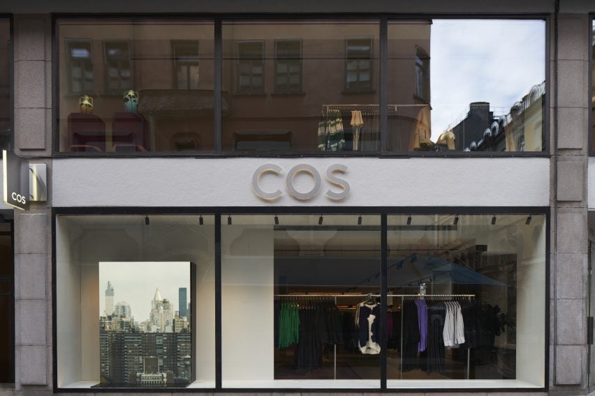
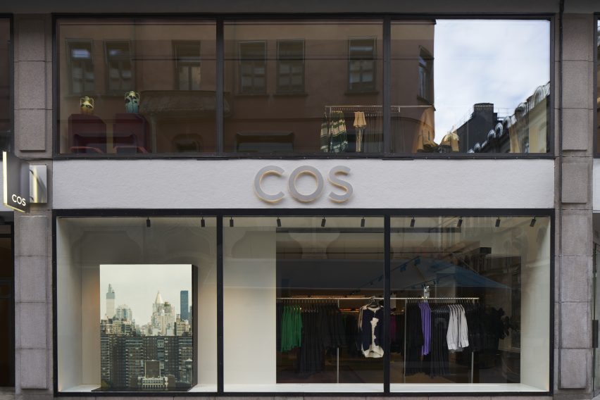
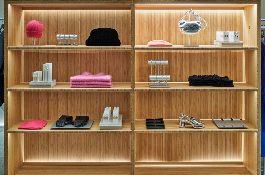
COS architectural creative lead Marcus Cole explains how more sustainable design principles were used in its recently opened concept stores, in this exclusive video produced by Dezeen for the brand.
The brand recently opened two stores, located in Stockholm and Mexico City, which according to COS exemplify its commitment to sustainable building and circular design. Cole talked to Dezeen about the brand’s approach when creating the new retail spaces.
“This flagship store in Stockholm is the first in Europe to adopt the most sustainable store concept from COS to date,” he said.
The Stockholm flagship store reflects the brand’s promise to lower CO2 emissions. Photograph by Åke Lindman
At 566 metres square and spread over two floors, the store, located on Biblioteksgatan, is also the brand’s largest concept store.
When creating the space, COS wanted to address their existing waste flows, finding ways in which byproducts that would traditionally be categorised as waste could be reused and repurposed.
“The design focuses on circularity in both our material selection and our design strategy,” explained Cole.
“The floor throughout our sales area is a terrazzo tile that has been made from 90 per cent quarry waste from our own suppliers’ production line. The majority of the rugs are a collaboration using waste yarn from our suppliers’ chain, each bespoke in their own way.”
“We prioritised materials that can be easily repaired, and are designed for disassembly by avoiding mixing materials that are hard to decouple later down the line,” Cole added.
The Stockholm store uses 66 per cent more recycled materials than the original store design. Photograph by Åke Lindman
The brand also took the same approach when creating the furniture and fixtures used in the store, choosing to prioritise more sustainable and recycled materials.
“Our vitrines and wardrobes are made from a combination of recycled acrylic and bamboo,” said Cole.
“Bamboo is a more renewable choice than traditional hardwoods, because of the speed at which it grows, its carbon storage capacity, and also its durability,” he continued.
“If we look to our fitting rooms and some of the softer fixtures in our stores, the panels are made from 60 per cent recycled plastic bottles that have been spun into felt, [and] the floor consists of a PVC free linoleum, which is made from a mixture of recycled and natural materials.”
Sustainable and recycled materials were prioritised during the design process. Photograph by Åke Lindman
Other changes include 30 per cent recycled aluminium rails, 100 per cent recycled mannequins and the removal of all concrete fittings.
The brand also found it important to make use of the existing building where possible to reduce unnecessary CO2 emissions and to give new life to unused materials.
“This concept store is actually a rebuild of an existing store,” Cole explained. “We were able to reallocate and reuse 50 per cent of our interior elsewhere in our portfolio, making sure we have as much emphasis on what we’re taking out of the store as what we’re putting in it as well.”
A selection of paintings and sculptures by visual artist Liselotte Watkins decorate the store interior. Photograph by Åke Lindman
Following on from the Stockholm store, the brand also unveiled another sustainable concept store in Mexico City. The store is located in the Polanco neighbourhood, and the interior references Mexico’s artisan craft traditions.
In addition to operating as a fashion store, the shop also exhibits artworks by local creators, such as Caralarga, a female-led enterprise which focuses on sustainability and female empowerment.
The Mexico City store is the first in the Americas to embrace COS’s sustainable store concept. Photograph by Fernando Marroquin
“We have very ambitious plans to bring this sustainable approach and all of our learnings from it to more stores in the future,” Cole said.
“The stores that have adopted our new concept now have an average of 68 per cent recycled materials. And this is a percentage that we’re both really proud of because of how far we’ve come, but also challenged by because of where we want to get to,” he continued.
“Whether it’s a flagship store or a smaller activation, we worked hard to embed agility into the core of our interiors so that we’re not wasteful in the future.”
COS is a London-based fashion brand. The brand has 252 stores, spanning 47 physical markets.
Partnership content
This video is produced by Dezeen for COS as part of a partnership. Find out more about Dezeen’s partnership content here.
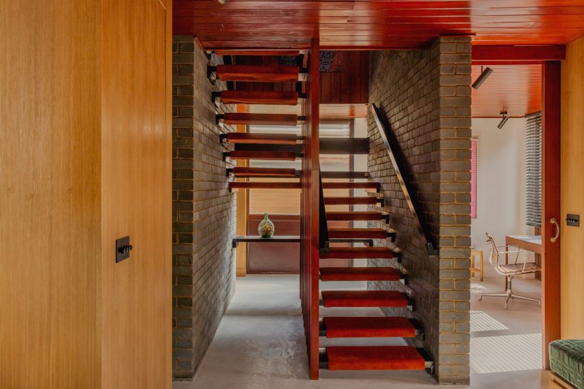
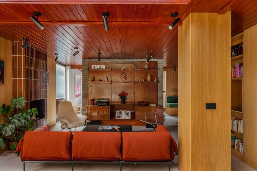
Timber ceilings and a fireplace clad in mahogany tiles feature in this London house, which its owners have renovated to honour the dwelling’s mid-century roots and nod to the colour palette of Stanley Kubrick films.
Located in north London’s Stanmore, Zero House belongs to recording artists Ben Garrett and Rae Morris, whose former home in Primrose Hill is the Dezeen Award-winning Canyon House designed by Studio Hagen Hall.
Zero House in Stanmore was built between 1959 and 1961
Unlike their previous dwelling, Garrett and Morris updated Zero House themselves but adopted the same mid-century palette when creating its interiors.
“The house was built between 1959 and 1961 by a Hungarian architect,” said Garrett, who explained that the original design was informed by Californian Case Study Houses such as Charles and Ray Eames’s 1949 home and design studio.
The two-storey dwelling was renovated by its owners
“It’s a great example of a number of imaginative mid-century domestic houses dotted around metro-land,” he told Dezeen. “Our main aim was to freshen it up relatively in keeping with the time but not to feel like we were living in a total time capsule.”
The pair maintained the matchbox timber ceilings that run throughout the two-storey home, which were stained with a dark reddish tone alongside stained wooden doors.
Slim mahogany tiles clad the floor-to-ceiling fireplace
Slim mahogany tiles clad the floor-to-ceiling fireplace in the living room, which features the same micro-cement flooring found at Canyon House and opens out onto a lush garden.
Garrett and Morris also maintained the home’s many exposed brick walls and inserted geometric timber shelving that displays eclectic ornaments including amorphous vases and a colourful set of nesting dolls.
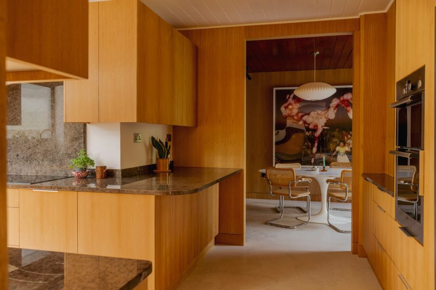
The kitchen was panelled in light-hued timber
Reeded 1970s-style glass was used to form various windows including a rectilinear opening in the kitchen that illuminates minimal timber cabinetry topped with grainy surfaces.
The pair transferred the tubular Marcel Breuer chairs and Tulip dining table by Eero Saarinen from their former home, as well as the same “heinous digital artwork” that decorated their previous living space.
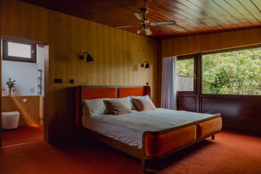
Darker tones create a “horror film” feel upstairs
Upstairs, a moody mahogany carpet darkens the main bedroom, which features the same timber wall and ceiling panels as the communal areas.
“There’s a lot of dark reds and browns in the house,” said Garrett.
“We leaned into the horror film slash Kubrick feel of the upstairs and made a few more austere choices this time,” he added, referencing the late filmmaker, whose credits include the 1980 supernatural horror movie The Shining.
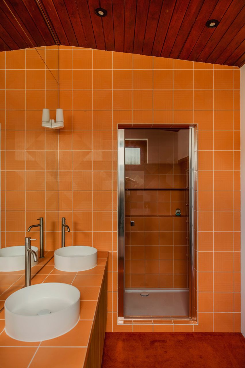
Coffee-hued cork was chosen to clad the exterior of the bathtub and the surrounding walls while another walk-in shower interrupts the dark wooden theme with bright orange tiles and deep white basins.
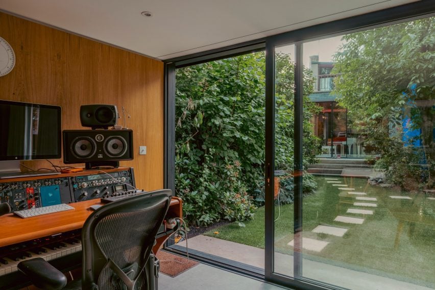
Zero House also holds a timber-panelled recording studio, which is located in a separate low-slung volume at the end of the garden and can be reached via a few stepping stones.
Bright orange tiles were chosen for a walk-in shower
Garrett and Morris left the structure of the property largely untouched. Instead, the duo chose to focus on dressing its mid-century interior.
“We didn’t have to be clever with this house as the space is abundant and the flow and design were incredibly well thought out in the early 60s,” he said. “So it was more of a cosmetic thing.”
There is a standalone recording studio in a shed at the back of the garden
Other recent mid-century renovation projects saw Design Theory update a coastal home in Perth from the 1960s while Woods + Dangaran added a koi pond among other elements to a Los Angeles dwelling built by architect Craig Ellwood during the same decade.