Exterior of Casa Soleto
CategoriesInterior Design

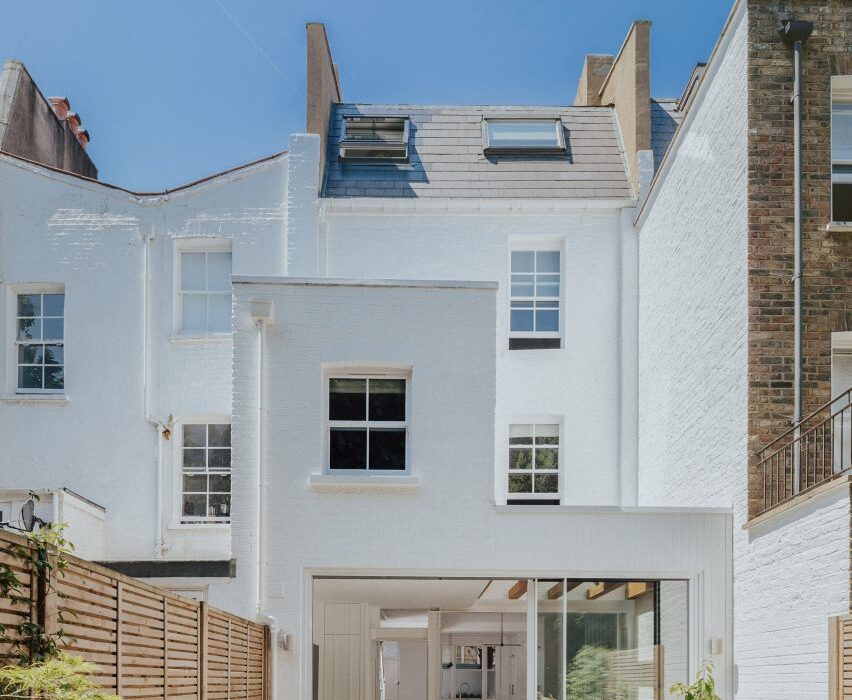
Studio Andrew Trotter refreshes 17th-century Casa Soleto in Puglia

Casa Soleto, a 17th-century house in Puglia, Italy, has been carefully renovated using lime plaster, terrazzo and furniture salvaged from a monastery.

The four-bedroom house, parts of which are over 400 years old, was given a refresh by its owners – architecture firm Studio Andrew Trotter and its studio manager Marcelo Martínez.

Exterior of Casa Soleto
Casa Soleto is located in southern Italy

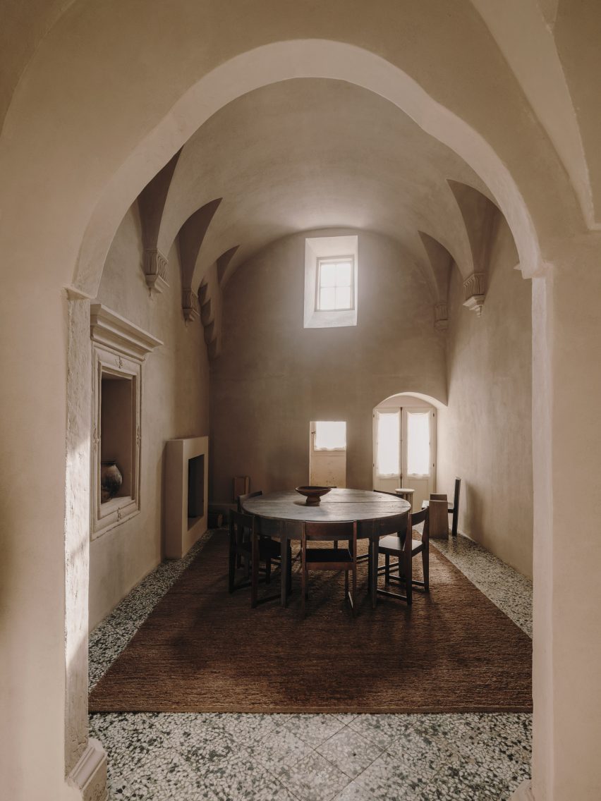
While no structural changes were made, the designers redid some of the building’s roofs, which were falling apart, added two bathrooms and powder rooms, and swapped the living and dining spaces around.

“The street front had all the baroque details of a small palazzo and inside it was like time stood still,” Studio Andrew Trotter founder Andrew Trotter said of the house.

Dining room in Casa Soleto
Parts of the house are over 400 years old

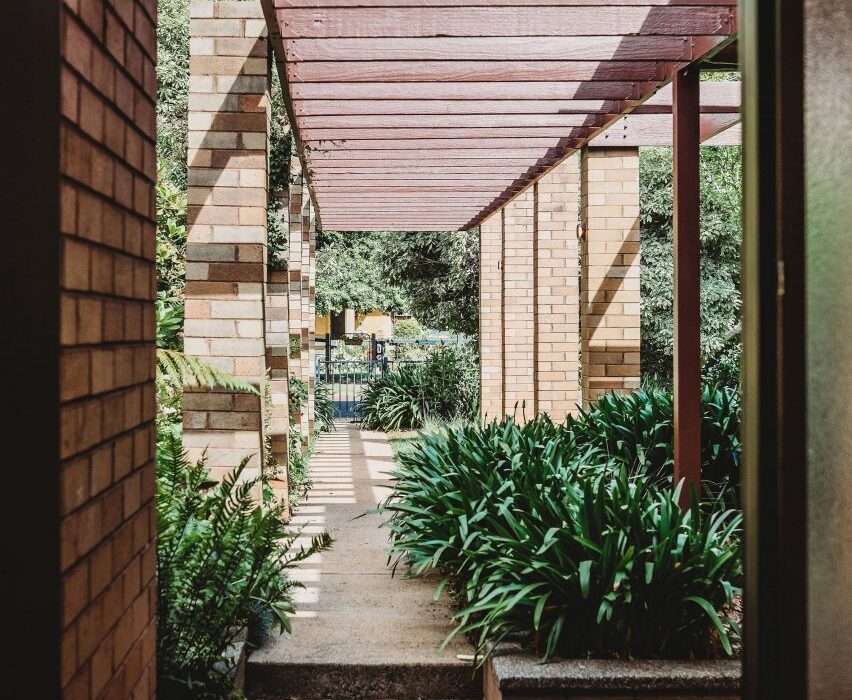
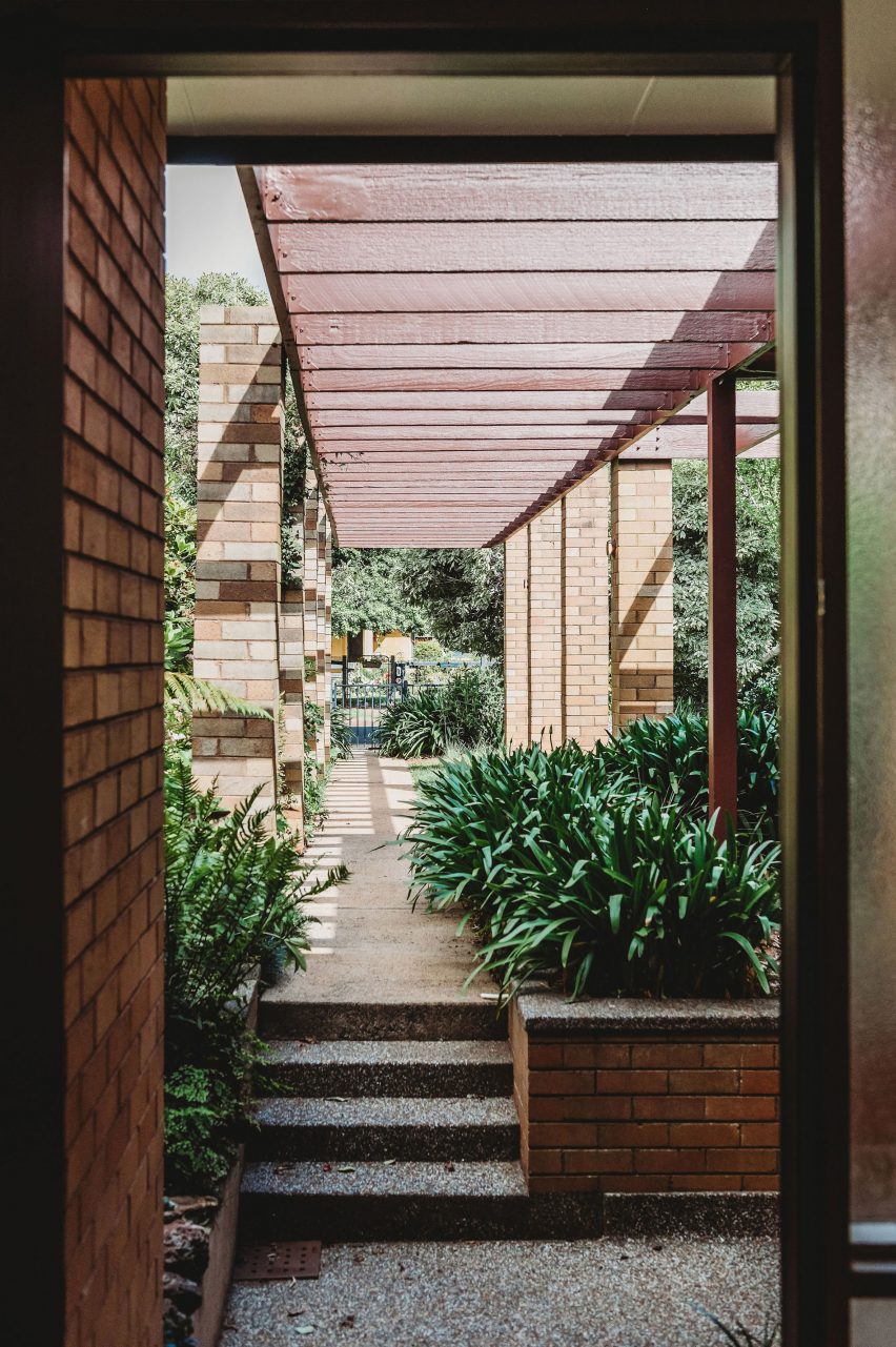
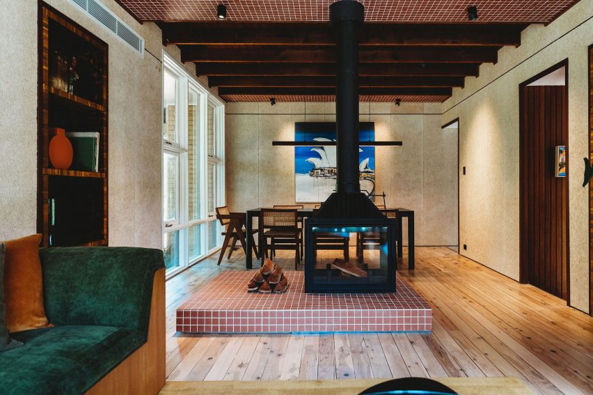
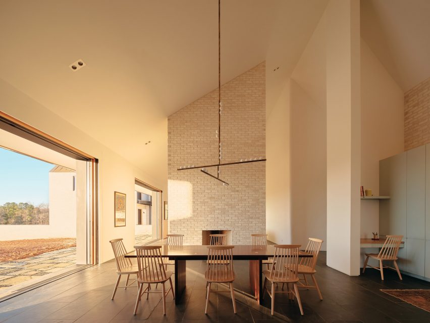
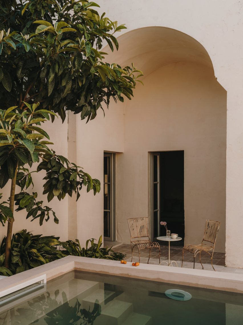
None of its walls were straight and the layout was designed for the needs of past occupants, with a chapel located behind the kitchen so that the family did not need to leave the house to pray.

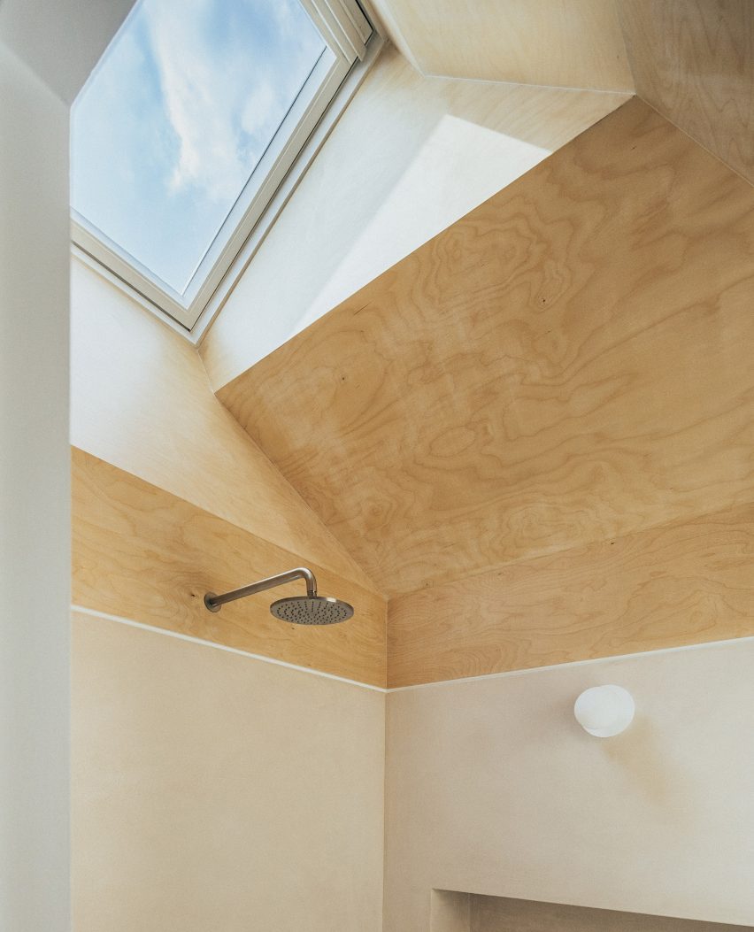
This place of worship was transformed into a media room and a powder room with an outdoor shower, creating a space that can be used as an extra guestroom if needed.

Old chapel in Puglia house
A former chapel was turned into a media room that can also serve as an extra guest room

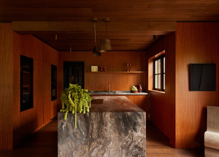
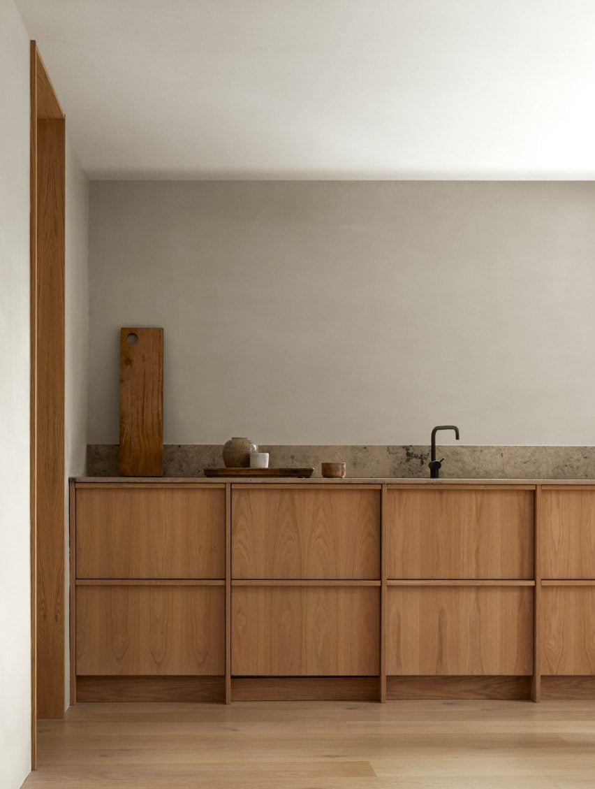
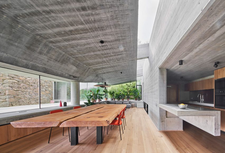
Trotter and Martínez aimed for the renovation of Casa Soleto to resemble the original building as much as possible and the team preserved much of its original flooring.

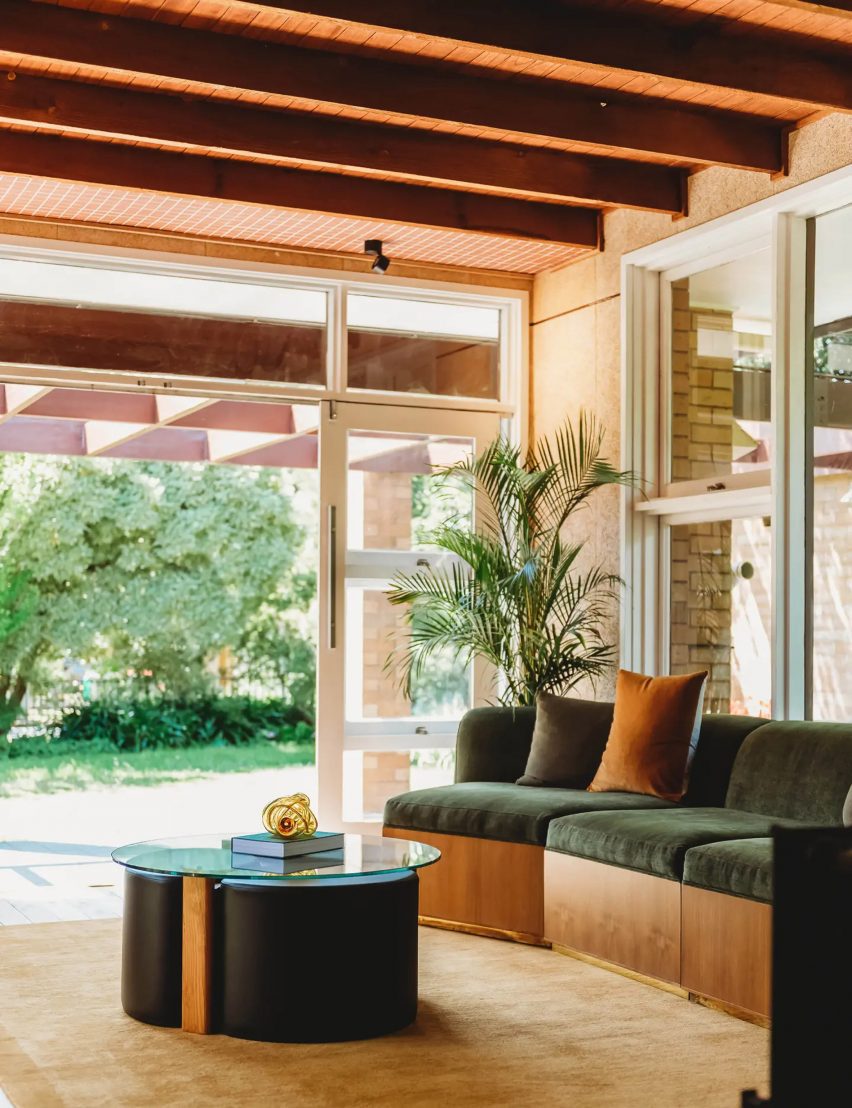
“We tried to use natural materials as much as possible,” Martínez told Dezeen.

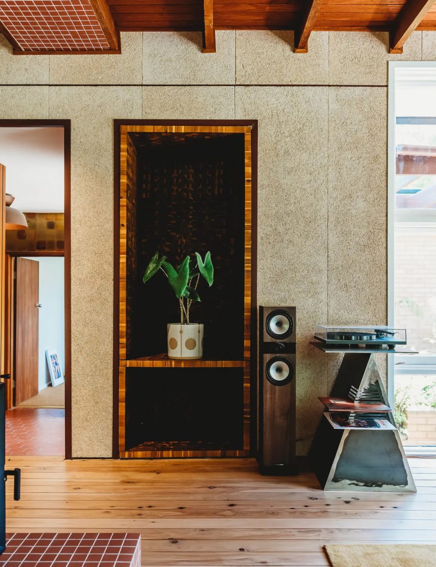
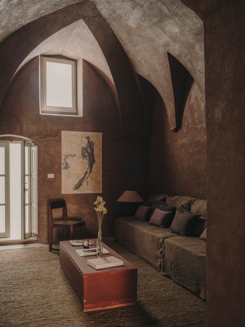
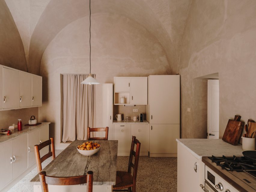
“We used lime plasters to give a natural and raw feeling to the walls, terrazzo floors – battuto alla veneziana – in the areas where new floors had to be made, wooden windows and doors seeking to imitate the original ones, cast iron hardware and linen sofas.”

Bedroom in Italian home by Studio Andrew Trotter and Marcelo Martínez
The 17th-century house was decorated with modern and antique furniture

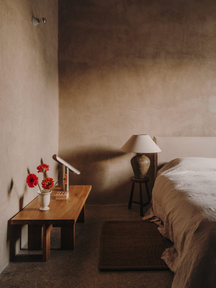
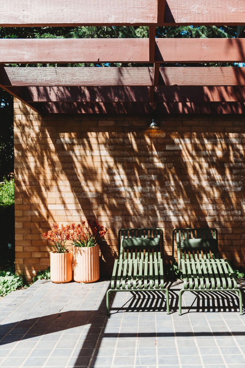
The designers also chose a discrete colour palette for the lime plaster used on the walls of the house, which on the ground floor culminate in five-metre-high ceilings.

“We chose subtle earthy and greeny colours,” Martínez said. “Colours played a central role, as some make spaces feel light, others moody.”

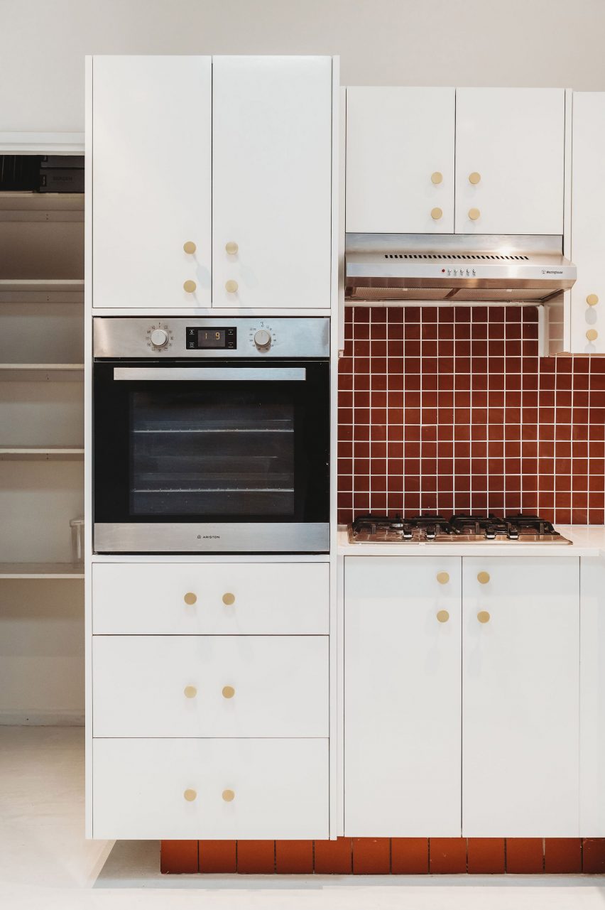
Studio Andrew Trotter kept the house’s original kitchen and commissioned local woodworkers from the city of Lecce to recreate the home’s original wooden doors.

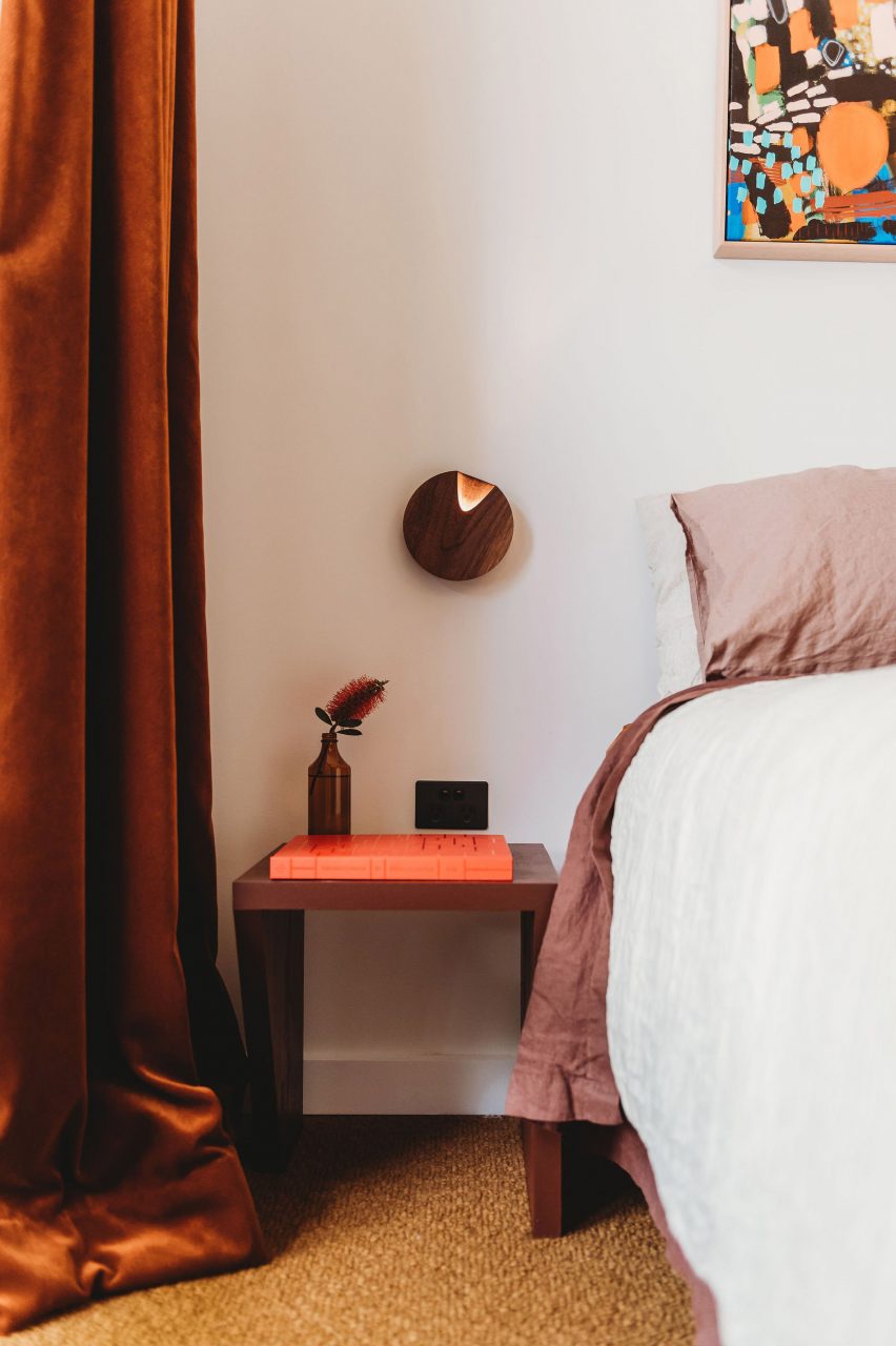
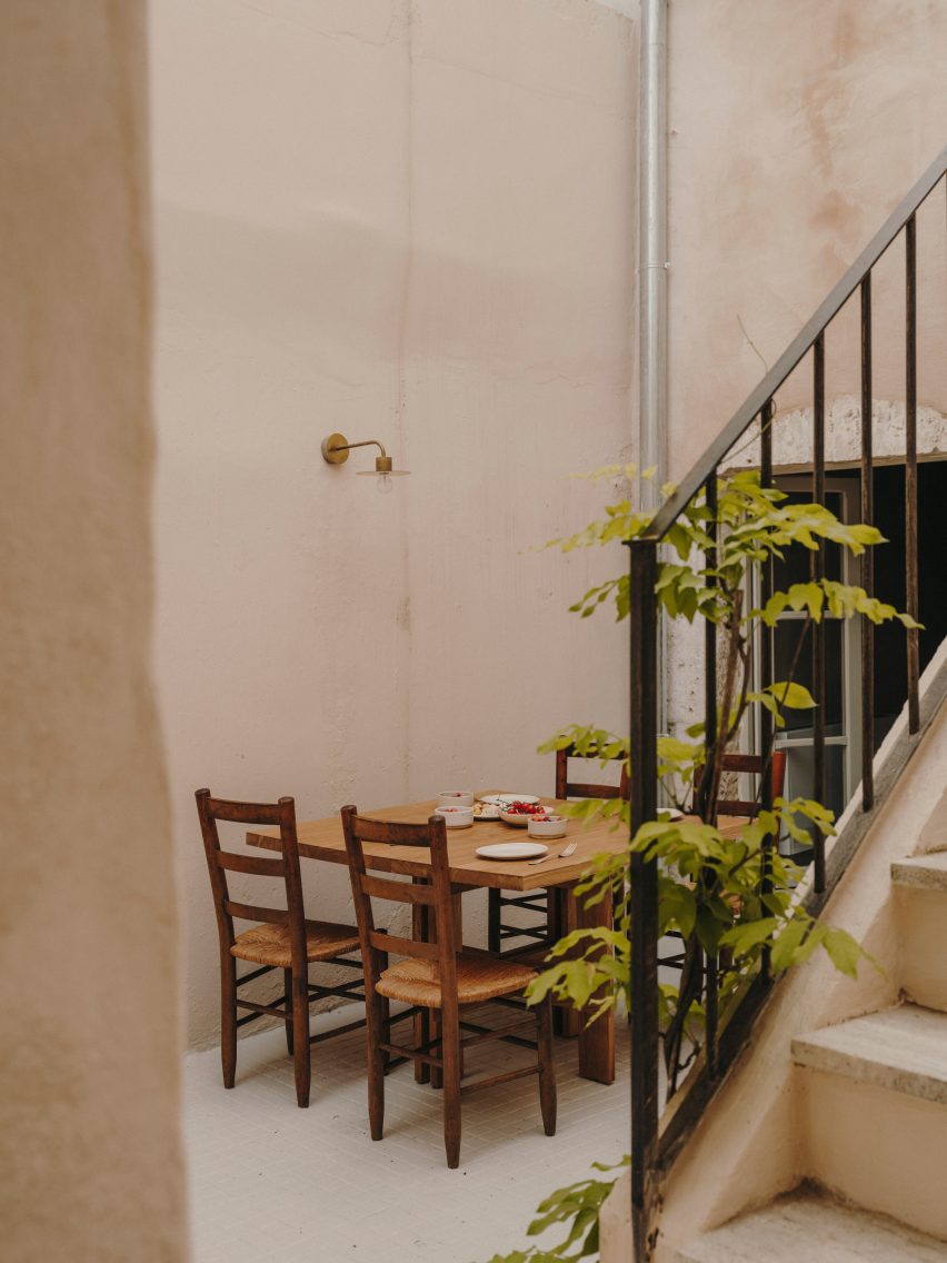
To add to the natural feel of the interior, the team used jute rugs to cover the stone floors and sourced linen upholstery and curtains from local artisans.

Living room in Casa Soleto
Lime plaster was used to give the walls a natural feel

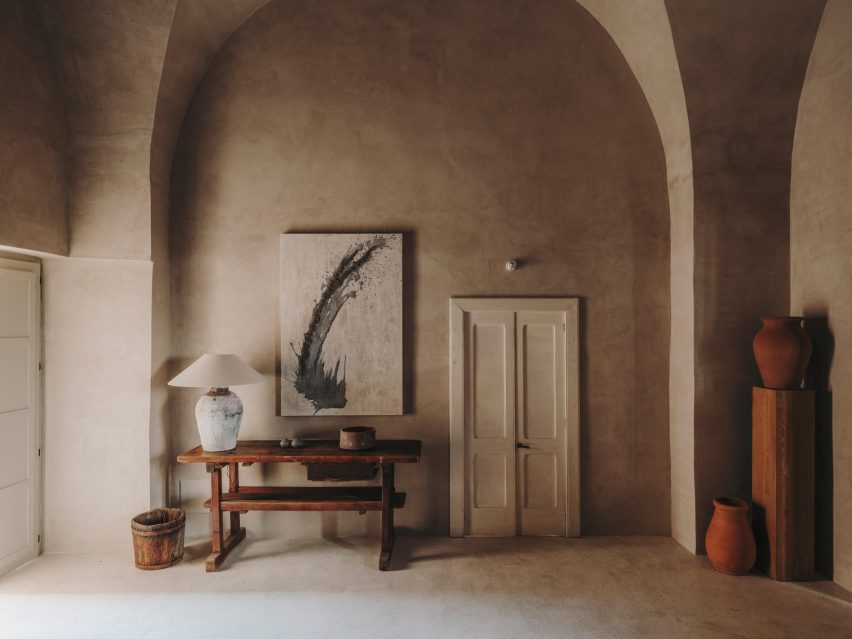
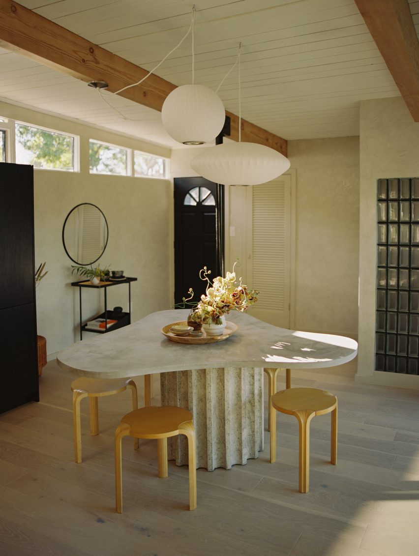
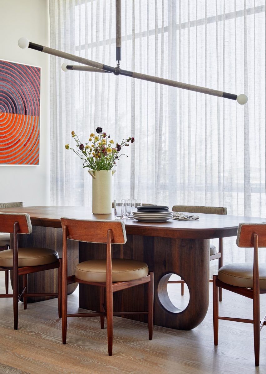
Furniture and accessories by Danish brand Frama were juxtaposed with antique furniture pieces including an 18th-century dining table that was salvaged from an Abruzzo monastery.

The studio also sourced a late 18th- early 19th-century wardrobe from Lombardy for one of the bedrooms in Casa Soleto, which can only be accessed by going through the front patio and up an outside staircase.

Kitchen in Casa Soleto
The original kitchen was kept and refurbished

Studio Andrew Trotter, which has worked on a number of projects in Puglia, plans to use Casa Soleto as a rental property.

“We purchased and restored it mainly to rent it out, and also to invite creative minds that we appreciate, make gatherings and exhibitions,” Martínez said.

Exterior of Casa Soleto
An exterior staircase leads up to the bedrooms

Previous projects the studio has completed in the area include a 19th-century school that was turned into a family home and an earth-toned villa made from local sandstone.

The photography is by Salva López.


Project credits:

Interior design: Andrew Trotter and Marcelo Martínez
Plaster application: Tullio Cardinale and team
Woodwork: Alba Falegnameria

Reference

Covered pergolas of Park Lane house
CategoriesInterior Design

PW Architecture Office brings “a little excitement” into mid-century house

Australian firm PW Architecture Office has revived the fortunes of this mid-century house in Orange, New South Wales, with a sensitive renovation that respects the original building while taking design cues from its material palette.

Park Lane house was originally designed by noted Australian architect Neville Gruzman for the 1962 Carlingford Home Fair before being built in 1964 by construction company Kell & Rigby – known for its work on Sydney’s landmark Grace Building.

Covered pergolas of Park Lane house
PW Architecture Office has renovated a 1960s house by Neville Gruzman

When Paddy Williams, founder of PW Architecture Office, discovered that the house was on the market in 2022, the team went to take a look out of architectural curiosity.

The studio was immediately seduced by the sense of flow between the indoor and outdoor spaces of the 1964 house and the quality of the design, construction and materials, despite the fact that it had been through several unsympathetic renovations.

Covered pergola and seats of house in Orange, New South Wales, by PW Architecture Office
Pergolas frame the entrance to the house

“We loved the sense of arrival created by the pergolas and colonnade that lead you past the garden and pond into the entrance hall,” Williams said.

“Pavilion-style wings separate the shared spaces from the private and we loved the way the pergolas wrap around the house and terraces, framing different spaces in the garden.”

Living room of Park Lane house
The home’s original Oregon timber beams were exposed

The practice ended up buying and renovating the house as a short-term rental for other modernist architecture lovers.

“We felt a real sense of responsibility to do the project justice and retain the elements of the plan and materials as they were intended,” Williams said.

“We wanted to bring a little excitement back into this mid-century marvel, as it would have had when it was first built.”

Living room of house in Orange, New South Wales, by PW Architecture Office
A double-sided fireplace divides the living and dining areas

Feeling that the floorplan still worked successfully, PW Architecture Office (PWAO) left it unchanged and set out to revive and celebrate the house’s original character while bringing it up to 21st-century living standards.

“We’ve designed it to be a modern take on the mid-century aesthetic, with an immediate sense of relaxation and peace through a refined palette and connection between house and gardens,” Williams told Dezeen.

Hallway of Park Lane house
Textural wood wool panels clad the walls in the living room

Removing the worn-out carpets revealed the home’s original Australian cypress floorboards, which were sanded and polished to freshen them up.

Elsewhere, PWAO replaced vinyl flooring with “durable and low-maintenance” micro-cement in the smaller living room, kitchen and some bathrooms.

In the main living room, false ceilings were taken out to expose the original Oregon timber beams, now infilled with hardwood timber and tiled bulkheads.

“When we pulled down the badly damaged plasterboard, the beams were in such great condition and had a beautiful texture so we decided to keep them on show,” Williams said.

“This also allowed us to increase the height of the ceiling and play with the scale and rhythm of the beams.”

Dining area of Park Lane house
Micro-cement was used to finish some of the floors

In the panelled entrance hall, the original native blackbean timber needed only a little care to restore its rich varied tones, also seen on the doors throughout the house.

Elsewhere PWAO used acacia as a feature timber for panelling and detailing across headboards, stair treads and integrated shelving.

“We’ve used these acacia elements in a playful pattern,” the studio said. “They’re in an ongoing conversation with the original blackbean timber used around the house.”

Kitchen of house in Orange, New South Wales, by PW Architecture Office
Terracotta tiles nod to the home’s original material palette

In the larger living space, a double-sided fireplace helps to zone the living and dining areas, while the walls were clad in textural wood wool panels – a composite made from recycled timber fibres.

“It is actually a thermal and acoustic panel, typically used for ceilings,” Williams said. “We thought it was a fabulous opportunity to provide texture on the walls.”

Bedroom of Park Lane house
Similar warm terracotta tones also feature in the bedroom

Throughout the house, terracotta tiles add to the sense of warm earthiness established through the material palette.

“The mosaic tiles were influenced by the original terracotta tiles in the entrance foyer,” the architect explained. “The smaller grids we’ve used are in contrast to the larger original terrace tiles, as well as the grid of the house itself, creating a play on scale.”

When the wiring was replaced, PWAO also had the opportunity to integrate the house with smart home technology, allowing the lights, heating, fans and irrigation to be controlled via an app, balancing modernist aesthetics with modern convenience.

Bathroom of house in Orange, New South Wales, by PW Architecture Office
The bathroom was designed to match

Dezeen recently rounded up eight other mid-century home renovations that marry period and contemporary details.

Among them was another 1960s Australian house with interiors updated by local studio Design Theory for a young client and her dog.

The photography is by Monique Lovick.

Reference

Kitchen inside Low Energy House designed by Architecture for London
CategoriesInterior Design

Eight textural kitchens that combine stone and wood surfaces

For this lookbook, we’ve collected eight kitchen interiors that marry the natural textures of wood and stone to create visual interest while remaining practical.

Stone is a hardwearing and durable material, making it a popular choice for kitchen worktops, while wood adds a sense of warmth to interior spaces when applied to walls, floors or kitchen cabinets.

In these kitchens, the natural grain of wood is complemented by striking stone surfaces, including cool-toned limestone, travertine, and a range of dramatically veined marble.

This is the latest in our lookbooks series, which provides visual inspiration from Dezeen’s archive. For more inspiration see previous lookbooks featuring mid-century home renovations, interiors centred around dining tables and spaces finished in reclaimed materials.


Kitchen inside Low Energy House designed by Architecture for London
Photo by Lorenzo Zandri and Christian Brailey

Muswell Hill house, UK, by Architecture for London

English studio Architecture for London renovated and extended this Edwardian home in London using natural materials in a bid to keep embodied emissions to a minimum.

In the kitchen, cabinets were lined with oak wood while pale grey limestone was used for the floors, worktops, prep counter and a chunky window seat.

The studio also exposed the original timber roof beams and complemented the minimal material palette with lime plaster on the walls, forming an airtight layer to mitigate heat loss.

Find out more about the Muswell Hill house ›


Wood-lined kitchen interior with a marble island by DAB Studio
Photo by Daniëlle Siobhán

Zwaag family home, Netherlands, by DAB Studio

For the kitchen renovation of this home in Zwaag, the Netherlands, Dutch interiors practice DAB Studio covered the walls and cabinets in Afromosia wood, and the floors and ceilings in smoked black-oiled oak.

The Afromosia wood was quarter-sawn to reveal a decorative grain pattern and add a sense of playfulness to the space, while an Arebescato Orobico marble kitchen island acts as the room’s centrepiece.

Find out more about Zwaag family home ›


Travertine stone kitchen island and backsplash with oak cabinets
Photo by David Dworkind

1980s Quebec home, Canada, by Ménard Dworkind

A sculptural travertine island sits at the centre of the kitchen in this 1980s home in Quebec, which was renovated by Canadian architecture studio Ménard Dworkind.

The studio also used a travertine slab to create a sliding backsplash, inserted into the warm oak cabinetry to conceal additional storage space.

Find out more about the 1980s Quebec home ›


Kitchen in Twentieth house by Woods and Dangaran
Photo by Joe Fletcher

Twentieth, USA, by Woods + Dangaran

For this kitchen in a Santa Monica home, Los Angeles studio Woods +Dangaran used a dark grey marble with bold white veining to form the island worktop and the surrounds of a recessed space in the wall units.

White oak lines the floors, while a darker shade of walnut was used for wall panelling, cupboards and the sides of the island.

Find out more about Twentieth ›


Palm Beach house in Sydney by YSG with stone kitchen island

Sydney Palm Beach house, Australia, by YSG

Informed by the rustic beach clubs of Ibiza and Cancun, Australian interiors studio YSG overhauled a holiday home in Palm Beach, Sydney, with a mix of sunny colours and textures.

In the kitchen, the studio sanded down the wooden floorboards to achieve a warmer tone and added an island made from two types of stone – Giallo Siena marble and travertine – to recall “the ombre shades of a freshly poured tequila sunrise”.

Find out more about the Sydney Palm Beach house ›


Minimal interiors of forest retreat designed by Norm Architects
Photo by Jonas Bjerre-Poulsen of Norm Architects

Forest cabin, Sweden, by Norm Architects

Danish studio Norm Architects kept the material palette minimal and rustic for this holiday cabin in a Swedish forest.

Handleless kitchen cupboards are finished in oak to match the floors, complemented by a stone worktop that extends up into a short backsplash.

Find out more about the forest cabin ›


Brooklyn Loft by Dean Works
Photo by Daniel Salemi

Brooklyn Loft, USA, by Dean Works

White marble with grey-and-blue veining provides an eye-catching worktop, backsplash and shelving in the kitchen of Brooklyn Loft, an apartment designed by local studio Dean Works.

Surrounding the marble is a large Baltic birch plywood storage unit that doubles as a room divider to separate the kitchen from the bedroom. A dark stone kitchen island was added to contrast the otherwise light-toned interior.

Find out more about Brooklyn Loft ›


Sunderland Road house in London by 2LG
Photo by Megan Taylor

Forest Hill house, UK, by 2LG Studio

Playful pastel colours characterise the interior of this Edwardian home in London, which was renovated by 2LG Studio.

The local firm aimed to balance Italian influences – in the form of the marble backsplash and kitchen island – with Scandinavian design elements such as the arched cabinets and grooved wood siding.

Find out more about the Forest Hill house ›

This is the latest in our lookbooks series, which provides visual inspiration from Dezeen’s archive. For more inspiration see previous lookbooks featuring mid-century home renovations, interiors centred around dining tables and spaces featuring reclaimed materials.

Reference

National Black Theatre
CategoriesInterior Design

Five key projects by interior designer and Dezeen Awards judge Little Wing Lee

Interior designer Little Wing Lee has joined Dezeen Awards 2023 as a judge. Here, she selects five projects that best reflect her work.

Lee’s interior design practice Studio & Projects creates spaces and products for cultural, commercial and residential clients, taking a “narrative approach to design”

“My designs are always informed by context, location and function,” Lee told Dezeen. “I always think about the project’s story and connect that to the design decisions I make.”

Lee is also the founder of Black Folks in Design, an organisation which raises awareness and promotes the culture and importance of Black designers. She was named the first winner of the Female Design Council and NicoleHollis Grant recognising women of colour-led interior design firms located in the US.

“The grant was an investment in my talent and skill and helped me sustain my momentum to build and invest in future projects,” said Lee.

Lee is currently working on a collection with Mexican rug brand Odabashian and the launch of a new lighting collection as well as several museum and restaurant projects.

Lee among Dezeen Awards 2023 judges

Dezeen Awards 2023, in partnership with Bentley Motors, is closed for entries. The longlists will be published on Dezeen in two weeks.

Other judges joining Lee this year include architects Jason Long and Zhu Pei, interior designers Diana Radomysler, Colin King and Martin Brudnizki, and designers Yves Béhar, Ineke Hans and Lani Adeoye.

Read on to find Lee’s views on the five projects that best represent her work:


National Black Theatre

National Black Theatre

“National Black Theatre is a unique project as it combines public, performance, and residential spaces.

“It is a historic major capital redevelopment project that will transform the current property into a 21st-century destination for Black culture through theatre.

“This project will anchor and recapitalise the institution with a 250-seat flexible temple space and a 99-seat studio theatre.

“As part of the same project, the developer Ray is also working on National Black Theatre Way, a building on 2033 5th Ave which will house residential, event and retail spaces.”


OKRA

OKRA for Odabashian

“OKRA was the first design by Studio & Projects from our upcoming rug collection with manufacturer Odabashian.

“The collection will be carried by Verso with additional designs exhibited this summer in their Bridgehampton gallery.”


Ace Hotel Toronto by Little Wing Lee

Ace Hotel Toronto

“Ace Hotel Toronto opened in July 2022 and is the brand’s first location in Canada.

“The 123-room hotel was designed by revered Toronto firm Shim-Sutcliffe Architects, led by Brigitte Shim and Howard Sutcliffe, in collaboration with Atelier Ace with me as the Atelier Ace/Ace Hotel Group present design director.”


Black Folks Design by Little Wing Lee

Black Folks in Design

“Black Folks in Design (BFiD) is a network that connects Black designers within and across disciplines to support each other and share professional opportunities.

“We help people understand the excellence, contributions and importance of black designers to create economic and portfolio-building opportunities for Black designers.”


National Museum of African American History and Culture exhibitions

“The National Museum of African American History and Culture (NMAAHC) at the Smithsonian Institution in Washington DC is the only national museum devoted exclusively to the documentation of African American life, history and culture.

“The museum helps all Americans see how their story, their history, and culture are shaped and informed by global influences. It explores what it means to be an American and shares how values like resiliency, optimism and spirituality are reflected in African American history and culture.”

Dezeen Awards 2023

Dezeen Awards celebrates the world’s best architecture, interiors and design. Now in its sixth year, it has become the ultimate accolade for architects and designers across the globe. The annual awards are in partnership with Bentley Motors, as part of a wider collaboration that will see the brand work with Dezeen to support and inspire the next generation of design talent.

Reference

Exterior photo of Burberry's New Bond Street store
CategoriesInterior Design

Burberry’s draws on minimalism at New Bond Street store

British luxury brand Burberry has renovated its New Bond Street store, which has been decorated with a minimalist scheme that is populated with striking contemporary furniture.

Set on a prominent spot on the corner of New Bond Street and Conduit Street in central London, the 22,000-square-metre store is split across three levels.

Exterior photo of Burberry's New Bond Street store
Burberry’s flagship store is located on New Bond Street

The flagship store has a minimal open-plan interior that is characterised by stark white floor, walls and ceilings which are offset by pops of gold, blue and tones of brown.

The fixtures of the store such as its pillars, staircase, wall displays and mirrors bring a rigid and strict geometry to the space that is complemented by a panelled ceiling which was designed to mimic the brand’s iconic check.

Interior photo of Burberry's New Bond Street Store
It has a minimalist interior

“The minimalist interior is punctuated with an eclectic mix of contemporary furniture, creating a stripped-back setting designed to spotlight key Burberry pieces,” said Burberry.

“Overhead lighting has been crafted to replicate the iconic Burberry Check – a pattern introduced in the 1920s, referencing the brand’s rich heritage.”

Interior photo of Burberry's New Bond Street Store
Burberry’s check was incorporated across the ceiling

Ceiling panels were organised in a gridded formation with spotlights set between each. Lighting strips were added to the panels at various intervals throughout the store and reference the multiple lines of the signature check.

Throughout the store, slivers of checkered tiles punctuate the stark white floors. A classic black-and-white checkered tile covers multiple areas of the interior, zoning numerous different spaces including ready-to-wear and accessory sections.

Other combinations of tiling include a dark brown and black rectangular tiles that are similarly organised in a checkerboard formation.

In contrast to the rigid lines of the store’s more permanent fixtures, furniture brings a softer and more playful look.

Curving sofas and armchairs were upholstered in bold shades of beige, brown and vibrant blue and placed on top of matching area rugs and carpets.

Photo of a seating area at the store
Areas of the store were decorated with pops of colour

Display tables in blocky shapes are carried throughout each of the store’s floors and sit alongside glass, metal and mirrored vitrines.

Clothing rails draw on an industrial look, with the floor-to-ceiling structures reminiscent of scaffolding systems, however, set apart by their polished and reflective finish.

Photo of a shopping area
Polished metals were paired with glass

“We are excited to open the doors of our newly refurbished flagship store on New Bond Street in one of London and the world’s premier luxury shopping destinations,” said Burberry’s chief executive officer Jonathan Akeroyd.

“The store showcases our beautifully crafted products in a luxury setting that connects our customers with our brand and unique heritage.”

Photo of the store interior
Blocky display units were placed throughout

In 2022, British designer Daniel Lee was announced as Burberry’s creative director following a shock exit from Bottega Veneta. Soon after his appointment, Lee revealed the “first creative expression” under his direction in the form of an archive-inspired charging knight logo and serif logo font.

Earlier this year, British artist Tom Atton Moore was commissioned to create a series of hand-tufted textile installations for Burberry’s Paris showroom and Rue Saint Honoré store.

The photography is courtesy of Burberry.

Reference

Apple Store in Battersea
CategoriesInterior Design

Transparency “one of the biggest beasts that we battle” says Apple

Apple is pushing for carbon transparency in the supply chain as it aims to reduce the impact of its stores, claims the tech company’s retail sustainability lead Rebecca Cully in this interview.

Created as the latest “evolution of the Apple Store”, Apple’s recently opened location in Battersea includes several material innovations aimed at reducing the shop’s carbon impact. These were sourced with transparency in mind, according to Cully.

“That transparency piece is one of the biggest beasts that we battle on a regular basis,” she told Dezeen.

“I think that’s a big reason why finding the right partners, not only in the design space but the construction space and the entire value chain, is just so critical.”

Apple seeking partners “absolutely committed to transparency”

Cully explained that Apple is seeking a commitment to transparency from all its construction partners as it aims to meet the company’s wider commitment of becoming carbon neutral by 2030, which will mean not only reducing the impact of its stores, but also its products.

“There’s so many brilliant products out there in the world, and so many incredible companies that are doing some really interesting things, but as far as innovation is concerned, if we can’t identify a partner who’s absolutely committed to transparency it’s a no-go,” said Cully.

Apple Store in Battersea
The Battersea Apple Store incorporated new floor materials and roof baffles

Apple is working on building record-keeping of impact and transparency into all its contracts. However, Cully acknowledged that evaluating the full of the impact of all components and materials in its stores is still not possible.

“Evaluating products by manufacturer for carbon is still very early,” she said. “And so contractually obligating our supply chain manufacturers to disclose that information as a result of award is certainly something that we are focused on right now.”

“The entire store? I think that’s a little ambitious right now, based on where industry is at,” she continued. “Frankly, we have not gotten to the point where we’re able to control that entire supply chain.”

“You have to prioritise. For instance, the the nuts and bolts that go into the store are not as significant as our avenues and our ceilings.”

“Industry is pretty slow to move”

The recently opened Battersea store, along with the reopened Tysons Corner store in the USA, are the first to use an updated set of fixtures and fittings that will be rolled out across other stores.

These include a timber framework for its walls and room dividers, flooring bound with a bio-polymer and acoustic baffles made from biogenic material.

“These are very visible, very large components within the store that we knew if we focused on in the original design intent were going to result in a superior outcome from a carbon perspective,” said Cully.

Battersea Apple Store
The store is the latest “evolution” of Apple’s retail designs.

Apple’s current strategy with its stores is to focus on the most impactful, often physically largest areas that have traditionally been the most carbon-intensive.

“So it’s really important that we are giving clear instructions to the folks that are sourcing for us to achieve particular outcomes,” said Cully.

“That being said, the industry is pretty slow to move in a lot of these cases. So I would say that we are targeting certain elements within the store that are traditionally very high-carbon and very resource-stressed.”

“We are targeting those manufacturers to make sure that they understand there is an obligation to deliver on transparency that is absolutely accurate.”

Cully also highlighted that one major way that the carbon impact was reduced at its Battersea store was the decision to locate within the redevelopment of Battersea Power Station.

Along with the Apple Store within the former turbine hall, the technology company has placed its UK offices within the former power station.

“Partnering on a redevelopment project of a brownfield site in and of itself has a tremendous value from the standpoint of carbon emissions avoided as a result of the existing structure,” said Cully.

“Certainly the partnership that we have with the landlord, was highly strategic in terms of positioning Apple to locate and operate as environmentally considerate as we possibly could.”

Apple “certainly interested in pushing industry”

According to Cully, Apple wants to push the construction industry to be more sustainable and noted that the company’s vice president of environment, policy and social initiatives, Lisa Jackson, has said she “intends to create a playbook that other organisations can follow”.

“We are certainly interested in pushing industry,” said Cully. “And because of scale, we have an ability to do that and hopefully pave the way to make it a little bit easier for other companies to follow suit – or at least start normalising conversations with manufacturers and industries so that you know, these things become a little bit easier or a little bit more cost effective for other folks to follow suit.”

“There are a few organisations around the world, I think, that have the ability to invest in this space the way we have, because the market just doesn’t exist.”

In the past Apple stores have been focused on aesthetics, but Cully believes that the refocus on sustainability and accessibility means the shops align closer with the brand’s values.

“This evolution of the store is so much more intrinsically linked to our values – it really is approaching the epitome of Apple’s values realised through the retail store space,” said Cully.

“We have evolved the store from kind of looking like a product, to now fully representing our values in every way that we can, within the context of the built environment itself.”

However, store fit-outs are far from being Apple’s biggest challenge in the race for carbon neutrality. Currently, 65 per cent of the company’s emissions from its products so this thinking will also need to be replicated in it production supply chains.

The first Apple Store opened in 2001 and there are now more than 500 around the world. Dezeen recently rounded up 10 of the latest to open.

The photography is courtesy of Apple.

Dezeen In Depth

If you enjoy reading Dezeen’s interviews, opinions and features, subscribe to Dezeen In Depth. Sent on the last Friday of each month, this newsletter provides a single place to read about the design and architecture stories behind the headlines.

Reference

Bar and seating area in Courvoisier pop-up bar at Selfridges designed by Yinka Ilori
CategoriesInterior Design

Yinka Ilori imbues Courvoisier bar with natural beauty of Cognac region

A wavy canopy emerges like a fountain from this pop-up cognac bar inside Selfridges in London, designed by local designer Yinka Ilori to mimic the glistening waters of the Charente river in France’s Cognac region.

The bar belongs to cognac brand Courvoisier and was designed to capture its hometown of Jarnac and the surrounding region, where cognac brandy is made using white grapes from one of six designated “crus” or areas.

Bar and seating area in Courvoisier pop-up bar at Selfridges designed by Yinka Ilori
Courvoisier has opened a pop-up bar at Selfridges

Ilori wanted to bring this bucolic setting to London’s Selfridges department store, using it to inform the colours and patterns featured throughout the space.

“I aimed to capture the essence of Jarnac – the warmth of the sun, the rippling of water, the beautiful wildflowers and the natural beauty in the surroundings,” he told Dezeen.

“The design pays homage to the magic and nature of Jarnac, creating a space that embodies its spirit.”

Seating area in Selfridges cognac bar pop-up
The interior was designed by Yinka Ilori

The town’s location on the Charente river is the most prominent influence, seen across the pale-blue floors, the sinuous rippling pattern on the walls and, most importantly, in the bar itself.

Here, a circular counter was topped with a wavy blue canopy that seems to pour out of a central pillar, with the same pattern continuing down onto the base.

Courvoisier VSOP bottle designed by Yinka Ilori
Ilori also designed a limited-edition VSOP bottle for the brand

“I wanted people to feel like they were surrounded by water, with it flowing both above and below them, creating a sense of immersion and tranquillity,” Ilori said.

“The design of the canopy aims to reference the effortless flow of water, making visitors feel as though they are in the midst of a serene river.”

The bar’s scalloped countertop picks up on the sinuous shape of the waves but provides a colourful contrast thanks to its lacquered red finish.

Another reoccurring feature throughout the space is a cartoonish flower shape that nods to Jarnac’s wildflower fields and is found across drinks stands and upholstered benches in the seating area.

To create a visual connection between the blue waves and the buttercup-coloured flowers, Ilori incorporated a sunset gradient that fades from yellow to soft lilac and envelops several cylindrical display stands as well as the base of the bar.

“I was struck by the gradients in the sky in Jarnac and wanted to capture this unique visual,” Ilori said.

Seating area of pop-up bar at Selfridges designed by Yinka Ilori
A wavy pattern features across the walls

These three repeated motifs, spanning earth, sky and water, also feature in the limited-edition bottle design that Ilori created for Courvoisier’s Very Superior Old Pale (VSOP) cognac.

The bottles are available in four different ombre colours and displayed throughout the bar, which will stay open for three weeks until 11 September.

Overhead shot of circular bar inside Courvoisier pop-up bar at Selfridges designed by Yinka Ilori
The same pattern is picked up in the canopy of the bar

The project forms part of Ilori’s ongoing collaboration with Courvoisier as the brand’s “ambassador of joy”.

Last year, the designer created an immersive dining for Courvoisier in New York, designed to transport diners into a surrealist interpretation of Jarnac.

Ilori’s colourful work is often considered as part of the New London Fabulous movement and includes a colourful skate park in Lille and The Colour Palace pavilion at the London Festival of Architecture.

Reference

Exterior of house in London by Studio Varey Architects
CategoriesInterior Design

Studio Varey Architects celebrates natural light in Notting Hill house

London firm Studio Varey Architects has simplified this Victorian terraced house to create a light-filled home in Notting Hill, with timber-framed skylights designed to catch the sun.

Set in the Westbourne Conservation Area, Huron House has belonged to its current owners for the last 25 years.

Exterior of house in London by Studio Varey Architects
Huron House is a renovated Victorian terrace in west London

The overhaul of the 19th-century building started as a simple ground-floor renovation to replace the kitchen and improve the connection between the house and its garden.

However, exploratory works showed the four-storey property to be in bad structural condition, which demanded major improvement works but also gave the owners an opportunity to reimagine their period home.

Dining area of Huron House
Decorative oak beams frame the skylight in the extension

The new brief to Studio Varey Architects included a full house renovation and interior design, with special emphasis on the bathrooms as well as custom joinery and the rebuilding of the 1990s rear extension to create a new open-plan kitchen and dining room.

“Our goal was to create an open-plan living space and bring lots of natural light into the ground floor, helping it to feel more inviting and better suited to entertaining friends and family,” the studio told Dezeen.

Stairwell of house in London by Studio Varey Architects
A simple white staircase leads upstairs

The property sits on a rough east-west axis, giving it the potential to achieve great light levels throughout the day, with the sun moving from the back of the house in the morning to the front in the afternoon.

“We wanted to ensure this natural light was captured through the architecture and design of the spaces,” the studio said.

On the ground floor, Studio Varey Architects removed a structural post that supported the building but divided the back wall.

Bathroom with light well in Huron House
A skylight illuminates the top-floor bathroom

This has been replaced with a steel frame, which allowed the studio to introduce slimline aluminium sliding doors that now run along the whole back of the property.

An existing skylight in the flat roof here was enlarged and framed with oak beams, pulling more light into the centre of the hybrid kitchen-dining space.

“Natural light cascades into the back of the house, while the introduction of oak beams created a feature that plays with the light as it travels through the property,” the studio said.

The whole staircase was replaced and positioned further away from the home’s large rear windows, creating a lightwell funnels sun into the lower floors.

On the top floor, an existing bathroom was fully renovated. Situated in the middle of the top floor it featured no windows save for a small skylight, meaning that light levels were totally inadequate.

Here, Studio Varey Architects cut back the ceiling to create a multifaceted surface clad in birch plywood – its colour knocked back with a wash of soft white – to bounce light around the space.

Timber-clad light well in Huron House
The ceiling was cut back to allow more light into the interior

“We created a splayed ceiling that increased the height of the space, allowing for the playful integration of materials to emphasise the new angles,” the studio said.

“Naturally finished birch ply, leading from the skylight down into Tadelakt walls, beautifully captures sunlight creating a special warmth in the space.”

Living room of house in London by Studio Varey Architects
Oak forms bookcases in the sitting rom

White oak can be found throughout the house in the form of built-in joinery from bookcases and wardrobes, as well as in the feature beams of the extension.

“We wanted to simplify the material palette and keep it light, both in appearance and number of elements we used,” the studio said.

“This was done to emphasise the quality of the materials themselves, highlight the craftsmanship of the work and establish a visual link between the interior spaces throughout the home.”

Bedroom of house in London by Studio Varey Architects
Oak joinery features in the primary bedroom

Polished concrete, used for the floor at ground level, is underlaid with underfloor heating and provides a durable surface that is easy to clean for the owners after walking their dog.

Other recently renovated houses in London include Sunderland Road House by 2LG, which features pastel-painted corniced ceilings, and Graphic House by Office S&M, which is defined by graphic shapes and bold hues.

The photography is by Taran Wilkhu.

Reference

Mid-century renovation of City Beach residence in Perth by Design Theory
CategoriesInterior Design

Eight mid-century home renovations that embrace contemporary details

From a modernist villa in Beverly Hills to a flat in one of Brasília’s iconic Superquadra apartment blocks, the mid-century renovations in this lookbook are a masterclass in updating a period home while retaining its distinctive character.

Originally constructed in the post-war period between 1945 and 1969, mid-century homes have proved enduringly popular due to their prescient emphasis on natural light, clean lines, open floor plans and humble materials such as wood, stone and concrete.

The renovations below see many of these original features retained and restored, supplemented with contemporary additions such as double-height ceilings and furniture by the likes of Tadao Ando and Mario Bellini.

This is the latest in our lookbooks series, which provides visual inspiration from Dezeen’s archive. For more inspiration see previous lookbooks featuring art deco homes, sunny yellow interiors and serene bedrooms with striking natural views.


Mid-century renovation of City Beach residence in Perth by Design Theory
Photo by Jack Lovel

City Beach Residence, Australia, by Design Theory

Australian studio Design Theory looked to preserve the “considerable mid-century charm” of this home on the coast of Perth during its renovation (top and above), remaining true to the rich palette of natural materials found in the original design.

Contemporary furniture and lighting with gently curving forms were chosen to soften the rigorous lines of the original architecture and prevent the interiors from feeling like a period pastiche.

Find out more about City Beach Residence ›


Brandaw Residence, US, by 180 Degrees Design + Build and CBTWO Architects
Photo by An Pham

Brandaw Residence, US, by 180 Degrees Design + Build and CBTWO Architects

A new double-height living room with a pitched roof and full-height glazing was added to modernise this 1960s home in Phoenix, creating sightlines up and out towards nearby Camelback Mountain.

Modernist touches remain on the interior in the form of plentiful wood panelling alongside finishes and furnishings in muted primary colours ranging from teal to mustard-yellow.

Find out more about Brandaw Residence ›


Mid-century renovation of Hampstead House by Coppin Dockray in London
Photo by James O Davies

Hampstead House, UK, by Coppin Dockray

This house in Hampstead was originally designed by British architect Trevor Dannatt in 1960 as London’s answer to the post-war Case Study Houses built by the likes of Richard Neutra and the Eameses in California.

When renovating and extending the property for a growing family, local studio Coppin Dockray contrasted vintage and contemporary furniture for a “domestic, lived-in” feel, with pieces ranging from a Togo chair to Mia Hamborg’s Shuffle table for &Tradition.

Find out more about Hampstead House ›


Beverly Hills villa, US, by Heusch
Photo by Gerhard Heusch

Beverly Hills villa, US, by Heusch

Historical images helped architecture firm Heusch to restore this Beverly Hills villa to its former glory and reverse some of its “unfortunate transformations” over the years.

Existing terrazzo floors on the ground floor were restored and complemented with fluted glass details and dark timber furnishings, both new and old, including Ando’s cantilevered Dream Chairs and a bookshelf by Italian architect Augusto Romano from the 1950s.

Find out more about Beverly Hills villa ›


Mid-century renovation of Palermo house, US, by OWIU
Photo by Justin Chung

Palermo house, US, by OWIU

California studio OWIU retained several original elements during the renovation of this 1955 home in LA’s San Rafael Hills, among them the glass-block walls and wooden ceiling beams, which were exposed from under false ceilings and sanded down to reveal their natural colour.

These were contrasted with more neutral contemporary elements such as pale oak flooring and walls coated in Venetian plaster, with assorted lights by Isamu Noguchi and George Nelson – one of the founding fathers of American modernism.

Find out more about Palermo house ›


308 Apartment by Debaixo do Bloco Arquitetura
Photo by Joana France

Brasília apartment, Brazil, by Debaixo do Bloco Arquitetura

This apartment is located inside Brasília’s historic Superquadra 308 Sul, the first “superblock” apartment complex constructed as part of architect Lucio Costa’s 1957 master plan for the new Brazilian capital.

Local studio Debaixo do Bloco Arquitetura cut open the building’s exposed concrete walls, opening up its layout to meet the needs of a modern family while preserving period details such as the building’s distinctive white breeze-block screens and its granilite flooring.

Find out more about Brasília apartment ›


Mid-century renovation of Malibu Surf Shack, US, by Kelly Wearstler
Photo by Ingalls Photography

Malibu Surf Shack, US, by Kelly Wearstler

When interior designer Kelly Wearstler turned this 1950s beachfront cottage in Malibu into a bohemian retreat for herself and her family, she retained the original wood-panelled walls and selected finishes that were “hand-crafted, rustic and raw” to match the existing material palette.

The interiors feature abundant planting, alongside an eclectic mix of period-agnostic furnishings including a 1980s green marble table by Bellini, paired with a plaster-covered Caféstuhl chair by contemporary Austrian designer Lukas Gschwandtner.

Find out more about Malibu Surf Shack ›


Golden House, US, by SHED Architecture and Design
Photo by Rafael Soldi

Golden House, US, by SHED

Seattle architecture firm SHED had to make several aggressive interventions when renovating this 1950s building in nearby Shoreline, which was originally constructed as a family home but had previously been divided up to serve as a retirement home.

Working around the existing post-and-beam structure, the studio updated the interior to maximise views of the Olympic Mountains and Puget Sound while enlarging the kitchen and reorganising it around a central island.

Find out more about Golden House ›

This is the latest in our lookbooks series, which provides visual inspiration from Dezeen’s archive. For more inspiration see previous lookbooks featuring art deco homes, sunny yellow interiors and serene bedrooms with striking natural views.

Reference

Dining area of Landaburu Borda by Jordi Hidalgo Tané
CategoriesInterior Design

Eight open-plan interiors where dining tables take centre stage

A brutalist apartment in Belgium and a coastal house in Australia feature in this lookbook, which collects open-plan interiors where dining tables are the focal point.

With dining rooms often forming part of larger, multipurpose living areas in our homes, tables are an easy way to create a focal point that subtly breaks up space.

As demonstrated by this lookbook, dining tables also present an opportunity for homeowners to bring personal style into a room while carving out an intimate setting to entertain guests.

This is the latest in Dezeen’s lookbooks series, which provides visual inspiration from Dezeen’s archive. For more inspiration see previous lookbooks that feature interiors with reclaimed materials, art deco influences and sunny yellow finishes.


Dining area of Landaburu Borda by Jordi Hidalgo Tané
Photo by Jose Hevia

Landaburu Borda, Spain, by Jordi Hidalgo Tané

A dining table takes centre stage in this house extension, which architecture studio Jordi Hidalgo Tané added to Landaburu Borda in rural Navarra.

Supported by chunky metal legs, the table is formed of two giant pieces of wood and paired with bright red chairs that help it pop against a backdrop of concrete walls.

Find out more about Landaburu Borda ›


Interior of Riverside Tower apartment, Belgium, by Studio Okami Architecten
Photo by Olmo Peeters

Riverside Tower apartment, Belgium, by Studio Okami Architecten

Studio Okami Architecten used the dining table as an opportunity to inject colour into this concrete apartment, which is located in a brutalist tower in Antwerp.

The bright aquamarine tabletop was married with slender red-metal legs, which draw the eye to the dining area with the help of a black ceramic chandelier plunging overhead.

Find out more about the Riverside Tower apartment ›


Pared-back dining room in Barwon Heads House
Photo by Timothy Kaye

Barwon Heads House, Australia, by Adam Kane Architects

Slabs of travertine form this monolithic table, located in the large living and dining room at a coastal home in Barwon Heads.

It brings a lavish aesthetic to the otherwise understated room, which features black wooden chairs, sheer curtains and a pared-back colour palette.

At one end is a sink, allowing the table to also be used as an island for food preperation.

Find out more about Barwon Heads House ›


Pink dining table
Photo by Megan Taylor

Sunderland Road house, UK, by 2LG Studio

Pink was used throughout this renovated Edwardian house in London by 2LG Studio, including in the playful dining room set.

Set against white walls and a baby-blue vitrine, the statement table has a top made from waste wood chips and resin and matching sculptural pink chairs.

Find out more about the Sunderland Road house ›


Interior of Three Chimney House by T W Ryan Architecture
Photo by Joe Fletcher

Three Chimney House, USA, by T W Ryan Architecture

A mottled-brass chandelier was suspended over this big eight-seater table, which sits at the heart of Three Chimney House in Virginia.

Its minimalist yet striking wooden form stands boldly against white walls, a pale-brick chimney and delicate spindle-back chairs.

Find out more about Three Chimney House ›


Wooden dining table
Photo by Read McKendree

Sag Harbor 2, USA, by Kevin O’Sullivan + Associates

Smooth edges and a curved cut-out give a sculptural look to the wooden legs beneath this chunky dining table.

Teamed with vintage Fresco dining chairs by G Plan, it brings a mid-century-style focal point to the contemporary interior of Sag Harbor 2.

Find out more about Sag Harbor 2 ›


Exposed ceiling beams in Nieby Crofters Cottage by Jan Henrik Jansen and Marshall Blecher
Photo by Jose Campos

Nieby Crofters Cottage, Germany, by Jan Henrik Jansen and Marshall Blecher

Architects Jan Henrik Jansen and Marshall Blecher designed this dining table as an extension of the island in the kitchen at Nieby Crofters Cottage.

Illuminated by low-hanging pendant lights, the table was surrounded by eight of Hans Wegner’s Wishbone chairs and creates an opportunity for the owner to entertain guests while preparing food.

Find out more about Nieby Crofters Cottage ›


Television Centre apartment interior
Photo by Michael Sinclair

Television Centre apartment, UK, by Waldo Works

Flanked by a black fireplace and kitchen cabinetry, this dining table stands out because of its glossy pine-green top.

Waldo Works contrasted it with saffron-coloured chairs a mustard-yellow rug, which helps establish it as the focal point and social heart of the open-plan room.

Find out more about the Television Centre apartment ›

This is the latest in Dezeen’s lookbooks series, which provides visual inspiration from Dezeen’s archive. For more inspiration see previous lookbooks that feature interiors with reclaimed materials, art deco influences and sunny yellow finishes.

Reference