Photograph showing large sofa in living area looking into dining area
CategoriesInterior Design

Relogged house by Balbek Bureau reinterprets traditional log cabins

Architecture studio Balbek Bureau has revamped a house in Ukraine using stainless steel and concrete to create a modern interpretation of a log cabin.

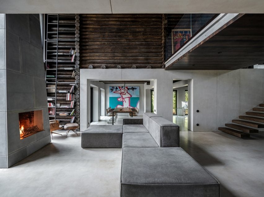
The three-bedroom cabin was built from horizontally stacked logs, which the designers kept on display throughout the interior.

Photograph showing large sofa in living area looking into dining area
Horizontally-laid logs clad both the exterior and interior

The Kyiv-based studio aimed to deviate from conventional cabin interiors, instead creating an industrial, utilitarian scheme informed by the style of American fashion designer Rick Owens.

“The pre-existing interior was in a classic log cabin style,” Balbek Bureau told Dezeen. “The logs were a lighter shade, closer to the natural wood colour – the furniture was mostly made of wood as well with traditional country-style shapes dominating the interior.”

Photograph of cantilevered staircase
The stairs have cantilevered steps that appear to float

In order to lend itself to a more industrial finish, the studio trimmed the interior of surplus logs and timber.

“Our goal was to achieve a clean geometry of the space with as little extra lines as possible,” said the studio.

“That is why we removed part of the log beams that were not load-bearing – we did the same with non-bearing walls to create an open space on the first floor.”

Photograph of double-height fireplace
A towering fireplace dominates the living space

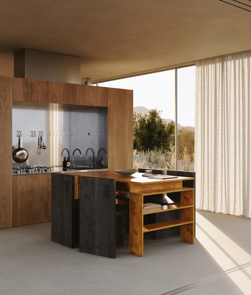
Microcement flooring and project-bespoke furniture pieces such as stainless steel consoles were added to the spaces to contrast the traditional log walls.

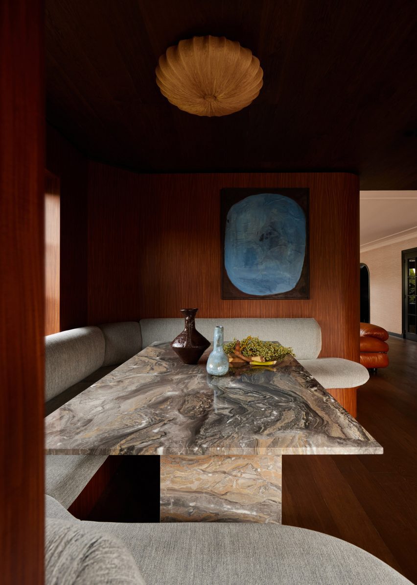
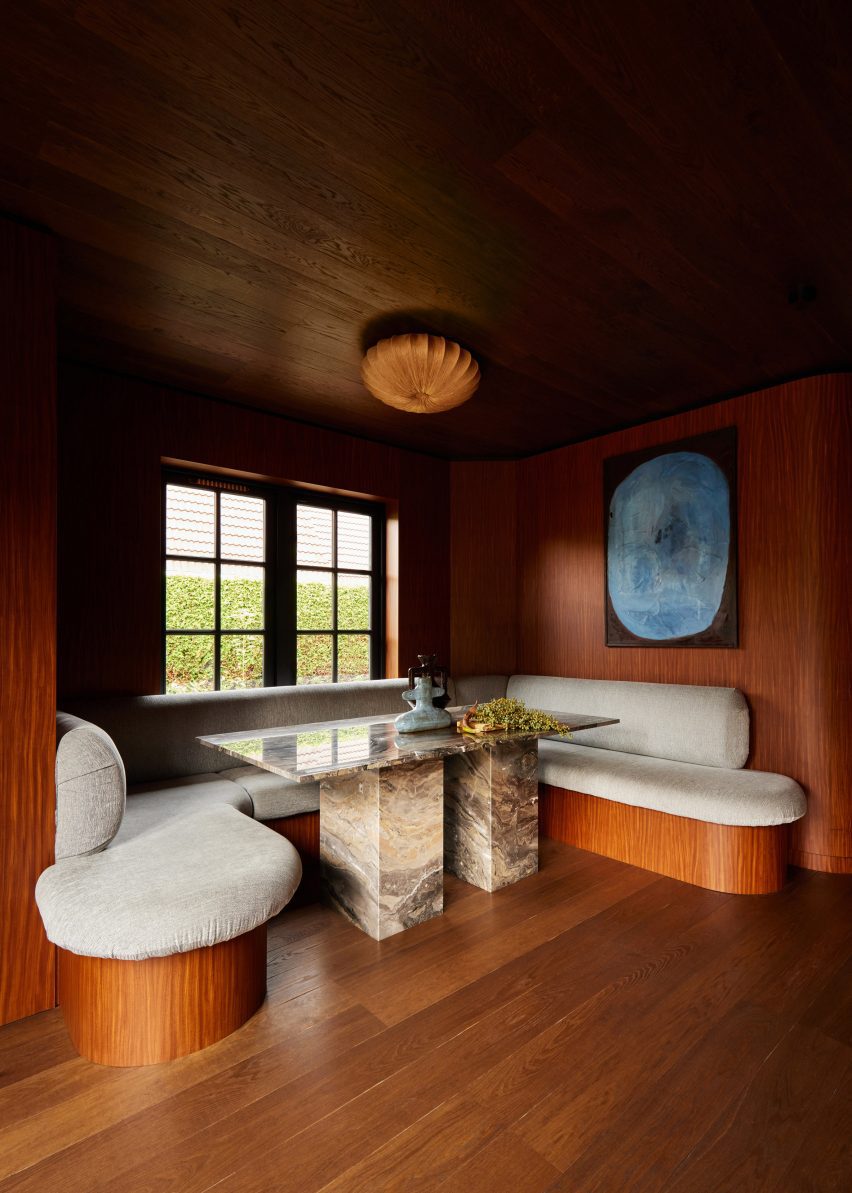
Vintage lounge and dining chairs from the owner’s own collection were added to character to the spaces, which were hung with paintings belonging to the client.

Photograph of concrete and stainless steel kitchen
Log beams juxtapose industrial finishes in the kitchen

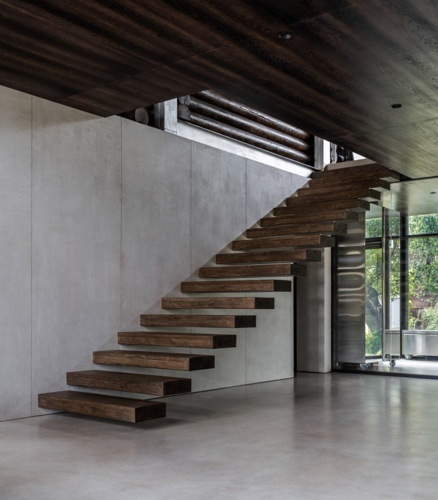
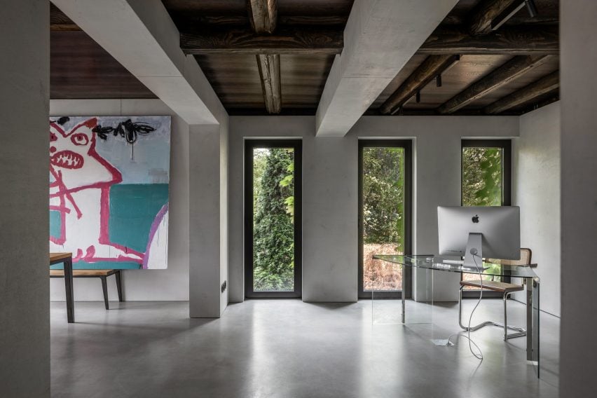
The glass-fronted entryway contains a staircase comprising timber planks cantilevered out from wall. Beyond, the kitchen, dining room, home office and living room are contained within one fluid space.

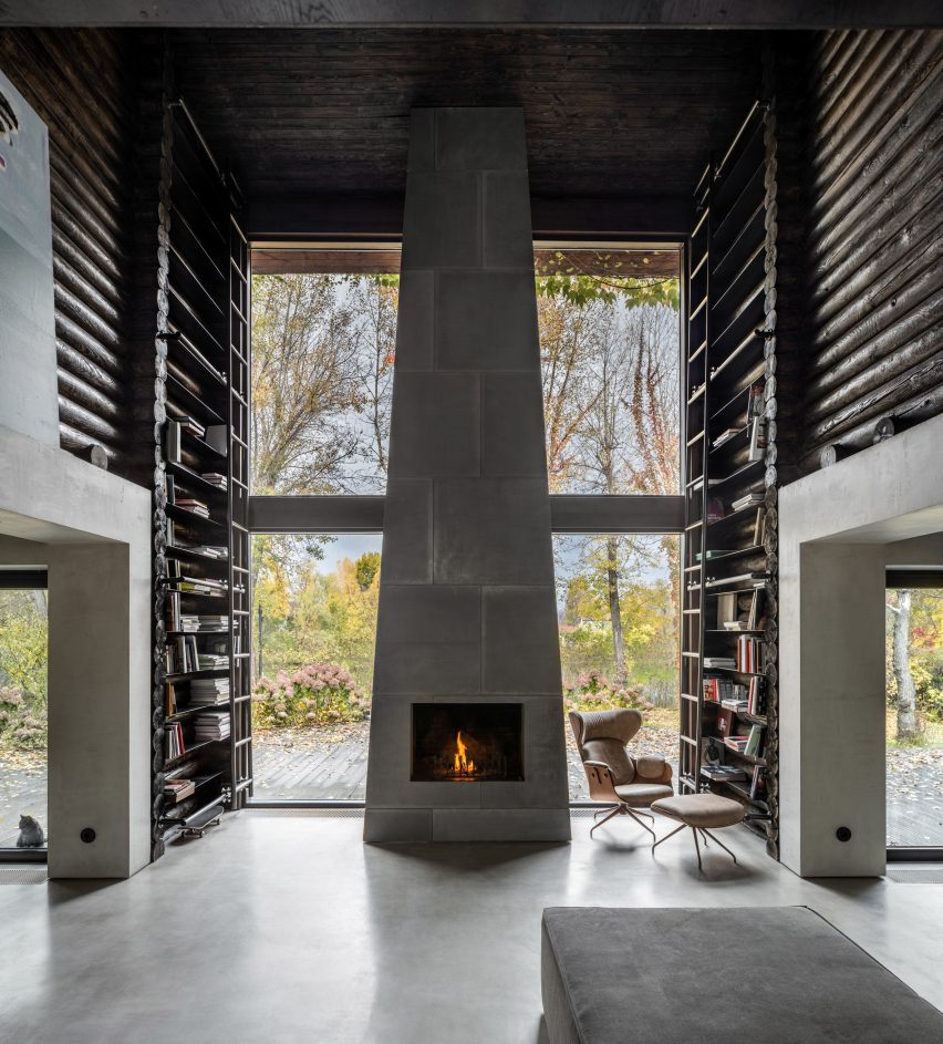
The cabin’s construction is most apparent in the double-height living space, where logs form tall bookcases accessed by a sliding metal ladder. These flank a tapered fireplace made from concrete blocks, at the foot of which sits a large sofa.

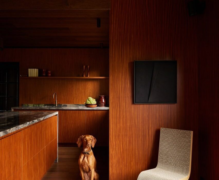
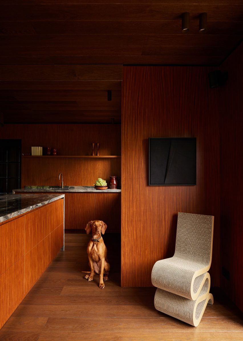
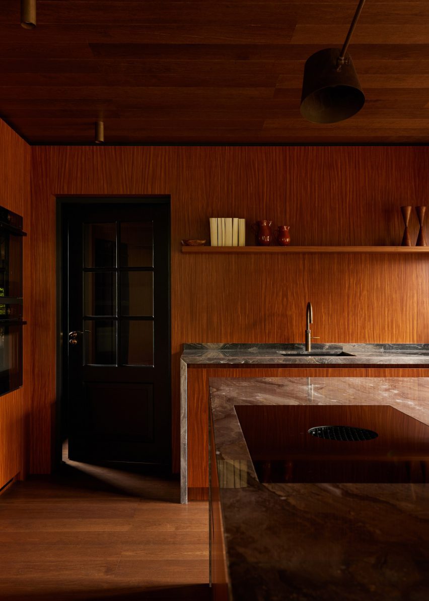
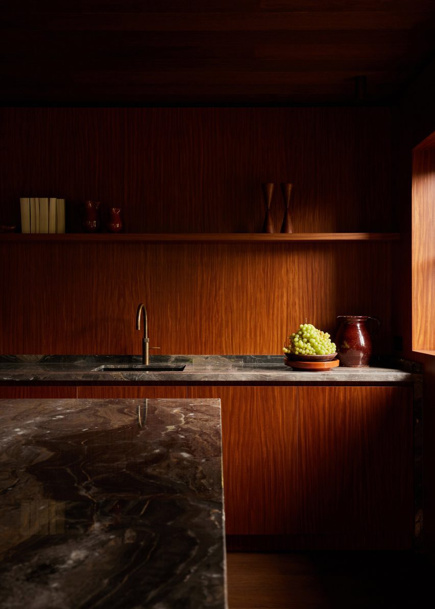
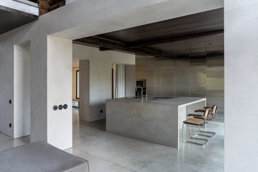
The use of concrete continues in the kitchen, which is dominated by a monolithic kitchen island flanked by floor-to-ceiling stainless steel cabinets.

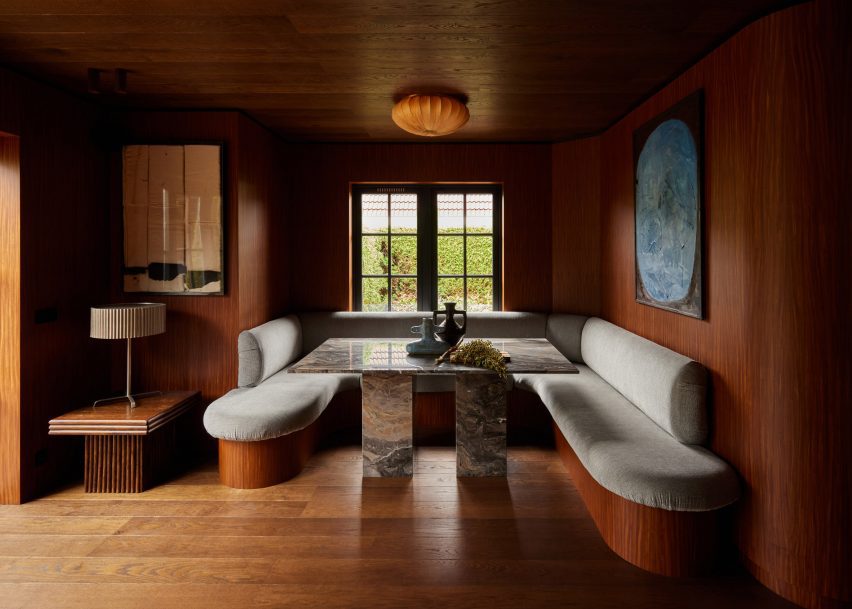
Plywood panelling replaces logs in the curtain lined theatre room leading off of the kitchen.

Photograph of home theatre space
Metal consoles on casters sit below the screen

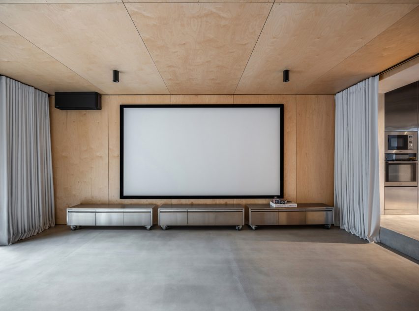
Modern, black-framed windows were installed throughout the building, with vertical windows added in the home office and dining room to bring more sunlight into the space.

Original ceiling beams were left exposed to highlight the cabin’s original construction.

Photograph of office space through from dining area
A clear desk contrasts the wooden dining room furniture

Recalling the sofas downstairs, the master bedroom features a sprawling custom-made bed that sits low to the floor. Its upholstered sides were bolstered by stainless steel consoles similar to those in the theatre room.

Retro lamps were added as a playful touches including a bulbous standing lamp that arches over the bed.

Bed in wood-panelled bedroom with retro lighting
The main bedroom utilises warmer-toned wood

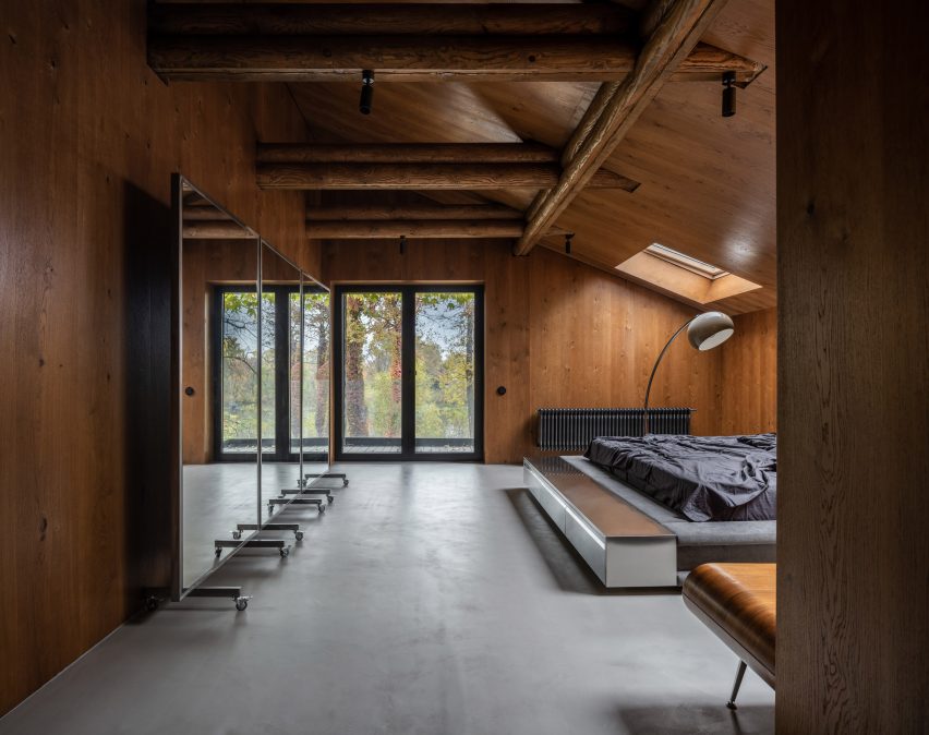
A moveable mirror-panelled screen on castors sits against one wall, and a wooden mid-century console references the warm-toned timber-clad walls.

Throughout the house black radiators, ceiling lights, window frames and power outlets punctuate the rooms.

Photograph of desk in children's room
Upholstered sleeping nooks create a cosy atmosphere

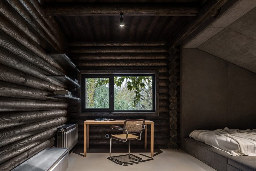
The two bedrooms on the other side of the cabin retain the dark-toned log walls of the living room, adjoined by steel shelves and contrasted by soft, padded sleeping nooks.

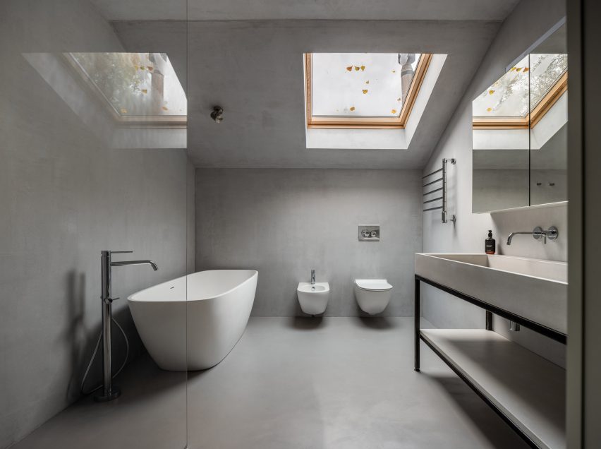
Both of the bathrooms are a stark contrast from the rest of the interiors, with almost no wooden finishes at all and housing white fixtures.

Photograph of grey bathroom
Concrete covers the bathroom walls, floors and ceilings

“[Relogged] allowed us to work on rethinking the rather established and traditional form of a log cabin,” concluded the studio.

Other cabins featured on Dezeen include A-frame cabins in a remote Canadian forest by Atelier l’Abri and a cabin clad in ash wood on a rocky outcrop in Norway by Line Solgaard Arkitekter.

The photography is by Andrey Bezuglov and Maryan Beresh.

Reference

Ramy Fischler designed the Cravan bar for Moët Hennessy
CategoriesInterior Design

Ramy Fischler creates Moët Hennessy’s first cocktail bar

Belgian designer Ramy Fischler has collaborated with Moët Hennessy and cocktail creator Franck Audoux to create the Cravan cocktail bar in the heart of Paris’ Saint-Germain-des-Prés.

Named Cravan, the bar for luxury drinks group Moët Hennessy was a collaboration between architect Fischler and restaurateur, author, historian and cocktail aficionado Audoux.

Ramy Fischler designed the Cravan bar for Moët Hennessy

“The objective of the design was to amplify a story by Franck Audoux originating from his small bar in the 16th arrondissement of Paris and transforming it into a cocktail house over five levels in the centre of the capital – to imagine the creation of a new house of the Moët Hennessy group,” Fischler told Dezeen.

“This is not a one-shot but the beginning of a long adventure. It was therefore necessary to define a harmony, a coherence, between all the ingredients of the project, whether it is the decoration, the service, the music or the lighting.”

Cravan cocktail bar for Moët Hennessy
The building features three separate bars

The space takes its name from the avant-garde poet-boxer and sometime art critic, Arthur Cravan, a free-spirited figure greatly admired by Audoux, with whom Fischler worked closely on this project.

“We share a common vision, based essentially on cultural references from literature and cinema, and above all a taste for scenic impact, framing a context, point of view, or narrative,” said Fischler.

“We started with the desire to freely assemble codes, eras, and styles to craft a new repertoire which made sense to us and expressed the essence of Cravan.”

Set in a 17th-century building in the heart of this historic and literary district, the space was arranged over five floors, with a small invitation-only space on the roof.

The building has separate bars, each with its own distinct character on the ground, first and third floors, while the second floor hosts the Rizzoli bookstore-cum-library, where guests can come with their drinks to leaf through and buy books. On the fourth floor, there’s another invitation-only atelier-style space.

Cocktail bar in Paris
Each of the spaces was designed to combine modern elements with the building’s historic fabric

According to Fischler, the whole project took its cues from the concept of the cocktail.

“I would never have imagined this project in its current state if it were not a question of drinking cocktails” he said.

“There are a number of ingredients that we blend together to create a unique whole, that seems offbeat but is actually very controlled,” he continued.

“I thought of the spaces as cinematic scenes, hence the individual atmospheres on each floor which form different sets. You can sit in front of the stage, on the stage, or behind the stage, depending on the experience and viewing angle you prefer.”

Moët Hennessy bar in Paris
The bar is Moët Hennessy’s first

To create these different scenes, the project makes use of a wide range of materials, often reclaimed salvaged pieces including parquet floors, stone floors and wood wall coverings, painstakingly installed by a large team of craftspeople.

In Ramy Fischler’s projects, the textiles always play an important role and the practice features its own in-house textile designer.

“For Cravan, we tried to use as much re-used material as possible, and in particular textiles from Nona Source, a start-up that makes available leftover, unused fabrics from the fashion houses of the LVMH group.”

Cravan cocktail bar
Historic elements were retained throughout the space

The practice strived to create a contrast between the warm and natural colours of the historic fittings, and the colder and metallic colours of the contemporary furniture and fittings, “which cohabit one alongside the other”.

“Depending on the level, the colour palette is totally different, and since no room is alike, and each colour has been chosen according to the universe we have sought to compose,” said Fischler.

Glasses designed by Fischler
Fischler also designed glasses for the bar

All of Cravan’s furniture was custom designed and Fischler’s holistic approach extends to the cocktail glasses, which the practice designed for Cravan and which are displayed in the library.

“Rather than creating new shapes, we preferred to select, from the history of glassware over the past 300 years, the models that we liked and that we wanted customers to rediscover,” explained Fischler.

Other recent bars featured on Dezeen include an eclectic cocktail in Los Angeles designed by Kelly Wearstler to feel “like it has been there for ages” and the Ca’ Select bar and distillery in Venice.

The photography is by Vincent Leroux and Alice Fenwick

Reference

Bronze pergola covered in jasmine through plant-filled courtyard
CategoriesInterior Design

The Rome Edition opens in converted 1940s bank building

American entrepreneur Ian Schrager’s The Edition group has landed in Rome, opening a hotel in a converted bank that makes use of its soaring lobby, original marble staircases and hidden front courtyard.

The Rome Edition began welcoming guests earlier this year to the 91-room hotel, located a block away from Via Veneto – the street that was immortalised in the 1960 movie La Dolce Vita.

Bronze pergola covered in jasmine through plant-filled courtyard
Arrival to The Rome Edition is via a path under a bronze pergola that leads to the lobby

Schrager and his in-house team spearheaded the renovation of the grand building, utilising many of the original features including a cipollino marble staircase, central courtyards, statues and lamps.

“Built in the 1940s and formerly occupied by one of the main Italian banks, the building is a striking example of the rationalist style and was created by Cesare Pascoletti in collaboration with the famed architect Marcello Piacentini,” said The Edition team.

Sunken plant-filled courtyard with teak banquettes and furniture
The plant-filled, sunken courtyard acts as an all-day lounge and dining spot

Unusually for Rome, arriving guests are escorted through a sunken garden “piazza” – which acts as an outdoor lounge, restaurant extension and gathering place – before reaching the lobby.

Once inside, dramatic seven-metre-high ceilings, full-height windows and green curtains, and travertine floors and walls set the tone for The Edition’s signature brand of soft minimalism.

Travertine-lined lobby with tall ceiling and full-height green curtains
The dramatic hotel lobby features seven-metre-high ceilings and full-height green curtains

Symmetrical arrangements of custom white furniture and low coffee tables exaggerate the strict geometry of the architecture.

“The lobby is Edition at its most dynamic,” said the team. “It is a place to relax and make merry; a place to see and be seen or play a few games of pool on the custom-made table.”

Restaurant with wooden furniture and chartreuse-coloured upholstery
The Amina restaurant is divided into two dining spaces, one of which is accented with chartreuse-coloured upholstery and carpet

For the hotel’s signature restaurant, Anima, the team partnered with local chef Paola Colucci on a menu that puts a modern spin on family recipes and traditional Roman dishes.

Amber glass separates the kitchen from the two dining areas, one with chartreuse-toned accents across furniture and artwork, and the other blue.

Restaurant with blue artworks and upholstery
The restaurant’s second dining space is decorated with blue accents

The various bar areas on the lobby level each provide guests with a experience. The Punch Room is a concept borrowed from other Edition properties including another recent opening in Tampa and occupies a cosy room with warm wood panelling and deep red tones, for sharing bowls of punch – a 17th-century tradition that’s been given a contemporary spin.

A dark walnut bar, Rosso Levanto marble fireplace, dark pink velvet sofas, and custom armchairs in rosewood and dark brown leather all add to the cosy atmosphere in the dimly lit space.

Cosy bar with walnut panelling and dark pink velvet furniture
Off the lobby, The Punch Room bar is lined in walnut and includes dark pink velvet furniture

With space for just 10, the intimate Jade Bar features a rotating cocktail menu and is fully lined in deep green antique marble.

This small and dramatic room is furnished with emerald-hued velvet soft seating and satin brass and gold accents – including a wall-mounted sculpture influenced by artist Jeff Koons.

Bar decorated with antique green marble, emerald seating and brass accents
The Jade Bar is wrapped in antique green marble, with emerald seating and brushed brass accents

In the front courtyard, The Garden is filled with over 400 plants and lightly perfumed by the jasmine that climbs over the facade.

A bronze awning divides the outdoor space in two, with an al fresco dining area for Amina on one side, and an all-day casual terrace for cocktails and light bites on the other.

Teak banquettes and free-standing furniture are surrounded by “an Italianate arrangement of lanterns to give it the feel of a traditional Roman garden”.

The roof terrace on the seventh floor features a pool and bar area that offers sweeping views over the Eternal City’s rooftops.

Bright guest room with walnut panelling and beige furniture
Walnut wall panelling and herringbone floors feature in the bright guest rooms

In the bright guest rooms, walnut wall panelling and herringbone floors are paired with custom beige leather furniture.

Carrera marble basins and brushed brass fixtures stand out against the grey stone bathrooms, and frosted glass partitions are used to conceal showers and toilets.

Bathroom with Carrera marble sink and frosted glass panels
Carrera marble sinks contrast the dark grey stone in the bathrooms

The Rome Edition is the group’s 16th global property, following locations that include Times Square in New York, West Hollywood in Los Angeles, and Tokyo.

The Madrid Edition, designed with British minimalist John Pawson, was longlisted in the hotel and short-stay interiors category of Dezeen Awards 2022.

The photography is by Nikolas Koenig.

Reference

Local design studio Otherworlds drew on the traditional Goan balcão when converting a 1980s villa in Panjim, India, into a restaurant and bar for Indian chain Terttulia.
CategoriesInterior Design

Otherworlds transforms Goan villa into restaurant that “celebrates chance encounters”

Local design studio Otherworlds drew on the traditional Goan balcão when converting a 1980s villa in Panjim, India, into the Terttulia restaurant and bar.

Housed in a Portuguese-style villa, Terttulia Goa is defined by a central island bar informed by the balcão – an outdoor porch with built-in seats that serves as the entrance to a typical Goan home.

The restaurant takes its name from the Spanish word tertulia, meaning a social gathering with literary or artistic associations.

Local design studio Otherworlds drew on the traditional Goan balcão when converting a 1980s villa in Panjim, India, into a restaurant and bar for Indian chain Terttulia.
Intimate two-seater booths flank the bar

“The balcão is a crucial part of a Goan home as this is where one spends most of their time,” Otherworlds founder Arko told Dezeen.

“At a time of rampant urbanisation, all houses tend to become very self-contained, private and detached, separated away from the city or the neighbourhood,” he continued.

“The balcão becomes all the more important at such a time as it is built with the idea of reinforcing the kinship between the house and the neighbourhood.”

Local design studio Otherworlds drew on the traditional Goan balcão when converting a 1980s villa in Panjim, India, into a restaurant and bar for Indian chain Terttulia.
Terttulia Goa is defined by a central bar informed by the balcão

Multidisciplinary studio Otherworlds overhauled the villa, which it describes as a “formerly enclosed shell”, by removing some of the external walls and extending the dining area into an outdoor porch.

This area is sheltered by a large bamboo canopy with elliptical openings that diffuse the natural light, transforming the space throughout the day.

The canopy is intended to mitigate the region’s extreme weather conditions; sheltering customers from the rain during monsoon season and providing a semi-open space with plenty of air circulation during the hot summer months.

Local design studio Otherworlds drew on the traditional Goan balcão when converting a 1980s villa in Panjim, India, into a restaurant and bar for Indian chain Terttulia.
Low-hung lamps add a sense of “whimsy”

Otherworlds designed the bar so that customers face each other, rather than facing the wall, in a bid to “encourage chance encounters”.

“The intention was to create an immersive atmospheric experience that inspires a feeling of being in a tropical, lush outdoor space under an overgrown natural canopy,” said Arko.

A metal and fluted glass structure hung from the building’s external walls floats above the white marble bartop and holds the arc-shaped lamps that light the intimate two-seater booths flanking the bar.

Local design studio Otherworlds drew on the traditional Goan balcão when converting a 1980s villa in Panjim, India, into a restaurant and bar for Indian chain Terttulia.
A bamboo canopy was inserted to mitigate the region’s extreme weather conditions

At night, the restaurant is lit by low-hung sinuous lamps informed by sweeping stems that are intended to add a sense of “whimsy” to the interior.

Adhering to Terttulia’s signature green and white colour scheme, the studio opted for a palette of locally sourced materials, including the green-pigmented hand-cast concrete that it used to create the restaurant’s flooring.

“The green pigmented hand-cast concrete floor, largely termed as IPS [Indian Patent stone], is found in most places in the country and is also used to finish the balcão in all Goan homes,” Arko explained.

Local design studio Otherworlds drew on the traditional Goan balcão when converting a 1980s villa in Panjim, India, into a restaurant and bar for Indian chain Terttulia.
Terttulia Goa is housed in a revamped 1980s villa

Otherworlds worked with local workshop Jyamiti & Sea to create ovoid terrazzo accents that are scattered in various places across the floor and walls.

The studio achieved what it terms “the perfect green” using a mixture of white and grey cement and green oxide pigment.

Local design studio Otherworlds drew on the traditional Goan balcão when converting a 1980s villa in Panjim, India, into a restaurant and bar for Indian chain Terttulia.
Otherworlds opted for a palette of locally sourced materials

“The tricky bit with coloured concrete is achieving the exact shade [because] once the cement sets and is polished, the result is quite different from the initial wet mix,” said Arko.

“The process required numerous iterations and experiments to get the right mixture of materials that would yield the correct shade.”

The green cement is offset by dark wood derived from the matti, Goa’s state tree.

“We imagined the restaurant to be an extension of the house and while being part of it, [we also wanted it to] feel like a part of the city.”

Other projects that take a contemporary approach to Indian design traditions include a rammed-earth family home in Rajasthan designed by Sketch Design Studio and a Rain Studio-designed “native yet contemporary” home in Chennai.

The photography is by Suryan and Dang


Reference

Store with concrete breezeblock displays and metal cans on the ceiling
CategoriesInterior Design

“Fashion meets art and design” at Pittsburgh boutique by NWDS

Global team NWDS took a spontaneous approach to designing the Tons fashion boutique in Pittsburgh, which contains a mix of modest materials and iconic furniture pieces.

The Tons store in the city’s East Liberty neighbourhood occupies a long, narrow building with its shorter side facing the street.

Store with concrete breezeblock displays and metal cans on the ceiling
The Tons store features a variety of “mundane” materials, including concrete breezeblocks and metal cans

Formerly an atelier, the two-storey structure was reimagined by NWDS to create a light-filled destination “where high-end fashion meets art and design”.

“Inside is a spacious and light-filled interior that now hosts a multifunctional venue designed to meet the needs of a modern-day sartorialist equally interested in fashion, art, and culture,” said the group.

Seating area beside clothing display
In the lobby, new apparel collections are displayed below a tapestry-like artwork

Designing the interiors of the 400-square-metre space involved dividing up the floor plan into several distinct areas that all flow together, but serve different purposes.

Throughout the various retail and office areas, a selection of unexpected materials were combined and layered.

Walls splashed with white paint
Some of the walls are splashed or streaked with white paint

Immediately through the glass front door is a lobby where new collections are presented.

Here, product displays were built from concrete breeze blocks, while the upper walls above the clothing rails were dressed in transparent plastic curtains.

Glass panels partition different retail areas
Glass panels are used to partition different retail areas

The ceiling above was covered with metal tubes of different lengths and diameters, and gives way to a double-height space where tall tapestry-like artworks by Sasha Brodsky hang over opposite walls, and white paint was seemingly dragged across another.

“There was a lot of spontaneity and many design decisions taken on site: some surfaces were uncovered and left in an unfinished state, and some were splashed with white paint,” NWDS said.

Frank Gehry Wiggle Chair next to clothing displayed on rails
A selection of iconic furniture designs can be found around the store, including Frank Gehry’s Wiggle Chair

Further along, fitting rooms are lined up behind black and white streaked partitions to one side, facing a room defined by glass panels that hosts monobrand products.

Towards the back, a lounge area that also displays shoes is reached by descending a short flight of stairs, which run parallel to a raised, built-in seating area.

Built-in seating area in front of shoe display room
A built-in seating area at the back of the store overlook the sunken shoe room

The lower floor level in this space results in a higher ceiling, which NWDS took advantage of by extending a mural the full height behind a wall-mounted shoe display.

A staircase at the very back leads to the upper storey, where retail displays and office areas for store employees sit side by side, and a photography studio is in full view.

“Inside Tons, the client space and the workspace are blended,” said NWDS.

“Buyers and managers have their work desks right next to the sale rails on the first floor, and store visitors are welcome to take a peek at the fashion photo shoot happening right there at Tons.”

Upper-floor rooms partitioned by artworks and glass balustrades
The unfinished aesthetic continues across the upper storey, where retail and offices spaces are blended

Throughout the store are a selection of iconic furniture pieces that continue the theme of unexpected materials and functionality.

They include metal-mesh Hi Tech armchairs by Piero Lissoni, a Mate chair by (A+B) Dominoni, Quaquaro that doubles as shelving, and Frank Gehry‘s compressed cardboard Wiggle Chair for Vitra.

“An interior comprising modest materials is a backdrop for high-end Italian furniture pieces, a collection carefully curated by the NWDS team,” said the designers.

Photography studio viewed from across a double-height void
An open photography studio allows shoppers to watch shoots as they happen

NWDS was established in 2013 as a team of architects, designers, curators and researchers from cities including New York, Tbilisi, Moscow, Paris, Berlin, Yerevan, Lisbon and Dubai. The group’s projects span residential, retail, hospitality, culture, exhibition design and more.

Other recently completed boutiques that feature unusual materials include the Boyy flagship in Milan, which reveals layers of the store’s history, and a Parisian jewellery store featuring rippled sheets of acrylic.

The photography is by Ekaterina Izmestieva and Alexandra Ribar.


Project credits:

Design concept: NWDS
Supervision and project management: Brnz Bureau
Lighting design: Natalia Markevich
Art: Sasha Brodsky

Reference

Eight interiors that feature reclaimed and recycled materials
CategoriesInterior Design

Eight interiors that feature reclaimed and recycled materials

For our latest lookbook, Dezeen has selected eight examples of interiors that were created with reclaimed and recycled materials, including a restaurant in Bangalore and a brick house in Ghent.

Recent decades have seen more awareness and reflection on environmental and sustainable issues both inside and outside the design world, leading a number of designers and architects to choose sustainable design for their projects.

From the use of unwanted items to the application of reclaimed bricks and recycled plastics, the eight projects in this lookbook present ways in which designers have rediscovered the value of waste.

This is the latest in Dezeen’s lookbooks series, which provides visual inspiration from Dezeen’s archive. For more inspiration see previous lookbooks featuring sunny yellow interiors, beds that have been built into interiors and tiled kitchen worktops.


Photo by Ishita Sitwala

Circus Canteen, India, by Multitude of Sins

Bangalore studio Multitude of Sins designed this restaurant interior, which was shortlisted in the sustainable interior category of Dezeen Awards 2022, to showcase a collage of unwanted objects.

The salvaged objects were sourced locally from a donation drive in a few weeks. The studio categorised them, then organised them into a colourful, stylish interior.

Find out more about the Circus Canteen ›


Kamikatsu Zero Waste Centre, Japan, by Hiroshi Nakamura

The Kamikatsu Zero Waste Centre (above and main image) was created as an eco-friendly community and educational space for recycling activities, and features a facade made of 700 windows donated by the local community.

Architect Hiroshi Nakamura attached harvesting containers from a mushroom factory to the wall to be used as bookshelves. Unwanted objects were also collected from abandoned houses, previous government buildings and schools in the local area.

Find out more about the Kamikatsu Zero Waste Centre ›


Silo restaurant designed by Nina+Co
Photo by Sam A Harris

Silo, UK, by Nina+Co

The dining tables of this zero-waste restaurant in London consist of flecked recycled-plastic tops and sustainably-sourced ash wood legs, with mycelium pendant lamps dangling above.

The dining space also features a long bar counter made from recycled plastic packaging.

Find out more about Silo zero-waste restaurant ›


Photo by Magdalena Gruber

Urselmann Interior’s office, Germany, by Urselmann Interior

The renovation of the ceiling in this Düsseldorf office was completed using poplar wood sourced from a tree felled in the nearby city of Krefeld. The studio preserved the existing wooden and terrazzo flooring.

The refurbishment of the office, which is the studio’s own, also included the use of biodegradable materials, glueless joinery and cellulose-based cladding.

Find out more about Urselmann Interior’s office ›


The Wendy House by Earthscape Studio
Photo by Syam Sreesylam

Wendy House, India, by Earthscape Studio

This vaulted residence in Bangalore, which sits among eight acres of dense forests, was covered with recycled mudga tiles. Its glass walls were framed with recycled rods.

Earthscape Studio also constructed the building with sithu kal bricks, a traditional technique that is currently not in use. This design revisited the neglected technique to help bring work opportunities to the local community.

Find out more about the Wendy House ›


GjG House built of reclaimed bricks by BLAF Architecten in Ghent, Belgium
Photo by Stijn Bollaert

GjG House, Belgium, by BLAF Architecten

Built without supporting interior walls, this house was constructed with reclaimed bricks and features a curved form and brick bonding.

BLAF Architecten designed the unusual curvilinear walls in order for the house to fit in between surrounding trees on the site in Ghent.

Find out more about GjG House ›


10K House by Takk
Photo by José Hevia

10K House, Spain, by Takk

In the context of global climate change and the energy crisis, 10K House was built on a material budget of only 10,000 euros and features rooms built inside each other to maximise insulation.

Spanish Architecture studio Takk used recycled white table legs to lift one of the interior rooms in the Barcelona apartment, creating space for water pipes and electrical fittings without the extra cost of adding wall grooves.

Find out more about 10K House ›


Rylett House by Studio 30 Architects
Photo by Agnese Sanvito

Rylett House, UK, Studio 30 Architects

Studio 30 Architects transformed an old carpenter’s bench into a kitchen island for this London house extension, which includes a living, kitchen and dining area.

The extension was built on the site of a previous conservatory and overlooks the garden through a timber window decorated with plants.

Find out more about Rylett House ›

This is the latest in Dezeen’s lookbooks series, which provides visual inspiration from Dezeen’s archive. For more inspiration see previous lookbooks featuring sunny yellow interiors, beds that have been built into interiors and tiled kitchen worktops.

Reference

Kitchen interior by DAB Studio with wood-lined walls, floors and cabinets
CategoriesInterior Design

DAB Studio lines kitchen of Dutch home with oak and Afromosia wood

Dutch interior design practice DAB Studio has transformed the kitchen of a family home in Zwaag, the Netherlands, by covering the floors and ceiling in one type of wood and the walls and cabinets in another.

DAB Studio aimed to create a “calm yet soulful” interior with an earthy colour palette made up of tan and neutral shades.

Kitchen interior by DAB Studio with wood-lined walls, floors and cabinets
Quarter-sawn Afromosia wood lines the walls and kitchen units

The floors and ceiling were covered in hand-scraped oak with a smoked and black-oiled finish, laid in a pattern of side-by-side plank pairs.

Afromosia wood, a tropical hardwood native to west Africa, was applied to the walls and cabinets. The wood was quarter sawn to create a decorative grain pattern and add a sense of playfulness to the interior.

Wood-lined dining room with a built-in seating nook
Oak planks were laid in side-by-side pairs on the floors and ceiling

DAB Studio co-founders, Lotte and Dennis Bruns, designed the interior to be a space that would balance “feminine and masculine elements” and reflect both of the owners’ design tastes.

According to the duo, the repeating wood choices for the different surfaces give the space a sense of completeness.

Wood-lined kitchen with a black door and marble worktops
Marble worktops extend down the sides of the kitchen units

“Per the client’s request, we wanted to merge the feminine and masculine vision of their new home, balancing each other out in one curated space,” the co-founders told Dezeen.

“This allowed us to create unique areas in line with our client’s habits and interests while imbuing the space with a sense of spaciousness and lightness.”

“In order to merge all elements of the design, it felt important to prioritise the theme of consistency,” the duo added.

“For that particular reason, the wood of the floor is repeated on the ceiling, and the wood used for cabinetry is continued into the walls of the room.”

The centrepiece of the kitchen is the island, which features Afromosia wood cabinet doors and a waterfall countertop made from Arebescato Orobico marble.

Wood cabinets along one kitchen wall were also topped with a marble worktop, which extends down one side to frame the unit.

Wood-clad seating nook with upholstered seating and a marble table by DAB Studio
The studio balanced “masculine and feminine” elements in the interior

DAB Studio added a dining nook below a window, designed to be a space flooded with natural light where the family can gather.

Seating with rounded corners wraps the three walls of the nook. The seating base was covered in the same wood as the interior walls, while the seat and backrest are covered in plush upholstery.

Wood-lined kitchen by DAB Studio with marble worktops
The quarter-sawn Afromosia wood creates a decorative grain

At the centre of the nook, a rectangular table with two blocky legs made from Arebescato Orobico marble contrasts the rounded seating.

“The dining nook is where the family can spend time together, welcome new conversations, and create core memories,” said Lotte and Dennis Bruns.

“The asymmetrical built-in banquette seating feels inviting with its round edges, and adds a dynamic feel to the space.”

Banquette seating in a dining room nook with wood flooring, ceiling and walls by DAB Studio
The dining nook sits below a window

Decorative items and free-standing furniture were introduced to the interior to add more rounded elements, including a Wiggle Chair by Frank Gehry.

Elsewhere in the Netherlands, Francois Verhoeven Architects has created a bungalow clad in vertical timber slats and Julia van Beuningen added a plywood staircase to a barn conversion.

The photography is by Daniëlle Siobhán.

Reference

Charge Cars factory by MOST Architecture
CategoriesInterior Design

Most Architecture creates Charge Cars factory with “everything on display”

UK studio Most Architecture has converted an industrial shed in west London into an all-black-and-white showroom and production facility for electric car start-up Charge Cars.

Created to manufacture Charge Cars‘ first vehicle the ’67 – an all-electric version of the 1960s Ford Mustang Fastback built using components from electric vehicle brand Arrival – the facility also acts as an office and showroom.

Charge Cars factory by MOST Architecture
Most Architecture has created a factory for electric car start-up Charge Cars

“Charge designs and makes its unique cars in a single facility,” said Most Architecture founder Olga McMurdo. “Like an open-kitchen restaurant, everything is on display to the staff and customers.”

“So we created an environment that allows immediate access to every aspect of the process from design through to production,” she told Dezeen. “The factory, and all of its contents, are at once an agile design and manufacturing centre, a customer showroom, and a design statement.”

'67 by Charge Cars
The building is arranged around the workshop

The facility in Stockley Close, west London, was designed around the idea of promoting a connection between Charge Cars’ clients and the engineers building and customising the cars.

At its centre is a large open workshop where the cars are built and customised, which is overlooked by various offices and meeting spaces.

The '67 by Charge Cars will be manufactured in the factory
Charge Cars’ ’67 will be manufactured in the factory

“Our client came to us with an ambition to re-define a classic design icon using cutting-edge electric vehicle technology and to create a customer experience that engenders a visceral response to the product, and the process of creating it,” said McMurdo.

“Their space had to accommodate both the manufacturing and the design process, facilitating teamwork and recreation, testing, a showroom, and areas for customer engagement,” she continued.

“All that had to happen within one architectural volume, and so the primary challenge was to facilitate all of these activities simultaneously and symbiotically, whilst projecting a clear and coherent design statement reflecting the client’s philosophy.”

Office in a car factory
Office spaces overlook the workshop

Unlike the majority of car factories, the Charge Cars facility was designed so that its customers can visit at any time to observe how the vehicle is designed and assembled.

“Charge wanted the customer journey to be mapped out by the design of the building,” said McMurdo.

“The customer’s access to, and experience of, the factory is an integral part of the product,” she continued.

“They have a personal relationship with the engineers that are making their car, and are able to see the car as it is being constructed.”

Black and white car factory
The Charge Cars factory is almost entirely black and white

Most Architecture designed the spaces with a stripped-back aesthetic united by a largely white and black colour palette, including a black light fixture above the building’s entrance.

“The white and the black amplify each other by contrast, representing the fusion of a laboratory and a garage, and the constant dynamic between research and production,” explained McMurdo.

“Using this pallet we also wanted to make an impactful design statement on entry to the building. The result was a large anamorphic light fixture, which coalesces into a Feynman diagram from a single vantage point, becoming a composition of independent pieces.”

Test facility for Charge Cars
Cars are designed, built and tested at the facility

Other recent electric car factories featured on Dezeen include a black steel and glass facility designed by Snøhetta for car brand Polestar in Chengdu, China. In Sweden, Danish architecture studio Cobe is designing a development centre for Chinese car manufacturer Geely, which it describes as a “chamber of secrets”.

The photography is by Paul Riddle.


Project credits:

Client: Charge Cars
Lead architect: Most Architecture
Interior concepts: Evgeniy Bulatnikov
Mechanical engineer: Airon
Electrical engineer: Smart Techno Systems
Structural engineer: HLS Structural
Lighting: Gaismas Magija
Building control: The Building Inspectors
Wind consultant: Buro Happold
Fire engineer: QFSM
CDM advisor: Andrew Goddard Associates
Main contractor: Hansa Group
Steel mezzanine contractor: System Store Solutions
Lighting manufacturer: Esse-Ci

Reference

3D designer Charlotte Taylor in her apartment
CategoriesInterior Design

“Not having architectural education makes you find solutions” says Charlotte Taylor

Visualisation artist Charlotte Taylor discusses how she is translating her digital design work into built architecture projects for the first time in this interview.

Taylor is the founder of 3D-design studio Maison de Sable, where she collaborates with other 3D designers on renderings of imaginary, fantastical interiors and buildings.

Recently Taylor’s designs have become less fantasy-driven and closer to real spaces, with some of them set to get built as physical architecture projects.

“In the long term, I’d like to move more into architecture,” Taylor told Dezeen.

3D designer Charlotte Taylor in her apartment
Taylor is venturing into built architecture projects for the first time. Image by Thea Caroline Sneve Løvstad and top image by Nicholas Préaud

Having not pursued formal architecture training, the designer believes there should be more non-traditional pathways to designing buildings.

“I didn’t train in architecture at all,” she said. “I think it would be great if there were more entries into architecture because it’s such a hard career to get into.”

“I’d like to think that there’s hope that you can get into building physical spaces through unconventional means.”

3D render of a modern building in the jungle by Charlotte Taylor
Casa Atibaia is a fictional home in Brazil that is due to be built. Image by Nicholas Préaud

One of Taylor’s designs due to be built is Casa Atibaia, a house that was originally conceived as an imaginary project in collaboration with designer Nicholas Préaud.

The duo imagined the house situated by the Atibaia River in São Paulo, creating a digital model of part of the riverbank based on information from Google Maps.

Front cover of the Design Dreams book by Charlotte Taylor
The interior of Casa Atibaia features on the front cover of Taylor’s book

From this, Taylor and Préaud designed a concrete and glass fantasy home raised on huge boulders, the interior of which features on the front cover of Taylor’s first book, Design Dreams, published last month.

Although the project was not originally intended to be built, Taylor is now in the process of finding a plot of land suitable to actualise the design.

Modernist home raised on large boulders in the jungle
The fantasy home is raised from the floor on boulders. Image by Nicholas Préaud

Taylor has also collaborated with architectural designer Andrew Trotter on a house in Utah, which forms part of Trotter’s wider design for a hotel and retreat centre named Paréa.

The house, which is currently under construction, was designed to blend into the desert landscape with large spans of glazing and walls finished in lime plaster.

Modernist house in the Utah desert with floor-to-ceiling glazing
Taylor also worked on a house in Utah that is currently under construction. Image by Klaudia Adamiak

According to Taylor her fictional designs have received a mixed response from architects, with some saying that “in the real world, it doesn’t work like that”.

But for Taylor, not having an architecture degree and exploring spatial design digitally without being constrained by lighting, noise, safety and budget requirements allows for more creativity.

Interior with an armchair and views of a desert landscape
The house in Utah was designed to blend into the landscape. Image by Klaudia Adamiak

“It acts as a sort of creative playground for me in which I can test out all these concepts and see how they work visually,” said Taylor.

“Then bringing that into the physical world and working with engineers and architects, it becomes pared down.”

“I think not having architectural education makes you find different solutions or ideas to bring to the real world that wouldn’t have come from just designing an actual space,” she added.

Kitchen interior with wood kitchen units and floor-to-ceiling windows with sheer curtains
According to Taylor, digital design allows for more creativity than designing for the real world. Image by Klaudia Adamiak

The designer mentioned that her design icon Carlo Scarpa also never became a licenced architect.

“My icon, Carlo Scarpa, never had his full qualification, so there are little stories that inspire me, but the general thinking is quite rigid – this particular entry is a bit frowned upon from what I’ve experienced,” said Taylor.

Having learned most of her design skills from experimenting with digital design and collaborating with other designers, Taylor describes herself as “self-studious” and encourages other designers to create work that they feel best represents themselves.

“Strive to build a portfolio that excites you and represents you the most,” Taylor said.

“Through building a portfolio and working with 3D designers and architects was how I learnt – it’s very research-heavy.”

Modernist house in the Utah desert with floor-to-ceiling glazing
She founded the 3D-design studio Maison de Sable. Image by Klaudia Adamiak

Taylor’s Design Dreams book features 3D designs of buildings and interiors created by herself and other artists.

The curation includes fantasy-like environments as well as renderings of interiors that appear like real, tangible spaces.

“[The book] became a space in which to share my personal projects, the artists I work with and work I admire around the field of interiors and architecture,” said Taylor.

Modernist house at night in the Utah desert with floor-to-ceiling glazing
Taylor recently published her first book. Image by Klaudia Adamiak

Although most of the images are already widely shared online, by collating them all into one volume Taylor hopes readers will enjoy getting lost in the printed format.

“The same way that the Instagram page acts where people go to get lost in the images, to have that in a physical format means you are able to spend more time in detail than you can on a phone screen,” she said.

The Design Dreams book open on a table
Design Dreams features work by Taylor and other digital designers

“To take something digital that doesn’t exist in the physical world and bring it to print was quite important for me, to see it in that way,” the designer added.

Although they work in the digital sphere, Taylor maintains that 3D-visual creators play a part in interior design trends.

Rendered images in the Design Dreams book by Charlotte Taylor
It collates digital designs into a physical format

“The arts trends that happen in 3D gradually make their way into interior spaces, and it’s really interesting to see the Pinterest effect,” she said.

“People love to collect images and make their ideal moodboard with them, and these spaces really play into that. People are constructing their own ideas and making architecture and interiors more accessible rather than something very professional.”

In her own interior visual designs, Taylor includes elements from her actual home to make the spaces feel more relatable than traditional architecture renderings.

Page spread of the Design Dreams book
The Design Dreams book includes fantasy interiors and ones that look like real spaces

“It’s down to the construction of the images, they have this sort of lightning and familiarity, and we always put little props that will often be things from my home,” she said.

“These little details make it lived-in and more relatable versus traditional architectural visualisation, which can be very sterile and not aesthetically relatable.”

Taylor has also previously worked on various NFT projects, including a video artwork informed by an OMA-design sculpture and NFT capsules that contain digital images of fantasy architecture projects.

The images are by Charlotte Taylor unless stated.

Dezeen In Depth

If you enjoy reading Dezeen’s interviews, opinions and features, subscribe to Dezeen In Depth. Sent on the last Friday of each month, this newsletter provides a single place to read about the design and architecture stories behind the headlines.

Reference

Central counter inside PJ Lobster eyewear store
CategoriesInterior Design

El Departamento designs glasses store as a “challenging visual exercise”

Slight variations in tone and texture differentiate surfaces inside the PJ Lobster glasses store in Barcelona, which Spanish interiors studio El Departamento has finished entirely in green.

The shop in the El Born district features walls, floors and stuccoed ceilings all covered in soft, tranquil tones of seafoam green, creating an immersive experience designed to challenge the eye.

Central counter inside PJ Lobster eyewear store
The PJ Lobster store in Barcelona is finished entirely in green

“The human eye is able to distinguish more different shades of green than any other colour,” El Departamento told Dezeen. “That’s because, deep inside us, we’re still hunters from the prehistoric era.”

“So that’s what we wanted to aim for here, not to hunt anything but to recover the challenging visual exercise of exploring a wide range of greens.”

Central mirrored counter inside eyewear store in Barcelona by El Departamento
A glossy counter stands at the centre of the shop

The practice was also influenced by Charles and Ray Eames’s short film Powers of Ten, which explores the scales of the universe.

This informed El Departamento’s study of different textures within the store “from macro to micro”, from the small-grained velvety micro-cement on the floor to the rough textured plaster that was applied to the wall by hand to achieve the right level of thickness.

“We wanted to get to the last step, just before a texture becomes a topography,” the studio said. “It was done manually, carefully and step by step to achieve the perfect state.”

Eye examination room inside PJ Lobster eyewear store
The examination room is located at the rear of the store

Stainless steel is another key player in the store, used to create banks of display shelving that frame each pair of glasses, with the soft sheen of the metal creating a striking contrast with the deliberately blobby texture of the walls behind.

Another textural juxtaposition is provided by the large, capsule-like counter at the heart of the store with its high-shine gloss finish and mirrored top.

Further back in the store is an area dedicated to visual examinations, delineated by a shiny pleather curtain and a softer carpeted floor.

The result, according to El Departamento, is “a vibrant space that swings between the soft and the hard, the rough and the velvety”.

Shelving inside eyewear store in Barcelona by El Departamento
Glasses are displayed on stainless steel shelves

The studio has been collaborating with PJ Lobster since the eyewear brand was founded in 2018 under the name Project Lobster, helping the company to expand from an online business into real-life stores.

With this latest outpost, El Departamento wanted to encapsulate the evolution of the brand and its products.

PJ Lobster eyewear store in Barcelona by El Departamento
The examination room is hidden behind a shiny pleather curtain

“We wanted to show that the brand has matured,” the studio said. “We tried to show somehow the organic evolution of the brand by giving this space a more technical and precise atmosphere, where the wide range of textures speaks of the precision levels of the products.”

Other monochrome eyewear stores include Lunettes Selection in Berlin, which is enveloped by mint-green floor-to-ceiling cabinets, and Melbourne’s Vision Studio where cool-toned industrial materials such as aluminium and concrete are paired with grey marble surfaces.

The photography is by José Hevia.

Reference