Lobby with pink terrazzo floor and matching plaster walls
CategoriesInterior Design

Hotel Genevieve in Louisville features colour-coordinated guest rooms

Room types are organized by bold colours at this hotel in Louisville, Kentucky, which was designed by US hospitality group Bunkhouse and Philadelphia-based design studio Rohe Creative.

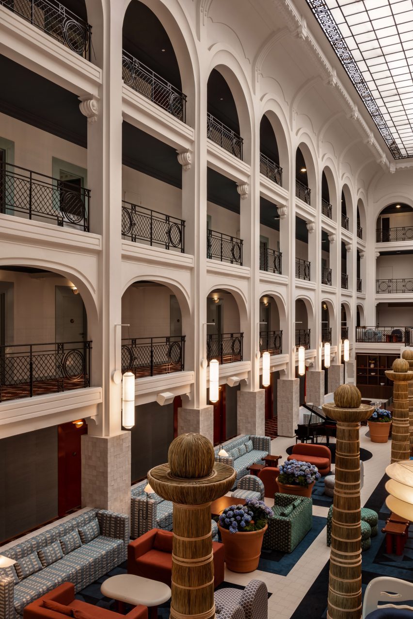
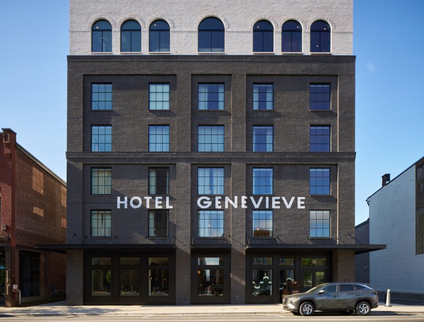
Located in Louisville’s East Market district, also known as NuLu (New Louisville), Hotel Genevieve occupies a new six-storey, black-brick building that’s within walking distance of some of the city’s biggest tourist attractions.

Lobby with pink terrazzo floor and matching plaster walls
In the hotel’s lobby, pink terrazzo flooring matches the plasterwork behind the reception desk

The hotel takes its name from a regional type of limestone, Saint Genevieve, which is a key ingredient in local bourbon production and also prevalent in Texas, where operator Bunkhouse is based.

The company collaborated with Rohe Creative on the interiors, which are intended to reference Louisville’s history.

Dark bar lounge with a vaulted golden ceiling
Communal spaces for guests include a speakeasy-style bar with a golden vaulted ceiling

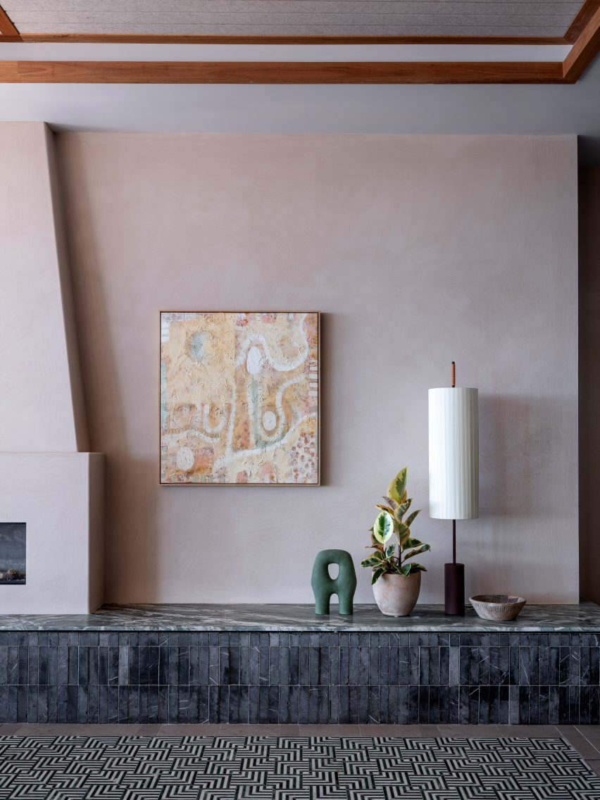
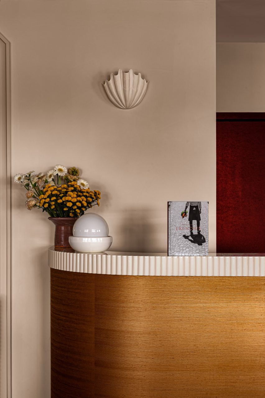
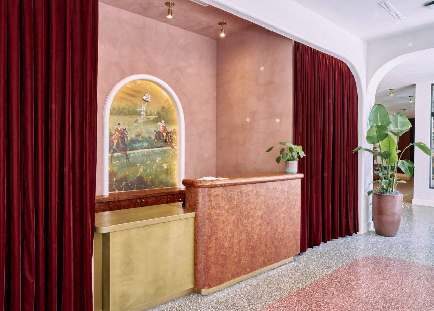
In the lobby, pink tones of terrazzo flooring are echoed in the plasterwork behind the reception desk, surrounding an equestrian-themed mural.

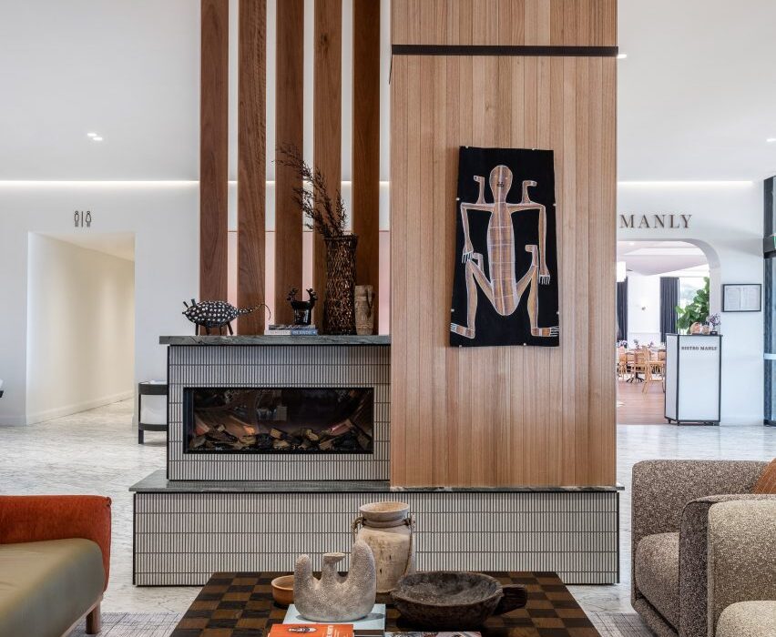
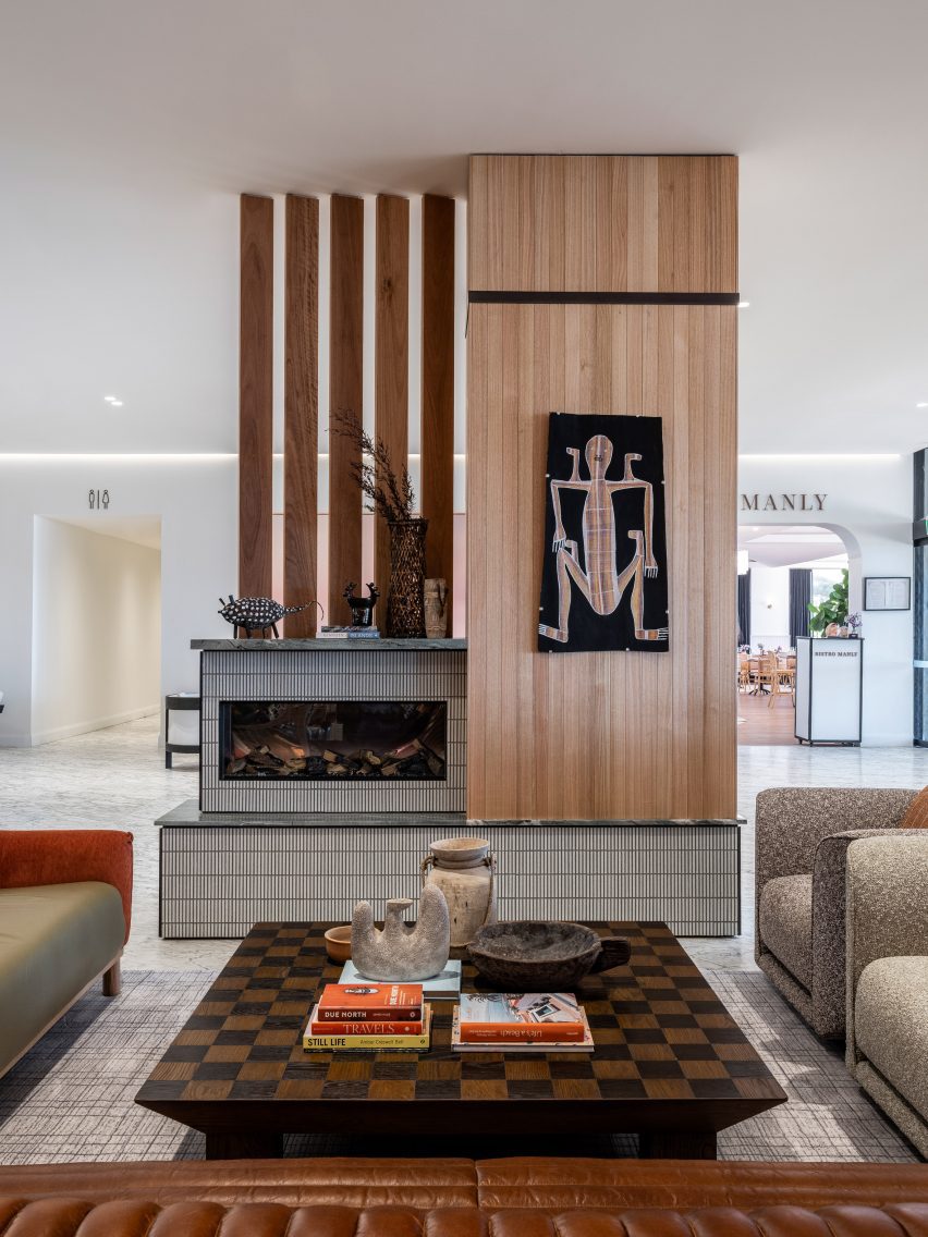
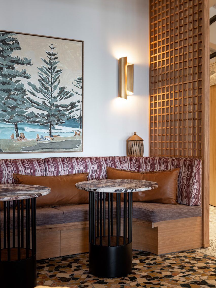
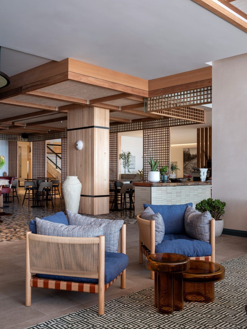
Artworks are displayed on white walls and in front of red velvet curtains to form a gallery around the lobby seating areas and corridors.

Blue guest bedroom with large bed
The rooms are coloured by type and the smaller spaces feature a blue palette

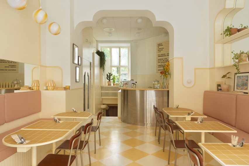
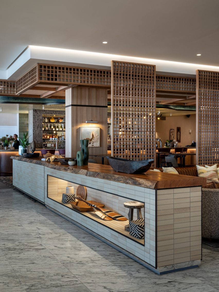
The adjacent all-day restaurant, Rosettes, serves food made with local ingredients and is influenced by al fresco Parisian cafes and chef Ashleigh Shanti’s Southern background. This bright, brasserie-like space combines green-tiled floors with colourful dining chairs and retro light fixtures.

“Richly decorated, each design accent tells a story, from bold usages of colour to a playful mix of vintage and modern furniture, and a vivacious art program featuring local talent,” said the hotel team.

View through an arched opening into a blue bedroom
The chosen colour in each room extends across the wall and ceiling, as well as into the bathrooms

A mini market on the ground floor, which is “part convenience store, part pop art installation”, sells locally sourced provisions, handmade artisanal goods, and coffee and snacks to go.

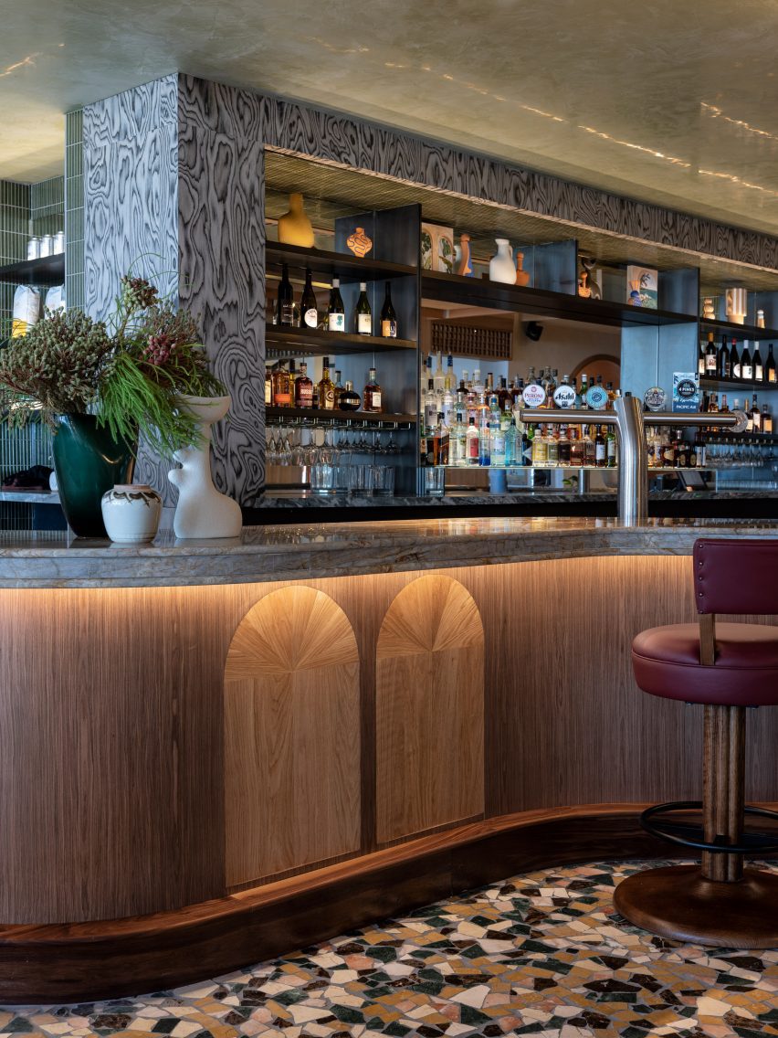
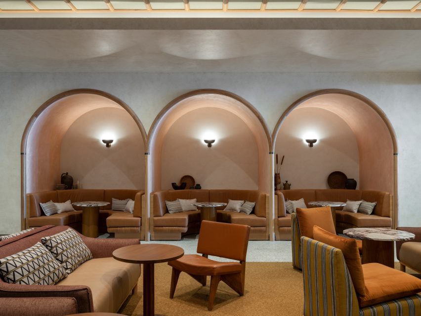
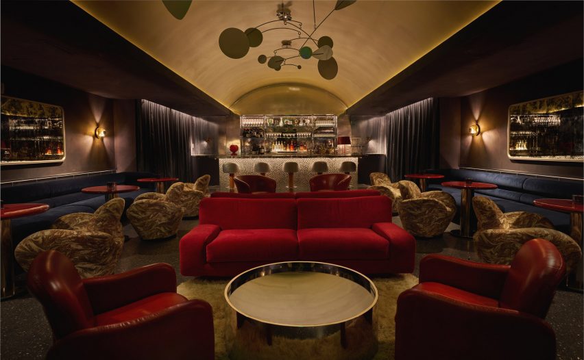
There’s also a dark and moody speakeasy-style bar with lounge seats and a golden vaulted ceiling.

Terracotta-coloured hotel room with two queen beds
Double Queen rooms are decorated in a terracotta hue

“Luxurious and feminine architectural details bring life to the space and reference the city’s namesake, King Louis XVI, heavily featuring Louisville’s vibrant local flora and fauna, with goldenrod [plants] shining throughout the suites and ground-floor restaurant,” said the hotel team.

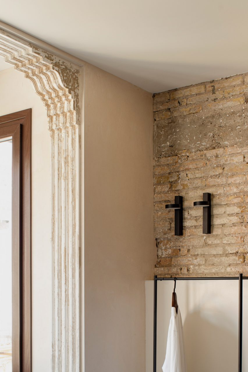
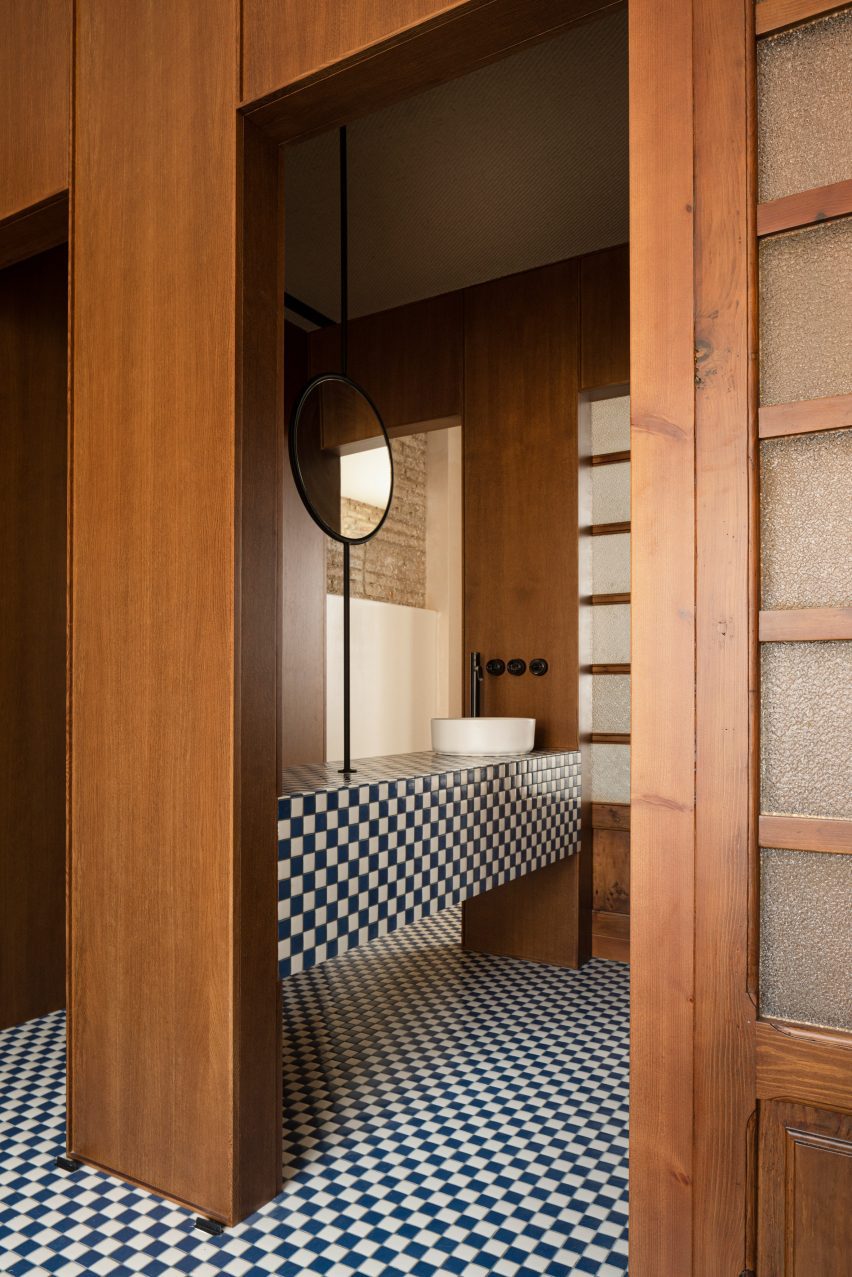
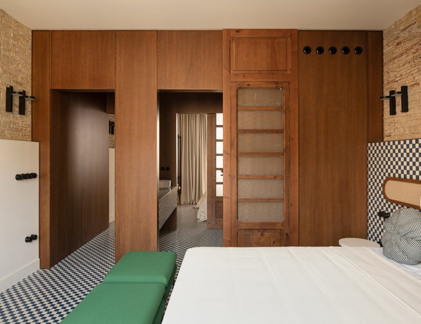
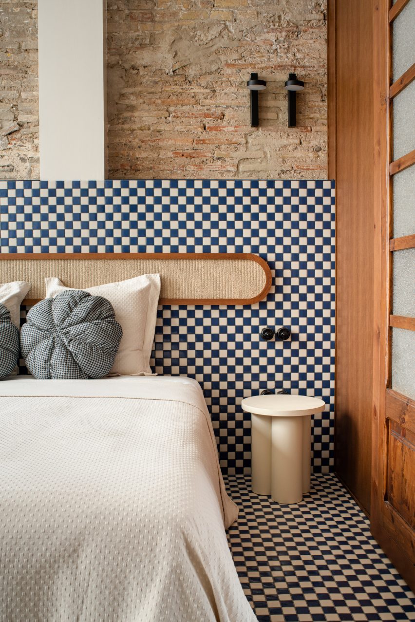
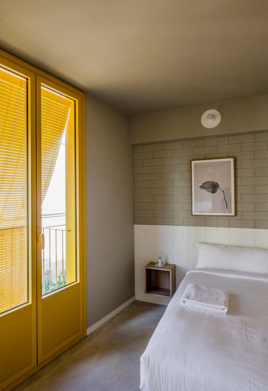
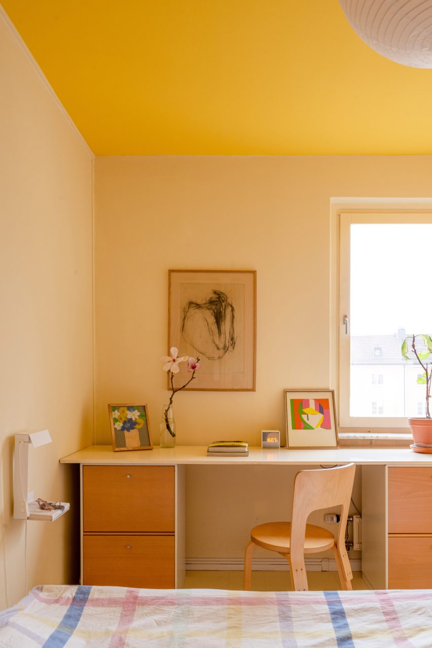
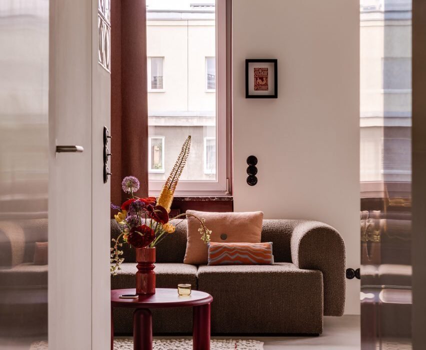
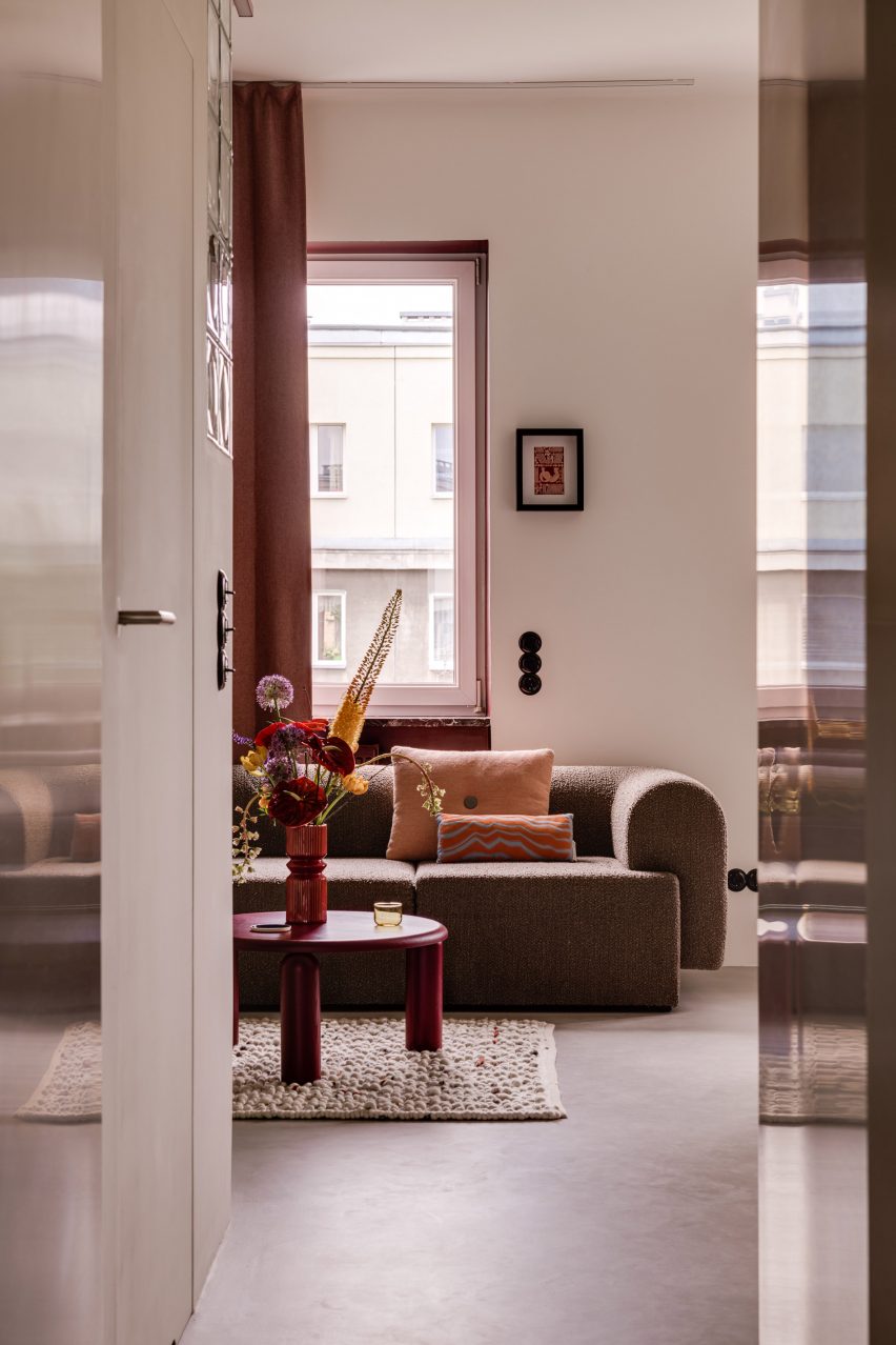
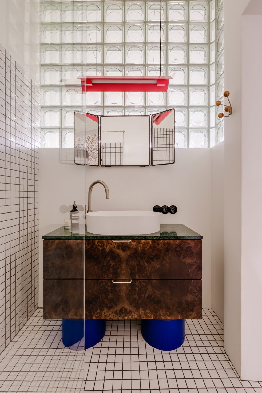
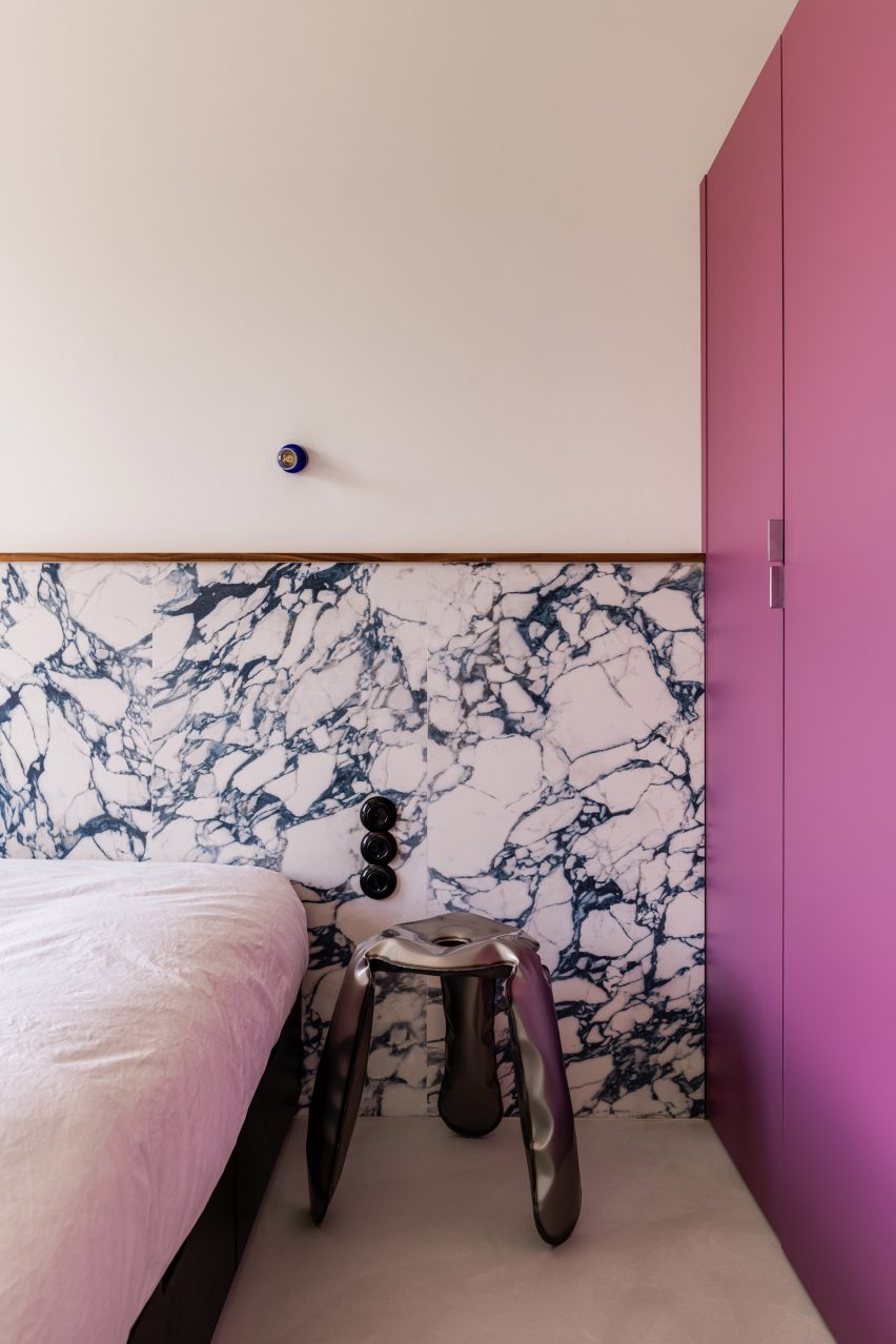
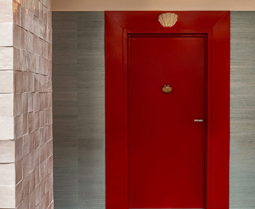
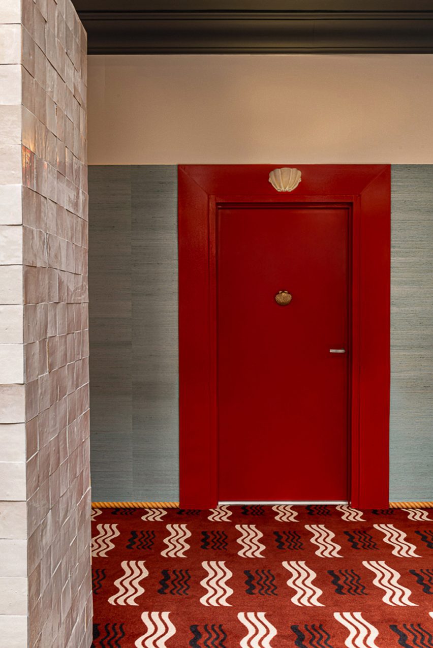
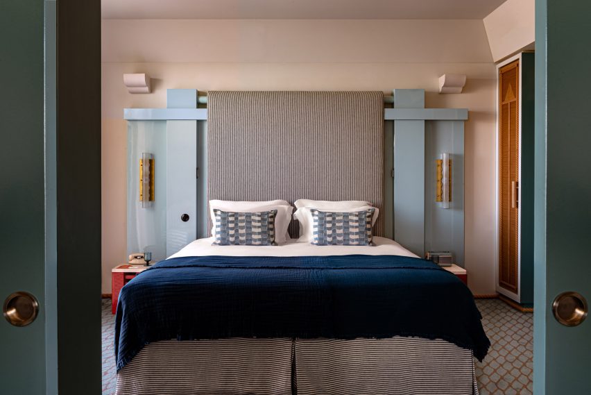
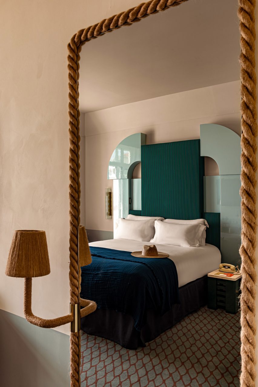
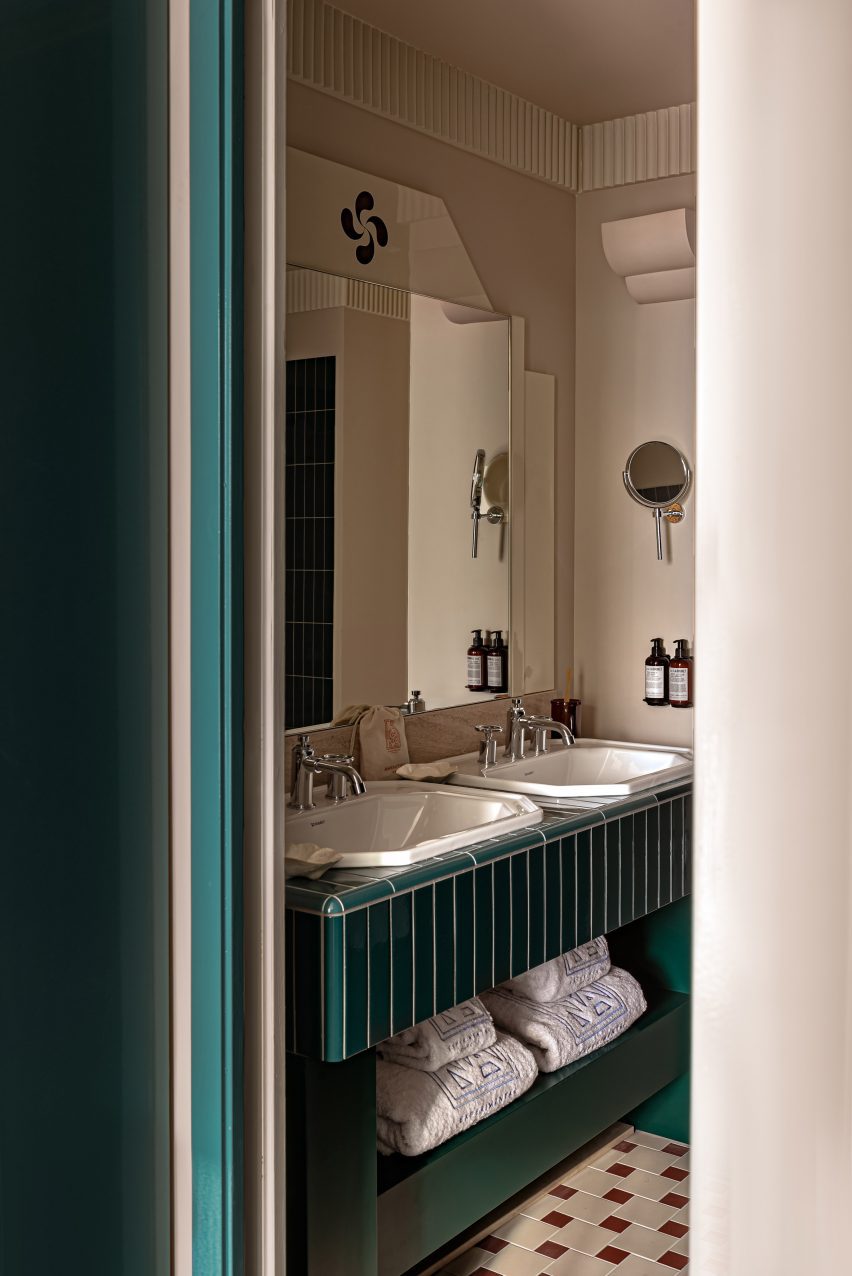
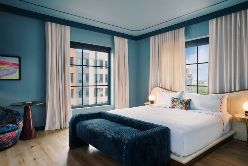
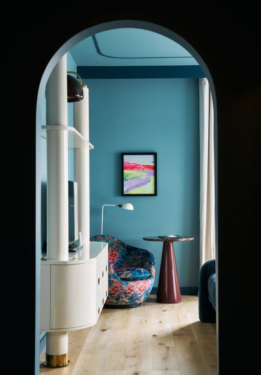
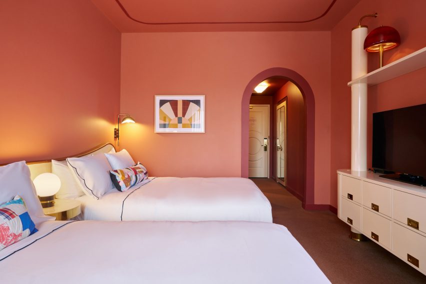
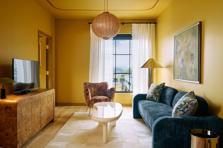
The hotel’s 122 guest rooms are each painted a distinct colour that correlates with their size or type. These hues cover the walls and ceilings, and also extend into the bathrooms via floor and shower tiles.

Yellow-coloured living room within a hotel room
Four Suite Genevieve rooms have a separate living room and are coloured yellow

Smaller rooms, including the King Louie and Petite King categories, feature a blue palette, while the slightly larger Double Queens are decorated in a terracotta hue.

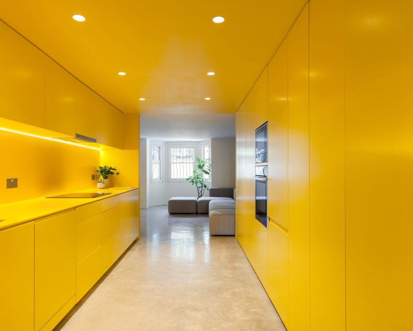
Four Grand King rooms accommodate a seating area and are also painted blue, while an additional four Suite Genevieve rooms have a separate living room and are coloured yellow.

All of the rooms boast custom features and fittings by ROHE, as well as paintings and prints by Kentucky-born artist John Paul Kesling.

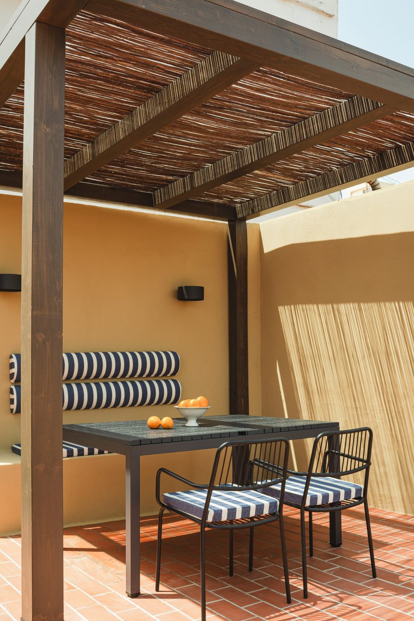
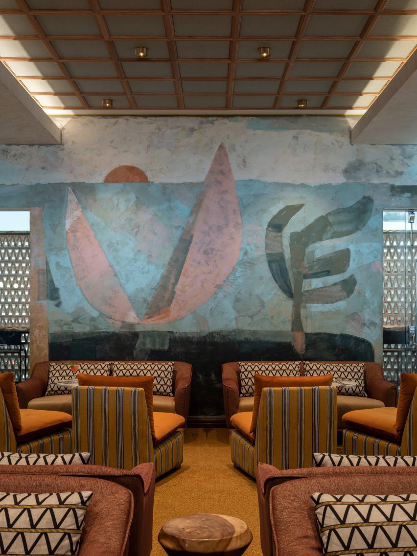
The rooftop venue, Bar Genevieve, serves cocktails and French-Mediterranean food from an indoor space that opens to the outdoors.

Spacious bar area with teal accents
Bar Genevieve on the top floor features teal accents and can be hired for private events

The bar area is accented with deep teal colours across the counter, stool seats, arched window frames and floor-to-ceiling velvet curtains that can be used to divide up the room.

Hotel Genevieve has also partnered with local organisations Black Soil Kentucky, Louisville Orchestra, and the Olmsted Parks Conservancy for programming across its varied communal spaces.

Exterior view of black-brick building
The hotel occupies a new black-brick building in Louisville’s East Market district

Kentucky draws visitors for its bourbon production and horse racing heritage, and demand for high-end accommodation in the state appears to be on the rise: a new five-star hotel called The Manchester also recently opened in Lexington.

Bunkhouse operates multiple properties across North America, including the Austin Motel and nearby Hotel Magdalena, Phoenix Hotel in San Francisco and Hotel San Cristóbal in Los Cabos, Mexico.

The photography is by Nick Simonite.

Reference

Entrance of Casa Cabanyal
CategoriesInterior Design

Viruta Lab blankets compact house in Valencia with chequerboard tiles

Spanish interiors studio Viruta Lab has renovated a compact house in El Cabanyal, Valencia’s traditional fishing neighbourhood, using geometric blue-and-white tiling for an understated nautical aesthetic.

Built in 1946, the humble two-storey building once belonged to the grandparents of the current owner but had been boarded up for many years.

Entrance of Casa Cabanyal
Viruta Lab has renovated a former fisherman’s house in Valencia

Viruta Lab was brought on board to transform the small 85-square-metre home into a modern holiday residence while respecting its great sentimental value to the family.

“Emotion was a very important starting point,” the studio told Dezeen.

Kitchen of Valencia house by Viruta Lab
The interior is dominated by chequerboard tiles

“The house is a family legacy and the image they have of it is very deep, so it was necessary for any intervention to be as respectful as possible and with a language that they understood and took as their own,” Viruta Lab continued.

“We understood that the architecture already had a value, that we only had to beautify it, preserve it.”

Dining area of Casa Cabanyal
Green upholstery provides a contrast with the blue-and-white colour scheme

Viruta Lab uncovered the building’s original brick walls from under layers of peeling paint and carefully repaired the pre-existing mouldings “to give height and nostalgic value to the interior design”.

Liberal chequerboard tiling provides a contrast to these traditional design details, featured throughout all the rooms from the kitchen to the sleeping quarters.

Mouldings inside house in Valencia by Viruta Lab
Viruta Lab restored the home’s original mouldings

In a suitably nautical palette of navy and off-white, the tiles reference the great variety of tiled facades found in the El Cabanyal neighbourhood.

“The dominant colours on the facades of the Cabanyal are white, blue and green, which are associated with a lifestyle linked to the resources offered by the sea,” the studio said.

“It was clear that we had to respect the local traditions, the architecture and the essence of the house and give it a maritime aesthetic, reinterpreting the Mediterranean style to adapt it to the tradition of the neighbourhood using its own materials.”

Green shows up throughout the interior in the form of simple upholstered furniture – including a sofa, pouffe, benches and stools – all custom-designed by Viruta Lab for this compact space.

Bathroom inside Casa Cabanyal
European oak was used to form joinery details

The interior woodwork in European oak was stained to resemble Canaletto walnut, matching the tones of the two remaining original interior doors that were painstakingly restored and repurposed as sliding doors.

“We wanted the woodwork to provide a quality counterpoint to the cold tones of the blues and greens, with an imprint and weight,” the studio said.

Bedroom inside house in Valencia by Viruta Lab
The remaining interior doors were restored and repurposed as sliding doors

Another key local material – esparto grass fibre – is less noticeable than the tiles but pops up throughout the house to add textural interest.

Traditionally used to make ropes, baskets, mats and espadrille sandals, the flexible natural material was repurposed to form headboards and backrests, and even clad the suspended ceilings in the bathrooms.

Bedroom inside Casa Cabanyal
Esparto grass was used to from headboards and backrests

“This material has been used because of its roots in the traditions and life in the Mediterranean area, especially in the Valencian community,” the studio said.

“For Viruta Lab, the legacy comes from its use by men of the countryside and the sea, by the original residents of the Cabanyal, those men who used to wear espadrilles.”

Courtyard inside house in Valencia by Viruta Lab
The house has a shaded outdoor dining area on the roof

As well as a clay-tiled roof terrace with a shaded outdoor dining area, the house also features a sensitively restored inner courtyard, complete with a stone water trough where the owner’s grandfather once dried his fishing nets at the end of a day’s work.

Other projects that celebrate Valencia’s historic architecture include a 1920s penthouse that was renovated to celebrate its original mosaic floors and an octogenarian home in El Cabanyal that was updated using traditional construction techniques and local materials.

The photography is by David Zarzoso.

Reference

Beresford Road by Russian for Fish
CategoriesInterior Design

Eight sunny yellow interiors from kitchens to living rooms

One-palette rooms and statement staircases are featured in our latest lookbook, which explores the best yellow interiors from the Dezeen archives.

From soft, buttery hues to vivid primary colours and deeper mustards, these residential and commercial spaces have challenged the use of traditional shades to create unique, eye-catching yellow interiors.

The use of yellow has been incorporated into bedrooms, living rooms, kitchens and facades, whether it is contrasting with brighter colours, blending with other honey tones or standing out against neutral materials.

This is the latest in our lookbooks series, which provides visual inspiration from Dezeen’s archive. For more inspiration see previous lookbooks featuring interiors with lime plaster walls, Barbiecore pink aspects and retro nods to Wes Anderson.


Beresford Road by Russian for Fish
Photography is by Peter Landers

Beresford Road property, London, by Russian for Fish

This London-based apartment features a statement yellow kitchen that was used to brighten the basement and complement the other colours in the space. Russian for Fish used the same vivid shade throughout the entirety of the kitchen, which also continues to the staircase.

Plant pots are added to the area to create dimension, with the green tones adding more colour to the otherwise yellow and neutral home.

“Yellow is a great colour – it brings out the ochre tones of the natural concrete floor, compliments the off-white walls, and creates warmth throughout the flat, even on the dullest of days,” says architect and founder at Russian for Fish, Pereen d’Avoine.

Find out more about Beresford Road property ›


Seven Lives by Anna and Eugeni Bach
Photography is by Eugeni Bach

Seven Lives, Spain, by Anna and Eugeni Bach

Spanish architecture studio Anna and Eugeni Bach built this apartment block in Barcelona, adding primary yellow features to the facade that add a vibrant touch to the interiors.

The building has yellow window frames and grills, balconies and blinds that are all visible from the apartments, as well as yellow internal doors to the balconies. These statement attributes contrast with the grey stucco and internal walls.

The shade – which was selected as it was approved by the area’s regulators – is also used in the communal staircase.

Find out more about Seven Lives ›


Bright yellow modular kitchen in compact apartment
Photography is by René de Wit and Pim Top

Residential complex, The Netherlands, by Shift Architecture Urbanism

A variety of bright colours were used to decorate this residential complex designed by Shift Architecture Urbanism in Amsterdam. The 235 apartments feature shades of yellow, green, blue, red in the furniture, fixtures and appliances to create a playful atmosphere.

The homes feature laminate floors, white walls and concrete ceilings that create a neutral base for the additional colours used for the modular units, cupboard-style bedrooms and ceramic tiled walls.

Find out more about the residential complex ›


Photo of a room with a yellow ceiling
Photography is by Jesper Westblom

Apartment, Sweden, by Westblom Krasse Arkitektkontor

This apartment in Stockholm uses plenty of primary colours, with reds, blues and yellows used on the walls and on the furniture.

A butter shade decorates the walls of the main and children’s bedrooms, and is complimented by a sunshine hue on the ceiling. Soft yellow shades are also used to contrast maroon tiles and doors throughout the home.

Yellow accents can also be found on its accessories, such as lamps, crockery and artwork.

Find out more about the Stockholm apartment ›


Interiors of Casa Collumpio by MACH
Photography is by Del Rio Bani

Casa Collumpio, Spain, by MACH

MACH designed this industrial-style house in Barcelona with lemon-yellow steelwork used on the interior and exterior.

Used as a focal point among grey concrete and wooden cladding, a bright yellow staircase with a protective mesh panel connects the upper floors of the building. To complement the feature, yellow stripes are added to the white kitchen cupboards.

The colour continues on the steelwork around the door, forming a decorative statement around the windows at the front and back of the home.

Find out more about Casa Collumpio ›


Duplex in Sant Gervasi by Arquitectura-G
Photography is by José Hevia

Apartment, Spain, by Arquitectura-G

Arquitectura-G designed the interiors of this apartment in Barcelona with pastel yellow tones to create a lighter, more open space. The walls and floor of the space are covered in glazed square tiles, with the metal kitchen units matching in a similar tone.

Yellow furniture, such as a sofa and cupboards, complement the apartment’s colour palette.

“We prefer to use the same colour in the whole project, in order to give a strong visual impact and make it an essential part of the house’s identity,” sids Arquitectura-G.

Find out more about the Spanish apartment ›


Photo of a cafe in Stockholm
Photography is by Mikael Lundblad

Cafe Banacado, Sweden, by ASKA

ASKA has created a picturesque cafe in Stockholm informed by film director Wes Anderson’s aesthetics, using shades of mustard, cream, pink and brown to adorn the space.

The yellow checkerboard floor was influenced by traditional Cuban styles of interiors and mirrored by similar tones in the tiled table tops.

“In order to create an environment that feels harmonious we work with subtle layering and tone in tone methods,” said ASKA co-founder Madeleine Klingspor. “The same yellow is used on the walls, lamps, tables and floor but in different scales and intensity,”

Find out more about Cafe Banacado ›


Pink, grey and chrome Kitchen in JJ16 apartment by Lucas y Hernández-Gil
The photography is by Jose Hevia

JJ16, Spain, by Lucas y Hernández-Gil

Citrus yellow offsets petal pink in this Madrid apartment by Lucas y Hernández-Gil, with a yellow built-in bookshelf lining the length of the corridor.

The hallway leads to the kitchen, which features a contrasting soft pink floor and walls and matte grey units.

The rest of the space has been decorated with similarly vivid colours and prints, including neon orange storage hidden by white doors, blue checkerboard flooring and an aubergine wardrobe.

Find out more about JJ16 ›

This is the latest in our lookbooks series, which provides visual inspiration from Dezeen’s archive. For more inspiration see previous lookbooks featuring interiors with lime plaster walls, Barbiecore pink aspects and retro nods to Wes Anderson.

Reference

Wooden Cave by Tenon Architecture
CategoriesInterior Design

Ten built-in beds that are embedded into the fabric of the building

From mattresses on concrete bases to beds encased within timber surrounds, this lookbook rounds up ten single, double and day beds that have been built into interiors.

Some designers choose to integrate beds into the building’s wider structure to create cohesion throughout interiors, eliminating the need to add matching furniture.

Built-in beds are often seen in buildings situated in warmer climates, such as Central America and the Mediterranean, where stone or concrete is used to keep spaces cool and to create bespoke, unmovable furniture.

Incorporated beds are also a popular choice when designing wooden cabins, due to their space-saving nature and the way they lend themselves to creating a cosy atmosphere.

This is the latest in our lookbooks series, which provides visual inspiration from Dezeen’s archive. For more inspiration see previous lookbooks featuring lime plaster walls, red interior schemes and interiors informed by retro design.


Wooden Cave by Tenon Architecture
Photo by Spyros Hound Photography

Wooden Cave, Greece, by Tenon Architecture

A double and a single bed were sunk into this striking cave-like hotel suite in Greece designed by Tenon Architecture, which is made from over 1,000 pieces of spruce wood.

The tiered wooden stricture has a smooth, biomorphic appearance that recalls the grotto dwellings used by early humans.

Find out more about Wooden Cave ›


Casa Alferez by Ludwig Godefroy
Photo by Rory Gardiner

Casa Alférez, Mexico, by Ludwig Godefroy

Two stark bedrooms are found in architect Ludwig Godefroy’s brutalism-informed home, situated in a pine forest in Mexico.

Concrete was used for the walls, ceilings, floors, storage and furniture of the house – the harshness of which is offset in the plush day bed in its office area.

Find out more about Casa Alférez ›


Interior of Cabin Anna in the Netherlands by Caspar Schols
Photo is courtesy of Caspar Schols

Cabin Anna, The Netherlands, by Caspar Schols

A double bed – including headboard and bedding – was integrated into the floor of this modular cabin created by architectural designer Caspar Schols.

The structure and some of the furniture within it are flat-packed, allowing the space to be reconfigured depending on the needs of the user.

Find out more about Cabin Anna ›


Bedroom with curved ceiling and curved window at end
Photo by César Béja

Villa Petrico, Mexico, by CO-LAB Design Office

A glazed arch-shaped door dictates the shape of the rest of this tunnel-like bedroom in a concrete holiday home in Tulum.

Platforms are present throughout the bedroom, one of which acts as a broad base for an understated mattress bed.

Find out more about Villa Petrico ›


Minimal interiors of forest retreat designed by Norm Architects
Photo by Jonas Bjerre-Poulsen

Swedish forest retreat, Sweden, by Norm Architects

A sunken day bed takes advantage of the dramatic views of a pine forest in this cabin by Norm Architects.

Linen upholstery and pillows compliment the natural wood texture of the bed’s base and the rest of the floor – a combination that extends throughout the rest of the interior.

Find out more about Swedish forest retreat ›


Bedroom with stone wall and bed on platform
Photo by Edmund Sumner

Cometa House, Mexico, by Mauricio Rocha and Gabriela Carrillo

A rustic wall made up of irregularly shaped stones provides the backdrop for the pared-back built-in bed in this coastal home in Oaxaca.

A jute mat separates the mattress from its wide stone base, which has built-in steps separating it from the rest of the space.

Find out more about Cometa House ›


A bedroom inside 4/Way House
Photo by Taiyo Watanabe

4/Way House, USA, by Deegan-Day Design & Architecture

A birch plywood platform bed blends into the interior of a house in California by Deegan-Day Design & Architecture.

The bed is surrounded by integrated panelling with a shelf for books and has an angular footprint to accommodate a built-in bedside table.

Find out more about 4/Way House ›


Interior of Chestnut House by João Mendes Ribeiro
Photo by José Campos

Chestnut House, Portugal, by João Mendes Ribeiro

A double bed saves space in this small-scale rural cabin by sitting flush with the surrounding structure that makes up the floor.

The mezzanine bed is flanked by a bedside table area on one side and a ladder platform on the other that allows access to the level above.

Find out more about Chestnut House ›


Bed on platform inside open-plan bedroom
Photo by Yiorgis Yerolympos

NCaved house, Greece, by Mold Architects

Pale bedsheets blend in with light-coloured cast concrete platform and steps in this split-level bedroom.

The built-in bed allows for other design features to take centre stage in the double-height space, including the stone wall, lancet windows and exposed structural beam.

Find out more about NCaved house ›


Cabin Above the Town by Byró Architekti
Photo by Ondřej Bouška

Cabin Above the Town, Czech Republic, by Byró Architekti

A curtain separates a sleeping nook from the rest of this hilltop cabin’s open-plan interior.

A single plywood volume snakes around the edge of the space and provides storage, seating and a bathroom as well as a built-in bed, with a further guest bed atop the structure accessible by a ladder.

Find out more about Cabin Above the Town ›

This is the latest in our lookbooks series, which provides visual inspiration from Dezeen’s archive. For more inspiration see previous lookbooks featuring lime plaster walls, red interior schemes and interiors informed by retro design.

Reference

Entrance of Chappelle Saint-Michel de Brasparts
CategoriesInterior Design

Ronan Bouroullec furnishes 17th-century Saint-Michel de Brasparts chapel

Following the wildfires that ravaged Brittany’s Arrée mountains last summer, Ronan Bouroullec has reimagined the interior of the region’s historic Chapelle Saint-Michel de Brasparts as part of a full restoration.

Originally built at the end of the 17th century, the chapel is a modest building without lighting or electricity, perched on top of a prominent hill that rises above the surrounding moorland.

Entrance of Chappelle Saint-Michel de Brasparts
Chappelle Saint-Michel de Brasparts has undergone a full restoration

Breton businessman François Pinault, founder of luxury group Kering, financed the chapel’s restoration after it was damaged during the wildfires, patching up its metre-thick stone walls, rammed-earth floors and the exposed oak frame supporting the slate roof.

Bouroullec, who was born and raised in Brittany, remembers the chapel from his childhood and was compelled to design a new altar and several furnishings for the building as part of the refurbishment.

Working in collaboration with local artisans, he used a trinity of roughly-hewn materials – granite, steel and glass – that would stand the test of time while reflecting the building’s rugged rural location.

Brittany chapel interior by Ronan Bouroullec
Ronan Bouroullec designed a new altar for the chapel

“Heavy enough not to be moved, sturdy enough not to be damaged, rough enough not to require cleaning, the elements that Ronan Bouroullec has placed in the chapel must succeed, despite or because of these characteristics, in creating a sensory experience,” wrote Martin Bethenod, former CEO of Pinault’s Bourse de Commerce museum, in an introductory text for the project.

“The bush-hammered granite, blurred glass, hammered steel, the choice of a galvanized finish to soften the contrast of the cross and candlesticks with the whiteness of the lime-rendered walls – each intervention combines sensations of roughness and softness, of force and tremor.”

Steel cross inside Chappelle Saint-Michel de Brasparts chapel
The granite altar is topped with a simple hammered-steel cross

Nuit celtique de Huelgoat granite – quarried less than 15 kilometres away from the chapel – was cut into three pieces before being worked by local stone mason Christophe Chini to create an altarpiece, its horizontal base and a console table for candles and offerings.

Bethenod compares the dark stone, studded with shards of white, to “the starry night sky over the chapel, virtually devoid of light pollution”.

The metal elements – a simple cross and a group of three tall candle holders, all in hammered steel – were the result of another collaboration, this time between Bouroullec and Roscoff-based metalworker Mathieu Cabioch.

Some of the candles stand directly on the altar while the rest are integrated into the Brutalist console table, which consists of a long slab of granite, seemingly supported by several of the steel candle holders.

Steel candle holders inside chapel interior by Ronan Bouroullec
A mirrored glass disc is mounted centrally behind the altar

The final element in Bouroullec’s material trinity is glass, in the form of a large mirrored disc that hangs centrally behind the altar.

Made by glassmakers from the Venice area, with whom Bouroullec has worked for several years, the piece was designed to create a dialogue with the two stained-glass windows in the apse, which are the chapel’s only surviving decorative element.

“More than a mirror, more than an object, it is a light source without physical substance, as if a round hole had been made in the wall to reveal daylight, unpredictable and constantly changing,” said Bethenod.

Candle sticks inside Chappelle Saint-Michel de Brasparts chapel
Steel candleholders are also integrated into a wall-mounted console

Brittany is home to some of the world’s oldest standing architecture. Other projects making use of the region’s historic buildings include this conversion of a 17th-century barn into a printmaker’s studio.

The first new church to be built in Brittany in the 21st century was completed by Portuguese architect Álvaro Siza Vieira in 2018, featuring a sculptural composition of intersecting concrete forms.

The photography is by Claire Lavabre courtesy of Studio Bouroullec.


Reference

Interior of apartment renovation by Mistovia
CategoriesInterior Design

Mistovia designs eclectic Warsaw apartment as “elaborate puzzle”

Walnut burl and terrazzo accents are combined with chunky statement furniture in this apartment in Warsaw, which Polish studio Mistovia has renovated for an art director and her pet dachshund.

Located in the city’s Praga Północ neighbourhood, the 45-square-metre flat is set within a 1950s estate designed by Polish architects Jerzy Gieysztor and Jerzy Kumelowski.

Interior of apartment renovation by Mistovia
The Warsaw apartment was renovated by Mistovia

Mistovia devised an eclectic material and colour palette when updating the interior, which the studio describes as an “elaborate puzzle” of contrasting patterns.

“The apartment is based on several dominant ‘cubes’,” said Mistovia founder Marcin Czopek. “Each of them has a different function, accentuated by various patterns through the use of veneer or colour.”

Swirly grey wood panels in the living space
Panels of swirly grey wood veneer feature in the living space

The living room is defined by a wall panelled in swirly grey wood veneer– originally designed by Memphis Group founder Ettore Sottsass for Alpi in the 1980s – while the bathroom is obscured behind a wall of glass blocks.

The kitchen is now connected to the lounge to create one open-plan space, filled with statement pieces including a misshapen vase and the molten-looking Plopp stool by Polish designer Oskar Zieta, set against the backdrop of floor-to-ceiling walnut-burl cabinets.

Tortoiseshell cabinet with cobalt legs in the bathroom
A tortoiseshell cabinet defines the bathroom

Terrazzo was used to form chunky black-and-white legs for the kitchen’s window-side breakfast bar as well as an entire burnt-orange table in the dining area.

“A muted base – bright, uniform micro cement flooring and walls with a delicate texture – allowed for the use of geometric forms, rich in interesting structures and bold patterns,” Czopek said.

Designed for an art director and her dog, the apartment features a similarly striking bathroom.

Here, gridded monochrome tiles and glass-brick walls are paired with a statement standalone sink, featuring squat cobalt-blue legs that support a tortoiseshell cabinet crowned by a triptych mirror.

Purple and marble accents designed by Mistovia
The single bedroom includes purple and marble accents

A purple wardrobe complements the rectilinear marble headboard in the apartment’s singular bedroom, adding to the boxy geometry of the home.

Also in Warsaw, Polish studio Projekt Praga incorporated mid-century elements and pops of colour into a dumpling restaurant while local firm Noke Architects referenced the high waters of Venice in a bar complete with sea-green floors and skirting tiles.

The photography is by Oni Studio


Reference

Lobby of Manly Pacific hotel
CategoriesInterior Design

Luchetti Krelle brings laid-back luxury to social spaces of Manly Pacific

Spicy shades of turmeric, cinnamon and ginger feature alongside mosaic tiles and hand-painted murals in the public spaces of this hotel in Sydney, following a makeover from local studio Luchetti Krelle.

The renovation encompassed Manly Pacific‘s lobby as well as its 55 North bar and a few neighbouring lounge areas, all located on the hotel’s ground floor, which opens directly onto Manly Beach.

Lobby of Manly Pacific hotel
Luchetti Krelle has overhauled the lobby of Sydney’s Manly Pacific hotel

In the reception area, Luchetti Krelle created an intimate lounge setting to bring a sense of warmth and welcome into the otherwise vast white space while creating a link to the more richly decorated drinking spaces beyond.

Tactile sofas and clubby armchairs are clustered around a chequerboard table looking onto a fireplace that mixes tile and timber in a mid-century-influenced design.

Latticed screens create a loose separation between Manly Pacific’s reception and the adjoining bar area, which introduces a richer palette of colours and materials to forge a sense of laid-back luxury.

55 North bar by Luchetti Krelle
The studio also renovated the adjoining bar

“A loose luxury defines our approach to the reappointment of the bar and neighbouring lounge areas,” Luchetti Krelle said.

“Layered textures, spiced tonal triggers and punchy patterns were selected to energise the drinking spaces with a graceful attitude that prioritised home comfort.”

55 North is centred on an impressive island bar that curves outwards into the room to create a sense of welcome.

Counter of Manly Pacific hotel bar
Crazy paving in autumnal hues defines the bar area

The bar’s outlines are mirrored by the lines of the bulkhead ceiling above, creating a shape reminiscent of a clamshell that draws the eye across the room and brings a cosy intimacy to the bar area.

“Hospitality design is about making people feel welcome, relaxed and confident so less noticeable elements drove our process,” the studio said.

“We lowered the bar’s original height so smaller guests didn’t feel intimidated by its stature, adding custom leather swivel stools with curved returns to encourage lengthier sittings.”

55 North bar by Luchetti Krelle
Lattice screens help to loosely divide the space

The client had originally requested a new bar closer to the lobby. But Luchetti Krelle chose instead to improve the existing design to conserve waste and save valuable build time.

“As with all hospitality projects, there is an added pressure to complete the build and installation within deadline, given commercial pressures to open for business,” the studio said.

“So we saved time finding creative solutions to transform existing elements, avoiding demolition and the waste of materials.”

Seating area inside Manly Pacific hotel
A series of lounge spaces lead off the bar

Opening off the main bar area is a series of lounges.

Through the careful use of curves, arches and latticed screens, Luchetti Krelle designed these spaces to flow from one to another with a clear sense of continuity, while each area maintains its own distinct character and sense of purpose.

“We created adjoining rooms to encourage hotel guests to treat the space like an extension of their home during the day,” the studio said.

On the beach side, a sunroom takes its cues from the vista with striped and patterned upholstery in a palette of cooling blues that tether the space to the seascape beyond.

To the rear of the bar, a former gaming room has become an expansive cocktail lounge, where arches frame three intimate booths and the eye is led across the room by an underwater scene, painted onto Venetian plaster by local mural studio Steady Hand Studio.

Fireplace inside lounge of Manly Pacific hotel
Cool blue tones connect the sunroom to Manly Pacific’s beachside setting

Tiles are the protagonist material of this project, defining each area.

“Intricate autumnal crazy paving lures eyes through latticed screens that lightly separate the lobby and bar,” said Luchetti Krelle.

“Waves of fanned pearl-hued marble mosaics accentuate the rear lounge’s sophistication. Within the front sun lounge, tessellated Indian green and Carrara marble mosaic arrangements mimic the effect of a rug.”

Street-facing hotel lounge designed by Luchetti Krelle
The sunroom opens straight onto Manly Beach

Timber, too, plays a large part in the design, used across walls, ceilings, arches and booths – particularly in the bar.

“It was important to use varied timber species, including Blackbutt and walnut, to add textural depth and warm shades,” the studio said.

A variety of plaster finishes introduce another level of texture while helping to convey a sense of history and permanence, according to Luchetti Krelle.

Mural inside cocktail lounge of Manly Pacific hotel
A hand-painted mural dominates the cocktail lounge in the rear

These include the teal plaster applied to the bulkhead surround of the main bar, which features a glossy underside to bring a sense of lightness to the structure.

And in the ocean-side lounge, the pale sand shade of the fireplace wall cools the space during summer, reflecting the sunlight.

Booths in cocktail lounge of hotel designed by Luchetti Krelle
Seating booths are enveloped in cosy arches

The Manly Pacific is among a number of hospitality projects that Luchetti Krelle has completed in Sydney over the last two years.

Among them is a bar set inside a former butcher shop as well as the restaurant RAFI, characterised by vivid abstract paintings and patterned floors.

The photography is by Tom Ferguson.

Reference

Travelling design gallery in Berlin by Vanessa Heepen
CategoriesInterior Design

Forma is a nomadic design gallery popping up around Berlin

Contemporary German furniture designs are displayed alongside vintage pieces at this travelling gallery that multidisciplinary designer Vanessa Heepen has launched in Berlin.

Rather than having a permanent home, Forma will take over different locations across the German capital.

Travelling design gallery in Berlin by Vanessa Heepen
Forma’s first exhibition was held in a building next to the Spree river

The gallery’s inaugural exhibition, titled The Room I Walk the Line, was recently on show on the ground floor of a mixed-use building in Friedrichshain, nestled in between fragments of the Berlin Wall on the banks of the river Spree.

“To be honest, the area is not where I would typically choose to open a gallery,” Heepen told Dezeen. “But when I first saw a picture of it on a real estate website, I was deeply touched by its huge windows, red columns and by the water, of course.”

Two stools in a concrete room
It featured German designers including Nazara Lázaro (left) and Studio Kuhlmann (top right)

A trained interior designer, Heepen largely left the space in its found state but worked with her team to create a simple mahogany bar counter and storage unit for the gallery.

She also asked “soft architecture” studio Curetain to create a white latex screen for the corner of the gallery.

As part of the exhibition, this served as the backdrop for a tall white spectator shelf by Stuttgart-based Freia Achenbach, along with a graphic white stool by local designer Nazara Lázaro.

Travelling design gallery in Berlin by Vanessa Heepen
This wiggly coat stand was mong the vintage pieces featured

Other pieces in the exhibition included a pigmented concrete chair by Carsten in der Elst and hanging metallic stars by Studio Kuhlmann, both from Cologne, as well as a translucent shelf by Berlin’s Lotto Studio.

Forma also sourced a number of vintage pieces from Moho – a 20th-century furniture showroom in Prenzlauer Berg – among them an embossed metal cabinet and a wriggly coat stand.

One of Heepen’s main motivations for founding the gallery was to carve out a space for showcasing design-led furnishings in Berlin, which she says is something of a rarity in the German capital.

“It is a discursive topic, and people have always been unsure about the success of it,” she explained. “After Forma’s first edition, I am glad to say it was hugely successful”.

Chair and transluscent shelf in Forma gallery
Contemporary design pieces included a translucent shelf by Lotto Studio

The designer is currently on the hunt for Forma’s next location and will let the new setting inform her selection of furnishings.

“I’m always open to something new that occurs within the process,” she said. “I hold on to my vision, but I am also open to taking a detour.”

Travelling design gallery in Berlin by Vanessa Heepen
Also featured was a pigmented concrete chair by Carsten in der Els

Elsewhere in Berlin, Swiss architecture firm Herzog & de Meuron is currently constructing a major new museum for modern art.

The building’s design came under fire at the end of last year, when it was discovered its complex air conditioning system would result in the venue using four times as much energy as a nearby museum from the 1800s.

The photography is by Matthias Leidinger

The Room I Walk the Line was on show at Mühlenstrasse 63 in Berlin from 15 June to 15 July 2023. For more exhibitions, events and talk in architecture and design, visit Dezeen Events Guide.


Reference

Corridor at Regina Experimental hotel
CategoriesInterior Design

Dorothée Meilichzon blends nautical and art deco inside Biarritz hotel

French interior designer Dorothée Meilichzon has renovated a Belle Epoque-era hotel in Biarritz, France, blending maritime and art deco motifs to add contemporary flair to the historic building.

The Regina Experimental sits on a clifftop overlooking the Bay of Biscay in the French seaside city, which was once a royal getaway and is now a popular surfing destination.

Corridor at Regina Experimental hotel
Nautical designs decorate the corridors

Constructed in 1907 by architect and landscape designer Henry Martinet, the grand building features a 15-metre-high atrium, large bay windows, a glass roof, and hints of art deco throughout.

The majority of its spaces were well preserved, so Meilichzon‘s input involved modernising the furnishings and decor – adding colour and pattern to enliven the spaces while playing on the hotel’s coastal location.

Atrium of Regina Experimental hotel
Totemic sculptures were used in the hotel’s atrium

In the light-filled atrium, dark red and green sofas were arranged to create intimate seating areas within the expansive room.

Totemic wicker sculptures form a line down the centre of the room, and cylindrical paper lanterns by designers Ingo Maurer and Anthony Dickens hang from the columns on either side.

Bedroom with art deco influenced headboard
Guest rooms feature geometric, art deco-influenced headboards and striped upholstery

Guests in this space are served cocktails from a bar top shaped like an ocean liner, designed as an homage to modernist architect Eileen Gray, while listening to live piano music.

While the bar top nods to Gray’s designs, the sofas in the room play on the shapes of the Itsasoan footbridge in nearby Guétary.

Reflection of a bed in a rope-wrapped mirror
Mirrors wrapped in rope continue the maritime theme in the rooms

Carpet patterns vary between the different areas of the hotel – in the corridors, they carry a nautical motif, while the markings are reminiscent of fish scales in the guest rooms.

The hotel’s restaurant, Frenchie, offers Basque-inspired cuisine within a bright room that features more nautical references, such as rope-hung shelves and shell-shaped sconces.

Dining room of Regina Experimental
Shell-shaped sconces decorate the dining room

Highly patterned tiled floors and furniture contrast the restaurant’s neutral plaster walls and ceiling, which are punctuated by arched niches and curved plywood panels.

The dining area spills onto an outdoor terrace, populated by red cafe tables and chairs lined up against pale blue banquettes, around the corner from a swimming pool.

The hotel’s 72 guest rooms are accessible from corridors that wrap around the atrium, and face either the ocean or the Golf de Biarritz Le Phare golf course.

Shades of blue and green dominate the art deco-influenced bedrooms, which feature glossy geometric headboards and marine-striped upholstery.

Bathroom with teal-coloured tiles
A cool palette of greens and blues is used in the bathrooms

Small lamps extend from rope frames that wrap around the mirrors, and red accents on smaller furniture pieces pop against the cooler hues.

“Bedrooms are awash with Japanese straw and rope combined with marine stripes and plaster frescoes with aquatic motifs,” said the hotel. “Evocative of an ocean liner, each bedroom incorporates curved forms and long horizontal lines.”

Hotel perched on a cliff overlooking the sea
Built in 1907, the hotel overlooks the Bay of Biscay from a clifftop

Meilichzon, founder of Paris-based design agency Chzon, is a frequent collaborator of the Experimental Group, and has designed the interiors for several of its properties.

Earlier this year, she gave a bohemian refresh to Ibiza’s first hotel, now called the Montesol Experimental, and previously completed the Hotel Il Palazzo Experimental in Venice.

The photography is by Mr Tripper.

Reference

Tiled worktops of Fruit Box, UK, by Nimtim Architects
CategoriesInterior Design

Eight kitchens with tiled worktops that are practical but pretty

A kitchen with a statement oxblood-colour island and another with curved child-friendly counters feature in our latest lookbook, which spotlights eight worktops that are covered in tiles.

Tiled worktops can be a functional yet attractive addition to a kitchen, able to withstand hot pots and food stains while also creating an opportunity for decoration.

The examples in this lookbook range from tiled worktops designed as focal points to more utilitarian counters that blend in with surrounding walls, illustrating the potential of tiles in a kitchen and proving they are not limited to just splashbacks and flooring.

This is the latest in Dezeen’s lookbooks series, which provides visual inspiration from our archive. Other recent editions showcase wine storage solutions, bedrooms with desk spaces and interiors that draw on Mediterranean living.


Tiled worktops of Fruit Box, UK, by Nimtim Architects
Photo by Megan Taylor

Fruit Box, UK, by Nimtim Architects

London studio Nimtim Architects opted for bright white tiles to cover the worktops of this kitchen and teamed them with plywood cupboards, shelves and drawers for a deliberately simple look.

Some tiles have curved edges, helping to create seamless transitions between the counters and splashback while also eradicating sharp corners so the space is safer for the client’s children.

Find out more about Fruit Box ›


East Village Apartment kitchen, USA, by GRT Architects
Photo by Nicole Franzen

East Village Apartment, USA, by GRT Architects

The focal point of this kitchen in an East Village apartment is an island covered in oxblood-coloured tiles, which stand out against a backdrop of white-oak cabinetry with oversized handles.

This rich, jewel-toned finish was complemented by chequerboard mosaic tiling across the floor and shiny brass legs for the end kitchen counters.

Find out more about East Village Apartment ›


Tiled worktop in West Bend House, Australia, by Brave New Eco
Photo by Peter Bennetts

West Bend House, Australia, by Brave New Eco

Duck-egg blue tiles adorn the surfaces of this galley kitchen, which studio Brave New Eco created in West Bend House in Melbourne.

This includes an island running through its centre, where square tiles are used on the worktop and the sides are lined with long, slender versions. They are teamed with wooden joinery and slender bar stools.

Find out more about West Bend House ›


Kitchen interior of De Sijs co-housing by Officeu Architects
Photo by Stijn Bollaert

De Sijs, Belgium, by Officeu Architects

Officeu Architects combined a mix of pastel-hued square tiles to decorate the worktops in this kitchen, which features in the De Sijs co-housing project in Leuven.

The dusky colours of the surfaces are complemented by a mix of fern-green and wooden cabinets and help draw attention to playful furnishings and fixtures, including hanging lights and bright red pots.

Find out more about De Sijs ›


Bright pink and green kitchen island in Palma Hideaway by Mariana de Delás
Photo by José Hevia

Palma Hideaway, Spain, by Mariana de Delás

Green tiles are used to create focal points throughout this lofty apartment, which architect Mariana de Delás has hidden in a former motorcycle workshop in Palma de Mallorca.

This includes the kitchen, where the tiles crown a statement island supported by chunky pink legs. This watermelon-like colour combination pops against a concrete floor and wooden cabinets.

Find out more about Palma Hideaway ›


Interior of Screen House by Ben Allen
Photo by Henrietta Williams

Screen House, UK, by Studio Ben Allen

This pared-back kitchen features inside Screen House, a north London flat that was modernised and reconfigured by Studio Ben Allen.

To align with a strict budget, the kitchen features utilitarian fixtures and combines simple wooden joinery with white-tiled surfaces. The end tiles are curved to form a smooth edge to the counter.

Find out more about Screen House ›


Tiled worktop in Dawnridge House kitchen, USA, by Field Architecture
Photo by Joe Fletcher

Dawnridge House, USA, by Field Architecture

Large grey tiles are used across the countertops of this wooden kitchen, which Field Architecture designed within a house in California.

They form part of the natural-looking material palette used throughout the home, for which the studio drew on the surrounding Los Altos Hills landscape that includes a creek and large oak trees.

Find out more about Dawnridge House ›


Industrial kitchen inside Bismarck House by Andrew Burges Architects in Bondi, Sydney
Photo by Peter Bennetts

Bismarck House, Australia, by Andrew Burges Architects

At Bismarck House in Bondi, Andrew Burges Architects used a palette of what it described as “outdoor materials” across the ground floor.

Alongside exposed brick, concrete and steel elements, this utilitarian palette includes tiled kitchen worktops and is intended to blur the boundary between the inside and robust exterior of the home.

Find out more about Bismarck House ›

This is the latest in Dezeen’s lookbooks series, which provides visual inspiration from our archive. Other recent editions showcase wine storage solutions, bedrooms with desk spaces and interiors that draw on Mediterranean living.

Reference