Dezeen Awards China 2023 judge Alex Mok interior project
CategoriesInterior Design

Five key projects by Dezeen Awards China judge Alex Mok

Shanghai-based interior designer Alex Mok has joined Dezeen Awards China 2023 as a judge. Here she selects five projects that best reflect her work.

Mok and Briar Hickling are the co-founders of architecture and interior design practice Linehouse. The female duo’s work has been recognised internationally and won a number of international design awards, including Emerging interior designers of the tear at Dezeen Awards 2019.

Linehouse‘s approach is purposeful, creating poetic concepts through research of cultural, urban and historic contexts that respond to the program, site and function,” Mok told Dezeen.

“Each project has a strong narrative, a focus on craft and unique spatial experience with a dynamic intersection between disciplines,” she continued.

Currently, Mok is working on hotel projects in Hangzhou and Hong Kong, a food market in Shanghai, and a series of retail projects in Bangkok.

Alex Mok among Dezeen Awards China 2023 judges

Dezeen Awards China 2023 launched in June in partnership with Bentley Motors. It is the first regional edition of Dezeen Awards, celebrating the best architecture, interiors and design in China.

We have announced 10 out of the 15 Dezeen Awards China judges, including architects Ma Yansong and Rossana Hu, furniture designer Frank Chou and interior designer Andre Fu, who will be joining Mok on the interior design judging panel.

Entries close on Thursday 24 August. Submit your entry before midnight Beijing time on 24 August to avoid late entry fees.

Read on to find Mok’s views on the five projects that best represent her work.


Dezeen Awards China 2023 judge Alex Mok interior project
Photo is by Jonathan Leijonhufvud

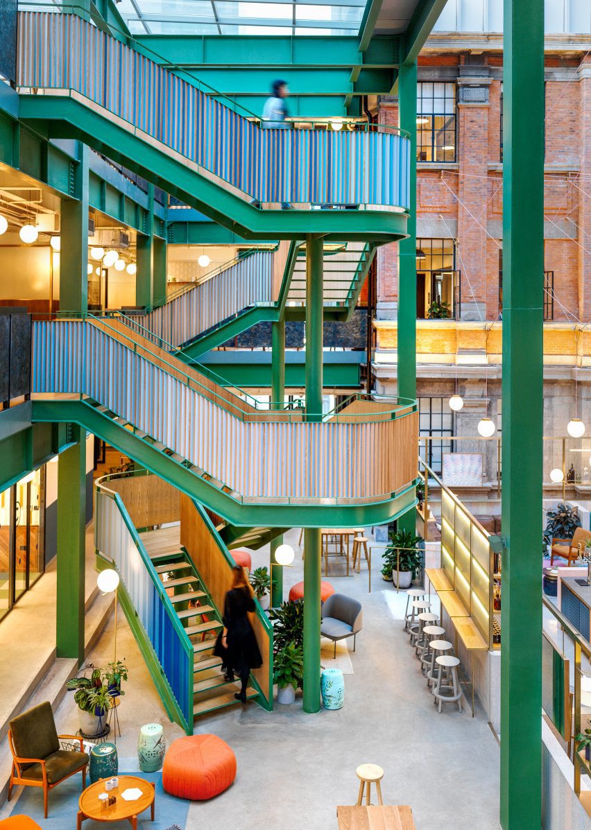
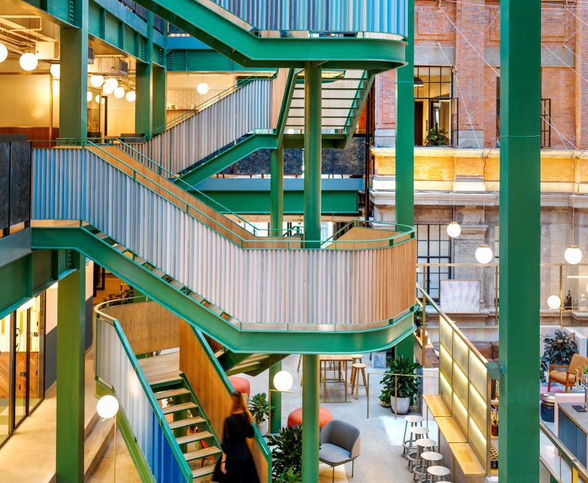
Wework Weihai Road, Shanghai, 2016

“Linehouse worked with Wework in 2016 to create their headquarters in a spectacular turn of the century brick building in Shanghai. Linehouse celebrated the grandeur of the former opium factory and artist residence, encapsulating the feeling of a grand hotel, transporting guests and members on an unexpected journey of whimsy, voyeurism and festivity.

“The heritage facade surrounds the central atrium. A curved terrazzo tray was inserted to define the space, and pastel diagonal strips in blue, green, pink and grey wrap the floor and wall, creating a hardscape carpet.

“A bespoke lighting installation is suspended in the triple-height space. A new sculptural staircase was inserted to connect all three levels of the main public areas.”


Dezeen Awards China 2023 judge Alex Mok interior project
Photo is by Dirk Weiblen

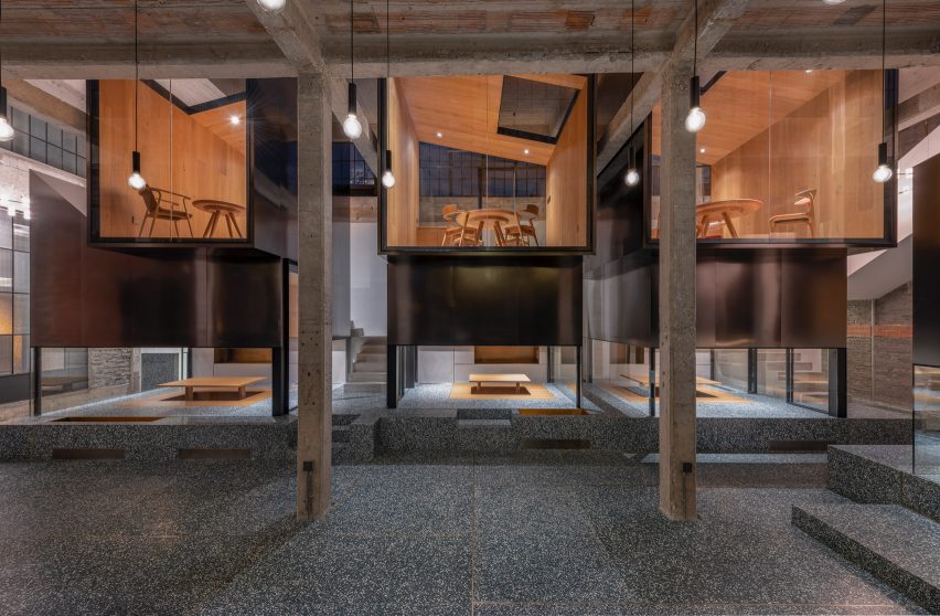
Tingtai Teahouse, Shanghai, 2018

“Tingtai Teahouse was completed in 2018 in a former factory space and art gallery in Shanghai’s Moganshan Road art district. We stripped the space completely to reveal the beautiful patina of the original factory with concrete beams and columns as well as the brick walls.

“The teahouses are modern architectural responses to the raw factory interior. They read as singular insertions that contrast with the rough brick and concrete interior and reflect the surroundings. The upper rooms in particular have strong relationships with the existing building in the way they connect to the original clerestory windows.

“With each of these rooms bookended with full-height glazing, guests become spectators to the activities below. Each room has a different roofline, which forms modern architectural puzzle spaces where tea drinkers can enjoy this age old drink with a new perspective. “

Find out more about Tingtai Teahouse ›


Dezeen Awards China 2023 judge Alex Mok interior project
Photo is by Wen Studio

Coast, Shanghai, 2022

“The Coast restaurant in Shanghai recalls a deep connection with coastal elements and Mediterranean soul. Linehouse transformed a three-storey building into a vertical journey of refined rusticity.

“Colours and materials across the three floors change, telling different parts of the story. Green earthy tones on the ground floor link the garden to the open cafe space, while the red fire tones on the first floor reflect the dining room centred on the parrilla grill. On the second floor black yakisugi wood contrasts against the whitewashed flanked stone walls and the existing traditional timber trussed ceiling.”

Find out more about Coast ›


Dezeen Awards China 2023 judge Alex Mok interior project
Photo is by DOF Sky|Ground

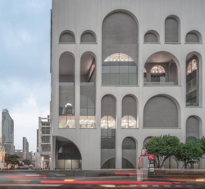
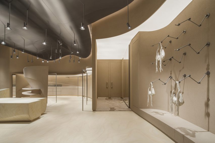
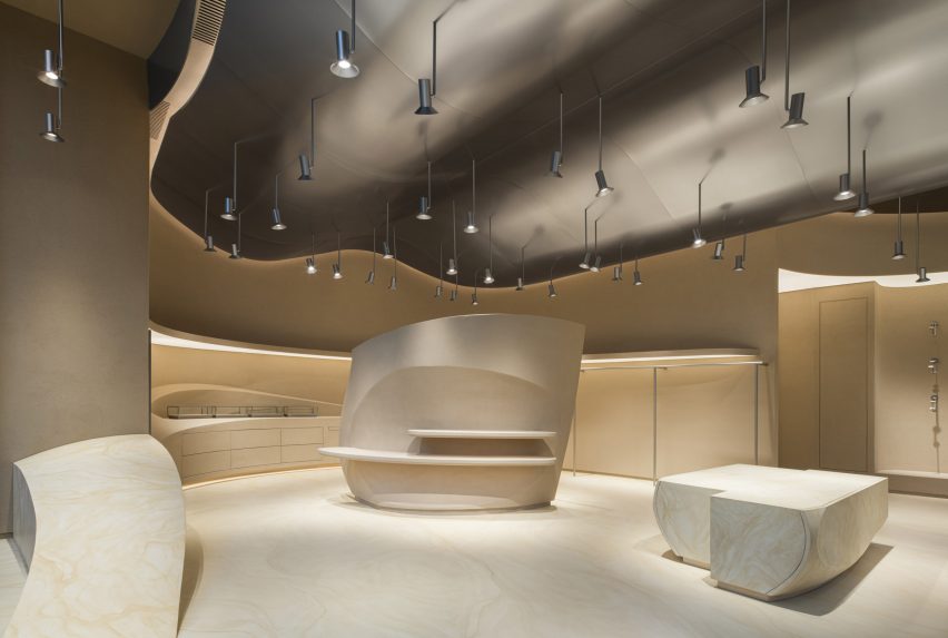
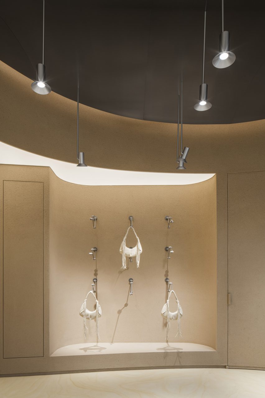
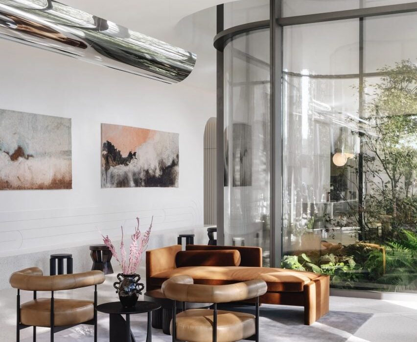
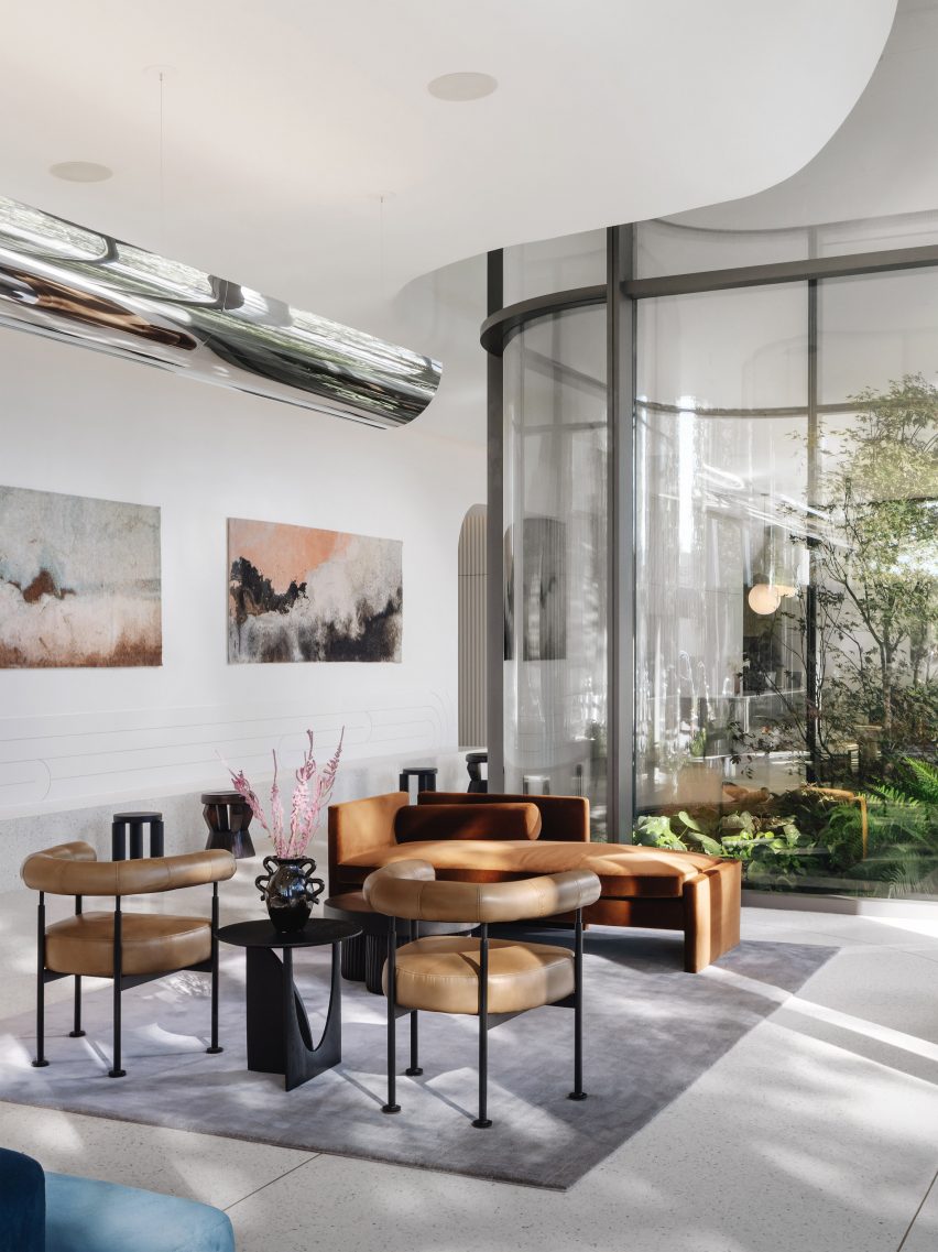
Central World, Bangkok, 2023

“Central World is our largest architectural project to date; a renovation project of an existing shopping centre called Isetan in Bangkok. Linehouse was commissioned to design the exterior facade and seven floors of retail space including a food court.

“The project was located in an area once abundant in lily pads. Linehouse examined the stemming, radiating and circular profile of the lily pads, translating this into a spatial narrative of the exterior and interior condition.

“The exterior is a double-layered, arched facade. The front layer was defined by concrete form and the back layer rendered in black. The arches stem in various heights and widths shifting on the two planes, creating interesting intersections which operate as framed views through to the interior.

“Linehouse punctuated the arches to allow green terraces, providing a depth to an otherwise flat elevation, and blurring the exteriors and interiors.”


Dezeen Awards China 2023 judge Alex Mok interior project
Photo is by Jonathan Leijonhufvud

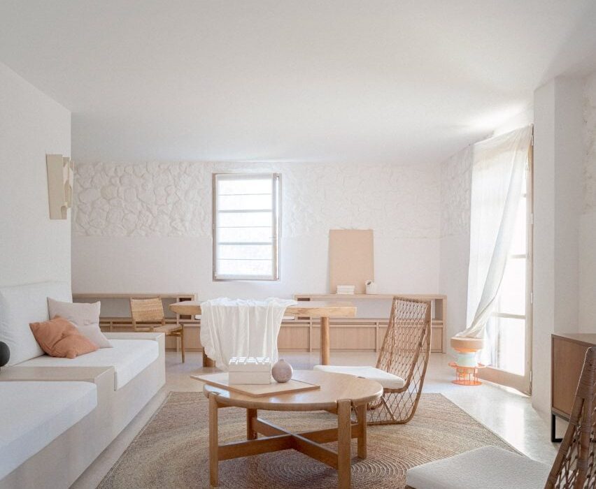
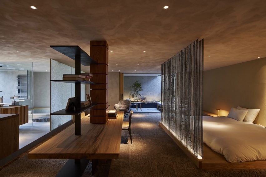
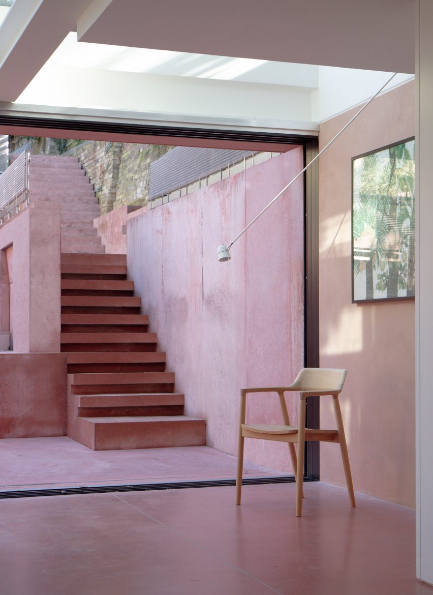
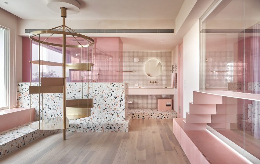
Ying’n Flo, Hong Kong, 2023

“Aiming to break the traditional hotel narrative of serious spaces and strict boundaries, Ying’n Flo is a lifestyle guesthouse for modern day travellers in Hong Kong.

“The spaces were designed to have a warm, welcoming and familiar feel, emphasising functionality and quality. Against this backdrop of curated simplicity is an edge of youthful attitude and local context, with vibrant elements giving the hotel its own unique flavour.”

Find out more about Ying’n Flo ›

Dezeen Awards China 2023

Dezeen Awards China is the first regional edition of Dezeen Awards, to celebrate the best architecture, interiors and design in China. The annual awards are in partnership with Bentley Motors, as part of a wider collaboration that will see the brand work with Dezeen to support and inspire the next generation of design talent in China.

Reference

Exterior of Larch Loft extension
CategoriesInterior Design

Whittaker Parsons crowns London mews house with “bolthole” extension

Using a combination of copper, larch and structural insulated panels, architecture firm Whittaker Parsons has added an additional storey to a contemporary mews house in Stoke Newington to house a bedroom suite.

Originally built in 2005, the property belongs to a couple with two older children, who have lived here for the last decade.

Exterior of Larch Loft extension
Whittaker Parsons added an additional storey to a London mews house

The family asked Whittaker Parsons to provide more space with the addition of a loft, as well as to revamp the lower floors including the studio on the second floor, which was reconfigured to create a well-proportioned workspace complete with its own library.

Daylight floods the new third storey, bouncing off lime-plastered walls while carefully positioned windows provide views of tree canopies and across rear gardens from window seats and the bespoke bed.

“We set out to design a beautiful, healthy, serene retreat, in which the homeowners could immerse themselves in the beauty of natural materials, a bolthole in the middle of north London,” Whittaker Parsons told Dezeen.

Larch staircase leading up to Larch Loft extension in London
The extension is accessed via a larch-clad staircase

With efficiency and quality in mind, the studio used prefabricated structural insulated panels (SIPs) to construct the additional storey, with the aim of minimising waste and saving time.

“Compared to standard timber construction, it is simpler to control the quality of onsite workmanship and achieve a more robust, air-tight building envelope,” the team explained.

Larch Loft extension in London by Whittaker Parsons
Generous windows provide views of the surrounding area

Externally, the extension is set back from the street elevation and finished in materials that mirror the surrounding architecture, including black-stained timber cladding, brick slips and patinated copper to tie in with the copper facade on the second floor below.

Internally, the triangular arrangement of the larch beams was developed to work with the load path of the existing building and the irregular form of the loft.

“The intention was to make visible and celebrate the structural effort that went into creating this new space,” Whittaker Parsons explained.

Man sitting on window seat of London extension by Whittaker Parsons
Integrated window seats provide a place to rest

The practice created a tranquil master bedroom with a larch-clad and lime-rendered interior, bespoke larch bed frame and walk-in wardrobe made from low-formaldehyde furniture board.

As the unsealed lime plaster wall finish cures, the lime will absorb almost as much carbon as was emitted in its production, the studio claims.

“Lime render is a calming tactile material, characterful and soft,” said Whittaker Parsons. “It is a low-carbon alternative to gypsum plaster. It’s also a hygroscopic material, so it naturally moderates the moisture level in the bedroom.”

Used alongside the render, white oiled larch panelling spans the spaces between the exposed larch beams, improving acoustic absorption.

“Often in bedrooms, the ceiling is the most important yet neglected surface,” the studio said. “The larch adds a sense of warmth, calm, and character to the space, creating an articulated ceiling at the top of the house – almost a reward for climbing all those stairs.”

Custom larch bed by Whittaker Parsons
Whittaker Parsons also created a custom larch-wood bed for the interior

In the adjoining skylit shower room, fluted travertine tiles line the walls, enveloping the shower area and complementing the travertine floor tiles.

“The roof light to the shower oversails the fluted travertine tiles, creating the impression that one is showering outside under the sky,” said Whittaker Parsons.

The basin, splashback and vanity unit are formed from unsealed Calacatta Rosato marble, which according to the studio provides a lower-carbon alternative to fired tiles.

Marble bathroom in Larch Loft extension
The vanity in the adjoining bathroom is formed from Calacatta Rosato marble

Overall, Whittaker Parsons says the project is “exceptionally low-carbon”, with the bulk of its embodied emissions coming from the triple glazing, thermal insulation and a single steel beam used to create the opening for the staircase.

Founded by Matthew Whittaker and Camilla Parsons in 2015, Whittaker Parsons has completed a number of projects in the British capital including The Naked House, which was longlisted for sustainable interior of the year at the 2021 Dezeen Awards.

View from bathroom to bedroom in Larch Loft extension
The marble is paired with fluted travertine tiles

Other sustainably-minded extensions in London include Low Energy House in Muswell Hill, designed by local studio Architecture for London founder for its founder Ben Ridley.

The photography is by Jim Stephenson.

Reference

Holzweiler Chengdu store by Snøhetta
CategoriesInterior Design

Snøhetta creates Holzweiler’s store informed by Norwegian coastline

Architecture studio Snøhetta has completed a shop for fashion and lifestyle brand Holzweiler in Chengdu, China, informed by its Norwegian heritage.

Located in Taikoo Li mall in central Chengdu, the 130-square-metre store is Norwegian brand Holzweiler‘s first outpost outside of Scandinavia.

Holzweiler Chengdu store by Snøhetta
The exterior of the store is covered with LED screen

“The store features recurring themes of currents, reflections and contrasts inspired by landscapes and coastal movements, a bespoke concept of the forces of norwegian nature playing on our shared heritage,” Snøhetta explained.

“With the aim of transporting Holzweiler’s love and deep respect for its origins, there is an immediate and consistent reference to the natural world that harks to the brand’s home country.”

Holzweiler Chengdu store by Snøhetta
The interiors nod to the Norwegian coastal lines

The exterior of the store features a full-size LED screen, which will be used to display campaigns that showcase that brand’s connection to nature.

A glass wall framed with wavy lines divides the LED screen into two parts, revealing the store’s warm clay-toned interiors to visitors.

Holzweiler Chengdu store by Snøhetta
The reflective surface of the ceiling resembles sky and ocean

The entrance of the store was crafted from floor-to-ceiling sand-blasted stone that extend to the product display area where mechanical arms present Holzweiler’s signature silk, lambswool and cashmere scarf designs.

Wavy lines were widely adopted inside the store, as a nod to to the shorelines along Norway’s extensive coastline. A series of hanging lights were suspended from the reflective surface of the ceiling, which was clad in steel with a sandblasted finish.

The clothing racks made with the same steal material run along the curved wall, while the forms of the display tables placed in the centre of the space were designed to evoke coastal rock formations.

Natural materials were used throughout the store, sourced locally from China. Meanwhile, all fixtures within the store were designed to be flexibly dissembled and repurposed in the future.

Holzweiler Chengdu store by Snøhetta
A hero wall with mechanical arms is used to present Holzweiler’s signature products

The point of sale area is tucked away at the back of the store separated from the main shopping area to provide privacy for customers.

Snøhetta is a long-term collaborator of Holzweiler’s, having designed the company’s flagship store and showroom in Oslo, as well as its first international outpost in Copenhagen.

The Studio has recently completed a planetarium in France, featuring two domes surrounded by sweeping wooden walls and a shingle-clad viewing tower in Austria.

The photography is courtesy of Holzweiler.

Reference

MA House by Timothee Mercier from Studio XM
CategoriesInterior Design

Eight airy interiors that draw on Mediterranean living

With summer in full flow, we have gathered eight residential and hotel interiors for our latest lookbook that each has a breezy and cooling Mediterranean style.

Mediterranean interiors can often be defined by their minimal, paired back aesthetic that focuses on creating bright, airy and cool living spaces that offer an escape from the heat of the sun.

White-washed walls, exposed brick and stone or terracotta floors typically serve as the basis for these interiors with furniture made from natural materials.

From hotels in Greece built into caves to a home in a former ruin in France, here are eight interiors that are influenced by the Mediterranean.

This is the latest in our lookbook series, which provides visual inspiration from Dezeen’s archive. For more inspiration see previous lookbooks featuring Barbie-pink interiors, rustic interiors and Wes Anderson-style interiors.


MA House by Timothee Mercier from Studio XM
Photo is by Simone Bossi

MA House, France, by Timothee Mercier

Architect Timothee Mercier of Studio XM converted this former ruined farm building in Vacluse, France into a home that aimed to honour the original features of the building.

The interior of the home was blanketed in white, covering its walls and exposed stone surfaces. The space was sparsely decorated with light wood furnishings and natural materials to give the interior a Mediterranean feel.

Find out more about MA House ›


Casa A690 by Fino Lozano
Photo is by César Béjar

Casa A690, Mexico, by Delfino Lozano

Named Casa A690, this three-storey building dates back to the 1970s. It was renovated by Mexican architect Delfino Lozano who looked to combine Mediterranean and Mexican aesthetics.

“We use the term Mexiterraneo to describe the materials and feeling we try to give our projects, in which we interpret the Mediterranean architecture – simple, pure materials – and mix it with our Mexican traditional architecture,” said Lozano.

Find out more about Casa A690 ›


Berlin summer loft by Loft Szczecin
Photo is by Karolina Bąk

Berlin summer loft, Germany, by Loft Szczecin

Polish studio Loft Szczecin looked to historic Mediterranean architecture when overhauling the interior of this apartment in the suburbs of Berlin.

The brick walls of the home were painted white while the floors of the interior were finished with old bricks that were sourced from industrial demolitions across Poland. Throughout the apartment, doors were removed to create more of an open-plan interior.

Find out more about Berlin summer loft, ›


Pura Comporta by Falcão de Campos
Photo is by Fernando Guerra

Pura Comporta, Portugal, by Falcão de Campos

In Portugal, Lisbon studio Falcão de Campos implemented a Mediterranean-informed interior scheme throughout this triple-pitched roof beach house.

White walls were paired with minimal architectural detailing and finishes to achieve a Mediterranean look. A natural-toned rug was used to zone the living area, while a 10-person wooden table occupies the dining area of the home.

Find out more about Pura Comporta ›


Saint Hotel by Kapsimalis Architects
Photo is by Giorgos Sfakianakis

Saint Hotel, Greece, by Kapsimalis Architects

Greek architecture studio Kapsimalis Architects transformed a series of former homes, barns and cellars on the island of Santorini into a hotel with rooms in caves.

The interior was designed to match the all-white exterior of the hotel. Each of the rooms features an almost all-white finish with the exception of their poured concrete floors and furnishings.

Find out more about Saint Hotel ›


Summer house on the mountain by Kapsimalis Architects

Summer house, Greece, by Kapsimalis Architects

Large arched openings add character to the open-plan interior of these Santorini apartments, which were designed by Kapsimalis Architects.

Throughout the space, small, wood-framed windows pierce the walls and furniture was organised sparsely.

Find out more about summer house›


Las 3 Marías by Bajet Giramé and Nicolas Burckhardt
Photo is by José Hevia

Las 3 Marías, Spain, by Bajet Giramé and Nicolas Burckhardt

Terracotta tile floors, large arched openings and bi-folding glass doors blend the boundaries of the interior and exterior at this Spanish holiday home, which was designed by Bajet Giramé and Nicolas Burckhardt.

Much like homes found across the Mediterranean, white stucco covers its walls and Valencian terracotta tiles run through both the interior and exterior.

Find out more about Las 3 Marías ›


Woorak House in Palm Beach, Sydney designed by CM Studio
Photo is by Prue Ruscoe

Woorak House, Australia, by CM Studio

CM Studio looked to bring a coastal, Mediterranean feel to the interior of this home in Australia through the use of a paired back interior palette and natural materials such as wood, stone and paper.

In the dining room, a wooden table, chairs and bench were placed beside a glazed corner of the home beneath exposed beams that run through the home.

Find out more about Woorak House ›

This is the latest in our lookbook series, which provides visual inspiration from Dezeen’s archive. For more inspiration see previous lookbooks featuring Barbie-pink interiors, rustic interiors and Wes Anderson-style interiors.

Reference

Bedroom interior of Palau apartment by Colombo and Serboli Architecture
CategoriesInterior Design

Eight interiors that embrace the principles of wabi-sabi

In this lookbook, we collect eight interiors informed by the Japanese design philosophy of wabi-sabi, which celebrates imperfection and impermanence.

Notoriously difficult to define, wabi-sabi is a concept rooted in Zen Buddhism that author Beth Kempton describes as helping us “to see beauty in imperfection, appreciate simplicity and accept the transient nature of all things”.

In interiors, it is often associated with the blending of rustic and minimalist elements as well as natural, earthy tones and raw surfaces. Below are eight interpretations of the aesthetic from around the world.

This is the latest in our lookbooks series, which provides visual inspiration from Dezeen’s archive. For more inspiration see previous lookbooks featuring Japandi living rooms, bedrooms with earthy colour palettes and calming organic-modern interiors.


Bedroom interior of Palau apartment by Colombo and Serboli Architecture
Photo by Roberto Ruiz

Palau apartment, Spain, by Colombo and Serboli Architecture

Barcelona studio Colombo and Serboli Architecture sought to highlight the “imperfect” features of this apartment in a renovation project.

Rough-textured wooden beams were left exposed, with the contemporary elements prioritising sturdy, simple shapes like circles and squares.

Find out more about Palau apartment ›


Imperfect Residence by NC Design & Architecture
Photo by Harold De Puymorin

Imperfect Residence, Hong Kong, by NC Design & Architecture

Grainy wood and veiny marble come together as symbols of nature’s flaws at Imperfect Residence in Hong Kong.

NC Design & Architecture also introduced finishes such as oxidised bronze and textured plaster to heighten the feeling of a sanctuary in the city.

Find out more about Imperfect Residence ›


Kyiv apartment, Ukraine, by Sergey Makhno
Photo by Andrey Avdeenko

Kyiv apartment, Ukraine, by Sergey Makhno

Ukrainian architect Sergey Makhno is among the key European practitioners of the contemporary wabi-sabi style.

He applied the concept at his own apartment in Kyiv (top and above), installing oak beams in the living room alongside furniture specifically designed for the home to complement his collection of ancient Eastern European ceramics.

Find out more about this Kyiv apartment ›


C4L House by Cubo Design Architects
Photo by Koji Fujii/TOREAL, Takashi Yasui

C4L House, Japan, by Cubo Design Architects

Traditional Japanese materials sit alongside contemporary finishes at this house in  Tokyo designed by Cubo Design Architects.

“We believe houses that are rooted in an understanding of Japan’s cultural context and a respect for the skills and innovations of our ancestors, which can nevertheless be passed onto future generations, are the kind of houses we should be building in Japan today,” said founder Hitoshi Saruta.

Find out more about C4L House ›


Interior of Butterfly House in Australia by Dane Taylor Design
Photo by Daniel Mulheran

Butterfly House, Australia, by Dane Taylor Design

This home on the coast of New South Wales was designed to have a therapeutic effect for its owner, who lives with multiple sclerosis.

Dane Taylor Design interpreted accessible design principles through a wabi-sabi lens, using a warm material palette and understated furniture pieces.

Find out more about Butterfly House ›


Tilden Hotel by Studio Tack
Photo courtesy of Tilden Hotel

Tilden Hotel, USA, by Studio Tack

Brooklyn design firm Studio Tack decided to evoke wabi-sabi in its revival of this art-deco hotel in San Francisco.

In a subtle nod to the philosophy, clean lines were mixed with organic textures throughout the distinctly modernist interior.

Find out more about Tilden Hotel ›


Wabi-Sabi house by Soar Design
Photo by Soar Design Studio

Wabi-Sabi House, Taiwan, by Soar Design Studio and Chen-Tien Chu

Taiwanese practice Soar Design Studio and architect Chen-Tien Chu created an open-plan layout when renovating this house in Taichung, allowing all the spaces to have a connection to the outdoors via a series of garden terraces.

In the lounge area, the wooden deck extends from the outside into the room, enhancing the feeling of nature being invited in.

Find out more about Wabi-Sabi House ›


Silo apartment by Arjaan de Feyter
Photo by Piet Albert Goethals

Silo apartment, Belgium, by Arjaan De Feyter

Belgian interior architect Arjaan De Feyter is another prominent proponent of wabi-sabi design, as seen in his renovation of this apartment that occupies the former silos of a distillery outside Antwerp.

Here, he left the structure’s curving concrete walls exposed and applied a micro-topping surface to the floors while installing bespoke oak furniture designed in collaboration with Tim Vranken.

Find out more about Silo apartment ›

This is the latest in our lookbooks series, which provides visual inspiration from Dezeen’s archive. For more inspiration see previous lookbooks featuring Japandi living rooms, bedrooms with earthy colour palettes and calming organic-modern interiors.

Reference

Living room of City Beach residence
CategoriesInterior Design

Design Theory updates mid-century coastal home in Perth

In the City Beach suburb of Perth in Western Australia, interiors studio Design Theory has updated a tired house from the 1960s while remaining true to the rich palette of natural materials in the original design.

The young client wanted a home where she could entertain friends and live with her dogs in a durable, easy-to-clean, pet-proof home with a reworked plan making space for three bedrooms and two bathrooms.

Living room of City Beach residence
Design Theory has renovated a 1960s house in Perth

“The brief was, on the surface, simple: to update the home while keeping its considerable mid-century charm,” said Design Theory.

“While its strengths lay in its architectural form and south-facing windows, our innovative approach to the project was essential in bringing contemporary functionality and sustainability to the fore,” the studio added.

“By specifying with our client’s lifestyle in mind and considering every detail, she feels relaxed to use the house the way she wants to.”

Living room of home in Perth by Design Theory
Carpet tiles bring tactility into the sunken lounge

Once the project was underway, Design Theory quickly discovered that the structure was largely rotten and had suffered significant termite damage, so extensive restoration work was required.

“We established an early rationale to restore base-building elements in keeping with the original architecture and interior elements,” the studio said.

“Joinery, finishes and furniture would be new, informed by mid-century design. This allowed the home to evolve yet respect the heritage of this special building.”

Kitchen of City Beach residence
Yellow mosaic tiles feature across the kitchen counter

Otherwise, the house only needed sensitive restoration and a light touch to bring it up to date, according to the studio, due to its prescient emphasis on natural light, fresh air and modern, unpretentious living.

“Our design cues were taken from the era of the house’s original design, a time of humbler, honest materials and restrained detailing,” said Design Theory co-founder Lisa Reeves.

“Where cabinetry needed restoration, it was updated in respectful ways, always with a nod to what may have come before us.”

Hallway of house in Perth by Design Theory
Design Theory introduced Blackbutt timber details to the interior

The material palette celebrates warm, earthy materials: exposed brick in terracotta tones, native Blackbutt timber and a cork-like Forbo Marmoleum on the floors.

In the sunken lounge area, carpet tiles bring an added element of comfort and a distinctive gridded visual effect.

The heavy use of richly toned timber and brick is balanced by the white of the painted wall sections, the grid-like window frames and low-hanging pendant lighting.

For the kitchen counters and the bathrooms, simple mosaic tiles continue the textural theme, while referencing the home’s early-60s origins.

“We embraced a quintessentially West Australia landscape-inspired palette of Eucalyptus greens, warm timbers and sunset oranges,” the studio said.

Study of City Beach residence
Forbo Marmoleum flooring was added for textural interest

In the kitchen, subtle detailing on the cabinetry such as the full-width handles adds visual interest without grabbing undue attention, while an orange range cooker adds a retro touch.

The client acquired several pieces of vintage furniture along with the house, which Design Theory was keen to retain and restore.

Bathroom in Perth house by Design Theory
Mint green tiles feature throughout one of the two bathrooms

As a counterpoint to these mid-century elements, contemporary furniture in gently curving forms softens the rigorous lines of the original architecture and prevents the interiors from feeling like a period pastiche.

Key pieces of hardware such as original door furniture and pendant lighting were also refurbished and reinstated, “lending an authenticity to the home’s new life”, according to the studio.

Mosaic bath tub in Perth house by Design Theory
The built-in bathtub is also made from multicoloured mosaic tiles

Other residential projects in Perth that have been featured on Dezeen include a family home formed from arched panels of precast concrete and a wood-and-brick extension for a couple of empty nesters.

The photography is by Jack Lovel.


Reference

Hallway of Sunderland Road house
CategoriesInterior Design

2LG Studio brings colour and personality into London family home

Ornately corniced ceilings were preserved and painted pastel inside this detached Edwardian house in southeast London, which local firm 2LG Studio has renovated for a returning client.

Set in the leafy residential area of Forest Hill, the house on Sunderland Road belongs to a couple who needed space for their three young children to grow and play.

Hallway of Sunderland Road house
2LG has completed Sunderland Road house in Forest Hill

“Having designed this couple’s previous home, we had a strong sense of their tastes and wanted to evolve that for them in this house,” 2LG Studio founders Jordan Cluroe and Russell Whitehead told Dezeen.

“We wanted to bring out their characters by emboldening their love of colour and finding ways to build pattern and joy into the materiality of the home,” the duo added.

“The intent here was to respect the period elements of the building, whilst reflecting the modern style of the family who live there.”

Open-plan living room and kitchen in London house by 2LG
Hand-printed wallpaper by Custhom Studio features in the lounge and hallway

Throughout the house, playful elements are in balance with a more serious aesthetic.

Instead of treating the home’s elaborate ceiling mouldings separately – as tradition dictates – 2LG Studio applied a colour-block philosophy and painted them in the same pastel tones used across the upper walls and ceilings.

The studio drew on a range of references for the interior, from 1980s colours to Italian design elements such as marble and Murano glass lighting, all the way to the Scandinavian influences seen in the natural materials and minimalist approach to furnishing.

Kitchen and dining room of Sunderland Road house
The kitchen is defined by sky-blue cabinetry and marble countertops

Creating impact in the entrance hall is a hand-printed wallpaper, designed by 2LG Studio with long-term collaborator Custhom Studio and used here in a bespoke calamine-pink colourway that’s repeated in the connecting spaces throughout the house, as well as in the rear living area.

“It creates a welcoming, human feel as soon as you enter,” the design team said.

This ballet-slipper colour is paired with a brighter candy pink, bringing calm and warmth to the overall scheme.

Lounge of Sunderland Road house
2LG painted ceilings, mouldings and upper walls in pastel colours

Pink-heavy palettes have become a signature for 2LG, also reflected in the natural pink undertones of the extra-wide Douglas fir floorboards that feature throughout the house alongside a grey poured-resin floor in the kitchen.

“The floorboards set the tone with a nod to Scandi minimalism, adding a natural soul throughout that unites the bolder elements,” said 2LG Studio.

In the kitchen, sky-blue cabinetry is used alongside marble countertops and splashbacks, with arched forms uniting the two finishes while pink elements such as bar stools pop against this calm backdrop.

“The colours are a key part of the atmosphere and identity of this house,” said 2LG. “The blues gets deeper and bolder as you move upstairs into the study and the family bathroom.”

“Primary red details give structure to the colour palette in the living room. Pastel green in the baby’s room is serene and fresh, warmed up with a mix of wood tones and creams.”

Bedroom of house in London by 2LG
Pink details feature throughout the home’s interiors

The project features bespoke joinery including a playhouse on stilts in one of the kids’ rooms alongside existing 2LG pieces such as the Luca bedhead in the loft bedroom and the Tilda sofa, both designed for London furniture company Love Your Home and upholstered here in Kvadrat x Raf Simons fabric.

“The fitted elements of the furniture give a sense of coherent design and function to the spaces whilst the classic design pieces bring a curated gallery feel, not unlike a contemporary luxury fashion store,” said 2LG Studio.

Children's bedroom of house in London by 2LG
2LG designed custom joinery including a stilted playhouse

Various recycled materials provide textural interest throughout the house, among them the recycled plastic wall lights in the living room by Spark and Bell.

2LG Studio also added a pink Foresso top made using waste wood chips and resin to the dining table, while the bespoke bathroom cabinet was made using leftover Douglas fir floorboards with recycled plastic details by UK company Smile Plastics.

Children's bedroom in Sunderland Road house
Pastel green was used to finish the baby’s room

Since Cluroe and Whitehead founded their design practice in 2014 under the name 2 Lovely Gays, the studio has completed a number of residential projects in the British capital.

Among them is the couple’s own home and office – to which they recently added a garden pavilion with a “touch of Beetlejuice” – and an equally colour-led renovation of a period property in the Heaver Estate conservation area.

The photography is by Megan Taylor.

Reference

Kitchen interior of Cloudy Outlines apartment by Note Design Studio
CategoriesInterior Design

Note Design Studio enriches Cloudy Outlines aparmtent with curvy stucco

Note Design Studio has updated this formerly characterless apartment in Stockholm to feature bespoke Douglas fir joinery and curvy stucco ceilings designed to suggest cloud formations.

Although the Cloudy Outlines apartment sits within a building dating back to 1842, Note Design Studio says the interior had been stripped of any historic charm and “traces of craftsmanship” during previous renovations.

Kitchen interior of Cloudy Outlines apartment by Note Design Studio
Douglas fir joinery appears throughout the Cloudy Outlines apartment

It also had a poor layout, with a living area that could only be accessed via a dark, lengthy corridor snaking around the back of the apartment while the remaining rooms were awkwardly shaped and difficult to furnish.

The studio decided to redesign the home from scratch, knocking down all of its internal walls to form a more cohesive floor plan.

Interior of Cloudy Outlines apartment by Note Design Studio
The apartment’s corridor was repositioned to allow for more natural light

The corridor was repositioned to run parallel to the building’s window-lined facade and, as a result, is now flooded with natural light.

Rooms were classically finished with white-painted walls and Douglas fir flooring.

Dining room interior of Cloudy Outlines apartment by Note Design Studio
Curved stucco gives the ceilings a soft, cloud-like quality

Billowy stucco moulding was added throughout to give a soft “cloudy” quality to the ceilings and provide a contrast with the “rationality and material robustness” of the apartment, the studio explained.

“With the previous interior and finishes removed, a new holistic design was developed with a limited amount of design principles, all with a timeless ambition,” Note Design Studio said.

In the kitchen, Douglas fir was used again to create simple cupboards and a striking circular cover for the extractor fan.

The countertop, on the other hand, is overlaid with a sleek metallic finish.

Hallway of Stockholm apartment by Note Design Studio with wooden door
Furnishings in pastel hues disrupt the otherwise neutral colour scheme

All of the apartment’s doors, as well as its window sills, are also made from Douglas fir.

The material palette only deviates slightly in the bathroom, which features grey-tile surfaces and flecked terrazzo-like flooring.

Bedroom interior of Cloudy Outlines apartment by Note Design Studio
The stucco effect can also be seen in the bedroom

The Cloudy Outlines apartment is one of several residential renovations that Note Design Studio has completed in the Swedish capital, where the firm is based.

Among them is Habitat 100 – an apartment littered with references to the Swedish Grace movement – and the Mantelpiece Loft, which is distinguished by its colour-block bedrooms.

The photography is courtesy of the studio.

Reference

Living room of Minimal Fantasy, a pink apartment in Madrid
CategoriesInterior Design

Eight interiors where Barbiecore pink adds a playful touch of colour

As the upcoming Barbie film has created a shortage of pink colour and launched a real-life dollhouse in Malibu, we gathered eight pink interiors to exemplify the Barbiecore aesthetic for this lookbook.

The pink hues that are usually associated with Barbie, a children’s toy first launched by manufacturer Mattel in 1959, are influencing both clothes and interiors ahead of Great Gerwig’s live-action Barbie film.

The style, which has become known as Barbiecore, can add a joyful touch of colour to otherwise pared-back interiors, or be used as a hyper-bright nod to 1980s opulence.

Here, we have gathered eight interiors where pink was used to give interiors additional warmth and a touch of whimsy.

This is the latest in our lookbook series, which provides visual inspiration from Dezeen’s archive. For more inspiration see previous lookbooks featuring rustic interiors, Wes Anderson-style interiors and welcoming wood-panelled dining rooms.


Living room of Minimal Fantasy, a pink apartment in Madrid
Photo by JC de Marcos

Minimal Fantasy, Spain, by Patricia Bustos Studio

The Minimal Fantasy apartment is anything but minimalist – instead, Patricia Bustos Studio aimed to create an “aesthetic madness” for the interior of this Madrid rental in a 1950s residential building.

The holiday home features 12 different shades of pink, with the entire living room covered in a pastel bubblegum pink.

“Pink vindicates the fall of stereotypes – everything is possible, nothing is planned or established and that’s the beauty of it,” the studio told Dezeen.

Find out more about Minimal Fantasy ›


San Francisco Residence by Jamie Bush
Photo by Matthew Millman

San Francisco house, US, by Jamie Bush

A more discrete take on adding pink to an interior can be found in this San Francisco house by architect Jamie Bush, who gave it an overhaul using an eclectic array of furniture.

Bush added pink walls to the dining room, where they contrast against dark-wood vintage furniture and white details including a lamp and sheer curtains to create a playful, yet elegant atmosphere.

Find out more about San Francisco House ›


Pink bedroom in Barbie's Malibu Dreamhouse
Photo by Hogwash Studios

Barbie’s Malibu Dreamhouse, US, by Ken

The most Barbiecore interior of them all can naturally be found in the Barbie Malibu Dreamhouse, which is being rented out by the doll’s boyfriend Ken on Airbnb.

Inside the California mansion, located beachside in Malibu, guests can enjoy pink rooms including the bright-fuchsia bedroom that has been decorated with cowboy hats, boots and cowhide rugs to add more “Kenergy”.

Find out more about Barbie’s Malibu Dreamhouse ›


Mixtape Apartment by Azab
Photo by Luis Díaz Díaz

Mixtape apartment, Spain, by Azab

A dusky baby-pink kitchen decorates the Mixtape apartment in Bilbao, which was designed by architecture studio Azab.

The white and pink cupboards are boarded by light timber strips, and the appliances in the room have also been painted pink. A multicoloured floor with pale green and yellow as well as darker red herringbone tiles give the space a vibrant feel.

Find out more about Mixtape apartment ›


13 Square Metre House By Studiomama
Photo by Rei Moon of Moon Ray Studio

130-square-metre-house, UK, by Studiomama

“London’s smallest house”, a conceptual design by Studiomama, features an abundance of pink details throughout, including in its plywood-clad kitchen.

Here, the clever fold-out seating has been decorated with blush-pink cushions and pillows, with a pink cushion also forming a cosy backrest.

Find out more about 130-square-metre house ›


Pink interior of Moco shop in Barcelona, designed by Isern Serra and Six N. Five
Photo by Salva Lopez

Moco Barcelona, Spain, by Isern Serra

A computer-generated image was transformed into a real-life interior for the Moco Barcelona store, a rose-coloured shop inside the city’s Moco Museum.

Designer Isern Serra used pink micro-cement to achieve the same uniform, ultra-smooth surfaces as those of the computer-generated image, creating a dream-like interior filled with rounded corners and arches.

Find out more about Moco Barcelona ›


Interior of Pigment House by Unknown Works
Photo by Lorenzo Zandri

Pigment House, UK, by Unknown Works

London studio Unknown Works went all in on the pink for Pigment House, a Hampstead home that was renovated to add a pink-toned patio area.

While not technically part of the interior, it adds a splash of colour to the ground floor area, and is used for indoor-outdoor living in the summer months. The choice of pink was a reference to the colourful buildings of Mexican architect Luiz Barragán.

Find out more about Pigment House ›


Cats' Pink House by KC Design Studio
Photo by Hey! Cheese

Cats’ Pink House, Taiwan, by KC Design Studio

This holiday home in Taiwan got its name, Cats’ Pink House, as it includes cat ladders, a rotating carousel-shaped climbing frame and a fluffy pink cat swing.

KC Design Studio used a mineral-based paint to create the pink walls throughout the home, which also features a pink bathroom – with a pink cat litter box.

Find out more about Cats’ Pink House ›

This is the latest in our lookbook series, which provides visual inspiration from Dezeen’s archive. For more inspiration see previous lookbooks featuring rustic interiors, Wes Anderson-style interiors and welcoming wood-panelled dining rooms.

Reference

Lounge area in front of glazed atrium
CategoriesInterior Design

Michael Hsu utilises soft shapes for Austin skyscraper interiors

US studio Michael Hsu Office of Architecture has designed the common areas and amenity spaces for a residential skyscraper in Austin, Texas, which include a circular outdoor swimming pool.

The 51-storey 44 East Avenue development on the city’s riverfront was designed by Page Architects, and includes 330 condominiums and a variety of shared amenities for residents.

Lounge area in front of glazed atrium
The ground-floor lobby of 44 East Avenue includes a glazed atrium that divides the space

Local studio Michael Hsu Office of Architecture took an organic approach when designing the communal spaces, introducing soft shapes and natural materials to the glass and concrete structure.

“44 East combines nature and design with the idea of home,” said studio founder Michael Hsu. “It’s an unexpected expression of what beautiful, livable, modern spaces can be.”

Dark green sofa, pale pink rug and wooden coffee table
Michael Hsu Office of Architecture has layered a variety of vintage and custom furniture in the lobby

The bright lobby features light colours, curved surfaces, and a blend of hard and soft materials.

Poured concrete terrazzo floors are intended to echo the gravel of the nearby riverside trail, while plaster ceilings are subtly smooth-edged to mimic the undersides of boats.

Rounded mint-green reception desk in front of white tambour wall
A rounded mint-green reception desk sits in front of a white tambour wall

A glazed atrium with curved corners divides the ground floor and brings the landscaping by DWG further into the building.

Lounges on either side are furnished with a mix of vintage and contemporary pieces, which add colour and texture.

Bright lounge space with a variety of seating areas
On the 11th floor, spaces feature pastel tones to match the interiors of the residences

The reception desk has rounded edges and sides, and a glossy mint-green finish. It sits on a chrome base that matches a custom pendant light over a nearby seating area.

“[The communal areas are] a completely designed experience, one that allows for a multitude of ways of living,” Hsu said. “It represents creativity and design without pretension.”

Circular swimming pool with loungers and seating around the perimeter
A circular outdoor swimming pool has loungers and pebble-shaped islands at its shallow ends

On the 11th floor, a series of spaces are oriented towards views of the Colorado River and the leafy neighbourhoods to the south.

A circular outdoor swimming pool features loungers dipped into the shallow water and a series of pebble-shaped islands.

Covered patio with a tree growing through a hole in the canopy
A tree grows through a hole in the canopy that covers a patio area for grilling

Adjacent is a partially covered patio for barbecuing and dining al fresco, oriented around a planter with a tree that grows up through a hole in the slatted canopy.

Indoor spaces on this level are decorated in pastel hues to match those found in the residences, which were designed by Page.

Further amenity areas on the 37th floor feature jewel tones and darker materials, such as the stone flooring, as well as fixtures including a large moon-like pendant light above a circular sofa.

“We hope that this space feels both fresh and welcoming, a place that has new moments to discover, but that is comfortable and familiar,” said Hsu. “Design here is part of the resident’s everyday experience, rather than reserved for a special occasion.”

Lounge with dark furniture and a view of the Austin skyline
Another lounge on the 37th floor has darker decor and a view of the Austin skyline

Austin continues to grow as a desirable place to live and work, and has seen a boom in development across residential, commercial and hospitality sectors as a result.

Plans for a supertall skyscraper in the city were unveiled in November 2022, although cut back significantly six months later, leaving another supertall by KPF in the running to become Texas’ tallest building.

Exterior view of 44 East Avenue with the Colorado River and Austin skyline behind
44 East Avenue is located beside the Colorado River, east of Downtown Austin

Meanwhile, a concrete office complex, a sculptural tower, and a technologically advanced sports arena have all been completed in Austin over the past year.

Michael Hsu Office of Architecture has also wrapped up a string of projects in its home state, from converting a 1930s Austin church into a design office to designing a cosy Japanese restaurant in Houston.

The photography is by Chase Daniel.


Project credits:

Common areas/amenity spaces: Michael Hsu Office of Architecture
Home interiors: Page
Landscape architect: DWG
Developer: Intracorp
Pre-construction: Flintco
Civil engineering: WGI

Reference