Exterior image of House in Hayashisaki Matsue Beach
CategoriesInterior Design

Akio Isshiki Architects marries old and new with Japanese home and restaurant

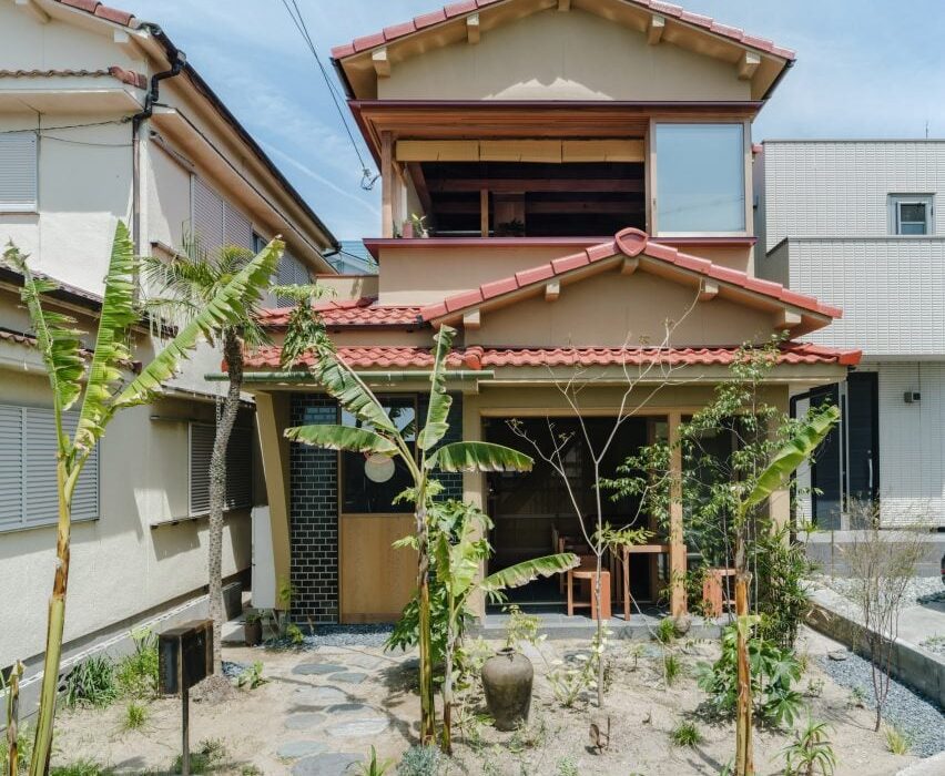
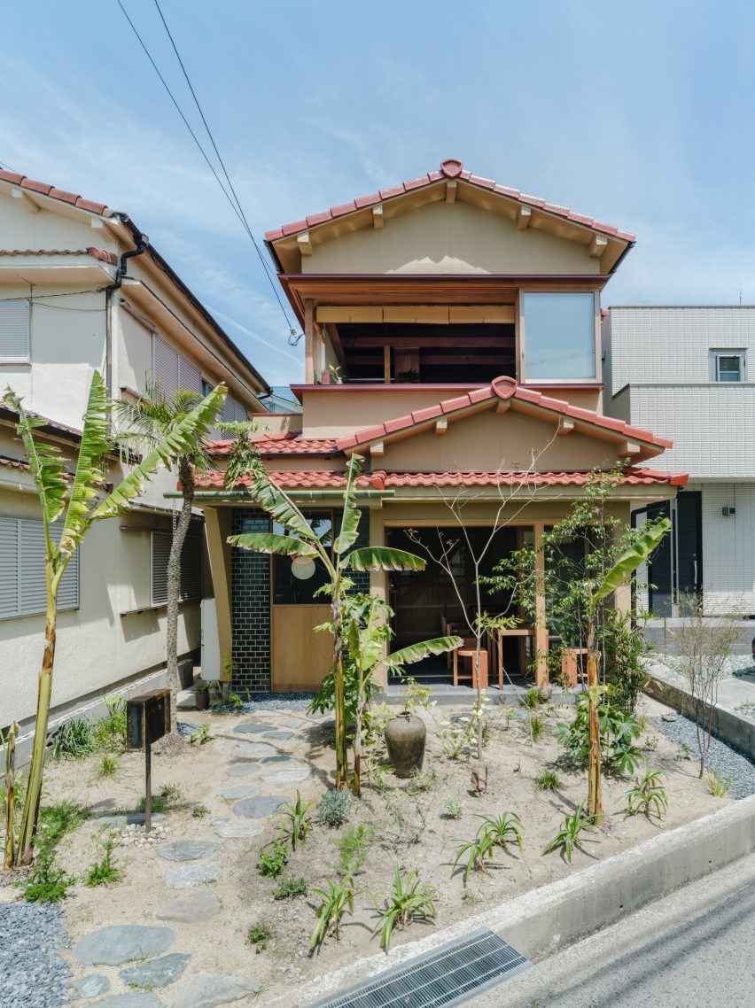
Japanese studio Akio Isshiki Architects has transformed an old wooden building into a warm-toned home and public restaurant named House in Hayashisaki Matsue Beach.

Located on a coastal street in Akashi in southern Japan, the mixed-use space was built within a 50-year-old building for a local designer and features a curry restaurant as well as residential and working spaces.

Designed to reflect traditional Japanese dwellings, the home and restaurant are contained within a wooden building that was previously dark and separated.

Exterior image of House in Hayashisaki Matsue Beach
House in Hayashisaki Matsue Beach was designed by Akio Isshiki Architects

During the renovation, Akio Isshiki Architects aimed to pair existing elements with modern features to reflect the mixed-use nature of the project.

“The house was divided into small rooms, narrow and dark,” studio founder Akio Isshiki told Dezeen.

“It was very old and damaged, but fortunately the carpenter had done a good job, there were no leaks, and the structure was solid.”

Interior photo of House in Hayashisaki Matsue Beach
It is located in Akashi

Accessed from the roadside, a series of circular stones form a path that leads through the planted front garden and curves to extend along the front of the building, providing access to the ground-floor restaurant.

Here, a stepped sheltered porch features external seating and is separated from the interior space by a wide sliding glass door set in a timber frame, which offers views into the garden and can be fully opened to connect the dining space to the outside.

Interior photo of the restaurant at House in Hayashisaki Matsue Beach
The structure contains a restaurant and a home

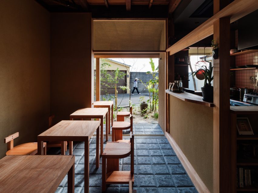
Inside, the floor has been coated with dark tiles informed by the history of the area, which was formerly a large tile producer.

“These tiles were handcrafted one by one by tile craftsmen in Awaji, with the image of lava stone pavements seen in cities in Central and South America superimposed on the texture and edge shape,” said the studio.

Interior photo of House in Hayashisaki Matsue Beach
It draws on traditional Japanese homes

Wooden furnishings, including bespoke D-shaped chairs designed by the studio and created by a local woodworker, are arranged throughout the dining space at the front of the building.

“To ensure stability even on uneven floors, three legs are used as a base for the chairs, and the legs are made of a thick material so that they do not fit in the joints of the Kawara tiles,” said Isshiki.

“I aimed for a primitive design with an unknown nationality, with as simple and crude a composition as possible.”

Separated from the main space by an earth-toned counter, the kitchen is tucked into one side of the dining room and features walls clad in wooden panels and white tiles, along with a lighting fixture formed from two circles that hangs in the street-facing window.

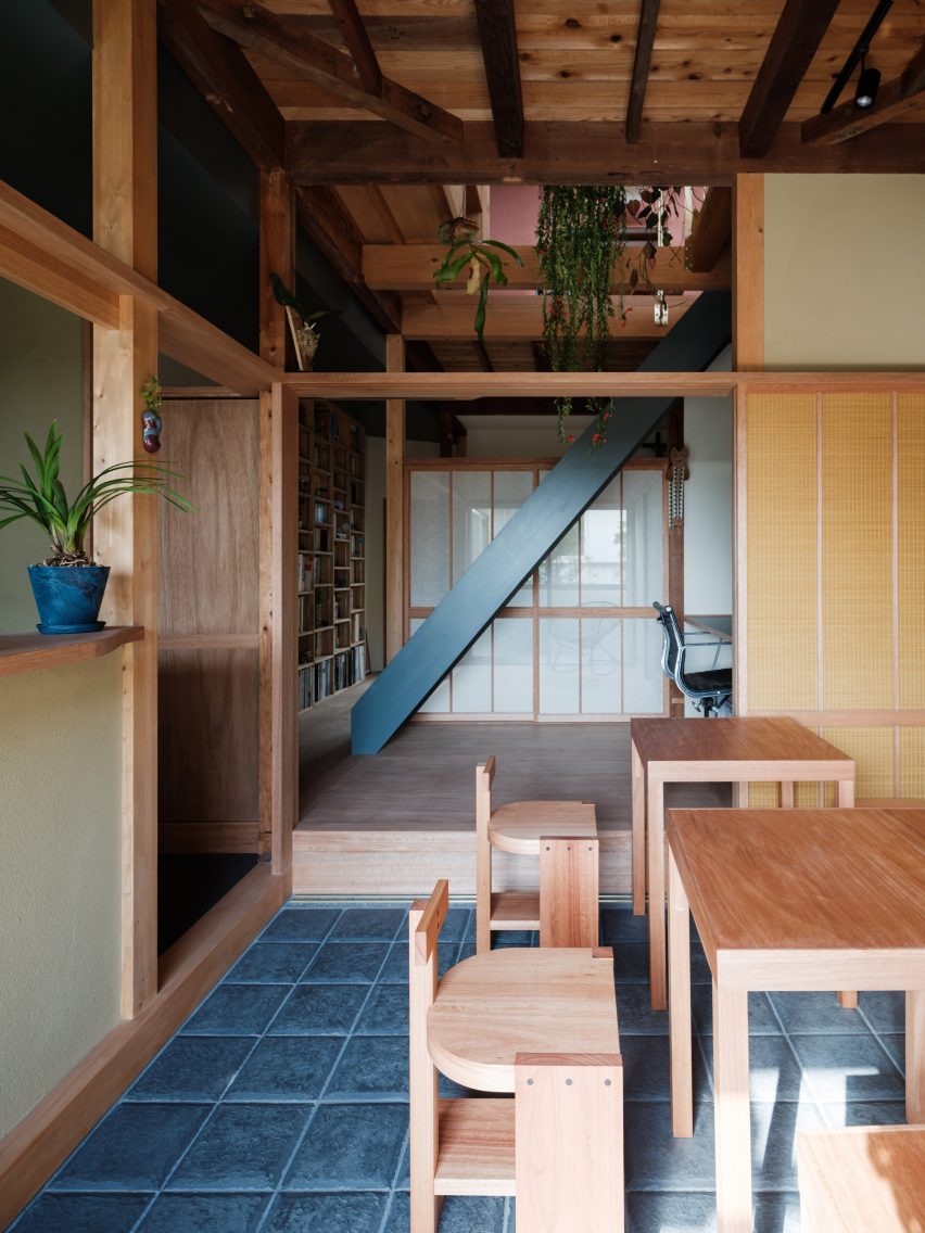
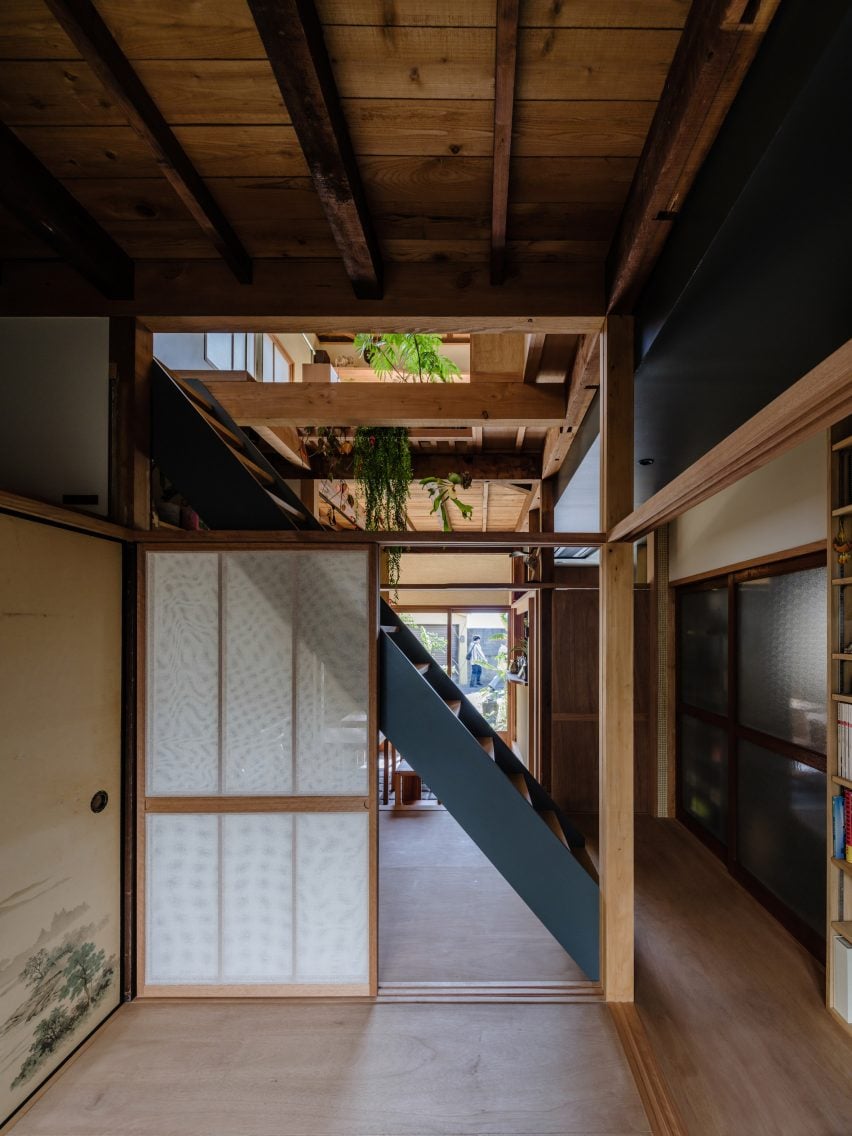
A Japanese shoji screen at the end of the dining room is the first of a series of flexible partitions throughout the home that can be pulled out to provide separation between the spaces.

Photo of House in Hayashisaki Matsue Beach
The upper floor contains private residential space

“Conscious of the tropics and nostalgia, we put nets that look like mosquito nets and sudare blinds on the shoji screens,” said the studio. “The graceful plans created by imperfect partitions such as shoji and fusuma are typical of ancient Japanese architecture.”

“In this house, where cultures, nationalities, times, and various other things are combined, I thought it would be appropriate to have the spaces partially mixed so that they could feel the presence of each other, rather than being permanently partitioned in terms of usage,” it continued.

Photo of a corridor at the Japanese home
Wood was used throughout the interior

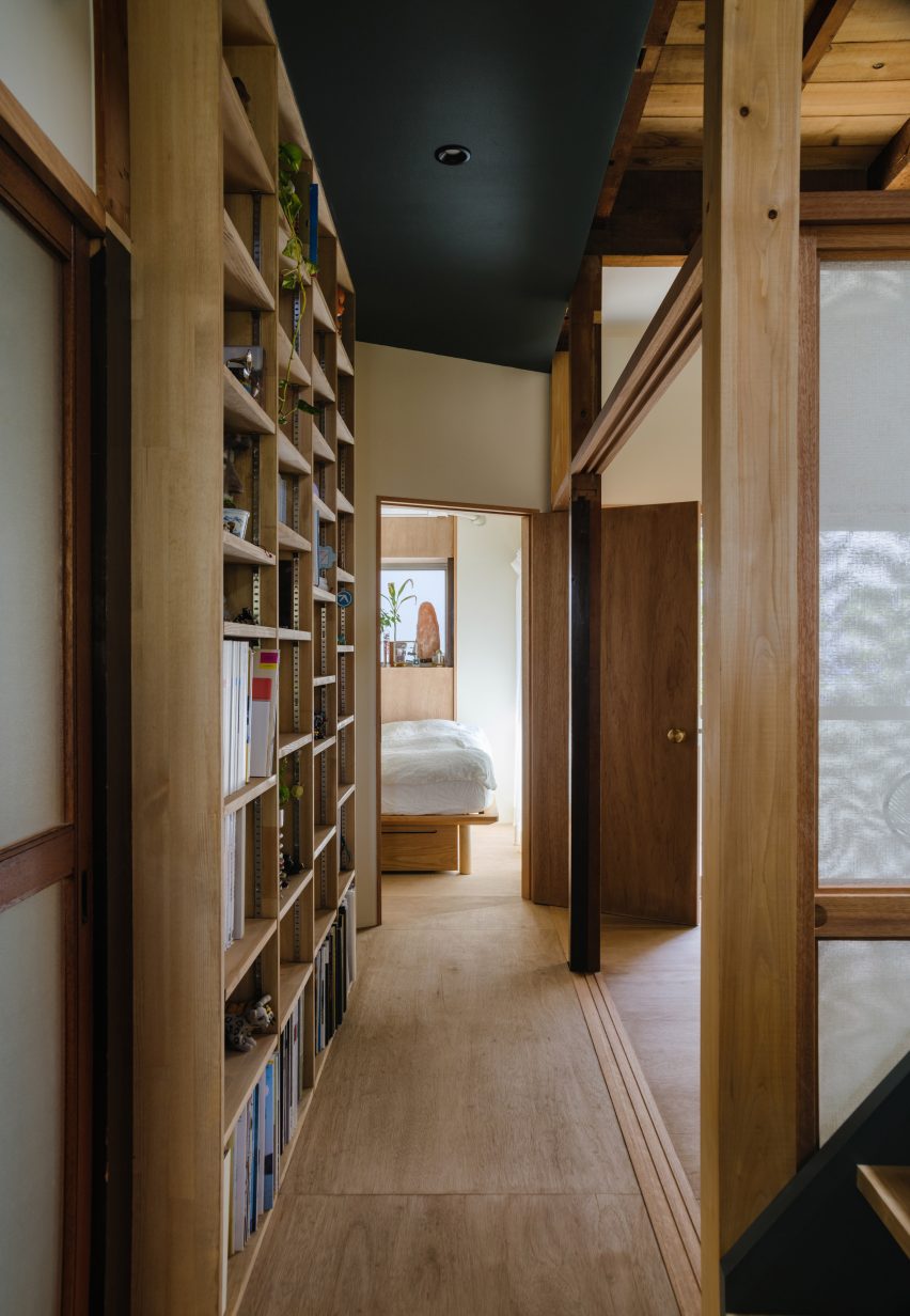
Built on a raised timber platform, the rest of the ground floor holds private rooms for the client, which are divided by shoji screens, including a traditional Japanese room that opens onto a garden.

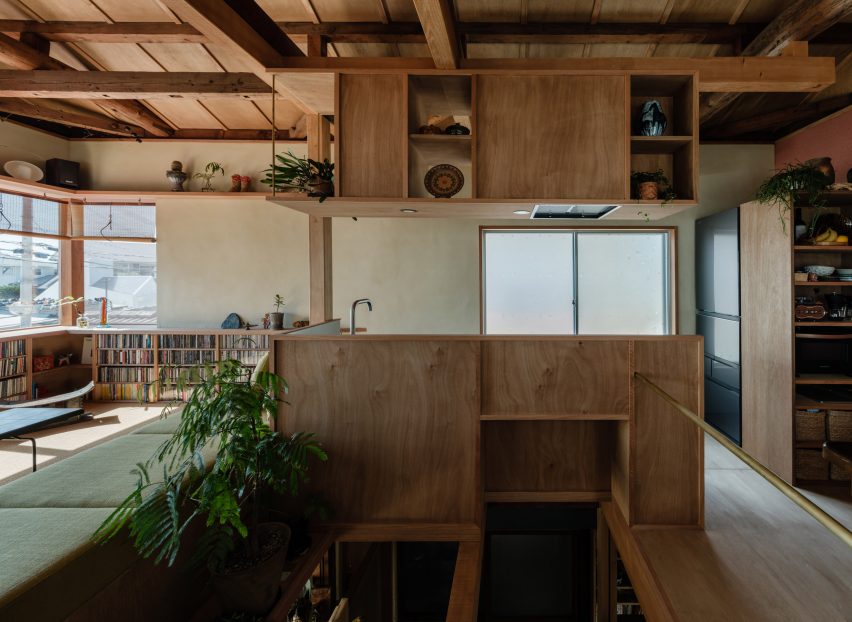
A home office borders the dining space, where a central black ladder leads to the floor above, while a bedroom, bathroom and utility room branch from the other side of the corridor.

Photo of the home
The residential space has views of the sea

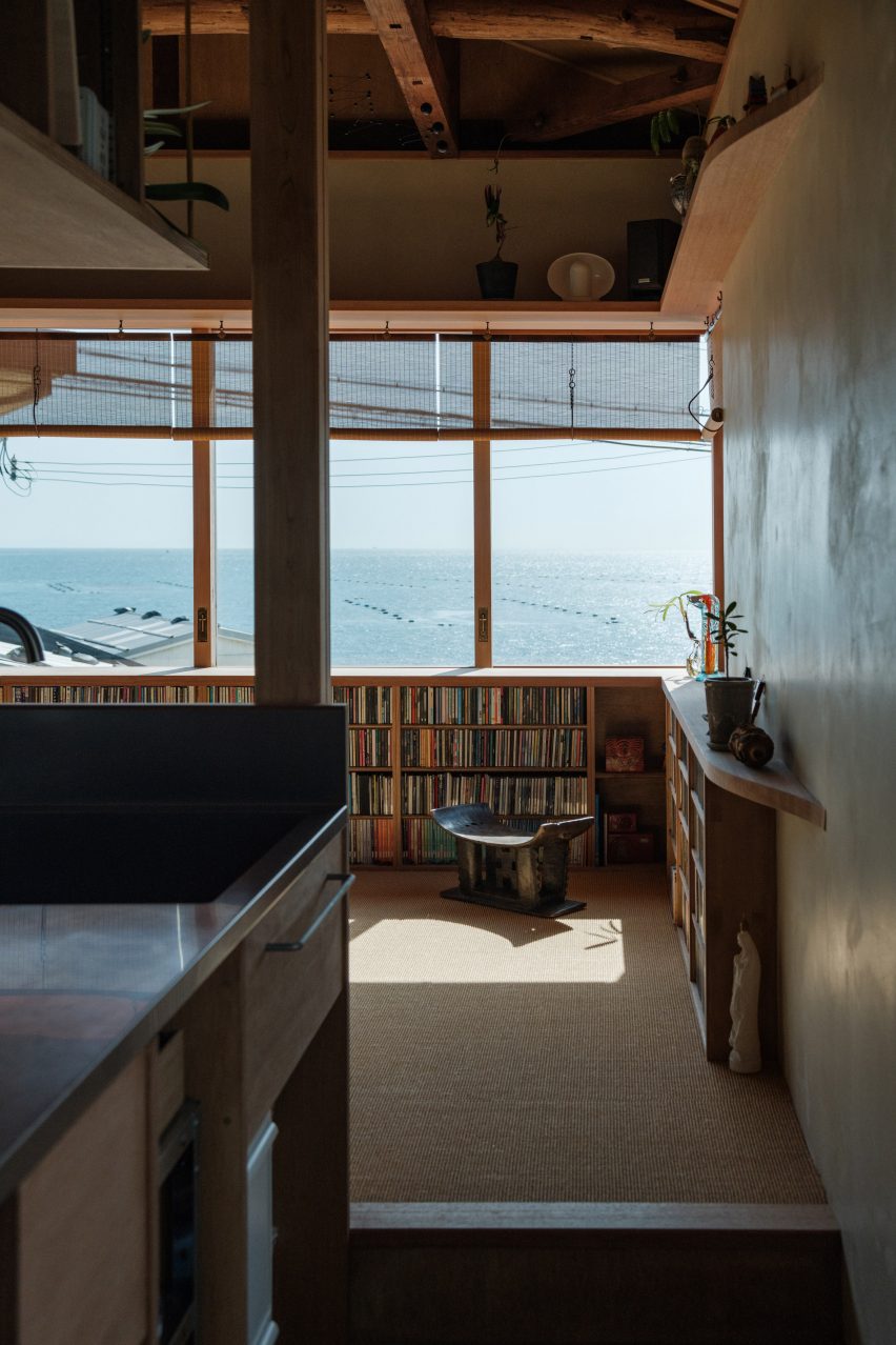
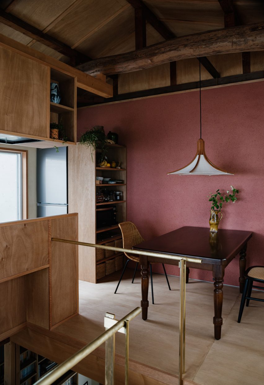
Upstairs, the studio added an open arrangement of dining and living spaces with warm-toned surfaces including a red wall and dark wooden beams that interact with the home’s original rustic roof structure.

“The wall on the second floor is a scraped wall mixed with red iron oxide and finished by a plasterer from Awaji,” said Isshiki. “This is an attempt to incorporate the colourful walls of each country into architecture in a Japanese context.”

Interior photo of the home
The home has an open-plan living arrangement

Other Japanese homes recently featured on Dezeen include a Tokyo home spread across two stacked volumes and a concrete home supported by a single column on Japan’s Okinawa Island.

The photography is by Yosuke Ohtake.

Reference

Kawakawa House by Herbst Architects
CategoriesInterior Design

Eight serene bedrooms with striking natural views

Far-flung homes from New Zealand to Patagonia feature in this lookbook that showcases bedrooms with calm interiors where glazing has been maximised and clutter minimised to keep the focus on the views.

Installing huge floor-to-ceiling windows is a no-brainer when a house is set in a prime location, whether overlooking Lake Tahoe or Chile’s craggy coastline.

But the real key is to create pared-back interiors that don’t detract from the natural vistas, using minimal furnishings and a natural material palette that brings the outside in.

Read on for eight minimalist bedroom interiors that make the view their protagonist.

This is the latest in our lookbooks series, which provides visual inspiration from Dezeen’s archive. For more inspiration see previous lookbooks featuring bedrooms with bathtubs, statement headboards and wood-panelled dining rooms.


Kawakawa House by Herbst Architects
Photo by Patrick Reynolds

Kawakawa House, New Zealand, by Herbst Architects

A clerestory window wraps all the way around this home in the surf town of Piha, New Zealand, allowing light to filter through a canopy of pōhutukawa trees and into the bedroom.

This dappled effect is mirrored in the interior through the use of dark birch on the walls and light plywood on the ceilings, which help to draw sun into the living spaces.

Find out more about Kawakawa House ›


Estancia Morro Chico, Argentinia, by RDR Architectes
Photo by Javier Agustin Rojas

Estancia Morro Chico, Argentinia, by RDR Architectes

Wood, leather and wool help to add warmth to this otherwise spartan bedroom, which belongs to a family of sheep farmers in remote Patagonia.

A floor-to-ceiling window makes the most of the region’s vacillating sunlight while providing views across the surrounding 27,000-hectare ranch and the wild steppe beyond.

“The general aesthetics of the project were inspired by the traditional architecture of the region, which demonstrated extreme austerity and an almost primitive simplicity,” said RDR Architectes.

Find out more about Estancia Morro Chico ›


Wooden bedroom in Finnish cabin
Photo by Marc Goodwin, Archmospheres

Niliaitta, Finland, by Studio Puisto

In the absence of bedside tables, most of the space inside this cabin near Finland’s Salamajärvi National Park is occupied by a custom-made bed, placed directly in front of a glazed wall.

Local practice Studio Puisto kept furnishings to a minimum and covered nearly all of the surfaces in the same pale wood, so as not to compete with the natural spectacle.

“The interior is done purposefully so that it would only serve as a neutral blank canvas, second to the nature outside,” Studio Puisto said.

Find out more about Niliaitta ›


Atelier Andy Carson finishes coastal home in Sydney with stone and bronze
Photo by Felix Forest

Matopos, Australia, by Atelier Andy Carson

When Atelier Andy Carson renovated the home of gallerist Judith Neilson, the Sydney studio set out to provide a minimalist backdrop for her personal collection of art and furniture.

Meanwhile, finishes and window placements throughout the house were chosen to honour nearby Freshwater Beach, with the best views provided by the window seat in the primary bedroom.

“Thoughtfully placed windows frame vistas of the sea, while polished plaster interior walls reflect views of the blue and yellow hues of ocean and sand back into the home,” the studio said.

Find out more about Matopos ›


Casa Ochoalcubo by Ryue Nishizawa
Photo by Cristobal Palma

House in Los Vilos, Chile, by Ryue Nishizawa

This bedroom was carved out of a cliffside on Chile’s Pacific coast, with a glass front and private terrace opening it up to views of crashing waves and craggy rocks.

The building’s board-marked concrete slab roof is left exposed throughout the interior, paired with pared-back wooden furnishings and floors.

Find out more about House in Los Vilos ›


Shelter by Vipp

Shelter, Sweden, by Vipp

A huge skylight stretches across the ceiling of this compact loft bedroom, set in a prefabricated cabin on the banks of Lake Immeln in Sweden, to create the impression of sleeping under the open sky.

To keep attention on the stars, the monochrome interior features moody lighting and slate grey felt panels that cover both the walls and the floors.

Find out more about Shelter ›


Lookout House by Faulkner Architects
Photo by Joe Fletcher

Lookout House, USA, by Faulkner Architects

A huge bed is placed diagonally at the centre of this room, effectively displacing all other furniture but taking full advantage of the home’s sweeping Lake Tahoe panorama.

For the interior, Californian studio Faulkner Architects brought together local materials including volcanic basalt, concrete made using local sand and walnut wood sourced from orchards in the nearby Sierra foothills.

“Consistent through the house, the quiet built environment is muted in colour and tonality, which allows the landscape outside to be the focus,” said the studio.

Find out more about Lookout House ›


Casa X by Branch Studio Architects
Photo by Peter Clarke

Casa X, Australia, by Branch Studio Architects

Dramatic sloped ceilings finished in pale wood panelling envelop the bedrooms of this house on Phillip Island near Melbourne, with bedside pendant lights suspended from their highest point.

Glazing covers the better part of one wall, looking out over the trees that encircle the property to provide privacy despite the home’s beachfront location.

Find out more about Casa X ›

This is the latest in our lookbooks series, which provides visual inspiration from Dezeen’s archive. For more inspiration see previous lookbooks featuring bedrooms with bathtubs, statement headboards and wood-panelled dining rooms.

Reference

The Architect Has Left The Building exhibition at RIBA
CategoriesInterior Design

Architectural photography is dominated by empty, glossy, new buildings

Architectural photographer Jim Stephenson explains how The Architect Has Left The Building exhibition at RIBA aims to draw attention to how people use buildings, in this interview.

Despite taking place at the Architecture Gallery at the Royal Institute of British Architects’ central London HQ, Stephenson told Dezeen that the exhibition is not focused on buildings.

“The installation is about people watching,” he said. “Although it’s at the RIBA and in the architecture gallery, it’s not really about the buildings – they’re just the backdrop, they’re the stage set really.”

“We wanted to create a meditative, large scale film piece that was all about how people use (and misuse) space once the architect’s work is done,” he continued.

The Architect Has Left The Building exhibition at RIBA
The Architect Has Left The Building is an exhibition at RIBA

As the exhibition’s title suggests, the exhibition focuses on how buildings are used after the architect’s work is finished.

It aims to show buildings in use, in contrast to the majority of architectural photography that often portrays buildings empty, at their point of completion.

“When I used to work in architecture practices, we used to design everything around people and context,” explained Stephenson. “It felt like everything was dictated by those two things and then when we would get projects photographed we’d ask the photographer to omit those two things.”

“The buildings were empty objects – sculptures,” he continued. “It always jarred with me, so in our work we focus on people using space as much as possible.”

Jim Stephenson's RIBA exhibition
The exhibition features the work of Jim Stephenson.

The exhibition include numerous photos taken by Stephenson, along with an enclosed screening room, where a film created for the exhibition was played on a dual screen.

“This film is all about the small interactions that occur in and around buildings – between individuals, groups of people and even between people and the buildings,” said Stephenson. “It’s all about the people!”

The film, which was created with artist Sofia Smith and has a soundtrack created by Simon James, contains numerous contemporary buildings from the past 15 years.

Among the buildings featured are Tintagel Castle Bridge by William Matthews Architects, Tate St Ives extension by Jamie Fobert, Sands End Arts and Community Centre by Mae Architects and London Bridge Station by Grimshaw, which were all shortlisted for the Stirling Prize.

Dual screen showing film at RIBA
The exhibition features a film screened on a dual screen

The film makes aims to makes people think about the connections between buildings and how people are connected to them.

“Watching Sofia make visual links between buildings that I hadn’t previously considered to have much in common was fascinating,” explained Stephenson.

“There’s a point in the film where we transition from Sands End Community Centre to Tintagel footbridge and it’s seamless – from a community centre in West London to a bridge over the sea in Cornwall!”

“And at London Bridge train station, Simon recorded not just the ambient sound that everyone can hear, but he also recorded the inner guts of the building with contact mics, as well as the sound in the electromagnetic spectrum,” he continued. “All those sounds get layered up in the show and I can’t go through that station now without thinking about them.”

Photo exhibition of Jim Stephenson's work
It also features photos taken by Jim Stephenson

Stephenson hopes that the film will demonstrate how people improve architectural spaces and how they are recorded.

“The history of architectural photography is dominated by empty, glossy, new buildings, photographed before people have come in,” said Stephenson.

“I think there was a fear amongst architects that people ‘mess up their building’ and photographing them empty somehow showed the architecture in a more pure and distilled way,” he continued.

“I think that’s mad. If the people you designed the building for are ‘messing it up’ then maybe there’s something wrong with the building? I’m half joking, but I’ve never documented a space that wasn’t improved by people, or at the very least a sign of life.”

One of the UK’s best-known architectural photographers, Stephenson co-founded film production studio Stephenson& with Smith. Recent projects photographed by Stephenson include a wood-lined community space in east London, a rammed-earth yoga studio to the gardens of Somerset hotel and a rolling bridge in London.

Recent buildings captured on film by Stephenson& include a visitor centre at the UK’s largest sawmill and a school theatre by Jonathan Tuckey Design in London.

The photography is by Agnese Sanvito, unless stated. The film is by Jim Stephenson and Sofia Smith with soundtrack by Simon James.

The Architect Has Left The Building is at RIBA in London until 12 August 2023. See Dezeen Events Guide for an up-to-date list of architecture and design events taking place around the world.

Reference

Kitchen with chrome counter in JJ16 apartment by Lucas y Hernández-Gil
CategoriesInterior Design

JJ16 apartment in Madrid features curves and colour blocking

Madrid studio Lucas y Hernández-Gil has completed a family home that makes the most of every inch, with details including a yellow storage wall, a corridor kitchen and a hidden closet.

JJ16 is a three-bedroom apartment in Madrid’s Salamanca district, but until recently it had been used as an office.

Kitchen with chrome counter in JJ16 apartment by Lucas y Hernández-Gil
JJ16 is a three-bedroom apartment for a family of four

Lucas y Hernández-Gil, a specialist in interior architecture, converted the property back into a residence for a family that includes a mother, three teenage children and their dog.

The challenge was not only to make it feel like a home again but also to create space for everyone’s personality within the 165 square-metre footprint.

Kitchen with chrome counter in JJ16 apartment by Lucas y Hernández-Gil
The kitchen occupies a corridor space between the entrance lobby and the living room

The designers achieved this by combining space-saving strategies with statement details, providing both functionality and character.

“Everyone had a clear idea of what they needed, which translated directly into the spaces,” said studio founders Cristina Domínguez Lucas and Fernando Hernández-Gil Ruano.

“Far from generating a conflict, different colours and materials give the house a richness, a harmonic heterogeneity,” they told Dezeen.

Pink, grey and chrome Kitchen in JJ16 apartment by Lucas y Hernández-Gil
The room is defined by shades of soft pink and grey

Optimising JJ16’s layout was crucial but difficult given the irregularity of the floor plan.

Lucas y Hernández-Gil’s strategy was to make every space, including the corridors, as useful as possible.

Utility area in corridor of JJ16 apartment by Lucas y Hernández-Gil
The utility area also occupies a corridor space

The kitchen now occupies a connecting space between the entrance lobby and the living room, freeing up space at the front of the apartment for a spacious main bedroom.

Meanwhile, the corridor leading to the main bathroom and the third bedroom incorporates a mini library and a utility area.

“The main challenge was the deep layout and long corridor,” said the architects.

“We provided circulation with content by creating spaces within it. This turned out to be one of the best design decisions of the project.”

Bedroom with curved wall in JJ16 apartment by Lucas y Hernández-Gil
A curved wall frames the main bedroom

Curved partitions create variety within JJ16’s layout. The largest of these separates the living room from the main bedroom, but other curves can be found in the second bedroom and a shower room.

Many spaces have their own colours, which contrast with the bright white tones that otherwise dominate the interior.

Bedroom with orange walk-in closet in JJ16 apartment by Lucas y Hernández-Gil
The third bedroom is a twin room with a hidden walk-in closet

The bright yellow bookshelf wall is the most striking, while the adjacent kitchen offers a two-tone effect with shades of soft pink and grey, and matt chrome finishes.

Bedrooms have a minimal feel, but they boast colourful dressing rooms and en-suites. Bright orange was chosen for the hidden walk-in closet, located in the twin third bedroom, while deep purple adds a luxury feel in the main bedroom.

Bedroom and en-suite with patterned floor tiles
Patterned tiles feature in the bathroom and en-suite areas

Floor surfaces provide more visual interest. Living spaces feature oak parquet, while bathrooms are all finished with patterned cement tiles.

This bold approach to colour and texture is a common feature in the work of Lucas y Hernández-Gil, whose other recent projects include the sunset-inspired Naked and Famous bar and the stylish Casa A12.

Bathroom with orange counter and chequered tiles
The main bathroom also features a curved shower room

“The approach to colour is a constant in our design process,” said Lucas and Hernández-Gil Ruano.

“It is about activating spaces and achieving a warm and joyful domestic atmosphere.”

The photography is by Jose Hevia.


Project credits

Architecture: Lucas y Hernández-Gil
Collaborators: Lucía Balboa, María Domínguez, Sara Urriza

Reference

Photo of the exterior of the Fender flagship store, showing the outside of the
CategoriesInterior Design

Klein Dytham Architecture gives Fender flagship store a welcoming feel

Klein Dytham Architecture has aimed to counter rock music snobbery with its design for guitar brand Fender’s Tokyo flagship store, which is meant to feel welcoming to people who might feel judged in other guitar stores.

The Fender store sits across the bottom four floors of the glass-walled Ice Cubes building, a 12,000-square-metre space in the neighbourhood of Harajuku that was formerly home to an H&M store.

It is the world’s first flagship store for the 77-year-old American brand, which is one of the most recognisable names in guitars and is particularly known for electric models like the Stratocaster.

Photo of the exterior of the Fender flagship store, showing the outside of the
The Fender flagship store is located in Harajuku, Tokyo

For the project, Fender asked Klein Dytham Architecture to create a space that would counter the perception of guitar stores as being intimidating, particularly for women and newer players.

It hoped the store would offer a sophisticated and immersive retail experience that would encourage leisurely browsing and communicate the brand’s heritage.

Klein Dytham Architecture answered the brief with a store design it sees as creating “a destination of discovery”, with gallery exhibits, an event space, a cafe and a “care bar” for repairs.

Photo of the first floor of the Fender Tokyo flagship store, showing many guitars displayed on curving light wood display stands
The main browsing area on the first floor features display stands made of curved wood

The first floor houses the main browsing area, which features undulating wood benches and display units that are meant to echo the curves and materials of a Fender guitar. These contours are further mimicked in the lighting above.

The area also has custom plectrum-shaped tables where staff can place guitars they have removed from the display to show customers. Clothing racks holding the F is for Fender streetwear collection sit among the guitars.

The second floor, which was realised in a soft grey palette, is primarily an exhibition space called the Artists Gallery.

Photo of a gallery-like space displaying large photos and a video of musicians and their guitars, as well as guitars in transparent display cases
The second floor is the main gallery space

Here, large-scale photos and video shows famous musicians in action, each one alongside a transparent display case housing their Fender of choice.

There are also displays dedicated to Japanese- and American-designed Fenders respectively, and a sound-proofed Amp Room where customers can test run guitars and amps.

On the darker and moodier third floor, another exhibition space — the Master Builders Gallery — focuses on the work of specific craftspeople, while two VIP rooms and a custom shop are furnished with comfortable couches and provide a setting for discussing bespoke builds.

Also on this floor is a colourful display of 400 guitar finish samples that fills the length of one wall.

Photo of a dark grey room with big couches and armchairs in the foreground and a library of colourful material and component samples along the back wall. On the side wall, a sign reads Fender Custom Shop
The third floor includes the Fender custom shop

The final floor is the basement, which houses an event space, cafe and the Fender care bar, and where Klein Dytham Architecture endeavoured to create a cosier feel with a plectrum-shaped rug and benches.

Tying the floors together is a spiral staircase with a hall-of-fame-style photo gallery on the interior, as well as a three-storey-high vertical LED display on the glass facade outside that will be used for Fender-related content.

Photo of a room with light-coloured walls, red cushioned bench seating and displays of acoustic guitars in the centre of the room, and racks full of guitar accessories at the back. Near the back wall, a man stands behind a counter with a display of guitar parts behind him and talks to a woman who is leaning on the front of the counter
The basement includes an event space and a care bar

“Conceived as a hub and clubhouse for all things Fender, this project takes the notion of a flagship store and experiential retail to beyond the next level,” Klein Dytham Architecture co-founder Mark Dytham told Dezeen.

Dytham started the practice with fellow Royal College of Art graduate Astrid Klein in Tokyo in 1991. Some of their recent work includes the PokoPoko clubhouse for the Risonare Nasu hotel in rural Japan and a Cartier store with an intricate wooden facade in Osaka.

Photography by Nacása & Partners.

Reference

Banquette seating with wool wall hanging above in Donna restaurant
CategoriesInterior Design

Michael Groth uses natural and recycled materials inside Donna restaurant

New York designer Michael Groth collaborated with a Moroccan artisan cooperative to create the wall hangings for this worker-owned bar and restaurant in the West Village.

The opening of Donna‘s new location on Cornelia Street follows the closure of its Williamsburg spot in December 2020 as a result of the coronavirus pandemic.

Banquette seating with wool wall hanging above in Donna restaurant
Michael Groth has designed the new Donna outpost in New York

Serving a pan-Latin menu with Mediterranean influences and Filipino-inspired cocktails, the restaurant and bar is now a worker-owned cooperative, with original owner Leif Young Huckman acting as an advisor.

To reflect this shift, Brooklyn-based Groth aimed to imbue the design of the new outpost with references to the previous location while nodding to Donna’s revised business model.

Bar area with earth-toned plaster walls
Earth-toned limewash plaster was applied to the walls in geometric patterns

He drew influences from the constructivist art movements of Latin America in the 20th century and particularly the work of artists Sandu Darie, Pedro Alvarez and Lygia Clark.

Donna is decorated with earth-toned limewash plaster, applied to the walls in geometric patterns that echo the brand’s visual identity.

Circular light fixture above the dining area  in Donna restaurant
Groth created wall hangings in collaboration with artisan cooperative The Anou

Exposed brickwork is painted white, forming a plain backdrop for the circular wool wall hangings that Groth created in collaboration with Moroccan artisan cooperative The Anou.

These help to dampen the acoustics while lime plaster assists in regulating humidity, according to Groth.

The tables are crafted from reclaimed Douglas fir flooring and stained plywood was used to build the banquette seating that wraps the perimeter.

Bar-back shelving and floors were repurposed from the unit’s previous tenant, while the bar tops were fabricated by Brooklyn Stone and Tile – another worker-owned cooperative.

Reclaimed Douglas fir tables and stained plywood banquettes
Tables are crafted from reclaimed Douglas fir

“The use of any new materials was limited to those that are natural and biodegradable, keeping in mind the holistic effects of resource extraction, human health and equity, and circular material cycles,” the Donna team said.

Pendants lights above the bar have shades made from mushroom mycelium, which according to the team presents “an environmentally holistic approach to material creation that poetically reflects Donna’s equitable business model”.

Bar with mycelium pendant lights suspended above  in Donna restaurant
The pendant lights above the bar feature mycelium shades

New York City’s dining scene was upheaved during the pandemic, with many eating and drinking establishments forced to either adapt or shutter.

As a result, sidewalk dining shelters sprung up across the city, as documented in these photographs by John Tymkiw.

The photography is by Nicholas Ruiz.

Reference

Republique apartment by Hauvette & Madani features red kitchen
CategoriesInterior Design

Wine-red kitchen forms centrepiece of apartment by Hauvette & Madani

Interior design studio Hauvette & Madani has made a sumptuous wine-red kitchen the focus of this otherwise neutral apartment in Paris.

The Republique apartment is set within a typical Haussmann-era building in the French capital’s 11th arrondissement and belongs to a family with two children.

From the outset of the renovation, the clients called for the home to orbit around a “spectacular” atmospheric kitchen.

Republique apartment by Hauvette & Madani features red kitchen
A wine-red kitchen is the focal point of the Republique apartment

Hauvette & Madani responded by using a striking colour scheme, rendering all of the kitchen’s linoleum cabinets and its curved breakfast island in a wine-red colour. The same shade was also applied to the ceiling but in a glossy lacquer.

“We wanted a dark but joyful colour and ended up deciding on this substantial red,” founders Samantha Hauvette and Lucas Madani told Dezeen. “We also love the fact [the colour’s] eccentricity matches the rest of the calm and soft apartment.”

Living room interior of Republique apartment by Hauvette & Madani
Spaces are connected by travertine-framed doorways

Lustrous decorative elements such as an aged-mirror splashback and brass light were also introduced to the space, and a support column was wrapped in stainless steel.

The room’s original wooden flooring was overlaid with travertine and Emperador marble tiling.

Living room interior of Republique apartment by Hauvette & Madani
Shades of beige can be seen throughout the living room

A travertine-framed doorway looks through to the adjacent living room, where walls were painted an oatmeal beige, matching a bean-shaped velvet sofa from French brand Pierre Augustin Rose.

A pair of wriggly-edged oak coffee tables and a terracotta-coloured edition of French designer Pierre Paulin’s Ribbon chair were also used to dress the space.

The dining room next door is centred by an oval travertine table, around which steel-framed leather seats have been arranged. At the rear of the room is a tall white dresser inset with oak-lined niches where ornaments or artworks can be displayed.

A Murano glass chandelier hangs from the ceiling, where ornate moulding was carefully preserved.

Dining room interior of Republique apartment by Hauvette & Madani
The nearby dining room has a travertine table at its centre

The project also saw Hauvette & Madani refresh the parents’ bedroom, which now features 1930s-style lighting and a bespoke oak headboard. This winds around the back of the room and has arched cut-outs that accommodate bedside tables.

A walnut-wood vanity cabinet and vintage Italian mirror were also fitted in its en-suite bathroom.

Bedroom interior of Republique apartment by Hauvette & Madani
A bespoke oak headboard was installed in the parents’ bedroom

Often considered the heart of the home, the kitchen is where architects and designers enjoy getting playful with colour.

Other examples include the kitchen inside Sans-Arc Studio’s Plaster Fun House, where a pink terrazzo breakfast island contrasts duck egg-blue cabinetry.

And the kitchen within this Belgian apartment by Carmine Van Der Linden and Thomas Geldof features birch wood cupboards that were stained a murky hue of green.

The photography is by Yannick Labrousse

Reference

Villa Kuro by Mini Inno
CategoriesInterior Design

Eight interiors that strike a balance between rustic and contemporary

For our latest lookbook, Dezeen has selected eight examples of rustic yet contemporary interiors, including but not limited to an apartment in Sao Paulo and a Tuscan boutique hotel.

Rustic interiors have a strong focus on natural and aged materials as well as traditional wooden or stone furnishings.

These material choices are often used to create a homely and welcoming atmosphere that is somewhat reminiscent of a farmhouse style.

From an inn with nautical-leaning decor to a mid-century home in Joshua Tree, here are eight examples of how interior designers are bringing rustic design tropes into the 21st century.

This is the latest in our lookbook series, which provides visual inspiration from Dezeen’s archive. For more inspiration see previous lookbooks featuring wood-panelled dining rooms, statement headboards and homes with pergolas.


Villa Kuro by Mini Inno
Photo is by Stanley Yang

Villa Kurno, US, by Mini Inno

Los Angeles interior design studio Mini Inno renovated this mid-century ranch-style home in Joshua Tree National Park and converted it into a holiday home.

The studio opted for a neutral interior scheme that serves as the background for various wooden furnishings and fixtures.

Wood beams were left exposed across the ceiling of the living area while wooden barstools, shelving and cupboard doors are contrasted against the white-painted walls and floors.

Find out more about Villa Kurno ›


Monteverdi Tuscany boutique hotel by Michael Cioffi and Ilaria Miani

Monteverdi Hotel, Italy, by Michael Cioffi

Located in a hamlet in Val d’Orcia, a UNESCO World Heritage Site in Tuscany, Monteverdi Hotel was transformed from a crumbling building to a 29-room hotel over a 14-year renovation.

Materials and finishes throughout the interior were chosen for their textural quality and walls feature uneven surfaces with indents and niches. Salvaged wood was used for ceiling beams, timber archways and closet doors, which were constructed from old farm doors.

Find out more about Monteverdi Hotel, ›


Captain Whidbey Inn
Photo is by Alexander Ribar

Whidbey Inn, US, by Mike and Matt French

Mike and Matt French collaborated with friends and local designers to update this historic inn on Widbey Island near Seattle.

The team renovated the property, which was built in 1907, and decorated the interior with a contemporary yet rustic approach with subtle nautical influences. Wood panelling in various shades was used across the interior and paired with timber furnishings.

Find out more about Whidbey Inn ›


Carriage House by Workstead
Photo is by Jeff Holt

Carriage House, US, by Workstead

This home is set inside a converted kitchen house in South Carolina – a small outbuilding that was originally used to prepare food for the main residence.

Workstead decorated its interior using an imperfect approach that saw the US studio make a feature of exposed, paint-splattered brickwork and crumbling plaster walls.

In one of the home’s living areas, cypress and woven cane cabinets with an integrated window seat were built around a window, extending from the wooden floors up to the white-washed ceilings.

Find out more about Carriage House ›


Interiors of La Ganea restaurant, designed by Studio Mabb
Photo is by Carola Merello

La Ganea, Italy, by Studio Mabb

A material palette of plaster, timber and iron defines the rustic interiors of this restaurant in Brescia, Italy, which was designed by interiors practice Studio Mabb.

The former farmhouse dates back to the 16th century and was renovated to have a simple aesthetic with earthy components. Large wooden beams stretch across the ceiling above a tiled floor and grey-washed walls while dark wood and iron furnishings complete the moody atmosphere.

Find out more about La Ganea ›


Tea House Italy by Lorenzo Guzzini
Photo is by Giorgio Marafiot

Japanese tea house, Italy, by Lorenzo Guzzini

At this home on Lake Como, which was informed by Japanese architecture, materials were chosen for their likeness to the surrounding nature and the vernacular architecture of the historic village of Dizzasco.

Textural wall finishes in earthy tones and stone-lined floors were combined with exposed wooden ceilings, pine skirting boards and doors in an effort to reference the rustic look of traditional tea houses.

Find out more about Japanese tea house ›


House V designed by Martin Skoček
Photo is by Matej Hakár

House V, Slovakia, by Martin Skoček

Slovakia-based architect Martin Skoček used salvaged and time-worn materials in the interior of this gabled home near Bratislava.

Bricks walls are exposed in the open-plan living area at the centre of the home beneath a wood-gabled ceiling that spans the entire length of the space.

Contemporary additions such as a steel breakfast island and oak storage wall anchor the kitchen area, providing a contrast with the raw brick walls and wooden ceiling.

Find out more about House V ›


GM Apartment by NJ+
Photo is by Fran Parente

GM Apartment, Brazil, by Nildo José Architects

Brazillian studio Nildo José Architects highlighted many of the existing architectural features when renovating this two-bedroom apartment in a condominium tower in Sao Paulo.

The interior scheme draws on a more contemporary idea of rustic, using exposed concrete elements combined with bleached wood and glazed tiles.

“The kitchen is open and funky, blending rustic and modern with colours, design and materials,” the studio said.

Find out more about GM Apartment ›

This is the latest in our lookbooks series, which provides visual inspiration from Dezeen’s archive. For more inspiration see previous lookbooks featuring wood-panelled dining rooms, statement headboards and homes with pergolas.

Reference

Bottle shop informed by Wes Anderson with central wooden counter and displays on either side
CategoriesInterior Design

Eight retro interiors that capture the mood of a Wes Anderson film

Following the release of American filmmaker Wes Anderson’s eleventh motion picture Asteroid City, we have collected eight interiors that embody his distinctive cinematic style for our latest lookbook.

Anderson is known for his retro pastel colour palettes and use of symmetry, as seen in the sets from his latest feature film that are currently the subject of an exhibition at London’s 180 the Strand.

From a Milanese cafe designed by the director himself to a quirky makeup store in China that was styled to mimic 1970s offices, here are eight interiors that were either directly influenced by Anderson or look as if they are taken straight out of one of his films.

This is the latest in our lookbooks series, which provides curated visual inspiration from Dezeen’s archive. For more inspiration see previous lookbooks featuring bedrooms with bathtubs, Parisian apartments and striking art gallery interiors.


Bottle shop informed by Wes Anderson with central wooden counter and displays on either side
Photo is by Ye Rin Mok

Boisson, USA, by Studio Paul Chan

Local firm Studio Paul Chan took cues from the opening scene of Anderson’s 2021 film The French Dispatch when designing the interiors for this bottle shop by non-alcoholic drinks brand Boisson in Los Angeles.

Elements of mid-century Hollywood design and art deco were combined in a space that includes walnut-stained wooden wall panelling, dusty green accents and a bespoke glass-block counter.

Find out more about Boisson ›


A yellow and orange store interior
Image is courtesy of AIM Architecture

Harmay store, China, by AIM Architecture

A colour palette of muted yellow, orange and brown characterises this shop by makeup brand Harmay, which is set across the renovated second floor of a business park in Hangzhou.

Chinese studio AIM Architecture designed the space to mimic a 1970s office by using rows of yellow desks to display stock and incorporating a retro woollen carpet and frosted-glass sliding “meeting room” doors.

“Creating an ‘old fashioned’ physical retail experience in an actual office space just seemed a fun way to translate this duality of space and time,” the studio’s founder Wendy Saunders told Dezeen.

Find out more about this Harmay store ›


Shelves and a fridge inside a cannabis dispensary
Photo is by Alex Lysakowski

The Annex, Canada, by Superette

The vivid colour palettes and geometric shapes often associated with Anderson’s cinematography also feature at The Annex, a marijuana dispensary in Toronto that was modelled on Italian delis.

Green and beige checkerboard flooring was paired with deli props, tomato-red stools and hanging pendant lights while various cannabis paraphernalia was laid out like groceries.

Find out more about The Annex ›


Bar Luce by Wes Anderson
Photo is by Roland Halbe

Bar Luce, Italy, by Wes Anderson

Created by Anderson himself, Bar Luce is located within the OMA-designed Fondazione Prada in Milan.

Pastel colours and veneered wood panelling were applied to the space, which was designed to reference iconic city landmarks and cafes – particularly those dating back to the 1950s and 60s.

“I tried to make it a bar I would want to spend my own non-fictional afternoons in,” said the filmmaker, who stressed that the bar was not designed as a set but rather as a “real” place.

Find out more about Bar Luce ›


Interior of Cafe Bancado with colour palette informed by Wes Anderson
Photo is by Mikael Lundblad

Cafe Banacado, Sweden, by ASKA

Cafe Banacado is an all-day breakfast cafe in Stockholm designed by local architecture studio ASKA.

ASKA followed “a strong symmetry” when creating the interiors, which feature checkerboard flooring, arched mirrors and a sunny colour palette that was specifically chosen to evoke the dreamlike atmosphere of Anderson’s films.

Find out more about Cafe Banacado ›


The Budapest Cafe by Biasol
Photo is by Derek Swalwell

The Budapest Cafe, Australia, by Biasol

Local studio Biasol designed this salmon-hued cafe in Carlton, Melbourne, to reference Anderson’s 2014 feature film The Grand Budapest Hotel – in particular its symmetrical compositions and “nostalgic” colour palettes.

Stylised steps to nowhere decorate the walls, while a curved archway frames a glossy point-of-sale counter with a tubular base finished in terracotta.

Find out more about The Budapest Cafe in Melbourne ›


Budapest Cafe informed by Wes Anderson
Photo is by James Morgan

The Budapest Cafe, China, by Biasol

Biasol also designed another outpost for The Budapest Cafe in Chengdu, China, that references the titular film.

Here, Biasol combined pastel shades and marble surfaces with similar chunky elevations to those found in the Melbourne cafe. The centrepiece of the room is a tiered terrazzo seating area topped with a pink ball pit and an original Eero Aarnio Bubble chair.

Find out more about The Budapest Cafe in Chengdu ›


Hotel Palace restaurant, Finland, by Note Design Studio
Photo is by Romain Laprade

Hotel Palace restaurant, Finland, by Note Design Studio

When Note Design Studio renovated a restaurant within Helsinki’s Hotel Palace, the Swedish firm set out to honour the history of the modernist building, which was opened in time for the city’s 1952 Summer Olympics.

Teak panelling, luxurious teal carpet and expansive windows lend themselves to a cinematic atmosphere, while white tablecloths add a touch of glamour to the space, where visitors can imagine Anderson’s characters dining.

This is the latest in our lookbooks series, which provides visual inspiration from Dezeen’s archive. For more inspiration see previous lookbooks featuring bedrooms with bathtubs, Parisian apartments and striking art gallery interiors.

Reference

Bowler James Brindley transforms 19th-century palace into W Budapest
CategoriesInterior Design

W Budapest hotel occupies 19th-century Drechsler Palace

Interior design studios Bowler James Brindley and Bánáti + Hartvig have transformed a 140-year-old neo-Renaissance building in central Budapest into the latest outpost from hotel chain W Hotels.

W Budapest is set inside the 1886 Drechsler Palace designed by architects Ödön Lechner and Gyula Pártos, previously home to a grand cafe and the headquarters of the Hungarian State Ballet Academy.

Bowler James Brindley transforms 19th-century palace into W Budapest
Bowler James Brindley and Bánáti + Hartvig have renovated Drechsler Palace

Working with local studio Bánáti + Hartvig, London-based Bowler James Brindley (BJB) wanted to draw out the glamorous history of the building, which had stood empty for 15 years before being acquired by W Hotels’ owner Marriott International.

BJB aimed to “playfully modernise” the interiors while drawing on the architecture of the surrounding area on Andrássy Avenue – a UNESCO World Heritage site that’s also home to the Hungarian State Opera House.

Bowler James Brindley transforms 19th-century palace into W Budapest
The building now houses the 151-room W Budapest hotel

Alongside 151 rooms and suites, the building now houses a restaurant, lounge, spa and speakeasy.

“The challenge from the outset was not to be overawed by the beauty and strength of the building,” BJB partner Ian Bayliss told Dezeen.

“Many original details of Drechsler Palace were studied and re-imagined, as were original colours and textures. Protected architecture has been carefully restored and celebrated, and original glazed tiles have been reused.”

Bowler James Brindley transforms 19th-century palace into W Budapest
Gridded metal screens surround the beds in the guest rooms

Central to BJB’s conversion was the re-establishment of the palace’s two original entrances. This allowed the studio to free up the spaces bordering Andrassy Avenue and create a “living room” within the building’s light-filled inner courtyard, which has been enclosed by a glass roof.

Tasked with modernising the building’s interiors while adhering to heritage protection rules, BJB made what it calls “second skin” interventions, which included the creation of new “corridors” within the palace’s ornate arches using freestanding, fret-cut installations.

The bathrooms in W Budapest reference a chessboard
In the bathrooms, checkerboard tiles reference Hungary’s affiliation with chess

“We wanted to respect the fabric and ‘skin’ of Drechsler Palace so we set about designing spaces, which created a new atmosphere while not touching the beautifully restored fabric,” Bayliss explained.

The studio took the same approach to the restoration of the palace’s vaulted basement spa, which uses “Houdini-inspired” mirror illusions to create a feeling of never-ending space.

Curving bronze metal installations follow the vaulted ceilings, while dimly lit treatment rooms were inserted within the natural spaces left by existing columns.

“In homage to Houdini, the treatment rooms are completely mirror-clad and essentially disappear, literally reflecting the existing architecture and the new second-skin installations,” Bayliss said, referencing Hungarian-born magician Harry Houdini.

Bowler James Brindley transforms 19th-century palace into W Budapest
Turquoise wall panelling is contrasted with gold-toned details

In the guest rooms, turquoise wall panelling is contrasted with the gold-toned screens that wrap the beds, while mirrored checkerboard doors with brass details nod to Hungary’s long ties to the game of chess.

The chess theme continues in the bathrooms, where monochrome checkerboard tiling is offset by handmade terrazzo-lined double sinks and lightbulb-framed Hollywood mirrors that pay tribute to Hungarian-American socialite Zsa Zsa Gabor.

“The combination of a beautiful free-standing French Renaissance-inspired building by a famous local architect with a modern, idiosyncratic interior inserted into it could only happen in Budapest,” Bayliss said.

The hotel opens later this month

Set to open later this month, W Budapest follows the opening of the brand’s Rome outpost in 2021.

Previous projects by Bowler James Brindley include several guest rooms at the W Barcelona and apartments on the lower levels of Herzog & de Meuron’s One Park Drive skyscraper in Canary Wharf.

Other hotels recently featured on Dezeen include a “thoughtfully designed” brutalist hotel in Mexico and Capella Hotels’ Sydney outpost, which is housed within a heritage-listed former government building.

The photography is courtesy of W Budapest. 

Reference