Frank Chou portrait
CategoriesInterior Design

Chinese designers can “bring something different to the world”

Architects and designers in China are poised to have a greater global influence as the country emerges from the coronavirus pandemic, according to Dezeen Awards China judges at a talk at Design Shanghai.

Hosted by Dezeen’s co-CEO Benedict Hobson, the panel discussion marked the launch of Dezeen’s new regional edition of Dezeen Awards to celebrate architecture and design in China, which is open for entries now.

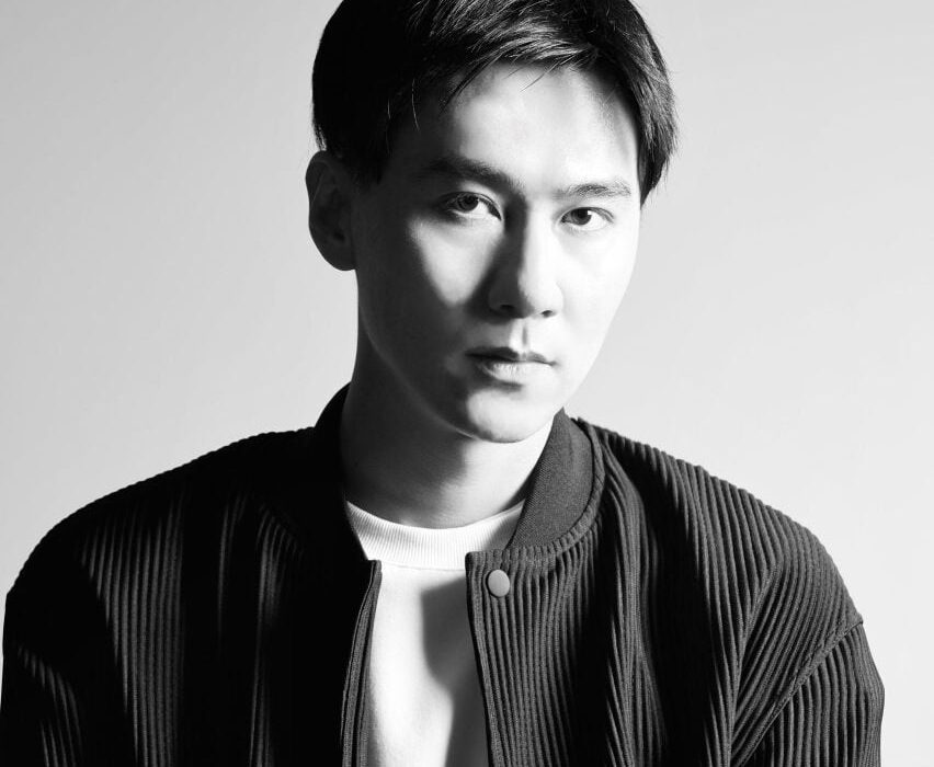
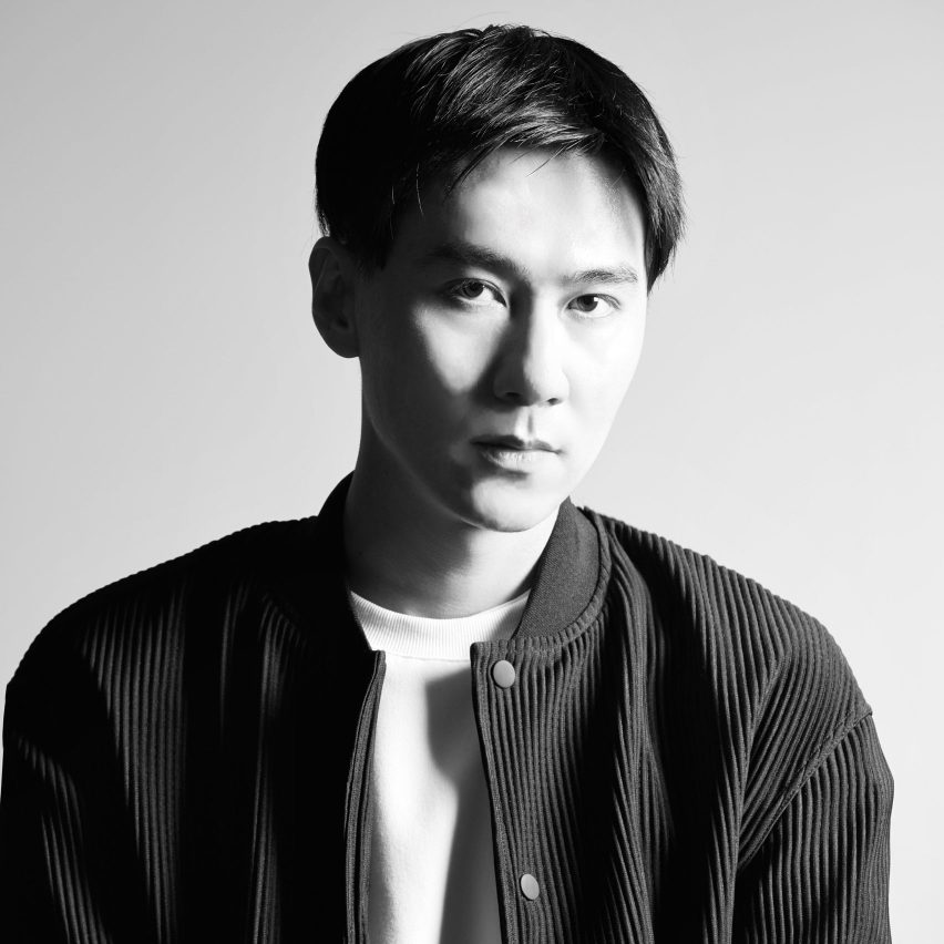
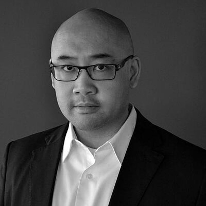
It featured Dezeen Awards China judges Alex Mok and Frank Chou, alongside Neri&Hu managing director Jerry del Fierro, who stood in for Dezeen Awards China judge Rossana Hu, who had to pull out due to illness.

Frank Chou portrait
Frank Chou is a product designer and Dezeen Awards China judge

According to Chou, who is one of the most established product designers in China, the country has a huge amount of untapped design potential.

“In Europe, there are so many design firms,” he said.

“In China, we have a population of 1.4 billion, but how many designers are there? There’s really a huge potential for Chinese designers to bring something different to the world.”

Sofa by Frank Chou
Frank Chou designs furniture under his own brand

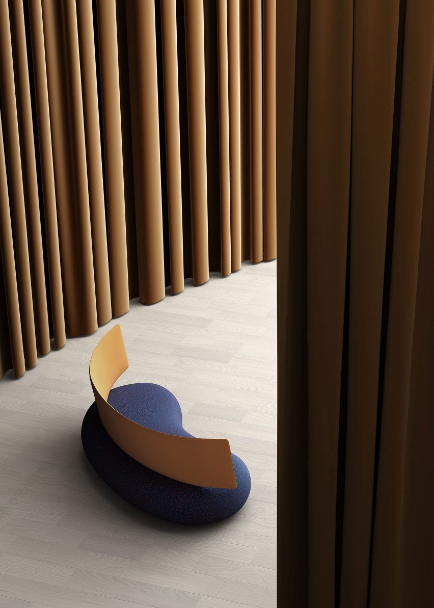
Chou believes that emerging Chinese designers are cultivating a unique, contemporary design language that draws from China’s rich history without being overly deferential to it.

“We need to shape the real modern Chinese culture,” he said.

“When we talk about culture, many people equate this to history, to something in the past. But we should also be thinking about the culture of the future. What will be China’s future culture?”

Jerry del Fierro portrait
Jerry del Fierro is managing director of Neri&Hu

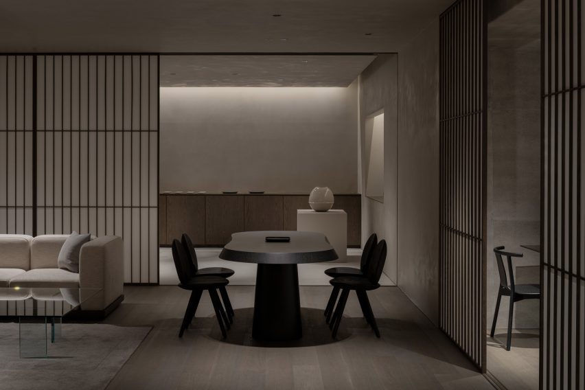
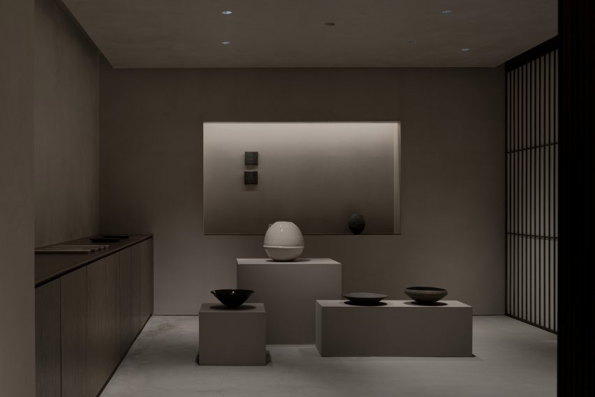
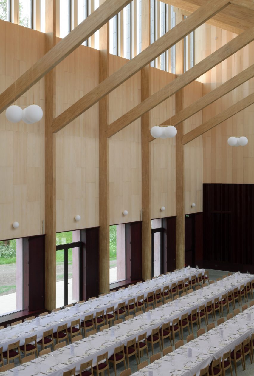
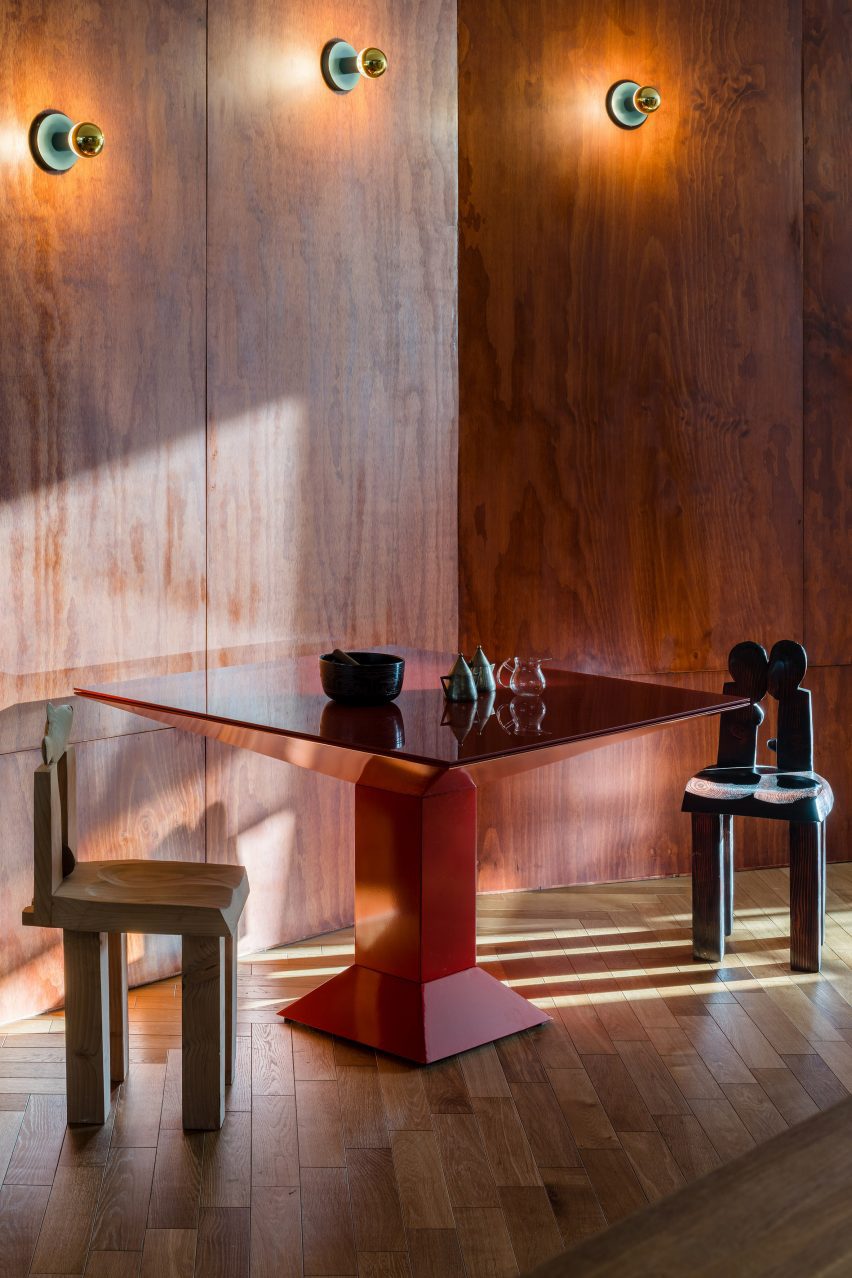
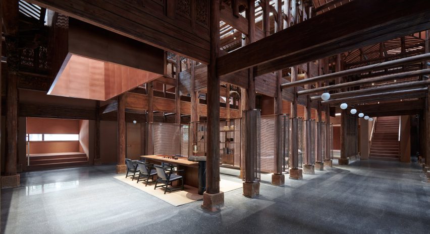
One firm that has successfully created a contemporary Chinese design identity is Neri&Hu, one of China’s best-known architecture and design studios.

According to managing director Del Fierro, the practice’s co-founders Hu and Lyndon Neri have been highly influenced by cultural theorist Svetlana Boym and her concept of “reflective nostalgia”.

“Reflective nostalgia is not a nostalgia that recreates the old, it respects the old but projects something new, something inspiring,” he said.

“It’s not about feeling sad about something that’s lost, but rather to taking elements from the past and making them fresh and new.”

The Relic Shelter teahouse in Fuzhou, China
Recent Neri&Hu projects include The Relic Shelter teahouse in Fuzhou, China

He believes that the conditions are right in China for architects and designers to push boundaries.

“If you work in America, and I worked in America for many years, some of the developers are very conservative,” he said.

“A lot of the Chinese developers are actually ready to try something more innovative. I think there’s something to be said about the culture here that allows for innovation.”

Alex Mok portrait
Alex Mok is co-founder of Linehouse and a Dezeen Awards China judge

Mok, who is co-founder of Shanghai- and Hong Kong-based architecture and interior design studio Linehouse, agreed.

“Transitioning from working in the UK to China was a revelation,” she said.

“At first, I was a bit shocked. But very quickly I just embraced how fluid and fast it is here. We now have the opportunity to be working globally, but our heart is still in China.”

Taking place as part of the Forum programme of talks at Design Shanghai 2023, the first edition of the annual trade show that has taken place since China relaxed international travel restrictions imposed during the coronavirus pandemic, the panel discussion explored how China’s architecture and design scene has been impacted by the pandemic.

Gaga's Coast restaurant in Shanghai designed by Linehouse
Recent Linehouse projects in China include the Coast restaurant in Shanghai

According to Mok, Covid-19 forced many architecture and design firms in China who previously relied on foreign workers to nurture and cultivate local talent instead.

“Everything had to be more local, which I think was a positive thing,” she said.

“It became a bit more about Chinese creativity. When we were hiring, we kept getting all these CVs from foreign architects, but it was impossible [to hire them]. This meant we ended up fostering more local Chinese talent.”

Del Fierro said that Neri&Hu experienced something similar, with many of the firm’s foreign workers returning to Europe or the US and working remotely. According to Fierro, this had the unexpected but welcome consequence of increasing the practice’s international projects.

Covid-19 pandemic created “new opportunities” for architects and designers

“Our practice is very different from three years ago,” he said.

“When the pandemic happened, there were a number of our staff who wanted to return to Europe. We now have about 50 per cent of our projects diversified. Fifty per cent of them are still in China, but 50 per cent are now outside of China.”

According to Del Fierro, the global acceptance of remote working will provide more opportunities for firms based in China to work on projects abroad.

“The concept of remote working is now very commonplace and we are not limited by physical travel anymore,” he said.

“So suddenly, we have all these new opportunities. We are based in Shanghai, can we work in Cape Town? Absolutely! And we don’t have to go there every month. So I think the pandemic caused an interesting situation to create new opportunities.”

Dezeen Awards China 2023 in partnership with Bentley

Dezeen Awards China open for entries until 24 August

Chou, Mok and Neri&Hu co-founder Hu are among the first judges to be announced for Dezeen Awards China, which launched in Shanghai on 8 June in partnership with Bentley. Further judges will be announced in the coming weeks.

Dezeen Awards China is open for entries now until 24 August 2023, but studios can save money on their entry if they enter before 13 July 2023.

There are 17 project categories to enter across architecture, interiors and design. The winners of these project categories will go head to head for the chance to be crowned one of three project of the year winners across architecture, interiors and design.

Reference

Tokyo Conran Shop in Daikanyama
CategoriesInterior Design

Keiji Ashizawa designs “home-like” The Conran Shop in Hillside Terrace

Designer Keiji Ashizawa has devised the interiors of The Conran Shop Daikanyama in Tokyo, which is located inside a building by architect Fumihiko Maki and spotlights products from Japan and Asia.

The latest outpost from British retailer The Conran Shop is located in the modernist Hillside Terrace in Daikanyama, a quiet area close to the Tokyo city centre.

The complex was designed by Pritzker Prize-winner Maki and constructed between 1967 and 1992.

Tokyo Conran Shop in Daikanyama
The Conran Shop Daikanyama was designed to resemble someone’s home

Ashizawa aimed to take the existing architecture of the two-storey building into consideration when designing the interior of The Conran Shop.

“Since the existing space had great potential, we knew that the work had to be put into elevating what was already there – thinking about the proportions of the space, the dry area and so on,” he told Dezeen.

“Although it is inside a well-known architecture, there were elements where we thought we could bring change to the inside.”

Interior of The Conran Shop Daikanyama
It features pieces by Japanese and Asian designers

These changes included turning one glass section into a solid wall.

“Glass walls were used extensively as part of the architectural concept so that the store space could be viewed through the layers of glass,” Ashizawa said.

“While building the store, we decided that there wouldn’t be a problem in making a section of the glass wall become a solid wall, considering its serenity as a space and its relationship with the street.”

Mezzanine in Conran store
A mezzanine showcases a sofa and other living room furniture

The designer created the 200-square-metre store to look like someone’s home, in a nod to the peaceful nature of the surrounding area. It features a large atrium on the ground floor, connecting it to an adjoining courtyard.

“Daikanyama is a very calm neighbourhood in Tokyo, where we wished to design a store where people could feel relaxed and away from the stimulation of the city,” Ashizawa said.

“We intended to create a space for people to stay for a long period of time and feel the space.”

Exterior of Tokyo interior store
The store is located in the iconic Hillside Terrace complex

The interior design was also based on The Conran Shop’s three keywords – plain, simple and useful – CEO of The Conran Shop Japan Shinichiro Nakahara told Dezeen.

The store’s product selection also places a special focus on Japanese and Asian design.

“Specifically for The Conran Shop Daikanyama, the selections were focused on objects from Asia, including Japan,” Nakahara said.

“The process of [founder] Terence [Conran] travelling around the world, finding and buying items in each place by himself, has not changed,” he added. “Many of the objects selected by the Conran team in Japan have a sense of craftsmanship.”

“We created the space by imagining a situation in which such objects would be displayed alongside each other. For example, the details of the objects are reflected in the interior design.”

Staircase in Japanese interior store
It features a staircase with a handrail made from black paper cords

The interior uses materials that are common in Japan including concrete, steel, wood, plaster, Japanese stone and paper.

“The use of Japanese paper in interior design is an element that is distinctively Japanese,” Ashizawa explained.

“Shoji screens are an important element in creating a Japanese-style room but I realize that they can also be well used in both functional and aesthetic ways in a modern space.”

Basement floor in Conran Shop Daikanyama
Concrete walls and shoji screens were used for the interior

The studio also used Japanese paper that had been dyed in a grey hue as wallpaper to give the space a “soft and contemporary feel.”

“Since we weren’t building an actual house but rather a home-like Conran store, the materials were thoughtfully instrumented to achieve a balance,” Ashizawa said.

The ground floor of the store holds furniture, homeware and apparel, and also has a mezzanine floor that is accessible by a staircase featuring a handrail made from black paper cords.

Gallery-like interior by Keiji Ashizawa
A gallery-like space is located on the basement floor

Ashizawa designed the basement floor, which functions both as an additional shopping area and a gallery space, to have a calmer atmosphere.

“Filled with natural light, the ground floor uses colours that bring grandeur and a sense of calmness,” he said.

“The basement floor is toned to create a more private feeling. We respected the natural colours of the materials as much as possible, while also considering the harmony with the objects on display and in the gallery.”

Clothes in Conran Shop Tokyo
The store has a neutral colour palette and wooden details

The Conran Shop Daikanyama also has an adjoining bar where visitors can enjoy teas such as sencha and macha.

Ashizawa has previously worked on a number of other projects in Tokyo, including the Bellustar Tokyo “hotel in the sky” and the Hiroo Residence.

Reference

White clothes rails inside Lestrange store in Coal's Drop Yard
CategoriesInterior Design

Fred Rigby Studio creates dried flower meadow inside Lestrange store

Forest sounds and furnishings made from storm-stricken trees bring elements of nature into this menswear boutique in London’s King’s Cross, designed by local practice Fred Rigby Studio.

The store is the fourth outpost from men’s fashion brand Lestrange and was conceived based on blueprints by biophilic design expert Oliver Heath, combining greenery with reclaimed and natural materials to forge a greater connection to the outdoors.

White clothes rails inside Lestrange store in Coal's Drop Yard
Fred Rigby Studio has designed the latest Lestrange boutique in London

According to Fred Rigby Studio, this approach was chosen to reflect the brand’s philosophy of using renewable and recycled fibres to produce clothing with longevity.

“We wanted to create a sense of calm within the space, which didn’t feel like a generic shop but an interior which told a story behind the clothing and the brand’s ethos,” explained the studio’s eponymous founder.

Overview of wood-lined London shop interior by Fred Rigby Studio and Oliver Heath
Rice paper lanterns are suspended at varying heights throughout the space

The Lestrange store is set inside the Thomas Heatherwick-designed Coal Drops Yard shopping centre, formed of two converted warehouses that were originally built in the Victorian era to store the vast quantities of coal needed by the capital.

Rigby wanted to incorporate this imposing brick structure into his final design.

Shelves inside Lestrange store in Coal's Drop Yard
Tactile plaster was used to cover the walls

“We didn’t want to hide this history by covering it up, which would have also entailed using construction materials,” he told Dezeen.

“So we celebrated it, breaking the space up using timber walls and cladding, then adding the rice paper lights to give the space a more intimate feel.”

Speaker on a plaster-covered shelf
The same finish was also applied to a trio of display shelves

Using the existing site as his canvas, Rigby focused on sourcing a tight edit of natural and reclaimed materials.

“There are lots of new materials on the market, but finding those that are produced in quantity and applicable to commercial use can be a challenge,” he said.

London plane timber – harvested from “storm-stricken and diseased trees” within a few miles of King’s Cross – was used to form the partitions that define the store’s display and changing areas, as well as some bespoke furniture pieces.

British manufacturer Clayworks blended unfired clays with minerals and natural pigments to create the tactile wall finishes, while the terrazzo-style countertops were made by Welsh company Smile Plastics using a mix of recycled plastics from discarded mobile phone casings and chopping boards.

Lestrange store in Coal's Drop Yard by Fred Rigby Studio and Oliver Heath
The changing rooms are clad in panels of London plane timber

As the ultimate counterpoint to the mass and severity of the brick, Rigby conceived the idea of an indoor meadow that meanders through the Lestrange store.

The arrangement of natural dried flowers and grasses was realised by award-winning garden designer Lottie Delamain, integrating a carefully chosen mix of species to reflect the fibres commonly used in apparel manufacture such as cotton and flax.

“We wanted to bring nature inside, using plants linked to the clothes while creating a touch point to the materiality,” said Rigby.

Dried flowers and grasses in a bed of stones inside Lestrange store in Coal's Drop Yard
Garden designer Lottie Delamain created a dried flower meadow for the store

Clothes are displayed on simple white metal rails and the capacious open-topped dressing rooms feature speakers playing forest sounds, complemented by discreet wall lights that cast a subtle glow.

There are also subtle nods to Japanese design in the form of the rice paper lampshades that float at varying heights throughout the store.

Mini dried flower meadow inside London shop by Fred Rigby Studio and Oliver Heath
The flowers are set in wood-framed stone beds

“We started with a mixture of initial references, one of which was a teahouse designed by Charlotte Perriand,” said Rigby.

“We wanted to create a material-focused space with nods to natural materials such as the rice paper lights, which we felt would add to the space and create a sense of calm and stillness.”

Lestrange store in Coal's Drop Yard by Fred Rigby Studio and Oliver Heath
The Lestrange shop is set inside the Coal Drops Yard shopping centre

Previous projects from Rigby, who founded his studio in 2008, include bespoke furnishings for a renovated 1920s office building in London as well as the interiors of Bath’s Francis Gallery, which is set inside a Georgian townhouse.

The photography is by Felix Speller.

Reference

Entryway with black and white mosaic flooring
CategoriesInterior Design

MRDK uses arches and mosaics for Ciele Athletics store in Montreal

Rounded walls and archways create a flow through this Montreal boutique, designed by local studio MRDK for Canadian sportswear brand Ciele Athletics.

The first boutique for Ciele, which sells technical headwear and apparel for running, opened in April 2023 on Notre-Dame Street in Montreal – the brand’s hometown.

Entryway with black and white mosaic flooring
Black and white mosaic tiles form a pattern based on Ciele’s apparel at the entrance to the store

The 3,000-square-foot (279-square-metre) flagship store was designed by MRDK to be as much a boutique as a community space for runners to meet and socialise.

Along the narrow entryway, flooring comprises black and white mosaic tiles that form a graphic pattern based on select items of the brand’s apparel.

Four mannequins within a wall niche
Visitors are lead past a quartet of mannequins to a community lounge area

Ascending four steps or a ramp leads visitors past a large white-tiled planter, then a display of mannequins lined up in front of a brick wall.

A lounge area at the end is designated for gathering and conversation, offering “anyone with an interest in movement and connection a chance to experience running and the many facets of its dynamic community through regular meet-ups and events”, said MRDK.

A dark green dividing wall with arched openings
Access to the main retail space is via an archway that punctures a dark green partition

Access to the main retail space is through an archway with rounded corners that punctures a deep, dark green partition.

“An arched wall gracefully separates the more public community area from the rest of the store, creating a sense of intrigue and inviting exploration,” MRDK said.

White service counter in front of a dark green wall
The green hue continues behind the fluted white service counter

Other similar openings in this spatial divider are used to display clothing on single or double-stacked rails.

The same forest green shade continues on the wall behind the service counter, which is fronted by a white fluted panel and includes a small glass vitrine set into its top.

Sportswear displayed in a series of angled niches
Lime plaster covers the angled walls, which feature bull-nose edges that soften their appearance

Herringbone white oak parquet floors are laid wall to wall, running beneath a low central island that is designed to be broken apart and moved around the store depending on merchandising needs.

A textured lime plaster finish was applied to the walls, wrapping around the bull-nosed corners that soften the angles created by the offset displays.

“The play of light and shadows on these textured surfaces creates a sense of dynamism, accentuating the uniqueness of the space,” said MRDK.

In one corner, a 12-foot-tall (3.7-metre) shelving system presents Ciele’s range of hats on cork mannequin heads.

Hats displayed on floor-to-ceiling shelves
A tall shelving system displays Ciele’s hat collection

Fitting rooms at the back of the store are kept minimal, with green velvet curtain draped behind the arched openings to the cubicles.

“The thoughtful combination of materials, textures, and colours creates an atmosphere that seamlessly blends modernity with a touch of timeless elegance,” said MRDK.

Minimalist fitting room with green velvet curtain
The fitting rooms are kept minimalist and feature green velvet curtains

Formerly known as Ménard Dworkind, the studio was founded by Guillaume Ménard and David Dworkind, and has completed a variety of retail spaces in Montreal and beyond.

Most recently, these have included a store for plastic-free beauty brand Attitude.

The photography is by David Dworkind and Alex Lesage.


Project credits:

Team: David Dworkind, Benjamin Lavoie Laroche
Contractor: Groupe Manovra
Ceramic floor tile: Daltile
Lighting: Sistemalux
Lime plaster: Venosa
Wood profiles: Brenlo

Reference

Dining room
CategoriesInterior Design

Eight welcoming wood-panelled dining rooms with an organic feel

For our latest lookbook, we’ve selected eight dining rooms from the Dezeen archive where wooden panelling was used to create cosy, earthy environments with an organic feel.

From South America to Europe, these wood-panelled dining rooms serve as focal points in the interiors and create social spaces for residents and guests.

Whether they’re made from timber, pine or plywood, the wooden finishes on these statement walls and ceilings have been used to create welcoming environments with peaceful atmospheres.

This is the latest in our lookbooks series, which provides visual inspiration from Dezeen’s archive. For more inspiration see previous lookbooks featuring homes with focal point wardrobes, statement headboards and homes with pergolas.


Dining room
Photography is by Fran Parente and image production is by Victor Correa

ER Apartment, Brazil, Pascali Semerdjian Arquitetos

This apartment in São Paulo has an exposed concrete ceiling and uses natural materials, such as walnut, bronze, onyx and stone in its furnishings and finishes.

Pascali Semerdjian Arquitetos used vertical timber cladding, local art and furniture by Brazilian architects and designers Oscar Niemeyer and Claudia Moreira Salles in the dining room to make the space “deeply Brazilian and vividly cosmopolitan”.

Find out more about ER Apartment ›


Photo of a dining room and stairs
Photography is by Eric Petschek

Carroll Gardens Townhouse, US, Starling Architecture and Emily Lindberg Design

Starling Architecture and Emily Lindberg Design combined two units in a Brooklyn townhouse to create this family home. The townhouse features Belgian white oak on the flooring and along the corridor, stairs, mudroom, kitchen and dining area.

The New York-based studios used neutral tones to decorate the five-story house. In the dining room, wooden cabinets and decorative lamellas match the floor and ceiling.

Find out more about Carroll Gardens Townhouse ›


River Thames engraving in Dragon Flat by Tsuruta Architects
Photography is by Tim Croker

Dragon Flat, UK, Tsuruta Architects

Artificial intelligence (AI) was used to design the patterns engraved on plywood panels that decorate the dining room of the Dragon Flat in London’s Notting Hill. Tsuruta Architects used a CNC router – a computer-controlled cutting machine – to engrave a pattern of the River Thames on the wall.

The architecture studio also updated the two-level maisonette to include a walk-in wardrobe and tatami room, which features an engraved design on its panelled walls.

Find out more about Dragon Flat ›


Wood-panelled dining hall
Photography is by David Grandorge

Homerton College, UK, Feilden Fowles

Homerton College at the University of Cambridge includes a dining hall by London architecture studio Feilden Fowles made from concrete, timber and 3,200 faience tiles.

The building, which was constructed with chestnut-laminated timber frames and clerestory windows, features a larger eating space, a smaller eating room, the kitchen and staff amenities.

It was designed to celebrate handcrafting techniques and contemporary construction and engineering.

Find out more about Homerton College ›


House in El Peumo, Chile by Cristian Izquierdo Hehmann
Photography is by Roland Halbe

House in El Peumo, Chile, Cristián Izquierdo Lehmann

This house, designed by Cristián Izquierdo Lehmann, centres around an open-plan kitchen and dining room with a vaulted ceiling that is used for cooking, dining and socialising.

A minimalist decor compliments the dramatic ceiling, with red stools used for dining and a bookcase lining the wall.

Located in El Peumo, Chile, the house was clad with laminated pine and features concrete floors and large windows for the owners to enjoy the green exterior.

Find out more about House in El Peumo ›


Another Seedbed Brooklyn

Another Seedbed, US, Future Projects

The Another Seedbed loft in Williamsburg, Brooklyn, serves as both a home and performance space for its owner. To function as both, the space is predominately open, with hidden rooms located around the apartment.

Warm pine walls mark the dining space, which features a complementary red angular table and wooden sculptural chairs.

Other walls in the loft are covered in hand-troweled earthen clay plaster, blue penny-round tiles and floor-to-ceiling shelving.

Find out more about Another Seedbed ›


Stone Creek Camp by Anderson-Wise Architects
Photography is by Art Gray

Stone Creek Camp, US, Andersson-Wise Architects

US-based Andersson-Wise Architects designed the Stone Creek Camp in Big Fork, Montana, as a family retreat of cabins and cottages.

While it is wood-clad, the kitchen and dining area does not feature traditional panelled walls. Instead, one wall is made from wooden logs that have been assembled to create an unusual wall with a highly textured surface.

The ceiling was clad in wooden panels that match the floorboards in the home.

Find out more about Stone Creek Camp ›


Cabin Geilo, Norway by Lund Hagem
Photography is by Marc Goodwin

Geilo Valley Cabin, Norway, Lund Hagem

Panelled with blackened timber, this Norwegian ski cabin shelters residents from harsh weather conditions and offers panoramic views of the Geilo Valley. The cabin’s exterior concrete walls have also been tinted black to reflect the interior panels.

The walls and ceiling of the dining room use the same timber cladding, matching the kitchen island to create a cosy, coherent atmosphere.

“The dark tone allows the nature outside to come closer and creates a darkness that contrasts with the white winter landscape,” said the project’s architects Lund Hagem.

Find out more about Geilo Valley Cabin ›

This is the latest in our lookbooks series, which provides visual inspiration from Dezeen’s archive. For more inspiration see previous lookbooks featuring homes with focal point wardrobes, statement headboards and homes with pergolas.

Reference

Interior of Steele's Road House by Neiheiser Argyros
CategoriesInterior Design

Eight pared-back kitchens with minimalist storage solutions

Sometimes the simple solutions are the best, as seen in this lookbook featuring tidy kitchen interiors where minimalist closed cabinets are combined with decorative materials.

In these kitchens, found in homes from Sweden to Mexico, architects and designers largely chose simple storage solutions but added material interest in the form of marble, steel and brick details.

By hiding utensils and crockery away, benches and kitchen islands are freed up to use for food preparation. In some of these kitchens, open shelves above the work areas also provide spaces to hold decorative plates, bowls and cookbooks.

This is the latest in our lookbooks series, which provides visual inspiration from Dezeen’s archive. For more inspiration see previous lookbooks featuring homes where the wardrobe is the focal point, bedrooms with statement headboards and homes with pergolas.


Interior of Steele's Road House by Neiheiser Argyros
Photo by Lorenzo Zandri

Steele’s Road House, UK, by Neiheiser Argyros

The original brickwork was uncovered in parts of this London flat, including in the kitchen where it forms the backdrop to the room’s minimalist cabinets.

Pale-wood cupboards sit underneath the brick wall, which also features shelves to add more storage.

Designers Neiheiser Argyros added a curved window seat, as well as a wooden kitchen table and stool to match the cabinets and give the room a more natural feel.

Find out more about Steele’s Road House ›


Canal Saint-Martin apartment by Rodolphe Parente
Photo by Giulio Ghirardi

Hausmann apartment, France, by Rodolphe Parente

This Parisian apartment in a 19th-century Haussmann building in Paris was given an overhaul by interior designer Rodolphe Parente, who took cues from the owner’s art collection.

In the kitchen, stainless steel cabinets were used to form storage and workspaces, creating an industrial feel that is tempered by pastel-pink walls.

“The kitchen is a deconstructed block sitting in the Haussmanian environment,” Parente told Dezeen. “It is connected to the historical elements through its composition.”

Find out more about the Hausmann apartment ›


Kitchen in Studio Vaaro's House M
Photo by Scott Norsworthy

House M, Canada, by Studio Vaaro

Studio Vaaro used oak cabinetry for the kitchen of this home in Canada, while matching oak shelving provides additional storage above the workspaces.

To contrast the warm wood, the studio chose grey marble for the countertops and splashbacks, which gives the kitchen an organic feel. Additional storage can be found in the pale grey cabinets that frame the kitchen.

Find out more about House M ›


Kitchen in apartment by Holloway Li
Photo by Edmund Dabney

London apartment, UK, by Holloway Li

A kitchen clad in circle-brushed stainless steel clads one wall in this London flat by local studio Holloway Li. Designed in reference to the city’s many fish-and-chip shops, it features a striking curved splashback.

Above the workspaces, a built-in open shelf provides space to store glasses and cooking utensils, with the rest of the storage is hidden behind patterned-steel cabinet doors.

Find out more about London apartment ›


Quesnel apartment
Photo by Ronan Mézière

Montreal apartment, Canada, by Naturehumanie

Fresh minty hues decorate the kitchen of this Montreal apartment, which was given a modern update while retaining many of its traditional details.

The green colour matches that of the apartment’s existing stained glass doors. And the kitchen island and cabinets both have inviting curved forms, finished in a glossy paint that complements the rougher tiles above the counters.

Find out more about the Montreal apartment ›


Kitchen in Highbury House by Daytrip
Photo by Gareth Hacker

Highbury House, UK, by Daytrip

Located in Highbury in north London, this home juxtaposes a gallery-like minimalism with more organic forms.

This is evident in the kitchen, where pared-back storage cabinets in an unusual rectangular shape sit underneath a decorative marble countertop.

Sculptural vases, plates and cooking utensils decorate the matching marble kitchen island as well as a small ledge that functions as both storage and display counter.

Find out more about Highbury House ›


Kitchen with white oak and Florida Brush quartzite
Photo by Yoshihiro Makino

Eastern Columbia Loft, US, by Sheft Farrace

Architecture studio Sheft Farrace renovated this flat, which is located in the iconic art deco Eastern Columbia building in Los Angeles, creating minimalist interiors that draw on the building’s exterior.

In the kitchen, this can be seen in the curved corners of the counters and the elongated cabinet hardware, which reference 1930s design. Florida Brush quartzite was used to cover much of the kitchen, adding a striking decorative detail that is complemented by white oak.

Find out more about Eastern Columbia Loft ›


Kitchen inside Archipelago House by Norm Architects
Photo courtesy of Jonas Bjerre-Poulsen of Norm Architects

Archipelago House, Sweden, by Norm Architects

Danish studio Norm Architects designed this home on the west coast of Sweden to embody both Scandinavian and Japanese aesthetics.

In the white-walled kitchen, a stainless-steel kitchen island offers both a practical workspace and cupboards for storage. Open wood shelving was decorated with black ceramics to create an art installation-style feature on one wall.

Find out more about Archipelago House ›

This is the latest in our lookbooks series, which provides visual inspiration from Dezeen’s archive. For more inspiration see previous lookbooks featuring homes where the wardrobe is the focal point, bedrooms with statement headboards and homes with pergolas.

Reference

Casetify Osaka flagship by André Fu
CategoriesInterior Design

André Fu designs colourful Casetify shop informed by shoji lanterns

Hong Kong-based architect and interior designer André Fu has completed the first global flagship store for electronic accessory brand Casetify in Osaka, combining traditional Japanese shoji paper lanterns with bright colours.

The store, which marks the first retail project by Fu in Japan, was informed by the urban landscape of the Shinsaibashi neighbourhood in Osaka where the store is located.

Casetify Osaka flagship by André Fu
The store is located in Shinsaibashi, the main shopping area in Osaka

According to Fu, the interiors aim to bring “the allure of the dynamic Shinsaibashi neighbourhood into the store”.

“The overall concept is rooted in a vision to celebrate the distinct context of the project with contrasting shapes and forms, capturing the neighbourhood’s cinematic streetscape in a world where bold geometries juxtapose against each other,” said Fu.

Casetify Osaka flagship by André Fu
Curved shoji screens form the product display wall

The storefront was designed as a floor-to-ceiling shoji lantern framed in bright orange. Customers are greeted by a round display table encircled by cylindrical shoji screens, with the same circular arrangement mirrored at the back of the store and its upper floor.

At the centre of the Casetify store sit cabinets that have been decorated with old phone cases, donated by customers in the recycling box located next to them.

A secret shoji window at the rear of the ground floor can be slid open to unveil customised online purchases.

“A lot of my work is rooted in the idea of a journey that takes the contextual quality of each project into an architectural medium,” Fu explained.

“The world of shoji lanterns that goes around you, that folds and unfolds, creates that effect,” he added.

“It transports you from the everyday reality of the neighbourhood to an imaginary, illusionistic expression that blends a relaxed sense of luxury with the popping Casetify colours that the brand is so well known for.”

Casetify Osaka flagship by André Fu
Cabinets are covered with materials made from recycled phone cases

Fu is known for his work on luxury hotels and restaurants, including the Upper House hotel in Hong Kong, the Berkeley London, and the Mitsui hotel in Kyoto.

More recently, he created a two-person “conversation” chair in collaboration with Louis Vuitton’s Objects Nomades, and furnished a model apartment inside the Jean Nouvel tower in New York with his homeware collection.

The photography is courtesy of Casetify.

Reference

Battersea Powerstation Apple store by Foster + Partners
CategoriesInterior Design

Ten Foster + Partners-designed Apple Stores

With Apple opening its latest Foster + Partners-designed store in the newly renovated Battersea Power Station, our latest roundup spotlights 10 Apple Stores designed by the British architecture studio.

Apple has been working with Foster + Partners since 2014, when the technology company and architecture studio initiated its almost decade-long relationship to complete a retail location in Istanbul, Turkey.

Apple describes its first stores as looking “like nothing else”, but is now more focused on renovating and restoring buildings such as its Los Angeles store, Champs-Élysées store and Rome flagship.

“I think that the evolution of retail for Apple is really interesting – starting with very bold statement with stores that look like nothing else,” said Bill Bergeron Mirsky, a global retail design lead at Apple, at the opening of the brand’s Battersea Power Station store.

“And then over time, you move to the Apple Store being very ubiquitous. And now it’s come around to being a responsibility approach,” he continued. “As we see the rise of Apple in the world and the importance people place on the brand and the values that it represents.”

With Apple now having stores in 526 locations across the world Dezeen has selected 10 striking recent stores from its archive:


Battersea Powerstation Apple store by Foster + Partners

Battersea Power Station, UK, 2023

Apple’s most recently opened store is located within the newly renovated Battersea Power Station in London, which marks the technology company’s 40th UK store.

The store is set on the ground floor of the shopping centre within the power station’s 1930s Turbine Hall A. The interior was organised around four original brick columns and beneath steel roof supports that were left exposed.

Find out more about Battersea Powerstation Apple store ›


Oak ceiling in Mumbai apple store

Mumbai, India, 2023

India’s first flagship Apple Store contains a wooden canopy made from 450,000 hand-crafted oak elements that form 1,000 triangular ceiling tiles.

The walls of the store were made from stone sourced from Rajasthan and have a fine grain that is meant to convey the texture of Georgette fabric. It was enclosed by two eight-metre-high glass walls that allow light to flood the double-height interior.

Find out more about Mumbai Apple store ›


 Brompton Road Apple store by Foster + Partners
Photo by Nigel Young

Brompton Road, UK, 2022

An arched timber ceiling with seven-metre tall interiors defines the Brompton Road Apple store in west London. The arched timber ceiling mirrors the profile and shape of the window bays located at the facade of the building.

The studio removed a mezzanine level from the shop interiors and incorporated six Castagna stone columns, four Ficus trees and a terrazzo floor made from castor oil resin, aggregate and recycled glass.

Find out more about Brompton Road Apple store ›


Abu Dhabi Apple store by Foster + Partners
Photo by Nigel Young

Abu Dhabi, UAE, 2022

Apple’s Abu Dhabi store on Al Maryah Island was built on top of a raised podium and surrounded by a stepped waterfall around all of its four sides.

The podium the building is set on is pyramid shaped and constructed from black granite stone. The store is accessed via two bridges that extend over the water feature from a waterfront promenade.

Find out more about Abu Dhabi Apple store ›


Los Angeles Apple store by Foster + Partners
Photo by Nigel Young

Los Angeles, US, 2021

In Downtown Los Angeles, Foster + Partners worked with Apple to renovate a historic 1920s, baroque revival-style movie theatre that was designed by American architect S Charles Lee in 1927.

The sensitive renovation of the formerly abandoned theatre saw the studio restore its corner clock tower, terracotta facade, exterior canopy, and grand entry hall that is complete with bronze handrails and marble columns.

Find out more about Los Angeles Apple store ›


Istanbul staircase
Photo is by Nigel Young

Istanbul, Turkey, 2021

Two large travertine walls flank the interior of Istanbul’s Bagdat Caddesi Apple store. Benefitting from a column-free interior encompasses two levels with a sunken double-height space at its rear.

The building is set back from the street and appears to be a single-storey structure as a result of its sunken lower level. The structure was topped with a large overhanging roof.

Find out more about Istanbul Apple store ›


Rome shop by Foster + Partners

Via Del Corso, Italy, 2021

Another restoration project saw Foster + Partners convert and restore a historic palazzo in Rome, which is located in the centre of the Italian city.

Palazzo Marignoli was constructed between 1873 and 1878 and served as a home for Italian politician Marquis Filippo Marignoli. Foster + Partners wanted to celebrate the building’s history by restoring and highlighting its grandeur and historic features. Hand-painted patterned ceilings and frescos were restored throughout.

Find out more about Rome Apple store ›


Apple Marina Bay Sands in Singapore by Foster + Partners floats in Marina Bay

Singapore Apple, Singapore, 2020

Noted as Apple’s “most ambitious retail project”, its Marina Bay Sands store in Singapore is a spherical glass structure that is completely surrounded by water and accessed via a 45-metre-long underwater tunnel.

The store’s interior is an open-plan space that measures 30 metres wide beneath a self-supporting glass and steel dome, which is made from 114 pieces of glass with 10 steel vertical mullions that provide structural support.

Find out more about Singapore Apple store ›


Central World by Foster + Partners
Photo by Bear and Terry

Bangkok Apple, Thailand, 2020

Named Apple Central World, this Bangkok store is organised around a timber-clad column and a large overhanging roof that was designed to resemble the canopy of a tree.

The store has a 24.4-metre diameter with a timber column that is clad in 1,461 slats of European white oak at its centre. The column fans out at ceiling level and adjoins the roof and extends past the glass perimeter of the store, forming a three-metre cantilever over the glazing.

Find out more about Bangkok Apple store ›


Aventura by Foster + Partners

Miami, US, 2019

An undulating white concrete roof, which draws on Miami’s art deco buildings, tops the Apple Aventura store that is located in Aventura Mall in the north of Miami.

The structure is a boxy, two-storey building with glass walls and indoor trees. The roof of the store is made up of seven, precast six-metre-wide white concrete arches to form a barrel-vaulted ceiling.

Find out more about Miami Apple store ›

Reference

Pop-up shop at Liberty by EBBA
CategoriesInterior Design

EBBA designs sculptural pop-up for Rotaro at London store Liberty

London-based studio EBBA Architects has channelled the environmental ethos of fashion rental platform Rotaro for its pop-up boutique at department store Liberty.

The project aimed to show that beautiful and interesting spaces can be created for temporary use, while still considering the environmental impacts of materials and construction.

“We are very aware of our environmental impact and we believe design should speak to this, while also trying to make a unique experience for the visitor,” EBBA founder Benjamin Allan told Dezeen.

Pop-up shop at Liberty by EBBA
EBBA designed a pop-up shop for fashion rental platform Rotaro

Rotaro is all about fashion rental, as a response to waste in the industry,” he added. “Circularity is key to their ethos and we wanted to connect to this, both in the use of material and form.”

Bringing definition to Rotaro’s space within the wider store, EBBA has demarcated the area with a pair of substantial columns, each with an elongated, semi-circular cross-section.

“The position and shape of the columns create the sense of walking into an entirely new space within the historic context of Liberty,” said Allan.

Cork column emblazoned with the Rotaro logo
The studio demarcated the area with a pair of substantial columns

Entwining the two columns, a pair of metal rails have the dual function of creating a display area and introducing a sculptural element that further defines the space, with soaring, free-form curves.

“The two rails rotate and wrap around each of the columns, while also simultaneously responding to the opposite rail, a bit like a choreographed piece,” Allan said.

Cork column at Rotaro pop-up in Liberty
Cork is the project’s primary material

Continuing the theme of duality, just two key materials have been used in the space – cork and metal.

EBBA was influenced by the work of artists Donald Judd and Carl Andre and their elevation of humble materials through detailing and construction.

Metal rails by EBBA for the Rotaro pop-up
A pair of metal rails have a dual function

“We always look to push the potential of a project, to make the most impact through the simplest of means and also address the need to be economical,” Allan said.

“Essentially the design revolves around only two materials which, working together, give a sense of regularity in the layouts of the blocks, combined with the sculptural forms of the rails.”

Garments hanging from metal rails
Curated garments hang from the rails

Cork was used as the primary material, cladding the two columns and creating the backdrops that zone Rotaro’s area.

EBBA aimed to use a material that had an environmental quality, while using the standardisation of the blocks to set parameters for the design.

“We chose blocks of a specific dimension that could then be adapted to create both the walls and the columns themselves,” Allan said.

“The cork is a natural material that has an inherent warmth and depth, while also being incredibly versatile and easily recycled,” he added.

Textured ultramarine plinth
Texture characterises the pop-up shop

Brushed stainless steel was used for the metalwork, with each rail comprised of a single piece of metal that was bent and sculpted to wrap around the columns.

This rail’s curving form relates to the idea of circularity in Rotaro’s business model, while also bringing an adaptability to the space by allowing the garments to be shown in a variety of ways.

Stainless steel railing for Rotaro by EBBA
Brushed stainless steel was used for the metalwork

“The primary purpose is to display the continuously updated collection while also adding a sculptural aspect that helps to create a sense of space,” said Allan.

Within the ornately-detailed Liberty store, the project offers a bold, contemporary response to the interior, while finding common ground with the wider building.

Curving metal rail
The rail’s curving form relates to the idea of circularity

“The tones and textures in the warmth of the cork, tie in with the timber and natural colours of Liberty’s interior spaces,” Allan said. “Detailing and decoration in the original columns relate to nature and vegetation, which also tie into the use of cork and its qualities.”

Because the Liberty building has Grade II listed status, no fixings were allowed into the building fabric.

“The benefit of the lightweight cork material meant we could also adapt the Rotaro space with minimal impact on the wider building,” he added.

Lightweight cork column at Rotaro by EBBa
Cork was chosen for being lightweight

To create a plinth that provides a flat surface for displaying objects, EBBA used the same semi-circular form of the columns, but flipped onto its side.

This element has been given an ultramarine blue coating to add a sense of playfulness and catch the attention of visitors, using one of Rotaro’s key colours to connect with the brand’s identity.

Semi-circular plinth with ultramarine coating
A semi-circular plinth features an ultramarine blue coating

While the space has been designed as a pop-up, EBBA worked – through the quality of the materials and the construction of the walls and blocks – to give it a sense of permanence.

“All of our projects aim to achieve a quality of permanence through the use of natural materials and the detailing of the construction,” Allan said.

“We believe that this level of quality helps to create a design that feels purposeful, even for temporary uses.”

Other recent projects by EBBA Architects include a shop for Cubitts in an old pie-and-mash restaurant and a house extension with brutalist-style materials.

The photography is by James Retief

Reference

Kendom saloon door
CategoriesInterior Design

Barbie and Ken unveil bright-pink lifesize dollhouse in Malibu

Rental website Airbnb has unveiled Barbie’s Malibu Dreamhouse, an all-pink California mansion with an outdoor disco, infinity pool and Western-themed bedroom.

Located on the oceanfront in western Malibu, California, the lifesize dollhouse is being rented out by Barbie’s partner Ken via an Airbnb listing written as if by the doll himself.

Kendom saloon door
“Kendom Saloon” welcomes beach house guests

The house, which was previously listed by Airbnb for Barbie’s 60th anniversary in 2019, has had a recent update to give it more “Kenergy” and mark Barbie making her live-action debut in the Barbie film starring Margot Robbie.

“We all have dreams, and Barbie is lucky enough to have a house full of them,” Ken said. “But now, it’s my turn, and I can’t wait to host guests inside these one-of-a-kind – dare I say, one-of-a-Ken? – digs.”

Pink bedroom in Barbie's Malibu Dreamhouse
A cowboy-themed bedroom nods to Ken’s style

The large oceanfront house features a pink bedroom decorated with cowhide rugs, cowboy hats and horse-printed throws as well as a closet from which guests can borrow Ken’s fringed cowboy shirts and his guitar.

Some of Barbie’s clothing, including the iconic high-heeled pink shoe with a fluffy feather decoration from the movie, also hang in the closet.

The closet in Barbie's Malibu Dreamhouse
Barbie’s Malibu Dreamhouse is located by the beach in California

At the centre of the building, on one of the house’s many terraces, guests can make use of an outside disco dance floor in pink, purple and yellow with its own DJ deck.

“I’ve added a few touches to bring some much-needed Kenergy to the newly renovated and iconic Malibu DreamHouse,” Ken said.

The Dreamhouse also has a bright-pink outdoor lounging area, an outdoor gym – complete with a barrel filled with “beefy body brine” –  a pink outdoor kitchen with a barbecue and an infinity pool.

Other details that nod to Ken’s takeover include a Western-style swing door, decorated with an image of a horse and the words “Kendom Saloon”, and a crossed-out “Barbie” sign above the outdoor kitchen that now reads “Ken”.

Outdoor disco dance floor in Barbie house
Guests can disco outdoors

Guests can enjoy nearby activities such as shopping, surfing and roller blading on the boardwalk, and will also get to take home their own set of yellow-and-pink Impala skates and surfboard.

Barbie’s Malibu Dreamhouse will be available to book for up to two guests each on July 21 and July 22, 2023, with bookings opening on 17 July.

Outdoor gym in Barbie Dreamhouse
An outdoor gym features weightlifts and “body brine”

“All stays will be free of charge – because Ken couldn’t figure out how to put a price on Barbie’s Malibu DreamHouse – after all, Ken’s thing is beach, not math!” Airbnb said.

The company will make a one-time donation to the charity Save the Children in celebration of the Barbie movie.

The film was recently in the news as it made “the world run out of pink”, while a recent book explored Barbie’s Dreamhouse through the ages.

The imagery is by Hogwash Studios.

Reference