Pink interior of Moco shop in Barcelona, designed by Isern Serra and Six N. Five
CategoriesInterior Design

Isern Serra turns renderings into reality to form pink Moco Concept Store

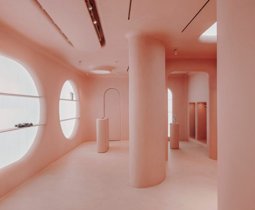
Design studio Isern Serra has transformed a computer-generated image by digital artist Six N Five into a rose-coloured retail space for the Moco Museum in Barcelona.

Situated in Barcelona’s El Born neighbourhood, the Moco Museum exclusively exhibits the work of modern artists such as Damien Hirst, Kaws, Yayoi Kusama and Jeff Koons.

The institution’s eponymous concept store has a similarly contemporary offering, selling a mix of design, fashion and lifestyle goods.

Pink interior of Moco shop in Barcelona, designed by Isern Serra and Six N. Five
The store’s interior is completely covered in pink micro-cement

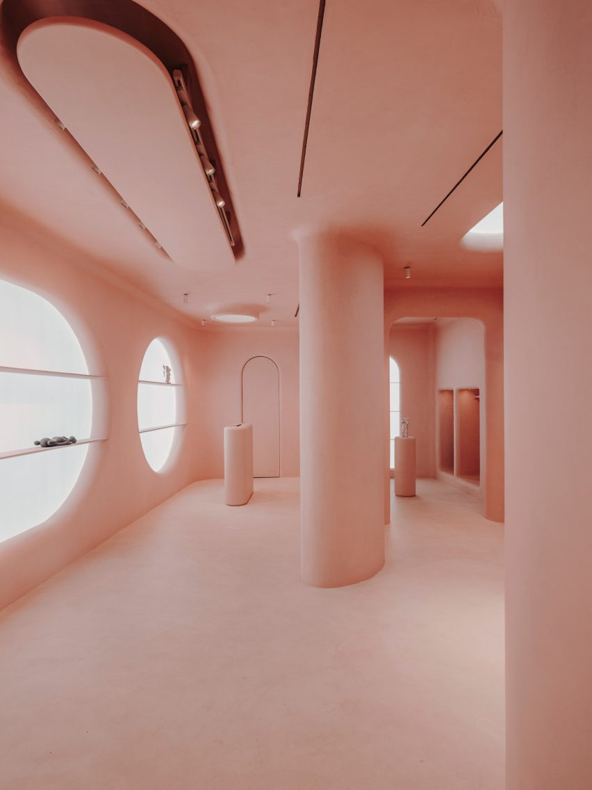
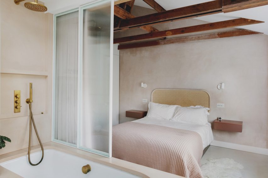
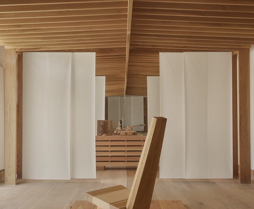
Its surreal pink interior started out as a computer-generated image by Six N Five, a digital artist known for envisioning other-worldly dreamscapes in pastel hues.

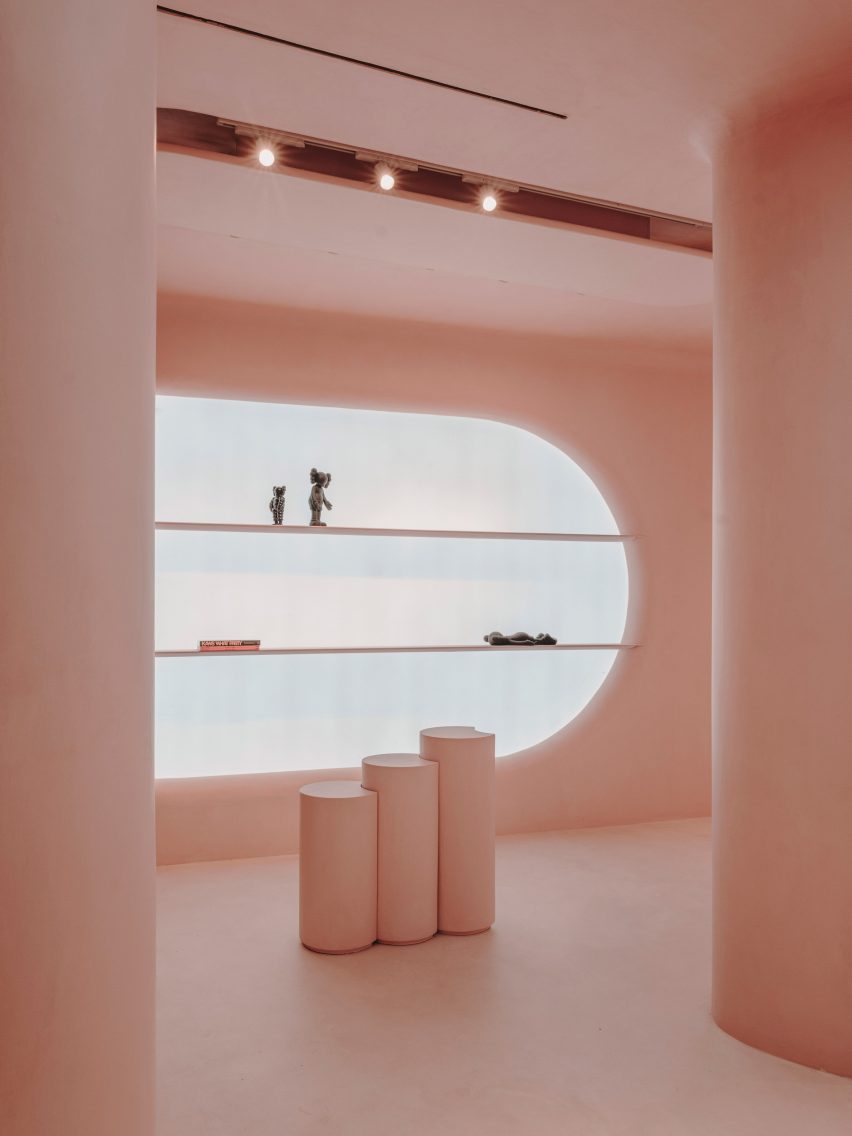
Barcelona-based design studio Isern Serra then brought the image to life, using pink micro-cement to achieve the same uniform, ultra-smooth surfaces seen in the drawing.

Pink interior of Moco shop in Barcelona, designed by Isern Serra and Six N. Five
Products are displayed inside huge circular display niches

“The Moco Concept Store represented an interesting challenge, as I had to combine the purpose of the store with actual architecture remaining true to our original dreamy world I had built in CGI,” explained Six N Five, whose real name is Ezequiel Pini.

“But these concepts were able to go one level further, both in decisions and execution, thanks to Isern Serra who brought its extraordinary talent and experience.”

Pink interior of Moco shop in Barcelona, designed by Isern Serra and Six N. Five
Arched and square niches have also been punctured into the walls

The store’s rosy interior can be seen through two large openings in its facade – one of them is rectangular, while the other is slightly curved and contains the entrance door.

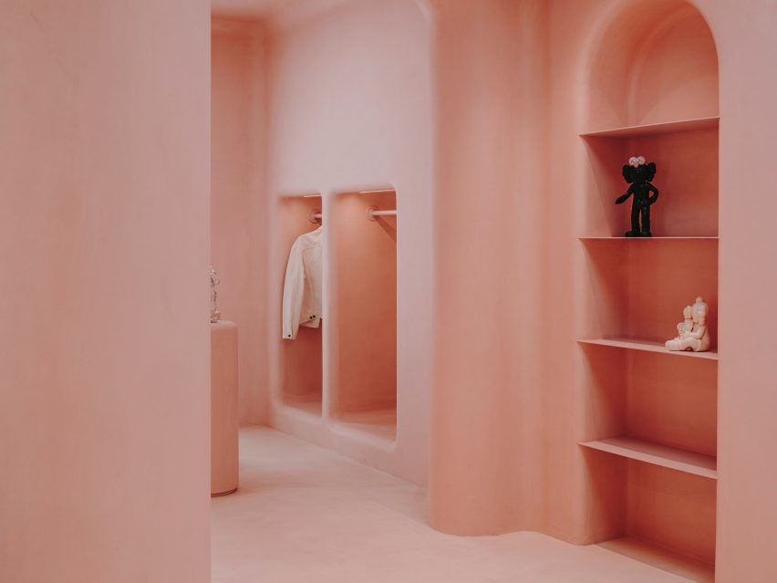
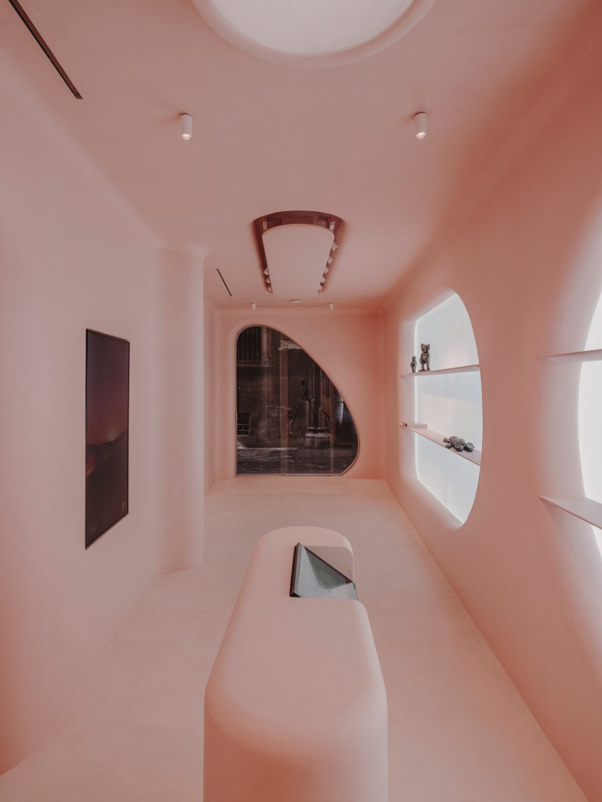
A series of chunky columns run through the middle of the space. Surrounding walls have been punctured with arched, square and circular display niches, some of which are dramatically backlit.

Rows of shelves and a frame for a tv screen have also been made to project from the wall.

Pink interior of Moco shop in Barcelona, designed by Isern Serra and Six N. Five
A faux skylight sits directly above pink display plinths

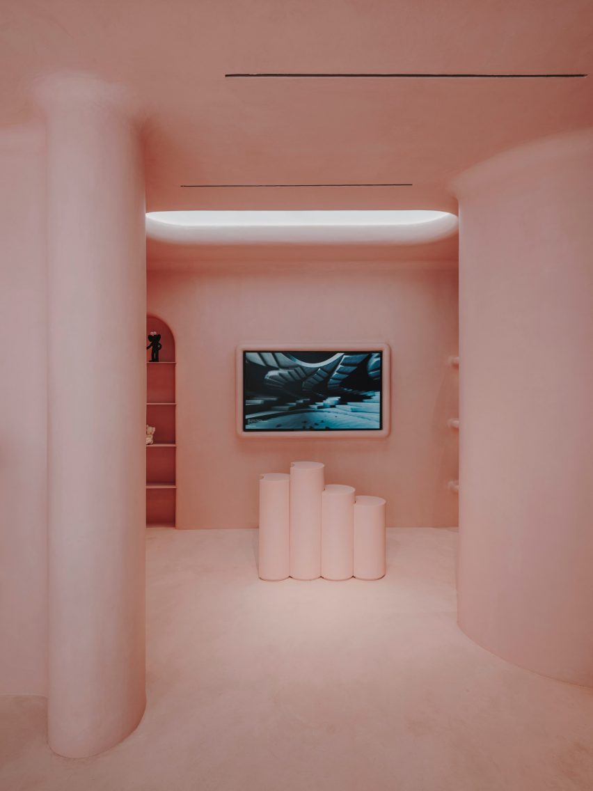
The store’s largely open floor plan is only interrupted by a few pink cylindrical plinths used to showcase products, and a bespoke pink cashier desk with an integrated computer system.

Custom spotlights have been installed on the ceiling, along with a faux skylight.

Pink interior of Moco shop in Barcelona, designed by Isern Serra and Six N. Five
The store’s custom furnishings, like the cashier desk, are also rendered in pink

An increasing number of creatives are making their virtual designs a reality.

Last year, digital artist Andres Reisinger collaborated with furniture brand Moooi to produce a physical version of his Instagram-famous Hortensia chair, which was initially a rendering.

The piece is covered with 20,000 pink fabric petals, emulating the almost fluffy appearance of a hydrangea flower.

In Sweden, designer Christoffer Jansson passed off a virtual apartment as an Instagram home renovation project.

The photography is by Salva Lopez.


Project credits:

Authors: Six N Five and Isern Serra
Builder: Tegola Rosso SL

Reference

Apple Battersea by Foster + Partners
CategoriesInterior Design

Apple reveals Battersea Power Station shop as latest “evolution of the store”

Technology company Apple has unveiled its latest Foster + Partners-designed store in the recently revamped Battersea Power Station in London, which features updated fixtures and furniture.

Set to open later today, Apple Battersea is the brand’s 40th UK store and represents an evolution in its retail design thinking with more of an emphasis placed on accessibility and sustainability.

“We developed this material palette and this fixture set that is really trying to align with like Apple’s goals,” said Bill Bergeron Mirsky, a global retail design lead at Apple.

“This material palette is new for us, it’s an evolution of the Apple Store,” he told Dezeen.

Apple Battersea by Foster + Partners
Apple Battersea opens today

Designed by UK studio Foster + Partners, the store is set on the ground floor of the shopping centre within the 1930s Turbine Hall A at the former power station, where the studio also designed the technology brand’s offices.

The shop is arranged around four original brick piers and has steel roof supports exposed on the ceiling. On top of this base, Foster + Partners overlaid a revamped fixture set that Mirsky said “will become familiar over time”.

Apple Battersea is the second store – after the recently reopened Tysons Corner store in the USA, which replaced Apple’s first ever store – to feature the redesigned fixtures.

Apple Battersea by Foster + Partners
It features an updated fixture set

Around the edge of the store is an oak framework of shelving that was developed with Foster + Partners.  The timber structure also defines a space dedicated to watches, a pick-up area and a redesigned Genius Bar.

The Genius Bar has a counter for stand-up service along with a lowered area where people can be served sitting down. Along with its standard Parsons tables, which are made from sustainably harvested European oak, the store also has several lowered tables.

Updated Genius Bar
The redesigned Genius Bar has a lower counter

“We’ve thought about mobility issues across the whole fixture set,” explained Mirsky. “We have our traditional Parsons table with our standard height, but you notice that the tables in the back are varied and our new genius bar as well.”

“We have a standing height because the team really prefers to stand and it lets them work with more people and then they can stand at the tables, but customers who want to sit or need to sit can actually use these slightly modified tables,” he continued.

As part of the focus on mobility, Apple also increased the amount of circulation around the edge of the store.

Tables in London Apple store
There is more space around the edge of the store

Along with the timber framework, Apple aimed to replace other more carbon-intensive elements in the store with biomaterials.

The floor, which was first used in the Brompton Road store, was made from aggregates bound together with a bio-polymer, while the acoustic baffles in the ceiling were made from biogenic material.

The acoustic baffles and bright floor form part of a focus on improving visual and acoustic clarity in the store, with a dark band placed around the base of the walls to provide visual differentiation with the flooring.

“Something I want to point out that is really part and parcel of the material palette, but also goes to our universal design, is the contrast in the store,” said Mirsky.

“We wanted to make sure we have this really enhanced kind of navigation,” he continued. “So the floor is brightened – it helps us with our low energy – but it also makes it so that you can clearly see the table and the walls are defined.”

Pick up space in Apple Store
The store has a dedicated pick-up corner

The fixture set, flooring and ceiling baffles were also used at the Tysons Corner store and Mirsky believes the base can create a feeling of familiarity for Apple’s customers.

“Each store is really dealt with as a unique circumstance Battersea has this incredible, incredible existing architectural fabric to work in,” he said.

“We use the same fixture set at Tysons Corner in a mall setting in America which doesn’t have this sort of grand grandiose architecture, but the same fixture set can generate an environment that’s very familiar and welcoming no matter where you are.”

The store is the latest to open in London, following the Brompton Road store that opened last year, which was designed to be a “calm oasis”. Other recently completed Apple Stores include the band’s first shop in India and a store in Los Angeles’ historic Tower Theatre.

Reference

Exterior of Palm Beach house
CategoriesInterior Design

YSG draws on beach clubs of Ibiza for redesign of Sydney coastal home

Australian interiors studio YSG has updated a holiday home in Sydney’s Palm Beach suburb, layering it with a maximalist mix of colours, patterns and textures.

The 400-square-metre house belongs to a young family who wanted a place to escape during the holidays while still providing space for remote working.

Exterior of Palm Beach house
YSG renovated a holiday home in Sydney’s Palm Beach

The home’s original furnishings were included in the sale but the clients were less than enthused by the nautical colour palette, seashells and model yachts.

“The weathered features and cliched seaside tropes, amongst other things, deterred their visits,” said Yasmine Ghoniem, founder and director of YSG.

Look from patio into Sydney home by YSG
Its living and dining area are separated by a small step

YSG took cues from the rustic beach clubs of Ibiza and Cancun for the revamp, with a touch of French Riviera refinement to create “a palpably playful mood for entertaining”.

The house was given a full overhaul, with worn floorboards sanded back to reveal warmer timber accents while windows and doors were replaced with more slimline versions.

Living room with painting in Palm Beach house
Details from a painting in the lounge were carried over onto the walls

In the sunroom, tongue-and-groove panelling was removed for a more contemporary look while a mirrored wall was taken out because it caused the room to overheat.

A new rose-tinted marble floor extends to skirting height, amplifying the sense of space while helping to keep the room cool. In the kitchen, YSG added a stone island “that recalls the ombre shades of a freshly poured tequila sunrise”.

Seating area next to pool in Sydney house by YSG
Chequerboard tiles surround the pool

The couple also asked for a second master suite, so that they could each have their own retreat while working remotely.

“We designed integrated marble and timber desks, enabling both to simultaneously work privately from their rooms whilst enjoying views from the upper level,” Ghoniem said.

For the all-important exterior areas, which wrap around the house on each level, YSG provided a material refresh by removing the old heavy paving and weathered grey timber as they distracted from the views.

The pool area now features a chequerboard pattern of tumbled marble cobblestones while the dark blue pool tiles were replaced with a lighter finish and the chrome fence posts were powder-coated in a soft white tone to prevent glaring reflections.

Kitchen of Palm Beach house
The home’s stone kitchen island is made from thickly veined stone

YSG added a playful painting in the living room that acted as a starting point for the home’s entire interior scheme, including the colour palette of ochres, yellows, and reds.

Its motifs such as palm trees and fruit are repeated throughout the house across prints and cushions, as well as being hand-painted onto walls and doors.

Living room of Sydney house by YSG
The home also has a second lounge area

Even the painting’s chequered top border is continued as a hand-painted datum line across the living room to enliven the otherwise plain walls.

Ghoniem also repeated the same device on the side of the raised step that lead to the dining area, “artistically acknowledging a trip hazard”.

Bedroom of Palm Beach house
The bedrooms were designed to provide space for remote working

In the sunroom, hand-painted swirls soften the beams while in one of the master bedrooms, the vertical red lines of a nude painting were playfully continued onto the wall above the artwork.

The rich material palette features many types of marble, including Giallo, Toledo and Tiberio along with honed travertine and French wash walls, while the textiles include linen and kimono silk.

Bathroom of Palm Beach house in Sydney
Chequerboard tiling also features in some of the bathrooms

YSG has completed a number of projects across Sydney, including another house in a coastal suburb with tactile finishes and a penthouse for a couple of empty nesters.

The photography is by Prue Ruscoe.

Reference

Entrance to SKIMS Swim Selfridges pop-up
CategoriesInterior Design

Kim Kardashian brings poolside vibes to SKIMS pop-up at Selfridges

A three-tiered diving board stands next to a metallic palm tree inside this pop-up shop that designer Willo Perron has created for Kim Kardashian’s lingerie brand SKIMS in London.

The brand’s first physical retail space in the UK, at the Selfridges department store in London, follows the same formula as its debut shop in Paris. Here, surfaces were coated in panels of glossy plastic with gentle thermoformed curves to suggest the shape of the human body.

Entrance to SKIMS Swim Selfridges pop-up
SKIMS has opened a swimwear pop-up in Selfridges

But for this temporary summertime pop-up, Perron abandoned the brand’s typical fleshy colour palette in favour of a pale blue hue reminiscent of a heavily chlorinated swimming pool.

The resulting plastic panels are so glossy they look almost wet as they form everything from mirror frames and bench seats to wall panels and the shop’s monolithic till counter, which is embossed with the SKIMS logo.

Diving board sculpture by Willo Perron of Perron-Roettinger
A three-tiered diving board sculpture forms the centrepiece of the store

A huge replica of a three-levelled diving board stands at the heart of the store, with a stepped base and springboards formed from lengths of the same baby-blue plastic.

Shiny chrome tubes act as handrails and are repeated throughout the store in the form of gridded partitions and clothing rails, curving around the columns of the Grade II-listed department store.

Rounding off the poolside atmosphere is a matching metal palm tree sculpture, integrated into the long bench set that runs along the shopfront.

To display stacks of rolled-up nude-coloured SKIMS towels, Perron also added two smaller freestanding platforms with the same steps and chrome handrails as the diving platform but minus the springboards.

Entrance to SKIMS Swim Selfridges pop-up
Thermoformed plastic panels in glossy blue glad most of the interior

Taking over Selfridges’ ground-floor pop-up space The Corner Shop until 8 July 2023, the shop will offer the brand’s core collection of swimsuits and bikinis alongside limited editions and seasonal colourways.

Customers will also be able to buy ice cream to match their swimwear, stored in baby-blue freezers courtesy of London gelato company Chin Chin Labs.

SKIMS Swim Selfridges pop-up by Willo Perron of Perron-Roettinger
A metallic palm tree decorates the store

“I’m thrilled to bring SKIMS Swim to London for the first-time ever and take over The Corner Shop at Selfridges with our most conceptual pop-up experience to date,” said SKIMS co-founder and creative director Kim Kardashian.

“We have followers all over the world,” she added. “As we enter the next phase of SKIMS retail, I look forward to connecting with these customers through innovative shopping experiences on a global scale.”

Overview of baby-blue retail space by Willo Perron of Perron-Roettinger
A metallic palm tree completes the poolside atmosphere

Returning for its second year, SKIMS’s swimwear offering is pitched towards providing various levels of coverage for different body types and modesty requirements.

This is an extension of the brand’s drive to create inclusive underwear and shapewear that works for people of different sizes and abilities, following the launch of its Adaptive Collection last year.

Over the next three years, the brand is planning to open a roster of freestanding stores across the UK and EU.

Reference

Dezeen Awards China WeChat code
CategoriesInterior Design

Dezeen launches China edition of Dezeen Awards

Dezeen has launched a new edition of Dezeen Awards to celebrate the best architecture, interiors and design in China. Start your entry today!

Dezeen Awards China is the first regional edition of Dezeen Awards, which has grown rapidly to become one of the most entered awards programmes on the planet and is a benchmark for international design excellence.

Dezeen Awards China to spotlight Chinese design talent

Launched in partnership with Bentley Motors, Dezeen Awards China will shine a spotlight on the best Chinese architecture, interiors and design, providing international recognition from around the globe.

Dezeen Awards China will be a celebration of Chinese design talent. It is therefore for architects, designers and studios based in China, rather than for projects by international firms that are built in China.

Multinational firms that have an office in China are free to enter, as long as the majority of the work on the project was completed by the Chinese office.

Just like the international edition, Dezeen Awards China is open to studios large and small and will celebrate both established names and emerging studios working in China today.

Judges include Rossana Hu, Alex Mok and Michael Young

Dezeen Awards China will be judged by a stellar jury made up of the top Chinese architects and designers, as well as high-profile international names with experience working in China.

Judges confirmed so far include architect Rossana Hu, interior designer Alex Mok and designer Michael Young. More names will be announced in the coming weeks.

Seventeen categories spanning architecture, interiors and design

There are 17 project categories to enter across architecture, interiors and design. The winners of these project categories will go head to head for the chance to be crowned one of three project of the year winners across architecture, interiors and design.

In addition, six China Designers of the Year awards will celebrate the leading emerging and established names working in China across architecture, interiors and design.

However, these awards are nomination-only and our judges will shortlist names – it is not possible to enter these awards.

Dezeen Awards China is open for entries now until 24 August 2023, but studios can save money on their entry if they enter before 13 July 2023.

Dezeen Awards China WeChat code
Scan the code above using WeChat to download entry forms

Go to dezeen.com/awards/china to find out more about Dezeen Awards China, including how to enter and information on the categories and entry prices and deadlines.

Or, scan the code above using WeChat to access the WeChat mini app for all the information about Dezeen Awards China in Chinese and to download entry forms.

Dezeen Awards China launches in partnership with Bentley

Dezeen Awards China launched in partnership with Bentley, as part of a wider three-year collaboration that also includes headline sponsorship of the international edition of Dezeen Awards, which closed for entries last week, and a design competition to redefine the future of luxury retail that launched last month.

“We are thrilled to be working with Bentley to launch Dezeen Awards China, our first regional awards programme,” said head of Dezeen Awards Claire Barrett.

“We are looking forward to discovering a wealth of design talent and promoting it both locally and on a global stage, showcasing the country’s rising position as a design powerhouse.”

“We are delighted to be working with Dezeen to deliver a new global platform that will celebrate both new Chinese design talent and established names,” added Steven De Ploey, Bentley’s global head of marketing.

“Partnering with Dezeen in this way enables us to reward and support cutting-edge innovators in the design industry who strive to deliver transformational experiences and best solve the design challenges of our age.”

Winners to be announced in December 2023

Dezeen Awards China is open for entries until 24 August 2023

Shortlists will be announced in October and the winners will be revealed at a ceremony in December 2023.

Sign up to our Dezeen Awards China newsletter

Join our mailing list to get updates about Dezeen Awards China 2023! Subscribe here.

Questions?

If you have any questions about Dezeen Awards China, please email [email protected] or send a message to our WeChat account DezeenCN and someone from the team will get back to you.

Good luck with your entries!

Reference

Nicolai Paris bedroom apartment by NOA with a bath on a wooden step and a double bed with white bedding
CategoriesInterior Design

Eight bedrooms with bathtubs that make a lavish statement

A steel bathtub in a grey carpeted bedroom and a marble bath positioned on a wooden plinth are included in Dezeen’s latest lookbook, highlighting luxurious bedrooms with bathtubs.

Typically confined to bathrooms with splash-safe surfaces, a bathtub in a bedroom has an air of grandiosity and indulgence.

It is often seen as an impractical design trend due to ventilation considerations, the need for a strengthened floor and the transition of moving from a soapy bath soak to fresh bed sheets, but this roundup showcases different ways baths in bedrooms have been achieved in homes and hotels.

This is the latest in our lookbooks series, which provides visual inspiration from Dezeen’s archive. For more inspiration see previous lookbooks featuring cherry red interiors, minimalist bedrooms and concrete kitchens.


Nicolai Paris bedroom apartment by NOA with a bath on a wooden step and a double bed with white bedding
Photo by Antoine Huot

Nicolai Paris, France, by Network of Architecture

Architecture studio Network of Architecture added curved lines and custom oak furniture to this Parisian apartment, including a curved wooden plinth for a Botticino Fiorito marble bathtub in the main bedroom.

Located in the former Hotel Nicolai, the studio transformed the interior into a two-level family home that “reflects the elegance of the Parisian ambience in the flat”.

Find out more about Nicolai Paris ›


Bedroom and adjacent open-plan ensuite at Apartment A by Atelier Dialect with a rectangular bathtub
Photo by Piet-Albert Goethals

Apartment A, Belgium, by Atelier Dialect

For the Apartment A residence in Antwerp, Belgian design studio Atelier Dialect placed a shiny steel rectangular bathtub in the carpeted open-plan bedroom, offsetting the surrounding green walls.

Behind the tub is a partition wall covered in white and black subway tiles, creating a graphic backdrop and concealing a walk-in shower.

Find out more about Apartment A ›


Lundies House guesthouse in Tongue by Wildlands and Groves-Raines Architects

Lundies House, UK, by Groves-Raines Architects

Scottish studio Groves-Raines Architects combined Scottish vernacular and contemporary Scandinavian design when converting a former clergy living quarters into the Lundies House guesthouse, complete with a slipper bath in the main bedroom.

With views out the nearby window of the Scottish highlands, the freestanding tub is a luxurious addition to the calming neutral-toned interior.

Find out more about Lundies House ›


Concrete bedroom with a rectangular bathtub by a window looking out to rocks
Photo by Gaudenz Danuser

Concrete Cabin, Switzerland, Nickisch Sano Walder Architects

A deep polished concrete ledge with a sunken bath stretches the width of this holiday cabin bedroom, which is sunken into a rocky site in the Swiss Alps.

Architecture studio Nickisch Sano Walder Architects designed the Concrete Cabin as a stark hideaway for up to two people. Timber salvaged from a log cabin previously on the site was used as the formwork for the cast concrete walls.

Find out more about Concrete Cabin ›


Studio Hagen Hall 1970s-style townhouse bedroom with a bathtub and glass screen
Photo by Mariell Lind Hansen

Primrose Hill townhouse, UK, by Studio Hagen Hall

The owners of this refurbished London townhouse can draw a pink curtain to separate the cork-tiled bathtub from the rest of the bedroom, designed by architecture office Studio Hagen Hall.

The pastel-toned bedroom has a paired-back appearance compared to the rest of the home, which features elm, velvet and fluted glass surfaces informed by 1970s Californian modernism.

Find out more about the Primrose Hill townhouse ›


Standard Studio use patio and skylights to funnel light into Amsterdam loft

Amsterdam canal house, the Netherlands, by Standard Studio

Local firm Standard Studio converted a canal house in Amsterdam into an apartment with rooms arranged around a central courtyard, including a bedroom with an oval bath and freestanding bath tap.

Large glazed doors open the bedroom and bath area to the courtyard, and both interior and exterior spaces were finished with polished concrete floors.

Find out more about the Amsterdam canal house ›


Tiled bathroom inside Open Heart Lisboa's artist residence
Photo by Ricardo Oliveira Alves

Open Hearts, Portugal, by AB+AC Architects

Open Hearts is a wellness centre in Lisbon that doubles as an artists’ residence, designed by Portuguese practice AB+AC Architects.

The studio added terracotta tiling to a corner of the white bedroom, visually separating the bath area from the rest of the space.

Find out more about Open Hearts ›


Dark, red-toned bedroom in the Mona hotel in Athens with a freestanding bath
Photo by Ana Santl

Mona Athens, Greece, by House of Shila

Located in a former 1950s textile factory, design studio House of Shila created luxurious open-plan rooms with freestanding baths for the Mona Athens hotel.

A change in floor level and translucent drapes separate sleeping and bathing areas, creating a “certain balance of comfort and drama” according to the studio.

Find out more about Mona Athens ›

This is the latest in our lookbooks series, which provides visual inspiration from Dezeen’s archive. For more inspiration see previous lookbooks featuring cherry red interiors, minimalist bedrooms and concrete kitchens.

Reference

Louisville Road house designed by 2LG
CategoriesInterior Design

Ten bathrooms with double sinks for couples who prioritise personal space

Nobody likes knocking elbows while brushing their teeth. In this lookbook, we collect 10 bathrooms with interesting takes on double sinks from the Dezeen archive.

Sometimes called his-and-hers sinks, double sinks immediately introduce a luxurious feel to the bathroom. The 10 examples below feature varying contemporary interpretations of this classic design flourish.

This is the latest in our lookbooks series, which provides visual inspiration from Dezeen’s archive. For more inspiration see previous lookbooks featuring bathrooms with colourful toilets and sinks, timber cladding and lots of concrete.


Louisville Road house designed by 2LG
Photo by Megan Taylor

Louisville Road apartment, UK, by 2LG Studio

London design firm 2LG Studio fitted a bespoke coral-orange vanity unit with luted-lacquer-coated doors to form the double sink in this house in Tooting.

The unit contrasts with baby-blue taps that match the floor tiles and the bordering around the large bathroom mirror, as well as the shower screen.

Find out more about this Louisville Road apartment ›


York Vault House by Studio Ben Allen
Photo by Mel Yates/24mm Photography

House in York, UK, by Studio Ben Allen

A utilitarian theme pervades Studio Ben Allen’s extension to a Victorian terraced house in York, including in the first-floor bathroom.

Twin basins feature taps stripped back to their base brass and exposed copper piping, while the two curving mirrors above them continue an arch motif used throughout the project.

Find out more about this house in York ›


Candy Loft by StudioAC
Photo by Jeremie Warshafsky

Candy Loft, Canada, by StudioAC

The double sink in this Toronto loft conversion by local firm StudioAC is housed inside a wood-clad unit that is fixed to the wall and lit from underneath.

It features in a minimalist bathroom with borderless shower screen and mirrors, white walls and subtly patterned tiling.

Find out more about Candy Loft ›


Triangle by Yellow Cloud Studio
Photo by Alex Forsey Photography

The Triangle extension, UK, by Yellow Cloud Studio

A free-standing bathtub separates two sinks in the en-suite bathroom of this Victorian house in Hackney, extended and renovated by London practice Yellow Cloud Studio.

The bath fits into what was formerly a fireplace, with the original chimney stack providing a symmetrical layout for the concrete basins and pastel-green vanity units.

Find out more about the Triangle extension ›


Ibiza Campo by Standard Studio & Ibiza Interiors
Photo by Youri Claesens

Casa Campo, Ibiza, Spain, by Standard Studio

Casa Campo is an off-grid home nestled in a mountain range in northern Ibiza by Amsterdam firm Standard Studio.

In the bathroom, a concrete partition forms a low wall around the double sink, contrasting with the rustic stone walling and timber counter.

Find out more about Casa Campo ›


Casa Hualle by Ampuero Yutronic
Photo by Felipe Fontecilla

Casa Hualle, Chile, by Ampuero Yutronic

Pale plywood walls and a dark concrete floor give the bathroom in this house in Chile’s volcanic Araucania Region a rustic feel.

Architecture studio Ampuero Yutronic raised a pair of circular sinks on a simple wooden stand in line with a window above the bathtub.

Find out more about Casa Hualle ›


David Adjaye's 130 William interiors
Photo by Evan Joseph

130 William show apartment, USA, by David Adjaye

British architect David Adjaye used serrated grey marble tiling to line the walls and floors of the bathroom in this model apartment for his first Manhattan skyscraper.

This extends to the bathtub and double sink, contrasted with black tap fixtures and a black wooden vanity unit.

Find out more about this 130 William show apartment ›


Workstead House by Workstead
Photo by Matthew Williams

Workstead House, USA, by Workstead

This home in Charleston, South Carolina was created through the renovation of a building formerly used as a store for selling blockaded goods during the US Civil War.

In the darkly painted en-suite bathroom next to the master bedroom, design studio Workstead built a pair of sink units standing independently of each other and looking out through large double-sash windows.

Find out more about Workstead House ›


AML Apartment by David Ito Architecture
Photo by Pedro Kok

AML Apartment, Brazil, by David Ito Arquitetura

David Ito Arquitetura put a different spin on the double sink inside this apartment in São Paulo.

The two vanity units face each other from opposite walls, their wooden cupboards contrasting with the black fittings and floor tiles and the white wall tiles and marble in the sinks and the two-person bathtub.

Find out more about AML Apartment ›


Vallirana 47 apartment by Vora
Photo courtesy of Vora

Vallirana 47 apartments, Spain, by Vora

A more modest approach to the double sink is on display in these Barcelona apartments designed by Architecture studio Vora.

The pale marble sink is divided into two basins, sharing the same white vanity unit and grey marble counter.

Find out more about these Vallirana 47 apartments ›

This is the latest in our lookbooks series, which provides visual inspiration from Dezeen’s archive. For more inspiration see previous lookbooks featuring bathrooms with colourful toilets and sinks, timber cladding and lots of concrete.

Reference

Lobby lounge at Mona Athens hotel
CategoriesInterior Design

House of Shila designs industrial yet sultry interiors for Mona Athens

The ancient Acropolis of Athens is in full view from the rooftop of this boutique hotel, which design studio House of Shila has housed in a former factory building.

Mona Athens is located in the city’s lively Psirri district, within an eight-storey 1950s building that once served as a textile factory.

Lobby lounge at Mona Athens hotel
The Mona Athens lobby features an eclectic mix of furniture and decor

House of Shila, led by New York-based entrepreneur Shai Antebi and Greek photographer and creative director Eftihia Stefanidi, chose to keep as much of the building’s bones as possible when converting it into a 20-key hotel.

This meant retaining its original dramatic iron staircase, terrazzo flooring, metal window frames and marble facade.

Staircase in communal area of hotel by House of Shila
The spilt-level communal space houses a lounge and cafe

“We designed Mona with great respect for the building’s 1950s architecture,” said Stefanidi.

“The structure itself remains unchanged, revealing 70 years of history. Emphasis was given to preserving original features.”

Iron staircase in the lobby of Mona Athens
House of Shila retained as many of the building’s original details as possible

Layering over industrial materials like exposed concrete and weathering steel, the team added wooden furniture and textured fabrics to bring warmth and tactility to the spaces throughout.

Accessed from the street, the 200-square-metre split-level lobby serves as a lounge and a cafe that can host pop-up events and installations.

Guest room with exposed concrete walls in hotel by House of Shila
A variety of textured materials are layered over the building’s industrial bones

An eclectic mix of furniture and decor populate the space, which can be opened to the outside via full-height folding glass doors.

The hotel’s six different room categories range from intimate rooms of around 16 to 20 square metres all the way up to the 55-square-metre penthouses and Mona’s Suite, with some of the larger rooms providing access to private balconies and patios.

Guest room at Mona Athens
Wash areas are open to the sleeping quarters in many of the rooms

All feature a similar sultry-meets-industrial aesthetic, which House of Shila compares to a “sensual refuge”, characterised by curtains of sheer cotton and richly-coloured velvet, low minimalist beds, custom-knitted carpets and soft lighting from bespoke fixtures.

In the majority of the guest rooms, the washing areas are open to the sleeping quarters – with separate water closets for privacy – and some feature comfy lounge seating.

Bathroom in suite at hotel by House of Shila
Larger suites have access to porches, balconies and patios

White freestanding Corian bathtubs and industrial-style rain showers are shrouded by translucent curtains, creating a “certain balance of comfort and drama”, according to the design studio.

The open rooftop offers a direct view of the Parthenon and other structures atop the Acropolis, the UNESCO-listed epicentre of Ancient Greece, while the tourist entrance to the site is a 15-minute walk from the hotel.

Reserved for Mona Athens guests and members, this outdoor space includes a long glass-and-metal communal table, cushioned sofas, outdoor showers, lush planting and a bar that serves cocktails and “eclectic fare” with ingredients sourced from the local food market.

There’s also a speakeasy venue in the basement, where pop-up exhibitions and private events can take place.

Corian bathtub in Mona Athens guest room
Freestanding Corian bathtubs are set against weathering steel

All of the decorative items in the rooms are available for guests to purchase, from the organic cotton bedsheets to the ceramic coffee cups.

Antebi’s background is in real estate development while Stefanidi was previously the creative director for immersive entertainment company Secret Cinema.

rooftop bar in hotel by House of Shila
The rooftop is reserved for hotel guests and members

The duo founded House of Shila after working together on their first hospitality project Shila – another boutique hotel-cum-arts venue in Athens’ Kolonaki neighbourhood.

Once a quick stopover for tourists on the way to the Greek islands, the capital is becoming a popular destination for city breaks in its own right, thanks to its rich history, growing culinary scene, year-round fair weather and relative affordability.

Acropolis view from Mona Athens rooftop
A prime view of the Acropolis can be enjoyed from the roof

The owner of Carwan Gallery described Athens as “the new Berlin” when the contemporary design gallery relocated there from Beirut in 2020.

Several boutique hotels have opened or undergone renovation in the downtown area over the past few years, including the neo-modernist Perianth Hotel and the Evripidis Hotel, which received a new rooftop bar and breakfast room.

The photography is by Ana Santl.

Reference

Barbie Land in Barbie movie
CategoriesInterior Design

“The world ran out of pink” due to Barbie movie production

The sets of Greta Gerwig’s upcoming Barbie movie required such vast amounts of pink paint, they swallowed up one company’s entire global supply, according to production designer Sarah Greenwood.

Speaking to Architectural Digest, Gerwig revealed that the team constructed the movie’s fluorescent Barbie Land sets almost entirely from scratch at the Warner Bros Studios Leavesden – all the way down to the sky, which was hand-painted rather than CGI rendered.

Barbie Land in Barbie movie
Barbie Land sets were built from scratch in a movie lot

“We were literally creating the alternate universe of Barbie Land,” she told the magazine. “Everything needed to be tactile, because toys are, above all, things you touch.”

To recreate the almost monochromatic colour palette of Barbie’s Dreamhouses, the set design team had to source a bottomless supply of pink paint to cover everything from lampposts to road signs.

Barbie movie cast dancing in a pink town square
Almost everything from lamp posts to sidewalks is rendered in vibrant pink

In particular, the production used a highly saturated shade by US manufacturer Rosco to capture the hyperreality of Barbie Land.

“I wanted the pinks to be very bright, and everything to be almost too much,” Gerwig told Architectural Digest.

So much paint was needed, in fact, that Greenwood says the movie’s production caused a worldwide shortage of that particular hue.

“The world ran out of pink,” she joked.

Rosco later told the LA Times that the company’s supply chain had already been disrupted when the movie began production at the start of 2022, due to the lingering aftereffects of the coronavirus pandemic and the winter storm that shocked Texas the previous year.

“There was this shortage and then we gave them everything we could – I don’t know they can claim credit,” Rosco’s vice president of global marketing Lauren Proud told the LA Times, before conceding that “they did clean us out on paint”.

Margot Robbie in a pink car
Margot Robbie plays the movie’s main character

Since stills for the upcoming movie were first released a year ago, the all-pink hyper-feminine “Barbiecore” aesthetic has infiltrated the design world, with Google searches skyrocketing and the term accumulating more than 349 million views on TikTok.

Earlier this year, Barbie manufacturer Mattel collaborated with Pin-Up magazine to release a monograph on the architecture and interiors of Barbie’s Dreamhouse to mark its 60th anniversary.

“There have been so many books and entire PhDs on Barbie, but never really on her many houses and her furniture,” Pin-Up founder Felix Burrichter told Dezeen.

“So we thought it would be a good idea to make one and treat it as a serious subject, in the same way that Barbie has been treated as a serious subject over the years.”

The image is by Mattel.

Reference

Photo of Weight of Wood exhibition
CategoriesInterior Design

Christian + Jade explores the Weight of Wood at 3 Days of Design

Danish design studio Christian + Jade has created an exhibition in collaboration with wood flooring manufacturer Dinesen that explores the density of wood and its significance and history as a commodity.

The Weight of Wood exhibition, which takes place at the Dinesen showroom as part of Copenhagen festival 3 Days of Design, was the result of a year-long research project commissioned by the brand’s recently founded Dinesen Lab.

Photo of Weight of Wood exhibition
Weight of Wood is an exhibition by Christian + Jade

Dinesen Lab invited Christian Hammer Juhl and Jade Chan, founders of Christian + Jade, to take part in a residency in which local artists were asked to work with wood harvested by the company to produce a research project and explore the weight of wood.

The Weight of Wood installation is located within a large exhibition space at the brand’s showroom in Copenhagen. This was divided into a series of smaller rooms via sheets of textured paper hung vertically from a wooden pavilion.

Photo of an installation at the Weight of Wood exhibition
It takes place at the Dinesen showroom

Each of the smaller rooms separates the exhibition into three different parts titled Forest and Wood, Wood and Wood, and Human and Wood.

Throughout the exhibition space, wooden tables hold a number of experiments and interventions completed by Christian + Jade using different types of wood that were harvested by Dinesen.

“We were fascinated by the idea that no two pieces of wood weigh the same, not even if it comes from the same tree trunk,” the studio explained at a preview of the exhibition. “This was really what sparked our interest in this project.”

Photo of Weight of Wood
The exhibition explores the ways in which wood has been commodified

“Through this exhibition, we have tried to work with this idea in various scales,” the studio founders added. “It sort of presents a design methodology, combining different pieces of wood with different densities.”

“What we have created is not only a series of furniture but also a rocking horse, a rocking chair and lots of small experiments that visualise this intangible quality of wood, which is the weight of wood.”

A collection of different-sized cubic wooden volumes were presented in the exhibition, made from 11 different species of wood including beech, cherry, Douglas fir and elm. Each of the pieces of wood weighs 250 grams and conveys the different densities of wood through volume and size.

A seesaw placed at the rear of the exhibition space featured a base made from Douglas fir and topped by a seat constructed from equal parts Douglas fir and oak. As a result of oak having a higher density than Douglas fir, the seesaw will always lean towards its oak-constructed side.

Photo of a wooden scale at Weight of Wood exhibition
The designers used Dinesen’s wood for their experiments

“We chose three different furniture archetypes that require weight and balance in their function – the seesaw, the rocking chair and the rocking horse,” Chan said.

“So in designing or reimagining the furniture, we’ve worked with four of Dinesen’s main wood species; that is Douglas fir, oak, pine and ash.”

Photo of the exhibition
The exhibition was divided into three parts

“The seesaw is an example of one of the simple principles that we apply – the pivot point is made using Douglas and the seat is made using oak and Douglas,” Chan added.

The rocking horse was constructed from 87 per cent Douglas fir and 13 per cent ash. Because of its Douglas fir-heavy construction, the horse always tilts towards one side, which provides it with a unique movement.

Photo of the exhibition
The exhibition included a rocking horse, seesaw and rocking chair

Chan concluded the preview of the Weight of Wood exhibition with a poem by H P Dinesen, a relative of the company founders:

“To those who love the tree, those who may be fighting the tree, the one who plants the tree, the one who fells the tree, the poet who praises the tree, and the one who simply settles with enjoying the tree.”

Also at this year’s 3 Days of Design, Nemo Lighting unveiled a light designed by architect Le Corbusier and a lamp by architect Charlotte Perriand and Takt launched a fully disassemblable sofa that can be replaced and recycled.

The photography is by Claus Troelsgaard.

Weight of Wood is on show as part of 3 Days of Design 2023, from 7 June to 9 June 2023. See Dezeen Events Guide for information about the event, plus a list of other architecture and design events taking place around the world.

Reference