India Mahdavi revamps Villa Medici in Rome
CategoriesInterior Design

India Mahdavi enlivens Rome’s Villa Medici with bold geometric furnishings

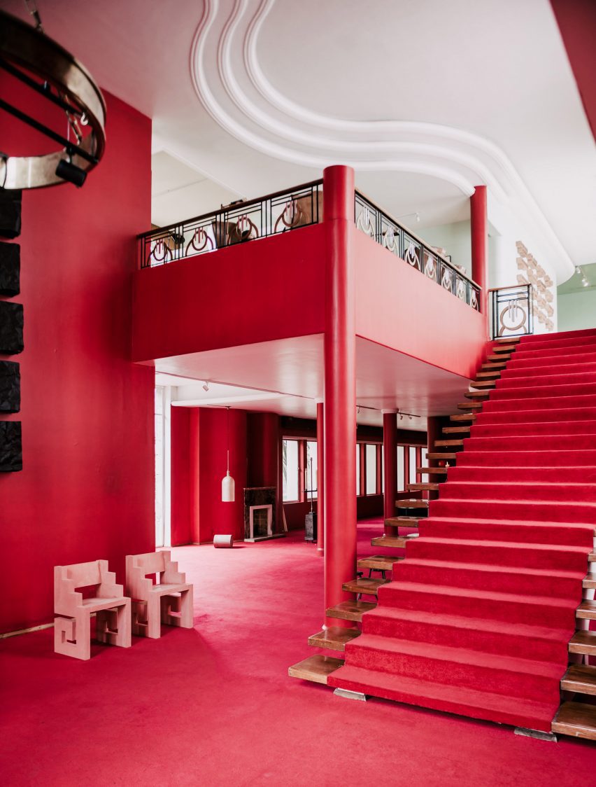
Architect India Mahdavi has updated six rooms within Rome’s 16th-century Villa Medici to feature an array of contemporary and colourful furniture.

The intervention comes as part of a three-year project called Re-enchanting Villa Medici, which was launched in 2022 to amplify the presence of contemporary design and craft within the Renaissance palace.

India Mahdavi revamps Villa Medici in Rome
India Mahdavi has furnished six rooms inside the Villa Medici including the Chamber of the Muses (above) and the Lili Boulanger room (top image)

While the first phase of the project saw fashion brand Fendi revamp Villa Medici’s salons, Mahdavi was asked to freshen up rooms on the building’s piano nobile or “noble level”, where the main reception and the bedrooms are housed.

She worked on a total of six spaces including the Chamber of the Elements, Chamber of the Muses and Chamber of the Lovers of Jupiter, which once served as an apartment to Cardinal Ferdinando de Medici.

India Mahdavi revamps Villa Medici in Rome
Several of Mahdavi’s Bishop stools were integrated into the design

The three other rooms – titled Debussy, Galileo and Lili Boulanger – were formerly used as guest quarters.

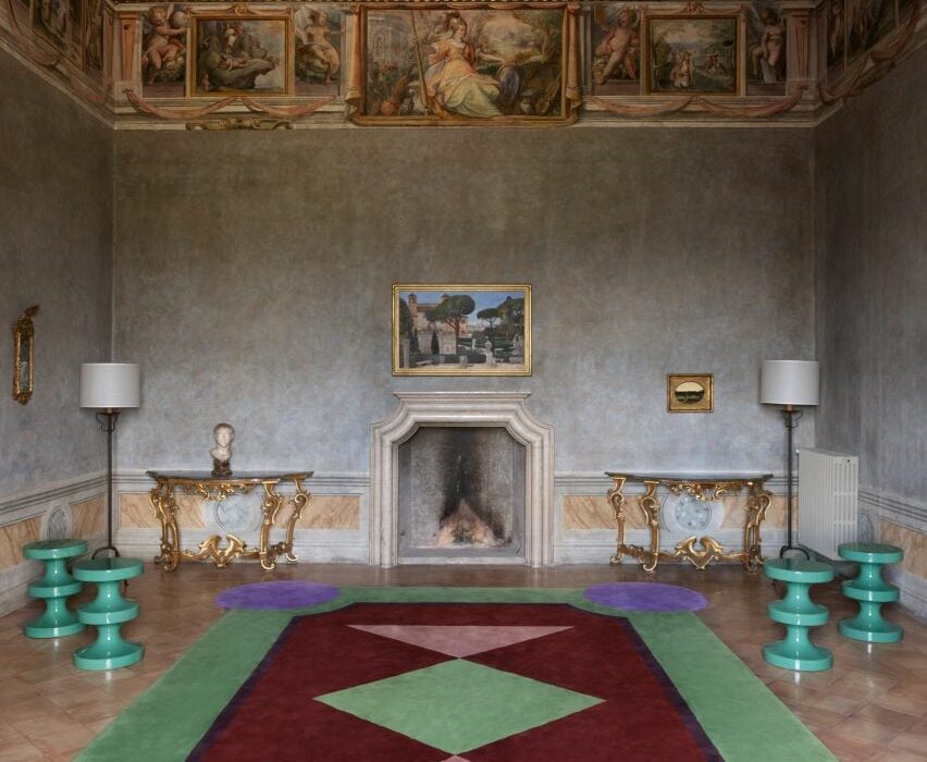
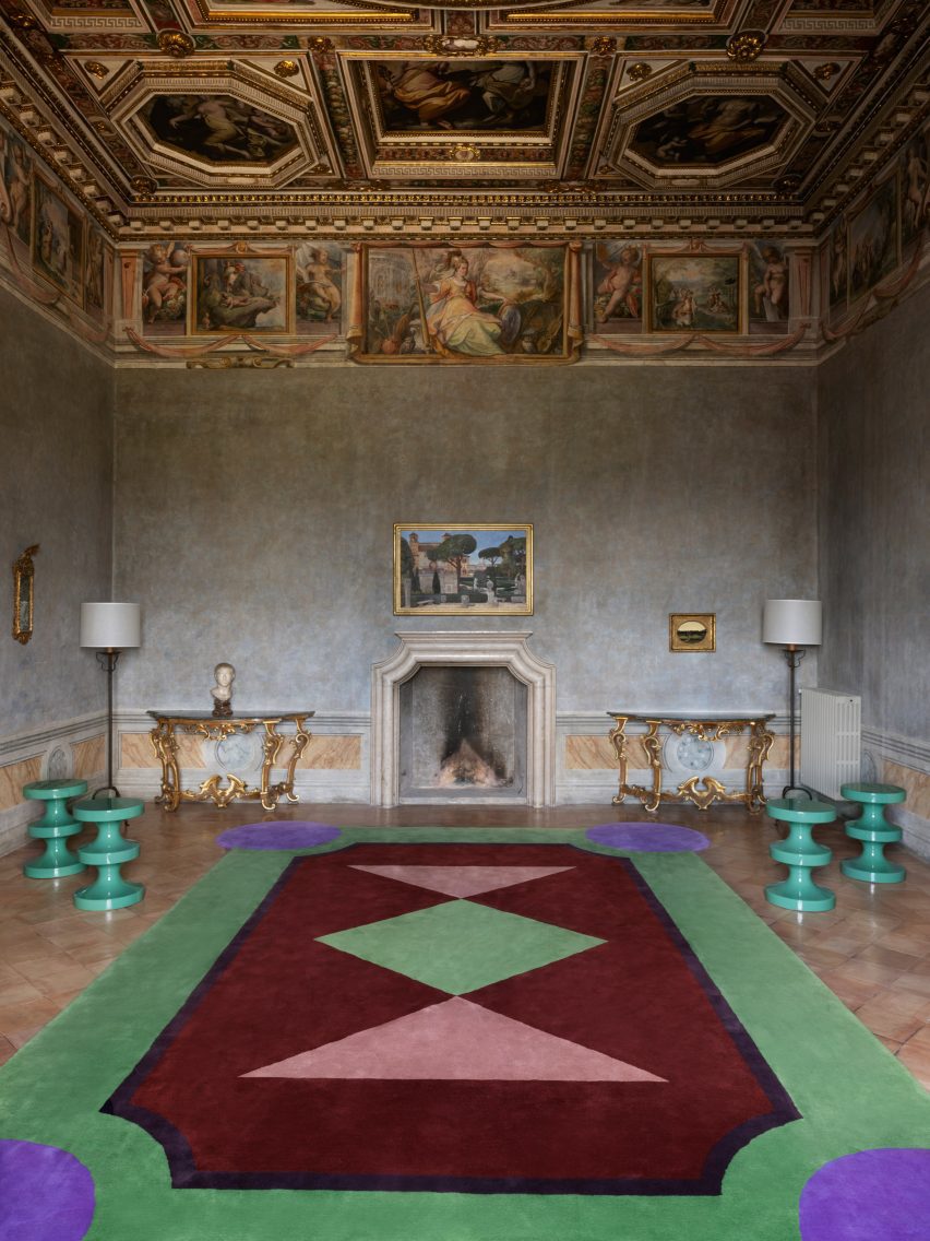
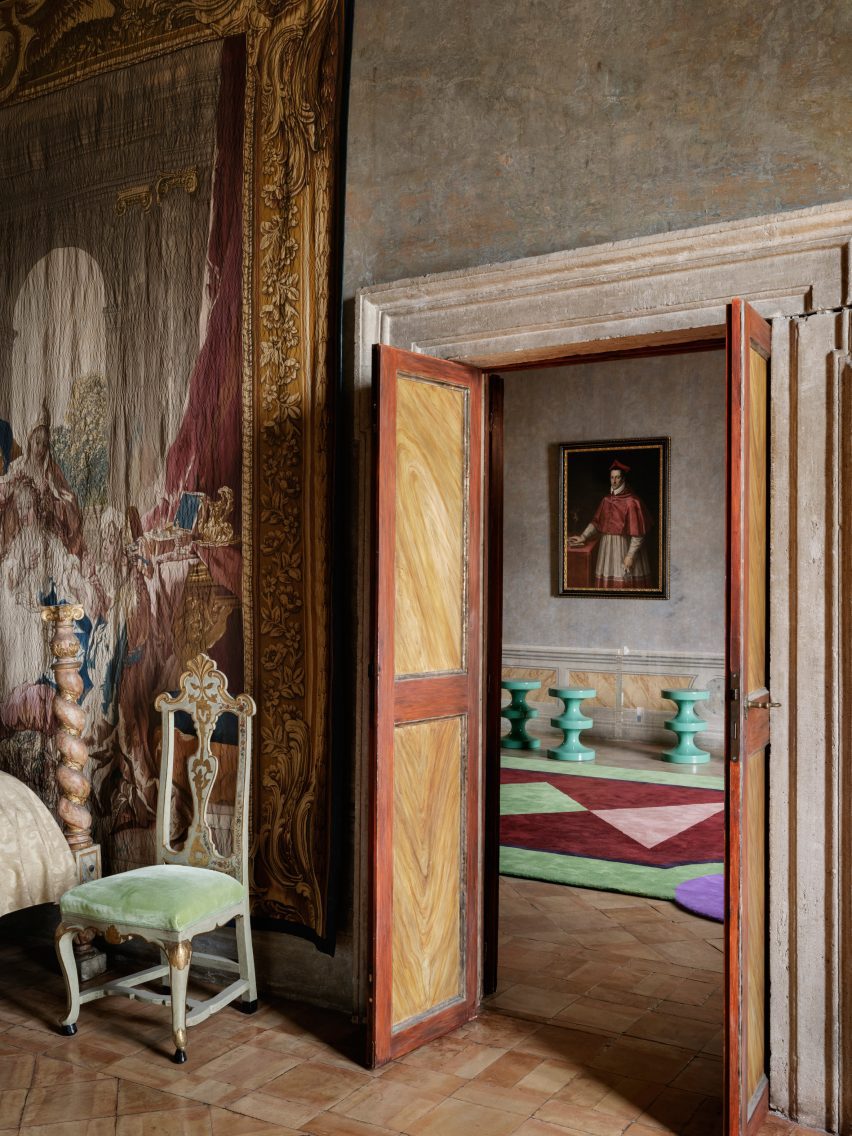
In the Chamber of the Muses, which is topped with a dramatic coffered ceiling, Mahdavi inserted sea-green editions of her Bishop stool alongside an enormous hand-tufted rug by French workshop Manufacture d’Aubusson Robert Four.

Its geometric design features green, purple, red, and rosy pink shapes, recalling the flowerbeds that appear across the villa’s sprawling gardens.

India Mahdavi revamps Villa Medici in Rome
Chairs were reupholstered with eye-catching raspberry-hued velvet

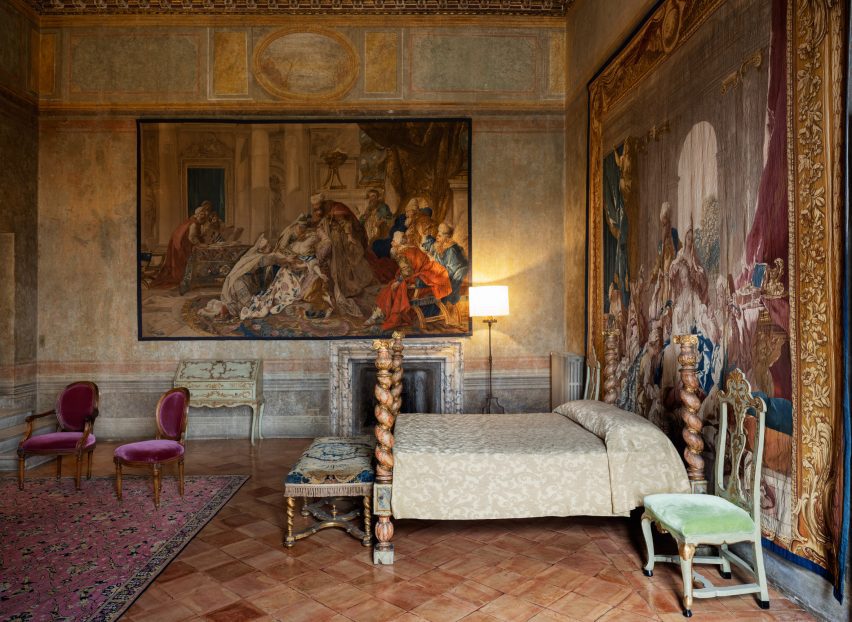
Only subtle alterations were made to the Chamber of the Elements and Chamber of the Lovers of Jupiter, where Mahdavi has repositioned an existing bed to sit against an expansive wall tapestry.

Some of the chairs here were also reupholstered in raspberry-hued velvet.

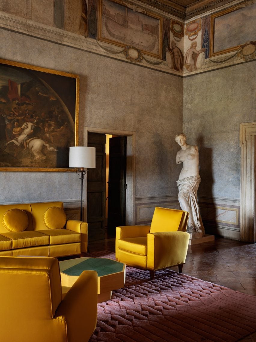
A cluster of bright yellow sofas and armchairs sourced from the French conservation agency Mobilier National was incorporated into the Lili Boulanger room, named after the first female composer to take up residence at the villa.

The furnishings sit on top of a blush-pink rug by French manufacturer La Manufacture Coglin and are accompanied by octagonal tables designed by Mahdavi.

India Mahdavi revamps Villa Medici in Rome
The Lili Boulanger room has a grouping of bright yellow sofas and armchairs

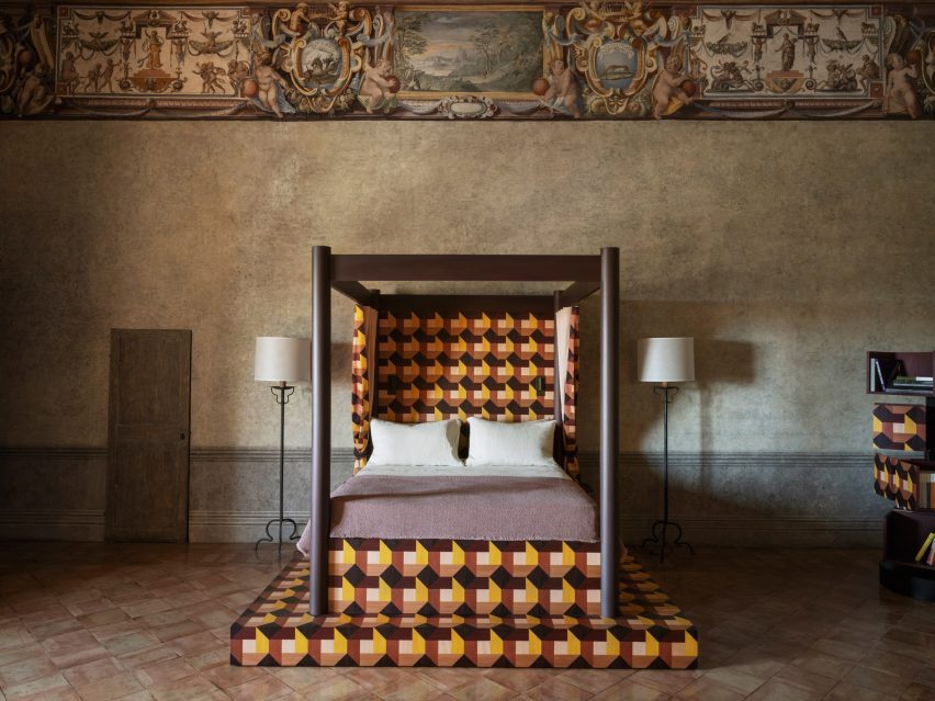
A Renaissance-style four-poster bed was added to the room named after astronomer Galileo Galilei, who reportedly visited Villa Medici twice in his lifetime.

The bed’s tiered wooden base and headboard were inlaid with graphic, berry-toned marquetry by cabinetmaker Craman Lagarde. The pattern, which also appears on the curtains that enclose the bed, takes cues from the design of the villa’s flooring.

India Mahdavi revamps Villa Medici in Rome
A grand four-poster bed is inlaid with berry-tone marquetry

A similar bed can be seen in the room named after French composer Claude Debussy. But this time, the marquetry done by French furnituremaker Pascal Michalon is executed in more “acidulous” colours that Mahdavi said reminded her of Debussy’s piano piece Clair de lune.

Mahdavi has lent her distinctive colour-rich aesthetic to a number of significant venues. Recent examples include the lavish London restaurant Sketch, to which she added sunshine-yellow and golden furnishings.

The photography is by François Halard.


Reference

Photo of a brightly coloured kitchenette in Camille Walala's London studio
CategoriesInterior Design

Camille Walala takes colourful style to the max in self-designed studio

London designer Camille Walala has worked with carpentry workshop Our Department to fit out her own studio with a no-holds-barred version of her colourful design style.

Electric blue floors, graphically patterned cabinetry and a kitchenette with cartoon-like proportions feature in the space, which is located in the Regent Studios building off Broadway Market in East London.

Photo of a brightly coloured kitchenette in Camille Walala's London studio
Camille Walala designed her studio to include a kitchen with exaggerated proportions

The seventh-floor space attracted Walala and her studio manager Julia Jomaa with its sweeping views.

Knowing they would be in no hurry to vacate, the duo took their time with the design, working side by side in the studio for over a year while adjusting the position of their space-dividing furniture until they arrived at a layout with the perfect functionality for them.

Photo of Camille Walala and her studio team in their London office in Regent Studios
The studio chose to embrace colour in the design

Once they decided to embark on the interior design, it was not a given that they would embrace Walala’s signature bold colour palette, as they worried about it potentially clashing with future work.

“We were like, how colourful should we go?” Walala told Dezeen. “Should we keep it quite simple or should we actually go for it?”

But ultimately, she says the desire to feel inspired by their workspace and “inhabit the aesthetic fully” won out.

Photo of the workspace in Camille Walala's London studio
The studio is divided into two rooms including one for “clean” computer-based work

The studio is divided into two rooms – one for “clean” computer-based work and the other for “messy” activities such as painting and model making.

Walala and Jomaa created a 3D model of the interior in SketchUp before bringing in their favourite carpenters” Our Department – a studio specialising in design and fabrication for the creative industries – to realise the design.

The duo of Simon Sawyer and Gustave Andre built all of the elements in the space with a focus on achieving clean lines and pure block colours along with maximum functionality.

Close-up photo of colourful cabinetry at Camille Walala's studio showing relief pattern of cut-out shapes glued onto black MDF doors
Our Department achieved clean lines by sticking coloured shapes onto MDF doors

For the cabinetry, they used doors made of melamine-faced medium-density fibreboard (MDF) and applied a decorative technique they had used on previous Walala projects.

This involved CNC-cutting shapes out of thin MDF, before spraypainting and precisely glueing them onto the doors to create a graphic pattern while avoiding the fuzzy lines that can sometimes come from painting directly onto surfaces.

In the kitchen, the group worked together to exaggerate proportions as much as possible, with Walala saying she dreamed of achieving a “Bart Simpson kitchen” through elements such as chunky handles and bold grout.

“We designed the Lego House a few years ago, this really colourful house,” she explained. “Especially the kitchen in that space was really quite bold and almost like a cartoon, and we thought we should do something similar in our studio.”

By contrast, a more subtle feature is the double sliding door between the studio’s two rooms, which consists of a transparent fluted screen set within a black frame.

While it may be less attention-grabbing, Jomaa says the mesmeric effect of the fluted panels sliding against each other is like a “little animation of colour”.

Photo of a colourful office space with a yellow sofa in front of a big worktable
The workspace also includes natural details like custom tulipwood desk legs

There are also a few natural wood elements throughout the interior such as tulipwood desk legs to balance the liberal use of colour.

As with all residents of Regent Studios, Walala will need to return the rented space to its original condition when her studio eventually leaves, so there are no permanent fixtures and everything is designed to be dismantled.

Even the central “wall”, which contains floor-to-ceiling storage on one side, is freestanding. But the team used kitchen-unit feet to wedge it against the ceiling for stability.

Photo of details in a colourful office space with bold cabinetry, bright blue floors and plants and colourful ornaments on display
Everything is designed to be dismantled when the studio one day moves out

Walala and Jamaa have been working together for eight years and started off sharing a desk in a basement studio. Their recent projects have included murals, installations and a proposal for a car-free Oxford Street.

Walala is often seen as being part of the New London Fabulous wave of maximalist designers, alongside Yinka Ilori, Morag Myerscough and Adam Nathaniel Furman.

The photography is by Taran Wilkhu.

Reference

Barn House by Jon Danielsen Aarhus 
CategoriesInterior Design

Ten cherry red interiors that make colour their focus

For our latest lookbook, we’ve picked eight interiors that are blanketed in shades of red that include an office in Belgium, a bar toilet in London and a mansion in Mexico.

The colour red is most commonly associated with activity, passion, sexuality, love and joy. In this lookbook Dezeen has highlighted ways in which interior designers and architects have used the colour in different interior settings.

Red terracotta tiles cover the interior of a home in Barcelona and red-tinted glass creates a glowy magma-like hue within the interior of a home located at the base of a volcano.

This is the latest in our lookbooks series, which provides visual inspiration from Dezeen’s archive. For more inspiration see previous lookbooks featuring terraces and balconies, marble-lined bathrooms and cave-like interiors.


Barn House by Jon Danielsen Aarhus 
Photo by Knut Bry

Barn House, Norway, by Jon Danielsen Aarhus 

Oslo based-architect Jon Danielsen Aarhus designed a gabled shed that sits on the grounds of a retired couple’s home in Lillehammer, Norway, which is used for painting, sculpting, craft and as additional living space.

The entrance hall of the gabled shed was covered entirely in red, including its window frames. The colour was chosen specifically to contrast against the structure’s raw timber exterior.

Find out more about Barn House ›


AEtelier office by Studio Anton Hendrik Denys
Photo by Hannelore Veelaert

AEtelier office, Belgium, by Studio Anton Hendrik Denys

In Belgium, Studio Anton Hendrik Denys and Steen Architecten transformed an industrial office building and added colourful graphics and bold hues to define areas across the interior.

The kitchen-cum-bar of the office was blanketed in an orangey-red hue, including its floor, walls, ceiling, fixtures and furnishings, which signifies and zones areas of the interior without the need for partition walls.

Find out more about AEtelier office ›


Social House by WAW Architects
Photo by Tim Van de Velde

Social House, Brussels, by WAW Architects

A vibrant red covers cabinet doors, drawers, floors, walls and the ceiling of a shared staff kitchen at a social services centre in Brussels, which was designed by WAW Architects.

The centre is located within a former orphanage and was converted into offices by the architecture studio. Bright hues were used throughout the interior to colour code the office space with red extending from a kitchen to an adjoining corridor.

Find out more about Social House ›


SOMA by Cake Architecture and Max Radford
Photo is by Felix Speller

SOMA, UK, by Cake Architecture and Max Radford

Located within a basement in London’s Soho, speakeasy-style bar SOMA was designed by Cake Architecture and Max Radford.

The restroom of the underground bar was painted bright red and paired with wooden fixtures and trimmings that were used to surround doorframes and recessed shelving in each of the cubicles.

Find out more about SOMA ›


House in Sant Antoni de Vilamajor by Arquitectura-G
Photo is by José Hevia

House in Sant Antoni de Vilamjor, Spain, by Arquitectura-G

Red was used as a running theme across this family home on the outskirts of Barcelona. It was designed by local studio Arquitectura-G and sits directly on top of a pre-existing garage.

Red features both inside and outdoors with many materials used across the exterior similarly used to decorate the interior, such as red bricks, red corrugated panelling and clay tiles.

Find out more about House in Sant Antoni de Vilamjor ›


Collective/Collectible by Masa
Photo is by Genevieve Lutkin

Collective/Collectible, Mexico, by Masa

Rich tones of red blanket the walls and floors of this abandoned mansion in the Lomas neighbourhood of Mexico City, which was used as the setting for an exhibition by gallerist Masa.

The 1970s home was decorated with furniture designed by 16 Mexico City-based designers and architects, including Esrawe, EWE Studio and Frida Escobedo. The interior features a grand staircase that was topped with a red runner.

Find out more about Collective/Collectible ›


Lookout House by Faulkner Architects
Photo is by Joe Fletcher

Lookout House, US, by Faulkner Architects

Although this room has no physical red elements Lookout House was fitted with red-tinted glass that provides the interior with a glowing red hue when light penetrates through the home.

The home is located in Truckee, California at the foot of Lookout Mountain volcano. It was designed by Faulkner Architects who wanted to mimic the colour of cooling magma within the home.

Find out more about Lookout House ›


Fox Head Inc office by Clive Wilkinson Architects

Fox Head Inc, US, by Clive Wilkinson Architects

A bright red interior was selected as a focal feature for the offices of a motocross apparel company in California. The headquarters was designed by Clive Wilkinson Architects which transformed a 7,600-square-metre warehouse into a flexible workplace.

A conference room at the headquarters was enclosed with red-tinted glass and fitted with a deep red carpet. A large white table and matching chairs, which have a bright red upholstered seat, were placed at the centre of the space.

Find out more about Fox Head Inc office ›

This is the latest in our lookbooks series, which provides visual inspiration from Dezeen’s archive. For more inspiration see previous lookbooks featuring terraces and balconies, marble-lined bathrooms and cave-like interiors.

Reference

Wood Ribbon apartment by Toledano + Architects in Haussmann-era building
CategoriesInterior Design

Six renovated Parisian apartments in historical Haussmann-era buildings

Period details are mixed with contemporary interventions inside these renovated apartments in Paris, built in the mid-19th century during Georges-Eugène Haussmann’s reconstruction of the French capital.

In his role as the prefect of the Seine département under Napoleon III, Baron Haussmann was responsible for creating the network of boulevards that still define the city’s urban landscape today.

The homogenous apartment buildings flanking these boulevards were designed to strict guidelines, all made from cream-coloured stone with a steep four-sided mansard roof and no more than six storeys.

Although Haussmann was less prescriptive about the building’s interiors, they generally feature high ceilings and parquet floors alongside elaborate mouldings and boiserie.

Read on for six examples of how architects and interior designers have brought these apartments into the 21st century, including a book lover’s loft and two flats combined to form a family home in the Marais.

This is the latest in our lookbooks series, which provides visual inspiration from Dezeen’s archive. For more inspiration see previous lookbooks featuring bedrooms with minimalist interiors, concrete kitchens and marble-lined bathrooms.


Wood Ribbon apartment by Toledano + Architects in Haussmann-era building
Photo by Salem Mostefaoui

Wood Ribbon apartment by Toledano + Architects

Original details such as parquet floors and ornate ceiling plasterwork were retained in the renovation of this apartment, which had been left largely untouched since the end of the 19th century.

But local studio Toledano + Architects tore down several partition walls to create a more open floorplan, traversed by a snaking plywood wall that roughly divides the apartment into three zones while providing tactical storage in the living room and kitchen.

“I really wanted to enhance this dichotomy between ancient and contemporary,” founder Gabrielle Toledano told Dezeen. “It’s very relevant in a city like Paris where both are in a constant dialogue.”

Find out more about Wood Ribbon apartment ›


Canal Saint-Martin apartment by Rodolphe Parente
Photo by Giulio Ghirardi

Apartment Canal Saint Martin by Rodolphe Parente

French interior designer Rodolphe Parente made only a few minor architectural interventions when overhauling this apartment in Canal Saint-Martin, exposing long sealed-off doorways and creating a hybrid dining room and kitchen.

Instead, he modernised the apartment by contrasting original details such as mouldings with unexpected contemporary details, colours and the “radical” art collection of the owner.

In the bedroom, a vivid purple rug clashes with caramel-coloured walls while in the living room, period wall panelling highlights the modernity of the sofa and the glossy coffee table.

Find out more about Apartment Canal Saint Martin ›


Apartment XIV by Studio Ravazi in Haussmann-era building
Photo by Olivier Martin Gambier

Apartment XIV by Studio Razavi

With several partition walls removed, French office Studio Razavi created a new layout for this apartment by slotting a multi-faceted furniture block made from wood-fibre panels into the remaining gaps.

Its staggered profile creates sightlines between the different areas of the house while framing some of the building’s original Hausmann-style ceiling mouldings.

Painted in a muted slate grey, the furniture block performs a different function in every room – acting as a storage cabinet in the kitchen, a TV mount in the living room and a desk in the study.

Find out more about Apartment XIV ›


Apartment Paris Marais living and dining room by Sophie Dries
Photo by Stephan Julliard

Marais apartment by Sophie Dries

Two flats become one 100-square-metre residence in this renovation project that French architect Sophie Dries completed in trendy Marais for a family of four.

Period details were painted in simple white, providing a contrast with new additions such as the Hans J Wegner chairs and the dyed linen curtains in the living room

“The Haussmannian style was refined and pared down, in order to introduce minimal lines better suited to a modern family,” Dries explained.

Find out more about Marais apartment ›


Enter the diamond by atelier 37.2 in Haussmann-era building

Enter the Diamond by Atelier 37.2

An additional bathroom is housed inside the three-metre-high birchwood volume at the centre of this residence in the French capital, designed by local studio Atelier 37.2.

The sharp lines of the diamond-shaped structure contrast with the apartment’s ornate ceiling mouldings and white-painted walls.

“This tension generates a fictional potential that plays with the imagination of the inhabitants,” said the studio.

Find out more about Enter the Diamond ›


Arsenal loft by h2o Architectes
Photo by Stéphane Chalmeau

Arsenal loft by h2o Architectes

This three-room loft is set inside the mansard roof of a Haussmann-era building in the Arsenale district, which originally served as servant’s quarters for the apartments below.

Parisian firm h2o Architectes opened up its floor plan to make the most of the top-floor views while installing wooden bookshelves to define different areas and house the extensive library of the apartment’s book-loving owner.

Their timber construction creates a visual connection with the original parquet floors, while the white paint used to brighten walls and other structural elements continues onto some sections of the floor.

Find out more about Arsenal loft ›

This is the latest in our lookbooks series, which provides visual inspiration from Dezeen’s archive. For more inspiration see previous lookbooks featuring bedrooms with minimalist interiors, concrete kitchens and marble-lined bathrooms.

Reference

Four works from Loewe Foundation Craft Prize exhibition 2023
CategoriesInterior Design

“I sometimes feel like I fell into doing fashion” says Jonathan Anderson

Loewe creative director Jonathan Anderson set up the brand’s annual craft prize to decode the “chintz” and “pastiche” associations of the discipline, he tells Dezeen in this interview.

Luxury fashion house Loewe recently announced the sixth winner of its annual craft prize at NYCxDesign, which celebrates applied arts and innovation in modern craftsmanship.

A spiky egg sculpture by Japanese ceramicist Eriko Inazaki was selected for the 2023 award from more than 2,700 entries.

“It became chintz”

Anderson established The Loewe Foundation Craft Prize in 2016 in an effort to honour the brand’s 19th-century origins as a leather-making craft collective.

Speaking to Dezeen at the awards ceremony for the prize at The Noguchi Museum in Brooklyn, he explained he also wanted to redefine contemporary understandings of artisanal production.

“I think from the ’80s onwards, [craft] had become this thing which was linked to mid-century, it was pastiche,” said Anderson.

“In Britain, for example, there was a lot of money put into crafts and the Arts Council to boost this idea of making, and then it became maybe chintz at some point.”

Four works from Loewe Foundation Craft Prize exhibition 2023
The winning sculpture by Eriko Inazaki (front) was displayed among an exhibition of shortlisted projects at NYCxDesign. Photo courtesy of Loewe

“The reason why I set the prize up was to try to sort of decode that,” he told Dezeen. “It was like it wasn’t marketed right. The work was there, but the platform was not there.”

Young creatives are now becoming interested in craft once again, he suggested.

“I think younger people are starting to realise that, as much as it’s interesting being a contemporary artist, it can be just as interesting to be a rug maker or to make ceramics or to work with wood,” said Anderson.

“It’s a less sort of diminished form of the arts.”

“I am probably a shopaholic”

Before being appointed by Loewe in 2014, Anderson founded his eponymous label, JW Anderson.

Although differentiated by what Anderson describes as an “angst” at JW Anderson and a “heightened perfection” at Loewe, the two brands share an emphasis on art, design, craft and interiors.

His collections at Loewe often incorporate elements of applied arts – bringing in collaborators and craftspeople, such as metal artist Elie Hirsch who created solid copper and pewter jackets for its Autumn Winter 2023 collection.

Loewe also presented a collection of decorated wooden chairs during Milan design week that were created by global artisans.

“Art for me is always going to be a language no matter what brand I’m in,” he said. “Because I think this is a way for me to kind of explain to the consumer, what I love, or things that I’m fascinated with.”

Photo of a Loewe store by Jonathan Anderson
Anderson works with the internal architectural team to design stores. Photo by Adrià Cañameras

The Northern Irish designer’s love of craft and art extends to the conception of store interiors for both of his brands.

JW Anderson recently unveiled its first flagship store in Milan during Milan design week, designed by Anderson in collaboration with 6a Architects.

“I sometimes feel like I fell into doing fashion but ultimately the interior part is what I love the most,” he said.

“The thing I love about interiors is, it is a singular kind of environment. Whereas fashion is like a transient period that goes in different environments. I quite like with interiors the control that you can have within space.”

He described his love of shopping for items to appear in stores.

“I think I am probably a shopaholic,” he said. “I could be at an auction or be in a gallery and I’ll be like, ‘oh, that’s perfect for Korea or that’s perfect for…’.”

“I think it just adds this element and a pleasingness for a consumer to go in and to a store and to see an original Rennie Mackintosh chair.”

Anderson feels that for Loewe, the design of stores is sometimes more important than fashion shows.

“I think stores can be more than just like these commercial vehicles,” he said. “I think, for me, the store is just as important as doing a show. It’s sort of even more important because they have to last longer.”

“I’m in a very lucky position at Loewe where I decide everything,” he added. “I have an internal architectural team, but I decide every artwork, I decide every door handle, every fixture.”

However, that does not tempt Anderson to cross over from fashion into interiors permanently.

“I enjoy it because it’s probably more like a hobby,” he said. “It’s something that distracts me from what I do as a day job, but I do it because of the stage of Loewe or JW Anderson.

“But I would never see it as something where I would be like, ‘oh, I’m going to be an interior designer’,” he continued. “There are other people out there that are actually really good at it. I think I’m good at it to an extent, but I change my mind too quickly. I would like it for like a day and then I would want to redo it again.”

The portrait is by Scott Trindle.

Reference

Seating area in main dining room of 20 Berkeley
CategoriesInterior Design

Pirajean Lees creates Arts and Crafts-style interior for Mayfair restaurant

London design studio Pirajean Lees referenced Mayfair’s pastoral past and created a series of spaces that nod to the idea of a Georgian manor house when designing restaurant 20 Berkeley.

Pirajean Lees aimed to build a story around the space and its sequence of many small rooms, while tapping into the restaurant’s British produce-led culinary approach.

Seating area in main dining room of 20 Berkeley
Pirajean Lees has completed the 20 Berkeley restaurant in Mayfair

“The restaurant is situated in the heart of Mayfair, a place once on the cusp of the city and countryside,” Pirajean Lees told Dezeen.

“The farming history of the area and its connection to the surrounding rural lands is prevalent throughout the project and paramount to the dining experience.”

Dining area in restaurant in London by Pirajean Lees
The restaurant features a series of cosy rooms on the first floor

Pirajean Lees wanted to put nature and craft at the heart of this design project to align it with the ethos of Creative Restaurant Group, the restaurant’s founders.

“This led us to build on the strong connection of an imagined Mayfair Georgian manor house and its rural lands, which would have been used to grow produce,” the studio said.

“A central staircase leads to rooms usually found in a traditional family home, such as the drawing room, music room, pantry, orangery and salon. Each room has its own character whilst belonging to the one property.”

Seating banquette in 20 Berkeley restaurant
Among them is the music room

On the upper-ground floor are the richly designed reception and main dining rooms.

The lower-ground level houses a 14-seat private room with its own exclusive lounge and dining area, alongside the kitchen, wine cellar and main bar, The Nipperkin.

The design of the interiors references the arts and crafts movement of the late 19th and early 20th centuries.

Seating booth in restaurant in London by Pirajean Lees
Stained glass features in the drawing room

“At 20 Berkeley, we have developed a layered story of handmade details and tactile finishes that exude elegance,” said Pirajean Lees.

“The project’s expression is rooted in the traditions of craftsmanship and how the process of making decorative objects and furniture should showcase the beauty of both its materials and construction.”

Table at restaurant in London by Pirajean Lees
Antique mirrors were used to surround the building’s columns

The resulting aesthetic is detailed, with a palette of rich, warm tones including ambers, ochres and dark reds, used across upholstery and textural wallcoverings. Floor tiles have been hand-crafted in Wales and feature clay embedded with fossils.

Bespoke joinery work was utilised throughout the space, including for the wall panelling, dowelled ceilings and an English oak staircase.

The project also features bespoke elements that were added to bring a sense of opulence to the various spaces.

These include a pantry, in painted timber, that provides a strong focal point of the upper floor. Here, chefs prepare dishes on the pantry island, “inviting guests to witness the chefs’ craft, as one would do in one’s home, whilst hosting guests for dinner,” said Pirajean Lees.

In the orangery, a bespoke pickling cupboard, made from sapele wood and marble, serves as “a pleasing curiosity”, used by the chefs to store jars of vegetables for their recipes.

Staircase in 20 Berkeley restaurant
An English oak staircase leads down to 20 Berkeley’s lower ground level

The bespoke dining tables and chairs were made of oak, while the chairs have been traditionally upholstered for maximum comfort.

“The bespoke and craft elements bring depth to the project, anchoring it in its strong narrative and creating timeless interiors,” said Pirajean Lees.

Private dining area in 20 Berkeley restaurant
A private dining room is located on the lower ground floor

Bespoke stained glass, handcrafted in a North London studio, is another of the restaurant’s features.

Used in the reception and drawing room, the stained glass has been strategically positioned, backing onto the busy central bar to give a sense of movement and energy.

In front of the windows, it warms the light coming into the rooms to create an immersive atmosphere.

Table in private dining area of restaurant in London by Pirajean Lees
Mixed clay tiles are laid across the floor

“The stained glass introduces shadows and reflections, which change throughout the day and are different in each room,” said Pirajean Lees.

“As per each of our projects, the tailored finishes, joinery and surfaces here, have been carefully created to ensure optimum use of the space by the restaurateur and their guests.”

Other hospitality projects from the studio include an ornate sushi restaurant in Dubai with interiors informed by 1920s Japan and a members club in London, housed inside the iconic music venue Koko.

The photography is by Polly Tootal.

Reference

Living room interior of apartment in Barcelona, designed by Raúl Sanchez Architects
CategoriesInterior Design

Raúl Sanchez divides Girona Street apartment with 21-metre wooden wall

A lengthy walnut-panelled wall runs through the bright white living spaces inside this Barcelona apartment, renovated by local studio Raúl Sanchez Architects.

The Girona Street apartment is set within a 19th-century building in Barcelona’s affluent Dreta de l’Eixample neighbourhood and belongs to a design-savvy couple with two young children.

Living room interior of apartment in Barcelona, designed by Raúl Sanchez Architects
A 21-metre-long walnut-panelled wall runs the length of the Girona Street apartment

Prior to the renovation, the apartment contained a warren of small, dark living spaces bookended by an indoor patio and a sitting room that overlooks the street.

Raúl Sanchez Architects connected these two rooms with a 21-metre-long wall that stretches from one end of the floor plan to the other. While the majority of surfaces in the apartment were rendered in white micro-cement, the wall is crafted from walnut wood.

Living room interior of Girona Street apartment in Barcelona, designed by Raúl Sanchez Architects
Spaces throughout are rendered in white micro-cement

“I thought of a material, which could contrast the whiteness with elegance and warmth while also adding texture and ruggedness,” founder Raúl Sanchez told Dezeen.

“We made several samples and trials until we got the right wood and the right porosity of walnut.”

Dining room interior of apartment in Barcelona, designed by Raúl Sanchez Architects
A blue-painted dining room lies next to the lounge

A series of rooms run parallel to the wall, beginning with a dining area.

Here, a section of the rear wall was painted dark blue and fitted with a built-in bench seat, while the floor was inlaid with a square patch of patterned hydraulic tiles.

Further along the hallway, a sitting area was created just in front of a pair of stained glass windows. This is followed by two bedrooms that are partially painted blue to match the dining area.

One of them is fronted by a huge pivoting door that, like the apartment, is split into two sides. One half is clad with stainless steel and the other in brass.

Green kitchen interior of Girona Street apartment in Barcelona, designed by Raúl Sanchez Architects
A sea-green kitchen is hidden behind doors in the walnut-wood wall

More rooms lie concealed behind the long walnut wall, each accessed via a discrete flush door. This includes a U-shaped kitchen, which was almost entirely painted a sea-green hue.

There’s also a storage area, the family bathroom and the principal bedroom, where a floor-to-ceiling cream curtain helps conceal en-suite facilities.

Apartment designed by Raúl Sanchez Architects features walnut wood wall
Other rooms in the Girona Street apartment are concealed behind flush doors

The apartment’s indoor patio was freshened up, as was the street-facing sitting area. It now features a mint-green sideboard and bookshelf, as well as a decorative wall panel that mimics the brass-and-steel pivot door.

More hydraulic tiles were also incorporated into the floor, this time in mismatch prints.

Living room interior of Girona Street apartment in Barcelona, designed by Raúl Sanchez Architects
Hydraulic floor tiles and mint-green furnishings feature in the living room

Raúl Sanchez Architects is behind a number of striking homes in Barcelona, aside from the Girona Street apartment.

This includes BSP20 House with its towering spiral staircase and the Tamarit Apartment, which is decked out with clashing materials.

The photography is by José Hevia.


Project credits:

Architecture: Raúl Sanchez Architects
Team: Valentina Barberio, Paolo Burattini, Flavia Thalisa Gütermann, Dimitris Louizos, Albert Montilla
Structure: Diagonal Arquitectura
Enginering: Marés Ingenieros
Textile design: Catalina Montaña

Reference

Lounge of 1 Warwick members’ club
CategoriesInterior Design

Fettle channels Soho’s “grittier” years at 1 Warwick members’ club

Interiors studio Fettle drew on the neo-baroque architecture of this Edwardian building in London’s Soho when converting it into a members’ club, as well as nodding to the area’s colourful history of the 1950s and 60s.

Owned by Maslow’s, the group behind Fitzrovia club Mortimer House, 1 Warwick features mid-century furniture and lighting along with bespoke designs that reimagine the furniture of the period.

Lounge of 1 Warwick members’ club
Fettle has designed the 1 Warwick members’ club in London

The mix includes jaunty elements such as splayed-leg easy chairs and scallop-edged rattan lighting.

“During this period of history, Soho was much grittier than we find it today, so we wanted to underplay the more elevated finishes that you would typically find in a members’ club,” Fettle‘s director Andy Goodwin told Dezeen.

“We have referenced the less polished nature of Soho in this period with raw plaster wall finishes and exposed brick.”

Yasmin restaurant by Fettle
The club has a rooftop restaurant called Yasmin

Fettle juxtaposes these references with some influences from the neo-baroque mansion itself, reworking its sense of assured comfort in a contemporary way with richly toned wood panelling and elaborate chandeliers.

“We wanted to ensure that we referenced this period within the final design,” Goodwin said. “We simplified a traditional Edwardian baroque skirting and architrave style within the bespoke joinery that was designed for the ground and first floors.”

“Typically, buildings of a similar age had common features, including bold geometric floor patterns within the entrances. And as such we reimagined a pattern from the period in the lobby of 1 Warwick.”

Balcony of Yasmin restaurant at 1 Warwick members’ club
Its wraparound roof terrace offers views across Soho

While drawing on the history of the building and the area, Fettle worked hard to ensure that the club feels fresh, welcoming and contemporary.

“We have mixed furniture, lighting and accessories from a variety of different eras and curated a space that feels relaxed and residential in its aesthetic,” he continued.

“When designing furniture specifically for the project, we referenced more traditional designs, however. We looked at the details through a modern lens to make the space feel familiar yet contemporary.”

Set over six floors, the crowning glory of 1 Warwick is the rooftop bar and restaurant Yasmin with its wraparound roof terrace and views across Soho.

Here, pink mohair-upholstered bar stools nestle against a wood-clad marble-topped bar while the menu is Middle Eastern, inspired by executive chef Tom Cenci’s time in Istanbul.

Two lounge spaces – the Living Room and adjoining Den – are at the heart of the club, where Fettle used an earthy-toned palette, along with exposed brick walls and geometric patterned rugs to bring a sense of warmth to the interior.

Shared workspace in 1 Warwick members’ club
The club has several co-working areas

“We wanted to let the existing architectural features be visible within the final design to create a more neutral backdrop, onto which we layered playful choices across the furniture and fittings,” said Goodwin.

“We used deep, saturated, colourful fabrics for the upholstered pieces and we have looked to mix mohairs and velvets with more vibrant leathers and patterned fabrics to give an eclectic feel to the space,” said Goodwin.

In the daytime, 1 Warwick offers spaces to suit different kinds of working styles, from private studies and rentable desks to the Pied-à-Terre – an open-plan workspace featuring long, library-style tables and comfortable lounge seating.

Office space by Fettle
Members can also work in private meeting rooms

At ground level, there’s the neighbourhood bistro and bar Nessa, open to all and offering a playful take on British classics while the more intimate, horseshoe-shaped bar serves up its own menu of small plates.

With a colour palette of warm, autumnal tones and a material mix of exposed brick, wood panelling and marble-topped tables, the atmosphere here is welcoming and down-to-earth.

Nessa restaurant at 1 Warwick members’ club
The Nessa restaurant is set on the ground floor and open to the public

Founded in 2013, Fettle has a long history in hospitality design with previous projects including the Schwan Locke Hotel in Munich, which was conceived as an homage to early German modernism.

Elsewhere in London, the studio was also responsible for designing The Gessner apartment block to resemble a hotel, complete with a cafe and co-working area.

The photography is by Simon Brown.

Reference

Red-stained plywood volume within apartment
CategoriesInterior Design

Another Seedbed is an apartment that doubles as a performance space

In this renovated loft in Brooklyn, the owner both resides and hosts public art performances within a space divided by a variety of inserted volumes.

The loft is located in a late 19th-century cast iron building in Williamsburg that once served as a hat factory, and was renovated by a team of architects.

Red-stained plywood volume within apartment
A team of architects renovated the loft, inserted volumes to conceal private areas

Ignacio G Galán, Jesse McCormick, Khoi Nguyen and Julie Tran of Future Projects collaborated to turn the industrial space into a residence that could also serve as a venue for artistic performances and other public events.

Named Another Seedbed, the project recalls the use of lofts in New York City by artists in 1960s to 1980s for developing experimental works.

Red-stained plywood with concertina door
The bedroom is hidden behind red-stained plywood panels and accessed through a concertina door

The owner and activator of this apartment began organising parties, performances and other events in a similarly industrial space in Bushwick.

He then decided to create a dedicated space for himself to live and work, as well as host other artist friends who needed square footage to bring their ideas to life.

Hand-troweled earthen clay plaster wall in front of plywood doors
Hand-troweled earthen clay plaster covers the bathroom volume

“Neither just a private studio nor an art gallery, the space is equipped to welcome gatherings that operate between a dinner party and a public performance,” said the project team.

“Artists appropriate the space and become hosts themselves, expanding the communities which the project brings together.”

Bathroom lined with blue penny-round tiles
Inside, the bathroom is lined with blue penny-round tiles

The apartment is organised as a largely open-plan space, with private areas concealed inside inserted volumes.

Red-stained pine plywood panels hide the bedroom, which is accessed via a concertina door, and also contain storage.

Living room with open-shelf storage and ochre-coloured sofa
Moveable furniture helps to arrange the apartment for performances

The bathroom occupies another volume that’s covered in hand-troweled earthen clay plaster outside and lined entirely is blue penny-round tiles inside.

An open kitchen with grey cabinetry sits below a framework of coloured wood, featuring smokey polycarbonate panels that are lit from behind.

This frame extends into the living area to form a floor-to-ceiling shelving unit, on which books and objects are displayed, and a projector for screening videos onto the opposite wall is housed.

A variety of moving furniture pieces, including an ochre-toned sofa on wheels, help to choreograph the events and arrange the apartment as desired by whoever is using it.

Dark room illuminated by projector and neon lights
The owner and his artist friends are able to transform the space to present their work

“The space will not advertise its performances,” said the team.

“Some neighbors might not know of its existence. Others will hear about an event through friends. Some might find themselves there often and will develop networks of neighbourliness within it.”

Silhouetted figures sweep the ground of the dark room
Performances are open to the public but not advertised

Brooklyn has both a thriving arts scene and a wealth of defunct industrial buildings for hosting exhibitions, performances and events.

Herzog & de Meuron recently completed the transformation of a derelict power plant in the borough into arts centre, while the Public Records creative venue added a bar and lounge on an upper floor of its former warehouse building earlier this year.

Reference

Bedroom, Casa Tres Árboles in Valle de Bravo by Direccion
CategoriesInterior Design

Eight calming bedrooms with minimalist interiors from across the world

For our latest lookbook, we’ve gathered ten minimalist bedrooms with peaceful designs, ranging from a Mexican bedroom with a concrete bed to a cosy space in a former girls’ school in Puglia.

Natural materials including wood and stone were used to finish these eight bedrooms, which also feature muted colour palettes and little in the way of decoration.

Leaving walls bare and keeping the amount of artworks and personal items to a minimum can help create a more soothing and clutter-free bedroom.

Beige, grey and warm brown hues, meanwhile, make for relaxing spaces free from eye-catching colours.

This is the latest in our lookbooks series, which provides visual inspiration from Dezeen’s archive. For more inspiration see previous lookbooks featuring terraces and balconies, marble-lined bathrooms and cave-like interiors.


Bedroom, Casa Tres Árboles in Valle de Bravo by Direccion
Photo by Fabian Martinez

Casa Tres Árboles, Mexico, by Direccion

Designed to resemble a “monastic sanctuary”, this weekend retreat in Valle de Bravo, Mexico, aims to celebrate the contrast between shadow and light in its interior.

In the pared-down bedrooms, the walls were painted in dark colours to contrast the warm wooden ceiling beams. A wooden bench at the end of the bed and tactile linen textiles give the room a slightly rustic feel.

Find out more about Casa Tres Árboles ›


Bedroom inside Bangalore home
Photo by Aaron Chapman

Cabin House, India, by Taliesyn

Cabin House’s interior was informed by the vernacular architecture of its location in south Bangalore’s Jayanagar neighbourhood.

Earthy finishes were used for the home, which features bare concrete walls and plenty of wood details. A wooden bedframe and flowers create a friendly atmosphere in the mezzanine bedroom.

Find out more about Cabin House ›


Bedroom interior of Pacific House designed by Alexander & Co
Photo by Anson Smart

Pacific House, Australia, by Alexander & Co

Australian studio Alexander & Co aimed to create contemplative spaces inside Pacific House in Sydney.

In the minimalist bedroom, walls were rendered in concrete and matched with carpet in a darker grey colour. Sculptural bedside lamps and transparent floor-to-ceiling curtains add a softer feel to the spartan interior.

Find out more about Pacific House ›


Bedroom of Tokyo apartment by Keiji Ashizawa
Photo by Tomooki Kengaku

Hiroo Residence, Japan, by Keiji Ashizawa

Custom-made wooden furniture and art pieces are dotted throughout Hiroo Residence. Designer Keiji Ashizawa used muted tones to make the most of the sunlight in the central Tokyo apartment, which has several large windows.

In the bedroom, wood panels cover entire walls and hide away technical functions behind the beds. Organically shaped ceramics add discrete decorative touches.

Find out more about Hiroo Residence ›


Interiors of Fisherman's cottage
Photo by Gavin Green

Fisherman’s Cottage, Australia, by Studio Prineas

The bedroom in this Australian home is located inside a concrete extension to an old fisherman’s cottage.

Here, a solid-stone bath doubles as a bedhead and mirrored walls were used to make the small room feel bigger. To not clutter the space, accessories were restricted to a few glass trays and vases as well as a striped throw.

Find out more about Fisherman’s Cottage ›


Bedroom in brutalist home
Photo by Rory Gardiner

Casa Alférez, Mexico, by Ludwig Godefroy

A bedside nook sits underneath a high window inside this brutalist holiday home, which features wooden floors and walls made of board-formed concrete.

Architect Ludwig Godefroy also designed built-in concrete furniture for the house, including a concrete bed. A pale grey version of designer Verner Panton’s classic Flowerpot lamp adds a glossy detail to the room’s rough texture.

Find out more about Casa Alférez ›


Interior of Casolare Scarani in Puglia by Studio Andrew Trotter
Photo by Salva López

Casolare Scarani, Italy, by Studio Andrew Trotter

Architecture practice Studio Andrew Trotter converted a girls’ school in Puglia that dates back to 1883 into a grand family home with plenty of decorative arches.

In the cosy minimalist bedroom, a jute rug covers the stone floor made from crushed rocks and mortar, while the colour palette was kept to creamy whites as well as warm brown and tan hues.

Find out more about Casolare Scarani ›


Bedroom interior of Palau apartment by Colombo and Serboli Architecture
Photo by Roberto Ruiz

Palau apartment, Spain, by Colombo and Serboli Architecture

“Imperfect” original features were highlighted during the renovation of this apartment in Barcelona, which features white-washed walls and wooden floors.

In the mezzanine-level bedroom (above and top image), wicker doors front an entire wall and cover the closet. An organically shaped mirror and an orange chair make the calm space feel more playful.

Find out more about Palau apartment ›

This is the latest in our lookbooks series, which provides visual inspiration from Dezeen’s archive. For more inspiration see previous lookbooks featuring terraces and balconies, marble-lined bathrooms and cave-like interiors.

Reference