Eight concrete kitchens with raw and tactile surfaces
Kitchens with exposed concrete surfaces take centre stage in this lookbook, which includes homes in Mexico, Japan and Ireland.
Concrete is a ubiquitous material in architecture, but it is less commonly used in interiors – particularly in residential spaces such as kitchens.
However, its durability and impermeability make it an ideal surface material for cooking and food preparation, while its raw aesthetic can create a striking backdrop for dining and entertaining.
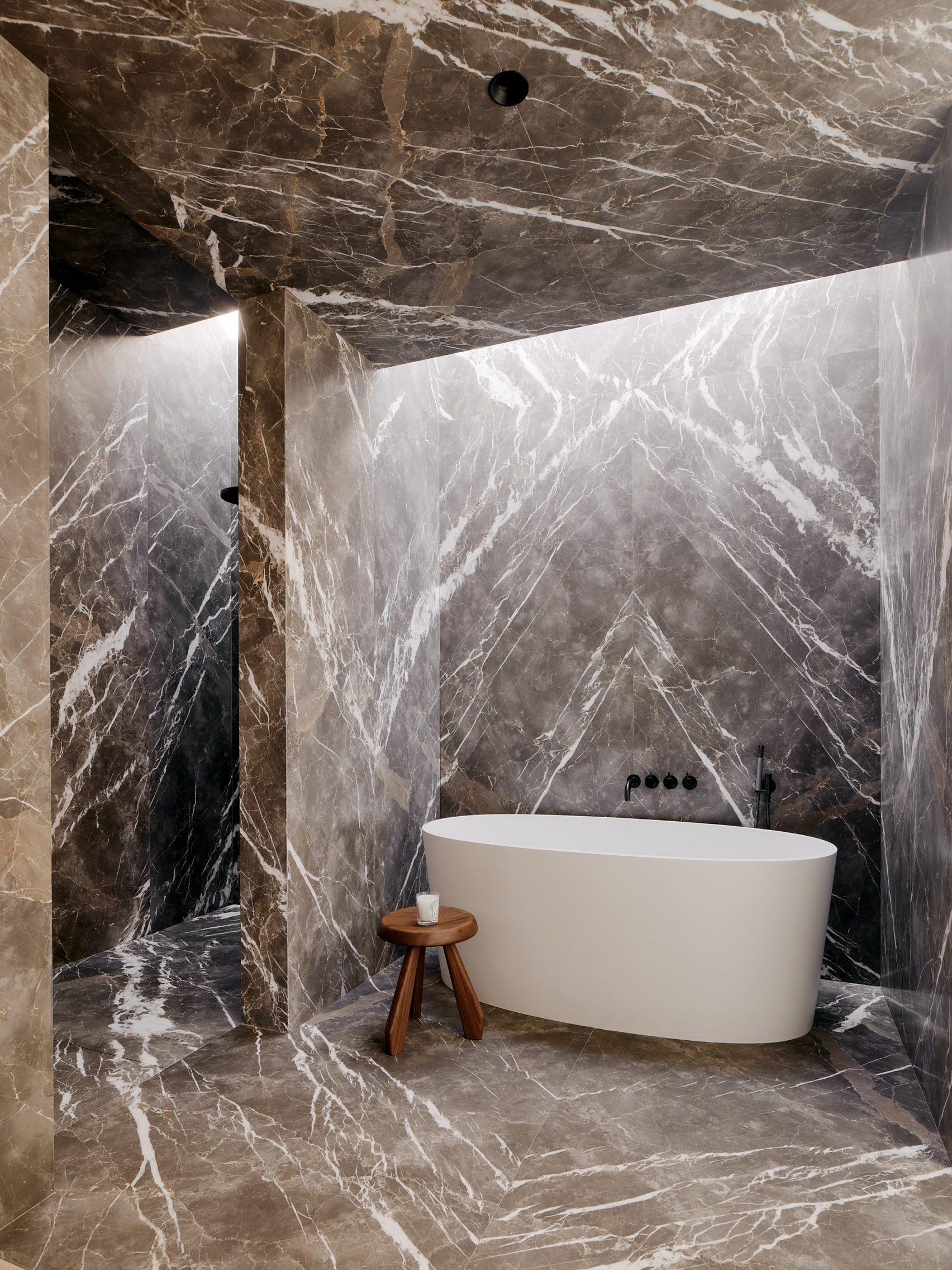
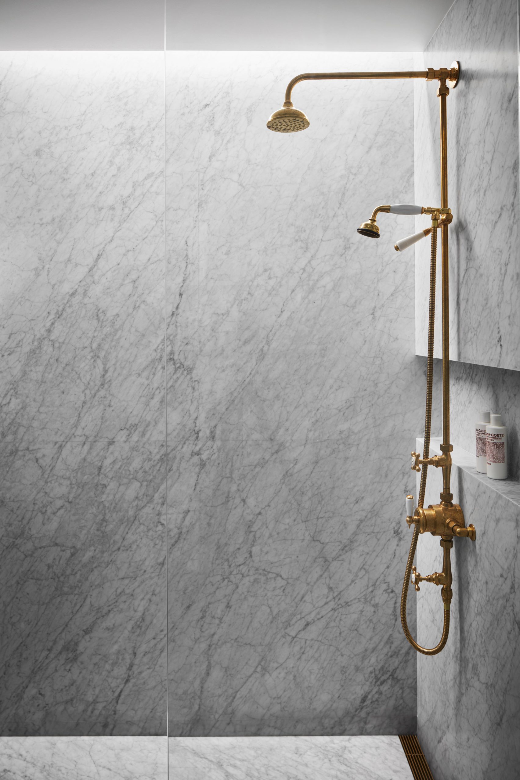
This is the latest in our lookbooks series, which provides visual inspiration from Dezeen’s archive. Other recent editions showcase airy balconies, marble bathrooms and gallery interiors.
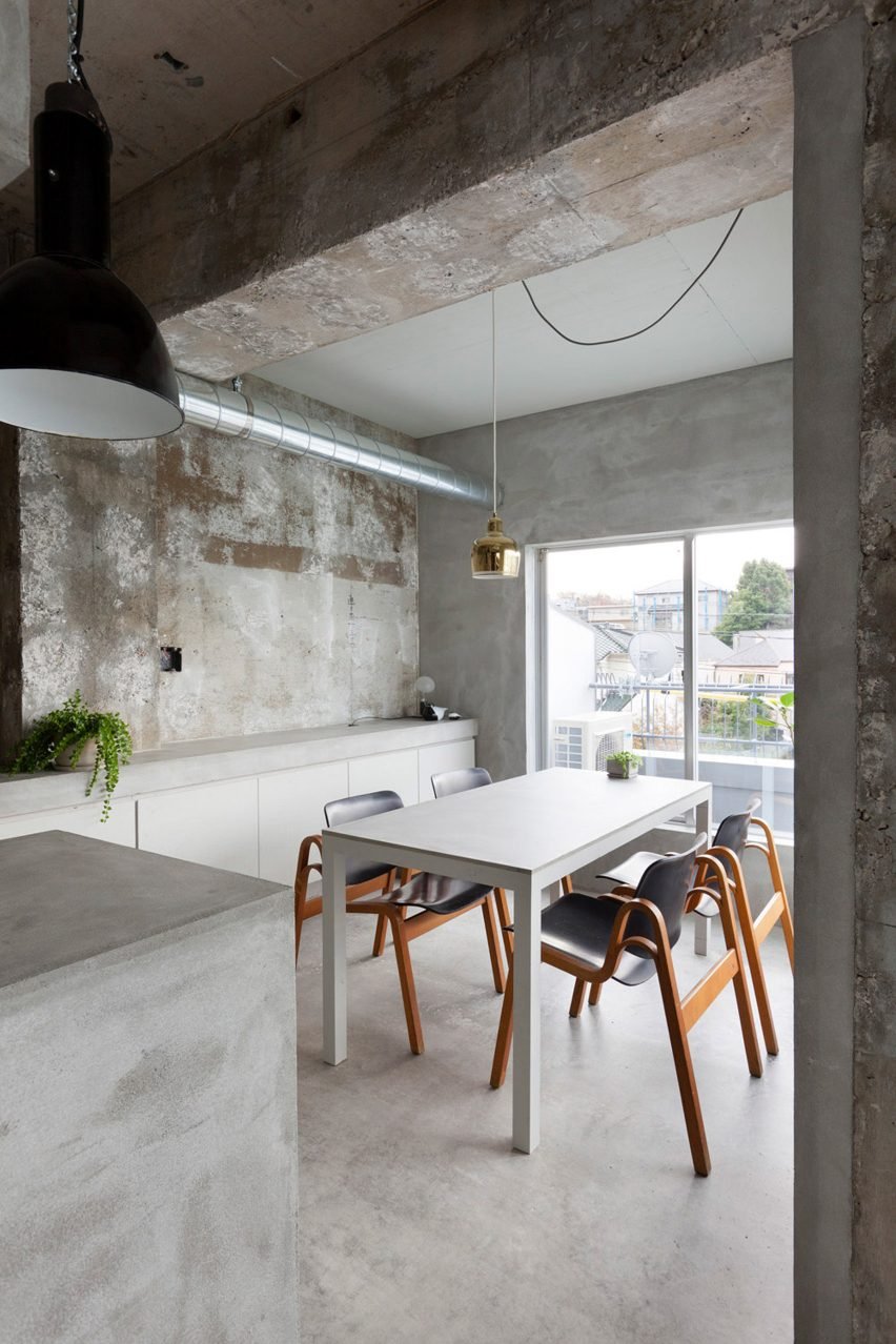
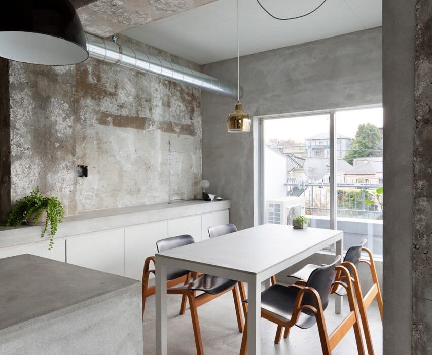
House in Jiyugaoka, Japan, by Airhouse Design Office
Airhouse Design Office created this kitchen as part of its renovation of an apartment for a fashion fanatic in Nagoya, Japan.
Like the rest of the home, the kitchen’s walls, floor and ceiling have been stripped back to expose the concrete beneath. While some areas were left with chipped edges and plaster, others have been polished for a smooth finish.
Find out more about House in Jiyugaoka ›
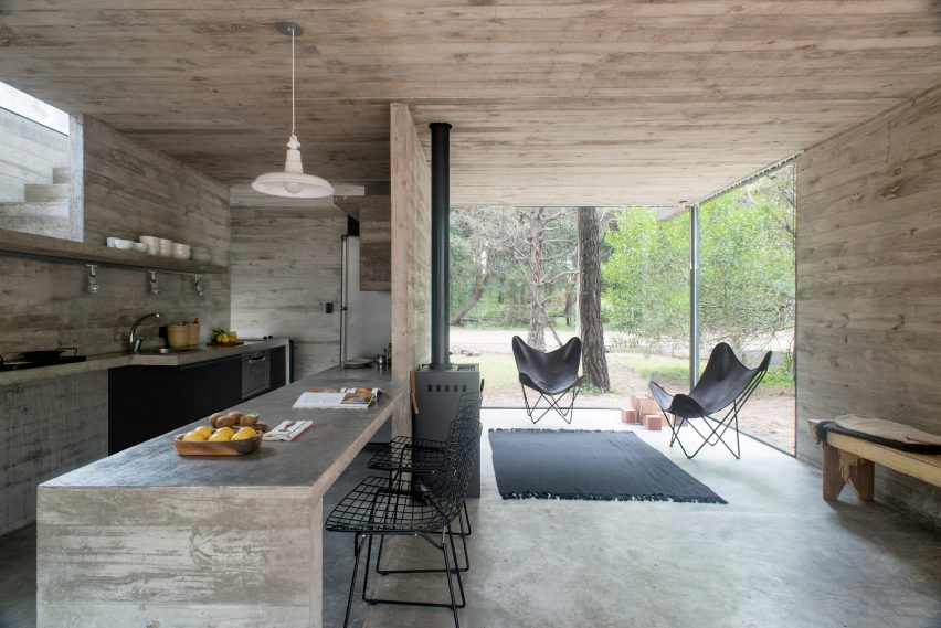
Casa H3, Argentina, by Luciano Kruk
This open-plan kitchen and dining room sits on the ground floor of a holiday home by architect Luciano Kruk in Mar Azul.
Blending seamlessly into the home’s concrete structure, it features geometric shelving and kitchen counters that extend from the walls and floor. Its industrial look is complemented by an enamel pendant light and a pair of wireframe chairs.
Find out more about Casa H3 ›
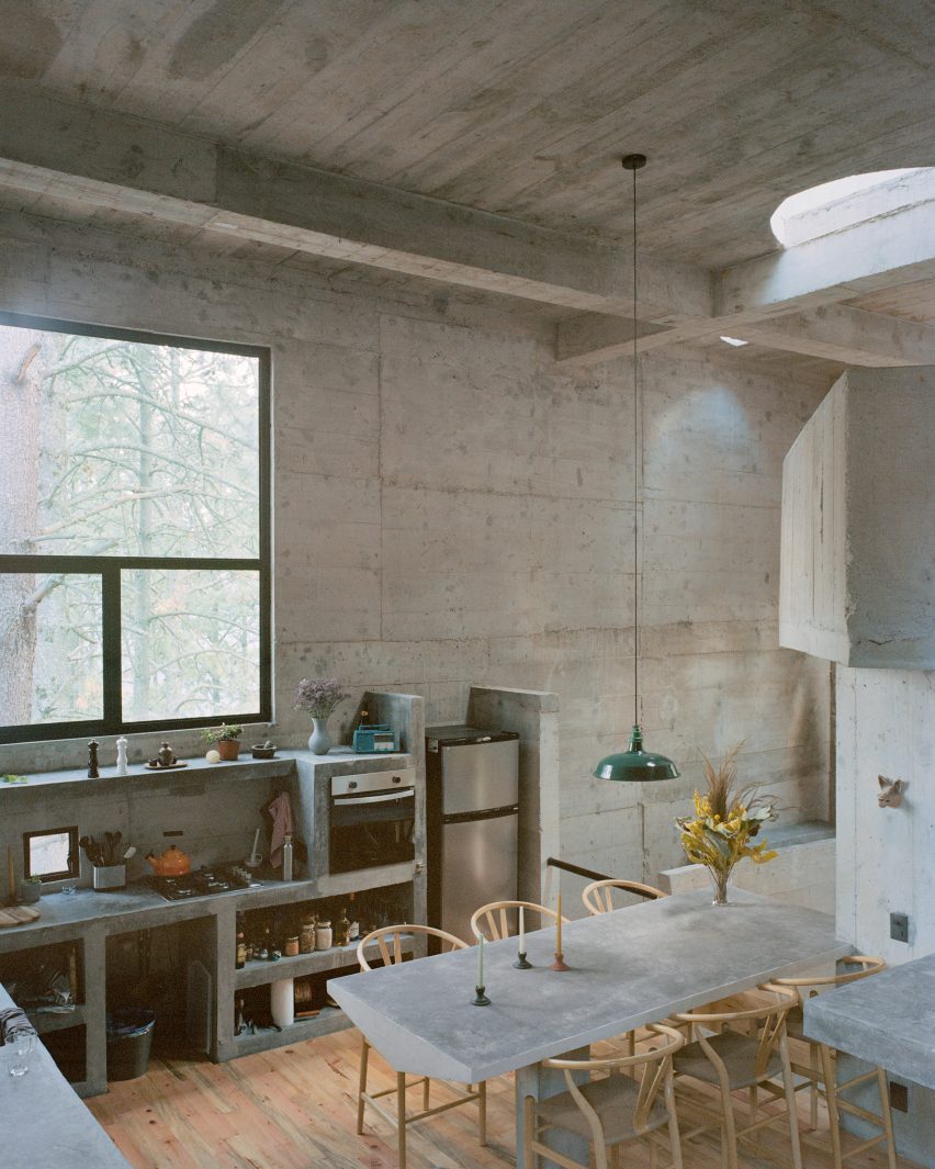
Casa Alférez, Mexico, by Ludwig Godefroy
In a pine forest in Mexico, architect Ludwig Godefroy created a brutalist cube-shaped home that is built from concrete cast in situ.
This includes its kitchen, where the shelving and worktops are also all cast from concrete. Here, their raw finishes are juxtaposed with delicate ceramics and Danish designer Hans Wegner’s Wishbone chairs, visually softening the space.
Find out more about Casa Alférez ›
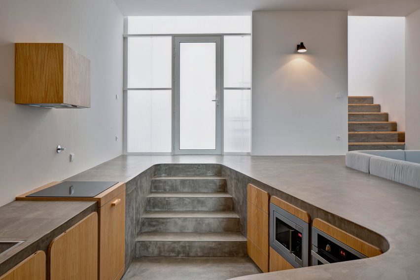
Flower House, Portugal, by Ezzo
The concrete worktops of this sunken kitchen double up as a smooth floor for the dining room at Flower House, a renovated dwelling in Porto.
Wood-fronted cabinets slot in beneath the flooring, which was hand-poured on site and has been covered with a waterproof coating to give it a polished look.
Find out more about Flower House ›
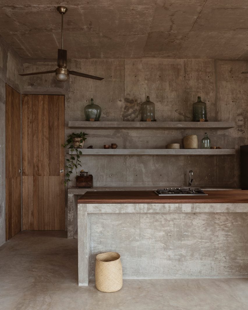
Toad’s House, Mexico, by Espacio 18 Arquitectura
Throughout the minimalist Toad’s House on Zapotengo Beach in Oaxaca, architecture studio Espacio 18 has left the concrete structure unfinished and exposed.
In the bar-style kitchen, the board-marked walls are teamed with glass ornaments and woven baskets, while a central island has been topped with a wooden countertop.
Find out more about Toad’s House ›
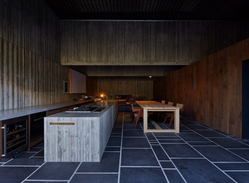
House T, Japan, by Suppose Design Office
This concrete kitchen is among the purposely dark and cave-like living spaces in the monolithic home that Suppose Design Office designed for its founder in Tokyo.
Its concrete walls and worktops have tactile finishes, which stand against a backdrop of large stone floor tiles and wooden furnishings.
Find out more about ›
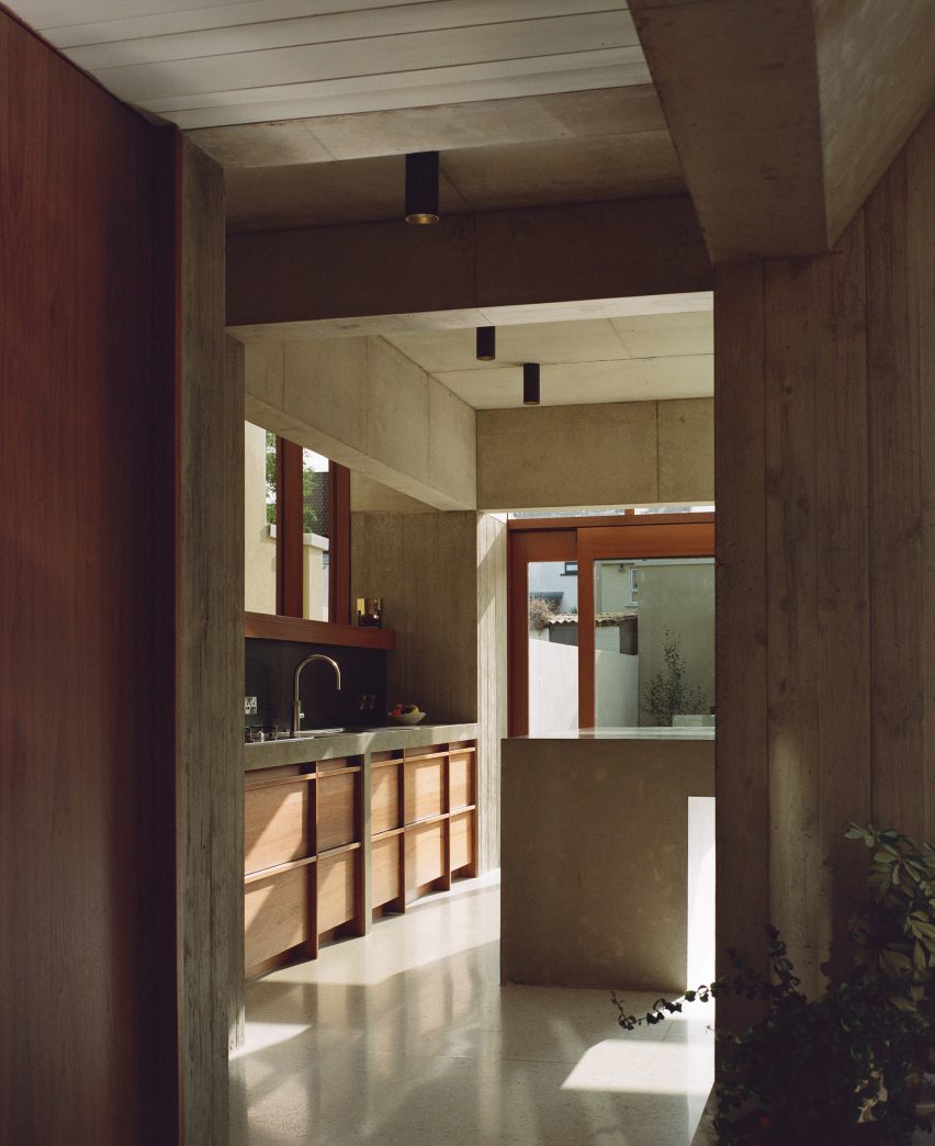
Hollybrook Road, Ireland, by TOB Architect
Irish studio TOB Architect designed this concrete kitchen extension to evoke the feeling of “being a child under a very robust table”.
It was cast in situ as one geometric form with the goal of creating a seamless and cavernous look inside. The architect chose an otherwise restrained material palette of terrazzo, walnut and Accoya wood in an effort to retain focus on the texture of the concrete.
Find out more about Hollybrook Road ›
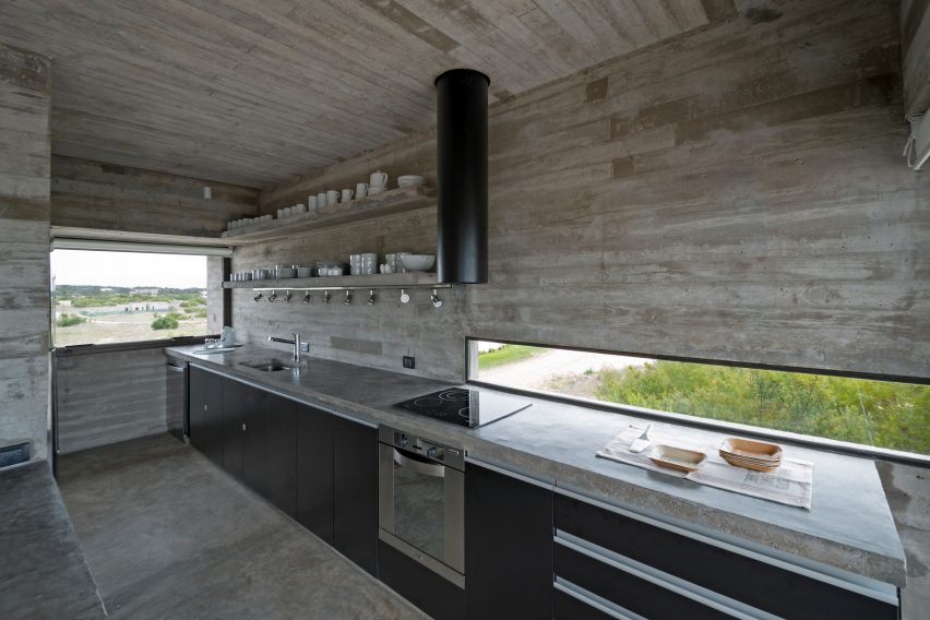
Casa Golf, Argentina, by Luciano Kruk
Another concrete kitchen by architect Luciano Kruk is found in Casa Golf, a holiday home on the Argentinian coastline.
Paired with black cabinets and extractor ducting, its dark-grey surfaces add texture to the space without distracting from the outward views framed by the variety of windows that line the space.
Find out more about Casa Golf ›
This is the latest in our lookbooks series, which provides visual inspiration from Dezeen’s archive. Other recent editions showcase airy balconies, marble bathrooms and gallery interiors.