Bedroom and mirror in Ember Locke hotel
CategoriesInterior Design

Ember Locke hotel channels Kensington’s decadent heyday

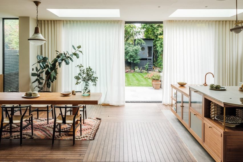
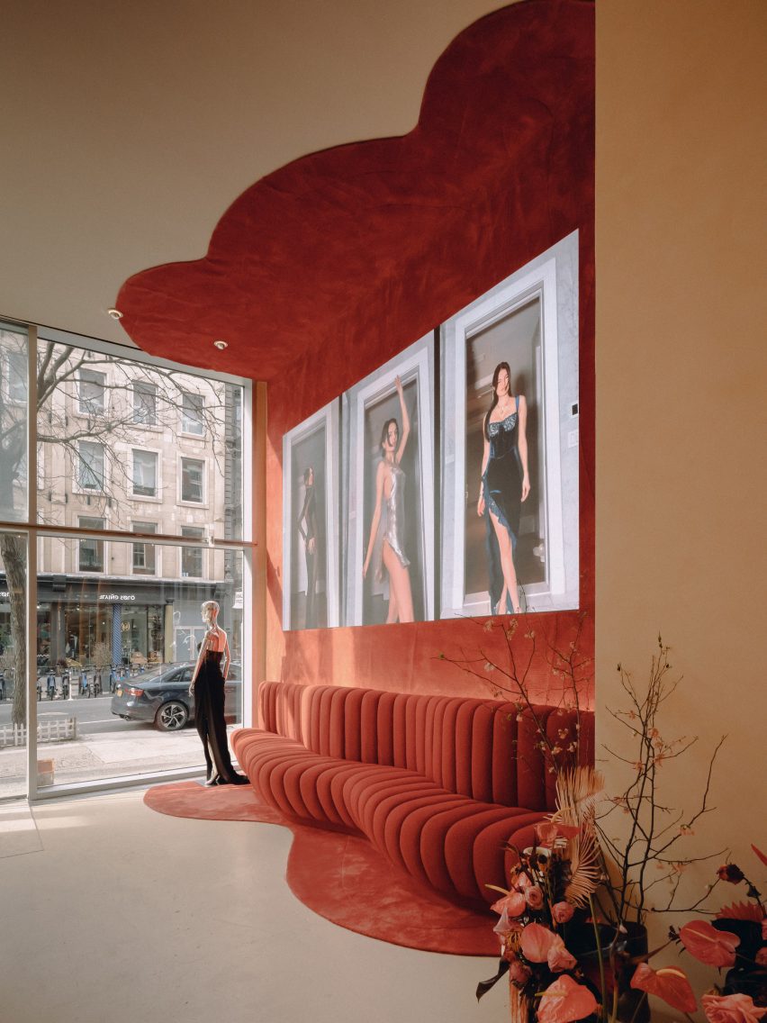
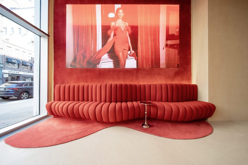
Warm saturated colours and maximalist touches are combined inside Locke Hotels’ latest outpost in west London, designed by local studios Atelier Ochre and House of Dré.

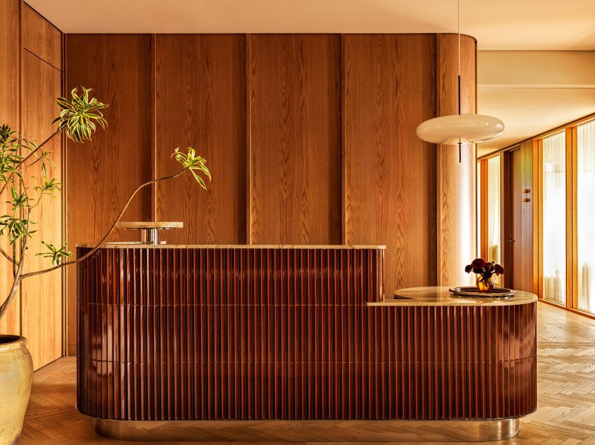
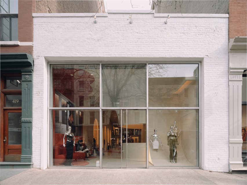
Occupying an imposing Victorian mansion block in Kensington, the Ember Locke hotel was designed as a homage to some of the area’s historic architecture.

Bedroom and mirror in Ember Locke hotel
Atelier Ochre and House of Dré have designed the Ember Locke hotel

Among the references brought in by the designers were the art deco Kensington Roof Gardens and the now-defunct Biba department store, which rose to popularity in the Swinging Sixties.

“We wanted to create interiors that are an extension and interpretation of the neighbourhood, a space that reflects the cultural heritage of Kensington but also somewhere that shows the area’s evolution over time,” Atelier Ochre founder Pauline Dellemotte told Dezeen.

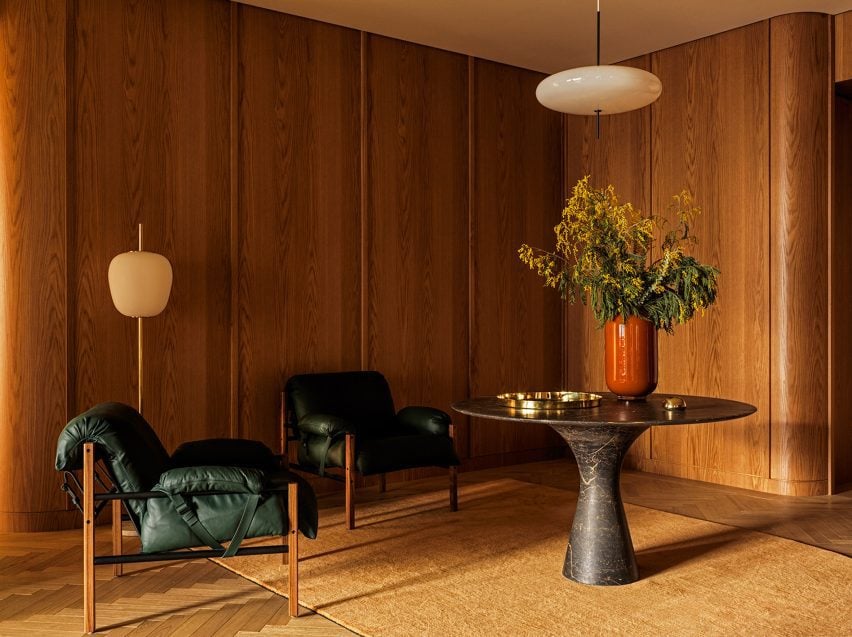
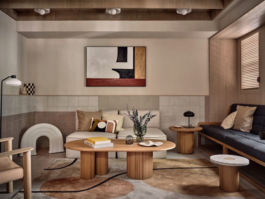
“We wanted to delve into the world of bold patterns, rich colours, eclectic furniture and art deco details, to tap into the sense of opulence that once dominated the Kensington scene.”

Kitchen and seating area in Kensington hotel by Atelier Ochre and House of Dré
The hotel accommodates 121 serviced apartments

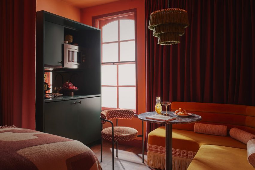
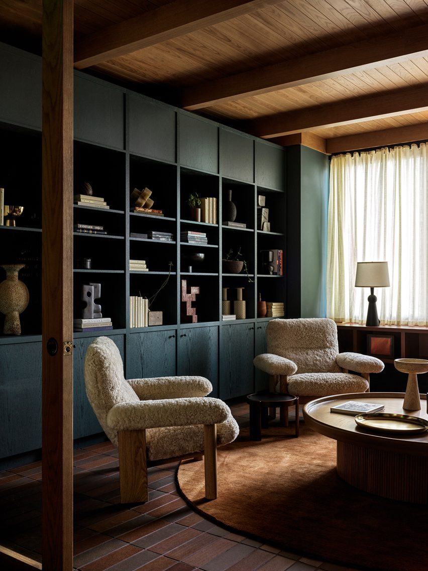
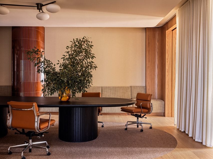
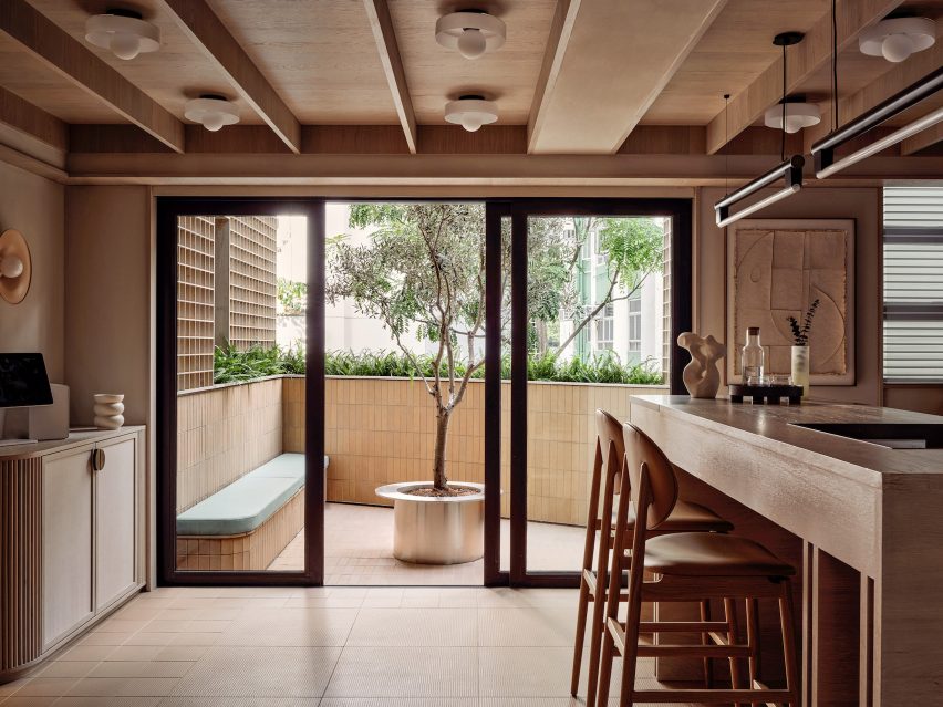
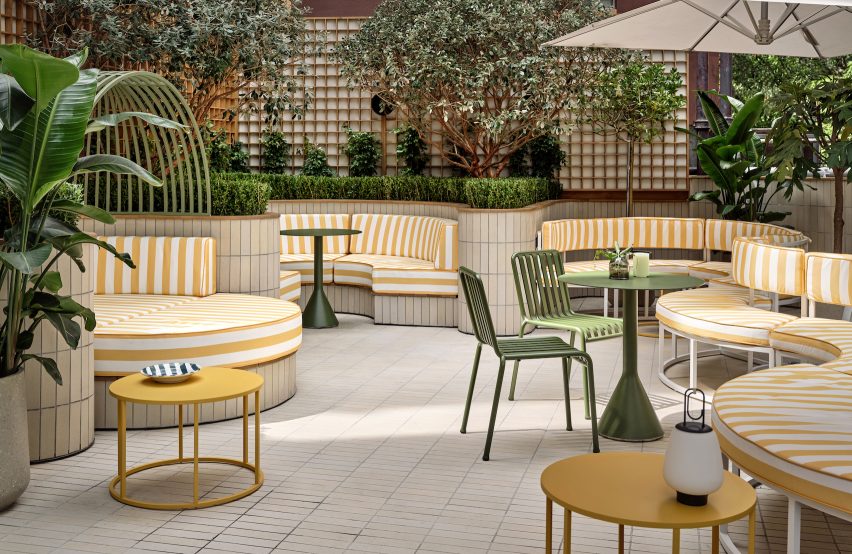
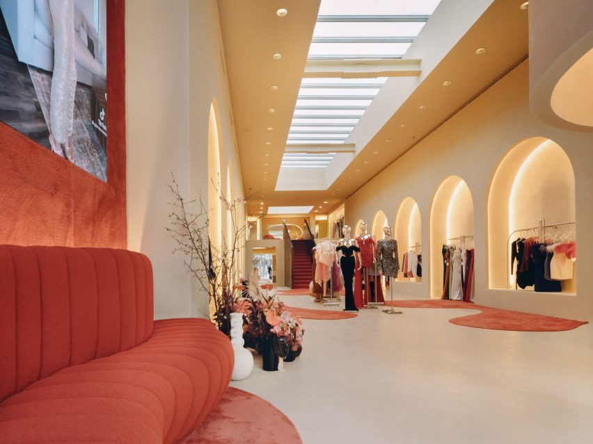
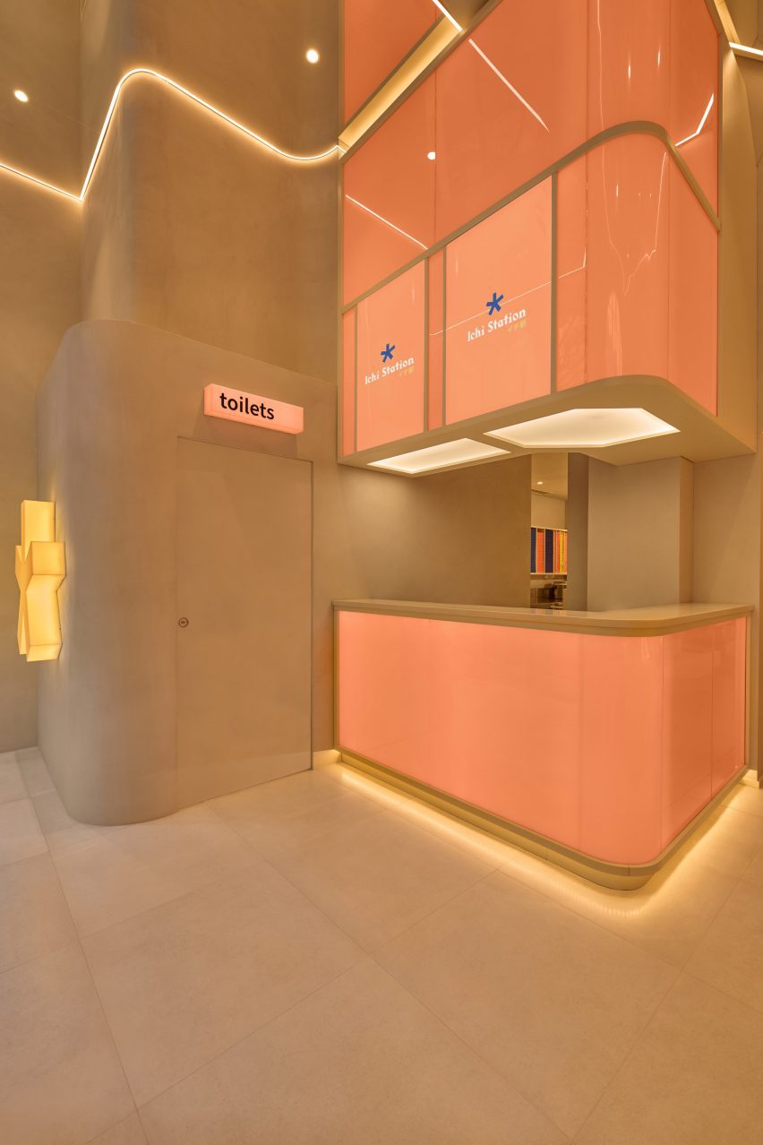
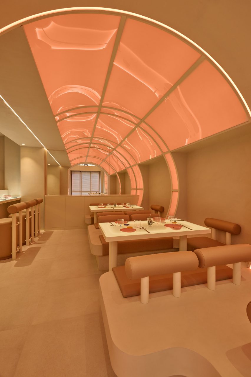
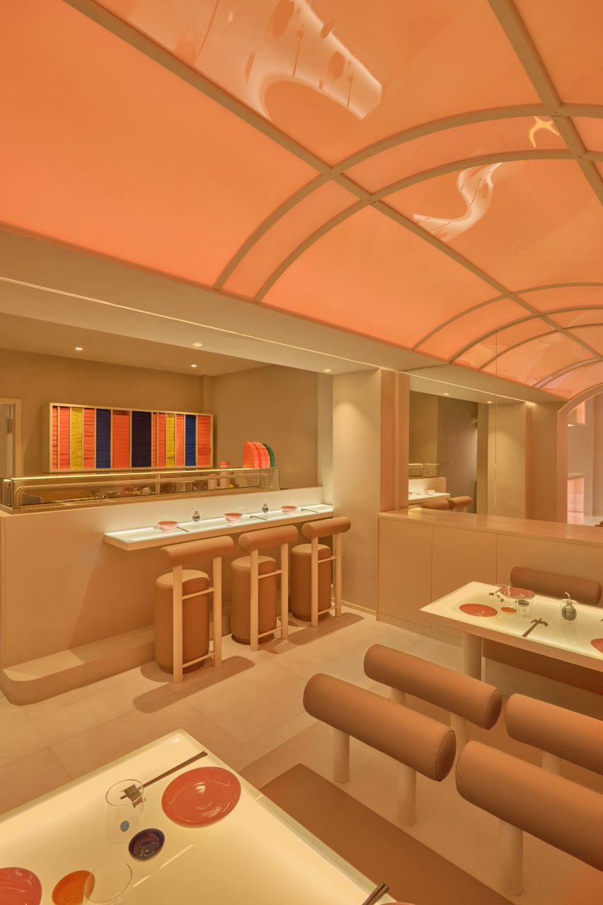
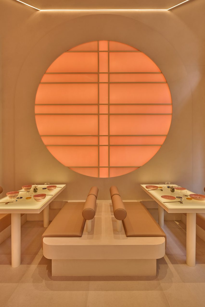
Instead of traditional guest rooms, Ember Locke accommodates 121 serviced apartments over eight floors, alongside a bakery, restaurant and conservatory cocktail bar, a stage for live performances, a co-working space, a gym and a garden.

Its interiors were designed to offer a contrast to the hotel’s location on bustling Cromwell Road – home to three of London’s most important museums including the V&A and the Natural History Museum.

Seating area of guest room in Ember Locke hotel
Velvet banquettes in the rooms are trimmed with ultra-long fringing

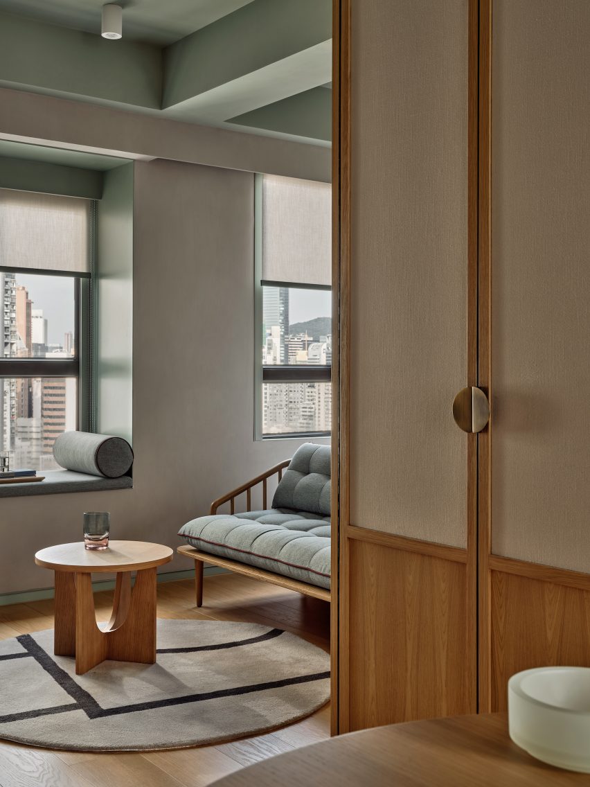
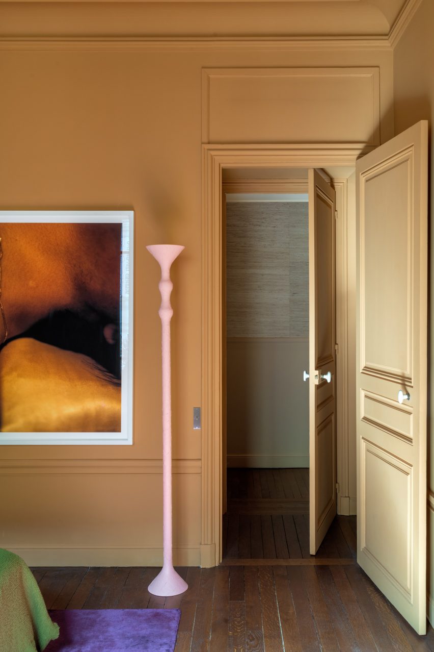
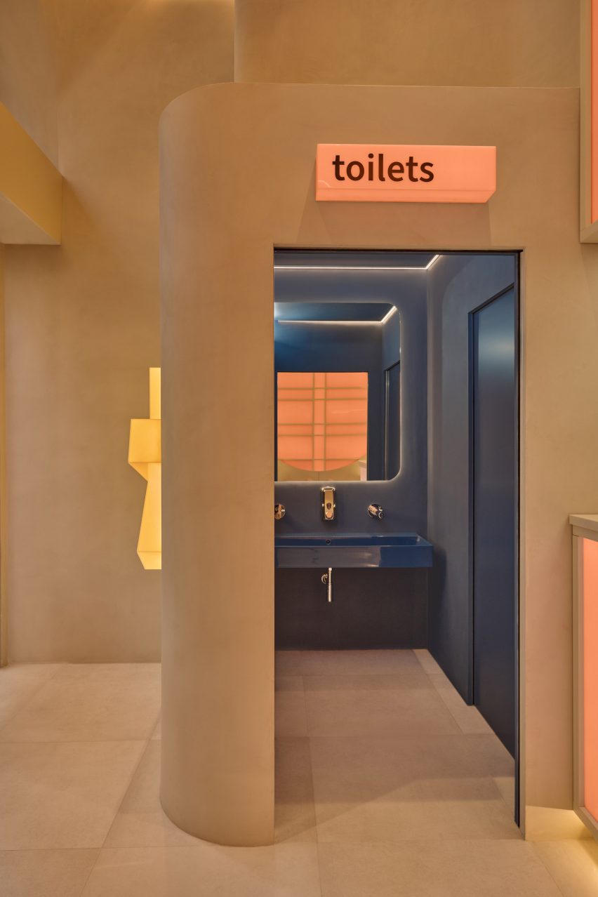
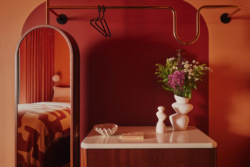
The building’s original arch-topped windows are mirrored in the arches and curves found in each room, from tubular-backed banquettes and chairs to the sculptural meandering clothes rail of the deconstructed wardrobe.

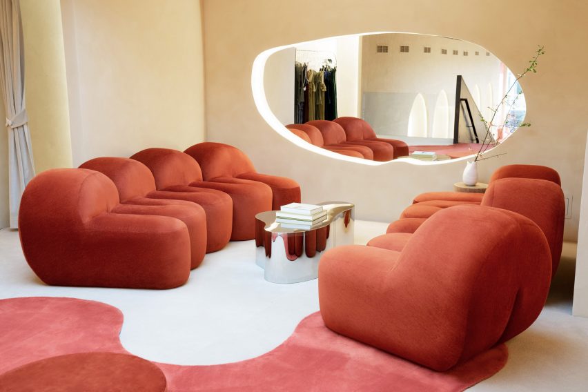
“The curved edges of the banquette, the rotating mirror and the wardrobe rail are attempts to combine the unlikely trio of playfulness, comfort and practicality,” said House of Dré founder Andreas Christodoulou.

“We’ve introduced some bold furniture and sculptural objects to spark a sense of curiosity and playfulness, and to allow guests to interact and reflect themselves within the space,” Dellemotte added.

Kitchenette in guest room of Kensington hotel by Atelier Ochre and House of Dré
Each apartment also has a small kitchenette

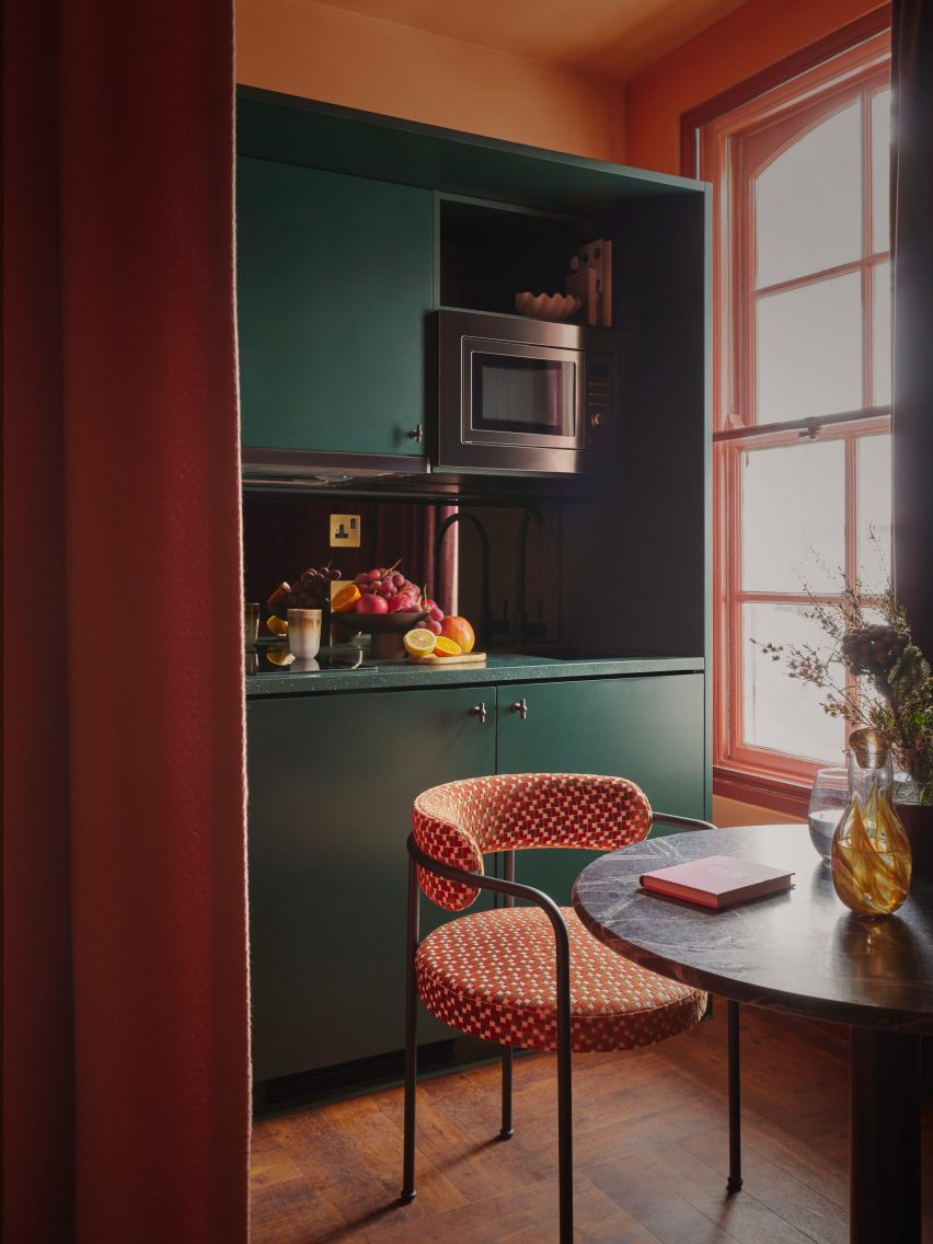
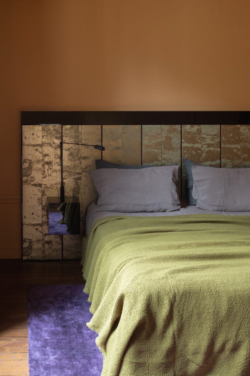
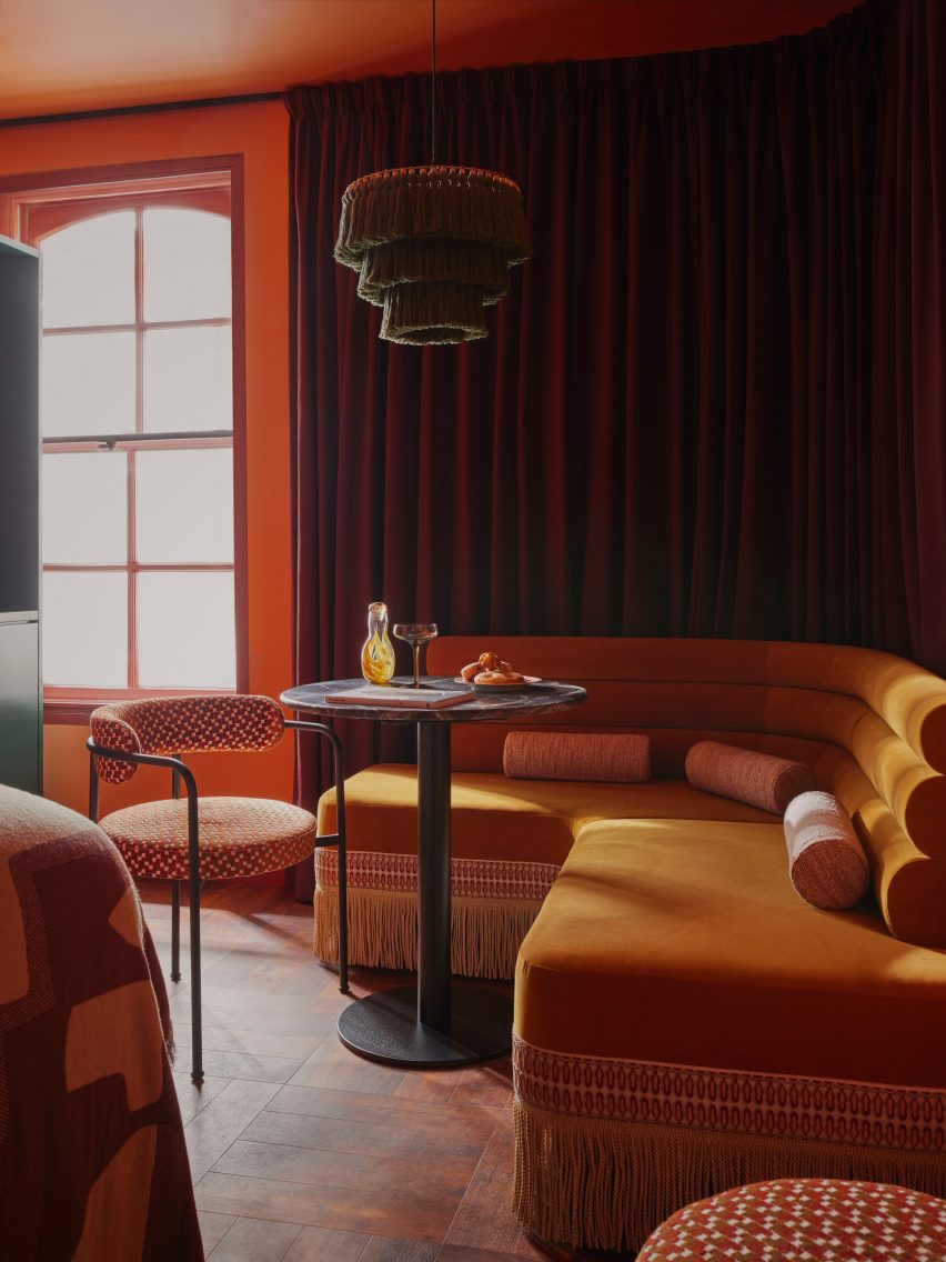
The velvet banquettes are trimmed with ultra-long fringing, echoed by the fringed pendant lights that hang low above the circular table in each room to zone the seating area.

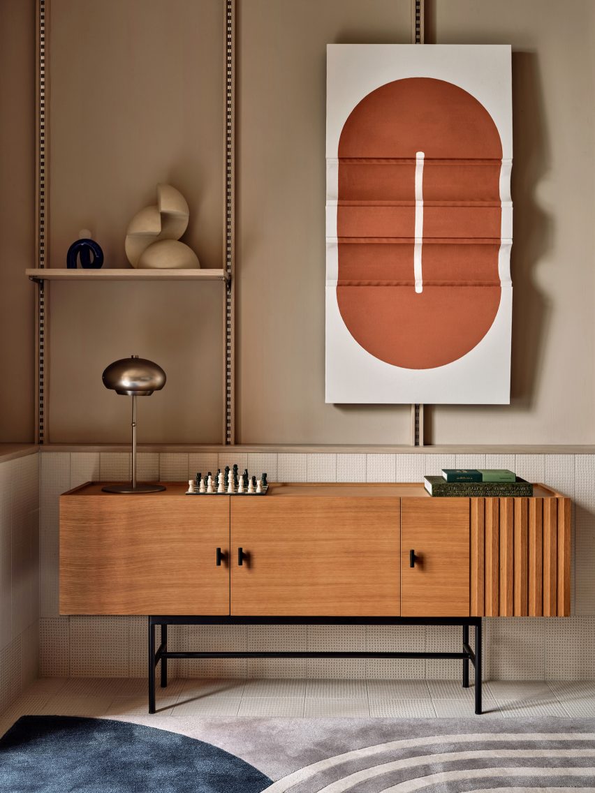
Brass detailing across coat hooks, wall lights and clothes rails adds to the sense of opulent modernity.

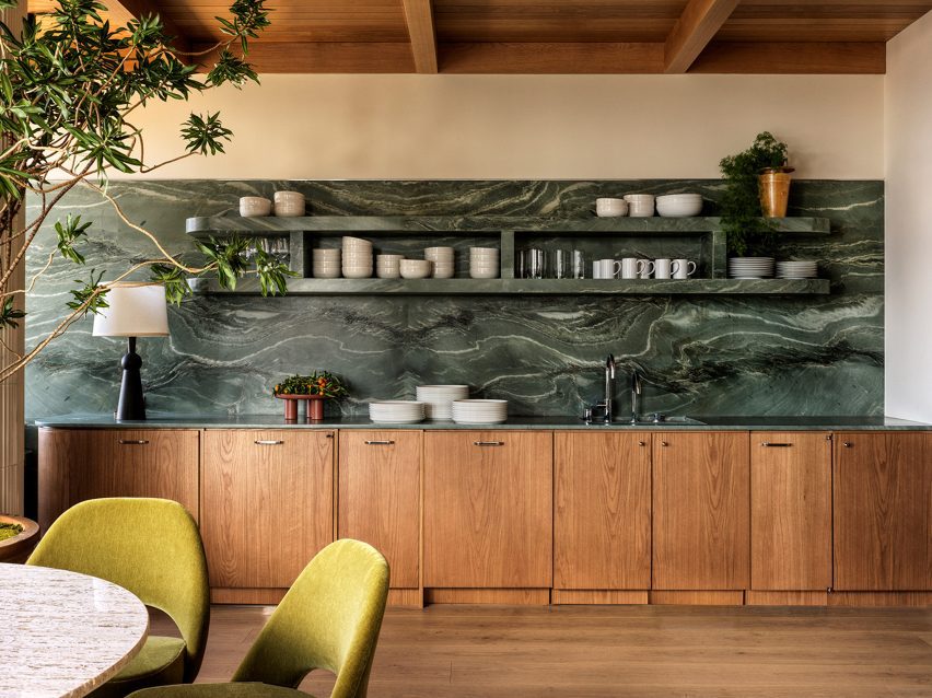
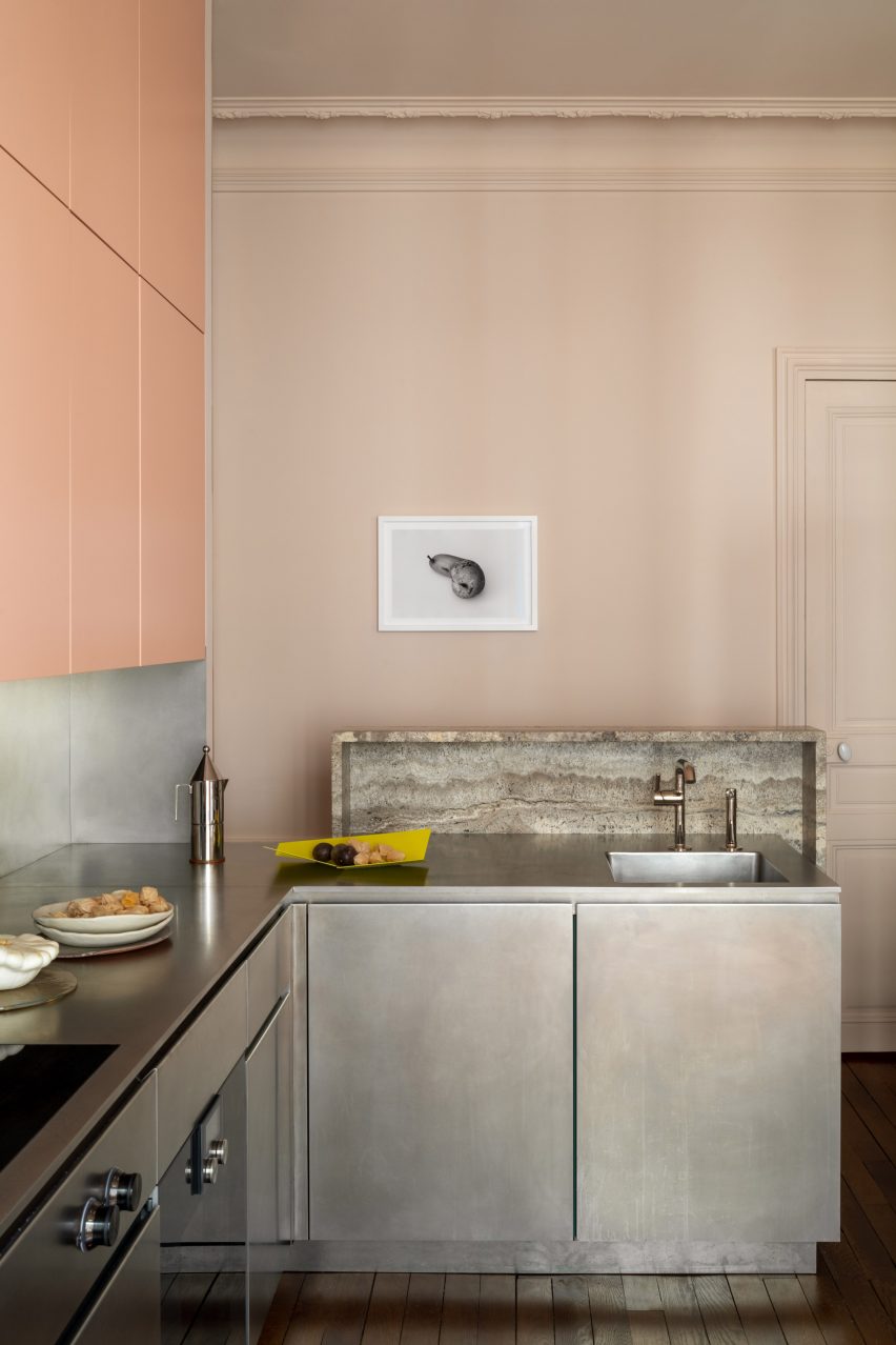
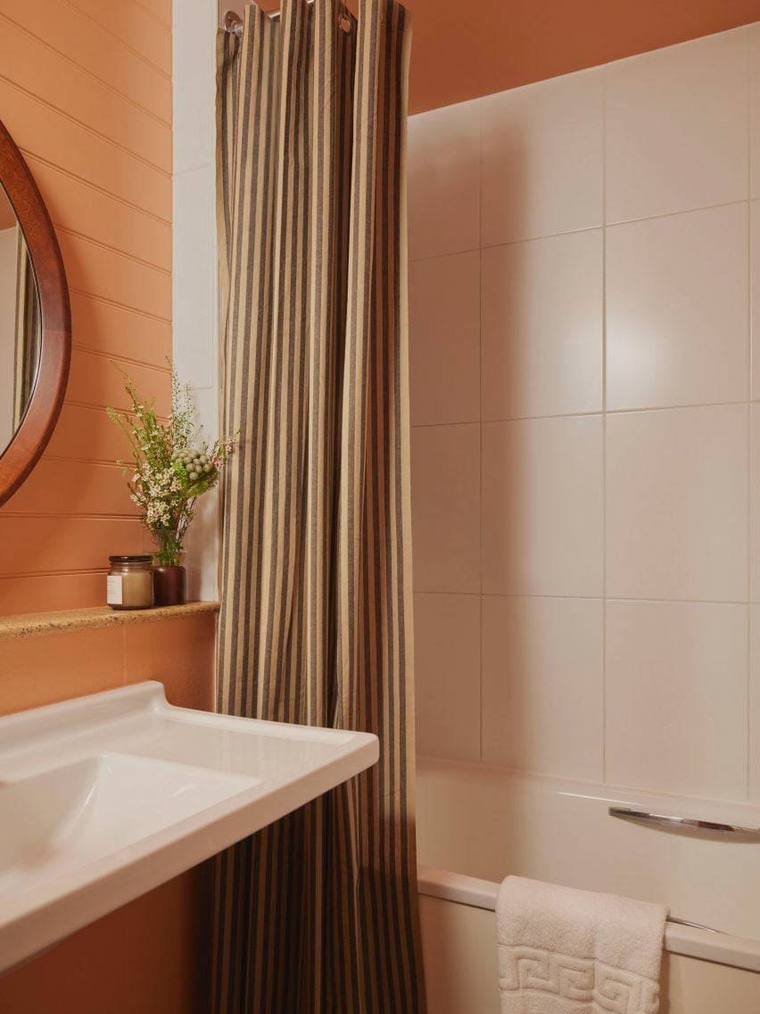
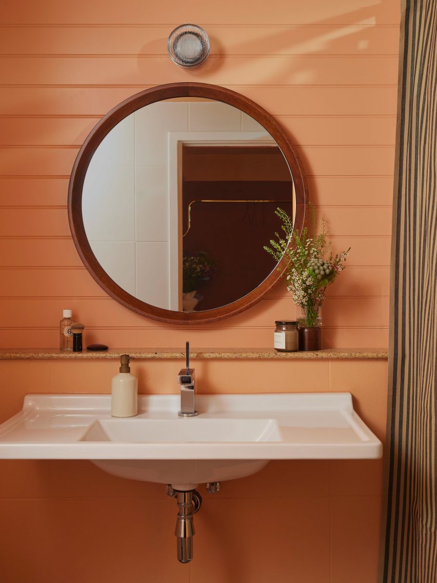
An intense colour palette, which layers red, orange and mustard tones, is offset by the deep green of the apartment kitchenettes, highlighting the more practical nature of this area.

“With the fringing and warm earthy colours, the rooms flirt with maximalism but still possess the calm and contemporary sophistication that one would expect from a Locke hotel,” said Christodoulou.

Bed and kitchen in Kensington hotel by Atelier Ochre and House of Dré
The bed is separated from the kitchen via a cotton curtain

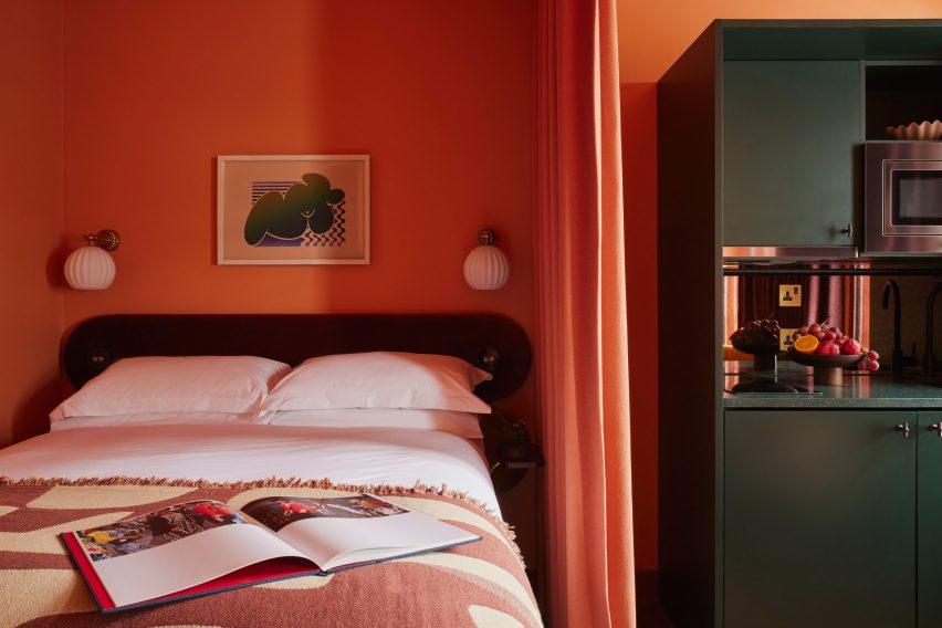
Heavy recycled-cotton curtains in a claret colour, custom-created by London textile company Yarn Collective, track around the walls and create a flexible room divider, separating the bed and kitchen areas when needed.

Many of the communal spaces feature art by local and up-and-coming artists alongside specially created works by House of Dré.

Bathroom with striped shower curtains in Ember Locke hotel
Striped shower curtains jazz up the bathrooms

The project was a close creative collaboration between Dellemotte and Christodoulou.

“We are old friends who met at a previous practice,” said Dellemotte. “Our friendship grew to include exciting collaborations across hospitality projects, where we combined our passions for design and art.”

“At Ember Locke, we’ve been given the opportunity to blend the interior aesthetics and art curation of the spaces with the overall branding of the hotel in a holistic way.”

Bathroom sink in guest room of Kensington hotel by Atelier Ochre and House of Dré
Surfaces are finished in a salmony peach colour

Locke Hotels already has a number of other outposts in London. Among them is one in Bermondsey – with interiors designed by Holloway Li to echo sunny California deserts – and one near St Paul’s Cathedral that is housed in a converted 1970s office block.

The photography is by Kensington Leverne

Reference

Reception desk wrapped in glossy oxblood-coloured tiles
CategoriesInterior Design

And And And Studio brings 1970s elements to Century City Law Office

And And And Studio has overhauled the offices for one of LA’s top entertainment law firms, opting for a look that’s “more akin to a hotel lobby”.

The firm, which represents several Hollywood actors, tasked And And And Studio founders Annie Ritz and Daniel Rabin with designing interiors for its offices in Century City, a commercial district south of Beverly Hills.

Reception desk wrapped in glossy oxblood-coloured tiles
Visitors to the law offices in Century City are greeted by a desk wrapped in glossy oxblood-coloured tiles

The design studio convinced the clients to stay in their current building rather than move – a decision that required a complete redesign of the 22,000-square-foot (2,044-square-metre) space and the gutting of the interiors to make room for a brand-new layout.

The clients required over 30 private offices within the floor plan, so it had to compromise on the size of the rooms to leave enough area for lounges and other communal facilities.

Wood-panelled seating area with two slingback chairs and a marble table
The wood-panelled reception area sets the tone for the rest of the interiors

“The goal was for Ritz and Rabin to make the space feel airy, open and more akin to a hotel lobby than an office,” said the studio.

“[The lawyers] traded slightly smaller private offices in order to provide the entire office with inviting and functional communal spaces.”

Lounge area with teal-coloured bookshelves, two armchairs and a coffee table
And And And Studio drew references from a variety of design styles, most noticeably the 1970s

Visitors arriving at the wood-panelled reception area are met by a counter wrapped in glossy oxblood Rombini tiles from Mutina, which also surround curved columns in meeting spaces.

Bassam Fellows sling lounge chairs and an Angelo M Marble Table from Alinea Design Objects were also placed in reception, setting the tone for the rest of the interiors.

Kitchen featuring green marble countertops, backsplash and shelves
In the kitchen, green marble forms countertops, backsplash and shelves

Furnishings found throughout pull references from a variety of design styles, including art deco and 1970s, as seen in the Brasilia chairs by Menu, sofas by Arflex, and a Phillipe Malouin sofa for SCP.

Brown and yellow velvet upholstery in the lounge spaces also nods to the 1970s, while in the kitchen, green marble forms the countertop, backsplash and open shelving.

“The 1970s-inspired design transcends through warm wood tones, and bold-hued gold and green fabrics,” said And And And Studio.

Designing and executed during the Covid-19 pandemic, the team was met with various hurdles during the project, which resulted in multiple last-minute changes.

Conference room
The red tiles from the reception area are repeated in conference rooms

“[Our] approach to the re-design of this office embraces the goals and ethos of this law firm, giving a unique design to the space that is distinct,” And And And Studio said.

“This goal was met with several challenges due to the pandemic, creating delays and changes, specing and re-specing products, all while balancing a tight timeline.”

Meeting rooms with chairs around a circular table
The interior is designed to look more like a hotel lobby than an office

Ritz and Rabin’s studio has offices in both Los Angeles and Toronto.

Other law office designs include one created by Studio Arthur Casas for a firm in São Paulo with a chocolate-coloured space that’s brightened by hundreds of books, while Vladimir Radutny Architects used minimal white partitions to divide a lawyers’ office in Chicago.

The photography is by Chris Mottalini.

Reference

Zaha Hadid's Issam Faires photography
CategoriesInterior Design

Five highlights from Zaha’s Moonsoon: An Interior in Japan

The Zaha Hadid Foundation has opened an exhibition about Zaha Hadid’s Moonsoon restaurant in Sapporo, Japan. Here, exhibitions officer and curator Johan Deurell selects five highlights from the show.

Zaha’s Moonsoon: An Interior in Japan is a case study of architect Hadid’s first built project outside of the UK – the Moonsoon Bar and Restaurant in Sapporo, Japan, which was constructed in 1989.

The exhibition offers a journey from the conception of the venue  – conveyed through a series of archival models, presentation documents and sketches – through to its built form, presented through images and one-to-one recommissioned furniture from the bar’s interior.

“Our latest exhibition showcases the creative processes behind one of Zaha Hadid’s earliest and less well-known projects,” said Zaha Hadid Foundation director Paul Greenhalgh. “Moonsoon was created at the time of the incredible explosion of the Japanese economy, and the design boom that accompanied it.”

“Japan provided opportunities for emerging architects to work on experimental projects. For the foundation, it is a chance for us to dive deep into the archives and highlight works rarely seen before.”

Monsoon’s design referenced some of the early 20th-century avant-grade movements that emerged out of Russia, such as the works of Russian abstract artist Kazimir Malevich.

Angular, twisting and geometric shapes were translated into functional architectural volumes and layers. Additional design references include the works of sculptor Alexander Calder, French liquor commercials from the 1950s and imagery of orange peel and pasta.

Zaha’s Moonsoon: An Interior in Japan takes place at the Zaha Hadid Foundation headquarters in Clerkenwell, London, which functioned as Hadid’s headquarters from 1985 until her death in 2016.

Read on for Deurell‘s five highlights:


Photo of a presentation briefcase at Zaha's Moonsoon: An Interior in Japan

Presentation case, acrylic and aluminium by Zaha Hadid Architects, 1989-90

“The idea of our exhibition came about with the discovery of a Perspex briefcase in the archive. This briefcase was made by Daniel Chadwick as a container for the Moonsoon design concept.

“It carried elements of model as well as 14 paintings, six perspective drawings and 13 collages shown in this exhibition. The case would be taken to the clients as a form of presentation strategy, where the works on paper would be laid out and the model assembled.”


Photo of a model at Zaha's Moonsoon: An Interior in Japan

Presentation model, acrylic by Zaha Hadid Architects, 1989-90

“This model, made by Daniel Chadwick, was created to illustrate a concept, rather than as a replica of the restaurant’s final form. Here an ‘orange peel’ shape swirls through the two floors, and the colourful shards represent the furniture and interior elements. At the time it was made, the interior and furniture designs had yet to be finalised.

“Zaha Hadid Architects embraced the transparency of acrylic to make the relationship between interior and spatial elements in the model easier to view. In the future, digital models would provide the transparent layering effects that Hadid sought to achieve through the early use of acrylic.”


Painting on show at Zaha's Moonsoon: An Interior in Japan

Interior concepts, acrylic paint on black cartridge paper by Zaha Hadid Architects, 1989-90

“This painting belongs to a suite of 14 paintings originally stored in the Perspex briefcase. Moonsoon’s concept was partially inspired by fire (for the first-floor bar) and ice (for the ground-floor restaurant), which is illustrated through the reds and blues in this painting. A swirling ‘orange peel’ shape represents the central furnace penetrating through the two floors, whereas splintered ‘ice shards’ symbolise tables.

“Zaha Hadid Architects used paintings to explore concepts that could not be shown through conventional perspective drawings. Various team members contributed to the paintings. The works were derived from sketches, which had been transferred to tracing paper and then onto cartridge paper, and subsequently coloured in, often by Hadid herself. Their warped shapes and layering anticipated the possibilities later offered by CAD software.”


Zaha’s Moonsoon, by Marwan Kaabour, 2023

“Not everything in the show came from that briefcase. There were boxes upon boxes of archival material too. During the research phase, colleagues at Zaha Hadid Architects told me: ‘go find the little doodle’. That turned out to be a sheet of Arabic letterforms spelling out Zaha and Moonsoon, and the recurring swirly shape, which you see in the model and paintings.

“With some help from Marwan Kaabour, who designed the graphic identity for the exhibition, I learnt that the swirl is a stylised version of the letter H in Zaha. Marwan has done some amazing work for Phaidon and V&A before and runs the Instagram account Takweer on queer narratives in the SWANA region. I asked him to make a video based upon the archival material we had found.

“This snippet is taken from that video. It charts the development of Moonsoon’s ‘orange peel’ structure, from the brief to its final built form. Beginning with sketches of the words مونسون [Moonsoon] and زها [Zaha] based on Arabic letterforms, through references to orange peel, pasta, and the works of Alexander Calder, it concludes with their eventual translation into the technical drawings informing the construction, as well as images of the construction and built.”


Interior photo of the restaurant
Photo by Paul Warchol

Sofa and tray table by Zaha Hadid Architects, 1989-90 (remade in 2014)

“Finally, the exhibition includes a boomerang-shaped sofa from the bar. The furniture for Moonsoon employed intersecting curves and diagonal planes to create an interior landscape. Designed by Michael Wolfson, the differently sized sofas have interchangeable plug-in backrests and tray tables, which came in different colours and finishes.

“Waiters could set the tables on their stands when delivering the drinks to guests. I am not sure how well this waiting method worked in practice, but it is interesting to think about this furniture as part of a design historical tradition of flexible seating landscapes. We know that Zaha was a fan of Verner Panton’s work, for example.”

Zaha’s Moonsoon: An Interior in Japan is on show at the Zaha Hadid Foundation in London from 20 April until 22 July 2023. See Dezeen Events Guide for an up-to-date list of architecture and design events taking place around the world.


Reference

North London house by The Mint List
CategoriesInterior Design

The Mint List brings mid-century influences to north London family home

Interior design studio The Mint List has brought light, space and warmth to this Edwardian house in London with multiple extensions, a hidden playroom and plenty of tactile materials.

The renovated end-of-terrace house in Kensal Rise belongs to a film-industry couple that wanted a cosy family home with mid-century elements, in particular referencing the work of designers Charles and Ray Eames.

North London house by The Mint List
The Mint List has renovated and extended an Edwardian house in north London

“The clients had a leaning towards mid-century style but they didn’t want that to overwhelm the scheme,” The Mint List founder Camilla Kelly told Dezeen.

“The Eames House was a good mid-century reference in terms of encompassing warm, repurposed textures, a sense of scale and an abundance of light.”

North London house by The Mint List
A new rear extension houses the home’s kitchen and dining space

The brief was to open up this formerly dark and “unremarkable” home and create an improved sense of flow.

As well as adding two bedrooms and a small study in the newly converted loft, The Mint List created a rear extension to house the kitchen-dining space and absorbed the property’s former garage into the house, providing a mudroom, pantry and playroom.

North London house by The Mint List
The custom-built kitchen island has two levels

The playroom is cleverly concealed behind a bank of new storage in the hallway, which has also been enlarged by opening it up into the former porch.

“There was huge importance given to light in the design,” said Kelly. “Wherever possible, we created tall windows benefiting from the south-facing aspect.”

North London house by The Mint List
Bookshelves act as room dividers to form a hybrid library and snug

The house is full of custom-designed features and finishes at the request of the client.

The floor uses unusually slim lengths of oak, laid at right angles to each other in huge grids, while the thresholds were distinguished with slender fins of brass that add subtle visual interest.

North London house by The Mint List
The children’s playroom is hidden inside a wall of storage in the hallway

Drawing on the design language of mid-century furniture, the kitchen was completely custom-built for the space with a clean-lined, yet playfully asymmetric design.

“We centralised the assembly and used high windows on either side of the cabinets to emphasise the cubic nature of the design,” said Kelly. “The asymmetric cubes that form the cabinets were built using walnut, with cream-painted doors for the covered storage.”

The material mix includes walnut veneer, reeded glass, olive-coloured door fronts and antique brass detailing, as well as concrete and reclaimed iroko wood worktops.

“I’m averse to keeping things all in one colour,” the designer said. “It’s a missed opportunity to bring texture, colour and character to a space.”

North London house by The Mint List
The children’s bedroom is located on the first floor

The kitchen island was designed to account for the owners’ love of entertaining, with a section of the worktop raised to bar height to draw guests away from the cooking area.

“The island is even more asymmetric, with different levels, drawers, shelves and openings that served to show how the geometry of a design can sometimes be off-kilter and still look neatly intentioned, as long as it sits correctly within the scale of the space,” Kelly said.

North London house by The Mint List
A small study now occupies the loft alongside a primary bedrooms suite

The curved bar provides a visual link to the rounded steps that lead down into the kitchen area, as well as to other curved elements throughout the house.

“I like to include some curves in my projects through room openings, joinery and countertops,” Kelly said. “They help to soften spaces and improve flow from one area to the next.”

North London house by The Mint List
The main bathroom is held in pale blue and green tones

Adjoining the kitchen is a hybrid library and snug, which is partially enclosed with oak shelving finished in glass and raffia, that double up as room dividers and nod to the Eames House in California.

“We didn’t want this to be a dead space,” Kelly said. “It’s a quiet spot where you can curl up with a book or listen to music. And when the couple is entertaining, this is a soft space where you come to catch up with someone.”

Four bedrooms are spread across the home’s upper levels, including a shared children’s bedroom with bunk beds on the first floor and two added bedrooms in the converted loft.

North London house by The Mint List
A baby pink sink provides a pop of colour

Since founding The Mint List in 2011, Kelly has completed a number of interior projects in London.

Among them are the headquarters of music management company Everybody’s in Highbury, which she kitted out with mid-century-style movable furniture.

The photography is by Dave Watts.

Reference

IK Lab at Azulik
CategoriesInterior Design

Ten gallery interiors that are artworks in their own right

A subterranean gallery carved into a sand dune and a treehouse-style art museum feature in our latest lookbook, which collects striking gallery interiors from around the world.

Art galleries are specifically designed as spaces for showcasing artworks such as sculptures and paintings. As a result, they are often characterised by neutral and minimalist interiors so as not to divert attention from the objects on display.

However, some galleries are defined by statement designs that not only complement the artworks they house, but transform their interiors into masterpieces themselves.

From a converted Iranian brewery to a Milanese basement, read on for 10 galleries with memorable interior designs.

This is the latest in our lookbooks series, which provides visual inspiration from Dezeen’s archive. For more inspiration see previous lookbooks featuring inviting entrance halls, terracotta kitchens and Crittal-style windows.


IK Lab at Azulik
Top: Helsinki’s Amox Rex museum. Above: image is courtesy of IK Lab

IK Lab, Mexico, by Jorge Eduardo Neira Sterkel

Curving cement walls and undulating vine floors provide an alternative backdrop for artwork within the gallery at the Azulik resort in Tulum.

The gallery, which visitors must enter without shoes via a winding walkway, is elevated above the ground and reaches the height of the surrounding tree canopy. Circular windows of various sizes flood the space with natural light.

The gallery was opened by the resort’s founder and designer, Jorge Eduardo Neira Sterkel, after the great-grandson of the famed American art collector Peggy Guggenheim and a Tulum local suggested the idea.

Find out more about IK Lab ›


Interior of TaoCang Art Center by Roarc Renew in Jiaxing, China
Photo is by Wen Studio

TaoCang Art Center, China, by Roarc Renew

TaoCang Art Center is comprised of two disused granaries located in the village of Wangjiangjing in China’s Zhejiang province. Shanghai studio Roarc Renew connected the volumes with a pair of sweeping brick corridors that are lined with arches.

Functioning as distinct gallery spaces, the granaries are characterised by striking arrangements of lotus flowers on their floors – an ode to the village’s lotus-flower industry and a pond adjacent to the site.

Find out more about TaoCang Art Centre ›


Bedroom at art gallery
Photo is by Ye Rin Mok

Maison Lune, USA, by Sandrine Abessera, Lubov Azria and Gabriella Kuti

Designers Sandrine Abessera and Lubov Azria, founders of the contemporary art gallery Maison Lune, worked with interior designer Gabriella Kuti to set it within a former private house in California.

Spread across rooms in neutral hues, the gallery is laid out like a collector’s home featuring a varied cluster of artworks and design pieces. Multiple terraces and internal stepped areas provide plinth-like display units for the objects throughout the property.

“We want to build an alternative to traditional galleries, which are often perceived as too elitist and intimidating,” explained Abessera and Azria.

Find out more about Maison Lune ›


Amos Rex by JKMM Architects
Photo is by Tuomas Uusheimo

Amos Rex, Finland, by JKMM Architects

Finnish studio JKMM Architects designed the Amos Rex art museum in Helsinki with a series of domed subterranean galleries, which bubble up through the ground to create a sloping outdoor playground.

While a portion of the museum is housed in the renovated Lasipalatsi, a functionalist 1930s building at street level, Amos Rex was also extended underground to include the domed galleries. These subterranean spaces feature minimalist monochrome interiors illuminated by large round skylights.

Find out more about Amos Rex ›


Studio and gallery for Bosco Sodi
Photo is by Sergio Lopez

Studio CDMX, Mexico, by Alberto Kalach

A multi-purpose artist residency and gallery come together at Studio CDMX, a space in Mexico City designed for Casa Wabi founder Bosco Sodi in which to work and exhibit his pieces.

Constructed on the site of a former warehouse, the building reflects its location’s industrial roots with concrete, metal and brick elements arranged in chunky formations. Sodi’s sculptural works, finished in materials including stone and ceramic, also influenced the interiors.

Find out more about Studio CDMX ›


Meandering rattan structure in a dining room by Enter Projects Asia
Photo is by William Barrington-Binns

Private gallery, Thailand, by Enter Projects Asia

A winding rattan installation traces an overhead route through this private gallery in Chiang Mai, Thailand.

Architecture studio Enter Projects Asia used an algorithm to design the structure, which snakes in and out of the gallery’s various indoor and outdoor spaces.

“We sought to create an immersive experience, giving the space a warmth and depth uncharacteristic of conventional art galleries,” said studio director Patrick Keane.

Find out more about this private gallery ›


Fondazione Luigi Rovati Museum in Milan
Photo is by Duccio Malagamba

Fondazione Luigi Rovati Museum, Italy, by Mario Cucinella Architects

Layered stone walls line the new basement of the Fondazione Luigi Rovati Museum, an art gallery housed within a 19th-century palazzo in Milan that was both preserved and expanded by Italian studio Mario Cucinella Architects.

The basement walls were created from overlapping layers of limestone ashlar, which curve upwards to form domed ceilings. Free-standing and wall-mounted cases designed by the architecture studio display two hundred Etruscan artifacts, including ancient jewellery and cinerary urns.

Find out more about Fondazione Luigi Rovati Museum ›


Argo Factory
Photo is by Ahmadreza Schricker

Argo Factory Contemporary Art Museum & Cultural Centre, Iran, by Ahmadreza Schricker Architecture North

US studio Ahmadreza Schricker Architecture North renovated a 1920s brewery in central Tehran to create the Argo Factory Contemporary Art Museum & Cultural Centre, preserving many of the factory’s original industrial features.

Designed without middle supports, a curvilinear concrete staircase was inserted into the building to connect the museum’s lobby and its six galleries above. The staircase is one of a number of new elements with a rounded shape, created to contrast the uniform brick architecture.

Find out more about Argo Factory Contemporary Art Museum & Cultural Centre ›


UCCA Dune Art Museum
Photo is by Wu Qingshan

UCCA Dune Art Museum, China, by Open Architecture

Carved into a dune on a beach in Qinhuangdao, this coastal art museum is comprised of a network of subterranean concrete galleries.

Beijing-based firm Open Architecture took cues from caves for the interlinked spaces, which are illuminated by organically shaped openings and feature an irregular texture.

“The walls of ancient caves were where art was first practiced,” Open Architecture co-founder Li Hu told Dezeen.

Find out more about UCCA Dune Art Museum ›


GO'C Mini Mart City Park
Photo is by Kevin Scott

Mini Mart City Park, USA, by GO’C

Mini Mart City Park is a community arts centre with a gallery built on the site of a former 1930s petrol station in Seattle.

Local studio GO’C referenced the location’s history when creating the design for the centre, opting for classic signage, an overhanging roof and divided metal windows.

Inside, the gallery space is characterised by exposed wooden rafters and smooth grey-hued floors, providing a neutral backdrop for the exhibition of artwork.

Find out more about Mini Mart City Park ›

This is the latest in our lookbooks series, which provides visual inspiration from Dezeen’s archive. For more inspiration see previous lookbooks featuring inviting entrance halls, terracotta kitchens and Crittal-style windows.

Reference

Ying'nFlo Hong Kong by Linehouse
CategoriesInterior Design

Linehouse designs Hong Kong hotel to evoke the comfort of home

Shanghai-based interior studio Linehouse used natural materials and a muted colour palette to give the Ying’nFlo hotel in Wan Chai, Hong Kong, the feel of an inviting home.

The hotel occupies the podium of a 24-story tower on a hilly street in Hong Kong. Its ground floor holds a series of communal spaces that Linehouse designed to provide “home comfort” for guests.

Ying'nFlo Hong Kong by Linehouse
The ground floor comprises a series of rooms referencing living rooms

The Collectors Room, which greets guests at the entrance of the hotel, has a neutral palette of hand-rendered walls, timber paneling, and linen cabinetry that display curated objects and artworks. A communal oak table serves as a counter where guests can interact.

This room also connects to an outdoor terrace through sliding glazed doors. Built-in bench seating and an olive tree sit at the centre of the terrace and invite guests to relax and socialise.

Ying'nFlo Hong Kong by Linehouse
A communal table and outdoor bench invite guests to socialise

A gridded timber screen leads further into the space through to the lift lobby and the Arcade room, where guests can gather to relax and play.

Soft-rendered walls, timber shutters and an eclectic mix of furniture create a sense of intimacy, while floor tiles in various geometrical motifs add a sense of playfulness.

Ying'nFlo Hong Kong by Linehouse
The Music Room features ceramic tiles

Adjacent to the Arcade is the Music Room, the social hub of the hotel. Here, ceramic tiles, a bespoke oak shelving system, a custom sofa and curated art and lifestyle objects were added to evoke a sense of a residential living room.

The Music Room opens up to the Garden Terrace, where undulating greenery sits behind circular seating in yellow-striped fabric, a colourful contrast to the overall neutral colour palette of the Ying’nFlo hotel.

Ying'nFlo Hong Kong by Linehouse
Yellow-striped fabric seating on the terrace adds playfulness

“The spaces are designed to have a warm, welcoming and familiar feel,” Linehouse said.

“Against this backdrop of curated simplicity is an edge of youthful attitude and local context, with vibrant elements giving the hotel its own unique flavour.”

The guest rooms of the Ying’nFlo hotel are located on the upper floor and feature ceilings painted in a muted green hue, which the same green tone used to frame window seating nooks and for the hand-glazed tiles in the bathroom and kitchen.

A clean palette of plaster, wood, white-washed oak and canvas add texture to the rooms. Seating nooks and lounge furniture serve multiple functions as spaces where guests can work, relax or dine.

Ying'nFlo Hong Kong by Linehouse
Muted green and selection of wood furniture create a warm feeling for the guest rooms

Linehouse was founded by Alex Mok and Briar Hickling in 2013 and the duo went on to win emerging interior designer of the year at the 2019 Dezeen Awards.

The studio has recently completed a Mediterranean restaurant with natural, tactile materials, as well as a space-themed cafe decorated with real meteorites, both in Shanghai.

The photography is by Jonathan Leijonhufvud.


Project credits:

Design principle: Briar Hickling
Design team: Ricki-Lee Van Het Wout, Lara Daoud, Justin Cheung

Dezeen is on WeChat!

Click here to read the Chinese version of this article on Dezeen’s official WeChat account, where we publish daily architecture and design news and projects in Simplified Chinese.

Reference

Winning a Dezeen Award "made me feel like anything is possible"
CategoriesInterior Design

Winning a Dezeen Award “made me feel like anything is possible”

With just three weeks until Dezeen Awards entries close, last year’s winners detail the positive outcomes of winning and encourage other studios to enter.

One studio said that winning a Dezeen Award was “a thrilling, rewarding and inspiring experience” while another said it created “new relationships with retailers, media and customers”.

“Winning a Dezeen Award has considerably raised my profile and helped me secure further collaborations,” said a studio that won for their consumer product design.

Dezeen Awards 2023, in partnership with Bentley Motors, is open for entries. There are only three weeks left to submit your project before midnight London time on 1 June and avoid late entry fees.

Read on to see what last year’s winners had to say:

British company MysteryVibe won for their a sex toy designed to help with erectile dysfunction

Sex toy company MysteryVibe, which won wearable design of the year for its vibrator aimed at tackling erectile dysfunction, considered winning a Dezeen Award “the ultimate honour”.

“It’s the ultimate honour for us to be recognised for all the hard work over many years that has gone into improving the health and happiness of people across the globe,” said the studio.

“The award resulted in press coverage and media attention in publications that we wouldn’t normally be featured in.”

Japanese startup studio Quantum won Dezeen Awards 2022 overall design project of the year

Japanese firm Quantum won product design of the year and design project of the year for its lightweight foldable wheelchair and told Dezeen that winning last year offered the practice new clients and media exposure, and encouraged other studios to also enter.

“We have received more inquiries from new clients and media who had heard about us winning the award,” said Quantum. “It also resulted in being selected as a part of the permanent collection of the museum Designmuseum Danmark.”

Architecture practice Studio Bua won residential rebirth project of the year for its Icelandic artist’s studio and residence and agreed that winning has led to new opportunities.

“It has positively affected our previous client relationships and it helps when acquiring new clients,” said Studio Bua. “We did see an increase in followers on our social media and clients have mentioned it after they saw that we posted about it.”

Designer Kathleen Reilly playfully rests her winning designs on her trophy

“It made me feel like anything is possible and I saw my future career as an artist and designer a lot more clearly,” said designer Kathleen Reilly, who won homeware design of the year for Oku, a knife informed by chopstick rests.

“As a result of winning, I have managed to secure a new collaboration, as well as several press articles and new relationships with retailers, media, and customers.”

“The wooden board which comes with Oku is now being made with Karimoku, Japan’s leading furniture manufacturer, and we are looking to launch this new collaboration this year.”

Studio G8A Architecture’s Dezeen Awards trophy pictured in front of a scale model of the winning factory

The team at Dutch practice Olaf Gipser Architects won housing project of the year for their apartment block with planted balconies and their win has served as motivation for future projects.

“We display our Dezeen Awards 2022 trophy at our office close to the entrance and next to a 1:200 scale wooden model,” said Olaf Gipser Architects.

“It reminds us of our achievements and recognitions and gives us all extra motivation to keep on going towards our goals.”

Office G8A Architecture, which won for its stainless steel manufacturing factory designed in collaboration with Switzerland-based Rollimarchini Architects, told Dezeen that winning gained the studio international validation.

“Winning a Dezeen Award can be described as a thrilling, rewarding and inspiring experience,” said G8A Architecture. “It helped us gain international recognition, reaching new clients and new talent for our team.”

Practice Atelier Boter’s trophy and certificate are displayed on the shelves in their office

Taiwanese architecture studio Atelier Boter won small workspace interior for its glass-fronted community hub and also has its trophy on display in the office.

“We put the trophy on the shelf together with all the books we gain inspiration from – it is a shelf we only place things that we’ve filtered through, as it is what falls in sight every time we walk into our studio,” said Atelier Boter.

“Winning a Dezeen Award is certainly an important encouragement to us as a small studio and it reassures us that we are doing the right thing,” added the studio.

Dezeen Awards 2023

Dezeen Awards celebrates the world’s best architecture, interiors and design. Now in its sixth year, it has become the ultimate accolade for architects and designers across the globe. The annual awards are in partnership with Bentley Motors, as part of a wider collaboration that will see the brand work with Dezeen to support and inspire the next generation of design talent.


Reference

Rows of arched colonnades displaying garments on both sides of the store
CategoriesInterior Design

JUJU Studio creates flagship for Miss Circle in New York

Pools of red carpet spill across the floor of this women’s fashion boutique designed by JUJU Studio in New York City.

For fashion brand Miss Circle, New York-based JUJU Studio created the interiors of its 2,600-square-foot (242-square-metre) store on West Broadway in SoHo.

Rows of arched colonnades displaying garments on both sides of the store
The Miss Circle flagship in occupies a long, narrow space designed by JUJU Studio

The space has a long, narrow footprint, so studio founder Jing Ju devised a variety of display techniques for the brand’s womenswear garments.

“Unlike typical fashion retail spaces, the Sensorial Flagship Store is inviting and relatable, encouraging customers to engage with the brand in a fully stimulating way,” said the studio.

Minimal sliding counter
At the front of the store, a sliding counter can be used for multiple purposes

The majority of surfaces are finished in beige plaster, providing a neutral backdrop for more dramatic moments.

These include areas where red carpet appears from the walls in fluid forms and spreads across the floor to look like pools of liquid.

Carpet on walls, floor and ceiling beside the entrance
Red carpet extends from the floor to the ceiling beside the entrance

“The smooth yet durable surfaces add texture and visual interest to the space, while the beige hue creates a sense of lightness and spaciousness,” the studio said.

“This helps to create an accommodating atmosphere in the closed retail environment, where customers are likely to take their time browsing through the store’s selection of clothing and accessories.”

Ribbed red seating and carpet on the wall
Matching the carpet is a curvaceous red sofa

At the front of the store, carpet also extends up the wall behind a curvaceous sofa of the same colour and seeps onto the ceiling.

A sliding counter can be used for checking in guests during events, or for displaying accessories at other times.

View of the store from the front
Garments are displayed in niches formed by arched colonnades on either side of the store

“The sleek and minimalistic design of the counter complements the overall aesthetic of the store and demonstrates a thoughtful and efficient use of space,” said the studio.

Along both sides of the store are arched colonnades, with cove-lit niches that each display a selection of clothing designs.

More outfits are presented on chrome railings and mannequins in the centre of this double-height space, above which a long skylight is positioned.

Towards the back of the boutique is a carpeted staircase that leads up to a mezzanine level, where the fitting rooms are located.

Red furniture in the fitting room area
Fitting rooms and a lounge area for customers is located upstairs

Red satin furniture, designed by Thehighkey, forms a seating area for customers to relax beneath another skylight, while plenty of mirrors are provided for those trying on garments.

“The warm lighting adds to the overall golden atmosphere, and the use of red provides a poetic and romantic sensation, making for a truly captivating experience,” the studio said.

Store exterior on West Broadway
The Miss Circle store is on West Broadway in SoHo

SoHo is renowned as a shopping destination for both fashion and furniture, and new stores are always appearing in the neighbourhood.

Recent openings include a Khaite flagship with a tree planted in the centre, an outpost for Road to Awe that includes red fitting rooms and a lofty Moroso showroom.

The photography is by David Luo and Justin Missner.

Reference

Entrance hall of Canal Saint-Martin apartment
CategoriesInterior Design

Rodolphe Parente respectfully rethinks Haussmannian apartment in Paris

French interior designer Rodolphe Parente has completed a contemporary overhaul of a 19th-century Parisian apartment, reflecting both the building’s heritage and the “radical” art collection of its owner.

Originally built during Haussmann’s major reconstruction of Paris, the 150-square-metre flat is located in the Canal Saint-Martin neighbourhood in northeastern Paris.

Entrance hall of Canal Saint-Martin apartment
Rodolphe Parente has renovated a Haussmann-era apartment in Paris

As part of the renovation, Parente sought to celebrate the apartment’s extensive period details. In the entrance hall, a band of gold leaf now highlights the geometry of the circular ceiling and missing sections of the mouldings were painstakingly reinstated.

“The main idea was to preserve and at some points restore the classic Haussmannian codes of a Parisian apartment,” Parente told Dezeen. “It was important for me to keep the Parisian vibration as well as the radical tone of my client’s art taste.”

Dining room of Parisian apartment by Rodolphe Parente
Redfield & Dattner created an abstract fresco behind the dining table

Parente began by opening up the apartment to improve the sense of flow, exposing long sealed-off doorways and connecting the dining room with the kitchen.

Taking cues from the craftsmanship inherent in the apartment, Parente drafted in several contemporary craftspeople including custom painting studio Redfield & Dattner, which created an abstract fresco on the new wall behind the dining table.

Kitchen of Canal Saint-Martin apartment
The kitchen balances cabinet finishes of stainless steel and pastel pink

“I wanted to bring the hand of craftsmanship into this project,” said Parente.

“The people I have worked with on this apartment bring something to the creativity in general.”

Living room of Parisian apartment by Rodolphe Parente
A sculptural vintage sofa centres the living room

Throughout the space, a palette of warm neutrals was used to create a sense of immersion.

“I chose neutral tones to subtly enhance the classical heritage of the apartment and keep an enveloping atmosphere,” the interior designer explained.

Against this cohesive backdrop, surprisingly colourful elements leap out including the lacquered yellow light above the dining table – Parente’s own design – and the vivid purple rug used against caramel-coloured walls in the main bedroom.

The kitchen balances cabinet finishes of stainless steel and pastel pink with a frame-like marble splashback, created by French artist Alice Guittard for Double V Gallery.

“The kitchen is a deconstructed block sitting in the Haussmanian environment,” Parente said. “It is connected to the historical elements through its composition.”

Reading room of Canal Saint-Martin apartment
Period wall panelling remains in the reading room

In the living room, a sculptural vintage sofa is sited in the centre of the space, anchored by a graphic rug and positioned to disrupt the angles of the room.

Parente played with contrast via the material and colour palettes throughout the apartment. In the reading room, period wall panelling highlights the modernity of the sofa and chair with their highly lacquered side panels.

Reading room of Parisian apartment by Rodolphe Parente
Parente designed a custom chair and sofa for the space

“For this room, we have designed custom-made furniture with contemporary and radical shapes bringing a form of reflection to the space,” the designer said.

The idea of juxtaposition continues with the art displayed in the apartment, with the client’s often provocative pieces completing the aesthetic in each room.

Detail shot of bedroom in Canal Saint-Martin apartment
Colours clash in the main bedroom

“The client showed total faith in this balance between modernism and legacy for the interior design. He also wanted to keep this dialogue for the decoration and focused on staying eclectic in his choice of furniture and art,” said Parente.

“The client has a radical point of view regarding art and design. It was a real pleasure to create a dialogue between the existing pieces and the interior design.”

Bedroom of Parisian apartment by Rodolphe Parente
A vivid purple rug contrasts with caramel-coloured walls

Other Hausmann-era apartment renovations in Paris have seen interior designers make more dramatic interventions, with Atelier 37.2 adding a sculptural wooden volume to house a new bathroom while Studio Razavi inserted a multifaceted furniture block that takes on a different function in each room.

The photography is by Giulio Ghirardi.

Reference

View inside ICHI Station restaurant
CategoriesInterior Design

Space tourism informs design of Ichi Station sushi restaurant in Milan

Valencian design studio Masquespacio has completed a dine-in restaurant for takeaway sushi chain Ichi Station in Milan, with interiors designed to resemble a futuristic spaceship.

Set in a historic building in the Brera district, the chain’s latest outpost builds on the same travel and transport concept established across its other outlets – including eight in Milan and another in Turin.

View inside ICHI Station restaurant
Masquespacio has designed Ichi Station’s Brera outpost

But Masquespacio wanted to take this idea to the next level for the new restaurant by drawing on the visual language of sci-fi and space tourism.

“We proposed approaching the travel concept as a trip to the future,” said Masquespacio co-founder Christophe Penasse.

“When you enter Ichi, it’s like entering a capsule-like spaceship travelling through light, where you will disconnect from reality in order to get in touch with the food.”

Takeaway counter of sushi restaurant in Milan by Masquespacio
Customers can pick up orders at the takeaway counter

Masquespacio completely redeveloped the layout of the 80-square-metre site – previously another restaurant – creating a central dining area along with a tunnel where diners can observe some of the sushi-making process.

A pick-up bar close to the entrance was added to separate the circulation routes of take-away customers and diners.

Dining area of ICHI Station restaurant in Brera
The dining area is housed in a cylindrical tunnel

The tunnel motif was developed as a way to express the idea of travel and make a reference to Japan without falling into cliches.

“Some elements were incorporated to remind the customer of Japan, like the huge lighting circles, although we tried to avoid making typical references to Japan such as using wooden structures,” Penasse explained.

The tunnel motif also informed the circular and cylindrical details that pop up throughout the space across seat backs, bar stools and decorative elements such as the circular feature light in the main dining area.

“The shapes and forms give the project the futuristic look that it needed,” the designer said.

Counter seating in Milan restaurant by Masquespacio
Diners can also watch sushi being prepared at the counter

Masquespacio opted for a simple and restrained material palette that includes glass and micro-cement, which was used along with fully integrated tables and seating to create a seamless look reminiscent of a spaceship.

The restaurant’s custom-made furniture brings in another reference to transport design tropes. “You can recognise it as a reinterpretation of the seating in a station and especially on a train,” Penasse explained.

Dining booths in ICHI Station restaurant
LED light panels are integrated into the walls, ceilings and table tops

The interior is finished in neutral shades of beige and off-white but is cast in different vivid colours thanks to the LED lighting system that is integrated into the walls, ceilings and even the table tops.

The lights alternate between shades of blue, green, purple and peach at variable speeds and, according to Penasse, create a veritable “explosion of colour”.

Toilets of restaurant in Milan by Masquespacio
The toilets are finished in contrasting navy blue

Although based in Spain, Masquespacio has completed a number of projects in Italy in recent years.

Among them are two colour-block restaurants for fast-food chain Bun – a blue-and-green interior in Turin and a green-and-purple version in Milan.

The photography is by Luis Beltran.

Reference