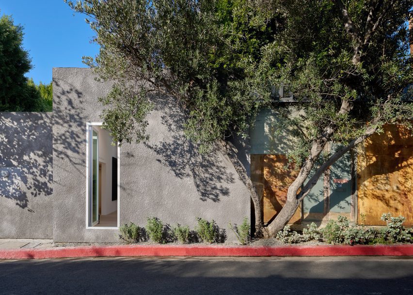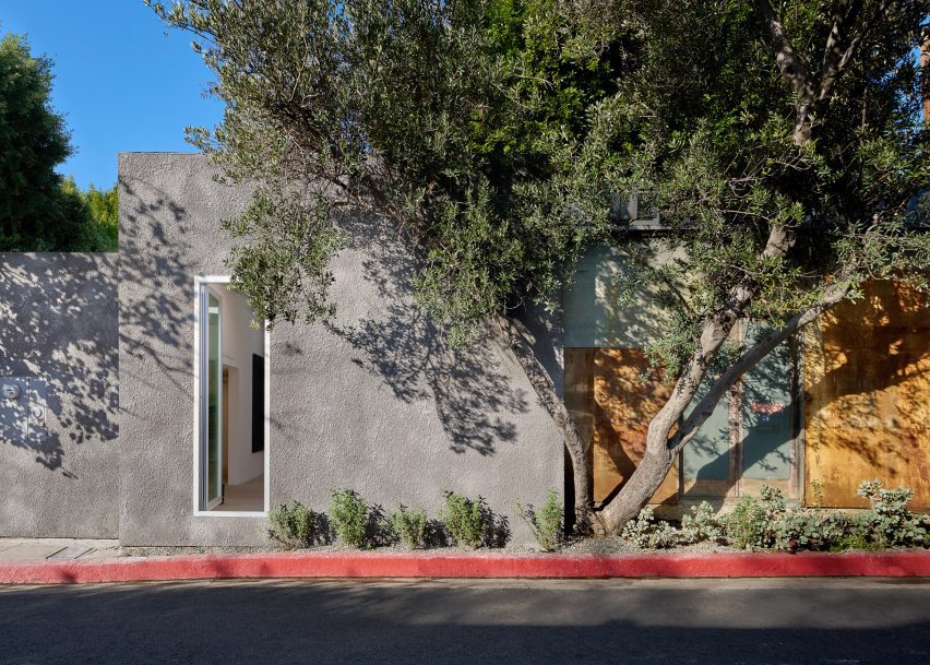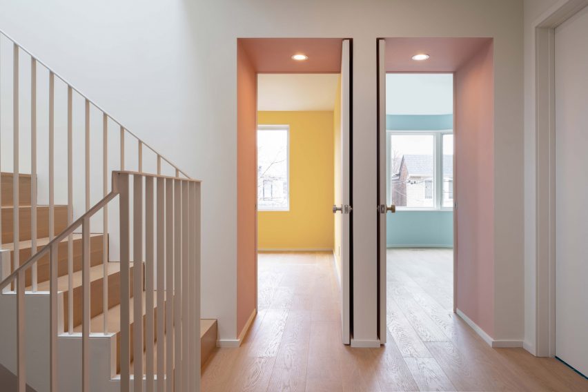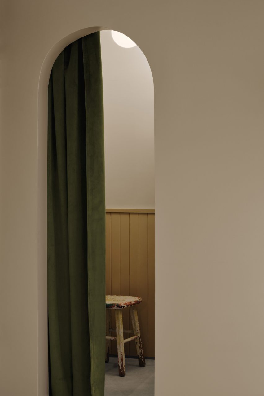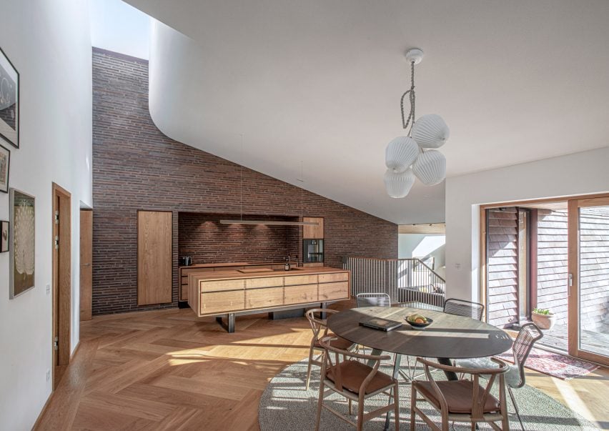
Eight cave-like interiors that celebrate curved forms
A spa with a spherical swimming pool and holiday homes with sloping plaster walls feature in our latest lookbook, which showcases eight cavernous Greek interiors.
Cave-like interior designs are becoming increasingly popular, as seen in the Gilder Center by Studio Gang – a recently completed museum extension in New York with a large grotto-like atrium.
In Greece, which is known for its caves, there is a wide variety of cave-like architecture either built from existing geological structures or designed to mimic these natural dugouts. Thick, curved walls are often chosen to protect interior spaces from the country’s Mediterranean climate.
As the weather becomes warmer in the northern hemisphere, here are eight cave-like interiors from Greece that are defined by their curved shapes.
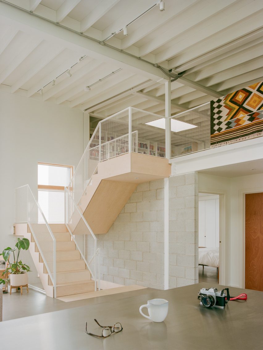
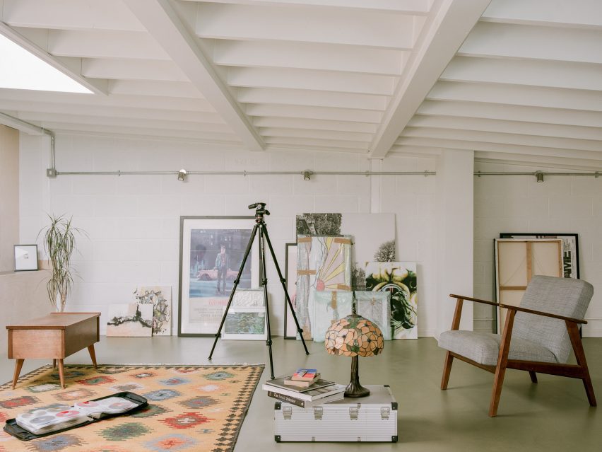
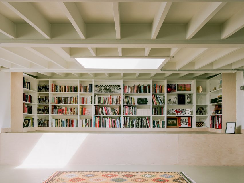
This is the latest in our lookbooks series, which provides visual inspiration from Dezeen’s archive. For more inspiration see previous lookbooks featuring homes with striking bookshelves, outdoor showers and offbeat bakeries.

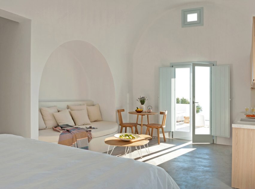
Summer houses, Santorini, by Kapsimalis Architects
Local studio Kapsimalis Architects converted two underground caves at an old property in Santorini into summer houses with bright white facades.
Inside, the homes are characterised by smoothed-out interiors finished with earthy-hued plaster, while arched doorways and niches nod to the property’s history.
Find out more about these summer houses ›
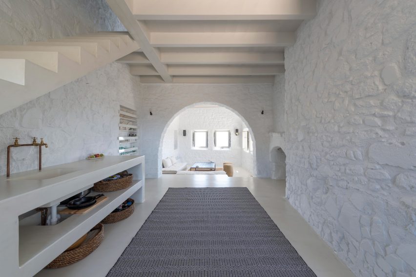
Sterna Nisyros Residences, Nisyros, by Greg Haji Joannides
Designer Greg Haji Joannides renovated the interior of an earthquake-damaged house on the island of Nisyros using historic photographs as a guide.
On the ground floor, wide brick archways create an open-plan layout that allows the space to double as an exhibition site for artists in residence.
“The inspiration behind this design was to keep as much as possible of the original way the Nisyrians would build houses,” Joannides told Dezeen. “They would use the ground floor as a storage or working space.”
Find out more about this island house ›

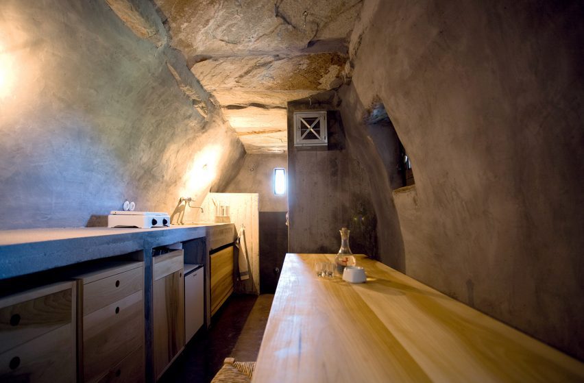
Wooden Cave, Trikala Korinthias, by Tenon Architecture
Wooden Cave is a timber-clad suite that forms part of Hyades Mountain Resort – a hotel in the mountainous village of Trikala Korinthias.
Tenon Architecture split the suite into two sections that intend to mirror the appearance and experience of entering a cave. The front half features ashy black tiles arranged in a linear formation, while the rear half is made from almost 1,000 pieces of curved hand-cut spruce.
“This division intends to create a clear distinction between the hard, ‘protective’ shell and the curved, ‘inviting’ interior, reminiscent of the form of a cave,” explained the architecture studio.
Find out more about Wooden Cave ›
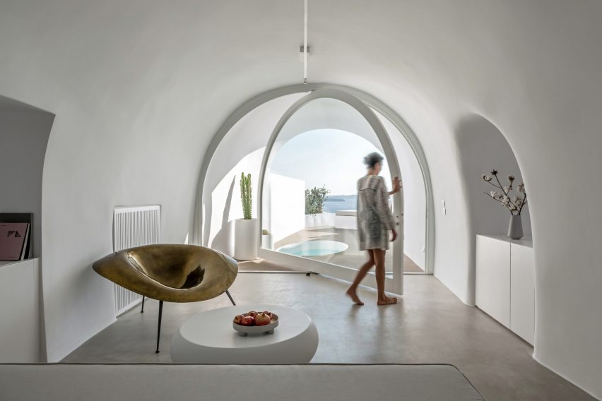
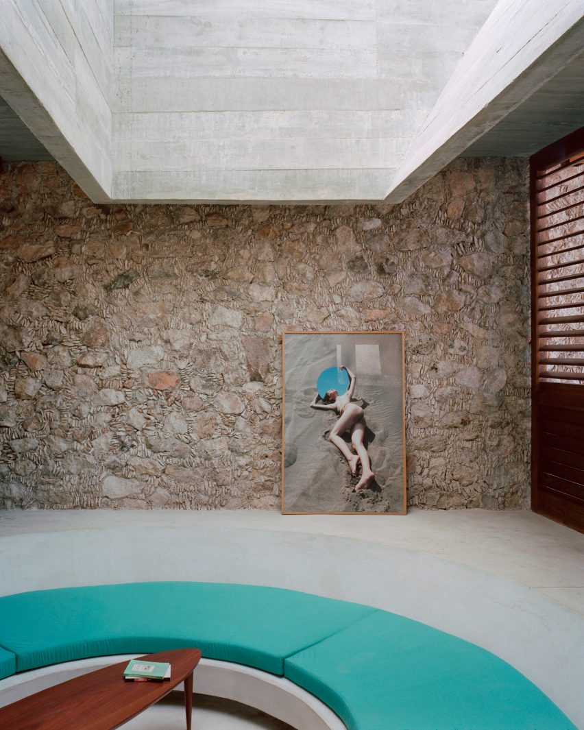
Saint Hotel, Santorini, by Kapsimalis Architects
Kapsimalis Architects converted a cluster of former homes, barns and cellars in Santorini into the Saint Hotel – the volumes of which are arranged in a stepped formation down a sea-facing cliffside.
Inside, smooth cavernous walls were finished in white plaster that creates a subtle backdrop for minimal fittings and amorphous furniture.
Find out more about Saint Hotel ›
Retreat in Tinos Island by Ioannis Exarchou
Retreat in Tinos Island is a 100-year-old stable that was transformed into a cosy holiday home for two by architect Ioannis Exarchou.
Exarchou set large stones and thick tree branches into the dwelling’s ceiling, clad the walls in smooth white plaster and covered the floors in coloured concrete.
“My main objective was to retain and preserve the cavernous unique feeling of the space,” the architect told Dezeen.
Find out more about Retreat in Tinos Island ›
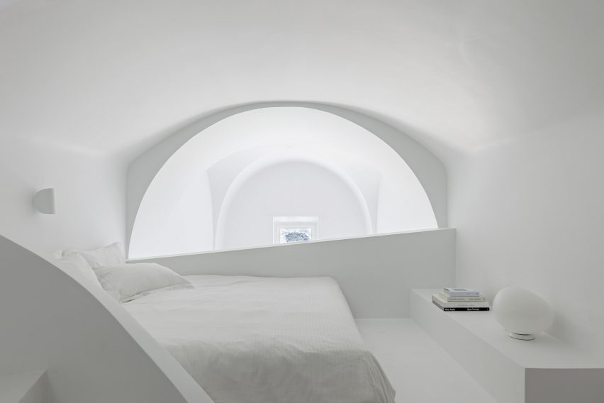
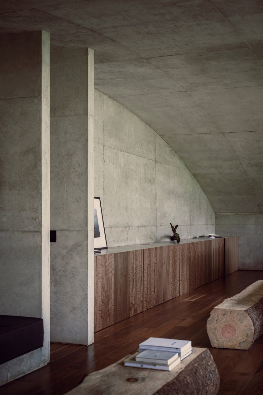
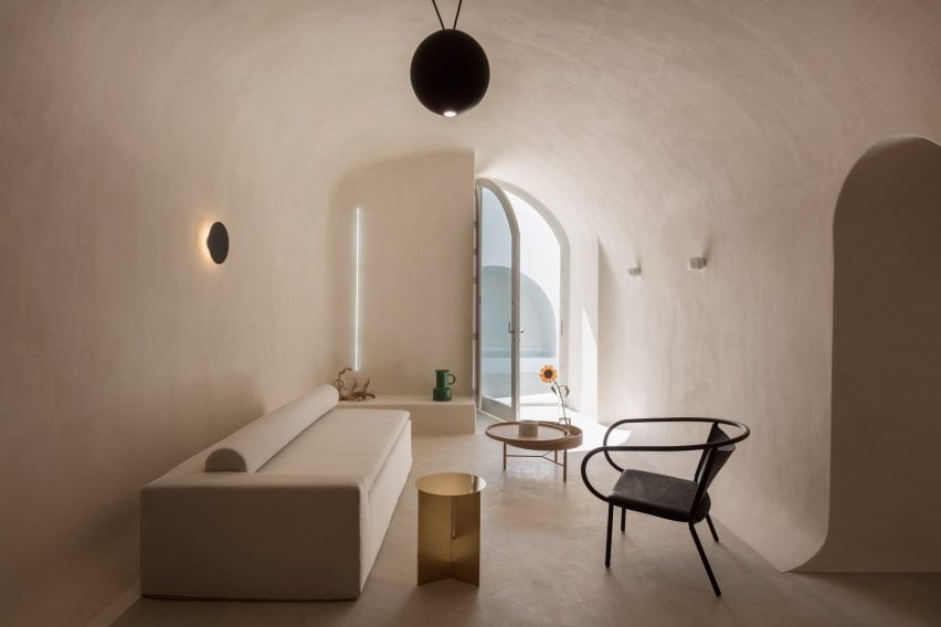
Holiday home, Santorini, by Kapsimalis Architects
The cave-like subterranean spaces and vaulted rooms within this Santorini holiday home were renovated by Kapsimalis Architects to retain the building’s existing architecture.
The studio worked to simplify the complex interior layout, which features a labyrinthine arrangement of spaces that are brightened by all-white plaster walls.
Find out more about this holiday home ›
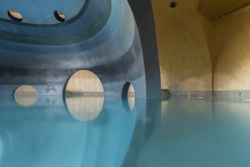
Euphoria Spa, Mystras, by DecaArchitecture
Carved into the base of a mountain in Mystras, Euphoria Spa is made up of differently scaled elliptical spaces that are connected by a web of catacomb-style passages.
One of these areas contains an indoor spherical pool that is characterised by a dark central structure that can be accessed via curved archways.
“Floating in the centre of this dark orb there is a sense of being suspended in the void of a platonic volume, but also a sense of womb-like calmness,” said DecaArchitecture.
Find out more about Euphoria Spa
Holiday apartments, Santorini, by Kapsimalis Architects
Arched niches and grey cement plaster floors create neutral living spaces within these four holiday apartments, which were built near Santorini’s highest point.
The complex’s terraces and retaining walls were formed from rocks excavated from the site to create a continuity between the architecture and the surrounding mountains.
Find out more about these apartments ›
This is the latest in our lookbooks series, which provides visual inspiration from Dezeen’s archive. For more inspiration see previous lookbooks featuring homes with striking bookshelves, outdoor showers and offbeat bakeries.