Planted beds surrounded by raised ceramic floor
CategoriesInterior Design

MRDK creates a “journey through nature” at Attitude boutique in Montreal

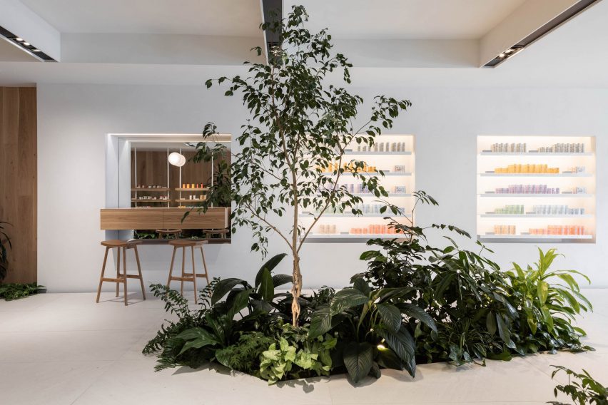
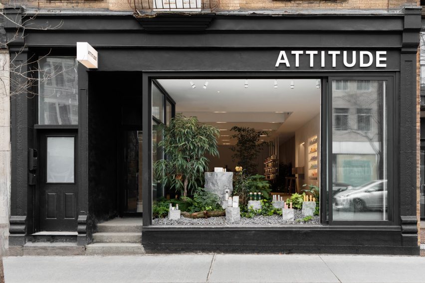
Blocks of granite among planted beds are used to display plastic-free beauty products at this Montreal store, designed by local architecture firm MRDK.

MRDK, also known as Ménard Dworkind, designed the interiors of the Attitude boutique to reflect the sustainable focus of the cosmetics for sale.

Planted beds surrounded by raised ceramic floor
Planted beds are surrounded by a raised ceramic floor at the Attitude store

“From the moment you step inside, the design of the space reflects their commitment to sustainability and a connection to nature,” said the studio.

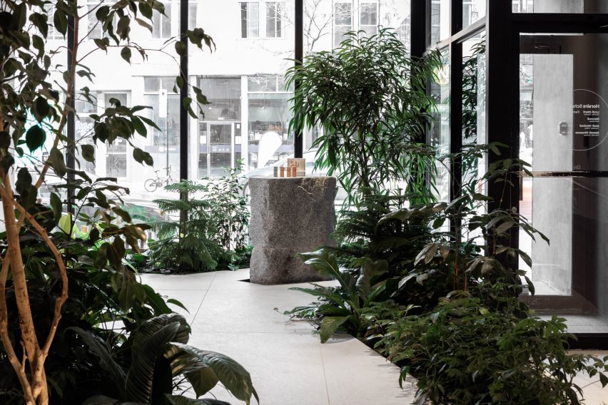
Located on Saint Denis Street in the Plateau Mont-Royal neighbourhood, the 1,000-square-foot (93-square-metre) shop is laid out to evoke a “journey through nature” according to MRDK.

Sinks carved out of a granite block
A large granite block at the centre has two sinks carved into its top

Planted beds in the store window and around the space overspill with greenery, and a raised ceramic floor creates the impression of traversing a boardwalk between them.

“This subtle elevation change immediately transports you into a new space, a forest floor full of life and colour,” MRDK said.

Oak shelves display products
The brand’s plastic-free beauty products are display on oak shelves that emerge from the greenery

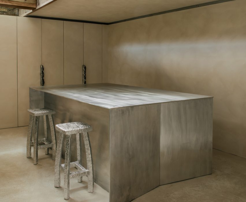
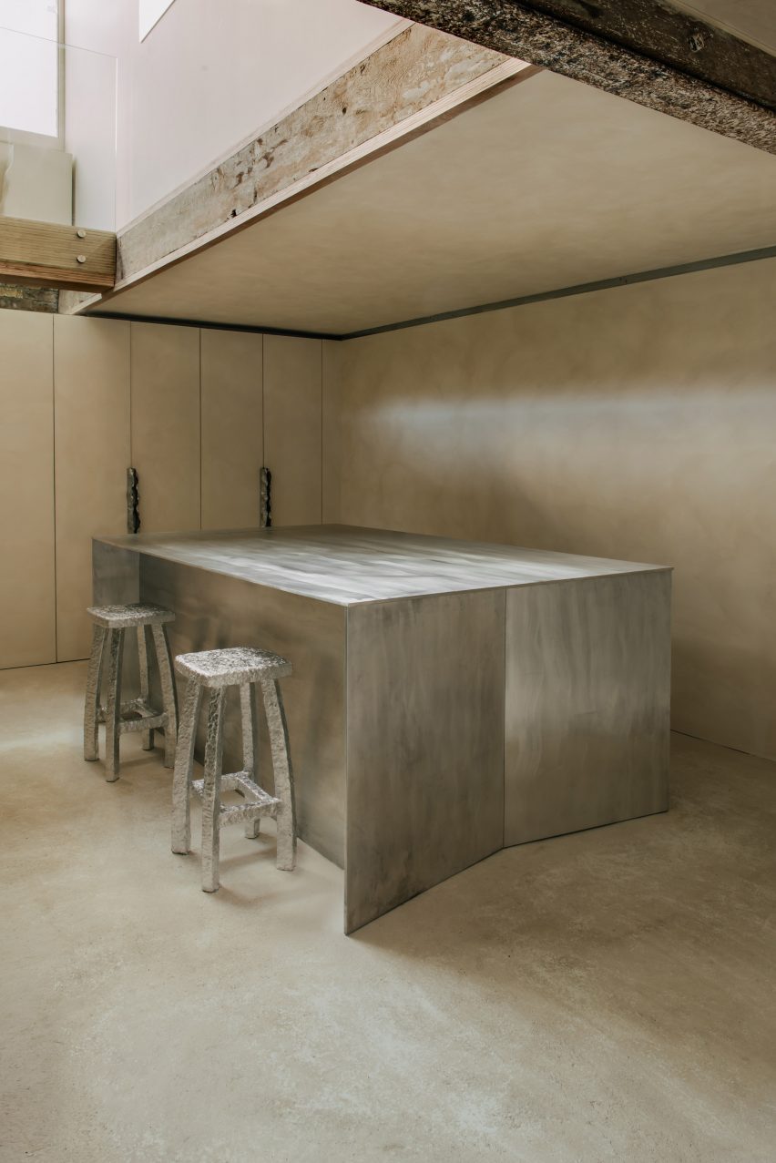
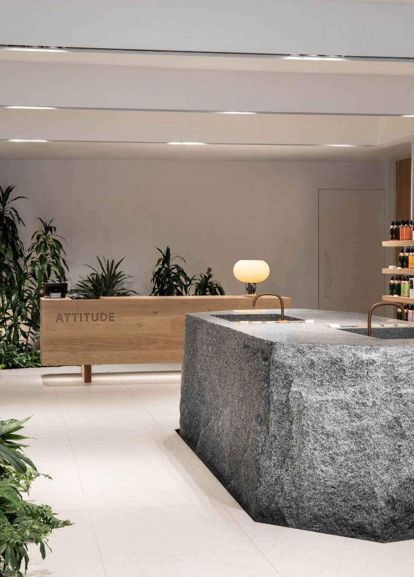
Chunks of granite are used as pedestals for displaying products in the window, while a much larger block in the centre has a pair of sinks carved into its flat top.

“The boulder-like shape and texture of the island suggest a natural element, as if it has been carved by the forces of nature over time,” said MRDK.

“This centerpiece perfectly complements the natural theme of the space, giving customers the sense of being in a nature surrounded by rock formations.”

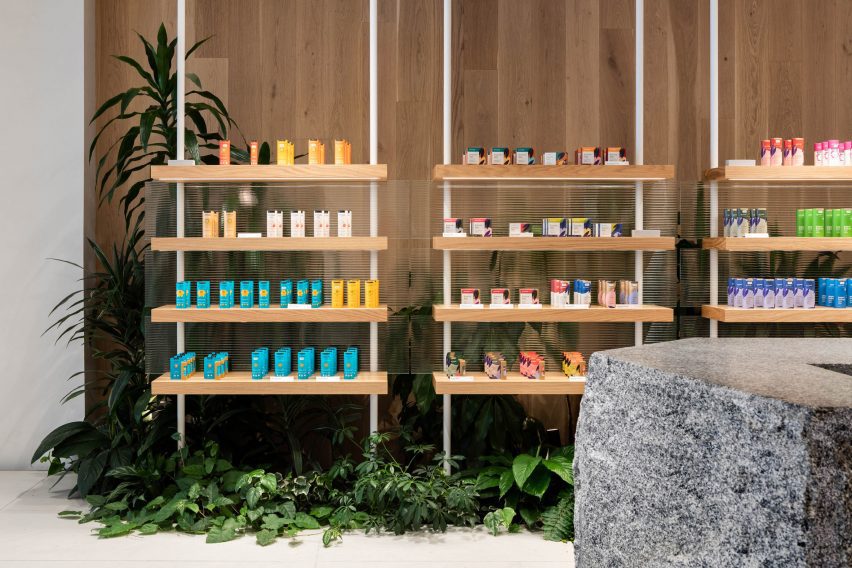
The majority of Attitude’s products are presented on white oak shelves that emerge from the plant beds on both sides of the store.

Granite plinth surrounded by plants
The raised floor is designed to create a boardwalk between the planted beds

Suspended on white poles and backed by fritted glass, these shelves match the rectangular cashier’s desk at the back, into which the brand’s name is hewn.

There’s also a refill station that customers can use to replenish the aluminium bottles, further promoting sustainability.

Attitude storefront on Saint Denis Street
Smaller blocks of granite are used as plinths to showcase the products in the storefront

MRDK was founded by partners Guillaume Ménard and David Dworkind in 2010, and has completed a wide variety of projects in and around Montreal.

These include a 1970s-themes pizza restaurant, a colossal Chinese brasserie and a wine bar that takes cues from bottle labels, as well as a renovated 1980s home and a cedar-clad hideaway.

The photography is by David Dworkind.


Project credits:

Architecture: MRDK
Team: David Dworkind, Benjamin Lavoie Laroche
Contractor: Groupe STLC


Reference

Indoor playground in Tel Aviv designed by Sarit Shani Hay
CategoriesInterior Design

Sarit Shani Hay references the outdoors to design indoor playground

Tree-like columns and other nature-inspired details feature in this indoor playground, which design studio Sarit Shani Hay has created for the children of employees at an Israeli software company.

The playground is set on the 15th floor of a skyscraper, surrounded by floor-to-ceiling glass windows that provide uninterrupted views across the city of Tel Aviv.

Indoor playground in Tel Aviv designed by Sarit Shani Hay
Tree-like plywood columns can be seen throughout the playroom

Despite this urban setting, Sarit Shani Hay wanted the space to “emphasise closeness to nature” and subtly incorporate biophilic design principles.

The studio has therefore made reference to the outdoors throughout the scheme.

Indoor playground in Tel Aviv designed by Sarit Shani Hay
Plywood has been used to create other elements in the room, like the playhouses

Huge, round pieces of sea blue and forest-green carpet have been set into the floor. Circular panels in the same blue and green hues have also been put on the ceiling, bordered by LED tube lights.

Parts of the floor that are not covered with carpet have been overlaid with plywood or rubber to account for shock absorption.

Indoor playground in Tel Aviv designed by Sarit Shani Hay
The playhouses include features such as ramps and secret nooks

A series of tall plywood “trees” with spindly branches have been dotted across the room; a couple of them suspend a swinging hammock, while another supports a gridded toy shelf.

Plywood was also used to make house-shaped volumes for the children to play in.

Each of these volumes includes playful interactive features such as ramps, tunnels, rope ladders, sliding poles and secretive nooks.

The children also have the option of using a climbing wall at the rear of the room, which has different-coloured footholds.

Indoor playground in Tel Aviv designed by Sarit Shani Hay
Sea blue and forest-green carpet has been laid across the floor

The project also saw Sarit Shani Hay create a small kitchen where the children can wash their hands and have snacks prepared for them. This space was finished with sea-blue cabinetry and a gridded tile splashback.

The indoor playground also features a small cafe area, where employees can enjoy their lunch breaks whilst being close to their children.

Indoor playground in Tel Aviv designed by Sarit Shani Hay
A similar colour palette has been applied in the kitchen

Playgrounds are increasingly offering more than just swing sets and slides. Architecture studio KWY.studio created a play area for a park in Billund, Denmark that includes pink marble sculptures.

Artist Mike Hewson has also designed a public playground in Melbourne that features giant boulders on wheels, encouraging children to climb and explore intuitively.

The photography is by Roni Cnaani.


Project credits:

Design: Sarit Shani Hay
Lead designer: Adi Levy Harari

Reference

Completedworks studio designed by Hollie Bowden features minimalist interior
CategoriesInterior Design

Hollie Bowden converts London pub into Completedworks showroom

Lime-washed walls meet aluminium display fixtures in this minimalist studio and showroom that designer Hollie Bowden has devised for London brand Completedworks.

Set over two floors of a former pub in Marylebone, it provides space for Completedworks to design and display its jewellery and ceramics, as well as to host an array of craft-focused classes.

Completedworks studio designed by Hollie Bowden features minimalist interior
Hollie Bowden has designed a studio and showroom for Completedworks

The brand was established in 2013 and up until now, has largely been sold via high-end department stores such as Dover Street Market and Liberty. But founder Anna Jewsbury felt it was time for Completedworks to have its own brick-and-mortar space.

“We increasingly had clients asking to come and see our pieces in person but felt that we didn’t have a space that felt considered and reflected our vision,” she said. “We wanted people to be able to enter our world and get to know us, and for us to get to know them.”

Completedworks studio designed by Hollie Bowden features minimalist interior
Display shelving was crafted from lustrous aluminium

For the design of the showroom, Jewsbury worked with London-based designer Hollie Bowden, who naturally looked to the brand’s jewellery for inspiration.

This can be seen for example in the hammered-metal door handles that appear throughout the studio and directly reference the creased design of the gold Cohesion earrings.

Completedworks studio designed by Hollie Bowden features minimalist interior
A modular display system in the showroom is clad in lilac linen

“[Completedworks] is known for the beauty of the textural surfaces and flowing almost baroque forms,” Bowden explained. “We developed a display language that played off that, with minimal details and strict lines.”

Almost every surface throughout the studio is washed in beige-toned lime paint, with only a few slivers of the original brick walls and a worn metal column left exposed near the central staircase.

Bowden used brushed aluminium to create a range of display fixtures, including chunky plinths and super-slender shelving units supported by floor-to-ceiling poles.

The space also houses a couple of angular aluminium counters for packing orders that include discrete storage for boxes and subtle openings, through which tissue paper or bubble wrap can be pulled.

Completedworks studio designed by Hollie Bowden features minimalist interior
Shoji-style storage cabinets can be seen in the office

A slightly more playful selection of colours and materials was used for the studio’s custom furnishings.

In the main showroom, there’s a modular display island sheathed in lilac linen. Meanwhile in the office, designer Byron Pritchard – who is also Bowden’s partner – created a gridded wooden cabinet inlaid with translucent sheets of paper, intended to resemble a traditional Japanese shoji screen.

Completedworks studio designed by Hollie Bowden features minimalist interior
Hammered-metal door handles in the studio resemble Completedworks’ earrings

This isn’t Bowden’s first project in London’s affluent Marylebone neighbourhood.

Previously, the designer created an office for real estate company Schönhaus, decking the space out with dark-stained oak and aged leather to emulate the feel of a gentleman’s club.

The photography is by Genevieve Lutkin.

Reference

Colourful chairs within the IKEA installation at Milan design week
CategoriesInterior Design

IKEA reflects on “the past, the present and the future” of the home

Swedish retailer IKEA marked its 80th anniversary at Milan design week with Assembling the Future Together, an immersive exhibition that charts the furniture company’s history and addresses its future.

Assembling the Future Together took place at Padiglione Visconti in Milan and explored the brand’s progression since the 1950s.

Colourful chairs within the IKEA installation at Milan design week
Assembling the Future Together is on display at Milan design week

“The whole exhibition is about the past, the present and the future,” said IKEA designer and chief creative officer Marcus Engman.

“So it’s a little bit like telling the story of IKEA furniture, things we have done and things that we will do even more,” he told Dezeen in Milan.

Chairs from the past at Assembling the Future Together by IKEA
Furniture from IKEA’s history is on display to reflect its past

To reflect this idea, the space was divided into three main sections. One area dedicated to the past features designs from IKEA’s 80-year history displayed on geometric white shelving.

Among the pieces was furniture from the 1970s with bright fabrics and bold shapes, which were influenced by the increasing emergence of youth culture during this decade, according to the brand.

Chunky children’s furniture from IKEA’s Mammut series was also included. The line was first designed in the 1990s and has remained popular ever since.

Nytillverkad collection by IKEA
IKEA is also debuting its new Nytillverkad collection

For the present portion of the exhibition, the brand launched the first products in its new Nytillverkad collection.

Characterised by “simple, functional and playful” elements, the furniture, bedding and accessories intend to pay homage to past iconic IKEA pieces in line with the current wide-spread revival of interest in vintage designs, according to the brand.

Colourful
The colourful collection takes cues from previous IKEA designs

While the collection nods to IKEA’s roots, the brand used contemporary materials to create the pieces.

“It’s putting old things into a new perspective,” explained Engman.

Wedding guests carrying IKEA's Frakta bag
Crowd-sourced images of people using the brand’s iconic Frakta bag are suspended in the space

Large-scale contemporary photographs, which showed members of the public sporting IKEA’s recognisable blue and yellow Frakta shopping bag in unexpected ways, were suspended from the ceiling throughout the venue

One image showed a bride protecting her dress inside one of the shoppers on her wedding day, while another has been adapted to transport a dog on the subway in New York.

“Even if we perceive our products as ‘ready design’, people see them a bit more like Lego pieces to play with,” acknowledged the designer. “People use the Frakta bag in so many ways we didn’t expect.”

Installations referencing earth, wind, water and fire
The ‘future’ section references the four elements with installations

The future area of the exhibition features four towering installations dedicated to the elements of fire, water, earth and wind, which include an illuminated tree and smoke dispensers.

“The future part is all about showing how we are using design and product development to nudge people’s behaviours into doing something that is good for people and the planet,” reflected Engman.

“It’s also where we try to challenge people to be part of this – not just wait for IKEA to do stuff, but actually ask, how can we do things together?”

“We have set out to be fully circular by 2030 so that affects everything that we do,” he continued.

IKEA Assembling the Future Together installations
IKEA intends to urge people to think about the role they can play in shaping the future of design

Designed as an inclusive, “down-to-earth” space that is open to all, the exhibition drew together many other experiences, such as a cinema zone showing portraits taken by photographer and IKEA’s first artist-in-residence Annie Leibovitz that document the “real lives” of people in their homes.

The project is part of IKEA’s annual Life at Home Report, where members of the brand’s team visit people in their living spaces and document their findings.

Person reclining within cinema space by IKEA at Milan design week
A cinema zone is showing portraits of people at home taken by Annie Leibovitz

Various talks and music events took place in the space throughout the week alongside a dedicated “record shop” and on-site IKEA cafe serving branded food and drinks.

The aim of incorporating music into the exhibition was to bring people together, according to Engman. Communicating the sacredness of the home is at the core of the IKEA exhibition, said the designer.

“This is something for us that we need to constantly work on – finding new ways of getting people to understand how important the home is,” he explained.

“I mean, the challenges during covid and now the cost of living crisis has been where we can help out even more.”

“Because people have had to spend more time at home – but how can we make the home also something that is really not just a functional thing, but an emotional thing?” he continued.

“So I think that’s our biggest thing, but making sure we do that in people- and planet-positive ways. Because that’s the only way forward.”

Immersive installation by IKEA
The exhibition was designed to be inclusive

Previously, IKEA donated its products and design services to create a series of United Nations-led refugee support centres in Eastern Europe to offer sanctuary to vulnerable groups displaced by Russia’s invasion of Ukraine. The brand’s research lab, Space10, developed a concept for connecting physical furniture to an ever-evolving NFT tree.

Assembling the Future Together is on show from 18 to 23 April 2023 at Padiglione Visconti, Via Tortona 58, Milan. See our Milan design week 2023 guide on Dezeen Events Guide for information about the many other exhibitions, installations and talks taking place throughout the week.


Reference

Hand-painted mural designed by Álvaro Siza
CategoriesInterior Design

Álvaro Siza designs mural for Space Copenhagen Porto restaurant

A ceramic mural by Álvaro Siza is at the heart of this rustic restaurant interior in Porto, Portugal, designed by Space Copenhagen.

Located in a renovated 16th-century building in Porto’s Largo de São Domingos area, the Cozinha das Flores restaurant features a mural designed by the Pritzker Architecture Prize-winning Portuguese architect.

Hand-painted mural designed by Álvaro Siza
Pritzker Prize-winner Álvaro Siza designed the mural

“Whilst Siza has created many pieces of non-architectural works worldwide, he had never created something of this kind for his hometown of Porto,” Space Copenhagen founders Peter Bundgaard Rützou and Signe Bindslev Henriksen told Dezeen.

“Given Siza’s prominence and contribution to Porto life, having him manifest this into a mural depicting his perception of the city was beyond our expectations.”

Open kitchen in Cozinha das Flores restaurant
Cozinha das Flores is located in a 16th-century building in Porto, Portugal

Sketches of figures playing musical instruments stand out in black against contrasting lime green and burnt orange tiles, which was completed by ceramic tile company Viuva Lamego.

“When asked to imagine a piece for Cozinha das Flores, he [Siza] depicted the recurrent theme of musicians, representing time well spent; fun, relaxed moments; a medley of emotions; and people joined by arts and culture,” said the studio.  

“The specialist craftspeople used a traditional technique of hand painting the scaled-up facsimile of a sketched image from paper onto the tiles, painted dot by dot.”

Plastered wall and wooden table in Porto restaurant interior
The studio used green and orange tones throughout the interior

The green and orange hues of the tiles appear elsewhere in the interior. Green cushions top the built-in oak seating bench that runs along the wall below the mural, while doorways were painted dark green.

The colour palette was unified with coppery plastered walls and warm lighting. 

“We introduced plastered walls in earthy warm tones and a conscious use of light to enhance and saturate,” the studio explained. 

Green door and wooden table in Porto restaurant
The focus on the local area is reflected in the studio’s design choices

Natural materials like stone, marble, brass and oak were used throughout the interior. The seating was arranged around an open kitchen, which has dark grey quartzite stone surfaces and wooden cabinets

Under the direction of Lisbon-born chef Nuno Mendes, the restaurant aims to celebrate the ingredients, wine and culture of northern Portugal.

Wooden tables and chairs in Porto restaurant
Space Copenhagen’s approach involved collaborations with local craftspeople

The warm, earthy hues chosen by Space Copenhagen were informed by the restaurant’s food, as well as the building and area in which it is located. 

“The historical building structure that frames the restaurant and bar provided the base palette, which we have built upon,” said Space Copenhagen. 

“Aged stone and dark-stained wood were our existing starting points. All elements are associated with the city of Porto”, they added. 

Round wooden table in Porto restaurant
Materials were sourced from across Portugal

Throughout the project, the studio prioritised regional materials and collaborated with a variety of local architects, artists and craftspeople. Woodworkers from northern Portugal crafted the dark wood furnishings and fittings.  

“All stone, wood, metal and tiling has been sourced from regions in Portugal using a proximity criterion as priority,” said the studio. “All the millwork has been made by local artisans.”

Wine cabinet in Space Copenhagen restaurant design
Natural materials like stone, marble, brass and oak feature throughout the interior

Cozinha das Flores, and its adjacent 12-seater bar, Flôr, are amongst five heritage buildings that make up the Largo project, set to open later this year. 

Other local projects by Siza include his 1963 Boa Nova Tea House, which was transformed into a seafood restaurant for Portuguese chef Rui Paula in 2014. Previous projects by Space Copenhagen include the renovation of the Mammertsberg restaurant and hotel in Switzerland and the Blueness restaurant in Antwerp.

The photography is by Luís Moreira and Matilde Cunha. 

Reference

Gale Apartment living room with brown lounge chairs and concrete walls
CategoriesInterior Design

Eight home interiors that make a feature of exposed services

Our latest lookbook showcases eight home interiors that make a visual statement by revealing their services, including wires, cables, ducts and plumbing.

Stripping back interiors can expose services including pipework that runs along walls and ceilings to provide heating, water, electricity and airflow to our homes.

This roundup features homes with industrial and unfinished appearances that make a feature of exposed services, including a Parisian studio that uses copper pipework as hanging space and a stripped-back apartment in Brazil with blue-painted pipes.

This is the latest in our lookbooks series, which provides curated visual inspiration from Dezeen’s archive. For more inspiration see previous lookbooks featuring Milanese home and hotel interiors, living rooms decorated in the primary colours and terracotta-tiled kitchens.


Gale Apartment living room with brown lounge chairs and concrete walls
Photo is by Fran Parente

Gale Apartment, Brazil, by Memola Estudio

Brazilian studio Memola Estudio renovated this São Paulo apartment to better suit the owner’s tastes, stripping back finishes on the walls and ceilings to expose the building’s concrete structure, piping, wiring and ductwork.

The studio contrasted the industrial look of the apartment with warm, earthy-toned furniture and contemporary artwork.

Find out more about Gale Apartment ›


ARL008_Shaker Studio by Ariel Claudet with exposed copper wires
Photo is by Cyrille Lallement

Shakers Studio, France, by Ariel Claudet

A network of copper pipes snakes around the perimeter of this studio apartment in a 17th-century Parisian building, which architect Ariel Claudet added to make it stand out on Airbnb.

Informed by traditional Shaker peg rails, the pipes conceal electrical cables and double as a hanging rail to display ornaments and household items.

Find out more about Shakers Studio ›


Kitchen with exposed services at the RF Apartment by SuperLimão with peach ceilings and concrete walls
Photo is by Maíra Acayaba

RF Apartment, Brazil, by SuperLimão

Located inside a modernist São Paulo building completed in 1958, Brazilian studio SuperLimão exposed the pipes in the RF Apartment and painted them a pale shade of blue-green that was in keeping with the period the building was constructed.

SuperLimão also painted the ceiling a burnt pink colour and peeled back the edges of the entryways to reveal large chunks of plaster and brick.

Find out more about RF Apartment ›


Interior of the open-plan kitchen with exposed services at NZ10 Apartment in Spain by Auba Studio with wood cabinets
Photo is by José Hevia

NZ10 Apartment, Spain, by Auba Studio

Spanish architecture firm Auba Studio transformed a former bakery in Palma into an apartment, stripping back the interior to reveal the building’s high ceilings and bare structure.

Auba Studio added a stainless steel kitchen island to complement the industrial look of the exposed ductwork and light fittings.

Find out more about NZ10 Apartment ›


Exposed services, wiring, plumbing and plaster walls at the 10K House by Takk
Photo is by José Hevia

10K House, Spain, by Takk

10K House is a 50-square-metre Barcelona apartment that Spanish studio Takk renovated, adding rooms nestled inside one another to maximise insulation.

Water pipes and electrical fittings were left exposed to allow free passage between the Russian-doll-like rooms and to keep material costs down.

Find out more about 10K House ›


Wooden table and chair and exposed services inside the De Lakfabriek by Wenink Holtkamp Architecten
Photo is by Tim van de Velde

De Lakfabriek apartments, the Netherlands, by Wenink Holtkamp Architecten

Eidenhoven studio Wenink Holtkamp Architecten converted a 20th-century factory in Oisterwijk, the Netherlands, into apartments that maintain the industrial character of the building.

The apartments have an open-plan layout with the building’s raw concrete structure, metal ductwork and wiring left visible.

Find out more about De Lakfabriek apartments ›


Fluorescent rotating partition walls revealing a freestanding bathtub in a concrete apartment
Photo is by Takumi Ota

Fishmarket, Japan, by Ab Rogers Design

Fishmarket is an artist’s studio and residence in Kanazawa, Japan, with an interior that was stripped back to its industrial shell by London-based studio Ab Rogers Design.

The studio added a series of fluorescent rotating partition walls that transform how the space is used and add bright pops of colour that stand in contrast against the grey concrete and metal pipework.

Find out more about Fishmarket ›


Open-plan kitchen with concrete ceiling and brick wall at Earthrise Studio by Studio McW
Photo is by Lorenzo Zandri

Earthrise Studio, UK, by Studio McW

London-based architecture practice Studio McW transformed this London warehouse into a studio and office that enhances the building’s original features.

The practice removed some of the redundant overhead services that were restricting the ceiling height. The remaining exposed services add to the industrial look of the property, while custom oak joinery adds warmth to the spaces.

Find out more about Earthrise Studio ›

This is the latest in our lookbooks series, which provides curated visual inspiration from Dezeen’s archive. For more inspiration see previous lookbooks featuring Milanese home and hotel interiors, living rooms decorated in the primary colours and terracotta-tiled kitchens.

Reference

Reception area at the PatBo New York showroom
CategoriesInterior Design

BoND creates New York “embassy” for fashion brand PatBo

Architecture studio BoND has designed the New York headquarters for Brazilian fashion brand PatBo, which features pink scaffolding and rugs based on drawings by Roberto Burle Marx.

The office and showroom for PatBo occupies a 7,000-square-foot (650-square-metre) loft, which spans the entire seventh floor of a historic building on Fifth Avenue.

Reception area at the PatBo New York showroom
The PatBo showroom is located in a light-filled loft in New York’s Flatiron District

As the brand’s global headquarters, this space serves multiple purposes: showcasing the brand’s apparel; providing office space for staff; hosting buyers and events.

“Our biggest challenge was to divide the space according to the showroom’s new program while keeping its loft-like openness,” said BoND co-founder Noam Dvir.

Pink scaffolding used as clothes trails
To divide the open space, BoND used pink-painted scaffolding that doubles as clothing rails

To create partitions that double as displays, the designers chose scaffolding elements on which clothing can be hung and shelving can be installed.

“They are so readily available, so New York in their character, and very easy to adapt to different conditions,” said Daniel Rauchwerger, BoND’s other co-founder. “Moreover, they’re inexpensive and have a younger, fresher feel that works so well with the spirit of a PatBo studio.”

The showroom also serves as an office space
The showroom also serves as an office space for the PatBo team

Scaffolding has been used in a variety of retail environments for its versatility and ease of installation, including a bright yellow Calvin Klein store transformed by Raf Simons and Sterling Ruby, and a boutique for Wardrobe NYC designed by Jordana Maisie.

Painted pale pink in the PatBo showroom, the industrial scaffolding takes on a more feminine appearance, which sets the tone for the rest of the showroom.

Pleated pendant lights hang above a long table
Feminine touches like pleated pendant lights align with the brand’s aesthetic

Curved couches, pleated pendant lamps and tambour panelling all add to the soft aesthetic and further align with PatBo’s brand expression.

Circular fitting rooms surrounded by curtains allow clients to try on the colourful clothing in the main showrooom.

Tambour panelling is installed in private offices
Private offices feature tambour panelling and a mix of furniture

A second showroom area for hosting buyer appointments and casting calls includes minimal clothing racks with brass rails and oak frames.

This space is closed off from the reception, but still visible through large glass panels that allow light from the exterior windows to pass through.

The loft space overlooks Fifth Avenue
The historic building overlooks Fifth Avenue

Private offices along the far side of the loft also feature glass doors for the same purpose, and add to the feeling of openness and transparency throughout the showroom.

“It’s not meant to be too precious or delicate, but rather a place where a group of creative professionals can feel encouraged to move things around and make it their own,” said Dvir.

Atop the wooden floors are rugs based on the drawings of Brazilian modernist and landscape architect Roberto Burle Marx, designed in collaboration with São Paulo-based Punto e Filo.

Colourful furniture and potted plants also contribute to the Brazilian vibe in the space, and complement PatBo’s vibrant garments.

Wooden chairs on top of a rug inspired by Roberto Burle Marx
Rugs throughout the space are based on the drawings of Brazilian modernist Roberto Burle Marx

At the back of the showroom is a bar area, featuring a pink stone counter with rounded corners, and a sink placed within a curved niche that has mirrored sides.

“This is a space that combines elements of office, retail, and hospitality,” said Rauchwerger. “With that, it is able to serve as a real embassy for PatBo as a brand.”

A bar area with pink stone counters
A bar area with pink stone counters is used for hosting events

Rauchwerger and Dvir, both former journalists, founded BoND in 2019 after working as architects at OMA, WeWork and more.

Their studio’s previous projects have included the renovation of a dark Chelsea apartment into a light-filled home.

The photography is by Blaine Davis.


Project credits:

Project team: Daniel Rauchwerger, Noam Dvir, Liza Tedeschi

Reference

Dining room and living room
CategoriesInterior Design

Sheft Farrace designs loft in LA’s art deco Eastern Columbia building

Architecture studio Sheft Farrace has renovated a loft apartment in Los Angeles’ iconic Eastern Columbia building, subtly incorporating colours from the art deco exterior into the minimalist interiors.

The studio renovated the loft while drawing details from the exterior of the 13-storey building in Downtown Los Angeles, known for its highly detailed turquoise facade and clock tower, which was designed by Claud Beelman and completed in 1930.

Dining room and living room
Sheft Farrace chose to divide up the loft, yet retain visual connections through framed openings

It was converted into lofts in 2006, and local studio Sheft Farrace was recently tasked with renovating one of the condos for a young creative from Kazakhstan.

“Uninspired by the unit’s original 2006 layout and interiors, the owner wanted it to feel like a brand new space — so Sheft Farrace approached it as a blank canvas,” said the studio, led by Alex Sheft and John Farrace.

Living room
The pared-down decor contrasts the building’s colourful exterior

The apartment has tall ceilings, and their height is accentuated by the building’s long narrow windows and floor-to-ceiling drapery.

Rather than keep the open floor plan, the studio chose to divide up the space to help define areas for different functions.

Bedroom with tall ceiling and drapery
The ceiling height is accentuated by tall windows and floor-to-ceiling drapery

However, the visual connections between the kitchen and dining room, and the living room and bedroom, are retained by large framed openings used in place of doors.

“Every space has its own character, based on what time of day it is and how the natural light comes in through the full-height windows,” said Sheft Farrace.

For the most part, the home is decorated in a much more pared-down style than the building’s opulent exterior, primarily with soft neutral hues and sparse furnishings.

Certain material choices in the kitchen and bathroom tie much more closely to the colourful facades, including white oak, Verde Aver marble, and Florida Brush quartzite to echo the orange, green and blue exterior tiles.

Kitchen with white oak and Florida Brush quartzite
Materials like white oak and Florida Brush quartzite in the kitchen nod to the art deco exterior

The curved corners of the kitchen counters and elongated cabinet hardware also evoke 1930s design.

“Upon first glance, it’s stylistically in stark contrast with the historical building that it’s within, but throughout the space are subtle nods to the art deco exterior and ultimately, it feels like it belongs,” Sheft Farrace said. “We felt honored to have contributed a small chapter to the long and storied history of a Los Angeles landmark.”

Bathroom lined with Verde Aver marble
In the bathroom, Verde Aver marble was also chosen to reference the historic tiled facades

Downtown Los Angeles has dramatically transformed from a no-go zone to a popular and thriving neighbourhood over the past 20 years.

This shift is partially thanks to the opening of cultural institutions like Frank Gehry’s Walt Disney Concert Hall and Diller Scofidio + Renfro’s The Broad museum, as well as a spate of high-end hotels.

The photography is by Yoshihiro Makino.

Reference

Entryway at Artemest’s L'Appartamento in Milan by Dubai-based studio T.ZED Architects
CategoriesInterior Design

Six interior designers style rooms at L’Appartamento in Milan

Six interior design studios, including Kingston Lafferty Design and T.ZED Architects, have overhauled a room at the 1930s L’Appartamento for commerce platform Artemest at Milan design week.

The designers each used furniture, lighting and art from the brands, designers and artists represented on the Artemest platform to showcase their own style in a room at the apartment in Milan’s 5Vie district for the L’Appartamento exhibition.

“We wanted to bring this stunning apartment back to life and show how different interior design studios, each with its own style and design approach, can work with Artemest to create inspiring and surprising interiors that celebrate authentic Italian beauty,” said Artemest founder Ippolita Rostagno.

Entryway at Artemest’s L'Appartamento in Milan by Dubai-based studio T.ZED Architects
T.ZED Architects designed the entrance space at Artemest’s L’Appartamento

In the entryway, Dubai-based studio T.ZED Architects aimed “to set the tone for what is yet to come” by preserving the character of the room and adding selected pieces.

The studio choose a mix of furniture in off-white, cream and brown, including copper and leather finishes that plays off the green tones of the richly patterned, period wallpaper.

Mirrors – including a Sybilla mirror with console by Ettore Sottsass for Glas Italia, and an Itaca floor mirror by Atlasproject – were placed to illuminate and enlarge the space, while amplifying the period details.

Living room at Artemest's L'Appartamento in Milan by Kingston Lafferty Design
Kingston Lafferty Design placed a golden block in the living room

In the adjoining room, Dublin-based studio Kingston Lafferty Design aimed to “challenge visitors’ sense of what a living room should be” by placing a sculptural monolithic block seems to glow with a soft golden sheen in the centre of the space.

The block splits the room into two distinct spaces and contains a mirrored space described by the studio as “a gallery of lights”.

Golden block in living room
The golden block divides the space into two

On one side of the block is an informal living room that evokes a sense of playfulness through the use of oversized furniture in bright colours, including the Osaka Blue Sofa by Pierre Paulin for La Cividina.

The other side has a rich palette of jewel-tones to creates a more decadent atmosphere.

Terrace at Milanese villa
Moniomi aimed to create a room on the terrace

Leading from the living room a large terrace was reworked by Miami-based studio Moniomi, which aimed to create an outside room that felt like an interior space.

The studio used a combination of large-scale upholstered pieces, gridline patterns and graphic blacks and whites, softened by lush greens to reference the outdoor location.

The design language here features saturated colours and layered patterns – including the Nuovola 01 dining table by Mario Cucinella for Officine Tamborrino, which represent the studio’s Hispanic roots.

Dining space in Milanese apartment
Nina Magon designed the apartment’s dining space

Another US-based designer, Nina Magon, created the L’Appartamento dining room, playing with monochromatic hues to enhance the authenticity of the original finishes here.

Sculptural furniture, such as the Trompe-l’oeil Trois dining table by DelMondo Studio, topped with a cluster of Flow[t] pendant lamps by Nao Tamura for WonderGlass was added to the space.

Bedroom designed by Styled Habitat
The bedroom was designed by Styled Habitat

In the bedroom, Dubai-based studio, Styled Habitat, delved into the history of the 1930s to translate the romance of that era into the modern day and evoke a sense of timeless glamour.

To capture the experimental and avant-garde trends of European modernism, Styled Habitat juxtaposed new and old, with a Czech Chair by Hermann Czech for Gebrüder Thonet Vienna, alongside pieces like the Calle Pinzi Murano Glass Chandelier by Luci Italia.

Finally, for L’Appartamento’s hallway and the studio, Paris-based interior designer Anne-Sophie Pailleret was informed by her first reaction to seeing the apartment.

The long, narrow hall, has been covered with the textural Tra 1100 Wallpaper hand-crafted by La Scala Milano Wallcovering, contrasting with geometric Alfabeto Tiles by Margherita Rui for Ninefifty, on the floor.

Corridor by Anne-Sophie Pailleret
Anne-Sophie Pailleret styled the corridor

The walls are further decorated with Ninfea wall lamps by Giovanni Botticelli in collaboration with Paola Paronetto, functioning as a gallery-style grouping of lights.

For the studio room, Pailleret created a mix of warm colours and graphic patterns, with comfortable and curvaceous furniture.

The photography is courtesy of Artemest.

L’Appartamento takes place from 17 to 23 April 2023 at Via Cesare Correnti 14, 20123 Milan, Italy. See our Milan design week 2023 guide on Dezeen Events Guide for information about the many other exhibitions, installations and talks taking place throughout the week.

Reference

Interior of Gota bar in Madrid designed by Plantea Estudio
CategoriesInterior Design

Plantea Estudio creates cosy cave-like room within bar Gota in Madrid

A red “cave” hides behind the main dining space of this wine and small plates bar in Madrid designed by interiors studio Plantea Estudio.

Located on the ground floor of a neoclassical building in Madrid’s buzzy Justicia neighbourhood, Plantea Estudio designed Gota to appear “dark, stony and secluded”.

Interior of Gota bar in Madrid designed by Plantea Estudio
Gota sits on the ground floor of a neoclassical building in the Justicia neighbourhood

Guests ring a bell to enter the 70-square-metre bar, and are then welcomed into a dining room enclosed by thickset granite ashlar walls. While some of the walls were left exposed, others have been smoothly plastered over and washed with grey lime paint.

The floor was overlaid with black volcanic stone tiles that the studio thought were suggestive of a “newly discovered terrain”.

Interior of Gota bar in Madrid designed by Plantea Estudio
A counter in the first dining space is inbuilt with a record player

A bench seat runs down the left-hand side of the bar, accompanied by lustrous aluminium tables and square birchwood stools from Danish design brand Frama.

Guests can alternatively perch on high stools at the peripheries of the room, where lies a slender stone ledge for drinks to be set down on.

Interior of Gota bar in Madrid designed by Plantea Estudio
Shelving displays wine bottles, vinyls, and other objects

More seating was created around a bespoke chestnut counter at the room’s centre; its surfacetop has an in-built turntable on which the Gota team plays a curated selection of music.

Behind the counter is a storage wall where wine bottles, vintage vinyl records and other music-related paraphernalia are displayed.

Gota bar in Madrid includes red cave-like room
A cave-like dining room hides at the bar’s rear

An open doorway takes guests down a short corridor to a secondary cave-like dining space, which boasts a dramatic vaulted ceiling and craggy brick walls. It has been almost entirely painted red.

“It’s relatively common to find this kind of vaulted brick space in the basements of old buildings in Madrid – this case was special because it’s on the ground floor with small openings to a garden,” the studio told Dezeen.

“It was perfect for a more quiet and private area of the bar,” it continued.

“The red colour is an abstract reference to the brick of which the cave is really made, and also a reference to wine.”

Gota bar in Madrid includes red cave-like room
The space is arranged around a huge granite table

At the room’s heart is a huge 10-centimetre-thick granite table that’s meant to look as if it has “been there forever”, surrounded by aluminium chairs also from Frama. Smaller birch tables and chairs custom-designed by the studio have been tucked into the rooms corners.

To enhance the cosy, intimate feel of the bar, lighting has been kept to a minimum – there are a handful of candles, reclaimed sconces and an alabaster lamp by Spanish brand Santa & Cole.

Gota bar in Madrid includes red cave-like room
Red paint covers the space’s vaulted ceiling and brick walls

Established in 2008, Plantea Estudio is responsible for a number of hospitality projects in Madrid.

Others include Hermosilla, a Mediterranean restaurant decked out in earthy tones, and Sala Equis, a multi-purpose entertainment space that occupies a former erotic cinema.

The photography is by Salva López.

Reference