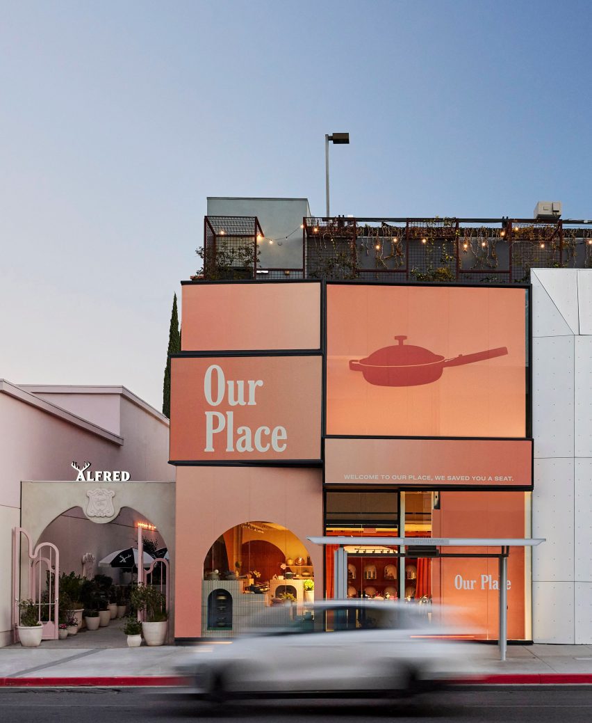
Brooklyn-based Ringo Studio designed a store for kitchenware brand Our Place that features colourful tile displays and expressive drapery that hangs from the ceiling.
The Our Place Melrose store is the brand’s second location in Los Angeles, following the inaugural shop in Venice, and is situated in West Hollywood’s busy shopping district.
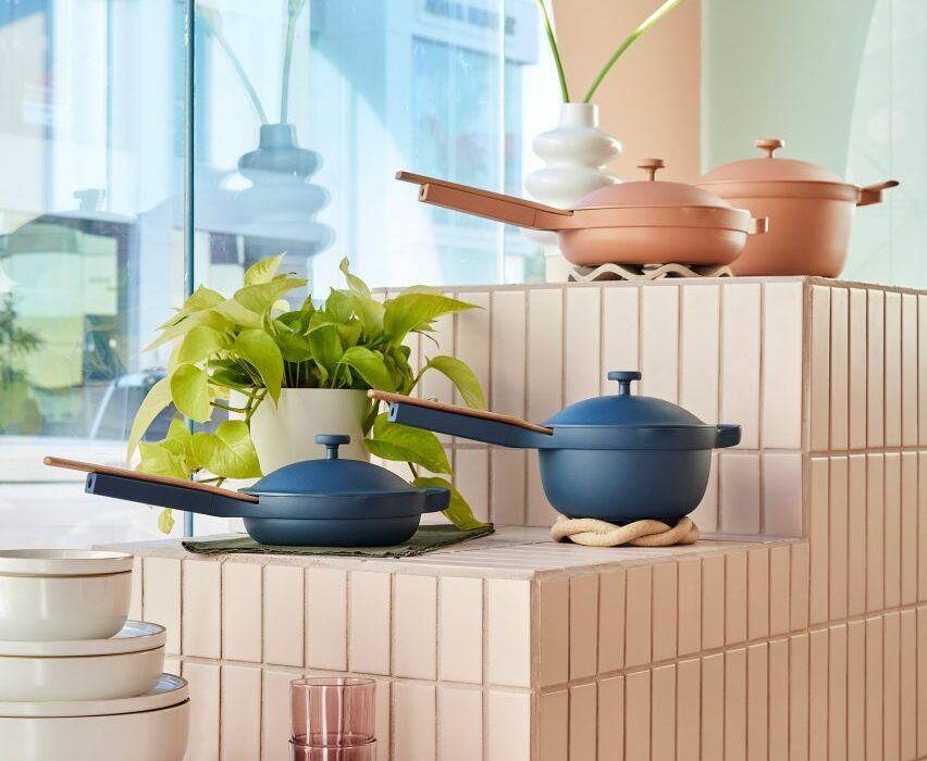
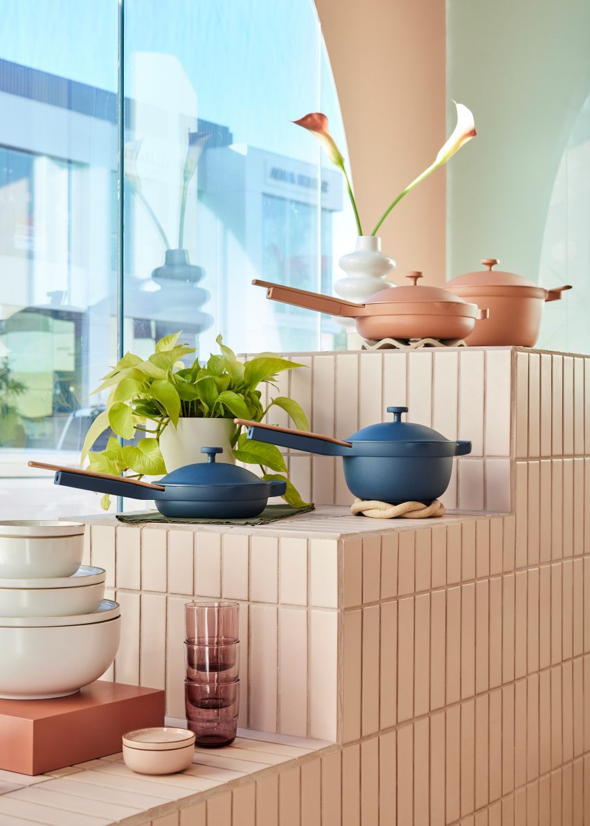
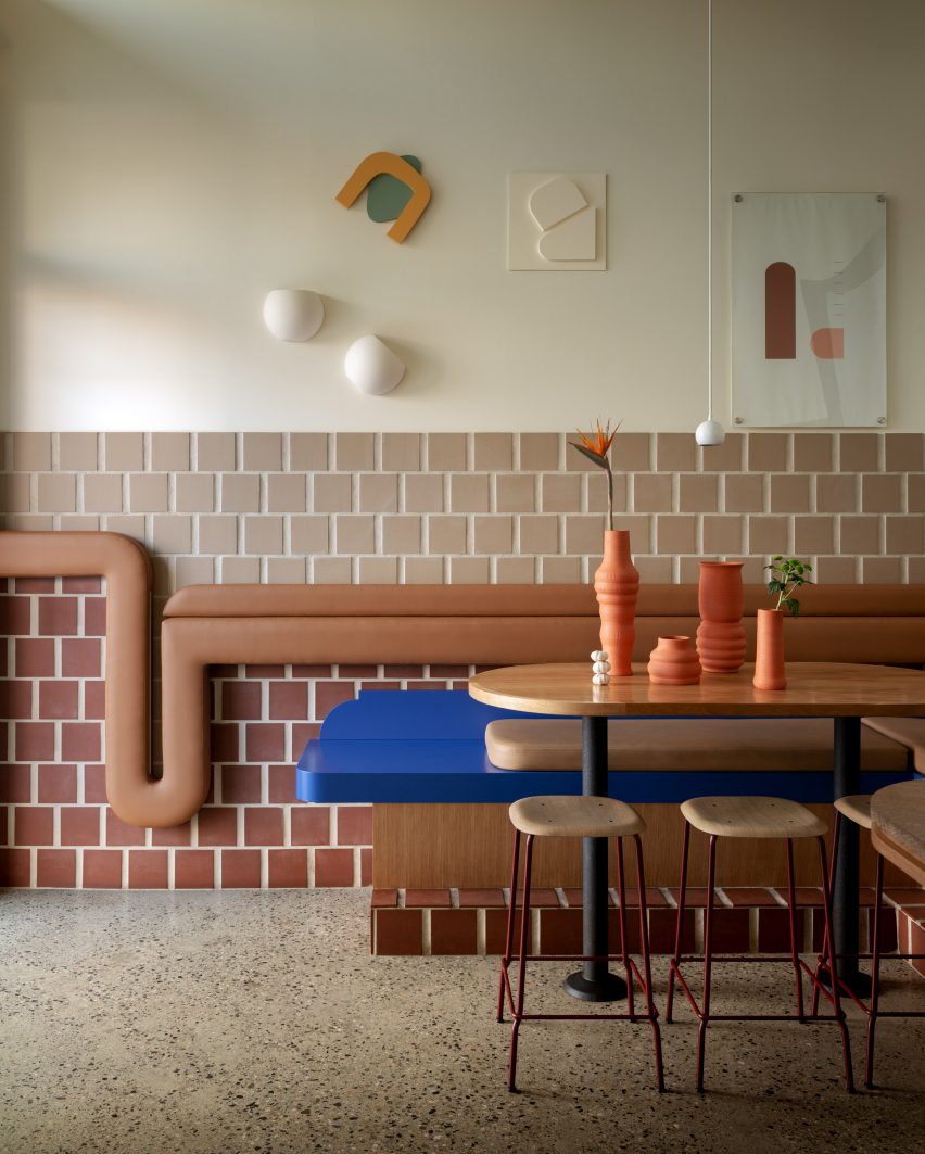
The Our Place store is designed to showcase the brand’s colourful cookware
The interiors by Ringo Studio are based on the identifiable colour palette of Our Place cookware sets, which are known for in a variety of pastel, neutral and jewel-toned hues.
“It retains the warmth and intricacy of Our Place’s first store in Venice, concepted by Mythology, while also taking Our Place’s design ethos into new and unique expressions,” said the team.
Many of the surfaces are covered in long rectangular tiles laid in a straight stack pattern
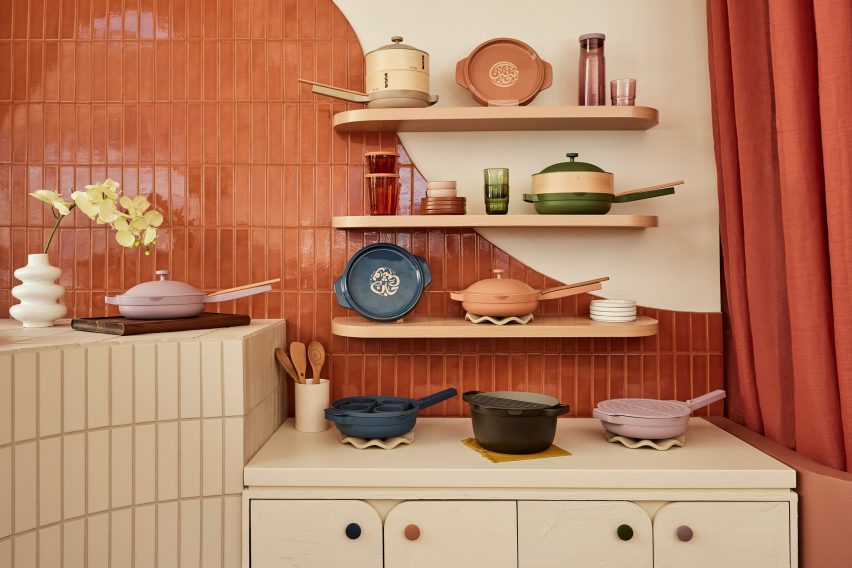
Elements derived from classical architecture were included, from fluted columns that support a wavy-topped table to arches that curve over shelving units and form punctured openings for showcasing small items.
Storage cabinets have rounded corners, as do the doors that front them, and many of the built-in elements also feature filleted edges.
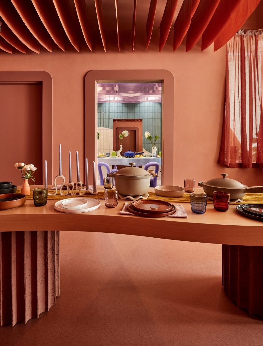
At the back is a space coloured entirely terracotta, which features a table displaying the brand’s products
Long rectangular tiles laid in straight stack patterns cover several of the walls and display stands.
Each tiled block or surface is a different colour, with large panels including terracotta, lilac and cream, and smaller sections in pale blue and green.
An area towards the back is decorated entirely in terracotta, which covers the floor and walls, as well as matching strips of fabric hung in rows from the ceiling.
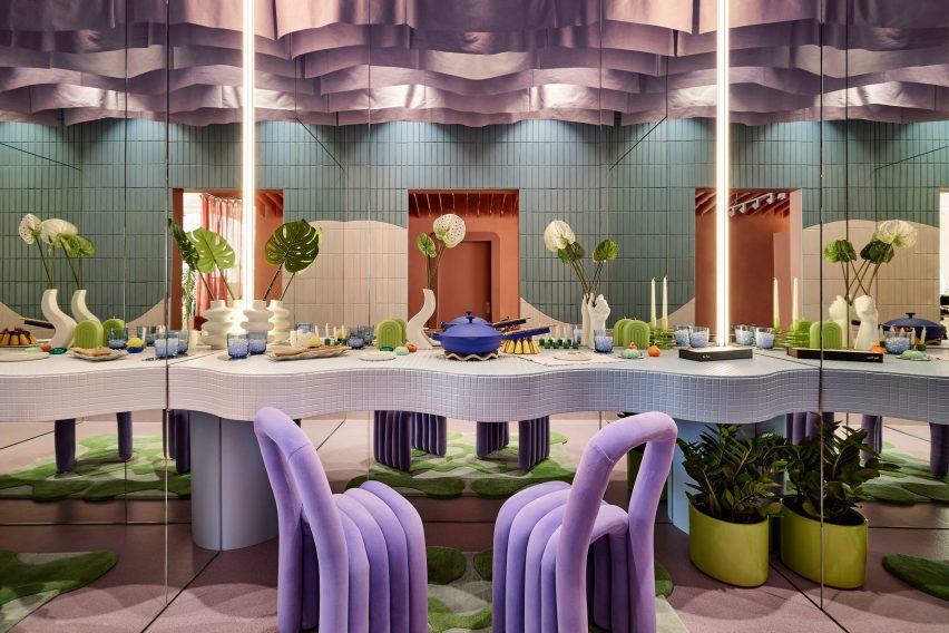
There’s also a side room where Our Place products are laid out on a dining table with mirrors on three sides, creating infinite reflections intended to “welcome everyone to have a seat at the table”.
A side room features mirrors on three sides to create infinite reflections of a dining table setup
Covered in mosaic tiles and with an undulating front, the table is accompanied by a pair of purple velvet chairs, and from the ceiling hangs purple drapery.
“Infused with the cozy feeling of home, the streamlined suite of products are artfully displayed throughout the store, making them feel like chic, sculptural objects,” said the Our Place team.
Our Place Melrose is located in West Hollywood’s busy shopping district and is the brand’s second location in LA
Ringo Studio was founded by architectural designer Madelynn Ringo, who has created retail experiences for companies such as Glossier, Studs and Funny Face Bakery.
Last year, the studio completed a store for fitness brand Bala in New York City, which includes scaled-up versions of its products.
In the lead-up to Milan design week, we have rounded up eight residential and hotel interiors in the Italian city that are united by their use of muted colours and diverse materials.
As the Salone del Mobile furniture fair is set to kick off next week, alongside its surrounding Fuorisalone events programme, these interiors provide a glimpse into some of the city’s design-led apartments, homes and hotels.
Among the featured projects in Italy’s industrial capital is a hybrid home and office space in a former dental studio, a home set within a 200-year-old palazzo and a nunnery-turned-hotel.
This is the latest in our lookbooks series, which provides curated visual inspiration from Dezeen’s archive. For more inspiration see previous lookbooks featuring accent walls, bookshelves and terracotta tiles.
Photo is by Carola Ripamonti
Teorema Milanese, Italy, by Marcante-Testa
With the exception of removing a partition wall to create an open-plan living and dining area, Italian design studio Marcante-Testa looked to maintain the classic layout of this apartment in a 1960s building on Corso Sempione during its renovation.
The studio decorated the apartment in muted colours and used pale grey cipollino tirreno marble as a “carpet” across the sitting area. Elsewhere, a pale lemon-hued cabinet functions as a partition while the bathroom is clad in a maroon-streaked salomè marble.
Find out more about Teorema Milanese ›
Out of the Blue, Italy, by AIM
Italian design studio AIM made liberal use of the colour grey when renovating the interior of this 150-square-metre home in Milan. The concealed staircase that forms the centre of the renovation is framed in the distinctive bluey-grey hue.
And in the dining area, the home’s wooden flooring was decorated with a painted rectangle that aims to visually zone and separate the space from its surroundings. Brass fixtures complement its grey hue, which can also be found across light fixings and ornaments.
Find out more about Out of the Blue ›
Photo is by Giovanni Emilio Galanello
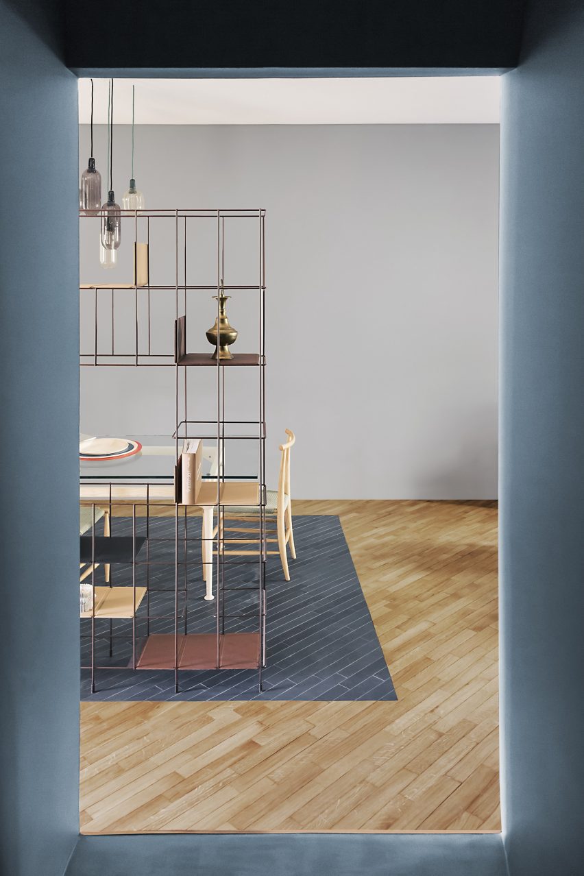
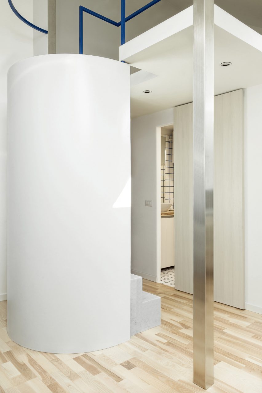
Private apartment, Italy, by Untitled Architecture
A cylindrical staircase and metal structural elements are the focal features of this small apartment, designed by local studio Untitled Architecture.
The apartment has a minimal paired-back aesthetic, with white-painted walls and bleached wood elements contrasted against tiny pops of colour introduced through blue-hued grouting and balustrades.
Find out more about the private apartment ›
Photo is by Michele Filippi
CPR Apartment, Italy, by +R Piuerre
Housed in a former dental studio, this hybrid home and office belongs to a young remote-working couple and was designed to combine Milanese modernism with Nordic design.
Two areas of the apartment were colour-coded according to their function, with the bedroom, office and entryway covered in tones of grey while the living area and kitchen are marked by a bright yellow hue. The spaces are connected by a white-painted staircase constructed from sheets of folded metal.
Find out more about CPR Apartment ›
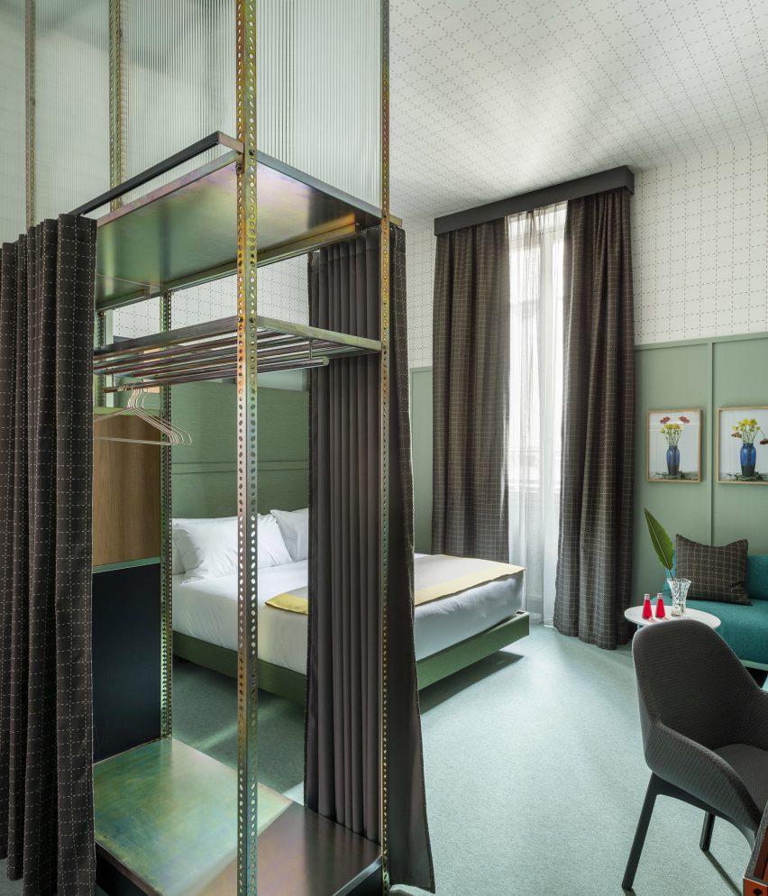
Room Mate Giulia, Italy, by Patricia Urquiola
Pistachio green was used to colour the dado wall panelling and soft furnishings inside this suite in Milan’s Room Mate Giulia hotel decorated by Spanish designer Patricia Urquiola. Meanwhile, the upper half of the walls and the ceilings are covered in white wallpaper with a geometric grid pattern.
Industrial materials and furnishings, including a galvanised metal shelving unit, were repurposed as boutique storage solutions and room partitions.
Find out more about Room Mate Hotels ›
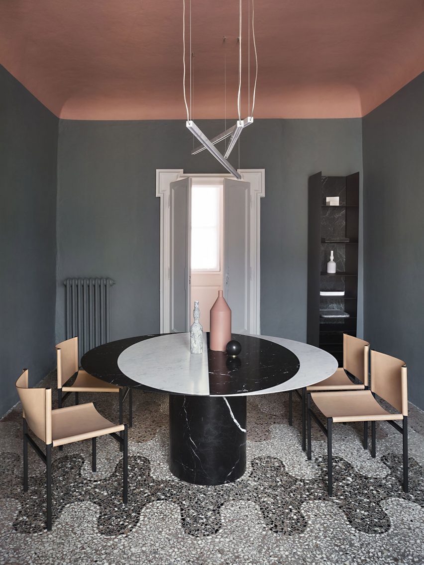
Casa Salvatori, Italy, by Elissa Ossino Studio
This home, designed by Milanese architecture practice Elissa Ossino Studio for the head of Italian stone company Salvatori, brings together marble furnishings and flecked terrazzo floors to link the interior with Salvatori’s stone manufacturing history.
Dulled hues of blue, peach, green and yellow were carried through the interior of the home, which is set within a 200-year-old palazzo in the city’s Brera district.
Find out more about Casa Salvatori ›
Photo is by Giovanna Silva
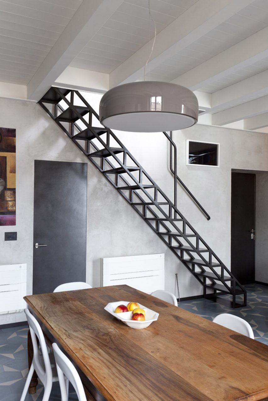
House with an iron staircase, Italy, by Roberto Murgia and Valentina Ravara
An iron staircase with a zig-zagging framework reminiscent of structural trusses was installed along one wall of this apartment in the Isola district, designed by Italian architects Roberto Murgia and Valentina Ravara.
The floor of the main living space features a geometric design, achieved through the use of hexagonal cement tiles. Each of the tiles is handmade and coloured in shades of light blue and white to provide tonal variation.
Find out more about House with an iron staircase ›
Photo is by Alberto Strada
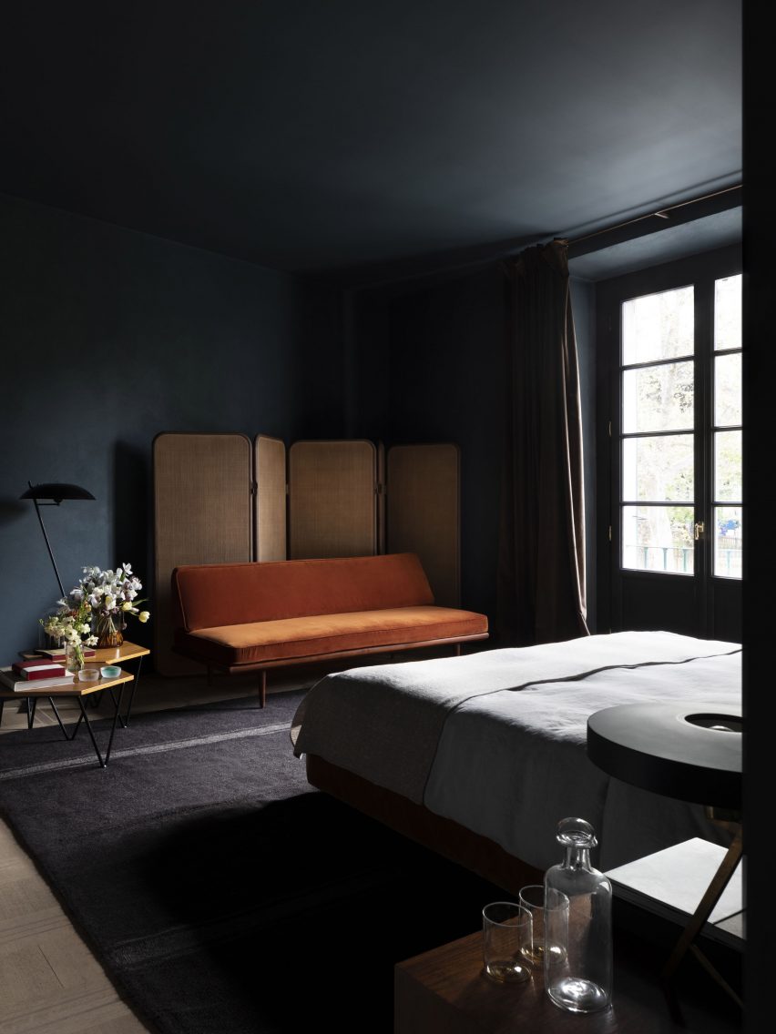
The Sister Hotel, Italy, by Quincoces-Dragò
Housed in a former 16th-century nunnery in Milan’s city centre, The Sister Hotel features decadent yet eclectic interiors by architecture studio Quincoces-Dragò.
The studio looked to grandiose private townhouses when designing the interiors, opting for moody shades of navy blue and deep green within the bedrooms. Furnishings introduce brighter colours into the suites, including a velvet-upholstered orange sofa.
Find out more about The Sister Hotel ›
This is the latest in our lookbooks series, which provides visual inspiration from Dezeen’s archive. For more inspiration see previous lookbooks featuring accent walls, bookshelves and terracotta tiles.
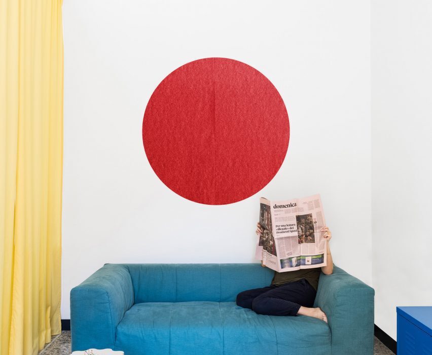
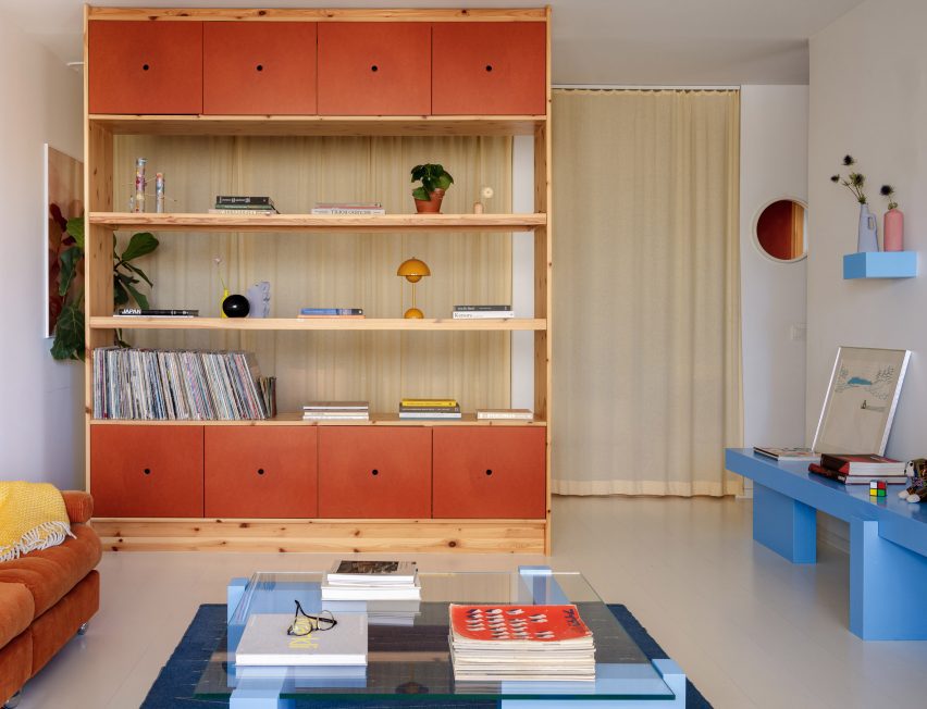
Our latest lookbook compiles residential living rooms that have been given an air of playfulness through their use of the three primary colours.
In design, the primary colours are yellow, blue and red. They usually appear in this context as strong cobalt blues, vivid sunshine yellows and intense fire-engine reds.
This trio of colours is prevalent throughout design history and can be seen in paintings by Dutch artist Piet Mondrian and suspended mobiles by American sculptor Alexander Calder.
They are often used when designing products for children due to the visually stimulating nature of their bright, dense hues.
In interior design, they have a similarly invigorating effect, whether applied directly to structural elements such as walls and columns or found in soft furnishings and accessories.
They primary colours help to bring energy into living areas both when used in isolation and when appearing in tandem with one another.
This is the latest in our lookbook series, which provides visual inspiration from Dezeen’s archive. For more inspiration see previous lookbooks featuring four-poster beds, split-level living areas and colourful bathrooms.
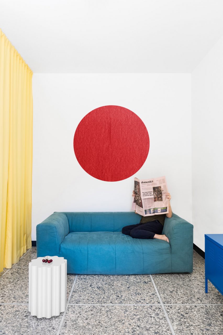
Photo by Paolo Fusco
Retroscena apartment, Italy, by La Macchina Studio
Vibrant pops of blue, yellow and red are set against a neutral backdrop of white walls and terrazzo stone floors in the living room of this mid-century one-bedroom apartment in Rome.
The space represents the distilled interior scheme devised by Italian architecture practice La Macchina Studio that characterises the apartment, which is also home to floor-to-ceiling citrus-toned curtains and bright blue doorways.
Find out more about Retroscena ›
Photo by José Hevia
House in Sant Antoni de Vilamajor, Spain, by Arquitectura-G
A monochromatic red colour scheme dominates both the exterior and interior of this rural house near Barcelona designed by Spanish design studio Arquitectura-G.
The split-level living space features a rhythm of striking red-painted columns and ceiling-height cupboard doors combined with rosy clay tiles.
Find out more about House in Sant Antoni de Vilamajor ›
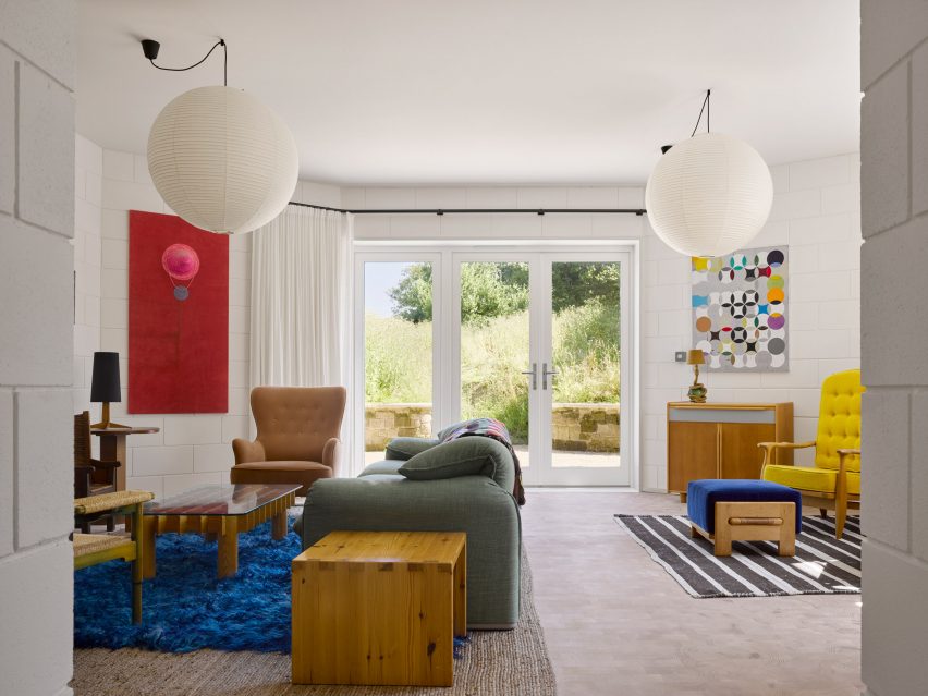
Photo by Will Pryce
Red House, UK, by David Kohn Architects
Red House in Dorset, England, was given its name by David Kohn Architects in reference to its red brick facade, however, splashes of the colour also appear throughout its eclectic interior.
Primary coloured furnishings – including a blue rug and footstool, red wall hanging and yellow upholstered armchair – are dotted around the living space, offset by white-painted cinderblock walls and warm wooden accents.
Find out more about Red House ›
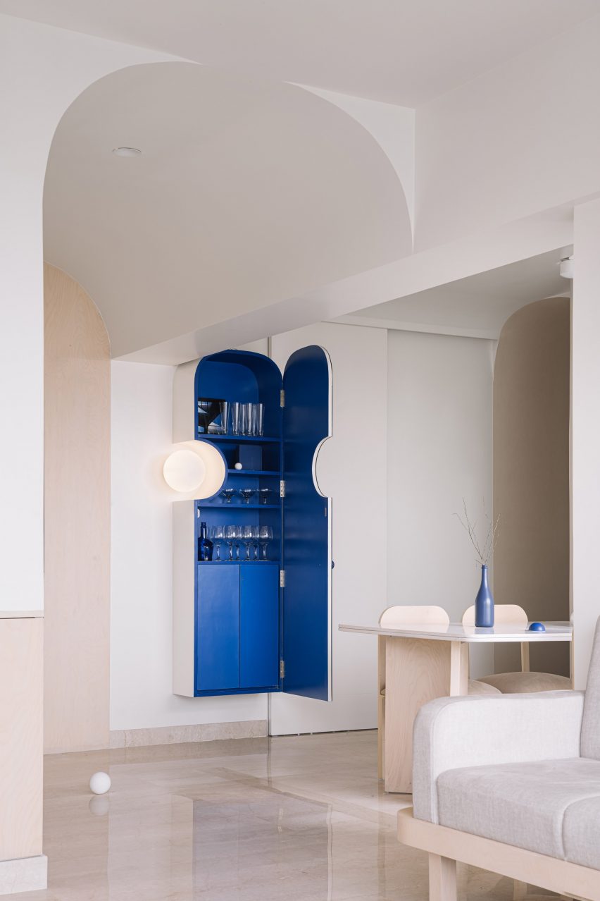
Photo by The Fishy Project
Out of the Blue, India, by The Act of Quad
Renovated by Mumbai-based studio The Act of Quad, this apartment in the Indian city of Thane is defined by its consistent use of cobalt blue in an otherwise neutral interior.
Soothing splashes of the colour appear in pieces of bespoke furniture – including hemispherical and spherical inclusions on light fittings and tables – and line the inside of a wall-mounted drinks cabinet.
Find out more about Out of the Blue ›
Photo by Jesper Westblom
Apartment renovation, Sweden, by Westblom Krasse Arkitektkontor
The full trio of primary colours is used across this apartment in Stockholm by local practice Westblom Krasse Arkitektkontor.
Blue, yellow and red are seen in both full saturation and muted hues on walls, ceilings, soft furnishings and furniture, creating a colourful yet cohesive interior.
Find out more about apartment renovation ›
Photo is by José Hevia
Apartment renovation, Spain, by Arquitectura-G
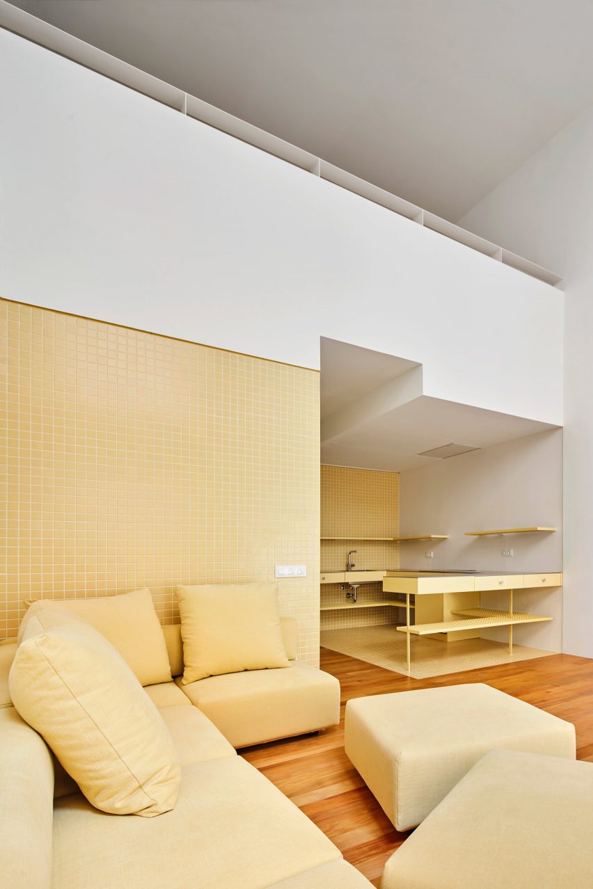
Spanish studio Arquitectura-G used a colour palette governed by shades of yellow in its refurbishment of this apartment in Barcelona.
The living space contains a sunny yellow modular sofa and matching kitchenette, with the spaces united by a backdrop of small golden wall tiles, a honey-coloured wooden floor and white plasterwork.
Find out more about this apartment renovation ›
Photo by Johanna Link
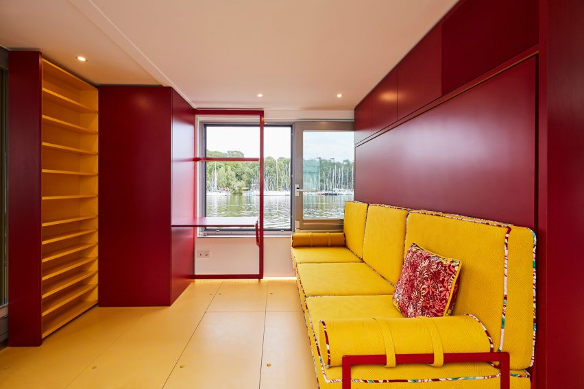
Fàng Sōng, Germany, by Crossboundaries
Beijing-based architecture practice Crossboundaries reconfigured the interior of a houseboat moored in Berlin, which features modular furniture and storage solutions all finished in either red or yellow in reference to the Chinese imperial colours.
An adaptable living area onboard contains a lemon-yellow sofa that folds away to support a double bed, as well as a cantilevered desk integrated into a wall panel that can be stowed away when not in use.
Find out more about Fàng Sōng ›
Photo by Yiannis Hadjiaslanis and Point Supreme
Ilioupoli Apartment, Greece, by Point Supreme
Graphic primary-coloured details are scattered around this 56-square-metre subterranean apartment in Athens renovated by local architecture studio Point Supreme.
The rough concrete walls and ceilings of the small living area are contrasted by red items – including a bench and window panes – as well as a trio of deep blue flags suspended in the entryway.
Find out more about Ilioupoli Apartment ›
Photo by Mattias Hamrén
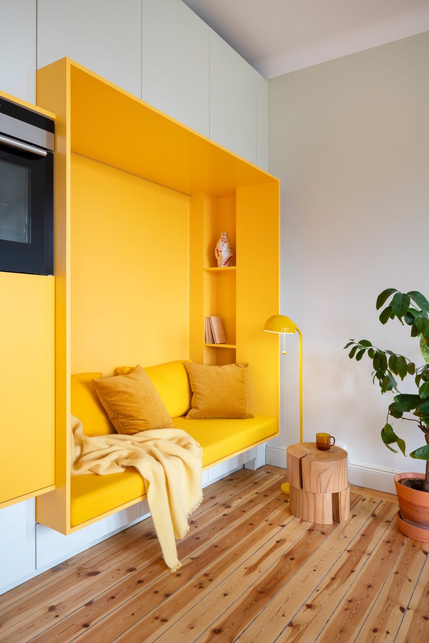
Function Walls, Sweden, by Lookofsky Architecture
This apartment in Stockholm, which was renovated by local studio Lookofsky Architecture, is designed around a multifunctional wall that snakes through the interior.
In the living area, the zesty yellow structure contains a sofa snuggled inside an extruded frame, accompanied by integrated shelving and matching golden upholstery.
Find out more about Function Walls ›
Photo by Prue Ruscoe
Polychrome House, Australia, by Amber Road and Lymesmith
Australian design studio Amber Road worked with colour consultants Lymesmith on this house in suburban Sydney, which is charactertised by its excessive use of colour.
The aptly named Polychrome House is finished in a kaleidoscopic spectrum of colours, including in its living room where a wall mural of abstract shapes featuring red, blue and yellow is echoed by red and blue seating.
Find out more about Polychrome House ›
This is the latest in our lookbook series, which provides visual inspiration from Dezeen’s archive. For more inspiration see previous lookbooks featuring four-poster beds, split-level living areas and colourful bathrooms.
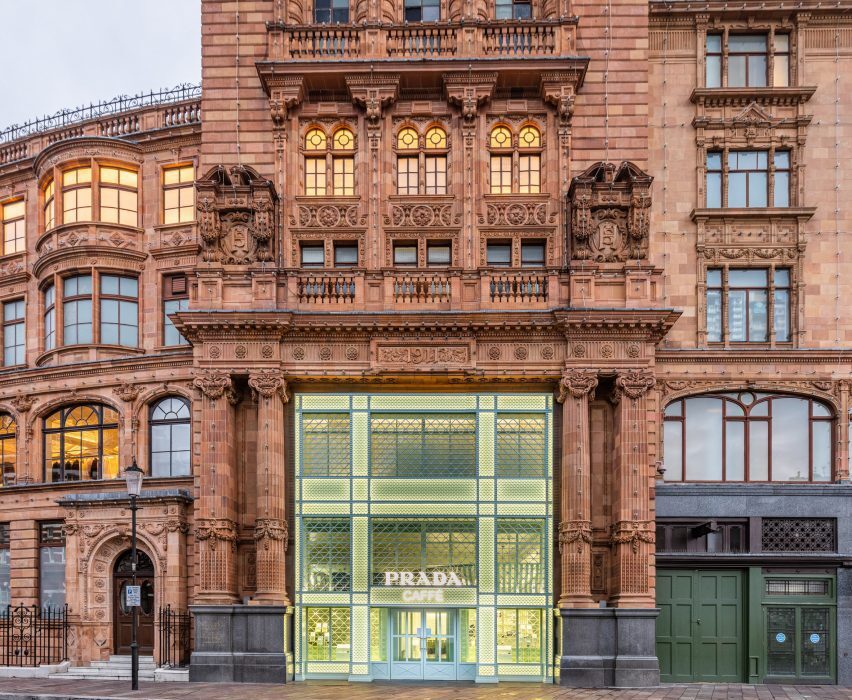
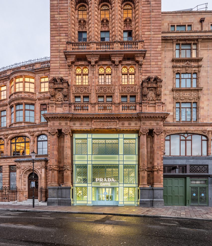
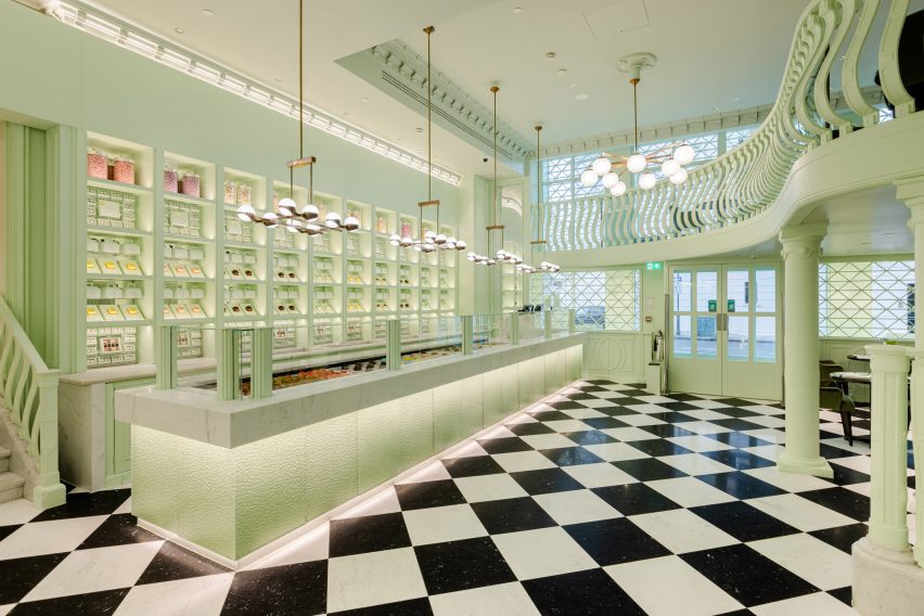
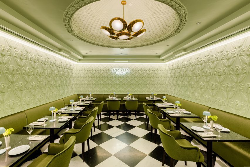
Fashion house Prada has opened the Prada Caffè in luxury department store Harrods, which has an interior that is blanketed in the brand’s signature green hue and mirrors one of Milan’s oldest patisseries.
Located at the corner of Hans Road in London, the Prada Caffè is accessed via a mint green latticed storefront that complements Harrods‘s Edwardian baroque terracotta facade.
Prada Caffè is located in Harrods
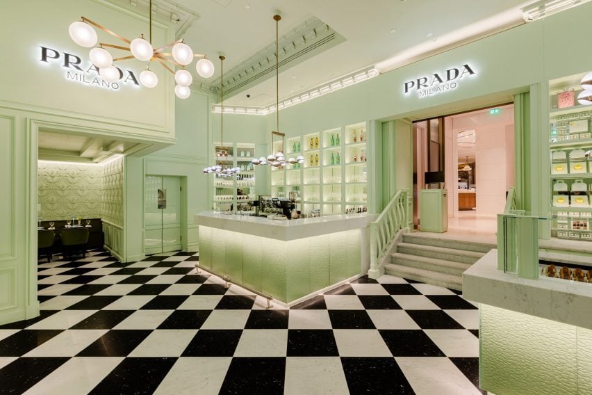
The interior of the pop-up cafe draws on the interior of Pasticceria Marchesi, a Milanese patisserie that opened in 1824, which has similar pale-green interiors that are paired with green velvet-upholstered soft furnishings.
At Prada Caffè, the walls, ceilings and furniture – including booth seating, plush armchairs and architectural elements – were hued in a minty green referred to as Prada green, a colour that has become synonymous with the brand.
It was decorated in Prada’s signature green colour
A large marble countertop, decorated with textural, pebbled panelling at its base, is located at the entrance to the cafe and used to display Prada-branded patisseries that are presented like individual pieces of jewellery.
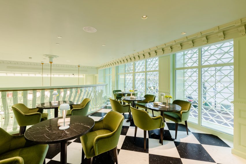
The floors of the space were clad in black and white-checkered floor tiles in a nod to the floors of the Prada boutique located in Milan’s Galleria Vittorio Emanuele II.
The interior referenced Prada stores and a Milanese patisserie
Floral reliefs and mouldings cover the walls and ceilings of the cafe, which the brand explained aims to evoke the look of Prada stores worldwide.
A mezzanine level, supported by green columns, is decorated with bowed balustrades and used as an elevated seating area overlooking the marble-wrapped patisserie counter.
At the rear of the cafe, a secluded room continues the interior scheme. Here, green velvet booth seating surrounds the perimeter of the space beneath decorative floral relief walls.
Tableware was selected specifically for the cafe and ranges from blue-hued Japanese porcelain, informed by ancient Celadon pottery and decorated with contrasting black lines, to blown-glass crystalware.
A checkered floor runs through the cafe
To accompany the blown glassware and duck egg blue porcelain, silverware was engraved with Prada branding and features handle ends that are shaped like the brand’s triangular logo.
The cafe will remain at Harrods until January 2024.
Furniture was upholstered in velvet
During Milan Fashion Week, Prada presented its Autumn Winter 2023 collection in the Deposito of the Fondazione Prada, which featured a moving and retractable ceiling.
Elsewhere in London, Ola Jachymiak Studio brightened a cafe in Notting Hill incorporating terracotta-tile floors and tangerine-hued walls.
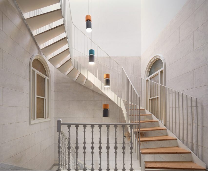
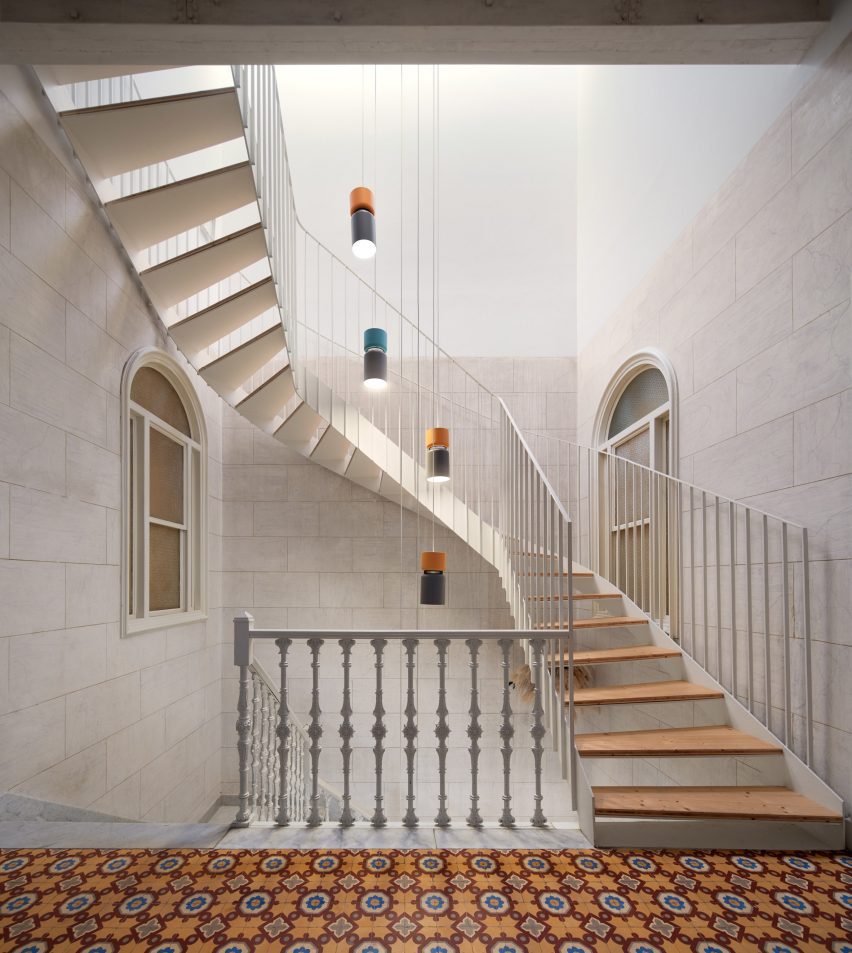
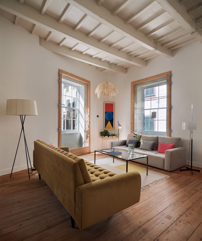
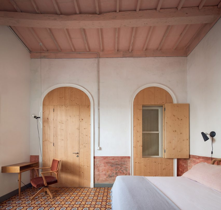
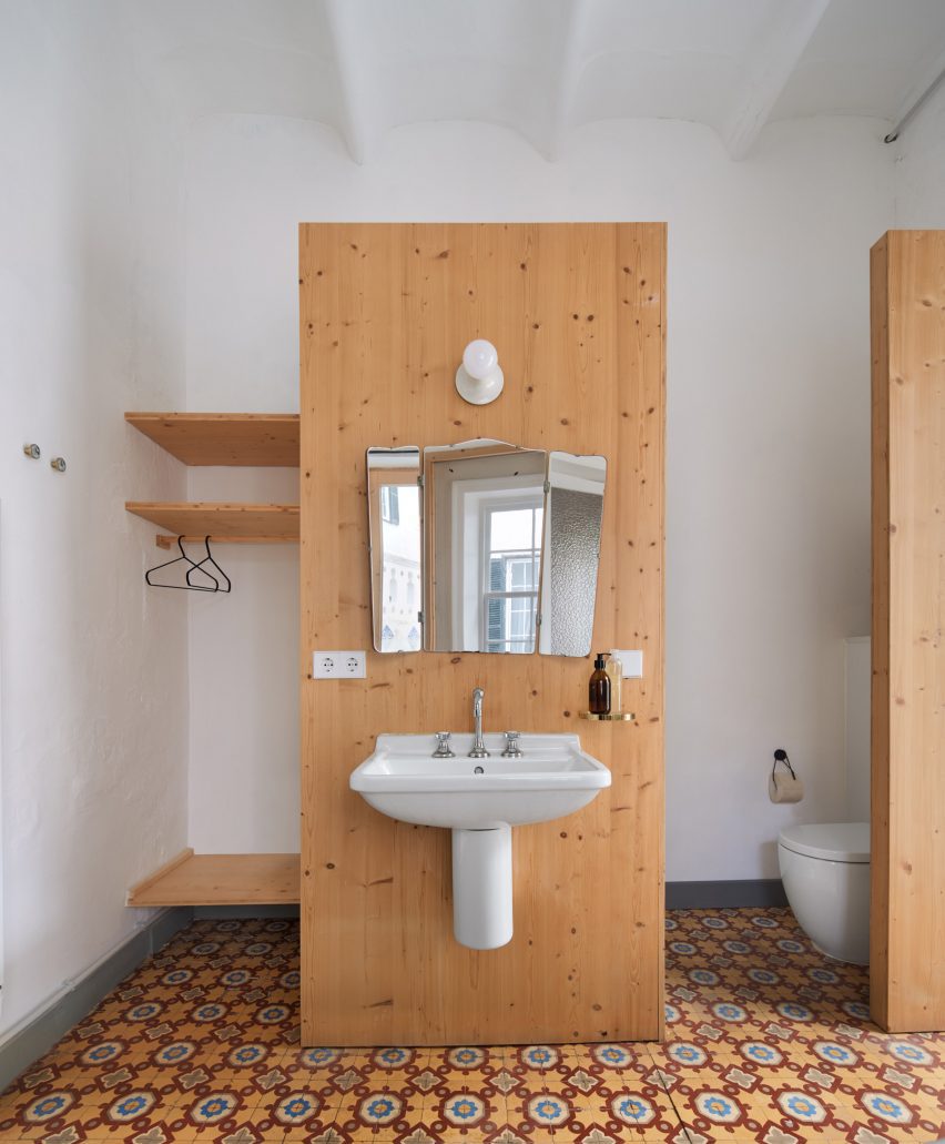
Spanish architect Emma Martí has converted an 18th-century townhouse on the Balearic island of Menorca into the intimate eight-bedroom Hevresac Hotel, taking over all of its five floors from basement to attic.
The building, which originally belonged to a local merchant and privateer, is set in the historic centre of Mahón – a former trade hub that still bears traces of French and English culture after spending many years under colonial rule.
Emma Martí has converted a five-storey townhouse into the Hevresac Hotel
Hevresac owners Ignasi Truyol and Stephanie Mahé brought Martí on board for the renovation in part because she was an old friend, who they thought could be trusted to conserve and enhance the spirit and character of the building.
Martí’s aim for the project was to fill the building with light and life while preserving its wealth of existing architectural elements, from wooden beams and mosaic flooring to stucco walls and staircases.
“The aim of the project was to create a fresh and inspiring hotel that values the beauty of the existing architecture,” said the hotel’s owners.
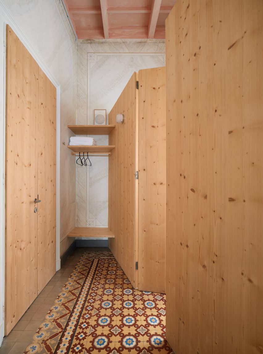
Original details such as parquet floors were retained throughout
Hevresac’s original floors, covered variously in wooden parquet and encaustic cement tiles, were carefully preserved.
In areas where it was not possible to retain the original elements, Martí chose a new design language using modern equivalents of these original materials, including micro-cement.
Hevresac Hotel has only eight guest rooms
The renovation process revealed both the stucco on the walls and the original paintwork on the beams, uncovering part of the building’s hidden history.
The original wrought iron columns in the living room are now a celebrated feature. Less noticeable but equally interesting is the Masonic symbolism on the wrought-iron railing of the marble staircase at the entrance.
Solid timber was used to frame private bathrooms in each of the bedrooms
Martí also wanted to preserve the original room structure of the townhouse.
To allow for this, she added private bathrooms within each of the existing bedrooms using a lightweight timber framing system made of solid Flanders pine, while three-ply spruce boards form partitions, headboards and wardrobes in each bedroom.
“Martí’s intention is for the new materials to coexist and harmonise with the originals, providing a new language, lightness and contemporaneity,” the owners said.
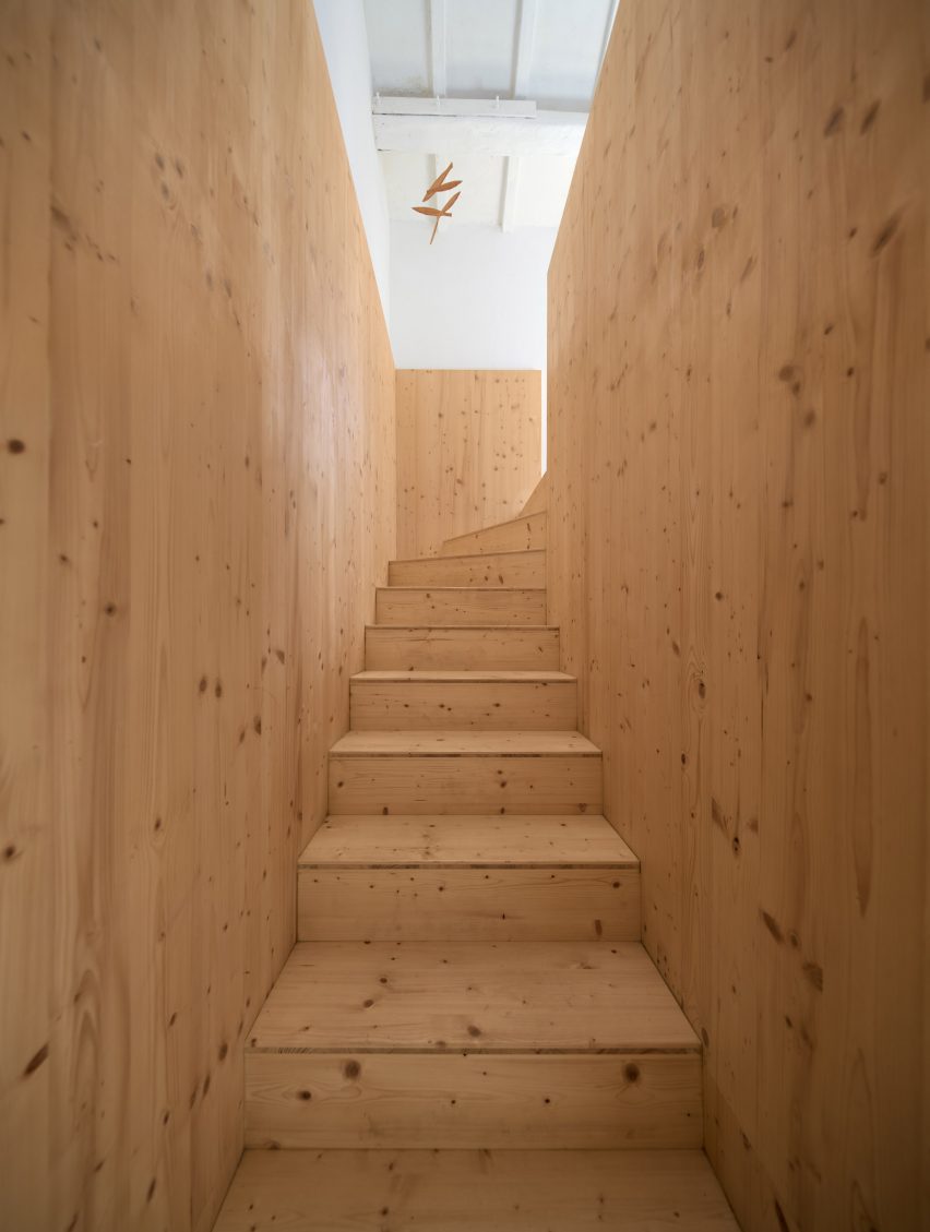
A new staircase – also utilising spruce ply – now coexists with the original staircase, providing an alternative route through the Hevresac Hotel.
The material is key to the contemporary language of the new insertions, which sit clearly differentiated alongside layers of the building’s past.
“I like to work with an honest and frank attitude towards the island’s architectural heritage,” Martí told Dezeen. “I wanted it to be clear what our intervention was, not to highlight it but to highlight the value of what existed in the building.”
Three-ply spruce boards form partitions and wardrobes in each of the bedrooms
To fill the spaces with natural light, several skylights were added on the upper floor, with one above the main stairwell as well as three new openings in the facade.
In the basement, the vaulted ceiling made of local marés stone required an intervention to lighten the space.
Martí’s response was to remove a bay of the existing vault and install a new, more comfortable staircase to link the ground floor with the basement and flood the space with light.
Martí also added a new spruce ply staircase
Hevresac’s choice of furnishings reflects Mahón’s cosmopolitan history, including an eclectic assembly of antique, vintage and contemporary pieces from all over Europe.
Among them are Nanimarquina rugs, Achille Castiglioni lights and some of Marcel Breuer’s Cesca chairs, as well as items from Menorcan antique dealers including Alcolea & Kraus and Antics Antigüedades.
“It’s a kind of synergy,” the owners said. “Together, the components project a warm, creative and personal composition, which is more than the algebraical sum of those individual pieces.”
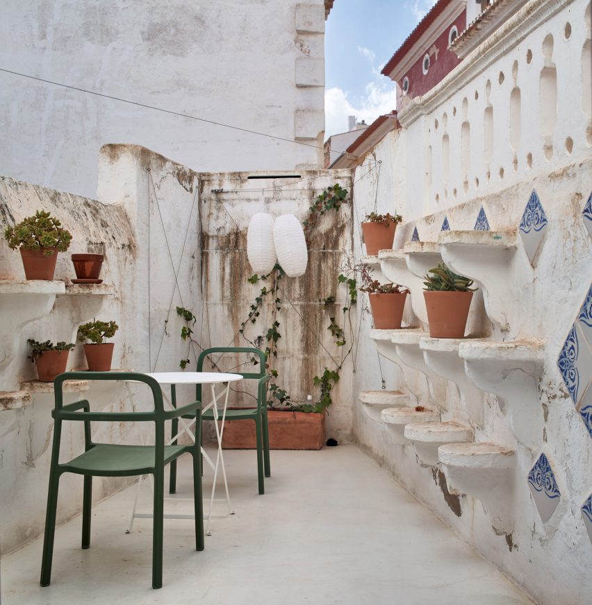
The hotel has a small terrace
Martí, who founded her self-titled studio Emma Martí Arquitectura in Menorca in 2013, has since completed a number of projects on the island.
Among them is a work retreat inside an abandoned girls’ school, with design-driven spaces where businesses can host meetings or team-building sessions.
Asian diner chain Light Years has renovated its restaurant in the Australian surf town of Byron Bay, with interiors conceived by local practice Studio Plenty in collaboration with home-grown artists and designers.
The team behind Light Years wanted its flagship eatery to mirror the playful visual identity established across its three other venues on Australia’s East Coast while refining and elevating their aesthetic.
Studio Plenty has renovated the Light Years diner in Byron Bay
“We were asked to reimagine the Byron Bay restaurant, taking cues from its sister diners but with greater restraint in composition,” Studio Plenty founder Will Rathgeber told Dezeen.
“We were looking to achieve something refined without letting go of the relaxed culture behind the brand, with satisfying colours and patterns, and playful shapes and materials.”
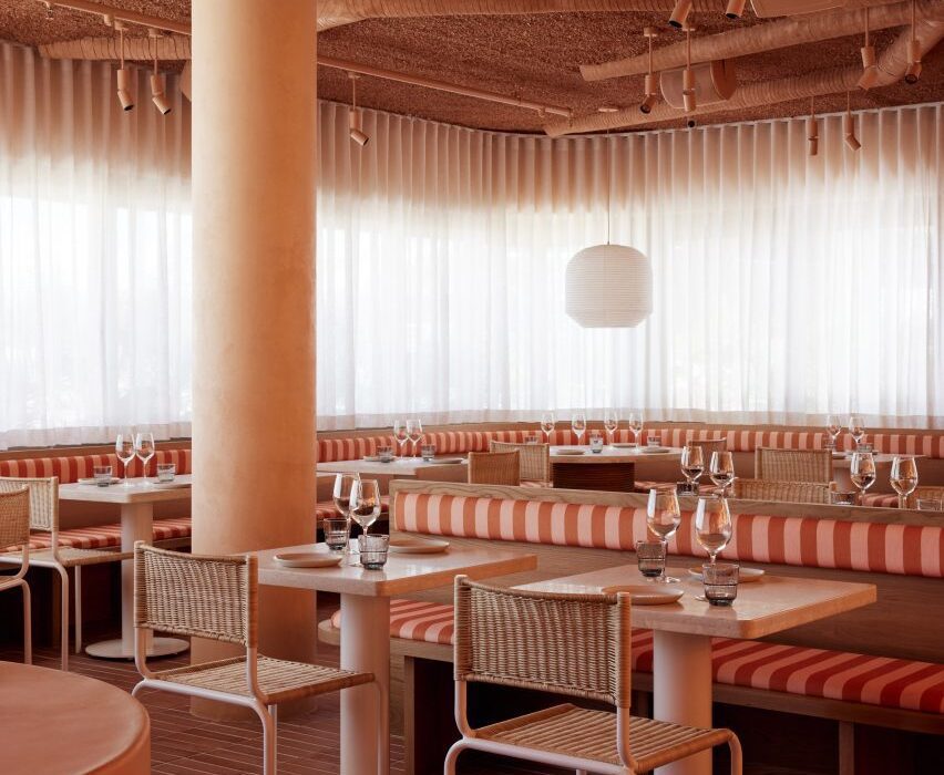
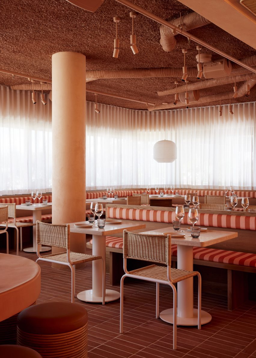
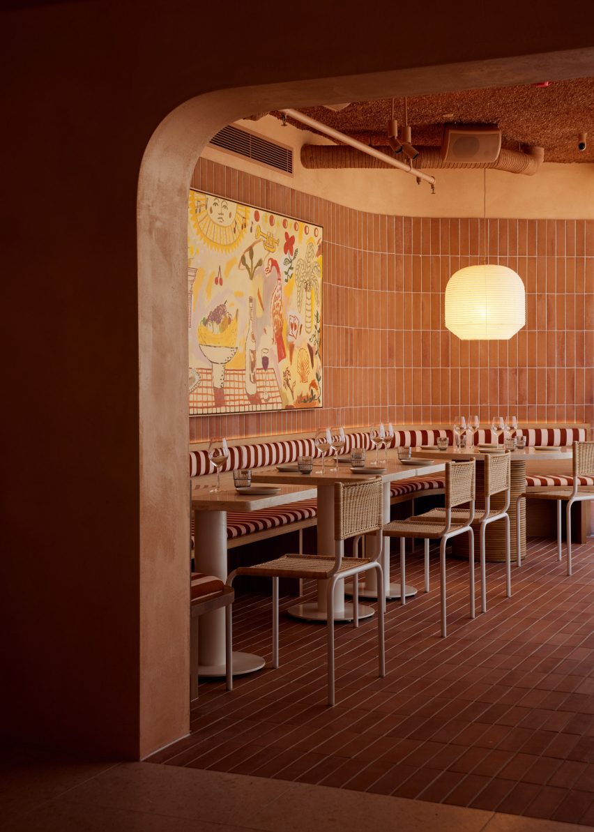
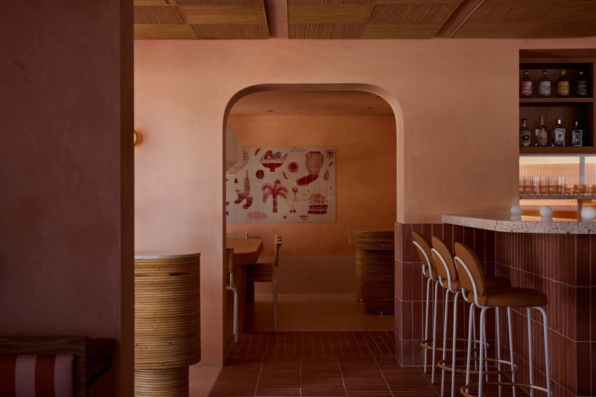
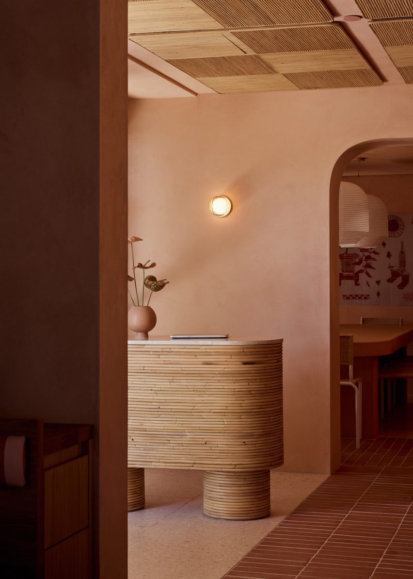
Terracotta tiles were used to finish the walls and floors
Soft corners and gently curving walls help to create a sense of intimacy, according to Rathgeber, while the restaurant’s colour palette of soft pink and terracotta tones “embraces you like a warm hug”.
Underpinning the playful feel of the eatery is a careful focus on the practicalities, with arched openings and material thresholds helping to define three distinct spaces – the main dining room, a curved bar with counter seating and a private dining area for larger groups.
Arched openings separate the restaurant’s different dining areas
The restaurant’s material palette incorporates handmade terracotta tiles with a rustic brushed finish and a rusty colour that is also picked up in the restaurant’s floors and the Fibonacci terrazzo bar counter.
In the main dining room, the ceiling was treated with an acoustic spray to absorb sound while contributing to the earthy, vernacular look of the diner thanks to its bumpy texture.
Rattan acoustic panels cover the ceiling near the entrance
Since the acoustic spray does not adhere to pipes, Studio Plenty specified a motorbike exhaust wrap for the pipes to achieve a harmonious ceiling plane.
In the bar area, ceilings are clad in rattan acoustic panels by local product designer and interior stylist Sarah Ellison, who also worked with Studio Plenty to design the restaurant’s custom furniture including the chunky tables and bistro-style chairs.
Artist collective Studio of the Sun created two colourful murals for the restaurant, with one featuring playful illustrations laser-printed onto a section of glossy white tiles.
“The client was committed to a locally focussed project, hence approaching Studio Plenty to design the restaurant and Sarah Ellison and Studio of the Sun to collaborate,” said Rathgeber.
A curved terrazzo bar provides counter seating
Rathgeber founded his Byron Bay practice in 2020 after cutting his teeth working for architecture firms Woods Bagot and Jackson Clements Burrows in Melbourne.
“We believe happiness is achieved through sensible design, not excess,” he explained of his studio’s ethos. “We have an appetite for rational design and an obsession with functionalism.”
The private dining area is defined by a Studio of the Sun artwork
Elsewhere in Byron Bay’s bustling bar and restaurant scene, Australian studio Pattern has designed the interiors for an eatery serving South America-style small plates and cocktails.
Its patchy grey surfaces and concrete fixtures were designed to reflect the “raw beauty” of late-night eateries in Mexico.
A refined palette of oak, plaster and steel defines the interior of the Liewood headquarters in Copenhagen, Denmark, designed by local practice Norm Architects.
The pared-back 2,200-square-metre office was conceived to give prominence to Liewood‘s colourful, Scandi-style children’s clothes, toys and homeware.
Norm Architects has completed Liewood’s Copenhagen headquarters
“With the ambition to create a comfortable space with a somewhat understated character, we worked to let the space obtain its significance through the thoughtful use of tactile elements such as textured plaster walls and contrasting elements like oakwood and steel,” explained Sofie Bak, an architect at the practice.
Staff enter the five-floor office via an airy light-filled lobby that is anchored by a rounded counter, roughly washed with sandy-beige plaster.
Plaster podiums provide display space on the first floor
Cone-shaped pendant lights are strung along the ceiling while oversized stone tiles are laid across the floor, helping to “emphasise the grandeur” of the space.
A pre-existing staircase curves up to the first floor, which accommodates a showroom. This part of the building formerly served as a production hall, with a vast scale that could easily feel empty and unwelcoming, according to Norm Architects.
At mealtimes, staff can gather in The Parlour
To counter this, the practice constructed what it describes as a “warm wooden core” – a house-shaped oakwood volume with built-in shelves for showcasing Liewood’s products.
Large, plaster-coated display plinths are dotted across the rest of the room. At the back is a short flight of wide, wooden stairs where staff can sit and chat throughout the day.
More products can also be presented here on bespoke podiums that, thanks to cut-outs at their base, are able to slot onto the steps.
The building’s first floor also contains The Parlour – a kitchen and dining area where Liewood employees can enjoy meals together. It features a large travertine table, a series of plump grey sofas and graphic art pieces by the Danish designer Sara Martinsen.
Traditional work areas can be found across the rest of the HQ
Work areas throughout the rest of the HQ are furnished with practical desks and storage units that match the off-white walls, while meeting rooms are fronted with panes of glass to foster a sense of openness.
As the building’s original staircase didn’t extend all the way to the fifth floor, Norm Architects installed a spiralling set of white-steel steps.
These grant access to a space the practice refers to as The Apartment: a secondary showroom designed to have a more intimate, homely feel.
The top floor accommodates The Apartment, a more intimate showroom
Elsewhere, Norm Architects recently took its minimalist aesthetic off-shore when designing the interiors of the Y9 sailing yacht, decked out with supple suede furnishings and wood-panelled surfaces.
The photography is by Jonas Bjerre Poulsen of Norm Architects.
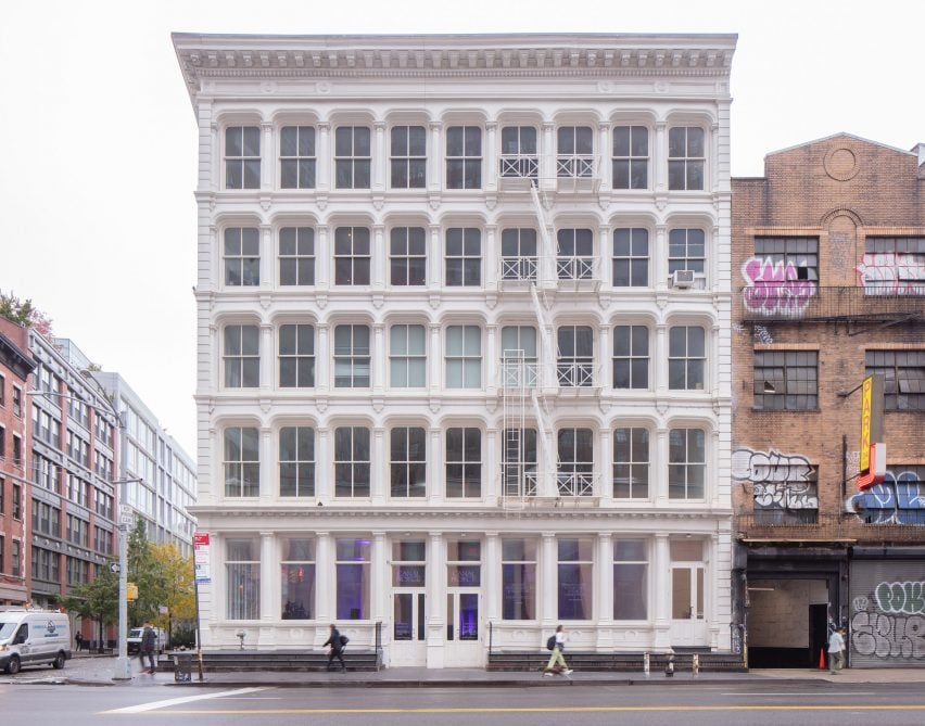
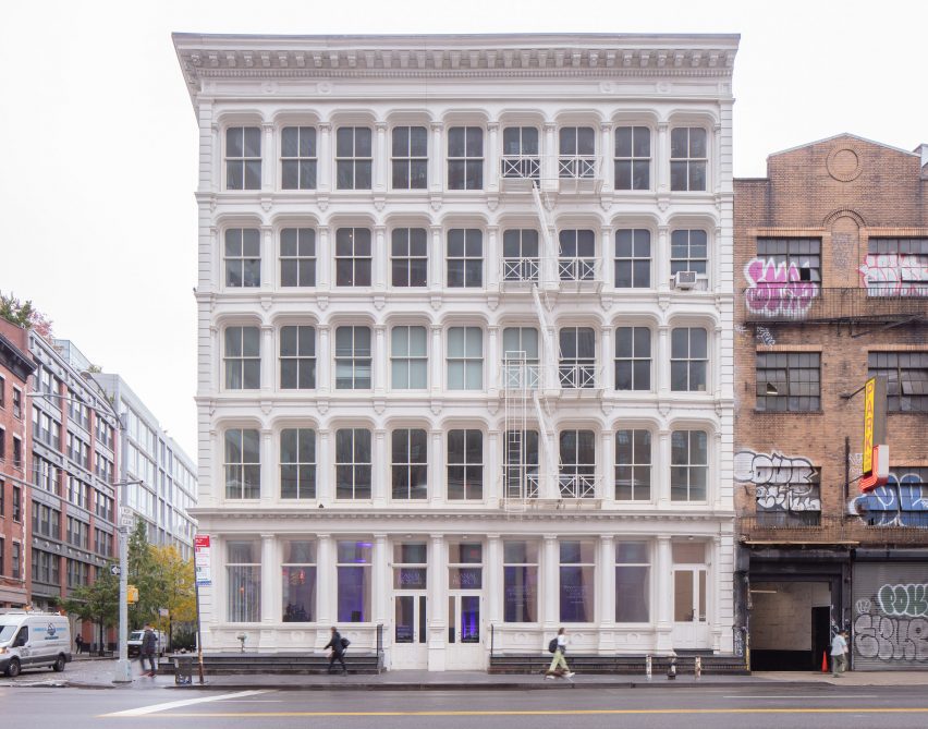
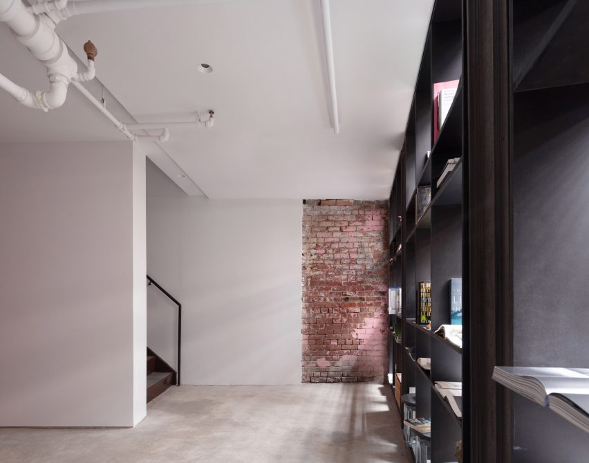
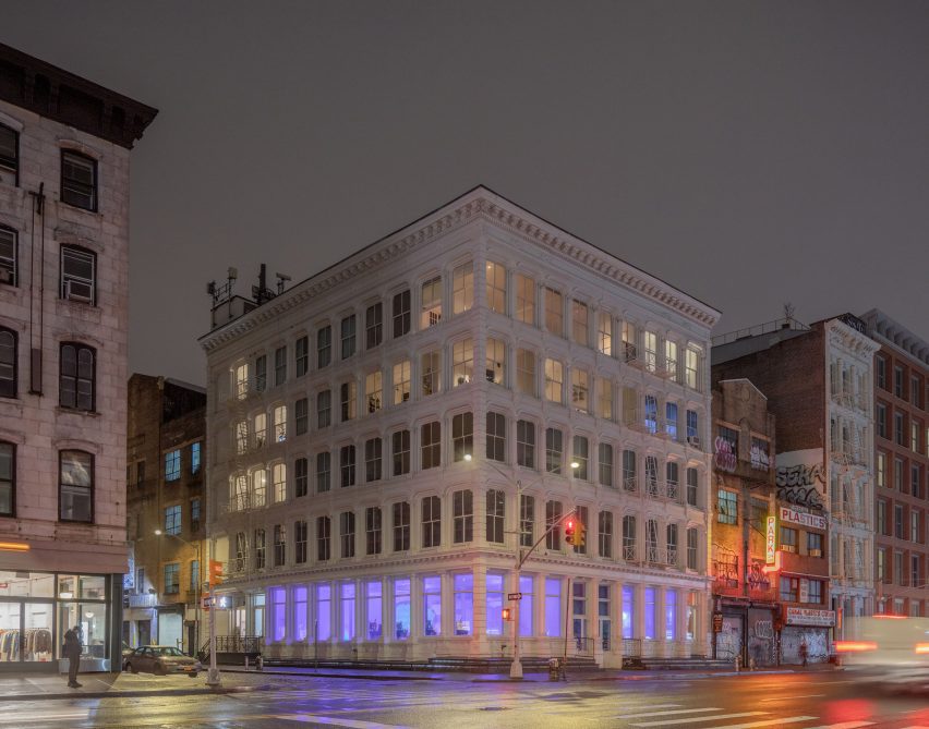
Architecture studio Worrell Yeung has renovated a historic cast-iron building in Soho for an arts organisation called Canal Projects, which hosts exhibitions “in an unmistakably New York City space”.
Sat between Soho and Tribeca, the five-storey landmark was built in 1900 as a manufacturing centre, featuring a decorative white facade, double-hung windows and an external fire escape all typical of the neighbourhood.
Worrell Yeung renovated the lower two floors of a landmarked building to create a home for Canal Projects
Its street and basement levels were renovated by Worrell Yeung to create a home for Canal Projects, a non-profit arts organisation that hosts exhibitions, talks, performances, readings and screenings for the community.
The studio was careful to retain as much of the building’s character as possible, highlighting the existing features like original masonry and steam radiators, and restoring them where necessary.
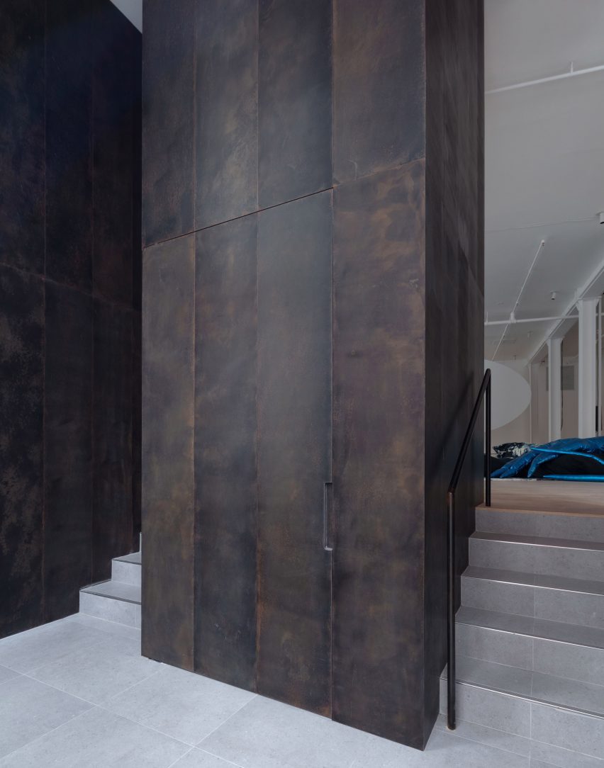
Patinated bronze panels line the new entry threshold
Visitors arrive via a new entry threshold on Canal Street, where patinated bronze panels line the tall walls in a space intended to offer a moment of pause.
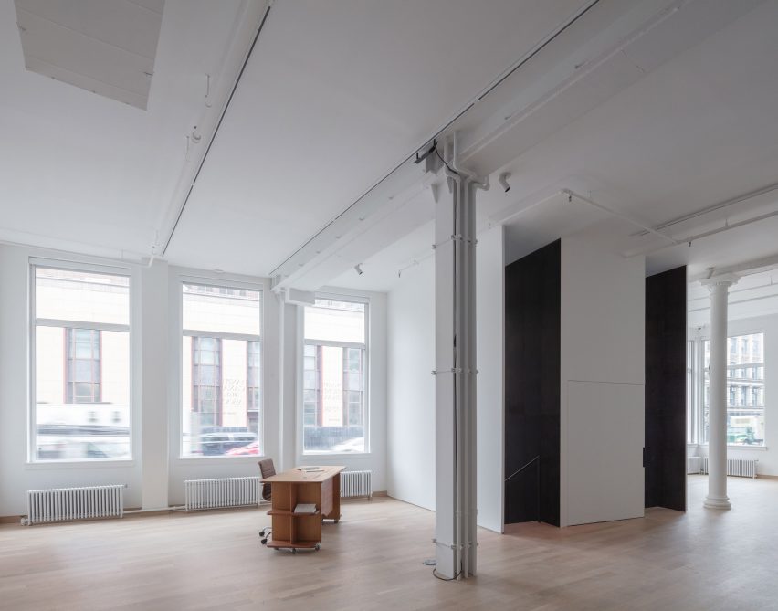
Up a short flight of steps is the main gallery space – a large, open and flexible room that can be programmed in accordance with the organisation’s needs.
The main gallery space is surrounded by windows and features historic details
“We designed the foundation to be a series of spaces that would compress and expand, collapse and unfold and move between dark and light,” said Worrell Yeung co-founder Jejon Yeung.
Surrounded by 14 large windows on two sides and boasting ceilings over 13 feet (four metres) tall, this room is light-filled and spacious.
A staircase leads down to more space at cellar level
New white oak floors complement the industrial details, including five cast iron columns and five wide flange steel columns that were exposed and restored.
“Similarly to providing artists with a distinctive platform, we wanted viewers to experience art in an unmistakably New York City space,” said Max Worrell, Worrell Yeung’s other co-founder.
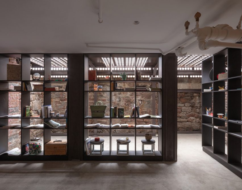
A library area is formed by pivoting floor-to-ceiling shelves
“Passers-by will glimpse exhibitions from the street through the window walls along Canal and Wooster Streets, and visitors on the interior can see artwork with the city context visible in the background,” Worrell said.
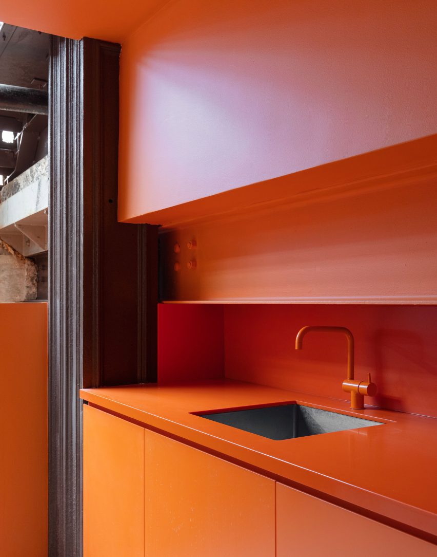
Also on the ground-floor level are private offices for the curators and a bright orange public restroom.
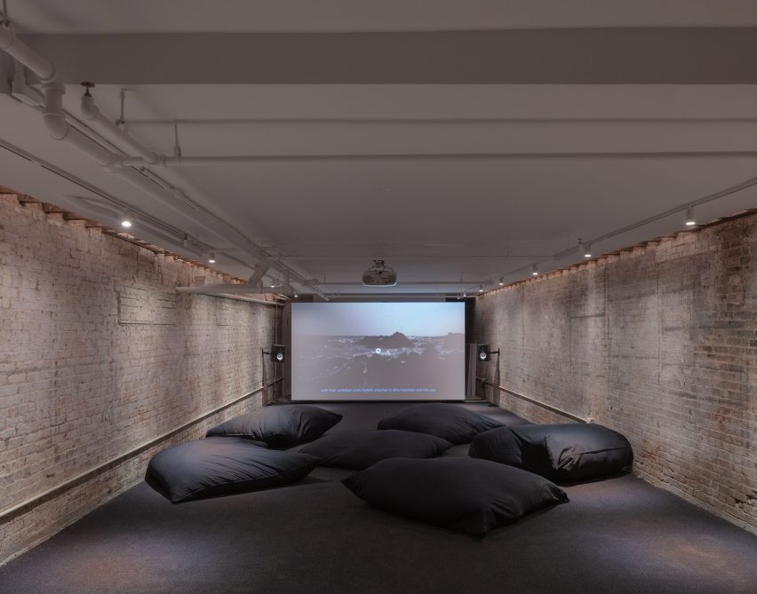
The dark cellar space is used for film screenings
Next to a freestanding reception desk by artist Zachary Tuabe, a staircase leads down to the basement level, which has a much smaller occupiable footprint.
Darker and more enclosed, the cellar space features original brickwork, masonry and timber ceiling joists, and provides a very different exhibition space that is suitable for film screenings.
A bright orange kitchen is tucked into an alcove
Light from the steel sidewalk grates illuminates one end of the space, where a library area is created by floor-to-ceiling shelving that pivots as required.
A pantry area is hidden in an alcove behind a set of stable doors and is coloured entirely bright orange to match the upstairs restroom.
“We wanted artists to confront a venue that provides sufficient neutrality for their work, but that is also distinctly undivorceable from the Soho Cast Iron District,” said Yeung.
“This is a building typology unique to New York City, and a richly layered context within which to exhibit.”
A public restroom on the upper level matches the kitchen
Canal Projects opened to the public in September 2022, with an exhibition titled Pray organised by artistic director and senior curator Summer Guthery.
The building is located on the corner of Canal and Wooster Street, between Soho and Tribeca
Worrell Yeung was founded in 2015, and has worked on a variety of projects in and around New York.
The studio recently completed a timber-clad lake house with cantilevered roof planes in Connecticut, while past endeavours have included a Hamptons renovation, a Chelsea loft apartment, and the penthouse in the Dumbo Clocktower Building.
Architecture and interior design: Worrell Yeung Worrell Yeung project team: Max Worrell, founder and principal; Jejon Yeung, founder and principal; Beatriz de Uña Bóveda, project manager; Yunchao Le, project designer Structural engineer: Silman (Geoff Smith, Nick Lancellotti) Lighting designer: Lighting Workshop (Doug Russell, Steven Espinoza) MEP engineer: Jack Green Associates (Larry Green) Expediter/code consultant: Anzalone Architecture (James Anzalone) Contractor: Hugo Construction (Hugo Cheng, Kong Leong)
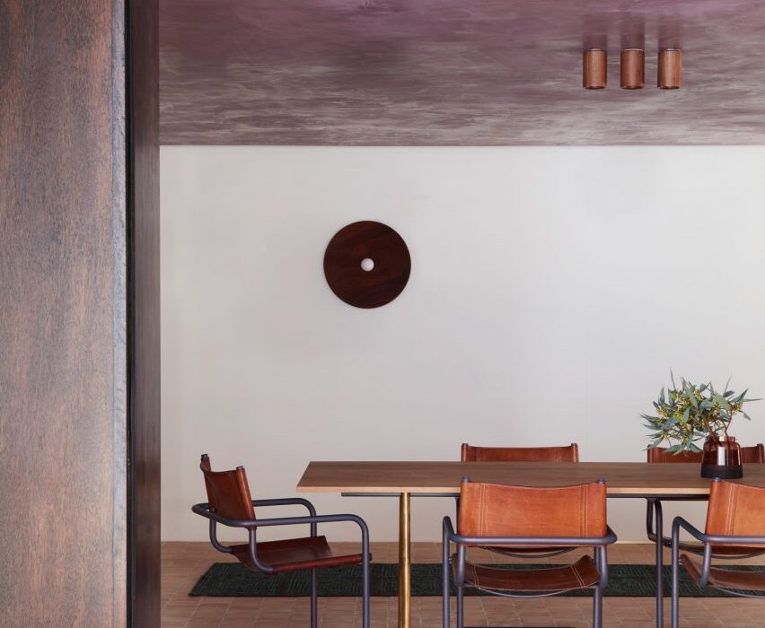
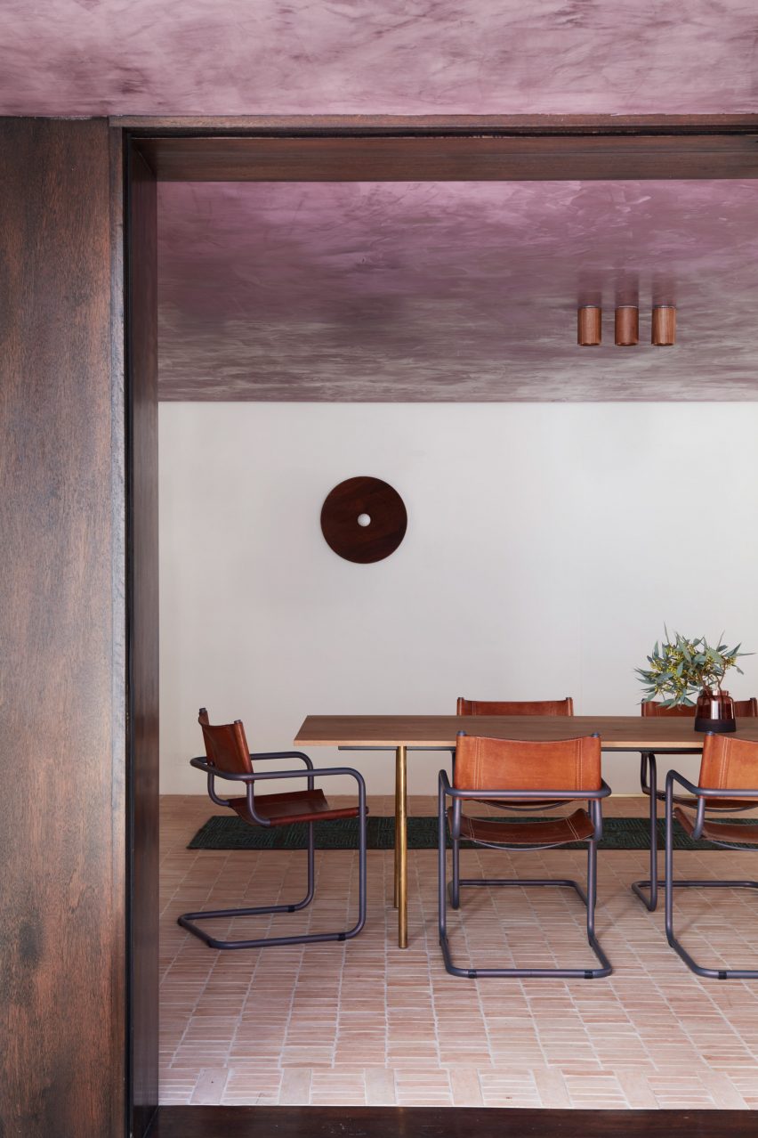
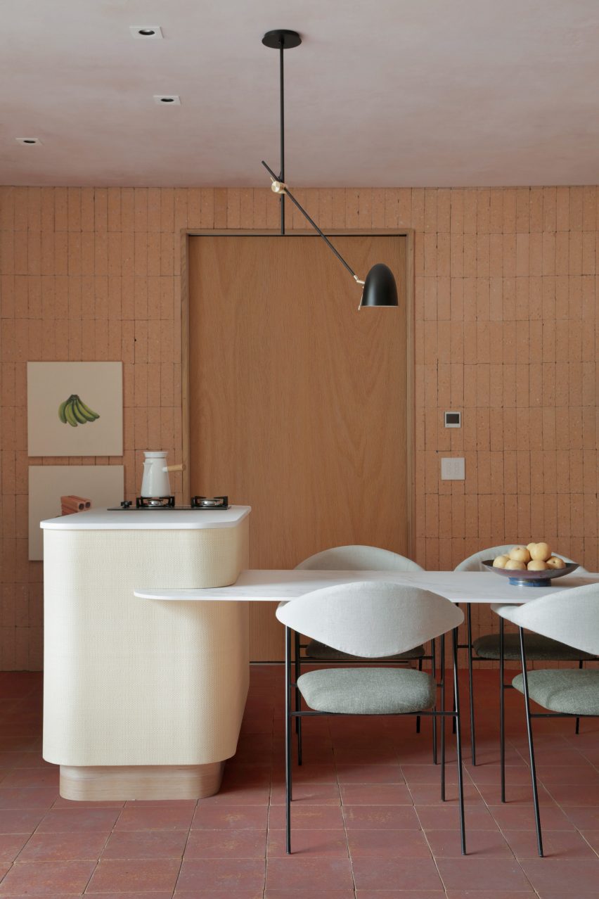
For this lookbook, we’ve collated eight kitchens from Dezeen’s archive that use terracotta tiling to bring a sense of warmth into the functional space.
Terracotta – meaning baked earth in Italian – technically refers to any object made from fired clay. But most commonly, the term is used to describe pottery made from a porous type of earthenware clay that is high in iron oxides, giving it a rusty reddish brown colour.
Unlike ceramic stoneware or porcelain, terracotta is fired at lower temperatures so it does not vitrify – meaning the clay retains a coarse, organic texture and isn’t waterproof unless it is glazed.
Used as a backsplash or flooring, this can bring some much-needed colour and texture into the kitchen while helping to create a connection to the outdoors.
This is the latest in our lookbooks series, which provides visual inspiration from Dezeen’s archive. For more inspiration see previous lookbooks featuring accent walls, bookshelves and sunken baths.
Photo by Prue Ruscoe
Budge Over Dover, Australia, by YSG
Australian studio YSG used narrow terracotta tiles to “draw the outside in” to this house in Sydney, spilling from the floor of the garden patio onto the adjacent kitchen and dining area, which can be opened up to the exterior using sliding glass doors.
The rough clay is paired with shiny aubergine-coloured plaster and travertine in the sunken living room beyond, creating a contrast between raw and polished surfaces.
Find out more about Budge Over Dover ›
Photo by Mariell Lind Hansen
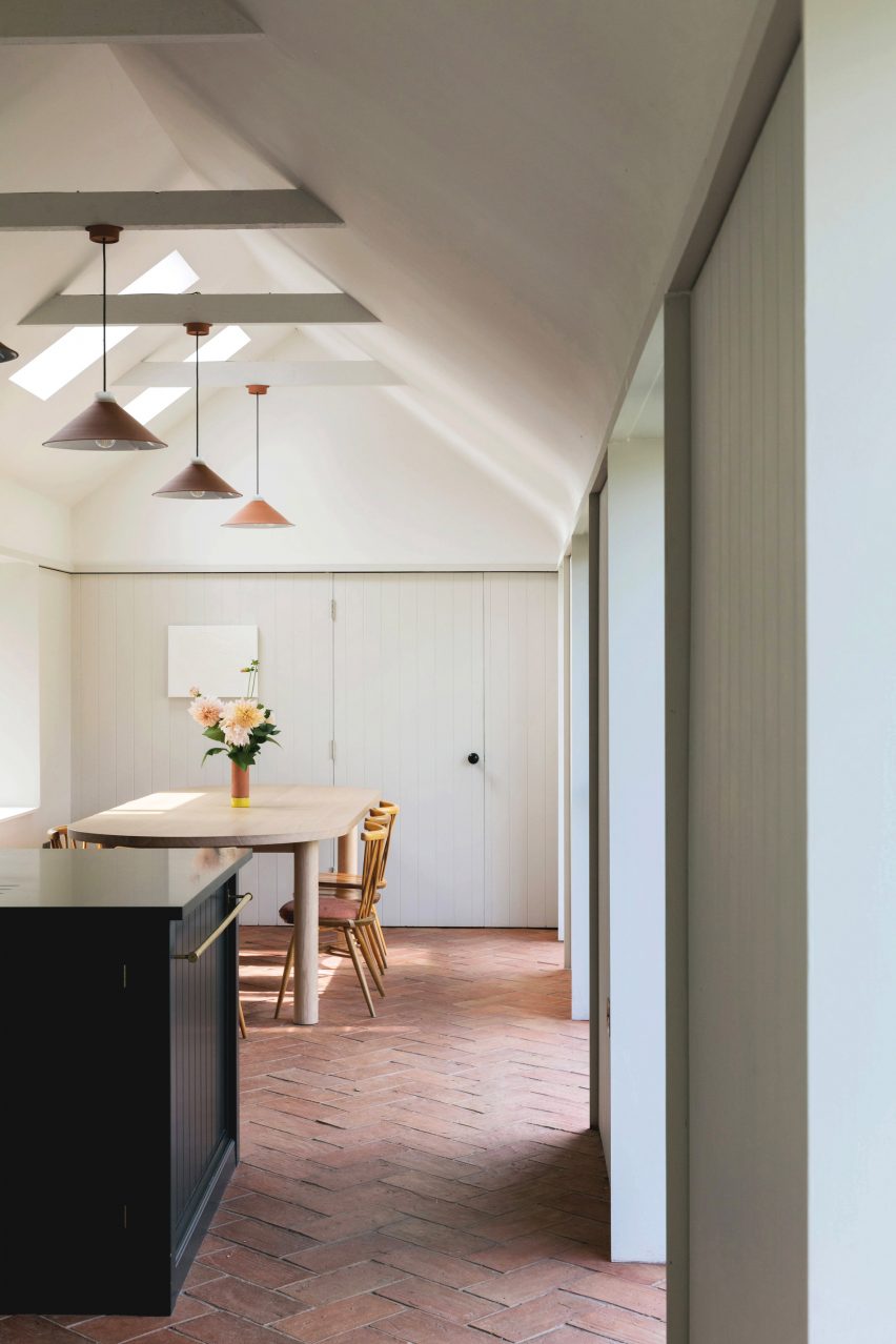
Farley Farmhouse, UK, by Emil Eve Architects
When Emil Eve Architects added a gabled kitchen to a farmhouse in Wiltshire, the British studio set out to mirror the material palette of the existing home by adding arrowhead terracotta tiles to the extension’s exterior.
Inside, matching rectangular tiles were laid in a herringbone pattern on the floor while a row of clay pendant lights hang from the wooden roof beams.
Find out more about Farley Farmhouse ›
Photo by Denilson Machado
Hygge Studio, Brazil, by Melina Romano
Terracotta flooring and tan brick walls lend a “rustic charm” to this São Paulo apartment, designed by Brazilian designer Melina Romano.
The tiles spill out across the entire home including the bedroom and lounge, which is framed by a screen made of decorative perforated cobogó blocks.
Find out more about Hygge Studio ›
Photo by José Hevia
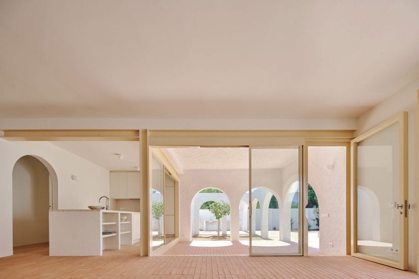
Las 3 Marías, Spain, by Bajet Giramé and Nicolas Burckhardt
All-over terracotta flooring was one of the ways that Spanish studio Bajet Giramé found to connect the kitchen of this 1960s holiday home to its generous backyard, alongside the addition of generous arched openings and perforated steel doors.
“We ended up working on the whole plot, treating both house and garden as a playful matrix of varied interconnected rooms,” the studio told Dezeen.
Find out more about Las 3 Marías ›
Photo by Adrià Goula
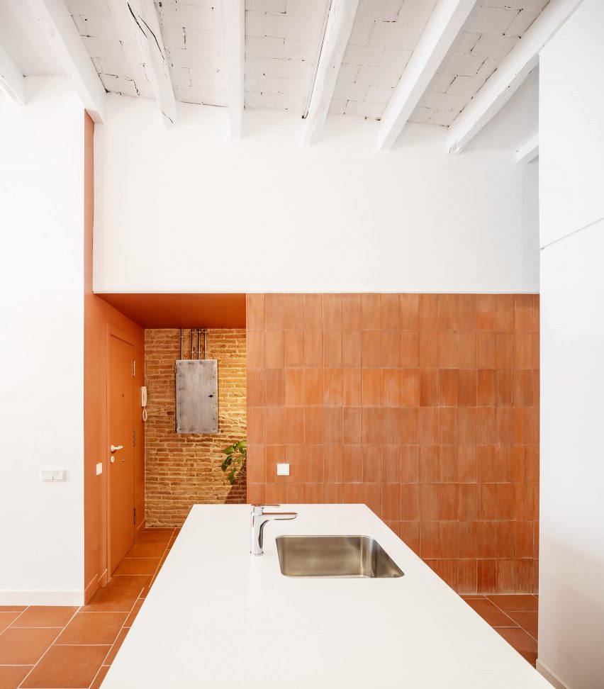
La Odette, Spain, CRÜ
To create a bright, open floor plan inside this apartment in a Barcelona housing block that dates back to 1877, Spanish studio CRÜ tore down most of the internal petition walls
Instead, the kitchen is now delineated by a statement wall clad in terracotta tiles – left over from the flooring and turned back-to-front to reveal their ribbed underside.
Find out more about La Odette ›
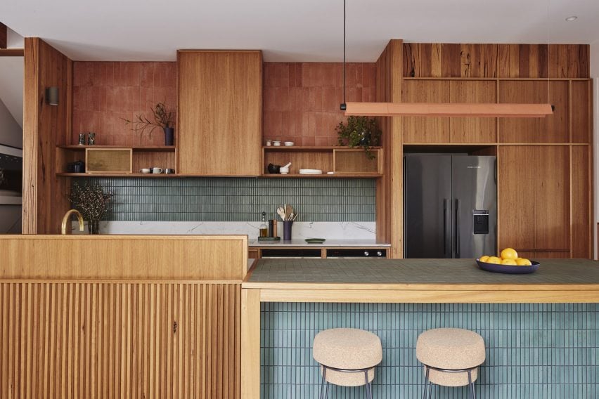
West Bend House, Australia, by Brave New Eco
Three kinds of tiling provide textural interest inside the kitchen of this “forever home” in Melbourne, with sections of rustic terracotta contrasted against a backsplash of teal-glazed ceramics.
Corrugated tiles were also folded around the pendant light above the island that illuminates the work area, courtesy of Australian lighting brand Southdrawn.
Find out more about West Bend House ›
Photo by Conrad Brown
Como Taperia, Canada, by Ste Marie
Both the seating area and the open kitchen of this Spanish tapas bar in Vancouver were lined with terracotta, in a nod to the brick chimneys of Barcelona’s industrial Poble Sec power station.
Other Catalan references can be found in the restaurant’s cobalt blue accents – informed by the paintings of Joan Miró – and various abstract details that nod to the work of architect Antoni Gaudí.
Find out more about Como Taperia ›
Photo by German Sáiz
Conde Duque apartment, Spain, by Sierra + De La Higuera
Different spaces in this open-plan apartment in Madrid were defined by traditional Moroccan zellige tiles, with glossy yellow and green glazes and organic handcrafted surfaces.
To balance out these flashier surfaces, terracotta was used to ground the kitchen and dining area, paired with plain white walls and custom timber joinery.
Find out more about Conde Duque apartment ›
This is the latest in our lookbooks series, which provides visual inspiration from Dezeen’s archive. For more inspiration see previous lookbooks featuring accent walls, bookshelves and sunken baths.
Industrial-looking living spaces with Crittal-style windows and doors are the focus of this lookbook, which includes an apartment in Israel and a rural Chinese house.
Crittal-style windows and doors are characterised by their gridded metal frames, traditionally made of steel with a bold black finish.
They are modelled on the iconic Crittal windows by ironmonger Francis Henry Crittall, which were developed in the late-19th century and became a feature in many art deco and modernist buildings.
Today they are seeing a resurgence in popularity, with their clean graphic lines bringing an industrial quality to contemporary homes around the world.
This is the latest in our lookbooks series, which provides visual inspiration from Dezeen’s archive. For more inspiration see previous lookbooks featuring striking accent walls, stylish bookshelves and tranquil sunken baths.
Photo is by Felix Mooneeram
Ghost House, UK, by BPN Architects
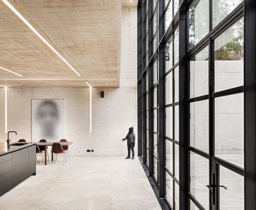
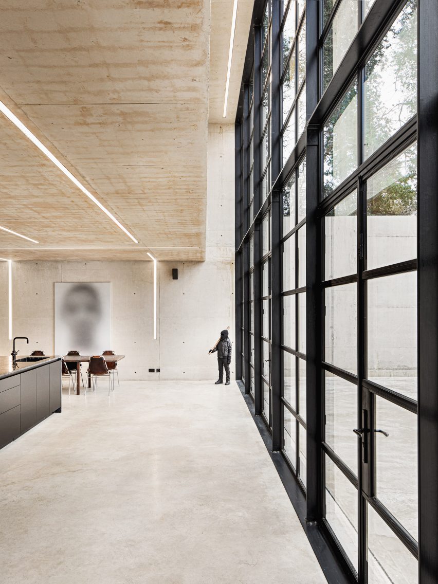
This double-height Crittall-style window doubles as the wall to an open-plan living and dining room in an industrial concrete house in Warwickshire, England.
It is one of several steel-framed windows that enclose the home, which was designed by BPN Architects to have an “ethereal presence” – leading to it being named Ghost House.
Find out more about Ghost House ›
Photo is by 181
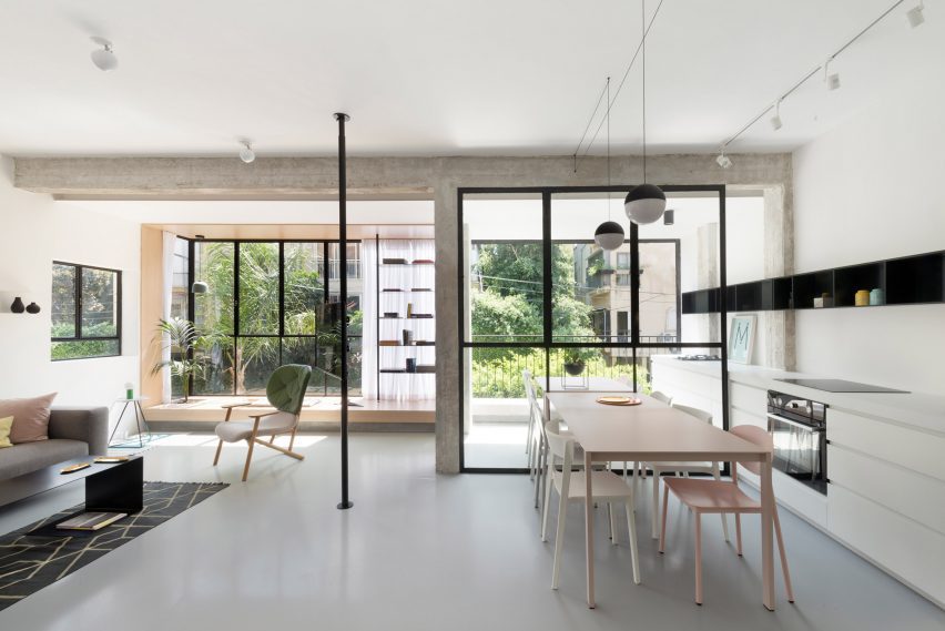
Tel Aviv apartment, Israel, by Maayan Zusman and Amir Navon
Interior designer Maayan Zusman and architect Amir Navon opted for gridded black window frames when renovating this apartment in Tel Aviv.
Complemented by other delicate black furnishings, the windows form part of a wider design strategy that centred on creating an interior that felt “airy yet framed”.
Find out more about the Tel Aviv apartment ›
Photo is by Wu Yong-Chang
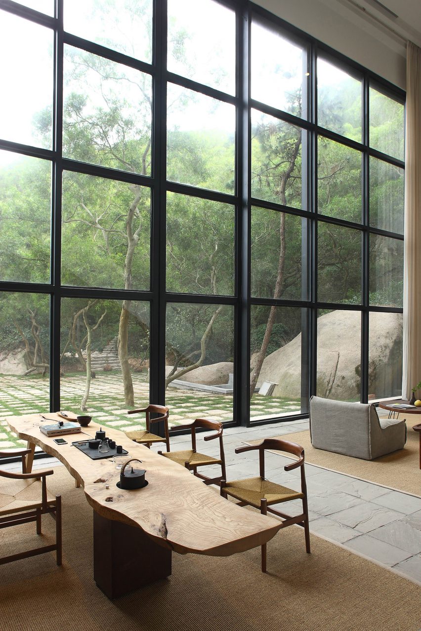
Returning Hut, China, by Xu Fu-Min
The Returning Hut is a two-storey home just outside the city of Xiamen in China, designed by Xu Fu-Min to offer their client a peaceful retreat where they can connect with nature.
Among its key features is an open living room with a giant wall of glazing. Lined with gridded metal frames, it slides open to create a seamless connection to the garden.
Find out more about Returning Hut ›
Photo is by Johan Dehlin
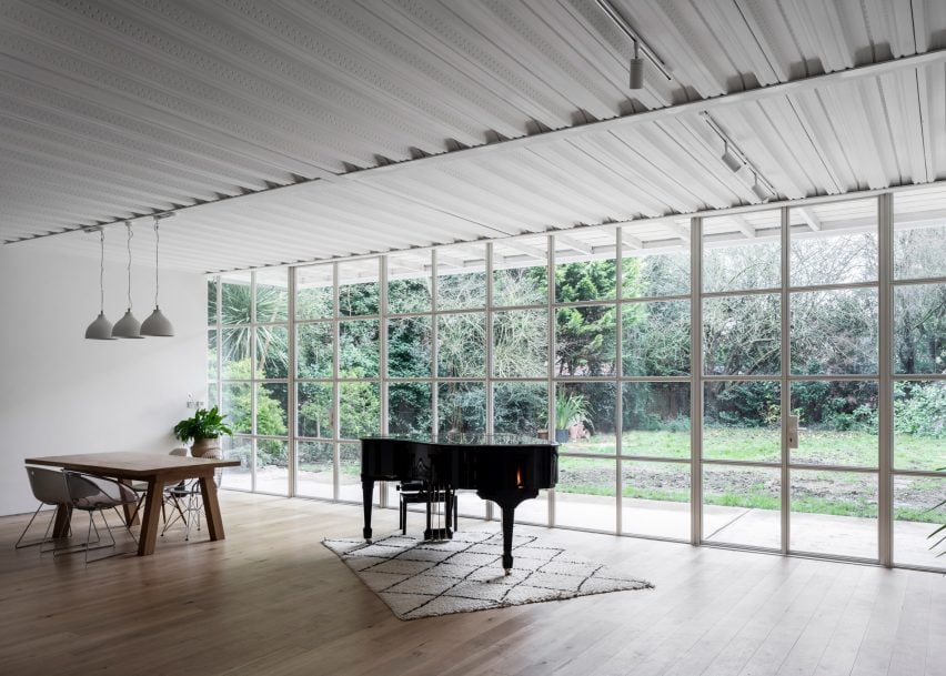
Ditton Hill House, UK, by Surman Weston
Surman Weston honoured its “client’s love for all things industrial” when creating the Ditton Hill House, a London residence with an exposed steel frame that nods to mock-Tudor homes nearby.
This steel framework enabled the studio to create spacious, column-free interiors, such as this open-plan living area. Here, Crittal-style windows overlook the garden and are paired with exposed steel floor decks for a warehouse-like aesthetic.
Find out more about Ditton Hill House ›
Photo is by Greta Rybus
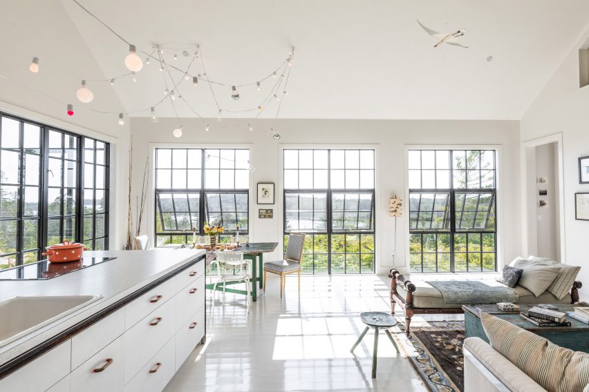
Little Peak, USA, by Berman Horn Studio
Black gridded windows and doors puncture the facade of Little Peak, a holiday home that the founders of Berman Horn Studio, Maria Berman and Brad Horn, built themselves on an island in Maine.
According to the duo, they were chosen for their industrial look and to help “bring focus onto the textures and colours of the stone, huckleberry, bay and lichen that surround the house”.
Find out more about Little Peak ›
Photo is by Ståle Eriksen
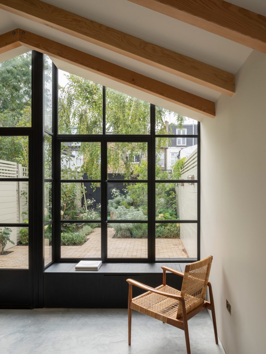
Burnt House, UK, by Will Gamble Architects
These Crittal-style windows and doors help to create a minimalist aesthetic for the Burnt House, a residential extension that Will Gamble Architects has modelled on a Japanese tea house.
They are intended to evoke a shoji screen and were complemented by a large window seat finished in blackened wood that sits up against the glazing.
Find out more about Burnt House ›
Photo is by Trieu Chien
Binh Thuan House, Vietnam, by MIA Design Studio
MIA Design Studio used white gridded frames on the sliding doors at the Binh Thuan House in Vietnam.
The steel frames were complemented by its industrial all-white structure, which is modular and designed for easy modification or expansion in the future.
Find out more about Binh Thuan House ›
Photo is by William Abranowicz
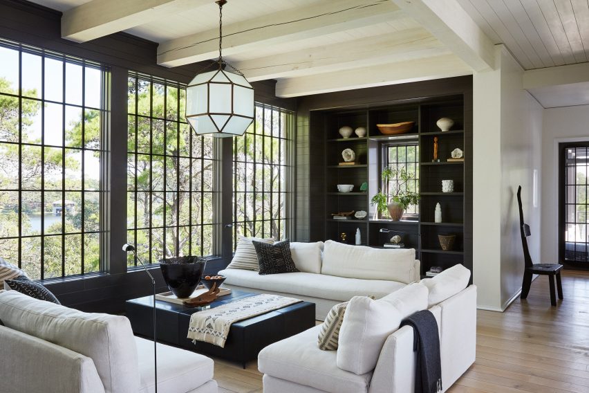
Harrison Residence, USA, by Jeffrey Dungan Architects
These black Crittal-style windows form the focal point of the living space at the Harrison Residence, a home in Florida designed by Jeffrey Dungan Architects.
Framing the surrounding tall trees, the windows help bring colour into the otherwise monochrome interior, which features black shelving and a coffee table, and white walls and sofas.
Find out more about Harrison Residence ›
This is the latest in our lookbooks series, which provides visual inspiration from Dezeen’s archive. For more inspiration see previous lookbooks featuring striking stylish bookshelves and tranquil sunken baths.