Moxy hotel lobby with motorcycle
CategoriesInterior Design

Yabu Pushelberg references multi-faceted LA culture in conjoined hotels

Canadian design studio Yabu Pushelberg has created the Moxy and AC Hotel in Downtown Los Angeles to encapsulate a variety of references to the surrounding city.

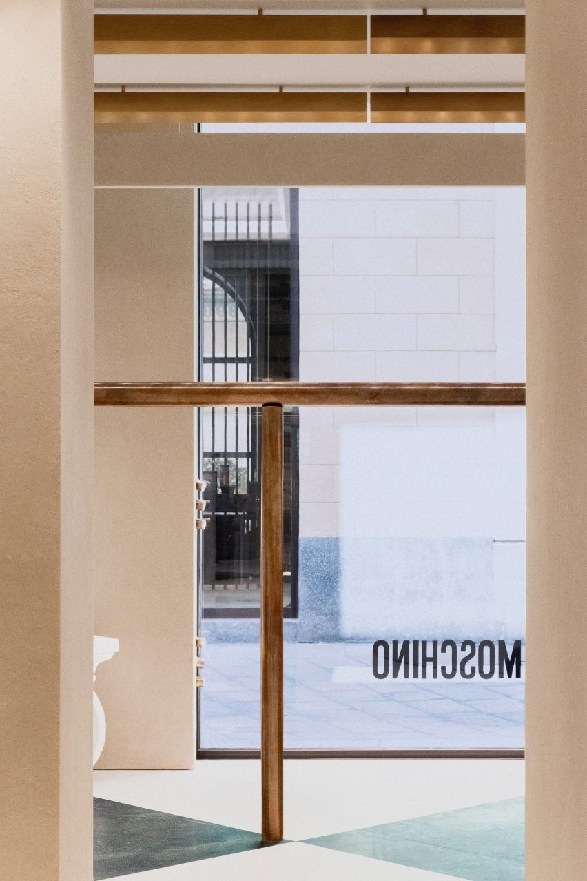
The two hotels were placed side by side within a Gensler-designed building in central Los Angeles, with Yabu Pushelberg carrying out the design for both hotels.

The designers used a variety of LA-oriented references across both hotels, referencing local artist culture, streetlife, the desert, as well as the imagery of movies from Hollywood.

Moxy hotel lobby with motorcycle
The Moxy Hotel in Downtown Los Angeles was designed based on deserts and cinema

“Moving making and the California Dream are all mashed up together to create this atmosphere,” studio co-founder George Yabu told Dezeen.

We also captured the grittiness,” added co-founder Glenn Pushelberg. 

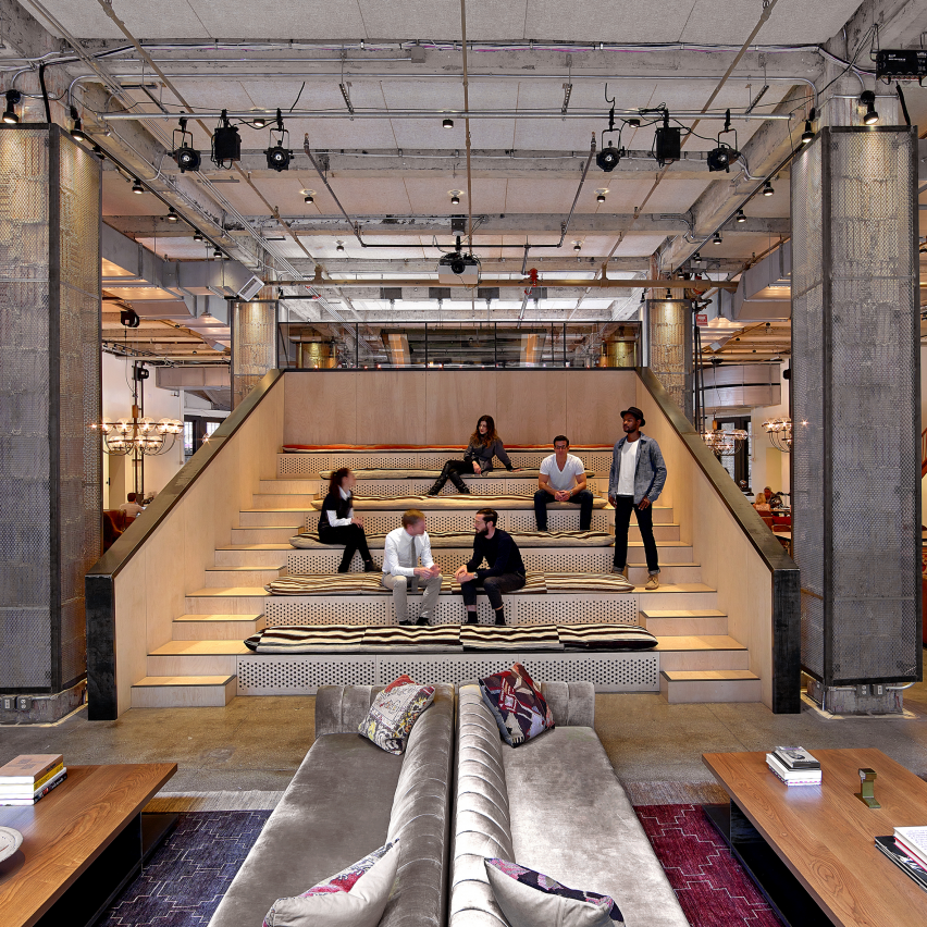
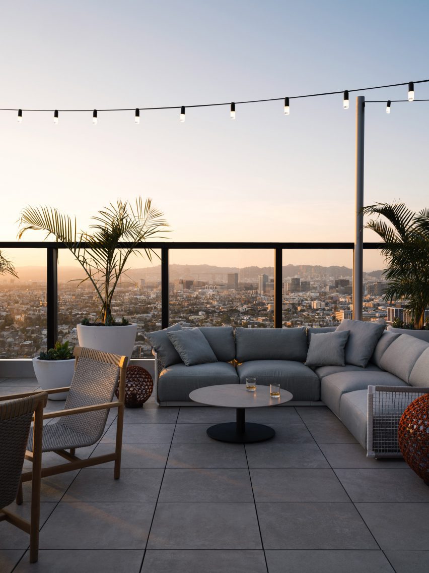
The hotels were designed to complement each other, providing various experiences for guests, who the team hopes can be staying in one while visiting the bars and restaurants of the others.

Moxy Hotel Los Angeles lobby
Yabu Pushelberg wanted to challenge guests with a sense of “grittiness”

According to the duo, the hotels are meant to be the day and nighttime versions of the same person or “like the same person in different movies”.

AC Hotel provides a more work-oriented vision and the Moxy representing a more dimly lit atmosphere.

Plush furniture in Moxy lounge
The Moxy includes lounge areas with plush furniture

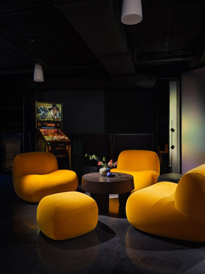
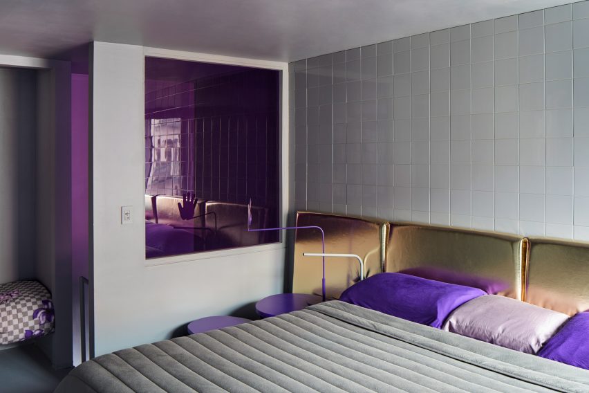
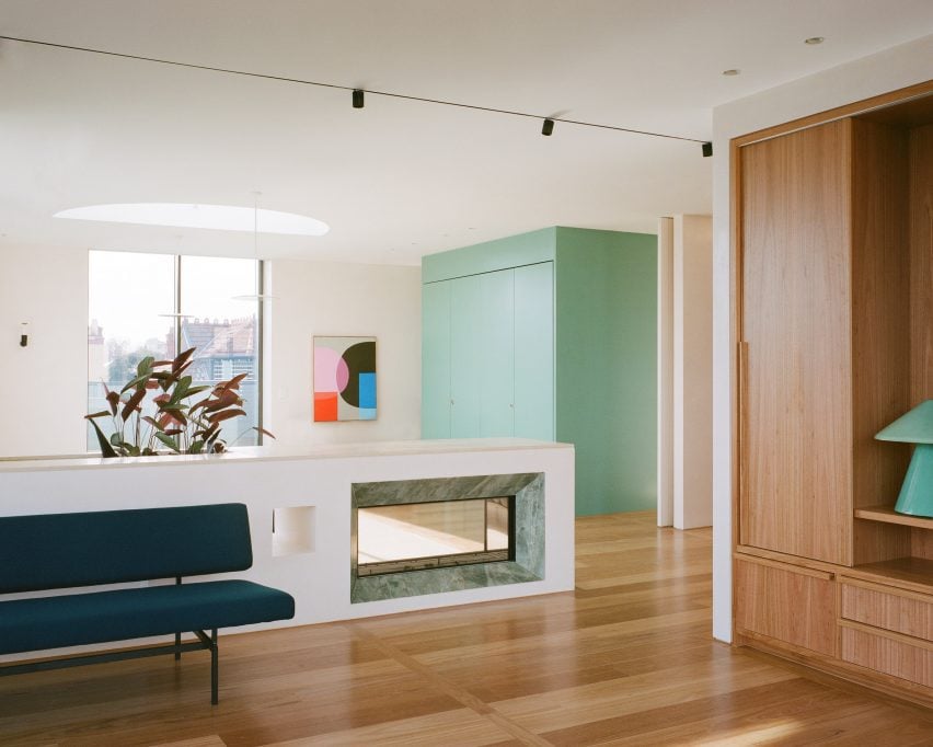
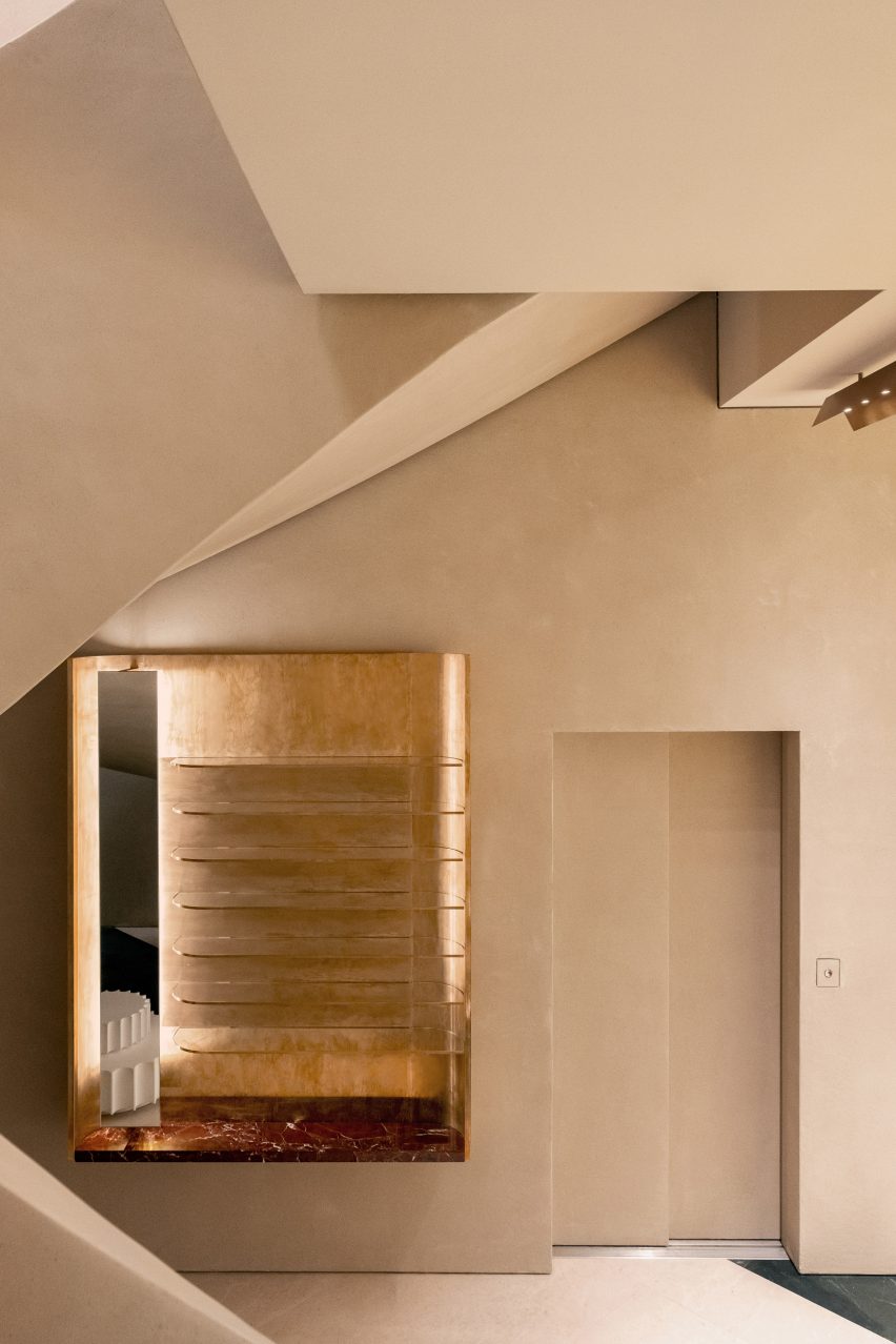
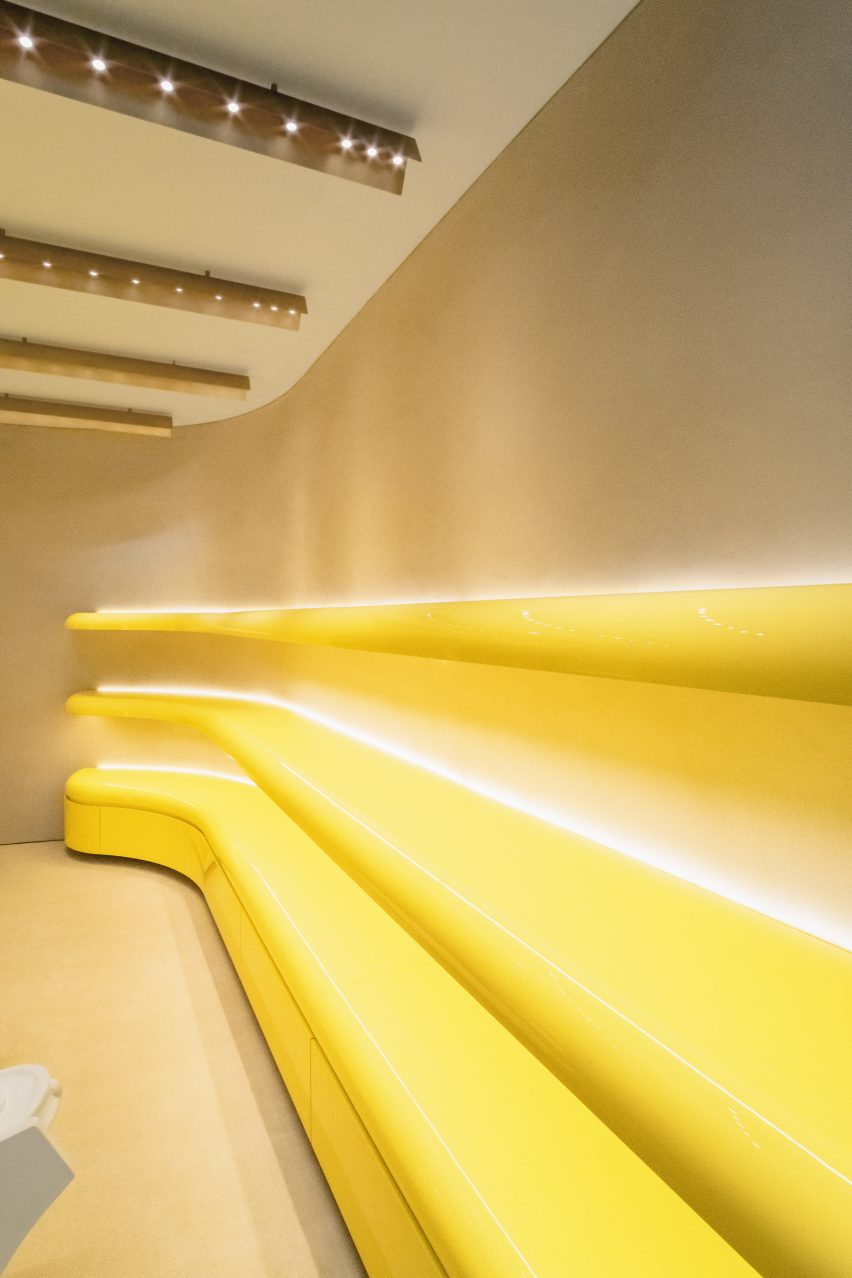
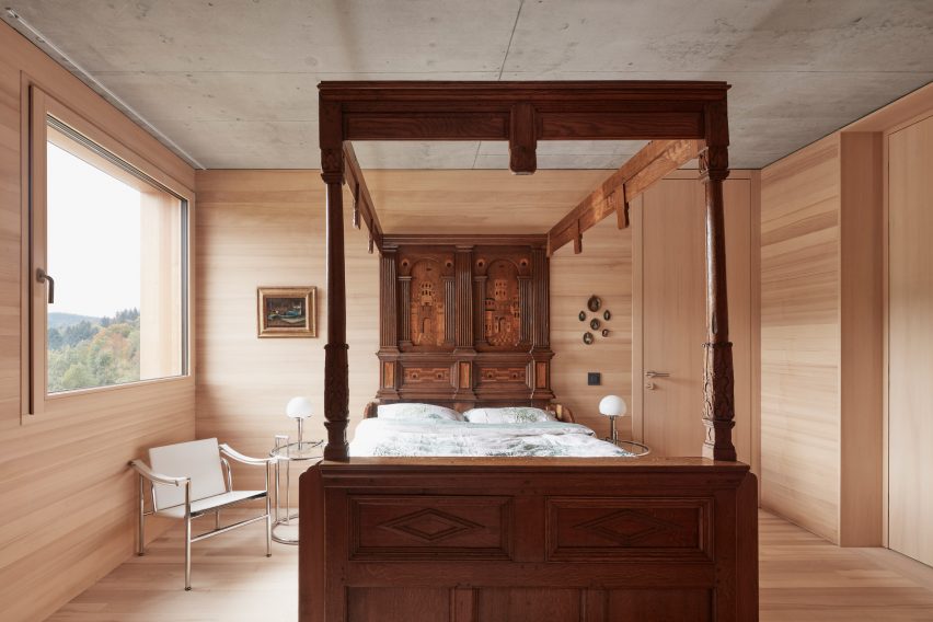
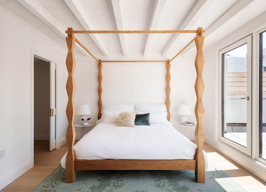
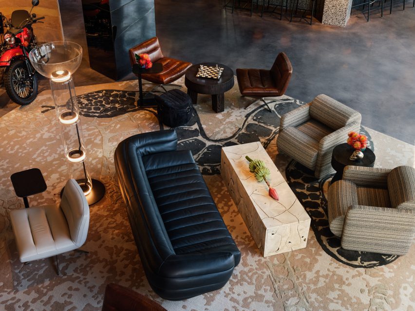
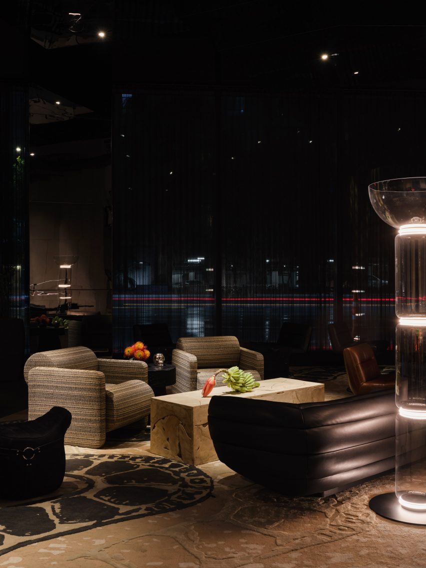
Using desert themes and references to the 1969 film Easy Rider starring Peter Fonda, the Moxy has rammed earth walls, woven wall hangings and homages to motorcycle culture with a custom pouf designed with Harley Davidson in mind. It even has a motorcycle in the lobby lounge.

“If you look at the materialities and colors and textures, it is kind of off-off, which makes it on,” said Pushelberg. 

AC hotel with custom Yabu Pushelberg rug and wall hanging
AC Hotel is more restrained

Also in the Moxy’s lobby is a snakeskin-like carpet with a graphic of a snake.

The hotel includes studio spaces above the lobby with neon lights and plush furniture; minimal rooms with tile and stone walls; and a bar inspired by the “roadside gas station” with mottled stone countertops, metal mesh liquor cabinets and “cocoon-like” chairs.

Black table in Hotel AC Los Angeles
The AC Hotel is meant to evoke the artist’s loft

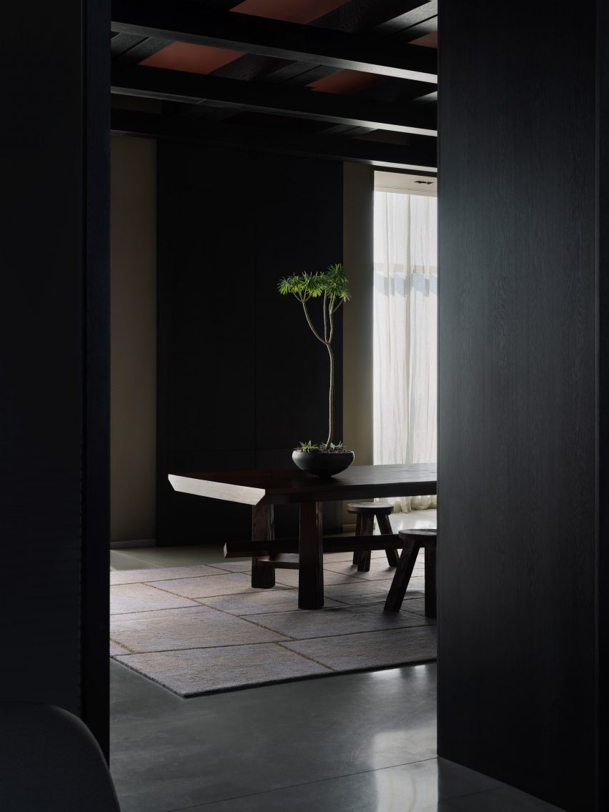
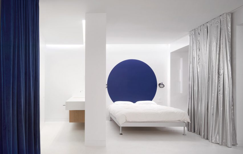
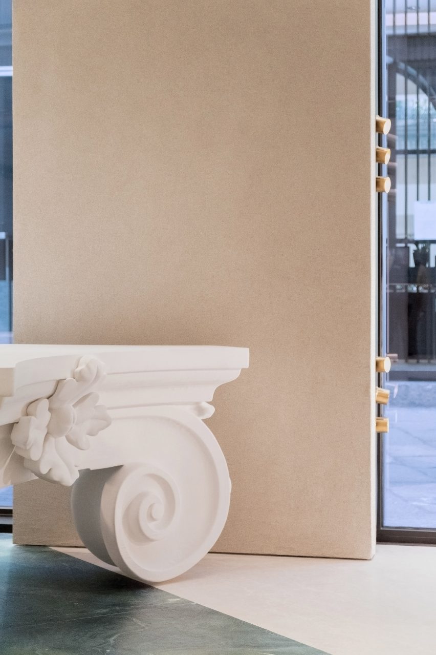
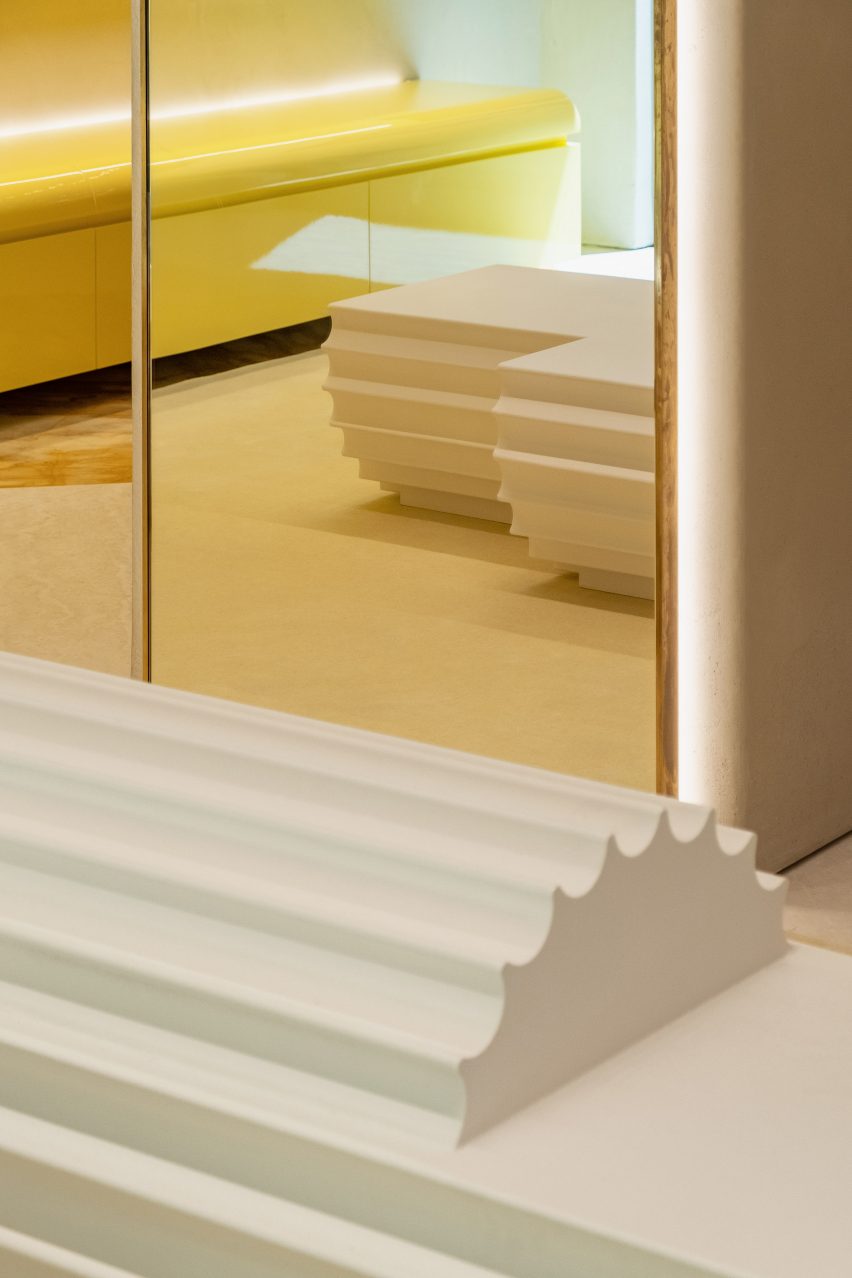
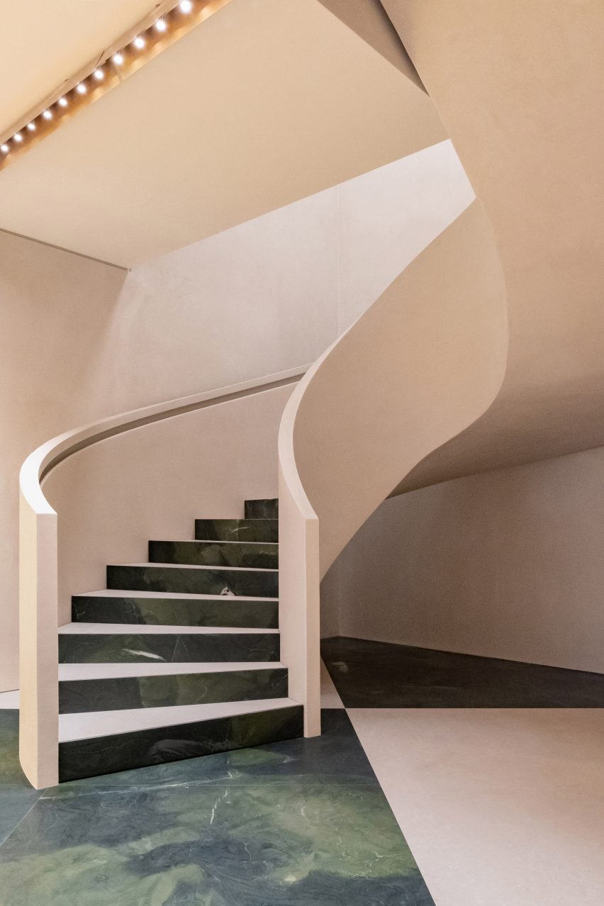
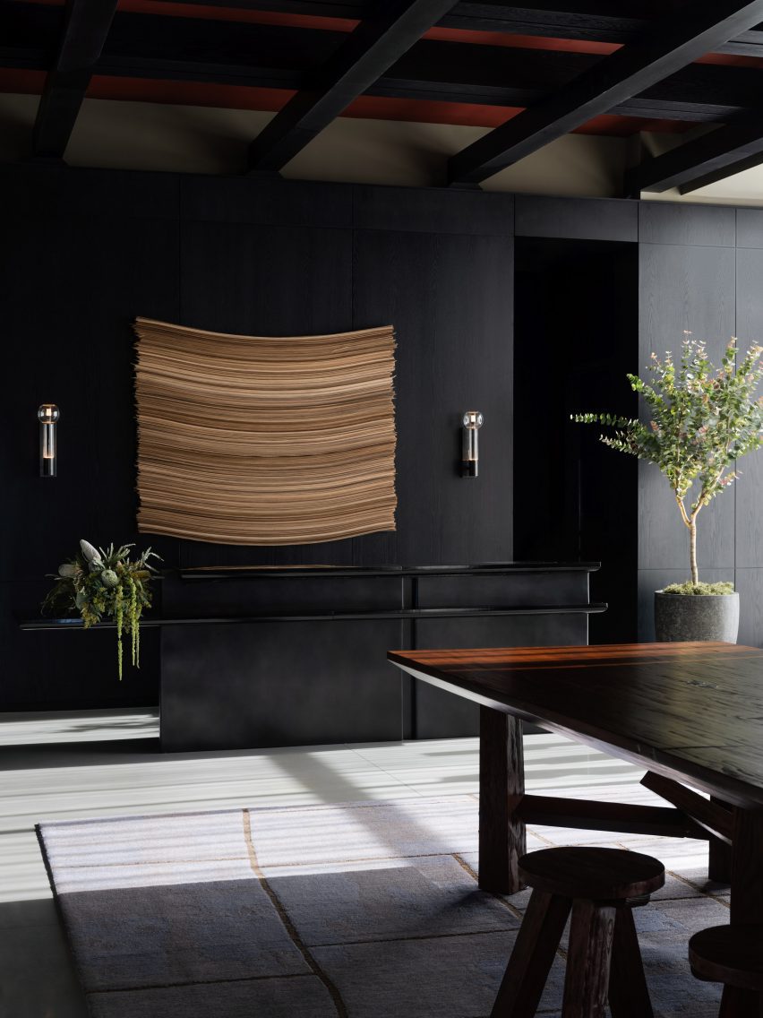
The AC Hotel is more restrained. The lobby is on the 34th floor and was designed to evoke the “artist’s loft” with views of the city below. Materials were inspired by Spanish architecture – such as textured plaster and stucco.

These details continue throughout the bars, guestrooms and library lounge, with the addition of wooden sculptures and dark black tile.

Yabu Pushelberg designed the carpets in the guest rooms to “reflect the geometric pattern and color story found throughout the hotel” and contrast the birch wood flooring.

According to the team, the hotels together are meant to bring together a variety of local influences to attract people to the downtown core.

“It’s a ​​perfect time for the hotels to be there because all these different types of people have never ever had a reason to go downtown,” said Pushelberg, who referenced the growing gallery scene in the area as an additional inspiration.

Hotel AC lobby overlooking Los Angeles
The AC’s lobby is on the 34th floor of the building

The design follows a slew of other hotels designed for LA’s downtown, including Hotel Per La designed by Jaqui Seerman, which occupies a 1920s bank building.

A division of Marriot, Moxy has dozens of hotels around the world, including a recent addition in New York’s Lower East Side designed by Michaelis Boyd and Rockwell Group.

Reference

Nobu Hotel Barcelona by Rockwell Group
CategoriesInterior Design

Five key projects by architect and Dezeen Awards judge David Rockwell

New York architect David Rockwell has joined Dezeen Awards 2023 as a judge. Here, he selects five projects that best reflect his studio’s work.

Architect and designer Rockwell is the founder of US practice Rockwell Group. He aims for his work to “help facilitate storytelling, community-building and memory-making”.

“The core value I try to bring to all my work is empathy,” Rockwell told Dezeen.”I approach each decision from the perspective of those who will inhabit the spaces.”

Projects spanning “theatre, hospitality and the public realm”

“Working in the theatre has been an incredible training ground for strengthening my own capacity for empathy,” said Rockwell.

“Our work falls into three main categories: theatre, hospitality and the public realm,” he continued. “Rockwell Group has been fortunate to work across a diverse range of project types, from restaurants, hotels, schools and offices to museum installations, Broadway sets and theatres.”

The New York-based office is currently working alongside architectural firms Ennead Architects and SmithGroup to convert a museum at 555 Pennsylvania Avenue in Washington DC into an academic building for Johns Hopkins University,.

Rockwell Group is also designing several restaurants in New York City, including collaborations with Ethiopian-born Swedish-American chef Marcus Samuelsson and French restauranteur Daniel Boulud, as well as an outpost for the international Taiwanese restaurant group Din Tai Fung.

Rockwell among Dezeen Awards 2023 judges

Dezeen Awards 2023 launched last month in partnership with Bentley Motors. On Tuesday we announced five more Dezeen Awards judges, including interior designers Kelly Behun and Martin Brudnizki and architects Lara Lesmes, Jayden Ali and Rooshad Shroff.

Submit your entry before the standard entry deadline on Thursday 1 June. Click here for more entry information.

Read on to find Rockwell’s views on the five projects that best represent the work of his studio.


Nobu Hotel Barcelona by Rockwell Group
Nobu Hotel in Barcelona, Spain

Nobu

“Our work with Chef Nobu Matsuhisa started 29 years ago when we designed his now iconic restaurant in Tribeca.

“Chef Nobu’s innovative cooking, as well as his origins in the Japanese countryside, inspired an irresistible narrative we got to weave into our design.

“All these years later, we are still reinventing Nobu – as both a restaurant and hotel brand – in cities worldwide. It is, without question, one of the most significant collaborations of my career. “


Mott St ChinaTown DineOutNYC by Rockwell Group

DineOut NYC, New York City, USA

“We conceived our pro-bono project DineOut NYC at the height of the pandemic. Covid-19 had completely devastated our restaurant industry.

“In addition to providing over 300 thousand jobs for New Yorkers, I have always had a strong personal attachment to this sector.

“Designed in collaboration with the NYC Hospitality Alliance, DineOut is an adaptable, modular outdoor dining system. The project helped end our era of isolation by bringing people together again and getting restaurants back on their feet.

“Design is most meaningful to me when it fosters community and I feel like we made a real impact doing just that with DineOut NYC.”

Read more about DineOut NYC ›


Hayes Theatre by Rockwell Group
Photo by Paul Warchol

Hayes Theater and Take Me Out, New York City, USA

“In 2018 we renovated the 100-year-old Hayes Theater, Broadway’s most intimate venue with only 600 seats.

“In addition to instilling the historic space with a modern, approachable design vocabulary, we also needed to accommodate the staggering technical demands of modern productions.

“Last year we had the chance to put our work to the test when we designed the sets for the revival of Take Me Out at the Hayes. Had the theatre been unable to meet our technical needs, I’d have had no one to blame but myself. Thankfully, I was a very satisfied customer.”


Neuehouse NYC by Rockwell Group

NeueHouse Madison Square, New York City, USA

“When it opened 10 years ago, NeueHouse Madison Square was a groundbreaking workspace collective that helped usher in a new typology in which art, life, culture, food, and work converge seamlessly.

“This kind of convergence has taken on profound new meaning in our late-stage pandemic era, in which people are craving bespoke, communal experiences.”

Read more about NeueHouse Madison Square ›


TED Vancouver by Rockwell Group

TED Theater

“Our portable TED Theater [for nonprofit foundation TED Talks] is approaching its 10th anniversary this year and it remains a great experiment in the power of ephemeral, shared experiences.

“The attention to detail recalls permanent works of architecture but its flexibility allows it to adapt and evolve as TED does.”

All images courtesy of Rockwell Group unless stated otherwise.

Dezeen Awards 2023

Dezeen Awards celebrates the world’s best architecture, interiors and design. Now in its sixth year, it has become the ultimate accolade for architects and designers across the globe. The annual awards are in partnership with Bentley Motors, as part of a wider collaboration that will see the brand work with Dezeen to support and inspire the next generation of design talent.

Reference

Heat 360 House in Ukraine
CategoriesInterior Design

Eight eclectic interiors enhanced by striking accent walls

Blotchy slate tiles, playfully patterned murals and a single oversized circle form these eye-catching interior accent walls that we have collected for our latest lookbook.

An accent or feature wall is one that differs in colour, material or texture from the other walls that surround it. Accent walls can feature in both interior and exterior locations.

Architects and designers often use these statement walls to delineate different spaces in a room, or simply to create striking and joyful interior details.

From a New York apartment to a Helsinki teahouse, here are eight eclectic interiors defined by eye-catching accent walls.

This is the latest in our lookbooks series, which provides visual inspiration from Dezeen’s archive. For more inspiration see previous lookbooks featuring offbeat bakeries, inviting entrance halls and homes with split-level living areas.


Heat 360 House in Ukraine
Photo is by A Avdeenko

Heat 360, Ukraine, by Azovskiy & Pahomova Architects

This house in the Dnepropetrovsk region of Ukraine features a bedroom with a dark slate-tile wall defined by dramatic rust blotches.

Azovskiy & Pahomova Architects made the adjacent wall from floor-to-ceiling glazing that illuminates the room’s earthy-hued interiors.

Find out more about Heat 360 ›


Interiors of Polychrome House, designed by Amber Road
Photo is by Prue Ruscoe

Polychrome House, Australia, by Amber Road and Lymesmith

An abstract mural packed with colourful geometric shapes covers one of the walls in the living space at Polychrome House in Sydney.

The bold interiors are enhanced by graphic paved floors and a mismatch of bright furniture in hues ranging from burnt orange to sea green.

Find out more about Polychrome House ›


Harry Nuriev and Tyler Billinger Residence
Photo is by Dylan Chandler

New York apartment, USA, by Harry Nuriev and Tyler Billinger

Designer Harry Nuriev and partner Tyler Billinger – both of Crosby Studios – renovated their New York home with Nuriev’s “signature boldness”.

A white-tiled accent wall features in the otherwise colourful bedroom, which features a plush gold-lame headboard and ultraviolet elements including a hand-shaped bedside lamp.

Find out more about this New York apartment ›


Minimal interiors of Teemaa teahouse in Helsinki, designed by Yatofu
Photo is by Aleksi Tikkala

Teemaa, Finland, by Yatofu

A combination of traditional flat bricks and grooved bricks comes together in the tasting room of Helsinki’s Teemaa teahouse to create an eclectic accent wall.

Design studio Yatofu aimed to reference the raw tactility of tea leaves when creating the interiors, which are also characterised by elements of oak and oxidised steel.

Find out more about Teemaa ›


Bedroom of Casa A12 in Madrid
Photo is by José Hevia

Casa A12, Spain, by Lucas y Hernández-Gil

The white floors and sheets in the bedroom suite at Casa A12 form a neutral backdrop for a large cobalt blue dot circle that creates a playful feature wall.

Local studio Lucas y Hernández-Gil added various other space-delineating accents to the Madrid apartment, including swathes of silvery curtains and corrugated metal partitions.

Find out more about Casa A12 ›


Shkrub by Sergey Makhno Architects
Photo is by Serhii Kadulin

Shkrub, Ukraine, by Sergey Makhno

Built by architect Sergey Makhno for him and his family, the Shkrub house includes a feature wall made up of rows of rounded ceramic tiles that resemble jumbo fish scales.

These were made from several types of clay finish that were usually mixed with flax seeds, rye and wheat in accordance with Ukrainian traditions.

Find out more about Shkrub ›


Chelsea Pied-à-Terre by STADT Architecture
Photo is by David Mitchell

Chelsea Pied-à-Terre, USA, by Stadt Architecture

Decadence takes centre stage at this renovated New York apartment in the form of a green bedroom mural that is “dripping” with globules of gold paint.

Covering an entire wall and moving up into the ceiling, the design was created by Brooklyn-based Calico Wallpaper and references the lush nature of Vancouver’s Stanley Park – a location that is meaningful to the dwelling’s Canadian occupants.

Find out more about Chelsea Pied-à-Terre ›


Leaf-patterned wall in white bedroom
Photo is by Alexandria Hall

582 Rydon Street, London, by Moxon Architects

British studio Moxon Architects renovated a Victorian townhouse in north London’s Islington area by adding a sunken garden and minimalist interiors.

Throughout the home, subtle reminders of its early 19th-century history were inserted into the design. These include a floral gridded feature wall in the primary bedroom.

Find out more about 582 Rydon Street ›

This is the latest in our lookbooks series, which provides visual inspiration from Dezeen’s archive. For more inspiration see previous lookbooks featuring offbeat bakeries, inviting entrance halls and homes with split-level living areas.

Reference

Salmon pink kitchen in Melbourne apartment by Office Alex Nicholls
CategoriesInterior Design

Office Alex Nicholls creates multi-generational apartment with its own spa

Architecture studio Office Alex Nicholls has fused two penthouse apartments in Melbourne into one large flexible home, converting their basement parking spots into a private spa and pool.

Adaptability was key to the home in Melbourne’s Elsternwick suburb, which needed to provide enough space for a multi-generational family as well as accommodating visiting relatives in guest rooms that double up as studies.

Salmon pink kitchen in Melbourne apartment by Office Alex Nicholls
Office Alex Nicholls fused two apartments to create Elsternwick Penthouse

“Spaces were designed to adapt to a multitude of uses, with flexible working and living spaces as well as areas that could expand for large groups or contract to provide intimate settings,” the studio’s founder Alex Nicholls told Dezeen.

Office Alex Nicholls was brought on board while the apartment block was still under construction and was able to make significant changes to suit his clients’ needs – improving the layout, adding skylights and up-speccing on key details like the windows.

Wooden staircase inside Elsternwick Penthouse
Timber staircases lead to the roof garden

“The design intent was to create variety and different spatial experiences across a very expansive and potentially monotonous floorplan,” Nicholls said.

“I wanted to create a light yet grounded and natural-feeling space that was contrasted with some stronger formal elements such as sculptural skylights and coloured functional volumes.”

Timber storage and staircase in Melbourne apartment by Office Alex Nicholls
A “library spine” runs through the apartment to provide storage

To navigate this vast apartment, Nicholls devised a central “library spine” – a corridor running the entire length of the apartment that houses the family’s collection of books, art and artefacts while creating an opportunity out of what could have been a dark and monotonous space.

“The idea for the library spine was born from a storage requirement of the clients,” the architect said. “However, it became a key architectural intervention.”

“From a practical standpoint, it allowed everything to be easily accessible and displayed but it also helps to draw people through the apartment and celebrate the two staircases to the roof garden at either end.”

Living room of Melbourne apartemnt by Office Alex Nicholls
Oculus skylights funnel sunlight into the interior

To provide vital light to the heart of the apartment and enhance the two main living spaces, Nicholls designed a series of circular and semi-circular oculus skylights, which reference the clients’ love of Elsternwick’s art deco architecture.

“They create a sense of movement and symmetry in the composition of otherwise rectilinear volumes,” he explained.

The apartment has three kitchens, partly to meet the family’s religious requirements and partly to allow the different generations who are sharing the apartment to enjoy their own independence.

Described by Nicholls as a series of “magic boxes”, each monolithic kitchen is defined by one vivid colour. This helps to delineate spaces and provides a counterpoint to the otherwise warm and natural material palette, which includes Blackbutt timber and Gosford sandstone.

Turquoise kitchen in Elsternwick Penthouse
The apartment has three colourful kitchen units

“The kitchens were designed to be largely concealed within these coloured volumes to give each one more spatial presence while ensuring the apartment did not feel too kitchen- and appliance-heavy as a result of the clients’ complex requirements,” Nicholls said.

In the basement, Nicholls turned the penthouses’ lift-accessed parking spots into a private 100-square-metre wellness space that features a fitness pool, sauna, kitchenette, changing rooms and a flexible rehabilitation area.

Basement spa with pool in Melbourne flat by Office Alex Nicholls
Nicholls also converted the apartments’ parking spots into a private spa

To make up for the lack of natural light in this subterranean space, Nicholls deployed atmospheric indirect lighting and a warm colour palette.

“Lighting the space via a datum of timber niches helped give the spa a restorative atmosphere, enhanced by the use of natural materials such as sandstone, timber, terracotta and lime render,” he explained.

Timber sauna in Elsternwick Penthouse basement
The spa is home to a timber sauna

Elsternwick is a thriving suburb in the southeast of Melbourne, brimming with buzzy shops, restaurants and bars.

Among them is the Hunter & Co Deli, whose interiors were informed by the cold cuts on offer, and the minimal Penta cafe with its monolithic concrete counter.

The photography is by Rory Gardiner.

Reference

Infinite mirror reflections in pale pink Glossier store
CategoriesInterior Design

Glossier Boston store features pastel green mouldings

Decorative architectural mouldings are recreated in pastel green to frame openings at the Boston store for the cosmetics brand Glossier.

Designed by the company’s in-house team, the permanent Glossier Boston location on the city’s bustling Newbury Street follows a pop-up at the Seaport in 2019.

Infinite mirror reflections in pale pink Glossier store
Mirrors positioned to face one another create infinite reflections at the Glossier Boston store

For the space, the designers took influences from historic local architecture and Boston’s status as a college student hub, with Harvard University and MIT located just over the Charles River in Cambridge.

“With our 10th Glossier location, we wanted to bring something special to the city that honors its metropolitan and scholastic personality,” said the team. “Our influences for Glossier Boston’s design include collegiate fashion and the decorative characteristics of Boston’s local architecture.”

Glossier logo affixed to pale pink wall
The brand’s signature pink hue covers the walls

They also cited the “blush pink stucco, verdant green stone and verdant plant life” of the nearby Isabella Stewart Gardner Museum, which is modelled on a Venetian palazzo, as a source of inspiration for the store interior.

Glossier’s signature Millennial pink shade covers the walls, while cased openings are framed with stylised versions of architectural mouldings found on neighbouring buildings.

Product display in front of large mirror
Products are displayed on wavy trays

Mirrors are positioned to face one another in order to create infinite reflections of customers testing makeup and skincare products.

The merchandise is displayed on the wavy trays, cylindrical displays and rectangular tables found in many of Glossier’s stores.

Soft seating
The store is Glossier’s 10th permanent retail location

Pale wood floors contribute to the soft colour palette, while bright lighting is designed to be flattering.

On the exterior, the tall windows and brass doors are surrounded by marble panels and bronze detailing.

These details contrast the pale hues inside.

“There is also a large step-back from the curbside, filled with lush trees that invite visitors to connect and hang out,” the team said.

Brass doors
Stylised versions of historic architectural mouldings frame cased openings

When Glossier launched in 2014, it became known for its pop-up stores that opened across the US.

The temporary spot that the company installed in Seattle, which was filled with plant-covered mounds, was named small retail interior of the year at the 2020 Dezeen Awards.

Glossier Boston store exterior
The store’s marble and bronze exterior contrasts the interior colour scheme

The brand has since opened permanent locations in cities including Seattle, Los Angeles and London.

All of these share a similar aesthetic and colour scheme, with subtle differences that nod to the specific location and context.

The photography is by Brian W Ferry.

Reference

Eye Eye retail space with cutout ceiling to add extra height
CategoriesInterior Design

Glass blocks divide Eye Eye optical store by Best Practice Architecture

Local studio Best Practice Architecture has used punchy colours, glass bricks and dichroic glass inside an optometry store in Seattle’s Leschi neighbourhood.

For Eye Eye‘s second location, founder Will Pentecost got back in touch with Best Practice Architecture, which had completed the brand’s first brick-and-mortar store back in 2015.

Eye Eye retail space with cutout ceiling to add extra height
Cutouts in the low ceiling add extra height to the Eye Eye retail space

Unlike the inaugural space, the new store does not benefit from tall ceilings and a strong street presence.

So the architects had to get creative to turn the “drab” commercial building into a fun and inviting environment.

Glass block partitions divide the store
Glass block partitions are angled to create a more dynamic space

“The client gave Best Practice free range to transform the interior with only three requests: include glass blocks, use lit signage, and incorporate design language from the original location without being too repetitive,” said the studio.

The retail area is situated at the front of the space, facing the street through large windows, while the examination rooms and staff facilities can be found at the back.

Glasses displayed on shelves with the glass block partitions
Niches in the partitions contain mirrors and product displays

The specified glass blocks are used to divide the store, forming angled walls with openings that feature mirrors, product displays and furniture that spans both sides.

“Carefully placed to create an interesting circulation flow and contrast with the orthogonal layout, the clever design provides both form and function, welcoming filtered daylight deep into the space while accommodating basic retail needs,” said Best Practice.

Purple banquette beneath illuminated graphic of concentric arcs
A purple banquette is tucked in a corner for casual consultations

Cutouts in the low ceiling add extra height and expose ductwork that is painted purple – a hue that’s repeated in the upholstery of a banquette tucked in the corner for consultations.

More purple covers the walls in the examination reception area, which is separated from the store by a screen of dichroic glass that changes colour depending on the angle from which it’s viewed.

The glass blocks appear again as a partition between the clinic reception and the exam rooms behind, which are outfitted with custom medical equipment and wood cabinetry.

Signage that echoes the original Eye Eye branding is also installed in the retail space, including a concentric circle that echoes vintage eye tests and two large “E” letterforms.

Dichroic glass partition
A dichroic glass screen separates the retail space from the examination area

“With this new space, Best Practice brings Eye Eye’s vision to life once again through an exploration of materiality, the patient experience, and a fresh take on a commercial space,” said the studio. “It’s an eye care clinic reimagined.”

Founded in 2011 by Ian Butcher, Best Practice Architecture has completed a variety of projects in and around its home city of Seattle.

Exam room at Eye Eye
Exam rooms are outfitted with custom medical equipment and wood cabinetry

These range from updating a historic bungalow and transforming a storage shed into backyard studio, to designing a men’s footwear store.

The photography is by Rafael Soldi.


Project credits:

Architect: Best Practice Architecture
Design team: partner in charge: Kailin Gregga; partner/principal architect: Ian Butcher; lead designer/project architect: Sarah Smith
Contractor: Metis Construction
Graphics and branding: Drew Hamlet
Custom signage: Western Neon
Custom casework: Creoworks

Reference

Interior image of the Moschino flagship
CategoriesInterior Design

Moschino store in Millan designed to reference the “history of ancient Italy”

Italian studio Andrea Tognon Architecture has collaborated with former Moschino creative director Jeremy Scott to renovate the brand’s flagship store in Milan.

Located on Via della Spiga, one of Milan’s famed shopping streets, the store sits within the 18th-century Palazzo Perusati, which was recently transformed by real estate company Hines into a luxury retail development.

The store was designed by Andrea Tognon Architecture in collaboration with Scott who aimed to recreate and allude to the history of ancient Italy through a minimalist yet ornamental interior scheme.

Interior image of the Moschino flagship
The Moschino Milan store was designed by Andrea Tognon and Jeremy Scott

“I was inspired by the rich history of ancient Italy and the beauty and decadent opulence of its design,” said Scott.

“Sometimes we start to design from memories, sometimes from form, materials and colours,” added Andrea Tognon Architecture founder Andrea Tognon.

“For this project, I started only from words.”

Photo of the interior of the Moschino Milan store
It is located within a recently renovated retail hub

The Milan flagship spans two floors and covers 380 square metres.

Its ground floor is dedicated to the brand’s women’s ready-to-wear collections and accessories, while its first floor is dedicated to its men’s and kid’s collections.

Photo of the Moschino store
Oversized columns and capitals fill the store

Throughout the interior, Andrea Tognon Architecture used rich materials that speak to Moschino’s baroque flair, which was also highlighted through decorative and oversized architectural elements.

A checkered floor constructed from Botticino marble and green stone, sourced from Brazil, covers the ground floor retail area while the above floors were clad in yellow Siena marble.

A vast stone spiral staircase connects the two floors of retail space and forms a continuation of the oversized checkered floor – with the tread and rise of each step similarly clad in green stone and marble.

Patinated brass lighting stretches rhythmically in horizontal rows across the ceiling of the store. Curving tubular display rails line the boundaries of the interior and were constructed in the same brass finish.

Pale pink spiral staircase
Marble and stone cover the floors

Pops of colour were introduced to the interior through bright yellow lacquered wood shelving that flank the walls of the store and follow its curving profile.

Oversized columns and capitals were placed throughout the interior and function as furniture and display areas for the brand’s products and accessories.

Interior photo of the Milan store
It was designed to reference the ancient history of Italy

Also scattered throughout the store are additional custom furniture pieces that were created by Scott in homage to Moschino’s founder Franco Moschino.

These tables combine two tables which were spliced in the middle, joined together and decorated with marble tops and gold leaf ornamentation.

Photo of shelving at the store
Pops of colours were incorporated throughout the store

Last week news broke that Jeremy Scott was leaving Moschino after a decade-long tenure at the Milanese fashion house. In 2020, Scott replaced models at his Spring Summer 2021 show with puppets that wore the brand’s womenswear collection.

Elsewhere in Milan, London design studios Brinkworth and The Wilson Brothers created a caravan-shaped artist studio for Marni’s flagship store in the Italian city.

The photography is by Adriano Mura.

Reference

Interior of Chatsworth House featuring staircase and benches
CategoriesInterior Design

Chatsworth House exhibition is a “collision of past and present”

An exhibition at Chatsworth House including designers including Michael Anastassiades, Faye Toogood and Formafantasma, features in this video produced by Dezeen for the stately home.

Called Mirror Mirror: Reflections on Design at Chatsworth, the exhibition brings together a collection of furniture and objects displayed throughout and responding to Chatsworth House and its gardens.

In total, 16 international designers and artists created pieces that respond to the interiors of the building.

Interior of Chatsworth House featuring staircase and benches
The exhibition introduces new art pieces and objects into the house and garden

Some responded by sourcing materials from the property itself, while others focussed on themes and ideas taken from decorations within the interiors.

“The designers of the exhibition have responded to Chatsworth in all sorts of fascinating ways,” said co-curator of the exhibition Glenn Adamson.

“Throughout you really see this kind of conversation between the present and the past.”

Jay Sae Jung Oh's throne-like seat wrapped in leather made from musical instruments
Jay Sae Jung Oh designed a throne using musical instruments

The exhibition continues Chatsworth House’s 500-year-long history of working with leading artists and designers and collecting an extensive collection of art and objects.

“An artist’s new work can create a new way of looking at these spaces,” said Chatsworth House Trust director Jane Marriott.

“It can capture their imaginations and hopefully inspire them to explore Chatsworth in a different light.”

Faye Toogood's monolithic stone furniture in the chapel space
Toogood’s monolithic furniture creates a pensive space within the exhibition

British designer Toogood took over Chatsworth’s chapel and adjoining Oak Room. As a nod to the historical use of the space as a place of worship and gathering, she created an installation of monolithic furniture made from bronze and stone.

The sculptural forms were designed to evoke ecclesiastical structures and to reflect the local landscape.

“These objects give a sense of meditative calm, a sense of massiveness or monumentality that feels appropriate to the space,” Adamson said.

Joris Laarman's benches situated in the gardens of Chatsworth House
Dutch designer Joris Laarman designed a series of benches for the exhibition

Two stone benches by Dutch designer Joris Laarman made from locally sourced gritstone , which was the material used to build the house itself, were placed in Chatsworth House’s gardens.

The surfaces of the benches were carved with undulating patterns in which moss and lichen have been planted and will continue to grow over time.

Other objects in the exhibition include a throne-like seat wrapped in leather made from musical instruments by Jay Sae Jung Oh, a fibrous cabinet designed by Fernando Laposse, and sinuous steam-wood sculptures by Irish furniture maker Joseph Walsh.

Agave cabinet by Fernando Laposse
Laposse’s fluffy cabinet is made from agave plant fibres

Another section of the exhibition, which occupy Chatsworth’s Sculpture Gallery built in the early 19th century, features pieces by British designer Samuel Ross.

Ross’s pieces were designed to echo the surrounding sculptures, mimicking their form to invite viewers to imagine the body that would recline on them. The designer has used a material palette of stone and marble to further reflect the sculptures within the gallery.

Samuel Ross's sculptural objects
Chatsworth’s collection contains art and design pieces spanning 4,000 years

“It’s a kind of collision of past and present, of the artisanal with the technological, the classical with the industrial,” Adamson said.

“It’s a great example of how the show in general tries to talk across generations, across centuries.”

Mirror Mirror: Reflections on Design at Chatsworth is on display at Chatsworth House in Derbyshire until 1 October 2023. See Dezeen Events Guide for an up-to-date list of architecture and design events taking place around the world.

Photography is courtesy of the Chatsworth House Trust.

Partnership content

This video was produced by Dezeen for Chatsworth House as part of a partnership. Find out more about Dezeen’s partnership content here.

Reference

House at the Schopfacker by Bernardo Bader
CategoriesInterior Design

Eight bedrooms featuring regal four-poster beds

There’s no symbol of luxury more universal than the four-poster bed. In this lookbook, we select eight bedrooms elevated by their presence.

Beds with vertical columns in each corner supporting an upper panel date back to the medieval period.

Originally built with wraparound curtains to keep out the cold and provide privacy, they have historically been associated with highly ornate designs for nobility.

Today the four-poster bed remains an unmistakable statement piece of furniture, and the list below sees the concept applied to a variety of bedroom settings, from the traditional to the contemporary.

This is the latest in our lookbooks series, which provides visual inspiration from Dezeen’s archive. For more inspiration see previous lookbooks featuring bedrooms with wood panelling, lounges with suspended fireplaces and homes with vaulted ceilings.


House at the Schopfacker by Bernardo Bader
Photo by Adolf Bereuter

House on the Schopfacker, Switzerland, by Bernardo Bader Architects

Austrian studio Bernardo Bader Architects created this reinterpretation of the traditional Alpine chalet in the Swiss village of Trogen for an art and antique furniture collector.

In the bedroom, a grand carved four-poster bed contrasts with contemporary chrome-edged furniture, as well as the concrete ceiling and the pale larch walls and floor.

Find out more about House on the Schopfacker ›


The Ned Hotel by Soho House&Co and Sydell Group
Photo courtesy of Soho House

The Ned, UK, by Soho House and Sydell Group

The Ned is an upscale hotel formed out of a historic London bank originally designed by British architect Edwin Lutyens.

Soho House worked with New York-based Sydell Group to give the bedrooms a 1920s feel, with large, mahogany four-poster beds bearing richly patterned curtains and set among other lavish details like walnut panelling and restored chandeliers.

Find out more about The Ned ›


Hotel Peter & Paul by StudioWTA and ASH NYC
Photo courtesy of StudioWTA and ASH NYC

Hotel Peter and Paul, USA, by StudioWTA and ASH NYC

Crucifixes top the black four-poster beds inside the rooms of this New Orleans hotel as a nod to the building’s past as a church, rectory and convent.

New York Design firm ASH NYC continued the religious iconography with paintings of saints on the walls, while traditional furniture and furnishings give the space a sense of timelessness.

Find out more about Hotel Peter and Paul ›


Villa Pelícanos by Main Office
Photo by Rafael Gamo

Villa Pelícanos, Mexico, by Main Office

This thatch-roof seaside villa overlooking the Pacific Ocean features a rustic four-poster bed hung with gauzy white curtains.

Part of a 1980s holiday village renovated by architecture studio Main Office, the interior marries Mexican materials with South African elements – parota wood furniture sitting among a bright, blank backdrop delivered by the white walls and smooth concrete floor.

Find out more about Villa Pelícanos ›


The Tri-Pod bedroom for a throuple by Scott Whitby Studio
Photo by Nicholas Worley

The Tri-Pod, UK, by Scott Whitby Studio

Designed for a polyamorous throuple, this bespoke boudoir by London-based Scott Whitby Studio has enough space for three people to sleep together comfortably.

The architects chose to reimagine the traditional four-poster as a divider of space as well as a piece of furniture. Above the closable walnut sleeping space is a mezzanine for reading and relaxation.

Find out more about The Tri-Pod ›


The Sackett Street townhouse's main bedroom's hand-crafted bed
Photo by Travis Williams/Travis Mark

Sackett Street townhouse, USA, by The Brooklyn Home Company

The wooden four-poster bed in the main bedroom of this Brooklyn townhouse was designed and hand-crafted by Fitzhugh Karol, a sculptor-in-residence at The Brooklyn Home Company.

It sits in the middle of a bright and airy bedroom with white oak floors, white-painted walls and an adjacent private terrace.

Find out more about this Sackett Street townhouse ›


Henry Howard Hotel by Hunter Mabry Design
Photo courtesy of Hunter Mabry Design

Henry Howard Hotel, USA, by Hunter Mabry Design

Another New Orleans hotel renovation, this time with a sleek black metal four-poster bed that adds a gently modern touch to the rooms.

New York studio Hunter Mabry Design juxtaposed the contemporary bed with antique furnishings and vintage brass instruments that reference the city’s jazz heritage.

Find out more about Henry Howard Hotel ›


Xiang Jiang House by Claesson Koivisto Rune
Photo courtesy of Claesson Koivisto Rune

Xiang Jiang House, China, by Claesson Koivisto Rune

Swedish studio Claesson Koivisto Rune included a modern take on the traditional four-poster bed in this Beijing house that was designed to have a Scandinavian feel.

An oversized plinth provides room for a bedside table lamp, enhancing the sense of tranquility and cosiness in the bedroom among the extra-wide floorboards and pale-wood wall panelling.

Find out more about Xiang Jiang House ›

This is the latest in our lookbooks series, which provides visual inspiration from Dezeen’s archive. For more inspiration see previous lookbooks featuring bedrooms with wood panelling, lounges with suspended fireplaces and homes with vaulted ceilings.

Reference

Bathroom with sunken bath, blue tiled walls and a window overlooking a garden
CategoriesInterior Design

Eight inspirational bathrooms with tranquil sunken baths

For our latest lookbook, we’ve collected eight bathrooms with decorative sunken baths that create a relaxing atmosphere.

Sunken baths are bathtubs that have been sunk into the bathroom floor, decks or patios. They can help to save space in the bathroom and to create a luxurious spa-like feeling.

In this lookbook, we’ve gathered inspirational sunken bathtubs in homes from South Korea to Ukraine, including a peaceful sunken bath on a wood patio and a bath clad in green tiles.

This is the latest in our lookbooks series, which provides visual inspiration from Dezeen’s archive. For more inspiration see previous lookbooks featuring offbeat bakeries, minimalist Tokyo apartments and interiors with natural materials and timeless accents.


Bathroom with sunken bath, blue tiled walls and a window overlooking a garden
Photo by Rohan Venn

Sydney extension, Australia, by Emily Sandstrom

Architect Emily Sandstrom’s extension to a 1930s bungalow in Sydney includes a bathtub that was sunk below floor level.

Clad in small black and grey tiles, the bath was informed by Japanese bathing rituals and also has timber decking that covers the drainage points for an overhead shower. Glass sliding doors provide restful garden views.

Find out more about the Sydney extension ›


The Preston Hollow by Specht Architects
Photo by Casey Dunn

The Preston Hollow, US, by Specht Architects

The Preston Hollow was designed to reference brutalist architecture and its clean concrete lines are visible in the interior, too, including in the minimalist bathroom.

Here, a sunken bathtub blends into the wood floor. Marble details and a sculptural chair add decorative, organic touches to the spartan space.

Find out more about The Preston Hollow ›


Sunken bathtub in Australian house
Photo by Rob Maver

Bruny Island Cabin, Australia, by Maguire + Devin

This wood-lined off-grid cabin in Tasmania comes with two decks to let the owner enjoy both the sunset and the sunrise. The western deck, which provides views of the sunset, has a cosy, sunken outdoor bathtub.

The tub can be hidden under removable decking panels when it is not in use.

Find out more about Bruny Island Cabin ›


Nuwa guesthouse by Z_Lab
Photo by Texture on Texture

Nuwa guesthouse, South Korea, by Z_Lab

This tiny guesthouse (above and main image) in Seoul, South Korea, is located in a small alley in the city’s Seochon neighbourhood. Inside, the serene living spaces are finished in neutral colours.

The living space features a long walnut table with a rough stone base. Next to it sits a sunken bath in which guests can wash their feet.

Find out more about Nuwa guesthouse ›


Palma Hideaway by Mariana de Delás
Photo by José Hevia

Palma hideaway, Spain, by Mariana de Delás

In the all-white bathroom of this Spanish apartment, the floor has been raised in order to accommodate a sunken bath that was lined with green tiles also used elsewhere in the project.

A white marble sink and a couple of green plants add decorative details.

Find out more about Palma hideaway ›


Wabi sabi apartment by Sergey Makhno
Photo by Andrey Avdeenko

Family apartment, Ukraine, by Sergey Makhno

Japanese influences were blended with Ukrainian design in this family flat in Kyiv, Ukraine.

A bathroom with a sunken bath and garden views is divided from the main bedroom by a gridded Crittall-style glass wall. A small bonsai tree on the floor and a stone sink create a natural feel in the bathroom.

Find out more about the family apartment ›


Cottage by Panovscott

Sydney cottage, Australia, by Panovscott

The bathroom inside this Australian cottage extension has four alcoves in different sizes and walls and floors made from compressed cement.

A sunken bath made from a single piece of concrete is merged into the floor.

Find out more about the Sydney cottage ›


Sunken Bath by Studio 304
Photography by Radu Palicica

Sunken Bath, UK, by Studio 304

This glazed bathroom, called Sunken Bath, was added to a Victorian terraced house in east London by local designers Studio 304.

The bathing area is enclosed by glass walls and a glass roof and features a sunken bath designed to follow the Japanese ritual of bathing.

Find out more about the Sunken Bath ›

This is the latest in our lookbooks series, which provides visual inspiration from Dezeen’s archive. For more inspiration see previous lookbooks featuring offbeat bakeries, minimalist Tokyo apartments and interiors with natural materials and timeless accents.

Reference