Dining room in Gaga's Coast restaurant
CategoriesInterior Design

Linehouse creates Coast restaurant with “Mediterranean soul” in Shanghai

Design studio Linehouse has used natural, tactile materials for the interiors of the Coast restaurant in Shanghai for China’s casual dining brand Gaga.

The restaurant is set inside a traditional mid-century Shikumen house – a blend of Western and Chinese architecture – with a renovated interior informed by its Mediterranean menu.

“We aimed to create a deep connection with coastal elements and Mediterranean soul,” said Linehouse co-founder Alex Mok.

Dining room in Gaga's Coast restaurant
Linehouse has completed the Coast restaurant in Shanghai

According to the studio, the restaurant’s aesthetic is one of “refined rusticity” – a contemporary reframing of rough-hewn vernacular styles, that creates a laid-back and tranquil atmosphere.

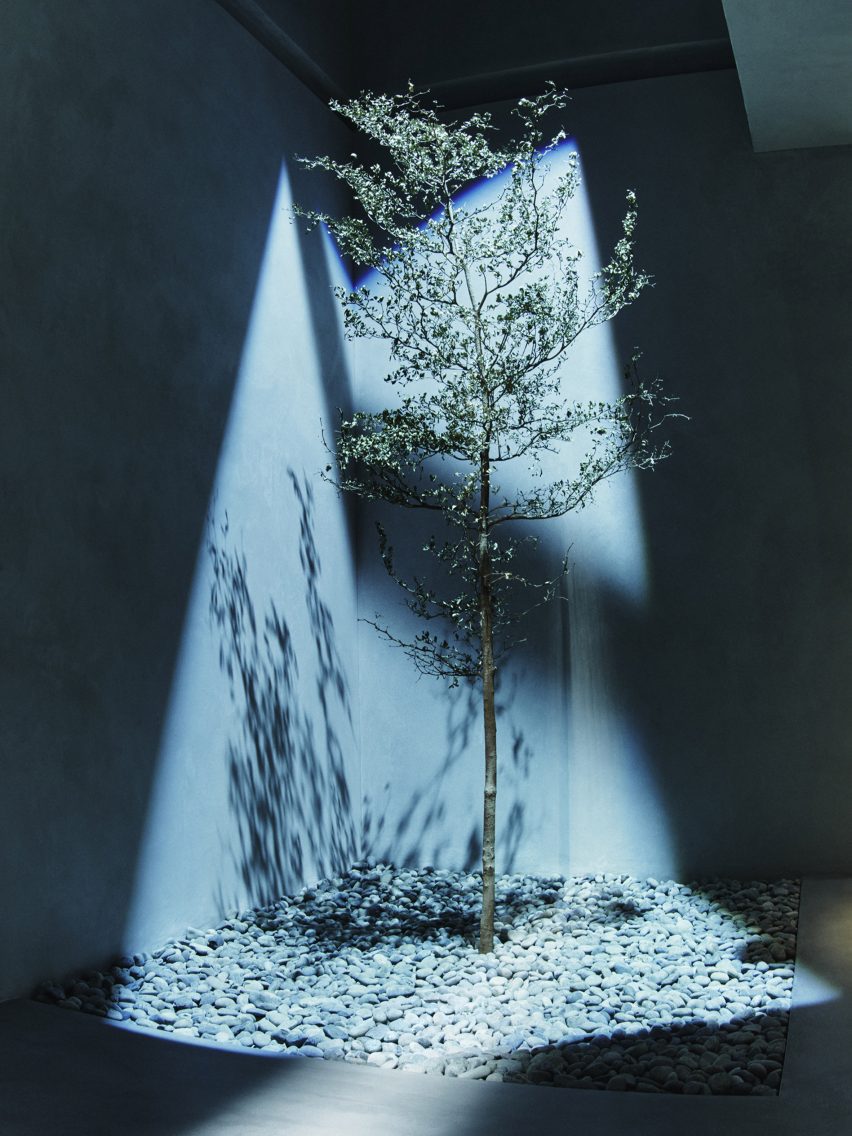
Throughout the scheme, Linehouse was informed by the idea of coastal terrain, including earthy and fired elements.

Linehouse chose a natural material palette, which in turn informed the colour scheme that flows throughout the interior of the three-storey restaurant.

Green-tiled cafe in Shanghai designed by Linehouse
Green-glazed lava stone surrounds the ground-floor cafe and bar

The aim was to take the visitor on a “vertical journey” by giving each of the three floors its own unique identity.

“The colours and materials shift on each floor, telling a different part of the story,” Mok said.

Bar in Gaga's Coast restaurant
The bar is finished in the same tiles

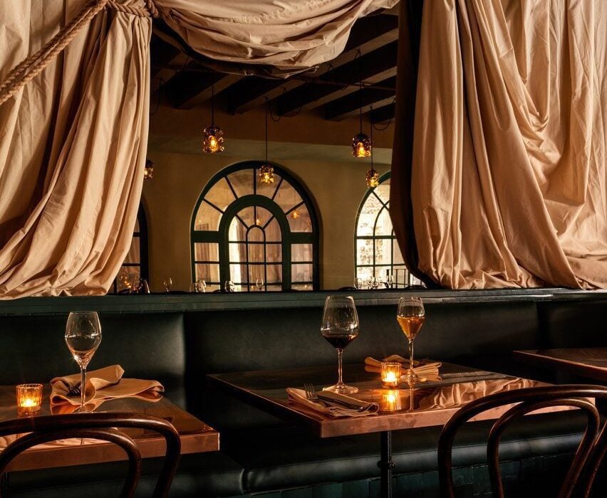
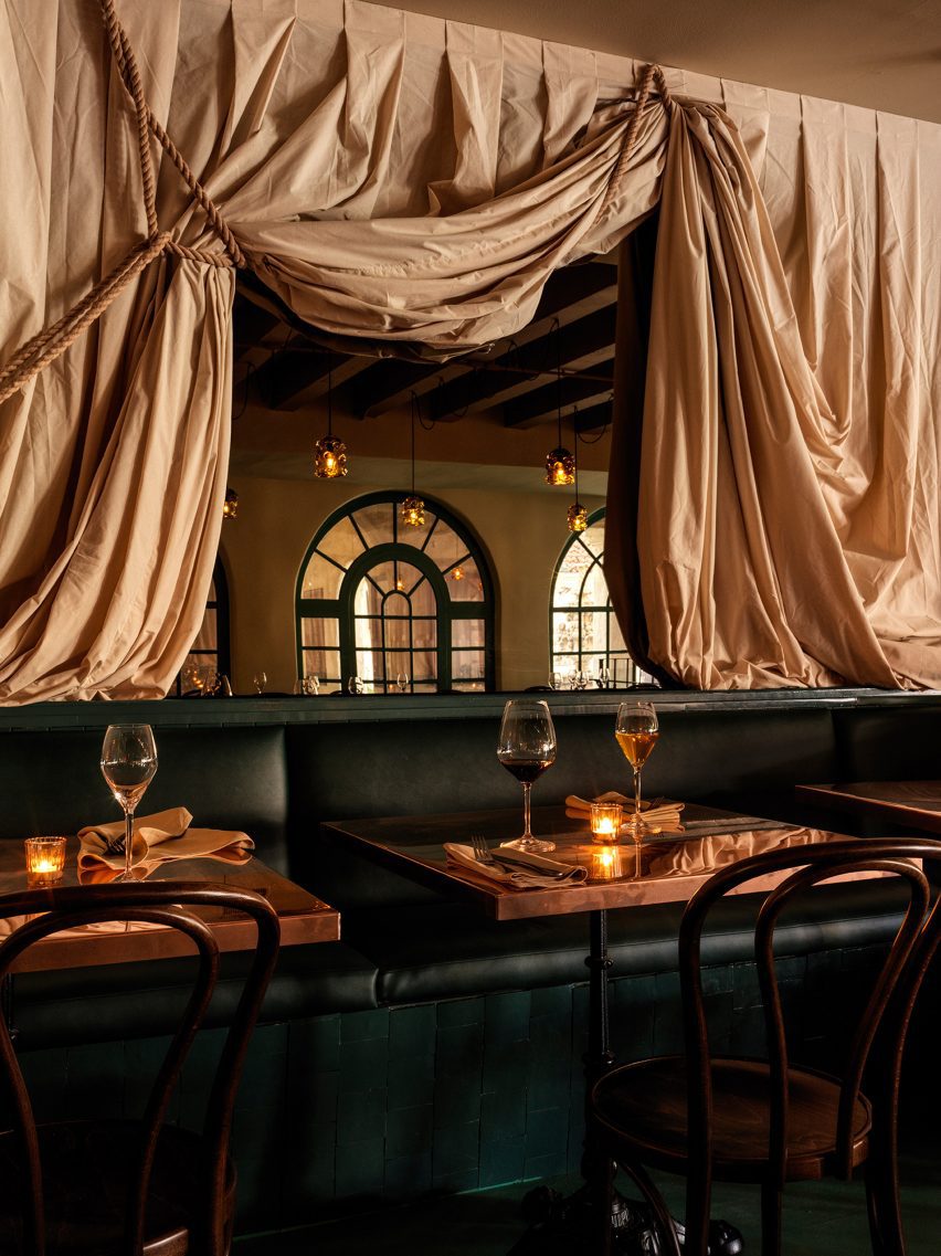
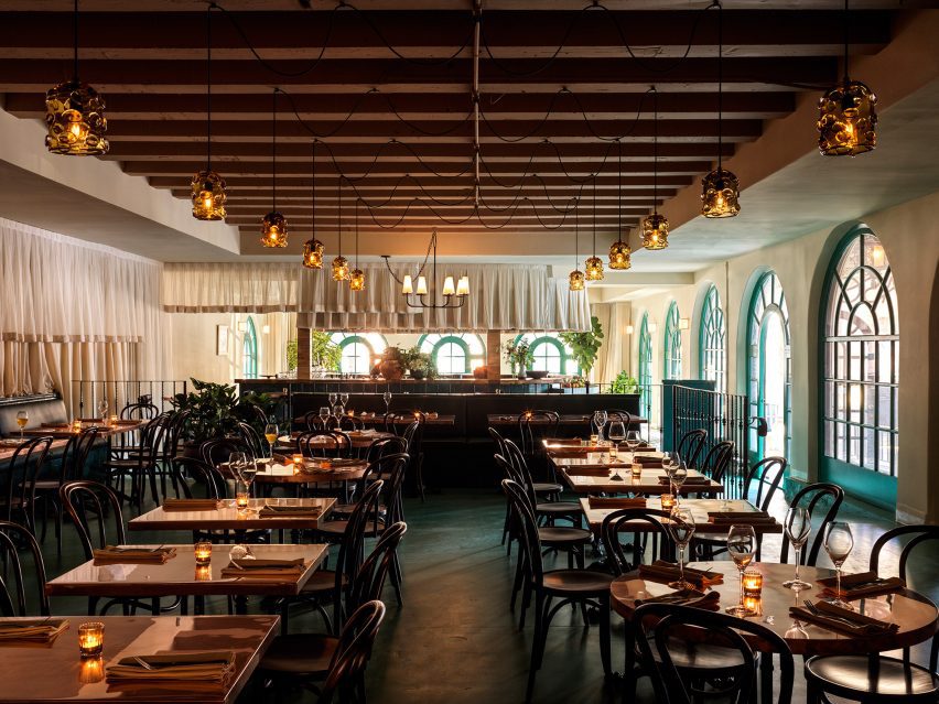
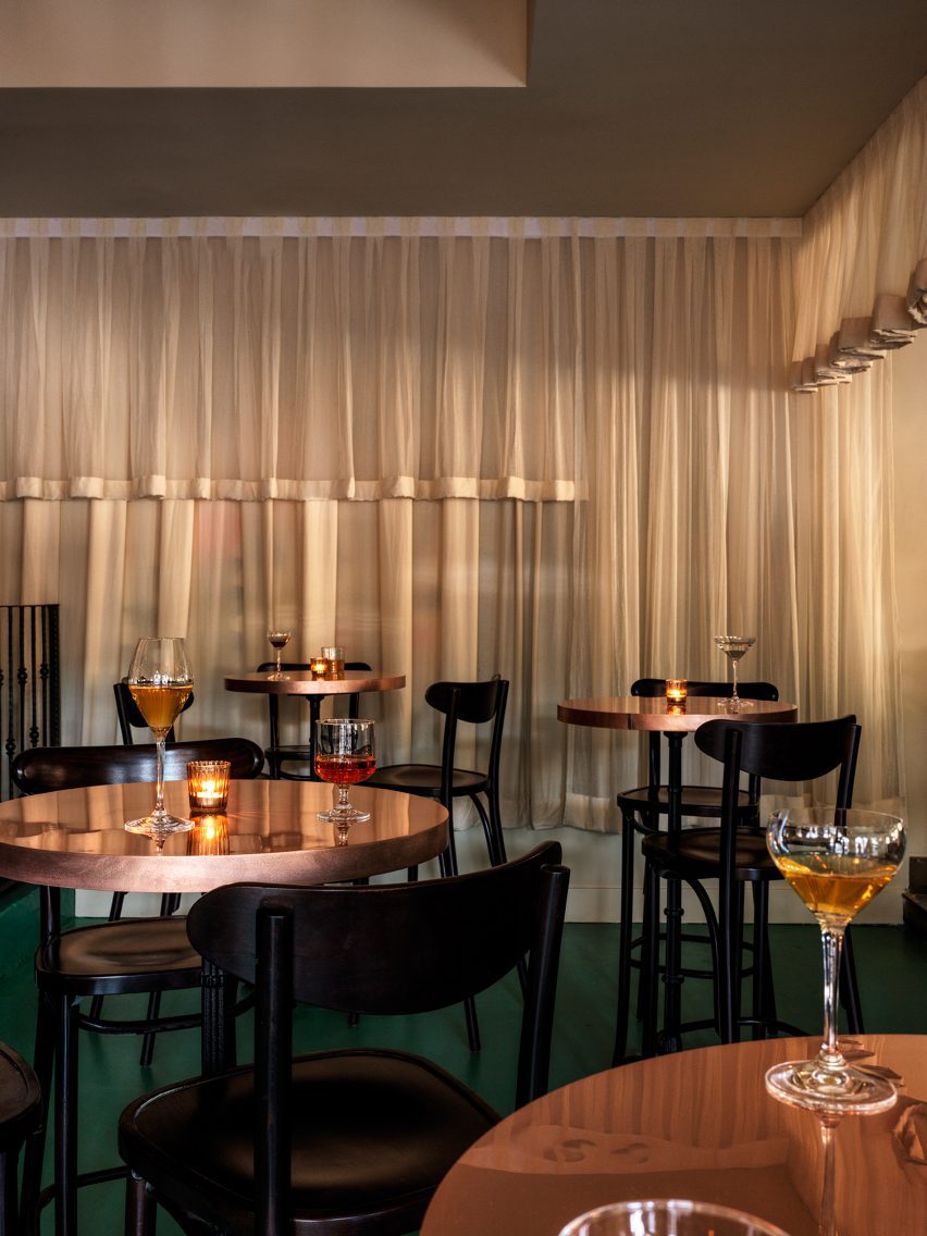
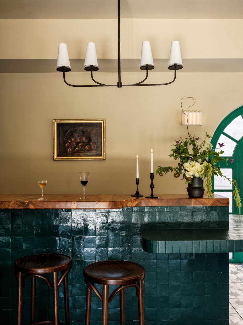
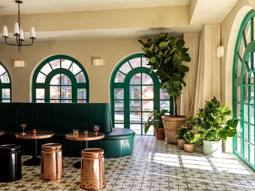
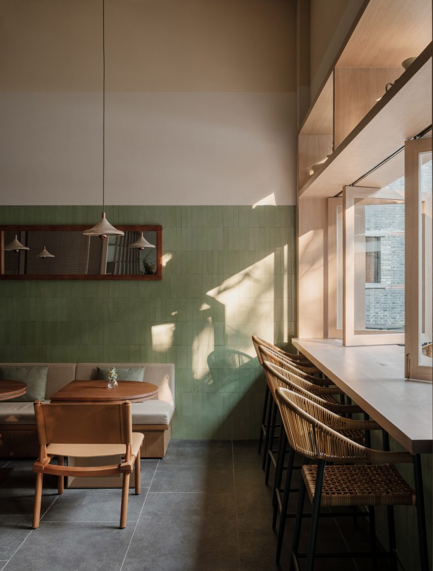
On the ground floor, where a daytime cafe transitions into an evening bar, green and earthy tones link to the leafy garden beyond. Walls are wrapped in a green-glazed lava stone, with a deliberately hand-made patina, “representing the earth element”.

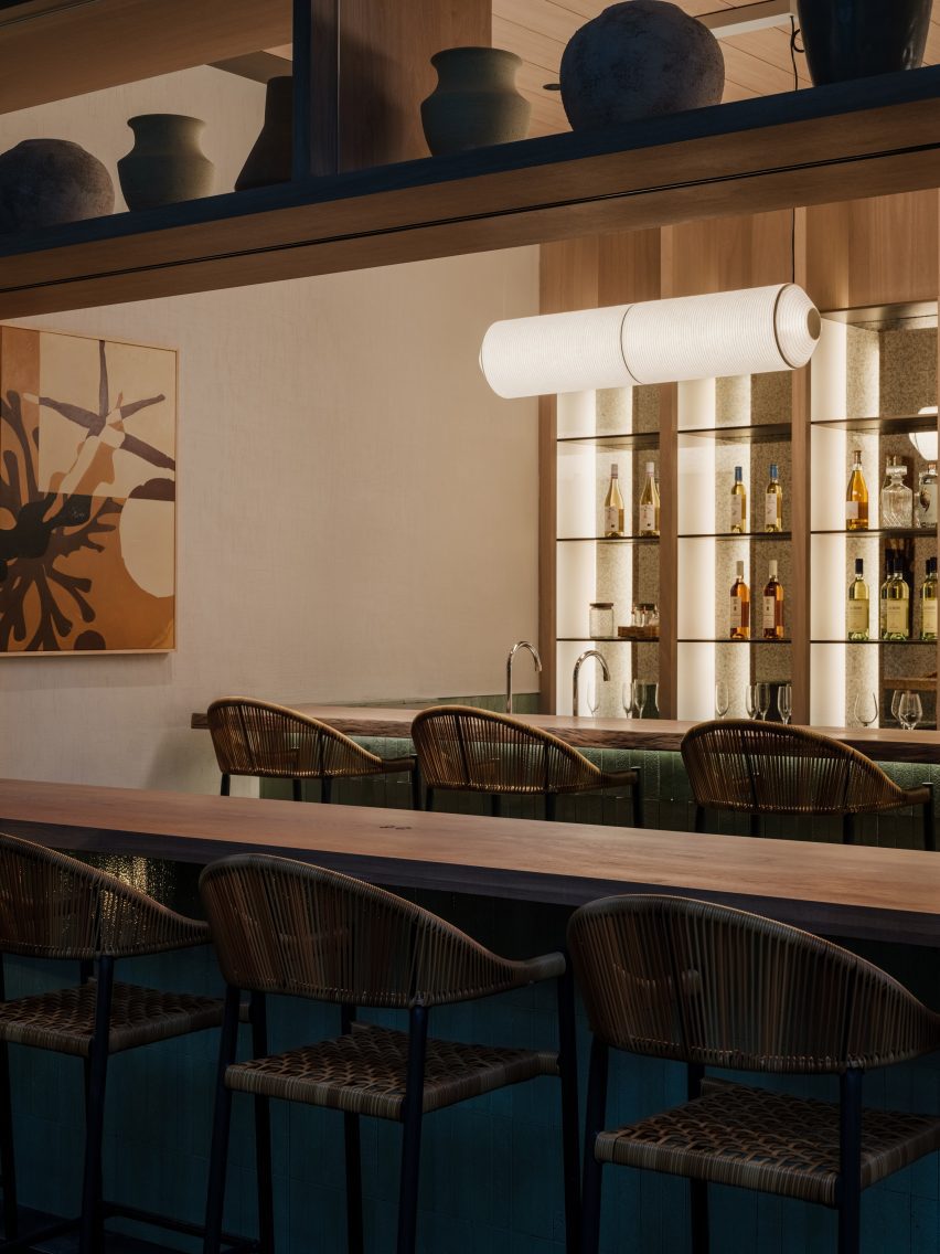
Custom furniture pieces designed by Linehouse were used throughout the restaurant, while lighting was chosen for its intriguing, sculptural forms from designers including Santa & Cole and Studio KAE.

Natural timbers were used for the centrepiece bar counter, while the timber-framed windows open up to the silver-grey of the olive trees outside.

Open-hearth grill in Gaga's Coast restaurant
An open-hearth grill features on the first floor

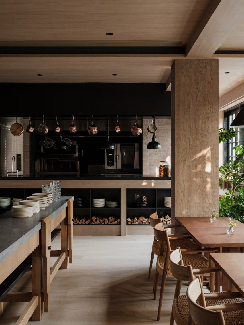
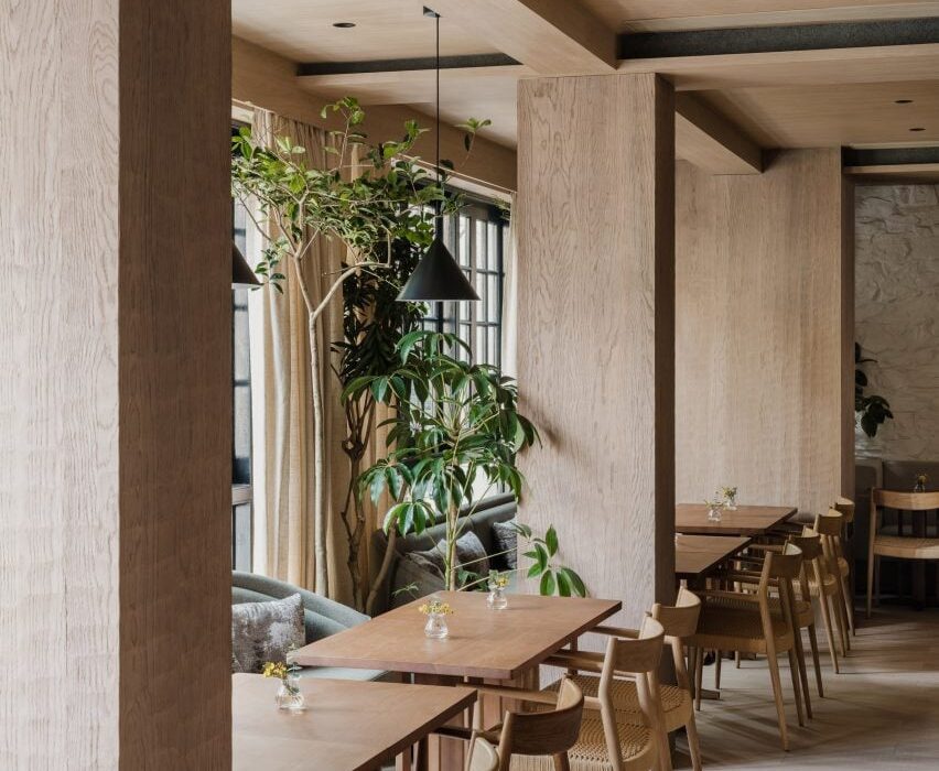
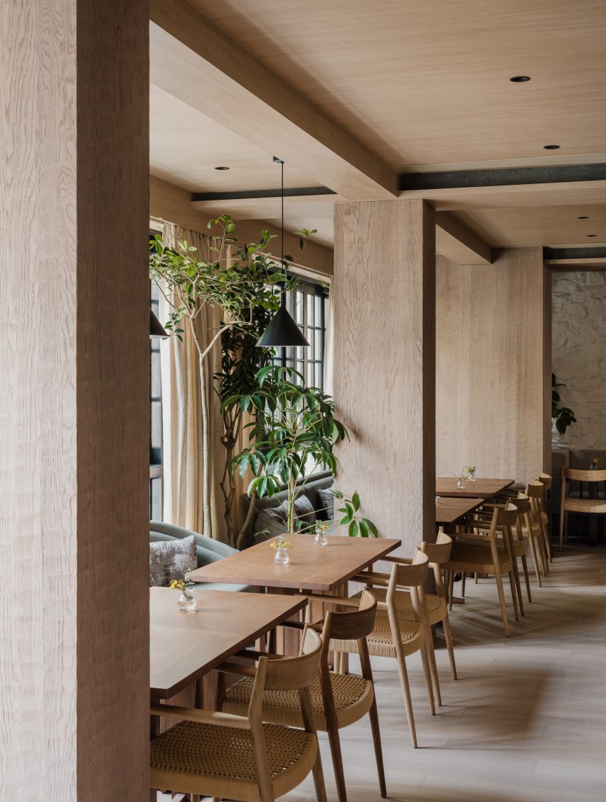
Above this on the first floor is an intimate dining space lined with white-washed stone and timber panelling. Layered oak panels hung horizontally from the ceiling create intimate dining nooks, with taupe-toned banquette sofas and oak dining tables.

The focal point of this room is the parrilla – an open-hearth grill – and a chef’s table.

“The concept of the open parrilla grill captures the quintessence of Mediterranean cuisine,” Mok told Dezeen.

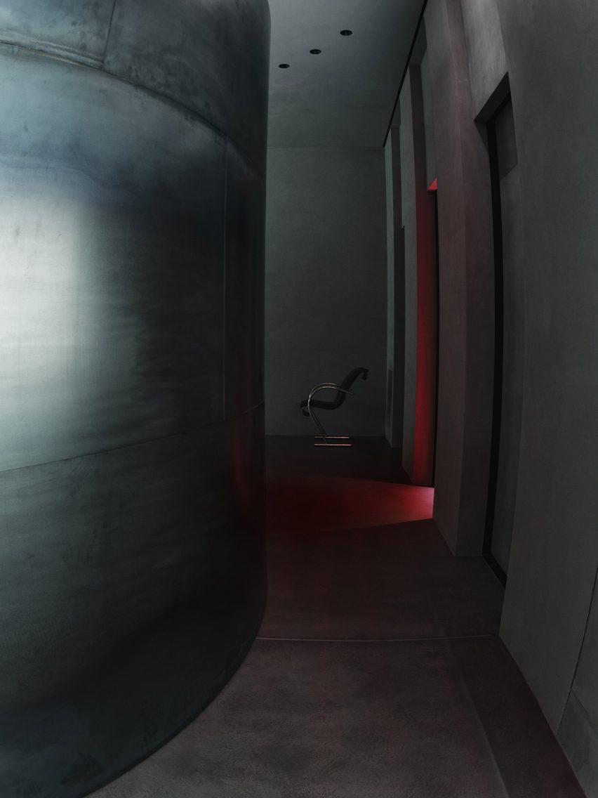
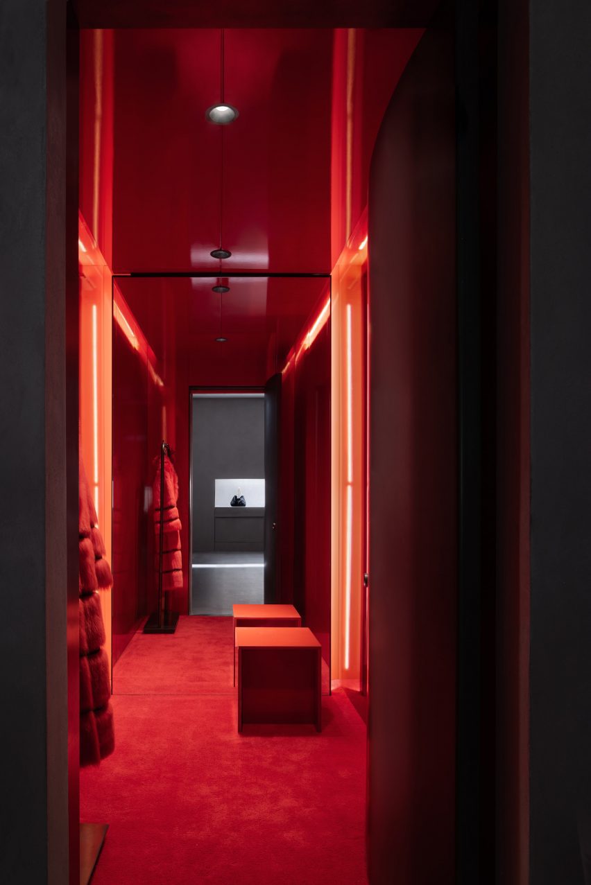
On this level, fire-informed red and brown tones punctuate the space including the tiles that line the kitchen, which were repurposed from used coffee grounds.

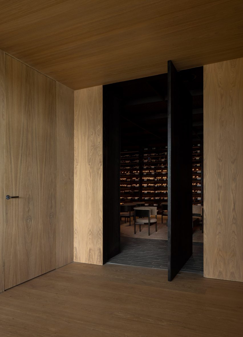
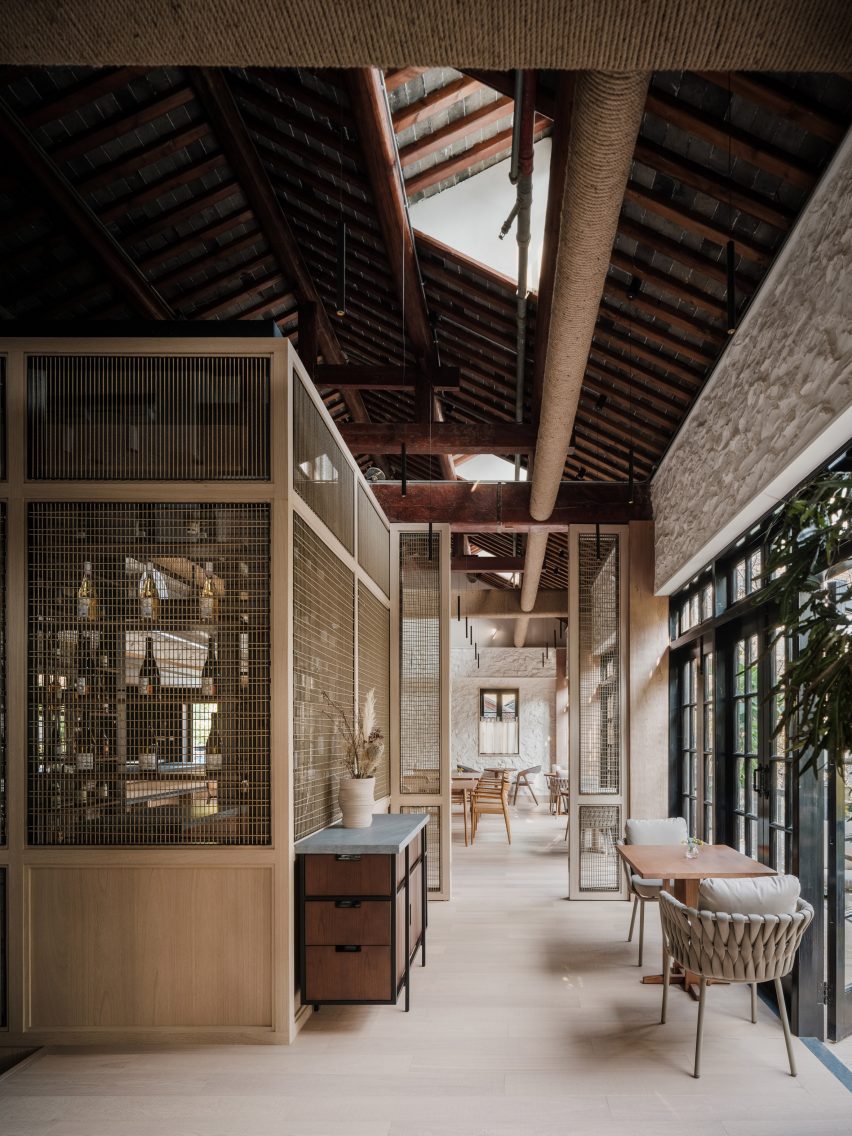
Finally, on the top floor under the exposed timber beams of the pitched roof, Linehouse created a string-wrapped wine room and a lofty private dining space.

Stairwell in Shanghai restaurant designed by Linehouse
Panels of string line the staircase structure

The walls were again clad in white-washed stone. But here, it is contrasted with the intense black of yakisugi, or fire-preserved wood, which serves as a backdrop to a chef’s table.

The space also features a generously-sized balcony, providing views out across this bustling neighbourhood.

Cord-lined wine bar in by Linehouse
Linehouse created a string-wrapped wine room on the top floor

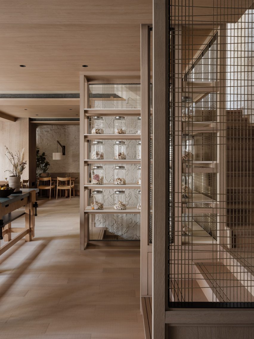
The spaces are linked by a staircase that weaves up through the centre of the building. Its chalky-white outer walls are patterned with a sculptural relief of sea creature exoskeletons, echoed by collections of shells displayed in glass jars nearby.

Panels of string, woven into simple grids, line the staircase structure, allowing natural light to flow into the heart of the building.

“We chose materials that tell the story of the coastal journey, while the exoskeleton wall is a modern representation of the sea,” said Mok.

Wine bar with wooden furniture in Gaga's Coast restaurant
The top floor also houses a private dining room

Linehouse was founded by Mok and Briar Hickling in 2013 and the duo went on to win emerging interior designer of the year at the 2019 Dezeen Awards.

The studio has completed a number of other projects in Shanghai, including a space-themed cafe decorated with real meteorites and an office housed in a former swimming pool.

The photography is by Wen Studio, courtesy of Linehouse.


Reference

Curtain pulled back to reveal a mirror
CategoriesInterior Design

Lovers Unite wraps Bar Chelou in Pasadena with expressive drapery

Late artists Christo and Jeanne-Claude influenced the dramatic drapery around this restaurant in Pasadena, California, designed by Los Angeles studio Lovers Unite.

Conceived by chef-owner Douglas Rankin as a take on a Parisian bistro, Bar Chelou opened earlier this year in a building in a Spanish Colonial Revival plaza next to the Pasadena Playhouse.

Curtain pulled back to reveal a mirror
Natural muslin is draped around Bar Chelou, emulating the works of Christo and Jeanne-Claude

Lovers Unite had just a few weeks to transform the space into an operational dining room, so looked to ways it could make maximum impact with minimal time.

The studio found inspiration in the legacy of Christo and Jeanne-Claude, who famously wrapped some of the world’s most recognisable monuments in giant swaths of fabric – most recently the Arc du Triomphe in Paris, which was realised a year after Christo’s death.

The duo’s seemingly effortless but meticulously planned drapery is echoed on a much smaller scale around the Bar Chelou space, which was formerly a Baroque-themed restaurant called Saso.

Dining room with copper tables and green floor
The restaurant in Pasadena features copper-topped tables that reflect light from an amber glass chandelier

“We felt the spirit of Christo and Jeanne-Claude’s work was a good conceptual fit for a project, which is supposed to evolve over time, but we’re able to be referential while being playful with our approach,” Lovers Unite told Dezeen.

“Translating the gesture of the wrap to a human scale and a hospitality context changes the meaning and impact of the gesture — it’s not necessarily an artwork but it’s evocative and surprising.”

Patrons enter via an arched doorway, and are immediately met with the sight of natural muslin fabric hung around the walls and above the bar.

Curtains surrounding dining room
Curtains surround the dining room and offer glimpses of the kitchen in places

“Upon entering, one might feel as if they are visiting an expansive and uncluttered artist’s studio in a transitory state; hints abound that change is coming,” said the Bar Chelou team.

Lifts and pleats in the curtains created by thick ropes reveal the chefs at work in the kitchen, as well as framing views of the arched windows seen in mirrored panels.

A dark shade of green was chosen to contrast the natural muslin and is used across the dining room floor and built-in leather banquettes.

Similarly coloured tiles clad the front of the walnut-topped bar counter at the front, which is slightly lower that the main dining area and offers additional seating.

Bar clad in glossy green tiles
A dark shade of green chosen to contrast the fabric covers the front of the bar counter

Thonet-style bistro chairs accompany polished copper cafe tables, which reflect the light from a custom, amber glass chandelier that spans the length of the room.

Walls were painted to match the hue of the curtain fabric, and the window frames are bright green.

Bar area illuminated by green-framed arched windows
Light pours into the bar area through arched windows with frames painted bright green

Pasadena located is northeast of Los Angeles, where many new restaurants with notable interiors have opened over the past few months.

Among them are the retro-futurist 19 Town designed by Jialun Xiong, and Great White Melrose, which offers outdoor dining on a pink-plaster patio.

The photography is by Chris Mottalini.

Reference

Modular offices with timber frames and glass walls
CategoriesInterior Design

KKDW Studios creates offices for a yoga teacher in Austin

Austin-based KKDW Studios has designed the headquarters for a yoga subscription app called Find What Feels Good, including a space for filming instructional videos.

KKDW Studios founder Kelly DeWitt collaborated with yoga teacher Adriene Mishler – who became well-known through her Yoga With Adriene instructional videos – to create a base for Find What Feels Good, the platform she co-founded that offers video tutorials for at-home workouts.

Modular offices with timber frames and glass walls
KKDW Studios used a modular system to build offices within the space for Find What Feels Good

Located in East Austin, the 5,000-square-foot (465-square-metre) space was previously an empty shell with blue walls and a high-gloss, yellow-tinged concrete floor.

DeWitt’s team described an intention to create “a space to evolve in and experiment with, a place to be inspired and inspired others.”

Open workspace featuring large wood tables
Communal workstations are positioned in front of private offices

“The space should feel welcoming with a warm, homey ambiance that makes you want to take a deep exhale,” the team added.

To add this warmth, the majority of the interventions were made with wood, which forms wall panelling, louvred partitions, frames for glass walls, and furniture. The concrete floors were refinished in matte grey.

Bright kitchen with a moveable island
A bright kitchen includes an island mounted on castors, which can be moved when needed

Designed for a quickly growing team and to be multi-functional, all the elements of the interiors are either bolted together or mounted on wheels, so they can be easily moved if needed.

The linear space is divided up along its fenestrated facade. At one end is a cosy lounge area for receiving visitors or communal work, while a bright, fully equipped kitchen is located at the other.

Beige sofa in front of glass-walled offices
Warm-toned materials were chosen for the space

In between, the modular timber-framed glazed walls form a row of private offices, while an open workspace with large tables is positioned in front.

Facing the windows is an uninterrupted wall that stretches 80 feet (24 metres), which is used by Mishler and her team as a backdrop for filming yoga videos for their app and Youtube channel.

Air ducts and other visual obstacles had to be moved to ensure that the shot is unobstructed, while the vertical slat in the lounge partition pivot to ensure the lighting is just right.

“Natural light can be inspiring, but when filming, sometimes what they need is control – this allows them the best of both worlds,” said KKDW Studios.

Welcome lounge in a corner of the office
Slats in a partition can be adjusted to control light levels when filming in the space

Cushions for sofas and armchairs are wrapped in tufted, textured beige fabric in a variety of tones that are echoed in the rugs.

From the exposed, angled ceiling hang a series of spherical pendant lamps, as well as power outlets on retractable cords for use at the workstations.

Find What Feels Good founder Adriene Mishler holds a yoga pose next to her dog
An uninterrupted wall provides a backdrop for Adriene Mishler’s instructional yoga videos

“All furniture is completely custom, designed after getting to know Adriene and her team, their needs, workflow, etc,” said KKDW Studios, which also acted as general contractor for the project.

Yoga – a group of physical, mental, and spiritual practices – continues to grow in popularity around the world, and demand for at-home workouts like those facilitated by Find What Feels Good skyrocketed during the Covid-19 pandemic.

Here are 10 homes with dedicated spaces for practising yoga and meditation.

The photography is by Andrea Calo.

Reference

Kith Williamsburg
CategoriesInterior Design

Kith creates “industrial ambiance” for its Williamsburg store

American clothing brand Kith has created a flagship store in Williamsburg, Brooklyn, that uses brick, wood and steel to reference the industrial history of the neighbourhood.

Designed by Kith‘s founder Ronnie Fieg and the brand’s in-house team of architects, the Williamsburg location is located in the Gensler-designed 25 Kent Plaza office building, where Kith also has its corporate offices.

Kith Williamsburg
Kith designed a store for its apparel in Williamsburg

The design takes elements that carry through some of the other Kith stores, such as marble finishes and metal fins, and adds details that situate it in the context of Williamsburg.

These include a massive circular structure at the heart of the store that is covered with red brick on the outside and lined with white oak inside. The piece was custom-made at a nearby, undisclosed wood workshop.

Kith Williamsburg
It features a central structure made of brick and wood

This central element has a domed wooden ceiling with a wooden column and circular light fixtures that radiate out towards the edges concentrically.

A number of sloping arched voids in the structure have metal-lined undersides and provide an entryway on two sides and display cases for the brand’s collection of sneakers on another.

“We constructed the central dome completely from scratch and created the exterior from the same exact bricks used on the outside of the main building so it feels very cohesive as you enter,” said Fieg.

“Every inch of that dome is custom which meant our precision down to the last minute detail was crucial.”

“Outfitting the interior with rounded wood panels, shaping the footwear shelves to sit flush within the windows, every detail was poured over.”

Kith polished concrete floor
It steps down from an outdoor plaza

Outside the circular area, the lights radiate perpendicularly, like sun rays, towards the walls.

The perimeter of the store is lined with metal fins that block the sun from the glass-lined eastern exposure while also creating a massive logo when viewed from outside.

Also lining the perimeter of the store are custom wooden clothing racks.

Mosiac in polished concrete flooring
A custom mosaic was placed in the floor

Polished concrete flooring runs through the space, which steps down from the public plaza at the centre of 25 Kent.

The designers oriented the entrance towards the plaza and placed garden boxes in the corners of the store to better connect it with the public space outside.

Marble snack bar
Marble clads the snack bar

“The industrial ambiance is balanced with lush oak trees outside, and an abundance of greenery spread throughout the store,” the brand said.

The Kith Treats Area at the entrance – where a combination of ice cream and cereal are served – was lined with Rosa Aurora marble and has a to-go window that opens up to the plaza.

Wooden dome inside Kith store
The wooden elements were custom made nearby

A wall of stainless steel panels separates the treats area from the retail space, while the walls opposite the street-facing glass are matte concrete with wooden insets for further display and service areas.

On the floor, Kith installed a brand logo made of mosaic tiles.

It is the third store in New York City for the brand, which was founded in 2011, and creates apparel for men, women and children.

To celebrate the opening, the brand launched a sneaker with footwear companies Clarks and Adidas.

Gensler Williamsburg Kent
It is in a Gensler-designed building in Williamsburg

This is the twelfth store opened by Fieg, who moved to Williamsburg himself with his family in 2017, and the Kith headquarters there in 2021.

“The restaurants, the shops, the people, and the atmosphere make it a very special area in New York and were all factors in us moving our brand HQ there in 2021,” he said.

“It’s my home, our team’s home, and it only made sense for us to make it a home for our community.”

Many of Kith’s prior locations, in Miami and Los Angeles, for instance, were designed by designer Daniel Arsham and his studio Snarkitecture.

In both the Paris and original downtown Brooklyn locations, Kith installed chandeliers made up completely of Nike Air Max sneakers.

Reference

Interior image of the Khaite store
CategoriesInterior Design

Khaite flagship store designed as a “tribute to the cultural legacy of SoHo”

American fashion brand Khaite has opened its flagship store in SoHo, New York City – a cement-trowelled and steel-lined interior with an evergreen tree planted into its shop floor.

The store was designed by Khaite‘s founder and creative director, Catherine Holstein and her husband New York-based architect, Griffin Frazen.

Interior image of the Khaite store
The Khaite flagship store is located in SoHo, New York City

It occupies a Corinthian column-fronted building in SoHo, capped with Italianate cast-iron modillion cornices, designed by German architect Henry Fernbach in 1871.

Holstein and Frazen wanted to encapsulate the cultural legacy of the SoHo location with the area’s connection to the founding of the brand.

Interior of the Khaite store
It was designed by Khaite’s founder and her husband

“Every element of KHAITE is shaped by New York, and we set out to make this space a tribute to the cultural legacy of SoHo,” said Holstein.

“When I moved to New York twenty years ago, this block of Mercer was my entry point to the city, and SoHo is where KHAITE was born. Our first design studio was just down the street.”

Interior image of the Khaite store in SoHo
The couple looked to encapsulate the legacy of its location

The entire 371 square metre ground floor of the store was dedicated to retail space while the building’s basement was reserved for back-of-house workings as well as a private meeting area.

Holstein and Frazen’s approach saw the store clad in city-characterising materials such as steel, glass, poured concrete, troweled cement and plaster, which bring an industrial and monolithic look to the space.

Photo of the Khaite store
Cement, concrete and steel were used throughout the store

Four curving steel partition walls meander through the length of the retail space and are used to conceal and frame Khaite’s ready-to-wear collections that are displayed on curved display rails.

The four steel walls are visually separated by a channel of light from one of two skylights at the rear of the store that was exposed during its renovation.

A focal feature of the store is an evergreen Bucida Buceras tree, which was named the Shady Lady and planted into the floor beneath the rear skylight.

As light enters and flows into the space from the skylights the rough and textural quality of the cement-trowelled walls is revealed.

Photo of the interior of the Khaite store
Skylights were uncovered during its renovation

“The design was conceived in terms of material – choosing the right materials and working with them in the right way to satisfy the programmatic requirements,” said Frazen.

“We leaned into elemental qualities like natural light, preserving the scale and openness while creating intimate spaces.”

Photo of a tree in the store
A tree was planted into the floor of the store

“We embrace the change of materials like steel and concrete just as you would leather and cashmere, honoring them by allowing them to wear in gracefully,” said Frazen.

“Each piece has unique textures, and rather than polishing away or painting over them, we preserved imperfection.”

Photo of the concrete store
It has an industrial look

Three fitting rooms were designed to contrast the brutalist details of the store and were blanketed in a deep red, fitted with plush red carpeting and warm lighting.

Minimal furniture was placed throughout, such as a Sing Sing chair by Japanese designer Shiro Kuramata that sits beside a twisted, low-lying shelf used to display the brand’s accessories.

Interior image of a red fitting room
The basement contains back-of-house operations

Before opening to the public, the store was used as the setting for Khaite’s Autumn Winter 2023 show which was presented in February.

Nearby in SoHo, design agency Aruliden completed a store interior for fashion brand Jonathan Simkhai that incorporated cut-out shapes from Simkhai’s clothing into partitions and furniture.

Design firm Crosby Studios teamed up with AR technology company Zero10 to create a pop-up store also in SoHo that allows people to try on virtual clothes.

Reference

Photograph showing room with wood panelling and green wall
CategoriesInterior Design

Ten interiors featuring natural materials and timeless accents

For this special lookbook sponsored by Danish design company D Line, we’ve selected ten interiors that showcase architectural details by the brand including door handles, taps and drawer pulls.

Door furniture and other pieces of practical hardware provide the finishing touches to interior schemes, and can create physical touchpoints that play a significant role in how people interact with the spaces they inhabit.

D Line has been designing and manufacturing architectural hardware and sanitary ware since 1971. Collaborators include Danish architects Knud Holscher and Arne Jacobsen and British designer Tom Dixon.

Here are 10 projects where D Line’s products have been used to add timeless accents to interiors with natural materials, including homes, hotels, restaurants and even a medical facility.


Photograph showing room with wood panelling and green wall
Photo is by Jonas Bjerre Poulsen

St Catherine’s College, Oxford, by Arne Jacobsen and Knud Holscher

Jacobsen designed the modernist concrete exterior as well as the interior and furnishings of St Catherine’s College at the University of Oxford, which opened in 1962.

Details as small as the handles on the interior doors – named AJ lever handles in reference to the designer’s initials – echo the curved, smooth form of the college’s larger design elements.


Äng restaurant by Norm Architects
Photo is by Jonas Bjerre Poulsen

Äng restaurant, Sweden, by Norm Architects

Danish studio Norm Architects has designed Äng, a restaurant in Sweden with both an above-ground structure resembling a greenhouse and a subterranean wine cellar.

D line’s distinct L lever handle in a gunmetal finish was used on doors throughout both spaces, where it matches other metal lighting fixtures as well as the building’s structural components.

Find out more about Äng restaurant ›


Photograph showing room with white door and light blue walls
Photo is courtesy of Norm Architects

SAS Royal Hotel, Copenhagen, by Arne Jacobsen

Another project by Jacobsen, who designed all the elements found in the SAS Royal Hotel in Copenhagen – which opened in 1960 – in line with his all-encompassing approach to architecture and interior design.

Subsequent remodelling means that only Room 606 remains in its original form. Here, steel AJ lever handles were chosen to tie in with the cool duck-egg blue walls and other silver hardware, such as the frame of the blue seats and sofa.

Find out more about SAS Royal Hotel ›


Photograph of neutral toned living area with large cone shaped lamp shade
Photo is by Jonas Bjerre Poulsen

Archipelago House, Sweden, by Norm Architects

This holiday home by Norm Architects is situated in a coastal area of Sweden and combines Scandinavian design with Japanese aesthetics.

The L lever handle in charcoal from D line’s Holscher range provides a steady rhythm of graphic contrast in the interior, which primarily uses light wood furnishings and bright neutral finishes.

Find out more about Archipelago House ›


View through coastal dwelling onto sea
Photo is courtesy of Rubow Architects

Private Summer Residence, Denmark, by Rubow Architects

Designed by Danish studio Rubow Architects, this holiday home in Denmark aims to blend in with its surroundings by using neutral tones and floor-to-ceiling windows that allow natural light and views of nature into the house.

The L lever handle provides an unobstructive finish to the house’s doors and helps give the house its indoor-outdoor feel.


Neutral interior with mismatched furniture
Photo is by Enok Holsegård

Barbara’s atelier, Copenhagen, by Barbara Bendix Becker

Textile designer Barbara Bendix Becker’s Copenhagen-based antiques and collectibles atelier is full of Nordic ceramics, lighting and furniture by celebrated Scandinavian designers.

The brass Arne Jacobsen lever handle features alongside these other design classics and has been seamlessly integrated with other warm-toned metal finishes, as well as the atelier’s honey-coloured wooden elements.


Photograph of bathroom with bath below long window
Photo is courtesy of MTJ Studio

Stockholmsgade bathroom, Copenhagen, by Emil Thorup

This bathroom scheme created by interior designer Emil Thorup is characterised by its rhythmic herringbone tile floor, muted sage-coloured walls and round-cornered, freestanding bathtub.

D-line’s Qtoo bathroom hardware collection in a subtle brushed-steel finish was used for part of the bath, sink and shower setup, and creates a nice metallic contrast to the pale green walls and natural materials used in the room.


Dentology+ by Norm Architects
Photo is by Jonas Bjerre Poulsen

Dentology+ clinic, Antwerp, by Norm Architects

Norm Architects went against the grain with the design of this dental surgery, which avoids overtly clinical interiors in favour of soft neutral finishes that encourage calmness in patients.

Charcoal-toned L lever handles punctuate the otherwise light and airy interior, alongside unexpected homely details like low-slung sofas and translucent draped curtains.

Find out more about Dentology+ clinic ›


Kitchen island with red handles in front of tall curtains
Photo is courtesy of &Shufl

&Shufl x D Line collaboration

Danish design company &Shufl provides carpentry and hardware elements that are compatible with IKEA kitchens, bathrooms and wardrobes to give existing schemes a facelift.

D Line’s bar handles, which have featured in its catalogue for over 50 years, are used for the &Shufl designs, where they come in a curated palette of different colours and finishes.


Neutral room with light wood clad door
Photo is by Luke Arthur Wells

Luke Arthur Wells x Fat collection by Tom Dixon

British interior designer Luke Arthur Wells devised an interior scheme that encourages peacefulness by using rounded furniture, handmade ceramics and soft floor coverings.

D Line’s FAT lever handle – part of a wider collection by Dixon – is shorter, thicker and more rounded than traditional door furniture and further softens the already gentle interior.


This is the latest in our series of lookbooks providing curated visual inspiration from Dezeen’s image archive. For more inspiration see previous lookbooks showcasing sociable split-level living spaces, subtly installed lifts, cosy cabins and opulent hotels.

This lookbook was produced by Dezeen for D line as part of a partnership. Find out more about Dezeen partnership content here.

Reference

A detached sauna structure
CategoriesInterior Design

Dezeen’s Pinterest roundup features nine sauna’s in touch with nature

Saunas are trending on Pinterest and Dezeen has featured some of the best, including a floating sauna in Stockholm and a three-storey, outdoor sauna in the USA. Follow Dezeen on Pinterest and read on to discover the projects.

Pinners have been attracted to Dezeen’s sauna board. The most popular saunas are inspired by their natural surroundings and have cosy and relaxing interiors.

An out-building sauna in Canada, up a slope behind the main cabin, stood out due to its miniature size and unique shape.

Scroll down to see nine popular projects pinned on Dezeen’s Pinterest and browse our sauna Pinterest board to see more.


A detached sauna structure

Ambassador Crescent, Canada, by BattersbyHowat Architects

This detached sauna, built on the property of a mountainside home in Whistler, British Columbia, was designed by Vancouver-based studio BattersbyHowat Architects.

Clad in standing seam metal, the small sauna mimics the design of the nearby holiday home.

Find out more about the Ambassador Crescent ›


A floating sauna

The Big Branzino, Stockholm, by Sandellsandberg

Pine planks clad the exterior of a floating sauna by Swedish studio Sandellsandberg, which they designed to blend in with the surrounding forests.

For the interior, the studio used red cedar and added a fireplace, meaning that the central space can be heated for overnight trips when not used as a sauna.

Find out more about The Big Branzino ›


A red and orange sauna

Bademaschinen, Norway, by ACT! Studio and Borhaven Arkitekter

ACT! Studio and Borhaven Arkitekter designed a collection of floating red and orange buildings in Oslo harbour to be a playful and relaxing space sauna.

For the project, the studio covered the floors with red vinyl. Birch plywood was used for the walls, tiered seating and changing rooms.

Find out more about Bademaschinen ›


Löyly by Trolle Rudebeck Haar

Löyly, Switzerland, by Trolle Rudebeck Haar

Graduate Trolle Rudebeck Haar designed another floating sauna in Switzerland to fit up to three people. It has a sloped roof, wooden stove, bench, translucent glass windows and an exterior deck.

Löyly sits on a floating pontoon deck which allows it to be placed on any water with low-wave motion.

Find out more about Löyly ›


A black timber sauna

Saunaravintola Kiulu, Finland, by Studio Puisto

Simple and traditional materials such as black wood and red epoxy flooring were used by Studio Puisto to create a sombre and crisp atmosphere for this sauna at a lakeside wellness centre in the town of Ähtäri, Finland

Located in its own independent wooden cabin, the studio added a large window with the aim of connecting with the surrounding environment.

Find out more about Saunaravintola Kiulu ›


A three-storey outdoor sauna

Sauna Tower, USA, by BarlisWedlick

This treehouse-style, three-storey outdoor sauna in New York’s Hudson Valley was designed by American studio BarlisWedlick.

A concrete sauna acts as the base for stacked-timber platforms made from Alaskan yellow cedar, topped with a viewing platform.

Find out more about the Sauna Tower ›


Arctic Sauna pavilion

The Arctic Sauna Pavillion, Finland, by Toni Yli-Suvanto Architects

The surrounding natural environment inspired the design of the Arctic Sauna Pavilion by Tony Yli-Suvanto Architects in Lapland, Finland.

Inside, both bathing and relaxation take place in the same space, in accordance with an ancient arctic tradition. The walls of the building tilt outwards in the local custom to prevent the timber wall construction from getting wet.

Find out more about The Arctic Sauna Pavillion  ›


A sauna installation

Atmosphere, Australia, by Studio Rain

Studio Rain created a temporary sauna that is prefabricated and off-grid. Polycarbonate panels clads the walls and ceilings and it is heated by a wood-burning stove.

Made of reclaimed timber, it can be built, disassembled and reused without the need for any equipment.

Find out more about Atmosphere  ›


House and sauna in Cambridge by Neil Dusheiko Architects

Dark Spa, UK, by Neil Dusheiko Architects

This spa was built in the garden of a renovated Victorian semi-detached home by Neil Dusheiko Architects. Inside the spa, the studio added a Japanese soaking tub, sauna, shower, gym and relaxation room with a fold-down bed.

With walls clad in Sapele timber and black slate flooring, the Dark Spa is intended to be “silent and mysterious”, the studio told Dezeen.

Find out more about the Dark Spa ›

Follow Dezeen on Pinterest

Pinterest is one of Dezeen’s fastest-growing social media networks with over 1.4 million followers and more than ten million monthly views. Follow our Pinterest to see the latest architecture, interiors and design projects – there are more than four hundred boards to browser and pin from.

Currently, our most popular boards are retail interiors and staircases.

Reference

Retrofitted Jacksons Lane community centre
CategoriesInterior Design

Citizens Design Bureau retrofits Jacksons Lane arts space in London

UK studio Citizens Design Bureau has given a colourful retrofit to Jacksons Lane, an arts and circus centre in an old church in London, with the aim of decluttering and simplifying its interior.

The studio aimed to improve the functionality of the grade II-listed building, which used to be a church but has been a community hub and “leading centre in contemporary circus arts” since the 1980s, Citizens Design Bureau said.

Retrofitted Jacksons Lane community centre
The Jacksons Lane building has a colourful interior

“The previous layout was a real jumble of spaces that didn’t work from a functional perspective,” the studio’s director Katy Marks told Dezeen.

“Our approach was to declutter the old church building, so that the original structure was more visible, giving a sense of the symmetrical cruciform of the original plan and using the drama of those spaces to full effect, improving acoustic separation, functionality as well as making the building fully accessible,” she added.

Interior of community u=hub by Citizens Design Bureau
Spaces were rearranged to create a more functional interior

The venue in Highgate, London, had a dated interior with more than 20 different levels.

While reconfiguring its spaces to make them more functional, Citizens Design Bureau added a cafe and hireable studios in the former church’s double-height transept.

Red walls in Jacksons Lane in London
Red and teal colours brighten up the space

New details that make Jacksons Lane more functional include acoustic windows, as well as ramps and lifts that create easier access to the different spaces.

It also restored some parts of the church that had been hidden under more recent interventions. This included reinstating the main entrance of the building to the original church porch, which had been boarded up.

“You would often see people still climbing the steps up to the original, boarded-up door, trying to push it open,” Marks said.

“In a grade II-listed building, we had limited scope to make big changes to the exterior, so we felt that opening up the original and intuitively obvious entrance was the most impactful move we could make, to make the building much more legible and welcoming to everyone,” she added.

Orange wall and teal details inside community centre by Citizens Design Bureau
Citizens Design Bureau retrofitted the arts centre in Highgate

Inside the centre, Citizens Design Bureau introduced a warm colour palette of deep reds and oranges with teal accents, which complements the existing brick, stone and dark-wood details.

“The building has undergone many changes over decades of use, so the internal fabric in particular has a layered history,” Marks said.

“We have used colour to express those layers – white for the church structure, a teal blue for elements that were added in the 70s, and then volcanic oranges, reds and purples for completely new insertions with pops of other colours in the lighting, reflecting the playfulness of its current function as a creative space, specialising in circus arts.”

Room inside Jacksons Lane in London
Whitewashed walls contrast dark-wood floors

The studio clad some of Jacksons Lane’s ceilings with a pale-green concertina form that improves acoustics.

Lamps with bright orange cables add another colourful touch to the space.

View of community centre by Citizens Design Bureau
The former church is now used as an arts and circus hub

Jacksons Lane is used by a lot of people in the local area and Marks said the feedback so far has been “wonderful”.

“We hope that what we have done really expresses the ethos and character of Jacksons Lane with clarity and a bit of joy, raises a smile and is the kind of place that people really want to hang out in,” she said.

Citizens Design Bureau has previously added a “delicately perforated” Corten extension to Manchester Jewish Museum, for which the studio was longlisted for a Dezeen Award in 2021.

The photography is by Fred Howarth.

Reference

Living room by FrenchCalifornia
CategoriesInterior Design

One Wall Street completes conversion from offices to apartments

Work to convert an art deco skyscraper from offices to residential use has completed, becoming the largest building in New York City to undergo this type of adaptive reuse.

A total of 566 homes now occupy One Wall Street, designed by Ralph Walker and completed in 1931, in Lower Manhattan’s Financial District.

Living room by FrenchCalifornia
The completion of One Wall Street’s conversion was marked by the reveal of a new model apartment

Developer Harry Macklowe of Macklowe Properties is behind the transformation, which encompasses one million square feet (92,900 square metres) of residential and 250,000 square feet (23,200 square metres) of commercial amenities.

“In the heart of the iconic financial district, One Wall Street, one of New York City’s most significant buildings, both in history and sheer size, has set the standard for residential conversions, marking yet another historic success,” said Macklowe.

Office with Lower Manhattan view
The apartment was designed by Guillaume Coutheillas of FrenchCalifornia

“The goal was to incarnate empty spaces into thoughtfully redesigned residences that will stand the test of time and continue to answer future demands of modern living.”

The building’s opening was marked by the reveal of a new model residence, designed by Guillaume Coutheillas of FrenchCalifornia.

Bedroom within FrenchCalifornia's model residence
Residence 3404 features three bedroom and multi-aspect views

Residence 3404, one of the building’s largest, includes three bedrooms and multi-aspect views of New York harbour.

Coutheillas envisioned the interiors as if Macklowe himself were to live there, blending European influences using warm neutral colours.

Sky Pool
Amenities in the tower include a “sky pool” with a glass ceiling

Many of the furniture and decor items were sourced from Mexico City studio Atra and are debuting in the space.

Other model residences completed last year were designed by Elizabeth Graziolo of Yellow House Architects and French architect and designer Cyril Vergniol.

A 6,500-square-foot (600-square-metre) co-working space available exclusively to residents and their guests was outfitted in partnership with architect Deborah Berke.

More amenity spaces cover the 38th and 39th floors, including a 75-foot (23-metre), glass-enclosed Sky Pool with a wraparound terrace, and a private restaurant, bar and dining room for residents.

One Wall Street entrance
One Wall Street was designed by Ralph Walker and completed in 1931

The Financial District, known locally as FiDi, is named for being home to the New York Stock Exchange and many global banking headquarters.

However, the area has gradually seen a rise in residential developments over the past decade.

One Wall Street art deco skyscraper
The skyscraper is the largest office building to be converted for residential use in New York City’s history

Many of Manhattan’s office buildings are still struggling with low occupancy rates following the Covid-19 pandemic, so this type of office-to-residential conversion may become more common in the near future.

The photography is by Colin Miller.


Reference

Furniture arranged on raised platforms across the showroom
CategoriesInterior Design

Coil + Drift opens lighting studio and showroom in the Catskills

Lighting studio Coil + Drift has opened an office, showroom and production facility in the Catskill Mountains of Upstate New York that places modern elements in a barn-like building.

Coil + Drift founder John Sorensen-Jolink, who relocated to the area in 2021, has created a new home for his brand in a barn-like structure surrounded by nature.

Furniture arranged on raised platforms across the showroom
Coil + Drift’s new space in the Catskills showcases the brand’s products

“By relocating their queer-owned design business to the countryside, Coil + Drift is sparking a visceral conversation between people in a thriving rural creative community about how what we make defines who we are,” said the studio.

The building encompasses 3,000 square feet (280 square metres) and boasts tall ceilings, which are painted white along with its plywood-panelled walls.

Glass-topped metal desk positioned on a brown rug
The showroom includes an office space, defined by a chocolate-brown rug

The space is divided between a combined office and showroom, and a production facility where an in-house team now creates all of the company’s lighting designs.

In one corner of the showroom sits a black wood-burning stove, with a flue that extends through the roof, next to a pile of chopped logs used to fuel it.

Wood table on a plinth with brass light above
Furniture is displayed on stepped plinths, accompanied by lighting above

Chocolate-brown area rugs contrast the pale concrete floors, defining the entrance, the office space and a spot by the fire in lieu of walls or partitions.

Plinths are used to raise furniture designs, arranged in styled vignettes along with lighting, plants and small accessories.

More objects are displayed on wooden shelves of varying lengths, held up at different heights on thin golden rods.

Industrial-looking metal and glass doors mounted on rolling tracks separate the showroom from the workshop, which is located in an adjoining room.

Daybed presented on a raised plinth
The showroom features a white ceiling and walls, and a pale concrete floor

On show are several new additions to popular Coil + Drift collections, such as a floor version of the Yama table lamp and a “mobile-like” chandelier that joins the Atlas series.

Also to coincide with its move and expansion, the company has launched a trade-focused online platform for its products.

Wide shot of the showroom with yellow chair in the foreground
The building also houses a production facility behind industrial-style doors

Coil + Drift’s previous projects have included styling a townhouse in Brooklyn’s Prospect Heights neighbourhood for Hatchet Design.

Sorensen-Jolink, a former dancer, is one of many creatives that moved from New York City to nearby rural areas, either during or following the Covid-19 pandemic.

Exterior view of the Coil + Drift showroom facing the door
Coil + Drift founder John Sorensen-Jolink relocated to the Catskills in 2021 before opening the new studio

Upstate New York, and particularly the Hudson Valley and Catskills area, was already growing in popularity as a destination for artists and designers before the lockdowns, thanks to its reputation for vintage furniture shopping and art institutions.

Then low property prices and high demand for space and fresh air sparked an exodus to the region, when many bought second homes or relocated permanently.

The photography is by Zach Hyman.

Reference