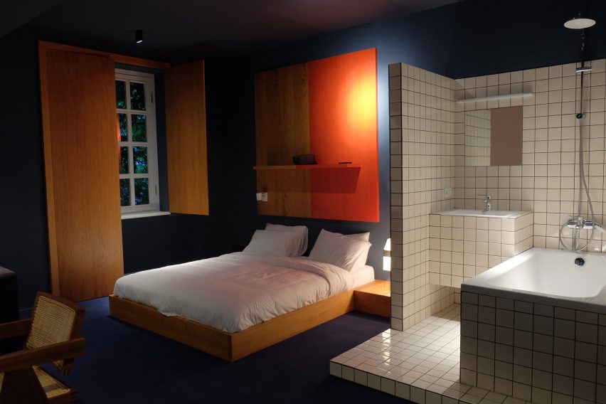
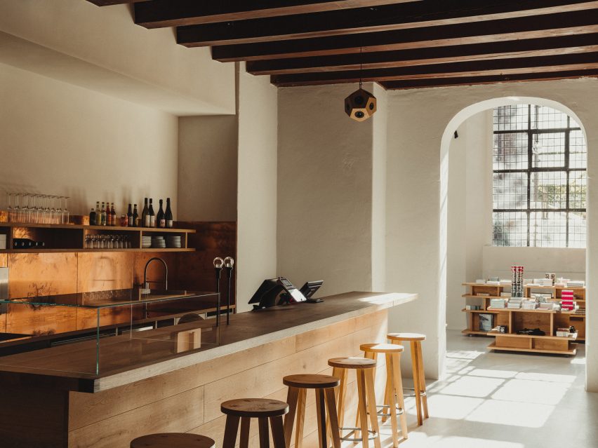
Ten Tokyo apartments with minimalist interior designs
Cleverly concealed kitchens and subtle wooden accents feature in our latest lookbook, which collects Tokyo apartments characterised by minimalist and serene interiors.
These apartments in Japan’s capital are united by their muted colours and an abundance of wood – elements often associated with traditional Japanese interior design.
As one of the world’s most densely populated cities, Tokyo homes often feature smaller floor plans or less natural light than those located in more spacious cities.
Architects and designers have created plenty of understated solutions to these restrictions, such as inserting space-saving storage into open-plan living areas.
From a flat informed by traditional Kyoto townhouses to an Airbnb dressed in subtle geometric furniture, here are 10 Tokyo apartments with minimalist interior designs.
This is the latest in our lookbooks series, which provides visual inspiration from Dezeen’s archive. For more inspiration see previous lookbooks featuring concrete bathrooms, cosy cabins and homes with elevators.
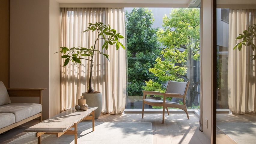
Kinuta Terrace by Norm Architects and Keiji Ashizawa Design
Two apartments within Tokyo’s 1980s-designed Kinuta Terrace apartment block were renovated by Norm Architects and Keiji Ashizawa Design to include more natural light.
The studios reconfigured the floor plans to form fewer but larger living spaces, which are characterised by smooth concrete, timber fixtures and sheer sandy-hued curtains.
“Nature feels integrated into the apartment from most rooms so that, when looking out into the courtyard, you can’t quite tell you’re in a city as immense as Tokyo,” said Norm Architects designer Frederik Werner.
Find out more about these Kinuta Terrace apartments ›
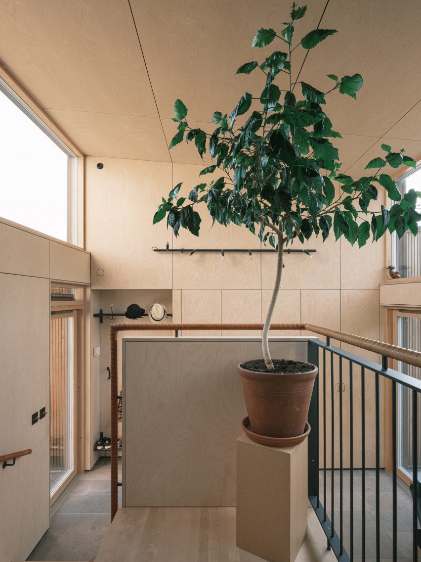
Apartment in Kitasando by Minorpoet
This 1960s apartment contains a sleek kitchen counter and storage space concealed behind folding doors informed by traditional Japanese screens known as Byōbu.
Design studio Minorpoet took cues from traditional Kyoto townhouses for the project, which features a hidden kitchen that cannot be seen from the living room.
Minimalist furniture and finishes match the pared-back theme, including iconic Finnish architect Alvar Aalto’s stackable wooden 60 stool.
Find out more about Apartment in Kitasando ›
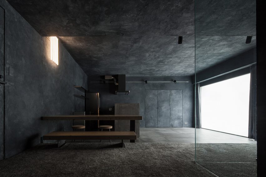
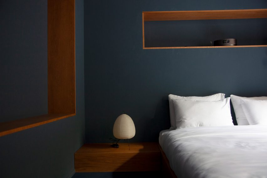
Airbnb apartments by Hiroyuki Ogawa Architects
Local studio Hiroyuki Ogawa Architects renovated two Airbnb apartments in Tokyo’s Shibuya ward with completely contrasting designs. One has floors and walls clad in light wood (main image), while the other pairs a plush grey carpet with dark plasterwork.
Neon lighting in the latter apartment was chosen to remind guests of the bustling city while cork stools, metallic kitchen cabinetry and charcoal-toned accents create a moody atmosphere.
Find out more about these Airbnb apartments ›
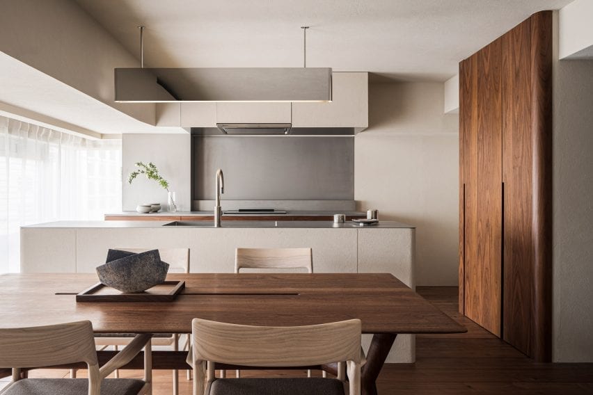
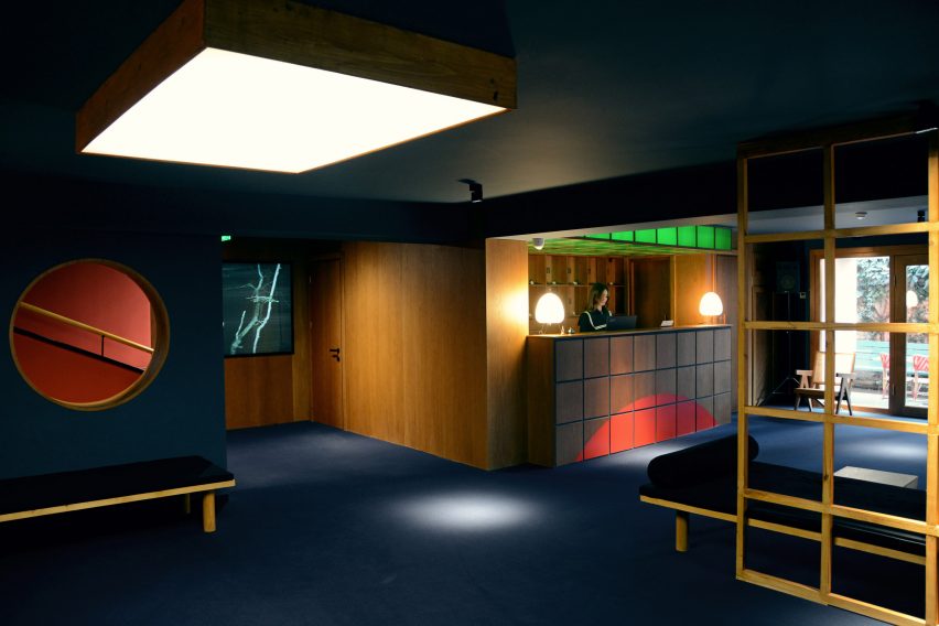
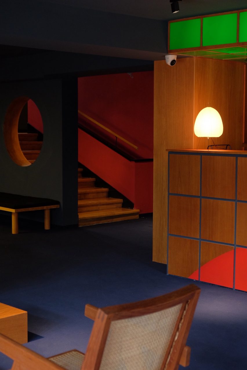
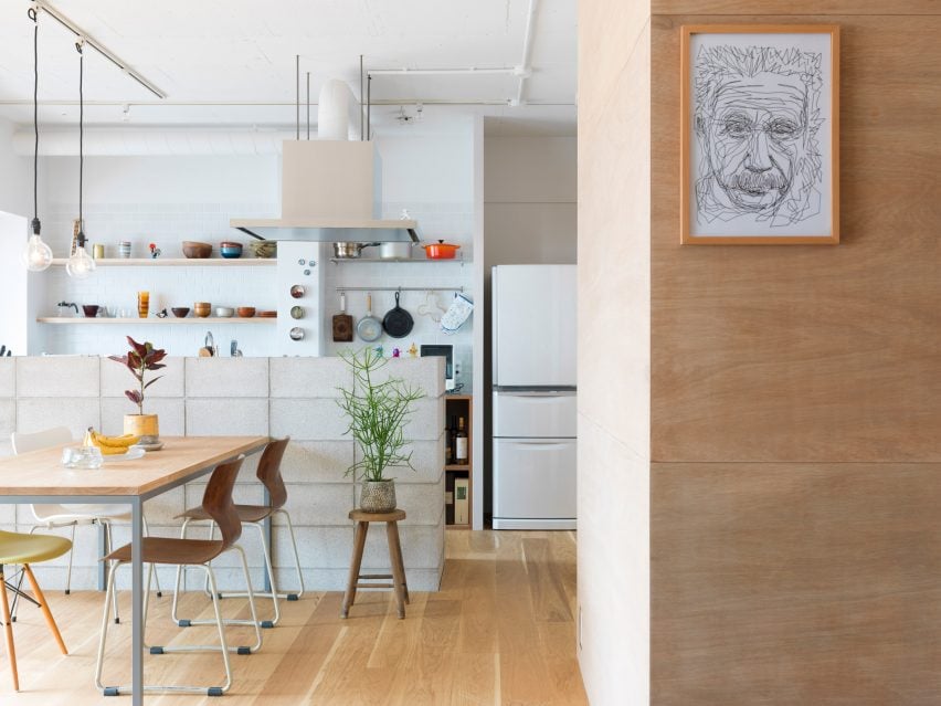
The Life concept apartment by I IN
The Life concept apartment is an understated residence set within a 1980s building by Tokyo design firm I IN. According to the studio, the project was created to encourage people to rethink renovated apartments in Japan, rather than favour newbuilds.
An open-plan living space contains a kitchen, living room and bedroom characterised by reeded glass partitions, stucco walls and luxurious red walnut joinery.
Find out more about The Life concept apartment ›
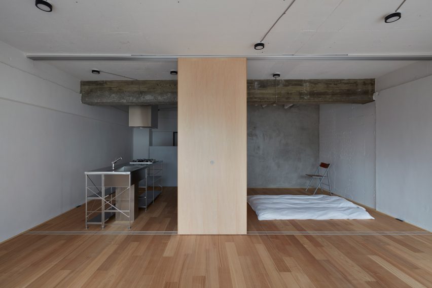
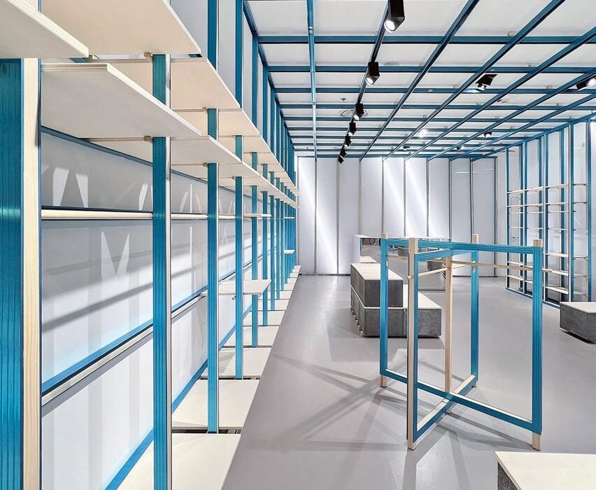
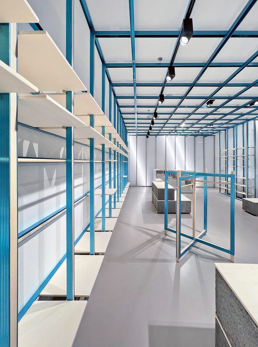
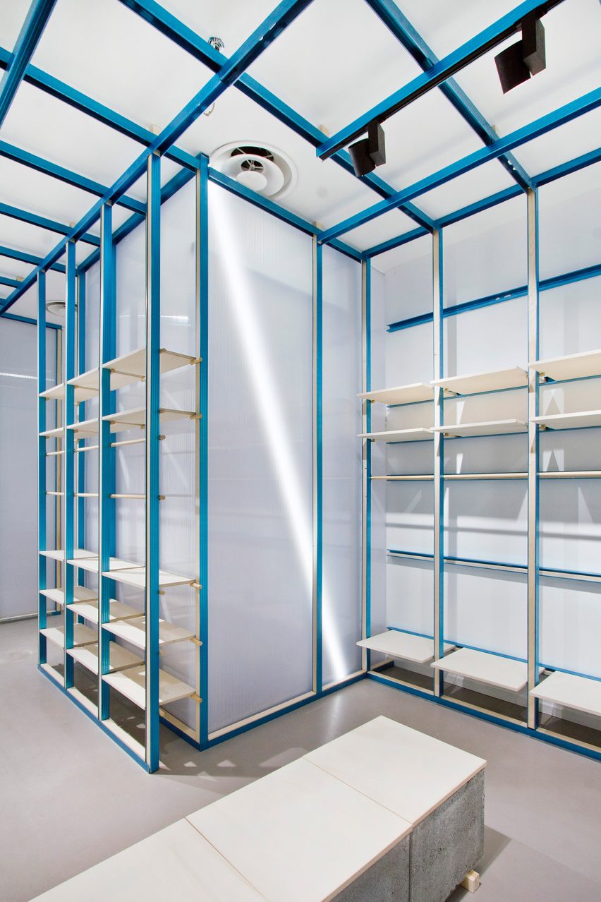
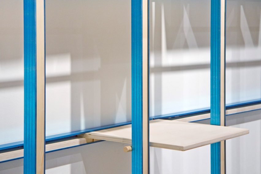
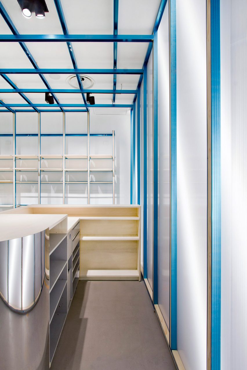
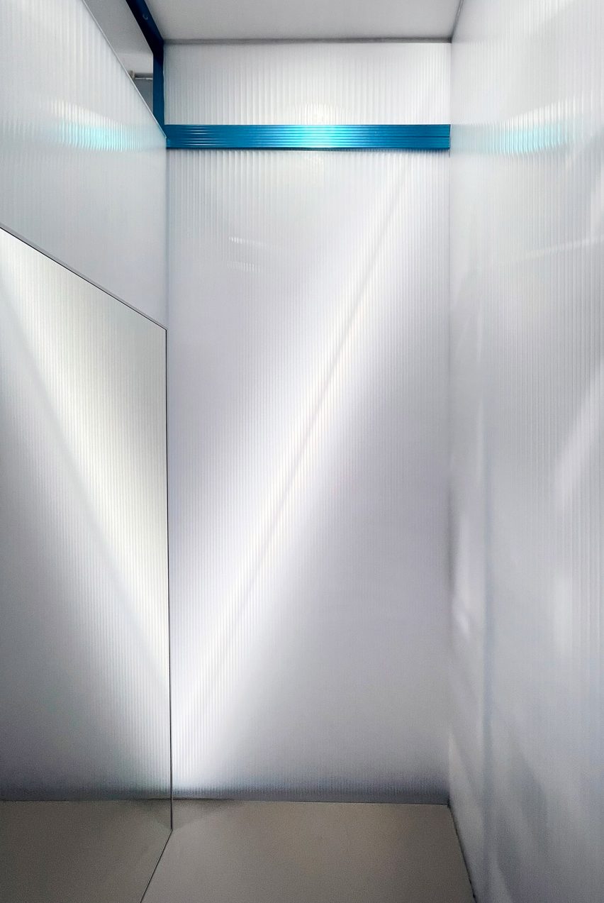
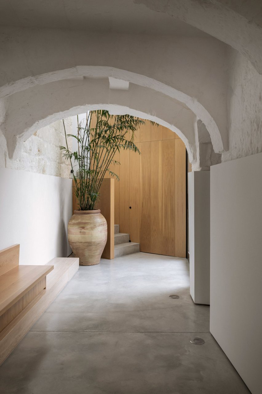
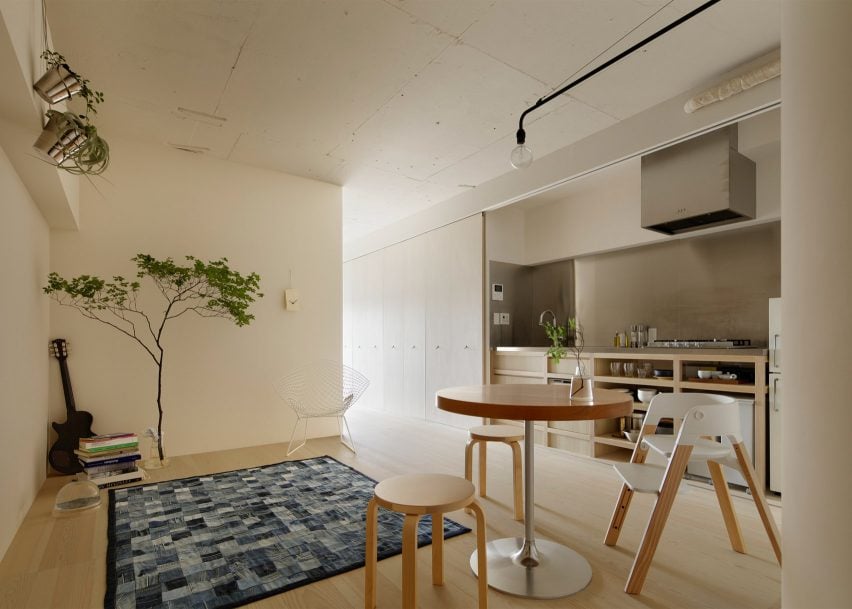
Akasaka apartment by FrontOfficeTokyo
Almost all of the walls within this 50-square-metre flat were replaced with multi-functional box units and sliding partitions to make the space feel bigger and brighter.
Local studio FrontOfficeTokyo stripped the apartment down to a single room, which features designated zones to lounge, cook, eat and sleep.
Raw and simple materials emphasise the utilitarian interior design, including exposed ceilings, pale timber floors and a corner bathroom contained in a concrete box.
Find out more about this apartment ›
House in Chofu by Snark Architectures
Snark Architectures renovated an apartment in Chofu – a city to the west of downtown Tokyo. Located at the base of Mount Takao, the dwelling intends to mirror traditional cabins.
With an open-plan layout that references mountain huts, House in Chofu is characterised by lauan plywood cabinetry and floor-to-ceiling glazing that offers views of the surrounding scenery.
“The house is the base camp connecting mountains and cities,” Snark Architectures director Yu Yamada told Dezeen.
Find out more about House in Chofu ›
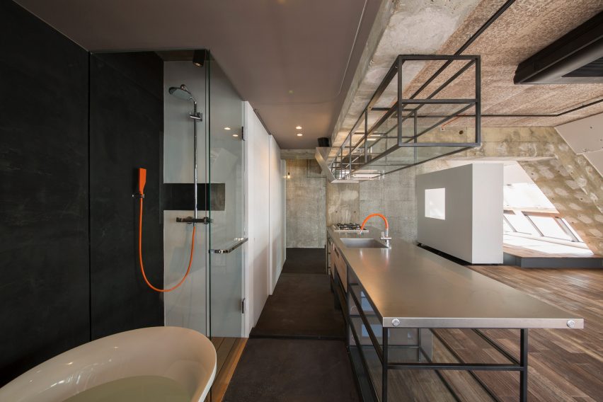
Tokyo Loft by G Studio Architects
Located on one of the top floors of a 1980s housing block, Tokyo Loft is short-term accommodation that intends to balance home comforts with industrial finishes.
G Studio worked with architects Teruya Kido and Suma-Saga-Fudosan to complete the interior look, which includes original sloping concrete walls that were illustrated with splashes of white paint in a nod to traditional Japanese washi paper.
Rows of skylights were added to the walls to flood the apartment with natural light, while bright orange electrical wires and plumbing features were left exposed. A freestanding bathtub adds a playful touch to the main living space.
Find out more about Tokyo Loft ›
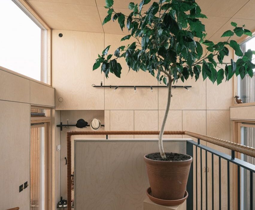
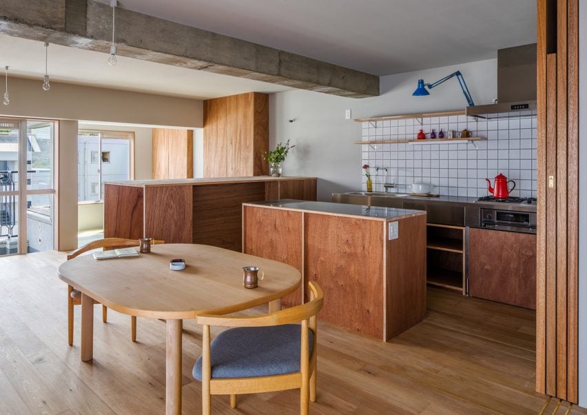
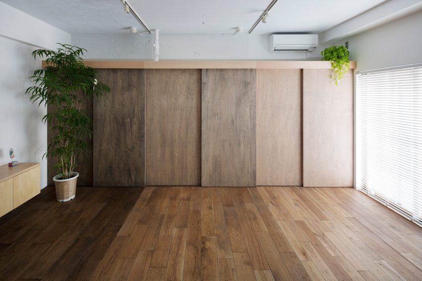
J House by Domino Architects
Wooden panelling creates “corners, blind spots and niches” in J House – a pared-back apartment renovated to maximise restricted floor space for a growing family.
Japanese studio Domino Architects used low-cost exposed plywood for its simplicity, while rough concrete in the kitchen adds to the dwelling’s minimalist interior design.
Find out more about J House ›
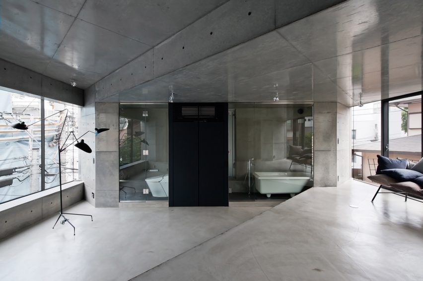
Motoazabu Apartment sYms by Kiyonobu Nakagame Architect & Associates
Diagonally stepped floors and ceilings create a dynamic layout of triangular zones within a pair of apartments in Tokyo’s Motoazabu neighbourhood.
Smooth, understated concrete defines the central interior spaces, which are surrounded by kitchen worktops and glazed bathrooms.
“What we aimed to do with this structure was to create something that would blend with its surroundings and maintain absolute simplicity,” explained architect Kiyonubu Nakagame.
Find out more about Motoazabu Apartment sYms ›
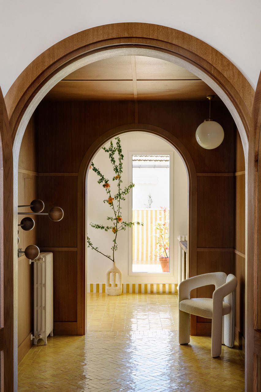
Opera Apartment by Taka Shinomoto and Voar Design Haus
A material and colour palette influenced by the different shades of an Opera cake – a famed French dessert – informed the “layered” coffee-hued interiors in this apartment.
The hallway features sliding geometric cupboard doors stained in various shades of brown while a mixture of glossy, matte and textured coatings cover the white walls.
Find out more about Opera Apartment ›
This is the latest in our lookbooks series, which provides visual inspiration from Dezeen’s archive. For more inspiration see previous lookbooks featuring concrete bathrooms, cosy cabins and homes with cleverly designed lifts.