Hairpin staircases rise through atrium
CategoriesInterior Design

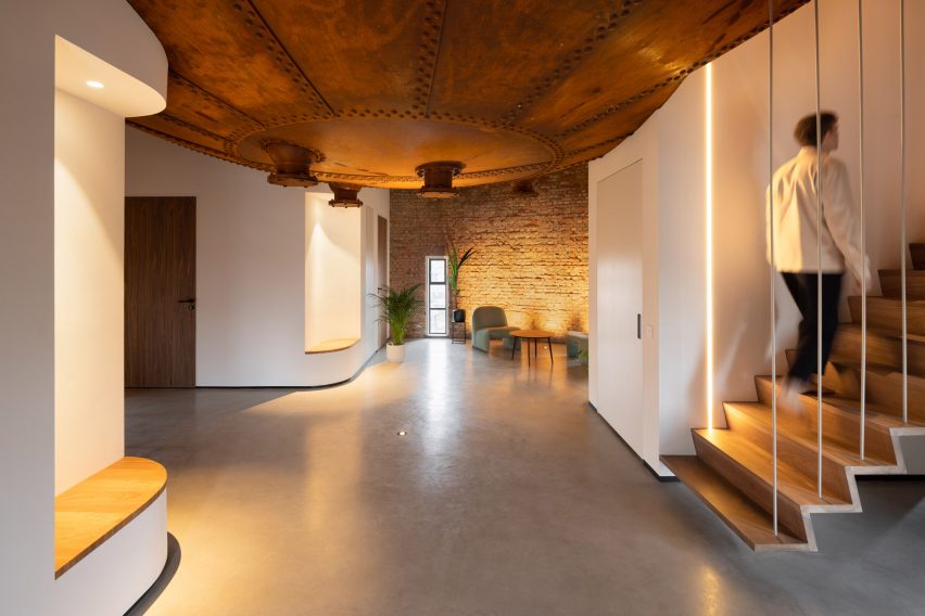
Black staircases link SC Workplace by Behnisch Architekten

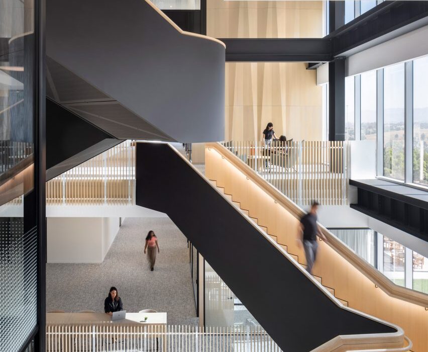
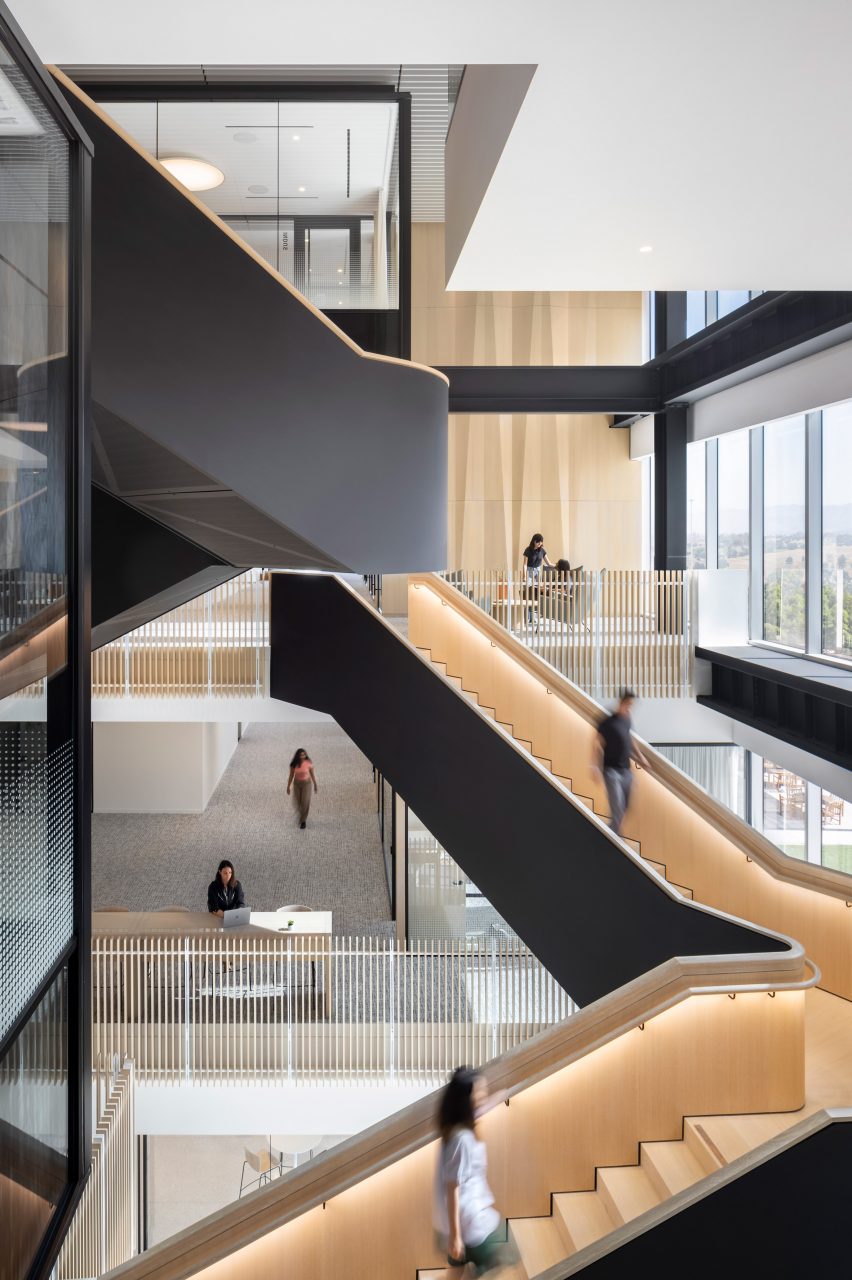
A variety of black staircases dogleg and spiral between the levels of this office in Southern California, designed by global firm Behnisch Architekten.

Tasked with bringing personality to a four-storey “developer box”, Behnisch Architekten 110,000 square feet (10,220 square metres) for an undisclosed client.

Hairpin staircases rise through atrium
Hairpin staircases rise through an atrium to link offices on different levels

“We had the opportunity to work with a great client to transform this ubiquitous building type into a dynamic work environment, which promotes connection and collaboration,” said the studio.

The building shell, measuring 120 by 240 feet (37 by 74 metres), features glass facades and an elevator core at its centre.

Atrium with glass facade and two staircases
Behnisch Architekten carved the atria from the floor plates to bring in light and create visual connections

The team began by carving up the continuous floor plates to open up the levels to one another – allowing in more light and creating visual connections between multiple spaces.

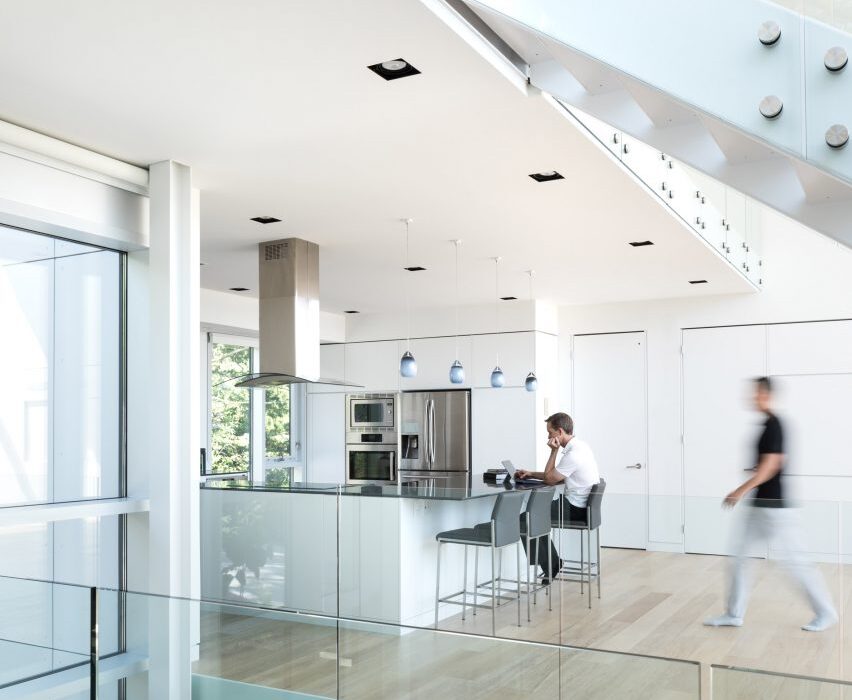
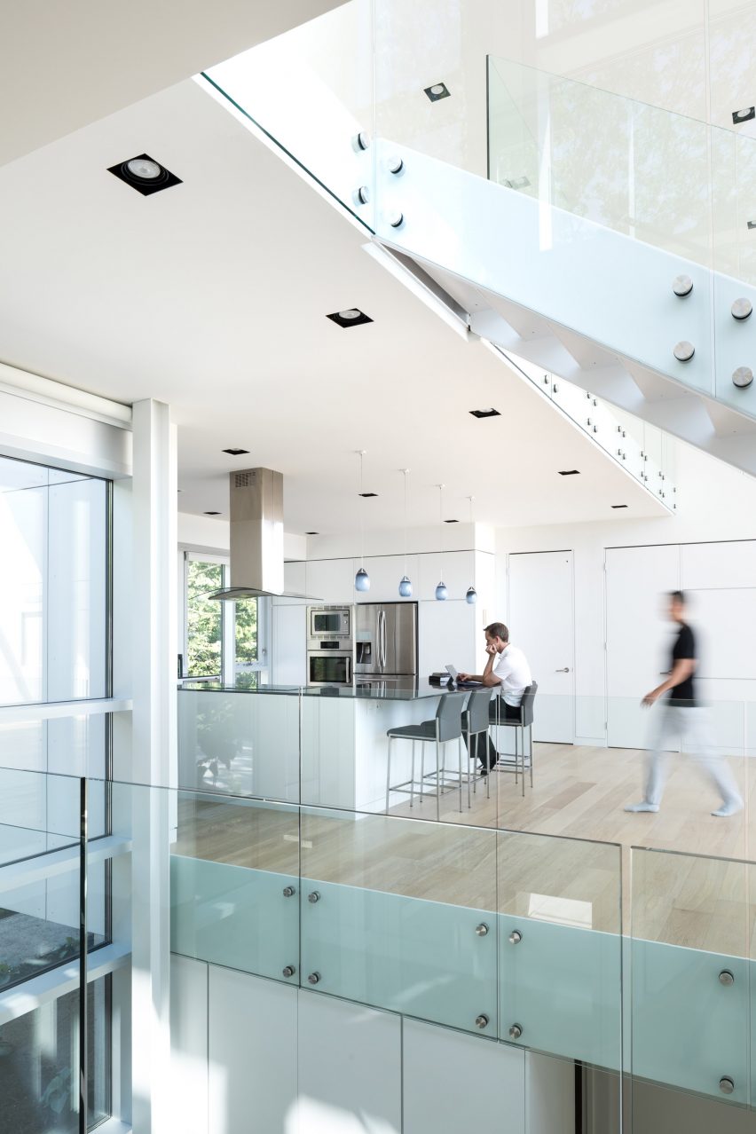
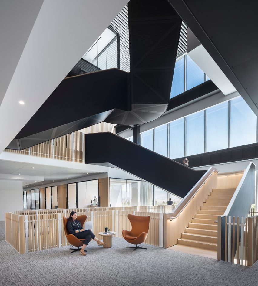
On opposite sides of the core, they created two “eccentrically-shaped atriums” by staggering the walls of meeting rooms on the different storeys.

Underside of staircases
The staircases are wrapped in solid black on three sides

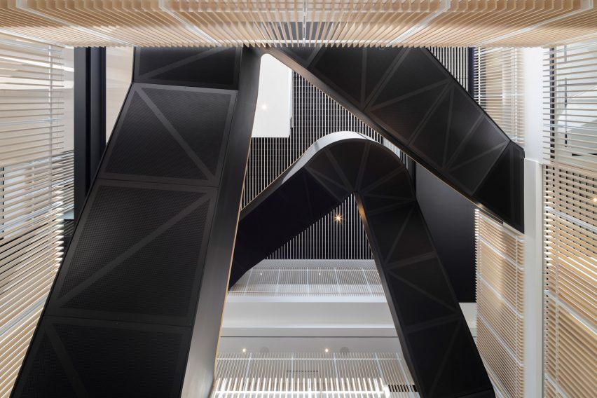
“A pair of hairpin-shaped stairs are situated in each atrium and connect users between office levels two to four, promoting inter-level exchange, but also serving as a sculptural element within the space,” said the studio.

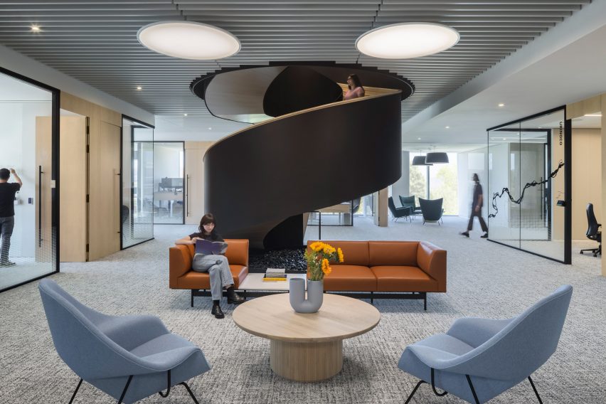
Voids were also created in opposing corners, each containing a spiral staircase treated with the same solid black balustrades and light wooden treads as the doglegged ones.

Spiral staircase in corner void
More voids were formed at the building’s corners, which are used as lounge areas

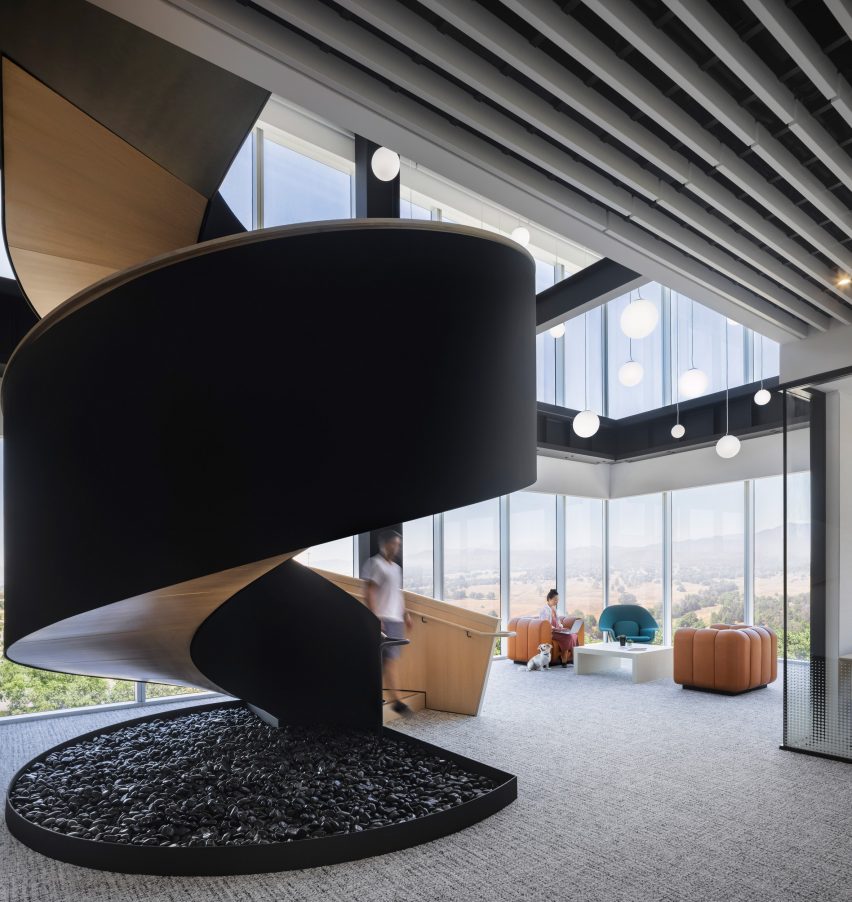
“The multitude of options between levels allows users to move freely from floor to floor,” Behnisch Architekten said. “These voids also add communication and transparency between previously disconnected floor plates.”

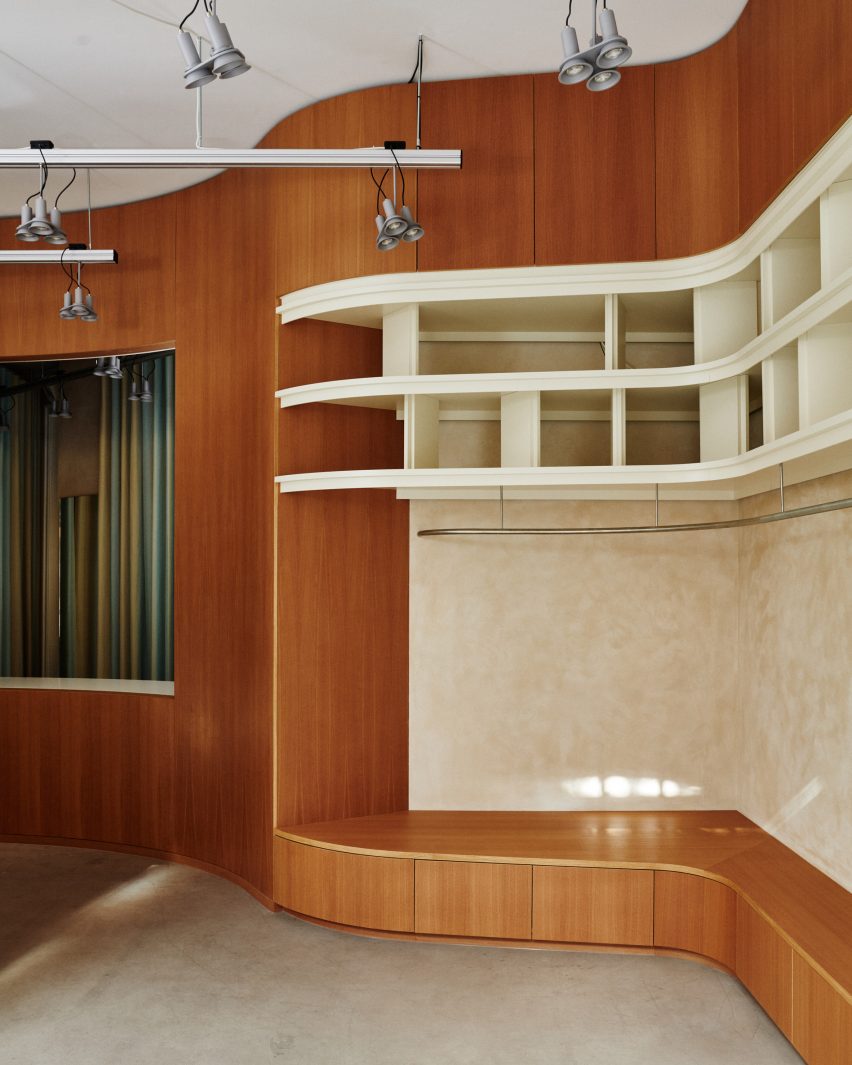
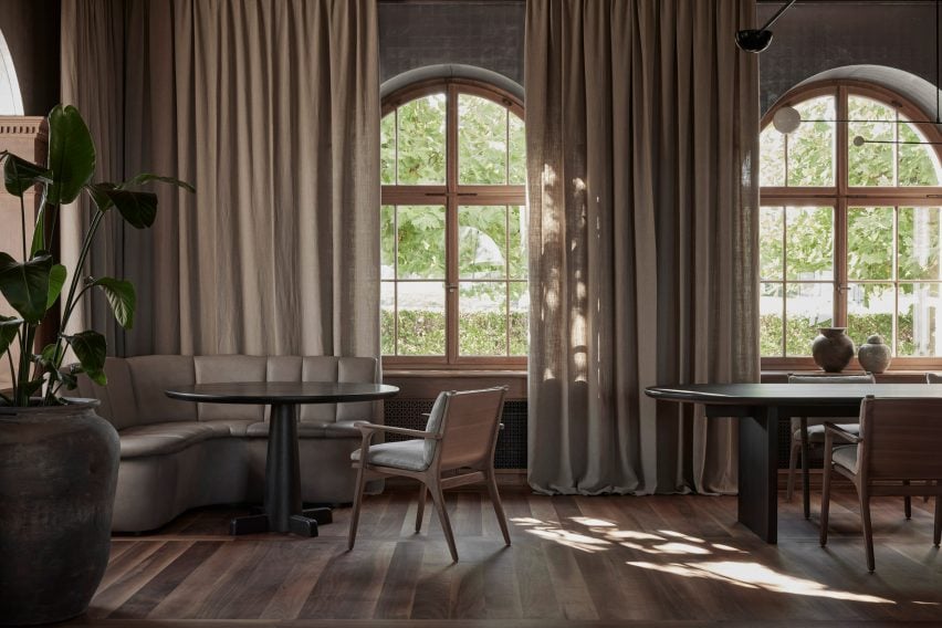
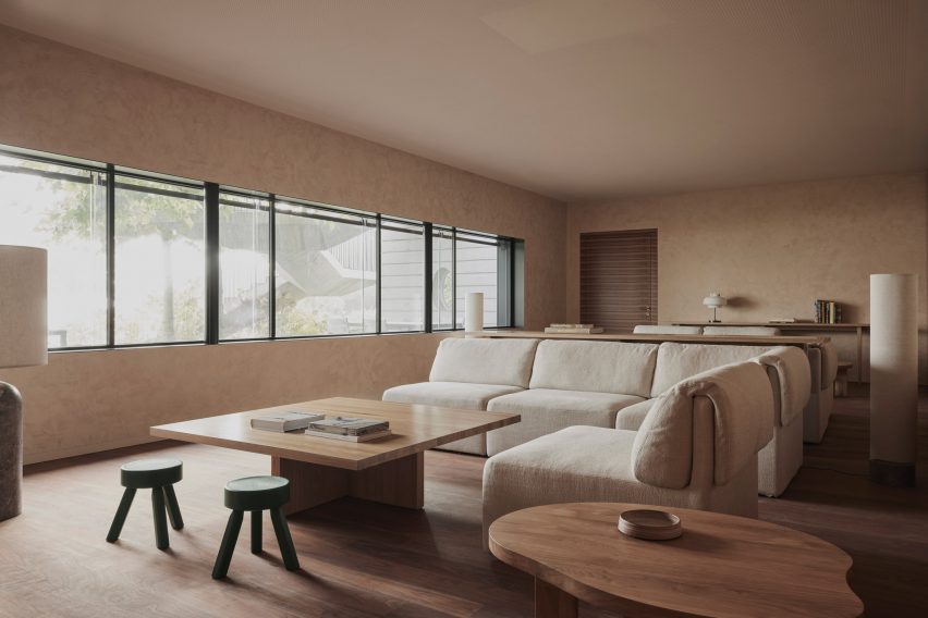
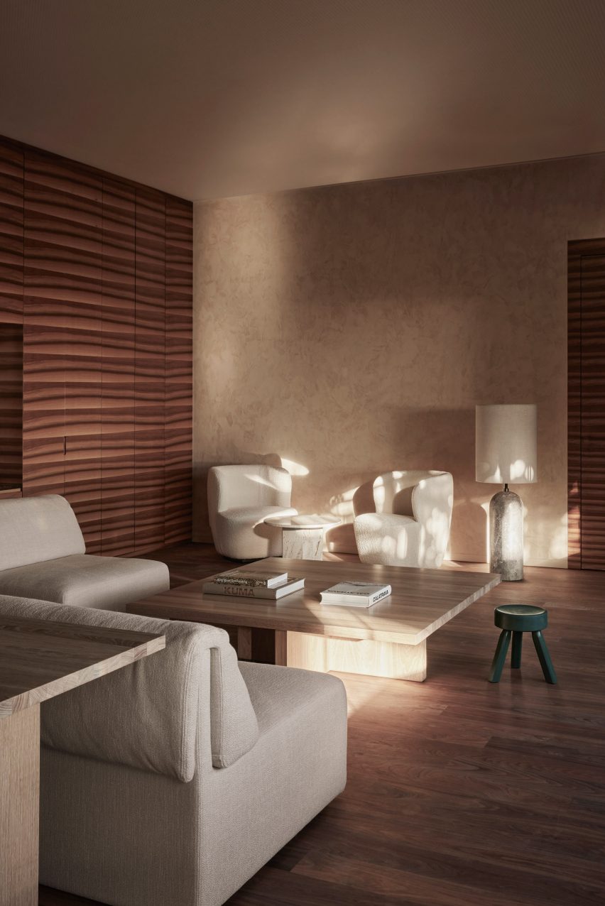
Lounge areas also occupy the corner voids, which offer social spaces for employees and are flooded with light from the dual-aspect glazing.

Lounge area in front of staircase
Spiral staircases provide alternatives vertical routes through the building

Private offices are situated around the building’s perimeter so that users are afforded light and views.

Closer to the elevator lobbies, conference and meeting rooms feature glass walls, allowing some to overlook the atria.

Internal lounge area with colourful sofas
Meeting and conference rooms are located in the centre of the building

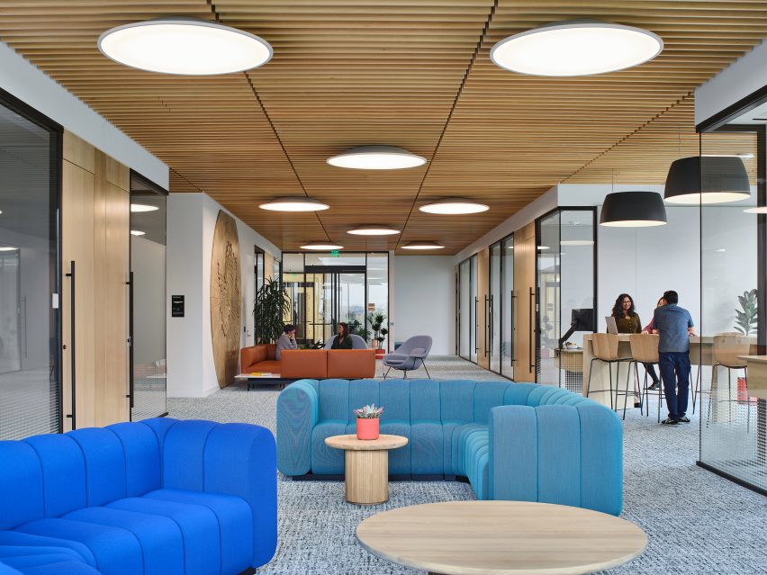
For wayfinding and booking, every meeting room is named after a river, while lounges are represented by lakes.

Each floor corresponds with two continental regions, which are identified through custom-designed wood artworks and photography.

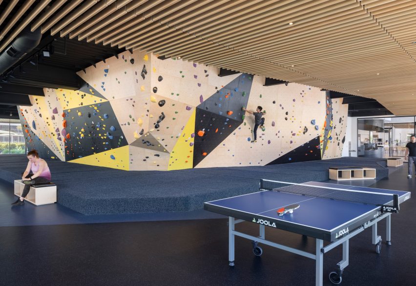
Amenities for staff at ground level include a bouldering wall that wraps the core and is connected to a gym and a game room.

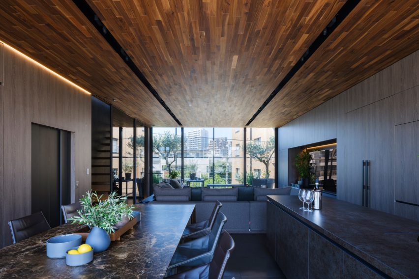
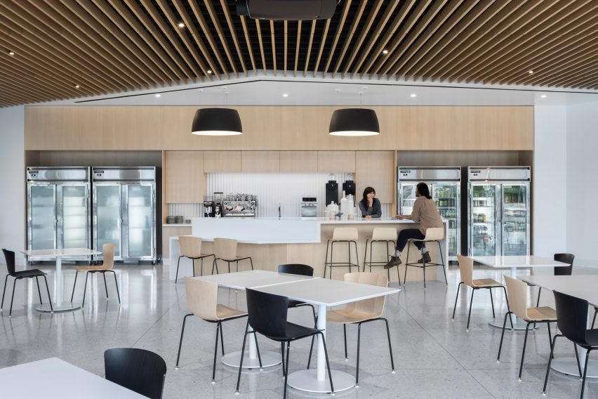
A large dining hall features pale materials and a slatted wood ceiling also found in other areas of the building.

Bouldering wall
On the ground floor, the core is wrapped with a bouldering wall

Stefan Behnisch established Behnisch Architekten in Stuttgart in 1989 with his late father Günter Behnisch. The firm now has additional offices in Los Angeles, Boston and Munich.

It has completed a variety of different building typologies over the years, from kindergartens, schools and laboratories, to offices for Adidas and an academic building at Harvard University.

Dining hall
Staff amenities include a large dining hall

Behnisch was interviewed about his firm’s projects as part of Dezeen’s Virtual Design Festival in 2020.

The photography is by Brad Feinknopf and Nephew.


Project credits:

Project team: Kristi Paulson (Partner in Charge), Daniel Poei (Director/Project Lead), Tony Gonzalez, Vera Tian, Laura Fox, Eric Hegre Apurva Ravi, Victoria Oakes
Consultants: John A. Martin & Associates (Structural), Loisos + Ubbelohde (Lighting/Daylighting), ARUP (Fire/Life Safety, Acoustical, Audio/Visual), ACCO Engineered Systems (Design-Build – Mechanical/Plumbing), Morrow Meadows (Design- Build – Electrical), Pinnacle (Design-Build – Audio/Visual), Ockert and Partners (Graphics), SPMDesign (Custom-fabricated Artwork)
General contractor: DPR Construction

Reference

Copenhagen store features minimalist interiors by Snøhetta
CategoriesInterior Design

Snøhetta combines clay and oak for minimalist interior of Holzweiler store

Architecture practice Snøhetta stuck to natural materials for the fit-out of the Holzweiler boutique in Copenhagen, incorporating subtle references to the fashion brand’s Norwegian heritage.

Snøhetta is a long-term collaborator of Holzweiler‘s, having designed the company’s flagship store and showroom in Oslo, as well as a number of its pop-up shops, runway sets and its digital identity.

Copenhagen store features minimalist interiors by Snøhetta
Snøhetta has designed Holzweiler’s Copenhagen outpost

For Holzweiler’s first international outpost in Copenhagen, Snøhetta followed the concept of “tracing” – devising an interior scheme that shows traces of the brand’s Norwegian roots alongside the minimalist aesthetic found in its previous retail spaces.

“Reminiscent of a memory or feeling that remains, the idea of ‘traces’ evokes an emotional sense of the brand’s beloved heritage as it travels to a new city,” the practice said.

Holzweiler's Copenhagen store features minimalist interiors by Snøhetta
A clay sculpture by Ingeborg Riseng sits at the heart of the store

At the centre of the 100-square-metre store is a tall, hollow sculpture by Norwegian artist Ingeborg Riseng, which shoppers can step into. Its undulating outer walls are fitted with display shelves and coated in a smooth layer of clay, while the inside has a rough, craggy surface.

An oakwood display plinth winds its way around the periphery of the store, eventually connecting to a curved timber partition at the rear of the floor plan.

Copenhagen store features minimalist interiors by Snøhetta
Around the edge of the store is an oak display plinth

Behind the wall lies a changing area with cubicles and curtains created by Danish textile design studio Tronhjem Rømer.

The fabric is digitally printed with subtle yellow and pale blue stripes, designed to evoke the shifting shades of the Norwegian sky.

To contrast the store’s largely natural material palette, Snøhetta added some industrial-style finishing touches like metal clothing rails and custom strip lighting, developed by Swedish brand Ateljé Lyktan.

Both the floors and ceilings were preserved from the store’s previous fit-out.

Holzweiler's Copenhagen store features minimalist interiors by Snøhetta
Garments hang from steel rails

Other recent projects by Snøhetta include Bolder Star Lodges, a quartet of wooden cabins that overlook a fjord in Norway.

Meanwhile in Denmark, the practice employed boat construction techniques to create a timber community centre in Esbjerg.

The photography is by Magnus Nordstrand, courtesy of Snøhetta and Holzweiler.

Reference

Concrete bath and Crittal screen in bathroom of Untiled House extension by Szczepaniak Astridge in London
CategoriesInterior Design

Eight practical and beautiful concrete bathrooms around the world

Our latest lookbook explores eight bathrooms with striking concrete interiors, ranging from a Mexico City bathroom that also features a rough-hewn stone bathtub to a UK bathroom built around a “concrete sculpture”.

Concrete is a practical choice for bathroom interiors since the material is water-resistant, hardwearing and easy to clean. It can also be a decorative option – the material has a rugged, industrial look that gives bathroom interiors a brutalist feel.

This is the latest in our lookbooks series, which provides visual inspiration from Dezeen’s archive. For more inspiration see previous lookbooks featuring interiors that prove beige doesn’t have to be boring, tidy kitchens with slick storage solutions and save-saving pocket doors.


Concrete bath and Crittal screen in bathroom of Untiled House extension by Szczepaniak Astridge in London
Photo by Nicholas Worley

Untitled House, UK, by Szczepaniak Astridge

This residential extension in south London was designed around a “concrete sculpture”, a concrete-walled void that travels through the house from the kitchen up to the bathroom.

Here, concrete was poured in situ to form the foundations, floors, walls and ceilings. A monolithic bathtub, also made from concrete, adds to the brutalist feel of the bathroom.

Find out more about Untitled House ›


Concrete bathroom in Cloister House
Photo by Givlio Aristide

Cloister House, Australia, by MORQ

The almost-windowless Cloister House in Perth surrounds a plant-filled courtyard and was designed to have a sense of privacy.

Made from thick concrete, its interior walls only have thin, arrow-slit openings. In the home’s bathroom, the rammed-concrete finish of the walls was left exposed and softened with a floor made from wooden slats and a red hardwood ceiling.

Find out more about Cloister House ›


Sunken Bath by Studio 304
Photo by Radu Palicica

Sunken Bath, UK, by Studio 304

Sunken Bath is a glazed bathroom that local studio Studio 304 designed for a London flat to create space for Japanese ritual bathing – a relaxation practice.

The shower and toilet are separated from the concrete bathtub, which is enclosed by glass walls and a glass roof and offers views of the peaceful bamboo-filled garden.

Find out more about Sunken Bath ›


House and Studio Lambeth by Carmody Groarke
Photo by Gilbert McCarragher

House and Studio Lambeth, UK, by Carmody Groarke

Architecture office Carmody Groarke designed House and Studio Lambeth to slot inside the fabric of an old warehouse. Its design combines a brick “skin” with a smooth concrete interior.

A concrete bathroom unit finished with a large shadow gap underneath the ceiling divides one of the home’s four bedrooms. This is contrasted with a decorative marble sink and copper-hued taps and details.

Find out more about House and Studio Lambeth ›


Concrete bathroom in Habitat 67 building
Photo by Maxime Brouillet

Unit 622, Canada, by Rainville Sangaré

Moshe Safdie’s famous brutalist Habitat 67 in Montreal is home to this apartment, which is one of 158 homes in 354 stacked, prefabricated concrete “boxes”.

Its bathroom features a shower fronted by dichroic glass that changes colour depending on which angle it’s viewed from. Vertical concrete wall tiles were designed in a nod to the brutalist building’s structure.

Find out more about Unit 622 ›


Bathtub in Mexico City concrete bathroom
Photo by Edmund Sumner

Pedro Reyes House, Mexico, by Pedro Reyes and Carla Fernandez

This Mexico City home was made primarily from concrete, applied in varying degrees of coarseness, and was designed for and by a Mexican sculptor and fashion designer.

In the bathroom, the sink was moulded into a shape that resembles pottery and the bathtub is made from stone to look like a rock pool. The rough-hewn shapes match the rough feel of the concrete walls and ceiling.

Find out more about Pedro Reyes House ›


Concrete bathroom in Costa Rica
Photo by BoysPlayNice

Art Villa, Costa Rica, by Formafatal and Refuel Works

The Art Villa is nestled into the Costa Rican jungle and was designed to reference the tropical landscape and buildings by architect Paulo Mendes da Rocha, which are known for their monolithic concrete forms.

The concrete walls and ceilings in its bathroom match the large stone bathtub and contrast the wood used for the floor. Large floor-to-ceiling windows offer views of the verdant countryside.

Find out more about Art Villa ›


Concrete bathroom in New York apartment
Photo by Amy Barkow

S-M-L Loft, US, by BC–OA

Located in a cast-iron building dating from 1880 in New York’s Soho district, the S-M-L Loft draws on its past as a warehouse.

The functional, industrial vibe of the flat can also be seen in the bathroom, which has solid walnut millwork paired with raw concrete panels and white porcelain tiles.

Find out more about S-M-L Loft ›

This is the latest in our lookbooks series, which provides visual inspiration from Dezeen’s archive. For more inspiration see previous lookbooks featuring interiors that prove beige doesn’t have to be boring, tidy kitchens with slick storage solutions and save-saving pocket doors.

Reference

Hallway of Hiroo Residence
CategoriesInterior Design

Wooden furniture and artworks decorate Hiroo Residence in Tokyo

Designer Keiji Ashizawa used muted tones to make the most of the sunlight in this apartment in central Tokyo, which features wooden art pieces and furniture that was specially designed for the space.

For the Hiroo Residence, named after its location in the city’s Hiroo neighbourhood, Ashizawa wanted to underline the quality of the light in the flat.

Hallway of Hiroo Residence
A cut-out wall lets light into the hallway, which has an artwork by Sara Martinsen

In the open-plan kitchen and living room, light streams in from a balcony, and the designer took advantage of this light source by creating a cut-out wall so that the light carries through to the hallway next to it.

“I think you can see we have a very nice sunlight here,” he told Dezeen during a walkthrough of the apartment. “So I didn’t want to use white, as it would be too bright – instead I used muted, subtle tones.”

Living room corner in Hiroo Residence
A wooden artwork by Atelier Plateau and a slatted sideboard decorate the living room

He also wanted Hiroo Residence to feel like a peaceful place to come home to in a busy city, using natural materials to create a calm ambience.

“Outside it’s super noisy but inside it’s very quiet, so I chose muted tones that also fuse with the materials; the wood and the stone,” Ashizawa said.

The tranquil 200-square-metre apartment, which overlooks the Arisugawanomiya Memorial Park, has three bedrooms and two bathrooms, as well as a kitchen and dining area, a small workspace and plenty of storage spaces.

Wooden furniture in Tokyo apartment by Keiji Ashizawa
Shaker-informed chairs and a wooden light were used for the kitchen

Before designing the interior, Ashizawa changed the layout of the flat to make it more open, taking out an existing hallway to create a bigger dining space.

“Our goal was to design a space that can only be created by meticulously crafting from the smallest detail to the furniture, resulting in a quiet, comforting, and inspiring atmosphere with little noise, surrounded by natural materials crafted with tactility,” Ashizawa said of the design.

Sofa and coffee table in Hiroo Residence
Keiji Ashizawa used a neutral colour palette for the home

He worked with the Japanese wooden furniture company Karimoku on the project, which is the eighth in its Karimoku Case Study series that sees it collaborate with architects on bespoke furniture and interior projects.

As a result, wood was used throughout Hiroo Residence, with white-stained oak covering many of the floors.

Ashizawa also worked with Karimoku to create wooden window frames and sliding doors, which were placed throughout the flat to add privacy without taking up too much space.

The furniture matches the wooden interior details and includes two pieces created especially for the project – a sideboard with decorative wooden slats and a dining chair with a woven seat that was inspired by both Shaker designs and classic Scandinavian chairs.

Bedroom of Tokyo apartment by Keiji Ashizawa
Wooden panels cover the bedroom walls

In the bedroom of Hiroo Residence, wooden wall panels add a tactile and more natural feel, which is echoed in the built-in shelves and drawers in the en-suite walk-in closet.

Cabinets were also used to hide different functions in the kitchen, where a large wooden unit takes up an entire wall.

Kitchen by Karimoku for Tokyo flat
An entire wall is taken up by a wooden kitchen unit

Even smaller details in the flat, such as the long kitchen lamp, were made from the material.

Artworks in wood by Danish art studio Atelier Plateau and the artist Sara Martinsen, which were created especially for the space,  decorate the walls.

Karimoku has worked with Ashizawa on a number of projects, including its second showroom which just opened in Kyoto, Japan, and the Azabu Residence Case Study, where the designer referenced mid-century American design.

The photography is by Tomooki Kengaku.

Reference

Lobby of Mammertsberg hotel
CategoriesInterior Design

Mammertsberg by Space Copenhagen pays homage to historic features

A sculptural spiral staircase, floor-to-ceiling windows and panelled walls have been paired with contemporary furnishings in Space Copenhagen’s renovation of a restaurant and hotel in Switzerland.

Called Mammertsberg, the combined hotel and restaurant is housed within a 1911 villa that overlooks the Alps mountain range in Freidorf, Switzerland.

Lobby of Mammertsberg hotel
Top: a spiral staircase takes centre stage in Mammertsberg. Above: Space Copenhagen has renovated the Swiss hotel and restaurant

Danish design studio Space Copenhagen focused on the restaurant and lounge, which were totally refurbished to transform the interior from its previous status as a Swiss-food restaurant.

Meanwhile, the adjacent six hotel guest rooms were given a light refresh.

A lounge area interior by Space Copenhagen
Contemporary furniture was added to the lounge

“We embraced the idea of keeping key historic, listed, and structural features, defining for the building and its architectural heritage,” Space Copenhagen told Dezeen.

“For the transformation towards something new, it felt important to add a diverse mix of furniture, lighting, materials, art and books, all of which could have been collected slowly over time,” the studio added.

The interior of Mammertsberg restaurant
Linen curtains frame the large windows

Due to the building’s historic status, Space Copenhagen faced certain refurbishment restrictions, which resulted in the studio adapting its design around existing features within the property.

These included a large central staircase by architect Tilla Theus that connects the restaurant on the ground floor to the bar and lounge on the first floor.

The ground floor of the Mammertsberg
Natural materials were used throughout the interior

In the 42-seat fine-dining restaurant, which serves up locally sourced dishes, the studio embraced the high ceilings and large windows by adding floor-to-ceiling curtains in tactile, heavy linen.

“The building overlooks the impressive landscape and alpine scenery that characterises Switzerland and this inspired our design choices and approach,” said Space Copenhagen.

“It felt natural to treat the house as a large country home from which to enjoy the surrounding nature; offering guests the opportunity to contemplate and recharge.”

The interior of a restaurant in Switzerland
The restaurant has a walnut and linen colour palette

The surrounding nature was referenced in the material and colour choices, with solid oak tables in varying shapes and sizes dotted throughout the restaurant and lounge.

Elsewhere in the Mammertsberg restaurant, Scandinavian chairs were upholstered in subdued colour tones such as walnut and light linen, while petrol blue leather was added for contrast.

“We wanted to create a warm and inviting scene to balance the vibrant dishes while simultaneously seeking a high level of detailing, quality, and refinement in the curation of materials and furniture pieces,” explained Space Copenhagen.

“We worked with a new approach to solve the layout for the restaurant. Being a small restaurant allowed us to create a sense of familiarity with a variety of different tables – round, square and longer styles – all with different configurations and possibilities.”

A guest room inside the Mammertsberg
Six guest rooms were given a light refresh

The project also involved updating Mammertsberg’s guest rooms. Each of the six rooms was individually decorated to feel like someone’s private residence, with sculptural lighting and soft furniture to encourage rest and relaxation.

According to the designers, the limited time frame meant that finer details such as adding new finishes were prioritised over a larger overhaul.

A neutral coloured guest hotel room
Each hotel suite is individually furnished

“We couldn’t change the polished stone floors in certain public areas such as the restrooms, bathrooms and guestrooms,” Space Copenhagen said.

“We solved this by applying a different finish which honed them as much as possible towards a more matt and subdued hue, settling into the overall colour and material palette.”

Space Copenhagen was established in Denmark in 2005 and is best known for its restaurant interior design projects.

Among them is the Blueness restaurant in Antwerp, which is decorated with bespoke furnishings and Le Pristine, a restaurant that the company renovated with a moody aesthetic.

The photography is by Joachim Wichmann.

Reference

Natural Connections by AHEC
CategoriesInterior Design

Natural Connections exhibition aims to “help people rediscover nature”

Designers Inma Bermúdez, Moritz Krefter, Jorge Penadés and Alvaro Catalán de Ocón have created three playful wooden furniture pieces on show at Madrid Design Festival.

Devised by the American Hardwood Export Council (AHEC), Natural Connections was on show in the entrance hall of the cultural building Matadero Madrid.

Natural Connections by AHEC
Top: Natural Connections features playful furniture pieces. Above: the exhibition took place in the Matadero Madrid

Each of the three furniture pieces was designed to encourage interaction with wood – with one acting as a bench, the other a climbing frame and the third a hanging light installation.

The designs were created in response to a brief provided by AHEC, which sought pieces made by Spanish designers out of maple, cherry, and red oak hardwoods sourced from American forests in an effort to encourage the use of the material.

The inside of a light installation at Natural Connections
Catalán de Ocón designed Nube, a hanging light installation

“We challenged the design studios to present these chambers in a public space – in a public context – so that visitors get to experience a connection,” AHEC European director David Venables told Dezeen.

“The design teams worked with maple, cherry, and red oak to create playful, original, and highly innovative installations that we hope will provide engagement, excitement and a connection for visitors to these wonderful natural materials,” said Venables.

The Lost Herd furniture pieces
Inma Bermúdez and Moritz Krefter created several “bovine-shaped” seats

Designer Catalán de Ocón created a six-metre-long hanging light called Nube  – which translates to cloud in English – made of 4,000 interconnected spherical and cylindrical individual pieces of wood.

Nube is lit by several LED lights that were placed in the middle of the hollow structure. A brass cable runs from the bass into the mesh structure, branching into positive and negative electric currents.

Positive poles run through the cherry wood while negative poles run through the maple pieces, which form a complete circuit when they touch and illuminate the bulbs.

The Lost Herd by Inma Bermúdez and Moritz Krefter
Visitors can perch on the benches and touch the woods

Its design was informed by Catalán de Ocón’s fascination with the manufacturing process for small utilitarian wooden objects such as pegs, matches and blinds.

“I was inspired by the little match or the pencil, or the wooden pin for hanging the clothes – those kinds of manufacturing techniques, where you get an object which is repeated over and over and over again,” Catalán de Ocón told Dezeen.

Wrap installation at Madrid Design Festival
Jorge Penadés produced a bleacher-style structure

Meanwhile, La Manada Perdida, or The Lost Herd, by Inma Bermúdez and Moritz Krefter was influenced by the Matadero’s former function as a slaughterhouse and cattle market.

The Spanish design duo produced a series of red oak, maple and cherry benches for Natural Connections that reference equine and bovine animals such as horses and cows. The pieces were given minimal finishing to mimic the texture of the tree they came from.

“They appear as benches or seats, but their design goes beyond furniture to incorporate aspects of imagination and play to help people encounter and rediscover nature,” said AHEC.

Madrid-based designer Penadés responded to the natural connections theme by producing a tiered seating piece called Wrap that is connected by ball joints.

The designer, who is known for his interior projects with Spanish footwear brand Camper, glued and rolled 0.7-millimetres-thick pieces of cherry veneer into tubes to create tubular hollow components, which form a bleacher-style seat when joined together.

Natural Connections furniture by Jorge Penadés
Wrap is made from thin rolls of cherry veneer

Natural Connections is one of several exhibitions at Madrid Design Festival, a month-long event that sees a design programme take over the Spanish city. After the exhibition ends, the furniture will remain in the cultural centre for a year.

Also at this year’s edition is Slow Spain, an exhibition by university students that aims to explore American hardwoods and mindful furniture consumption.

Last year saw lighting designer Antoni Arola and Spanish light manufacturer Simon use a smoke machine, lasers and a small tree to create Fiat Lux 3 Architectures of Light.

Natural Connections is on show at Matadero Madrid as part of Madrid Design Festival 2023, which takes place from 14 February to 12 March. See Dezeen Events Guide for information about the many other exhibitions, installations and talks taking place throughout the month.

The photography is courtesy of AHEC.


Project credits:

Designers: Inma Bermúdez and Moritz Krefter, Alvaro Catalán de Ocón, Jorge Penadés
Partners: American Hardwood Export Council, Matadero Madrid, Madrid Design Festival, Tamalsa

Reference

Syncline by Omar Ghandi Architect
CategoriesInterior Design

Seven homes with discrete cleverly designed lifts

A converted showroom in London and a São Paulo penthouse with a wood-wrapped elevator are included in this lookbook of homes with smart residential lifts.

Lifts, also known as elevators, are mechanical shafts that carry people, cars and loads between multiple levels and are typically used in tall buildings.

But they can also be found in residential buildings, where they can be used to quickly move between floors and ensure that people with mobility issues can easily access the different levels of their homes.

This is the latest in our lookbooks series, which provides visual inspiration from Dezeen’s archive. For more inspiration see previous lookbooks featuring beige interiors, cosy cabins, space-saving pocket doors.


Syncline by Omar Ghandi Architect
Photo is by Ema Peter

Syncline, Canada, by Omar Gandhi Architect

Canadian architecture firm Omar Gandhi Architects built this three-storey home in Halifax, Nova Scotia. The home was named after a syncline – a type of rock formation – and comprises two white volumes that flank a double-height glazed core at its centre.

A lift was added to the home and set within locally-sourced spruce housing. This elevator is located at the corner of the home and leads to its open-plan kitchen from behind a white door.

Find out more about Syncline ›


Espirit House by Apollo Architects & Associates
Photo is by Masao Nishikawa

Espirit House, Japan, by Apollo Architects & Associates 

Espirit House was designed by Japanese architecture studio Apollo Architects & Associates for a client who works in landscaping.

The main bulk of the home has a blocky concrete form and is suspended above a garage. An elevator leads to the interior of the home,  where it is located next to the staircase in the main dining area. Floor-to-ceiling windows flank each side of the home, bringing light to the wood-clad interior.

Find out more about Espirit House ›


Cole Valley Residence by Jensen Architects
Photo is by Joe Fletcher

Cole Valley Residence, US, by Jensen Architects

Completed by San Francisco-based practice Jensen Architects, this home was built for a couple who wanted a home with a serene feel that had views of San Francisco.

Totalling five storeys, the home is composed of a number of stacked boxes with cantilevered areas. Jensen Architects added a simplistic interior palette of white oak, plaster and polished concrete.

An elevator was added to the home so that its owners can enjoy the space and its views as they age. On the fourth floor, it is located within a white-painted volume and opens up towards an outdoor terrace.

Find out more about Cole Valley Residence ›


São Paulo penthouse by Tria Arquitectura
Photo is by Fran Parente

São Paulo penthouse, Brazil, by Tria Arquitectura

At this São Paulo penthouse, which was designed by Brazilian studio Tria Arquitectura, an elevator shaft was wrapped in vertical strips of slatted wood.

Other textural materials were used throughout the home, including travertine floors, fabric and wood-panelled walls, which contrast against the home’s stark white walls.

Find out more about São Paulo penthouse ›


Danish Mews House by Neil Dusheiko
Photo is by Rachael Smith

Danish Mews House, UK, by Neil Dusheiko

In this west London home that was converted from a showroom to a residence for its elderly owners, British architect Neil Duskeiko installed a lift so that its residents could gain access to the upper floors of the home with ease.

The elevator runs from the ground floor to the living area and finally to the primary bedroom, which was decorated with floral wallpaper. The elevator has a wooden door with a decorative grain that matches the ceiling.

Find out more about Danish Mews House ›


Case Room by Geoffrey von Oeyen
Photo is by Kyle Monk

Case Room, US, by Geoffrey von Oeyen

A glass door fronted elevator was added to the ground and first floor of this Malibu home that was designed by American designer Geoffrey von Oeyen.

Von Oeyen extended the home and incorporated a paired back interior palette that was comprised of light wood panelling, dark stone floors and white walls. The elevator, which is located to the right of the front entrance, allows visitors with limited mobility to easily access the home’s renovated media room.

Find out more about Case Room ›


Amsterdamsestraatweg Water Tower by Zecc Architecten
Photo is by Stijn Poelstra Fotografie

Amsterdamsestraatweg Water Tower, the Netherlands, by Zecc Architecten

A former water tower in Utrecht was converted into a series of apartments that have 360-degree views of the city. Dutch studio Zecc Architecten retrofitted the building and added the largest of its apartments, a six-level home, to its very peak.

A private elevator, located within a white volume and beside a floating staircase, provides access to the six-floor apartment and opens out to an entrance space that features a rusted metal convexed ceiling constructed from the tower’s former water tank.

Find out more about Utrecht Water Tower ›

This is the latest in our lookbooks series, which provides visual inspiration from Dezeen’s archive. For more inspiration see previous lookbooks featuring beige interiors, cosy cabins, save-saving and pocket doors. 

Reference

Bar with painted mural by Carissa Marx
CategoriesInterior Design

Gin Design Group completes The Lymbar restaurant in Houston

Houston-based Gin Design Group has combined various mid-century references at a local restaurant, which celebrates its chef’s family history and is “a tribute to all grandmothers”.

Located at The Ion business centre in Midtown Houston, The Lymbar‘s design was heavily influenced by the upbringing of chef David Cordúa, whose menu is based on Latin-Mediterranean cuisine.

Bar with painted mural by Carissa Marx
The Lymbar’s bar features a mural by Carissa Marx influenced by the colours of the chef’s family home

The 4,000-square-foot (370-square-metre) establishment is named after Lymbar Drive, the street where Cordúa’s grandparents settled in Houston from Nicaragua.

It was designed by Gin Braverman of Gin Design Group, who was the chef’s childhood babysitter.

The Lymbar dining room
Tones used for the plush furniture were taken from the bar mural

“The Lymbar is my grandmother’s house,” Cordúa said. “The house stayed in our family, and it’s where we perfected our family’s hospitality.”

“It’s a tribute to all grandmothers,” he added of the restaurant, which is intended to feel both elevated and cosy, achieved through warm lighting, deep red curtains and plush furnishings.

A life-like tree in the middle of the dining room
Greenery is introduced by a life-like tree in the centre and globe-shaped planters above the bar

“We wanted to capture the bustle of a hotel lobby, the polish of a private club and the hospitality of the Cordúa family in the design,” Braverman said.

“Mixed with a confluence of Latin American, Lebanese and Mediterranean textures and art layered over a backdrop of classic mid-century materials such as warm woods, earthy colors and lush greenery.”

Shelving above banquette seating
The shelving above the banquette seating displays mementos from the chef’s childhood

The colour palette for the interiors was drawn from the Cordúa family home.

Orange, red and olive hues were used as a starting point for a mural painted on the front of the bar by local artist Carissa Marx.

Dining tables and a collage by Vernon Caldera
Artworks in the space in include a collage by Vernon Caldera, while the scalloped floor pattern was hand-painted by Carissa Marx

Influenced by the work of Brazilian modernist Roberto Burle Marx, no relation to Carissa, the mural then informed the tones chosen for the lounge-style furniture.

Marx also hand-painted a black and white scalloped pattern across the concrete floor.

Red velvet curtains and warm lighting
Red velvet curtains and warm lighting evoke the appearance of a hotel lobby

Other nods to mid-century design in the restaurant include the shelving at the main bar, which was inspired by Gio Ponti’s Planchart Villa in Venezuela.

The shelves display a collection of nostalgic objects and mementos from Cordúa’s childhood.

Greenery is introduced through a life-like tree that sits at the centre of the dining area and large globe-shaped planters above the bar created in collaboration with locally based Nicaraguan artist Vernon Caldera and The Flora Culture.

Caldera also helped to curate The Lymbar’s art collection, and one of his collages hangs in the dining room.

Private dining room
A private dining room is decorated entirely in a red-purple shade

The restaurant’s open kitchen is framed by a concrete counter and faceted breeze blocks that incorporate lighting. There’s also a private dining room decorated entirely in a red-purple shade.

Gin Design Group focuses on hospitality interiors primarily in the Houston area. The studio recently completed a barbershop in the Southside Place neighbourhood, which features a radial layout and a hidden cork-like bar.

Open kitchen
The open kitchen is framed by a concrete counter and faceted breeze blocks that incorporate lighting

Other restaurants to open in the city over the past year include cosy Japanese spot Uchiko Houston and lively smokehouse Loro Heights – both designed by Michael Hsu.

The photography is by Leonid Furmansky.


Reference

Office space with dark wood desks, wall panelling and a yellow sofa in office interior by The Mint List
CategoriesInterior Design

The Mint List fits out London office with mid-century-style movable furniture

Bespoke furniture with a mid-century feel can be rearranged to alter the use of this office space in north London, which interior design studio The Mint List has created for a music management company.

Camilla Kelly of The Mint List designed the headquarters for management company Everybody’s, which recently upgraded to larger premises on the ground floor of a former shipping depot.

Office space with dark wood desks, wall panelling and a yellow sofa in office interior by The Mint List
Everybody’s office is located in a former shipping depot

Architect Duncan Woodburn developed plans to reconfigure the large, light-filled unit as an open-plan workspace including a high-ceilinged entrance along with a kitchen and dining area.

For the interior scheme, Kelly worked closely with Lucy Tudhope of Everybody’s, ensuring the focus was on retaining the building’s existing character and creating a flexible workspace with a midcentury feel.

Flexible office space with white walls and floors, decorated with dark wood midcentury furniture
The Mint List designed custom joinery to divvy up the interior

“We wanted to ensure that we respected the modernist nature of this industrial site, whilst integrating a sense of creativity that was absolutely key for the client,” Kelly said.

One of the main challenges was zoning the large space to create different functional areas. This was achieved using custom-built joinery to separate self-contained yet open-plan spaces.

Modular kitchen island in a double-height space with overhead pendant lighting in office interior by The Mint List
Modular furniture features throughout the office interior

Much of the joinery is modular, allowing the space to be reconfigured if required. Large storage units at the entrance are accessible from both sides and completely movable so they can be rolled away to create an open event space.

Most of the time, the units serve to separate the office from the entrance area and provide staff with a degree of privacy from visitors.

Lounge room with parquet flooring, grey sofa and cream armchair
The office also houses a lounge for playing music

The main workspace is flooded with light that enters through the building’s glazed frontage. It contains desks and bespoke oak credenzas that can also be easily moved to completely clear the open-plan room.

At one end of the office is a kitchen with built-in storage, including coloured drawers and cupboard fronts that complement the African sapele wood joinery.

The kitchen contains bar seating next to the windows and a dining space arranged around a three-metre-long leather-topped artist’s table.

A full-height glazed wall specified by the client separates the workspace from private offices and a cloakroom on the ground floor, as well as a mezzanine that houses an acoustically sealed meeting room and a lounge for playing music.

Staircase with brown tile walls, white panelling and glass pendant lamp in hallway by The Mint List
Glossy tiles feature in the stairwell

“The brief was a seamless, vertical grid of glass,” explained Kelly. “So we helped to translate that in terms of the finishes – textured glass to obscure vision through to the office and a beautifully finished oak frame that complements the midcentury scheme.”

Throughout the project, The Mint List applied a palette of tactile and honest materials including sapele wood, oak, concrete and burnished brass.

Office meeting room with parquet flooring wooden table and wooden chairs with black upholstered seats
The Mint List added wood surfaces and brass details

A colour scheme based on natural hues including greens, creams and earthy browns adds visual richness to the spaces.

The office’s Marmoleum flooring is a custom design that subtly separates the space into different zones. The renewable material was chosen for its excellent acoustic properties in order to help absorb sound within the open spaces.

Bathroom with white sink and toilet and pink and white tiled wall in office interior by The Mint List
The bathrooms are playfully decorated with colourful tiles

Bathrooms located on the ground floor feature retro sanitary- and brassware complemented by playful tiles, with each wall laid in different patterns and colours.

Other recent office makeovers in London include Office S&M’s self-designed studio inside a former paint-making workshop and creative agency Ask Us For Ideas’ Soho office, which is split across two diametrically opposed floors.

The photography is by Dave Watts.

Reference

Clothes on displays 3D-printed from recycled plastic by Nagami
CategoriesInterior Design

Nagami 3D-prints plastic to mimic melting glaciers in Spanish boutique

Spanish design studio Nagami has completed a shop interior for sustainable clothing brand Ecoalf near Madrid that is almost entirely 3D printed from recycled plastic.

Walls, shelves and display tables inside the store in the Las Rozas Village designer outlet are made from 3.3 tonnes of repurposed plastic waste, sourced mainly from hospitals and used to create transluscent surfaces that resemble melting glaciers.

Clothes on displays 3D-printed from recycled plastic by Nagami
Nagami has 3D-printed the interior of Ecoalf’s boutique near Madrid

Additive manufacturing specialist Nagami created the plastic panels using a robotic arm equipped with a custom-built extruder that can print complex 3D forms, with the aim of uniting design and technology to raise awareness about the climate crisis.

“We wanted to highlight the melting of the polar glaciers due to climate change,” Nagami co-founder Manuel Jiménez García told Dezeen. “So the walls are meant to represent a glacier that is cracking.”

“The 3D-sculpted texture is a reference to the way the wind and snow erode the ice over time,” he added. “The idea was to recreate the sensation you might have when walking inside a glacier.”

Clothes on displays 3D-printed from recycled plastic in Ecoalf shop near Madrid
The interior was designed to resemeble a melting glacier

The Ecoalf store is the first fully 3D-printed interior completed by Nagami. And García believes it may be the first in the world to be fully 3D-printed using recycled plastic.

The project was completed with a very short lead time of just three months from design to installation.

Clothes on displays 3D-printed from recycled plastic by Nagami
Almost all of the surfaces are made from recycled plastic

According to García, the undulating forms that cover almost all of the store’s internal surfaces pushed the robotic printing technology to its limit.

“The machines needed to literally dance to create all of these different angles,” the designer explained. “Traditional 3D printing uses layers. But we can change the angle of the robot to make the kinds of curved and wavy forms you see in this project.”

The walls are divided into panels and joined using connectors that form part of the printed structure. This meant that the tolerances needed to be very precise so that the components can slot together neatly.

On the floor, natural stone tiles feature veins reminiscent of cracking ice to enhance the feeling of walking on a glacier.

All of the components used for the interior can be disassembled and reused or recycled for future projects. The plastic itself is almost infinitely recyclable, losing just one per cent of its structural performance with each new use, Nagami claims.

Interior of Ecoalf store in Las Rozas Village by Nagami
The shop is located in the Las Rozas Village designer outlet

Both companies share an interest in sustainable manufacturing, with Ecoalf creating clothing, footwear and accessories using recycled materials including plastic bottles, discarded fishing nets, used tyres and post-industrial wool and cotton.

Similarly, Nagami works with recycled plastic to create furniture, sculptures, interiors and architectural elements as part of a closed-loop production process.

The studio’s previous projects include several window displays for Dior, as well as a mobile toilet cubicle called The Throne and a collection of 3D-printed chairs by designers including Ross Lovegrove and Zaha Hadid Architects.

Robotic 3D-printing arm printing clear plastic
Nagami used special robotic arms to 3D-print the panels. Photo by Nagami

During the coronavirus pandemic, Nagami also made use of its quick-fire production process to 3D print face shields for medical staff.

“We see 3D printing as one of the most sustainable forms of production,” García explained. “You don’t have to produce stock, it doesn’t create any fumes and it’s very versatile so you can create things on demand.”

“In the future as we expand we want to have production sites around the world making things locally and reducing our carbon footprint even further.”

All photography is by Alfonso-Quiroga unless otherwise stated.


Reference