Shop front with stone facade and large window looking into a store with rammed-earth islands
CategoriesInterior Design

Gonzalez Haase AAS includes rammed-earth “islands” at clothing store

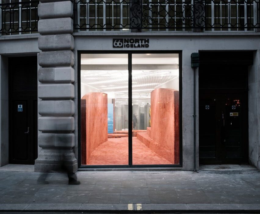
Architecture studio Gonzalez Haase AAS has completed a store on London’s Regent Street for Icelandic clothing brand 66º North, featuring curved walls and freestanding plinths made from rammed earth.

The Berlin-based studio headed by Pierre Jorge Gonzalez and Judith Haase set out to create a holistic concept for the store that represents Iceland in an original way, rather than relying on stereotypes.

Shop front with stone facade and large window looking into a store with rammed-earth islands
The shop interior was informed by Iceland’s volcanic landscapes

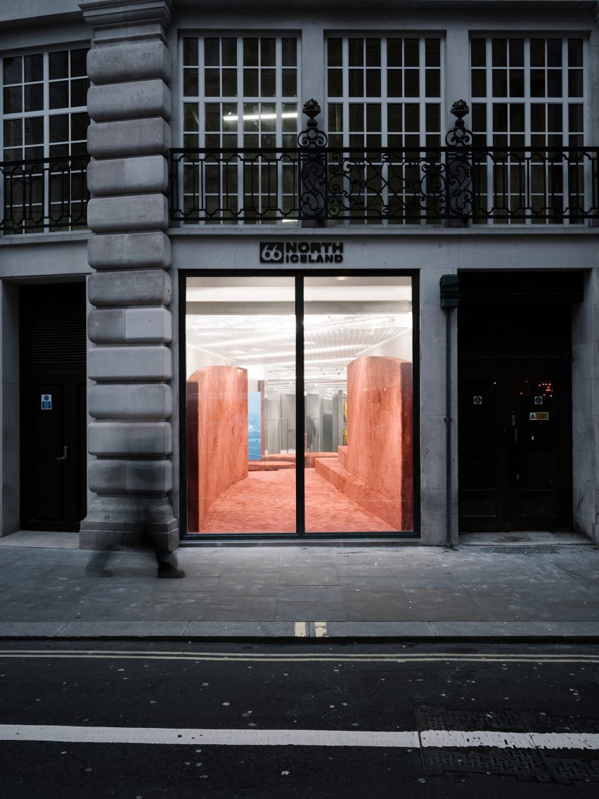
Gonzalez Haase AAS let the natural elements and the country’s geology inform key design features such as curved grey walls that evoke the shifting weather and rammed-earth islands that represent the earth.

“The weather in Iceland is a very real and prominent feature in the land and we classified this as static (the island) and forever changing (the weather),” the studio explained. “The static island of Iceland stands still in comparison to the constantly evolving and adapting weather, but this influences the perception of the island.”

Shop interior with grey floor and rammed-earth displays
Rammed-earth islands add colour and texture to the shop’s interior

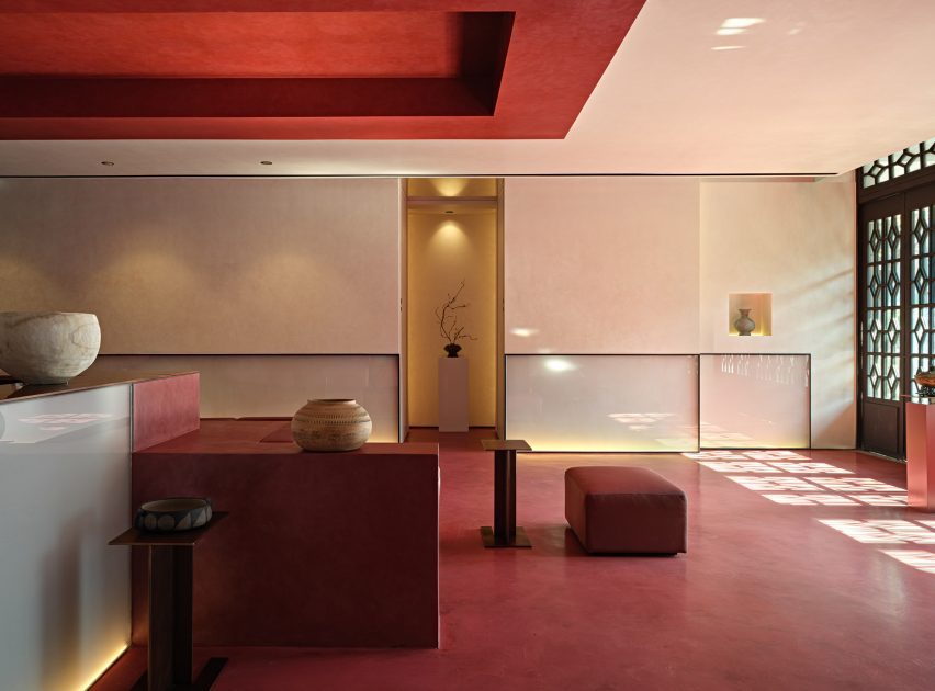
Upon entering the space, visitors encounter a series of curved walls rendered in natural pigmented clay sourced from Cornwall in the south of England.

The designers said the use of different grey tones represents the changing weather: “the immaterial, movement, changing, blurry and informal”.

Shop interior with grey floor, silver island and rammed-earth steps and partition wall
Grey walls represent Iceland’s shifting weather

The curved walls vary in height and frame different views within the store. At the entrance, one of the walls stretches back 18 metres, drawing the viewer’s gaze into the space and offering a tactile introduction to the experiential interior.

“These curved walls create different perspectives and atmospheres,” the design team added. “They sit in front of the existing white walls to create a dramatic foreground of rolling soft curves.”

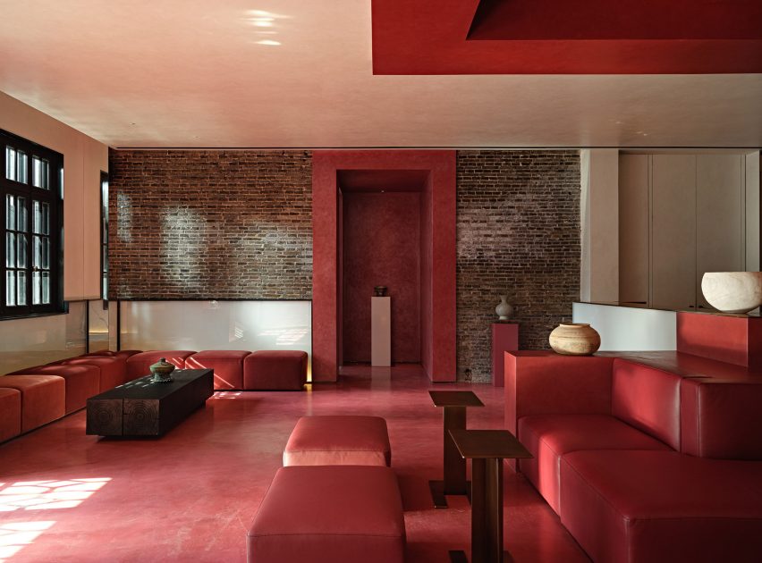
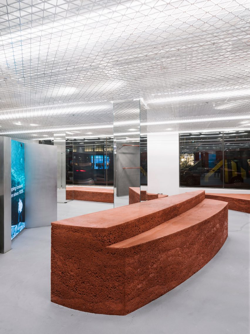
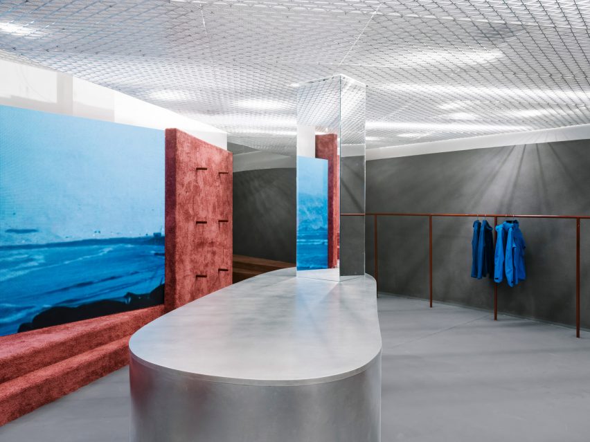
A series of monumental rammed-earth islands are inserted throughout the floor plan, adding colour and texture that evokes the earth and magma of Iceland’s volcanic landscape.

The islands were created by artist Lennart Frank, who cast and sculpted them from an aggregate mix of different lava rocks to create a layered effect.

Close up of the rammed-earth display islands at the 66 Degrees North clothing store
The islands were made from an aggregate mix containing different lava rocks

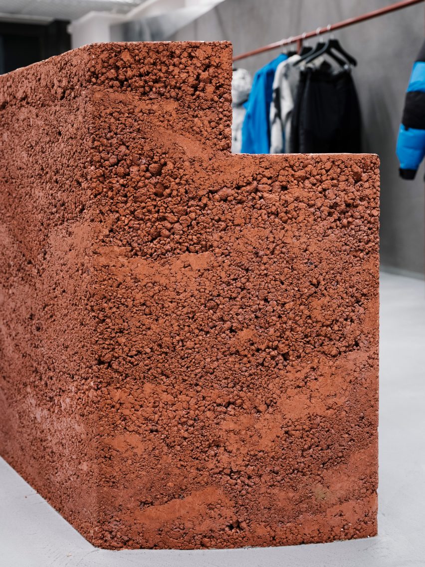
A combination of pigmented aggregate and sand gives the islands their reddish-brown hue, while the rugged texture brings a tactile element to the space that complements the brand’s clothing.

The earthy tones are echoed in the metal clothes rails, as well as in the colour of a carpet applied to the surfaces within a more intimate space at the rear of the store.

Shop interior with rammed-earth floor, steps and partition wall
Earth-toned carpet was used in parts of the shop

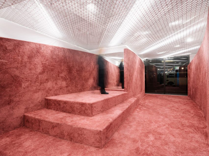
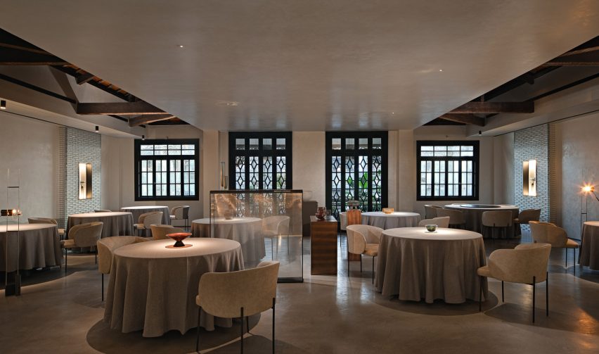
A custom-made mesh ceiling was designed to evoke a misty white sky, while also concealing lights and technical equipment.

Mirrors and screens displaying films of the Icelandic landscape help to define the flow of movement through the space and add a playful dimension to the shopping experience.

Shop front with stone facade and large window looking into a store with rammed-earth islands
The shop is located on Regent Street in London

Gonzalez and Haase founded their Berlin-based studio in 1999. The firm works on commercial, residential and cultural projects, developing spatial concepts and experiences that foreground the interplay between light and architecture.

Previous interiors designed by Gonzalez Haase AAS include a minimal office for a Berlin communications firm and a sparse, white-walled concept store in Lisbon that occupies a disused warehouse.

The photography is by Thomas Meyer, Ostkreuz Photography.


Reference

Wood-framed seating booths in Bao Express
CategoriesInterior Design

Traditional Hong Kong diners inform interior of Bao Express in Paris

Design studio Atelieramo has completed a retro interior for a Chinese restaurant in Paris, featuring celadon-green walls and curvaceous wooden booths modelled on those found in Hong Kong diners from the 1970s.

Architect Tala Gharagozlou and designer Virginie de Graveron oversaw the interior concept for Bao Express, a restaurant near Bastille in the 11th arrondissement that serves dim sum and bao buns.

Wood-framed seating booths in Bao Express
Bao Express is a Chinese restaurant in Paris. Top photo by Géraldine Martens

Housed in a former button factory, the 500-square-metre space is divided into three areas: a bakery, a diner and a basement bar.

Atelieramo set out to create a series of distinct yet connected spaces that evoke the architecture and pop culture of 1970s Hong Kong – in particular its greasy spoon cafes, locally known as cha chaan tengs.

Wood-lined seating booth in Paris restaurant by Atelieramo
Diners can sit in the eatery’s cosy wood-lined booths

“We reinterpreted snippets of that vibrant Hong Kong urban atmosphere with its coloured pavings, pastel colours, neon lights and dense mix of patterns and motifs,” said the studio.

“The aim was not to create a decor but rather, with a playful nod to these references, create a new atmosphere distinct to Bao’s new space.”

Mint-green dining room of Bao Express restaurant in Paris
A larger skylit dining area is located in the rear. Photo by Géraldine Martens

The adaptation of the existing abandoned building involved significant alterations to the floor plates and structure, along with the addition of a new staircase and circulation.

From the street, customers enter a small bakery and cafe serving sweet and savoury snacks to eat in or take away. What appears as a simple neighbourhood cafe conceals the presence of the larger dining areas, which are set back in the building’s plan.

Pastel-hued staircase in Chinese restaurant by Atelieramo
A new staircase leads down to the basement bar. Photo by Bérénice Bonnot

The kitchens are visible from the street and guests walk past colourful crates of raw produce before passing through a metal curtain to reach the main Bao Express diner.

The long dining space features cosy booths with sinuous wooden frames. The pastel-green walls are contrasted with bespoke bright-red sconces and simple mosaic panels that echo the materials of the central bar.

Towards the rear of the building is a larger dining area topped with an expansive skylight. This bright and airy space is filled with plants that create the feeling of dining in a winter garden.

Exposed masonry walls painted in celadon-green form the basis for a playful colour palette featuring contrasting peach and pink elements as seen in the glossy tabletops.

Bar with hammered-metal ceiling in Bao Express restaurant in Paris
A hammered-metal artwork by SupaKitch decorates the ceiling in the bar

The studio’s eclectic use of colour and pattern extends to the geometric tiled floors and punchy black-and-white stripes that are painted on the walls of the staircase leading down to the basement bar Underpool.

This bar area features a hammered-metal ceiling installation by French artist SupaKitch, with a rippled surface that reflects the blue-green interior and creates the impression of looking up at an upside-down swimming pool.

Swimming pool ceiling installation in Chinese restaurant by Atelieramo
The artwork creates the impression of looking up at a swimming pool

Bao Express is part of a family of eateries in Paris owned by restaurateurs Céline Chung and Billy Pham. Atelieramo was responsible for designing several of the duo’s restaurants, each of which has a unique character inspired by different aspects of Chinese culture.

Another eatery informed by traditional cha chaan tengs is The Astor restaurant in Hong Kong’s Eaton hotel, designed by New York studio AvroKO, which mixes elements of the city’s diners and street food stalls with nods to the arthouse films of Wong Kar-Wai.

The photography is by Carole Cheung unless otherwise stated.

Reference

Fireplace at the centre of a dining table
CategoriesInterior Design

Frank Architecture puts Japanese spin on cabincore at Hello Sunshine bar

A “psychedelic inverted cabin” provided Canadian studio Frank Architecture with the design narrative for this Japanese casual bar and restaurant in Banff, Alberta.

Located in the mountains of Alberta, Hello Sunshine offers barbecue, sushi and karaoke in a retro-influenced space by Frank Architecture.

Fireplace at the centre of a dining table
Fireplaces sit at the centre of special tables at Hello Sunshine

The team imagined an alternate reality, in which Japanese graphic designer Tadanori Yokoo ventured into the mountains and holed up in a cabin for years, and based the interiors on what the result might have been.

“Taking cues from the unlikely juxtaposition of Japanese psychedelia meets spaghetti western meets mountain cabin, Hello Sunshine is bold, playful, and distinct,” said Frank Architecture, which has an office in Banff.

Fire pit foregrounds a rounded bar behind
The wood-panelled restaurant features a rounded bar at the back

The eatery is located in the middle of the town, which is a popular destination for tourists and winter sports enthusiasts and is laid out to offer a sense of discovery.

“The spatial planning is intended to feel organic and meandering,” the team said. “Upon entry, the restaurant isn’t immediately visible but is slowly revealed as one moves through space.”

Paper lantern above bench seating
Japanese elements like paper lanterns and textile artworks and paired with plaid curtains and plenty of wood

The restaurant occupies a tall open space lined almost entirely in wood, with the rounded bar located at the back and a variety of table seating options scattered around.

Diners can choose between communal benches, four-tops, booths, bar stools, or sit at one of two special tables.

Booths beside angled shingle-covered walls
Booth seating is lined up against angled, shingle-covered walls

This pair of large circular counters both feature a raised fire pit at their centre, below fluid-shaped flues clad in glossy, glazed ceramic tiles.

Japanese design staples like paper lanterns and ceiling-hung textile artworks are combined with mountain tropes such as plaid curtains, exposed stone and plenty of wood.

Blue corduroy fabric is used to cover banquettes, while the booth seating is tucked into a niche formed by angled walls covered with timber shingles.

In the karaoke rooms tucked away at the back, patterned carpet, lava lamps and disco balls add colour and sparkle to the wood-panelled spaces.

Karaoke room with disco ball and lava lamps
Karaoke rooms are enlivened by disco balls and lava lamps

There’s also a concealed tiny bar based on those crammed into the alleyways of Golden Gai in Shinjuku, Tokyo.

“The result is a bold and encapsulating space that surprises and delights guests with unexpected moments and distinctive style,” said the team.

Tiny concealed bar
A tiny concealed bar is based on those found in Golden Gai, Shinjuku

This isn’t Frank Architecture’s only Japanese restaurant – the studio also created an intimate setting for the Lonely Mouth noodle bar in its other home city of Calgary.

For another spot in the Western Canada metropolis, the team drew inspiration from author Truman Capote to set a 1960s vibe at Major Tom on the 40th floor of a downtown skyscraper.

The photography is by Chris Amat.

Reference

Dollis Hill Avenue by Thomas-McBrien
CategoriesInterior Design

Eight neutral home interiors proving that beige doesn’t have to be boring

A residence for retirees in Tel Aviv and a stripped-back Barbican apartment by minimalist architect John Pawson feature in this lookbook of beige interiors designed to bring a sense of calm into the home.

To compensate for their desaturated colour palette, these spaces rely on a varied material palette – ranging from pale timbers and limestone to textured plaster – in order to add visual and tactile interest.

Accompanied by plenty of storage, this helps to create peaceful, decluttered spaces even in tight urban areas.

This is the latest in our lookbooks series, which provides visual inspiration from Dezeen’s archive. For more inspiration see previous lookbooks featuring cosy cabins, save-saving pocket doors and Spanish apartment renovations with eclectic tiles.


Dollis Hill Avenue by Thomas-McBrien
Photo by Ståle Eriksen

Dollis Hill Avenue, UK, by Thomas-McBrien

British architecture firm Thomas-McBrien used pale bricks and whitewashed oak joinery to create a “calm and relaxing” atmosphere inside this house extension in London’s Dollis Hill.

In the pursuit of continuity, the timber was used to line everything from the kitchen cupboards and the floors to a newly added partition wall, which conceals a hidden utility room on one side and forms a cosy reading nook on the other.

Find out more about Dollis Hill Avenue ›


Mureli House in Kozyn, Ukraine, by Makhno Studio
Photo courtesy of Makhno Studio

Mureli House, Ukraine, by Makhno Studio

Completed just two months before Russia’s invasion of Ukraine, this home near Kyiv was designed to celebrate Ukrainian craft traditions and is finished almost entirely in beige.

“All materials in the home are natural,” architect Serhii Makhno told Dezeen. “The team used almost all Ukrainian brands and worked with several local contractors to minimise the distance and logistics.”

Find out more about Mureli House ›


Plywood kitchen inside Iceberg apartment by Laila Architecture
Photo by Mikaela Burstow

Iceberg apartment, Israel, by Laila Architecture

Israeli architect Talia Davidi of Laila Architecture used only pale, muted colours when designing this apartment in Tel Aviv, with the aim of turning it into a calm refuge for its retired owners.

To form a brighter, more open floor plan, almost all of the home’s partition walls were removed, while many of the surfaces – including the kitchen and the storage volume-cum-room divider in the living room – were finished in light birch plywood.

Find out more about Iceberg apartment ›


Barbican apartment designed by John Pawson

Barbican apartment, UK, by John Pawson

In keeping with his typically minimalist style, British designer John Pawson stripped this Barbican apartment back to its bare bones, adding only a smattering of furnishings and pale surfaces all around.

Full-height cupboards were integrated into a central timber volume made of bleached maple wood so that all belongings can be stowed away rather than cluttering the space.

Find out more about the Barbican apartment ›


Minimal interiors of forest retreat designed by Norm Architects
Photo by Jonas Bjerre-Poulsen

Forest Retreat, Sweden, by Norm Architects

Sandy-hued Dolomite plaster, plump greige sofas and a sheepskin-covered lounge chair were used to dress the living room of this traditional timber cabin in a Swedish forest, which Danish studio Norm Architects has converted into a pared-back holiday home.

“Creating homes is often an exercise in restraint,” explained co-founder Jonas Bjerre-Poulsen. “And while the creation of a simple, authentic and welcoming space might seem effortless and natural once completed, the journey to simplicity and the exercise of finding essence is often rather complex and not an easy task.”

Find out more about Forest Retreat ›


Bedroom inside Low Energy House designed by Architecture for London
Photo by Lorenzo Zandri and Christian Brailey

Low Energy House, UK, by Architecture for London

Architecture for London founder Ben Ridley aimed to celebrate the “modest beauty” of this three-floor Edwardian house in Muswell Hill when turning the neglected building into his own home.

Instead of cement-based products, natural materials including limestone, lime plaster and timber were used throughout the scheme to emphasise the home’s original details while also lowering its embodied carbon footprint.

Find out more about A Brutalist Tropical Home ›


White bedroom with sculptural wooden furniture
Photo by Do Sy

Brown Box apartment, Vietnam, by Limdim House Studio

Creamy terrazzo features not just on the kitchen counters but spills out across all of the floors of this apartment in the Vietnamese port city of Huế, designed by local practice Limdim House Studio.

Curving walls covered in textural plaster provide a backdrop for the interior’s restrained colour palette, which is warmed up with a handful of wooden furnishings to evoke a sense of quiet sophistication.

Find out more about Brown Box apartment ›


Wood Ribbon apartment by Toledano + Architects
Photo by Salem Mostefaoui

Wood Ribbon apartment, France, by Toledano + Architects

A sinuous plywood wall snakes its way through this Haussmann-era apartment in Paris, forming integrated shelves in the sitting room and storage cupboards in the kitchen that can be pushed back to reveal the sink and appliances.

The pale wood complements the apartment’s original parquet flooring and ornate plasterwork, paired with tonal furnishings including an oatmeal-coloured sofa in one room and a travertine island in the other.

Find out more about Wood Ribbon apartment ›

This is the latest in our lookbooks series, which provides visual inspiration from Dezeen’s archive. For more inspiration see previous lookbooks featuring cosy cabins, save-saving pocket doors and Spanish apartment renovations with eclectic tiles.

Reference

MAP House by SAM Architects
CategoriesInterior Design

Eight tidy kitchens with slick storage solutions

As people’s interest in ultra-organised homes shows no signs of abating, we’ve collected eight clutter-free kitchens with smart storage solutions in our latest lookbook.

Spearheaded by Japanese organisational guru Marie Kondo, well-organised interiors have become a global trend. In no room is this more evident than in the kitchen, where pantries are stocked up with decanted jam jars, spice racks are labelled and shelving units are customised to house specific utensils.

The following projects, which range from compact apartments to home extensions, use hooks, nooks, racks, shelves, cubby holes and display units to create tidy kitchens where not a grain is out of place.

This is the latest in our lookbooks series, which provides visual inspiration from Dezeen’s archive. For more inspiration see previous lookbooks featuring Spanish apartment renovations, cosy cabins and interiors with statement carpets.


MAP House by SAM Architects
Photo is by Edmund Sumner

Map House, UK, by SAM Architects

Paolo Vimercati and Melanie Schubert of SAM Architects demolished a garage hidden behind several listed buildings in south London in order to create this mews house for themselves.

Designed to accommodate their “modern lifestyles”, the home’s interior is clad in vertical planks of charred larch and has plenty of open-plan spaces.

The kitchen has pink, blue and orange plywood units that are filled with cooking books and glassware, while a pegboard display area is used to hang crockery.

Find out more about Map House ›


Fifth Avenue Kitchen by Handwerk Art and Design
Photo is by Perry E Hall

Fifth Avenue Kitchen, US, by Handwerk Art and Design

Space-saving storage solutions can be found in Fifth Avenue Kitchen, a compact New York apartment created by interior design studio Handwerk Art and Design for a client who works in the film industry.

Aiming to make the most of the 160-square-foot (15 square-metre) space, Handwerk retrofitted the kitchen with features including a pegboard wall for hanging mugs, aprons and other items.

“Starting with a study of their cooking habits and spatial needs, we designed a set of custom cabinets for the whole kitchen that placed everything specifically and precisely,” said the studio.

Find out more about Fifth Avenue Kitchen ›


A kitchen interior by Nimtim Architects
Photo is by Megan Taylor

Fruit Box, UK, by Nimtim Architects

Plywood and planed softwood structures with square tiles characterise this playful galley kitchen designed by Nimtim Architects for a home extension project in Forest Hill, London.

A kitchen island features a tiled waterfall countertop above a sink and shelving. The kitchen walls were designed to be filled in to increase privacy, or easily removed to maximise open space depending on the family’s future needs.

Find out more about Fruit Box ›


The Family Playground by HAO Design
Photo is by Hey Cheese

The Family Playground, Taiwan, by HAO Design

This family home in Taiwan was reorganised by studio HAO Design so that its occupants could spend more time with each other. In the kitchen, the parents are able to watch their children play games or listen to them play the piano while they are making dinner.

High ceilings in the kitchen meant there was room for a large black steel storage rack to be hung above a white-tiled island. The cage-like storage system serves as a “visual focus” and can also be used to hold plants or kitchenware.

Find out more about The Family Playground ›


Air BnP by Position Collection
Photo is courtesy of Position Collective

Air-BnP, Hungary, by Position Collective

This former studio flat in Budapest was reorganised by Hungarian studio Position Collective to create an Airbnb property suitable for two guests. Rather than rearranging the layout – and mindful of the small budget – the studio installed a plywood furniture and storage system that caters to temporary occupants’ needs.

In the kitchen, it features a modular pegboard storage wall with adjustable shelves to showcase different pieces of local Hungarian art books, home accessories and cooking equipment.

Find out more about Air-BnP ›


Curve Appeal kitchen interior
Photo is by Megan Taylor

Curve Appeal, UK, by Nimtim Architects

London studio Nimtim Architects transformed a 1920s semi-detached house in Southwark using multifunctional plywood partitions with arched openings and alcoves for storing belongings.

A limited, neutral-toned material palette was employed in the kitchen, comprised of handmade terracotta floor tiles, laminated countertops and sustainably sourced plywood.

Find out more about Curve Appeal ›


Kitchen of Maison Pour Dodo by Studio Merlin
Photo is by Richard Chivers

Maison Pour Dodo, UK, by Studio Merlin

For the revamp of a flat in Stoke Newington, British interior firm Studio Merlin added an abundance of storage to form serene, clutter-free living spaces.

An opening in the living room connects the kitchen, where there’s a wall of deep-set IKEA cabinets with smokey blue door fronts and a seating nook. Above this, a series of pantry-style shelves means the owner can easily access jars of cooking ingredients.

Find out more about Maison Pour Dodo ›


A kitchen with wooden shleving units
Photo is by Cristobal Palma

Punta Chilen, Chile, by Guillermo Acuña Arquitectos Asociados

Named after the peninsula of land that the residential complex sits on, this red home extension was constructed by Santiago-based architecture studio Guillermo Acuña Arquitectos Asociados using pine stilts.

An open-plan room in the heart of the home is a communal space designed for cooking and eating. Large pine shelves filled with ornaments and tableware line the walls.

Find out more about Punta Chilen ›

This is the latest in our lookbooks series, which provides visual inspiration from Dezeen’s archive. For more inspiration see previous lookbooks featuring homes with sliding doors, earthy bedrooms with natural colours and kitchens with marble surfaces.

Reference

Photo of Primrose Hill House
CategoriesInterior Design

Wood and stone surfaces bring “rich texture” to Primrose Hill House interior

Architecture for London has updated a 1960s house in London, creating an open-plan interior filled with natural materials and an improved connection to the rear courtyard garden.

The house is one of two detached properties set in a modernist estate in Primrose Hill that primarily consists of painted brick courtyard houses and small terraces.

Photo of Primrose Hill House
Primrose Hill House was designed by Architecture for London

The new owner asked Architecture for London to transform the interior into a modern layout that is better suited to their lifestyle.

“The house had a very broken plan consisting of lots of small rooms,” the studio’s director Ben Ridley told Dezeen. “The client wanted to create a family house that was more open plan with better views of the garden.”

Exterior photo of Primrose Hill House
The studio added a rooftop extension clad in white bricks

The remodelled interior improves the connection with the garden by incorporating a large picture window in the kitchen, along with sliding wood-framed doors in the living area.

The ground floor also contains a smaller reception area next to the entrance hall, with folding doors allowing this space to be separated from the kitchen and dining area.

Image of Primrose Hill House
Sliding wood-framed doors open the living room up to the garden

A bespoke blackened-steel staircase provides access to four bedrooms on the first floor, including a main suite with a juliet balcony overlooking the garden.

Following a detailed cost and sustainability review, a decision was made to demolish all of the property’s interior walls and rebuild them in order to achieve the required spaces.

Interior image of Primrose Hill House
The interior was finished in a rich material palette

This solution also offered the best energy-efficiency potential, according to Ridley, with a layer of wall insulation added alongside a heat recovery ventilation system (MVHR).

The home’s first-floor plate was replaced using steel beams and timber joists to enable the demolition of the ground-floor walls and the opening up of the interior.

Interior photo of Primrose Hill House
Flooring was used to define different zonessp

The project also involved the addition of a timber-framed rooftop extension, clad with white-painted brick to tie in with the rest of the house and set back so it’s largely hidden from view.

The extension contains a flexible mezzanine space for yoga and meditation that is accessed from the main bedroom suite.

Throughout the home, Architecture for London applied a pared-back palette of natural materials that is intended to create a sense of calmness and connection with the garden.

Internal walls treated with breathable lime plaster provide a neutral backdrop for furniture designed by architect Christian Brailey, which includes a dining table made from locally sourced London plane trees.

Photo of a dining area
Doors and windows are framed with wood

“We intentionally didn’t use a lot of colour so there’s a strong feeling of consistency,” Ridley said. “The choice of stone and timber brings a rich texture to the palette.”

A reference image of a Portuguese manor house, featuring a tiled trompe l’oeil frieze around a doorway, informed the use of materials to define space within the interior.

Photo of a bar at the home
The shared living areas have an open-plan layout

In the living room, stone floor tiles in different shades create a border around the room, as if an area rug has been placed on the floor to demarcate where furniture could be placed.

Ben Ridley founded Architecture for London in 2009 following his studies at London’s Barlett School of Architecture. The studio aims to create places that improve how people live and work, with a focus on reducing their operational emissions.

Photo of a staircase at the London home
Wood lines the interior walls of the home

Ridley’s own London house recently featured in our round-up of five UK house renovations designed to improve energy efficiency.

“Ultimately we are going to have to accept some changes in the appearance of our traditional homes,” he said, speaking to Dezeen as part of a feature on architects who have retrofitted their own homes.

The photography is by Christian Brailey.

Reference

Pink, orange and green rotating partition walls in a concrete apartment by AB Rogers
CategoriesInterior Design

Rotating panels define spaces in artist’s studio by Ab Rogers Design

Ab Rogers Design has completed an artist’s studio and residence in Kanazawa, Japan, featuring a series of fluorescent partition walls that can be rotated to transform how the space is used.

Called Fishmarket, the multipurpose creative and living space was designed for Japanese artist Hiraki Sawa, who lives in London but regularly visits his home city of Kanazawa.

Pink, orange and green rotating partition walls in a concrete apartment by AB Rogers
Ab Rogers Design introduced rotating walls that define spaces

Sawa met Ab Rogers in 2019 when the pair were both working on projects for the Wonderfruit music festival in Thailand.

At the time, they were both living in east London and over the course of several conversations decided to work together on what Rogers calls the “co-being space” in Kanazawa.

Fluorescent rotating partition walls revealing a freestanding bathtub in a concrete apartment by Ab Rogers Design
The interior was stripped back to its shell

Named after the duo’s shared love of fish, the former commercial space was converted into a place for Sawa to stay while in Kanazawa, as well as a place to host workshops around design, culture and food.

Rogers’ studio stripped the interior back to its industrial shell before adding foil-backed insulation to some of the walls and introducing interventions including the rotating plywood walls.

Pink fluorescent partition wall in an industrial apartment with concrete staircase to the side
The fluorescent partition walls are made from plywood

“We didn’t want to make it cosy or glossy, we wanted to work with the bones of what was there,” Rogers told Dezeen.

“We tried to let the light in as much as possible while keeping it raw and creating these interventions, these objects in space.”

Yellow, pink, orange and green rotating partition walls zoning a bedroom in a concrete apartment by Ab Rogers Design
The walls were painted in different colours to add character

The insertion of the four movable partitions on the building’s second floor allows this open space to be transformed into three smaller multipurpose zones.

Pivoting doors conceal the bathroom and enable the bedroom to become a workshop for making art, a place for viewing it or a social space for gatherings.

Each panel is painted in a different fluorescent highlighter hue to bring a sense of vibrancy and character to the otherwise pared-back space.

“I love fluorescent colours because they’re really alive and dynamic,” Rogers explained. “When daylight hits them they become electrified and they transform into something else.”

Long kitchen island bench topped with blue tiles in a dimly lit industrial apartment
The kitchen is located on the upper floor

A concrete staircase ascends to another open space where a monolithic nine-metre-long workbench functions as a kitchen, a worktop and a table for cooking, eating and sharing.

“The kitchen can be used as a kitchen but it’s also adaptable depending on what actions are being performed in the space,” Rogers explained.

“If you put a plate on it, it becomes a restaurant,” he added. “If you put a computer on it then it’s an office and if you put a sewing machine on it then it becomes a workshop for designing or making textiles.”

Long kitchen table topped with blue tiles with red strip lighting overhead in an unfinished industrial apartment
A long tiled bench provides space for food preparation and dining

All of the materials used in the project were sourced locally and chosen for their affordability. Building regulations also dictated some of the design decisions, such as the need to line certain walls with plywood panels.

Rogers never visited Kanazawa, so Sawa was responsible for solving problems on-site and finding materials to turn his ideas into reality.

Toilet and sink on a wooden bench in an industrial bathroom with fluorescent green wall by Ab Rogers Design
Some walls were lined with plywood panels

The project evolved over time with lots of back and forth between the client and designer. According to Rogers, this organic process produced an outcome that embodies both of their visions.

“I love these small projects where you have a strong affiliation with the client,” said the designer. “This symbiotic way of designing through a conversation is really fluent and means you’re always building ambition.”

Fluorescent green rotating wall at the top of a concrete staircase
The studio was previously a commercial space

Rogers works across fields such as health, culture, retail, hospitality and housing.

Previous projects by the multidisciplinary design studio include a cancer treatment hospital clad in glazed red terracotta and a space-efficient apartment with a floor area of just 19 square metres.

The photography is by Takumi Ota.

Reference

Interior of the cocktail bar at Gud restaurant by Studio8
CategoriesInterior Design

Studio8 transforms 1930s Hangzhou villa into hotpot restaurant

Promotion: Chinese architecture practice Studio8 has renovated the interior of a 1930s villa in Hangzhou, China, transforming it into a hotpot restaurant and cocktail bar that celebrates the building’s history.

The Gud restaurant and bar includes a roof terrace, dining space on the upper floors and bar on the ground floor.

The 496-square-metre space occupies a three-storey building that was built in 1939, as well as a later-built extension and the ground floor of an adjacent property.

Interior of the cocktail bar at Gud restaurant by Studio8
Antique hotpots are displayed throughout the interior

Although the villa had previously undergone a number of renovations, when designing the restaurant Studio8 aimed to maintain the building’s original features, including the street-facing facade.

Service areas, including the kitchen, restroom and staircase, are located in the extension and adjacent building, leaving the full space of the historic villa for restaurant dining and the cocktail bar.

Interior of the cocktail bar at Gud restaurant by Studio8
The cocktail bar features red velvet seating

The Gud restaurant specialises in hotpots, which lead Studio8 to study the culture of the cuisine and introduce aspects of it into the interior design, creating a “museum-like experience”.

The project’s design was informed by three stages of making and experiencing hotpots – the heat from the fire that cooks it, water as the main medium of the food, and the elevation of the flavour coming from the steam.

Studio8 used the themes of “heat, medium and elevation of flavour” to influence the function, materials, textures and light used in each space.

Antique hotpots at the Gud restaurant by Studio8
The restaurant interior was informed by hotpot cuisine

The cocktail bar on the ground floor of the historic villa was designed to be a lively space. It features a red floor, a fireplace, structural columns that display antique hotpots and red velvet sofas.

Part of the original brick wall was left exposed and a recessed mirrored ceiling at the perimeter of the room makes the space feel larger and more luxurious.

Restaurant at Gud by Studio8
The interior nods to the building’s history

“As the first element, heat is a fundamental design factor on the first floor, where human interactions were planned out accordingly,” said Studio8.

“The aim was to create a warmer and more welcoming space at the beginning of the hotpot experience, where people and friends meet first, have a cocktail and wait for everyone to arrive.”

Glass-brick niche in the Gud restaurant by Studio8
The restaurant features glass-brick niches

On the upper floor is the restaurant’s main dining area, which features glass-brick niches in the walls where windows used to be.

At the sides of the dining area, Studio8 opened up the ceiling to expose the wooden roof structure.

Private dining area at the Gud restaurant by Studio8
The third floor includes a private dining room

“After passing through the heated cocktail bar, comes the second element, water – the medium that reunites all elements,” said Studio8.

“Family and friends are seated together in groups around the round tables on the second floor for the food experience, a process that the architects relate to water reconstructing the atoms of the ingredients.”

Terrace at the Gud restaurant by Studio8
A roof terrace overlooks the city

The building’s original timber staircase was removed and a new enclosed staircase that connects the three floor levels was added in the patio area.

The staircase has double glazed U-shaped glass partitions along its floors with a “lighting system to represent the continuous energy flow transition”.

A terrace and private dining room are located on the third floor of the villa.

Staircase designed by Studio8
A new enclosed staircase that connects the three floor levels was added in the patio area.

“Here, the customers are reconnected with the city and able to look at it from different heights and angles, corresponding to the last element, steam, the elevation of taste,” said Studio8.

“The simply designed interior shows off the geometric shape of the attic, while benches on the roof allow customers to have a more exclusive interaction with the city.”

Metal staircase designed by Studio8
The staircase has double glazed U-shaped glass partitions along its floors

Studio8 is currently working on a number of renovation projects that aim to respect the history of the building, including the transformation of hotels and restaurants.

The photography is by Sven Zhang.

Partnership content

This article was written by Dezeen for Studio8 as part of a partnership. Find out more about Dezeen partnership content here.

Reference

Shrouded body in a black tunnel
CategoriesInterior Design

Recompose human composting facility transforms bodies into soil

American startup Recompose has opened a funeral home in Seattle designed by architecture firm Olson Kundig, where human remains are composted and turned into a nutrient-rich soil that can nurture new plant life.

Set in a converted warehouse in the city’s SoDo district, the facility is one of the first to make use of a burgeoning practice known as natural organic reduction  – or human composting, which was legalised in the state of Washington in 2019.

This sees the body of the deceased placed on a bed of plant materials inside a stainless steel vessel, purpose-built to accelerate the natural process of decomposition.

Shrouded body in a black tunnel
Recompose has opened a human composting facility in Seattle. Above photo by Austin Wilson

Over the course of 60 days, their remains are converted into one cubic yard of fertile soil – enough to fill the bed of a pickup truck. Loved ones can then take this compost home and use it to nourish their garden, plant trees in memory of the deceased or donate it to a local conservation area.

The aim is to offer a less polluting alternative to cremation or burial, which are hugely emissions and resource intensive, and instead create a meaningful funeral practice that allows people to give back to nature.

“Clients have shared with us that the idea of their person becoming soil is comforting,” Recompose founder Katrina Spade told Dezeen.

“Growing new life out of that soil is profound and the small ritual of planting, using soil created from a loved one’s body, is so tangible.”

Composting vessel inside Recompose facility in Seattle designed by Olson Kundig
Remains are left to decompose in cylindrical stainless steel vessels

Recompose’s 19,500-square-foot flagship facility in Seattle accommodates an array of 31 cylindrical composting vessels, stacked inside a hexagonal steel framework.

This vertical construction helps to conserve space in a bid to overcome the land-use issue associated with traditional burial and make human composting feasible even in dense urban areas.

“Recompose can be thought of as the urban equivalent to natural burial – returning us to the earth without requiring lots of land,” said Spade, a trained architect who developed the vessels as part of a residency at Olson Kundig‘s Seattle studio.

Lobby of Recompose human composting funeral home
The building’s lobby brings in elements of nature including plants and wood

The building itself was designed in collaboration with the architecture studio to reimagine the experience of being in a funeral home, making the process more transparent and bringing in elements of nature instead of overt religious iconography.

In the spirit of regeneration, much of the warehouse’s original shell was preserved. Warm wooden flooring and a planted wall enliven the central lobby, while strips of green glass are inset into the walls to provide glimpses of the intimate ceremony space beyond.

Here, loved ones can participate in a “laying-in ceremony”, similar to a traditional funeral service.

Ceremony room of human composting facility in Seattle designed by Olson Kundig
Green glazing provides glimpses into the main ceremony room

“The Gathering Space has floor-to-ceiling coloured glass windows that let light in, similar to the way light filters between trees in a forest,” said Olson Kundig design principal Alan Maskin.

“In a way, Recompose is a funeral home turned inside-out. There’s a suggestion of transparency and openness about death – including the ability to see and understand the entire process – that’s very different from a traditional funeral home experience.”

Body being placed into transitional vessel in Recompose Seattle
At the end of the funeral service, the body is moved through a transitional vessel. Photo by Austin Wilson

During the ceremony, a simple wooden lectern allows the bereaved to share words about their loved ones while the body of the deceased is draped in a cotton shroud and presented on a dark green bed called a cradle.

Mimicking the ritual of throwing dirt on a casket, guests can place flowers and plant materials on their person, which will help their transformation into soil.

The funeral home also has dedicated rooms for those who want to perform more hands-on care for their deceased ahead of the ceremony by bathing the body or reciting prayers and songs.

At the end of the service, the cradle is moved through a so-called threshold vessel embedded into the wall and into the Greenhouse, where it will join the other vessels in the array.

“A tremendous amount of care was taken to consider the experience of the body,” Maskin said. “There’s even a bit of poetry inscribed along the inside of the transitional vessel used during ceremonies.”

“That poem isn’t for the living; it’s only visible inside the vessel.”

Array of composting vessels inside human composting facility in Seattle designed by Olson Kundig
On the other side is the Greenhouse – home to an array of 31 vessels

Each vessel in the array contains a mix of plant materials developed by Recompose that includes wood chips, straw and a cloverlike plant called alfalfa, with ratios adapted based on the person’s body and weight.

Over the course of 30 days, the natural microbes found in the plants and the body will break down the remains, with any unpleasant odours filtered out and fresh air – and sometimes moisture – pumped into the vessel, which is intermittently rotated to speed up decomposition.

At the end of this process, any remaining bone fragments are ground down using a cremulator and any medical implants are removed for recycling.

The remaining soil is placed in a curing bin to dry out for another two to six weeks before it can be collected by friends or family.

Body in cradle being pushed into human composting vessel at Recompose in Seattle
The body is deposited inside one of these vessels along with different plant materials

Unlike cremation, this process does not require huge amounts of energy and fossil fuels, Recompose says, while the carbon contained in the human body is sequestered in the soil rather than released into the atmosphere.

The process also forgoes the vast amounts of embalming chemicals and emissions-intensive materials like steel and concrete that are needed for burials.

In total, the process to “transform your loved one’s body into soil” saves around one metric ton of CO2 emissions per person compared to burial or cremation, Recompose claims.

Person holding a handful of dirt
Friends and family can collect the soil and use it as they wish. Photo by Austin Wilson

Since 2019, a number of US states have followed in Washington’s footsteps and legalised natural organic reduction, with New York joining Colorado, Oregon, Vermont and California last month.

This comes as people are increasingly becoming aware of the hidden environmental impact of the deathcare industry and moving towards alternative funeral practices from liquid cremation to burial pods that grow into trees.

“Members of the baby boomer generation have started experiencing the deaths of their parents and I think many are asking: was that the best we can do,” Spade said.

Exterior of Recompose human composting facility in Seattle
The facility is housed inside a converted warehouse in SoDo. Photo by Austin Wilson

“But what’s interesting is that it’s not only older folks,” she added.

“Over 25 per cent of our Precompose [prepayment plan] members are under 49. I think this is because the climate crisis has played a role, too. People are wondering why our funeral practices haven’t been considered when it comes to our carbon footprint.”

Recompose plans to expand into Colorado in 2023 and California in 2027, while rival company Earth Funeral has set its sights on Oregon.

The photography is by Mat Hayward unless otherwise stated.

Reference

Kitchen with black cabinets and green-tiled floor
CategoriesInterior Design

Vipp transforms 13th-century Italian palazzo into pop-up hotel

Interior designer Julie Cloos Mølsgaard has created a pop-up hotel filled with Italian frescos and modern Scandinavian furniture for Danish homeware brand Vipp within Palazzo Monti in Brescia, Italy.

The collaboration with Vipp saw the Palazzo Monti, which is an artist residency foundation hosted in a 13th-century palace, transformed into a hotel for guests to stay overnight.

Kitchen with black cabinets and green-tiled floor
Palazzo Monti was converted into a pop-up hotel

The space was redesigned into a hotel suites focused on showcasing Vipp products.

Mølsgaard added minimalist furniture and lighting by Vipp to the interior spaces, aiming to complement the historic building, which features Baroque paintings from 1750 on its walls and ceilings.

Bed on red-tiled floor of Palazzo Monti
The rooms were decorated with minimalist furniture

“Palazzo Monti showcases a broad array of art exhibitions,” said Palazzo Monti founder Edoardo Monti.

“For the first time, we will host a liveable installation curated by Vipp, where we invite guests to check into our residency,” he continued.

“Entering the opulent gates of the palazzo is like stepping into an old master’s painting.”

Staircase within Palazzo Monti with frescos
The staircase is surrounded by frescos on the walls and ceiling

“For the pop-up hotel at the palazzo, Mølsgaard had an ambition of building a bridge between the minimalist and the opulent,” said Vipp CEO Kasper Egelund.

“Vipp and Mølsgaard approached the interior design with a simple and minimalist mindset to respect and not compete with the surrounding richness.”

Black kitchen island counter with Italian palazzo
Green tiles cover the kitchen floor

On the ground floor is a combined kitchen and dining area. Mølsgaard added an industrial-looking matte black kitchen island in the middle of the space, which sits under an ornate ceiling and atop a green-tiled floor.

A grand staircase surrounded by pastel frescoes leads visitors to the pop-up hotel on the first floor.

A succession of rooms – a hallway, salon and bedroom – were transformed into a suite decorated with Vipp furniture and lighting.

The furniture in the bedroom was intended to be simple and minimalist. The mattress sits on the floor without a bedframe, making the painted three-metre-high ceiling the main focus of the room.

“The idea is that guests should visit and explore the space,” Mølsgaard told Dezeen. “When you wake up under the frescoes, it’s impossible not to think, what kind of life must have been lived in this house?”

Hallway within Vipp pop-up hotel
Artwork was placed on the floor

Throughout the palazzo, artwork and picture frames were placed on the floor propped up against the walls, rather than being hung.

“We initially hung a lot of art on the walls, but it was making too much noise, so instead I have sought the purity of the history of the place and wanted to let it speak through the bare walls,” said Mølsgaard.

Living space in pop-up hotel with beige chez lounge in Palazzo Monti
Mølsgaard aimed to combine Scandinavian minimalism with Italian opulence

“The whole place is one big art piece,” she continued. “The staircase is a work of art, the doors are works of art, the shutters, the walls and the ceilings.”

“When you walk around the rooms, you simply experience so many things that you almost get overloaded, so there was something that had to be removed.”

Desk space with Monti Edition chair
Vipp launched a special edition chair for the pop-up

Artist workshops on the second floor of the building overlook Brescia, which is a UNESCO World Heritage Site.

To celebrate the pop-up hotel at Palazzo Monti, Vipp launched the Monti Edition chair, which sees the brand’s Swivel chair design upholstered in an Italian woven fabric created by textile company Torri Lana.

The pop-up hotel at Palazzo Monti opens on 18 April to coincide with Milan furniture fair Salone del Mobile and closes on 18 May 2023.

Vipp and Mølsgaard have previously collaborated on projects including a one-room hotel in a converted pencil factory and a pop-up supper club venue.

The photography is by Irina Boersma César Machado.


Reference