Ten Spanish apartment renovations characterised by eclectic tiles
For our latest lookbook, we have collected 10 apartments in Spain that have been brought to life using decorative tiles, from preserved 20th-century features to speckled contemporary terrazzo grout.
Known for its abundance of colourful tiles, Spain has many period apartments with original details including ornate archways and eclectic tiling.
The following architecture and interior design studios have made the most of these traditions when renovating homes, which often involved refreshing the homes’ interiors while maintaining their history, or adding contemporary elements that nod to the past.
This is the latest in our lookbooks series, which provides visual inspiration from Dezeen’s archive. For more inspiration see previous lookbooks featuring statement carpets, pop-up shops and homes with sliding doors.
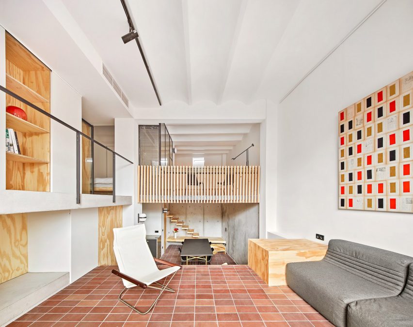
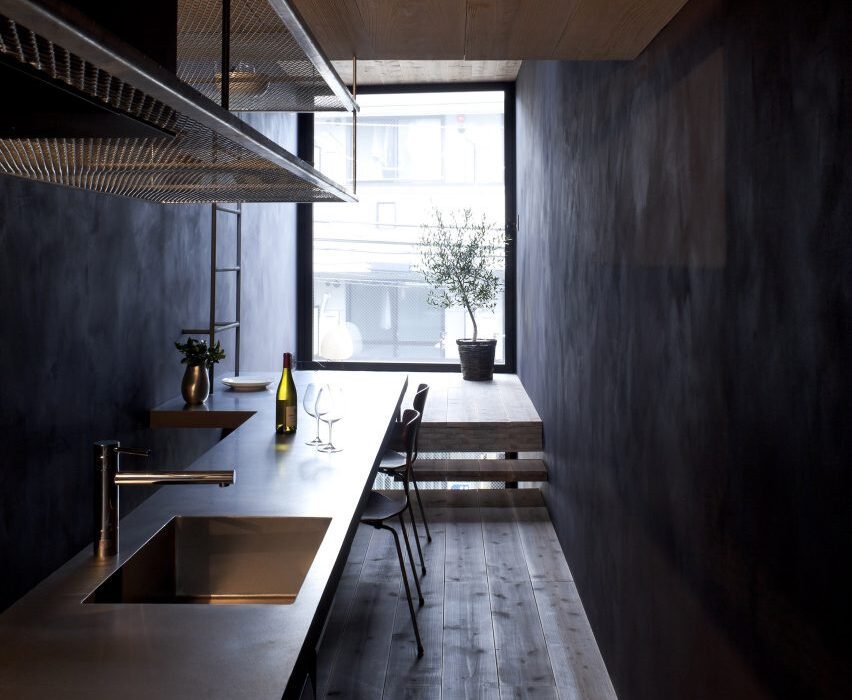
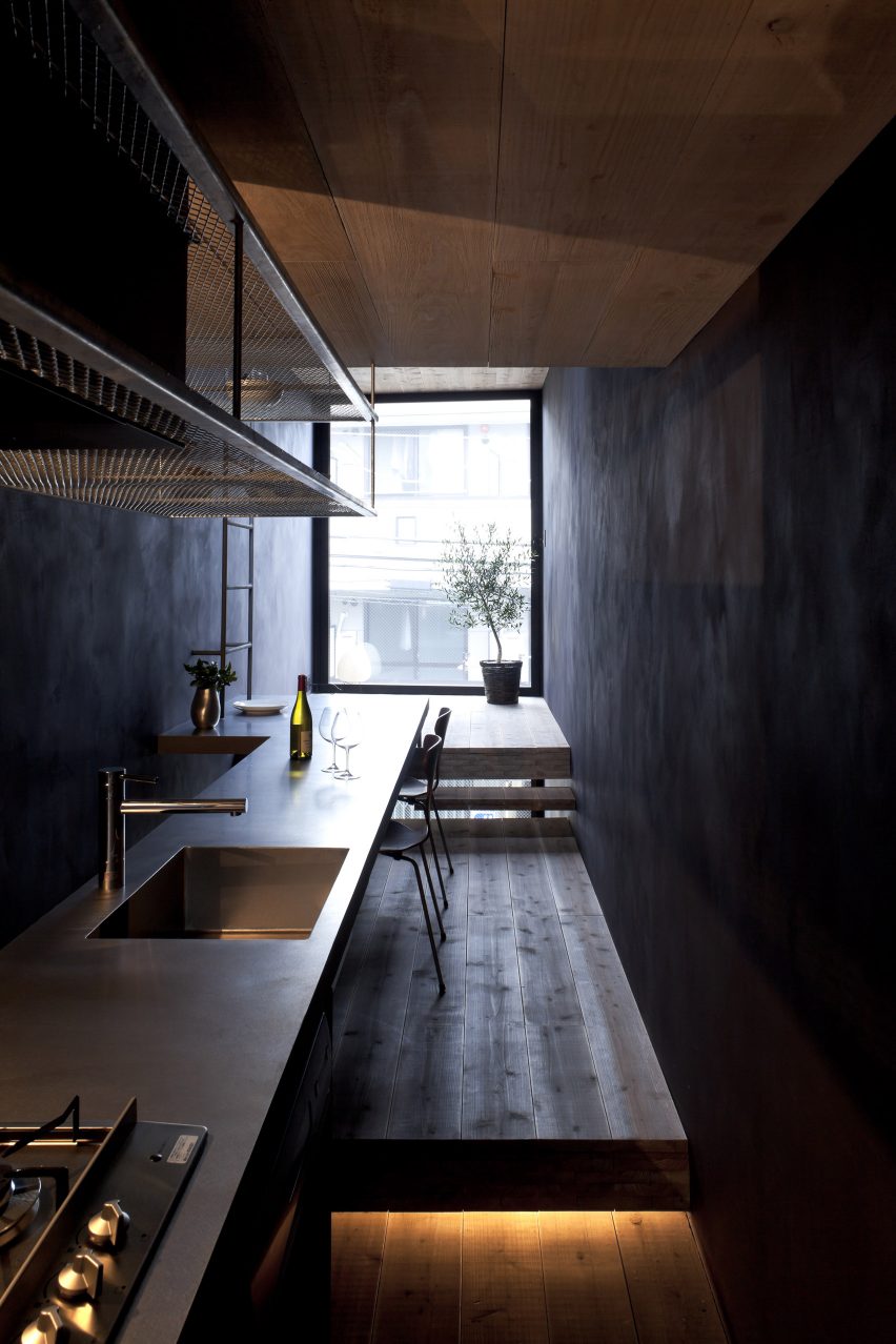
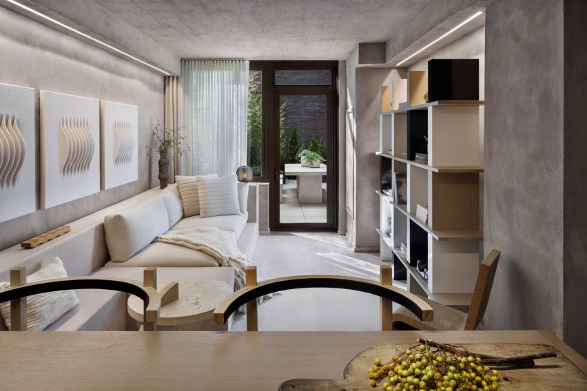
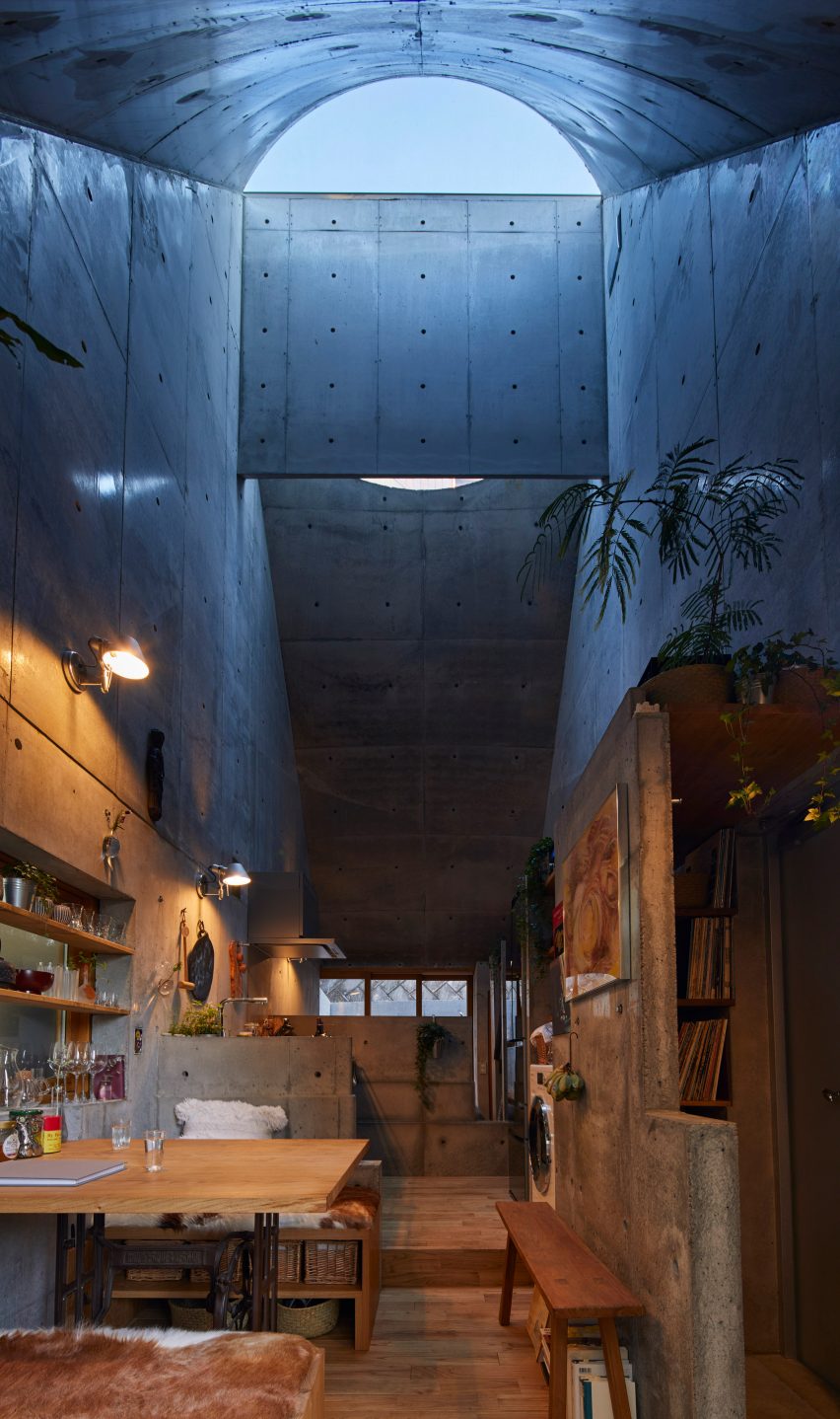
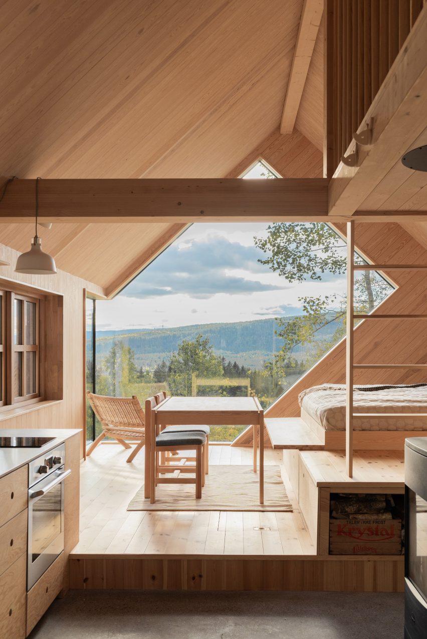
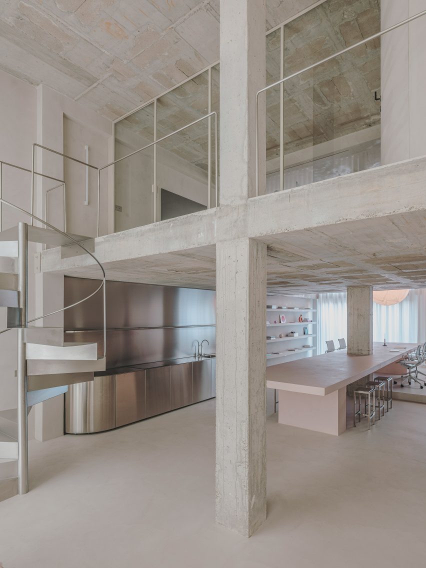
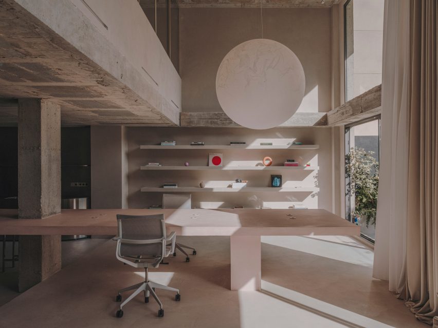
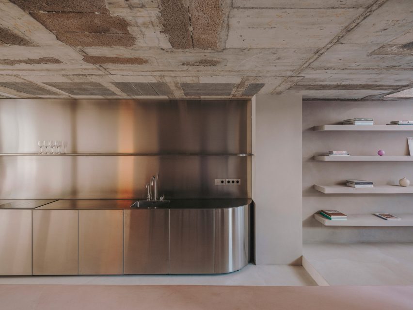
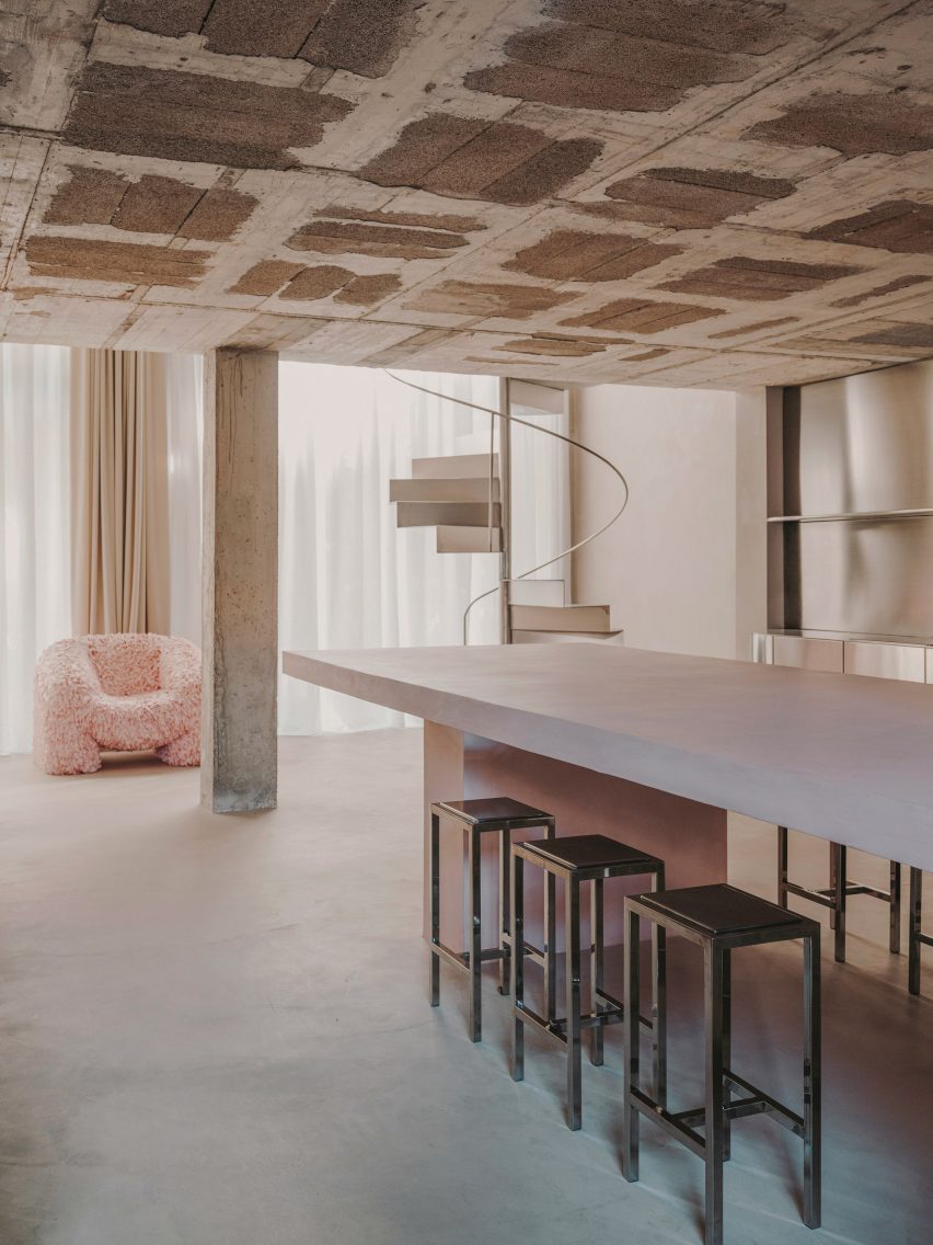
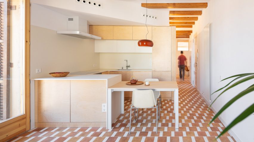
Yurikago House, Barcelona, by Mas-aqui
Architecture studio Mas-aqui opened up an apartment in Barcelona by creating multiple levels lined with slabs of exposed concrete, slatted wood and reddish ceramic tiles.
The dwelling was named Yurikago House after the Japanese word for a cradle, which references the shape of the timber structure that supports part of a new mezzanine that was created in the renovation.
Find out more about Yurikago House ›
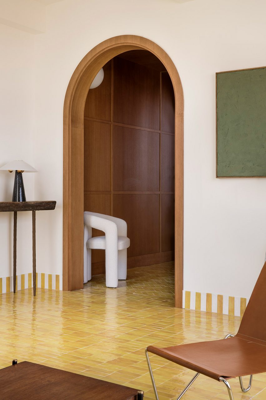
Madrid apartment by Sierra + De La Higuera
Set within a 1940s building, interior spaces in this Madrid apartment were delineated with vibrantly hued Moroccan zellige tiles, from bold yellow accents in the living room to an emerald green kitchen.
The tiles are defined by imperfect hand-moulded surfaces and feature throughout the home in the form of decorative skirting as well as flooring and cabinetry.
Find out more about this Madrid apartment ›
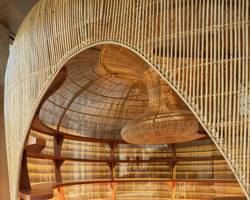
Valencia apartment by DG Arquitecto
During the minimalist renovation of a 1920s apartment in Valencia, local studio DG Arquitecto preserved the original mosaic elements – flooring that the firm called “typical” of the city.
The studio paired mid-century rattan dining chairs and delicate timber elements with the colourful tiles while original mouldings and decorative arched doorways were also maintained.
Find out more about this Valencia apartment ›
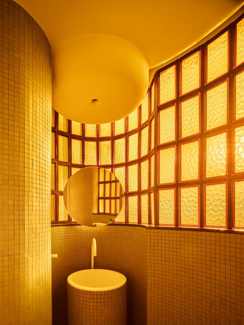
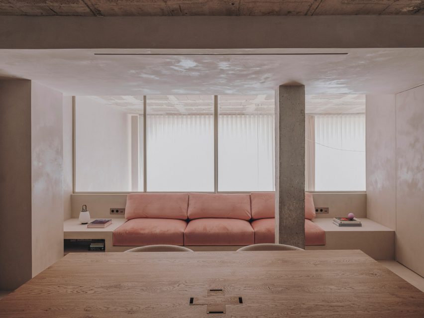
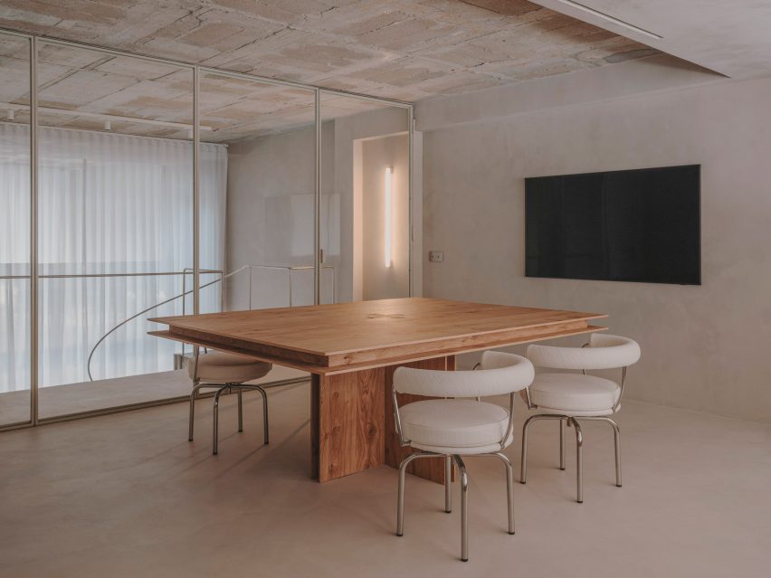
1040 Unit, Madrid, by Studio Noju
Working within Madrid’s iconic brutalist Torres Blancas tower, emerging practice Studio Noju created an apartment that balances contemporary details with the building’s brutalist history.
Each of the dwelling’s three bathrooms were individually colour-coded with small geometric mosaics that nod to the green ceramic tiles that clad the apartment’s terraces.
“The [mosaic] material allowed us to solve all the elements of the bathroom such as shower areas, vanities, walls and floors, referencing a similar material strategy used in the original design,” studio co-founder Antonio Mora told Dezeen.
Find out more about 1040 Unit ›
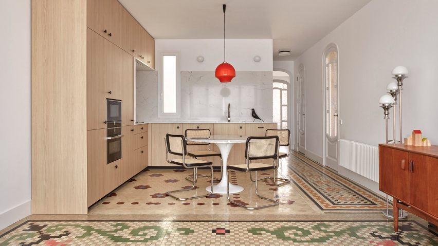
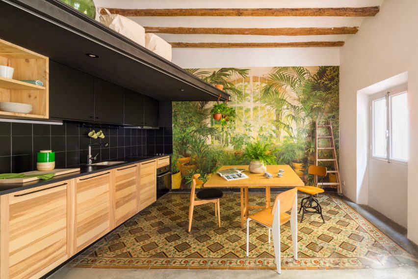
Barcelona apartment by Narch
Eclectically arranged decorative floors dating back to the early 20th century take centre stage in this Barcelona apartment that was renovated by Narch architecture office.
Known as encaustic tiling, which is common in the city, each tile is created by pouring pigmented ceramics into moulds and pressing them to create a pattern.
Elsewhere in the apartment, doors made from laminated glass screen off its bedrooms. This material was chosen for its neutrality in order to emphasise the space’s ornate flooring.
Find out more about this Barcelona apartment ›
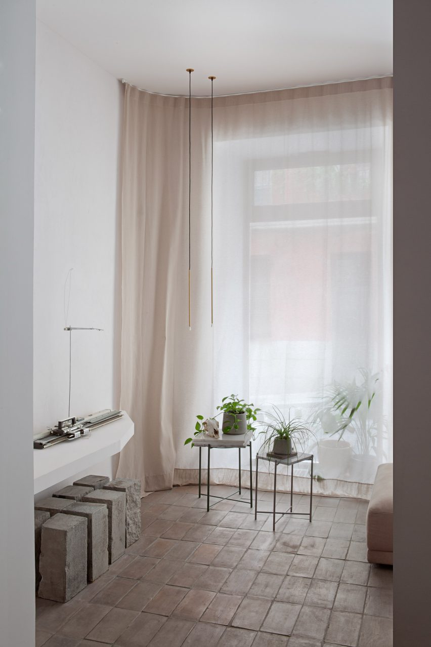
Casa Olivar, Madrid, by Matteo Ferrari and Carlota Gallo
Casa Olivar is a two-storey apartment by designers Matteo Ferrari and Carlota Gallo, which is characterised by handmade terracotta floor tiles that complement the home’s muted colour palette.
Created as a “sensorial refuge”, the dwelling includes two large windows in the living room that flood the space with natural light. Earthy-toned, simple materials feature throughout, including textured plaster finishes.
Find out more about Casa Olivar ›
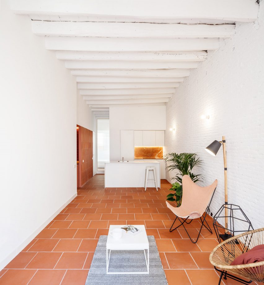
Barcelona apartment by Parramon + Tahull
Barcelona studio Parramon + Tahull added bespoke birch plywood joinery and continuous tiled flooring to an apartment in the city’s Gracia neighbourhood, in order to blend with the building’s original features.
Created by Spanish manufacturer Wow, the terracotta tiles feature a mismatched geometric design that covers the entire apartment, including the kitchen and the bathroom.
Find out more about this Barcelona apartment ›
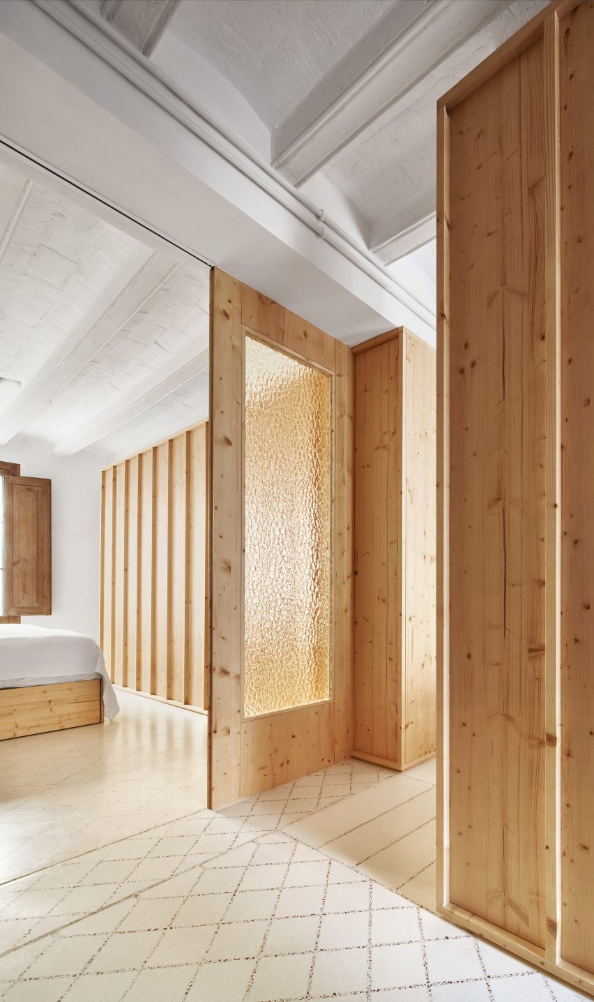
Laia and Biel’s House, Barcelona, by TEd’A
Architecture office TEd’A used crushed tiles to create playful terrazzo grout in a renovated apartment that belongs to the owners of the Mallorcan tile brand Huguet.
The grout was made from the original terracotta tiles that lined the home before its revamp, which were crushed into tiny pieces to form a reddish-hued aggregate that was mixed with existing white tile grout.
“Our idea was to keep the best parts of the old flat we bought,” Biel told Dezeen, citing sustainability and honouring the apartment’s original design.
Find out more about Laia and Biel’s House ›
End of the Roc, Barcelona, by Nook Architects
Nook Architects redesigned another apartment in Barcelona while maintaining its distinctive historical details, including a striking mural-style wall that is over 40 years old, timber beams and intricately patterned floor tiles.
“Our approach to End of the Roc revolved around the restoration and consolidation of the building’s original character,” said the architecture studio.
Find out more about End of the Roc ›
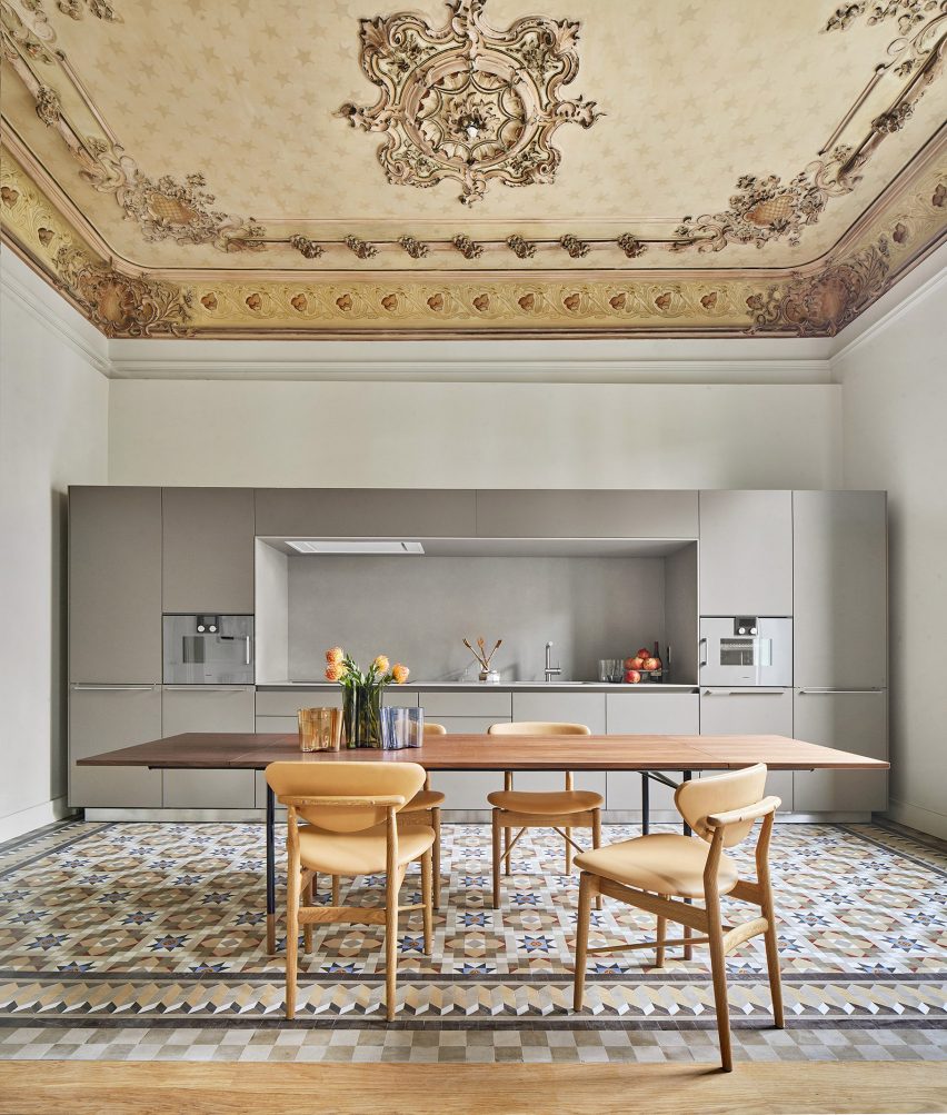
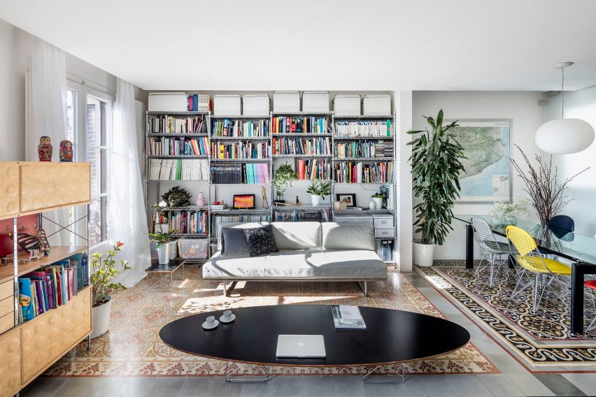
Casa Burés, Barcelona, by Vilablanch and TDB Arquitectura
Interior design studio Vilablanch collaborated with TBD Arquitectura to refurbish all 26 apartments within Case Burés – a 20th-century building constructed by the late architect Francesc Berenguer i Mestres.
The team selected “silent” contemporary furnishings to complement Case Burés’ original decorative features, such as stainless steel geometric cabinetry that was chosen so as not to “compete with” or “imitate” the colourful tiled flooring.
Find out more about Casa Burés ›
This is the latest in our lookbooks series, which provides visual inspiration from Dezeen’s archive. For more inspiration see previous lookbooks featuring statement carpets, pop-up shops and homes with sliding doors.