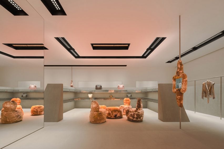
Fashion brand Acne Studios has opened its latest store in China, which was designed by Stockholm studio Halleroed and is located in the submerged SKP department store designed by Sybarite in Chengdu, China.
The 338-square-metre store has a discrete sandstone exterior marked by a red LED sign displaying the brand’s logo.
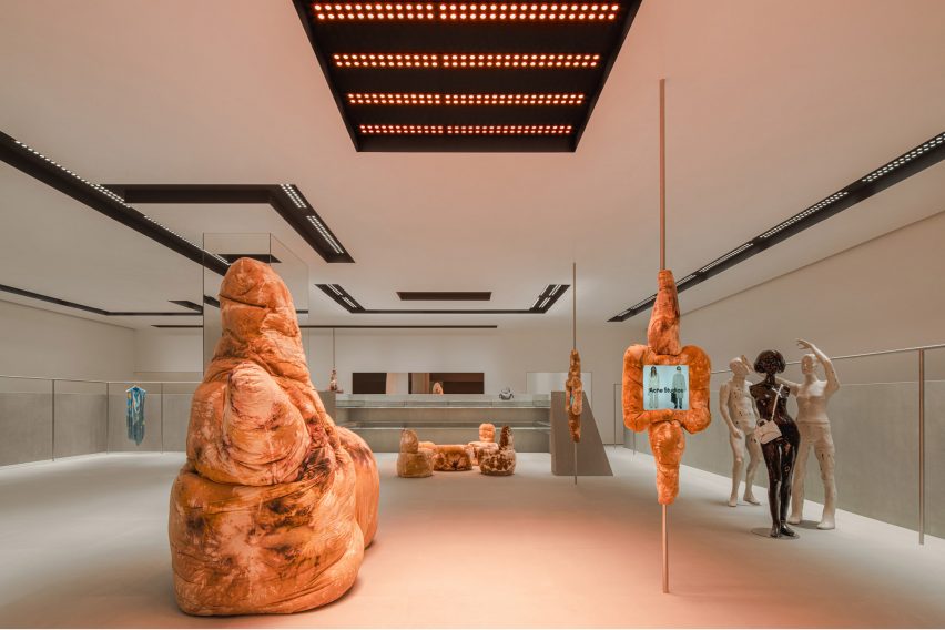
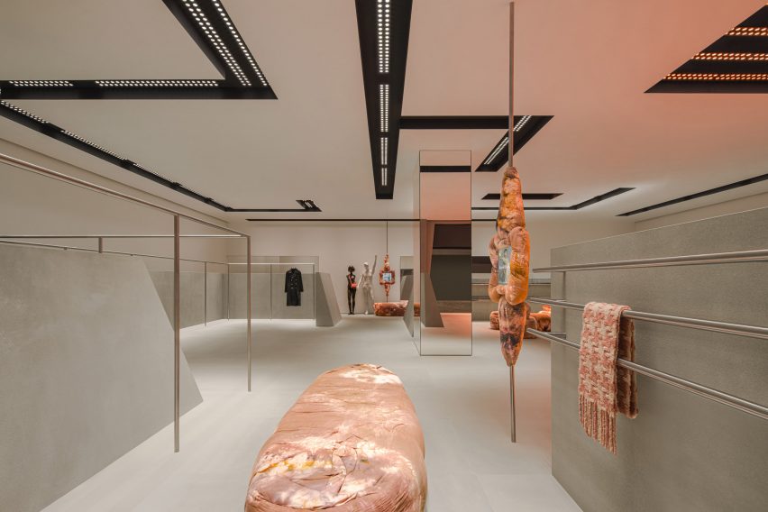
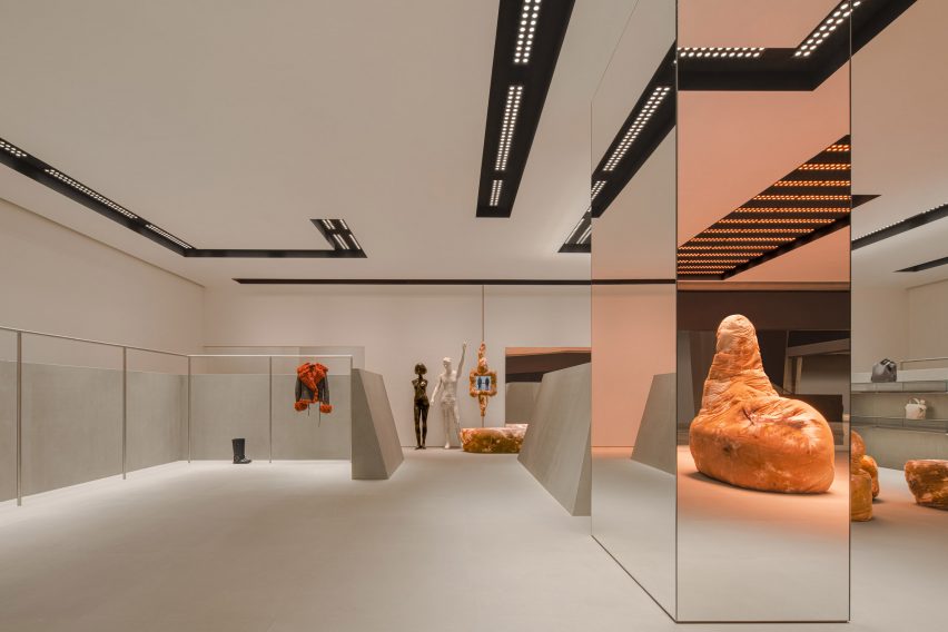
Inside, grey sandstone walls contrast against sculptural tie-dye furniture in earthy tan hues by British designer Max Lamb.
The store is located inside Chengdu’s SKP department store
“Our inspiration was aesthetically playing with design from the 1980s and 90s, and how that period looked at the future,” Halleroed founder Christian Halleroed told Dezeen.
“The inclined stone clad walls, the futuristic lighting together with the Daniel Silver mannequins – we thought of a futuristic space/computer age feel, but in a contemporary way of putting it together,” he added.
“We clashed this with the Max Lamb sculpture-like furniture that has a more primitive, earthy feeling.”
It features tactile, soft seating by Max Lamb
As well as the furniture, Lamb designed four fabric-clad touchscreens that are mounted on slim poles throughout the store and provide an overview of the brand’s current collection and stock availability.
Expressive mannequins by artist Daniel Silver and a light installation by designer Benoit Lalloz help to add a futuristic feel to the space.
Lighting was designed to feel “like a spaceship”
Halleored, which has designed a number of Acne Studios‘ stores, normally works with Lalloz on the lighting but said the Chengdu store lights have a different feel to those in other stores.
“These were done a bit differently than previous since they are recessed in the ceiling, but still has the typical look of Benoit Lalloz,” Halleroed said.
“We wanted the lighting to feel like a spaceship,” he added.
A large mirrored column in the middle of the store reflects its pared-down interior, which features a colour palette informed by the grey hues used for early computer designs.
A large mirrored column sits in the centre of the sandstone room
“We used a very restrained palette with the grey, monochrome sandstone on the floor and angled walls, high gloss white walls and ceiling, the black coves in the ceiling, and for the fixtures brushed stainless steel,” Halleroed said.
“The Max Lamb and Daniel Silver pieces contrast this, with their brown batik fabric and the white with patina and silver mannequins.”
Previous Acne Studios store designs featured on Dezeen include a “monolithic” store in Paris and a pink-ceiling flagship store in Milan’s Brera district.
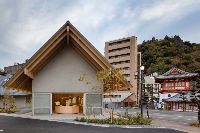
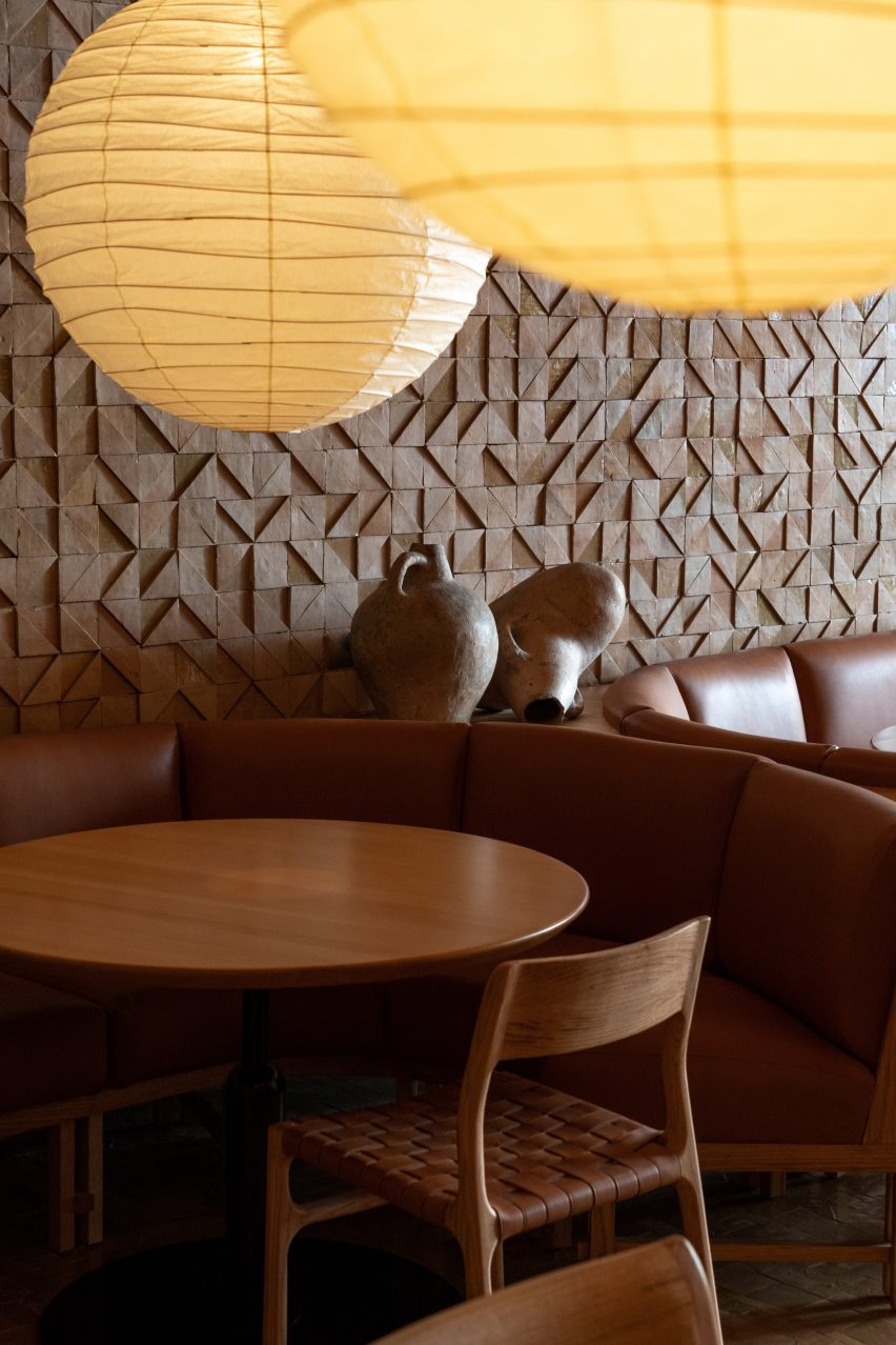
Japanese designer Keiji Ashizawa paid homage to the food on offer when designing the Saga Hirakawaya tofu restaurant, which hopes to revitalise a depopulated community in Japan.
Located in the hot spring resort Takeo Onsen in Japan’s Saga prefecture, the curved restaurant was designed to blend in with the surrounding environment, including a historical tower gate.
The Saga Hirakawaya restaurant is located next to a historical tower gate
“Tofu, a food culture rooted in the region of Saga prefecture, is the main ingredient of this restaurant,” Ashizawa told Dezeen. “Since tofu is a simple food, we chose materials with a sense of simplicity such as wood, concrete and walls finished in plaster to bring out the texture in the materials.”
“With a background of wishing to use local materials, wood was used for the entrance, windows and undersurface of eaves to match the wood from Ariake, a furniture brand based in Saga.”
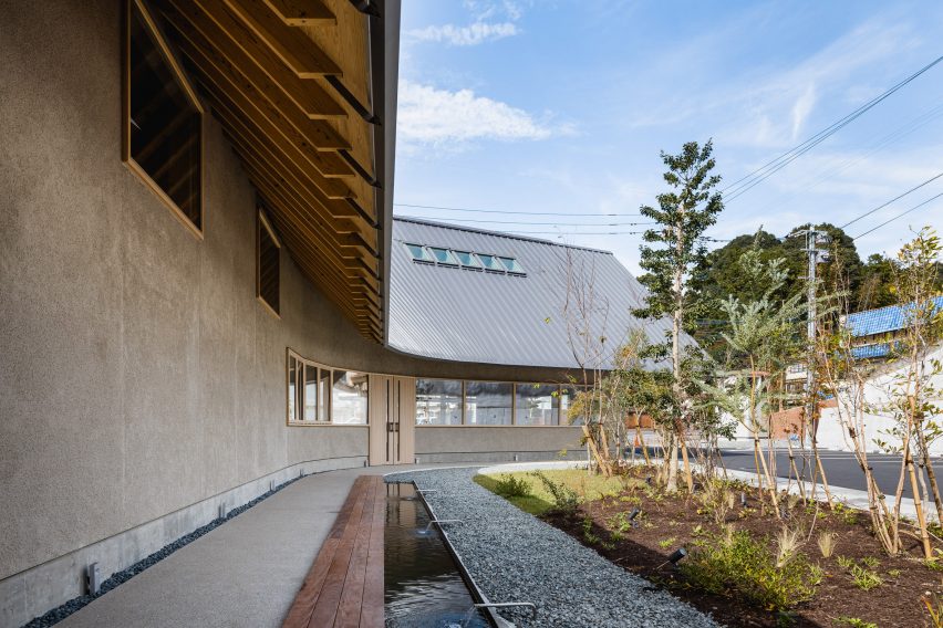
Volcanic ash was used for the plaster
The studio also used shirasu – a type of volcanic ash from Mount Sakurajima in Kyushu – as a plastering material for the building’s exterior walls.
Saga Hirakawaya has a curved design forming a semi-open interior courtyard, which holds a foot bath with hot spring water that aims to encourage the restaurant’s customers to eat and stay outside the establishment for longer.
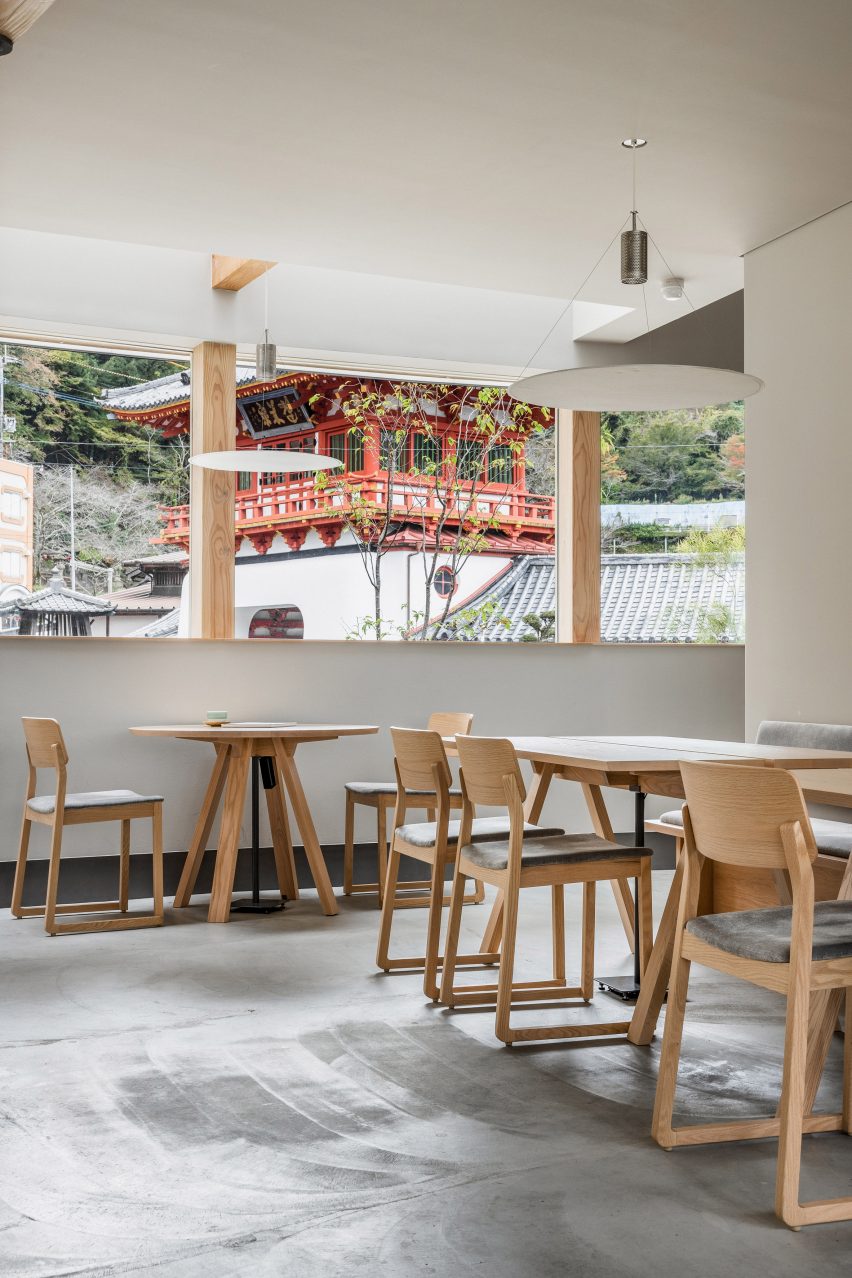
Wooden furniture matches the pared-down interior
Inside the 435-square-metre restaurant, the interior matches the exterior with pale grey walls that nod to the food on the menu.
“As the ceiling and walls are curved, pale colours are used to extend the light beautifully in the restaurant, complemented by the use of grey colours on the walls and floors,” Ashizawa said. “It also signifies the whiteness of the tofu.”
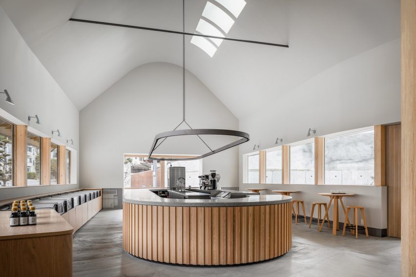
The restaurant’s ground floor houses a shop selling tofu-based products and sweets, while the first floor is home to a restaurant serving onsen yudofu – a type of tofu made using hot spring water.
An open atrium connects the shop and restaurant, which both feature large windows.
The ground floor houses a shop
Circular lamps made by local paper manufacturer Nao Washi hang over the tables while the wooden furniture was made by furniture brand Ariake, which manufactures in Saga prefecture.
The decision to open the Saga Hirakawaya restaurant in Takeo Onsen was made by its owner, who was born and raised in the area and wanted to help revitalise the community, which has suffered from a population decline.
Paper lamps hang over tables
“Depopulation is inevitable in rural areas of Japan,” Ashizawa said. “But in order to revitalise a region, it is important to attract people to the area through tourism.”
“The client decided to create a restaurant serving onsen yudofu, believing that the region’s unique culinary culture could be an incentive to visit the area for sightseeing.”
A restaurant space is located on the first floor
“We deeply sympathise with the client’s hope to make the most of the wonderful location in front of the historical tower gate of Takeo Onsen, an important cultural asset, and to combine it with the region’s unique food culture to attract tourists from both inside and outside of Japan, contributing to the revitalisation of the area,” he added.
Other recent projects by Ashizawa include a Blue Bottle Coffee shop in Kobe and a mid-century-modern-informed residence in Tokyo.
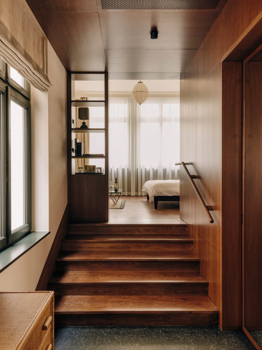
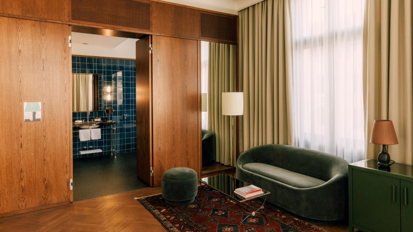
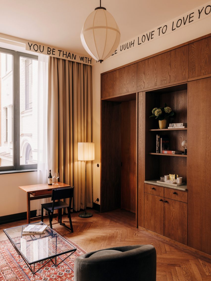
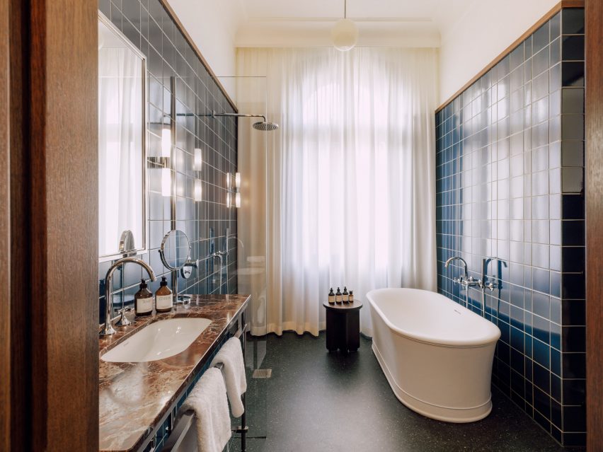
Interior architect Irina Kromayer has overseen the design of Berlin’s Château Royal hotel, creating a series of eclectic spaces that reference the heyday of the German capital at the turn of the 20th century.
The 93-room Château Royal is located in the heart of Mitte, on a street parallel to Unter den Linden boulevard and close to the iconic Brandenburg Gate.
Château Royal has 93 rooms (top image) as well as a fireside lounge (above)
The hotel comprises two buildings dating from 1850 and 1910, as well as a newer building and roof extension designed by David Chipperfield Architects.
The renovation project, led by Kromayer with support from Swiss architect Etienne Descloux and interior designer Katariina Minits, aims to reflect the periods during which the heritage-listed buildings were constructed.
Built-in joinery features in all the guest rooms
“Our design goal was to provide the traveller with an ‘authentic’ experience of being in Berlin, using materials and colours that traditionally stand for the city’s heyday,” Kromayer told Dezeen.
Oak panelling, art nouveau tiles, sisal carpets and hardware in brass and nickel were incorporated into the scheme based on the finishings commonly found in Berlin’s historic buildings.
This was informed by the storage walls of traditional West Berlin apartments
Kromayer designed much of the furniture herself – as well as in collaboration with Porto-based German designer Christian Haas – in order to achieve a seamless merging of contemporary and classic details.
“We didn’t want the hotel to be retro but rather to feel classic so we simplified things into less decorative shapes,” she explained.
In addition, vintage pieces were sourced from all over Europe to give a lived-in “patina” to the interior and explore a more sustainable approach to furniture sourcing.
Loupiotte pendant lights emphasise the building’s high ceilings
The pendant lights for the guest rooms were created in collaboration with Berlin-based manufacturer Loupiotte and are intended to emphasise the building’s high ceilings.
Made from Japanese paper and brass, the lamps are based on a 1920s design from Josef Hoffmann, one of the co-founders of the Wiener Werkstätte art movement.
The hotel’s custom-made wooden beds feature headboards crafted from Viennese wickerwork. Kromayer also created outdoor lanterns that reference traditional Berlin street lights and include unique glass panels made by artist Paul Hance.
Built-in joinery found in each of the bedrooms was informed by the partition walls with integrated storage, which are typical of traditional West Berlin apartments.
Glazed blue tiles can be found in the guest bathrooms
Paintings by early 20th-century artists associated with the expressionist and new objectivity movements influenced the hotel’s bold colour scheme, which is applied across surfaces including tiles and upholstery textiles, along with curated artworks.
The interior features colourful glazed bricks and tiles similar to those found in Berlin’s underground stations, as well as stained glass and coloured marble.
Stained-glass panels brighten up the hotel bar
The hotel bar is made from tin – a material Kromayer says was widely used at the turn of the century but is rarely found in contemporary German interiors. Nickel and chrome bathroom fixtures were chosen to reference the modernist and Bauhaus design movements.
Alongside its guest rooms, which include 13 suites and an apartment, Château Royal also accommodates a lobby, bar, restaurant, private dining room, fireside lounge and winter garden.
A Karl Holmqvist artwork hangs inside the hotel’s Dóttir eatery
Built-in carpentry used throughout the public areas helps to create a sense of consistency with the bedrooms, while vintage furniture, rugs and lamps made for the hotel by KL Ceramics add to the eclectic feel of the spaces.
The hotel’s restaurant, called Dóttir, features upholstered oak seating by Bauhaus designer Erich Dieckmann. Artworks including a neon piece by Karl Holmqvist bring character to the ground-floor eatery.
Other recent renovation projects from Berlin include a pistachio-toned revamp of one of the city’s oldest cinemas and a hotel housed inside an abandoned women’s prison.
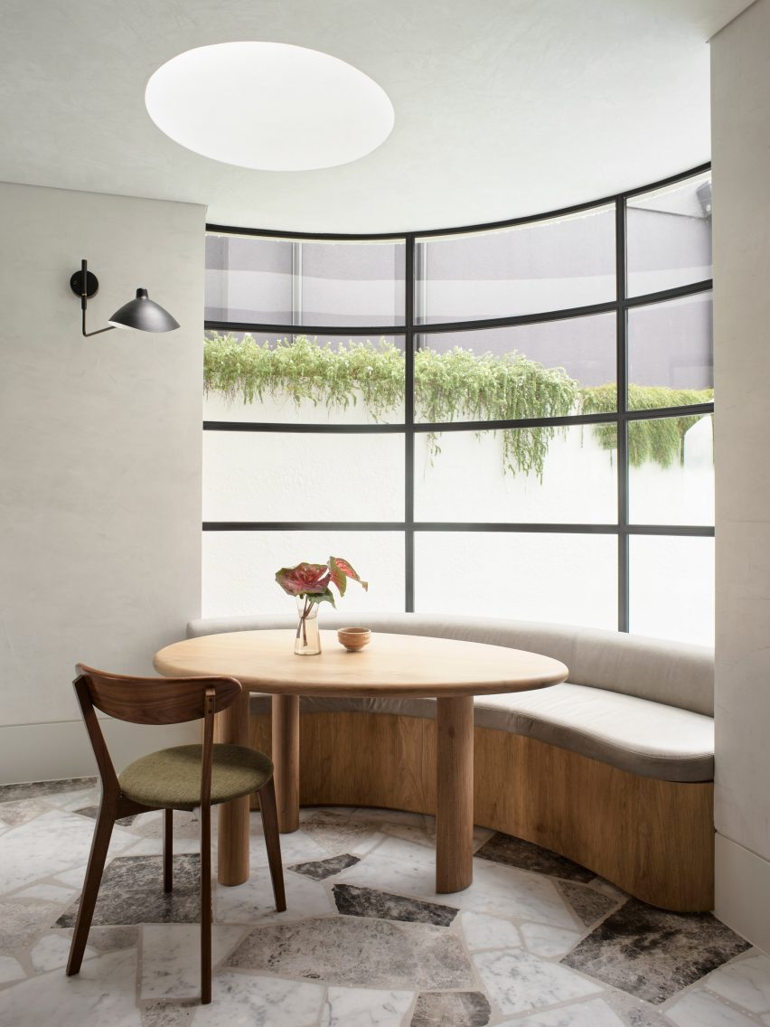
Australian architecture practice Alexander & Co has overhauled this oceanside home in Sydney to make it more suitable for family life.
Before its renovation, the five-bedroom house had a disjointed floor plan that was proving inefficient for its two young owners and their three children. Many of the rooms were also cut off from views of the garden and the ocean beyond.
Pacific House’s kitchen is decked out with oakwood and different types of marble
“[Pacific House] was substantial in structure but devoid of spirit and certainly absent of any operational utility,” said Alexander & Co‘s principal architect Jeremy Bull.
Tasked with making the home a “functional engineer of family life”, the practice decided to carve out areas for activity and play, alongside spaces with a calmer, more contemplative ambience for the adults.
The cosy breakfast nook backs onto a curved window
At the heart of the plan now sits an expansive kitchen. All of the cabinetry is made from warm-hued American oak, while panels of a paler European oak were laid across the ceiling.
Jagged-edged pieces of Grigio Firma, Grigio Lana and Carrara marble were set into the kitchen floor.
Arched doorways open onto the garden
Inhabitants can eat at the central island or take a seat at the breakfast nook, which is tucked against a huge concave window.
Its form nods to the architectural style of P&O – an offshoot of modernism that was popular in 1930s Sydney and drew on the streamlined curves of Pacific and Orient-line cruise ships.
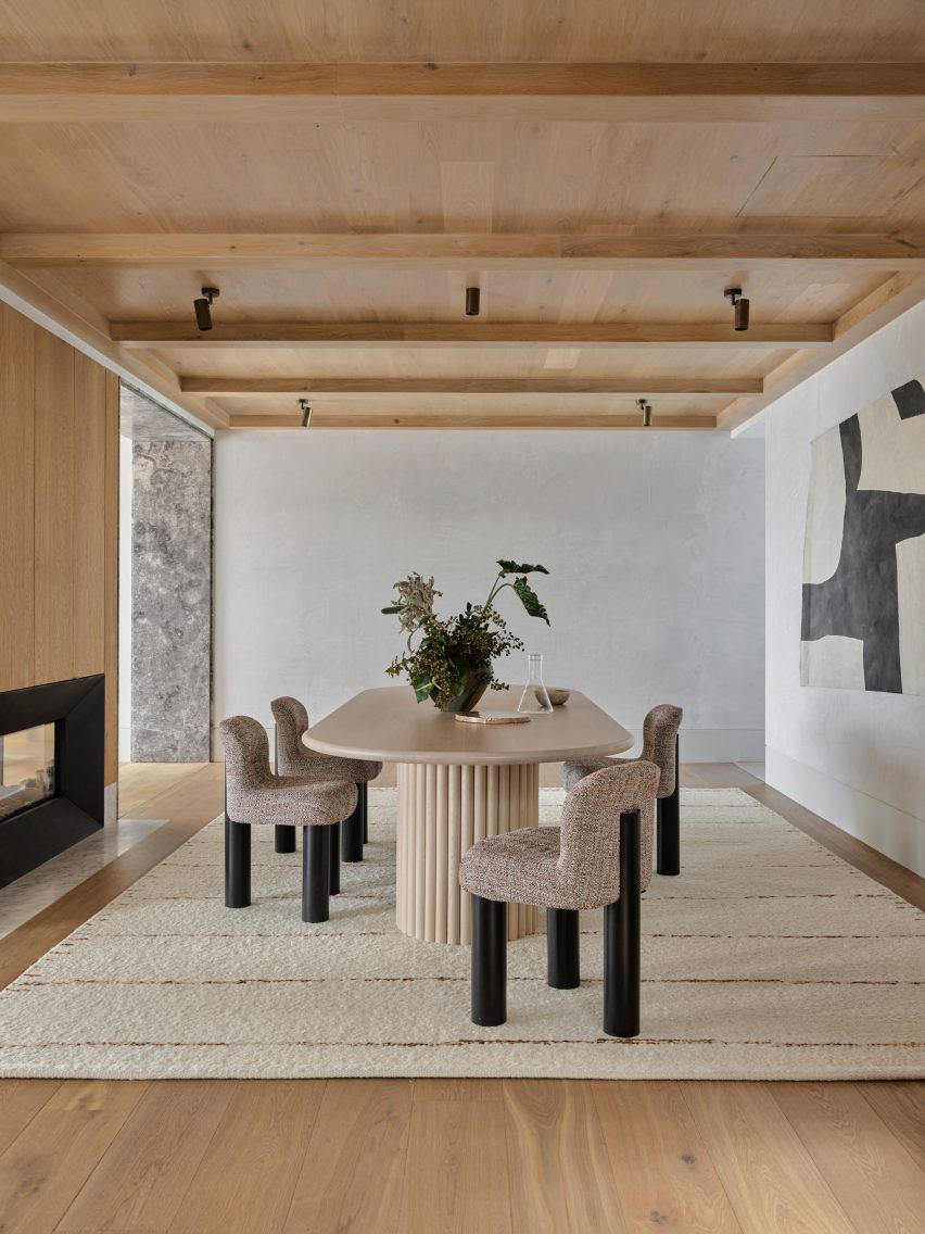
Neutral hues were applied throughout the formal dining area
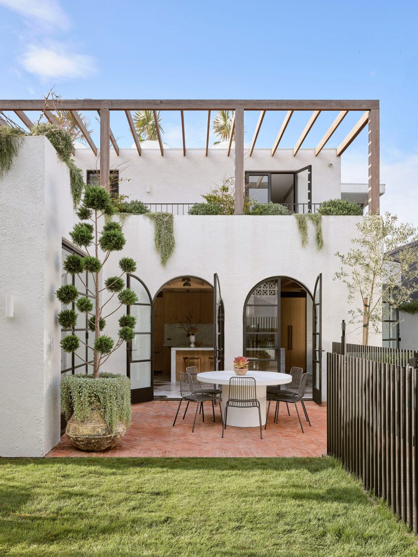
Two arched doors at the front of the kitchen grant access to the garden, where there’s an alfresco seating area.
A new swimming pool was added in an excavation pit that had previously been created in the home’s driveway.
The rest of Pacific House’s ground floor includes a rumpus room for games, parties and recreation, plus a sophisticated dining area decked out in neutral hues.
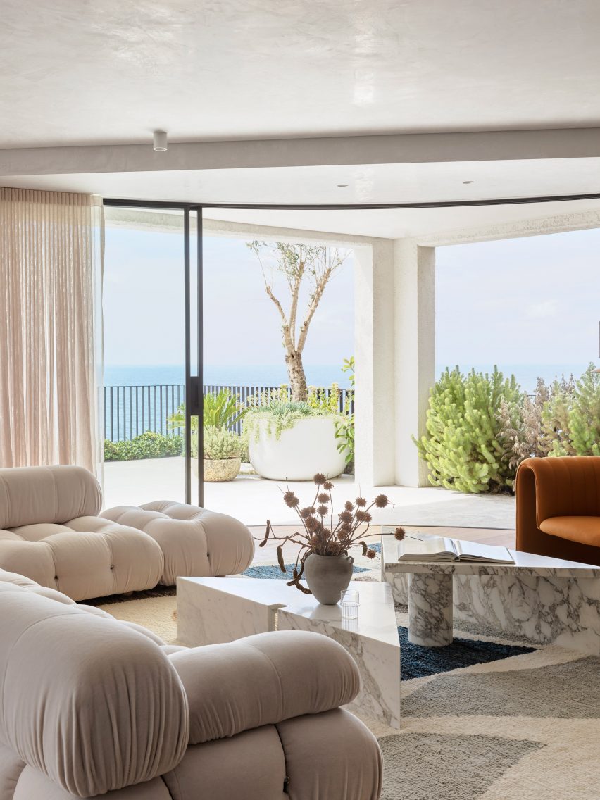
There’s also a spacious living area with Mario Bellini’s Camaleonda sofa for B&B Italia, which looks out across the ocean waves.
An Afghan rug printed with abstract shapes and a couple of triangular marble coffee tables add to the more fun, graphic look that the practice sought to establish in this room.
The living area is arranged to prioritise ocean vistas
Spaces become slightly more muted on the floor above, which is accessed via an oakwood staircase.
In the principal bedroom – which features another P&O-style curved window – walls are rendered in concrete.
Grey terrazzo and marble was used to cover surfaces in the bathroom, clashing against the pattern of the grey mosaic flooring.
The primary bedroom has a curved window and a greyscale en-suite
Alexander & Co has completed a number of other projects in Sydney including an Italian trattoria and most recently its own studio, which is housed in a converted Victorian-era residence.
Formal workstations are built into the building’s basement, but the remaining residential-style floors accommodate a kitchen, living room and library where staff can brainstorm ideas.
A bright red carpet covering the interior of an abandoned Mexico City mansion, a sisal carpet stretched over furnishings and a carpeted bathroom are among the floor coverings in our latest lookbook of 10 interiors with bold carpets.
Not only can carpets bring more texture and statement colour to an interior setting, but they can also help to insulate homes, especially if used in combination with a layer of underlay.
These interiors showcase how carpets in unusual shades and carpets displayed in unexpected ways can bring a unique look to homes and offices.
This is the latest in our lookbooks series, which provides visual inspiration from Dezeen’s archive. For more inspiration see previous lookbooks featuring hotel interiors with decadent jewel tones, kitchens with marble surfaces and residential interiors informed by biophilic design.
Photo is by José Hevia
Arches Apartment, Spain, by PMAA
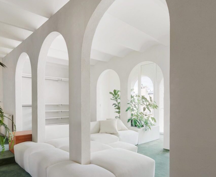
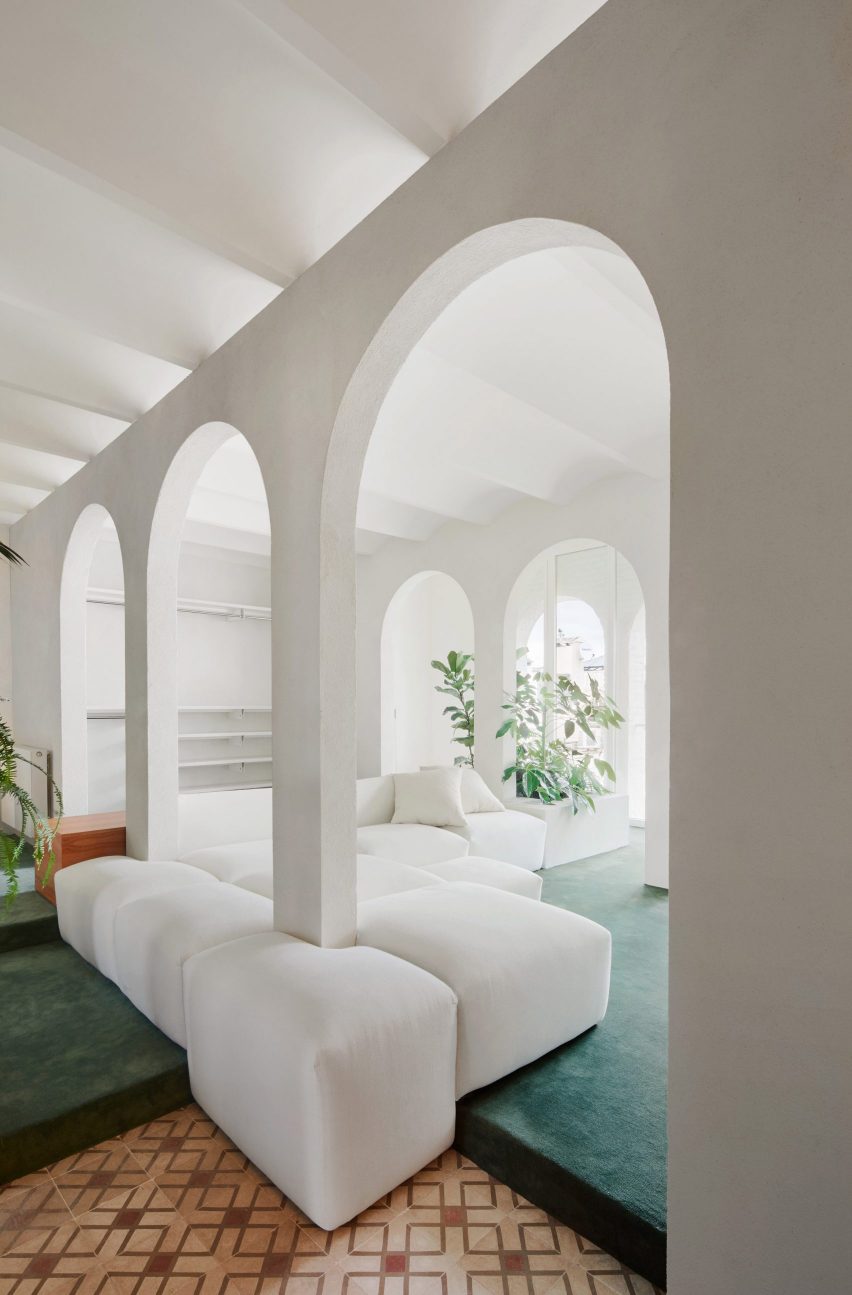
Spanish architecture studio PMAA overhauled the interior of this top-floor apartment in Barcelona’s Raval neighbourhood. The apartment is characterised by white-painted partitions with arched openings that run through and divide the interior of the home.
The living area, which is raised on a slight platform, was blanketed in a cool, sea green-toned carpet juxtaposed against the stark white walls. A large modular sofa wraps around the columns of the arched partitions.
Find out more about Arches Apartment ›
Photo is by Jan Vranovsky
Nagatachō Apartment, Japan, by Adam Nathaniel Furman
London designer Adam Nathaniel Furman renovated the interior of this formerly “claustrophobic” Tokyo apartment, adding a bold, pastel and sugar-sweet colour palette.
A low-pile, lilac carpet extends through the interior of the home and serves as a base for a rainbow of pastel hues that cover the walls, joinery and furniture throughout.
Find out more about Nagatachō Apartment ›
Photo is by Erik Undehn
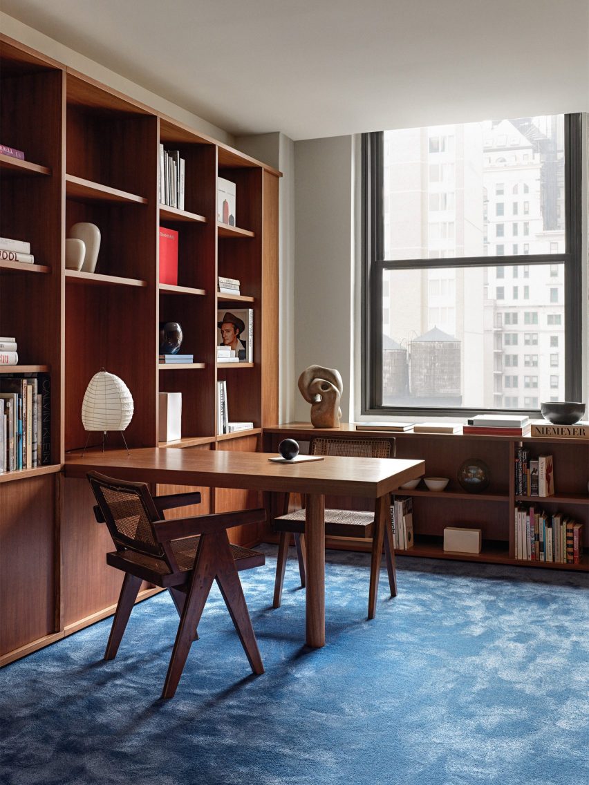
New York Office, US, by Halleroed
In New York City, Stockholm studio Halleroed made a bold feature out of plush blue carpets and wood panelling throughout the interior of an office building that covers almost 17 stories.
The interior scheme was informed by movies created by American filmmaker David Lynch. Most of the walls and surfaces of the interior were clad in veneer panels made from Makore wood, which is native to central and western Africa.
Find out more about New York Office ›
Photo is by Piet-Albert Goethals
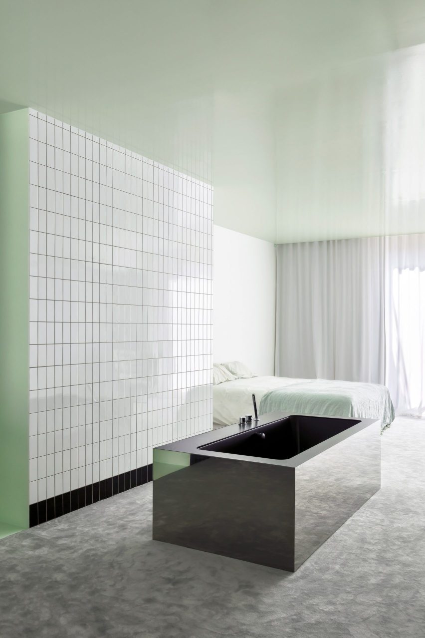
Apartment A, Belgium, by Atelier Dialect
A rectangular stainless-steel bathtub sat on top of a heavy grey carpet form part of this Antwerp apartment, which underwent a contemporary renovation by Belgian design studio Atelier Dialect.
The primary bedroom has an open-plan design that adjoins an en-suite bathroom. Both spaces are linked by a grey carpet that covers the floor, and minty-green lacquer that stretches across the walls and ceiling of the open-plan spaces.
A reflective tub sits in the middle of the room in front of a wall of subway tiles.
Find out more about Apartment A ›
Photo is by Genevieve Lutkin
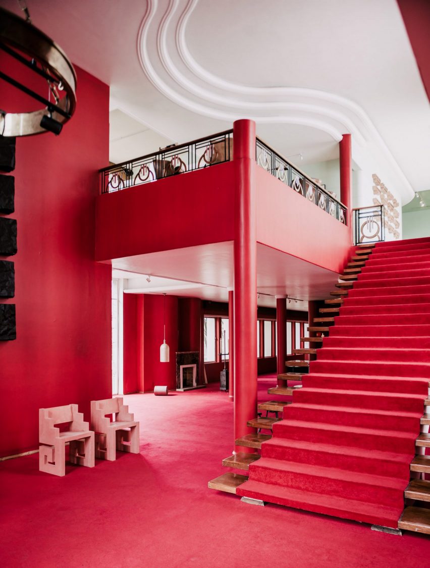
Mexico City mansion, Mexico, by Masa gallery
This 1970s mansion in Mexico City was used as a setting for the inaugural exhibit from Masa gallery. The venue was decorated with bright red walls and also features expanses of red and golden-hued carpets.
The mansion, which had been vacant since the 1970s, was kept as the gallery found it and decorated with works by a number of Mexico City-based designers and architects.
Find out more about Mexico City mansion ›
Photo is by José Hevia
Barcelona apartment, Spain, by Arquitectura-G
Located in the Ensanche district of Barcelona, this 149-square-metre apartment was renovated by Spanish studio Aqruitectura-G, which was assigned with opening up the interior and drawing in natural light.
The studio adapted the floor levels of the home to zone different areas across each floor. In the living area, a warm-hued sisal carpet extends across the stepped levels of the space, while also covering and wrapping around built-in seating, tables and other surfaces.
Find out more about Barcelona apartment ›
Photo is by Dylan Chandler
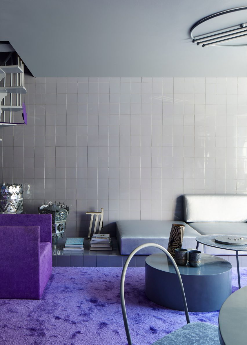
New York apartment, US, by Harry Nuriev and Tyler Billinger
Crosby Studios founder Harry Nuriev and his partner and CEO Tyler Billinger renovated their NoLita apartment in Manhattan, New York City, in shades of violet. A heavy-pile purple carpet was fitted in the living area amid grey tile-clad surrounding walls and floors.
“We wanted a space that was not only elegant, but also liveable – we wanted to create a cosy sanctuary, which is why we used a warm grey as the base colour, and a vibrant purple as the supporting to give it that Crosby signature boldness,” said Billinger.
Find out more about the New York apartment ›
Photo is by Mariell Lind Hansen
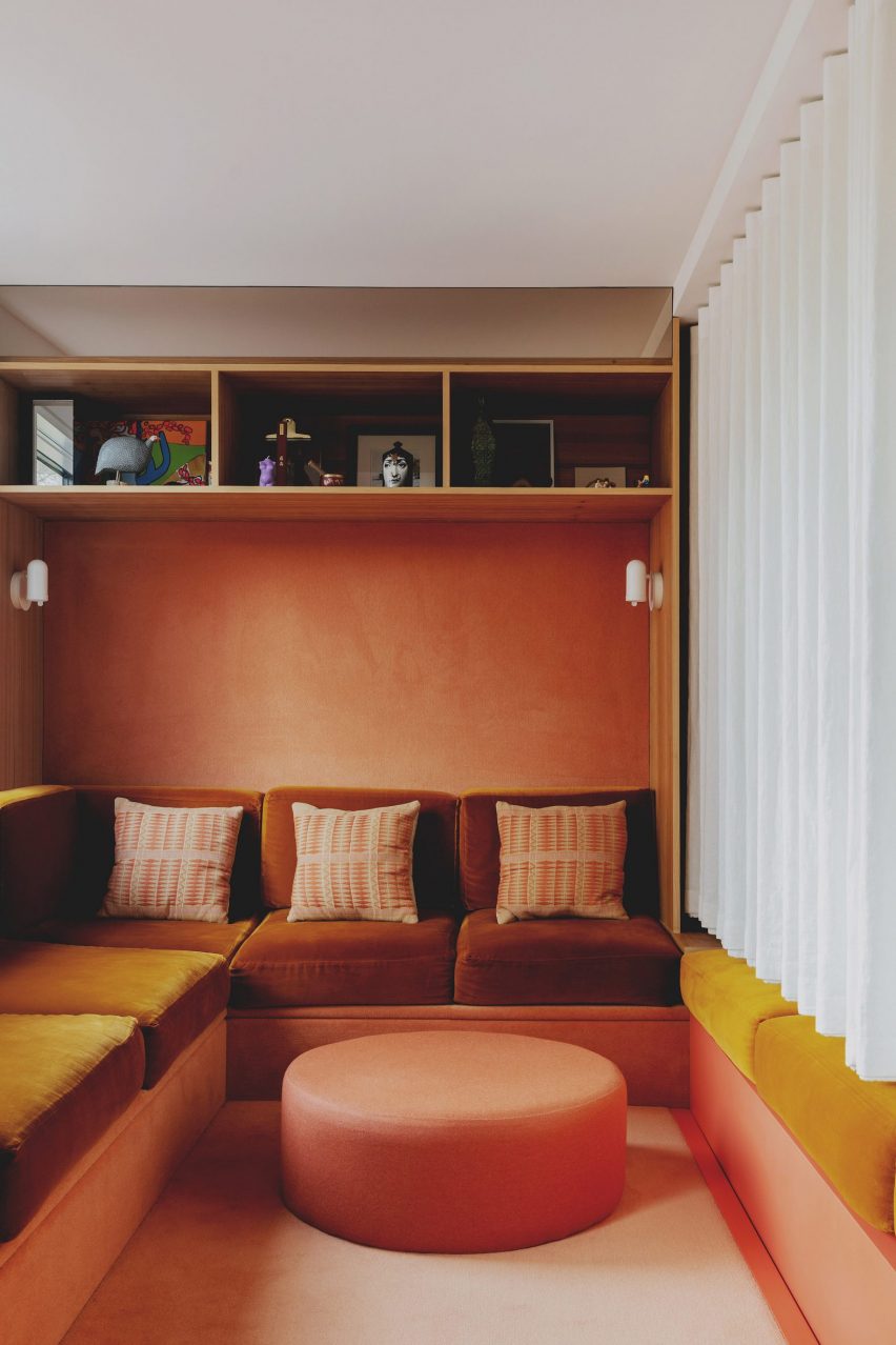
London townhouse, UK, by Studio Hagen Hall
Architecture office Studio Hagen Hall transformed this townhouse in north London, decorating its interior with a scheme that nods to 1970s Californian modernism.
The lounge includes a custom sofa upholstered in a mustardy, orange-hued velvet. Beneath the sofa and across the walls, a peach carpet covers the surfaces as well as a circular ottoman at the foot of the sofa.
Find out more about London townhouse ›
Photo is by Gianluca Di Ioia
Casa Lana, Milan, by Ettore Sottsass
In 2022, the Triennale di Milano museum reconstructed the interior of a Milanese apartment that was designed by Memphis Group founder Ettore Sottsass.
A magenta-coloured carpet runs through the interior of the replica apartment, while wood-clad and boldly upholstered soft furnishings in contrasting blue hues were also placed in the room.
Find out more about Casa Lana ›
Photo is by Lisa Petrole
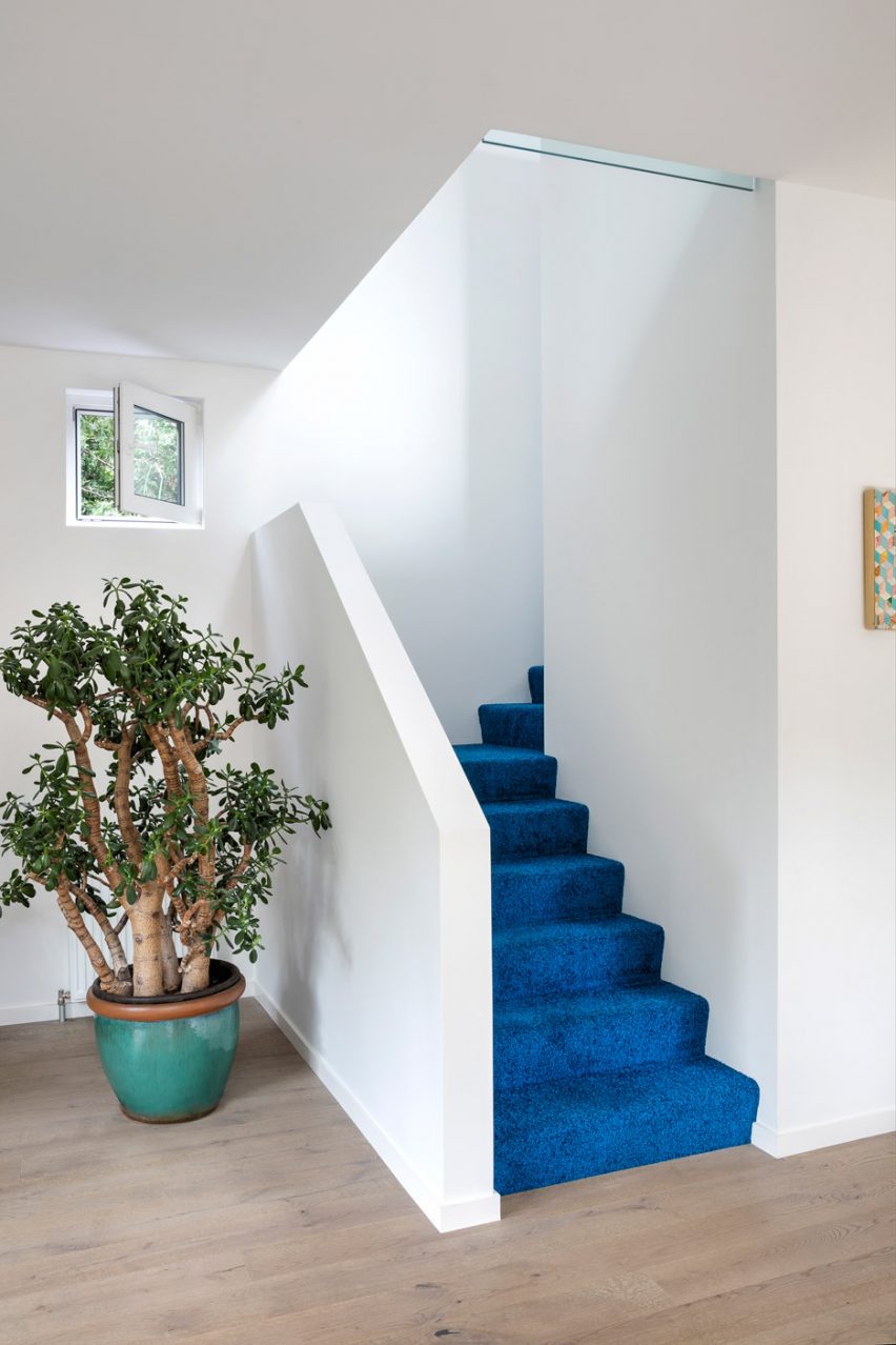
Winona House, Canada, by Reigo and Bauer
At Winona House, a family home in Toronto that was designed by local architecture studio Reigo and Bauer, residents and visitors are met by a bright blue carpet in the entrance hall that covers the stairs to the home’s upper levels.
Pops of colour were added throughout the home, including on the exterior, which features a hot pink-painted entrance that is surrounded by black shingles.
Find out more about Winona House ›
This is the latest in our lookbooks series, which provides visual inspiration from Dezeen’s archive. For more inspiration see previous lookbooks featuring pop-up shop interiors, kitchens with marble surfaces and interiors with stone furnishings.
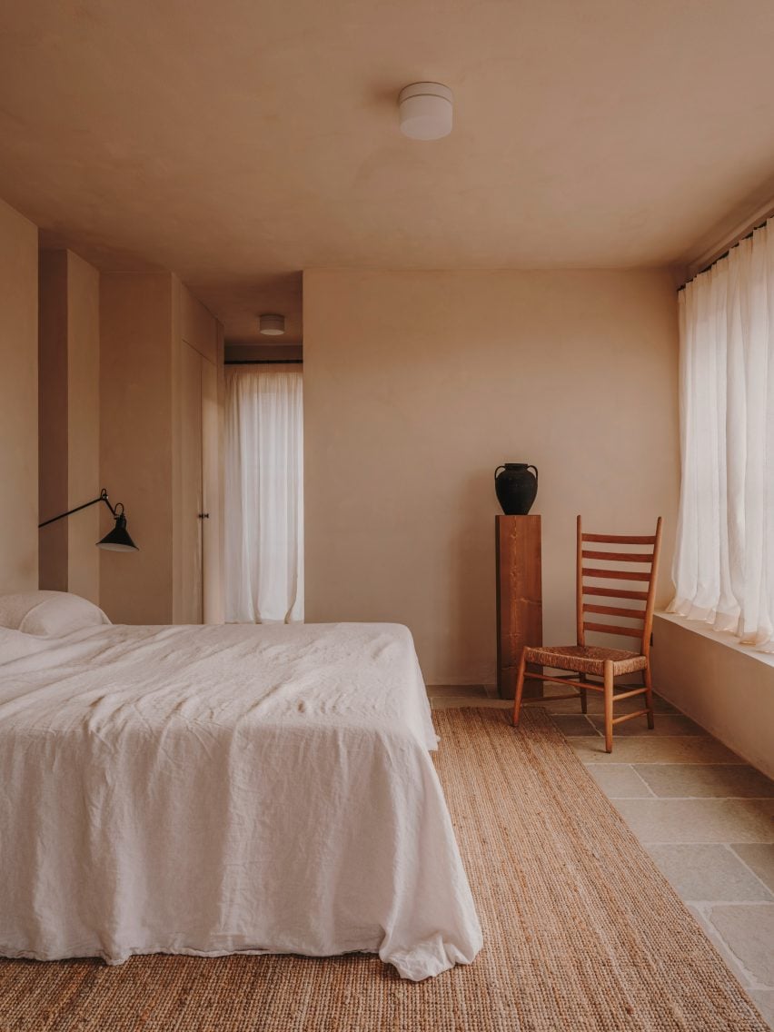
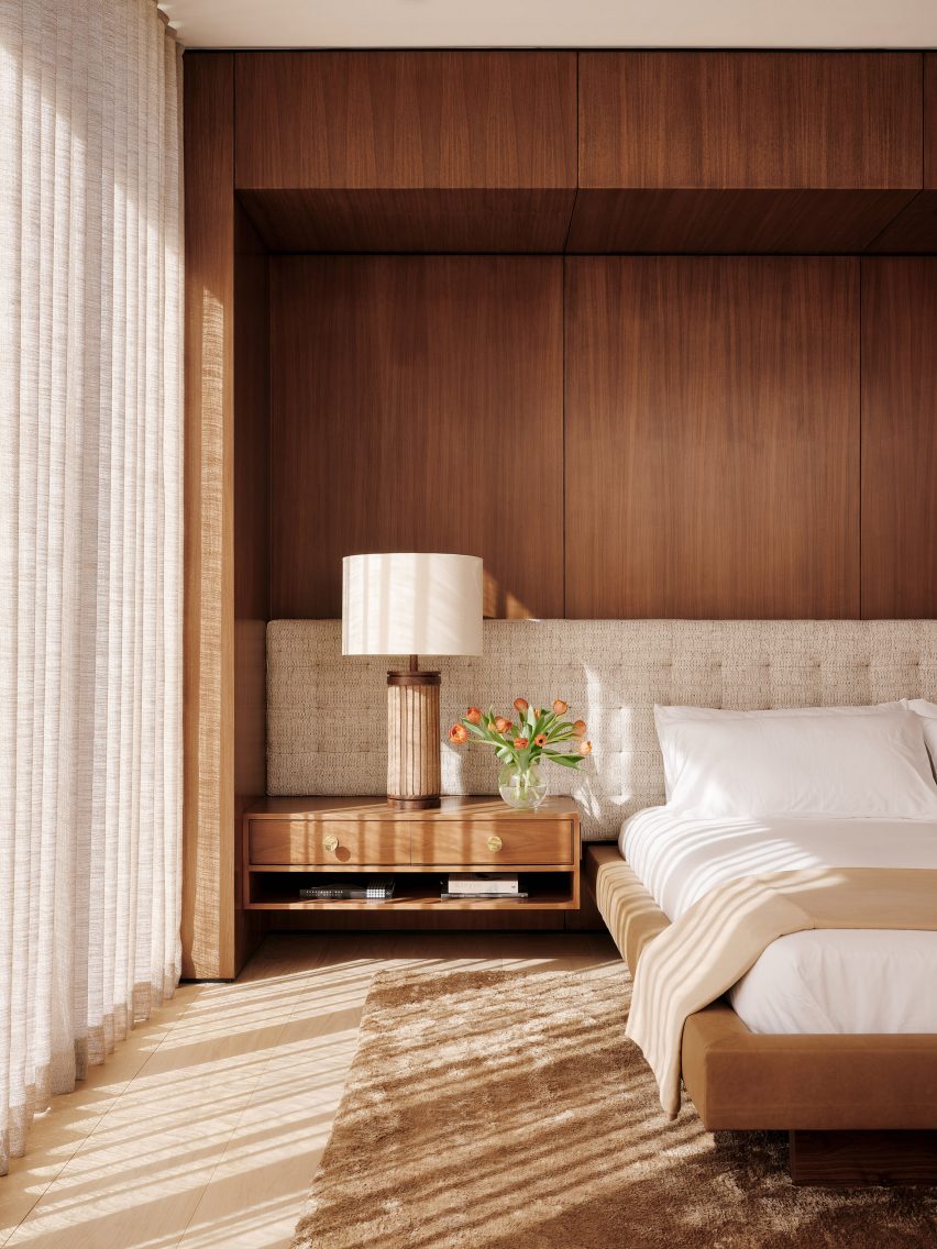
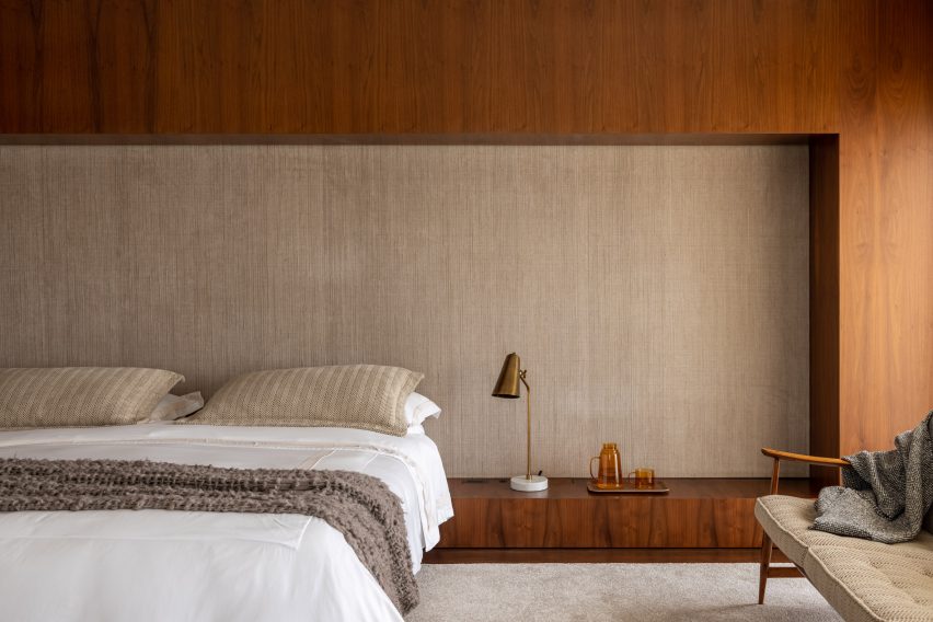
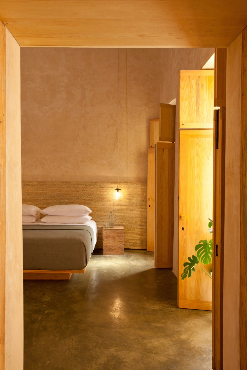
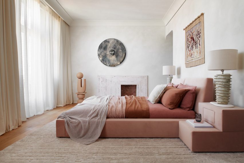
In our latest lookbook, we highlight 10 bedroom interiors that introduce earthy colour palettes and natural materials to evoke a sense of calm and tranquility.
Warm tones of earthen brown and light neutrals were used alongside colourful pops of terracotta and leafy greens on soft furnishings, headboards and decorations to create a peaceful atmosphere in these bedrooms.
Stone surfaces, timber panelling, linen fabric, accents of clay and limewash finishes add subtle textures to the interior spaces.
This is the latest in our lookbooks series, which provides visual inspiration from Dezeen’s archive. For more inspiration see previous lookbooks featuring jewel-toned hotel interiors, kitchens with marble surfaces and biophilic homes.
Photo by Fabian Martinez
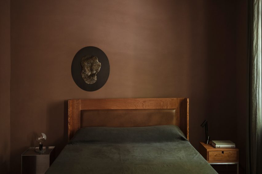
Colonia Condesa House, Mexico, by Chloé Mason Gray
For the renovation of this mid-20th century house in Mexico City, local interiors studio Chloé Mason Gray embraced the lack of natural light coming into the space by introducing dark, earthy colours and textures.
The walls of the primary bedroom were coated in brown plaster, and the space was finished with a brown leather headboard and linen furnishings in deep shades of forest green.
Find out more about Colonia Condesa House ›
Photo by Salva López
Casa Maiora, Italy, by Studio Andrew Trotter
Designed to mimic the surrounding landscape, Italian architecture practice Studio Andrew Trotter created this villa in Puglia with sandstone and limestone walls coated in a pink lime wash.
Stone floors complement the warm-toned walls while in the bedrooms, locally-sourced wooden antique furniture and large woven rugs add hints of deeper earthen shades.
Find out more about Casa Maiora ›
Photo by Seth Caplan
Dumbo Loft, USA, by Crystal Sinclair Designs
New York interiors studio Crystal Sinclair Designs punctuated the pale white backdrop of this bedroom in a Brooklyn loft apartment with caramel shades of brown and natural textures.
A yellow-brown velvet chair, rustic tiles that wrap around the lower half of structural columns, and a wooden batten wall help to make the space cosier and more inviting.
Find out more about Dumbo Loft ›
Photo by Emanuelis Stasaitis
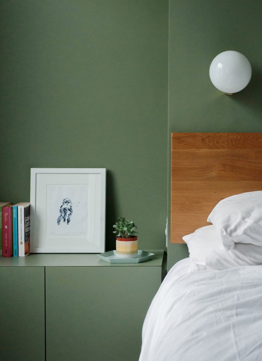
De Beauvoir Townhouse, UK, by HÛT
As part of the overhaul of a home in London, British architecture studio HÛT finished the surfaces and joinery in the main bedroom in sage green, nodding to the use of green shades in the kitchen and living room downstairs.
According to the studio, the muted green colour was chosen for its timelessness and longevity, as well as for its visual appeal when paired with exposed timber.
Find out more about De Beauvoir Townhouse ›
Photo by MCA Estúdio
Hygge Studio, Brazil, by Melina Romano
Brazilian designer Melina Romano used a myriad of earthy colours, textures and decorations to achieve a modern interior with “rustic charm” in this São Paulo apartment.
Terracotta flooring and creamy brick walls were complemented with comfy furniture and soft furnishing in earthy tones, including the rust-coloured bed frame and elongated headboard in the bedroom.
Romano also added a tropical leafy plant, branches speckled with lichen and insect-shaped wall art to the space.
Find out more about Hygge Studio ›
Photo by Joe Fletcher
Twentieth, USA, by Woods + Dangaran
Wood panelling, vintage furnishings and earthy-brown colours characterise the interior spaces of the Twentieth house in Santa Monica by Los Angeles studio Woods +Dangaran, which was built around an olive tree.
The primary bedroom was designed to feel flush and luxurious, with a Mehraban silk shag rug, brass fixtures and a custom bed recessed into a wooden surround.
Find out more about Twentieth ›
Photo by Fran Parente
Flat #6, Brazil, by Studio MK27
Also featuring a custom-made wooden bed surround is this bedroom designed by local architecture and design practice Studio MK27.
The practice added tactile rugs, blankets and fabric wall panels in various shades of brown and light neutrals to contrast with the basalt stone flooring in the São Paulo apartment.
“Natural light warms up every piece and every corner, letting the woods, the velvets and the stones speak louder,” said Studio MK27.
Find out more about Flat #6 ›
Photo by Undine Pröhl
Escondido Oaxaca Hotel, Mexico, by Decada Muebles
Interiors studio Decada Muebles finished the bedrooms of this boutique hotel in Oaxaca City with woven palm leaf headboards and sabino wood furniture pieces made by local artisans, including side tables, bed frames and shutters.
Alongside the wood accents, stucco walls help to add warmth and texture to the space and create a relaxing place for vacationers to stay.
Find out more about Escondido Oaxaca Hotel ›
Photo by Michael Sinclair
The Palace Gate Apartment, UK, by Tala Fustok Studio
Local interior design practice Tala Fustok Studio transformed this west London apartment into a “calm sanctuary” with a mixture of stone textures, earthy fabrics and a soft-warm colour palette.
The centrepiece of the bedroom is a 1960s-style velvet bed in a dusty pink hue. Decorative items surrounding it include a wall tapestry, a modern stone fireplace and an organically-shaped ceramic statue.
Find out more about The Palace Gate Apartment ›
Photo by Supee Juntranggur
Lom Haijai, Thailand, by Studionomad
Lom Haijai is an apartment block in Bangkok designed by architecture practice Studionomad, which features trees growing through the facade’s louvres.
Each bedroom in the apartment block has a Juliet balcony that looks over an internal courtyard. Wooden flooring and wall panelling add to the nature-inspired theme of the design.
Find out more about Lom Haijai ›
This is the latest in our lookbooks series, which provides visual inspiration from Dezeen’s archive. For more inspiration see previous lookbooks featuring jewel-toned hotel interiors, kitchens with marble surfaces and biophilic homes.
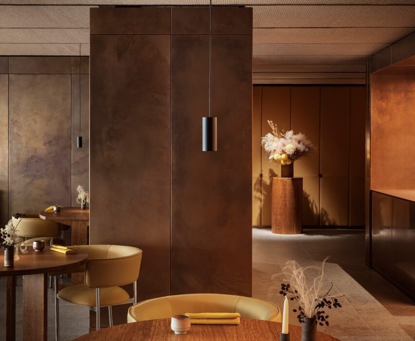
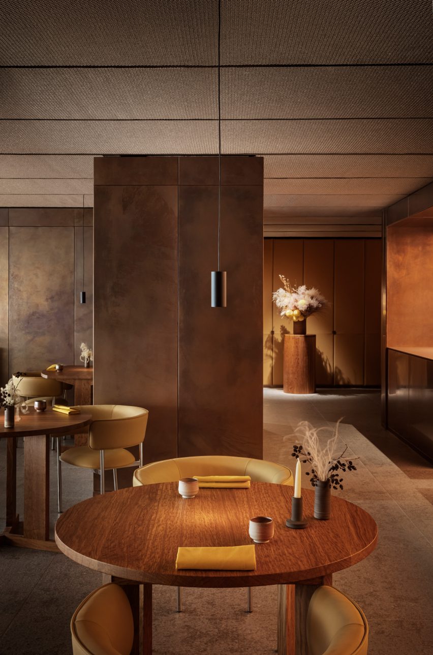
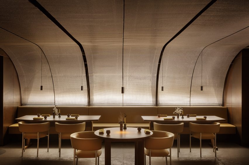
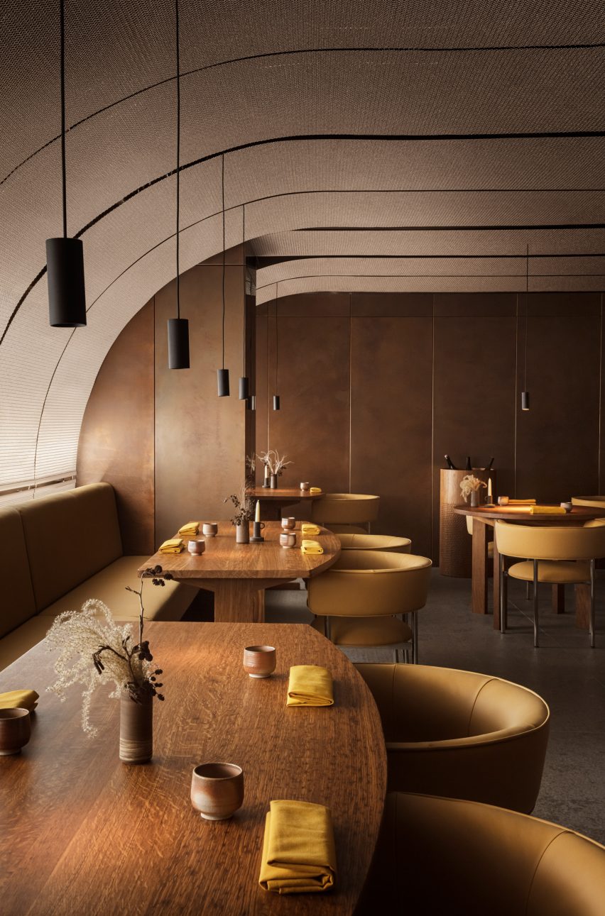
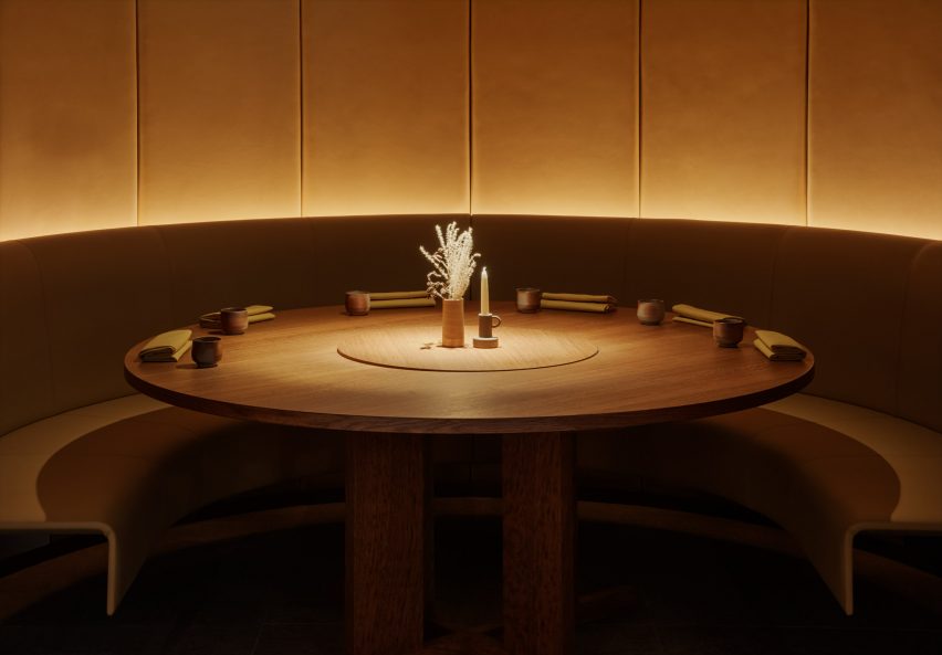
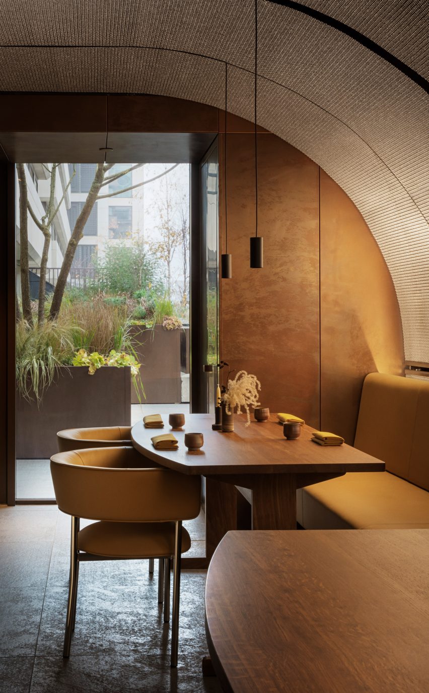
Copenhagen-based designer David Thulstrup drew on spice-making processes when designing the interior of London’s Ikoyi restaurant, which features a variety of materials including copper and oak.
The 150-square-metre restaurant, which has a menu based on seasonal British produce and spices from sub-Saharan west Africa, is located inside the brutalist 180 The Strand building in central London.
Studio David Thulstrup has clad London’s Ikoyi restaurant in copper sheets
Thulstrup completely renovated the interior, adding panels of a specially-designed metal-mesh weave that curve up from the restaurant’s windows and cover the ceiling. The ceiling design was informed by the process of spice production.
“I was inspired by sifting spices and thought the mesh could both capture and reflect light coming from the outside, the street light in the evening and sunlight in the daytime, but also be respectful to the exterior,” Thulstrup told Dezeen. “The lights from inside the restaurant will be captured and ‘sifted’ towards the street.”
Decorative metal mesh was used to cover the ceiling
Thulstrup also layered materials to create a restaurant interior that references the “boldness and intensity of the gastronomy” delivered by Ikoyi‘s founders Jeremy Chan and Ire Hassan-Odukale.
The restaurant walls were lined with oxidised copper sheets finished with beeswax, while the floors were covered in Gris de Catalan limestone that was flamed and brushed to develop a hammered surface.
Ikoyi is located inside a brutalist building
The custom-built furniture and built-in joinery were made from British oak, while banquettes, chairs and wall panels were lined with ginger-coloured leather.
“I always work with contrasts and I like honest juxtapositions of materials that activate your senses – the copper that is warm in colour but cold when you touch it, the warm natural ginger leather against the colder steel mesh and the rough Catalan limestone floor against the warm English brown oak,” Thulstrup said.
The colour palette was kept warm and earthy
The earthy, rustic hues chosen by Thulstrup for the interior were informed both by the restaurant’s food and the building in which it is located.
“Ikoyi is placed on the ground level of the beautiful and very active brutalist building 180 The Strand,” he said.
“The restaurant’s gastronomy plays an essential role in the palette as well,” he added. “It’s not an interpretation of a dish but an exchange in colour and tracing ingredients back to their natural form and colour.”
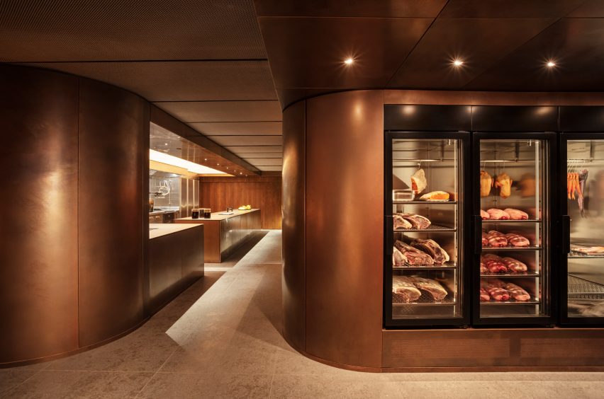
On arrival, visitors to the restaurant are also greeted by a large copper-clad fridge that shows the produce served at Ikoyi, with slabs of meat and fresh fish hanging from meathooks.
Large copper fridges showcase fresh produce
Thulstrup wanted the fridges to remind people of where their food is coming from.
“[The idea was] that we know where a piece of fish comes from and that we are aware what a piece of meat looks like,” he said. “It traces the story back to when the animal was alive and underscores that we have to take good care of them and appreciate them.”
“I thought it would be a modern interpretation and celebration of our awareness of food.”
Wooden and leather-clad furniture was used for the interior
Thulstrup founded his studio in 2009 and it is based in Copenhagen, Denmark. The studio works in architecture, design and interiors.
Previous projects by the studio include an office in Borough Yards, London, and the revamp of a winery in California’s Sonoma County.
Creative studio Spacemen looked to biophilic design principles to construct a tree-like installation covered in moss, which forms the centrepiece of a flagship outlet for luxury leather brand Braun Büffel in Malaysia.
Described by Shanghai-based Spacemen as a store that straddles an art gallery and a laboratory, the studio wanted to create an interior that would attract a younger audience and serve as “an abstract oasis” in Putrajaya’s IOI Mall.
Spacemen designed the store interior for bag brand Braun Büffel
Central to this design is an oversized, organic-shaped sculpture clad in preserved flat moss, ball moss and lichen that is suspended from an illuminated disc in the middle of the shop.
A rounded table clad in the same plants was positioned directly below to complete the installation. It also doubles as a plinth for Braun Büffel leather bags, which are displayed sparsely across the store like museum artefacts.
It is characterised by a central moss-covered sculpture
The sculpture takes cues from biophilic design – a concept that encourages a closer connection between humans and nature when creating interior spaces.
“The form was designed to seem as though it is sprouting from the ground towards the ceiling – towards the sun – hence why we integrated the membrane lighting ceiling above it, just like how it would grow out of a beaker in a mad scientist’s lab towards natural light,” explained Spacemen founder Edward Tan.
“We envisioned an otherworldly concept akin to something out of a Hollywood sci-fi movie,” he told Dezeen.
A green onyx feature wall was placed at the back of the store
Tan said that Spacemen adopted a “maximal minimalism” approach when creating the store interiors, in an attempt to challenge the neutral shapes and colours often associated with luxury.
Throughout the shop, lime plaster walls and bright white terrazzo floors are interrupted by various ornate display units and shelves magnified by floor-to-ceiling mirrors.
This cabinetry is made from decadent slabs of swirly orange onyx and jade marble, some of which are topped with glass vitrines that reveal small leather goods.
Spacemen placed a green onyx feature wall at the back of the store, which sits behind furniture including a bespoke curved bench created from the same material as well as a custom oak armchair.
Bespoke seating creates a waiting area for customers
Explaining the decision to incorporate biophilic design into the Braun Büffel outlet, Tan said, “I think with the pandemic, people have taken to appreciating nature a lot more than before.”
“This is especially true for people living in big cities where they live in apartments and are confined to office cubicles all the time, and do not have access to nature and greenery as much as they should.”
“Therefore it has become a new form of luxury to be able to afford lush greenery and gardens indoors,” he concluded.
Green and orange hues add colourful accents to the space
Other retailers featuring similar designs include a store in Seattle for beauty brand Glossier with a mossy mushroom-covered mound and a Celine boutique in Paris that is characterised by large expanses of brass and marble.
Today, AHEAD will announce the winners of the AHEAD Global 2022 hospitality design awards and its headline Ultimate Accolade. Dezeen is collaborating with the brand to show the ceremony here at 1pm London time.
The AHEAD Awards is an annual programme highlighting striking hospitality around the world, split across Europe, Middle East and Africa (MEA), Asia and the Americas.
For its climactic Global leg, regional winners are pitted against each other to determine the ultimate winner in each category. The winners will be announced over a digital broadcast aired on Dezeen and AHEAD’s website.
This year the programme received over 630 entries spanning 60 countries, which were judged by a panel of leading hoteliers, architects, interior designers and industry experts.
Previous AHEAD winners include the Six Senses hotel by Jonathon Leitersdorf, a luxury resort in Cala Xarraca, Ibiza, which was named the winner of the spa and wellness category at the AHEAD Europe awards 2021.
NoMad London, a former prison transformed into a luxury hotel, was named Hotel of the Year for the AHEAD Europe 2021 award, while the One & Only Mandarina luxury resort in Mexico was awarded the Hotel of the Year for the AHEAD Americas 2021 award.
Partnership content
This ceremony was broadcast by Dezeen for AHEAD as part of a partnership. Find out more about Dezeen partnership content here. Images courtesy of AHEAD.
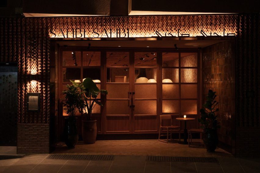
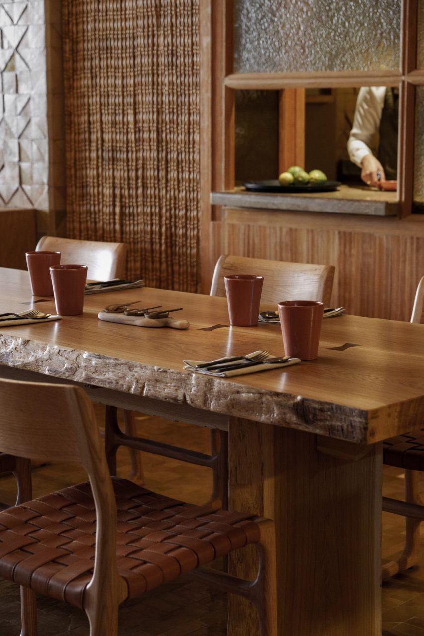
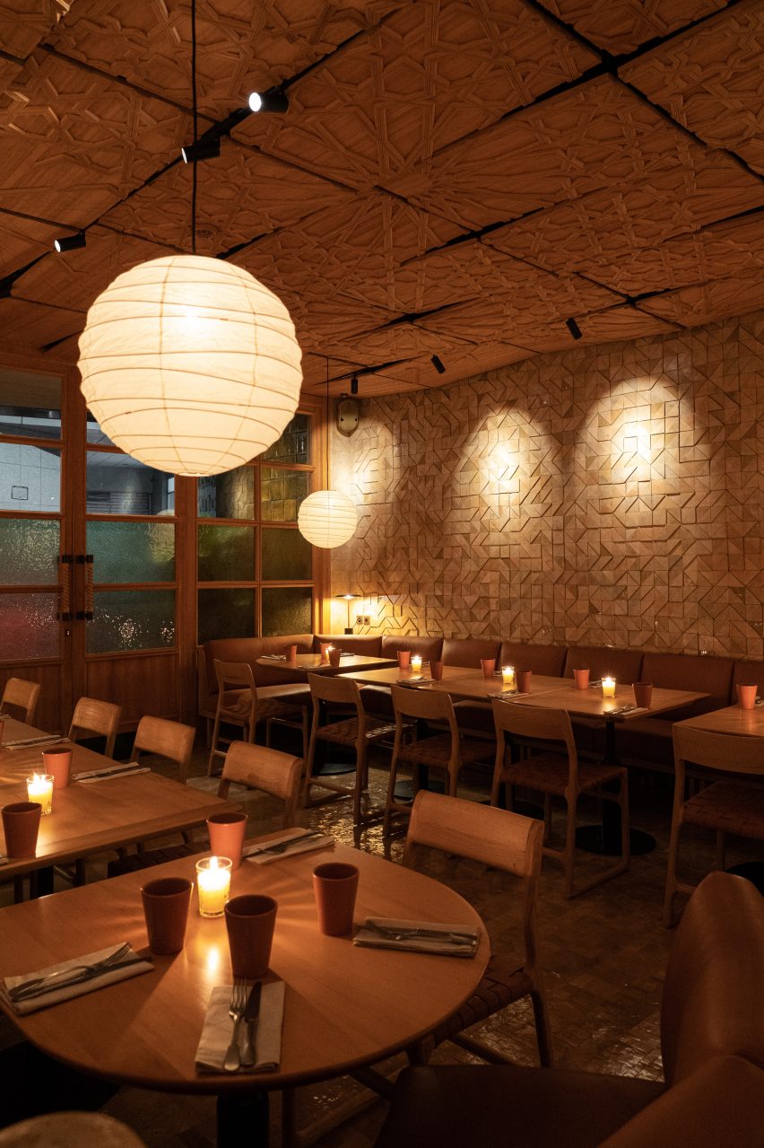
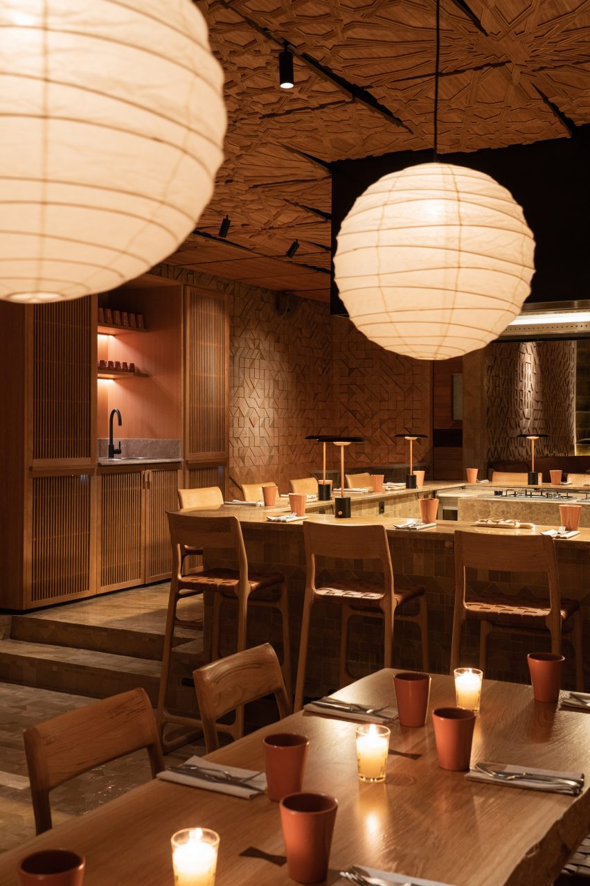
French architecture practice Studio KO has designed the restaurant interiors of Sahbi Sahbi using textures, tones and materials that celebrate Moroccan cuisine and female culinary practices.
Sahbi Sahbi, which translates to soulmates in Darija – a form of Arabic spoken in Morocco, is located in the Guéliz neighbourhood of Marrakech.
Top: An open kitchen is at the heart of Sahbi Sahbi. Above: the restaurant is in Marrakech
“Sahbi Sahbi is a reinvented tribute to Moroccan craftsmanship,” Studio KO told Dezeen.
“It is a symbiosis of modernity and tradition, of Japan wood tradition and details and Moroccan motifs and materials.”
Studio KO wanted the restaurant to celebrate the female chefs who work there
The eatery serves a menu of traditional Morrocan dishes made using recipes created by Dadas – female cooks in Morocco who orally handed down their trade through generations.
Sahbi Sahibi’s focus on Dada cuisine influenced Studio KO to create an interior that places the female chefs at the centre of the space.
Warm wood was used for the ceiling, walls and table and chairs
“In Morocco, the kitchen is normally a secretive place, the hidden domain of the Dadas, women who hand down recipes from one generation to the next,” Studio KO said.
“It is with precisely this intention, to share and transmit knowledge – an intention evident even in the layout of the restaurant – that guests are welcomed at Sahbi Sahbi,” added the brand.
Rust-coloured paint and tableware is dotted throughout
In the centre of the restaurant, the kitchen was intentionally left open so that diners can watch the chefs at work and get an insight into the culinary process.
Horseshoe-shaped tables and seating wrap around an open stove integrated into a kitchen island counter where chefs prepare meals.
“In conceiving this warm, convivial space, the designers inverted the archetype of Moroccan cuisine – its secretiveness – and instead placed the cooking at the epicentre of the restaurant’s activity,” said Studio KO.
Earthy colours and natural materials were used to complement the relaxed and friendly aesthetic of the restaurant.
Wood was used to add warmth throughout. It covers the walls and ceiling and also forms the woven chairs and dining tables. These are illuminated with spherical pendant lights while brown leather upholsters the booth seating around the edge of the space.
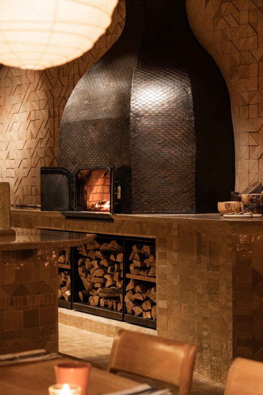
A traditional oven is located at the side of the space
In one corner, there is a large traditional oven where chefs can burn logs to bake bread or roast meat.
Finer details include rust-coloured ceramic urns, clay pots and pans and orange-brown paint in an alcove above a sink.
“The beauty is subtle: details, textures, the play of light and surfaces, natural tones and motifs that tell a story of traditional materials and knowledge, freely reinterpreted,” Studio KO explained.
the interiors were designed as a tribute to Moroccan craftsmanship
Studio KO has previously worked on projects in Marrakech. In 2017 the studio revealed the Musée Yves Saint Laurent, a 4,000-square-metre museum building showcasing the work of the late fashion designer Yves Saint Laurent.
Other notable buildings in the Moroccan capital city include Fobe House, a white house designed by Paris-based architecture studio Guilhem Eustache.