Petit Salon, home of the French Academy in Rome
CategoriesInterior Design

Fendi introduces modern furnishings to Rome’s historic Villa Medici

Italian fashion brand Fendi has teamed up with the French Academy in Rome to refresh six salons inside the Villa Medici – a 16th-century Renaissance palace set amongst sprawling gardens in the heart of Rome.

The villa has been home to the French Academy in Rome since 1803, and today is used by the French art institute to host creative residencies and public art programmes.

Petit Salon, home of the French Academy in Rome
Fendi has introduced new furnishings to Rome’s Villa Medici

The building’s salons had not been significantly modified in some 20 years, leading the academy to initiate a revamp in the hopes of establishing a better connection between the centuries-old rooms and contemporary design.

Fendi was brought on board to consult on Villa Medici’s interior scheme alongside Mobilier National – France’s national furniture collection and conservation agency.

The project also saw the academy call in French architect Pierre-Antoine Gatier to restore some decorative features of the Grand Salon, while conservation specialist Bobin Tradition carried out preservation work on the building’s existing wall hangings.

Salon des Pensionnaires in Villa Medici, home of the French Academy in Rome
Umbrella pine trees informed the shape of the table in the Salon des Pensionnaires

Fendi’s artistic director of couture and womenswear Kim Jones worked with Silvia Venturini Fendi, the brand’s artistic director of accessories and menswear, as well as Mobilier National to curate a selection of modern French and Italian furnishings for the salons.

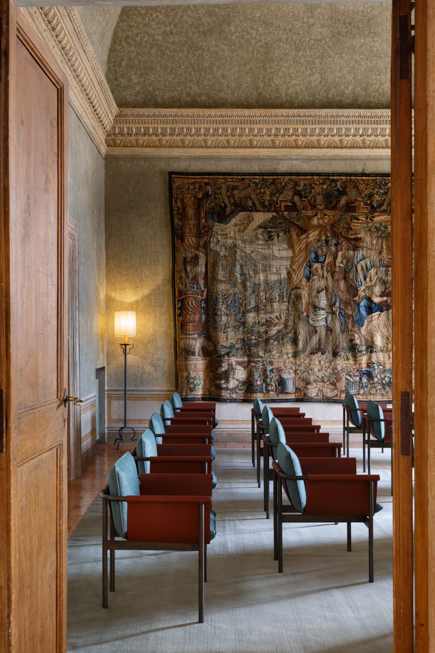
Many of the pieces were pulled from Fendi Casa, the brand’s homeware collection, and chosen for their ability to slot in amongst the building’s existing heritage pieces and classical artworks.

Salon Bleu, home of the French Academy in Rome
Noé Duchaufour-Lawrance’s tables for the Salon Bleu mimic ancient Roman paving slabs

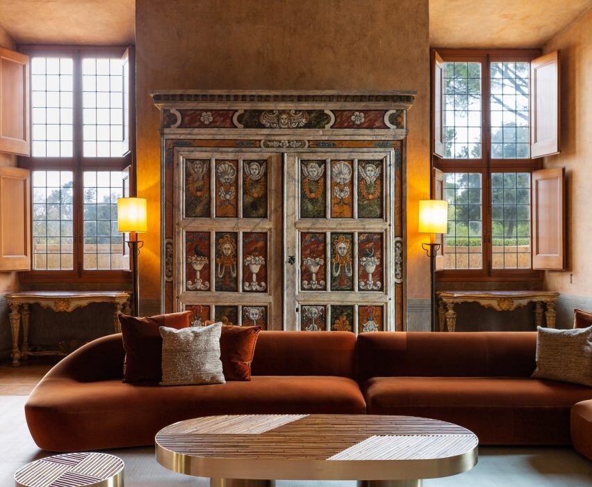
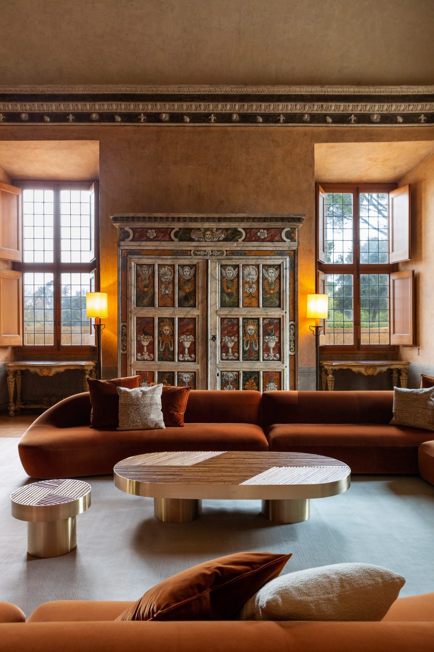
The focal point of the Petit Salon is now a huge modular sofa by Milan-based designer Toan Nguyen, upholstered in a rust-orange fabric that matches the colour of the walls.

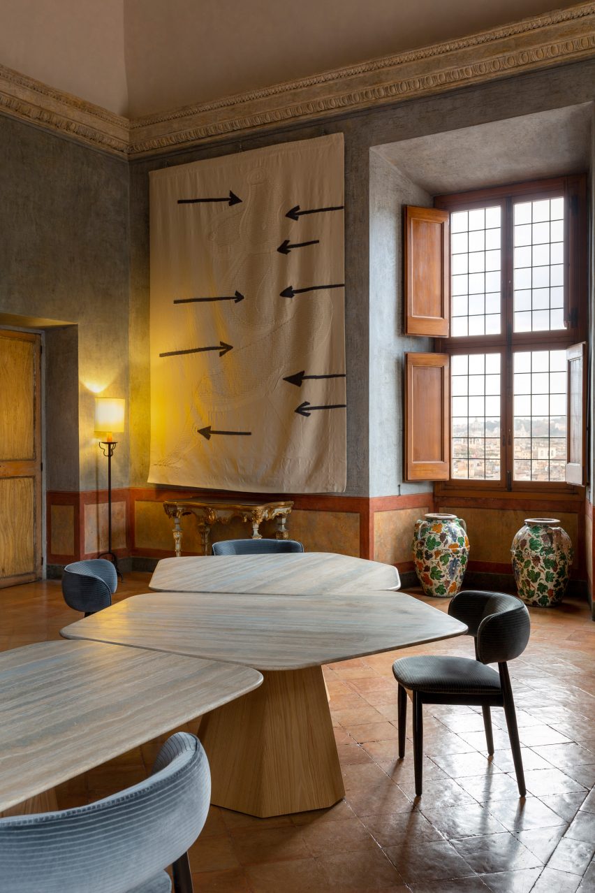
Over in the Salon des Pensionnaires is a table by French designer Noé Duchaufour-Lawrance. This is supported by spindly black legs, which resemble the branches of Rome’s ubiquitous umbrella pine trees.

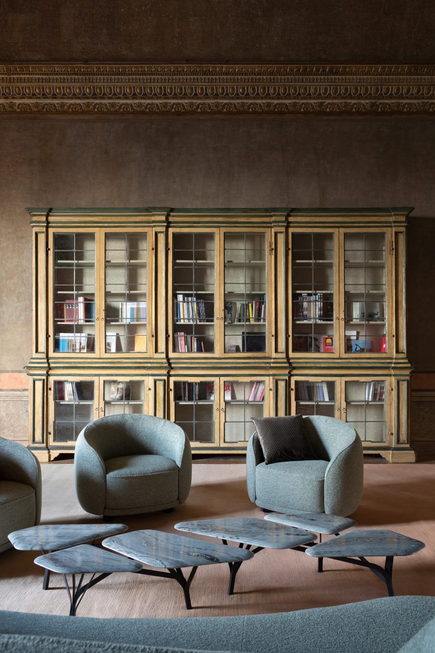
The slightly moodier feel of this room is complemented by grey-blue sofas and armchairs by Italian designer Chiara Andreatti.

Duchaufour-Lawrance was also responsible for crafting the tables found in the villa’s Salon de Lecture and Salon Bleu, shaped to look like the time-worn paving slabs of the Appian Way – one of the oldest roads that lead to Rome.

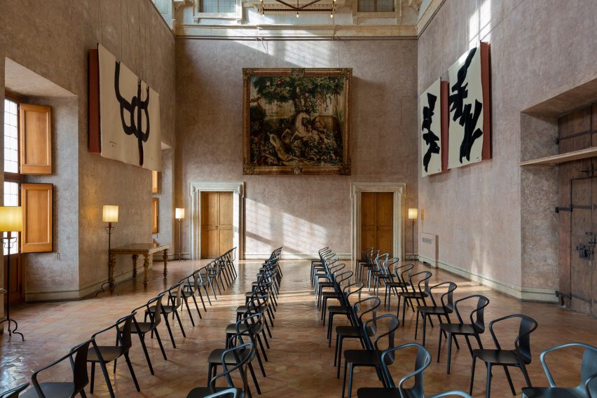
The Grand Salon houses rows of the sinuous Belleville chair, created by French design pair Ronan and Erwan Bouroullec for Vitra.

Salon de Musique in Villa Medici, home of the French Academy in Rome
Contemporary chairs were added to the building’s Salon de Musique

Both here and in the other salons, Fendi and Mobilier National introduced tapestries from well-known artists including Louise Bourgeois, Sheila Hicks and Sonia Delaunay.

Acoustic panels by Devialet were tucked behind selected artworks to discreetly enhance the sound quality inside the villa.

Grand Salon, home of the French Academy in Rome
Seats by the Bouroullec brothers line the Grand Salon

Over the past few years, high-end fashion designers have become increasingly involved with interior design projects.

In London, Roksanda Ilincic and Bella Freud applied their respective styles to two separate penthouse apartments, while Jasquemus founder Simon Porte Jacquemus has devised a summery interior scheme for a restaurant in Paris.

The photography is by Silvia Rivoltella.


Reference

Jewel toned sitting room in The Chloe hotel in New Orleans
CategoriesInterior Design

Eight hotel interiors enriched by decadent jewel tones

Plush velvet upholstery, Moroccan rugs and chinoiserie-style ottomans feature in this lookbook of hotel interiors that use saturated jewel colours to bridge the gap between cosiness and luxury.

Shades of ruby red, cobalt blue and emerald can help to create interiors that are rich in depth and dimension, especially when accompanied by tactile materials such as silk or leather.

Read on for eight hotel interiors that demonstrate how to translate this palette into modern interiors without it feeling stuffy.

This is the latest in our lookbooks series, which provides visual inspiration from Dezeen’s archive. For more inspiration see previous lookbooks featuring 70s-style interiors, biophilic homes and innovative stone furniture.


Jewel toned sitting room in The Chloe hotel in New Orleans
Photo by Paul Costello

The Chloe hotel, USA, by Sara Ruffin Costello

Interior designer Sara Ruffin Costello set out to emphasise the grand Southern Victorian architecture of this 1800s family mansion in New Orleans when converting it into The Chloe hotel (top and above).

Cobalt blue walls and matching chinoiserie ottomans help to complement the building’s original tall ceilings and dark wooden floors, as well as the burnt umber tiles that encircle the fireplace in the reception room.

“The Chloe is moody with dark, antique furniture, with an emphasis on Orientalism but updated and made culturally relevant through a very special art collection,” Costello told Dezeen.

Find out more about The Chloe hotel ›


Jewel toned carpet and couch in Nobu Hotel Barcelona, Spain, by Rockwell Group
Photo by Ricardo Labougle

Nobu Hotel Barcelona, Spain, by Rockwell Group

This Barcelona hotel by restaurant-turned-hospitality chain Nobu introduces elements of Japanese craft and design into the Catalan capital, with nods to traditional ink paintings, shoji screens and the gold-lacquer mending technique of kintsugi.

In the hotel’s moody suites, this is realised in the form of inky blue carpets and built-in millwork finished in saturated lacquer colours, while bathrooms feature traditional ofuro soaking tubs.

Find out more about Nobu Hotel Barcelona ›


Esme Hotel by Jessica Schuster Design
Photo by Christian Harder

Esme Hotel, USA, by Jessica Schuster Design

Interior designer Jessica Schuster worked with the Historic Preservation Board of Miami to revive the Mediterranean revival “grandeur” of this 1920s hotel in Miami, making liberal use of plaster and travertine. Pecky cypress, a type of cypress wood containing small holes, was used on the ceilings.

These are complemented by decadent furnishings, vibrantly clashing patterns and saturated colours, with bedrooms finished in either a rose quartz or emerald green colour scheme.

Find out more about Esme Hotel ›


Jewel toned guest room in Hotel Kinsley by Robert McKinley
Photo by Nicole Franzen

Hotel Kinsley, USA, by Studio Robert McKinley

Interior designer Robert McKinley wanted to steer clear of the typical upstate New York aesthetic of “antlers or plaid” when designing Hotel Kinsley in the Hudson Valley.

Set over four historic buildings – including a former bank – the hotel instead draws on an unexpected material palette of boiled wool, intricate garnet-red Moroccan rugs and velvet upholstery in shades of mustard yellow and topaz.

Find out more about Hotel Kinsley ›


Jewel toned concierge counter at Maison De La Luz by Studio Shamshiri and Atelier Ace
Photo by Atelier Ace

Maison De La Luz, USA, by Atelier Ace and Studio Shamshiri

Housed inside the former annex to New Orleans’ town hall, this 67-room guest house offers a modern take on Southern hospitality by integrating furnishings and artworks that draw on the city’s uniquely multicultural heritage.

Among them are references to New Orleans as the home of America’s first pirate, alongside quirky details such as the sapphire-blue concierge desk, where guests can collect their tasselled keys.

Find out more about Maison De La Luz ›


Interiors of Chief members club in Chicago, designed by AvroKO

Chief Chicago, USA, by AvroKO

Down to the service ducts, every surface in the lobby of this Chicago members’ club is painted a rich shade of green, with matching tiles laid across the floor.

This serves to set the backdrop for a mix of eclectic furnishings and abstract artworks, which design firm AvroKO chose to provide an alternative interpretation of traditional old-world luxury.

“Saturated walls are intentionally bold, balanced by the warmth of plush upholstery and broken-in leather, creating approachability with an overall style that is fresh and enduring,” the studio said.

Find out more about Chief Chicago ›


Hotel Torni by Fyra
Photo by Riikka Kantinkoski

Hotel Torni, Finland, by Fyra

Originally built in 1931, Helsinki’s Hotel Torni once served as a meeting place for spies during world war two and was later favoured by artists, journalists and other cultural figures, including Finnish composer Jean Sibelius.

Now, local studio Fyra has renovated the building while preserving its “bohemian ambience”, sticking to a moody emerald-green colour palette and layering different styles of furniture, including modern pieces by Swedish designer Gustaf Westman alongside tubular steel seats that were typical of the time.

Find out more about Hotel Torni ›


A corner seating section at The Hoxton, Poblenou
Photo by Heiko Prigge

The Hoxton Poblenou, Spain, by Ennismore

The Hoxton’s outpost in Barcelona proves that jewel tones can also work in sunnier climates, drawing on a slightly more muted palette of rust red, mustard yellow and aquamarine.

The scheme was informed by the distinctive colours and forms used by Spanish architect Ricardo Bofill, whose studio was located nearby.

Find out more about The Hoxton Poblenou ›

This is the latest in our lookbooks series, which provides visual inspiration from Dezeen’s archive. For more inspiration see previous lookbooks featuring 70s-style interiors, biophilic homes and innovative stone furniture.

Reference

Apartment 207 by BST Arquitetura
CategoriesInterior Design

Eight kitchens that benefit from generous marble surfaces

From veiny and earthy to sleek and spotless, our latest lookbook features eight kitchens from the Dezeen archive that prominently feature marble.

Marble is a metamorphic stone formed when limestone rock is heated and pressured in the Earth’s crust, making it crystallise and form a streaky, swirly mix. The smooth stone can be used on walls, floors and other surfaces, often in bathrooms or kitchens.

In larger kitchens, marble can be used to form sturdy islands, breakfast bars or dining tables while in smaller spaces, it can be used as an easy-to-clean splashback or countertop for meal preparation.

Here are eight interior projects that feature marble kitchens, including a playful apartment in Melbourne and a minimalist house in Canada.

This is the latest in our lookbooks series, which provides visual inspiration from Dezeen’s archive. For more inspiration see previous lookbooks featuring homes informed by biophilic design, colourful 1970s interiors and homes with sliding doors.


Apartment 207 by BST Arquitetura
Photo is by Eduardo Macarios

Apartment 207, Brazil, by Belotto Scopel Tanaka

For the revamp of a 75-square-metre apartment in Brazil, architecture studio Belotto Scopel Tanaka employed a simple material palette of glossy, dark wooded cabinetry against black and white marble.

On one side of the marble breakfast bar, there is space for the residents to sit and enjoy meals; on the other, there are several drawers for crockery and kitchenware storage.

Find out more about Apartment 207 ›


Lawyers office by Arjaan De Feyter
Photo is by Piet-Albert Goethals

Deknudt Nelis, Belgium, by Arjaan de Freyter

Blackened steel, dark walnut fittings and deep-green marble slabs fill the interior of this pared-back office that Belgian studio Arjaan de Freyter designed for law firm Deknudt Nelis.

The same veiny stone used for the striking kitchen island has also been used to line the inner shelves of a full-height storage unit. Architect De Freyter chose the material to convey “decisiveness and professionalism,” he told Dezeen.

Find out more about Deknudt Nelis ›


Kitchen with terrazzo floor
Photo is by Benjamin Hosking

Brunswick Apartment, Australia, by Murray Barker and Esther Stewart

Like the majority of this Melbourne apartment, its L-shaped kitchen pays homage to the 1960s, with the same pistachio green tones and speckled flooring as its original mid-century interior.

The designers used Rosa Alicante marble on the top of the custom-made steel frame table and long countertops, which complements the terrazzo floor tiles beneath.

Find out more about Brunswick Apartment ›


Brooklyn Loft by Dean Works
Photo is by Daniel Salemi

Brooklyn Loft, US, by Dean Works

New York studio Dean Works added a statement multi-functional plywood unit in the kitchen of this Brooklyn apartment, giving its occupants some much-needed storage space.

Its in-built grey and white marble countertop was cut away to make space for a traditional white sink and a gas hob, while the shelves provide space above the counter for tableware, crockery and cooking utensils.

Find out more about Brooklyn Loft ›


Apartment in Belgium features green kitchen
Photo is by Piet-Albert Goethals

Belgian Apartment, Belgium, by Carmine Van Der Linden and Thomas Geldof

Local architects Carmine Van Der Linden and Thomas Geldof designed this coastal two-floor apartment to reflect its calm countryside surroundings.

Seaweed-coloured joinery and streaky Alga Marina marble surfaces make the kitchen the focal point of the residence and contrast the panelled birchwood cabinets and shelves.

Find out more about Belgian Apartment ›


Beaconsfield Residence by Sudio AC
Photo is by Andrew Snow

Beaconsfield Residence, Canada, by StudioAC

Located in Toronto, this Victorian townhouse renovated by StudioAC combines clean white hues with wooden furnishing and flooring.

The overhaul included opening up the interior by reorganising the layout, as well as installing a black marble-covered kitchen island to provide a darker contrast.

Find out more about Beaconsfield Residence ›


Light marble counter tops in a kitchen
Photo is by Raphaël Thibodeau

Cottage on the Point, Canada, by Paul Bernier Architecte

Designed by local studio Paul Bernier Architecte, this sun-drenched kitchen sits within a house extension in Cottage on the Point, a lakeside dwelling in Quebec.

The large glass windows that frame views of the surrounding trees and night skies also allow light to bounce across the pale marble surfaces that line the table, shelves and countertops.

Find out more about Cottage on the Point ›


Kitchen in Barwon Heads House
Photo is by Timothy Kaye

Barwon Heads House, Australia, Adam Kane Architects

Australian studio Adam Kane Architects blanketed the barn-style extension of Barwon Heads House in a monochrome interior palette and contemporary finishes.

The open plan kitchen and dining area is divided by a large marble dining table, while elsewhere in the cottage, matching slabs of travertine marble are used as countertops and coffee tables.

Find out more about A Barwon Heads House ›

This is the latest in our lookbooks series, which provides visual inspiration from Dezeen’s archive. For more inspiration see previous lookbooks featuring interiors with Eames chairs, memorable pop-up shops and interiors informed by Bauhaus principles.

Reference

Mezzanine with green staircase by The Guild of Saint Luke
CategoriesInterior Design

GSL Gallery takes over disused Parisian factory with “punk” interiors

Weathered walls and concrete floors feature in this design gallery that creative collective The Guild of Saint Luke and architecture firm Studio ECOA have set up inside a former factory in Paris.

Spread across one storey and two mezzanines, GSL Gallery provides a mixture of studio and exhibition space for the group of architects, artists and artisans that make up The Guild of Saint Luke.

Mezzanine with green staircase by The Guild of Saint Luke
GSL Gallery sits inside an old factory

The gallery occupies a disused factory in Pantin, a neighbourhood in northeastern Paris with a growing arts and culture scene.

In recent years, the building operated as a classic car garage but was purchased by art dealer and gallerist Hadrien de Montferrand during the pandemic with the aim of transforming the site into a gallery.

Industrial hallway with concrete floors and green metal doors
The building’s concrete floors were retained

De Montferrand enlisted locally based Studio ECOA to carry out all the necessary architectural changes and asked The Guild of Saint Luke (GSL) to steer the building’s design and become its first tenant.

“We were charmed by the space and found the patina and raw walls to be punk and accidentally on-point,” GSL’s creative director John Whelan told Dezeen.

Close-up shot of green metal staircase
Clean white panelling was added to give the space the look of a typical gallery

“Working in close collaboration with Studio ECOA, we proposed a project that retained all of the rawness of the spaces with very minimal design interventions,” he continued.

“We felt that it would be criminal to interfere with the existing mood, which is melancholic and eerily beautiful.”

Studio ECOA restored the building’s facade and aluminium roof, as well as preserving its original concrete flooring.

The Guild of Saint Luke opens GSL Gallery in Paris
A live-work space can be found on GSL Gallery’s first mezzanine

Boxy storage units were built on either side of the front door to form a corridor-like entrance to the ground floor, where white panelling was added across the lower half of the patchy, time-worn walls to emulate the look of a typical gallery.

This ground-floor space will be used to display a changing roster of avant-garde installations, which GSL hopes to finance by using the gallery’s workspaces to produce more commercial projects for design brands.

“Commercial endeavours will help to fund more proactive ‘passion projects’, where we will exhibit GSL’s own designs along with designers and artists that we admire,” Whelan said.

“Our chief motivation is creative freedom, as we hope to produce installations that do not necessarily adhere to a commercial brief.”

The Guild of Saint Luke opens GSL Gallery in Paris
Bathroom facilities are contained in a mirrored volume

The building’s two existing mezzanines were cut back to create a central atrium, which draws natural light into the gallery’s interior.

The lower mezzanine now houses a hybrid live-work space where GSL members or visiting artists can stay the night.

This space is centred by a large Donald Judd-style wooden table and also accommodates a bed, kitchenette and a bathroom concealed within a mirrored volume.

Stainless steel sink in a narrow bathroom
Metal sanitary ware reflects the light in the bathroom

Extra exhibition space is provided on the secondary mezzanine that sits beneath the building’s roof, directly under a series of expansive skylights.

Prior to now, GSL has largely specialised in hospitality interiors – restoring historic brasseries across Paris and devising opulent restaurants such as Nolinski near the Musée du Louvre and Maison Francois in London.

The Guild of Saint Luke opens GSL Gallery in Paris
The lower mezzanine also houses a bed and a large table

“We hope that the gallery will be an extension of the aesthetic that we are trying to develop, embracing new ideas but never abandoning the pursuit of beauty,” Whelan explained.

“It feels like a good time to do so, as Covid has cleared and a mood of optimism in design has emerged. This bracing, minimal space feels almost like a clean slate and invites a multitude of possibilities.”

The Guild of Saint Luke opens GSL Gallery in Paris
The second mezzanine sits directly underneath the building’s skylights

Other recent additions to Paris’s cultural landscape include a major extension of the Musée Albert Kahn by Kengo Kuma and Associates, which made room for a historic collection of 72,000 photographs.

Elsewhere in the French capital, Bruno Gaudin Architectes just completed a 15-year renovation of the National Library of France, incorporating a number of new circulation routes and public spaces.

The photography is by Oskar Proctor

Reference

Window counter of Blue Bottle Coffee shop in Kobe
CategoriesInterior Design

Keiji Ashizawa creates Blue Bottle Coffee shop in Kobe department store

Japanese studio Keiji Ashizawa Design has created the interior of the Blue Bottle Coffee shop in Kobe’s Hankyu department store, taking advantage of its display windows to connect the cafe with the street outside.

The 173-square-metre cafe, which shares the department store’s ground floor with a number of apparel brands, has five large display windows.

To open the coffee shop up towards the street, designer Keiji Ashizawa turned one of the windows into a take-out counter.

Window counter of Blue Bottle Coffee shop in Kobe
One display window was turned into a take-out counter

The remaining window niches were filled with blue built-in seating, creating a splash of colour among the wooden furniture.

Inside the cafe, square-shaped and rectangular furniture nods to the graphic look of the facade and is contrasted by round tables and large circular ceiling lights.

“The furniture is mainly made of domestic wood in collaboration with the Japanese furniture manufacturer Karimoku, who specializes in working with oak wood,” Ashizawa told Dezeen.

Interior of Hankyu Blue Bottle Coffee shop
Wooden furniture and terrazzo tabletops were used for the interior

The studio also mixed in terrazzo amongst the wooden furniture to give the cafe a welcoming feel.

“By placing a large terrazzo tabletop with fine textures created by mixing grounded glass into the material, it adds to the soft and welcoming atmosphere that identifies Blue Bottle Coffee and their hospitality,” Ashizawa said.

“It is also used for the low coffee table surrounded by the sofas, creating a sense of harmony and elegance throughout the space of the cafe,” he added.

While the studio was unable to change the material of the existing rough concrete floor, the department store allowed it to create a discrete demarcation by polishing the floor underneath the central tables.

Terrazzo table inside Blue Bottle Coffee shop
Circular pendant lights were made from raw aluminium

Large disc-shaped pendant lights add a sense of drama to the coffee shop’s pared-back design.

“With the idea of creating a high ceiling within the space, the pendant lights were made from raw aluminum to complement the industrial structures,” Ashizawa said.

“Six pendant lights are placed in the central space at equal distances in three zones, creating a sense of rhythm and spatial balance.”

Polished concrete floor in Blue Bottle Coffee shop
The concrete floor was polished in part of the cafe

The wooden furniture inside the Blue Bottle Coffe Hankyu cafe has mainly been kept in its natural colour, but Ashizawa added bright colour to some of the wood.

“In the space with concrete structures, the yellow color was added to balance the combination of wood and concrete, and the blue color was placed as a contrast,” he said.

“We also designed the space to fit in with the apparel brands that share the ground floor.”

Colourful shelving in Kobe cafe
Shelves were painted a bright yellow

Ashizawa has previously created a number of cafes for the Blue Bottle Coffee company, including a Shanghai store decorated with traditional Chinese roof tiles and a Tokyo outpost with a volcanic-ash counter.

The photography is by Tomooki Kengaku.


Project credits:

Architect: Keiji Ashizawa Design
Project architect: Keiji Ashizawa, Tomohiko Fujishita, Masaru Kiotya
Construction: Tank
Design supervision: Miyachi Office/Kunihiko Miyachi
Lighting design: Aurora/Yoshiki Ichikawa
Furniture: Karimoku Case Study/Ichinomaki Laboratory by Karimoku
Metal works: Super Robot

Reference

Get listed in Dezeen's digital guide for Stockholm Design Week 2023
CategoriesInterior Design

Get listed in Dezeen’s digital guide for Stockholm Design Week 2023

Are you putting on an exhibition, talk or other event in Stockholm next month? Get your event listed in our digital guide to Stockholm Design Week on Dezeen Events Guide, which will highlight the key events taking place from 6 to 12 February 2023.

Stockholm Design Week hosts hundreds of events, including exhibitions, open showrooms, talks and parties, as well as the trade show Stockholm Furniture Fair.

Dezeen’s guide, which will be published a week ahead of the design week, will provide visitors with all the key information about the festival with listings for the must-see events.

The Stockholm Design Week guide follows on from the success of our digital guides to Milan design week and London Design Festival last year, which received over 60,000 page views combined. In total, Dezeen Events Guide received over 400,000 page views in 2022.

To be considered for inclusion in the guide, email [email protected]. Events will be selected by the Dezeen team to ensure that the best events are included.

Get listed in Dezeen’s digital Stockholm guide

Dezeen offers standard, enhanced and featured listings in its Stockholm guide.

Standard listing: For only £100, you can feature your event name, date and location details plus a website link. These listings will also feature up to 50 words of text about the event.

Enhanced listing: For £150, you can include all of the above plus an image at the top of the listing’s page and an image in the listing preview on the Stockholm guide page. These listings can also feature up to 100 words of text about the event.

Featured listing: For £300, your listing will feature everything as part of an enhanced listing plus inclusion in the featured events carousel and accompanying posts on Dezeen Events Guide social media channels. These listings can also feature up to 150 words of text about the event and can include commercial information and additional links to website pages such as ticket sales, newsletter signups etc.

For more information about partnering with us to help amplify your event, contact the team at [email protected].

About Dezeen Events Guide

Dezeen Events Guide lists events across the globe, which can be filtered by location and type.

Events taking place later in the year include Nomad St Moritz 2023, Venice Architecture Biennale 2023 and Design Shanghai 2023.

The illustration is by Rima Sabina Aouf.

Reference

A spiraling ramp replaces the need for stairs in this modern office and adds a sculptural element.
CategoriesInterior Design

Instead Of Stairs, A Spiraling Ramp Was Designed For This Office Building

A spiraling ramp replaces the need for stairs in this modern office and adds a sculptural element.

PAULO MERLINI architects has designed the offices of E-GOI & CLAVEL´S KITCHEN in Portugal, and one of the main design features central to the interior is a spiraling ramp.

A spiraling ramp replaces the need for stairs in this modern office and adds a sculptural element.

The former warehouse, which has now been transformed into offices that span multiple floors, includes a ramp that replaces the need for a staircase.

A spiraling ramp replaces the need for stairs in this modern office and adds a sculptural element.

The elegantly curves of the concrete form is accentuated by the use of white bars and edges.

A spiraling ramp replaces the need for stairs in this modern office and adds a sculptural element.

The circling ramp connects the floors of the office and adds a sculptural element that doesn’t block the light from traveling throughout the interior.

A spiraling ramp replaces the need for stairs in this modern office and adds a sculptural element.
A white frame and supports connect the top of a spiraling ramp with the ceiling.

Here’s a glimpse of the ramp looking down from the top floor, and up from the ground.

A spiraling ramp replaces the need for stairs in this modern office.

Let’s take a look at the rest of the office…

The exterior of the office has walls of glass providing a glimpse of the interior for the pedestrians on the street.

The exterior of this modern office has walls of glass providing a glimpse of the interior for the pedestrians on the street.

There’s a variety of different seating areas in the office interior, including spaces for casual meetings in house-shaped alcoves.

There's a variety of different seating areas in this modern office interior, including spaces for casual meetings in house-shaped alcoves.

More private work rooms with glass walls that keep the sound in or out.

A modern office interior with a variety of work areas.

A larger meeting room with a blue curtain that’s filled with beanbags and has LED lighting in the ceiling.

A large meeting room with a blue curtain that's filled with beanbags and has LED lighting in the ceiling.

Other more traditional work spaces exist too, with desks that include multiple work stations.

A modern office with floor-to-ceiling windows.

There’s also a photo studio with a minimalist white kitchen with floating wood shelves. Adjacent to the kitchen are tall wood shelves filled with photography props and kitchen equipment.

A modern office has a photo studio with a minimalist white kitchen with floating wood shelves. Adjacent to the kitchen are tall wood shelves filled with photography props and kitchen equipment.
Wood shelves frame a spiraling ramp in the center of this modern office.

When it’s time to take a break from working, there’s a communal area with long wood tables, a kitchenette, seating by the windows, and an outdoor space.

A modern office with a communal break room.
A modern office with seating by the windows that take advantage of the natural light.
A modern office with plants that hang from a metal detail.
Photography by Ivo Tavares Studio | Architecture Office: PAULO MERLINI architects | Main Architects: Paulo Merlini/ André Santos Silva

Casa Nano exterior Tokyo
CategoriesInterior Design

Bosco Sodi unveils remodelled Tokyo residence as Casa Wabi extension

Studio Wasabi Architecture and Satoshi Kawakami Architects have created a home and artist residency in Tokyo for Mexican artist Bosco Sodi, founder of the arts foundation Casa Wabi in Mexico.

Occupying a corner plot in the Sendagi district of Tokyo, Casa Nano 2.0 is a renovation of a postwar house constructed in the late 1950s.

Casa Nano exterior Tokyo
Casa Wabi founder Bosco Sodi has unveiled a home and artist residency in Tokyo

“The house has a very simple facade system to protect the windows, a system called amado, where you can slide some metal windows and close them when there is a typhoon,” said Studio Wasabi co-founder Rafael Balboa.

The 68-square-metre home has a simple facade with a gabled roof and ridges that jut out to create small awnings.

Japanese home interior with cedar beams
The home renovated a post-world war two home in Tokyo

“For the exterior, we only applied one material – which is called Excell Joint – so it looks similar to the original house in order to make it more natural and coherent with the neighbourhood,” said Balboa.

Studio Wasabi worked with Satoshi Kawakami Architects to completely revamp the interiors for use as an extension of the Casa Wabi artist residency in Puerto Escondido, Mexico or as a home for founder Bosco Sodi and his wife interior designer Lucia Corredor.

Cedar beams and floating staircases tokyo home
The home’s original cedar beams were maintained in the redesign

After sponsoring 13 Mexican artists in the original Casa Nano at another location, Sodi needed more space and decided to move the residency into a larger space – Casa Nano 2.0.

The architecture studios worked with Sodi and Corredor to open up the space, creating an open-concept kitchen, adding furniture and moving the original staircase.

Floating steel staircase
In order to open up floorplan, the architecture studio included a floating staircase

The first floor of the two-storey, cedar-framed structure is concrete, and the second storey’s floor is made of cedar.

The designers and construction company Washin Architects kept all of the old cedar beams and columns, as well as the windows from the original house to preserve the essence of the original building.

Japanese windows with shelves and bench
The original windows were maintained

“For us, it was also very important to be able to have blackout windows so we kept the original pocket metal windows of the facade of the old house to be able to close the windows completely,” explained Corredor.

The team had to move the original staircase to open up the ground floor, so a floating steel staircase was placed against the wall at the middle of the structure, suspended from the existing beams.

Japanese home with natural wood beams
There are three living spaces on the second floor

“This house, besides being part of the art residence of Casa Wabi, was designed to fit our family needs,” said Corredor.

Storage space was another important factor in the design process, so the architecture studios created a shelf unit that hangs from the existing beams that stretch around the entire house.

Japanese home with shelving and open window
A shelving system surrounds the home

On the second floor, three separate spaces were included to accommodate a family of five. The primary bedroom has a simple layout and connects to a small terrace.

A central living area has a bench with a small reading nook and the seating area was furnished with a vintage French sofa from the 1950s and an old wood table from a local flea market.

Japanese sliding doors
The spaces are divded by sliding panel doors

The bunk bedroom at the end of the second floor was built for the kids or as another area spot an artist in residence and has access via a ladder to a small outdoor terrace.

The three spaces are divided by Japanese paper sliding doors with overlaying glass thick enough to maintain privacy and let the light flow into the space.

Read: Five Casa Wabi pavilions include Álvaro Siza ceramics studio and Kengo Kuma chicken coop

The doors and built-in furniture as well as the ceiling of the second floor were made using Lauan wood.

Corredor used furniture from the previous residence and items that were locally sourced to furnish the home.

“We brought all the furniture we already had in the former Casa Nano,” she said.

“Like our old wood table that we found in the flea market in UENO and our beloved Noguchi lamp to give warmth and light to the space.”

Front door on Japanese home
The home’s exterior blends into the style of the neighbourhood

Casa Nano 2.0 will continue with its residency program, inviting four Mexican artists every year, each for a period of one month.

“Japan has been life-changing for the artists that have been already,” Sodi said.

“As it was for me when I was invited to an art residence in Tokyo almost 20 years ago.”

Casa Wabi’s headquarters in Puerto Escondido was designed by Japanese architect Tadao Ando and features yearly pavilions by international architects including a red brick chimney by Mexico City-based architect Alberto Kalach and a ceramics workshop by Portuguese architect Álvaro Siza.

The photography is by Nao Takahashi. 

Reference

Reception Relinque
CategoriesInterior Design

Studio Tate creates “textural earthiness” for Relinque wellness spa

Melbourne-based Studio Tate has used raw and tactile materials to create “a soothing urban oasis” for the Relinque spa in Melbourne.

Located in north east Melbourne, the 800 square-metre space includes a day-spa, spinal clinic, pilates and yoga studios.

Reception Relinque
The interiors are informed by local parks and waterways

Local practice Studio Tate was informed by nearby parklands and waterways to create “a soothing urban oasis”.

“It was important to create a textural earthiness that evokes the senses, while striking a balance between sophistication and approachability,” explained Studio Tate senior associate Emily Addison.

Treatment room Relinque
A deep rust tone in the treatment rooms was selected to be gender neutral

The treatments rooms were located on either side of a central reception area, with the spa and yoga studio located on one side and the spinal clinic and pilates studio on the other.

Studio Tate used green marble, honed granite and hand-glazed Japanese tiles in the reception area, where visitors are encouraged to relax and browse the retail products before stepping into treatments.

Corridor Relinque
Curved corridors encourage visitors to explore the space

The yoga studio was intentionally positioned close to the entrance facing the street, which allows plenty of natural light. A timber floor and ceiling were desigend to create a sense of warmth in the room.

Moving further into the spa area, the tones get darker to provide privacy. Spaces were arranged in a circular configuration, which “encourages a continuous experience of the venue”.

Relinque spa
The design aimed to have “textural earthines”

A curved corridor finished in polished plaster leads visitors to the spa area. Five individually-contained treatment rooms feature a deep rust tone, steam showers with sage green tiles and a granite shower bench.

Above the treatment bench, a backlit ceiling creates a halo around a circular acoustic fabric panel. The gently diffused light helps calm the mind throughout treatments.

The rounded steam room is lined with mosaic tiles, facing directly onto an ice room centred around an ice well covered in Japanese ceramic tiles.

“Luxurious accents are balanced with raw and tactile materials, ensuring the space feels welcoming to all,”added Addison.

Shower Relinque
Steam showers are lined with sage green tiles and a granite shower bench

A palette of greens, greys, burgundy and earth tones were used throughout the space in response to the nature-themed design narrative, according to Addison.

Studio Tate is led by interior designer Alex Hopkins and Carley Nicholls. The studios previous work includes an open office design for Burnet Institute and a day-spa with calming interiors in Melbourne.

The Photography is by Lillie Thompson.

Reference

Salvador Dalí's Mae West Lips sofa on display in the exhibition
CategoriesInterior Design

Design Museum exhibition explores “surrealism and why it matters now”

Curator Kathryn Johnson explains the story behind surrealism and its impact on design in this video Dezeen produced for the Design Museum about its latest exhibition.

Titled Objects of Desire: Surrealism and Design 1924 – Today, the exhibition features almost 350 surrealist objects spanning fashion, furniture and film.

The exhibition, which was curated by Johnson, explores the conception of the surrealist movement in the 1920s and the impact it has had on the design world ever since.

Salvador Dalí's Mae West Lips sofa on display in the exhibition
The exhibition features nearly 350 pieces of art, design, photography, fashion and film

It features some of the most recognised surrealist paintings and sculptures, including pieces by Salvador Dalí, Man Ray and Leonora Carrington, as well as work from contemporary artists and designers such as Dior and Björk.

“Surrealism was born out of the horrors of the first world war, in a period of conflict and uncertainty, and it was a creative response to that chaos,” Johnson said in the video.

“It saw in the fracturing of the world an opportunity to shake things up, to do things differently, to think differently, and to acknowledge the subconscious and its importance for our everyday lives.”

Chairs, sofas, red curtains and other objects displayed within the exhibition
The exhibition explores the beginnings of the surrealist movement in the 1920s

The exhibition explores surrealism’s impact on contemporary design, with nearly a third of the objects on show dating from the past 50 years.

“We want to start a conversation about what surrealism is and why it matters now,” Johnson said.

The name of the exhibition references the importance of the concept of desire within the movement. In the video, Johnson explained that the surrealist movement began with poetry, with French poet and author André Breton penning the first surrealist manifesto.

Breton described desire as “being the sole motivating force in the world” and “the only master humans should recognise.”

Visitors viewing surrealist artwork displayed in the exhibition
The exhibition’s name refers to the importance of the concept of desire within the movement

The exhibition is segmented into four themes. It begins with an introduction to surrealism from the 1920s and explores the influence of the movement on everyday objects, as well as its pivotal role in the evolution of design throughout the twentieth century.

Another part of the exhibition explores surrealism and interior design, since early protagonists of the movement were interested in capturing the aura or mystery of everyday household objects.

Objects on display include Marcel Duchamp’s Porte-Bouteilles, a sculpture made from bottle racks, and Man Ray’s Cadeau/Audace, a traditional flat iron with a single row of 14 nails.

Close up of the Horse Lamp created by design studio Front in the exhibition
Early surrealists were interested in capturing the mystery of ordinary household objects

The exhibition moves along to the 1940s, where designers started using surrealist art for ideas to create surprising and humorous objects. Items borne from this include Sella by Achille and Pier Giacomo Castiglioni and Jasper Morrison’s Handlebar Table.

A key section of the exhibition includes a spotlight on surrealism’s significance in the UK, documenting the partnership between Salvador Dalí and the British poet and art patron Edward James, whose collaboration resulted in some of the most notable works of surrealism such as the Mae West Lips sofas and the Lobster Telephone.

Salvador Dalí's Lobster Telephone
The exhibition features a number of pieces by Dalí including the Lobster Telephone

Another section of the exhibition examines surrealism and the body in relation to the human form, sexuality and desire.

Included in this section are Sarah Lucas’ Cigarette Tits, in which the language of tabloids is used to expose stereotypes of female sexuality, and Najla el Zein’s Hay, which highlights the sensory pleasures provided by everyday materials.

Photographs, vintage magazine covers and fashion items are on display to show the impact of surrealism on the fashion industry starting from the 1930s.

Visitors looking at four mannequins wearing fashion inspired by surrealism
The exhibition features fashion and objects exploring the human form, sexuality and desire

According to Johnson, “surrealism attracted more women than any other movement since romanticism.” As a result, she wanted to ensure there was a wide representation of female artists and designers in the exhibition.

“I think that was partly because of concerns about the body, about sexuality, and how the domestic were key themes of surrealism from the beginning,” she said.

“But those themes were approached in a very original and critical way by the women associated with the movement – some of whom would not have considered themselves surrealists but were in dialogue with those ideas.”

A chair with a bra upholstered to the backrest
Surrealism attracted more women than any other movement since romanticism, according to Johnson

The final section of the exhibition looks at the surrealist preoccupation with challenging the creative process itself and how this resulted in original works of art and design.

According to Johnson, contemporary designers are still using ideas from early surrealism, such as welcoming chance into the creative process, or using techniques like automatism.

“The surrealists try to write and draw without thinking, and we see in the exhibitions and studies where they are drawing in an automatic way. But now, of course, contemporary designers have other tools to use to try and bypass the known and the conventional,” Johnson said.

Visitors looking at a surrealist light sculpture
The exhibition is on show at the Design Museum until 19 February 2023

An example of this in the exhibition is Sketch Chair by design studio Front, which was produced using motion capture technology to translate the movement of drawing in mid-air into a 3D-printed form.

“The surrealists knew that changing the mind would change the material world and we’re now at this frightening but thrilling juncture where we’re creating a computerised intelligence that can be creative,” Johnson said.

Objects of Desire: Surrealism and Design 1924 – Today opened at the Design Museum on 14 October 2022 and is on show until 19 February 2o23.

Tickets are available at designmuseum.org/surrealism.

Partnership content

This video was produced by Dezeen for Design Museum as part of a partnership. Find out more about Dezeen’s partnership content here.

Reference