Australian designer Nickolas Gurtler has drawn from the nightclubs of 1970s Milan and Florence to create the interior for a cosmetic clinic in Perth, Australia.
It is the third interior that Gurtler has created for Youth Lab, a clinic that offers a range of non-surgical cosmetic treatments that include anti-ageing procedures, hair removal and skin rejuvenation.
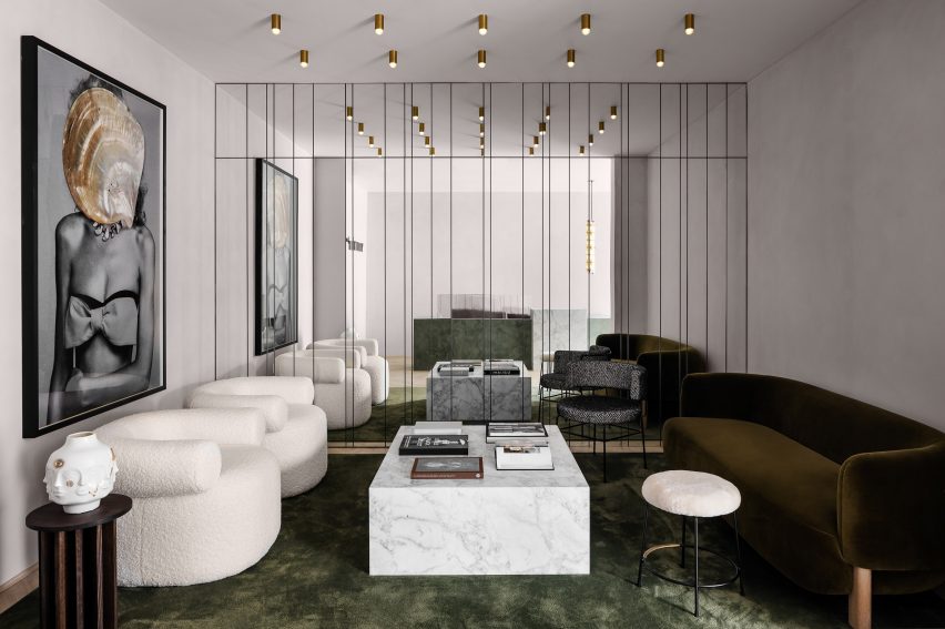
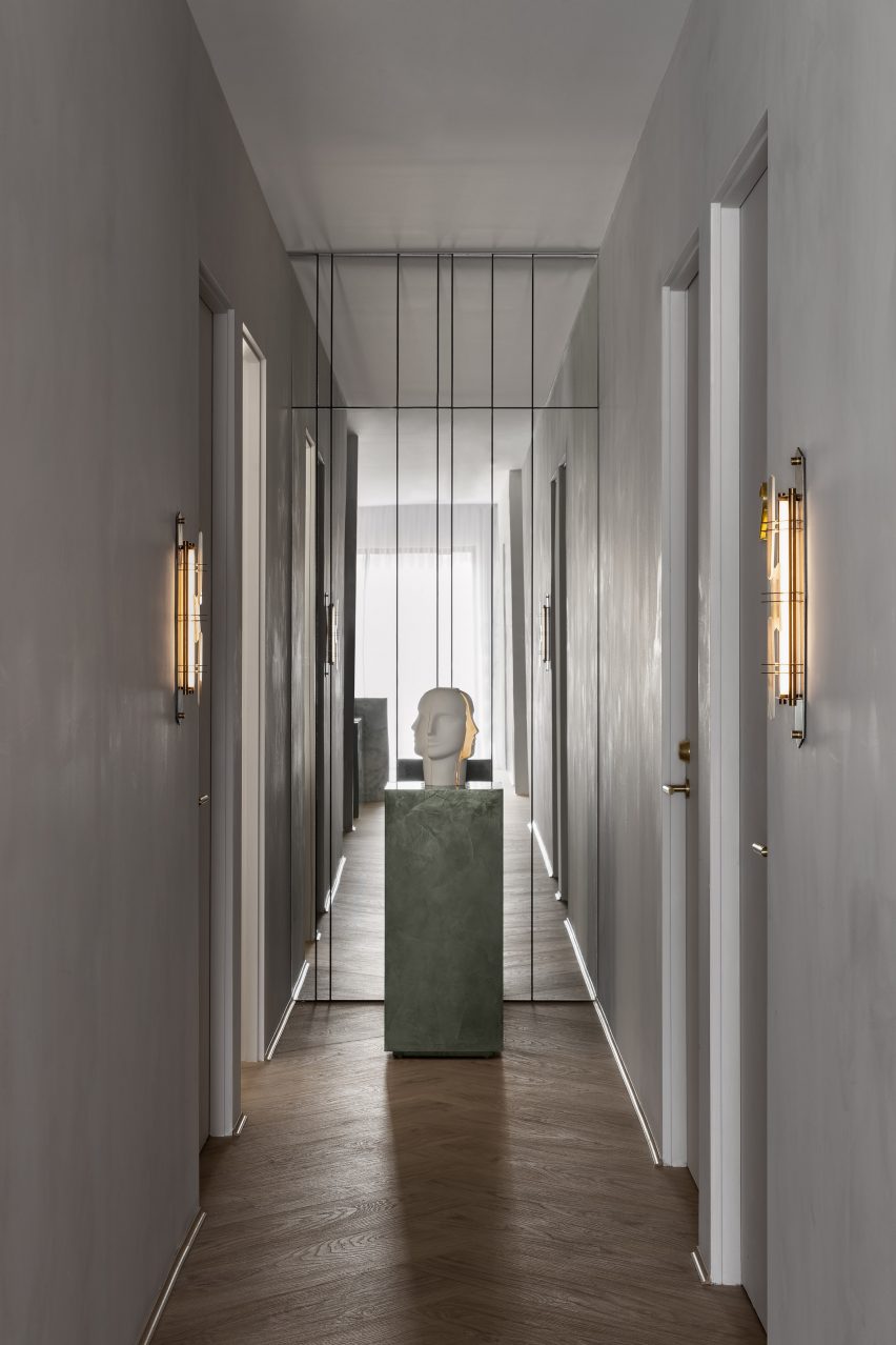
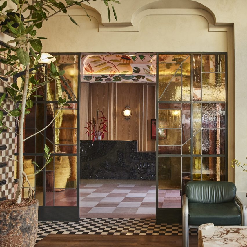
The waiting area features a mirror wall, gold lights and a green silk carpet
Located in Joondalup, Youth Lab 3.0 is the brand’s most experimental space so far.
While the two other locations – in Claremont and West Perth – occupy heritage buildings, this one is set inside a commercial block from the 1990s. This meant Gurtler could be more daring in his approach.
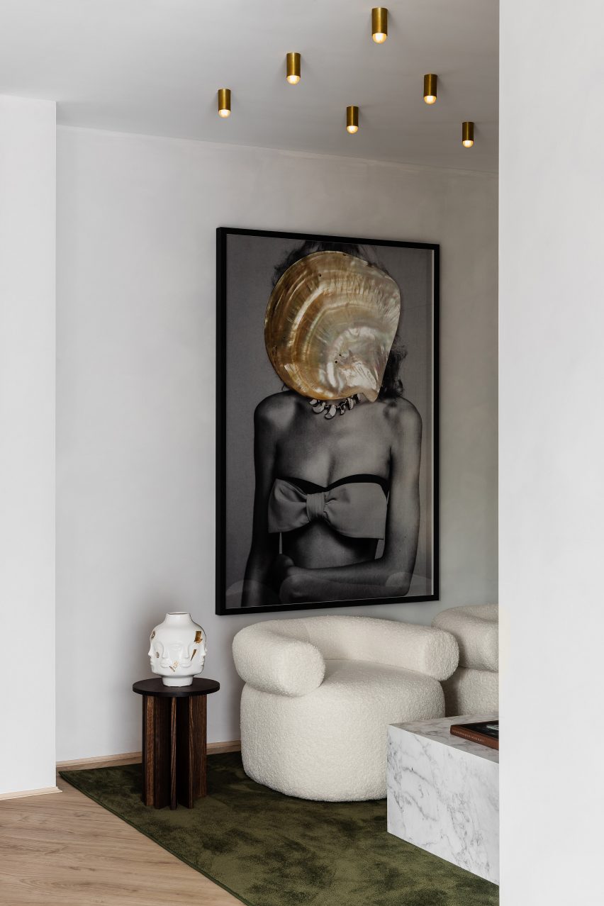
A Dina Broadhurst artwork provides a focal point
While the design was partly informed by the brand’s minimalist identity, it also features playful details that include mirror walls and a grand geometric reception desk.
“There were some really outrageous and glamorous concepts that I really responded to and had filed away for the right project,” said Gurtler.
“When Youth Lab approached us again for their third clinic, I knew that this was the right time to bring them to life.”
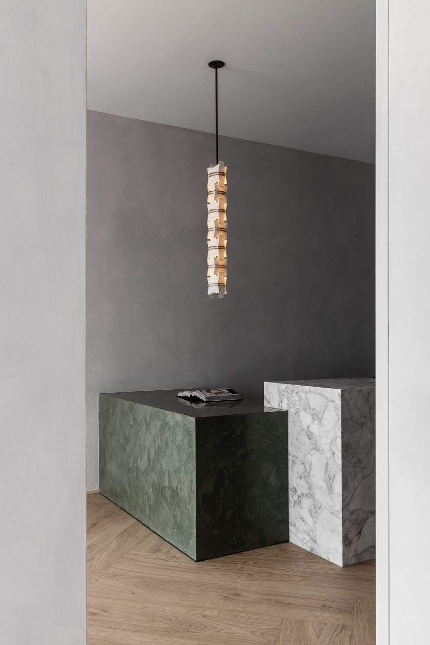
The reception desk is formed of Arabescato marble and Venetian plaster
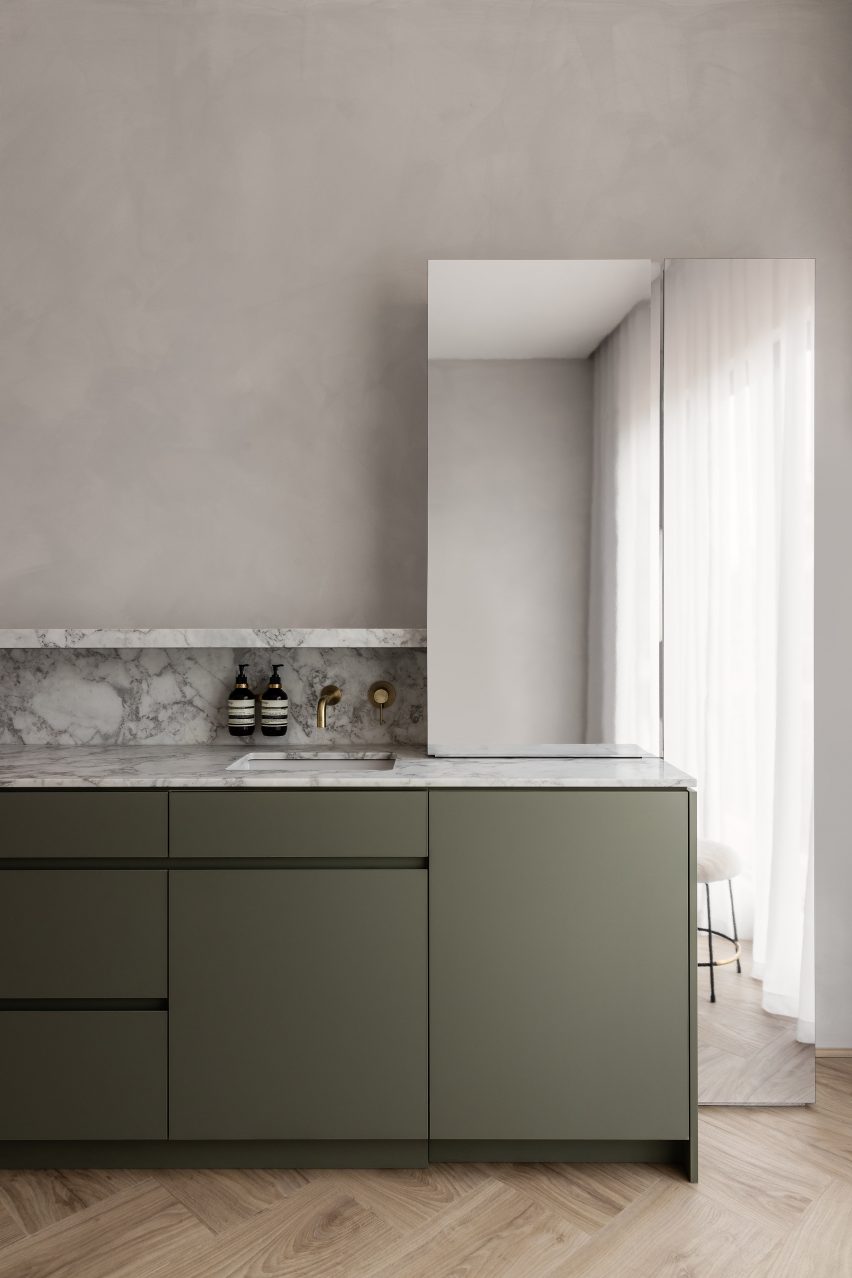
The starting point was the palette of forms and materials that Gurtler has worked with previously for the brand, which includes decorative marble, plush velvet and metal cabinetry.
While the Claremont space that Gurtler designed for the brand has a New York loft vibe, here these elements are paired with shades of olive green and gold to create a more retro Italian feel.
“This language is a kind of style guide for us on each project,” said Gurtler.
“Common elements such as mixed metals, monolithic forms, plush textures and rich colour are used in each of the clinics, but we translate these elements completely differently each time.”
The colour palette centres around olive green and gold
Arabescato marble is combined with Venetian plaster and polished aluminium to create the cuboidal forms of the reception desk, which sits beneath a custom glass and brass lighting pendant by designer Lost Profile Studio.
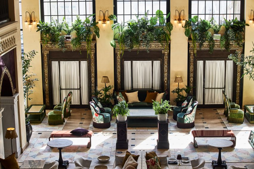
A large gridded mirror installation provides the backdrop to a waiting area furnished with a green silk carpet, a blocky marble coffee table and sculptural white armchairs.
A sculpture by American potter Jonathan Adler sits in front of a second mirror wall
Rows of golden-hued ceiling lights are reflected in the mirrors, doubling their visual impact, and an artwork by Dina Broadhurst creates another focal point.
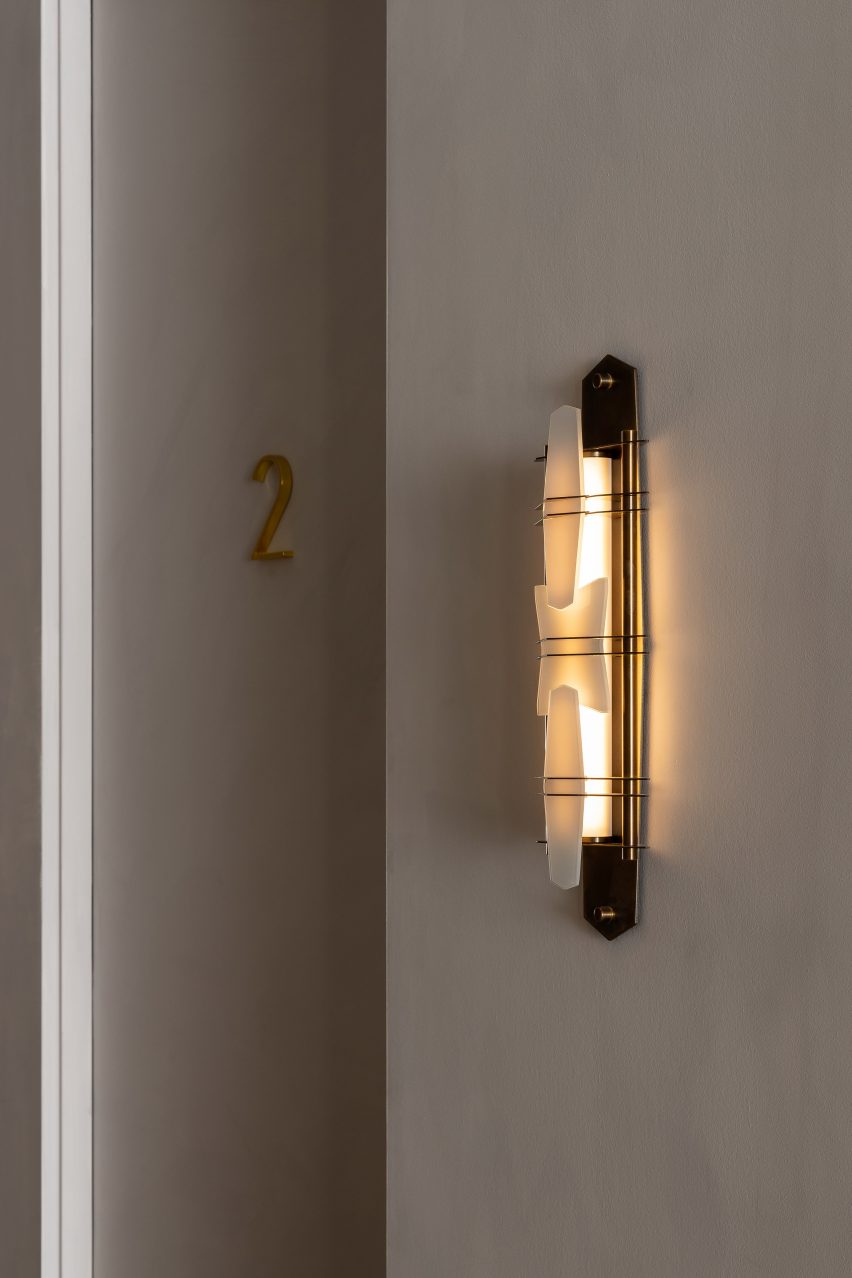
As customers are led through for treatment, they also encounter a second mirror wall, a ceramic by American potter Jonathan Adler, custom wall lights and brass door numbers.
Custom lighting scones embellish the walls
Youth Lab 3.0 was longlisted for Dezeen Awards 2022 in the leisure and wellness interior category, along another of Gurtler’s designs, the Cole Hair Studio.
The designer hopes the space offers “an immersive and sensorial experience which is as much invigorating as it is calming”.
“The Youth Lab experience is a luxury and the interior reflects that,” he added.
A renovated dwelling in rural China and a converted stable in Ibiza feature in our latest lookbook, which collects 10 cottage interiors that promise rest and relaxation.
Cottages are small dwellings that are traditionally characterised by a sense of comfort and cosiness. However, interior designers are increasingly pushing the boundaries of how to dress the insides of these homes, as seen in these innovative examples.
As the weather cools down in the northern hemisphere, here are 10 calming interior spaces in cottages by architects and interior designers from across the globe.
This is the latest in our lookbooks series, which provides visual inspiration from Dezeen’s archive. For more inspiration see previous lookbooks featuring neutral living rooms, homes in converted warehouses and Bauhaus-informed interiors.
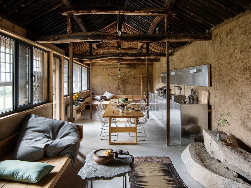
Photo is by courtesy of Sun Min and Christian Taeubert
Hai Zhen cottage, China, by Sun Min and Christian Taeubert
Located in Hai Zhen, a village just outside of Beijing, this previously neglected cottage was renovated by fashion designer Sun Min and architect Christian Taeubert.
A large, open-plan lounge area displays a mixture of rustic features such as the original roof and timber beams, which are presented alongside more contemporary elements including stainless steel and spindly, wireframe lighting.
Find out more about this Hai Zhen cottage ›
Photo is by Timothy Kaye
Barwon Heads House, Australia, by Adam Kane Architects
Barwon Heads House is a renovated cottage by Melbourne-based studio Adam Kane Architects with a barn-style extension defined by an open-plan living area.
Shortlisted for the 2022 house interior of the year Dezeen Award, the cottage interior features a monochrome interior palette and statement geometric furniture, such as a pair of Kangaroo Lounge Chairs by designer Pierre Jeanneret.
Find out more about Barwon Heads House ›
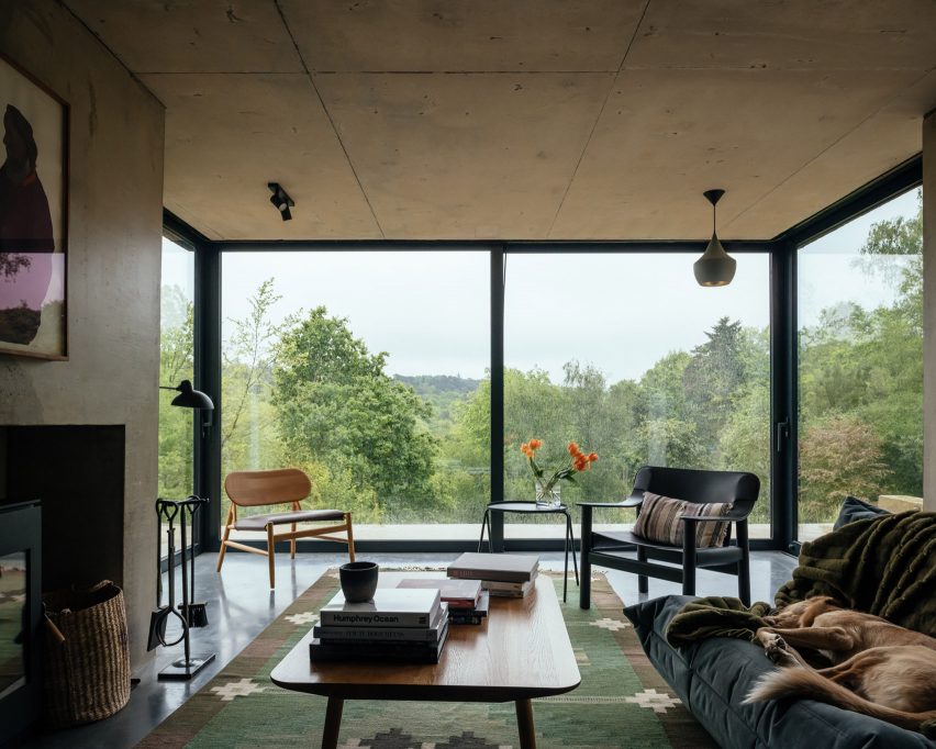
Photo is by Jim Stephenson
English cottage, UK, by Invisible Studio
Architecture practice Invisible Studio added a double-pitched extension to this cottage that is located on the borders of Hampshire and Surrey in England.
Exposed concrete accents contrast with rectilinear sliding glass doors in the living space, which cantilevers over the sliding patio doors below with the support of a concrete chimney.
“All the materials are fair-faced so had to be perfectly made,” explained studio founder Piers Taylor. “Nothing is covered up and everything exposed.”
Find out more about this English cottage ›
Photo is by Youri Claesens
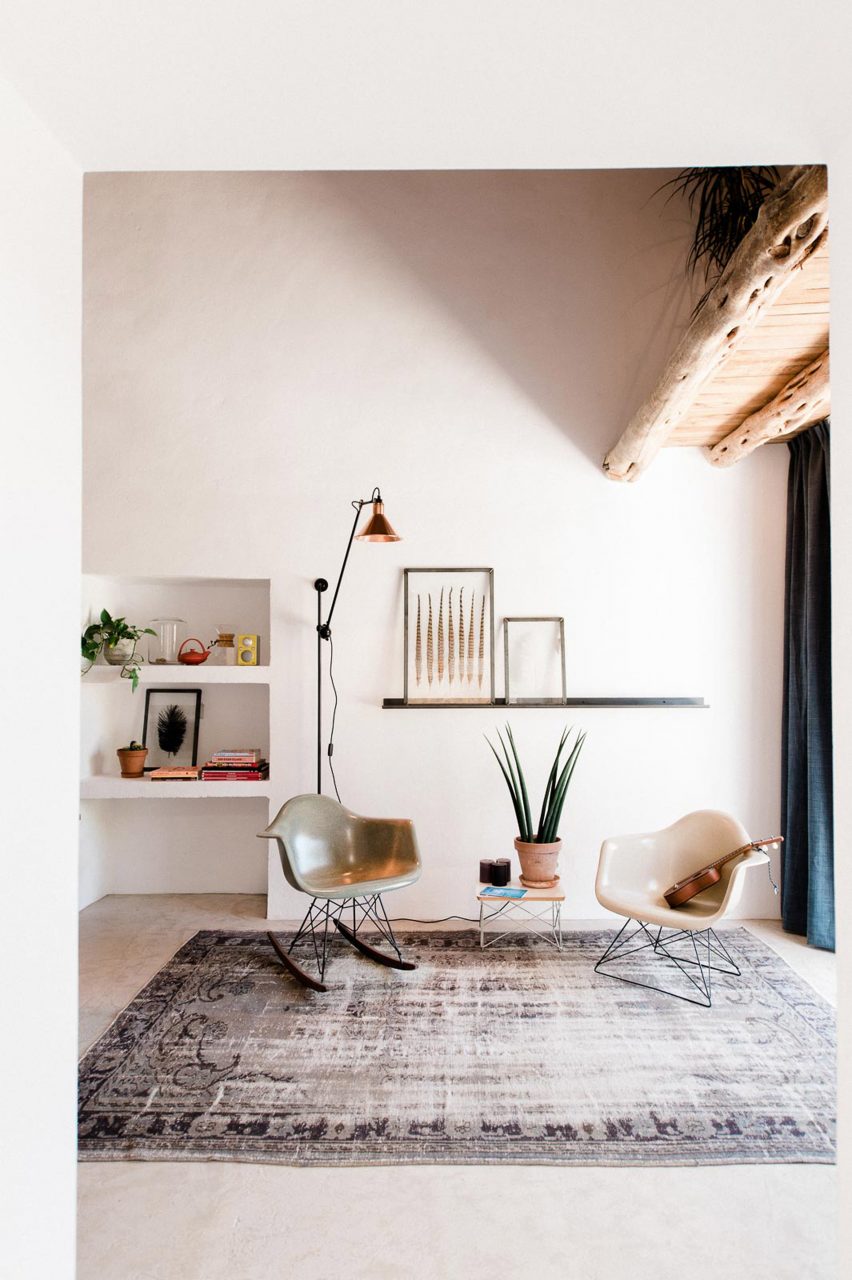
Casa Campo, Ibiza, by Standard Studio
Casa Campo is a cottage in Ibiza that Standard Studio converted from a 200-year-old stable to an off-grid showroom and home for the owners of an interior design shop.
Original beams crafted from Ibiza’s native Sabina pine trees are paired with contemporary low-slung furniture in the double-height living space that is illuminated by bright white walls.
Find out more about Casa Campo ›
Photo is by Jim Stephenson
Made of Sand, UK, by Studio Weave
Architecture office Studio Weave designed a wooden extension to a stone cottage in Devon’s Blackdown Hills in the English countryside, which was created as a creative workspace for its owners and visiting artists.
Called Made of Sand, the extension’s interior is defined by built-in timber window seats and wall storage that is framed by large glass windows.
“The contrast between materials, old and new, in and out, are foregrounded to create a distinct sense of rest and relaxation in the new spaces,” said studio director Je Ahn.
Find out more about Made of Sand ›
Photo is by Ronan Mézière
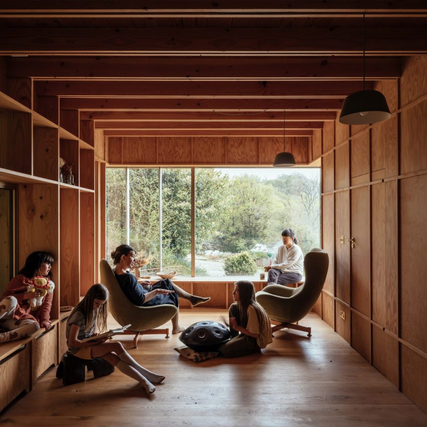
La Brèche, Canada, by Naturehumaine
Two volumes connected by a walkway make up La Brèche, a ski cottage in Quebec by Montreal studio Naturehumaine that features facades informed by the area’s vernacular architecture.
Floor-to-ceiling corner windows illuminate the living space, which is characterised by a polished concrete floor and minimal accents of colour and texture.
Find out more about La Brèche ›
Photo is by Joel Esposito
Muskoka Cottage, Canada, by Studio Paolo Ferrari
Named after its location in Canada’s Muskoka region, this cottage interior features exposed finishes informed by the surrounding natural forests and the area’s geological details.
These include sandy-hued, Douglas fir exposed ceilings and large slabs of granite that make up various statement islands throughout the home, as well as a large fireplace in the living space.
“The granite is coarse-grained and hard,” noted Studio Paolo Ferrari. “It references the minerality of the site and imbues the interiors with a sense of ruggedness.”
Find out more about Muskoka Cottage ›
Photo is by Paul Crosby Photography
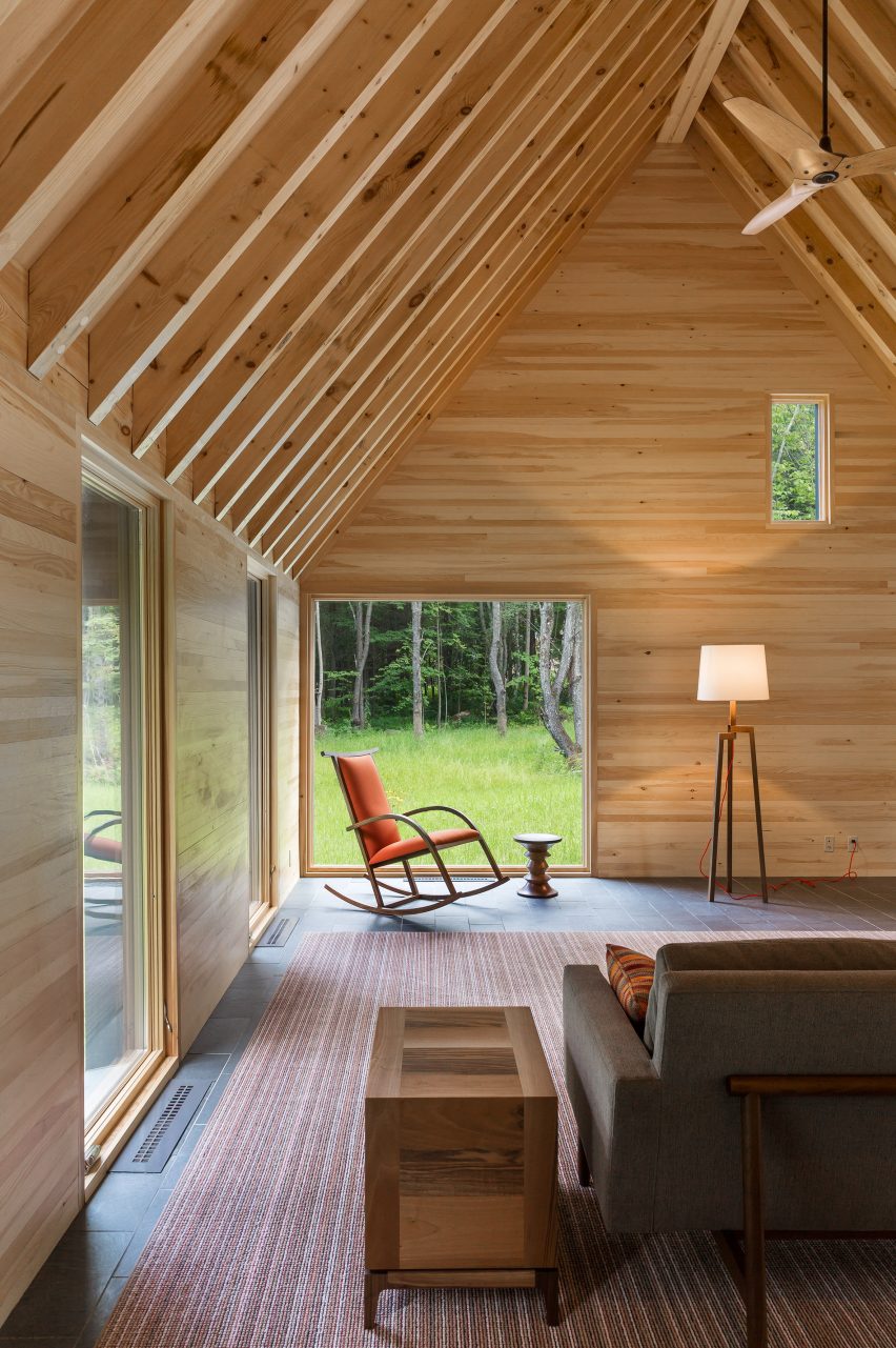
The Marlboro Music Cottages, USA, by HGA Architects and Engineers
The Marlboro Music Cottages are a series of cabin-style dwellings by HGA Architects and Engineers (HGA) for musicians staying in New England over the summer during the Marlboro Music School and Festival, an annual event.
HGA took cues from the single-storey boxy dwellings with gabled roofs that populate Cape Cod for the cottages’ architecture. Cedar plank cladding and pitched roofs were used to embrace the homes’ natural setting.
Inside, the cottage interior features exposed timber ceilings, pine-sheathed walls and slate flooring, adding to this pared-back approach.
Find out more about The Marlboro Music Cottages ›
Photo is by Michael Moran
Hamptons cottage, USA, by Birdseye Design
A double-height living space offers views of the surrounding Hamptons at this cottage by architecture studio Birdseye Design, which is wrapped in thin wooden slats that nod to local traditional buildings.
Eclectic geometric furniture makes up dining and living areas that anchor the west side of the property and open out onto an outdoor dining space.
“Operable glass walls open to a large stone terrace off the living room and the kitchen opens to a wood-slatted, pergola-covered porch,” said Birdseye.
Find out more about this Hamptons cottage ›
Photo is by Trevor Mein
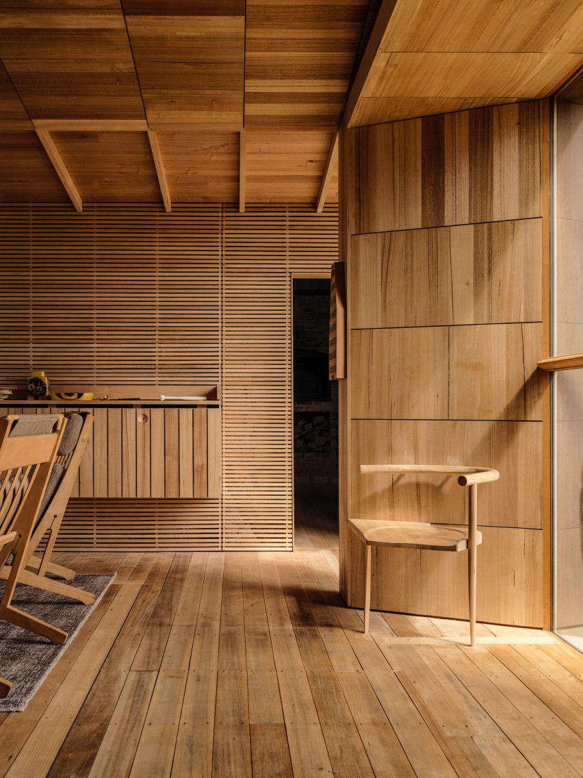
Captain Kelly’s Cottage, Tasmania, John Wardle Architects
Australian studio John Wardle Architects has repaired this weatherboard cottage in Tasmania, which originally belonged to its architect, harbourmaster Captain Kelly, in the 1840s.
Furniture created from materials left over at the end of the project’s renovation feature in its updated design, while a focus on wooden interiors maintains a sense of the dwelling’s history.
“Over 175 years there had been many unsympathetic alterations to the small cottage,” said the studio. “Part of our work involved the removal of these non-original works, to respectfully return the cottage to its original form.”
Find out more about Captain Kelly’s Cottage ›
This is the latest in our lookbooks series, which provides visual inspiration from Dezeen’s archive. For more inspiration see previous lookbooks featuring neutral living rooms, homes in converted warehouses and Bauhaus-informed interiors.
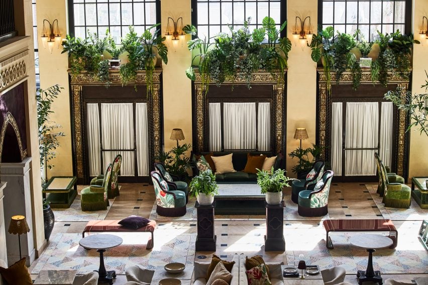
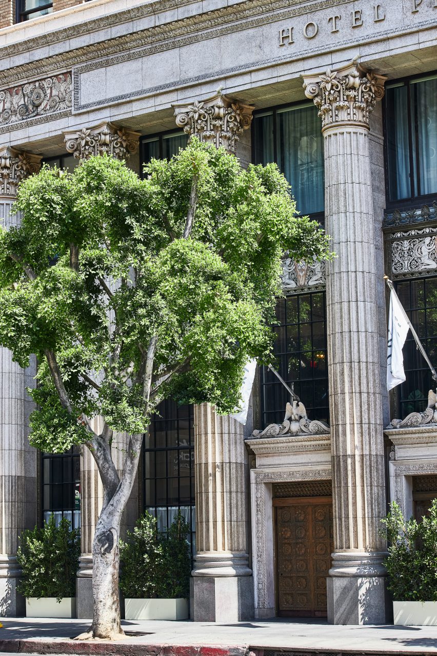
A new hotel occupies 1920s bank headquarters in Downtown LA, where Jaqui Seerman refreshed public spaces to include a botanical-themed lounge and a mirror-lined arched gallery.
Hotel Per La is housed in the neoclassical Giannini Building, built in 1922 as the headquarters for the Bank of Italy, and takes the place of the NoMad Los Angeles which closed its doors in March 2021.
Hotel Per La replaces the Nomad Los Angeles in the 1920s bank headquarters
Its 10,000 square feet (930 square metres) of public and event spaces have been refreshed by local interior designer Jaqui Seerman, who used the 12-storey property’s Italian connection to inform her updates.
“A nod to the building’s storied beginning as a bank for the people, the ‘Per La’ name translates to ‘for the’ in Italian,” said the hotel.
“[The bank’s] founder, Amadeo Pietro Giannini, believed in the dignity and abilities of those commonly overlooked, signifying the hotel’s inclusive spirit and name, essentially meaning ‘for Los Angeles, and people like you’.”
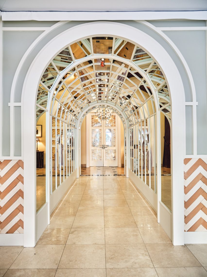
A mirror-lined arched gallery opens into the main lobby
Demarcated by a pale blue awning, the hotel’s entrance has been relocated from 7th Street to Olive Street, leaving the doric columns across the grand facade fully visible.
Through the doors, guests find themselves in a double-height lounge filled with plants and comfy chairs covered in botanical patterns.
The custom front desk is by Voila Creative Studio and the hand-painted tapestry behind is by Jessalyn Brooks
An arched gallery lined with mirrors leads to the lobby, situated in what was once the main banking hall.
In the reception area, a custom-made curved plaster front desk influenced by linen fabric was designed by Voila Creative Studio, while a hand-painted tapestry that hangs in the niches behind was produced by LA muralist Jessalyn Brooks.
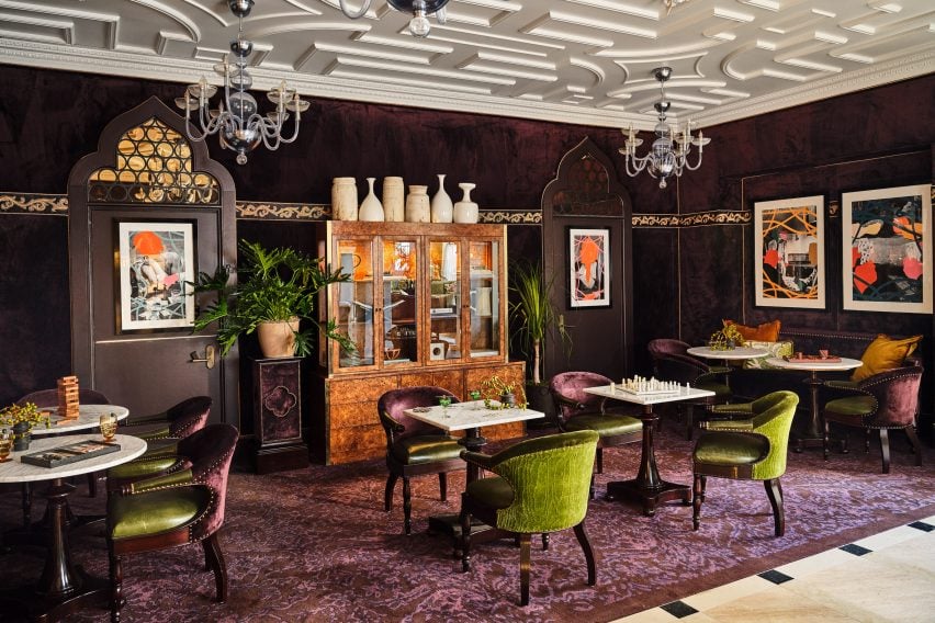
A purple games room features commissioned art and furniture from local artisans
A rich purple lounge features a new game cabinet, as well as commissioned art and furniture sourced from local artisans.
Event spaces range from a second-floor courtyard for private outdoor dinners, to larger spaces for up to 850 people.
A second-floor courtyard hosts private outdoor dinners
Dining options within the hotel include Per L’Ora, which serves Italian cuisine and features a light colour palette across curvaceous design elements influenced by the early 2000s.
“The bar of the restaurant acts as a dramatic centerpiece, with a custom-made marble top in shades of green, grey, and white, and globe-shaped light fixtures, while custom white plasterwork on the front of the bar offers a new sense of texture,” said the hotel operators.
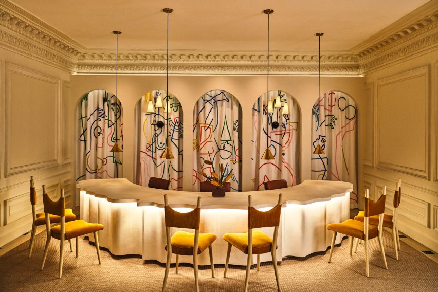
Adjacent to the restaurant is a casual cafe modelled on a Venetian coffee shop, serving beverages, pastries and snacks.
On the rooftop, Bar Clara offers cocktails for poolside lounging and hosts live performances with the LA skyline as a backdrop.
Guest rooms are decorated to echo the ornate blue and gold ceiling in lobby
The 241 guest rooms and suites have retained much of the aesthetic created by French architect Jacques Garcia for the NoMad, referencing the restored gold and blue ceiling in the lobby.
Downtown LA, the city’s most walkable neighbourhood, has experienced a cultural renaissance over the past decade.
The hotel occupies the neoclassical Giannini Building in Downtown LA
The area is now home to several design-forward hotels including Kelly Wearstler’s Proper – which was just named hotel and short-stay interior of the year at the 2022 Dezeen Awards – a Soho House, and an Ace Hotel.
Per La is the latest hotel in the US to open in a converted bank building, following the likes of The Durham in North Carolina and The Quoin in Wilmington, Delaware.
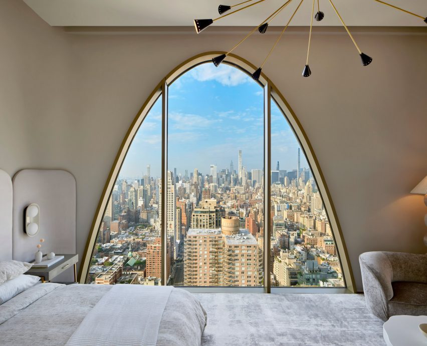
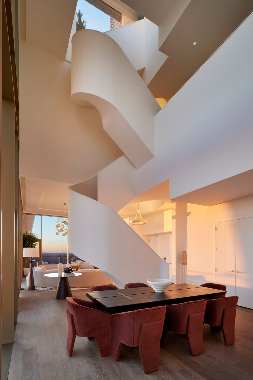
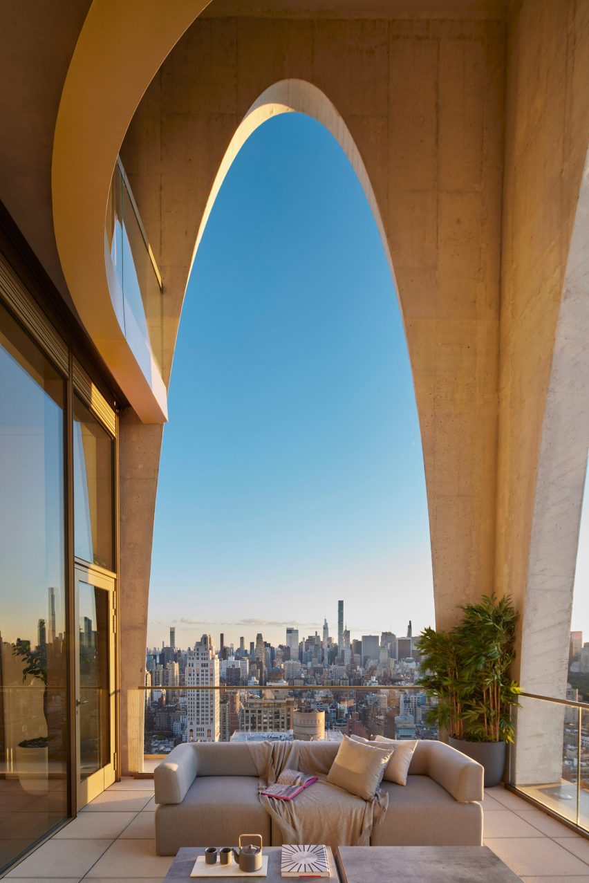
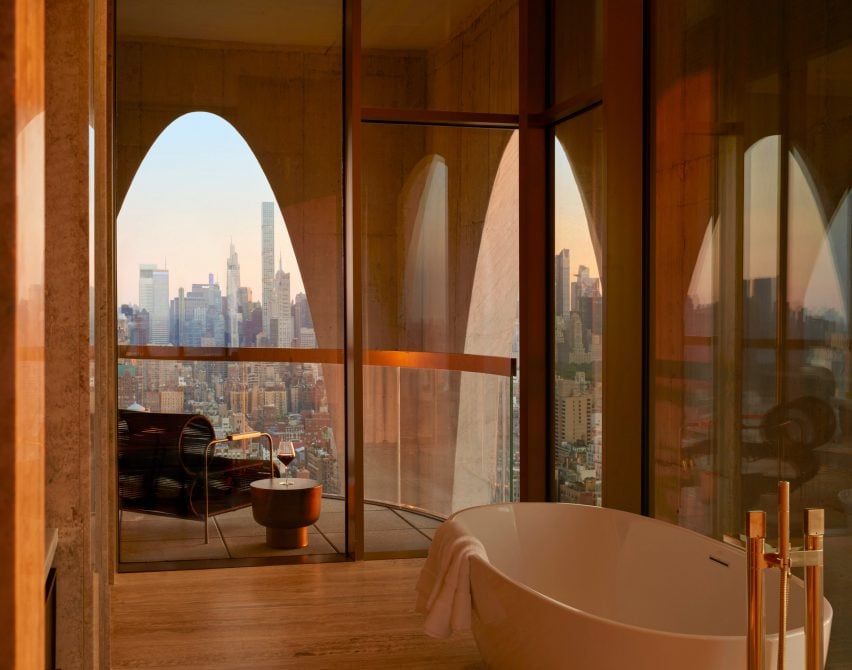
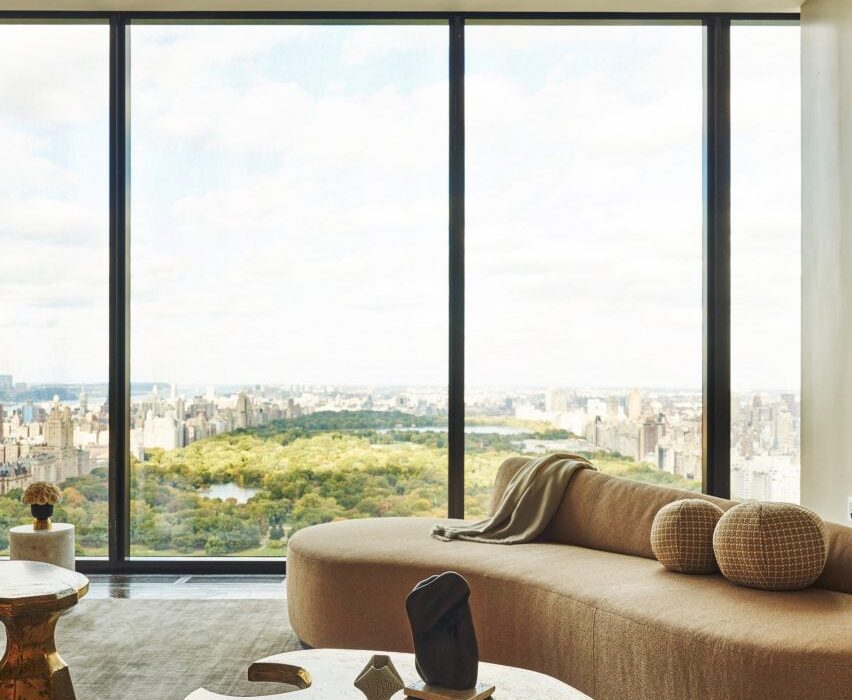
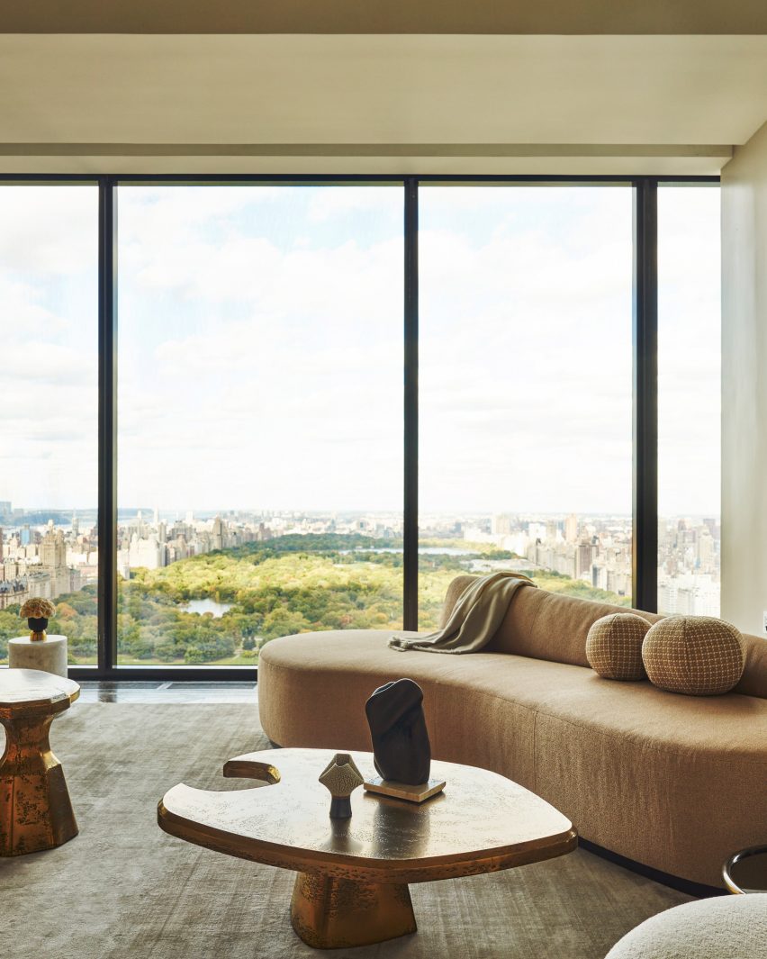
Arched openings frame views of New York City from this duplex penthouse apartment in a Carnegie Hill residential tower, designed and developed by American real estate company DDG.
The penthouse sits atop the newly constructed 180 East 88th Street, an art deco-influenced building that tallest residence north of 72nd Street on Manhattan’s Upper East Side.
The arched opening that crowns 180 East 88th Street frame views from the interior
Spilt over two storeys, its 5,508 square feet (512 square metres) of interiors were designed by the tower’s architects and developers DDG and staged by New York firm IMG.
The residence also enjoys an additional 3,500 square feet (325 square metres) of exterior spaces across multiple levels — including a private rooftop terrace overlooking Central Park.
A sculptural staircase connects the two storeys and the roof terrace of the penthouse
Huge arches in the grey-brick facades that wrap the building’s crown are visible from the inside, thanks to large expanses of glazing that enclose the apartment on both floors.
There are views across the city in all directions, the most dramatic of which is of the Midtown skyline to the south.
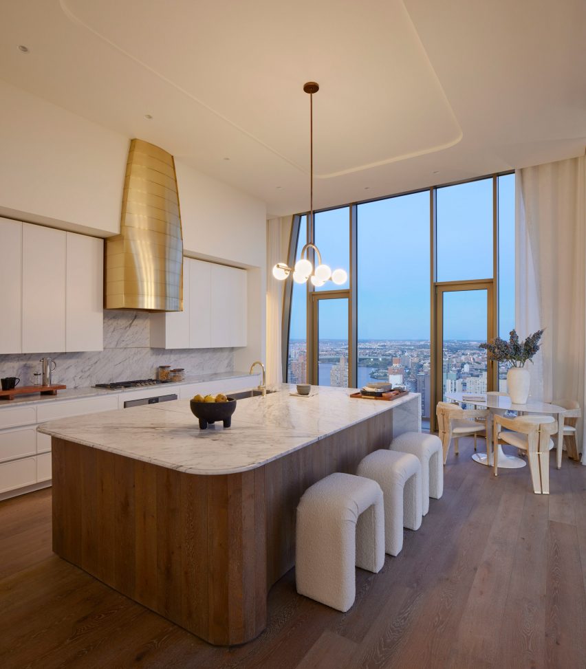
The kitchen features a golden cooker hood that echoes the building’s pinnacle
There are two living spaces, a large dining area and a separate eat-in kitchen, five bedrooms and a den, and four full and two half bathrooms.
The two internal levels and the roof terrace are connected by a curvaceous staircase that rises through centre of the penthouse.
Spaces are neutrally decorated, with sculptural light fixtures and expressive artworks adding visual interest.
In the kitchen, a golden cooker hood echoes the colour and shape of an architectural feature on the building’s pinnacle.
Expansive terraces enjoy unobstructed views across Manhattan
Completed earlier this year, 180 East 88th Street includes 46 half- and full-floor residences, along with amenities such as a partial indoor basketball court and soccer pitch, a game room, a residents’ lounge, a private fitness and yoga studio, and a children’s playroom with a slide.
The building’s exterior design was influenced by “the boom in high-rise masonry construction in New York in the early 20th century”, and is one of many recent skyscrapers in the city that have ditched glass in favour of more solid-looking materials.
Full-height glass walls allow the vistas to be enjoyed from the majority of rooms
“Paying homage to the lost art of traditional craftsmanship, the intricate exterior features a striking hand-laid brick facade made of 600,000 handmade bricks by Denmark’s master brickworks Petersen Tegl,” said a statement from DDG.
Manhattan has no shortage of luxury penthouses, with some of the most notable including a residence at the top of Rafael Viñoly’s 432 Park Avenue and the premium unit at Zaha Hadid’s 520 West 28th Street development.
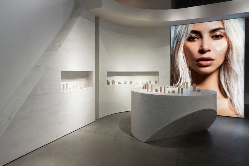
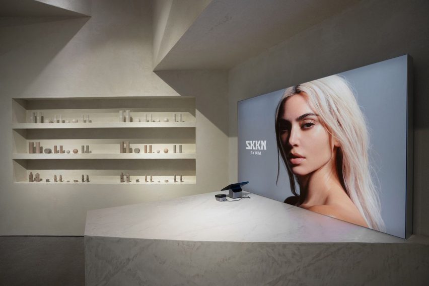
Design studio Perron-Roettinger has created a pop-up shop for Kim Kardashian’s skincare and homeware brand SKKN in Los Angeles that showcases its products in a physical space for the first time.
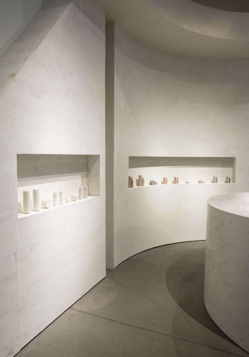
The minimalist pop-up store, which is located inside Los Angeles shopping mall Westfield Century City, was designed using a limited material palette in a nod to the brand’s pared-back design.
Perron-Roettinger has created a pop-up shop for Skkn
“The SKKN [store] is about raw materials – bold, big blocks of stacked raw material – which is inspired from an inactive quarry that I visited once,” Perron-Roettinger cofounder Willo Perron told Dezeen.
“All different plaster and cement finishes echo the emphasis on the raw natural materials.”
The walls and counters are made from concrete and plaster
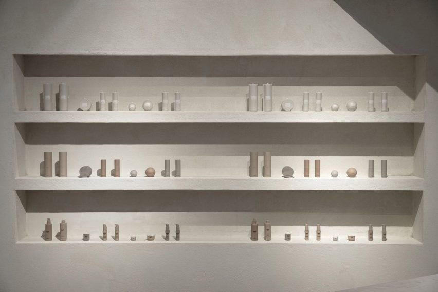
In the 1,330-square-foot (123 square-metre) space, homeware and skincare products are presented within curved wall alcoves or on top of sculptural counters made from grey concrete and plaster. The room is framed by two large portrait photos of reality television star Kardashian.
“Just in time for the holiday season, the pop-up will offer customers a luxurious in-person shopping experience with the entire SKKN By Kim collection – from skincare to home decor,” said the brand.
Skincare items are displayed in alcoves
The use of raw materials references Perron’s partner Brian Roettinger’s packaging for SKKN products, as well as Kardashian’s recently launched concrete homeware collection called Home Accessories Collection.
All the materials come in varying shades of Kardashian’s signature beige and grey colour palette, which she has used in her home and her shapewear collections.
According to Perron, the brand’s packaging and the store interior are united in their reliance on simple shapes and raw materials.
“The throughline idea is materials untouched, most primary and elemental state,” he explained. “Simple geometry is important to add a recognizable component to both the space and the packaging.”
Perron–Roettinger was also responsible for SKKN’s creative direction, brand identity and art direction.
The store mirrors the brand’s minimalist packaging
The SKKN pop-up shop is open until the end of the year in Westfield Century City, Los Angeles.
The longtime collaboration between designer Willo Perron and Kim Kardashian has seen Perron design other pop-up stores for the American reality star’s brands.
For Kardashian’s shapewear company Skims, Perron created a beige coloured pop-up shop in Paris with chunky display units and partitions.
Los-Angeles based Perron-Roettinger has also completed other pop-up shops for brands including Stüssy.
Dezeen has revealed the winners of this year’s Dezeen Awards interiors categories, which include interiors by Proctor and Shaw, Kelly Wearstler and Woods + Dangaran.
The 11 winners awarded in Dezeen’s annual awards programme are located across nine different countries including Denmark, Taiwan, USA, Belgium and Canada.
Three interiors that feature various reclaimed materials have been awarded this year, including a supermarket-style secondhand bookshop in China, a design school with mobile furniture in the south of France and a flexible retail interior for Italian eyewear brand Monc on London’s Chiltern Street.
Other winners this year include Atelier Boter for its glass-fronted community hub in a Taiwanese fishing village and Hariri Pontarini Architects for its warm wood-toned clinic in Canada.
Danish studio Tableau and Australian designer Ari Prasetya collaborated to design Connie-Connie Cafe at the Copenhagen Contemporary, winning them restaurant and bar interior of the year.
Entries were initially scored by our jury of 25 leading international interior designers before the winners were decided by a master jury that met at One Hundred Shoreditch in September and was made up of Lore Group creative director Jacu Strauss, Studiopepe co-founder Chiara Di Pinto and London-based fashion designer Mary Katrantzou.
They were joined by Design Haus Liberty founder Dara Huang and French architect and designer India Mahdavi.
The 11 project winners will now compete to win overall interiors project of the year award, which will be unveiled at the Dezeen Awards 2022 party in London on 29 November.
Find out more about the winning interiors projects on the Dezeen Awards website or read on below:
Photo by Joe Fletcher
House interior of the year: Twentieth by Woods + Dangaran
Twentieth is a three-storey house designed for a couple and their three young children in Santa Monica. Living spaces are organised around a courtyard with a decade-old olive tree with a U-shape ground floor, creating space for living rooms on both sides of the courtyard.
The kitchen and bathrooms designed by Los Angeles studio Woods + Dangaran feature dark grey marble surfaces with streaks of white.
“This project demonstrates a nice interplay between inside and outside and a good mix of different finishes and textures,” said the interiors master jury panel.
Read more about Twentieth by Woods + Dangaran ›
Photo by Stale Eriksen
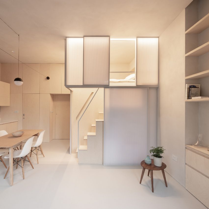
Apartment interior of the year: Shoji Apartment by Proctor and Shaw
Shoji Apartment is a 29-square-metre micro-apartment in London that features birch plywood joinery throughout its interior.
The apartment has an elevated sleeping area enclosed in translucent panels, which reference Japanese shoji screens and lend the project its name.
“This is a highly innovative solution to the treatment of a challenging space that retains all the functionality of a normal apartment,” said the judges. “We would definitely accept an invitation to dinner!”
Read more about Shoji Apartment by Proctor and Shaw ›
Photo by Michael Rygaard
Restaurant and bar interior of the year: Connie-Connie at Copenhagen Contemporary by Tableau and Ari Prasetya
Connie-Connie is a 150-square-metre cafe located within the Copenhagen Contemporary art gallery, an international art centre in a former welding facility. Tableau created the overall spatial design while Prasetya was in charge of the design and manufacturing of the bar as well as several other furniture pieces.
The cafe explores how furniture can also be art and features chairs made by 25 designers from offcut wood.
“The project addresses everything we expect from an interior design today, not only does it connect on a physical level, it connects with the community,” said the interiors panel. “There is also an impressive sobriety and humility to the design.”
Read more about Connie-Connie at Copenhagen Contemporary by Tableau and Ari Prasetya ›
Photo by The Ingalls
Hotel and short-stay interior of the year: Downtown LA Proper Hotel by Kelly Wearstler Studio
American designer Kelly Wearstler transformed the interior of the Proper Hotel group chain’s new hotel in downtown Los Angeles. Wearstler stripped out alterations made to the 1930s building to reveal existing grand ceilings, checkered tiled floors and wood panelling.
The interiors are furnished with custom furniture as well as vintage furniture and artwork.
“This project exudes a sense of joyfulness that needs to be rewarded!” said the judges. “The interior design evokes an experience that subverts the formality of conventional hotel design through its sense of identity and integrity throughout.”
Read more about Downtown LA Proper Hotel by Kelly Wearstler Studio ›
Photo courtesy of Dyson
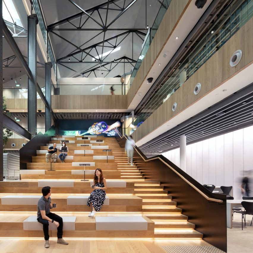
Large workspace interior of the year: Dyson Global HQ, St James Power Station by M Moser Associates
M Moser Associates reconditioned the interiors of a power station in Singapore to create the global headquarters for multinational technology company Dyson. The interiors feature amphitheatre-style seating to encourage informal gatherings and a sculptural spiral staircase in the former turbine hall.
The judges valued using an existing building to house a leading global enterprise such as Dyson.
“We were pleasantly surprised that Dyson, a bleeding-edge company in innovation and technology, have opted for a refurbishment rather than a new build,” they said. “We were impressed with how they took an old shell and modernised it.”
Read more about Dyson Global HQ, St James Power Station by M Moser Associates ›
Photo by James Lin
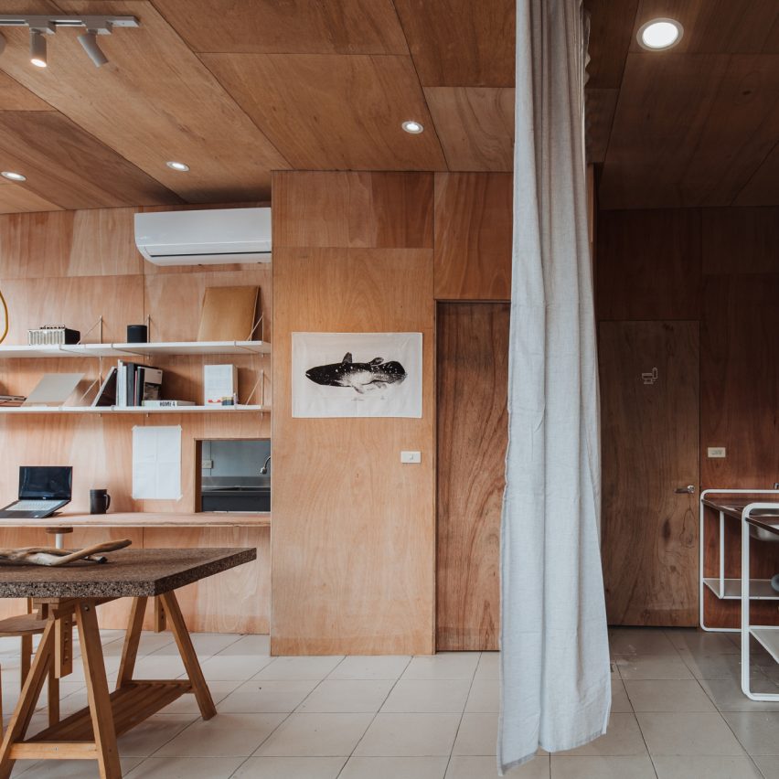
Small workspace interior of the year: The F.Forest Office by Atelier Boter
The community centre situated in a fishing village in Taiwan was designed by Atelier Boter as a hybrid dining, working and event space, loosely divided by a curtain.
The 53-square-metre venue is almost entirely lined with warm-hued plywood. A plywood partition wall at the end of the workspace is fitted with bookshelves and a small hatch, which connects to the kitchen.
“This project is very well embedded in its cultural context and, despite a small budget, the designers were able to create something beautiful and modern – a small jewel within an old fishing village,” said the interiors panel.
Read more about The F.Forest Office by Atelier Boter ›
Photo by Hu Yanyun
Large retail interior of the year: Deja Vu Recycle Store by Offhand Practice
Deja Vu Recycle Store is a second-hand bookshop located on the first and second floors of a three-storey building in Shanghai. Local studio Offhand Practice aimed to create a relaxed shopping environment by mimicking the experience of grocery shopping. The clothes and books are displayed on shelves that resemble fruit and vegetable crates.
Green mosaic tiles made from stone off-cuts were used to frame the building’s windows and accentuate other architectural details.
“This is food for the mind!” said the judges. “It’s stripped back but in a confident way, exuding calmness and thoughtful simplicity.”
Read more about Deja Vu Recycle Store by Offhand Practice ›
Photo courtesy of Nina+Co
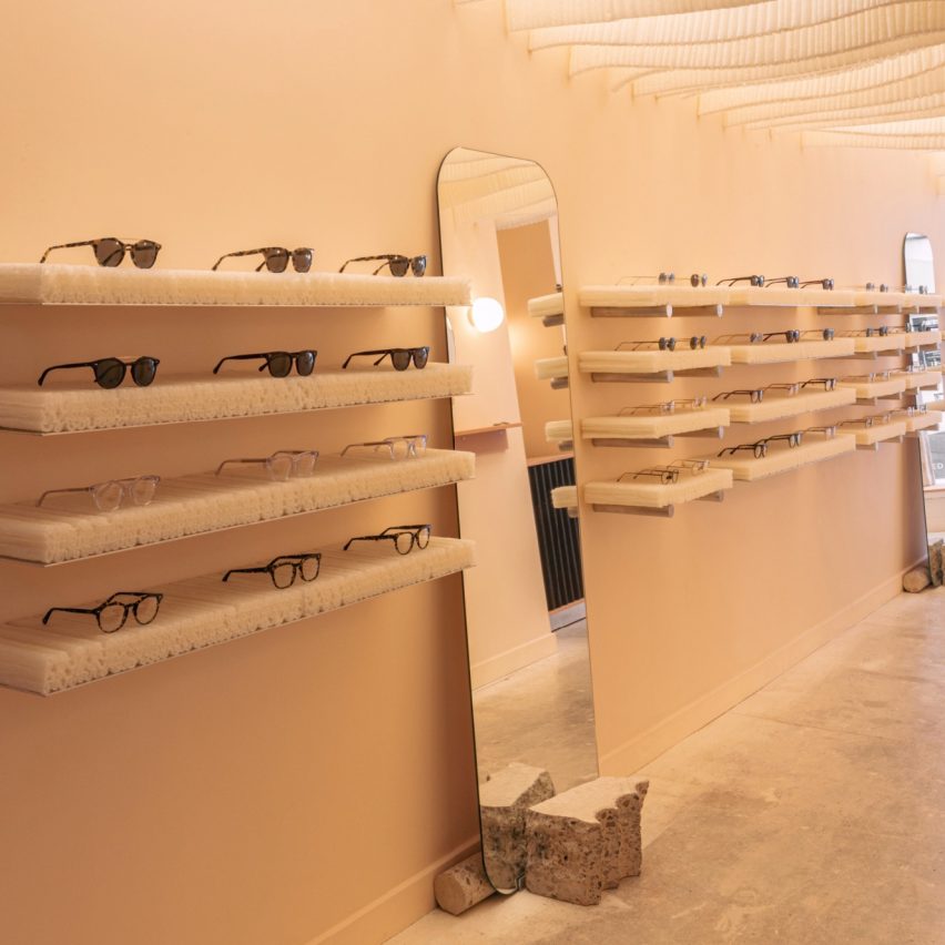
Small retail interior of the year:Monc by Nina + Co
London-based Nina + Co incorporated biomaterials throughout the interior of eyewear brand Monc’s debut store.
The glasses made from bio-acetate rest on cornstarch-foam shelves and mycelium display plinths. Long mirrors lean on blocks of local salvaged concrete.
“This project demonstrates integrity between the finishes used and the product they are selling,” said the jury. “It is a very well-executed retail interior with an encouraging use of sustainable materials.”
Read more about Monc by Nina + Co ›
Photo by A-Frame Photography
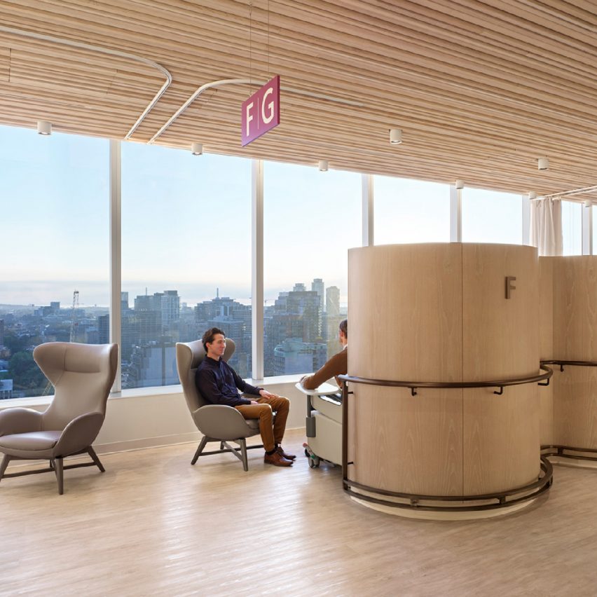
Leisure and wellness interior of the year: Barlo MS Centre by Hariri Pontarini Architects
The clinic was designed by Canadian practice Hariri Pontarini Architects for patients who suffer from multiple sclerosis (MS), a complex autoimmune disease that affects the central nervous system.
As some MS patients experience vision and cognitive loss, as well as fatigue and decreased coordination, durability and accessibility were present throughout the design process. Barlo MS Centre features atypical colours, materials, textures and lighting to rethink sterile-looking healthcare spaces.
“We were impressed by the fusion of the spa and the medical facilities, introducing a wellness element into something that would not traditionally have such an emphasis,” said the judges.
“It is a more holistic approach to healthcare design, which is considerate to the mental aspects of healthcare environments.”
Read more about Barlo MS Centre by Hariri Pontarini Architects ›
Photo by Antoine Huot
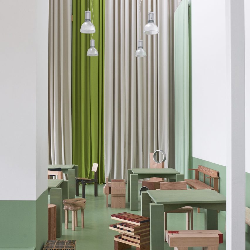
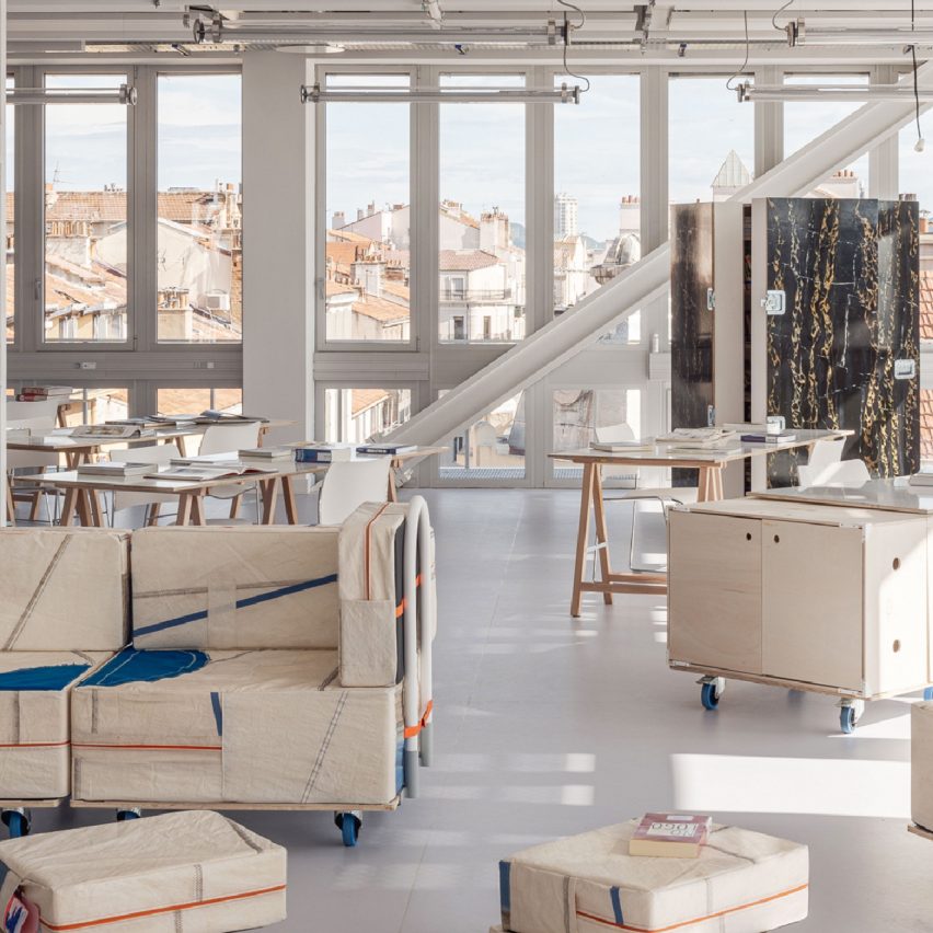
Civic and cultural interior of the year: Ecole Camondo Méditerranée by Émilieu Studio
Émilieu Studio designed the interior of Camondo Méditerranée design school in Toulon, France. The studio aimed to create a large-scale flexible learning space, only furnished with reused local materials.
The project features a mobile furniture system that can be easily compiled, transported and deployed outdoors. The furniture is made from locally sourced construction offcuts.
“This school sets a new example of how to approach design education, creating a sense of openness and mobility, which is what a school should be all about,” said the interiors master jury panel.
Read more about Ecole Camondo Méditerranée by Émilieu Studio ›
Photo by Jochen Verghote
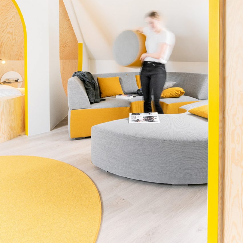
Small interior of the year: Relaxing Geometry with Pops of Yellow by Van Staeyen Interieur Architecten
Arched portals, curvy furniture and yellow decor accents feature in Van Staeyen Interieur Architecten’s revamped attic in Antwerp.
The local studio refurbished a neglected attic in a family home, turning the area into a multi-functional space.
“This is a good example of how design can be joyful and whimsical,” said the judges. “Accessible in many different aspects, financially and physically, it’s not just a playground for kids but a playground for everyone.”
Read more about Relaxing Geometry with Pops of Yellow by Van Staeyen Interieur Architecten ›
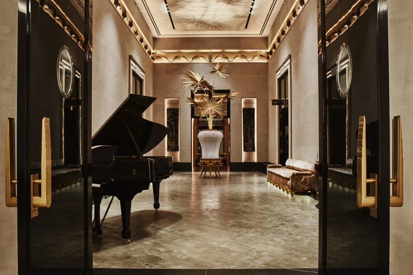
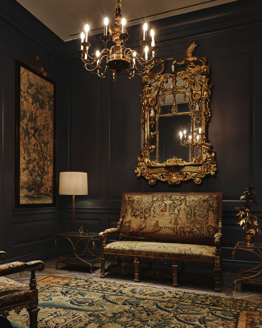
Studio Sofield has completed the interiors of 111 West 57th Street, also known as Steinway Tower – a supertall skyscraper designed by SHoP Architects in New York City.
The interiors mark the full completion of the 1,428-foot-tall (435-metre) skyscraper, which is the second tallest in the Western Hemisphere, and the skinniest in the world with a height-to-width ratio of 24:1.
Studio Sofield completed interiors for Steinway Tower in Manhattan
Sited on a street bordering Central Park in Midtown that has come to be known as Billionaire’s Row, the skyscraper has views looking north and south.
New York-based Studio Sofield designed the interiors for the skyscraper as well as the adjacent Steinway Hall, which is connected to the tower.
The 91-storey skyscraper has 46 residences, with an additional 14 held in Steinway Hall, as well as a variety of amenities, and was developed by JDS Development Group and Property Markets Group.
The design included interiors for the lobby spaces that connect the tower and Steinway Hall
“With 111 West 57th Street, I set out to create interior architecture that was unmistakably and quintessentially New York,” said Studio Sofield founder William Sofield.
“While celebrating the vibrancy of today, I am a historian by nature and sought to honor and evoke the splendor of our city’s gilded age.”
Studio Sofield wanted the public interiors to reflect the “gilded age” of New York City
Interiors designed by Sofield includes the “block-long lobby sequence” that connects the two aspects of the tower. Here, the studio restored the original flooring of the Steinway Hall and used limestone, marble, blackened steel and velvet accents.
Murals in bas-reliefs of gold and silver leaves depict architectural landmarks of New York, and elephants were depicted elephants roaming through the city as a”tribute to the history of pianos”.
The swimming pool room has full-height windows
Another room in the lobby sequence was outfitted with bronze mirror cladding that leads to a “domed salon” lined with banquet seating.
On 58th street, a residence entrance featuring a granite porte-cochere with grillwork doors inspired by “the bronze filigree on the building’s exterior”.
Steinway Hall was renovated using themes from the original building
The bar area and the swimming pool are also in the hall structure. According to the studio, the bar was based on the “legendary King Cole Bar with its chic bar” with an ornamental balcony and skylights that further the material references to the original building.
Elevator vestibules for the tower were completed using custom-made doors by artist Nancy Lorenz. The swimming pool is 82 feet long (25 metres) and is housed in a double-height room with floor-to-ceiling windows.
In the skyscraper, the residences each occupy at least a single floor. Each home has a central room where the views to the north and south are prioritised, and these rooms lead to a “signature great hall, which often spans the full width of the tower,” according to the studio.
Grey oak and macauba stone were used for the flooring and nine-foot-tall doors separate the room.
The skyscraper’s residences have wooden and stone floor
Hardware for the doors as well as other features like the freestanding bathtubs and the fixtures were sourced from long-standing US manufacturers such as PE Guerin, which, according to the studio, is the “country’s oldest architectural hardware firm”.
Other supertall skyscrapers – defined as one between 984 and 1,969 feet (300 and 600 metres) – designed by SHoP Architects include the Brooklyn Tower in Downtown Brooklyn, which is nearing its way to completion, having topped out earlier this year.
Billionare’s Row – the name for the luxury skyscrapers on 57th Street near Central Park in Manhattan, continues to see new developments, with New York studio ODA announcing the construction of a “fractal” skyscraper on the street.
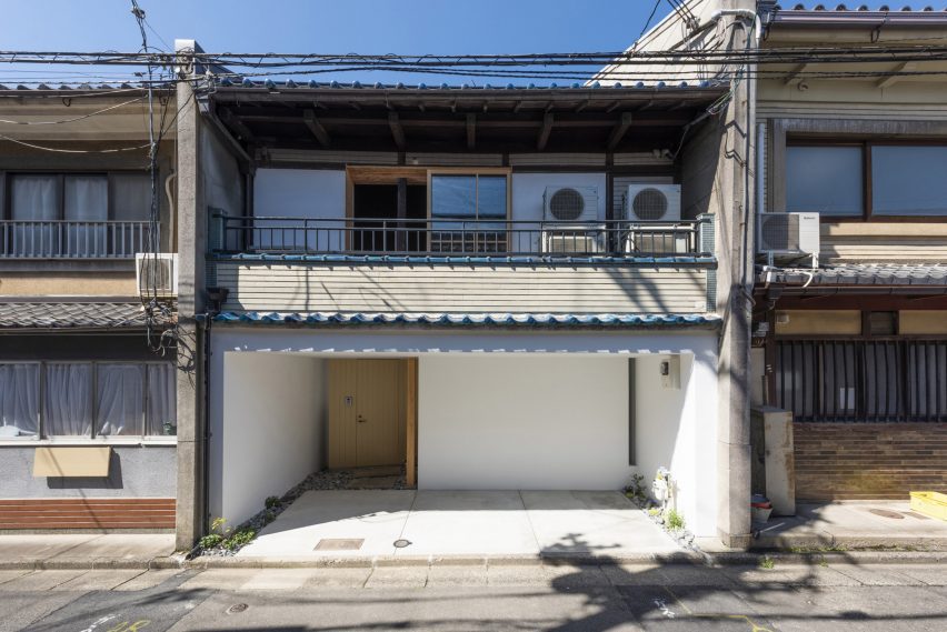
Japanese design studios Td-Atelier and Endo Shorijo Design have renovated a century-old machiya townhouse in Kyoto with minimal interiors that intend to honour the home’s existing architecture.
Called House in Marutamachi, the Japanese house was built over 120 years ago and is arranged across two floors on a long and narrow site.
House in Marutamachi is a traditional machiya house in Kyoto
Tucked between two other residential properties, the house is an example of the wooden machiya townhouses that were once common in Japan’s historical capital Kyoto but are now at risk of going extinct.
“Traditional Kyoto townhouses are being destroyed at a pace of 800 houses a year,” Td-Atelier explained.
“Old buildings don’t match modern life. However, we want to stop the decline of Kyoto townhouses by fusing tradition, design and new life.”
The kitchen is encased in a white volume
Td-Atelier and Endo Shorijo Design dressed House in Marutamachi’s interior with new components including sleek tiles and geometric furniture alongside materials reused from the original house, as seen in the traditional team room.
The studios retained the building’s wooden columns and beams but added white volumes to house rooms including the kitchen and study to avoid disturbing the existing architecture with harsh structural materials.
The tea room was constructed using materials reused from the original building
These variously sized cubes were designed to mimic the contrasting heights of buildings in a cityscape.
“The gaps and omissions created between the volume group and the existing columns, beams, walls and floors create continuity in the space,” Td-Atelier said.
Throughout the house, Td-Atelier and Endo Shorijo Design adopted a minimal material and colour palette including a combination of light and dark woods alongside smooth concrete.
A thin, sculptural light is suspended above the timber breakfast bar on the second floor, where occupants can sit on clusters of subtle-coloured stools.
Original features were maintained in the garden
Outside, a plant-filled garden features elements from the building’s original architecture such as sandy-hued lanterns and a chōzubachi – a traditional stone water bowl historically used for washing hands before a tea ceremony.
House in Marutamachi was shortlisted for house interior of the year at the 2022 Dezeen Awards.
Dezeen recently announced the winners of this year’s interiors categories, who are now competing to win the overall interiors project of the year award.
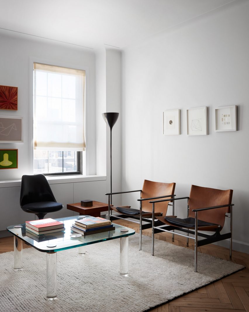
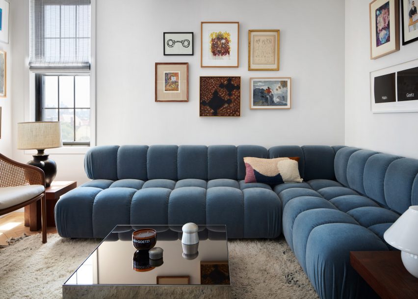
New York studio Messana O’Rorke has extended its collaboration with skincare brand Malin + Goetz by designing an apartment for its founders on Manhattan’s Upper West Side, where special attention was paid to the bathrooms.
After creating store interiors for the brand across the US for several years, Messana O’Rorke turned its attention to a space for co-founders Matthew Malin and Andrew Goetz to live in.
Messana O’Rorke renovated the apartment in a historic building on West 76th Street
The apartment on West 76th Street was fully renovated for the couple to reflect their passions for beauty and wellness, while embracing the building’s history.
“The space creates a gentle push and pull between the comfort of the past and the vigor of the present – embedded in the architectural details,” said Messana O’Rorke.
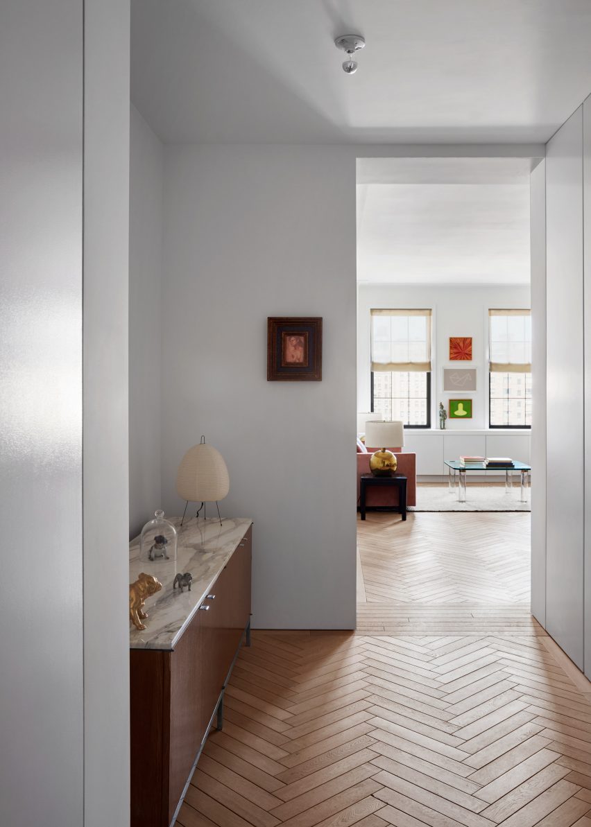
A mixture of contemporary and vintage furniture and artworks imbue the spaces with personality
These details include a traditional baseboard that encircles the main living spaces but ends abruptly in the central vestibule, where it is replaced with a quarter-inch (0.6-centimetre) shadow gap between the walls and floor for a more modern look.
Reclaimed oak parquet flooring is laid in a herringbone pattern throughout most of the rooms, providing the air of a European pied-à-terre.
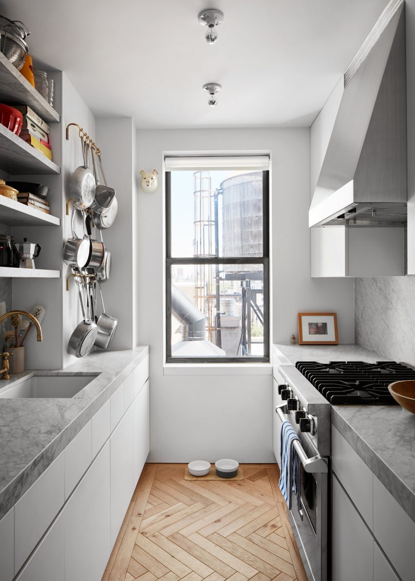
Light materials were used for surfaces in the narrow kitchen
A simplified version of a plaster relief detail – found during the demolition of a dropped ceiling in the bedroom – also wraps the wall and ceiling junctions, suggestive of crown moulding.
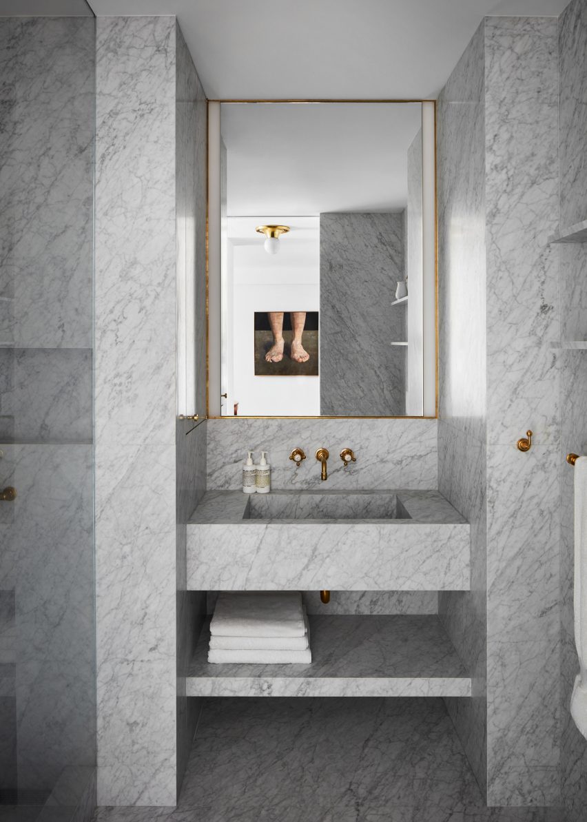
While these details all tie the living spaces together, it’s in the bathrooms that Messana O’Rorke has made the most dramatic interventions.
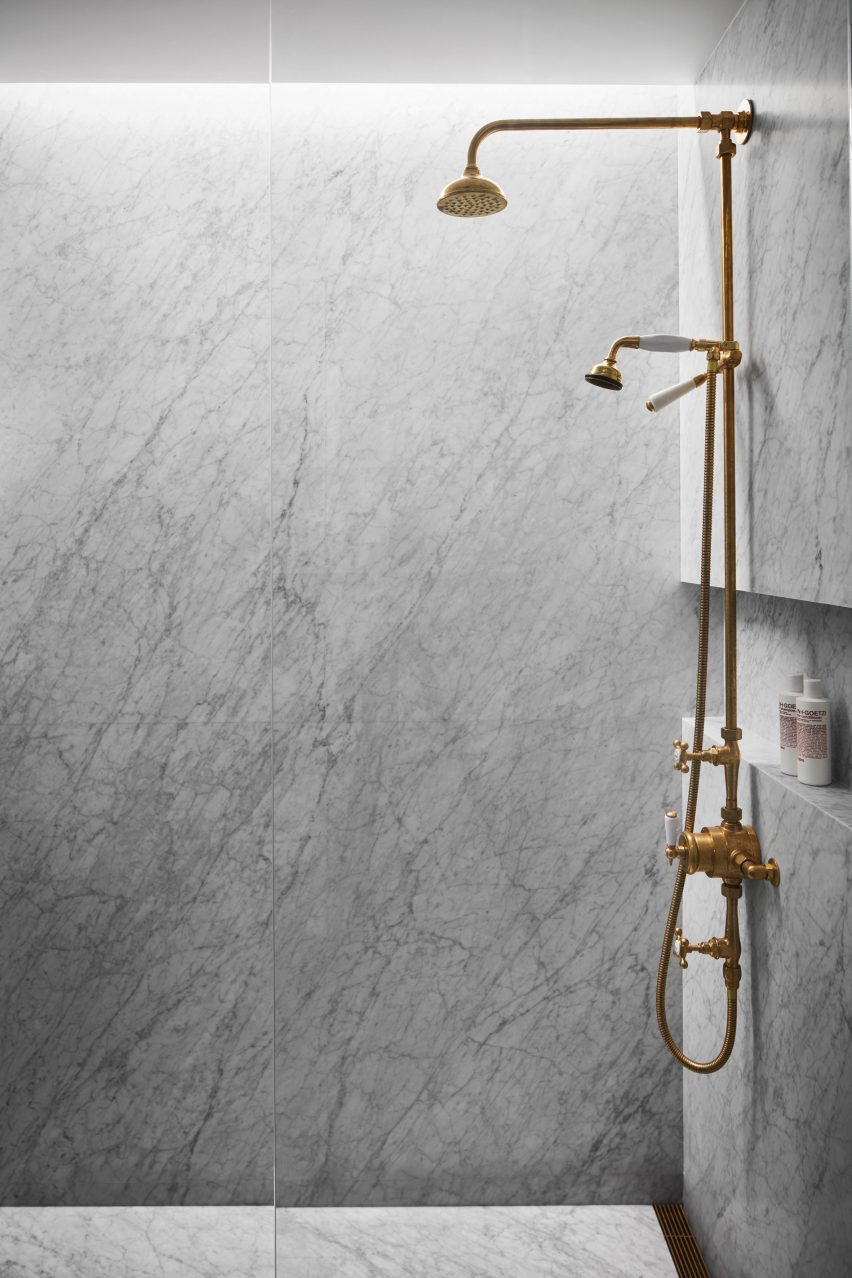
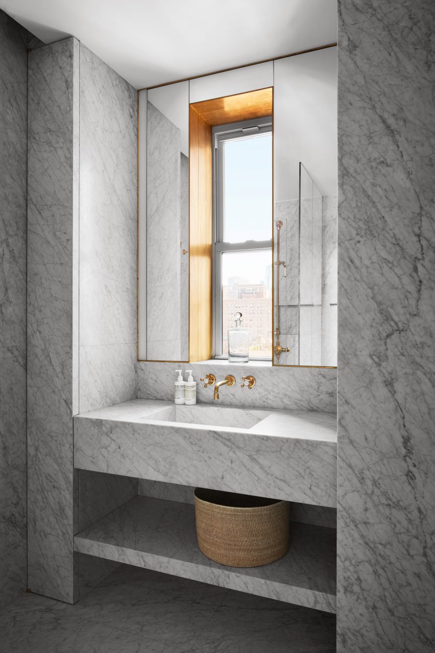
In the two bathrooms, Carrera marble lines the walls, floors and showers
“Given that the homeowners are the founding partners of Malin + Goetz, Messana O’Rorke paid particular attention to the design of the two bathrooms, which reflect the beauty brand’s ethos as a modern apothecary,” said the studio.
Unlacquered brass fixtures and hardware are installed against Carrera marble, which clads the walls, floors and showers to create a “spa-like” feeling.
A hidden light strip appears to wash the stone in the shower with daylight
In one bathroom, mirrors surrounded a window above the sink, where more brass is used to line the recess and forms a trim around the perimeter.
A shower is illuminated from a hidden pocket in the ceiling, giving the illusion that the stone wall is washed with daylight.
The same marble is continued in the narrow kitchen as countertops and backsplash, keeping the space light in tandem with white cabinets and stainless steel appliances.
Furniture is a blend of contemporary and vintage, mixing dark woods with sofas in muted velvet upholstery.
Unlacquered brass is used for fixtures and to line a window recess
A variety of artworks decorate the living room and den walls, while a large collection of books fills shelves in the office – both providing more colour and personality to the apartment.
“Much like the Malin + Goetz boutiques the firm had previously designed, a single vintage display element subtly offsets the taut architectural envelope; the furnishings and interior appointments bridge the traditional and the modern,” Messana O’Rorke said.
Herringbone patterned parquet was laid through the living spaces
The studio was founded in 1996 by Brian Messana and Toby O’Rorke, and has previously renovated an 18th-century home in Upstate New York.
Renovations on the Upper West Side completed by other studios include a residence by Stadt Architecture where existing brickwork walls were paired with walnut floors and a 1920s apartment overhauled with custom millwork by Format Architecture Office.
A hotel that pays tribute to early German modernism and an apartment within a ski resort designed by architect Marcel Breuer are among the projects collected in our latest lookbook, which explores interiors informed by the Bauhaus.
The most influential art and design school in history, the Bauhaus’ was established in Germany in 1919 and although it closed just over a decade later continues to influence interior designers today.
Work produced by students and teachers during the school’s 14-year history, centred on founder Walter Gropius’ ethos that art and craft should marry to create a new architecture.
The below projects feature distinctly Bauhaus elements including chrome tubular chairs, geometric shapes, primary colours and abstract textiles.
This is the latest in our lookbooks series, which provides visual inspiration from Dezeen’s archive. For more inspiration see previous lookbooks featuring living rooms that use warm neutrals to create a cosy ambience, bedrooms with wardrobes that are disguised as walls and contemporary living rooms in Georgian and Victorian homes.
Photo is by Arthur Fechoz
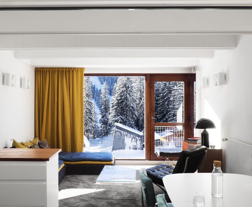
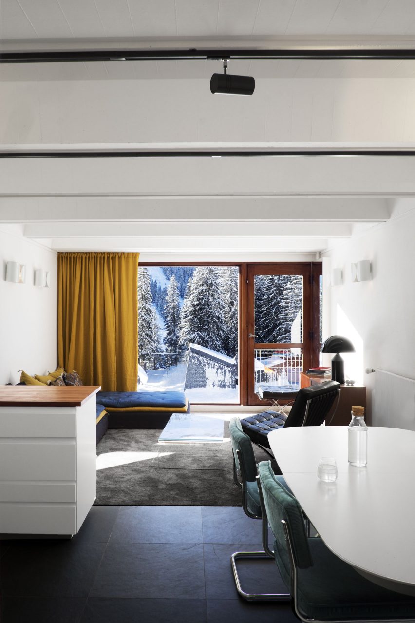
Cassiopeia Apartment, France, by Volta
Tasked with reviving the “Bauhaus spirit” of this apartment set within a Breuer-designed ski resort, architecture studio Volta added soft furnishings in mustard yellows and royal blues, referencing the colour palette of movement.
Armchairs with steel frames that resemble Breuer’s Wassily Chair have also been used to decorate the living room.
“The Bauhaus movement was predominant in the design of the project,” said the studio. “It has influenced its history, its choice of materials and its furniture. The challenge was to revive its influences in a contemporary context.”
Find out more about Cassiopeia apartment ›
Photo is by Nicole Franzen
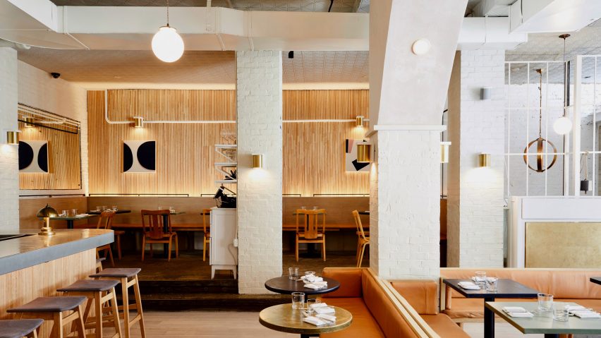
De Maria, US, by The MP Shift
Design studio The MP Shift wanted De Maria, a contemporary American restaurant in Manhattan’s Nolita neighbourhood to look like an artist’s studio, complete with white brickwork and pink-tinted plaster.
The studio paid tribute to Bauhaus and 1970s Soho style by adding sofas upholstered in tan-coloured leather, orb-shaped pendant lamps and simple pieces of art with triangular shapes.
Find out more about De Maria ›
Photo courtesy of Agnieszka Owsiany Studio
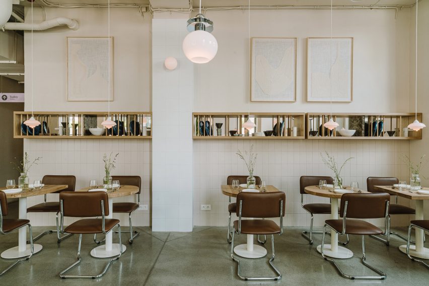
Nadzieja, Poland, by Agnieszka Owsiany Studio
Design influences from the Bauhaus collide with Israeli flavours at Nadzieja, a restaurant in Poznań, Poland designed by local studio Agnieszka Owsiany Studio.
Filled with brown-leather chairs with tubular steel frames, high granite ivory counters and spherical pendant lights, the eatery has a bright and warm interior that draws parallels with the large number of Bauhaus buildings found in Tel Aviv.
Find out more about Nadzieja ›
Photo is by Edmund Dabney
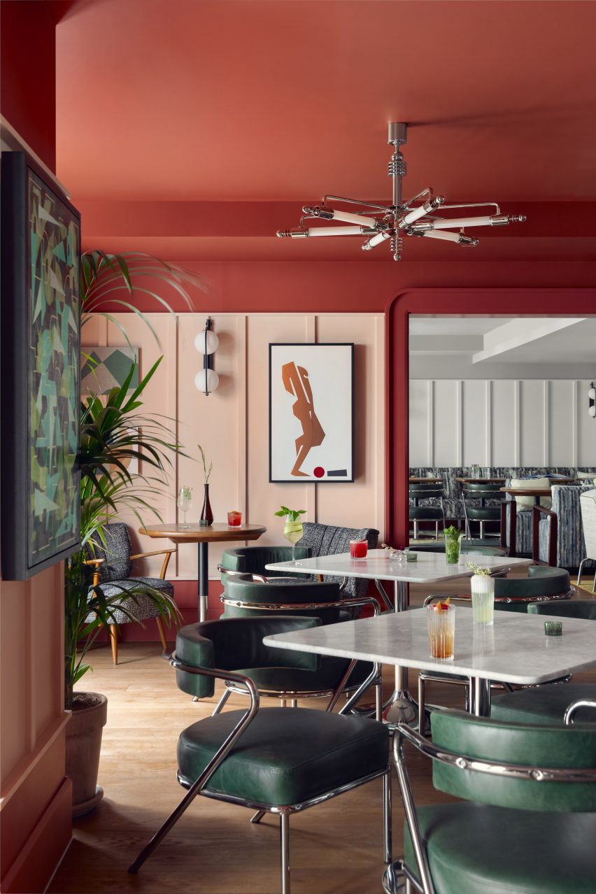
Schwan Locke Hotel, Germany, by Fettle
Influenced by the work of proto-Bauhaus association Deutsche Werkbund, design studio Fettle wanted the interiors of aparthotel Locke to be at once nostalgic and distinctly contemporary.
Its 151 apartment rooms feature a combination of light timber, raw plaster, chrome, steel and mohair materials set against a colourful yet muted pink and green backdrop.
Find out more about Schwan Locke hotel ›
Photo courtesy of Kasthall
Quilt by Ellinor Eliasson
In this living room, Swedish designer Ellinor Eliasson’s tufted rug acts as a centrepiece and gives the space a warm and richly textured look.
The graphic, modernist rug recalls the work of renowned Bauhaus weaving workshop teacher Anni Albers, who is best known for her textiles and recognisable lines, colours and forms.
Find out more about Quilt ›
Photo is by Andrew Joseph Woomer
Soho House Nashville, US, by Soho House
At the Soho House in Nashville, guests can enjoy a taste of the city’s musical heritage while uncovering the building’s industrial past as a knitting mill.
Designed to feel warm and rich, much like the rock and roll, jazz and blues music that Nashville is known for, the accommodation features bespoke lamps, brassy industrial finishes and plenty of tubular decor to create an industrial interior that still feels modern.
Find out more about Soho House Nashville ›
Photo is by Stephen Kent Johnson
53 West Apartment, US, by André Fu and AFSO
Architect André Fu and his Hong Kong studio AFSO referenced the geometric designs of the Bauhaus school for 53 West Apartment, a model unit set within architect Jean Nouvel’s New York tower block.
The two-bedroom apartment is peppered with sculptural pieces of furniture such as a room divider comprised of dark wood and rods, which compliments the existing walnut doors and oak floors and cabinets.
Find out more about 53 West Apartment ›
Photo is by Fran Parente
RP House, Brazil, by Estúdio BG
Inside this stripped-back two-storey residence called RP House, black steelwork, bare walls and simple white volumes stacked on top of each other come together to create a sparse yet light-filled Brazilian home.
São Paulo studio Estúdio BG said that the design referenced the principles of repeatability and standardisation advocated by designers of the Bauhaus.
“This 1920s movement was characterised by the replication of design in an industrial format,” the studio said. “The simple geometric volume, the elimination of decorative elements and the use of the roof as terraces reinforce the principles adopted in the project.”
Find out more about RP House ›
Photo is by Krista Jahnke
Palm Springs Dome House, US, by Pavlina Williams
Los Angeles-based architect Pavlina Williams added multiple windows and knocked down several walls in her renovation of this Californian house, transforming it from a gloomy residence into a desert sun trap.
In the open-plan living area, a caramel leather Wassily Chair by the Hungarian architect and designer Breuer sits alongside a spiral stainless-steel staircase that leads up to a loft.
Find out more about Palm Springs Dome House ›
Photo is by Derek Hudson
KaDeWe, Germany, by India Mahdavi
French architect India Mahdavi borrowed from the Bauhaus’ preoccupation with strong graphic lines and shapes in her renovation of department store KaDeWe by adding sweeping black, white and grey stripes of Santa Margherita to the floor of the womenswear section.
Elsewhere in the 2,000-square-metre shopping space, pink carpeting is set off against triple-tiered, brass clothes rails and olive green and dusty pink velvet curtains.
Find out more about KaDeWe ›
This is the latest in our lookbooks series, which provides visual inspiration from Dezeen’s archive. For more inspiration see previous lookbooks featuring bathrooms where the sink takes centre stage, homes with arched openings that add architectural interest and bookshops designed to enhance the browsing experience.