Wooden interior of Foster Retreat
CategoriesInterior Design

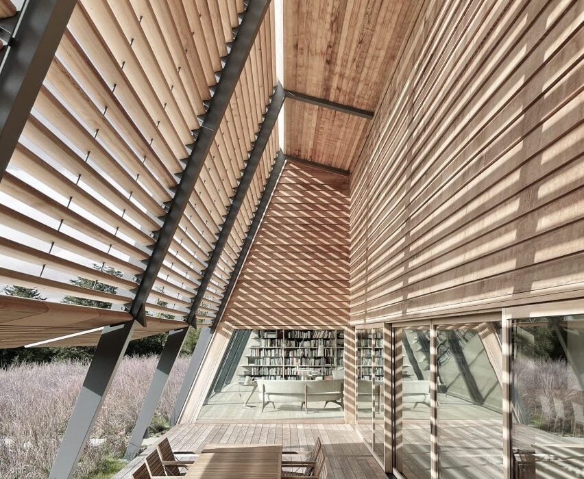
Norman Foster creates angular Foster Retreat in Martha’s Vineyard

Pritzker Architecture Prize-winning architect Norman Foster has designed the Foster Retreat in Martha’s Vineyard as a holiday home for his friends and those of the Norman Foster Foundation, which features furniture designed by the architect for Karimoku.

Named the Foster Retreat, the mono-pitch roofed building in Martha’s Vineyard, Massachusetts, was built opposite Foster’s US home.

Wooden interior of Foster Retreat
The building draws on traditional wood structures

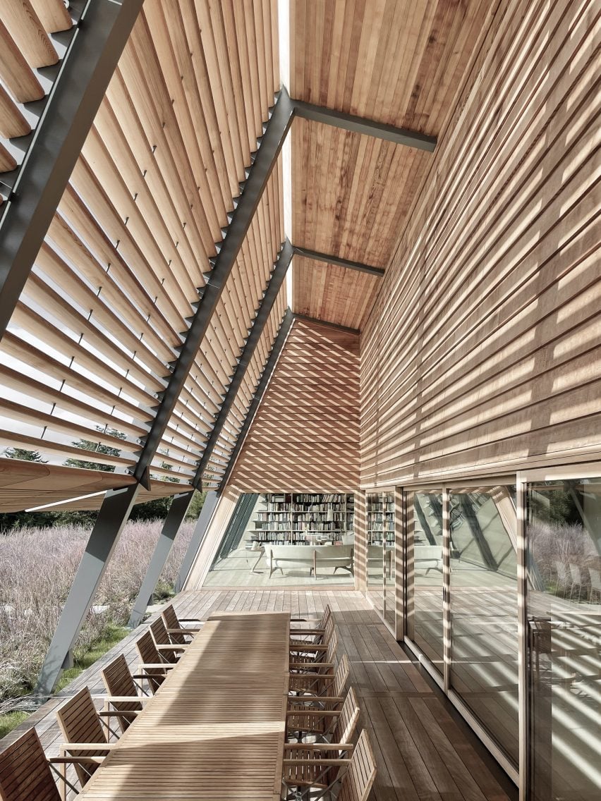
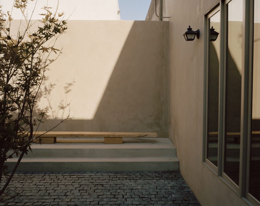
The home was formed from a series of angled steel beams that are connected by timber beams with smooth timber louvres enclosing an outdoor patio space.

According to Foster, the holiday home’s shape was informed by North American barn structures, with large amounts of timber chosen to reference Martha’s Vineyard’s traditional wood-boarded structures and its sustainability credentials.

A wood-clad interior in Martha's Vineyard house
Pale wood was used inside Foster Retreat

“The retreat takes inspiration from the generous wooden barn structures of North America and combines that tradition of timber construction with a small amount of steel in the form of skinny portal frames which touch the ground lightly,” said Foster, who is the founder of UK studio Foster + Partners.

“Wood was the obvious choice not only for reasons of sustainability but also as a direct reference to the traditional buildings that characterise the island.”

View out onto green grass from kitchen
The building has a visible grid

The site levels around Foster Retreat, which will be used as a private residence for friends of Foster’s family and of the Norman Foster Foundation, were contoured to hide the building from the roadside and situate it within the landscape.

The studio also added indigenous plants to the site, as well as a bank of solar panels that together with “a high level of insulation and shading” helps the building be more sustainable, according to Foster.

Wooden furniture with white seats
Norman Foster designed the NF Collection for Karimoku

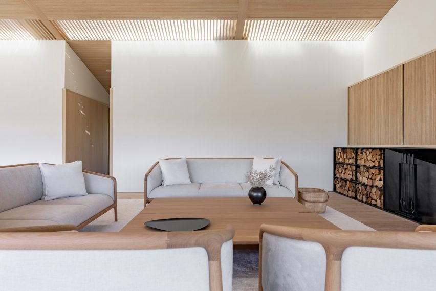
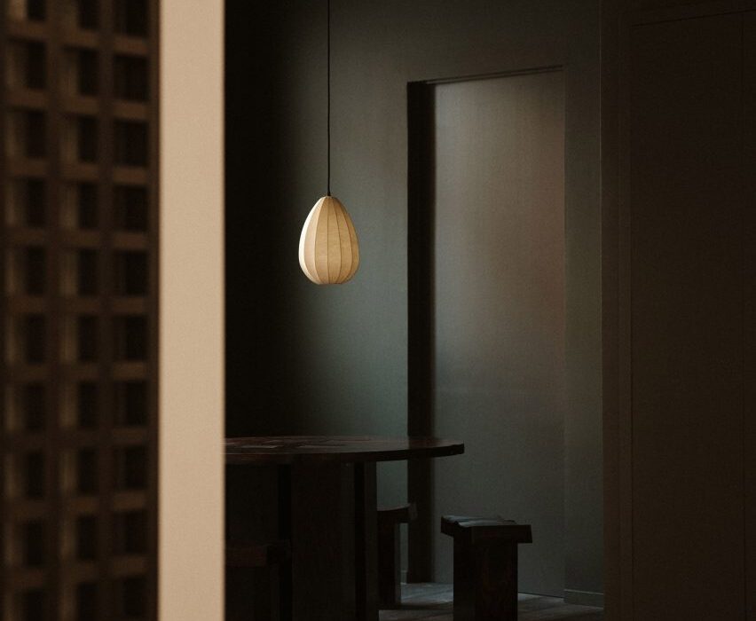
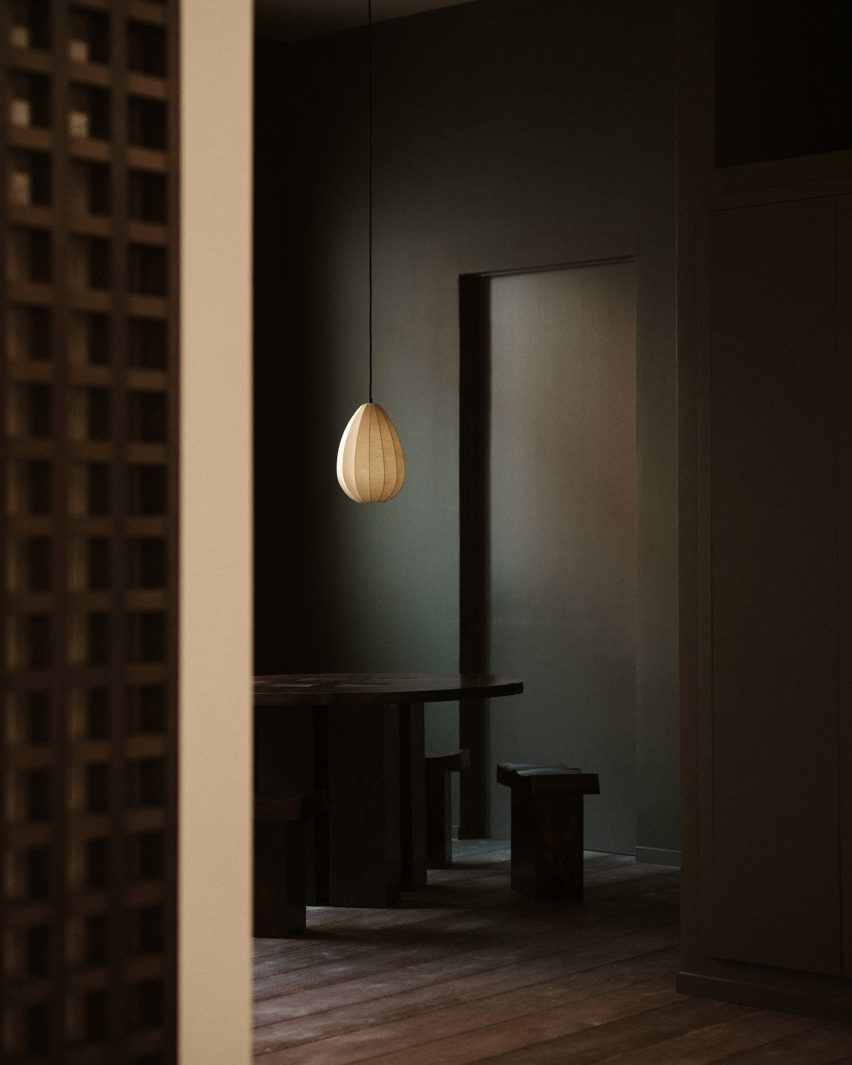
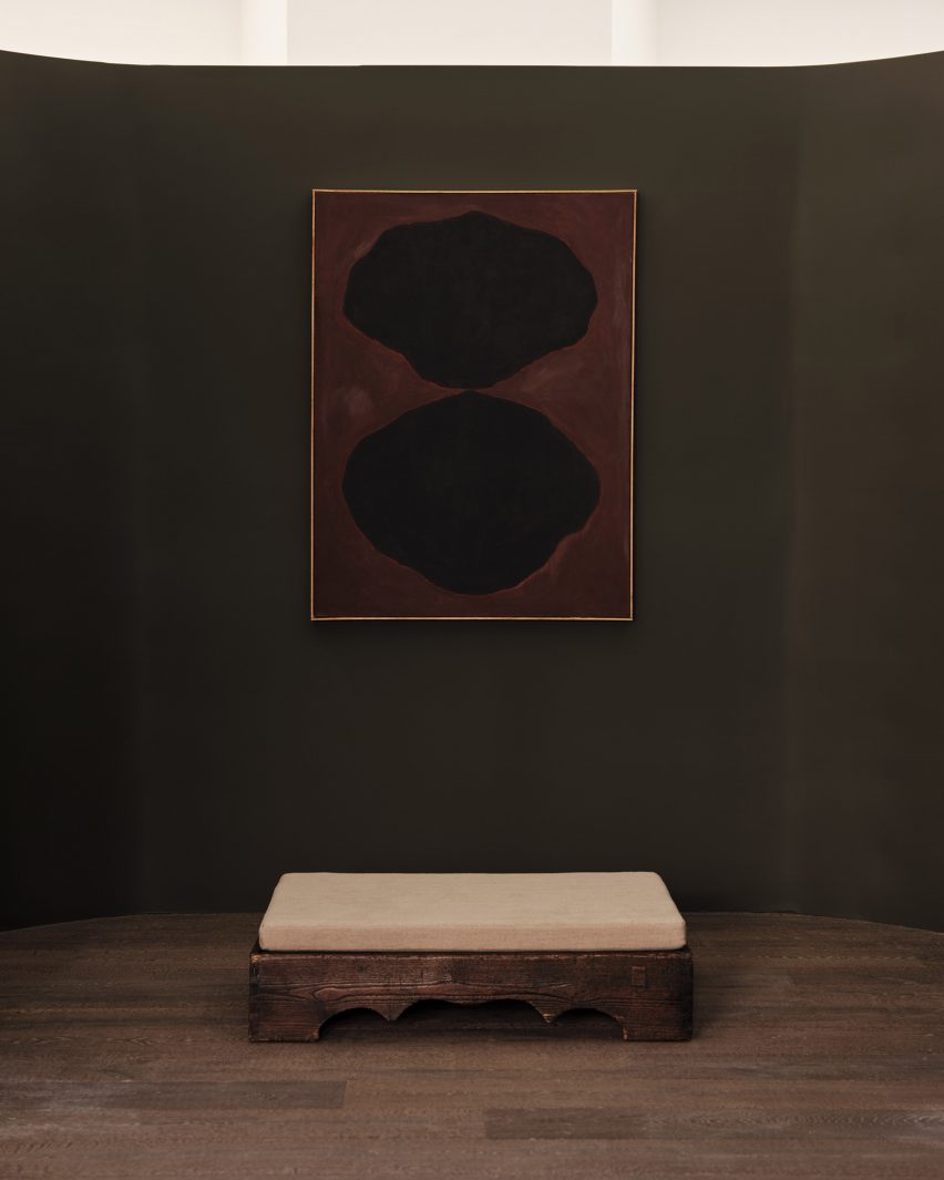
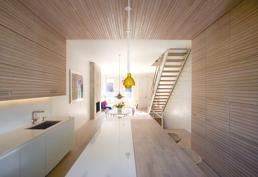
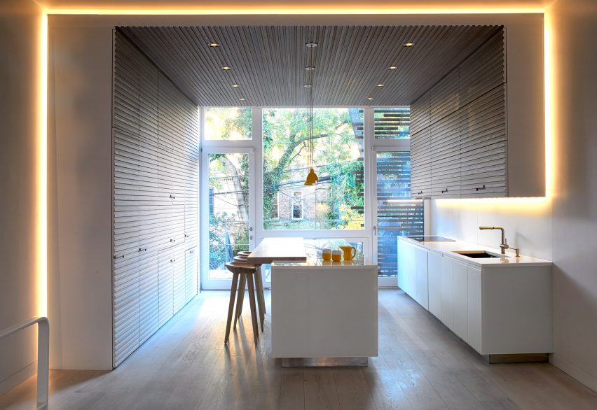
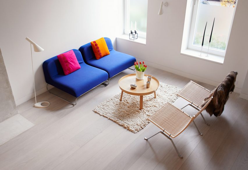
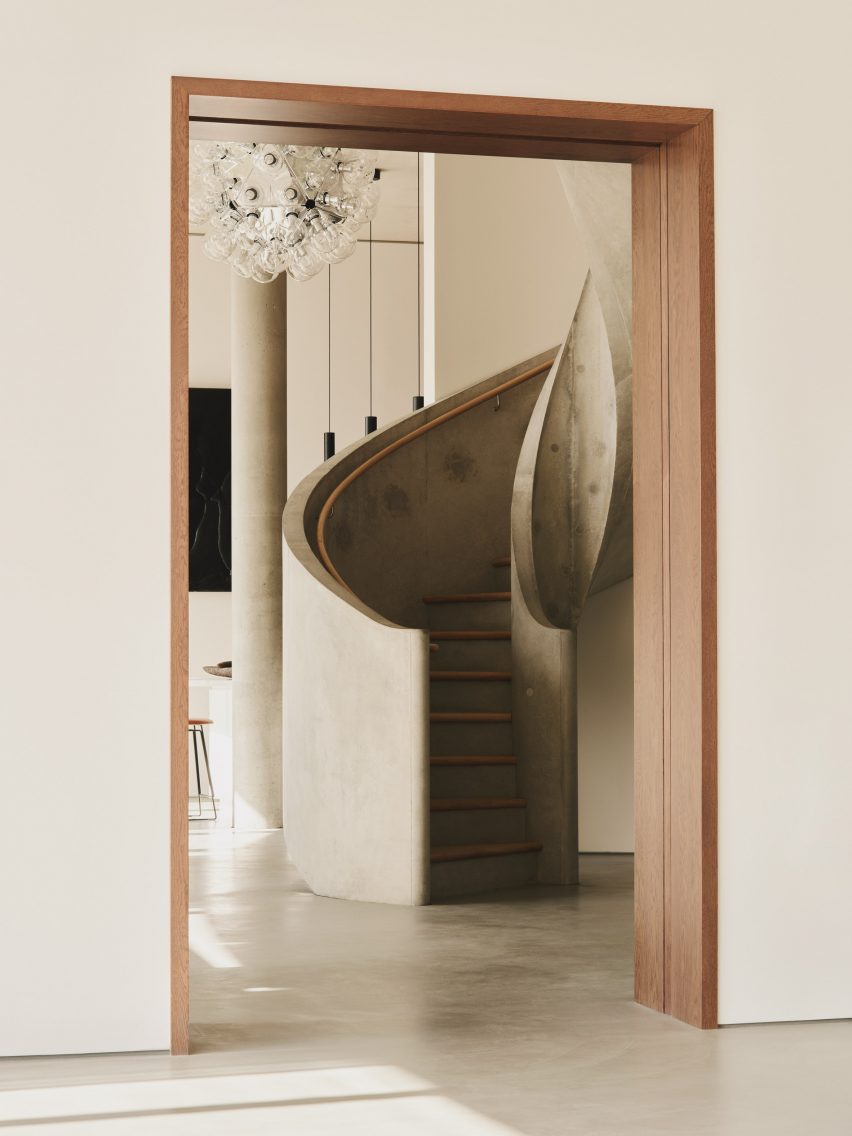
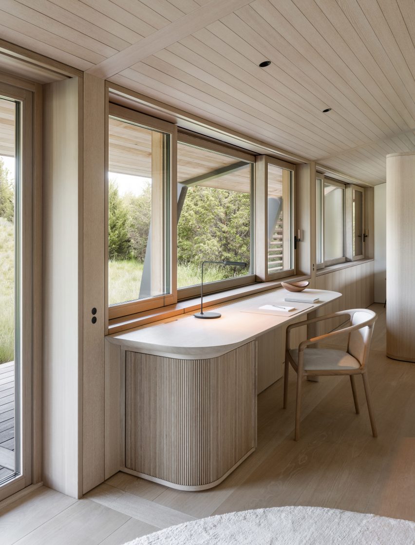
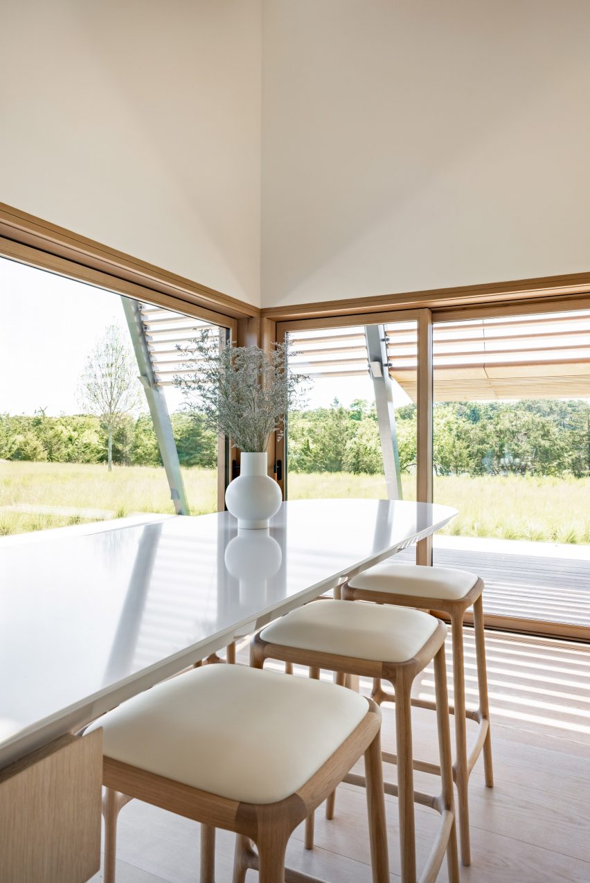
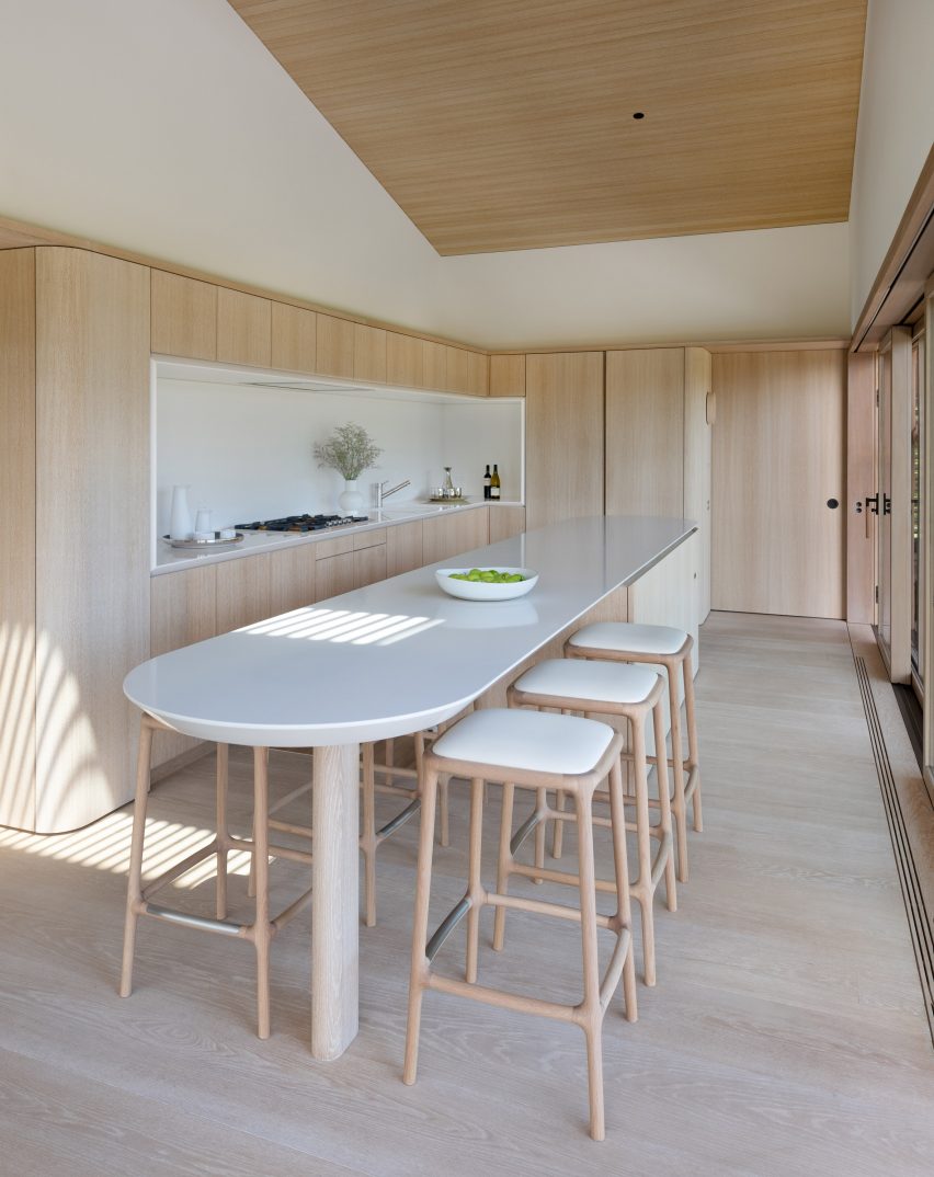
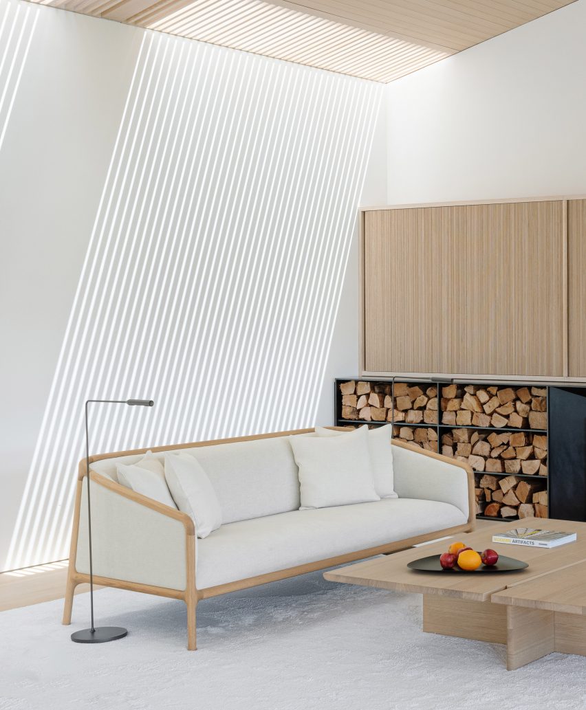
Inside the building, the holiday home has white walls with pale wood panels and wooden floors.

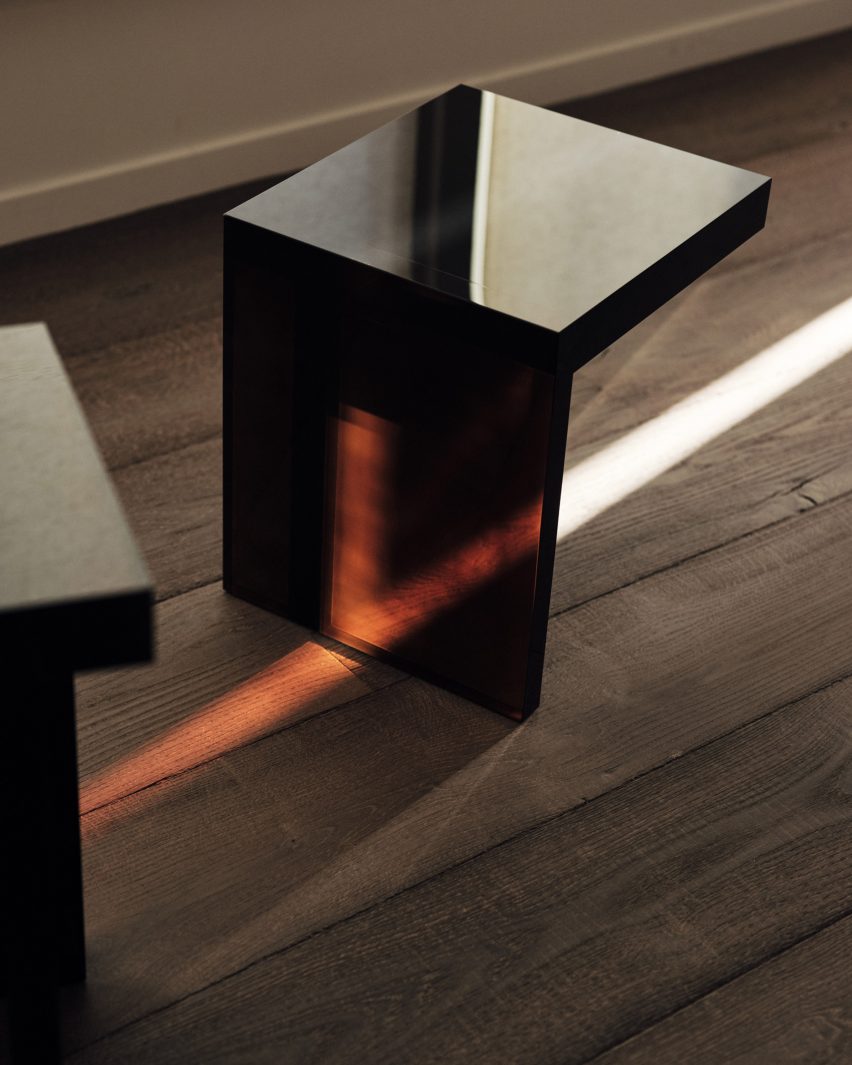
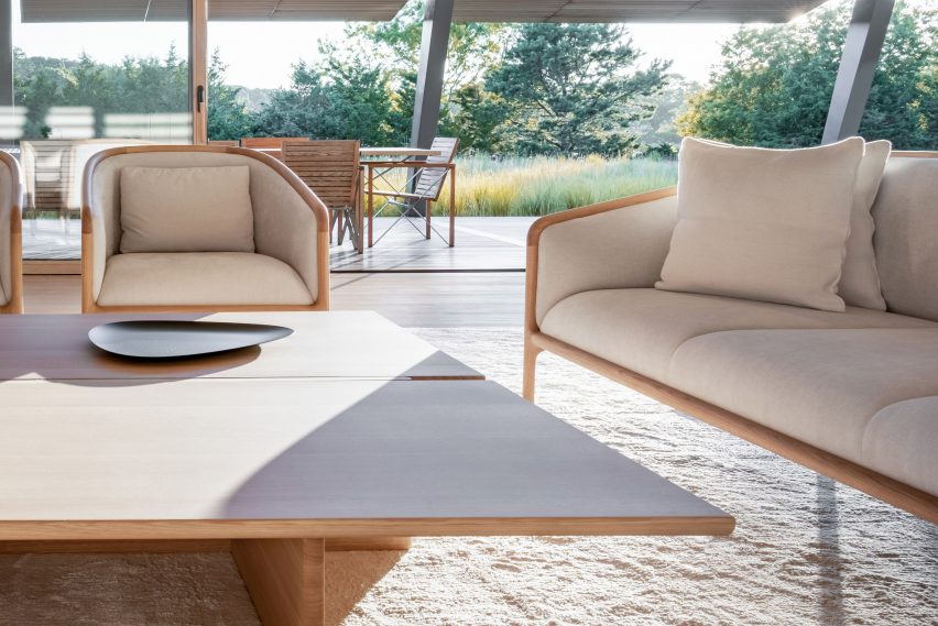
To match the pared-back material palette of the house’s exterior and interior, Foster designed a wooden furniture collection named NF Collection together with Japanese furniture brand Karimoku.

The collection comprises a dining chair, two stools, a lounge chair, a sofa, and a dining table, all of which feature pale “skeletal” timber frames and padded upholstery.

“The wood-based furniture I designed for Karimoku is an extension of the philosophy behind the building,” Foster explained.

“lt has always seemed to me that there is a commonality between the American Shaker Movement and traditional Japanese furniture. Given my own admiration for the qualities of historic Japanese architecture, there are evident cultural links.”

White dining table with wooden chairs
The furniture has skeletal frames and white padding. Photo is by Chuck Choi

The collection was developed as Foster had trouble finding suitable furniture for the space.

“When we started to think about what type of furniture could best fit in the spaces created in the Foster Retreat, Martha’s Vineyard, we realised that there was no single specific collection in existence that could be used for the different uses of the building, so I decided to develop a bespoke family of furniture,” Foster explained.

“Timber was a natural choice to match the spirit of the building.”

Living room with wooden furniture and white rug
Foster Retreat was designed as a private residence

Foster Retreat is Karimoku’s seventh case study project, which sees the studio work together with architects on bespoke furniture collections.

“I see the collaboration with NF as an important step for us as a brand – not only do we venture into a new area with the case at Martha’s Vineyard, but we also show how the brand can accomodate a more diverse furniture collection, showcasing the unique design languages of the individual studios, yet still maintaining a red thread throughout the collection in the use of materials, excellent craftsmanship and high quality,” Karimoku creative director Frederik Werner told Dezeen.

White sofa in front of fireplace
The collection marks Karimoku’s seventh case study. Photo is by Chuck Choi

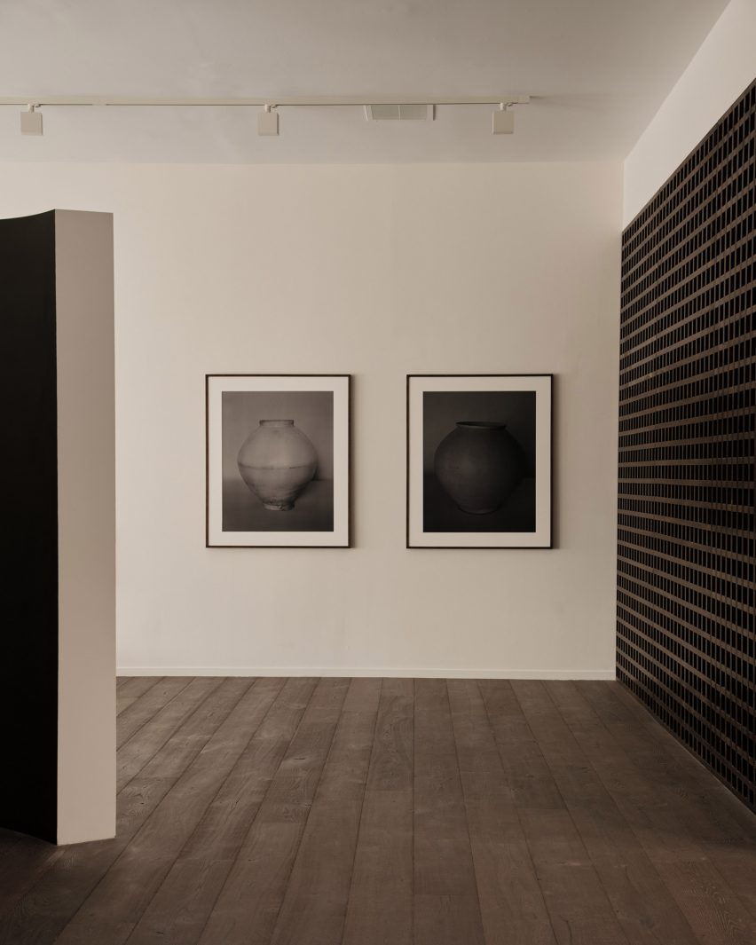
The NF Collection will also be shown in an exhibition at Karimoku Commons in Tokyo, the brand’s retail and showroom space. Karimoku was one of a number of Japanese brands that showed at this year’s Salone del Mobile furniture fair as the focus on the European market grows.

One of the world’s best-known architects, Foster leads the UK’s largest studio Foster + Partners. The studio’s recent projects include 425 Park Avenue, which is the “first full-block office building” to be built on Park Avenue in over 50 years, and the tallest building in the EU, the Varso Tower in Warsaw.

The photography is by Marc Fairstein unless stated otherwise. All photography courtesy of the Norman Foster Foundation.

The Norman Foster x Karimoku exhibition is at Karimoku Commons from 21 October to 9 December. See Dezeen Events Guide for an up-to-date list of architecture and design events taking place around the world.

Reference

Dark walls at Francis Gallery LA
CategoriesInterior Design

BC designs Francis Gallery LA to celebrate Korean art and culture

Gallerist Rosa Park has opened a space in Los Angeles to showcase the work of Korean artists and designers, with interiors by local studio BC intended to reflect the country’s visual culture.

Francis Gallery LA is Park’s second location and is an expansion of her original gallery in Bath, UK – both presenting the work of emerging Korean artists.

Dark walls at Francis Gallery LA
Places of worship informed the interiors of the gallery on Melrose Avenue

Situated on Melrose Avenue in West Hollywood, the new space was designed with Lindsey Chan and Jerome Byron, founders of LA-based BC.

The duo preserved the building while transforming the inside with references to traditional Korean architecture and art.

Paintings hung on walls
The inaugural exhibition displays the work of six artists, including photography by Koo Bohnchang

These include a curved partition wall influenced by a moon jar and a contemporary re-interpretation of a hanok courtyard.

“The space was conceived to pay homage to Korean art and design in subtle ways – whether it was in the curve of a partition wall, the colour palette of the interior paints, or the profile of a low bench in the courtyard,” said Park.

Corner view with window
BC designed the gallery to be pared-back yet warm

Places of worship like chapels and monasteries were also referenced in the design. These were accentuated by the use of “humble materials” and pared-back forms.

Although minimal, the intention was to ensure the gallery still felt warm and inviting, as well as provide an appropriate setting for the pieces on show.

Resin stools
Rahee Yoon’s translucent acrylic blocks are among the works on show

“I think this emotional connection to a space, to a work, is central to what I’m doing with Francis,” Park said.

“It was of great importance to me that the space acted as the ideal framework to house works that I hope will move people.”

The inaugural exhibition at Francis Gallery LA is titled Morning Calm, on view until 7 January 2023, and features the work of six artists of Korean descent.

Bo Kim, John Zabawa, Koo Bohn Chang, Nancy Kwon, Rahee Yoon and Song Jaeho are all at different stages in their careers.

Stones VI by John Zabawa
An abstract painting by John Zabawa hangs on a dark wall

Their painting, photography, sculpture and ceramics all explore Korean identity in an international context and offer insights into the artists’ cultural heritage.

“With Los Angeles being home to the largest Korean community in the United States and Park having roots in both Seoul and LA, the debut show seeks to explore the nuanced connections between the two places,” said a statement from the gallery.

Courtyard with low bench
References to Korean architecture at the gallery include a contemporary interpretation of a traditional hanok courtyard

LA’s art scene has grown exponentially over the past decade, and the city is now home to many new galleries and exhibition spaces.

Well-known names that have opened their own locations there include Hauser & Wirth and The Future Perfect, while others like Marta are using modernist buildings like Neutra’s VDL II House to exhibit.

The photography is by Rich Stapleton.

Reference

Aerial view of Patina Maldives
CategoriesInterior Design

Studio MK27 creates Patina Maldives resort on Fari Islands

Brazil-based Studio MK27 has used wood, rattan and stone textures to create the buildings for a holiday resort on the Fari Islands archipelago in the Maldives.

Patina Maldives occupies one of the four islands that makes up the artificial archipelago, which was built over approximately 10 kilometres of reef on the northern edge of North Male Atoll.

Aerial view of Patina Maldives
Patina Maldives is located within the new Fari Islands archipelago

Studio MK27 has designed architecture and interiors for buildings across the island, including an arrival pavilion, a spa, a kid’s club, and a cluster of bars and restaurants.

Accommodation is provided by a mix of beach suites, private in-land villas and water villas that project out to sea.

Patina Maldives by Studio MK27
Studio MK27 designed architecture and interiors for the resort’s various buildings

Never rising above the tree canopy, the buildings are dotted around the island in an arrangement designed to create areas of vibrant social activity and spaces of complete seclusion.

“Patina is unique in the Maldives: an opportunity to be together in isolation,” said Studio MK27 founder Marcio Kogan. “[It is] one of the most remote places on Earth and still a place designed for people to meet one another.”

Deck at Patina Maldives by Studio MK27
Natural materials are combined with earthy colours

“Patina Maldives embraces our natural conflicts: desire for peace and party, for nature and design, technology and rusticity, self-indulgence and deep reflections,” he added.

The materials palette throughout consists of earthy colours, matt finishes and natural textures that are intended to chime with the natural landscape.

Beach villa at Patina Maldives by Studio MK27
Water villas come with their own swimming pools

Many of Studio MK27’s own designs can be found in the furnishings, including woven lighting pendants, neatly crafted shelving units, and cabana and deck chairs co-designed with Norm Architects.

The villas feature high-tech sliding window systems that allow the interiors to be opened up on three sides at the touch of a button, as well as custom-made blackout blinds.

“We escalate the textures and emotions from zero to 100, from soft shadows to overwhelming light,” said Studio MK27.

“It’s a rhythm with contrast, pauses and transparencies. From slow dolce far niente to exuberant real vitality, it is a place for people to bond with nature and each other, for people to experience the essential with glamour.”

Villa at Patina Maldives by Studio MK27
There are also suites and villas inland and on the beach

Many of the buildings are characterised by clever details.

The spa centres around a shallow pool, with a skylight above offering a play of light and shadow, while the kid’s club is defined by colourful window apertures.

Spa at Patina Maldives by Studio MK27
The spa centres around a calming pool

The bar and restaurant area, known as the village, has its own sense of style.

Arabesque, a restaurant serving Middle Eastern cuisine, combines patterned terracotta blockwork with copper lights, while the Brasa grill is designed as a Latin American smokehouse.

Restaurant at Patina Maldives by Studio MK27
The Village is a cluster of bars and restaurants

Studio MK27 has worked on many projects in idyllic locations, such as the beachside Vista House, or Jungle House, which is located in a rainforest.

The studio spent five years developing designs for Patina Maldives, which officially opened in May 2021.

Cabana at Patina Maldives by Studio MK27
Studio MK27 custom designed much of the furniture

The hotel was longlisted for Dezeen Awards 2022 in the hospitality building category, while the spa is shortlisted in the leisure and wellness interior category.

It is one of three resorts located on islands within the Fari Islands archipelago, along with the Ritz-Carlton Maldives and the Capella-Maldives.

The photography is by Fernando Guerra.


Project credits

Architecture: Studio MK27
Lead architects: Marcio Kogan, Renata Furnaletto
Interior designers: Diana Radomysler, Pedro Ribeiro
Project team: André Sumida, Carlos Costa, Carolina Klocker, Diego Solano, Eduardo Glycerio, Elisa Friedmann, Gabriela Chow, Gustavo Ramos, Giovanni Meirelles, Julia Pinheiro, Lair Reis, Laura Guedes, Luciana Antunes, Renato Rerigo, Regiane Leão, Renata Scheliga, Ricardo Ariza, Marcio Tanaka, Mariana Ruzante, Mariana Simas, Samanta Cafardo, Suzana Glogowski, Tamara Lichtenstein, Thauan Miquelin
Developer: Pontiac Land Group
Landscape designer: Vladimir Djurovic Landscape Architects
Lighting design: The Flaming Beacon
Construction: Alhl Pvt
Project manager: Mace Group

Reference

Curtained interior of Open Hearts Lisboa
CategoriesInterior Design

White leather curtains enclose Lisbon wellness centre by AB+AC Architects

Portuguese practice AB+AC Architects has designed a multifunctional wellness centre in Lisbon that doubles up as an artists’ residence.

The Open Hearts wellness centre is arranged around one large room, which AB+AC Architects refers to as the shala. This Sanskrit term refers to the idea of home but also, in the context of yoga, a place where people can learn and practise together.

Curtained interior of Open Hearts Lisboa
The Open Hearts centre is orientated around a curtained room known as the shala

As well as yoga classes, this adaptable space will host everything from breathwork classes and sound baths to meditation sessions, film screenings, dining experiences and creative writing workshops.

Running around the periphery of the shala are floor-to-ceiling curtains crafted from white vegan leather, which can be drawn to keep the room out of view from the bustling street outdoors.

At the front of the room, a wall of gold-tinted mirrors conceals a series of storage compartments. When an event is being held, the room can also be temporarily dressed with floor cushions and long birchwood tables.

Interior of Open Hearts Lisboa
Behind the shala is the artists’ residence

“Normally, when a design is very flexible, there is a risk of ending up with a very generic or sterile space, as if the only way to address adaptability is through non-specific design,” explained AB+AC Architects.

“We knew that creating a neutral mood that could accommodate a variety of programs would not be stimulating, so we decided that the centre had to be able to evoke different emotions based on the function occurring at that given moment.”

Wooden kitchen inside Open Heart Lisboa's artist residence
This includes a dining room and bespoke kitchen

A grand limestone archway to the side of the shala grants access to the artists’ residence, which is entered via a narrow lounge area.

The room is topped with a light-up ceiling that measures eight metres long and, when the artist is hosting an exhibition, washes their work in a complementary glow.

Next up is a small dining area and a custom-made kitchen suite featuring wooden cabinetry and a terrazzo-style countertop.

Surfaces in the adjacent bedroom are painted a crisp shade of white while the corner dedicated to the bathroom – complete with a freestanding tub – is clad in distinctive terracotta tiles.

The same gold-tinged mirrors from the shala are used here to help disguise the toilet.

Tiled bathroom inside Open Heart Lisboa's artist residence
A terracotta-tiled bathroom contrasts with the white walls of the bedroom

Should the resident artist want some fresh air, they can head outside to the small private patio.

Here, a concrete planter that winds around the edge of the space is overspilling with leafy tropical plants, while volcanic stone pebbles are scattered over the floor.

Outdoor patio of Open Heart Lisboa's artist residence
Foliage lines the private outdoor patio of the artists’ residence

Open Hearts Lisbon has been shortlisted in the civic and cultural interior category of this year’s Dezeen Awards.

Other projects in the running include a cow shed-turned-library, a historic cinema in Berlin and the world’s first multi-storey skatepark.

The photography is by Ricardo Oliveira Alves.

Reference

Passive Brooklyn Townhouse cedar facade
CategoriesInterior Design

Sarah Jefferys creates Passive House in Brooklyn with cedar screen

American studio Sarah Jefferys Architecture + Interiors has renovated a slender townhouse in Brooklyn with airy rooms and a cedar screen on the facade to meet Passive House standards.

Located in the Park Slope neighbourhood, the Passive House project involved the overhaul of a brick-faced, three-storey townhouse built in 1921 and owned by a family of four.

Passive Brooklyn Townhouse cedar facade
Sarah Jefferys Architecture + Interiors remodelled a Brooklyn townhouse into a passive house

New York-based Sarah Jefferys Architecture + Interiors sought to create a tranquil living atmosphere with elements that pay homage to the family’s Indian and Danish roots.

Moreover, the team wanted the 3,000-square-foot (279-square-metre) building to align with Passive House standards for energy efficiency.

Brooklyn Passive House interior
High-quality windows were installed

To significantly reduce heating and cooling needs, the team installed triple-pane Zola windows, which are often used in passive houses. Walls were reconstructed to create an airtight envelope, which included the addition of cellulose insulation.

The team also added an electric heat pump and an energy recovery ventilator, which helps purify the air.

The front facade was kept intact and refurbished, while the rear wall was redesigned to add ample glazing. To provide privacy and to modulate incoming daylight, the team added an artful cedar screen that acts as both “a sculpture and a veil”.

Brooklyn Passive House with Dutch furniture
White oak was used to complement the bright colours

Within the slender home, the team incorporated pops of colour and pale materials such as white oak.

“We strategically used light hues and reflective materials, and created an airy environment to offset the narrow footprint of the townhouse,” the team said.

The ground level has an open plan and holds the communal spaces.

Brooklyn Passive House kitchen
Reflective and light materials helped the studio meet environmental standards

Up front is the living room, where one finds a blue Living Divani sofa, rattan chairs from Fritz Hansen and a Muuto table.

A wood-burning fireplace, an element not often found in passive homes, sits between the living and dining areas.

To curb emissions from the hearth, the architects added a triple-pane glass enclosure and an extraction fan with an insulated cap. Still, because of the fireplace, the home does not fully meet the PHIUS certification requirements, the architect said.

The all-white dining room is furnished with Ant chairs by Arne Jacobsen and a PH50 pendant by Poul Henningsen. Just beyond is the “showpiece kitchen”, which is framed with an LED light cove.

Brooklyn passive house white stairway
The staircase has a skylight above

“The light cove acts as a separation point – an outline – and provides an atmospheric glow throughout the kitchen,” the team said.

In addition to the special lighting, the kitchen features slatted wooden cabinetry, yellow pendants by Louis Poulsen, and an island topped with Glassos crystallized glass.

Part of the island consists of a live-sawn slab of white oak, which is lined with bar stools.

Brooklyn Passive house living room from above
The living room features a Muuto table

“The beautiful juxtaposition between Glassos and white oak exemplifies the nature of the kitchen as both a practical work area and a leisurely lounge space for entertaining,” the team said.

A sky-lit staircase leads to the upper levels. The first floor holds the main bedroom and bathroom, along with an office – all of which are arrayed along a corridor lined with frosted glass.

The main bedroom features a BoConcept bed, sconces by Robert Dudley Best for Bestlite and a graphic blanket by Pia Wallén for HAY. The bathroom is adorned with matte glass and penny-round tiles from Ann Sacks.

The office is infused with a “touch of nostalgia”. Pieces include a Hans Wegner armchair, a teak Danish dresser and a 1962 copper pendant by Jo Hammerborg.

Brooklyn Passive house bathroom
Bright colours were used throughout

The top level contains a den and two additional bedrooms. The house also has a cellar.

Other Brooklyn townhouses include a house by Space4Architecture that has a skylit staircase and minimalist decor, and the family home of architects Fanny and Matthew Mueller, which features floating steps and a wood-and-steel bridge.

The photography is by Morten Smidt.

Reference

Wood-clad courtyard and white bathroom
CategoriesInterior Design

Tom Dixon furnishes penthouses in One Park Drive skyscraper

British designer Tom Dixon’s Design Research Studio has furnished the interiors for two duplex penthouses that Herzog & de Meuron has created within its cylindrical Canary Wharf skyscraper.

Architecture studio Herzog & de Meuron designed the seven penthouses in the residential One Park Drive skyscraper, which were the last part of the project to be completed, to contrast the commercial buildings that surround them.

“We had to think about what it means to live vertically and how to create a strong distinction between something that is commercial and something that is residential,” Herzog & de Meuron’s UK studio director John O’Mara said at the penthouses’ opening.

Wood-clad courtyard and white bathroom
The seven penthouses feature wood-clad courtyards

Located on the 56th and final floor of the 205-metre-tall One Park Drive building, the duplex penthouses feature balconies overlooking Canary Wharf. To give them a more residential feel, Herzog & de Meuron added an unusual detail – hidden internal courtyards.

The wood-clad courtyards open up towards the sky via D-shaped ceiling cut-outs and function as a “back garden,” the studio said.

Each of the penthouses, which range from 152 to 362 square metres, also feature a statement spiral staircase made from concrete poured in-situ. The staircases all have different designs.

Spiral concrete staircase inside One Park Drive penthouse
Spiral staircases were made from concrete poured in-situ

Design Research Studio furnished the interiors for two of the duplex penthouses in One Park Drive using a combination of furniture by Dixon’s studio and handpicked vintage furniture.

Among the vintage pieces used for the design were chairs by Danish designer Verner Panton and lamps by Finnish architect Alvar Aalto. Dixon also custom-made large artworks for the space.

White sofa in front of floor-to-ceiling windows
The penthouses are on the 56th floor

Dixon’s studio used the theme of Home of the Collector to imagine what the interiors of the penthouses should feel like.

“Each room has been meticulously curated – we wanted every single object to feel as if it has been made specifically for this space or that it has been carefully selected for it,” Dixon explained.

“It should feel personal, convincing, compelling and aspirational – we didn’t want to design a typical luxury apartment,” he added.

“The beautiful, fluid spaces feature high ceilings and large expanses of wall and windows and the artworks create the sense of a private gallery.”

Coming up with a concept for an imaginary homeowner was an enjoyable aspect of the job, Dixon added.

“It’s actually really good fun to try and invent a personality and try and work out what they would actually do,” he said, explaining that he had envisioned the apartments being filled with art pieces and furniture that had been picked up on travels.

Bathroom with tadelakt walls at One Park Drive penthouse
Bathrooms have sand-coloured Tadelakt walls

The apartments in One Park Drive are all designed by Herzog & de Meuron with a tactile material palette that helps to draw attention to the interiors.

Wood was used to create striking details for the interior architecture, including the wardrobe doors with leaf-shaped openings.

The studio used Tadelakt plaster to create sand-coloured bathrooms with globe-shaped lights and rounded mirrors, while floors are concrete or pale wood.

Sofa in living room of One Park Drive penthouse
The penthouses also have balconies overlooking Wood Wharf

The duplex penthouses are the last part of One Park Drive to be completed. The skyscraper, which contains 484 apartments in total, forms part of developer Canary Wharf Group‘s plan to add homes to the predominantly commercial Canary Wharf neighbourhood.

Other recent projects by Tom Dixon include a twentieth-anniversary exhibition that featured mycelium towers and Design Research Studio’s design for restaurant The Manzoni.

Reference

Reflecting pool and floating staircase in multi-brand store in Shanghai designed by Dongqi Design
CategoriesInterior Design

Reflecting pool centres XC273 fashion boutique in former Shanghai factory

Chinese studio Dongqi Design has turned a disused factory in Shanghai into a multi-brand fashion and lifestyle store, adding glossy marble and metal surfaces to offset its exposed concrete shell.

Set across three floors, the XC273 retail space houses designer showrooms and pop-ups alongside a small cafe, as well as providing spaces for temporary exhibitions and events.

Reflecting pool and floating staircase in multi-brand store in Shanghai designed by Dongqi Design
Dongqi Design has turned a former factory into a fashion boutique

Formerly a state-owned towel factory, the building had already been changed several times before the latest round of renovations.

Dongqi Design strived to preserve and emphasise these different layers of history, which are contrasted against shiny new finishes to create a kind of “nostalgic futurism”.

“All the differences of the space were kept as part of the building’s history so that people walking in could feel that the boundaries between the past and the present are blurred, as if they had walked into a timeless space,” the studio explained.

Cafe with glossy floors in XC273 store
The XC273 store houses a cafe alongside designer showrooms and pop-ups

The building is organised around three voids, which now form the basis of the store’s circulation routes.

The largest of these voids consists of a double-height space at the core of the building, where Dongqi Design added a small reflecting pool surrounded by a collonade.

Fashion retail space with glossy floors in multi-brand store in Shanghai designed by Dongqi Design
Glossy surfaces are contrasted against the building’s raw concrete shell

The collonade’s raw concrete columns are left exposed where they face the pond, while their other three sides are wrapped with either marble, wood or metal.

This approach is replicated across the store’s display fixtures to create a sense of spatial continuity. It can also be seen on the first floor, where new paving was added to enhance the existing geometric flooring.

A sound tunnel that provides visitors with an experimental music experience was placed near the cafe on the ground floor.

The second floor is accessed via a metal staircase, which is suspended above the reflecting pool and winds its way up through a small hole in the ceiling.

Reflecting pool in XC273 store
A reflecting pool was installed at the core of the building

“The key element connecting all the spaces is the stairs,” the studio explained.

“The stairs are designed in their purest metallic form, further enhanced by the details of the balustrade where the fence becomes a simple element sliding into the structural beam at the bottom while having a profile on the top to allow visitors to grab the handrail comfortably.”

First floor of multi-brand store in Shanghai designed by Dongqi Design with geometric flooring
Concrete paving was added to complement the geometric flooring on the first floor

On the second floor, Dongqi Design selected a bright white finish to emphasise the old wooden structure of the building’s pitched roof. A series of square windows let light into the space and offer views out across the city and toward the sky.

To balance out the otherwise all-white interior, the VIP room is finished in a darker palette. During spring and summer, these darker shades also contrast with the colour of the trees outside.

White-painted second floor of multi-brand store in Shanghai designed by Dongqi Design
Dongqi Design gave the second floor a bright white finish

XC273 has been shortlisted in the large retail interior category of this year’s Dezeen Awards.

Other projects in the running include a second-hand bookshop in Shanghai that uses supermarket-style crates to display its wares and a reusable sales showroom with fabric walls.

The photography is by Raitt Liu.

Reference

Semba Good Ethical Office interior
CategoriesInterior Design

Semba Corporation creates own office interior from reclaimed materials

Interior construction firm Semba Corporation has renovated the interior of its headquarters in Tokyo to include reclaimed materials discarded during the demolition of other offices.

The company’s redesign of its own office interior is shortlisted in the sustainable interior category for the upcoming Dezeen Awards, which will announce its winners next month.

Semba Good Ethical Office interior
The interior is made from materials salvaged from demolished offices

Called Semba Good Ethical Office, the project features various pared-back tables, seating and shelving created from materials salvaged from previous office demolitions.

This furniture is positioned across a single open-plan space in Japan’s capital, which is brightly illuminated by overhead lighting and rectilinear windows.

Reclaimed wooden structure
Plinth-like seating and stairs forms a centrepiece

A plinth-like centrepiece takes the form of both a staircase and a designated desk area, which was formed from boxy arrangements of surplus wood and old filing cabinets.

Semba Corporation centred the interiors around two principles – “ethical” and “hackable” design – in order to complete the project, the company said.

Semba Corporation office
Semba Corporation applied its own design principles to the project

“To incorporate ‘ethical design’, a circular interior design [theory], into the office renovation, we mined materials from unnecessary stuff generated by office demolitions,” Semba Corporation told Dezeen.

“Under the theme of ‘hackable design’, we can redefine our working style and attitudes. We completely renovated our office to be friendly to the Earth, people and society,” explained the firm.

Reconstituted foam padding by Semba Corporation
Reconstituted foam was used to create padding on benches

According to the company, 80 per cent of the furniture in the Semba Good Ethical Office is reused, while the office achieved a waste-recycling rate of 99 per cent.

Reconstituted foam was used to create the padding on benches that make up informal meeting booths, while various offcuts of wood were used to construct geometric shelves throughout the interior.

Semba Corporation explained that it hopes that other firms will begin to adopt similar design principles when creating their office interiors.

“Especially in Japan, the lifespan from construction to demolition and disposal has become very short since [increasing] economic growth, and waste has been dumped in landfill,” the firm said.

“However, Japanese culture has originally valued attachment to things and has an aesthetic sense to continue to use them with creative ideas. So I think our principles have an affinity to that culture.”

“We hope that ‘ethical design,’ a future-friendly interior design, will be a basic principle in interior design for the future.”

Wooden shelving
Reclaimed wood was used to form various shelving

Semba Good Ethical Office joins a group of existing self-designed studios that other firms have created to be more sustainable than the average office, according to the companies.

These include German studio Urselmann Interior’s renovation of its studio to include biodegradable, recycled or upcycled materials.

The images are courtesy of Semba Corporation.

Reference

Entrance exhibition space at Qian Hu Zhi Wu, Xiamen
CategoriesInterior Design

Cun Panda designs escape room with tree at its centre

Chinese studio Cun Panda has created a flexible space for immersive game company Qian Hu Zhi Wu in Xiamen, China, that features a silver-foil-clad tree, acrylic seats and mirror installations.

The local game company runs 14 escape rooms in China. Cun Panda’s design for its latest space measures 330 square metres and was designed with a focus on flexibility to enable a number of gaming narrations to take place.

“We aim to create a space that can tell stories,” the studio said. “The design injects extraordinary imagination and creativity into the space that integrates art and immersive experience.”

Entrance exhibition space at Qian Hu Zhi Wu, Xiamen
A series of rock-like formations surround the central tree installation

At the entrance of the space, a giant tree made of resin and covered in silver foil stretches through the ceiling to form the centre piece of the space. Added light installations were designed to look like satellites and planets circling the tree, giving the piece a futuristic feel.

The tree is surrounded by a series of rock-like formations, which were informed by Stonehenge.

“Stonehenge is taken as the prototype to open the interlaced space leading to the new world and build a dimension door of virtual and real,” explained the studio.

Resin tree covered in silver foil
Light installations have been added to the silver tree

The rock-like sculptures in the space have round holes to create clear sightlines inside the escape room, where the lit-up floor is the main light source and creates a variation of shadows.

Next to the entrance space, a narrow corridor connects the game room with a storage room, dressing room, and makeup areas. Stripes of lights and a mirrors installation on the wall and ceiling were designed to create an infinite sense of space.

Waiting area at Qian Hu Zhi Wu, Xiamen
Green moss and black sand add a sense of nature inside a white room

In another room, sand-dune shaped seats are supported by transparent acrylic to create a floating effect, revealing green moss and black sand in the otherwise completely white space.

Here, another tree breaks through the wall into the space and connects to the main tree installation. The white wall is lit up by LED lights and printed with shapes of sand dunes.

Corridor at Qian Hu Zhi Wu, Xiamen
Stripes of lights and mirrors create a visual illusion

Cun Panda was founded by Xuanna Cai and Jiacheng Lin in 2019 and has offices in Beijing, Shanghai, Kunming and Xiamen.

Other recent interiors from China include timber and travertine reading room by Atelier Tao+C and Fatface Coffee shop by Baicai, both shortlisted in this year’s Dezeen Awards.

The photography is by Xinghao Liu.

Reference

Straw beds in spa
CategoriesInterior Design

Beer-filled baths and straw beds feature in Brussels’ Bath & Barley spa

Set in a vaulted cellar in the old city centre of Brussels, Bath & Barley is an updated take on a traditional Czech beer spa from design studio WeWantMore.

Beer spas offer beer-infused spa treatments, most notably beer baths where guests soak in water mixed with hops, malt and medicinal herbs.

Straw beds in spa
WeWantMore has designed the Bath & Barley spa in Brussels

Bath & Barley is the “very first” beer spa in Belgium, according to local practice WeWantMore, offering a modern take on the traditional day spas.

“Beer spas are a tradition in the Czech Republic but not in Belgium, despite our nation’s rich beer culture,” the studio explained.

Spa stained-glass screen
Privacy screens were designed to look like stained glass

“We noticed that most Czech beer spas are more beer than spa – dark, lots of neon and an overall pub vibe,” the practice added. “This wasn’t our idea of a soothing wellness experience.”

“Instead, we decided to create a sense of relaxation and intimacy, but with a link to what distinguishes Bath & Barley: beer, bathing and Belgium’s beer.”

Bath & Barley spa
The spa’s reception is located on the ground floor

To realise this vision, the studio drew on a palette of raw natural materials such as lime stucco, wood and straw, alongside copper and stained glass to evoke Belgium’s medieval beer brewing culture.

The spa is split across two floors, with the oak bathtubs nestled into the vaulted basement and framed by draft beer machines, where guests can pour themselves a pint.

Bath & Barley spa tasting counter
A stone tasting counter defines the entrance space

After the bathing ritual, guests can use the spa’s sauna or rest on a staw-upholstered lounge that allows them to “connect with nature”, according to WeWantMore.

“The design supports social wellbeing and creates a unique escape from the daily rush,” WeWantMore said.

The spa’s reception is located one level up on the ground floor and is wrapped in curved copper sheets to resemble the kettles used in traditional Belgian breweries.

Dried barley hangs from the ceiling above a stone tasting counter, where guests can taste a variety of beers and select the hops they want to add to their bath. 

Brussels basement spa
Steel balustrades depict the different stages of brewing beer

“The natural scent of the dried barley branches dangling from the ceiling adds to the sensory experience and sets the mood,” said the studio.

Ecclesial illustrations from Bath & Barley’s visual identity are integrated throughout the interior in the form of privacy screens, which resemble stained-glass church windows, and steel balustrades that depict the different steps of the brewing process.

Spa interior by WeWantMore
Copper accents feature throughout the interior

Bath & Barley has been shortlisted in the leisure and wellness interior category of this year’s Dezeen Awards.

Other projects in the running include a hotel spa in the Maldives designed by Marcio Kogan of Studio MK27 and a Shenzhen cinema with a copper-lined lobby.

All images are courtesy of WeWantMore.

Reference