Ten homes with arched openings that add architectural interest
In this lookbook, we’ve rounded up 10 home interiors that use archways to punctuate spaces and elevate the transition between rooms.
An arch is a curved structure that spans over an opening, typically to distribute the weight above it. Because of their structural effectiveness, arches were used as early as Roman times for the construction of bridges and aqueducts.
Arches have been reinterpreted throughout history and are often used to evoke classical or traditional architecture.
They can add charm and architectural detail to doorways, entrances and passageways in residential spaces, and are often framed with ornate mouldings to create a sense of grandeur.
Arched openings can also be used to mark transitions between rooms and punctuate otherwise plain walls in contemporary interiors.
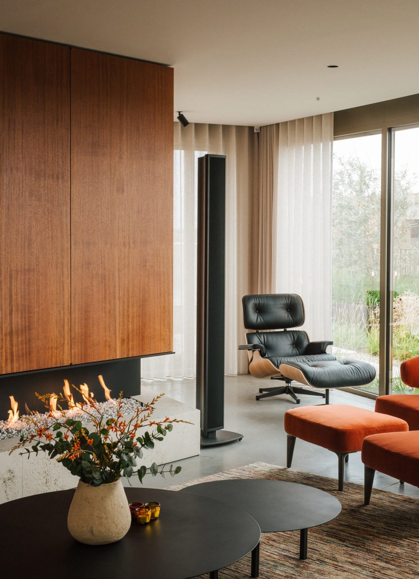
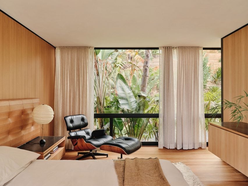
This is the latest in our lookbooks series, which provides visual inspiration from Dezeen’s archive. For more inspiration see previous lookbooks featuring homes with statement balustrades, interiors that feature the Eames chair and living spaces with decorative use of tiles.
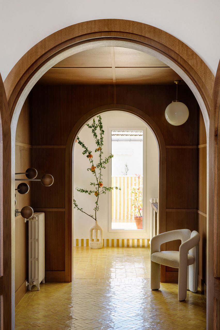
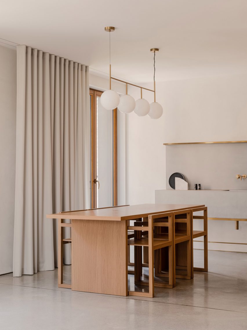
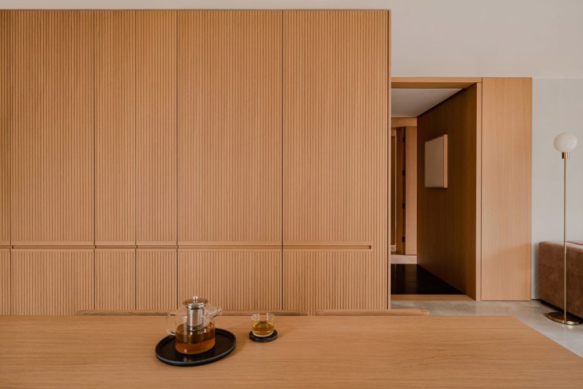
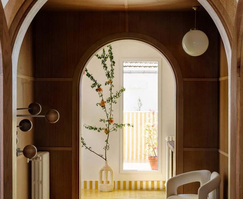
Conde Duque Apartment, Spain, by Sierra + De La Higuera
Spanish architecture studio Sierra + De La Higuera refurbished this Madrid apartment by organising open-plan living and dining areas on either side of a wood-panelled entrance hall.
The studio added two arched openings in wooden frames central to the hall, creating an intimate buffer zone in the open apartment.
Find out more about Conde Duque Apartment ›
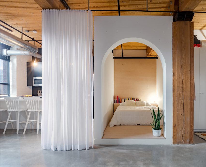
Broadview Loft, Canada, by StudioAC
Canadian firm StudioAC inserted a millwork box with a large arched cutout into this open rectangular apartment in Toronto, separating the bedroom from the living space.
The impactful entry and lowered wall height of the box help to mark the transition from the open living space to the cosy sleeping nook.
Find out more about Broadview Loft ›
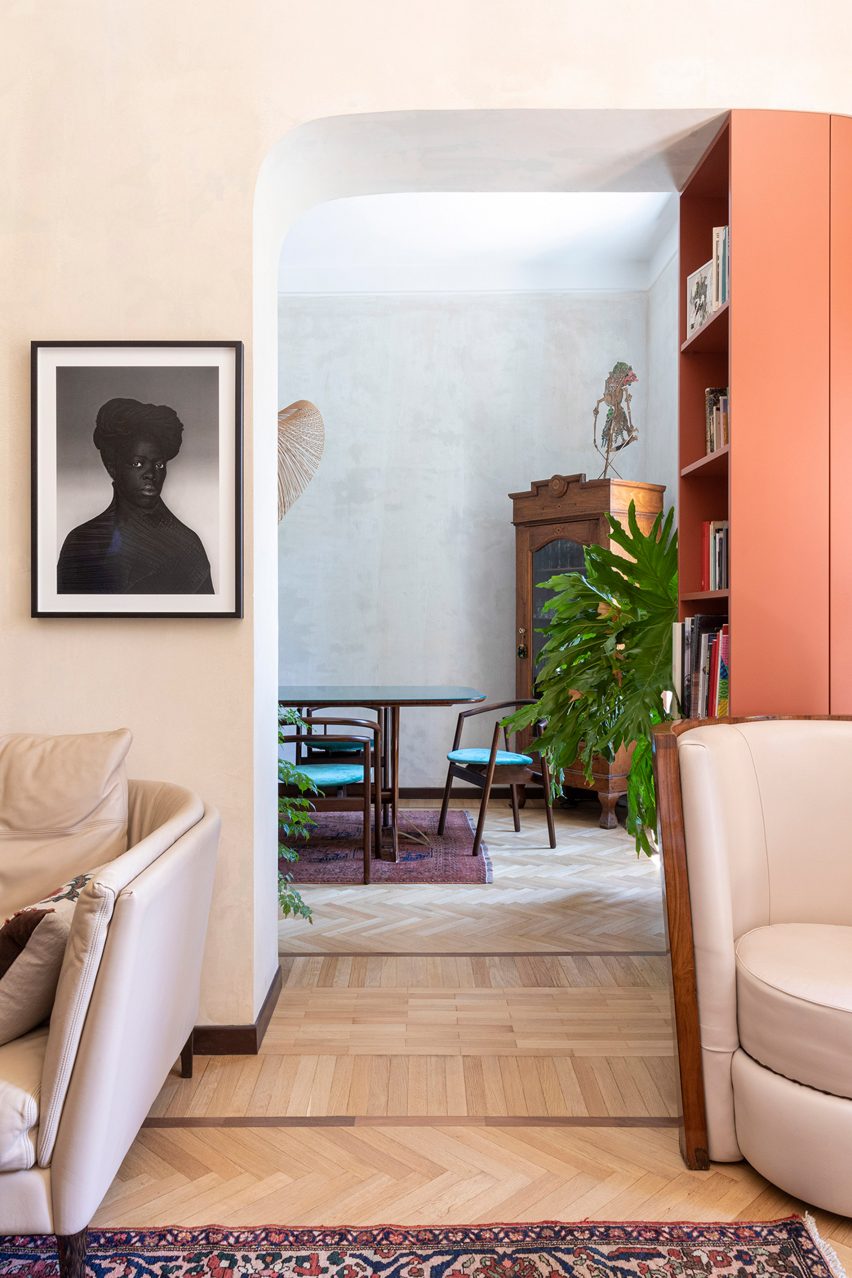
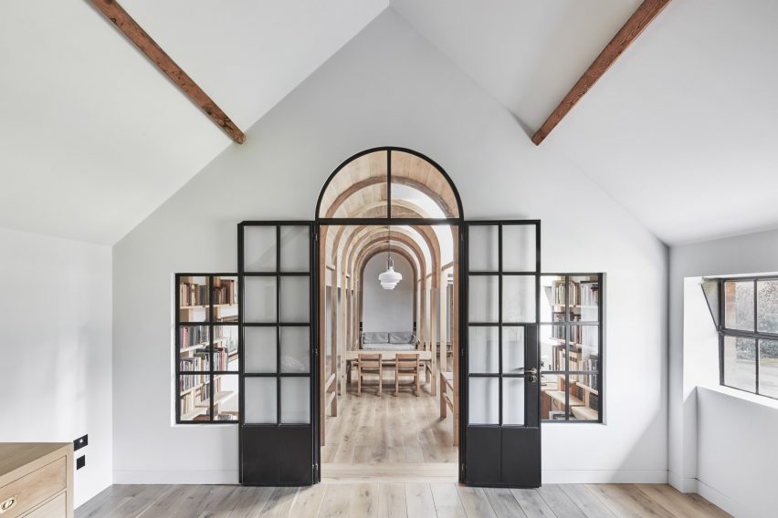
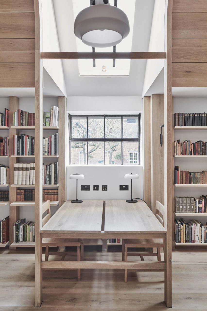
Diplomat’s Apartment, Italy, by 02A
This one-bed flat in Rome was designed by architecture and interiors studio 02A to adequately display the owner’s extensive collection of antique furniture and objects.
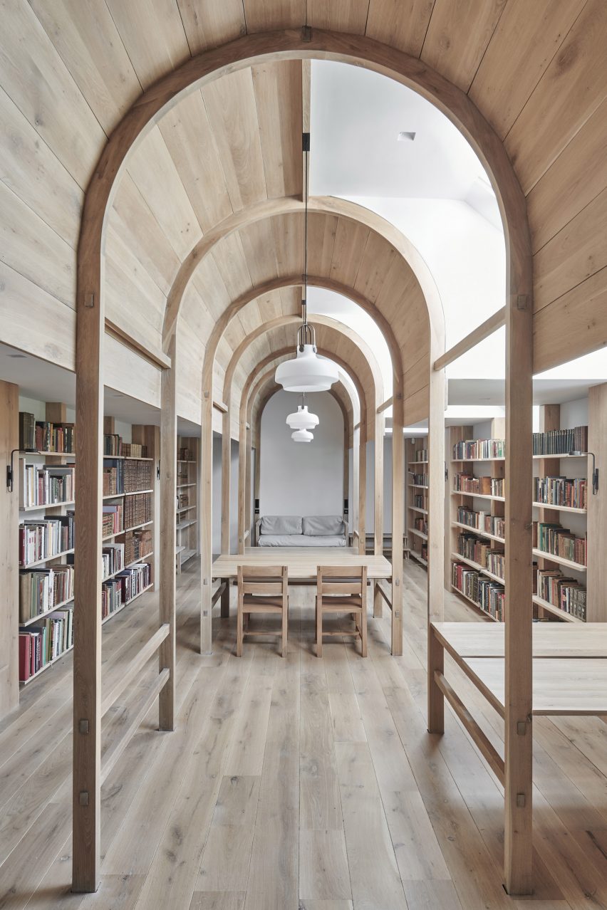
An arched passage with an integrated bookcase leads from the lounge to an intimate dining area. The change of space is also indicated by the change in pattern on the solid-oak parquet flooring.
Find out more about the Diplomat’s Apartment ›
Greetings from Rome, Lithuania, by 2XJ
Three arches punctuate a structural stone wall that separates social and private spaces in this family apartment in the old town of Vilnius, designed by local architecture firm 2XJ.
The arches reminded the architects of the Colosseum in Rome, lending the project its tongue-in-cheek name – Greetings from Rome – and leading the studio to clad the wall in the material used for the landmark’s external walls, Italian travertine.
Find out more about Greetings from Rome ›
Casa Mille, Italy, by Fabio Fantolino
For his own apartment, Italian architect Fabio Fantolino overhauled the 1930s extension of a 19th-century palatial building in Turin by introducing accents of bright green and blue colours.
In the living room an opening with curved corners looks through to a dining area, which is complemented by the rounded corners of the taupe sofa.
Find out more about Casa Mille ›
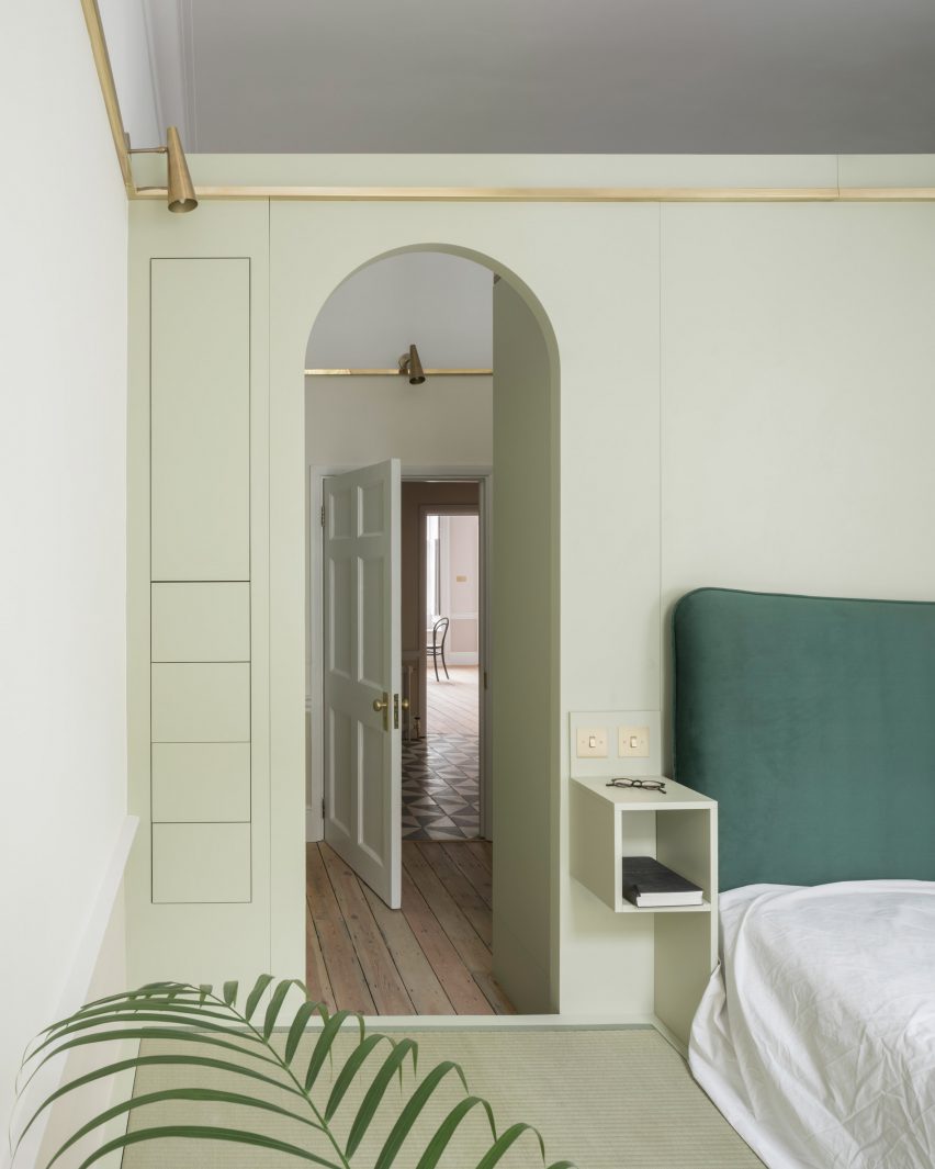
Upper Wimpole Street Apartment, UK, by Jonathan Tuckey Design
Architecture studio Jonathan Tuckey Design introduced MDF storage walls with built-in cupboards and arched niches to this townhouse apartment in London.
The studio also added tall arched openings into the joinery, which were informed by 15th-century oil paintings depicting biblical figures under soaring archways.
Find out more about Upper Wimpole Street Apartment ›
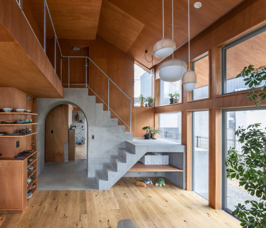
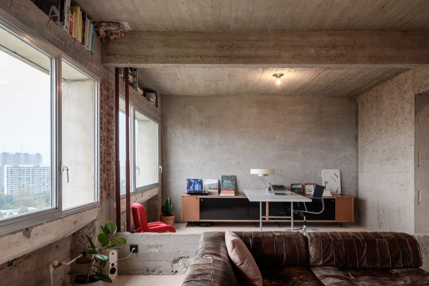
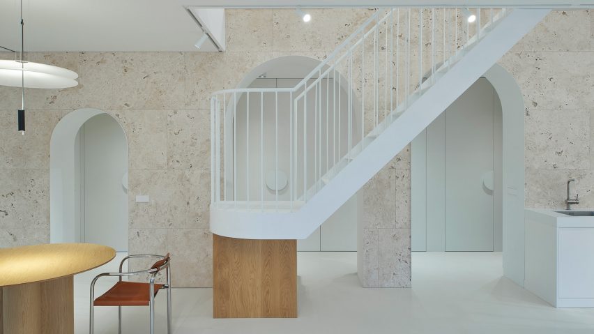
House in Akishima, Japan, Office M-SA
This house in Akishima, Tokyo, was arranged by Japanese architecture studio Office M-SA around a series of exposed concrete elements, including a staircase that runs over an archway that separates the kitchen and dining area from the study.
The concrete elements were designed to be permanent anchor points for the home’s timber wall construction, which can be altered or extended in the future to suit the owner’s needs.
Find out more about House in Akishima ›
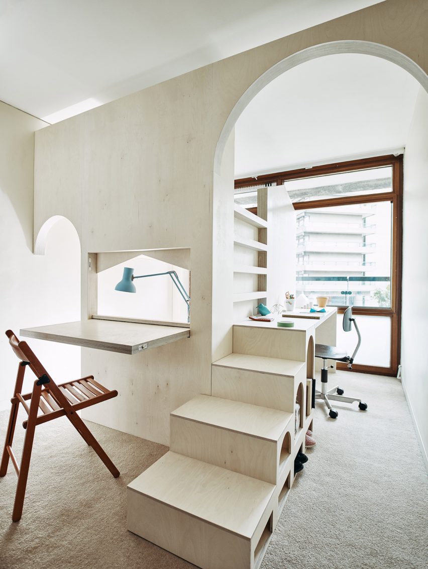
A Room for Two, UK, by Studio Ben Allen
Built inside a flat in London’s Barbican Estate, this plywood structure designed by architecture firm Studio Ben Allen transforms the room into a pair of bedrooms and studies for two children.
The cut-out arches, which mimic the barrel-vaulted shape of the housing estate’s terrace apartments, indicate the entrances to each child’s space.
Find out more about A Room for Two ›
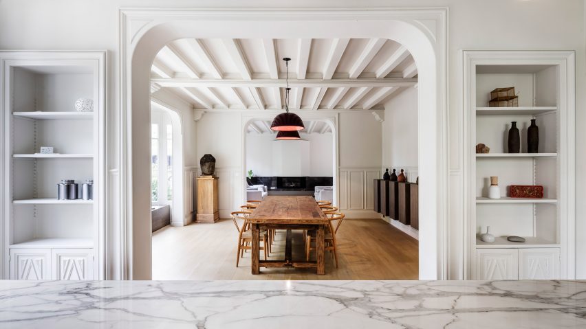
Maison à Colombages, France, by 05 AM Arquitectura
Spanish studio 05 AM Arquitectura aimed to incorporate a contemporary aesthetic while maintaining the traditional features of this 19th-century house located near Paris.
The studio removed partitions in the archways between the kitchen, dining and living spaces to connect the spaces and improve natural lighting while retaining the ornate wall mouldings that frame the openings.
Find out more about Maison à Colombages ›
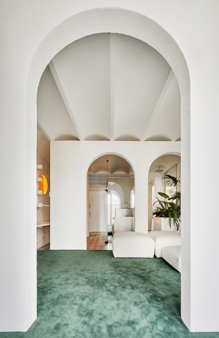
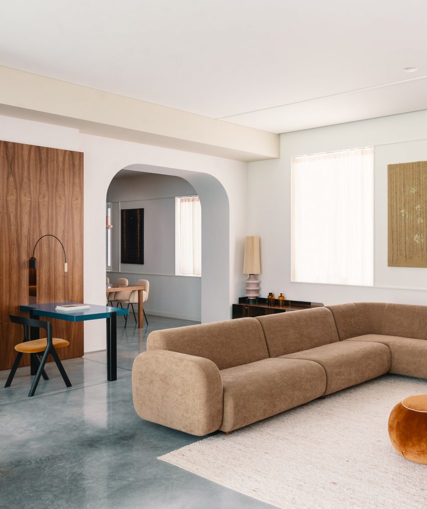
Penthouse, Spain by PMAA
Architecture studio PMAA divided the living space of this Barcelona apartment with partition walls punctuated by a series of arched openings.
A large modular sofa dominates the living space and morphs around the columns of the archways. The geometric repetition of the arch was informed by the apartment’s vaulted ceiling and arched windows.
Find out more about Penthouse ›
This is the latest in our lookbooks series, which provides visual inspiration from Dezeen’s archive. For more inspiration see previous lookbooks featuring homes with statement balustrades, interiors that feature the Eames chair and living spaces with decorative use of tiles.