Ten interiors by Corcoran School of the Arts and Design masters students
CategoriesInterior Design

Ten interiors by Corcoran School of the Arts and Design masters students

In this school show, masters students at the Corcoran School of the Arts and Design present interiors projects including a comforting dental office and a retail experience that encourages people to repurpose old clothes.


The projects are from students on the Interior Architecture MFA course at the Corcoran School of the Arts and Design at The George Washington University in Washington, DC, USA.


School: Corcoran School of the Arts & Design at The George Washington University
Course: Interior Architecture MFA
Email: ciarc@gwu.edu

School statement:

“The Interior Architecture Master of Fine Arts (MFA) at the George Washington University’s Corcoran School of the Arts & Design in Washington, DC, is the only Council for Interior Design Accreditation-accredited programme in the United States’ capital.

“It is designed for students who pursued a bachelor’s degree in a field other than interior design, interior architecture or architecture and are looking to follow a studio-based curriculum that will teach various aspects of interior design, theories and technicalities. We believe in fostering a community that encourages creativity and pushes the boundaries of design with an emphasis on conceptual thinking and the design process.”


George Washington University

ADHD Childcare and Community Centre by Edewede Akpesiri-Odia

“Children with attention deficit hyperactivity disorder, ADHD, often have difficulties with hyperactivity and self-control. This project aims to create order and organized activities for children with ADHD while also offering fun and wellness benefits.

“The existing building is located in a dense residential area of Arlington, Virginia. Within the building shell, a grid enables order and structure. Each programme block will have activities shifting the grid, creating movement and fluidity while maintaining its volume. Activities will encourage and strengthen neural networks in the brain and enable kids with ADHD to practise self-control.”

Student: Edewede Akpesiri-Odia
Advisor: Christina Filipescu
Course:
Studio 5 – graduate
Email: 
ede.odia@gmail.com

George Washington University

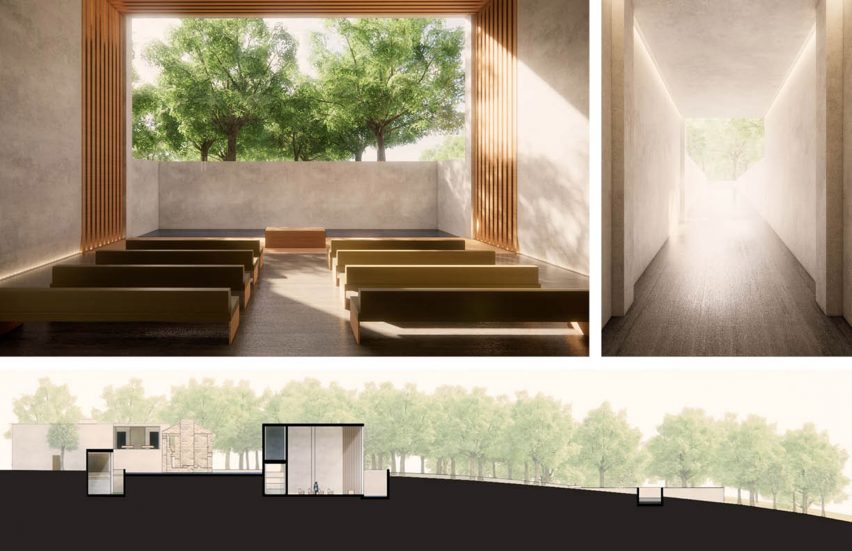
Remembrance Crematorium by Yi-Chen Chang

“Distinctive cultural responses to death inform how we process loss. Mourning rituals reflect the nature of the relationship with the deceased. As the solid stick fades to smoke, we connect to the sacred. We are reminded of the fragility of life and the importance of seizing the day.

“In this project, ruins of the McKinney homestead in Austin become a focal point for a crematorium complex. The symbolic omnipresence of death encourages us to cherish life and live deeply. References to death, burial, permanence/impermanence and the eternal are captured throughout the sequence of spaces providing quietude for reflection.”

Student: Yi-Chen Chang
Advisor: Christina Filipescu
Course:
Studio 5 – graduate
Email: changyichen@gwu.edu

George Washington University

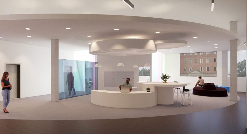
U.commons: A physical place for virtual learning by Aileen Kim

“With higher education leaning deeper into digital technologies, academic satellite sites can serve commuting and online students by providing practical resources and social support, leading to student success and equity.

“The interplay of physical and virtual realities is explored through the overlap, where the context of one reality may be expressed more dominantly over the other. At times, the overlap is a threshold, encouraging users to become aware of moving in and out of spaces designed for digi-centric or physi-centric programming. These portals guide inhabitants through areas for individual focused work to spaces for collaboration and social connection.”

Student: Aileen Kim
Advisor: Christina Filipescu
Course:
Studio 5 – graduate

George Washington

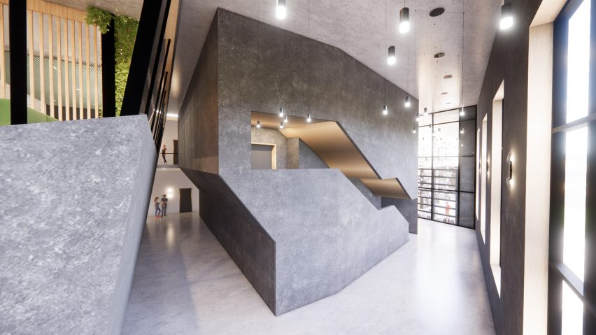
Suzuki School of Music, NYC by Taylor Oosting

“Classical music education for K-12 students comes with proven developmental benefits, but unfortunately, arts education is often among the first programmes cut from a public school’s budget. This project envisions an after-school Suzuki Education Center for strings. It aims to bring accessible music education to urban communities and lower entry barriers to classical music education and enjoyment.

“Located in one of the most diverse communities in the nation, a New York City borough, this project serves as a blueprint for future accessible music institutions. Conceptually, the project is based on the practice of Kintsugi, a Japanese method of repairing broken pottery by mending the broken areas or reattaching cracked pieces with gold lacquer, embracing the damage as an opportunity to find beauty in the imperfections.”

Student: Taylor Oosting
Advisor:
Christina Filipescu
Course:
Studio 5 – graduate
Email:
tayloroost@gwu.edu

George Washington University

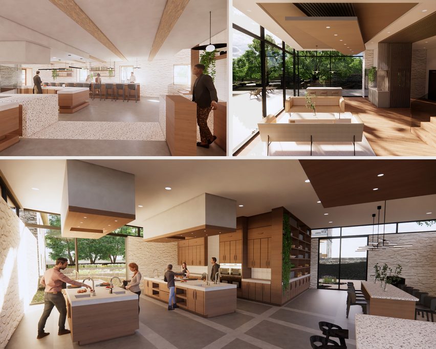
Peirce Mill: A Celebration of Food and Community by Brynn Jacoby Orban

“The Peirce Mill is a food-focused wellness centre featuring a garden-to-table restaurant, cooking classes, and a health and wellness coaching clinic. These facilities strive to celebrate food as a resource that nourishes the body and brings the community together.

“Inspired by the transformative process of grain’s movement through a mill, the site plan and architecture of the mill will highlight spaces of learning. With the use of the existing grids of the historic mill and barn, situated askew from each other in their idyllic forested, creekside setting, a shifted grid will be employed to highlight these transformative spaces of growth.”

Student: Brynn Jacoby Orban
Advisor:
Christina Filipescu
Course:
Studio 5 – graduate
Email:
jacobybrynn@gmail.com

George Washington University

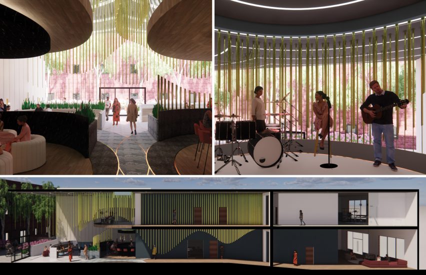
The Steady Beat Recording Studio by Hannah Shafer

“In music production and recording, women are often hindered by pay gaps, with limited mentorship and promotions opportunities while also confined to certain genres. The Steady Beat is a recording studio and artist social club in Washington DC designed with these limitations in mind – a space supportive of female excellence and collaboration.

“Inspired by sound waves, the space features undulating brass rods – a nod to musical instruments of the same material. As users cross the threshold where the historic building was once split into two, the waves become increasingly dynamic and the spaces more collaborative and creative.”

Student: Hannah Shafer
Advisor:
Christina Filipescu
Course:
Studio 5 – graduate
Email:
hannahcshafer@outlook.com

George Washington

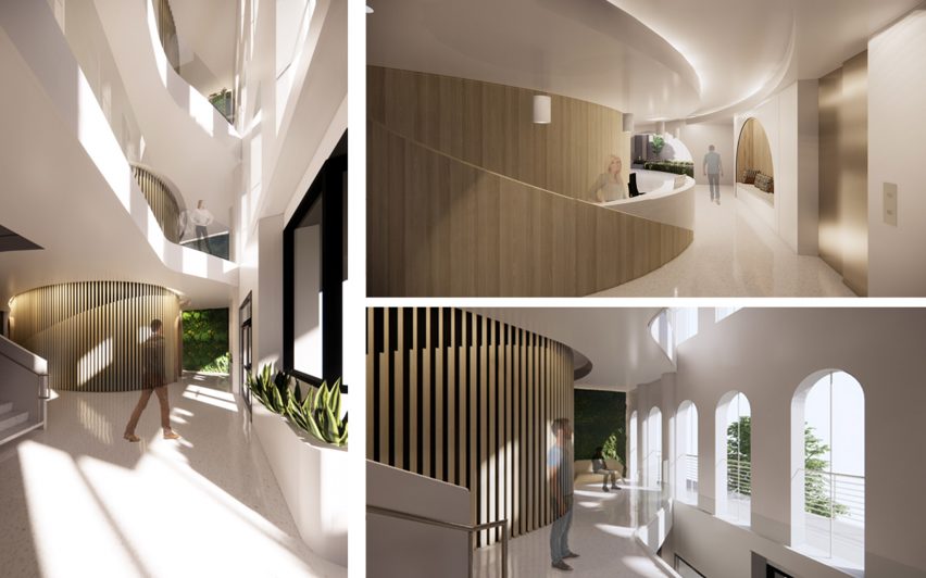
Dental Office by Vanessa Spencer

“It is estimated that 61 per cent of people have dentophobia, or fear of dentists, worldwide. This fear usually generates from past negative experiences or oral health concerns. To promote wellbeing, this project mimics nature’s process of protecting.

“A dental office is designed to bring comfort and a feeling of protection to the user by creating forms that are wrapped barriers of protection. These protected areas wrap around the spaces where the user might feel the most vulnerable. Biophilic tools are used throughout the design to connect the user with nature during their visit.”

Student: Vanessa Spencer
Advisor:
Christina Filipescu
Course:
Studio 5 – graduate
Email:
nessa31.vf3@gmail.com

George Washington University

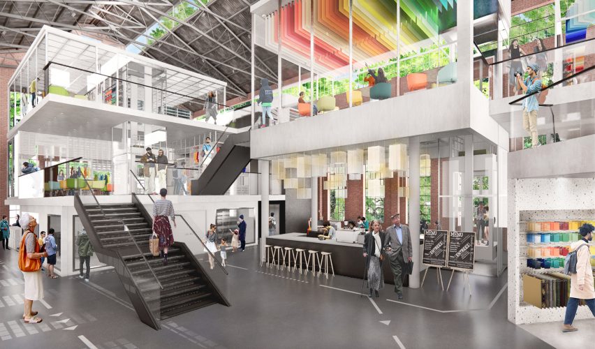
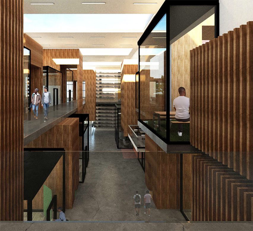
Upcycling Retail Experience Store by Mengjiao Wang

“The fashion industry is the second-largest polluter in the world. Textile production requires significant natural resources, and the decomposition process produces greenhouse gas and leaches toxic chemicals into groundwater and soil.

“This project aims to increase people’s attention to this urgent environmental problem and to encourage people to participate in the process of upcycling clothing. Here, the old garments can be reinvented and start their new life. Drawing ideas from using ‘entropy increase’ to express the flow of time, the store will show the clothing’s journey and provide opportunities for customers to visit and join in.”

Student: Mengjiao Wang
Advisor:
Christina Filipescu
Course:
Studio 5 – graduate
Email:
mengjiaowang@gwu.edu

George Washington University

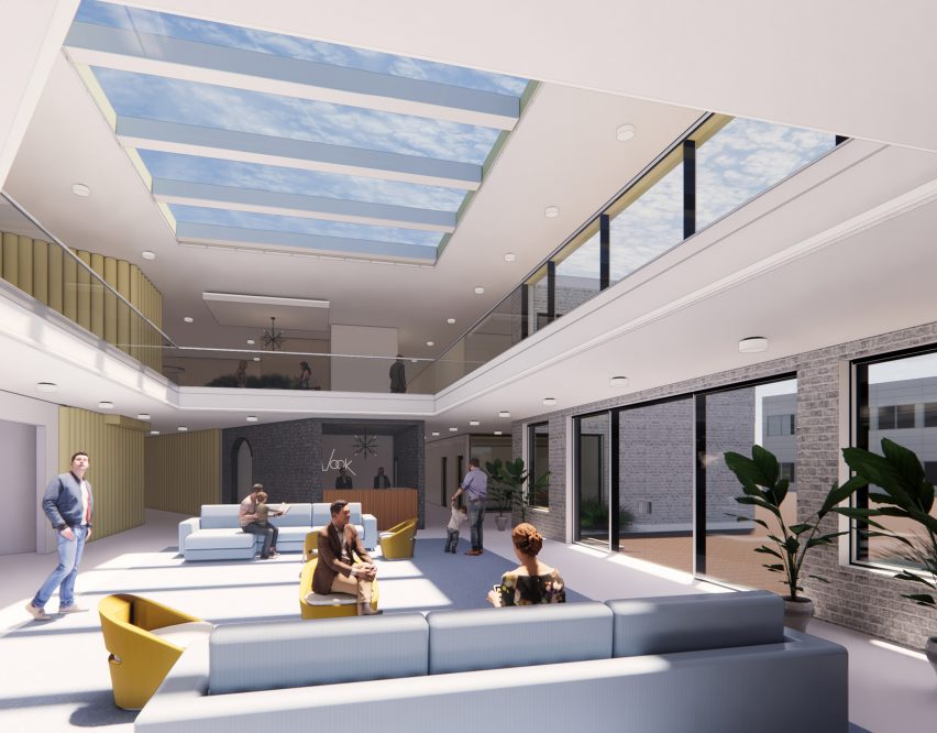
Education Co-op by Aidan Young

“In the current education system, undue emphasis is placed on academic content and standardized testing, leaving teachers with a substantial burden that consumes their mental bandwidth.

“To address the issue and to work toward a solution, this education centre will focus on one main reason students report dropping out of high school: a lack of positive peer and mentor relationships. The Education Co-op will provide students educational support in a space that cultivates and celebrates warmth and connection.”

Student: Aidan Young
Advisor:
Christina Filipescu
Course:
Studio 5 – graduate
Email:
young.aidan2015@gmail.com


Partnership content

This school show is a partnership between Dezeen and the Corcoran School of the Arts and Design. Find out more about Dezeen partnership content here.

Reference

Dezeen presents cafe bar designed by Michael Young at Design Shanghai
CategoriesInterior Design

Dezeen presents cafe bar designed by Michael Young at Design Shanghai

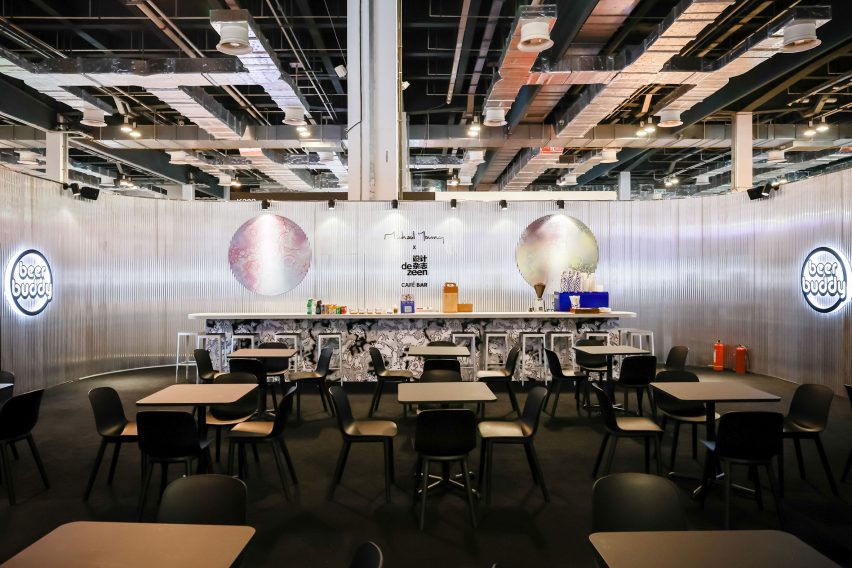
Dezeen has partnered with Design Shanghai to present a cafe and bar designed by Michael Young at the 2021 edition of the trade show, which opened in Shanghai this week.


The cafe and bar is located at booth K207 in Hall 2 at Design Shanghai 2021, which takes place at the Shanghai World Expo Exhibition and Convention Center in Shanghai, China, until 6 June.

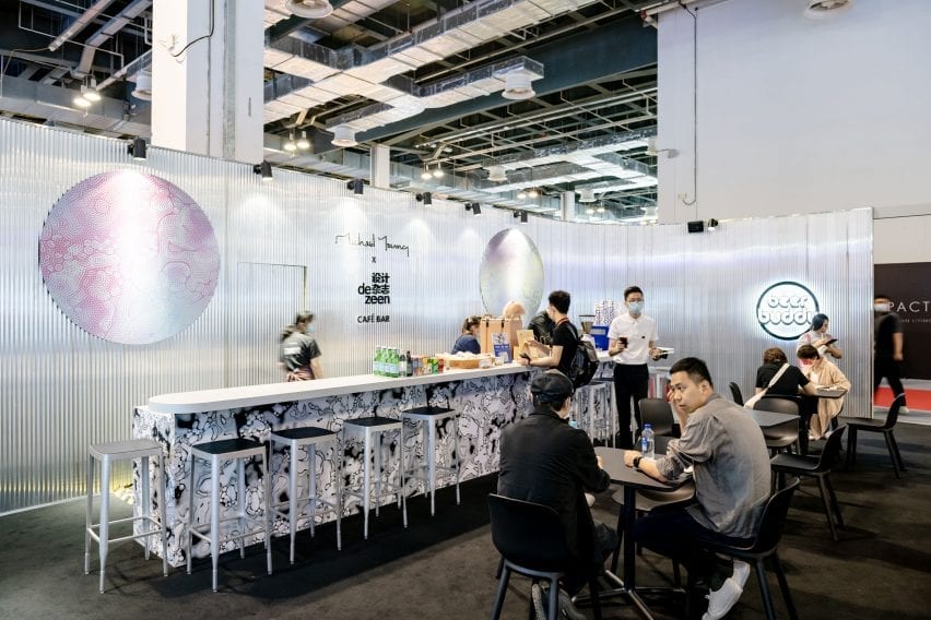
The space features grey corrugated walls with splashes of colour and is furnished with previews of furniture pieces designed by Young that will be launched later in the year.

Michael Young x Dezeen cafe and bar at Design Shanghai
Dezeen has partnered with Design Shanghai to present a cafe and bar designed by Michael Young

According to Young, the concept for the space is loosely based on a bar he created last year at his office in Shekou, Shenzhen.

“I ended up with an opportunity to create a bar last year beneath our studio but with only a few weeks to build the concept I decided to throw in anything I could get hold of – samples, prototypes and things from the studio that we have collected from around the world,” the Hong Kong-based British designer told Dezeen.

“I basically scavenged the studio together like a magpie so it became a real beer shack and a place that was not designed but created organically.”

The bar has grey walls
The bar features ribbed walls with splashes of colour and pattern

Citta Design has contributed pieces of Young’s new Acre Chair for the New Zealand brand, which will be launched in Auckland in September. The space is also furnished with new editions of Young’s Stool 4a for EOQ Design, which will be launched in December.

The bar is being used to launch Young’s new drinks brand Beer Buddy, which developed a new pilsner called House for the event.

The beer brand is specifically designed to connect creatives at events, trade shows and gatherings around Asia. Drinkers can scan a QR code on the beer packaging to connect with other creatives attending the event.

It is serving Beer Buddy
Young is launching his new Beer Buddy drinks brand at the bar

The dark grey exterior walls of the space are decorated with swirling patterns based on the graphics on the Beer Buddy cans and bottles.

Colourful versions of this pattern have been used to add splashes of colour to the interior walls and enclose private seating areas.

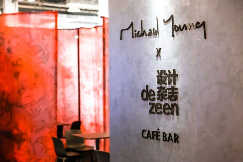
The space is co-branded with Young’s studio logo and the Chinese version of Dezeen’s logo. The walls also feature the QR code for people to follow Dezeen’s official WeChat account, which features news and features about the latest architecture, design and interiors written in Simplified Chinese.

Michael Young x Dezeen cafe and bar at Design Shanghai
The interior and exterior of the bar features swirling patterns based on the Beer Buddy packaging

Dezeen is a media partner for Design Shanghai 2021.

The show presents over 400 local and international brands across eight different sections alongside a programme of installations, exhibitions and the return of its annual talks programme, which this year explores the topic of regenerative design.

Design Shanghai takes place from 3 to 6 June at the Shanghai World Expo Exhibition and Convention Center. See Dezeen Events Guide for an up-to-date list of architecture and design events taking place around the world.

Reference

Masquespacio designs colour-blocked restaurant in Turin for burger joint
CategoriesInterior Design

Masquespacio designs colour-blocked restaurant in Turin for burger joint

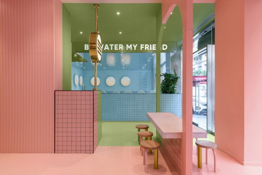
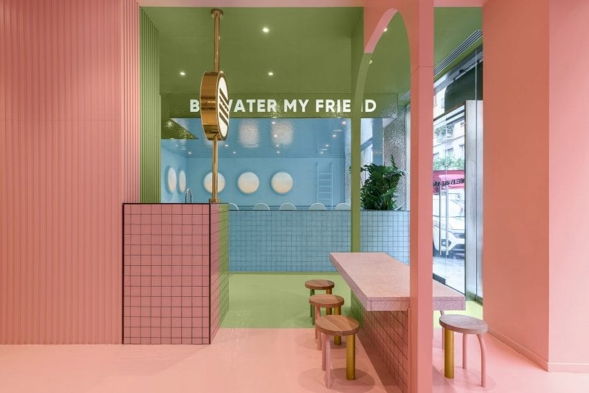
Spanish design agency Masquespacio has created the interiors of Italian fast food chain Bun’s Turin branch that combines blocks of pink and green with a blue seating area designed to look like a swimming pool.


Bun Turin is a burger joint that takes its bold identity from the first Bun restaurant in Milan, which was also designed by Masquespacio.

“This restaurant’s target customer is the urban lifestyle of people born late in the Millennium and the new Generation Z,” Masquespacio co-founder Christophe Penasse told Dezeen.

Masquespacio designed the colour-blocked interiors
The burger bar is in Turin

Characterised by three distinct colourful areas, the burger joint uses pink, blue and green in order to playfully carve out different spaces in the restaurant.

The sections are designed so that the restaurant’s three large windows present each colour as a separate blocked out space from the outside.

The restaurant is in Turin
Green and pink sections feature in the restaurant

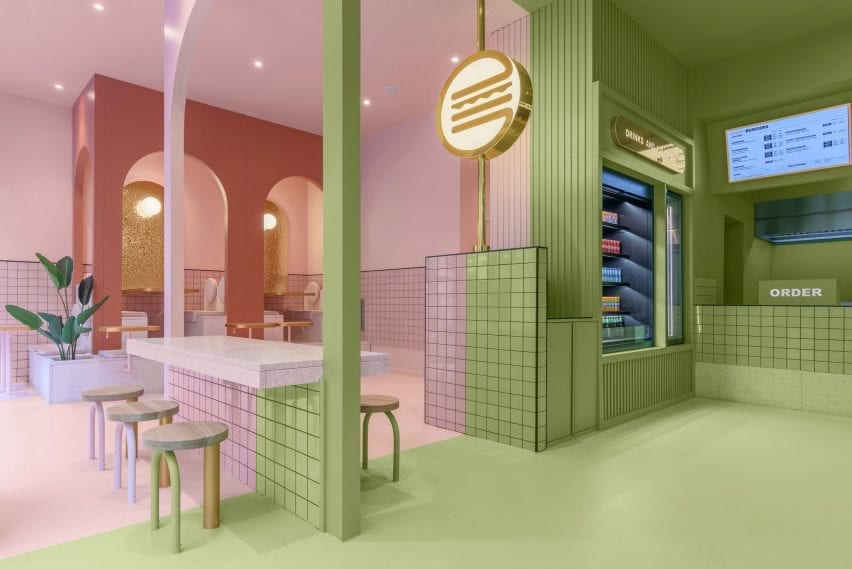
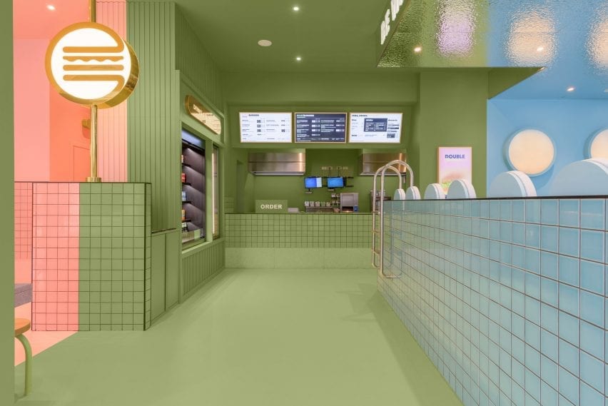
Upon entering Bun Turin, visitors are greeted with an ordering bar and drinks and ice cream fridge coloured in a dusty sage shade of the restaurant’s trademark green.

Lit-up digital menu boards with gold accents display the restaurant’s food options, while a version of the same neon burger logo found in Bun’s Milan branch glows from a nearby pillar.

Colourful tiles form the restaurant by Masquespacio
A neon burger sign glows from a pillar

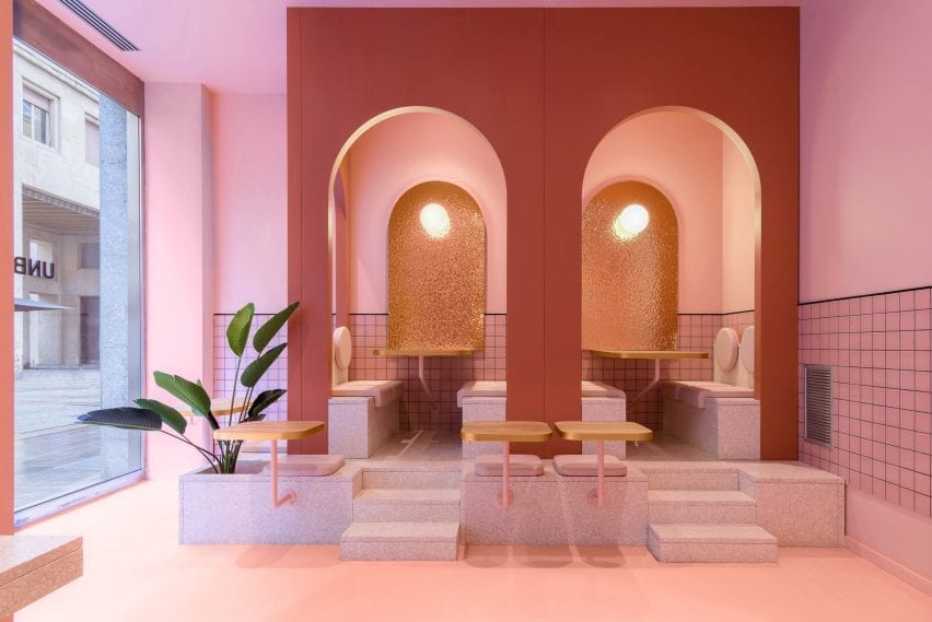
Pink and blue are used for two different seating areas both complete with built-in furniture.
In the pink area, a central table coloured partly in green straddles both the pink and green sections of the restaurant.

Sugary-pink terrazzo steps that double as a planter lead visitors to seats tucked into arched booths in the pink seating area, which also houses the burger joint’s toilets.

A planter features in the pink seating area
The pink seating area has terrazzo steps

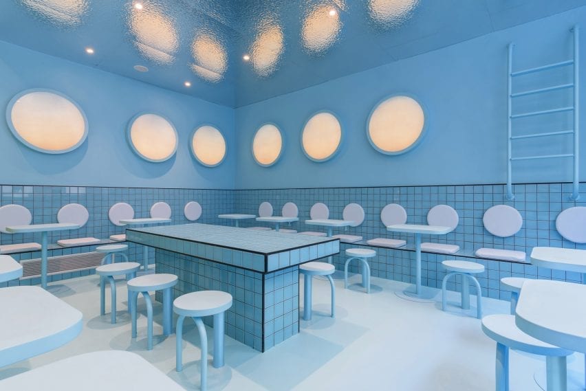
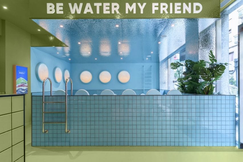
Bun Turin’s all-blue seating area is built from pale tiles that are designed to look like a swimming pool.

The area features mock pool ladders which aim to give visitors the impression of floating in water while they eat.

“Once we defined Bun’s identity we developed the project in 3D,” said Penasse.
“At the end of the process, we do a lot of trials to reach the correct combination of colours and materials,” continued the designer.
“In this case, we had several options for colour combinations, all focussed on a younger audience.”

Masquespacio designed a swimming pool seating area
The blue seating area resembles a swimming pool

Apart from tiles by Complementto, all of the furniture in Bun Turin was designed by Masquespacio.

“It is important for clients that Bun spaces can be recognised wherever they are located,” explained Penasse.

“For this reason, the design will evolve and be slightly different in each space, but maintain a clear identity.”

Masquespacio designed the three sections in blocks of colour
Each section is revealed to the street by a large window

Masquespacio is a Valencia-based design agency founded in 2010 by Penasse and Ana Milena Hernández Palacios, known for its use of bright colour.

Other recent projects by the studio include colour-blocked student housing in Bilbao, and a stucco and terracotta restaurant in the Spanish town of Aragon constructed from twisting shapes informed by the nearby Pyrenees mountains.

Photography is by Gregory Abbate.

Reference

Child Studio channels Soho’s peep show booths for Cubitts eyewear store
CategoriesInterior Design

Child Studio channels Soho’s peep show booths for Cubitts eyewear store

Featuring linoleum floors, Formica-clad walls and a deep red basement, Soho’s peep show booths served as inspiration for the atmospheric interior of this London eyewear store by Child Studio for spectacle-maker Cubitts.


Perched on the corner of Marshall Street in London’s Soho neighbourhood, the store occupies one of the early 19th-century buildings that form the area’s narrow streets.

Checked linoleum floor and wood-panelled walls in Cubitts eyewear store
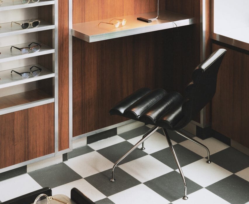
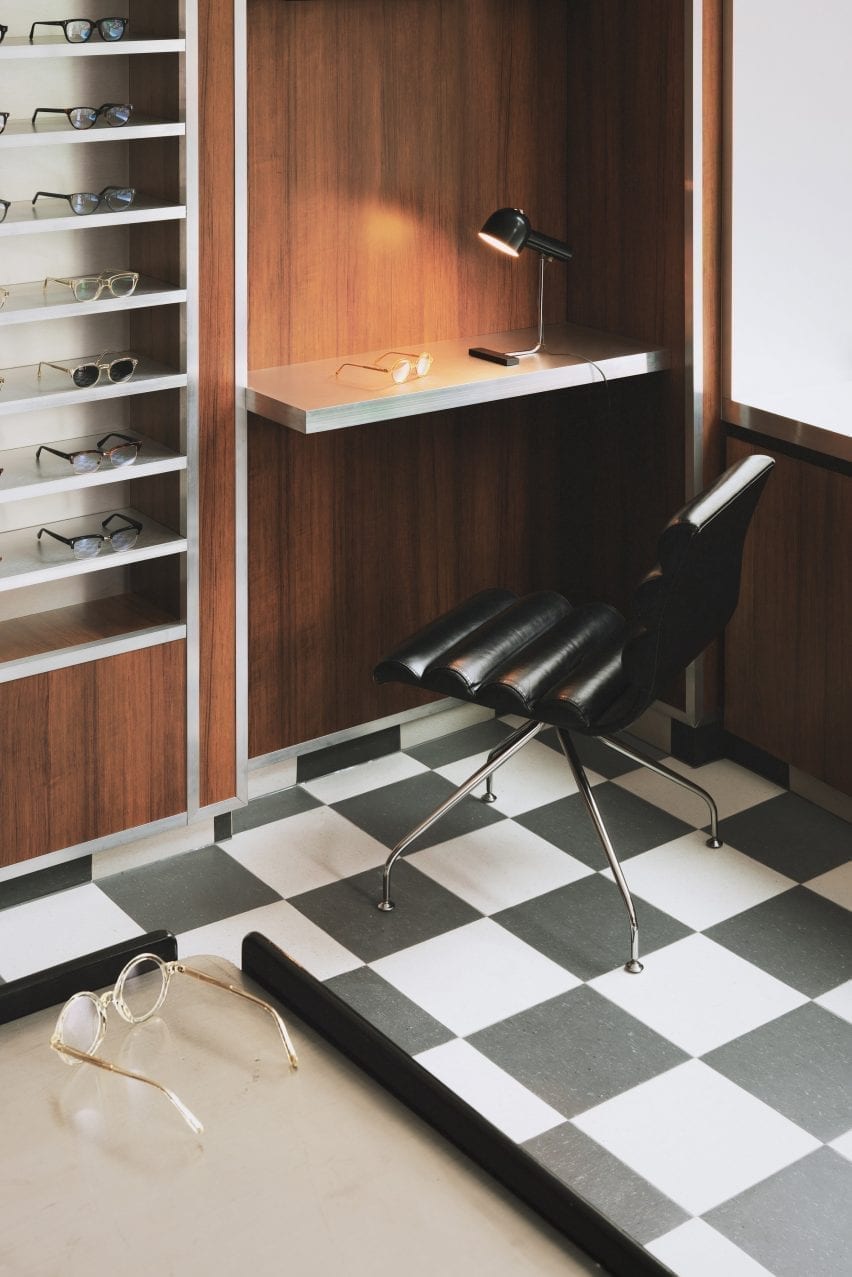
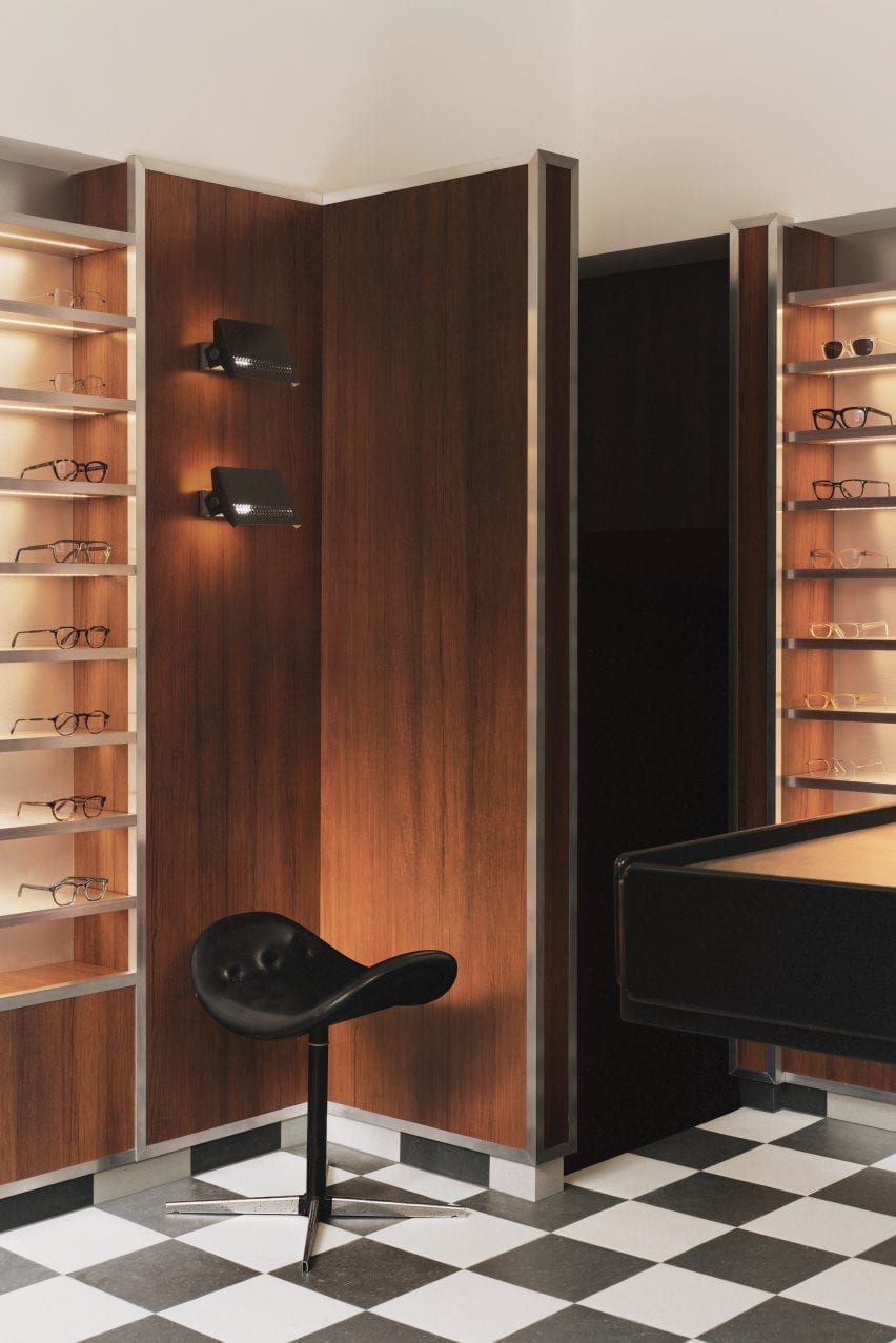
Black and white checkered linoleum flooring features throughout the store

The store is spread out over a small ground floor and basement space lined by a narrow staircase.

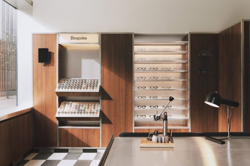
In terms of practical requirements, the store needed to incorporate a display of the 100 different coloured acetate chips that customers can choose from to create bespoke frames.

London-based Child Studio designed a space for Cubitts that aims to reflect the history of the local area and create a customer journey that would encourage people to explore the basement space.

Wood-panelled walls and acrylic display stands in eyewear store by Child Studio
A wall-mounted display case holds 100 different coloured acetate chips

Cubitts wants each of its shops to have a unique design reflecting the history of the local neighbourhood,” Child Studio co-founder Alexy Kos told Dezeen.

“The brand has a strong connection to London, where its glasses are made, and to Modernism as the guiding principle to its design aesthetic.”

Checkered floor, black stool and wood-panelled walls in Cubitts London shop

To design the interior, the studio drew upon Soho’s colourful history as a destination for massage parlours, adult cinemas and sex shops in the postwar era.

“Gambling, drinking, religious and political dissent, clubbing and prostitution were all, at varying times, peculiar Soho specialities,” said the studio.

“We have focussed our research on Soho’s heyday in the postwar era, looking at the interiors of the neighbourhood’s iconic venues, such as the Formica-clad Bar Italia and the legendary jazz venue 100 Club, with its all-red interiors.”

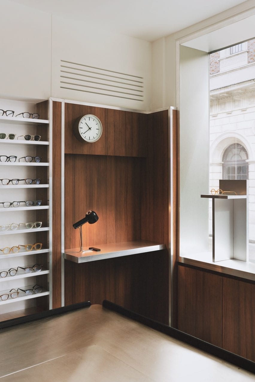
Desk nook with clock and glasses display in eyewear store by Child Studio
Formica laminate partitions with aluminium trims divide up the space

Referencing the peep show booths of Soho, the store incorporates low partitions clad in a wood-effect Formica laminate and trimmed with aluminium to form a maze-like environment.

Display areas with illuminated acrylic shelving that showcase the spectacles and the colourful acetate chips are recessed into the walls. Lightbox signage integrated into the metal-trim cladding and black and white checkered linoleum flooring add to the store’s nostalgic ambience.

An antique Caori cocktail table designed by Vico Magistretti in 1961 serves as a focal point on the ground floor.

Featuring a brushed aluminium tabletop and several concealed compartments for records and magazines, the piece was specially sourced by Child Studio and adapted to include a raised podium so that it is better serves the retail environment.

Leather chair with red glasses display in Cubitts store
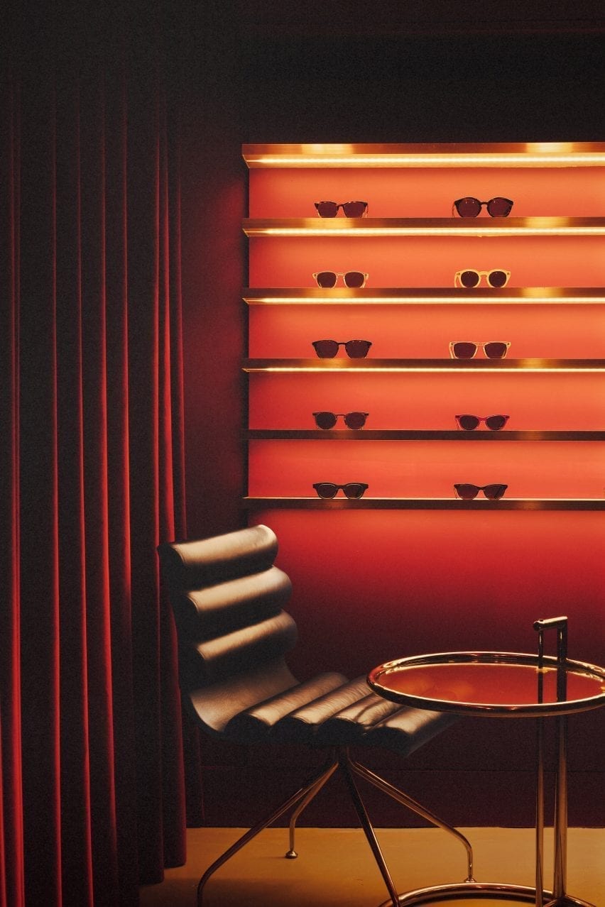
The basement is saturated with a deep red colour

“Every project tells a unique story and we always look for rare and unusual furniture pieces to add depth and authenticity to the narrative,” said the design team.

“The desk lamp is another mid-century find, created by the Czech designer Josef Hurka for the manufacturer Napako in the 1960s.”

Acryclic glasses display with red velvet curtain in eyewear store by Child Studio
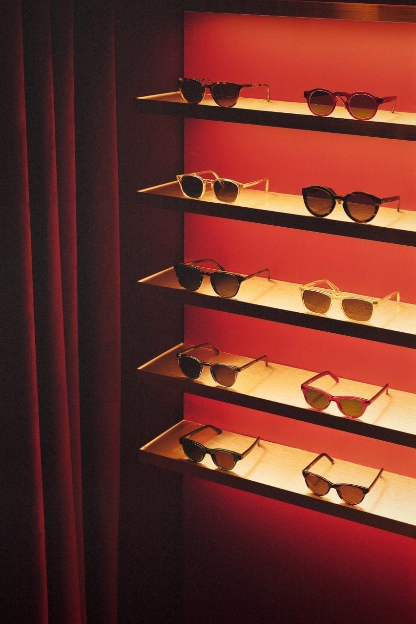
Limited-edition sunglasses are displayed on shelves clad in aluminium-effect Formica

A narrow staircase leads to the basement, which is saturated in a deep red colour. Customers are guided to an eye examination room concealed behind a velvet curtain by neon signs.

Cubitt’s moody basement lounge area is lit by the Conelight floor lamp by the British designer Ronald Homes and furnished with chrome and leather chairs designed by Giovanna Modonutti.

A collection of limited-edition sunglasses is displayed on illuminated shelves clad in aluminium-effect Formica that create a theatrical effect in the dark red surrounds.

Neon peep show sign in Cubitts Soho store
A neon peep show sign hangs at the entrance to the eye examination room

Previously, the studio run by Kos and Che Huang has channelled the look of a 1950s cafe inside a vegan pizza restaurant in west London and transformed a former London post office into a sushi restaurant with a 1960s interior.

“We like to use the word ‘cinematic’ to describe the spaces designed by Child Studio,” Kos told Dezeen. “With every project, we aim to capture a particular mood and atmosphere, rather than trying to recreate an interior from a specific era.”

Photography is by Felix Speller and Child Studio.

Reference

Ten space-saving peninsula kitchens designed by architects
CategoriesInterior Design

Ten space-saving peninsula kitchens designed by architects

This lookbook highlights ten examples of peninsula kitchens, which have the functionality of kitchen islands but are a more space-saving solution.


Named after the geological feature, a kitchen peninsula is a spur that juts out from the wall or work surfaces, creating a three-sided surface. Peninsulas are often additionally used as breakfast bars for casual dining.

Peninsulas offer a space-saving solution for kitchens that don’t have enough floor space for a free-standing kitchen island. They are also useful in kitchens with irregular layouts since they can be asymmetrical or placed at jaunty angles.

They can also be used to create a useful staging post between the food preparation area and the dining area.

This is the latest roundup in our Dezeen Lookbooks series providing visual inspiration for the home. Previous kitchen-related roundups include kitchens with islands, galley kitchens and kitchens with breakfast bars.


Caldrap in Barcelona, Spain, by Nook Architects

Caldrap in Barcelona, Spain, by Nook Architects

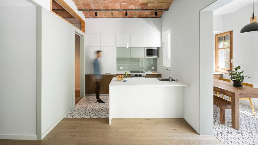
Nook Architects remodelled this 67-square-metre apartment in Barcelona to accommodate a family of three. A marble peninsula counter abuts the half-wall that divides the kitchen and the dining area.

A sink is sunk into the countertop at one end, and the marble surface overhangs to create a breakfast bar. Patterned tiles demarcate the kitchen area, which sits below a ceiling of traditional Catalonian brick vaults.

Find out more about Caldrap ›


Golden Lane flat renovation in London, UK, by Archmongers

Golden Lane flat renovation in London, UK, by Archmongers

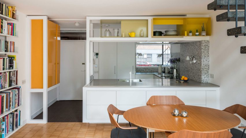
Archmongers reinstated modernist design elements for this 1950s flat renovation in London’s Golden Lane estate. Chunky white-painted wooden frames separate the kitchen and dining areas, adding high shelving above the peninsula kitchen.

The white kitchen cabinets are topped with steel while grey terrazzo picks out the counter end and splashback.

Find out more about Golden Lane flat renovation ›


Reception House in Higashiyama in Nagoya, Japan, by Yuki Mitani and Atsumi Nonaka

Reception House in Higashiyama in Nagoya, Japan, by Yuki Mitani and Atsumi Nonaka

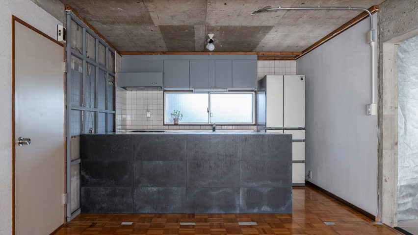
Architects Yuki Mitani and Atsumi Nonaka redesigned their kitchen to create a more social space when they remodelled their own home. A peninsula kitchen counter creates extra counter space, while allowing the hosts to chat with their guests as they prepare meals.

The rental flat came with no finishes, just raw concrete walls, so the architects played up to this and clad the counter with panels of industrial-looking zinc.

Find out more about Reception House in Higashiyama ›


Botaniczna Apartment in Poznań, Poland, by Agnieszka Owsiany Studio

Botaniczna Apartment in Poznań, Poland, by Agnieszka Owsiany Studio

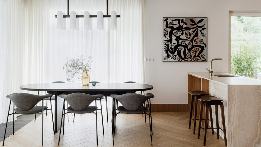
A bronze tap complements the creamy marble of this peninsula counter for an open-plan kitchen diner in a Polish apartment. Agnieszka Owsiany Studio designed the space to be as calming as possible for a couple with high-pressure jobs in medicine.

Wooden shelves are built into one side of the counter, which overhangs slightly so it can double as an informal breakfast bar with saddle-style bar stools ›.

Find out more about Botaniczna Apartment ›


Apartment in Born in Barcelona, Spain, by Colombo and Serboli Architecture

Apartment in Born in Barcelona, Spain, by Colombo and Serboli Architecture

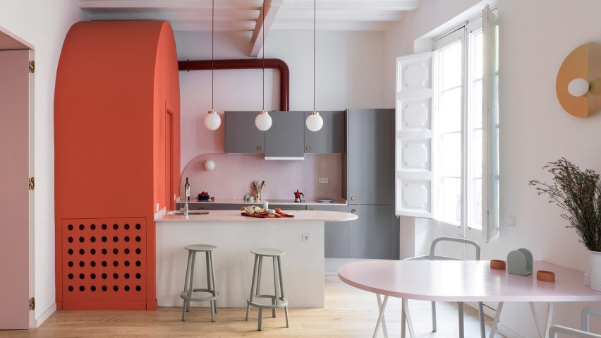
A curved countertop projects to form a breakfast bar in this colourful flat renovation by Colombo and Serboli Architecture for a woman working in the fashion industry.

The countertop abuts a bright coral arched volume that hides a guest bathroom. A polished metal tap curves over the sink on the kitchen side and two grey Revolver Stools from Hay can be drawn up to turn the surface into a breakfast bar.

Find out more about Apartment in Born ›


St Lawrence in Toronto, Canada, by Odami

St Lawrence in Toronto, Canada, by Odami

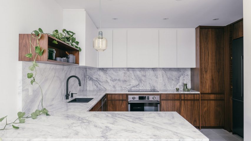
Canadian studio Odami opened up the previously enclosed kitchen of a dated 1980s apartment in Toronto. The peninsula kitchen adds more worksurfaces while creating a line of sight with the dining area.

Matching grey marble countertops and splashback contrast with the dark wood cabinetry and a matt black sink and tap.

Find out more about St Lawrence ›


Tsubo House in London, UK, by Fraher & Findlay

Tsubo House in London, UK, by Fraher & Findlay

Architecture practice Fraher & Findlay introduced a Japanese aesthetic during the renovation and extension of this Victorian-era house in London.

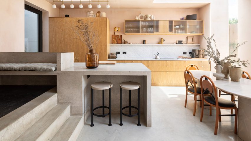
The kitchen features pink plaster walls and a peninsula-style polished concrete counter that also serves as a breakfast bar and continues up a short flight of steps to form a bench seat.

Find out more about Tsubo House ›


Cabinette in Valencia, Spain, by Masquespacio

Cabinette in Valencia, Spain, by Masquespacio

A row of retro-futuristic stools with tiered fringing from Spanish studio Masquespacio’s Déjà-Vu collection line up below the bar of this peninsula kitchen in a co-working space in Valencia.

The studio designed the space in homage to French director Jacques Tati’s 1960s film Playtime. The kitchen area features baby-blue tiling and strips of neon underlighting.

Find out more about Cabinette ›


308 S apartment in Brasilia, Brazil, by Bloco Arquitetos

308 S apartment in Brasilia, Brazil, by Bloco Arquitetos

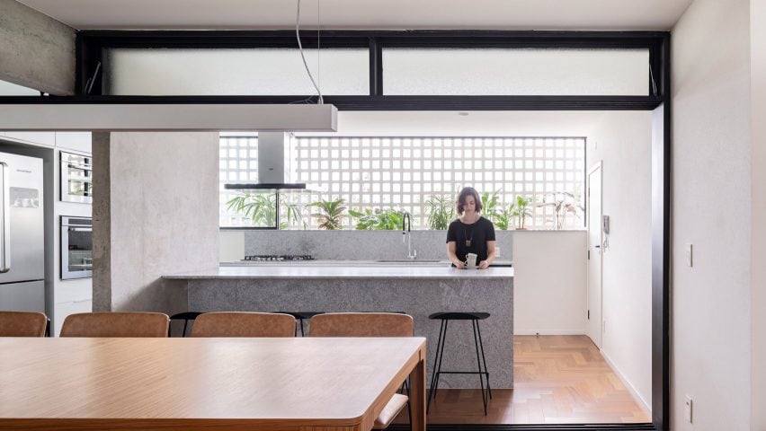
Bloco Arquitetos reconfigured this 1960s apartment in Brasilia, adding translucent sliding doorways that can be pulled across to separate the kitchen and the dining area.

The peninsula kitchen with its marble counter abuts a concrete divider wall and allows the kitchen and dining room to become one large entertaining space when the doors are open.

Find out more about 308 S ›


La Nave in Madrid, Spain, by Nomos

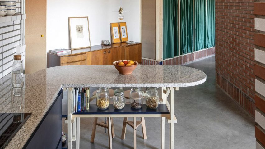
Spanish architecture studio Nomos converted an old workshop into a home for two of its partners. The original pipes and brickwork are still visible in the kitchen, which has a rounded peninsula counter supported by a wooden frame.

Nomos built the custom timber elements out of pine, including the frame and the bar stools. A blue-painted shelf under the counter doubles as a handy spot to store breakfast cereals and cookbooks.

Find out more about La Nave ›


This is the latest in our series of lookbooks providing curated visual inspiration from Dezeen’s image archive. For more inspiration see previous lookbooks showcasing peaceful bedrooms, wallpapered interiors and colourful kitchens.

Reference

Ten beautiful and practical combined kitchen and dining rooms
CategoriesInterior Design

Ten beautiful and practical combined kitchen and dining rooms

For our latest lookbook, we’ve found ten projects in the Dezeen archive where kitchens and dining rooms have been combined into one practical and sociable space.


Most homes around the world traditionally had separate areas for preparing and eating food but over the last few decades, the popularity of combined kitchen dining rooms has soared.

These are more informal spaces capable of hosting a variety of activities including entertaining, home-working as well as cooking and eating.

Kitchen dining rooms can also save space in smaller homes.

The ten examples below show some of the best examples from Dezeen’s archive and feature a variety of kitchen layouts including kitchens with islands, peninsula kitchens and kitchens with breakfast bars.

This is the latest roundup in our Dezeen Lookbooks series providing visual inspiration for the home. Previous kitchen-related roundups include compact kitchens and terrazzo kitchens.


Lover's House in Spain

Lover’s House, Spain, by Isla Architects

Local studio Isla Architects adapted and improved this holiday home on the Spanish island of Mallorca, using a minimalist material and colour palette to “reveal the simple geometry of the building”.

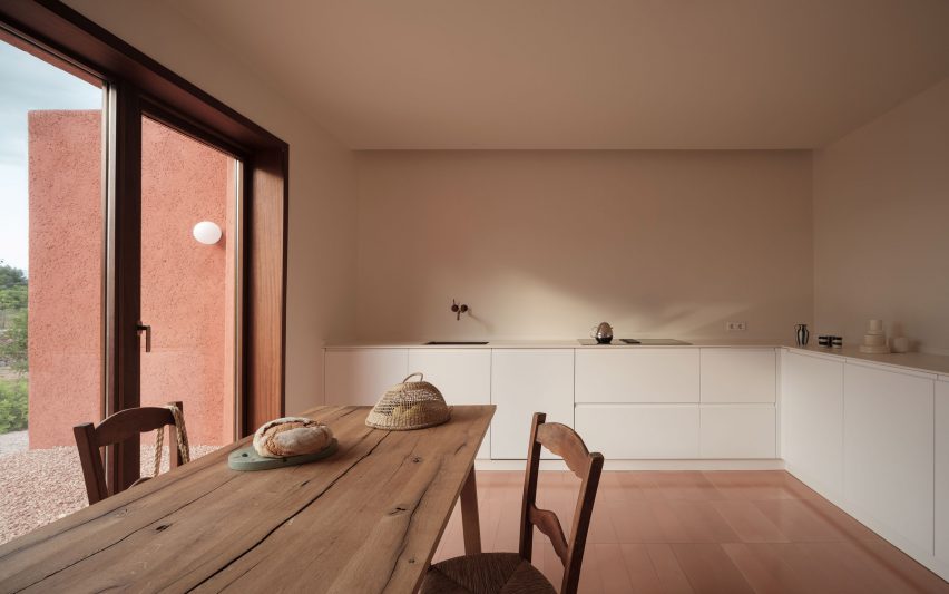
In the kitchen and dining space, matte white cabinets and countertops complement the off-white walls.

A tiled floor picks up the warm terracotta hue of the house’s exterior while utilities such as the sink and hob have clean, unadorned designs that contrast against the rustic wooden dining table and chairs.

Find out more about Lover’s House ›


The Cedars by Michael Yarinsky Studio

The Cedars, US, by Michael Yarinsky

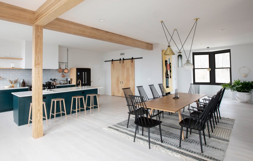
The Cedars on Long Island, New York, has a light, open kitchen and dining area with a kitchen corner that features a tiled back wall to demarcate it from the rest of the room.

As well as the larger dining table, the kitchen nook has a breakfast bar for more informal eating that has been painted in a dark petroleum blue to match the cabinetry.

Danish furniture brand Hay’s black J1110 chairs add an eyecatching graphic touch to the room, while a playful light by Ladies & Gentlemen Studio hangs above the table.

Find out more about The Cedars ›


Bright kitchen in Perth house

Marine, Australia, by David Barr Architects

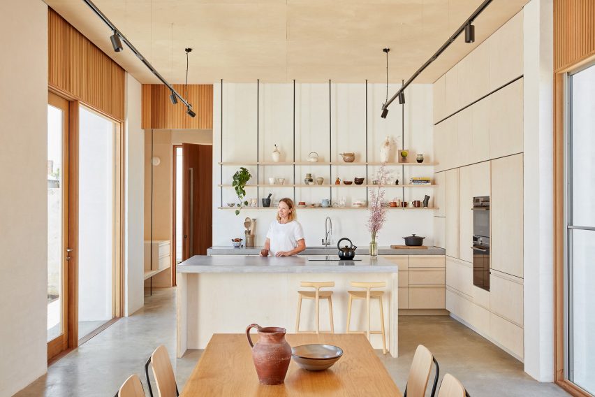
Wood runs through this kitchen and dining space in an extension to a home in Perth, Australia, designed by David Barr Architects.

Wooden cabinets and a wood kitchen island covered with grey stone countertops sit next to a wood-clad wall that hides the oven and various storage spaces.

Above the sink and work areas, open shelves hold a collection of decorative ceramics, while a matching ceramic jug and bowl sit on the wooden dining table. One side of the kitchen island functions as a breakfast bar, complete with ash chairs by Mattiazzi.

Find out more about Marine ›


Kitchen in House for a Sea Dog in Genoa by Dodi Moss

House for a Sea Dog, Italy, by Dodi Moss

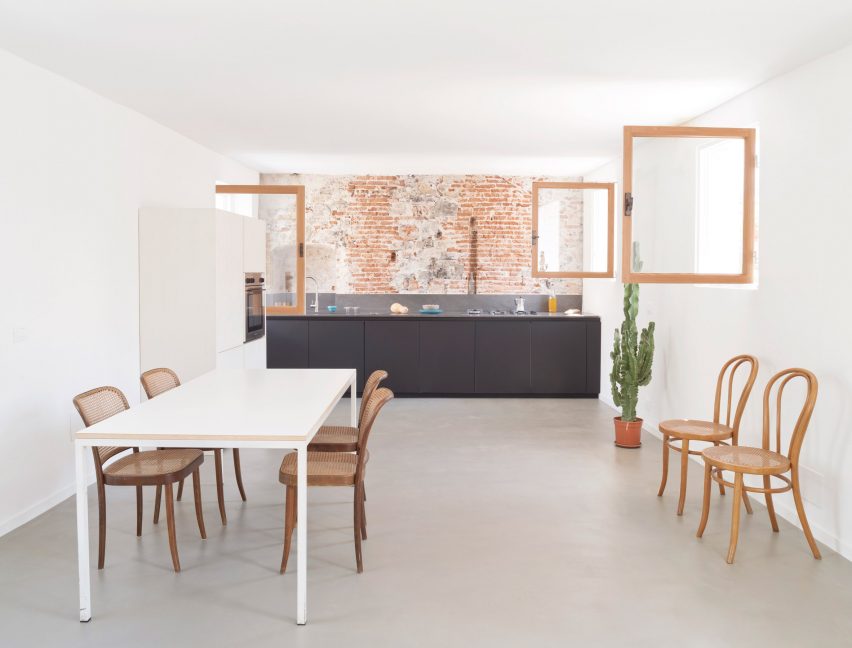
This loft apartment inside a 300-year-old building in Genoa, Italy, was designed to feel as open and spacious as possible. In the kitchen and dining room, a one-wall kitchen in a soothing dark-grey hue sits against a red brick wall.

This leaves space for a dining table and a selection of bentwood chairs with rattan seats. The oven and fridge are hidden away in white cupboards that blend into the wall.

Find out more about House for a Sea Dog ›


Three Chimney House by T W Ryan Architecture

Three Chimney House, US, by T W Ryan Architecture

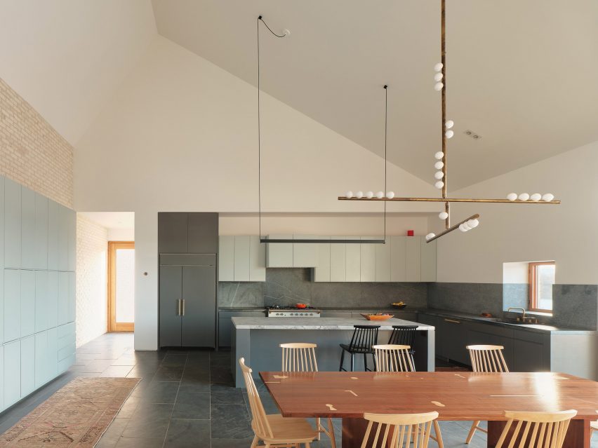
A large kitchen island with a marble countertop sits in the middle of this kitchen and dining room in Three Chimney House in rural Virginia.

With a design that was informed by both modernism and Southern colonial style, the room has been given a striking material palette. A stone floor matches the stone splashback that runs along the kitchen workspaces, while a tiled wall sits below the angled white ceiling.

Mid-century modern Stick Back chairs by Thomas Harlev underline the sparse geometric design while Lindsey Adelman’s 15 Bulb Drop System chandelier, which hangs above the table, gives the room a sacral feel.

Find out more about Three Chimney House ›


Open plan kitchen dining space

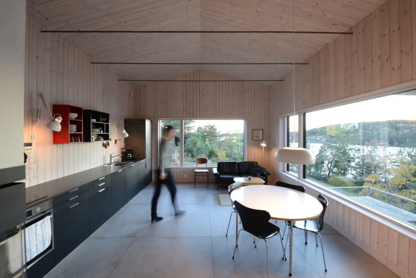
Cabin Son, Norway, by Jon Danielsen Aarhus

The rectangular kitchen in this spruce-clad holiday home in Norway has a small dining area and a sofa for lounging.

The multiuse space features a long single-wall kitchen that holds an oven and sink as well as multiple cabinets.

Colourful shelving above the countertops adds additional storage space and a vibrant touch against the pale-wood walls. A wooden table and black chairs by Danish designer Arne Jacobsen give the kitchen an elegant, modern feel.

Find out more about Cabin Son ›


Casa Meco kitchen and dining area

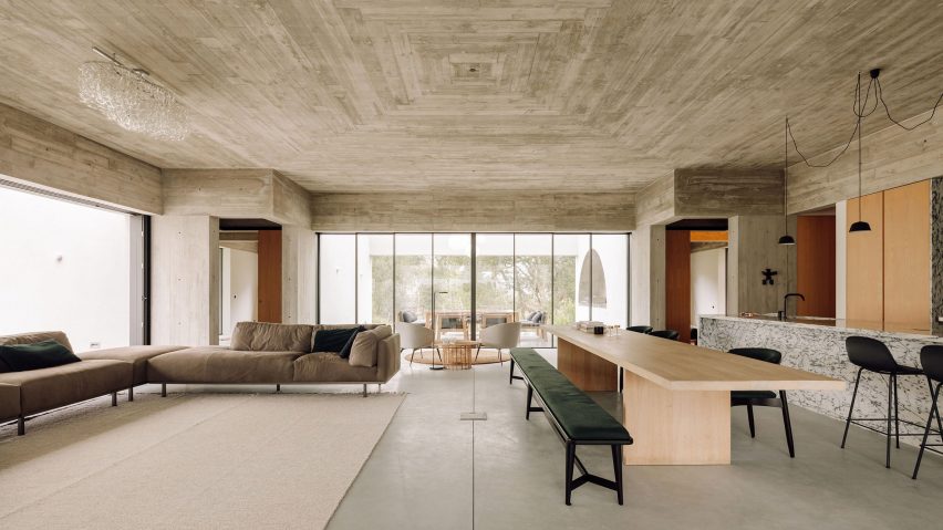
Casa Meco, Portugal, by Atelier Rua

A built-in kitchen clad in a decorative veiny marble, complete with a matching breakfast island, sits in one corner of Casa Meco’s enormous main room.

Wooden cupboards on either side of the kitchen hide the kitchen facilities. A long table made from pale wood with contrasting black chairs and a black bench can be used for large dinners, while a breakfast bar adds more seating options.

Find out more about Casa Meco ›


House-within-a-House by Alma-nac

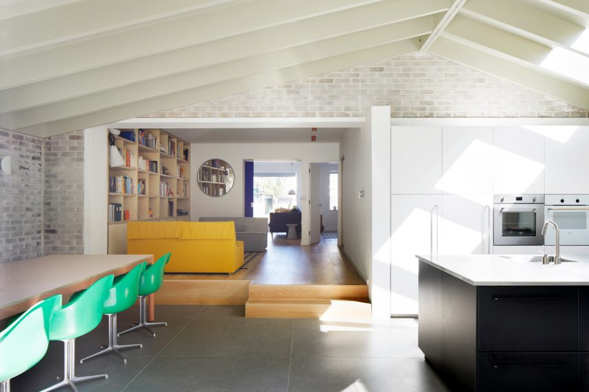
House-within-a-House, UK, by Alma-nac

Alma-nac’s joyful design for House-within-a-House in south London includes an extension that holds the kitchen and dining area. Here, simple white cabinetry and a jet-black kitchen island sit on one side and offer plenty of space for food preparation and cooking.

Opposite, a dining table is completed with vintage-style apple-green plastic chairs. Their bright colour picks up the yellow hue of a sofa in the raised lounge area next to the dining space.

Find out more about House-within-a-House ›


Mài Apartment in Vietnam designed by Whale Design Lab

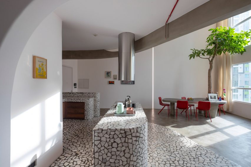
Mài Apartment, Vietnam, by Whale Design Lab

Graphic terrazzo surfaces decorate the kitchen area in this Vietnamese apartment by Whale Design Lab, which has a design informed by American architect Louis Kahn.

The splashback, countertop, breakfast island and floor were all crafted from the material. The organic, curved shapes of the kitchen island and workspaces are mirrored in the grey dining table that sits underneath a small indoor tree.

Bright red Dragonfly chairs by Einrichten Design add a splash of colour to the room.

Find out more about Mài Apartment ›


Interior of kitchen in London house

Quarter Glass House, UK, by Proctor & Shaw

Proctor & Shaw’s design Quarter Glass House is an extension to a London house that holds the kitchen and dining space and was designed to have as much height and light as possible.

The studio lowered the floor to create more space, and combined exposed timber with duck-egg cabinetry and shiny copper surfaces to fulfill a request for warm and textural materials. A kitchen island with a breakfast bar has practical shelving on one side, and long floating wall shelves add storage space.

A simple white table with rattan chairs can seat six people and overlooks the garden outside the extension.

Find out more about Quarter Glass House ›


This is the latest in our series of lookbooks providing curated visual inspiration from Dezeen’s image archive. For more inspiration see previous lookbooks showcasing peaceful bedrooms, wallpapered interiors and colourful kitchens.

Reference