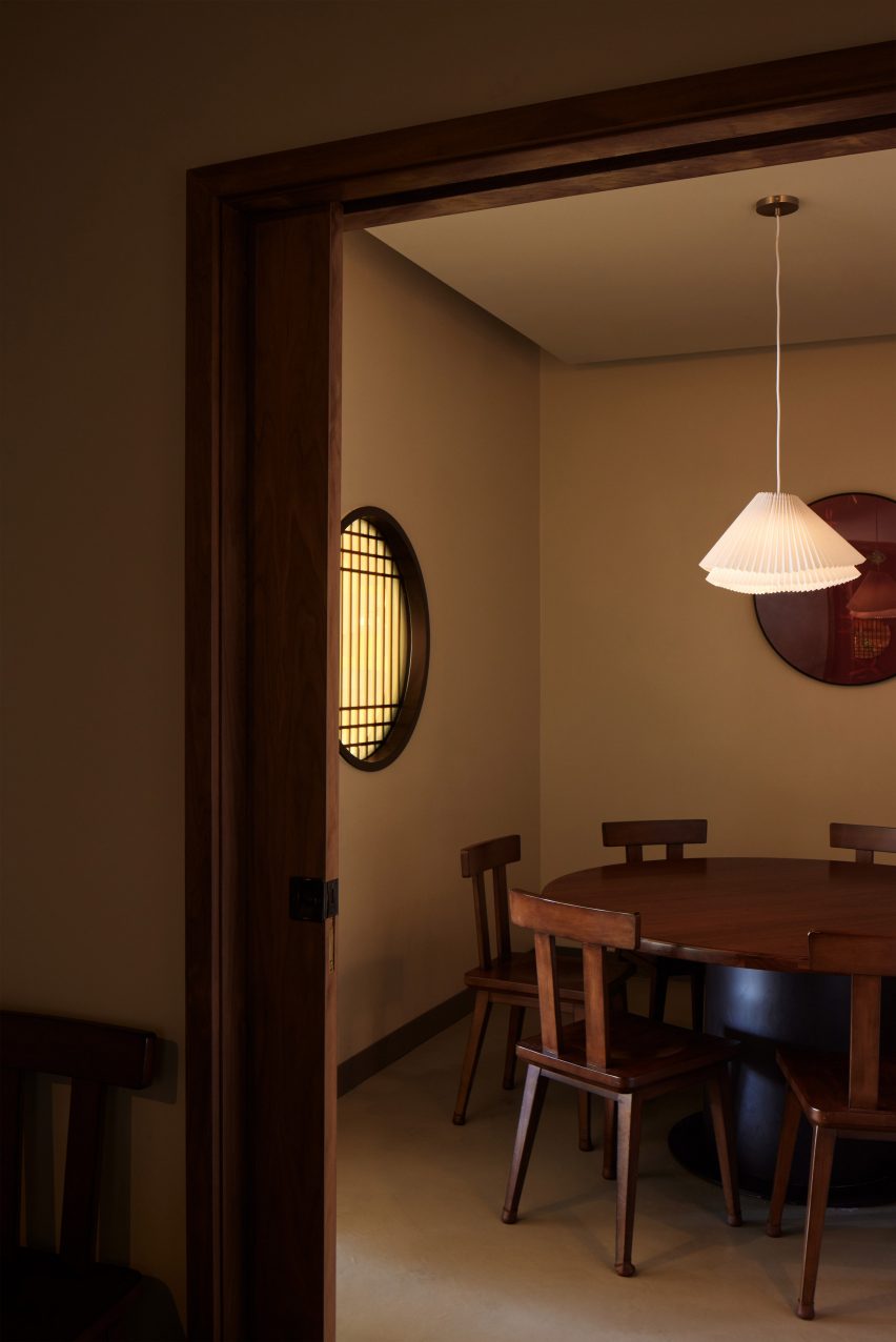
Eight interiors where burl wood provides natural texture
CategoriesInterior Design

Eight interiors where burl wood provides natural texture

This week’s lookbook rounds up eight interiors with furnishings and surfaces finished in burl-wood veneer, allowing its swirly, psychedelic graining to serve a decorative function.

Burl wood is a rare and expensive wood, often only available in thin sheets of veneer. That’s because it is derived from the knobbly outgrowths of tree trunks and branches – also known as burls.

Like the botanical equivalent of a callous, these outgrowths form in response to different stress factors and grow unpredictably, creating complex unexpected grain patterns behind their gnarled bark.

Burl wood has been experiencing a renaissance over the last few years, with interior designers including Kelly Wearstler using it to evoke the bohemian flair of its 1970s heyday.

Mixed and matched with other patterns, the material is now used to communicate a kind of organic understated luxury, much like natural stone.

From a Michelin-starred restaurant to a home that was designed to resemble a boutique hotel, read on for eight examples of how burl wood can provide textural richness to a modern interior.

This is the latest in our lookbook series, which provides visual inspiration from Dezeen’s archive. For more inspiration see previous lookbooks featuring rooms with net floors, interiors with furry walls and homes with mid-century modern furniture.
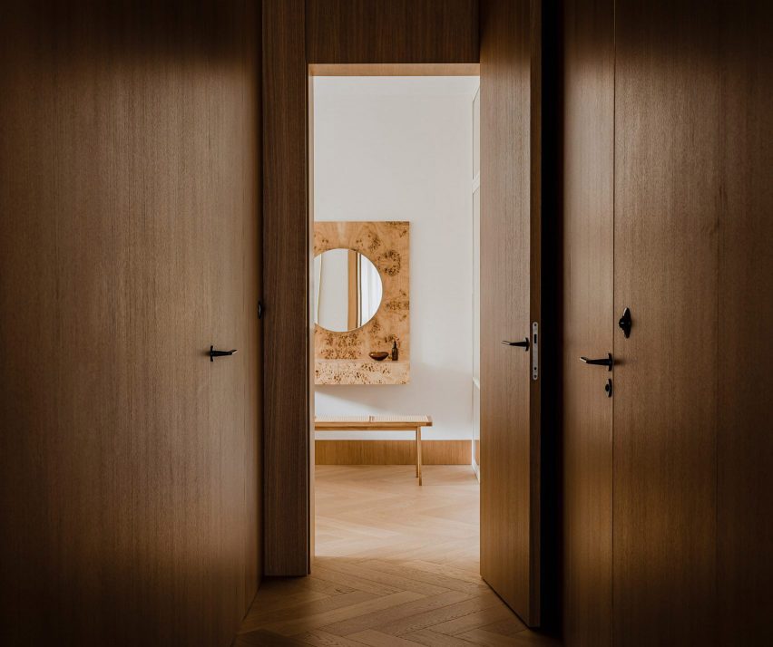

Botaniczna Apartment, Poland, by Agnieszka Owsiany StudioBotaniczna Apartment, Poland, by Agnieszka Owsiany Studio
Photo by Pion Studio

Botaniczna Apartment, Poland, by Agnieszka Owsiany Studio

This tranquil apartment in Poznań was designed by local firm Agnieszka Owsiany Studio to give the owners a reprise from their high-pressure medical jobs.

The interior combines a calming mix of pale marble and various kinds of wood, including oak cabinetry, chevron parquet flooring and a console and vanity, both finished in speckled burl.

“My clients asked for a high quality, almost hotel-like space, as they were in need of everyday comfort,” founder Agnieszka Owsiany told Dezeen.

Find out more about Botaniczna Apartment ›

Ulla Johnson flagship, USA, by Kelly WearstlerUlla Johnson flagship, USA, by Kelly Wearstler
Photo by Adrian Gaut

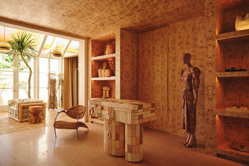
Ulla Johnson flagship, USA, by Kelly Wearstler

Burlwood brings “a touch of 1970s California nostalgia” to the Ulla Johnson flagship store in Los Angeles, courtesy of local designer Kelly Wearstler.

The unusual veneer was used liberally to cover walls, ceilings and shelves, as well as forming a statement display cabinet where the material’s natural wavy surface texture provides an added element of tactility (top image).

Find out more about the Ulla Johnson flagship ›

Koda hair salon by Arent & PykeKoda hair salon by Arent & Pyke
Photo by Prue Ruscoe

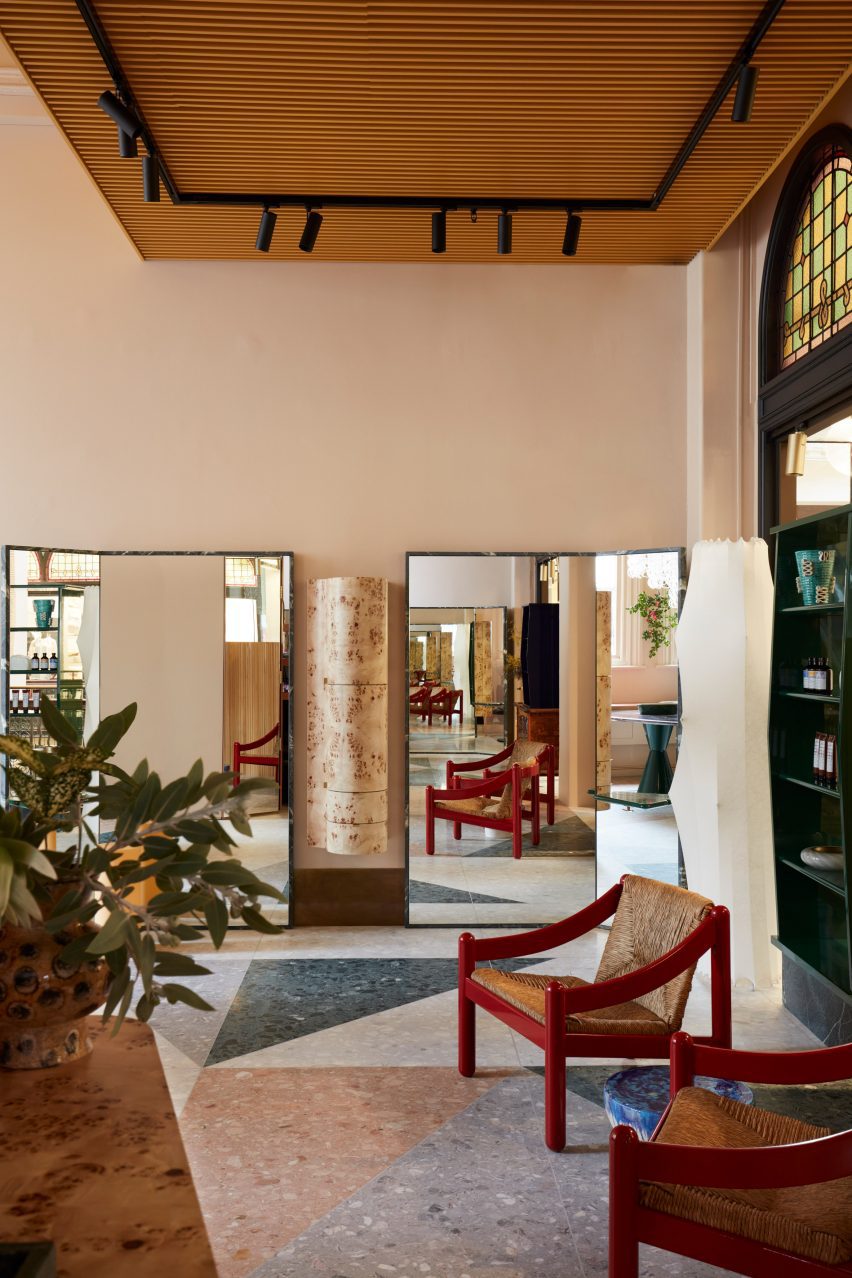
Koda hair salon, Australia, by Arent & Pyke

This hair salon in Sydney’s Queen Victoria Building was designed by Australian studio Arent & Pyke to be “best appreciated from seated height”.

Drawing attention away from the building’s extra-tall ceilings, freestanding quartzite-rimmed mirrors are placed at angles in front of the styling chairs, framing a vintage hanging cabinet made from pale burl.

Find out more about the Koda hair salon ›

Opasły Tom restaurant by Buck StudioOpasły Tom restaurant by Buck Studio
Photo by Pion Studio

Opasly Tom restaurant, Poland, by Buck Studio

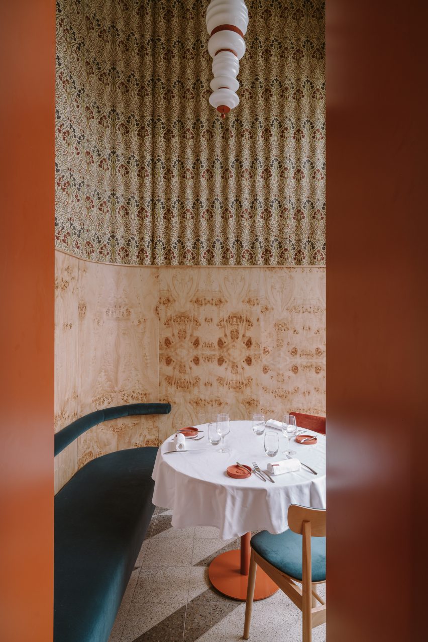
Buck Studio employed a limited palette of colours and materials to create visual continuity throughout Warsaw restaurant Opasly Tom, which occupies a split-level building that was broken up into a series of rooms of different sizes.

Coral-orange chair cushions mirror the hardware of the totem-like pendant lights, and several burl-clad cabinets are dotted throughout the eatery. These match the kaleidoscopically patterned panelling in the hallway and the private dining rooms.

“This contemporary, minimalistic design approach produces the impression of coherence while creating a powerful aesthetic impact,” explained the Polish studio, which is headed up by Dominika Buck and Pawel Buck.

Find out more about the Opasly Tom restaurant ›

Warsaw apartment by MistoviaWarsaw apartment by Mistovia
Photo by Oni Studio

Warsaw apartment, Poland, by Mistovia

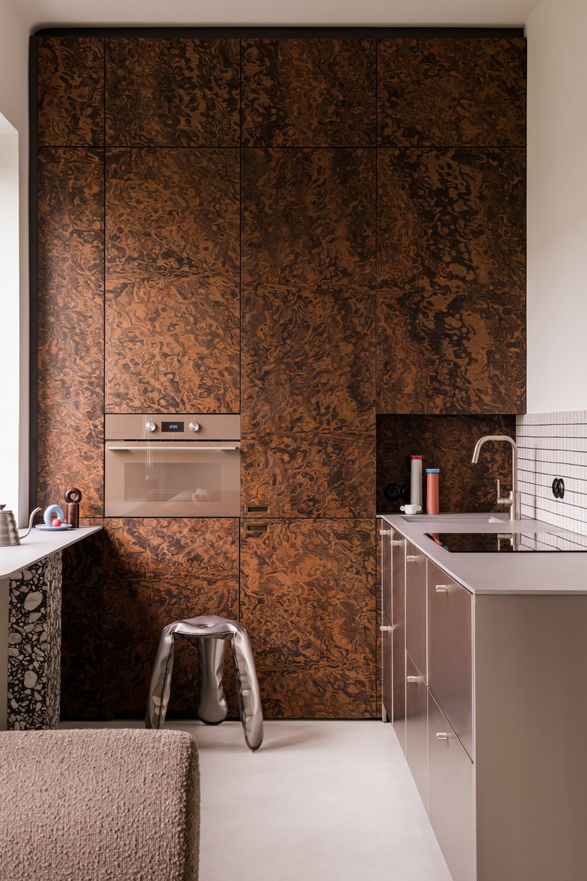
Elsewhere in Warsaw, Polish studio Mistovia designed an apartment for an art director and her pet dachshund to resemble an “elaborate puzzle” of contrasting patterns.

Walnut-burl cabinets dominate the kitchen, with their trippy swirling pattern offset against monochrome tiles, brushed-metal drawers and a terrazzo-legged breakfast bar.

Find out more about the Warsaw apartment ›

Imperfecto, USA, by OOAK ArchitectsImperfecto, USA, by OOAK Architects
Photo by Jennifer Chase and Yorgos Efthymiadis

Imperfecto, USA, by OOAK Architects

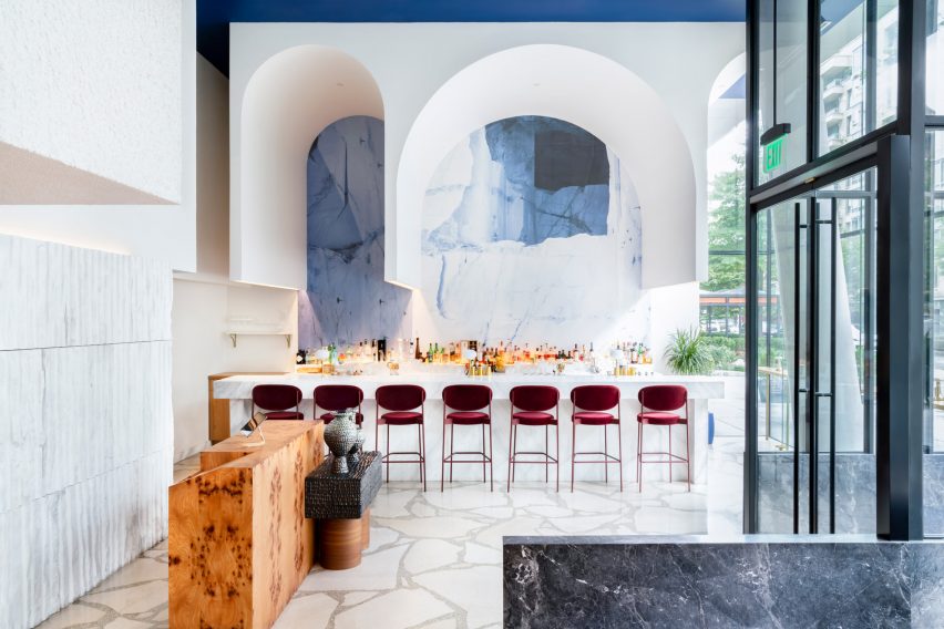
Upon entering Michelin-starred restaurant Imperfecto in Washington DC, diners are greeted by a custom-made maître-d stand clad in panels of burl-wood veneer, creating a mirrored tortoiseshell pattern across its surface.

The interior, designed by Greek-Swedish studio OOAK Architects, sees neutral tones paired with splashes of blue and white that nod to the restaurant’s Mediterranean menu.

“OOAK Architects has used varied, high-quality finishes and authentic materials including Greek and Italian marbles, as well as brass and wood from different parts of the world, creating contrasting textures across the space,” the team said.

Find out more about Imperfecto ›

Interior of Black Diamond house by YSGInterior of Black Diamond house by YSG
Photo by Anson Smart

Black Diamond house, Australia, by YSG

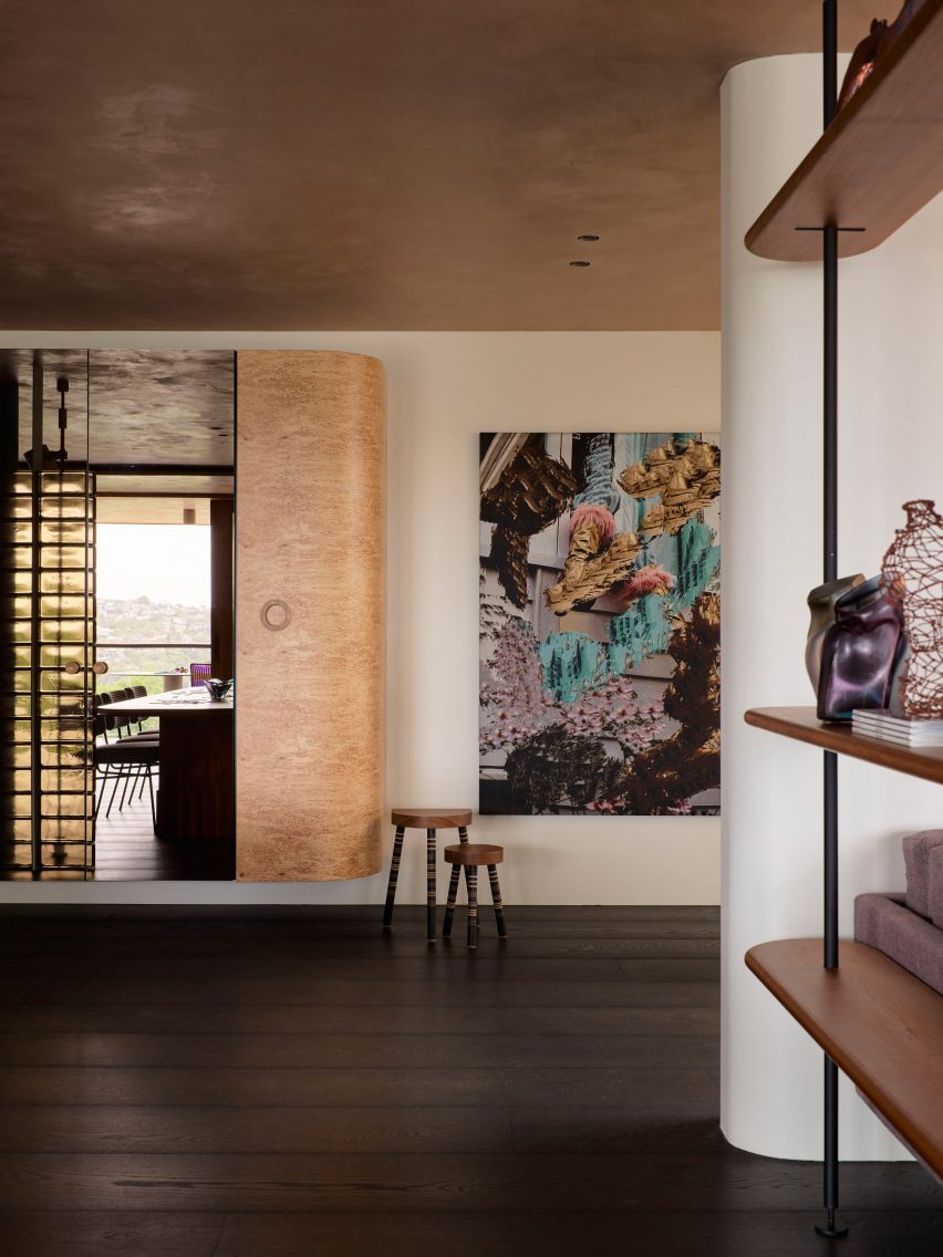
Australian interiors studio YSG introduced a sumptuous mix of materials to this house in Sydney’s Mosman suburb to evoke the feeling of staying in a luxury hotel.

This approach is evidenced by a number of custom furniture pieces dotted throughout the home, including a Tiberio marble vanity in the downstairs powder room and a poplar-burl cabinet with a bronzed mirror that looms over the nearby living room.

Find out more about Black Diamond house ›

Studio Frantzén, UK, by Joyn StudioStudio Frantzén, UK, by Joyn Studio
Photo by Åsa Liffner

Studio Frantzén, UK, by Joyn Studio

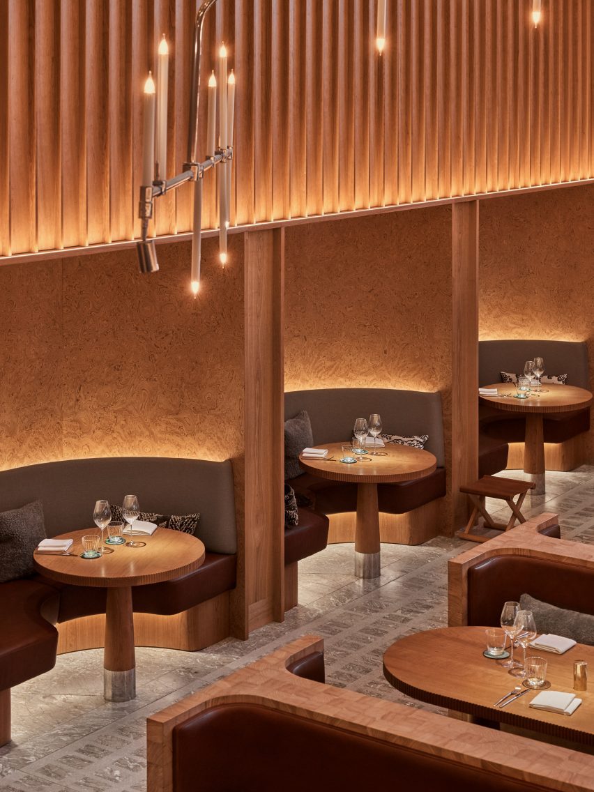
Restaurant Studio Frantzén in London’s Harrods department store serves a fusion of Nordic and Asian food that is also reflected in its Japandi interiors – taking cues from both Scandinavian and Japanese design.

Interiors practice Joyn Studio leaned heavily on both cultures’ penchant for wood, combining seating banquettes made from blocks of end-grain pine wood with gridded timber ceilings and seating booths framed by burl-wood wall panelling.

Find out more about Studio Frantzén ›

This is the latest in our lookbook series, which provides visual inspiration from Dezeen’s archive. For more inspiration see previous lookbooks featuring rooms with net floors, interiors with furry walls and homes with mid-century modern furniture.

Reference

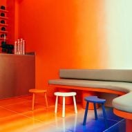
Aro Archive store in Shoreditch features pastel-coloured rooms
CategoriesInterior Design

Aro Archive store in Shoreditch features pastel-coloured rooms

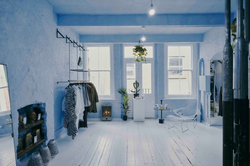
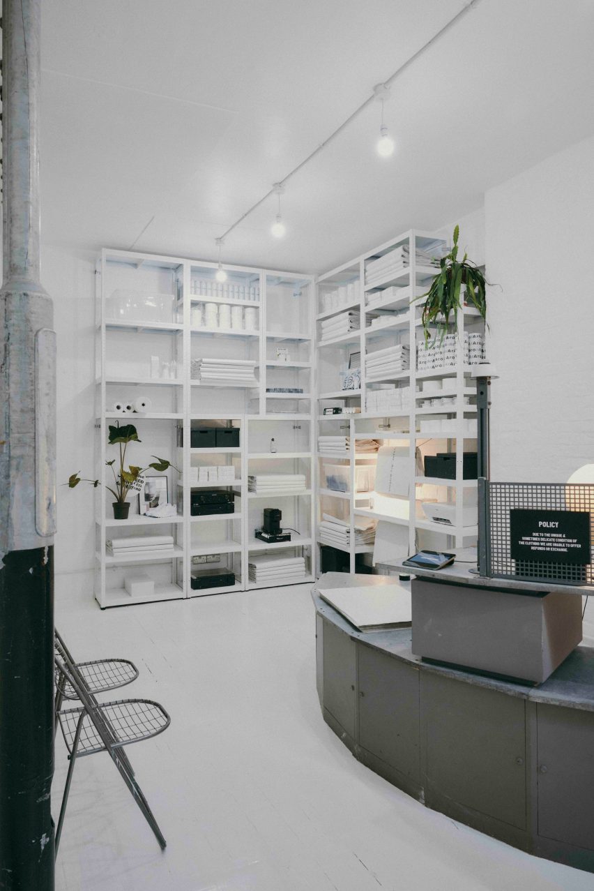
Fashion retailer Aro Archive’s pastel-hued east London store was designed by founder Ariana Waiata Sheehan to evoke “a sense of otherworldliness”.

The store, located in Shoreditch, replaces the brand’s previous, more industrial store on nearby Broadway Market and was intended to have a frivolous feel.

Pastel-coloured fashion storePastel-coloured fashion store
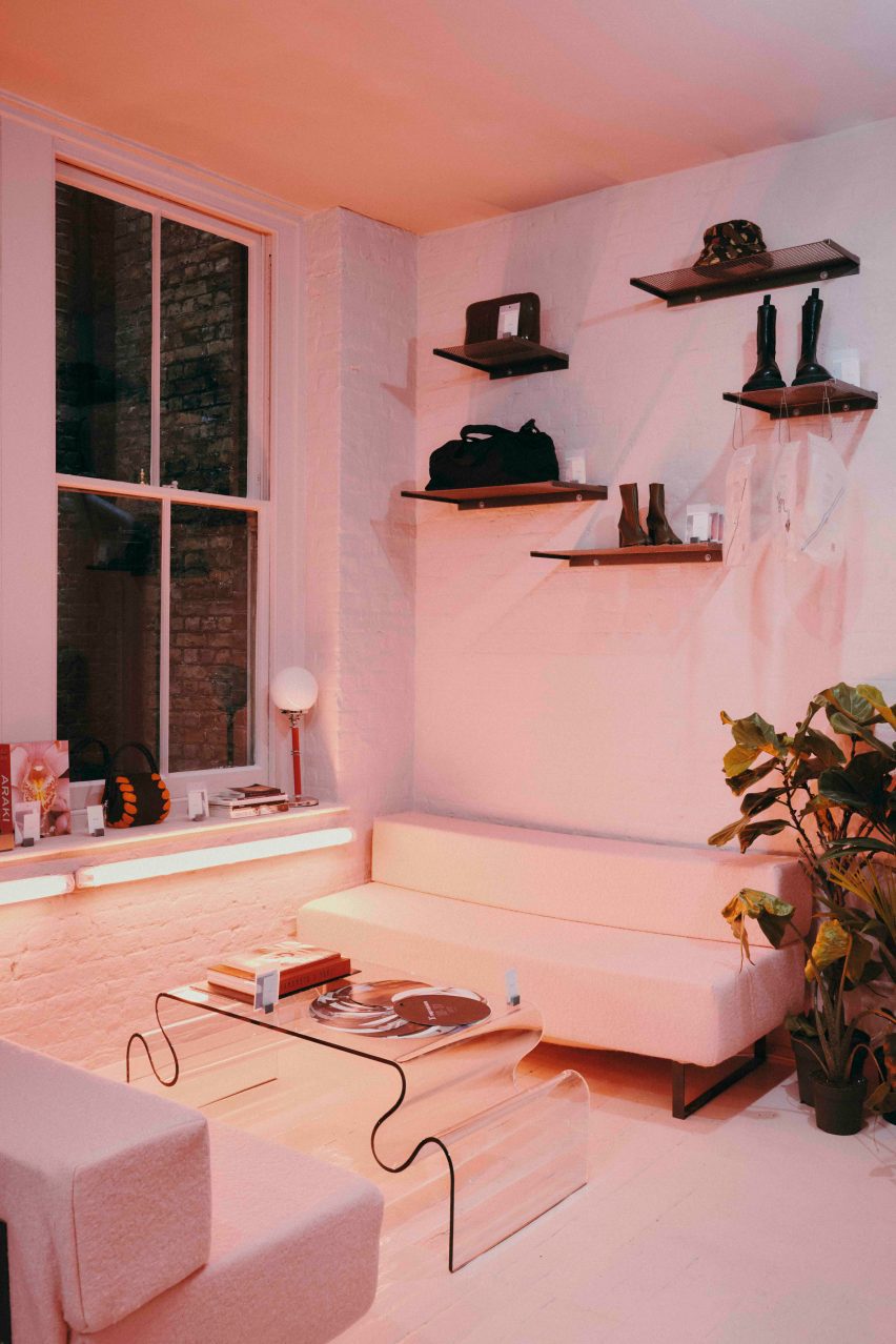
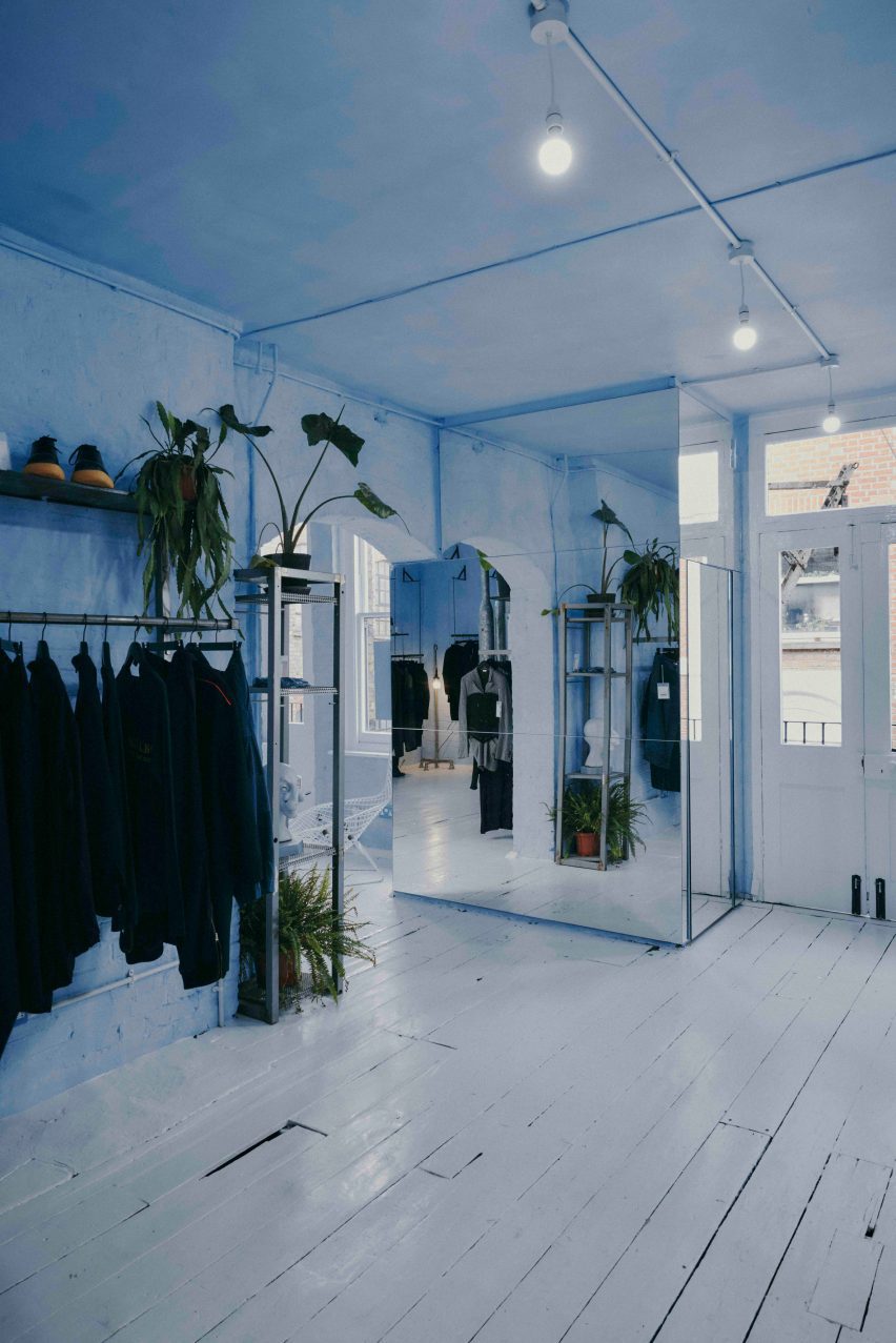
The Aro Archive store has pastel-coloured floors in pink and blue

The interior has “a sense of otherworldliness, escapism and fun,” Waiata Sheehan explains, comparing it to “a mixture between a mushroom trip and going to visit someone’s rich aunty who runs a gallery”.

“We’ve always had very neutral industrial spaces,” she told Dezeen. |But you can get an industrial Zara these days, so time to switch it up and go full personality, which has been scary but so worth it.”

Pink floor in Aro ArchivePink floor in Aro Archive
It is located inside an old Victorian warehouse

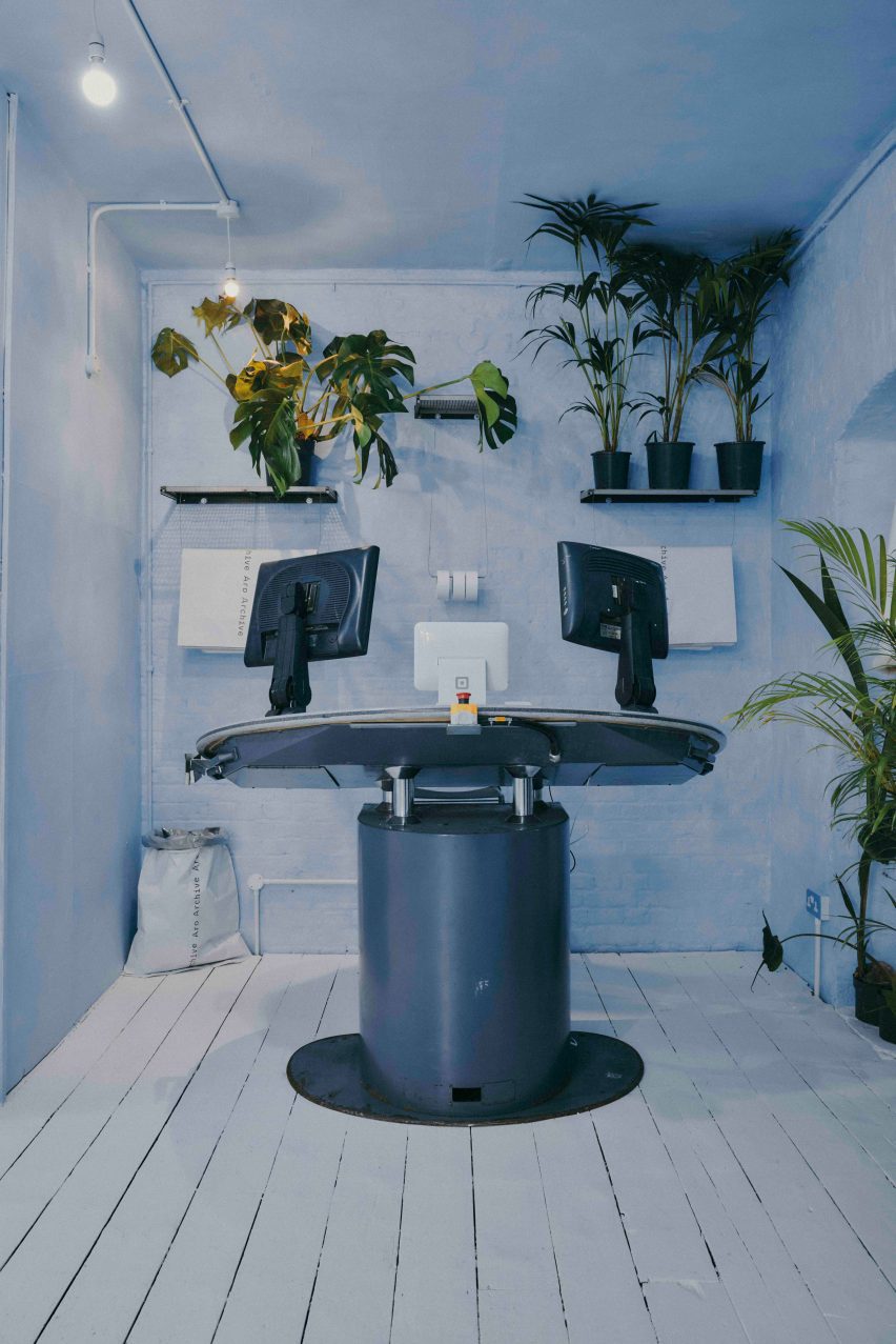
Located inside a five-storey former Victorian warehouse, Aro Archive, which sells pre-owned clothing by avant-garde designers, was organised so that each floor has a different colour.

Monochrome pastel pink, blue and white hues decorate the different levels, which also feature a wide range of reclaimed and recycled materials, furniture and artworks.

Blue floor in Aro ArchiveBlue floor in Aro Archive
Founder Ariana Waiata Sheehan created the interior design

“The pink floor is supposed to feel very warm, womb-like and enclosed,” Waiata Sheehan said. “The blue floor is more light and otherworldly. And the two white floors are very ethereal and calm.”

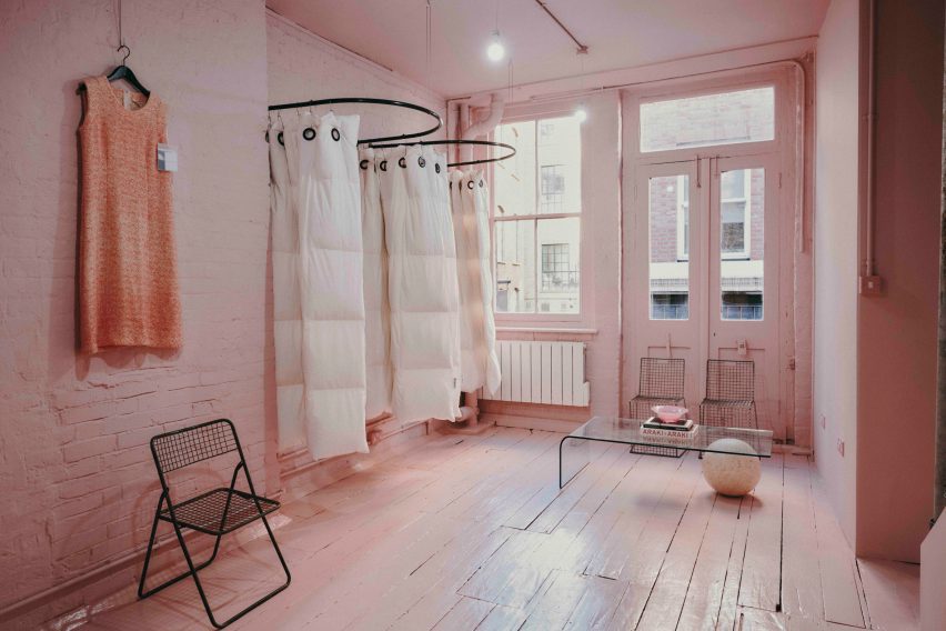
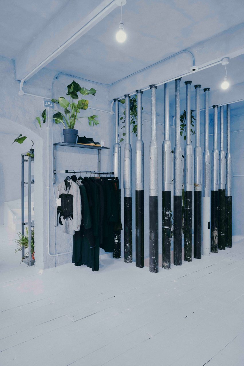
White duvet covers by fashion house Maison Martin Margiela were used to create curtains for the changing rooms, while interior pillars are made from reclaimed 1990s metal lamp posts that the designer sourced from a scrapyard in Preston.

Martin Margiela duvet-changing roomsMartin Margiela duvet-changing rooms
Duvet covers by Maison Martin Margiela frame the changing rooms

“The building and surrounding area feel very London, so we did want to bring in a sense of that for example with the lamp posts, metal works and details, bright neon lights and so forth,” Waiata Sheehan said.

She sourced a number of unusual furnishings for the Aro Archive store, including an industrial control station from a paper-manufacturing plant that is now used as a till.

“The industrial paper control station I’ve been watching on eBay for nearly 4 years, waiting for a time I had the space to buy it,” Waiata Sheehan explained. “I wanted something different to the normal till, they’re all so boring and square.”

The store also has another large metal till and metal drawers that originally came from a 1980s Mary Quant store and were rescued from a squat in Hackney Wick.

Metal till from Mary QuantMetal till from Mary Quant
A large metal till was originally from a Mary Quant store

Waiata Sheehan also sourced several smaller pieces for the boutique, where customers can purchase everything down to the artwork, furniture and accessories.

“I do all the buying so everything is here because I love it in some way,” she explained. “But in terms of favourite pieces in store right now?”

“For fashion, it’s the Rick Owens orange shearling gimp mask gilet, for objects the Shirin Guild ceramic incense holders and for furniture the wobbly glass table with magazine racks.”

Industrial control stationIndustrial control station
Waiata Sheehan bought an old industrial control station from eBay

Waiata Sheehan hopes the Aro Archive boutique will feel like a home away from home and help to create a community feel in the area.

“I think Shoreditch is lacking a sense of community and I wanted to work that into the space,” she said. “The feeling of a chaotic family home and a feeling of togetherness.”

Pillars made from lampposts at Aro ArchivePillars made from lampposts at Aro Archive
Lampposts from a scrapyard form pillars inside the store

Other London stores with notable interior design recently covered on Dezeen include Swedish fashion brand Toteme’s newly-opened Mayfair store and a Coach pop-up store at Selfridges that had fixtures made from recyclable materials.

The photography is by John Munro.

Reference

Ideas of Order selects bright colours for New York apartment renovation
CategoriesInterior Design

Ideas of Order selects bright colours for New York apartment renovation

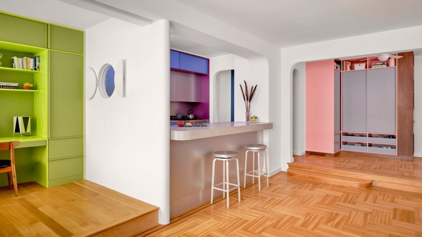
Bright hues define the different interventions that New York architecture studio Ideas of Order has made in this apartment at the northern tip of Manhattan.

The 1,000-square-foot primary residence in Hudson Heights was partially renovated for a couple, who had been living in the space for several years before deciding to invest in making it better suited to their needs, rather than buying another apartment.

Apartment with green bedroom, blue kitchen and pink storageApartment with green bedroom, blue kitchen and pink storage
One side of this Manhattan apartment was overhauled by Ideas of Order to make it function better for its owners

“Their sons had been sharing a room, but were beginning to need their own spaces,” Ideas of Order told Dezeen.

“They also wanted a space that could be designed for flexibility for when their children left for college.”

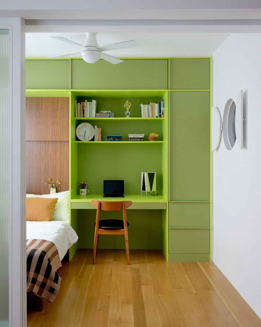
Bedroom with lime green built-ins housing a bed, a desk and storageBedroom with lime green built-ins housing a bed, a desk and storage
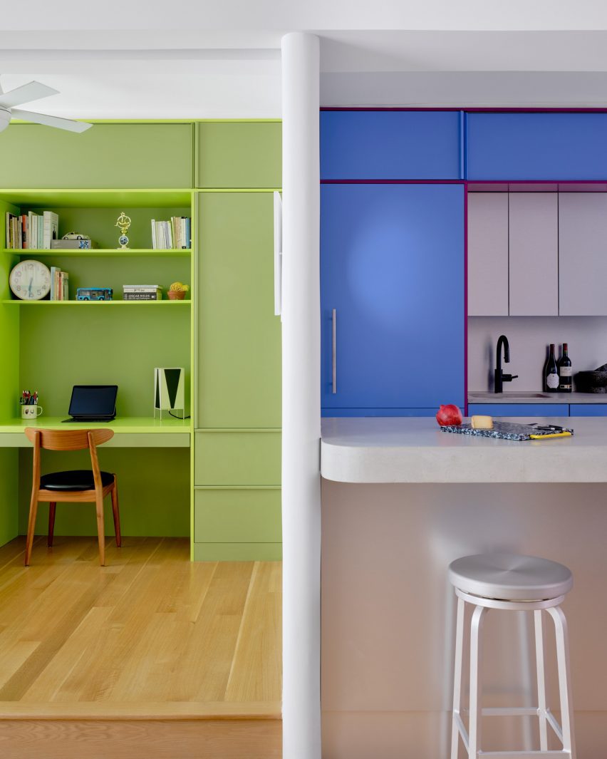
In the newly created bedroom, a lime green built-in houses a bed, a desk and storage

The kitchen also needed updating, to make it more suitable for entertaining, and more efficient storage space was required in the entryway.

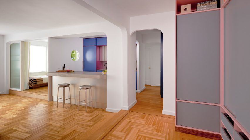
So the architects reworked one side of the open living area, adding a bedroom on one side of the kitchen and refreshing the other areas.

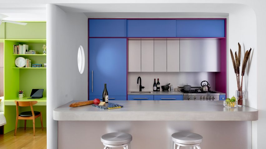
Blue and purple kitchen cabinets behind a concrete counterBlue and purple kitchen cabinets behind a concrete counter
A new wall divides the bedroom from the kitchen

The husband is French, and the couple spent several years living together in France.

During this period, they both became enamoured by the midcentury architecture and design in the country and wanted to apply this style to their own home.

Raspberry and periwinkle cabinets surrounding a cooking area, which also features aluminium panelsRaspberry and periwinkle cabinets surrounding a cooking area, which also features aluminium panels
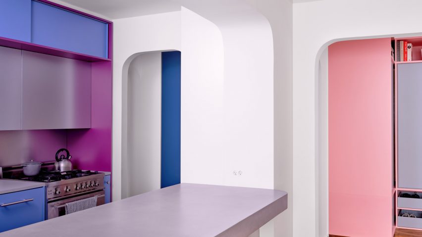
Raspberry and periwinkle cabinets surround the cooking area, which also features aluminium panels

“Inspired by their stories and the history of how colour was used by French midcentury designers like Charlotte Perriand, we suggested a series of polychrome millwork pieces inspired by Perriand’s design language, but updated for a contemporary home,” said Ideas of Order.

The different areas of the home were therefore given their own identities by applying bright hues.

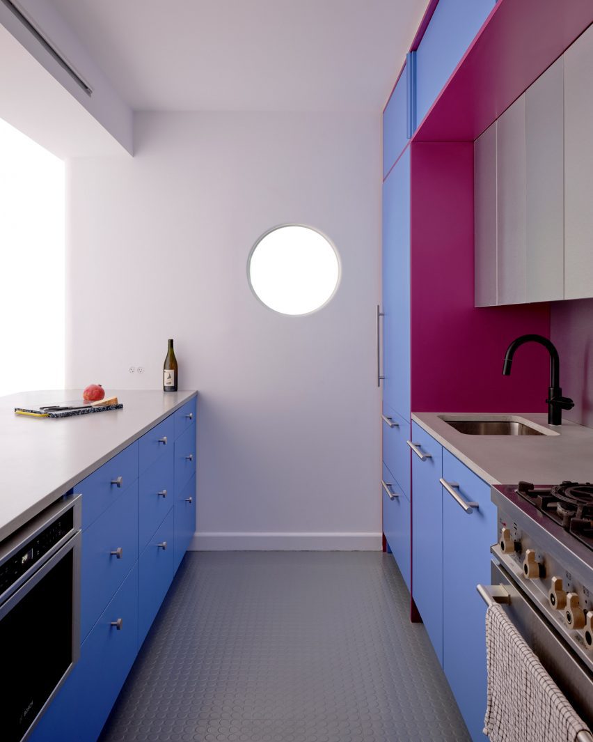
Kitchen with cabinets on two sides and a porthole in the end wallKitchen with cabinets on two sides and a porthole in the end wall
A porthole looks through from the bedroom into the kitchen, which has rubber flooring

Lime green is used in the bedroom across a full wall of built-ins that incorporate a single bed, a workstation and plenty of storage.

Sliding doors with fritted glass panels pull across to enclose the slightly raised room, while a porthole window with double shutters looks through the new wall that separates the kitchen.

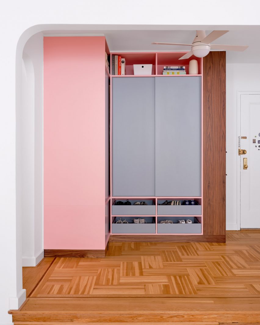
Pink and grey built-in storage in an entrywayPink and grey built-in storage in an entryway
Storage in the entryway was made more efficient by new pink and grey built-ins

This adjacent space is denoted by raspberry and periwinkle millwork, which surrounds a small preparation area with an aluminium backsplash and matching panels above.

The same metal also fronts the bar counter between an arched opening to the living area, which is topped with concrete.

Kitchen viewed through an arched openingKitchen viewed through an arched opening
Archways between spaces throughout the apartment have curved corners

Rubber flooring in the kitchen offers a practical alternative to the wood used through the rest of the apartment.

Finally, in the entryway – which is again raised slightly higher than the living area – an L-shaped cabinet system was constructed in a corner beside the door.

Pale pink is applied to the frames, while the doors and drawer fronts are finished in light grey and walnut is used for the trim. Choosing the right hues was a challenge that took many iterations to find the right balance, according to the architects.

“It was important that each pair of colours in the millwork work together, but that the colours also harmonise when viewed as a whole,” they said. “We wanted the colours to be bright, but not overpowering. And we wanted the colour pairings to feel timeless and not too trendy.”

Lime green bedroom to the left and blue kitchen to the rightLime green bedroom to the left and blue kitchen to the right
The architects went through many iterations to find the right balance of colours

Another challenge was the budget, which was modest by New York City standards and required some conscientious spending – particularly on small details that would make a big impact.

“We love the custom pulls for the millwork, the shutters for the circular window, and the rounded end to the partition between bedroom and kitchen, which reflects the rounded openings throughout the apartment,” the architects said.

Wide view of an apartment with wooden floors, white walls and colourful accentsWide view of an apartment with wooden floors, white walls and colourful accents
The couple had been living in the space for several years before deciding to invest in making it better suited to their needs

Ideas of Order was founded by Jacob Esocoff and Henry Ng, who are both Fosters + Partners and WORKac alumni.

Their renovation is one of the most colourful interiors we’ve featured in New York City of late, compared to a neutral show apartment inside the One Wall Street skyscraper and a loft in Dumbo with a subdued palette.

The photography is by Sean Davidson.

Reference

Bird feathers inform Bar Miller interior by Polonsky & Friends
CategoriesInterior Design

Bird feathers inform Bar Miller interior by Polonsky & Friends

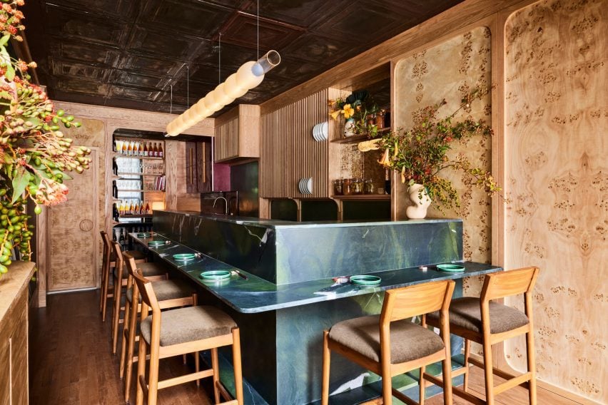
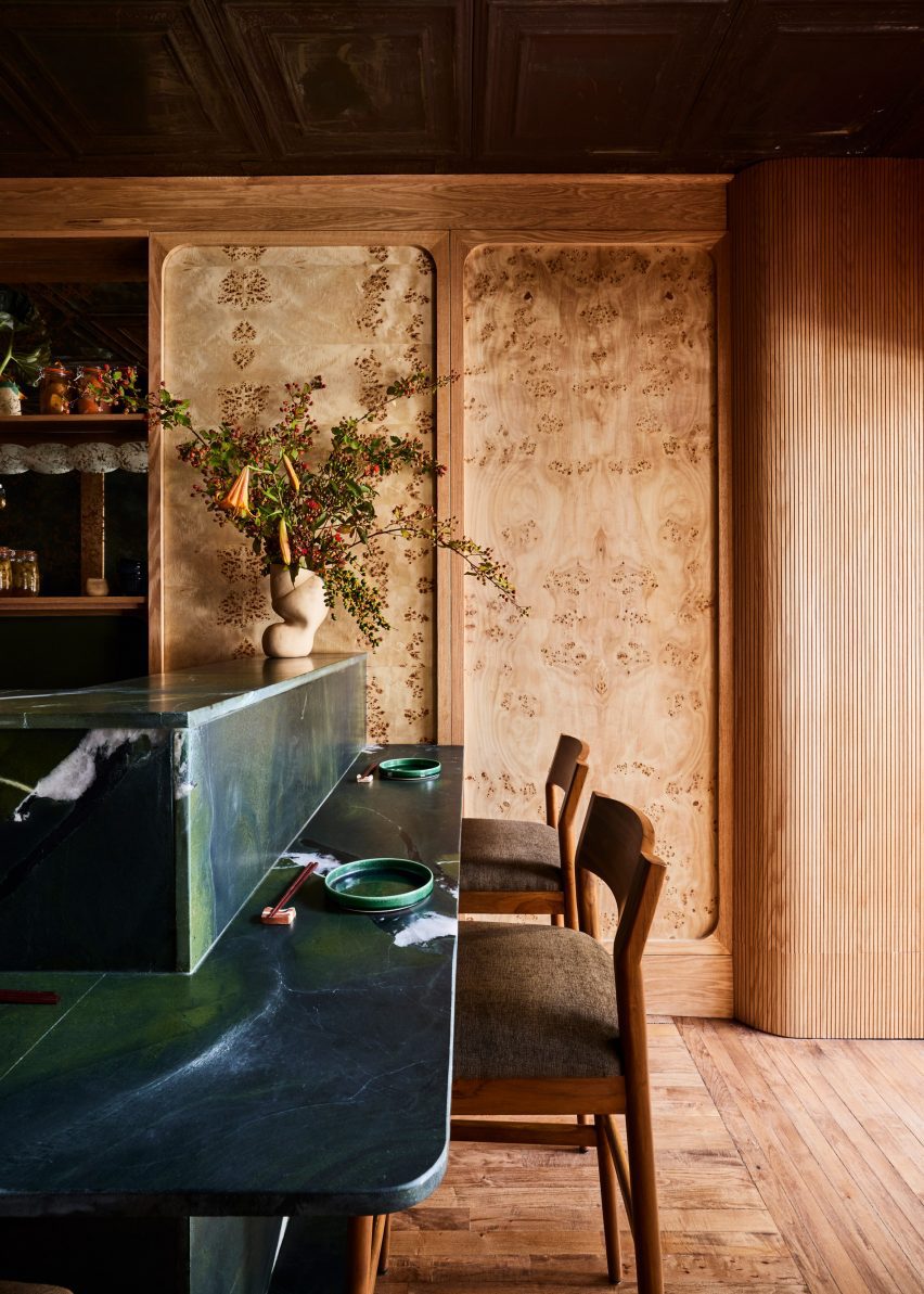
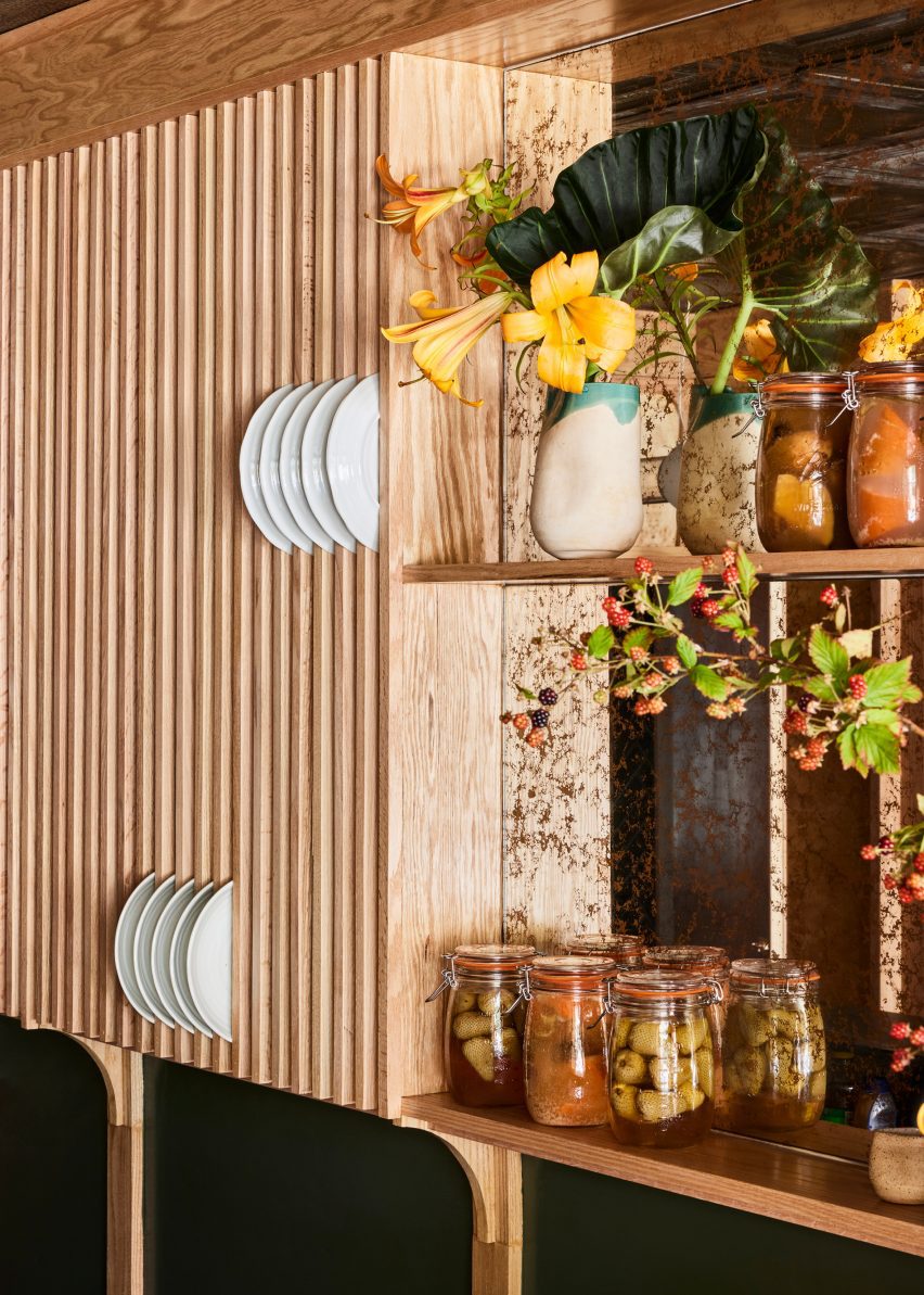
New York design studio Polonsky & Friends has lined this tiny New York omakase restaurant with burl wood veneer panels, while its counters and cabinetry are coloured to resemble bird feathers.

Designed as a sister location of Rosella, an East Village sushi spot that opened in 2020, Bar Miller is located a few blocks away in Alphabet City.

Small restaurant with dark blue-green counters and burl wood wallsSmall restaurant with dark blue-green counters and burl wood walls
The compact Bar Miller space seats eight covers around a counter made from rare Avocatus stone

The owners brought back Polonsky & Friends to complete the interiors so that the two outposts could share the same “warm, welcoming energy”.

Although the menu borrows from traditional sushi craft, it’s not authentically Japanese, so the designers wanted to steer clear of any tropes that might deceive customers.

Burl wood veneer panels framed in white oak on the wallsBurl wood veneer panels framed in white oak on the walls
Burl wood veneer panels on the walls are framed in white oak, matching the building’s original floors

“The design had to incorporate local and craft-centric elements and honour the food’s Japanese inspiration, but not fall into any folklore since the team isn’t Japanese and the menu is untraditional,” studio founder Anna Polonsky told Dezeen.

The restaurant only seats eight covers, which surround the open kitchen in the centre of the compact space.

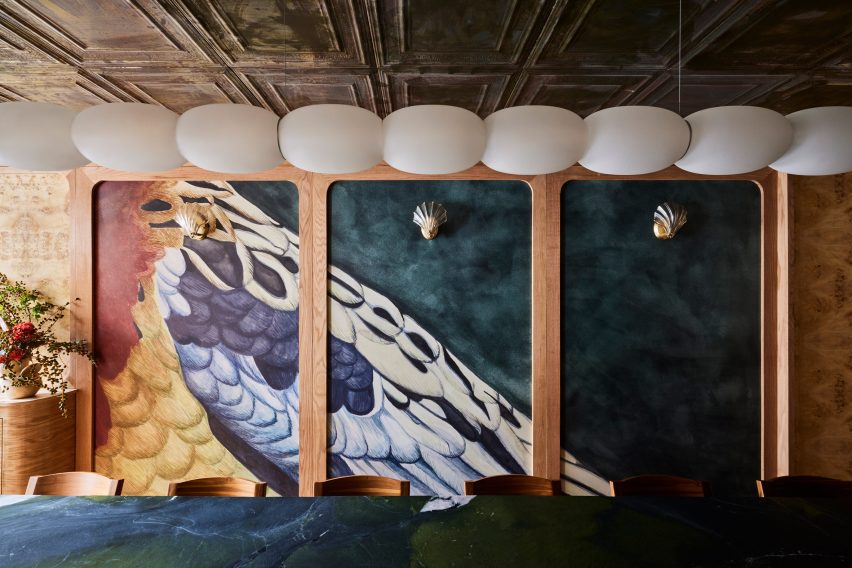
Trio of panels with hand-painted wallpaper displaying bird feathersTrio of panels with hand-painted wallpaper displaying bird feathers
Custom wallpaper hand-painted by Hollie M Kelley displays the feathers of an eastern rosella bird

Deep blue-green Avocatus stone – a rare quartzite with a leathered finish – forms the entire bar counter

A custom ceiling pendant by Madrid-based designer Pablo Bolumar is suspended above the counter like a string of pearly beads.

Blue-green counter with ceramic vase and flowers, in front of a wood-panelled wallBlue-green counter with ceramic vase and flowers, in front of a wood-panelled wall
Pieces by several local designers are featured in the restaurant, including ceramic vases by Fefostudio

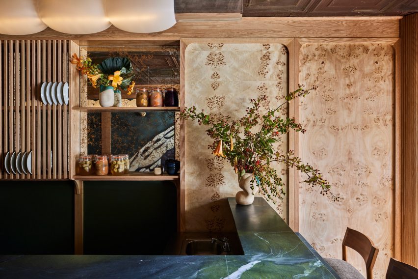
On the walls, panels of burl wood veneer are framed in white oak, which matches the refinished original parquet floors.

“We were able to sand back [the flooring] after it was hidden for years in the previous restaurant,” Polonsky said.

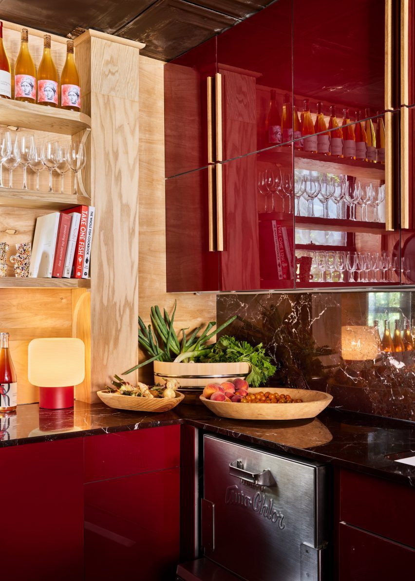
Glossy maroon kitchen cabinetsGlossy maroon kitchen cabinets
To contrast the blue-green dining area, kitchen cabinetry is coloured maroon as another nod to the rosella bird’s feathers

A trio of panels feature a custom wallpaper drawn by artist Hollie M Kelley, displaying the feathers of an eastern rosella bird.

Kelley also drew the icon for the sister restaurant, a western rosella, which has different colours in its plumage.

The maroon hues in the wallpaper are echoed on the cabinetry behind the kitchen counter, differentiating the food preparation area from the blue-green of the dining space.

Other details include a panel of vertical wood slats for storing plates above the sink and moulded-glass scones shaped like scallop shells.

Vertical wood slats provide spaces for storing dishesVertical wood slats provide spaces for storing dishes
Vertical wood slats provide spaces for storing dishes

The bar stools were crafted by Maderas Collective in Nicaragua and upholstered by Ecua in Queens, while ceramic vases were sourced from New York-based Fefostudio.

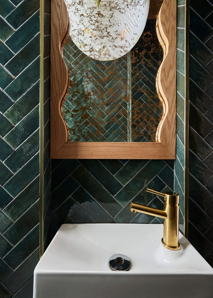
In the bathroom, green tiles laid in a herringbone pattern cover the walls and a rice paper pendant light hand-painted by Claire Dufournier hangs from the ceiling.

Bathroom featuring dark green tiles and a hand-painted rice paper pendant lightBathroom featuring dark green tiles and a hand-painted rice paper pendant light
The bathroom features dark green tiles and a hand-painted rice paper pendant light

For those looking for more Japanese restaurants with notable interiors, New York City has plenty of options to choose from.

Check out the Rockwell Group-designed Katsuya close to Hudson Yards, Rule of Thirds by Love is Enough in Greenpoint, and Tsukimi in the East Village designed by Post Company – formerly known as Studio Tack.

The photography is by Nicole Franzen.


Reference

Side Angle Side transforms Austin post office into restaurant
CategoriesInterior Design

Side Angle Side transforms Austin post office into restaurant

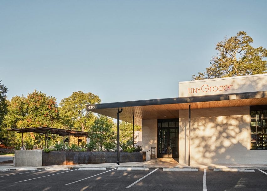
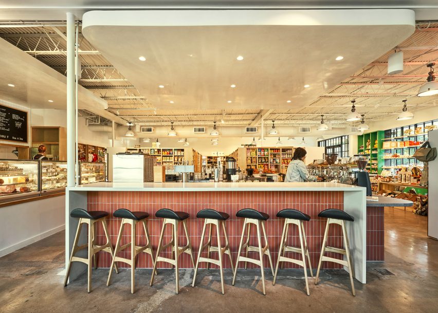
Texas architecture studio Side Angle Side has adapted a 1960s post office into a food market and restaurant in Austin.

Opened in October 2023 in the Hyde Park area, Tiny Grocer serves as a speciality market, bar and cafe while Bureau de Poste is a modern French bistro led by celebrity chef Jo Chan.

The exterior of a small, modern grocery storeThe exterior of a small, modern grocery store
Side Angle Side has transformed a 1960s post office into a food market and restaurant

Austin-based commercial and residential architecture firm Side Angle Side renovated the 3,500-square foot (325-square metre) 1967 US Post Office building and added a 1,500-square foot (140-square metre) outdoor dining patio.

“The Hyde Park U.S. Post Office was an important neighborhood hub in the 1960s – so we were especially careful to keep the integrity and spirit of the mid-century-utilitarian design,” Arthur Furman, founding partner of Side Angle Side, told Dezeen.

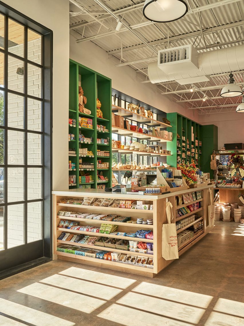
A grocery market with green shelvingA grocery market with green shelving
The team sought to preserve the building’s history as a community hub

“As the anchor tenant in the space, Tiny Grocer continues to be the centre of the community, a place to gather, shop, eat and drink.”

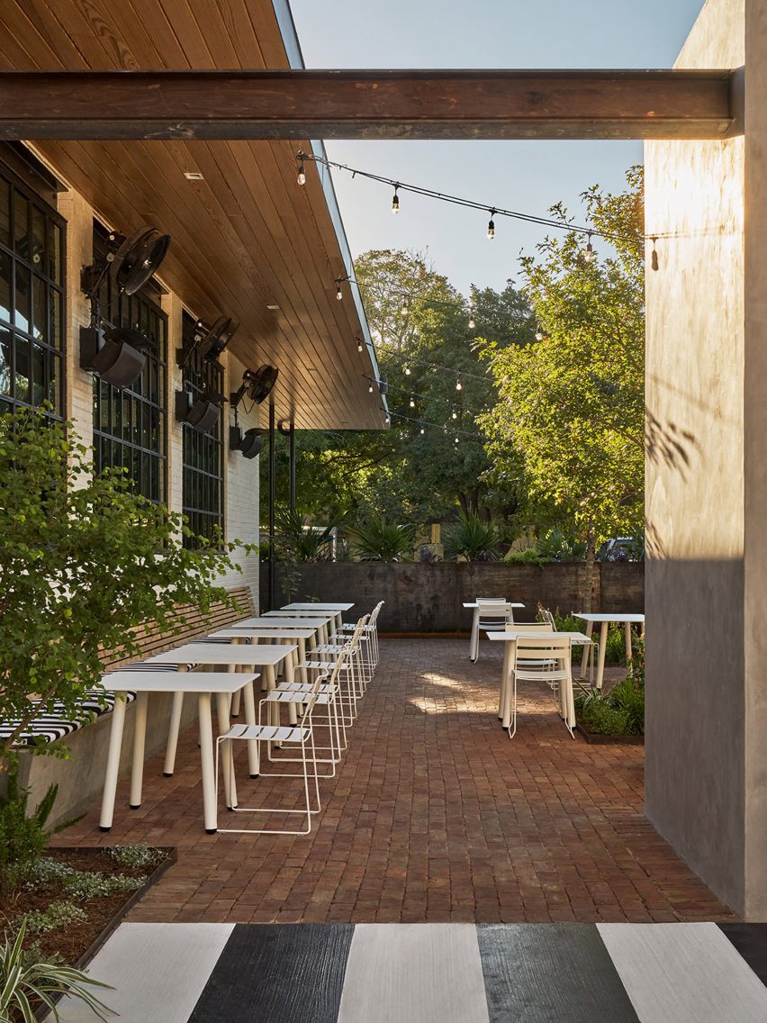
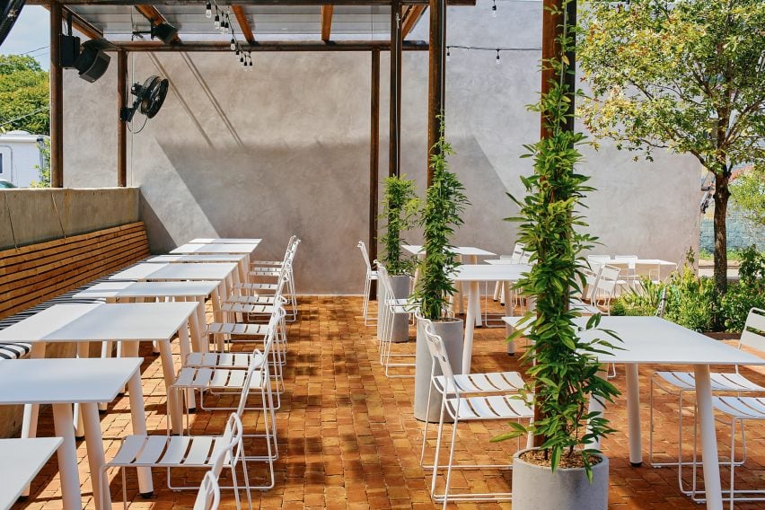
The shell of the white brick building was left intact, but the street-facing facade was previously used as a loading dock so the team transformed the back-of-house edge into a welcoming patio for the neighbourhood by removing the asphalt and adding two large live oak trees and a steel trellis and planters.

A bar in a grocery and marketA bar in a grocery and market
The exterior of the building was kept intact

A cast-in-place concrete banquette holds the edge of the patio that is paved with antique red brick.

The steel planter forms a boundary between the parking area and the dining space, while the other edge is held by a light grey-coloured stucco restroom building. White metal furniture from Isimar and Portofino was used to furnish the patio.

“The patio and wine garden is the real heart of the project,” the team said, mentioning that it wasn’t within the original scope of the project but added later when its larger value was realized. “This is where all the care and thought of the interior spills to the outside, creating a lively environment.”

Wooden tables in front of a black framed windowWooden tables in front of a black framed window
The renovated building has exposed concrete floors from the original building

On the interior, Side Angle Side complemented the original ceiling and open web joists with metal decking and industrial warehouse pendants by AQ Lighting. The polished concrete floors expose the weathered imperfections and show the history of the building.

Upon entering, shoppers take in the colourful selection of curated products displayed on white oak mercantile shelving. Green millwork hugs one wall and the space widens to an open interior plan.

A patio with white metal seating and plantsA patio with white metal seating and plants
A patio and wine garden is at the heart of the project

A central deli and coffee bar floats in the middle of the room and creates a transition from the market to the bistro. The bar is wrapped in Seneca terracotta tile and topped with grey and white quartz countertops. Wooden Soule barstools are tucked under the waterfall counter.

The back-of-house spaces hold a kitchen office, storage, and bar equipment.

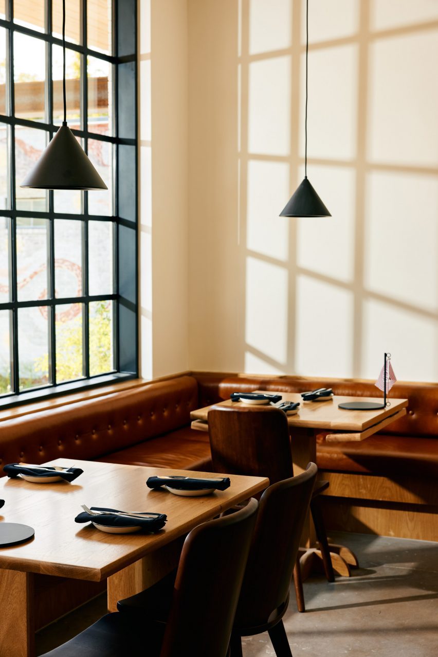
“Working closely with the owner, design finishes hint at the building’s midcentury past,” the team said, referencing the custom, built-in leather banquette by Undercover Austin Upholstery that lines the bistro’s back wall.

Above the banquette and Second Chance Custom wooden dining tables hang black cone light pendants by All Modern.

A patio with white metal seatingA patio with white metal seating
The patio features brick flooring and white metal furniture

“The single biggest sustainable feature of this project is one that is often overlooked,” the team said, noting the adaptation of the structure. “The ‘loose fit, long life’ style of these old buildings leads to more reuse and far less waste.”
Recent adaptive reuse projects in Austin include a 1900s house converted to a luxury office by Michael Hsu and commercial units converted to an architecture studio by Baldridge Architects.

The photography is by Likeness Studio and Mackenzie Smith Kelly.


Project credits:

Structural engineer: Creative Engineering
MEP engineer: ATS Engineers
Builder: Archive Properties
Commercial interior design: Side Angle Side
Architects: Side Angle Side
Building shell: Thought Barn Studio
Landscape design: Side Angle Side & Wild Heart Dirt
Owner: Steph Steele


Reference

Sam Crawford Architects tops Sydney home renovation with “garden oasis”
CategoriesInterior Design

Sam Crawford Architects tops Sydney home renovation with “garden oasis”

A private roof terrace enclosed by greenery features in Hidden Garden House, a Sydney home reconfigured by Australian studio Sam Crawford Architects.

Situated within a conservation zone, the home has been updated by Sam Crawford Architects to brighten its dark interior and transform it into an urban “sanctuary”.

Entryway of Hidden Garden House by Sam Crawford ArchitectsEntryway of Hidden Garden House by Sam Crawford Architects
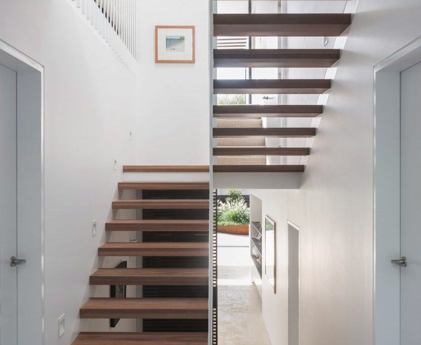
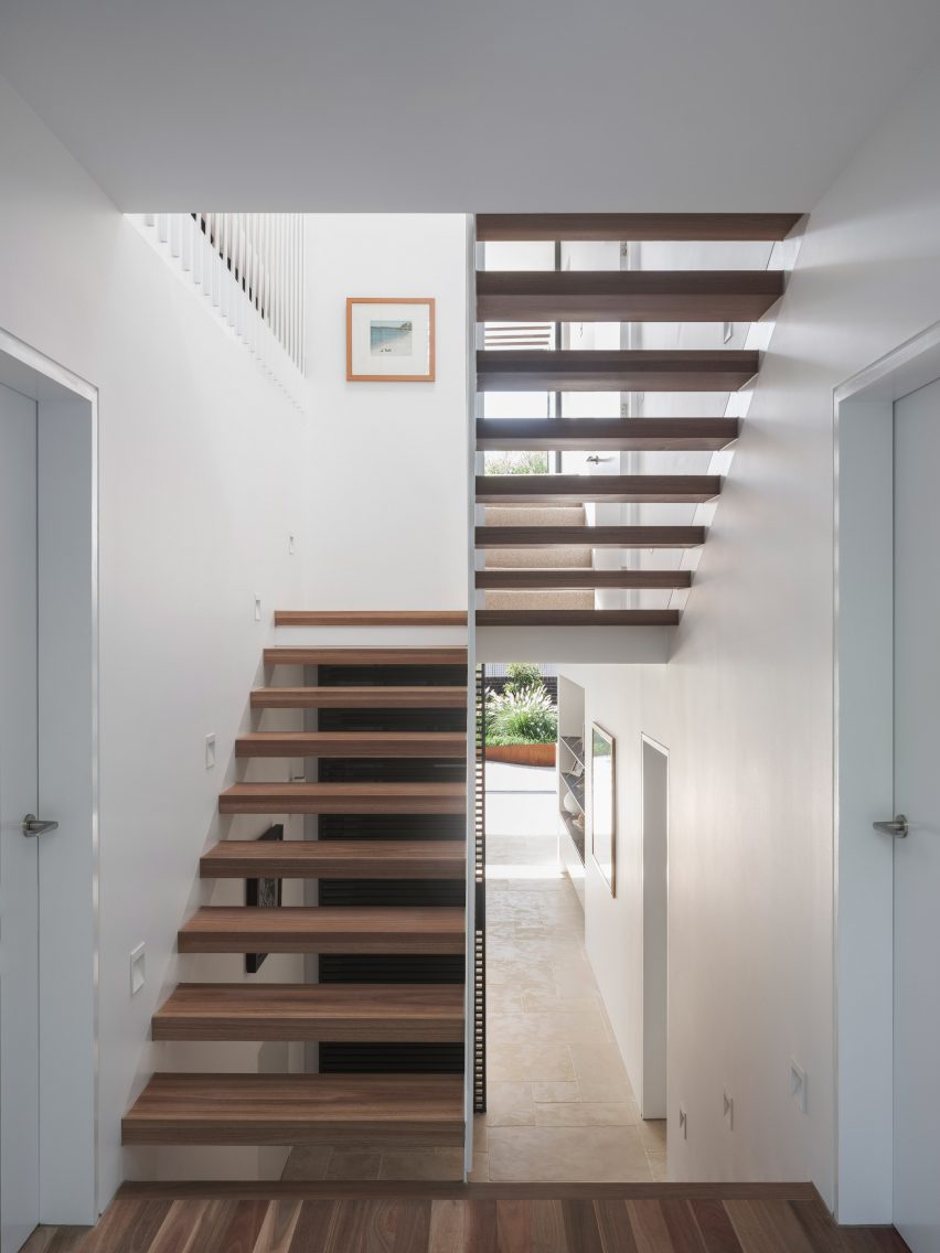
An open-tread staircase has been added to the hallway

Alterations to the 198-square-metre home’s interior are first seen in its entrance, where a stair with open treads and a white-steel balustrade replaces a solid timber structure that previously restricted light from a skylight above.

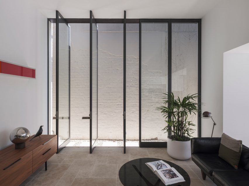
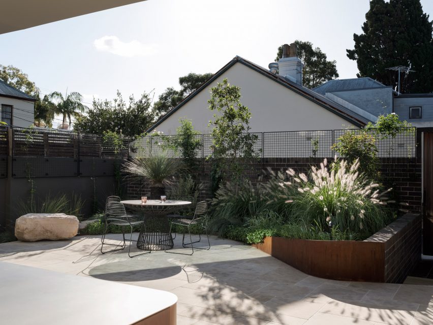
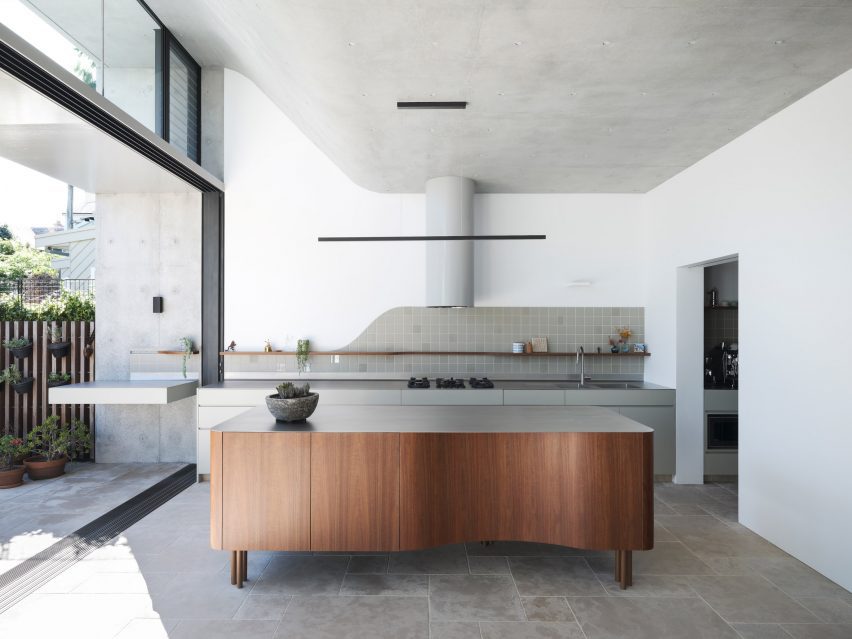
Down from the entry hall is a spacious ground-floor kitchen and dining area, which is illuminated by 4.5-metre-high glass openings that lead out to a landscaped patio. The patio is paved with limestone tiles that extend out from the interior.

Renovated kitchen and dining area in Sydney home by Sam Crawford ArchitectsRenovated kitchen and dining area in Sydney home by Sam Crawford Architects
A curved concrete roof features in the kitchen

“By extending the ground floor finishes through the full-width doors into the rear yard, the garden and high-level green trellises at the rear of the site form the fourth wall to the rear wing,” studio director Sam Crawford told Dezeen.

“They create a sense of enclosure that draws the occupant’s eye up to the expanse of the sky rather than surrounding suburbia.”

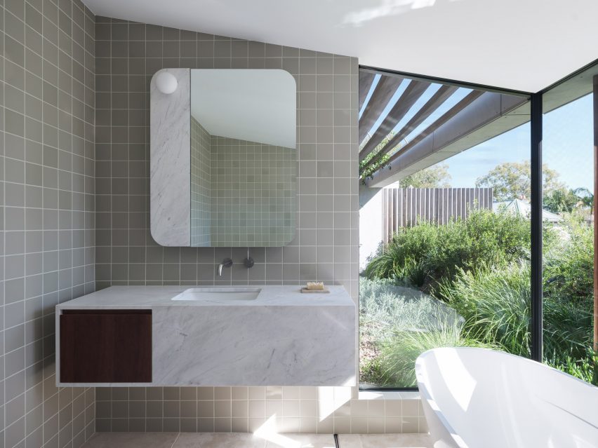
Bathroom interior at Hidden Garden House in AustraliaBathroom interior at Hidden Garden House in Australia
Angled timber screens and greenery ensure privacy for the bathroom

A concrete ceiling in Hidden Garden House’s kitchen curves upwards to help draw in the winter sun and provide summer shading, while operable clerestory windows allow natural ventilation.

Above, this curved ceiling forms a sloped roof terrace filled with plants, which is situated off the main bedroom on the upper floor.

An ensuite bathroom, also lined with limestone floor tiles, has expansive openings offering a scenic yet private bathing experience enabled by angled timber screens and the terrace’s greenery.

“The rolling green roof serves as a visual barrier to the surrounding suburb, whilst allowing the occupants to occupy their private garden oasis,” added Crawford.

Living space interior of Hidden Garden House in SydneyLiving space interior of Hidden Garden House in Sydney
White walls and wooden furniture feature throughout the interior

Hidden Garden House’s consistent material palette of bright white walls and wooden furniture ties its living spaces together, while decorative square tiles line both the kitchen and bathrooms.

Curved details, such as the patio’s shape and the kitchen island and splashback, also feature throughout.

Terrace of Hidden Garden House in Sydney designed by Sam Crawford ArchitectsTerrace of Hidden Garden House in Sydney designed by Sam Crawford Architects
The home aims to be an urban “sanctuary”

Other alterations that were made to improve Hidden Garden House’s layout include the relocation of entrances to the ground floor laundry room and bathroom.

Elsewhere, Sam Crawford Architects has also created a restaurant topped with an oversized steel roof and a bridge modelled on the curving shape of eels.

The photography is by Tom Ferguson.


Project credits:

Architect: Sam Crawford Architects
Builder:
Toki
Structural engineer: Cantilever Engineers
Civil & hydraulic engineer: Partridge
Acoustic engineer: Acoustic Logic
Heritage consultant: Damian O’Toole Town Planning
Quantity Surveyor: QS Plus
Landscape design: Gabrielle Pelletier, SCA
Roof garden supplier: Fytogreen Australia

Reference

Bunkhouse and Reurbano convert Mexico City building into boutique hotel
CategoriesInterior Design

Bunkhouse and Reurbano convert Mexico City building into boutique hotel

American hotel brand Bunkhouse and interior design studio Reurbano have used motifs derived from the history of a Mexico City structure when converting it into a boutique hotel.

Hotel San Fernando is located in the Condesa neighbourhood of Mexico City, a largely residential zone that in recent years has seen an influx of national and international travellers.

Hotel San Fernando with lettering and entrance corridorHotel San Fernando with lettering and entrance corridor
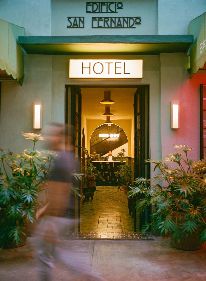
Bunkhouse and Reurbano have converted a 1940s apartment building into a boutique hotel in Mexico City

Bunkhouse worked with local interior design studio Reurbano to take a 1940s apartment building and convert it into a 19-room hotel, with finishes informed by the neighbourhood.

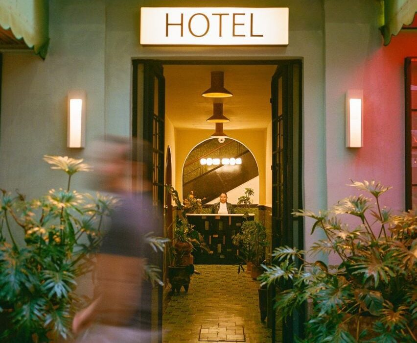
The face of the structure was restored and painted a light green, with darker green used on the awnings that provide coverage for seating attached to the hotel’s lobby and restaurant, which open to the street through glass-paned French doors.

Chandelier on bar top Chandelier on bar top
It features renovated spaces that maintain details of the original structure

An art deco-style logo spells out the name of the hotel above the door. Saint Fernando is known as the patron saint of engineers, and the team wanted to highlight this by maintaining the name of the original building in the branding of the new structure.
“We wanted to honour this building,” said Bunkhouse senior vice president of design Tenaya Hills.

“We love the story and the history and like to imagine what it has been for people over the decades.”

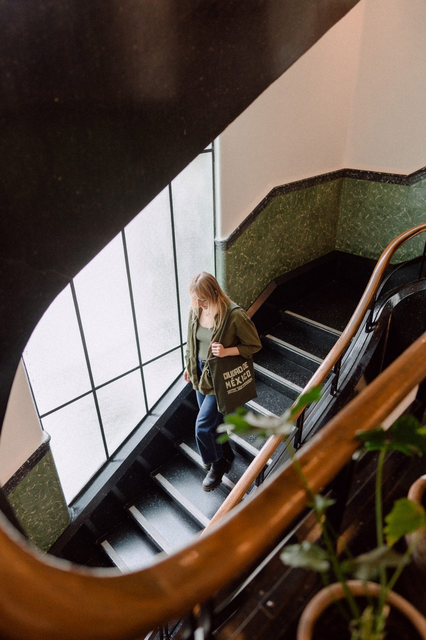
Woman on spiral staircase at Hotel San FernandoWoman on spiral staircase at Hotel San Fernando
A spiral staircase leads from the lobby to the rooftop

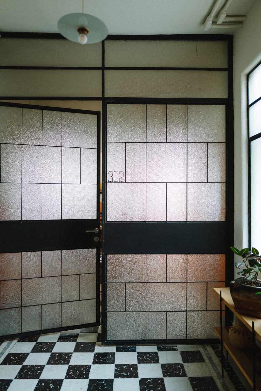
This primary entrance features a metal door with glass panes informed by the original stained glass of the building.

The entry corridor leads past a lobby lounge, with lighting by Oaxaca studio Oaxifornia and furnishings by local gallery Originario; and design studios Daniel Y Catalina, and La Metropolitana, which also created custom furniture for all of the guest suites.

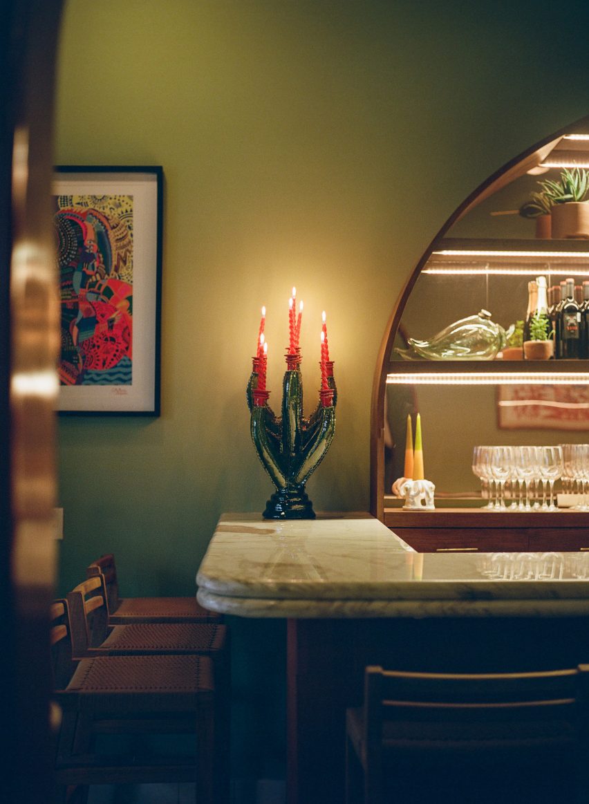
At the far end of the lobby lounge is the restaurant’s bar, which features a large semi-circular cabinet with mirrored back to hold the spirits. A chandelier by local sculptor Rebeca Cors hangs above the clay-clad bar.

French doors with black and white tile flooringFrench doors with black and white tile flooring
French doors feature at the entrance and on some of the rooms

The entrance corridor has green encaustic concrete tiles from the original building. Other original details include the wainscotting and casement windows.

A reception area is located at the end of the corridor and behind it is a circular staircase with metal-and-wood railing that leads all the way up through the building, with landings on each of its five floors, terminating at a terrace on top of the building.

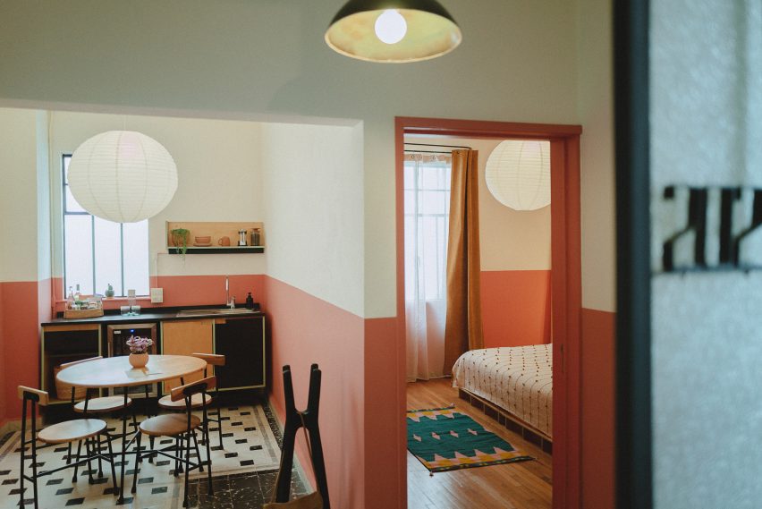
The guest rooms range from single-room setups to multi-room suites, the largest of which are accessed through French doors with opaque windows.

Here the studio departed from the greens used on the exterior and the lobby and utilised soft orange, pink and white paints.

Room at Hotel San FernandoRoom at Hotel San Fernando
Light colours and hand-crafted goods fill the rooms

Floors in the rooms are either tile or wood and furniture made from light-coloured wood is covered by locally derived textiles. Three rooms on the rooftop level feature furniture designed by Bunkhouse and fabricated by local design outfit B Collective Studio.

Pendant lamps and sconces by local ceramicist Anfora are found in the kitchens and bathrooms.

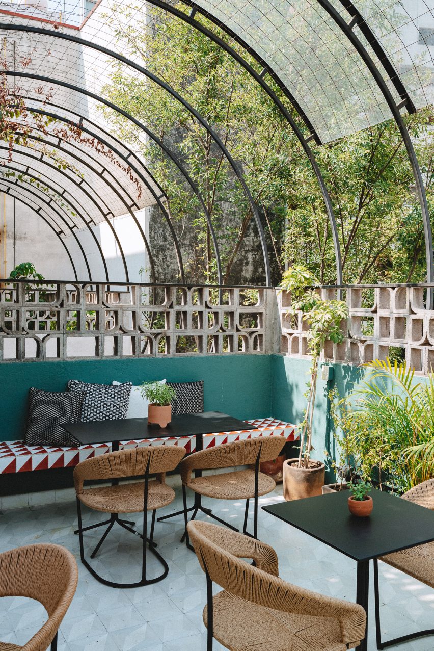
Sculptural breezeblocks on hotel terraceSculptural breezeblocks on hotel terrace
The rooftop features sculptural breeze blocks

The rooftop features a tiled dining and lounge area surrounded by sculptural breeze blocks, designed to mimic the original building’s patterned stained glass.

Mexican design studios Mexa and Comité de Proyectos contributed furniture pieces for the rooftop.

Other hotels in Mexico include a tile-clad structure in San Miguel de Allende by Productora and Esrawe Studio and a hotel in Mexico City with wooden lattices by PPAA.

The photography is by Chad Wadsworth. 


Reference

We must abandon the good taste and comfort that we’ve become used to
CategoriesInterior Design

We must abandon the good taste and comfort that we’ve become used to

Interior design must begin facing up to uncomfortable truths about our planet and health in 2024, Michelle Ogundehin writes in her annual trends report for Dezeen.


This must be the year of truth. It’s no time to be distracted by talk of trends, new or latest looks. The tactic of holding facts at arm’s length has only enabled denial, obfuscation, and fakery, as well as cauterising our moral obligation to change. Mark Twain aptly summarises our current malaise with the pithy: “What gets us into trouble is not what we don’t know, it’s what we know for sure that just ain’t so.”

Thankfully, the zeitgeist is shifting. We see it in current TV programming, ever a prescient reflection of public mood. Consider Channel 4’s punchy The Great Climate Fight, which volubly charges the British government with incompetence, to ITV’s Mr Bates vs The Post Office, dramatising the scandalous lies behind a huge miscarriage of justice.

It’s no time to be distracted by talk of trends, new or latest looks

The desire for unvarnished veracity is there in Netflix’s new tranche of documentaries. Think Robbie Williams: Behind the Scenes and its Jeffrey Epstein exposé. Even Disney’s Wagatha Christie vehicle was about truth-telling.

It reflects the shattering of any persistent facade that everything’s just fine. In the face of extreme weather patterns – from tornados in Manchester in the north of England to record-breaking monsoons in Pakistan – and the escalating rates of chronic disease, anxiety, depression, loneliness epidemics, and other mental-health disorders seen worldwide, surely, finally, our eyes are opening?

In case not, here are a couple of truths that we may need to be reminded of.

One: the perpetual quest for economic growth is unsustainable on a finite planet, yet it prevails because we’ve been hoodwinked into believing that better always means newer, faster, or more. We are entreated to consume for the good of the economy – the work-to-spend cycle. The implication being that if we don’t, we’re responsible for mass unemployment and the failure of honest businesses.
Ergo, consumer-driven economies are routinely prioritised over basic citizen welfare, and material goods have become proxies for our dreams and aspirations, even our expressions of love.

Two: the environments in which we live are increasingly toxic – physically, socially, and mentally. Yet we’re reneging on personal responsibility for our wellbeing with the misguided assumption that big industry would never create products dangerous to human health, and that our healthcare providers are there to patch us up if they do. We need to focus on causes and prevention instead of lucrative (but futile) searches for cures for diseases like cancer.

It wasn’t so long ago that the desire to exercise, seek wellbeing, or be social were reasons to leave the home

What’s tricky is that potential solutions to the above don’t wash well with legislators or many politicians because they appear slow, unduly restrictive, difficult, or inconvenient. Immediate results (i.e. within a single term of office) are seldom forthcoming, thus a stance of head-in-the-sand, or a default to fast fixes, becomes entrenched as the go-to action.

And yet, research suggests that we, the people, feel differently. According to the 10th annual Life at Home report produced this year by IKEA (one of the world’s largest home surveys, encompassing the views of 37,428 people aged 18-plus across 38 countries), searches for “slow living” have doubled since 2015.

So where does this leave us?

We’re being pushed and pulled in many contradictory directions. It wasn’t so long ago that the desire to exercise, seek wellbeing, or be social were reasons to leave the home. Now these activities all happen within the same four walls.

This creates many tensions. Should our domestic caves be linked to the world via the latest high-tech gizmos, or be our deliberate respite from the techno-frazzle? How do we square a wish for personal privacy with the sensation of living in more open spaces? Can we work from home without feeling like we live at work?

It was no surprise to me that Squishmallows were the hit toy of 2023. These soft, malleable cute-character cushions are acutely comforting to hold. Even the revered investor Warren Buffet now has the company in his portfolio. They are a potent symbol of a need.

In response, the popular press touts voluminous La-Z-Boy-style recliners as the next big thing, but is an inducement to lounge ever further into denial really what’s called for?

Our ability to thrive must become the guiding principle for all design

Humans are the ultimate adaptors, but we require stimulus to learn and grow, if not an element of discomfort. While your genes may load the gun, your environment pulls the trigger. Currently, for many, that’s somewhere hyperconnected yet also physically disconnected, temperature-controlled and sedentary.

Align this with the current cult of convenience – that which enhances personal comfort or advantage over everything else, and therein lies the downward spiral.

We must abandon the ordered, rational, learned good taste and comfort that we’ve become used to in favour of something more instinctive and rugged. Less a singular design aesthetic than a profoundly sensory desire to touch, smell and feel intensely. It is the personal over the predictable. The umami in the dish. The idea that owes its genus to a singular moment of unique creative vision, or innovation.

We must aim for a societal stability that does not rely on the continuous fetishisation of “novelty” to drive ever-increasing consumption if economic activity is to have a hope of remaining within ecological scale. Our ability to thrive must become the guiding principle for all design, if not perceptions of success.

Most importantly, we can no longer be afraid to speak or hear these truths, starting at home – the environment over which we have the most agency.

Here, then, are some final “home” truths that bear repeating.

Most homes are more polluted on the inside than a busy street corner outside due to the build-up of invisible toxins therein, yet we spend 90 per cent of our time indoors. Some examples: gas hobs leak benzene, a known carcinogen, even when they’re off – this has been linked to one in eight cases of childhood asthma.

We have been living in a time of fantastical storytelling

Microplastics have been found in the placentas of unborn babies. Chemicals in everyday personal care products can cause chronic hormonal disruption that leads to breast cancer. Chemical flame retardants legally mandated for use on your upholstery increase smoke toxicity more than they reduce fire growth.

And Wi-Fi may not be as benign as you think. The World Health Organisation, in association with the International Agency on Cancer, formally classified electromagnetic field radiation (as emitted by Wi-Fi connected devices) as a Class 2B human carcinogen (potentially harmful to health) over a decade ago.

In summary, we have been living in a time of fantastical storytelling, fictions of delusional positivity that obscure the truth. Plato considered that truth is a correspondence between belief and reality. Time to wake up then if we are to stand a chance of survival, as our current reality almost beggars belief.

Michelle Ogundehin is a thought leader on interiors, trends, style and wellbeing. Originally trained as an architect and the former editor-in-chief of ELLE Decoration UK, she is the head judge on the BBC’s Interior Design Masters, and the author of Happy Inside: How to Harness the Power of Home for Health and Happiness, a guide to living well. She is also a regular contributor to publications including Vogue Living, FT How to Spend It magazine and Dezeen.

The photo, of a Kyiv apartment designed by Olga Fradina, is by Yevhenii Avramenko.

Dezeen In Depth
If you enjoy reading Dezeen’s interviews, opinions and features, subscribe to Dezeen In Depth. Sent on the last Friday of each month, this newsletter provides a single place to read about the design and architecture stories behind the headlines.

Reference

PSLab’s monochromatic Berlin showroom is a “sacred place for light”
CategoriesInterior Design

PSLab’s monochromatic Berlin showroom is a “sacred place for light”

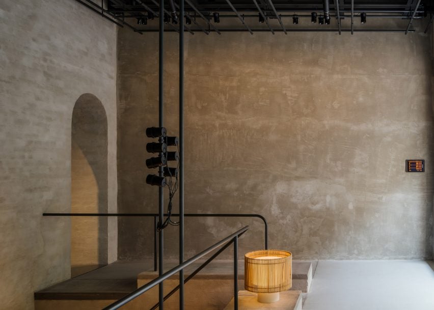
A pared-back palette of raw materials creates a calm backdrop for PSLab’s lighting products inside the brand’s Berlin workshop and showroom space, designed in collaboration with Belgian firm B-bis architecten.

The newly opened studio occupies the ground floor and basement of a 1907 residential building in the city’s Charlottenburg district.

Entrance of PSLab's Berlin studioEntrance of PSLab's Berlin studio
PSLab has opened a new workshop and showroom in Berlin

PSLab, which designs and manufactures light fixtures for architectural projects, set out to create a showroom where customers can experience lighting effects in a home-like environment.

“PSLab is not a digital platform where clients pick and buy products,” the company’s founder Dimitri Saddi told Dezeen. “Therefore the physical space as a ‘home’ is most important for one-on-one communication.”

“In Berlin, as with all our studios, we wanted to design a canvas to show the quality of our light and to show the process of our bespoke design approach by integrating a material library of endless opportunities and possibilities.”

Library of materials inside lighting showroom by B-bis architectenLibrary of materials inside lighting showroom by B-bis architecten
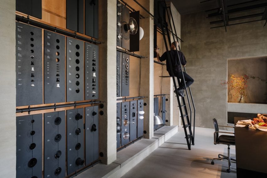
The space includes a materials library with a movable ladder

Working together with B-bis architecten, the design team looked to create a contemporary space that contrasts with Charlottenburg’s classical architecture whilst retaining references to common elements like colonnades, arches and symmetrical forms.

The entrance takes the form of a large zinc-and-glass sliding door that is set into the facade of the building on Niebuhrstrasse. Moving the door aside reveals a full-height opening that welcomes visitors into the studio.

Vase illuminated inside PSLab's Berlin studioVase illuminated inside PSLab's Berlin studio
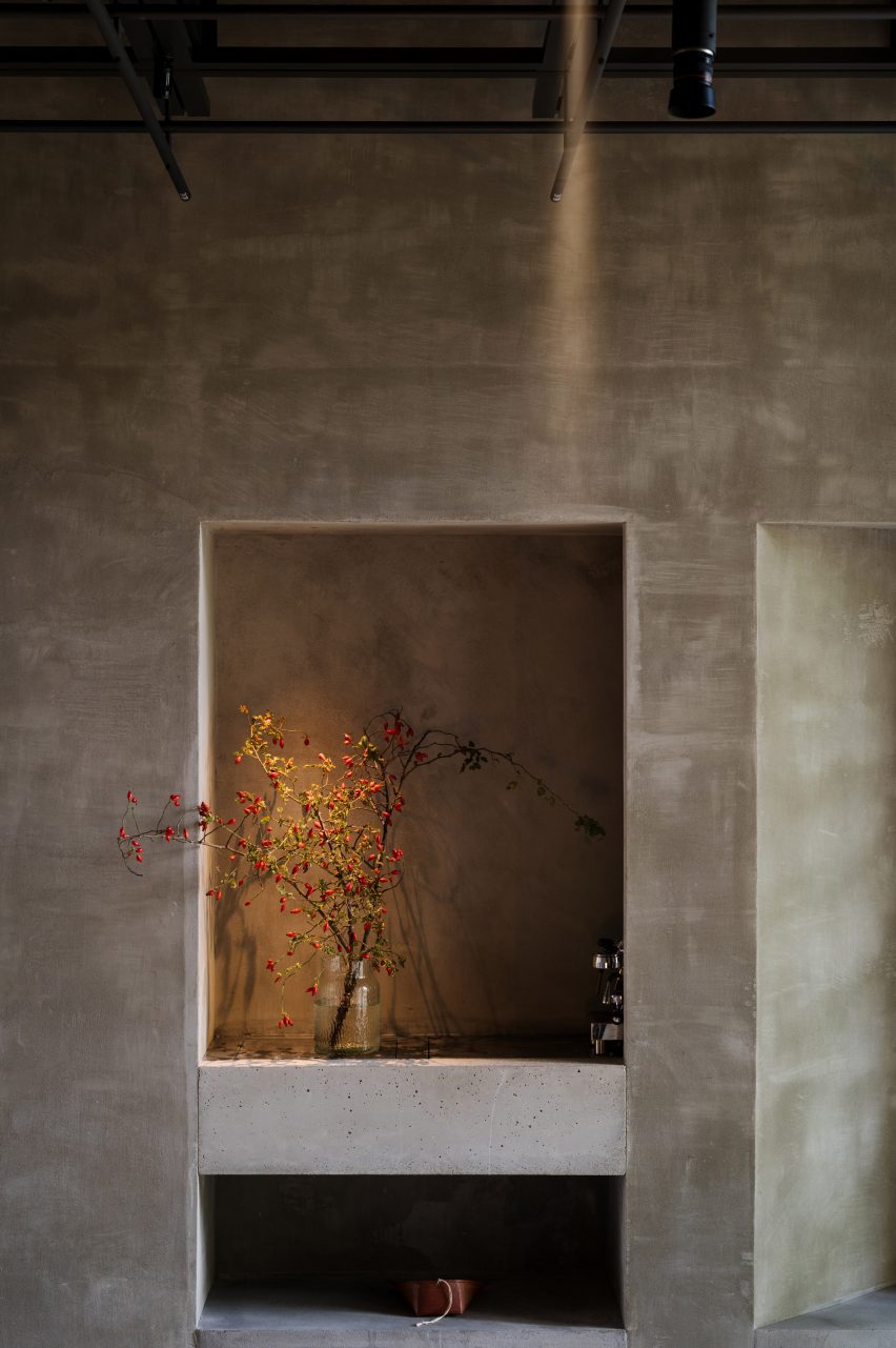
The interior was designed to present the brand’s lighting to its best advantage

Inside, a double-height space with a six-metre-high ceiling allows lighting products to be hung in various heights and configurations.

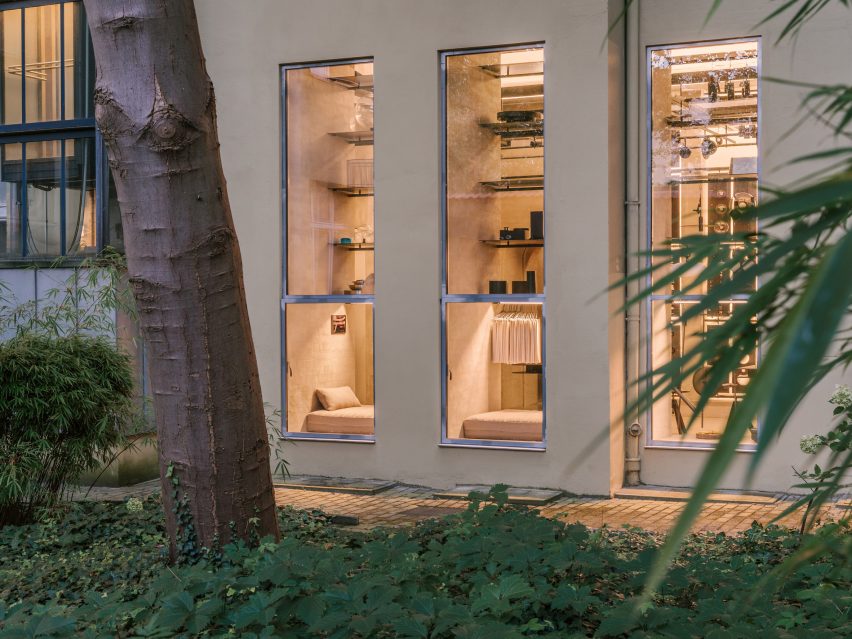
Arched openings on either side of the staircase void lead through to a garden room that looks onto a leafy courtyard. Daylight streams into the space through large windows to create a tranquil atmosphere.

The workshop space includes a materials library where visitors can touch and explore the physical qualities of the brand’s lighting products. A movable ladder provides access to items on the library’s upper rows.

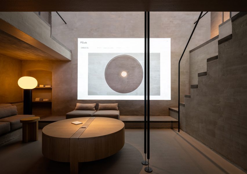
The cosy basement level is a place for informal conversations with clients. A projector in this parlour space also allows the team to display the company’s extensive digital library.

Lounge inside lighting showroom by B-bis architectenLounge inside lighting showroom by B-bis architecten
The basement serves as a cosy lounge

Throughout the studio, PSLab chose materials and finishes including lime wash, concrete, zinc and textiles that focus attention on how the space is lit rather than its architectural features to create a kind of “sacred place for light”.

“It is all about monochromatics and textures, which are specific to the location,” said Mario Weck, a partner at PSLab GmbH. “The atmosphere lets people focus on our approach.”

Llighting rig inside PSLab's Berlin studioLlighting rig inside PSLab's Berlin studio
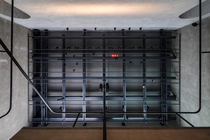
Gantries provide support for various light sources

On the ceiling of both the front room and garden room is a grey-steel gantry that helps unify the spaces whilst supporting various light sources as well as technical elements, much like on a theatre stage.

Furniture is mostly built in, with simple cushions providing casual seating while cylindrical wooden side tables and coffee tables offer somewhere to place a cup or catalogue.

Exterior of PSLab's Berlin studioExterior of PSLab's Berlin studio
The showroom is set in Berlin’s Charlottenburg

PSLab has studios in Antwerp, Bologna, London, Stuttgart and Beirut, where the firm originated. For its UK headquarters, the company commissioned JamesPlumb to convert a Victorian tannery into a space that evokes the “quiet brutalism” of the former industrial building.

Previously, the lighting brand has collaborated with Parisian studio Tolila+Gilliland on the design of an Aesop store in London featuring felt-covered walls and slim black pendant lights.

The photography is by Nate Cook.

Reference

Jialun Xiong creates intricate Sichuanese restaurant in LA
CategoriesInterior Design

Jialun Xiong creates intricate Sichuanese restaurant in LA

Subtle nods to traditional Chinese architecture can be found throughout this restaurant in California, designed by LA-based Jialun Xiong.

Sichuan Impression‘s third outpost, located in Alhambra, occupies a 2,000-square-foot (186-square-metre) space that “takes an elegantly pared-down approach to family-style dining”.

Restaurant interior with a pared-back paletteRestaurant interior with a pared-back palette
Jialun Xiong chose a pared-back palette for the Sichuan Impression interiors, creating a relaxed atmosphere

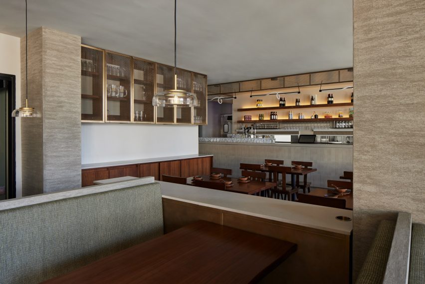
Jialun Xiong took an equally relaxed approach to the interiors, combining warm and soft colours with walnut furniture and metal accents.

“For Sichuan Impression, I chose a muted palette and natural materials to encourage guests to look a little longer and see the intricacies and textures that aren’t so obvious at first glance,” said Xiong.

A free-seating area beside a bar featuring walnut furniture and floating metal cabinetsA free-seating area beside a bar featuring walnut furniture and floating metal cabinets
A free-seating area beside the bar features walnut furniture and floating metal cabinets

The restaurant is roughly divided into four dining areas, each open to one another but defined by the style of seating.

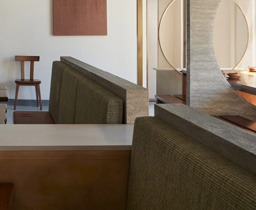
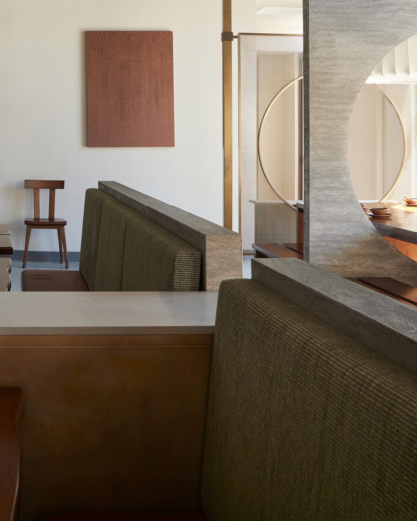
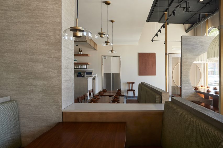
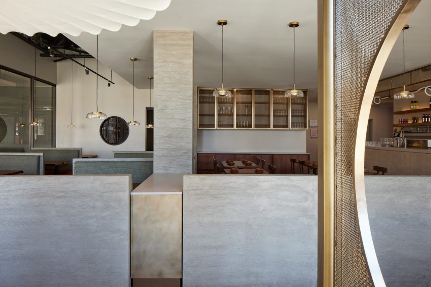
To the left of the entrance is a sequence of partitions that alternate between heavy grey plaster and delicate metal mesh screens supported by antique brass frames.

Plaster partition separating different sections of the restaurantPlaster partition separating different sections of the restaurant
Plaster partitions separate the various sections of the restaurant

Each has a circular opening, which align to provide a continuous view along the minimalist walnut tables and benches that run along the same axis.

One table extends through an opening, accommodating larger parties when needed, and each compartment features an oversized, raw silk cloth light shade suspended above.

Restaurant interior with walls and screens of different heights and thicknessRestaurant interior with walls and screens of different heights and thickness
Walls and screens of different heights and thickness create a hierarchy of spaces

“The custom chandeliers nod to traditional Chinese lanterns and reflect Xiong’s skeletal furniture designs,” said the restaurant team.

In front of the bar is a free-seating space furnished with more wooden tables and chairs, which match the cabinetry against the far wall, while glass-fronted metal cabinets are mounted above.

A pair of chunky plaster-wrapped columns and low partitions separate a collection of booths with leather seats and upholstered cushioned backs on the other side.

The green fabric was chosen to resemble bamboo – a common material used in Sichuanese design.

Two rows of booth seating either side of a walkwayTwo rows of booth seating either side of a walkway
Booth seating is upholstered with a green fabric chosen to evoke bamboo

At the back of the restaurant is the private dining area, which can accommodate 16 guests altogether, or two groups of eight when a sliding partition is closed.

A circular window offers a glimpse into the private space, where the pared-back material palette is continued.

Private dining room with an intimate feelPrivate dining room with an intimate feel
A private dining room at the back has an intimate feel and can be spied through a circular window

“The secluded space is designed to feel like home with its bespoke circular dining table and ambient lighting,” said Xiong. “I believe good design doesn’t always have to be instantly recognisable, it can simply blend in.”

Xiong, who is originally from Chongqing, has also completed the retro-futuristic Chinese restaurant 19 Town close to Downtown LA. The designer recently showed her furniture and lighting pieces as part of the INTRO/LA showcase in November 2023, and at the Alcova exhibition during Art Basel in Miami in December.

Reference