Ready-made Home by Azab
CategoriesInterior Design

Eight home interiors where full-length curtains add a touch of drama

Ready-made Home by Azab

From a glitzy Parisian apartment to a converted garage in Buffalo, New York, our latest lookbook collects eight residential interiors where floor-to-ceiling curtains inject a theatrical feel.

Curtains aren’t just for covering windows. A set of statement drapes can be an easy way to significantly change the mood of a room, particularly in apartment renovations.

The selection below features curtains in stage-like living rooms, rough-edged bedrooms and cosy working nooks.

This is the latest in our lookbooks series, which provides visual inspiration from Dezeen’s archive. For more inspiration, see previous lookbooks featuring interiors with statement carpets, furry walls and colourful bedrooms.


Ready-made Home by AzabReady-made Home by Azab
Photo is by Luis Díaz Díaz

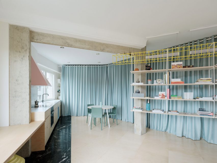
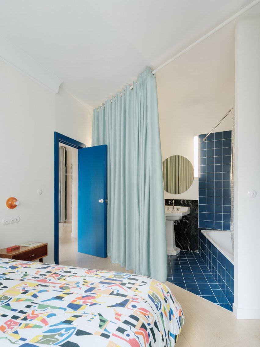
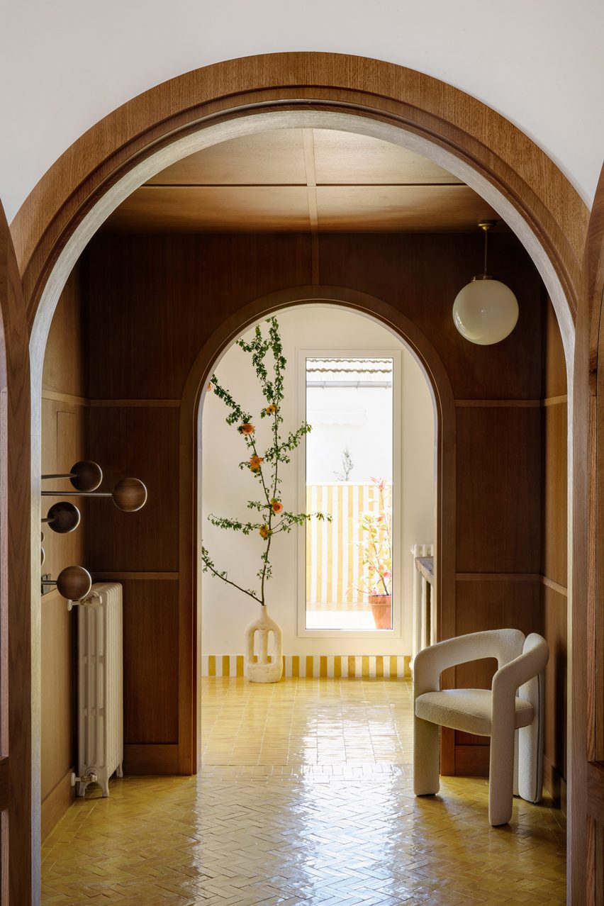
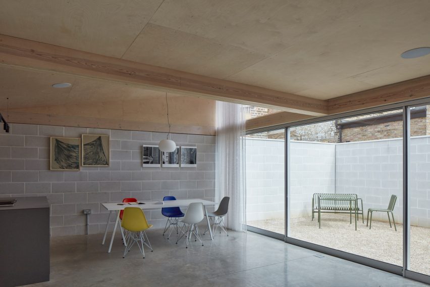
Ready-made Home, Spain, by Azab

Duck-egg blue curtains help to create a flexible open-plan layout at this apartment in Bilbao that was overhauled by architecture studio Azab, running the length of the living-dining-kitchen area to conceal storage space and a bathroom.

“The curtains have theatrical and playful connotations and invites the inhabitant to perform with it, to change the space and to play with the mysteries, contradictions and paradoxes that privacy offers us beyond morality,” said the studio.

Find out more about Ready-made Home ›


Ruckers Hill House by Studio BrightRuckers Hill House by Studio Bright
Photo by Rory Gardiner

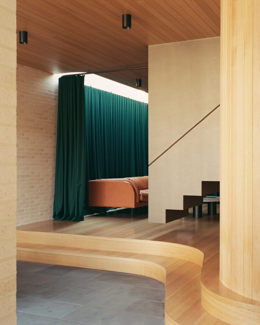
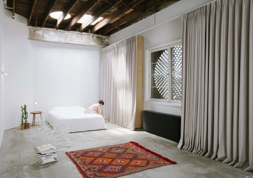
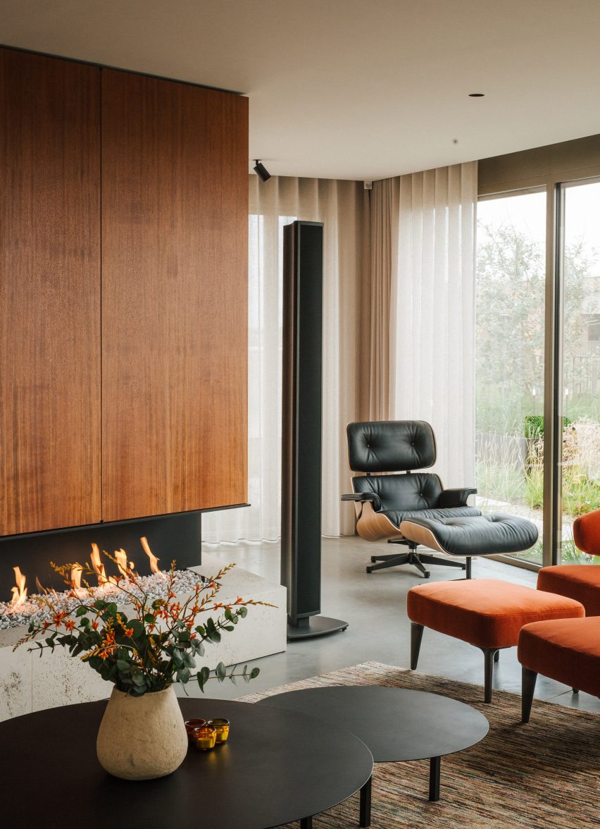
Ruckers Hill House, Australia, by Studio Bright

In this extension to an Edwardian family home in Melbourne, architecture practice Studio Bright raised the sitting room on a curved plinth, giving it a stage-like quality.

Enhancing the effect is a heavy green curtain hung from the ceiling, which can be drawn across to turn the space into an impromptu theatre for the children to play in.

Find out more about Ruckers Hill House ›


Uchronia renovated a Haussmann-era apartment in ParisUchronia renovated a Haussmann-era apartment in Paris
Photo by Félix Dol Maillot

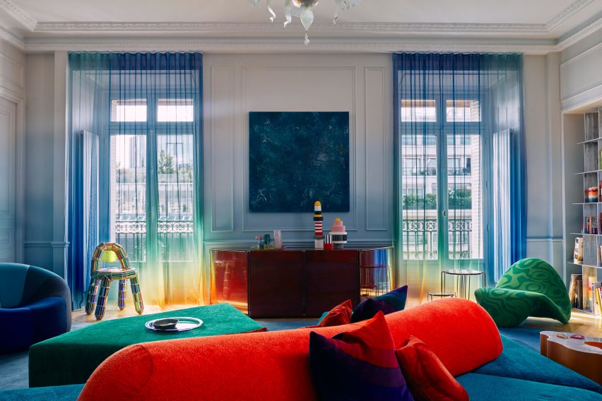
Avenue Montaigne apartment, France, by Uchronia

Sheer, rainbow-effect curtains cover the balconies of this opulent Haussman-era Parisian apartment, renovated by local studio Uchronia.

Even the walls echo the curtains’ gradations of colour, while the brightly toned furnishings are designed to resemble pieces of jewellery.

Find out more about this apartment ›


Roksanda Ilincic penthouse apartment in London's King's CrossRoksanda Ilincic penthouse apartment in London's King's Cross
Photo by Michael Sinclair

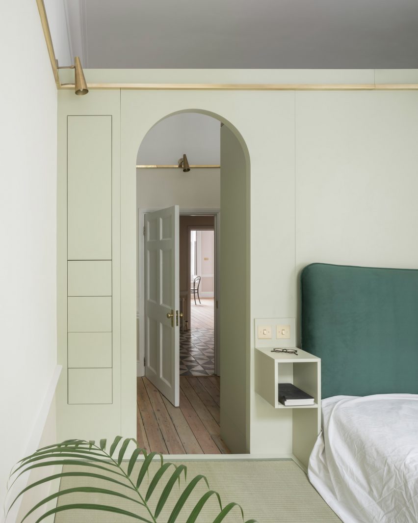
Gas-holder apartment, UK, by Roksanda Ilincic

Fashion designer Roksanda Ilincic brought her proclivity for bold colours and shapes to this London penthouse inside a former Victorian gas holder.

Pale pink Kvadrat curtains over the full-height windows cast a rose-tinted hue over the rooms, where the colour palette is kept mostly neutral apart from some pops of bright yellow.

Find out more about this apartment ›


Big Space, Little Space by Davidson RafailidisBig Space, Little Space by Davidson Rafailidis
Photo by Florian Holzherr

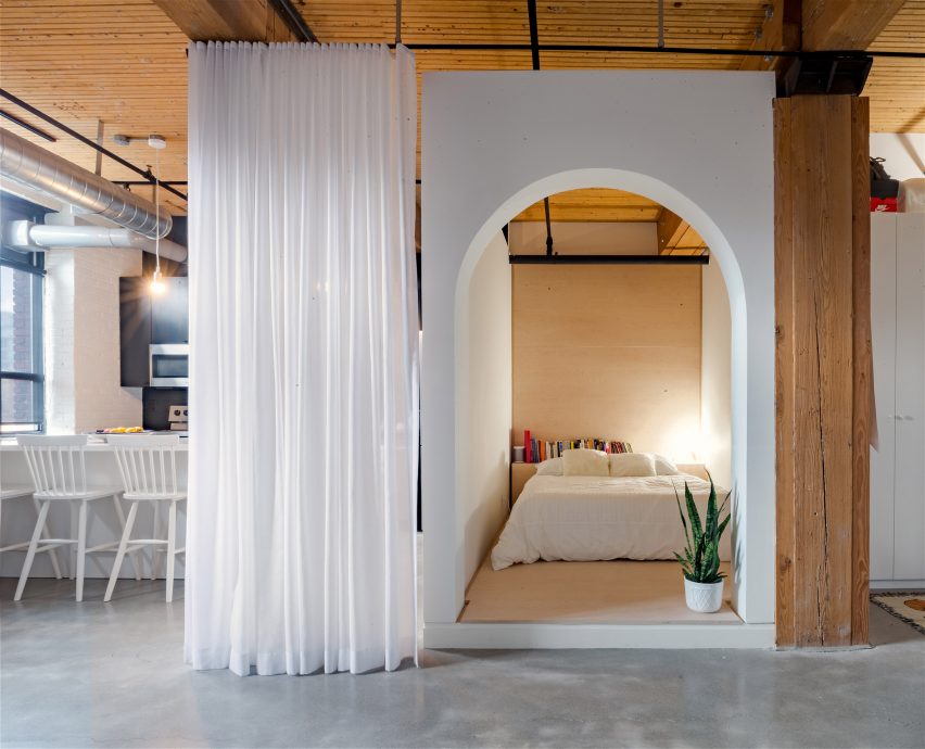
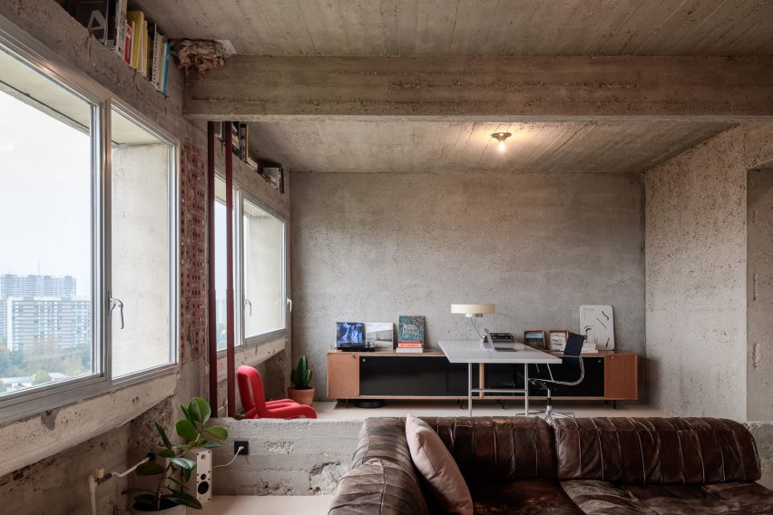
Big Space, Little Space, USA, by Davidson Rafailidis

Peeling paintwork, uneven concrete floors and distressed wooden beams lend a distinctly rough-and-ready feel to this home-slash-workspace in Buffalo created out of a garage conversion by design studio Davidson Rafailidis.

For the most part, the space is minimally furnished, apart from a set of high and wide drapes that introduce a luxurious twist.

Find out more about Big Space, Little Space ›


Silver curtains in hallway at Landscape House in JapanSilver curtains in hallway at Landscape House in Japan
Photo by Norihito Yamauchi

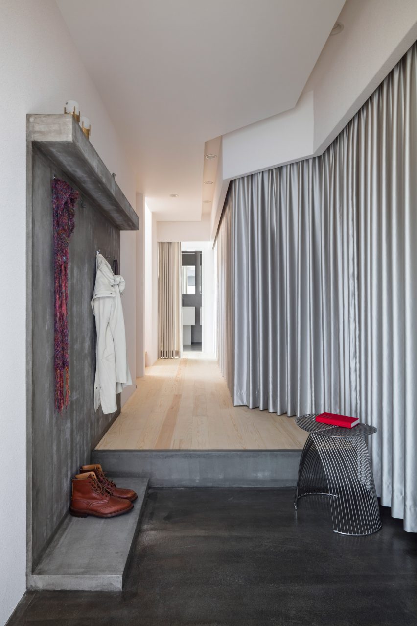
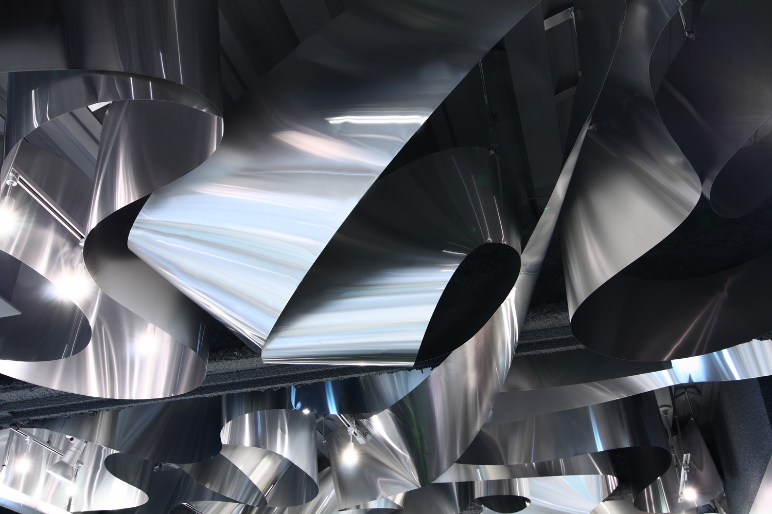
Landscape House, Japan, by FORM/Kouichi Kimura Architects

Upon entering Landscape House in central Japan, designed by Japanese studio FORM/Kouichi Kimura Architects, one is greeted by a lengthy corridor lined entirely on one side by a full-length silver curtain.

The fabric echoes a raw concrete feature wall on the opposite side of the corridor, as well as referencing the extensive use of metal throughout the building.

Find out more about Landscape House ›


Kitchen in Pops apartment by Furora StudioKitchen in Pops apartment by Furora Studio
Photo by ONI Studio

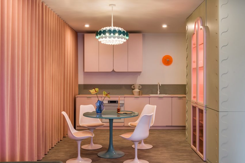
Pops, Poland, by Furora Studio

Furora Studio wanted the design of this holiday apartment in Kraków to be slightly more outrageous than the standard residential interior.

A velvety, salmon-pink curtain dresses an entire wall in the open-plan kitchen and living room, adding to a plethora of sugary colours and rounded edges.

Find out more about Pops ›


Maison-Boutique Coloniale by Michael Godmer and Mathieu TurgeonMaison-Boutique Coloniale by Michael Godmer and Mathieu Turgeon
Photo by Maxime Brouillett

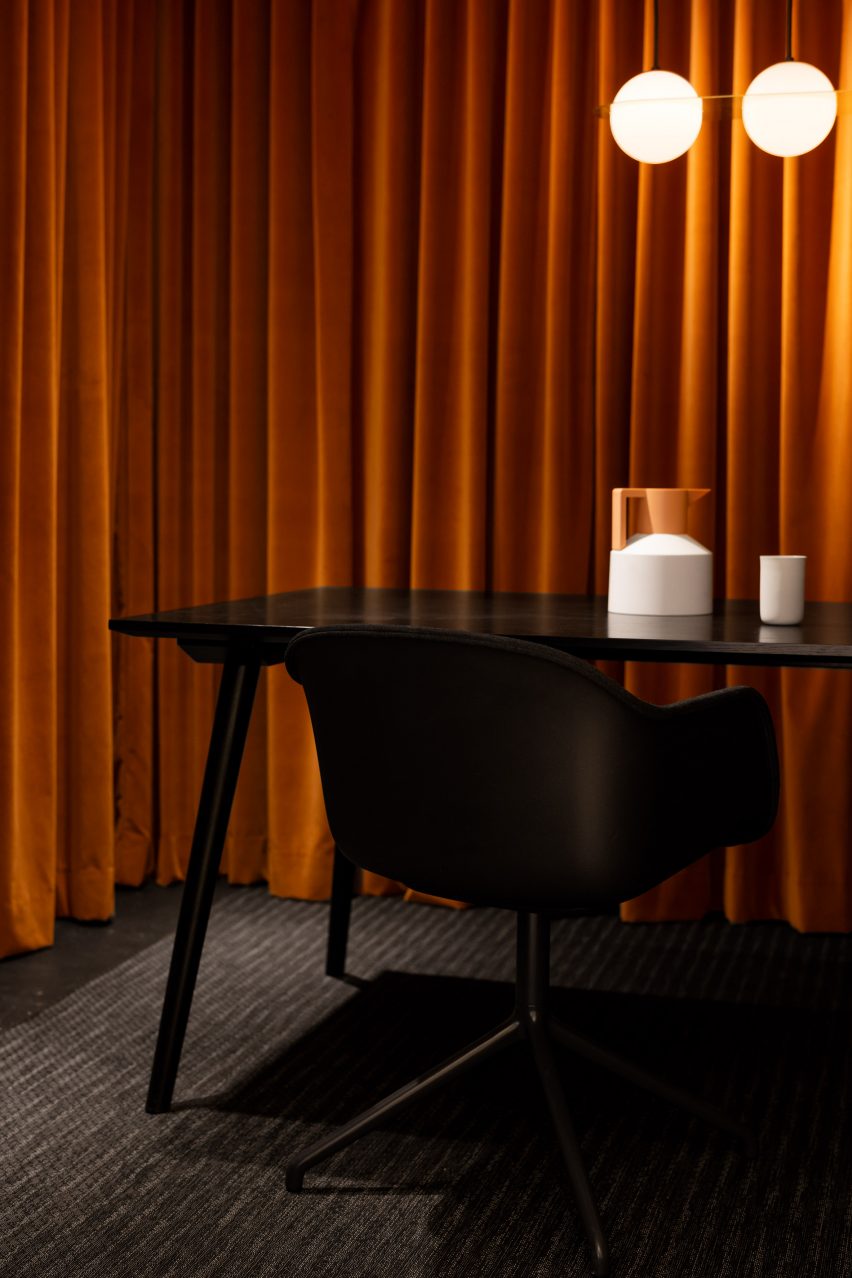
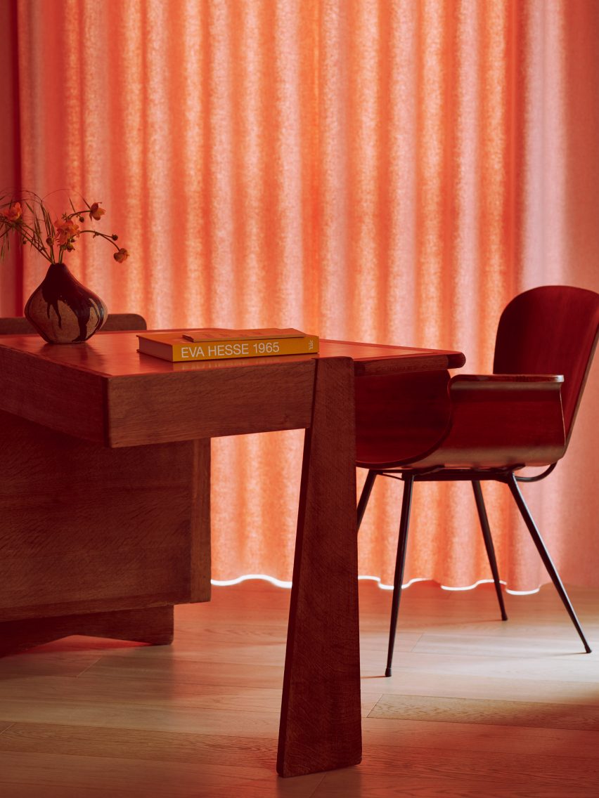
Maison-Boutique Coloniale, Canada, by Michael Godmer and Mathieu Turgeon

Most of the spaces inside Maison-Boutique Coloniale in Montreal – renovated by designers Michael Godmer and Mathieu Turgeon as their own residence and studio – are pared-back and neutral.

But in an office space on the basement level, plush orange curtains line the walls, combined with dim pendant lighting and a black table arrangement by Muuto and &tradition for an intimate effect.

Find out more about Maison-Boutique Coloniale ›

This is the latest in our lookbooks series, which provides visual inspiration from Dezeen’s archive. For more inspiration, see previous lookbooks featuring interiors with statement carpets, furry walls and colourful bedrooms.

Reference

Harry Nuriev and Tyler Billinger Residence
CategoriesInterior Design

Eight bold showers that add a pop of colour to the bathroom

Harry Nuriev and Tyler Billinger Residence

Showers enclosed in dichroic glass and wrapped in speckled terrazzo are featured in our latest lookbook, which showcases eight unique showers that bring a touch of colour to the bathroom.

Bathtubs often hold the spotlight in a bathroom, but this round-up proves showers can be just as showstopping – and luxurious.

From an all-pink shower in Taiwan to a minty-green shower in an Antwerp apartment, these colourful showers add a bold touch to brighten up the surrounding space.

This is the latest in our lookbooks series, which provides visual inspiration from Dezeen’s archive. For more inspiration see previous lookbooks featuring pared-back loft conversions, lattice screens and outdoor showers.


Harry Nuriev and Tyler Billinger Residence
Photo is by Dylan Chandler

Crosby Studios apartment, USA, Crosby Studios

Crosby Studios founder Harry Nuriev and partner Tyler Billinger outfitted their New York City apartment in a palette of purple and grey.

The bold colour scheme was carried into the bathroom, where the shower was clad in grey tile and enclosed with a purple shower screen.

Find out more about the Crosby Studios apartment ›


The Siren Hotel by ASH NYC
Photo is by Christian Harder

The Siren Hotel, USA, Quinn Evans Architects

The Siren Hotel in Detroit was originally built in 1926 by architect Robert Finn before being refreshed by design development firm ASH NYC with the help of Quinn Evans Architects in 2018.

The renovation included the addition of pastel hues and an assortment of rich textiles, while the hotel’s showers were updated with red-speckled terrazzo and a glass-brick divider.

Find out more about The Siren Hotel ›


Concrete bathroom in Habitat 67 building
Photo is by Maxime Brouillet

Unit 622, Canada, Rainville Sangaré 

Unit 622 by Rainville Sangaré is located inside architect Moshe Safdie’s famous brutalist Habitat 67 in Montreal, Canada.

Sangaré updated the apartment to include walk-in showers enclosed in dichroic glass that appears to change colour when viewed from different angles.

Find out more about Unit 622 ›


A bathroom with pink tile
Photo is by Hey! Cheese

Cats’ Pink House, Taiwan, KC Design Studio

Not only does the Cats Pink House by KC Design Studio include an entire room dedicated to the owner’s cats, but it also contains a spacious pink bathroom.

Large pink tiles cover the walls and floor of a walk-in shower, which is also outfitted with a stand-alone tub.

Find out more about Cat’s Pink House ›


Spinmolenplein apartment by Jürgen Vandewalle
Photo is by Karen Van der Biest

Spinmolenplein penthouse, Belgium, Jürgen Vandewalle

Located on the top floor of the tallest residential building in Ghent, Belgium, the 60-square-metre Spinmolenplein penthouse updated by Jürgen Vandewalle was designed to maximize space.

A bathroom unit clad in white wood panels opens to reveal a colourful shower stall finished with a micro-cement in a muted red.

Find out more about Spinmolenplein penthouse ›


A bathroom with shower and bathtub clad in blue tile
Photo is by Luis Díaz Díaz

Ready-made Home, Spain, Azab

Located in an apartment building in Spain built in the 1960s, the Ready-made Home by Azab features a colourful palette of soft pinks, blues and yellows.

A corner bathroom in the main bedroom is partitioned by a light blue curtain, while a deeper shade of blue was carried into the tiles that cover the floor and walls of the bathtub and shower.

Find out more about Ready-made Home ›


Apartment A by Atelier Dialect
Photo is by Piet-Albert Goethals

Apartment A, Belgium, Atelier Dialect 

While an en-suite shiny steel tub makes quite the statement in this Antwerp apartment updated by Belgian design studio Atelier Dialect, the shower is equally intriguing.

Contrasted by the stark white and black palette of the surrounding bedroom, the shower was wrapped in minty green, with a single shelf cut into the wall for toiletries and a bench installed opposite.

Find out more about Apartment A ›


Louisville Road house designed by 2LG
Photo is by Megan Taylor

Louisville Road house, England, 2LG Studio

Located in Tooting, south London, interior design studio 2LG overhauled a period home with blue tilework and coral-orange cabinetry.

The walk-in shower features baby blue floor tiles and matching hardware, as well as sky-blue bordering that surrounds the fluted-glass shower screen.

Find out more about Louisville Road house ›

This is the latest in our lookbooks series, which provides visual inspiration from Dezeen’s archive. For more inspiration see previous lookbooks featuring basement apartments, mid-century homes and textural kitchens.

Reference

Budge Over Dover house in Sydney designed by YSG
CategoriesInterior Design

Eight earthy kitchens where terracotta tiles add warmth and tactility

Budge Over Dover house in Sydney designed by YSG

For this lookbook, we’ve collated eight kitchens from Dezeen’s archive that use terracotta tiling to bring a sense of warmth into the functional space.

Terracotta – meaning baked earth in Italian – technically refers to any object made from fired clay. But most commonly, the term is used to describe pottery made from a porous type of earthenware clay that is high in iron oxides, giving it a rusty reddish brown colour.

Unlike ceramic stoneware or porcelain, terracotta is fired at lower temperatures so it does not vitrify – meaning the clay retains a coarse, organic texture and isn’t waterproof unless it is glazed.

Used as a backsplash or flooring, this can bring some much-needed colour and texture into the kitchen while helping to create a connection to the outdoors.

This is the latest in our lookbooks series, which provides visual inspiration from Dezeen’s archive. For more inspiration see previous lookbooks featuring accent walls, bookshelves and sunken baths.


Budge Over Dover house in Sydney designed by YSG
Photo by Prue Ruscoe

Budge Over Dover, Australia, by YSG

Australian studio YSG used narrow terracotta tiles to “draw the outside in” to this house in Sydney, spilling from the floor of the garden patio onto the adjacent kitchen and dining area, which can be opened up to the exterior using sliding glass doors.

The rough clay is paired with shiny aubergine-coloured plaster and travertine in the sunken living room beyond, creating a contrast between raw and polished surfaces.

Find out more about Budge Over Dover ›


Dining area in Farley Farmhouse by Emil Eve Architects
Photo by Mariell Lind Hansen

Farley Farmhouse, UK, by Emil Eve Architects

When Emil Eve Architects added a gabled kitchen to a farmhouse in Wiltshire, the British studio set out to mirror the material palette of the existing home by adding arrowhead terracotta tiles to the extension’s exterior.

Inside, matching rectangular tiles were laid in a herringbone pattern on the floor while a row of clay pendant lights hang from the wooden roof beams.

Find out more about Farley Farmhouse ›


Hygge Studio by Melina Romano
Photo by Denilson Machado

Hygge Studio, Brazil, by Melina Romano

Terracotta flooring and tan brick walls lend a “rustic charm” to this São Paulo apartment, designed by Brazilian designer Melina Romano.

The tiles spill out across the entire home including the bedroom and lounge, which is framed by a screen made of decorative perforated cobogó blocks.

Find out more about Hygge Studio ›


Photo by José Hevia

Las 3 Marías, Spain, by Bajet Giramé and Nicolas Burckhardt

All-over terracotta flooring was one of the ways that Spanish studio Bajet Giramé found to connect the kitchen of this 1960s holiday home to its generous backyard, alongside the addition of generous arched openings and perforated steel doors.

“We ended up working on the whole plot, treating both house and garden as a playful matrix of varied interconnected rooms,” the studio told Dezeen.

Find out more about Las 3 Marías ›


Interiors of La Odette apartment by Crü
Photo by Adrià Goula

La Odette, Spain, CRÜ

To create a bright, open floor plan inside this apartment in a Barcelona housing block that dates back to 1877, Spanish studio CRÜ tore down most of the internal petition walls

Instead, the kitchen is now delineated by a statement wall clad in terracotta tiles – left over from the flooring and turned back-to-front to reveal their ribbed underside.

Find out more about La Odette ›


Kitchen of West Bend House in Melbourne, designed by Brave New Eco

West Bend House, Australia, by Brave New Eco

Three kinds of tiling provide textural interest inside the kitchen of this “forever home” in Melbourne, with sections of rustic terracotta contrasted against a backsplash of teal-glazed ceramics.

Corrugated tiles were also folded around the pendant light above the island that illuminates the work area, courtesy of Australian lighting brand Southdrawn.

Find out more about West Bend House ›


Como Taperia by Ste Marie
Photo by Conrad Brown

Como Taperia, Canada, by Ste Marie

Both the seating area and the open kitchen of this Spanish tapas bar in Vancouver were lined with terracotta, in a nod to the brick chimneys of Barcelona’s industrial Poble Sec power station.

Other Catalan references can be found in the restaurant’s cobalt blue accents – informed by the paintings of Joan Miró – and various abstract details that nod to the work of architect Antoni Gaudí.

Find out more about Como Taperia ›


Conde Duque apartment by Sierra + De La Higuera
Photo by German Sáiz

Conde Duque apartment, Spain, by Sierra + De La Higuera

Different spaces in this open-plan apartment in Madrid were defined by traditional Moroccan zellige tiles, with glossy yellow and green glazes and organic handcrafted surfaces.

To balance out these flashier surfaces, terracotta was used to ground the kitchen and dining area, paired with plain white walls and custom timber joinery.

Find out more about Conde Duque apartment ›

This is the latest in our lookbooks series, which provides visual inspiration from Dezeen’s archive. For more inspiration see previous lookbooks featuring accent walls, bookshelves and sunken baths.

Reference

Wood-panelled hallway with white armchair in flat by Sierra + De La Higuera
CategoriesInterior Design

Ten homes with arched openings that add architectural interest

Wood-panelled hallway with white armchair in flat by Sierra + De La Higuera

In this lookbook, we’ve rounded up 10 home interiors that use archways to punctuate spaces and elevate the transition between rooms.

An arch is a curved structure that spans over an opening, typically to distribute the weight above it. Because of their structural effectiveness, arches were used as early as Roman times for the construction of bridges and aqueducts.

Arches have been reinterpreted throughout history and are often used to evoke classical or traditional architecture.

They can add charm and architectural detail to doorways, entrances and passageways in residential spaces, and are often framed with ornate mouldings to create a sense of grandeur.

Arched openings can also be used to mark transitions between rooms and punctuate otherwise plain walls in contemporary interiors.

This is the latest in our lookbooks series, which provides visual inspiration from Dezeen’s archive. For more inspiration see previous lookbooks featuring homes with statement balustrades, interiors that feature the Eames chair and living spaces with decorative use of tiles.


Conde Duque apartment by Sierra + De La Higuera
Photo is by German Sáiz

Conde Duque Apartment, Spain, by Sierra + De La Higuera

Spanish architecture studio Sierra + De La Higuera refurbished this Madrid apartment by organising open-plan living and dining areas on either side of a wood-panelled entrance hall.

The studio added two arched openings in wooden frames central to the hall, creating an intimate buffer zone in the open apartment.

Find out more about Conde Duque Apartment ›


A white curtain in front of a bedroom
Photo is by Andrew Snow

Broadview Loft, Canada, by StudioAC

Canadian firm StudioAC inserted a millwork box with a large arched cutout into this open rectangular apartment in Toronto, separating the bedroom from the living space.

The impactful entry and lowered wall height of the box help to mark the transition from the open living space to the cosy sleeping nook.

Find out more about Broadview Loft ›


Diplomat's House in Rome by 02A
Photo is by Serena Eller

Diplomat’s Apartment, Italy, by 02A

This one-bed flat in Rome was designed by architecture and interiors studio 02A to adequately display the owner’s extensive collection of antique furniture and objects.

An arched passage with an integrated bookcase leads from the lounge to an intimate dining area. The change of space is also indicated by the change in pattern on the solid-oak parquet flooring.

Find out more about the Diplomat’s Apartment ›


Arched openings in Greetings from Rome apartment in Vilnius by 2XJ
Photo is by Darius Petrulaitis

Greetings from Rome, Lithuania, by 2XJ

Three arches punctuate a structural stone wall that separates social and private spaces in this family apartment in the old town of Vilnius, designed by local architecture firm 2XJ.

The arches reminded the architects of the Colosseum in Rome, lending the project its tongue-in-cheek name – Greetings from Rome – and leading the studio to clad the wall in the material used for the landmark’s external walls, Italian travertine.

Find out more about Greetings from Rome ›


Casa Mille by Fabio Fantolino

Casa Mille, Italy, by Fabio Fantolino

For his own apartment, Italian architect Fabio Fantolino overhauled the 1930s extension of a 19th-century palatial building in Turin by introducing accents of bright green and blue colours.

In the living room an opening with curved corners looks through to a dining area, which is complemented by the rounded corners of the taupe sofa.

Find out more about Casa Mille ›


Arched opening in bedroom of Upper Wimpole Street apartment by Jonathan Tuckey Design
Photo is by Ståle Eriksen

Upper Wimpole Street Apartment, UK, by Jonathan Tuckey Design

Architecture studio Jonathan Tuckey Design introduced MDF storage walls with built-in cupboards and arched niches to this townhouse apartment in London.

The studio also added tall arched openings into the joinery, which were informed by 15th-century oil paintings depicting biblical figures under soaring archways.

Find out more about Upper Wimpole Street Apartment ›


Interior of house in Akishima by Office M-SA
Photo is by Kazuhisa Kota

House in Akishima, Japan, Office M-SA

This house in Akishima, Tokyo, was arranged by Japanese architecture studio Office M-SA around a series of exposed concrete elements, including a staircase that runs over an archway that separates the kitchen and dining area from the study.

The concrete elements were designed to be permanent anchor points for the home’s timber wall construction, which can be altered or extended in the future to suit the owner’s needs.

Find out more about House in Akishima ›


Room for two by Studio Ben Allen
Photo is by Michael Sinclair

A Room for Two, UK, by Studio Ben Allen

Built inside a flat in London’s Barbican Estate, this plywood structure designed by architecture firm Studio Ben Allen transforms the room into a pair of bedrooms and studies for two children.

The cut-out arches, which mimic the barrel-vaulted shape of the housing estate’s terrace apartments, indicate the entrances to each child’s space.

Find out more about A Room for Two ›


Arched opening in Maison à Colombages by 05AM Arquitectura
Photo is by Adrià Goula Sardà

Maison à Colombages, France, by 05 AM Arquitectura

Spanish studio 05 AM Arquitectura aimed to incorporate a contemporary aesthetic while maintaining the traditional features of this 19th-century house located near Paris.

The studio removed partitions in the archways between the kitchen, dining and living spaces to connect the spaces and improve natural lighting while retaining the ornate wall mouldings that frame the openings.

Find out more about Maison à Colombages ›


Arched openings in interiors of penthouse apartment designed by PMAA
Photo is by José Hevia

Penthouse, Spain by PMAA

Architecture studio PMAA divided the living space of this Barcelona apartment with partition walls punctuated by a series of arched openings.

A large modular sofa dominates the living space and morphs around the columns of the archways. The geometric repetition of the arch was informed by the apartment’s vaulted ceiling and arched windows.

Find out more about Penthouse ›

This is the latest in our lookbooks series, which provides visual inspiration from Dezeen’s archive. For more inspiration see previous lookbooks featuring homes with statement balustrades, interiors that feature the Eames chair and living spaces with decorative use of tiles.

Reference

Apartment in Riverside Tower in Antwerp
CategoriesInterior Design

Ten homes where classic Eames chairs add a mid-century modern feel

Apartment in Riverside Tower in Antwerp

For our latest lookbook, we’ve collected 10 interiors featuring some of Charles and Ray Eames’ best-known chair designs, including the couple’s Shell chair and lounge chair.

The Eames designers were known for their iconic mid-century modern furniture, which is still widely appreciated and can be seen in a number of contemporary interiors.

Among the most popular Eames designs are their chairs, many of which are still in production. Original chairs have become sought-after vintage finds, and the designs are often copied, 60 years after they were first released.

Here, we have collected 10 projects on Dezeen that feature Eames chairs, ranging from a penthouse in Belgium to a narrow house in London and the designers’ own home.

This is the latest in our lookbooks series, which provides visual inspiration from Dezeen’s archive. For more inspiration see previous lookbooks featuring tiled living spaces, decorative ceilings and ornate plasterwork and homes with deliberately unfinished interiors.


Apartment in Riverside Tower in Antwerp
Photo by Olmo Peeters

Riverside Tower Apartment, The Netherlands, by Studio Okami Architecten

The interior of this Belgian apartment in a brutalist concrete building was livened up by tactile furnishings in organic materials and features a number of design classics.

In the home office area, the Eames Aluminium office chair by Vitra, designed in 1958, adds an elegant touch to the room and is contrasted by an abstract red chair.

Find out more about Riverside Tower Apartment ›


Light loft apartment with modern furniture
Photo by Justin Chung

Biscuit Loft, US, by OWIU Studio

OWIU Studio drew on Japanese style when designing the sun-dappled Biscuit Loft in Los Angeles, and also added a number of mid-century modern furniture pieces.

A white Eames lounge chair with a matching ottoman sits in pride of place in the living room, matching the white sofa and coffee table as well as the room’s other classic piece, the Knoll Wassily lounge chair designed by architect Marcel Breuer.

Find out more about Biscuit Loft ›


Catching Sun House by Studioshaw
Photo by James Brittain

Catching Sun House, UK, by Studioshaw

A collection of the Eames DSR chairs adds colour to the open-plan kitchen and dining room in this Walthamstow home built on a hidden infill site.

Exposed blockwork was used for both the interior and the exterior, with a plywood ceiling giving the space a cosy feel.

Find out more about Catching Sun House ›


Eames House Conservation Management Plan
Photo by Leslie Schwartz and Joshua White

Eames House, US, by Ray and Charles Eames

The Eameses’ own house embodies the couple’s design aesthetic and is filled with their furniture, books, fabrics, art, shells, rocks and straw baskets.

In the study area of the modernist house, the chosen task chair is naturally one of the duo’s own designs – a Soft Pad armchair that was designed in the 1960s and produced by ICF.

Find out more about Eames House ›


An open plan office and living room
Photo by Lit Ma

Grosvenor Residence, China, by Lim + Lu

Multidisciplinary design practice Lim + Lu refurbished this Hong Kong family apartment to give it the feel of an “elegant yet quaint summer home”.

Neutral colours were used throughout, with green plants adding life to the rooms and matching the wood detailing on the furniture, which includes a stylish black leather and rosewood Eames lounge chair.

Find out more about Grosvenor Residence ›


Slot House in Peckham, London, by Sandy Rendel Architects, working with Sally Rendel
Photo by Jim Stephenson

Slot House, UK, by Sandy Rendel

A disused alley in Peckham, south London, was transformed into the aptly named Slot House by Sandy Rendel Architects and Sally Rendel.

The 2.8-metre-wide house has an upstairs study area clad, like the rest of the house, in spruce plywood and with a cork floor. An Eames Shell chair makes for an eye-catching office chair.

Find out more about Slot House ›


Irwin Caplan’s Laurelhurst House by SHED
Photo by Rafael Soldi

Seattle home, US, by SHED

This house on the Pacific West Coast, originally built for cartoonist Irwin Caplan, was refurbished by American studio SHED.

The studio gave the home, designed in 1951, a refresh with a more open layout but kept its mid-century modern feel with an interior that features numerous design classics.

In the kitchen and dining area, a set of the Eamses’ Shell chairs create a striking white contrast to the wood-panelled walls.

Find out more about Seattle home ›


Fireplace in Penthouse BV by Adjo Studio
Photo by Renaat Nijs

Penthouse BV, Belgium, by Adjo Studio

Warm autumnal colours were used in this living room in a penthouse in Belgium designed by Adjo Studio. An earth-coloured rug and rust-coloured seating contrast the greenery outside the window, with the colours picked up in a set of decorative tealight holders.

Wooden panelling above the fireplace, sand-coloured curtains and an Eames lounge chair with a wooden frame complete the interior.

Find out more about Penthouse BV ›


6M House by Jannina Cabal in Ecuador
Photo by JAG Studio

6M House, Ecuador, by Jannina Cabal

The DCW Eames plywood chair is less well-known that the duo’s Shell chairs, but no less of a design classic. The chair was designed in 1945 from moulded plywood and features a rounded seat and backrest and arched legs.

In the 6M House in Ecuador, two DCW chairs can be found in the living room, where they blend in well with the wooden bookshelf and panelling.

Find out more about 6M House ›


Bedroom with wooden panelling
Photo is by Joe Fletcher

Moore House, US, by Woods + Dangaran

Moore House in Los Angeles was originally built in 1965 and given an update by local firm Woods + Dangaran in 2021. The studio used both vintage and contemporary pieces for the interior, including the Eames lounge chair in one of the bedrooms.

On the bedside tables, vintage Akari lights by designer Isamu Noguchi also nod to the house’s mid-century origin.

Find out more about Moore House ›

This is the latest in our lookbooks series, which provides visual inspiration from Dezeen’s archive. For more inspiration see previous lookbooks featuring tiled living spaces, decorative ceilings and ornate plasterwork and homes with deliberately unfinished interiors.

Reference

To Make Sure Neutral Architectural Surfaces Don’t Fall Flat, Just Add Texture
CategoriesArchitecture

To Make Sure Neutral Architectural Surfaces Don’t Fall Flat, Just Add Texture

To Make Sure Neutral Architectural Surfaces Don’t Fall Flat, Just Add Texture

At their best, blank white walls can make a room feel large and airy; on the other hand, expansive blank planes can also lend themselves to clinical or boring atmospheres. And while vibrant colors and bold patterns can inject some personality into spaces, they might not always be an option for homes and offices that are dimly light, narrow or cramped.

In such cases, where neutral tones like white and beige are preferable, adding texture to walls and ceilings can add movement and depth to a monochrome space. Subtle textural protrusions won’t take up much space yet will leave a strong impact. More and more architects are incorporating corrugations, curved profiles, shallow folds and more to add intrigue to greyscale walls and ceilings.

Images by Jonathan Leijonhufvud Architectural Photography

Nanchang Insun International Cinema by One Plus Partnership Ltd, Wuhan, China

Taking inspiration from the black font over white pages in books, the studio transformed the cinema into a heavily textured space. The different panels on the walls are reminiscent of the flipping of pages of masterpieces written by scriptwriters. In the lobby, visitors come across cashier tables that resemble giant stacks of paper — in reality, they are made of Corian.

Panels with slim triangular blocks are suspended from the ceiling to resemble a curtain of flipping paper. Even the columns in the space have been painted and textured to continue the black and white theme. The only thing breaking up the monotony of black and white is a series of green cylindrical spotlights that are put together in an abstract composition.

Huaxin Business Center by Scenic Architecture, Shanghai, China
Jury Winner, 2014 A+Awards, Office Building – Low Rise (1-4 Floors)

The aim of the project was to maximize green cover and protect the six trees present on site. This is achieved by elevating the main mass above the ground to leave more room for green spaces below. The four blocks of the building are connected by open bridges. On the upper level, the spaces holding important functions are covered in twisted aluminum strips on the outside. These strips add translucency to the walls and help establish connectivity with nature beyond. The thin panels, much like light strips of paper floating and twisting with the wind, give the building a very tactile quality and heighten the experience as people walk around and try to peek at the trees beyond.

Images by Sharyn Cairns

Paperbark by KOICHI TAKADA ARCHITECTS, Melbourne, Australia

The restaurant offers a zero-waste menu with locally foraged Australian produce that is designed to inspire and delight. The space reflects this awareness of nature and slow movement. It is inspired by the Victorian Dandenong Ranges and the organic lines of the native paperbark tree. Repurpose biodegradable fabric is used to create the contoured ceiling installation. The subtle tones and softness of the installation help people form an emotional connection with nature while they dine and thereby create more awareness around conservation.

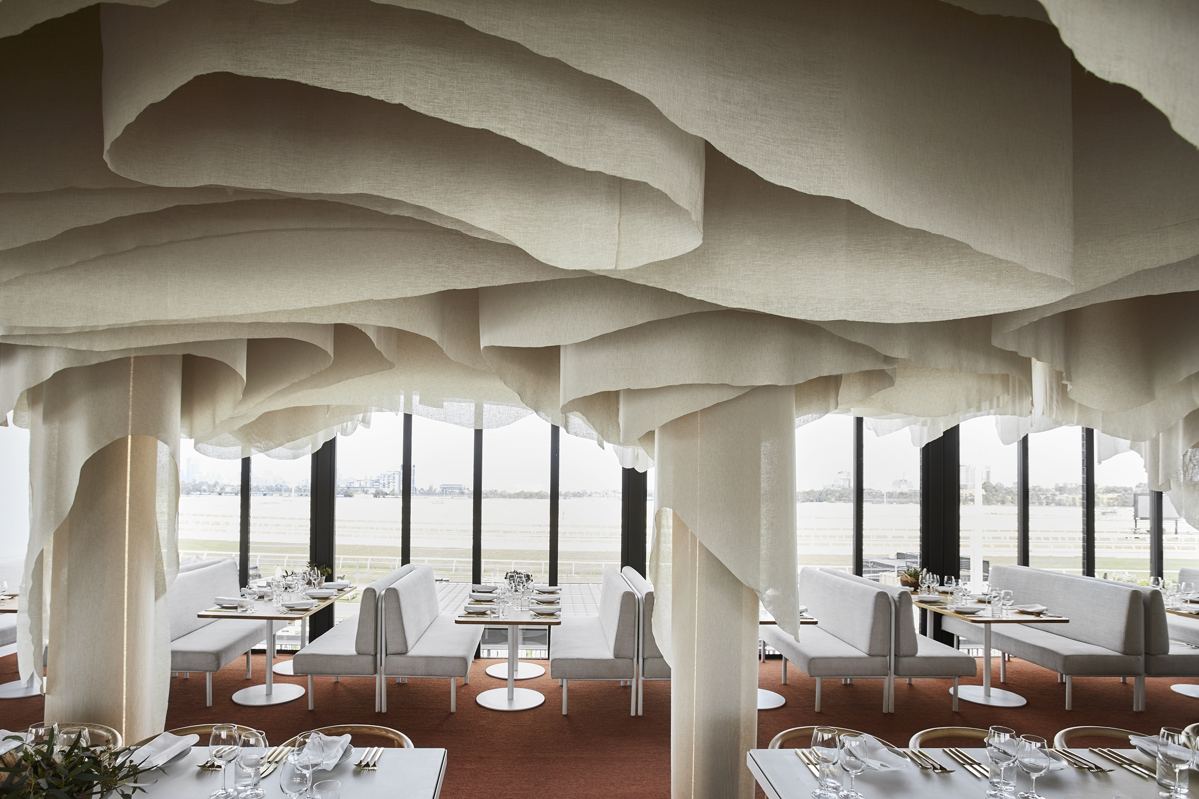
“Light Arrival” Yorkshire Ceiling by Flynn Architecture & Design, Crystal Lake, Illinois

Fluid lines on the ceiling of the sunroom help soften the rectangular edges of this space. Instead of going the digitally designed route, the ceiling is hand sculpted using translucent contoured panels that cover low-voltage LED strip lights for a diffused glow. During the day, when the lights are turned off, the shadows created by sunlight add more dimension to this three-dimensional installation. Fans suspended from this ceiling feature a similar curved profile.

Norwegian embassy in Athens by gfra, Athens, Greece

Unlike traditional origami, the art of kirigami uses small cuts in paper along with folks to create intricate, three-dimensional patterns. The Norwegian embassy in Athens uses this technique to imitate mountains reflecting in the fjord waters. Lights placed above this wooden structure enhance the folds and make this the focal point of the overall space.

Images by Alik Usik and Serhii Nikiforov

Tween Coexistence by Dmytro Aranchii Architects, Kyiv, Ukraine

Curved and bent strips of white shape all elements of this space — right from the ceilings to the reception desk. This technique also helps the furniture to blend into the walls, visualizing fluid circulation. The waiting area contains a large reception desk and an L-shaped sofa that blends in with the stairs leading to the interior spaces. On the ceiling, one can see two distinct patterns: one that originates in the reception area and another that continues along the transition to the inner spaces.

Images by Anil Patel

1102 Penthouse by Apical Reform, Ahmedabad, India

Much like a handcrafted contour model, planes with gradually decreasing cutouts are layered on top of one another to create the ceiling. Similar cutouts are used to embellish the kitchen island and console. The entire space is decorated in a neutral palette of grey and white to create a calming atmosphere. The staircase leading to the terrace is also composed using folded strips of metal similar to the forms of kirigami sculptures. Despite its lightness, it still holds a strong presence within the space.

Images by Jun Murata

N STRIPS by Jam, Osaka, Japan

This project is a renovation of a multi-tenant building that holds living areas and office spaces. The previous blank façade of the building is transformed into an eye-catching display with the help of white fins. This was done to add more privacy as the plot across from it is meant to have an apartment building built on it in the future. Furthermore, the louvers help conceal any unevenness in the external walls as well as the new pipes installed. The extrusions also create constantly changing shadows throughout the day.


Reference

From the Top: 7 Way Statement Ceilings Can Add an Architectural Punch
CategoriesArchitecture

From the Top: 7 Way Statement Ceilings Can Add an Architectural Punch

From the Top: 7 Way Statement Ceilings Can Add an Architectural Punch

The A+Product Awards is open for entries, with a Late Entry Deadline of July 22nd. Get started on your submission today! 

One thing that ties together the Sistine Chapel, The Peacock Room and The Romanian Athenaeum is their majestic ceilings. These buildings are proof that these surfaces can serve a purpose beyond just holding light fixtures. However, excessive embellishments and traditional techniques can look out of place in contemporary homes or restaurants. Below are just a few modern alternatives that ensure that the ceiling takes center stage.

Bella Italia Weine by Ippolito Fleitz Group – Identity Architects, Stuttgart, Germany

Gallery walls are a common occurrence in the Pinterest home décor search results. Another trend is creating a composition of mirrors featuring different design styles to create interest and play with the dimensions of the space. One interpretation of this trend is to adapt it to the horizontal plane or the celling of a room.

This approach is showcased in the Bella Italia Weine in Stuttgart. 90 different mirrors obtained from several rummage sales are mounted on the ceiling, ranging from large rectangular framed ones to decorative handheld mirrors. One of them even features hanging crystal lights to replicate a chandelier. They create broken reflections of the activity below and also imitate the comfort and intimacy offered by the home-style cuisine served here.

ARKHE Beauty Salon by Moriyuki Ochiai Architects, Chiba, Japan

While a sculpture can enhance the look of any space, turning an entire element of architecture into a sculpture can leave a significantly stronger impact. Using different materials, textures and forms in ceilings can create a captivating effect, reflect light in new ways and also help give dimension to an otherwise plain space. In ARKHE Beauty Salon, the firm uses strips of recycled aluminum curled and twisted over and over again on the entire surface to create almost a fluid composition. The firm wanted to replicate the movement of water and the lightness of the hair. The reflection of light on the metal’s surface also mimics the visual of light falling on the surface of the ocean.

Zafar Dental Office by ReNa Design, Tehran, Iran | Images by Reza Najafian

Zafar Dental Office is a great example of how even subtle introductions in a space can make a big difference. Here, they have used small cutouts in the ceiling to hold lights, much like simple cuts in a sheet of paper. These cuts have both sharp profiles as well as sinuous curves. The form is then continued n shelves and seating throughout the space to unify the design. This proves that even small changes in lighting design and geometry can create interest in spaces where it is difficult to add color or protrusions either due to the nature of the function or lack of height.

Over View by FreelandBuck, Pittsburgh, Pennsylvania

Art has been shown to be a successful way of decorating ceilings throughout history. It compels people to stop and look up, changing the way they use and perceive space. Taking this one step further, using optical illusions on the horizontal pain can not only trick people into believing there is a 3D form instead of a plane but also create movement. This helps create the perception of greater floor height as well.  Over View, an installation composed of printed textile pieces, transforms the lobby of the Carnegie Library into a Renaissance-era spectacle. When seen from the center of the room, it appears to have depth and go higher. When seen from other angles, it looks as if it is protruding toward the floor.

Tsujita by SWeet Co, LTD, Los Angeles, California

Being able to look at clouds when dining can make for a thoroughly enjoyable experience. But outdoor dining can also be challenging when grappling with uncertain weather. Interior decorators have often tried to bring the outdoors in by painting murals on walls and ceilings or bringing in greenery. This technique can be altered to better fit fine dining establishments by using a more abstract version of natural elements to add more whimsy. In Tsujita, 25,000 wooden sticks of different lengths are used to create the imagery of clouds. This image changes when seen from different angles due to the space between the sticks.

:PM Club by MODE, Sofia, Bulgaria

Vaults and domes have been significant structural elements in religious and cultural buildings throughout history. Now, we can see modern versions in interiors that are purely aesthetic. It can be done by padding beams to create vaulted tops or using wooden panels to add curves to flat surfaces. Another way to add dimension is by using hexagonal and pentagonal forms to create geometric domes as in :PM. The panels also diffuse the color-changing lights placed in this arrangement. This technique combines the charm of conventional domes with the grandeur of chandeliers.

Banq by Office dA, Boston, Massachusetts

There has been an emergence of designs that allows floors, walls and ceilings to blend into one another. Pirogovka Appartment does so by allowing paint from the walls to crawl up the ceiling and floor and a bakery in Oporto continues vertical panels from the wall as swooping curves on the ceiling. Banq in Boston uses wooden slats to create a contouring canopy that continues upwards from the columns. This system also serves an additional function of concealing the old mechanical and structural systems from the previous design. The design also features a wine storage area in the center that becomes a part of this system.

The A+Product Awards is open for entries, with a Late Entry Deadline of July 22nd. Get started on your submission today! 

Reference