Home Studios adds soft seating to Italian restaurant Bar Enza
CategoriesInterior Design

Home Studios adds soft seating to Italian restaurant Bar Enza

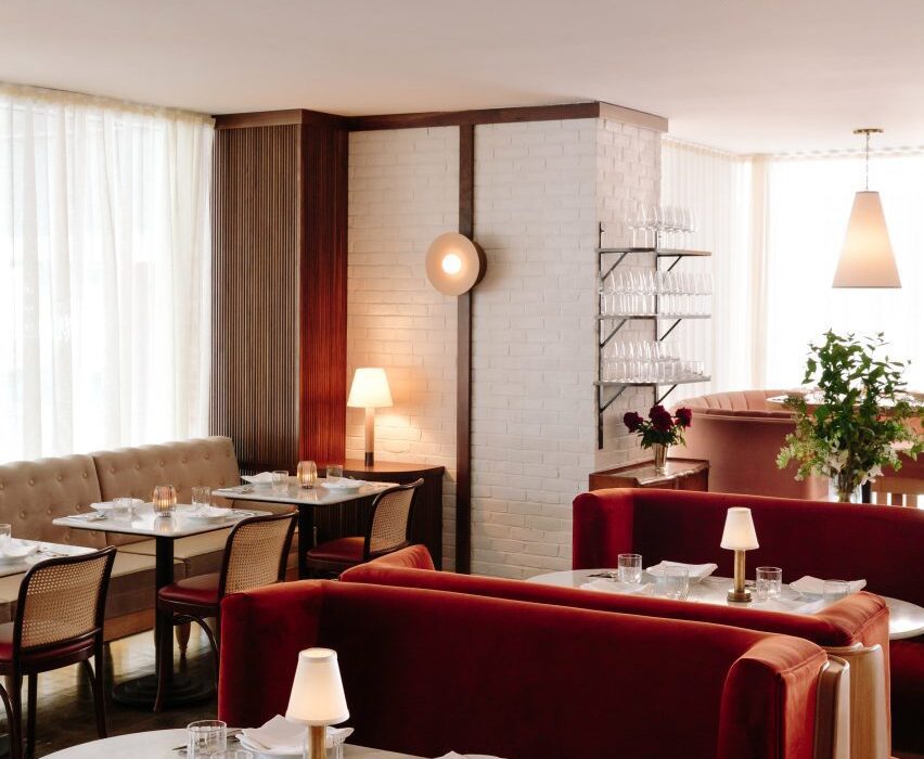
Brooklyn-based Home Studios has filled an Italian restaurant close to Harvard University with plush booths and banquettes to introduce colour and texture to the space.

Bar Enza is situated in a prime spot on Harvard Square next to the Ivy League college in Cambridge, Massachusetts – just across the Charles River from Boston.
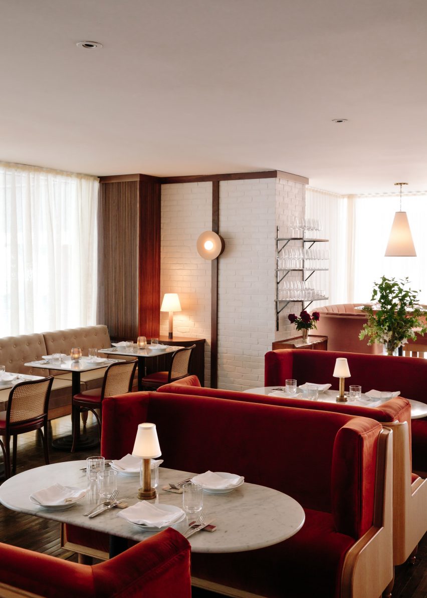
Red booth seating at Bar Enza
Home Studios revamped Bar Enza to include a variety of soft seating

The project involved the revamp of an existing restaurant on the ground floor of The Charles Hotel.

To complement chef Mark Ladner’s menu, Home Studios pulled references from a range of regions and styles across Italy – from Rome’s trattorias to Milanese villas – and combined them to create interiors that feel elevated yet cosy.
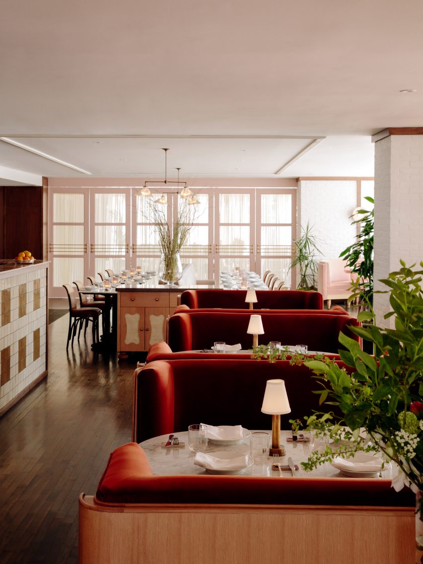
Sofa seating forms a row through the centre
The restaurant’s original floors and ceiling were kept intact

Upon request of the client, the original ceilings and floors were retained. Meanwhile, brick walls were plastered and painted white to match the ceiling and to help brighten the space.

Freestanding tables and chairs were mostly swapped for soft seating, in the form of booths, banquettes and sofas covered in five different upholstery types to add variety.
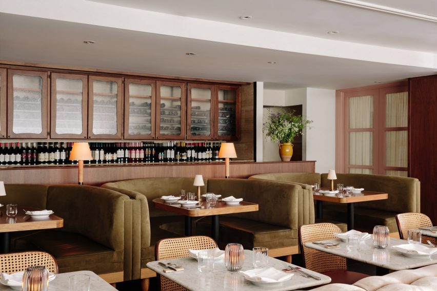
Green booths against the service area
Five different fabrics were used to upholster the booths and banquettes

The building’s zig-zag glazed facade, which brings in plenty of light, creates niches that are filled with high-top tables surrounded by curved, pale pink booths.

Forming a row through the centre of the dining area, pairs of high-backed red sofas face each other across marble tables.
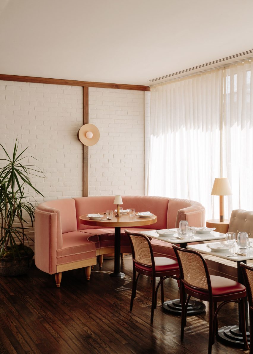
Curved pink booth in a corner
Brick walls were painted white to help brighten the interior

Other booths and banquettes feature sage green or beige fabrics, accompanied by cane-backed cafe chairs, while bar stools are topped with red leather cushions.

“Unexpected details include plush seating, reminiscent of stately libraries and studies,” Haslegrave said. “Essentially we mixed mid-century architectural details with more traditional upholstered seating to achieve a confluence and diversity of designs.”

The service areas were kept largely intact, but custom millwork was added to refresh the materiality.

Shelving was also clad in warm woods, while textured glass and brass hardware were introduced as accents.
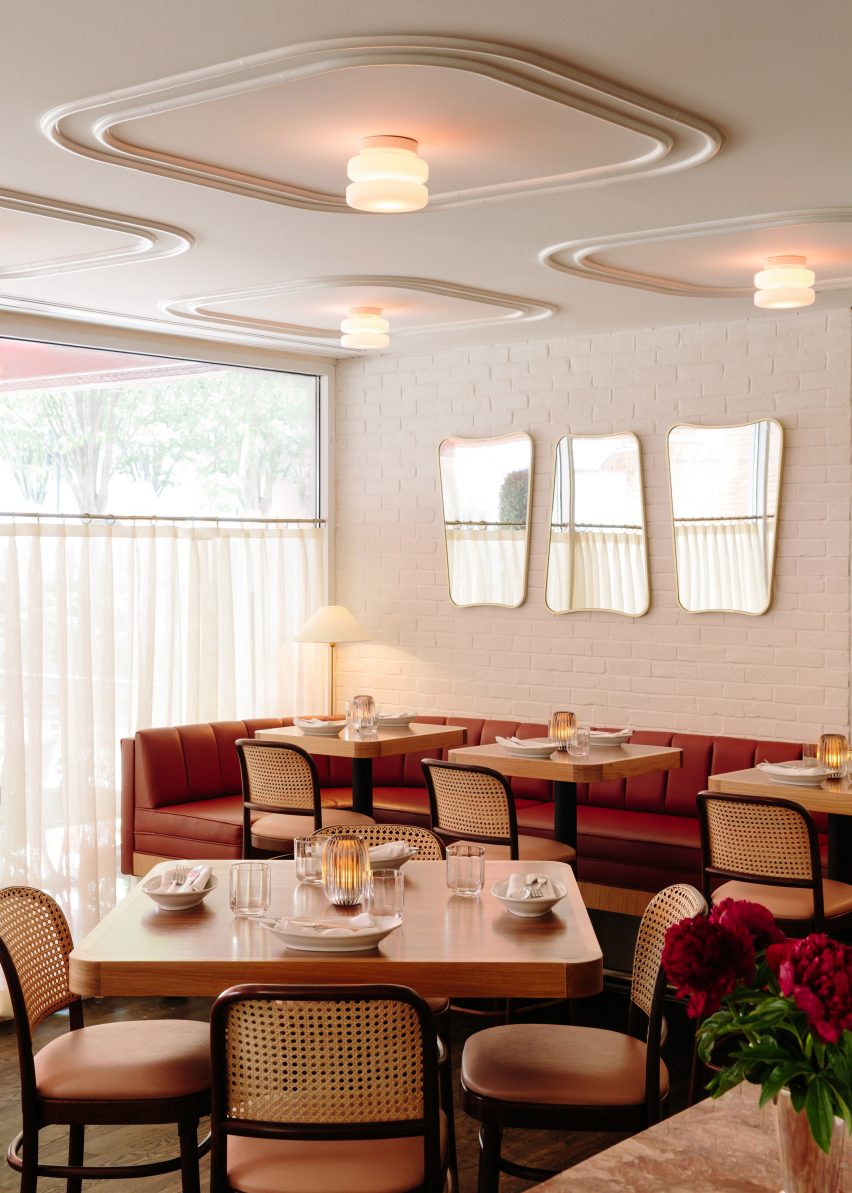
Ceiling details above marble tables
Cane-baked cafe chairs accompany the booths and freestanding tables

“The very elevated level of service meant for very specific requirements on the service area millwork and shelving,” said Haslegrave.

Time and budget restrictions meant that lighting was sourced. The selection of sconces, pendants and table lamps was chosen to create a “warm and sexy” feeling in the evening.
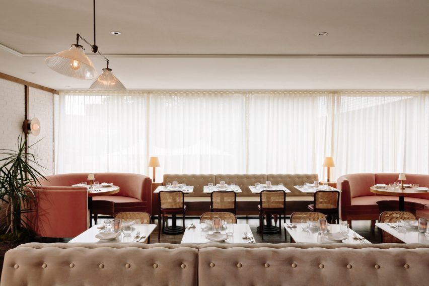
Beige banquette along a window
The Italian restaurants draws references from Rome’s trattorias and Milanese villas

During the day, sheer curtains allow natural light to wash over the interior and allows the fabric hue to pop.

Home Studios’ previous bar and restaurant projects across the US include the Laurel Brasserie and Bar in Salt Lake City, The Harvey House in Madison, Wisconsin,and Bibo Ergo Sum in LA.

The photography is by Brian W Ferry.

Reference

Z’scape adds grassy amphitheatre and wild garden to hotel in rural China
CategoriesArchitecture

Z’scape adds grassy amphitheatre and wild garden to hotel in rural China

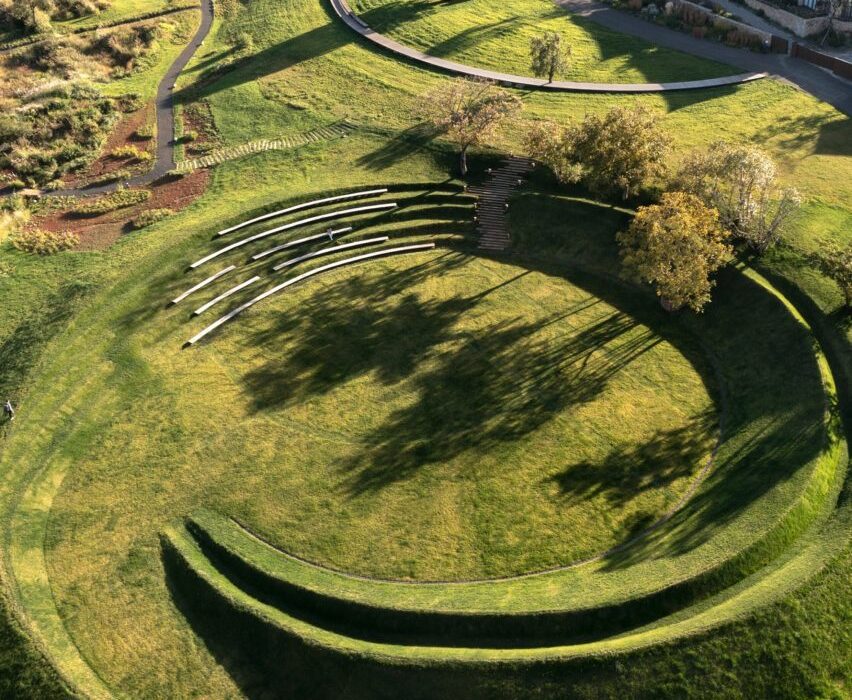
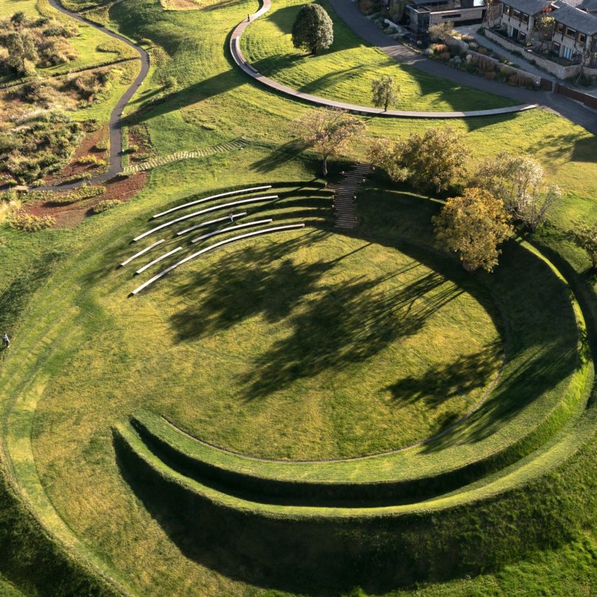
A winding wooden path leads to a natural amphitheatre created by rippling mounds of grass at this garden in Lijiang, China, which was designed by landscape studio Z’scape and has been shortlisted for the Dezeen Awards 2022.

Located at the Linjiang Hilla Vintage Hotel complex, the Wilderness Garden and Amphitheatre extends an existing landscape designed by the Beijing-based practice last year.

Path leading to grassy amphitheatre in Lijiang
Z’scape added a winding path and a natural amphitheatre to the site in Lijiang

The new additions have been shortlisted in the landscape project category of Dezeen Awards 2022.

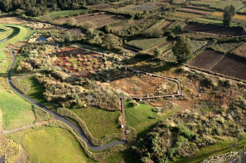
For the new area of wild grassland, Z’scape worked with a botanist and local villages to find native plant varieties that would naturally thrive without needing any maintenance or irrigation, introducing greater biodiversity to the site.

Amphitheatre and wild garden in China by Z'scape
A raised boardwalk allows animals and insects to move freely around the landscape

A wooden boardwalk, raised 60 centimetres to allow animals and insects to move underneath, cuts through this wild garden, with an elevated platform providing a lookout.

Areas of open grass, large rocks and two small wildlife ponds are interspersed throughout the garden and were also designed to help minimise the risk of wildfires spreading.

Benches in grassy amphitheatre by Z'scape in China
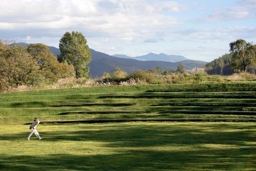
The amphitheatre is formed by mounds of grass in a sunken region of the site

“Providing a critical habitat that offers rich nutritional value and shelter, Wilderness Garden is a haven for wildlife,” said the practice.

“To strike a compelling dialogue, a zigzag boardwalk weaves its way through the grassland to give visitors an extraordinary experience with dramatic and intimate overlooks,” it continued.

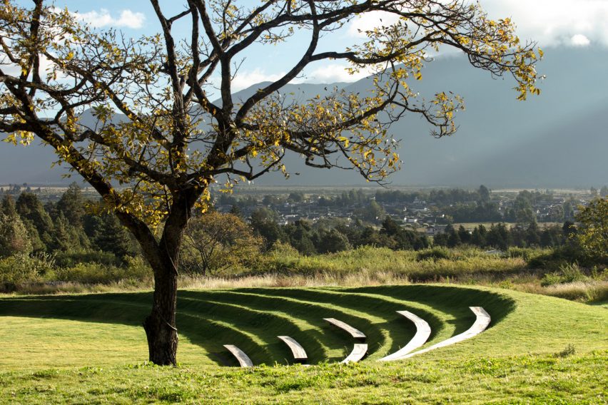
The wooden boardwalk leads to the new amphitheatre at the north of the site, making use of an existing sunken area in the landscape’s topography and defining it with concentric ridges that overlook a central performance lawn.

Recycled timber has been used to create simple benches that follow the contours of the amphitheatre’s ridges and are dotted with works by local sculptors.

As well as a space to watch performances, the amphitheatre looks out across a dramatic landscape, including the UNESCO heritage site of Baisha and Jade Dragon Snow Mountain.

Amphitheatre by Z'scape in Chinese landscape with views of mountains
Long benches in the amphitheatre offer spaces for children to play

“Natural play opportunities are embedded in the landform, where children can run, climb, jump, dance or roll,” said the practice.

“A series of long benches offer historic views to the snow mountain and the best views of the central performance lawn,” it continued.

Aerial view of amphitheatre by Z'scape with curved benches covered with snow
Long recycled timber benches wrap around the circular feature

The original landscape design incorporated the remains of an abandoned village built by the Naxi people, and every year a traditional torch festival creates an “immersive and interactive environment” for celebrating Naxi culture and craft.

Z’scape was founded by Zhou Liangjun and Zhou Ting, and has a particular focus on landscaping projects for cultural tourism projects, boutique hotels, urban spaces and residential developments.

Other projects that join the Wilderness Garden and Amphitheatre on the landscape project shortlist of Dezeen awards 2022 include a rural farm in Iran co-designed with local communities, and Heatherwick Studio’s Little Island in Manhattan.

The photography is by Holi Landscape Photography.

Reference

Ivy Studio adds pops of colour to Spacial co-working office in Montreal
CategoriesInterior Design

Ivy Studio adds pops of colour to Spacial co-working office in Montreal

Mint green and burgundy are among the hues incorporated into a Montreal co-working space that Canadian firm Ivy Studio designed to “stand out from its competitors.”


The office is located on the second floor of a 743-square-metre building in Verdun, one of city’s trendiest neighbourhoods. The space formerly housed a Jiu Jitsu gym and a beauty salon.

Ivy Studio designed the project
Spacial co-working office includes mint and burgundy hues

This is the first location for the new co-working brand Spacial. Local practice Ivy Studio was charged with designing a flexible work environment for up to 120 people.

“Being the first of its brand, this space had to stand out from its competitors by offering a unique vision for co-working,” the team said.

Local firm Ivy Studio added dashes of colour to the space
The project was designed by Ivy Studio

The team divided the rectangular space into two distinct zones.

The front portion encompasses public areas that are largely used for informal working, socialising and relaxing. In the rear, the team created a more private area with about two dozen rentable offices in varying sizes.

Throughout the space, contemporary finishes and decor are paired with original building elements, such as exposed ceiling joists and brick surfaces.

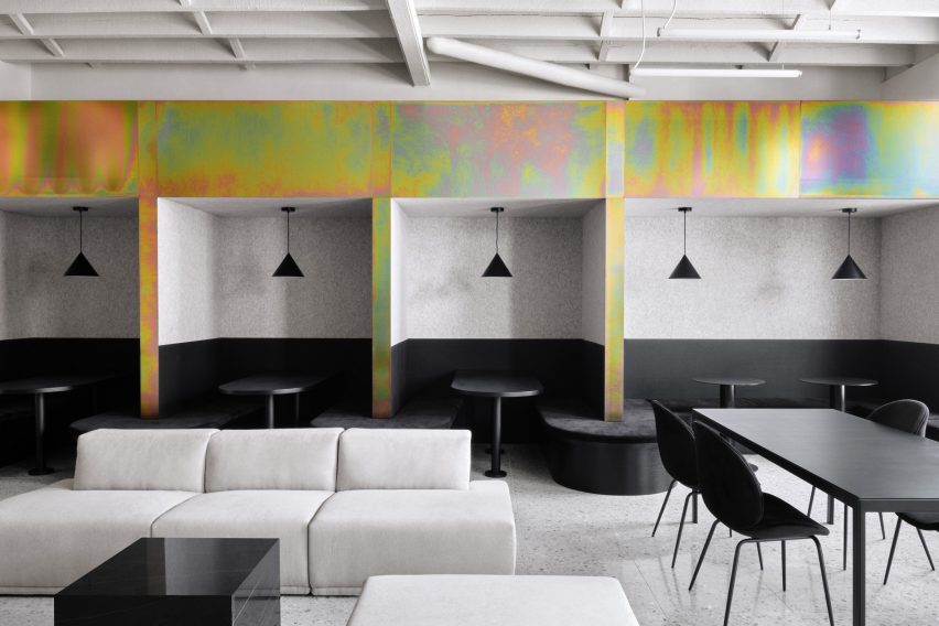
In many areas, the team coated the walls with an off-white plaster and covered the floors with light-grey terrazzo. Much of the furniture is black, although dashes of colour are sprinkled throughout.

Rainbow-coloured elements feature in the office
Dashes of colour are set against monochrome walls

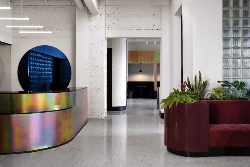
Upon entering, one encounters a rounded reception desk made of zinc with a rainbow-coloured finish. Hanging on a wall is a blue, circular mirror – one of several rounded elements in the venue.

To one side of the foyer is a lounge and a trio of conference rooms, each with a wall-mounted screen.

Ivy Studio created a mixture of light and dark areas
Brick walls feature in the office

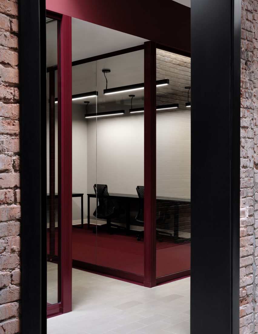
“In the conference rooms, televisions are camouflaged in front of matching, circular black mirrors, each backlit to put forward the white-washed brick wall,” the team said.

To the other side of the foyer is a second public area. This one encompasses a kitchen and dining space, including private booths that are well-suited for small groups.

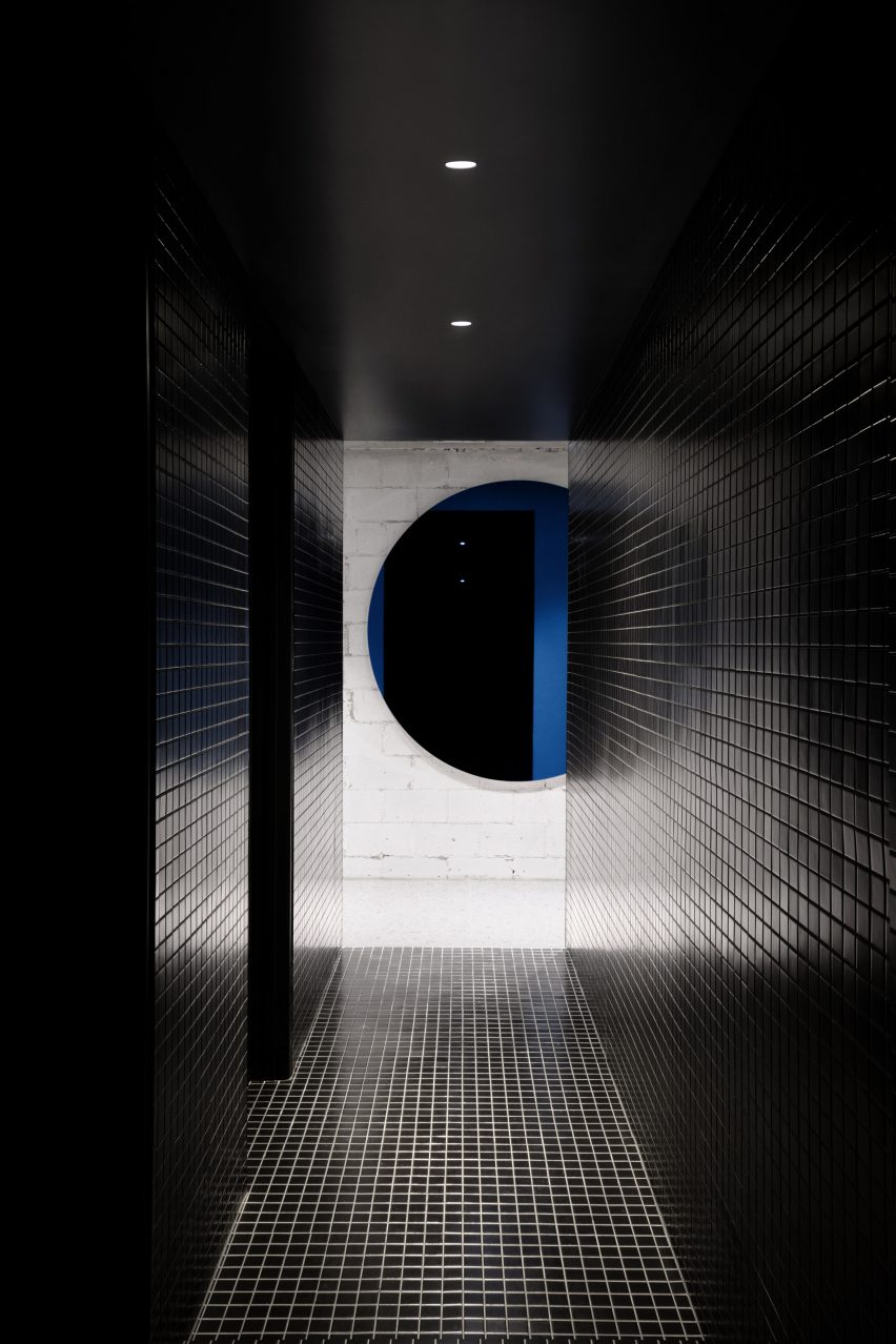
Bathrooms have black tiles and pops of colour
Bathrooms have black ceramic tiles

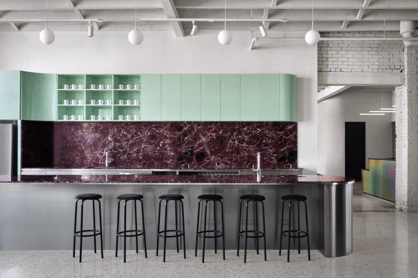
The kitchen features curved cabinetry with a glossy mint-green finish, and a backsplash and island covered with Rosso Levanto marble. The base of the island is made of stainless steel, which mimics the chrome planters found throughout the office.

Situated near the kitchen are the bathrooms, which have black ceramic tiles and matching plumbing fixtures.

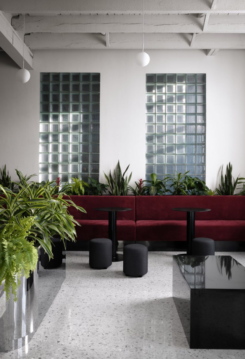
Ivy Studio put a glass-brick wall in the reception
The reception area has a blocky glass brick wall

Behind the reception desk is a glazed-block wall that separates the public zone from the private offices, while still enabling light to pass through.

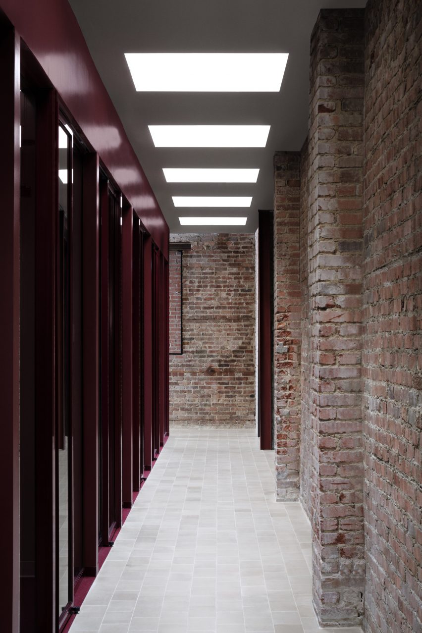
The offices are arrayed along corridors with tile flooring and brick walls. Both fixed and sliding glass panels enclose the work spaces. A dark burgundy hue was chosen for the carpeting and mullions.

Skylights throw light onto the office's corridors
Skylights bring extra light into the office’s interior

To ensure the private area felt bright and welcoming, the team installed 20 skylights above the corridors.

“With the exposed brick walls, sandstone floor tiles and abundance of natural light pouring into the hallways, the general feeling resembles that of working in an exterior courtyard,” the team said.

Other co-working spaces in Canada include an office designed by Henri Cleinge within Montreal’s old Royal Bank, and a women-only space in Toronto that was designed by MMNT Studio to feel peaceful yet playful.

Photography is by Alex Lesage.


Project credits:

Architecture and design: Ivy Studio Inc
Construction: Gestion Gauthier Construction
Furniture: Ivy Studio Inc.

Reference

VATRAA adds pink plaster walls in south London council house renovation
CategoriesInterior Design

VATRAA adds pink plaster walls in south London council house renovation

Architecture studio VATRAA has won a Don’t Move, Improve! award with this London council house renovation featuring pink-toned plaster walls and an oversized window.


Called Council House Renovation, the project involved a full refurbishment and remodelling of the two-bedroom home in Bermondsey, south London.

VATRAA’s design was a joint winner in the 2021 Compact Design of the Year category for Don’t Move, Improve!

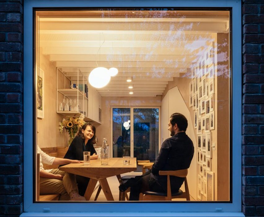
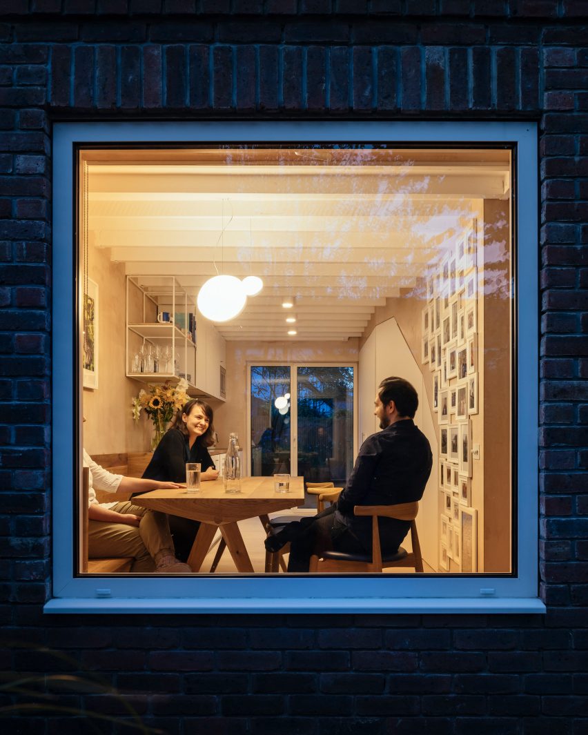
Large square window looking into house with people dining
An oversized window creates transparency from front to back in the Council House Renovation

VATRAA‘s client wanted a warm, contemporary interior that gave her more space but without an extension that would disrupt the appearance of the council estate, which was built in the 1980s.

Instead, the architects aimed to create spaciousness within the small, 76-square-metre flat by making only minimal interventions.

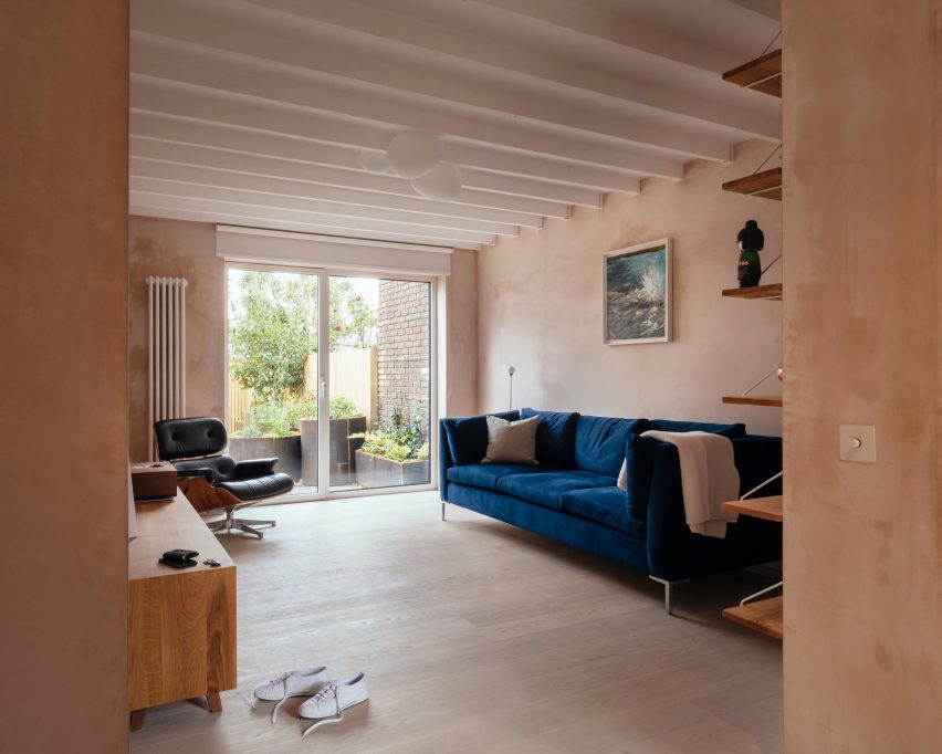
Council House Renovation with pink plaster walls
The architects created a warm and contemporary look

Seeing the opportunities the small seven-by-seven-metre footprint presented for enhanced front-to-back transparency, the architects swapped out an ornamental bay window for a larger clean-lined square one.

It forms a new aesthetic feature and frames views of the evergreen front garden.

Living room with pink plaster walls
Ceiling joists are exposed in the living room

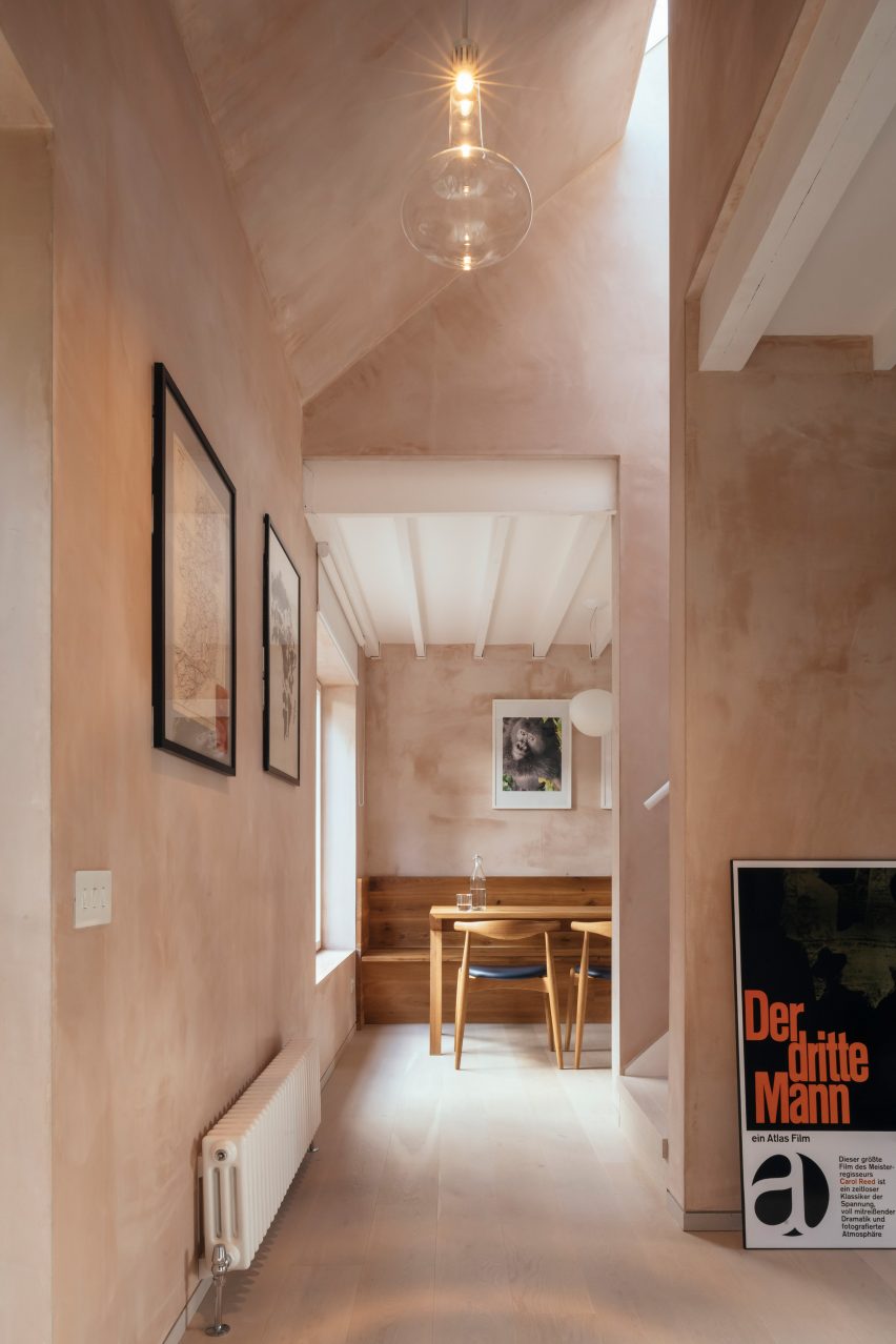
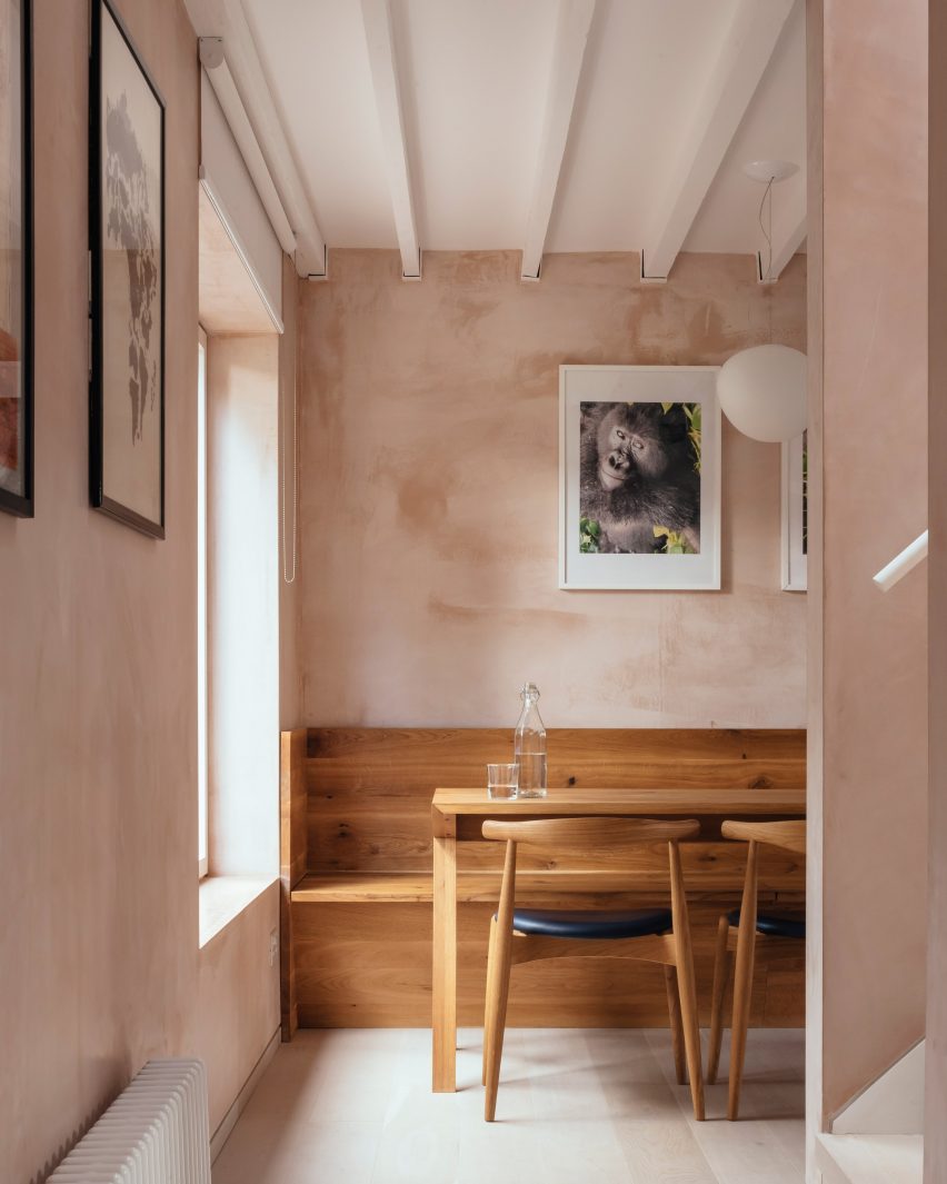
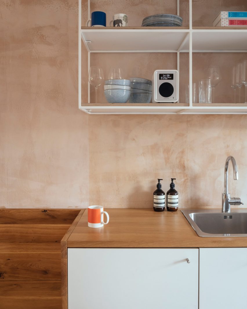
Another key feature is the textured, dusky pink-coloured walls.

This effect is created with what VATRAA describes as a “banal” plaster, British Gypsum Multifinish, avoiding the cost and resources of wall paint altogether.

VATRAA applied the plaster carefully to achieve a textured and slightly reflective finish that responds well to daylight, creating different moods and effects at different times of the day.

Teamed with white ceilings and white-washed oak floors, it forms an aesthetic backdrop to the client’s collection of art and design objects.

Oak dining table with light coming through a large window
There are white-washed floors and white ceilings

For the floor plan, VATRAA were guided by the existing stairs and heating source, a pre-feed water tank that is part of a communal system.

To take advantage of its heat, they placed the laundry room around it so clothing would air-dry faster, and the bathroom directly above so the floor tiles would be warmed without additional heating.

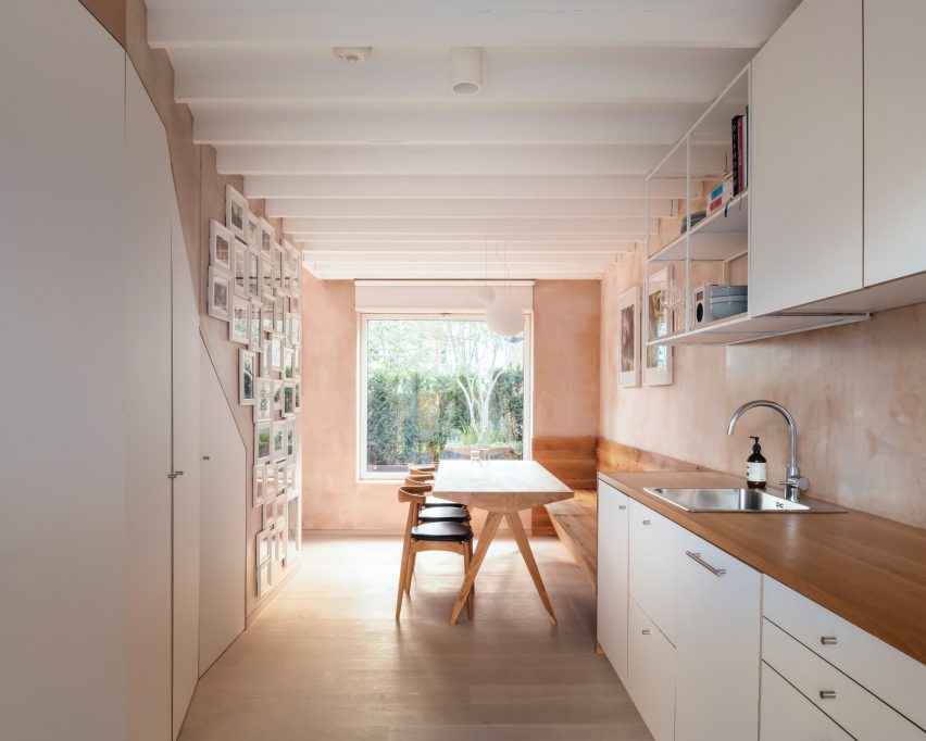
White pantry and kitchen cabinets
An angled pantry optimises the space under the stairs

Each of the other spaces is given its own atmosphere according to function.

The architects made the entrance lobby grander by opening the ceiling to the pitched roof and incorporating the old external loggia into the interior.

Kitchen sink in Council House Renovation
The kitchen has bespoke furniture and cabinetry

In the living room, they exposed the previously concealed structural joists in the ceiling, making the 2.4-metre-high space feel loftier.

In the dining room, they created an angled pantry feature that makes the most of the awkward space underneath the stairs and added bespoke solid oak dining furniture.

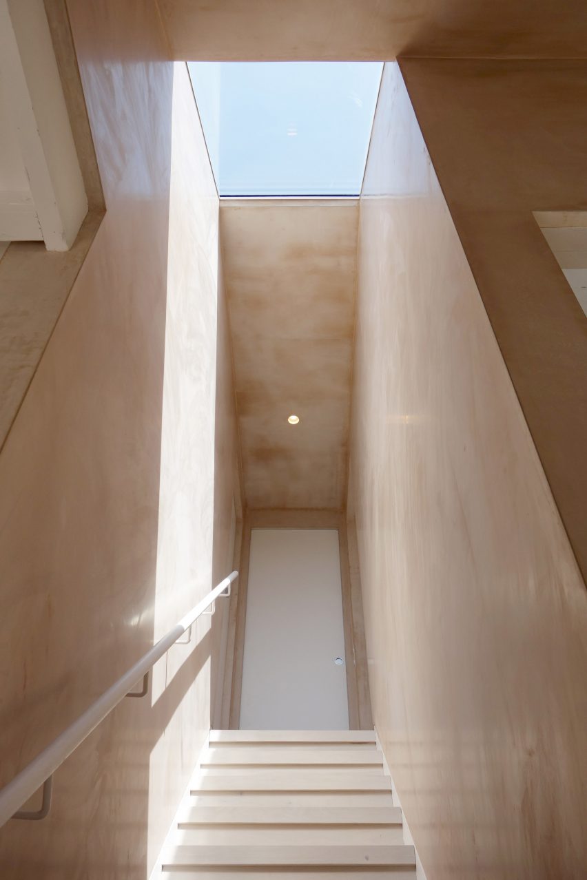
Staircase with skylight
Different qualities of light create different moods in the house

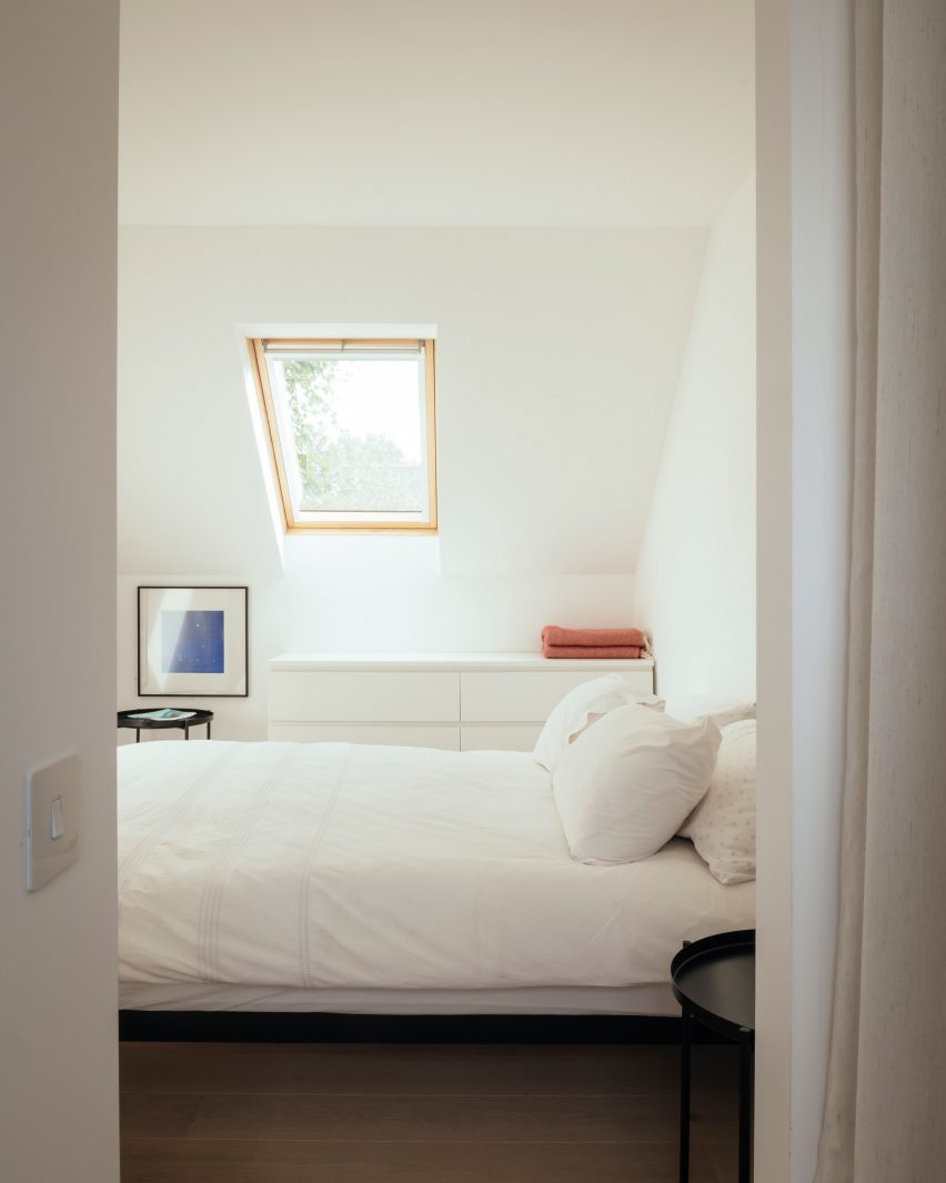
Upstairs, the two bedrooms are finished in calming all-white to create a contrast to the stimulating warmth of the downstairs living areas.

“The morning transition between the night and day zones becomes an event, giving the homeowner a sensation of energy, immediately as she steps into the stairwell and descends to the ground floor,” said VATRAA.

“With thoughtful decisions fully grounded in the context we operated in, we managed to turn a nondescript ex-council house into a home with a distinctive character, now proud to tell its story through space, light and materials.”

White bedroom with roof light
The upstairs bedrooms are a contrast in clean white

VATRAA was founded in 2018 by Anamaria Pircu and Bogdan Rusu, who are based across London and Bucharest. They completed the Council House Renovation in 2020.

It was named the Don’t Move, Improve! Compact Design of the Year alongside Two and a Half Story House by B-VDS Architecture, another project in a council estate.

Photography is by Jim Stephenson

Reference