8 Adventurous Ways Architects Innovated in Interior Design in 2022
Architizer’s 11th Annual A+Awards is open for entries! With a Final Entry Deadline of January 27th, 2023, the clock is ticking — get started on your submission today.
The exterior experience of a building — marveling at a remarkable structure in the midst of a busy skyline, for instance — differs wildly from the interior experience. Crossing a threshold into an internal space is a transformative act. With it, the environment becomes intimate. The senses are enveloped by the spatial and material surroundings; the architect’s intent is suddenly palpably personal.
As these A+Award-winning projects demonstrate, the best interior schemes deftly position the user, both practically and emotionally. From stations, theaters and cafés to places of worship and residential structures, take a look at eight ways architects are innovating interior design and creating immersive schemes that scintillate and astound.
1. Stylizing Ceilings
Shanghai Subway Line 14 Yuyuan Station by XING DESIGN, Shanghai, China
Jury Winner, 10th Annual A+Awards, Transport Interiors
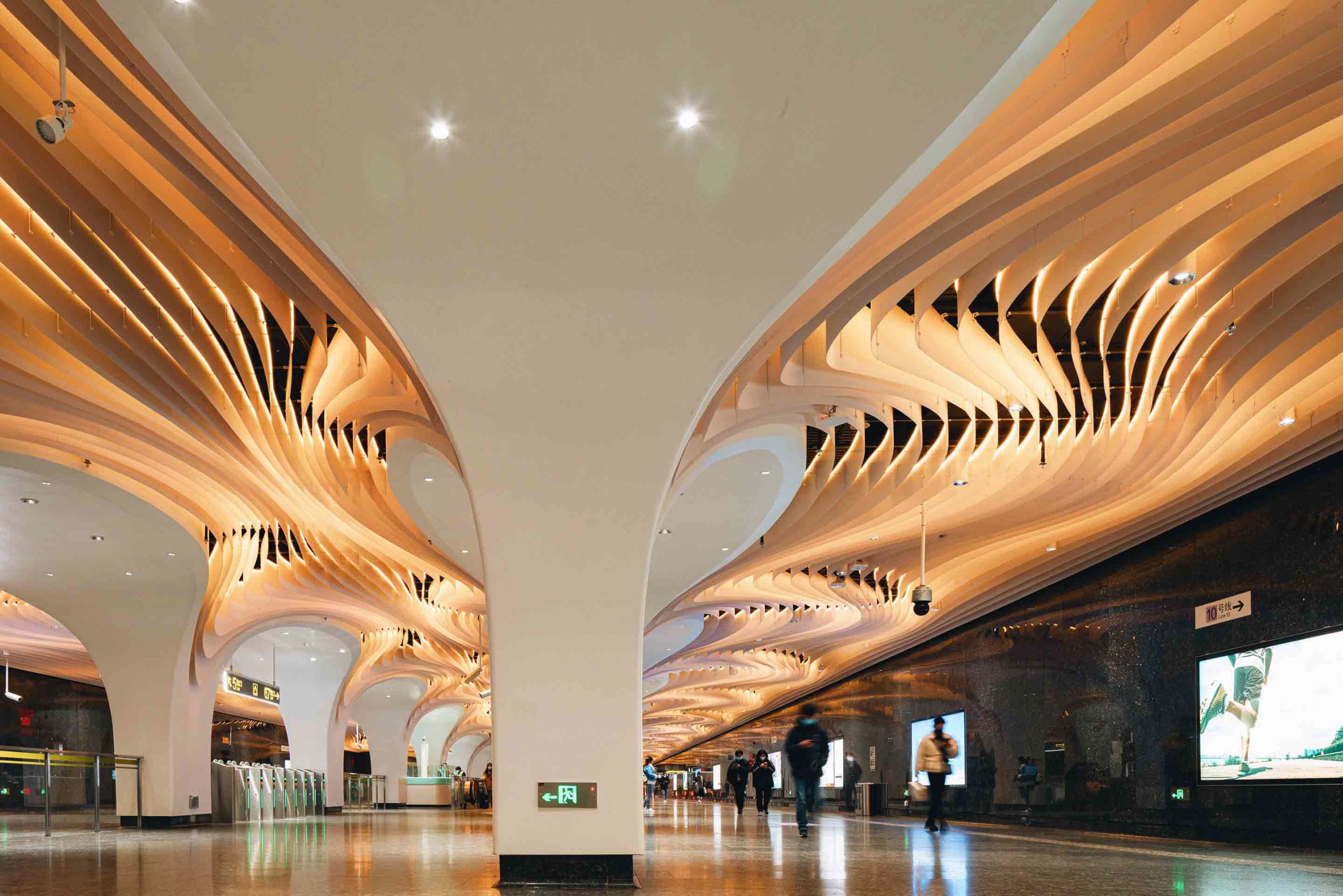
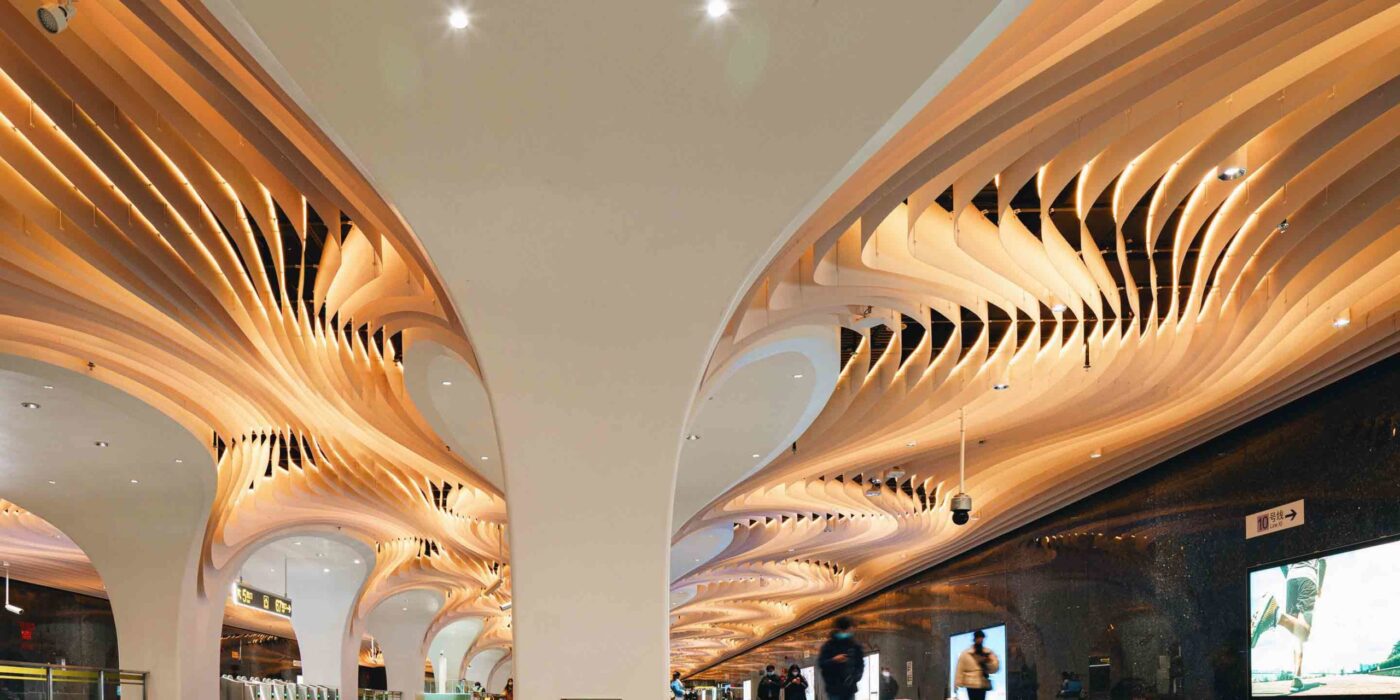
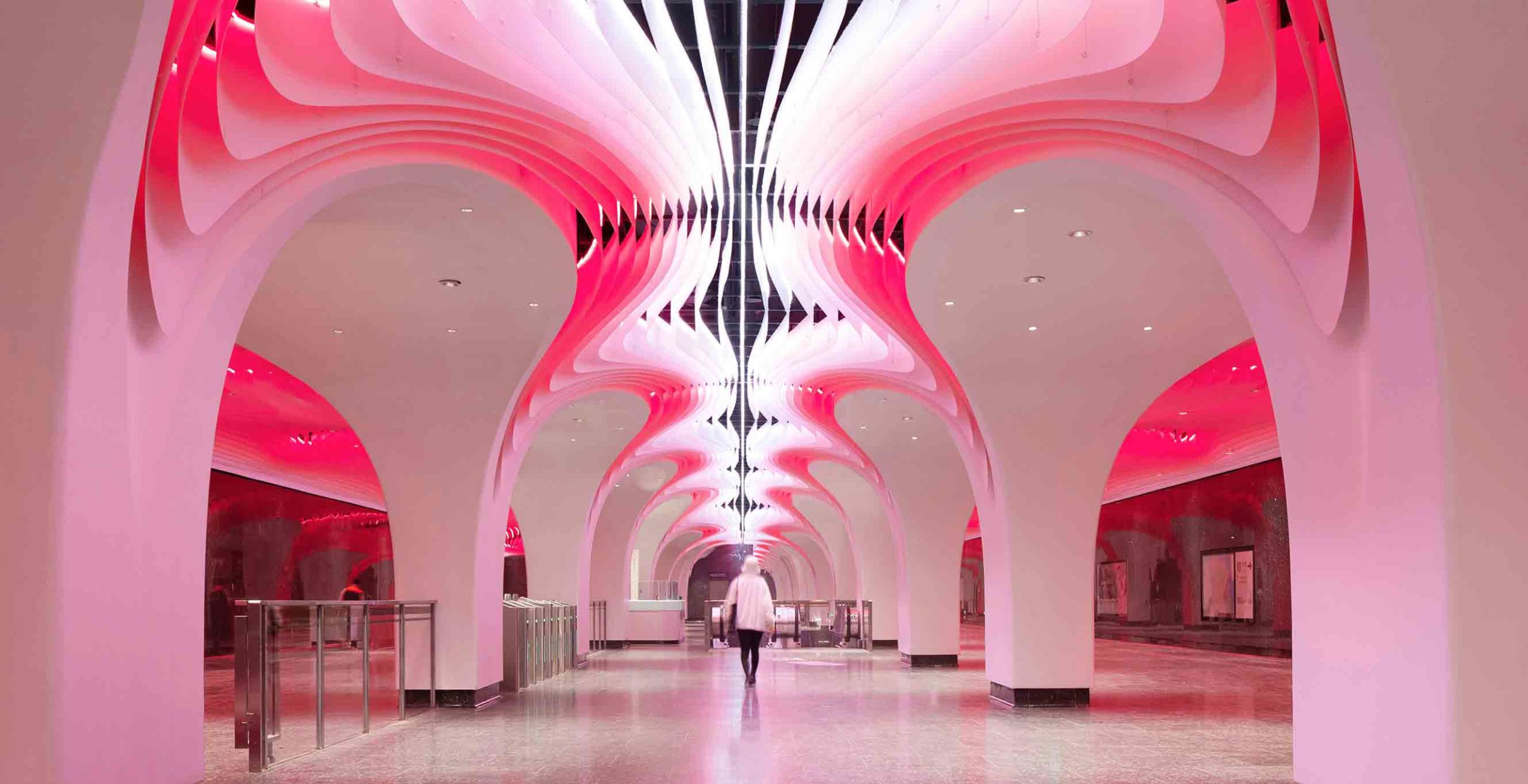 Concealed underground, Yuyuan Station is Shanghai’s deepest transport hub. Elevating the experience of this subterranean space came with its challenges. Essential elements of the site, including the walls, columns and flooring, could not be altered. Nevertheless, the architects delivered an immersive scheme that consumes the senses of its users.
A liminal passing place and the gateway to the suburb, the remarkable design embodies both the transience of the space and the topography of the landscape above. Tens of thousands of aluminum panels ripple across the ceiling and around the arches in a complex geometry of waves that echo the Huangpu River, which runs over the metro line. LED lights illuminate the unique undulations of the canopy. Like the passers-by below, the rhythmic ceiling courses in a multitude of diverse routes.
2. Transforming Translucent Materials
Santa Maria Goretti Church by Mario Cucinella Architects, Mormanno, Italy
Jury Winner, 10th Annual A+Awards, Religious Buildings & Memorials
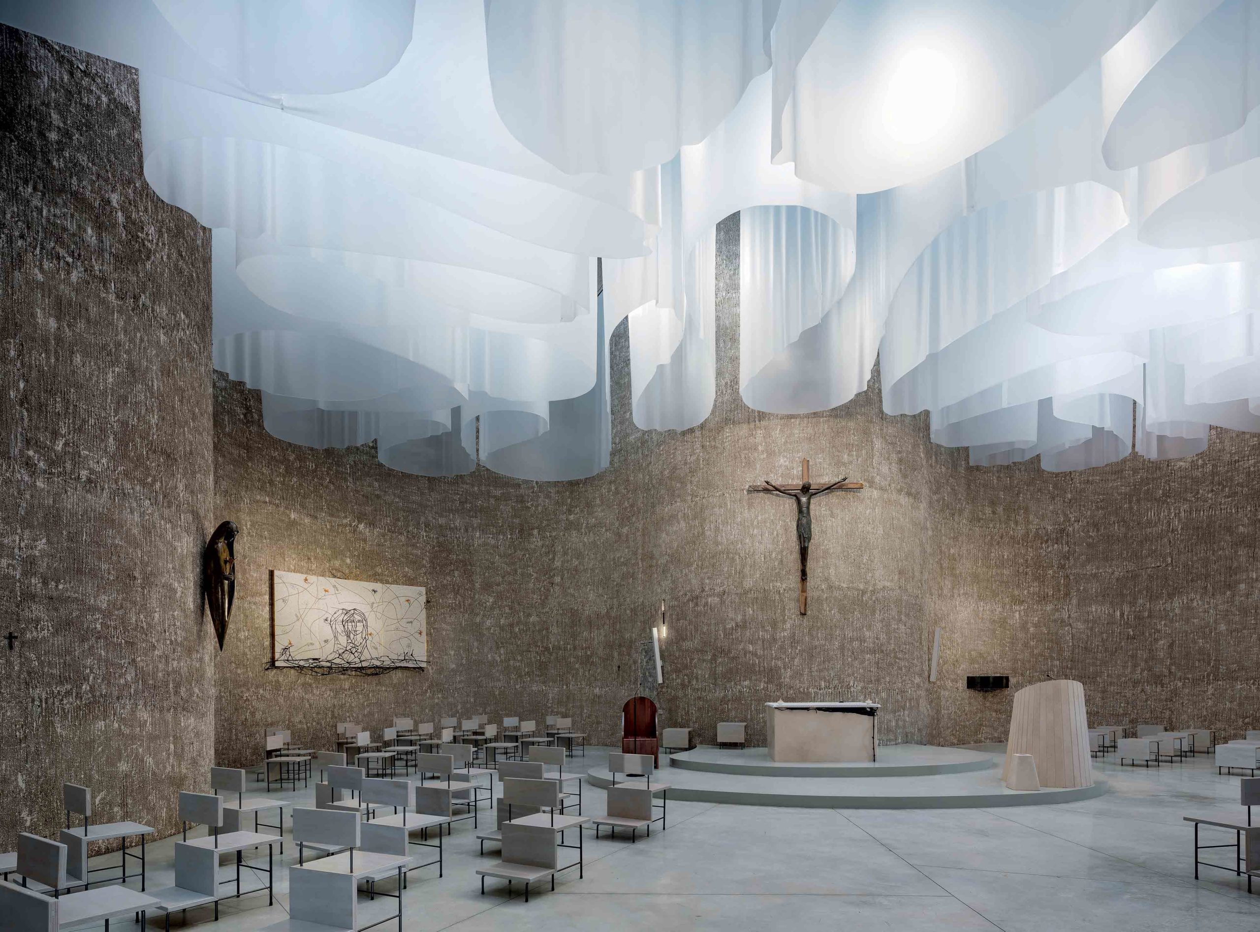
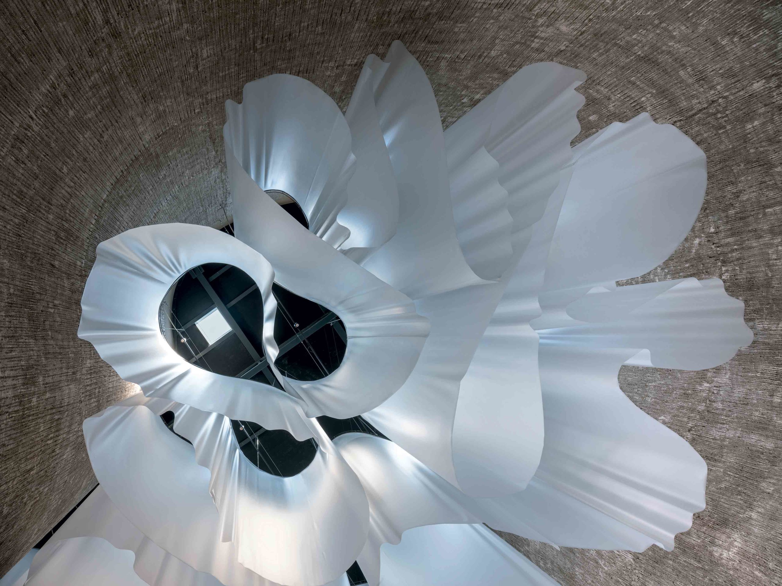 Revising religious architecture can be an imposing task, one that calls for reverence in the same breath as reinvention. This contemporary church in the Calabrian region of southern Italy negotiates that careful dance between tradition and innovation. While its organic, cross-shaped plan is inspired by some of the country’s most impressive Baroque churches, the interior is something of an inversion of the ornate domed designs of its predecessors.
Instead of exposing the structure’s towering scale, the ceiling is filled with a series of translucent veils that fall in soft curved forms. While the design may be a radical departure from historic typologies, it remains steeped in religious language. Natural light, a Christian symbol of holiness, hope and wisdom, cascades down through the church and is cradled in the folds of the drapes. The result is atmospheric ebbs and flows of illumination that reference natural phenomena like the Northern Lights.
3. Utilizing Unobtrusive Divisions
Nil Dos House by Valentí Albareda Studio, Gràcia, Spain
Jury Winner, 10th Annual A+Awards, Residential Interiors (<3000 sq ft)
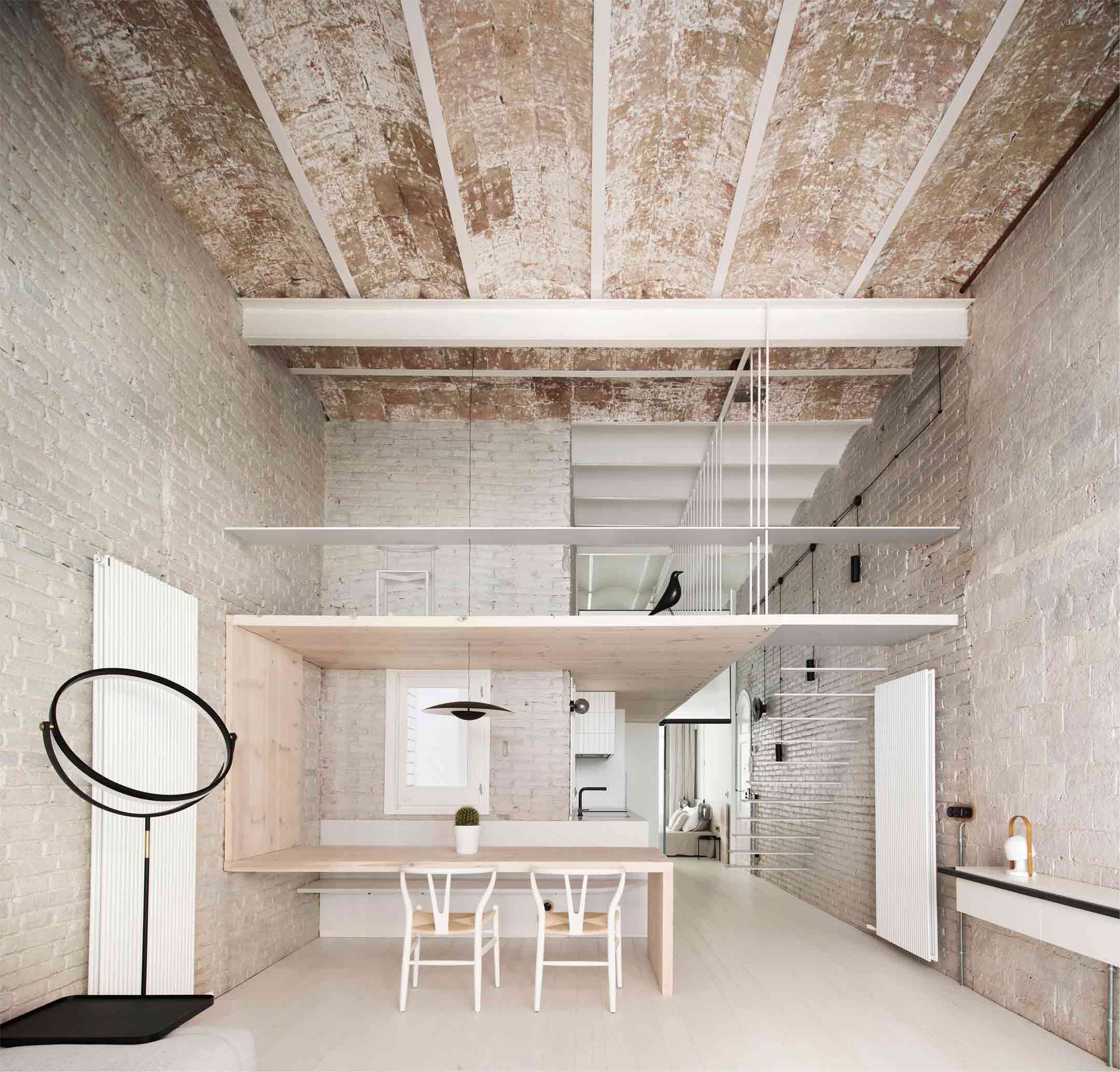
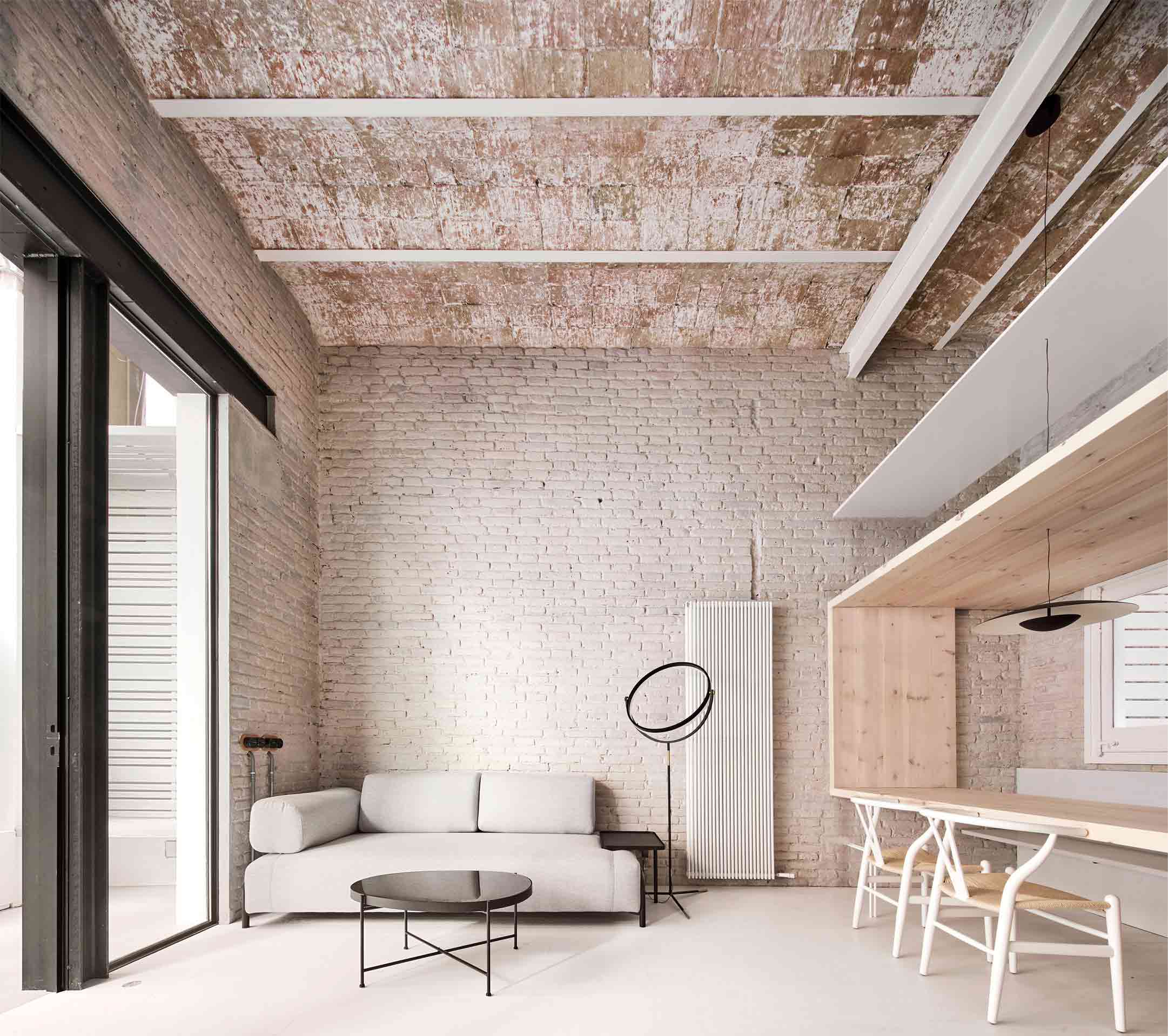 In another life, this building in Spain’s Catalan region was a warehouse. Once a dark space of industry, it’s now been sensitively transformed into a modern light-filled residence. However, traces of the structure’s history still take center stage thanks to considerate spatial organization.
Encased by an exposed brick ceiling and original whitewashed brick walls, the impressive double-height living space is imbued with its industrial roots. An ingenious light wood frame acts as an unobtrusive room divider, simultaneously zoning the kitchen and forming a tabletop, as well as providing a floor for the loft above. While the scheme accommodates modern living, the absence of opaque barriers places meaningful emphasis on the original form and fabric of the building.
4. Merging Past and Future
CoCo Tea Coffee Juice shop in Shiquan Street by OYTT Design, Suzhou, China
Popular Choice Winner, 10th Annual A+Awards, Restaurants (S <1000 sq ft)
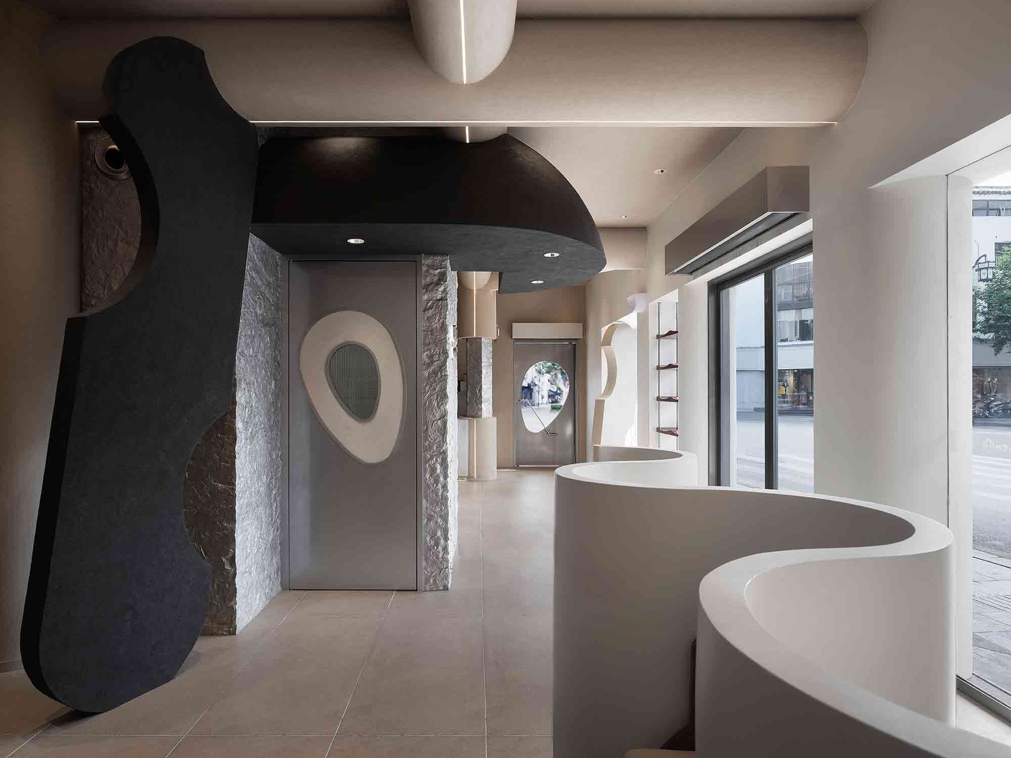
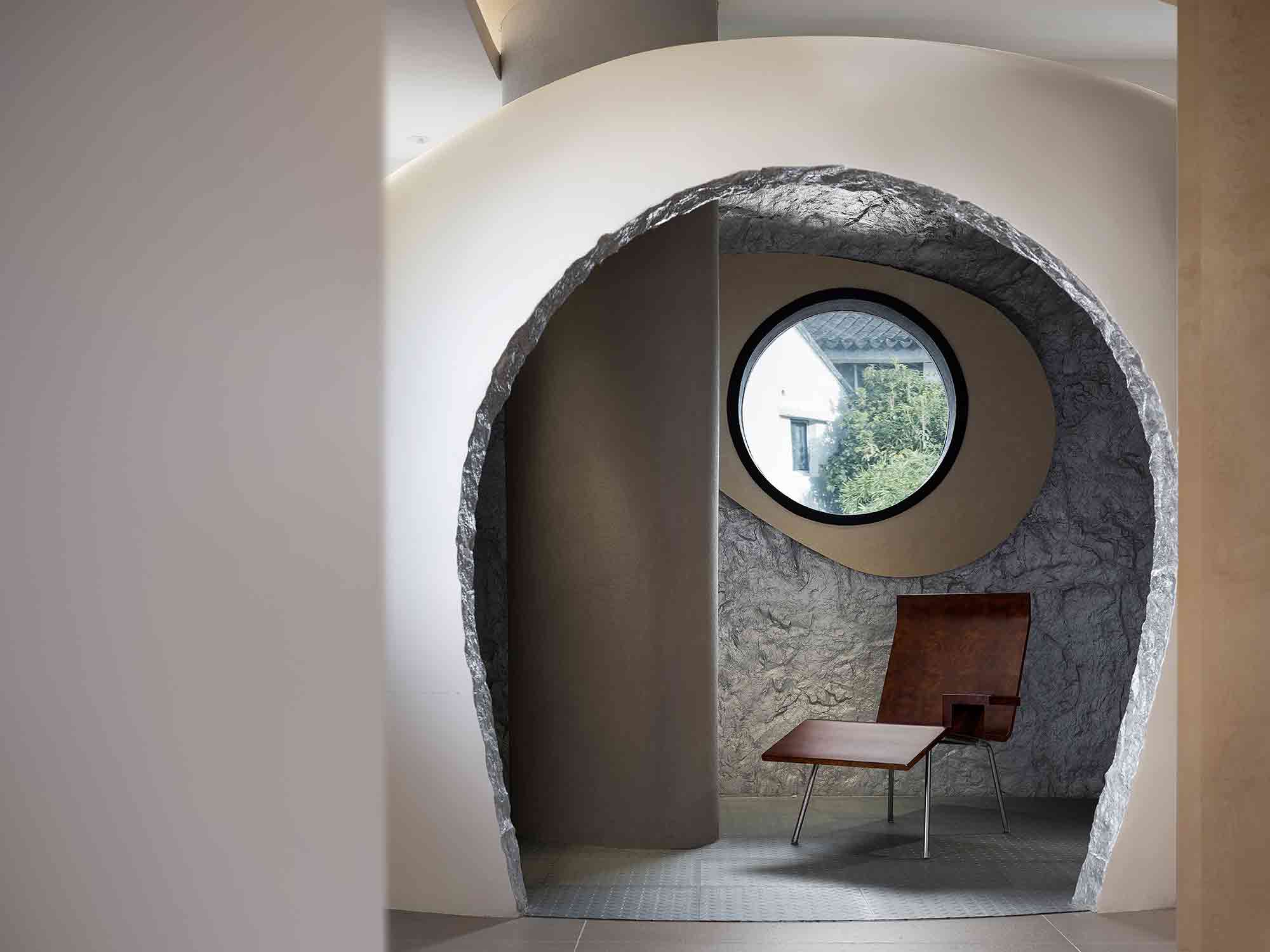 Situated in the Chinese city of Suzhou, this pioneering café was inspired by the concept of returning to the origin of life. The interior is an unexpected convergence of old and new, responding to the historic street outside while reimagining commercial typologies through a futuristic lens.
The space is framed by curvaceous forms and undulating lines that merge the distinction between walls and ceiling. The effect is a cocooning embrace that channels the topography of caves and the ancient environment, emphasized by punctuations of rugged exposed rock and mottled, organic paint effects. However, these natural emblems are skillfully translated into a contemporary vocabulary, from the sleek architectural staircase to the surprising apertures. Past and future convene in a fascinating conversation, at once forward-looking and mindful of what came before.
5. Experimenting With Solid Surface Patterns
Zhengzhou Grand Theater by The Architectural Design and Research Institute of HIT, Zhengzhou, China
Popular Choice Winner, 10th Annual A+Awards, Hall / Theater
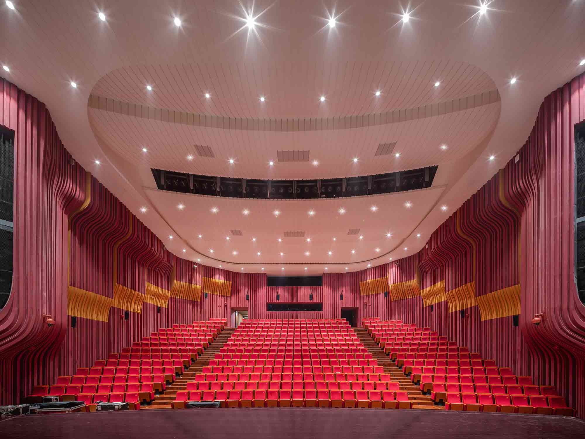
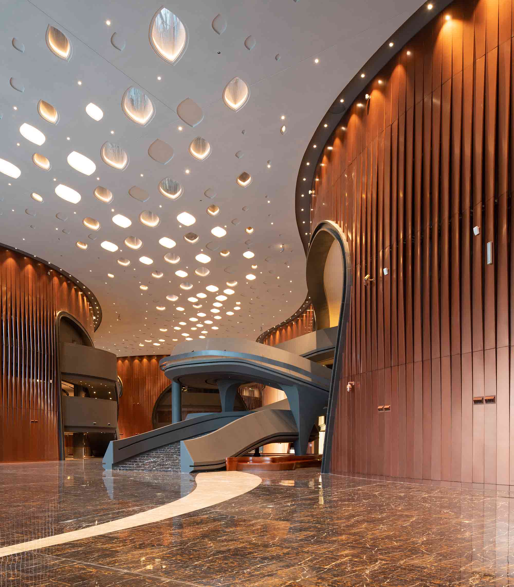 A performance complex of impressive proportions, the Zhengzhou Grand Theater encompasses four large venues with distinct architectural characters. In one hall, the walls ripple with a daring solid surface design in pink and orange hues. Narrow, repetitive channels envelop the room, resembling the interior architecture of a living, breathing organism, while the carefully considered contours were crafted to meet high acoustic standards.
While the stage is the focus within the halls, the gaze is guided upwards in the lobby and corridors. Droplet-shaped motifs adorn the ceiling; the intricate design combines engraved shapes with perforated apertures. These unusual skylights illuminate a path between the venues, as well as reducing the roof’s weight and construction costs.
6. Internalizing the Outdoors
Fort 137 by Daniel Joseph Chenin, Ltd., Las Vegas, Nevada
Jury Winner, 10th Annual A+Awards, Private House (XL >6000 sq ft)
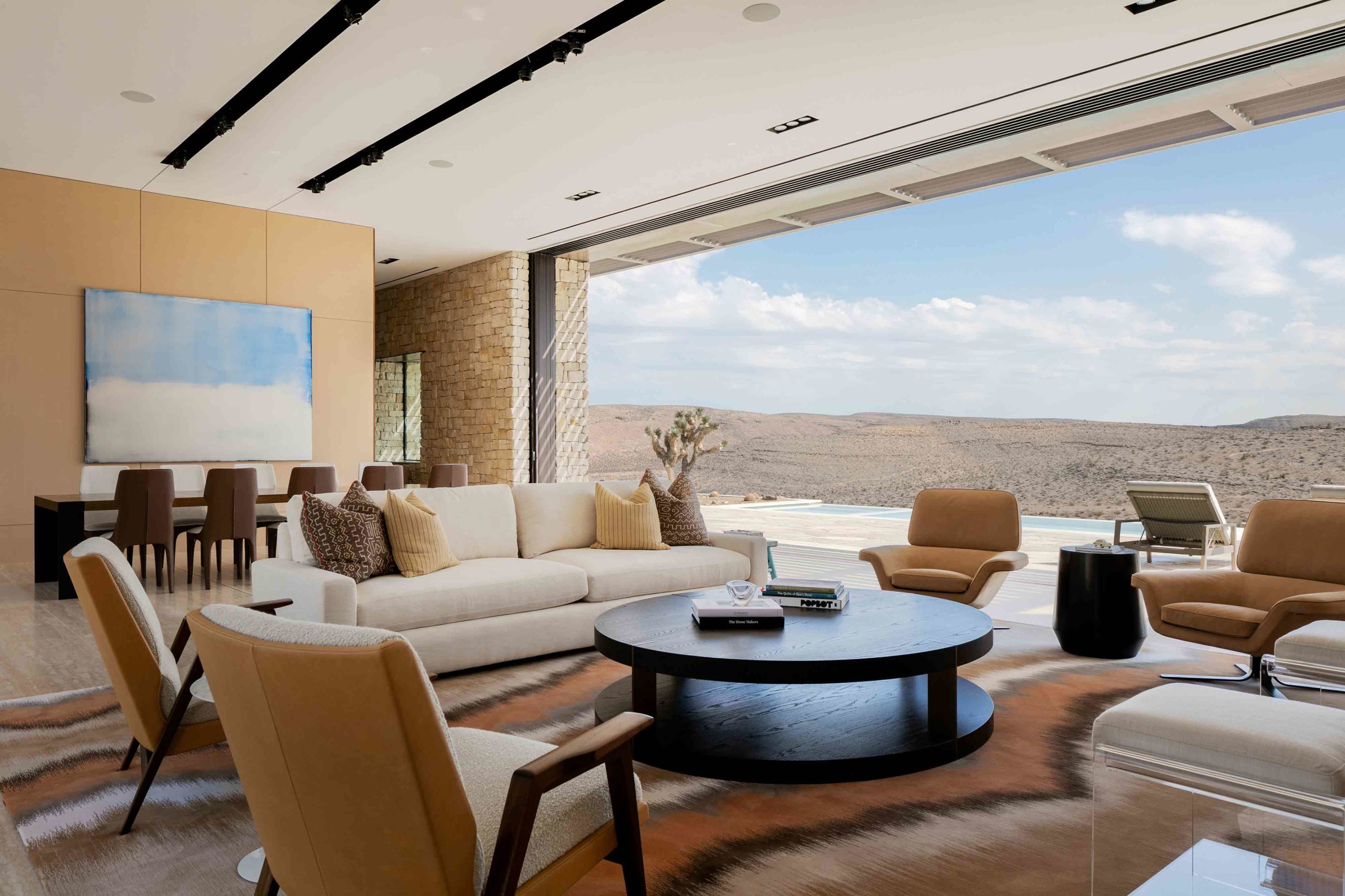
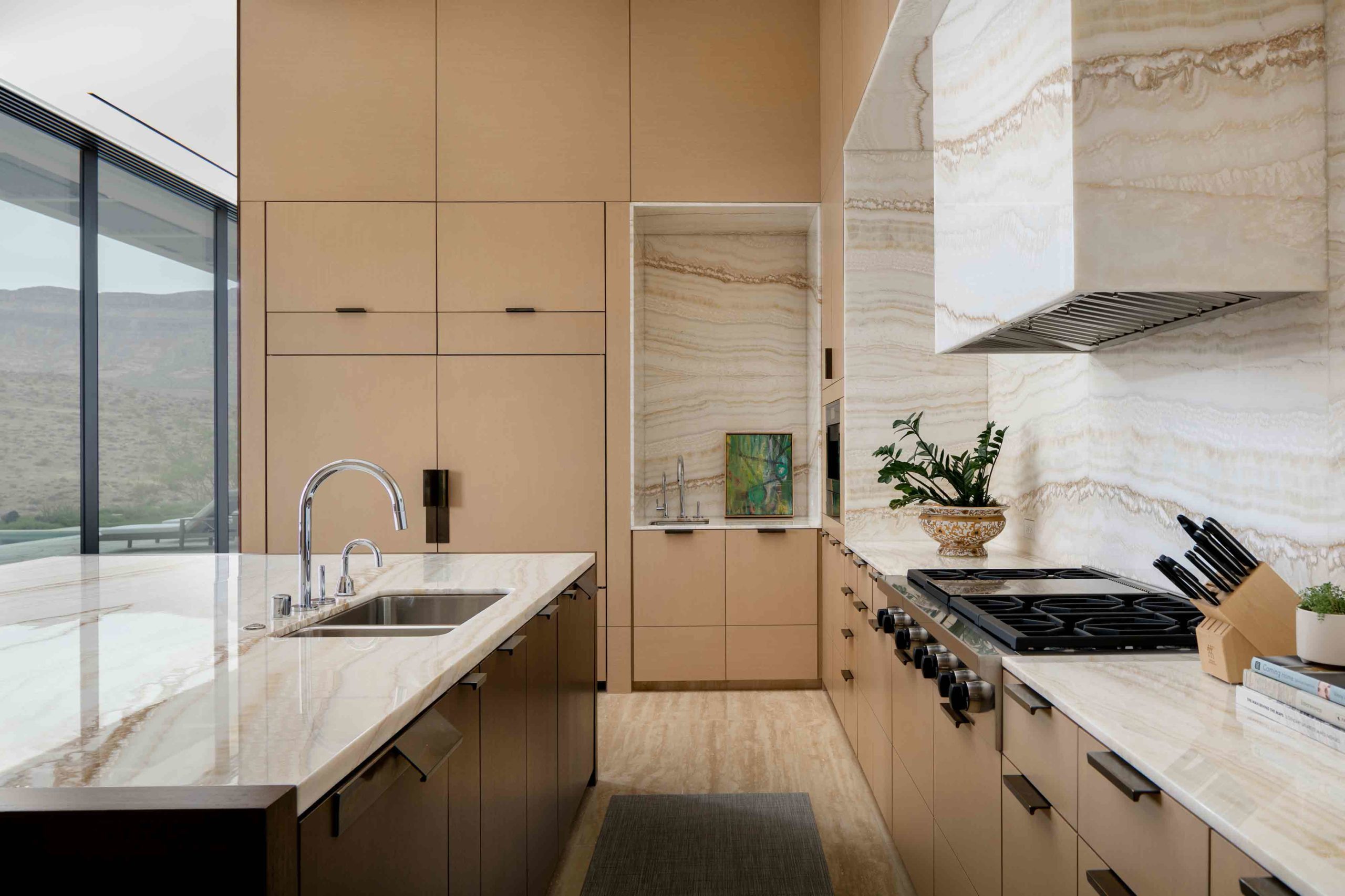 Nestled in the arid Nevada desert, this residence reads as an extension of the topography, both externally and internally. Retractable walls of glass, which span across two different aspects, peel away in the main living and dining zone, erasing the boundary between natural and built environments. Exposed rock excavated from the site lines the walls of the living spaces and orients the home within the same tactile language as the rugged terrain.
The color palette throughout the interior is earthy and warm, a combination of cream, peach, terracotta and deep brown that blurs with the desert. In the kitchen, veined surfaces across the countertops and backsplash mirror the relief of the landscape outside in the same sand hues, internalizing the outdoors with stunning effect.
7. Articulating Unusual Arches
SOMESOME Bar & Restaurant by MARS Studio, Beijing, China
Jury Winner and Popular Choice Winner, 10th Annual A+Awards, Bars & Wineries
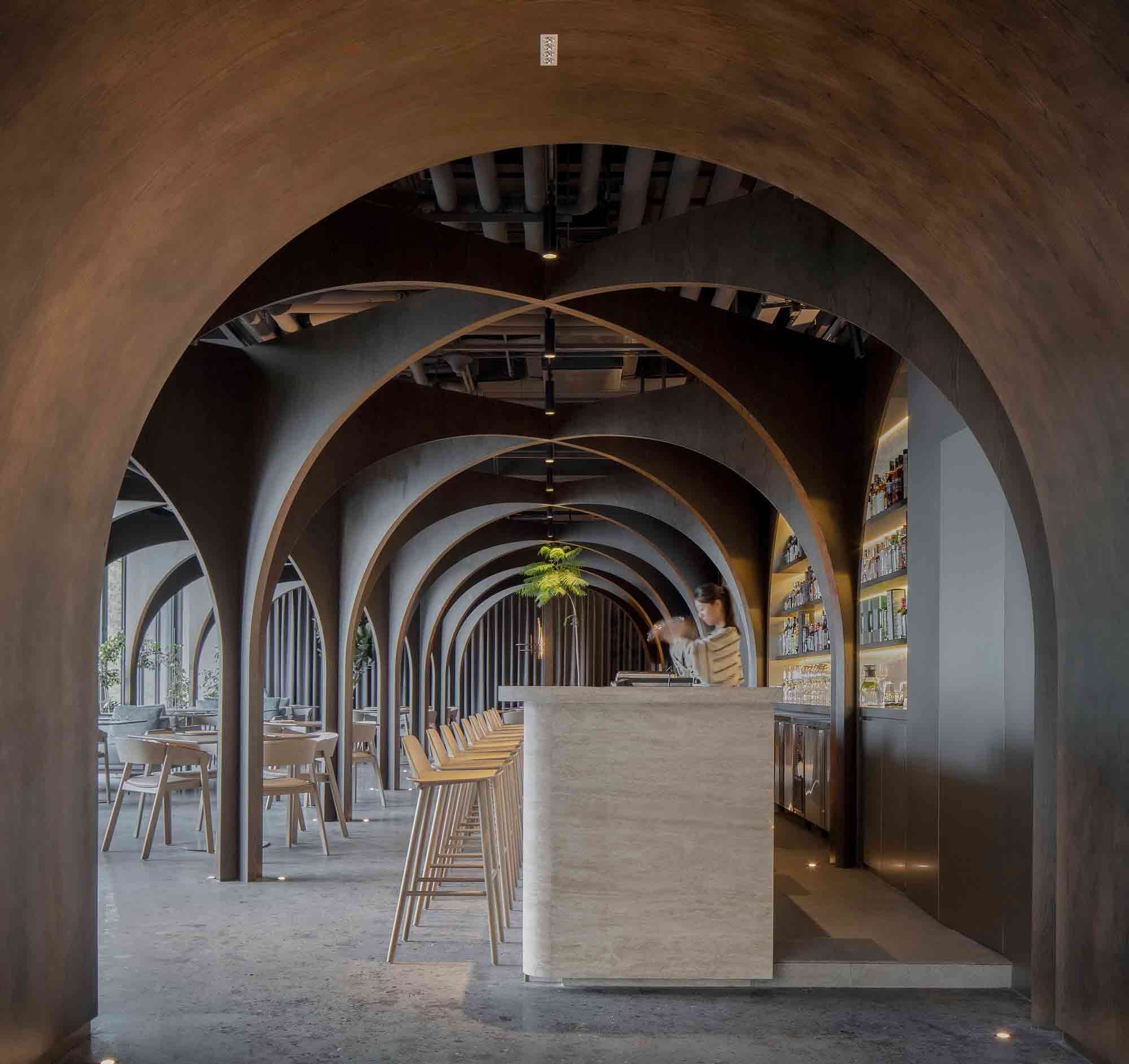
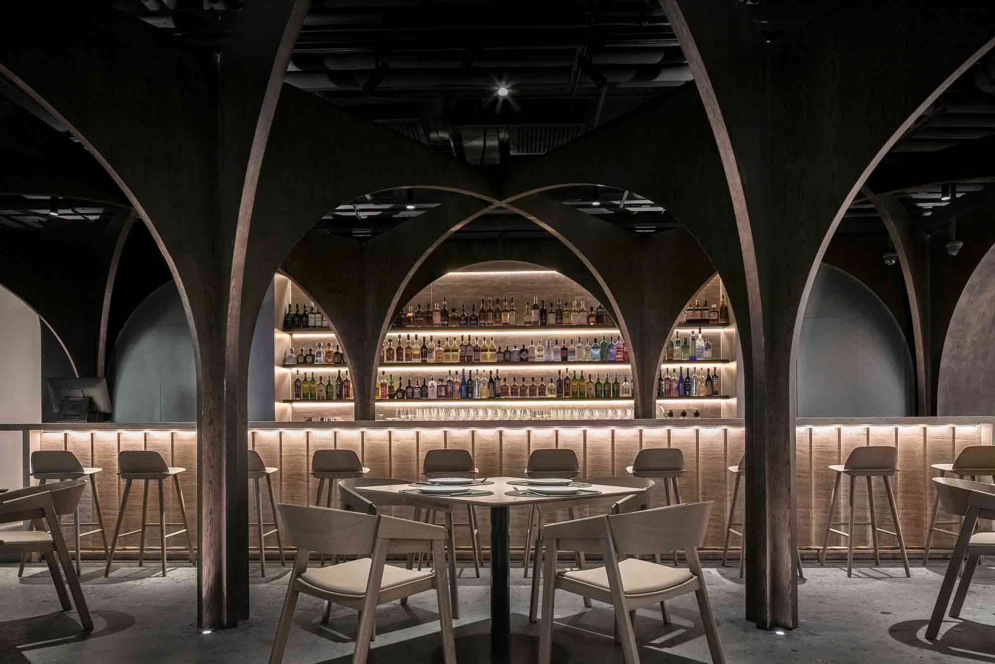 This visually striking bar and restaurant in Beijing eschews right angles and straight lines. Approaching the curved threshold to this daring space is like delving into a warren. The arched entrance draws the eye down through a cocoon-like portal defined by dark, earthy colors.
Inside, warped surfaces shape the unconventional hospitality scheme, offering an atmospheric spatial journey from start to finish. A complex arrangement of archways creates a sinuous pathway between the tables, bar and glass-fronted outlook. Their intersecting forms serve as elaborate picture frames, revealing unexpected internal and external perspectives to the restaurant’s patrons. The design succeeds in embodying diverse qualities — a large, open interior where air can flow freely, at once segmented into intimate rooms of experience.
8. Innovating Installations
550 Madison Lobby by Gensler, Manhattan, New York
Popular Choice Winner, 10th Annual A+Awards, Commercial Interiors (<25,000 sq ft)
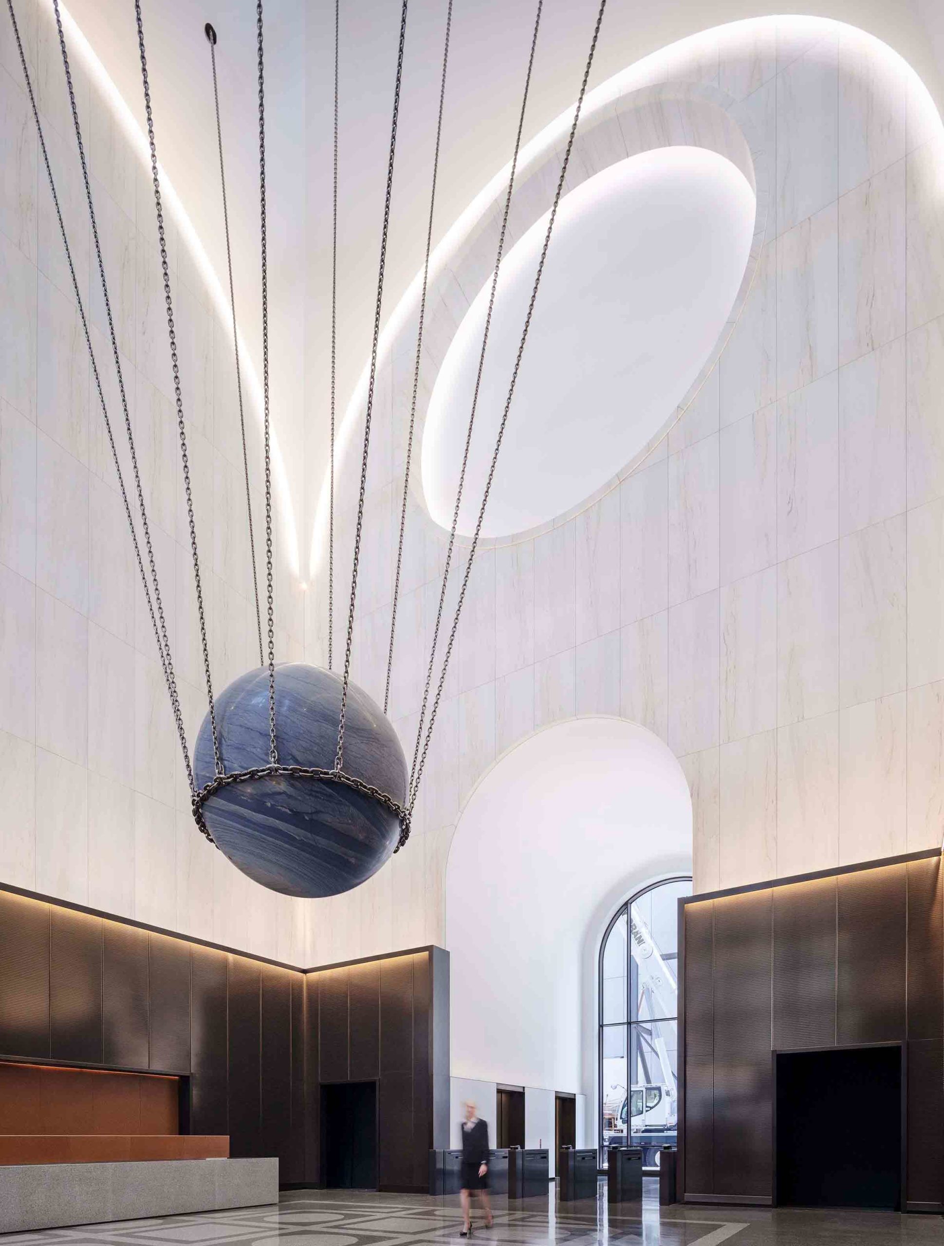
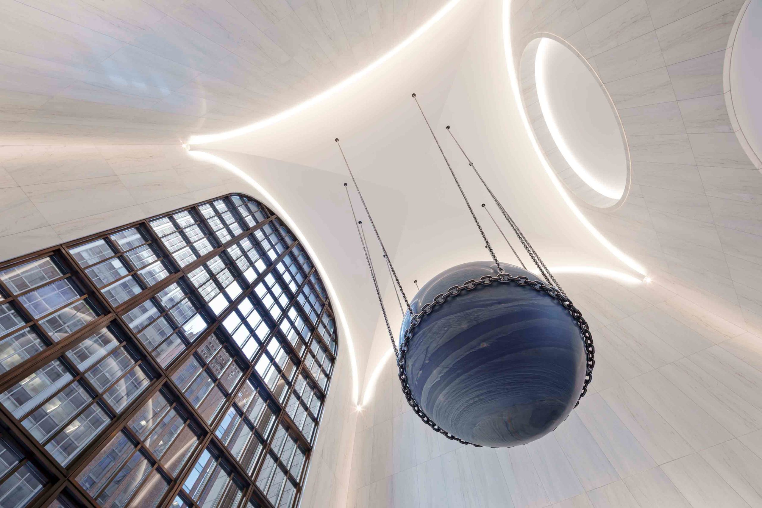 Dating back to 1984, the lobby of this postmodern building in New York City underwent a contemporary update by architectural firm Gensler. While remaining respectful of the scheme’s heritage materials and capacious proportions, the towering, triple-height ceiling now arches softly around the space. The convex lines of the engraved oculus emphasize the vaulted barrel design, accentuated by the illuminated perimeter, which imparts a celestial, almost weightless effect.
The spherical motif reappears in the remarkable art installation suspended from the ceiling by Alicja Kwade. Called Solid Sky, the presence of the 24-ton marble orb is profound — it presides over the lobby with a quiet intensity, much like its namesake. Visually, the installation anchors the dramatic space and establishes a line of sight to the outdoor garden beyond.
Architizer’s 11th Annual A+Awards is open for entries! With a Final Entry Deadline of January 27th, 2023, the clock is ticking — get started on your submission today.

