These Terracotta Experts Are Redefining the Architectural Possibilities of an Ancient Material
The One Rendering Challenge is now part of the Architizer Vision Awards, honoring the best architectural photography, film, visualizations, drawings, models and the talented creators behind them. Winners are published in print! Start your entry >
Great architecture marries function with aesthetics. Often, the expression of this negotiation between form and use plays out in materials, the many assemblies and combinations that define what we experience. Terracotta is a clay-based ceramic that can be glazed and has been used throughout history. But it wasn’t until the 19th century that the material began gaining new architectural applications outside roofing. With varying colors and textures depending on the type of clay, terracotta is now produced in a vast array of shapes, styles and varieties.
Shildan has become known for its rainscreens and terracotta products, which bring iconic and energy-efficient building façades to life. With over 300 institutional projects, they specialize in designing and engineering systems for high-performing facades. While a large majority of contemporary terracotta buildings include cultural institutions and arts facilities, the material can also be used in residential and commercial construction. Durable as it is beautiful, Shildan’s terracotta is used in contemporary architecture to redefine building envelopes in both rainscreens and cladding. Each of the following projects explores how Shildan rethinks terracotta and its application in diverse building types.
Mercy Corps Global Headquarters
By Hacker, Portland, OR, United States
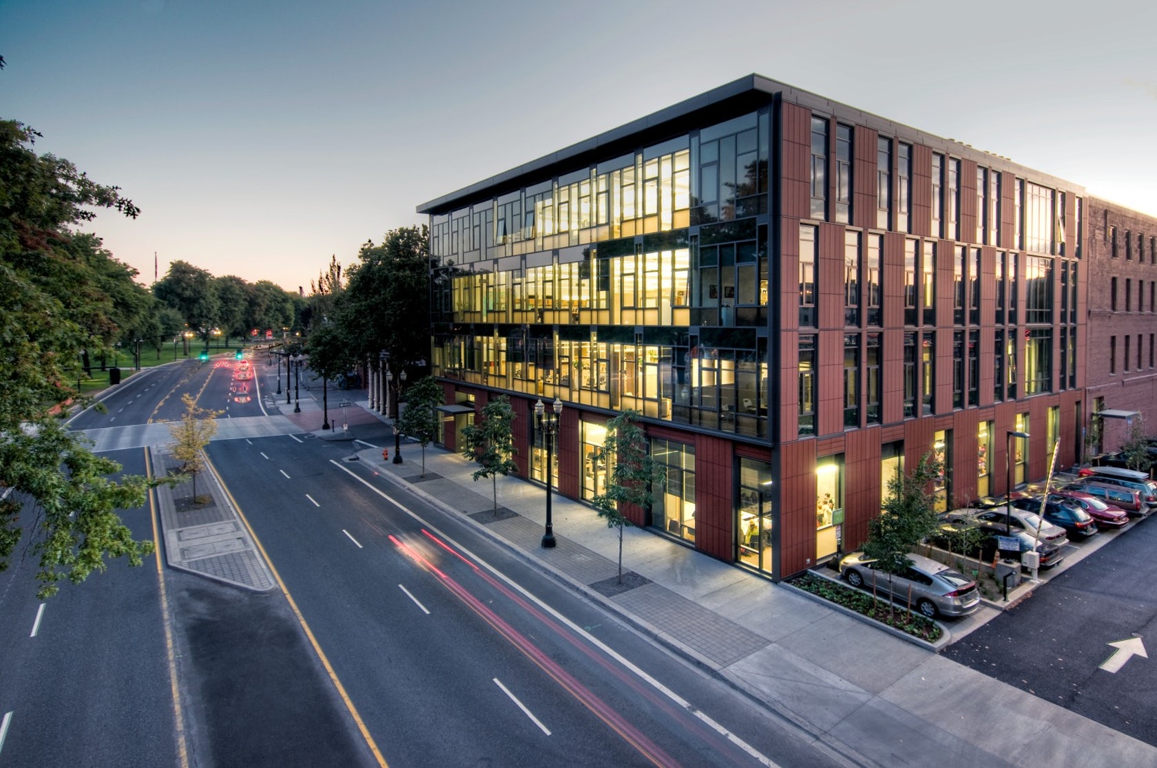
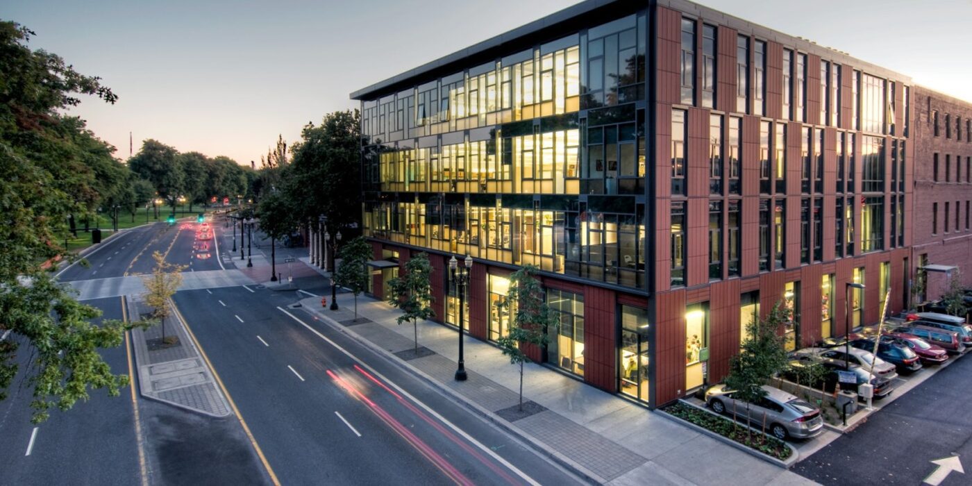
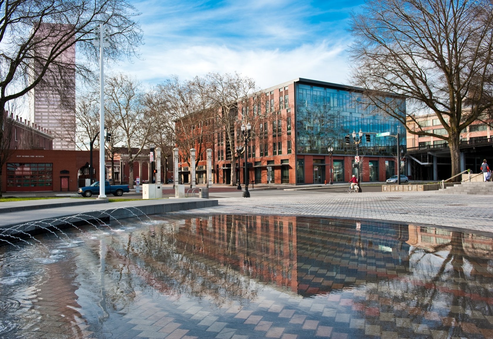 Designed to teach and encourage visitors to engage with contemporary issues, the Mercy Corps building was built to exemplify a sustainable, community-focused approach. Doubling the size of the historic Portland Packer-Scott Building, the landmark project combined a green roof, with resource-friendly landscaping and a glass and terracotta envelope.
Certified LEED Platinum, the project uses the LONGOTON Terracotta Rainscreen Panels with extruded, double leaf, 1.6 inch (40 mm) panels. The panel has increased strength from a chain of internal I-beam supports. The panels were chosen because of their flexibility in being able to be incorporated in both horizontal and vertical support systems, as well as a flexible orientation in layout. The headquarters also includes the Action Center — a “window to the world” — featuring interactive exhibits that educate visitors about the changing nature of relief and development work.
NASA Langley Research Center – Headquarters Building
By AECOM, Hampton, VA, United States
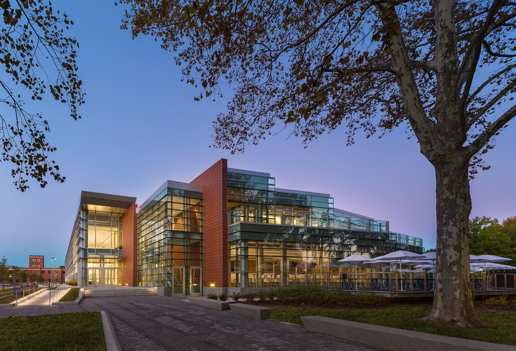
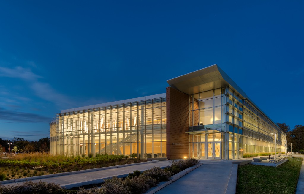
For NASA’s Langley Research Center, a $23 million, 72,000-square foot administrative office building, AECOM provided full bridging architectural and engineering services for the headquarters. The building is conceptualized as a parallelogram on a triangular site with a two-sided entry at ground level linked by a continuous lobby. The southern entrance plaza links both through the lobby and around the building to the north plaza, which is oriented to the heart of the campus.
The headquarters building was required to achieve LEED-NC Gold certification but achieved LEED-NC Platinum certification, focusing on the reduction of operating and maintenance costs, energy efficiency, comfort for the occupants, and a low environmental impact. The project features the Shildan/Moeding ALPHATON Panel, an extruded, double leaf, 30 mm (1.18”) terracotta panel. The ALPHATON panels can be incorporated in both horizontal and vertical support systems, and they were used in the Langley project to for durability and to denote the change in building form.
NOAA Southwest Fisheries Science Center
By Multistudio, San Diego, CA, United States
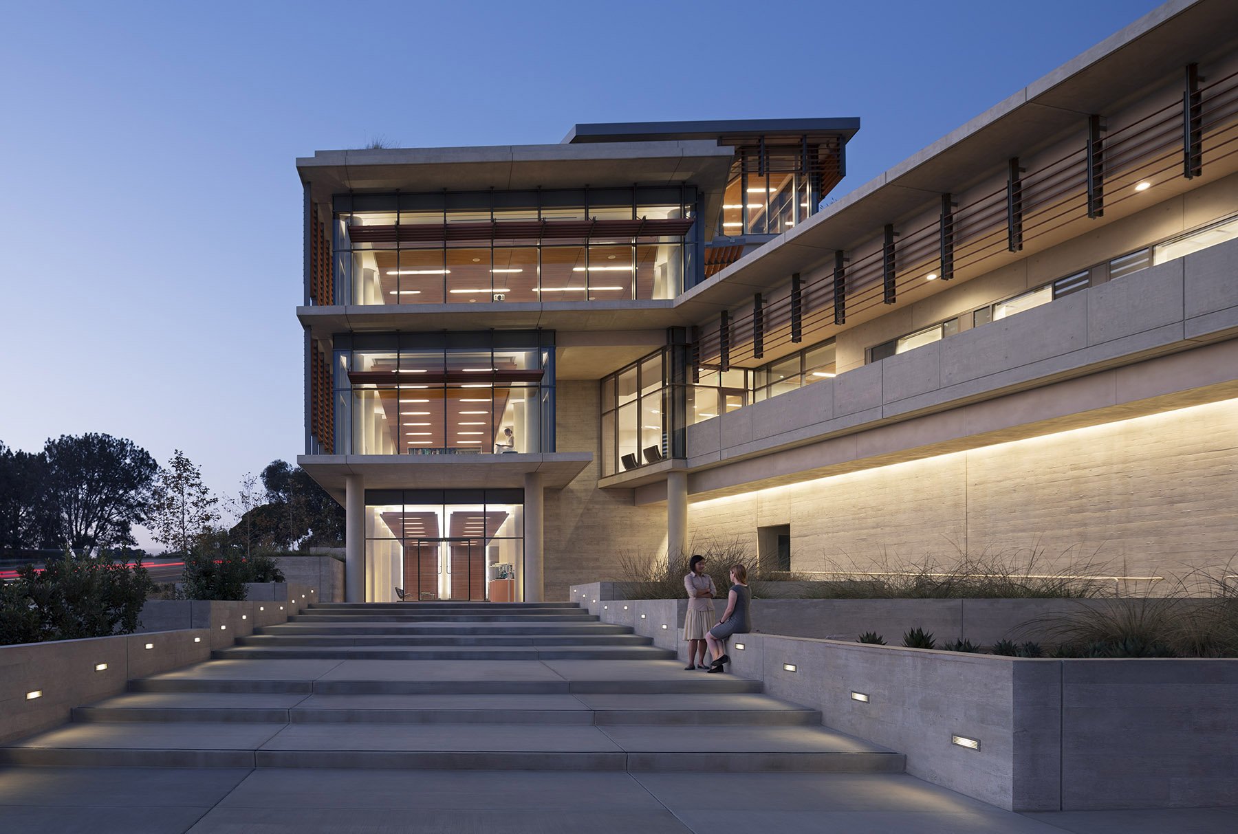
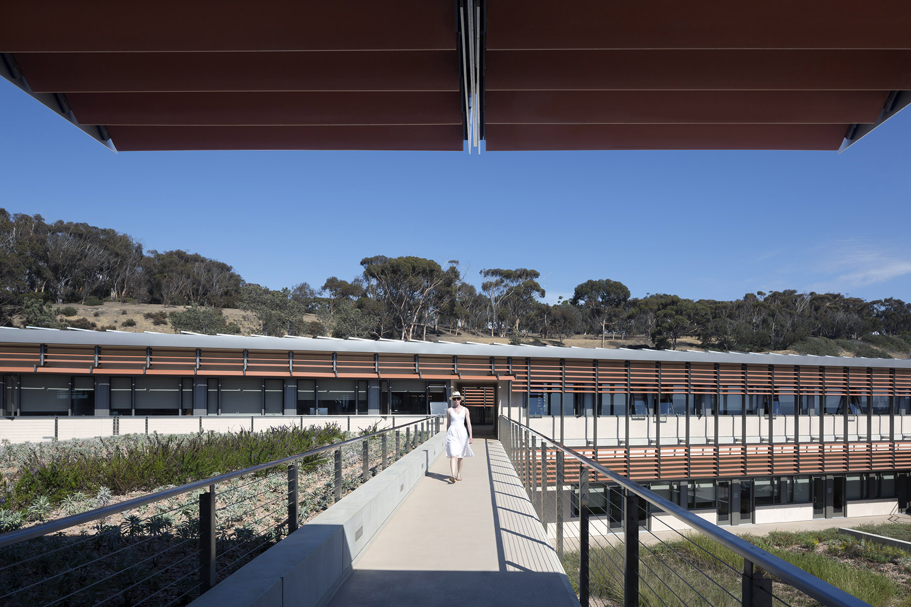 For the design of the National Oceanic and Atmospheric Administration (NOAA)’s Southwest Fisheries building, the team partnered with the University of California San Diego to design a facility that would pay homage to a world-class site and create a sustainable building for environmental stewards of the ocean.
The Southwest Fisheries building takes advantage of the local microclimate while respecting the ever changing needs of the research scientists. The new facility continues the California-style legacy of an open architectural environment, and courtyards encourage interactions among researchers from different disciplines. Terracotta sun shades, green roofs, photo-voltaic panels, and a state-of-the-art 528,000 gallon ocean technology tank help this building rethink scientific building design.
UCLA Evelyn & Mo Ostin Music Center
By Kevin Daly Architects, Los Angeles, CA, United States
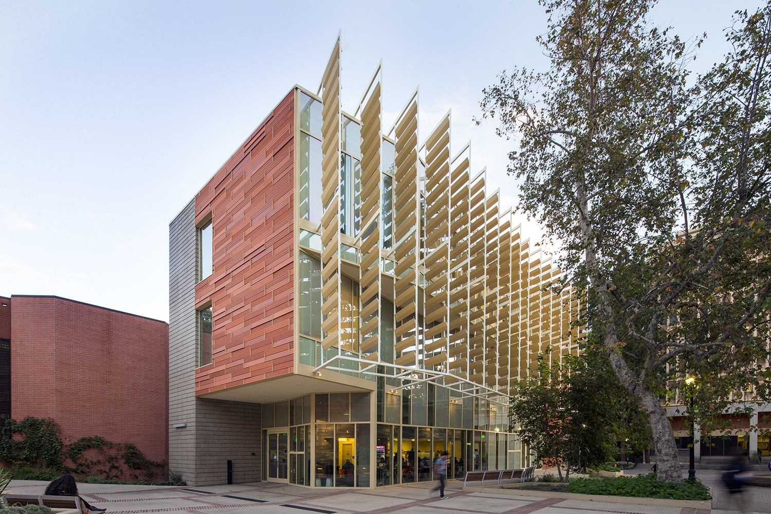
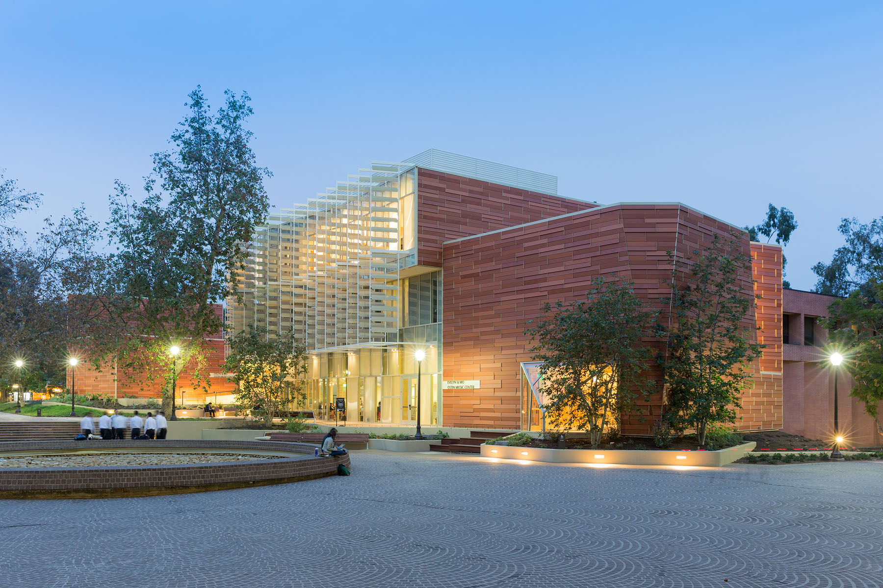 For this music center in Los Angeles ,the project includes a high-tech recording studio, spaces for rehearsal and teaching, a café and social space for students, and an Internet-based music production center. Music industry executive and philanthropist Morris “Mo” Ostin donated $10 million to UCLA for the music facility, now known as the Evelyn and Mo Ostin Music Center. Adjacent to the Schoenberg Music Building and the Inverted Fountain, the new structures provide faculty and students access to the latest advances in music technology, research and technology.
The design utilized Shildan’s Terracotta Baguette Sunscreen to provide subtle variation and add texture to a building. This was combined with the ALPHATON terracotta panel. Kevin Daly Architects utilized these materials and assemblies, as well as proposed a series of additions, subtractions, and modifications to the existing facilities that transformed the building into a dynamic complex that supports a new vision for music education at UCLA.
Lesley University, Lunder Arts Center
By Bruner/Cott & Associates, Inc., MA, United States
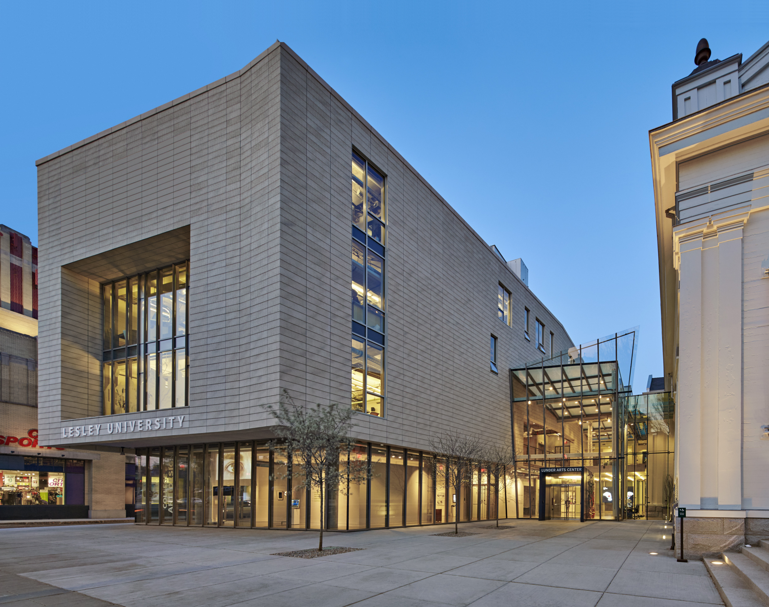
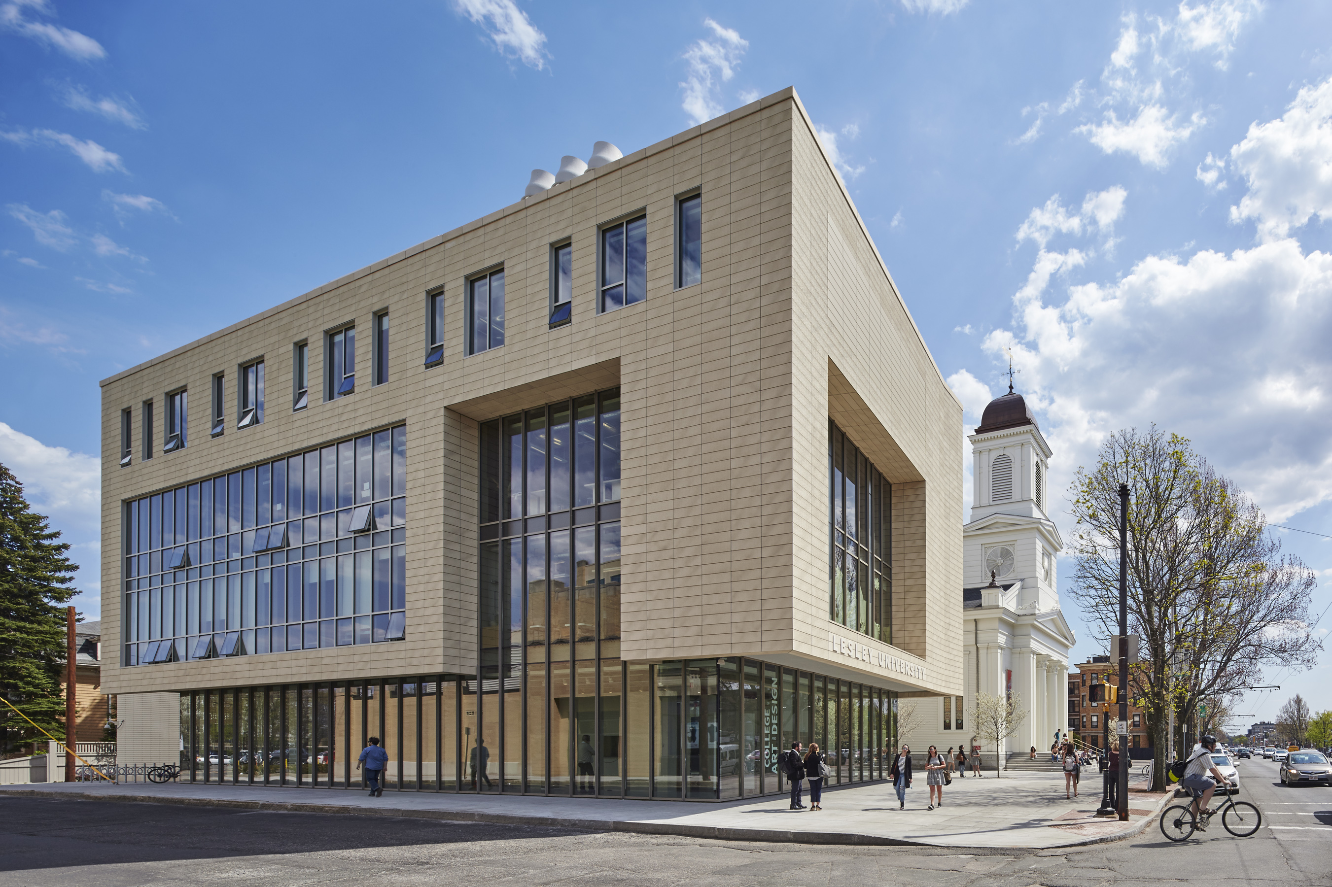 The Lunder Arts Center at Lesley was designed to be the new heart of the College of Art and Design. A center for art teaching and making, the campus is a crossroads for academic, artistic, and neighborhood communities. The terra-cotta and glass design foregrounds the site’s important historic church, initiating a dialog between 19th century religious and 21st century educational icons. An art gallery in the new glass building and a library in the historic church anchor the building at both ends; both are open to the public.
The complex is a transition from Porter Square’s large-scale industrial buildings to the smaller, finer-scaled residences and stores along the avenue. The scale and detail of the historic church inform the new building; terra cotta reflects back neighboring brick and clapboard. Registered for LEED Gold, the complex exceeds Cambridge’s strict new Stretch Energy Code. The project team used both the ALPHATON terracotta panel system, as well as Shildan’s Patinated Terracotta Rainscreen Panels.
Stephen M. Ross School of Business
By Kohn Pedersen Fox Associates, Ann Arbor, MI, United States
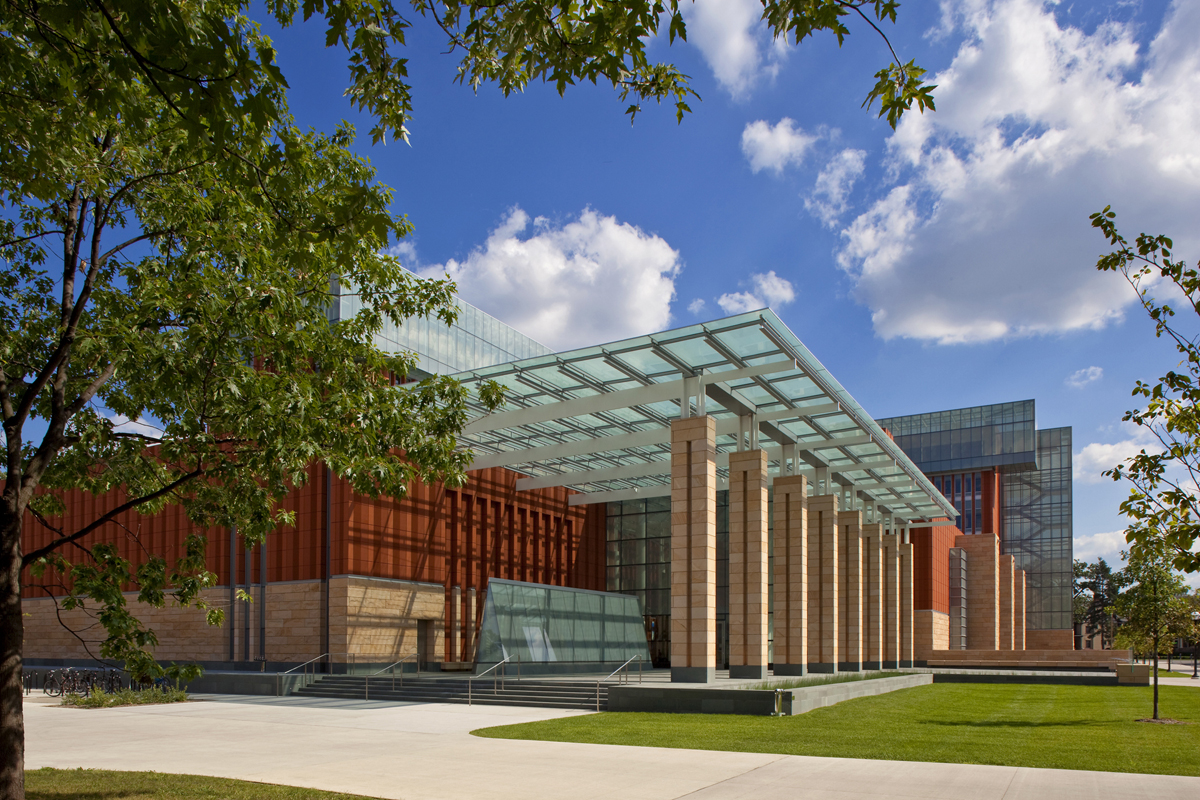
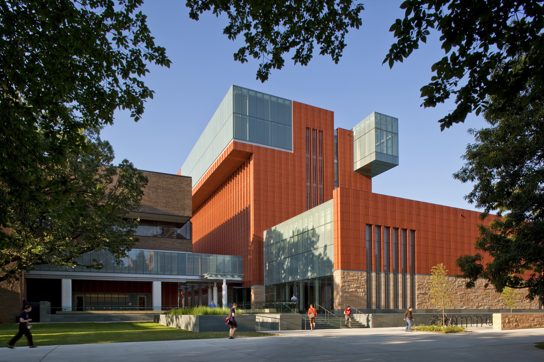 Key to the success of the design of the new Stephen M. Ross School building was relating the typical tiered classroom to group study spaces. To do so, the design team developed a model for early site planning studies to address the pedagogical needs of the school, which focused on assessing the capacity of existing buildings to accommodate new teaching spaces. Equally important was a sense of local identity, both for the building on the university campus and for distinct groups within the school.
Respect for the language and history of nearby buildings on campus had to be balanced with the goal of projecting a forward-looking image for the school. The new building meets these challenges set by the Ross School with an organization of elements around a central winter garden which opens directly to the street, providing a distinctive presence and a new “front door” for the school on the University of Michigan campus. Through both phases, glass, terracotta, and warm sandstone define the material vocabulary of the building. The mixture of textures offers smooth glass that is clear and fritted, machined terracotta, split-faced sandstone and water-jet finished granite to provide a contrast in color, texture and feel. Terracotta is the building’s most prominent material.
The One Rendering Challenge is now part of the Architizer Vision Awards, honoring the best architectural photography, film, visualizations, drawings, models and the talented creators behind them. Winners are published in print! Start your entry >

