Familien Kvistad designs colourful Yellow House in the Apple Garden
CategoriesInterior Design

Familien Kvistad designs colourful Yellow House in the Apple Garden

Vibrantly coloured tiles and textiles feature in this house renovation in Oslo, Norway, designed by locally based duo Familien Kvistad.

The Yellow House in the Apple Garden is a 1950s house in Oslo’s Voldsløkka area, home to a family of four and their cat, “the rambunctious Caspian”.
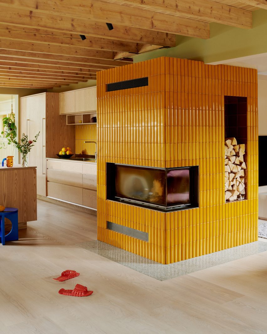
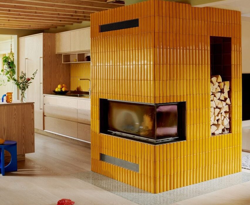
Fireplace with yellow tiles by Familien Kvistad
Familien Kvistad has renovated a Oslo home

Familien Kvistad founders, married couple Astrid and Ziemowit Kvistad, have completely remodelled the interior using a palette that also includes solid ash joinery and lightly speckled terrazzo surfaces.

“When they bought the house, the family envisioned painting some walls, moving the kitchen and building two new bathrooms,” the pair told Dezeen. “Over time, things naturally escalated, resulting in a complete change of layout, roof windows, new insulation, siding… absolutely everything was replaced.”

Kitchen with ask cabinets and yellow tile splashback and cat
The kitchen features solid ash cabinets

The three-storey house has an enviable setting in a large garden filled with fruit trees. It was this that primarily attracted the owners, rather than the building itself.

“The house was relatively old, not architecturally distinctive and outdated inside on all levels,” said the designers.
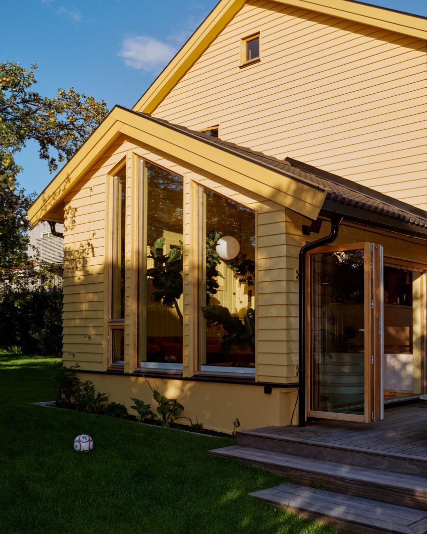
Yellow House in the Apple Garden by Familien Kvistad
The house was originally built in the 1950s

However, shortly after they bought the property, the council enforced new conservation zone restrictions that made it impossible to alter the building’s exterior in any way.

The task for Astrid and Ziemowit was to modernise the house without changing or extending its structure.

“This is obviously a costly project; it would have been cheaper to build a new house,” they explained.

“However, the outer structure had to remain.”

Conservatory in Yellow House in the Apple Garden
A terrazzo floor and ochre sofa are installed in the conservatory

The renovation removed many of the old internal partitions, creating a more open layout. This gives the ground floor a broken-plan feel, made up of various separate but connected living and dining spaces.

The old loft was also removed and replaced with small mezzanines, revealing the sloping roof beams and increasing the ceiling height in the first-floor bedrooms and bathroom to up to four metres.
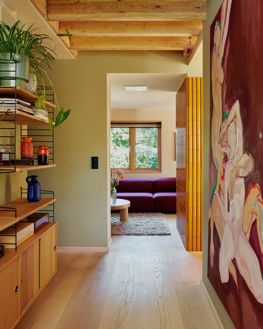
Entrance lobby by Familien Kvistad
Wooden ceiling joists are exposed throughout

The colour scheme was based on “earthy shades” of the owners’ favourite colours.

On the ground floor, this resulted in a feature fireplace clad in mustard-yellow Kaufmann tiles, a lounge sofa upholstered in a plum-coloured Kvadrat textile and a storage bench topped by forest-green cushions.

Lounge in Yellow House in the Apple Garden
A storage bench topped with green cushions lines the main living space

An abundance of wood brings balance to this bold palette, with Douglas fir flooring from Dinesen and solid ash kitchen cabinets matching the exposed ceiling joists.

This level also includes a sunken conservatory featuring large plants, a terrazzo floor, an ochre-toned sofa and electric-blue cushions. On the wall, an expressive painting displays similar colours.
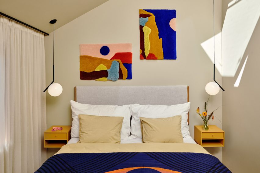
Bedroom with wall carpets by Familien Kvistad
Custom-designed wall carpets adorn the primary bedroom

“During the renovation, the family sold most of what they already owned,” said Astrid and Ziemowit. “This meant that all the furniture was purchased new.”

“However, they did have some art from before,” they added. “Much to our delight, they fit perfectly into both the colour palette and the style.”
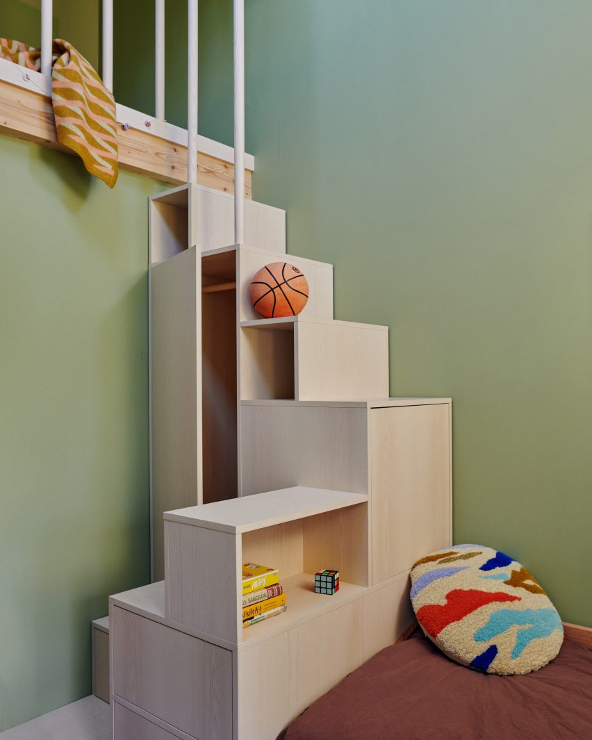
Staircase doubles as a shelving unit
In one of the children’s rooms, a staircase doubles as a shelving unit

Upstairs, the primary bedroom features a pair of tufted wall carpets designed and made by Familien Kvistad, depicting abstract landscapes.

One of the two children’s bedrooms features a playful storage unit that doubles as a staircase, while the other has a ladder to provide access to the mezzanine loft above.
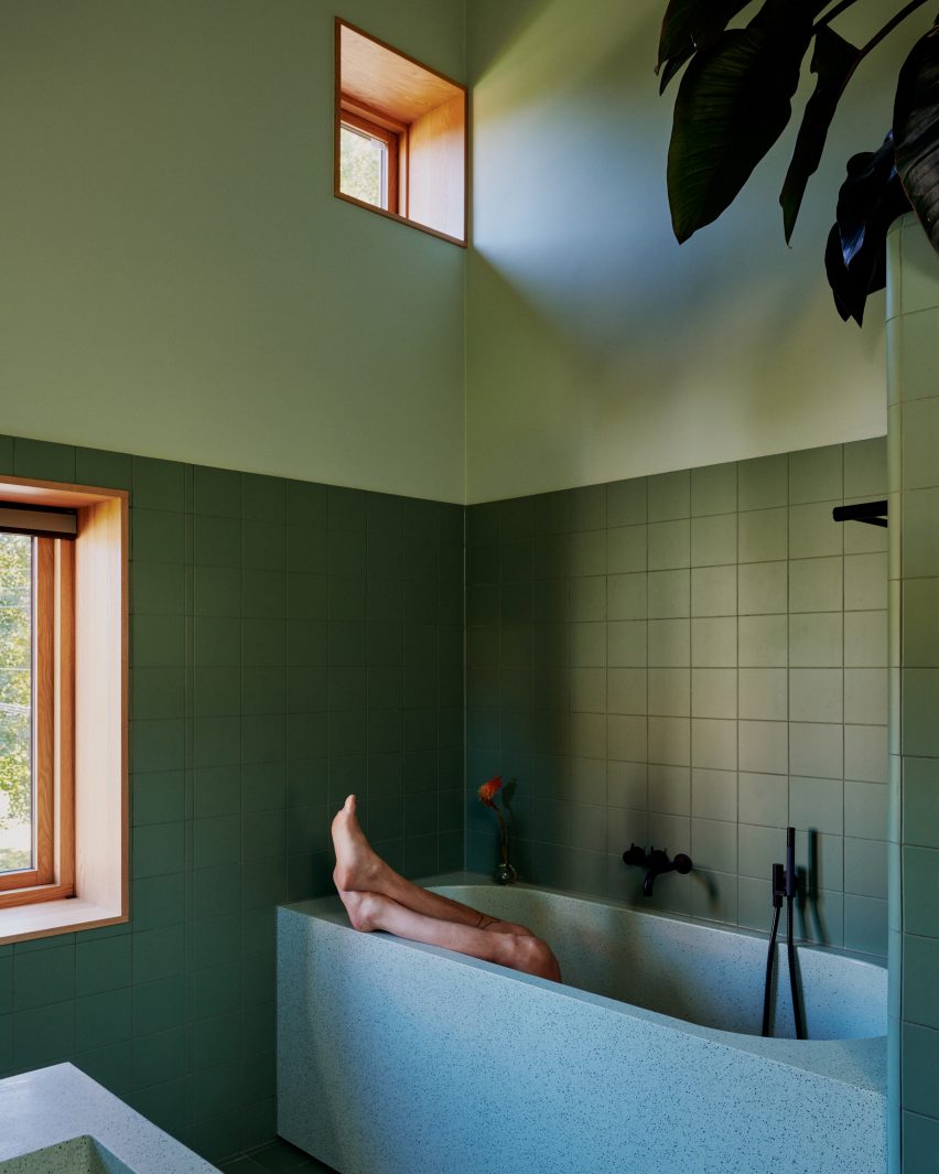
Bathroom with green tiles and terrazzo bath and basin
The family bathroom combines green tones with terrazzo

The bathroom has a more mellow character, combining terrazzo sanitaryware with calming green tones. The basement floor mainly serves as a utility area, although it does include an extra bathroom and a living room that doubles as a guest bedroom.

Other recently completed homes in Norway include a “house of offcuts” by Kolman Boye Architects and a villa on piloti by Saunders Architecture.

The photography is by Magnus Berger Nordstrand.

Reference

Transparency “one of the biggest beasts that we battle” says Apple
CategoriesInterior Design

Transparency “one of the biggest beasts that we battle” says Apple

Apple is pushing for carbon transparency in the supply chain as it aims to reduce the impact of its stores, claims the tech company’s retail sustainability lead Rebecca Cully in this interview.

Created as the latest “evolution of the Apple Store”, Apple’s recently opened location in Battersea includes several material innovations aimed at reducing the shop’s carbon impact. These were sourced with transparency in mind, according to Cully.

“That transparency piece is one of the biggest beasts that we battle on a regular basis,” she told Dezeen.

“I think that’s a big reason why finding the right partners, not only in the design space but the construction space and the entire value chain, is just so critical.”

Apple seeking partners “absolutely committed to transparency”

Cully explained that Apple is seeking a commitment to transparency from all its construction partners as it aims to meet the company’s wider commitment of becoming carbon neutral by 2030, which will mean not only reducing the impact of its stores, but also its products.

“There’s so many brilliant products out there in the world, and so many incredible companies that are doing some really interesting things, but as far as innovation is concerned, if we can’t identify a partner who’s absolutely committed to transparency it’s a no-go,” said Cully.

Apple Store in Battersea
The Battersea Apple Store incorporated new floor materials and roof baffles

Apple is working on building record-keeping of impact and transparency into all its contracts. However, Cully acknowledged that evaluating the full of the impact of all components and materials in its stores is still not possible.

“Evaluating products by manufacturer for carbon is still very early,” she said. “And so contractually obligating our supply chain manufacturers to disclose that information as a result of award is certainly something that we are focused on right now.”

“The entire store? I think that’s a little ambitious right now, based on where industry is at,” she continued. “Frankly, we have not gotten to the point where we’re able to control that entire supply chain.”

“You have to prioritise. For instance, the the nuts and bolts that go into the store are not as significant as our avenues and our ceilings.”

“Industry is pretty slow to move”

The recently opened Battersea store, along with the reopened Tysons Corner store in the USA, are the first to use an updated set of fixtures and fittings that will be rolled out across other stores.

These include a timber framework for its walls and room dividers, flooring bound with a bio-polymer and acoustic baffles made from biogenic material.

“These are very visible, very large components within the store that we knew if we focused on in the original design intent were going to result in a superior outcome from a carbon perspective,” said Cully.

Battersea Apple Store
The store is the latest “evolution” of Apple’s retail designs.

Apple’s current strategy with its stores is to focus on the most impactful, often physically largest areas that have traditionally been the most carbon-intensive.

“So it’s really important that we are giving clear instructions to the folks that are sourcing for us to achieve particular outcomes,” said Cully.

“That being said, the industry is pretty slow to move in a lot of these cases. So I would say that we are targeting certain elements within the store that are traditionally very high-carbon and very resource-stressed.”

“We are targeting those manufacturers to make sure that they understand there is an obligation to deliver on transparency that is absolutely accurate.”

Cully also highlighted that one major way that the carbon impact was reduced at its Battersea store was the decision to locate within the redevelopment of Battersea Power Station.

Along with the Apple Store within the former turbine hall, the technology company has placed its UK offices within the former power station.

“Partnering on a redevelopment project of a brownfield site in and of itself has a tremendous value from the standpoint of carbon emissions avoided as a result of the existing structure,” said Cully.

“Certainly the partnership that we have with the landlord, was highly strategic in terms of positioning Apple to locate and operate as environmentally considerate as we possibly could.”

Apple “certainly interested in pushing industry”

According to Cully, Apple wants to push the construction industry to be more sustainable and noted that the company’s vice president of environment, policy and social initiatives, Lisa Jackson, has said she “intends to create a playbook that other organisations can follow”.

“We are certainly interested in pushing industry,” said Cully. “And because of scale, we have an ability to do that and hopefully pave the way to make it a little bit easier for other companies to follow suit – or at least start normalising conversations with manufacturers and industries so that you know, these things become a little bit easier or a little bit more cost effective for other folks to follow suit.”

“There are a few organisations around the world, I think, that have the ability to invest in this space the way we have, because the market just doesn’t exist.”

In the past Apple stores have been focused on aesthetics, but Cully believes that the refocus on sustainability and accessibility means the shops align closer with the brand’s values.

“This evolution of the store is so much more intrinsically linked to our values – it really is approaching the epitome of Apple’s values realised through the retail store space,” said Cully.

“We have evolved the store from kind of looking like a product, to now fully representing our values in every way that we can, within the context of the built environment itself.”

However, store fit-outs are far from being Apple’s biggest challenge in the race for carbon neutrality. Currently, 65 per cent of the company’s emissions from its products so this thinking will also need to be replicated in it production supply chains.

The first Apple Store opened in 2001 and there are now more than 500 around the world. Dezeen recently rounded up 10 of the latest to open.

The photography is courtesy of Apple.

Dezeen In Depth

If you enjoy reading Dezeen’s interviews, opinions and features, subscribe to Dezeen In Depth. Sent on the last Friday of each month, this newsletter provides a single place to read about the design and architecture stories behind the headlines.

Reference

Ten Foster + Partners-designed Apple Stores
CategoriesInterior Design

Ten Foster + Partners-designed Apple Stores

With Apple opening its latest Foster + Partners-designed store in the newly renovated Battersea Power Station, our latest roundup spotlights 10 Apple Stores designed by the British architecture studio.

Apple has been working with Foster + Partners since 2014, when the technology company and architecture studio initiated its almost decade-long relationship to complete a retail location in Istanbul, Turkey.

Apple describes its first stores as looking “like nothing else”, but is now more focused on renovating and restoring buildings such as its Los Angeles store, Champs-Élysées store and Rome flagship.

“I think that the evolution of retail for Apple is really interesting – starting with very bold statement with stores that look like nothing else,” said Bill Bergeron Mirsky, a global retail design lead at Apple, at the opening of the brand’s Battersea Power Station store.

“And then over time, you move to the Apple Store being very ubiquitous. And now it’s come around to being a responsibility approach,” he continued. “As we see the rise of Apple in the world and the importance people place on the brand and the values that it represents.”

With Apple now having stores in 526 locations across the world Dezeen has selected 10 striking recent stores from its archive:


Battersea Powerstation Apple store by Foster + Partners

Battersea Power Station, UK, 2023

Apple’s most recently opened store is located within the newly renovated Battersea Power Station in London, which marks the technology company’s 40th UK store.

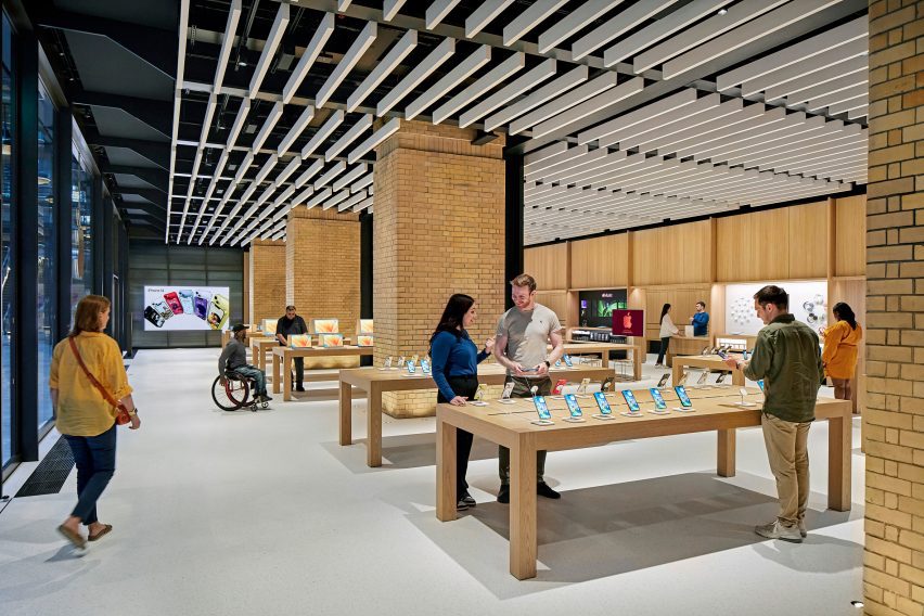
The store is set on the ground floor of the shopping centre within the power station’s 1930s Turbine Hall A. The interior was organised around four original brick columns and beneath steel roof supports that were left exposed.

Find out more about Battersea Powerstation Apple store ›


Oak ceiling in Mumbai apple store

Mumbai, India, 2023

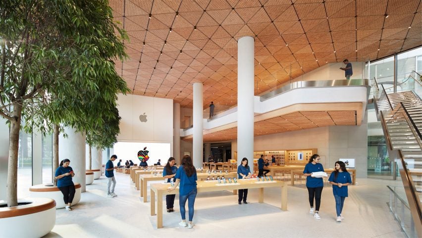
India’s first flagship Apple Store contains a wooden canopy made from 450,000 hand-crafted oak elements that form 1,000 triangular ceiling tiles.

The walls of the store were made from stone sourced from Rajasthan and have a fine grain that is meant to convey the texture of Georgette fabric. It was enclosed by two eight-metre-high glass walls that allow light to flood the double-height interior.

Find out more about Mumbai Apple store ›


 Brompton Road Apple store by Foster + Partners
Photo by Nigel Young

Brompton Road, UK, 2022

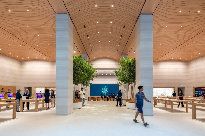
An arched timber ceiling with seven-metre tall interiors defines the Brompton Road Apple store in west London. The arched timber ceiling mirrors the profile and shape of the window bays located at the facade of the building.

The studio removed a mezzanine level from the shop interiors and incorporated six Castagna stone columns, four Ficus trees and a terrazzo floor made from castor oil resin, aggregate and recycled glass.

Find out more about Brompton Road Apple store ›


Abu Dhabi Apple store by Foster + Partners
Photo by Nigel Young

Abu Dhabi, UAE, 2022

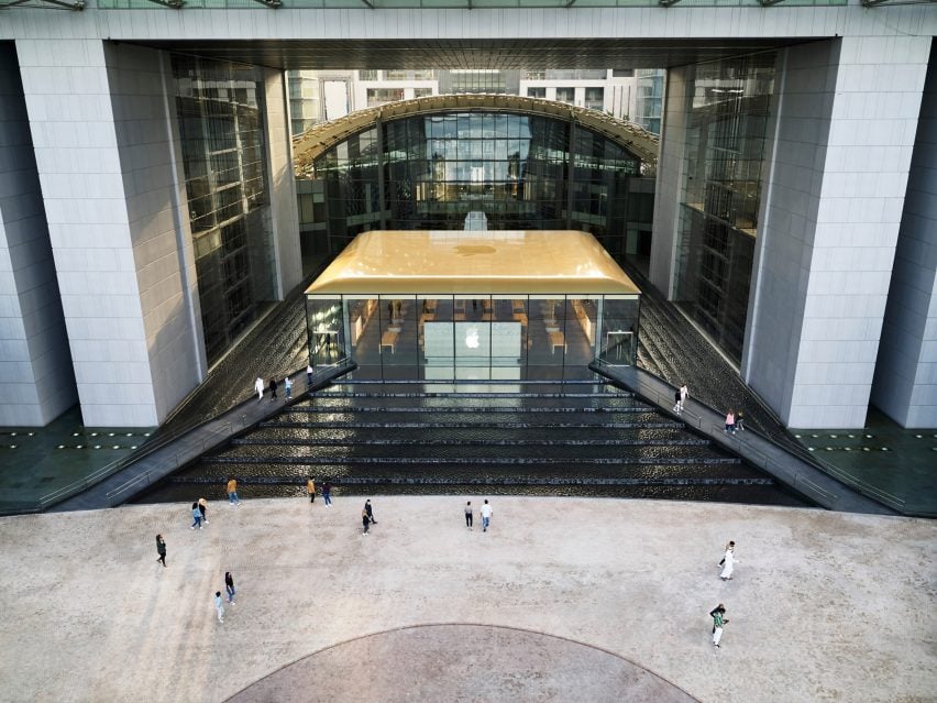
Apple’s Abu Dhabi store on Al Maryah Island was built on top of a raised podium and surrounded by a stepped waterfall around all of its four sides.

The podium the building is set on is pyramid shaped and constructed from black granite stone. The store is accessed via two bridges that extend over the water feature from a waterfront promenade.

Find out more about Abu Dhabi Apple store ›


Los Angeles Apple store by Foster + Partners
Photo by Nigel Young

Los Angeles, US, 2021

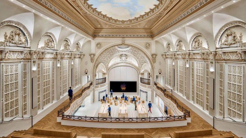
In Downtown Los Angeles, Foster + Partners worked with Apple to renovate a historic 1920s, baroque revival-style movie theatre that was designed by American architect S Charles Lee in 1927.

The sensitive renovation of the formerly abandoned theatre saw the studio restore its corner clock tower, terracotta facade, exterior canopy, and grand entry hall that is complete with bronze handrails and marble columns.

Find out more about Los Angeles Apple store ›


Istanbul staircase
Photo is by Nigel Young

Istanbul, Turkey, 2021

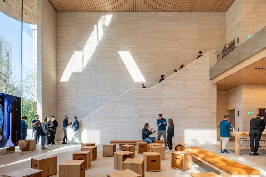
Two large travertine walls flank the interior of Istanbul’s Bagdat Caddesi Apple store. Benefitting from a column-free interior encompasses two levels with a sunken double-height space at its rear.

The building is set back from the street and appears to be a single-storey structure as a result of its sunken lower level. The structure was topped with a large overhanging roof.

Find out more about Istanbul Apple store ›


Rome shop by Foster + Partners

Via Del Corso, Italy, 2021

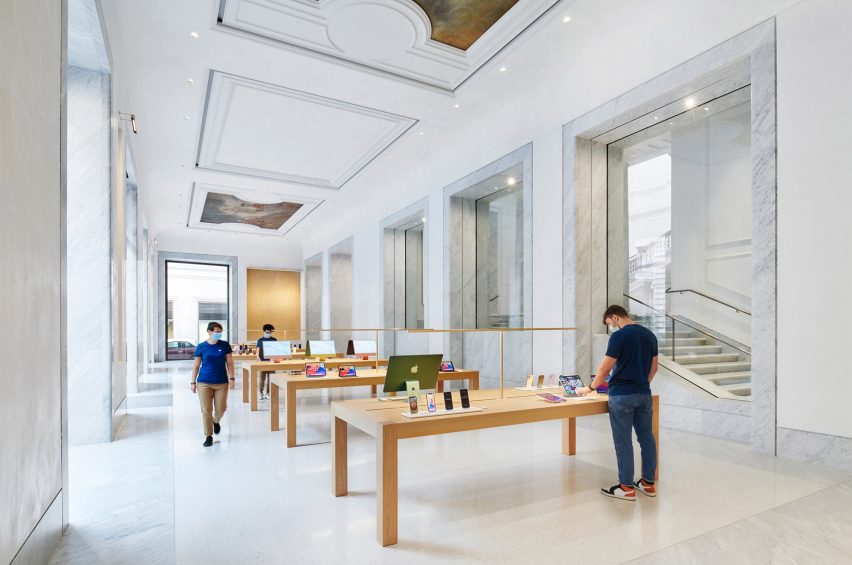
Another restoration project saw Foster + Partners convert and restore a historic palazzo in Rome, which is located in the centre of the Italian city.

Palazzo Marignoli was constructed between 1873 and 1878 and served as a home for Italian politician Marquis Filippo Marignoli. Foster + Partners wanted to celebrate the building’s history by restoring and highlighting its grandeur and historic features. Hand-painted patterned ceilings and frescos were restored throughout.

Find out more about Rome Apple store ›


Apple Marina Bay Sands in Singapore by Foster + Partners floats in Marina Bay

Singapore Apple, Singapore, 2020

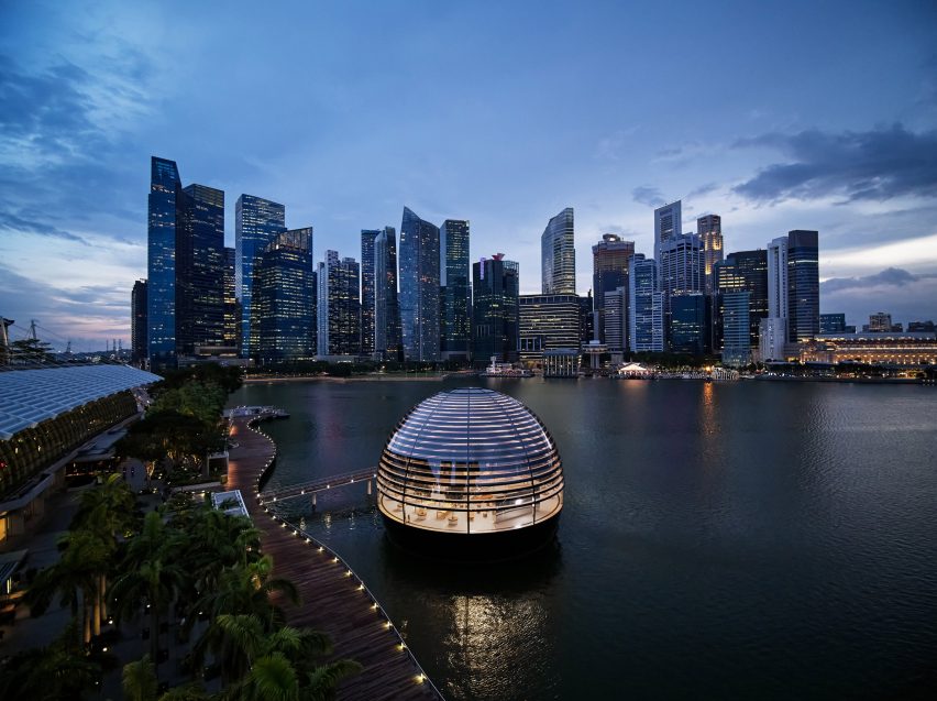
Noted as Apple’s “most ambitious retail project”, its Marina Bay Sands store in Singapore is a spherical glass structure that is completely surrounded by water and accessed via a 45-metre-long underwater tunnel.

The store’s interior is an open-plan space that measures 30 metres wide beneath a self-supporting glass and steel dome, which is made from 114 pieces of glass with 10 steel vertical mullions that provide structural support.

Find out more about Singapore Apple store ›


Central World by Foster + Partners
Photo by Bear and Terry

Bangkok Apple, Thailand, 2020

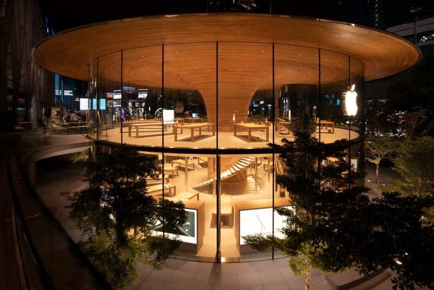
Named Apple Central World, this Bangkok store is organised around a timber-clad column and a large overhanging roof that was designed to resemble the canopy of a tree.

The store has a 24.4-metre diameter with a timber column that is clad in 1,461 slats of European white oak at its centre. The column fans out at ceiling level and adjoins the roof and extends past the glass perimeter of the store, forming a three-metre cantilever over the glazing.

Find out more about Bangkok Apple store ›


Aventura by Foster + Partners

Miami, US, 2019

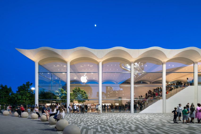
An undulating white concrete roof, which draws on Miami’s art deco buildings, tops the Apple Aventura store that is located in Aventura Mall in the north of Miami.

The structure is a boxy, two-storey building with glass walls and indoor trees. The roof of the store is made up of seven, precast six-metre-wide white concrete arches to form a barrel-vaulted ceiling.

Find out more about Miami Apple store ›

Reference

Apple reveals Battersea Power Station shop as latest “evolution of the store”
CategoriesInterior Design

Apple reveals Battersea Power Station shop as latest “evolution of the store”

Technology company Apple has unveiled its latest Foster + Partners-designed store in the recently revamped Battersea Power Station in London, which features updated fixtures and furniture.

Set to open later today, Apple Battersea is the brand’s 40th UK store and represents an evolution in its retail design thinking with more of an emphasis placed on accessibility and sustainability.

“We developed this material palette and this fixture set that is really trying to align with like Apple’s goals,” said Bill Bergeron Mirsky, a global retail design lead at Apple.

“This material palette is new for us, it’s an evolution of the Apple Store,” he told Dezeen.

Apple Battersea by Foster + Partners
Apple Battersea opens today

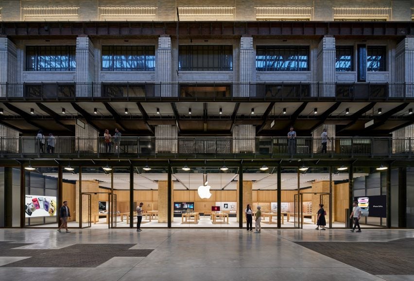
Designed by UK studio Foster + Partners, the store is set on the ground floor of the shopping centre within the 1930s Turbine Hall A at the former power station, where the studio also designed the technology brand’s offices.

The shop is arranged around four original brick piers and has steel roof supports exposed on the ceiling. On top of this base, Foster + Partners overlaid a revamped fixture set that Mirsky said “will become familiar over time”.

Apple Battersea is the second store – after the recently reopened Tysons Corner store in the USA, which replaced Apple’s first ever store – to feature the redesigned fixtures.

Apple Battersea by Foster + Partners
It features an updated fixture set

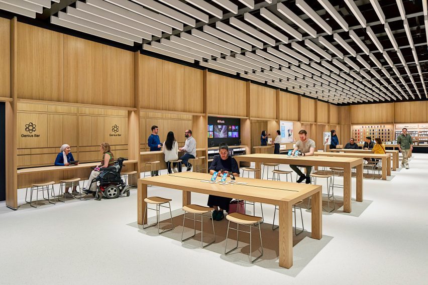
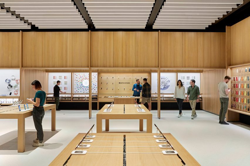
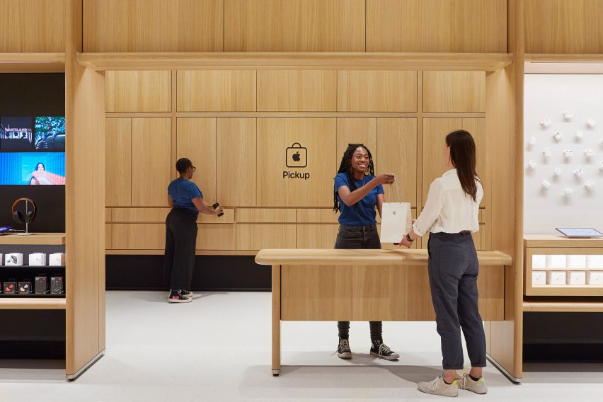
Around the edge of the store is an oak framework of shelving that was developed with Foster + Partners.  The timber structure also defines a space dedicated to watches, a pick-up area and a redesigned Genius Bar.

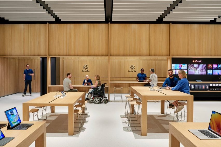
The Genius Bar has a counter for stand-up service along with a lowered area where people can be served sitting down. Along with its standard Parsons tables, which are made from sustainably harvested European oak, the store also has several lowered tables.

Updated Genius Bar
The redesigned Genius Bar has a lower counter

“We’ve thought about mobility issues across the whole fixture set,” explained Mirsky. “We have our traditional Parsons table with our standard height, but you notice that the tables in the back are varied and our new genius bar as well.”

“We have a standing height because the team really prefers to stand and it lets them work with more people and then they can stand at the tables, but customers who want to sit or need to sit can actually use these slightly modified tables,” he continued.

As part of the focus on mobility, Apple also increased the amount of circulation around the edge of the store.

Tables in London Apple store
There is more space around the edge of the store

Along with the timber framework, Apple aimed to replace other more carbon-intensive elements in the store with biomaterials.

The floor, which was first used in the Brompton Road store, was made from aggregates bound together with a bio-polymer, while the acoustic baffles in the ceiling were made from biogenic material.

The acoustic baffles and bright floor form part of a focus on improving visual and acoustic clarity in the store, with a dark band placed around the base of the walls to provide visual differentiation with the flooring.

“Something I want to point out that is really part and parcel of the material palette, but also goes to our universal design, is the contrast in the store,” said Mirsky.

“We wanted to make sure we have this really enhanced kind of navigation,” he continued. “So the floor is brightened – it helps us with our low energy – but it also makes it so that you can clearly see the table and the walls are defined.”

Pick up space in Apple Store
The store has a dedicated pick-up corner

The fixture set, flooring and ceiling baffles were also used at the Tysons Corner store and Mirsky believes the base can create a feeling of familiarity for Apple’s customers.

“Each store is really dealt with as a unique circumstance Battersea has this incredible, incredible existing architectural fabric to work in,” he said.

“We use the same fixture set at Tysons Corner in a mall setting in America which doesn’t have this sort of grand grandiose architecture, but the same fixture set can generate an environment that’s very familiar and welcoming no matter where you are.”

The store is the latest to open in London, following the Brompton Road store that opened last year, which was designed to be a “calm oasis”. Other recently completed Apple Stores include the band’s first shop in India and a store in Los Angeles’ historic Tower Theatre.

Reference

Foster + Partners turns palazzo in Rome into Apple Store
CategoriesInterior Design

Foster + Partners turns palazzo in Rome into Apple Store

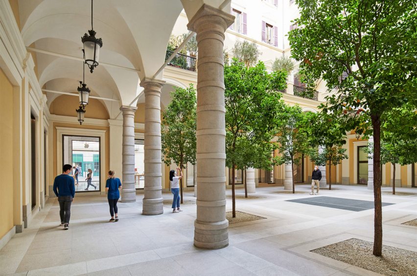
Fosters + Partners has restored and converted the Palazzo Marignoli in Rome into an Apple Store, uncovering historic features and opening up a central courtyard.


Apple Via del Corso is the largest Apple Store in Europe and occupies the historic Palazzo Marignoli, near the Piazza Colonna, in the centre of Rome.

The courtyard of the Apple Via del Corso contains local trees
Top: the store is located in the Palazzo Marignoli. Above: a courtyard is at the centre of the building

The Apple Via del Corso building sits on a site that held a church and a convent in the 16th century.

The current Palazzo Marignoli building was constructed between 1873 and 1878 and served as a home for Marquis Filippo Marignoli. It also housed the Caffè Aragno, a famous gathering spot for artists.

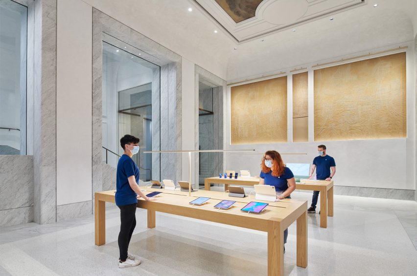
Marble covers the interior of Apple Via del Corso
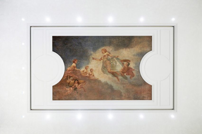
Original paintings were restored and placed in the ceiling

Foster + Partners wanted to celebrate its history by highlighting its grandeur and restoring its historic features.

“The idea was to celebrate different aspects and various areas of the history of the building,” said Foster + Partners partner Luis Matania.

“You have this juxtaposition of all these various areas in the building’s history, through to now, the 21st century.”

Lighting surrounds an original painting
Ettore Ballerini’s Dusk was placed between ceiling panelling

L-shaped in its plan, the building is organised around a large courtyard that the studio opened up to be used by the public and to greet visitors upon entry into the building.

Camphor trees placed across the courtyard informed by the 16th-century convent that previously existed on the site.

Grey marble frames doorways and windows at Apple Via del Corso
Wooden tables were placed within retail spaces

“The courtyard is no longer private, it becomes a democratic space that the community is invited to come through into and enjoy,” said Foster + Partners partner Stefan Behling.

“We reintroduced trees as a reference to the old convent and it allows the community to come and enjoy this beautiful space.”

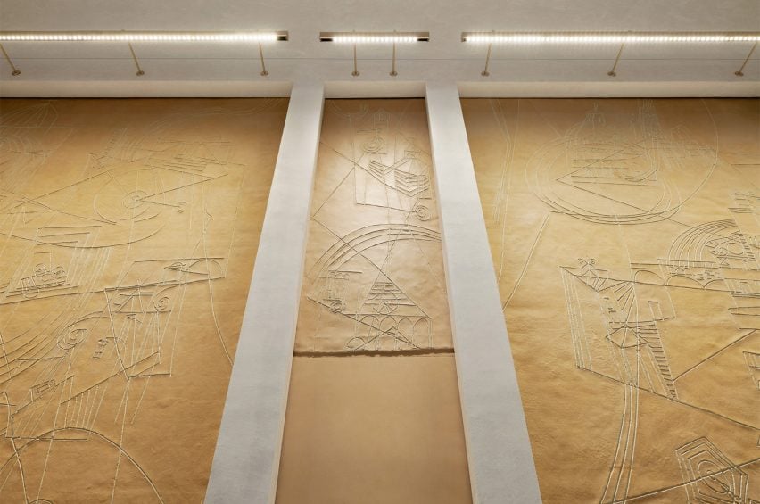
Artworks were placed within the walls of Apple Via del Corso
Artworks by Afro Basaldella that were found in the building were restored

Artworks by Italian artist Afro Basaldella from the building’s art cafe days abstractly depict imagery and scenes of Italy were carefully restored and set into the walls.

Large early-1900s ceiling paintings by Fabio Cipolla and Ettore Ballerini have also restored and incorporated above the marble interiors between ceiling panelling.

“It has been a complicated building and we have discovered things along the way,” said Matania.

“It has been an evolving design process, that has amended and adapted as we found new things, new painting and new aspects of the architecture”

Decorative mouldings cover the walls and ceilings of Apple Via del Corso
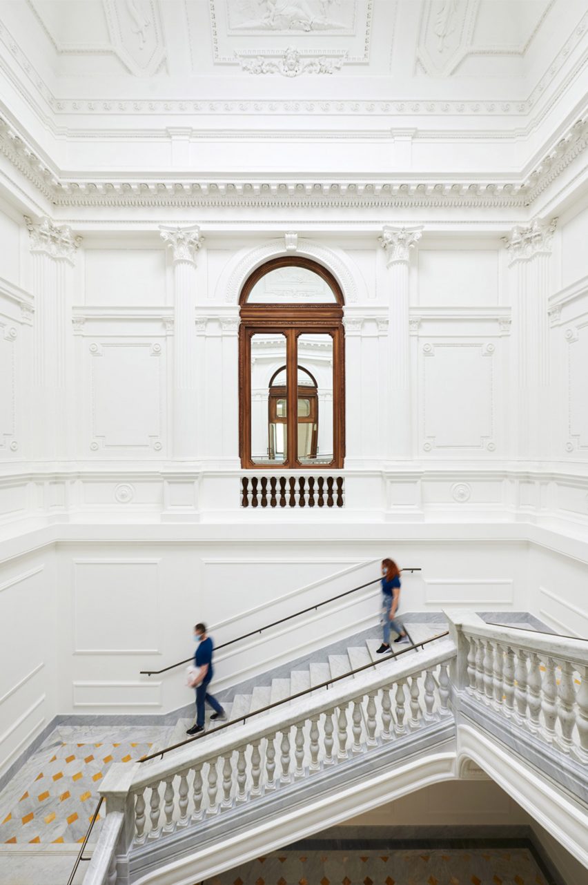
The grand staircase was fitted with local marble

White marble was used throughout the interior of Apple Via del Corso, covering the floors of each room and framing large windows that provide glimpses into adjoining rooms.

To the west of the courtyard, a grand staircase with vast mouldings and a former oculus on its ceiling was restored, structurally reinforced and fitted with locally sourced Carrara marble.

The firm recreated daylight within the grand stairwell by adding LED lighting to the oculus that changes with the time of day.

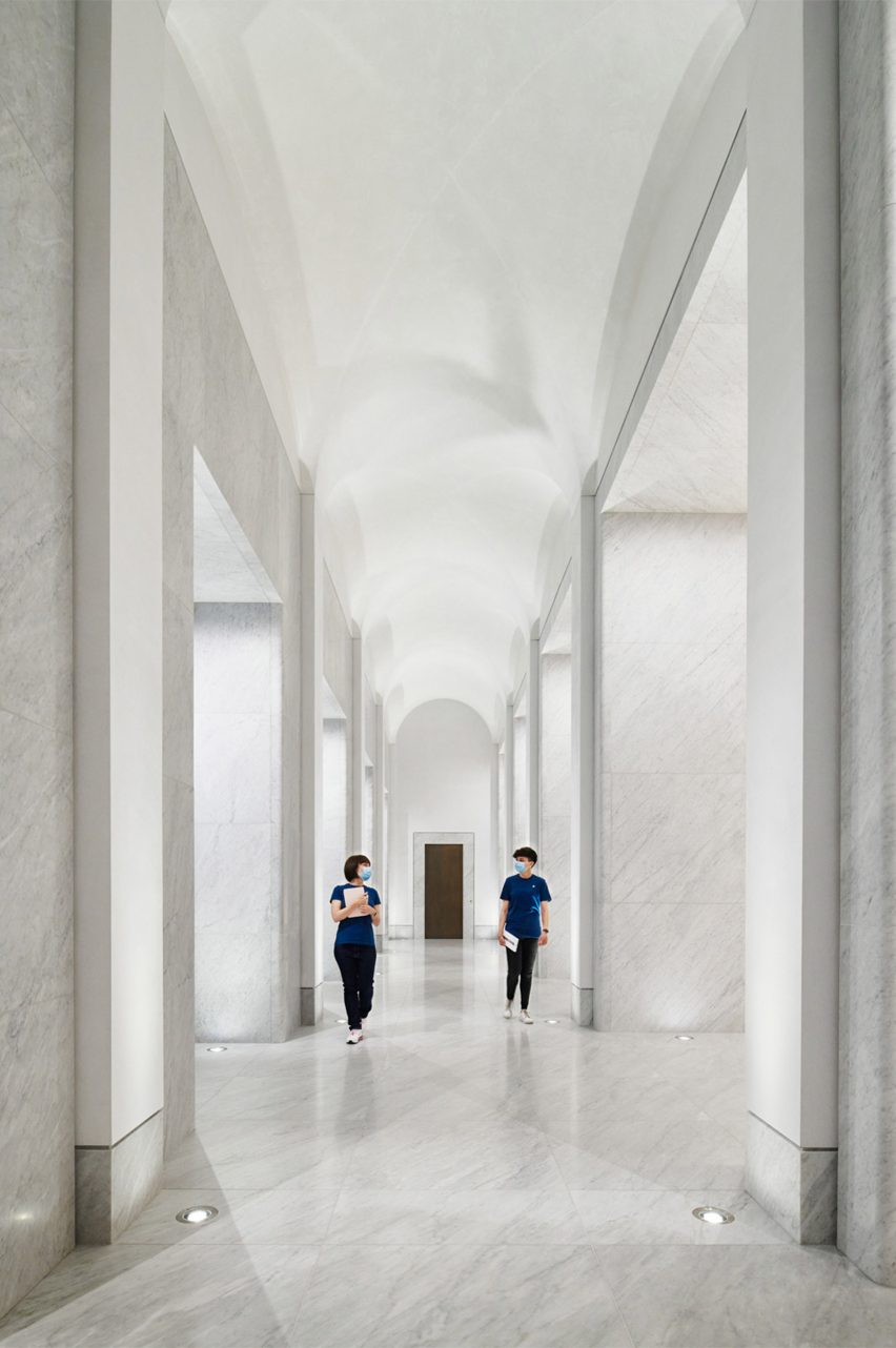
The corridor has a curved ceiling
A long corridor links spaces in the store

On the first floor, a long corridor connects a forum space with a Genius Bar and three retail areas.

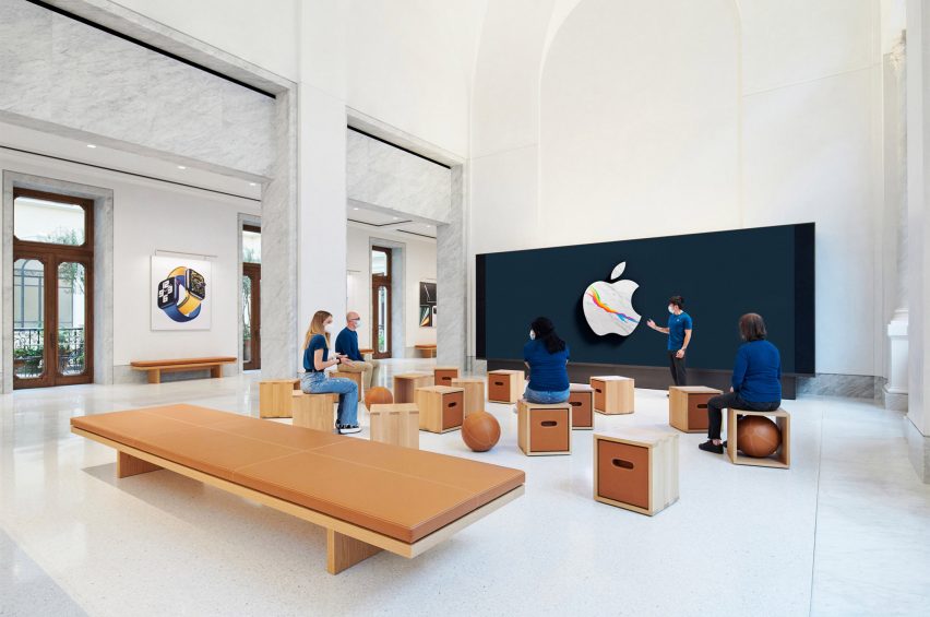
The forum-style space will be used for community events, occupying what used to be the Palazzo’s ballroom a central point of the first floor.

Box stools were placed around the room at Apple Via del Corso
Apple Via del Corso’s forum-style space was furnished with pale wood and leather

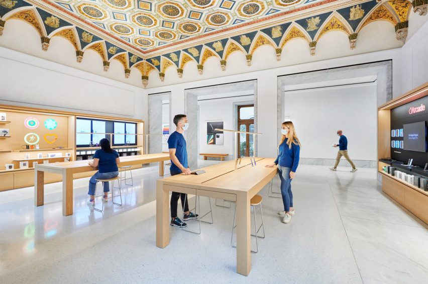
In the Genius Bar, conservators restored a hand-painted geometrically patterned ceiling with decorative crown mouldings.

Wooden furniture and joinery were used throughout to bring warmth to the interior spaces.

Cabinetry was constructed with a pale wood
An original hand-painted patterned ceiling covers the Genius Bar of Apple Via del Corso

Dark wood-framed doors and windows along the corridors and edge of the rooms open out onto Juliette balconies and a terrace that overlooks the courtyard below.

Camphor trees, olive trees and jasmine vines were placed across the terrace to reflect typical plant-filled Roman roof terraces.

Apple Via del Corso is one of many historic buildings the technology company has opened stores in, including the Foster + Partner designed Champs-Élysées store in Paris and the converted Washington DC library.

Reference