James Wines is a renowned American artist and architect associated with environmental design, and is founder and president of SITE, a New York City-based architecture and environmental arts organization chartered in 1970. He’s also on the jury for Architizer’s One Drawing Challenge, architecture’s biggest drawing competition, which offers $2,500 to its winners and publication opportunities for participants. In this essay, originally published in Blueprint Magazine with the title “From Hand to Mouse and Back Again”, Wines makes the argument for hand drawing as a means of architectural representation in the digital era.
It may seem strange to champion hand drawing, especially in view of the universal triumph of digital graphics, when every progressive architect in the world seems obsessed with elevating computerized delineation to new heights of illustrative supremacy. At the same time, as the software revolution has taken precedence, there appears to be a fresh incentive among many architecture students and emerging professionals – actually, a kind of quiet revolution – based on a new-found desire to hone their manual skills and learn to draw in the old way.
I have been a long-standing supporter of dual skills, encouraging young designers to maintain equal graphic abilities on paper surfaces and computer desktops. This advocacy is based on a deeply felt conviction that, by focusing exclusively on computer generated illustration alone, something conceptually profound is forfeited in the design process. When electronic response mechanisms replace the filtration of idea development through tactile means and guiding fingertips, the fertile territory of “subliminal accident” is lost. This refers to marginal calligraphy that dribbles off the edge of the paper, the inadvertent congestion of squiggly lines with no apparent meaning, the unwelcome blobs of ink that drop off a pen tip, or the inclusion of seemingly irrelevant visual references that have nothing to do with initial intentions.
On innumerable occasions over the years, I have been the creative beneficiary of my own graphic musings and the chaotic trail of ambiguities left behind by random charcoal smudges and watercolor washes. In other words, this pictorial detritus inscribed on paper, without any pre-determined architectonic mission, has often become the springboard for new ideas.
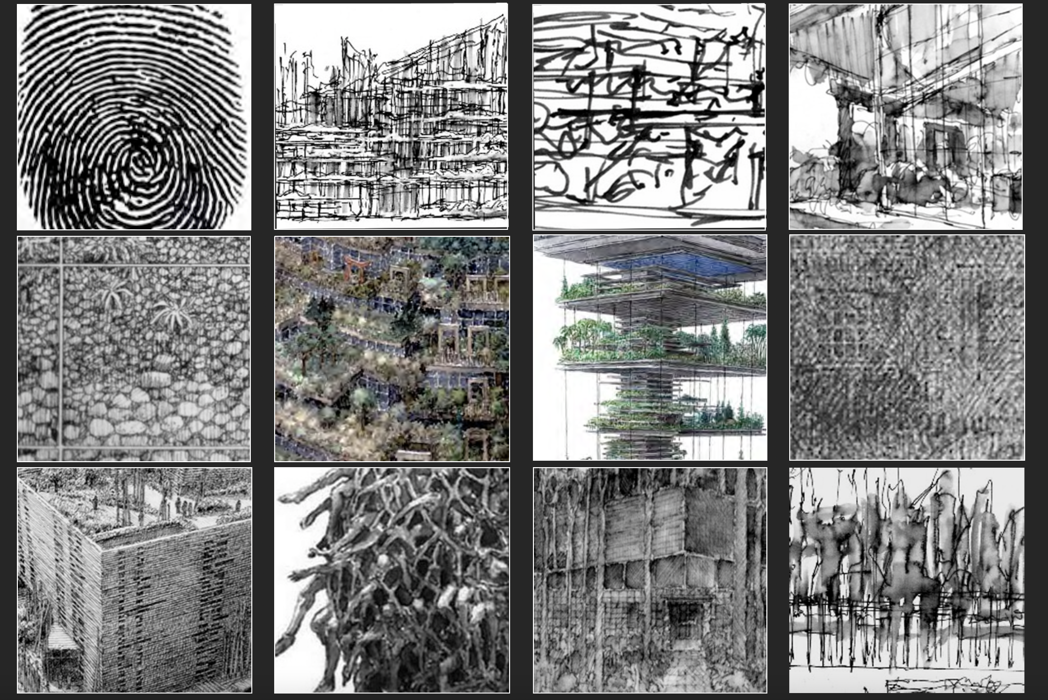
A selection of Wines’ sketches. Slide from James Wines’ “Mind to Hand” presentation, 2021; images courtesy James Wines
Frequently, when watching some seemingly pre-pubescent computer whiz use software to whip out multi-dimensional views of a complex structure in a matter of minutes, I feel as though I may be pushing a hopelessly old-fashioned aesthetic ritual, as a consequence of some deep-seated psychological resistance to the cybernetic world. I recall, two decades ago – when proficiency in computer rendering was being applauded as some kind of transcendental feat – how impressed I was with the photo-fidelity of digital drawing. Everything churned out in those days looked too good to be true . . . and it was. As my eyes became accustomed to sorting out slickness from substance, I gradually acquired a highly refined aptitude for detecting mediocrity (or outright crap) lurking under the pictorial gloss – to a point where I can now spot digital dazzle, camouflaging conceptual vacuity, at a distance of fifty feet from the monitor screen.
In addition to the inspirational merits of those idea generating graphic accidents credited earlier, one advantage the computer can never offer is the kind of calligraphic proficiency needed to draw really well. As I often try to explain to architectural students, this elevated status is a combination of aesthetic instinct and responsive rendition that goes considerably beyond the conventional ability to produce photo-like images with great fidelity . . . a commonplace talent in architecture, which is frequently mistaken for genuine drawing. Mechanical reportage also forms the basis of computer graphics and it is the primary reason that digital tools will always be best employed as an efficient means of confirmation (describing the big idea after it has been conceived), but never a deeply resonant art experience in itself.
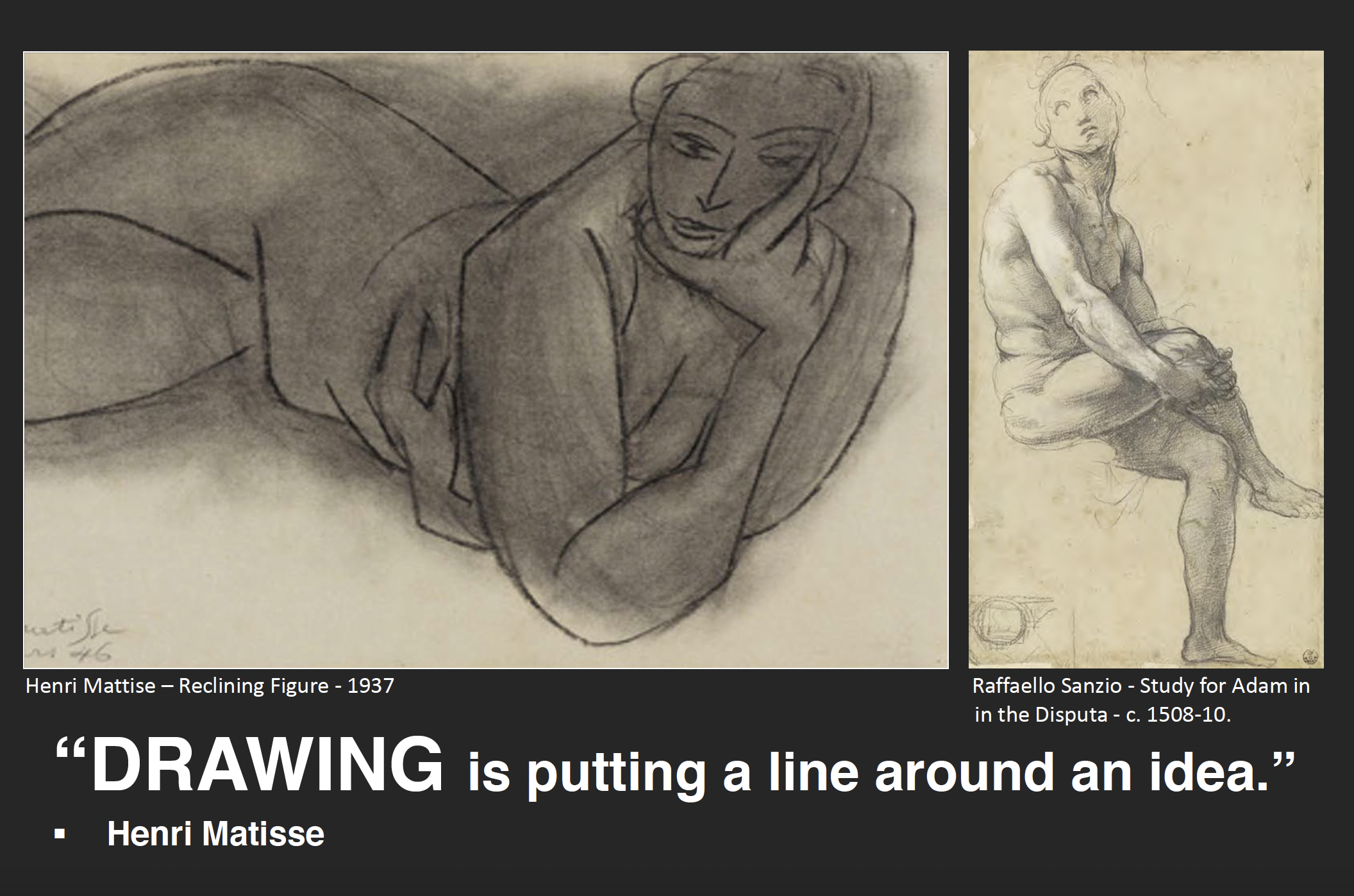
When teaching drawing to young designers, their most noticeable deficit is a lack of understanding of the complex aesthetic challenges in accomplished draughtsmanship. These include knowledge of the origins of written language, the evolution of calligraphy, the nature of signification and the abstract dimension that unites positive and negative visual elements on a picture plane. In this context, I am speaking mainly of drawing in its subsidiary role as a recorder of thought process within the larger goal of building design. But, like the artist’s study for a painting or sculpture, the calligraphic nature of the conceptual sketch is always a decisive factor in its ultimate qualification as art.
Particularly among design students, the tradition of illustrative purpose often seems to hinder their grasp of what might be called the “deep structure” of drawing, with its multiple layers of art value and sources of content. For this reason, it can be a revelatory experience – especially in the computer age – to review the history of graphic invention and its relationship to the fusion of signs, symbols and aesthetic choices.
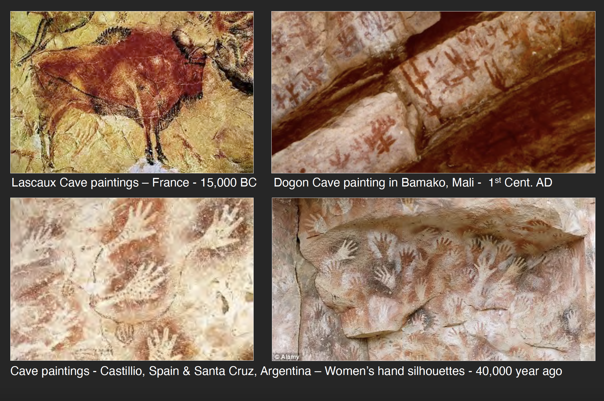
Slide from James Wines’ “Mind to Hand” presentation, 2021; images courtesy James Wines
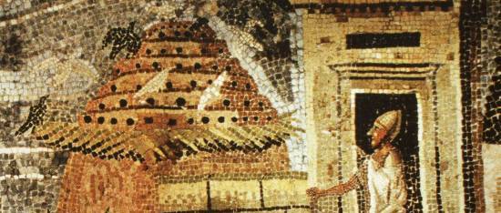
The discovery in of the Altamira and Lascaux cave paintings (in 1879 and 1940 respectively) confirmed the fact that Paleolithic cultures as far back as thirty thousand years ago had mastered the art of drawing and established the foundations for all subsequent graphic selection in the formation of written language. Contrary to the previous view that Cro-Magnon people were simply meandering hunter/gatherers, these communities obviously absolved a privileged minority of visually skilled individuals – perhaps as designated religious shamans – from their food-harvesting obligations. It is clear, given the consummate artistic quality of the cave murals, that this level of mastery was probably the result of centuries of stylistic refinement.
Without going into myriad speculations on the how and why of Lascaux and Altamira, it is sufficient to view the reality and conclude that nothing this aesthetically resolved could have occurred without a profound investment in both the urgency of communication and its translation into culturally endorsed nuances of line, tone and color. The illustrative factor was certainly part of the purpose of cave art; but those Magdalenian masters also knew that the profundity of visual language resided in its abstract elements – in essence, the connections linking symbolism and philosophy – apart from any reportage intentions.
It is reported that Picasso wept when he first viewed the Spanish cave paintings, exclaiming that, “After Altamira, all is decadence.” As one of history’s greatest draughtsman, he understood that prophetic Neolithic artists had anticipated not only the development of Egyptian hieroglyphics and Chinese calligraphy thousands of years later, but also the signifier/signified basis of linguistics and the role of mind and hand in the evolution of visual ideas. Historian Andrew Robinson refers to Magdalenian art as “proto-writing;” seemingly based on the assumption that Ice Age people did not yet have a legitimate alphabet. On the other hand, there are enough abstract symbols punctuating the cave murals to suggest that these Cro-Magnon painters had already laid major groundwork for the development of written language . . . as well as all subsequent calligraphic innovation in art and design.
Slide from James Wines’ “Mind to Hand” presentation, 2021; images courtesy James Wines
Supporting this argument, there is also the remarkable stylistic consistency linking the art of Lascaux and Altamira with innumerable other cave paintings in Chauvet and La Marche in France, as well as those found in Africa and Australia. For example, bison, deer and wild boar are represented with an extraordinary sensitivity of rendering techniques – particularly in terms of linear and tonal choices – which are parallel to those same skills found in the drawings of Da Vinci. Rembrandt, Van Gogh, Matisse and Giacometti and, in architecture, Alberti, Piranesi and Frank Lloyd Wright. In the context of prehistoric times, it was only a small aesthetic and linguistic leap to associate the gracefully tapered legs of a bison with all forms of stability and movement in nature. The next logical step was to abstract this fragment of anatomy into a pictographic symbol, refine it into a cuneiform inscription and, finally, amplify its meaning by phonetic markings and syllabary alphabets. With progressive logic, the extended legacy of this process eventually evolved into the serviceability of e-mail on one hand and the expressive pathos of Picasso’s drawings for Guernica on the other.
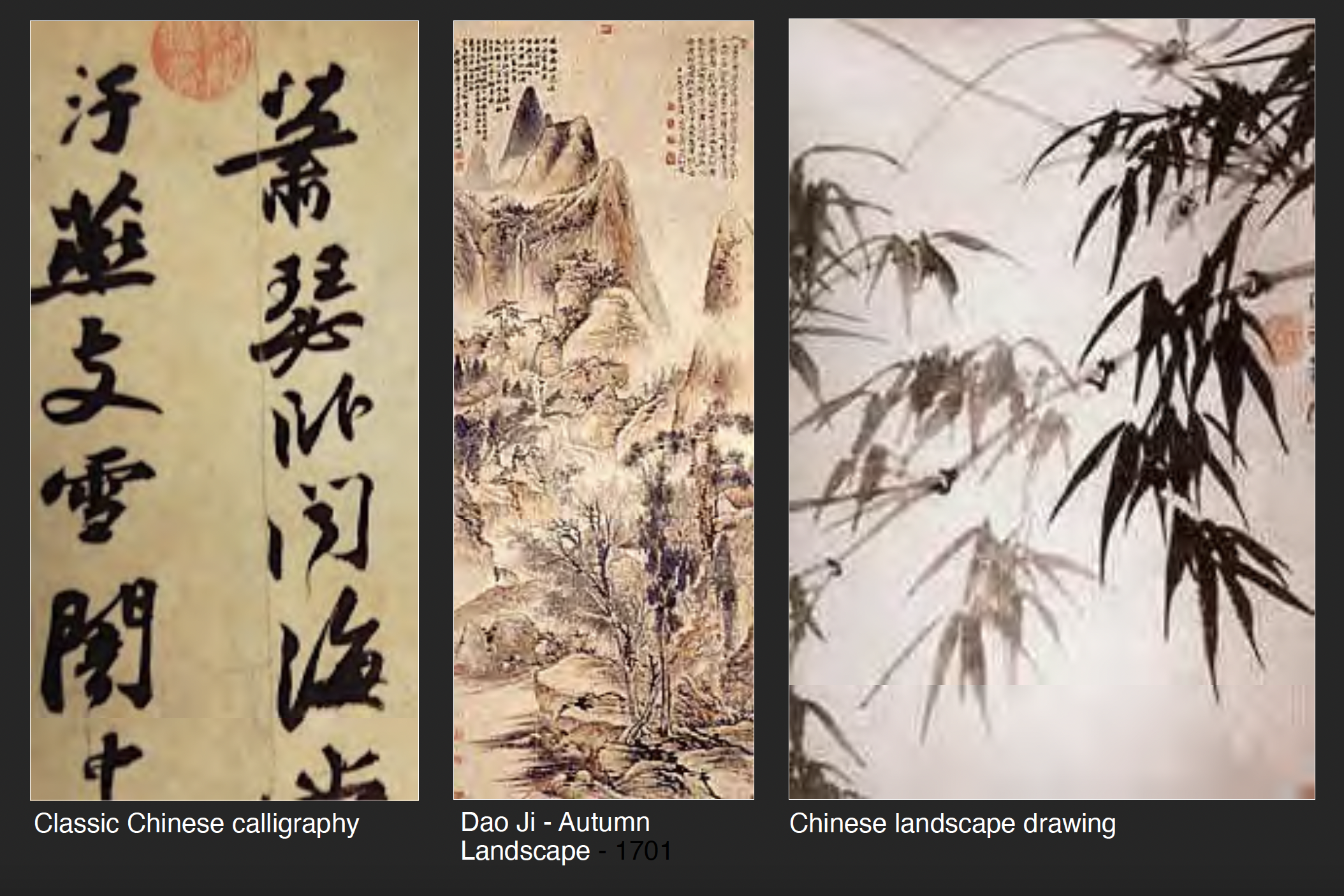
Observing the bridge from Magdalenian culture’s deep sense of symbolism and lyrical representation in the depiction of mammal prey to the advent of written language in Asia pretty much says it all concerning the value of graphic invention. By following a similar route four thousand years ago, China had already developed calligraphy to a degree where fragments of the first alphabet still remain a part of contemporary Chinese writing. This interface between language development and the aesthetics of drawing is at the core of graphic expression.
It is also a cyclical and continuously evolutionary form of communication, thriving on renewal and re-invention. As described by linguist Noam Chomsky; “Language is a process of free creation; its laws and principles are fixed, but the manner in which the principles of generation are used is free and infinitely varied. Even the interpretation and use of words involves a process of free creation.” To his “use of words” must be added the “use of line.”
Slide from James Wines’ “Mind to Hand” presentation, 2021; images courtesy James Wines
Chinese writing and drawing have remained synonymous skills in the hands of Asian calligraphers since the first pictographs emerged – which, in later dynasties, included “ideographs” to embody fully developed narratives. Like all languages, Chinese underwent a logical development from the faithful contour depiction of such images as “man, sun, ox, water, etc., toward a more complex system of signs needed for phonetic/semantic functions. But, the continuing beauty of Chinese characters is their metamorphic quality . . . moving gracefully back and forth between representational and conceptual realms of signification.” This “art of language” has kept Asian painters and poets continuously supplied with renewable source material and has perpetuated the performance role of master calligraphers. It is the kind of drawing that becomes a true fusion of theater, communication and graphic style. It is also extremely instructive to anyone seriously committed to understanding what the successful coordination of mind and hand can accomplish.
At the core of Chinese calligraphic aesthetic is the gestural rhythm of the pen or brush stroke and the manual control demonstrated by the flow of thick and thin lines. However, it is the raggedness of edges, the spontaneous splatters, the inadvertent drips and their collective interaction with negatives spaces – reinforcing that all-important element of “subliminal accident” mentioned before – which I personally consider essential ingredients in the multi-layered practice of drawing. For the master Chinese calligrapher, these indeterminate factors are usually captured in bold gestures; but the same spontaneity and fragmentation (and this includes architectural drawings) can be manifested in the smallest and most search-oriented lines on paper.
Slide from James Wines’ “Mind to Hand” presentation, 2021; images courtesy James Wines
I want to summarize a few of these observations on calligraphic values by discussing the contemporary efforts of SITE in this direction. From the beginning of the studio in 1970, our work has been a fusion of art, architecture and landscape. The philosophy of the firm is based on a view that communicative content in the building arts can be based on sources outside the traditions of formalist/functionalist design. These include the social, psychological and ecological implications of a post-industrial era.
SITE’s buildings and public spaces are frequently interpreted as “filtering zones” for receiving and communicating information about the environment, rather than designed as hermetic objects sitting in the environment. For example, in certain graphic works this proposes a narrative function of architecture. It suggests that a building’s wall surfaces, volumes, and adjoining spaces can be seen as absorptive, sponge-like conveyors of messages that go considerably beyond conventional sculptural relationships – suggesting a function of “architecture as the inversion of architecture.” It is a means of converting the familiar ingredients and processes of construction technology – plus the public’s subliminal acceptance of certain kinds of archetypal buildings – into a form of critique and/or commentary about architecture. By prioritizing these reflex identifications (rather than focusing on compositions of abstract shapes) my own sketches tend to view architecture as a “subject matter for art,” rather than the objective of a conventional design process.
Slide from James Wines’ “Mind to Hand” presentation, 2021; images courtesy James Wines
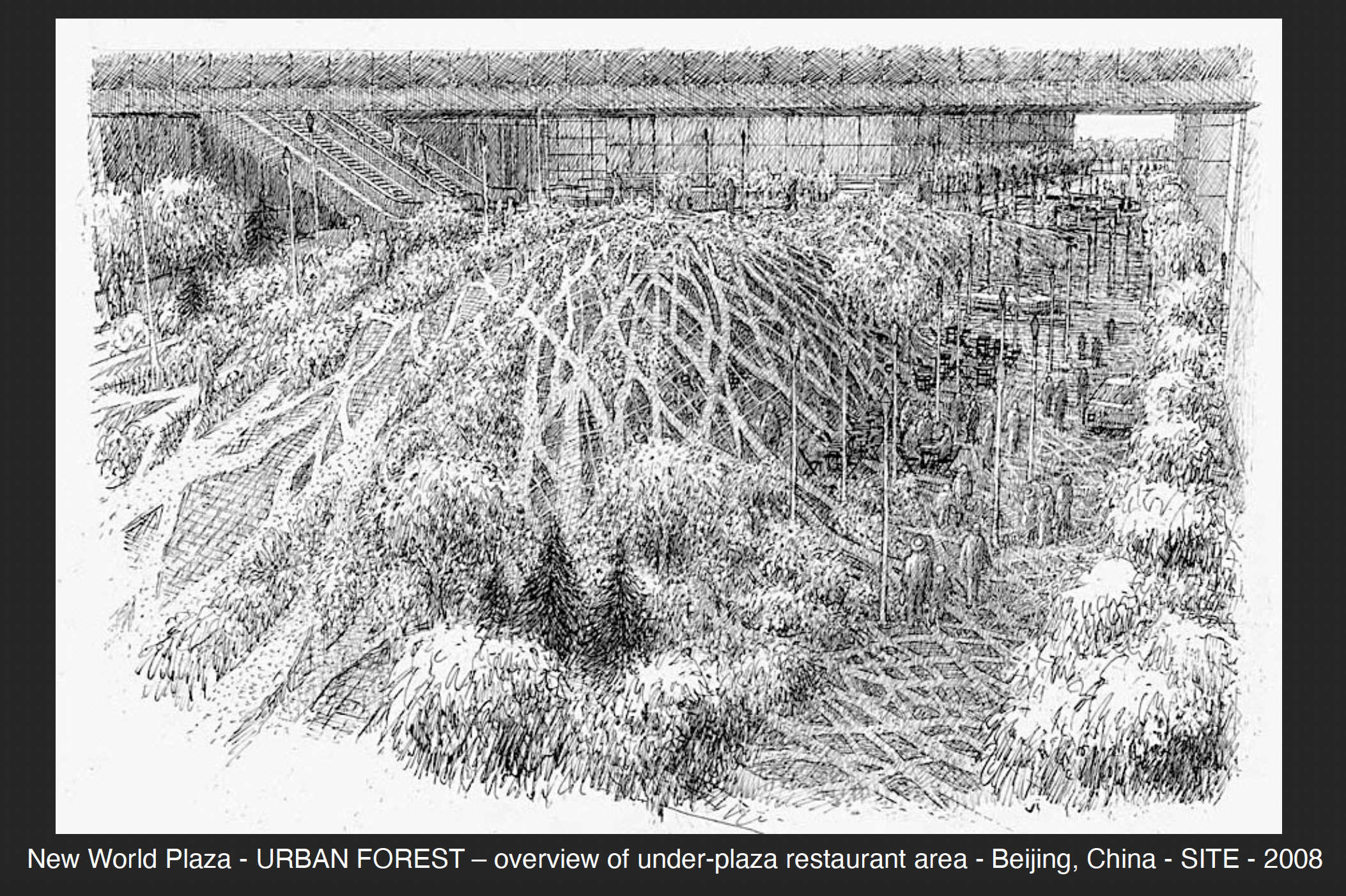
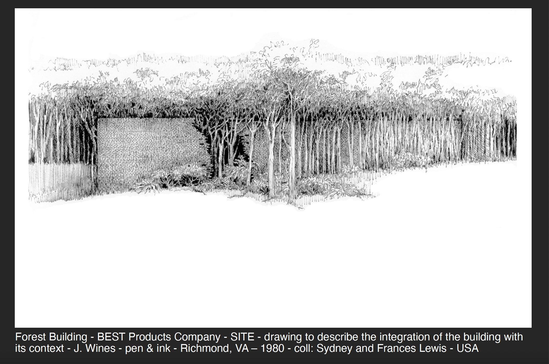
A number of my recent drawings explore the integration of architecture and landscape. This approach is often responsive by a situation where the building is located in a natural site and the objective is to preserve as many trees as possible. As a result, architecture appears to be consumed by its own environment – or, seen more perversely, as a victim of “nature’s revenge.” In other examples, the renderings describe the need for more forested areas, water sources and urban agriculture in the cityscape. The primary purpose is to explore the integration of architecture with context to a degree where it becomes difficult to discern where a building ends and the environment begins. Also, in this way, vegetation can become as much a part of the aesthetic fabric of a structure as masonry, glass, and steel.
From the perspective of fusing computer graphics with hand drawings, SITE has developed an extremely fluid interface between multi-media and conceptual development. For example, our studio’s “Residence Antilia” for Mumbai, India offers a clear sequential demonstration of this creative process, realized through a combination of interactive hand + digital drawing techniques. It shows the basic stages of source referencing, search-for-idea sketches, design clarification and renderings for pure aesthetic experience. The proposal also demonstrates the calligraphic underpinnings as they appear in multiple formats, scales and comparative qualities of line, tone and color. This residential tower, designed in 2003 for industrialist Mukesh Ambani, is located on a very restrictive hilltop site, overlooking the entire city of Mumbai.
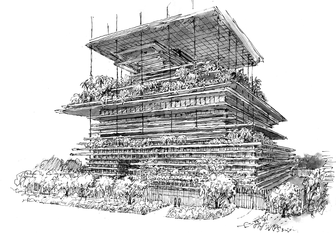
Antilia “Vertiscape” Tower proposal, Lower Levels, 2003, Image © SITE
The concept responds to the client’s desire to have a multi-tiered, heavily landscaped structure, similar to (his wife’s preference) the ancient Hanging Gardens of Babylon. For this reason, the entire building is conceived as a “Vertiscape” garden in the sky, freeing park spaces from their normal earthbound confinement. The concept responds to Vastu principles in Hinduism, wherein the spine is regarded as the main source of support, leading upward toward enlightenment. The seven levels of the residence are supported by a stratified structural spine, stabilized by the core and a series of steel cables that support five “floating” floor planes and a variety of interim garden terraces, verandas, trellises, viewing platforms, water features, and recreational facilities.
All horizontal projections emerge from the core structure, similar to the role played by vertebrae in the spine. In accordance with Chakra meanings in architecture, the zones of this building are linked to the themes of earth, water, fire, air, sound, light and information. The main residence, located on a crowning 4000 square meter platform, continues the visually unifying theme of stratification. All of the Vertiscape references, sources and interpretations are accounted for in my related series of drawings, which range from tentative pen lines, to amorphous washes, to hard-edged media combinations. And finally, most importantly for making conceptual choices, these depictions invariably explore what I refer to as the “ambient sensibility” of a place, the role of light and shadow and architecture’s capacity to transform context into content.
Slide from James Wines’ “Mind to Hand” presentation, 2021; images courtesy James Wines
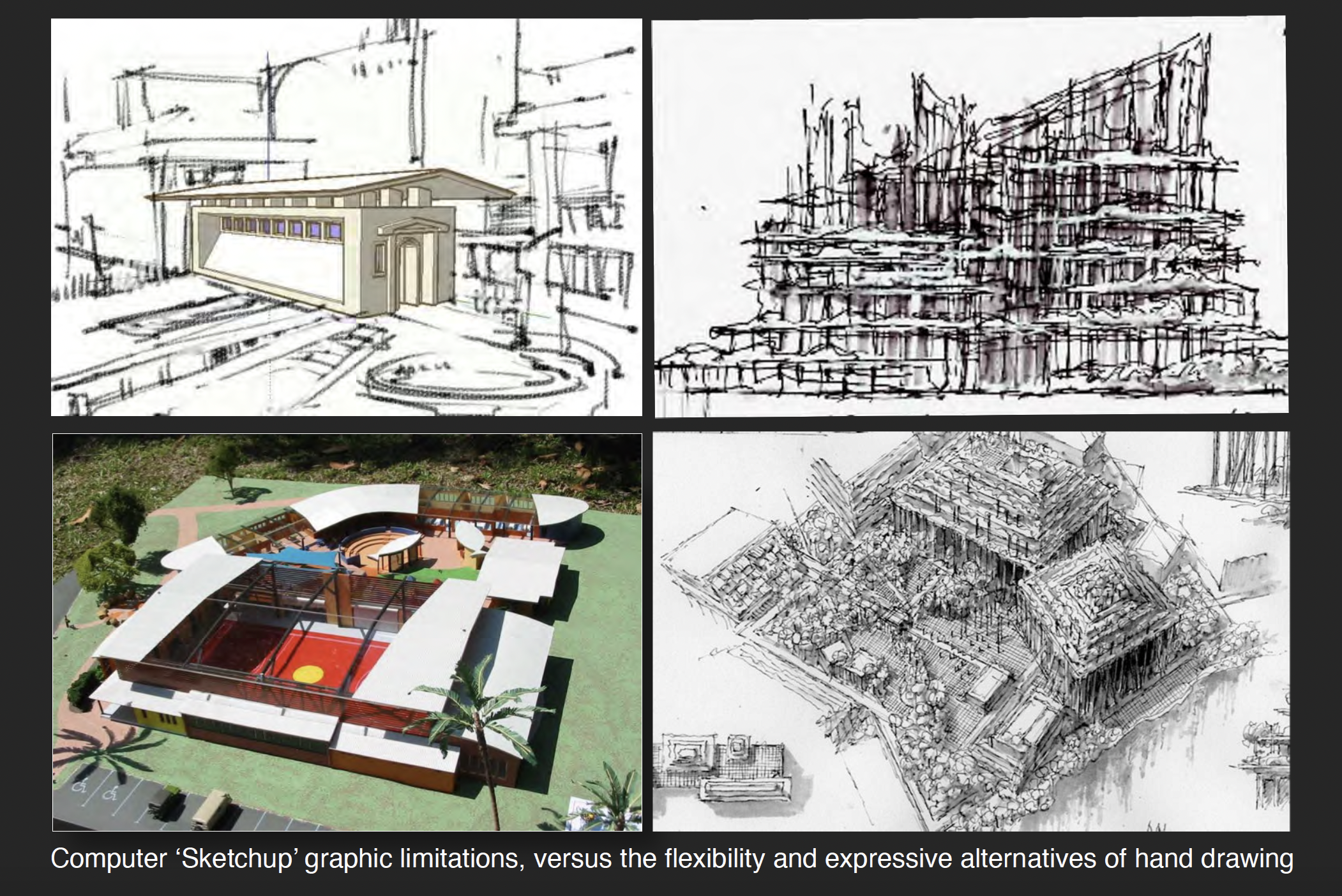
My continuing advice to young architects seeking to draw for reasons of idea development (or pure pleasure) is to follow Picasso’s obsessive example; “I draw like other people bite their nails.” In his enthusiasm for the power of the hand, the great Spanish artist is also purported to have taken a dim view of the digital revolution by commenting; “Computers are useless. They can only give you answers.” While overstating the case – and probably reflective of a certain 1960’s naivety concerning the importance of an emergent computer age – Picasso correctly prophesized the current revival of interest in hand drawing and the widening acknowledgement that there are conceptual and aesthetic territories that the software of Form Z, AutoCAD and Sketchup can neither equate, nor replace.
When I watch masses of architectural students locked into computer monitors as prosthetic extensions of their bodies and churning out facile simulations of buildings, I recall Baudrillard’s eerie assessments of Post-modern culture. Particularly resonant are his views of media phenomena – as illusion replacing reality; where substitution ultimately becomes the reality. In his world of “simulacra” I personally find that signs scratched on paper with a pen or pencil do have a way of restoring the authenticity of representation, as well as the nature-centric validity and socially relevant value of symbolic content in the subject described.
As Baudrillard astutely observed, the illusions created by media tend to remove people from the organic and tactile world around them. Retaining this connection between mind and hand seems just as valid now as it was for the cave art masters who immortalized the hunt in Lascaux and Altamira. The quest for calligraphic quality is no less relevant as well. It is an objective perfectly described by by the writer/animator, Walter Stanchfield; “We all have at least 10,000 bad drawings inside of us. The sooner we get them out and onto paper, the sooner we’ll get to the good ones buried deep within.”
Sign up to be informed when the next One Drawing Challenge competition opens for submissions. Be sure to check out the rest of this year’s extraordinary Winners and Commended Entries.
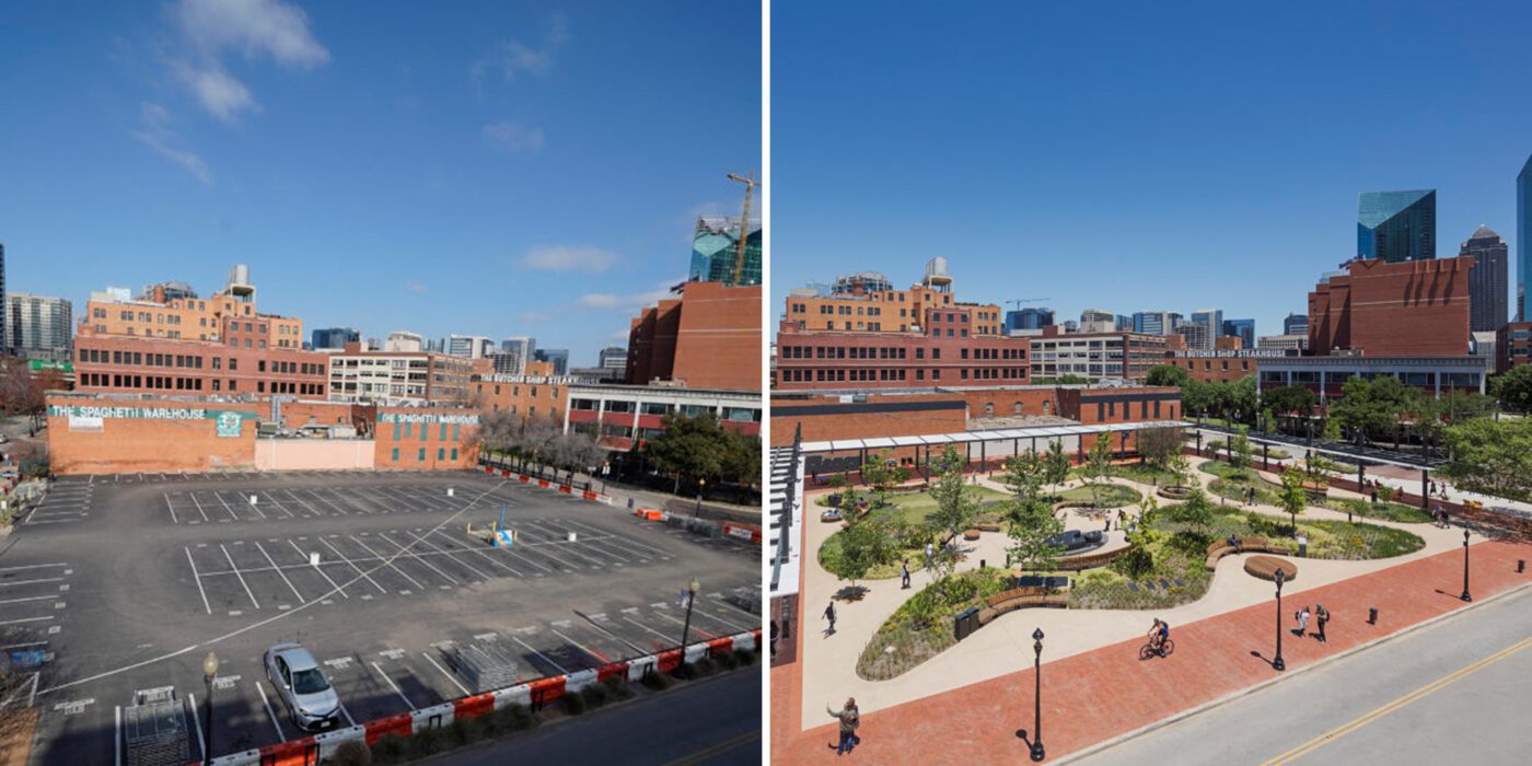
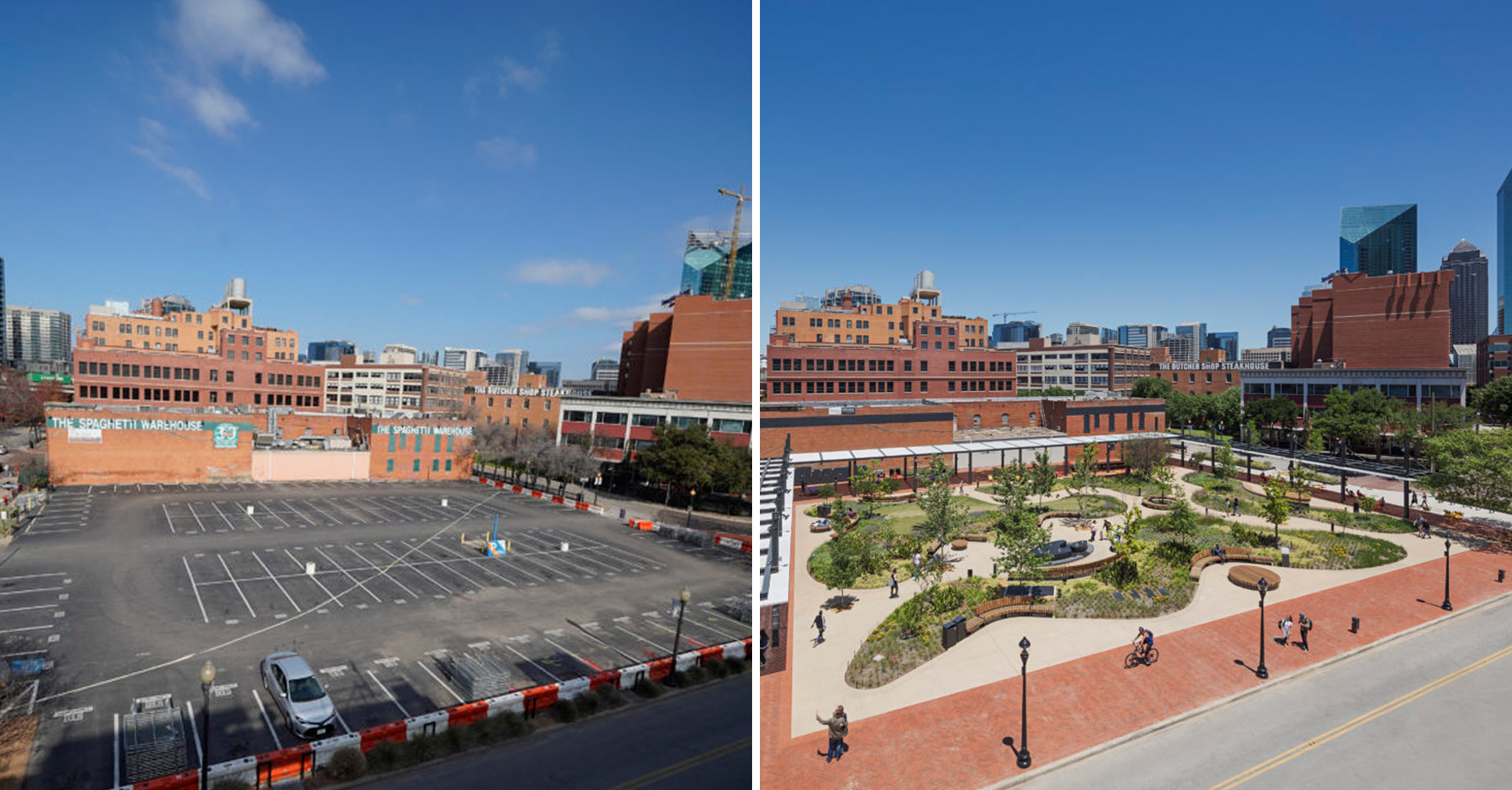
 Meanwhile, the Xiaoyunlu 8, MAHA Residential Park project by Ballistic Architecture Machine in Beijing, another A+Award popular winner this year, weaves together disparate sections of the site of various eras and styles into one seamless and soothing green space. Residents can now fully access and enjoy the park’s gardens, historical sites and communal areas.
 These projects are a mere snapshot of why at Architizer, we believe that landscapers are the unsung heroes of the design world. It’s why this week we are highlighting jobs in the sector.
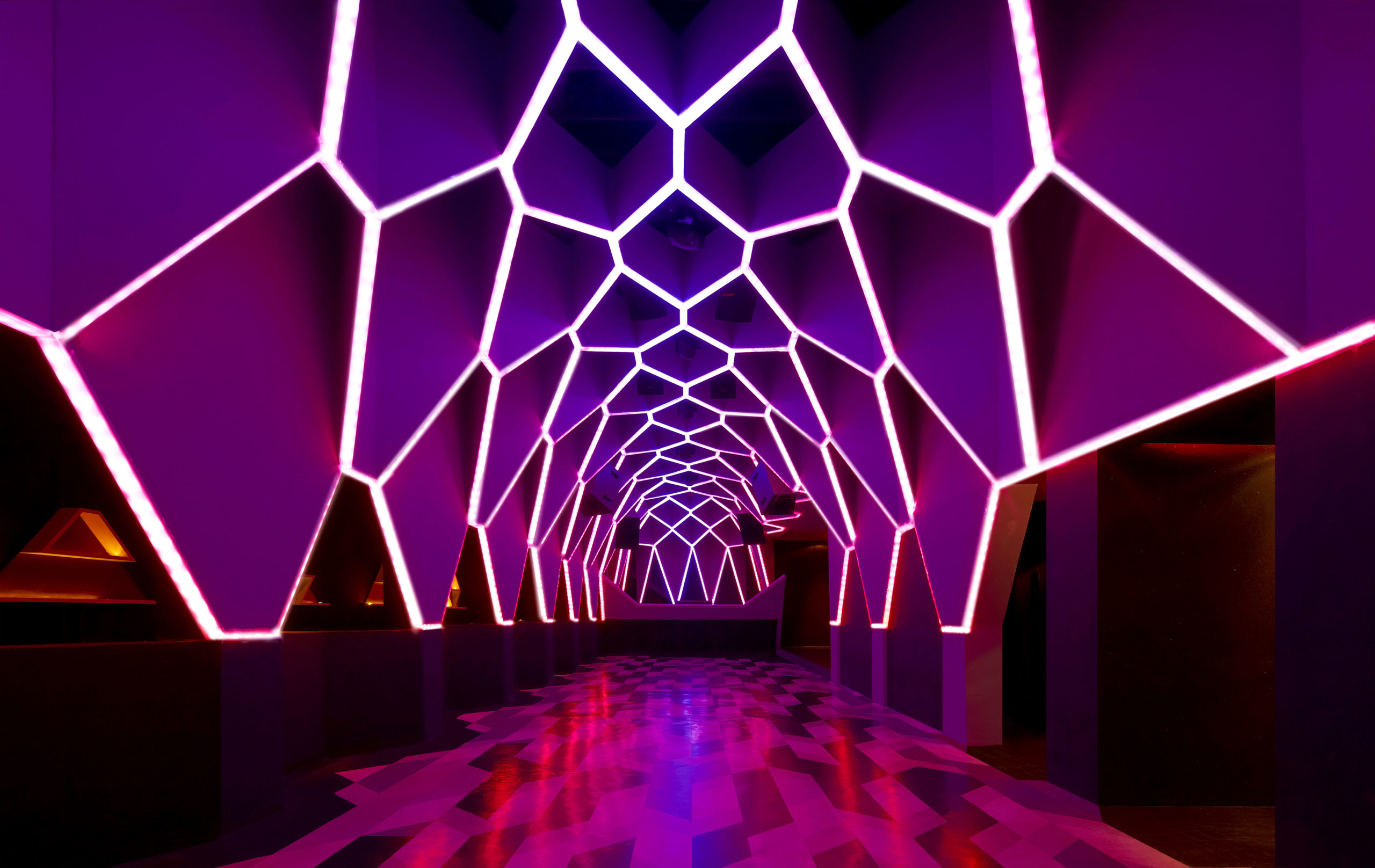
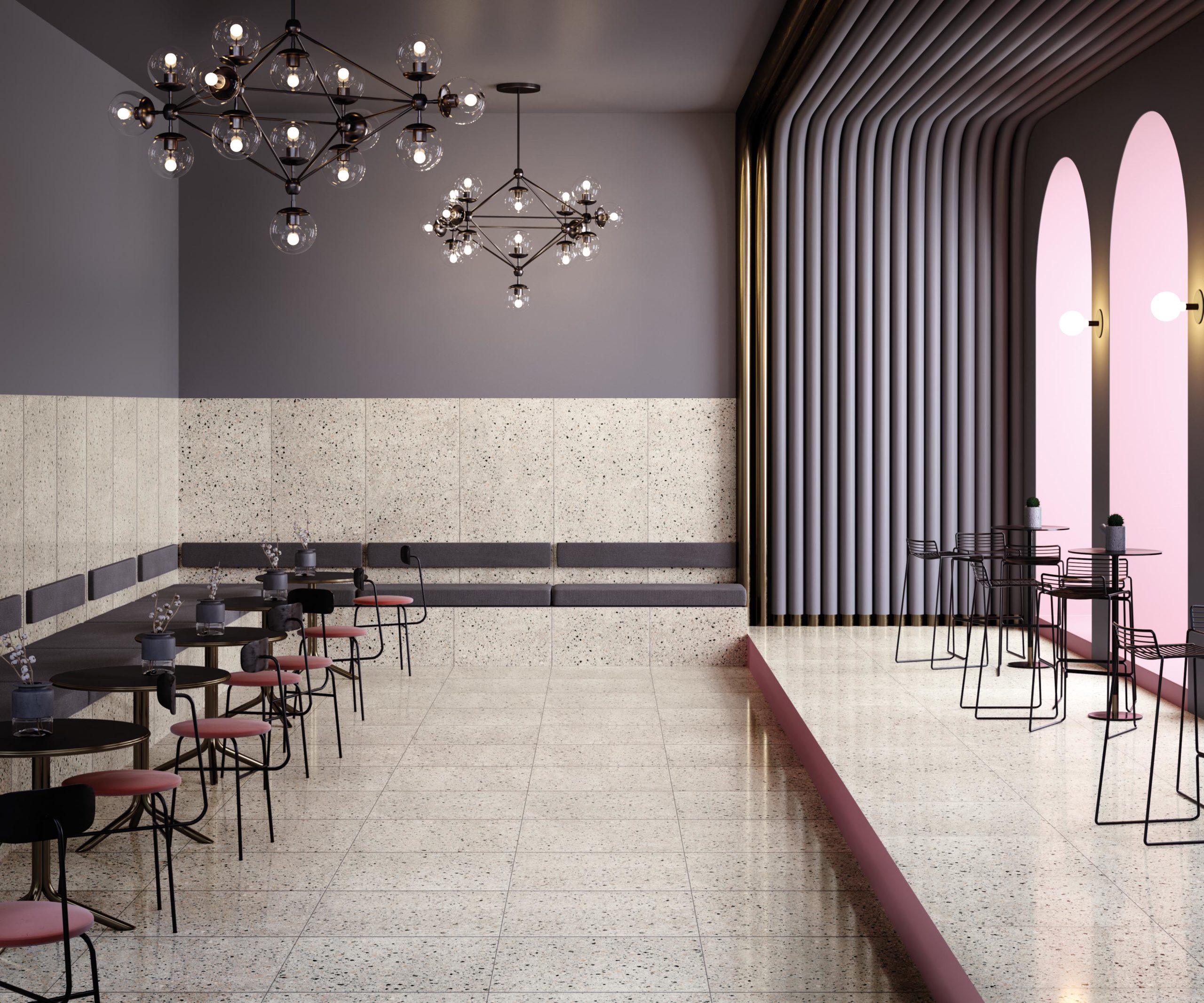
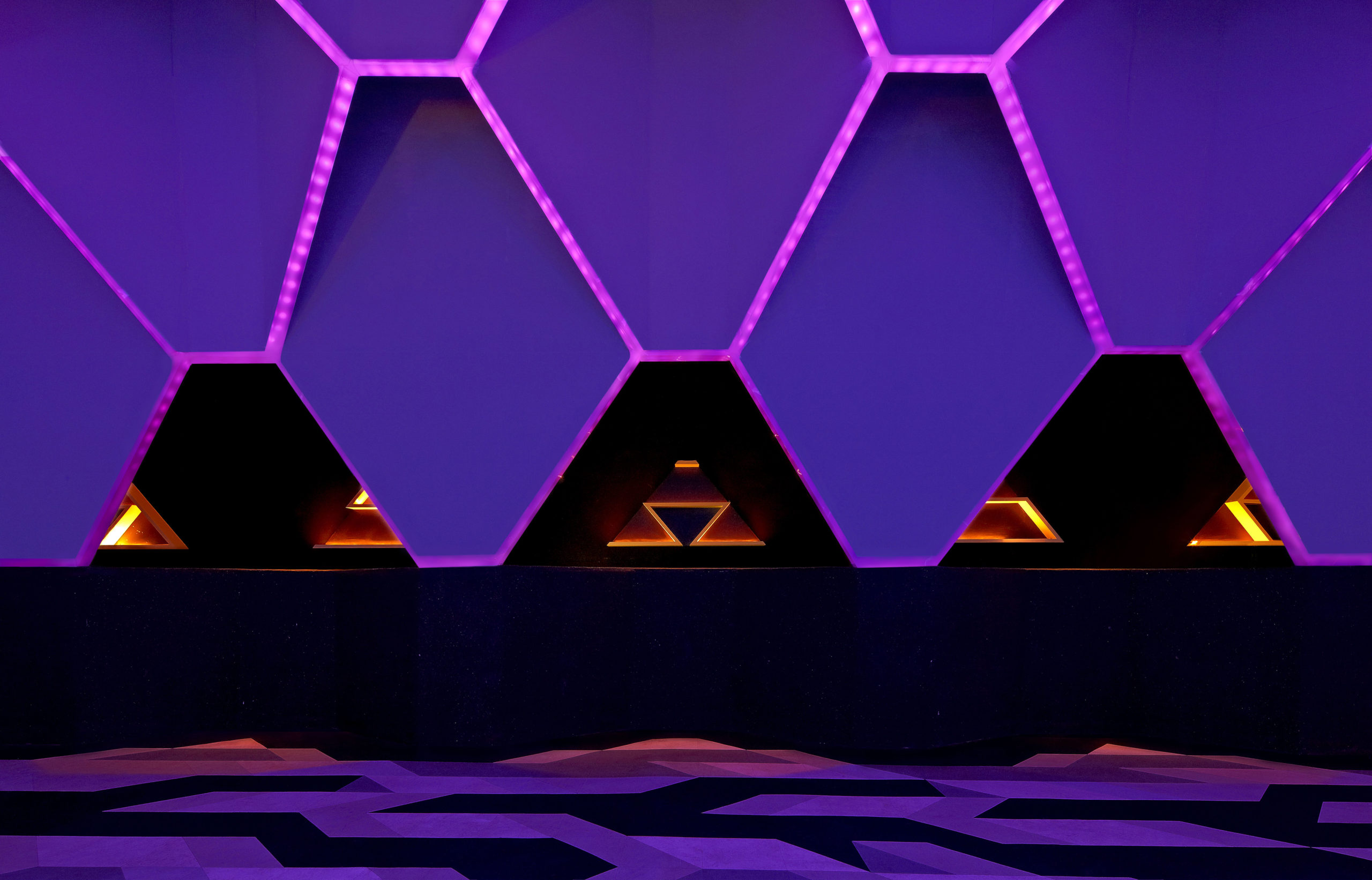 Josefine/ Roxy Club by Fred Mafra, Belo Horizonte, Brazil
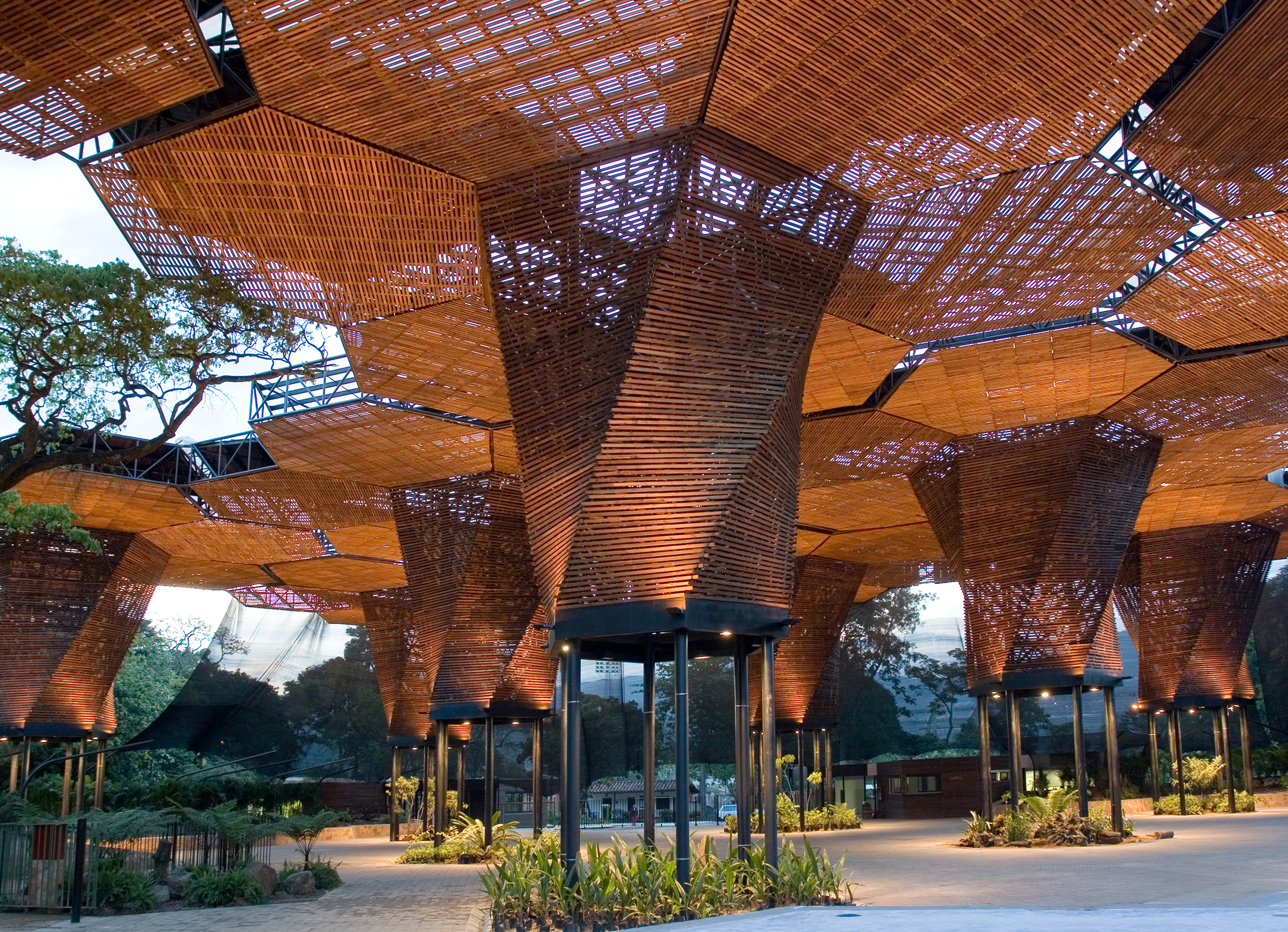
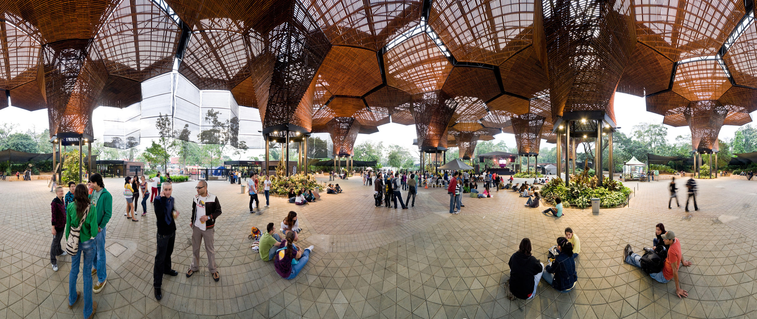
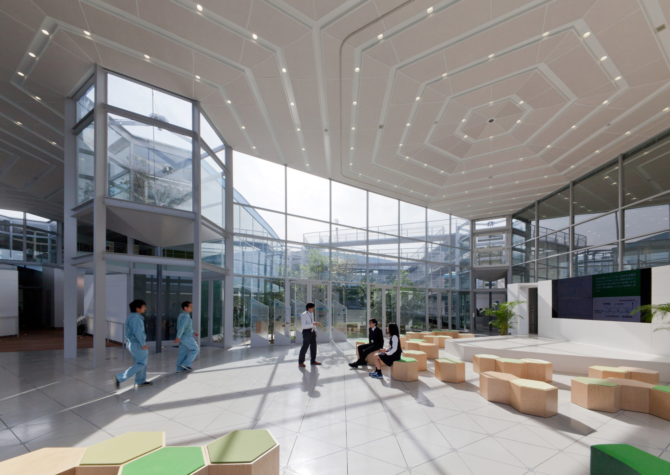
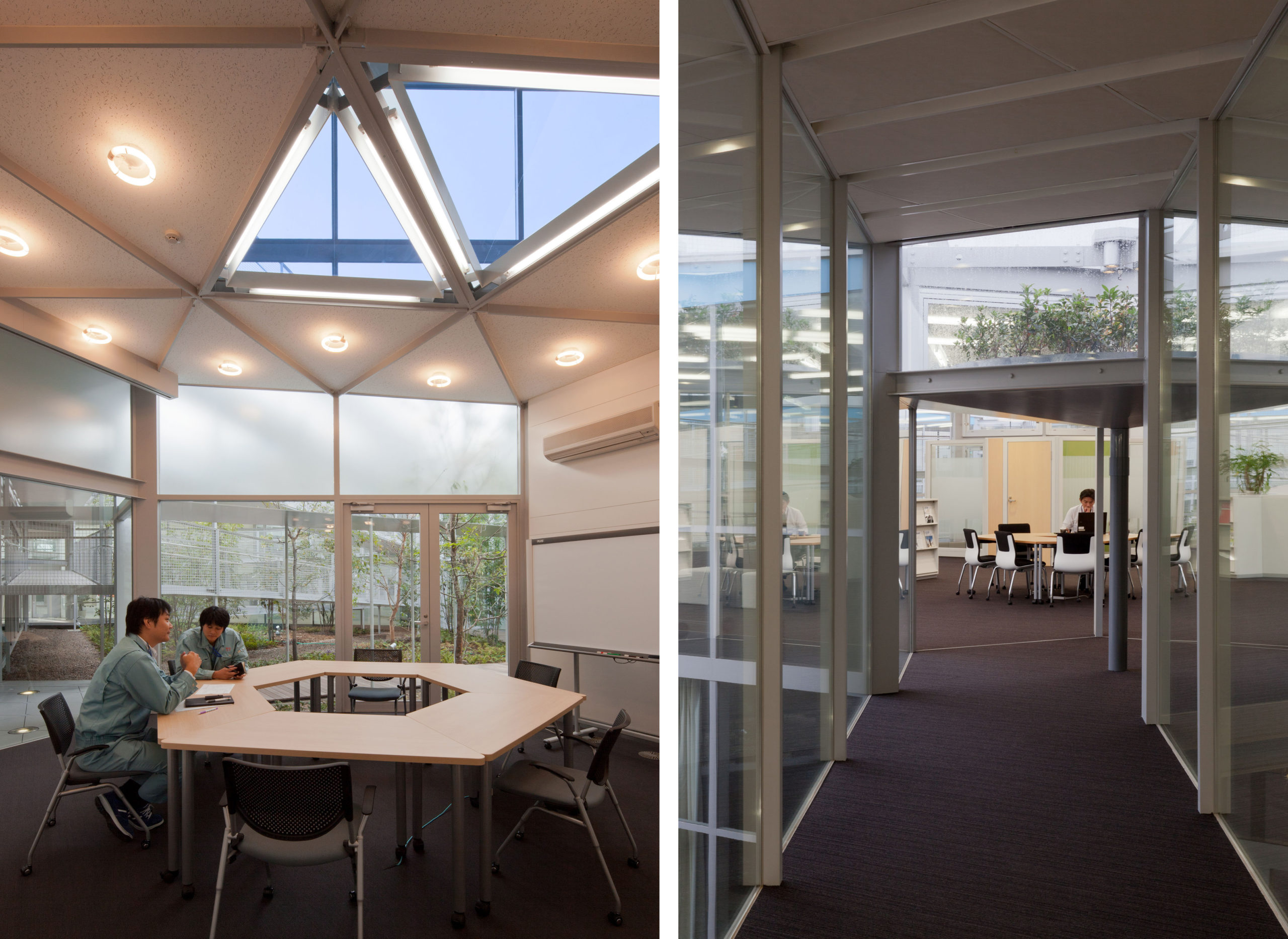 Aron R&D Center by Osamu Morishita Architect & Associates, Aichi, Japan
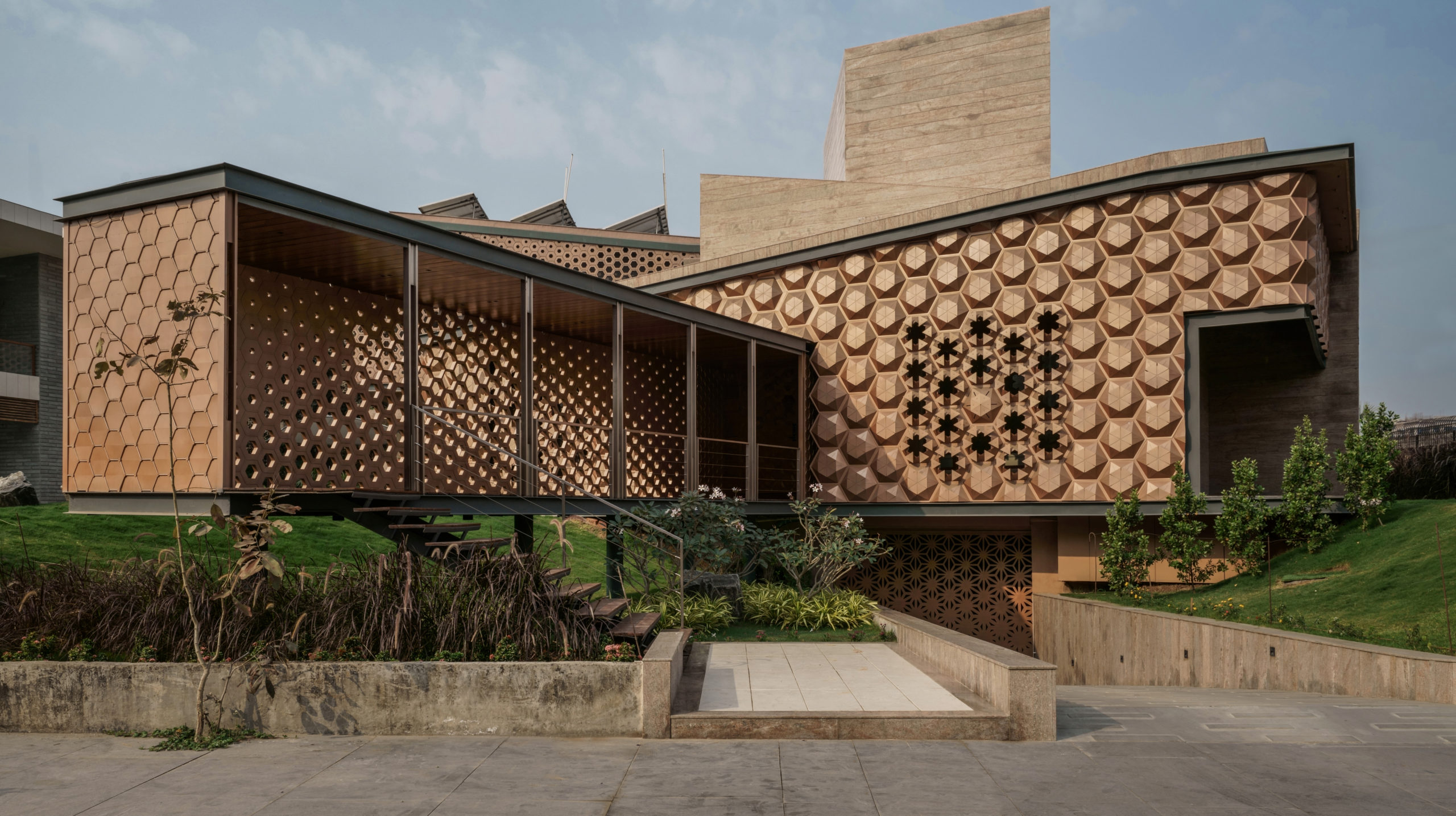
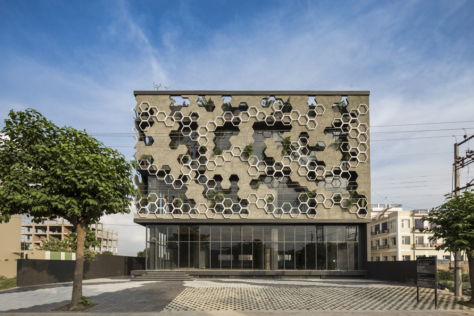
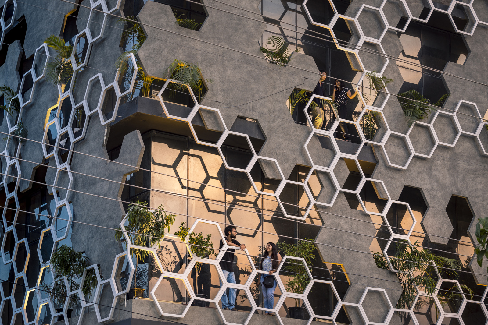
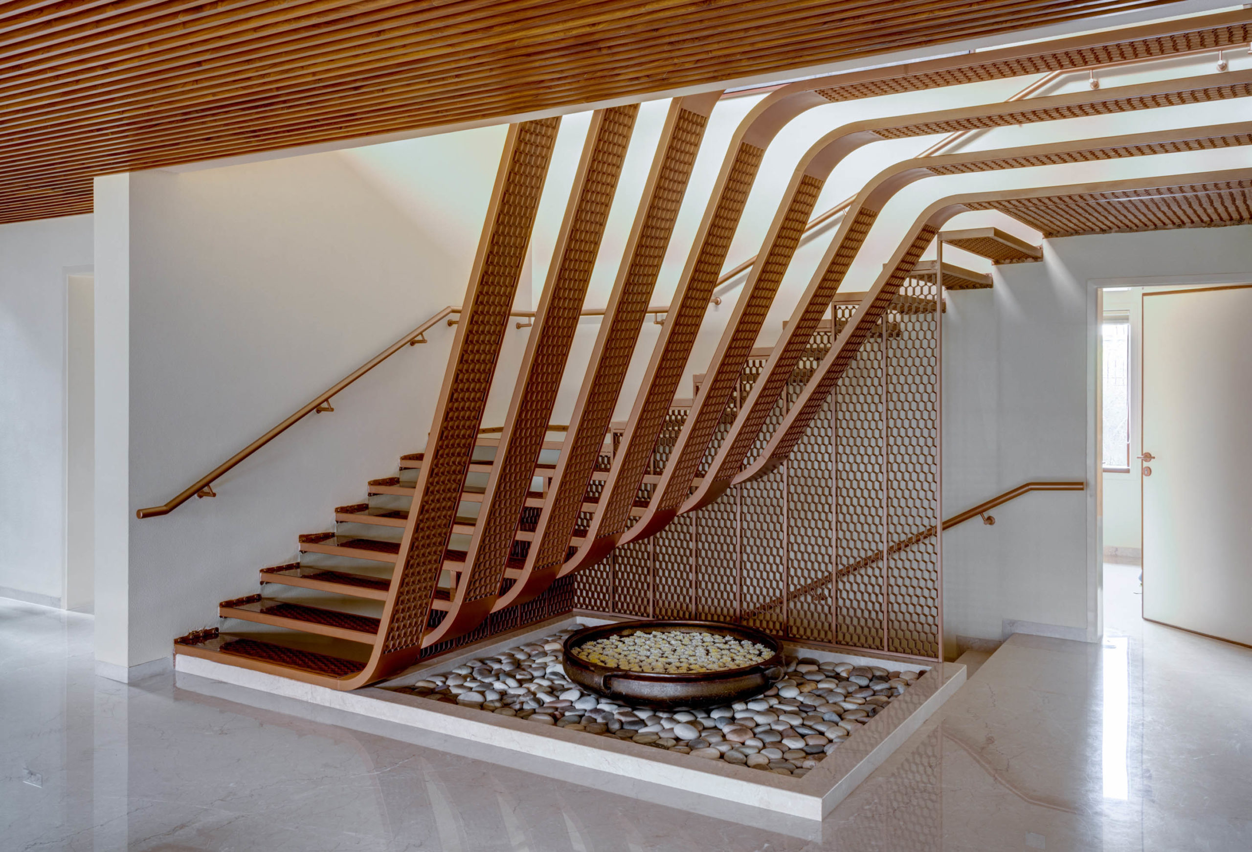 Hive by OPENIDEAS ARCHITECTS, Surat, India
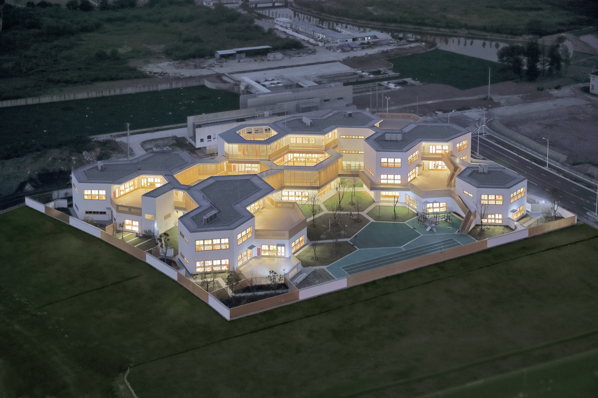
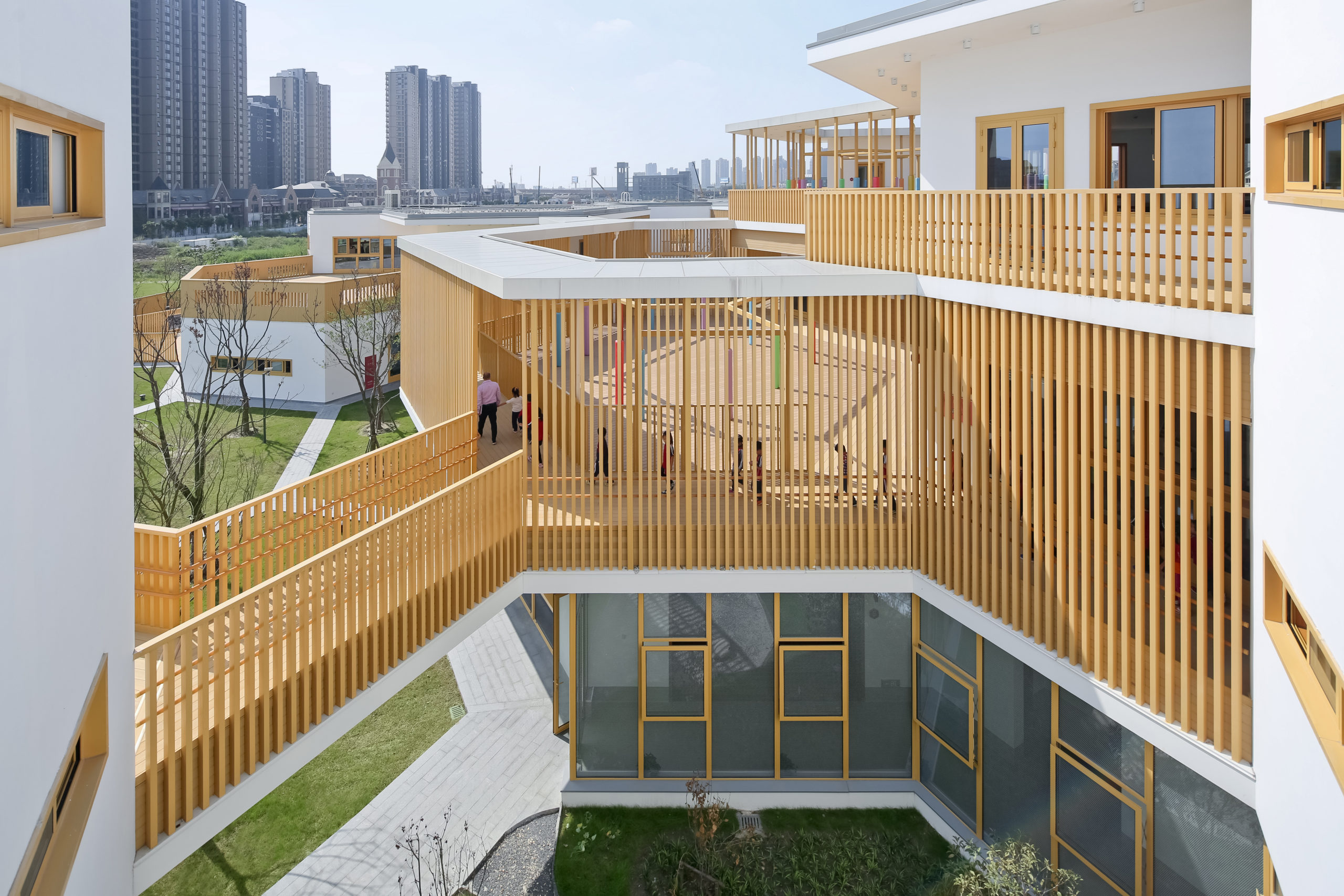 East China Normal University Affiliated Bilingual Kindergarten by Scenic Architecture, Shanghai, China