Delve Architects designs “nurturing but playful” The Nest nursery
English practice Delve Architects has used joyful colours and natural, tactile materials to outfit a newly established kindergarten by the River Thames in east London that can be accessed via boat.
The Nest daycare centre is part of a wider housing development in the Royal Wharf area, occupying a commercial unit at the base of a 19-storey housing block.
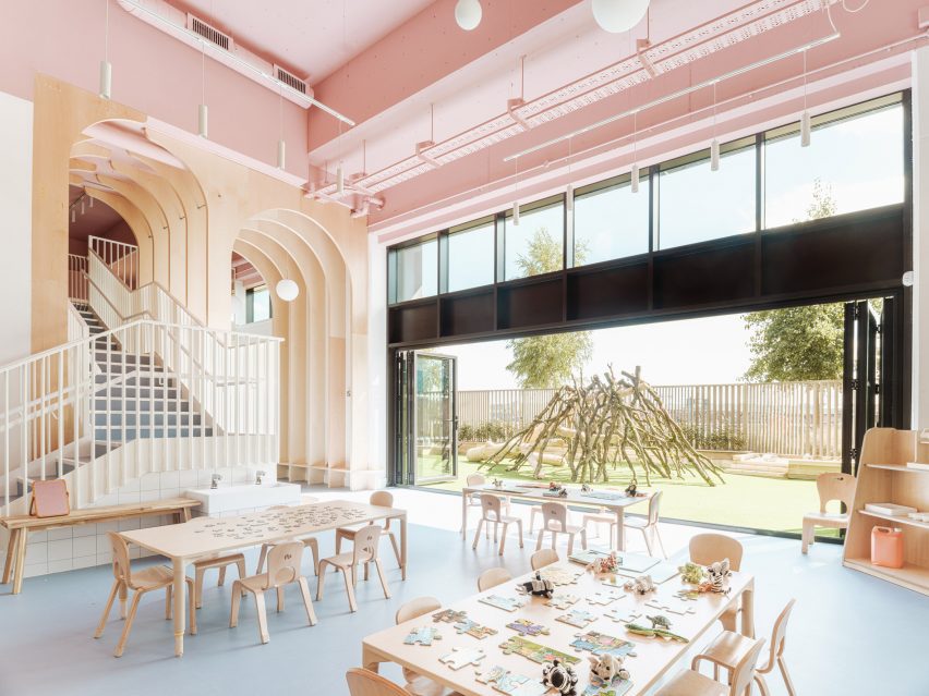
As a result, the primary challenge was to bring the towering newbuild space down to child scale and make it feel more homely while forging a greater connection to the riverfront.
“We wanted to create a calm, nurturing but playful space that reflected the values of the nursery,” Delve Architects co-founder Alex Raher told Dezeen.
“Their ethos is for children to have a positive learning experience through a healthy relationship with the environment around them and a connection to the outdoors.”
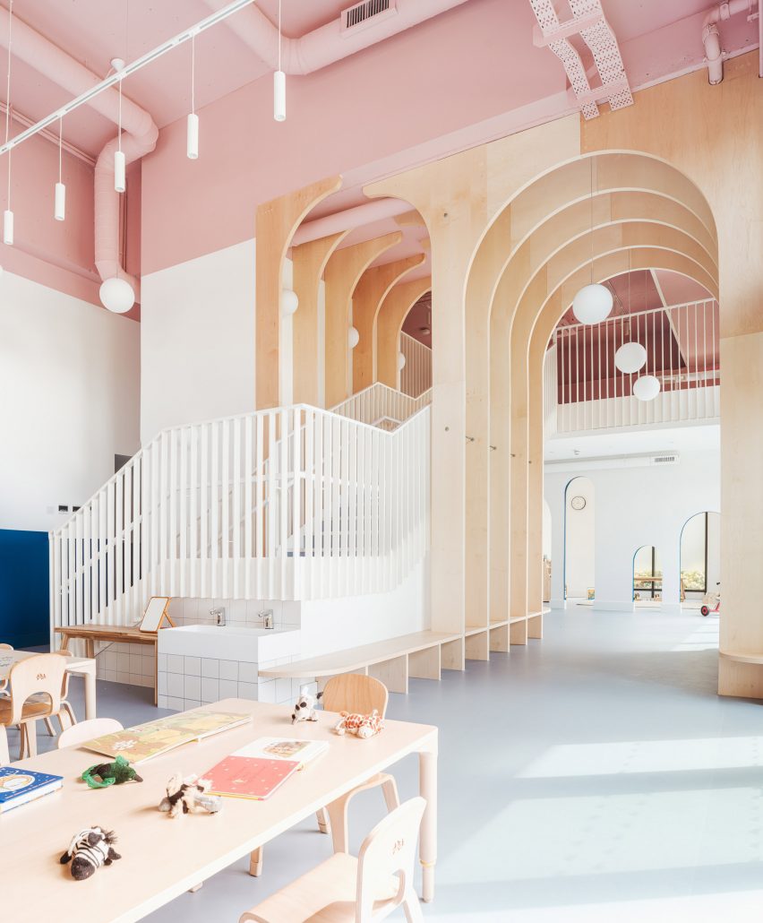
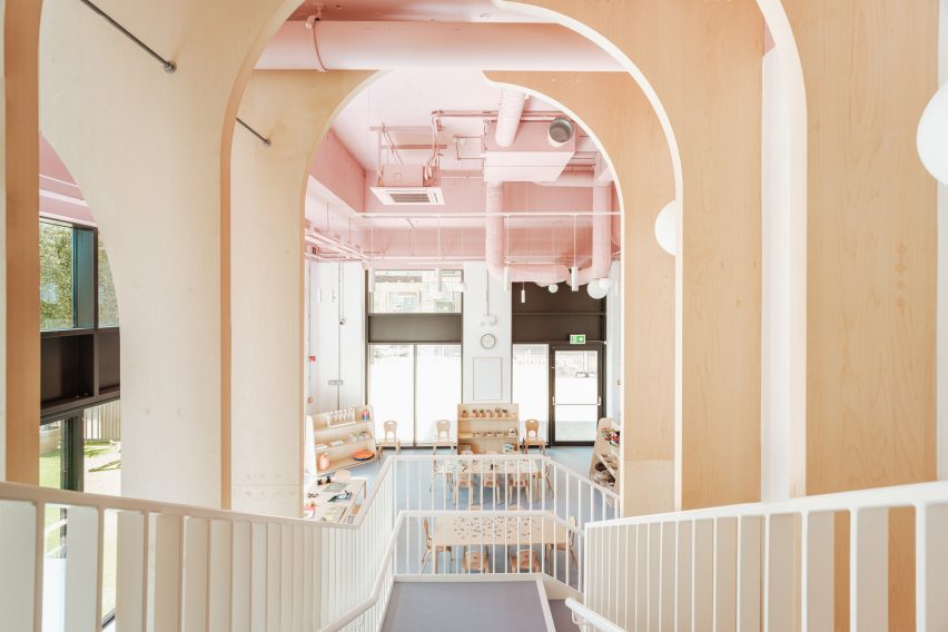
To boost the internal floor are, the studio installed a new mezzanine with a bespoke, powder-coated metal staircase that rises through a double-height space defined by a series of arched timber fins.
These maple-veneered arches – each around 4.5 metres tall – were conceived by Delve Architects to subdivide the space, creating zones without physical barriers.
“We wanted to connect the spaces visually and physically between the mezzanine and lower level, and to soften the hardened edges of the space,” said Raher.
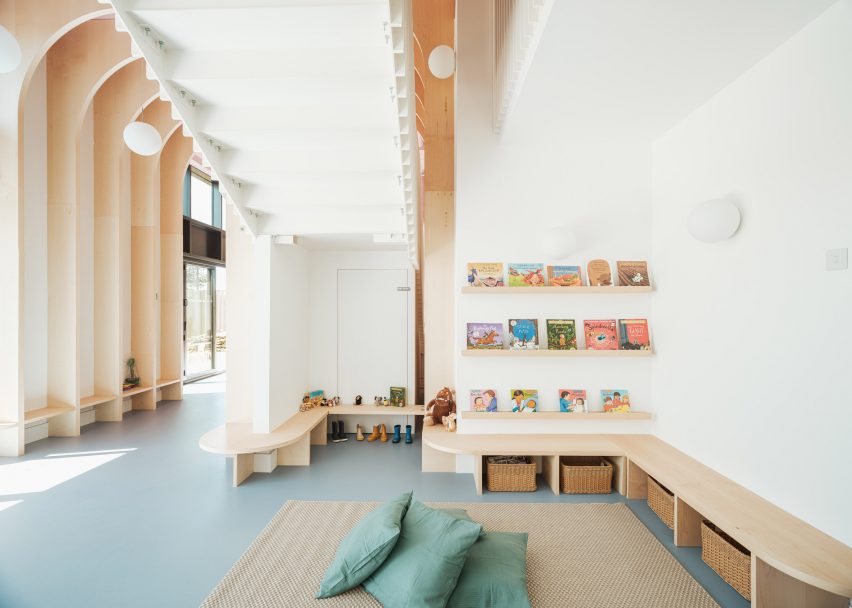
The arches are formed from a series of fins that merge into benches and individual seating as they approach the ground.
“The grand scale of the arches for a small child could feel overwhelming, so we brought this down into child-height seating, benches and joinery to play with the scale and make it more familiar to them,” said Raher.
“The material flows seamlessly between the two levels and creates a natural material palette that the children could recognise and read through different heights and spaces.”
The arches also span over the main staircase, where Raher says they suggest a canopy of trees.
“We wanted it to be a centrepiece that was exciting, functional and exploratory, almost like a meandering joinery up to a treehouse-style level on the mezzanine, through a network of arches and branches on the way,” the architect explained.
“One of the first concepts we explored was the treehouse idea, developing ideas around the nursery name The Nest and how we could bring a playful part of nature into the design.”
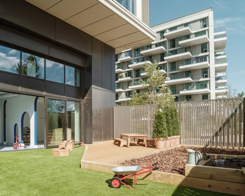
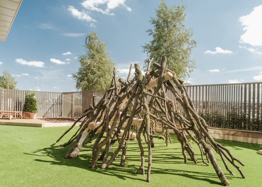
Given its inner-city location, the nursery is fortunate to have a large garden overlooking the riverfront, which is connected to the nursery via a double set of six bi-folding doors.
The external fencing was designed by Delve Architects “to merge with the rhythm of the existing tower’s balconies” and powder-coated in a matching colour.
“We wanted to celebrate the connection to the outside space, the riverfront location and the child-height views from the mezzanine to the water, as it was unique to the space and to the nursery setting,” said Raher.
“Children can arrive and parents can commute using the river boat directly outside the nursery. The new pier designed by Nex Architecture is a beautiful backdrop to the site.”
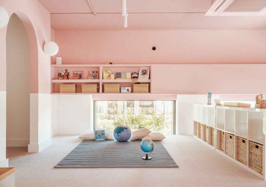
To cope with the demands of a nursery setting, materials and finishes are resilient as well as being natural and tactile. Among them is recycled and recyclable Marmoleum flooring, maple-veneered joinery and low VOC paint.
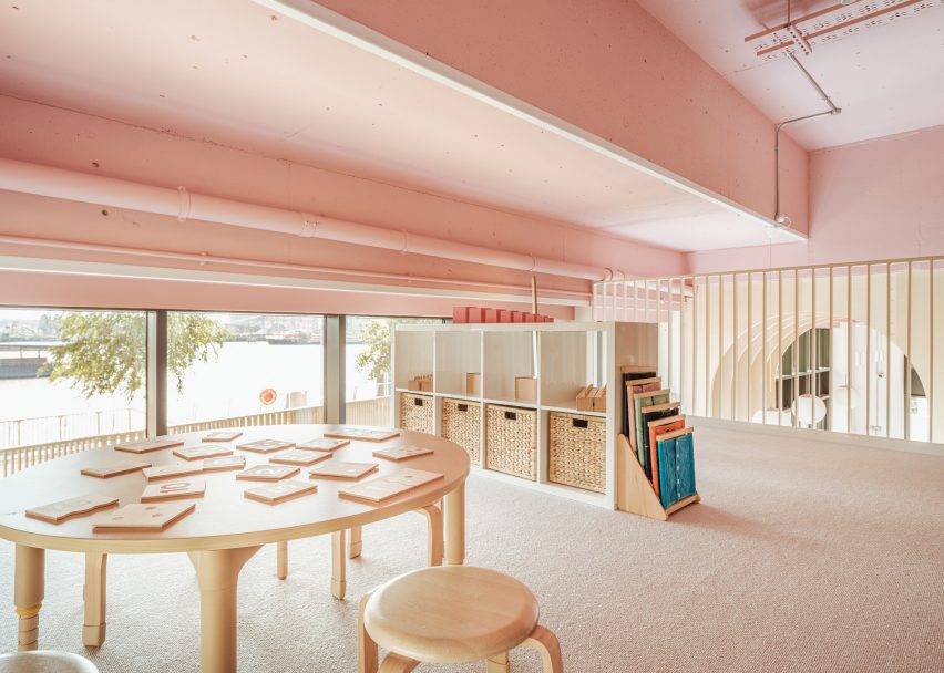
A colour palette of soft muted shades helps to create a homely atmosphere inside The Nest.
“This palette works better than bolder primary colours, as these create too much visual noise for younger children,” Raher said.
A panel of dark teal blue creates a datum line around the walls, designed to be “resilient to little fingers” while making the tall spaces feel more relatable to children.
“We always try to design from a child’s perspective, putting ourselves at that level, quite literally in some cases,” Raher said.
The soft blue of the flooring gels with the tones of the pale maple veneer and the matt pink that wraps around the ceiling and upper walls, covering almost the entire mezzanine.
“It both draws your eye upwards but also manages to change the scale of the space,” said Raher. “In some areas there is a five-metre ceiling height, so we wanted to break this up visually.”
“The services for heating, cooling and ventilation were also left exposed, giving a little insight for children to explore and imagine what they could be – a network of intriguing forms and geometry running through the nursery.”
Other kindergartens that hope to forge a greater connection to nature include this English nursery by Feilden Clegg Bradley, which makes use of natural materials to reflect the surrounding woodland, and a timber kindergarten extension in Austria by Bernardo Bader Architekten.
The photography is by Fred Howarth.
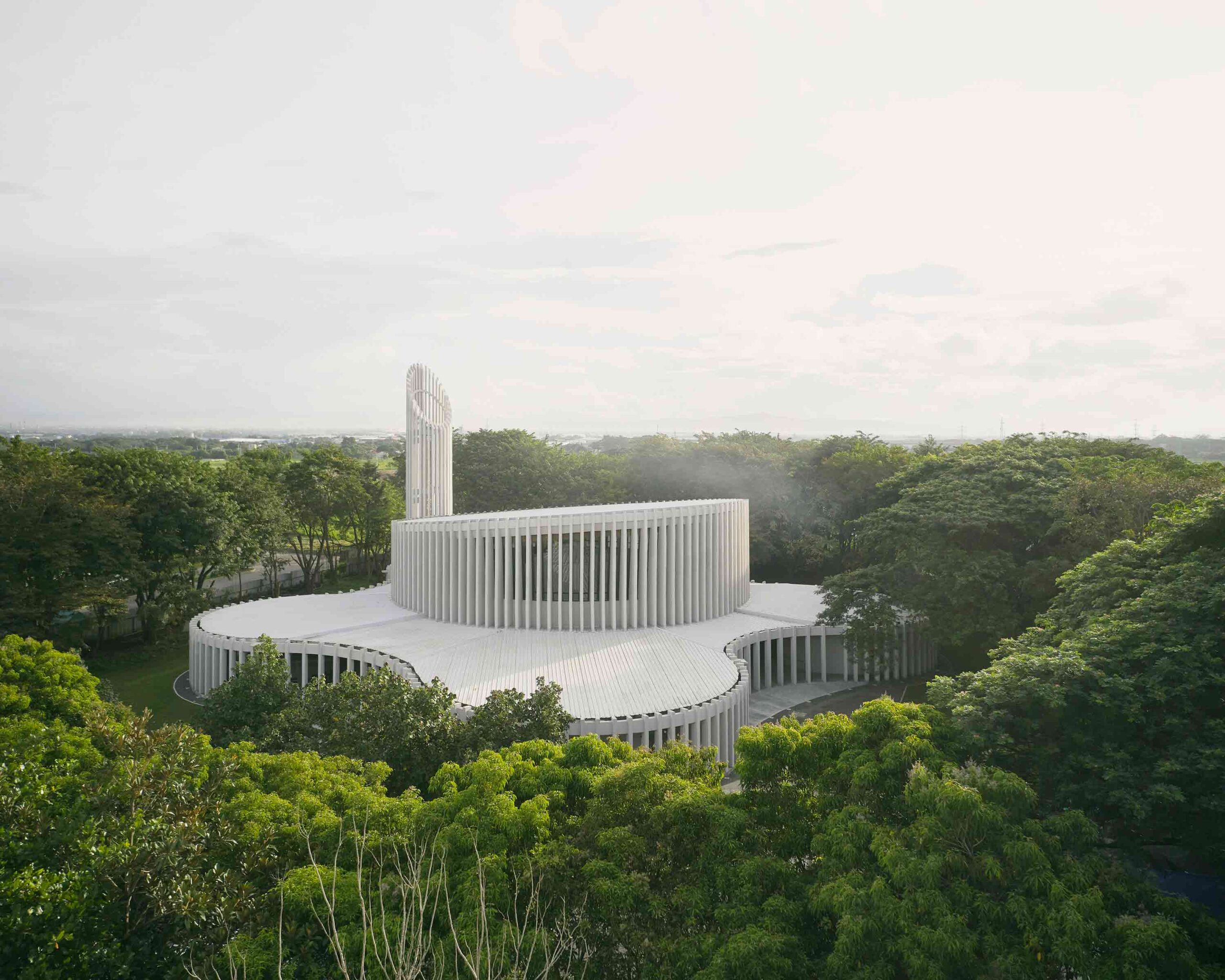
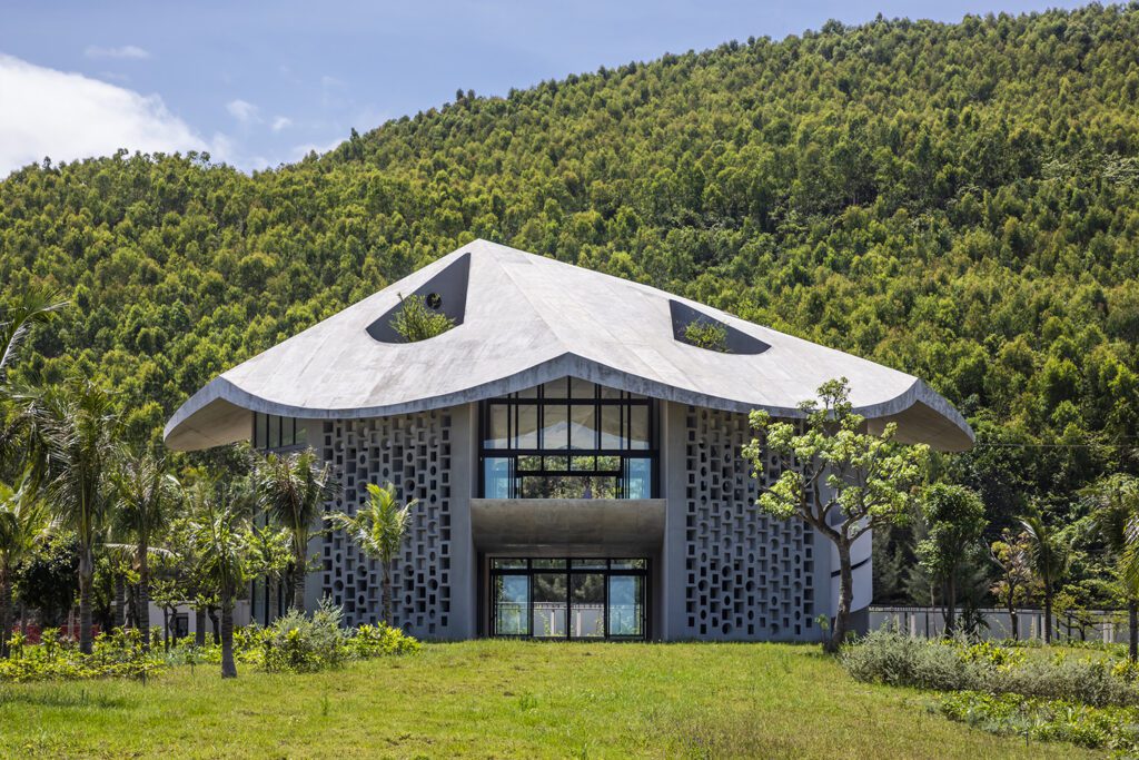
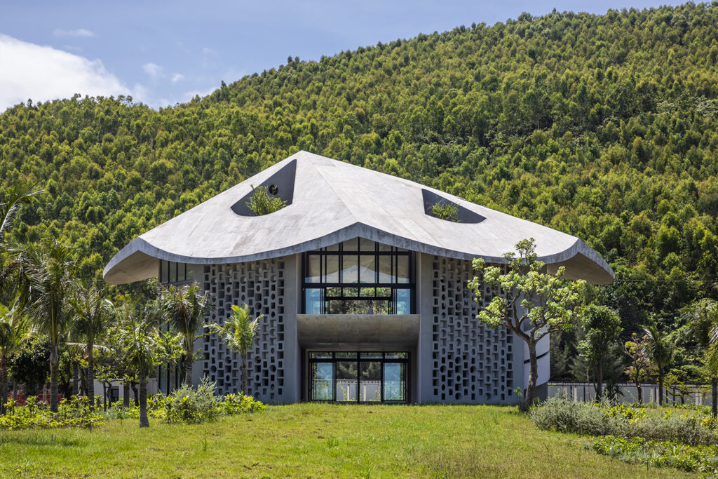
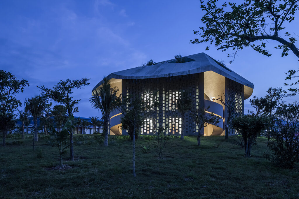
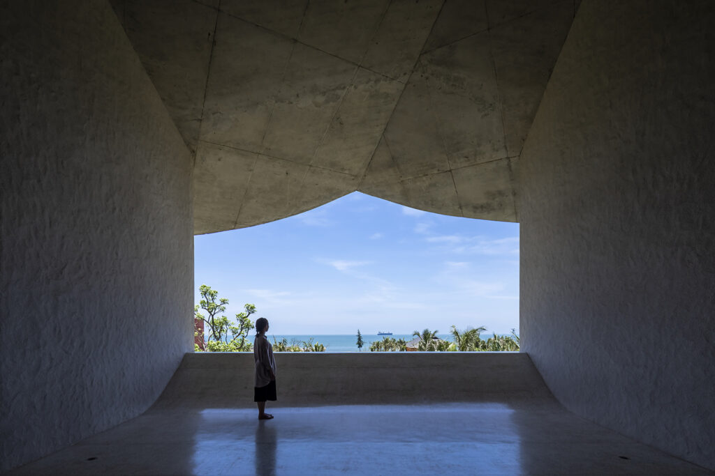
 In a dramatic departure from the historic cruciform plan, this remarkable church in the Philippines is defined by its striking, amorphous form. Shrouded by woodland, the mysterious edifice is veiled by a rhythmic curtain of white slats, eschewing precise angles for flowing, curvilinear lines. The building embraces organic shapes, while its permeable façade establishes a dialogue between the inner world of worship and the external landscape.
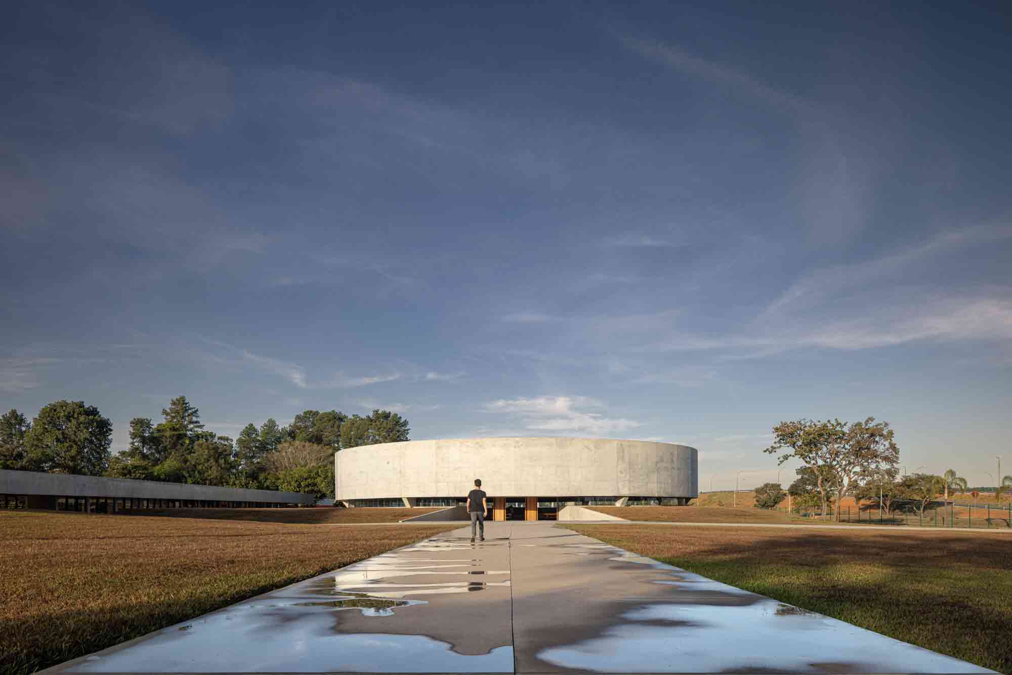
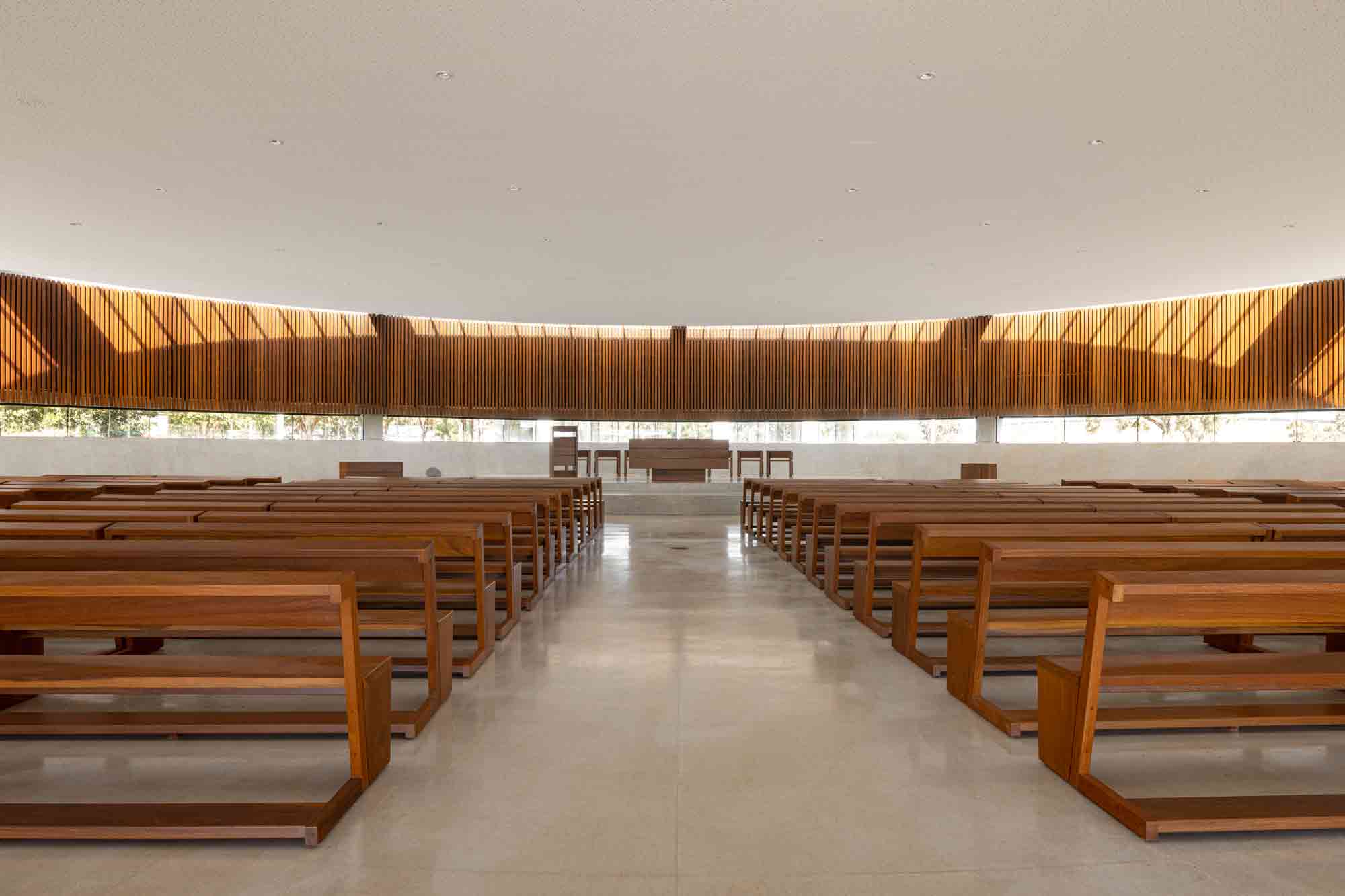 A casualty of urbanization, the trees that once surrounded this site in Brasília were all but removed to make way for an adjacent expressway. The acreage’s new Catholic church seeks to reawaken the bucolic soul of the land and illuminate the relationship between the spiritual and environmental realms.
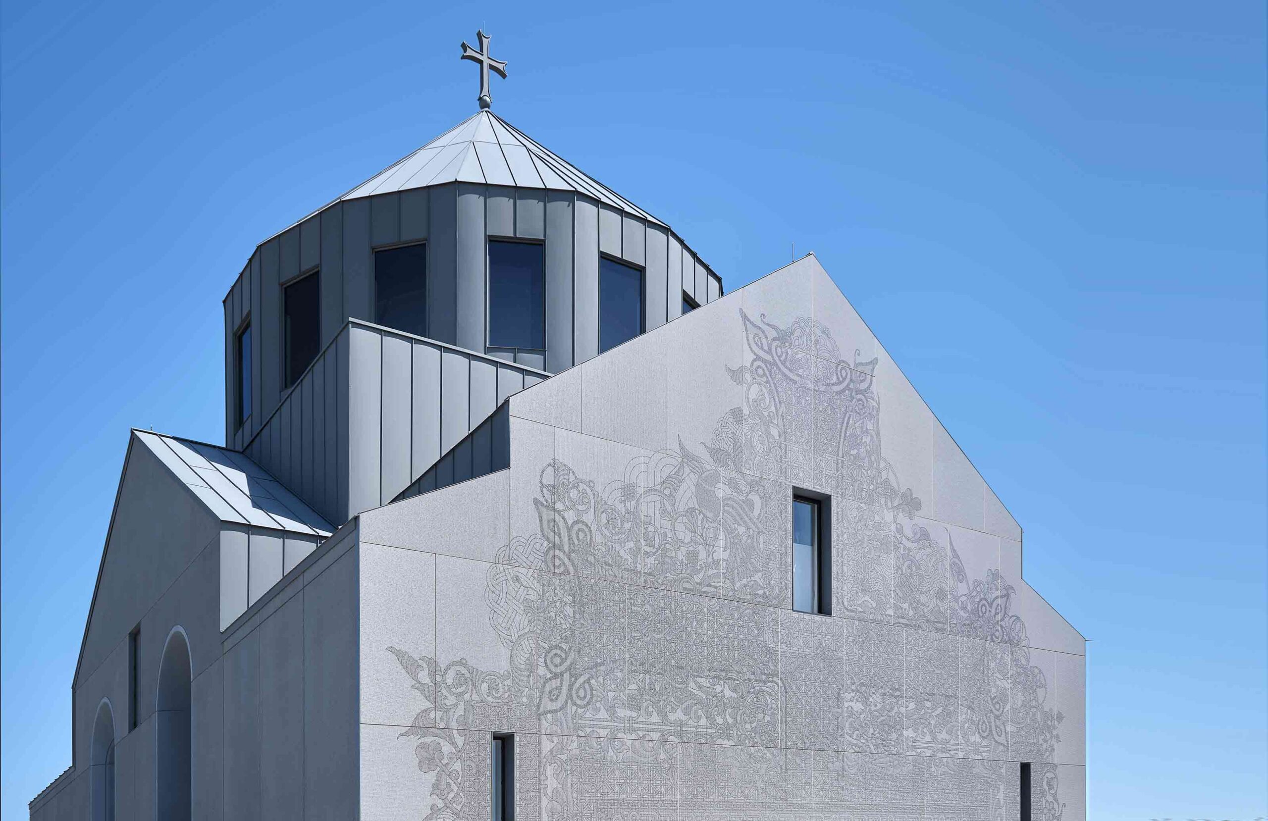
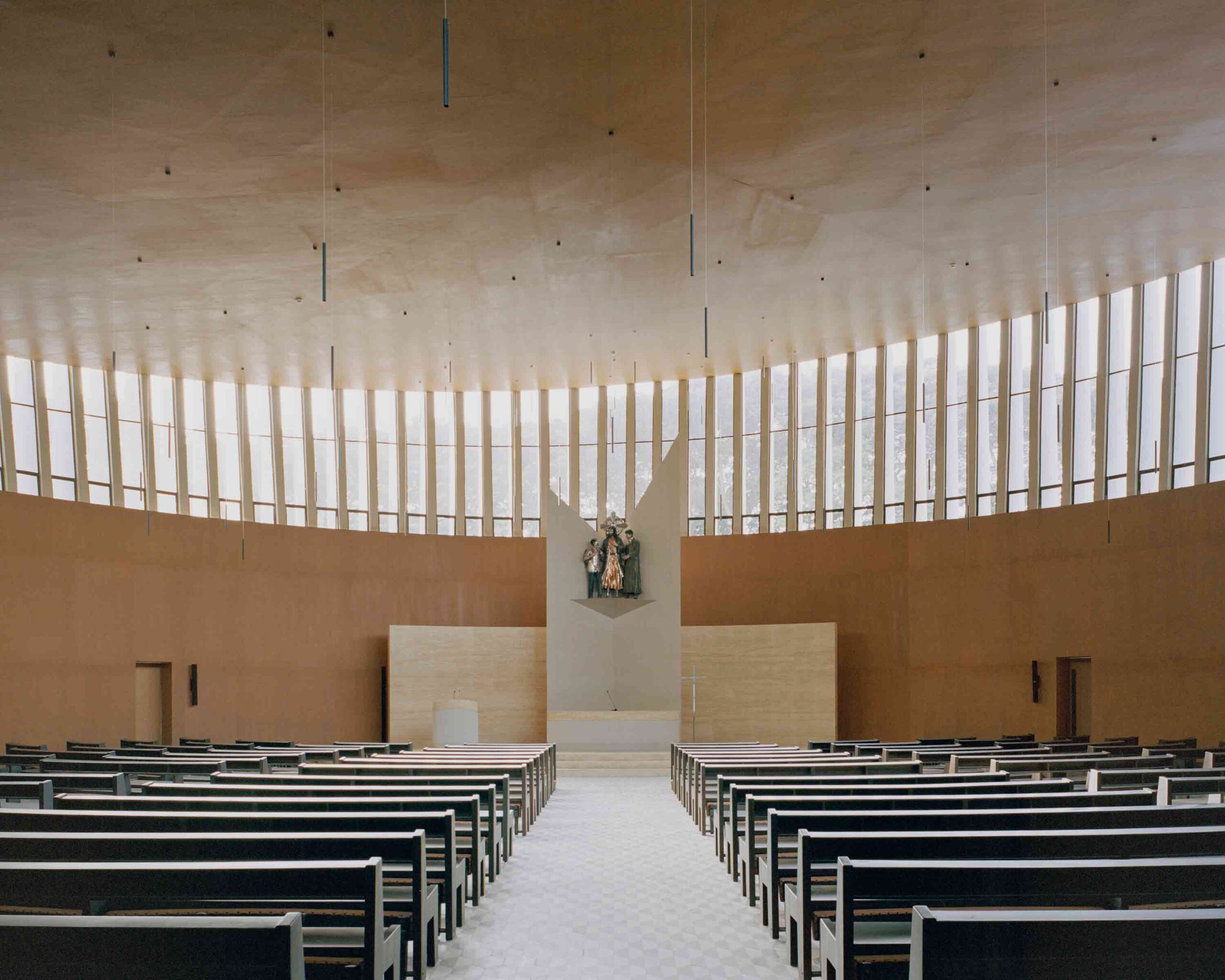
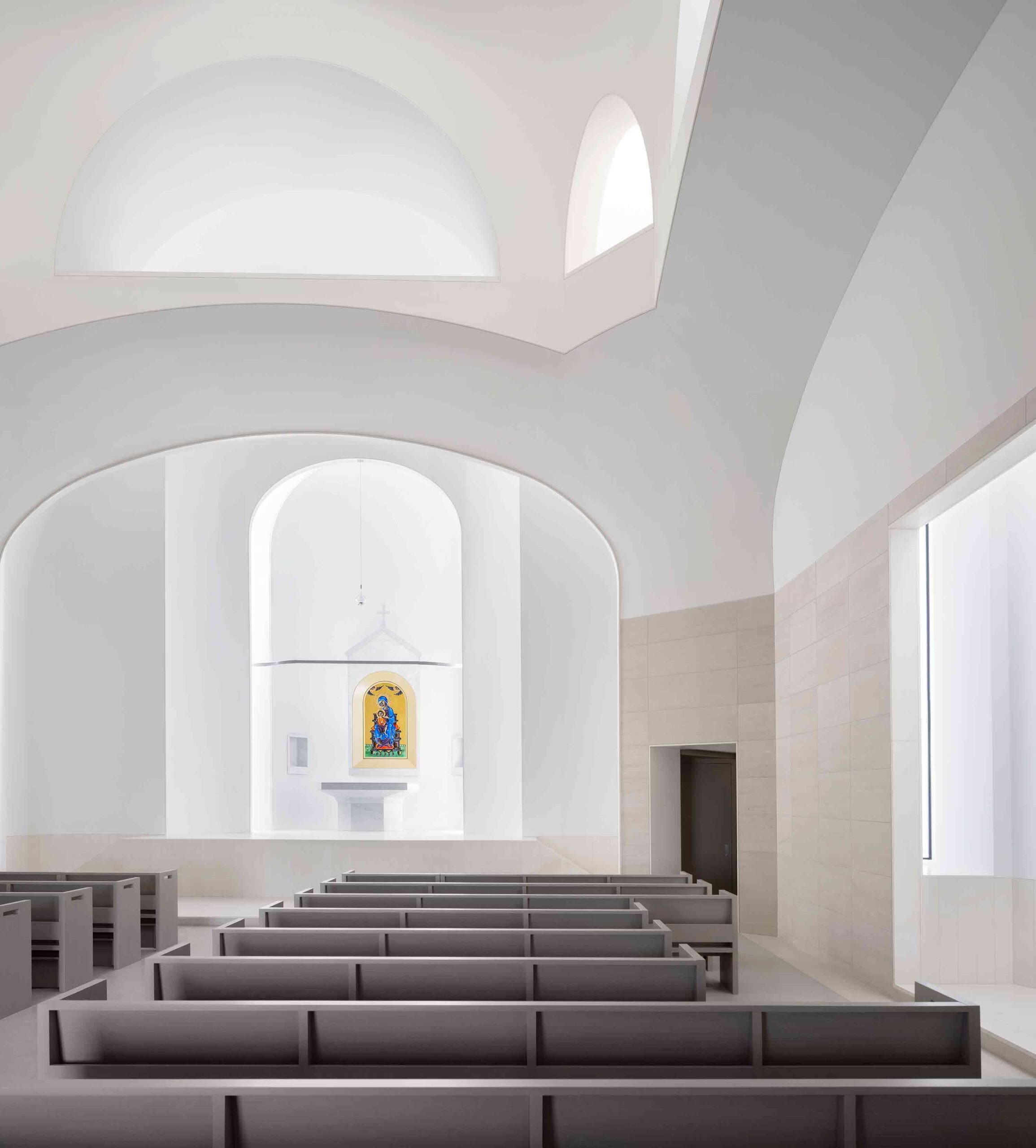 While this astonishing church stands in East Texas, it draws on an ecclesiastical tradition some 8,000 miles away. A homage to the historic Armenian church of Saint Hripsime, it features the same domed form, built some 1,400 years on from its counterpart. The structure’s sculptural interior, carved from glass-fiber reinforced concrete, follows the lead of its ancient inspiration. Lighting fixtures, air-conditioning ducts and other modern interventions have been skilfully concealed, creating an ethereal finish that transcends time.
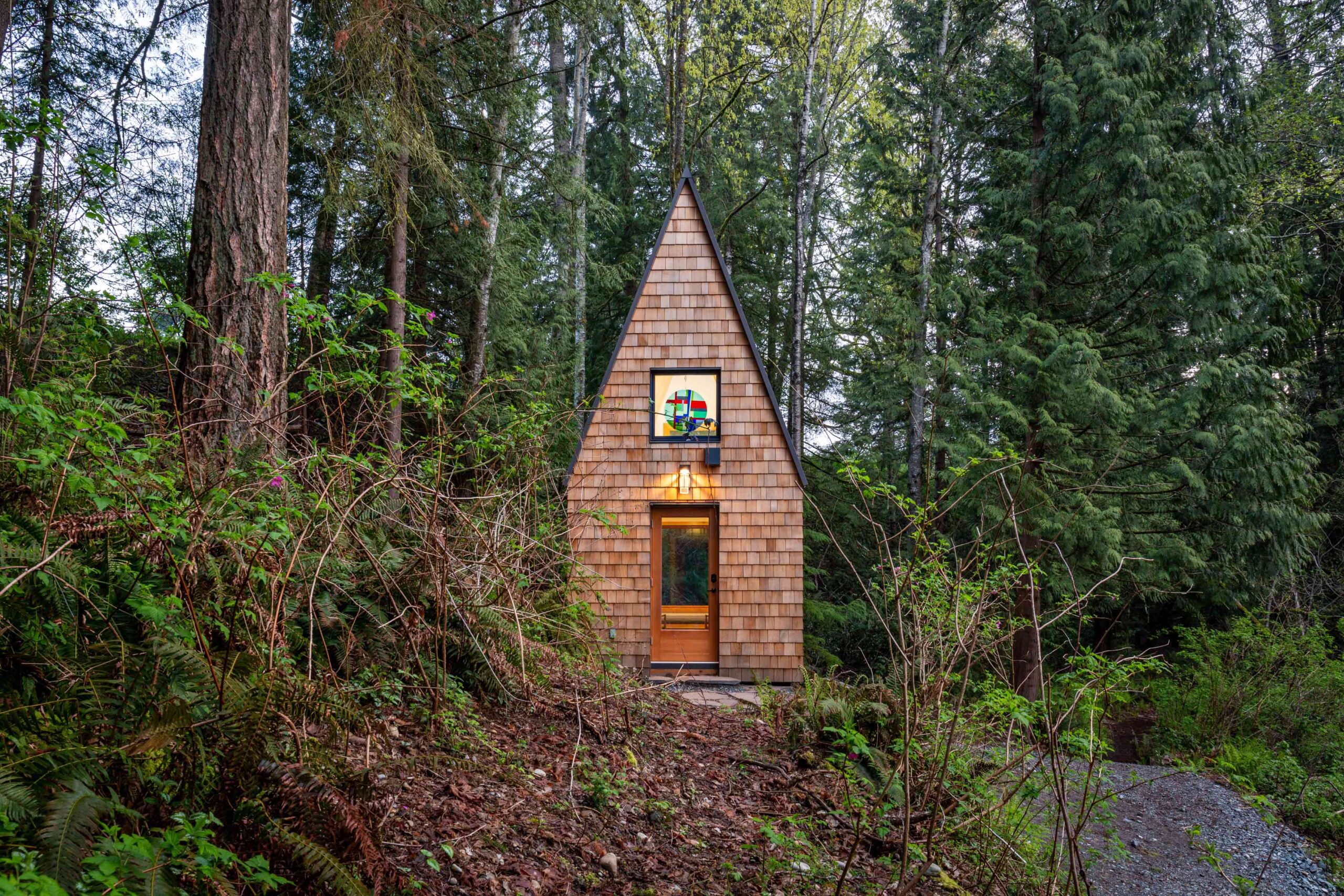
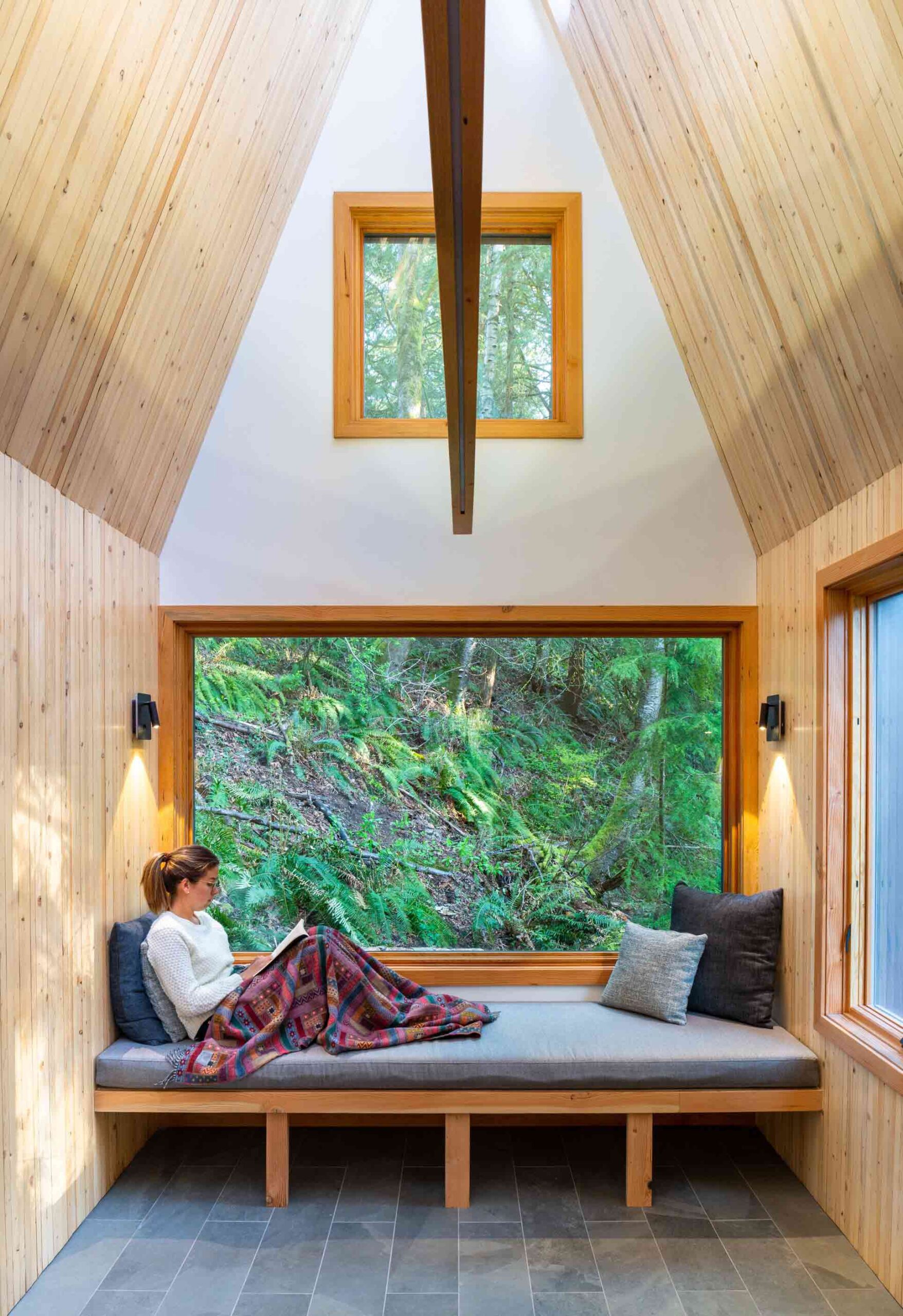 This enchanting chapel in British Columbia was conceived as a peaceful place of reflection and reconnection with the organic landscape, at a distance from the frenetic hubbub of modern life. Its name, Meristem, references a plant tissue found in the roots and shoots of foliage, which instigates the growth of new cells. In the same way, this unassuming space seeks to instill spiritual growth in those who find refuge within its walls.
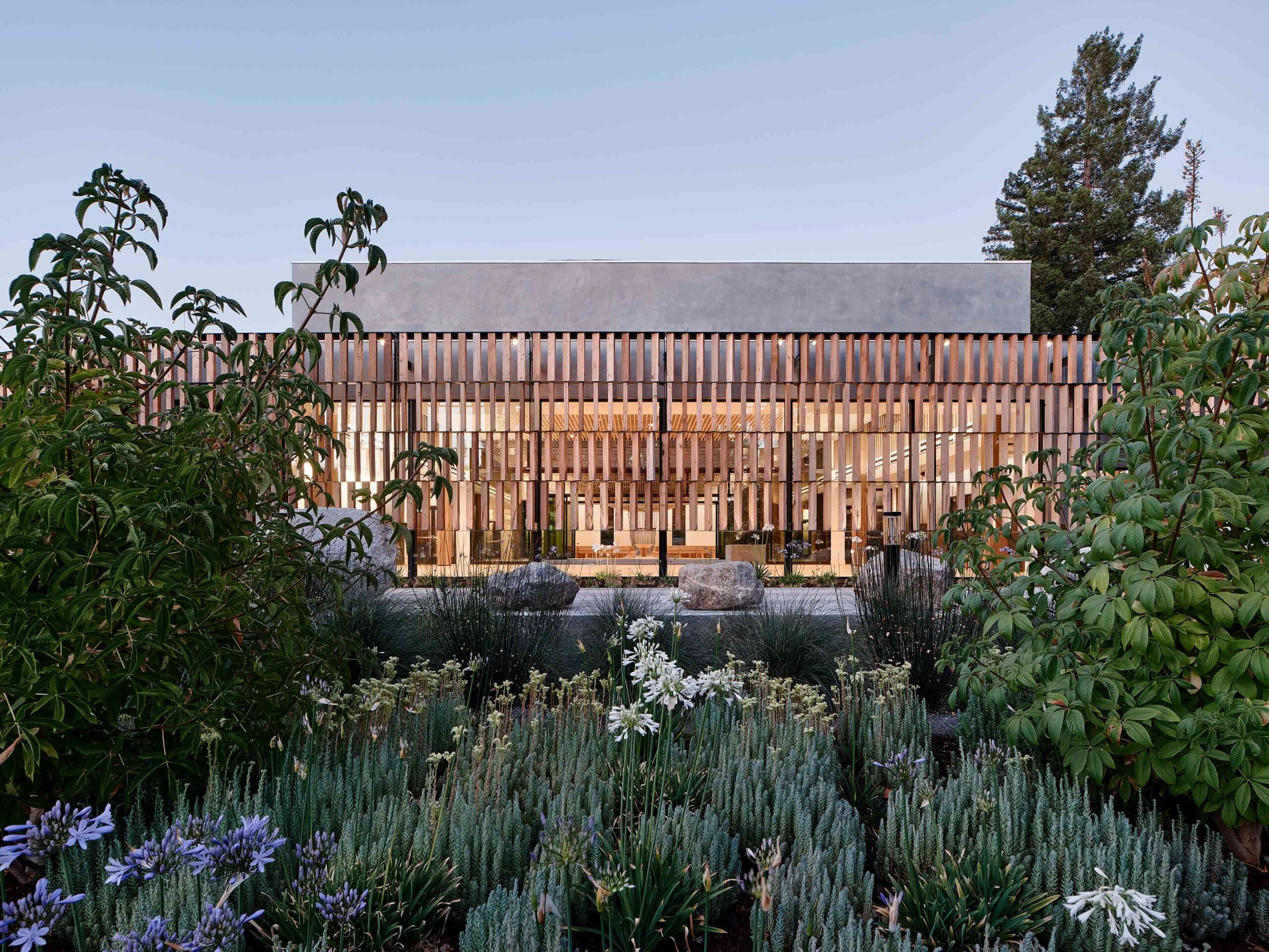
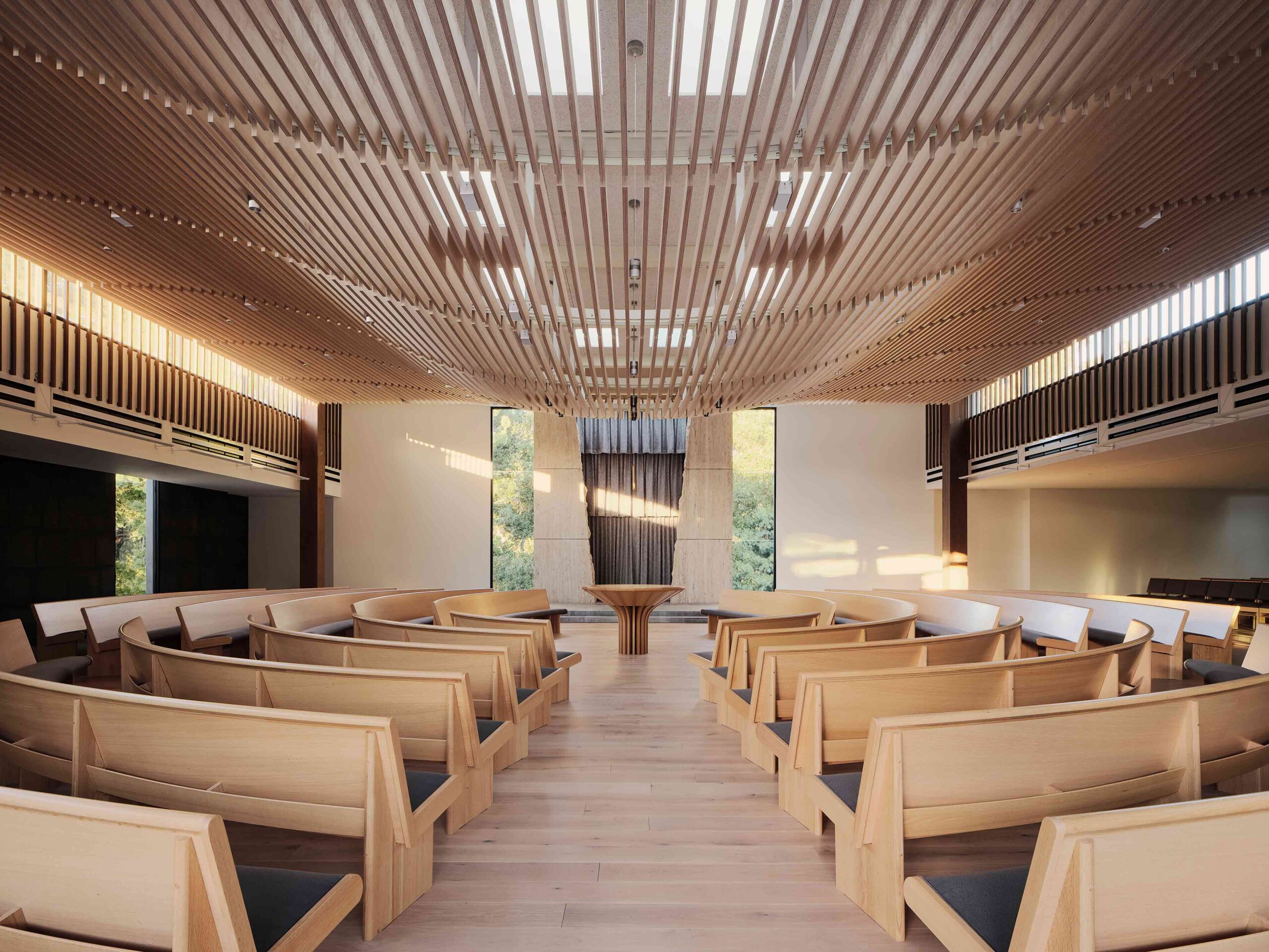 Envisaged as a progressive beacon, this extraordinary synagogue in California combines centuries-old tradition with modern values, articulated through cutting-edge construction methods. The project negotiated a number of restrictions, including an awkward, triangular plot, a single-story height limit and a tight budget. The result is a versatile place of worship that utilizes humble materials and honors the structure’s environmental context.
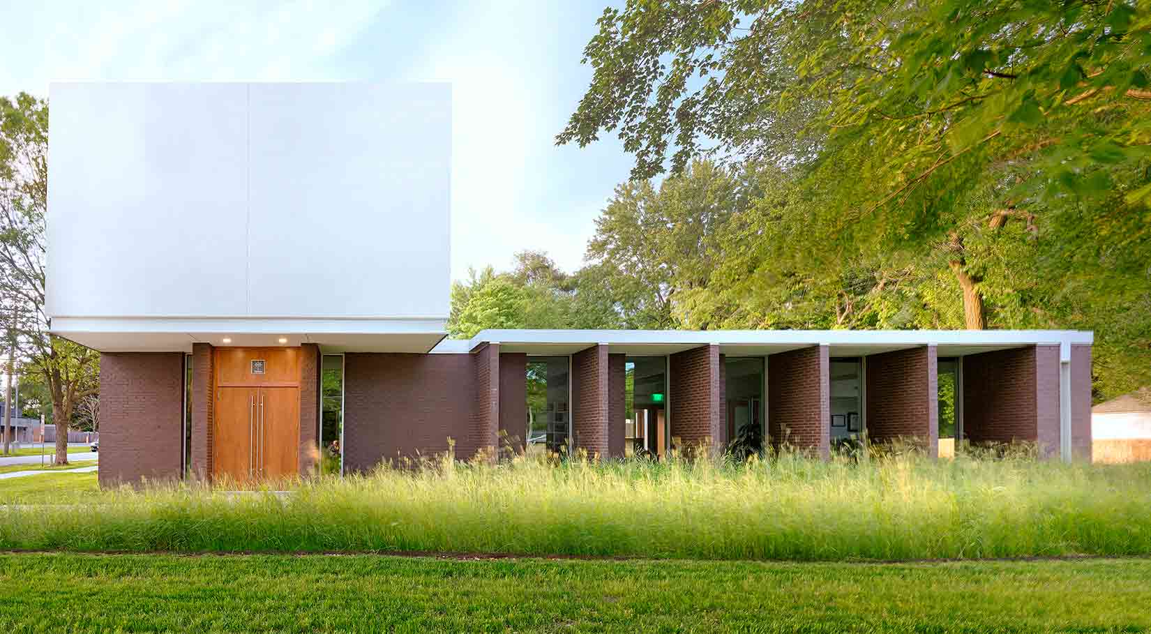
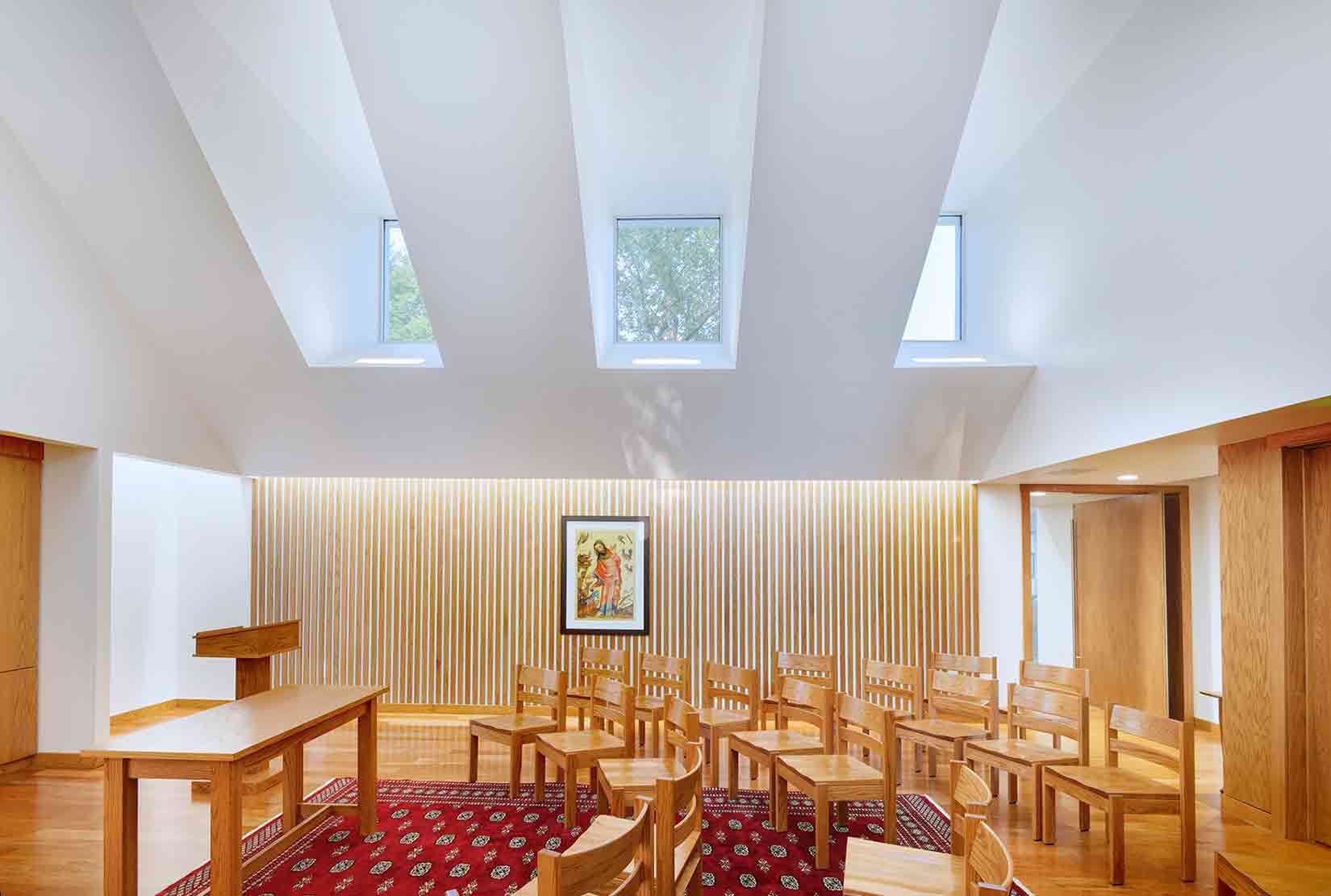 This innovative project sits at a juncture between contrasting worlds. Bridging Springfield’s energetic commercial district and a quiet neighborhood, the building fuses two surprising typologies: a private law practice and a chapel. Visually compelling, the modernist-inspired structure masterfully balances the needs of its client, a minister and attorney with a proclivity for Le Corbusier and Louis Kahn.


 images ©
 the trio of cabins are linked by a network of footpaths
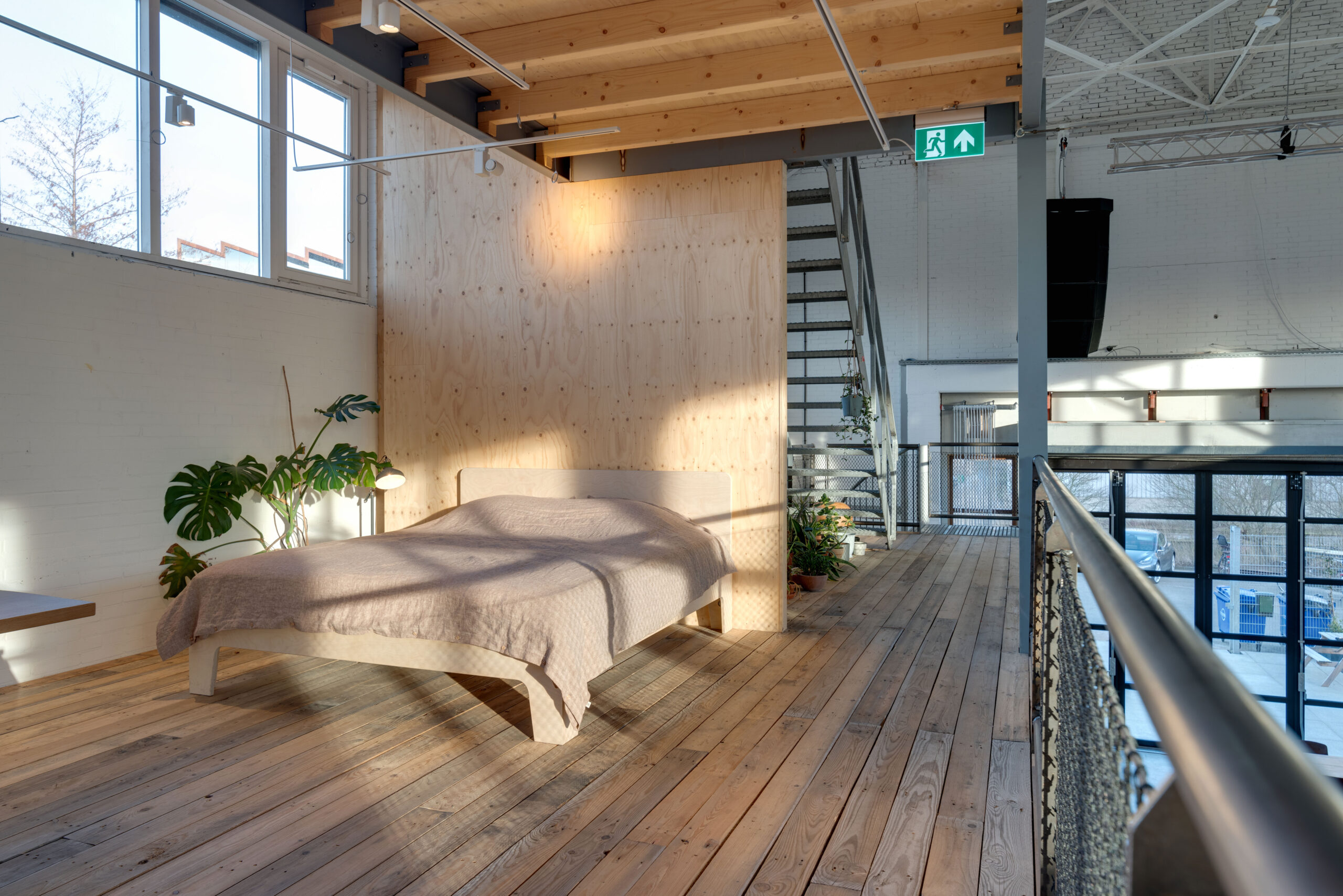
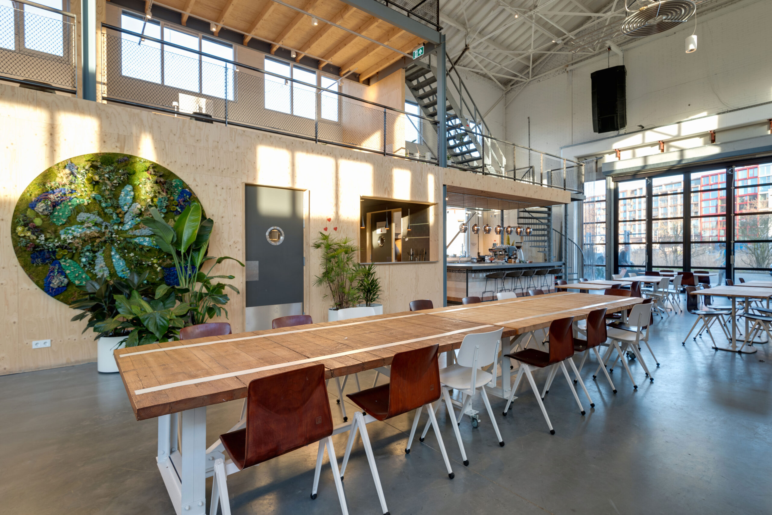
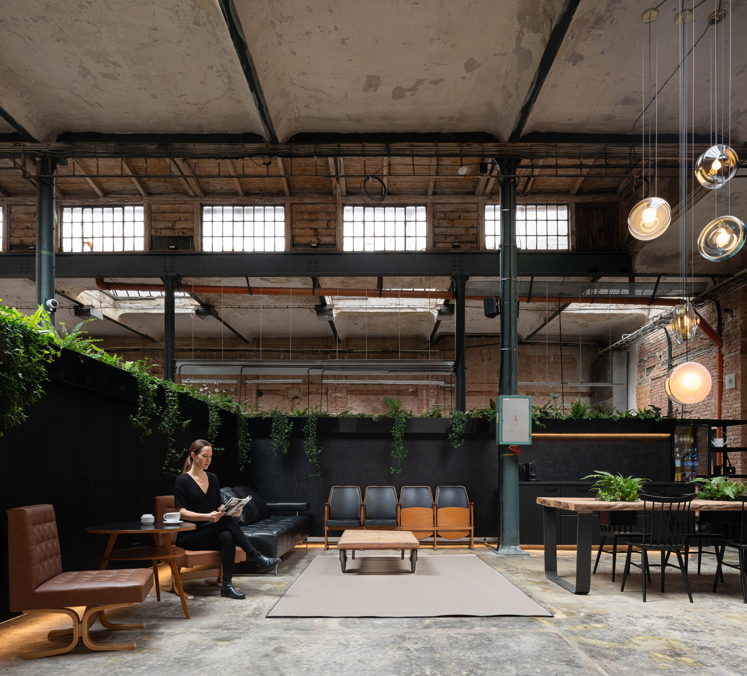
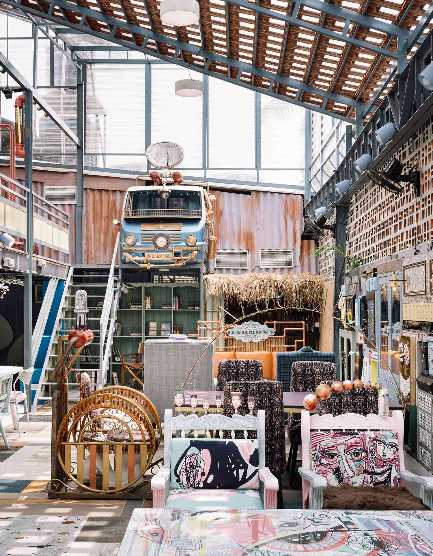
 Entering this think tank feels like entering someone’s living room, you almost feel like you need to knock first. Designed as an engaging and emotion provoking workplace that seamlessly flows between what used to be two warehouses in the Bay Area in California, this design research company adopts what the designers termed as a “better-than-home” concept, achieved through the selection of furniture, carpets, plants and materials that have contributed to producing a very relaxing and tranquil work environment. The workspaces are distributed over a wide variety of smaller spaces anchored in the open floor plan and staggered vertically across a number of split levels that together enrich the user experience for the employees, guests and collaborators.
 From the outside, the two newly designed EDGE office buildings facing Hedwig-Dohm-Strasse in Berlin give no hint of what their insides look like, presenting employees a pleasant surprise once they enter. Inside the “Carré” building, the larger of the two buildings, a generously naturally lit atrium almost looks like a play area for adults, with its design blurring the boundary between the inside and the outside.
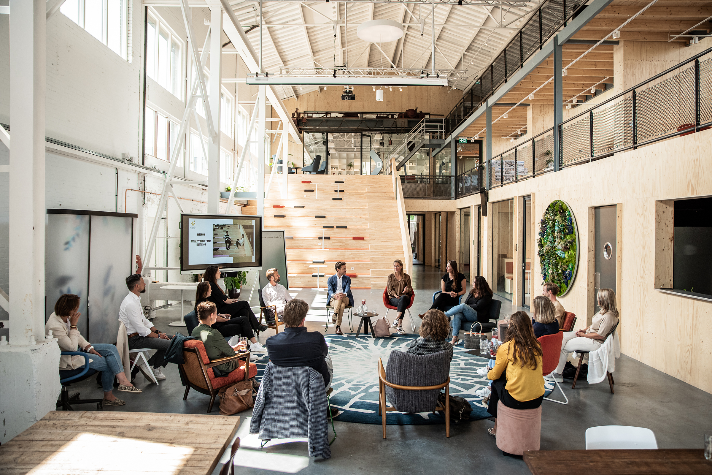
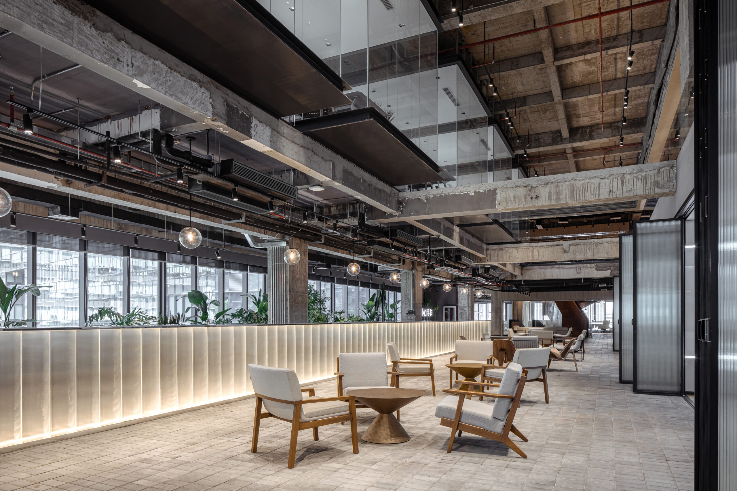 The interiors of the Yeahka headquarter office look like an ultra modern apartment set in a futuristic movie scene, with meeting tables hovering over the building’s central space inside glass boxes and the exposed structure of the refurbished building boldly exposed. The rough appearance of the building’s envelope is nicely contrasted with the use of softer materials and lighter colors for the partitions and the furniture, while the high ceilings allow floods of natural sunlight to travel across the office’s atriums and establish a variety of visual connections for visitors and employees across the different floors.
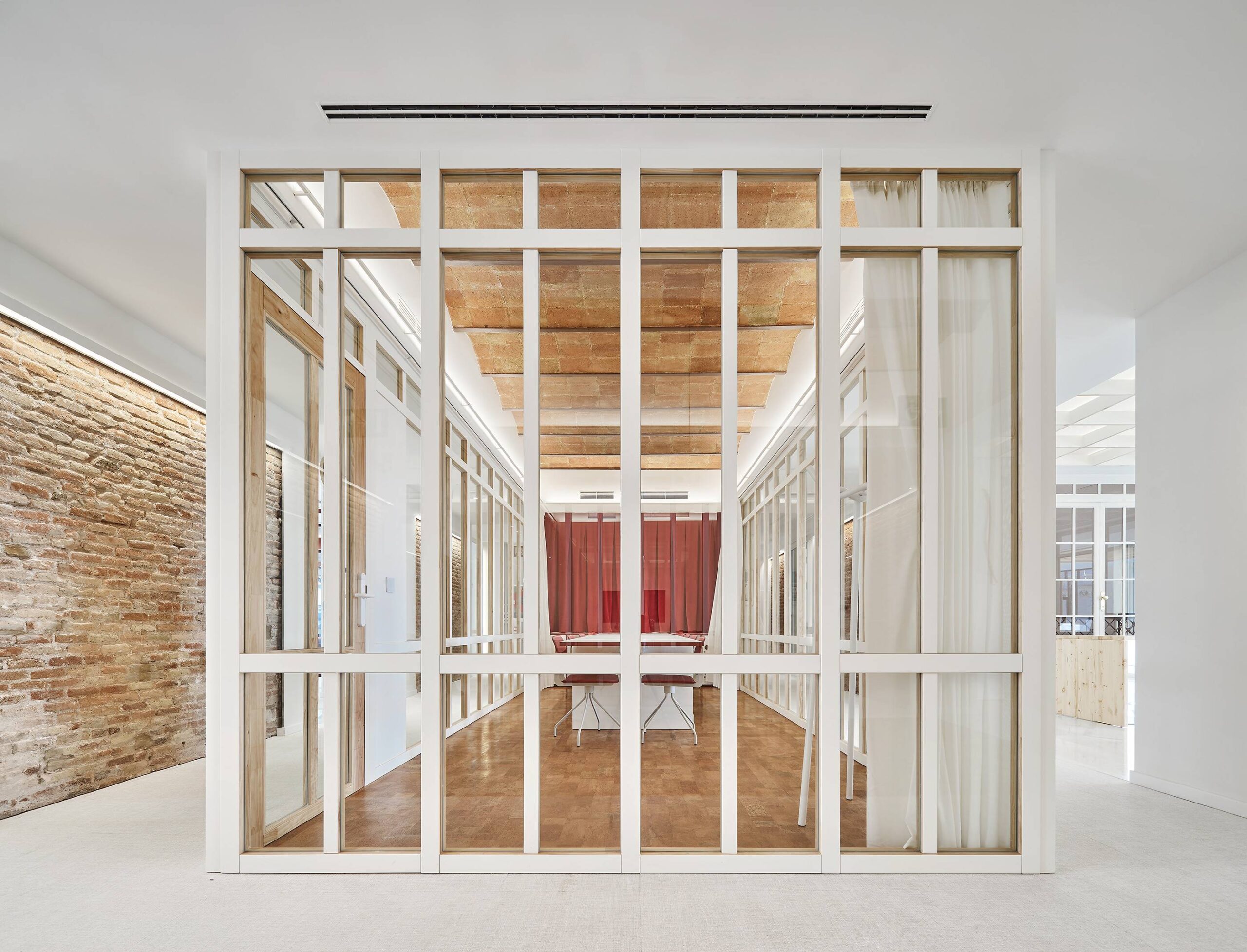
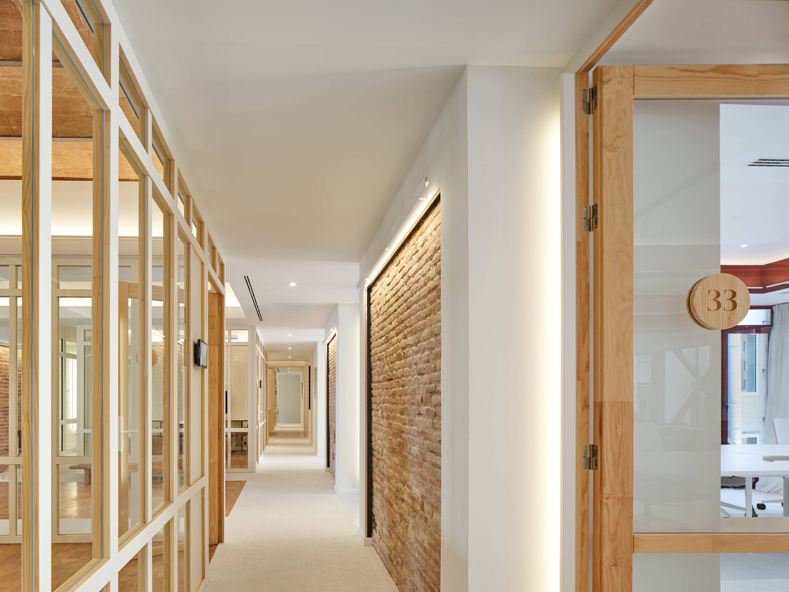
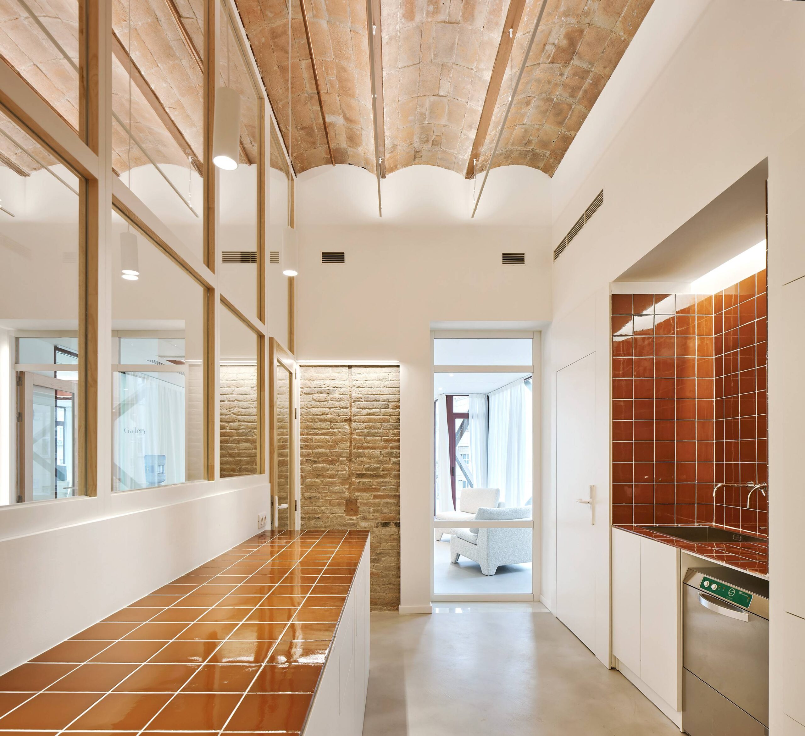 Aesthetically, the organization of this office space is remarkably appealing, allowing the eye to travel across a variety of layers and vertical lines around every corner. Whether it is through the contrast of materials, or the perfect positioning of the working chambers inside the open floor plan, a lot is happening inside this refurbished historical building whose celebratory classic exterior celebrates a masterpiece of its time. The color white, which dominates the interior, sets the stage for the other materials to occupy the space, particularly the red brick walls that stand as a reminder of the building’s rich past.

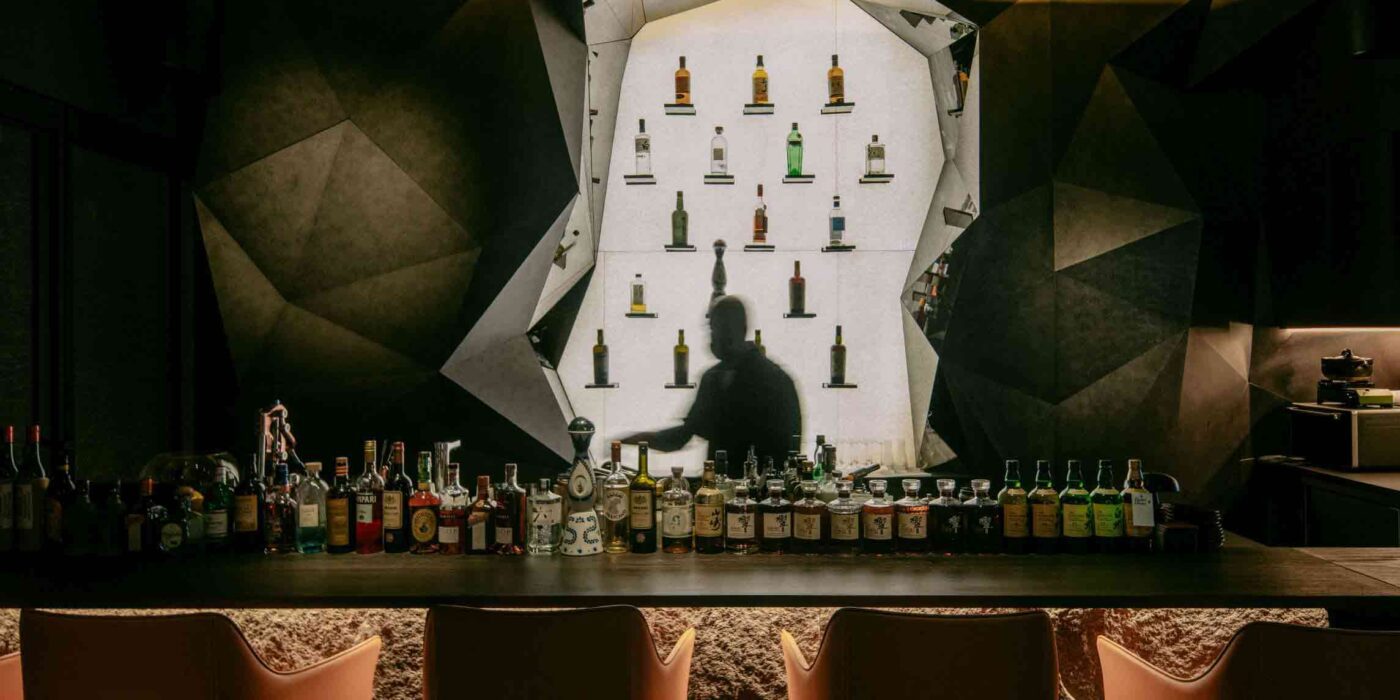
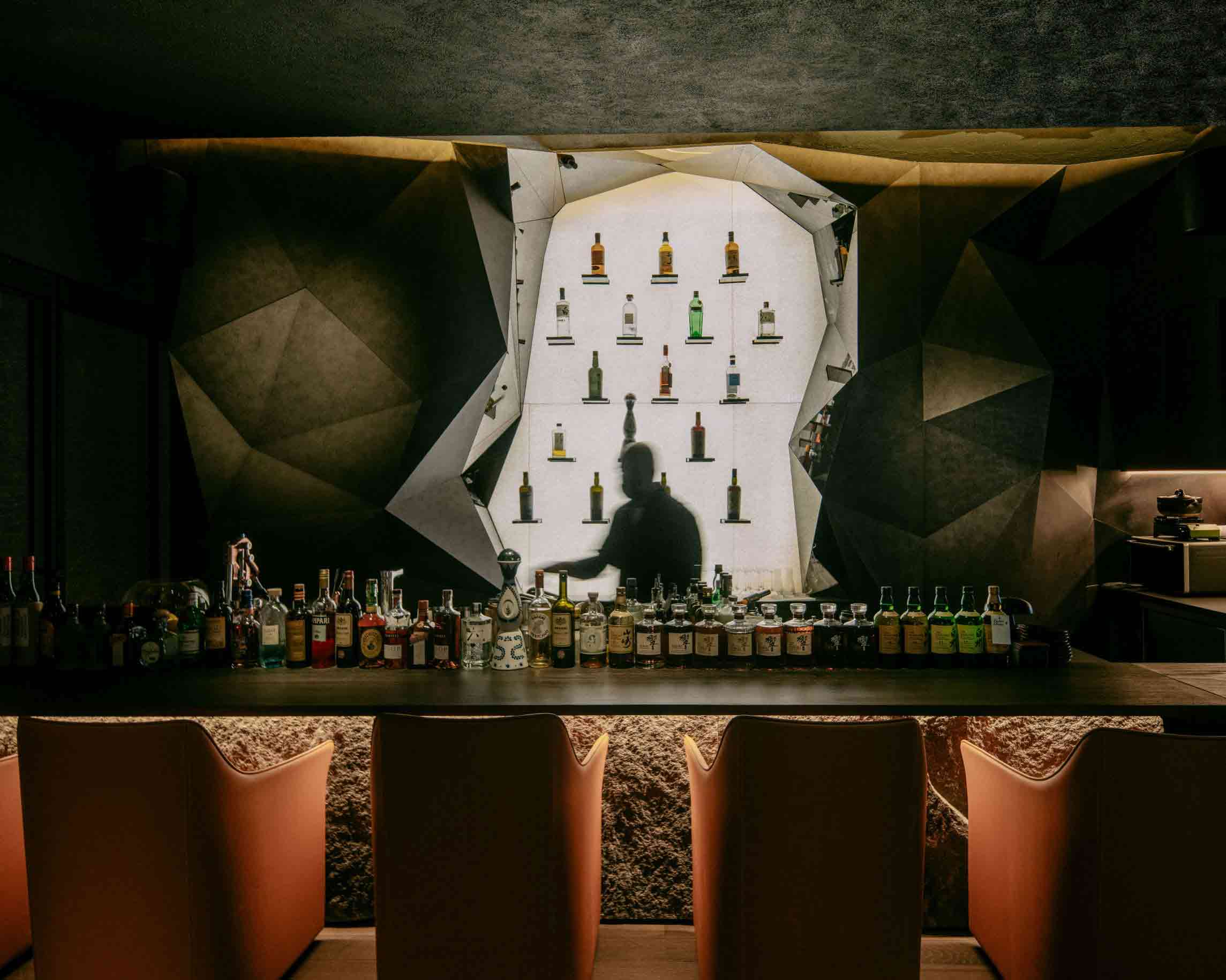
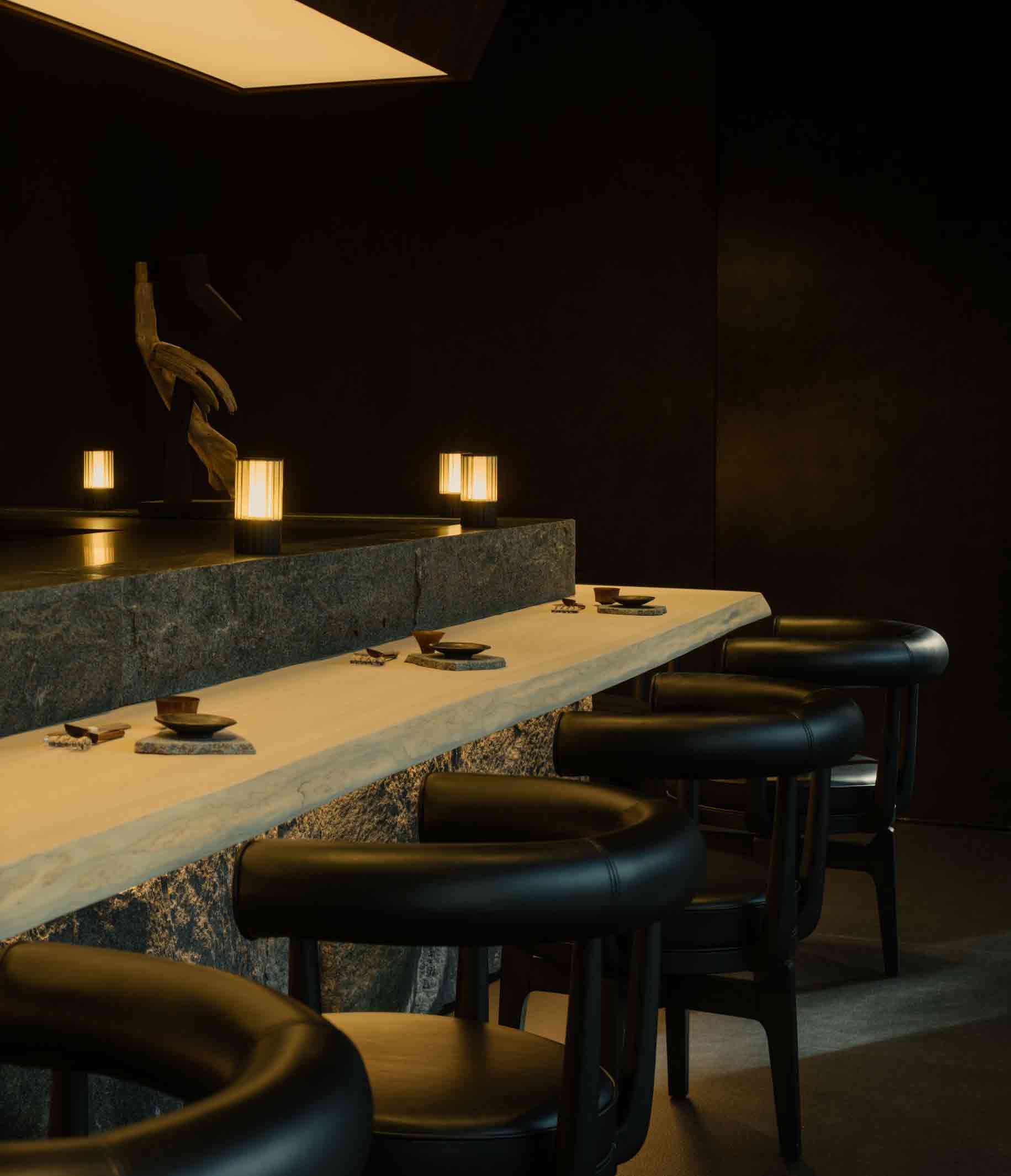 While it may be nestled amid the bustling cityscape of Singapore, this astonishing Japanese restaurant channels the topography of the chef’s native Kochi Prefecture, over 3,000 miles away. A diptych relief painting of a tumultuous rock formation conceals the eatery’s entrance. Stepping through the parted canvas is like stepping into the mountain itself — diners negotiate twists and turns as they navigate the architectural ‘foothills.’
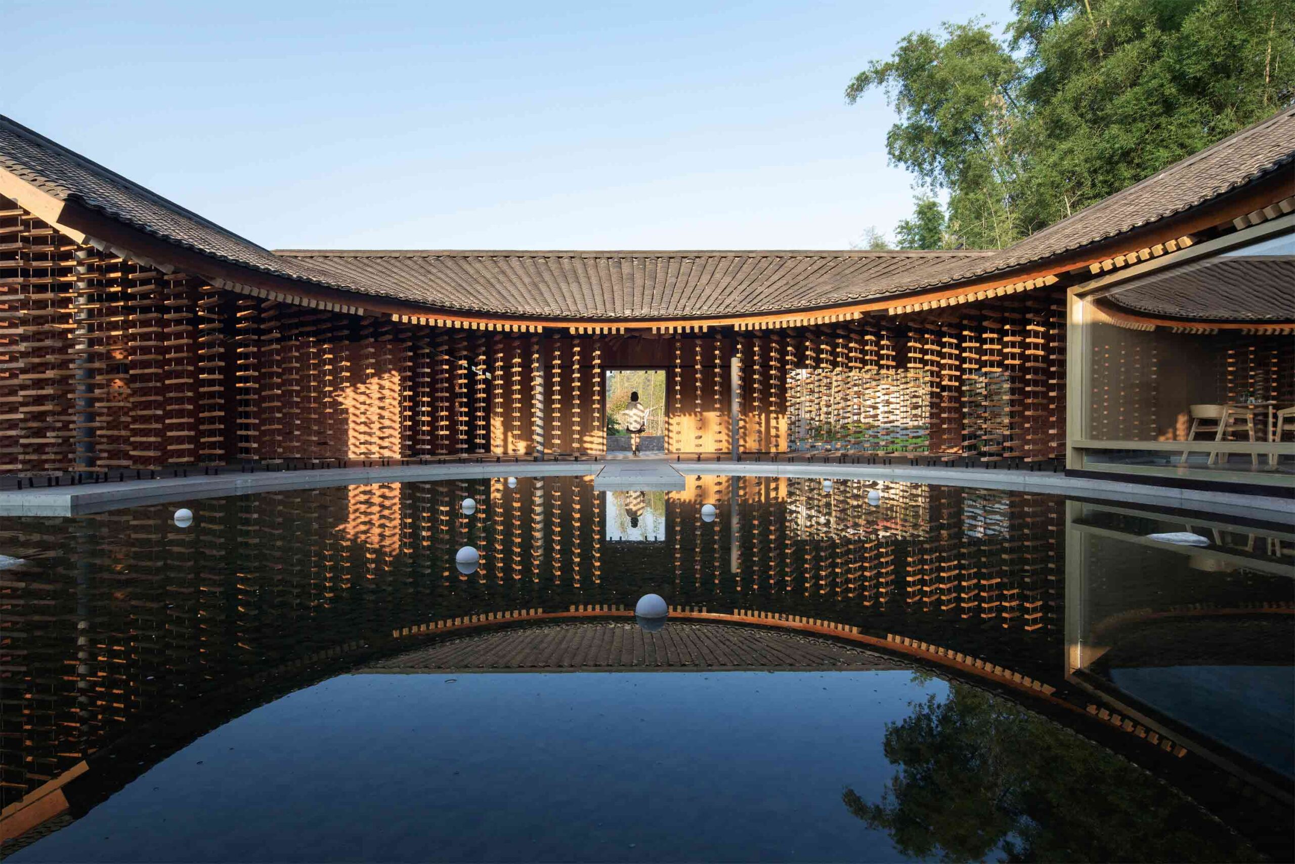
 This extraordinary restaurant in rural Sichuan province takes inspiration from the region’s architectural vernacular. Traditional low, far-reaching eaves offer ventilation and shelter from the elements, while a central courtyard pool blurs the boundary between organic and built landscapes. Curved lines define the interior dining space, which is dissected into more intimate zones, each offering a glimpse of a different rural outlook.
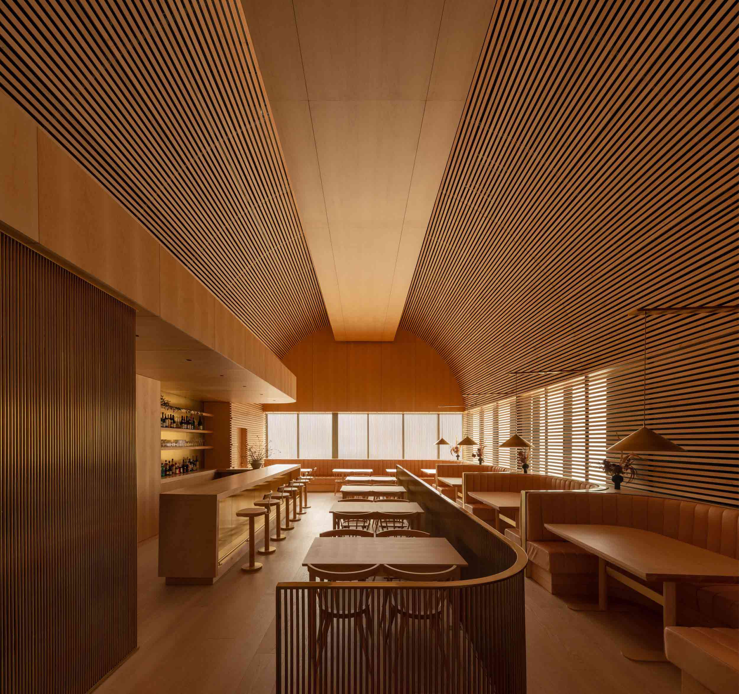
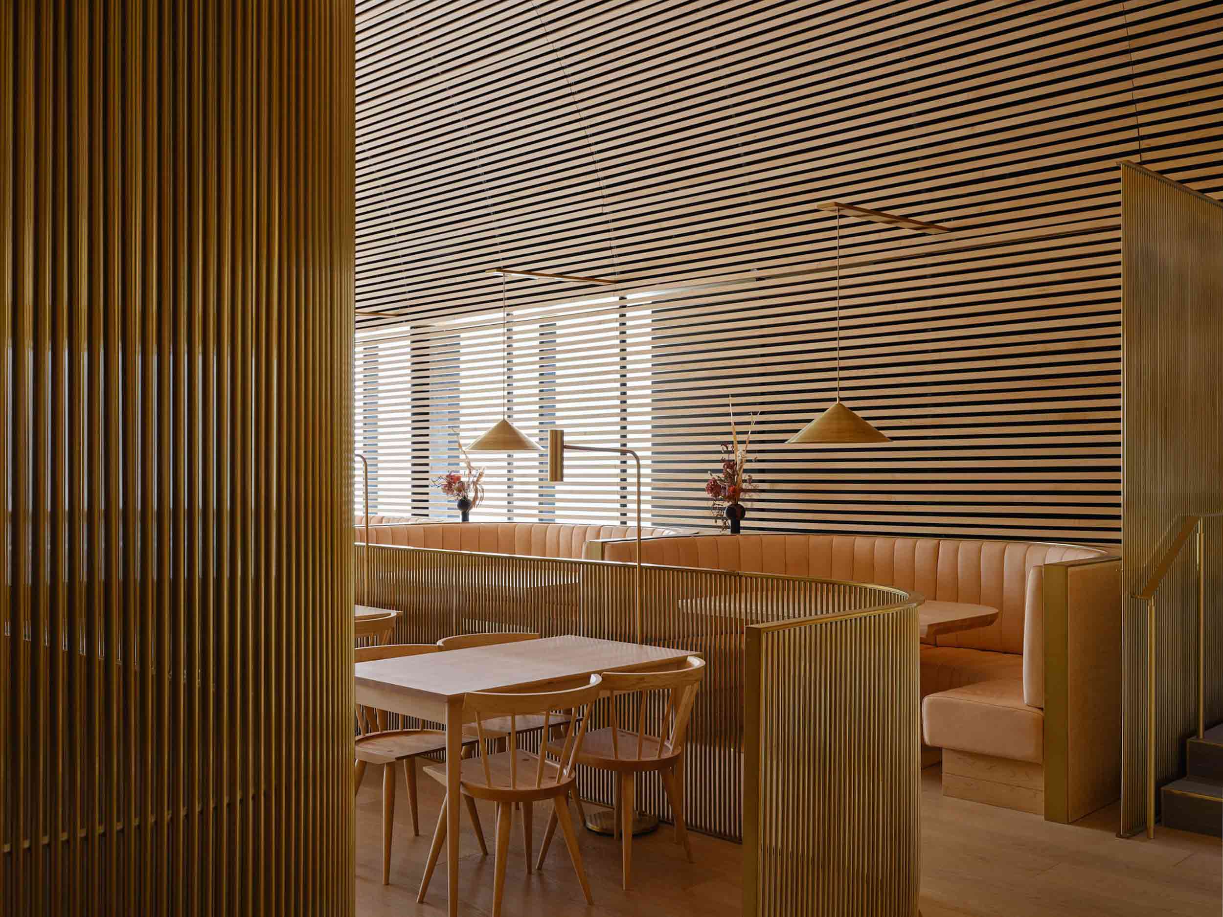 Bold in its monochrome execution, this Toronto restaurant was conceived as a mesmerizing timber cathedral. Rather than being shaped by the transient whims of interior trends, the architects opted for an evolving natural material palette that would patina and shift with the passage of time.
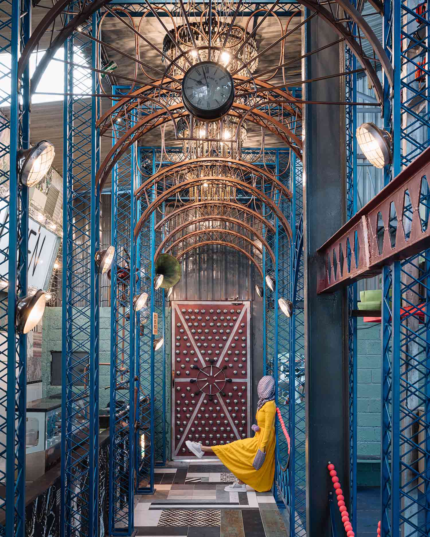
 While many in the industry pay lip service to sustainability, this whimsical restaurant in Bangalore is a true celebration of reuse. 90% of its material fabric comprises recycled and salvaged elements, resulting in a playful, architectural patchwork of curios. Inspired by the spectacle of the circus, the entrance is framed by a ripple of teal arches crafted from scrap metal, while chandeliers shaped from bike chains and metal filings hang overhead.
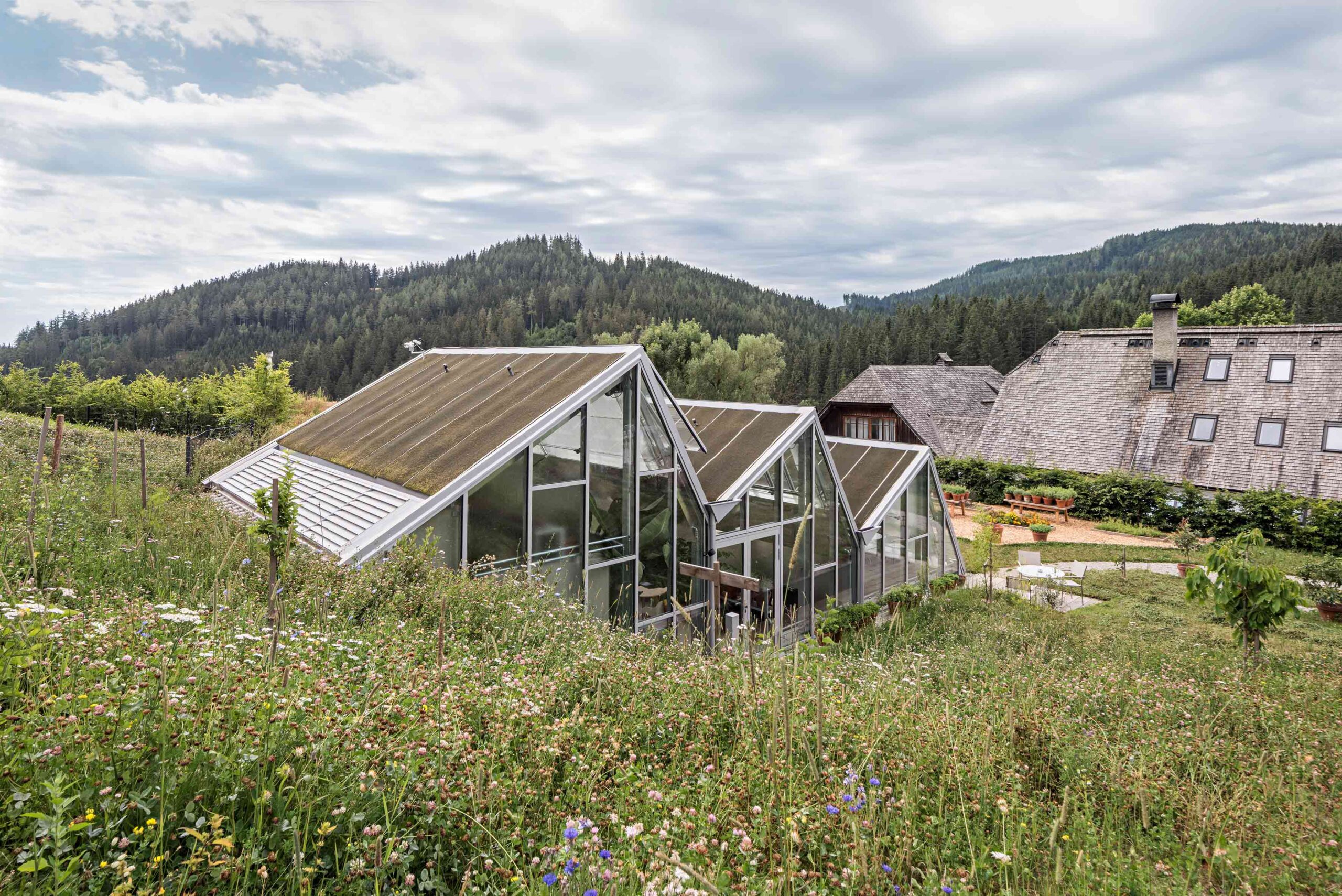
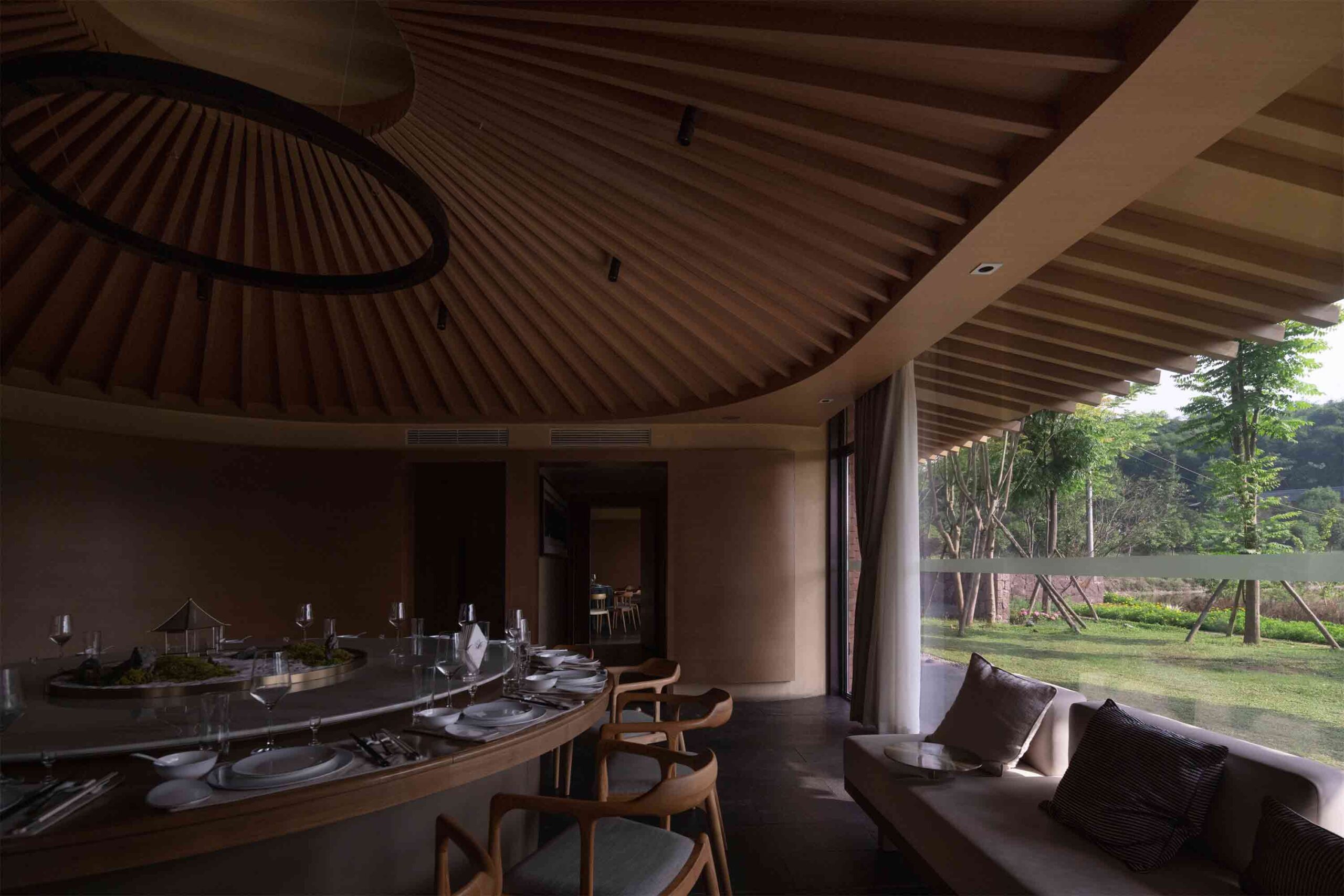
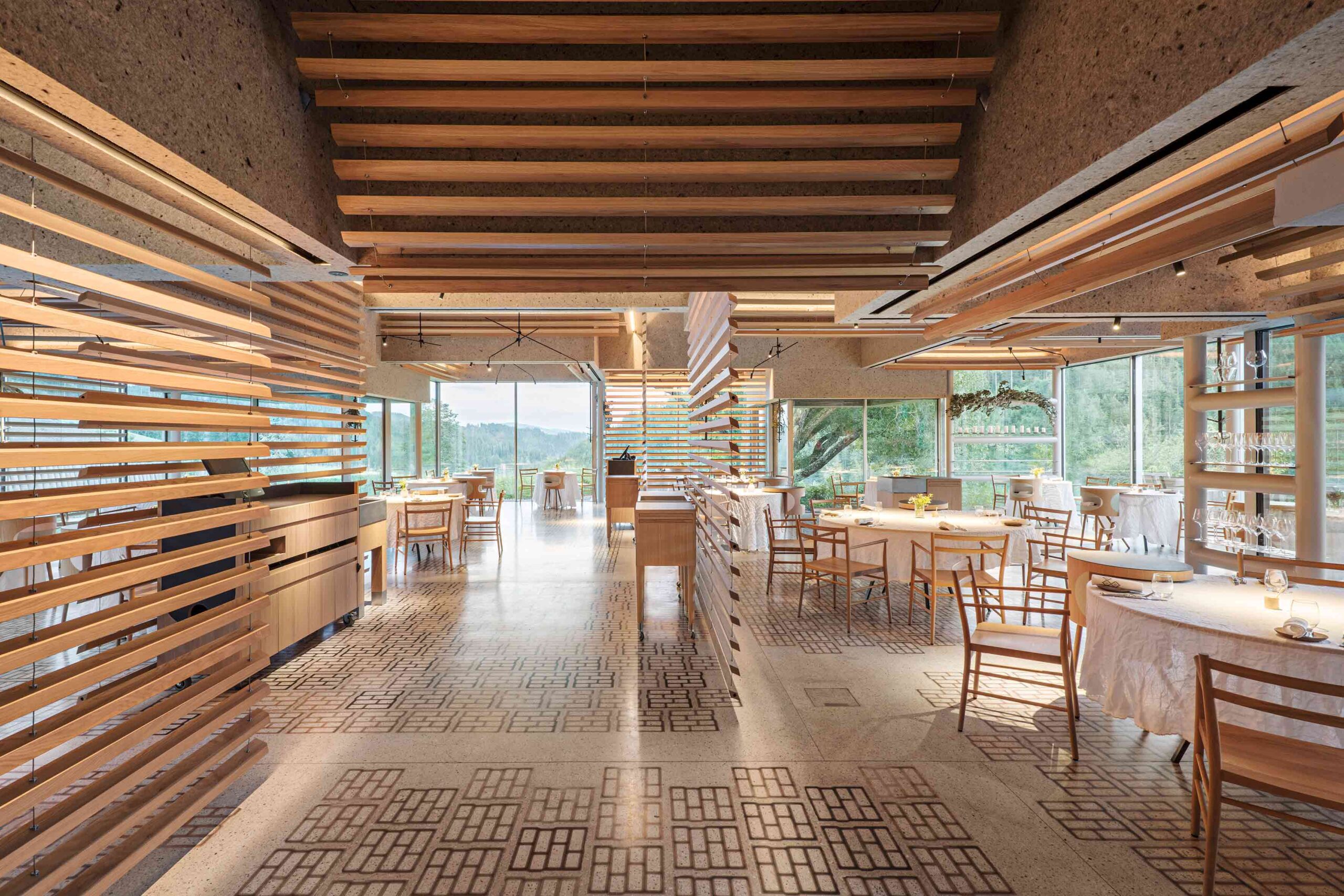 Sequestered in the Austrian Alps, this pioneering restaurant complex is rooted in its rural mountain locale. The various buildings, some old, some new, form a self-sufficient culinary village that encompasses dining areas, prep kitchens, staff zones, guest accommodation and a kitchen garden. Across the estate, the verdant landscape is never far from view. In one of the restaurants, swaths of glazing encircle the space. Slatted timber dividers create permeable divisions between tables, ensuring the breathtaking outlook takes center stage.
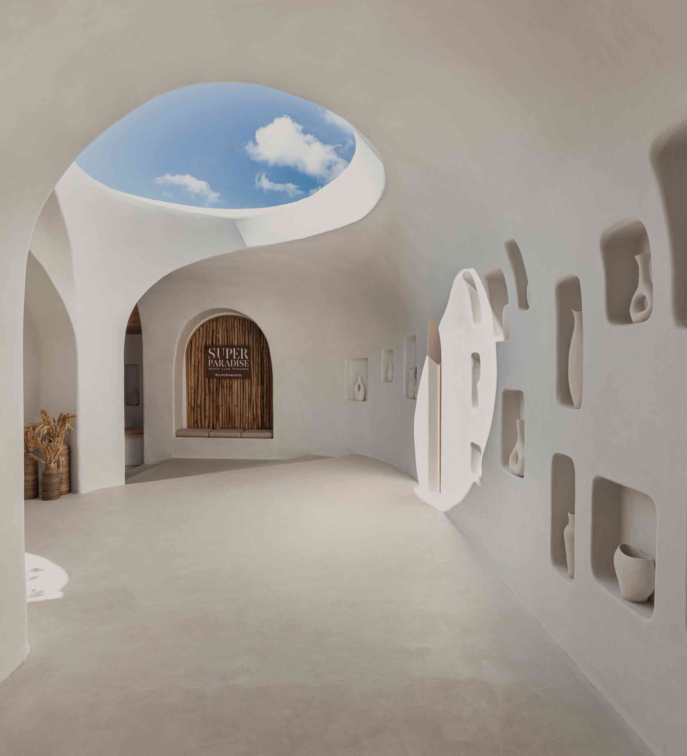
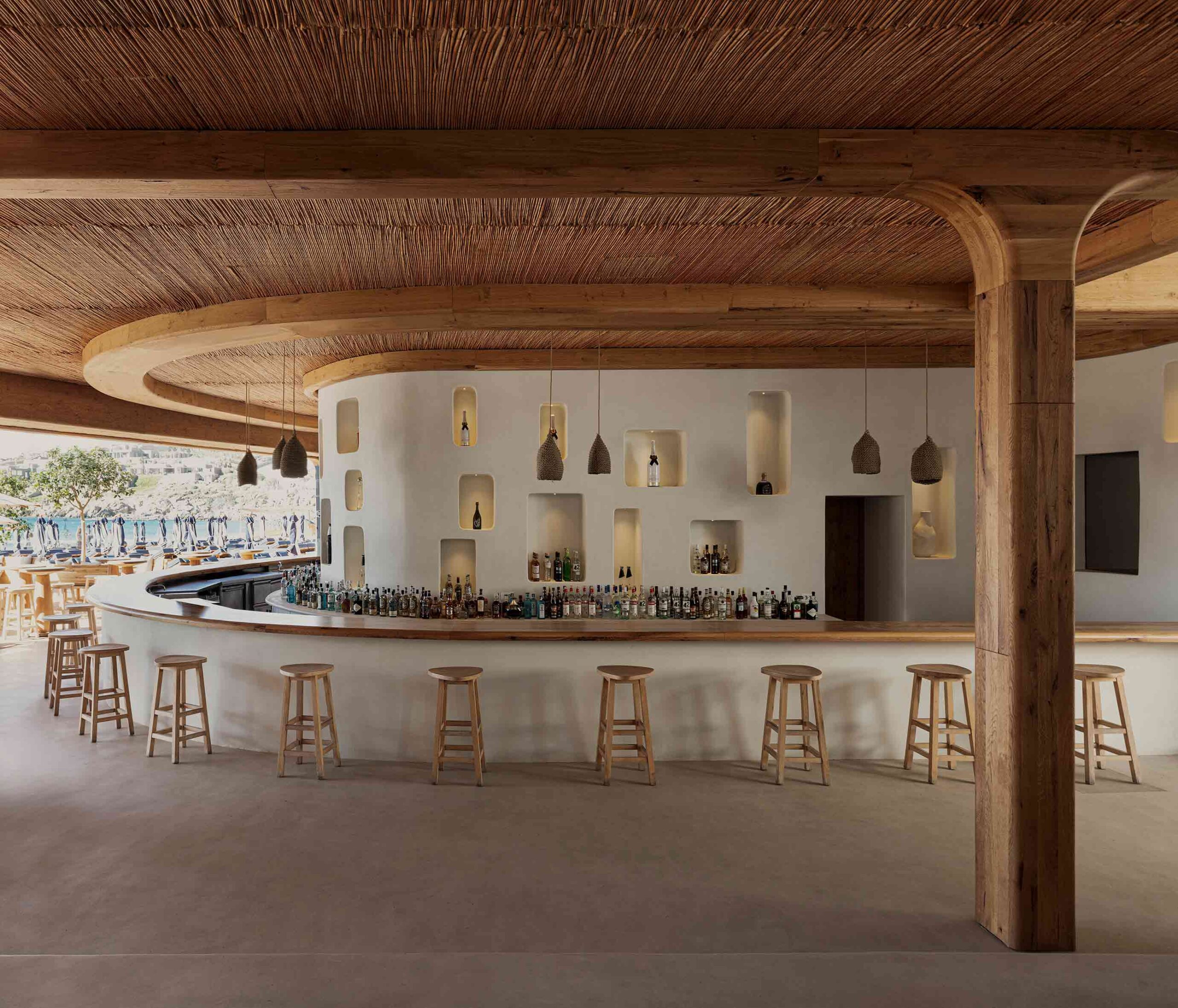 The artful revival of this historic beach bar on the Greek island of Mykonos has resulted in a fascinating collision of architectural languages. The unembellished whitewashed walls and rustic, traditional materials including wood and bamboo hark back to the Cycladic vernacular. Historic emblems play out across the scheme — hollows inset into the walls create display nooks around the bar and entryway.
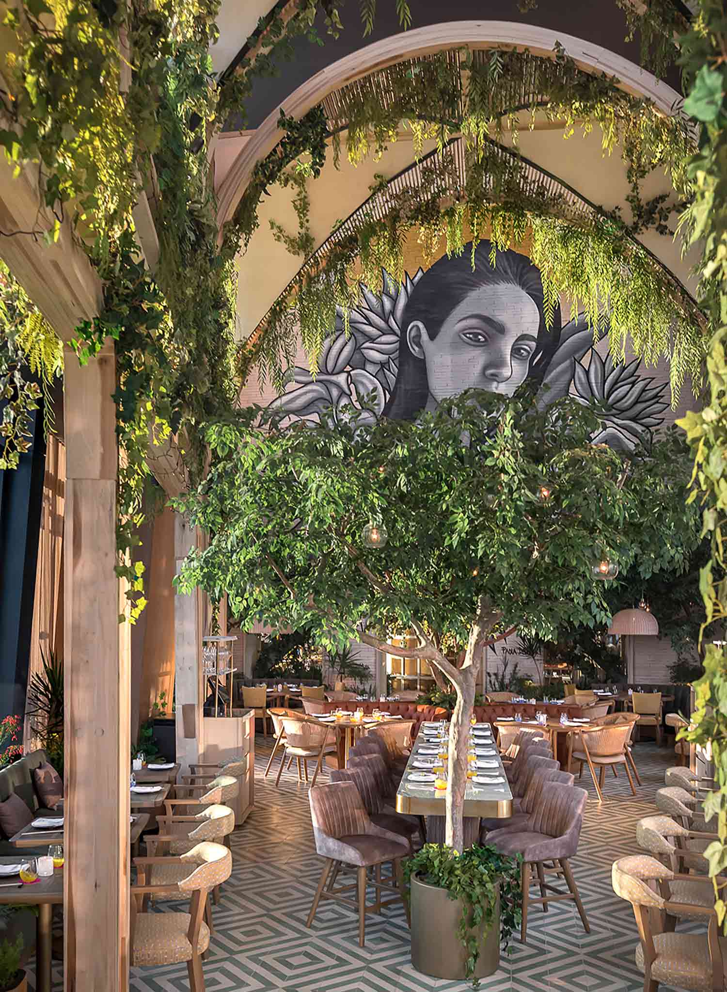
 Poised at the top of one of Mexico City’s highest skyscrapers, this extraordinary restaurant subverts expectations. Floating over the city, a flourishing garden unfurls, taking its design cues from the terraces and courtyards prevalent in Mexican architecture. In the triple-height dining zone, a lofty portico structure intertwined with greenery creates a biophilic cathedral of sorts.