A Step-By-Step Guide to Designing and Drawing Architectural Lighting Plans
CategoriesArchitecture

A Step-By-Step Guide to Designing and Drawing Architectural Lighting Plans

The Fourth Annual One Drawing Challenge is open for entries! Architecture’s most popular drawing competition is back and bigger than ever, including larger prizes. Get started on your submission and hurry — the Main Entry Deadline of October 21st is fast-approaching.

Enter the One Drawing Competition

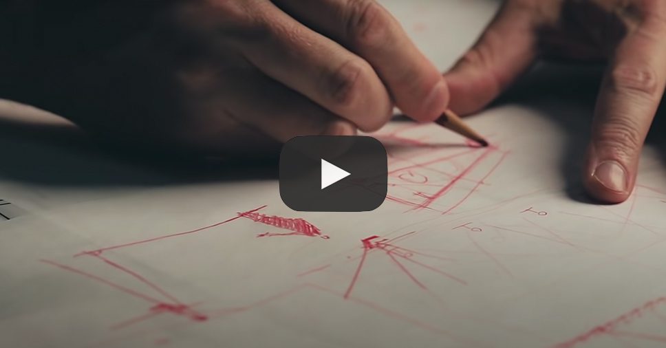
Are you interested in improving your architectural drawing technique? Follow along as the Founder of 30X40 Design Workshop and One Drawing juror Eric Reinholdt designs and draws an architectural lighting plan showing the necessary fixture types, switching, receptacle locations and all electrical devices and equipment. Designing such details in coordination with the other essential building systems — architectural, structural, mechanical and plumbing — affords the architect more control  in the final outcome by anticipating how these systems will work in conjunction with invisible elements such as beams, ductwork, vent stacks.

Drawing and overlaying each helps to identify conflicts on paper where it’s much more efficient and cost-effective to make changes. In this video, you’ll see how the abstract concepts of ambient, task and accent lighting are accounted for and applied in a real-world design of a remote, off-the-grid residential project in Maine, USA.

Want to get your drawings in front of industry experts like Eric Reinholdt? Consider entering architecture’s biggest drawing competition, which Eric will judge along with other architectural figures such as Bob Borson, Dan Hogman and more!

Eric Reinholdt is an architect, founder of the residential architecture practice, 30X40 Design Workshop, author of Architect + Entrepreneur, innovator of progressive practice models, and the creator of the eponymous YouTube channel, 30X40 Design Workshop. From his remote island studio, Erc makes videos about architecture, designs simple, modern homes, and shares his process online. 

Reference

Architectural Drawings: Residential Fireplaces in Plan
CategoriesArchitecture

Architectural Drawings: Residential Fireplaces in Plan

The Fourth Annual One Drawing Challenge is open for entries! Architecture’s most popular drawing competition is back and bigger than ever, including larger prizes. Get started on your submission.  

Architecture is designed to bring people together. In residential projects, warmth and comfort define life’s daily rhythms and how we gather. In turn, fireplaces have long been a central focus of architecture, drawing people close while setting the atmosphere. Frank Lloyd Wright famously expressed that “the hearth is the psychological center of the home.” Fireplaces are unique in that they are both functional and aesthetic, with very specific demands for detailing and safety. Whether gas or wood burning, historically, they have long been used to heat the home and provide light.

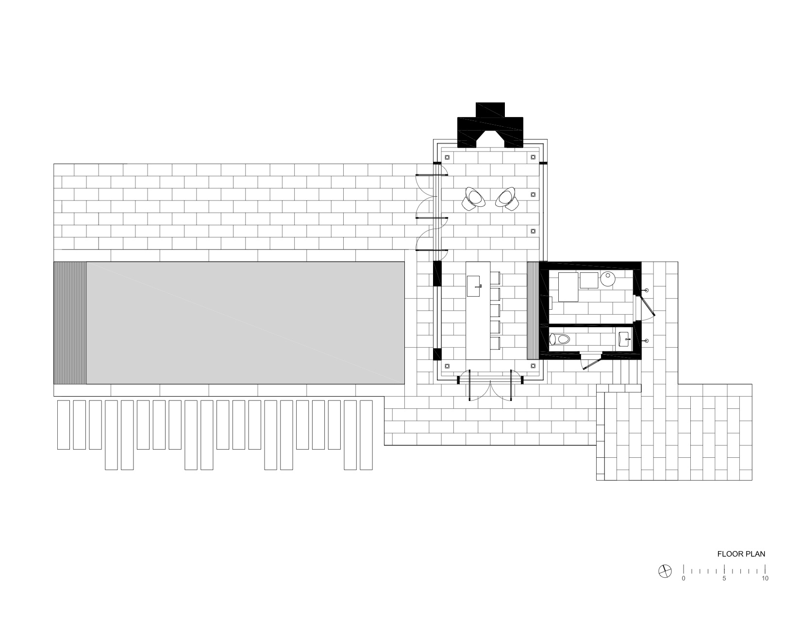
As a central defining element of residential projects, fireplaces take on a hierarchy in floor plan drawings. Often they anchor the interiors of a home while other decors, furniture or art are designed around them. Both indoors and outdoors alike, careful consideration is given to whether the fireplace needs to be functional or simply to provide a design aesthetic to a space. Today, manufacturers and architects are exploring new designs that provide exciting alternatives to traditional models. Drawing from the Architizer database, we’ve rounded up a collection of fireplaces and the corresponding floor plans to showcase how they are being designed around the world.


Grove House

By Roger Ferris + Partners, Bridgehampton, NY, United States

Jury Winner, 2018 A+Awards, Private House (XL>5000 sq ft)

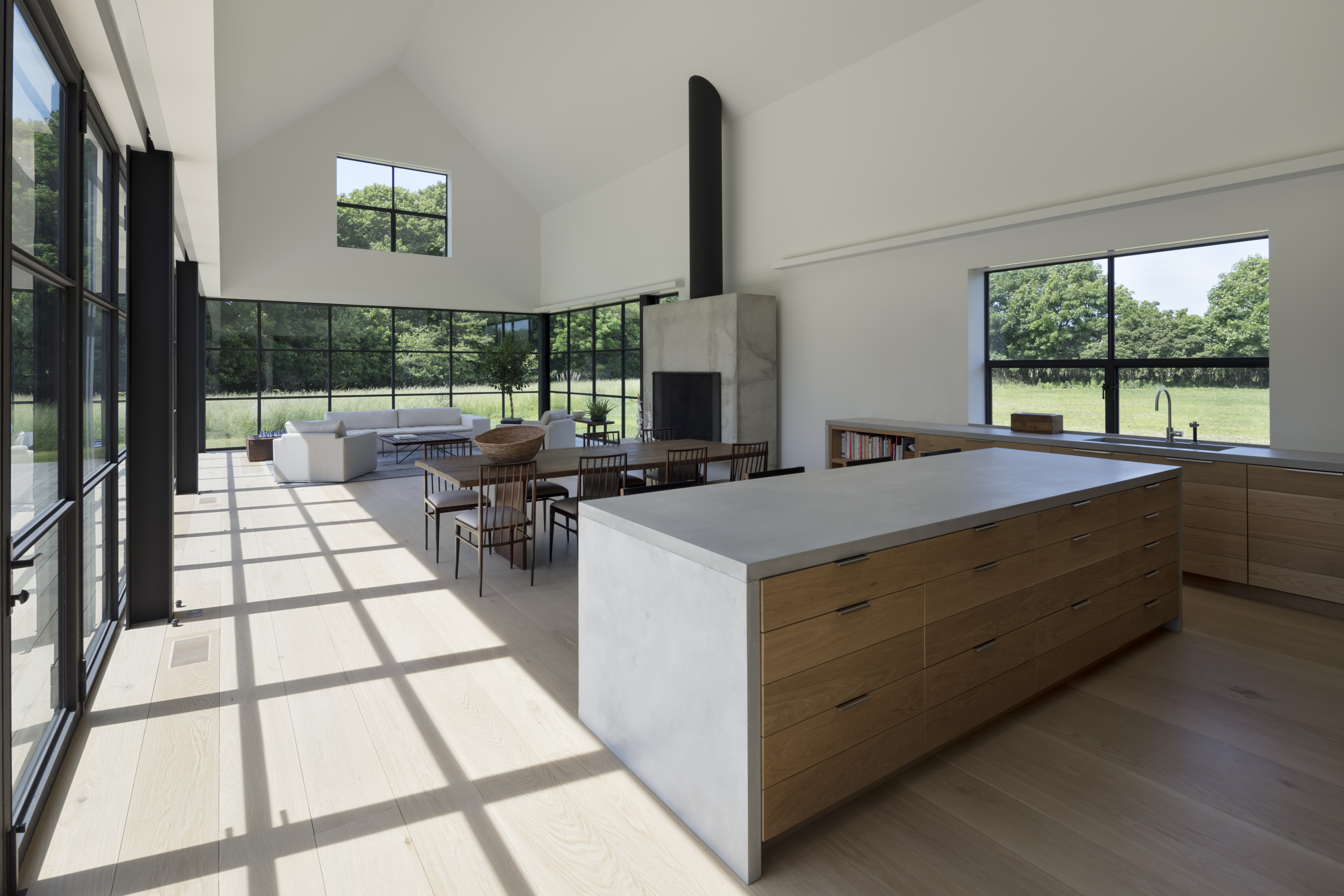
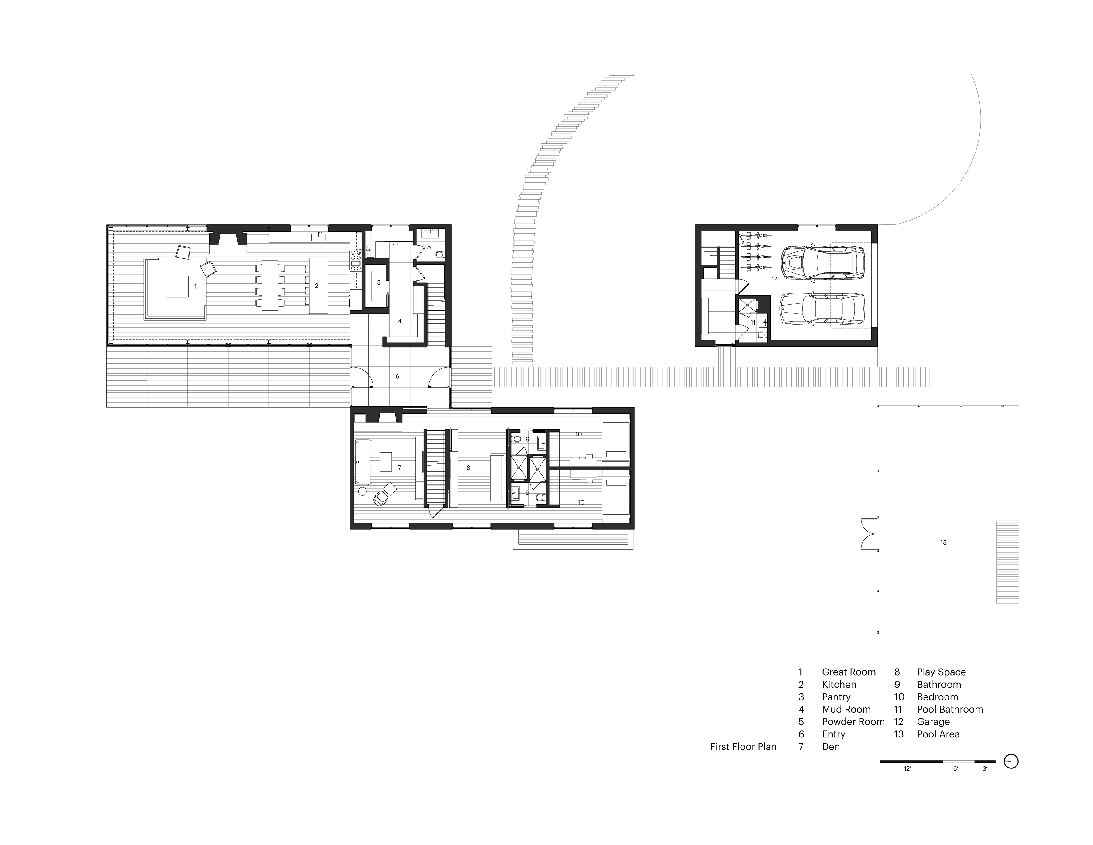
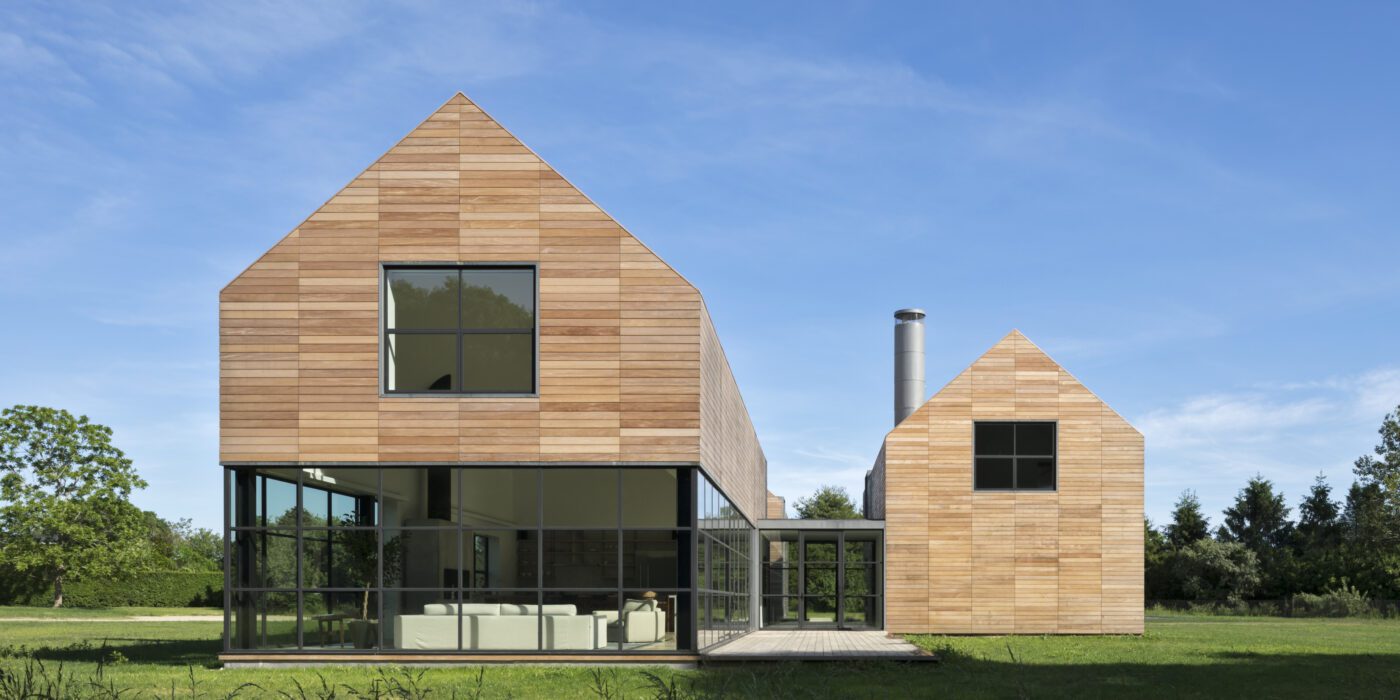
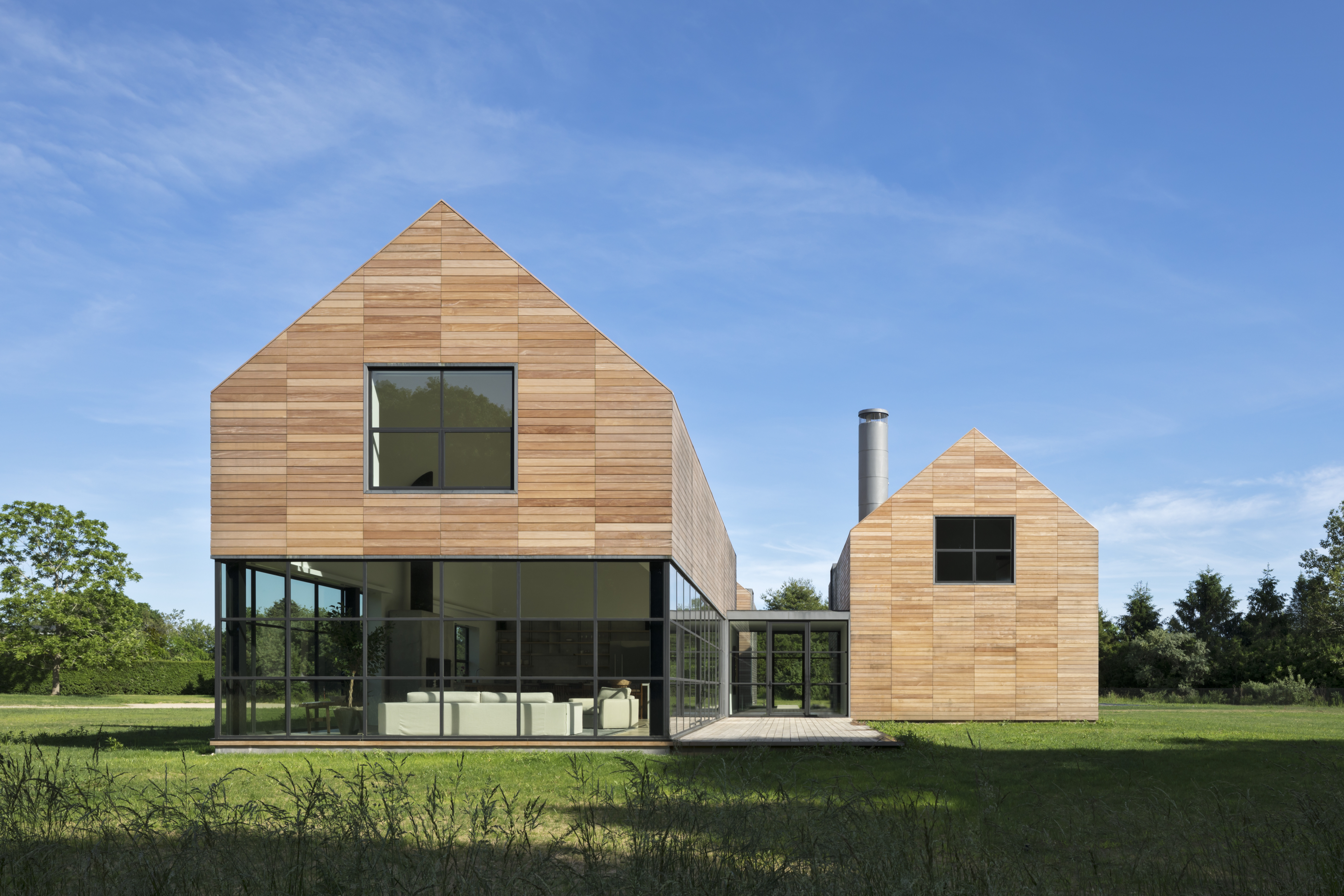
This private Hamptons residence was designed as an immersive retreat. Situated along a natural ravine and protected wetlands, the residence consists of three simple gable-shaped volumes, creating a dialogue between the natural grasslands and the built environment. A contemporary interpretation of a common New England building form, each volume is shrouded in horizontal wood slats which seamlessly wrap all wall and roof surfaces. A public great room is centrally located, acting as a social hub for family and guest interaction. Within the great room, special attention was taken to the design of the architectural concrete fireplace, countertops and black steel sash windows.


Ridge House

By Bohlin Cywinski Jackson, Bonnyville, Canada

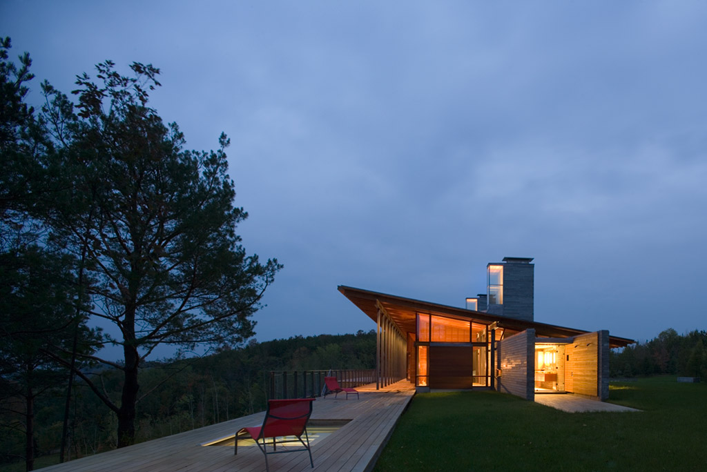
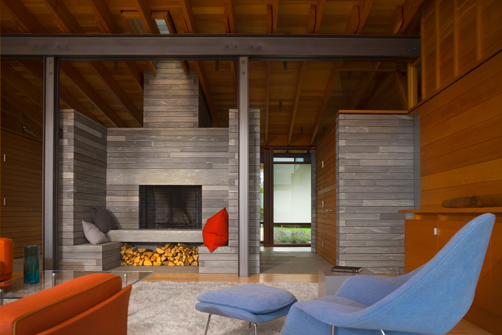
This retreat was conceived as a place for gathering family and friends as well as solitude. Located along the crest of a narrow ridge overlooking a broad valley, the drive that connects to the home turns to reveal a long, linear core of sawn stone that parallels the ridge, sliding under a single-slope roof through a steel-framed glass volume. The stone core, marked by two large fireplace masses, organizes the spaces, with primary circulation along its south face, while gaps in the stone provide access to each of the living spaces. In turn, clear and translucent glass along the south wall creates a play of light and shadow at the circulation spine.


Tofino Beach House

By Olson Kundig, Tofino, Canada

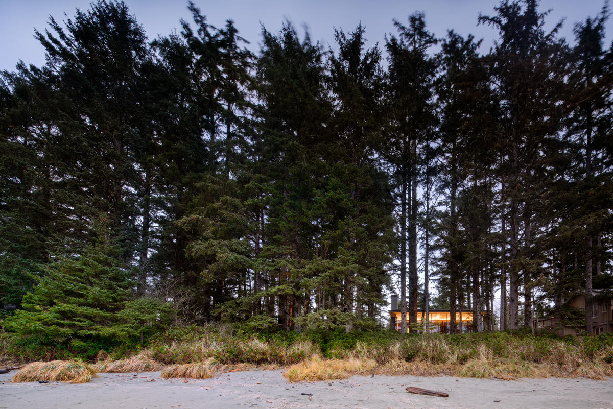
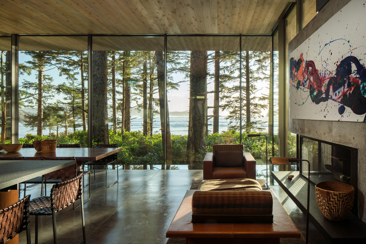
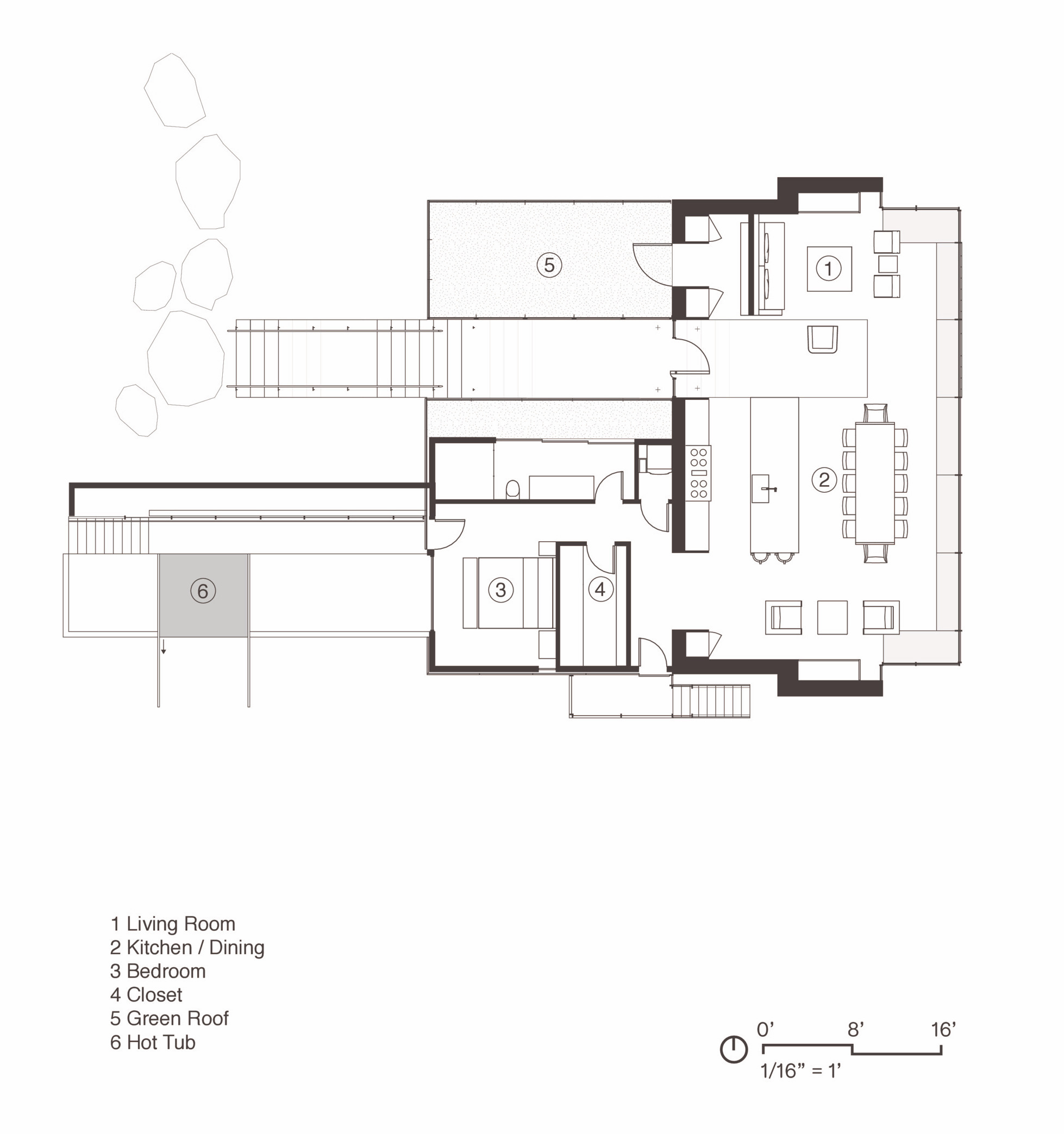
Designed as a beach house within the forest, this home creates a connection between the drama of the nearby ocean and the sense of sanctuary provided by the trees. Composed primarily of one large room, the house is light-filled on the south side facing the ocean, while remaining insular and protected on the other side. Glass walls open the living area to panoramic views of forest and ocean with two fireplaces on either end anchor that the space and provide a feeling of refuge. Artworks were incorporated into the design of the home, with the fireplace walls specially designed to fit paintings by Sam Francis and Diego Singh.


Nevis Pool and Garden Pavilion House

By Robert M. Gurney, Architect, Bethesda, MD, United States

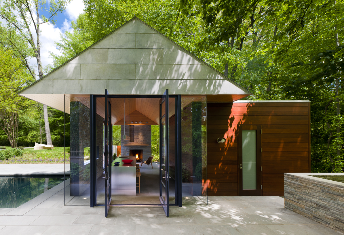
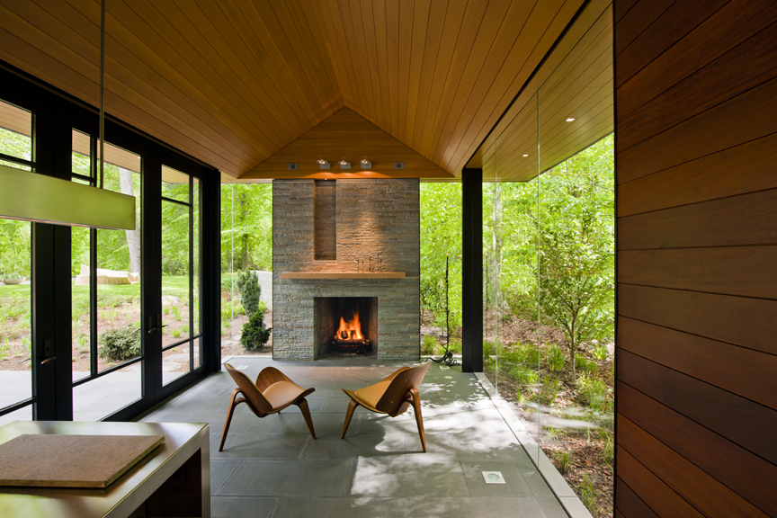
This suburban pavilion is located adjacent to woodlands. A contemporary house surrounded by mature trees and manicured gardens anchors the site. A new swimming pool, stone walls and terraces located behind the existing house organize the rear yard and establishes a dialogue between the existing house and a new pavilion. New paths, trees and structured plantings reinforce the geometry. The new pavilion, intended for year round use, is strategically located to provide a threshold between the structured landscape and adjacent woodland. The doors pivot to open the space much of the year while a large Rumford fireplace and heated floors provide a cozy counterpoint in winter months.


Courtyard House on a River

By Robert Hutchison Architecture, Greenwater, WA, United States

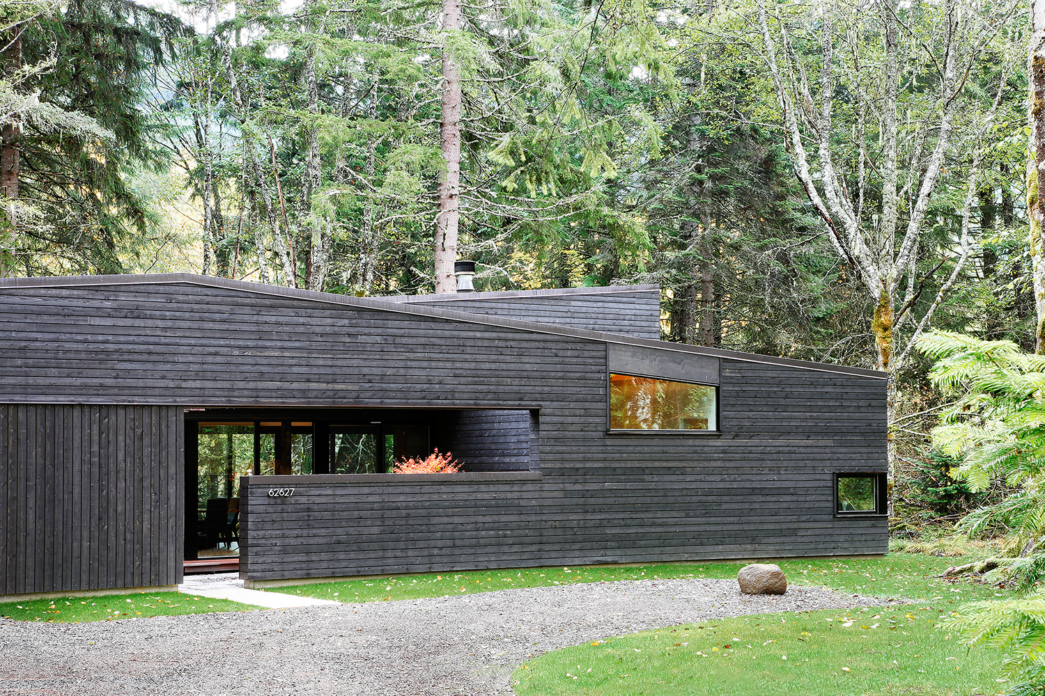
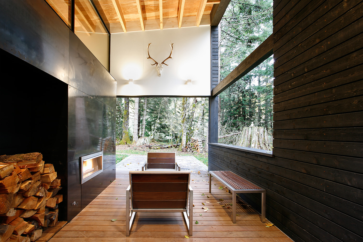
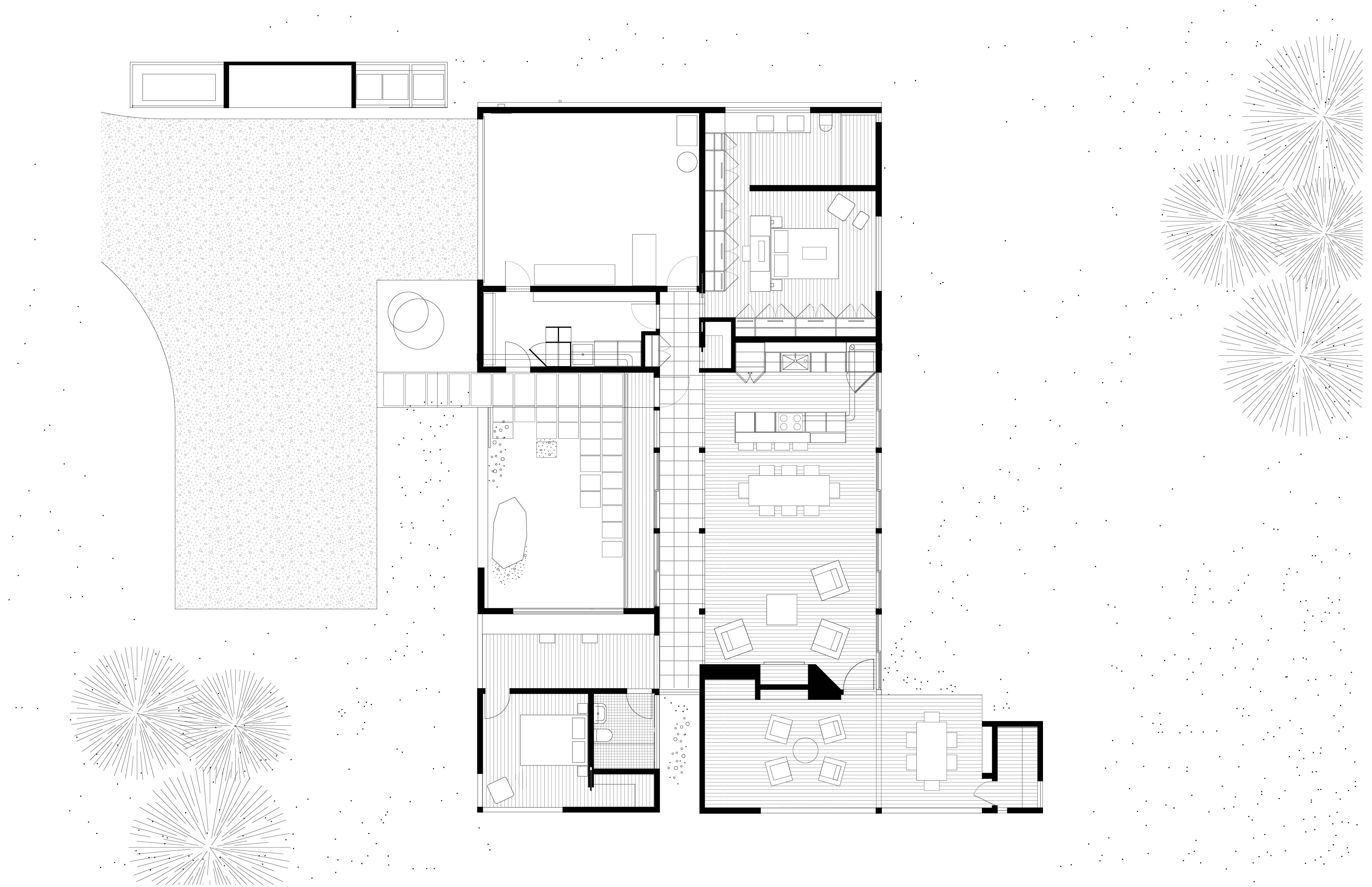
This small residence is sited on the banks of the White River five miles from Mt. Rainier. The project was designed to quietly blend into the surrounding forest. An entry courtyard serves as a transition space from outdoors to indoors and keeps the ubiquitous elk herds at bay. A steel-clad fireplace mass separates the living room from a covered outdoor patio. By working diligently with the client (who also served as General Contractor for the project), the building footprint was kept as compact as possible to minimize site disturbance. The residence was made to epitomize the small home living movement.


Pit House

By Bloot Architecture, The Hague, Netherlands

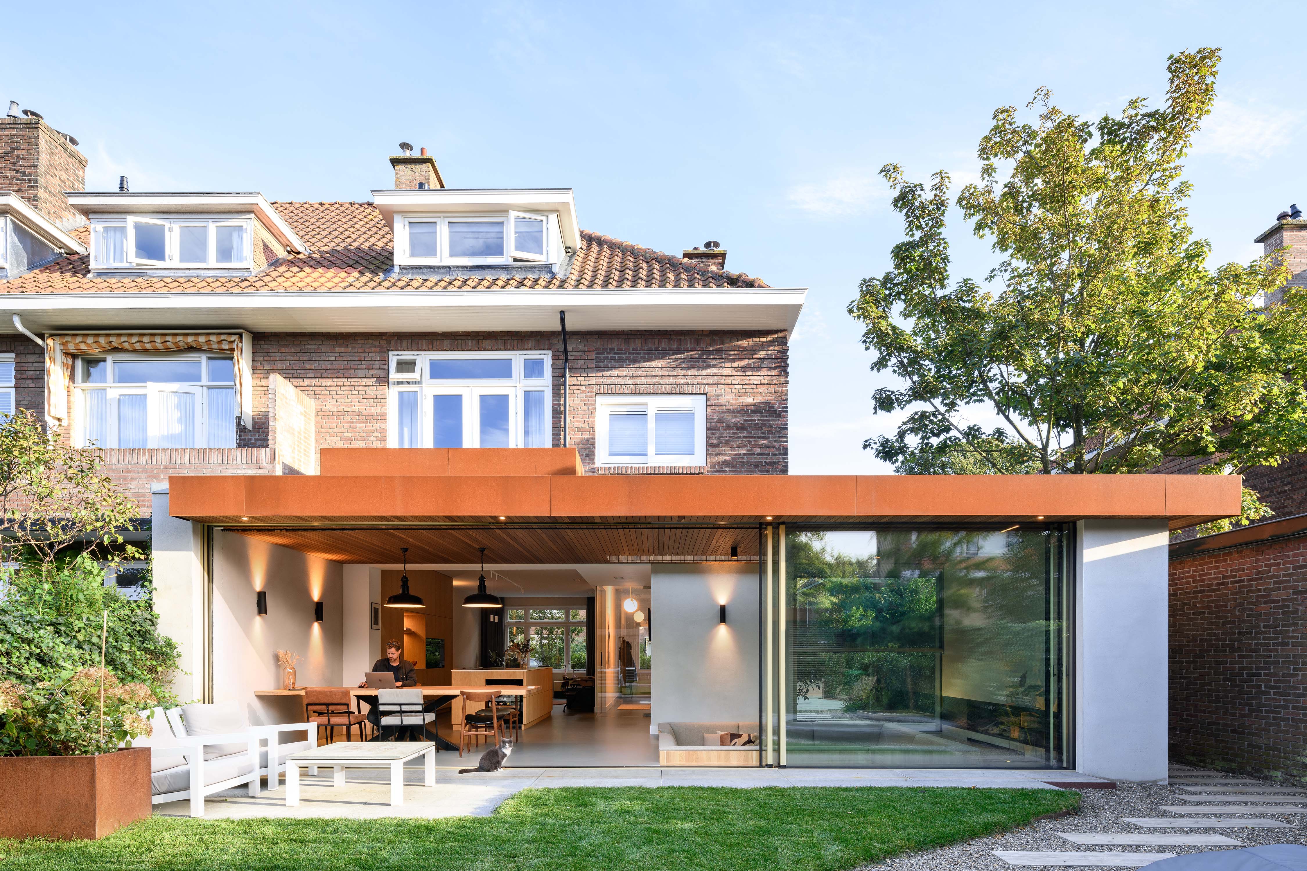
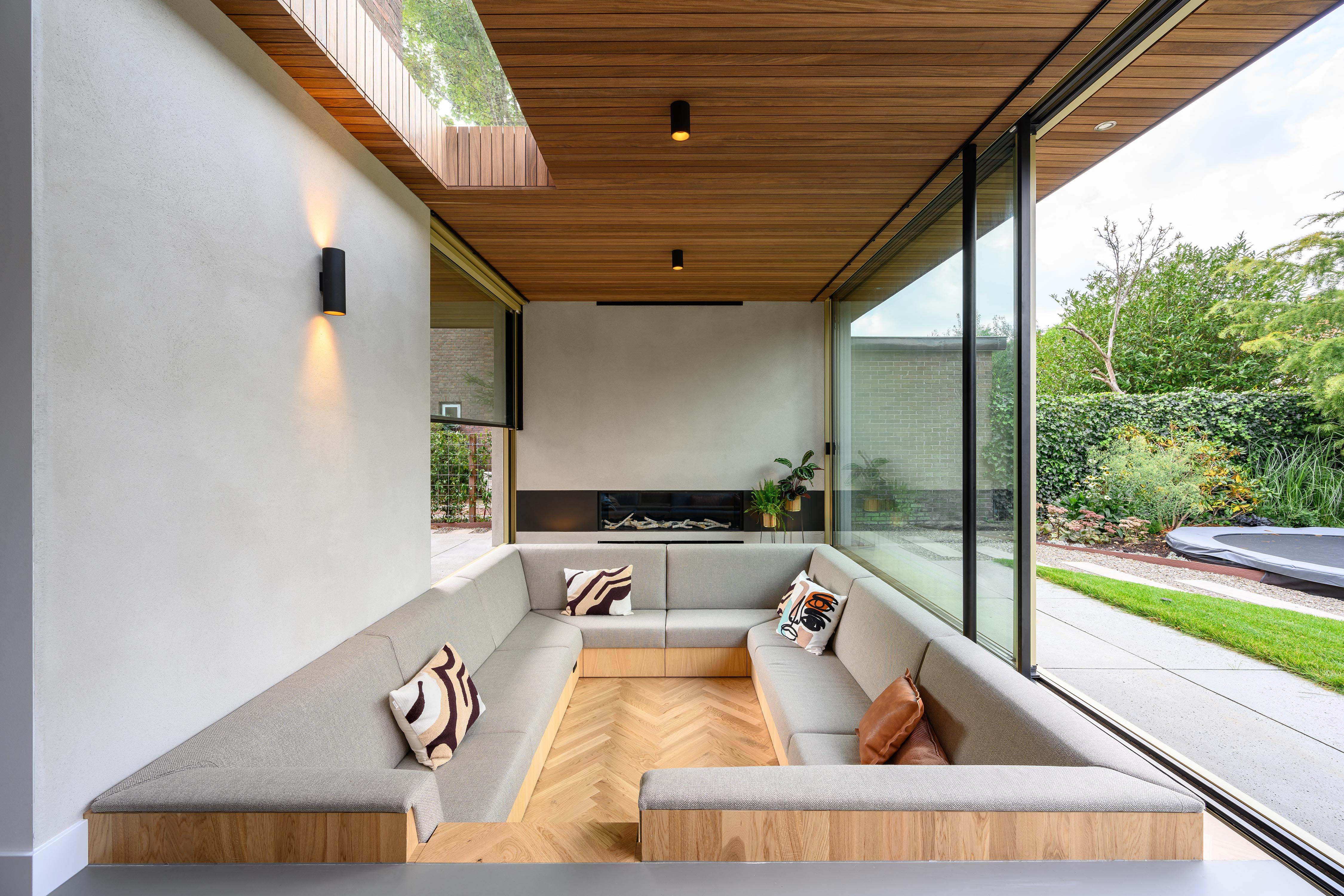
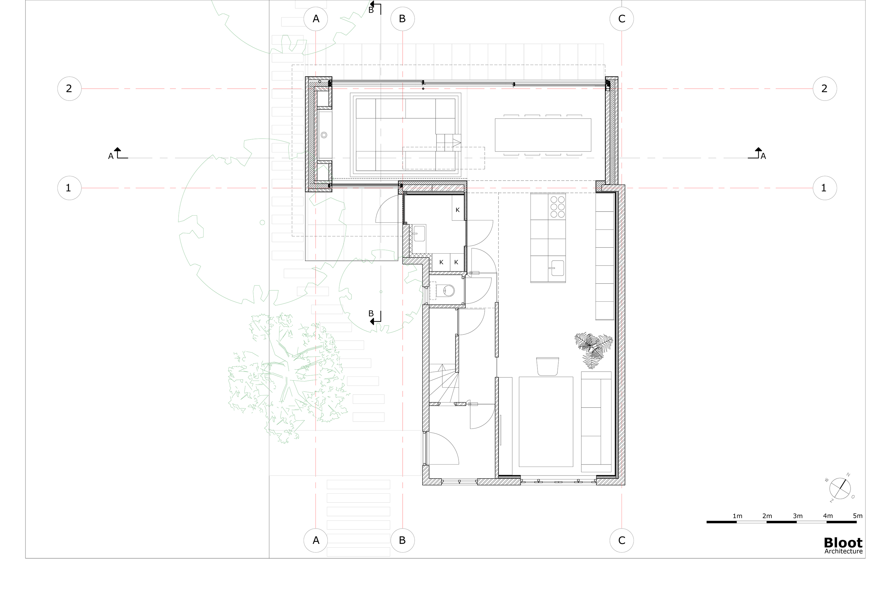
The heart of a dilapidated brick corner house from 1929 was completely renovated and extended, incorporating an inviting sitting pit. The clients asked for more space, an open kitchen and a more direct relationship to the garden. The sitting pit forms a playful space around the fireplace, where the owners are able to stay together with each other, friends and family. Seen at eye level from the seating pit, there is a vertically sliding window on the street side. By sliding this open as well as the large sliding doors at the rear, visitors find themselves outside in a sitting pit, at a fireplace and under a roof. The fireplace sits in a solid block that, together with a thick wall on the other side and a wall parallel to the seating pit, supports the roof.


Cabin at Norderhov

By AtelierOslo, Hønefoss, Norway

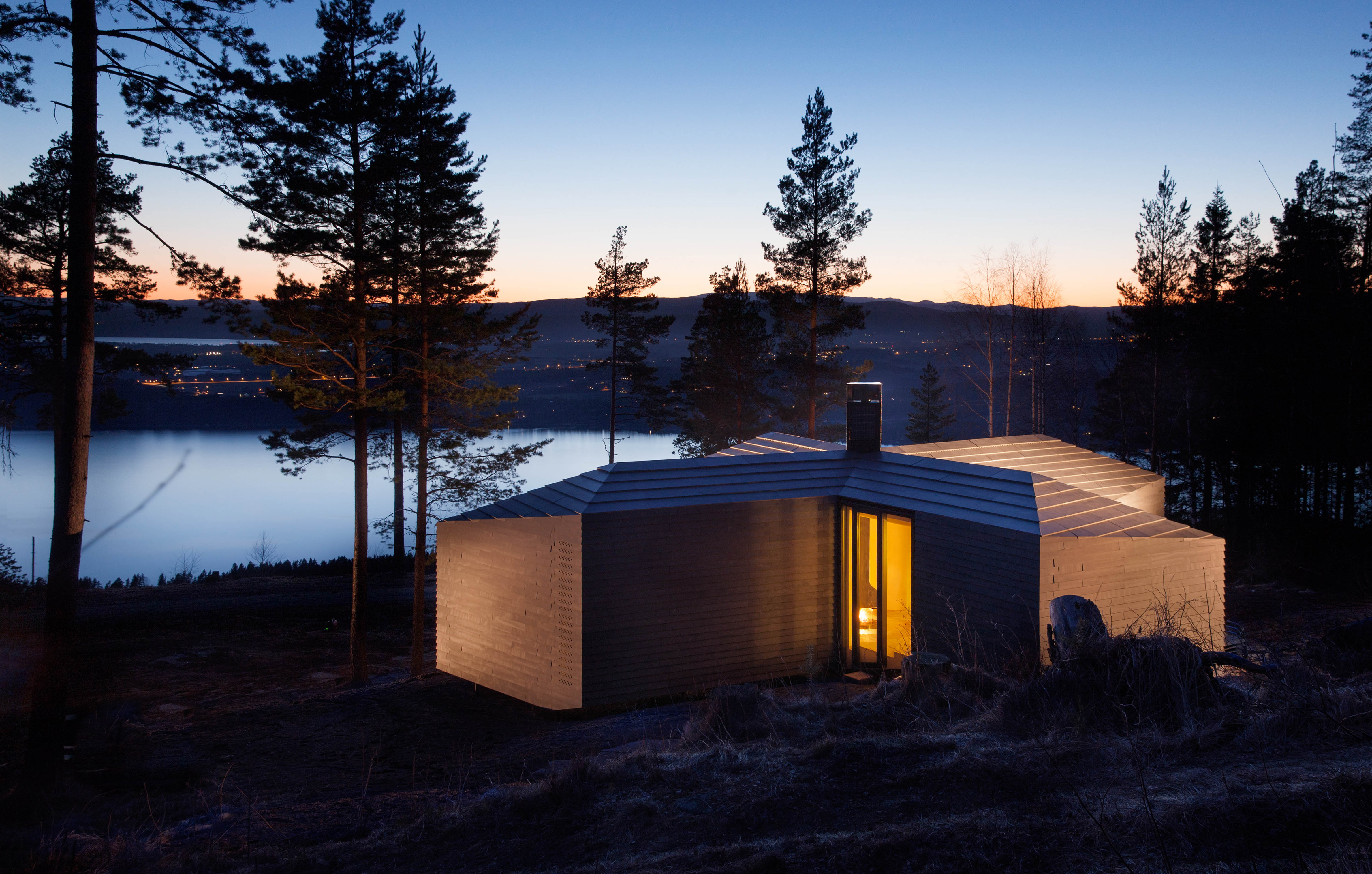
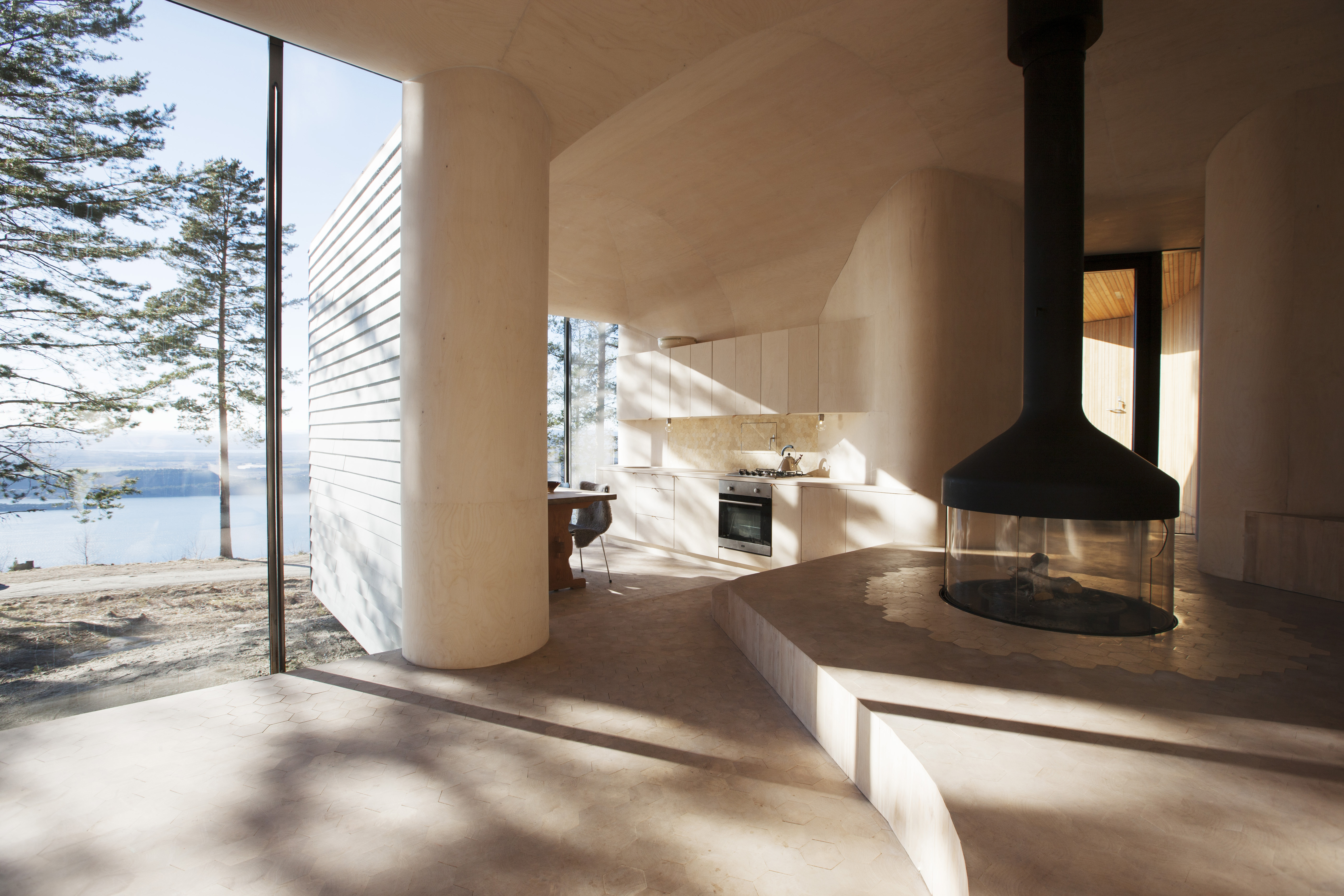
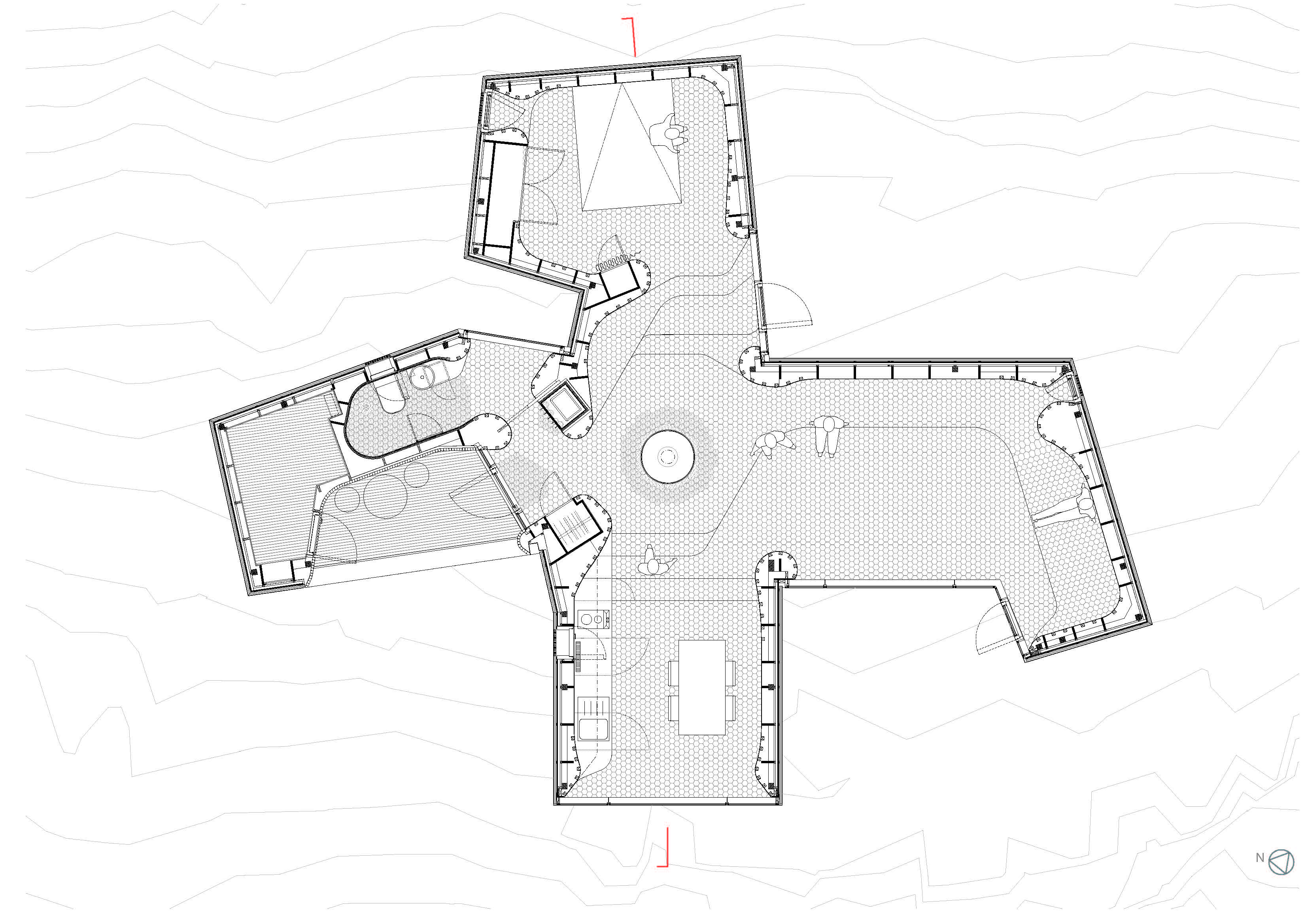
This residential cabin project is located in Krokskogen forests, outside the town of Hønefoss. The site is very exposed to the wind and the cabin is shaped to create several outdoors spaces that provide shelter from the wind and sun at different times of day. The interior is a continuous space finished in a thin layer of curved birch plywood. The fireplace is located at the center of the cabin. The fireplace mantel is hanging from the ceiling, while the fire is down at the floor of the access level. This provides the feeling of a campfire in the landscape that can be seen from different places.

The Fourth Annual One Drawing Challenge is open for entries! Architecture’s most popular drawing competition is back and bigger than ever, including larger prizes. Get started on your submission.  

Reference

One Drawing Challenge 2022: Send Us an Architectural Drawing. Tell Us a Story. Win ,000!
CategoriesArchitecture

One Drawing Challenge 2022: Send Us an Architectural Drawing. Tell Us a Story. Win $3,000!

Architizer is thrilled to announce that the Fourth Annual One Drawing Challenge is officially open for entries! Architecture’s most popular drawing competition is back and bigger than ever, including larger prizes (including an increased cash prize for our 2 Top Winners), more publicity and some amazing new jurors to boot. Without further ado, get started on your submission today, and don’t forget to share the competition with colleagues, students and friends who you know have the talent to succeed in this year’s program!

Submit a Drawing
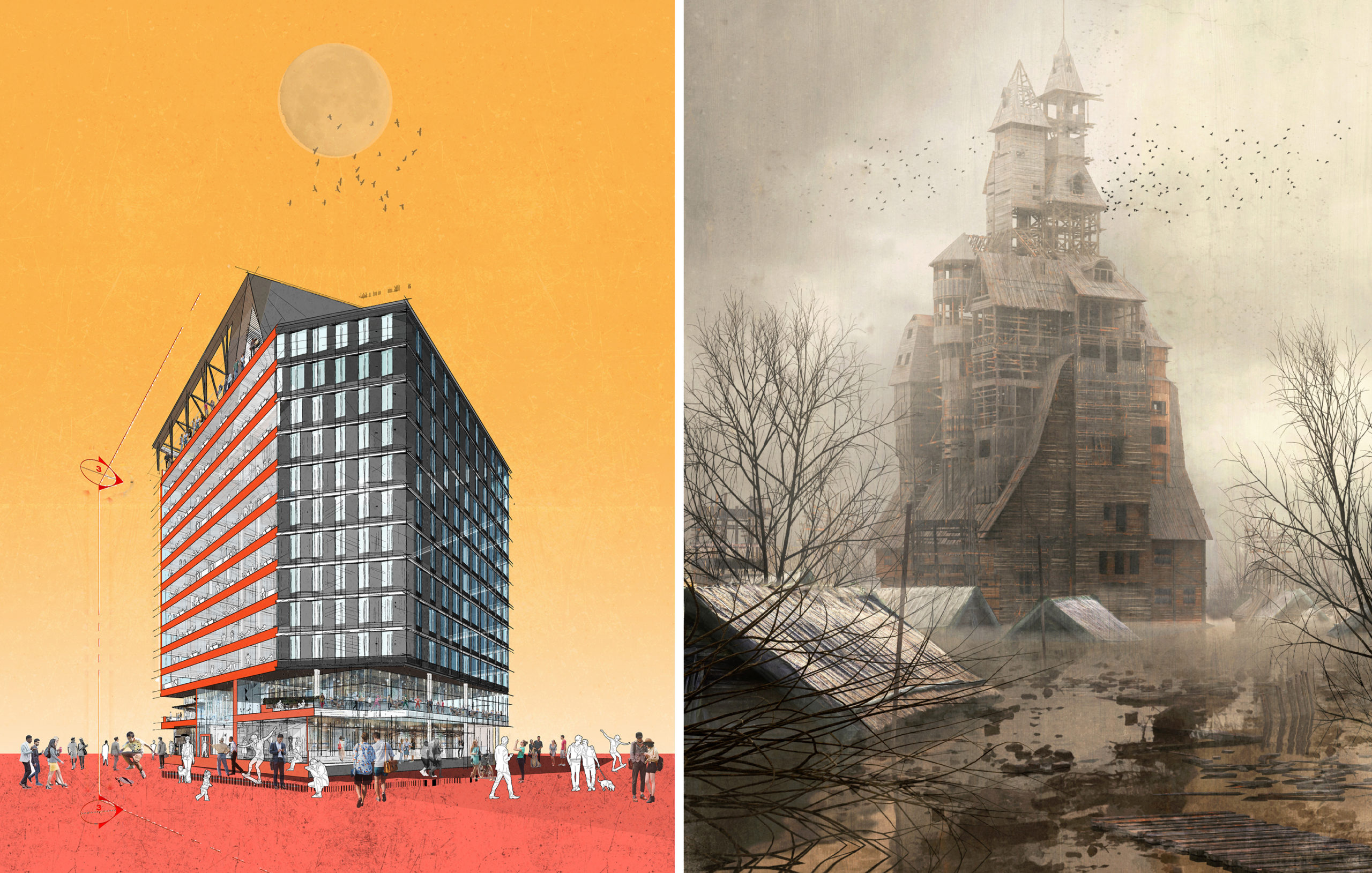
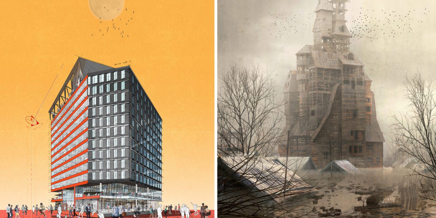
Left: “See You at Work” by Dorian Sosa; Right: “Sutyagin’s House” by Pavel Dikov; Finalists in the 2021 One Drawing Challenge

Competition Brief

For the One Drawing Challenge, your task is simple and complex in equal measure — tell a powerful visual story about architecture and the people that inhabit it through a single architectural drawing.

All drawing formats, both hand-drawn or digital, are permitted. It could be a cityscape, an individual building, or even an architectural detail. It could be a plan, section, elevation, perspective, axonometric projection, sketch or abstract. As long as it includes architecture in some ways, it is eligible.

You are welcome to submit an older drawing or create something brand new. For some examples of the types of images that you could submit, we encourage you to explore the best 100 architectural drawings from last year’s competition.

Your drawing should be accompanied by a written passage (up to 150 words), which explains what your drawing depicts. Focus points could include but are not limited to: The type of architecture portrayed, where it might be located, who might inhabit it, what atmosphere it conjures, the essence it captures, and what makes it special.

Enter the One Drawing Challenge

Prizes

This year, we are excited to be able to offer our largest prize fund to date for our One X Challenge competition series: A total of $6,000 will be split evenly between 2 Top Winners (1 student and 1 non-student).

As well as their cash prize, our Top Winners will have top billing in the Official Winners Announcement (see last year’s announcement here), as well as an exclusive interview about their work. A further 100 Finalists will also see their work published globally, in one of our most viewed editorial features of the year: 100 Stories That Tell Powerful Stories About Architecture.

Both Top Winners will also secure themselves a seat on next season’s competition jury, giving them the opportunity to review entries alongside the likes of James Wines on SITE, Amanda Ferber of Architecture Hunter, Bob Borson of Life of an Architect and more!
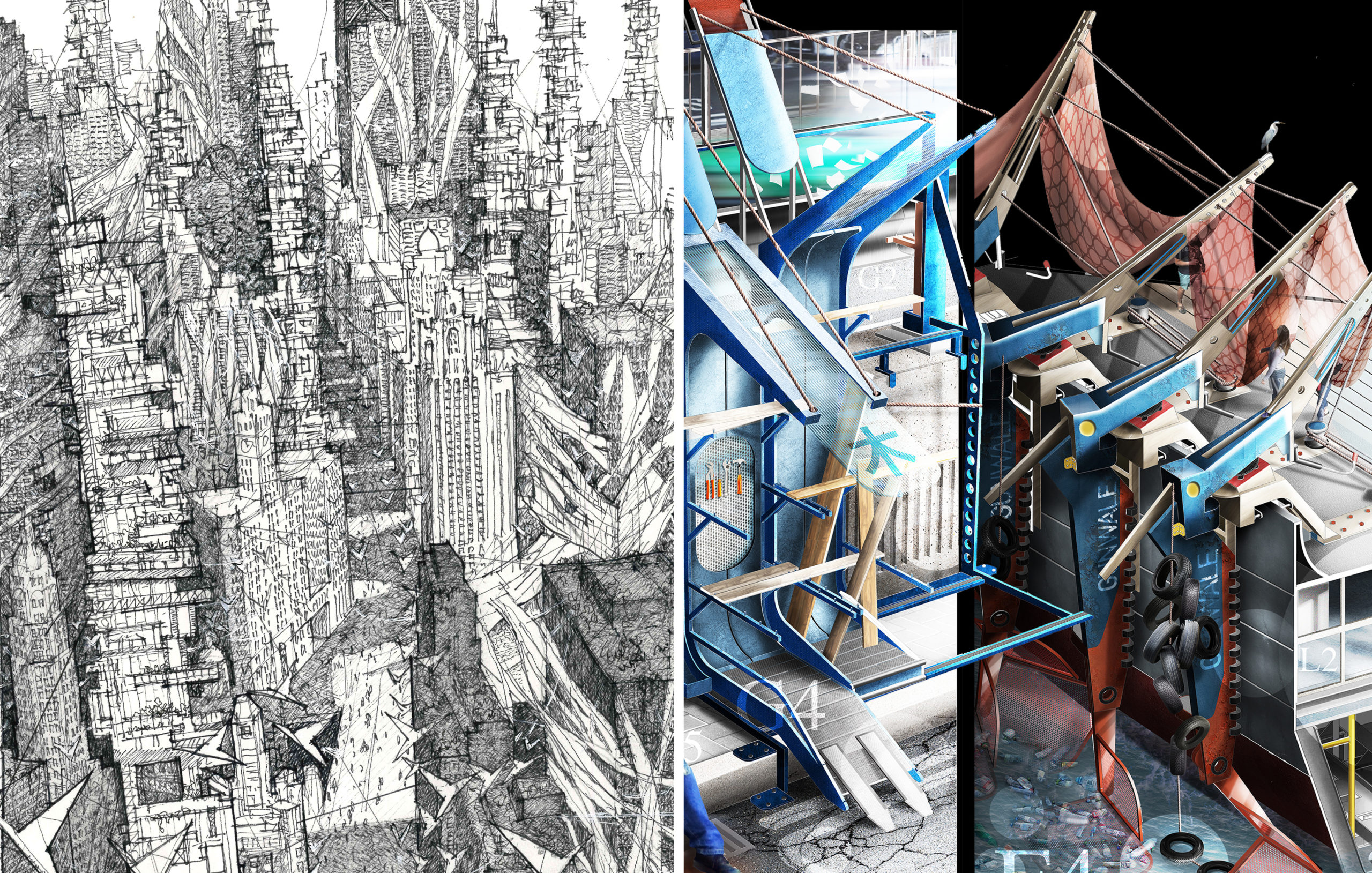
Left: “Chicago : Drifted” by Gregory Klosowski; Right: “The Shipwright’s Anthology – A New Story of Fantastic ‘Knots’” by Jay Jordan; Finalists in the 2021 One Drawing Challenge

New for 2022: The Storied Drawing Awards

This year, we want to take the One Drawing Challenge back to its roots, celebrating architectural drawings as a medium for telling stories — not only about our built environmental, but also about our wider world. When done well, an architectural drawing has the power to reveal new perspectives about the impact of architecture on society, communities and individual people.

In honor of this power, we are introducing a series of new, narrative-driven awards called the “Storied Drawing Awards”. Participants can apply for any one of these special awards at no extra cost when submitting an entry, and Architizer’s Editorial Team may also nominate entries as they see fit. You can apply for a “Storied Drawing Award” for the following themes:

  • Utopian Vision
  • Dystopian Warning
  • Fantasy Island
  • Sci Fi Streetscape
  • Sustainable City
  • Political Narrative
  • Climate Change Future
  • Awe-Inspiring Atmosphere

The Storied Drawing Award winners are eligible for the overall prizes as well, so it’s possible for your drawing to win multiple accolades! Storied Drawing winners will feature in their own dedicated editorial, similar to last season’s Special Mention Award recipients. We’ll be revealing more about the Storied Drawing Awards in the coming weeks, so stay tuned!

Start Submission
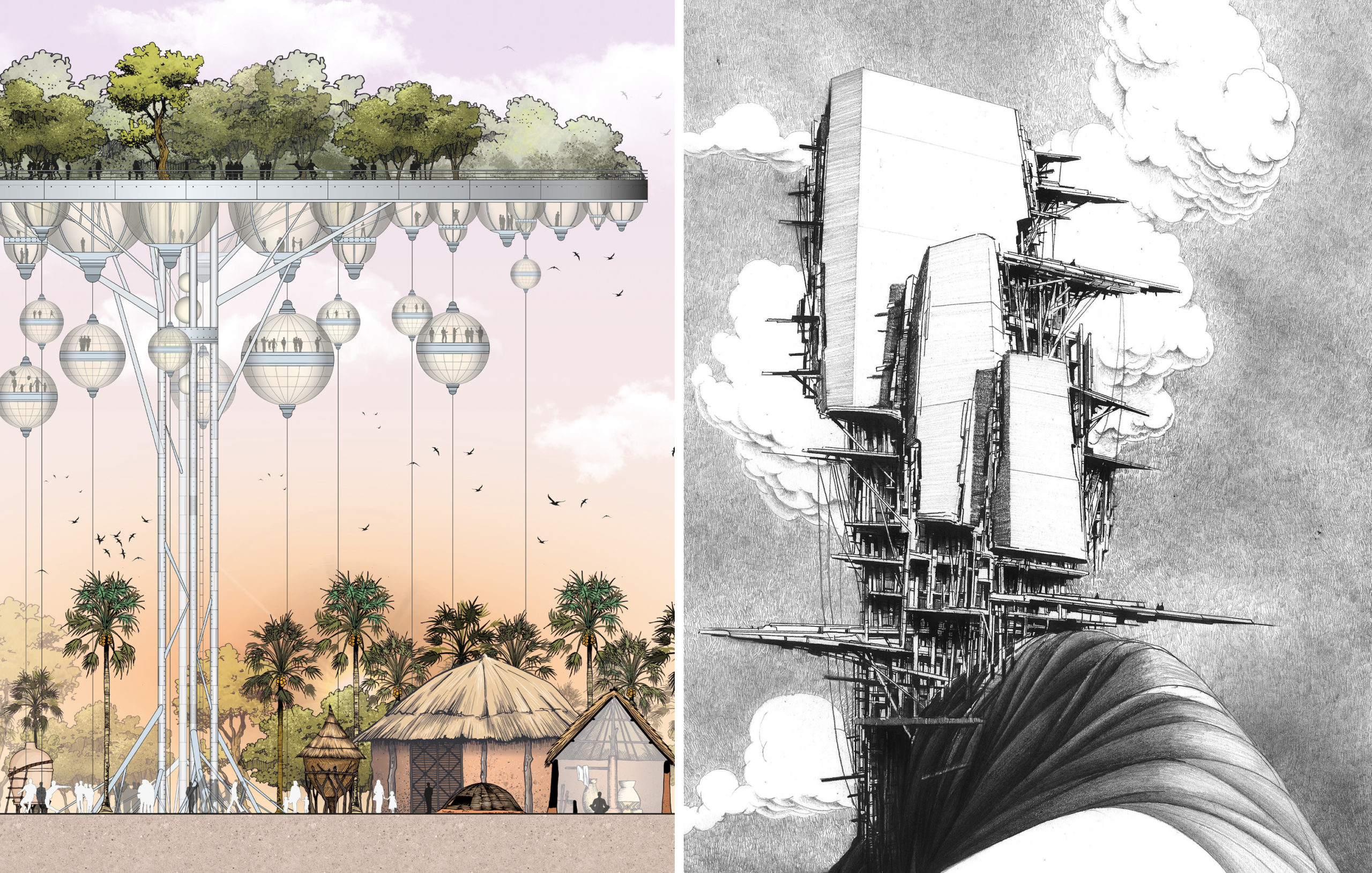
Left: “The Palaver Tree” by Jonathan Nkunku; Right: “ELLITANIUM city(in praise of naught)” by Hosein Mosavi; Finalists in the 2021 One Drawing Challenge

Meet the Jury

New to this year’s jury, we welcome one of the most popular experts in architectural drawing: Eric Reinholdt of 30×40 Design Workshop! As well as his architectural practice, Eric is widely known for creating the 30X40 Design Workshop YouTube channel, where he makes videos about architecture, designs simple modern homes, and openly shares his process online. The videos are used as curriculum in architecture schools, and by students and professionals worldwide. Learn more and join 980K+ subscribers on 30X40’s YouTube channel.

Eric is joined by Sabina Blasiotti, the talented designer behind last year’s One Drawing Challenge Winner, “Outlines of Nuclear Geography”. Sabina is an architectural designer based in London and a guest critic at UCL, where she graduated with distinction. Her work focuses on aesthetics and challenging stories and was awarded and exhibited internationally by Architizer, Azure Magazine, Royal Academy, Soane Museum, RIBA and others. Prior to working independently, Sabina gained experience in acclaimed offices such as BIG and Kengo Kuma.

See the rest of the amazing One Drawing Challenge jury here.

Submit a Drawing

Follow in the Footsteps of Last Year’s Winners

In her exclusive interview with Architizer, Sabina Blasiotti reflected on the value of her accolade for herself and the wider architectural community.

“The prime reason that led me to enter the competition was the desire to share my work,” she explained. “I believe that for architects and architecture students, sharing one’s own work can be of great significance, both to further value the time spent in creating a project but mainly to collect feedback from colleagues and the public for personal improvement.

“This accolade boosts the faith in myself and cheers me on to keep working and experimenting in my own style. On top of that, it further asserts that the international architecture community is supporting and encouraging youngsters to speak up against controversial prominent climate and societal challenges, such support is of great importance for our generation.”
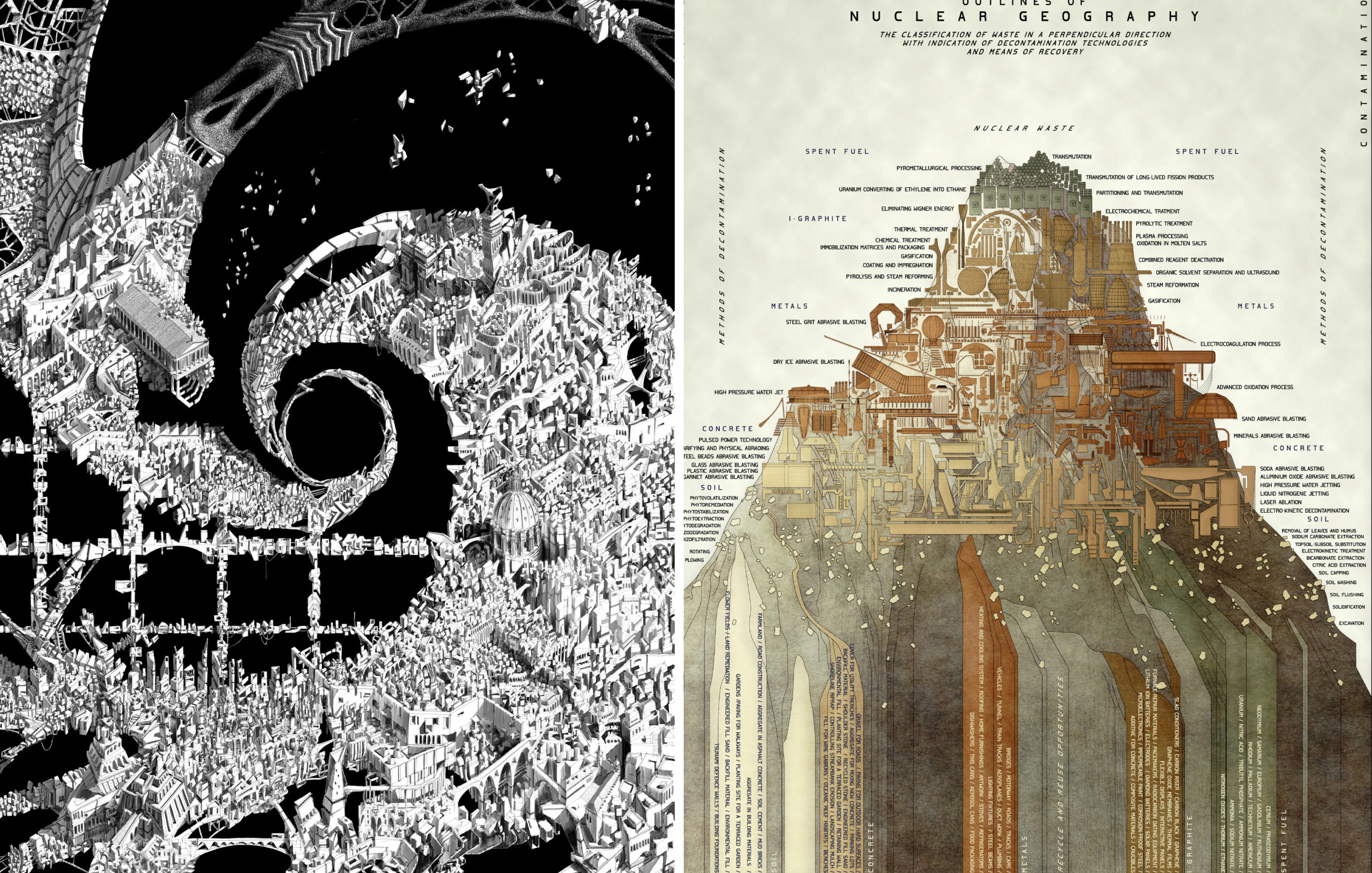
Left: “Vortex” by Endri Marku; Right: “Outlines of Nuclear Geography” by Sabina Blasiotti; Winners of the 2021 One Drawing Challenge

Similarly, architect Endrit Marku, last year’s Non-Student Winner for the extraordinary “Vortex”, used his interview to speak about the rewarding nature of the competition: “As an architect who loves drawing, it came naturally to search for a competition rather than, let’s say, finding an art gallery to exhibit my work. In this search, it is impossible to miss Architizer’s event. Winning was beautiful and unexpected. It is highly motivational having your work acknowledged internationally by reputable experts.”


Now, it’s your turn: Hit the button below to begin your entry, and tell YOUR story about architecture with a single drawing:

Enter the One Drawing Challenge

You can find out everything you need to know about this year’s competition here, including entry guidelines, deadlines, entry fees, FAQs and more. If you need assistance with your submission, don’t hesitate to reach out to us at competitions@architizer.com and we’ll be glad to help. Best of luck from the whole team at Architizer!

Reference

Architectural Details: GOA’s Perfectly Perforated Pyramidal Roof
CategoriesArchitecture

Architectural Details: GOA’s Perfectly Perforated Pyramidal Roof

How can architecture be a force for good in our ever-changing world? During Future Fest, we’ll pose this question to some of the world’s best architects. Launching in September, our three-week-long virtual event will be 100% free to attend. Register here!

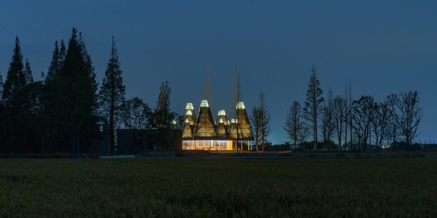
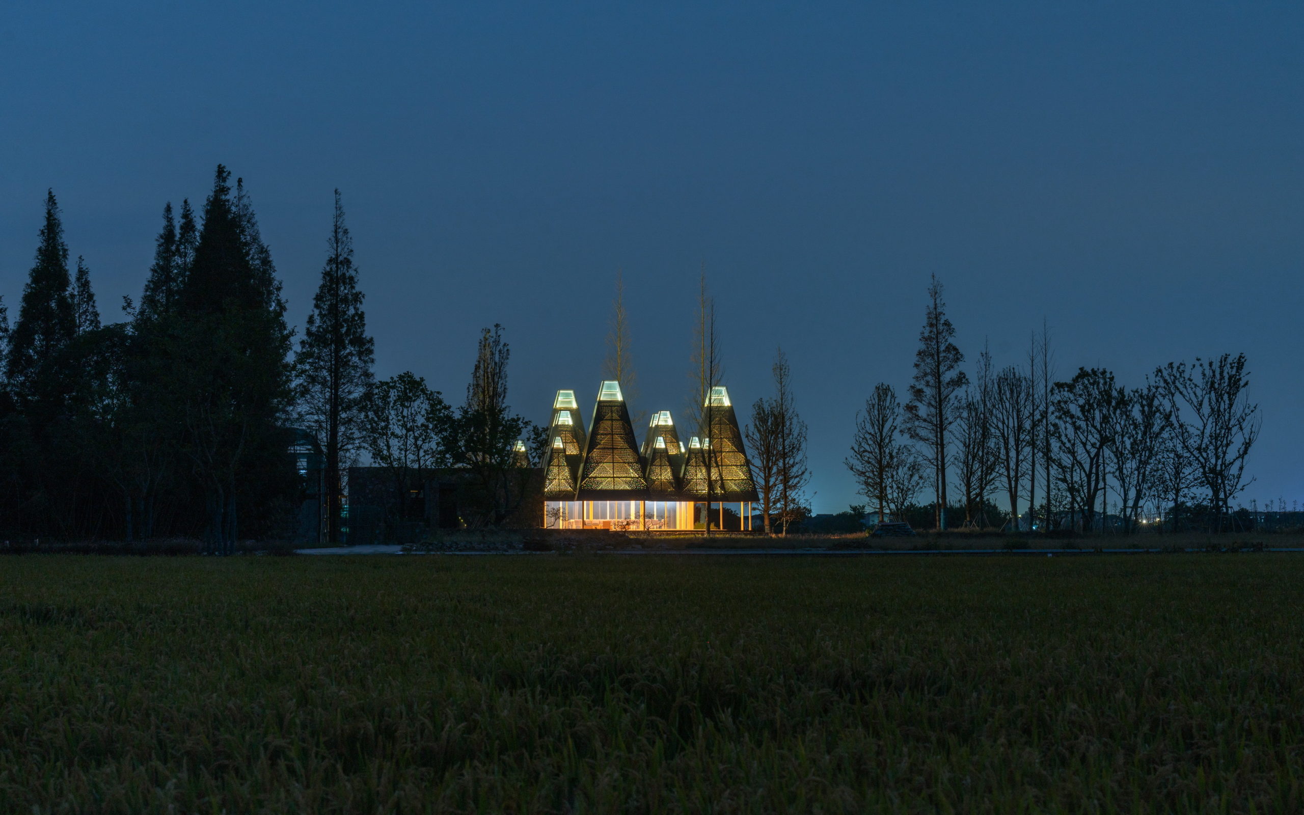
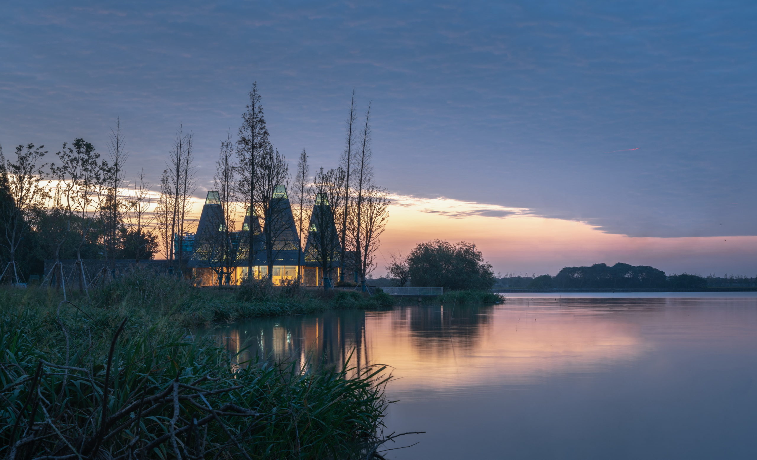
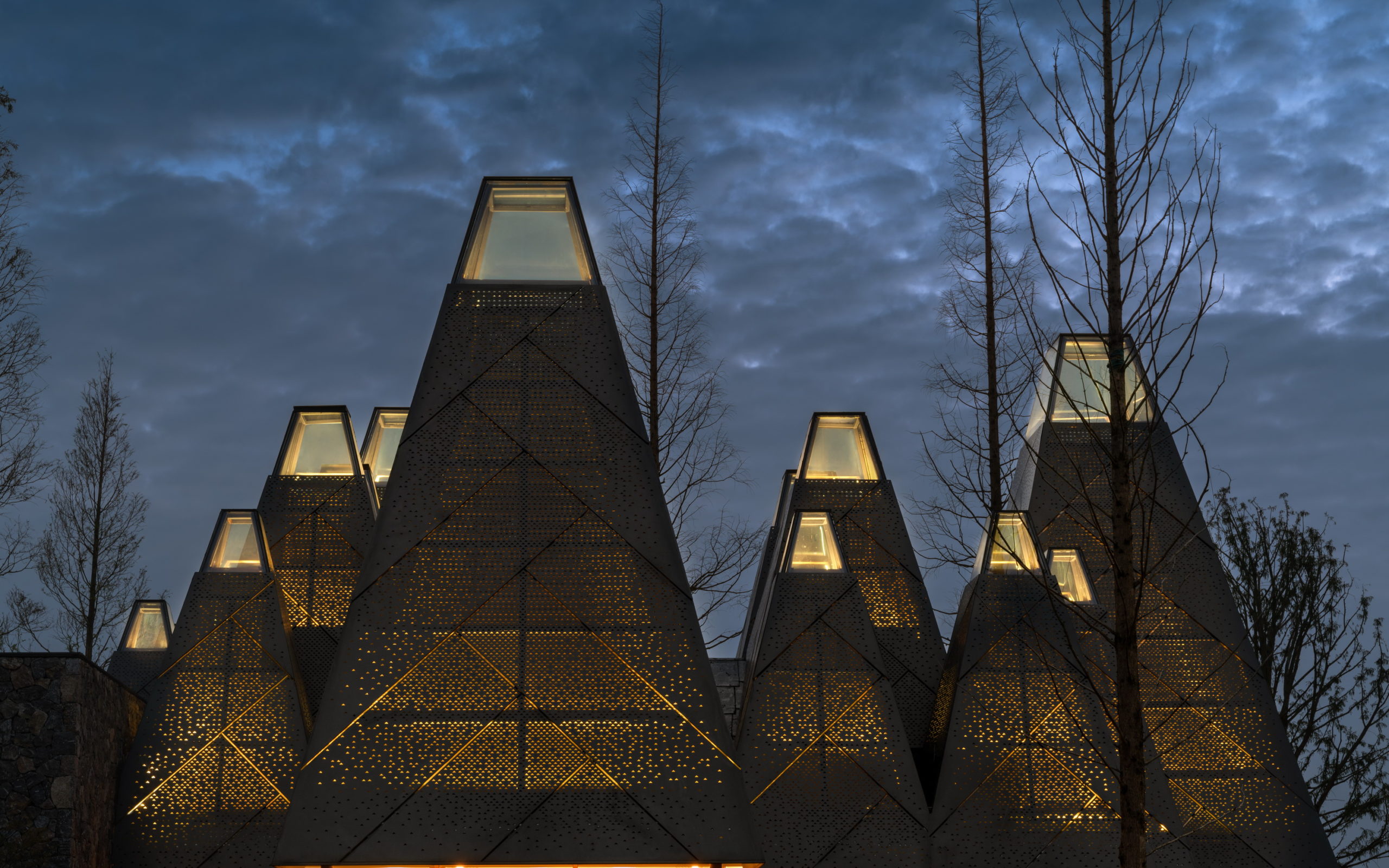
Amid a swampy plain in Suzhou, China, one can see a series of glowing pyramids peeking through a grove of metasequoia trees. (A native deciduous variety also known as dawn redwoods, the fast-growing trees are among the shorter in their genus, although no less beautiful with their pyramidal-shaped profiles.) The newly constructed Restaurant of Metasequoia Grove, designed by GOA (Group of Architects), draws inspiration from these plants to create an unusual building profile for the restaurant typology. The building is part of the Wujiang Beautiful Village plan that focuses on the rural revitalization of the surrounding Zhongjiadang area, which aims to encourage tourism and promote local culture. Inspired by the local flora, this restaurant and banquet hall is just the first step in this development.

The idea of the scheme is to make it a part of nature to heighten the dining experience for the user. “Water, sky and buildings constitute a background picture,” the team said. “The new restaurant will not only provide people with a place to enjoy the scenery, but it will also become a landscape embellished on the coastline.”

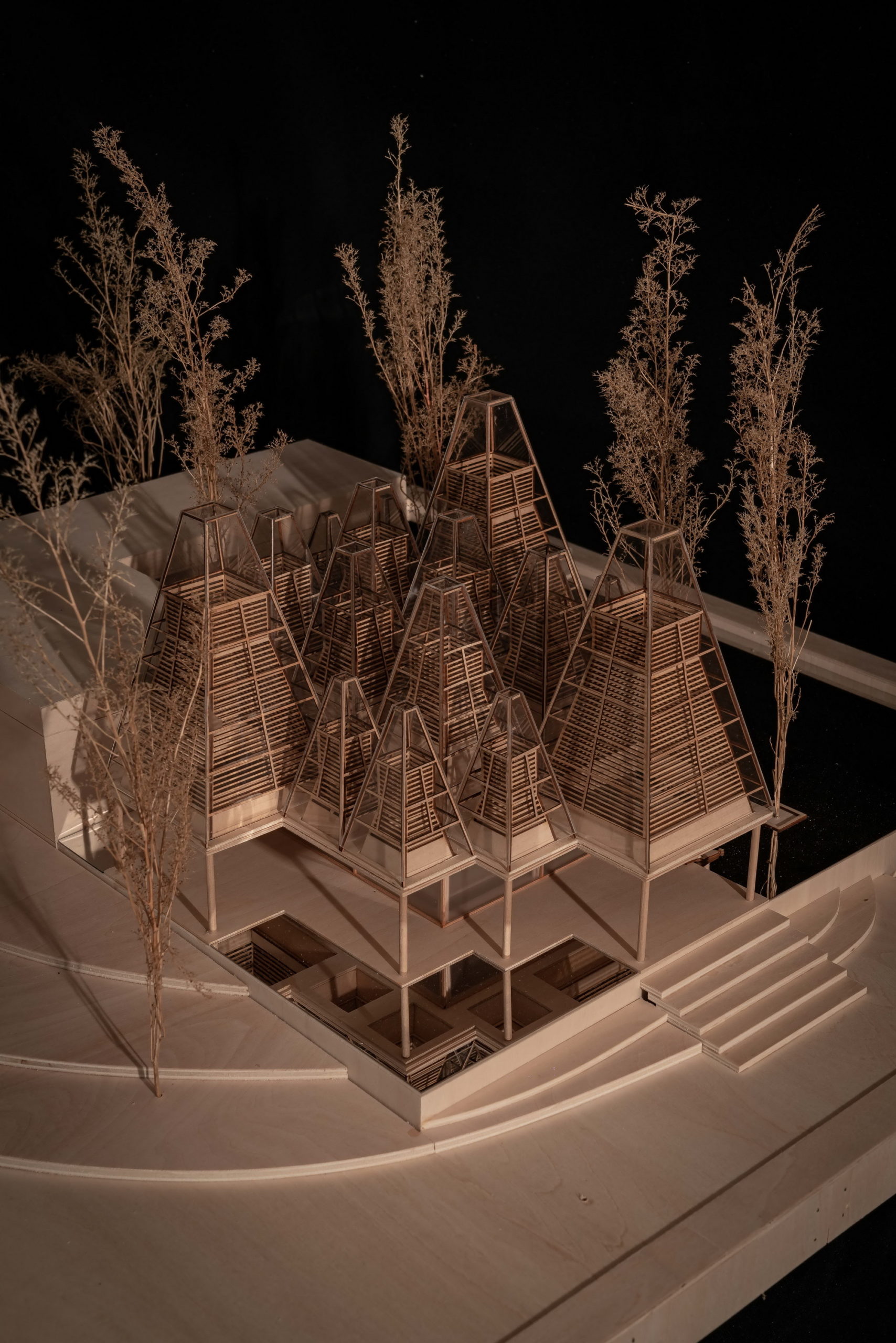
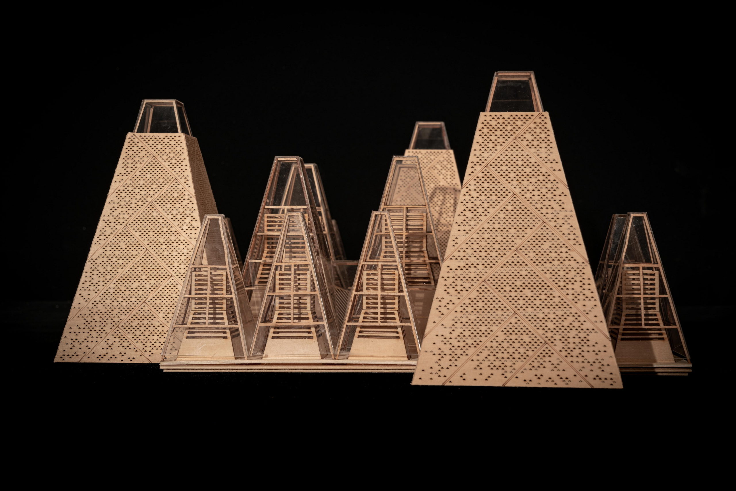
The nature-forward design of the restaurant takes a lot of inspiration from the site itself. The site’s northern edge is flanked by farmland and trees and the southern side is surrounded by water. The conical shapes of metasequoia trees around are abstracted into pyramids of different heights and widths to create something akin to a geometric forest. “Three different scales of modules mix and cluster together, forming a continuous canopy structure that traces an artificial forest profile within nature to simulate the natural substances’ generative process,” the firm said.

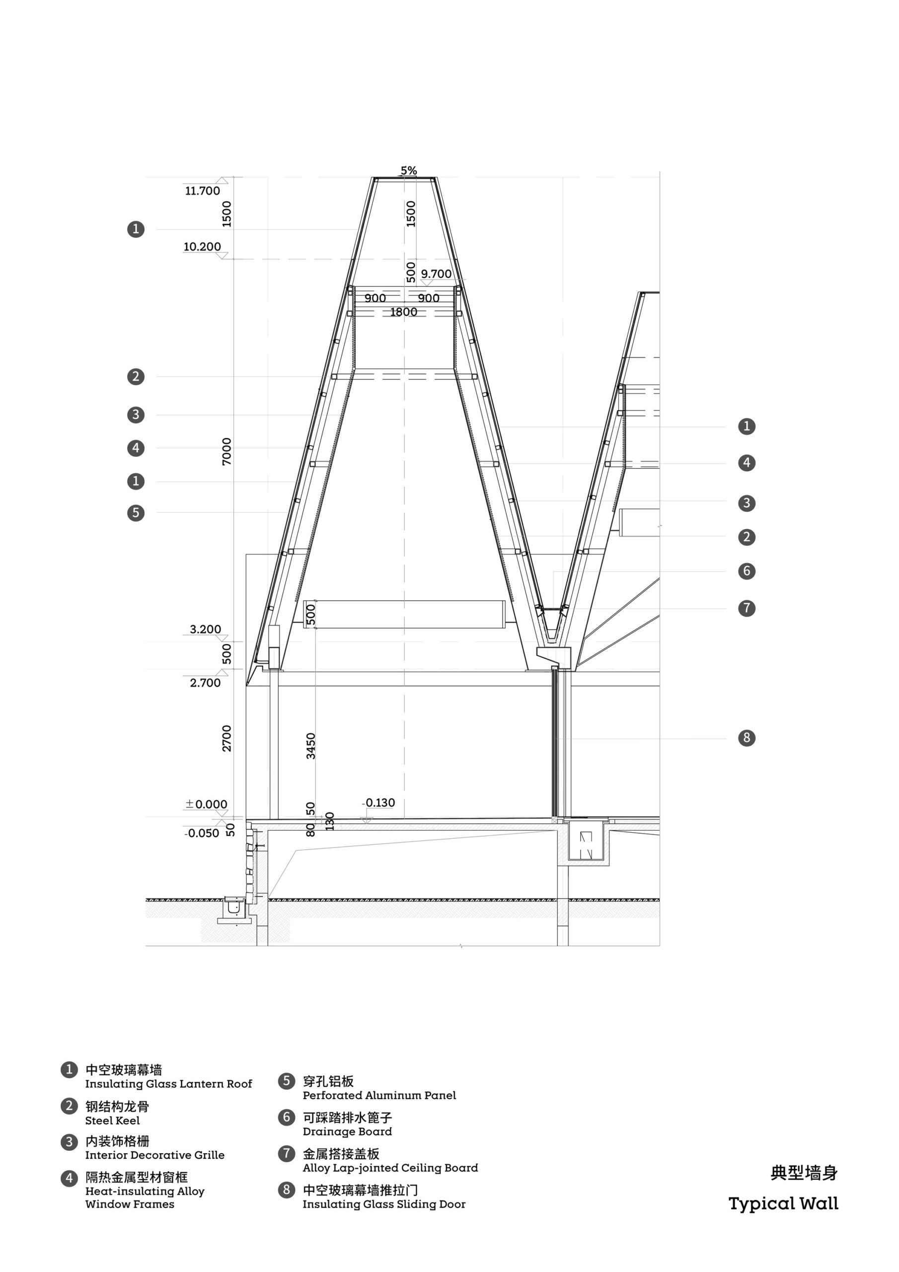
The total height of the roof canopy is just below forty feet. Each of the pyramidal forms is topped with a skylight to allow more natural light to enter the structure. The outer layer of these modules is covered in diagonal lines and a stippled pattern that recreates the texture of the metasequoia trees. Additionally, this perforated aluminum surface is layered with glass underneath and supported using grilled wood panels. This arrangement allows warm light to shine through the perforations during the night, much like a cluster of fireflies peeking through dense foliage. The contextual vision of this design has cemented its position in this year’s A+Awards gallery with both the Popular and Jury votes in the Restaurant category.

Despite the different heights on top, the lower end of the roof is evenly lowered by about nine feet to create a crisp frame of the view around. “Standing under the eaves and looking out, the vastness and tranquility of the plain wetlands seem to be included in the picture scroll,” GOA explained. The underside of the roof is also free of vents, which are in turn placed at the ground level along the glass windows, to create a disruption-free experience.
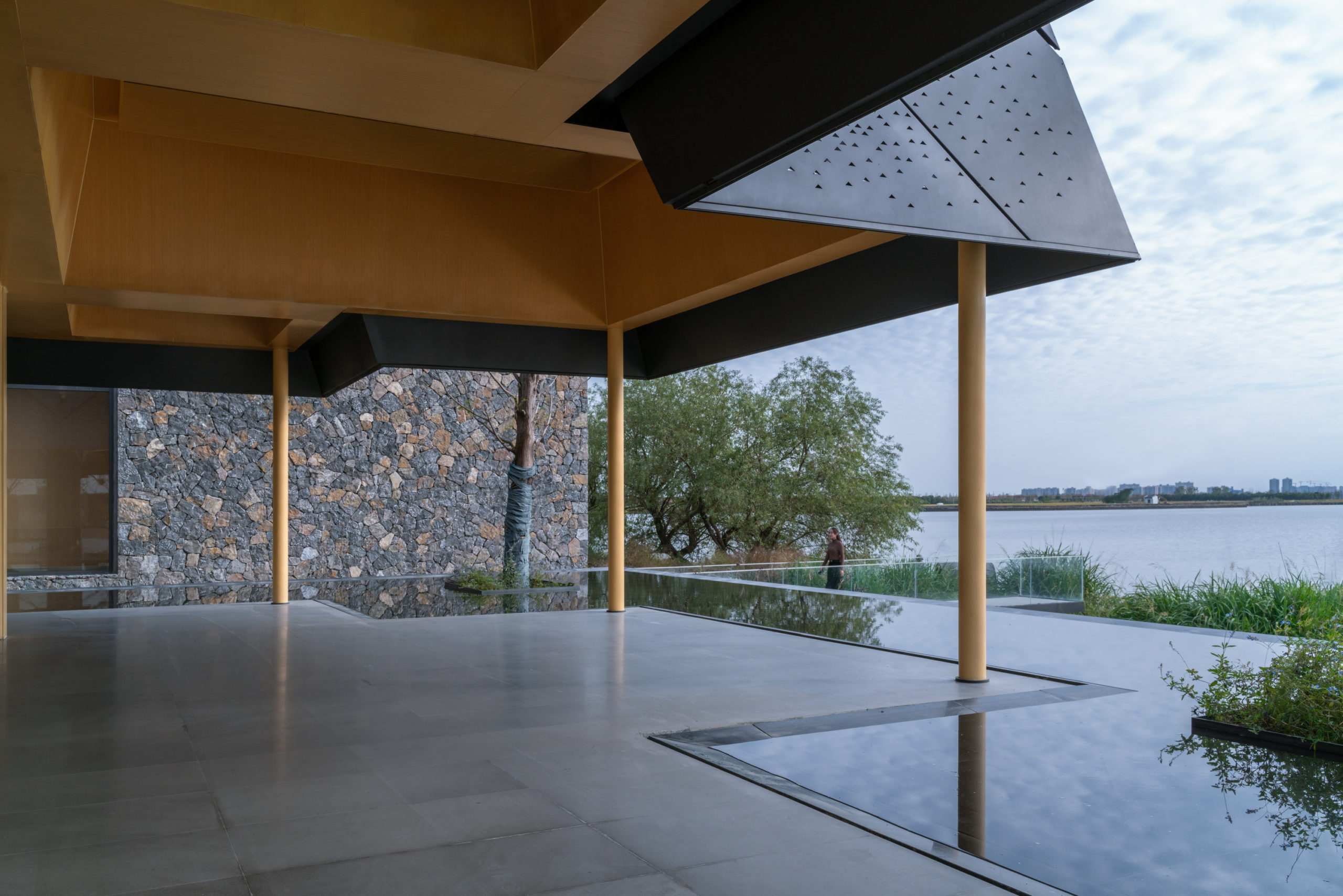
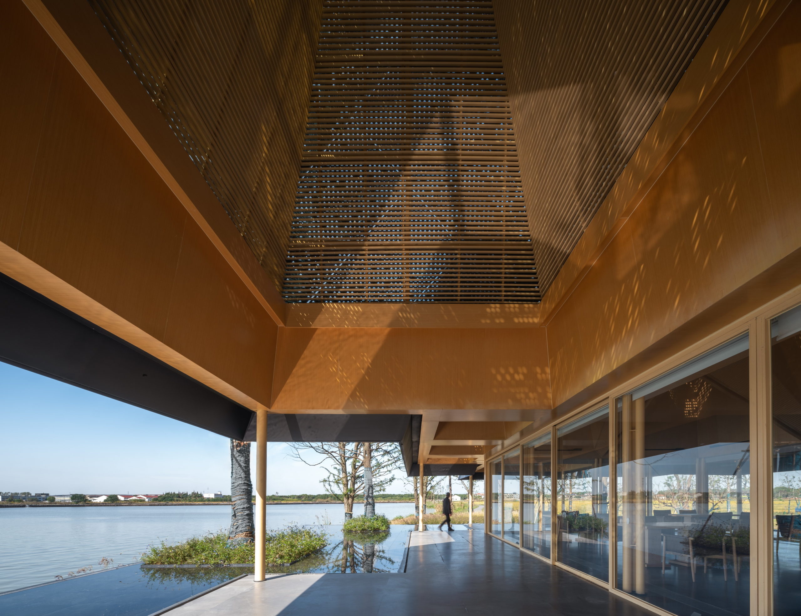
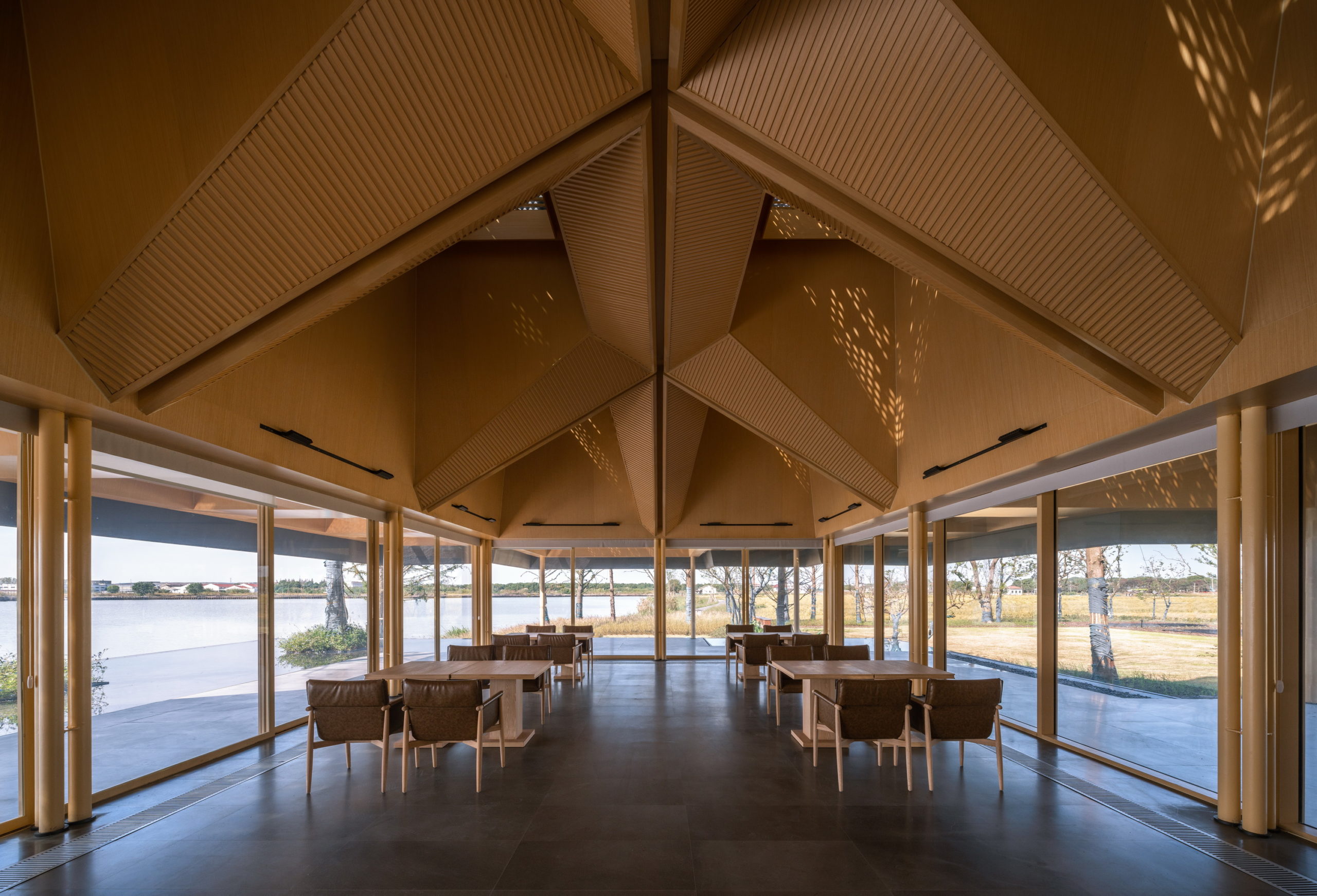
In order ensure maximum visual impact, GOA has used just ten load-bearing columns within the structure. These larger columns are combined with three slender columns. On the periphery, they have restricted the number of columns to just 11 to create unobstructed views of the water beyond. The team has used full-length single bay glass windows to envelop the main dining area.

In addition to eliminating partition devices, the team has further blurred the boundaries between the structure and site around by using the same paving materials within the restaurant and the terrace that extends outwards. The terrace also includes a planned water body, closer to the natural water body, which creates a continuous line of vision when sitting inside.
Understanding the interaction between architecture and its environment has always been a priority for GOA. They believe that architecture has the potential to redefine the way a location is perceived and can have a long-lasting impact on its growth and use. This restaurant design stays true to the firm’s idea of creating a landscape as opposed to a structure. Its true immersion into the site promises a tranquil sanctuary where visitors can disconnect and take in the mesmerizing waters and woods.

How can architecture be a force for good in our ever-changing world? During Future Fest, we’ll pose this question to some of the world’s best architects. Launching in September, our three-week-long virtual event will be 100% free to attend. Register here!

Reference

Naturally Illuminated: 6 Inventive Architectural Designs Starring Skylights
CategoriesArchitecture

Naturally Illuminated: 6 Inventive Architectural Designs Starring Skylights

Architects: Want to have your project featured? Showcase your work through Architizer and sign up for our inspirational newsletter. 

Skylights should be at the top of any architect’s list as an easy solution to make buildings more energy efficient. They can considerably reduce lighting energy (up to 80% in some buildings, according to the US Department of Energy) and with advances in insulating glass, the thermal performance of skylights has never been greater.

But beyond the clear functional advantages, skylights also open wide possibilities for architectural creativity. A skylight offers new opportunities for indoor spaces to interact with sunlight; these can be as simple as subtly incorporating one within an existing interior or as grand as arranging a building’s layout to maximize the natural lighting. Though allowing (often direct) sunlight to enter a building poses its own challenges, architects are devising original solutions to mitigate the inconveniences with skylights in unique shapes, configurations and patterns. The six projects below are shining examples of how skylights can be used to address the architectural, natural and artistic demands of buildings and their clients.


Pattern House

By MM++ Architects / MIMYA, Ho Chi Minh City, Vietnam

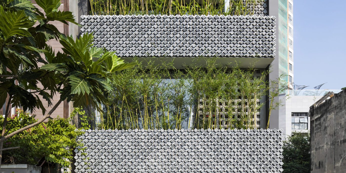
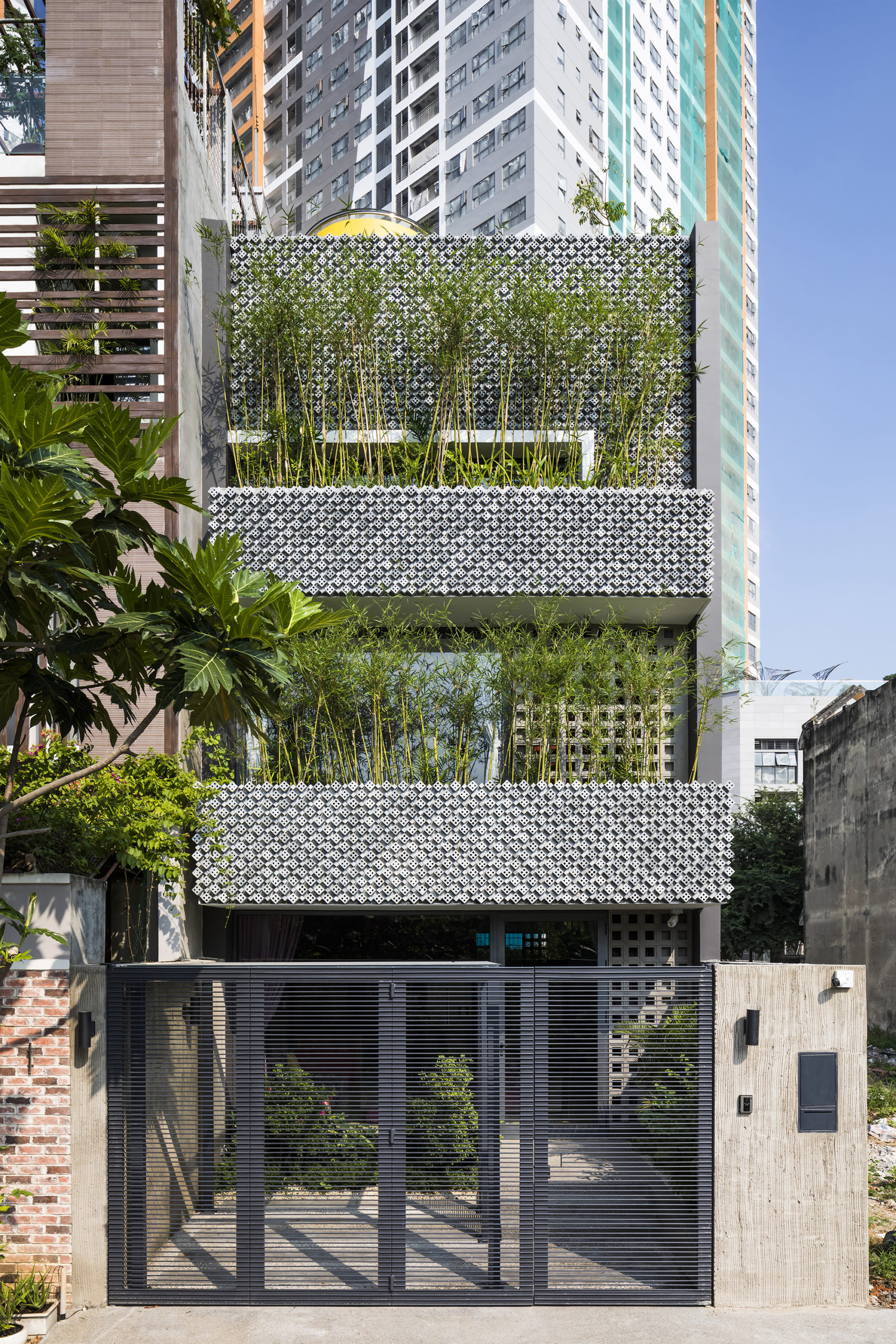
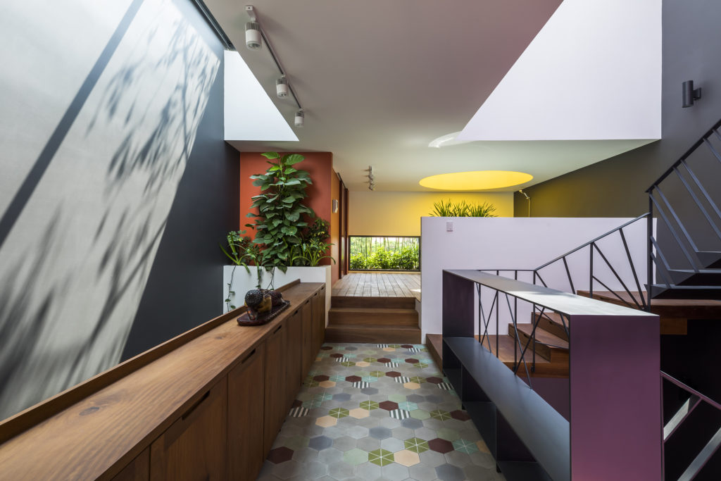
This modernist construction in Ho Chi Minh combats the perception that shophouse-style buildings suffer from a lack of natural light because of the inherent narrowness of their lot. The designers do so with a textured combination of cement breeze blocks and brick patterned walls, letting sunlight gently diffuse inside. Bamboo trees, meanwhile, create their own natural screen to filter the direct sunlight coming through the street-facing windows.
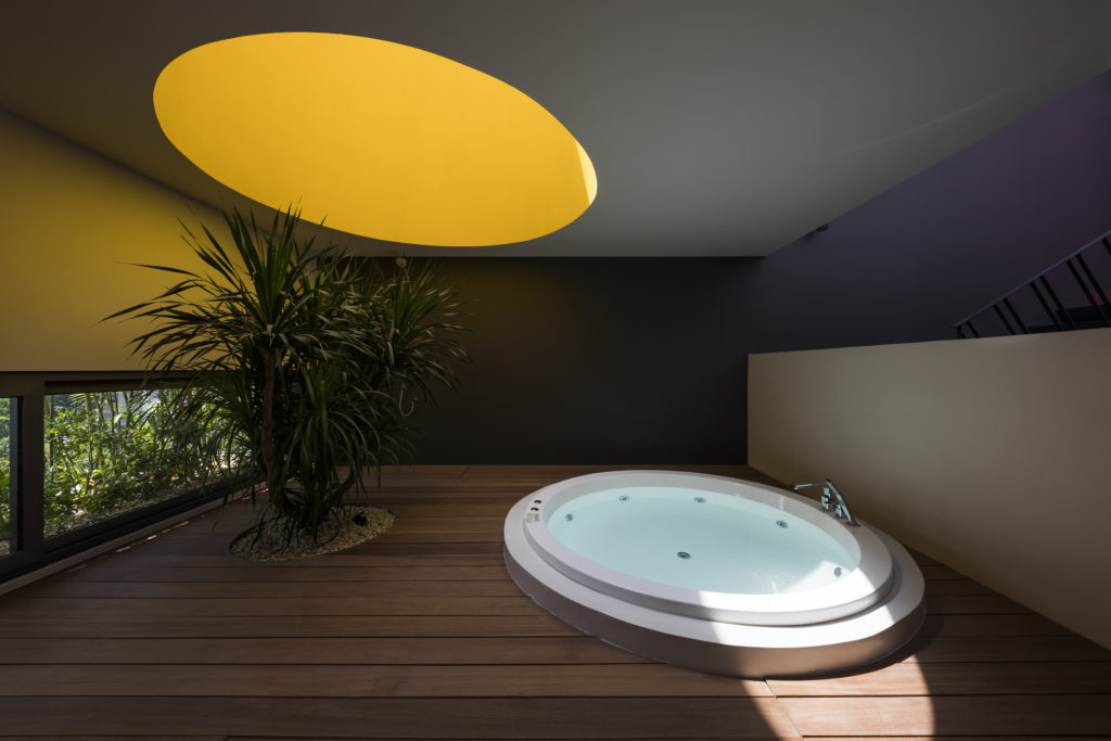
The crowning features are the two large skylights which illuminate the space in different fashions; one large, conventional skylight overlooking the central staircase; and a smaller circular skylight, providing an abstract yellow glow (akin to a halo) to the small space underneath.


Merricks House

By Robson Rak Architects, Merricks North, Australia

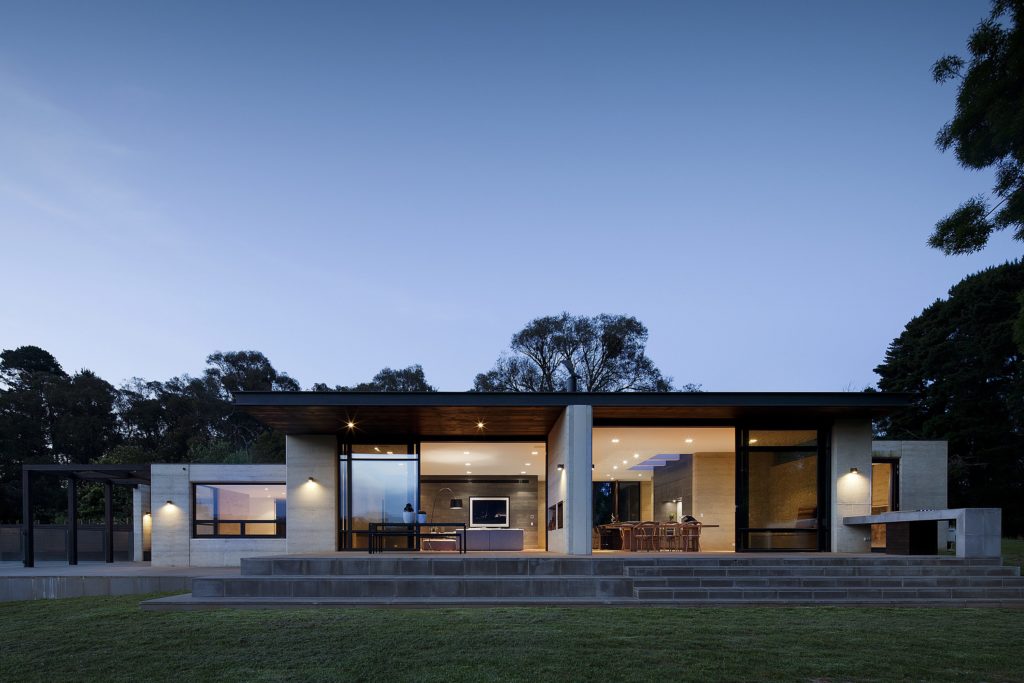
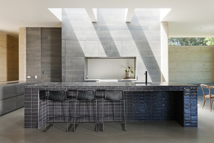
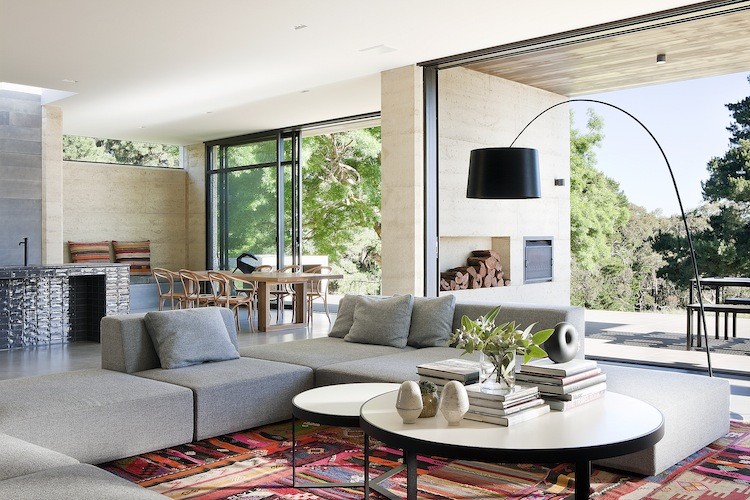
The family commissioning this rural home near Melbourne wanted to ensure plenty of natural light within the living space, but without the harsh direct northern and western sun. To resolve this issue, Robson Rak Architects designed large eaves to shade thin long high-level windows around the house, creating an evenly glowing living room and dining room. In similar fashion, the architects added two wall-like beams underneath the kitchen’s skylight, parsing out the strong sunlight into milder segments.
Milk Carton House

By TENHACHI ARCHITECT & INTERIOR DESIGN, Tokyo, Japan

Photos by Akihide Mishima

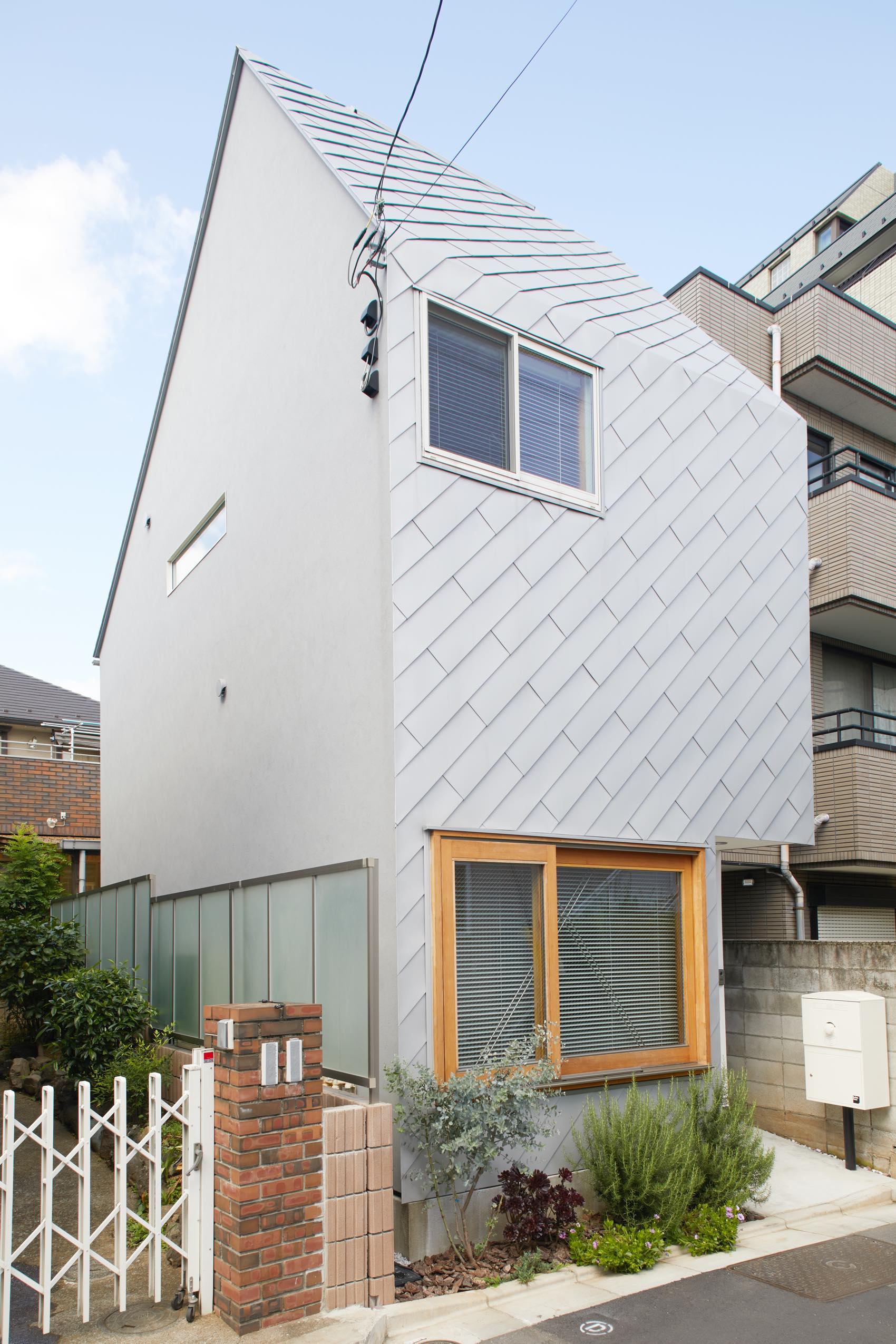
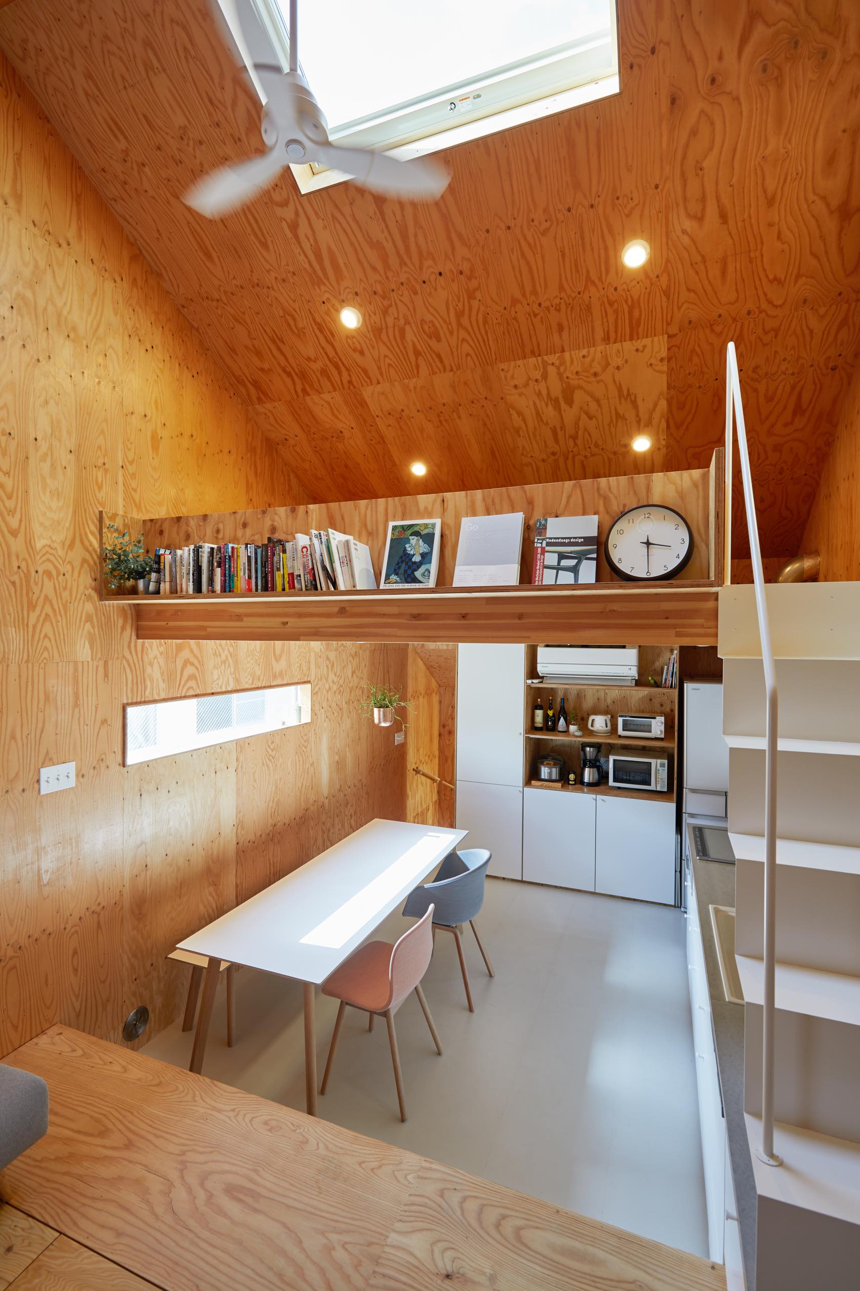
Located on a narrow lot in central Tokyo, this ‘milk carton’ shaped house uses a modest skylight to flood the first and second floors with sunlight. The skylight pairs well with the house’s open concept, letting the light emanate freely and leaving no corner in the dark. Moreover, the use of natural — as opposed to artificial lighting — contributes to the unvarnished aesthetic of the interior.


Plain House

By Wutopia Lab, China

Photos by CreatAR Images, Chen Hao and Shengliang Su

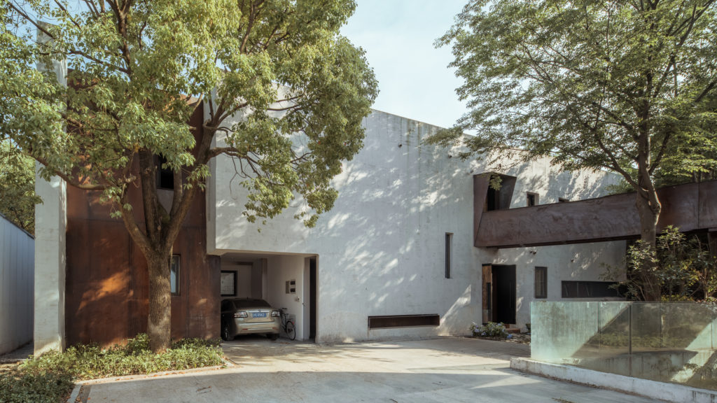
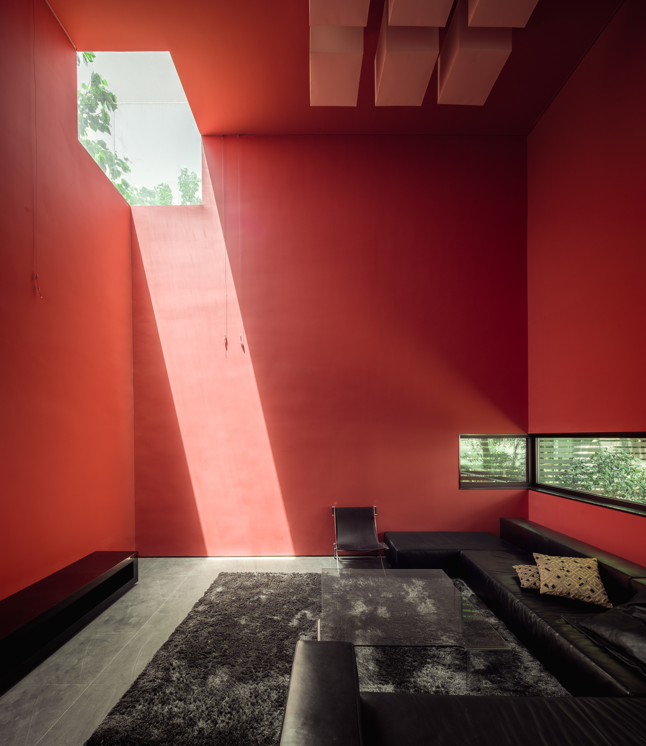
Wutopia Lab repurposed these two former studios to create a personal museum and a painter’s house for artist Li Bin. Looking to reflect their client’s craftsmanship, the architects have taken the usually functional design components and carefully elevated them to a higher artistic purpose. On the outside, leaf-printed patterns sprinkle the light grey façade and lush trees paint impressionistic strokes of shadow onto the walls. Inside, monochromatic walls interact with skylights and narrow windows for vivid combinations.

But the most noteworthy feature is a three-sided skylight on the south-west corner of the living room ceiling. The living room thus becomes its own art exhibit, as changes in the weather and time of day varies the composition and lighting of the red-painted room — an artistic interplay between color and light fit for the painter-in-residence.


House B – Terra Panonica

By Studio AUTORI, Mokrin, Serbia

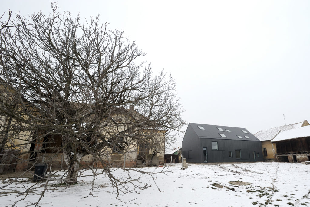
Rejecting the idea of the theatrical space as a necessarily dark and solemn place, this new estate espouses a more open (and bright) setting for its cultural projects thanks to a series of large skylights. From the outside, the playfully random assortment of skylights and windows healthily counterbalances the more serious dark-grey exterior.
Beijing Muee Restaurant

By MAT Office, Beijing, China
Photos by Jin Weiqi

Photos by Jin Weiqi

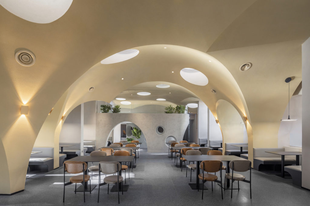
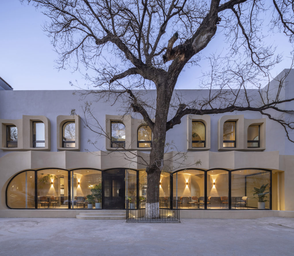
The interior design of this new restaurant in Beijing consists in an amalgam of superimposed domes with small circular skylights inserted throughout. The architects might argue that the cave-like design harks back to humans’ most primitive form of habitation, but the smooth arched surfaces and the rounded skylights assures us that the building is firmly anchored in the present-day.

Architects: Want to have your project featured? Showcase your work through Architizer and sign up for our inspirational newsletter. 

Reference

Rejecting the Ribbon Window: 7 Architectural Experimentations With Fenestration
CategoriesArchitecture

Rejecting the Ribbon Window: 7 Architectural Experimentations With Fenestration

Architizer is thrilled to announce the winners of the 10th Annual A+Awards. Want to earn global recognition for your projects? Sign up to be notified when the 11th Annual A+Awards program launches. 

In his 1927 manifesto, Five Points of Architecture, Le Corbusier made horizontal windows a core concept of his architectural philosophy. These long narrow windows which could wrap around the façade’s length like a ribbon, he argued, were the best way to offer evenly light spaces throughout a building without compromising privacy. Le Corbusier’s ‘ribbon window’ (highlighted in emblematic projects like his Villa Savoye) quickly became a staple of modernist architecture. From schools to office buildings and apartment blocks, the ribbon window became somewhat omnipresent.

One hundred years later, in a step that follows a similar logic yet moves away from Le Corbusier’s iconic signature, architects continue playing with new configurations for fenestration. Whether by de-emphasizing the horizontal nature of windows or experimenting with different shapes, sizes and compositions, architects are moving towards more tailored and idiosyncratic approaches to fenestration design.


Casas Cubo

By Aleph Zero, Curitiba, Brazil

Photos by Felipe Gomes

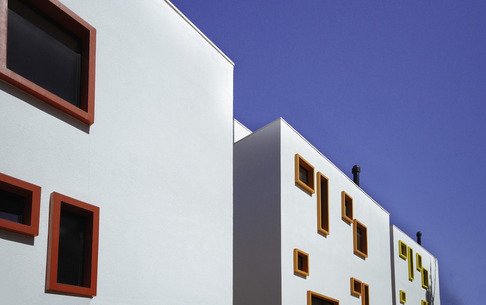
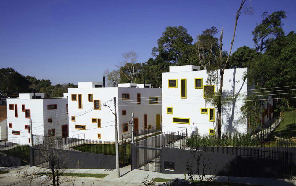
The architects of this new project in a remote neighborhood north of Curitiba wanted to create a sense of distinction between the three complexes and nearby houses. They do so by treating the exterior façades as a canvas onto which narrow windows are etched in seemingly whimsical fashion – though their order strategically aligns with the layout and functions of the rooms inside. The colorful composition of square and rectangular frames on the white plaster exterior is a clever homage to Piet Mondrian’s neo-plasticist masterpieces.


The Snail Apartments

By archimatika, New York City, NY

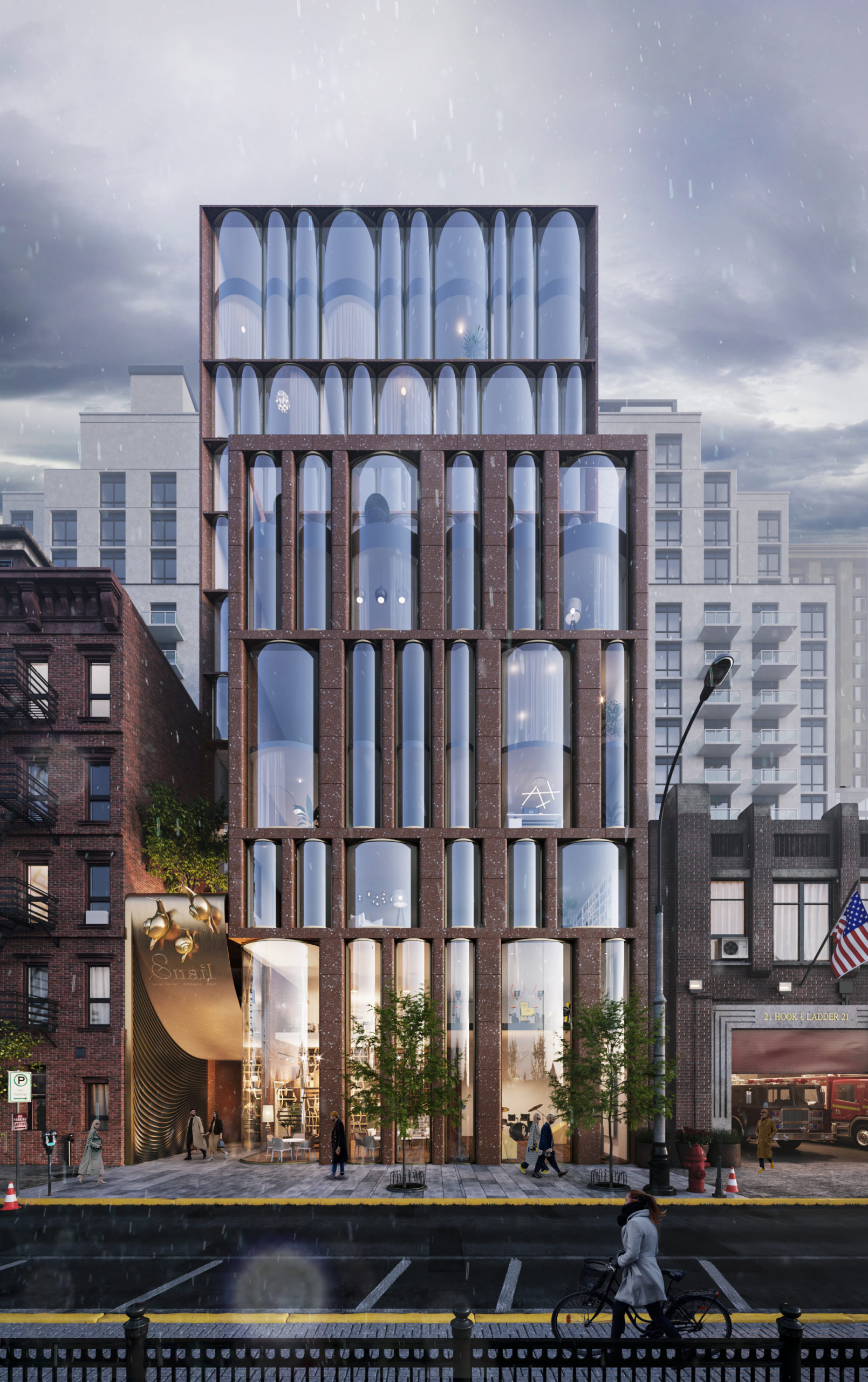
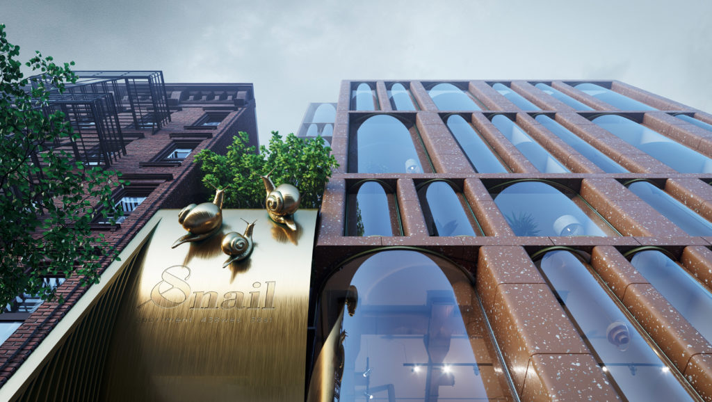
The design concept for this residential project in Chelsea, New York combines features from two different eras of the city’s architectural history: 19th and 20th century brick housing and contemporary glass skyscrapers. Yet, neither inspiration can account for the arrangement of floor to ceiling cylindrical-shaped windows which give the façade a lively character. It’s ironic that the project’s emblem is a snail because the design leaps towards an exciting vision of the future.
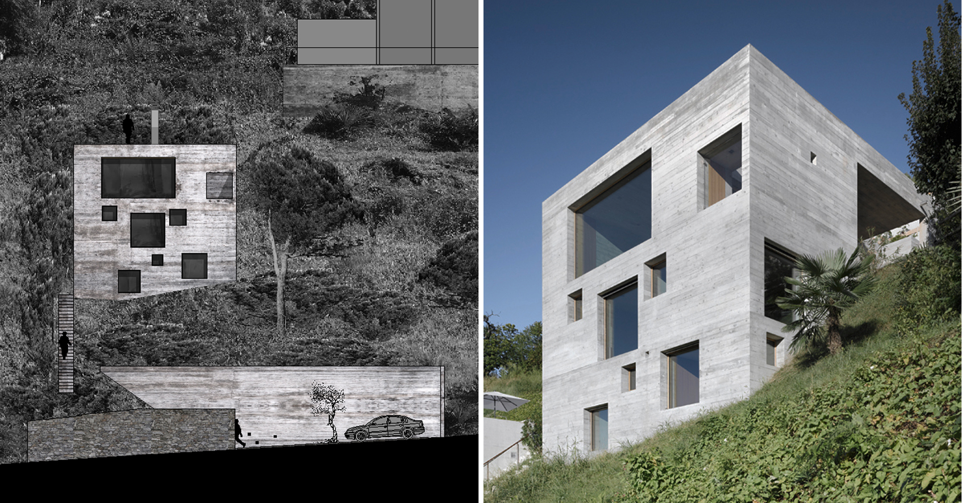

House in S.Abbondio

By wespi de meuron romeo architects, Locarno, Switzerland

Photos by Hannes Henz

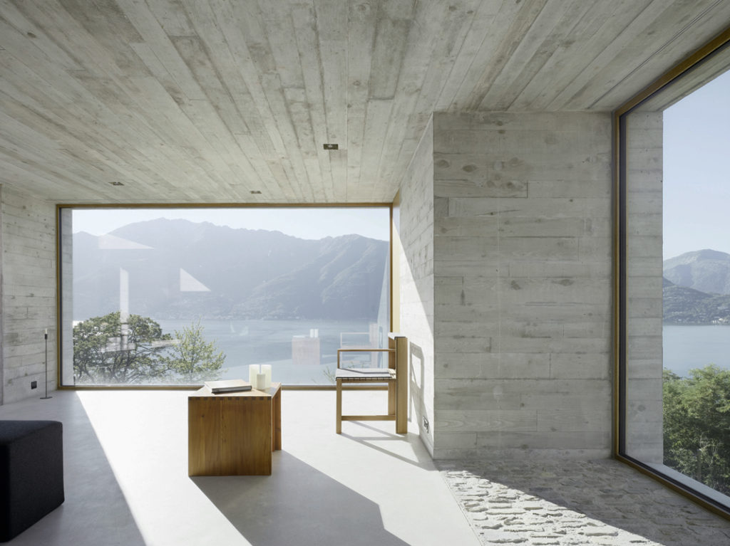
Standing on a steep slope near Lake Maggiore in the Swiss Alps, this new house keeps things simple with a cubic shaped structure and wood panel cast concrete walls. The irregularly placed large square and rectangular windows breaks with the monolithic façades and ensures no view of the stunning lake goes unseen.

House Au Yeung

By Tribe Studio, Sydney, Australia

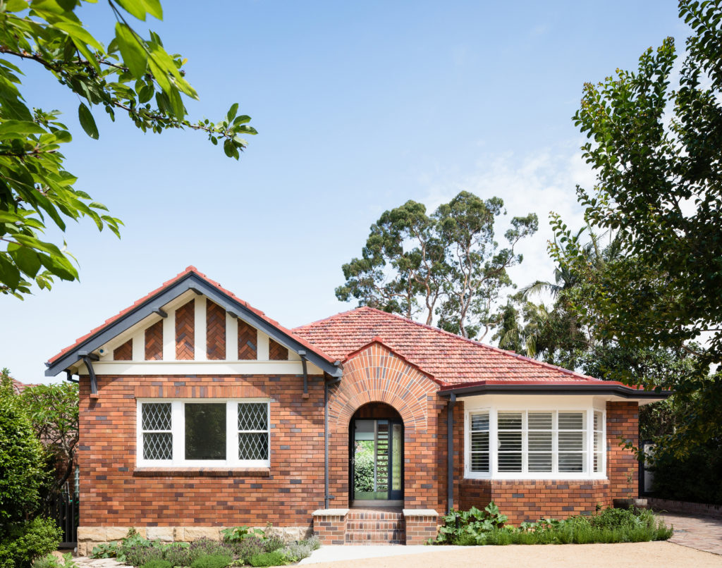
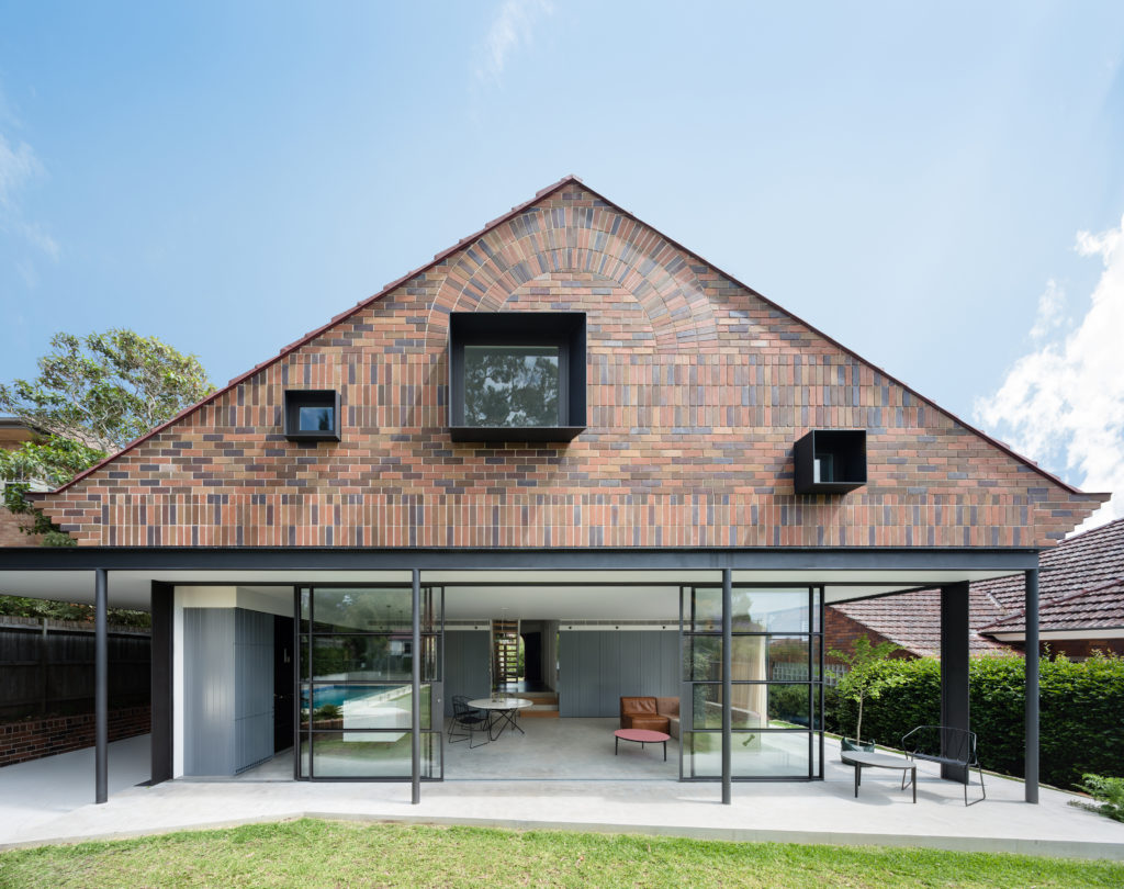
The rear extension to this modest 1930s bungalow in a leafy Sydney suburb reproduces many of the sensible design choices of the original house: herringbone brick gables, a brick sunburst and some Tudor detailing among other details. However, three deep-set square windows bring a pop of modernity to the rear façade, matching the design ethos of the new living room on the floor below.
Jazz Loft

By T2.a Architects, Budapest, Hungary

Photos by Zsolt Batar

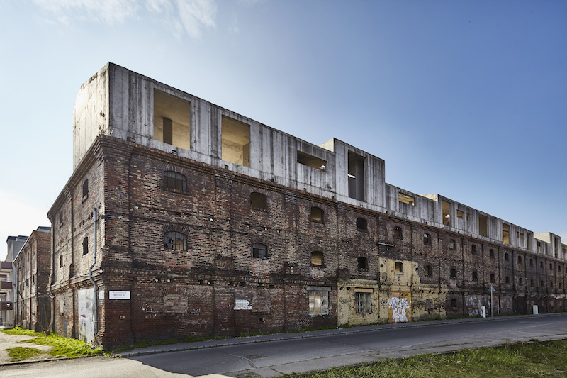
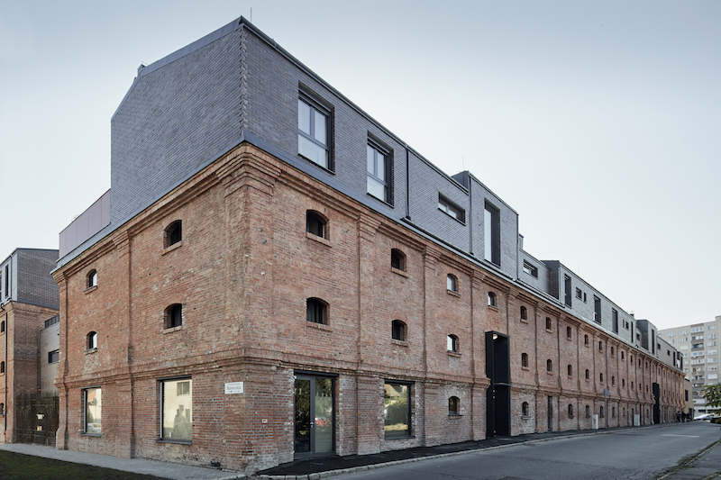
This residential building is the culmination of a fifteen year-long meticulous renovation and restoration project of an abandoned 19th century mill on the outskirts of Budapest. The decaying façade was refurbished and reinforced but maintained almost identically to its original configuration. Not only does this give a fresh face to the old building, it also helps reinterpret the industrial design elements for the new residential purpose.

Most notably, the row of windows on the top floor is now highlighted by a dark-grey brick cladding and draws attention to their random assortment of shapes and sizes; what were once functional windows designed for the mill now give an improvisational dynamism to the building, making it fit for the name “Jazz Loft”.


House A&J

By CKX architects, Eindhoven, Netherlands

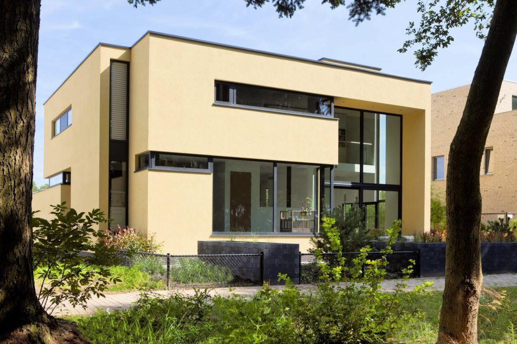
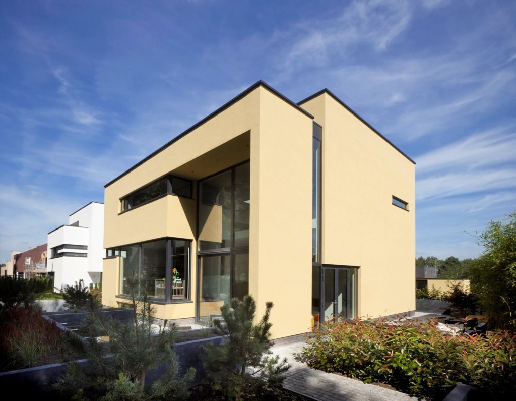
This new residence in Eindhoven is a playful remix on Le Corbusier’s ribbon window. The architects add a vertical dimension to the horizontal windows, ensuring one continuous flow of glass over two floors carved within the yellow cubic volumes. These offer generous vertical views of the nearby forestry while maintaining enough privacy for the second-floor bedrooms.
Fidalga_727

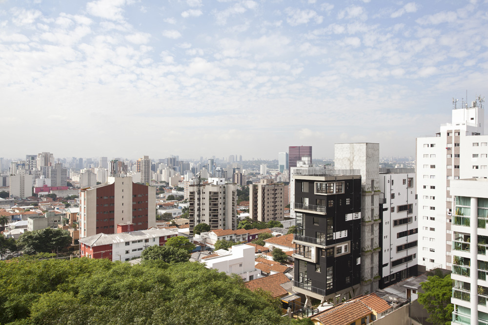
By Triptyque Architecture, São Paulo, Brazil

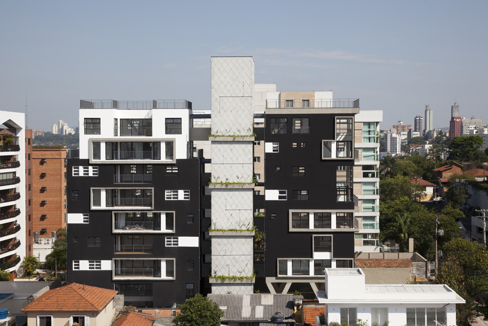
This new high rise apartment block in a middle-class neighborhood of São Paulo references the Paulista School — one of the major 20th century movements in Brazilian Brutalist architecture — with an elevated concrete structure and a building body fragmented into three parts. Somewhat ironically, it’s the Bauhaus-inspired window pattern (reminiscent of Walter Gropius’s Bauhaus Dessau) that takes the building into the 21st century.

Architizer is thrilled to announce the winners of the 10th Annual A+Awards. Want to earn global recognition for your projects? Sign up to be notified when the 11th Annual A+Awards program launches. 

Reference

Contemporary Vaults: 6 Modern Iterations of a Age-Old Architectural Classic
CategoriesArchitecture

Contemporary Vaults: 6 Modern Iterations of a Age-Old Architectural Classic

Architects: Want to have your project featured? Showcase your work through Architizer and sign up for our inspirational newsletter. 

Vaults have existed in architecture for thousands of years. Essentially an extrusion of an arch along an axis, the structural value of the self-supporting form has made it a popular motif across typologies and around the world: from the construction of homes, religious buildings and more. Additionally, arches can be created using a variety of materials such as stone, brick, timber and even bamboo. Some examples of traditional vault forms include smooth barrel vaults, complex groin vaults, pointed arch vaults and decorative rib vaults, among others. These systems not only act as a structural framework but also help elevate plain ceilings. With each innovation in arch-building technology came new aesthetic styles and forms of architectural expression.

Yet, despite their versatility, vaults and domes remain widely associated with more traditional design styles or religious architecture. The projects below break away from the stereotype and show how these time-tested forms can be adapted to suit modern homes and public spaces.


Waffled Spaces

Bean to Bar Chocolatier by STUDIO TOGGLE, Salmiya, Kuwait

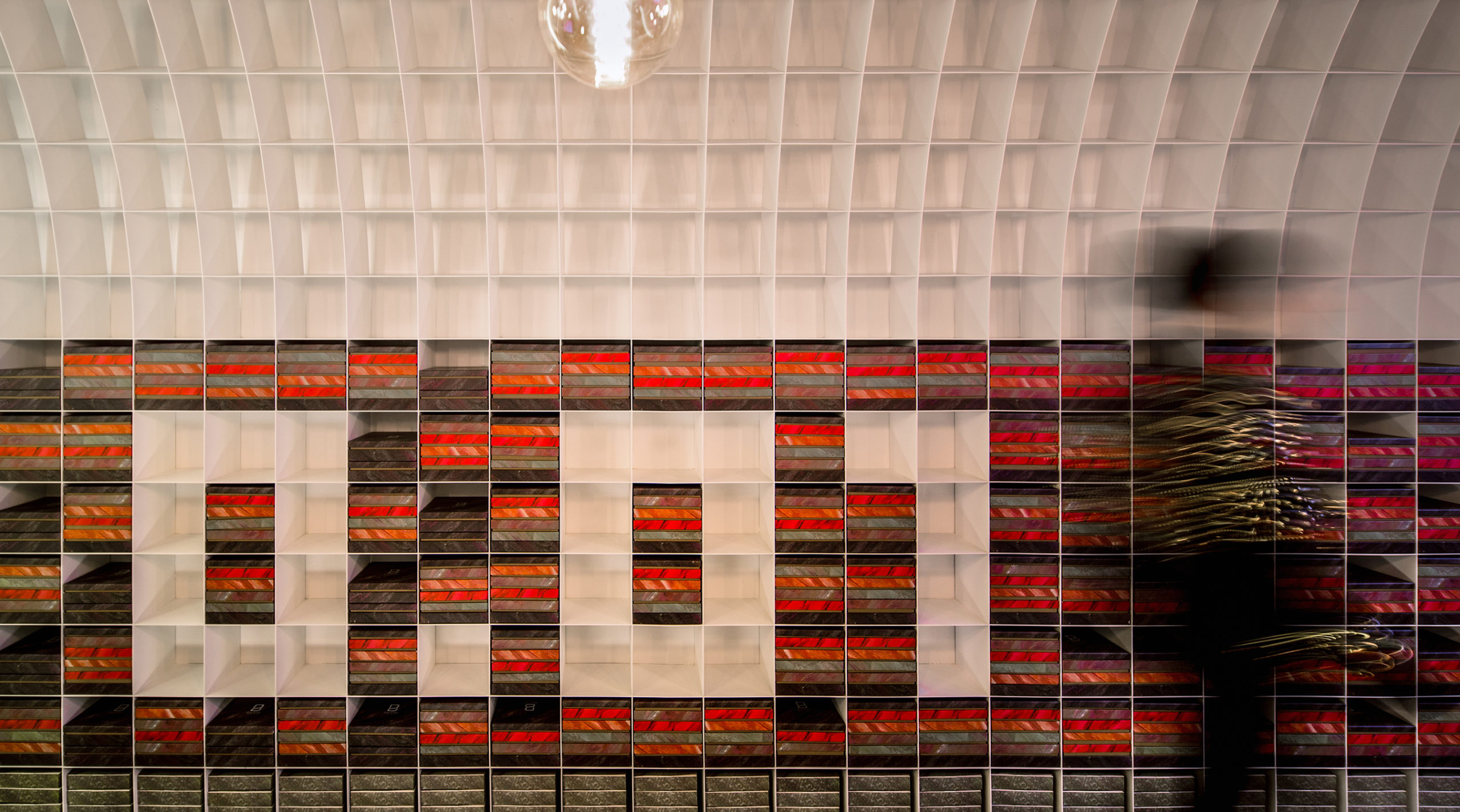
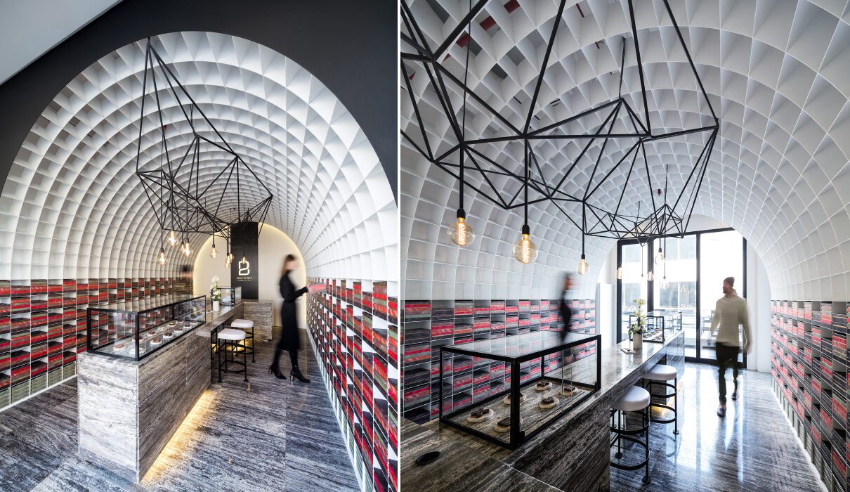
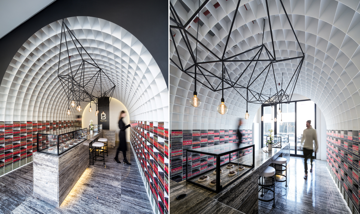
It was tricky to create brightness, storage and openness in a narrow, enclosed site. One solution, as showcased in the Bean to Bar Chocolatier store, introduces a waffle vault throughout the length of the space. A waffle vault can add dimension and interest to the ceiling without reducing the height in the way a false ceiling would. In this case, it can also extend to the floors and create room for display shelves. These pixels, which were sized based on the dimensions of the chocolate packaging, can be changed to create different patterns as and when needed. In other cases, waffle vaults such as this one can also be used to conceal lighting fixtures.


Organic Forms

Guyim Vault House by Nextoffice, Concept

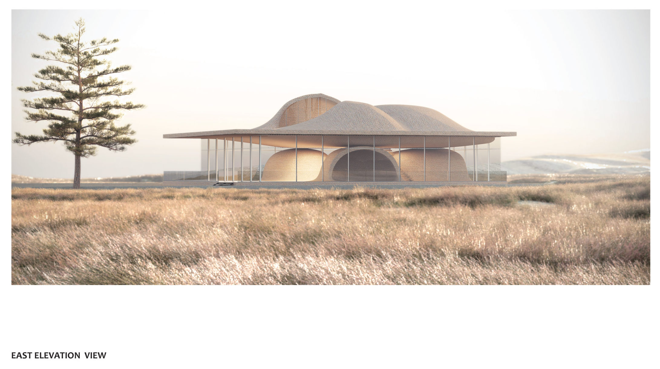
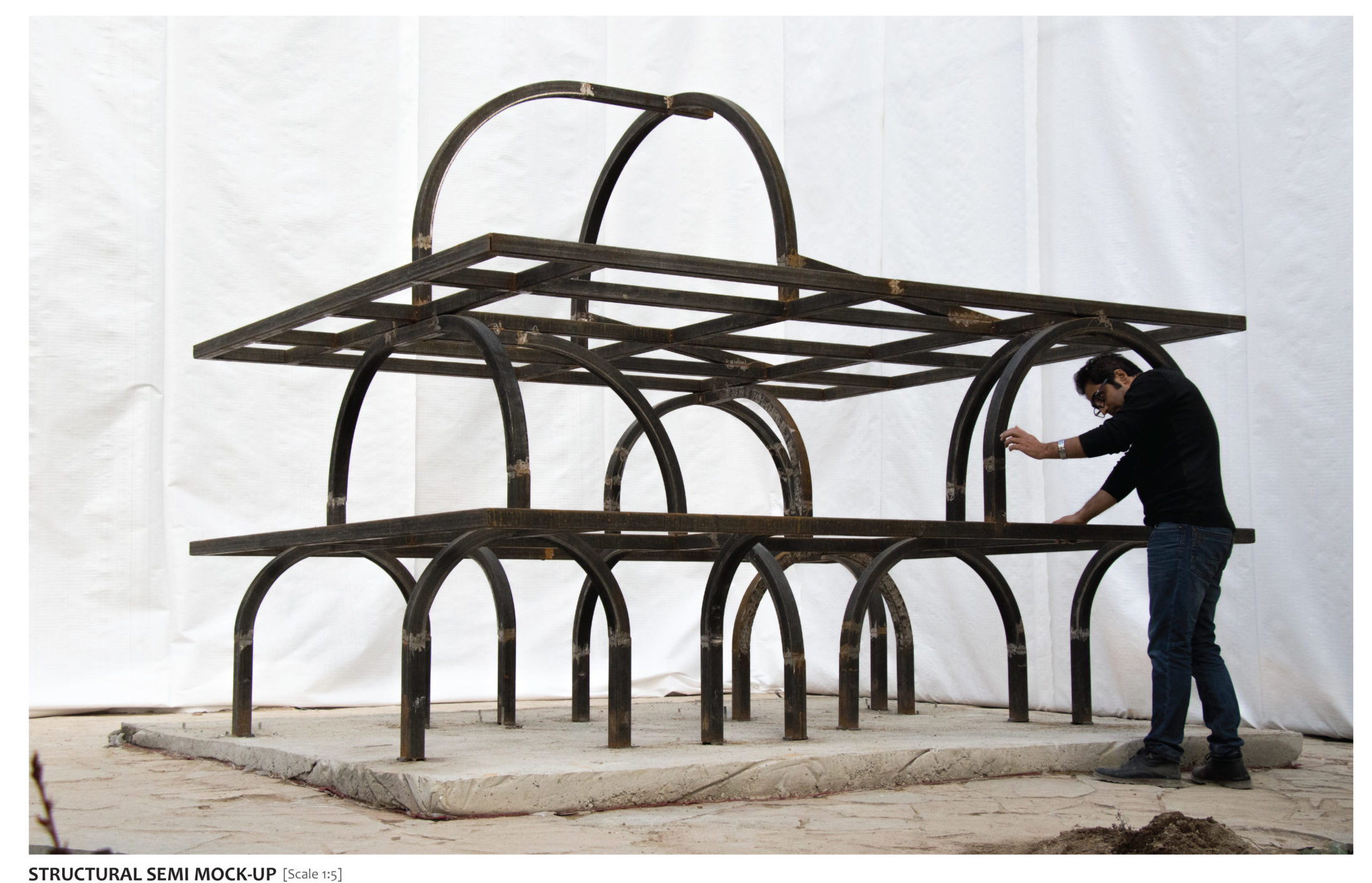
While vaults are traditionally elements that prominently enhance the interiors, they can also be used to redefine form on the outside. Using vaults in a skeletal cuboidal framework restrains the geometry while also creating a contoured form that clearly defines spaces and gives the structure a strong identity. In Guyim Vault House, Nextoffice uses semi-vaulted structural elements to create mounds in the different levels of the home. The system creates a very unique structural network that makes way for unique spatial blocks inside. These vaulted forms intersect with each other to create both public and private zones. For example, three domes face each other on the first floor to create a semi-private quadrangle. Taking this a step further, the forms on the upper level open up to allow light to enter the home.


Pointed Patterns

New Preston Mosque by AIDIA STUDIO

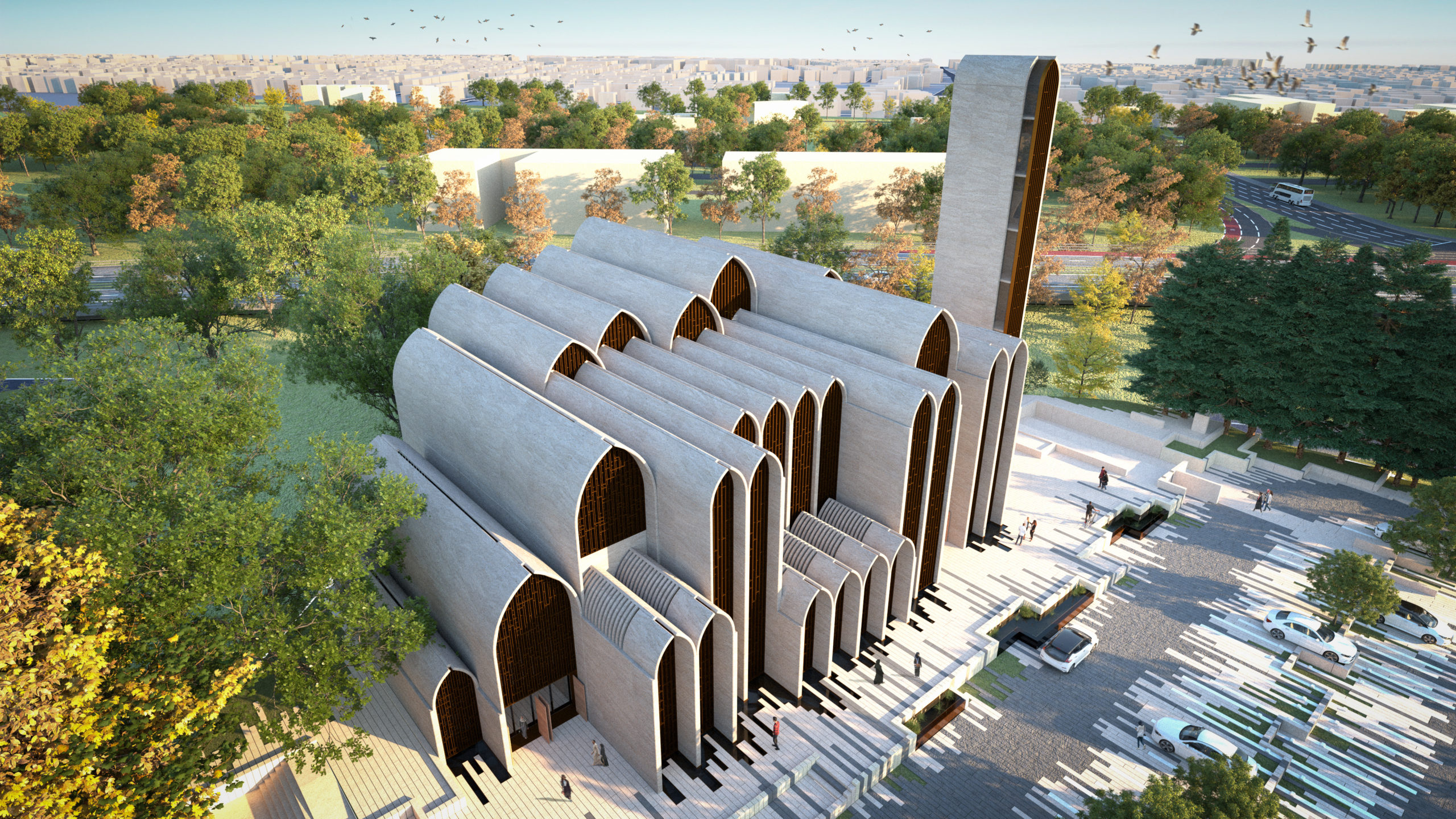
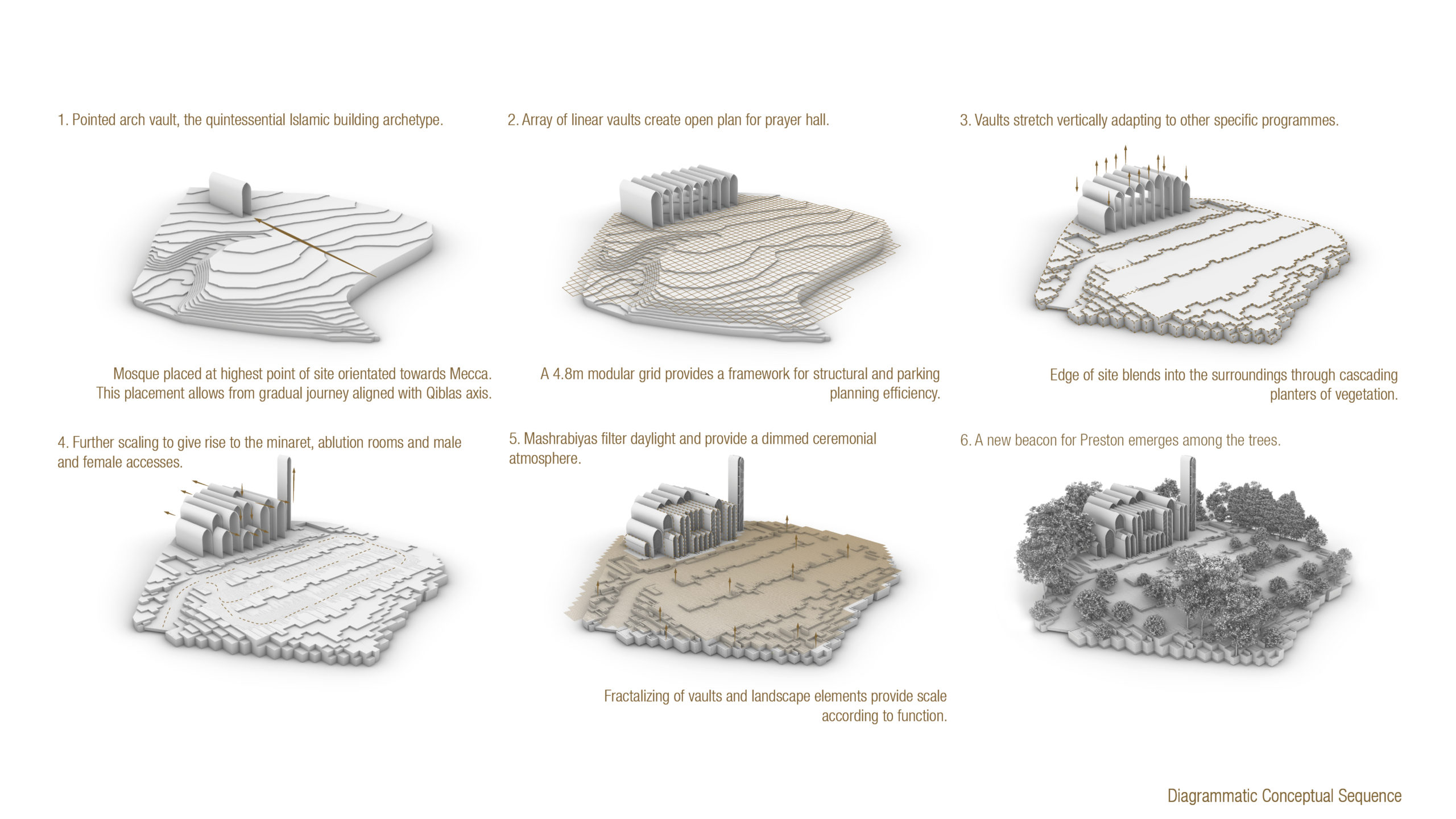
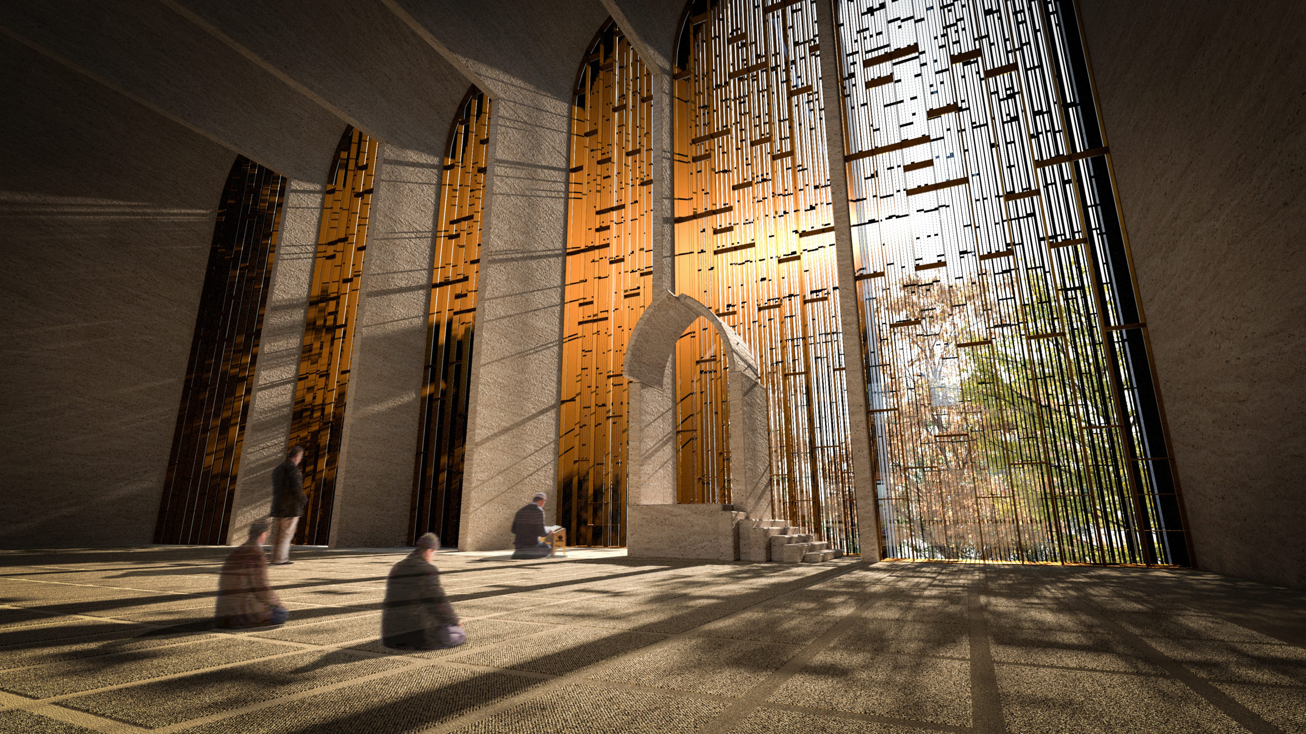
The pointed arch, which is commonly associated with Gothic architecture, found its origins in Islamic and Indian architecture. These arches were used to create doorways and ornate windows in religious or important structures. The team at AIDIA STUDIO used this historical reference and gave it a contemporary twist to create this conceptual mosque. Using a pointed arch form to create a vault allows the form to span more considerable lengths with more stability. It also allows for bigger column-free floor spans. Here, the studio turned this element into a fractal pattern that gets repeated across different levels and scales throughout the mosque.


Geometric Ceilings

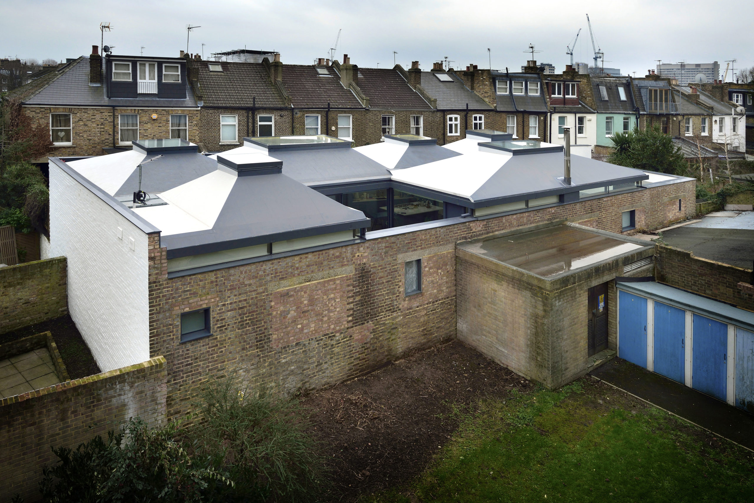
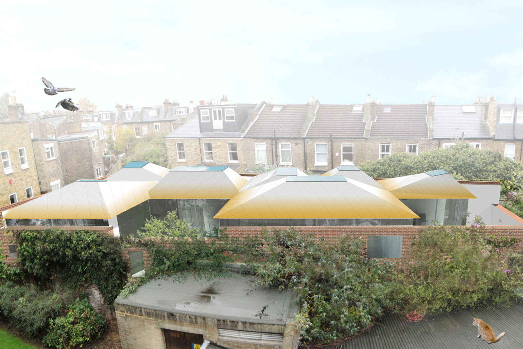
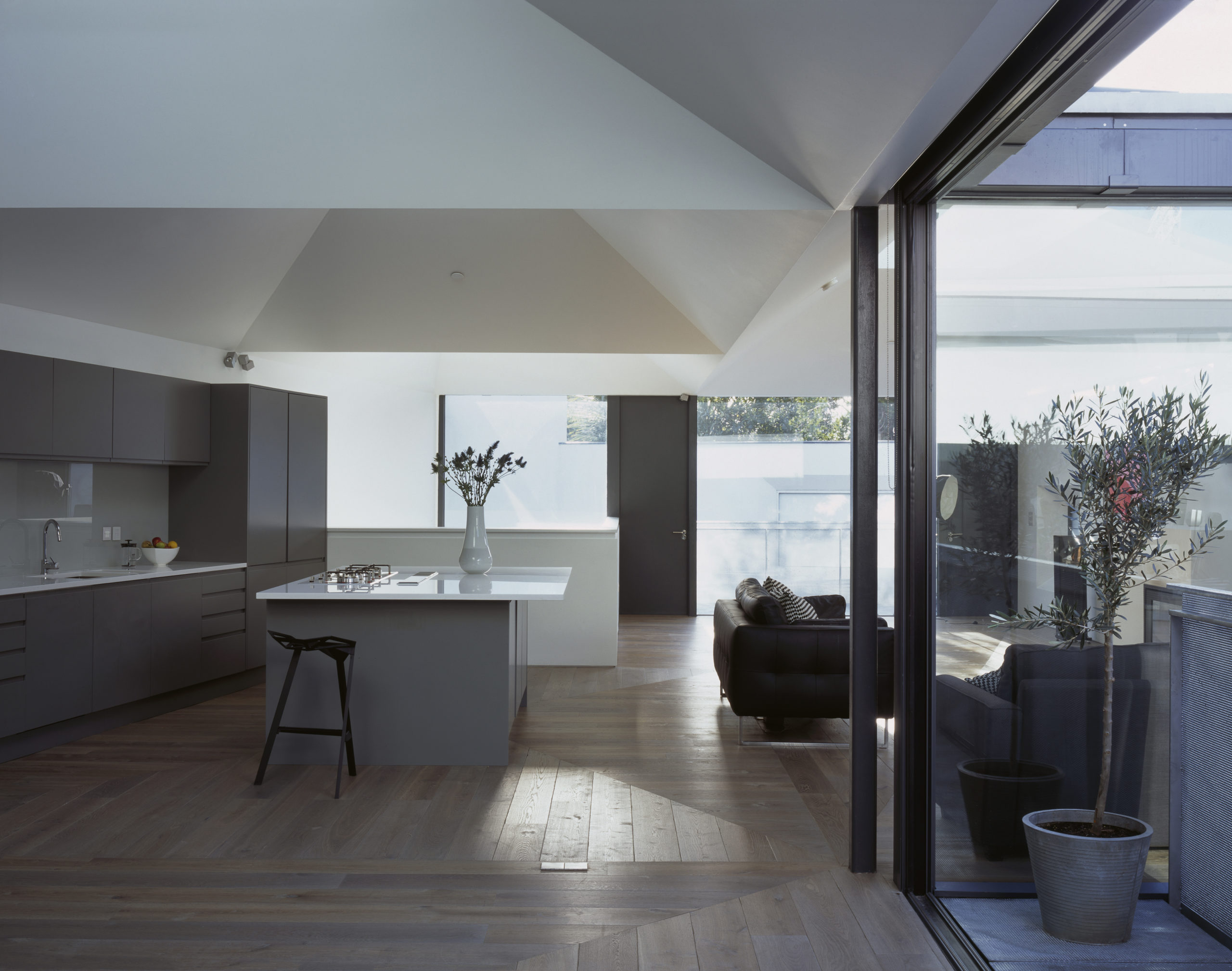
Vaulted House by vPPR Architects, London, United Kingdom

When curved ceilings don’t work with the overall design scheme, there is always an option to turn them into geometric arrangements that create a similar experience. This can be seen in Vaulted House by vPPR Architects. The roof of the entire home is divided into geometric vaults that coincide with the spatial distribution within the home. These sharp inclines completely mask the huge steel beams that are used to hold them up. The vaults are also capped with skylights to maximize the amount of natural light entering the home. To broaden the scope of this design, this trapezoidal geometry is further expanded to multiple objects around the house including the fireplace, windows, floors and the entrance.


Bamboo Lattice

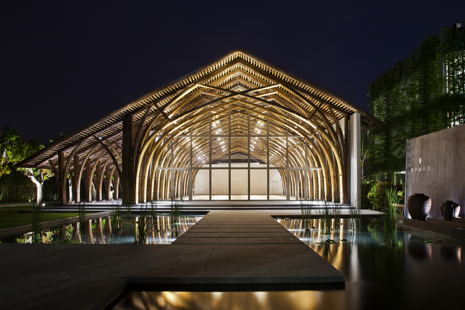
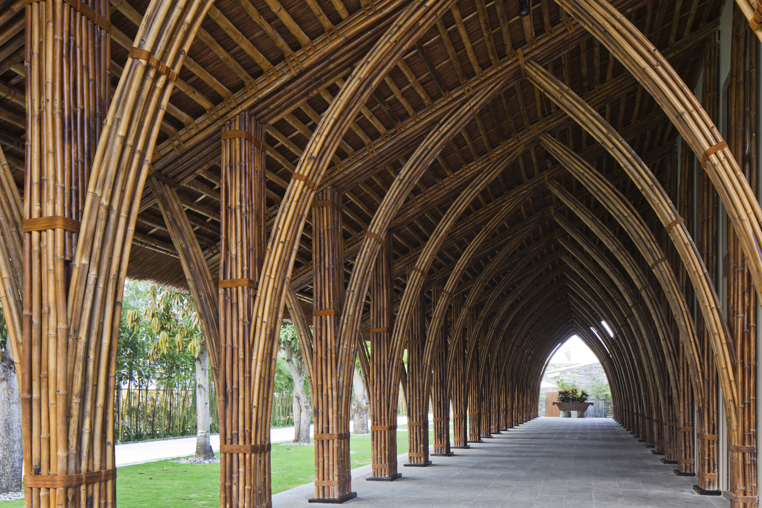
Naman Retreat Conference Hall by Vo Trong Nghia Architects, Ngũ Hành Sơn, Vietnam | Images by Hiroyuki Oki

A way of adapting the vault form for tropical regions is constructing it using locally-acquired materials such as bamboo. The flexibility of bamboo stems allows them to be bent and bundled together to create a sturdy framework that can hold up a large column-free roof. In Naman Retreat Conference Hall, two types of bamboo are used to create the central hall and an adjoining vaulted corridor. The enclosed hall spans about 44 feet and goes as high as 31 feet. A large glass plane is placed three arches in to create an arched canopy outside. These curved frames are prefabricated on ground to ensure quick and easy assembly, while being very affordable and offering more control.


Asymmetrical Systems

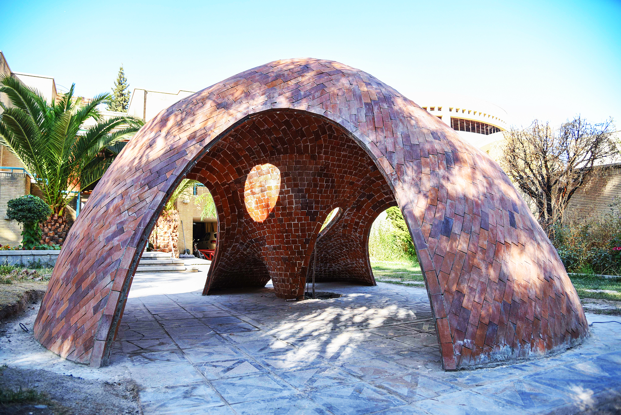
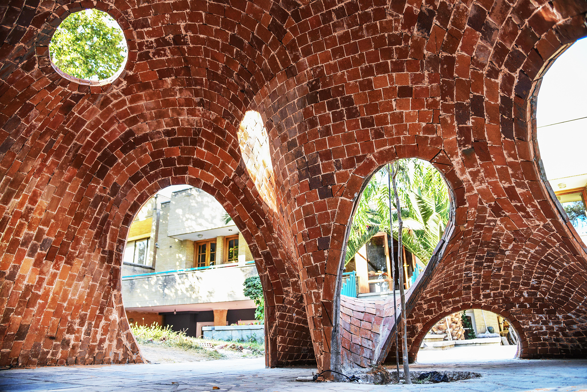
FaBRICKate by ADAPt, Isfahan, Iran | Images by Soroosh

Modern fabrication methods and materials have expanded the possibilities of buildable forms and architectures. And so, while it was often taken as a given that vaults were symmetrical structures in the past, architects are now exploring new ways of looking at them by using manual and digital technologies. FaBRICKate is an experimental free-form compression-only vault system that reverses the mechanism used by the tension-dependent catenary form. Using different 3D modeling plugins, the team devised this asymmetrical form and used a waffle structure combining a grid mesh and steel rods to construct it. This reinterpretation of the classic vault opens up new ways of carving spaces that are transcendental and unique.

Architects: Want to have your project featured? Showcase your work through Architizer and sign up for our inspirational newsletter. 

Reference

Architectural Pilgrimage: Trace Millennia of Architettura Innovativa Across the Italian Landscape
CategoriesArchitecture

Architectural Pilgrimage: Trace Millennia of Architettura Innovativa Across the Italian Landscape

Browse the Architizer Jobs Board and apply for architecture and design positions at some of the world’s best firms. Click here to sign up for our Jobs Newsletter. 

With over sixty million visitors annually, Italy is the third most visited country in the European Union, and there is no surprise why. With pronounced coastlines, culture, food and architecture, Italy is the perfect destination for those hoping to unwind near the Mediterranean sea, hike the Italian Alps or explore a bustling city. It proudly holds the world’s most UNESCO World Heritage Sites of any country, with a total of fifty-eight wonders to visit.

The romanticized Italian culture also makes this country a highly desired tourist destination. The mannerisms, the music, the family focus, the constant aperitivos and, of course, the food make Italian culture highly idealized worldwide. Tourists are desperate to get a taste for themselves and embody this passionate culture for a brief moment; they come from far and wide not only for the cuisine but for the architecture. The country is home to an abundance of architectural styles that date over three thousand centuries. From remnants of the Etruscan and Ancient Roman civilizations, Gothic and Renaissance masterpieces to today’s contemporary marvels, there are a plethora of sites worth visiting trip after trip.


Storia e Architettura 

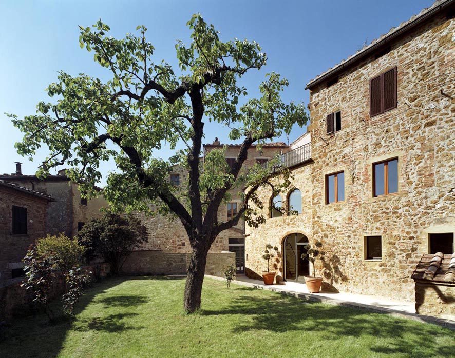
A1 House by VPS Architetti, Tuscany, Italy

One of the most common associations with Italian design is the Mediterranean villa. Historically these spaces were intended as country homes for upper-class families and date back to the Ancient Roman period. Today we see a plethora of lavish villas all throughout Europe. Some are modern and filled with 21st-century luxuries, while others are more carefully connected to tradition and Italian history.

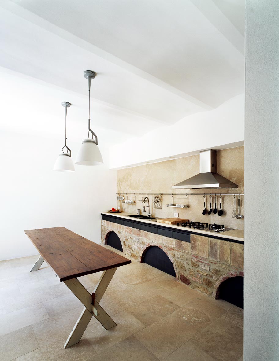
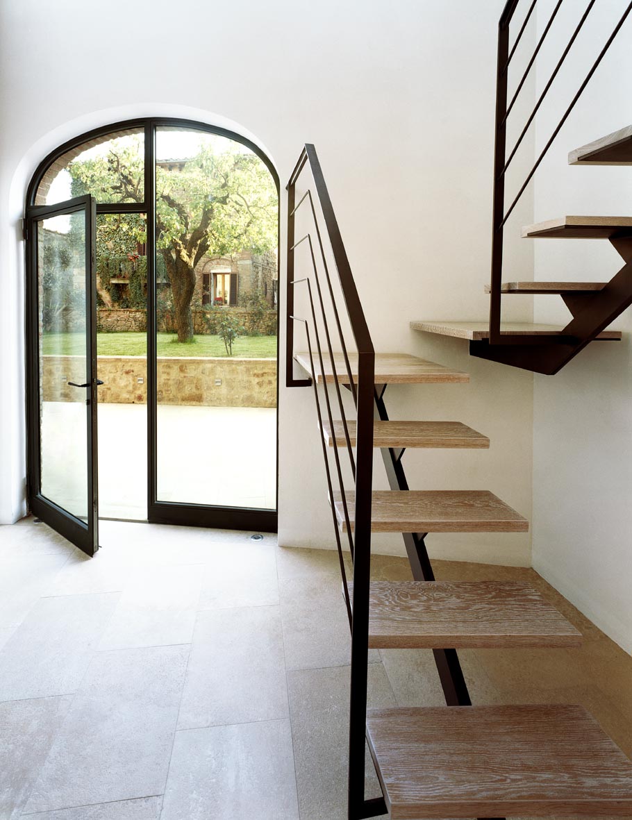
Take A1 house by VPS architetti for example. Located in a medieval hamlet and renovated in 2006, the original edifice dates back to the 1500s and has undergone many transformations over the centuries. An important feature of the quintessential villa is a pronounced and expansive outdoor space. In keeping with the tradition of green spaces, the garden was designed around the site’s centuries-old pear tree. The lush grass and simple shrubbery contrast the villa’s brick façade which is flanked by newer and older shuttered windows.

A1 House by VPS Architetti, Tuscany, Italy

Inside the home, the design team worked to create spatial continuity by eliminating the many incoherent elements from past renovations. A pronounced, double-height entry greets visitors into the home and works to bring in natural light. Simple white walls and earth-toned materials decorate the interior space and compliment the home’s historic elements. The kitchen area balances old and new with quality appliances worked into original stonework. The home is unadorned and lets the historic bones speak for themselves. A1 House is a true emblem of the perfectly restored villa.


Cibo

Connecting through food is intrinsic to Italian culture. Touring around the country provides an incredible opportunity to experience and taste regional delicacies and cuisine. Whether in the north or south, the traditional dishes vary and will certainly not disappoint. 

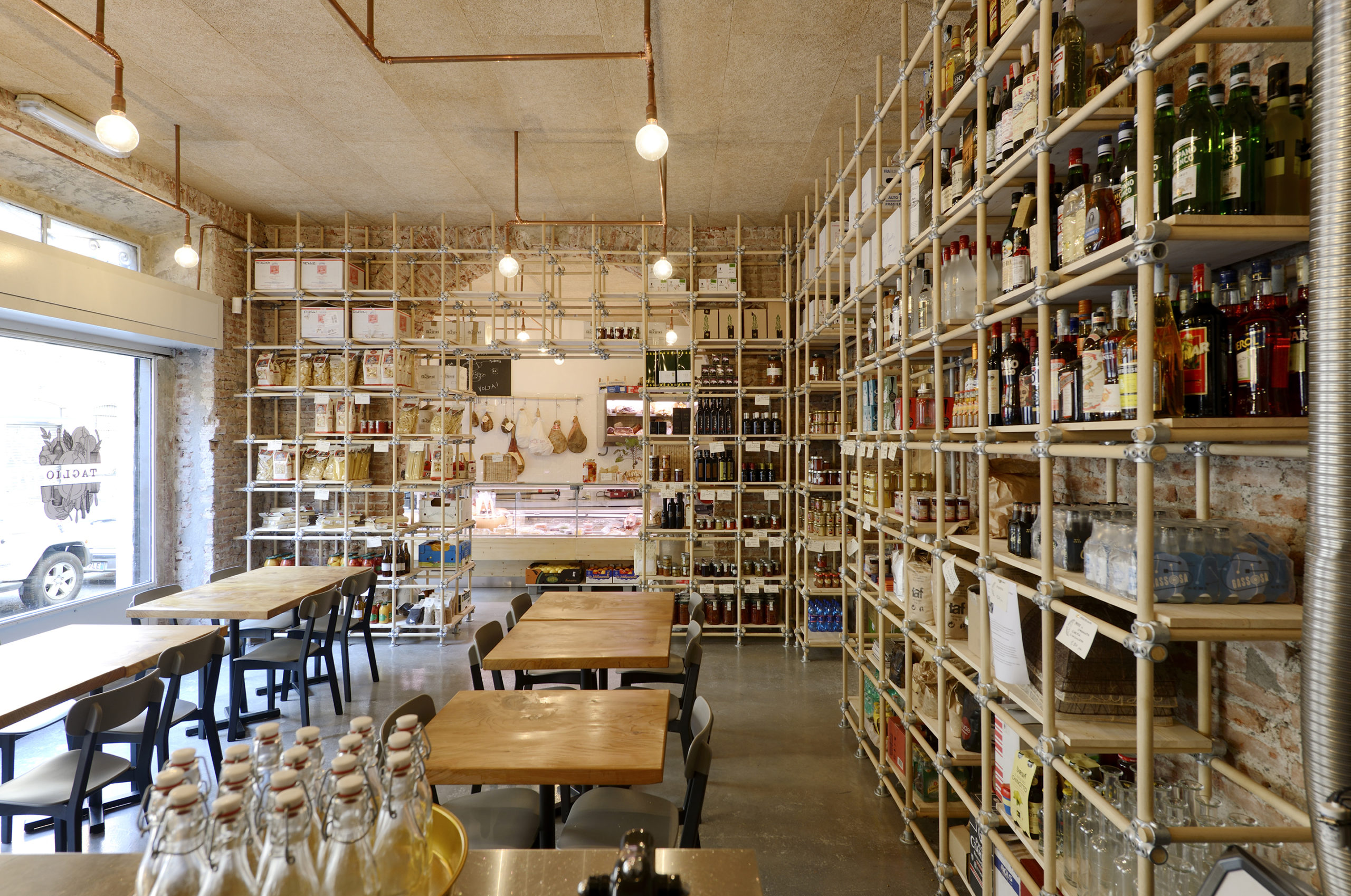
Taglio by rgastudio, Milan, Italy

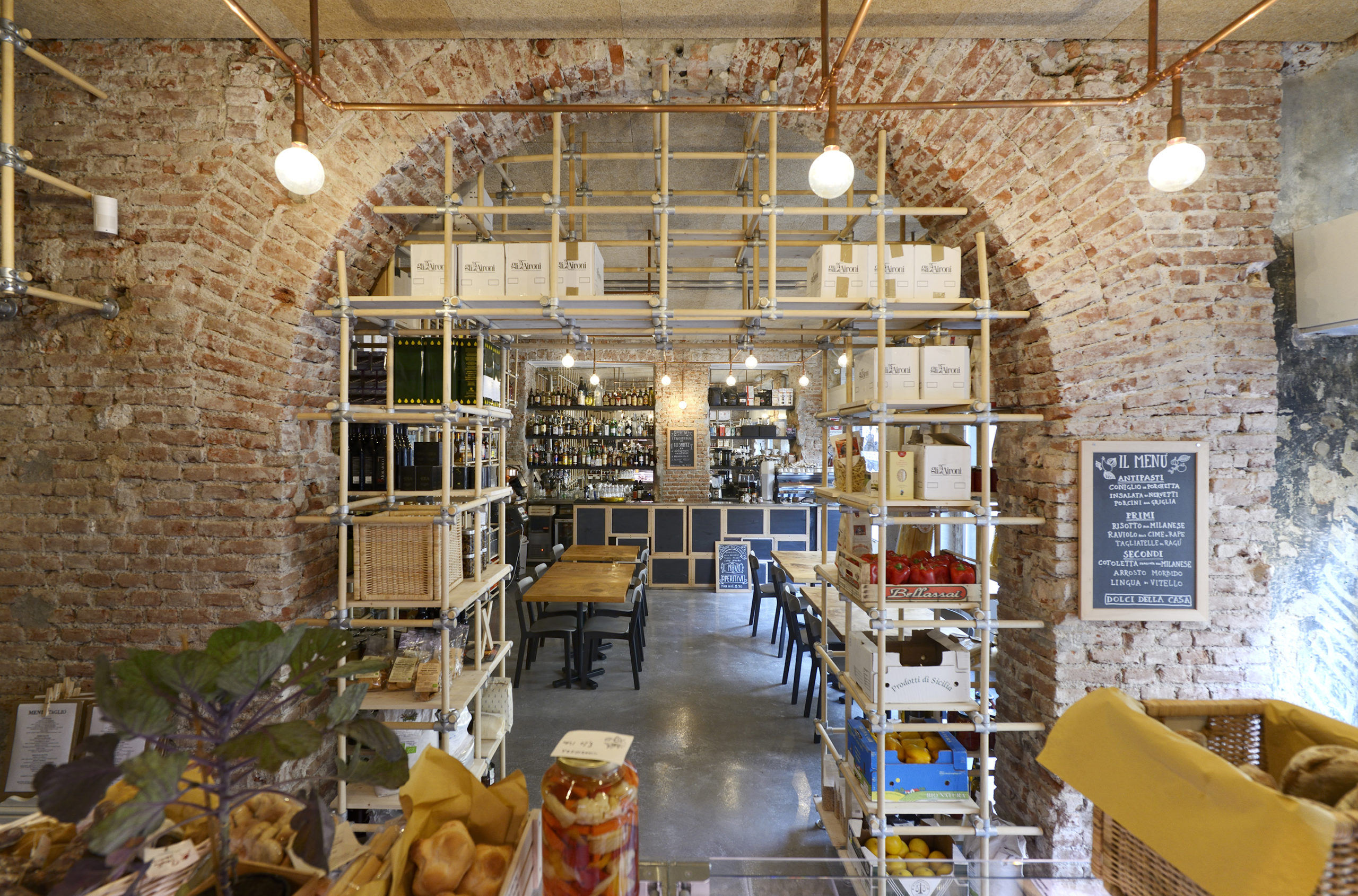
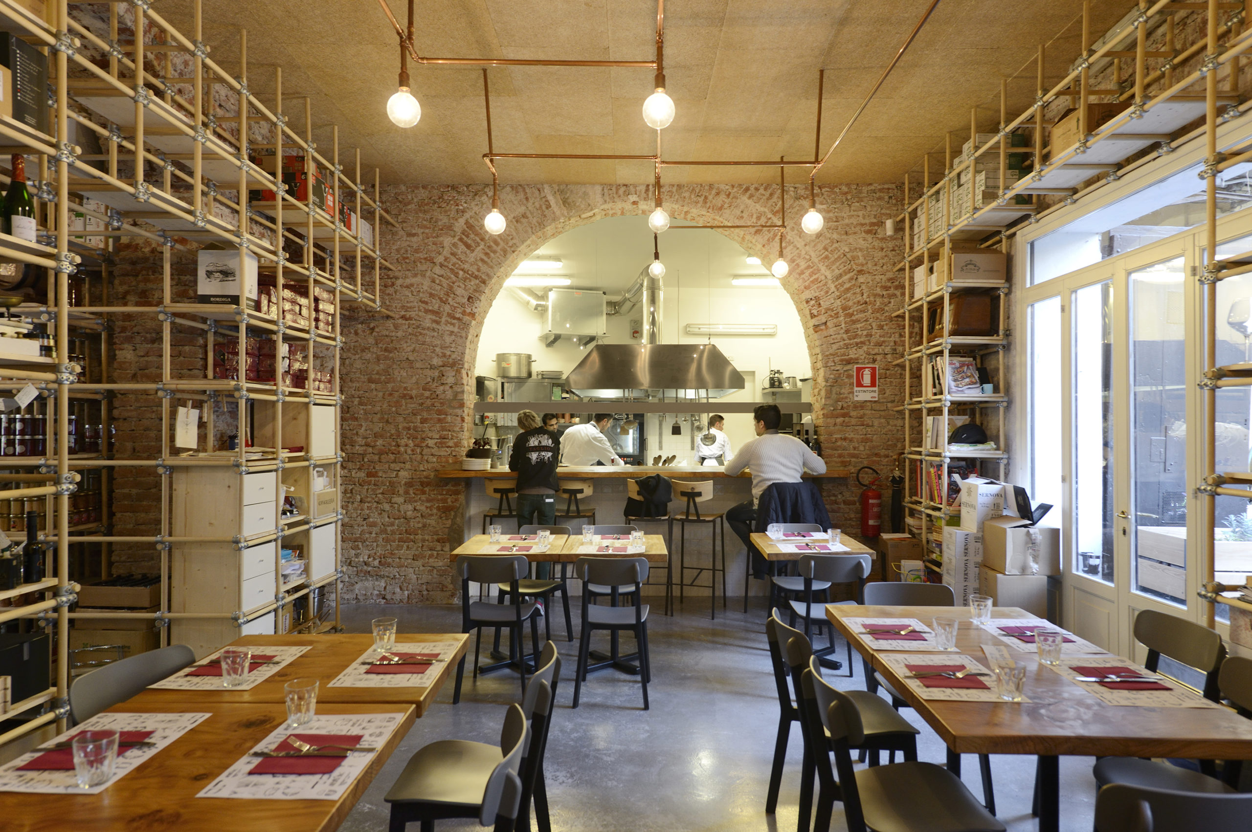
In Milan for example, tourists will experience the region’s meat-heavy cuisine, with dishes like ossobuco and cotoletta. Located in Milan’s bustling Navigli canal district is Taglio, a multifunctional hospitality space housing a restaurant, bar, cafe and small food shop. Designed by rgastudio, Taglio sits on the ground floor of a block of traditional Milanese flats and serves the local neighborhood as well as visiting tourists. The space is bustling from day to night as it serves an array of customers and dining patrons. Whether it be enjoying a quick espresso or dining with gourmet food and wine, Taglio provides numerous culinary services. 

Taglio by rgastudio, Milan, Italy

The interior plasterwork was removed to reveal the old brick and structural components, giving it an industrial and honest aesthetic. Divided into two sections, the first room houses the shop, cafe and part of the restaurant. While the second room boasts an open-plan kitchen visible to guests via a grand archway, thus providing a space where tourists can dine and watch the Italian chefs hard at work.


Geografia e Vino

Italy’s rich geography is a marvel to explore in and of itself. Whether it be the Alps in the north, the hilly central region, or the scattered volcanic islands in the south, the rich topography has given rise to wonderous architectural gems.

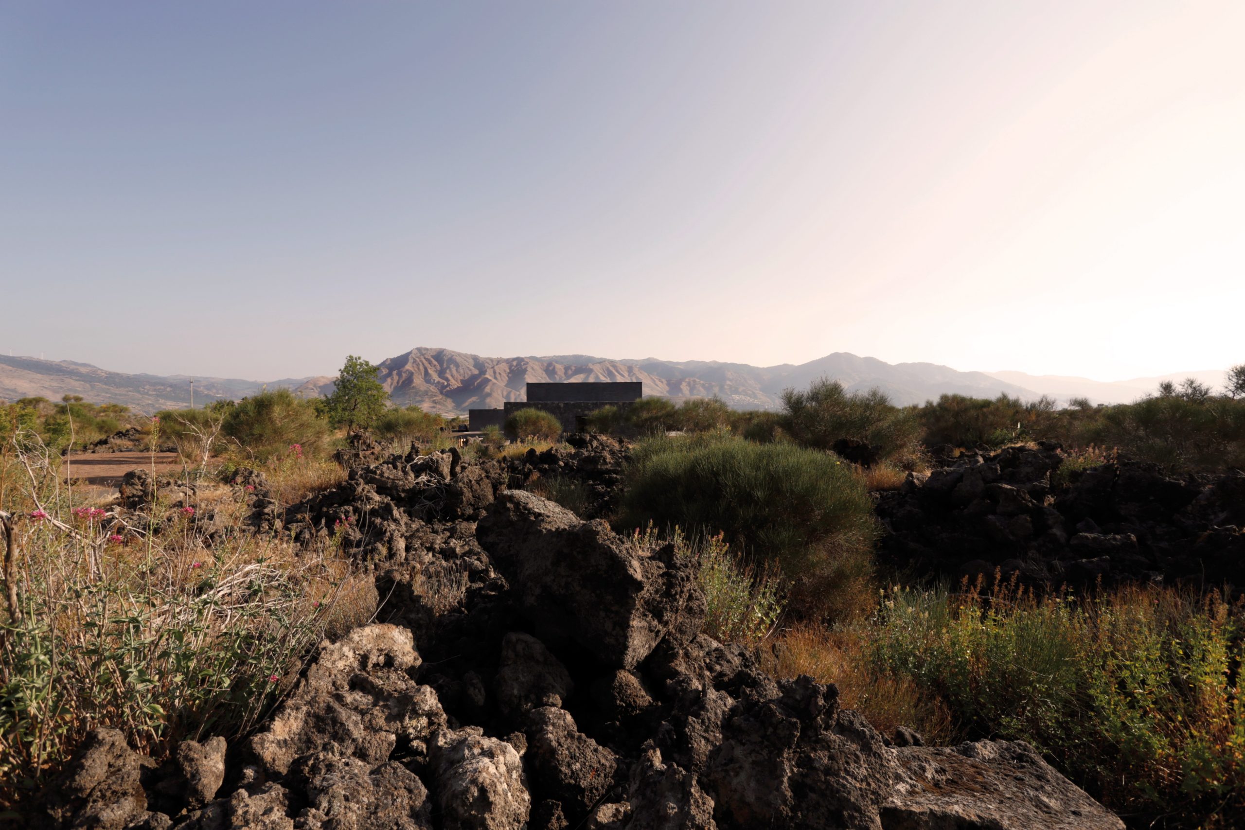
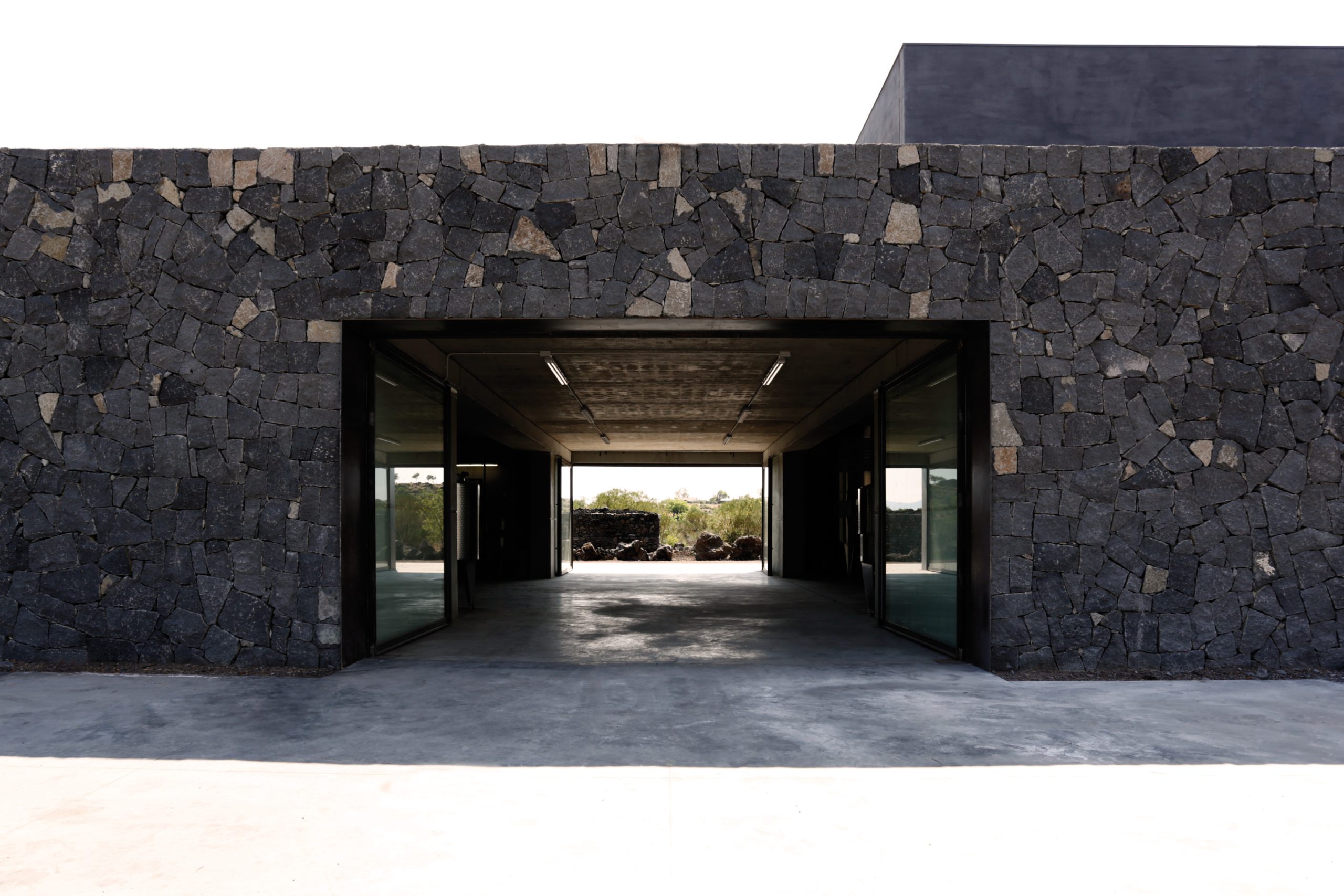
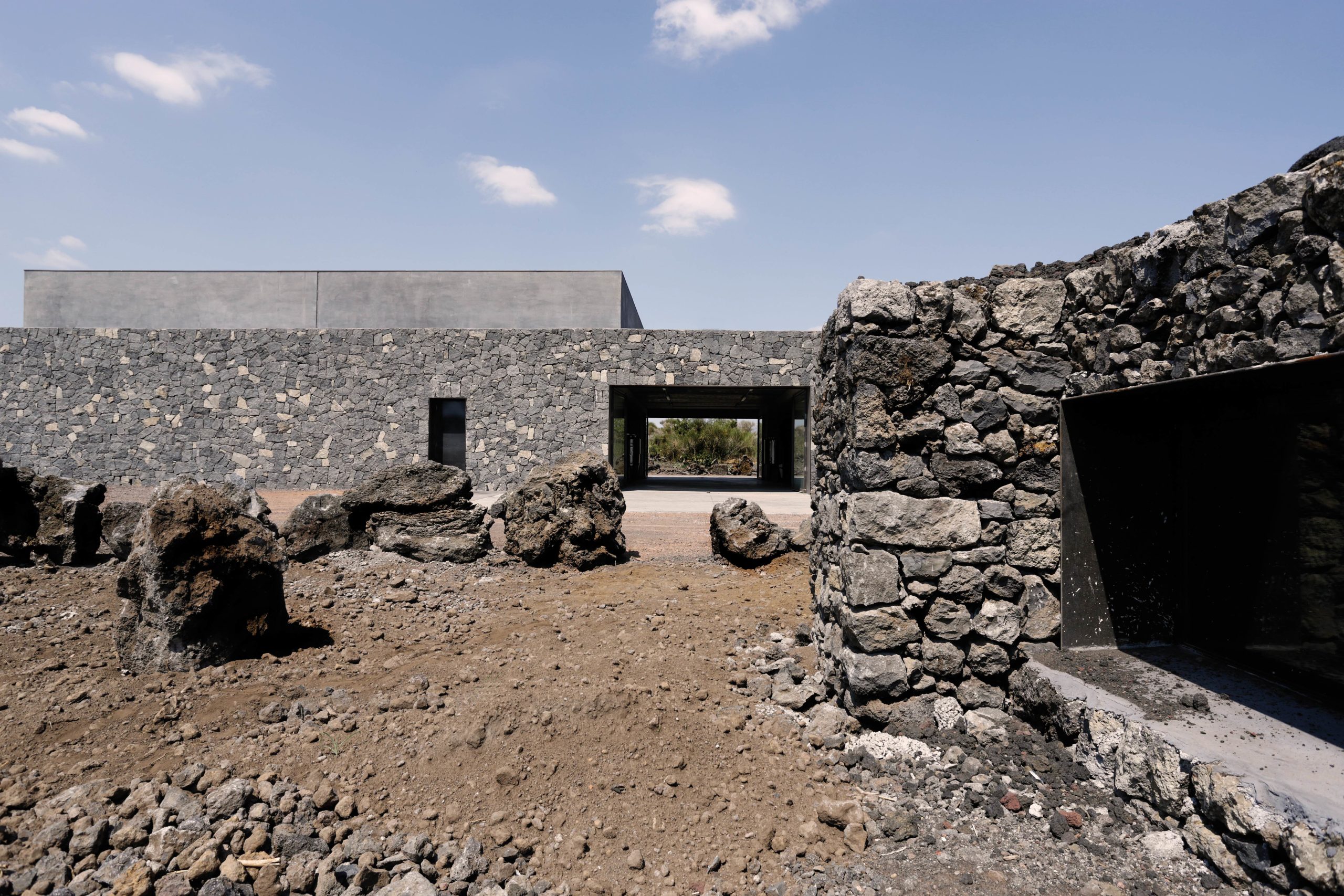
Winery on the Slope of Mount Etna by Vid’a Group, Castiglione di Sicilia, Italy

The island of Sicily is home to six volcanoes. Architects have learned to build and design around challenging topographical and environmental conditions, and in Sicily, respecting the local vernacular ensures a pronounced and secure structure. The Winery on the Slope of Mount Etna is an exceptional space to drink incredible Italian wine and marvel over this architectural achievement. Located in Castiglione di Sicilia, Italy, this architectural feat is thanks to design firm Vid’a Group. The challenge of building this winery was the land, which posed difficulties surrounding the active volcano, lava flow, and pietraie – dry stones which divide the territory.

Winery on the Slope of Mount Etna by Vid’a Group, Castiglione di Sicilia, Italy

The winery is located on a flat clearing surrounded by fertile soil and lava flow. The main building is made of quarry lava rock which ensures a secure structure and adheres to local building traditions. The primary structure takes the form of a monolith and directs visitors toward the cone of the volcano.


Architettura Innovativa

Italy’s mountainous region offers an abundance of resorts and outdoor attractions where visitors can ski and profit from the mountain air. Now, imagine sipping a glass of chianti amongst the clouds.

Hubertus Skypool by noa* network of architecture, Mitterolang, Italy, Photos by Alex Filz

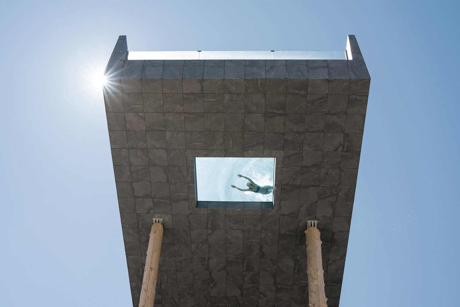
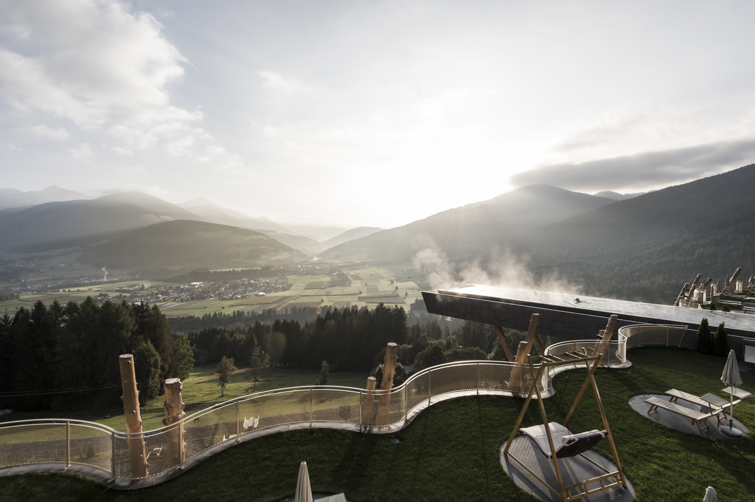
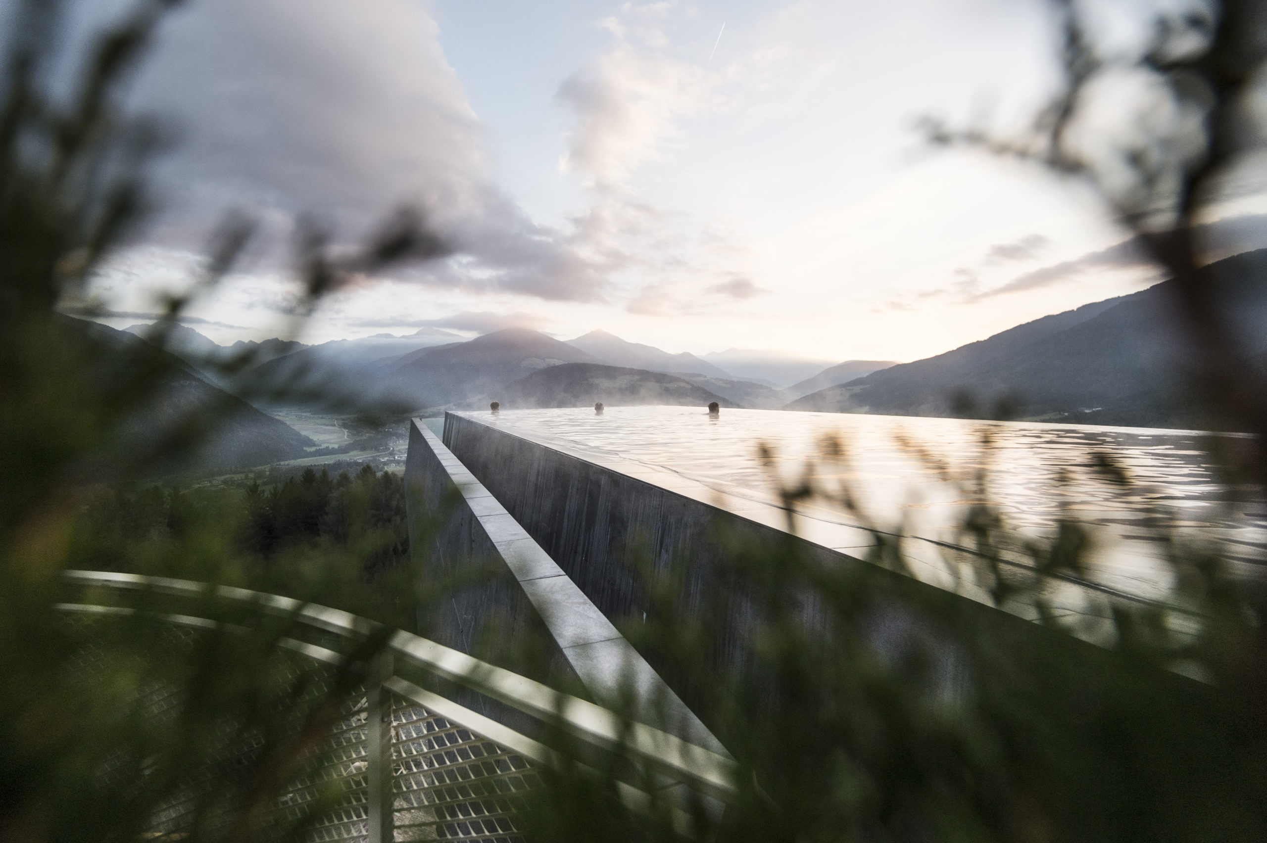
The Hotel Hubertus located in Valdaora underwent an incredible renovation to include new suites, enhanced guest spaces and most notably a 25-meter sky pool. The Hubertus Skypool was developed by noa* network of architecture with the intention of connecting old and new.

Hubertus Skypool by noa* network of architecture, Mitterolang, Italy, Photos by Alex Filz

The pool is cantilevered overlooking the mountain range and sits between the old and new hotel wings. The pool appears like a floating rock with a glass front and glazed window floor. The sensation feels like somewhere between heaven and earth and truly is a breathtaking architectural accomplishment.


Reference

To Make Sure Neutral Architectural Surfaces Don’t Fall Flat, Just Add Texture
CategoriesArchitecture

To Make Sure Neutral Architectural Surfaces Don’t Fall Flat, Just Add Texture

At their best, blank white walls can make a room feel large and airy; on the other hand, expansive blank planes can also lend themselves to clinical or boring atmospheres. And while vibrant colors and bold patterns can inject some personality into spaces, they might not always be an option for homes and offices that are dimly light, narrow or cramped.

In such cases, where neutral tones like white and beige are preferable, adding texture to walls and ceilings can add movement and depth to a monochrome space. Subtle textural protrusions won’t take up much space yet will leave a strong impact. More and more architects are incorporating corrugations, curved profiles, shallow folds and more to add intrigue to greyscale walls and ceilings.

Images by Jonathan Leijonhufvud Architectural Photography

Nanchang Insun International Cinema by One Plus Partnership Ltd, Wuhan, China

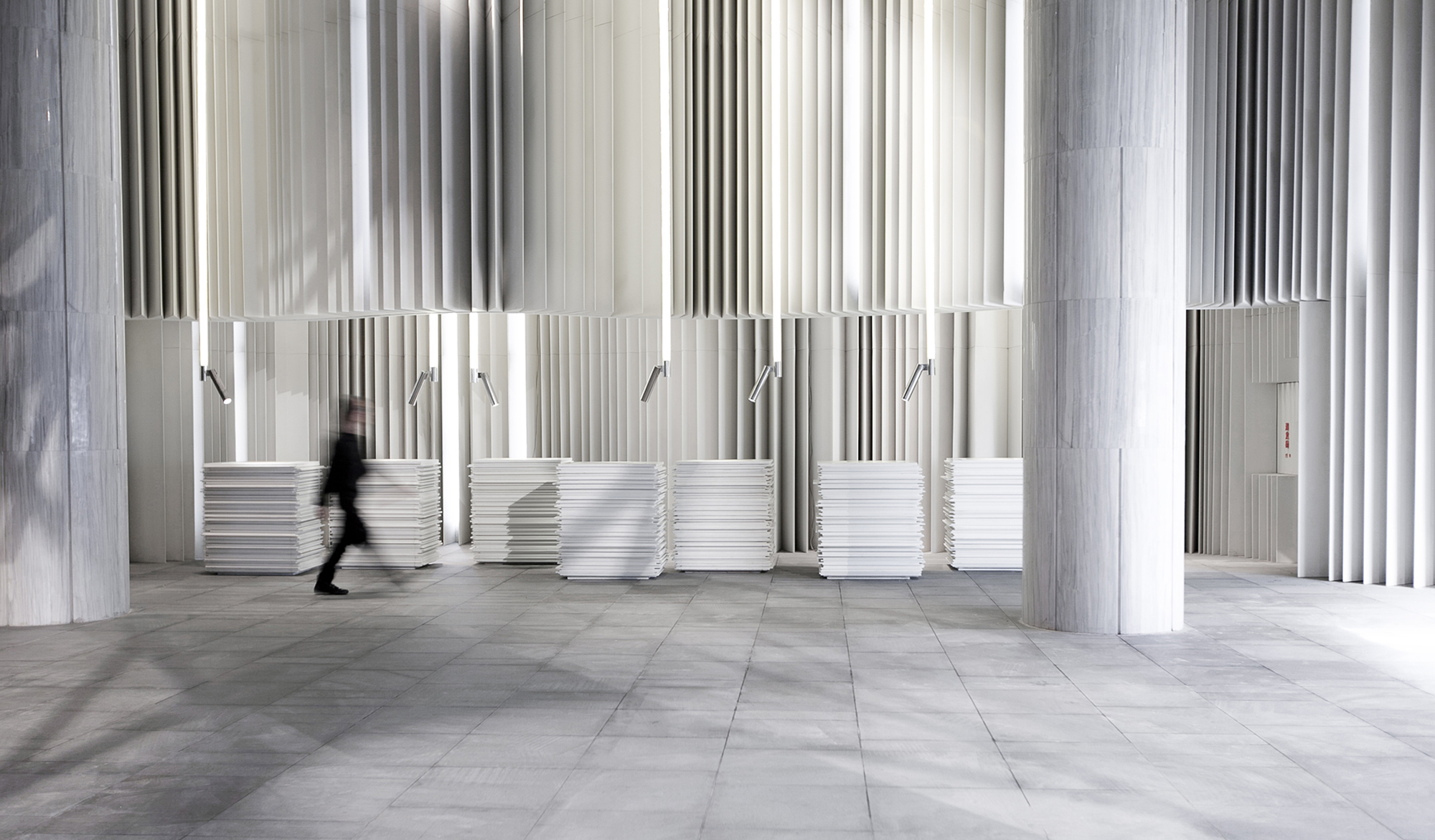
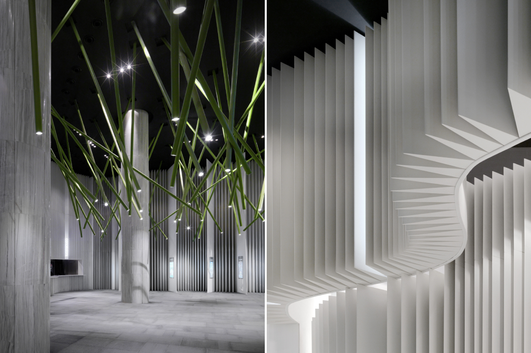
Taking inspiration from the black font over white pages in books, the studio transformed the cinema into a heavily textured space. The different panels on the walls are reminiscent of the flipping of pages of masterpieces written by scriptwriters. In the lobby, visitors come across cashier tables that resemble giant stacks of paper — in reality, they are made of Corian.

Panels with slim triangular blocks are suspended from the ceiling to resemble a curtain of flipping paper. Even the columns in the space have been painted and textured to continue the black and white theme. The only thing breaking up the monotony of black and white is a series of green cylindrical spotlights that are put together in an abstract composition.

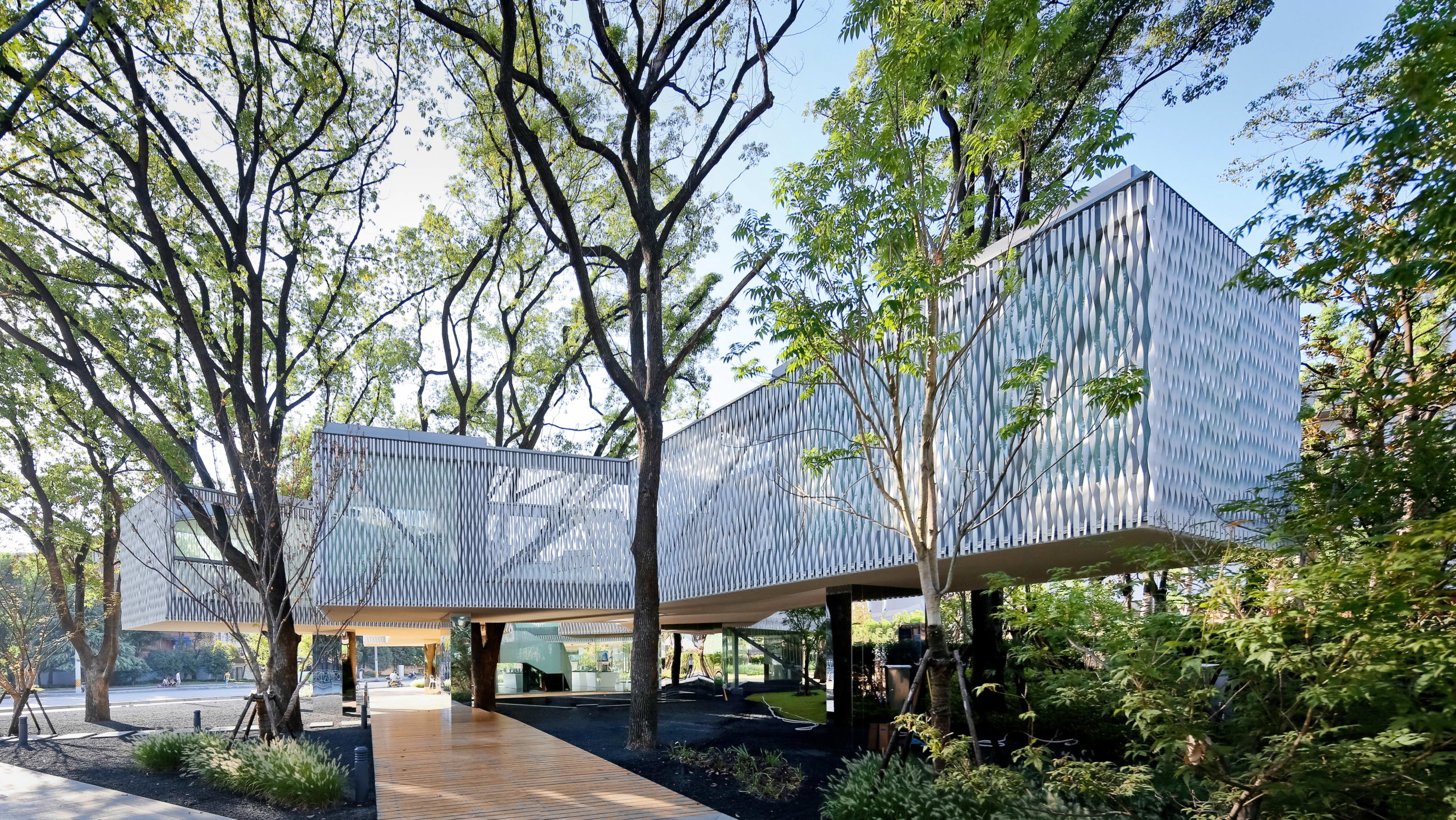
Huaxin Business Center by Scenic Architecture, Shanghai, China
Jury Winner, 2014 A+Awards, Office Building – Low Rise (1-4 Floors)

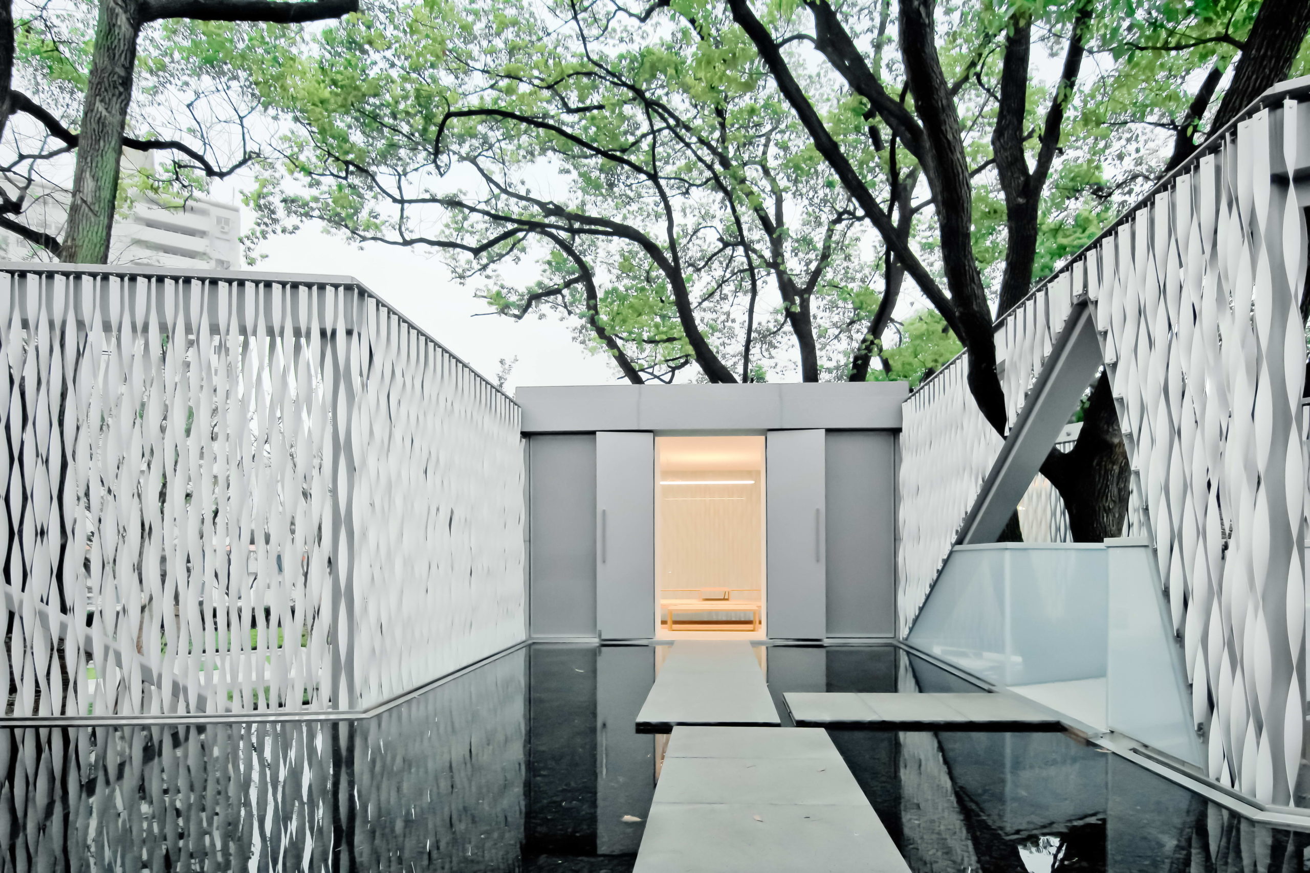
The aim of the project was to maximize green cover and protect the six trees present on site. This is achieved by elevating the main mass above the ground to leave more room for green spaces below. The four blocks of the building are connected by open bridges. On the upper level, the spaces holding important functions are covered in twisted aluminum strips on the outside. These strips add translucency to the walls and help establish connectivity with nature beyond. The thin panels, much like light strips of paper floating and twisting with the wind, give the building a very tactile quality and heighten the experience as people walk around and try to peek at the trees beyond.

Images by Sharyn Cairns

Paperbark by KOICHI TAKADA ARCHITECTS, Melbourne, Australia

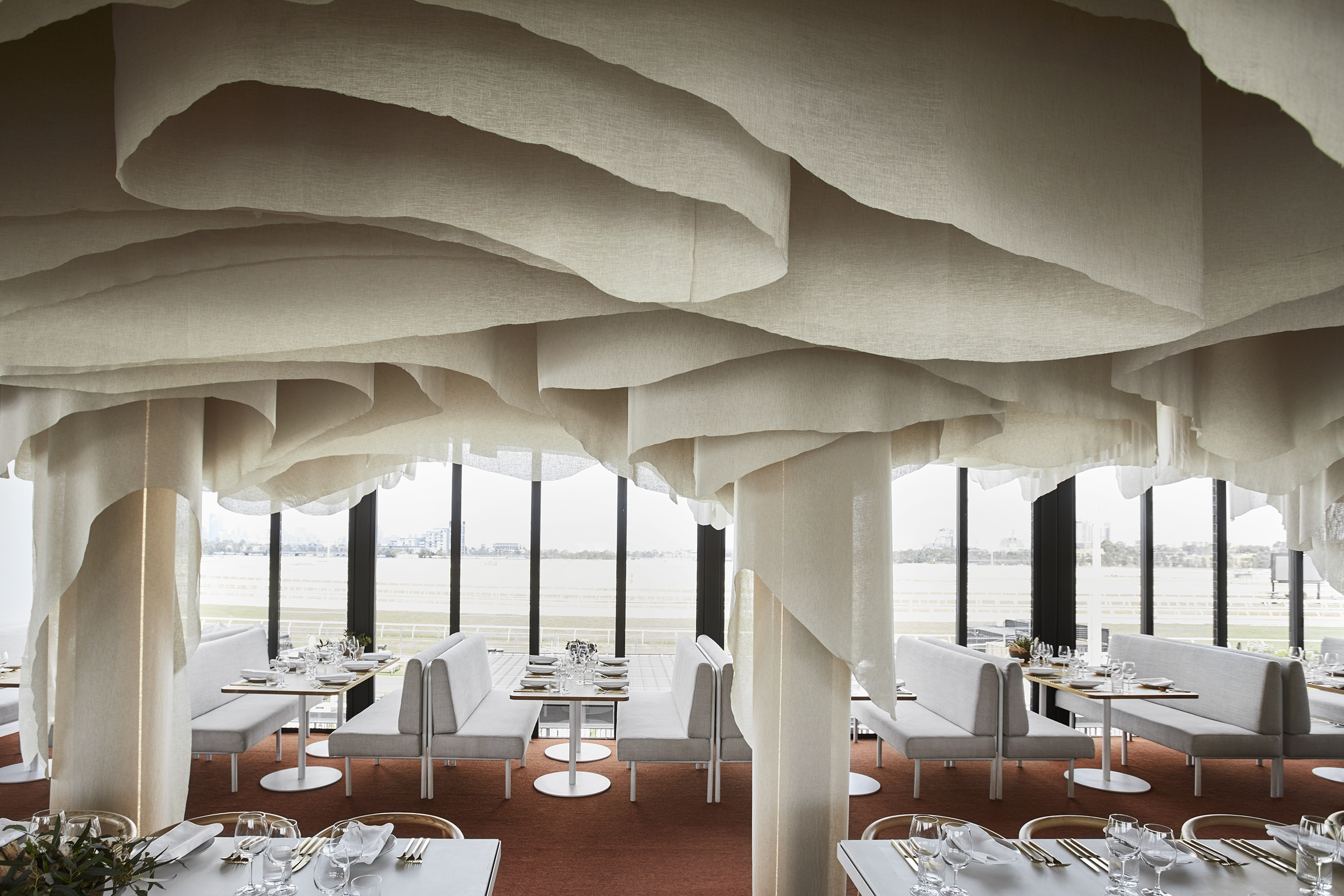
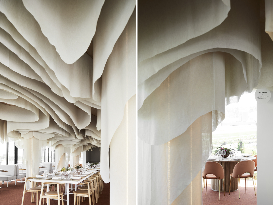
The restaurant offers a zero-waste menu with locally foraged Australian produce that is designed to inspire and delight. The space reflects this awareness of nature and slow movement. It is inspired by the Victorian Dandenong Ranges and the organic lines of the native paperbark tree. Repurpose biodegradable fabric is used to create the contoured ceiling installation. The subtle tones and softness of the installation help people form an emotional connection with nature while they dine and thereby create more awareness around conservation.

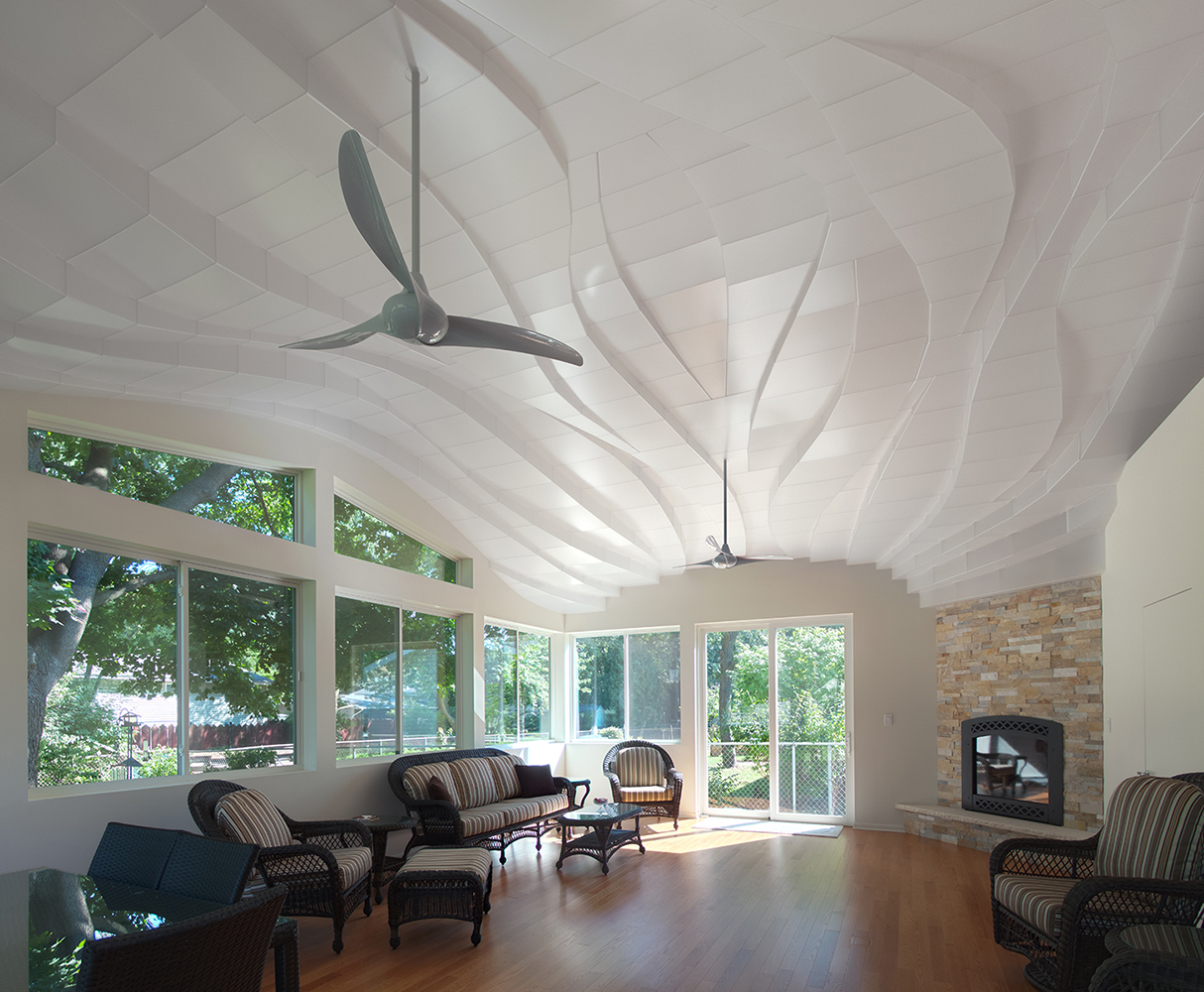
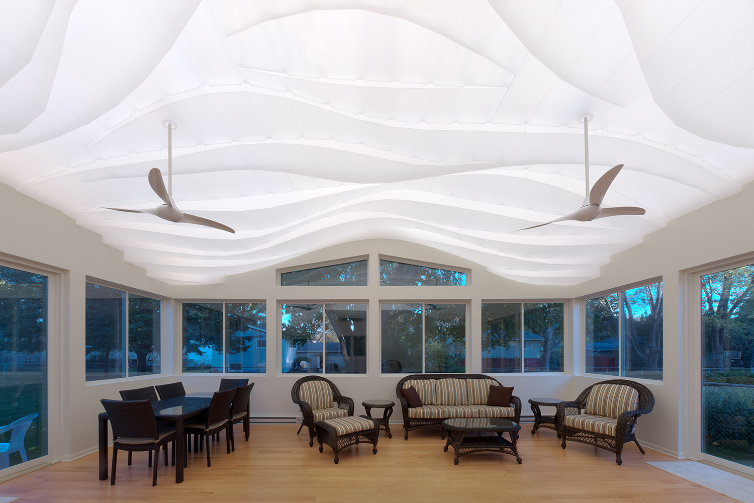
“Light Arrival” Yorkshire Ceiling by Flynn Architecture & Design, Crystal Lake, Illinois
Fluid lines on the ceiling of the sunroom help soften the rectangular edges of this space. Instead of going the digitally designed route, the ceiling is hand sculpted using translucent contoured panels that cover low-voltage LED strip lights for a diffused glow. During the day, when the lights are turned off, the shadows created by sunlight add more dimension to this three-dimensional installation. Fans suspended from this ceiling feature a similar curved profile.

Norwegian embassy in Athens by gfra, Athens, Greece
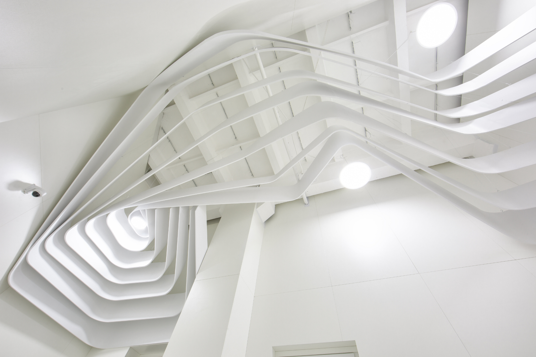
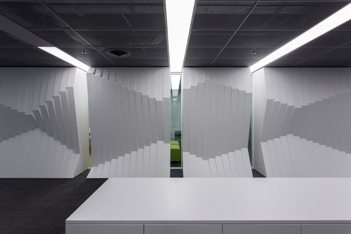
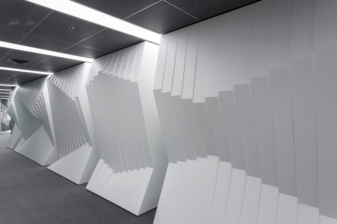
Unlike traditional origami, the art of kirigami uses small cuts in paper along with folks to create intricate, three-dimensional patterns. The Norwegian embassy in Athens uses this technique to imitate mountains reflecting in the fjord waters. Lights placed above this wooden structure enhance the folds and make this the focal point of the overall space.

Images by Alik Usik and Serhii Nikiforov

Tween Coexistence by Dmytro Aranchii Architects, Kyiv, Ukraine

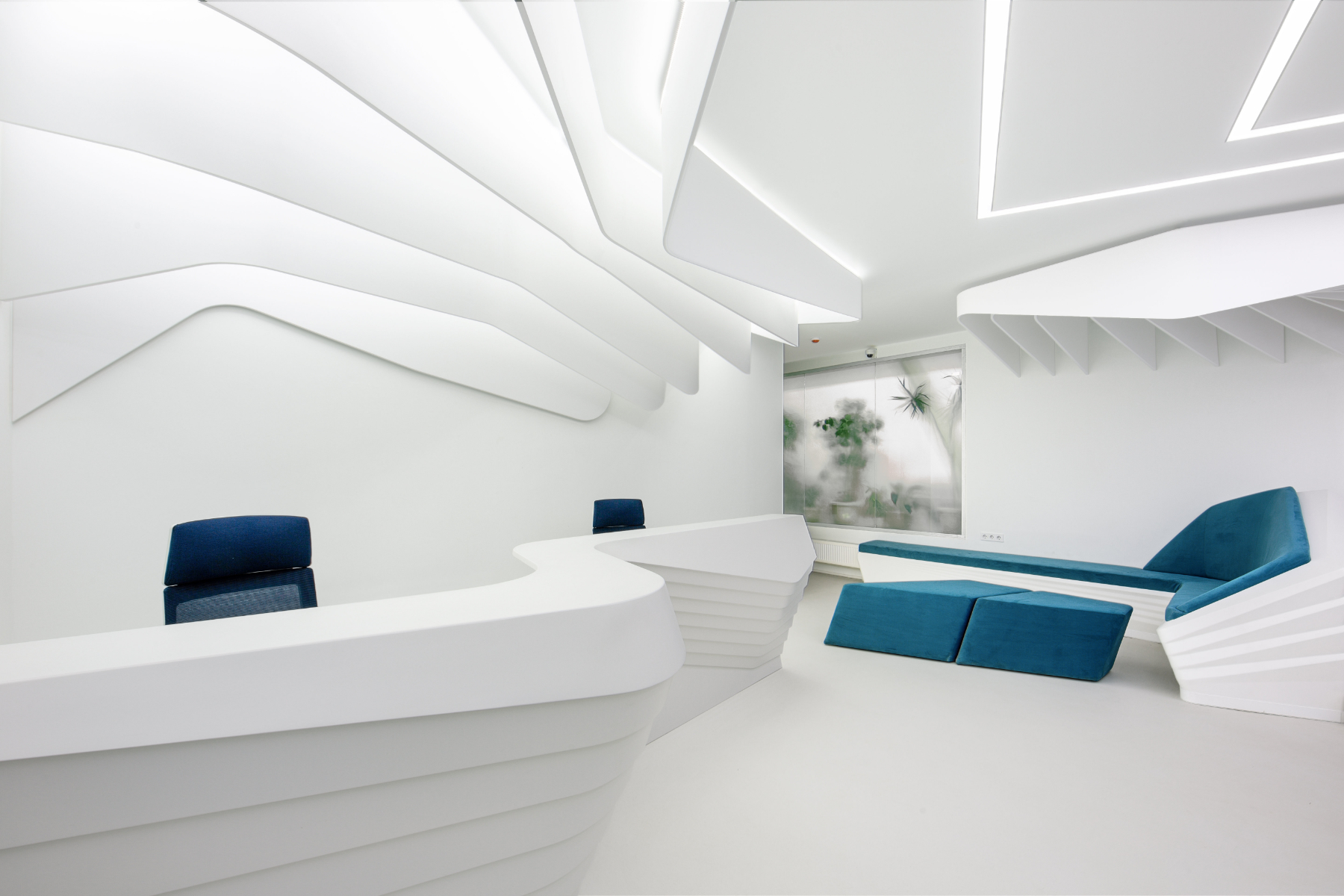
Curved and bent strips of white shape all elements of this space — right from the ceilings to the reception desk. This technique also helps the furniture to blend into the walls, visualizing fluid circulation. The waiting area contains a large reception desk and an L-shaped sofa that blends in with the stairs leading to the interior spaces. On the ceiling, one can see two distinct patterns: one that originates in the reception area and another that continues along the transition to the inner spaces.

Images by Anil Patel

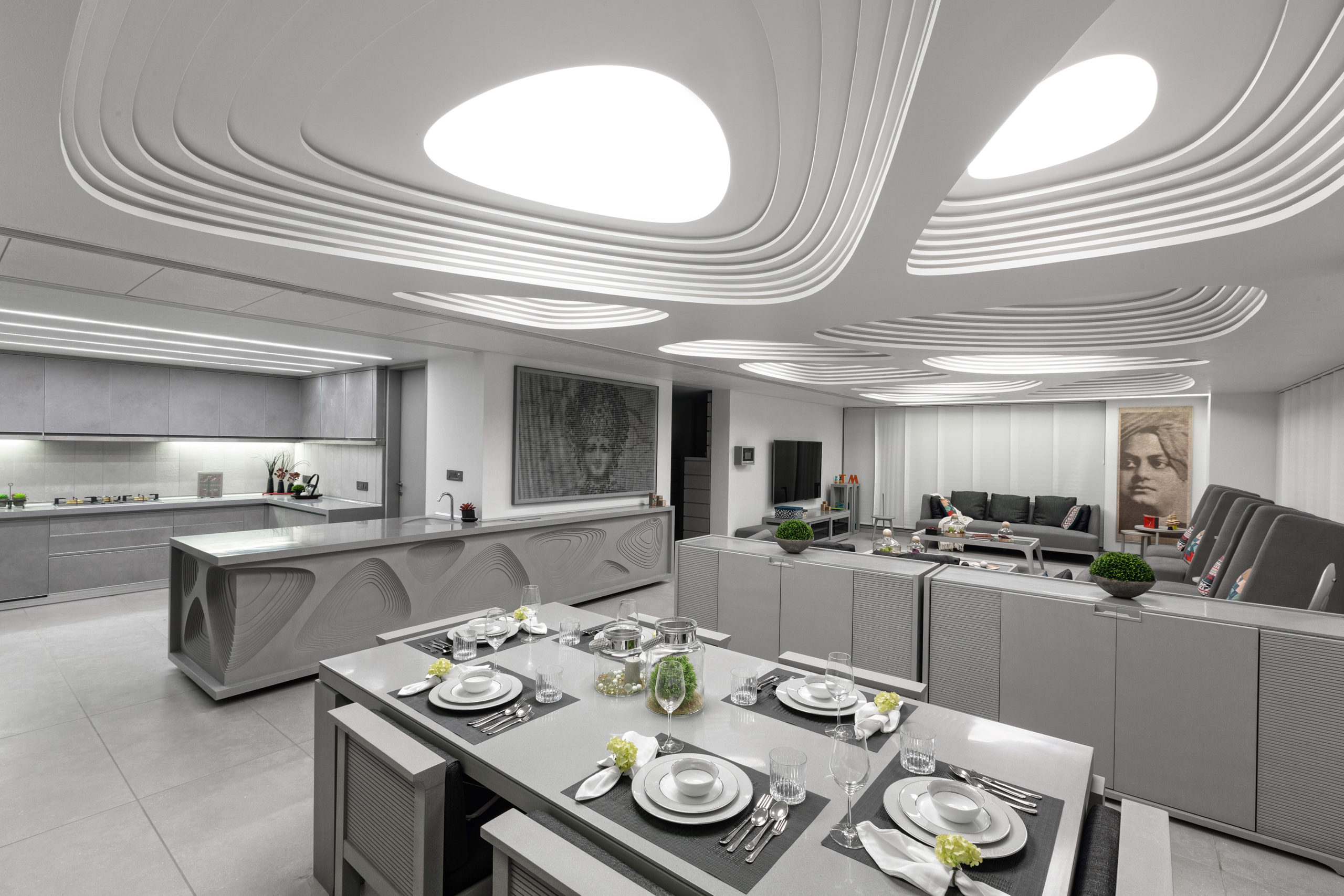
1102 Penthouse by Apical Reform, Ahmedabad, India

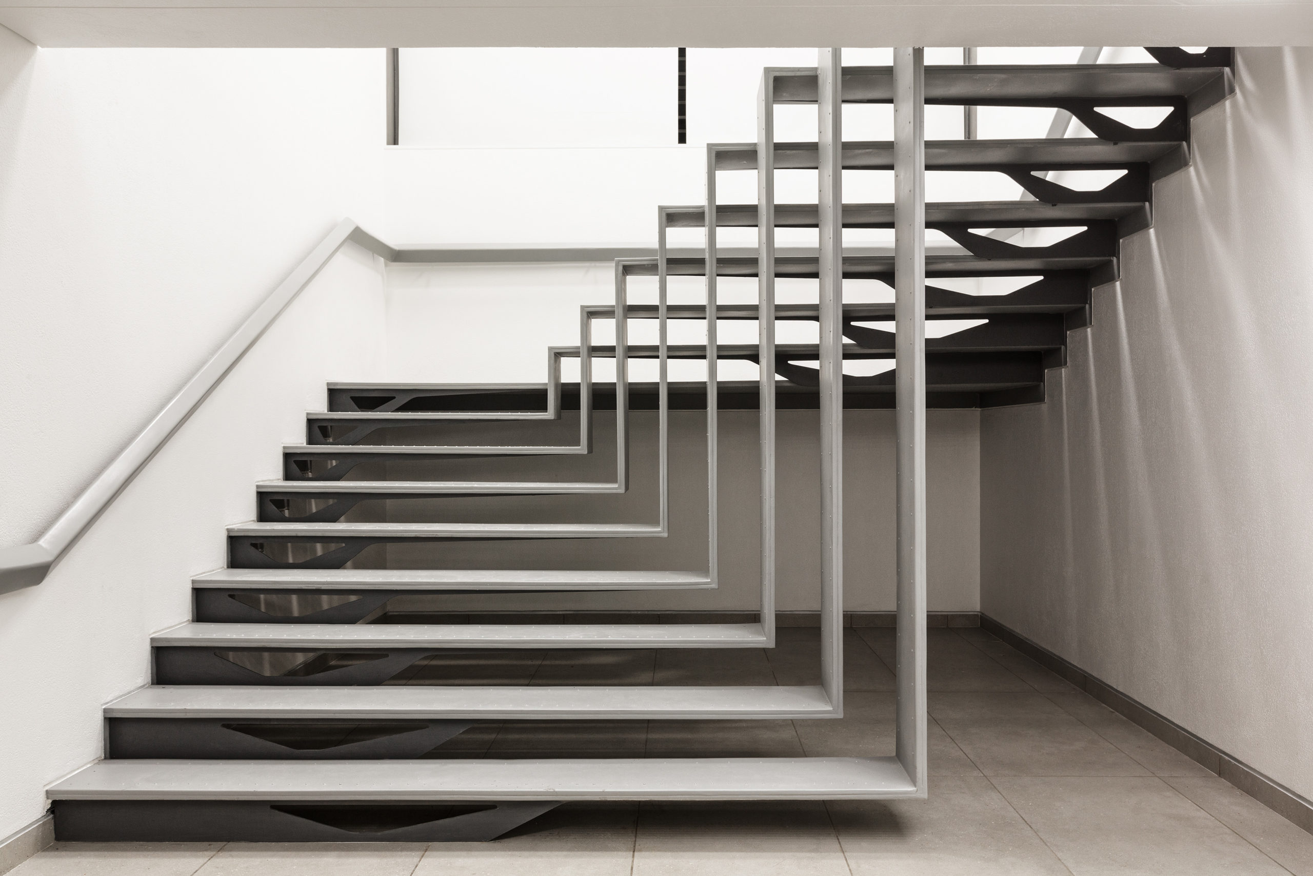
Much like a handcrafted contour model, planes with gradually decreasing cutouts are layered on top of one another to create the ceiling. Similar cutouts are used to embellish the kitchen island and console. The entire space is decorated in a neutral palette of grey and white to create a calming atmosphere. The staircase leading to the terrace is also composed using folded strips of metal similar to the forms of kirigami sculptures. Despite its lightness, it still holds a strong presence within the space.

Images by Jun Murata

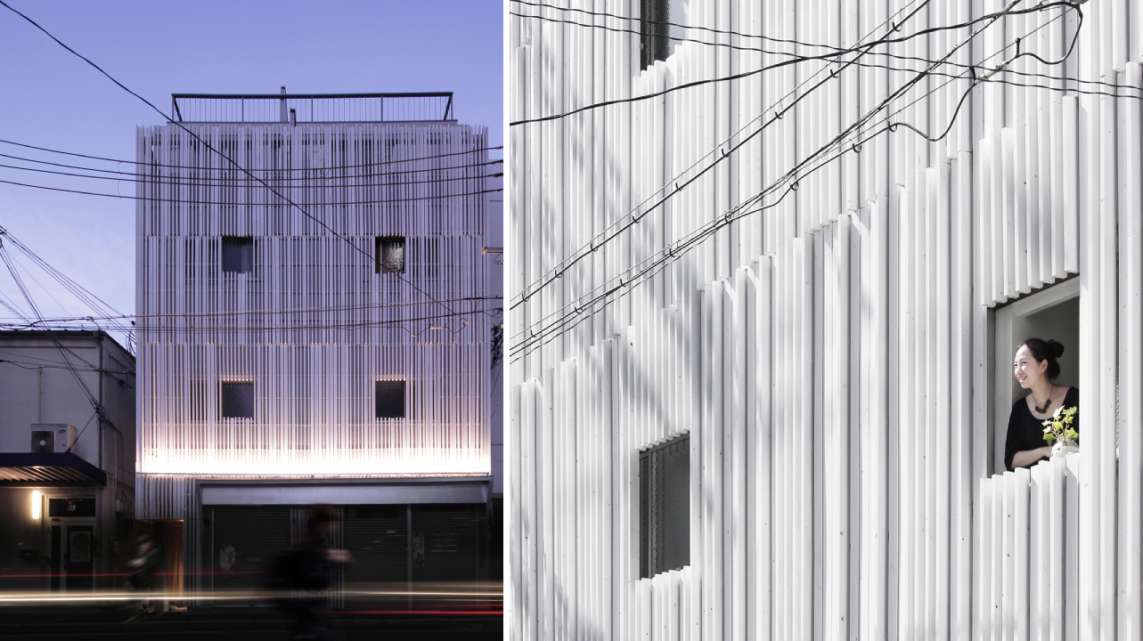
N STRIPS by Jam, Osaka, Japan

This project is a renovation of a multi-tenant building that holds living areas and office spaces. The previous blank façade of the building is transformed into an eye-catching display with the help of white fins. This was done to add more privacy as the plot across from it is meant to have an apartment building built on it in the future. Furthermore, the louvers help conceal any unevenness in the external walls as well as the new pipes installed. The extrusions also create constantly changing shadows throughout the day.


Reference

From the Top: 7 Way Statement Ceilings Can Add an Architectural Punch
CategoriesArchitecture

From the Top: 7 Way Statement Ceilings Can Add an Architectural Punch

The A+Product Awards is open for entries, with a Late Entry Deadline of July 22nd. Get started on your submission today! 

One thing that ties together the Sistine Chapel, The Peacock Room and The Romanian Athenaeum is their majestic ceilings. These buildings are proof that these surfaces can serve a purpose beyond just holding light fixtures. However, excessive embellishments and traditional techniques can look out of place in contemporary homes or restaurants. Below are just a few modern alternatives that ensure that the ceiling takes center stage.

Bella Italia Weine by Ippolito Fleitz Group – Identity Architects, Stuttgart, Germany

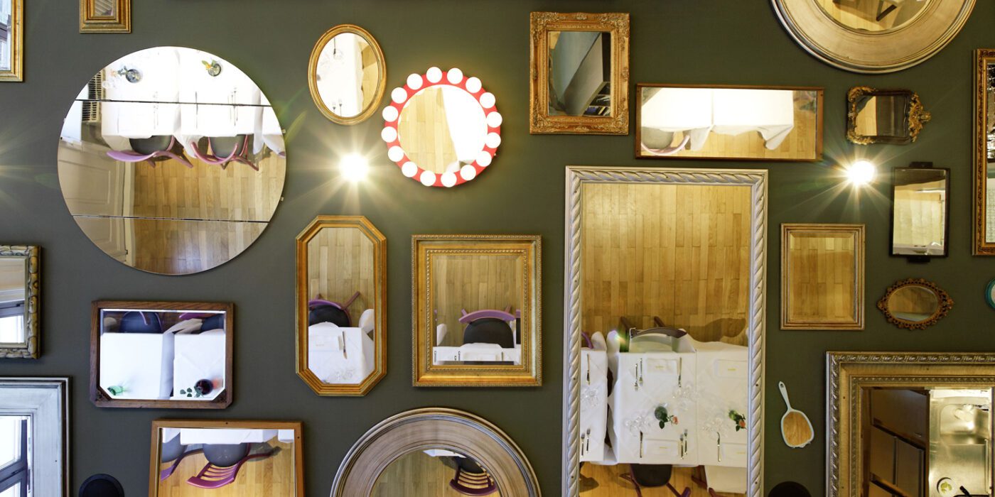
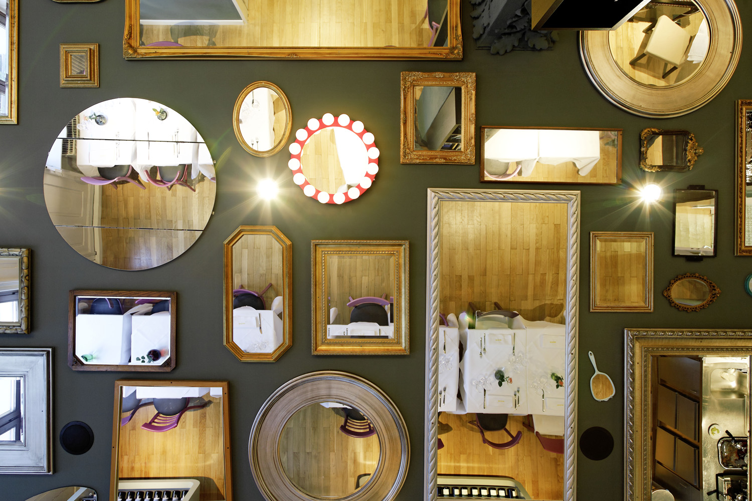
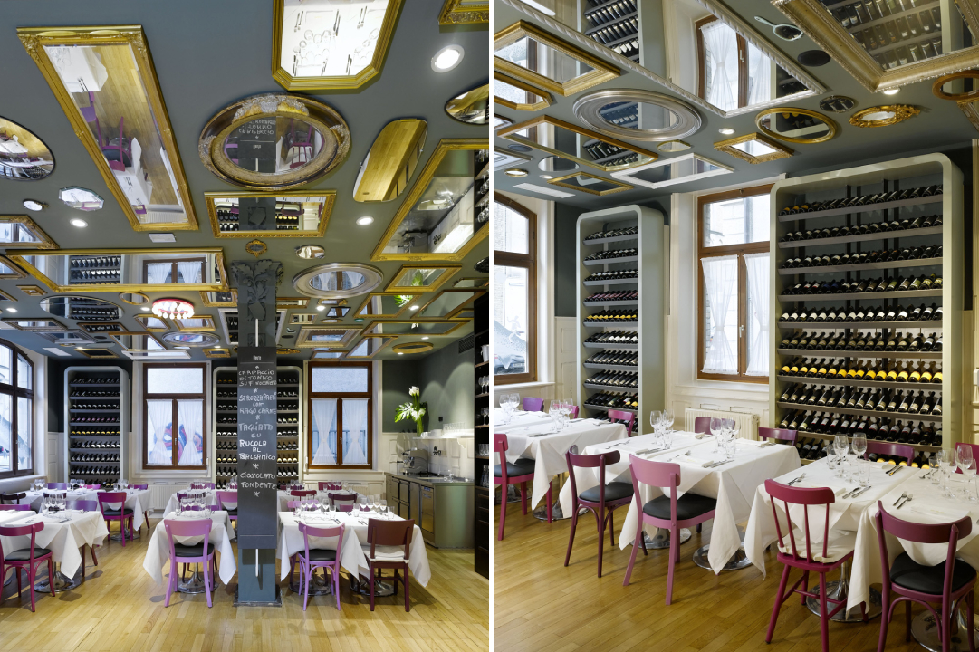
Gallery walls are a common occurrence in the Pinterest home décor search results. Another trend is creating a composition of mirrors featuring different design styles to create interest and play with the dimensions of the space. One interpretation of this trend is to adapt it to the horizontal plane or the celling of a room.

This approach is showcased in the Bella Italia Weine in Stuttgart. 90 different mirrors obtained from several rummage sales are mounted on the ceiling, ranging from large rectangular framed ones to decorative handheld mirrors. One of them even features hanging crystal lights to replicate a chandelier. They create broken reflections of the activity below and also imitate the comfort and intimacy offered by the home-style cuisine served here.

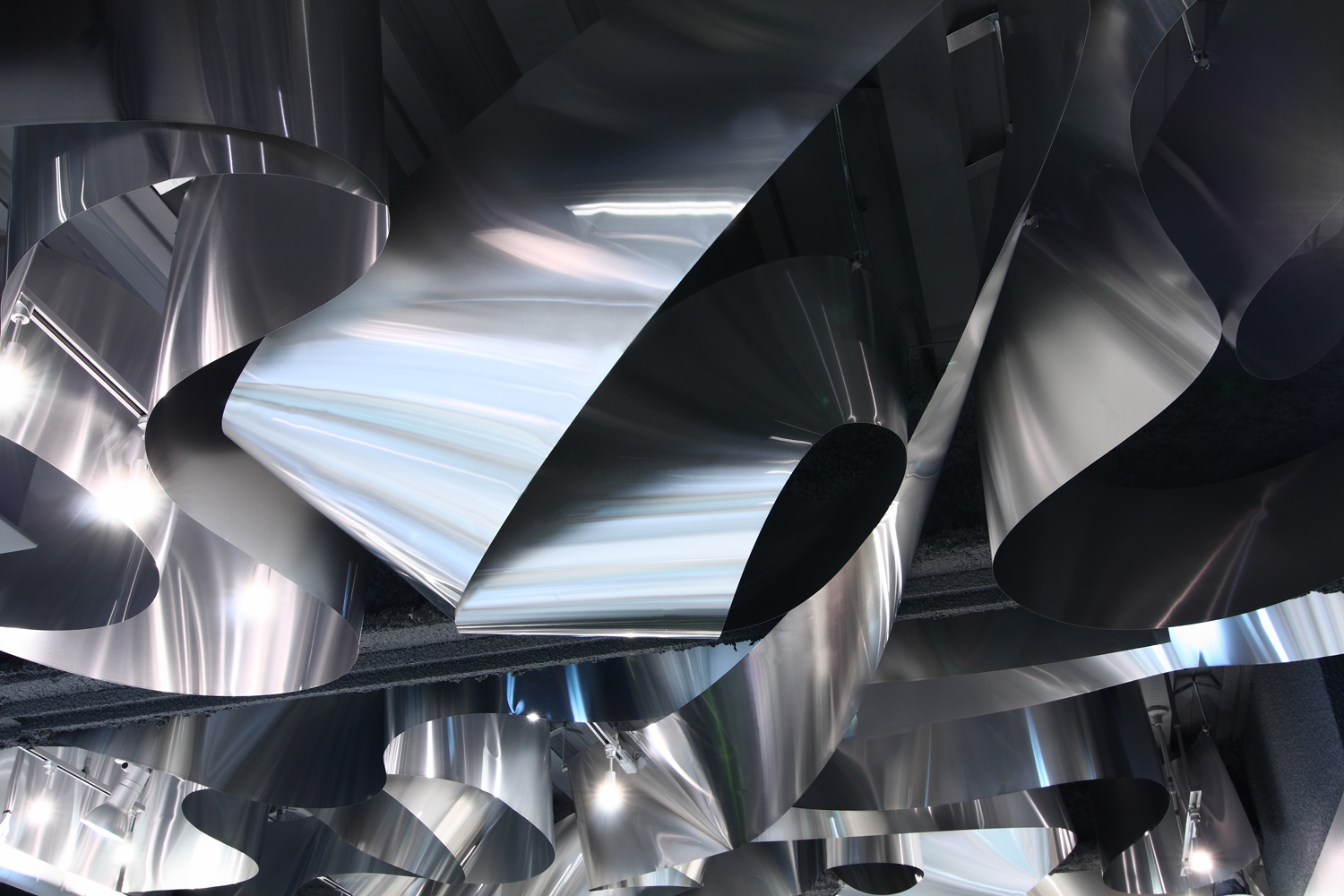
ARKHE Beauty Salon by Moriyuki Ochiai Architects, Chiba, Japan

While a sculpture can enhance the look of any space, turning an entire element of architecture into a sculpture can leave a significantly stronger impact. Using different materials, textures and forms in ceilings can create a captivating effect, reflect light in new ways and also help give dimension to an otherwise plain space. In ARKHE Beauty Salon, the firm uses strips of recycled aluminum curled and twisted over and over again on the entire surface to create almost a fluid composition. The firm wanted to replicate the movement of water and the lightness of the hair. The reflection of light on the metal’s surface also mimics the visual of light falling on the surface of the ocean.

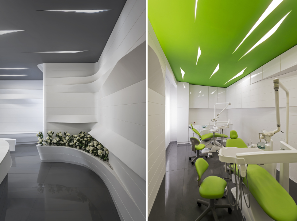
Zafar Dental Office by ReNa Design, Tehran, Iran | Images by Reza Najafian

Zafar Dental Office is a great example of how even subtle introductions in a space can make a big difference. Here, they have used small cutouts in the ceiling to hold lights, much like simple cuts in a sheet of paper. These cuts have both sharp profiles as well as sinuous curves. The form is then continued n shelves and seating throughout the space to unify the design. This proves that even small changes in lighting design and geometry can create interest in spaces where it is difficult to add color or protrusions either due to the nature of the function or lack of height.

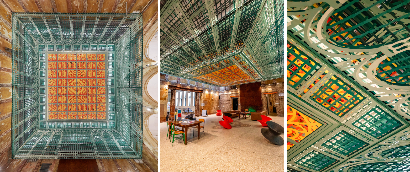
Over View by FreelandBuck, Pittsburgh, Pennsylvania

Art has been shown to be a successful way of decorating ceilings throughout history. It compels people to stop and look up, changing the way they use and perceive space. Taking this one step further, using optical illusions on the horizontal pain can not only trick people into believing there is a 3D form instead of a plane but also create movement. This helps create the perception of greater floor height as well.  Over View, an installation composed of printed textile pieces, transforms the lobby of the Carnegie Library into a Renaissance-era spectacle. When seen from the center of the room, it appears to have depth and go higher. When seen from other angles, it looks as if it is protruding toward the floor.

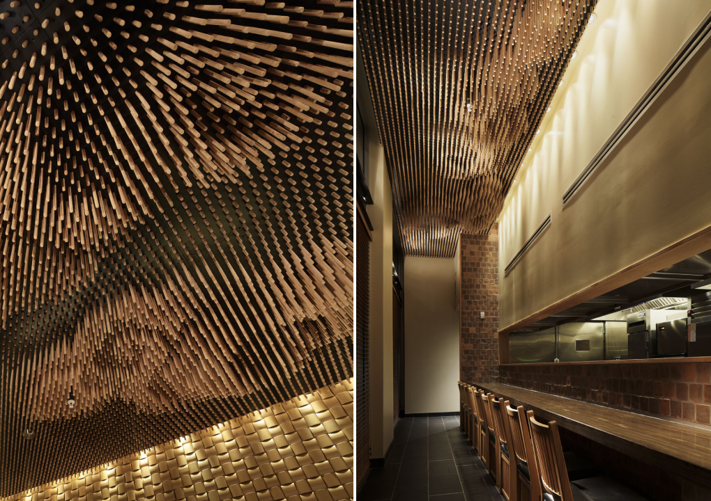
Tsujita by SWeet Co, LTD, Los Angeles, California

Being able to look at clouds when dining can make for a thoroughly enjoyable experience. But outdoor dining can also be challenging when grappling with uncertain weather. Interior decorators have often tried to bring the outdoors in by painting murals on walls and ceilings or bringing in greenery. This technique can be altered to better fit fine dining establishments by using a more abstract version of natural elements to add more whimsy. In Tsujita, 25,000 wooden sticks of different lengths are used to create the imagery of clouds. This image changes when seen from different angles due to the space between the sticks.

:PM Club by MODE, Sofia, Bulgaria

Vaults and domes have been significant structural elements in religious and cultural buildings throughout history. Now, we can see modern versions in interiors that are purely aesthetic. It can be done by padding beams to create vaulted tops or using wooden panels to add curves to flat surfaces. Another way to add dimension is by using hexagonal and pentagonal forms to create geometric domes as in :PM. The panels also diffuse the color-changing lights placed in this arrangement. This technique combines the charm of conventional domes with the grandeur of chandeliers.

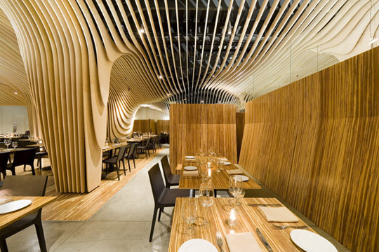
Banq by Office dA, Boston, Massachusetts

There has been an emergence of designs that allows floors, walls and ceilings to blend into one another. Pirogovka Appartment does so by allowing paint from the walls to crawl up the ceiling and floor and a bakery in Oporto continues vertical panels from the wall as swooping curves on the ceiling. Banq in Boston uses wooden slats to create a contouring canopy that continues upwards from the columns. This system also serves an additional function of concealing the old mechanical and structural systems from the previous design. The design also features a wine storage area in the center that becomes a part of this system.

The A+Product Awards is open for entries, with a Late Entry Deadline of July 22nd. Get started on your submission today! 

Reference